Open-ear earbuds concept transforms a common gadget into a fashion statement

TWS or True Wireless Stereo earbuds have become such a common sight that their no longer weird to see something sticking out from people’s ears these days. It’s not a pretty sight, no matter how minimalist or sleek they are. Unfortunately, limitations of acoustics and technology also limit the possible designs for these tiny accessories, but what if such restrictions were loosened up a bit?

This concept design for open-ear earbuds try to explore that possibility, offering a product that isn’t just functional but also aesthetic. With just a few changes to the basic formula, earbuds become chic fashion accessories you won’t feel ashamed to wear, almost like wearing large but stylish earrings, without the piercings, of course.

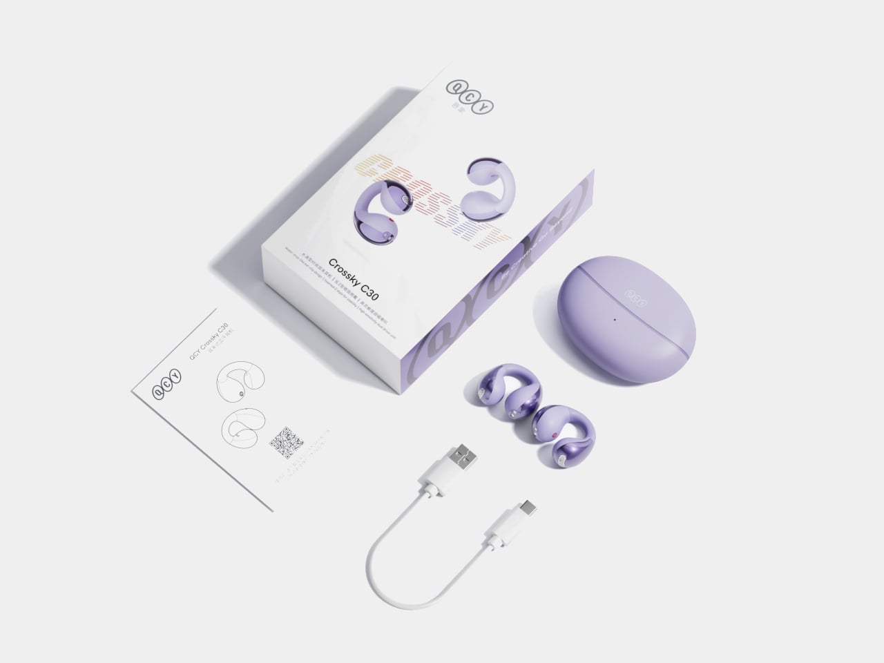
Designer: Zhang Yunxib

The basic earbuds design evolved from humble earphones to the point that the Apple AirPods were even ridiculed for looking like EarPods with their wires cut off. Other wireless earbud today don’t sport such dangling stems, but the basic mechanism remains the same. You stick part of the buds inside your ear canal and hope they won’t fall off thanks to the fit of the buds or their shape.

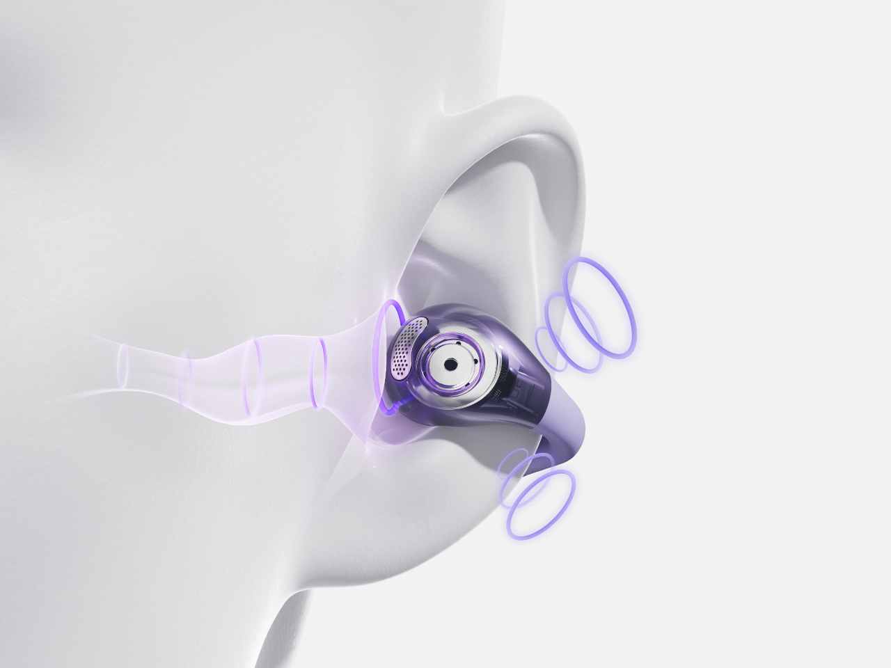
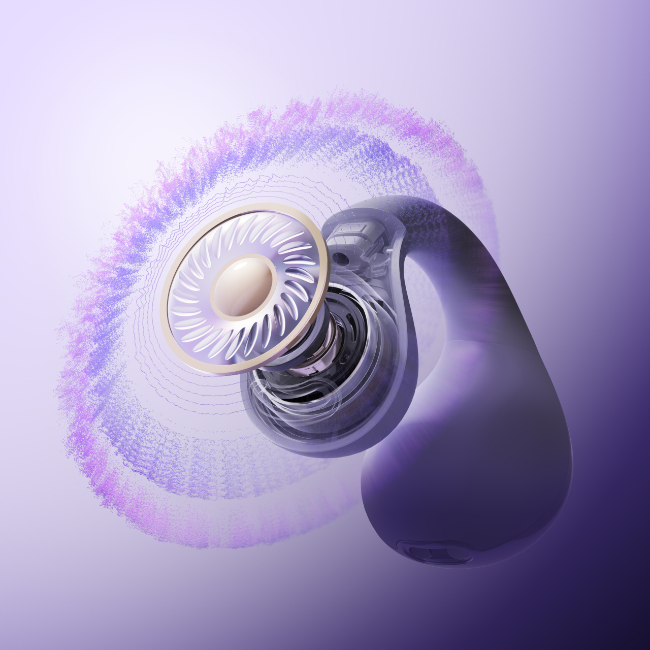
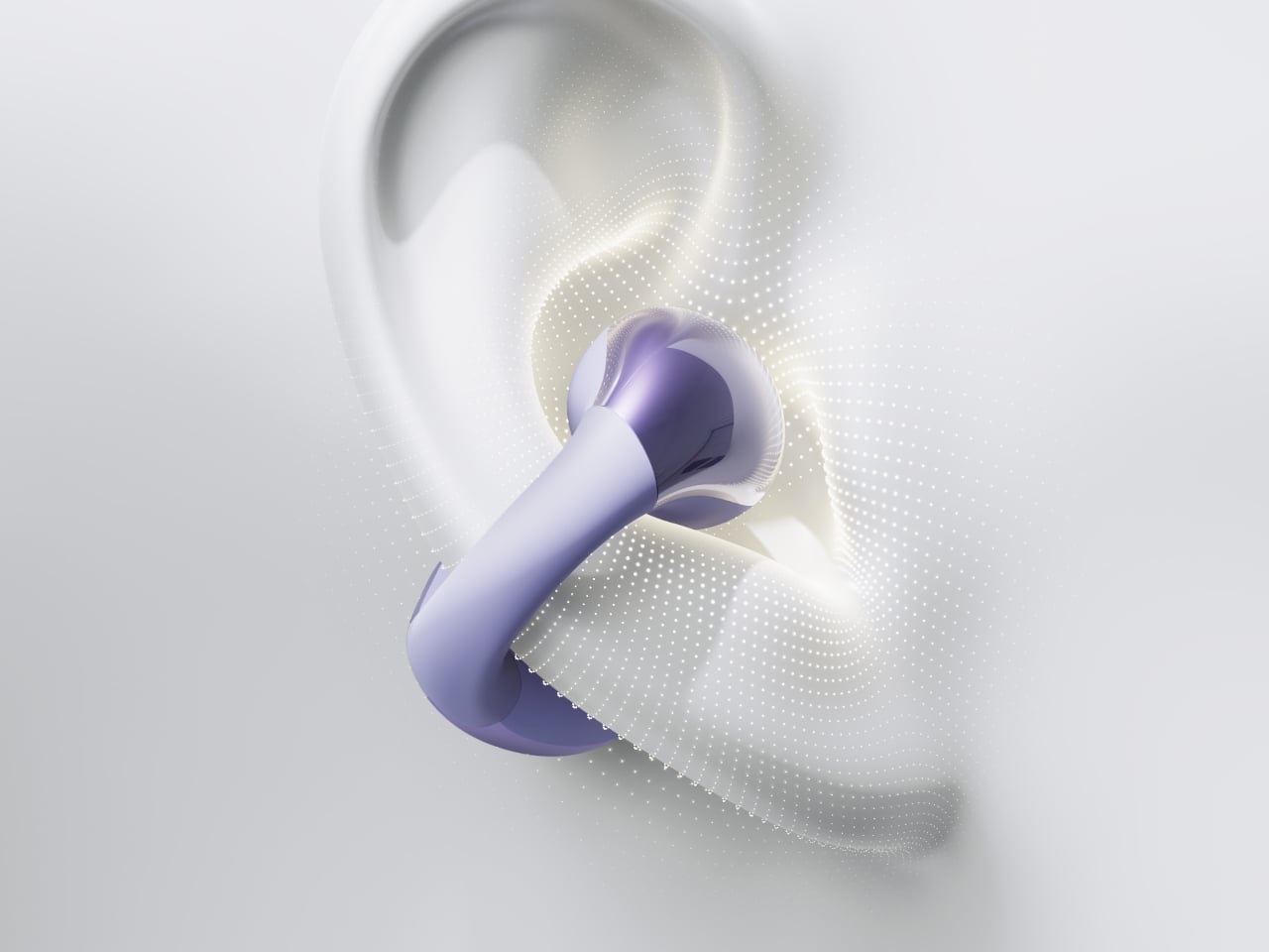
The are, however, other ways to bring sound waves to your ear without blasting them directly into your ear canal. Some “open ear” headphones, for example, use bone conduction to deliver vibrations directly to the bones in your head that you “hear” as sound, while other use simpler but more refined air conduction that won’t tickle your temples.

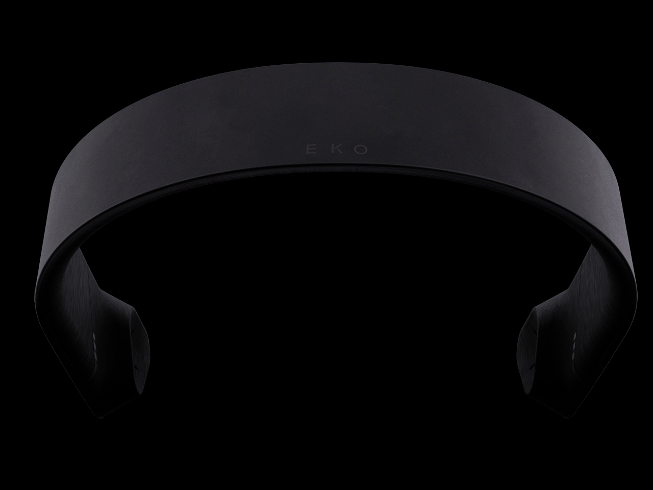
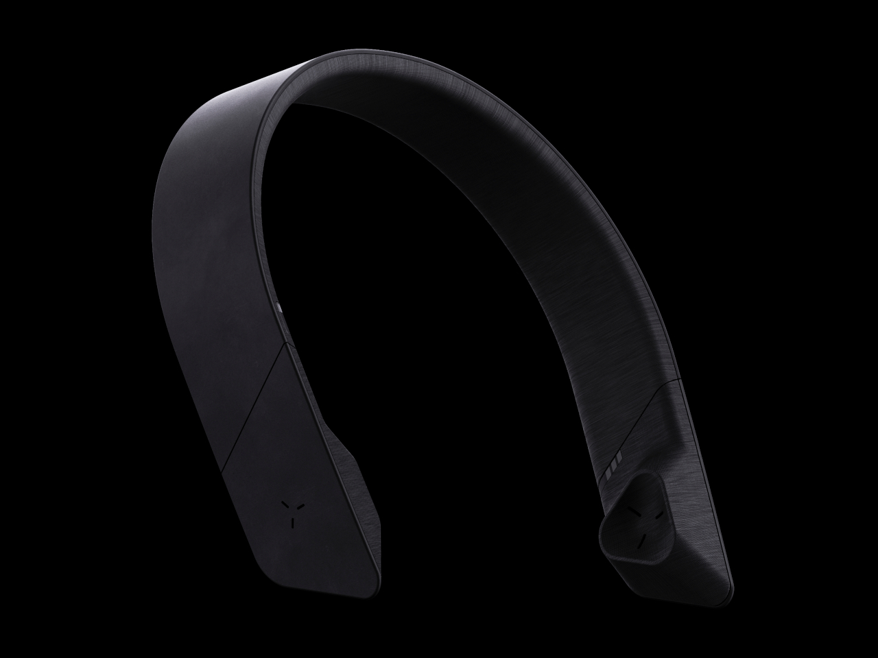
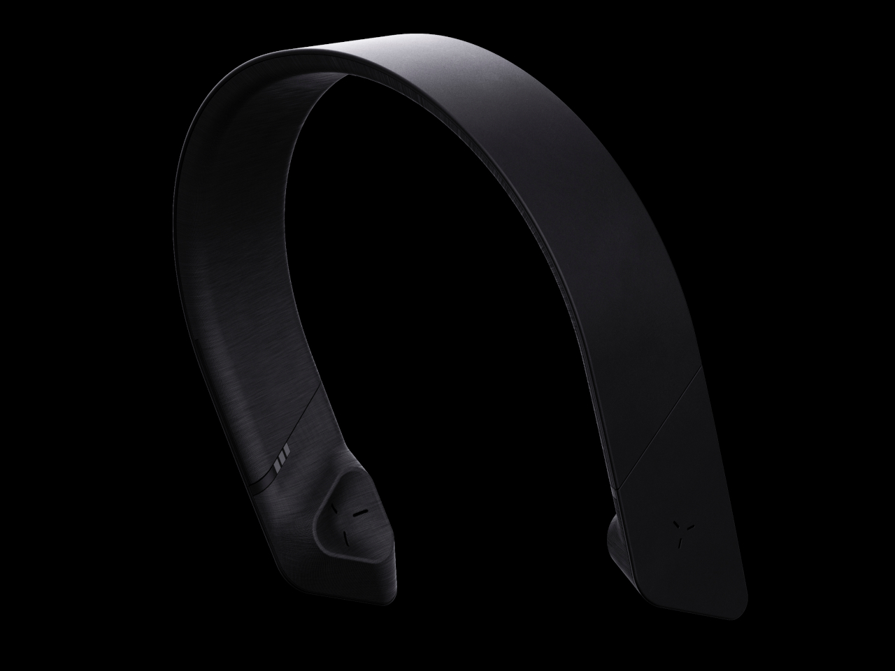
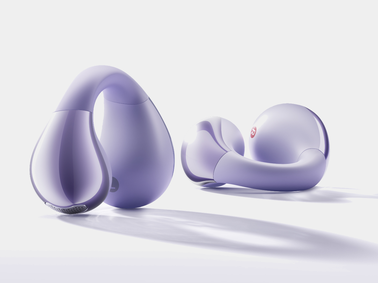
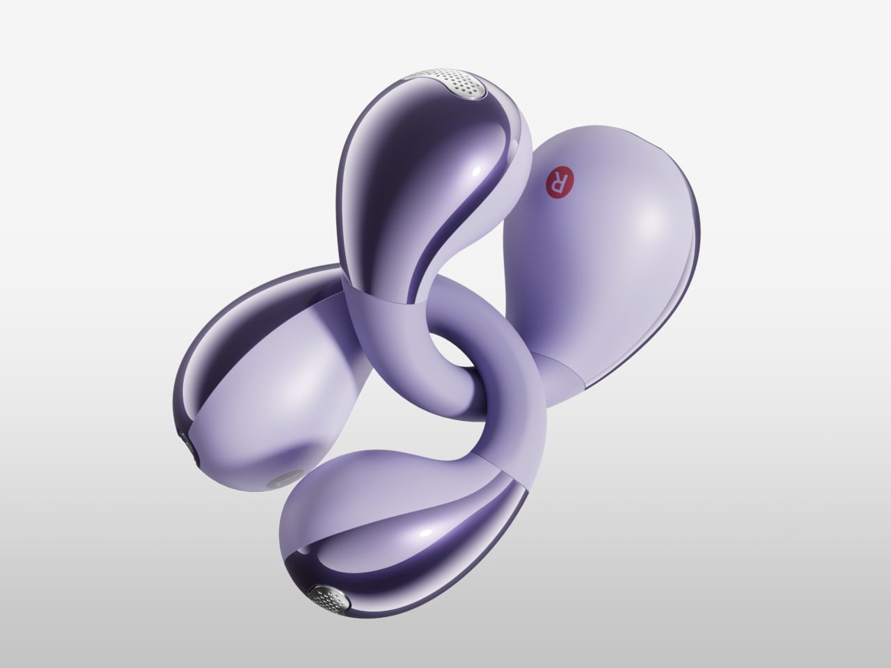
This earbuds design concept uses the latter to fashion earbuds that wrap around your ear to secure its position, leaving the actual speaker just a few millimeters away from the ear canal opening. This is a similar design to the Bose Ultra Open Earbuds launched early this year with one important difference: it’s made to look really good.

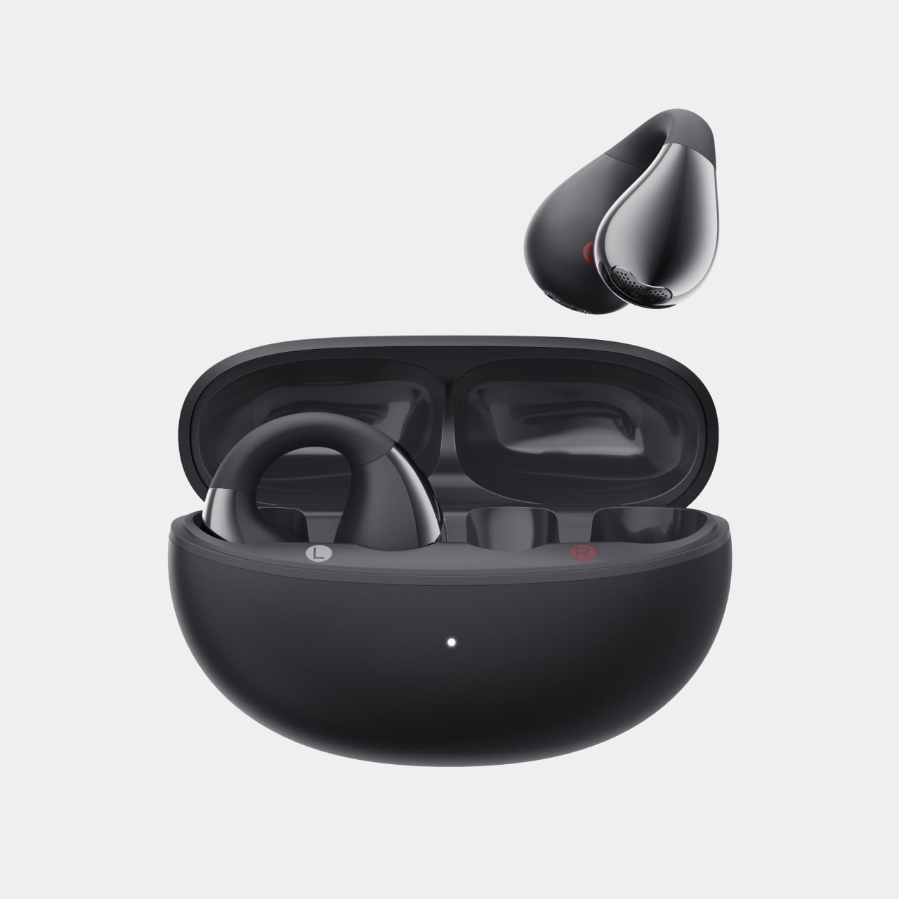
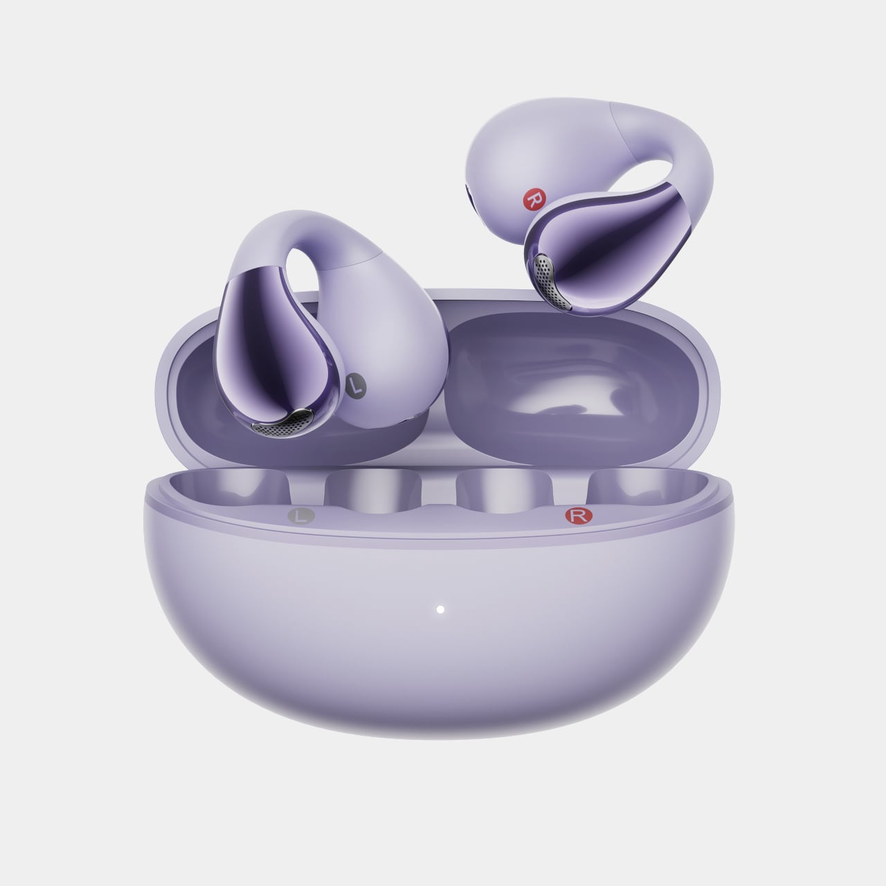
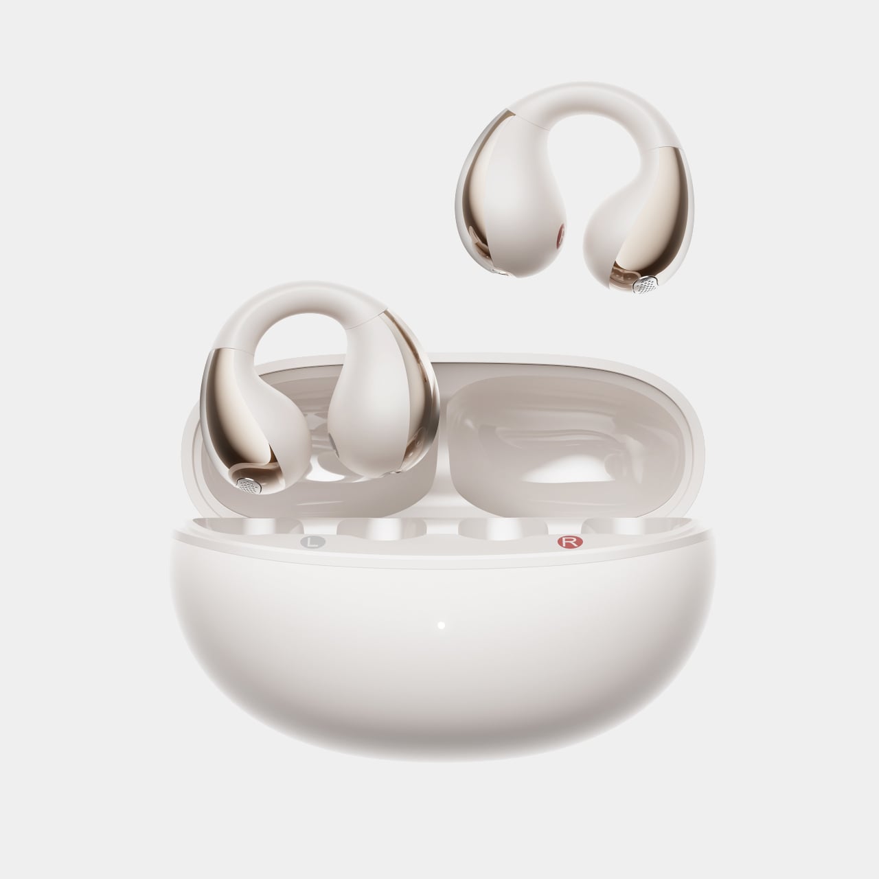
With an elegant matte texture and a mirror-like finish on the ball-shaped tips, these earbuds look more stylish than the typical rugged or sporty earbuds in the market. The way they hang on the sides of the ears rather than sticking down with a stem makes them look more like ear clips or earrings, giving them the appearance of fashion accessories or even jewelry.

The sleek and thin body doesn’t take up too much space or shove distracting forms, so you can still wear your favorite earrings that complement the earbuds. It’s a simple change to a tested formula, but one that completely changes the appeal and purpose of the product, from simple tech accessories to an expression of your taste and personality.

The post Open-ear earbuds concept transforms a common gadget into a fashion statement first appeared on Yanko Design.

Cubicle concept proposes a personal bunker for rest, focus, and collaboration

Open floor plans have become the trend after painting office cubicles in a negative light, blamed for the breakdown of human communication and social connections between colleagues. At the same time, however, these “borderless” arrangements also bring about distractions, tensions, and even stress, not to mention the complete lack of privacy when you do want it.

It doesn’t have to be an all-or-nothing solution, though, and cubicles don’t have to be the anti-social cages they’re made out to be. This personal bunker concept, for example, does put up barriers to let you focus and relax in peace, but literally leaves a window open when you do need to mingle with other people for work or study.

Designer: Ma. Camilla Isabel Reyes

Personal pod designs are becoming more common these days. People are realizing that open spaces aren’t all that they’re cut out to be and want to have some personal space from time to time. Being able to block off distractions in a visible and physical way can help improve concentration, especially when the pod includes features like soothing music and relaxing lights to help set the mood.

BrainBunk is a design concept for a personal pod intended to maximize focus and rest, while still leaving the option for communication without leaving the space. Unlike a normal desk cubicle that simply puts up walls around the table, it’s pretty much a miniature room complete with a reclining chair. The idea is to be able to work, eat, rest, or even sleep inside, all within your own personal bubble.

What makes the design a bit different from totally enclosed pods is that it has a sliding window mechanism that opens a corner of the cubicle. This would allow the person inside to communicate with others face-to-face without having to get up and walk out. And when they’re done and want to have their solitude back, they can simply slide the panel back out.

BrainBunk can have three configurations that take advantage of this unique feature. A lone cubicle would be great for the solitary worker, but groups of two or four allow that collaborative option among workers or even students. It’s a simple yet effective design for a personal space that doesn’t go over the top in terms of features and amenities, though it could probably do with a bit of improvement in the choice of more sustainable materials.

The post Cubicle concept proposes a personal bunker for rest, focus, and collaboration first appeared on Yanko Design.

Recycled plastic becomes stone-like sheets for sustainable furniture designs

We all know how bad plastic is for the planet, but no one will deny its versatility and affordability. Until we’re able to create a truly sustainable replacement that’s just as cheap to make, all we can do is take measures to reduce their impact on the environment. That might mean using bio-plastics, or it may mean reusing and recycling plastic into some other form.

Transforming plastic into new materials isn’t exactly new, but this innovation puts a new spin on that idea. Not only does it recycle plastic without using binders or glue, it also makes the resulting material almost as strong and as beautiful as stone. The result: striking furniture made almost 100% from plastic.

Desingers: Jared Seifert, Lauren Copping (Design Declassified)

There are plenty of ways to recycle plastic, but unlike wood or paper, the process involves a lot of water and energy. They also usually involve mixing some sort of binder or glue to keep the new material together, which ironically can make the new recycled plastic product less sustainable. And there’s also that distinct “recycled” aesthetic that may sometimes be seen as an advantage but can also be considered a flaw.

Design Declassified has developed a new kind of material that’s 100% made from recycled post-consumer and post-industrial thermoplastics without adding glue, resins, or even coloring to the mixture. This means that, after many years, the sheets can be recycled again for other purposes.

The recycled plastic sheets also come with a natural appearance not unlike marble or terrazzo, giving the material a unique character that looks nothing like your stereotypical recycled plastic. Available colors at the moment include Salt and Pepper, Moonlight, Mint, and Sea Moss, blends that you’d see in actual stone designs.

The material is durable as well, though definitely not as strong as marble or ceramic. In exchange, it retains its lightweight properties that make it easy to move around. It’s easy to cut into different shapes and forms as well, making it quite suitable for furniture like furniture, tiles for floors and walls, lighting, and even art installations.

Design Declassified is definitely an interesting solution to the plastic waste problem, especially if it can be mass-produced in an equally sustainable way. Although it doesn’t exactly reduce our reliance on plastic, it could at least help lessen the need to produce virgin plastic, especially if a more beautiful but equally versatile alternative is made available more easily.

The post Recycled plastic becomes stone-like sheets for sustainable furniture designs first appeared on Yanko Design.

3D Printed lamps made from cornstarch plastic exude cute candy-like vibes

3D printing has truly revolutionized the design and production industry, giving anyone the power to create almost any form they can think of. That revolution, however, came at a price to the environment, increasing the use of plastic material even further. Thankfully, there has been some significant pushback and changes in this young industry, as different kinds of material become printer-compatible, including food, metal, or even wood. There are even attempts at using alternative source materials for plastic, like this playful 3D-printed lamp that uses a base that you might have never thought of: corn starch.

Designers: Alexandre Touguet, Lise Rissel

Of the many types of materials used for 3D printing, PLY or polylactic acid plastic is one of the most popular. Unlike most plastics that are made from petroleum, this thermoplastic uses organic material, in this case, corn starch. This gives PLA a more sustainable character, although sometimes minimally so. It is biodegradable, but only under specific conditions that aren’t always easy to meet naturally.

It’s still a step in the right direction, nonetheless, especially since it opens the doors to more interesting designs when used in 3D printing. ALT Light is one such example, using 3D printing to bring not only light but also a joyful atmosphere to any space. Although its design might be possible to execute using traditional manufacturing processes and harmful plastic, the product demonstrates the economic and environmental benefits of a more sustainable approach to design and production centered around 3D printing.

ALT Light starts from the bottom with a normal rectangular block, if you could call a block with vertical ridges “normal” in the first place. As you lift your eyes, higher, you are the block seems to flare open, creating the semblance of a traditional conical lampshade. It stops halfway through this transformation, though, creating a sense of instability and dynamism simply through forms, as if the lampshade is trying to break free from its confines.

The lamp can come in different combinations of colors for the base and the lampshade. The transparent top gives it a jelly-like appearance, while the translucent version is like hard candy. The ribbed surface does more than just make the forms look interesting, they also create an interplay of light and shadow that mesmerizes the viewers. In addition to their unique designs, these lamps are all made in order to cut down on material waste, and each creation has minute imperfections that give each ALT Light lamp its own unique character.

The post 3D Printed lamps made from cornstarch plastic exude cute candy-like vibes first appeared on Yanko Design.

Wireless headphones concept sits on a charger that doubles as a speaker

Although they have been around for a long time already, it was the retirement of the 3.5mm headphone jack from smartphones that really caused a surge of interest in wireless headphones and earbuds. There is a wide variety of designs for over-ear cup headphones, most of them naturally focusing on the headphones themselves. The experience of using these accessories, however, doesn’t stop after you’ve taken them off, but most manufacturers seem to make charging headphones an afterthought. This design concept, in contrast, offers a more holistic experience, one that ensures you can continue enjoying your tunes even when your headphones are charging.

Designer: Zeta ID

Although it’s only too easy to lose one or two wireless earbuds, the small objects at least have a proper place to call their home. In contrast, larger wireless headphones have to be hung somewhere if they’re not left lying on a desk, and even then you have to remember to plug them in to charge. And, of course, you’re left with your phone or laptop speakers while its charging, perhaps with a noticeable loss in sound quality.

If earbuds and charging cases always come together, then maybe wireless headphones should also come with a wireless charger out of the box. That’s what the Eko concept tries to bring to the table, almost literally, offering a standard place where you know you’ll always find your headphones. Of course, it also charges while resting, so you can be sure that your personal listening device is always ready by the time you leave.

That stand, however, does more than just charge the headphones. It also functions as a Bluetooth speaker, so you can enjoy high-quality audio even when the headphones are docked. The concept doesn’t exactly say whether it can work independently of the headphones, but that’s often the case with Bluetooth speakers anyway. There can perhaps be a feature that could make it seamlessly switch between the headphones and the speaker as needed.

Eko also has a modern and stylish appearance, one that uses a streamlined band design instead of the usual circular cups. The speaker charging dock is a triangular prism that matches the dark motif of the headphones. One concern about the concept design is the comfort of the headphones themselves, as its speaker don’t seem to go over the ears like most designs and would instead press on it.

The post Wireless headphones concept sits on a charger that doubles as a speaker first appeared on Yanko Design.

Aesthetic speaker concept adds decorative value to your home entertainment setup

As people become more aware of the role that sound plays in immersive content, the number of speakers in homes also begins to rise. This means that these audio equipment are starting to make their presence not just heard but also seen, and sometimes not in pleasing ways. Fortunately, manufacturers are also becoming more sensitive to this aspect of product design, and we’re seeing a growing number of speakers that extol aesthetics as much as audio quality, though the side effect of this trend means getting locked into a specific design the moment you make your purchase. This customizable speaker concept, on the other hand, offers some flexibility that not only lets you decide how the speaker will look but where you want to put it as well.

Designer: Eshant Kumbhakarn

Compared to TVs, the true value of speakers lies not in their appearance but in their audio output. Unfortunately, these products still take up physical space, and hiding them doesn’t exactly work because that can negatively affect the way sound travels. Some audio equipment brands try to disguise speakers as art objects or minimize their footprint as soundbars, but this speaker concept design tries to combine both ideas to deliver the best of both worlds.

Aura is a concept for a speaker panel that delivers audio in 360 degrees. Rather than pushing sound from the front as you might expect from a flat box, the actual speakers are located around the edges. Thanks to this design, it is possible to place Aura anywhere and in any orientation, whether vertically on a wall, horizontally below a TV, or even lying flat on a long meeting table.

To help make this flexibility more practical, Aura has a special feature that very few speakers have. It has physical controls as well as input ports on both long sides of the speaker, letting you control it directly regardless of the position or orientation. Admittedly, that does add a complication to the internal implementation of the speaker, but it’s not entirely impossible given today’s technology.

That alone already makes it notable, but Aura’s real value comes from its customizable and interchangeable front panel. In theory, this lets you select a design that would match the motif of the room or even the material of the table on which it will be placed. Whether it’s a marble-like finish, wood, or a typical gray mesh, Aura puts the owner in control of how the speaker looks and blends into the background. Even better, you can always change that panel when you change your interior design, prolonging the speaker’s usefulness for years to come.

The post Aesthetic speaker concept adds decorative value to your home entertainment setup first appeared on Yanko Design.

Astropad Bookcase turns iPhones into slightly more ergonomic e-Readers

E-book Readers, a.k.a. e-Readers, are becoming popular again thanks to the introduction of new technologies like Color E Ink, as well as the proliferation of new brands like Onyx BOOX, Bigme, and reMarkable. That said, some people prefer to stick to the slightly large screens of their smartphones rather than carry a separate device, but that kind of digital reading experience brings its fair share of discomfort. Even disregarding eye strain, reading for long periods on a smartphone means potentially blocking part of the screen or giving your hand cramps in the long run. This iPhone accessory offers a solution that tries to make reading on a phone slightly more comfortable, even if it only addresses one very specific problem.

Designer: Astropad

While smartphones and tablets are banishing bezels, e-Readers are insistent on keeping them around. It isn’t because they can’t make screen borders incredibly thin but because they want to offer an ergonomic design where one or two hands can comfortably hold the device without worrying about accidentally touching the screen or blocking part of the content. Without that kind of “margin,” holding a smartphone can become awkward and uncomfortable for an extended period of time.

Astropad Bookcase is an accessory that adds handles to the sides of a phone without forcing owners to put on a protective case. A MagSafe-compatible phone attaches to the middle of the tray-like accessory when you want to read, giving your hands something stable to grasp. And when you’re done, you simply detach the phone, put away the Bookcase, and be on your merry way. The accessory is made with lightweight polycarbonate that makes it feel like you’re adding nothing to the smartphone, and it uses vegan leather to add a bit of style and elegance to the design.

The Astropad Bookcase has a few gimmicks that make the e-Reading experience a bit smoother. A companion app, for example, can automatically launch your favorite e-Reader app the moment you attach the iPhone to the Bookcase thanks to an NFC chip inside the MagSafe mount. Although it’s primarily compatible with iPhone 12 and later models, the package includes a MagSafe conversion kit to support older iPhones as well as Android phones.

While the Bookcase does solve one part of the smartphone ergonomic problem, it doesn’t fully address the reasons why it’s not ideal to read on a smartphone for too long. For one, there are no convenient physical buttons that would let you turn the page without having to swipe or tap on the screen, similar to how some apps allow you to use the volume buttons for the same purpose. And there’s no escaping the fact that LCD and OLED screens, regardless of advertised advanced technologies, cause eye strain over prolonged use compared to eye-friendly E Ink displays.

The post Astropad Bookcase turns iPhones into slightly more ergonomic e-Readers first appeared on Yanko Design.

Modular cat furniture system helps save space in small households

People these days are adopting more and more pets, sometimes more than their homes can accommodate. Dogs might have no problems staying in outdoor doghouses, but domesticated felines tend to prefer indoor accommodations. Of course, there’s no shortage of furniture for cats, ranging from litter boxes to scratching posts to climbing trees. The problem is that the majority of them are all designed to take up space on the floor, which leaves less room for human furniture. Just like how humans realize they have plenty of unused vertical space, this cat furniture concept grows upward rather than sideways to let you comfortably accommodate one or more furry felines, even if you don’t have much space for yourself either.

Designer: Arthur Zheng (Kuang Hsu)

Vertical furniture is definitely becoming a trend as we realize how precious little floor space we actually have. Unfortunately, that’s only part of the solution, because just like floor space, the vertical situation in our homes can change as well. Unlike regular furniture, however, vertical designs often have a fixed height and configuration, preventing us from easily rearranging these pieces of furniture.

FROHZ Cat Castle is a design concept that solves both those problems with a simple modular design. The furniture system is made of five pieces that can be freely rearranged as needed. Of course, they have certain limits given their fixed shapes, but you can, in theory, combine them in many ways without permanently committing to a particular configuration.

The largest part of the modular furniture system is the cat litter box, a tall cabinet with two doors at the top, one of which has an oval opening for the cat to crawl into. A “Play/Rest” box has a slightly similar design, except it’s a simpler and smaller box designed only to be a resting spot. An even simpler version of this is an arched structure with openings at the front and the back. There’s also an L-shaped scratching “post” and a simple storage box to keep kitty toys and accessories.

Arranging these pieces is as simple as stacking them on top of each other or putting them side by side, with some connectors to keep them from easily falling apart from the cat’s movement. The open-ended design even allows for more than one piece of each type to accommodate more than one feline in the house. And should the number of pets you own increase or decrease, you can quickly add or remove modules as needed. You might even be able to challenge yourself to come up with a creative design, one that would truly make your cat feel like a king or queen in its own castle.

The post Modular cat furniture system helps save space in small households first appeared on Yanko Design.

Leftover date seeds become 3D printer filaments to enable sustainable creations

3D printers revolutionized the manufacturing and design industries, enabling almost anyone to bring their ideas to life and iterate over designs quickly. Unfortunately, this flood of creativity also resulted in a surge in the use of plastic, specifically the thermoplastics used as filaments for fused deposit modeling or FDM 3D printers. Even the more sustainable PLA type of filament is only biodegradable under very specific conditions, so there is a dire need for more eco-friendly but accessible alternatives. This particular idea tries to harness and reuse the equally growing volume of food waste that we throw away, particularly fruit seeds that really serve no other purpose unless they’re planted again.

Designer: Nawa Tek

Dates are a very popular fruit, especially in Middle Eastern countries like Oman that produce and process tonnes of the fruit yearly. But like many fruits, only the flesh of dates is consumed, and the seeds or pits are simply discarded. These are biodegradable, of course, but they only decompose after a certain period of time, resulting in tonnes of garbage taking up space and potentially polluting waters as well. You can also plant some of the seeds but not all can be used this way.

Playing on the word for date pits and “repeat,” RePit is an emerging technology that puts these previously unusable food waste to better use. Rather than simply reusing the pits as they are, which could bring other complications like longevity and durability, the seeds instead becoming the foundations for a completely new material, one that can be woven into 3D printed products. In other words, what would have become garbage is ultimately transformed into art object, machine parts, and more.

In a nutshell, crushed date pits are mixed with limestone and clay to create a water-resistant composite material that is not unlike traditional Iranian “sarooj” that’s used for building houses. The composite is then transformed into filaments compatible with FDM 3D printers to create any shape imaginable, at least in theory. For a demonstration, decorative tiles were 3D printed and then fired and glazed to give them a ceramic-like appearance.

RePit is still a work in progress and it’s one of the growing number of sustainable 3D printing filaments being researched and developed today. The 3D printing industry has already expanded to support materials like metal, wood, and even chocolate, so it’s only proper that a more environment-friendly and long-lasting option is also developed, preferably one that embraces a circular economy that also reduces the waste we heap on landfills.

The post Leftover date seeds become 3D printer filaments to enable sustainable creations first appeared on Yanko Design.