Pick up an apple from your kitchen counter. Now imagine a pair of running shoes weighing less than that single piece of fruit. That’s the Adidas Adizero Adios Pro Evo 3, and it’s not a concept shoe or a lab curiosity. It just debuted at the 2026 London Marathon, worn by Sabastian Sawe and Yomif Kejelcha, who became the first athletes in history to break the sub-two-hour marathon barrier.
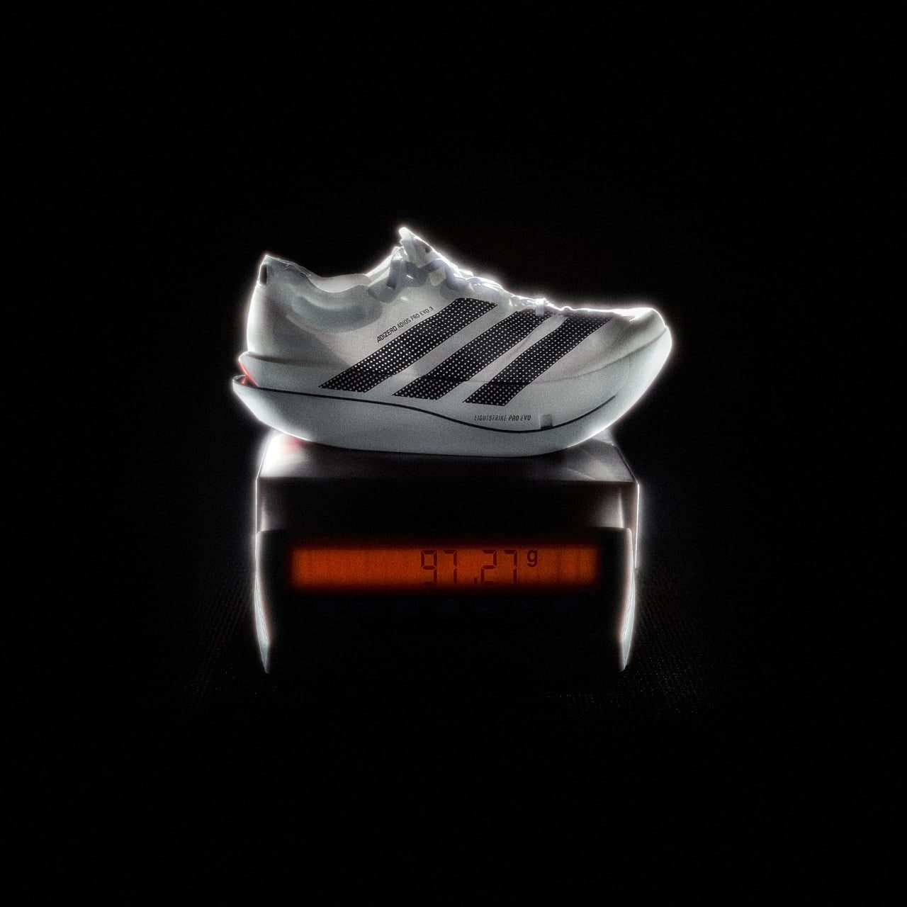
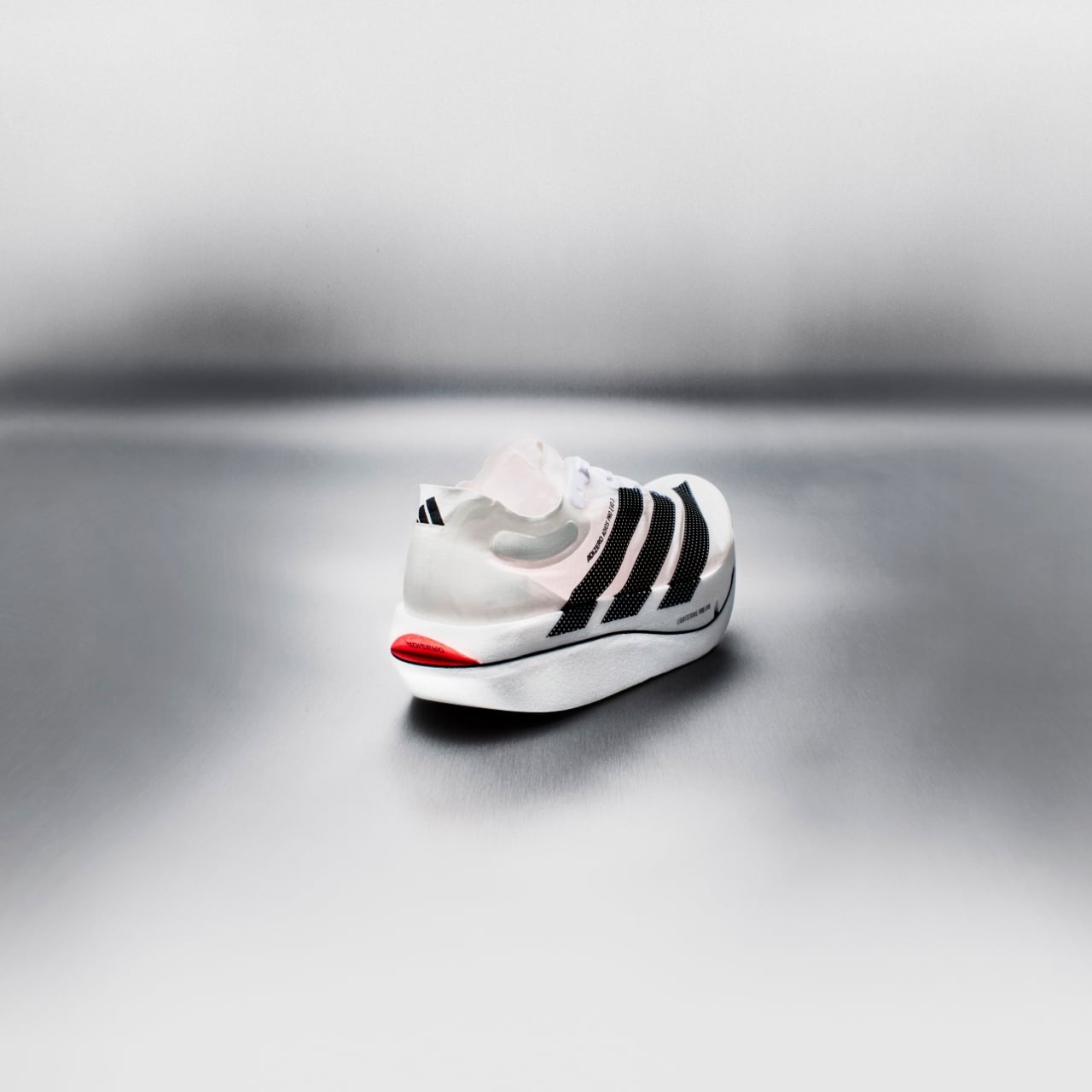
The Evo 3 weighs in at just 97 grams in a UK size 8.5, making it the first sub-100-gram racing shoe Adidas has ever produced. For context, the shoe’s box weighs more than the shoe inside it. That’s the kind of engineering achievement that sounds like a flex until you understand how much it actually matters at race pace.
Designer: adidas
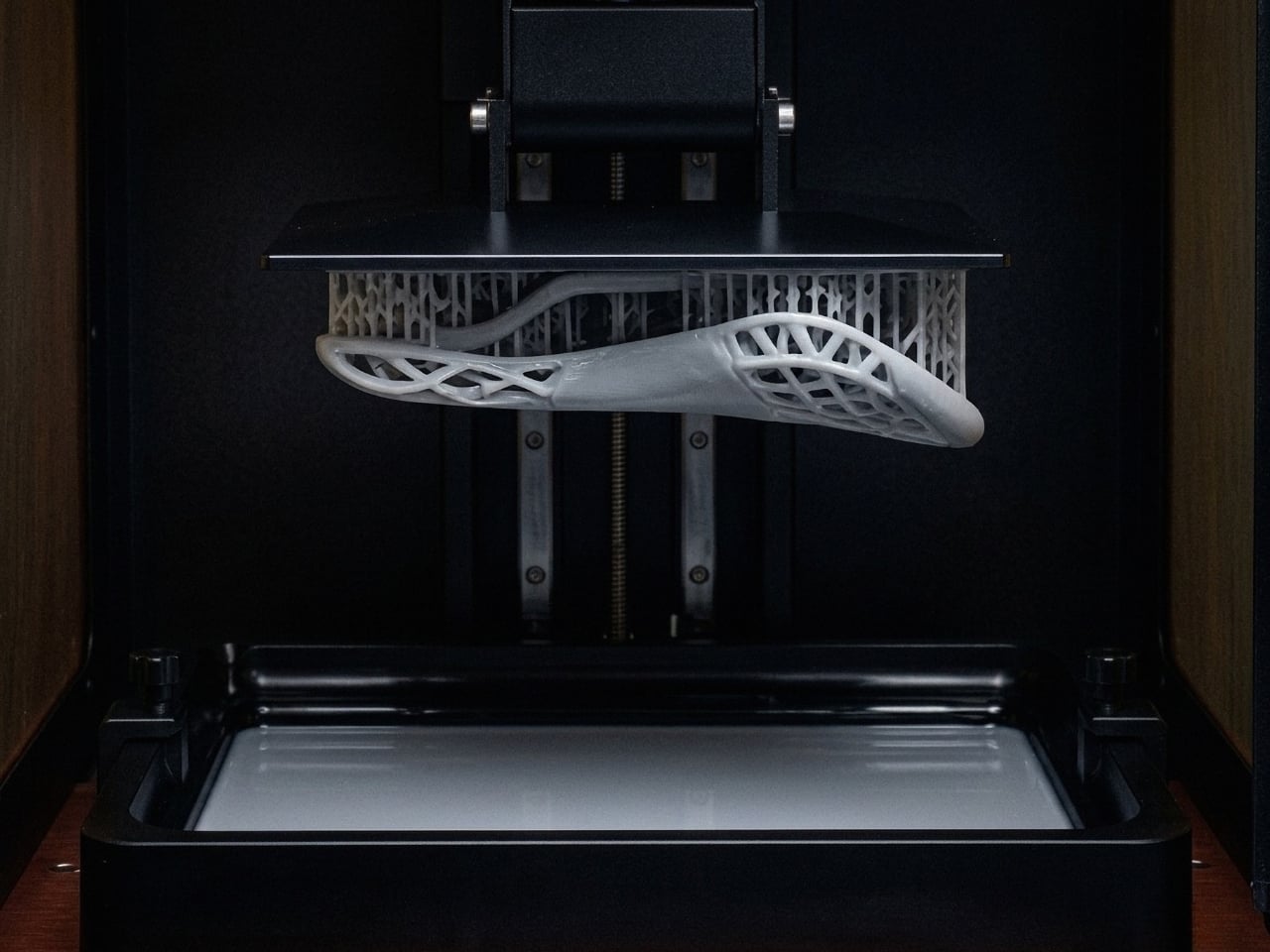
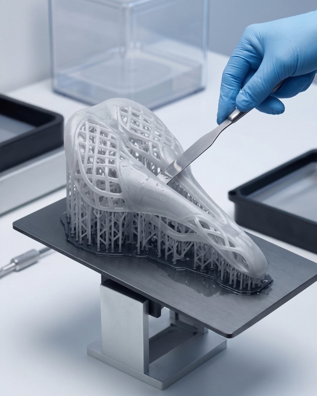
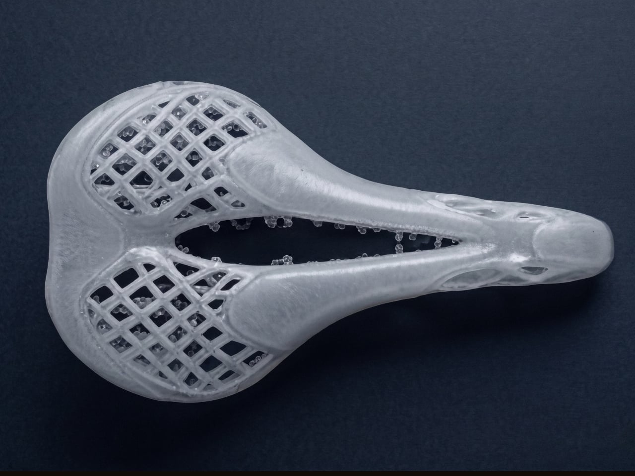
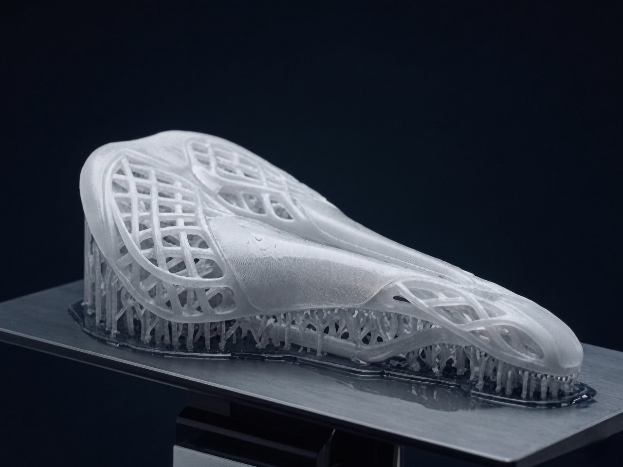
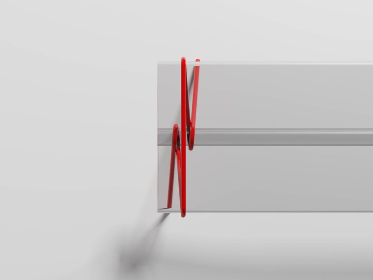
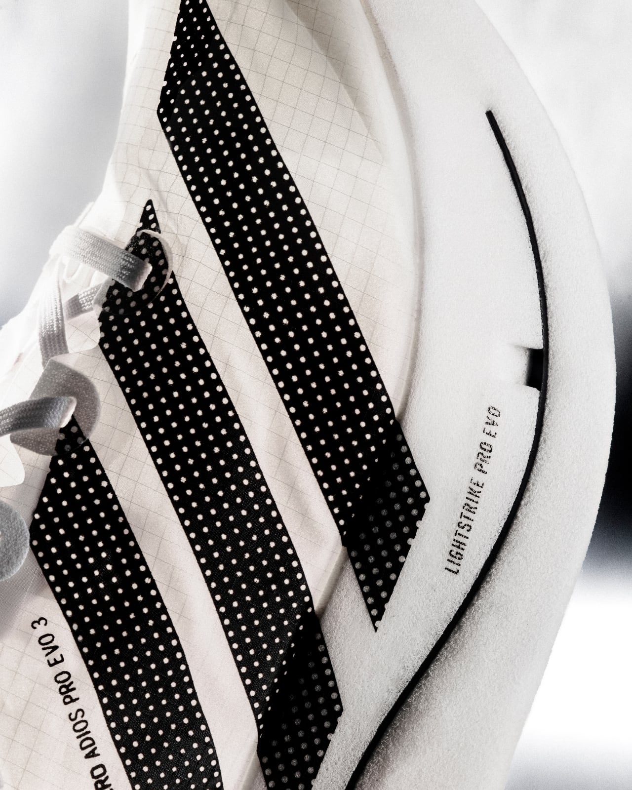
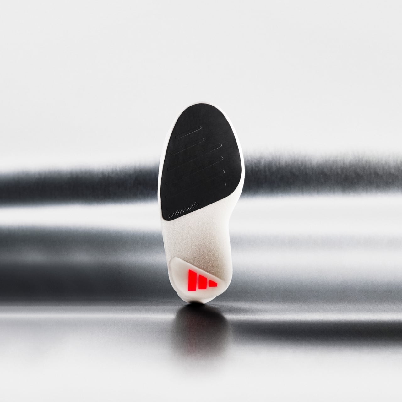
The secret is a new construction called ENERGYRIM, a carbon-integrated design that completely rethinks how a supershoe is built. Rather than simply layering carbon plates into foam, Adidas redesigned the relationship between the two, allowing them to work in concert rather than independently. The result is a shoe that’s 30% lighter than its predecessor, with 11% greater forefoot energy return and a 1.6% improvement in running economy. To put those numbers in context: at the marathon level, a 1.6% improvement in running economy isn’t marginal. It’s the kind of number that separates a podium from a personal best.
The foam itself is the other major story here. Adidas developed a new generation of Lightstrike Pro Evo compound that is 50% lighter than the version used in the Evo 2. That’s not a small iteration. It’s a material science leap that took three years and over a dozen tested prototypes, refined in labs in Herzogenaurach and tested at altitude training camps in Kenya and Ethiopia. Elsewhere on the shoe, the outsole ditches the liquid rubber coating from the previous model in favor of strategically placed Continental rubber, a welcome upgrade for anyone who isn’t a professional sprinter running on perfectly dry asphalt. It’s a small change that makes the shoe meaningfully more accessible without compromising the weight equation in any significant way.
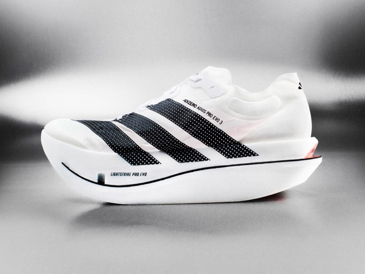
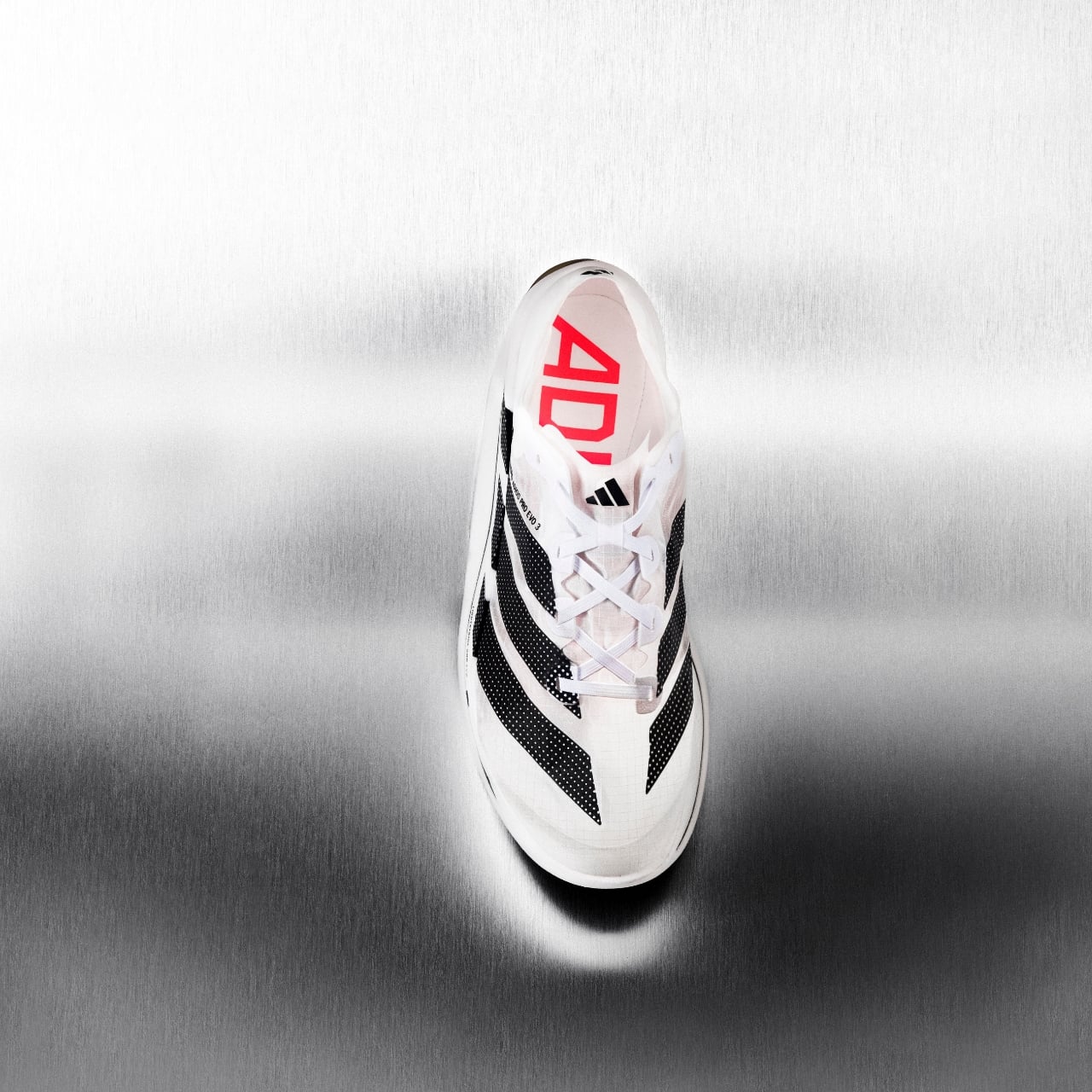
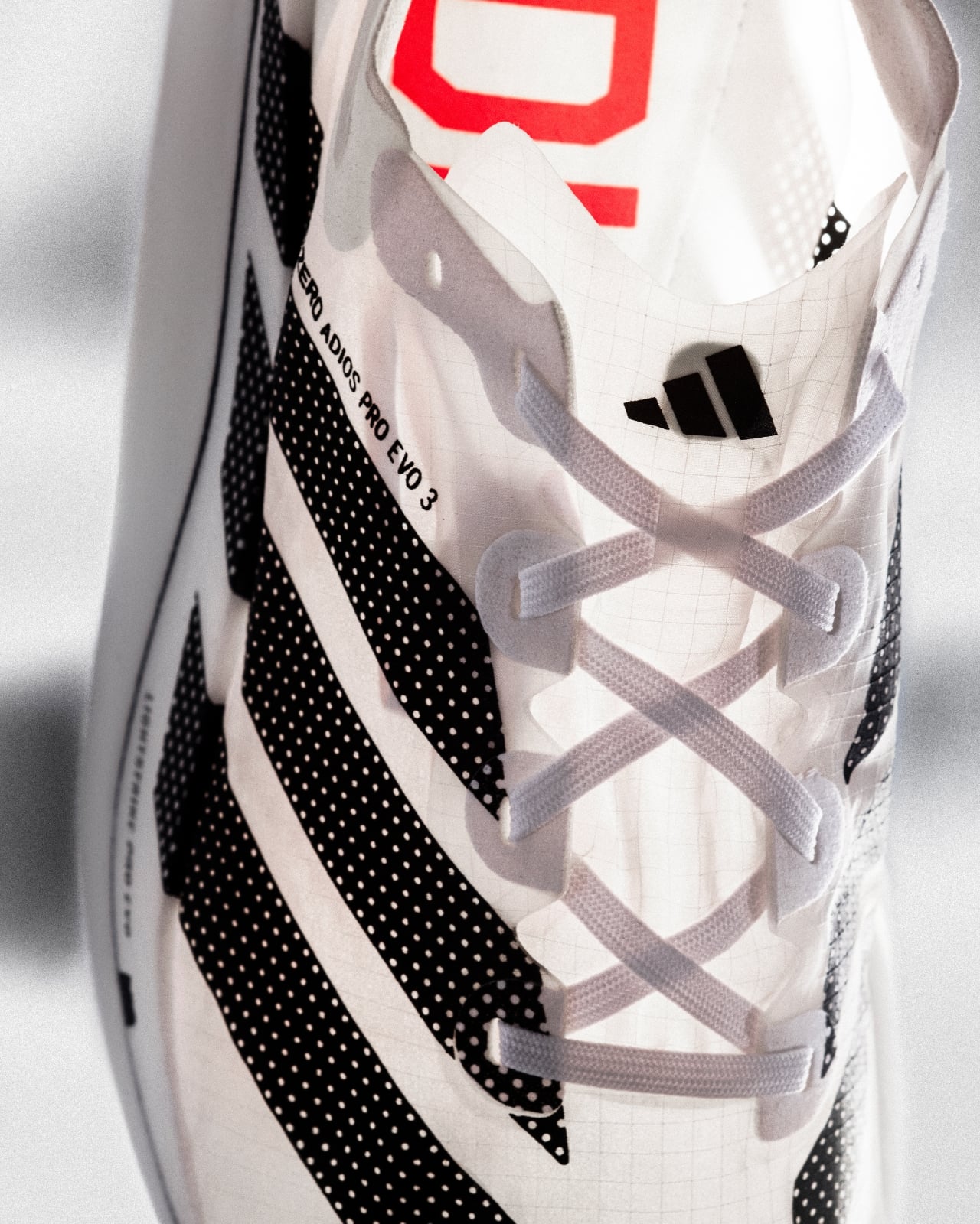
From a design standpoint, the Evo 3 is striking in the way extreme performance gear tends to be: lean, almost aggressive, with a silhouette that looks sculpted rather than constructed. The toebox is narrow, almost spike-like, which is clearly a functional decision rather than an aesthetic one. The fit prioritizes containment over comfort, and that feels like the right philosophy for a race day shoe that is not designed for casual wear. You wear shoes like this to run the fastest race of your life. The trade-offs are understood, and most serious runners will make them without hesitation.
The price is USD 500, with an initial limited release on April 27, 2026, and a wider launch expected in fall 2026. That price tag will raise eyebrows. But it helps to remember that the Adizero Evo franchise has already seen athletes break three world records and win over 30 major road races since 2023, including six World Marathon Major wins and an Olympic record time. The shoe’s pedigree isn’t marketing copy. It’s a documented track record.
What makes the Evo 3 genuinely interesting beyond the running community is what it represents as a design object. It sits at the intersection of sports science, materials engineering, and product design in a way that very few consumer products ever manage. The obsession with weight reduction, the carbon geometry experiments, the altitude testing: these are the ingredients of something closer to aerospace thinking than traditional footwear development. When the research process looks more like aircraft engineering than sneaker design, the result tends to look and perform like nothing that came before it.
Whether you run marathons or not, there’s a certain pleasure in watching a brand push against what seemed like a physical limit and actually break through. Adidas didn’t just shave a few grams off an existing shoe. They asked what a marathon shoe could look like if weight were treated as a fundamental design constraint rather than just another spec to optimize. The answer is 97 grams. And somehow, impossibly, it still performs better than everything that came before it.
The post Adidas Made a Marathon Shoe That Weighs Less Than an Apple first appeared on Yanko Design.