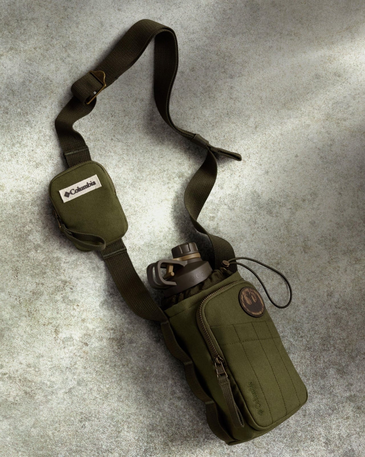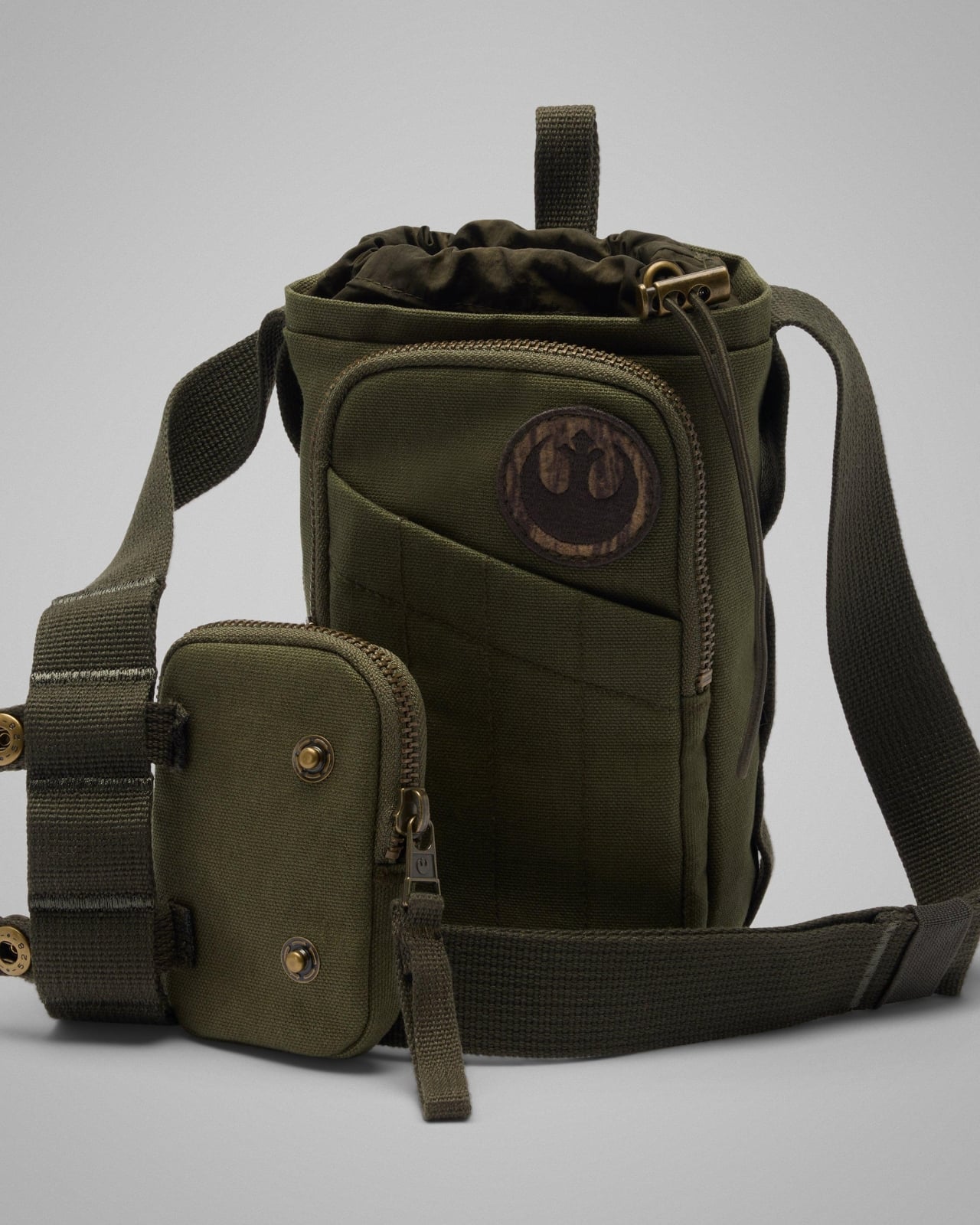
RC Outdoor Supply Made a Sacoche Bag for Actual Hiking

You know that feeling when you’re torn between bringing your sleek crossbody for a coffee run and a clunky backpack for a day hike? RC Outdoor Supply just solved that dilemma with their Trail Sacoche Bag, and honestly, it’s about time someone did.

For those not in the sacoche know, these compact bags have been having a major moment in streetwear circles. Originally a French term for a simple shoulder bag, the sacoche has become the go-to for minimalists who refuse to lug around more bag than they need. But here’s the thing: most sacoches are designed for urban jungles, not actual ones. RC Outdoor Supply flipped the script by taking this city slicker silhouette and giving it proper trail credentials.

Designer: RC Outdoor Supply ca

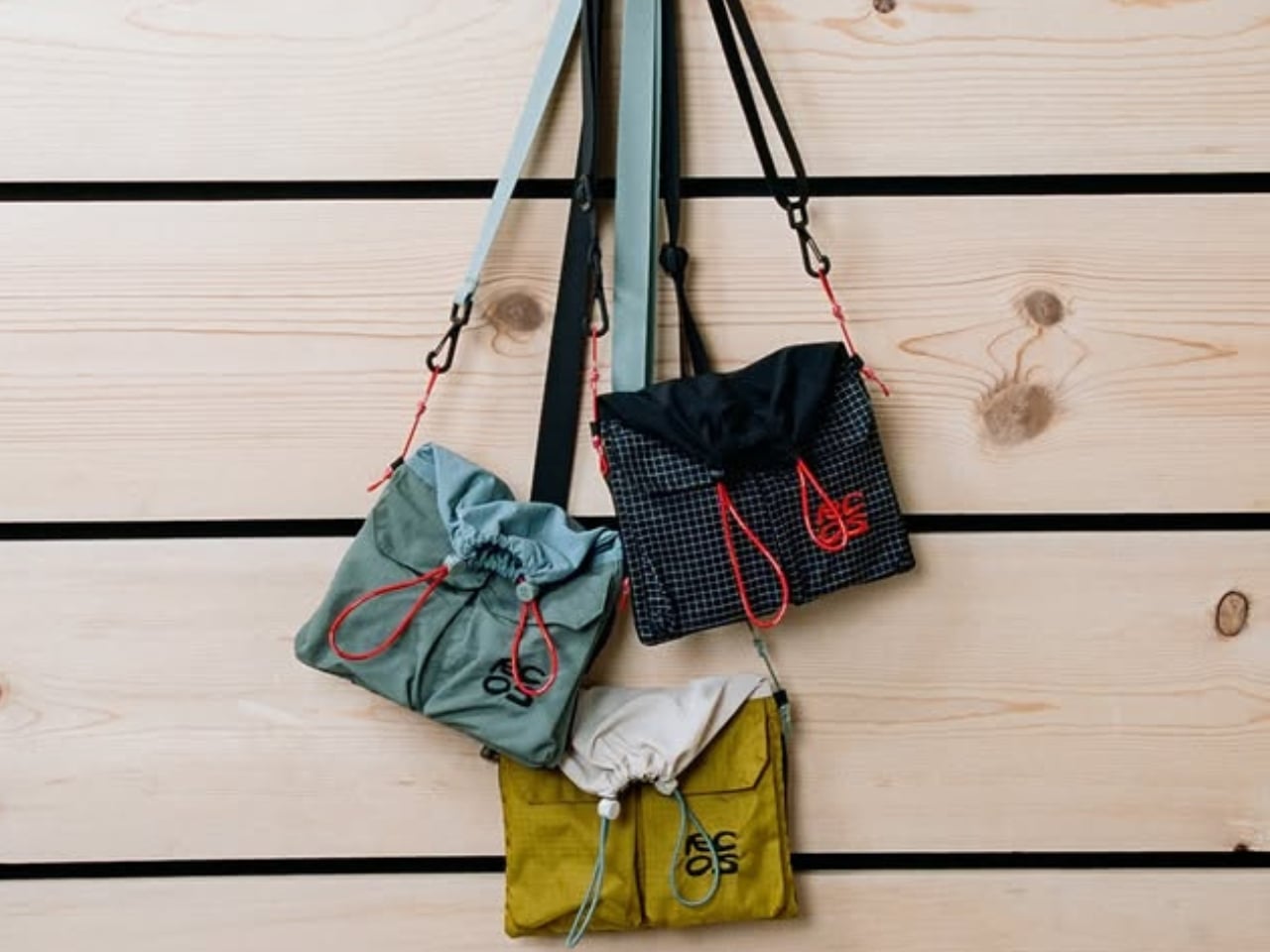
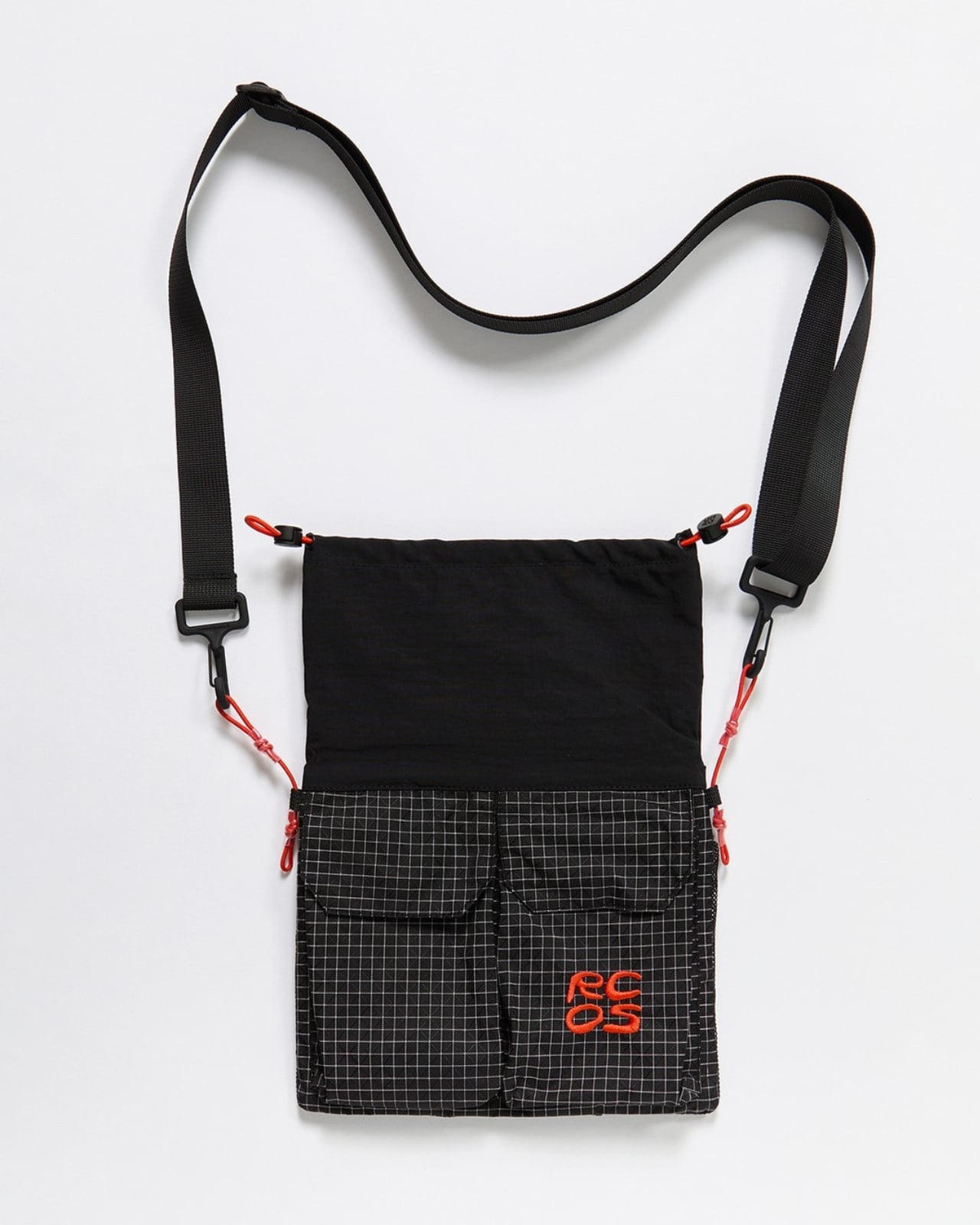
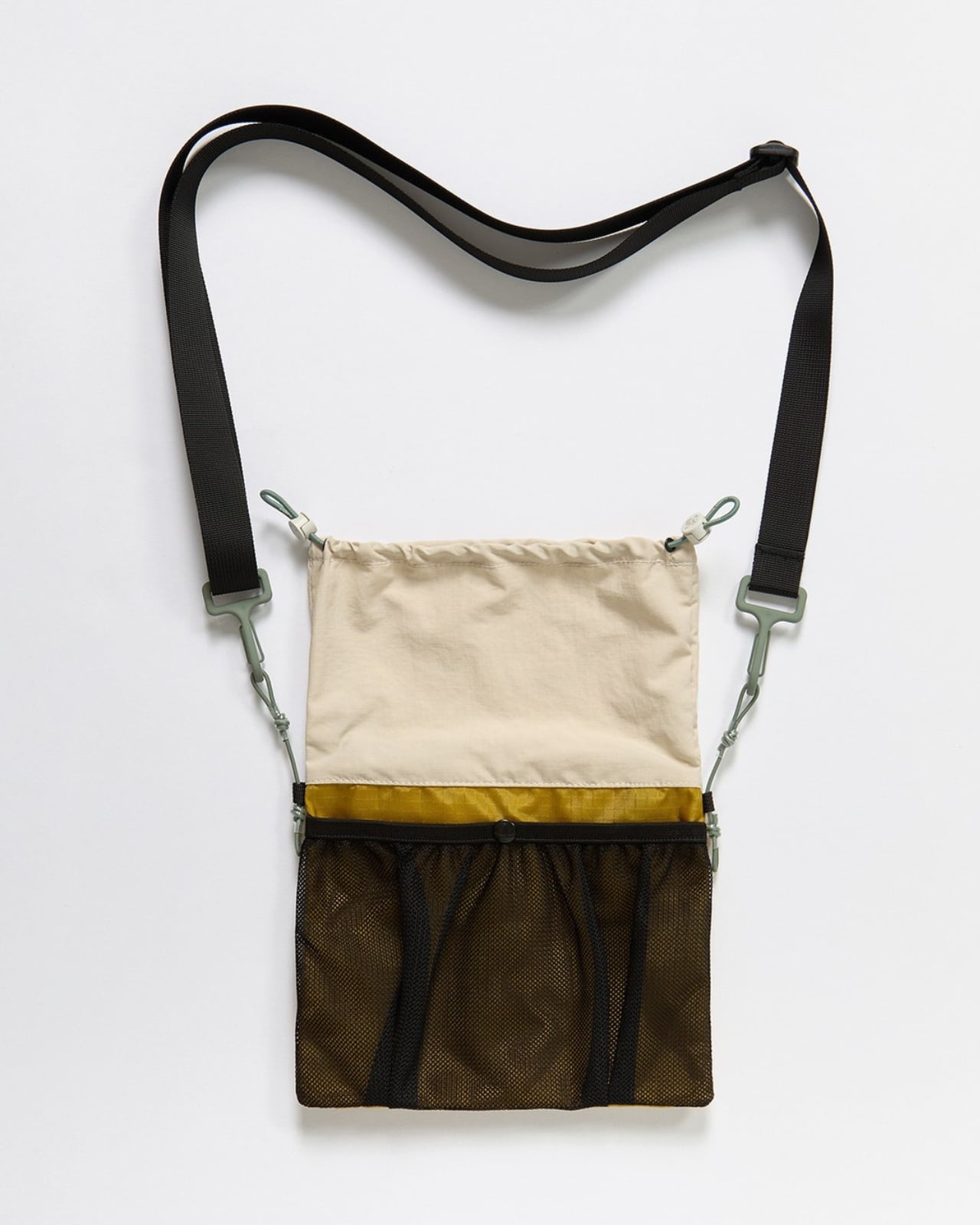
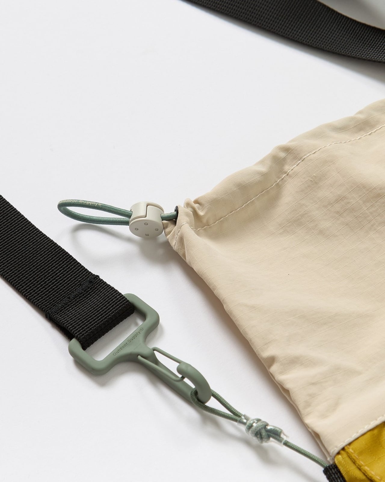
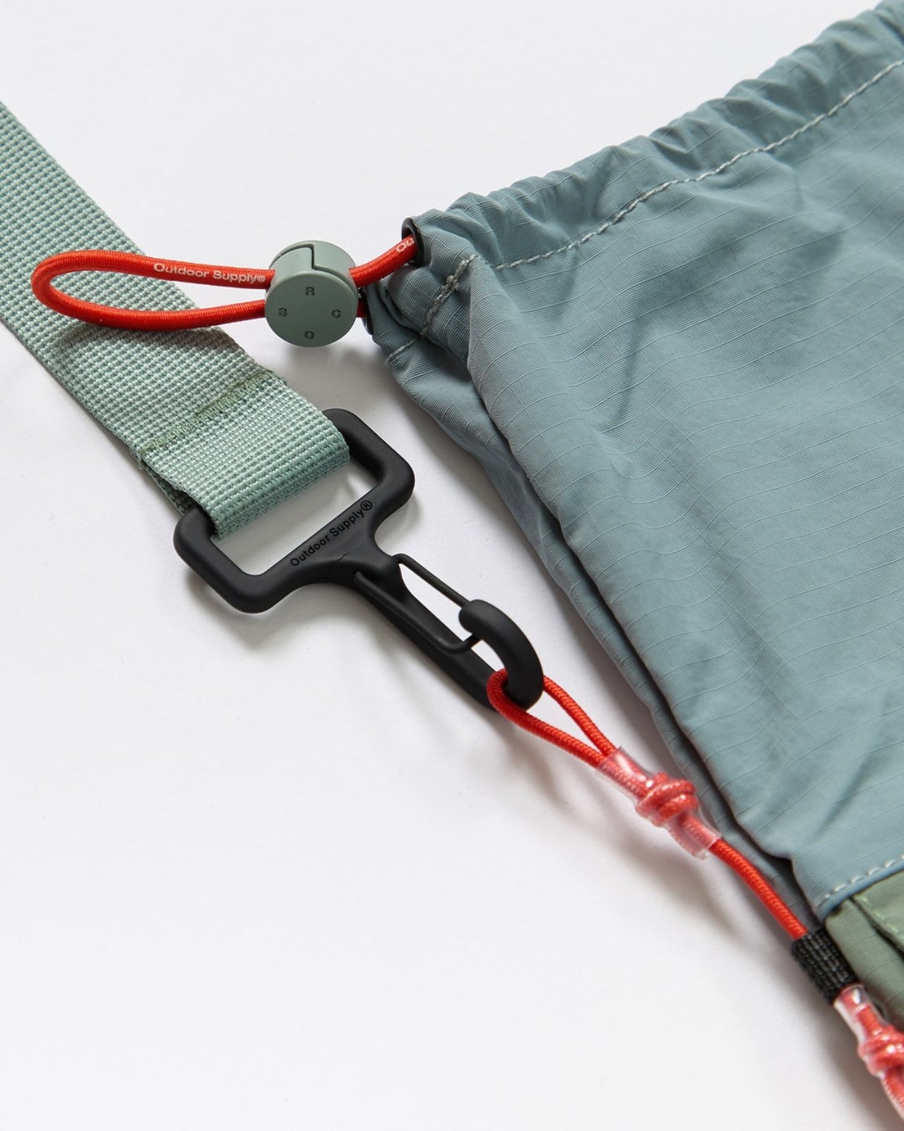
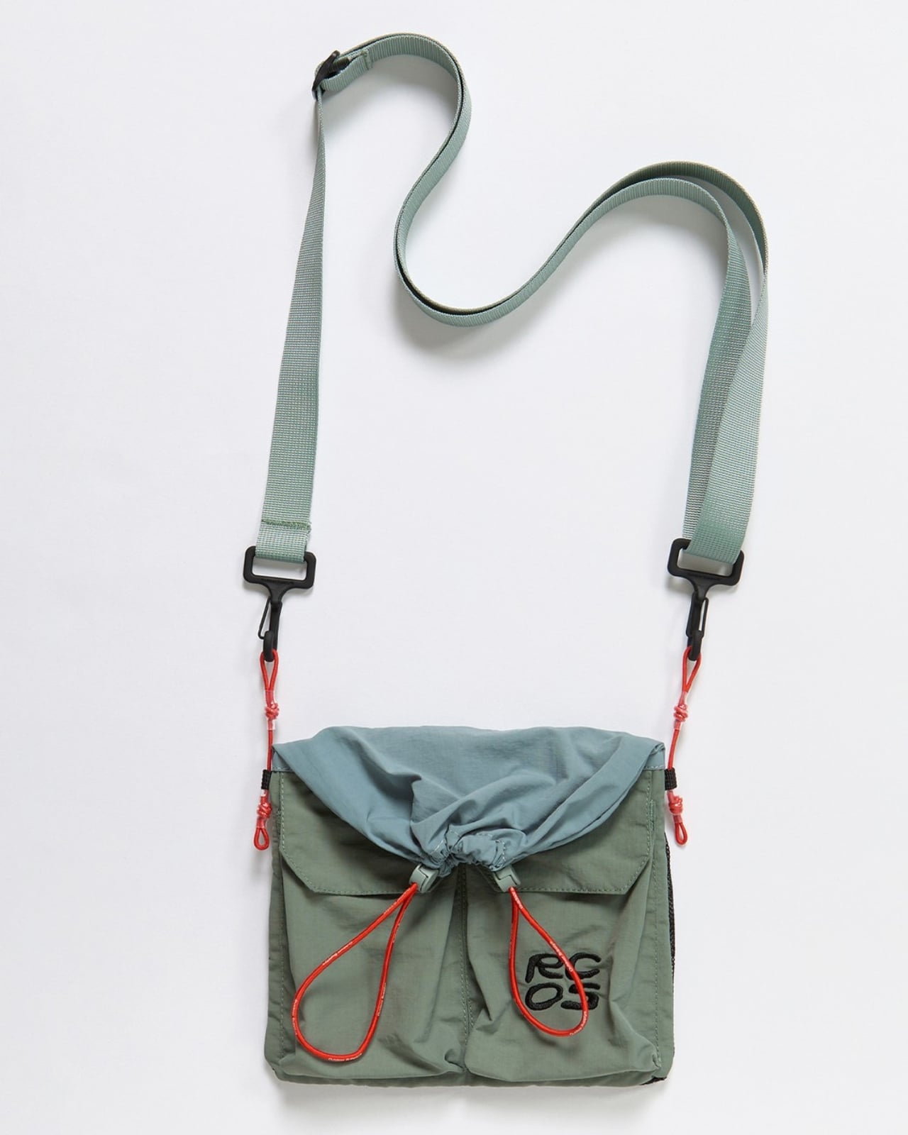
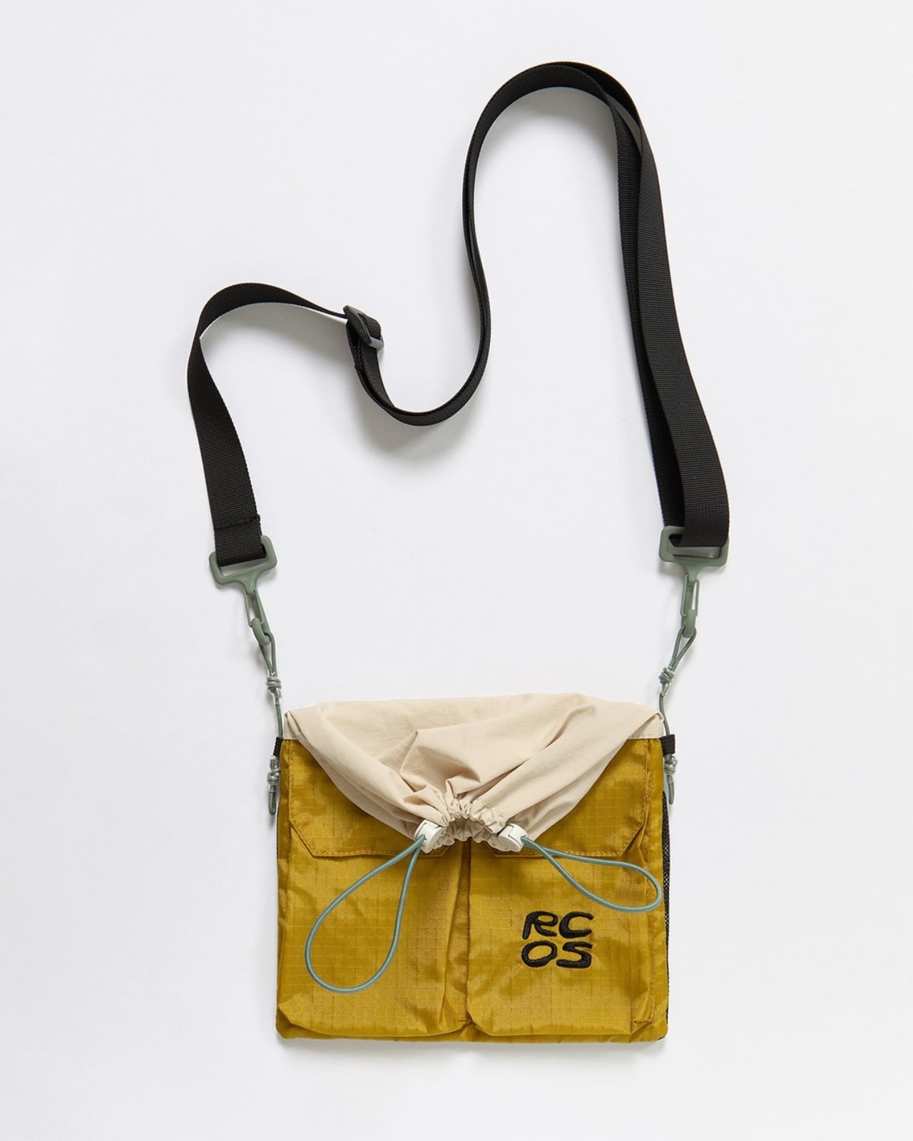
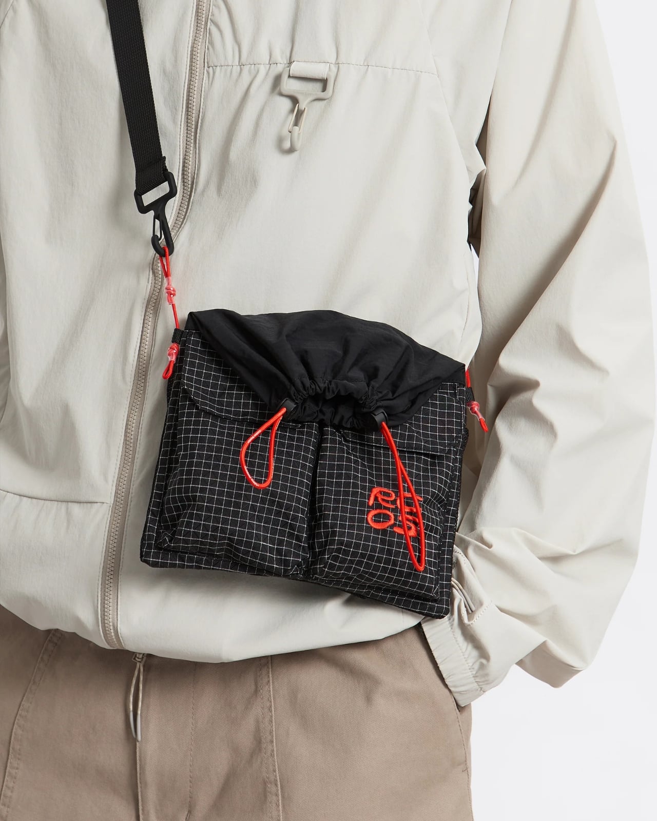
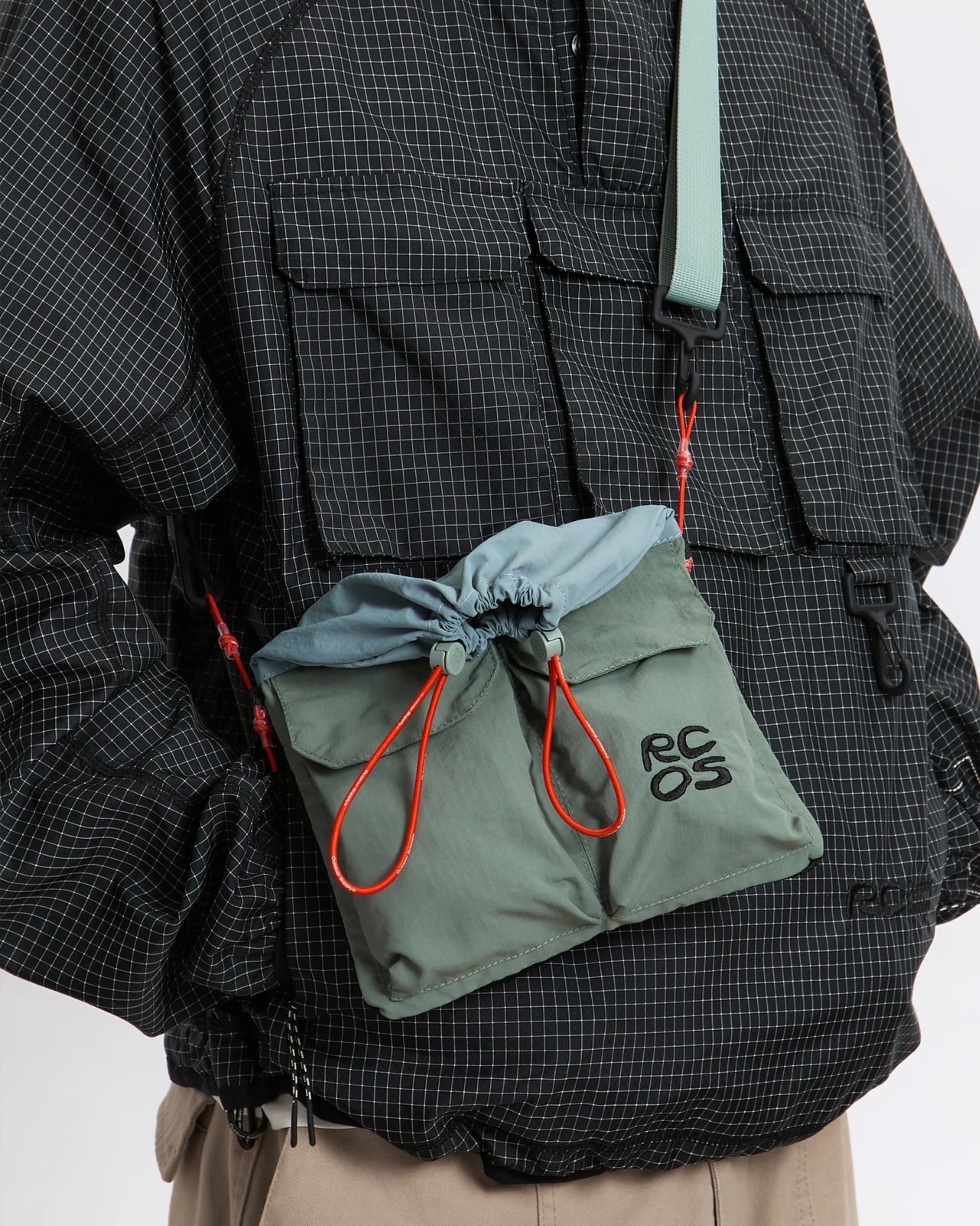
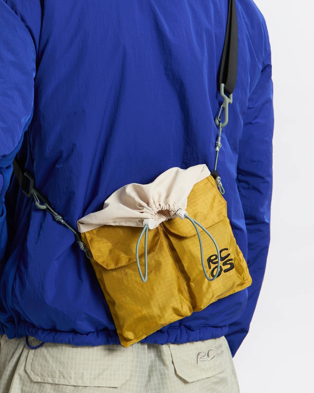
The Trail Sacoche hits that sweet spot of being compact without feeling restrictive. Made from durable nylon ripstop (the same stuff that keeps parachutes intact, no big deal), this bag laughs in the face of branches, rocks, and whatever else nature throws at it. The dimensions are clever too. At 11.5 by 8 inches when fully opened and 6.5 by 8 inches when folded, it’s like getting two bags in one depending on how much stuff you’re hauling around.

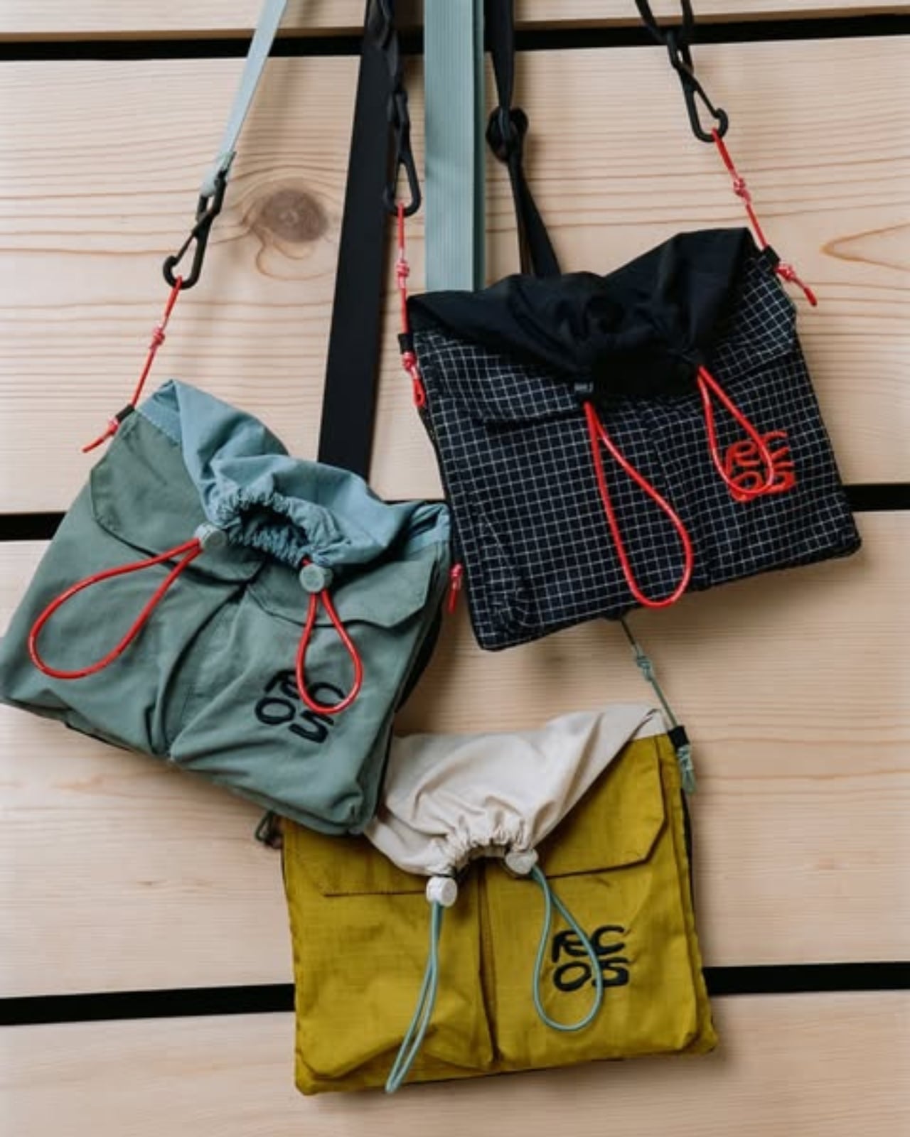
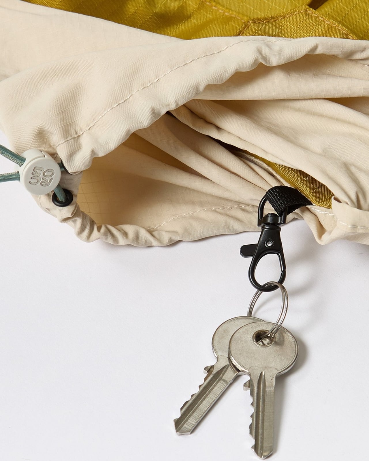
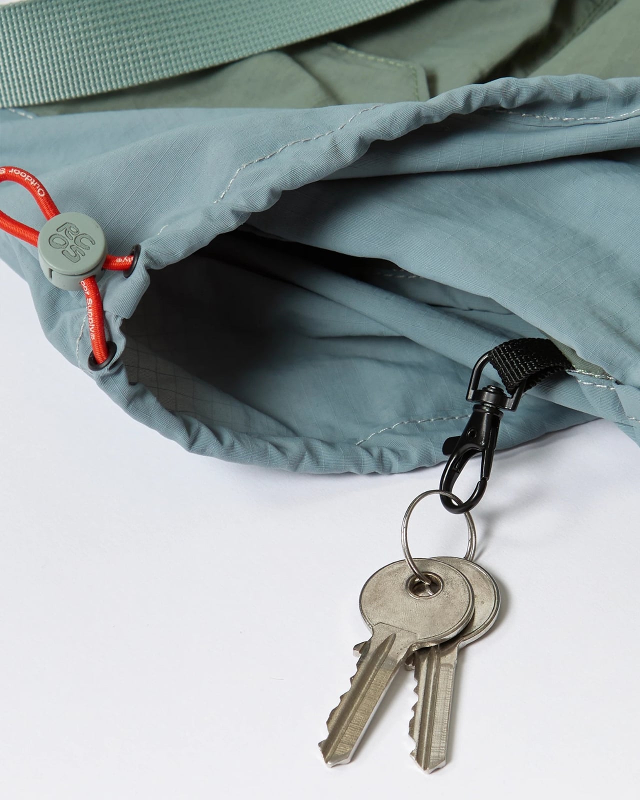
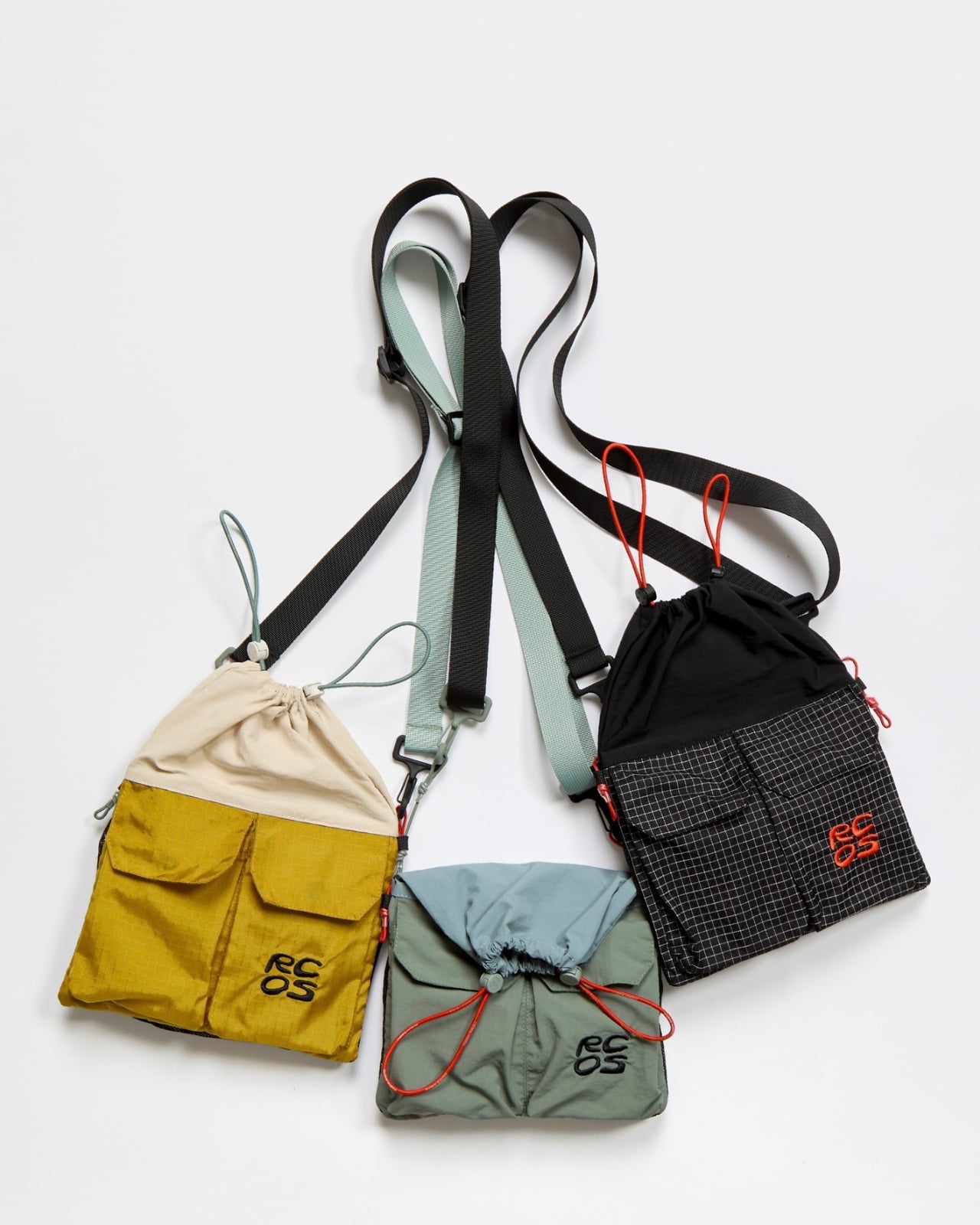
What really sets this apart from your average crossbody is the thoughtful pocket situation. There are two exterior cargo pockets on the front for quick-grab items (phone, trail snacks, that chapstick you’re always losing), plus a mesh pocket on the back that’s perfect for things you want visible but secure. The top closure uses bungee cording, which might sound casual but is actually genius for uneven terrain where you need flexibility and security at the same time. Inside, there’s a key ring because nobody wants to dig through their entire bag to find their car keys after a long hike. It’s these tiny details that show RC Outdoor Supply actually tested this thing in the wild rather than just sketching pretty pictures in a studio.

The brand, founded in California, has a specific philosophy: create clothing and gear that transitions seamlessly from the trail to the city. With the Trail Sacoche, they’ve nailed that brief. The bag comes in three colorways that work equally well on a mountain trail or a city street: Lichen (a muted green-gray), Saffron (a warm golden yellow that adds a pop without screaming for attention), and classic Black. Priced at $62, it sits in that reasonable middle ground where you’re not wincing at checkout but you’re also getting quality materials and construction. In a market flooded with either cheap fast-fashion bags or designer pieces that cost more than a weekend trip, this feels refreshingly honest.

What’s interesting is how this bag represents a larger shift in outdoor gear design. For years, the outdoor industry was stuck in a rut of aggressively technical-looking gear that screamed “I own expensive hiking equipment!” Now brands like RC Outdoor Supply are proving you can make functional gear that doesn’t look like it belongs exclusively on a summit attempt. The sacoche format itself is proof of this evolution, borrowing from fashion while adding legitimate outdoor functionality.

The versatility is the real selling point. Morning farmers market? Trail Sacoche. Afternoon hike? Same bag. Evening concert? Still works. This is exactly the kind of multifunctional design that makes sense for how people actually live, especially if you’re someone who refuses to be boxed into either “outdoorsy person” or “city person” categories. If there’s a critique, it’s that at this size, you’re definitely packing light. This isn’t replacing your daypack for serious hikes. But for short trails, urban exploring, travel, or just running around town with more style than a tote bag offers, it hits perfectly.

RC Outdoor Supply might not have the name recognition of legacy outdoor brands yet, but pieces like the Trail Sacoche Bag show they understand something crucial: the best gear works everywhere, looks good doing it, and doesn’t require a manual to figure out. Sometimes innovation isn’t about adding more features. It’s about doing something simple, exceptionally well.

The post RC Outdoor Supply Made a Sacoche Bag for Actual Hiking first appeared on Yanko Design.

These Official Squidward Crocs Will Repel Every Adult Woman In A 10-Mile Radius

Do I have a problem with Squidward? Fundamentally, no. Emotionally, maybe. He could be less of a buzzkill, but he’s truly a model neighbor and a great employee at Krusty Krabs. But do I have a problem with Squidward-themed Crocs? Overwhelmingly. I’m a Croc evangelist for life, but these footwear are so incredibly niche I wouldn’t want to be caught dead wearing them. At the same time, I want to be around people who wear then just for the opportunity to judge them!

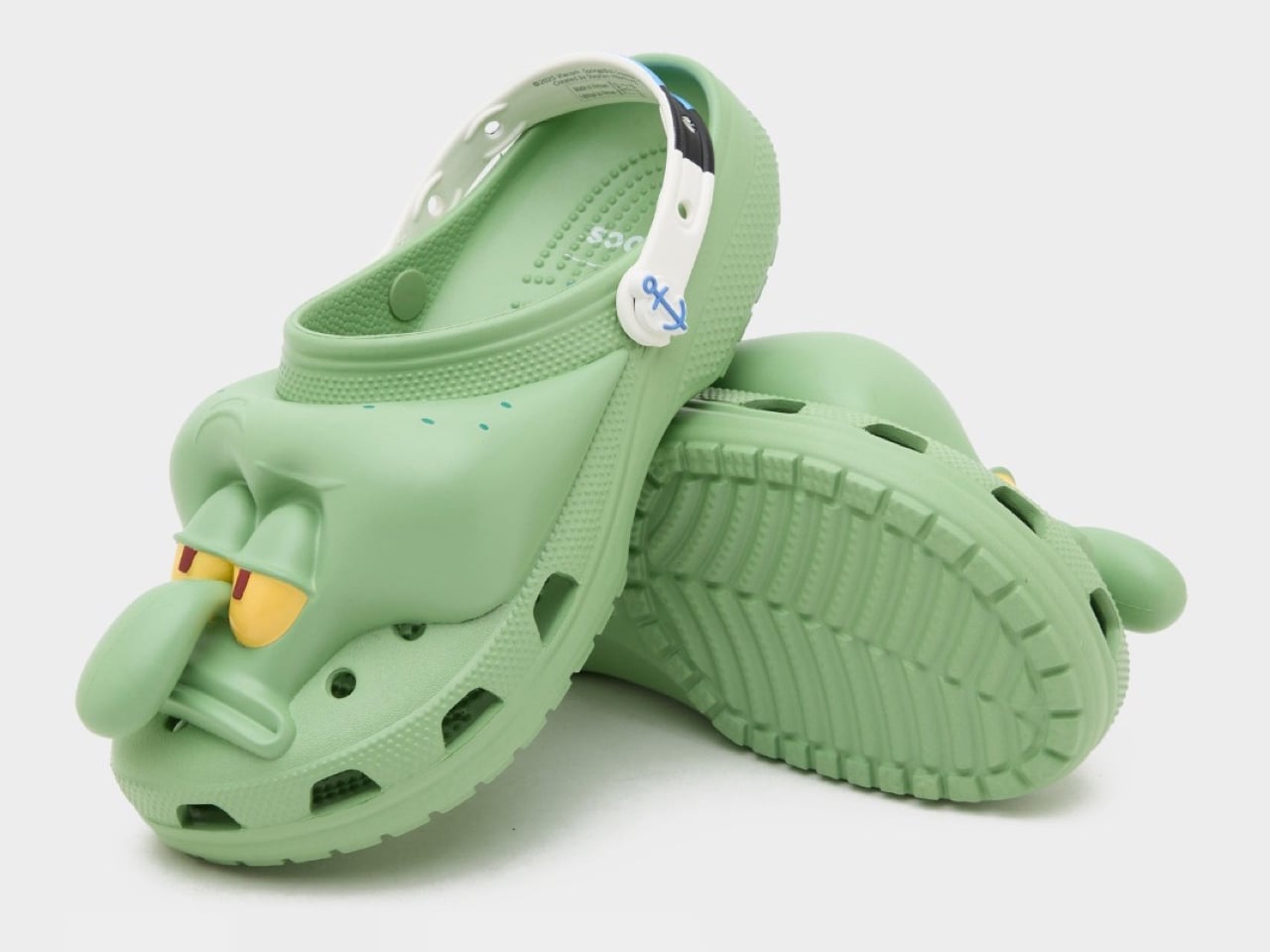
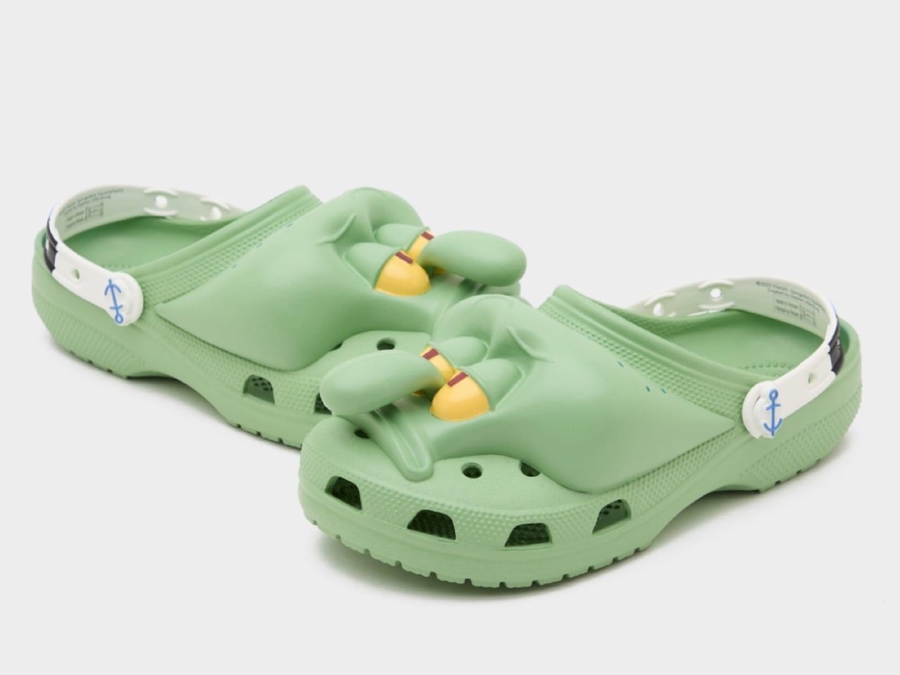
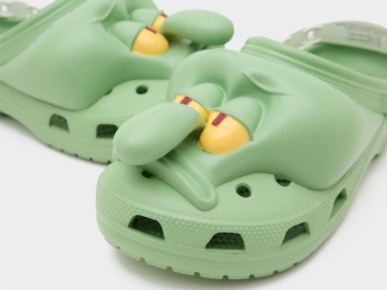
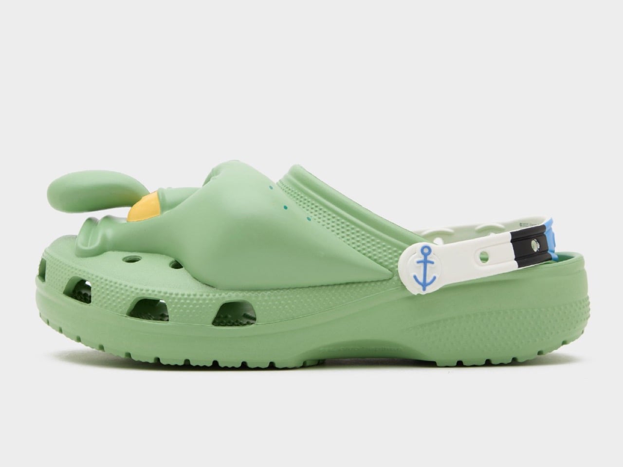
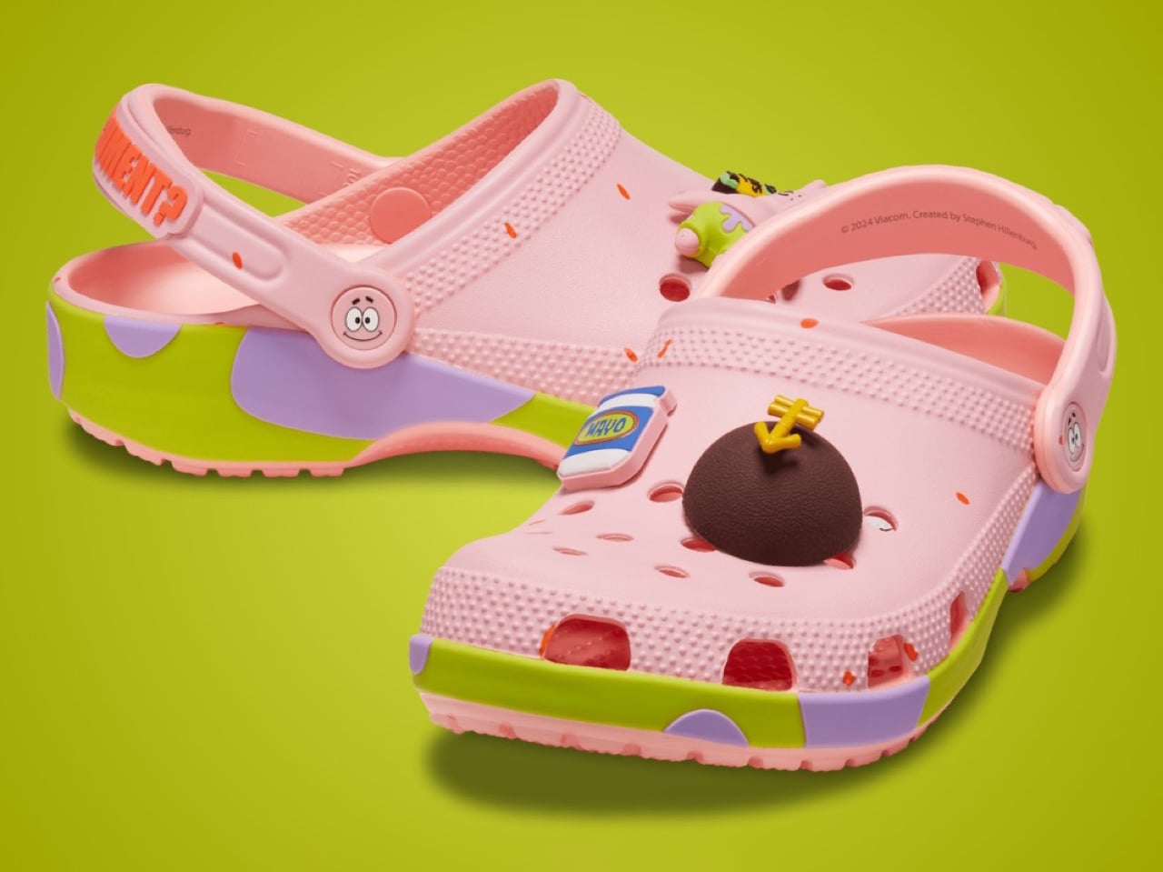
So, Crocs has been launching Spongebob-themed footwear to mark the launch of the latest movie, and while the company already unveiled Spongebob and Patrick-inspired clogs, they decided to keep the best (subjective, of course) drop for the absolute end. You see, the Spongebob and Patrick ones look fairly benign… but the Squidward clogs, dropped today, quite literally look like you’ve slipped your feet into a hole in Squidward’s skull. The details aren’t subtle at all. Each clog has an immaculate representation of Squidward’s face, with its skeptical stare and raised eyebrow, along with that nose only a mother can love.

Designer: Crocs

Let me reiterate. I love Spongebob as a franchise. I like Squidward as a character. But these shoes are, well, repellent to say the least. Don’t expect to score any ladies with these, but if you’re a diehard fan of the franchise, it’s entirely within your rights to collect these limited-edition pairs, and probably even wear them in support of the movie, which launches in May next year.

The entire croc is molded in the iconic Squidward pale green, with the strap being white and sporting an anchor symbol on the pivot-point. Available in unisex sizes, the shoes will officially hit the shelves on December 11th, with a price tag of $80. Am I talking smack about these shoes just so that I can convince enough people to NOT buy them so that I can get a shot at owning them? Probably, you’ll never know.

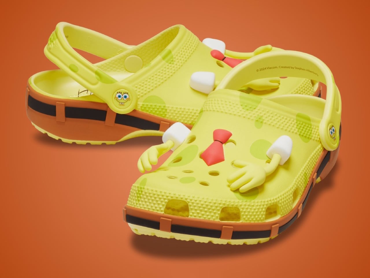
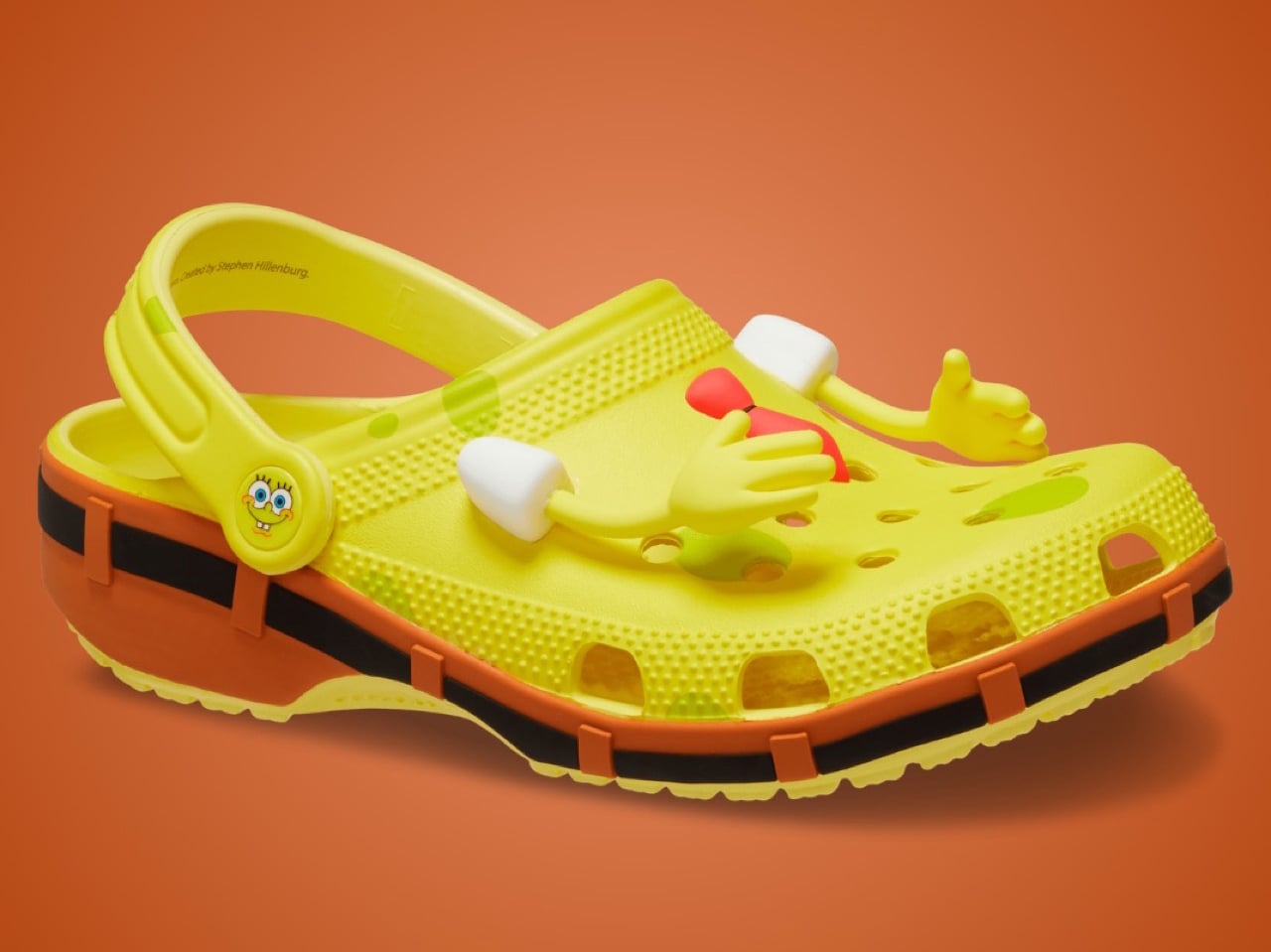
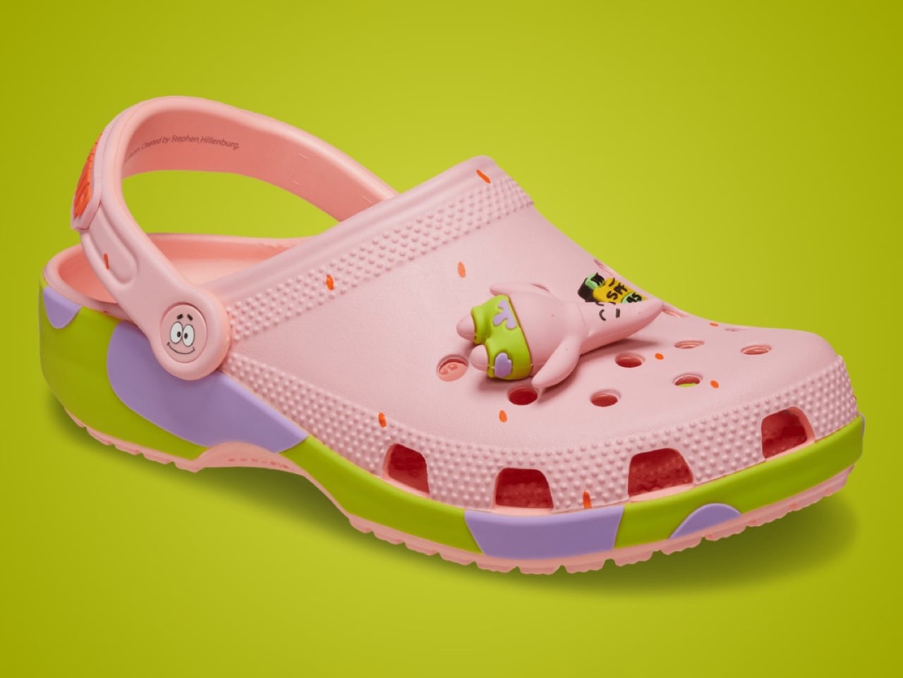
Also hitting the shelves tomorrow are the Spongebob and Patrick Star clogs, in their iconic colors and designs. The Spongebob one comes with arms on the shoes’ body, along with a belt running around the midsole to denote Spongebob’s iconic pants. The insole has Spongebob’s face printed on it, so the shoes look like him from the top. Similarly, even the Patrick Star ones come with Jibbitz that are typical to the starfish, like a rock, a minifigure of Patrick himself, a bottle of sunscreen, and a jar of mayo. The straps read Patrick’s famous lines ‘Is Mayonnaise An Instrument?’, and the midsole (like Spongebob) features the green and purple print from Patrick’s pants.

The post These Official Squidward Crocs Will Repel Every Adult Woman In A 10-Mile Radius first appeared on Yanko Design.

Hand-Stitched $2,300 Sneakers With Only 2 Pairs in the World

Let’s talk about what happens when ancient Japanese craftsmanship collides with one of the most elusive sneakers in the game. The result? A pair of shoes that costs more than most people’s monthly rent, and somehow, that price tag makes total sense.

New Balance Japan just announced a collaboration with Sashiko Gals that’s turning heads for all the right reasons. They’ve taken the legendary 1300JP and transformed it into something that exists somewhere between footwear and functional art. And before you dismiss this as another overpriced sneaker collab, hear me out, because this one’s different.

Designers: Sashiko Gals and New Balance

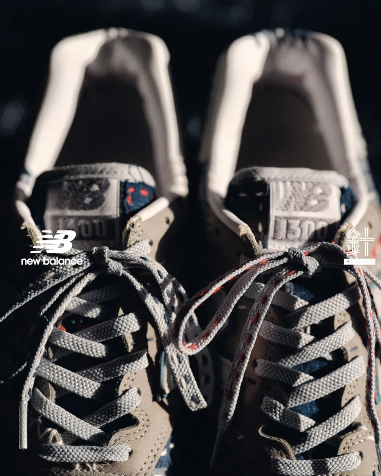
For those not deep in sneaker lore, the New Balance 1300JP is basically the Bigfoot of running shoes. Originally released in the 1980s, it only drops once every five years in Japan, making it the kind of shoe that serious collectors set calendar reminders for. It’s got that classic grey suede aesthetic and Made in USA quality that sneakerheads obsess over.

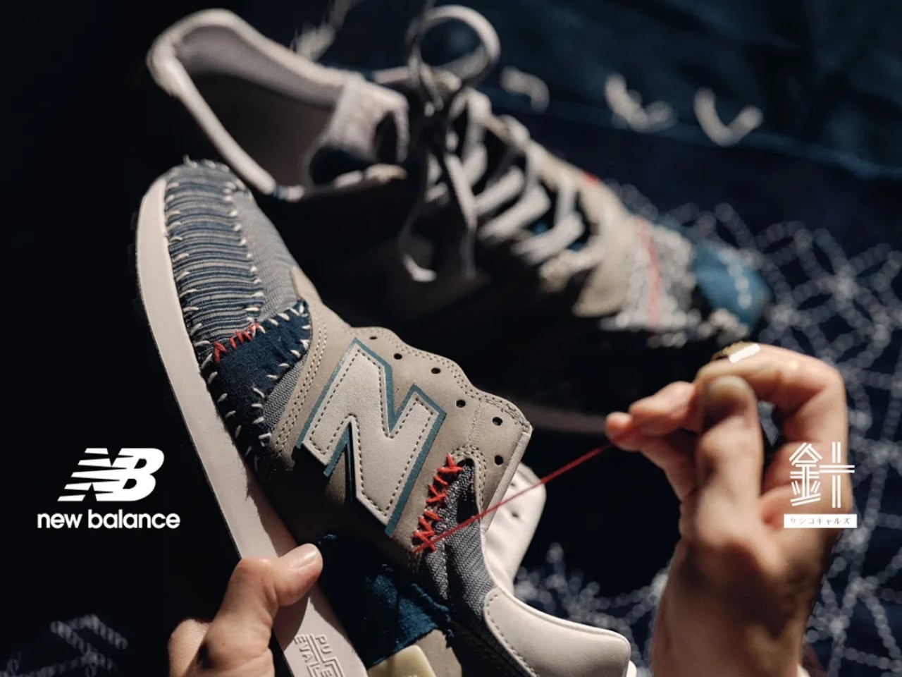
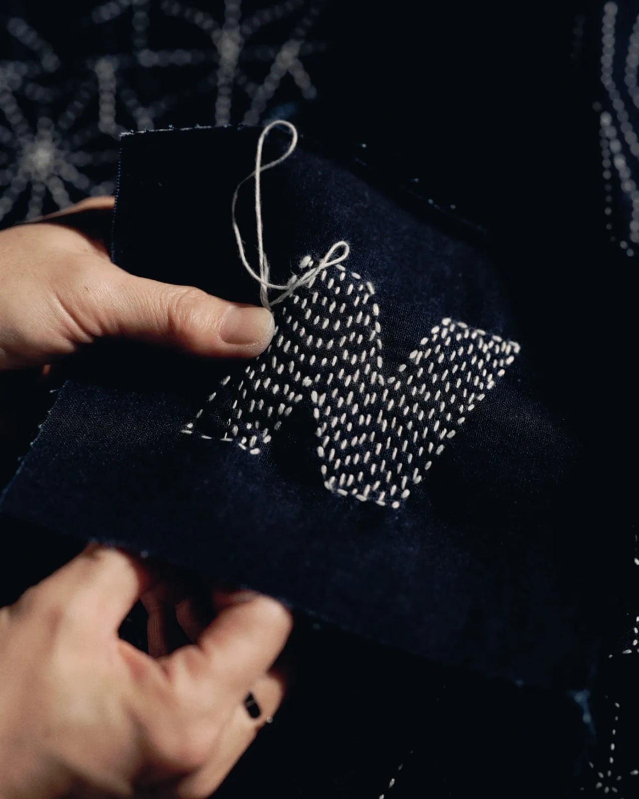
Enter Sashiko Gals, a community of Japanese artisans who are keeping the centuries-old tradition of sashiko embroidery alive by dragging it, stitch by careful stitch, into contemporary culture. Sashiko is that traditional Japanese hand-stitching technique where artisans use running stitches to create intricate patterns on fabric, typically indigo-dyed. It’s slow work. Meticulous work. The kind of craft that makes you appreciate the human hands behind every detail.

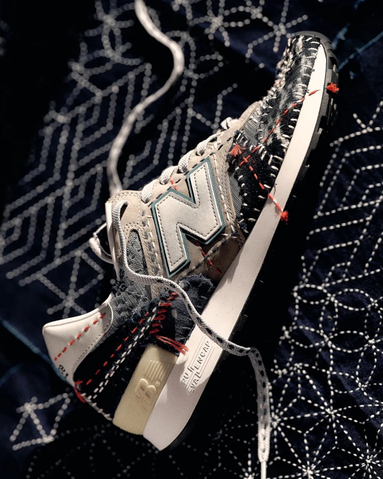
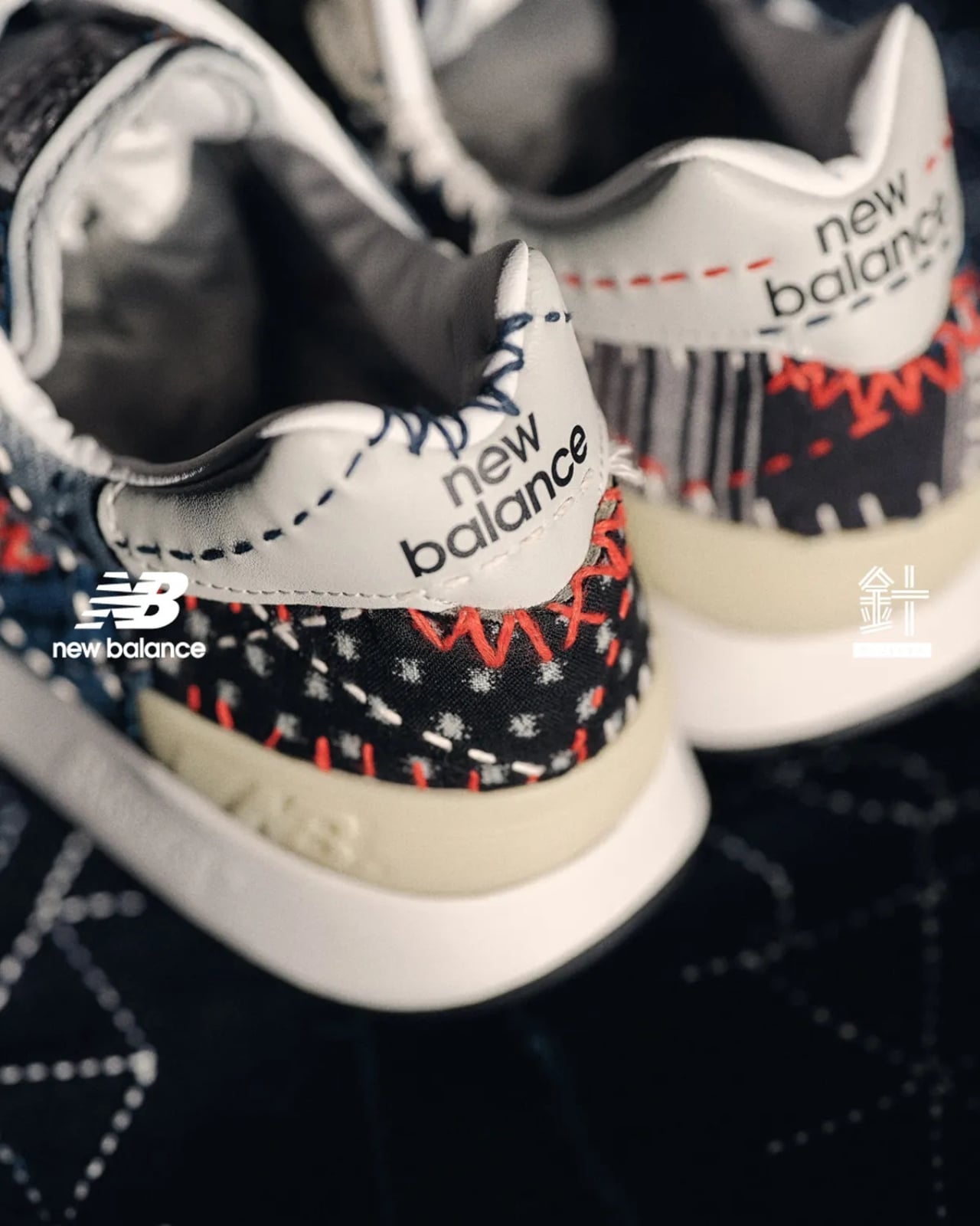
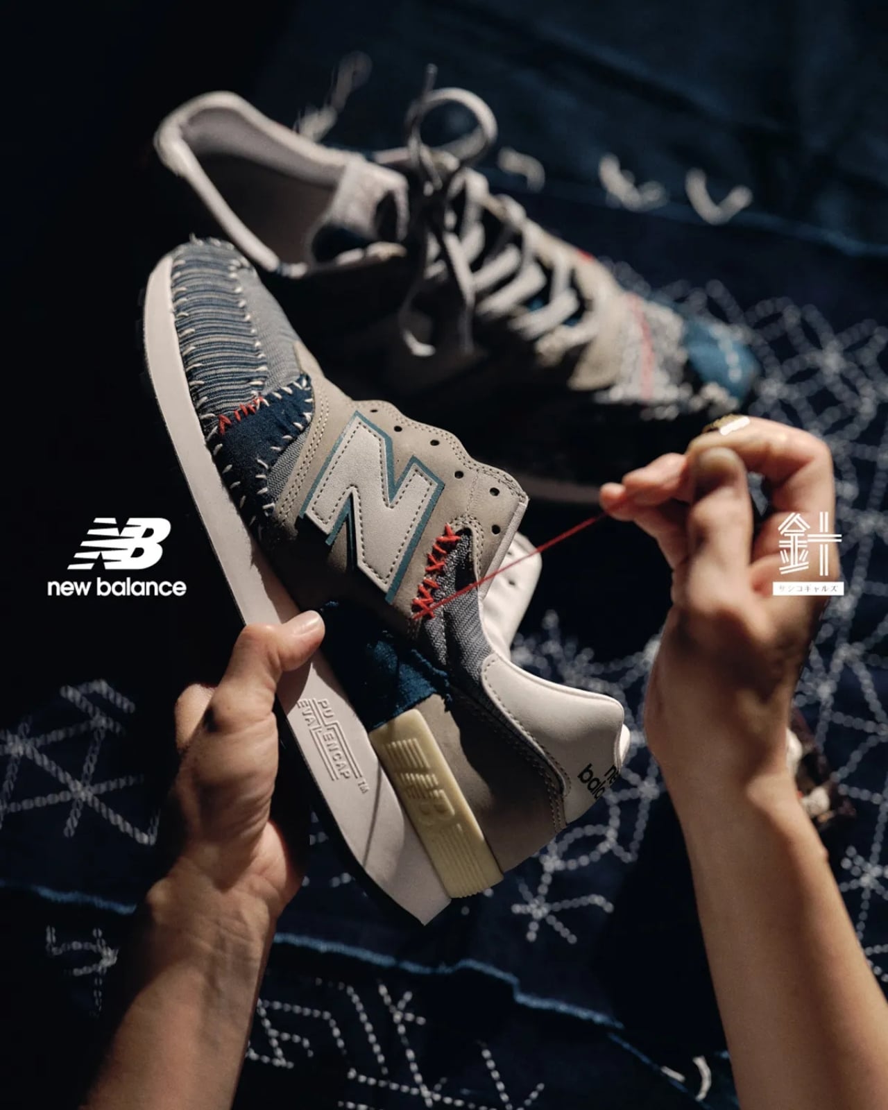
What these artisans did to the 1300JP is nothing short of remarkable. They covered the entire upper with hand-made sashiko patches, stitching them with white, orange, and indigo-blue thread. The decorative patterns create this visually rich tapestry that screams Japanese heritage while somehow still respecting the sneaker’s classic silhouette. And because these artisans apparently don’t believe in half-measures, they even stitched the running patterns onto the ends of the laces. Every. Single. Detail. Matters. The collaboration also includes a Made in USA varsity jacket that gets the same treatment, blending American sports heritage with Japanese craftsmanship in a way that shouldn’t work but absolutely does.

Now, about that price tag. The sneakers clock in at 363,000 yen, which translates to roughly $2,330 USD. The jackets? Try 990,000 yen, or about $6,300 USD. Yeah, you read that right. These numbers are stratospheric. But here’s where things get interesting. New Balance and Sashiko Gals are only making two pairs of the 1300JP and four jackets (one in each size from small to extra-large). They’ll drop via a charity-based lottery at the New Balance Harajuku flagship on December 12th, and here’s the kicker: every single yen from the sales goes to MOONSHOT Co., LTD., an organization dedicated to developing future sashiko artisans and funding the launch of something called the SASHIKO WORLD CHAMPIONSHIP.

This is what makes this collaboration actually matter. It’s not just two brands cashing in on hype. It’s a genuine effort to preserve and promote a traditional art form that’s at risk of fading away in our mass-production world. The Sashiko Gals are literally expanding the possibilities of their craft, proving that ancient techniques can still resonate in our modern, sneaker-obsessed culture. The “Crafted for the Future” partnership name suddenly makes sense. This isn’t about churning out product. It’s about creating a sustainable model where traditional craftsmanship can thrive, where artisans have platforms to showcase their work, where slow fashion and meticulous detail aren’t just marketing buzzwords but actual values worth paying for.

Will most of us ever own these sneakers? Probably not. Only two pairs exist, and the lottery system means even having the money isn’t enough. But that’s kind of the point. This collaboration is proving that sneakers can be more than just footwear or even fashion. They can be vessels for cultural preservation, fundraising tools, and tiny rebellions against our disposable culture. We’re living in an age where fast fashion dominates and sneaker collaborations drop every other week so the Sashiko Gals x New Balance 1300JP stands out by doing the exact opposite. It’s slow. It’s expensive. It’s impossibly rare. And somehow, that makes it one of the most exciting sneaker releases of the year.

The post Hand-Stitched $2,300 Sneakers With Only 2 Pairs in the World first appeared on Yanko Design.

Yeezy’s Former Designer Just Dropped His First Crocs Design

You know that feeling when two things you never expected to see together suddenly collide in the most delightful way? That’s exactly what’s happening right now in the world of footwear, and honestly, it’s about time someone shook things up at Crocs.

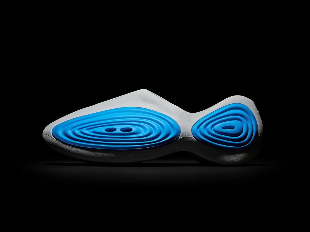
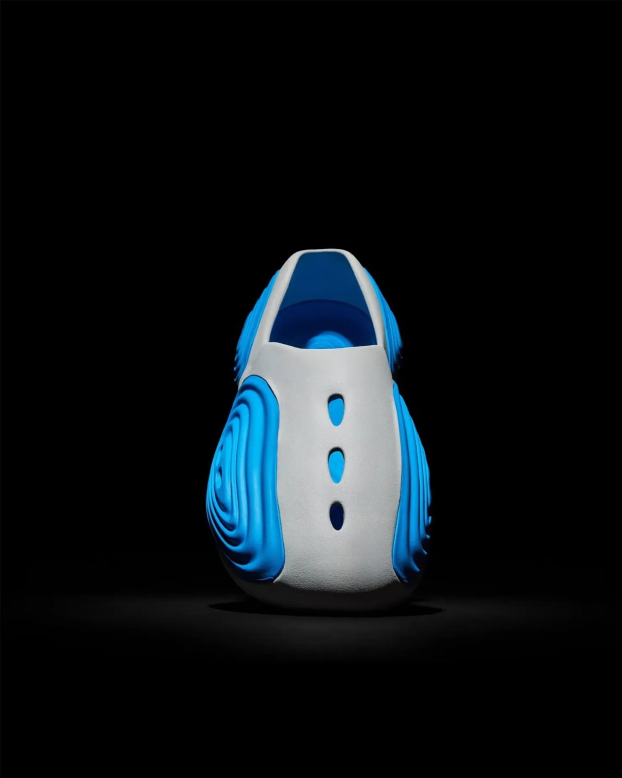
Let me introduce you to the Crocs Ripple, the brainchild of Steven Smith, a name that carries serious weight in the sneaker world. If you’re not familiar with Smith’s work, here’s the quick version: this guy has 40 years of industry experience under his belt and was the former head of product design at Yeezy. Yeah, that Yeezy. He’s the kind of designer whose resume makes other designers jealous, and now he’s bringing his magic to those polarizing foam clogs we all secretly own.

Designer: Steven Smith for Crocs

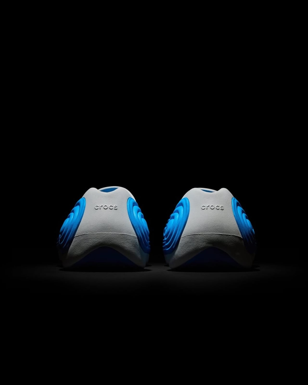
The Ripple represents Smith’s first design for Crocs since joining as Head of Creative Innovation, and it’s clear he’s not playing it safe. This isn’t just another color variant of the Classic Clog you’ve seen a million times. Instead, Smith has completely reimagined what a Crocs design can be, taking the brand’s comfort-first philosophy and wrapping it in a sculptural, almost futuristic package.

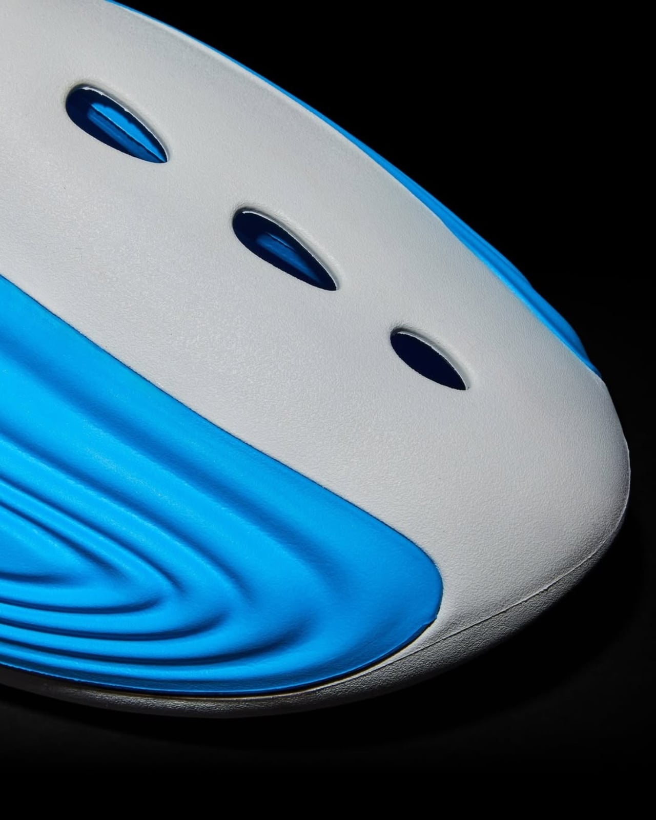
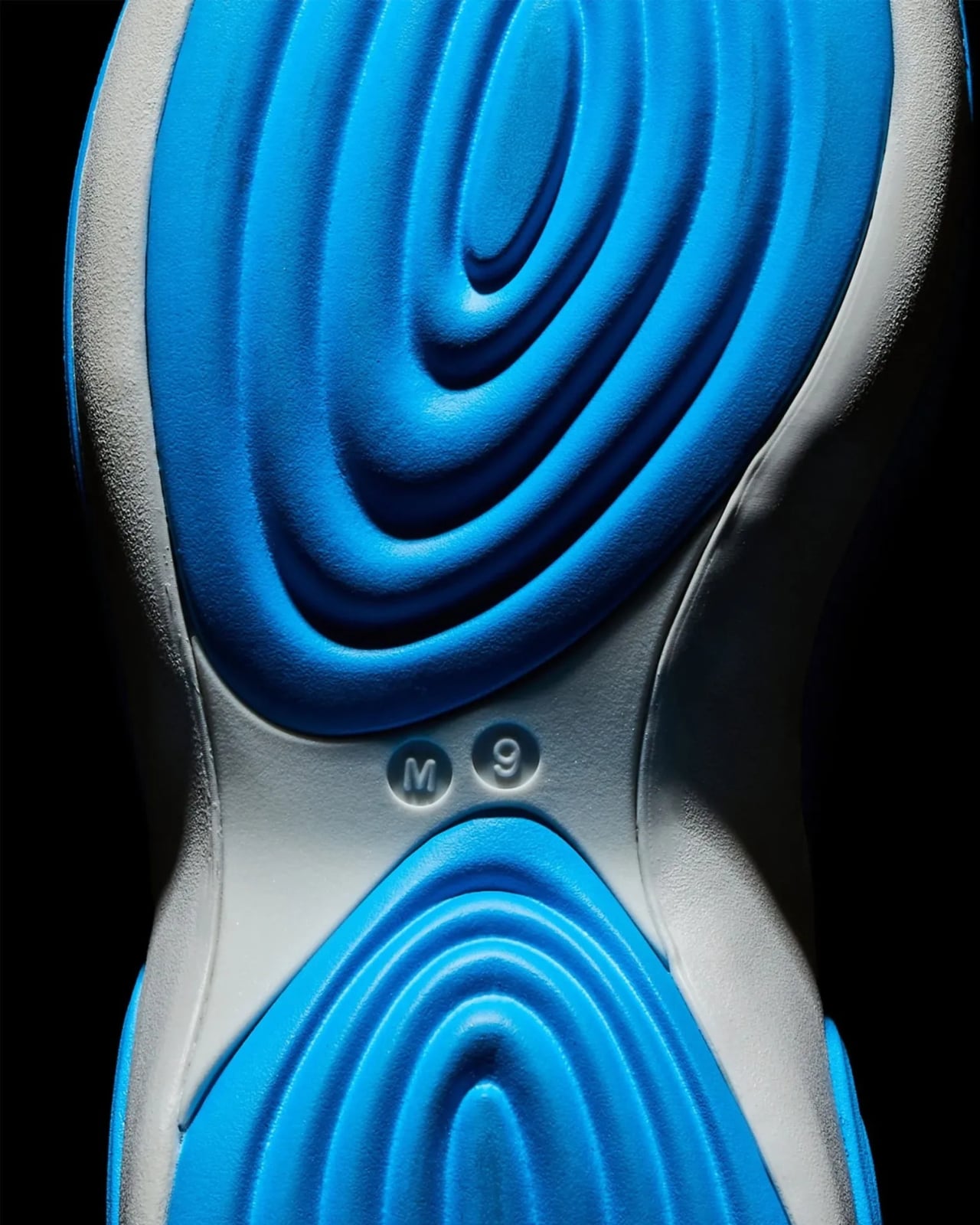
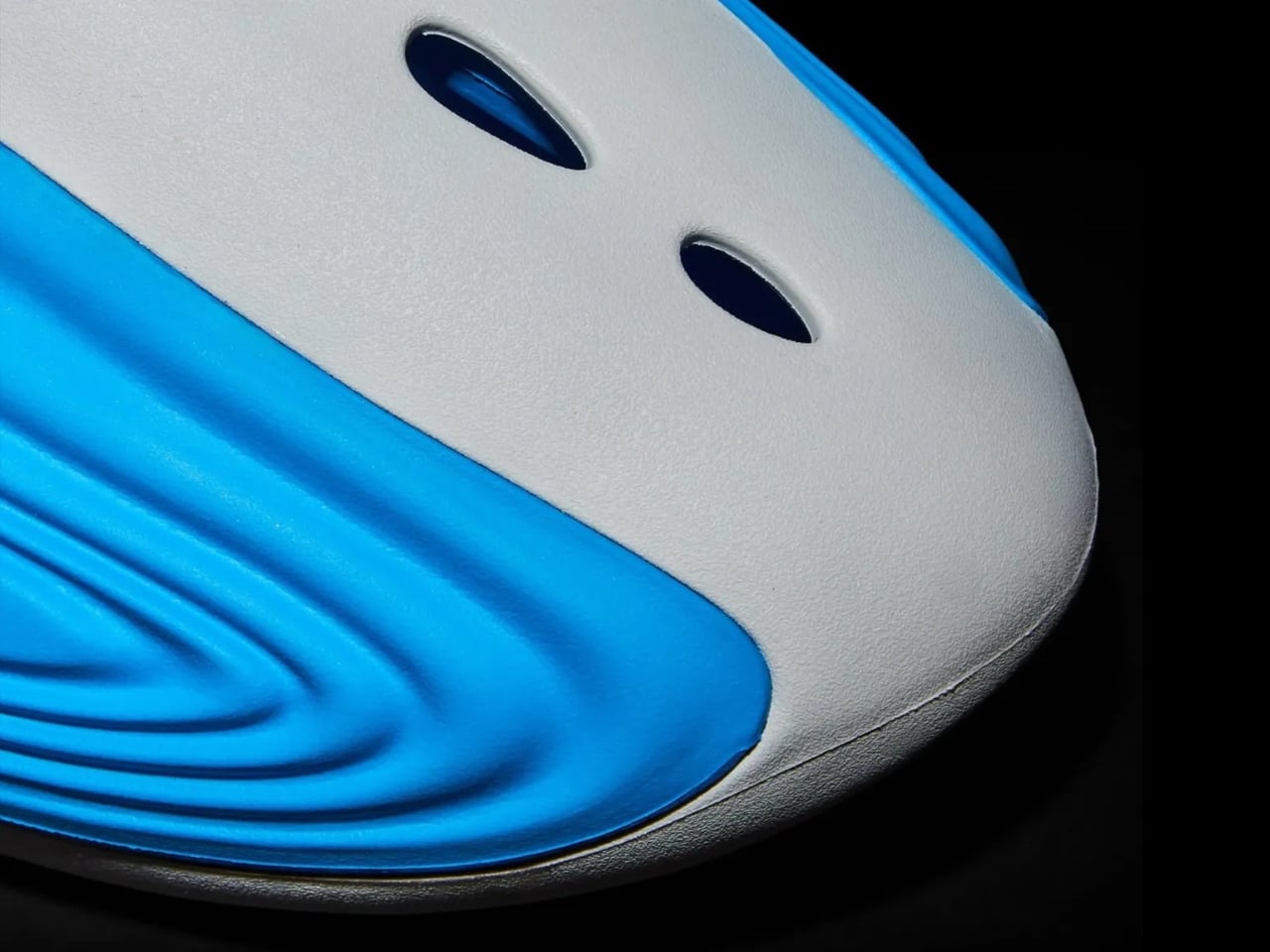
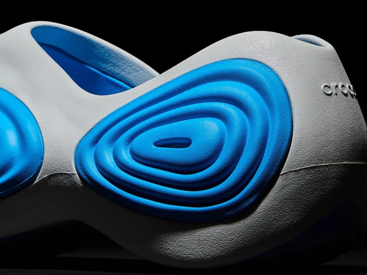
What makes the Ripple so different? For starters, forget about traditional laces or even the iconic heel strap. This is a slip-on clog with a bold personality written all over it. The design features three perforations on top for breathability, but the real showstopper is the wave-inspired aesthetic that runs across both sides. Those concentric oval patterns aren’t just there to look cool (though they absolutely do). They actually serve a functional purpose, incorporating two different types of Crocs foam technology: Croslite and Mellow.

The technical details get even more interesting when you look under the hood. Smith has integrated a TPU shank into the sole unit, which is footwear speak for added stability and support. It’s this kind of thoughtful engineering that separates designer collaborations that are all flash from ones that actually improve the wearing experience. The inaugural colorway launches in gray and blue, a combination that perfectly complements the Ripple’s boundary-pushing silhouette. There’s something almost aquatic about the design, like Smith took inspiration from water movement and translated it into foam and rubber. It stays true to his established design language while pushing Crocs into entirely new territory.

Now, here’s where things get exclusive. The Ripple is making its second in-person debut on December 5, 2025, exclusively at Flight Club Miami, perfectly timed with Art Basel. If you’re lucky enough to be in South Florida, this is one of those first-come, first-served situations where showing up early matters. Smith himself will be on site, which is a pretty big deal if you’re into sneaker culture and design.

But what does this collaboration really mean for Crocs? Smith has made it clear that he’s not looking to completely overhaul the brand. Instead, his approach is more subtle and potentially more impactful. He’s introducing boundary-pushing models that will, as the name suggests, create a ripple effect throughout both the company and the footwear industry at large.

It’s a smart strategy when you think about it. Crocs already has massive brand recognition and a devoted following. What they needed was someone who could elevate the design conversation without alienating their core audience. Smith brings credibility from the high-fashion sneaker world while respecting what makes Crocs work in the first place: uncompromising comfort and unmistakable personality.

The timing of this release feels significant too. We’re living in an era where the lines between high fashion, streetwear, and everyday comfort have completely blurred. The same people buying designer sneakers are also rocking Crocs to brunch. Smith’s Ripple sits perfectly at this intersection, offering something that’s conversation-worthy without sacrificing the practicality that made Crocs a household name.

While the Miami launch is happening now, a wider release through Crocs.com is expected to follow in early 2026. That means even if you can’t make it to Art Basel, you’ll eventually get your chance to experience what happens when sneaker royalty reimagines one of the most divisive shoes in modern history. Whether you’re team love-them or team hate-them when it comes to Crocs, the Ripple is worth paying attention to. It represents something bigger than just another shoe release. It’s proof that even the most established brands can evolve when they bring in the right creative voices.

The post Yeezy’s Former Designer Just Dropped His First Crocs Design first appeared on Yanko Design.

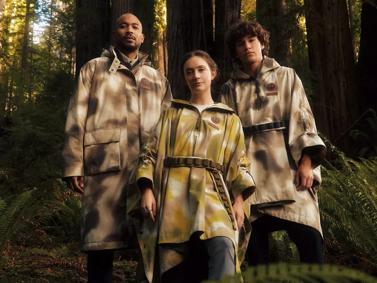
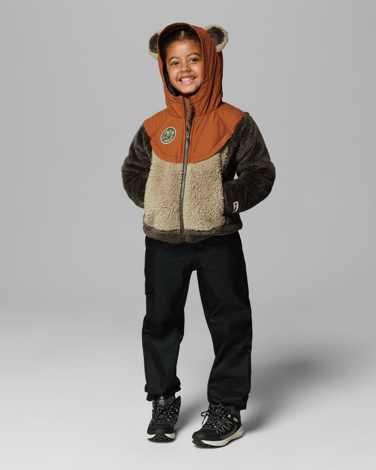
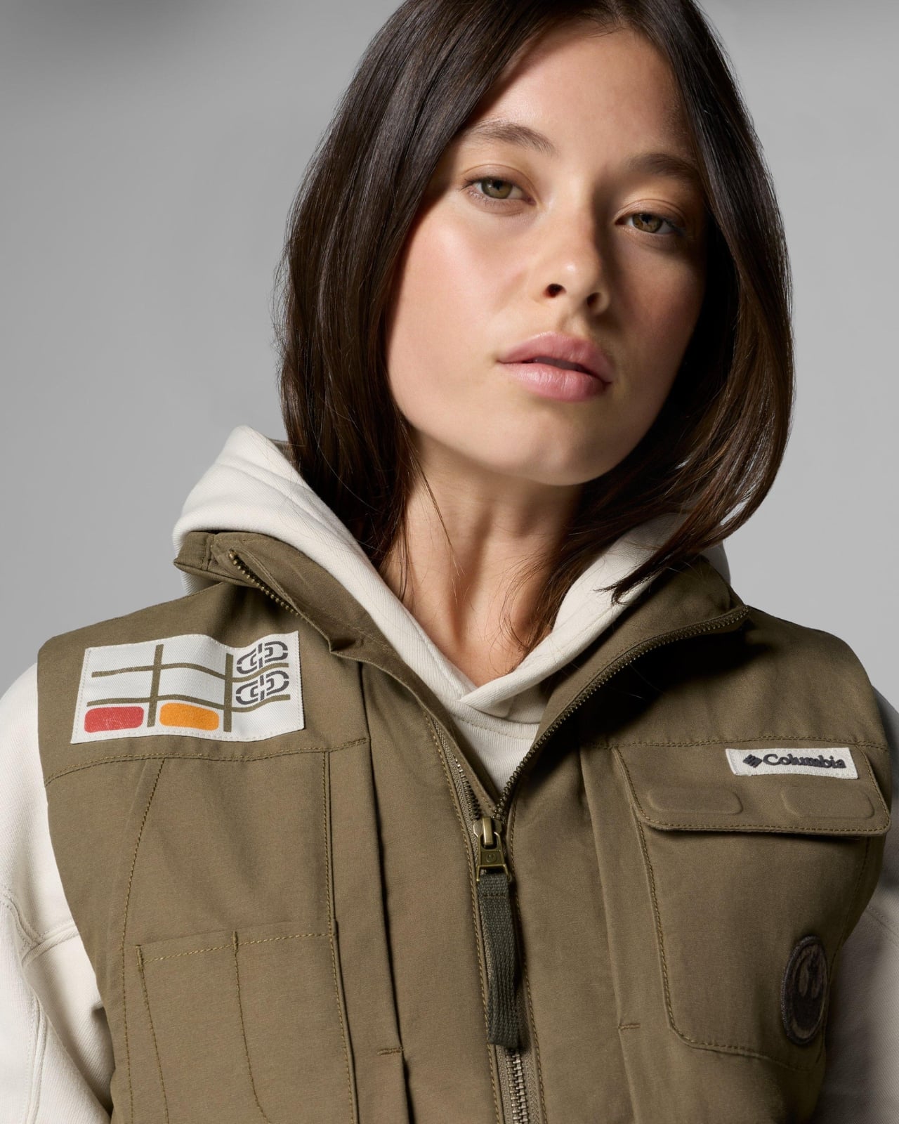
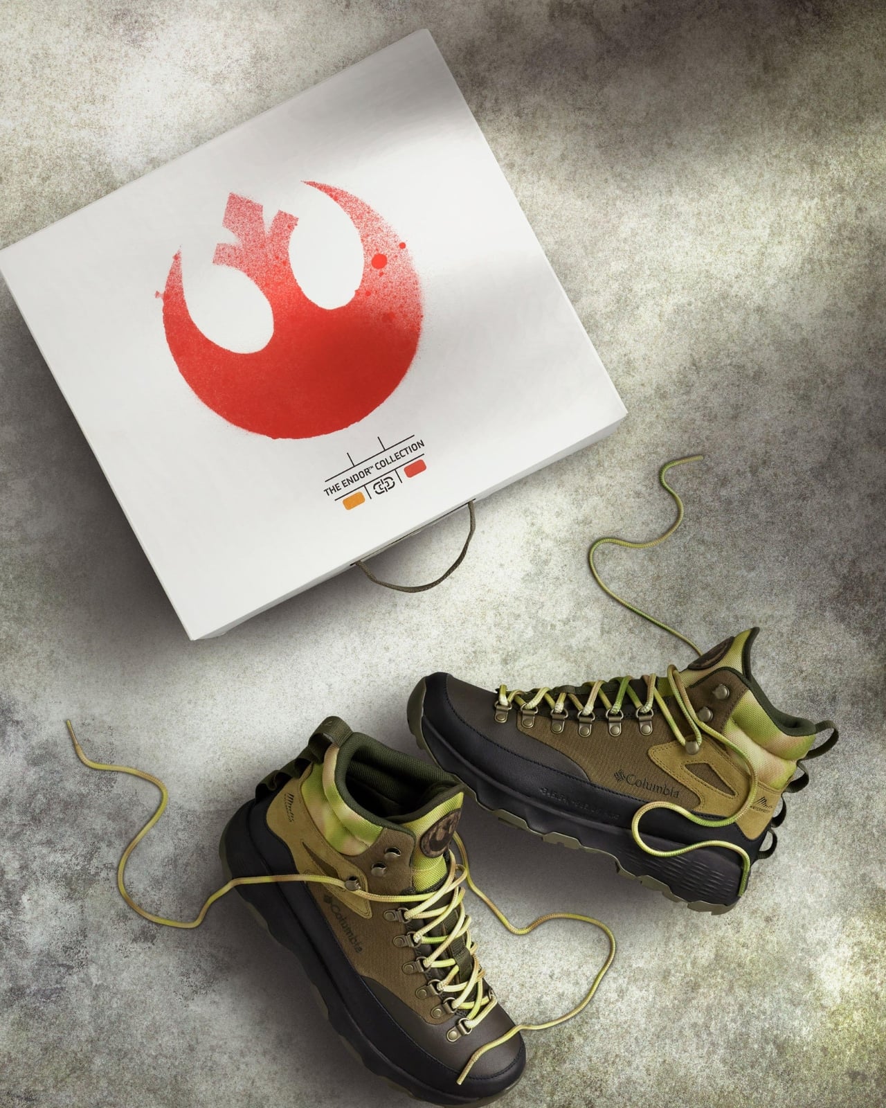
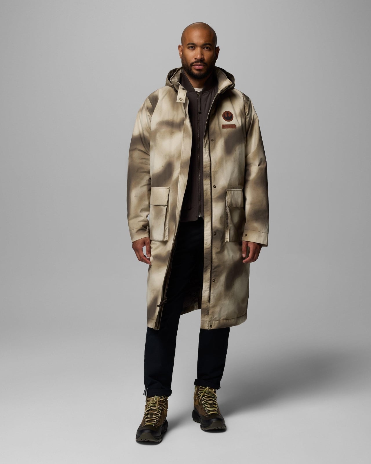
Columbia’s Endor Collection Brings Star Wars Style to Real Life

If you’ve ever wanted to dress like a Rebel Alliance soldier without looking like you just walked out of a cosplay convention, Columbia Sportswear has you covered. Their new Star Wars Endor Collection, dropping December 11th, is their most ambitious collaboration yet, and honestly, it’s pretty spectacular.

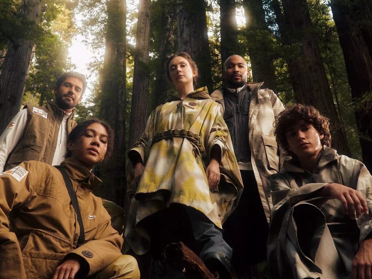
This isn’t just another brand slapping a logo on a hoodie and calling it a collaboration. Columbia has been partnering with Star Wars since 2016, releasing annual holiday collections that go deep into the details. But this 20-piece Endor Collection takes things to another level entirely. The designers actually visited Skywalker Ranch to see the original spray-painted camo costumes from Return of the Jedi in person. That hands-on research shows in every piece.

Designer: Columbia

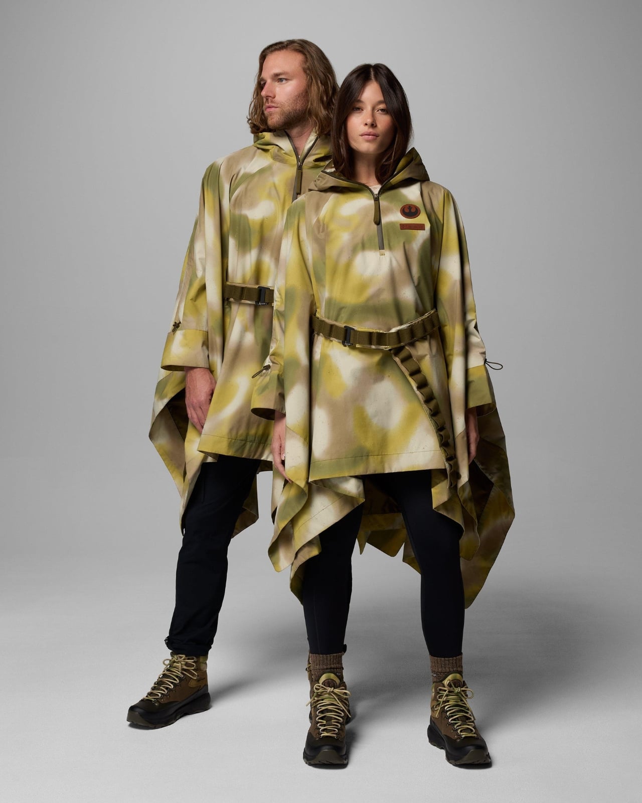
The collection reimagines some of the most iconic looks from the Battle of Endor: Han Solo’s camouflage trench coat, those memorable ponchos Luke and Leia wore, and the Rebel troop uniforms. But here’s what makes it special. These aren’t costume replicas. They’re actual functional outdoor gear that happens to be inspired by a galaxy far, far away. Columbia took their signature performance technology and merged it seamlessly with authentic Star Wars design elements.

Take the Endor Issue Ponchos, for example. They recreate the iconic look from the film, but they’re made with Omni-Tech waterproof fabric and feature bungee-adjustable arms. You could actually wear these hiking in the Pacific Northwest (which, let’s be honest, looks a lot like Endor anyway). The General Han Solo Trench is even more impressive because it separates into three individually wearable pieces, each packed with Star Wars Easter eggs for fans to discover.

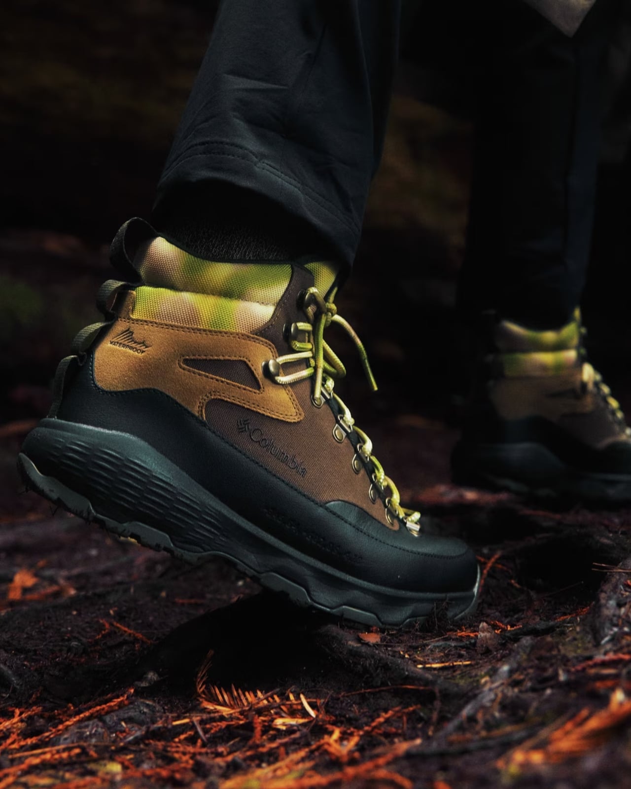
The boots deserve special mention too. The Endor Issue Boots combine technical features like Omni-MAX cushioning, an Omni-Grip outsole, and a TechLite midsole, making them genuinely trail-ready. Following last year’s footwear debut in the collaboration, Columbia clearly learned what works for fans who want both authenticity and actual performance from their gear.

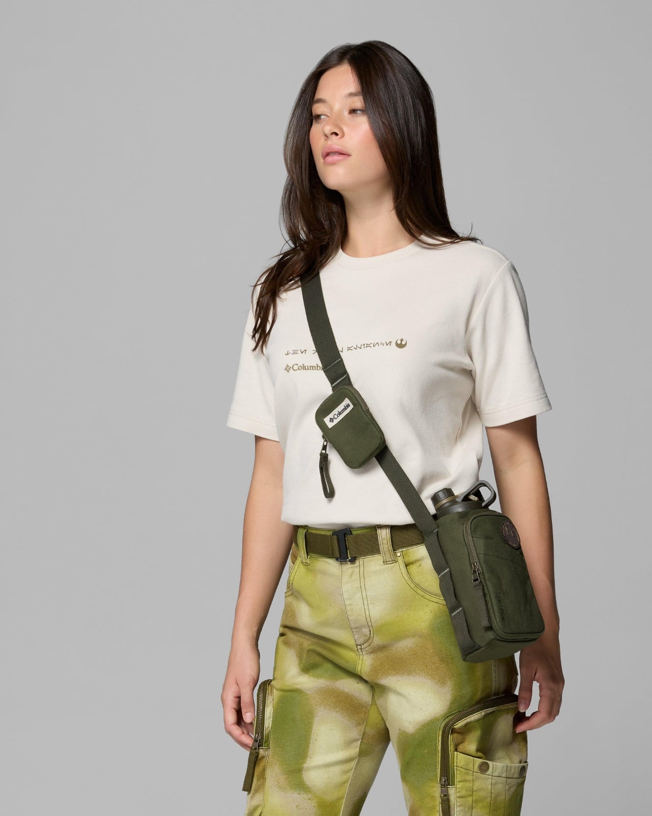
The attention to detail is where this collection really shines. Throughout the pieces, you’ll find carefully placed Rebel Alliance logos, coordinates, and messages written in Aurebesh (the Star Wars alphabet) for fans to decode. The blanket features original concept art, there are Ewok fleece patches, Bright Tree Village references, and even the actual map of the filming location tucked inside the shoebox and printed on long-sleeve tees. It’s like a treasure hunt for Star Wars enthusiasts.

What’s particularly clever is how Columbia captured that organic, hand-sprayed technique used on the original costumes. The designers worked to ensure their versions maintained that same imperfect, authentic look while still being performance-driven outdoor apparel. Balancing costume accuracy with real-world functionality took considerable time and effort, but the result is pieces that feel genuinely inspired rather than gimmicky. The color palette pulls directly from Endor’s forest moon aesthetic: earthy browns, mossy greens, and woodland camouflage patterns that feel both fantastical and wearable in everyday life.

The collection includes everything from the standout trench coat and ponchos to more practical pieces like the Endor Issue Pants (Columbia’s first-ever Star Wars-inspired pants), cargo jackets, reversible jackets, cargo vests, and various pullovers and half-zips. There’s also an Endor Issue Cargo Backpack for carrying your gear, water bottles with themed designs, multiple hat styles including a ball cap and wider-brimmed options, and even a quilted blanket perfect for outdoor adventures or cozy movie marathons watching the original trilogy.

Columbia enlisted Billie Lourd for the campaign, which feels particularly meaningful. Lourd, who played Lieutenant Connix in the sequel trilogy and is the daughter of the legendary Carrie Fisher, was photographed among towering California redwoods with her children wearing Ewok-inspired fleece pieces. It’s a beautiful tribute that connects the collection to Star Wars legacy while showcasing how these pieces work for real families having real outdoor adventures.

The collection launches December 11th at 10 AM EST on Columbia’s website, with early access for members of their free Greater Rewards program starting 30 minutes earlier. It’s the kind of collaboration that shows what happens when a brand genuinely respects both the source material and their customers. You get functional outdoor gear that happens to make you feel like you’re part of the Rebellion, without sacrificing style or performance. And in a world full of half-hearted pop culture collaborations, that’s definitely worth celebrating.

The post Columbia’s Endor Collection Brings Star Wars Style to Real Life first appeared on Yanko Design.

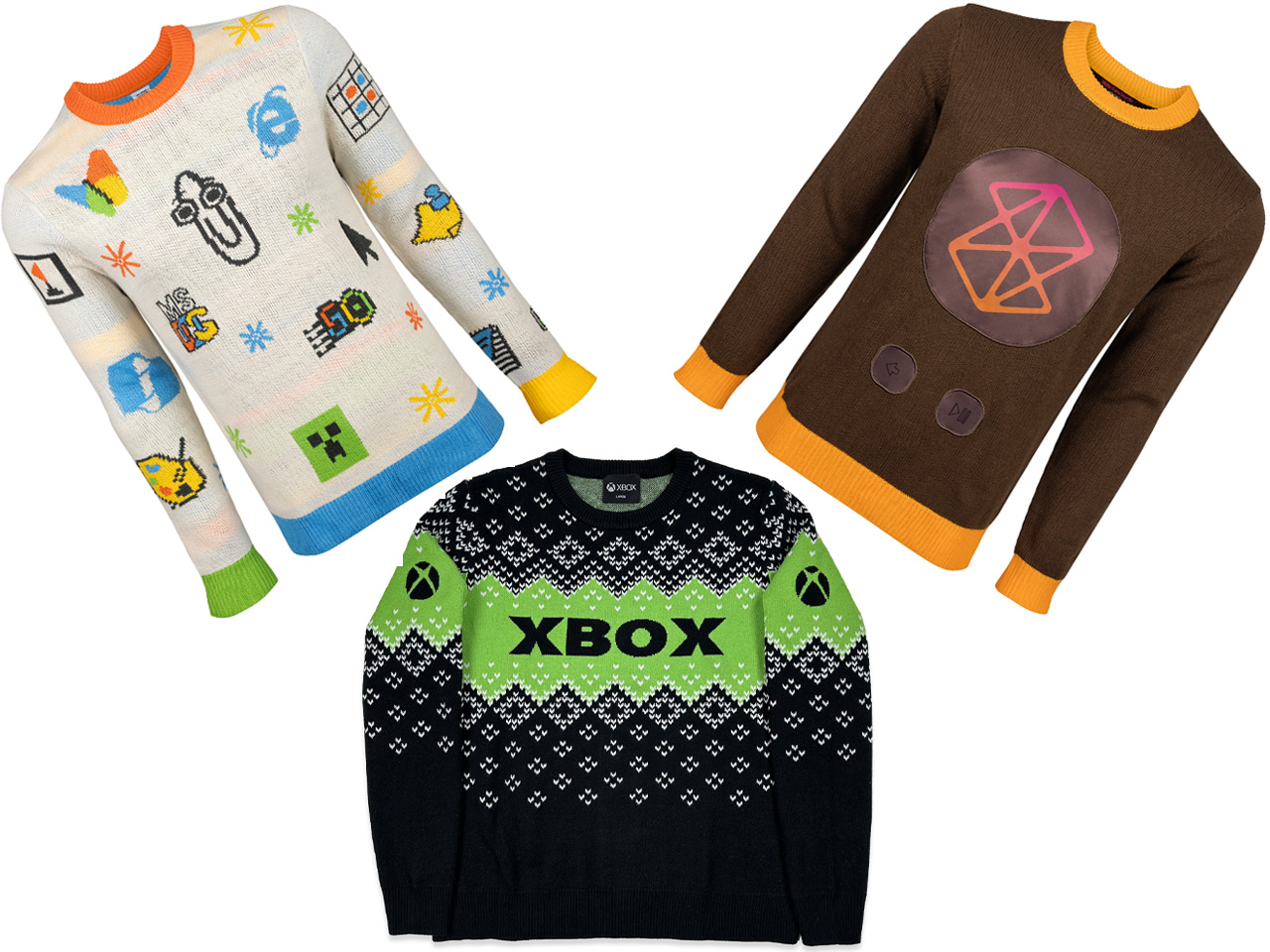
Microsoft’s ugly sweaters are back for this holiday season

Microsoft has an interesting tradition of releasing offbeat sweaters just in time for the holiday season. They call them the ugly sweaters as an ironic and humorous take on the garish holiday sweaters that were once deemed unstylish, especially in the 90s and early 2000 era. In 2002, the first ugly sweater parties were held in Vancouver to show off tacky sweaters bought from thrift stores. Over the decades, this bad fashion morphed into a collective celebration that now Microsoft also embraces.

The silicon giant released the first-ever ugly sweater limited edition collection in 2018 with the Windows 95 logo, followed by the Windows XP “Bliss” wallpaper in 2019, Minesweeper influence in 2021, Clippy vibes in 2022, and again the Biss wallpaper-themed sweater in 2023. For some reason, Microsoft didn’t release the winterwear in 2024, but this year, the ugly sweaters are making a comeback, celebrating the iconography from Windows’ glorious five-decade history, the Xbox gaming console, and the Zune logo. The release comes just in time to pair with your Xbox-themed crocs that were released a few days earlier.

Designer: Microsoft

The niche merchandizes this year, celebrating the company’s 50th anniversary, lets you choose from among three ugly Christmas sweaters. I find the Zune one to be the ugliest, the iconography sweater a bit too tacky, but the Xbox sweater is interesting on a serious note.

Artifact Sweater

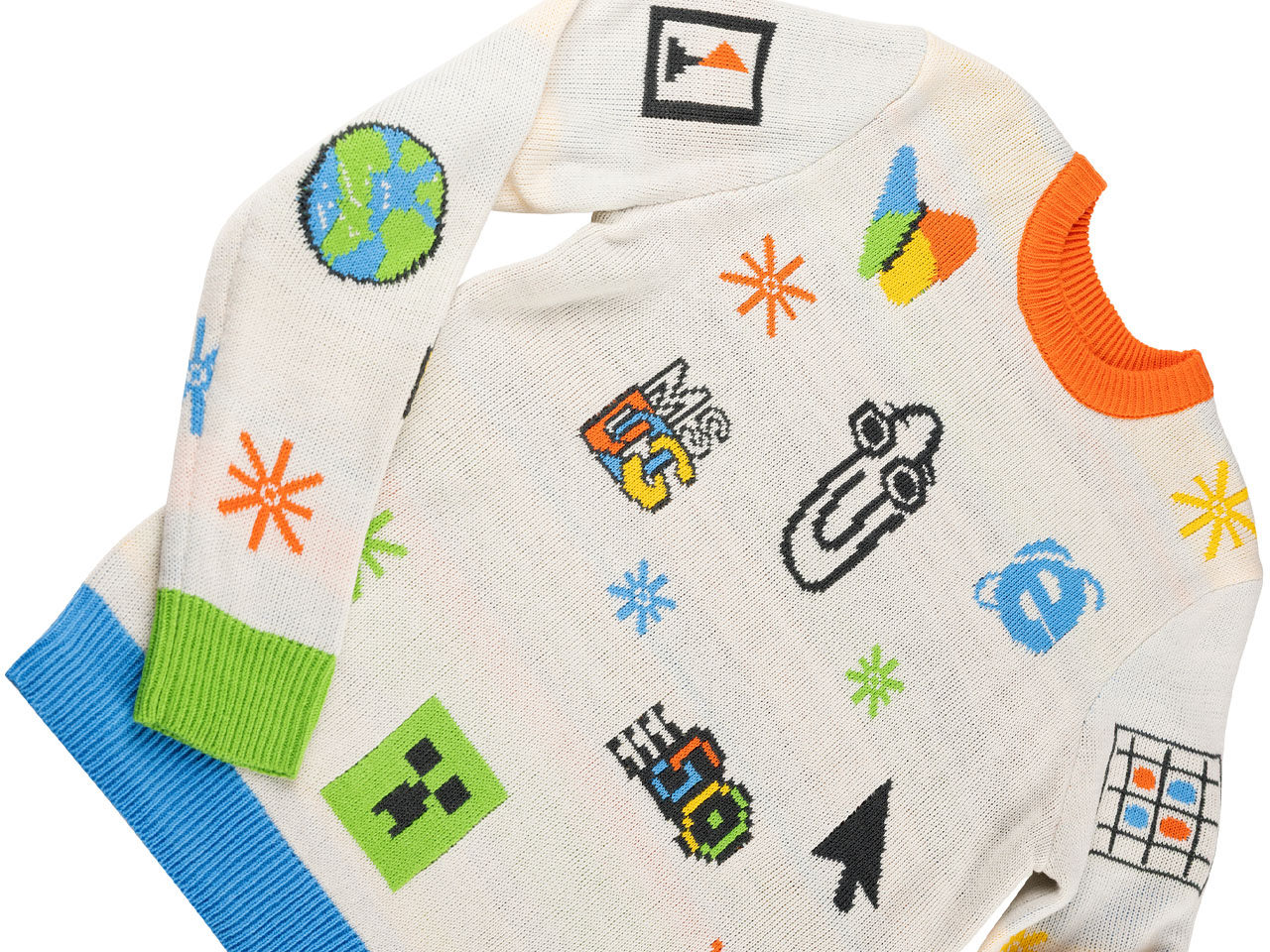
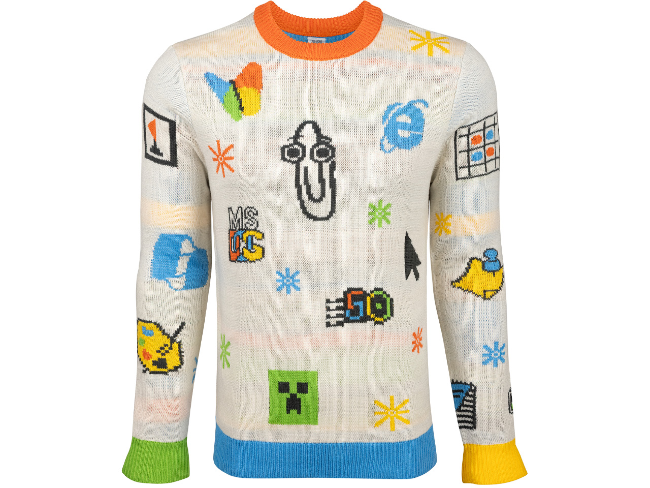
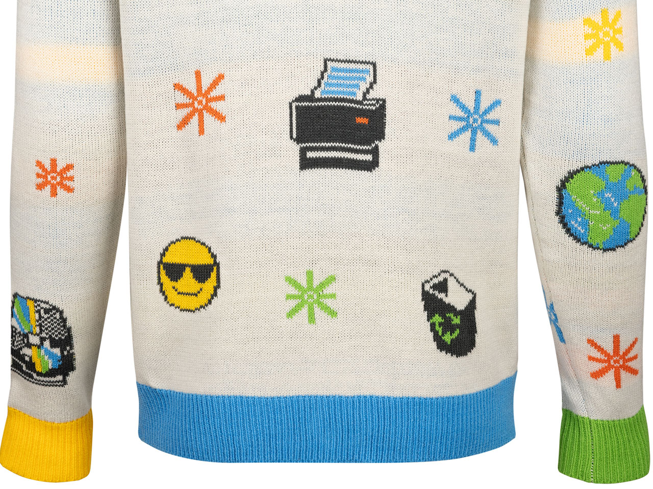
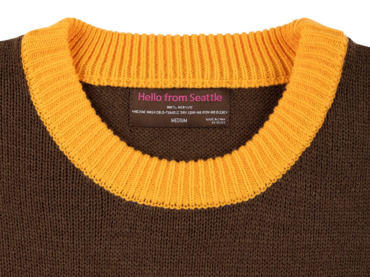
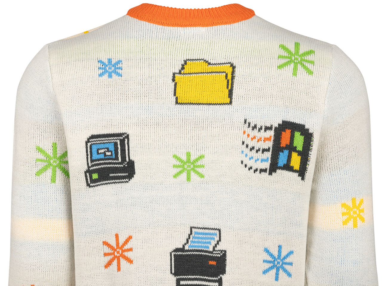
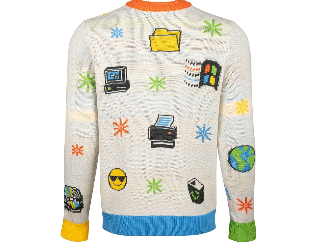
This one is an ode to Microsoft’s hot pan of software flaws and ugly content that nobody ever bothered to remember. The Clippy Assistant paperclip from the 1990s takes the limelight with other ignore-worthy icons, including the MSN butterfly logo, Minesweeper bomb, Internet Explorer icon, Paint app, and Windows OS logos dotted all over. The background is a subtle off-white hue, with the blue border and the bright orange collar adding to the tackiness.

The Artifact Sweater is woven from soft acrylic and wool combo material, in a range of the gaudiest colors you would instantly ignore. Priced at $79.95, the Clippy edition sweater is the one for your craziest holiday celebrations. The first wave of the collection has already sold, so you better pre-order it the next time this ugly one arrives.

Zune Sweater

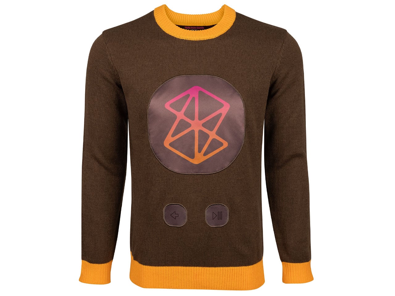
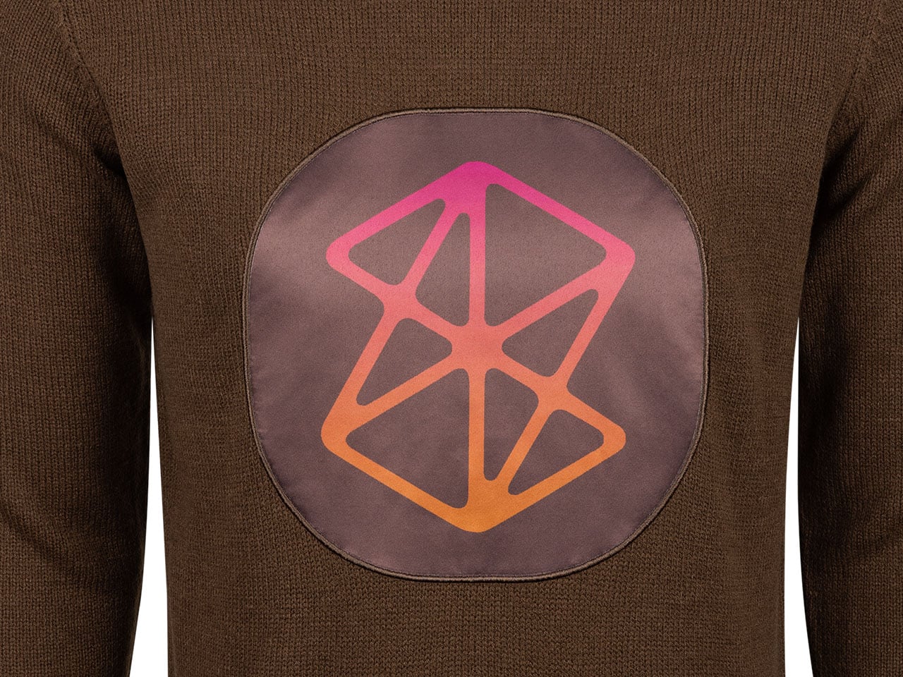
Highlighting the Zune portable music player, this sweater is giving me serious nausea owing to its color palette. The doomed music player of the music industry that couldn’t even make it past the mid-2000s will either make it to the closet of the craziest Microsoft fan or be completely ignored for its kitschy persona. Although I’m a music affectionate, and the sweater features landmark albums from OutKast and Coldplay on the inside of the cuffs, this one is not coming anywhere near me.

For those who might want to sport this for a Christmas party, the song names silhouetted in tiny typeface, and the headphone plug threads are appealing. There are back and play/pause buttons on the front with a big visualization adding to the gaudy effect. The material of the sweater is the same as the other one, and the brown-orange winterwear also costs $79.95.

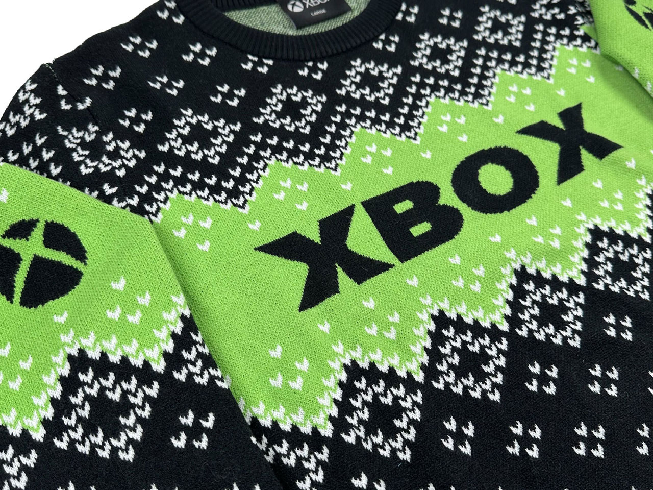
Xbox Holiday Sweater

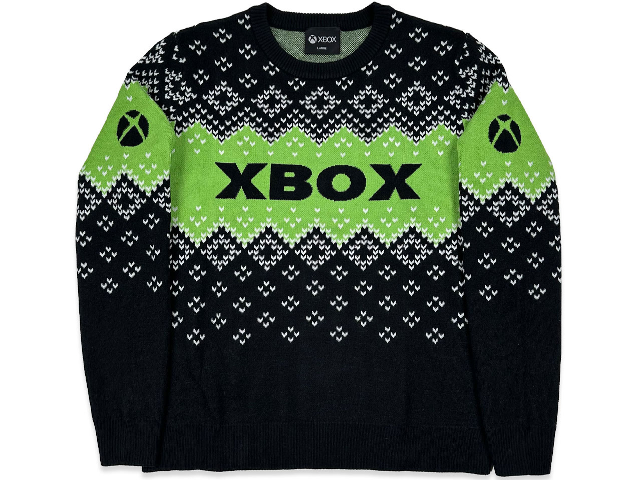
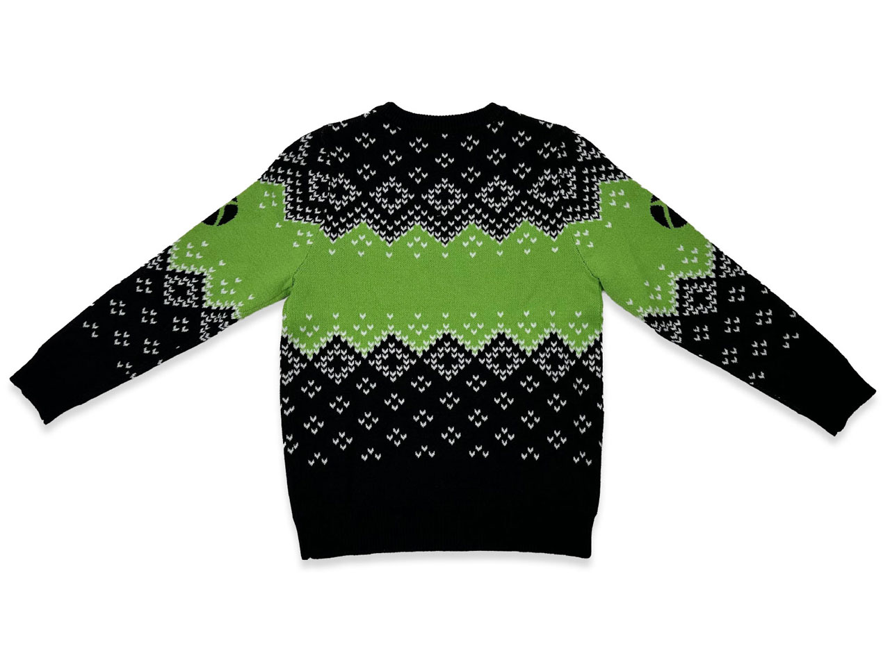
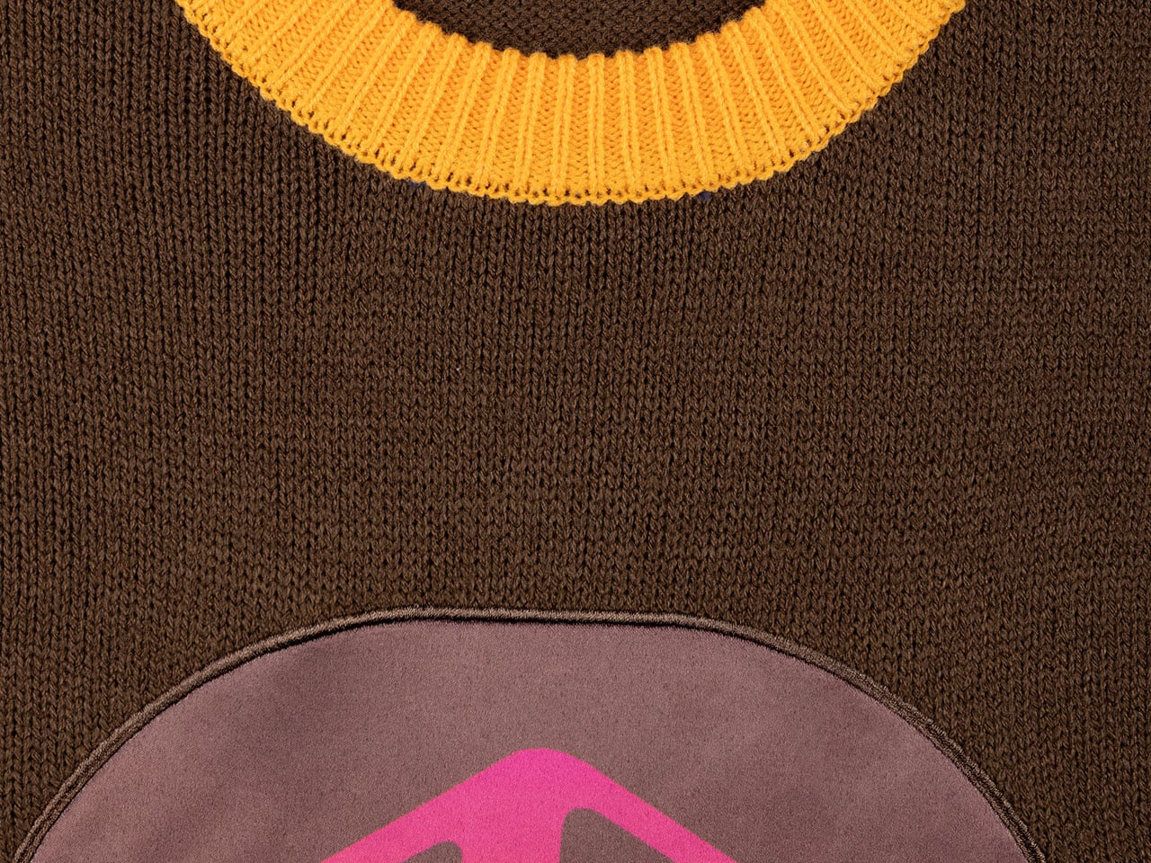
This one in the collection has my fancy as it is more subtle and cannot be deemed ugly. The color combos are more muted and basic, with black contrasting against the Xbox’s signature lime green, which looks cool. On closer look, the sweater has a controller outline, with the knit circles you can push. Also, there are the Halo rings with subtle silhouettes of the Master Chief in action. You can choose from the metallic thread material (bronze, platinum) for the achievement insignia that loops around the body.

Even better, it costs less than the two uglier options, priced at $59.99. The Xbox Holiday Sweater has a pattern that imitates falling snow. The knitted sweater is made from 100 percent polyester material; therefore, it won’t be as warm as the other two, still that isn’t a deal breaker in any way.

The post Microsoft’s ugly sweaters are back for this holiday season first appeared on Yanko Design.

Parsel EVA Tote: Rigid Shell and Soft Liner You Can Reconfigure

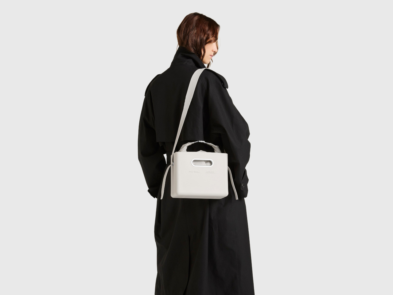
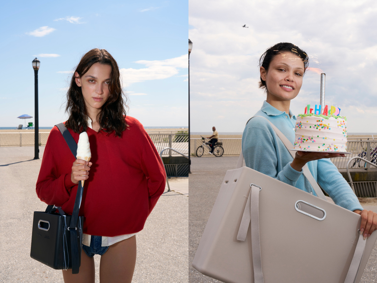
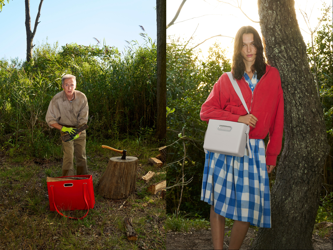
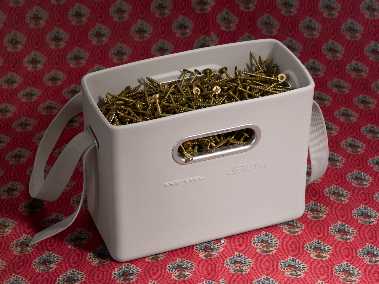
Most bags are single-purpose objects. A tote for groceries, a weekender for travel, a backpack for everything else. Parsel’s EVA East West Tote System treats a bag more like a modular platform, where a rigid shell, soft liner, and strap can be reconfigured for different uses. It’s less about one perfect tote and more about a carry architecture you can tune as your day changes.

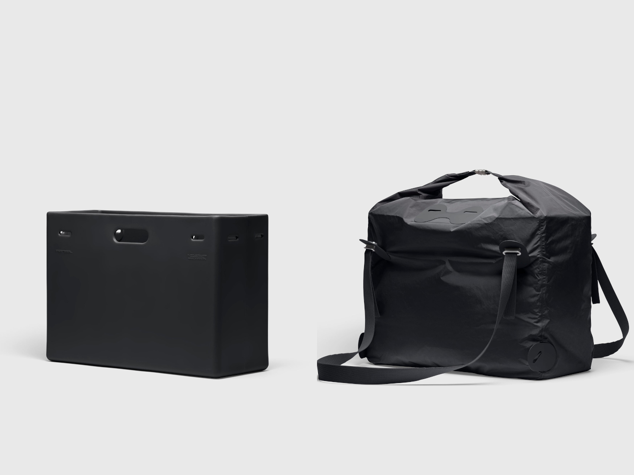
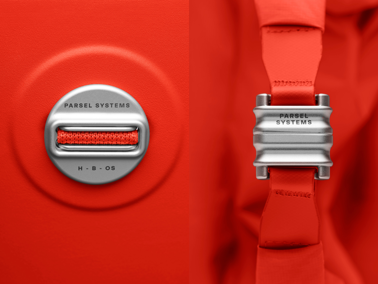
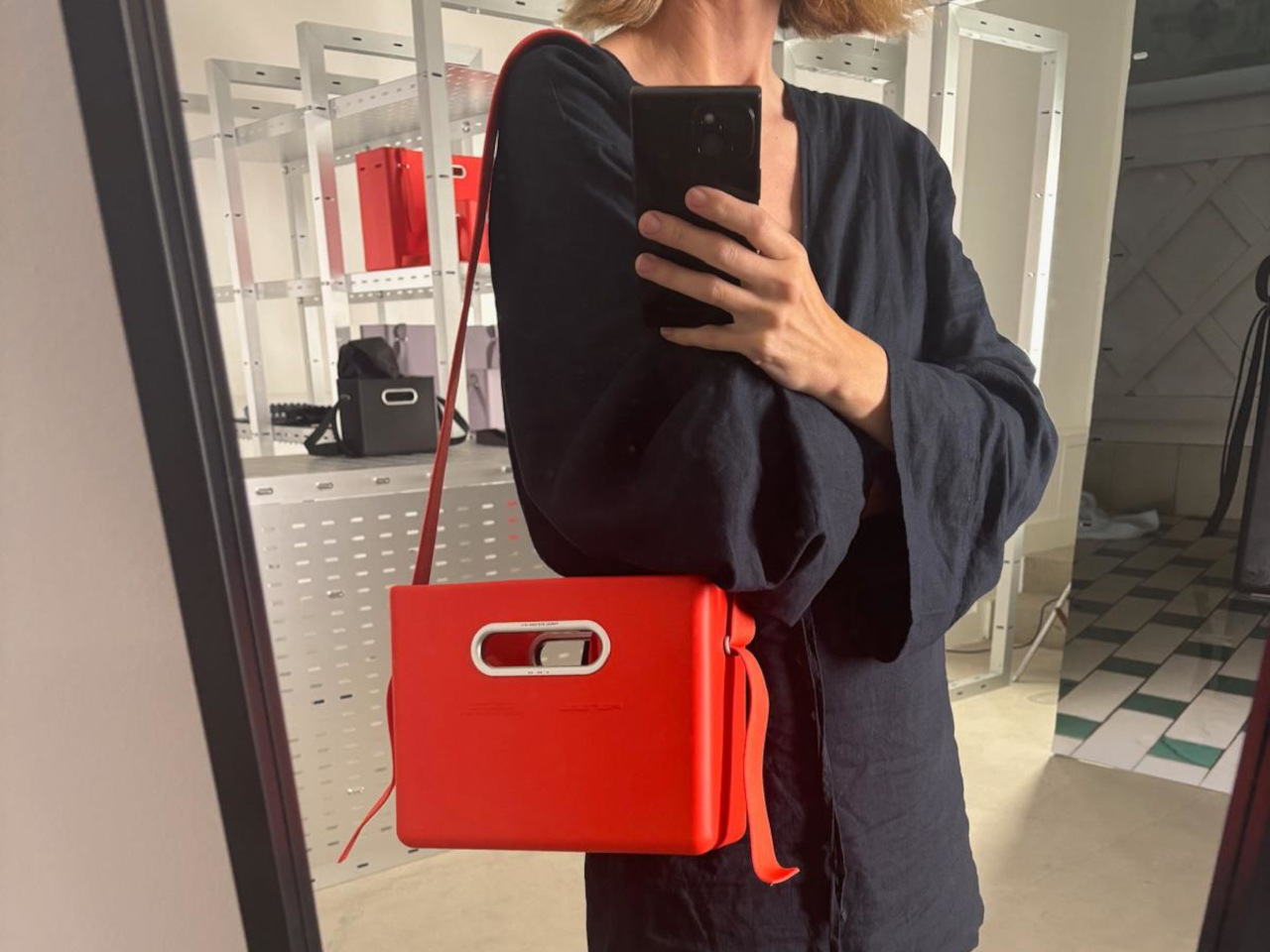
The EVA East West Tote System is a high-density EVA tote available in small and extra-large sizes. Each Unit is an injection-molded shell with integrated handles, paired with a removable roll-top nylon liner and an engineered knit strap. All the hardware is machined from aircraft-grade aluminum, giving the whole thing a gear-like feel rather than a fashion accessory vibe that falls apart after a season.

Designer: Nur Abbas (PARSEL)

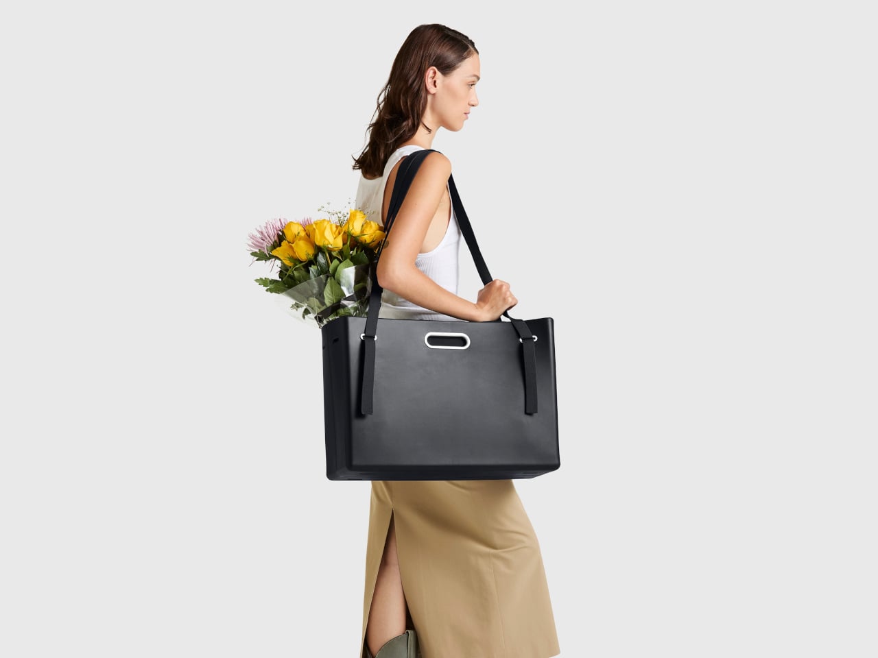
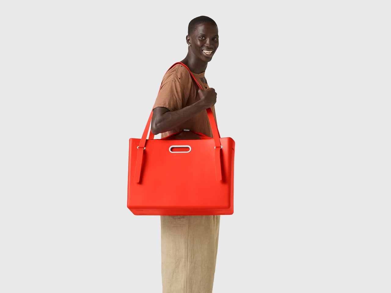
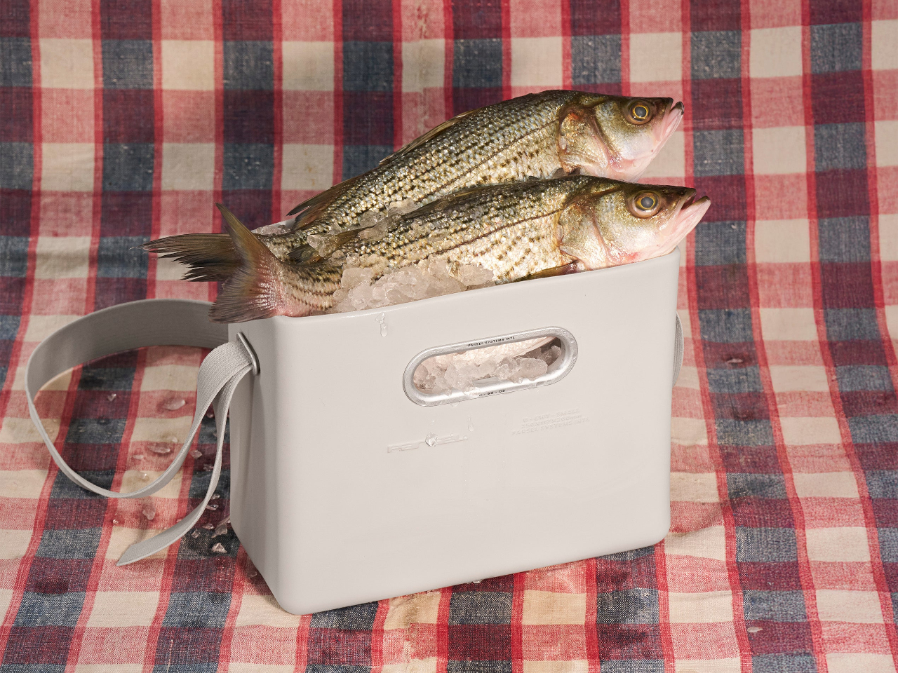
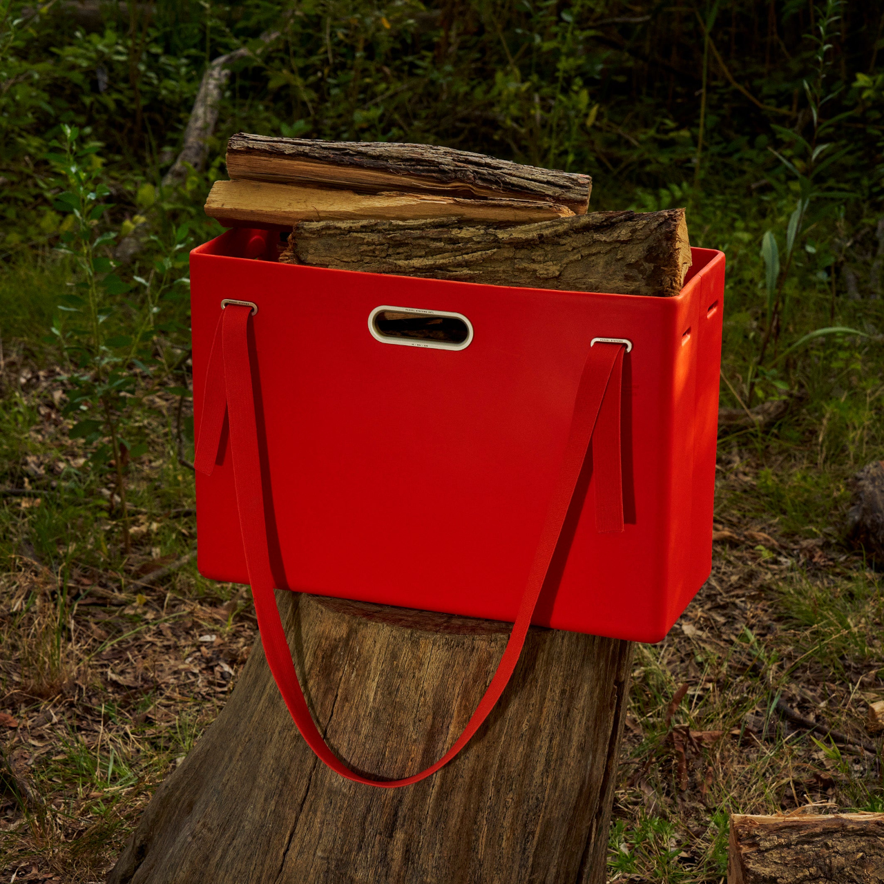
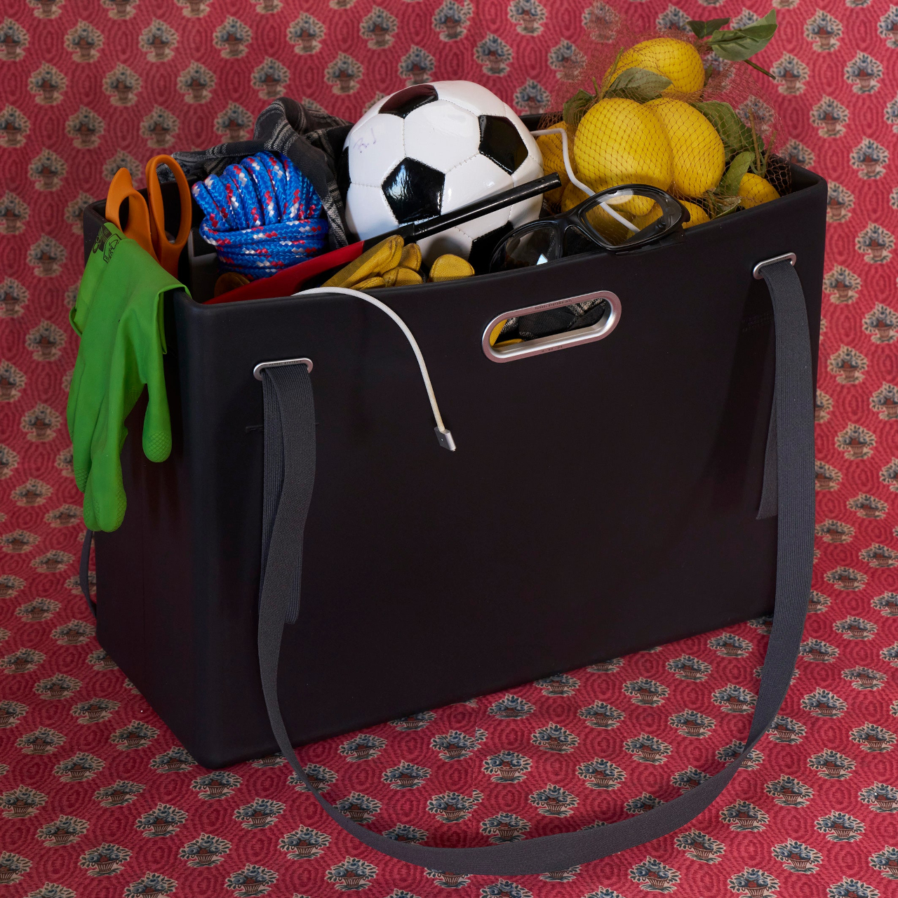
The Unit is a monolithic box with soft radii and an oval handle cutout, rigid enough to protect contents but flexible enough to absorb impact. In its small size, it reads like a compact utility caddy. In the extra large, it becomes a trunk-like tote that can swallow groceries, tools, or sports gear. The clean surfaces and embossed Parsel logo keep it visually quiet and precise.

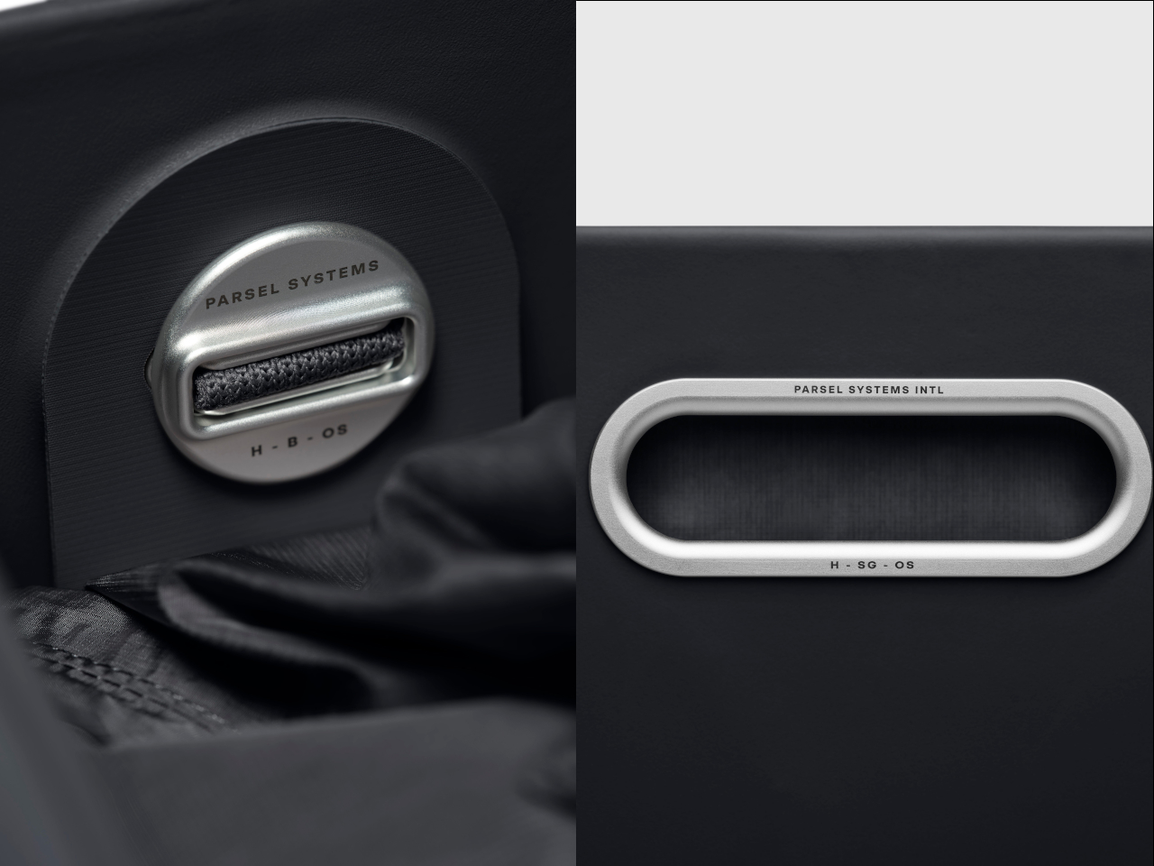
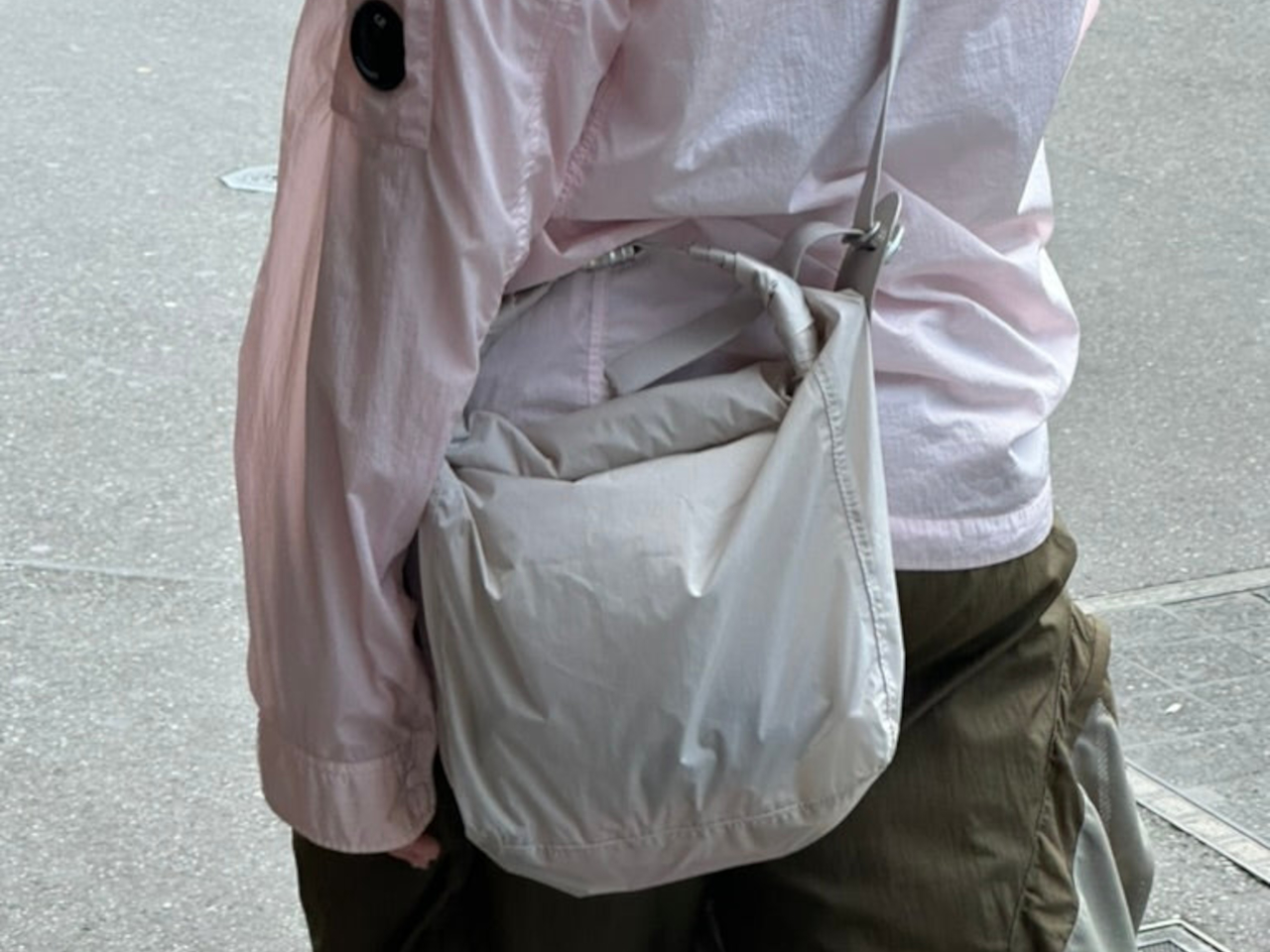
The removable nylon liner has a roll-top with a magnetic closure and can live inside the Unit or be used on its own. The adjustable knit strap stretches slightly for comfort and threads through Parsel’s signature Button, a ribbed aluminum connector that links everything together. That Button is the universal joint of the system, letting the strap move between the shell and liner without extra clips or buckles cluttering the sides.

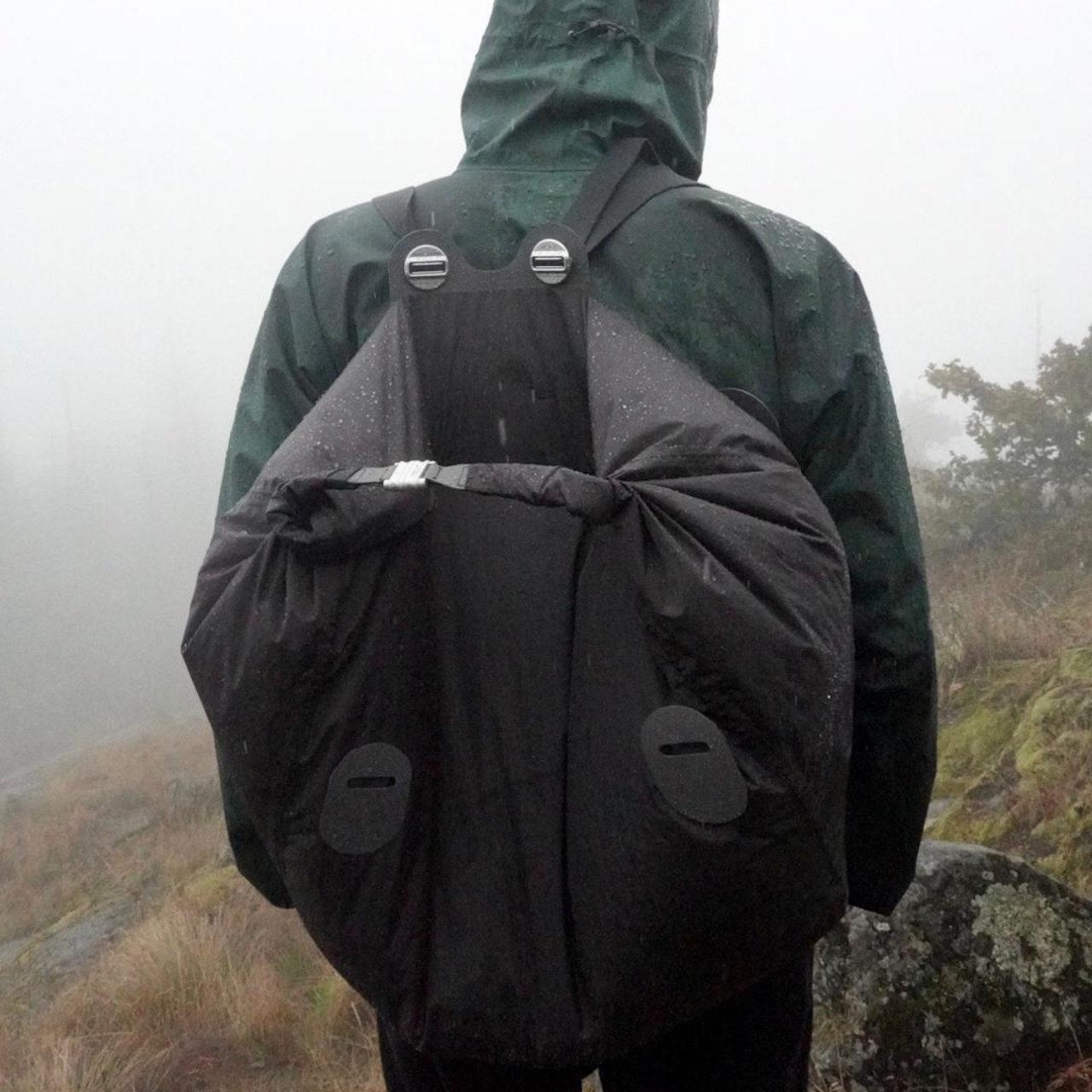
In classic tote mode, the strap attaches to the EVA Unit with the liner inside. For a lighter carry, the liner can be used alone with the strap as a soft shoulder bag. In the extra-large size, the liner can even be worn as a backpack by rethreading the strap through the Buttons. Parsel literally labels this “Play with the system,” inviting users to treat carry as something adjustable.

The aluminum handle insert is etched with Parsel Systems Intl around its oval perimeter, while the Button hardware carries the brand name in clean engraving. These details feel more like precision components from outdoor gear than fashion hardware. Colorways like Optic white, Deep black, and Priority orange let the bags shift toward either minimal or high-visibility use, comfortably filled with screws, firewood, fish, or flowers in both workshop and city.

The EVA East West Tote System is a thoughtful attempt to make one bag work across many lives. By separating structure, volume, and carry into distinct parts, Parsel lets you tune how rigid, soft, or hands-free the bag needs to be on a given day. For anyone who likes their everyday carry to feel more like a system than a single fixed object, this EVA tote is worth considering.

The post Parsel EVA Tote: Rigid Shell and Soft Liner You Can Reconfigure first appeared on Yanko Design.

Puma Just Dropped Mismatched Rick and Morty Basketball Shoes

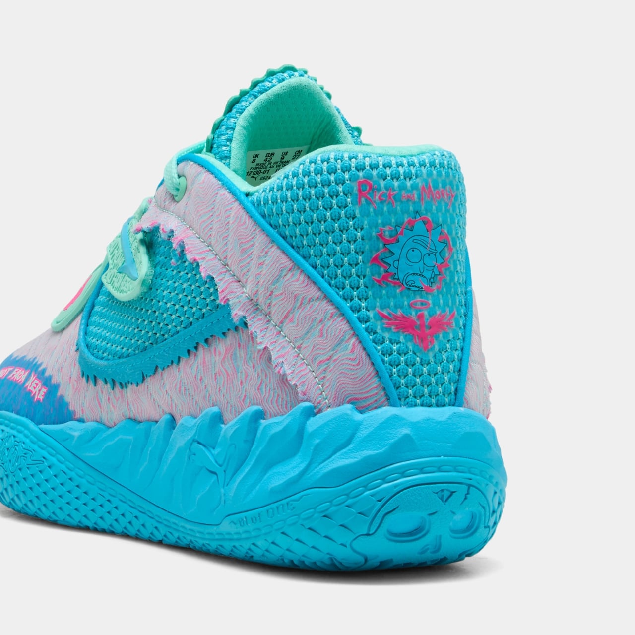
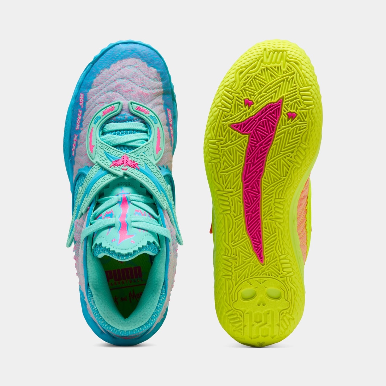
There’s something brilliantly chaotic about a basketball shoe that refuses to match itself. That’s exactly what Puma delivered with their latest collaboration featuring LaMelo Ball’s MB.05 and Adult Swim’s cult classic Rick and Morty, and honestly, I’m here for every interdimensional second of it.

This isn’t just another celebrity sneaker drop trying too hard to be relevant. It’s the third installment of what has become one of the most unexpected yet perfectly executed partnerships in recent footwear history. LaMelo Ball, the NBA All-Star known for his flamboyant court presence and genuine love for the animated series, has helped create something that feels authentically weird in the best possible way.

Designer: LaMelo Ball x PUMA

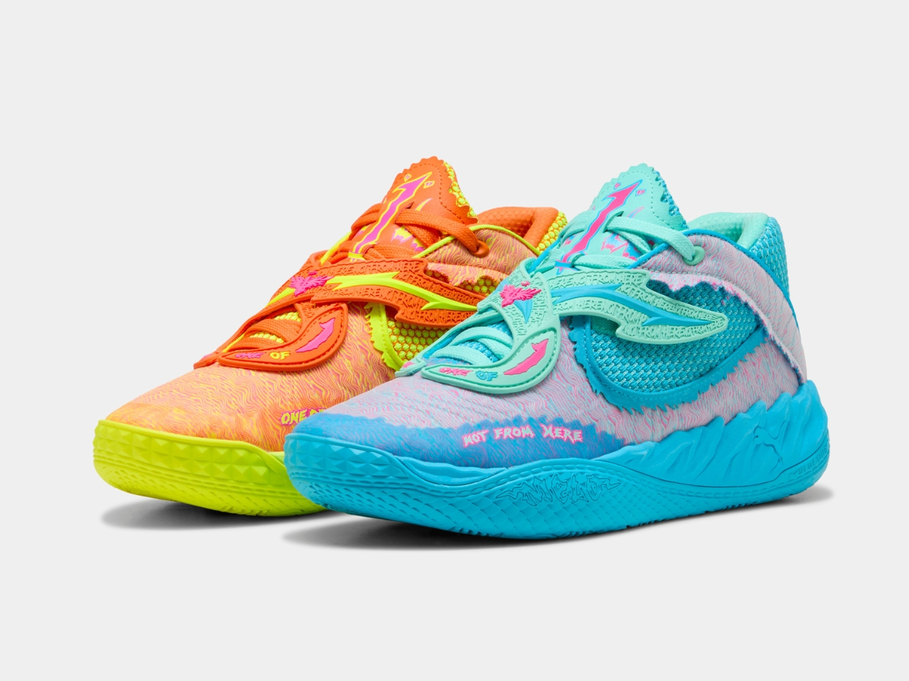
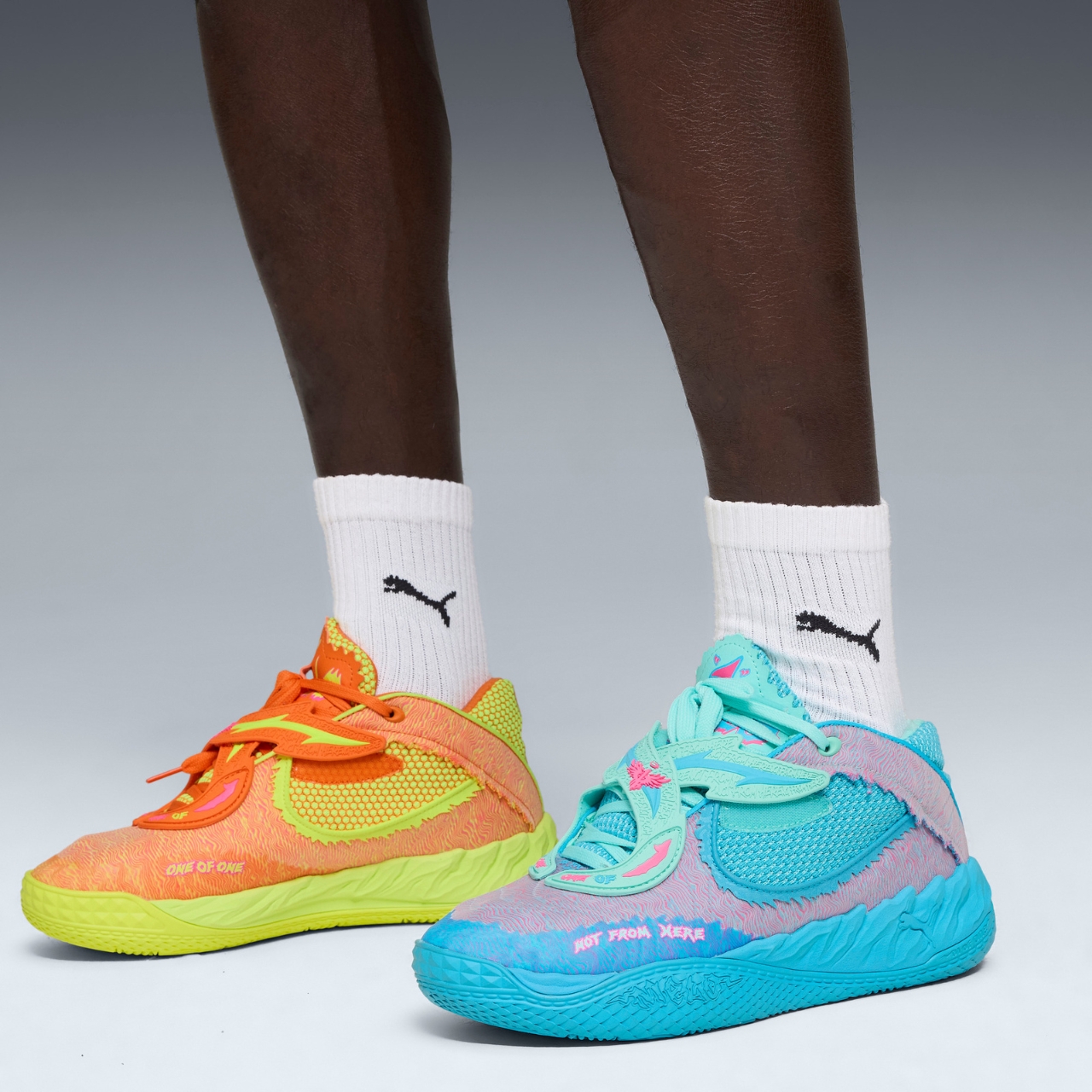
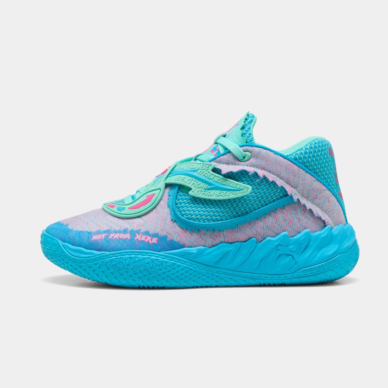
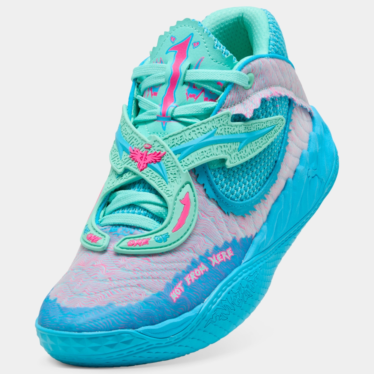
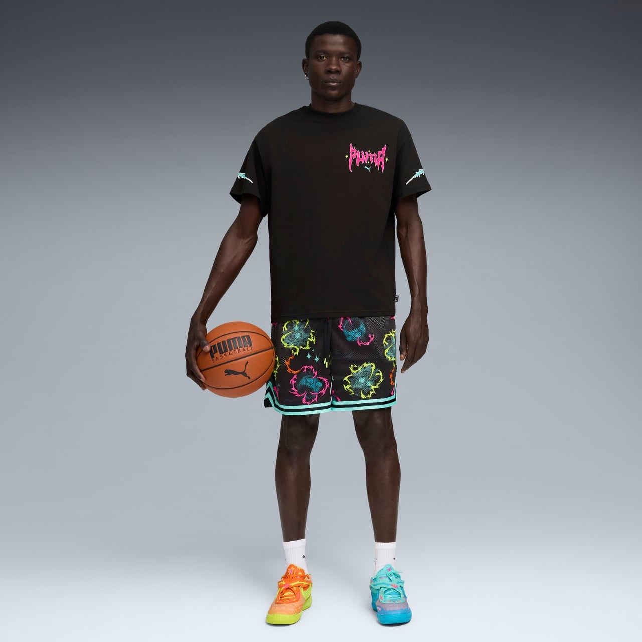
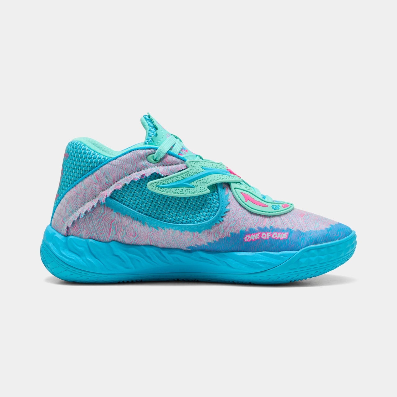
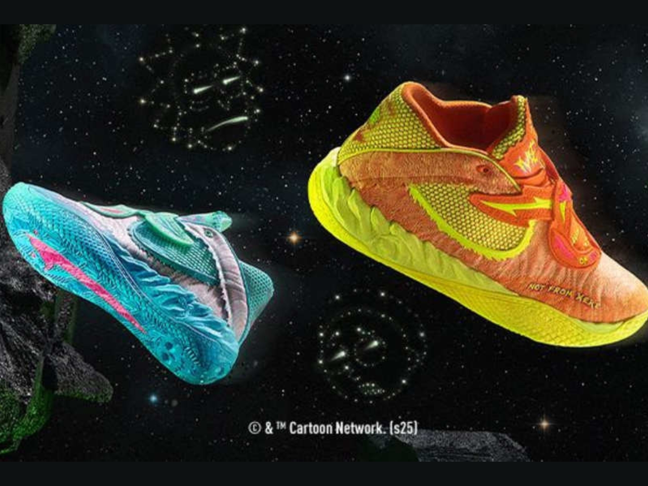
The design itself is pure multiverse mayhem. One shoe channels Rick’s chaotic genius with charged-up aqua and electric peppermint tones, while the other bursts with Morty’s anxious energy through vibrant orange and yellow. It’s asymmetrical, it’s bold, and it looks like it tumbled through six different portals before landing on shelves. The colorway, officially dubbed “Rickie Orange-Electric Peppermint,” breaks from the rockstar theme that has defined previous MB.05 releases.

What makes this collaboration work isn’t just the eye-catching colors. The MB.05 is built for performance, featuring Puma’s NITRO Foam technology that provides responsive cushioning without sacrificing court feel. The engineered mesh upper serves as the perfect canvas for Ball’s storytelling, while the revamped outsole stays true to his aggressive, unpredictable playing style. These aren’t just display pieces for your shelf, they’re legitimate performance basketball shoes that happen to look like they were designed by a mad scientist with impeccable taste.

The timing couldn’t be better. Rick and Morty has transcended its origins as a late-night cartoon to become a cultural phenomenon that resonates across demographics. Its humor is smart, dark, and unapologetically strange, much like Ball’s own approach to basketball. He plays with a creativity that feels improvisational, making passes that shouldn’t work but somehow do, launching shots from impossible angles. The connection between the show’s multiverse-hopping adventures and Ball’s style of play feels natural, not forced.

This partnership between Puma and Warner Bros. Discovery Global Consumer Products has expanded beyond just the MB.05. The collection includes the Puma Sportstyle Inverse and RS Surge styles, along with a full apparel line featuring two graphic tees, a long-sleeve option, shorts, a hoodie, and sweatpants. It’s the kind of comprehensive collaboration that shows real commitment to the concept rather than just slapping a logo on a product and calling it done.

At $135, the MB.05 Rick and Morty edition sits at a competitive price point for signature basketball shoes. Released on November 21, 2025, through Puma’s website, mobile app, the NYC flagship store, and select Foot Locker locations, the shoes represent accessible pop culture fashion for fans who want to express their interests through their footwear.

What’s particularly clever about this collaboration is how it embraces the core philosophy of Rick and Morty itself: nothing is sacred, everything is up for reinterpretation, and normal is overrated. In an era where most athletic footwear collaborations play it safe with neutral colors and subtle nods to their inspiration, Puma and Ball went full portal-gun chaos. They created something that demands attention and conversation, shoes that make people ask “what are those?” in the most complimentary way possible.

The broader implications for sneaker culture are worth noting too. This collaboration represents a growing trend of athletic brands embracing pop culture properties in genuine, creative ways. It’s not enough anymore to just reference something cool; the execution has to match the energy of both the athlete and the inspiration. Here, that balance is struck perfectly. Whether you’re a sneakerhead, a Rick and Morty superfan, or just someone who appreciates when design takes risks, the Puma x Rick and Morty MB.05 delivers. It’s weird, it’s functional, it’s conversation-starting footwear that doesn’t apologize for being exactly what it is: basketball shoes from another dimension.

The post Puma Just Dropped Mismatched Rick and Morty Basketball Shoes first appeared on Yanko Design.

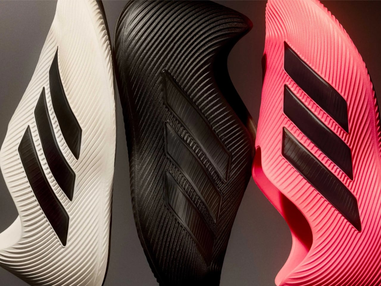
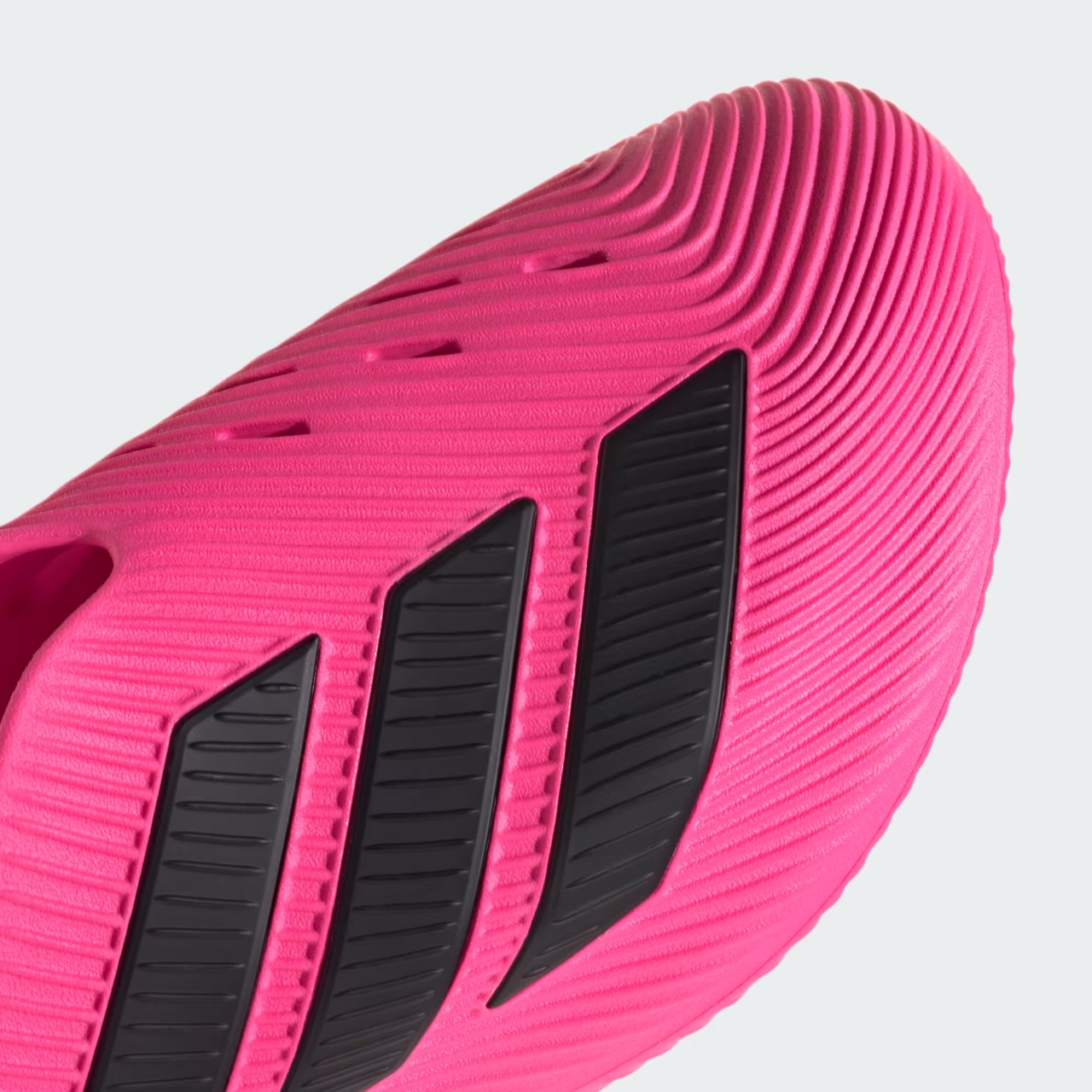
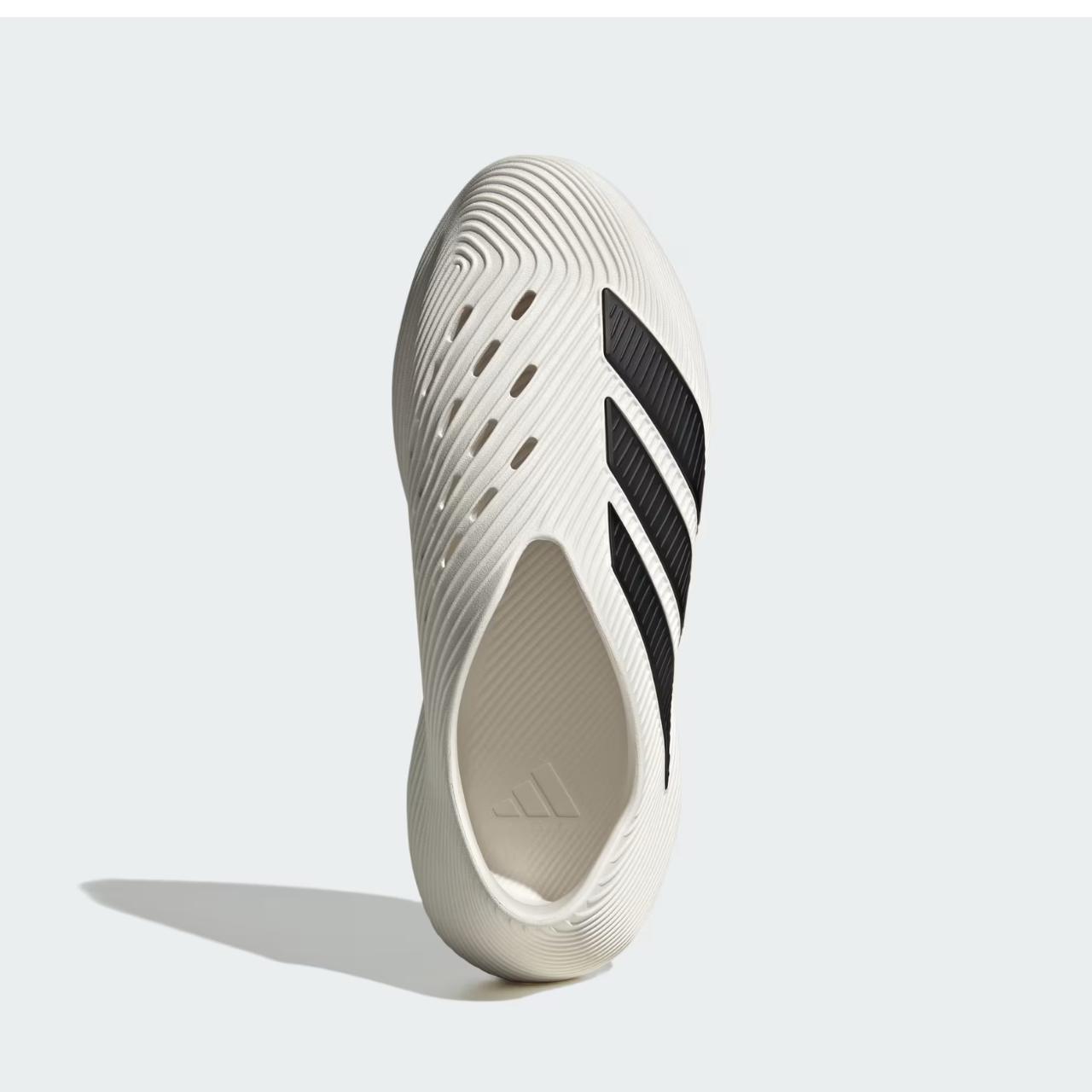
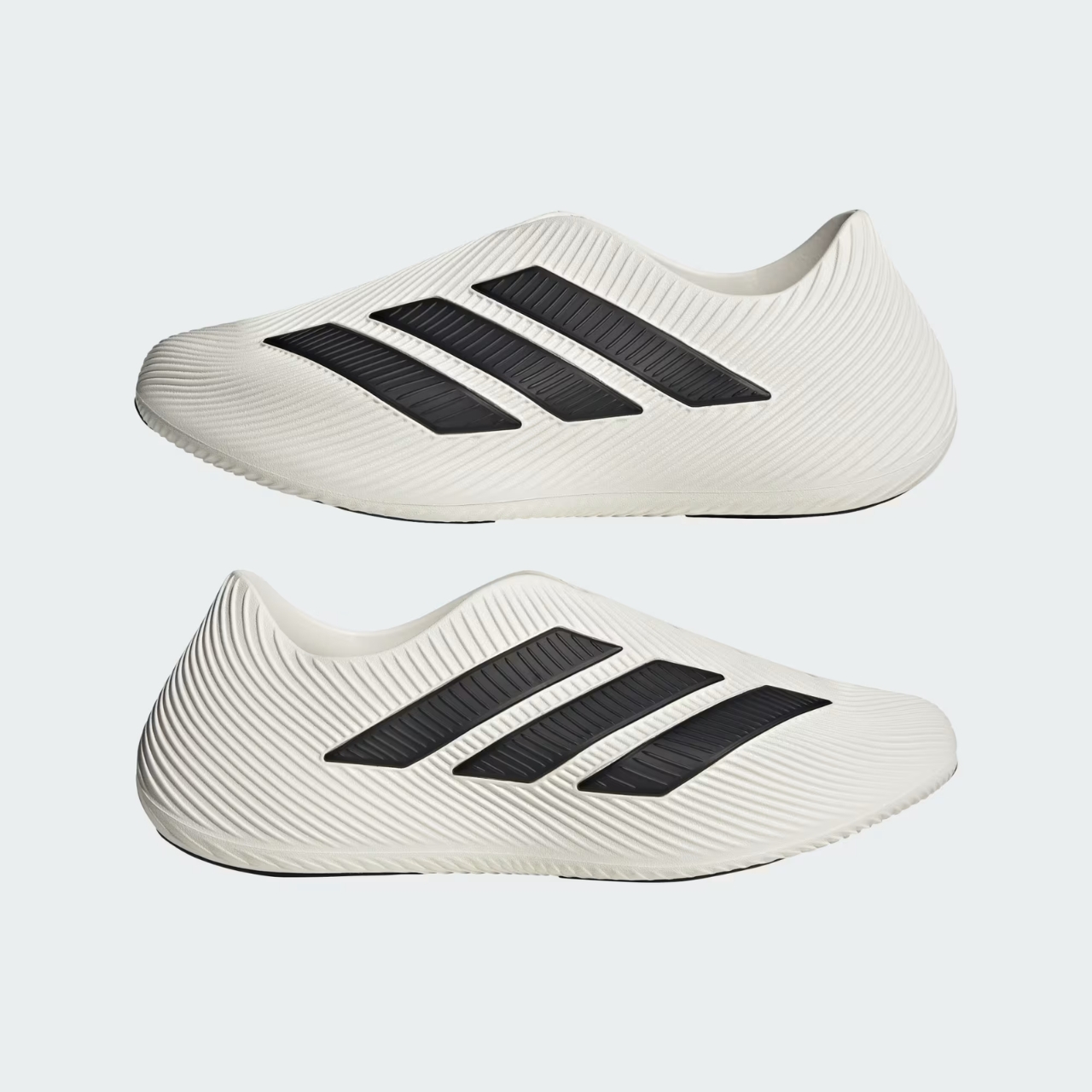
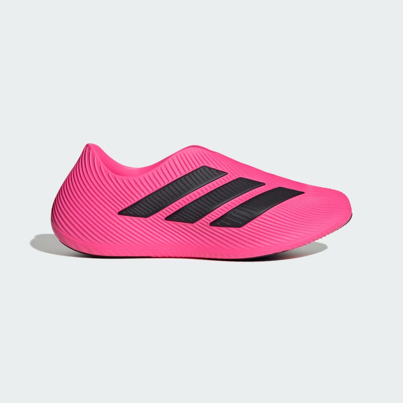
Adidas Purechill: The Sculptural Shoe Redefining Recovery

Look, I’ll be honest. When I first saw photos of the Adidas Purechill Runner, I thought someone had accidentally uploaded concept renders of a Frank Gehry building instead of a shoe. And honestly? That’s exactly what makes this thing so interesting.

Recovery footwear has quietly become one of the sneaker industry’s hottest categories, and for good reason. After a brutal workout, a long travel day, or honestly just existing in 2025, our feet deserve better than being shoved into whatever ratty slides are sitting by the door. Brands have been experimenting with everything from foam clogs to tech-enhanced designs, but Adidas just dropped something that looks less like footwear and more like wearable architecture.

Designer: Adidas

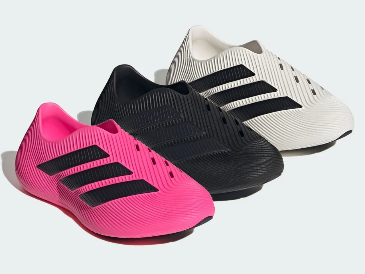
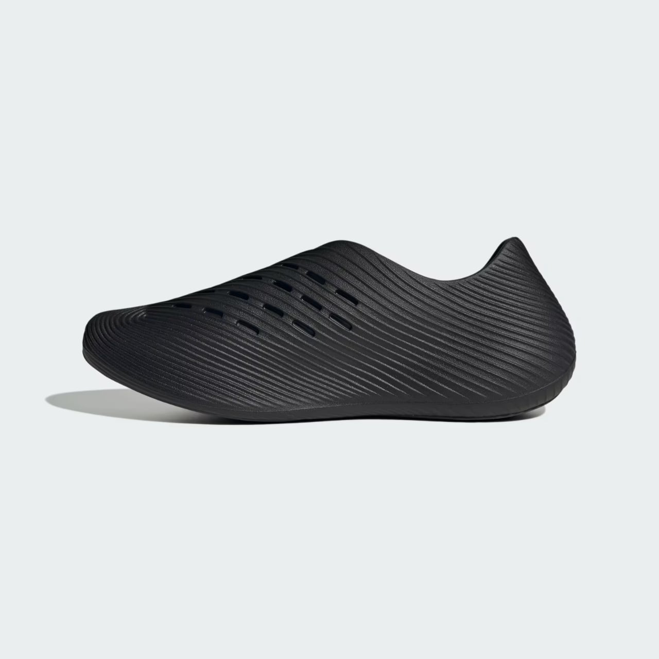
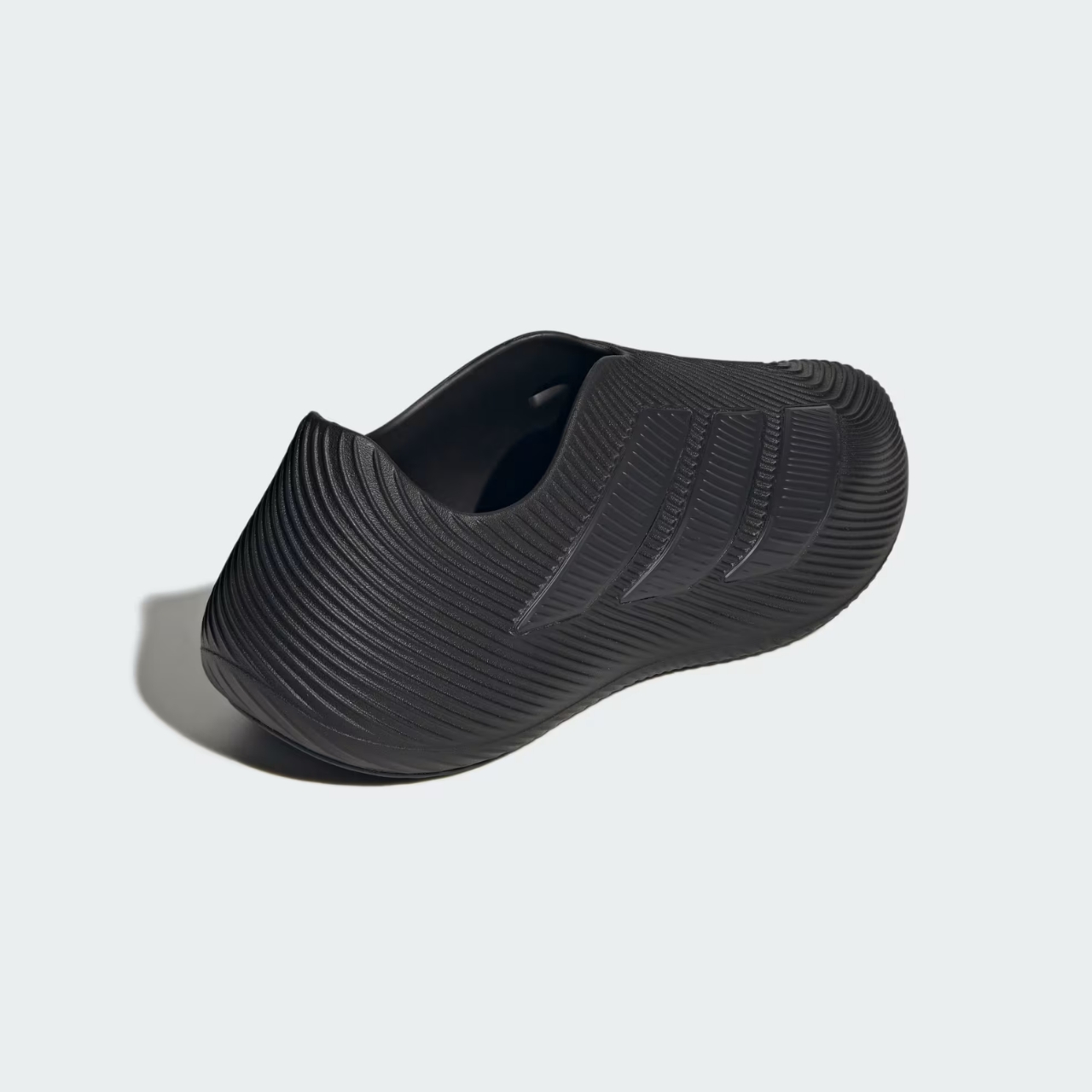
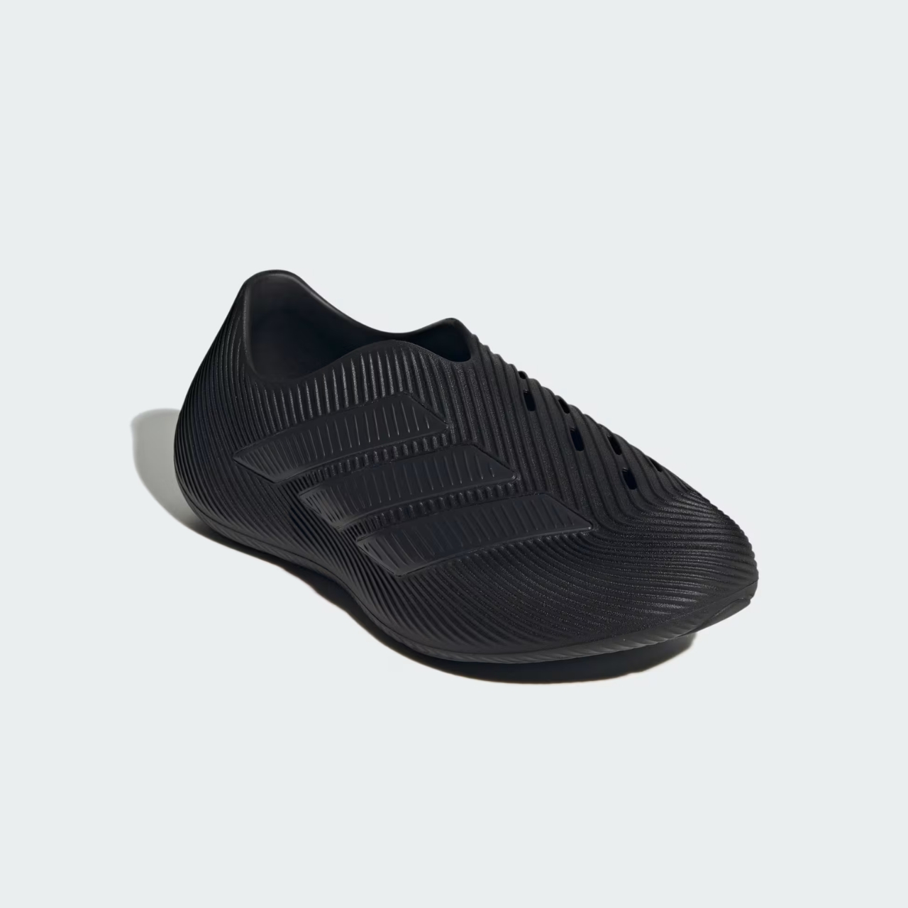
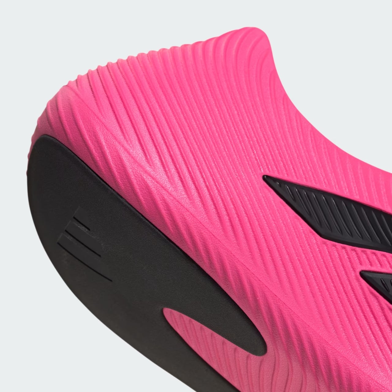
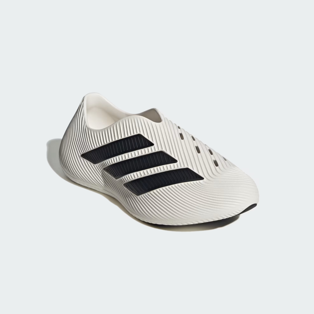
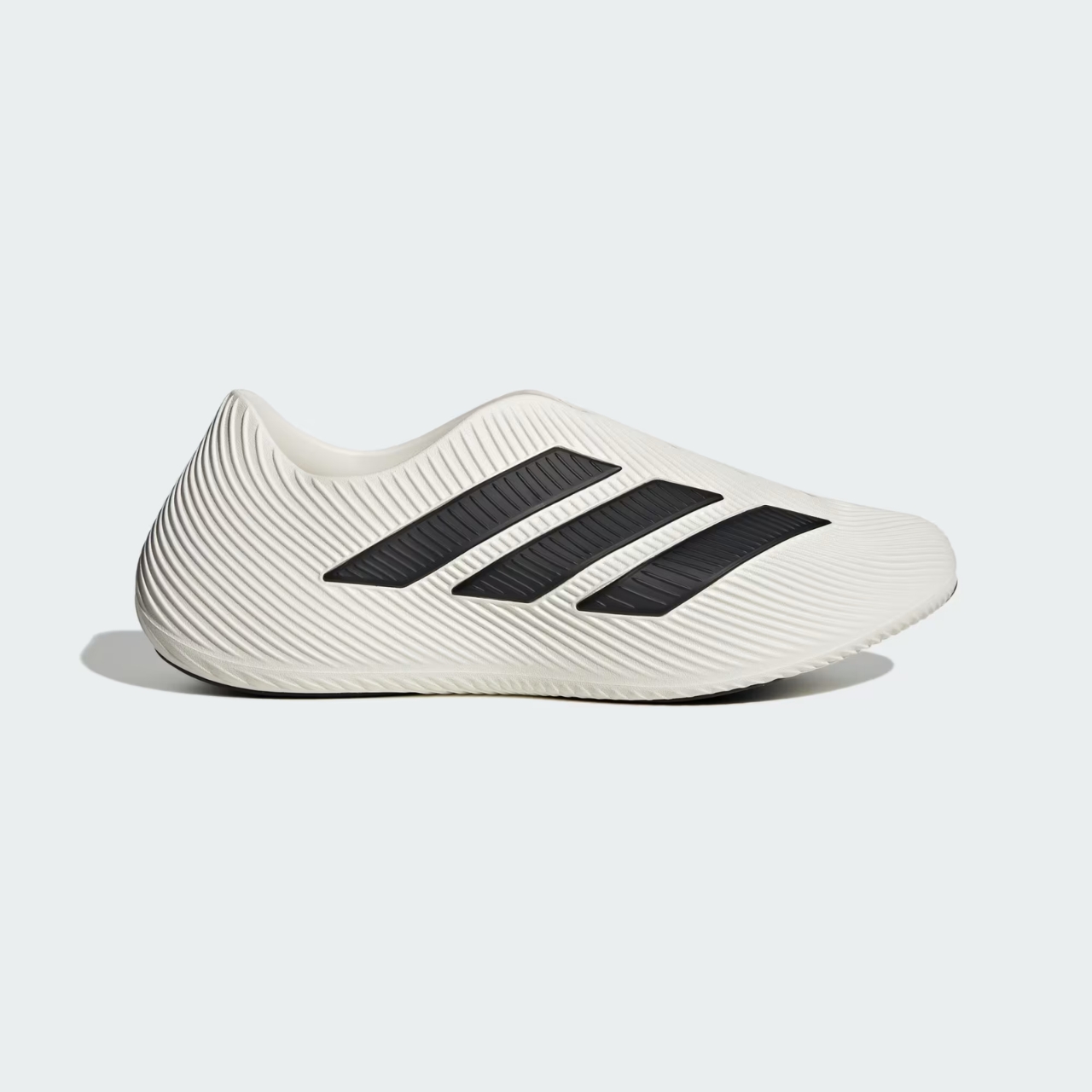
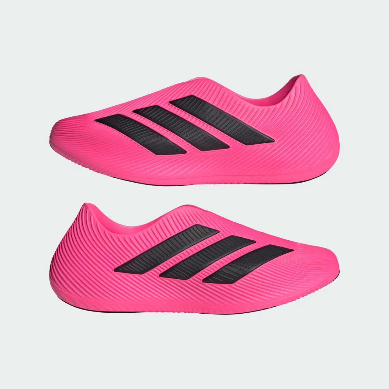
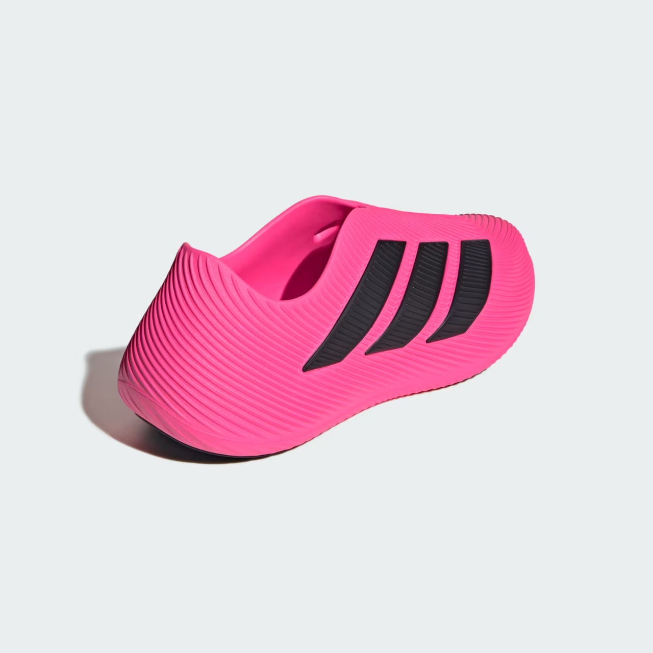
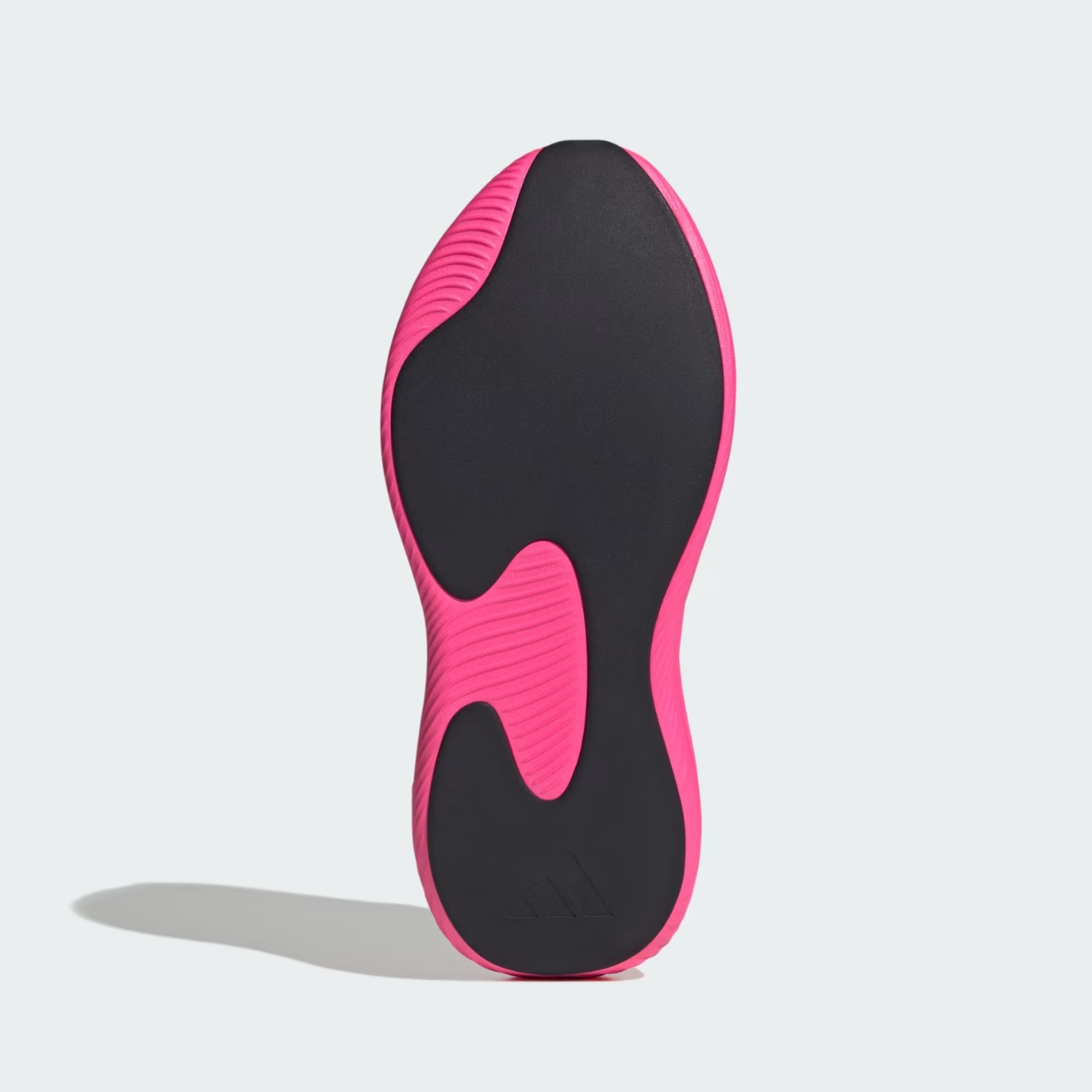
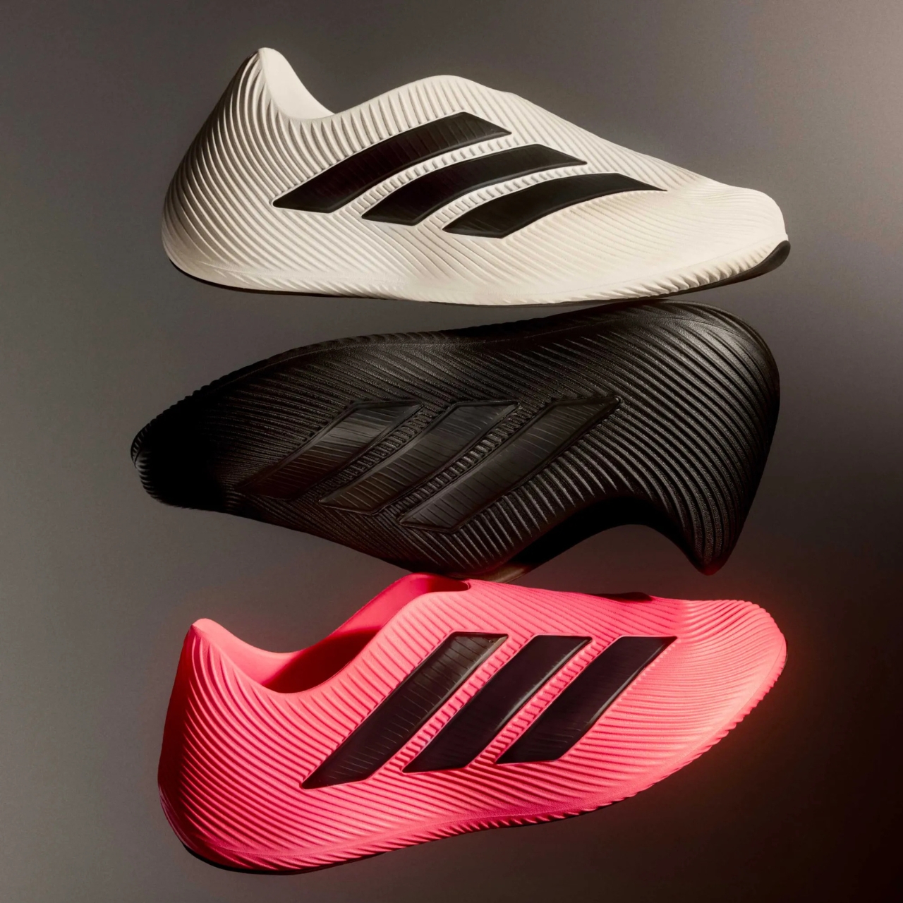
The Purechill Runner sits somewhere between a shoe and a sculpture, featuring a fully synthetic foam construction that’s both futuristic and oddly organic. The design language here is bold, with sweeping grooved patterns running across the surface and ventilated perforations that don’t just look cool but actually serve a purpose. This isn’t decoration for decoration’s sake. The molded upper cage channels airflow throughout the entire shoe, creating what Adidas calls 360-degree ventilation. In practical terms, your feet can actually breathe instead of marinating in their own misery.

What’s really clever about the Purechill is that it draws from Adidas’ data-driven approach to footwear design, similar to their 3D-printed ClimaCool shoes. Those models used stress-point mapping to figure out exactly where feet need support, and Adidas applied that same thinking to create a recovery shoe. It’s the kind of smart crossover that makes you wonder why more brands aren’t doing this.

The construction is deceptively simple. It’s a single-piece, injected EVA build that delivers an ultra-soft sensation under and around your foot. Hidden inside is an EVA midsole that handles the actual cushioning work, keeping you comfortable whether you’re shuffling around post-run or navigating airport terminals. Unlike some foam shoes that feel like stepping on clouds but offer zero stability, the Purechill includes TPU-molded Three Stripes branding on the lateral side that adds structural support while doubling down on that aggressive design aesthetic.

And here’s where Adidas got practical. The shoe features a full-length rubber outsole, which makes it more durable and reliable than early versions of the ClimaCool that tended to wear out quickly. This isn’t just a house shoe. You can actually walk around in these without worrying they’ll fall apart after a week. The slip-on design means no fussing with laces when your hands are full or you’re just too exhausted to care. It’s the kind of thoughtful detail that sounds minor until you’re trying to get shoes on while juggling bags, coffee, and your general will to exist. The shoes launch in multiple colorways, specifically Core Black, Core White, and a very bright Lucid Pink.

At $75, the Purechill Runner positions itself in an interesting sweet spot. It’s more expensive than basic slides but significantly cheaper than some of the premium recovery shoes flooding the market. You’re paying for legitimate design innovation and functional comfort, not just hype. What’s fascinating about this release is how it reflects our evolving relationship with athletic footwear. Recovery shoes represent a shift in thinking. They acknowledge that what happens after the workout, after the competition, after the hustle matters just as much as the performance itself. Athletes have known this forever, but now everyday consumers are catching on.

The Purechill Runner might look unconventional, but that sculptural quality is part of its appeal. It’s a conversation starter, a design object that happens to be incredibly comfortable. In a market saturated with variations on the same basic silhouettes, Adidas created something that genuinely stands out.

Whether you’re an actual runner looking for post-race relief or just someone who appreciates when design and function collide in interesting ways, the Purechill deserves attention. It’s proof that recovery footwear doesn’t have to be boring, and that sometimes the best innovations come from applying performance insights to everyday comfort. Your feet will thank you, and you might just feel a little cooler wearing what essentially amounts to architectural sculpture.

The post Adidas Purechill: The Sculptural Shoe Redefining Recovery first appeared on Yanko Design.

7 Best Fall-Inspired Designs That Ditch Basic Pumpkin Décor

Autumn is a study in warmth, texture, and tone – a season that favours depth over decoration. While others reach for pumpkin spice everything and orange plastic gourds, these designs capture fall’s essence through terracotta and forest green, reflecting the quiet transformation of nature. In design, these colours bring calm energy and grounded elegance, transforming functional objects into tactile expressions of comfort and craftsmanship.

These seven designs prove you don’t need seasonal clichés to celebrate fall. Through texture, materiality, and muted richness, each product embodies a connection to nature – one that is subtle, enduring, and timeless. Together, they form a narrative of balance, where modern living meets the organic beauty of autumn’s tones without a single jack-o’-lantern in sight.

1. Clay Products – Design That Begins with the Earth

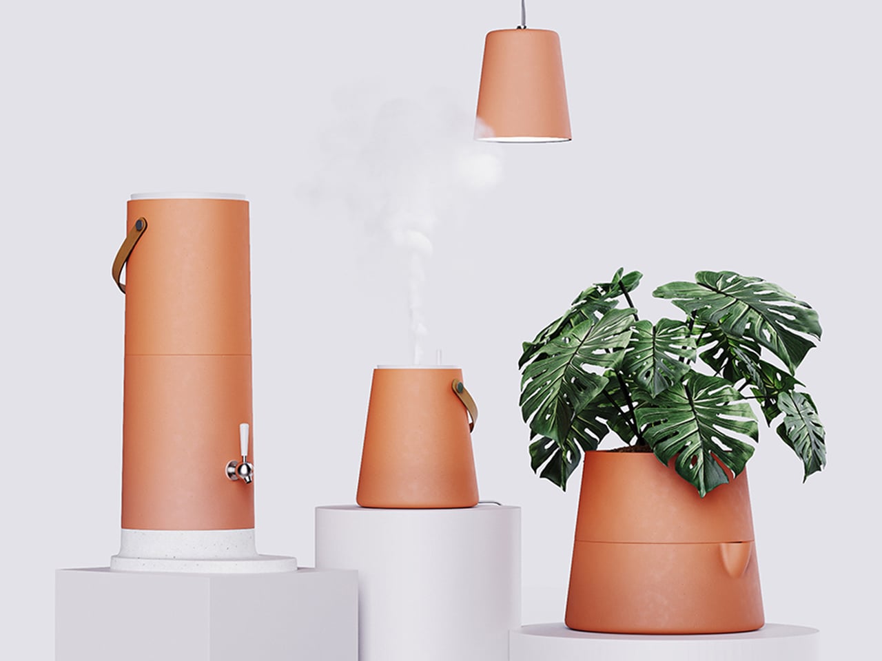
Forget foam pumpkins – clay offers something far more authentic. This ancient material’s tactile texture and thermal balance make it ideal for creating objects that breathe, cool, and connect with their environment. The natural terracotta palette radiates warmth, grounding modern interiors in authenticity and quiet beauty that lasts beyond October.

Beyond its function, clay represents craft, culture, and continuity. Whether shaped into planters, vessels, or humidifiers, it invites sustainability through simplicity. Each curve and imperfection tells a story of touch – a perfect reflection of autumn’s imperfect yet graceful rhythm between art and earth.
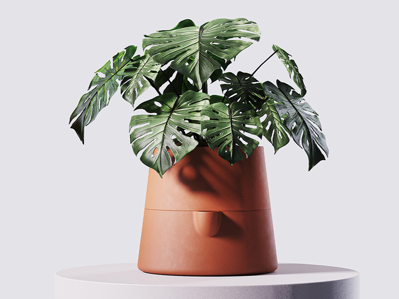
 

Clay filters are a household staple in Brazil, and designer Lucas Couto extends their legacy by incorporating clay into lamps, filters, and humidifiers. Celebrated for its natural, affordable, and versatile qualities, clay brings both warmth and function to contemporary homes. Couto honours traditional craftsmanship while adding thoughtful details like a handle for the upper reservoir and a base for supporting a glass, drawing inspiration from clay’s natural cooling properties.
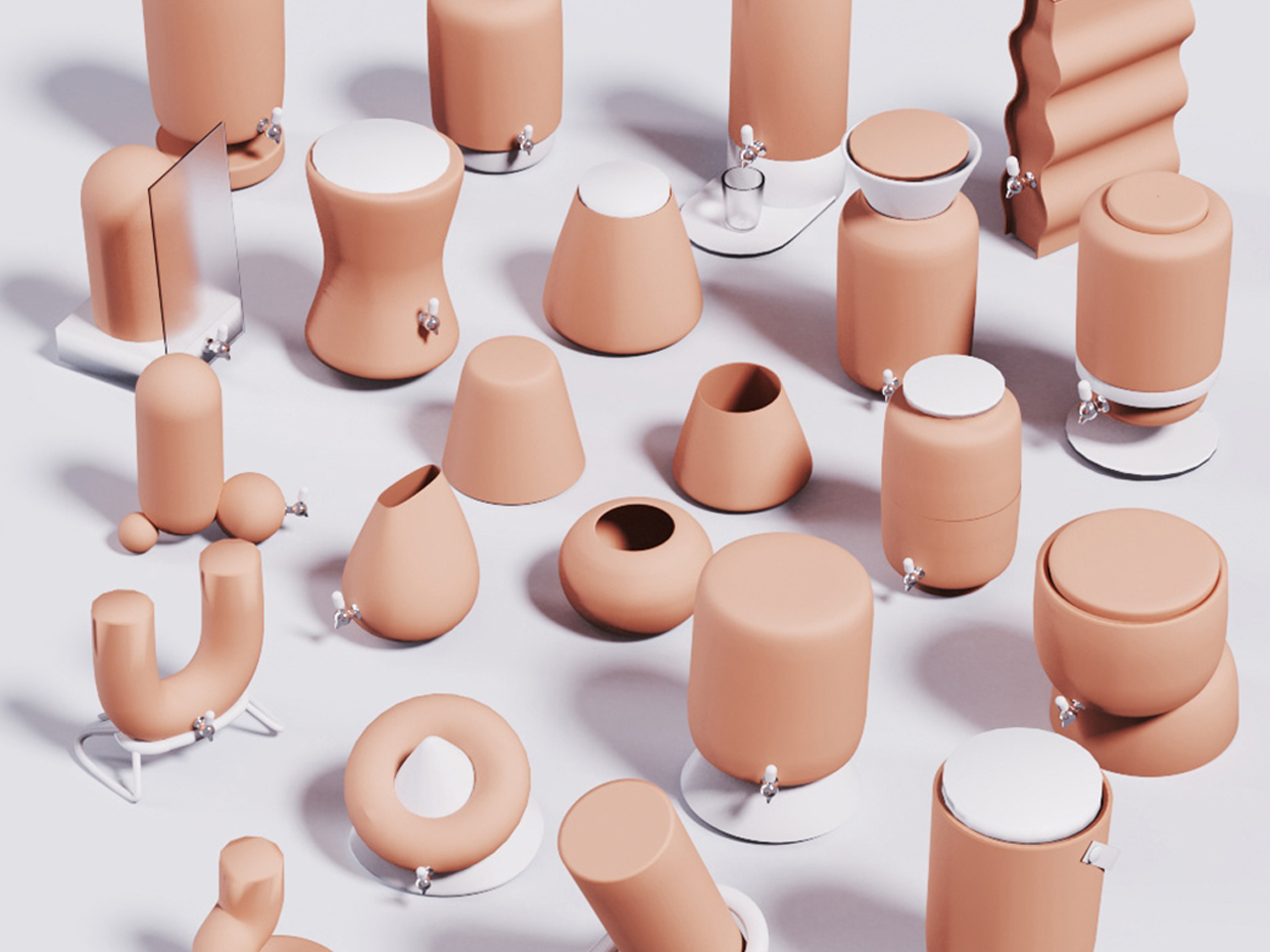
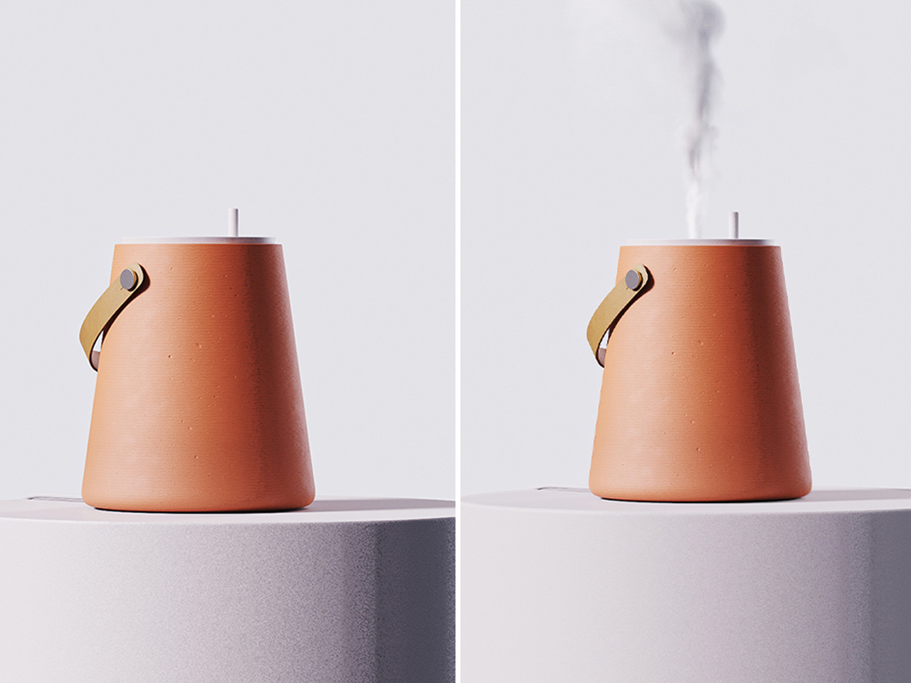
His creations offer a multi-sensory experience through terracotta’s rich colour, texture, and earthy aroma. The collection includes a humidifier, planter, and lamp, each blending tactile beauty with functionality, celebrating clay’s organic elegance in everyday living—no seasonal gimmicks required.

2. Lighting Design – Where Warmth Takes Shape

Real fall ambiance comes from light, not plastic harvest decorations. Lighting defines the mood of a space, especially during fall, when days shorten and evenings invite softness. Designs in forest green or amber tones mimic nature’s fading glow, evoking warmth and intimacy. Sculptural silhouettes and modular forms bring visual rhythm to otherwise quiet interiors.

Modern lighting celebrates both geometry and emotion. Whether diffused or directional, it transforms function into atmosphere. In terracotta and brass, it glows with autumnal richness, capturing the transient beauty of sunlight filtered through changing leaves – subtle, poetic, and endlessly comforting.
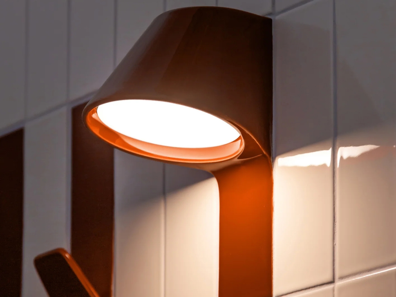
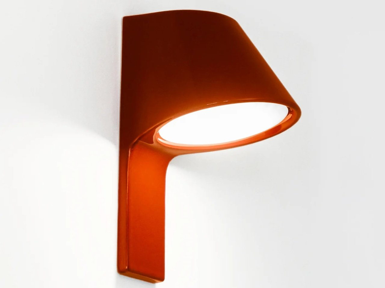
The UU Tiles project by Paris-based studio Unknown, Untitled represents a refined synthesis of functionality and aesthetic innovation. Drawing subtle parallels to the organic warmth of terracotta and the rich tones of autumn, these minimalist tiles integrate lighting, electrical access, and airflow directly into their architectural framework. The result is a contemporary design solution that harmonises practicality with visual sophistication, transforming ordinary surfaces into interactive, multi-sensory elements that feel seasonal without screaming Halloween.
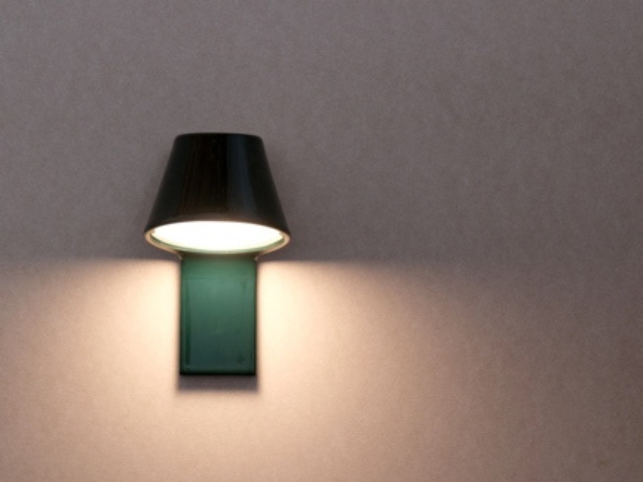
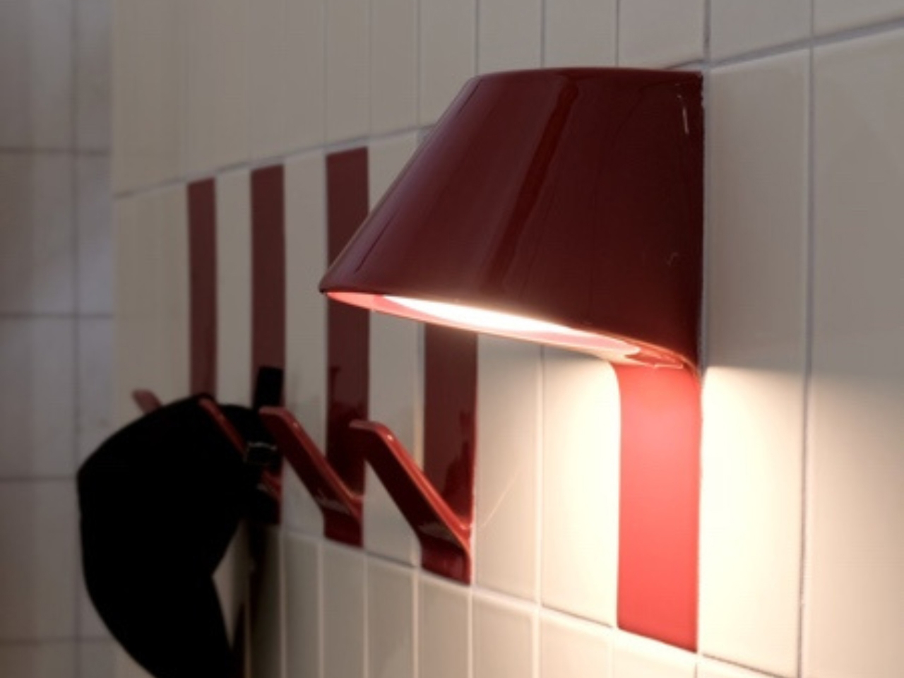
At the core of this collection lies the UU Tiles Lamp, a seamless extension of the wall that emits a gentle, autumn-inspired glow. More than a lighting fixture, it functions as a sculptural architectural component, embodying the studio’s pursuit of balance between form, atmosphere, and functionality.

3. Fluid Furniture – A Sculptural Embrace

Sophisticated fall style flows like autumn winds – not inflatable yard décor. Fluid furniture celebrates the art of continuous motion. With its seamless lines and organic curves, it reflects the natural flow of wind and water – a harmony that is echoed in autumn’s quiet transitions. Crafted from wood, leather, or resin, it embodies a craftsmanship that feels both tactile and timeless.

Each piece balances strength and grace, offering structure without rigidity. The use of rich materials and sculpted contours creates a visual softness ideal for modern interiors. It’s furniture that feels alive – breathing with the space around it and evolving with the season’s changing light, far more elegant than any seasonal tchotchke.
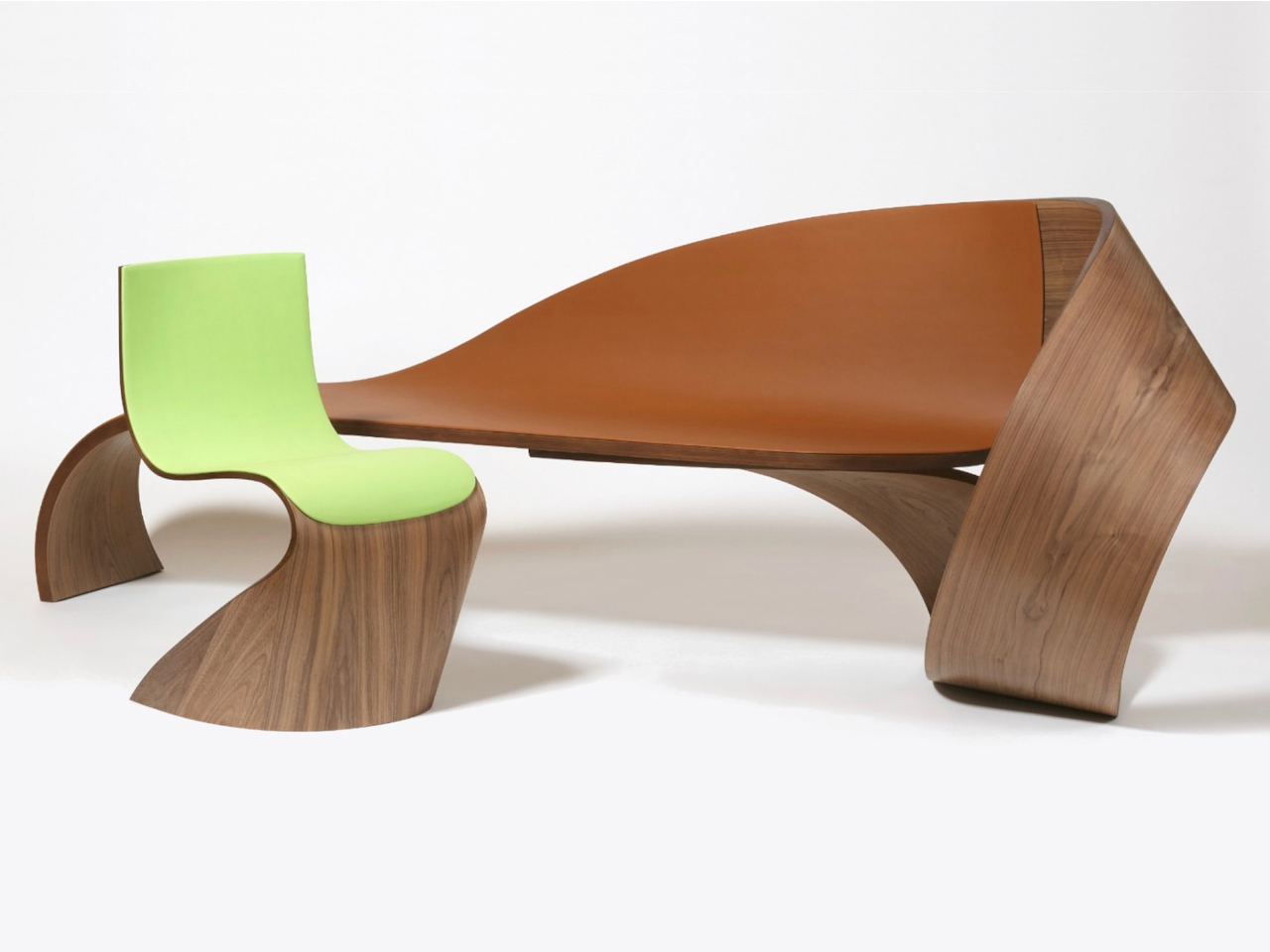
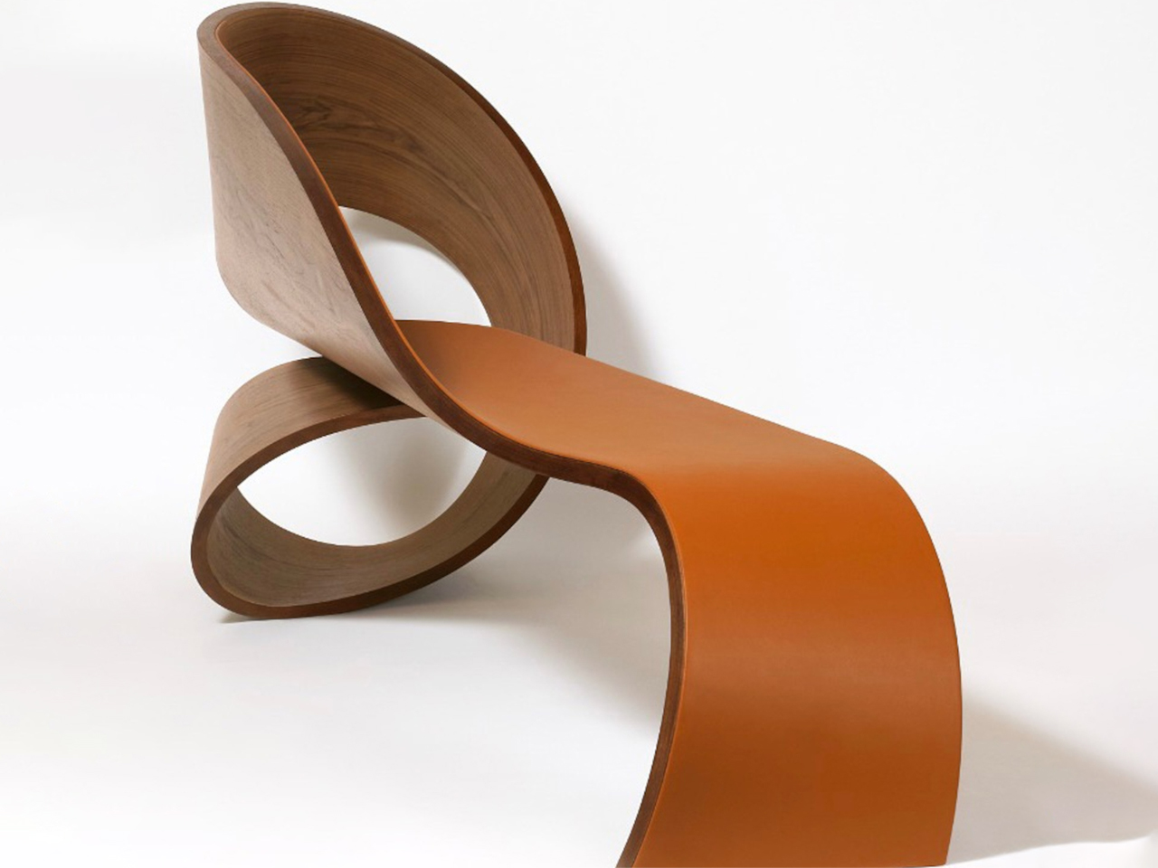
French fashion house Longchamp brings a touch of autumn warmth to interiors with its first furniture collection, created in collaboration with designer Pierre Renart. Echoing the earthy tones of terracotta and the organic spirit of fall, the collection fuses Longchamp’s renowned leather craftsmanship with Renart’s fluid woodworking. The Wave bench, upholstered in cashew-toned leather, captures the softness of natural materials and the gentle movement of fabric, embodying elegance and warmth.
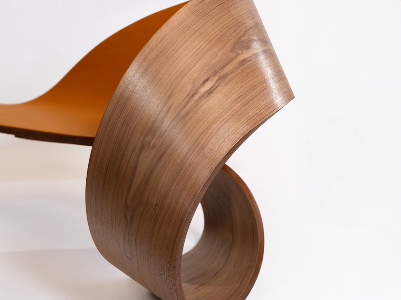
The Ruban chairs complement this palette with shades inspired by forest greens and sunlit browns, evoking the hues of fall foliage. Together, they celebrate craftsmanship, sustainability, and timeless seasonal beauty that never goes out of style when November arrives.

4. Coffee Table – A Bold Accent in Clay Red

Skip the pumpkin-shaped serving trays – a statement coffee table grounds your fall aesthetic. A coffee table anchors a living room, both visually and functionally. In earthy tones like terracotta or deep red, it becomes the focal point – a grounding presence that radiates warmth. Designs often combine geometry and storage, merging practicality with expressive form.

Beyond its purpose, the coffee table invites connection – a surface for books, conversation, and ritual. Whether minimal or sculptural, it captures the essence of modern living: simplicity enriched by texture, colour, and thoughtful proportion.
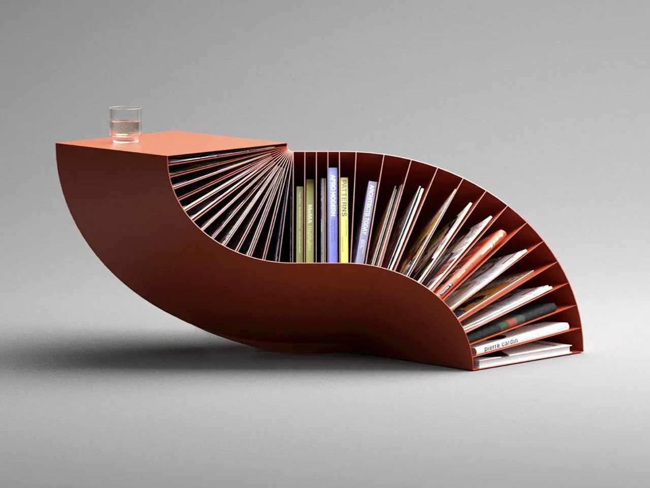
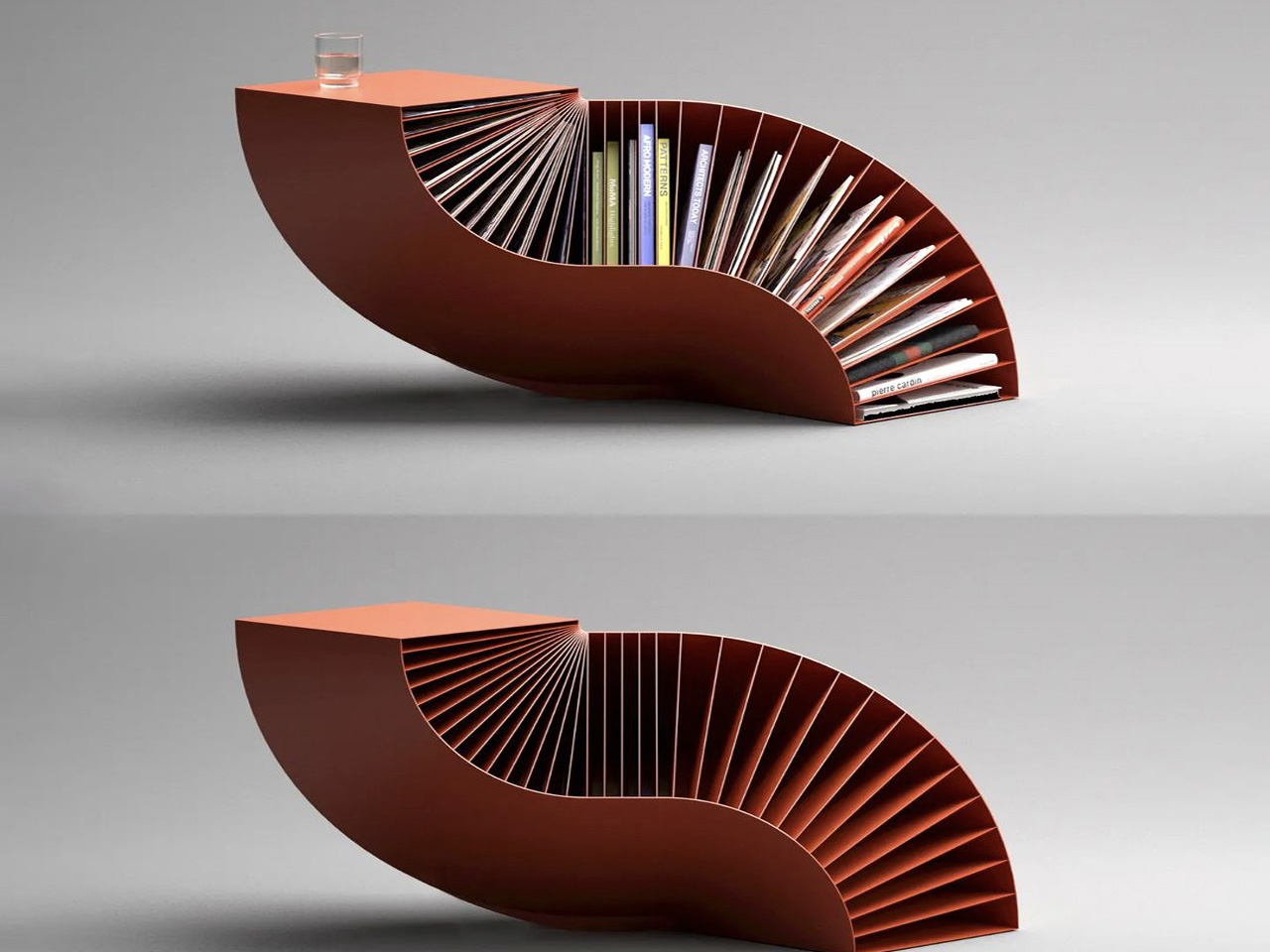
The Bookpet coffee table by designer Deniz Aktay embodies the warmth and elegance of terracotta hues, perfectly echoing the rich tones of autumn interiors. Crafted from a double-bent cuboid structure, its sculptural silhouette adds visual depth while offering built-in storage for books and magazines. The fluid lines and earthy palette create a sense of movement and comfort, making it a statement piece for contemporary living spaces.
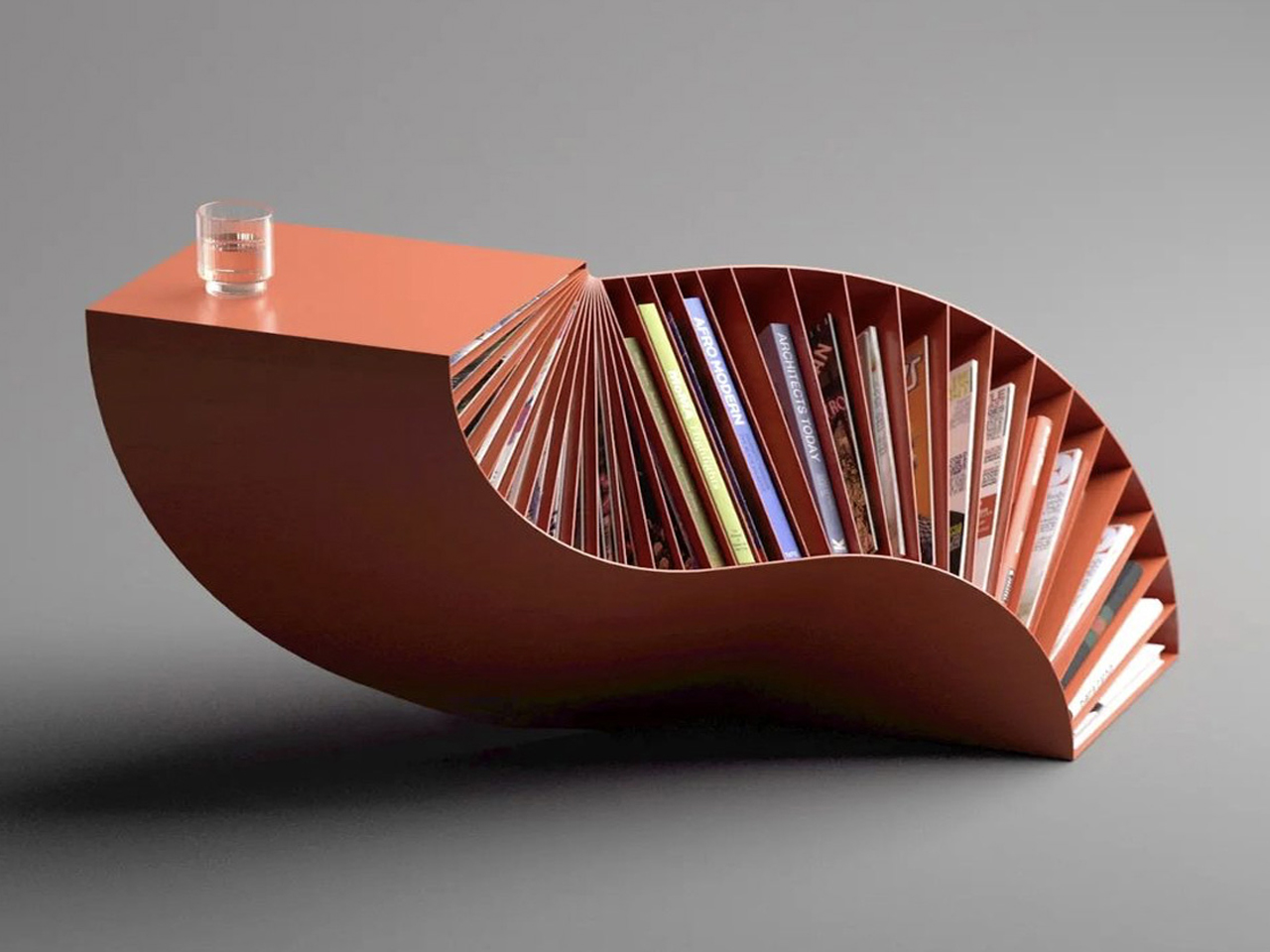
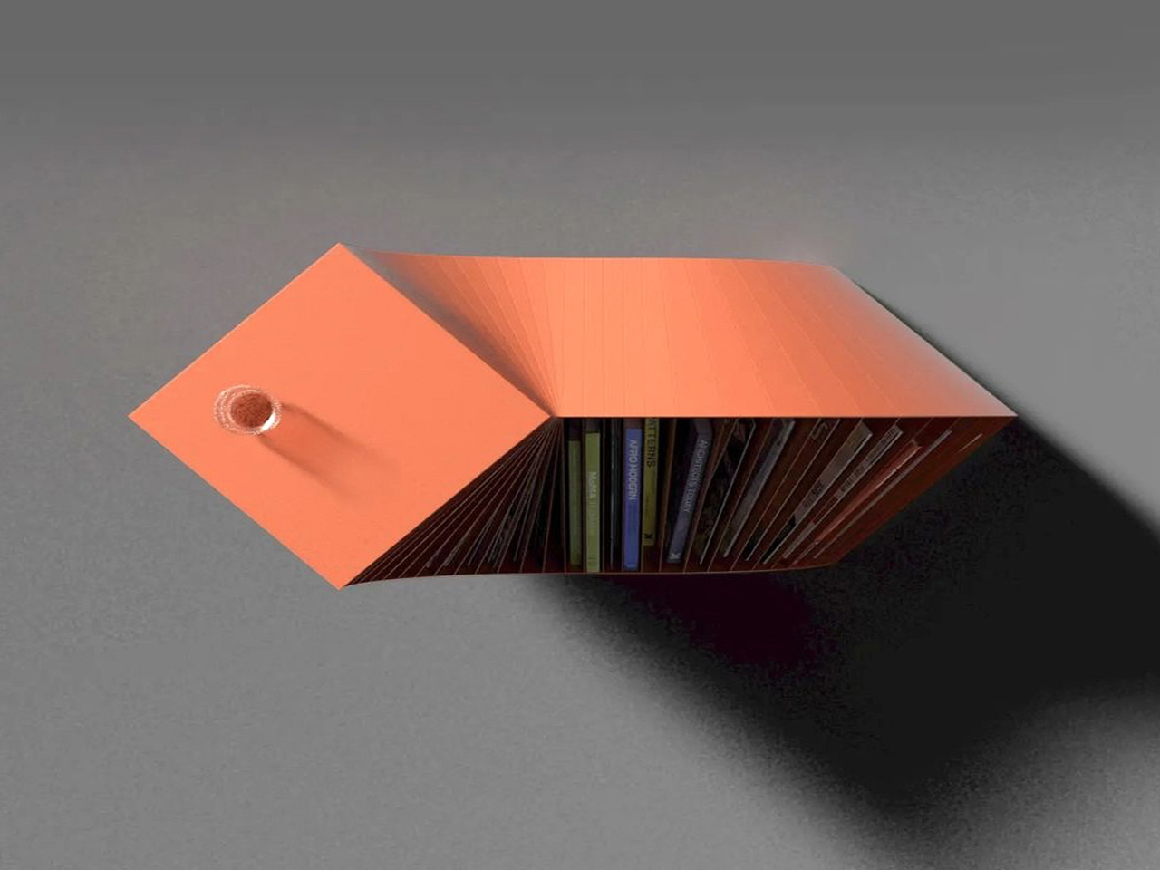
Designed for compact modern homes, Bookpet balances form, function, and seasonal warmth. Its terracotta-inspired finish complements fall décor, while the integrated nooks provide practical organisation – capturing the essence of cosy, organic, and thoughtfully crafted design that celebrates the season year-round.

5. Range Hood – Clean Air, Clear Mind

Nothing says sophisticated fall cooking like a kitchen that doesn’t rely on pumpkin spice candles to mask odours. The range hood is where performance meets aesthetic restraint. In contemporary kitchens, it’s no longer just an appliance but a quiet design statement. Compact, sleek, and minimal, it ensures clean air while blending into its surroundings with seamless precision.

Muted finishes like matte green or brushed metal soften its presence, allowing harmony within the cooking space. It represents how innovation can coexist with calm – a balance between efficiency and beauty that aligns perfectly with fall’s unhurried spirit.
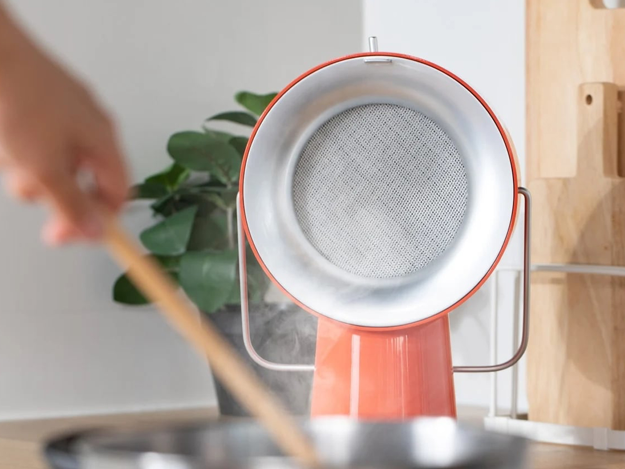
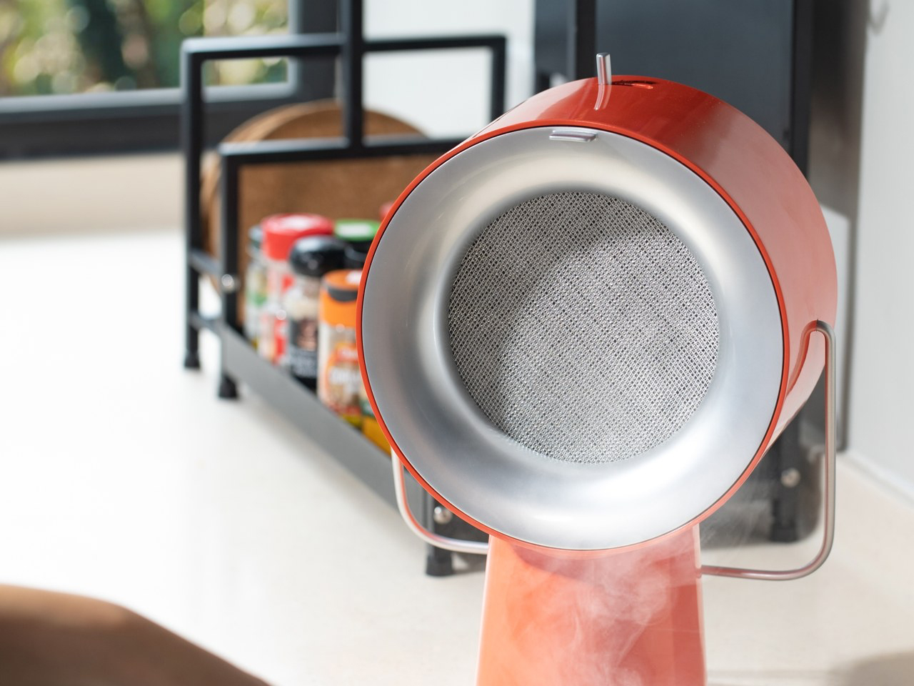
Home-cooked meals are ideal, but the mess and lingering smells from stovetop cooking often discourage the habit. The AirHood solves this by drawing in smoke and oily fumes before they stain walls and counters, helping you cook without dreading the clean-up. Its warm terracotta finish blends beautifully with autumn-toned kitchens and cosy seasonal palettes.
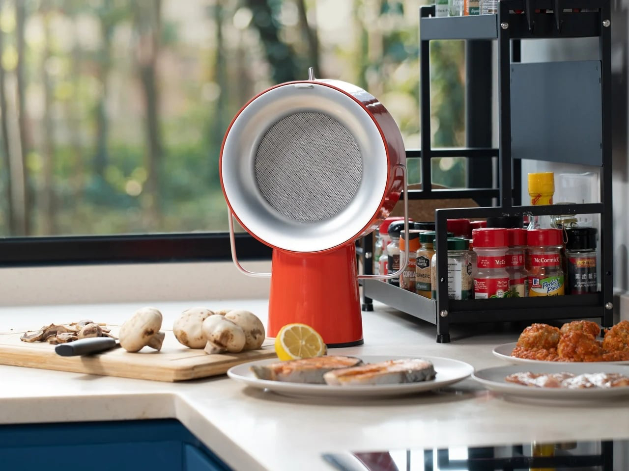
Charcoal filters neutralise odours, while a stainless-steel oil filter traps grease that would otherwise cling to surfaces. Both are easy to remove and clean. Portable and optionally wireless, the AirHood delivers a calm, cleaner cooking ritual – especially welcome as kitchens shift to earthier fall hues without the kitsch.

6. Desk Organizer – Nature’s Order at Your Fingertips

Bring fall to your workspace without the miniature pumpkin parade. A well-designed desk organiser creates visual calm amid daily chaos. Drawing inspiration from leaves, pebbles, or branches, it brings organic balance to modern workspaces. The use of natural textures and earthy colours evokes tranquillity while maintaining functionality.

Each element, including a tray, stand, or holder, becomes a sculptural accent rather than clutter. Terracotta or forest tones add grounded beauty to productivity, turning everyday organisation into a design ritual rooted in mindfulness and grace – not seasonal gimmicks.
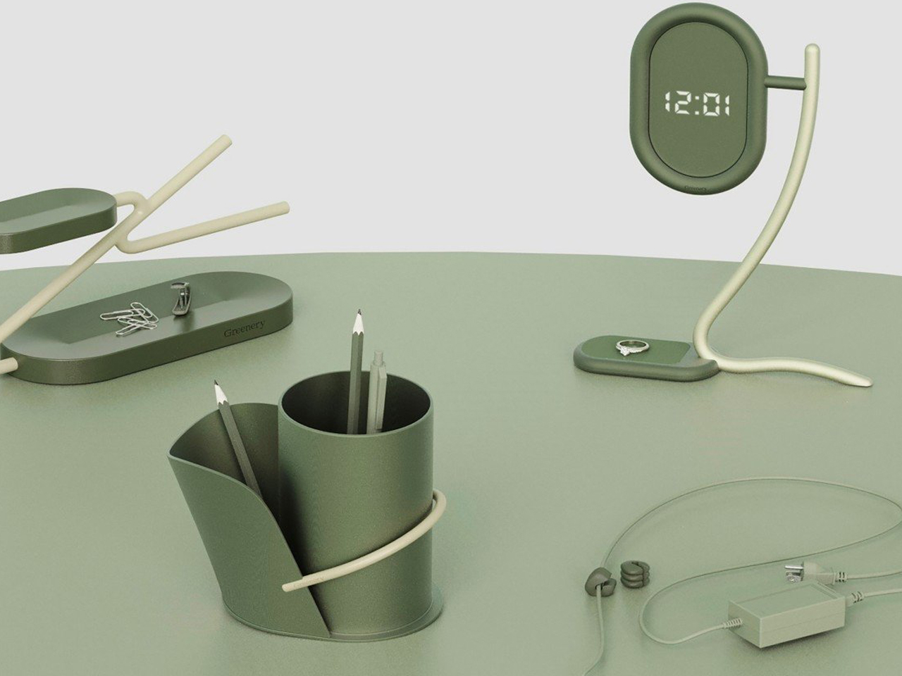
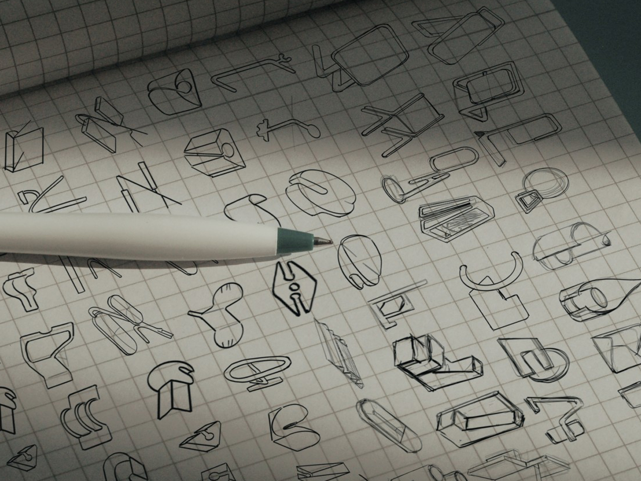
Workplace stress is often addressed with tidy desks, inspiring objects, and a touch of greenery, although real plants aren’t always practical. These nature-inspired accessories offer the same calming cue without maintenance. Rendered in deep forest green and muted autumn hues, they bring a grounded, seasonal warmth to the desktop while keeping the footprint minimal.
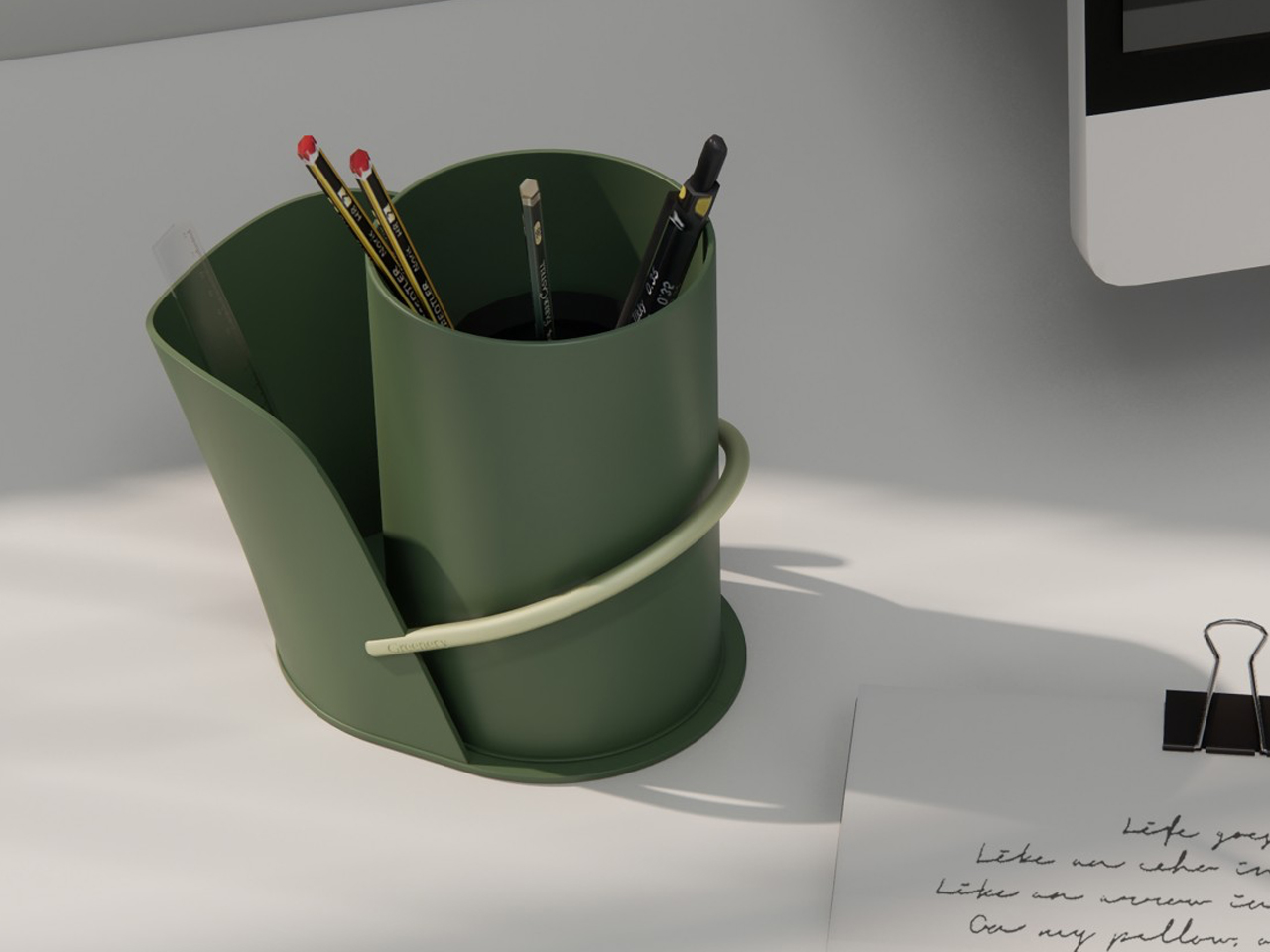
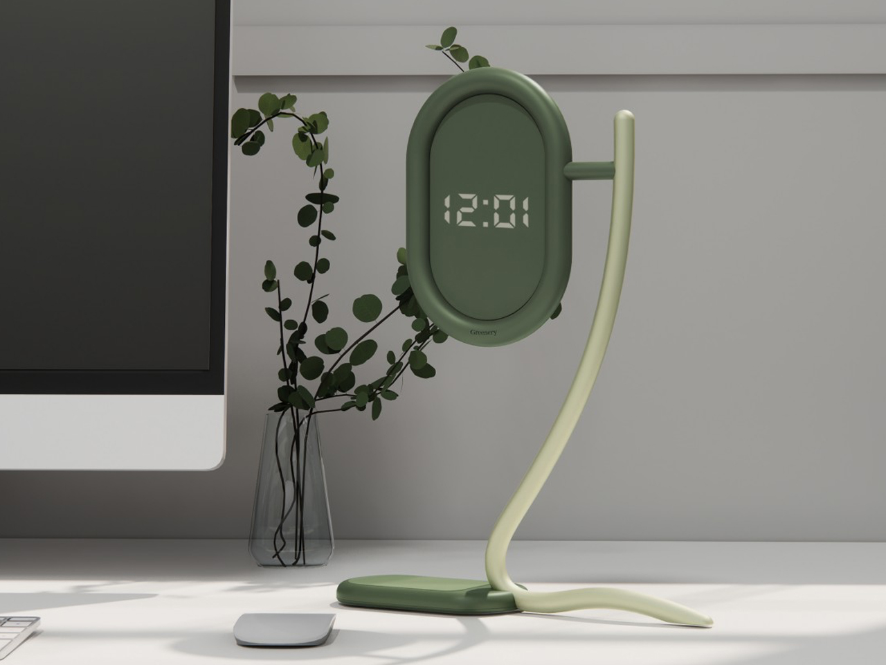
Rather than mimic plants literally, each piece abstracts stems and leaves into useful forms: a bamboo-like pencil holder with dual compartments, a curved “leaf” clock with a built-in tray, a tiered tray with hooks, and a subtle cable holder. Simple, elegant, and timeless – the anti-pumpkin approach to fall design.

7. Watch – Time, Reimagined in Metal and Fire

Why wear a watch with cartoon pumpkins when you can wear NASA’s rocket? A watch transforms timekeeping into personal expression. Modern designs balance technical precision with craftsmanship, often blending metals, ceramics, and glass. When accented with copper or red undertones, it mirrors the warmth of fall’s shifting light.

The watch embodies rhythm – not just in seconds but in seasons. Its enduring form reminds us that design can reflect both progress and pause, merging function with emotion in a single glance.
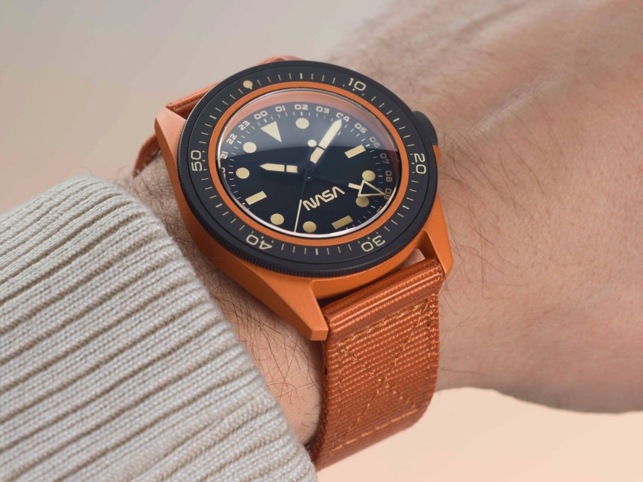
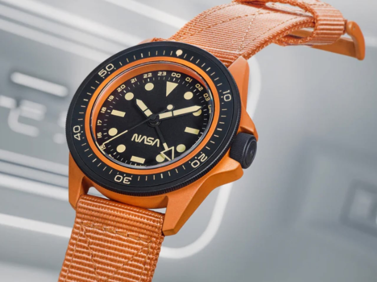
The U1-SPG “NASA Artemis” Limited Edition from Unimatic x Massena LAB translates the burnt-orange glow of NASA’s Space Launch System to the wrist. Limited to 99 pieces, its 40mm steel case wears a terracotta-hued Cerakote finish, evoking autumn warmth while honouring the Artemis rocket. A charcoal bezel, GMT hand, and Old Radium luminescent markers provide functional contrast, balancing style with practicality.
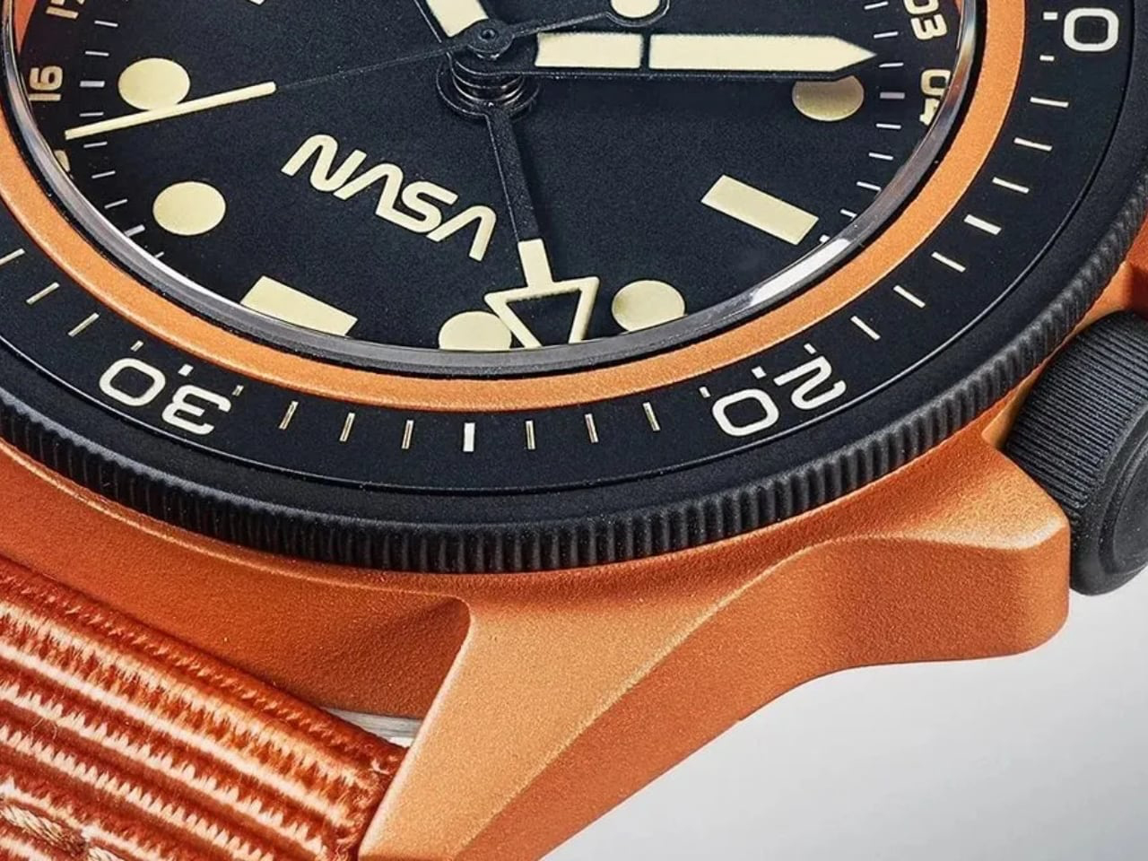
Rated to 300m and powered by the reliable Seiko NH34A movement, it comes with autumn-toned straps and a NASA mission patch. This limited-edition watch blends collectible prestige with everyday wearability, offering cosmic ambition wrapped in seasonal hues – proof that fall style doesn’t need to be literal.
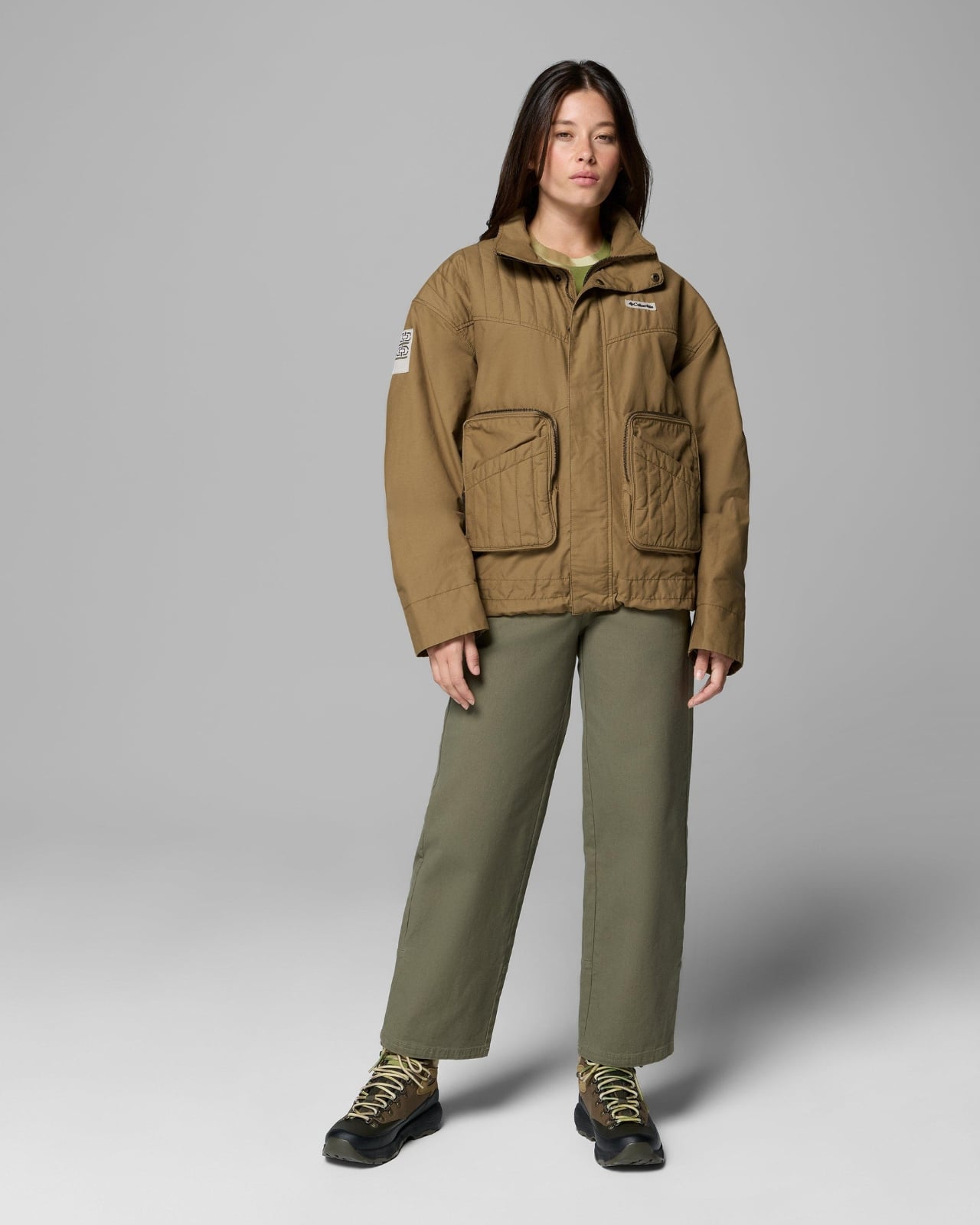
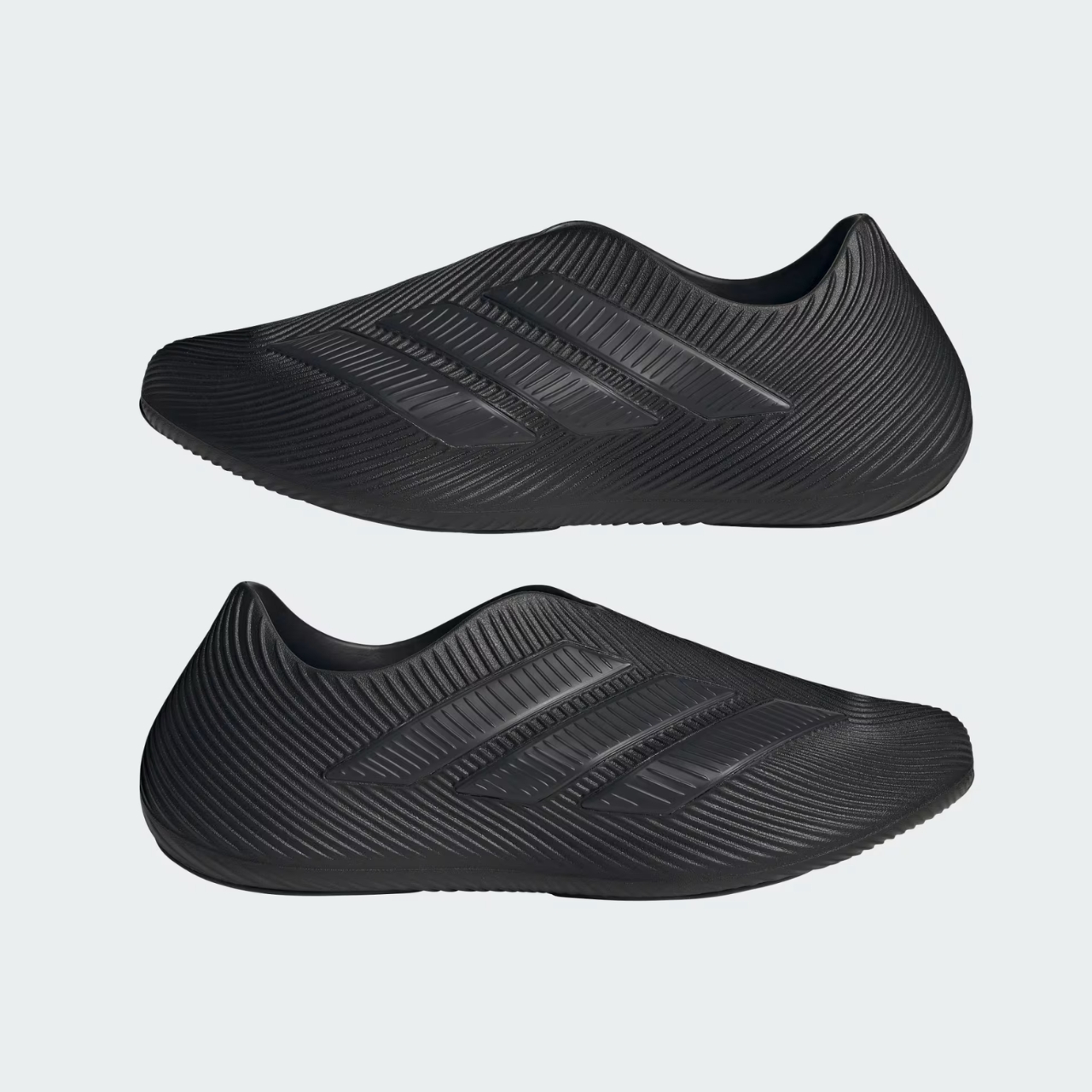
These terracotta and forest-green designs capture the essence of fall through sophisticated, earthy tones and seasonal warmth. Without relying on traditional pumpkin motifs or throwaway seasonal décor, they bring autumn-inspired style, comfort, and personality into your home and lifestyle – designs that work in September, stay beautiful through November, and never feel like they belong in a clearance bin come December.

The post 7 Best Fall-Inspired Designs That Ditch Basic Pumpkin Décor first appeared on Yanko Design.