Every April, you could spend an entire week in Milan chasing novelty. Salone del Mobile is full of it: the flashy, the concept-heavy, the beautifully photographed pieces that look better in a press release than they ever would in a real room. That’s what makes the Ori chair by Giuseppe Bavuso for Rimadesio so easy to stop at. It looks just as interesting on paper as it probably does in person, and against everything else being shown this week, that’s already a significant thing.
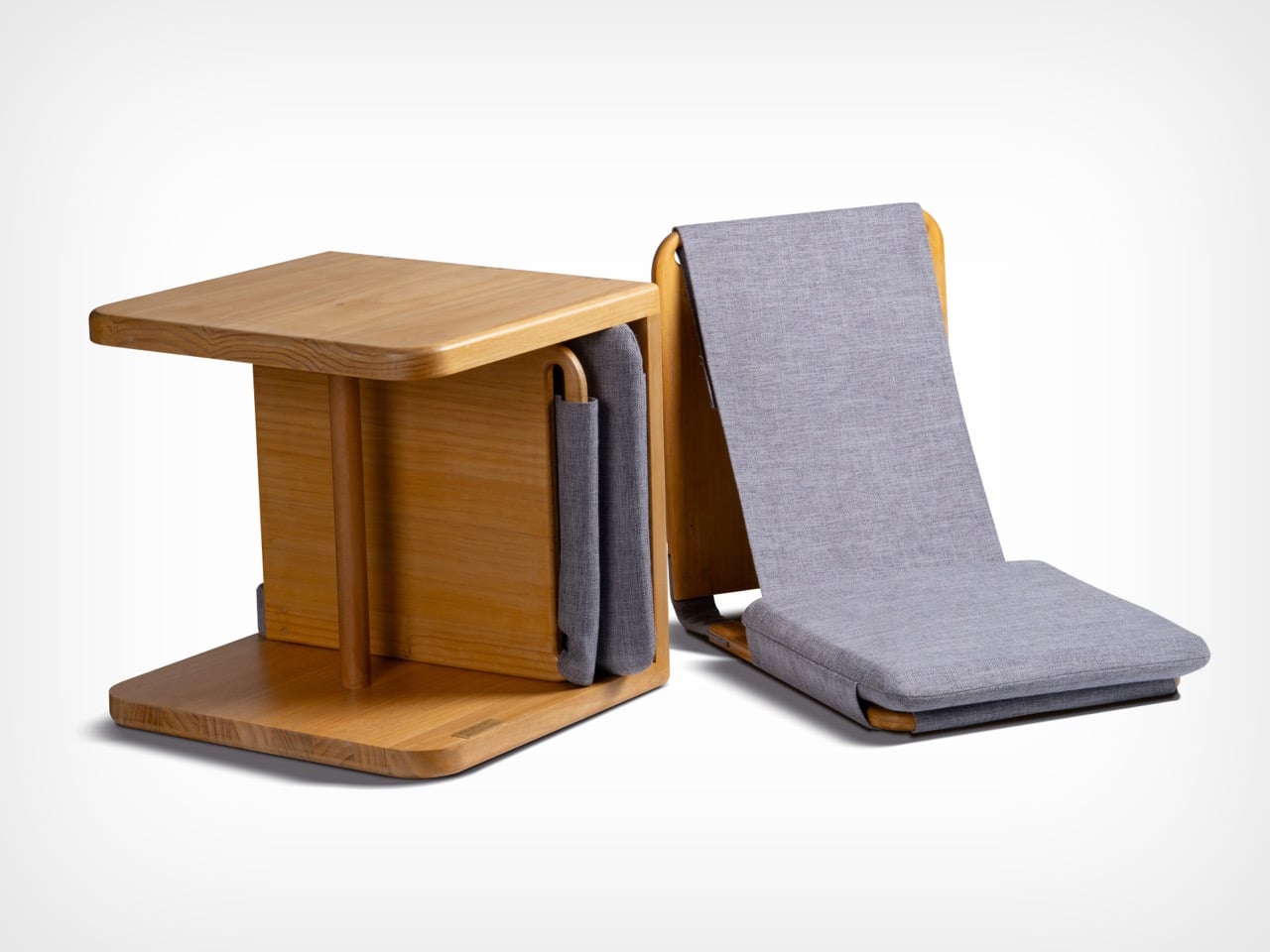
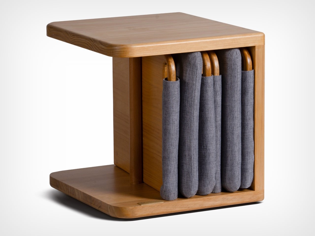
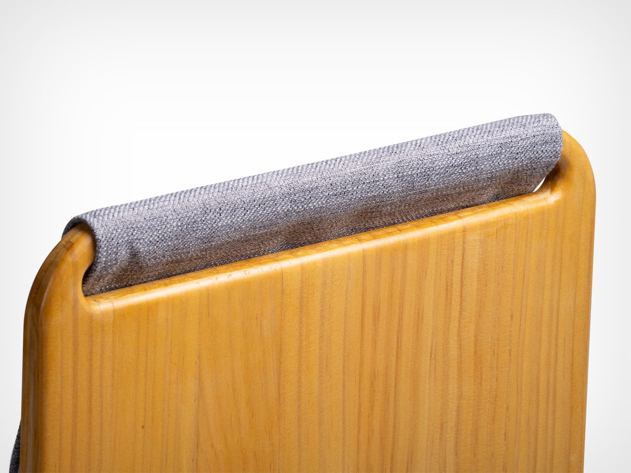
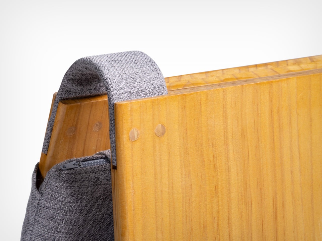
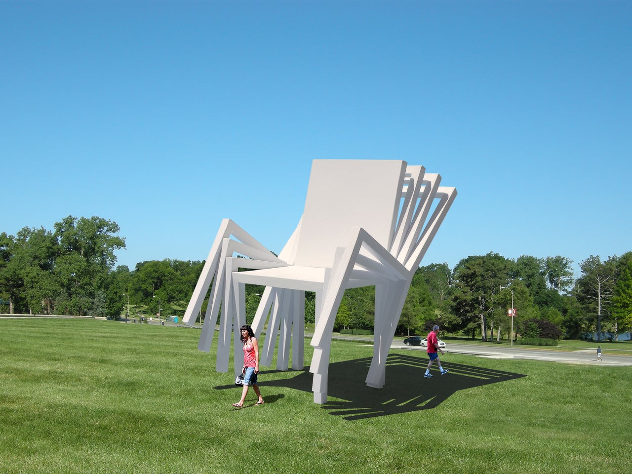
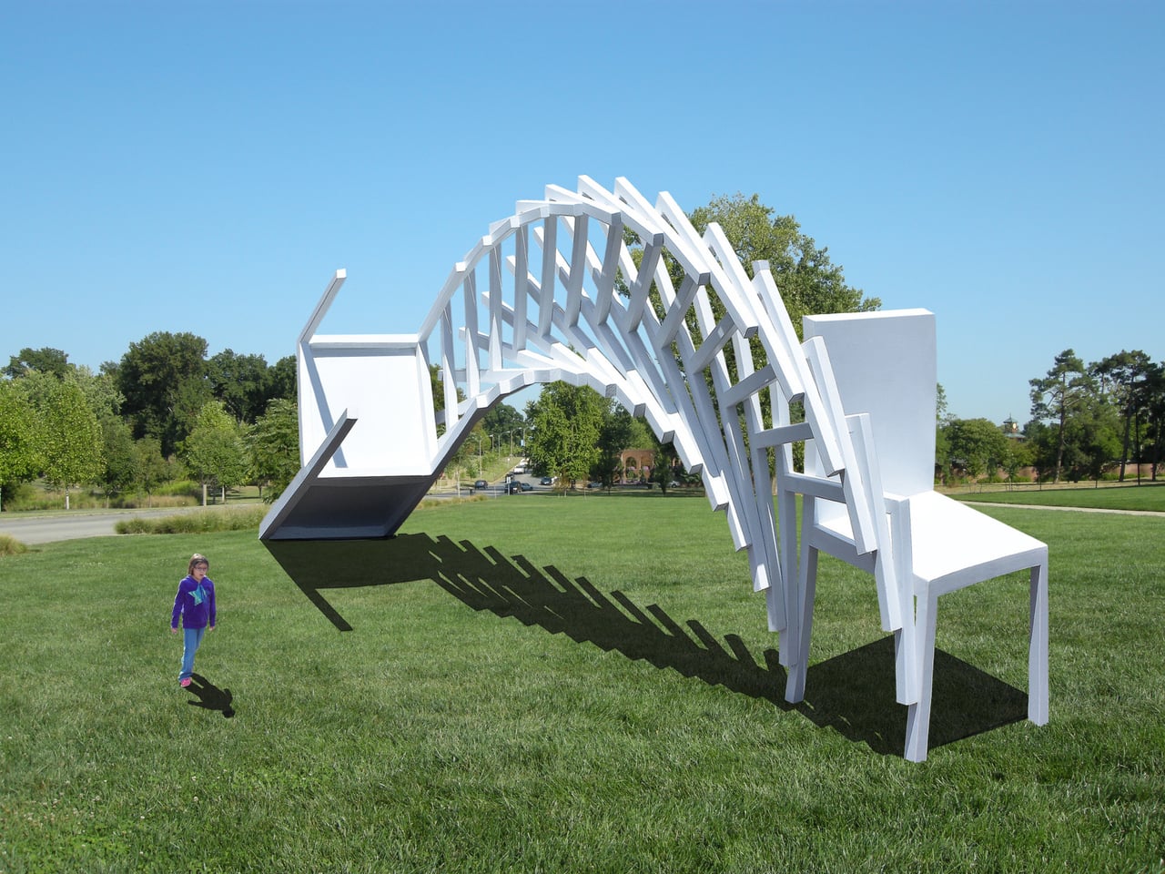
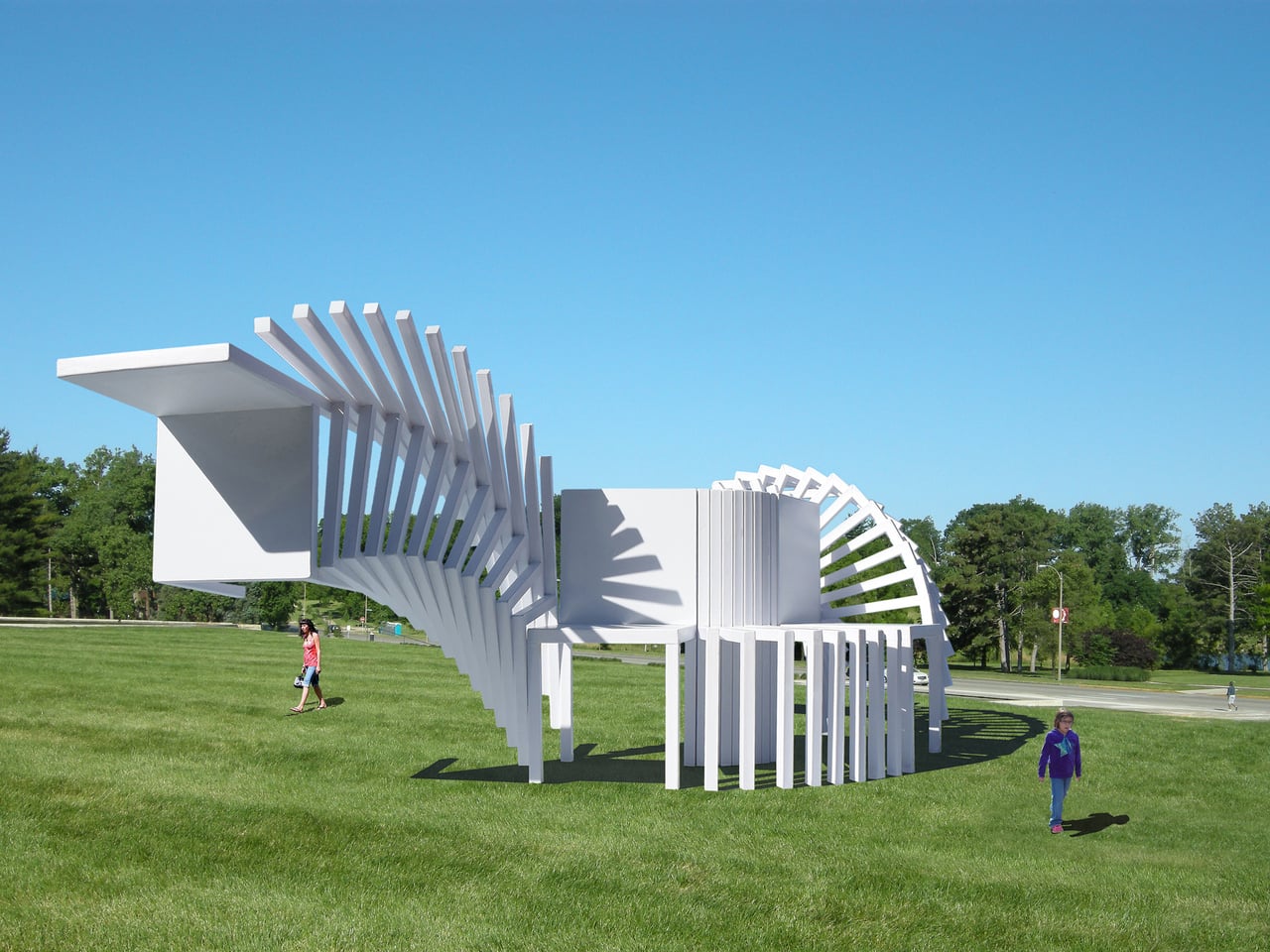
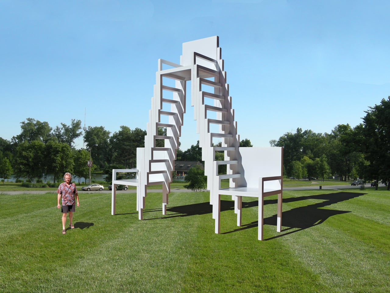
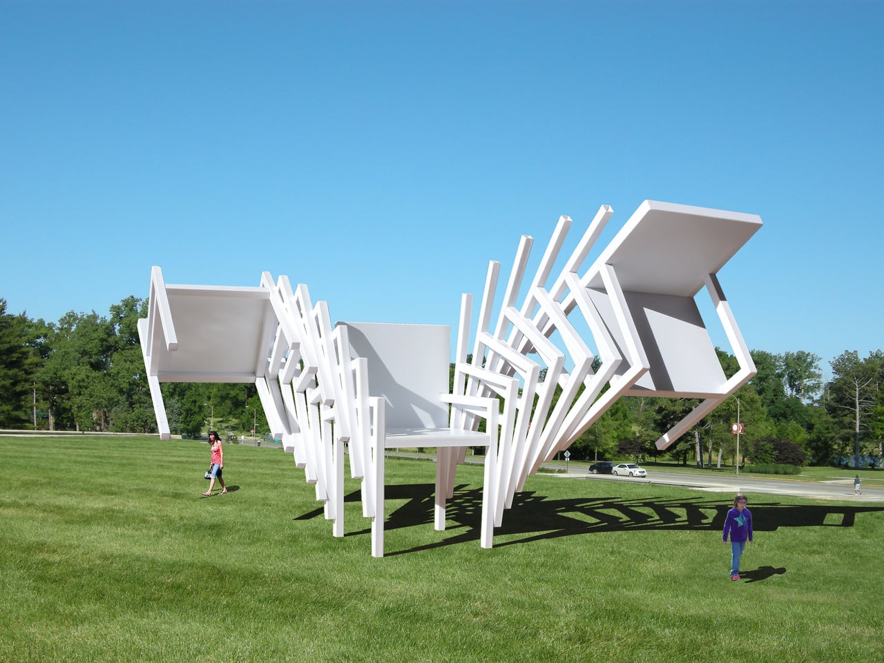
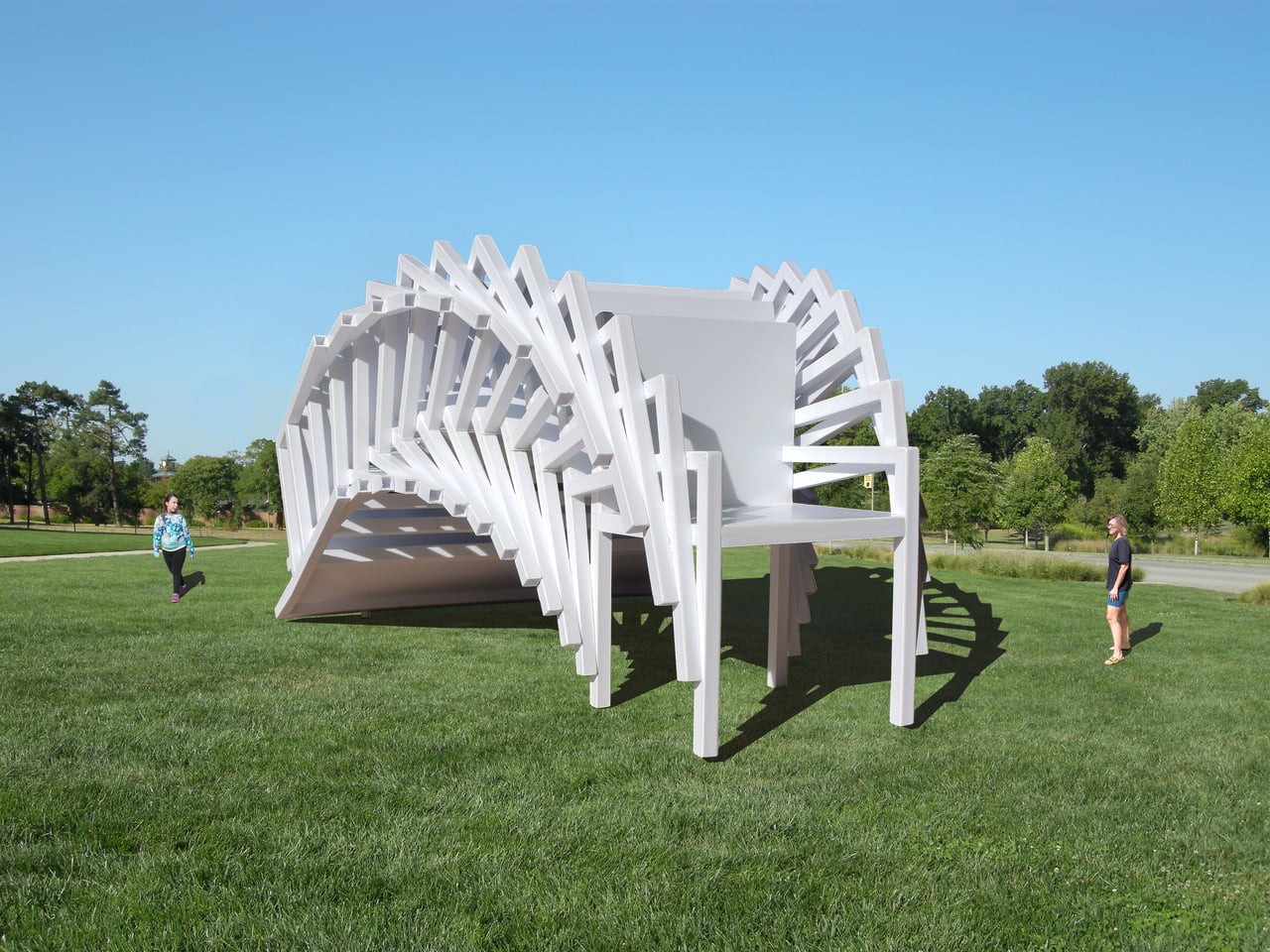
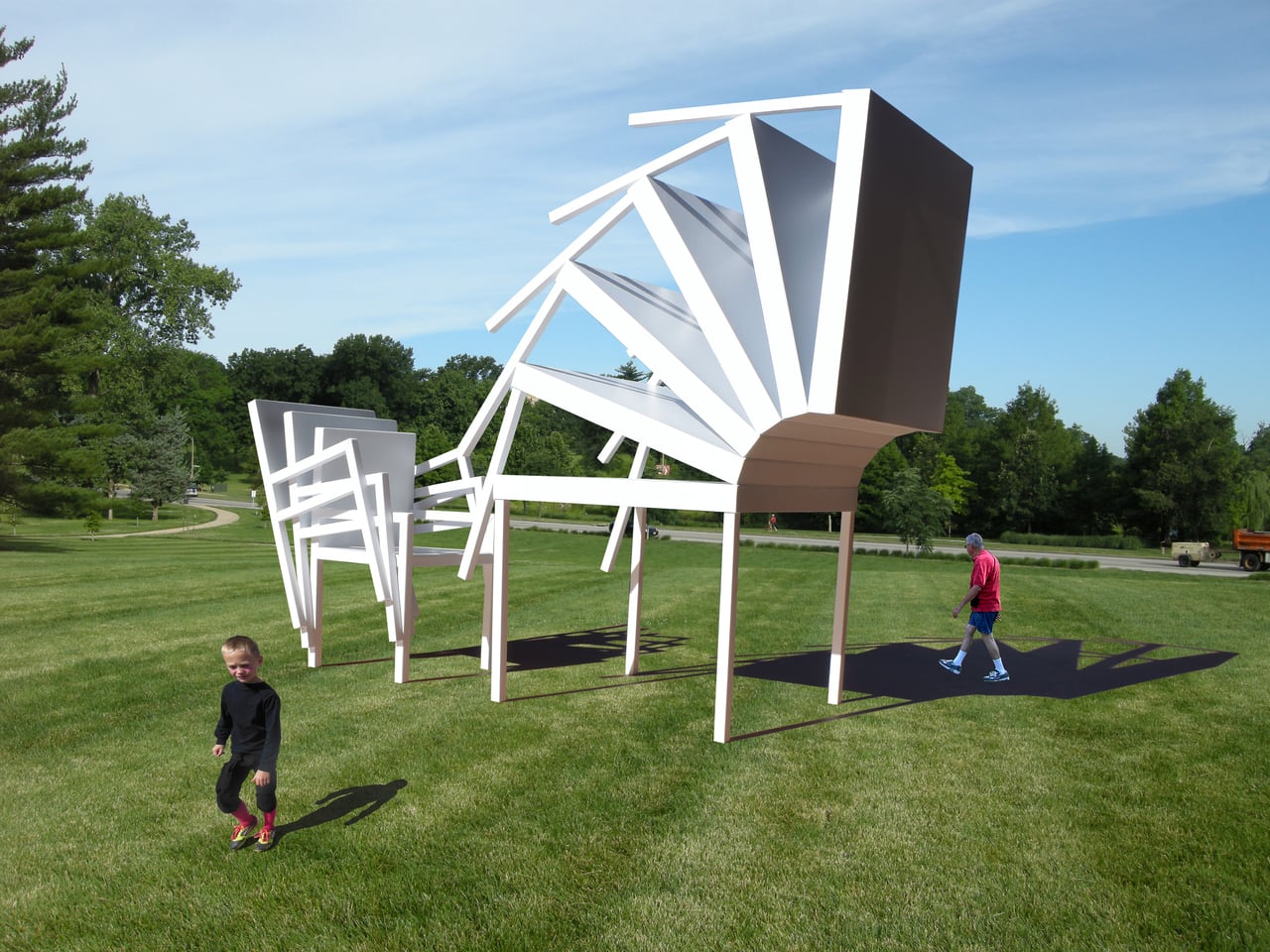
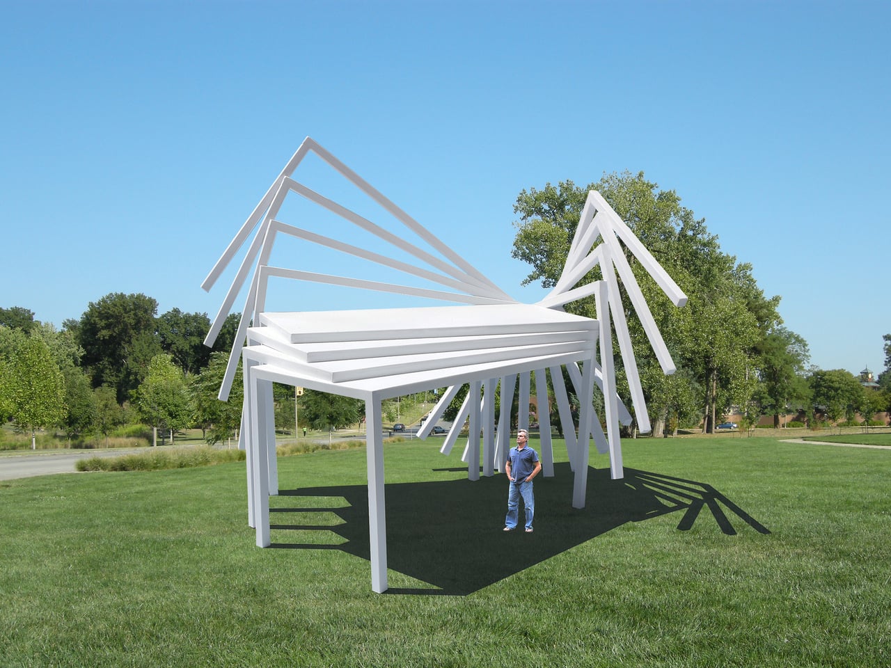
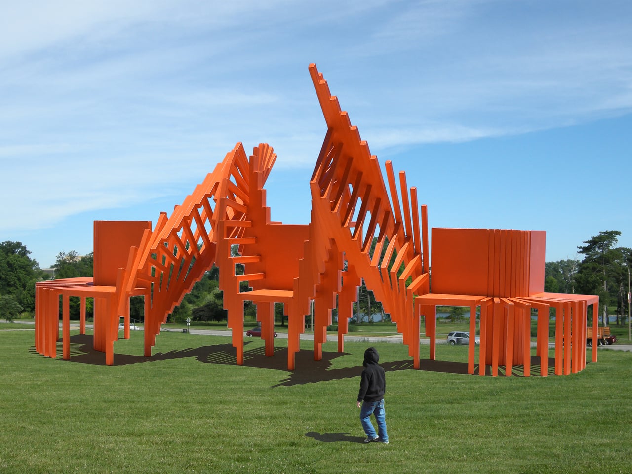
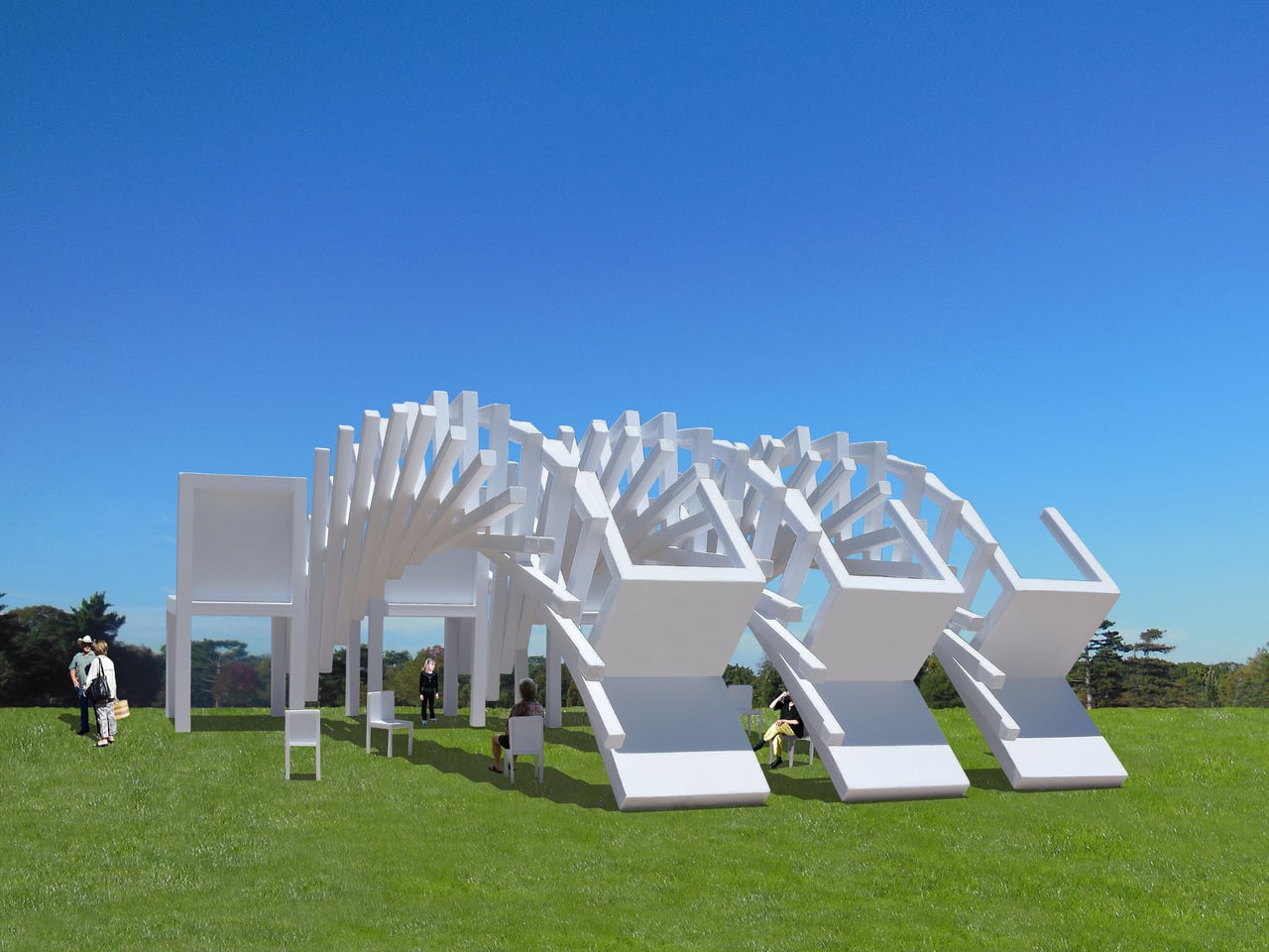
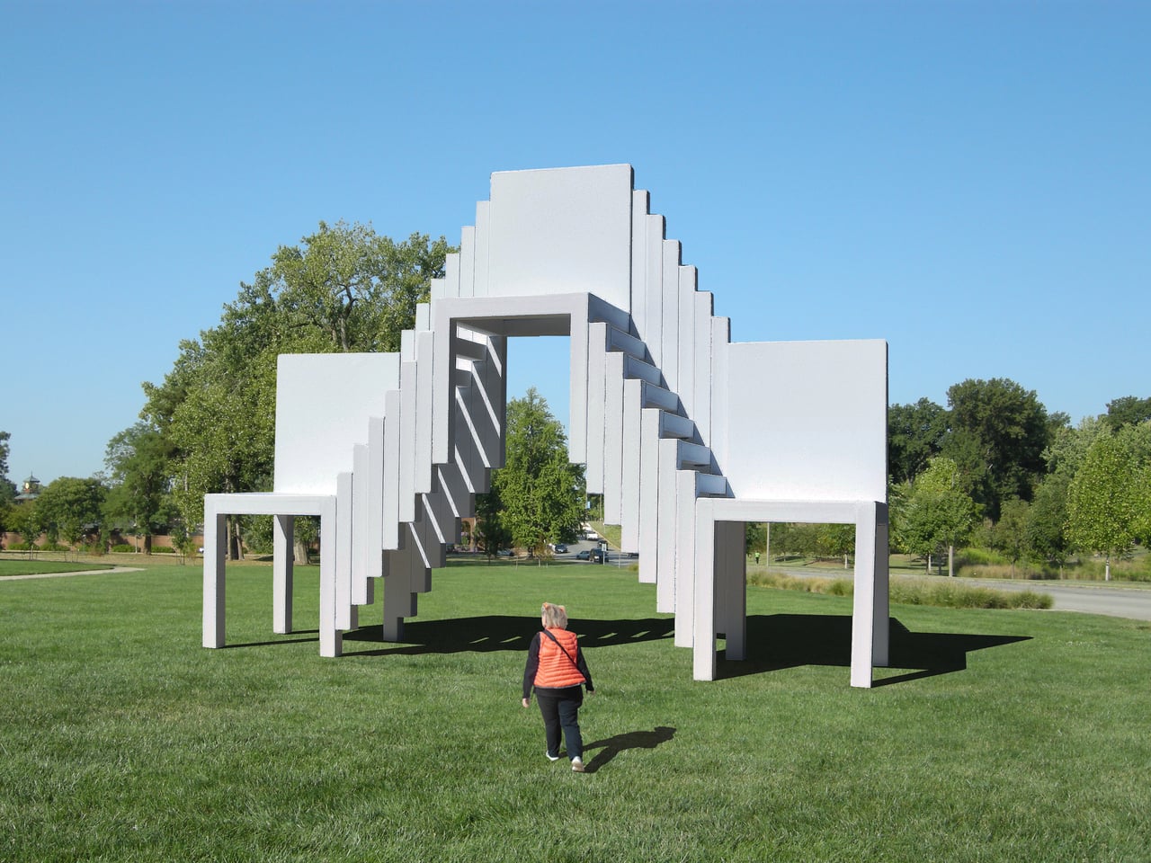
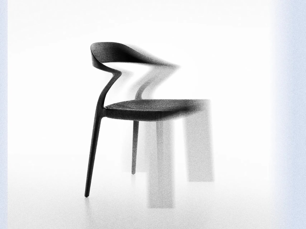
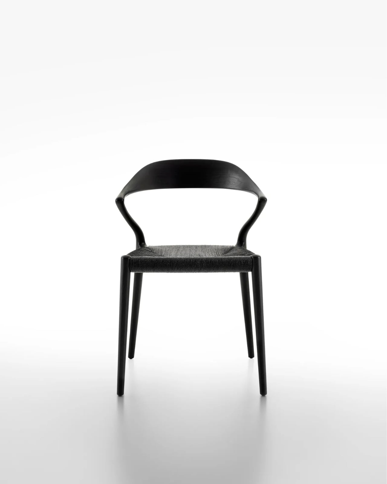
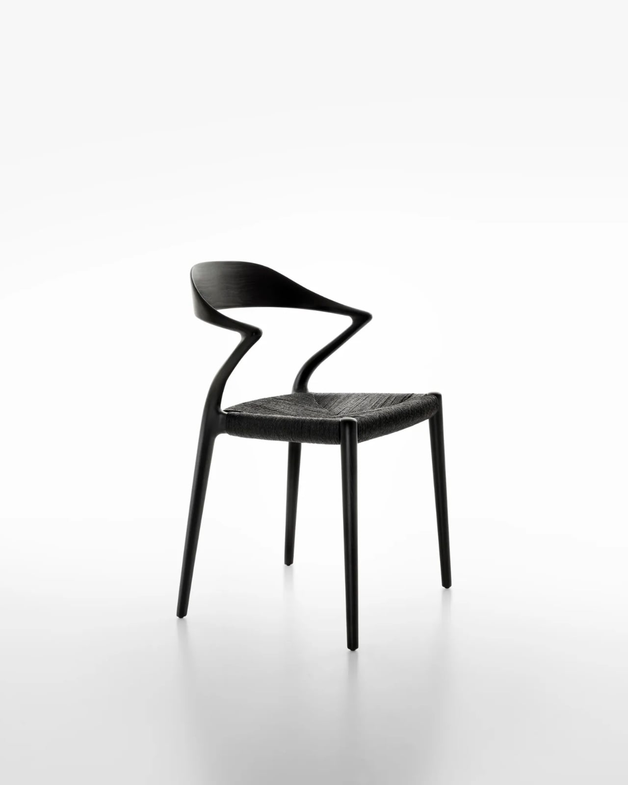
At its core, it’s a solid ash chair with a backrest. Except the backrest doesn’t go straight. It zigs. It zags. And somehow, it works with a kind of quiet conviction that makes you want to understand why.
Designer: Giuseppe Bavuso for Rimadesio
Rimadesio is not exactly a newcomer to this conversation. Founded in 1956 in the Brianza district north of Milan, the Italian brand has built its reputation around precision manufacturing and architectural intelligence. For decades, it has been the brand that architects reach for when they need sliding panels, modular shelving, or doors that close with the kind of satisfying weight that makes you feel like you live in a well-designed life. Furniture, in the traditional sense, has always played a supporting role. Ori feels like a shift.
Giuseppe Bavuso has been Rimadesio’s designer and art director for years, and the long-term relationship is visible in the collection’s consistency. There’s a particular design language at Rimadesio, one that values restraint without ever feeling cold. But Ori does something slightly different. The zig-zagging backrest introduces a kind of visual energy that isn’t typical of the brand. It feels expressive in a way Rimadesio rarely allows itself to be, turning the brand’s famous manufacturing precision toward something more overtly sculptural.
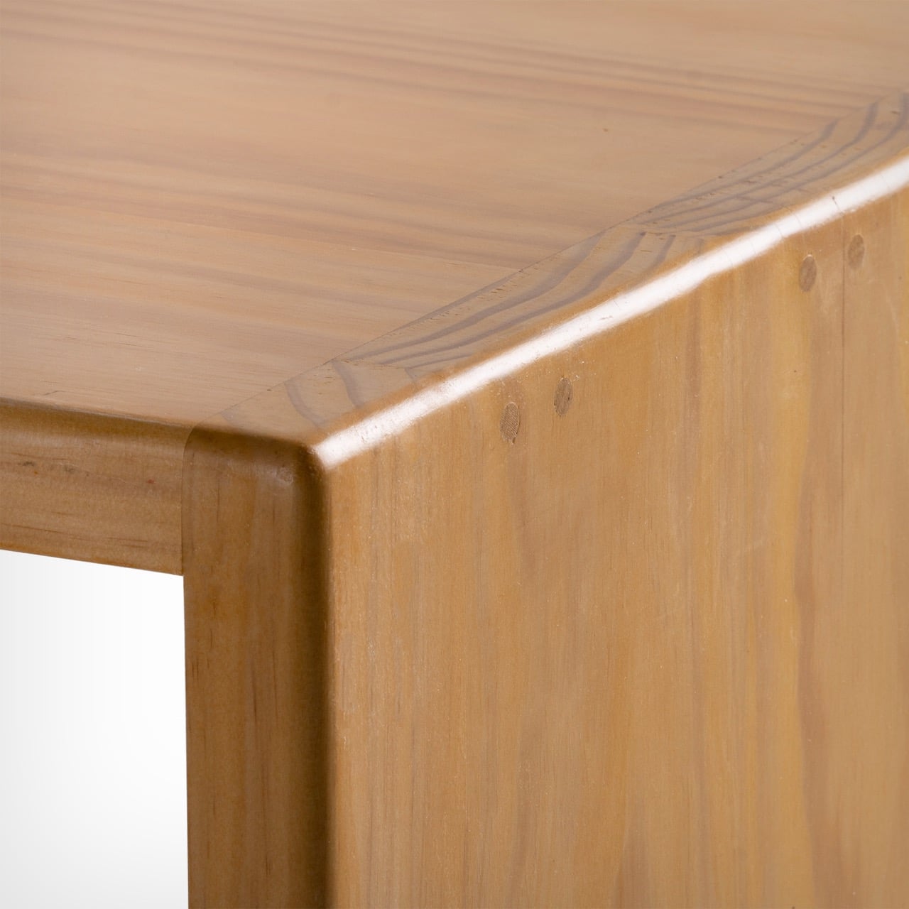
The choice of material matters here. Solid ash is warm, tactile, honest. It doesn’t pretend to be anything it isn’t, which makes it the right call for a piece that’s already making a visual argument with its form. Against the angular drama of the backrest, the naturalness of the wood acts as a stabilizer. The chair doesn’t feel aggressive or purely decorative. It feels considered. Like a piece that was worked out over a long time before anyone was allowed to see it.
The timing is also interesting. Rimadesio is celebrating its 70th anniversary at Salone del Mobile 2026 under the concept BECOMING, a theme that brings together design, architecture, art, and relationships. Introducing a chair as expressive as Ori at this particular moment feels intentional. Seventy years is long enough to have a strong point of view. It’s also long enough to know when to surprise people.
I think about this whenever I see brands with deep institutional histories try to evolve. It doesn’t always land. Sometimes it reads as a brand chasing relevance instead of generating it, making louder and louder declarations in the hope that someone notices. But Ori doesn’t feel like that. It feels like a designer who has been sitting with an idea for a while, one that has been refined until it became undeniable.
Design, at its best, has an opinion. It makes a choice and defends it without apology. The Ori chair’s backrest could have been straight. It wasn’t. That single decision, seemingly small, changes the entire character of the piece. It makes a chair worth looking at twice, which is harder to achieve than it sounds when you’re working in a material as familiar as wood. Whether or not you’d put it in your home is almost beside the point. Ori is the kind of piece that expands the conversation about what a chair can be, especially within the vocabulary of a brand that has spent seven decades being impeccably precise rather than openly expressive. The fact that both qualities now exist side by side in this chair is what makes it compelling.
Milan Design Week runs April 20 to 26, and if you’re in the area and you’re curious to see Ori in person, you should go. Some pieces change when you’re standing in front of them. I have a feeling this is one of them.
The post The Zig-Zag Chair That Shows Rimadesio at Its Most Expressive first appeared on Yanko Design.