Despite what naysayers claim, there foldable phone market is showing no signs of disappearing or even slowing down. After all, we’ve barely scratched the surface of what these form-changing devices can truly become, especially when it comes to design. The book-style large foldable has been around for years, yet every generation still has some improvement to offer, whether it’s in durability, performance, or size. “Thin” is a description not often associated with this kind of smartphone, a kind that once felt like two phone slabs placed on top of each other. The Xiaomi MIX Fold 4 is challenging that preconceived notion with what is one of the thinnest foldables in the market, and we were able to get a hands-on experience to see what the fuss is all about.
Designer: Xiaomi
Blurring the lines between Foldables and Ordinary Phones
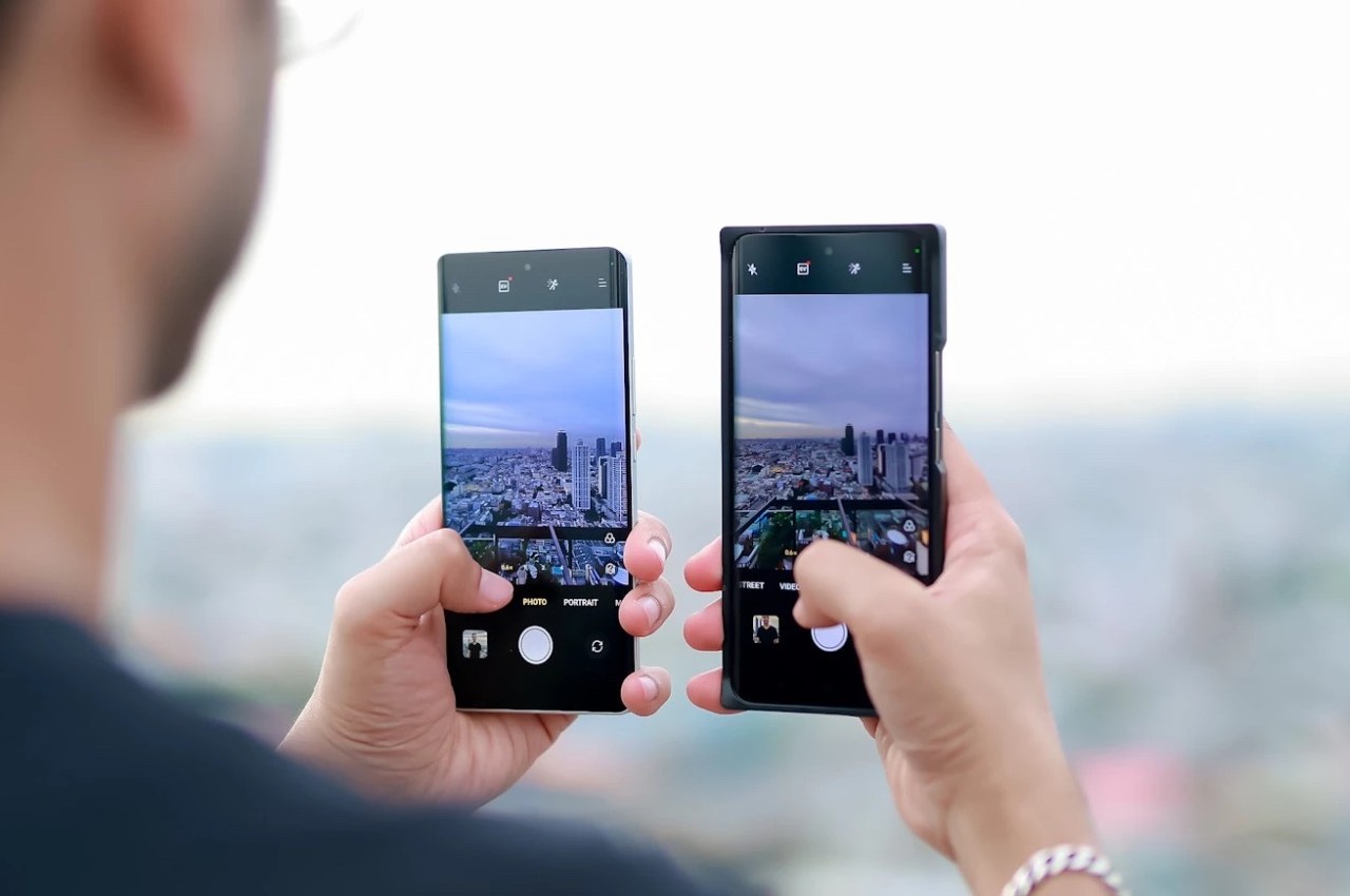
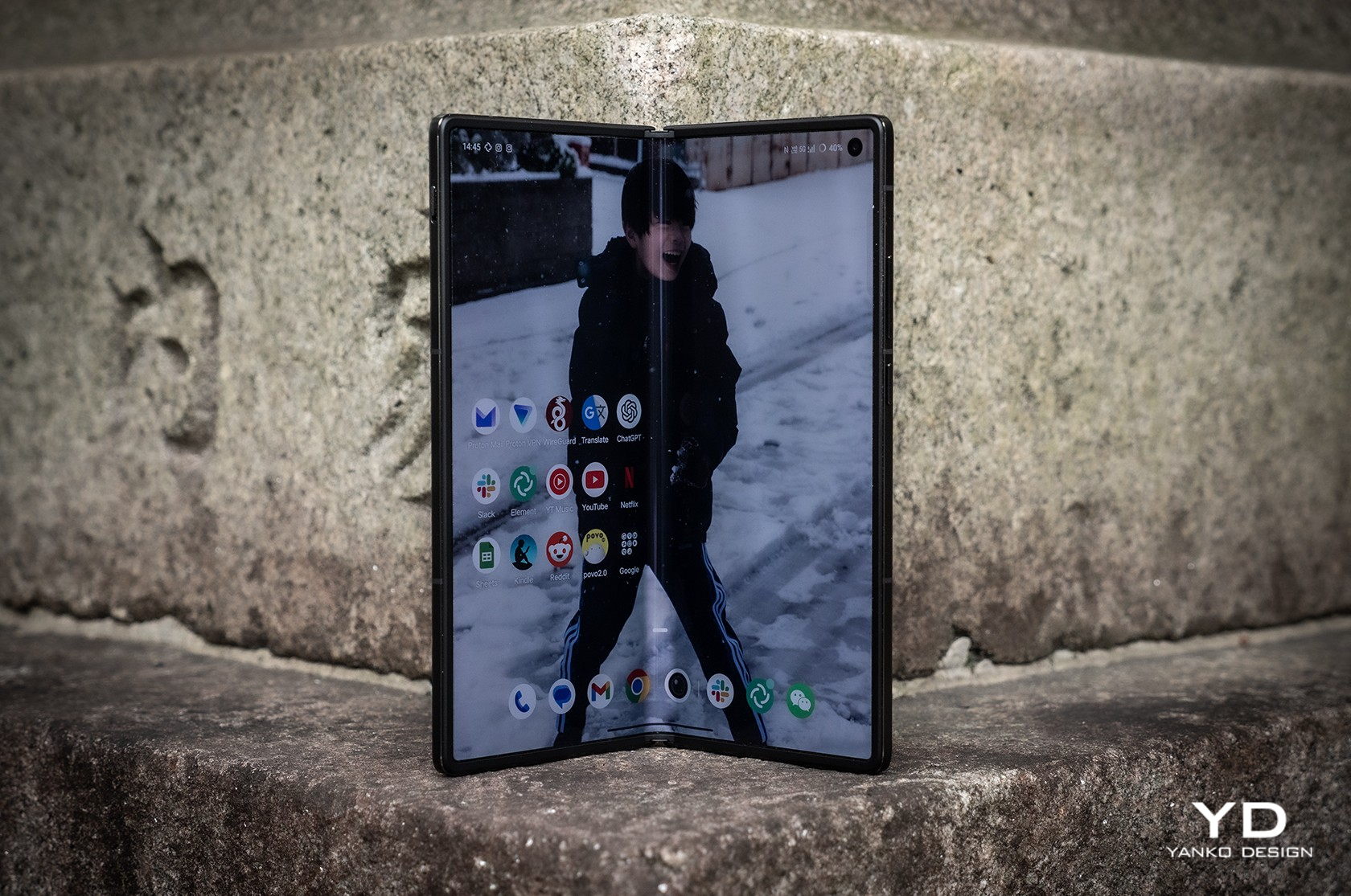
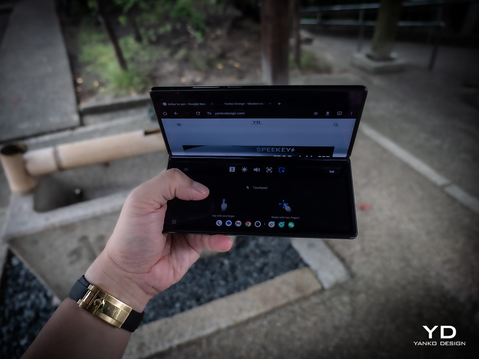
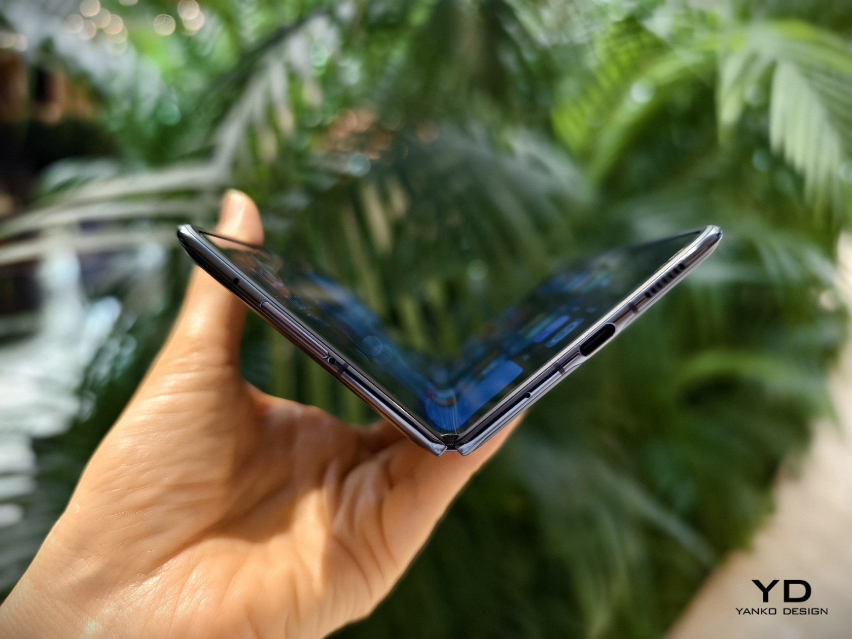
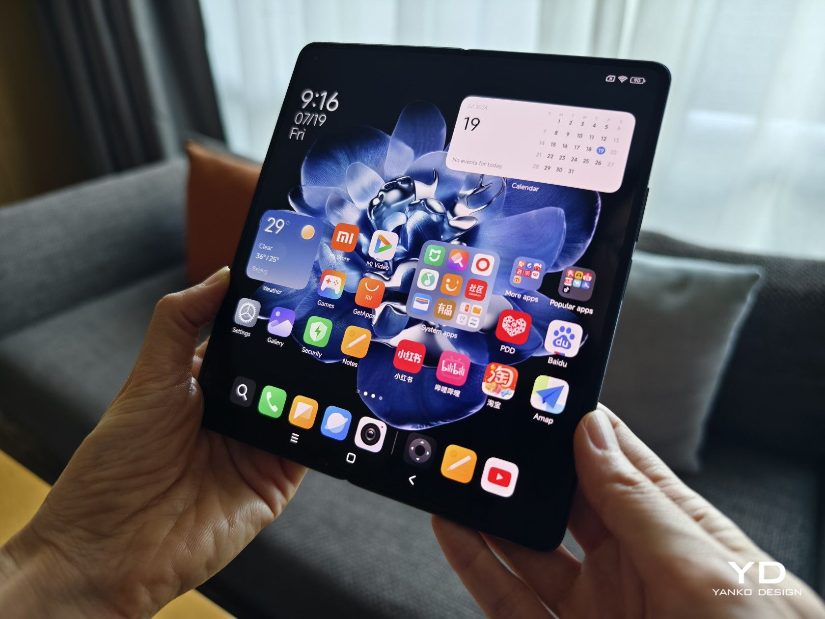
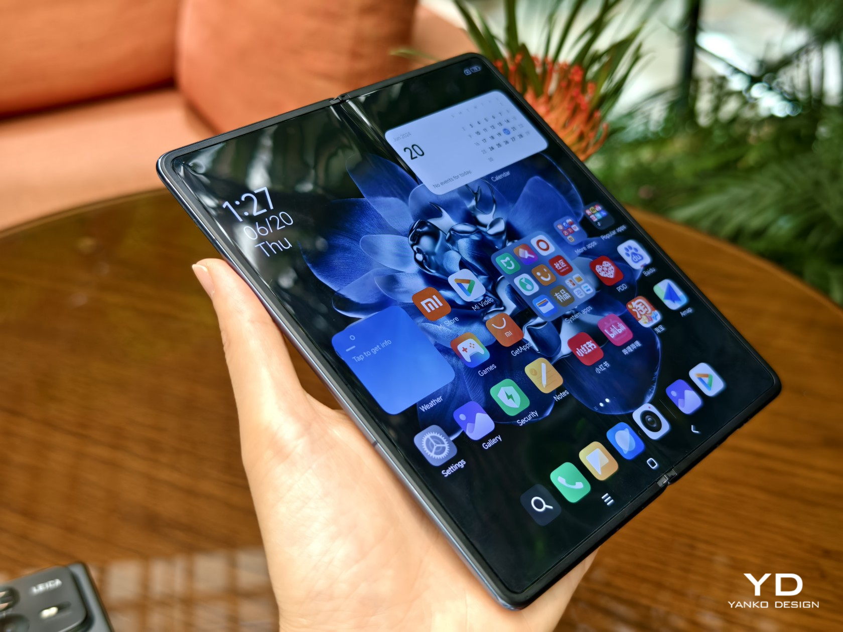
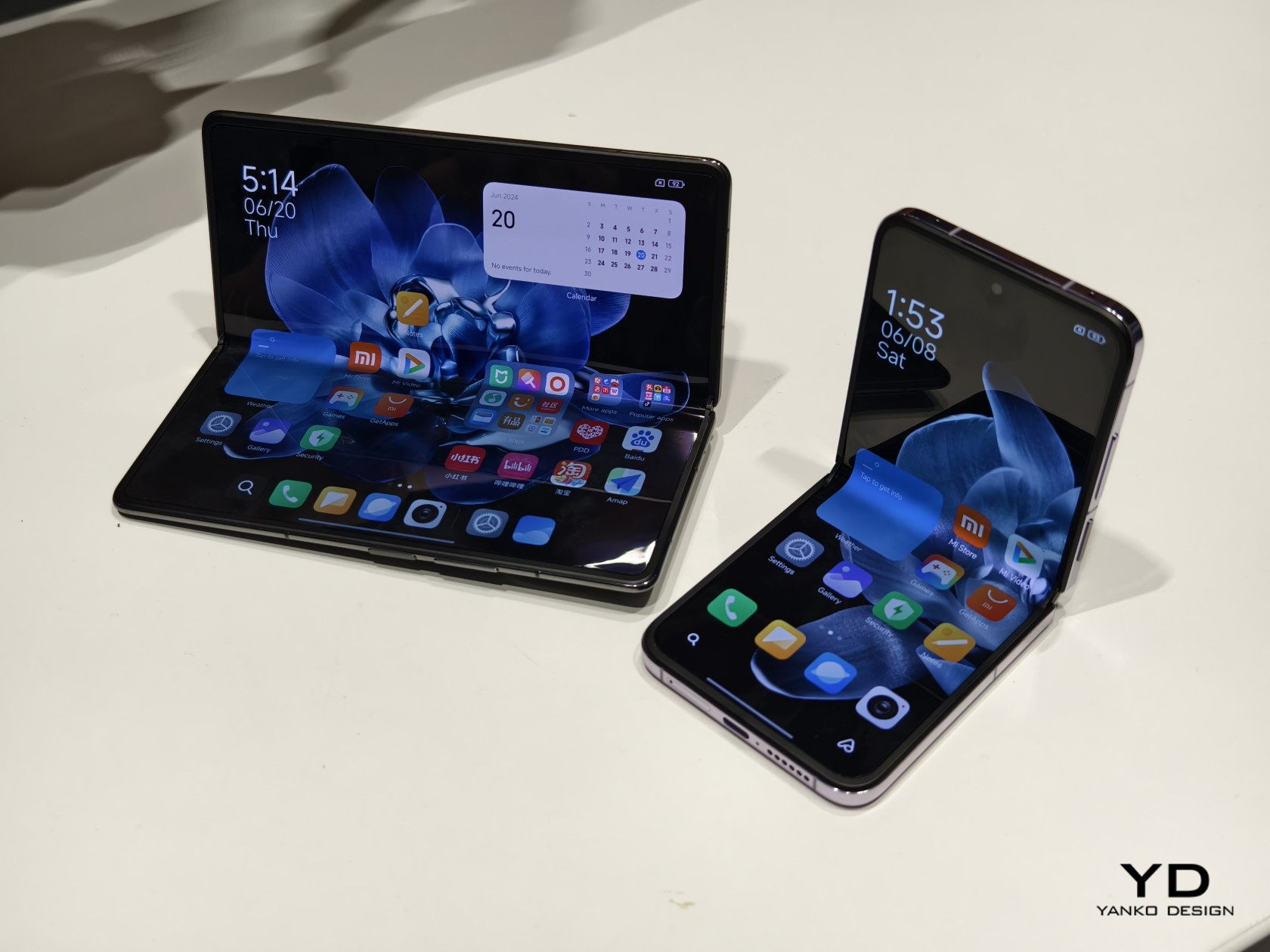
Next to the price tag and durability, one major concern that people have with foldable phones is their sizes. Admittedly, the earliest design iterations didn’t have the benefit of hindsight, but they were rather bulky and heavy when folded, a far cry from the regular phones we carry in our pockets. On its fourth generation, Xiaomi is really pushing the limits of foldables with a design that is getting really close to what people have become used to with non-foldable phones.
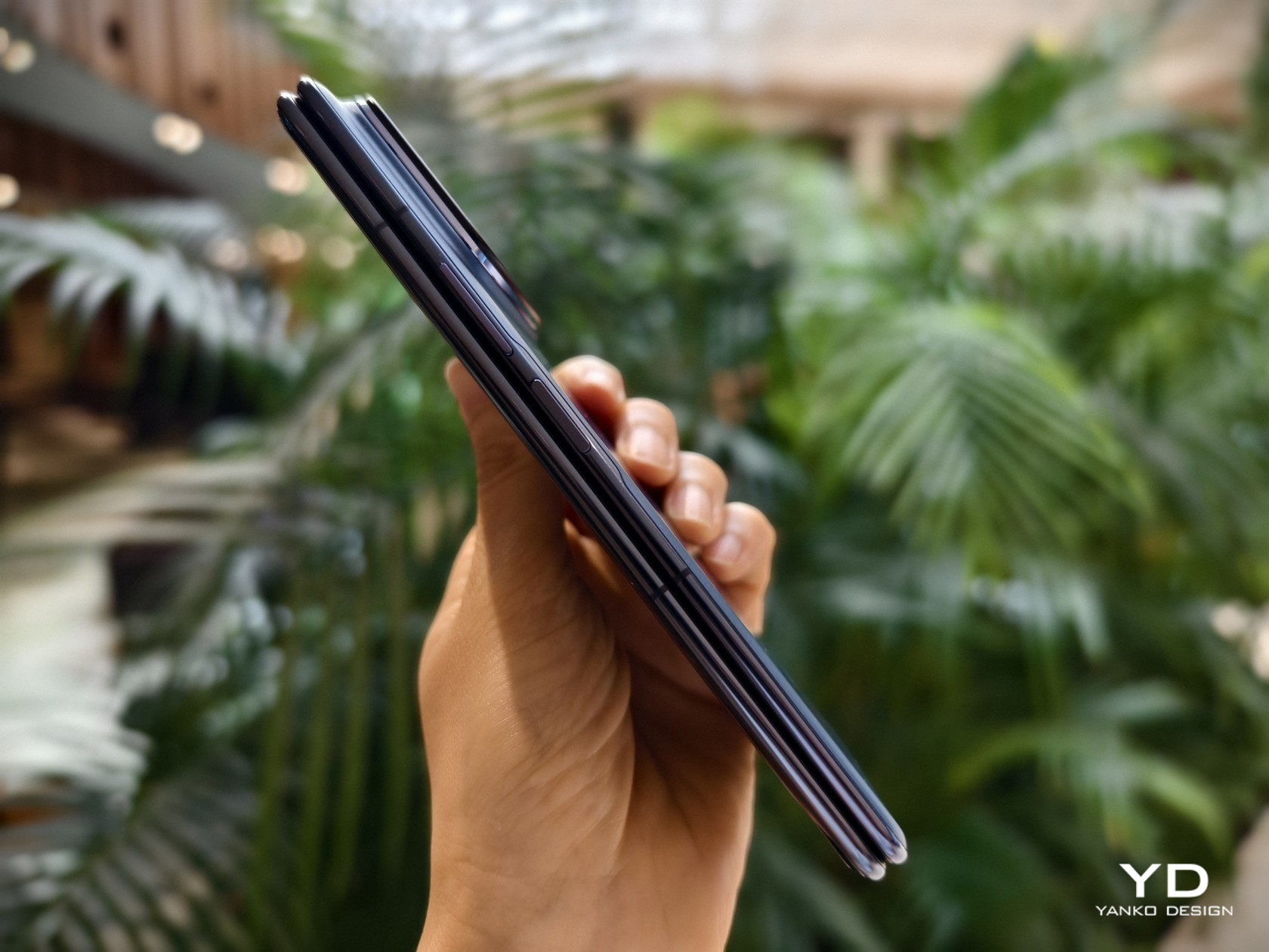
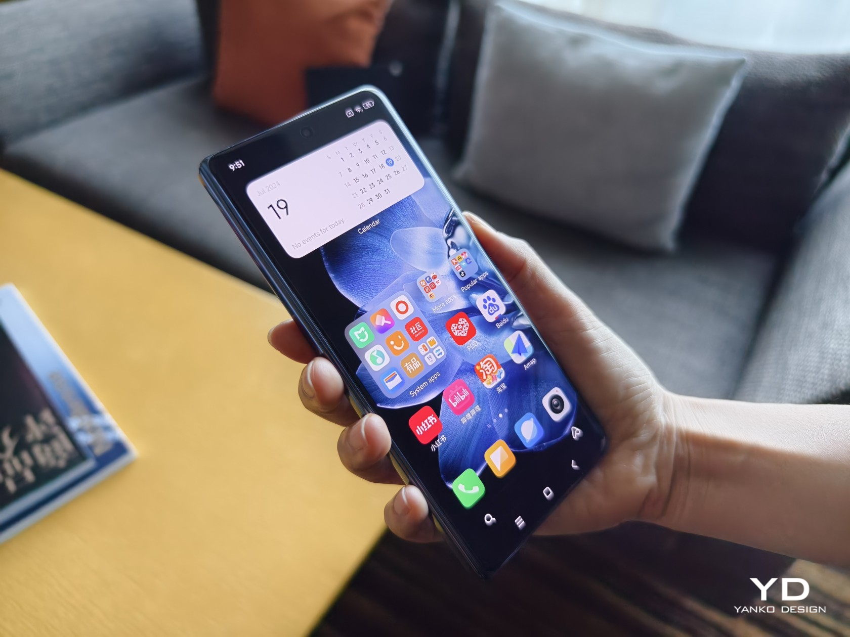
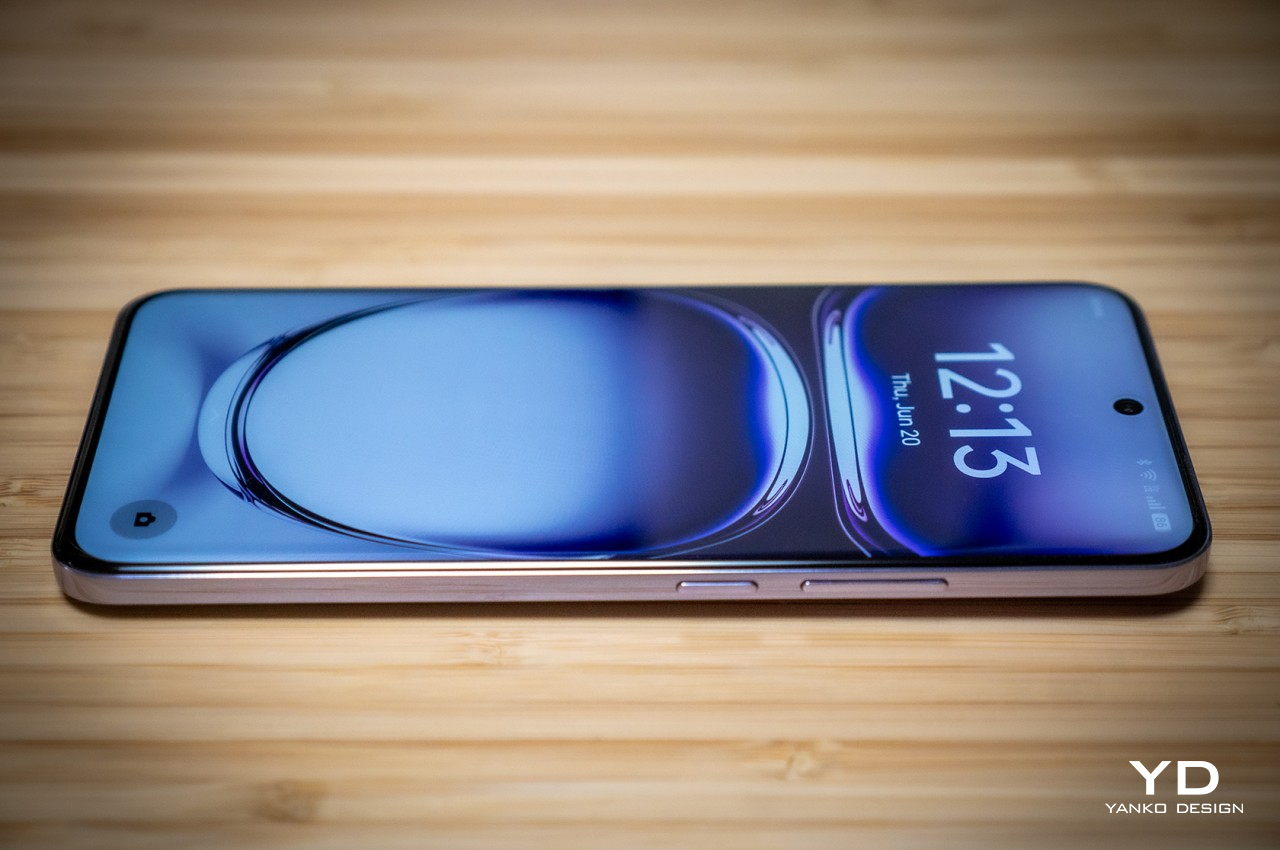
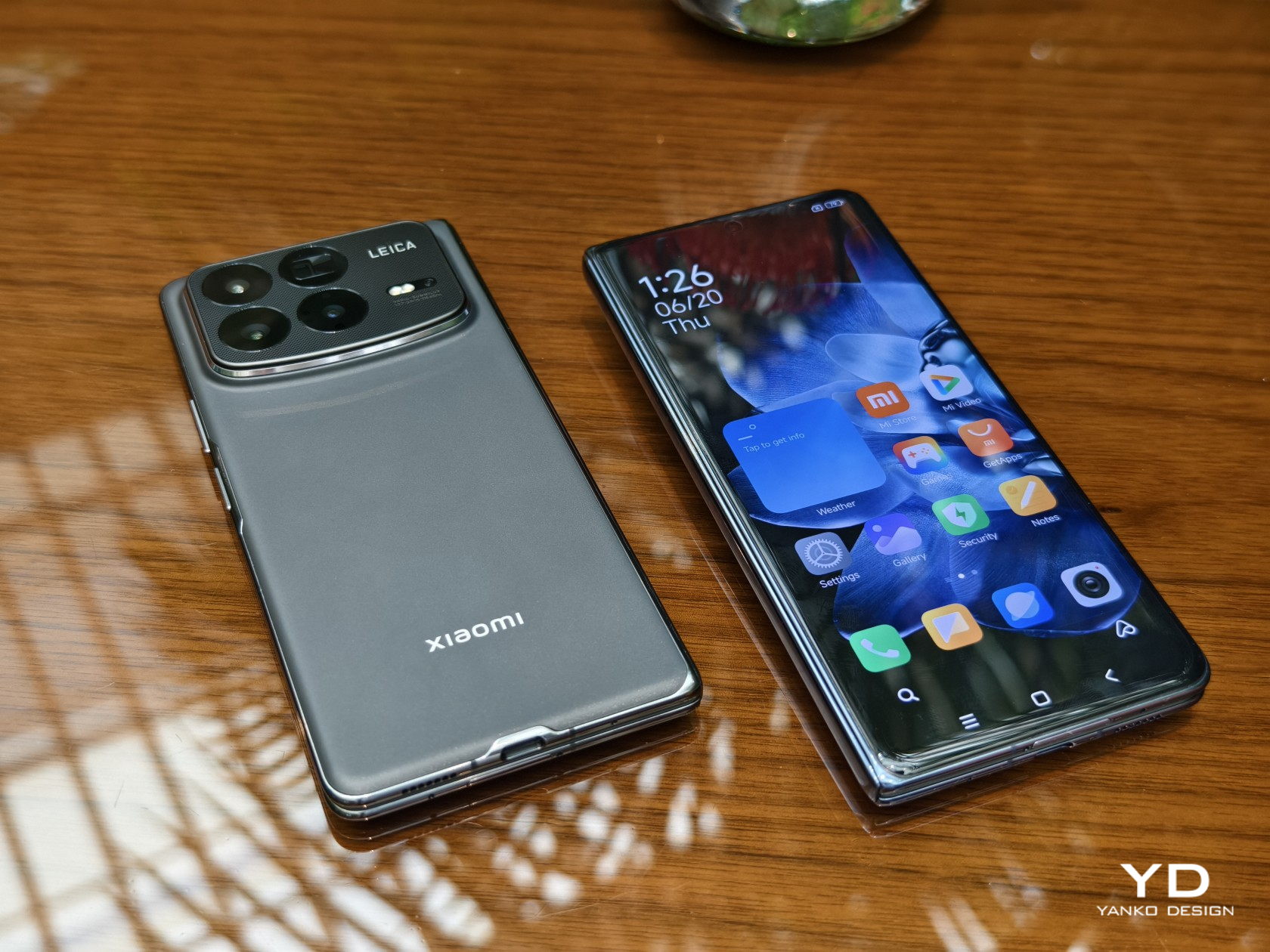
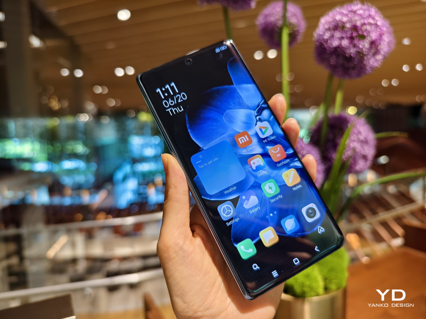
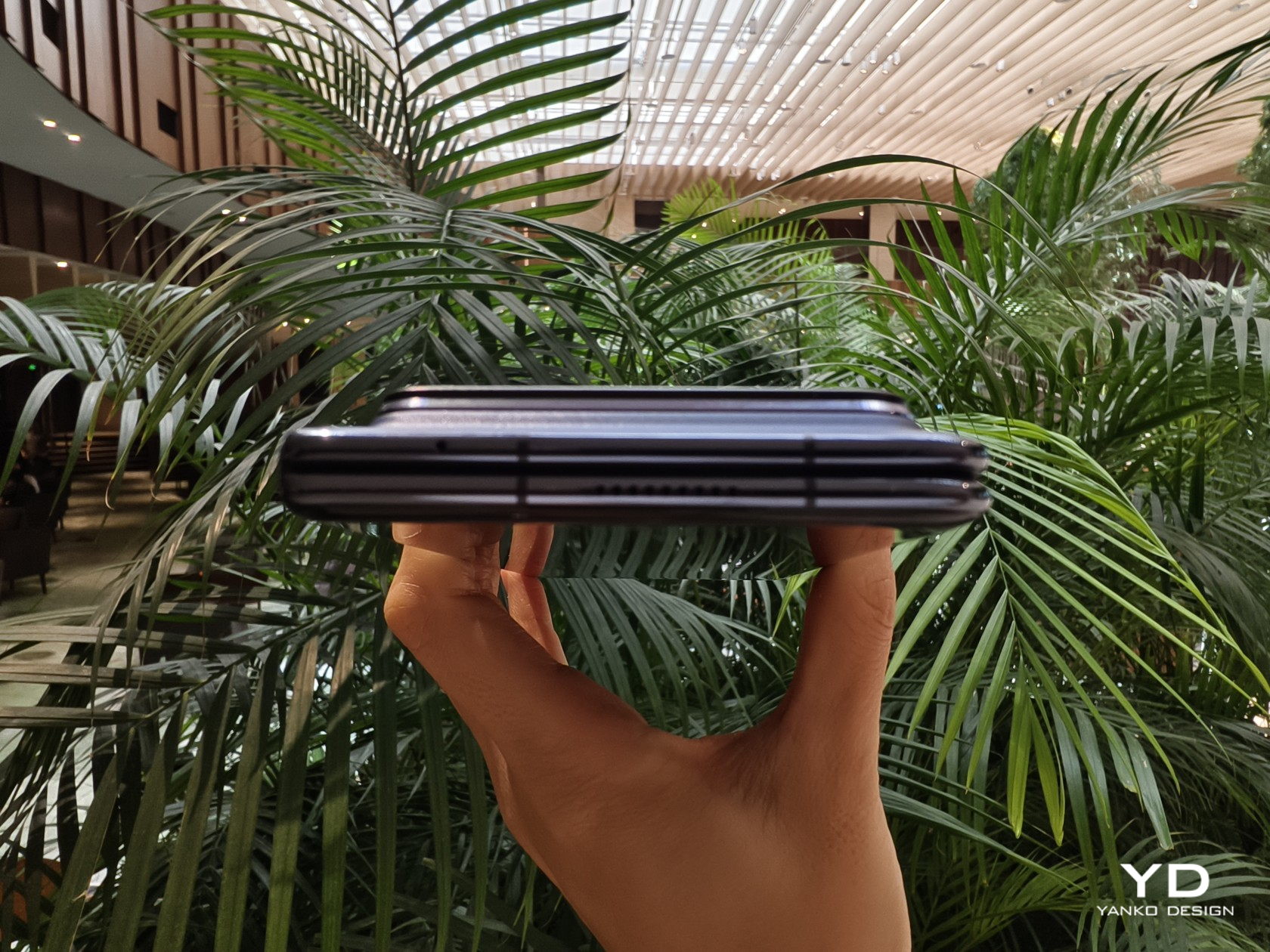
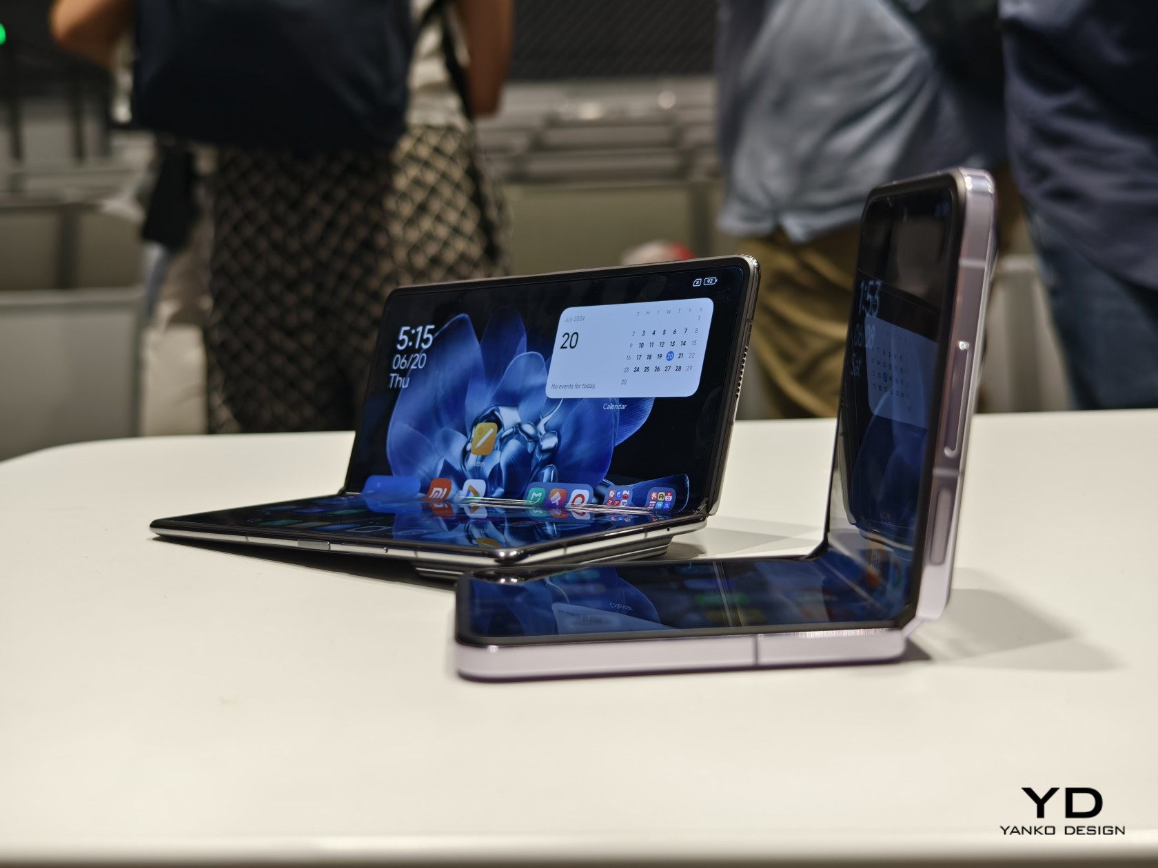
The Xiaomi MIX Fold 4 is crazy thin when laid open flat at 4.59mm, and with a 9.47mm thickness when folded close, it’s just 1mm shy of traditional phones. It’s also only 226g light, which is slowly getting closer to our definition of “normal.” Xiaomi credits no less than three technologies for this feat, like using lightweight yet durable carbon fiber materials in a few key parts. That said, the cover screen’s 21:9 aspect ratio still falls under the “tall and narrow” shape that has made many foldables like this a bit awkward to use. Aside from that, however, it’s really refreshing and delightful to hold such a thin and lightweight device.
More (Power) for Less (Space)
There are several consequences to shrinking the space inside a phone, from having less room for the battery or constricting airflow and affecting cooling. That’s even more problematic for foldable phones that have split their components, especially the battery, on two sides. You’d expect that a thinner foldable would have fewer features, but Xiaomi managed to surprise us yet again.
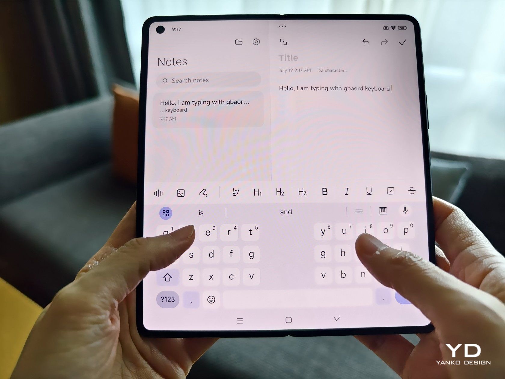
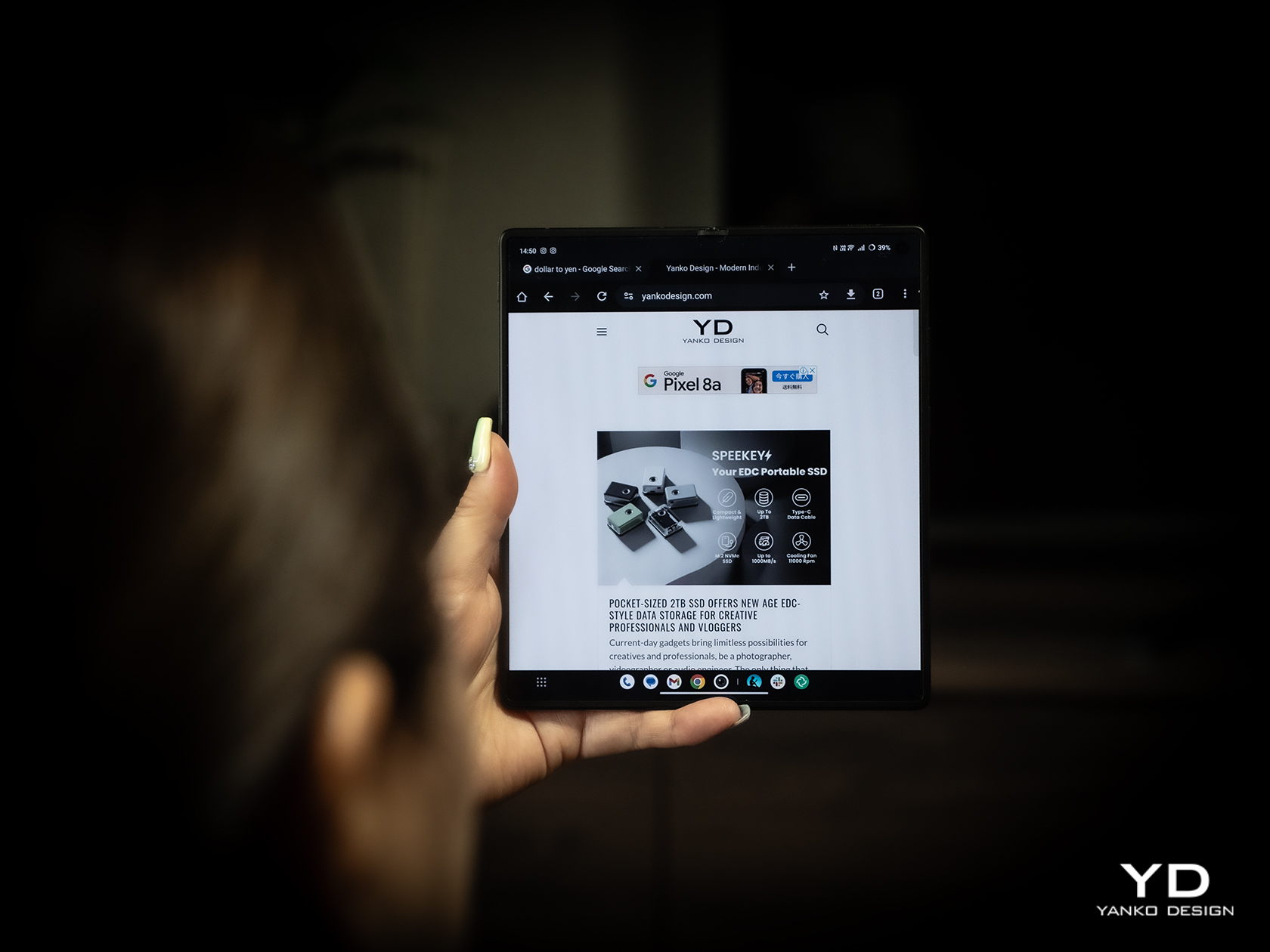
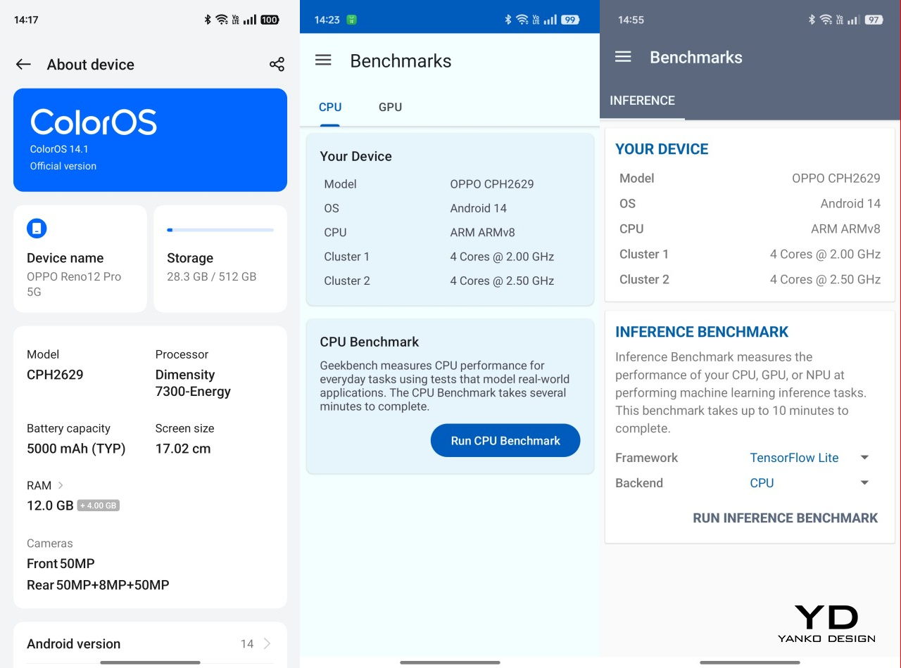
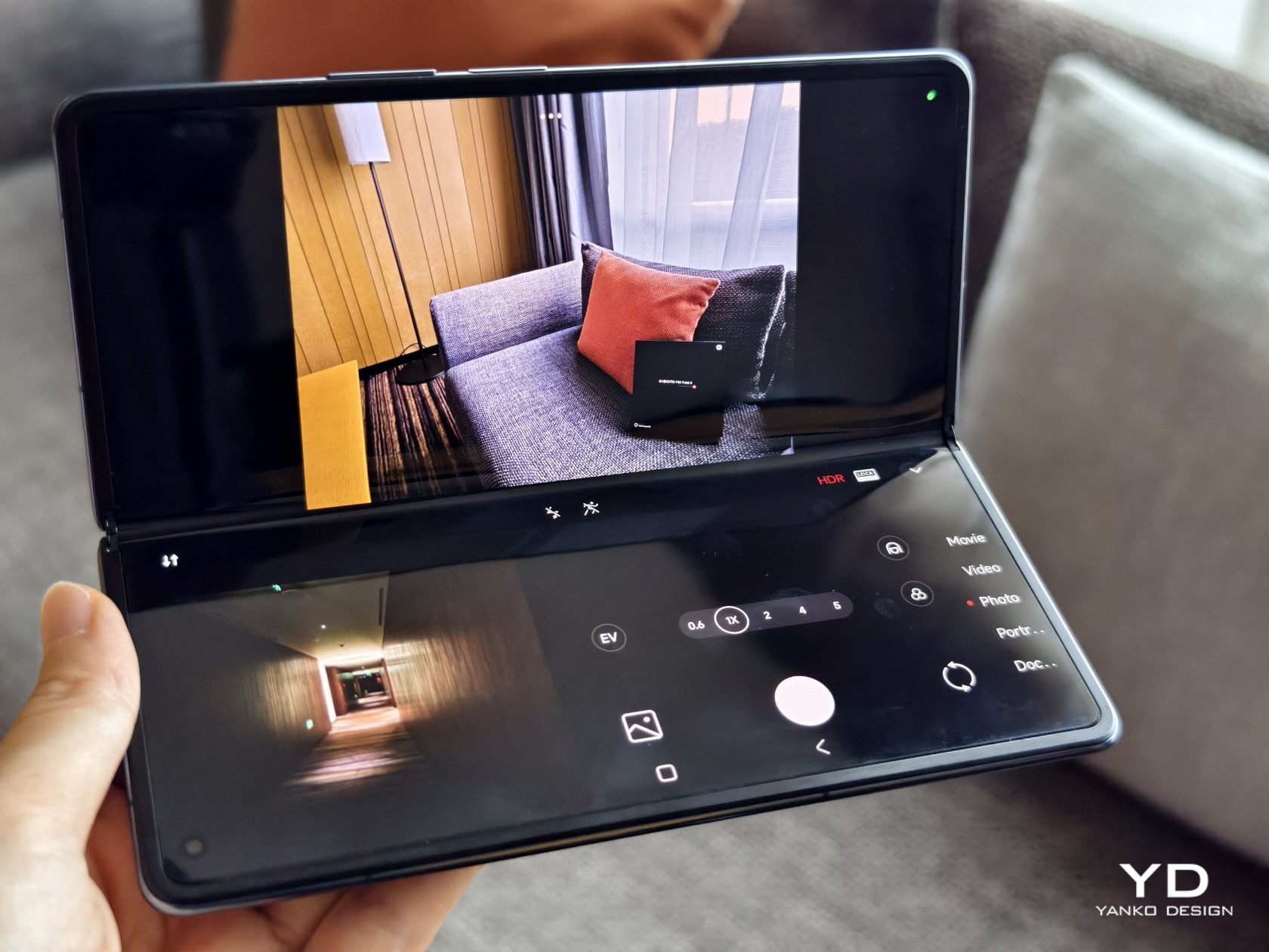
It’s already expected that the MIX Fold 4 will have the latest Snapdragon 8 Gen 3 processor and high-end memory, but getting a 5,100mAh battery that’s larger than its thicker predecessor is pretty impressive. Xiaomi didn’t skimp on the screens either, both with nearly identical capabilities, save for their sizes and aspect ratio. Unfortunately, our brief experience with the large foldable did disappoint us with a visible crease, a design flaw that’s already being squeezed out of other foldables. To be fair, though, you get used both to the appearance and even the feel of the crease so your mind begins to filter out its presence.
Big in Photography
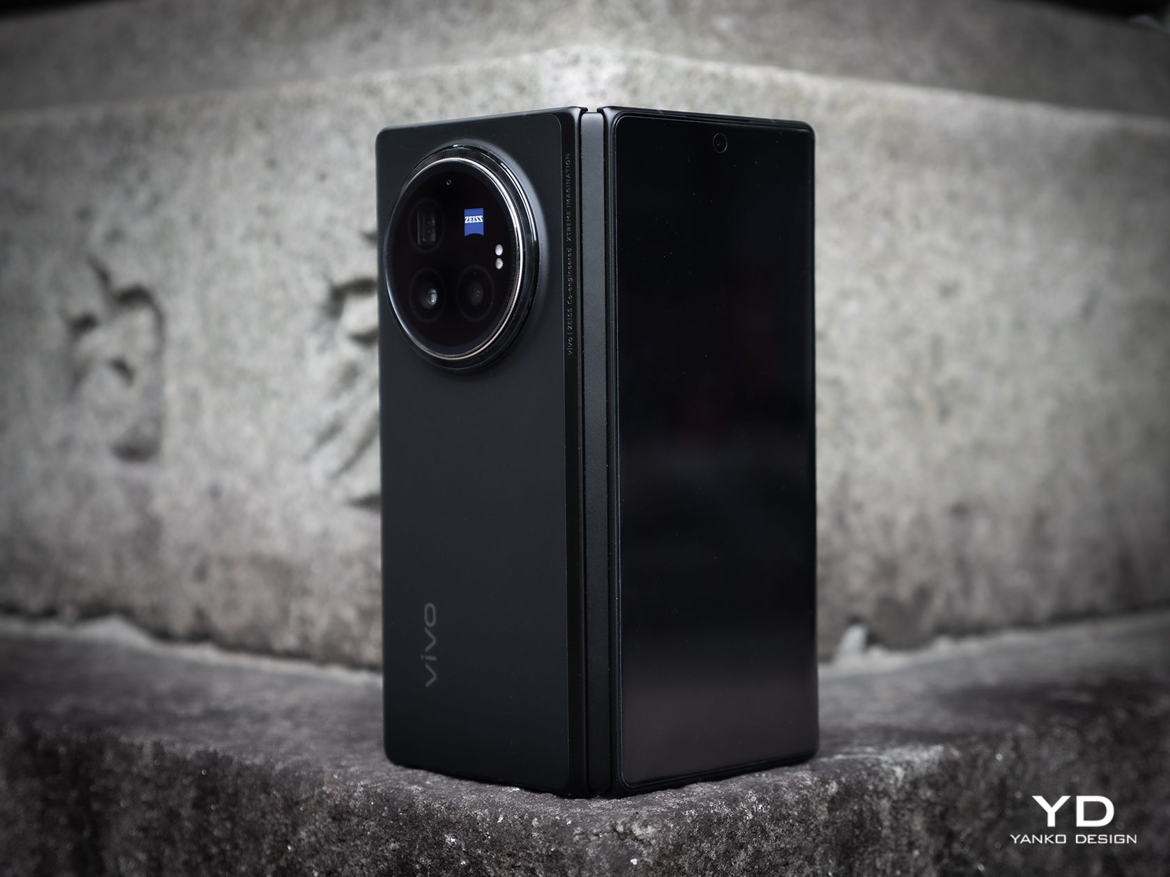
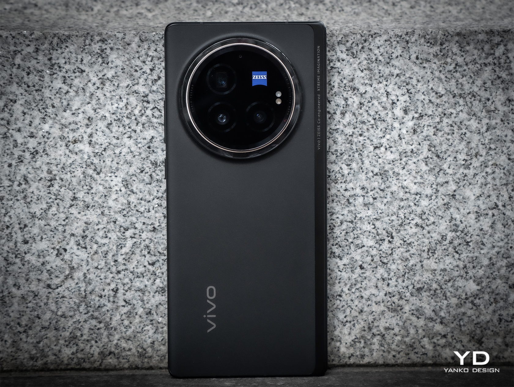
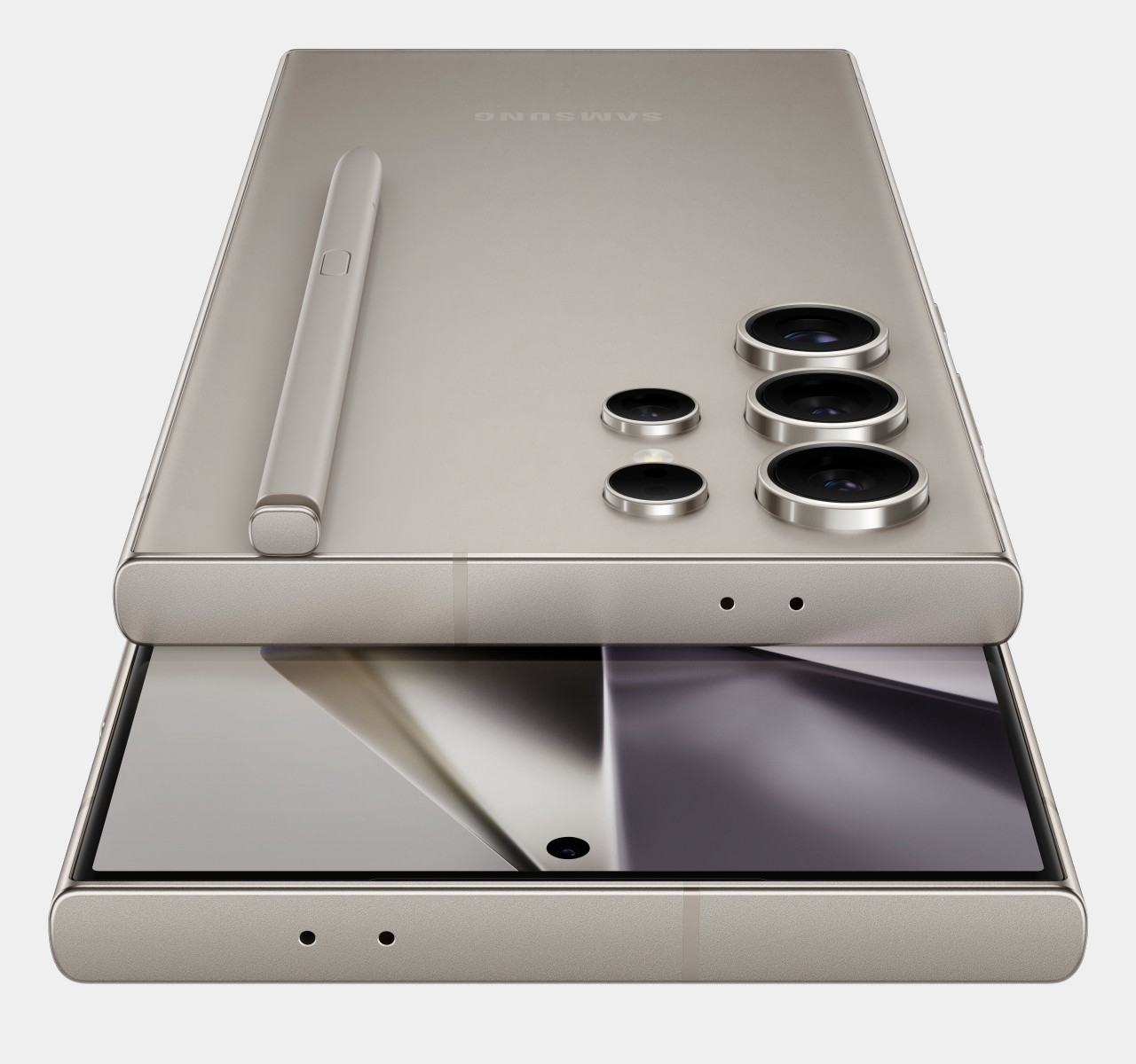
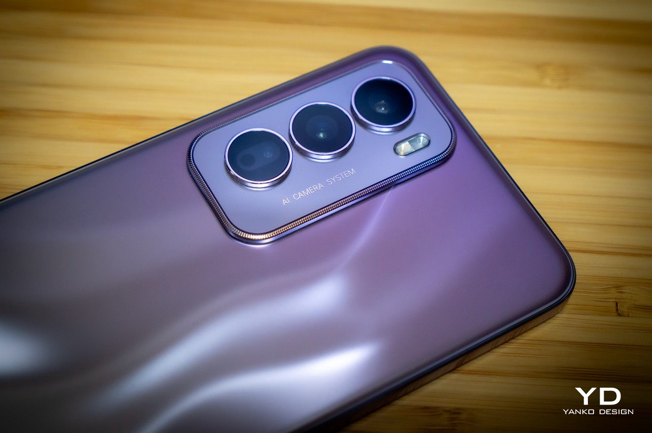
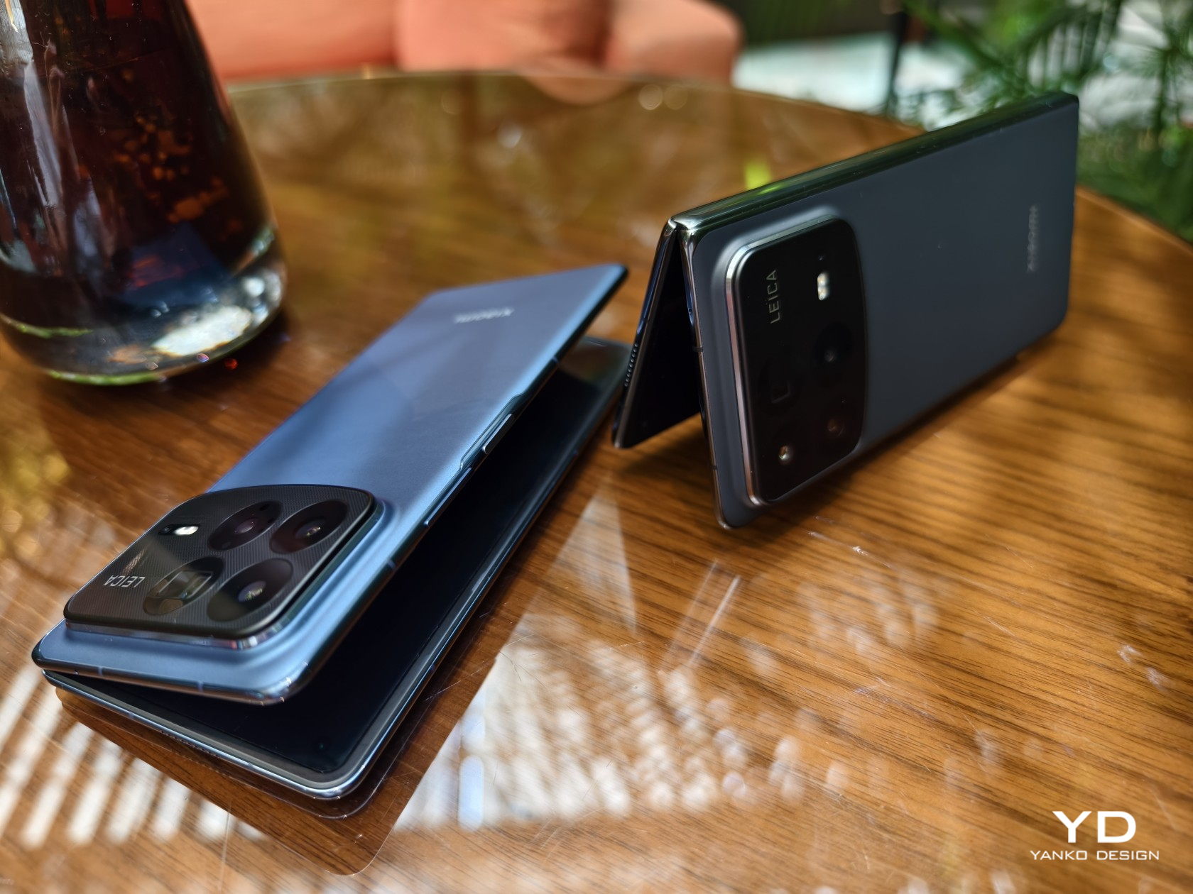
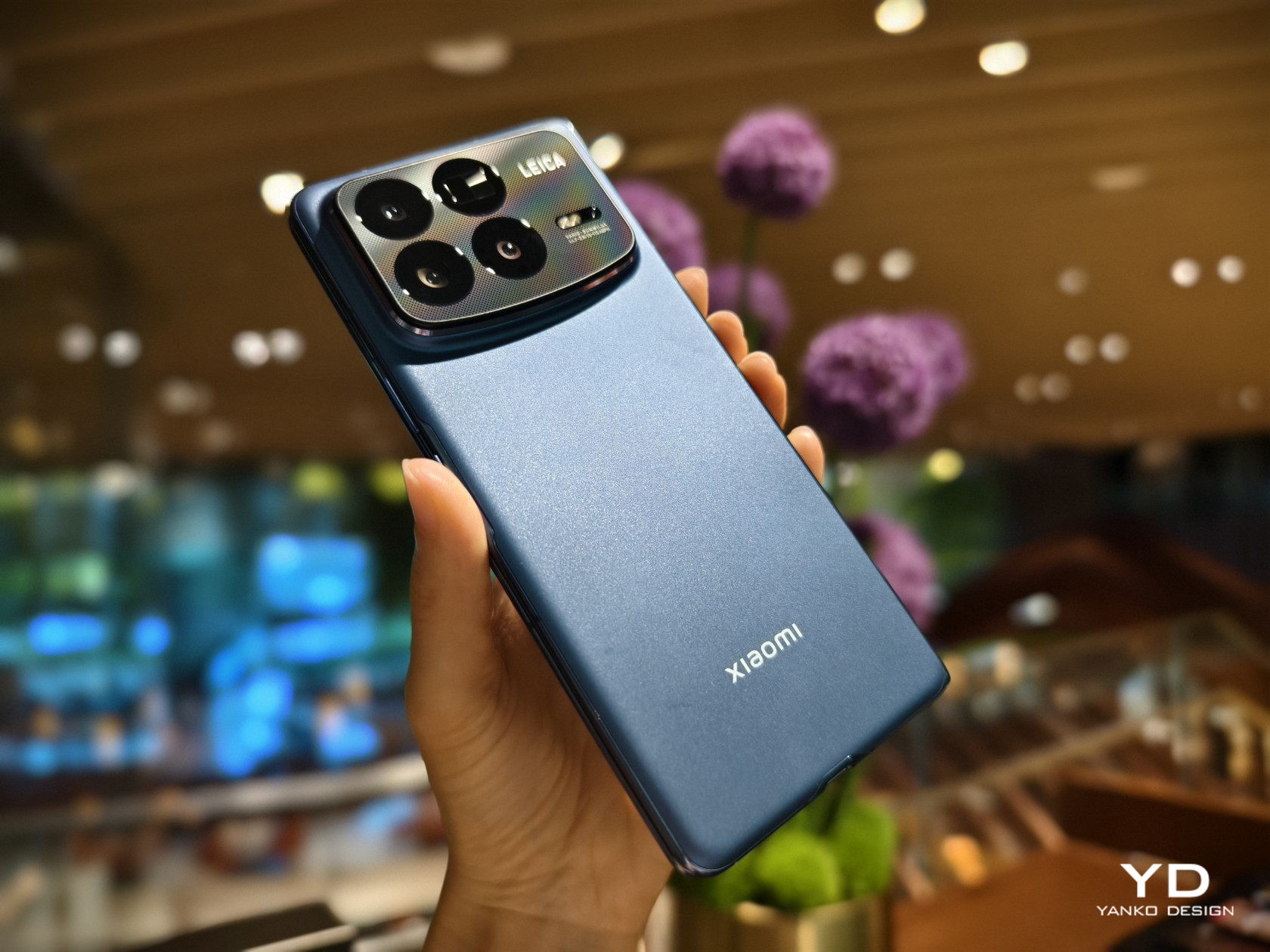
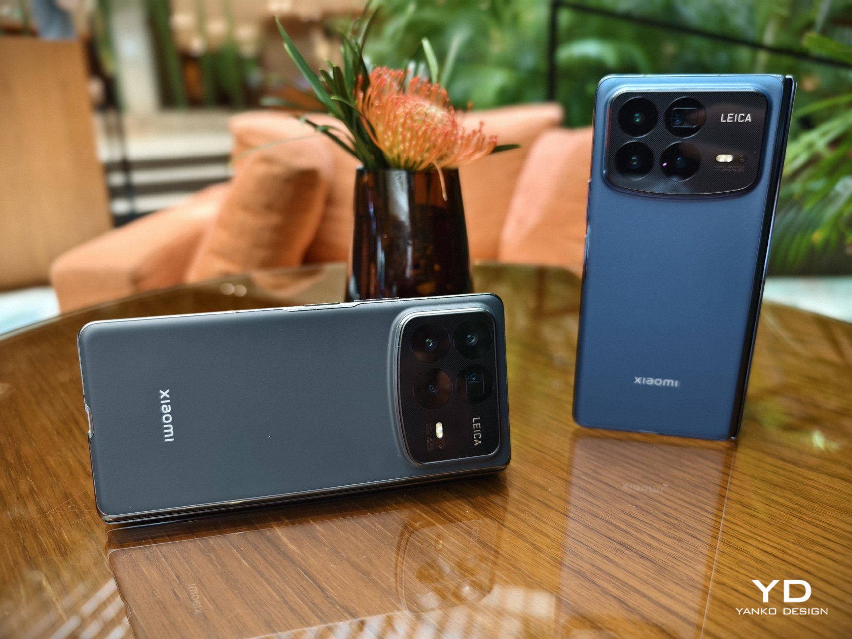
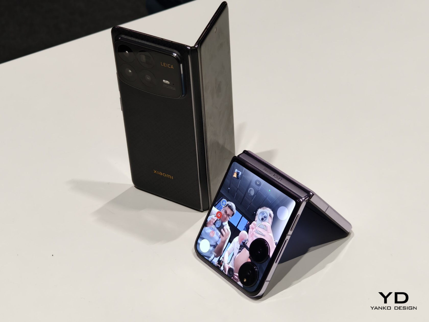
Whatever improvements Xiaomi made when it came to making the MIX Fold 4 extra-thin goes out the window when you see how thick the camera bump is, almost as thick as the (unfolded) phone itself. The raised box has a somewhat asymmetrical design where the lower edge curves down ever so slightly. There’s a grid pattern on the glass surrounding the cameras, and it’s actually a texture that you can feel with your finger. It’s a nice touch, but one that seems a bit out of the left field.
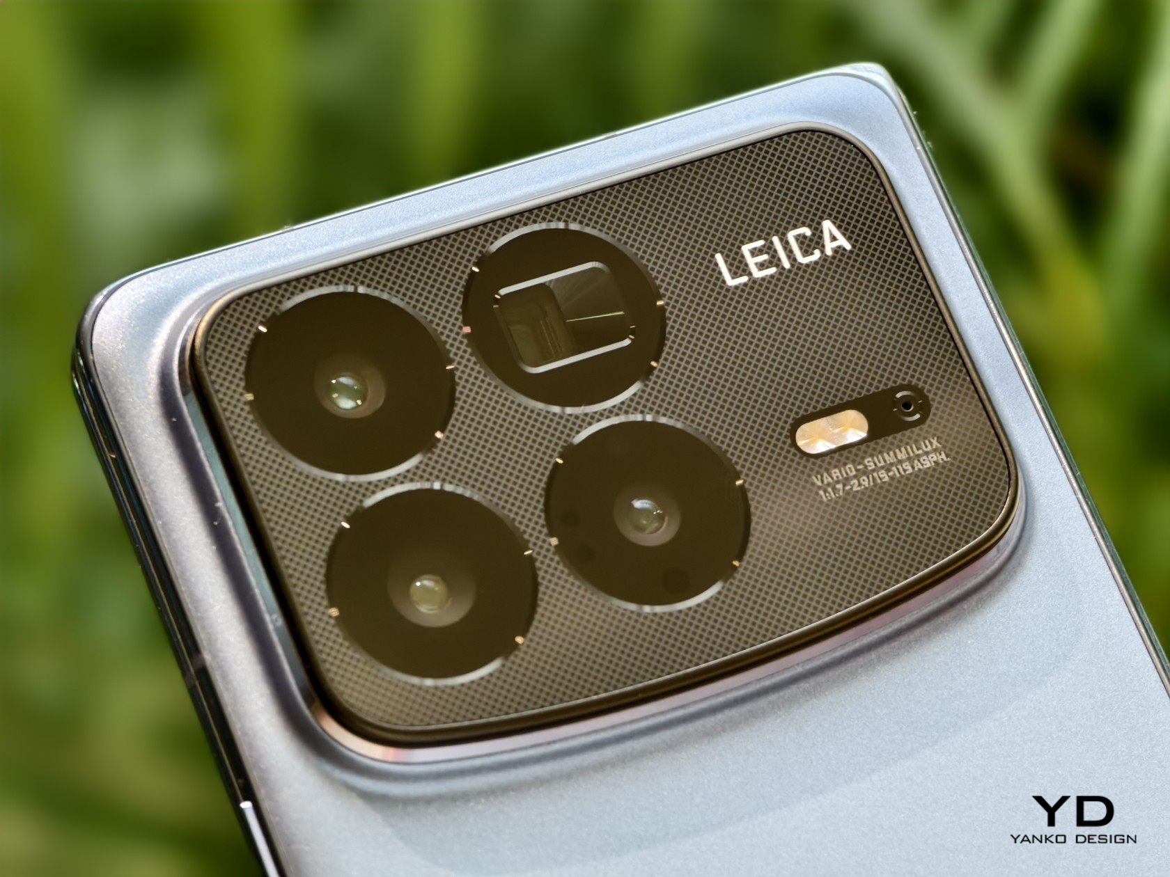
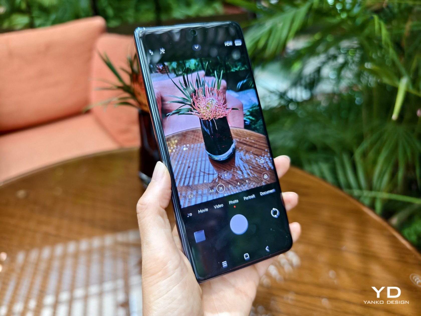
You will, however, forgive that slight design oddity when you witness the results of the four cameras on the MIX Fold 4’s back. There’s a 50MP main shooter with all the bells and whistles you’d expect, and it’s joined by not one but two 50MP telephoto cameras, one with a floating-style lens used for portrait and macro photography, the other with a periscope-style lens with 5x optical zoom. The ultra-wide camera has a 12MP sensor that’s admittedly just a small step higher than the typical measly 8MP. It still needs rigorous testing for verification, but what we’ve seen so far is enough to consider that large camera bump well worth the sacrifice.
Final Thoughts
Almost everyone (except Apple, of course) is making a foldable phone these days, and the competition is heating up as more players join the race. It’s no longer enough to just have the latest specs or a durable hinge, you also need to push the envelope of design and performance to catch up with non-foldable flagships. With one of the thinnest and lightest designs in this segment and a quad-camera system that could be on par with the latest and greatest, the Xiaomi MIX Fold 4 is inching closer to that ideal where there will be very little reason to opt for a non-foldable phone.
While we had to part ways with the MIX Fold 4, be sure to be on the lookout for our review of the Xiaomi MIX Flip, the brand’s first foray into the land of compact clamshell foldables.
The post Xiaomi MIX Fold 4 Hands-on Review: Thin in Size, Big in Everything Else first appeared on Yanko Design.