Vizcom x Corkway Launch a ‘Cork Design Challenge’ With Winning Designs Getting Industrial Production

Cork has spent decades being underestimated. Wine stoppers, bulletin boards, yoga mats, the occasional floor tile. Somewhere along the way, a material with genuinely remarkable engineering properties got slotted into the background of everyday objects.

That changed when designers started paying attention to cork’s unique properties: it absorbs sound, repels moisture, insulates against heat, compresses without cracking, and comes from a tree that absorbs more carbon than it releases. The story of cork is really a story of a material waiting for the right question to be asked of it.

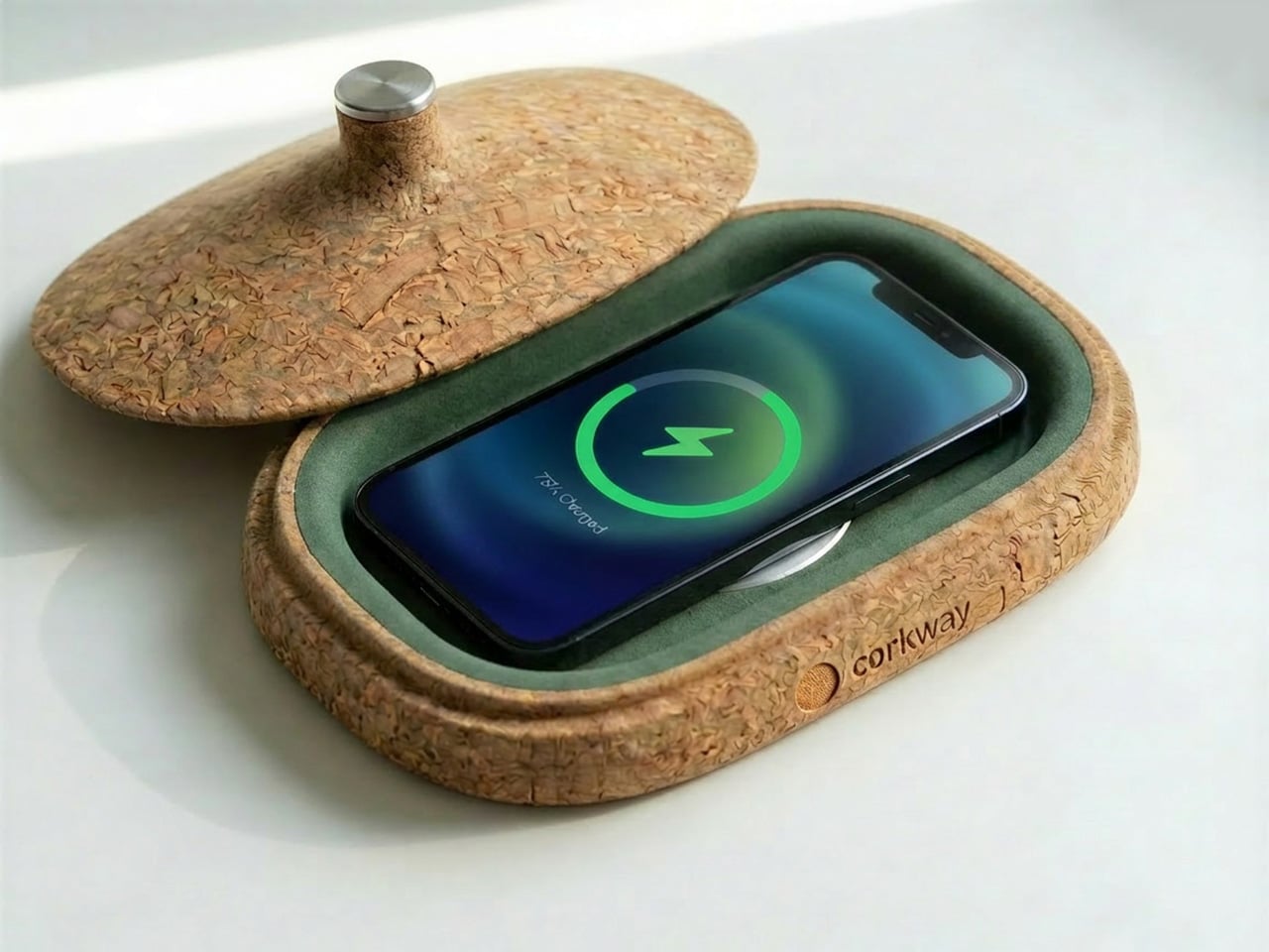
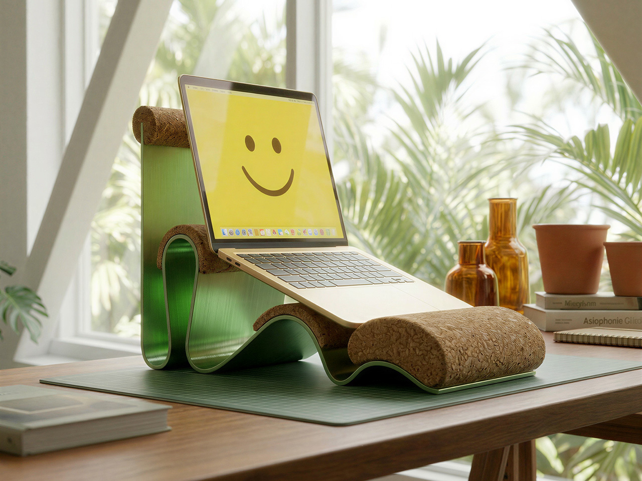
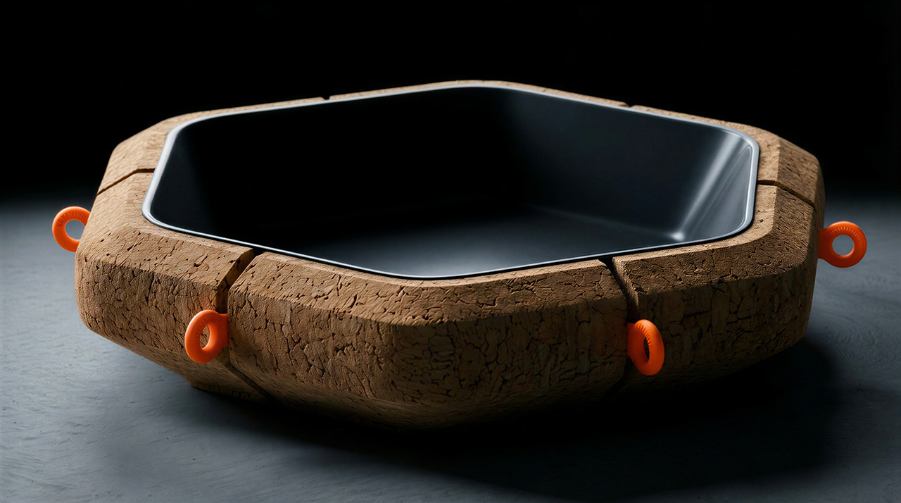
Vizcom and Corkway are asking that question now. Their Cork Design Challenge invites designers worldwide to reimagine cork in the spaces where people live, gather, and work, from home interiors to public installations to office environments. The brief is intentionally wide, letting designers push the boundaries of the material: from wall coverings, ergonomic objects, acoustic installations, to even sculptural décor. What makes the challenge compelling is that the top three designs get physically manufactured, CNC-milled from cork blocks in Portugal, and shipped to the winners. Submissions are open through June 8, 2026.

Click Here to Submit Now: Hurry, last date to enter is June 8, 2026.

The Brief

Vizcom and Corkway have structured the challenge around three spatial contexts: home, public, and office — each offering a different lens on how cork can enhance our everyday lives.

Designers are invited to think about how cork can enhance the comfort, experience, or functionality of a home? Could it redefine public installations or elevate office spaces?

At home, the intent is to push cork into décor and wall treatments that reframe how the material reads in a living space.

In public environments, the scope opens to installations, wayfinding systems, and seating concepts that could meaningfully transform communal areas.

Office applications lean into cork’s acoustic and tactile properties, where sound-absorbing partitions, ergonomic desk objects, and creative meeting environments are all fair game.

The Constraints

Creativity comes from constraints and these are the non-negotiables participants must keep in mind while they design:

  • Your design must be able to be CNC milled
  • Painted cork designs must be RAL colors
  • Must be at least 70% cork
  • Supplementary material can only be metal or plastic
  • Objects must be no larger than 890 (L) x 590 (W) x 180 (H) mm in total volume

The Submission
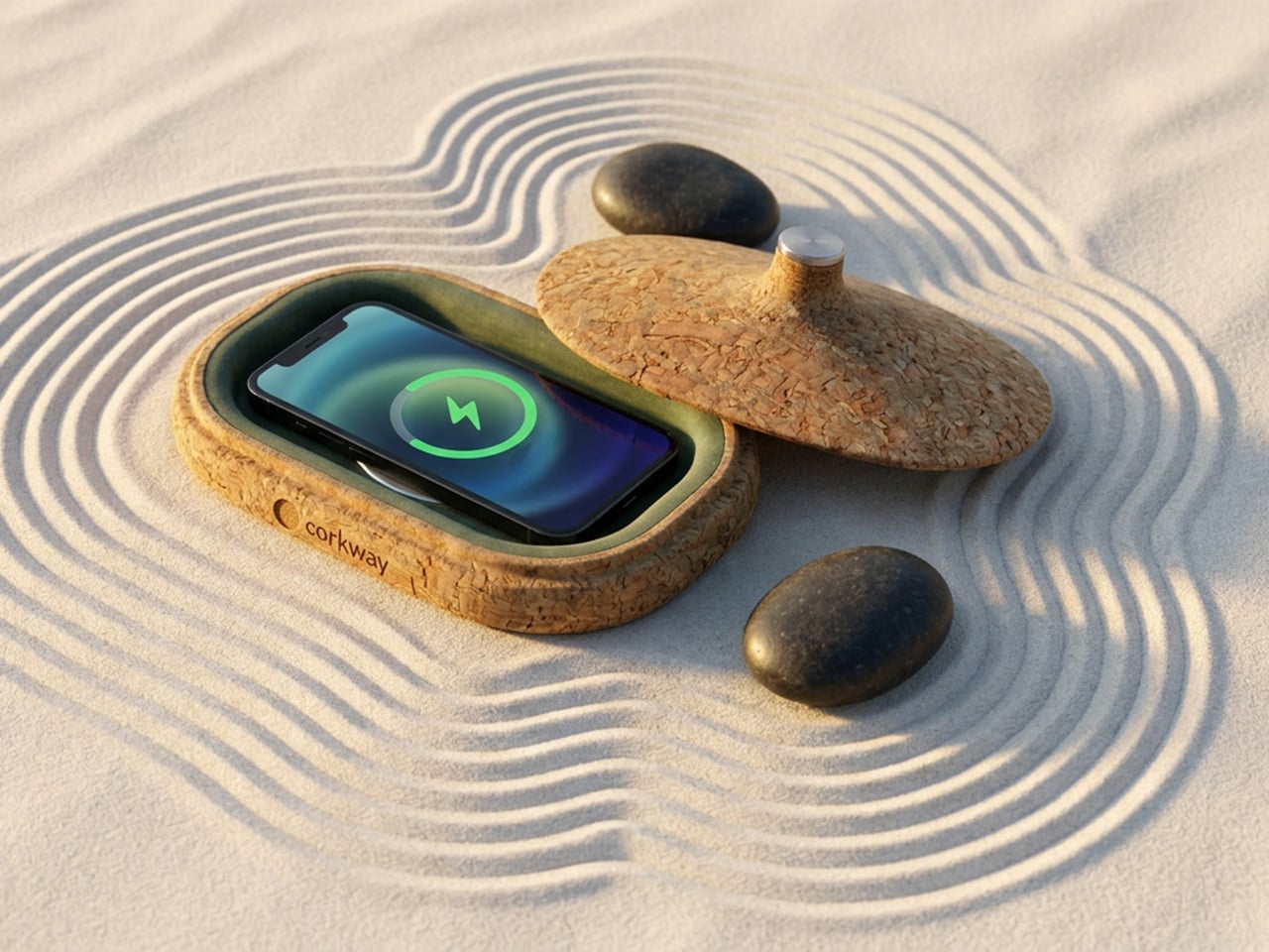
All entries must be designed in Vizcom: from early sketches through to final renders — and include a 3D model generated using Vizcom’s Make 3D tool as part of the submission.

All submissions must include:

  • Project name and description
  • Project inspiration
  • Vizcom project file link
  • Main hero image
  • Five final design images
  • One optional animation file

The best part: the winning concepts are made real. Corkway, the manufacturing partner behind the challenge will CNC-mill the top three designs from cork blocks at their production facility in Portugal and ship the finished objects to the winners. The challenge highlights the workflow from sketch to render, to real.

How To Participate

  1. Log in or create a free account at vizcom.com
  2. Access the Vizcom Template file from the Learn section
  3. Design your concept within Vizcom, ensuring your project meets the production constraints outlined in the challenge guide
  4. Generate a 3D model in Vizcom and set your project file to “Anyone with link” sharing

Submit your final entry at the challenge page before June 8 at 11:59 PM EST, including your project file link, hero image, five final design images, and a written project description and inspiration

Competition Dates

May 25, 2026 – Prompt released at 9:00 AM EST
June 8, 2026 – Submission deadline at 11:59 PM EST
June 16, 2026 – Top 30 announced
June 23, 2026 – Top 3 announced
Month of July – Production begins with Corkway

Judging Criteria
Entries will be evaluated by a panel of industry designers across five criteria:

  • Creativity and Originality (30%) – How well the design explores cork’s texture, flexibility, acoustic properties, and sustainability in meaningful ways
  • Design Quality and Spatial Experience (25%) – How well the concept integrates into a space, enhancing atmosphere, usability, and visual appeal
  • Feasibility and Material Understanding (20%) – Demonstrated understanding of cork as a material, including its strengths, limitations, and manufacturing possibilities
  • Process and Use of Vizcom (15%) – How ideas were explored, iterated, and developed using the platform
  • Alignment with Brief (10%) – How clearly the design connects to home, public, or office contexts while enhancing comfort, functionality, or experience

What You Can Win

Duck perched in a woven planter filled with plants floating on a pond, with a large orange koi swimming below.

  1. Your design, manufactured – in collaboration with Corkway, the top 3 winning designs will be CNC-milled and shipped to the winners
  2. Featured story – winning designs will be showcased across Vizcom’s site, social channels, and newsletter
  3. Vizcom Pro licenses – each winner receives 3 months of Vizcom’s Pro plan, free

Challenge Resources
Need feedback before you submit? Vizcom and Corkway are hosting two open office hours (May 28 at 12PM ET and June 5 at 10AM ET) — and keeping a #cork-challenge Discord channel open throughout the competition for material questions, design advice, and production guidance.

Join the Challenge
Close-up of a textured cork surface with the white branding 'vizcom × corkway' across the center.

If you’re a designer who’s ever wanted to see your idea made real, this is your chance. Design in Vizcom and submit your work by June 8 at 11:59PM for a chance to see it come to life.

How will you imagine cork in spaces we live, gather, and work?

Click Here to Submit Now: Hurry, last date to enter is June 8, 2026.

The post Vizcom x Corkway Launch a ‘Cork Design Challenge’ With Winning Designs Getting Industrial Production first appeared on Yanko Design.

This Dual-Sided Philips Monitor Lets You Share One Screen With Clients Without Sacrificing Desk Space

The business monitor market rarely sees truly original ideas, but Philips may have found one with the new Philips 24B2D5300. Instead of chasing higher resolutions or curved ultrawide panels, the company has introduced what it calls the world’s first standalone dual-sided monitor, placing two full HD displays back-to-back inside a single chassis. The idea sounds unconventional at first, but its practical applications quickly become obvious in customer-facing environments, collaborative offices, reception counters, healthcare desks, banks, retail spaces, and coworking setups where information needs to be shared across a desk without awkwardly rotating a screen.

The monitor uses two 23.8-inch IPS LCD panels, each with a 1920 x 1080 resolution and a 120Hz refresh rate. Both displays support wide 178-degree viewing angles, ensuring the image remains visible and color accurate from nearly any position. Philips also includes its SoftBlue low-blue-light technology and TÜV Rheinland certification to reduce eye strain during long work sessions. Unlike standard dual-monitor setups that consume more desk space and require additional cabling, the 24B2D5300 integrates everything into one footprint while still offering two independently usable screens.

Designer: Philips

The real innovation lies in how the screens can operate. Philips’ DualView and SmartView software features allow the monitor to either mirror content across both displays or extend the desktop independently. In practice, this means an employee can keep confidential information visible only on their side while showing approved content such as invoices, forms, instructions, transaction details, or queue information to customers on the opposite display. It can also function as a collaborative workstation where two users interact with the same computer from opposite sides of a desk. Philips even claims the monitor can handle up to three simultaneous application windows through its split-screen functionality.

Connectivity is equally business-focused as each side includes its own HDMI and USB-C ports, with the USB-C connections supporting up to 65W power delivery for laptops and notebooks. The monitor can connect to one or multiple devices simultaneously, allowing the screens to function independently if needed. Built-in stereo speakers, USB hub functionality, and synchronized on-screen display controls further simplify workspace management. A 180-degree swivel stand also helps users quickly rotate the display to check the opposite screen without repositioning the entire setup.

While the hardware specifications themselves are relatively modest by gaming or creative-professional standards, the product is clearly aimed at improving workflow efficiency rather than visual performance. The monitor’s compact design could be particularly useful in environments where counter space is limited, but customer interaction is constant. Tech observers have already pointed out that the concept feels surprisingly practical despite its unusual appearance, especially for front-desk staff, service counters, and collaborative workplaces.

The Philips 24B2D5300 is expected to launch in parts of Europe beginning in June 2026, with reported pricing starting around £359.99 (roughly $480). Availability in other markets has not yet been confirmed, though the monitor’s distinctive functionality could easily attract broader global interest if businesses see value in its space-saving and customer-friendly design.

The post This Dual-Sided Philips Monitor Lets You Share One Screen With Clients Without Sacrificing Desk Space first appeared on Yanko Design.

Africa’s Tallest Tower Was Worth the 40-Year Wait

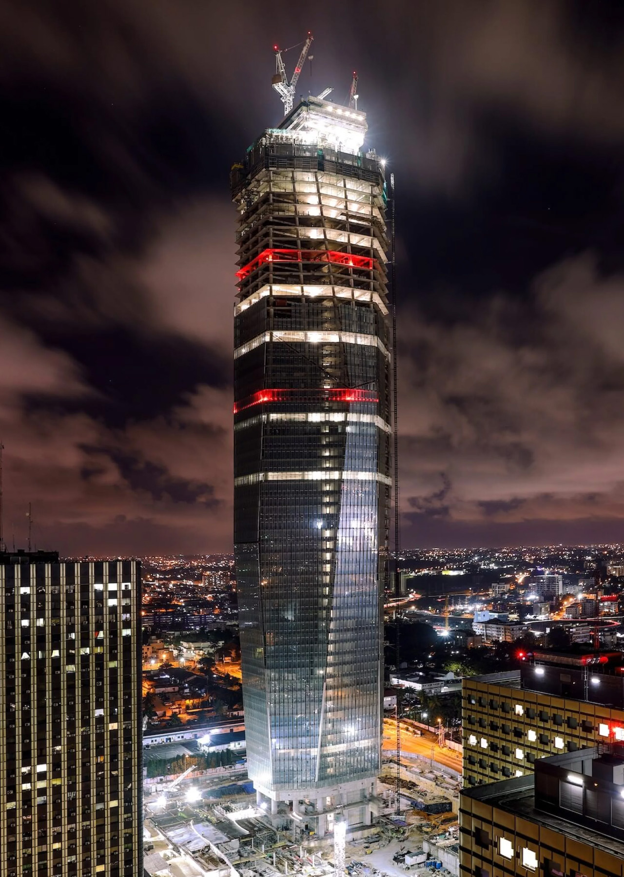
Forty years is a long time to wait for a building. But when you see what’s rising in Abidjan, the delay starts to feel almost intentional — like the city was simply holding its breath for the right moment. Tour F, the supertall skyscraper currently piercing the skyline of Ivory Coast’s economic capital, was first imagined in the 1970s as part of a sweeping urban development plan for Abidjan’s Plateau district. The idea was straightforward: complement the existing administrative towers — A through E — with a sixth.

What wasn’t straightforward was actually building it. The project stalled for decades, a vision suspended in bureaucratic and economic uncertainty. Construction finally broke ground in 2021, with BESIX Group drilling 70 foundation bars and 62-meter-deep diaphragm wall panels to anchor the structure.

Designer: Pierre Fakhoury

Designed by Lebanese-Ivorian architect Pierre Fakhoury — the same mind behind the breathtaking Notre-Dame de la Paix Basilica in Yamoussoukro — Tower F is not trying to be a generic glass box. It has something to say. The form is sculptural: a slender volume whose facade is carved into trapezoidal inclined glass planes, each facet tilting inward toward the earth or reaching toward the sky. The top is cleanly truncated, then crowned with a dramatic extension of the glass facade that dissolves into open air. It’s restrained and bold at the same time — a difficult balance that Fakhoury pulls off with architectural confidence.

What makes the design genuinely compelling is its embedded cultural logic. When viewed from a certain angle, the play of facets reads as a stylized African mask — a nod to West African artistic tradition embedded quietly into a 21st-century supertall. The building is symmetrical along its east-west axis, grounding the sculptural gesture in structural clarity. At street level, a simple rectangular podium houses the main entrance hall and support services, keeping the base honest and approachable despite the tower’s imposing scale.

At 421 meters, Tower F is set to claim the title of Africa’s tallest building, surpassing The Leonardo in Johannesburg. The gross floor area reaches approximately 140,000 square meters, consolidating government ministries and administrative units currently scattered across the city — a practical ambition wrapped in an extraordinary shell.

Construction costs are estimated at approximately €450 million, developed through a collaboration between the Ivorian Ministry of Construction and local firm PFO Africa. Completion is expected in 2026. For a continent whose architectural ambitions are accelerating fast, Tower F is exactly the kind of project that reframes the conversation — not just about African skylines, but about what it means to design a building that carries cultural memory into the future.

The post Africa’s Tallest Tower Was Worth the 40-Year Wait first appeared on Yanko Design.

The Lounge Chair That Has No Welds, No Joints, and No Legs – Just One Bent Sheet of Metal

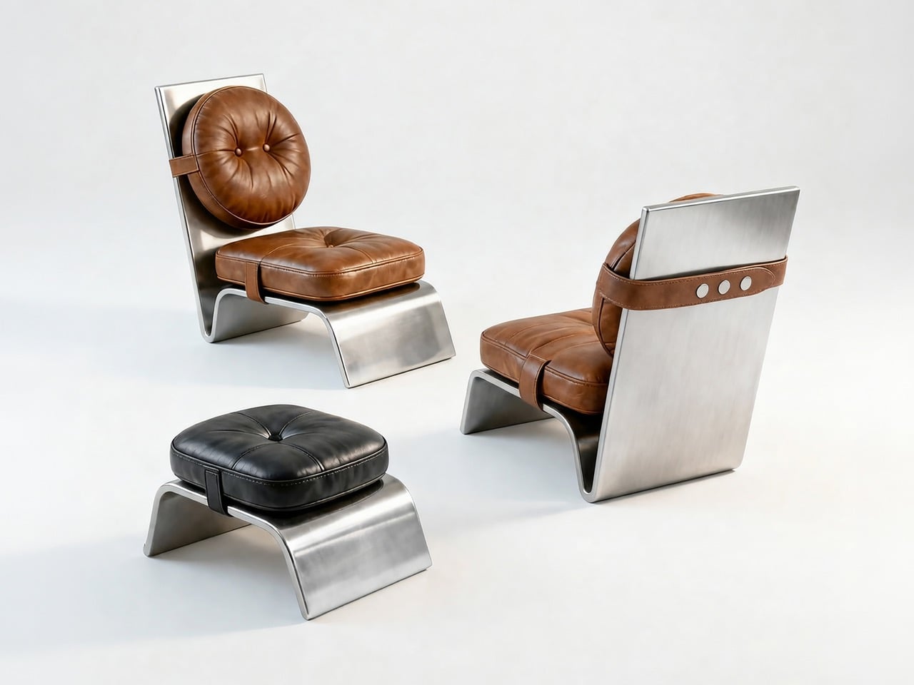
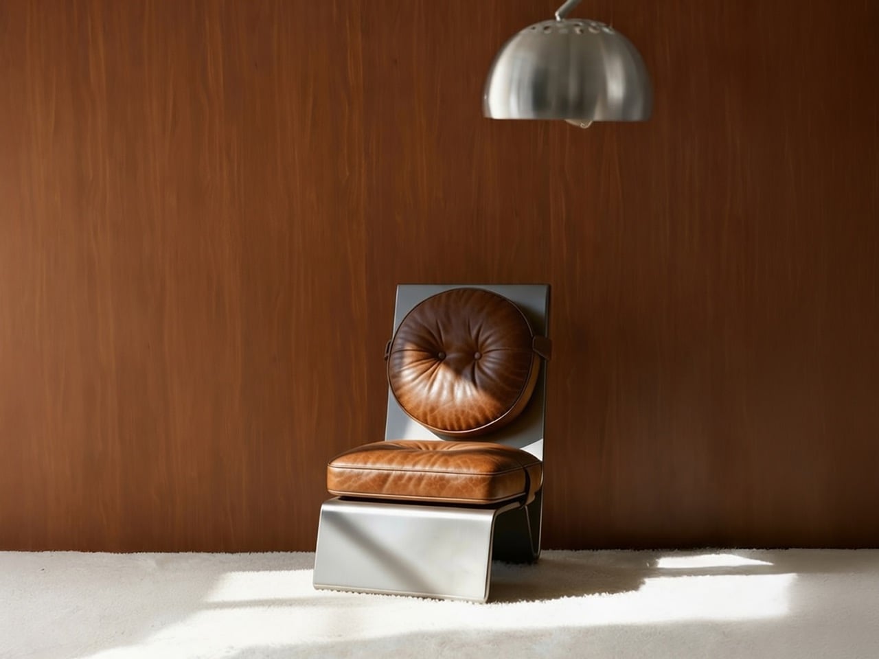
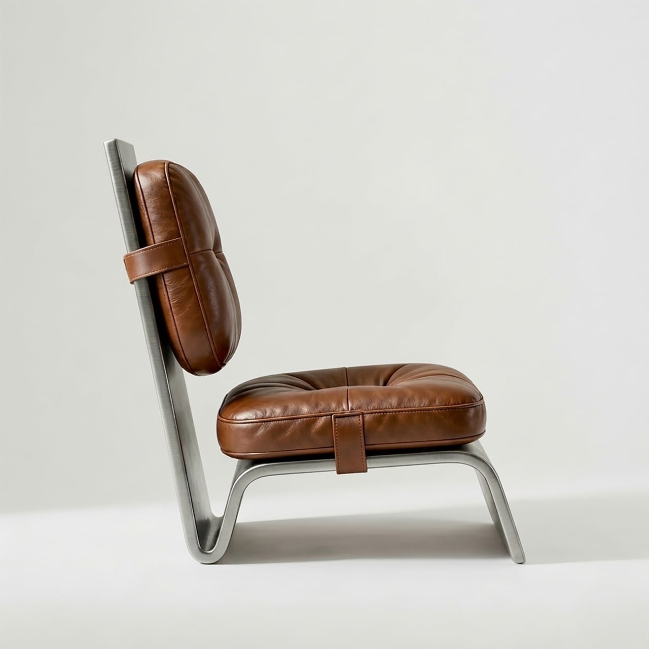
Sheet metal has been a furniture material for decades, but it almost always gets hidden. It becomes the internal skeleton, the underframe, the bracket buried beneath upholstery or lacquer. The design conversation rarely starts with the metal. Deniz Özdemir’s Arc One, an A’ Design Award-winning lounge chair developed in Istanbul between October 2025 and February 2026, turns that convention completely around, making the sheet metal the entire visible statement and letting the leather cushions play second fiddle to the structural drama underneath them.

From the side profile, the Arc One reads as a single continuous gesture, one surface that sweeps from backrest plane through seat pan and curls forward into the base. No legs. No frame. No secondary structure of any kind. The bent metal does all of it simultaneously, and Özdemir arrived at that form using only laser cutting and CNC bending, two processes that leave no room for the kind of hand-finishing that usually disguises manufacturing decisions in premium furniture.

Designer: Deniz Özdemir

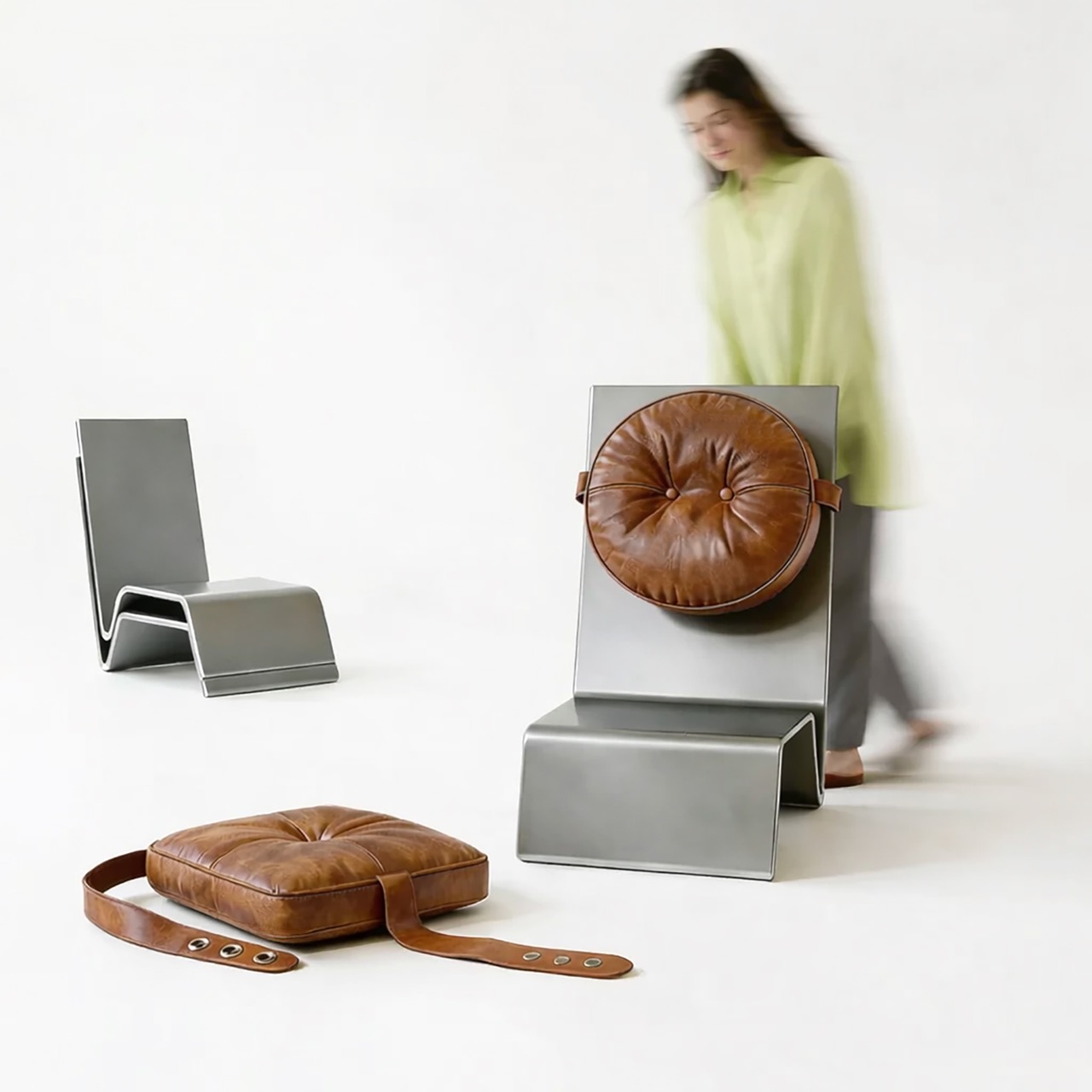
Most lounge chairs are assemblies, a frame joined to a seat shell joined to a base, each junction representing a production step, a potential failure point, and a logistics complication. Arc One eliminates all of that. The single-piece body requires no welding and no mechanical fastening, which means the bare frames stack flat for storage and transport, a logistical advantage that most furniture at this aesthetic level completely ignores. Özdemir’s research documentation notes that this directly reduces both production complexity and logistics volume, and looking at the photographs of the bare stacked frames, the practicality of that claim is immediately visible.

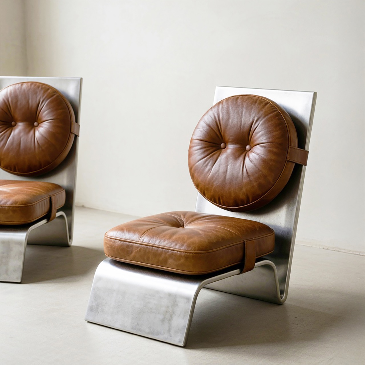
A round tufted back cushion and a square tufted seat cushion attach to the metal body via leather straps with snap fasteners, hardware that belongs more in a saddle shop than a furniture atelier. The strap details are visible and intentional, running horizontally across the metal surface with small riveted or snapped connections that read as honest joinery rather than disguised engineering. Remove the cushions entirely, and the bare metal frame is a genuinely severe object. Reattach them, and the warmth is immediate and complete, all without the metal structure yielding anything of its industrial character.

The cognac brown of the tufted leather against brushed raw metal is a pairing with serious mid-century pedigree, recalling the material confidence of Osvaldo Borsani’s work from the 1950s and 60s, where Italian designers routinely married industrial metal frames with generous upholstery without apologizing for either. The Arc One’s ottoman extends the family naturally, same bent-base logic scaled down, topped with a square tufted cushion that mirrors the seat in a different colorway.

At 650mm wide, 750mm deep, and 850mm tall, the proportions sit comfortably within lounge chair conventions without disappearing into them. The replaceable upholstery is the long-game move that most furniture at this price positioning forgets to make. Leather wears, tastes change, and a chair whose cushions can be swapped out for a different color or material is a chair with a genuinely extended lifespan. That decision transforms the Arc One from a sculptural object with a fixed personality into something closer to a platform.

The post The Lounge Chair That Has No Welds, No Joints, and No Legs – Just One Bent Sheet of Metal first appeared on Yanko Design.
OnePlus Mini Tablet Leak: Snapdragon 8 Gen 5, OLED Display, and a Real Shot at the iPad Mini

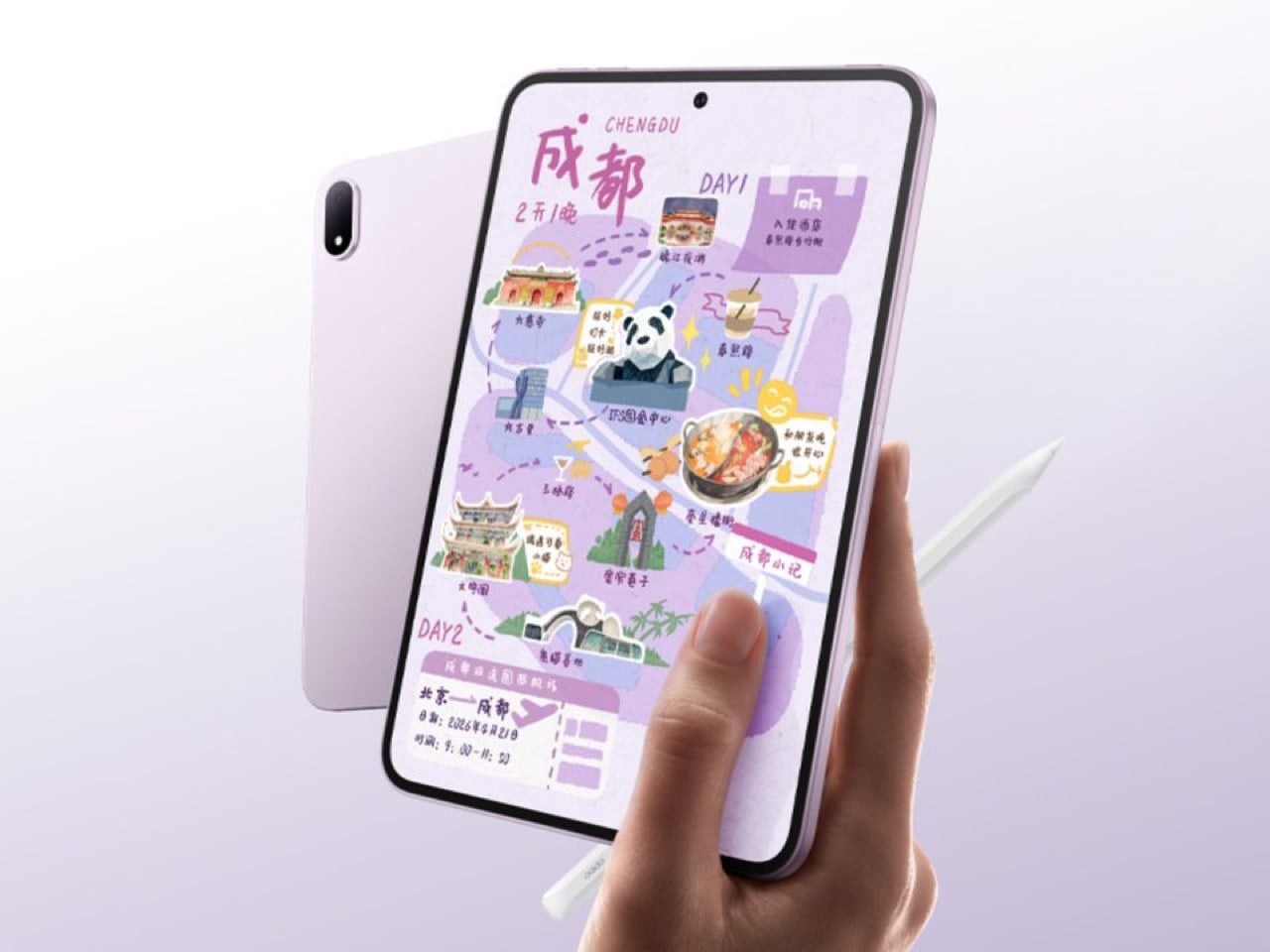
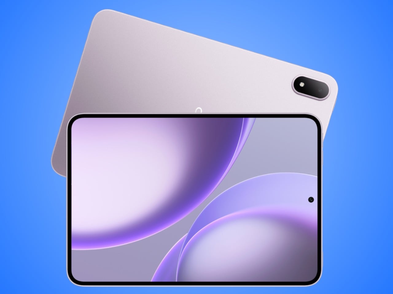
The Oppo Pad Mini (exclusive to China) serves as a template for what OnePlus’ mini tablet will look like.

Apple, a company that charges a premium for premium display technology, has somehow never put an OLED screen in its most pocket-friendly tablet. The iPad mini sits there in 2025 with a Liquid Retina LCD while the iPad Pro ships with a tandem OLED panel that costs as much as a laptop. That inconsistency has nagged at iPad mini fans for years, the sense that Apple’s smallest tablet is perpetually treated as a second-class citizen in its own lineup. It sells well enough to survive, but never well enough, apparently, to earn the display upgrade it deserves.

OnePlus may be about to make Apple look even more stubborn on that front. A leak from tipster Abhishek Yadav describes a compact OnePlus tablet with an 8.8-inch OLED display, 144Hz refresh rate, and Snapdragon 8 Gen 5 under the hood, paired with LPDDR5X RAM and UFS 4.1 storage. If those specs hold, OnePlus would be shipping a compact Android tablet with a display technology the iPad mini still does not have. A global launch is reportedly targeting Q3 2026, with India expected to be among the first markets. The hardware pitch is unusually straightforward: better screen, flagship guts, same general size class.

Designer: OnePlus

The spec sheet here reads like OnePlus raided the OnePlus Pad 4’s parts bin and asked engineering to compress it. That larger tablet runs a 13.2-inch IPS LCD with Snapdragon 8 Elite Gen 5, which is a fine machine for productivity but firmly in “bag required” territory. This rumored compact model flips the script entirely, pairing flagship silicon with a form factor you can actually hold one-handed on a commute. The 8,000mAh battery and 67W charging round out a package that looks, on paper, like the small Android tablet the market has been waiting for since the Nexus 7 quietly aged out of relevance over a decade ago.

The honest caveat here is that this hardware almost certainly has a prior life. The spec profile aligns closely with the Oppo Pad Mini, a China-exclusive device that has been doing exactly this job domestically without making a dent in the global conversation. LPDDR5X and UFS 4.1 mean fast memory and storage throughput, the kind of internals that keep a tablet feeling snappy for years rather than sluggish after two software updates. A OnePlus label, a global distribution push, and software support that extends beyond China would transform what is essentially proven hardware into a legitimate mainstream contender.

Pricing remains the missing piece. OnePlus has historically been disciplined about value positioning, which is precisely what makes this device interesting beyond the spec sheet. The iPad mini 7 starts at $499. If OnePlus lands this anywhere south of that number with an OLED panel and Snapdragon 8 Gen 5 inside, the conversation around compact tablets changes in a way it genuinely has not since Apple invented the category.

The post OnePlus Mini Tablet Leak: Snapdragon 8 Gen 5, OLED Display, and a Real Shot at the iPad Mini first appeared on Yanko Design.

Your Home’s Newest Resident Is a Tiny Blue Butler

Furniture, as a category, is not usually meant to make you smile. It holds things, supports things, stores things. Function dictates form, and form gets built around the assumption that your chair or side table should have as little personality as possible. That is the design orthodoxy, at least. The longstanding idea that objects in service of a purpose should quietly disappear into the background, noticed only when they are missing. Liam de la Bedoyere disagrees. And Mini Monsieur is his very persuasive argument.

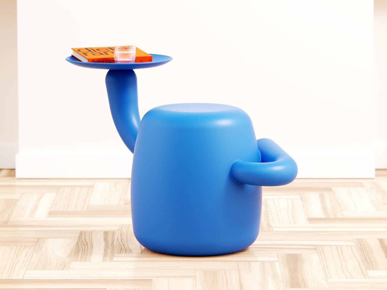
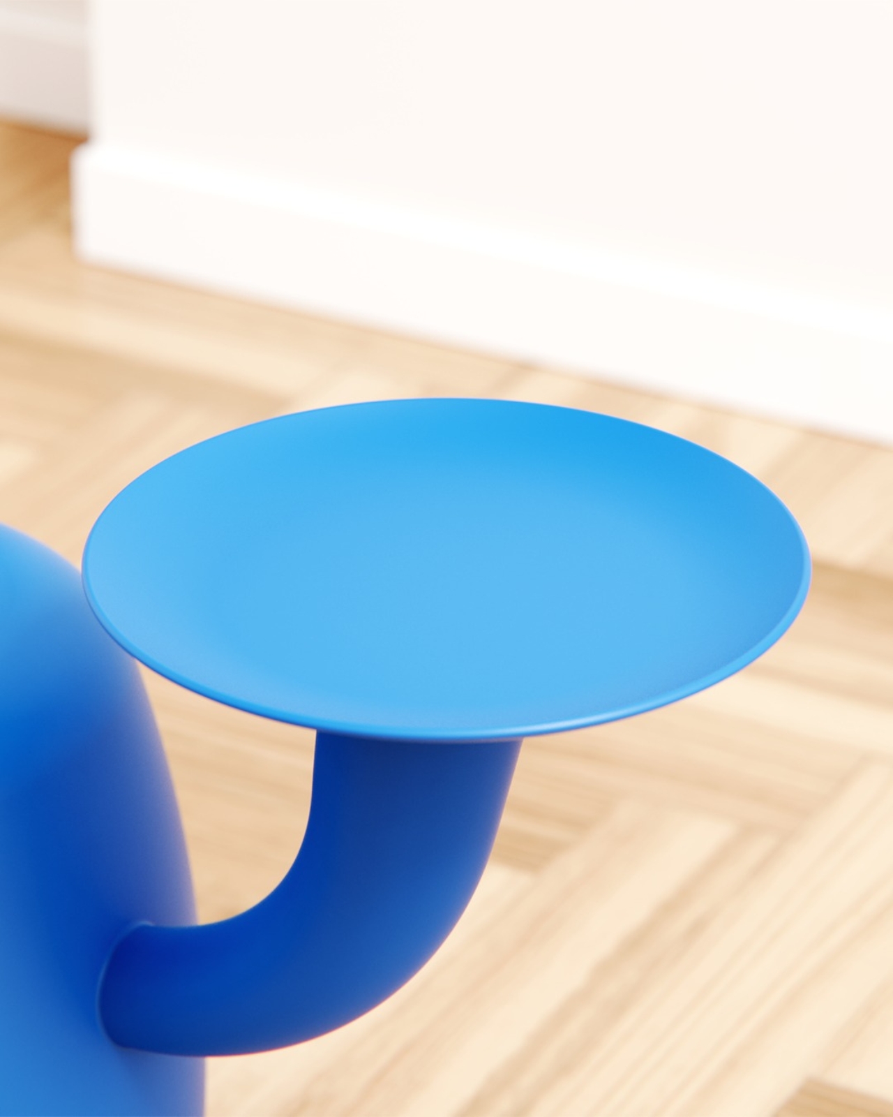
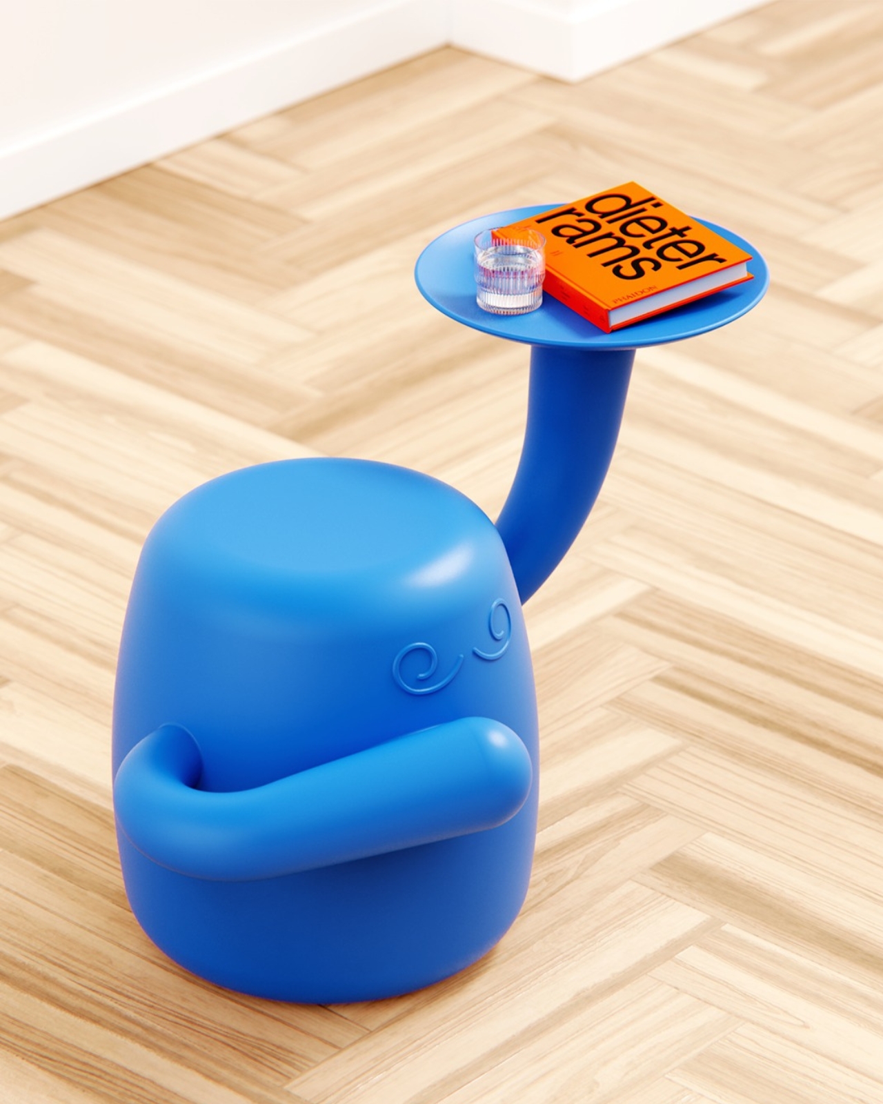
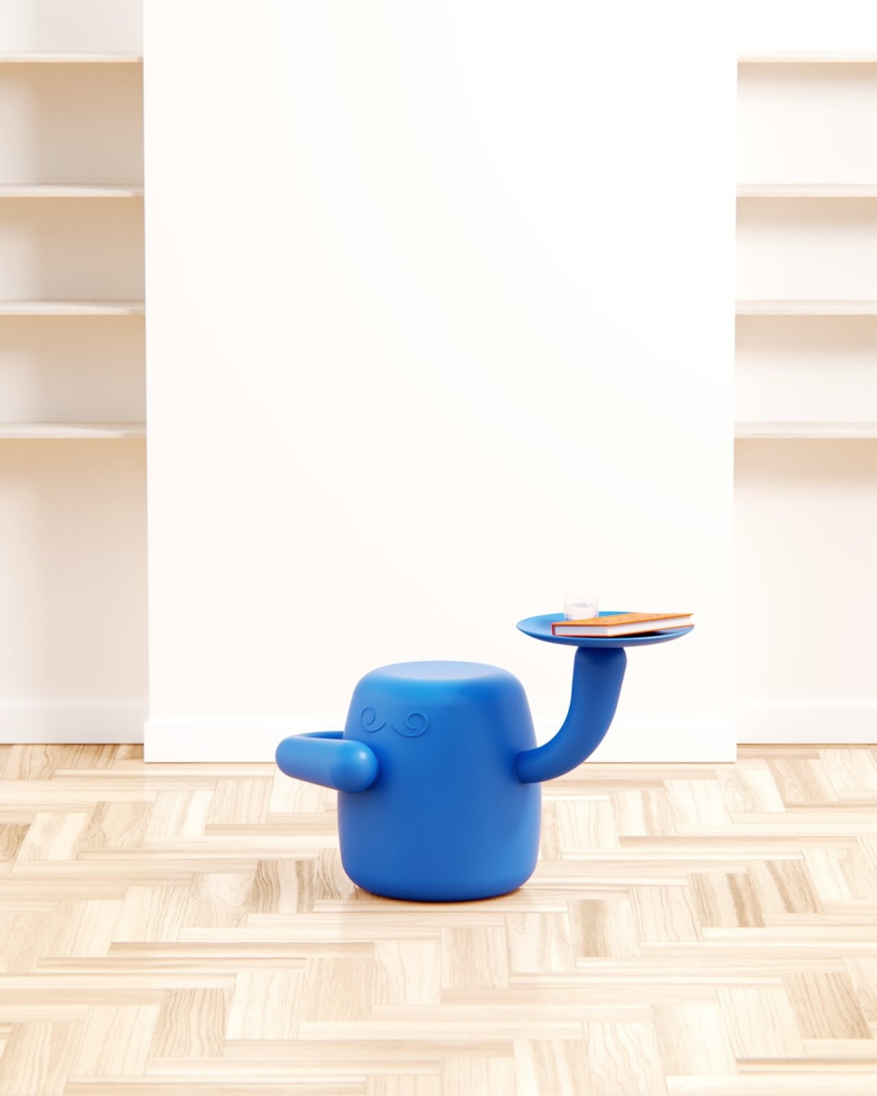
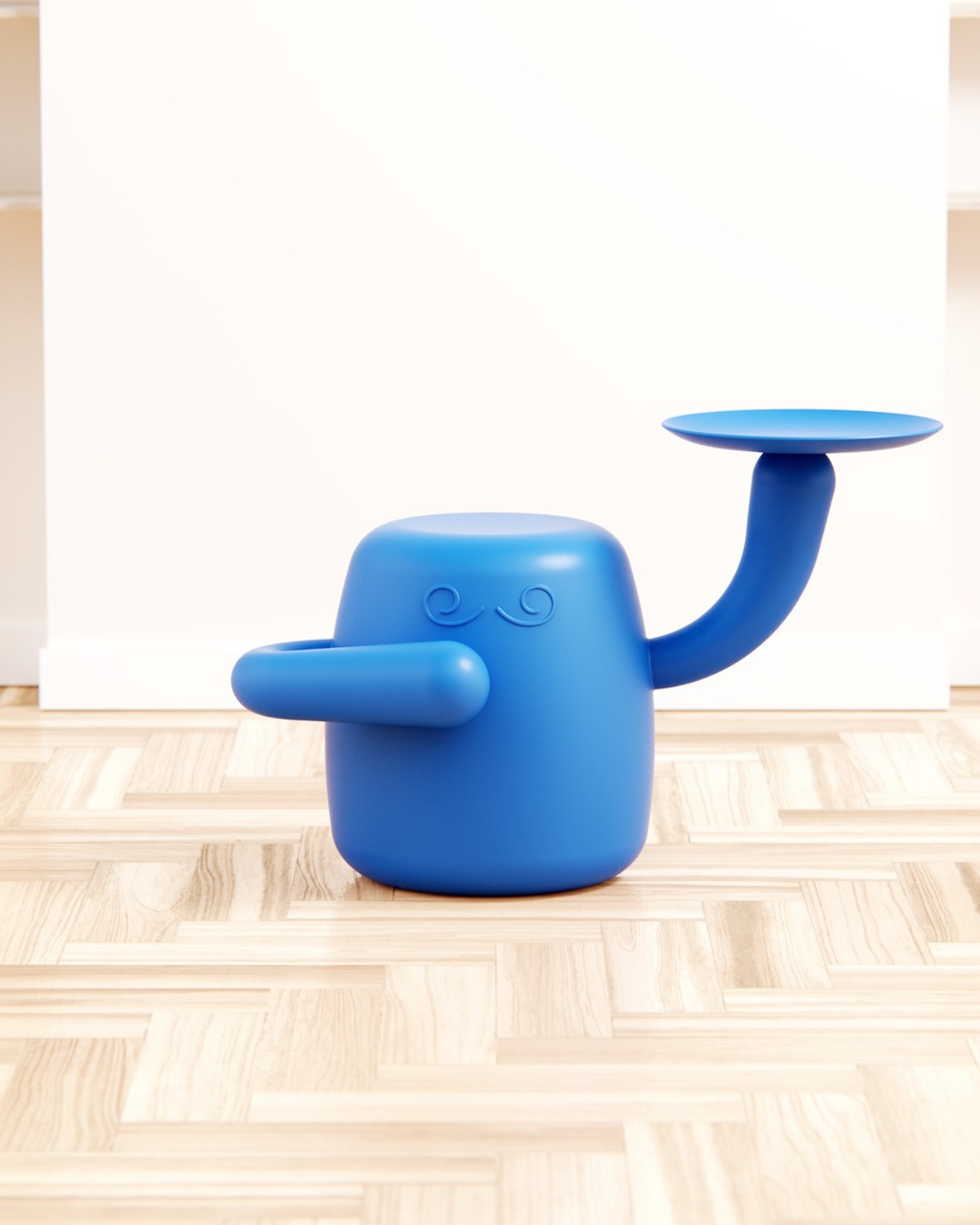
This concept piece, developed as a personal project at boredeye.design, rethinks the stool and side table as something altogether more alive. Mini Monsieur is a squat, rounded body rendered in an irresistible cobalt blue, with two arms posed differently: one curled against its torso, the other raised high and balancing a flat circular tray. Two swirling embossed brows sit just below the flat crown of its head, giving it the air of a patient, quietly distinguished little servant. If you have ever thought your furniture should have more opinions, this piece has exactly enough.

Designer: Liam de la Bedoyere (boredeye.design)

The butler concept is where the design gets genuinely clever. De la Bedoyere is not just making something cute, though it absolutely is that. The character premise actually explains the function. A butler exists to be present without being intrusive. It waits. It holds things for you. It serves without asking why. Translating that relationship into furniture means the form earns its personality rather than wearing it purely as decoration. The raised tray arm is not a quirky detail; it is a job description made physical.

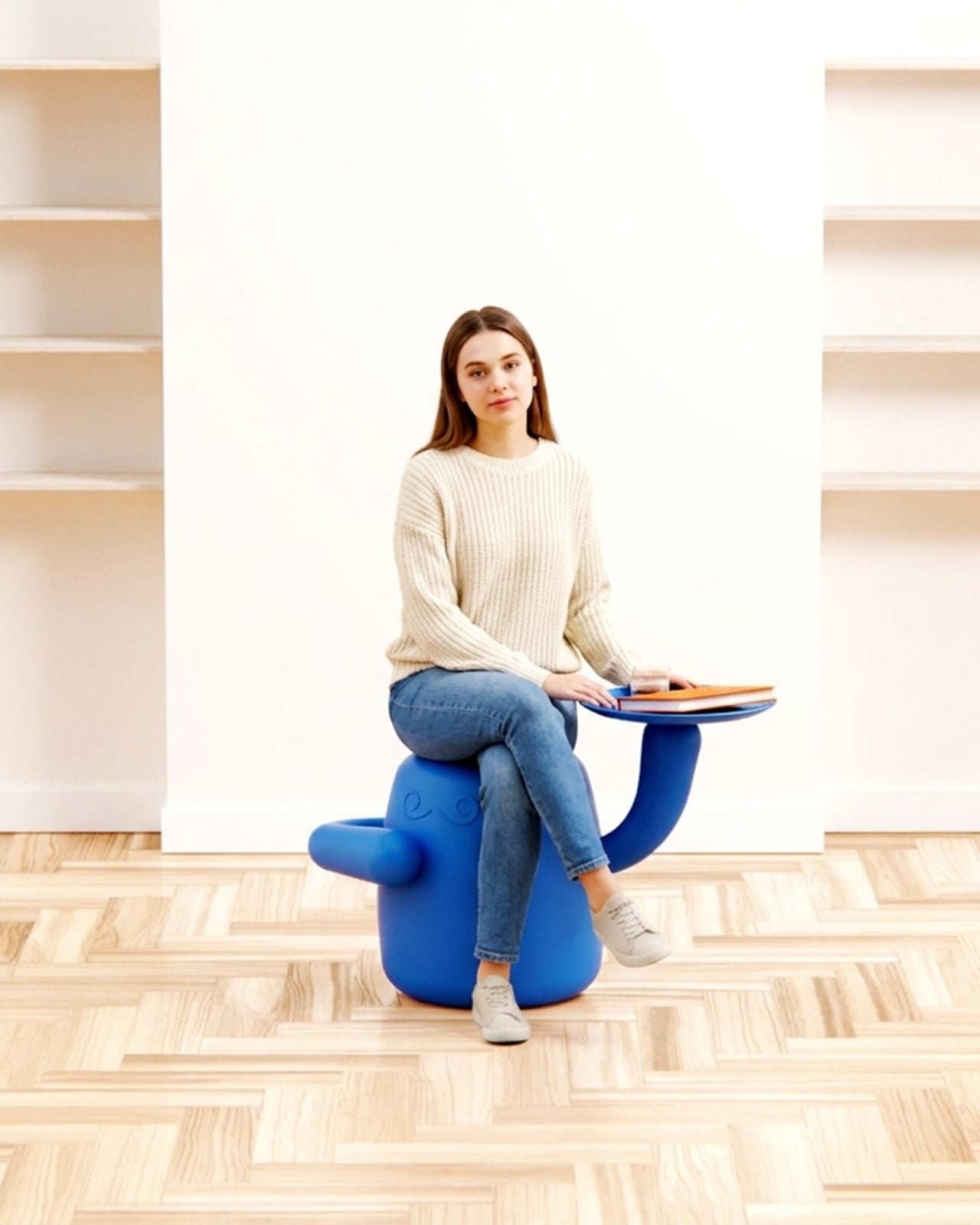
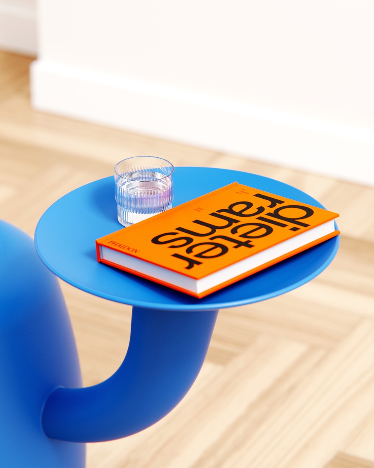
Functionally, Mini Monsieur works as both a stool and a side table, which makes it surprisingly practical for something that looks like it wandered off a Pixar set. The tray holds a glass, a phone, a book, whatever needs to be within arm’s reach without claiming additional floor space. A scaled render with a seated figure confirms it holds its own proportionally, compact without being precious, sized to actual human use rather than just optimized to photograph beautifully. You could genuinely use this every day.

Where the design earns its real credibility is in the restraint around how far the character goes. No mouth. No eyes. Just those two curled brows and the asymmetrical arms. De la Bedoyere stops exactly where he should, giving Mini Monsieur enough personality to register as a character without crossing into novelty-item territory. That balance is harder to strike than it looks, and it is the reason this concept holds its own in conversation with serious design references. The Dieter Rams book staged on the tray in the renders is not accidental. It is a knowing nod to the idea that rigorous design intent and genuine warmth do not have to occupy separate spaces.

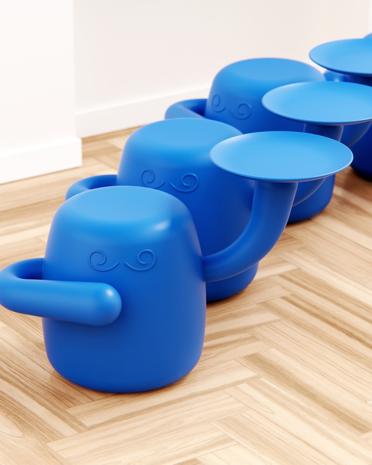
The all-over cobalt blue is also worth pausing on. Monochromatic execution is one of those choices that either elevates a form completely or exposes every weakness in it. Here, it does the former. The single-color treatment lets the silhouette read with full clarity, makes the curves feel more deliberate, and keeps the tray-as-arm reading as part of one cohesive body rather than a tacked-on accessory. One render includes a lone orange version surrounded by a field of blue, the kind of detail that signals a designer already thinking in colorways, editions, and how pieces behave as a family. That level of forward thinking is encouraging.

Whether Mini Monsieur moves from concept to production remains the open question, and frankly it is the only thing standing between this design and a very good home. My genuine hope is that it does, because the market for furniture that takes itself seriously while still being joyful is more underserved than we tend to acknowledge. Not everything needs to be a neutral linen cube or a Scandinavian plank. Sometimes a room benefits from something with a recognizable presence, a little dignity, and one arm already raised to take your drink. Mini Monsieur is already at its post, ready and waiting.

The post Your Home’s Newest Resident Is a Tiny Blue Butler first appeared on Yanko Design.

WWDC 2026: iOS 27, macOS 27 and the New Siri App — What to Expect June 8

Steve Jobs built Apple on the idea that hardware and software had to be designed as one thing, inseparable and mutually reinforcing. Tim Cook, who took over in 2011 with the company at roughly $350 billion in value, honored that philosophy while adding an operational layer Jobs never had the patience for: supply chains so resilient they made Apple virtually recession-proof, a services ecosystem generating over $100 billion a year, and a trillion-dollar valuation that eventually became three. Cook’s Apple was not the scrappy insurgent of the Jobs era. It was a machine, and WWDC 2026, opening June 8 at Apple Park, is the last keynote he delivers as CEO before stepping aside for John Ternus on September 1st.

Ternus running hardware engineering means he is the person responsible for Apple Silicon, the M-series chip architecture that gave Apple the on-device processing headroom to even attempt building a serious AI assistant. The timing of the leadership transition is its own kind of design decision: Cook presents the software at WWDC, and Ternus inherits it just in time to strap it to the iPhone 18, the rumored iPhone Fold, and whatever Mac hardware lands in the fall. iOS 27’s rebuilt Siri, a standalone app with Dynamic Island integration and a Google Gemini foundation licensed for a reported billion dollars a year, is the software story Cook leaves behind for Ternus to ship.

The Siri situation has been Apple’s most visible embarrassment in the AI era, and Cook knows it. While Google rebuilt Assistant into Gemini and OpenAI shipped ChatGPT to a billion users, Siri kept responding to complex queries with “I found some results on the web.” iOS 27 is the architectural correction. The rebuilt assistant ships as a dedicated app with conversation history, image and document input, and a chatbot-style interface that makes it feel, for the first time, like something a designer actually thought about. Activation drops a pill-shaped glow into the Dynamic Island with a “Search or Ask” prompt, and a swipe down from the top of the screen triggers it system-wide, effectively replacing Spotlight with something that can actually reason. The Gemini model underneath, accessed through Apple’s Private Cloud Compute infrastructure so user data never touches Google’s servers, is reportedly a custom 1.2 trillion parameter build licensed for around a billion dollars annually.

What makes iOS 27 structurally interesting, beyond the Siri cosmetics, is the Extensions framework. Apple is opening the platform to Claude, Gemini, and other third-party agents as swappable AI backends, accessible through a dedicated App Store section. A long-press on the Siri search bar lets you switch models entirely. That is a significant philosophical departure for a company that has spent fifteen years treating openness as a security vulnerability rather than a feature. Whether developers actually build compelling Extensions or whether the system becomes another neglected API graveyard is the real question, but the architecture at least acknowledges that Apple cannot win the AI race alone.

The rest of the OS lineup fills in around the Siri centerpiece. Wallet gets a “Create a Pass” feature that digitizes physical tickets and membership cards from a QR scan. Visual Intelligence gains the ability to read food nutrition labels and feed data directly into the Health app. Safari will auto-name tab groups. The keyboard gets a smarter autocorrect that suggests full rewrites rather than single-word swaps. macOS 27, meanwhile, is quietly laying software groundwork for touch-enabled Mac hardware that Ternus will presumably announce when he is ready. Apple treating macOS 27 as a Snow Leopard-style consolidation release, stable and foundational rather than showy, is exactly the kind of move that makes sense when you know a new CEO with a hardware background is about to take over.

Cook’s WWDC26 artwork says more than the tagline “Coming Bright Up” lets on. The Swift logo rendered in iridescent chrome and bloom light, the same visual language as iOS 26’s Liquid Glass design system taken to a more extreme register, telegraphs a platform doubling down on its own aesthetic identity even as it opens its AI layer to outside competition. It is a confident piece of visual communication from a company that built three trillion dollars of market value on the conviction that how things look and how things work are the same question. Ternus gets to answer what comes next.

The post WWDC 2026: iOS 27, macOS 27 and the New Siri App — What to Expect June 8 first appeared on Yanko Design.