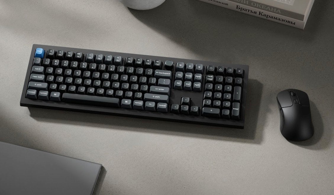
The Keychron V6 Ultra Hybrid 8K is a keyboard that combines magnetic and mechanical switches, designed to balance precision with tactile feedback. According to Kickbooster, this model features adjustable actuation down to 0.1 mm and rapid trigger technology, which support faster and more accurate inputs. With an 8K polling rate and the ability to switch […]
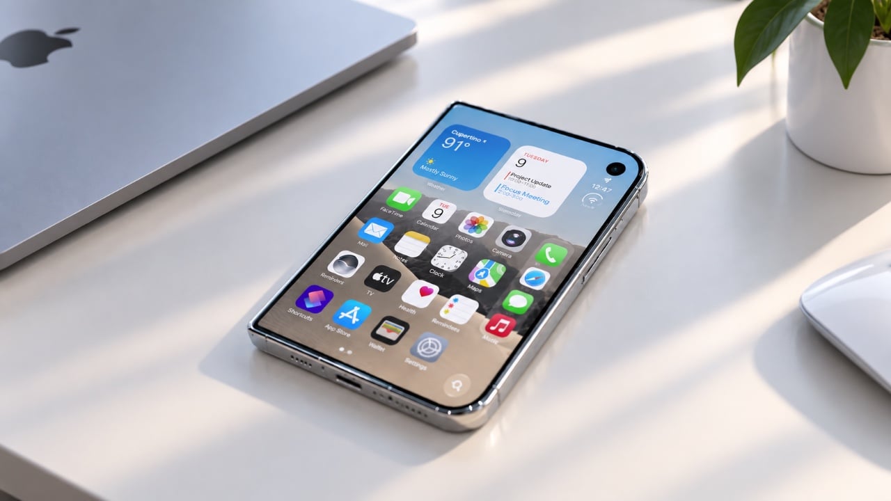
Apple has entered the foldable smartphone market with the iPhone Duo, marking a significant milestone in its product lineup. Priced at $1,999, the iPhone Duo combines a sleek foldable design with advanced features, aiming to cater to tech enthusiasts and early adopters. While the device showcases Apple’s signature craftsmanship and innovation, its high price and […]
A folding phone creates a folding problem for accessory makers, and MOFT’s answer for the iPhone Duo is to lean into that shape rather than fight it. The Dynamic Folio wraps the Duo in a single continuous flap of vegan leather that does triple duty, guarding the shell from scratches, propping the phone up on demand, and giving your hand something secure to hold onto. One fold, three jobs, no extra parts bolted on.
That fold takes its cue from origami, the same paper-based logic MOFT has applied to its iPad cases for years. Here it collapses down to a razor-thin 0.07 inches and adds just 2.58 ounces to the phone, numbers that matter enormously on a device already carrying two screens and a hinge. The case disappears into pocket space rather than fighting for it, staying close to the Duo’s own profile instead of doubling it.
Designer: MOFT
Unfold that flap, and it becomes a kickstand positioned dead center on the back of the phone, a deliberate placement that keeps the Duo balanced rather than tipping toward one edge. Four viewing angles come out of that single hinge point, covering both portrait and landscape orientations. One of those positions lays the phone nearly flat, built specifically for reading in bed or setting the Duo on an uneven surface without it sliding away.
That same centered geometry solves a smaller but real annoyance. Most phone grips assume you’re right-handed, forcing lefties to awkwardly reposition their thumb. Because the fold sits in the middle rather than off to one side, switching hands takes no adjustment at all. It’s a detail easy to overlook in a product photo but immediately noticeable the first time you actually use it one-handed on a crowded train.
Color plays into the case’s identity as much as its geometry. Rather than a single flat shade, the Dynamic Folio pairs contrasting tones between its exterior and the interior of the fold itself, so the moment you deploy the stand, a second color flashes into view. It’s a small piece of theater built into a purely functional motion, turning something as mundane as propping up your phone into a tiny visual reveal.
Wireless charging still works with the case installed, and the vegan leather shell is built to protect both the Duo’s inner and outer displays from scratches, not just the one you’d normally think to guard. At $69.99, the Dynamic Folio also marks the opening move in a larger accessory lineup MOFT has planned around the Duo, with a modular protective case, a rotating grip stand, and a card wallet still to come before the end of the year.
The iPhone 18 Pro introduces a range of updates aimed at enhancing performance, usability, and aesthetic appeal. However, the question remains: are these changes significant enough to warrant an upgrade? For users of recent models like the iPhone 17 Pro, the improvements may feel incremental. On the other hand, those with older devices might find […]
Handheld fans have traditionally been seen as seasonal accessories, but the category is evolving into something more versatile and designed for everyday carry. JisuLife’s Handheld Fan Ultra2 is built around that idea. That shift is also reflected in the broader consumer technology landscape on display at IFA Berlin, where everyday products are increasingly being designed to combine performance, convenience, and multiple functions in more compact forms.
The Ultra2 is one example of this evolution, bringing cooling, power, lighting, and focused airflow into a single handheld device. Built with an aluminum alloy body and multiple functions beyond cooling, it is designed to be a practical everyday carry rather than simply a seasonal accessory.
At its core, the Ultra2 delivers airflow of up to 17m/s in a compact form. But power is only part of the equation. Its roller dial offers 100 speed levels, giving users precise control from a gentle breeze to more powerful airflow. A roller dial runs through 100 discrete levels rather than snapping between a few presets, giving you genuinely fine-tuned control over how much air you want at any given moment.
That level of control also makes more sense once you understand the battery. The 9,000mAh cell supports up to 25 hours of continuous use at its lowest setting, enough for a full festival day or a long travel stretch before recharging becomes a concern. Higher speed settings naturally bring that runtime down, but the baseline is more than generous for most situations.
When it does need power, the Handheld Fan Ultra2 supports 18W fast charging via USB-C, making it easier to recharge when needed. That same port also works as an output, letting the Ultra2 charge other devices. For anyone who’s hit a critical battery level at the wrong moment with no outlet anywhere nearby, that’s a genuinely useful thing to have on hand.
The power bank function becomes most obvious once you’re away from a socket for a full day. You’re already holding the fan on a long hike or at an outdoor event, so being able to quietly top up your phone from the same device takes one thing off your list. Its 9,000mAh battery also provides reserve power to help keep your phone topped up when you’re away from an outlet.
The high-brightness spotlight, complete with an SOS mode, adds another layer of usefulness in outdoor settings, making the Ultra2 useful beyond cooling. Accessory nozzles also let you focus the airflow for more specific tasks, from clearing dust from camera gear to cleaning tight spaces. These aren’t features most handheld fans bother with.
None of that would count for much if the day-to-day details weren’t as carefully handled. The rear intake features an anti-hair-entanglement design to help prevent hair from being drawn in, the back cover pops off for cleaning, and a safety lock stops the fan from activating inside a bag. They’re not headline features, but they’re the kind of details that tend to matter once you’re actually using something regularly.
The aluminum alloy body gives the Handheld Fan Ultra2 a tactile quality that plastic alternatives can’t match, and the two available colorways, Dark Grey and Light Brown, fit naturally into an everyday gear context rather than feeling like a seasonal accessory. The circular LED display on the fan head shows battery status clearly, and the whole unit measures 74.5mm x 40mm x 135mm, compact enough to disappear into most bags.
Seen in the context of IFA Berlin, the Ultra2 reflects a broader shift in how everyday technology is being designed: products are becoming more multifunctional without becoming more complicated to carry. Rather than adding another single-purpose device to your bag, the Ultra2 brings several useful functions together in one compact form.
For regular travelers, outdoor enthusiasts, or anyone who thinks carefully about what goes into their bag, the JisuLife Handheld Fan Ultra2 earns its keep across enough different scenarios to justify the premium. It cools, charges, illuminates, and delivers focused airflow when needed, all from one compact device designed to fit naturally into your everyday carry.
Xi’an is a city that carries the weight of history on every street corner. As the ancient capital of thirteen dynasties and the eastern terminus of the Silk Road, it is not a place where new buildings go unnoticed. Chang’an Academy, situated on the west bank of the Ba River in Xi’an’s Chanba Ecological Area, sits across the water from the Xi’an Olympic Sports Center — a position that demanded both confidence and restraint. The result, delivered by China Northwest Architectural Design and Research Institute with interior design by HONG Designworks, is one of the most quietly commanding civic buildings to come out of China in recent memory.
At 70,016 square meters, the scale could easily have turned cold. Most buildings of this ambition solve the problem with spectacle. This one solves it with empathy. A sweeping roofline gently unfolds along the riverbank, echoing the upward-curving silhouette of traditional Chinese architecture, dipping at its center before extending outward to soften the building’s imposing frontage. Viewed from the opposite bank, the profile reads unmistakably as an open book — a symbolic gesture that feels earned rather than forced. The structure appears to float above the landscape, its mass dissolved by the precision of that single continuous gesture.
Designer: Hong Designworks & China Northwest Architectural Design and Research Institute
HONG Designworks, founded in 2002 by Zhiyong Fan and Ming Dang, operates with a human-centered philosophy at its core. That philosophy is visible in every interior decision. The complex integrates spaces for reading, art exhibitions, educational programs, cultural activities, and public interaction — but what makes it work is how naturally those functions flow into one another. Atrium stairs invite drift. Daylight moves through the building with the ease of someone who belongs there. Circulation feels less like a floor plan and more like a suggestion.
The collaboration between the two firms reflects how serious civic architecture gets made: structural ambition from China Northwest Architectural Design and Research Institute, spatial warmth from HONG Designworks. Neither function cancels the other out. The building is monumental without being alienating, contemporary without severing its ties to the city’s deep cultural memory.
What Chang’an Academy ultimately demonstrates is that landmark architecture doesn’t have to announce itself. A building can carry 5,000 years of Chinese cultural lineage in its roofline, open its arms to a river, and still feel like somewhere you’d want to spend an afternoon doing nothing in particular. That balance — between civic weight and everyday ease — is harder to achieve than it looks. Here, it looks effortless.
You know this moment. An idea hits you out of the blue, fully formed and when you least expect it. By the time you reach for your notebook and flip open the cover, it’s already gone. Even when you do capture the thought, the stark white pages of most notebooks can make every mark feel high stakes, while bound pages keep ideas locked in sequence instead of letting you compare them side by side.
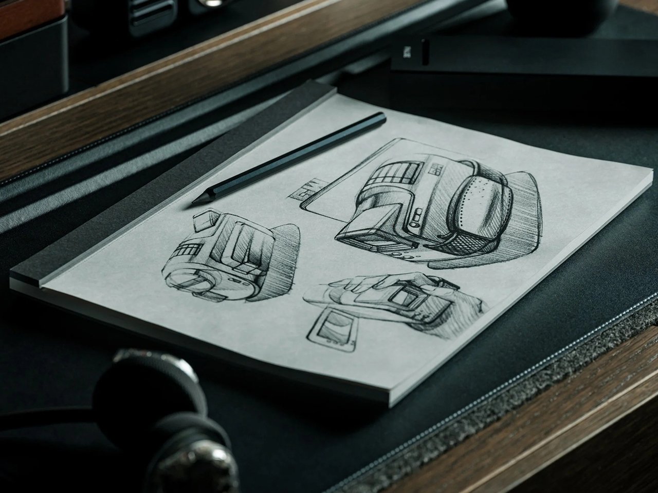
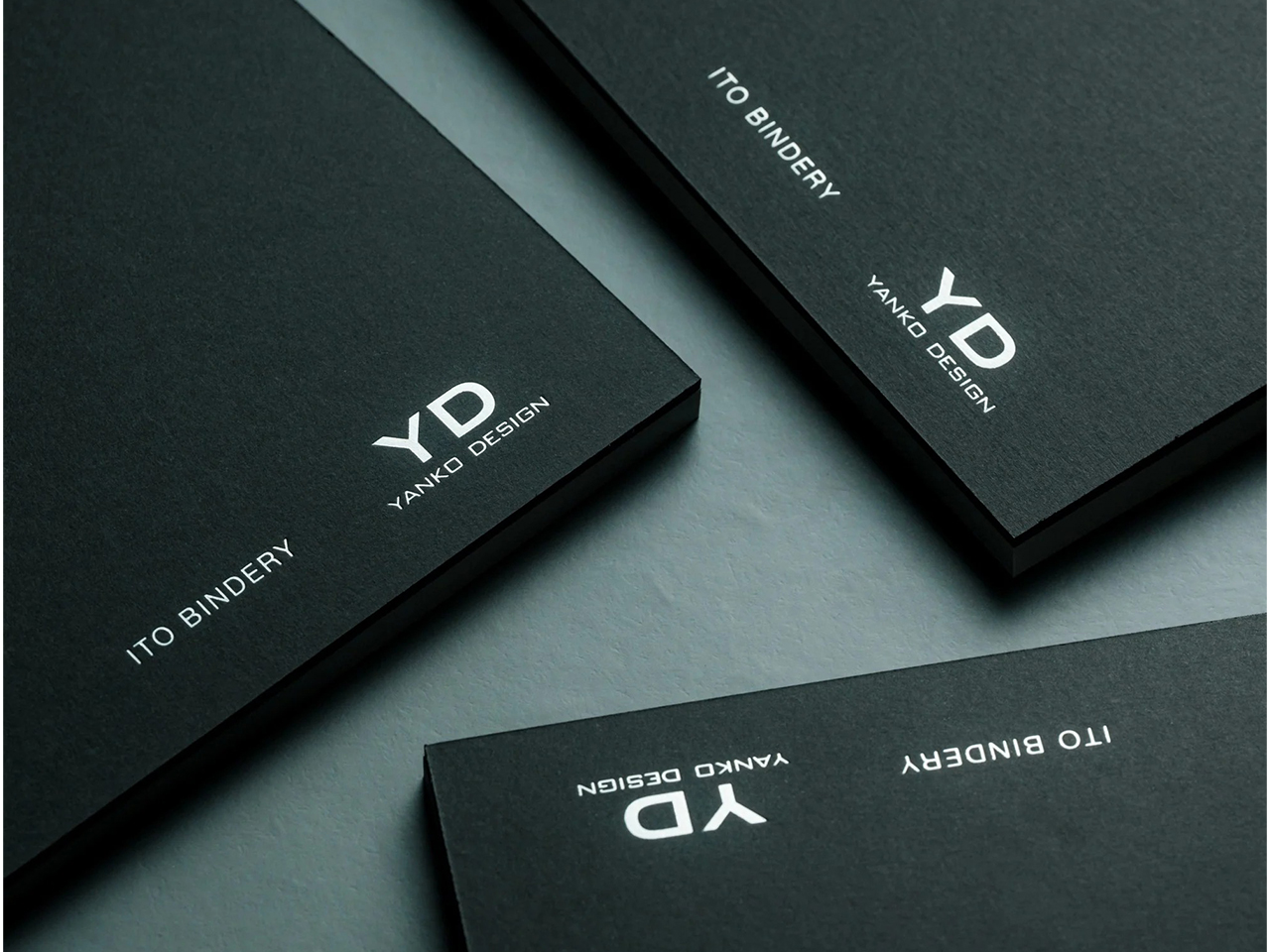
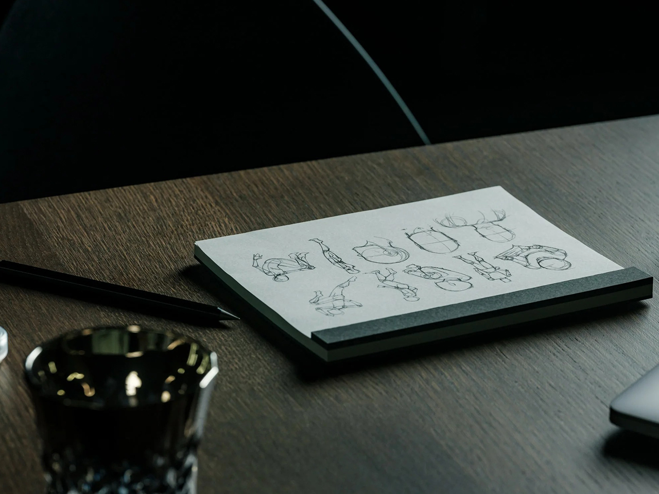
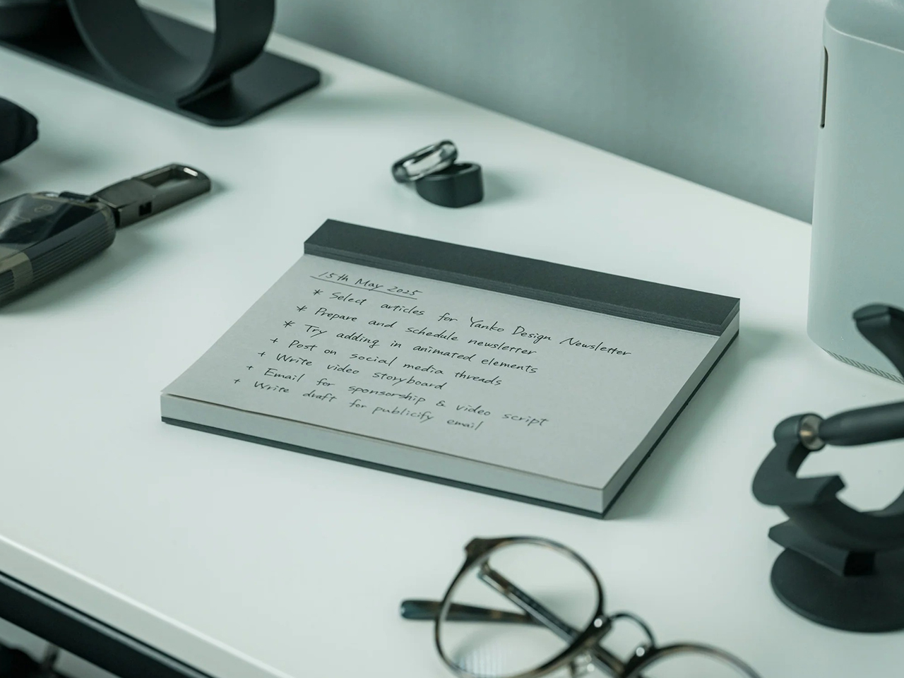
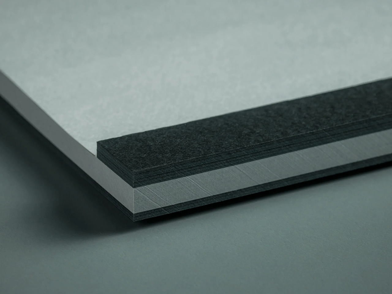
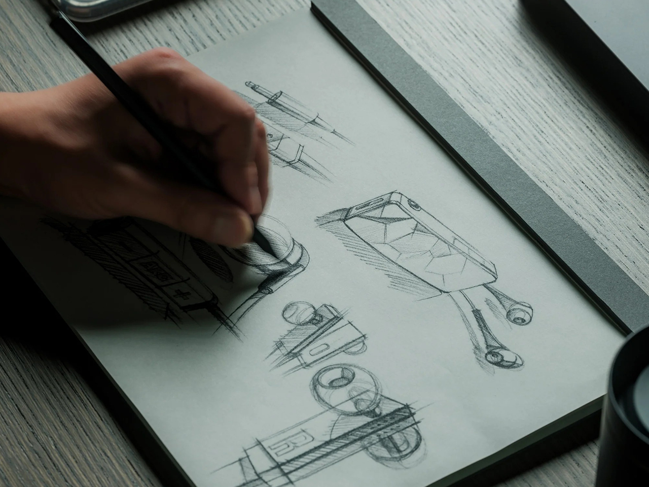
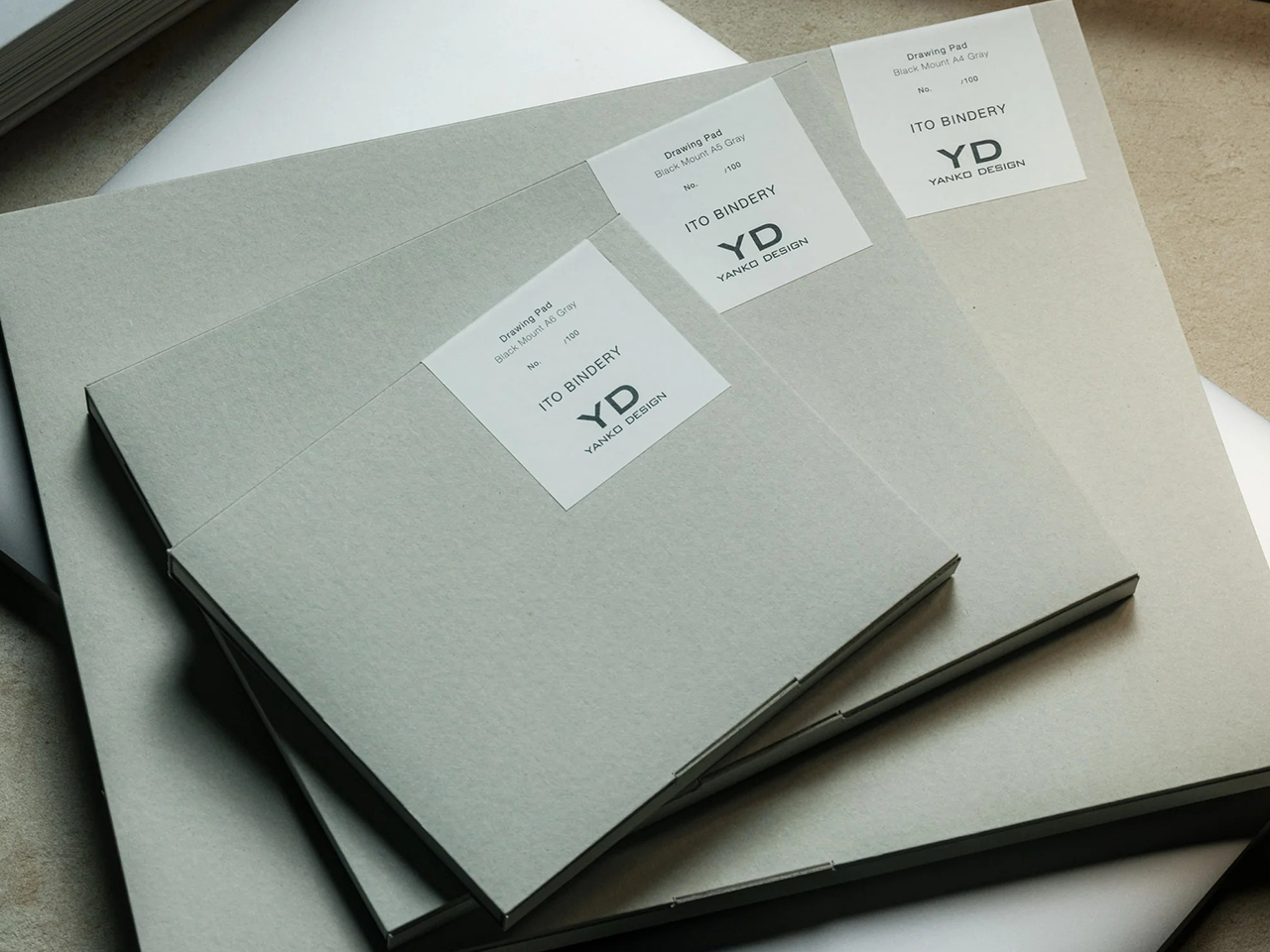
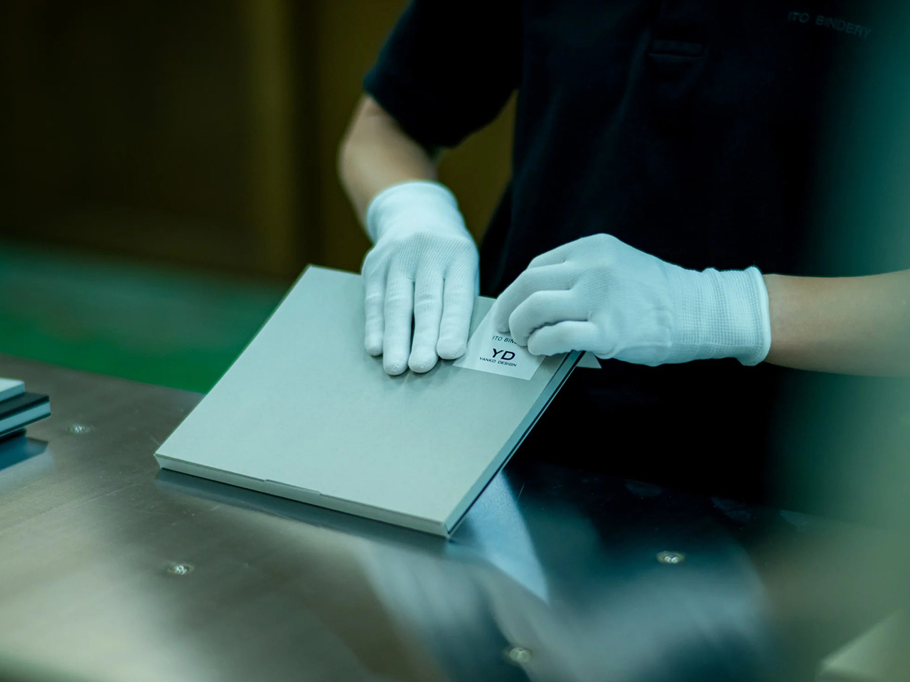
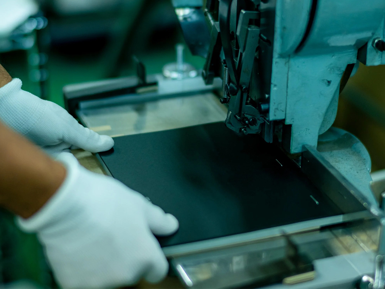
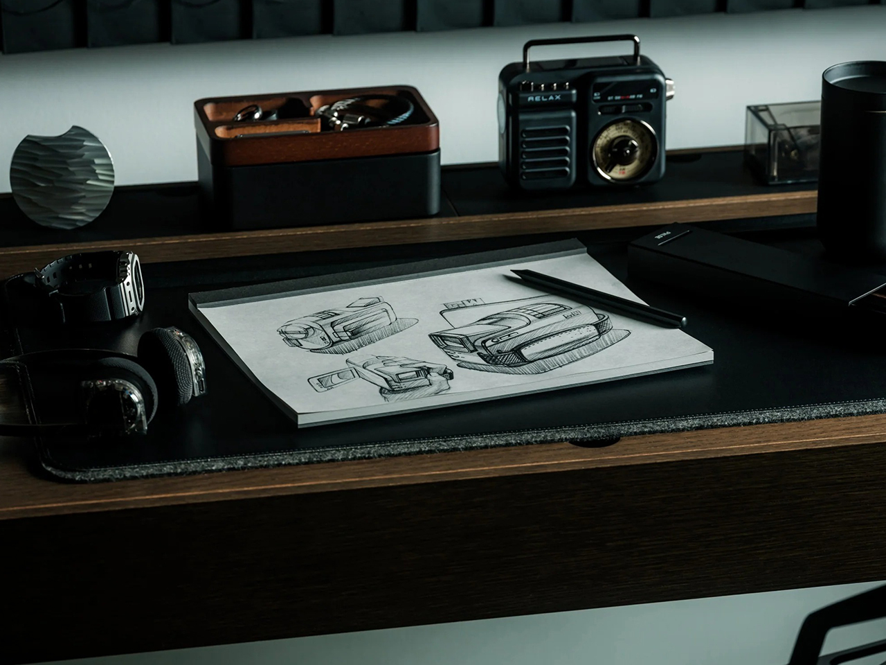
I’ve lost more ideas this way than I’d like to admit, until I found the Ito Bindery x YD Drawing Pad. Made with Japanese craftsmanship, it also has no cover, so it stays open on my desk, ready anytime I want to jot down a to-do list or brainstorm some concepts. The softer tone of its grey paper makes it easy to start writing, and when I need to look back at brainstorming sessions, I tear out the pages and pin them on my wall.
Find out what removing one small barrier can do. The Ito Bindery x YD Drawing Pad is available now, starting at $35.
A Moment of Hesitation Is All It Takes.
What you capture in the moment and what you write down later are not the same thing. The former is instinctive. The latter is a reconstruction. Even a second of friction is enough to break the creative impulse, and a cover is friction.
Without a cover, there is no moment of deliberation before the pen meets the page. Ideas can flow onto the page as the mind produces them, continuously and without interruption. It also removes the easiest justification for delay – “I’ll write it down later’ becomes harder to reason with when the page is already open. This drawing pad has no cover, so there is no pause between the idea and the page.
Getting Rid of Blank Page Syndrome
Staring at a blank white page can be intimidating. The contrast makes anything you write feel final. So instead of drawing or writing freely, you start filtering and editing your thoughts. You wait for the idea to be more fleshed out before you commit it to paper.
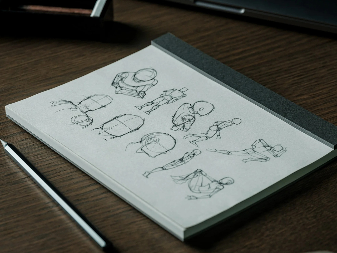
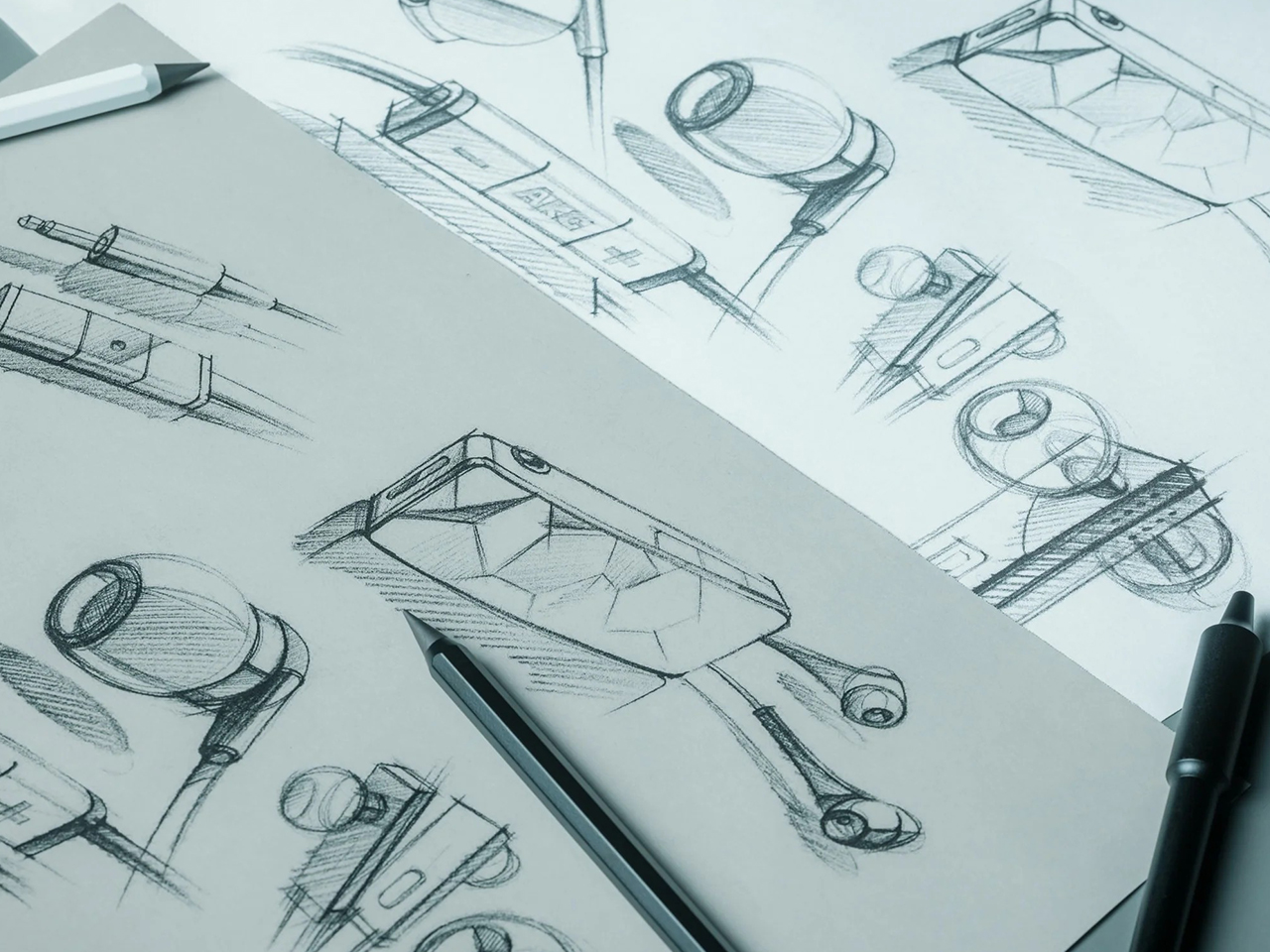
With grey paper, the Ito Bindery x YD Drawing Pad’s neutral shade reduces the pressure of putting something imperfect on the page. Its softer color also reduces strain on the eye, allowing for longer and more focused creative sessions. For designers and artists, the grey paper also functions as a natural mid-tone medium to sketch on. Shadows are darker and highlights are brighter against it, which adds more dimension to your sketches.
Your Ideas Don’t Have to Stay Bound to the Page
In a bound notebook, your ideas exist in the order you wrote them down.You often find yourself flipping the pages back and forth to relate one idea to another. On the other hand, each sheet in this drawing pad is micro-perforated at the header, allowing it to tear away cleanly and become part of a growing record of your ideas. Over time, these accumulated pages are a tangible way to trace your thinking, revisit past ideas, and see how one thought leads to another.
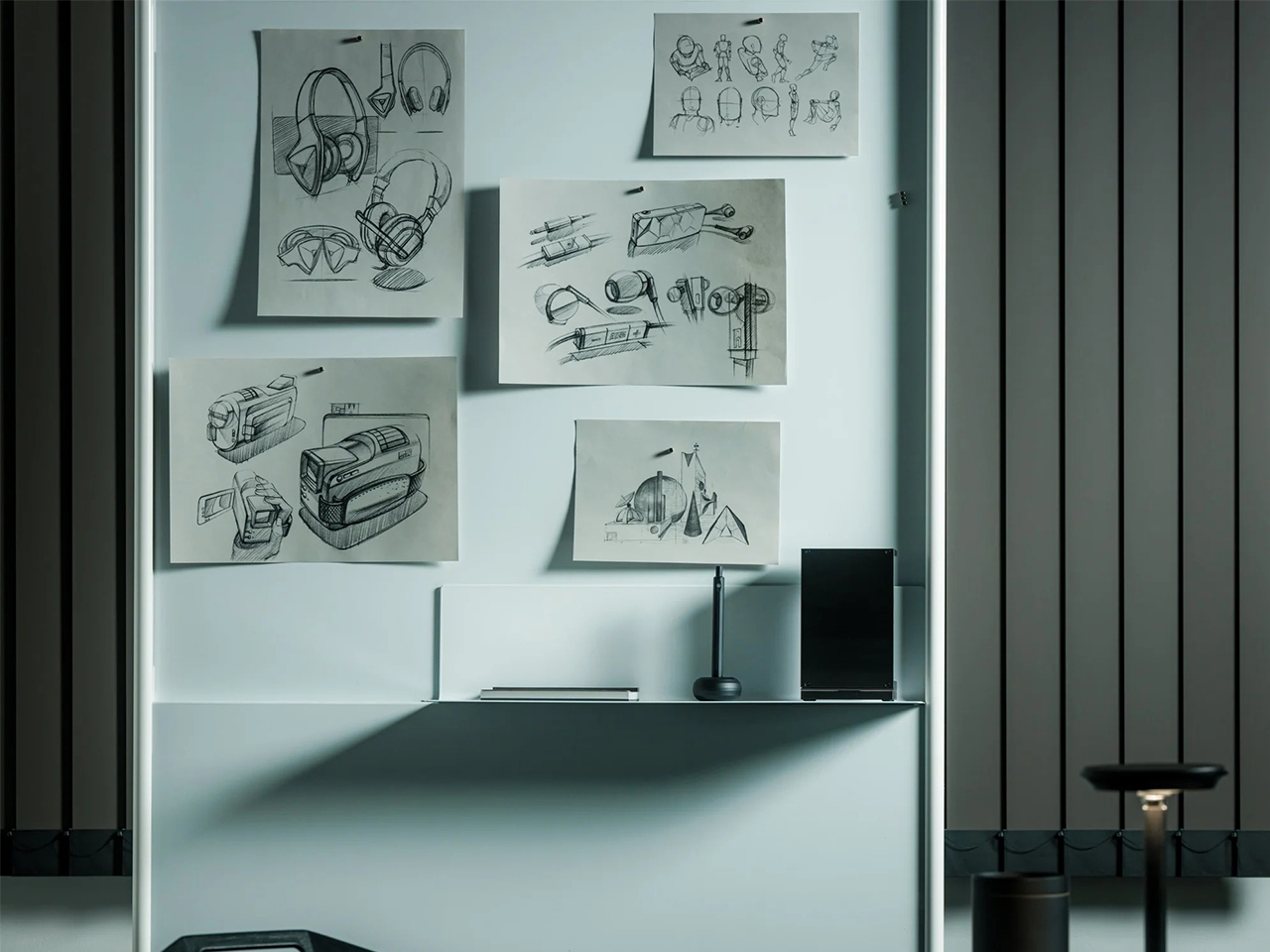
For brainstorming sessions, visibility can change the way you work. Pin individual sheets to a wall or whiteboard to map out your ideas, connect different concepts, and see the bigger picture as it takes shape.
Refining Only What Is Essential.
The real cost isn’t any single idea. It’s all of them. The sketch that never started. The concept that didn’t survive the commute. The thought that felt important enough to remember but wasn’t captured in time to prove it.
The Ito Bindery x YD Drawing Pad was designed around this simple observation: ideas don’t fail to materialise because of a lack of vision. They go unrealized because something got in the way before you could act on them. What makes the Drawing Pad different is not what was added, but what was deliberately left out.
Every neighborhood has that curb. The one where a slightly wobbly dining chair or a stained armchair shows up on trash day, waiting for someone to either haul it to the dump or grab it before the truck does. Most of us walk past. We’ve been trained to see secondhand furniture as a problem to solve quickly, not a story worth keeping. That instinct, to discard first and ask questions never, is exactly what London-based designer Yinka Ilori has spent more than a decade pushing back against.
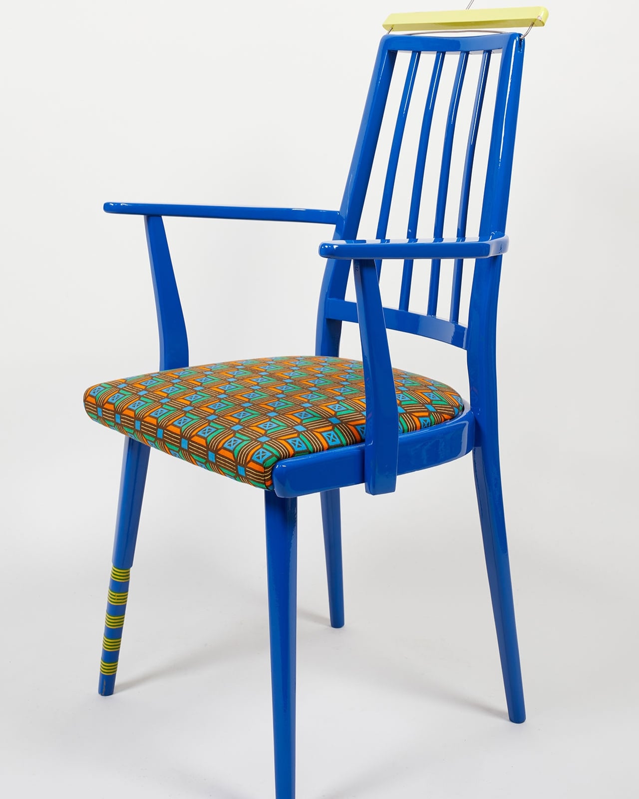
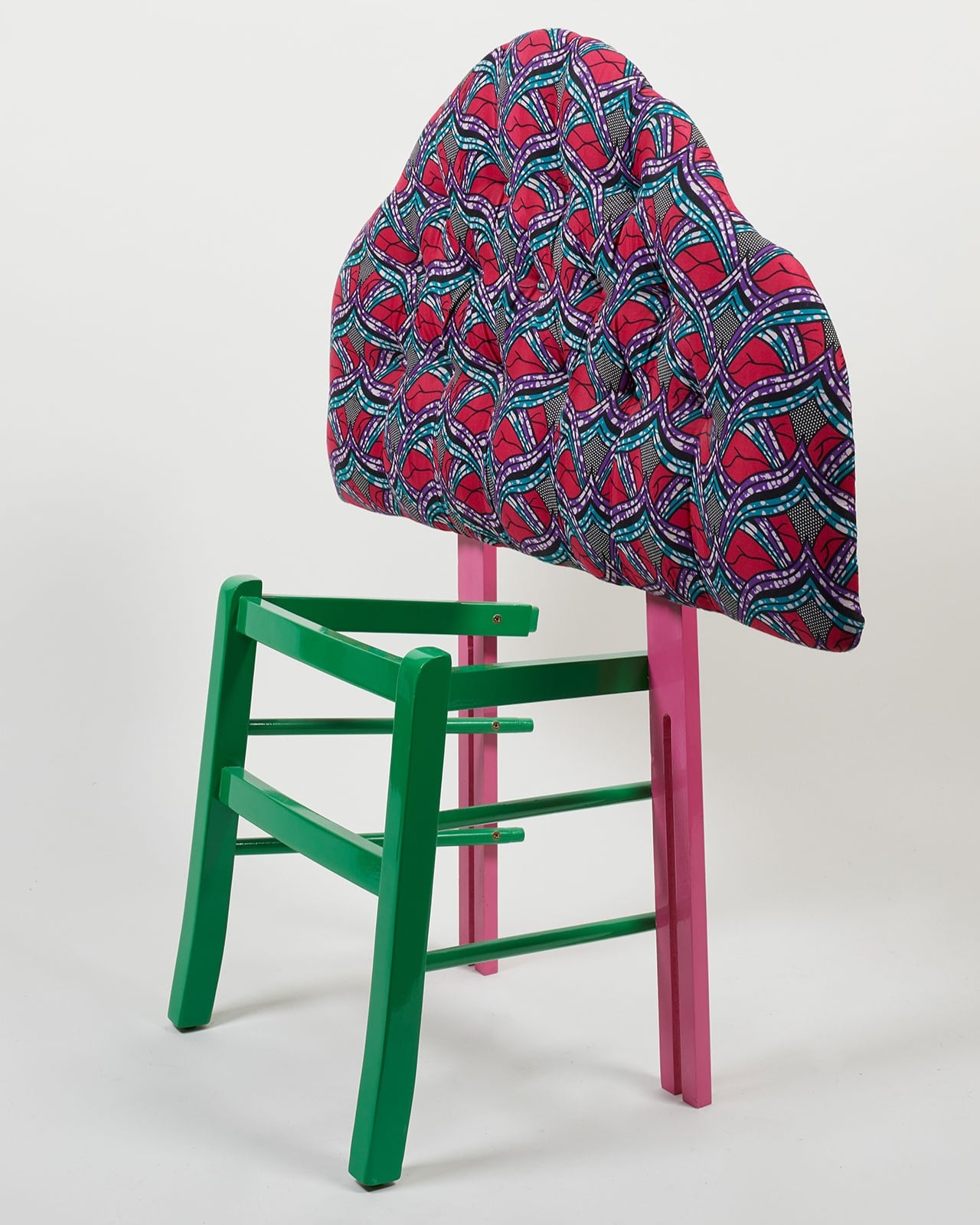
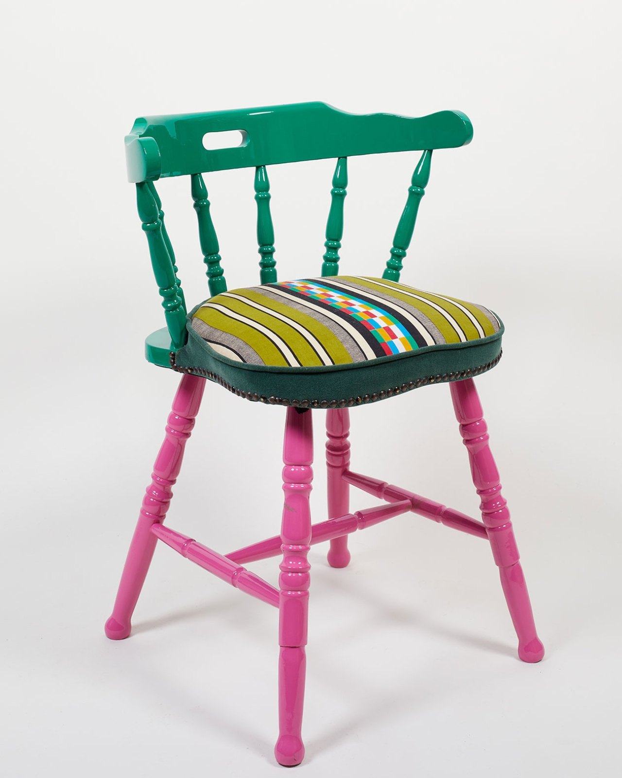
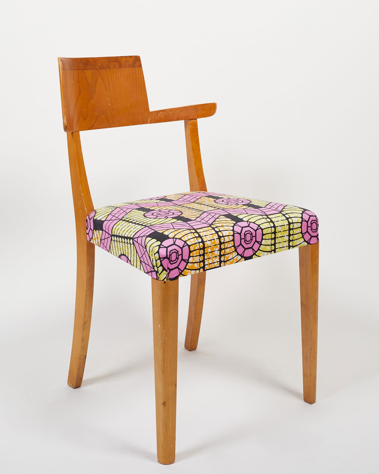
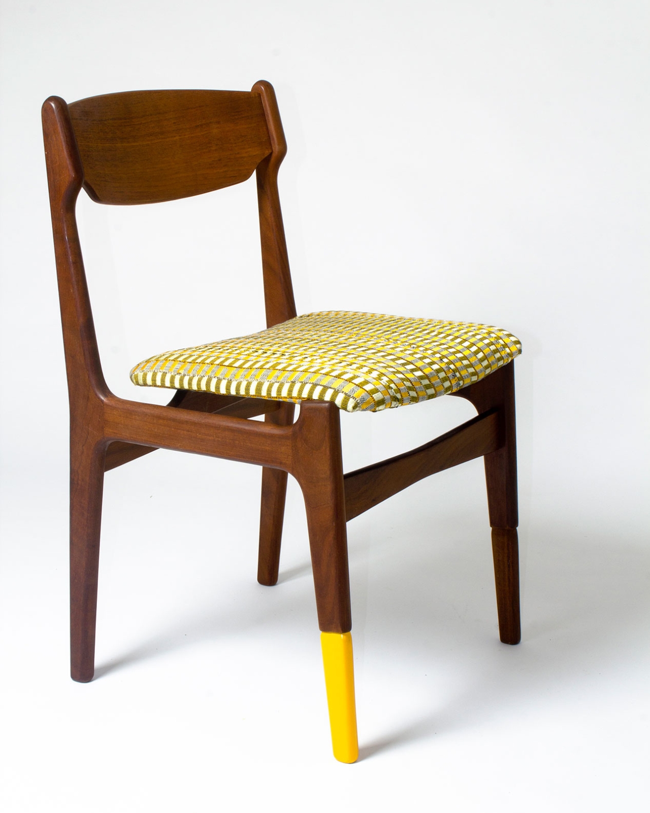
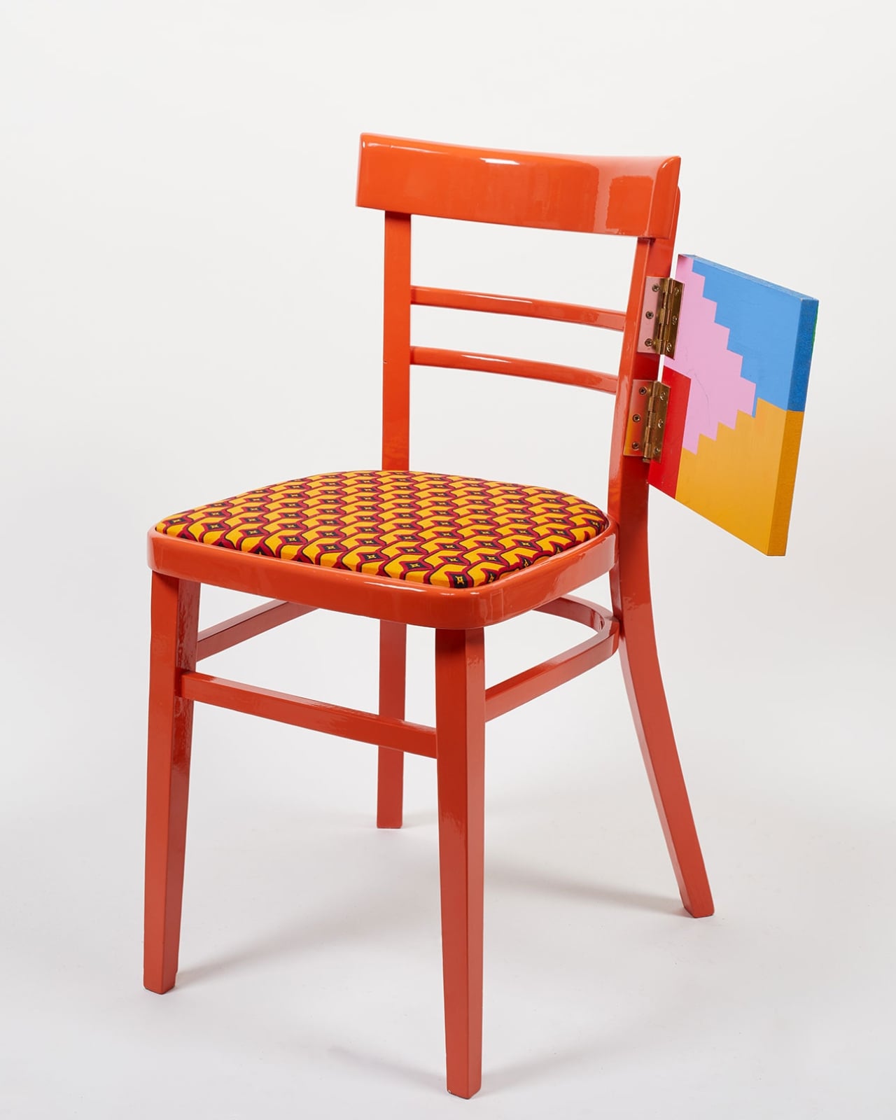
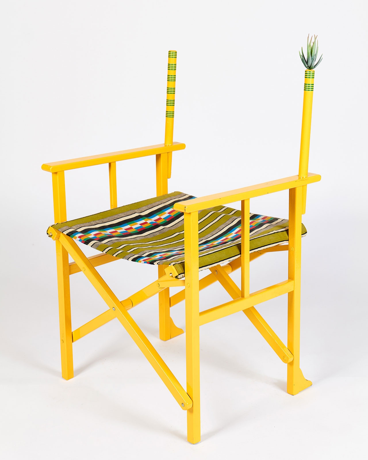
His new book, “Chairman,” published by ORO Editions, is the first to focus entirely on the furniture that made him famous: chairs he’s rescued from charity shops and street corners across London, then transformed with color, pattern, and a little bit of mischief. At 120 pages, it traces over ten years of work through what he calls vessels of memory, migration, and identity, three words that sound academic until you actually look at what he’s built. As Ilori puts it, chairs were his first design love because of the stories they carry, and that single line explains his career better than any curator’s essay could.
I like that the book doesn’t pretend the chairs are just chairs. Ilori has said that vintage furniture holds “personal stories, secrets, emotions, and sentiments,” and in his British-Nigerian household, offering someone your chair was never a small gesture. It meant you were inviting them into your life, your gossip, your grief. That idea shows up again and again in his work, most memorably in his 2015 show “If Chairs Could Talk,” where he named restored pieces after childhood friends from his neighborhood, some who went on to do well, others who didn’t. The point wasn’t to rank them. It was to remind people that judging a chair, or a person, by its current condition tells you nothing about where it’s been.
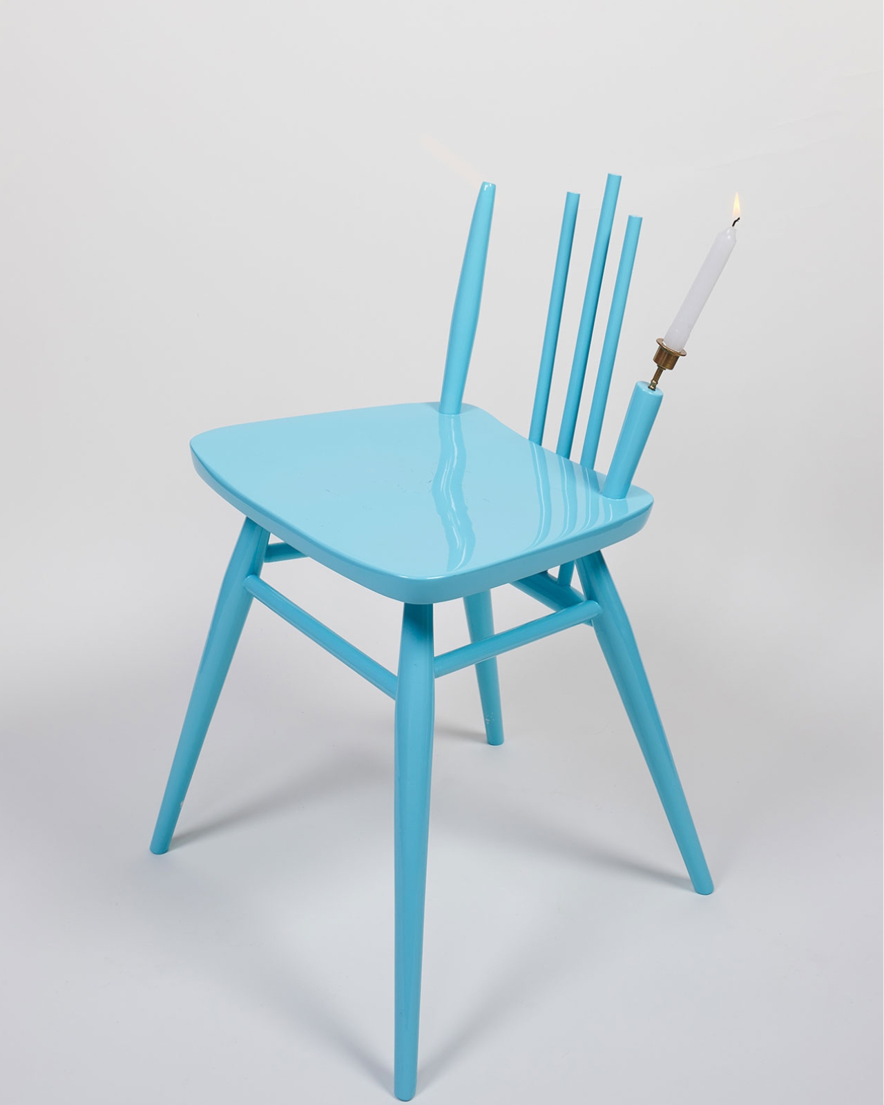
That’s the part of Ilori’s practice I find genuinely refreshing in a design landscape that often treats furniture as either disposable or precious, with nothing in between. He’s neither flipping thrift store finds for profit nor placing them behind museum glass. He’s giving them jobs to do again, usually with a candle holder tucked into a backrest or a plant shelf built into an armrest, details that are playful without being gimmicky.
We have our own complicated relationship with secondhand furniture. We love a good flea market flip on television, but we also replace couches the way we replace phones, and curbside “free” piles rarely stay put for long before someone tosses them for good anyway. Ilori’s approach, sourcing directly from charity shops rather than manufacturing new pieces from scratch, quietly argues for a slower, more attached way of living with objects. He’s not lecturing anyone about sustainability. He’s just showing what happens when you actually look at a chair before deciding it’s garbage.
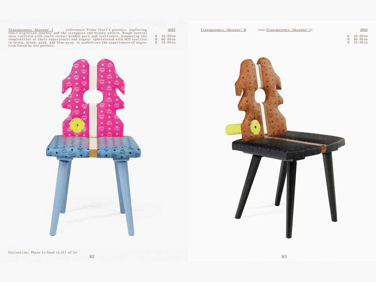
The book also situates his chair work inside a wider circle of artists and designers, which feels right, because Ilori has never worked in isolation the way some monograph subjects like to pretend they have. One section, drawn from his “There Is Good in All of Us” collection, makes that point almost too plainly, turning cast-off seating into small monuments to second chances. His path from upcycling furniture in 2011 to large public commissions, like the Colour Palace at Dulwich Picture Gallery or his Adidas collaboration, started with exactly this kind of hands-on, unglamorous restoration work. “Chairman” makes the case that the chairs weren’t a warm-up act before the bigger projects. They were always the main story.
What stays with me most is how simple the underlying belief actually is. Ilori isn’t claiming that every discarded object deserves a second act. He’s pointing out that most of them never get the chance to prove whether they do. Design so often chases what’s new, but “Chairman” quietly argues for paying attention to what’s already here, sitting in a corner somewhere, waiting for someone to notice it hasn’t finished its story yet.