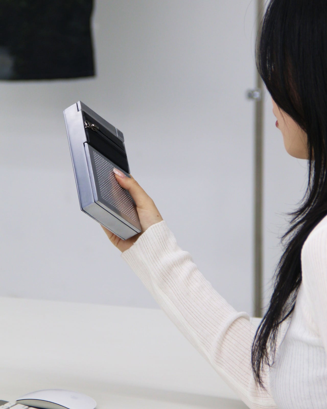
We’re used to devices and gadgets that have all complicated buttons and controls. But what if it wasn’t that way always? The gesture is almost embarrassingly simple. Pull a zipper open and sound plays. Pull it shut and the room goes quiet. No tapping a screen, no asking a voice assistant, no hunting for a button that somehow always ends up on the wrong side of the device. Just the same physical action you’ve been doing since you were old enough to dress yourself.
That’s the entire premise of ZIP, a concept speaker designed by Korean designers Taeyang Kim, Dugyeong Lee, Yejin Na, and Gijeong Shin. It’s one of those ideas that, once you see it, makes you wonder why it took this long. The concept draws directly from the universal expression “zip your lips,” mapping the act of silencing onto the most tactile and satisfying closure mechanism we use in everyday life. The zipper isn’t decorative here. It isn’t a style nod or an ironic wink. It is the interface. And that commitment is what makes ZIP genuinely interesting rather than just aesthetically clever.
Designers: Taeyang Kim, Dugyeong Lee, Yejin Na, gijeong Shin
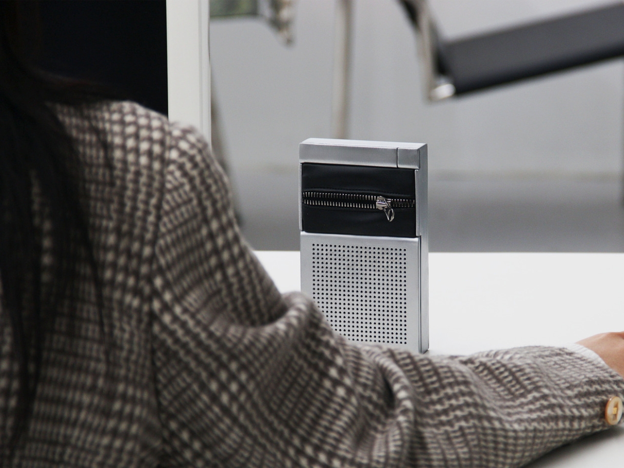
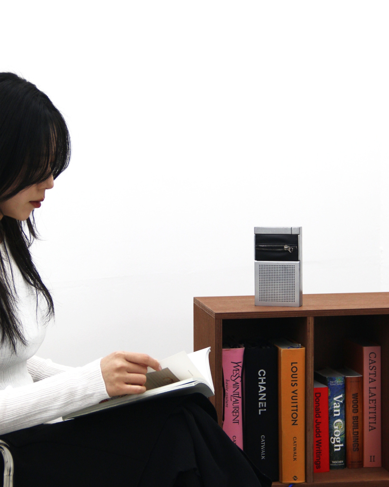
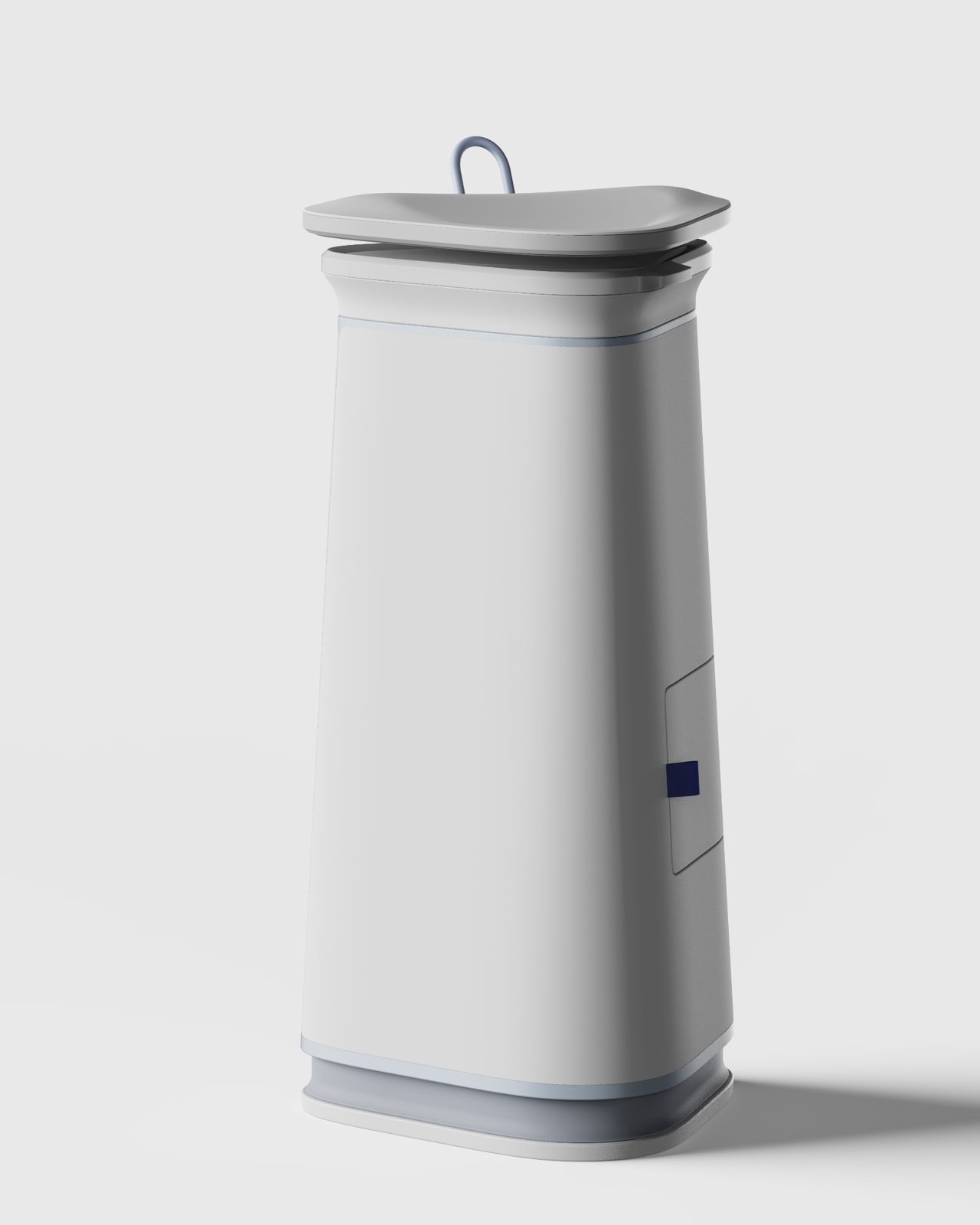
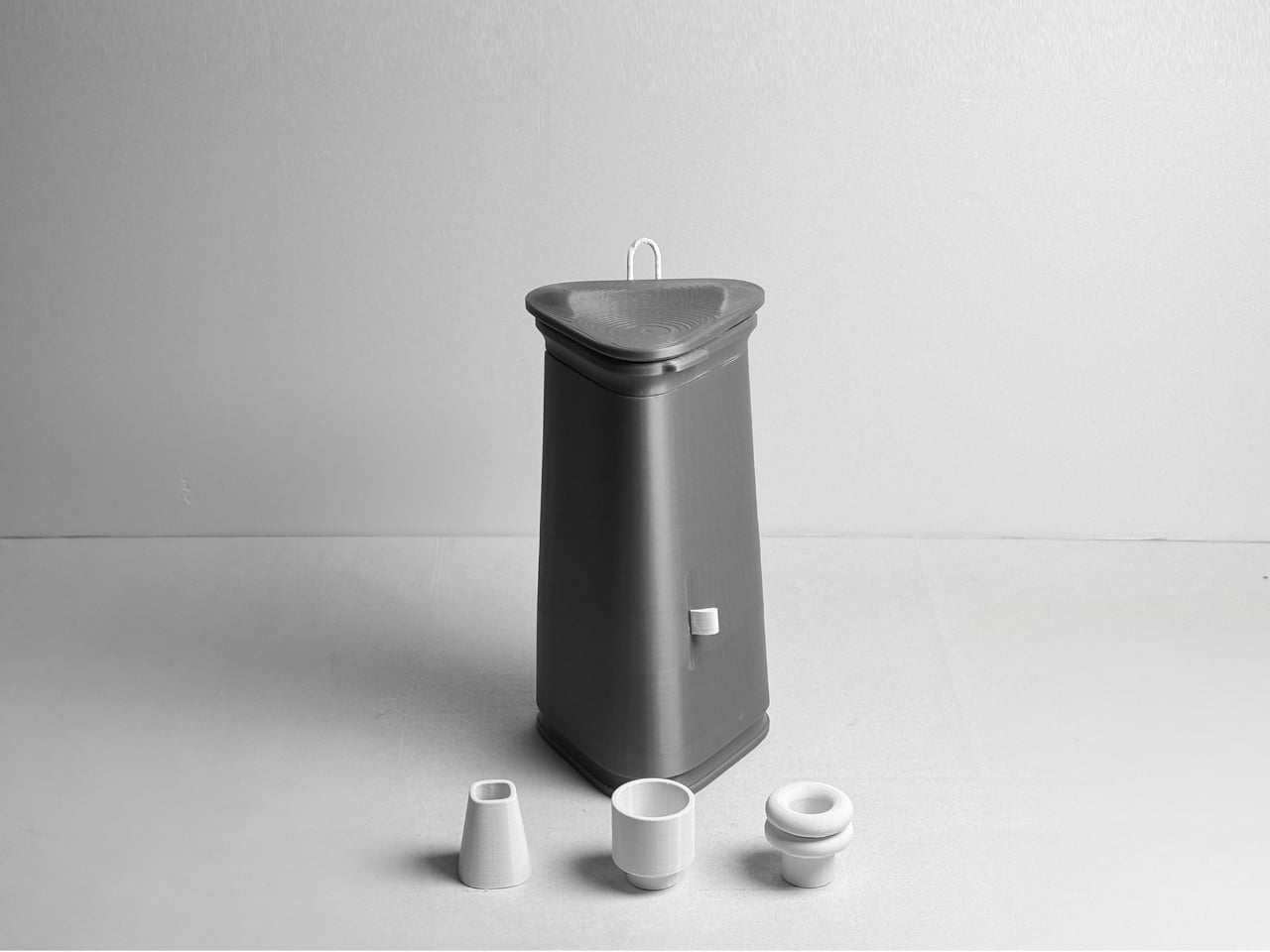
Physically, the object is composed and self-assured. A compact rectangular body in brushed silver aluminum sits below a band of dark fabric bisected by a metal zipper, the kind of heavy-duty hardware you’d find on a quality jacket, not a flimsy fashion detail. The lower half houses the speaker grille: a grid of evenly punched dots that reads like something out of a Dieter Rams archive, which is very much a compliment. The visual language is minimal without being cold, functional without being dull. It looks equally at home on a credenza beside art books and on a desk next to a keyboard.
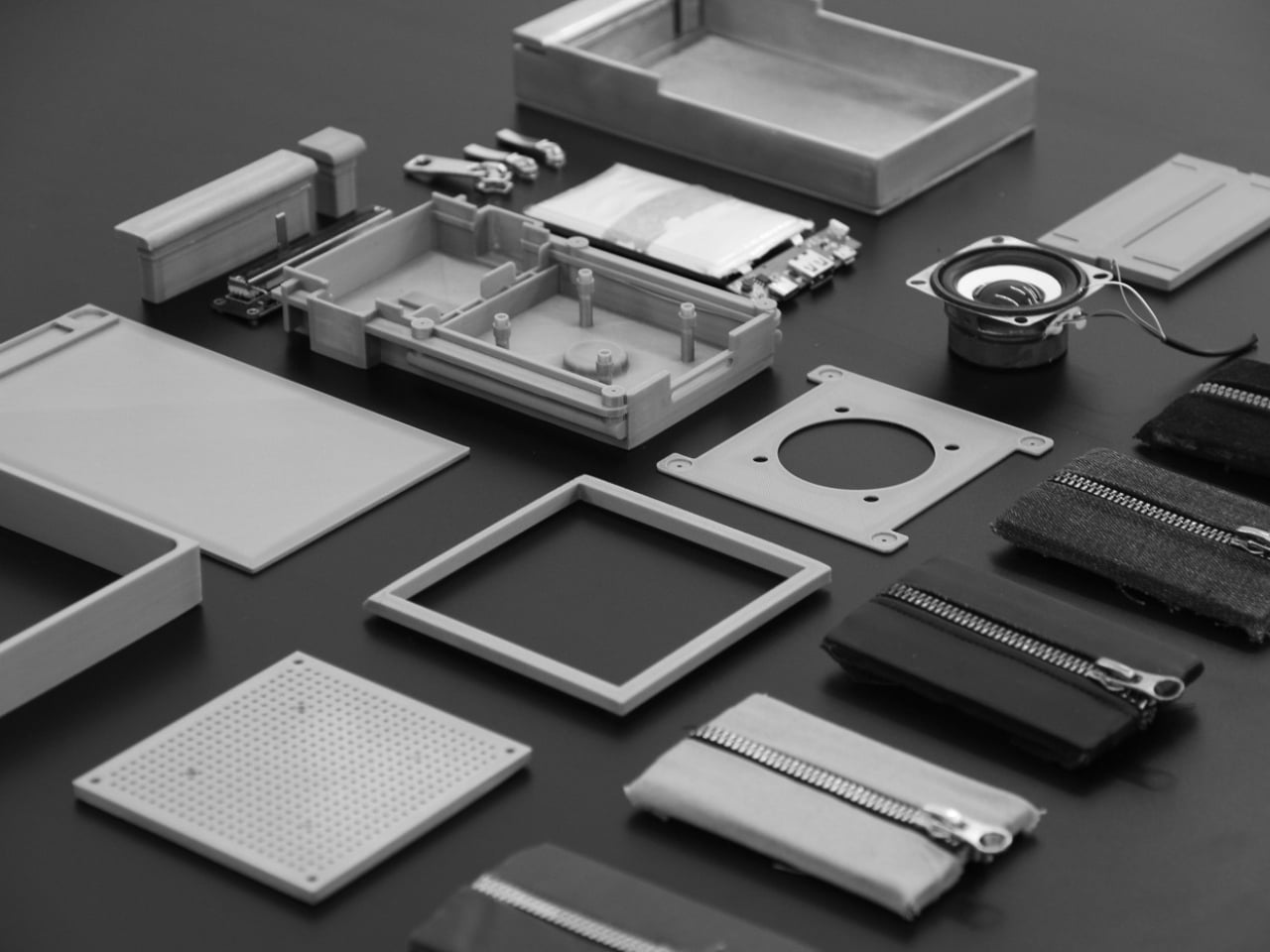
The prototype photos on Behance pull off something a lot of design projects fail to do: they make you feel the weight of the thing. The exploded component layout is especially good. You can see the actual speaker driver, the PCB, the battery, the zipper hardware, all laid out like a dissected argument for why this object should exist. It’s a working prototype, not a render, and that matters. Renders are promises. A functioning prototype is a proof.
What I keep coming back to is the conceptual integrity. A lot of tech and industrial design right now is obsessed with reducing interfaces to nothing: invisible touch surfaces, gesture sensing, proximity triggers. The instinct is understandable, but there’s a real cost to removing physicality from control. You lose feedback. You lose certainty. You lose the tiny neurological satisfaction of knowing you actually did a thing. ZIP goes in a different direction by betting that a familiar mechanical action can carry more meaning than a capacitive button ever will.
The “zip your lips” metaphor also does something a lot of design thinking misses. It’s cross-cultural in its clarity. You don’t need to read a manual to understand what zipping something shut means in relation to silence. The designers describe it as proposing “a new interface that controls sound, inspired by the gesture of closing your mouth.” That isn’t just product language. It’s a considered philosophical position on what intuitive design actually means. Intuitive doesn’t mean invisible. It means immediately understood.
The styling throughout the Behance project reinforces this with a dry, confident visual wit. The image of someone holding the zipper module over their mouth says everything the project text says, but in about half a second. It’s the kind of visual shorthand that designers spend entire careers trying to achieve.
Whether ZIP ever becomes a commercially available product is, frankly, beside the point right now. What it demonstrates is a design team that understands the difference between novelty and concept. Novelty fades. Concept compounds. And the concept here, that the best interface is the one that already lives in muscle memory, is solid enough to carry a lot more than a speaker. It’s rare to look at a design concept and feel like the people behind it already know something important. ZIP is that kind of rare.
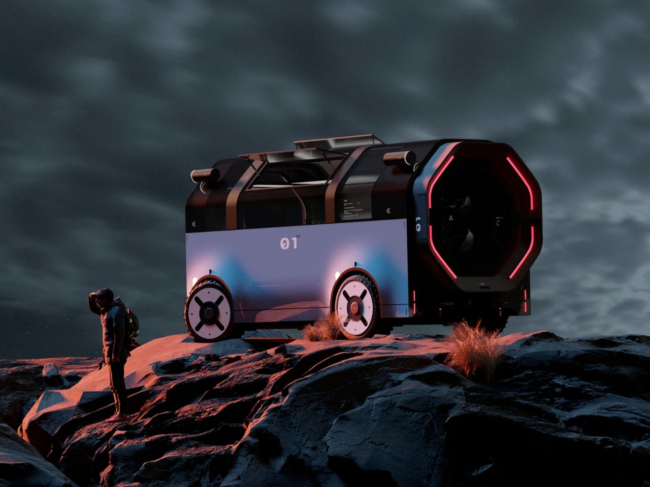
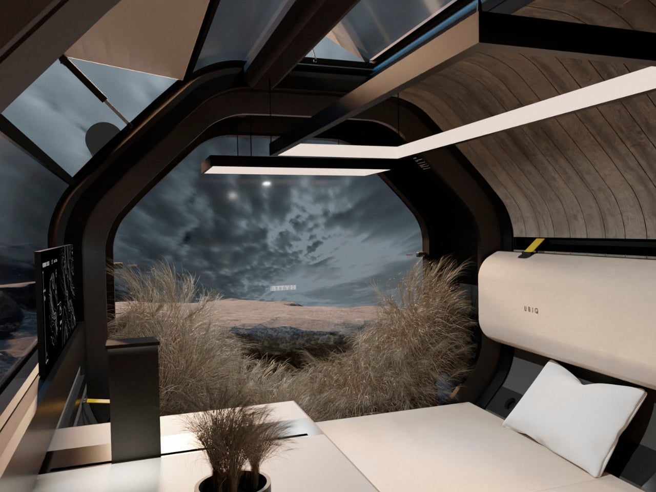
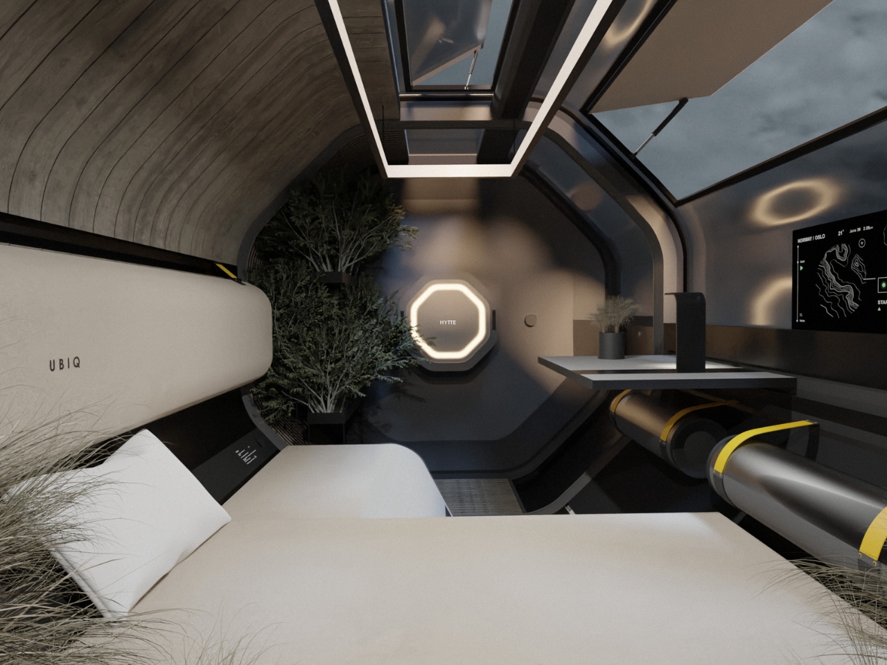
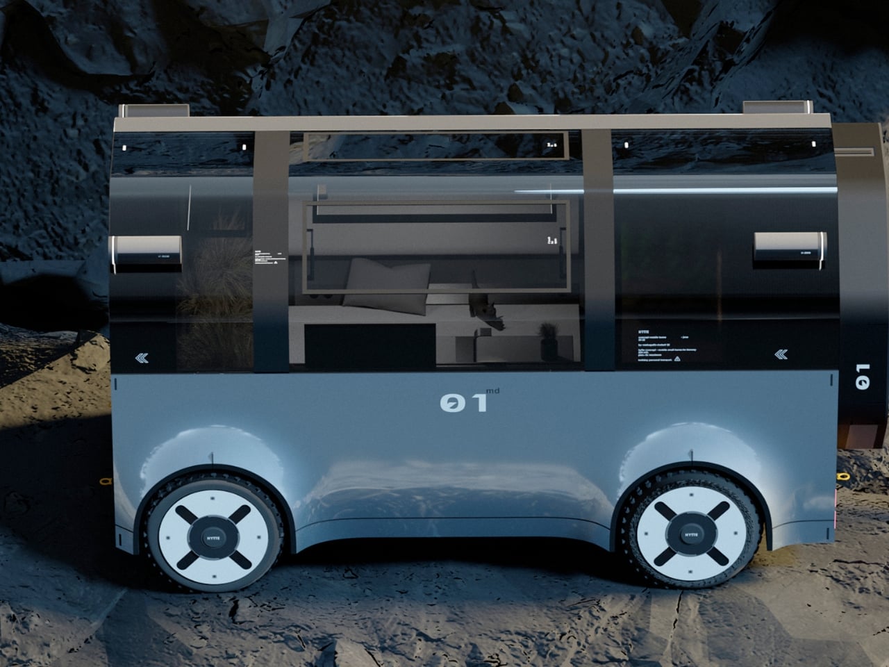
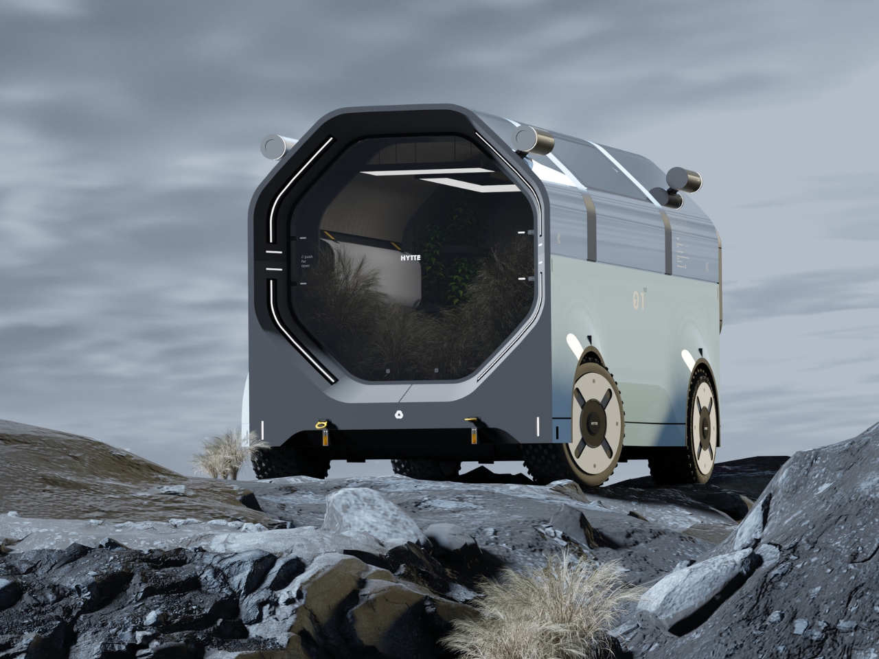
The motorhome has always had an identity problem on wheels. It is supposed to feel like home, but most of the time it looks and feels like neither a proper vehicle nor a proper house. It sits awkwardly in that middle ground, too big to be elegant and too cramped to be genuinely comfortable. RE:BURO, a studio that defines itself as a bureau of technical aesthetics, decided to take that problem seriously, and the result is HYTTE, a mobile home concept that genuinely earns the word “home.”
The name comes from the Scandinavian tradition of the hytte, a simple countryside cabin. That cultural reference is not decorative. It is the philosophical backbone of the entire project. RE:BURO’s stated goal was to create a mobile dwelling that is utilitarian and practical, but that also blends seamlessly into the natural environment without compromising its aesthetics. That is a harder brief to execute than it sounds, and the fact that HYTTE largely pulls it off is what makes it worth discussing.
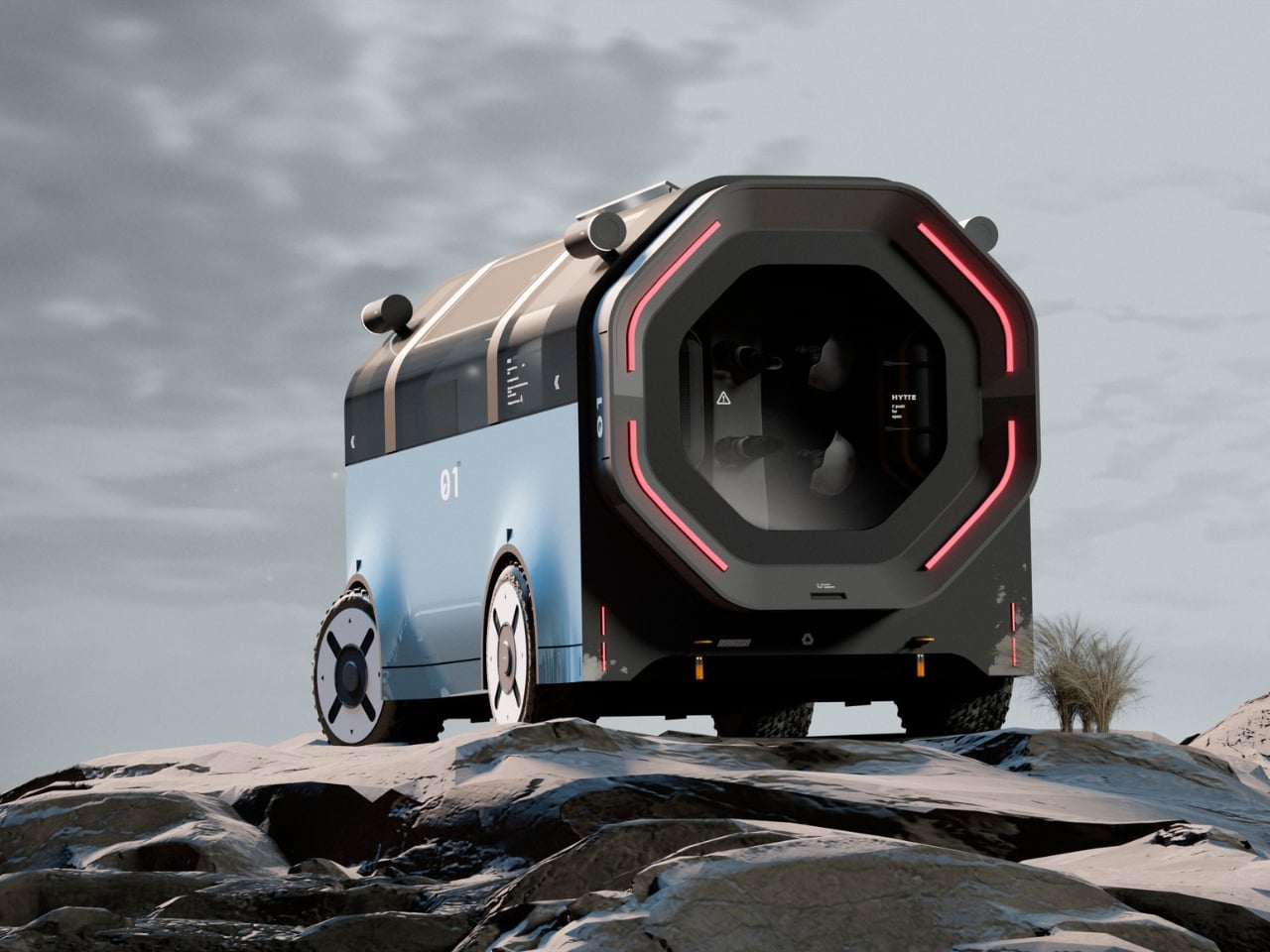
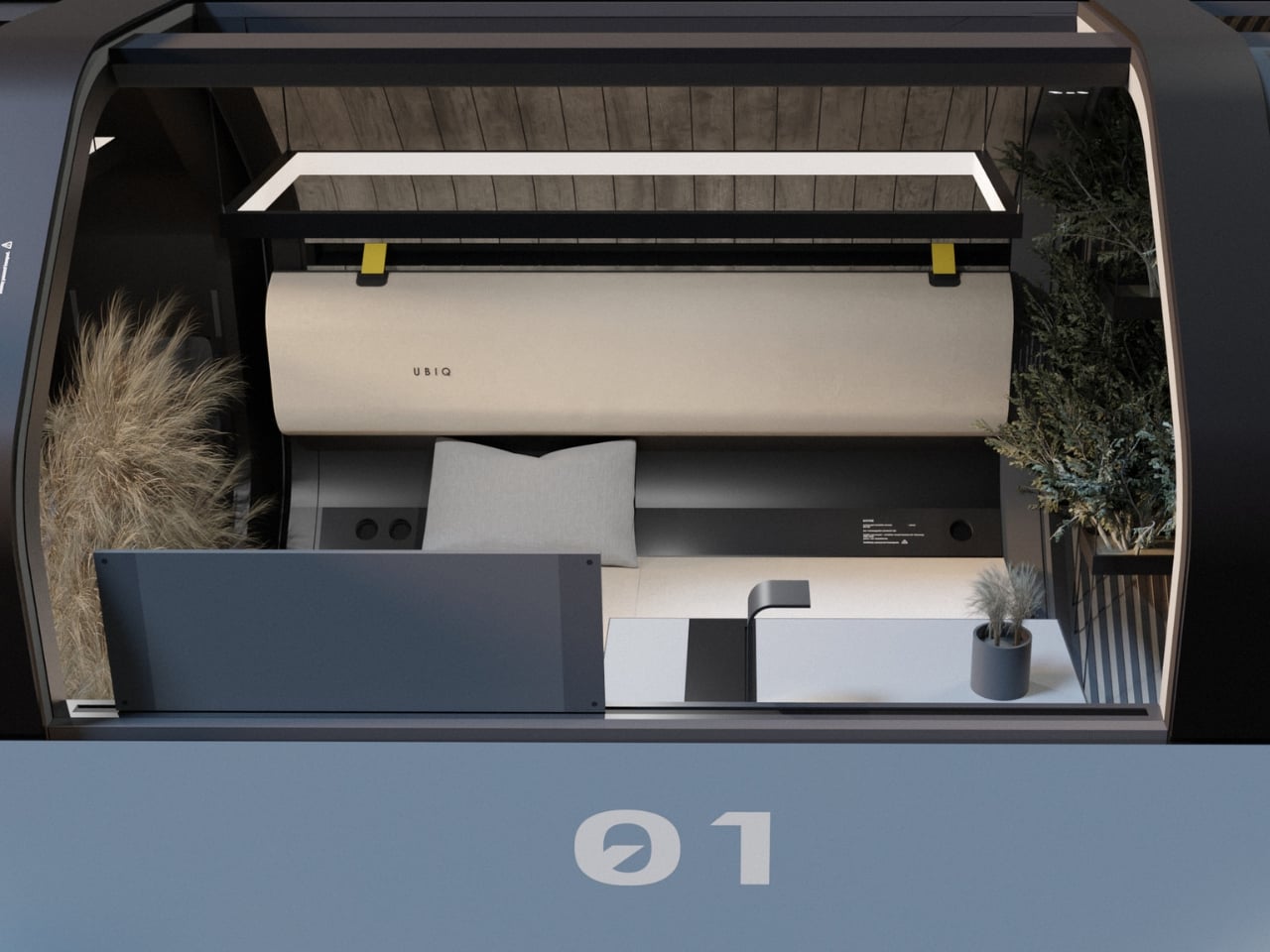
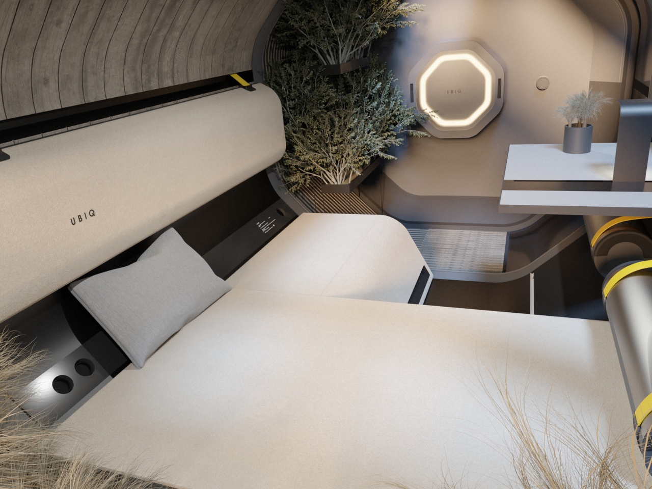
From the outside, HYTTE looks nothing like the motorhomes lining the highways. The exterior is compact and barrel-shaped, finished in dark matte tones, with a signature octagonal face that gives the whole vehicle an almost architectural quality. The red LED ring framing that face is the one moment of drama in an otherwise restrained design, and it works precisely because everything else is so controlled. Viewed from the side, the proportions feel more like a piece of land architecture than a road vehicle, which is exactly the intention. RE:BURO described the project as creating a vehicle similar to modern architecture that blends seamlessly into the natural environment while remaining a functional mobile home, and looking at the renders placed against those raw, rocky landscapes, that ambition holds up.
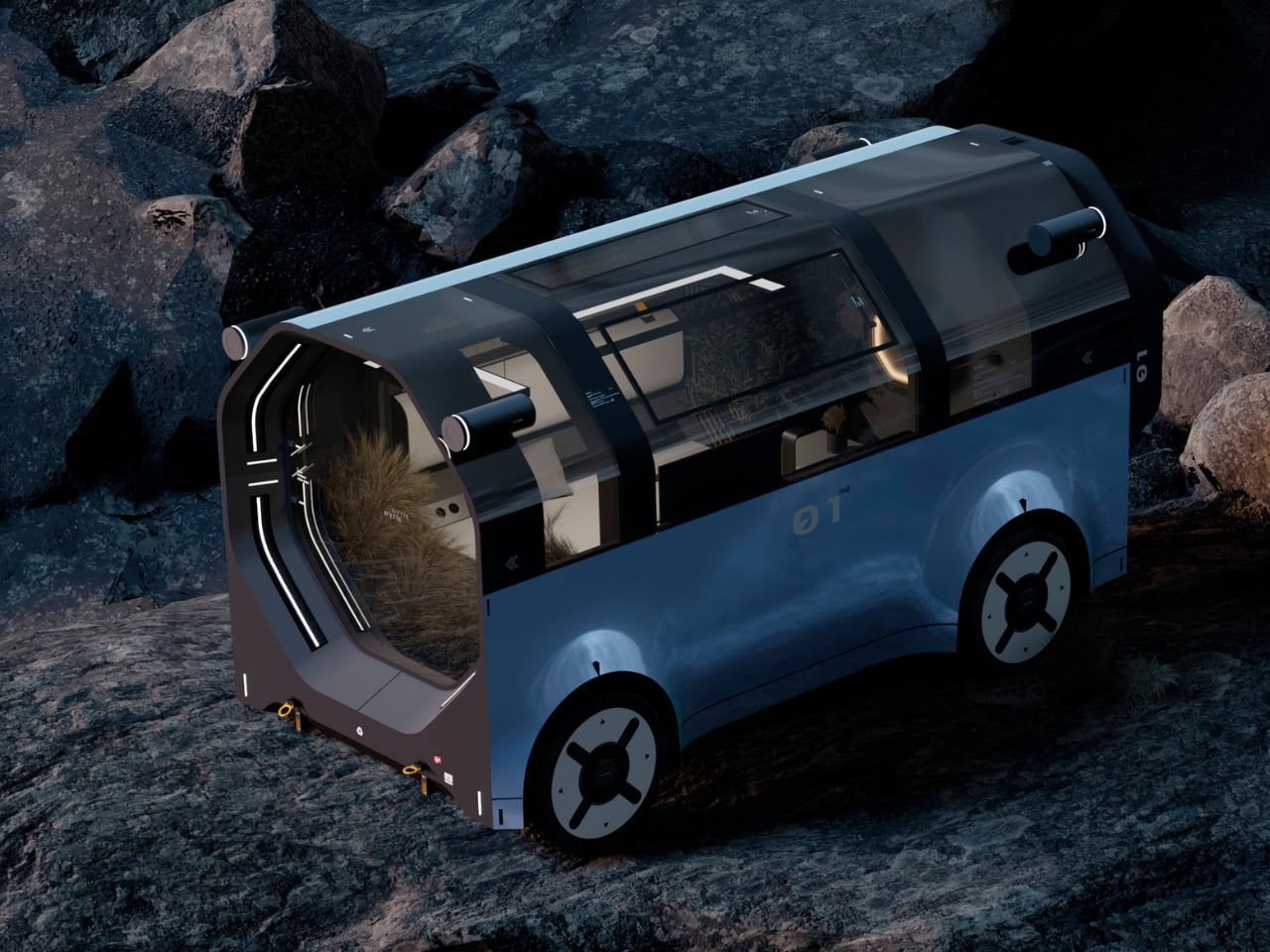
The structural platform is one of the more inventive aspects of the concept. The chassis uses two clamp-like grippers, similar in principle to a crab’s claws, that bind the living compartment on both sides using cables and fasteners. That modular logic means the platform is not locked into one configuration. It can be adapted to different use scenarios, which pushes HYTTE beyond a single-purpose vehicle and into something more like a system.
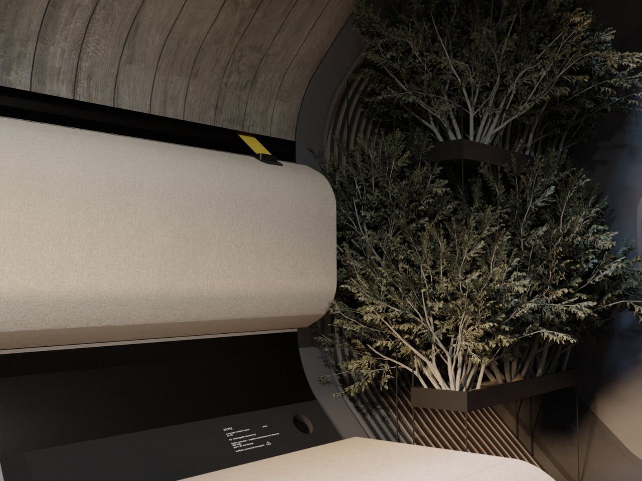
The interior is where the design thinking becomes most layered. RE:BURO chose to work within a simple geometric form and let those constraints generate solutions rather than fight them. That kind of design discipline is genuinely rare. The result is an interior that feels intentional rather than improvised. The dominant feature is an electric heater styled as a modern fireplace, which does more than provide warmth. It anchors the space psychologically, reinforcing the idea that this is a home rather than a vehicle cabin. The team noted that this element emphasises the idea of the object both visually and ideologically, creating an atmosphere of warmth and comfort, and that framing makes complete sense. A fireplace, even a reimagined one, signals rest and permanence in a way that no amount of clever storage ever could.
The rest of the interior follows that same ethos. Parts of the space are designed to transform into different structures for different usage scenarios, making the limited footprint feel versatile without feeling cluttered. The concept also includes dedicated spaces for houseplants and pets, details that seem minor but signal a design team that thought about how people actually live rather than just how spaces photograph in renders.
What RE:BURO has done with HYTTE is essentially make the case that the motorhome category has been underselling itself for decades by defaulting to the same visual and functional template. The concept draws on Scandinavian ideas of lagom, of getting the balance exactly right, and applies them to a vehicle type that has historically leaned toward excess or compromise. Neither approach tends to produce good design.
HYTTE is still a concept. But as a piece of thinking about what mobile living could look like when someone genuinely applies architectural rigour to it, it is one of the more compelling proposals I have come across in a while. The motorhome industry could learn a great deal from it.
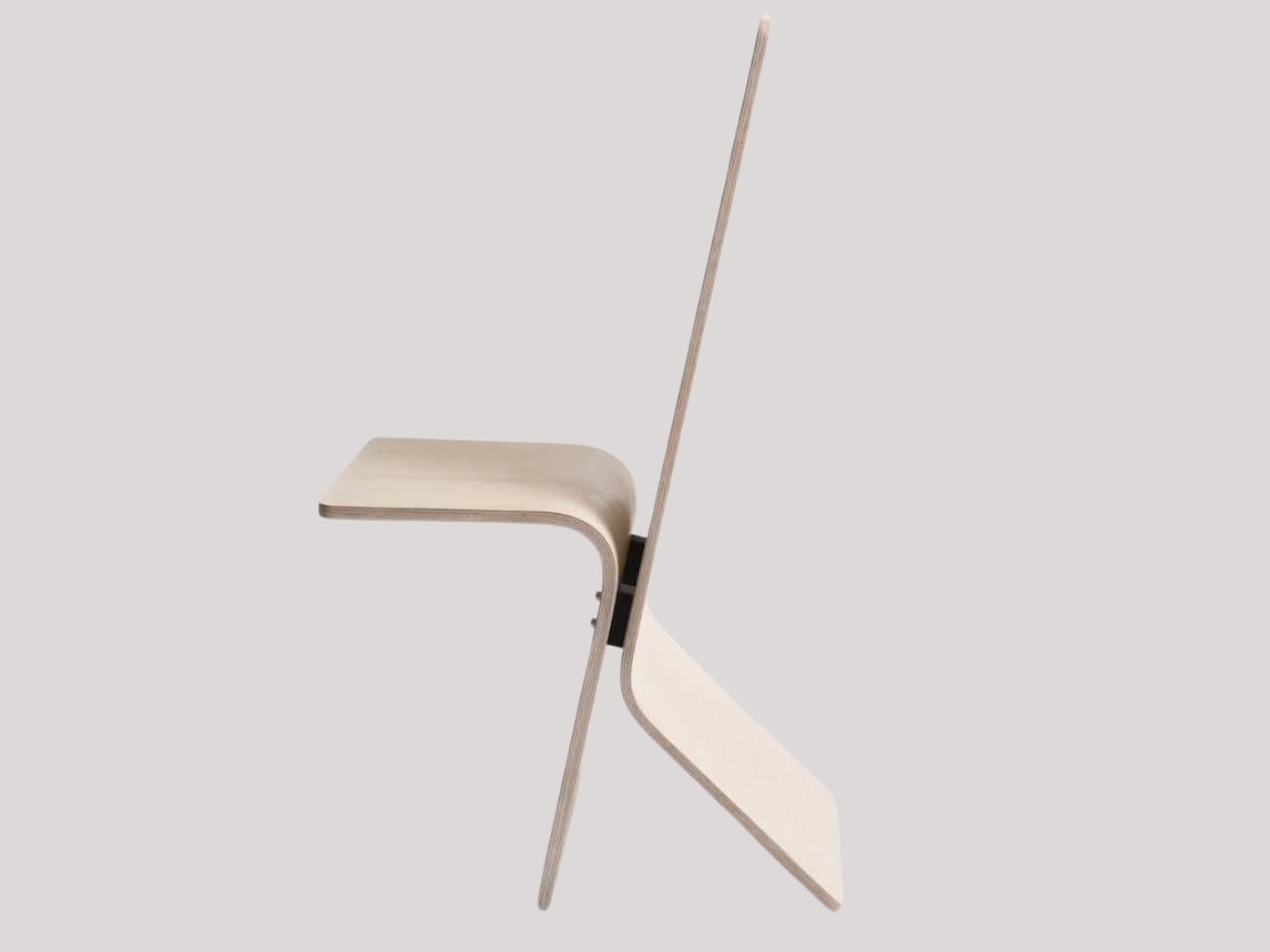
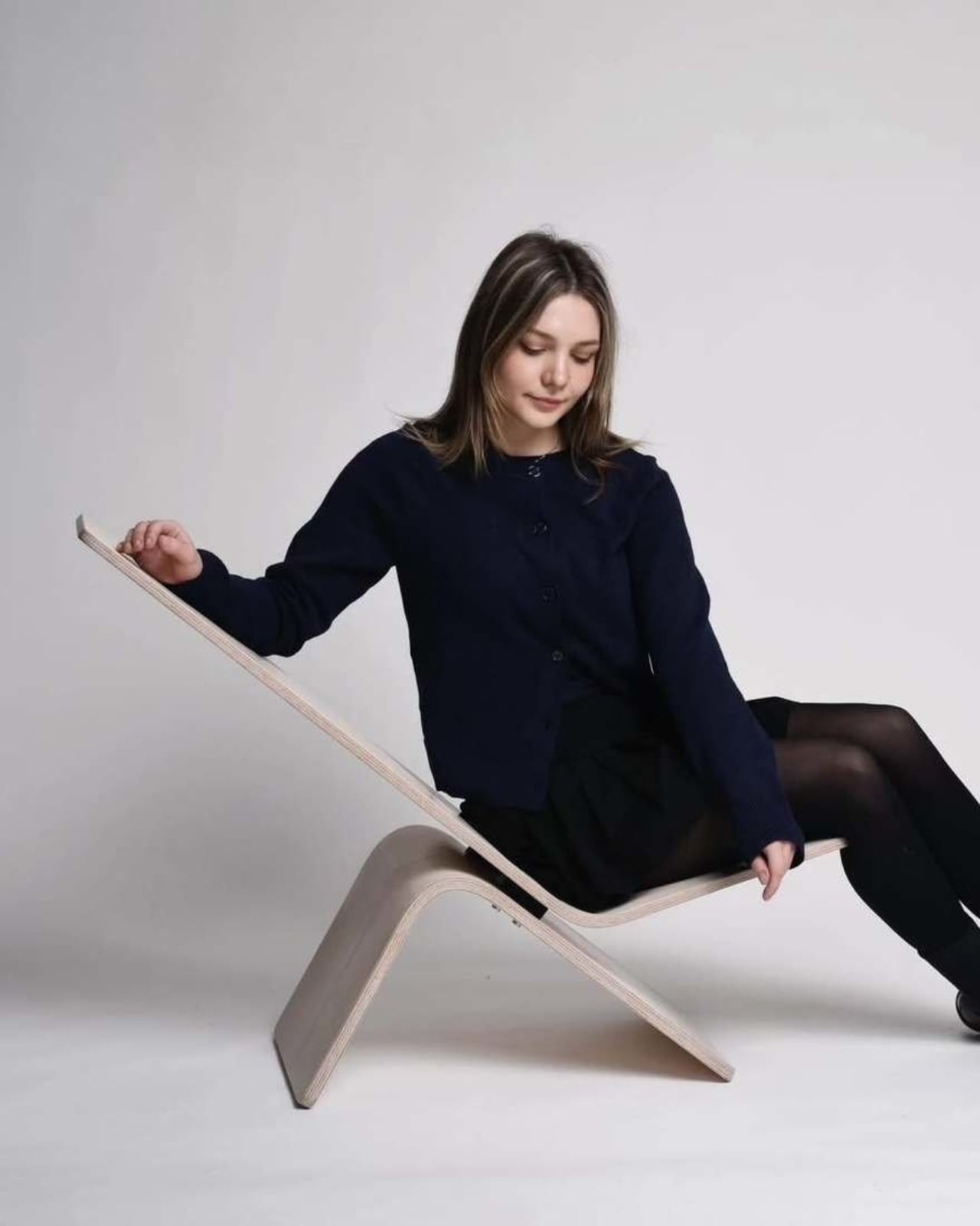
The best furniture tends to ask a quiet question. Not loudly, not with a press release, but through the way it sits in a room and dares you to interact with it differently. Manuela Hirschfeld’s Tilt chair does exactly that, and the fact that it comes from a student project makes it all the more interesting.
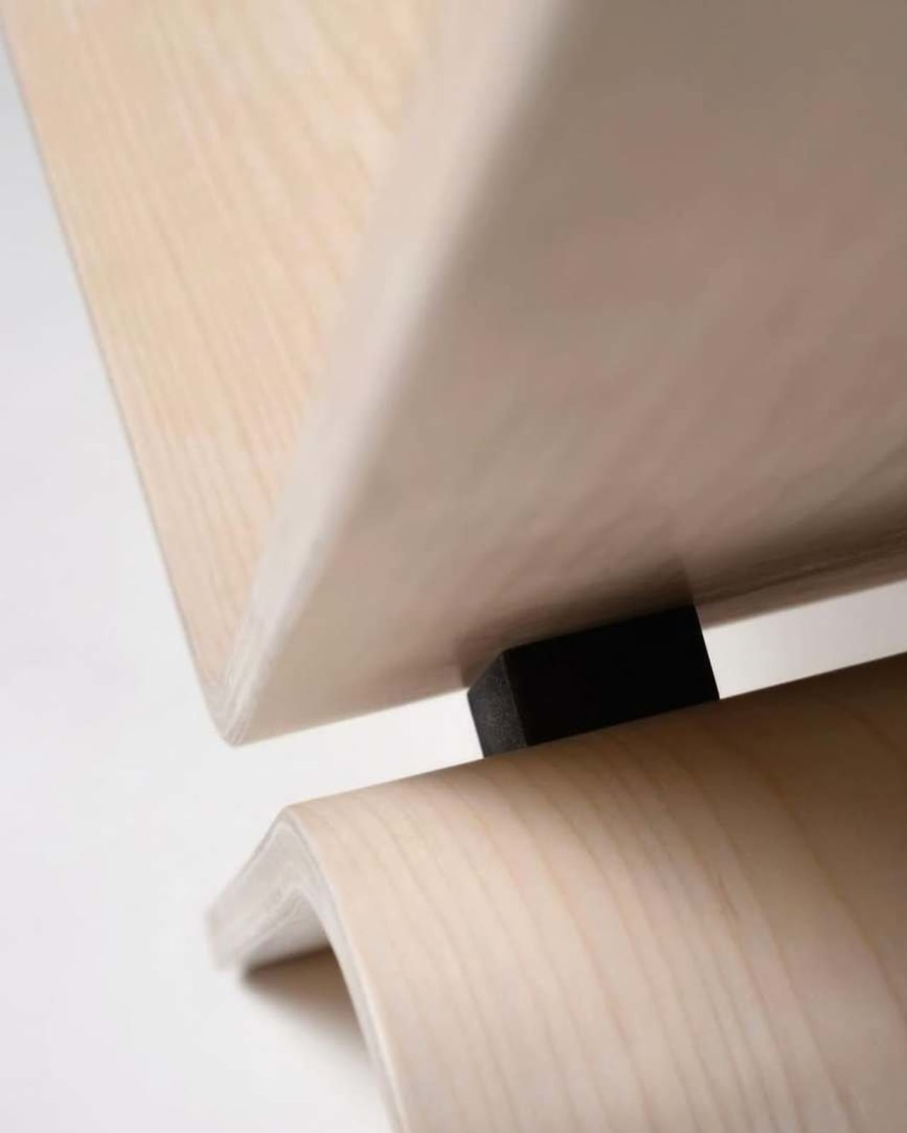
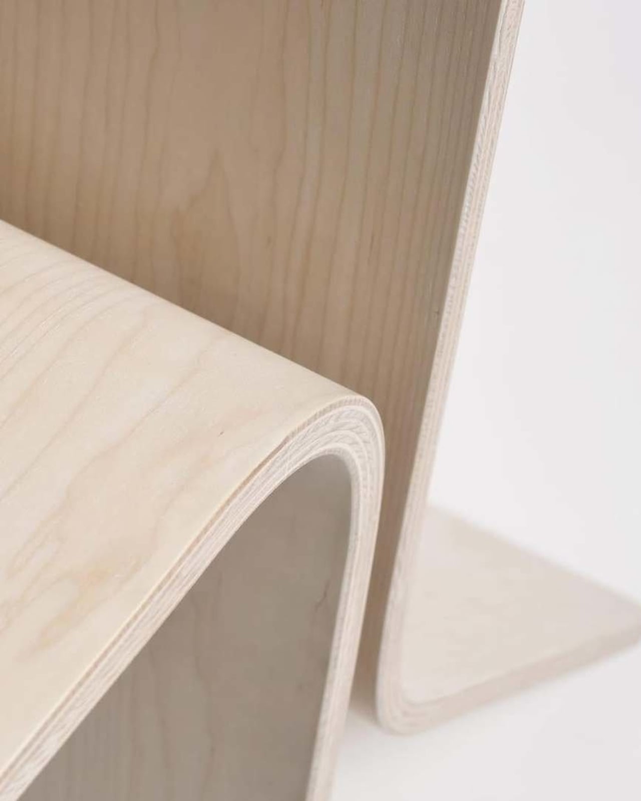
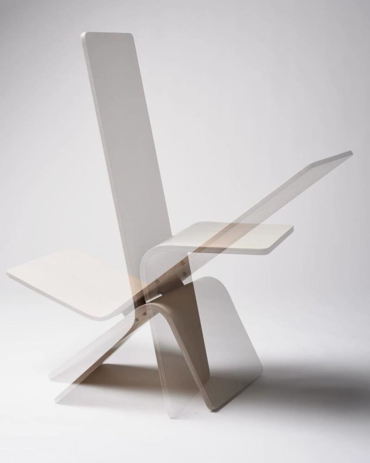
Hirschfeld is an industrial design student at Germany’s Hochschule Pforzheim, and her Tilt chair is exactly what the name suggests. Built from bent plywood with a minimalist silhouette, it’s a chair that shifts between two modes: upright for sitting and reclined for lounging, all with a single gentle forward tilt. No levers, no mechanical parts, no instructions needed. Just physics, balance, and good design doing the heavy lifting.
Designer: Manuela Hirschfeld
The concept is almost disarmingly simple. Hirschfeld describes it this way: “Tilt transforms from a chair to a lounger in seconds with a gentle forward tilt. Intuitive and perfectly balanced. Two moments arise from a single piece of furniture: arriving upright or relaxing and letting go.” That last line is the one that stuck with me. Arriving upright or relaxing and letting go. It reads more like a small philosophy than a product description.
What I find genuinely impressive here is the restraint. A lot of student design work goes big. It reaches for concepts that are hard to produce, materials that don’t yet exist, or ideas that require ten slides of explanation before they make sense. Tilt goes the other direction. It strips everything down to the point where the idea can stand entirely on its own. One material, one gesture, two functions. That’s it.
Bent plywood as a material has a rich history in furniture design. Charles and Ray Eames made it iconic. Alvar Aalto built a whole vocabulary around it. Choosing it for a student project isn’t a lazy shortcut; it’s actually a high bar. The material has been done so well, so many times, that doing something genuinely new with it means you have to think carefully. Hirschfeld has clearly done that thinking, because the Tilt doesn’t feel like it’s borrowing from those references. It feels like it belongs to the same conversation without trying to imitate anyone in it.
The two-position function also taps into something real about how people use furniture. We don’t sit the same way all day. Anyone who works from home, eats at their desk, or uses their living room for everything from Zoom calls to Sunday afternoon napping already knows this. The idea that a single well-designed chair could accommodate those different physical and emotional states is more practical than it first appears. It’s a simple answer to a genuinely complicated question.
What makes this worth paying attention to, beyond the design itself, is that Hirschfeld apparently maintains no online presence. Core77, who featured the project, noted it with a certain curiosity. No portfolio, no Instagram, no LinkedIn footprint to trace. That’s almost radical for a design student right now, when visibility tends to be treated as a prerequisite for being taken seriously. It raises the question of whether the work should be enough on its own. Looking at Tilt, you’d have to say it is.
Student design work often gets dismissed as theoretical, as something that sounds good in a studio critique but would never survive contact with manufacturing, retail, or real life. Tilt doesn’t read that way. It reads as resolved. The kind of thing that could sit in a well-edited apartment or a design-forward hotel room without anyone questioning whether it belongs there. Whether it ever goes into production is anyone’s guess. But that’s almost beside the point. What Hirschfeld has done with Tilt is prove that the clearest ideas are sometimes the hardest to arrive at, and that a chair doesn’t need to reinvent itself to be worth talking about. It just needs to do two things well.
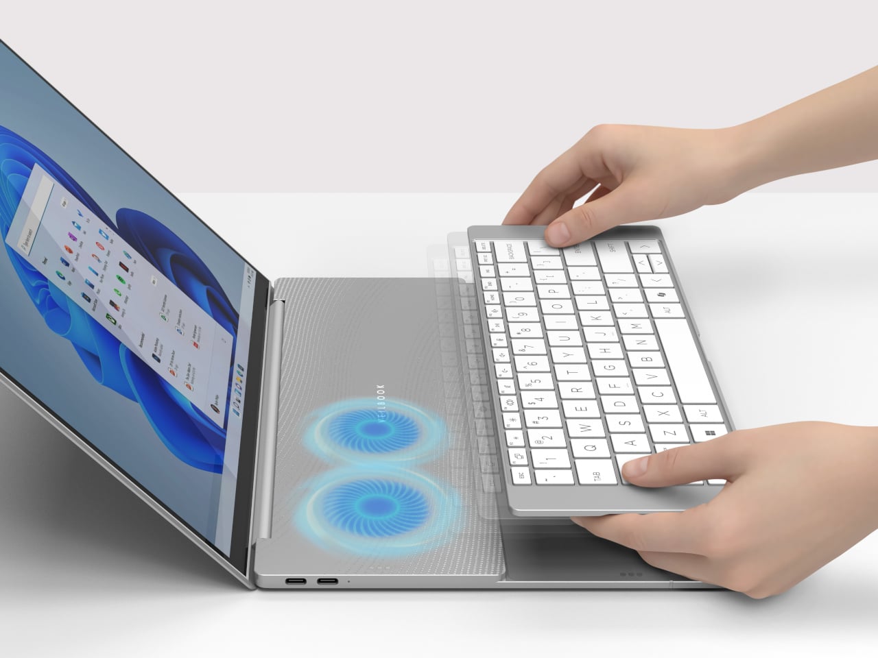
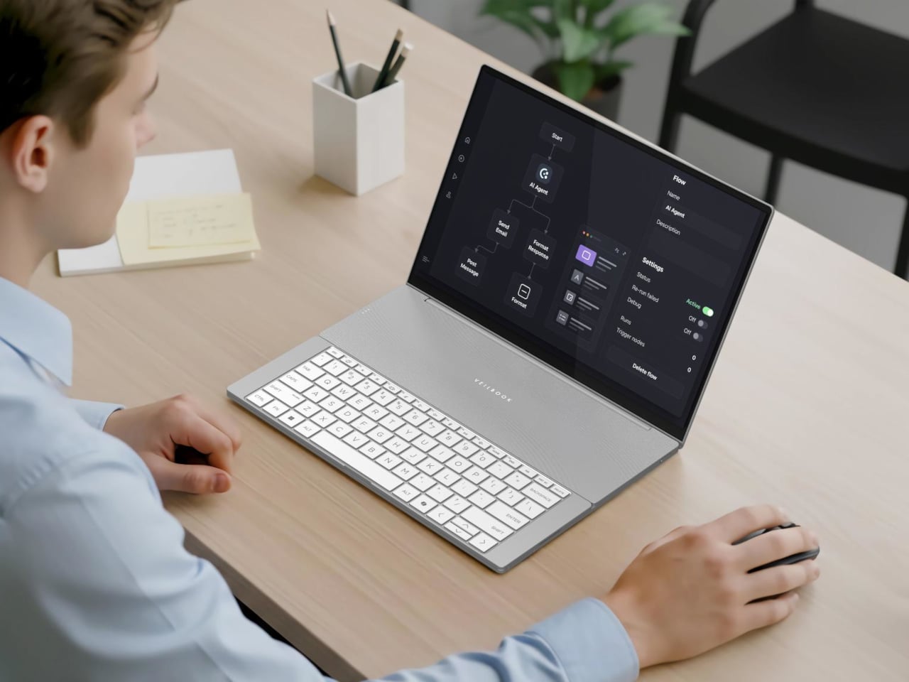
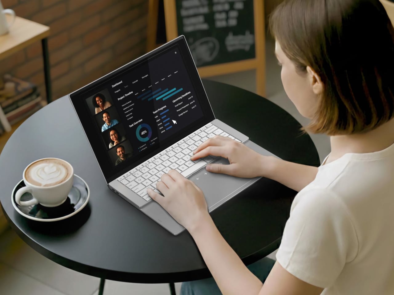
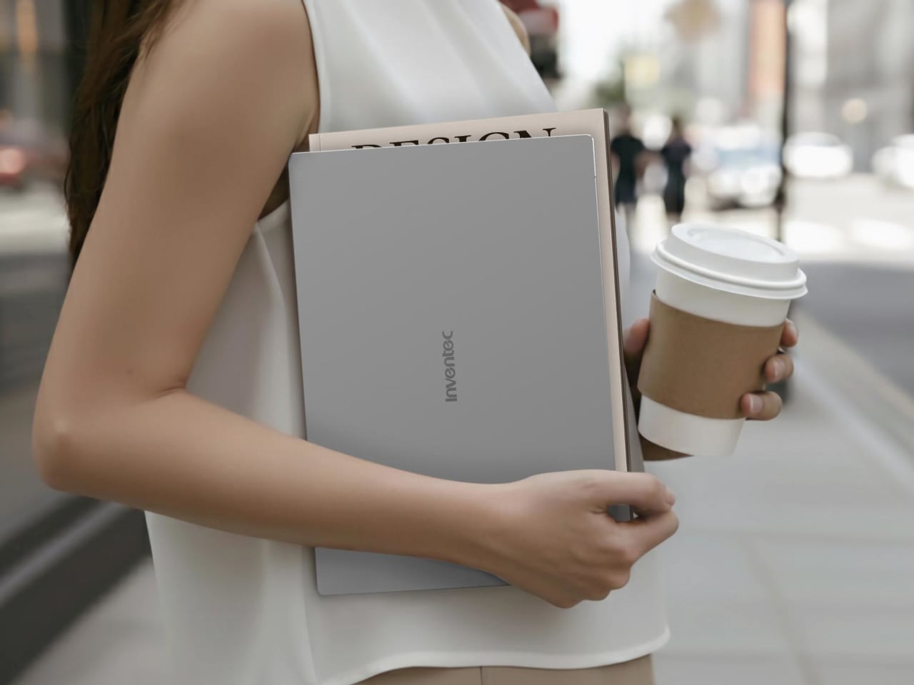
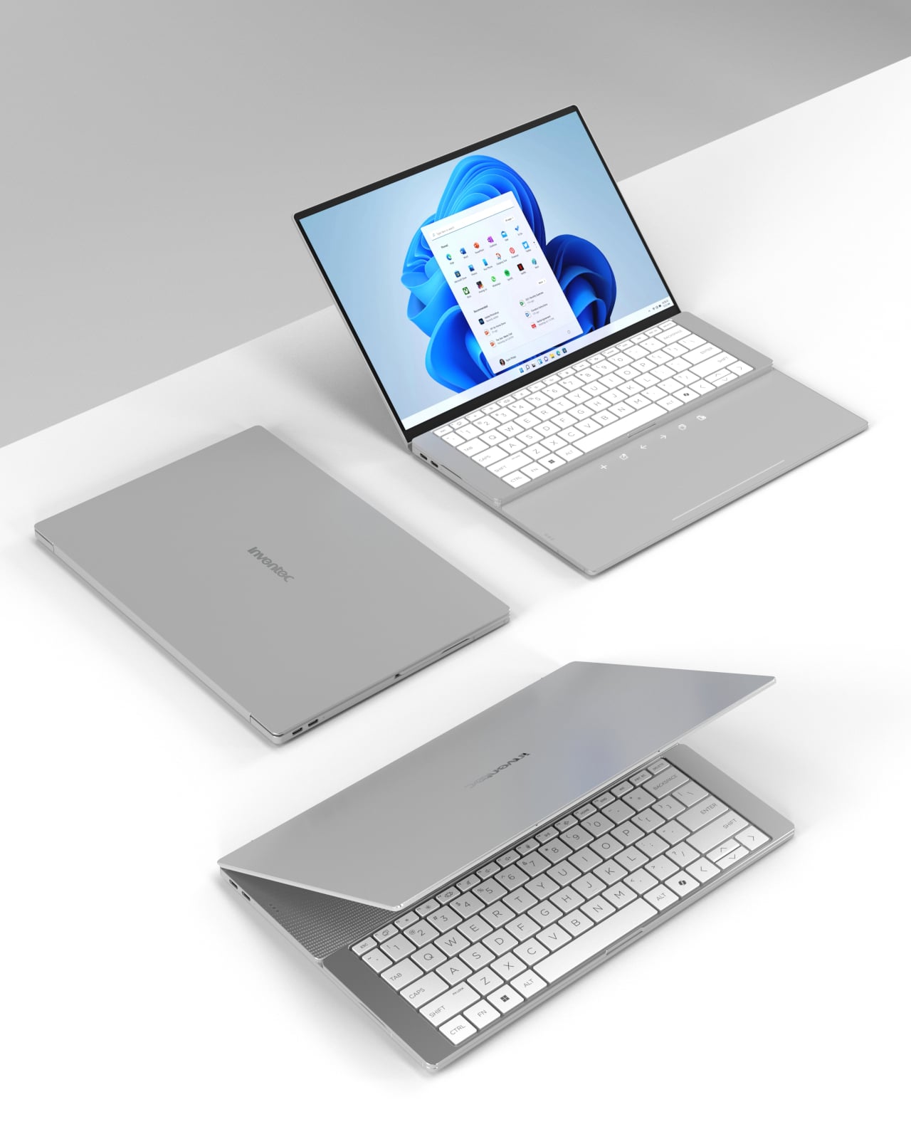
Laptop thinness has always been a trade-off dressed up as progress. The slimmer the chassis, the less room there is for the thermal infrastructure that keeps processors from throttling, and that compromise has long passed as the cost of portability. Inventec’s VeilBook, a 14-inch concept under 10 mm thick, took home an iF Design Award 2026 by rethinking not the materials but the physical behavior of the person using it.
The defining feature is a detachable keyboard that doesn’t stay fixed at the front of the deck. Most laptops position those fans beneath the keyboard, which occupies the upper area of the deck, and the keyboard itself limits how freely air can escape upward. Removing that obstruction improves airflow enough to keep the processor and memory from throttling under sustained load.
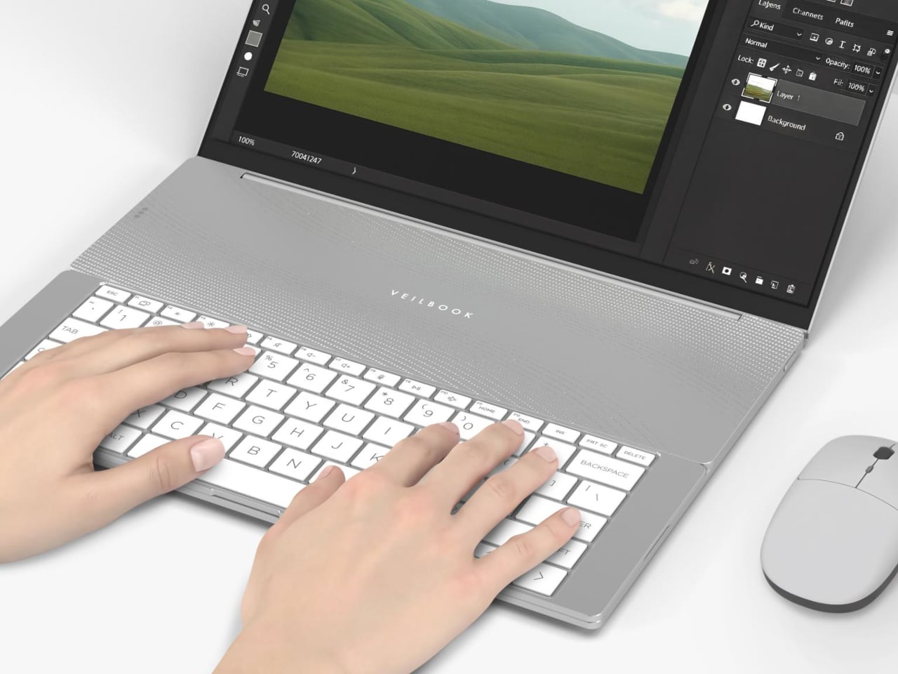
At rest, the keyboard covers the touchpad and palm rest, leaving the vent area above the cooling fans completely unobstructed. When you do need to use the touchpad, you can simply lift the keyboard and place it toward the back, a more natural position as far as traditional laptops are concerned. You can keep the keyboard there or put it back over the touchpad, depending on your needs and workflow.
That repositioning comes with a catch. To get the best thermal performance out of the VeilBook, the touchpad has to stay covered. If a workflow runs on keyboard shortcuts or an external mouse, that trade-off barely registers. For anyone accustomed to resting their palms beside the touchpad while typing, or reaching for it mid-sentence, it’s a more disruptive ask than the concept’s clean renders suggest.
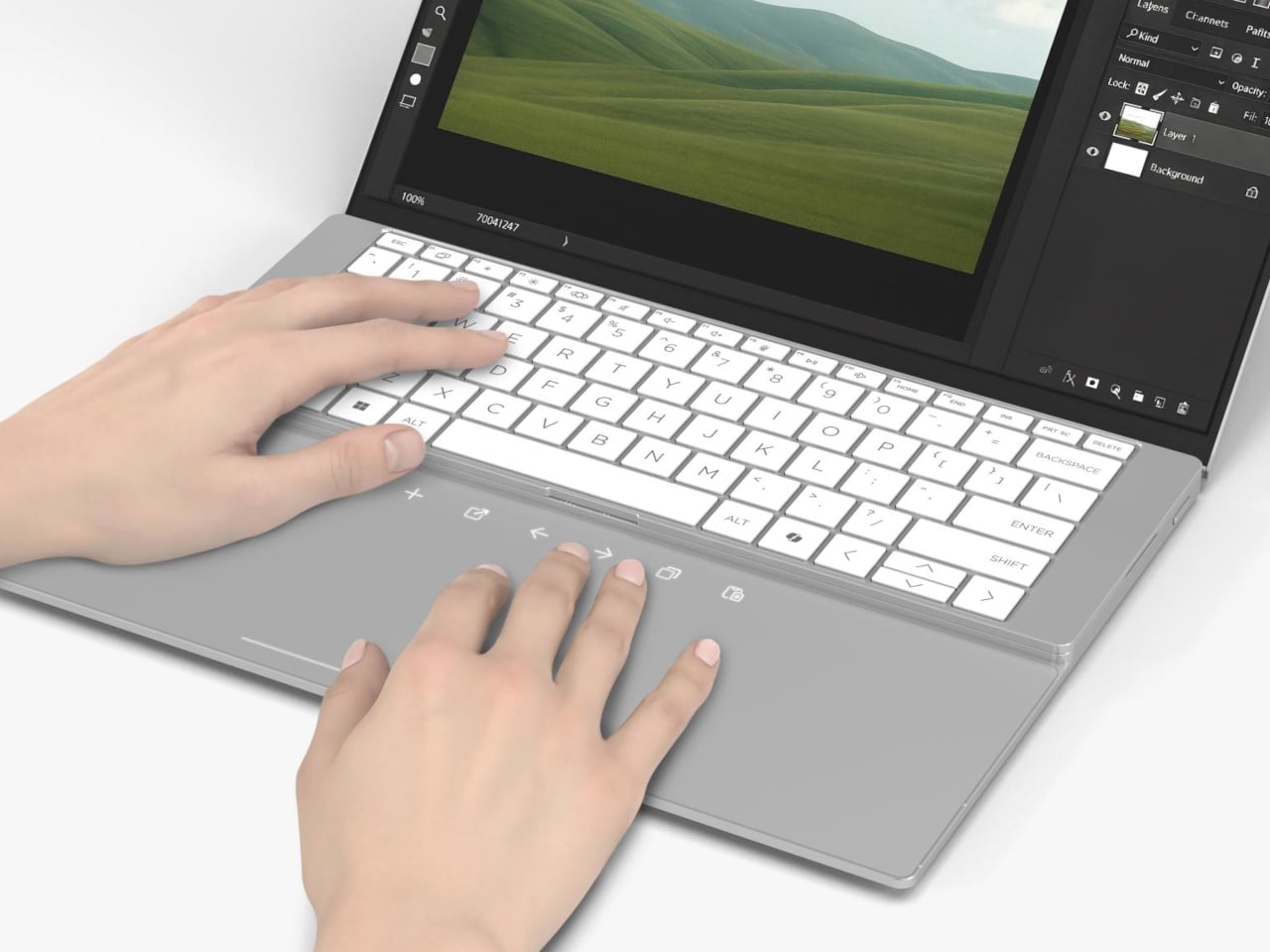
When the keyboard stays back and the touchpad is exposed, it doubles as a shortcut surface, a secondary input layer available without requiring a full posture shift. The VeilBook also incorporates behavior-linked power management, tying energy consumption to actual usage states rather than running at a fixed profile. When the keyboard is stowed and input activity drops, the system scales back power draw, which at least means the thermal compromise isn’t a constant condition.
What the VeilBook makes visible is a problem the industry has spent years papering over. Thin laptops throttle partly because keyboards sit on top of vents, and the obvious fix, moving the keyboard, apparently needed a concept award to surface. Whether blocking the touchpad is an acceptable price for better sustained performance is a question every potential user will answer differently, depending on how much of their day actually runs through that glass rectangle.
Most of us have a box. Or a bag, or a corner of the closet where clothes go to wait for a fate we haven’t quite settled on yet. Not trash, not donation, just quietly pushed aside. The jeans that stopped fitting but once made you feel unstoppable. The sweater that pilled after three washes but somehow survived four more years. Parting with clothes is harder than it sounds, and the fashion industry has largely treated that emotional gap as a non-problem.
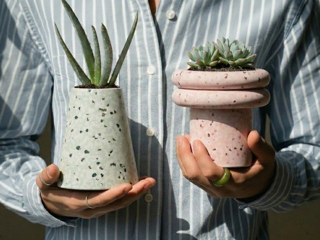
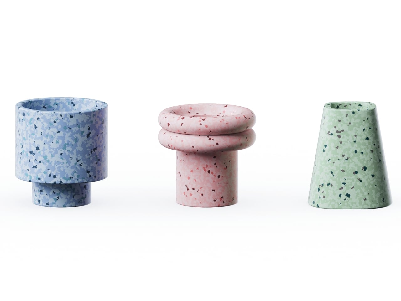
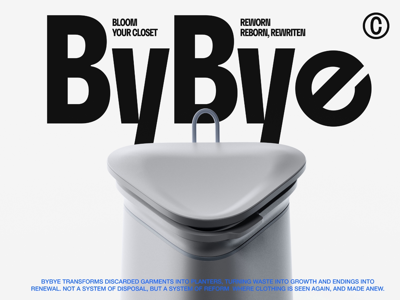
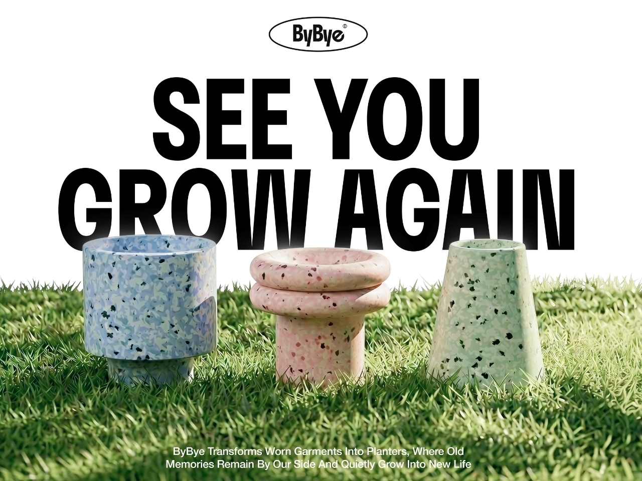
ByBye, a concept designed by Gyeong Wook Kim, Sooa Kim, Gayeon Kim, and Mingyeong Shin, disagrees with that approach in the most literal way possible. It’s a countertop-sized machine that takes your worn and discarded garments and transforms them, through a process of grinding, compression, and heat, into flower pots. Real, usable, actually beautiful flower pots.
Designers: Gyeong Wook Kim, Sooa Kim, Gayeon Kim, Mingyeong Shin
I want to sit with that idea for a second, because it’s a genuinely clever reframe of the problem. The designers describe ByBye not as a disposal system but as a “system of reform.” That language matters. When we throw clothes away, the garments disappear. When we donate, we hand off the moral weight to someone else. But ByBye asks you to stay present for the transformation and gives you something physical to show for it.
The mechanics are straightforward but impressively considered. You feed garments into the top opening, which uses a sliding rail mechanism to regulate input and automatically closes once the designated weight is reached. Inside, a shredder breaks the fabric down into fine particles. Those particles are then fed into a flower pot mold, compressed by a pressing plate, and hardened through high-temperature treatment. The finished pots rise up from the molding mechanism. The whole process takes about ten minutes per piece, and a companion app tracks fabric weight, the number of pots produced, and total production time.
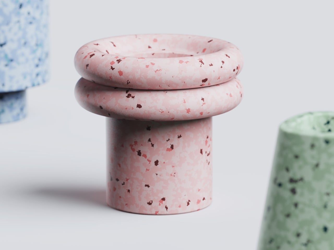
What comes out of the machine is genuinely surprising. The pots carry a terrazzo-like texture from the mixed fibers, soft and speckled in muted blues, pinks, and greens depending on the fabric input. They look like something you’d find at a design fair, not something born from a pile of worn-out t-shirts. That aesthetic outcome feels important to the whole concept. If the result were dull or utilitarian, the emotional payoff wouldn’t land. Instead, you end up with an object that holds some trace of the original garment, and then holds a plant on top of that.
The project raises questions I keep turning over. Can the machine handle all fabric types, including synthetic blends that behave very differently under heat and compression? What’s the upper limit on pot durability when working with processed textiles? These feel like the natural next steps for a concept this promising, and I genuinely hope the team is pushing toward them.
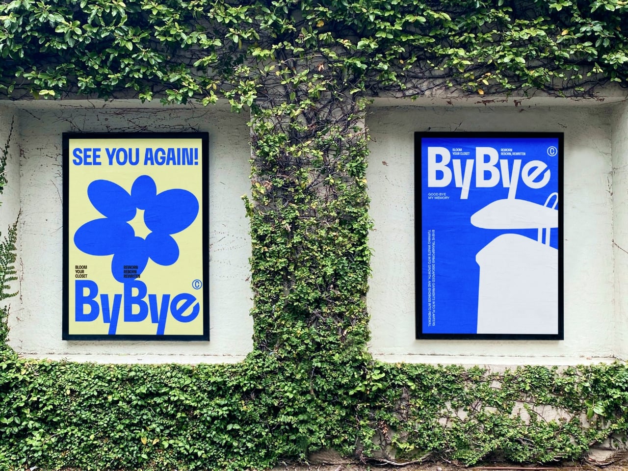
What ByBye gets absolutely right is the emotional architecture of the experience. The name alone, a gentle play on “bye bye” and “by” as in made by, signals that this isn’t designed to make you feel guilty about your wardrobe. The copy throughout the project, “Hello? Nice to Wear You,” “Let Your Clothes Begin Again,” reads more like an invitation than an environmental lecture. That tone is rare in sustainable design, which has a tendency to lead with shame rather than possibility.
The designers put it plainly in their project statement: “Not a system of disposal, but a system of reform where clothing is seen again, and made anew.” That’s a design philosophy worth paying attention to. Fashion produces staggering amounts of textile waste every year, and while no home appliance is going to fix that alone, concepts like ByBye shift the conversation in a useful direction. They make the ending feel less like a loss and more like a beginning. Parting with clothes is still going to feel like something. But now it might feel like planting something too.
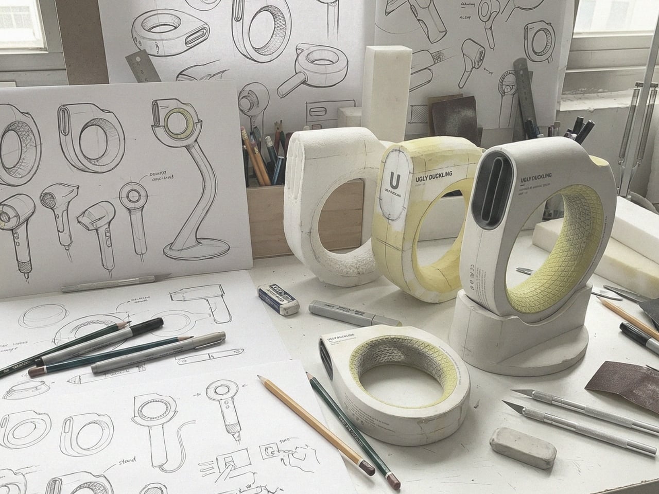
The hair dryer hasn’t really changed. Not fundamentally. You grip a barrel, aim at your head, and hold that position until your arm gives out or your hair is dry, whichever comes first. For something people use nearly every day, the hair dryer has been remarkably resistant to design rethinking. We’ve gotten quieter motors and better ionic technology and, yes, even a Dyson that costs more than a weekend getaway. But the form factor? The handle? The whole gun-shaped logic of it? That’s been largely untouched.
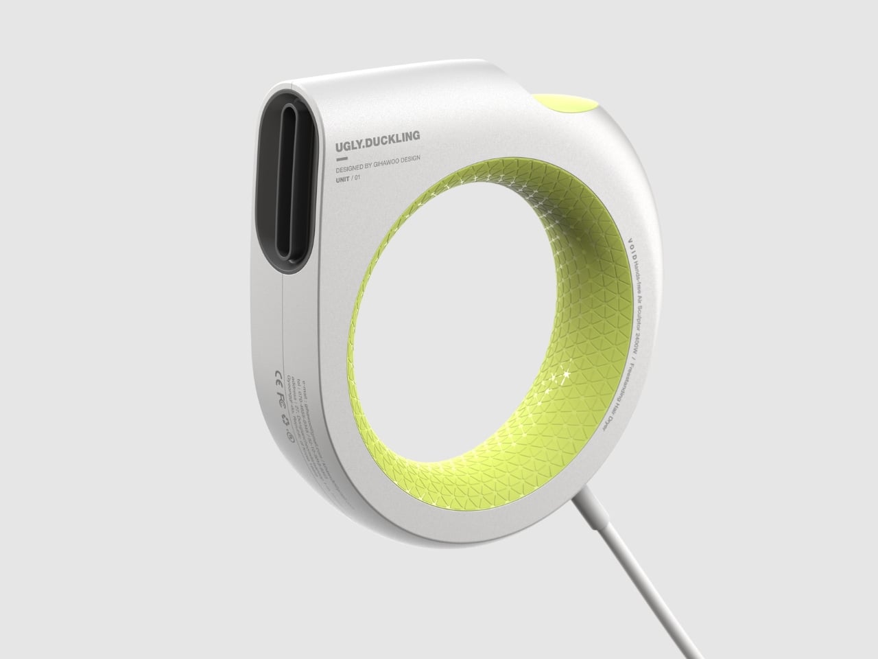
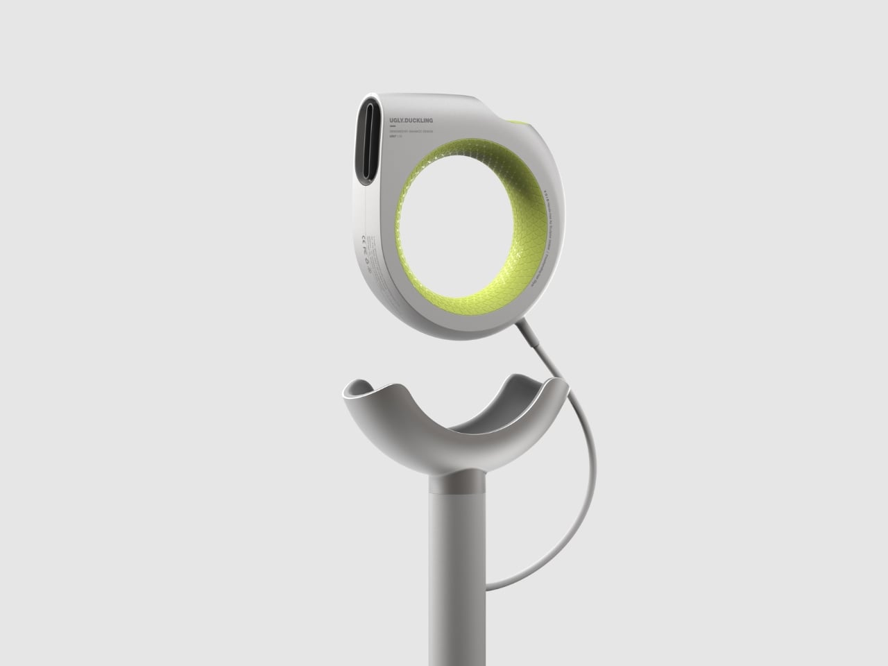
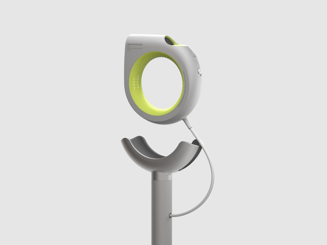
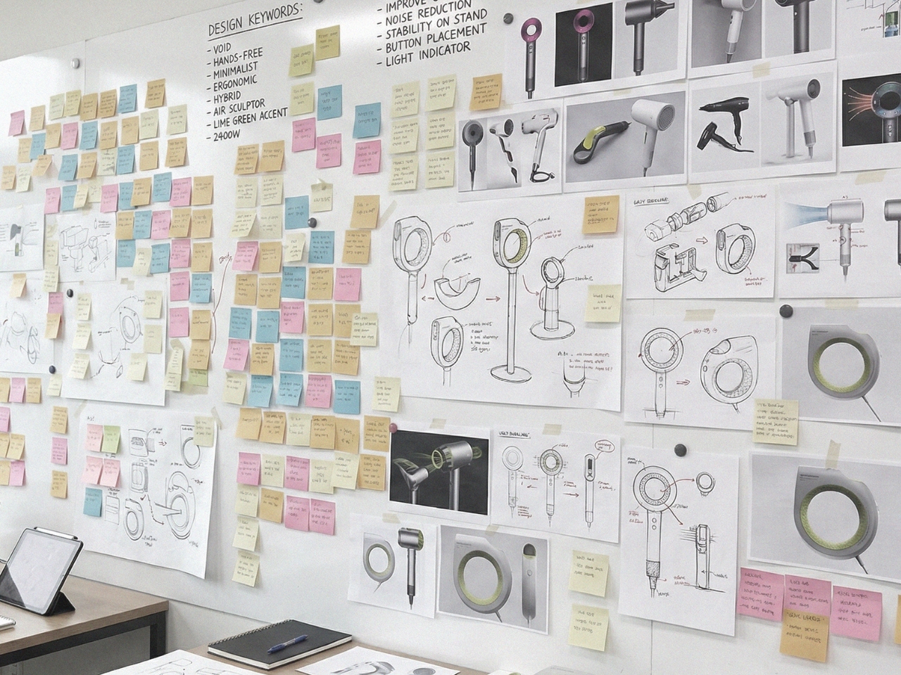
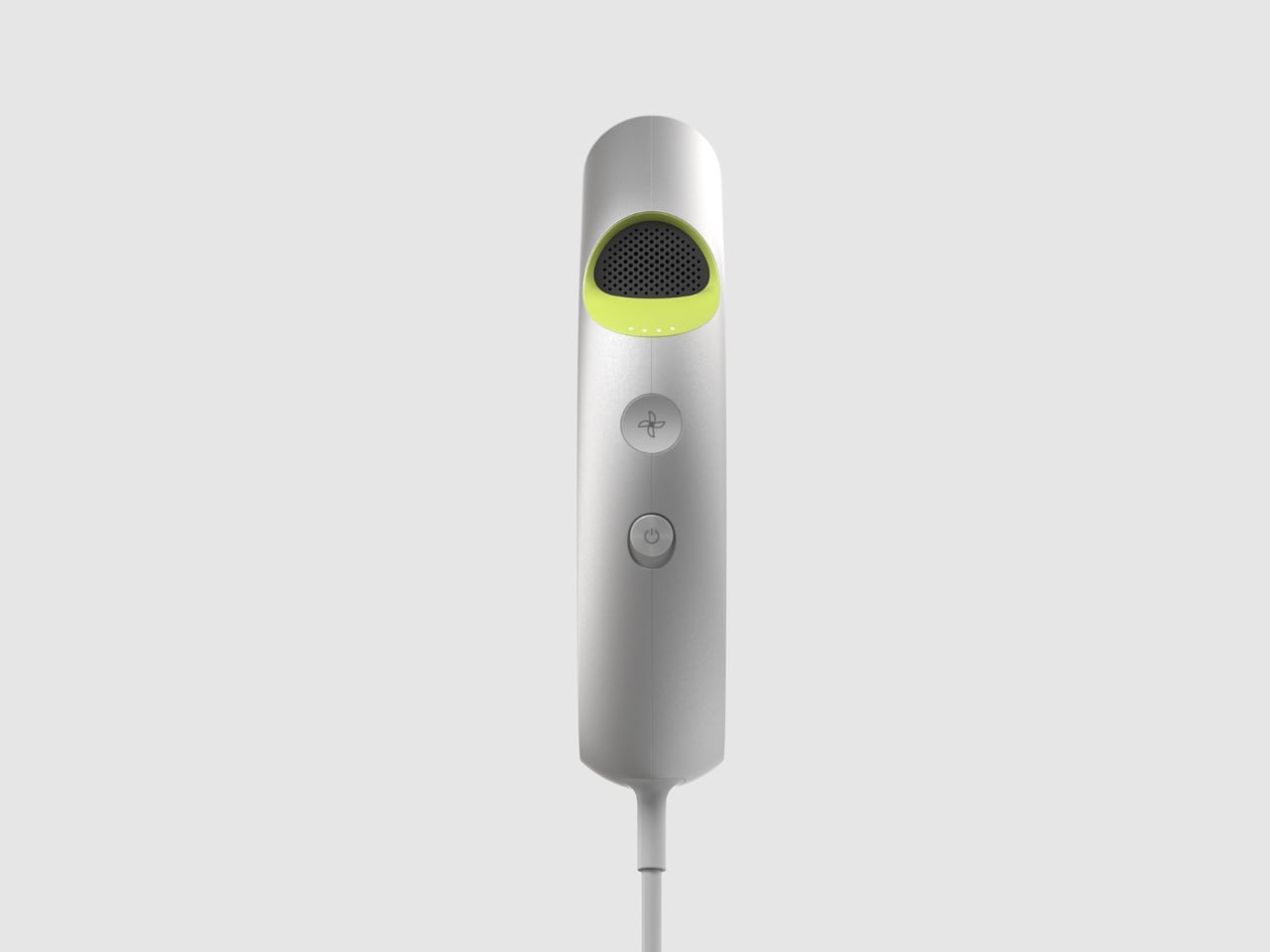
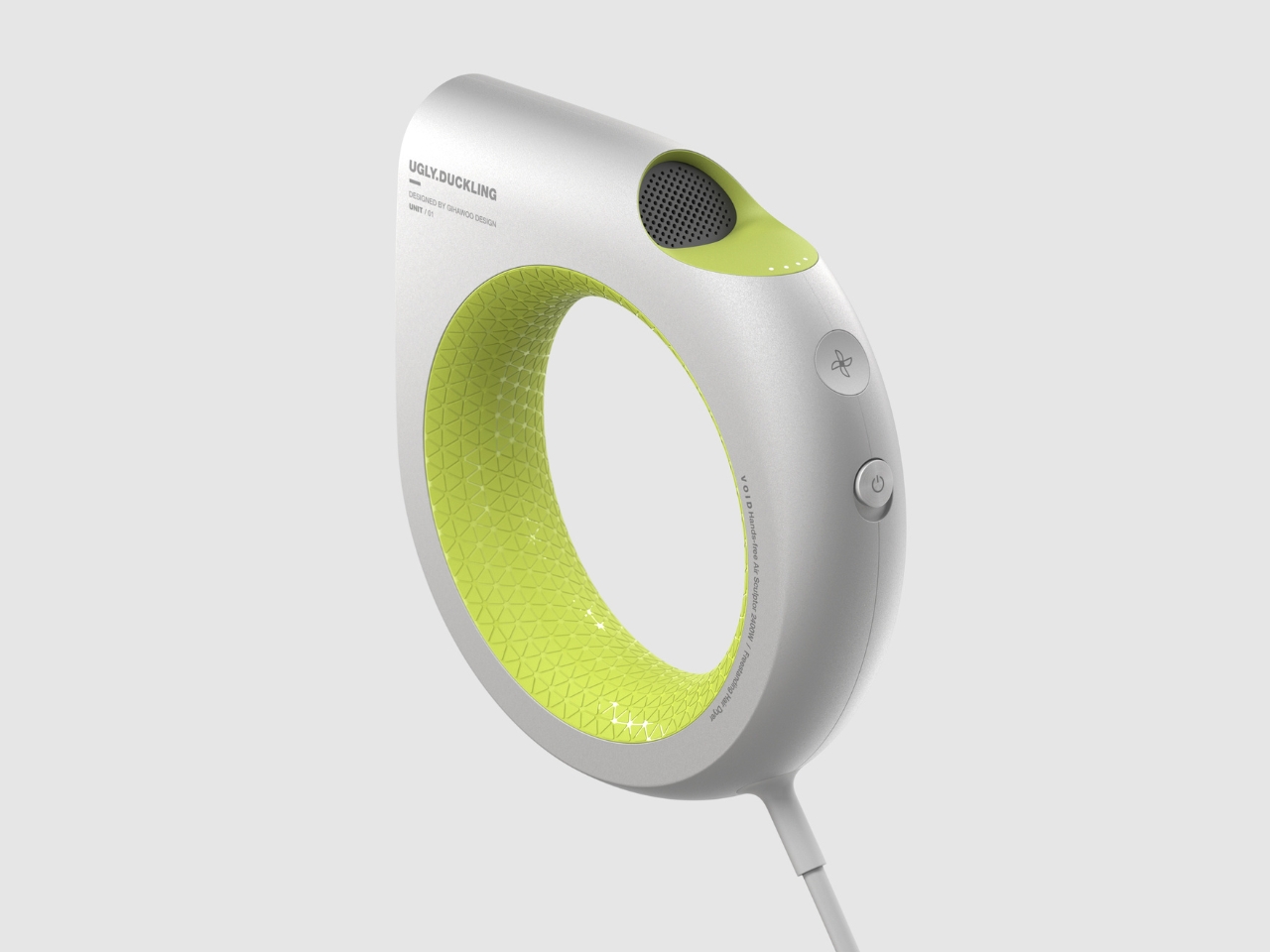
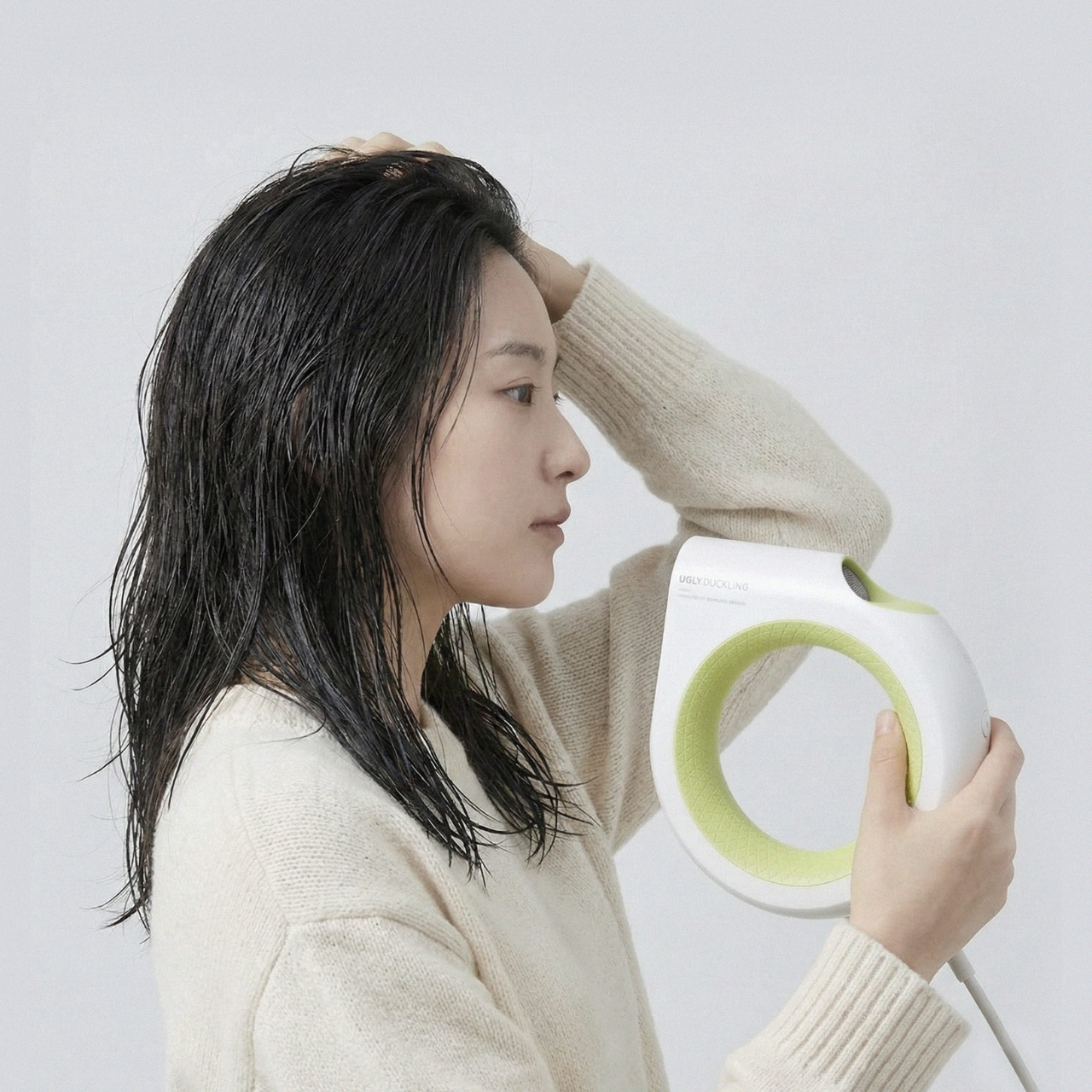
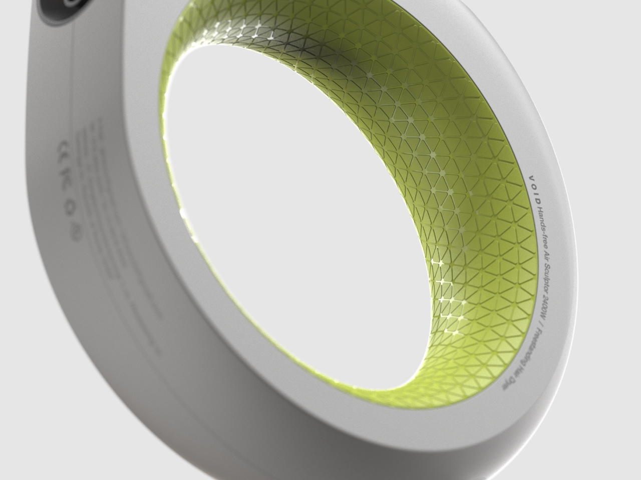
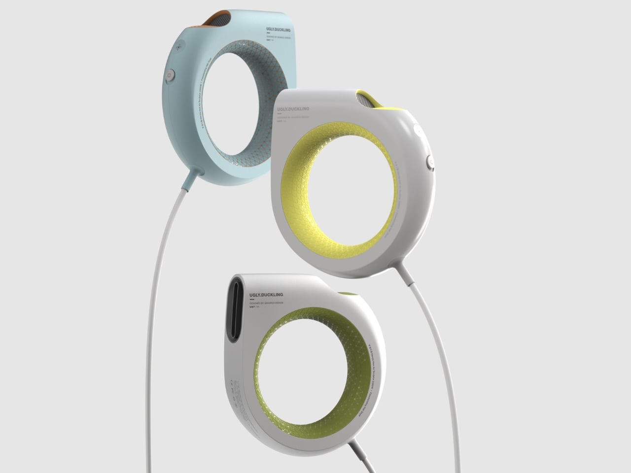
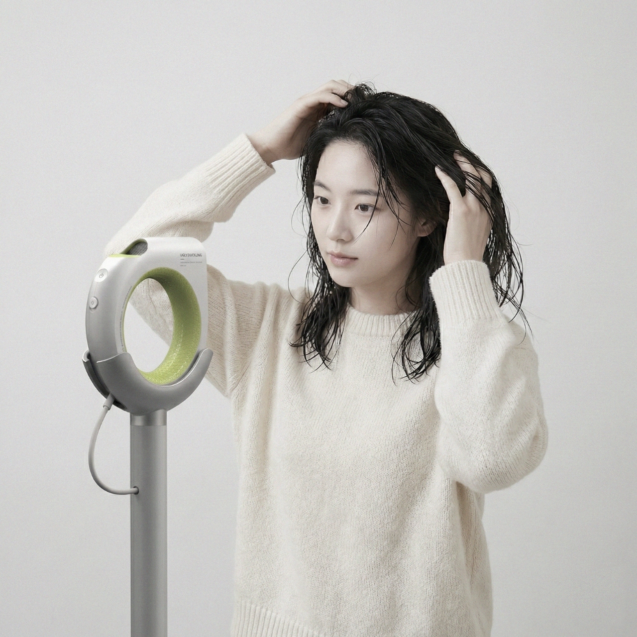
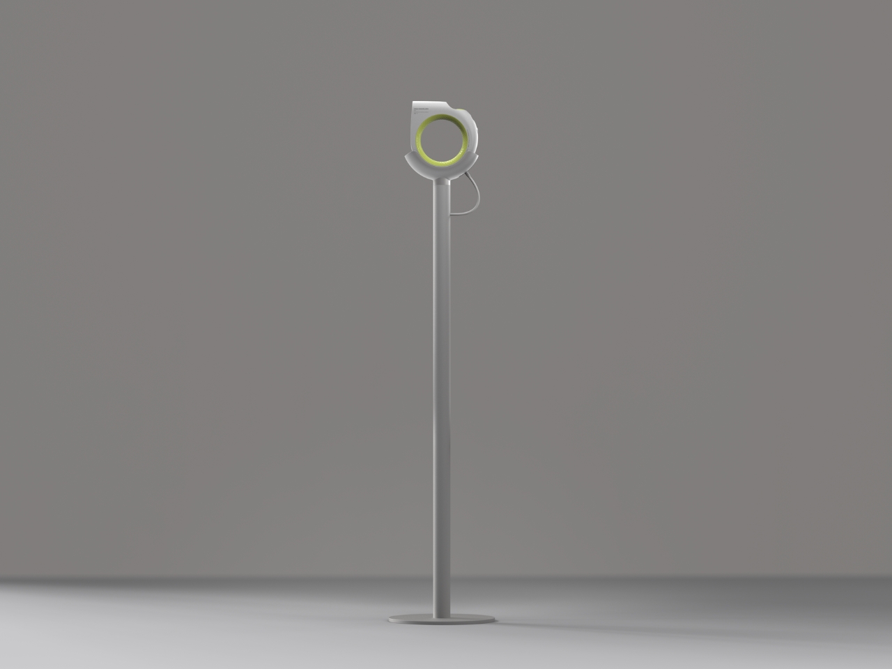
Seoul-based designer Giha Woo of UGLY DUCKLING ID apparently decided that was worth fixing. VOID, the studio’s 2026 concept, starts from a completely different question: what if we removed the handle entirely? Not just slimmed it down or repositioned it, but actually erased it and started over. The result is a geometric ring, a hollow torus-shaped dryer that sits in a freestanding cradle when not in use and can be held, angled, or used completely hands-free. The name is not accidental. The void in the design is literal: it is the absence of the handle that defines everything about this object.
What I find genuinely exciting about this is not just the visual novelty, which is considerable. It’s the design logic behind it. Giha Woo describes the concept as “breaking away from the familiar, discovering new usability,” and that phrase is doing real work here. Most product redesigns tinker at the edges. VOID goes to the center of what makes a hair dryer a hair dryer and questions whether that thing needs to exist at all. The ring structure doesn’t force a single way of holding. You can grip it at different points, set it in the stand and step back, or orient it however the airflow needs to go. That kind of flexibility isn’t just ergonomically interesting; it’s philosophically interesting. It’s a product that doesn’t tell you how to use it.
UGLY DUCKLING ID has always operated at that intersection of wit and precision. Founded by Giha Woo in Seoul in 2010, the studio has developed a portfolio that reads less like a product catalog and more like a cabinet of curiosities. They’ve made a piglet-shaped VR device and a phone controller that looks like a gun. They’ve worked with Samsung. The name UGLY DUCKLING is deliberate: these are designs that don’t look like what you’d expect, and that’s the whole point. VOID is a natural extension of that sensibility, except it’s arguably their most commercially plausible concept to date.
There’s also the question of who this is really for. Hands-free drying isn’t just a convenience play. For people with limited mobility, shoulder injuries, or conditions that make sustained arm-raised postures difficult, a freestanding drying system is genuinely functional rather than merely aesthetic. Design that improves daily life for a wider range of bodies tends to be better design overall, and VOID seems to understand that without making it the centerpiece of its branding.
The textured inner ring, compact motor strategy, and directional outlet placement show real system thinking behind the design. This isn’t a rendering exercise dressed up as a product. Whether VOID ever reaches production is another question entirely. As a concept, it already does what good design concepts are supposed to do: it makes you look at a familiar object and wonder why it was ever made differently in the first place.
That said, I’ll admit the idea of aiming a ring of air at your head takes some imagination to warm up to. The muscle memory of gripping a dryer handle is real, and habits are stubborn. But every now and then a concept arrives that makes the existing solution feel like the strange one. VOID does that. After seeing it, the traditional hair dryer starts to look slightly absurd, a pistol grip that was developed by historical accident and never really questioned. That, to me, is the clearest sign of a good design idea: it makes the old normal look a little weird.
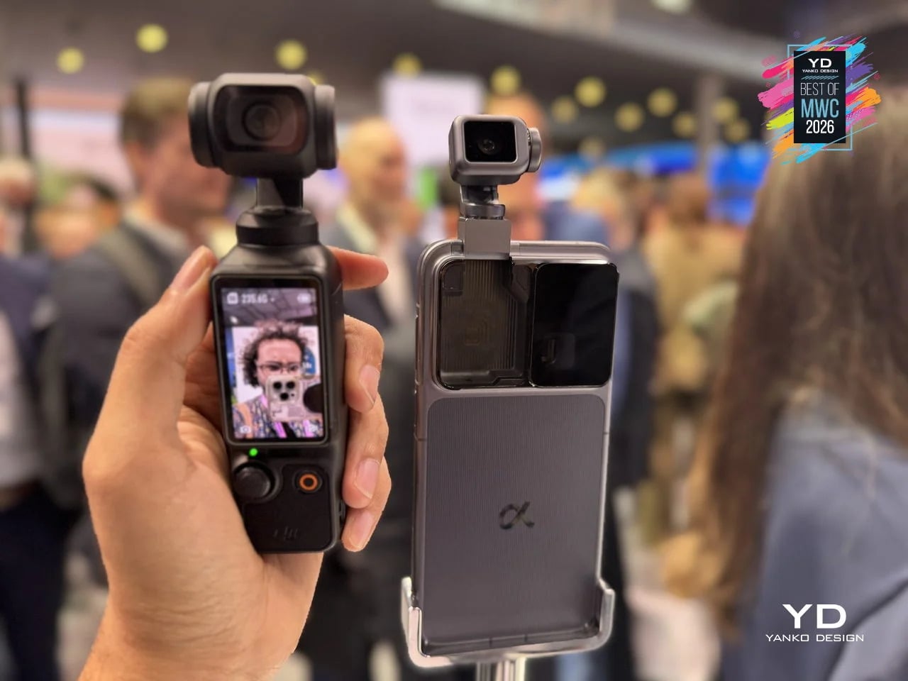
Look at the phones announced this year, like those revealed at MWC 2026 last week, and you will notice something. They are all faster, thinner, and shinier than last year’s models, and yet none of them feel particularly surprising. Cameras gained another sensor. Bezels shrank another millimeter. Battery life improved by an amount that is technically measurable but practically indistinguishable from the model before. The industry has gotten so good at making phones incrementally better that it has almost forgotten to ask whether they could be genuinely different.
That is where concept phones come in. Not all of them are practical, and not all of them will ship. But the five designs here do something that the latest Galaxy or iPhone cannot: they make you pause and reconsider what a phone actually is, and what it could be if the people designing it were not also worrying about carrier approvals, supply chains, and quarterly earnings. Some are functional prototypes shown on actual show floors. Others exist purely as design arguments. All of them are worth thinking about.
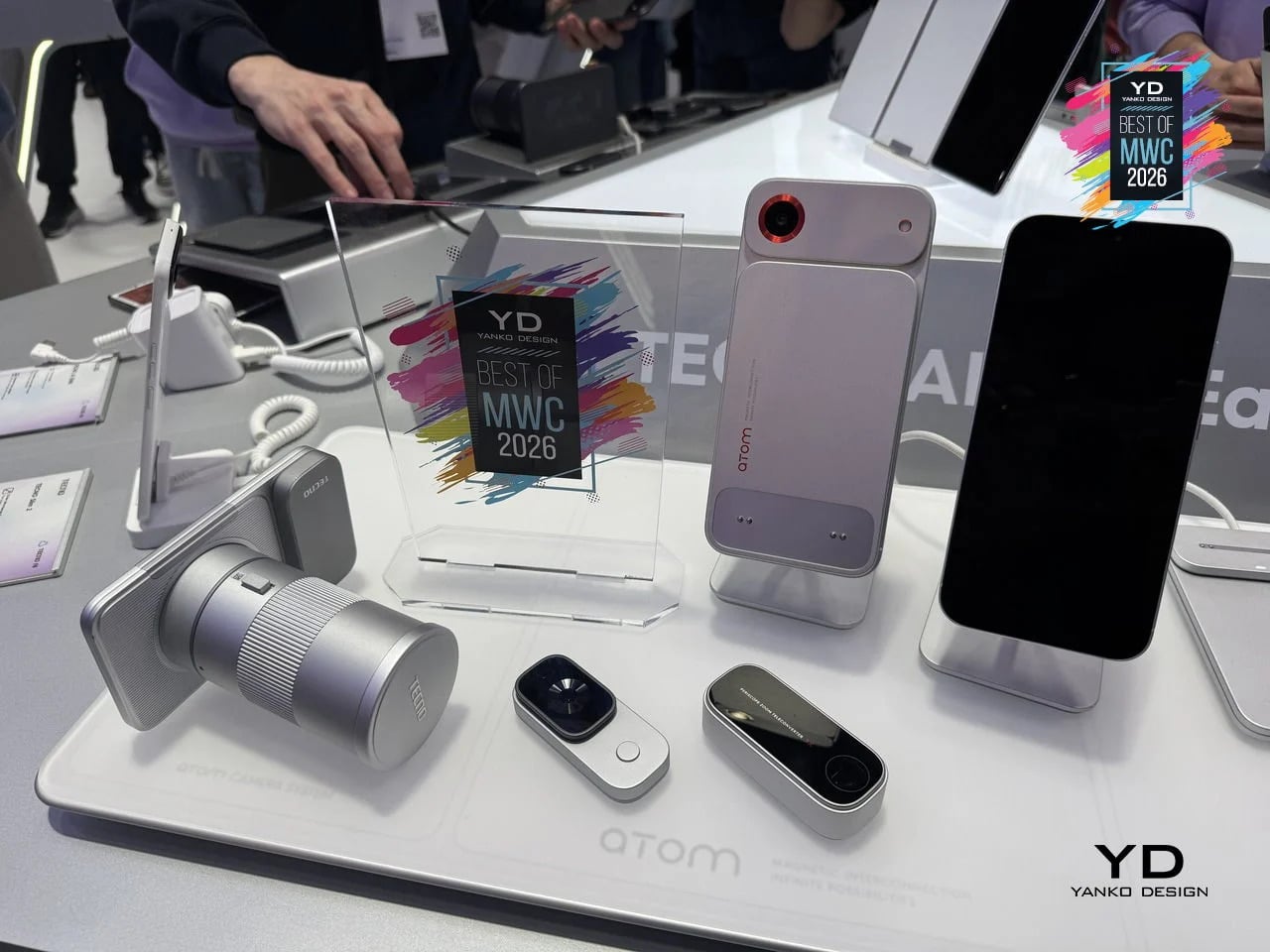
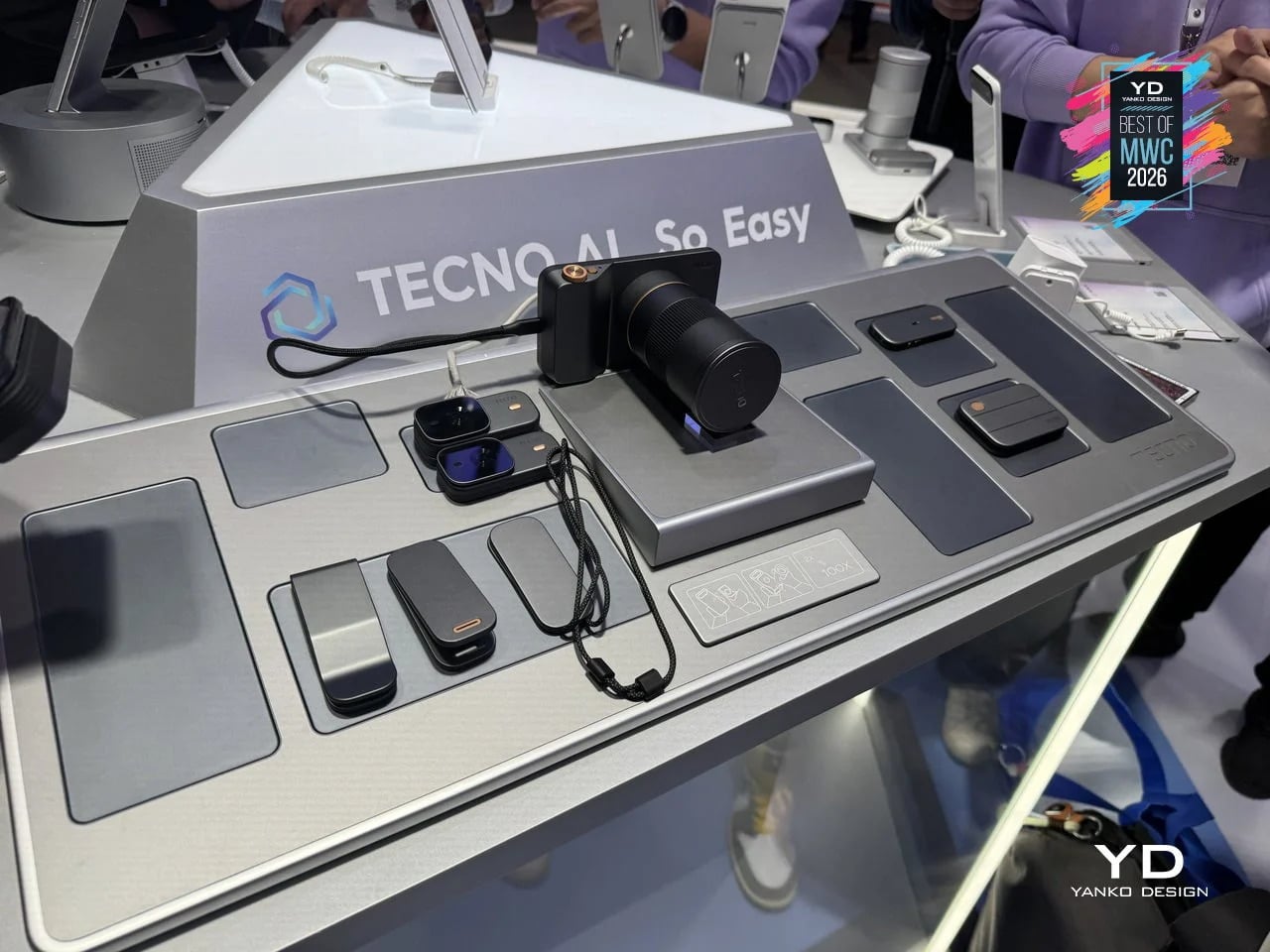
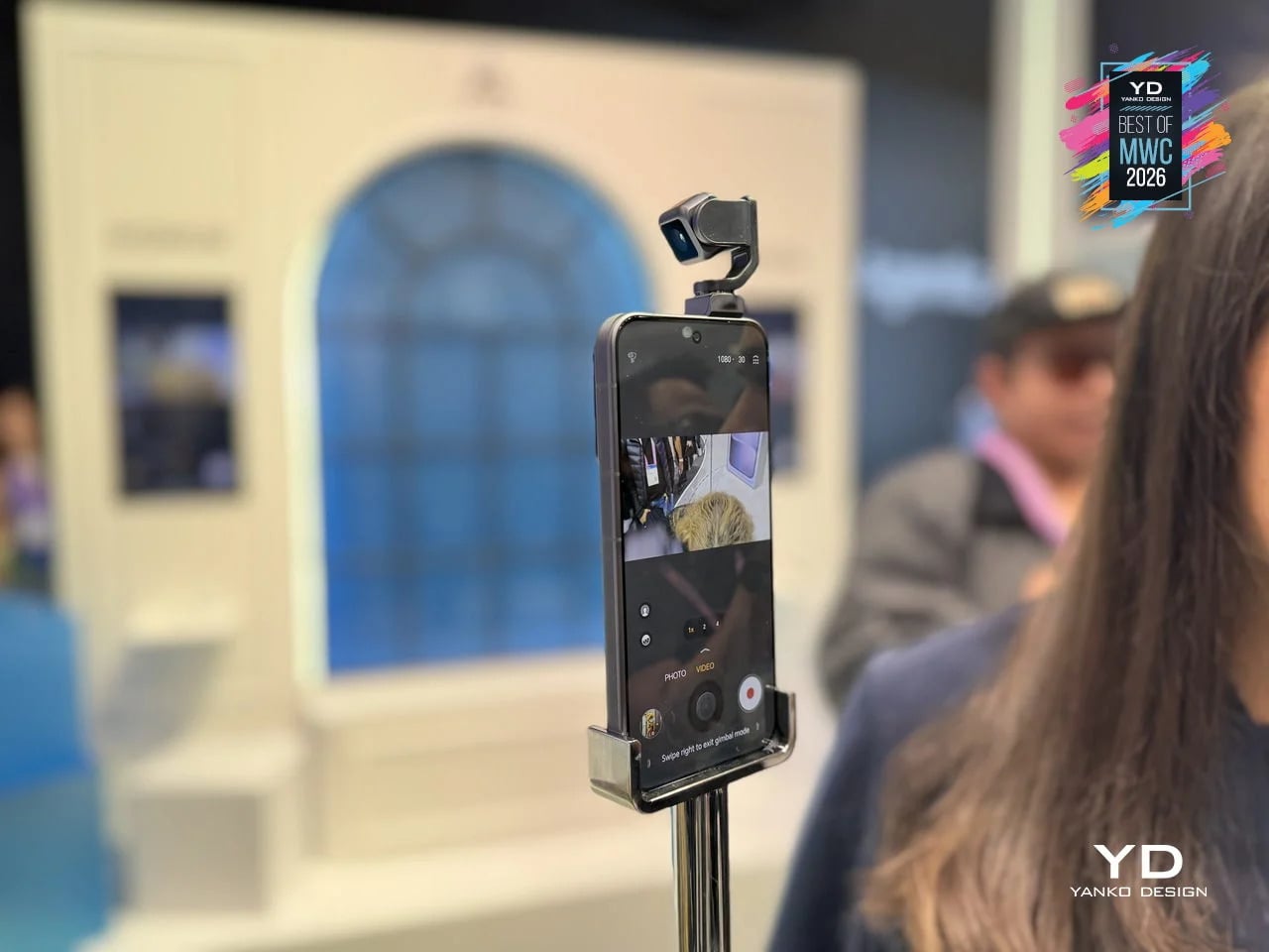
TECNO Magnetic Modular System
Phones have been getting thinner for years, which sounds like progress until you think about what got traded away in the process. Removable batteries went first, then expandable storage, then headphone jacks. Every feature that required physical complexity was quietly dropped in the name of a slimmer profile. TECNO’s Magnetic Modular System, shown at MWC 2026, challenges that logic directly. Rather than cramming every possible capability into a single fixed body, it keeps the phone lean by design and lets you snap on what you need, when you actually need it.
Designer: TECNO
The system works through a magnetic interconnection technology that attaches hardware modules directly to the phone. Telephoto lenses, action cameras, additional battery packs, and over a dozen other components can be added or removed in seconds. The core argument is straightforward: a phone that tries to do everything is permanently weighed down by everything it carries. A phone that adapts to the moment is only as heavy as today demands. Whether TECNO can pull off what Google’s Project Ara could not is another matter, but the design thinking here is at least pointed at the right problem.
What we liked
The base phone stays slim and fully usable on its own, so you’re not carrying the bulk of a photography rig on days when all you really need is a phone.
The modular suite covers a wide enough range of options to be genuinely practical, from camera upgrades to battery expansion, rather than limiting you to a couple of cosmetic add-ons.
What we disliked
Using the system to its full potential requires thinking ahead. If you leave the telephoto module at home, the hiking trail is not going to wait for you to go back and get it.
The smaller modules seem like prime candidates for disappearing to the bottom of a bag, while the larger ones can add considerable bulk when stacked, which rather defeats the point of keeping the base phone slim.
HONOR Alpha Robot Phone
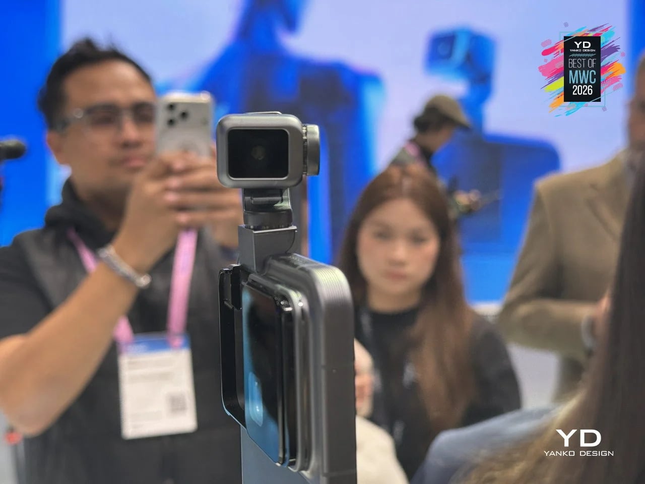
Most phones sit on a desk and wait. The HONOR Alpha does not. Demonstrated as a functional prototype at MWC 2026, this is a phone with a 4DoF gimbal system inside the camera bump, built around what HONOR describes as the industry’s smallest micro motor. Three-axis mechanical stabilization runs alongside an AI tracking engine, and a double-tap locks onto any subject, following it through movement, obstructions, and sudden changes in direction. The person who used to carry a separate DJI Osmo just to get steady footage now has a reasonable question to ask.
Designer: HONOR
The gimbal also does something harder to categorize. HONOR designed it to express what they call embodied AI interaction, meaning the phone physically responds to its environment. It nods during video calls. It reframes itself to keep you centered without being asked. It moves when music plays through its speakers. Phones have had personalities before, mostly through notification lights and ringtones. The Alpha just happens to have something closer to a neck.
What we liked
Giving AI a physical presence, rather than just a voice or a chat window, makes the technology feel more tangible and less like a background service you forgot was running.
The built-in gimbal meaningfully expands what the main camera can do without requiring any extra gear, turning a stationary device into something closer to an autonomous one-person film crew.
What we disliked
Motorized components inside a device that gets dropped, sat on, and shoved into pockets will eventually wear down. A gimbal mechanism that fails out of warranty is a discouraging prospect.
The behavioral features, nodding, swaying, tracking your face, are the kind of thing that feels charming in a demo and potentially exhausting at 7 AM when all you want to do is check your messages.
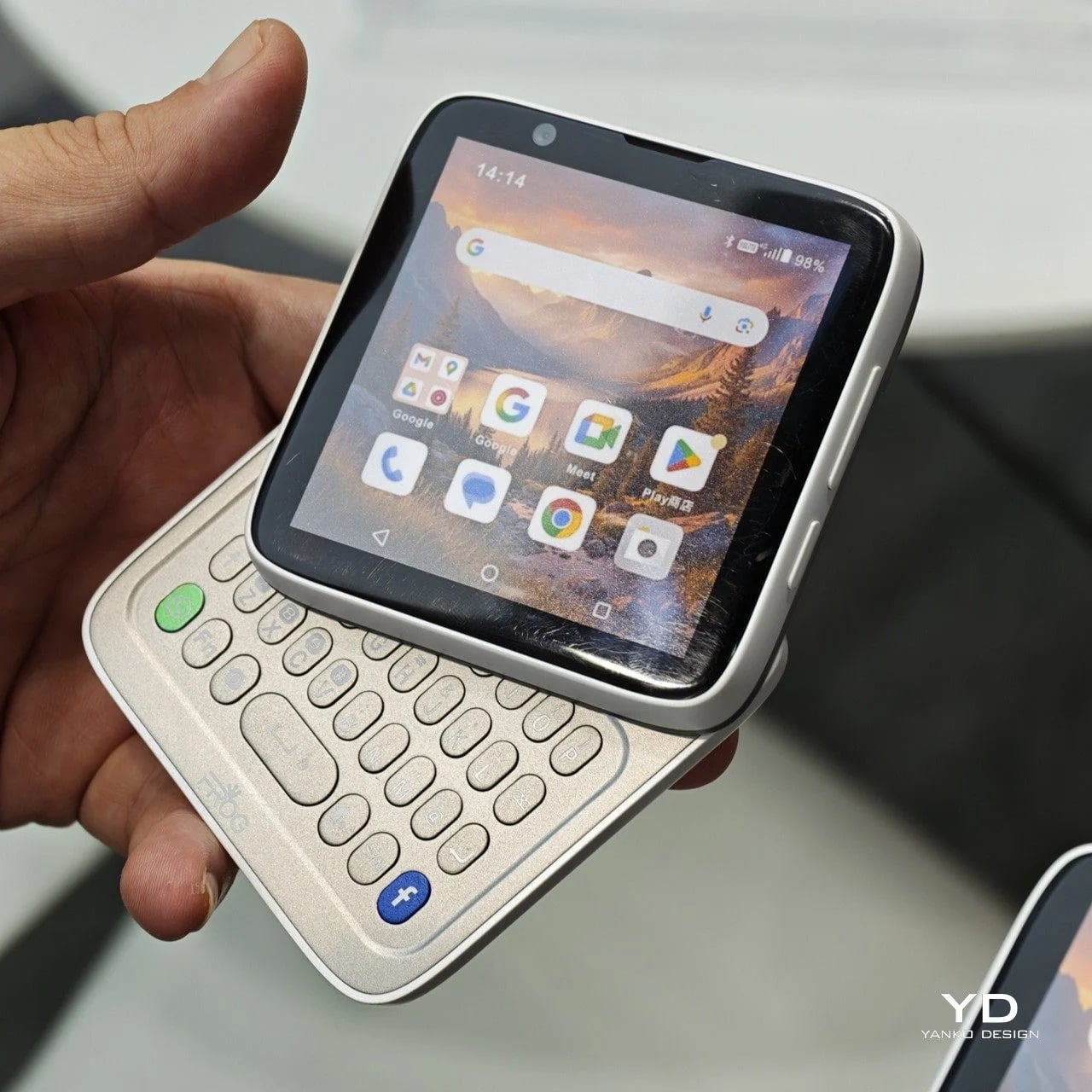
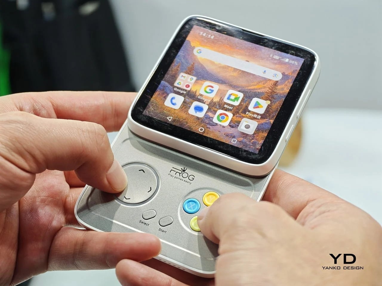
iFROG RS1
Every phone released this year is a tall rectangle, some taller than others. The iFROG RS1, shown at MWC 2026, is a square, which already makes it unusual before you get to the part where it twists open. Built around a 3.4-inch square display, the RS1 has a rotating lower section that reveals one of two things depending on the variant you’re looking at: a full QWERTY keyboard with raised, tactile keycaps, or a gamepad with a D-pad, a four-button cluster, and Select and Start. No price and no release date were announced at MWC, because the hardware itself is the pitch.
Designer: iFROG
The keyboard variant has a clear and underserved audience. The people who have quietly resented touchscreen typing for fifteen years are not a small group, and the Unihertz Titan has been proving that niche quietly for a while. The gamepad version is a stranger and arguably more interesting proposition. Running Android with physical controls in a square body draws instant comparisons to the Motorola Flipout, a 2010 Android phone that did something structurally similar and was adored by a small crowd before being largely ignored by everyone else.
What we liked
The rotating mechanism keeps the phone genuinely compact in normal use, so the keyboard or game controls are there when you want them and completely invisible when you don’t.
Adding physical input without making the phone permanently thicker or wider is a trade-off very few devices have come close to solving, and the RS1 at least makes a credible attempt.
What we disliked
Modern software is built almost entirely around tall, vertical screens, so the square format creates real friction with apps, video, and content that all assume a rectangular display.
Choosing between the keyboard and gamepad variants at the point of purchase is a long-term commitment. If your priorities shift, or you simply want both, you are looking at two separate phones.
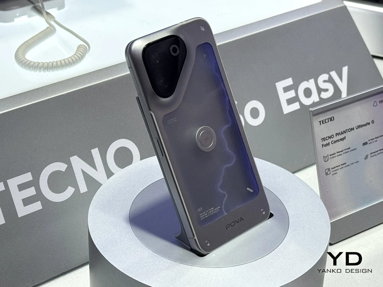
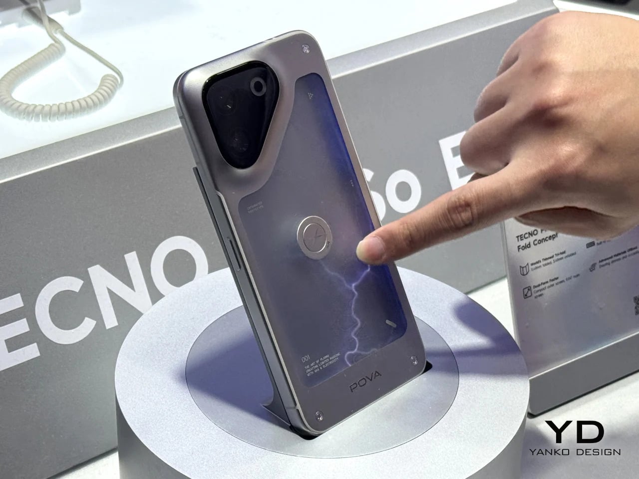
TECNO POVA Neon
Some phones try to solve a problem, but the POVA Neon honestly isn’t that kind of phone. TECNO’s other MWC 2026 concept uses ionized inert gas lighting, the same technology that gives neon signs their glow, to create a branching luminescent effect on the back panel that sits somewhere between a lightning bolt and a circuit trace. TECNO is not claiming this makes the phone faster or the camera better. The claim is simpler and more honest: a phone’s back doesn’t have to be an inert sheet of glass waiting to collect fingerprints.
Designer: TECNO
As design statements go, that one is actually worth taking seriously. Most phone backs are the most visible surface on a device that billions of people carry every day, and they’re almost universally empty. The POVA Neon asks what happens when that surface does something. The answer here is that it glows, which is not practical and doesn’t need to be. Concept work isn’t obligated to be practical. It’s obligated to make you look at a familiar object differently, and a phone that pulses with light like a neon sign in a diner window at least does that.
What we liked
Treating the back panel as a dynamic surface rather than a passive sheet of glass is a genuinely fresh direction, and using ionized gas to do it is unlike anything else currently on the market.
As a concept, it opens up real questions about how materials and lighting could make phone design more expressive without requiring any changes to the screen whatsoever.
What we disliked
Ionized gas channels in a device that flexes under grip pressure, absorbs impacts, and hits the floor on a semi-regular basis seem like they would not survive the lifespan of the phone itself.
A protective case, which most people use, would cover the entire back panel and make the concept completely invisible. It is a design that fundamentally cannot coexist with the most basic act of protecting your phone.
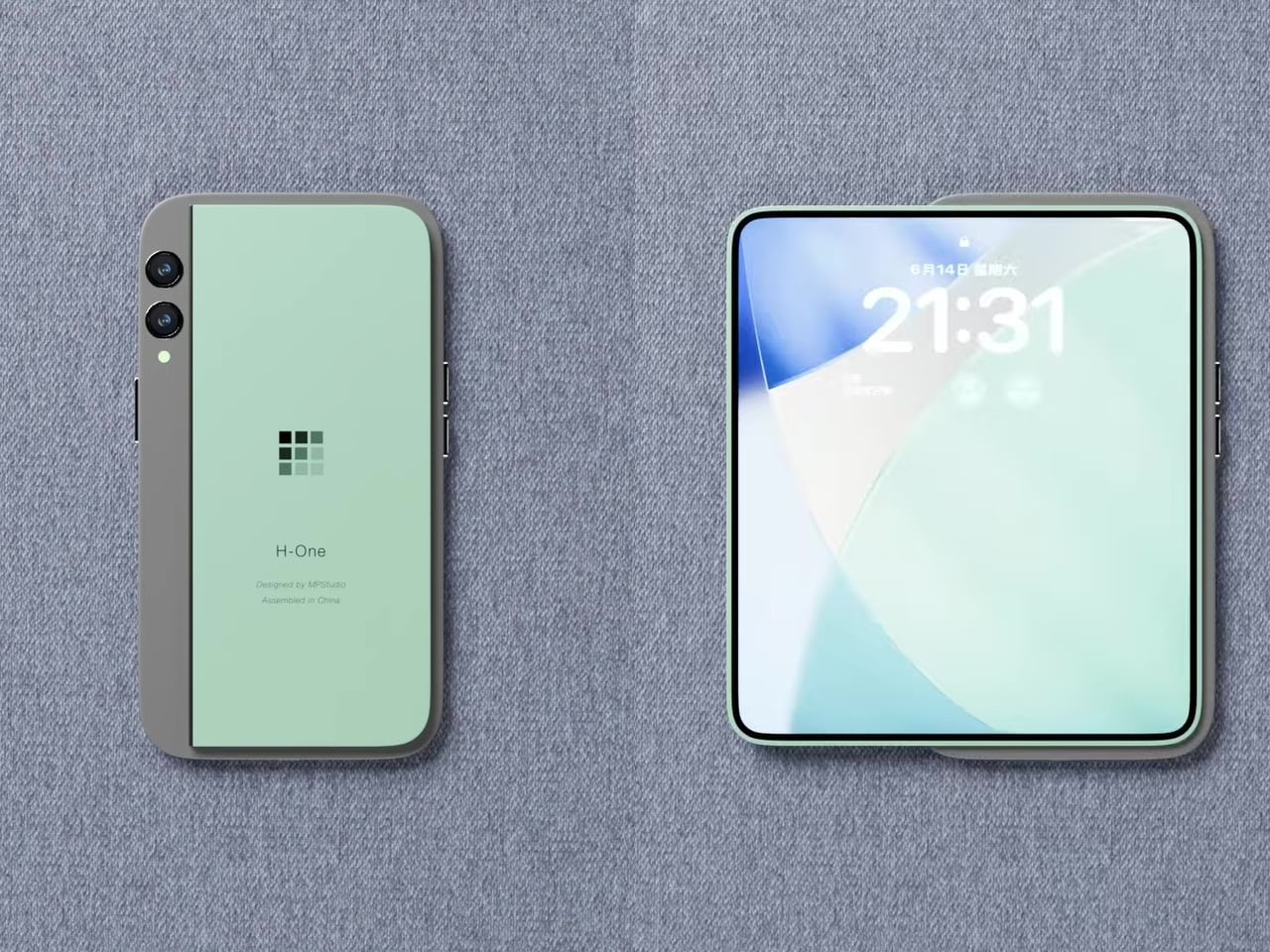
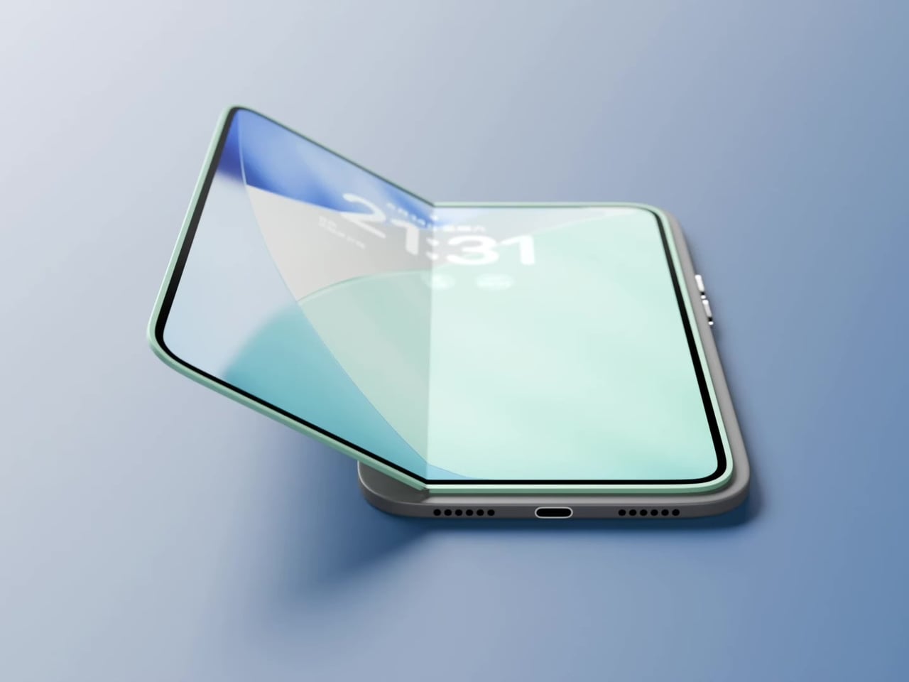
Pixel Dynamics iPhone Fold Concept
Foldable phones keep running into the same set of problems. The phone has to fold, which means the screen has to fold, which means the screen eventually creases at the hinge line, the hinge develops resistance over time, and the finished device ends up thicker than either of the two things it’s trying to be. Pixel Dynamic’s iPhone Fold concept approaches the whole premise from a different direction. Keep the iPhone exactly as it is. Add a separate foldable screen to the back.
The main iPhone body stays rigid and conventional. A thin, flexible secondary display sits raised on a platform above the rear panel, and when needed, it unfolds outward to create a larger, roughly square tablet surface. The phone itself does not flex, leaving the primary display completely untouched. In daily use, it feels and functions like a normal iPhone, because it essentially is one. That said, the raised platform adds thickness, wireless charging is probably absent, and using the camera while the secondary screen is unfolded becomes nearly impossible since it sits directly over the lenses. Apple almost certainly will never endorse the design, but as a thought experiment about whether a foldable screen and a foldable phone actually need to be the same thing, it’s one of the more original answers anyone has put forward.
What we liked
Treating the foldable display as a separate, discrete component rather than the phone’s primary structural element is unconventional thinking, and it raises genuinely interesting questions about repairability and modular design.
The concept challenges the assumption that a foldable phone has to mean a folding device, which is exactly the kind of first-principles questioning that occasionally turns into something the industry actually builds five years later.
What we disliked
Getting a raised foldable display to sit flush, function reliably through daily use, and survive the realities of a pocket likely puts this well outside what current manufacturing can deliver.
Apple’s tendency to design through subtraction rather than addition makes this particular execution, with its visible raised platform and external folding mechanism, almost impossible to imagine coming from Cupertino in any recognizable form.
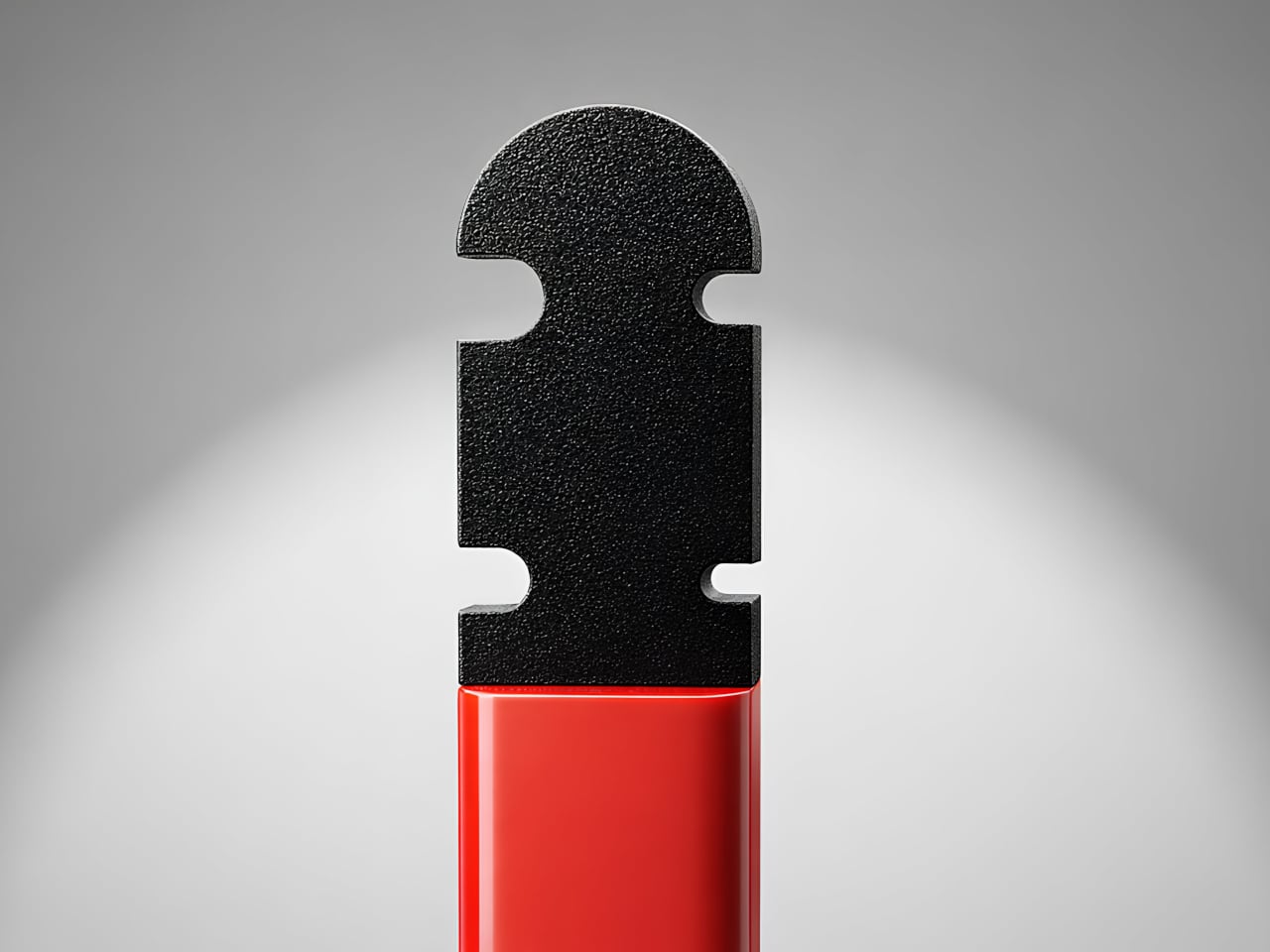
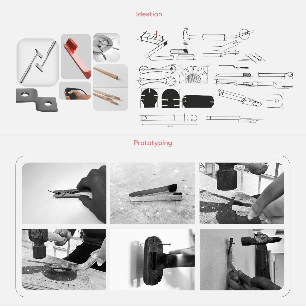
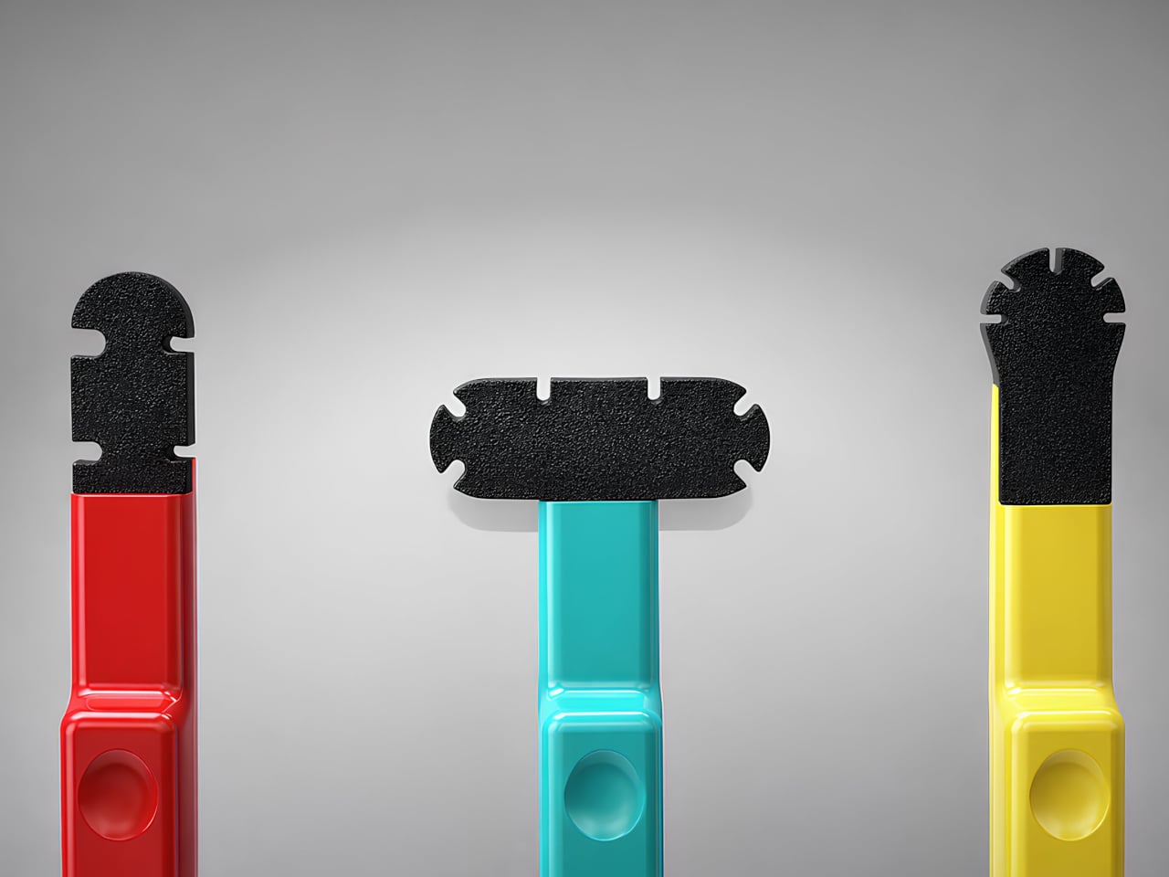
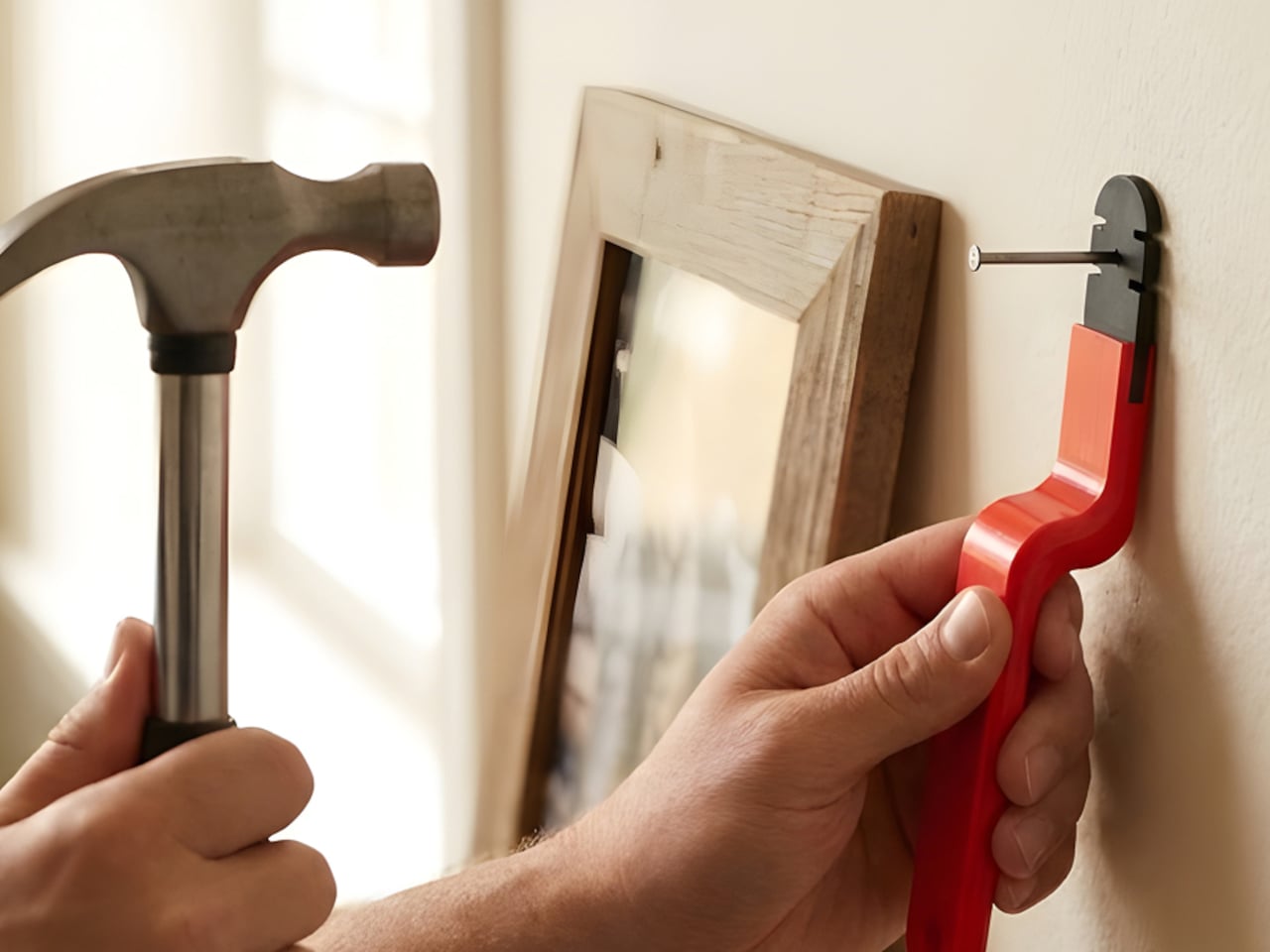
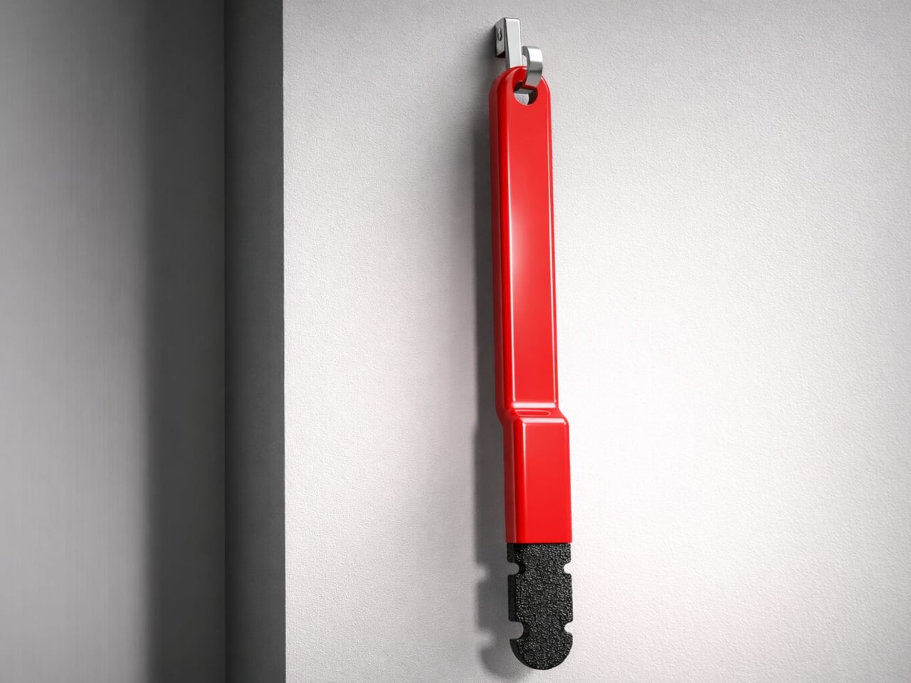
Hammering a nail is one of those tasks that sounds simple until you miss. The strike lands on a knuckle instead of the nail head, and a two-minute hanging job becomes a few minutes of genuine regret. It happens to beginners more than seasoned carpenters, but experience only reduces the odds rather than removing them entirely. That gap between “simple enough” and “actually safe” is what the Nailmate concept is set out to bridge.
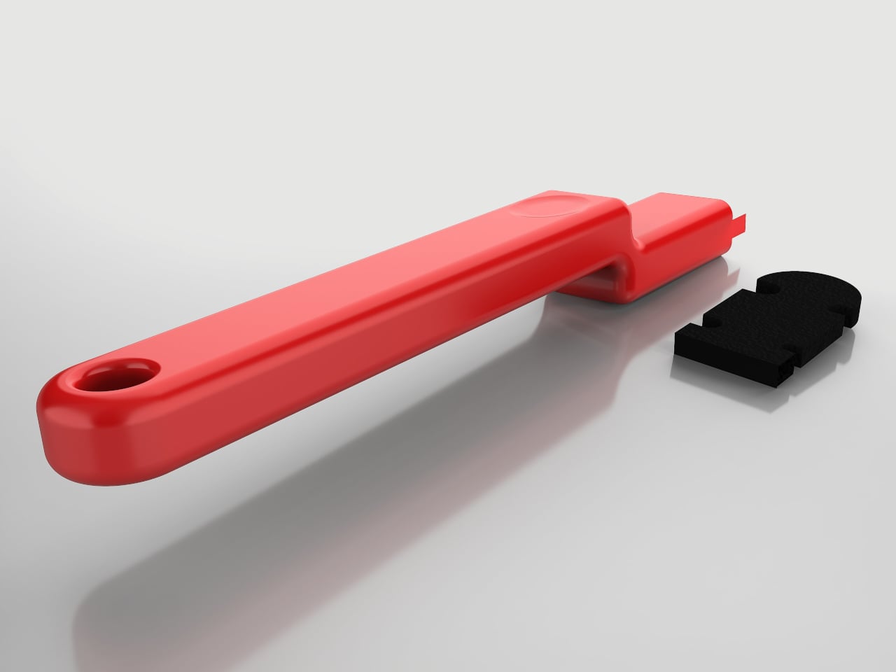
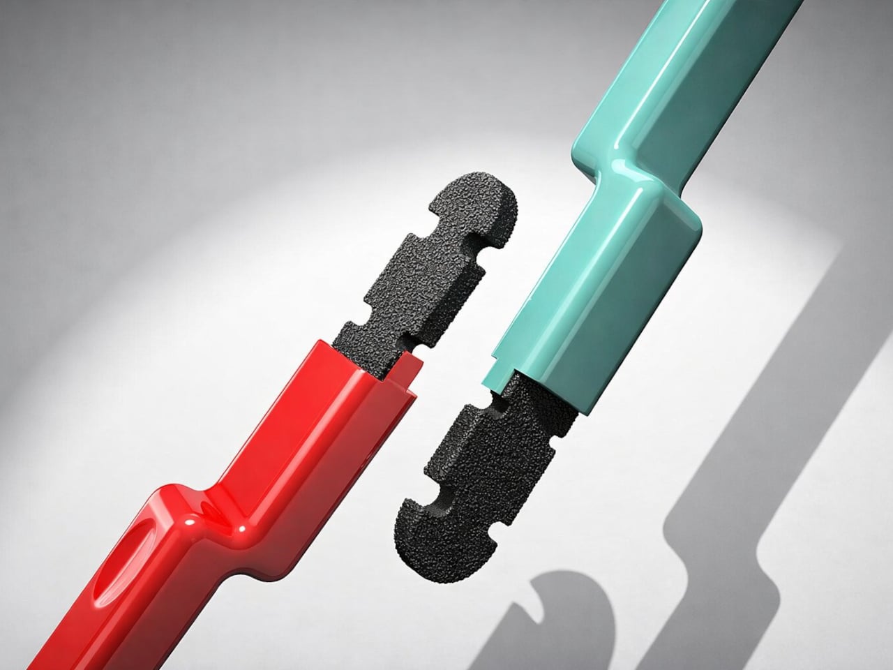
The premise is quite simple, really. Nailmate is a hand-held positioning tool made from ABS plastic with a TPU rubber gripping head. It holds a nail upright while keeping the user’s fingers well below the impact zone, with no springs, clamps, or adjustable parts to configure before the first swing. The elongated form puts meaningful distance between the hand and where the hammer lands.
Existing nail-holding solutions have real shortcomings worth naming. Small plastic holders keep fingers close enough to still be at risk. Plier-style holders work but are bulky enough that most people leave them in a drawer. Magnetic holders struggle with heavier nails and offer no guarantee against slipping. Nailmate addresses all three failure modes by doing less mechanically and more through considered geometry.
The tool comes in three variants, each color-coded for different working conditions. The red Stable version is built for flat, open surfaces like wooden boards or wall panels, where the hammer has a full vertical swing. The teal Expanded version has a wider horizontal head that supports a nail from multiple contact points, for situations where a perfectly vertical swing is not possible. The yellow Precise version handles curved, rounded, or edge-based surfaces where standard positioning gets awkward.
The color distinction is practical rather than decorative. On a cluttered workbench, making each variant visually distinct reduces the small but real friction of grabbing the wrong tool. The TPU head grips the nail shaft without scratching it, and the angled body sits naturally in the hand while maintaining a clear line of sight to the nail tip. A hanging hole at the base keeps it on a hook near the toolbox rather than lost in a drawer.
Where the design raises questions is around the TPU head’s durability after repeated use. It sits close enough to the nail that a slightly off-center hammer strike would occasionally land on it, and how the material holds up over months of regular work is something only extended testing would confirm.
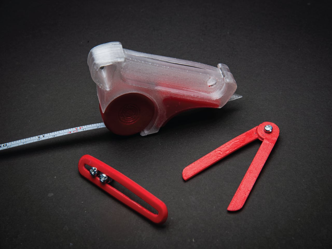
Model-making has a rhythm, and it is surprisingly easy to break out of the zone. You pull out the tape measure, get your reading, set it down, hunt for the caliper, check a dimension, reach for the cutter, and by the time you’ve touched four separate objects, you’ve lost track of where you were in the build. It’s a minor friction, but it compounds quickly across a studio session into something genuinely disruptive.
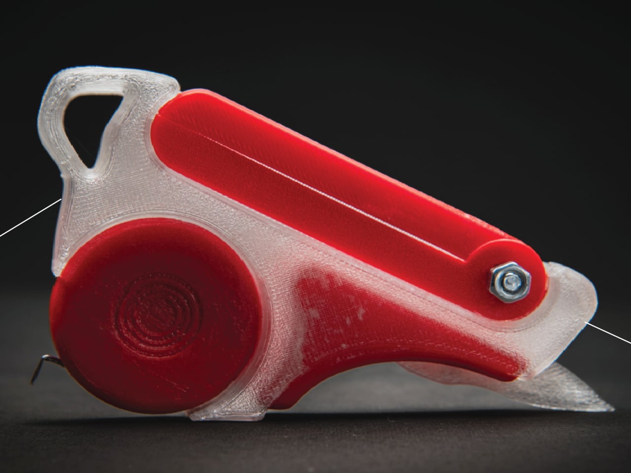
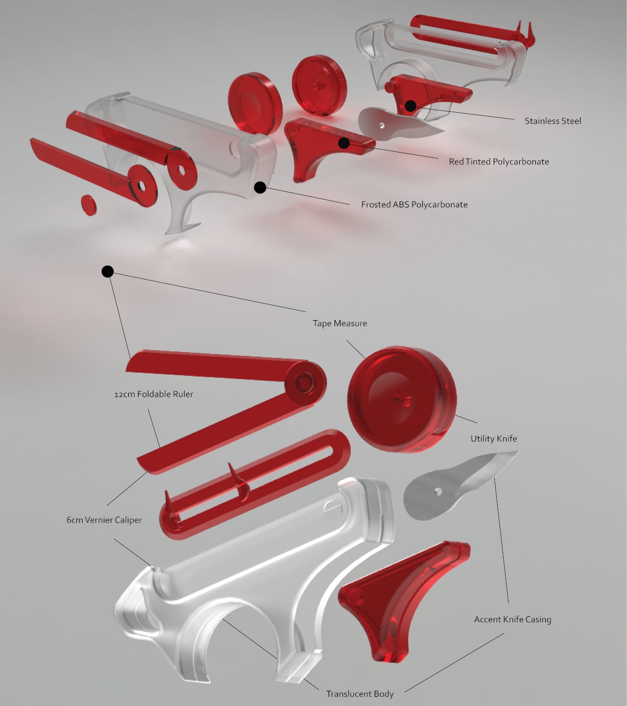
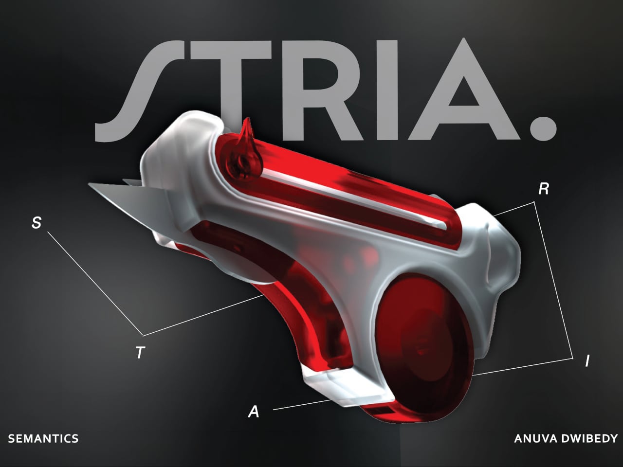
That friction is the exact problem STRIA was designed to address. The concept starts from a straightforward observation: the actions that make up physical prototyping, measuring, checking dimensions, and cutting materials, are tightly connected in practice but spread across a handful of unrelated objects. It combines four of the most essential tools that designers and architects reach for, creating a Swiss Army knife for any kind of physical creative work.
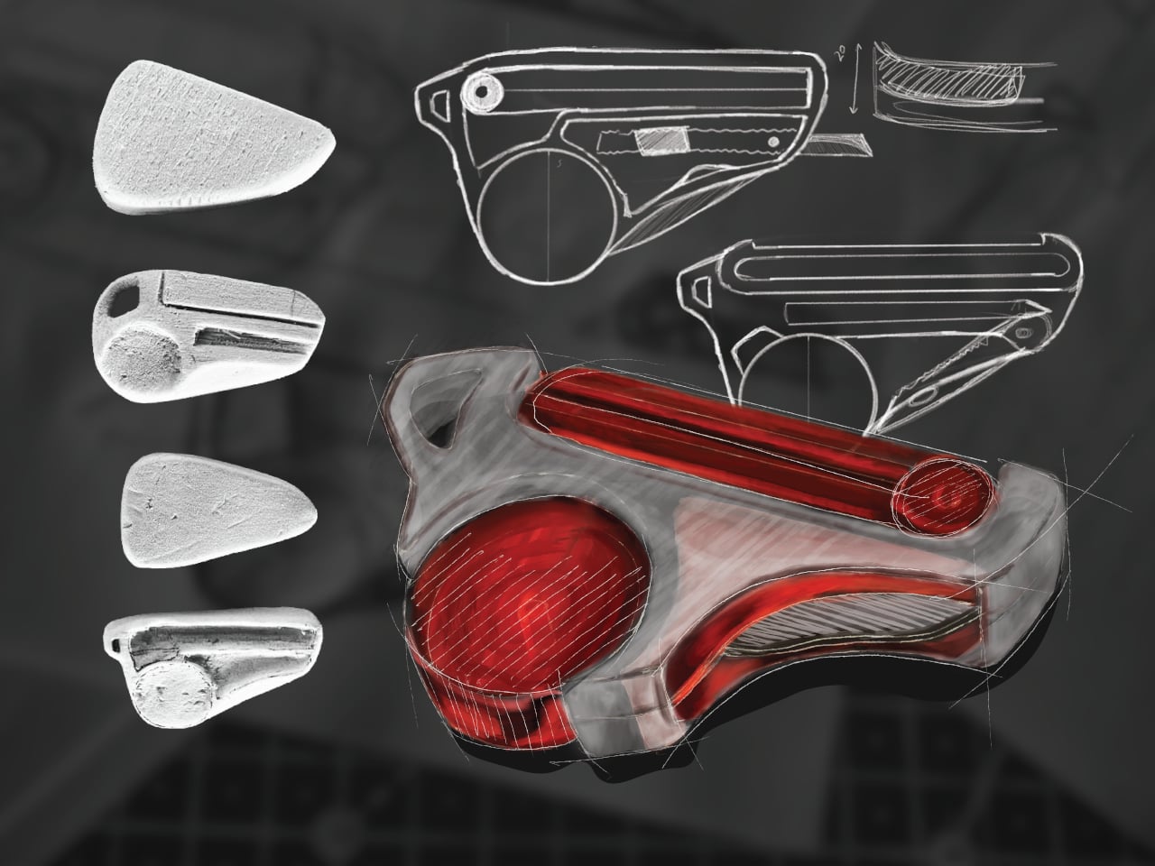
Those four are a tape measure, a 12 cm foldable ruler, a 6 cm vernier caliper, and a utility knife, all integrated into a single handheld device. The body is frosted ABS polycarbonate, with red-tinted polycarbonate accents and stainless steel for the blade and hardware. The translucent construction lets you see the internal components at a glance, which feels appropriate for a tool aimed at designers who spend a lot of time thinking about how things fit together.
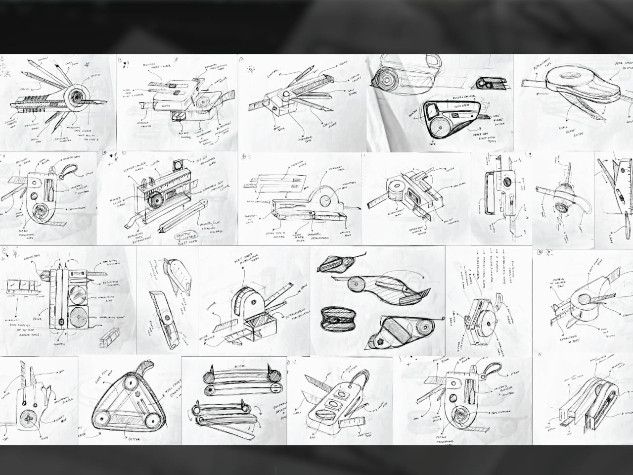
The form went through extensive iteration, with dozens of sketched directions and physical grip studies preceding the final shape. That process matters because fitting four tools into something pocket-sized is a mechanical problem as much as a visual one. Each function needs a deployment mechanism that doesn’t compromise the others, and the grip has to stay comfortable when you’re switching between them repeatedly during a long session.
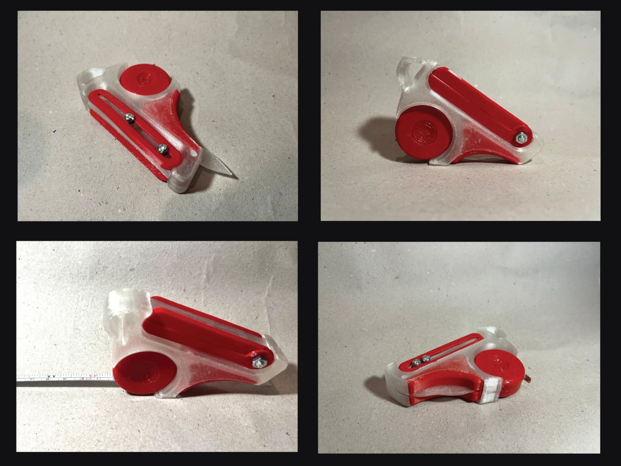
What STRIA gets right in concept is treating workflow continuity as a design constraint rather than an afterthought. Its five stated goals, compact, precise, durable, ergonomic, and integrated, read less like marketing language and more like a checklist for something that needs to survive a studio environment. A 3D printed prototype has already been produced, so the integration challenges aren’t purely theoretical at this stage.
Whether every mechanism holds up to the repetitive, sometimes rough handling that model-making actually demands is what a finished version would need to prove. And there’s a subtler question underneath that: consolidating tools changes how you reach for them, and it’s worth asking whether that’s always an improvement or occasionally a trade-off.
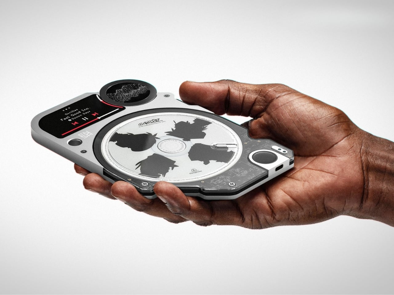
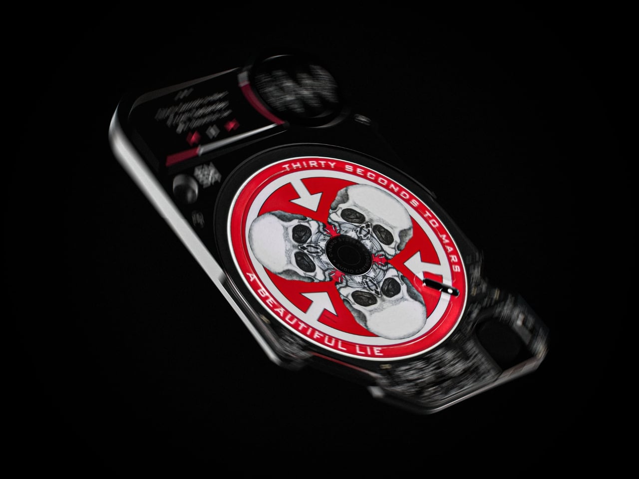
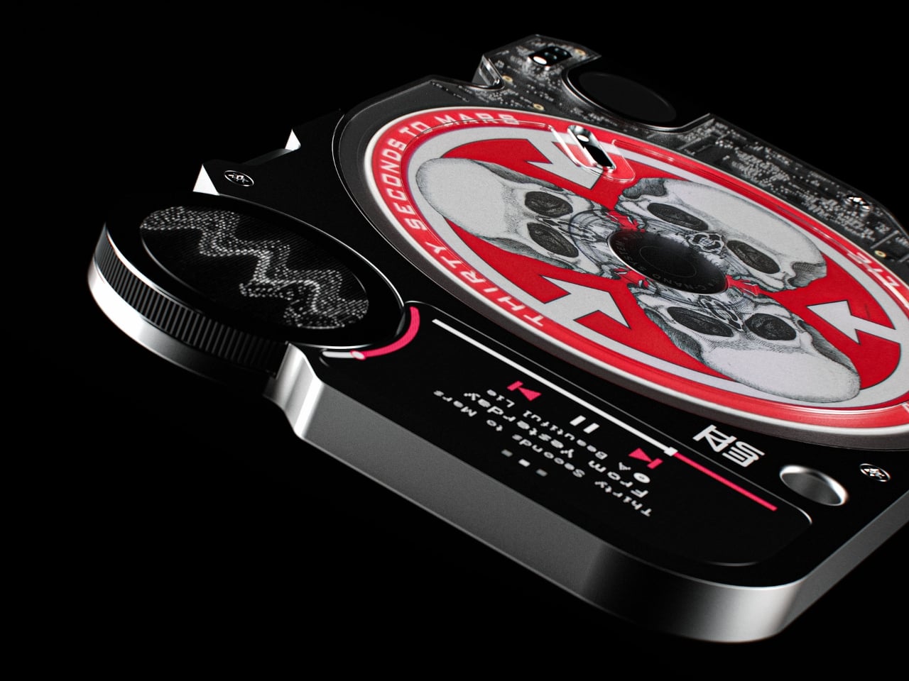
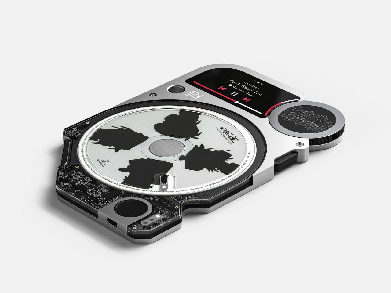
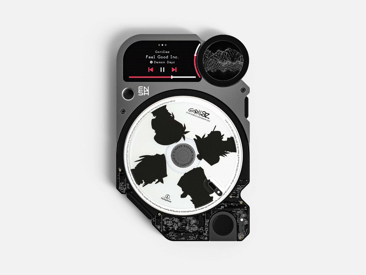
Music doesn’t weigh anything anymore. It hasn’t for a while. We went from shelves full of vinyl and towers of CDs to playlists that scroll infinitely and libraries that live nowhere in particular. Streaming gave us everything, all at once, all the time. But somewhere in the exchange, we lost the part of listening that involved our hands, our eyes, and our attention. Designer Vladimir Dubrovin seems to feel that loss deeply, and his concept project, the ENSA P1, is a beautifully strange attempt to get some of it back.
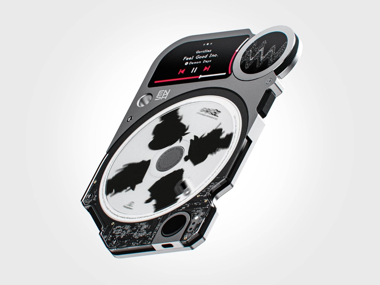
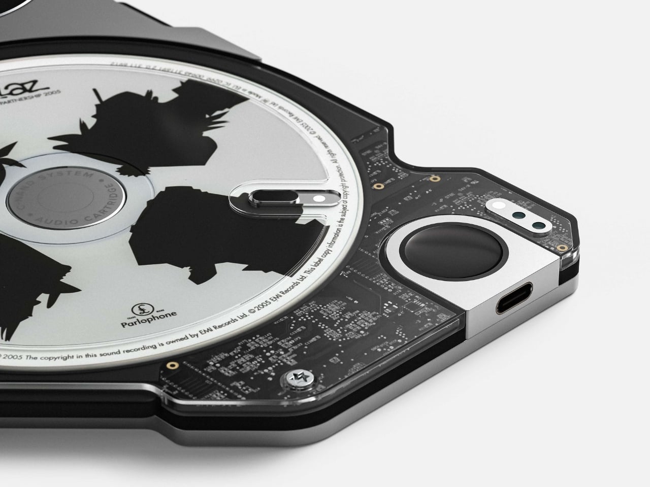
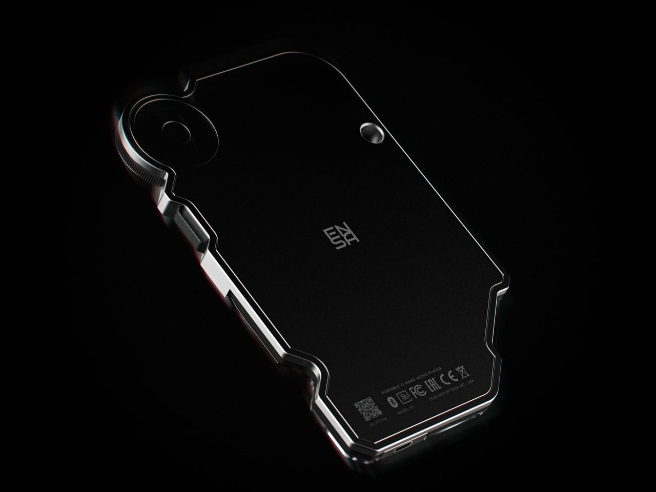
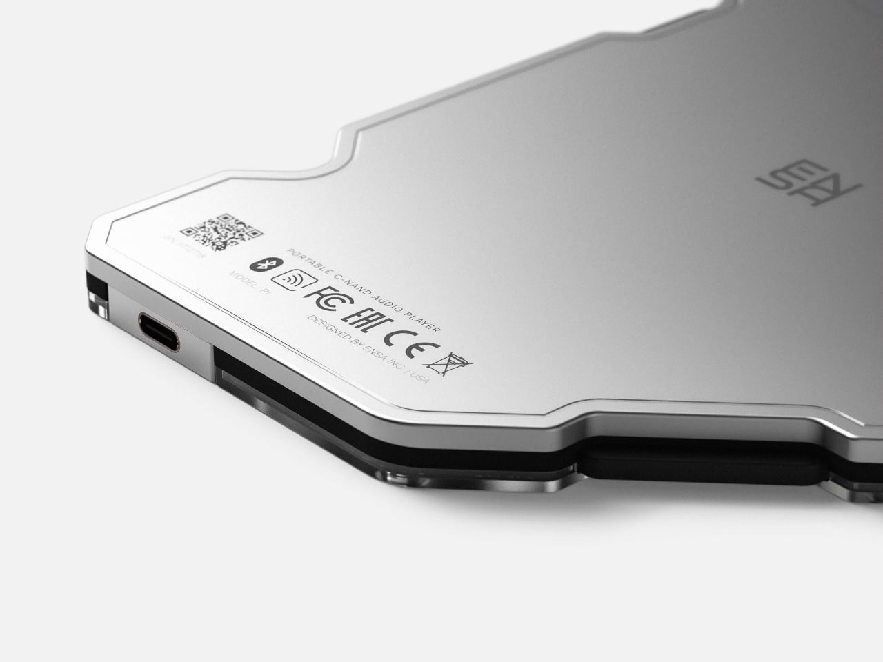
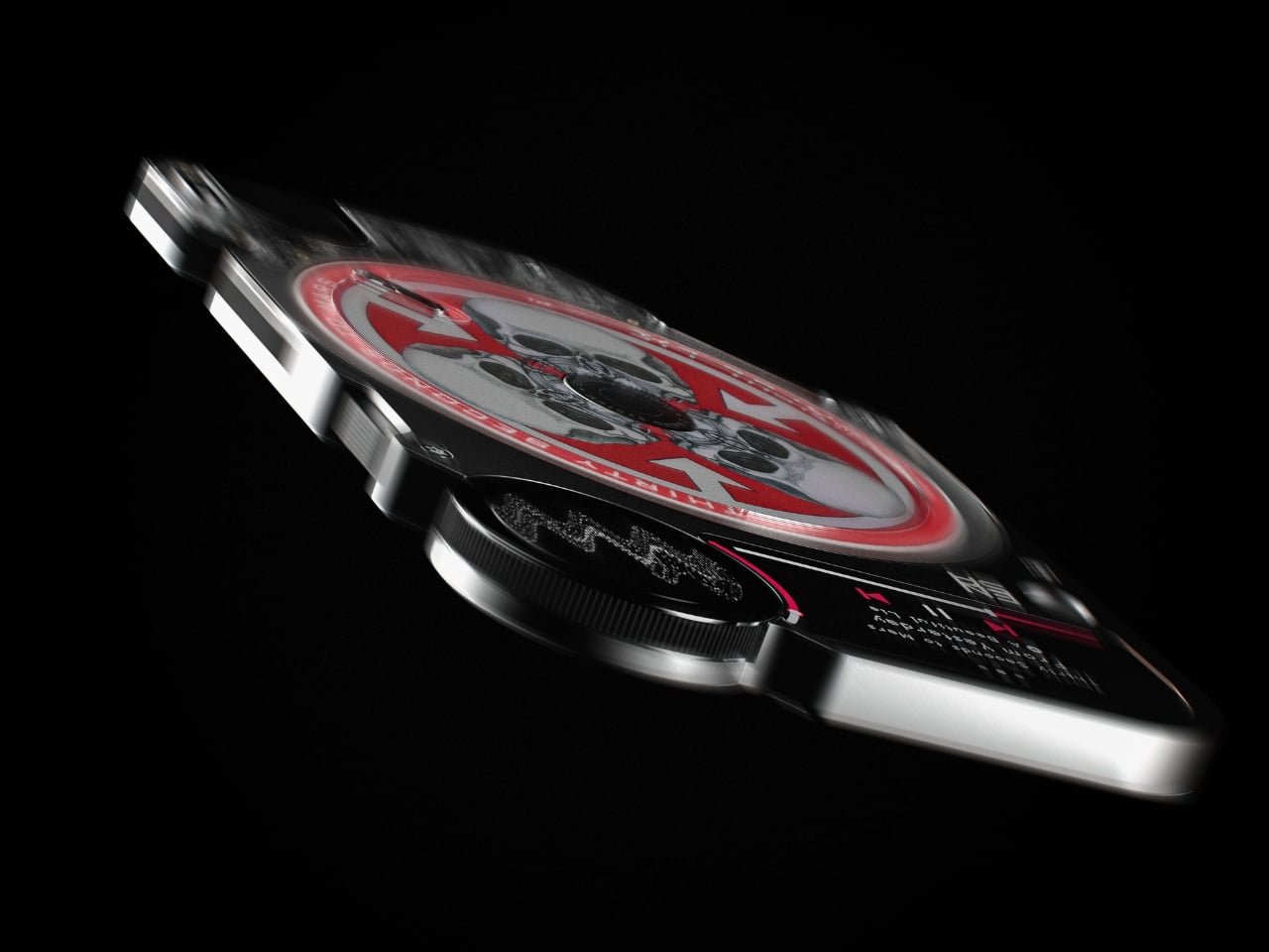
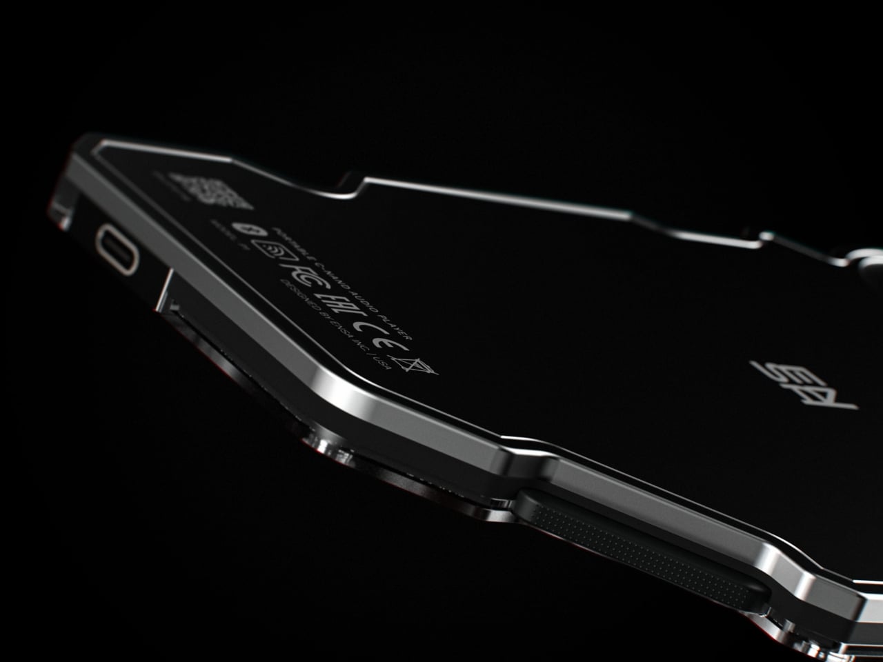
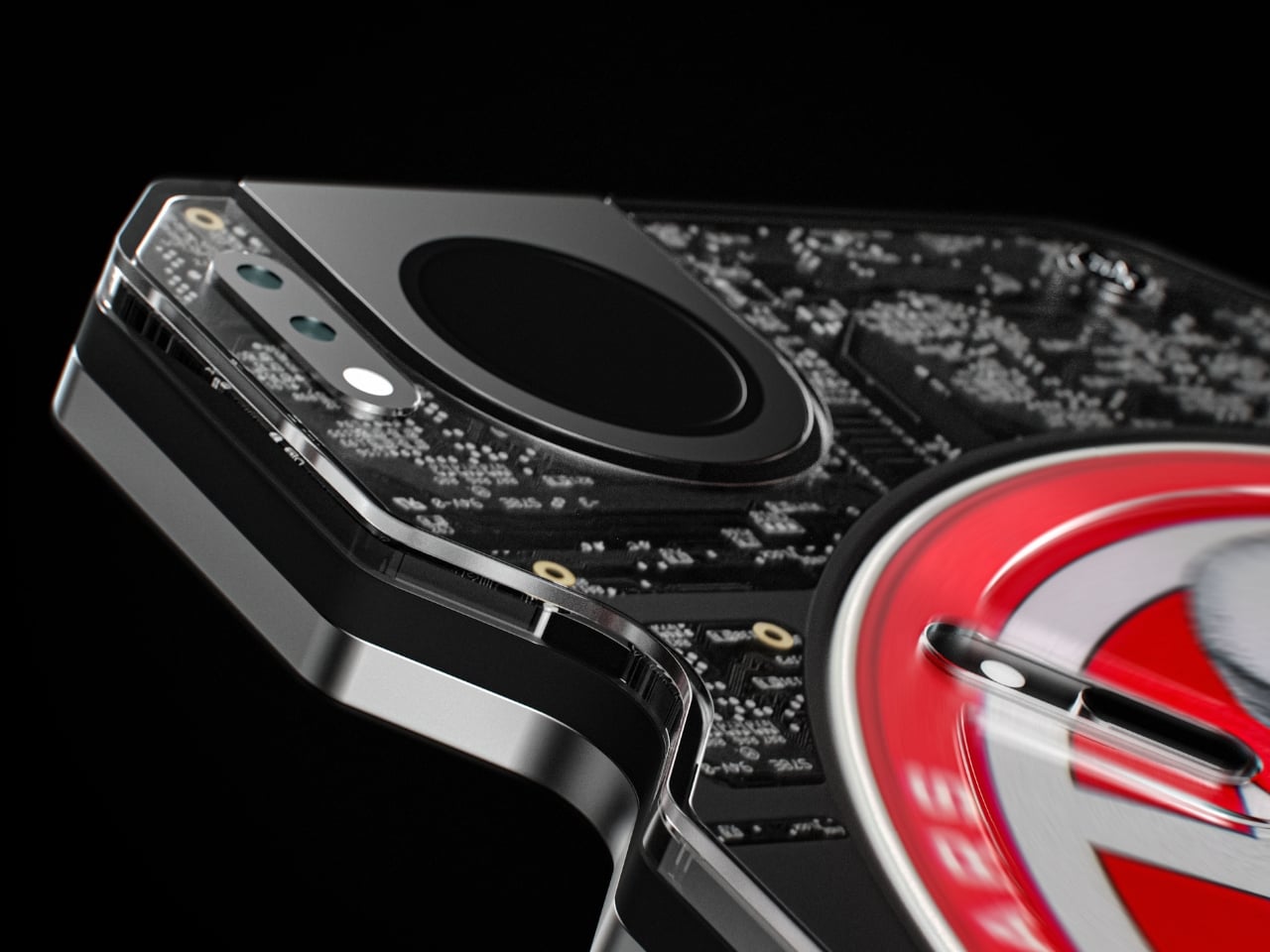
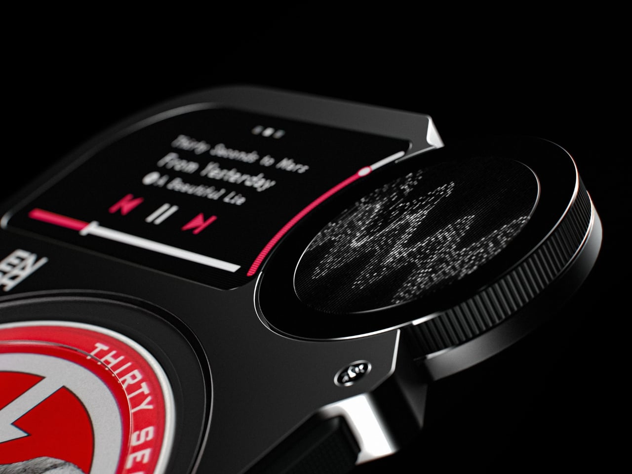
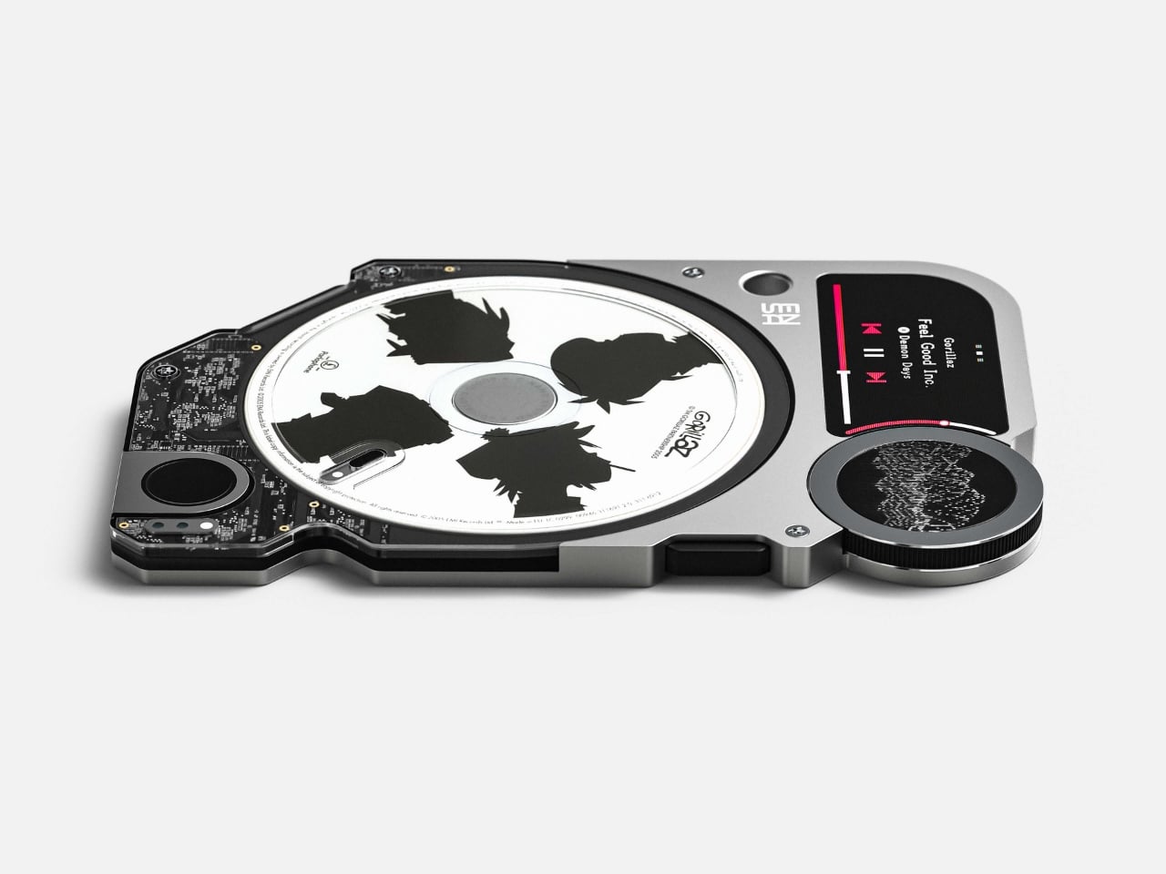
The ENSA P1 is a portable audio player built around a format Dubrovin calls C-NAND: small, disc-shaped solid-state cartridges, each one holding a single album. Think of it as a USB flash drive that decided it wanted to be a CD when it grew up. The cartridges have no moving parts, no spinning platters, nothing mechanical. They’re entirely digital in how they store sound. But they have shape, texture, and visual identity. You can hold one in your hand, flip it over, look at it, and place it into a device that makes the simple act of choosing music feel deliberate again.
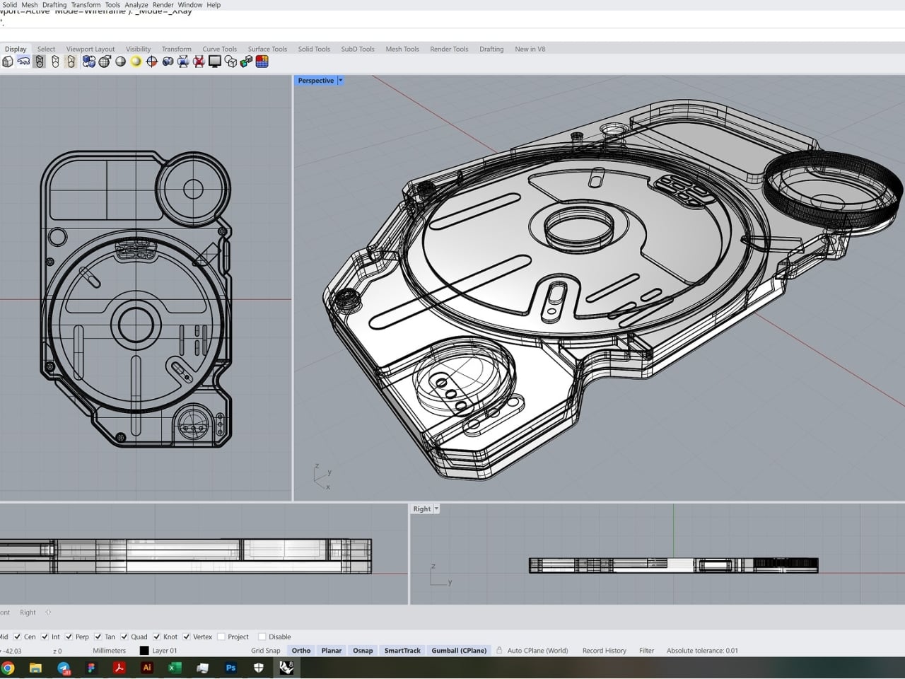
The player itself is a compact, rectangular piece of hardware with rounded corners and what appears to be an aluminum body. A small window in the center reveals the disc cartridge sitting inside, which is a clever touch that borrows the visual language of older disc players without pretending to be one. On the left side sits a mini display that shows track information and visualizes the rhythm of whatever you’re listening to, turning the waveform into something you can actually watch move. There’s a circular element on top that looks like it could be a control dial, though the overall design is restrained enough that you’d be forgiven for thinking it’s a piece of minimalist sculpture rather than consumer electronics.
What I find compelling about this project isn’t really the hardware specs or the imagined format. It’s the question sitting underneath all of it. Dubrovin is essentially proposing an alternate timeline for digital audio, one where music didn’t just evaporate into the cloud but instead evolved into a new kind of physical object. It’s speculative design at its most interesting because it doesn’t reject technology or romanticize the past. It takes the best of digital storage and asks why we couldn’t wrap it in something worth touching.
I think about this more than I probably should. The way I listen to music now is fundamentally different from how I listened to it fifteen years ago, and not all of those changes have been improvements. Streaming removed friction, which is great when you want to hear a song right now, but friction was also part of the ritual. Pulling a record from its sleeve, placing the needle, reading the liner notes while the first track played. Even loading a CD had a certain ceremony to it. The ENSA P1 reimagines that ceremony for a digital context, and I appreciate that it does so without being preachy about it.
Of course, this is a concept. Dubrovin is a designer exploring ideas, not launching a Kickstarter. The C-NAND format doesn’t exist, and the likelihood of any physical music format gaining mainstream traction against Spotify and Apple Music is, let’s say, modest. But that’s not really the point. Concept work like this serves a different purpose. It expands the conversation about what technology could look like if we designed it around human experience rather than pure efficiency. It reminds us that convenience and meaning don’t always travel in the same direction.
The vinyl revival already proved that people are willing to pay more and accept less convenience in exchange for a richer, more physical relationship with music. The ENSA P1 takes that impulse and pushes it forward instead of backward. Rather than returning to a format from the 1950s, it imagines what a new physical format could be if we designed one today with modern materials and digital storage. That feels like a more honest response to what listeners actually seem to want.
Whether or not something like the ENSA P1 ever gets made, the conversation it starts is worth having. We’ve spent two decades optimizing music for access. Maybe it’s time to start optimizing it for experience again.