Spotify Record Player brings tactile experience of enjoying vinyls to the streaming world

Enjoying music is much more than just setting up your listening gear, putting on the headphones, and getting lost in a melodic world. Spotify is currently one of the most used streaming services to enjoy music, anywhere, anytime. However, some inventive DIYers go the extra mile to elevate the experience as no one has done before. The Prestodesk Spotify desk music player by AKZ Dev is a good example.

The software engineer is back with another creation to showcase his love for Spotify and, obviously, music. To bring the tactile experience of loading and playing records via Spotify is a totally new and exciting idea. AKZ explores this with his intuitive engineering skills to add the satisfying feeling of loading a vinyl record and then playing it via the Spotify service.

Designer: AKZ Dev
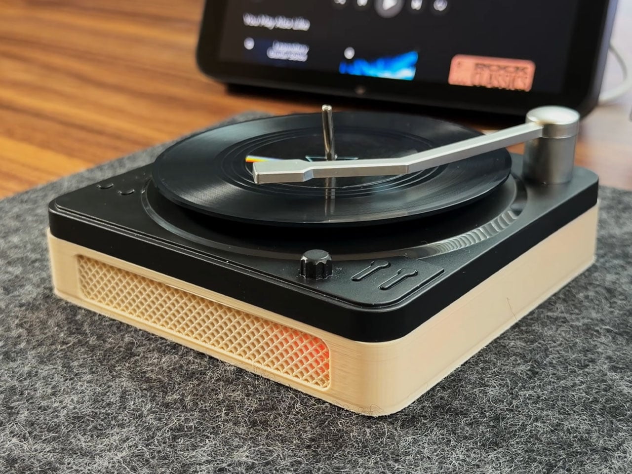
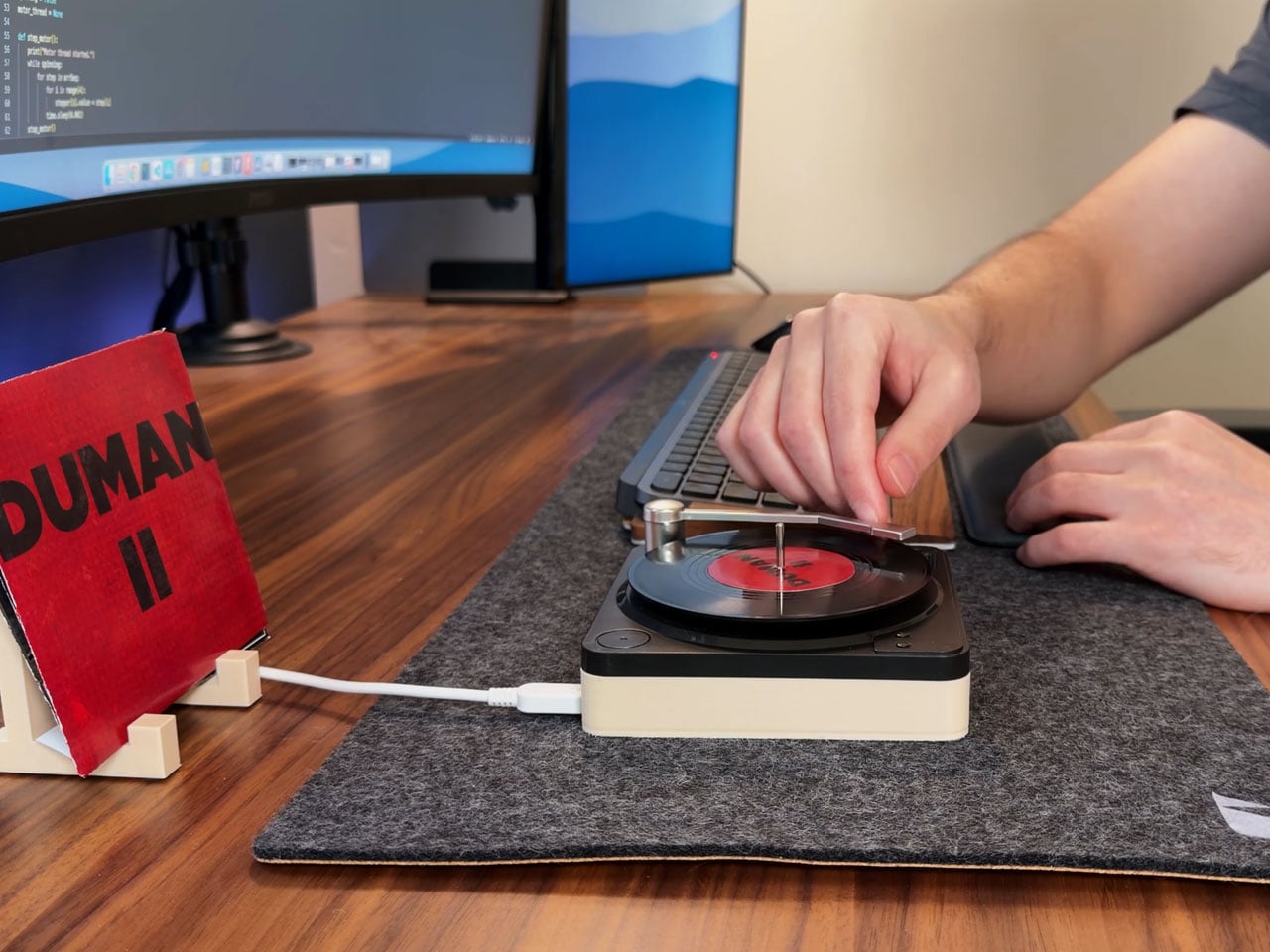
At the heart of this DIY record player is a Raspberry Pi that does all the complex handling and an RFID reader that turns a simple desk accessory into something interesting. The idea struck the DIY’er when he saw the gifted miniature vinyl record coasters lying on his desk, and he presumed they could do so much more than just hold a cup of coffee. The mini records move on the coaster base (which is modified to make space for the electronics) courtesy of the stepper motor, and to detect the tonearm position, he uses a hall effect sensor that’s found in most gaming controllers.
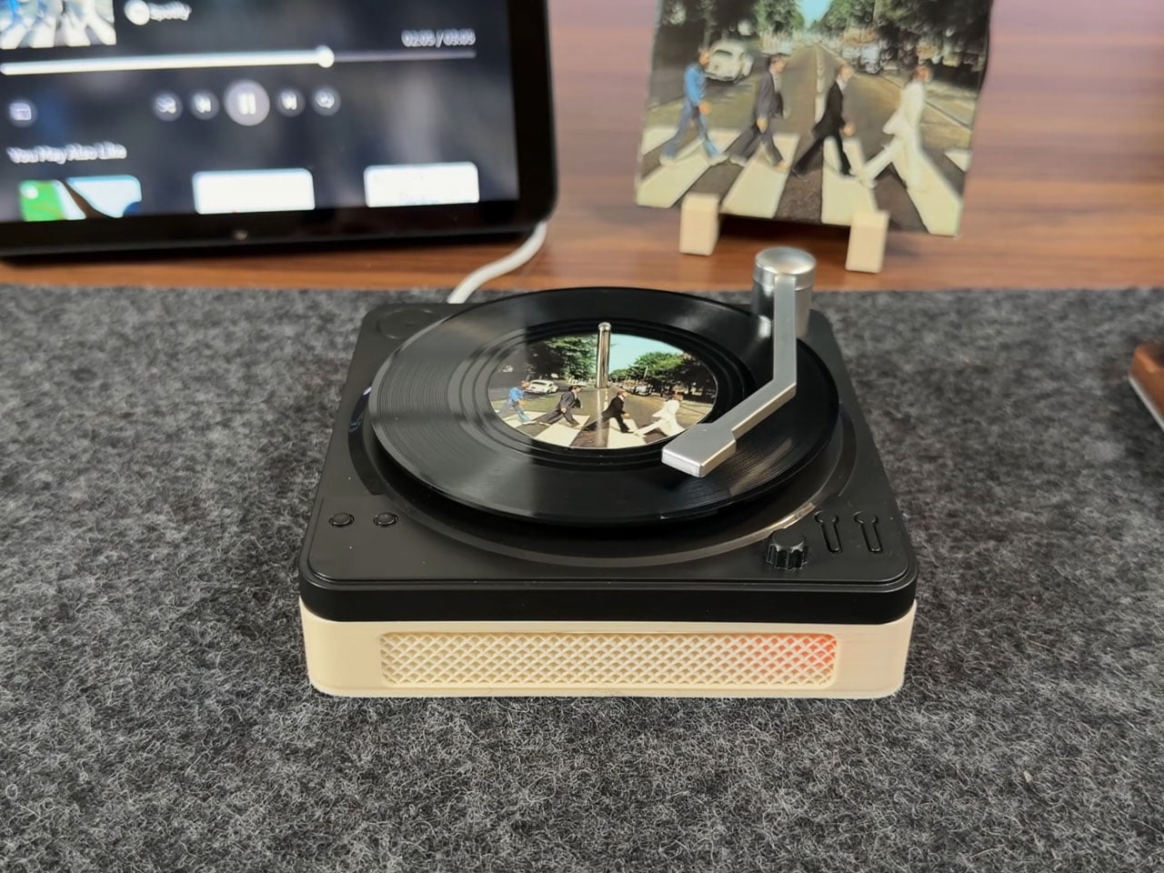
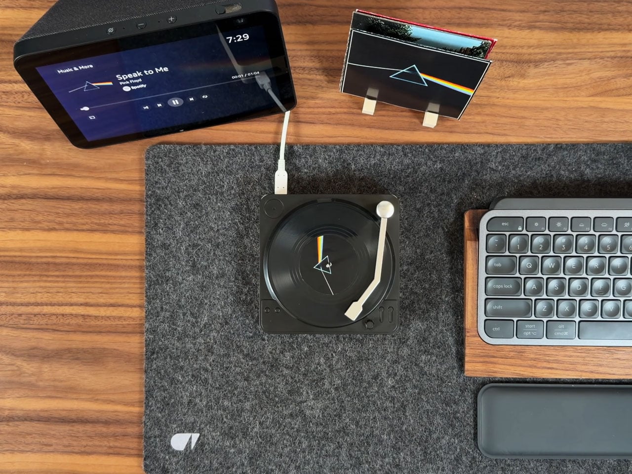
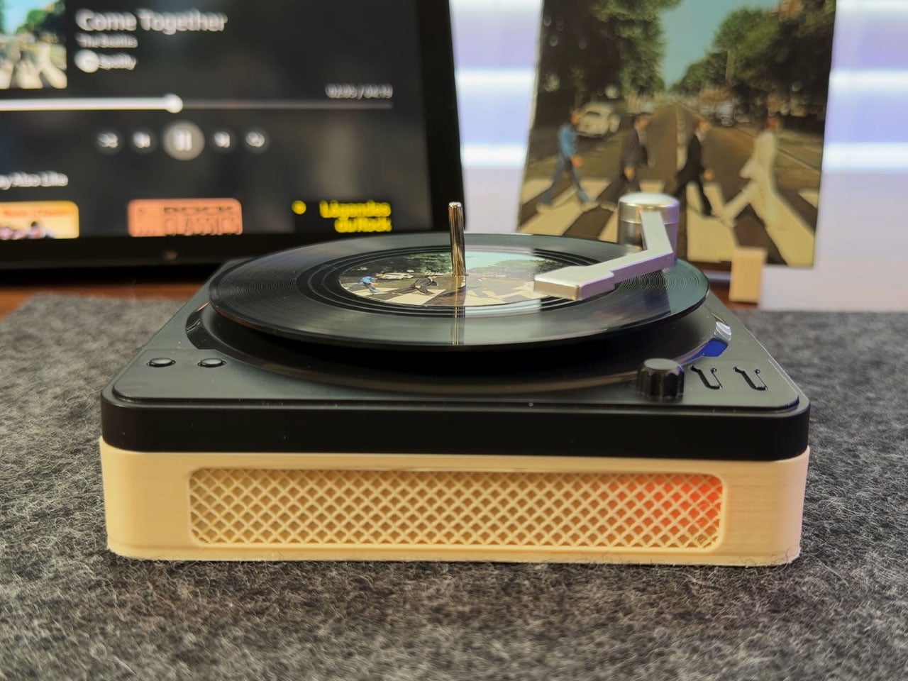
The enclosure below the coaster stand is 3D printed for a snug fit and gives the platter a genuine record player feel. After putting everything in place, the magnet is attached to the tone arm. The stepper motor lies beneath the spindle, so that the vinyl can spin seamlessly. The next step involves preparing the vinyl records for the musical nirvana. NFC stickers are placed behind the vinyl record, and custom labels are printed to make things feel authentic. AKZ also 3D printed a record stand to showcase the whole setup on the desk.

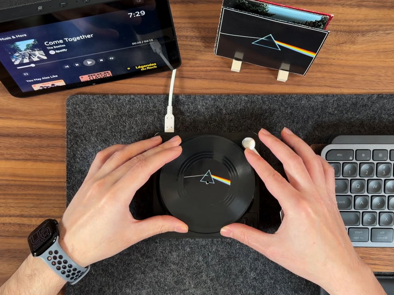
After doing a bit of tinkering with the Raspberry Pi software and connecting it to the Spotify API, the record player is ready to rock the desk. Basically, the music does not play off the record; the RFID tag on the mini vinyl record player is detected by the moving tonearm. This triggers the playback of the associated music from Spotify’s library. Pretty nifty, isn’t it? The DIYer is kind enough to share all the project files on GitHub, and tells that the record player can be improved further with volume controls, or by integrating the speaker unit inside the main enclosure.
 

The post Spotify Record Player brings tactile experience of enjoying vinyls to the streaming world first appeared on Yanko Design.


Winter-Proof Luxury: This Tiny House Brings Full-Time Comfort to Colorado’s Harsh Climate

Living small is often romanticized as a sun-drenched, coastal fantasy or a nomadic life on the road, but tiny houses are increasingly proving their worth in far harsher environments. One of the latest examples is a luxurious new model from Tru Form Tiny, designed specifically to handle brutal winters without compromising on comfort or aesthetics.

Set on a quad-axle trailer, this 36 ft (11 m) tiny house sits firmly in the full-time-living category. Its proportions feel generous rather than cramped, and the exterior treatment reinforces that impression. Vinyl siding is paired with warm cedar accents, while a standing-seam metal roof hints at durability and low maintenance. The overall look is more contemporary cabin than makeshift shelter, which feels appropriate given its intended home: the icy winters of Colorado.

Designer: Tru Form Tiny

Cold-climate performance was a driving force behind the design. Tru Form Tiny has wrapped the structure in high-R-value insulation and fitted energy-efficient Low-E windows to reduce heat loss and solar gain. Heating is handled by a high-efficiency mini-split system engineered for subfreezing temperatures, with a wood stove rough-in ready for those truly punishing cold snaps. A tankless hot water system and utility setup tailored for off-grid flexibility round out the resilience-focused specification, making this tiny home feel more like a compact alpine lodge than a seasonal camper.

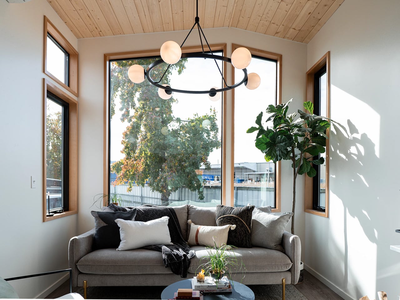
Inside, large trifold glass doors open into a surprisingly expansive living area. The high ceiling and generous glazing create a sense of volume and light that belies the footprint. A sofa, chair, and table form a comfortable lounge zone, anchored by the mini-split for everyday climate control and the option of a wood-burning stove when the weather turns severe. It’s a space that feels equally suited to curling up with a book on a snow day or hosting a small gathering.

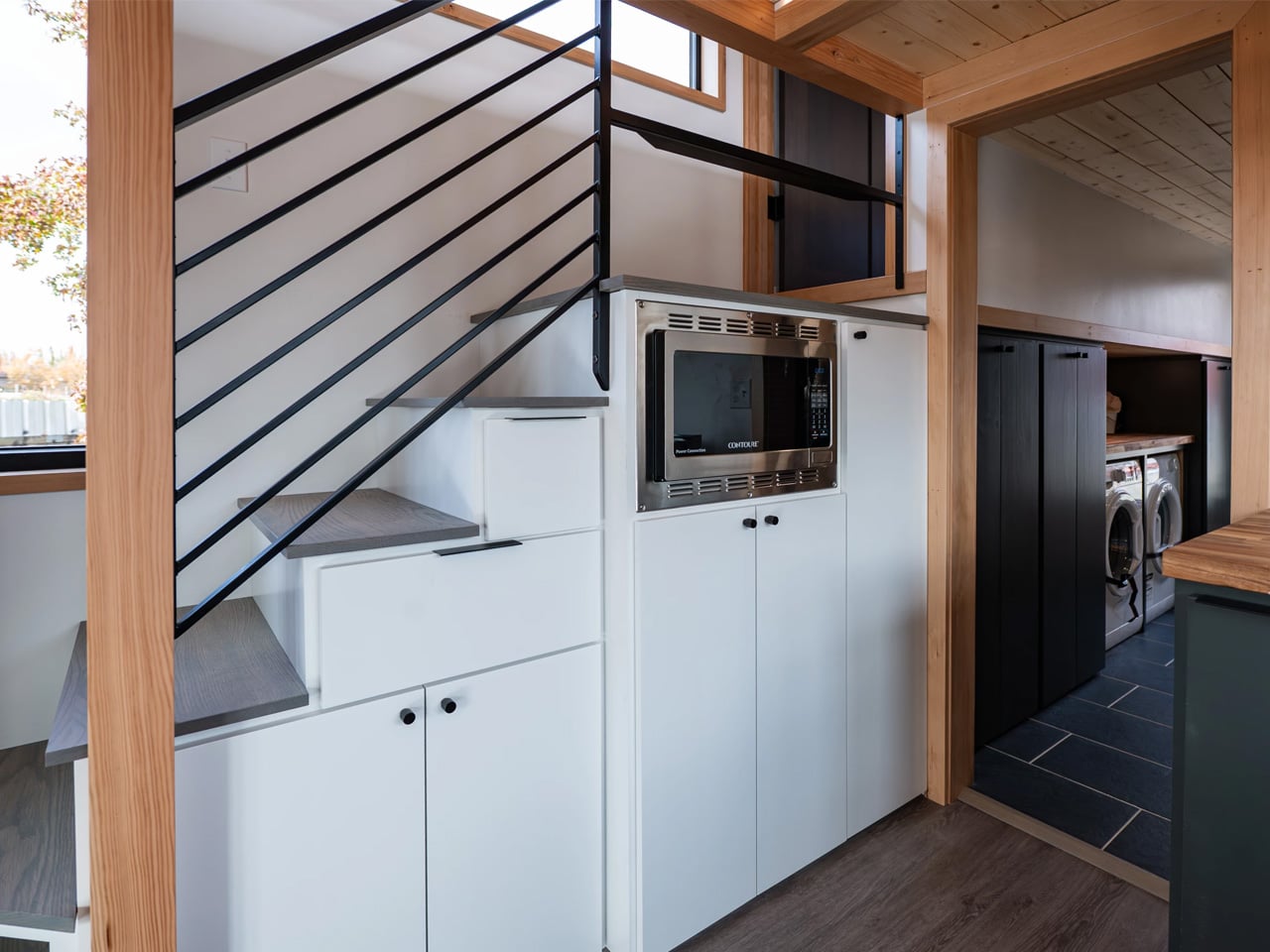
The kitchen continues the theme of full-size living in a small envelope. Running along one side of the home, it features a steel sink, four-burner propane stove with oven, microwave, dishwasher, and a fridge/freezer, all framed by ample counter space and cabinetry. A dining table subtly defines the transition between the kitchen and living area, reinforcing the sense of distinct yet connected zones.

On the opposite side of the house, the bathroom feels unusually generous for a tiny home. A glass-enclosed shower, composting toilet, vanity sink, and extensive storage create a practical, everyday space rather than a compromise. A separate washing machine and dryer underscore the home’s suitability for long-term, off-grid or semi-off-grid living in remote, snowy locations.

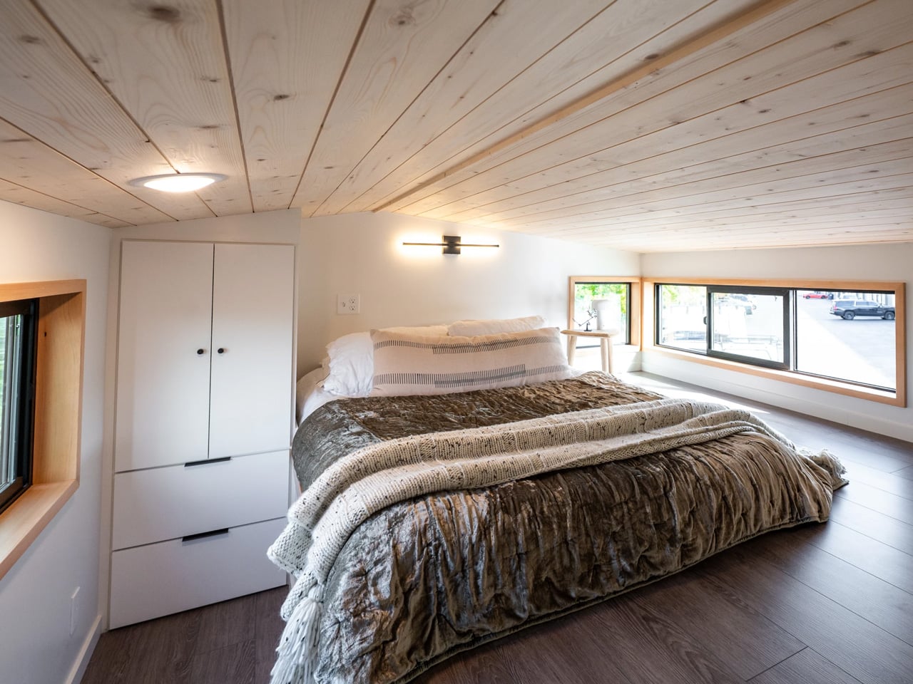
Originally planned as a main-floor feature, the bedroom was ultimately relocated to the loft to free up valuable ground-floor space. Accessed via a storage-integrated staircase, the loft offers a low-ceilinged but comfortable retreat with a double bed, entertainment center, and TV. It’s a compact sanctuary that completes a layout clearly focused on real-world livability in extreme conditions, proving that tiny houses can be both climate-resilient and quietly luxurious.

The post Winter-Proof Luxury: This Tiny House Brings Full-Time Comfort to Colorado’s Harsh Climate first appeared on Yanko Design.
This Designer Turns Children’s Imagination Into Furniture They Can Truly Own

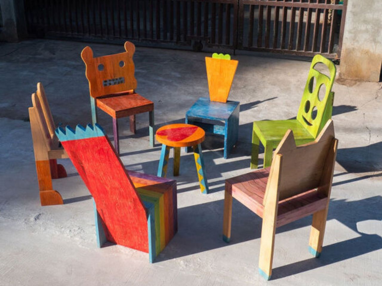
One of the most powerful moments in the creative process is seeing an idea transform into something real. For a child, that moment carries even greater weight. It builds confidence, validates imagination, and reinforces the belief that creativity is not limited by age. Chair for Kids, a participatory design project developed by Taekhan Yun, captures this experience by translating children’s playful and imperfect drawings into fully functional and usable chairs that children can see, touch, and use every day.

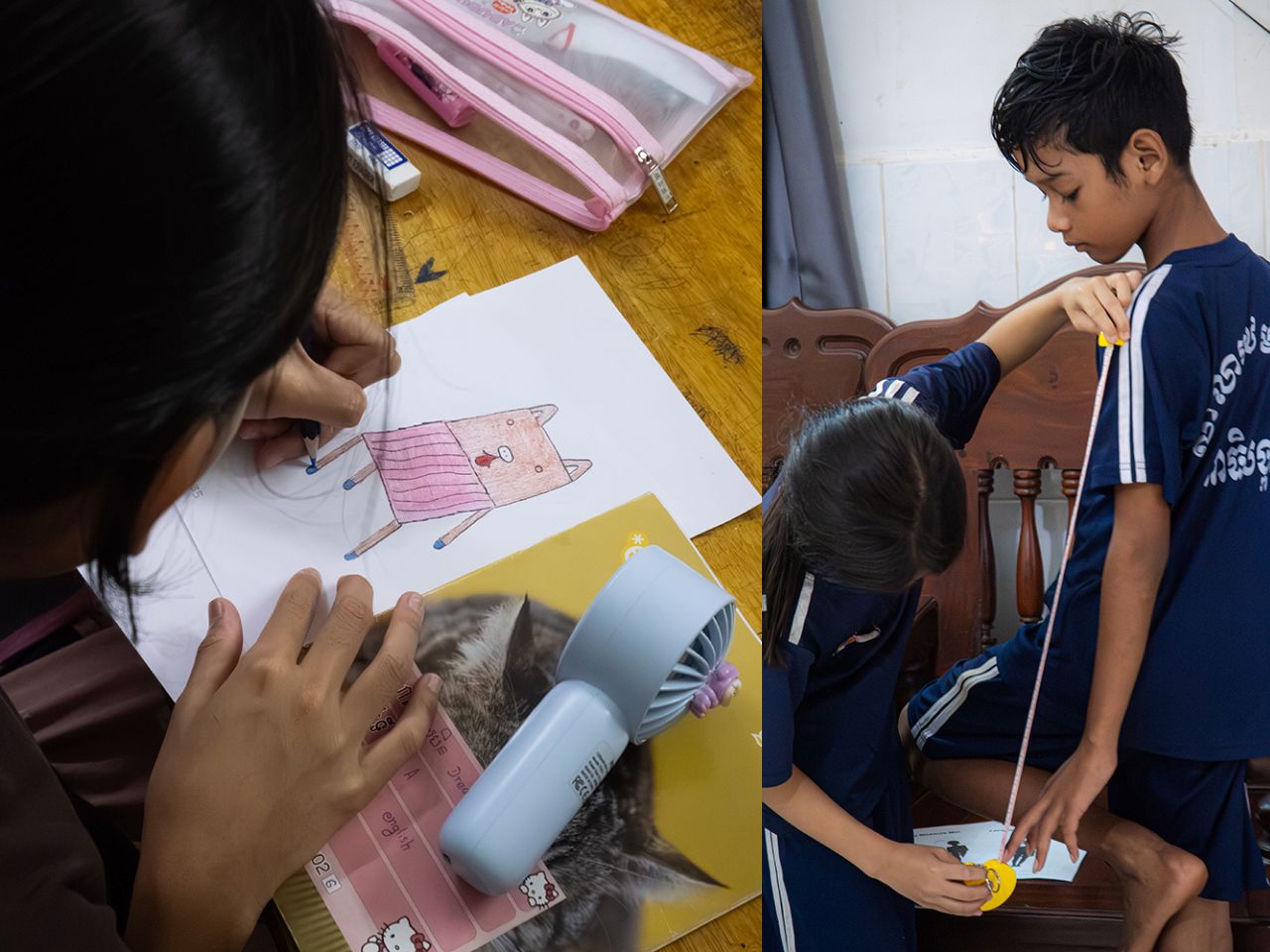
Created in collaboration with students from an English school in Siem Reap, the project places children at the center of the design process. Rather than correcting or refining their ideas to fit adult notions of good design, the project embraces the rawness of children’s imagination. More than seventy children participated, each drawing their own version of a chair or stool as an initial exploration of form, balance, and function. These drawings were treated as genuine starting points rather than symbolic exercises.

Designer: Taekhan Yun

Collaboration played a key role throughout the process. Children gathered to look at and share each other’s drawings, discussing differences in shape, structure, and intention. They then worked in pairs to measure their own height and body dimensions, learning how scale and proportion affect comfort and usability. Based on these measurements, the children described the type of chair they wanted to make, introducing basic ergonomic thinking in an intuitive and accessible way. Each chair was designed specifically to fit the child’s own body, reinforcing the connection between design and lived experience.

To translate drawings into three-dimensional objects, the children created clay prototypes of their chairs. Clay was chosen for its low cost, accessibility, and ease of manipulation, allowing children to freely experiment with volume and structure. These models helped bridge the gap between imagination and fabrication and served as references for the final chairs produced by Taekhan Yun. The resulting forms retain the charm of the original drawings with crooked legs, unexpected angles, and playful proportions while remaining structurally sound and functional.

In the final stage, the children actively participated in finishing their chairs. Crayons were used to apply color directly onto the surfaces, transforming each piece into a personal expression of identity. Acrylic lacquer spray was then applied to seal the drawings, followed by varnish to protect the finish. This process preserved the spontaneity of the children’s marks while ensuring durability, resulting in furniture that feels joyful, expressive, and intentional.

Beyond individual expression, Chair for Kids also highlights the potential for scalability. The chairs are low-cost and easy-to-build designs that rely on simple materials and straightforward construction methods. This makes them well-suited for mass manufacturing and adaptation across schools, community centers, and educational environments, particularly in resource-constrained contexts. The project demonstrates how participatory design can produce furniture that is not only meaningful and educational but also practical, affordable, and replicable.

Each chair reflects the imagination of a single child while contributing to a collective outcome. Chair for Kids shows how design education rooted in participation and making can empower children, build confidence, and reimagine furniture as a tool for learning, inclusion, and creativity.

The post This Designer Turns Children’s Imagination Into Furniture They Can Truly Own first appeared on Yanko Design.

The FTC isn’t giving up on its antitrust case against Meta

The Federal Trade Commission lost its antitrust case against Meta last year, but the regulator hasn't given up on its attempts to punish the social media company for its acquisitions of WhatsApp and Instagram. The FTC is appealing a ruling last year in which a federal judge found that the government hadn't proven that Meta is currently operating as a monopoly. 

"Meta has maintained its dominant position and record profits for well over a decade not through legitimate competition, but by buying its most significant competitive threats," the FTC's Bureau of Competition Director Daniel Guarnera said in a statement. "The Trump-Vance FTC will continue fighting its historic case against Meta to ensure that competition can thrive across the country to the benefit of all Americans and U.S. businesses.”

The FTC originally filed antitrust charges against Facebook in 2020 during President Donald Trump's first term in office. The government argued that by acquiring apps it once competed with, Instagram and WhatsApp, the company had depressed competition in the space and ultimately hurt consumers. A trial last year saw testimony from several current and former executives, including CEO Mark Zuckerberg and former COO Sheryl Sandberg, who spoke at length about the pressure to compete with TikTok. 

US District Judge James Boasberg was ultimately persuaded by Meta’s arguments, writing that the success of YouTube and TikTok prevented Meta from currently "holding a monopoly" even if the company had acted monopolistically in the past. If the FTC had won, it could have tried to force Meta to undo its acquisitions of WhatsApp and Instagram. Should it be successful in its appeal, that remedy could once again be on the table.

News of the FTC's plan to appeal is also a blow to Zuckerberg, who has spent the last year courting Trump and hyping Meta's plans to spend hundreds of billions of dollars on AI infrastructure in the United States. In a statement, Meta spokesperson Andy Stone said that the original ruling was "correct," and that "Meta will remain focused on innovating and investing in America."

This article originally appeared on Engadget at https://www.engadget.com/big-tech/the-ftc-isnt-giving-up-on-its-antitrust-case-against-meta-225020769.html?src=rss

Modular LEGO Pirate Map (With A Kraken) Lets You Redesign Your Own Adventure Every Single Day

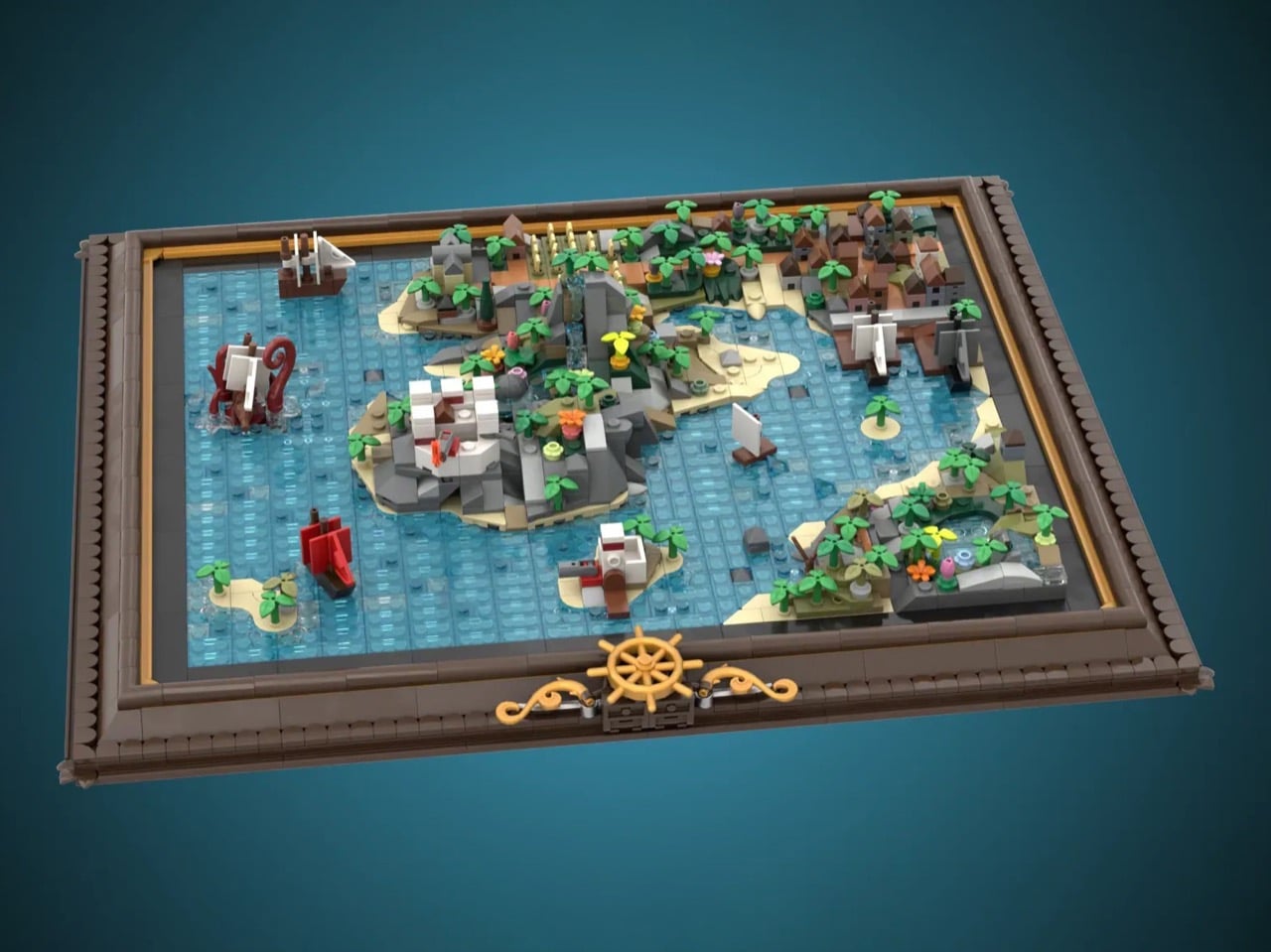
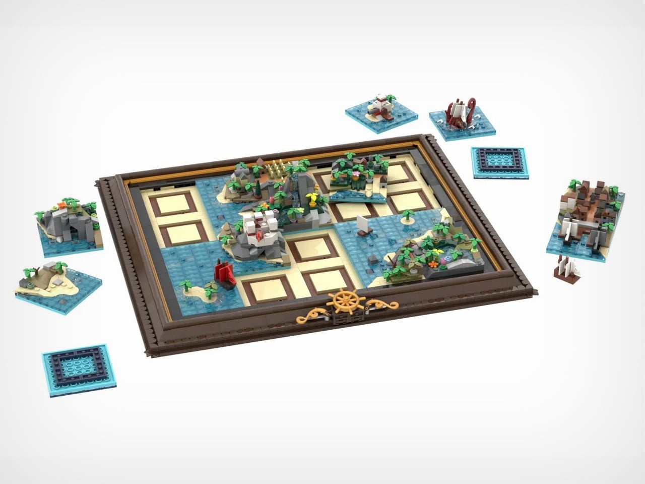
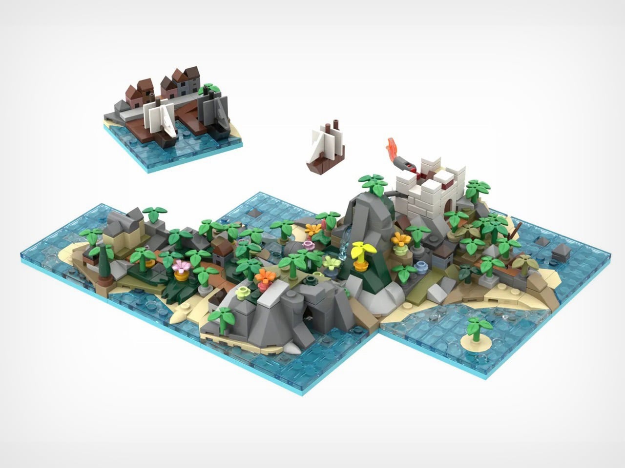
X marks the spot, but which spot? George Brickman’s Modular Pirate Map refuses to commit, and that’s precisely why I love it. This LEGO Ideas submission treats the pirate world like a puzzle where every piece works anywhere, creating a different adventure depending on your mood. Twenty tiles, each bursting with microscale detail, slot into an elegant frame to form a complete map. Then you mix them up and start again.

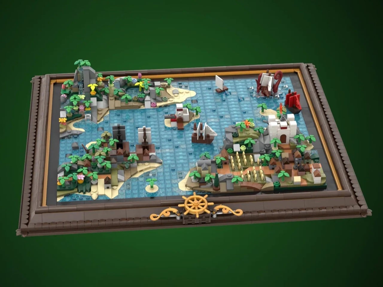
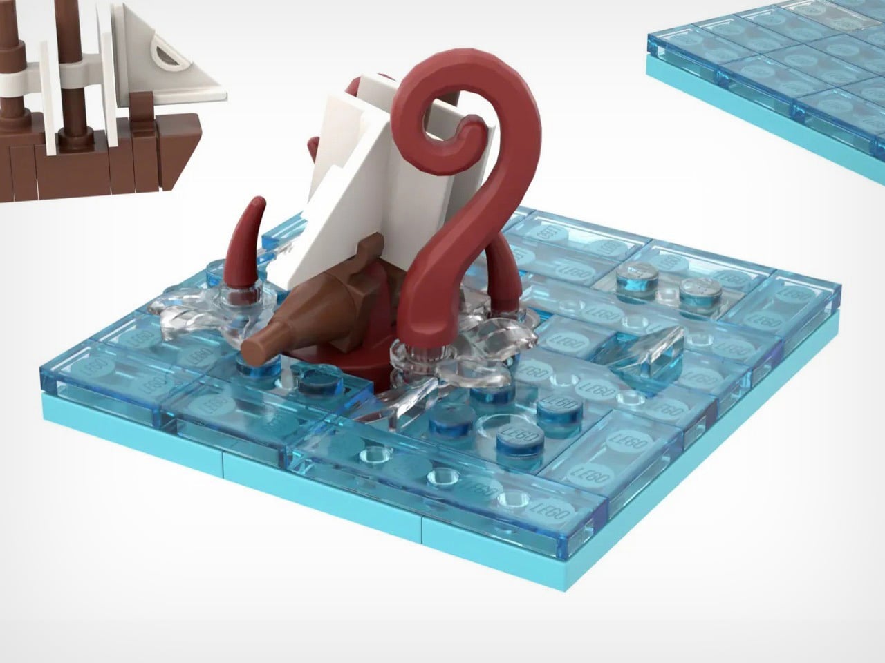
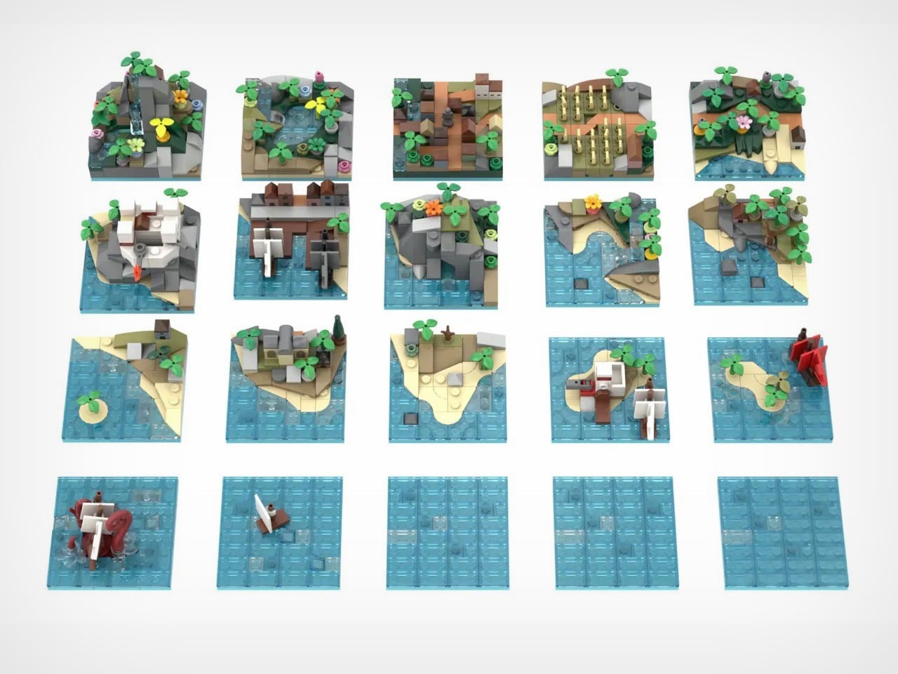
The tiles themselves are tiny masterpieces. Corner pieces house imperial forts and mysterious caves. Interior tiles feature mountain waterfalls and crop fields. Island tiles show colonial outposts. And then there’s the kraken, red tentacles wrapped around an unfortunate vessel, ready to terrorize whatever waters you assign it to. With approximately 2,120 pieces and already marked as a Staff Pick, this project currently has 4,172 supporters steering it toward the 10,000-vote goal. The frame measures about 16 by 13.5 inches, but the possibilities stretch much further.

Designer: George Brickman

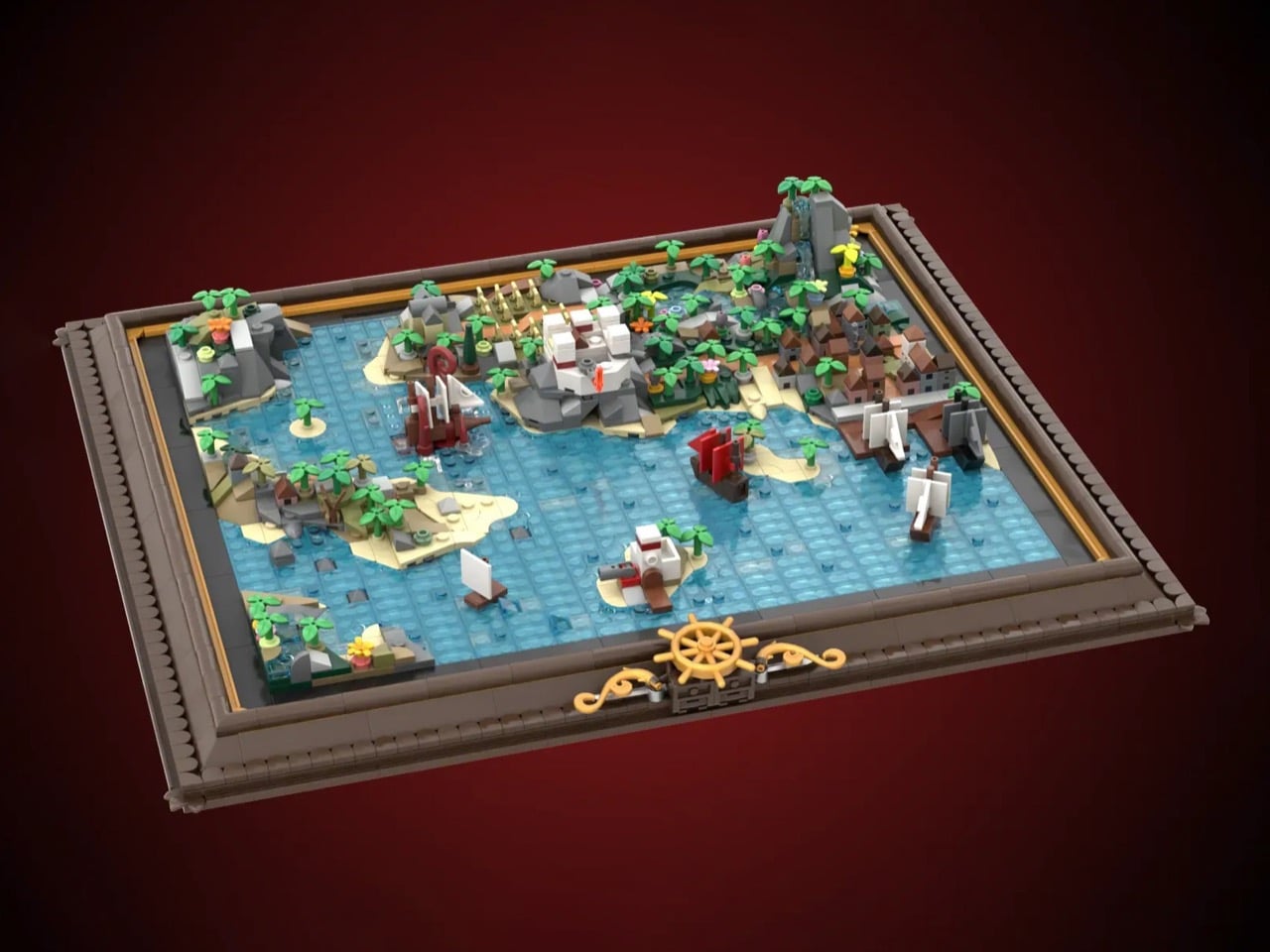
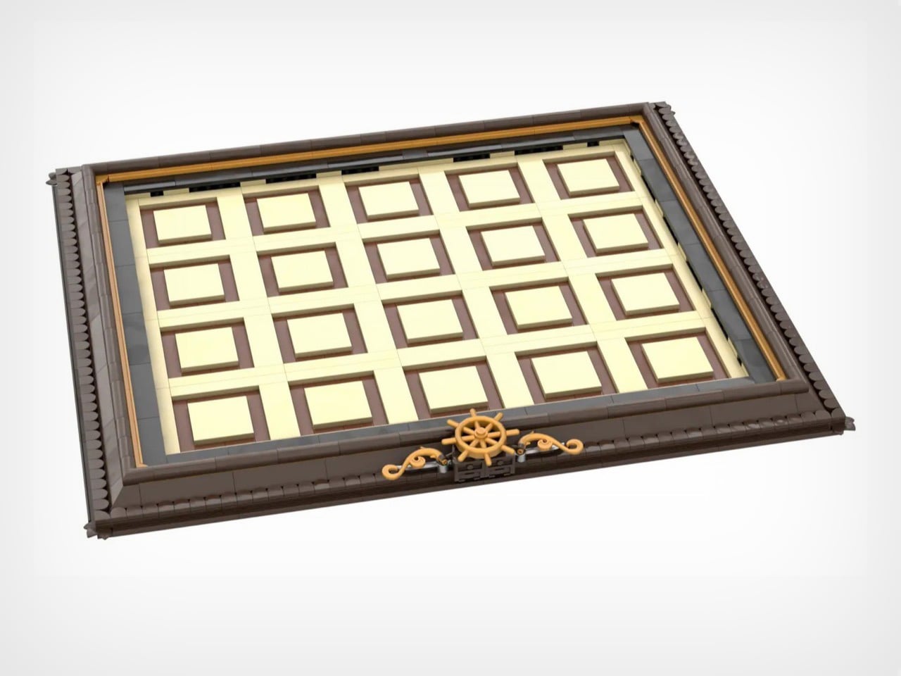
The constant element here is the map’s frame. Dark brown borders with golden accents, three ship’s wheels positioned along the bottom edge like they belong in a captain’s quarters. It’s museum presentation meets functional toy, which is a balance LEGO constantly chases but doesn’t always nail. When you pull tiles out to rearrange them, that empty grid doesn’t look unfinished. It looks like a map in progress, a world being redrawn in real time. The tan and brown tile slots aren’t just practical. They’re decorative infrastructure.

Six corner tiles carry the major landmarks. Bustling harbor with docked ships. Imperial fort with battlements and flag. Cave entrance carved into rocky cliffs. Mountain waterfall cascading into pools. Field of golden crops. Small town with multiple buildings crammed together. Four interior tiles handle the transitional spaces with pools, more agriculture, additional structures, varied terrain. Two island tiles add strategic focal points including an imperial outpost. One side tile gives you coastline on a single edge for asymmetrical builds. Four blank water tiles let you control how much ocean dominates your world. Every piece has a job, and Brickman clearly spent time figuring out what players would actually need versus what just fills space.

There’s a Kraken tile that adds a perfect amount of whimsy to the map. Massive red tentacles wrapped around a ship getting absolutely wrecked. At this scale, giving those appendages actual volume and curve is legitimately difficult, but Brickman pulled it off. Position matters with this one – drop it near your harbor and you’ve got a siege. Place it next to blank water and it becomes a deep-sea horror story. The kraken doesn’t passively occupy a tile. It dictates tone for everything around it, which is exactly how a showpiece element should function.

Modularity only works when every tile has character and purpose. You need each piece to justify independent existence, otherwise why bother with the swapping mechanic at all? Palm trees lean at intentionally different angles. Rocks stack with natural irregularity instead of uniform patterns. Ships have distinct hull shapes and sail configurations rather than cookie-cutter repetition. Microscale forces brutal economy because you can’t hide weak composition behind part-count excess. When you only have 75 pieces per tile, every single brick needs purpose.

Start mixing configurations and the mathematics get wild. A 4×5 grid holding 20 tiles produces absurd permutation counts even accounting for corner and edge restrictions. You could theme it with all land tiles clustered on one side creating an archipelago. You could scatter islands randomly across mostly-water fields. You could jam civilization into one corner and leave wilderness sprawling everywhere else. The modularity isn’t decorative flexibility. It’s the entire reason this concept works as a product rather than just a pretty render.

4,172 supporters with 589 days remaining and Staff Pick status means this campaign has actual legs (or kraken tentacles, should I say). LEGO has done modular buildings for years. They’ve released countless pirate ships across multiple themes. Nobody’s done a modular map, which feels like an obvious gap now that someone’s finally filled it. If this survives the 10,000-vote threshold and makes it through LEGO’s review process, you’re looking at a potential template for an entire category. Modular fantasy maps with castles and dragons. Space station maps with docking bays and asteroid fields. Underwater maps with submarines and coral reefs. The format translates to literally any theme that benefits from spatial reconfiguration. That’s a vision I can get behind – and if you believe in it too, go ahead and cast your vote for Brickman’s MOC (My Own Creation) on the LEGO Ideas website. It’s free!

The post Modular LEGO Pirate Map (With A Kraken) Lets You Redesign Your Own Adventure Every Single Day first appeared on Yanko Design.
OpenAI is launching age prediction for ChatGPT accounts

OpenAI is the latest company to hop on the bandwagon of gating access by users' age. The AI business is beginning a global rollout of an age prediction tool to determine whether or not a user is a minor. “The model looks at a combination of behavioral and account-level signals, including how long an account has existed, typical times of day when someone is active, usage patterns over time,and a user’s stated age,” the company’s announcement states. If an individual is incorrectly characterized by ChatGPT as underage, they will need to submit a selfie to correct the mistake through the Persona age verification platform. 

Most AI companies have been willing to push new features first and then attempt to layer on a patchwork of protections and safety guards on top of them after they cause harm. OpenAI was implicated in a wrongful death suit for a teen who allegedly used ChatGPT to plan his suicide, and only in the following months began pondering automatic restrictions on content for underage users and launching a mental health advisory council. In this instance, OpenAI is attempting to prepare for the launch of an "adult mode" that will allow users to create and consume content that would be dubbed NSFW. Considering how well a similar change has been going over at Roblox, another platform with a shaky history around protecting minors, it seems probable that underage users will find ways to circumvent the existing tools if they want to use ChatGPT as adults.

This article originally appeared on Engadget at https://www.engadget.com/ai/openai-is-launching-age-prediction-for-chatgpt-accounts-222650340.html?src=rss

This 1,000-Pound, 154 HP Motorcycle Has More Cylinders Than Your Car

Picture this: a Chinese automotive giant with zero motorcycle heritage decides its first two-wheeled creation should pack eight cylinders, displace two liters, and weigh over half a ton. Most companies would call that insane. GWM chairman Wei Jianjun called it a passion project and threw over 150 million dollars at making it happen.

The result is the Souo S2000, the world’s first production motorcycle with a flat-eight engine. While Honda, Harley, and BMW pivot toward electric futures and downsized engines, GWM has built something gloriously unnecessary: a touring bike with more cylinders than most cars, more power than a Honda Goldwing, and enough chrome and gold trim to make a baroque cathedral jealous. It’s excess personified, and it’s reportedly headed to America in 2027 with a $30,000 price tag.

Designer: Great Wall Motor Company

The specs read like someone’s fever dream. A 1,999cc horizontally opposed eight-cylinder engine making 154 horsepower at 6,500 rpm and 190 Nm of torque at 4,500 rpm. That’s 21% more power than the Goldwing’s 1.8-liter flat-six from only 9% more displacement, which suggests GWM’s engineers actually know what they’re doing. The engine connects to an eight-speed dual-clutch transmission because apparently seven speeds wasn’t enough to embarrass Honda. And here’s the kicker: it has a reverse gear that moves at 1.8 mph because backing up 461 kilograms by foot would be physically impossible for most humans.

The chassis borrows from automotive thinking in ways that make traditional motorcycle engineers wince. GWM claims the frame uses a bolt-free welded aluminum construction, which sounds impressive until you remember this thing weighs more than some compact cars. The front suspension is a three-tier double wishbone setup that they’re calling a world first, though anyone familiar with the Hossack front end will recognize the DNA. It’s basically a way to separate braking forces from suspension duties, which matters when you’re trying to stop a half-ton missile from 130 mph. Brembo supplies the four-piston calipers on both ends because of course they do.

That 1,810mm wheelbase is 115mm longer than the Goldwing, which explains why photos of this thing make it look like a small spaceship. The seat height sits at a surprisingly reasonable 740mm despite the bike’s overall mass, meaning shorter riders can actually touch the ground. GWM stuffed 118 liters of luggage capacity into the panniers and top case, heated everything that could conceivably be heated, and threw in an eight-speaker sound system because subtlety died somewhere around cylinder number five.

The really fascinating bit is how this bike even exists. GWM is primarily known for making SUVs and pickup trucks. They rank among the top 25 automakers globally and export to over 170 countries, but motorcycles? Completely new territory. Wei Jianjun simply loves bikes and had the resources to make this happen, so he did. The first batch of 200 units sold out. The second batch sold out. The third batch that went on sale in March 2025 also sold out. Chinese buyers are paying between 218,800 and 288,800 yuan depending on trim level, which translates to roughly $31,000 to $41,000 USD.

For context, a Honda Goldwing Tour with DCT starts at around $26,000 in America. The S2000 costs more and weighs 71 kilograms more than the fully loaded Goldwing Tour. It’s also faster, angrier, and comes in a Founder Edition with 24-karat gold accents and the chairman’s signature etched into the fuel tank. Only 88 of those were made, and someone recently paid 668,800 yuan for a one-off called the Cloud Lion with hand-painted clouds and mother-of-pearl lacquering. That’s over $100,000 for a motorcycle.

The question everyone’s asking is whether this thing will actually make it to American roads. GWM confirmed at CES 2026 that they’re planning a North American launch in 2027, targeting that same $30,000 price point. The company has zero presence in the US market currently, which makes this either incredibly ambitious or incredibly stupid. Probably both. They’re planning to expand through Europe and Australia first, testing the waters before tackling American regulations and the nightmare that is establishing a dealer network from scratch.

The post This 1,000-Pound, 154 HP Motorcycle Has More Cylinders Than Your Car first appeared on Yanko Design.

This $170 Retro Dock Solves the Mac Mini M4’s Biggest Port + Connectivity Problem With Style

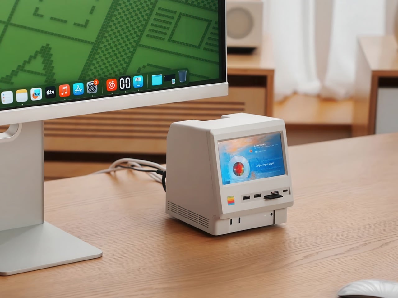
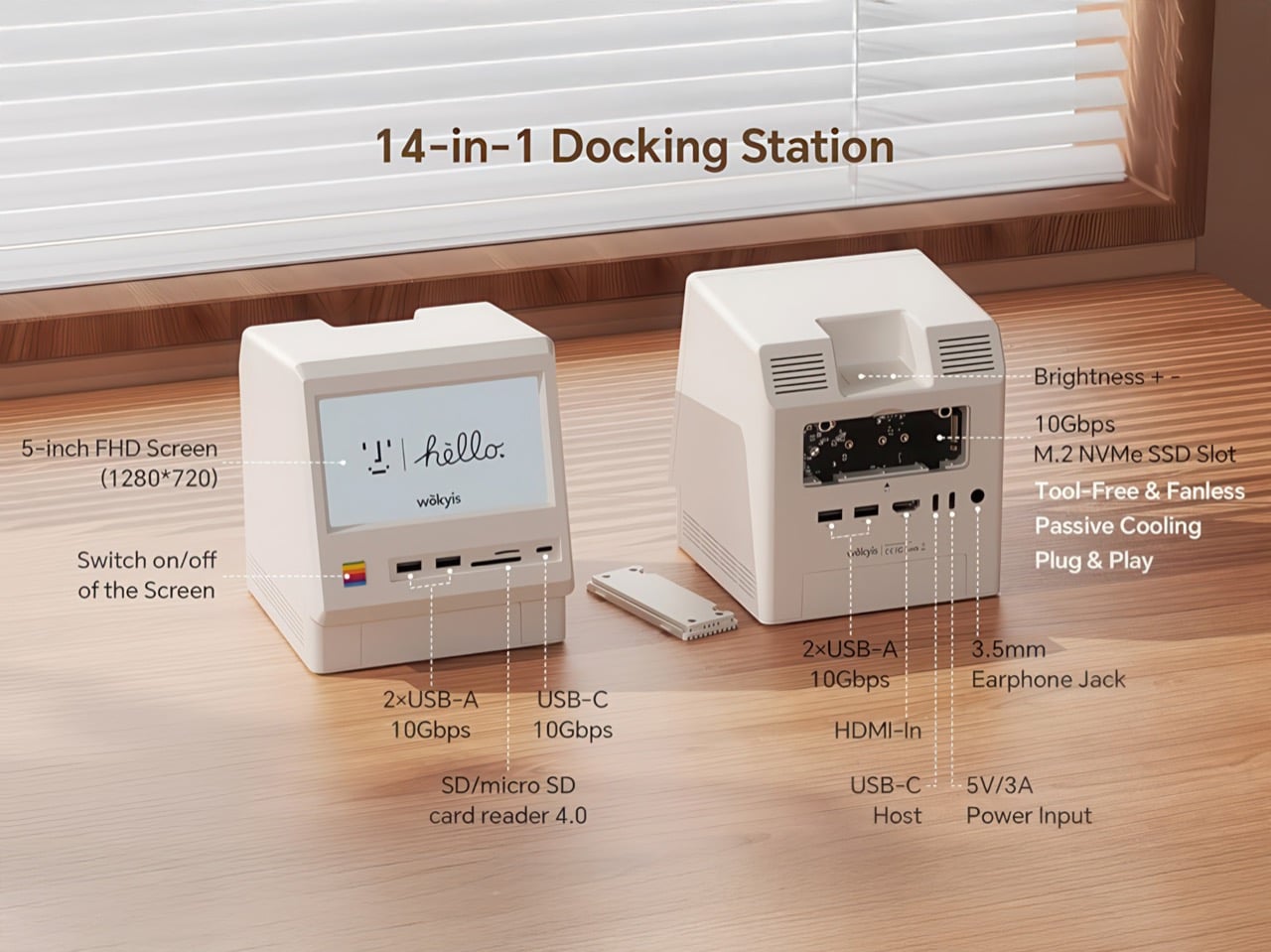
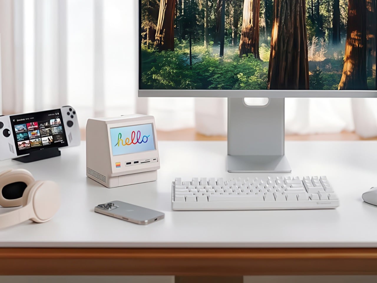
Apple’s Mac mini M4 is absurdly powerful for its size, but connecting anything to it requires a patience-testing game of dongle Tetris. The Wokyis M5 fixes this the fun way, wrapping your diminutive desktop in a retro Macintosh shell that’s actually packed with ports and storage. Yes, the naming is confusing since there’s no Mac mini M5 yet, but the compatibility story is straightforward: this works with the M4, M2, and M1 Mac minis, plus any Mac with Thunderbolt 3/4/5 ports.

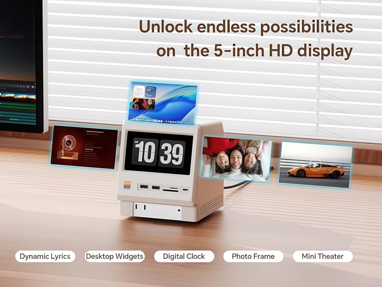
Inside that beige plastic homage to computing history, you’ll find legitimately fast 10Gbps connectivity on both USB-A and USB-C ports, card readers that hit 312MB/s with UHS-II cards, and a tool-free M.2 enclosure with included thermal pads for proper heat management. The 5-inch screen displaying “hello” works as a proper 720p panel for desktop widgets, music lyrics, photo frames, or system stats. Testing shows the SSD enclosure delivers around 900 MB/s with quality NVMe drives, which is respectable for a hub in this price range. The design lets you access the Mac mini’s own ports through a removable bottom panel, so nothing gets sacrificed in the name of aesthetics.

Designer: WOKYIS

Click Here to Buy Now

Photographers and video editors know the Mac mini M4’s port limitation intimately. Three Thunderbolt 4 ports and two USB-A ports sound adequate until your monitor claims one, your external SSD takes another, and you’re suddenly rationing connectivity like it’s a finite resource. The front panel of the M5 solves this with two USB-A 10Gbps ports, one USB-C 10Gbps port, and SD plus microSD slots that handle UHS-II speeds at 312MB/s. Offloading a 128GB card from a photo shoot takes minutes instead of the geological timescale you’d experience with slower readers. You do this without unplugging anything or performing cable gymnastics behind your monitor.

The M.2 enclosure accepts NVMe drives from 2230 to 2280 form factors and supports up to 8TB of storage. Pair it with a Samsung 990 EVO Plus and you’ll see read and write speeds hovering around 800 to 900 MB/s, which translates to genuinely usable performance for 4K editing timelines or RAW photo libraries. Wokyis ships two thermal pads in the box: a thicker one for single-sided SSDs and a thinner variant for double-sided drives. The passive cooling approach works because there’s actual thought behind the thermal management rather than hoping convection does all the heavy lifting. No fans means no noise, which matters when you’re recording voiceovers or working in a quiet space.

That 5-inch display hits 1280×720 resolution at roughly 290 PPI, putting it squarely in Retina territory for normal viewing distances. Text renders crisp, colors track accurately for casual use, and brightness handles typical indoor lighting without struggle. You can feed it content through the HDMI-in port or the USB-C host connection depending on your setup preferences. People are running Spotify controls on it, system monitoring dashboards, security camera feeds, even Slack notifications. The dedicated power button on the front means you can kill the screen when you don’t need it running, which beats having a perpetually glowing display burning into your peripheral vision at 2 AM.

Wokyis nailed the proportions by treating the original Macintosh as inspiration rather than a blueprint to slavishly recreate. The beige matches Apple’s classic off-white perfectly, the ventilation grills reference the original’s cooling design, and that rainbow stripe sits exactly where your brain expects it. The dimensions wrap the Mac mini M4 specifically, with a removable base plate that keeps every native port accessible. You’re adding capability on top of what Apple gave you rather than trading functionality for aesthetics. The Mac mini slides in, locks down, and you’ve suddenly got a setup that looks like it time-traveled from 1984 while performing like it’s from 2025.

Generic USB-C hubs from Anker or CalDigit run $80 to $150 and offer similar port counts with zero personality. None of them include an SSD enclosure or a display. The M5 at $169.99 lands in a weird value proposition where you’re paying a modest premium for design that actually makes you happy to look at your desk. The 80Gbps Thunderbolt 5 version exists at $389 if you’re pushing enormous video files or running external GPUs, but that’s specialist territory. The 10Gbps model handles what 90% of users throw at it. Ships in two days direct from Wokyis or grab it from Amazon if you’ve got Prime and prefer that refund safety net. Either way, you’re getting a dock that makes the Mac mini M4 better at its job while looking fantastic doing it.

Click Here to Buy Now

The post This $170 Retro Dock Solves the Mac Mini M4’s Biggest Port + Connectivity Problem With Style first appeared on Yanko Design.

Akai’s MPC XL groovebox is the most powerful device the company has ever made

Akai just revealed its most powerful standalone groovebox, the MPC XL. For the uninitiated, the MPC has been around since the 1980s and pretty much defined hip hop from that era. The line has continuously iterated to keep up with the times and the XL looks to be the baddest of them all.

First of all, it offers four times the processing power of previous MPCs, which is enough to load up to 32 virtual instruments at the same time. This is assisted by a full 16GB of RAM, which is a whole lot in this era of AI tomfoolery. The XL can handle 16 audio tracks simultaneously. In my experience with previous units, this is more than enough for a full song.

It runs on a proprietary OS and features a 10-inch OLED touchscreen for making adjustments. There are also dozens of knobs and buttons to play with, including 16 knobs that integrate with the display for real-time feedback.

The XL features a step sequencer, but this is an MPC. The real star attraction are those 16 drum pads. These pads can be set to trigger samples and hits, but can also be programmed to initiate effects and do all kinds of other stuff. Each pad has four quadrants, one for each corner, and they are all fully adjustable.

Looking for even more nuanced control? There are two assignable touch-strips and plenty of short-cut keys. It has built-in microphone preamps, phono inputs for sampling, instrument inputs and numerous other connectivity options. This is a true flagship in every sense of the word. It's also very, very large.

The MPC may have started as a hip hop machine, but newer models are useful for any genre of music. To that end, it comes with an extensive collection of plugins, samples and effects. These even include some plugins made by rival company Native Instruments.

The software can handle stuff like stem separation, time-stretching and more. The workflow has been heavily inspired by modern DAWs, with a full arrangement view available on that OLED.

The MPC XL is a standalone unit, so it doesn't need a computer or anything like that. The power requirements here, however, don't allow for batteries. This thing has to be plugged in, much like Native Instruments' Maschine+. It's available right now and costs a whopping $2,900. This is a serious machine with a serious price tag, just like Roland's recently-released TR-1000 drum machine.

This article originally appeared on Engadget at https://www.engadget.com/audio/akais-mpc-xl-groovebox-is-the-most-powerful-device-the-company-has-ever-made-183952483.html?src=rss

When Your Childhood Pen Becomes Your Living Room Centerpiece

You know that clear plastic pen you’ve chewed the cap off a hundred times? The one that’s probably rolling around in your junk drawer right now? Well, someone just turned it into a lamp and it’s kind of genius. Seeing design variations of products that are different from each other is a refreshing take especially if it’s done right.

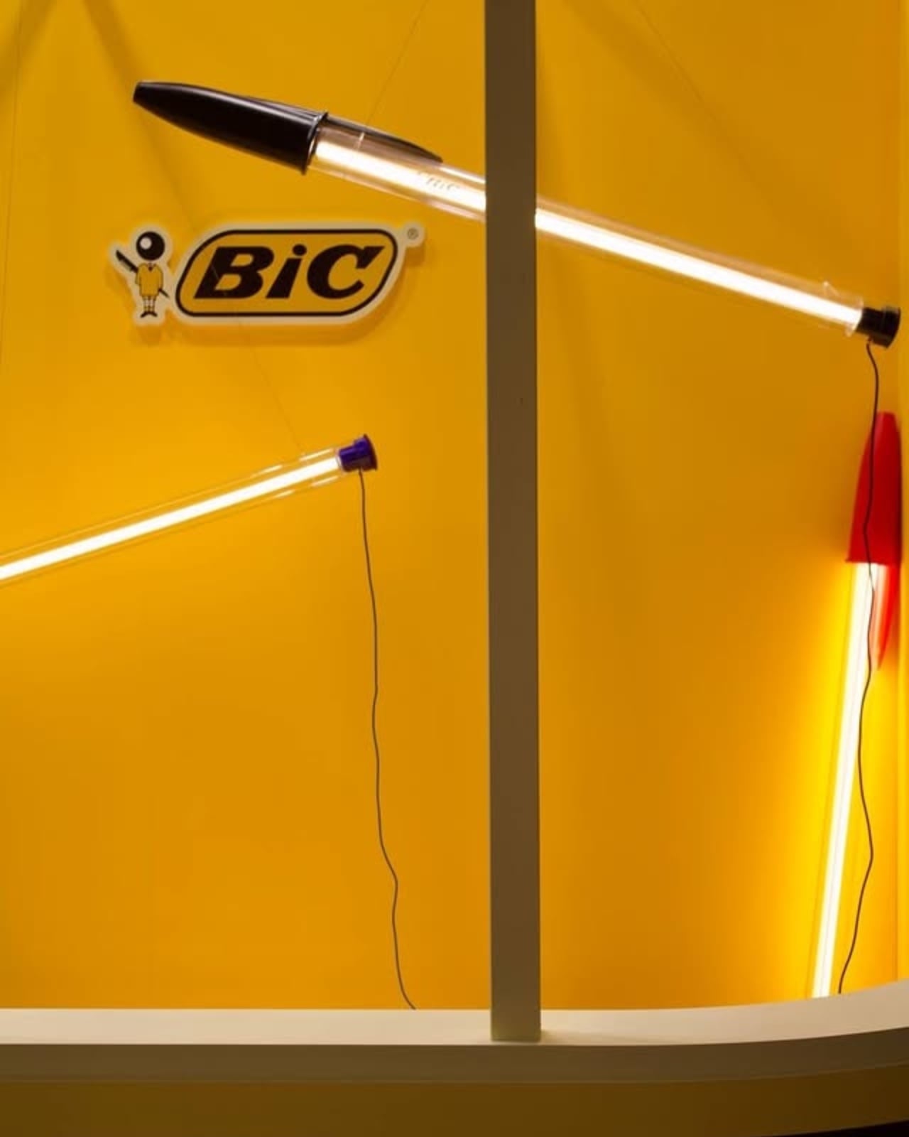
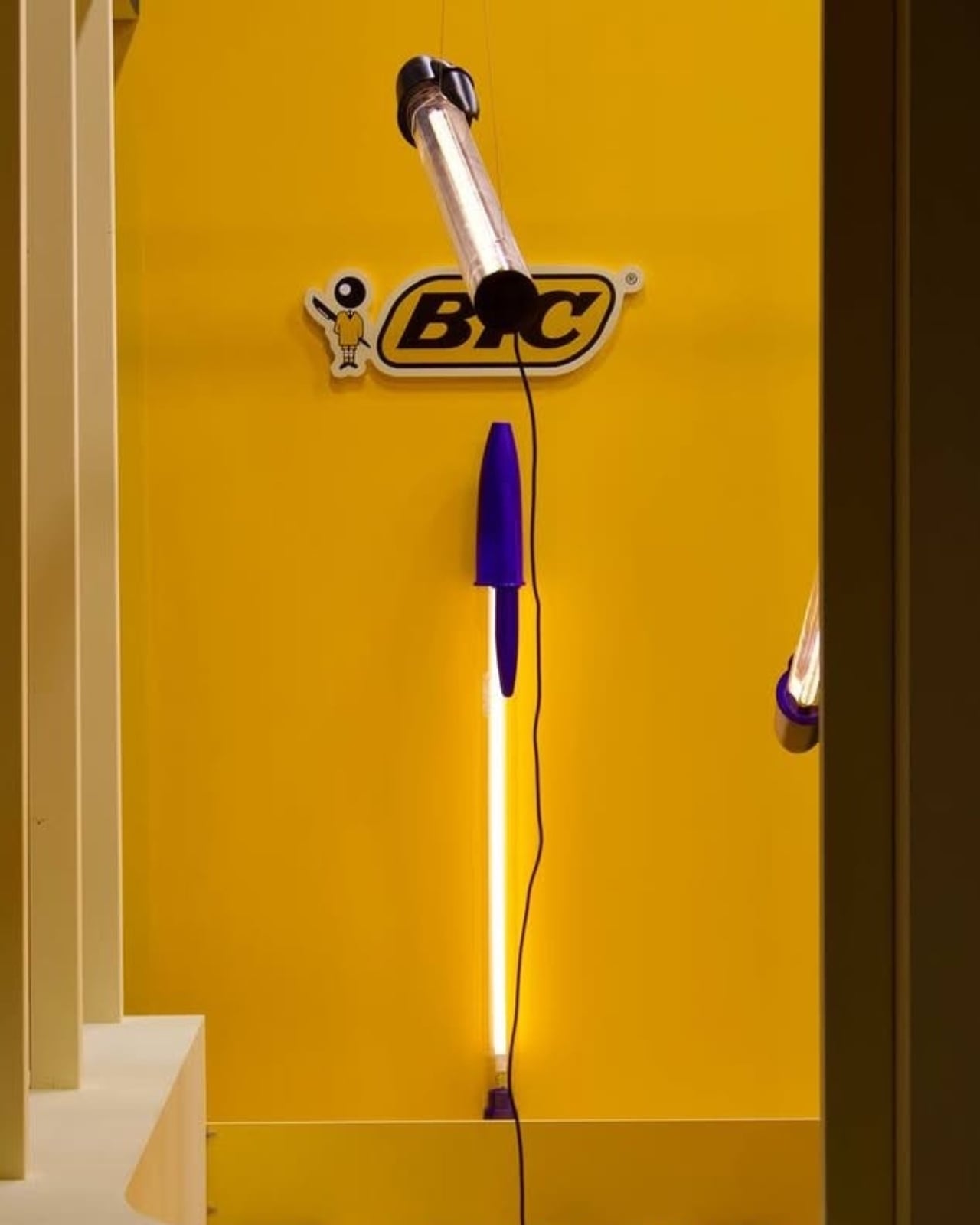
Italian design brand Seletti teamed up with designer Mario Paroli to celebrate the 75th anniversary of the BIC Cristal pen in the most extra way possible. They blew it up to 12 times its original size and transformed it into a floor lamp, pendant light, and wall-mounted fixture. Because apparently, nothing says “happy birthday” quite like making something absurdly large and hanging it from your ceiling.

Designer: Mario Paroli for Seletti

The BIC Lamp debuted at Maison & Objet 2026, and it’s exactly what you’d imagine if you scaled up that iconic ballpoint pen you’ve been using since elementary school. The transparent barrel is there, the hexagonal body is there, and yes, the caps come in those three classic colors: black, blue, and red. The only thing missing is the mysterious teeth marks we all somehow ended up making during boring classes or meetings.

What makes this collaboration so charming is how it taps into universal nostalgia. The BIC Cristal isn’t just any pen. Since 1950, when French-Italian entrepreneur Marcel Bich acquired the patent for the ballpoint mechanism from Hungarian-Argentine inventor László Bíró, this little writing tool has lived in every pencil case, backpack, and desk drawer imaginable. It’s been clutched by artists and writers, and it’s earned spots in the permanent collections at New York’s Museum of Modern Art and Paris’s Centre Georges Pompidou. For something so ordinary, it’s surprisingly extraordinary.
Seletti’s art director Stefano Seletti explains their approach perfectly: “We transform a universally and instantly recognisable shape that lives in everyone’s memory, into something completely new”. And that’s the magic here. The lamp doesn’t reinvent the wheel or try too hard to be clever. It just takes something we all recognize and makes us see it differently. The design uses carefully selected materials that echo the original pen, but instead of ink flowing through that clear barrel, you get LED technology lighting up your space. It’s functional, playful, and surprisingly versatile. Whether you mount it on a wall, suspend it as a pendant, or place it as a floor lamp, the BIC Lamp brings that same pop-culture irreverence Seletti is known for.

The lamp works because it doesn’t take itself too seriously. It’s design with a wink, a nod to our shared experiences with this humble writing instrument. How many times have we frantically searched for a pen, only to find three BIC Cristals that may or may not work? How many have we borrowed and never returned? The pen is part of our daily rituals, so familiar we barely notice it anymore. By supersizing it and giving it a new function, Paroli and Seletti invite us to reconsider everyday objects around us. Good design doesn’t always mean creating something entirely new. Sometimes it means looking at what’s already there and asking, “What if?” What if the pen we’ve used for decades became something else? What if we celebrated its simplicity by making it impossible to ignore?

The BIC Lamp transforms a desktop essential into a domestic icon, proving that the best design ideas often come from the most unexpected places. It’s memory-driven design at its finest, taking something ordinary and making it extraordinary simply by changing its scale and purpose.

The post When Your Childhood Pen Becomes Your Living Room Centerpiece first appeared on Yanko Design.