Earbuds case doubles as fidget toy for your anxious fingers

There are things that we need to have with us everywhere we go, depending of course on your personality. In fact, there’s a term for that – EDC or everyday carry. These are things like watches, pens, lighters, notebooks, utility knives, etc. But the past few years, they’re really more of our digital tools – smartphones, tablets, laptops, earphones. There are also those that have to carry fidget toys around with them to help relieve anxiety or boredom. What if you get a combination of a device that can also become a fidget toy for your restless fingers?

Designer: Eric Cheng

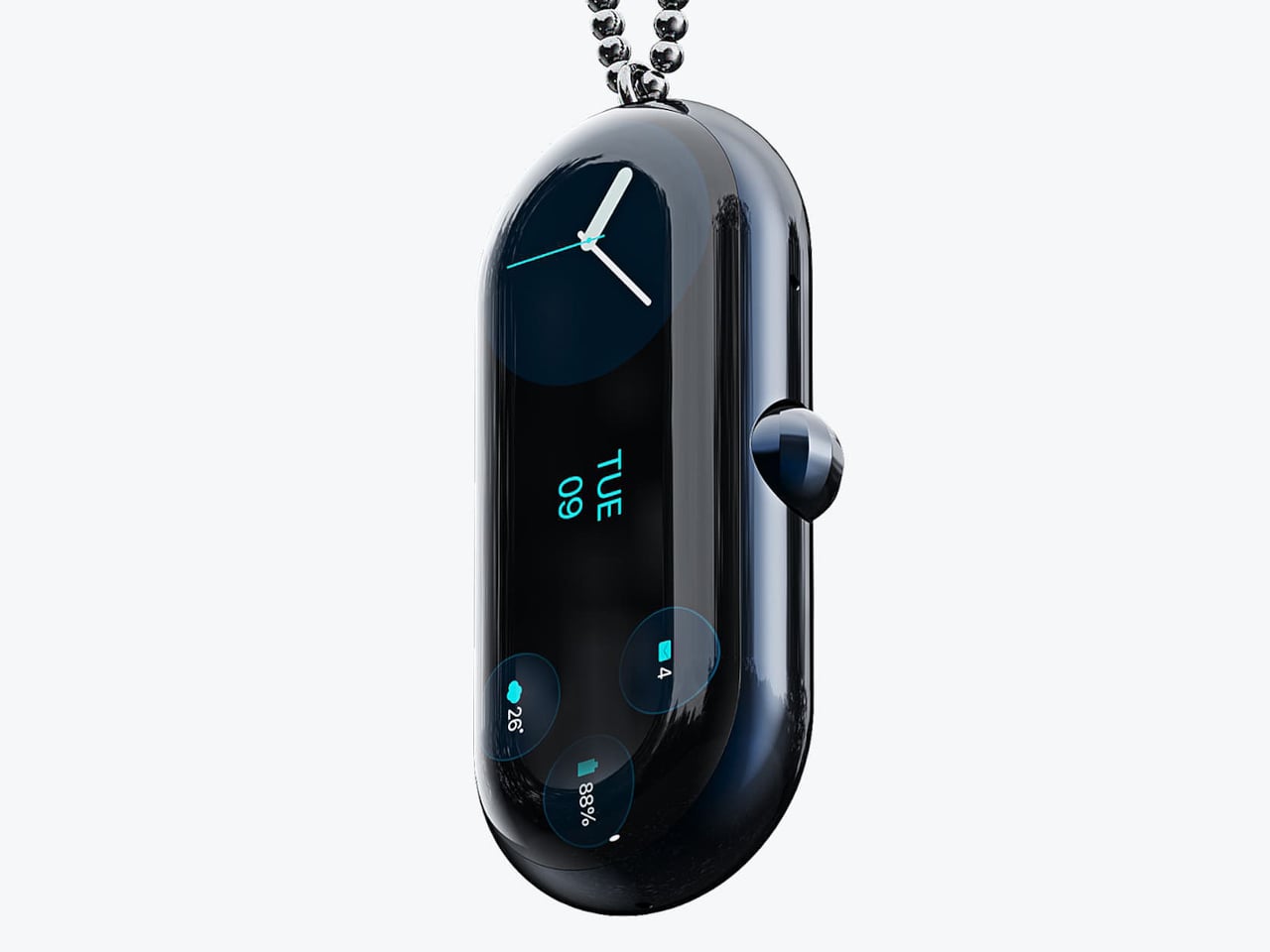
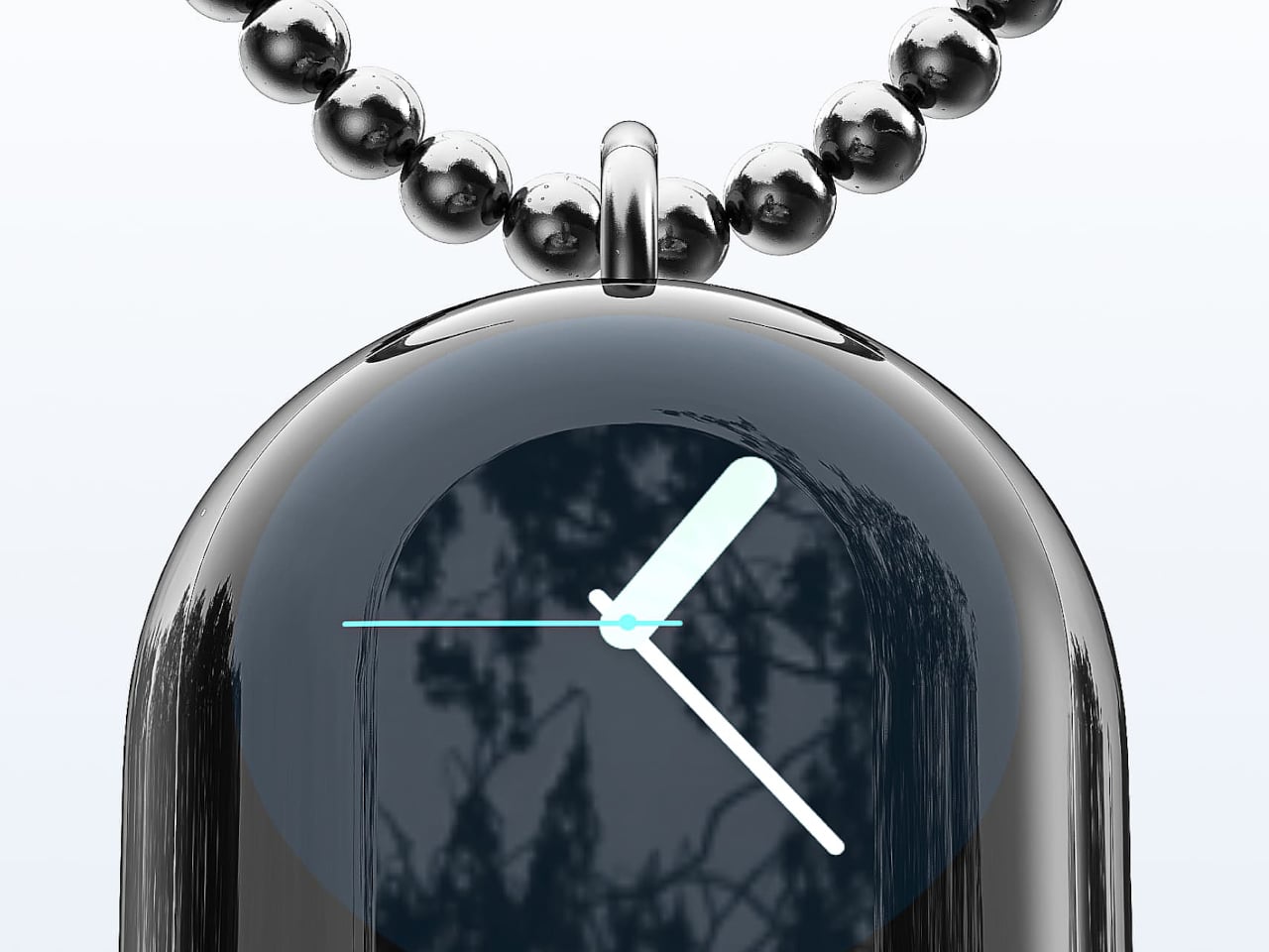
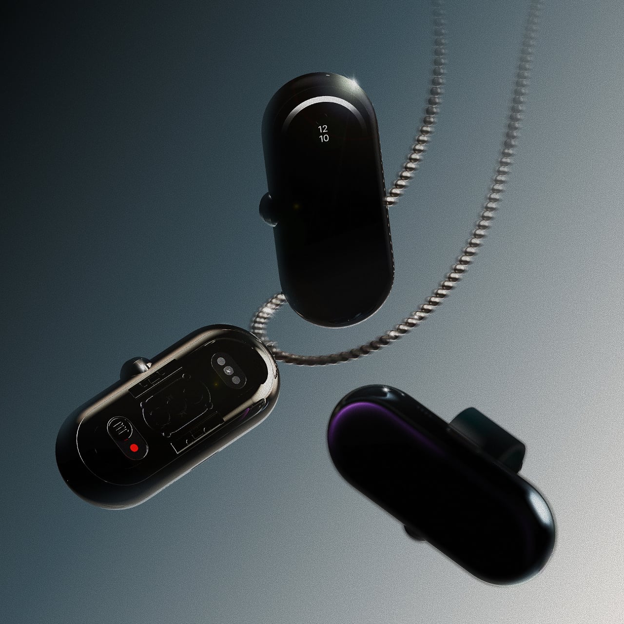
This concept for an earbuds case may be that combination you’re looking for. The EDC 1.0 Lucky Push is a concept case for the D-Mooster truly wireless earbuds that uses “card pushing” mechanism to open and close it. The motion of the sliding up and down and snapping is supposedly addictive enough that you would want to do it repetitively, even if you’re not using your earbuds at the moment. Hence, it becomes a fidget toy as well if you need to keep your hands busy.

There are three designs for the EDC 1.0 Lucky Push: Big Monster, Become Wealthy, and Become Happy. For the superstitious, doing the repetitive motion will let you accumulate luck and wealth, or at least that’s what the designer thinks it will bring you. I understand with the last two designs as we all want to be wealthier and happier, but I wonder what the Big Monster concept will bring you, other than a cute fidget toy with monsters engraved on it.

Earbuds cases are usually really more functional as you use it to store your earbuds or charge them once they run out of juice. So this is an interesting idea to make the case itself a bigger part of your EDC pack as it becomes a fidget toy as well. If the designs are also interchangeable, it will make it even more interesting.

The post Earbuds case doubles as fidget toy for your anxious fingers first appeared on Yanko Design.
Odd pen holder has a unique way to showcase your favorite writing tool

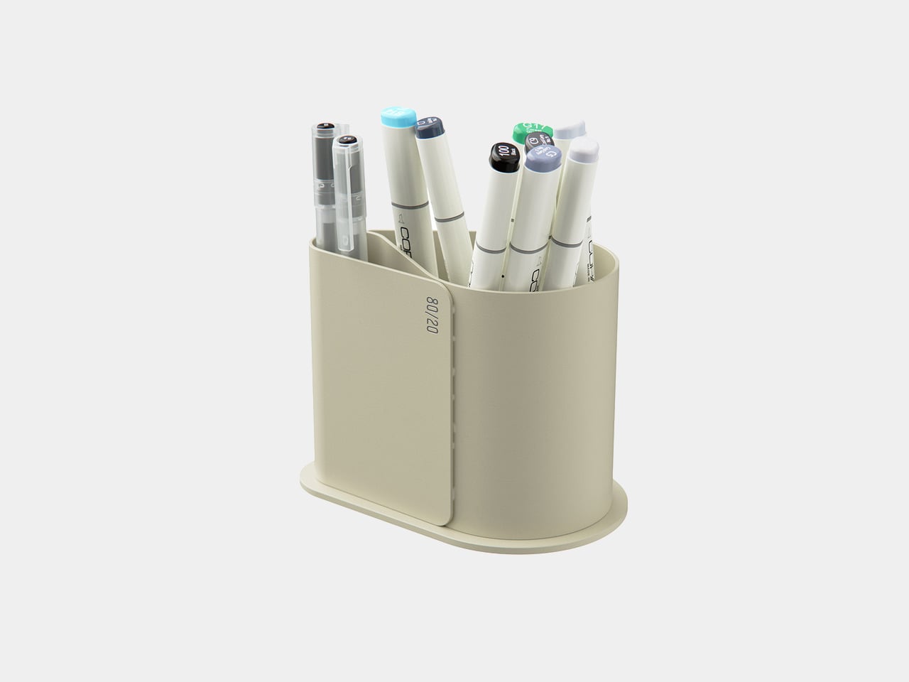
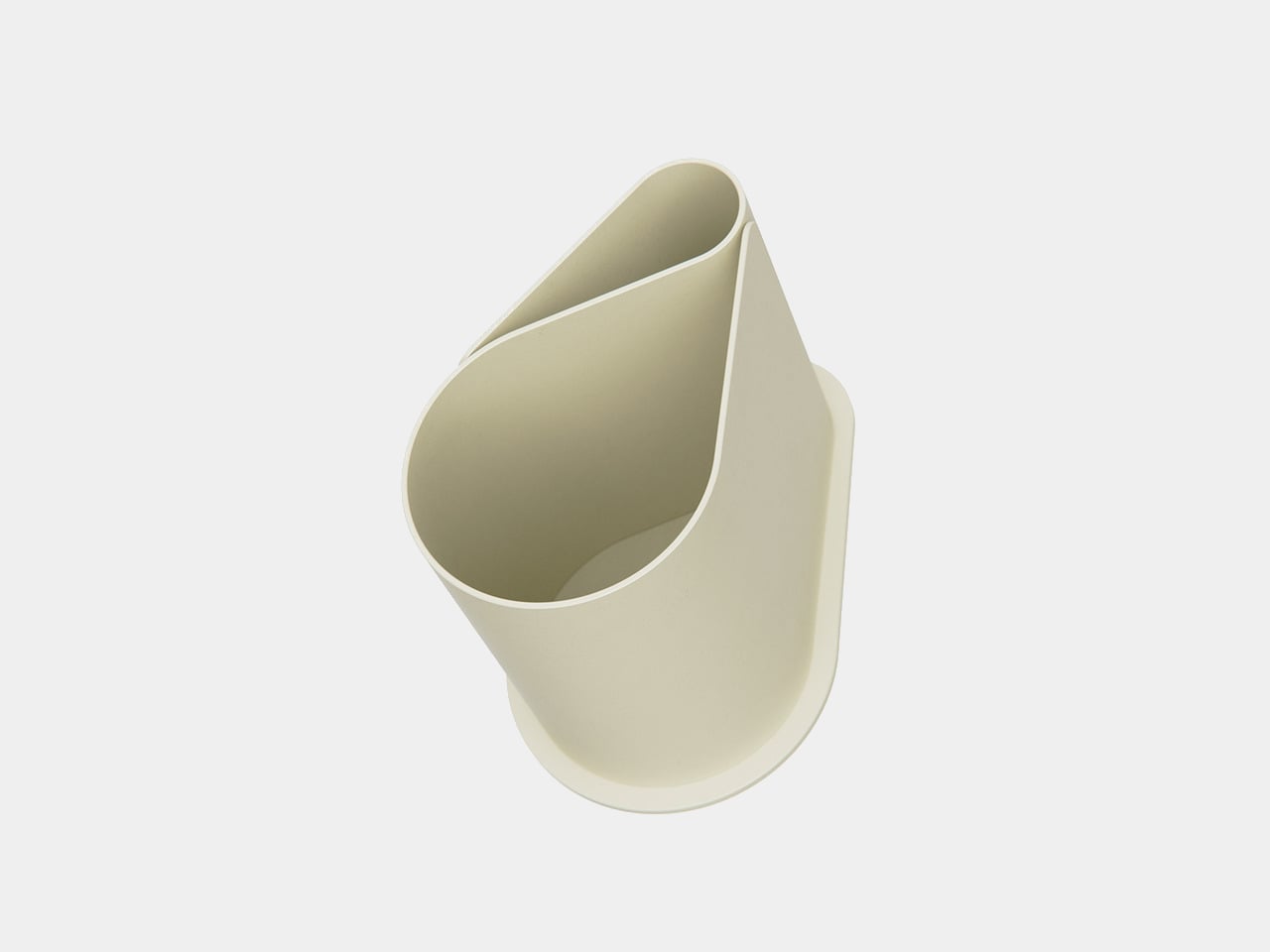
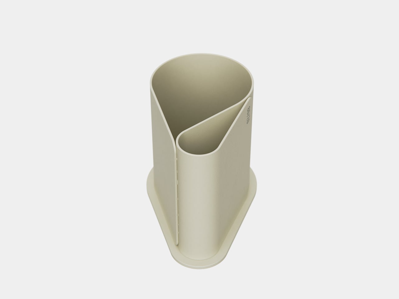
The key design elements for a pen holder or pen pot are pretty simple. It just needs to be tall enough to support writing instruments of different heights without them tipping over and would have enough room for at least a handful of pens, pencils, markers, and the like. Beyond that, the designer is free to interpret the shape of the container, and some even have dividers to segregate the different tools. But while pen holders are a convenient way to keep your pens together, they don’t really make it easy to pick out your favorite one from among the bundle. Some people would use a separate stand just for that single pen, which takes up unnecessary space on your desk. This concept design has a rather curious answer to the problem, one that pretty much leaves a conspicuous hole in the middle of the pill-shaped pot.

Designer: Liam de la Bedoyere

Usually, having a hole in the middle of a container is considered to be a defect, one that not only weakens the structure of the shape but also mars its visual integrity. After, something that cuts through an otherwise clean and whole form is sure to bother one’s aesthetic sense. In this case, however, that hole is not only intentional but also functional, setting the Void Pen Pot apart from your run-of-the-mill pen holders.

The hole that runs through the body of the pill-shaped container actually provides a convenient resting place for your most-used pen or pencil. Instead of wasting time and effort looking for that pen among half a dozen similar-looking rods, you can simply pull it out from its hole and start using it immediately. And when you’re done, you can just shove it back in to wait for the next time you need it.

Since that hole practically bisects the container, it also acts as a built-in divider that lets you group your pens into two. That said, this also means you’re not able to maximize the entire space of the container for your pens, specifically the area above and below the “tunnel” made by this hole.

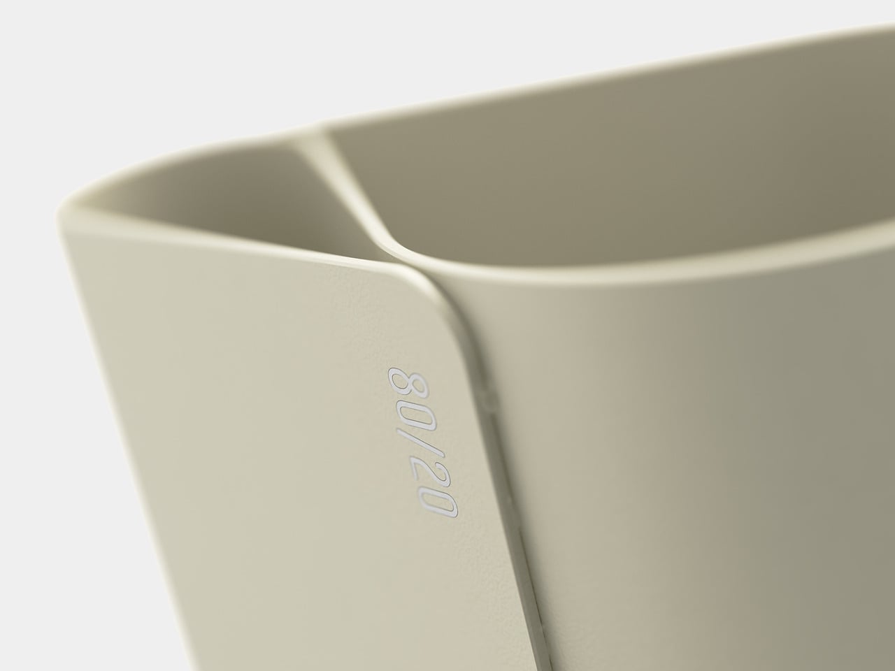
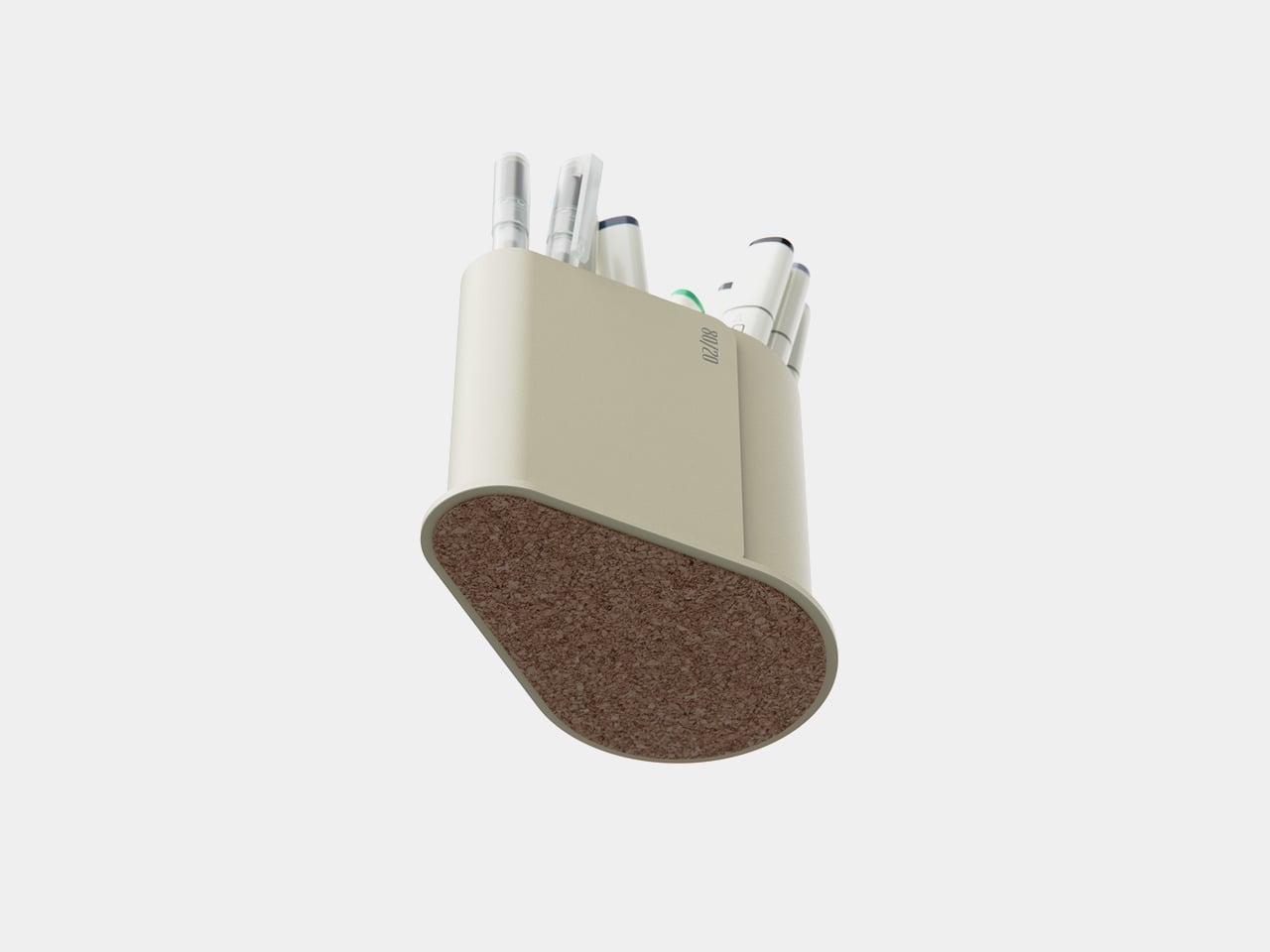
The concept comes in two flavors, four if you consider the pen holder can be pill-shaped or a conventional can. One design employs a polished chrome body, while the other tries to adopt Japanese minimalist brand MUJI’s signature frosted polypropylene, both with cork bottoms. While the function of having an odd yet special place for your favorite pen is definitely useful, it still raises the question of whether such a quirky design will be appealing or off-putting instead, with a pen sticking out from an otherwise blemish-free surface.

The post Odd pen holder has a unique way to showcase your favorite writing tool first appeared on Yanko Design.

Mini drum washing machine concept lets you clean small loads of clothes

Washing machines are normally pretty big and bulky, especially since you want to put in as many pieces of clothing as possible in one load. It has made washing clothes easier of course but it’s still a pretty tedious chore. If you live in a tiny space though, having a full sized machine may not be so feasible. Or if you have a child or children, constant washing and disinfecting of clothes is required, not necessarily needing the whole traditional machine.

Designer: Az

This concept for a mini drum washing machine may be the answer to space and size problems. Augenstern looks more like a rice cooker at first glance but it is a portable and smart machine that can disinfect clothes for babies and young children. It has a carrying handle since the idea is that you can carry it anywhere in the house or maybe even outside of your house if needed. There is a mention of wall-mounting by the designer but the renders don’t really show that.

The machine probably doesn’t fully function like your usual washing machines since there isn’t any of the usual tubes and things that you see. There seems to be a bottom suction cup somewhere there that is supposed to reduce the vibration and noise of the machine which should be useful if you have babies that wake up at the slightest noise. This means you can wash or disinfect their clothes even as they’re napping or sleeping.

It’s a pretty interesting concept especially for those that don’t have enough space to have a washing machine. But it may be a bit too small and therefore it means that you’ll have to do several loads, which may defeat the purpose. It would also be nice if there could be more information about the features but the design itself seems to be interesting and feasible.

The post Mini drum washing machine concept lets you clean small loads of clothes first appeared on Yanko Design.
Futuristic car interior concept makes you feel like you’re driving a giant robot

A great deal of interest has been poured into future car designs, most of which are envisioned to be self-driving vehicles. The reason for this is pretty simple, visionaries want to turn car cabins into moving hotel rooms, delivering luxurious and stylish comfort that lets passengers relax, enjoy, and ever socialize without having to pay attention to the traffic. We’re still far away from the future, however, and some car owners might prefer a different kind of ambiance and experience when driving. This car interior concept, for example, offers a different view of the future, one that makes you feel more like you’re inside the cockpit of a spaceship or, more accurately, a giant robot.

Designer: Advait Taware

Of the many Japanese franchises that became a big hit worldwide, Gundam is perhaps the most iconic when it comes to giant piloted robots. Although the brand has a wide variety of robot designs, perhaps the most popular ones involve a particular white, blue, and red theme with plenty of flat panels, sharp edges, and polygonal surfaces. Gundam has inspired generations of toy collectors, enthusiasts, and even designers, one of which turned that motif into something that can actually be realistic, even if you don’t have a mecha to pilot.

A giant robot cockpit is probably the last thing you’d imagine for the car of the future. After all, those robots were often used for militaristic purposes, though some might say that daily commute traffic makes them feel that way. That said, the Gundam Interiors concept does have a certain charm to it, providing a futuristic driving experience that is, ironically, more steeped in present reality than the self-driving concepts that automobile makers and tech companies are trying to paint. In other words, it still requires the driver to be in control, providing seats in front and a steering wheel.

Of course, the designs of these components are anything but typical for this concept. The U-shaped steering wheel, for example, looks more like the controls of a plane than a car. A tall display in the middle of the wheel provides immediate information and controls, which is important since the instrumentation dashboard is quite far in front, too far to reach for any interaction. The seats are also atypical of car seats, adopting an almost angular shape that looks aerodynamic, almost like a small aircraft itself.

The cabin of this futuristic car is filled with such hard, edgy design elements, but the use of lighter tones like white and light gray softens the visual to some extent. Ironically, the exterior of this futuristic car is the thematic opposite of its interior, sporting a smooth and curved chassis not unlike the typical self-driving car concepts you’d see lately. It’s an interesting juxtaposition that does give the design a bit of character but could also prove to be a bit incoherent in terms of overall themes.

The post Futuristic car interior concept makes you feel like you’re driving a giant robot first appeared on Yanko Design.
Sleek futuristic game controller concept removes almost all buttons

The recent years have put gaming under the spotlight, from the hit mobile games like Pokemon GO to innovative consoles like the Nintendo Switch, to the messy adaption of iconic video games into films or TV shows. Of course, this has also given rise to interesting new product designs, especially those riding on the retro trend that’s bringing aesthetics from the past to the present. That said, we can’t always be looking backward trying to relive a so-called “golden age” of design. In order to move forward, we sometimes have to break away from standards and tradition to pave the way for the future. That may sometimes result in unusual designs that may or may not work as intended. This futuristic-looking game controller, for example, aims to simplify the user experience and give the product a more aesthetic flair, but it also raises questions about the usability of the redesign.

Designers: Sami Azfar, Salekin Piash

The basic design of game controllers has changed little over the decades. Yes, they vary depending on the platform or generation, but the existence of buttons, directional pads (D-pads), joysticks, and triggers has always been a standard. For now, it’s the only way you can express a multitude of actions with a limited number of controls, but it’s hardly the most effective or convenient. Unfortunately, we will have to stick with such conventions for the foreseeable future, but that doesn’t mean we can change how they are implemented.

Moenix is a design concept that tries to simplify the form of the controller, thereby allowing it to take on a completely different aesthetic. It specifically takes inspiration from the design of steering wheels and gearshift which are examples of simple yet powerful user interfaces. Unsurprisingly, the Moenix takes on a shape that’s not unlike the steering wheel of a vehicle but utilizes more organic shapes to give it a less mechanical appearance.

The most striking aspect of the controller’s design, however, is the lack of any visible interfaces. There are only two explicitly mentioned in the design, and both come under your thumb. These are touch-sensitive buttons whose actions can change depending on the game being played. One could act as a trigger in a shooter or as the gas pedal in a racing game, while the other can be mapped to movement or camera controls. Given the shape of the controller, it wouldn’t be surprising if it had motion controls so that you can turn your character or your car just by turning the controller itself.

This concept allows the game controller to take on a simpler and more approachable design, but it seems to come at the price of actually providing enough controls to the player. The dynamic buttons can be changed, but unless it can provide more than 2 or four actions, it will definitely be insufficient for most modern games. Alternatively, it might be possible to include buttons behind each handle, providing the same amount of expressiveness but in a more ergonomic position.

The post Sleek futuristic game controller concept removes almost all buttons first appeared on Yanko Design.
Space-saving bookends double as a modular wireless speaker system

We seem to always be running out of space on our desks. Any free area that we get often quickly becomes occupied by a new thing, a tool, or a book, that we can always justify as necessary. And then there are purely decorative items that, while not serving any practical function, serve to put us in a good mood. Sadly, those reasons don’t remove the fact that they still take up precious space that could have been used for other things. Cutting down on the amount of “stuff” on your desk is one possible solution to this conundrum, but another is to use multi-functional products that serve more than one purpose, like these rather aesthetic bookends that are actually speakers in disguise.

Designer: Liam de la Bedoyere

If there are two things that are standard on a modern desk, it would be books and speakers. The former is often essential for work, even if just for appearance’s sake, while the latter is necessary to keep our minds sane with our favorite music and podcasts. They might even be necessary for the video meetings that are becoming more common these days. Naturally, these things will need some space on your desk, so why not combine them in a way that still retains each product’s identity while also bringing a fresh twist to their designs?

The Beat Bookends concept does exactly that by transforming bookends into two parts of a speaker system. Specifically, the triangular shapes that sit on either end of a row of books act not only as stable structures to keep your reading materials upright but also serve as front-firing speakers. Although it probably would have been enough to just have two wireless speakers performing this function, the design concept actually includes one or two more speakers for an even better audio experience.

The bookend speakers are actually just the “satellite” speakers, and a rectangular block serves as the main unit you connect to. This piece can stand in the middle of your row of books to add a bit of variety to the composition, or it can even be placed anywhere else to set up a spatial audio arrangement of sorts. Another rectangular speaker block can even be added to the mix for an even louder and more distributed audio output.

What’s interesting about the Beat Bookends concept is that it isn’t limited to actually being used as bookends only. With a flexible building block concept, you can mix and match pieces and arrange the speakers in different ways, even if you don’t have books to stand on your desk or shelf. You can combine the speakers in more interesting arrangements to provide not only audio but also a bit of decoration on your desk, hitting two birds with a single stone.

The post Space-saving bookends double as a modular wireless speaker system first appeared on Yanko Design.
Modular media player concept brings iconic Winamp design to the physical world

With almost everyone owning a smartphone these days, the need for dedicated media players has plummeted significantly. That’s not to say they’ve completely disappeared, especially those types that can be placed and displayed on desks or shelves. The retro design craze has breathed new life into old products like turntables, but these aren’t the only designs from bygone ages that deserve to be rediscovered. Some of these old-school designs come from the digital realm, where some software have achieved near immortality thanks to their distinctive user interfaces. Winamp is one of those iconic faces when it comes to music player applications, and this concept turns that into an actual device that, just like the digital original, can somewhat be configured to suit your needs and moods.

Designer: Eslam Mhd

By modern standards, the original design of the Winamp media player app is clearly outdated, but it remained a darling until recently because of its flexibility. It supported using different skins to personalize the software’s appearance, which naturally led to hundreds of designs, some of which might even make you want to gouge out your eyes. At the very least, Winamp followed a LEGO-like design where you can move parts of the app around or even remove them completely, depending on your needs.

This concept design for a device of the same name follows the latter aspect of Winamp’s design, particularly the ability to move its three main panels around or even leave one out. Like the original Winamp, the media player device has a component for the actual media controls with a single-line display for the current music, one for the equalizer, and another for displaying album art and the playlist. All three can be stacked together for a tall device that is propped up on a desk using the built-in kickstand of the equalizer. Or you can switch them around leaving only two components visible, as long as the equalizer is there to act as the base.

1

You can, for example, only have the media controls and the equalizer if you don’t mind not seeing the list of tracks and the album art. Or if you already have a fixed equalizer setting, you can put either the media player or the album display above it and then snap the other component in front of the equalizer to hide it. You can even show only the media player itself, with the other two hiding behind it. These components connect using strong magnets, so no rewiring is needed to make instant changes to the combination. And at the end of the day or if you want to take the device with you, you can simply collapse all the components in a sandwich and carry it around.

What’s interesting about this particular design is that it uses physical controls like sliders and buttons instead of simply employing a touch screen to offer the same interface. It’s like reverse skeuomorphism, where the digital user interface mimics the appearance and behavior of physical controls. Of course, this more physical design means you don’t get to use skins anymore, but it’s a small price to pay for such an intriguing device.

The post Modular media player concept brings iconic Winamp design to the physical world first appeared on Yanko Design.
Bowl-shaped chair concept offers geometric beauty at the expense of ergonomics

Just like a table, the most basic requirements for a chair are quite simple. It needs to be strong and stable enough to actually sit on, but comfort and convenience seem to be more open to interpretation than any other design element. Some brutalist designs look a little painful to sit on, meeting only the bare minimum of a chair, while others let your body literally sink inside its plushy cushions and make it difficult to pull yourself out quickly. And then there are designs like this concept that espouse simplicity and minimalism to convey a sense of beauty, but the end result, while visually successful, also raises concerns about its actual usefulness and comfort.

Designer: Mauricio Coelho

A chair isn’t a simple form that can be expressed in a single shape. After all, there are a few interconnecting planes needed to give it legs and an actual seat. A backrest is common but not obligatory, and armrests are even more optional. The Oco chair concept comes close to that simplicity of form while still providing a visually interesting piece, and it accomplishes that by employing a shape you wouldn’t always associate with a chair.

Bowl-shaped chairs are uncommon probably for a reason. A hollow half-sphere might not be the most comfortable thing to sit in unless you fill that space with cushions like what the Oco chair does. With extremely thin planes for legs, the bowl almost looks like it’s floating in mid-air. Made using carbon steel and fiberglass, the chair brings structural stability while also providing some subtle material details, like the wood-like grains of the spherical body.

But while it is indeed a sight to behold, closer inspection might make you rethink the comfort it promises. The thick cushions do look plus, but they might not provide enough support for the person’s back. Or at the very least the back cushion doesn’t have enough height to support someone leaning back, forcing them to sit upright without proper support, straining their body over time.

The bowl’s edges are also left exposed, which could scratch, cut, or press on a person’s skin, especially on the back of the legs and forearms. A few slight modifications, like lining the edges with soft fabric or changing the angle of the bowl could help improve the ergonomics of the design without ruining the simple geometric beauty that this concept wishes to convey.

The post Bowl-shaped chair concept offers geometric beauty at the expense of ergonomics first appeared on Yanko Design.
Air drying rack can make your clothes smell nice and your room look pretty

One of the most annoying smells I can think of are clothes that dried indoors and did not get any air circulation. That musty smell can be suffocating, even if the clothes were actually cleaned upon washing. Those living in houses or condo units that do not have proper airing space for wet clothes may be familiar with this smell. But what if you can have a drying rack that not only helps your wet clothes dry but also add a pleasing scent to it even as it’s not actually aired outdoors?

Designer: Seungbin Lee

This is the idea behind Air Blossom, a concept for an air drying rack for those living in single households that don’t have proper air circulation. It lets your clothes dry while getting rid of the musky smell that comes from drying indoors through scent filters that are part of the drying process. Aside from this fragrant innovation, the rack can also turn into a display when not in use. Clothes drying on a rack are not the most aesthetically pleasing sight but afterwards, you can turn the rack into a piece of art in the background of your space.

On the surface, it looks like a folding table when not used for anything. When you unfold it and lock it down, it turns into an air drying rack that can is able to rotate your clothes as they dry. There is a filter on the side where you can put your preferred scent so your clothes will not have that dried inside musty smell. When you fold it up and want to use it as a display, the “blinds” close together to form a photo or a painting. It’s unclear if the image and the scent can be customized or if you have to choose from the different options available.

The photo renders show the air drying rack in different pastel colors so maybe you can choose from the one that can fit your home. As someone who lives alone and barely does any clothes washing but maybe still needs it every once in a while, something like this can come in handy.

The post Air drying rack can make your clothes smell nice and your room look pretty first appeared on Yanko Design.
Sleek self-driving air purifier robot can go where it’s needed the most

The air purifier market saw a huge uptick in the past years as homeowners became more aware and concerned about the quality of the air they breathe indoors. A single machine is enough to satisfy the needs of a room or a small apartment, but bigger domiciles would need more units to cover the wider space or numerous rooms. Of course, people won’t be in all those spaces or rooms at the same time, and managing multiple air purifiers could be a tiresome task, even if they’re all connected to your smartphone. What if the air purifier operated only where it’s needed, like in a place where the air quality is too low for comfort? That’s the idea behind this concept design for this elegant air purifier that can indeed go to those areas, using technologies already in use today.

Designer: Gwan-deok Seo

Air purifiers these days, at least the more sophisticated ones, can already detect air quality, but it’s more for automatically adjusting the level of purifying they do more than pinpointing where the poor air is. Robot vacuum cleaners, on the other hand, have become so advanced that they can effortlessly navigate around your home, mapping the floor layout on their own and avoiding all kinds of obstacles. There’s very little reason why these technologies can’t be combined, at least aside from the space they might take up on a single machine.

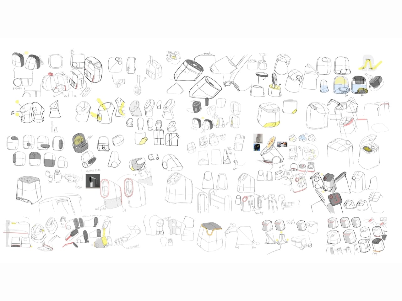
Puyager is a concept that does mix these two seemingly different worlds together in a harmonious manner and with a compact design. Of course, it can’t just be a low, disc-shaped machine like most robot vacuum cleaners on the market. It would be too cramped to include the necessary parts for sucking in, filtering, and blowing out air. At the same time, however, a box or cylindrical design similar to typical air purifiers would be too bulky, not to mention unappealing for something that will be moving around your house.
The shape chosen for this robot is an egg or at least the top half of one. This allows the bottom section to still be that round shape that makes robot vacuums efficient in moving around while leaving enough room for electronics and air circulation. Unlike a simple dome, however, Puyager has a gap between the left and right halves of this egg, providing an outlet for clean air to be released. The top edge of this gap houses the touch-sensitive controls that let owners minimally operate the machine without having to reach for their phone.
The end result is a product that looks stylish and elegant, a perfect fit for any home. Even while stationary, Puyager looks like a piece of decoration more than an appliance, adding a bit of visual value whether it’s busy purifying the air or just idling. Admittedly, its performance in actually detecting poor air quality and rolling over there to clean it is something that still needs to be tested, but the design is definitely a good starting point for a more modern and more human-centric solution to air quality at home.

The post Sleek self-driving air purifier robot can go where it’s needed the most first appeared on Yanko Design.