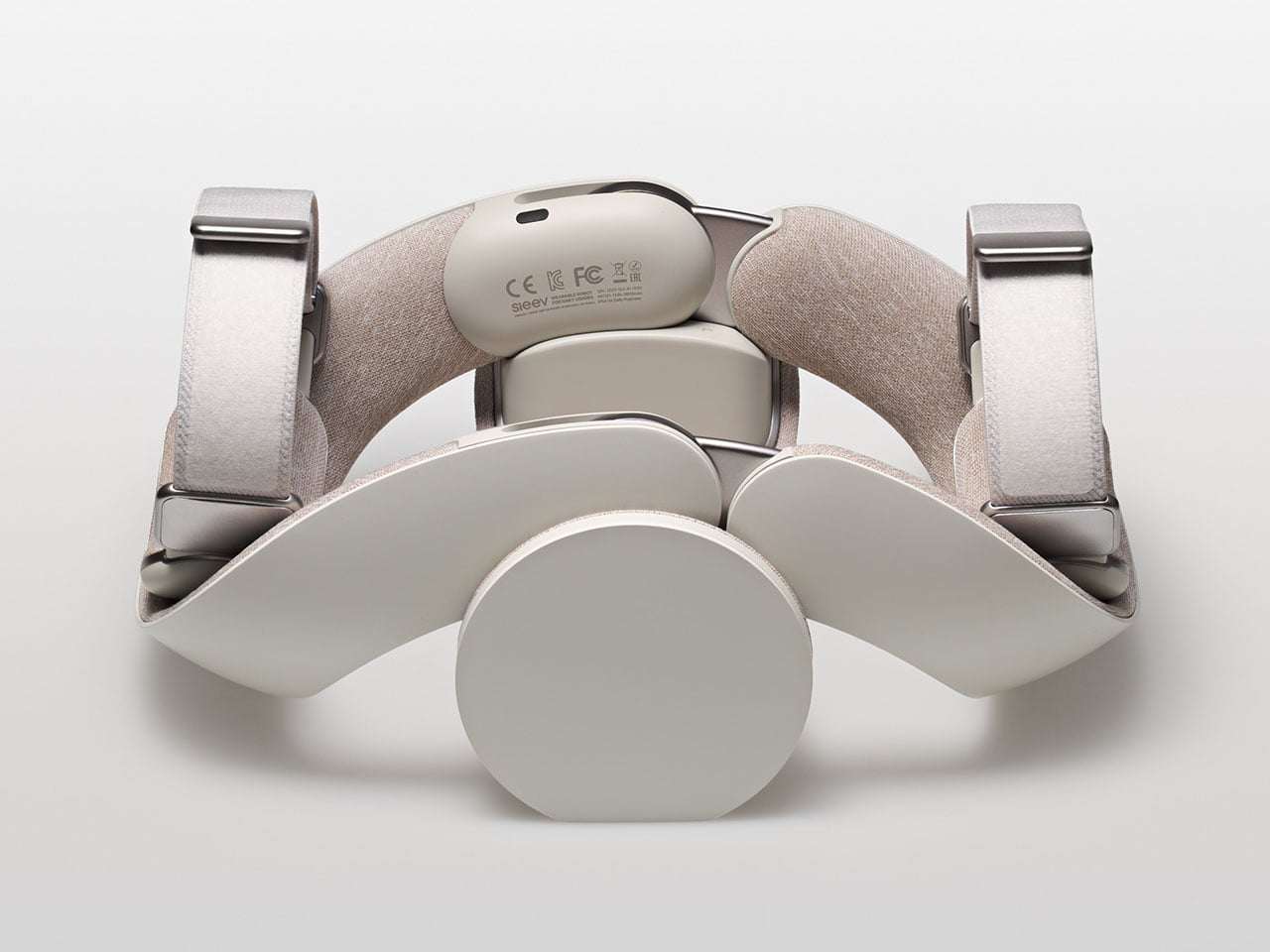
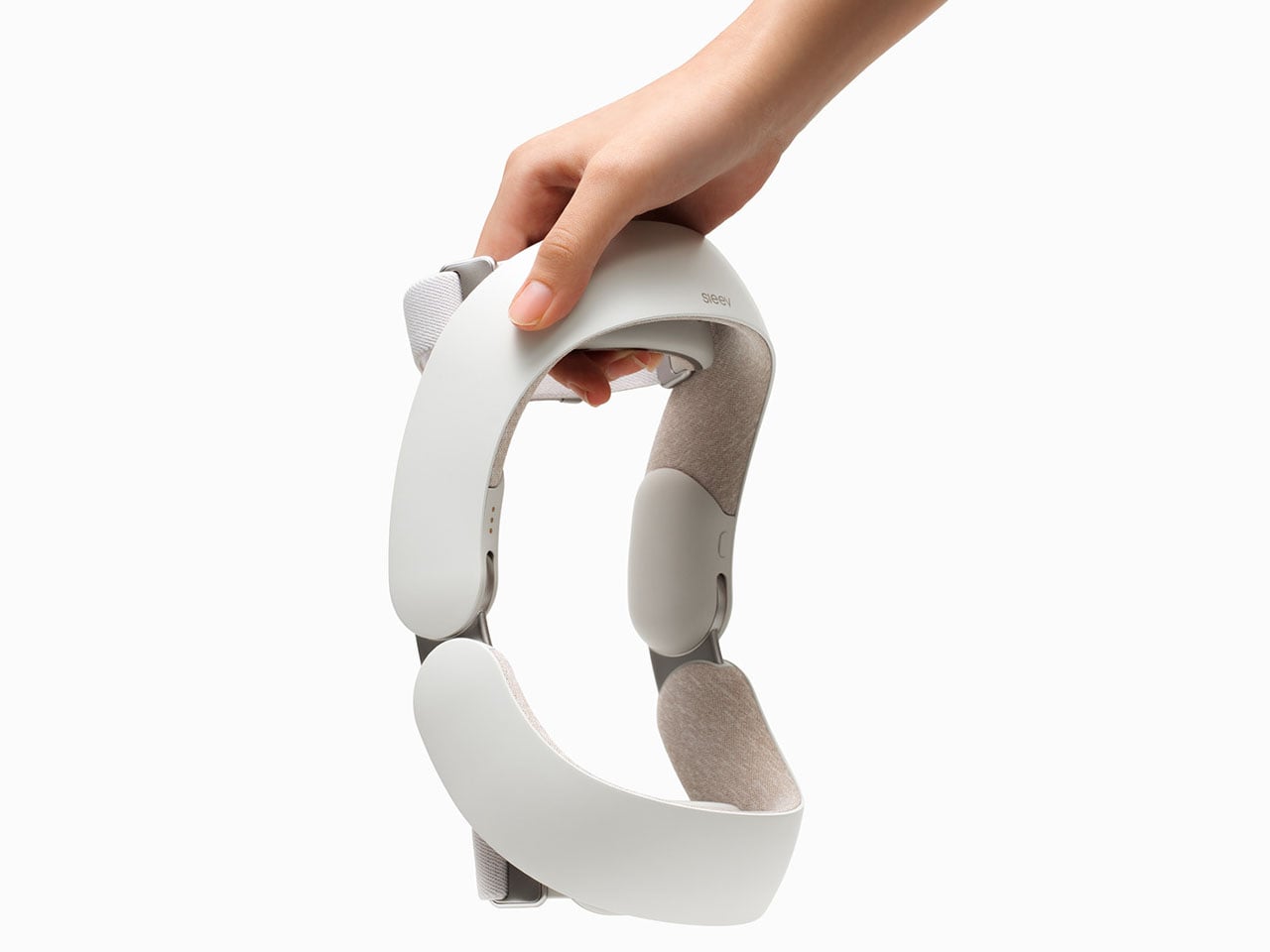
One thing exoskeletons have done right is help with motor rehabilitation. Of course, their size and weight have decreased over time, but most of those available are suitable for rehabilitation, load-bearing assistance, and similar purposes. However, they are not designed for daily wear. Not concentrating on the lower limb, which is a saturated market, a duo of budding South Korean designers has targeted the upper limb; creating a wearable robot that can be worn for daily usage.
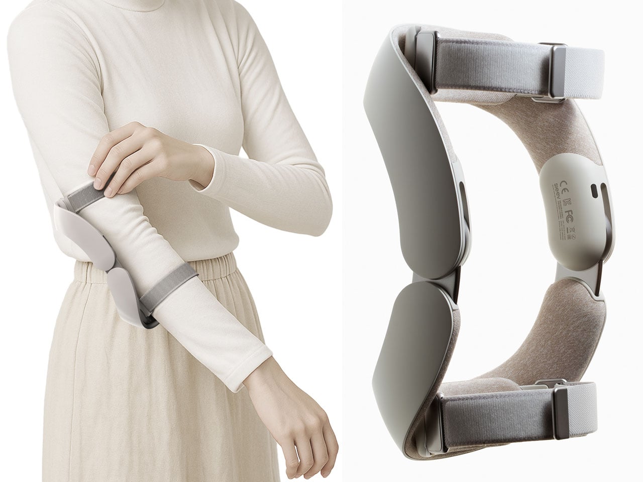
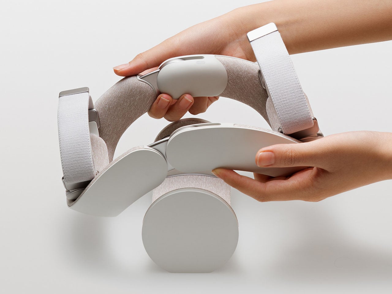
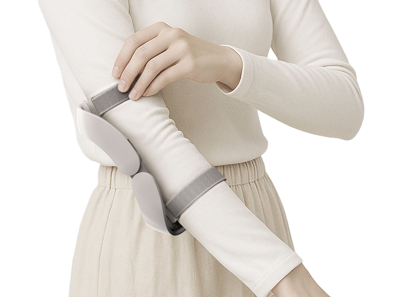
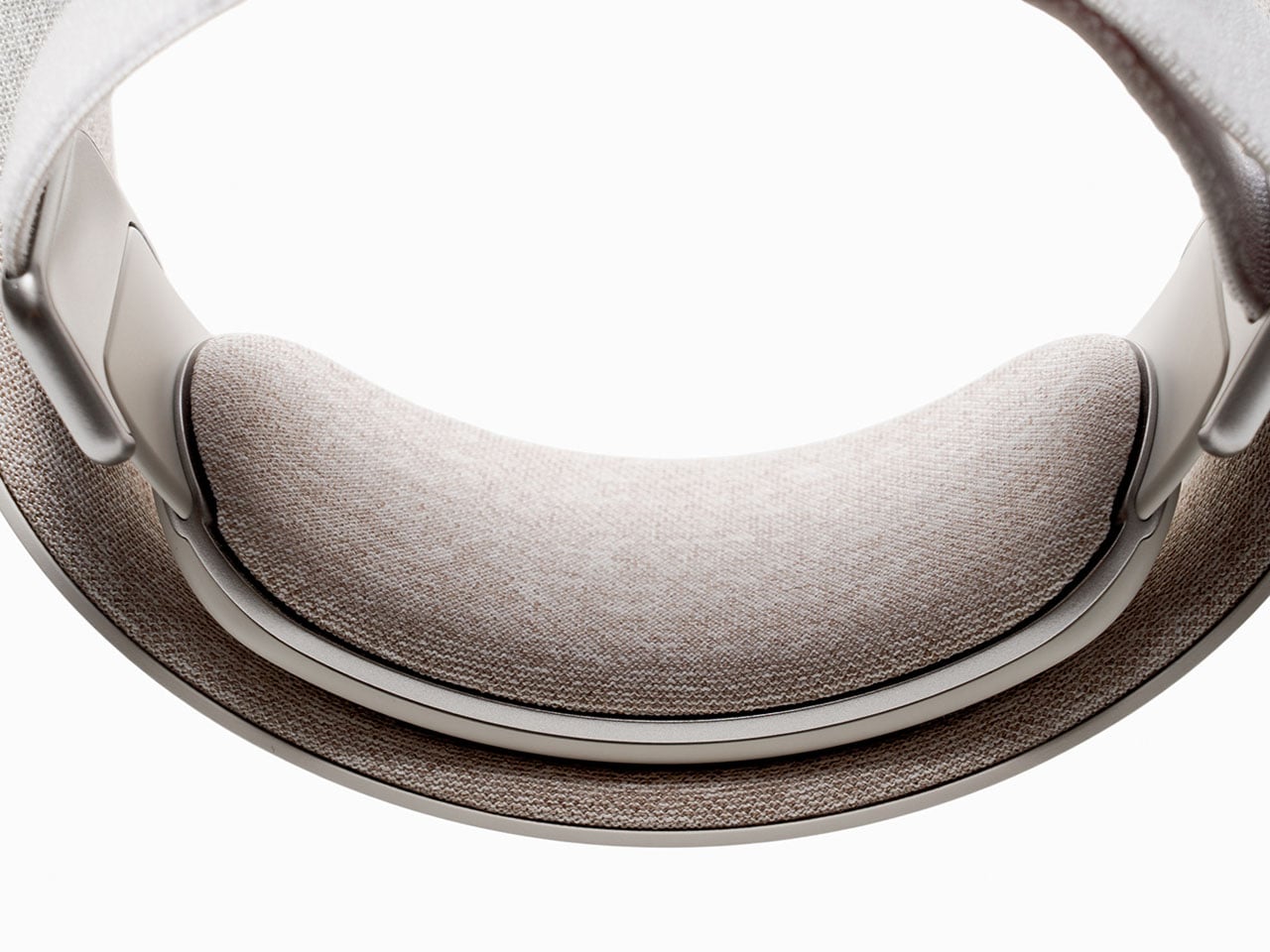
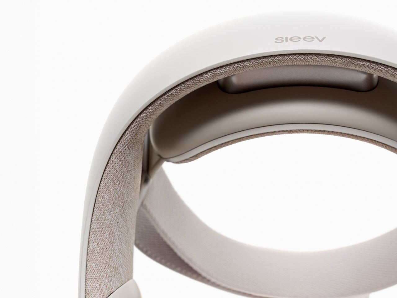
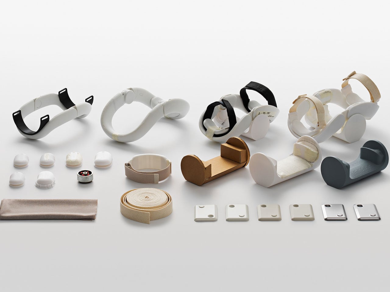
It’s called the Sleev. For now, it’s not far beyond the drawing books, but from how and what it’s projected to be built for, its God damn great solution for the purpose. Sleev is designed as a daily upper-limb exosuit (wearable robot). It supports independent arm movement and is effortless to wear and remove: just one hand, no more!
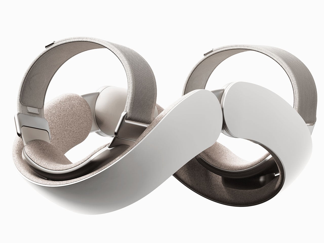
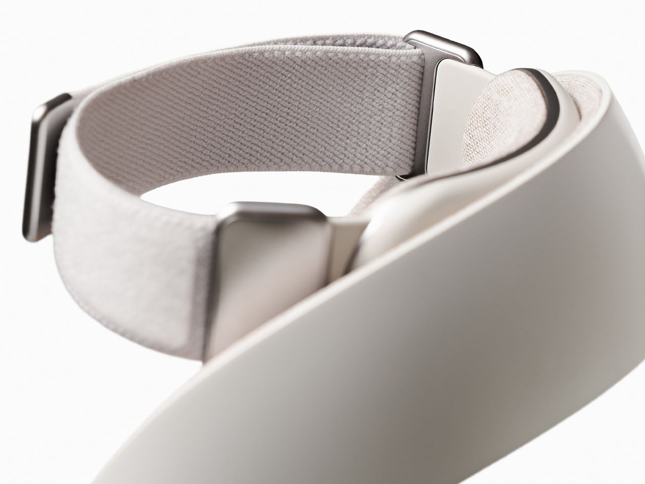
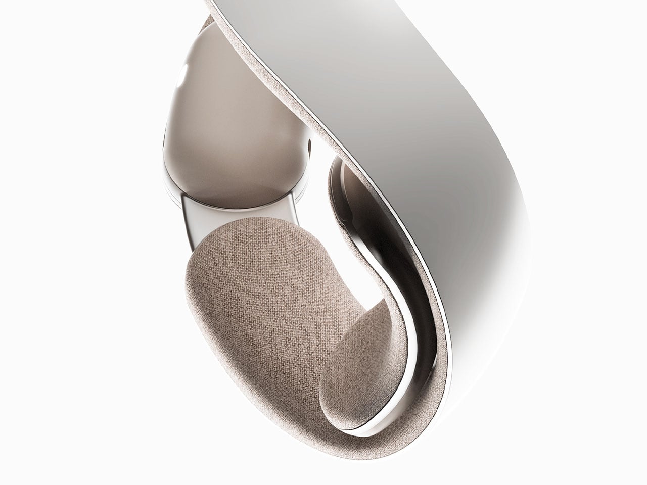
It’s not that we are seeing a robotic assistant for the arm for the first time. The market is flooded with iterations of bulky and inconvenient wearable robots that are designed with a great level of technological input and robotic sensors, but somehow make the wearer feel like a cyborg. With its sleek and lightweight limb, the Sleev is conceptualized to change that for a robotic assistant that you would like to wear. It can be strapped on like any other elbow brace to provide assistance in its movement. In addition to being a crucial option for people recovering from stroke or sports injury, the Sleev (for its design and attractive appearance) will augment daily tasks like lifting and carrying; you will like wearing it when carrying a baby for a long time or doing groceries and have a lot of packets to carry back home.
As a wearable robot conceptualized to integrate exoskeletons into our daily life, the Sleev is also strong and intelligent enough to support with rehabilitation activities. To ensure this, the design is integrated with FMG (force myography), a method that detects movement intentions through muscle pressure. The muscle pressure is different in people based on their gender, height, weight, and age. So, for the data accuracy and for the correct functioning of the wearable robot, this information about the users will be necessary. And a larger database will ensure better results, the designers believe.
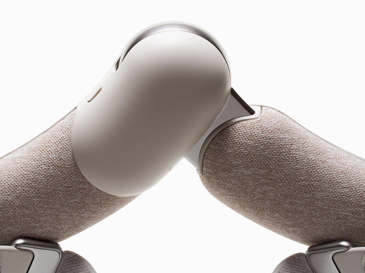
Collaborating FMG with IMU sensors, the designers suggest, they can allow the algorithm to know where the user intends to move and help them with it accordingly. Both these sensors are affordable and commonly used in game controllers, so they should not be overly expensive when Sleev can find itself into mass production. Interestingly, it relates its movements based on muscle strength and intention. The Sleev doesn’t need to be worn directly on the skin; users can wear it over a thin innerwear as well and go on with it during their daily activities.
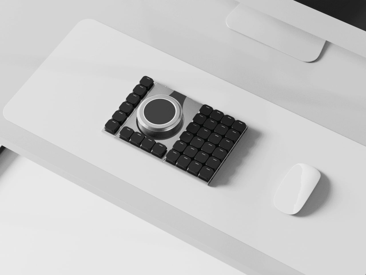
Most desks end up with a nice mechanical keyboard, a separate mouse, maybe a trackpad, a macro pad, and, if you work in 3D, a space controller, all fighting for room. Keyboards stay fixed layouts, even as workflows get more complex and tools multiply. Naya Connect treats the keyboard as the center of a modular workstation instead of just another rectangle, letting the rest of your input tools snap onto it and adapt as your work changes.
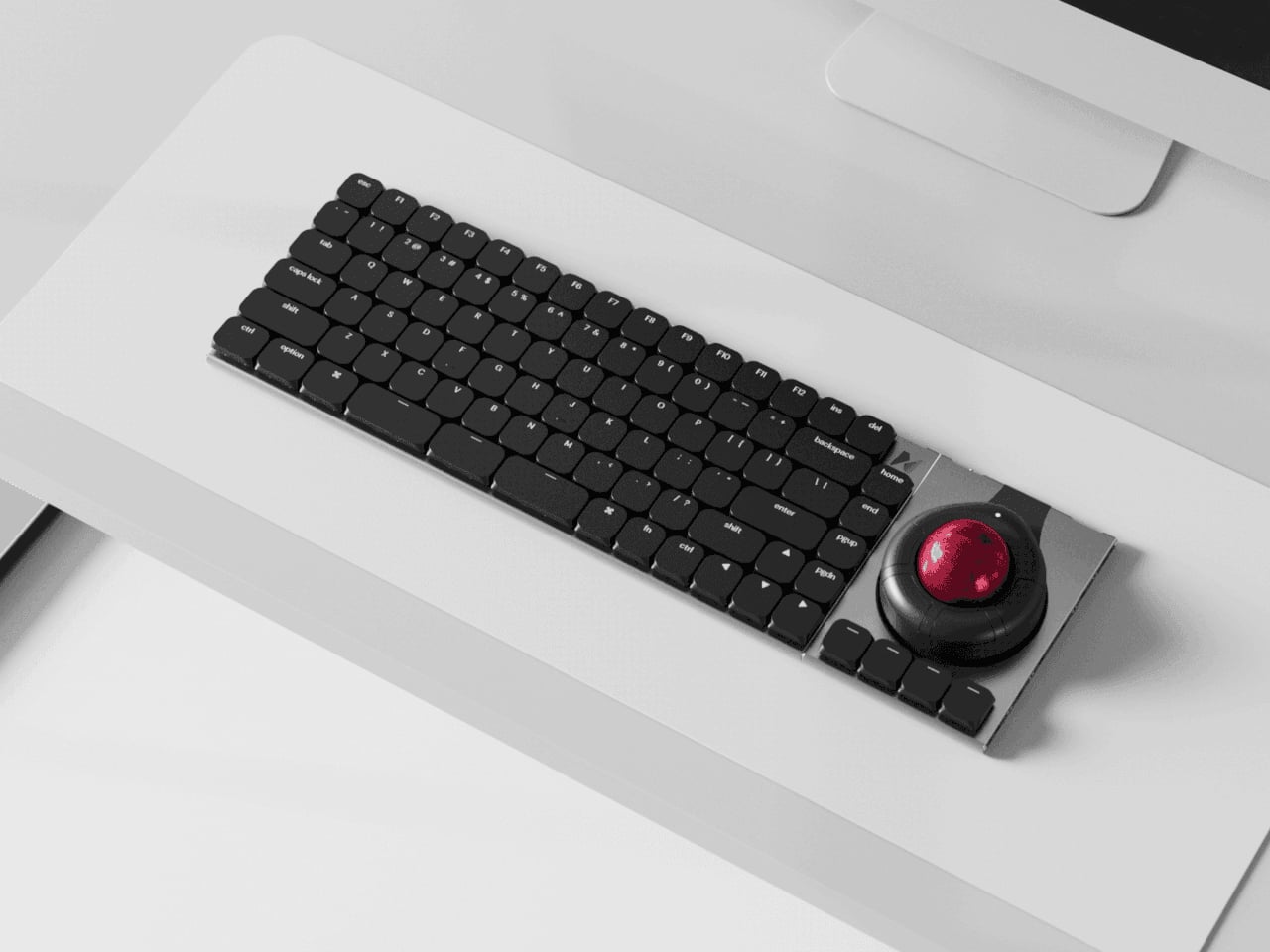
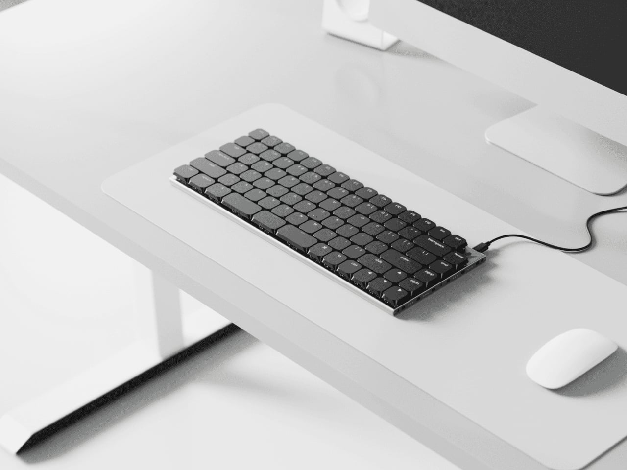
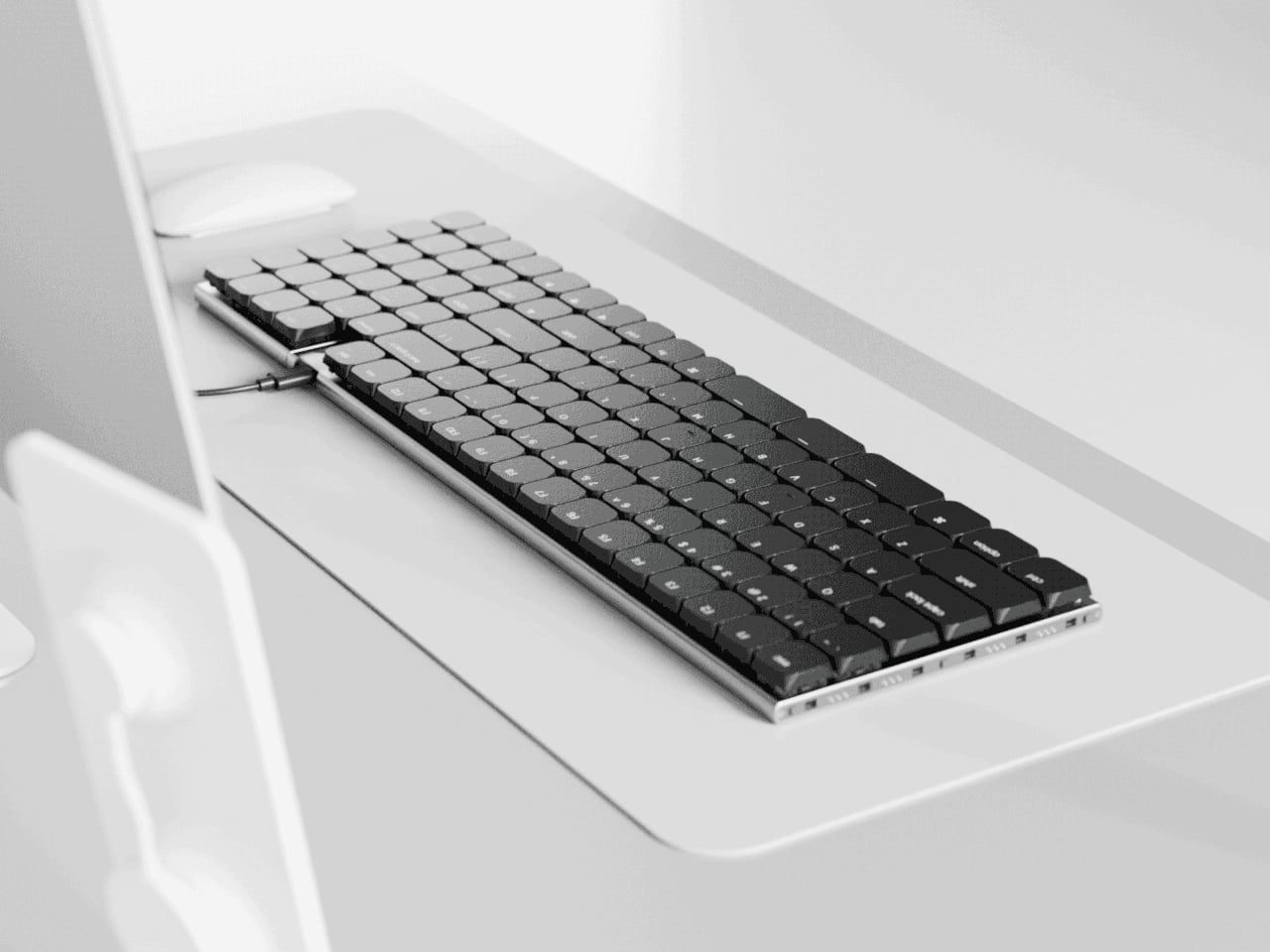
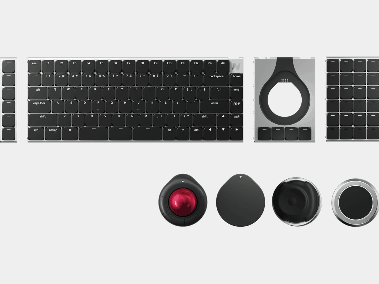
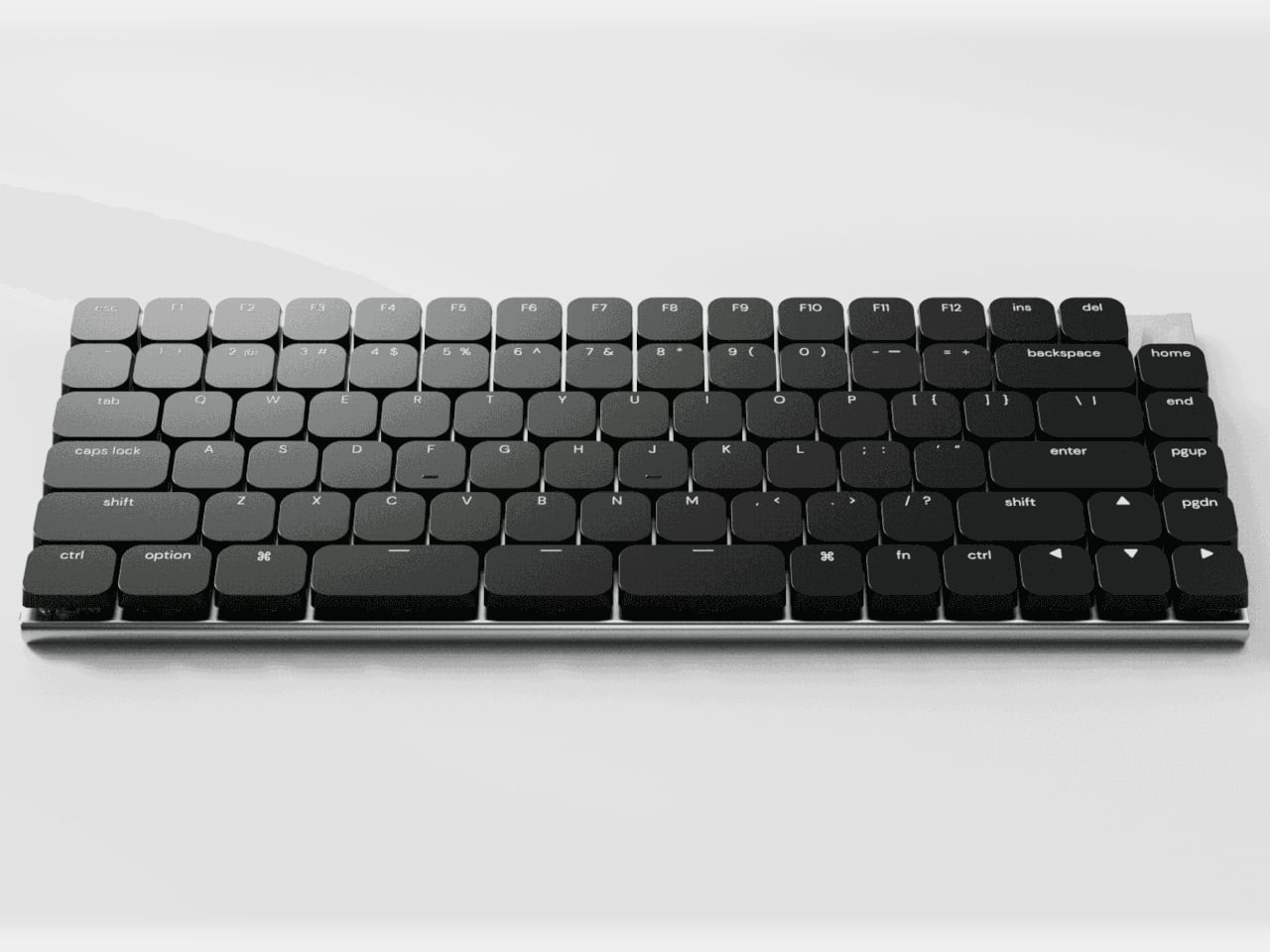
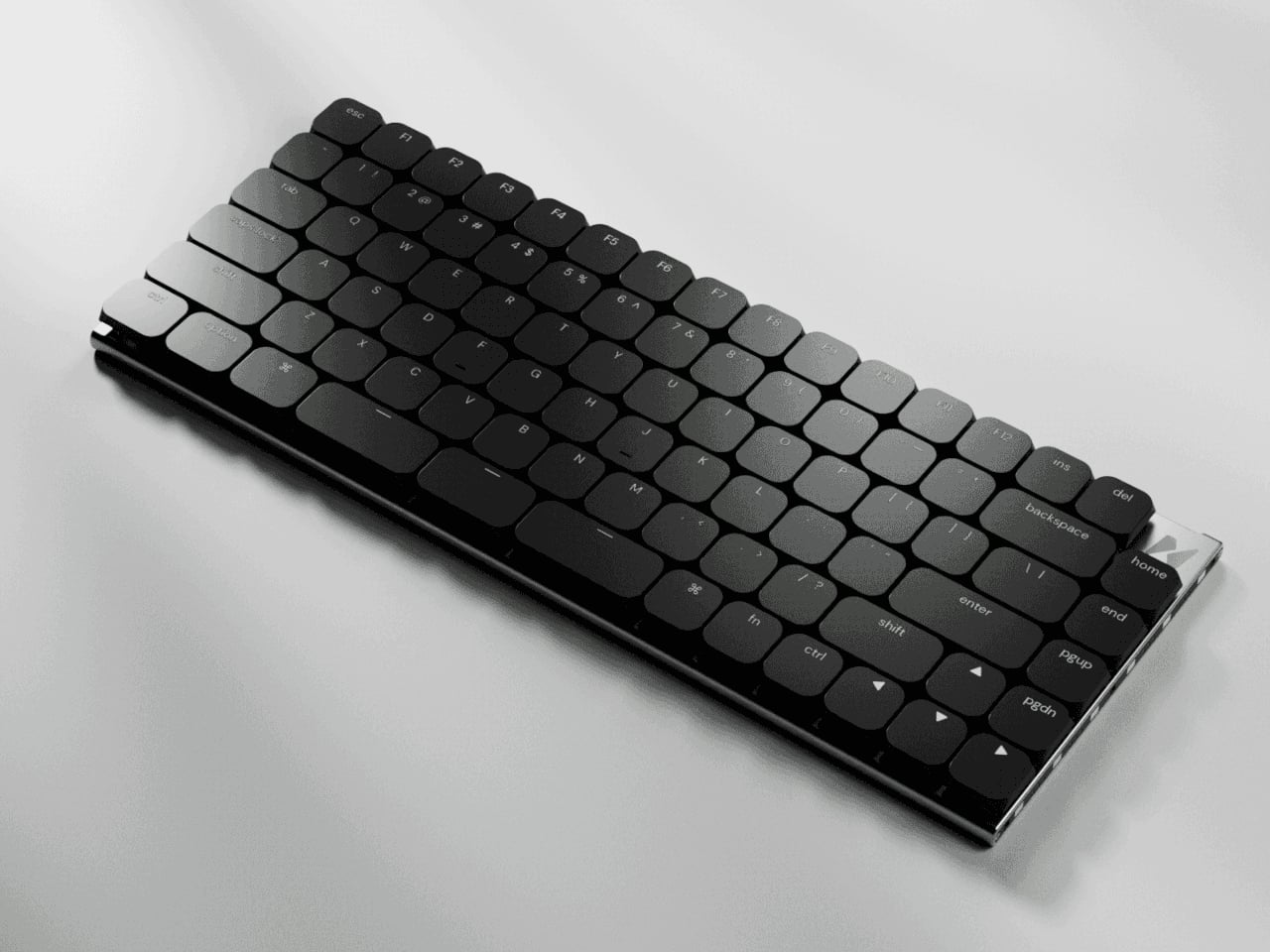
Naya Connect is a low-profile mechanical ecosystem built around the Naya Type keyboard and a dock. Naya Type is a slim 75% board with an aluminum body, Kailh Choc V2 switches, and a 14.9 mm profile, designed to be wireless when paired with the dock. The interesting part is not the layout, but what can snap onto it, a family of input modules that attach magnetically and talk to the same software layer.
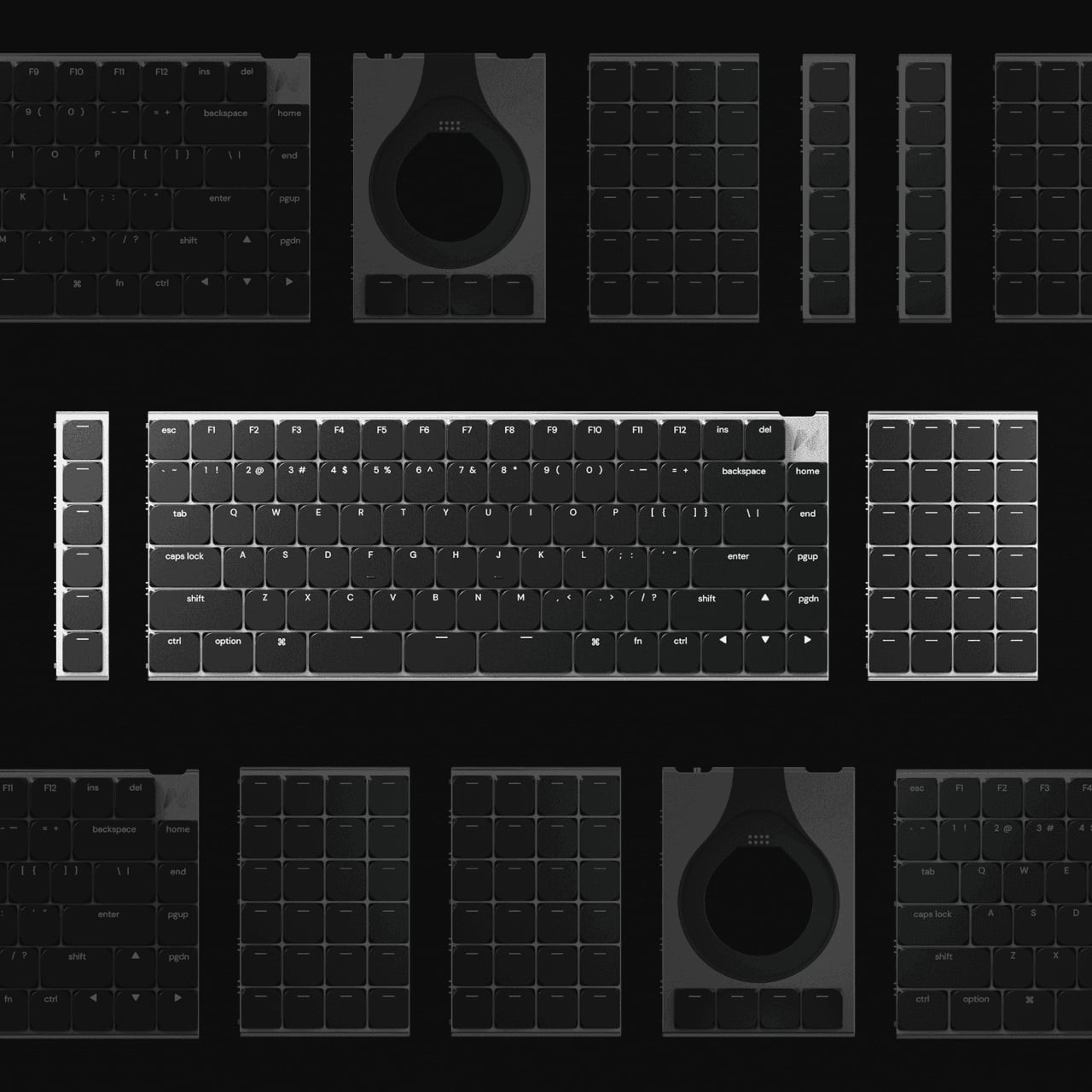
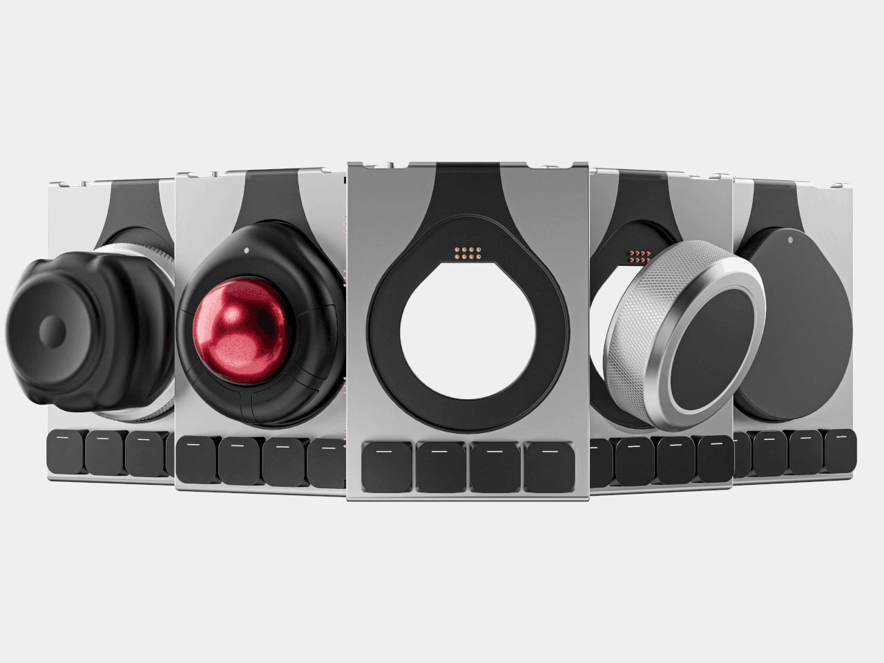
The keyboard and dock have magnetic connection points on both sides, letting you attach modules wherever they make sense. You can add a Multipad as a numpad or macro pad, a six-key strip for extra shortcuts, or build a full console by chaining modules along one edge. The system grows sideways with your workflow instead of forcing you into a single configuration that never quite fits once your needs shift or projects change.
The modules cover different input modes. A Multipad acts as a numpad or macro grid, a six-key strip handles quick actions, a Track module replaces a mouse with a trackball, a Touch module works like a compact touchpad, a Tune dial offers dynamic haptics for scrubbing timelines or adjusting values, and a Float puck gives six degrees of freedom for 3D navigation and camera control.
The hardware only works because the software is flexible. Naya Flow is the configuration app that lets you remap keys, tune module behaviour, and build complex logic with drag-and-drop tools. You can set per-app profiles, change how the Tune dial feels depending on what you are doing, and decide what each touch zone or trackball gesture should trigger, without writing scripts or diving into config files.
The aluminum body, low-profile keycaps, and clean black aesthetic keep the keyboard from looking like a science project, even when it is covered in modules. The modules share the same design language, so a trackball, dial, and macro pad feel like parts of one system rather than a pile of mismatched gadgets. The result is a desk that looks intentional even when it is heavily customized and adapted to very specific tasks.
Naya Connect is aimed at people who live in code editors, timelines, spreadsheets, or 3D scenes all day and want input tools that can evolve with their work. It is not trying to be a mass-market keyboard. Instead, it’s trying to be a platform that grows and reconfigures as often as the projects do, without asking you to keep buying entirely new peripherals or cluttering the desk with orphaned tools.
Finding a gift that arrives quickly without screaming “panic purchase” requires more than fast shipping. The best last-minute presents carry weight beyond their delivery speed—they reflect care through considered design, quality materials, and the kind of details that suggest you’ve been thinking about the recipient all along. These aren’t placeholder gifts. They’re objects that tell a story about taste, intention, and understanding what someone actually values.
The designs featured here share a quiet sophistication that transcends their availability. Each piece balances immediate gratification with lasting presence, turning a compressed timeline into an advantage rather than a compromise. From Japanese craftsmanship to innovative functionality, these gifts feel curated, not rushed. They’re the kind of presents that make people ask where you found them, never when you ordered them.
1. FoldLine Pen Roll
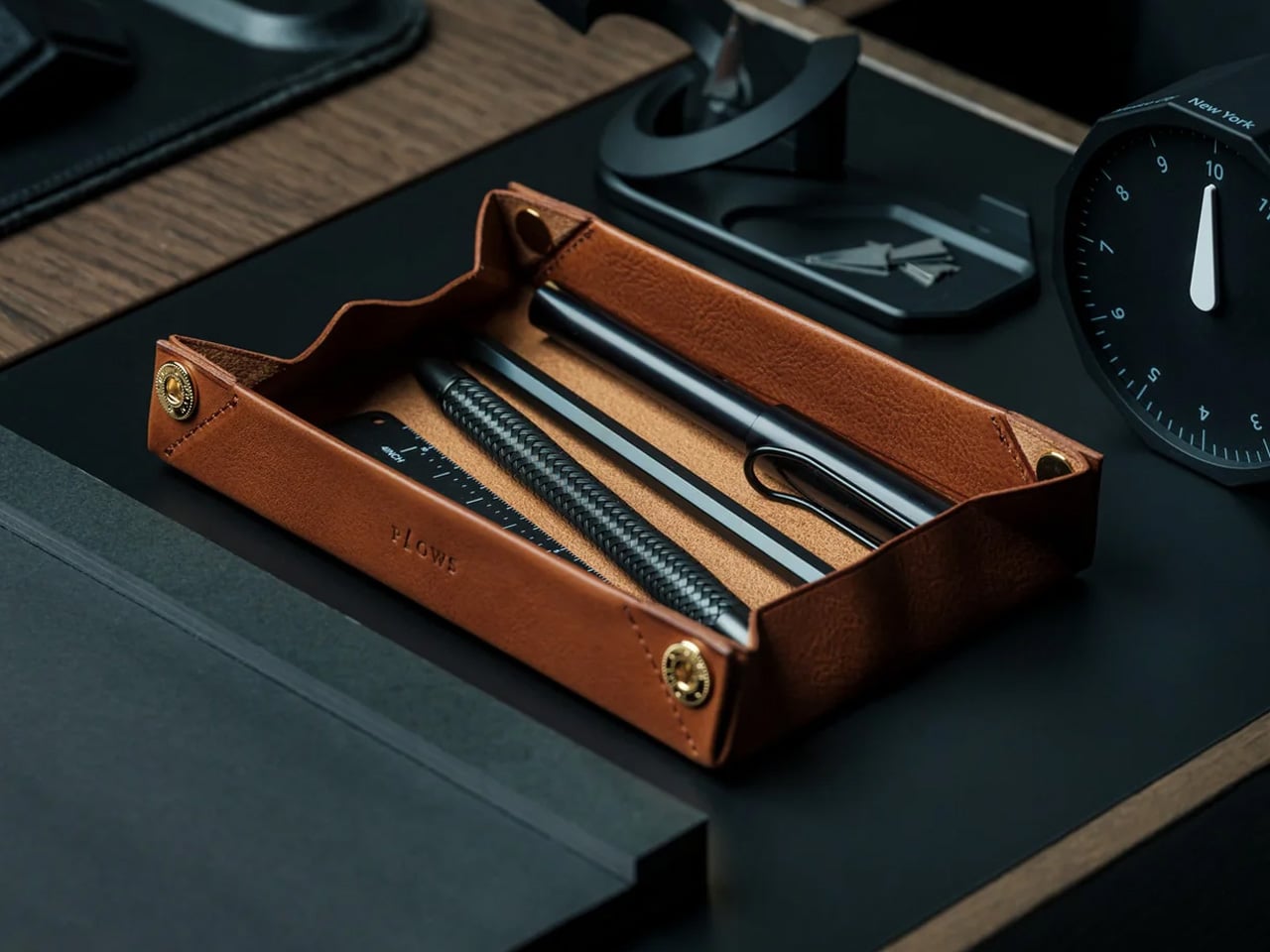
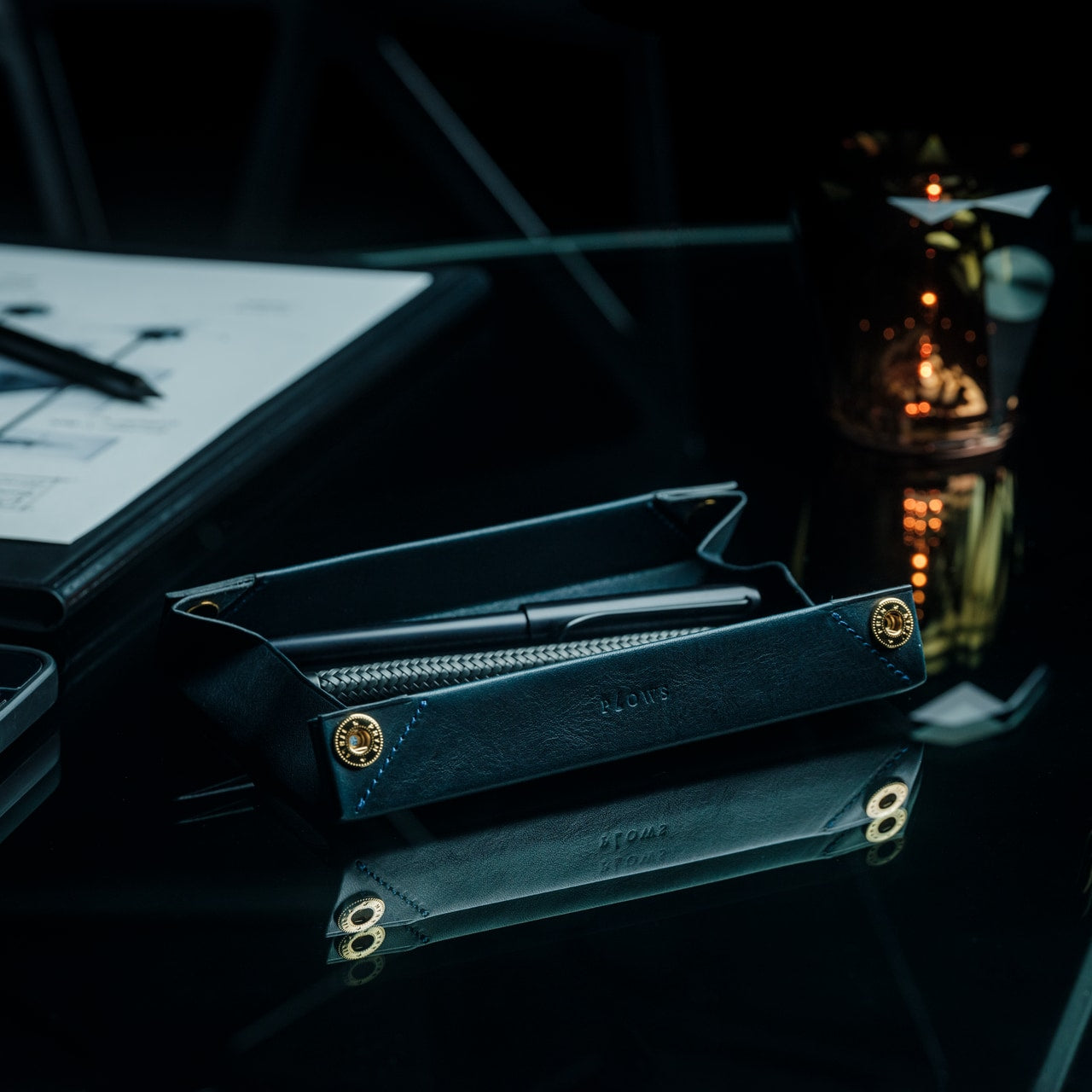
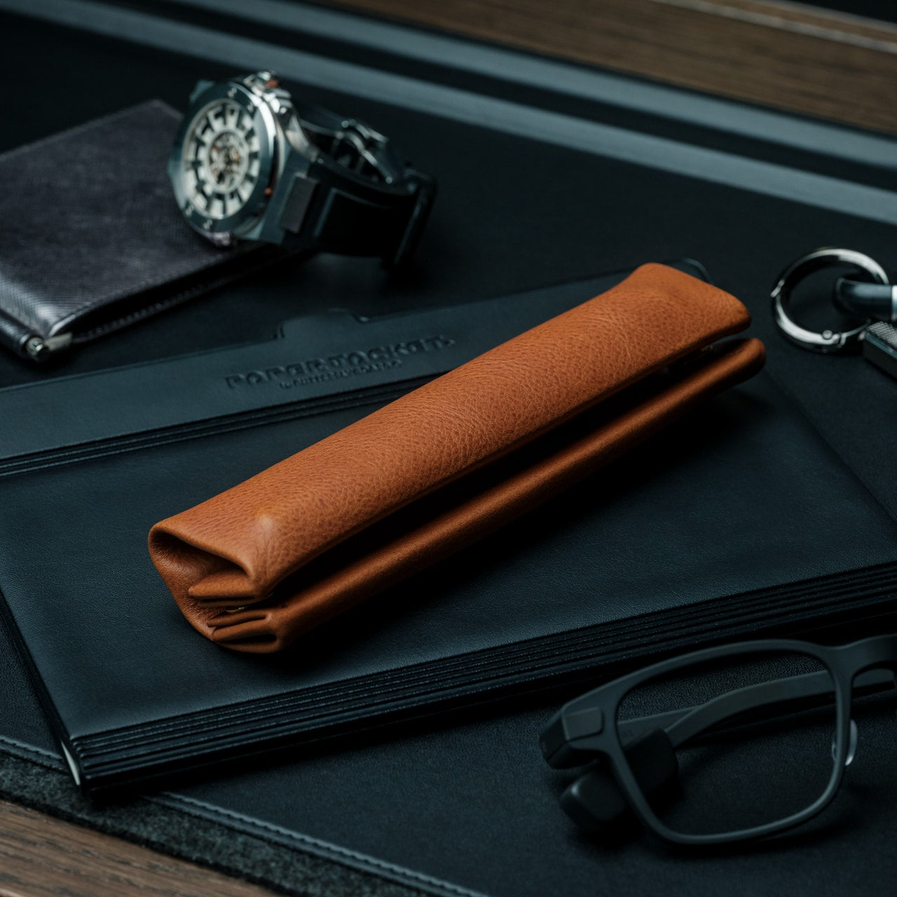
The ritual of writing deserves more than a cluttered pencil case. This leather pen roll transforms from compact storage into an instant workspace tray, giving anyone who thinks through their hands a moment of calm before the first mark hits paper. Made from single-piece Italian vegetable-tanned leather, it cradles writing instruments without rattling or scratching, creating separation through intelligent folding rather than bulky dividers. The design feels meditative—unzip from either side, unfold in two seconds, and suddenly any coffee shop counter becomes a defined creative zone.
What makes this gift feel intentional is how it anticipates the recipient’s actual needs. The hollow interior remains slim even when fully loaded, allowing it to slip into bags without adding bulk. The machined Italian snap closure delivers that satisfying tactile click that premium objects should. Over time, the Minerva Box leather from Badalassi Carlo tannery develops a patina unique to its owner’s habits, aging beautifully rather than simply wearing down. For writers, artists, or anyone who carries their tools with purpose, this feels less like an accessory and more like an extension of how they work.
The origami-inspired folding mechanism creates a tray without adding bulk to the closed form.
Single-piece leather construction eliminates internal stitching that could damage the pen’s finish.
Ambidextrous design opens cleanly from either direction for effortless access.
Natural vegetable tanning ensures the leather improves with age rather than deteriorating.
What we dislike
The premium Italian leather and Japanese craftsmanship place it at a higher price point.
Limited capacity means prolific pen collectors might need multiple rolls.
2. StillFrame Headphones
Listening becomes physical again with headphones that bridge the gap between intrusive over-ears and tinny earbuds. The StillFrame design pays homage to the era when albums came in jewel cases, and playlists required intention, translating that 80s-’90s geometry into a featherlight on-ear experience. At just 103 grams, they disappear physically while the 40mm drivers expand the soundstage into something you can almost walk through. This is music as landscape rather than background noise, perfect for anyone who still believes albums deserve to be heard in order.
The thoughtfulness reveals itself in adaptable features that respect how people actually move through their days. Active noise cancelling carves out solitude during commutes, while transparency mode keeps you connected during collaborative moments. The magnetic fabric ear cushions swap instantly—each set includes light gray and turquoise options alongside white, letting the listener match mood rather than trend. With 24 hours of battery life and both wireless and wired connectivity, these headphones refuse to choose between convenience and quality. They feel like a gift for someone whose relationship with music goes deeper than streaming algorithms.
The 40mm drivers deliver an open, spacious soundstage that brings detail to melodic layers.
The magnetic cushion system allows quick color changes to match different aesthetics or moods.
Hybrid wireless and USB-C wired connectivity accommodates both casual streaming and high-resolution playback.
Exceptional 24-hour battery life eliminates the daily charging routine.
What we dislike
On-ear design may feel less isolating than over-ear alternatives for some preferences.
The exposed circuitry aesthetic, while intentional, might not suit every style sensibility.
3. ClearFrame CD Player
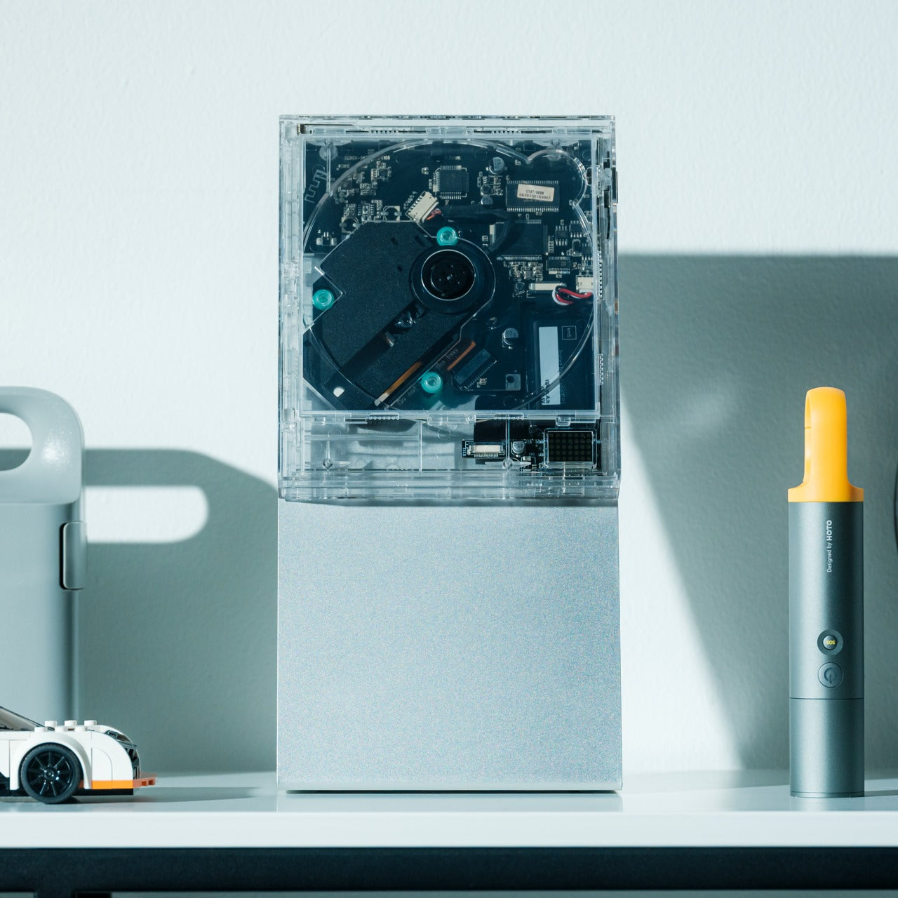
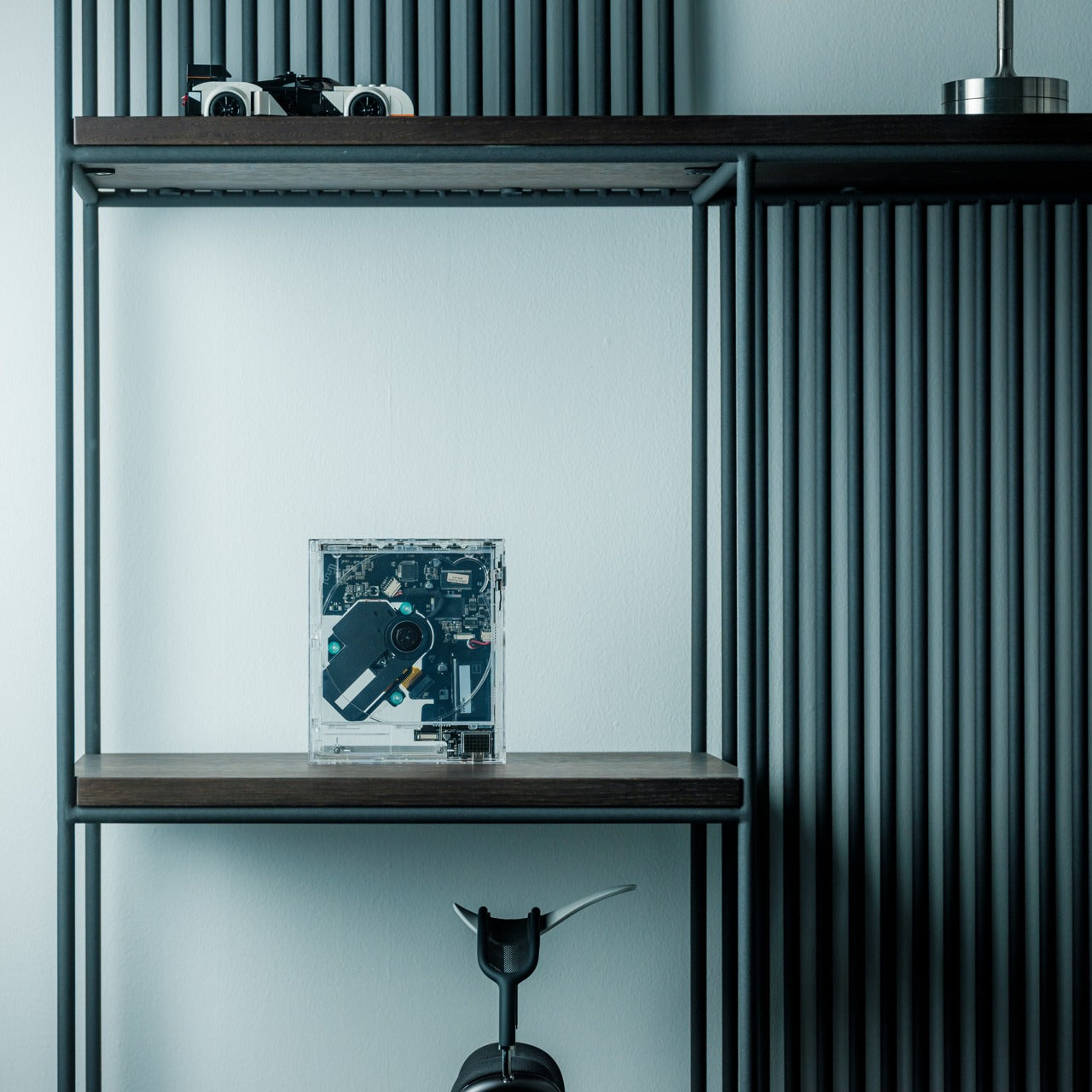
Physical media returns not as nostalgia but as a deliberate choice with a CD player that treats album art as essential to the listening experience. The transparent polycarbonate body frames each disc like a miniature gallery installation, with exposed black circuitry turning electronics into visible craftsmanship. This isn’t about abandoning streaming—it’s about reclaiming the ritual of selecting an album, seeing its artwork, and committing to the full experience. The square silhouette creates a display-worthy presence whether sitting on a shelf or mounted on a wall.
The design respects modern flexibility without sacrificing its analog soul. Bluetooth 5.1 connects to contemporary speakers, while the headphone jack accommodates direct listening. The rechargeable battery delivers seven to eight hours of portable playback, making it genuinely untethered from outlets. Multiple playback modes let you experience a full album, repeat everything, or loop a single track until it becomes part of you. For anyone who still owns CDs or wants to rediscover their collection, this feels like permission to care about format again. It’s a gift that validates the recipient’s belief that how you listen matters as much as what you hear.
Crystal-clear housing transforms the player itself into a visual display piece.
Exposed circuitry celebrates the engineering rather than hiding it behind plastic shells.
Bluetooth connectivity modernizes the format without requiring all-new equipment.
Wall-mount capability turns album covers into rotating artwork.
What we dislike
The 300-gram weight, while manageable, makes it less portable than pocket-sized digital players.
Playback limited to CD formats means no direct streaming integration.
4. Auger PrecisionMaster Grooming Set
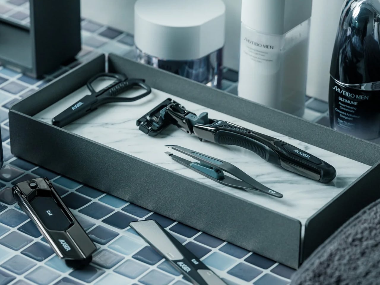
Grooming becomes a discipline rather than a chore when every tool performs with surgical precision. This all-black Japanese grooming set from Kai Corporation distills over a century of blade-making expertise into five essential instruments: razor, tweezers, scissors, nail file, and clipper. Each piece reflects the belief that self-care is self-mastery, turning daily maintenance into a quiet form of control. The aesthetics lean minimal and matte, avoiding flashy branding in favor of pure functional elegance. For someone who values preparation and presentation, this set says you understand that details matter.
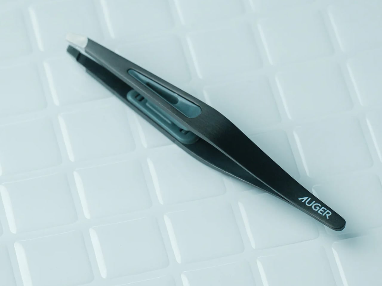
The engineering separates these from drugstore alternatives. The razor features a world-first 30-degree adjustable angle with a 3D pivoting head that follows facial contours even in reverse strokes. The tweezers include a patented stopper and ergonomic groove for pinpoint control. Ultra-thin curved scissors follow the natural lines of brows and beards with near-surgical finesse. The nail clipper’s rotating lever mechanism delivers cutting power with minimal effort, especially on thicker nails. Compact yet weighted, the entire set feels substantial without bulk. This is the gift for someone whose morning routine is deliberate, refined, and entirely under their command.
Kai Corporation’s 116-year blade-making heritage ensures professional-grade sharpness and durability.
The adjustable-angle razor accommodates different shaving techniques and hard-to-reach areas.
Patented mechanisms in the tweezers and clipper demonstrate genuine engineering innovation.
Cohesive all-black aesthetic creates a unified, sophisticated presence.
What we dislike
The precision-engineered components come at a premium compared to basic grooming tools.
Learning to use the adjustable razor features optimally requires some initial practice.
5. ZenFlow Personal Aroma Diffuser
Scent becomes portable and personal with a diffuser that treats aromatherapy as art rather than an appliance. The ZenFlow combines a handcrafted porcelain filter from a 180-year-old Japanese pottery house with a precision-engineered metal base, creating something that belongs on display as much as in use. The hybrid heat and airflow system disperses essential oils without water or mist, eliminating the mess and maintenance of traditional diffusers. Just two to three drops transform a 1.5-meter radius into a personal sanctuary, making this ideal for desks, nightstands, or any space that deserves its own atmosphere.
The design philosophy balances heritage with adaptability. Available in silver, gold, or black finishes—each with distinctive textures inspired by Japanese metalworking traditions—the diffuser complements minimalist, modern, or traditional interiors equally. Three modes adjust intensity: Normal for invigorating presence, Airflow for subtle background, ECO for energy-conscious extended use. The battery-powered portability means scent follows you rather than tethering you to outlets. Washable, reusable aroma plates eliminate disposable waste. For someone who curates their environment intentionally, this gift acknowledges that ambiance matters and offers them the tools to control it precisely.
Handcrafted Shibukusa Ryuzo porcelain filters bring 180 years of artisanal expertise to functional design.
Water-free operation eliminates refilling hassles and prevents mold or mineral buildup.
Portable battery design allows scent customization in any location without cord constraints.
Washable plates support sustainable, repeated use without replacement costs.
What we dislike
The 1.5-meter effective radius suits personal spaces better than large open rooms.
Premium materials and heritage craftsmanship position it above basic diffuser pricing.
6. AromaCraft Clothes Brush
Garment care becomes a sensory ritual with a brush that cleans while subtly scenting. Made by the Miyakawa Hake Brush Workshop—a family operation running since 1921—this tool combines traditional hand-planted white boar bristles with an innovative aromatic paper insert. Add a few drops of essential oil to customize the fragrance, then let each brush stroke remove dust and pollen while leaving clothes refreshed and subtly perfumed. The walnut wood handle, finished with shea butter, feels substantial and smooth, aging beautifully with regular use. This is the gift for someone who treats their wardrobe as an investment rather than an inventory.
The Tsubokuri method of bristle planting ensures longevity that machine-made brushes can’t match. Each bristle is individually secured, preventing shedding and maintaining consistent performance through years of use. White boar hair is firm enough to lift embedded particles from deep within fabric fibers yet gentle enough to protect delicate textiles. The aromatic element transforms functional maintenance into a moment of personalization—your favorite wool coat can carry hints of cedarwood, bergamot, or whatever scent centers you. For anyone who appreciates clothing that lasts, this brush extends garment life while making care feel less like labor and more like meditation.
Hand-planted bristles using century-old techniques ensure durability and prevent shedding.
Customizable aromatic paper insert allows personal scent preferences for each use.
White boar bristles balance effective cleaning with gentle fabric care.
Walnut and shea butter construction ages gracefully rather than degrading.
What we dislike
The artisanal construction process results in a higher cost than synthetic alternatives.
Aromatic papers require periodic replacement depending on usage intensity.
7. ClearMind Kendama
Focus finds form in a traditional Japanese skill toy that turns coordination into meditation. Crafted by Tokyo Kendama from solid walnut and maple, this isn’t childhood nostalgia—it’s a tool for building presence and breaking mental loops. The kendama’s simple challenge—catch the ball on the cup or spike—creates flow states that quiet mental noise better than scrolling ever could. Larger cups and an enlarged spike hole make tricks more achievable, building confidence through success rather than frustration. The unpainted wood develops character with use, gaining a patina that reflects your practice journey.
What makes this gift feel considered is how it offers an alternative to screen-based downtime. The unique bearing system prevents string twisting, maintaining smooth play without constant adjustment. The rough-textured surface and Japanese cowhide leather label add tactile richness that makes picking it up satisfying before you even attempt a trick. Each successful catch delivers a small dopamine hit earned through skill rather than algorithm. For someone seeking mindful breaks or creative challenges, the kendama becomes a desk companion that grounds rather than distracts. It’s permission to play with purpose, to build something through repetition, to find calm through focused movement.
Solid walnut and maple construction ensures durability while developing a unique patina over time.
Larger cups and tama holes increase success rates, making skill progression more rewarding.
Bearing system minimizes string twisting for smoother, more consistent play.
Natural materials and craftsmanship create an heirloom-quality feel.
What we dislike
The learning curve requires patience to master even basic tricks.
Unpainted wood may show wear marks more visibly than finished alternatives.
Finding Thoughtfulness in Urgency
The best last-minute gifts succeed because they contain stories worth telling. Each design here carries provenance—Japanese workshops with century-long legacies, innovative engineering that solves real frustrations, and materials that improve rather than degrade with time. These aren’t products rescued from generic bestseller lists. They’re objects that communicate care through their existence, regardless of when you discovered them. The compressed timeline becomes invisible when the gift itself holds weight.
What separates thoughtful from desperate is whether the gift reflects the recipient or merely fills space. The designs featured here offer enough specificity to feel personal—tools for writing rituals, listening experiences, grooming discipline, environmental curation, garment care, and mindful play. They suggest you understand how someone moves through their world and what they value in that movement. Speed of delivery never appears in the thank-you note. Quality, consideration, and alignment always do.
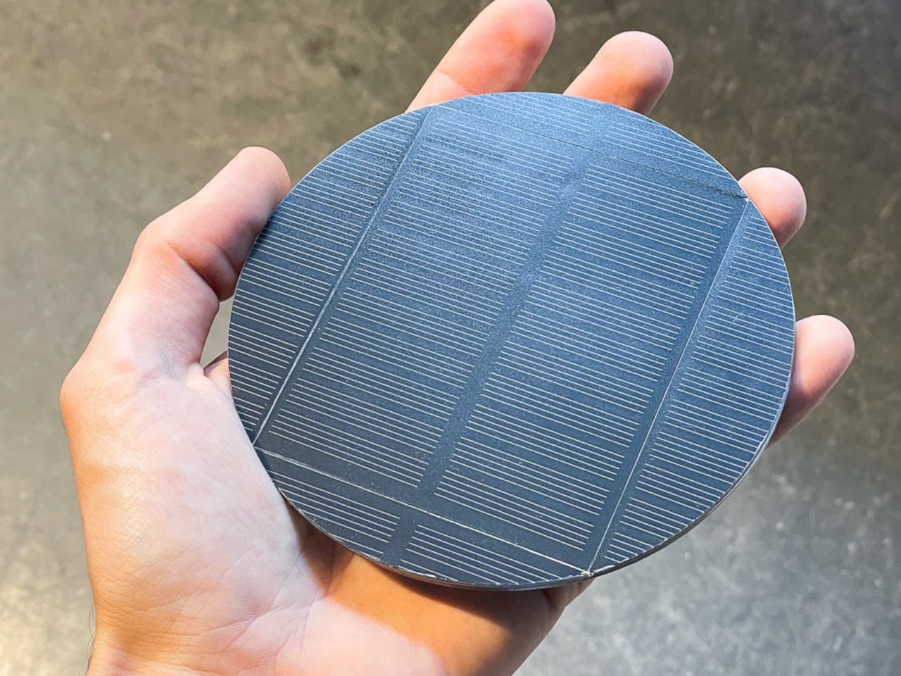
Solar power usually shows up as something big and remote, panels on roofs, fields of photovoltaics, or chunky outdoor lanterns that live on balconies. Very little of it feels like part of everyday indoor life. Nomad is a portable solar lamp that tries to shrink that idea down to the scale of a desk or bedside table, making daylight into a small daily habit instead of infrastructure you install and forget about.
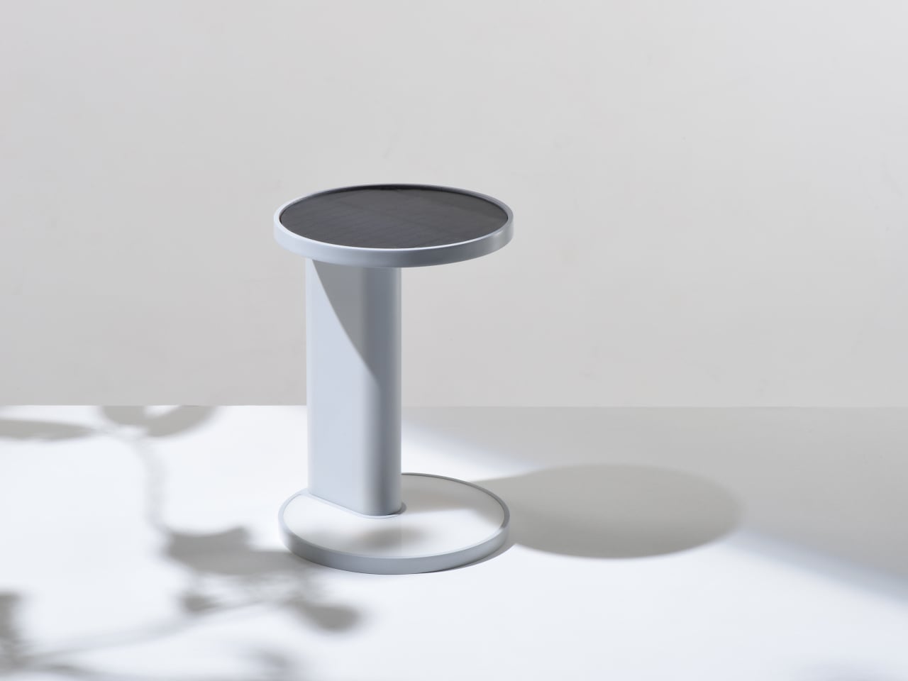
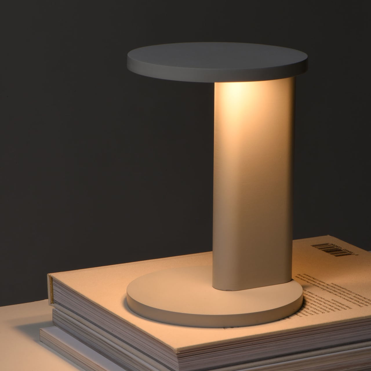
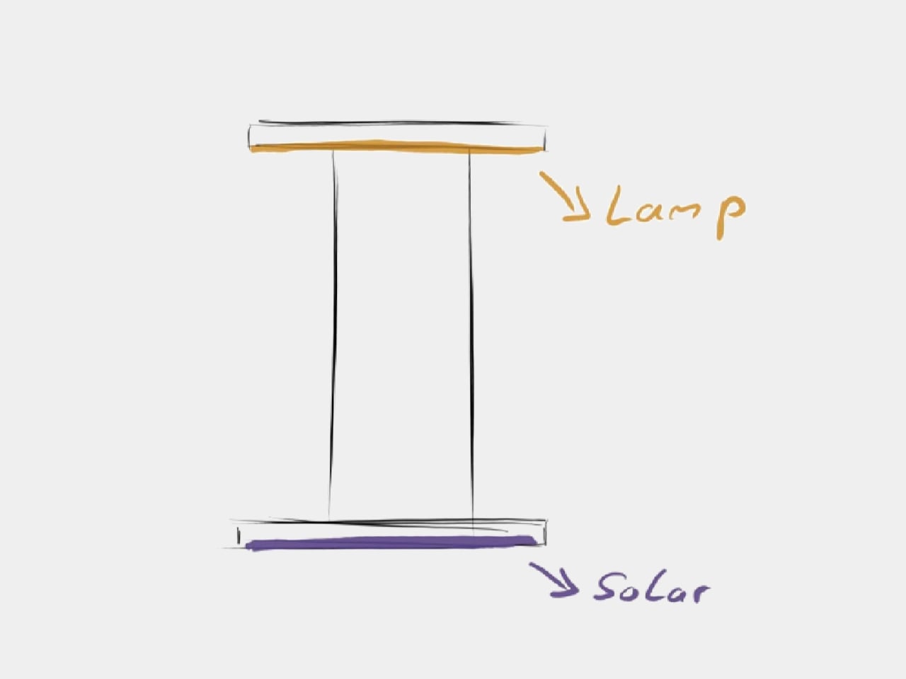
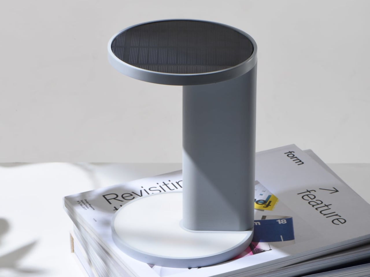
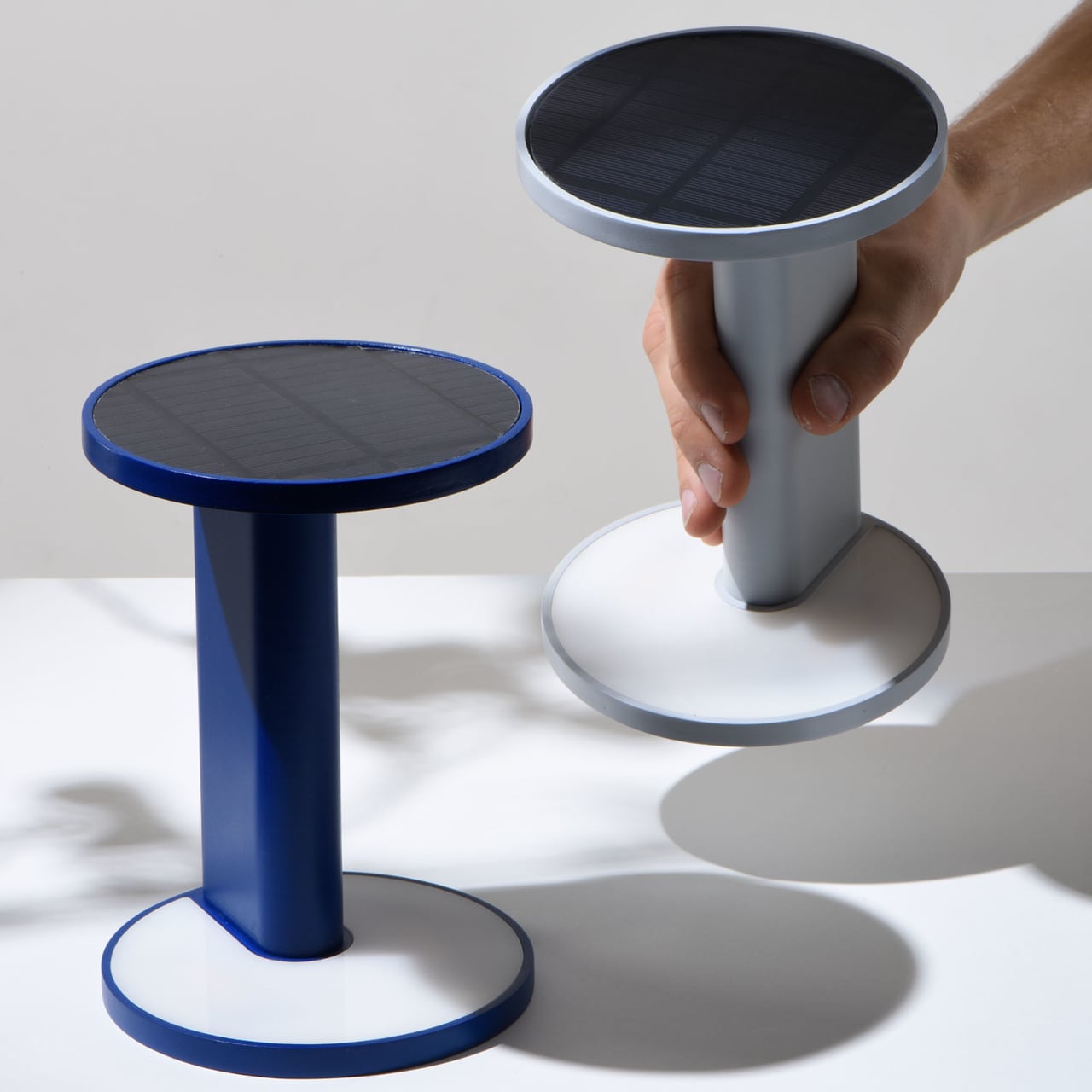
Nomad is a portable solar lamp charged indoors by natural light, with a symmetrical shape understood like an hourglass. Turning the lamp over switches between two modes, solar charging and ambient lighting, and this flip is the only real interaction. The lamp becomes its own panel and its own shade, depending on which disc is facing up, so the ritual of using it is also the ritual of charging it.
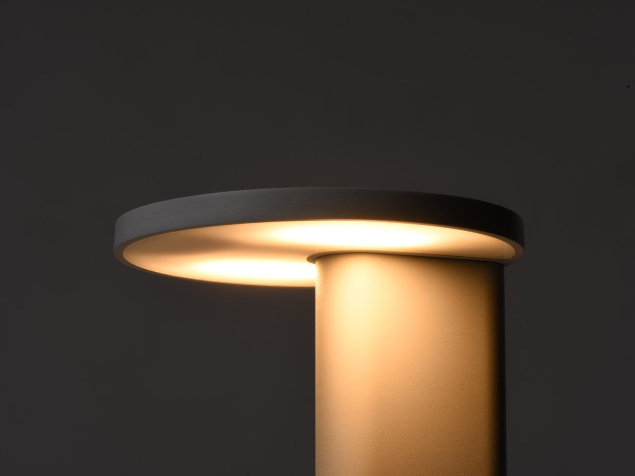
In charging mode, the solar panel disc faces upward, and the lamp stands on its light-emitting base, soaking up whatever daylight the room offers. In lighting mode, you flip it so the light disc faces up and the panel becomes the base. There is no separate switch; the act of turning the object over is how you decide whether you are storing light or spending it, which makes the interaction feel almost automatic after a few days.
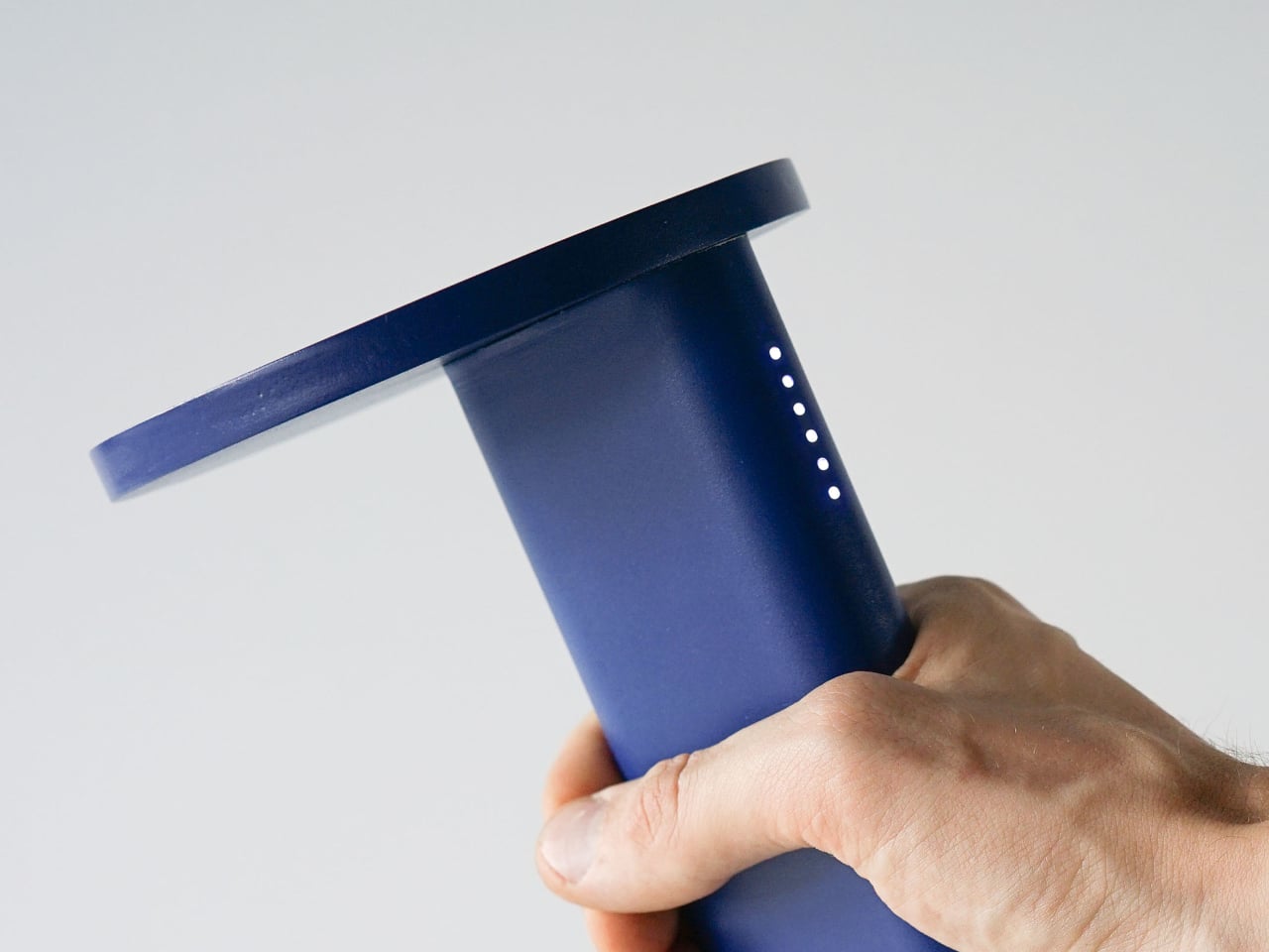
The subtle LED display on the side of the column is a vertical row of dots that visualizes the light quality in a room. In charging mode, more or brighter LEDs mean better solar potential. This invites you to move the lamp around, onto a windowsill, a stack of books, or a shelf, and see where it charges fastest. Over time, you build a mental map of where your home is secretly good at catching sun.
The visual language is a matte-finished column and two discs in muted colors like light grey and deep blue, with the solar panel flush in one disc and a warm, diffuse light in the other. The lamp looks more like a small side table or plinth than a gadget, which matters if it is going to live in a living room. The tech is present but quiet, so it can sit on books or a credenza without shouting solar device.
Nomad is an autonomous object that draws on solar energy, a freely available, sustainable resource, and makes it usable on a small scale for indoor use. It is not trying to power your house; it is trying to power itself. That autonomy means you can have a pool of warm light in the evening that owes nothing to the grid, just to where you left the lamp during the day and how well the sun reached it.
Nomad quietly reframes daylight from background condition to something you can actively harvest and read. Instead of an app full of charts, you get a lamp you flip and carry, and a line of LEDs that tell you when you have found a good spot. It is a small, almost toy-like way of making solar feel tangible indoors, turning the light already in your home into a resource you can actually use instead of just measuring it on a weather app.
Getting a laptop or tablet onto a TV or projector usually involves digging for the right cable, switching inputs, or wrestling with built-in casting that drops connections at the worst moment. This happens in meeting rooms, classrooms, and living rooms, turning simple screen sharing into a minor technical puzzle. A small, dedicated wireless bridge feels like a relief when it just works without software or setup rituals that waste five minutes before anything appears.
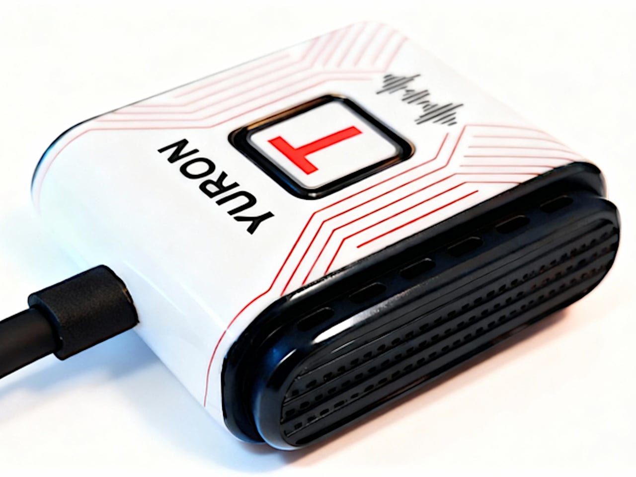
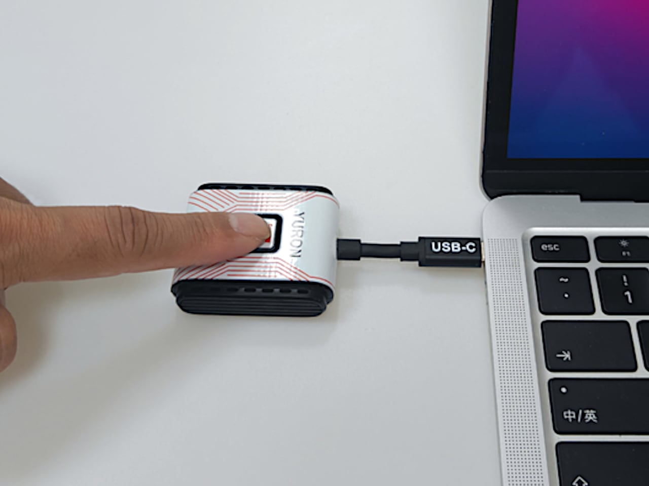
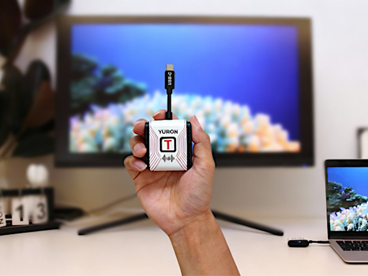
YURON is a plug-and-play 4K transmitter and receiver pair that lives in a bag or drawer until needed. One end plugs into a device over USB-C or HDMI, the other into a display’s HDMI port, and the link comes up automatically over its own 5G Wi-Fi connection. No apps, no pairing, no joining a network, just a direct path for video and audio that starts working the moment both sides power on.
YURON handles 4K 60 Hz HDR10 video up to 45 m, using H.265 compression, adaptive 5G Wi-Fi, and error correction to keep the picture smooth. It is fast enough for presentations, movies, and casual gaming, with audio and video traveling together, so there is no awkward lag. The point is to make the wireless link feel as transparent as a cable, without the cable running across the floor or desk.
Walking into a meeting room or classroom, you plug the receiver into the display once, then let different laptops or tablets take turns with the transmitter. YURON supports both mirror and extended modes, so someone can present slides on the big screen while keeping notes or chat on their own display. The 45 m range means it works in larger rooms without needing to huddle near the projector.
In a living room or dorm setup, a laptop, handheld console, or streaming box can send 4K content to a TV without an HDMI run. The low latency and 60 Hz refresh make it comfortable for games and sports, and the lack of app dependencies means guests can plug in and share videos or photos without installing anything. It becomes a quiet upgrade to movie nights and couch sessions.
The one-click control lets you cut the link instantly from the transmitter, useful when switching between apps with sensitive content or when you want to check something privately before sharing it again. A single receiver can pair with up to eight transmitters, with a button press cycling through them. In a studio, office, or classroom, multiple people can share the same screen without swapping cables or logging into accounts.
The hardware is compact and light enough to live on a key shelf or in a laptop sleeve, with a USB-C port that supports up to 100W Power Delivery, so a laptop can stay charged through the same connection. The internal cooling design, with multiple thermal zones and ventilation holes, keeps performance stable during long 4K sessions. It is the kind of detail that makes a small device feel engineered rather than improvised.
YURON turns screen sharing from a minor technical hurdle into something almost invisible. Instead of planning around cables or hoping a TV’s casting feature cooperates, you plug in a small pair of devices and treat any display as if it were directly connected. For people who move between work, study, and play, that kind of quiet reliability is often what makes a tool worth keeping in the bag, especially when the alternative is fumbling with adapters or explaining why the screen is still blank three minutes after the meeting was supposed to start.
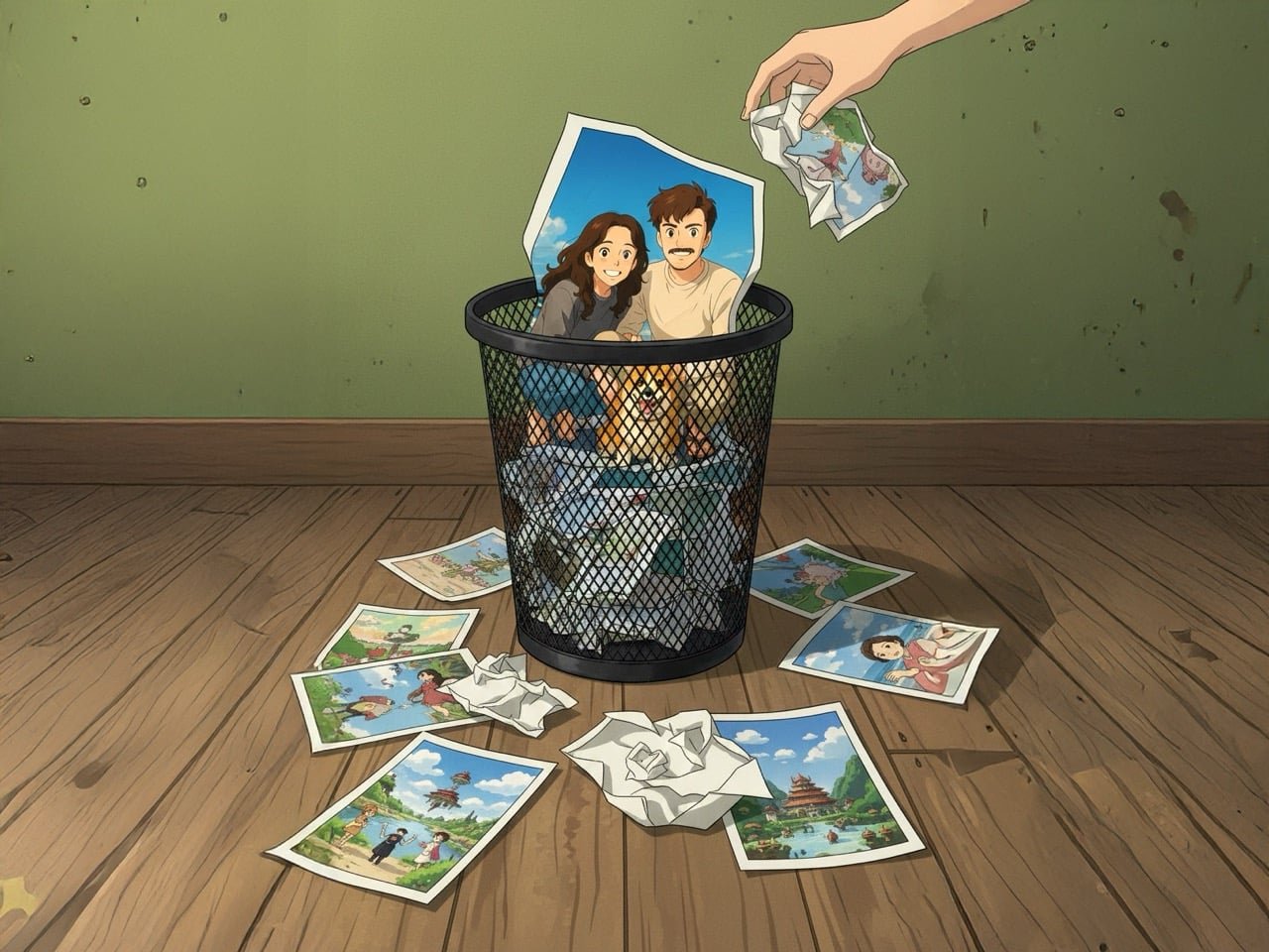
First, it was cottagecore, filling our feeds with sourdough starters and rustic linen. Then came the sharp, symmetrical pastels of the Wes Anderson trend, followed by a tidal wave of Barbie pink that painted the internet for a summer. Each aesthetic arrived like a weather front, dominating the landscape completely for a short time before vanishing just as quickly, leaving behind only a faint digital echo. They were cultural costumes, tried on for a season and then relegated to the back of the closet.
Into this cycle stepped Studio Ghibli, its decades of patient, handcrafted animation compressed into a one-click selfie generator. The resulting “Ghibli-fication” of our profiles was not a deep engagement with Hayao Miyazaki’s themes of environmentalism and pacifism; it was simply the next costume off the rack. The speed with which we adopted and then abandoned it reveals a difficult truth. Our treatment of Ghibli was a symptom of a much larger cultural pattern, one where even the most profound art is rendered disposable by the internet’s insatiable appetite for the new.
When everything becomes an aesthetic, nothing remains itself
Platforms thrive on legibility. Content needs to be instantly recognizable, easily categorized, and simple enough to reproduce at scale. This creates enormous pressure to reduce complex cultural artifacts into their most surface-level visual markers. A Wes Anderson film becomes “symmetrical shots in pastel.” A hit song from Raye (that marked her leaving a music label and following creative freedom) becomes just a fleeting 20-second TikTok dance about rings on fingers and finding husbands. Ghibli’s intricate storytelling about war, labor, and the natural world gets flattened into “soft colors and big eyes.”
The reduction is not accidental. It is the cost of entry into viral circulation. An aesthetic can only spread if it can be copied quickly, applied broadly, and understood immediately. Nuance, context, and depth are friction. They slow down the sharing, complicate the reproduction, and limit the audience. So they get stripped away, not out of malice, but out of structural necessity. What remains is a shell, a visual shorthand that gestures toward the original without containing any of its substance.
This process turns cultural works into raw material. A film, a book, a philosophical tradition, any of these can be mined for their most photogenic elements and reconfigured into something that fits neatly into a grid post or a TikTok filter. The original becomes less important than the aesthetic it can generate. Once the aesthetic stops performing well in terms of engagement metrics, the entire package gets discarded. The algorithm does not care about preservation or reverence. It cares about what is getting clicks and views today.
The appetite that cannot be satisfied
Social media platforms are built around a fundamental economic problem: they need to hold attention, but attention is finite and easily exhausted. The solution is constant novelty. If users get bored, they leave. If they leave, ad revenue drops. So the feed must always be serving something new, something that feels fresh enough to justify another scroll, another click, another few seconds of eyeball time.
This creates a culture of planned obsolescence for aesthetics. A look can only stay interesting for so long before it becomes familiar, then oversaturated, then tiresome. At that point, it has to be replaced. The cycle repeats endlessly, chewing through visual languages, artistic movements, and cultural traditions at a pace that would have been unthinkable even twenty years ago. What took decades to develop can be extracted, popularized, and discarded in a matter of weeks.
The speed of this churn has consequences. It trains us to engage with culture in a particular way: superficially, briefly, and without much attachment. We learn to skim surfaces rather than dig into depths. We participate in trends not because they resonate with us personally, but because participation itself is the point (the ice bucket challenge boosted ALS awareness for precisely 6 months). Being part of the moment, being visible within the current aesthetic wave, these become more valuable than any lasting connection to the work that aesthetic is borrowed from.
What sticks when the wave recedes
The irony is that while trends are disposable, the works they feed on often are not. Ghibli films continue to be watched, analyzed, and loved by new audiences long after the selfie filters have been forgotten. Wes Anderson’s movies did not become less meaningful because people used his color palettes for Instagram posts. The underlying art survives because it contains something that cannot be reduced to a visual shorthand.
What separates durable culture from disposable trends is substance that exceeds its surface. A Ghibli film rewards attention over time. The more you watch, the more you notice: the way labor is animated with dignity, the long quiet stretches that mirror real life’s pace, the refusal to offer simple moral answers. None of that fits in a filter. None of that can be mass-produced. It requires the viewer to bring time, focus, and openness to complexity.
This is what the trend cycle cannot replicate. It can borrow the look, but it cannot borrow the experience. It can create a momentary association with the aesthetic, but it cannot create the slow, layered engagement that builds lasting attachment. So the original work persists beneath the churn, waiting for the people who want more than a costume, who are looking for something to return to rather than something to discard.
Resisting the rhythm of disposability
Recognizing this pattern is not the same as escaping it. We are all embedded in systems that reward rapid consumption and constant novelty. The feed is designed to keep us moving, to prevent us from lingering too long on any one thing. Resisting that rhythm requires deliberate effort, a conscious choice to slow down when everything around us is accelerating.
That resistance can look small and personal: rewatching a film instead of merely watching a snippet of it on YouTube Shorts, reading longform essays instead of liking someone’s reel about it, spending time with art that does not immediately reveal itself. If anything, the pandemic allowed us to spend days culturing sourdough starter so we could bake our bread. The curfew ended and sourdough became a distant memory… but for those 6 months, we actually indulged in immersion. These acts do not change the structure of the platforms, but they change our relationship to culture. They create space for depth in an environment optimized for surface.
The broader question is whether we can build cultural spaces that do not treat everything as disposable. Platforms will not do this on their own; their incentives run in the opposite direction. But audiences, creators, and critics can push back by valuing longevity over virality, by rewarding substance over aesthetic repackaging, by choosing to engage with work in ways that cannot be reduced to a trend cycle.
Ghibli survived its moment as a disposable aesthetic because it was never fully captured by it. The films remain too slow, too strange, too resistant to easy consumption. They stand as a reminder that some things are built to last, even in an environment designed to make everything temporary. The real work is recognizing that difference and choosing to treat what matters accordingly.
First, it was cottagecore, filling our feeds with sourdough starters and rustic linen. Then came the sharp, symmetrical pastels of the Wes Anderson trend, followed by a tidal wave of Barbie pink that painted the internet for a summer. Each aesthetic arrived like a weather front, dominating the landscape completely for a short time before vanishing just as quickly, leaving behind only a faint digital echo. They were cultural costumes, tried on for a season and then relegated to the back of the closet.
Into this cycle stepped Studio Ghibli, its decades of patient, handcrafted animation compressed into a one-click selfie generator. The resulting “Ghibli-fication” of our profiles was not a deep engagement with Hayao Miyazaki’s themes of environmentalism and pacifism; it was simply the next costume off the rack. The speed with which we adopted and then abandoned it reveals a difficult truth. Our treatment of Ghibli was a symptom of a much larger cultural pattern, one where even the most profound art is rendered disposable by the internet’s insatiable appetite for the new.
When everything becomes an aesthetic, nothing remains itself
Platforms thrive on legibility. Content needs to be instantly recognizable, easily categorized, and simple enough to reproduce at scale. This creates enormous pressure to reduce complex cultural artifacts into their most surface-level visual markers. A Wes Anderson film becomes “symmetrical shots in pastel.” A hit song from Raye (that marked her leaving a music label and following creative freedom) becomes just a fleeting 20-second TikTok dance about rings on fingers and finding husbands. Ghibli’s intricate storytelling about war, labor, and the natural world gets flattened into “soft colors and big eyes.”
The reduction is not accidental. It is the cost of entry into viral circulation. An aesthetic can only spread if it can be copied quickly, applied broadly, and understood immediately. Nuance, context, and depth are friction. They slow down the sharing, complicate the reproduction, and limit the audience. So they get stripped away, not out of malice, but out of structural necessity. What remains is a shell, a visual shorthand that gestures toward the original without containing any of its substance.
This process turns cultural works into raw material. A film, a book, a philosophical tradition, any of these can be mined for their most photogenic elements and reconfigured into something that fits neatly into a grid post or a TikTok filter. The original becomes less important than the aesthetic it can generate. Once the aesthetic stops performing well in terms of engagement metrics, the entire package gets discarded. The algorithm does not care about preservation or reverence. It cares about what is getting clicks and views today.
The appetite that cannot be satisfied
Social media platforms are built around a fundamental economic problem: they need to hold attention, but attention is finite and easily exhausted. The solution is constant novelty. If users get bored, they leave. If they leave, ad revenue drops. So the feed must always be serving something new, something that feels fresh enough to justify another scroll, another click, another few seconds of eyeball time.
This creates a culture of planned obsolescence for aesthetics. A look can only stay interesting for so long before it becomes familiar, then oversaturated, then tiresome. At that point, it has to be replaced. The cycle repeats endlessly, chewing through visual languages, artistic movements, and cultural traditions at a pace that would have been unthinkable even twenty years ago. What took decades to develop can be extracted, popularized, and discarded in a matter of weeks.
The speed of this churn has consequences. It trains us to engage with culture in a particular way: superficially, briefly, and without much attachment. We learn to skim surfaces rather than dig into depths. We participate in trends not because they resonate with us personally, but because participation itself is the point (the ice bucket challenge boosted ALS awareness for precisely 6 months). Being part of the moment, being visible within the current aesthetic wave, these become more valuable than any lasting connection to the work that aesthetic is borrowed from.
What sticks when the wave recedes
The irony is that while trends are disposable, the works they feed on often are not. Ghibli films continue to be watched, analyzed, and loved by new audiences long after the selfie filters have been forgotten. Wes Anderson’s movies did not become less meaningful because people used his color palettes for Instagram posts. The underlying art survives because it contains something that cannot be reduced to a visual shorthand.
What separates durable culture from disposable trends is substance that exceeds its surface. A Ghibli film rewards attention over time. The more you watch, the more you notice: the way labor is animated with dignity, the long quiet stretches that mirror real life’s pace, the refusal to offer simple moral answers. None of that fits in a filter. None of that can be mass-produced. It requires the viewer to bring time, focus, and openness to complexity.
This is what the trend cycle cannot replicate. It can borrow the look, but it cannot borrow the experience. It can create a momentary association with the aesthetic, but it cannot create the slow, layered engagement that builds lasting attachment. So the original work persists beneath the churn, waiting for the people who want more than a costume, who are looking for something to return to rather than something to discard.
Resisting the rhythm of disposability
Recognizing this pattern is not the same as escaping it. We are all embedded in systems that reward rapid consumption and constant novelty. The feed is designed to keep us moving, to prevent us from lingering too long on any one thing. Resisting that rhythm requires deliberate effort, a conscious choice to slow down when everything around us is accelerating.
That resistance can look small and personal: rewatching a film instead of merely watching a snippet of it on YouTube Shorts, reading longform essays instead of liking someone’s reel about it, spending time with art that does not immediately reveal itself. If anything, the pandemic allowed us to spend days culturing sourdough starter so we could bake our bread. The curfew ended and sourdough became a distant memory… but for those 6 months, we actually indulged in immersion. These acts do not change the structure of the platforms, but they change our relationship to culture. They create space for depth in an environment optimized for surface.
The broader question is whether we can build cultural spaces that do not treat everything as disposable. Platforms will not do this on their own; their incentives run in the opposite direction. But audiences, creators, and critics can push back by valuing longevity over virality, by rewarding substance over aesthetic repackaging, by choosing to engage with work in ways that cannot be reduced to a trend cycle.
Ghibli survived its moment as a disposable aesthetic because it was never fully captured by it. The films remain too slow, too strange, too resistant to easy consumption. They stand as a reminder that some things are built to last, even in an environment designed to make everything temporary. The real work is recognizing that difference and choosing to treat what matters accordingly.
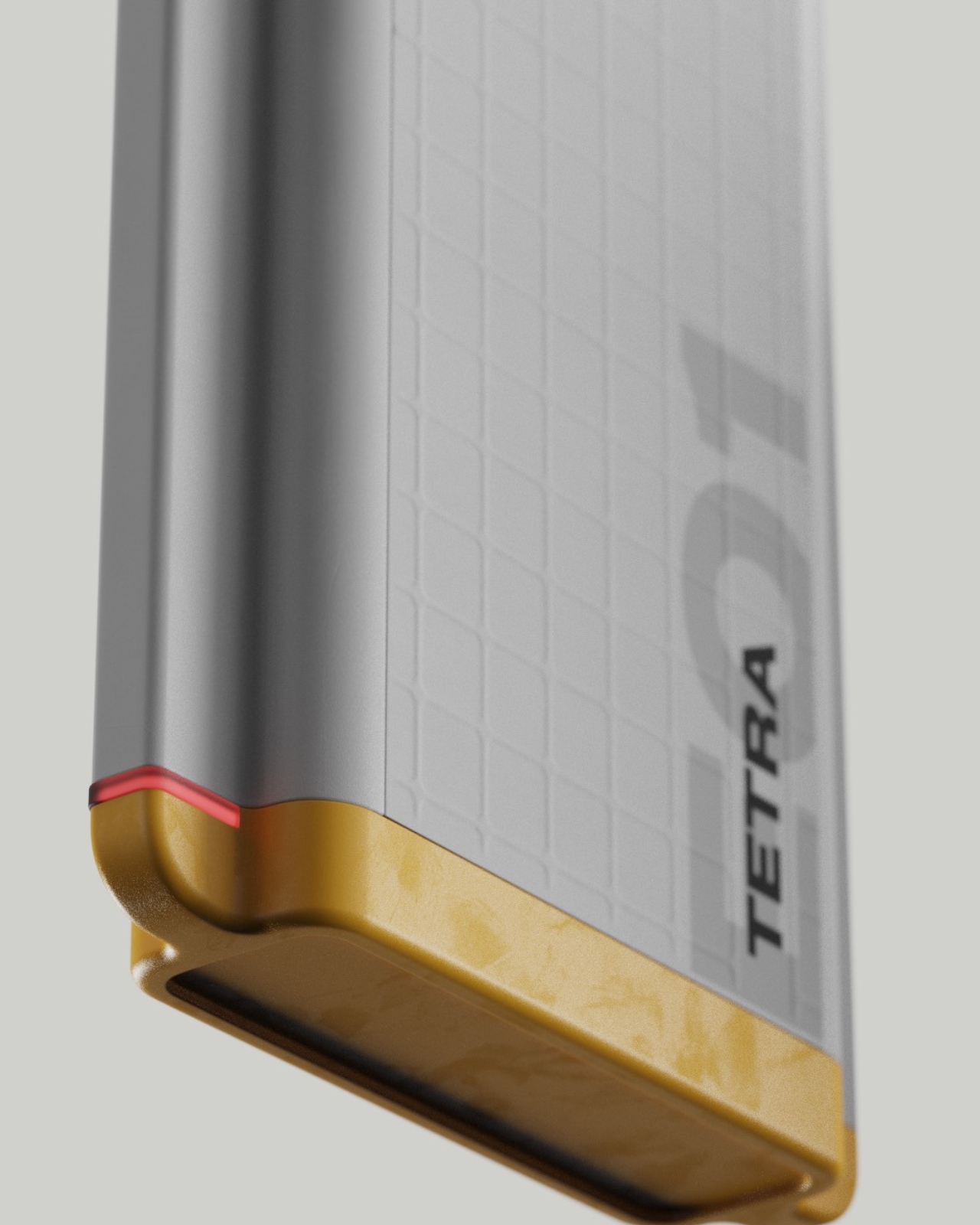
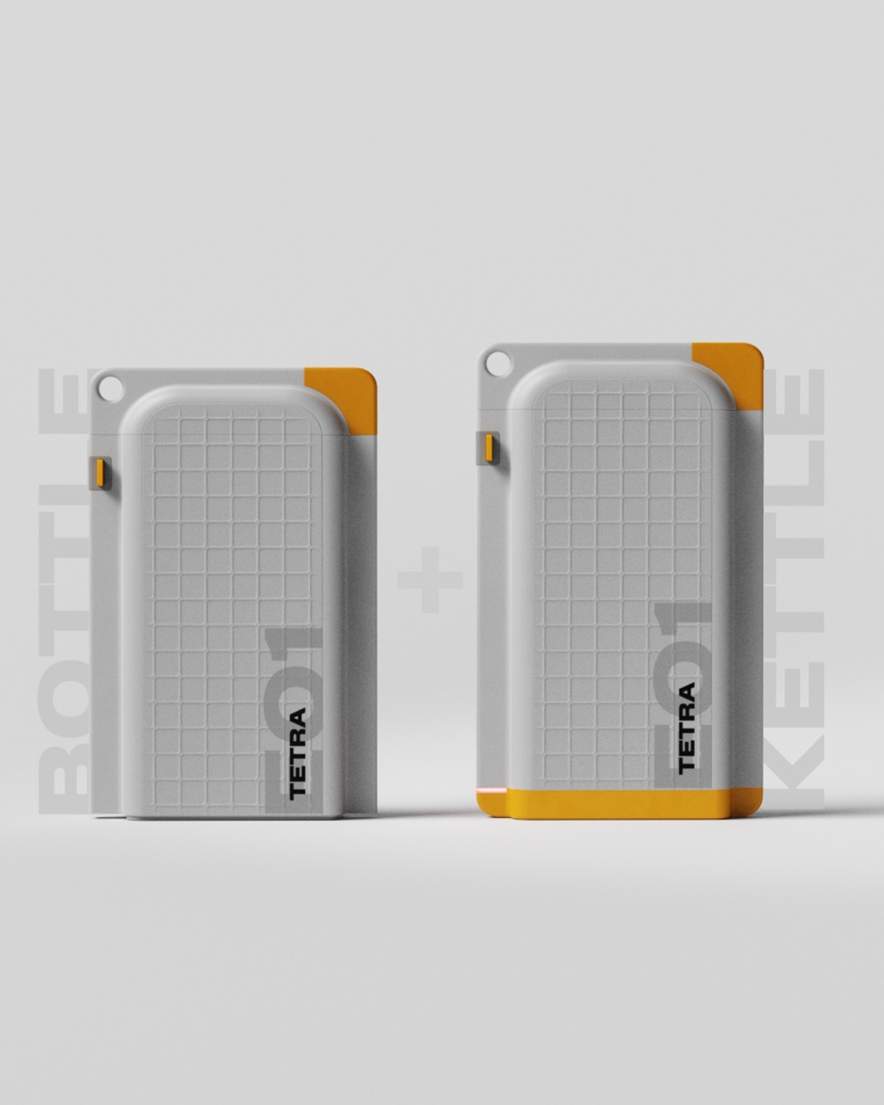
There’s something satisfying about products that do more with less. You know the feeling: when you discover a gadget that’s been cleverly engineered to solve multiple problems without adding bulk to your life. Tetra, a new travel bottle concept by designer Amal SS, nails that sweet spot between everyday practicality and outdoor functionality in a way that actually makes sense.
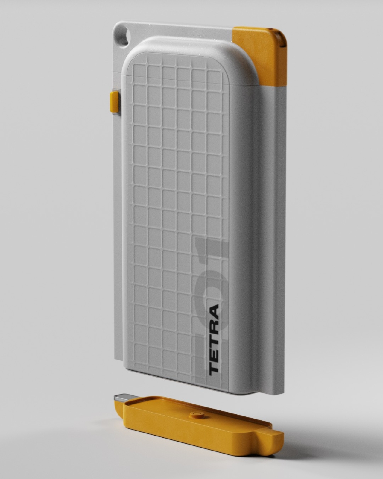
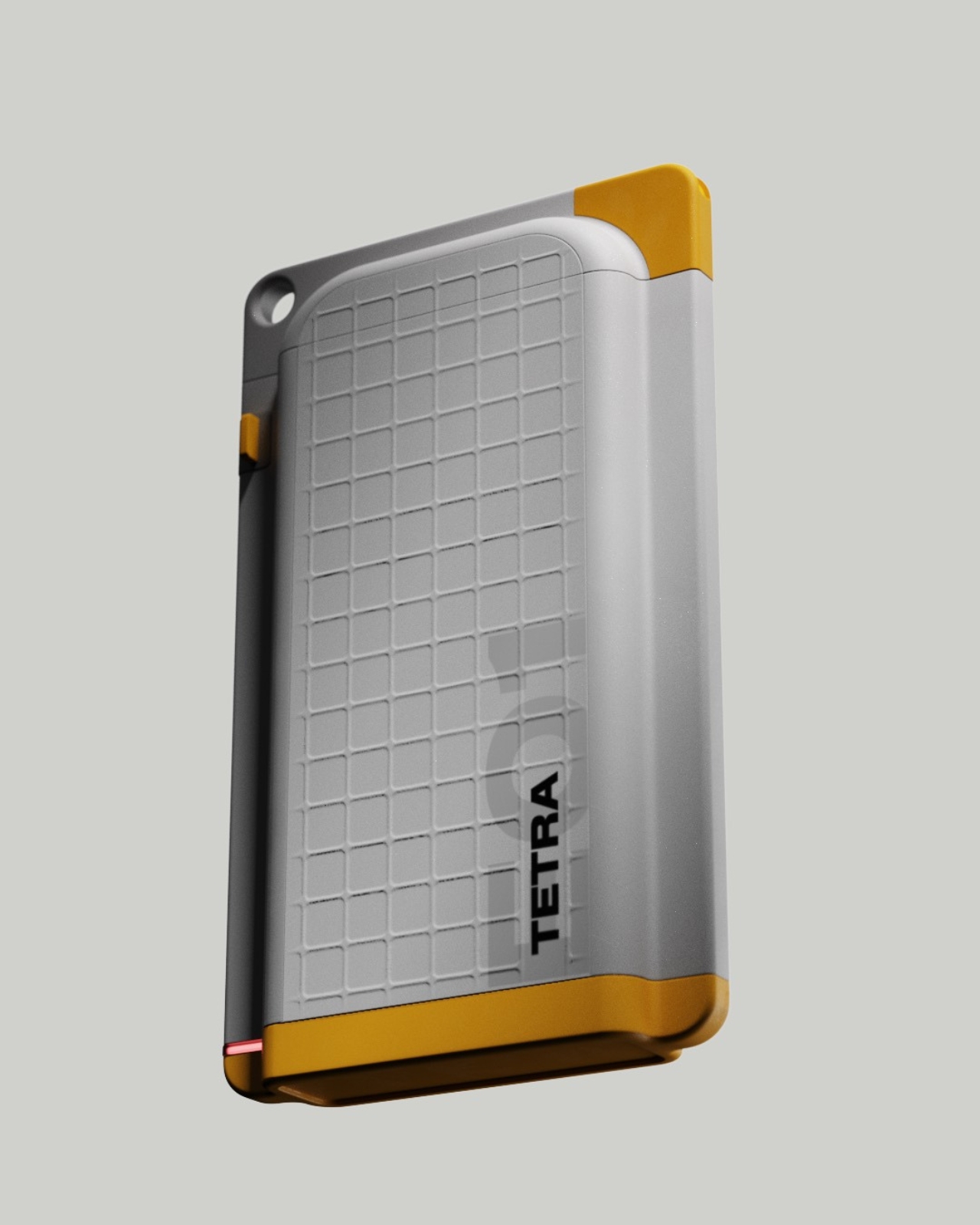
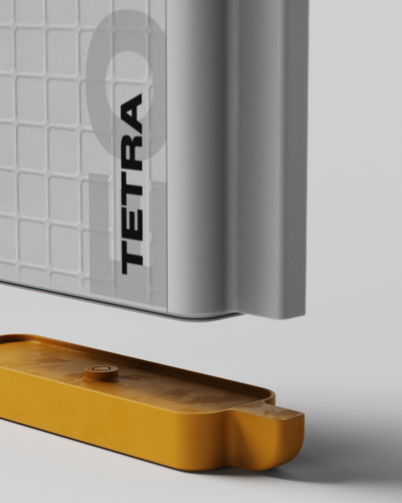
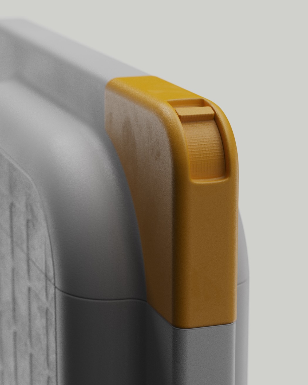
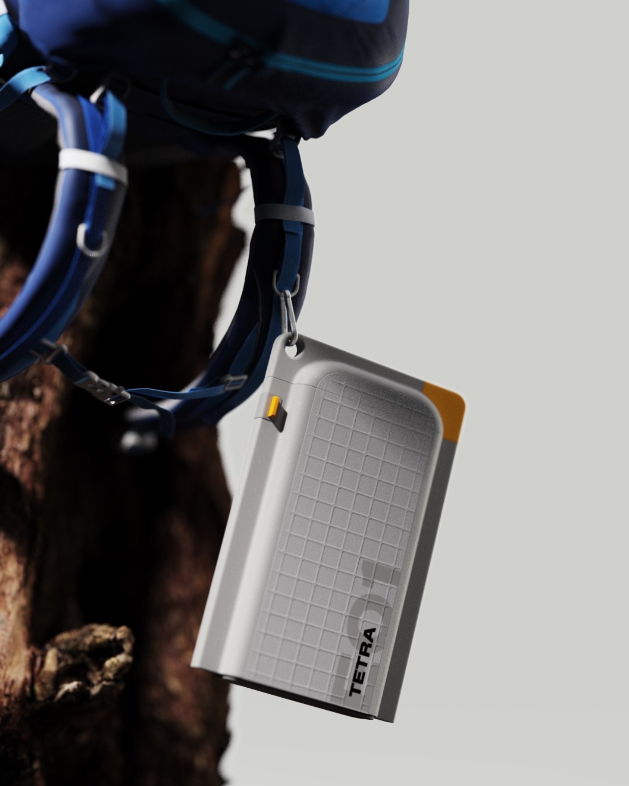
At first glance, Tetra looks like a streamlined water bottle dressed in a minimalist gray shell with sunny yellow corner accents. It’s flat, roughly the size of an A5 notebook, which immediately tells you someone thought hard about how this would actually fit in a backpack. But here’s where it gets interesting: that yellow base section? It’s not just decorative. It’s a detachable heating deck that transforms your water bottle into a portable kettle when you need it.
Designer: Amal SS
The modular approach is what sets Tetra apart from the crowded field of travel bottles trying to be all things at once. Instead of permanently integrating heating elements that add weight and complexity to something you might carry daily, Amal SS separated the functions. Need just a water bottle for your commute or gym session? Leave the Thermo-Deck at home and travel light. Heading into the wilderness for a camping trip? Snap it on and you’ve got hot water capability wherever you land.
This kind of thinking feels refreshingly practical in a world where most products seem designed to cram in every possible feature whether you need them or not. The architecture here respects how people actually use things. Your daily hydration needs don’t require heating functionality, so why carry that extra weight around? But when you’re watching the sunrise from a mountaintop or setting up camp after a long hike, having the ability to heat water for coffee or tea without packing separate equipment becomes genuinely valuable.
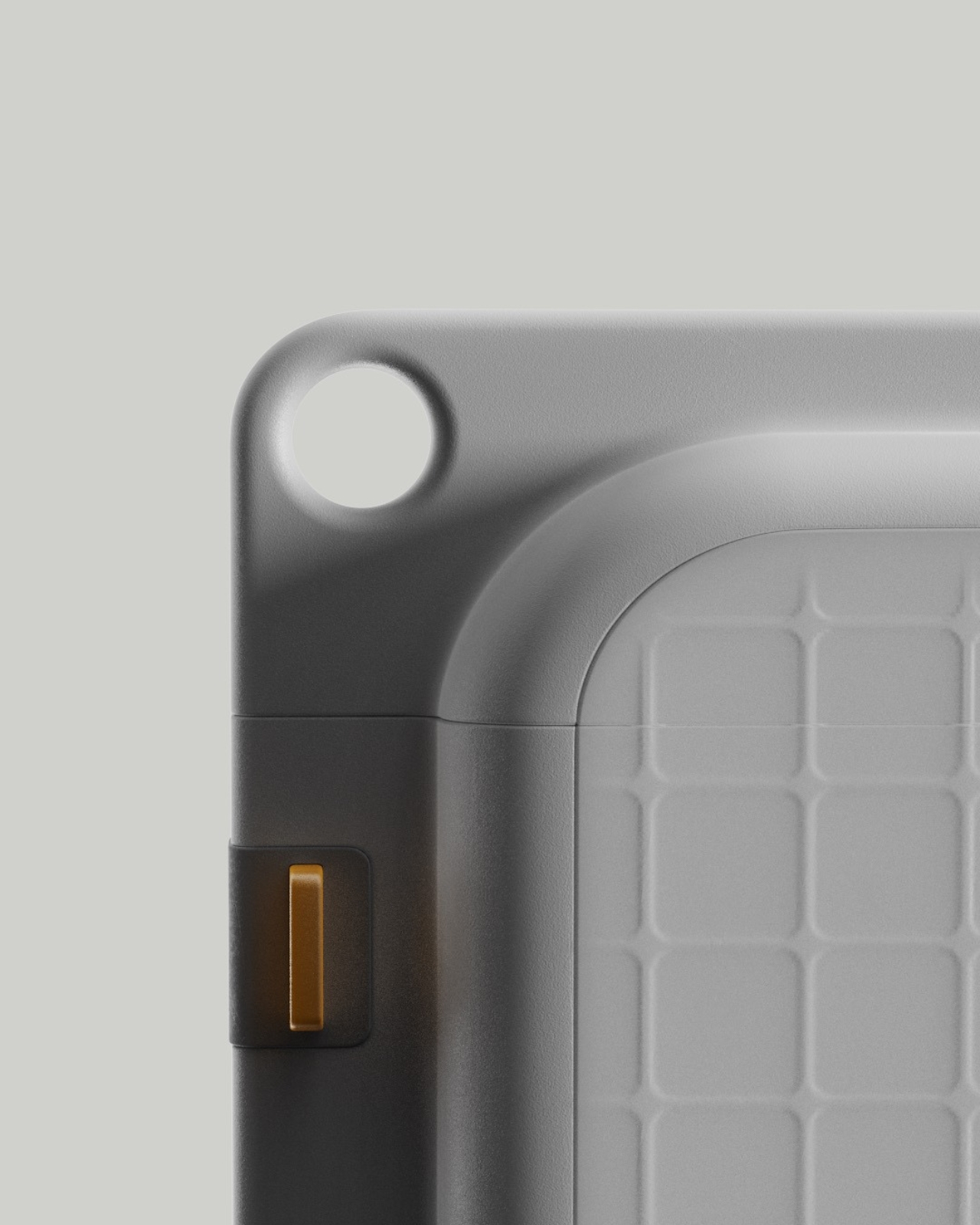
The design language speaks to durability and thoughtful interaction. Those yellow corner guards aren’t just visual punctuation, they’re protective reinforcement for the spots most likely to take impact when you inevitably drop this thing on a rocky trail or concrete floor. The recessed grip grid textured across the surface gives your hands something to hold onto, even when wet or wearing gloves. Every detail seems considered from the perspective of actual use rather than pure aesthetics, though the clean lines and confident color blocking certainly don’t hurt.
What really catches the eye is how Tetra manages to look tech-forward without screaming “gadget.” The flat profile feels almost architectural, like something that could live comfortably in a design studio or strapped to a hiking pack with equal credibility. The proportions are balanced, the material transitions feel intentional, and those yellow accents provide just enough visual interest without tipping into gimmicky territory.
The A5 form factor deserves special mention because it solves a genuine packing problem. Cylindrical bottles, no matter how well-designed, create awkward gaps and wasted space in bags. A flat profile nestles against laptops, books, and clothing layers much more efficiently. For anyone who’s played Tetris with their backpack contents before a trip, this thoughtful approach to dimensionality will resonate immediately.
There’s also something appealing about products that acknowledge different contexts of use. Tetra doesn’t pretend you’ll need a kettle function at your desk job, and it doesn’t force you to commit to carrying unnecessary weight just to have that option available. The snap-on, snap-off modularity respects your intelligence as a user and trusts you to configure the tool for your actual needs. This kind of flexible functionality reflects a broader shift in how we think about everyday carry items. The best products increasingly recognize that our days aren’t one-size-fits-all, and neither should our gear be. Something that works for Monday’s office routine might need different capabilities for Saturday’s mountain trail. Tetra’s modular design bridges that gap without compromise.
Whether you’re a design enthusiast who appreciates thoughtful industrial solutions, a tech person drawn to smart functionality, or an outdoor adventurer tired of juggling multiple pieces of equipment, Tetra presents an intriguing answer to the eternal question: how do we carry less while being prepared for more? Sometimes the smartest design move isn’t adding another feature. It’s knowing exactly which features to make optional.
Cory Doctorow coined the term “enshittification” to describe how internet platforms inevitably decay, prioritizing advertisers and shareholders over users who made them successful in the first place. What begins as a useful service gradually transforms into an advertising delivery system wrapped around minimal functionality. Websites that once loaded instantly now take seconds to render as they auction off your attention to the highest bidder. Social media feeds become algorithmic nightmares designed to maximize engagement with sponsored content rather than connections with actual people. This isn’t accidental degradation but a deliberate business model that treats users as products to be packaged and sold.
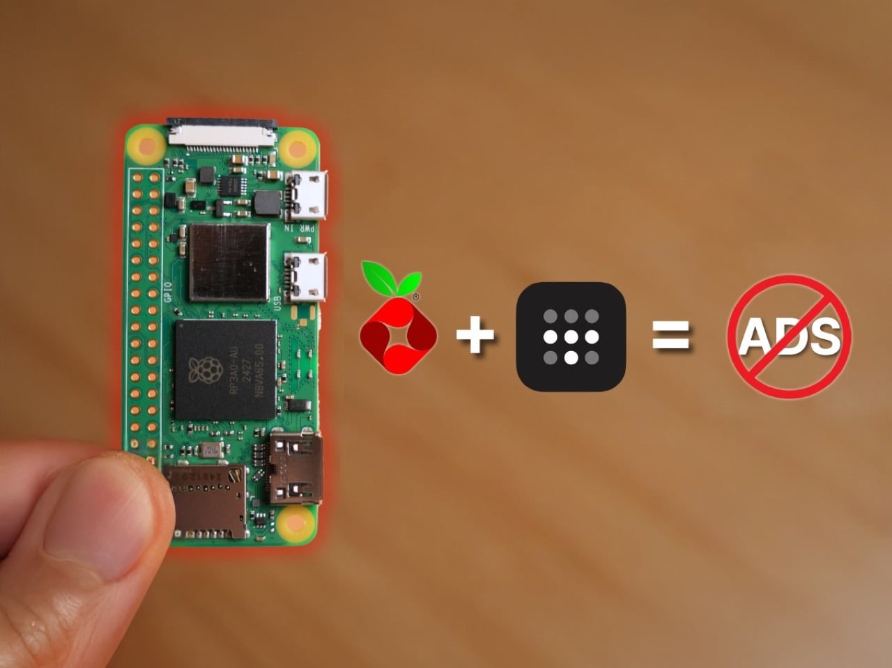
Fighting back against enshittification requires taking control of your own infrastructure rather than hoping platforms will respect your time and privacy. The Raspberry Pi Zero 2W running Pi-hole software represents a practical form of digital self-defense that costs less than $30 and works continuously in the background. This tiny computer sits on your home network and blocks advertising domains before they reach your devices, creating a cleaner internet experience across phones, tablets, computers, and smart TVs simultaneously. Adding Tailscale extends this protection beyond your home, ensuring that your browsing remains uncluttered whether you’re traveling or working remotely. The setup takes an evening and requires no programming expertise, just a willingness to reclaim your digital experience from platforms that have forgotten who they’re supposed to serve.
Designer: Enrique Neyra
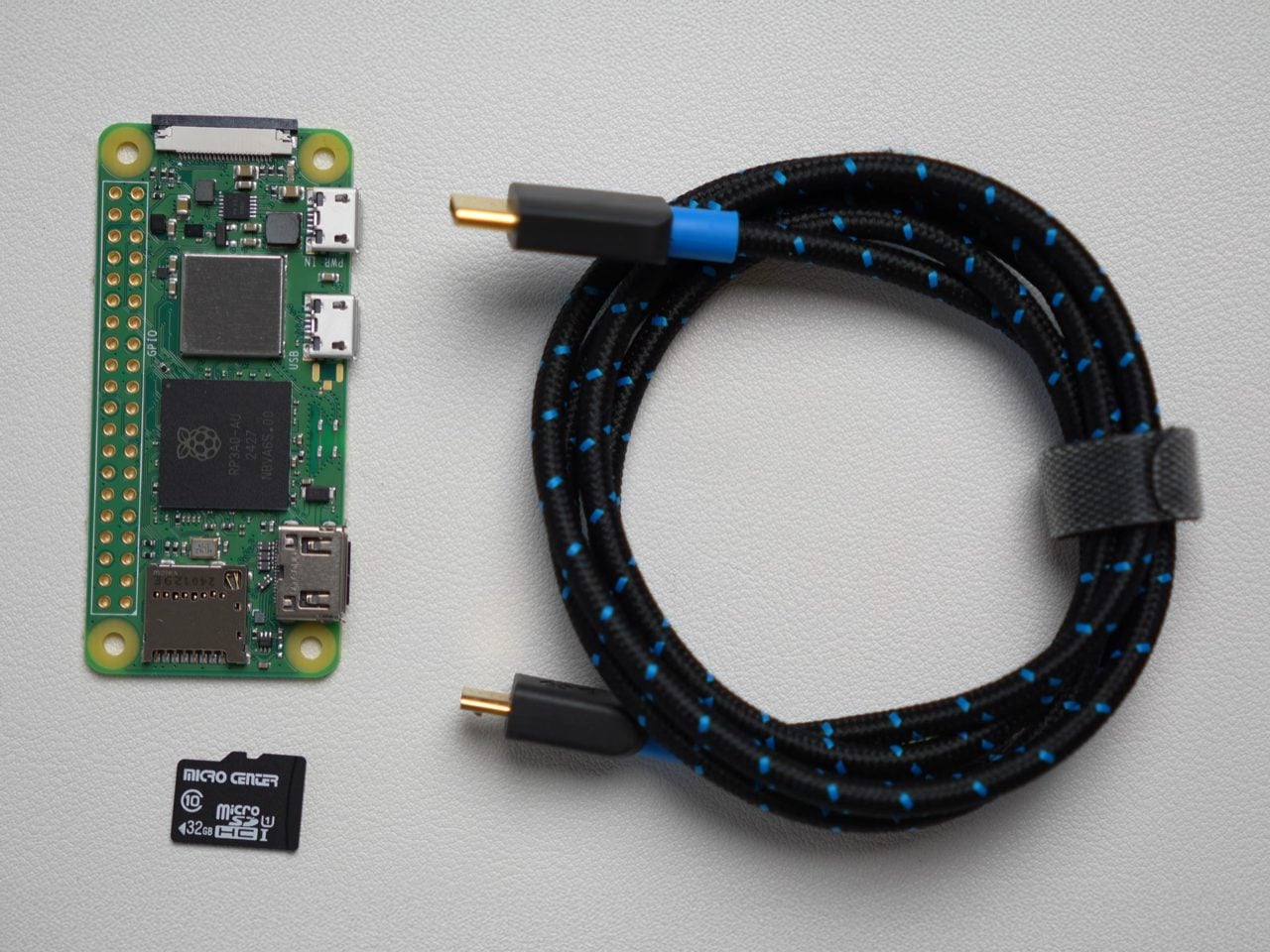
You’d expect an ad-blocker to be substantial on either the hardware or the software front, but this build proves just how small, easy, and cheap everything is. The Raspberry Pi Zero 2W running this entire thing measures 65mm by 30mm, smaller than most people’s wallets, drawing about 2 watts when it’s actually working. You could run this thing 24/7 for a year and spend less on electricity than a single trip to Starbucks. The whole shopping list is stupidly cheap too: the Pi itself runs $15, throw in an 8 dollar micro SD card and whatever USB cable you’ve got rattling around in a drawer. Thirty bucks max, and suddenly you’ve got hardware that can filter ads for every single device in your house.
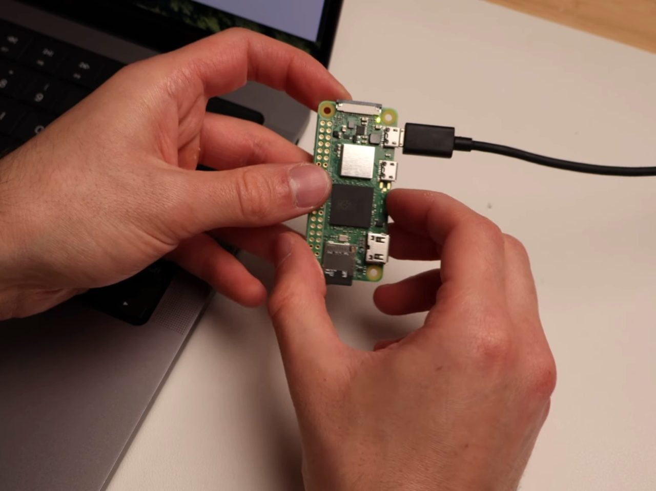
The Pi runs headless, meaning no monitor, no keyboard, just sitting there quietly doing DNS work in the background. You flash Raspberry Pi OS Light onto the SD card using their imaging tool, which strips out all the desktop environment bloat since you’ll never actually see a screen. During setup you punch in your WiFi credentials, enable SSH so you can talk to it remotely, and give it a hostname. Three minutes later the OS is ready and you’re plugging the card into the Pi. Boot it up, SSH in from your laptop, and you’re looking at a command prompt on a computer the size of a pack of gum.
Pi-hole (an open-source software that blocks ads across the entire network) installs with one command. Literally paste it into the terminal and the script handles everything, walking you through prompts about which DNS provider you want upstream and whether you want query logging enabled. You absolutely want the web admin interface because that’s where you’ll watch the magic happen in real time. The trickier bit is the static IP assignment, which sounds intimidating but really just means logging into your router and clicking a button that says “reserve this IP for this device.” Most modern routers make this dead simple. ISPs like Spectrum have apps where you just scroll through connected devices, find your Pi, and hit reserve. Done.
Once the Pi has its permanent address, you point your router’s DNS settings at it instead of whatever your ISP provides by default. Every device on your network now funnels DNS requests through Pi-hole before connecting to anything. Pi-hole maintains these massive blocklists of known advertising and tracking domains, thousands of entries that get updated regularly. Your phone tries to load an ad from doubleclick.net? Blocked. Facebook wants to ping its analytics server? Blocked. The actual content you’re trying to see loads normally while all the parasitic garbage just vanishes. The Pi-hole dashboard shows you this happening in real time, queries flying in and getting either allowed or blocked based on the lists.
The really clever part is Tailscale, which turns your home setup into something you can use anywhere. Tailscale creates this encrypted mesh network between all your devices using WireGuard under the hood, and it’s shockingly easy to configure. Install it on the Pi with another single command, authenticate through their web console by clicking a link, and boom, your Pi appears in the Tailscale admin panel. Then you tell Tailscale to use your Pi’s IP as the DNS server for everything connected to your account. Now your laptop routes through your home Pi-hole whether you’re at a coffee shop in Brooklyn or an airport in Singapore. The VPN overhead adds maybe 10 milliseconds, completely imperceptible during actual browsing.
What you get is immediate and obvious. News sites that normally assault you with autoplaying video ads and popup overlays suddenly render clean. Mobile apps stop shoving interstitials between every interaction. Your smart TV’s interface becomes less cluttered with sponsored content tiles. Pi-hole typically blocks 20 to 30 percent of all DNS queries, which translates directly into faster page loads because your devices skip downloading megabytes of ad scripts and tracking pixels. Battery life improves on phones and laptops since they’re not constantly rendering and refreshing ad content in the background. The internet feels faster because it actually is faster when you’re not waiting for seventeen different ad networks to respond.
Now, the limitations. DNS blocking works great until it doesn’t, and the main place it fails is when ads come from the same domain as the content you want. YouTube is the classic example because Google serves ads from youtube.com subdomains that the platform needs for actual video playback. Block those domains and you break the whole site. Some news organizations have gotten smarter about this too, serving ads from their own CDNs to sidestep DNS filters. You’re looking at maybe 95 percent effectiveness across the broader web, which is substantial but leaves gaps. For the stubborn stuff you still need browser extensions (or use the Brave browser that even blocks YouTube ads) or just simply accept some ads will slip through. If you’ve reached this far, the latter clearly sounds like it isn’t an option.
The other consideration is dependency. If your home internet goes down and you’re traveling somewhere relying on Tailscale to route back through your Pi-hole, you lose DNS resolution entirely. You can mitigate this by configuring a secondary DNS server like Google’s 8.8.8.8 as a fallback, though that partially defeats the privacy angle. Some people solve this by running Pi-hole in the cloud on something like Google Cloud’s free tier, which gives you better uptime but requires more sophisticated networking to avoid creating an open DNS resolver that attackers can hijack for DDoS amplification. That’s a whole different level of complexity that I’m frankly not equipped to even explain.
The upside, even with this regular build, is massive. For thirty bucks and an evening of tinkering, you get network-wide ad blocking that follows you everywhere and works on every device you own without individual configuration. That’s precisely the practical digital self-defense Doctorow addresses about when he describes taking back control from platforms designed to extract value rather than provide it. The web becomes usable again, and I know that shouldn’t sound like a massive deal… but honestly, after seeing ads in Google, Gmail, Instagram, YouTube, Uber, heck, even ChatGPT, it kinda does feel game-changing.
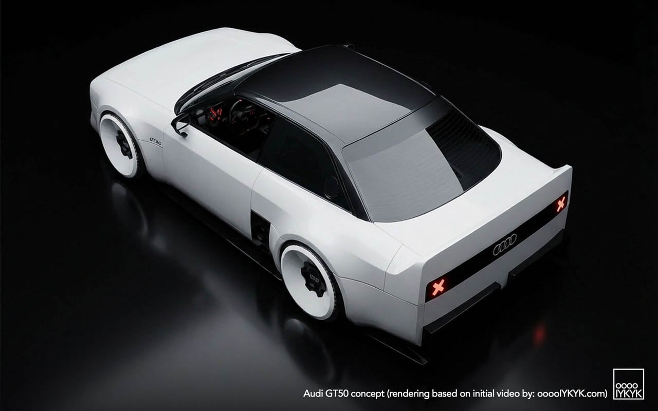
Audi’s electrification messaging has been relentless. Press releases foreground battery density. Concept reveals emphasize range anxiety solutions. The brand’s future, by every official metric, runs on electrons. Then the GT50 surfaces, quietly, through social channels and enthusiast blogs rather than a formal unveiling, and poses a question the corporate roadmap doesn’t answer: what cultural work can a five-cylinder engine still perform when the company building it has publicly committed to moving beyond internal combustion?
Designer: Audi
The concept car itself offers one response. Built by apprentices at Audi’s Neckarsulm training center, the GT50 wraps an unmodified RS3 powertrain in new fiberglass panels that visually lower the car (even if Audi has not detailed any suspension changes) while refusing every styling convention the parent company currently practices. The result reads less as tribute and more as provocation.
Visual Defiance: Reading the Surfaces
Start with what the photographs show that no press release describes. The C-pillar treatment carves a sharp notch where contemporary Audis would flow into a smooth shoulder line. Light catches the edge and dies. Below the rear glass, the decklid drops away at an angle that creates a shadow pocket, a visual trick borrowed from Group B rally cars, where abrupt surface breaks disrupted airflow less than they announced aggression.
The diffuser tells another story. Where modern RS models tuck their aerodynamic elements into integrated bumper designs, the GT50 exposes a finned undertray that reads like industrial equipment. No attempt to blend. No body-color covers. The functional hardware becomes ornament by being left visible.
Wheel graphics interact with the body in ways that suggest deliberate coordination. The turbofan blades repeat the horizontal slat motif from the grille, creating a visual echo across the car’s length. Whether this was intentional design language or happy accident, the effect unifies the silhouette: front face and wheel face speak the same vocabulary.
Three-box geometry defines the overall proportion. Flat hood. Upright greenhouse. Hard rear edge. Each volume asserts itself rather than dissolving into the next. This is geometry as argument, a rejection of the flowing sculpture that defines the e-tron GT and its siblings.
The Engine as Artifact
The 2.5-liter turbocharged five-cylinder produces 394 horsepower. The apprentice team changed nothing about it. No additional boost. No revised mapping. No intake modifications. This restraint is the point.
Enthusiasts know the platform. Basic modifications unlock nearly 500 horsepower. The aftermarket has mapped this engine extensively. Choosing to leave it stock reframes the powertrain as something worth preserving rather than improving: a museum piece still capable of performance, displayed in running condition rather than under glass.
The configuration itself has become rare. Volvo abandoned inline-fives years ago. Ford’s brief experiment ended. Fiat moved on. Among major manufacturers, Audi alone continues production, and only in the RS3. Fifty years after the layout debuted in the 1976 Audi 100 as a packaging compromise (five cylinders fit engine bays designed for fours while delivering displacement advantages) the configuration survives as brand signature rather than engineering necessity.
Racing Ghosts: Two Distinct Legacies
The GT50’s visual references split into separate histories that share an engine family but little else.
Rally heritage came first. The original Quattro road car and its competition derivatives established the five-cylinder as Audi’s performance identifier through the early 1980s. Gravel. Snow. Tarmac stages. The configuration proved itself in conditions that punished mechanical weakness.
North American racing followed a different path. The 90 Quattro IMSA GTO and 200 Quattro Trans-Am cars ran on circuits rather than stages, competing against purpose-built machinery from manufacturers with deeper racing budgets. The blocky bodywork, the aggressive aero addenda, the turbofan wheels: these elements came from that asphalt racing context, not from rally.
The GT50 draws primarily from the second lineage. Its proportions quote the IMSA cars directly: the way the fenders box out rather than curve, the stance created by wheels pushed to the body’s corners, the rear wing that spans the full decklid width. Rally Quattros looked different. The concept acknowledges this distinction through specific formal choices rather than generic “heritage” styling.
Apprentice Programs as Design Laboratory
Neckarsulm’s training program has produced boundary-testing work before. The RS6 GTO concept eventually influenced production decisions. That project proved the pipeline exists: ideas developed under apprentice freedom can migrate into showroom reality.
Other builds have pushed further from commercial viability. An electrified A2. A 236-horsepower NSU Prinz running modern EV hardware. These projects test technical integration as much as design direction.
The GT50 fits a different category. It uses a production powertrain unchanged. The bodywork is additive rather than structural. What the project tests is audience response, whether visual commitment to mechanical heritage generates the kind of enthusiasm that justifies development investment in combustion performance when corporate strategy points elsewhere.
Manufacturing Quality as Statement
Execution matters in this context. The released photography shows panel gaps that read as production-grade. Surface alignments hold. The fiberglass work displays none of the waviness or inconsistency that marks student-built specials at other institutions.
This finish level functions as argument. The GT50 is not a sketch in three dimensions. It is a proposal that could, with different business decisions, reach production. The apprentices built something that asks to be taken seriously as a potential product direction rather than dismissed as training exercise.
The Quiet Reveal and Its Implications
No stage. No livestream. No embargo coordination. The GT50 initially surfaced through social and niche outlets rather than the press machinery Audi deploys for products it expects to sell. This distribution choice communicates uncertainty, or perhaps strategic patience.
If reception proves enthusiastic, the soft launch becomes origin story. If response flatters less, the project remains an apprentice exercise, easily distanced from official product planning. The approach hedges corporate exposure while allowing genuine audience testing.
What the GT50 asserts, regardless of its production future, is that the five-cylinder’s cultural position within Audi’s identity has not been resolved by electrification commitments. The engine configuration still generates response. The racing heritage still communicates. Whether that cultural capital translates into business justification for extended combustion development remains the open question the concept was built to help answer.