These 5 Christmas Gifts for Designers Just Replaced Our Entire Home Office Setup

The best workspace tools seamlessly integrate into your creative flow, making every interaction feel intentional. For designers who spend hours surrounded by materials, implements, and ideas, the objects on their desk become extensions of their thinking process. This holiday season presents an opportunity to replace utilitarian clutter with pieces that spark joy through thoughtful design and refined aesthetics.

These five gifts represent a different approach to workspace essentials. Each one reimagines everyday tools through the lens of considered design, transforming mundane interactions into moments of tactile pleasure. From Japanese steelwork to magnetic innovation, these pieces prove that functional objects deserve the same design attention we give to creative projects themselves. They elevate workspaces not through decoration but through intelligent form meeting purposeful function.

1. Stellar Edge Scissors

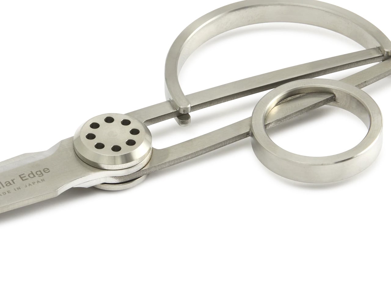
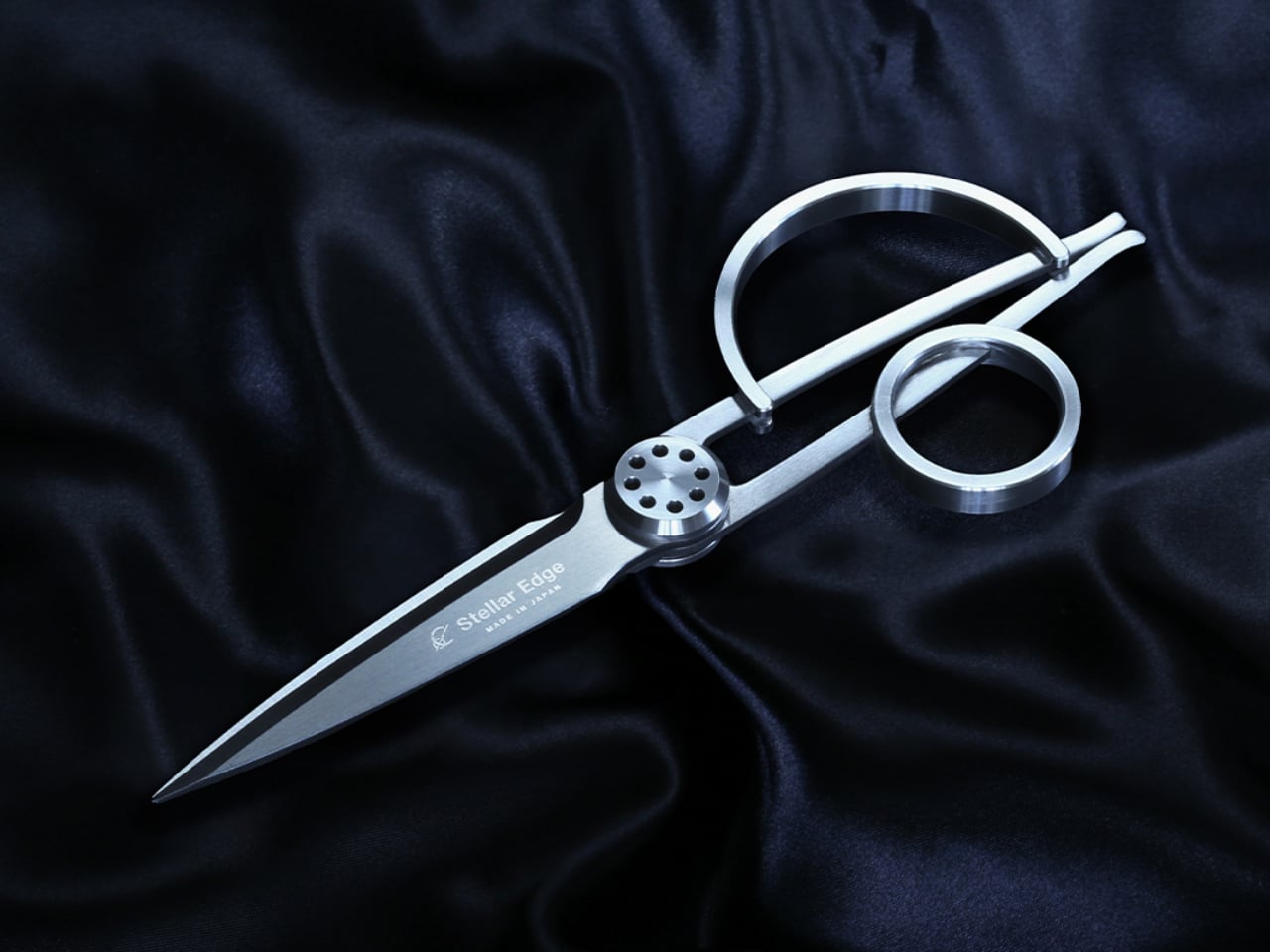
The moment you pick up these scissors, you understand why they come from Seki, Japan’s legendary blade-making region. Their asymmetrical handles challenge expectations while delivering surprising comfort, creating a sculptural presence that commands attention on any desk. The seamless stainless steel construction catches light beautifully, turning a cutting tool into an object worth displaying. When designers reach for scissors dozens of times daily, that repeated interaction deserves this level of refinement and visual consideration.

What makes these scissors exceptional goes beyond their museum-worthy appearance. The blade geometry ensures clean, effortless cuts through various materials, from delicate tracing paper to thick cardstock. That perfect balance point makes extended cutting sessions feel weightless rather than tedious. The polished finish resists fingerprints while providing just enough grip for control. These scissors transform routine tasks into satisfying rituals, proving that tools designed with genuine care create measurably better experiences throughout your workday.

What we like

  • The architectural form creates an instant focal point on any workspace surface.
  • Japanese stainless steel maintains razor sharpness through thousands of cuts.
  • Ergonomic engineering makes asymmetrical handles surprisingly comfortable for extended use.
  • Seamless construction and polished finish elevate them beyond typical office supplies.

What we dislike

  • The premium price point places them out of reach for budget-conscious buyers.
  • Their artistic appearance might make colleagues hesitant to borrow them for quick tasks.

2. Magboard Clipboard

Traditional notebooks impose structure before you’ve captured a single thought. This magnetic clipboard system throws out those constraints, letting you work with loose sheets that can be rearranged, removed, or inserted as ideas evolve. The hardcover design provides solid backing for writing anywhere, whether you’re sketching at your desk or capturing inspiration during a standing meeting. That simple magnet and lever mechanism holds up to thirty sheets securely while making page changes effortless and intuitive.

The beauty lies in removing friction from your creative process. Tear out pages that don’t work, reorder sequences that do, and add fresh sheets without committing to bound permanence. The water-resistant cover protects your work while staying easy to clean, making it genuinely portable rather than precious. For designers who think visually and need to see multiple concepts simultaneously, this system supports fluid thinking rather than forcing linear progression through pre-bound pages.

Click Here to Buy Now: $45.00

What we like

  • Magnetic binding system lets you reorganize pages instantly without tearing or waste.
  • Hardcover backing provides a stable writing surface for standing or mobile work sessions.
  • Water-resistant construction protects notes while remaining lightweight and portable.
  • Minimalist design strips away unnecessary features that complicate simple note-taking.

What we dislike

  • Loose sheets can scatter if the clipboard accidentally opens in a bag.
  • The system requires maintaining a supply of appropriately sized paper for ongoing use.

3. Everlasting All-Metal Pencil

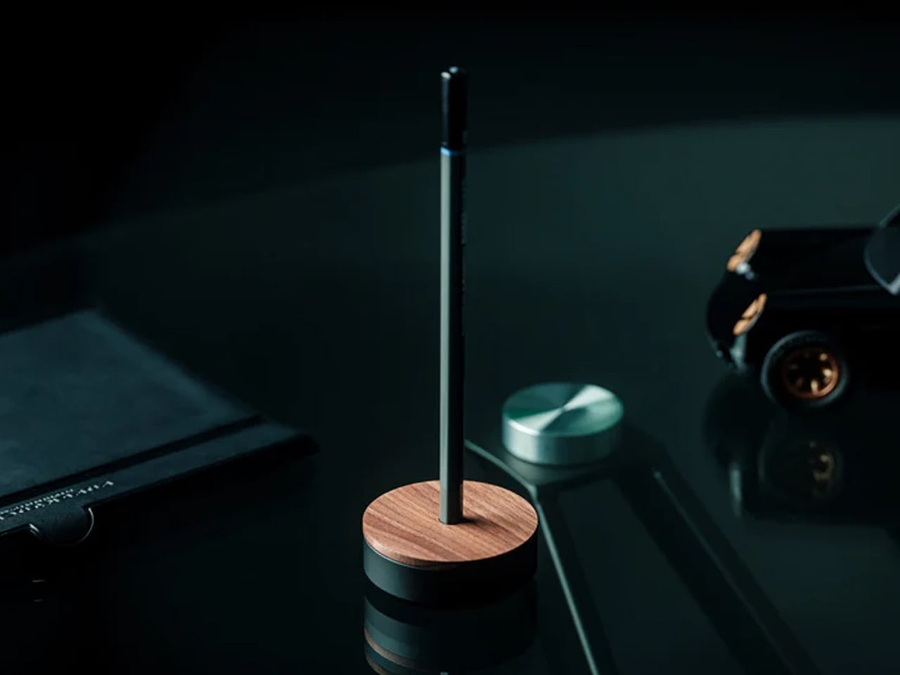
Pencils break, dull, and disappear precisely when you need them most. This metal alternative writes like graphite but never requires sharpening, combining a special alloy core with an aluminum body that feels substantial without being heavy. The marks it leaves behave exactly like traditional pencil writing, erasing cleanly and refusing to bleed when you add watercolor or markers over your sketches. It’s the kind of tool that makes you forget about the tool itself and focus entirely on the marks you’re making.

The engineering behind its “everlasting” claim deserves attention. Rather than soft graphite that wears away with each stroke, this alloy core releases tiny particles that create marks without significant material loss. You get consistent line weight and darkness through thousands of uses. For designers who sketch constantly throughout their day, eliminating the sharpen-write-sharpen cycle removes an annoying interruption from creative flow. The metal construction also means no snapped leads or splintered wood to derail your momentum mid-thought.

Click Here to Buy Now: $19.95

What we like

  • No sharpening required means uninterrupted sketching and writing sessions.
  • Alloy core provides consistent line quality through extensive use.
  • Standard erasers remove marks cleanly without special techniques.
  • Compatible with watercolor and water-based markers since the core doesn’t bleed or smear.

What we dislike

  • The metal body lacks the warmth and texture some prefer from traditional wooden pencils.
  • Line darkness may not satisfy those who love the rich blacks from soft graphite grades.

4. Quick Access Pencil Sharpener Stand

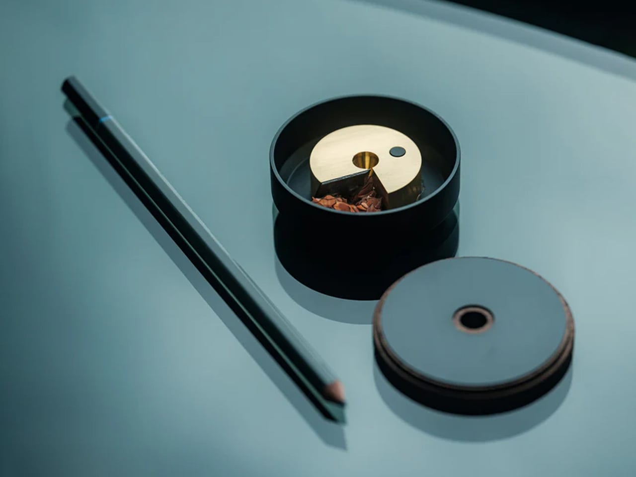
This disc-shaped object solves the eternal problem of misplaced sharpeners through brilliant simplicity: your pencil stands in the sharpener when not in use. The walnut wood cover and anodized aluminum base create an elegant desktop presence that justifies permanent placement rather than drawer banishment. That specially angled sharpening mechanism extends pencil life while reducing waste, making each sharpening session more purposeful. The brass mechanism prevents accidental opening, keeping shavings contained until you’re ready to empty them.

Beyond functional innovation, this piece brings warmth to workspaces dominated by glass and metal. The wood’s natural grain patterns ensure each sharpener carries a unique character, while the magnetic connection between cover and base provides satisfying tactile feedback. Designers who still value traditional pencils for sketching gain both a reliable sharpening solution and a sculptural desktop accent. It’s the kind of thoughtful industrial design that makes everyday interactions feel special rather than merely efficient or functional.

Click Here to Buy Now: $55.00

What we like

  • Dual function as a sharpener and a stand keeps everything organized in one elegant object.
  • Specially angled blade prolongs pencil life while creating less waste.
  • Walnut wood adds natural warmth to typically cold office environments.
  • Strong magnet prevents accidental spills while providing satisfying closing feedback.

What we dislike

  • The single-pencil capacity doesn’t accommodate designers who work with multiple pencils simultaneously.
  • Premium materials and construction result in a higher price than basic sharpeners.

5. reMarkable Paper Pro Move

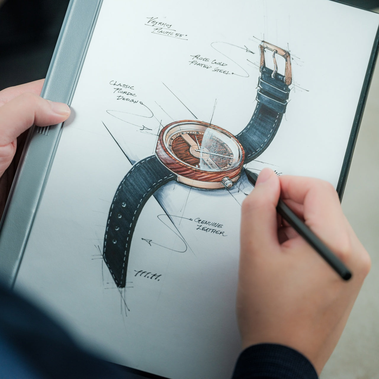
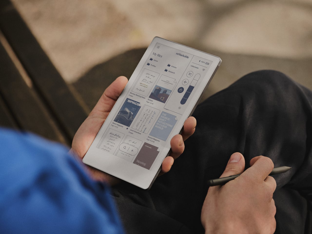
Digital notes often disappear into folders, never to resurface. This E Ink tablet bridges analog satisfaction with digital organization, offering that pen-on-paper texture designers crave while maintaining searchable, shareable files. The 7.3-inch color display fits comfortably in jacket pockets while providing enough real estate for meaningful sketching and notation. At $449, it occupies premium territory, yet the refined materials and thoughtful engineering justify the investment for designers serious about capturing ideas throughout their day.

The included Marker stylus delivers genuine tactile feedback that makes extended writing sessions genuinely pleasurable rather than tolerable. The E Ink screen eliminates eye strain from backlit displays, letting you work comfortably for hours without fatigue. Magnetic attachment keeps the stylus secure during transport while adding minimal bulk. The responsive surface captures subtle pressure variations, making sketches feel natural and expressive. For designers transitioning between physical and digital workflows, this device removes friction while maintaining the creative experience of working on actual paper.

What we like

  • The color E Ink display provides comfortable viewing during extended creative sessions.
  • Pocketable size makes it genuinely portable without sacrificing usable screen space.
  • Tactile feedback from the Marker stylus creates an authentic pen-on-paper sensation.
  • Magnetic stylus attachment prevents loss while keeping the profile slim and portable.

What we dislike

  • The $449 price point represents a significant investment compared to paper notebooks.
  • E Ink refresh rates can’t match the instant response of traditional paper or iPad displays.

Wrapping Up Workspace Elevation

Transforming a workspace isn’t about adding decoration. These five gifts demonstrate how reimagining fundamental tools creates measurably better daily experiences. Each piece removes friction from creative work while bringing visual refinement to surfaces where designers spend countless hours. They’re investments in the quality of repeated interactions, understanding that the tools you touch dozens of times daily deserve genuine design consideration and thoughtful engineering.

The best Christmas gifts for designers don’t gather dust on shelves. They integrate seamlessly into existing workflows while quietly elevating every interaction. From Japanese scissors to magnetic clipboards, these pieces prove that functional objects can spark joy through intelligent form and purposeful design. They’re reminders that workspace elevation comes from choosing tools that respect both your creative process and your aesthetic sensibilities.

The post These 5 Christmas Gifts for Designers Just Replaced Our Entire Home Office Setup first appeared on Yanko Design.

Tom Black Carves Travertine Tables That Look Like They’re Floating

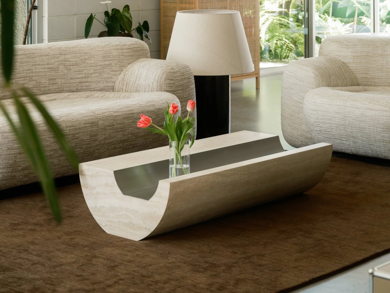
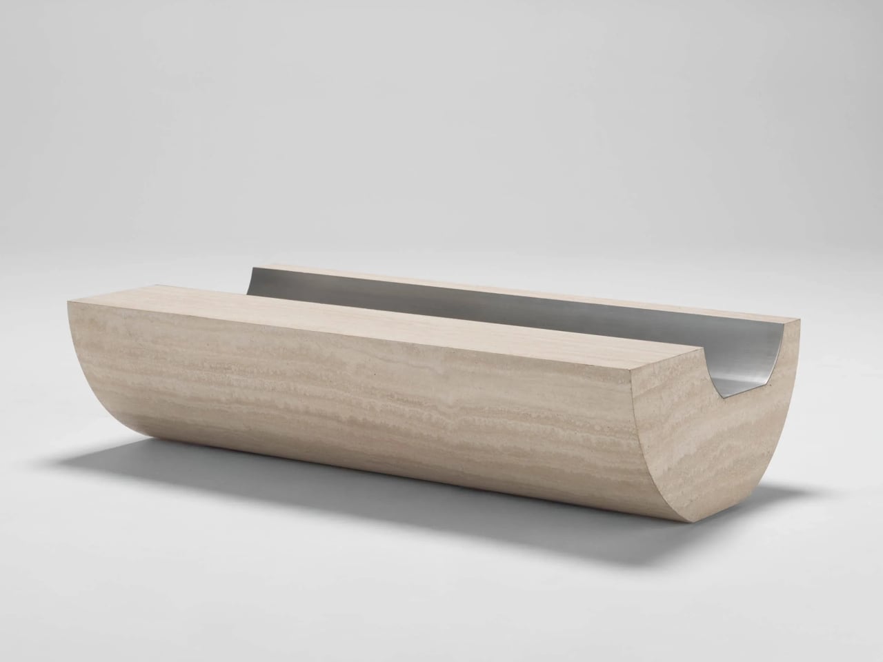
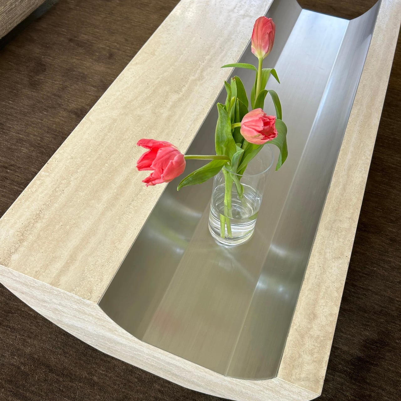
Stone coffee tables often default to simple slabs or blocks, heavy objects that sit on the floor and announce their weight. More interesting pieces treat stone as something to carve and balance, not just to drop into a room. Coffee Table 01 and Side Table 01 by Tom Black lean into that second approach, using one curved gesture to make Italian travertine feel lighter, paired with a contrasting metal inlay that turns solid into void.

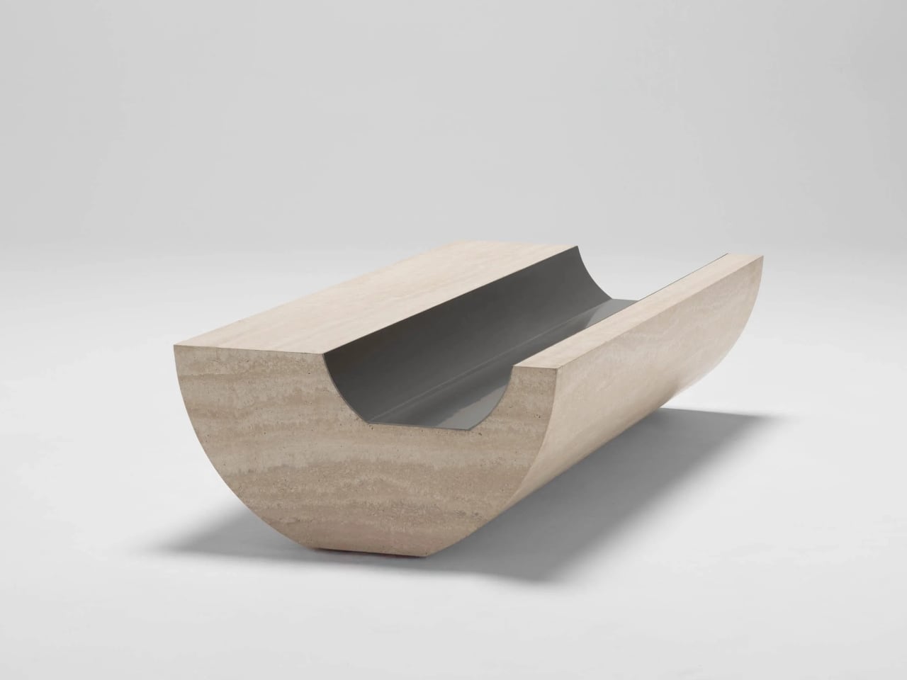
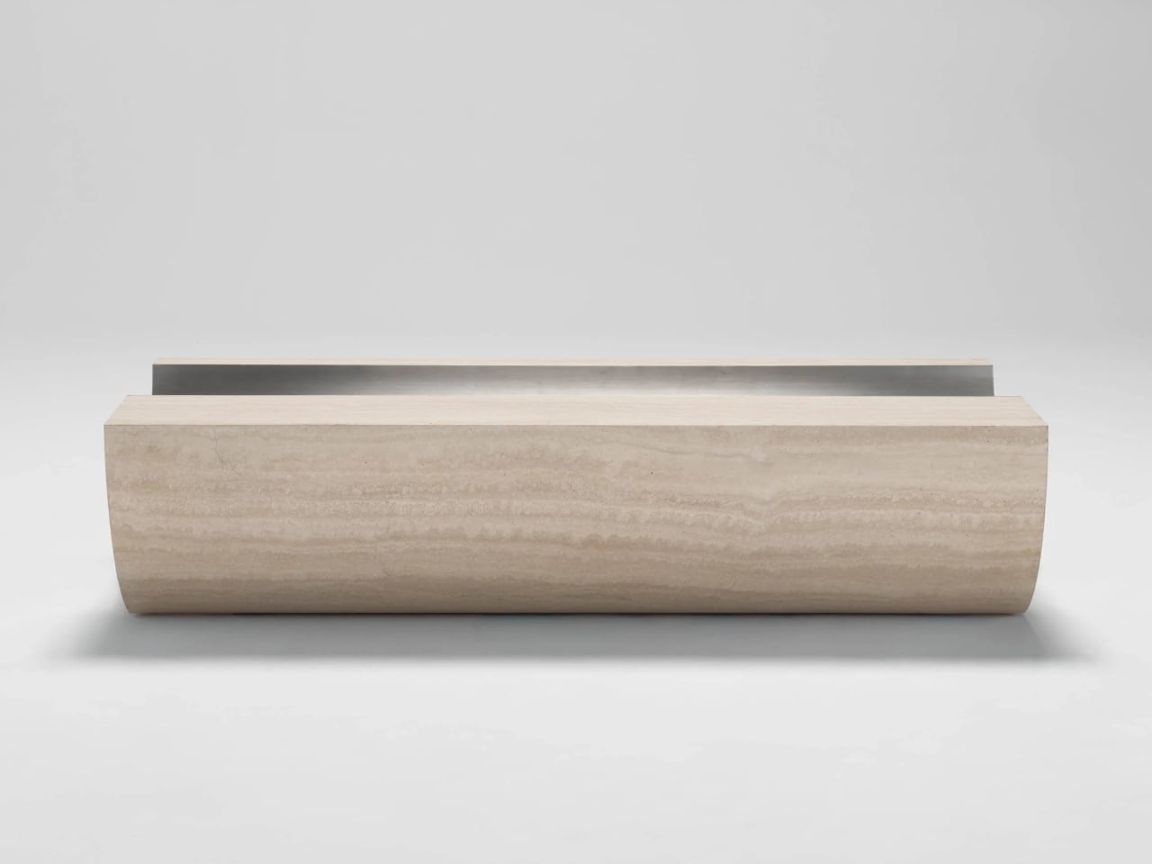
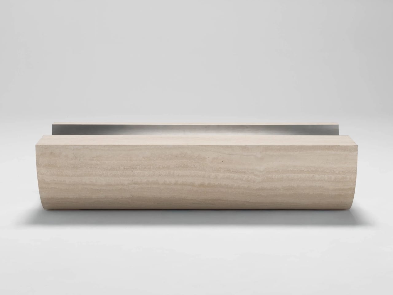
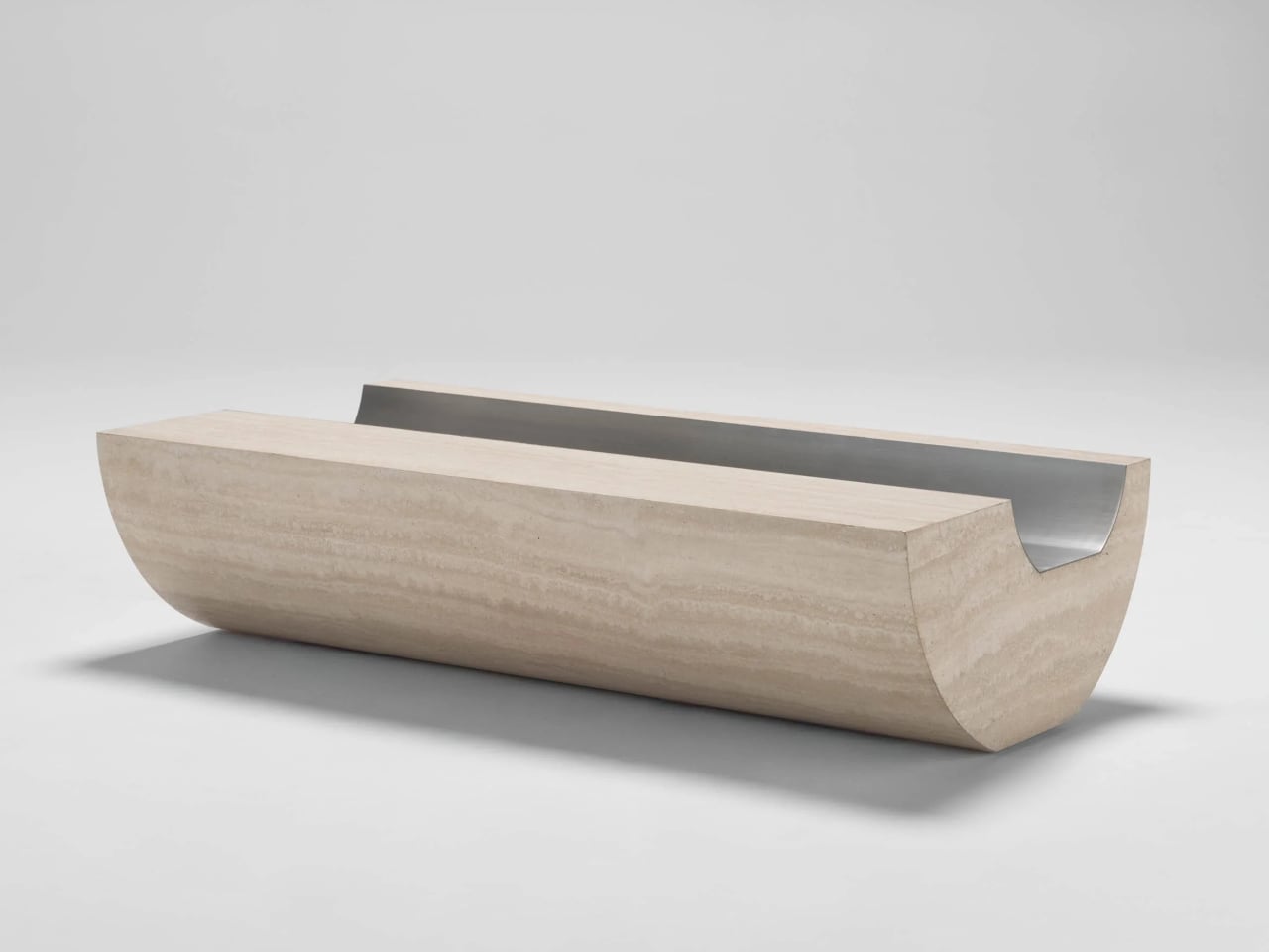
Coffee Table 01 is an exploration of form with a classic Italian materiality, carved from travertine with a soft curvature to the underside that gives a sense of floating and elevation. The top is not a flat slab, but a long trough lined with brushed metal, and this inverse layering of a metal finish into stone sets up a contrast in both finish and form, cool against warm, reflective against matte.

Designer: Tom Black

The underside curve lifts the edges off the floor so the table reads as a solid volume that barely touches the ground. The concave channel on top mirrors that curve, turning the center into a controlled void rather than a flat surface. The metal inlay sharpens that void, catching light differently from the travertine and making the negative space feel as intentional as the stone around it, a second reading of the same carved gesture.

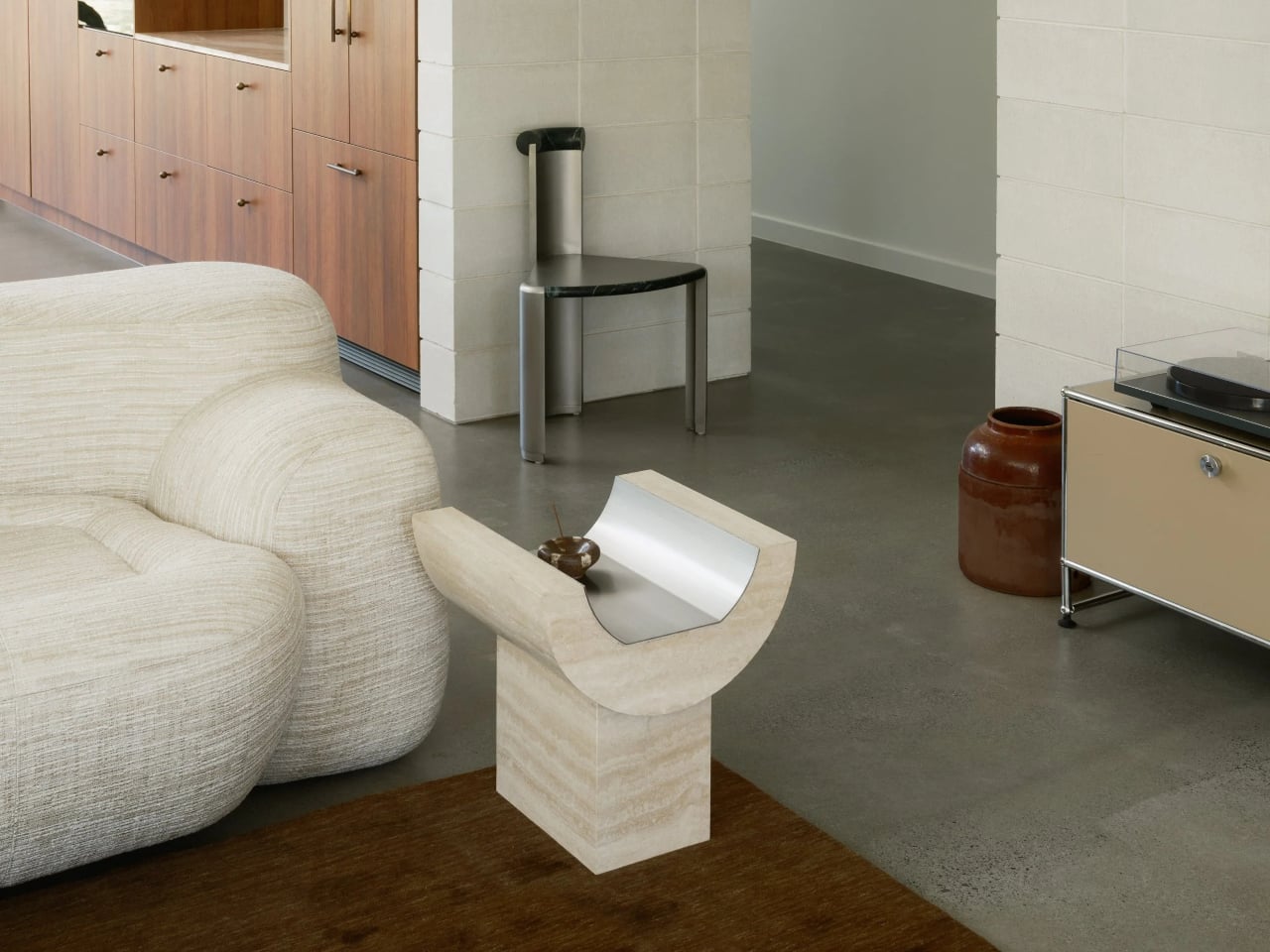
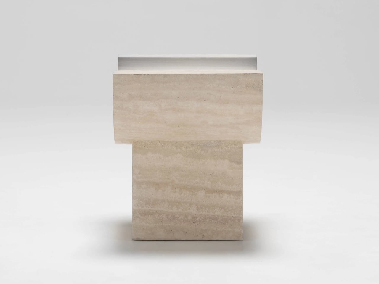
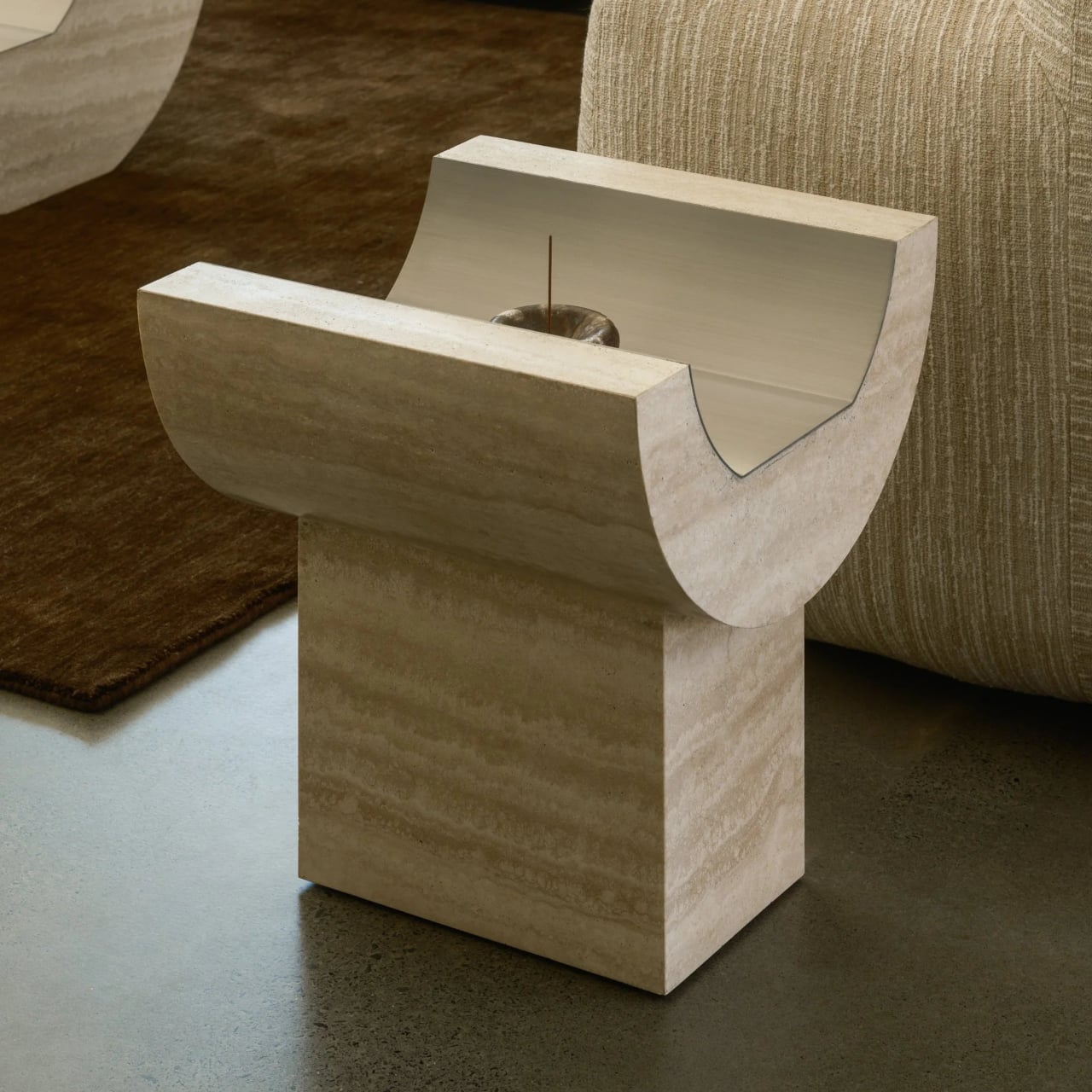
Side Table 01 is designed as the partner to Coffee Table 01 that can also stand alone. It shares the same exploration of form and material but takes a different approach to curvature. Instead of resting directly on the floor, the curved upper element sits on a rectangular base, and that base is what highlights the juxtaposition between curve and block, between the flowing top and the grounded plinth beneath.

The side table effectively rotates the coffee table’s gesture into a more vertical, totem-like object. The travertine trough becomes shorter and more upright, while the rectangular base grounds it. The relationship between the two parts, curved top and rectilinear plinth, makes the piece read as a small monument, echoing the coffee table’s floating mass but with a different emphasis in the room, more punctuation than sprawl.

The choice of Italian travertine brings a sense of permanence and architecture, with its horizontal veining and warm tone playing against the cool, brushed metal inlay. The stone offers classic materiality, while the metal introduces a precise, almost industrial note. Together, they feel less like a decorative veneer and more like a small section cut from a larger, imagined building, where structure and surface are the same thing.

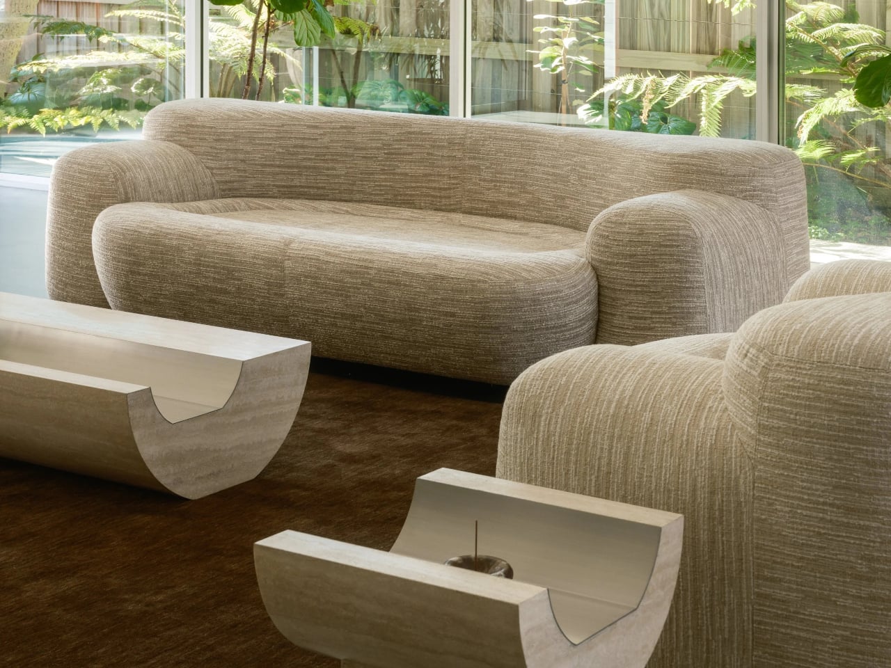
Coffee Table 01 and Side Table 01 operate as a family. The coffee table stretches low and horizontal between seating, the side table stands as a vertical accent beside a sofa or chair, and both share the same carved gesture and material palette. For anyone who likes furniture that behaves like small pieces of architecture, these two feel like a quiet study in how far one curve can go when you pair it with the right material and the right inlay to make the mass feel like it might lift off the floor.

The post Tom Black Carves Travertine Tables That Look Like They’re Floating first appeared on Yanko Design.

This 11g Keychain Knife Has a Tungsten Tip You Swap, Never Sharpen

Most keychain cutters feel like afterthoughts. Plastic shells with soft blades that struggle with packing tape, bend on zip ties, and disappoint when needed. The gap between how often a small sharp edge would be useful and how rarely those tools work is frustrating. Small does not have to mean flimsy, but most micro knives settle for exactly that, leaving you hunting for scissors or borrowing someone else’s blade when boxes arrive.

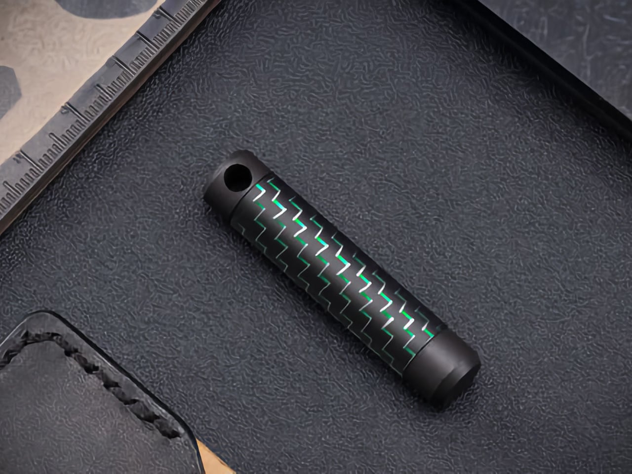
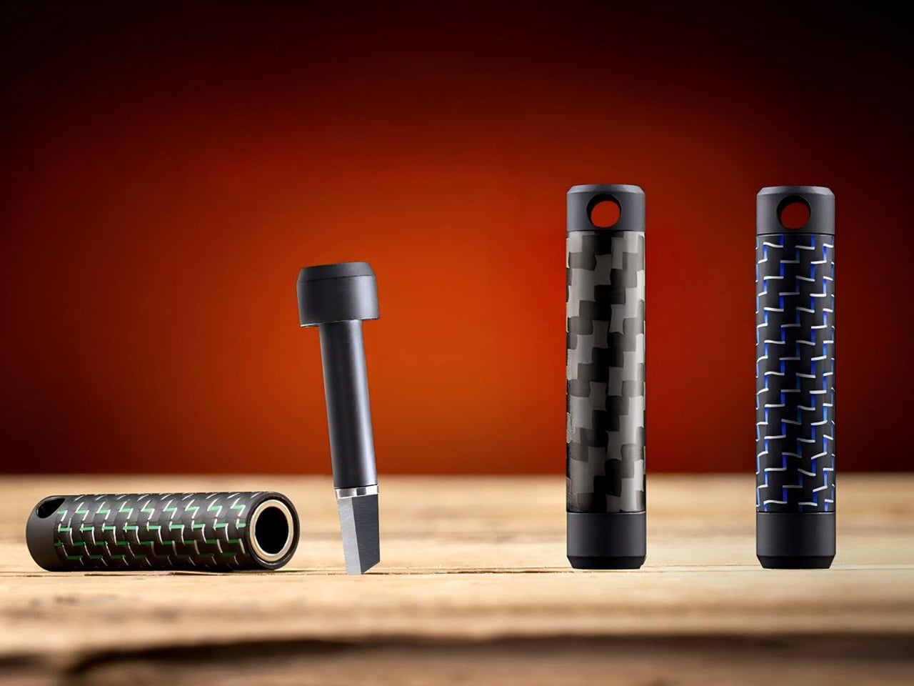
The Z3RO mini knife rebuilds the category from the materials up. It weighs 11g, measures around 5cm, and combines a tungsten cutting tip, carbon fiber body, and titanium backbone in a package that fits on a keychain without feeling like a toy. Instead of plastic or aluminum, Z3RO feels closer to pocket tech or minimalist jewelry, something you notice when you pick it up rather than ignore until it breaks.

Designer: YSMART Design Team

Click Here to Buy Now: $74 $120 (38% off). Hurry, only a few left!

The cutting tip is tungsten alloy, the same material used in surgical blades and industrial cutters, rated at Mohs hardness nine. It shrugs off cardboard, cord, plastic tags, and thick tape without dulling quickly or chipping like softer steel. It handles tasks that show up constantly, opening boxes, slicing cable ties, trimming threads, and cutting shrink wrap. Sharp enough to feel precise, hard enough to stay that way through months of daily cutting and abuse.

Instead of sharpening a tiny, ultra-hard edge, Z3RO uses a replaceable cutter head that swaps out in seconds without tools. When the tip eventually loses its bite, you pop in a fresh one. The body becomes a long-term object while the working edge is treated like a precision consumable. You replace the blade, not the tool, and the carbon fiber shell ages gracefully without looking worn after weeks of heavy pocket carry.

Most small knives lean on plastic or aluminum to save weight. Z3RO goes for woven carbon fiber wrapped around a titanium core, keeping the weight at eleven grams while still feeling solid. The material combination offers natural resistance to rust, sweat, moisture, and impacts, so it does not corrode in damp pockets or degrade from drops. It is the kind of material choice expected in high-end gear, not something dangling from house keys.

The mechanism is a magnetic quick-release using internal neodymium magnets instead of fiddly sliders. One firm pull separates the body, the cutter snaps into position with a click, and it is ready. The magnets hold everything with zero wobble, so it feels precise rather than loose. This matters when your other hand is holding a box, rope, or bag you do not want to drop while fumbling for a blade.

Everyday moments shift when a sharp, instantly accessible cutter lives on your keychain or neck lanyard. Cutting packing tape becomes one motion instead of clawing at it. Freeing a stuck zipper pull takes seconds. Trimming a cable tie or slicing shrink wrap happens without hunting for scissors. The tool turns minor annoyances into quick actions, and that quiet utility adds up, making it something you reach for multiple times daily without thinking.

The carbon fiber sheen, titanium accents, and slim silhouette make Z3RO look more like gear art than a utility blade. Color options like Stealth Black, Neo Blue, and Volt Green add personality without sacrificing the minimalist shape. It is the sort of object people notice when you set keys down, even if they do not immediately realize it cuts. The woven texture and metal details read as intentional design rather than generic hardware fare.

Z3RO exists because everyday carry has matured past cheap freebies into a space where materials, mechanics, and longevity matter. A tiny knife built from tungsten, carbon fiber, and titanium, with a magnetic quick-release and replaceable head, feels like a natural evolution. It reminds you that even the smallest tools can be designed with the same care as big ones, and sometimes the best gear is what you forget you are carrying until you actually need it.

Click Here to Buy Now: $74 $120 (38% off). Hurry, only a few left!

The post This 11g Keychain Knife Has a Tungsten Tip You Swap, Never Sharpen first appeared on Yanko Design.

How an RC Pilot Built the Most Technically Accurate LEGO Plane You’ve Seen

Most LEGO builders start with the instructions. Simons_Studio started with experience building actual radio-controlled aircraft, then wondered if the same principles could work with plastic bricks. The answer turned out to be yes, and in some ways, LEGO proved easier since every connection stays perfectly aligned without adjustment.

The Red Bull Extra Aerobatic Plane showcases this aviation-first approach to LEGO building. Rather than simply creating a brick shell shaped like an airplane, the builder constructed an actual airframe using proper longitudinal bracing and wing structures. At just under 1,000 pieces and 1/14 scale, this model balances impressive size with buildable complexity, making it a compelling candidate for LEGO’s official product lineup.

Designer: Simons_Studio

Lowkey there’s something fascinating about watching someone apply real engineering knowledge to a toy medium that makes you reconsider what that medium can do. Simons_Studio brought RC aircraft building experience to this Red Bull Extra, which explains why the fuselage tapers convincingly instead of looking like stacked rectangles trying their best. LEGO fights you on curves. The plastic wants right angles, wants to stack in predictable increments, wants to betray its modular origins at every turn. That rear fuselage section apparently took multiple attempts and different techniques before it worked, but the final result flows from cockpit to tail without those telltale bumps where one building method gives up and another takes over. You can see it in the profile shots, how the dark grey maintains its line.

The wings use actual longerons running lengthwise with plates acting as structural spars and ribs. If that sounds excessive for a display model, consider that this approach gives the wings proper internal geometry instead of being solid brick masses. Real aircraft wings are essentially fabric or metal stretched over a skeleton, and replicating that logic in LEGO means the proportions naturally fall into place. The thickness-to-chord ratio looks right because the structure underneath enforces it. It’s the difference between sculpting something to look like a wing versus building something that is fundamentally wing-shaped, even if it’ll never see airflow.

The Red Bull livery stretches across 48 centimeters of fuselage and a 55-centimeter wingspan, which puts this squarely in the display model category rather than something you’d swoosh around the living room. Those yellow wing tips and lightning bolt tail graphics capture the brand’s energy without sliding into corporate sponsorship territory. The color blocking works because it follows the aircraft’s actual lines instead of fighting them. At 1/14 scale with just under 1,000 pieces, this sits in an interesting space for LEGO Ideas submissions. Complex enough to justify the price point an official set would command, accessible enough that someone with intermediate building experience could tackle it over a weekend.

Now the Lycoming O-480 engine sitting behind that propeller deserves its own conversation. This is a six-cylinder horizontally-opposed powerplant, the kind you’d find in actual Extra aerobatic aircraft. Simons_Studio modeled it with a blue crankcase, white cylinder heads complete with cooling fins, and accessories in red and yellow positioned where they’d actually sit on the real thing. We’re talking about replicating individual cooling fins on cylinders, the sort of detail that lives in shadow and could easily be skipped. But then there’s the exhaust system, which uses custom-bent chrome LEGO bars to route individual pipes away from each cylinder in those distinctive curves. On a real Extra, this exhaust setup does real work during airshows, mixing smoke oil with hot gases to generate colored trails. Getting those curves right means someone heated LEGO bars and shaped them by hand, which is definitely off-label use of the parts.

That exhaust detailing matters beyond aesthetics. Anyone who’s spent time at airshows can spot an Extra’s exhaust configuration from the flight line, and those curves are part of the aircraft’s visual signature. Replicating them accurately signals that this build understands its subject matter at a level beyond “red and blue plane with wings.” The cockpit continues this pattern with a full instrument panel mimicking actual Extra avionics layouts, modern digital displays below representing GPS navigation systems, and proper canopy framing with curved transparency. Most LEGO aircraft put a seat in there and move on. This one recognizes that aerobatic pilots experience serious g-forces in that space and the cockpit deserves proportional attention to the exterior.

LEGO’s been oddly conservative with aircraft in their lineup. Military stuff runs into guideline issues around weapons and warfare, which eliminates a huge chunk of aviation history from consideration. But civilian aircraft don’t generate the same enthusiasm outside of specific niches, and planes generally demand more sophisticated building techniques than cars or buildings. This Extra threads through that narrow gap as a legitimate performance aircraft with name recognition that happens to be completely civilian.

LEGO Ideas MOCs (My Own Creations) needs 10,000 supporters for a project to get reviewed, and this one’s sitting at 361 with over a year to go. The platform’s algorithm favors early momentum, so that’s a concerning gap. LEGO’s been bizarrely stingy with aircraft sets, partly because military guidelines eliminate a huge chunk of aviation history, partly because planes demand building techniques that scare off casual customers. This Extra threads a narrow path: civilian aircraft with legitimate performance credentials, complex enough for adult builders but not so esoteric that it lacks mainstream appeal. Whether it hits that supporter threshold depends on whether aviation nerds and LEGO enthusiasts overlap enough to create critical mass. The build quality deserves it. The question is whether 9,639 more people will care. If you consider yourself a part of that demographic, head down to the LEGO Ideas website and cast your vote for this build!

The post How an RC Pilot Built the Most Technically Accurate LEGO Plane You’ve Seen first appeared on Yanko Design.

Huawei Wi Fi 7 Mesh Router Turns Connectivity into Sculptural Lighting

Most mesh routers exist to be hidden. They sit behind television consoles, inside media cabinets, anywhere out of sight. Huawei’s Wi-Fi 7 Mesh Router rejects that premise entirely-it was designed to occupy a shelf the way a sculptural lamp or a blown-glass vase might, demanding visibility rather than tolerating it. The system ships as a main router paired with up to two extenders, and every unit in the family brings aesthetic presence to a category that usually hides function. Whether that ambition translates into livable design depends on how much visual weight a room can absorb.

Form and First Impression

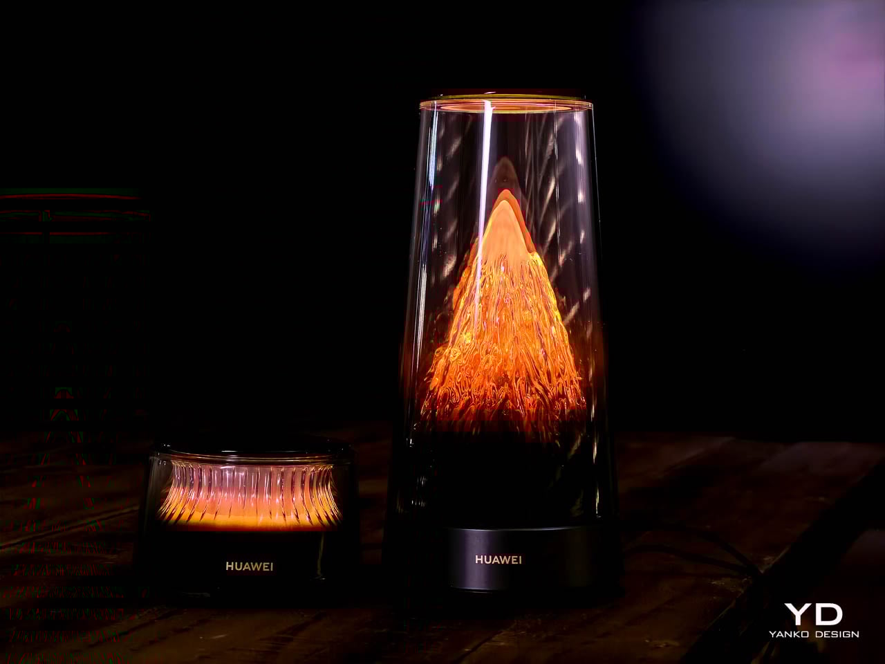
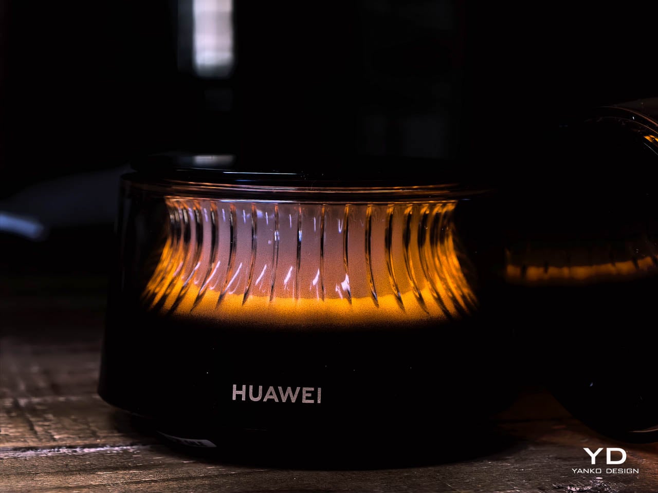
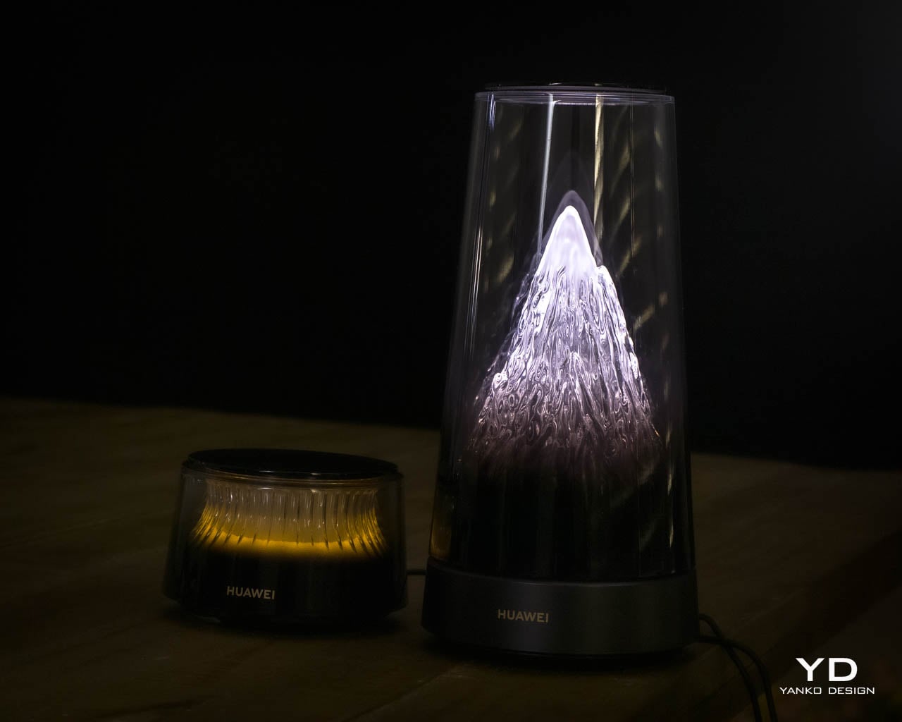
The main unit rises vertically under a tall transparent dome, and the first impression lands somewhere between illuminated glassware and a miniature architectural model. A sculpted cone sits inside the chamber, channeling warm LED light upward through fine vertical ribs that stretch the glow into elongated streaks. The gradient begins deep amber at the base, fades toward soft cream near the midpoint, and dissolves into near-invisibility at the dome’s crown. Under morning sun the dome reads as a sculptural artifact with subtle internal texture; under evening lamps it becomes a warm, glowing presence that anchors an entire corner of a room.

That visual prominence carries a trade-off worth acknowledging early. The dome’s height and luminosity demand attention in a way that softer network hardware does not. In quieter rooms-bedrooms, reading nooks, minimalist spaces-the persistent glow may feel like a permanent nightlight rather than a subtle accent. Huawei leans fully into the decorative category, and the result works best in spaces that already embrace statement objects.

Material Language

Huawei appears to use a dense transparent polymer that mimics the refraction and clarity of hand-blown glass. Close inspection reveals the material catches daylight differently than it catches artificial light, giving the object a living quality that shifts throughout the day. Fine vertical channels line the inner cone and catch the LEDs, stretching them into long streaks that resemble molten glass rising through a chimney. The effect positions the router closer to ambient lighting than consumer electronics.

Placement matters here. The design reads best on open shelving in a living area, a console table near an entryway, or a display ledge in a modern kitchen. Treating it as background hardware-tucked beside a television or wedged into a media cabinet-misreads the intent entirely.

Hidden Engineering

Functional elements remain invisible by design, but the engineering underneath is anything but minimal. Ports sit inside a recessed cavity on the underside, tucked into the dark base, so cables disappear the moment the device rests on a flat surface. The separation between glowing dome and utilitarian base gives the impression of a clean floating cylinder even though Ethernet, power, and every technical connection remain accessible.

Weight distribution pulls toward the base-intentional, since the main router includes active cooling with a built-in fan for high-throughput scenarios. That engineering decision affects form directly: the base must accommodate thermal management, which explains the unit’s footprint relative to passive competitors. The dark matte finish stays quiet, letting the luminous chamber dominate, but the chassis is doing real work underneath.

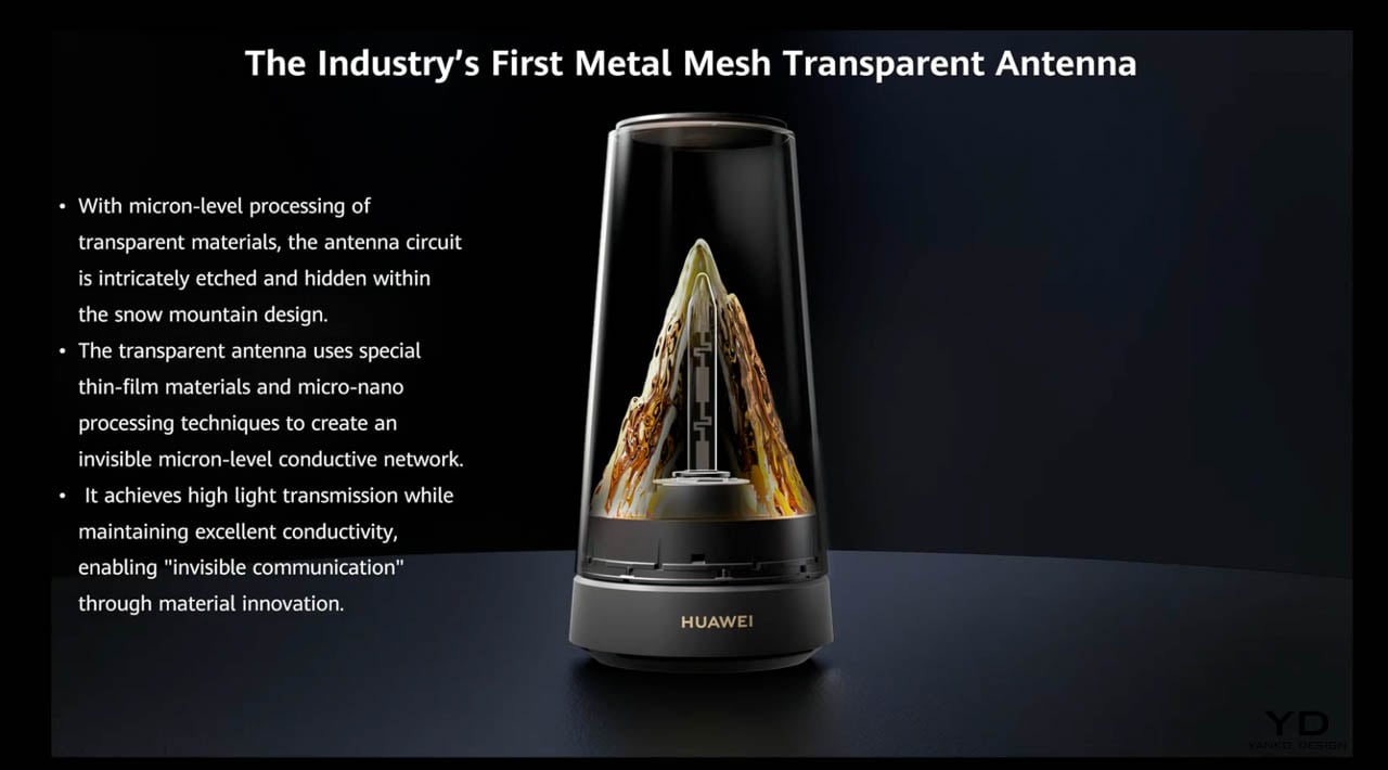
One detail that rarely survives the translation from engineering to marketing: Huawei literally etched the antennas into the sculpted mountain shape inside the dome. Six antennas-three for 2.4GHz, three for 5GHz-run along the contours of the internal cone, hidden in plain sight. The design team integrated signal hardware into the decorative structure rather than bolting it on as an afterthought. That level of form-function synthesis is rare in consumer networking equipment, and it suggests the industrial design team had genuine authority over the final product rather than decorating an engineering prototype.

The Satellite System

Satellite extenders interpret the same visual language in a shorter, more restrained form. Huawei’s briefing compared them to elegant whisky glasses-a fair analogy. Each unit features smoked outer walls with spaced vertical ribs that break the internal gradient into a soft, pulsing glow. The warm tone matches the main router but feels more intimate, less theatrical.

These units read as decorative accents on a shelf rather than technical equipment. No protruding antennas, no plastic ventilation grilles, no indicator LEDs screaming status codes from across the room. A candle holder or compact speaker would sit just as naturally in the same arrangement. The restraint here is notable-Huawei resisted the temptation to differentiate the satellites through size or brightness, which keeps the family identity coherent.

Interaction Design

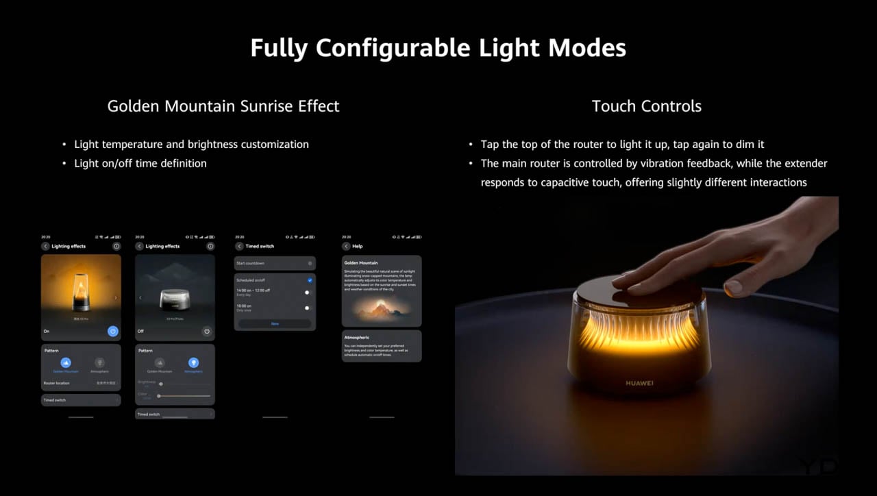
Both the main router and each satellite include a flush touch surface on the top, letting users adjust lighting modes directly from the device. The touch panel sits flush with the rim, preserving the cylindrical outline-no buttons, no visible interface elements, no mechanical disruption. The top surface remains dark and reflective when inactive, reinforcing the contrast with the illuminated body below.

That restraint suggests confidence in the form itself. Huawei trusts the design enough to let it speak without interface clutter. The interaction layer exists, but it never competes with the sculptural presence.

The Placement Tension

The system’s visual cohesion raises a practical question that Huawei’s marketing sidesteps. Mesh networks exist to blanket a home in wireless coverage, which means placing extenders in locations optimized for signal propagation-hallways, stairwell landings, rooms far from the main router. Huawei designed units beautiful enough to display prominently, but optimal placement for aesthetics rarely aligns with optimal placement for coverage.

A living room shelf may showcase the extender perfectly while delivering weaker signal to a home office two walls away. Buyers should expect to choose between form and function in at least one placement decision, and that tension deserves acknowledgment. The router rewards homes where signal-optimal spots happen to be visible spots-and punishes homes where they don’t.

System Coherence

Material consistency across the system reinforces the family identity in ways that most mesh systems ignore. The polymer domes, the dark matte bases, the warm LED gradients, and the vertical rib detailing all repeat across main unit and satellites. Nothing about the extenders looks like a compromise or an accessory-they read as intentional companions rather than technical necessities.

That coherence reflects a design philosophy that treats network hardware as a coordinated interior collection rather than a primary device surrounded by lesser satellites. The approach borrows from furniture design, where a sofa and matching armchairs share fabric and form language. It’s an unusual strategy for networking equipment, and it pays off visually.

Design Verdict

Together, these choices carve out a new category for consumer networking equipment. Huawei positions the Wi-Fi 7 Mesh Router not as infrastructure but as decor, borrowing visual cues from glass art, ambient lighting, and sculptural furniture rather than traditional electronics. The approach invites users to display their network hardware rather than hide it-a genuine inversion of the category’s usual logic.

That ambition has limits worth naming. The design rewards specific interiors-modern, curated, comfortable with statement objects-and punishes others. A room already crowded with visual noise may find the router’s glow overwhelming. A household that treats connectivity as invisible utility may resent paying for aesthetics they plan to hide. The placement tension between signal optimization and display value will frustrate anyone expecting both without compromise.

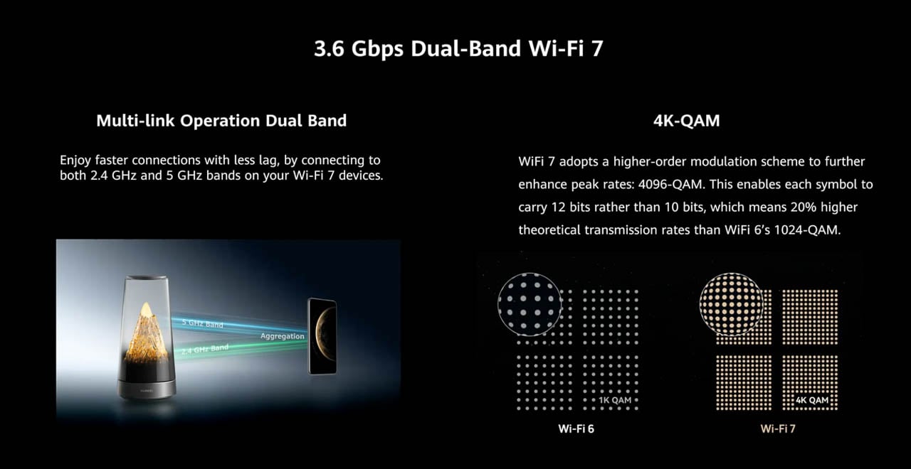
Huawei built a router for people who want their home network to carry emotional weight through form and material alone. The system achieves this without abandoning its technical identity: Wi-Fi 7 support, six integrated antennas, active cooling, and mesh scalability all remain intact beneath the decorative surface. For everyone else, the category’s quieter options remain available.

The post Huawei Wi Fi 7 Mesh Router Turns Connectivity into Sculptural Lighting first appeared on Yanko Design.

Anicorn x PlayStation’s $780 Mechanical Watch Is The Wildest 30th Anniversary Flex Yet

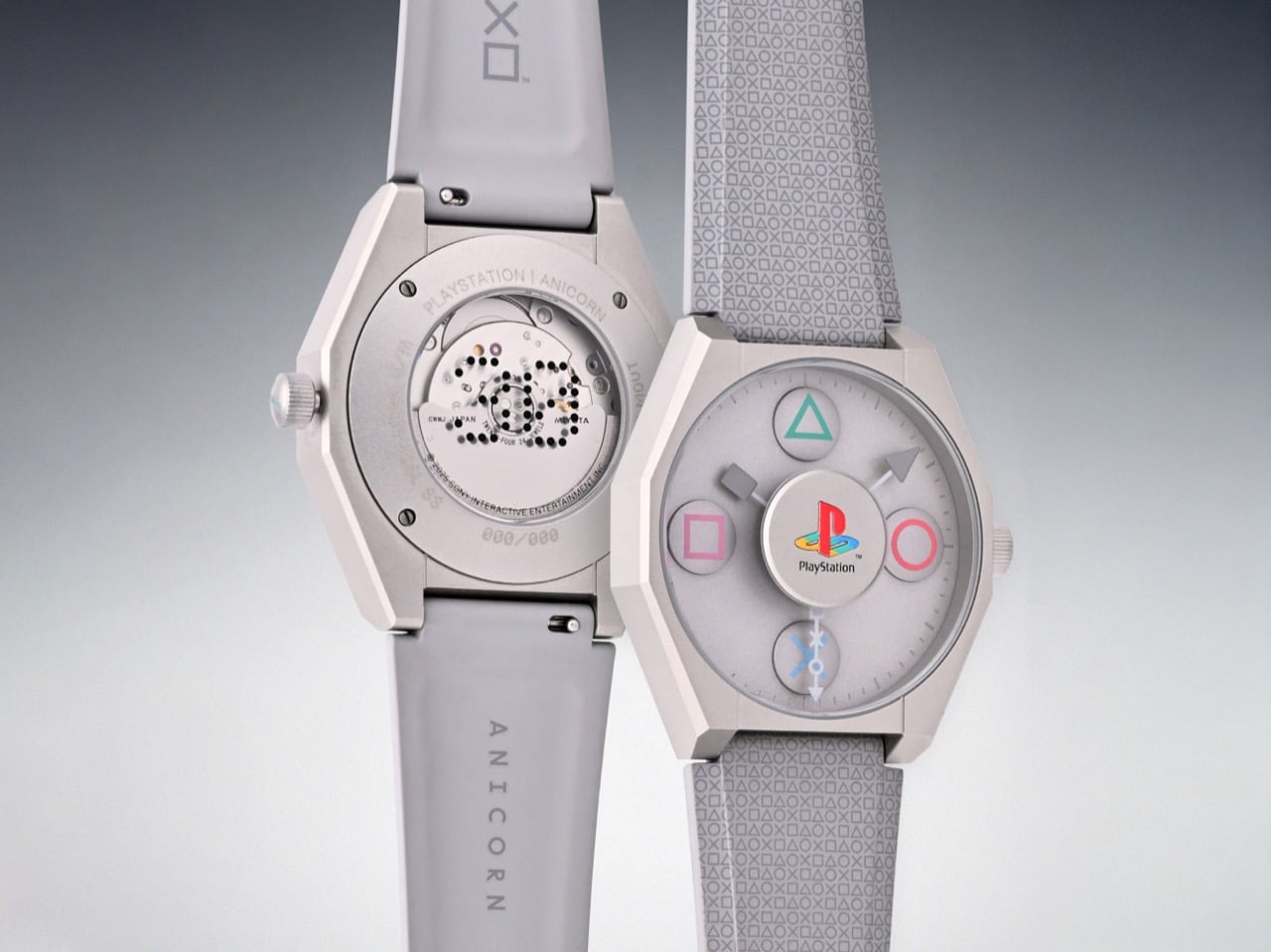
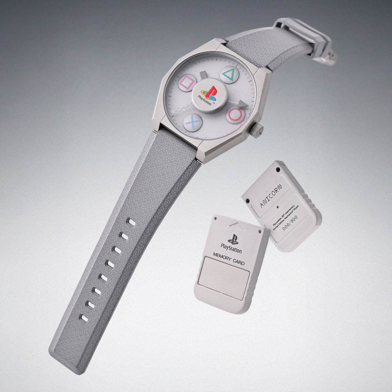
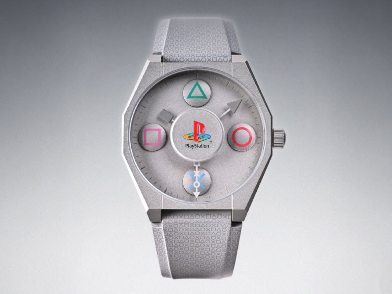
Anicorn and Sony just dropped a fully mechanical PlayStation watch, and the fact that it exists at all feels like a minor miracle in a market drowning in lazy licensed quartz. Limited to 300 numbered pieces and priced at $780, the PlayStation 30th Anniversary watch launches December 19th with a Miyota automatic movement, a custom rotor, and enough thoughtful design touches to justify the “limited edition” label beyond artificial scarcity. The caseback alone, with its exhibition window and engraved numbering, shows more restraint and craft than most gaming collabs bother with.

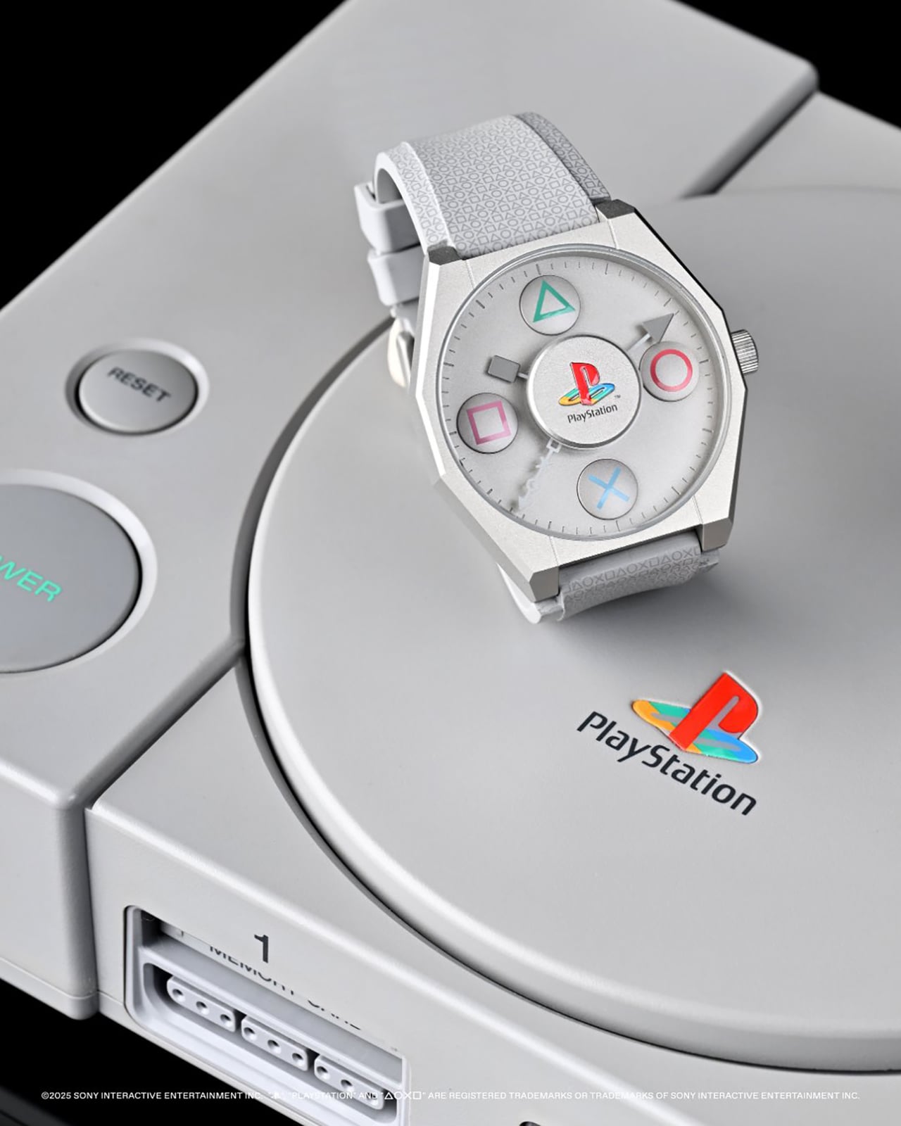
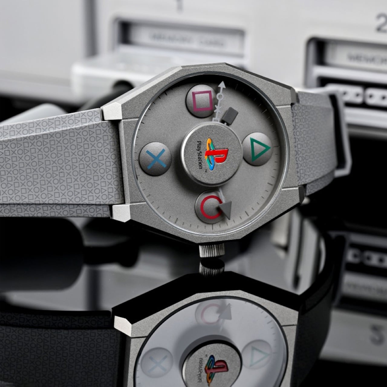
What makes this interesting beyond the usual merch cycle is how seriously they treated the design language. The △○×□ symbols sit at 12, 3, 6, and 9 o’clock as three-dimensional applied elements, not flat prints. The PlayStation logo occupies a raised central medallion, and the hands are modeled after the original controller’s Start and Select buttons, which is the kind of nerdy detail that separates fan service from actual design work. The case mirrors the faceted geometry of the 1994 console hardware, finished in that unmistakable matte grey, and the rubber strap carries the button symbols all the way down. It feels like someone actually cared about making this coherent as an object of sheer nostalgia, not just profitable as a limited drop.

Designer: Anicorn

Miyota movements get dismissed sometimes by the Swiss snob crowd, but here’s the thing: they’re reliable, serviceable by basically any competent watchmaker, and when decorated properly, they do the job without drama. The rotor visible through the exhibition caseback gets custom perforation work that echoes disc drive aesthetics, which is a subtle touch that could have easily been skipped in favor of a plain rotor with a logo slapped on. That kind of restraint shows up throughout the design, actually. The dial could have been a chaotic mess of branding and colors, but instead it uses that soft grey finish with selective pops of color on the applied symbols. Legibility takes a backseat to theme, sure, but you buy a watch shaped like a PS1 controller for the vibe, not to check train schedules.

Pay special attention to the case shape. Those faceted, near-octagonal edges are a direct reference to the original PlayStation’s industrial design language, which was all hard angles and serious electronics aesthetics back when consoles still tried to look like they belonged in an A/V rack. Anicorn could have gone with a standard round case and called it a day, but the geometric approach makes the whole thing feel intentional rather than opportunistic. The integrated strap design, with that all-over micro-print of controller symbols, reinforces the “this is a device” impression rather than trying to split the difference between jewelry and gadget. You wear this and people either get it immediately or think you’re wearing some kind of fitness tracker. There’s no middle ground, which is exactly how it should be.

Three hundred pieces worldwide means this will sell out in minutes, probably to a mix of serious PlayStation collectors who still keep mint PS1 longboxes and watch nerds who appreciate limited mechanical releases with actual design thought behind them. The memory card-shaped authenticity cards included in the packaging are pure fan service, but they work because they commit to the bit completely. At $780, you’re paying for scarcity, licensing, and that Miyota movement wrapped in very specific nostalgia. I can almost hear the PS booting sound as I look at this watch! Don’t lie, I’m sure you can too.

The post Anicorn x PlayStation’s $780 Mechanical Watch Is The Wildest 30th Anniversary Flex Yet first appeared on Yanko Design.

Clover Emotion Tracker Turns Small Happy Moments into a Daily Desk Ritual

People are more stressed than ever, yet still find it hard to talk honestly about how they feel, even with therapists or friends. Most mental health tools live inside apps that want you to rate your mood on a slider or fill out forms about your day, which can feel clinical or like homework you forgot to do. Clover is a concept that tries to make emotional check-ins gentler and more tangible, focusing on collecting small moments that went right instead of cataloging everything that went wrong.

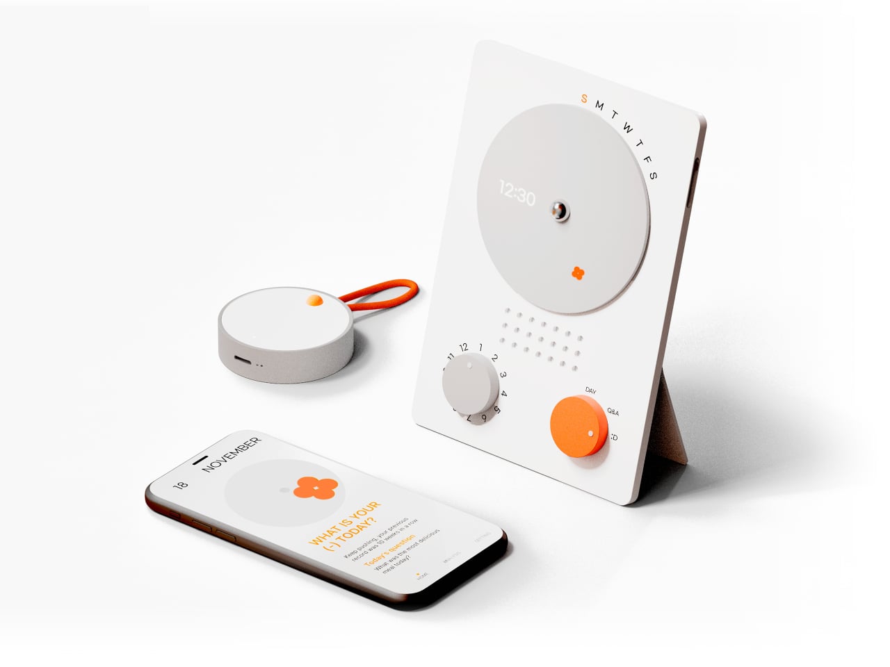
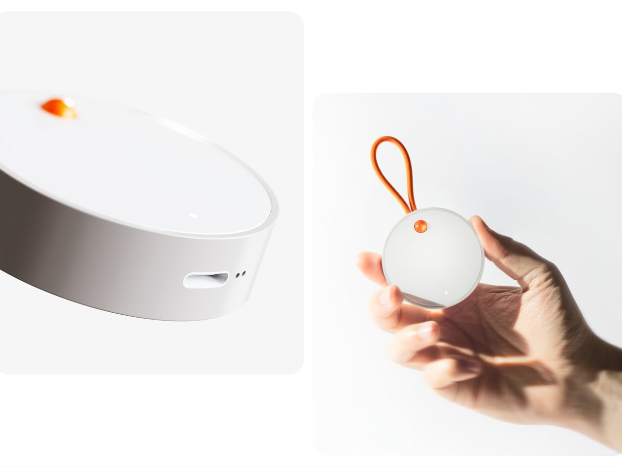
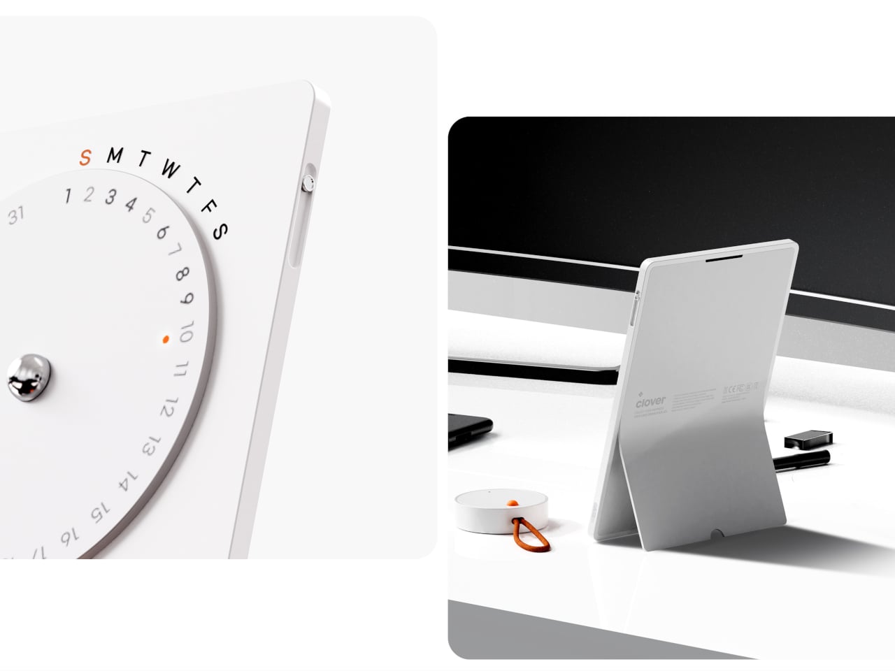
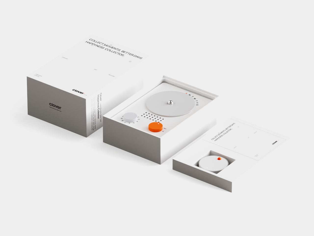
Clover is a small ecosystem built around three pieces: a pocketable voice recorder, a desk-calendar device, and a companion app. Instead of logging stress or symptoms, you press a button and record short voice notes whenever something makes you genuinely happy. Those moments are then visualized on the calendar and analyzed in the app, turning your week into a kind of happiness log that quietly reframes how you see your days.

Designers: Seyeon Park, Bhin Son, Yu Jin Song, Jiwon Park, Jinya Kim

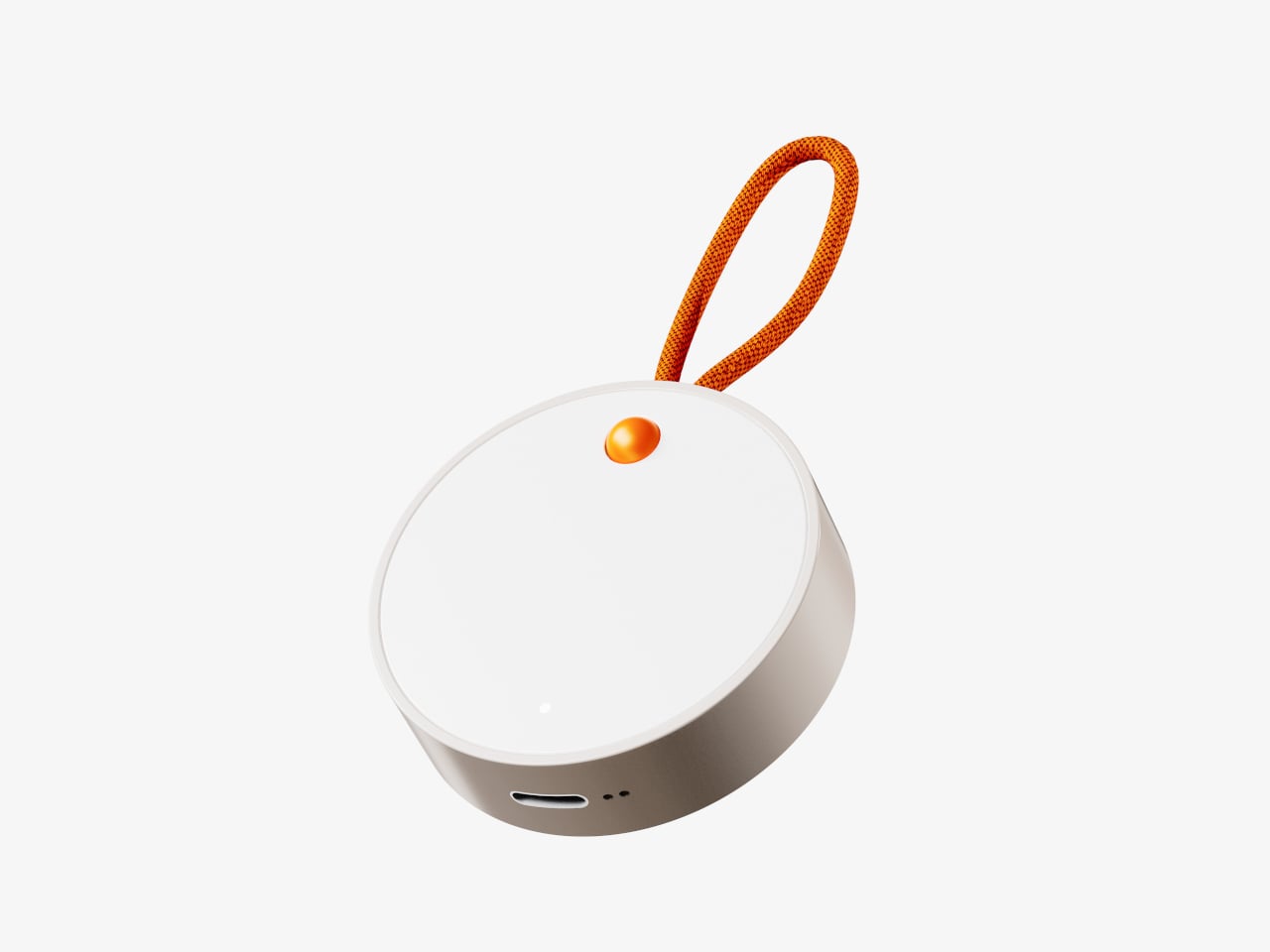
The recorder is a small, circular object with a single orange button and a loop strap, designed to be grabbed and pressed quickly. It is meant for capturing tiny, specific moments, sunlight on your desk, a good cup of tea, a joke from a friend, in your own voice. The goal is to lower the friction so much that recording a positive moment feels as easy as taking a photo, no unlocking, no tapping through screens, just press and speak.

1

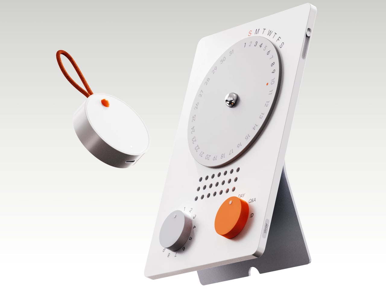
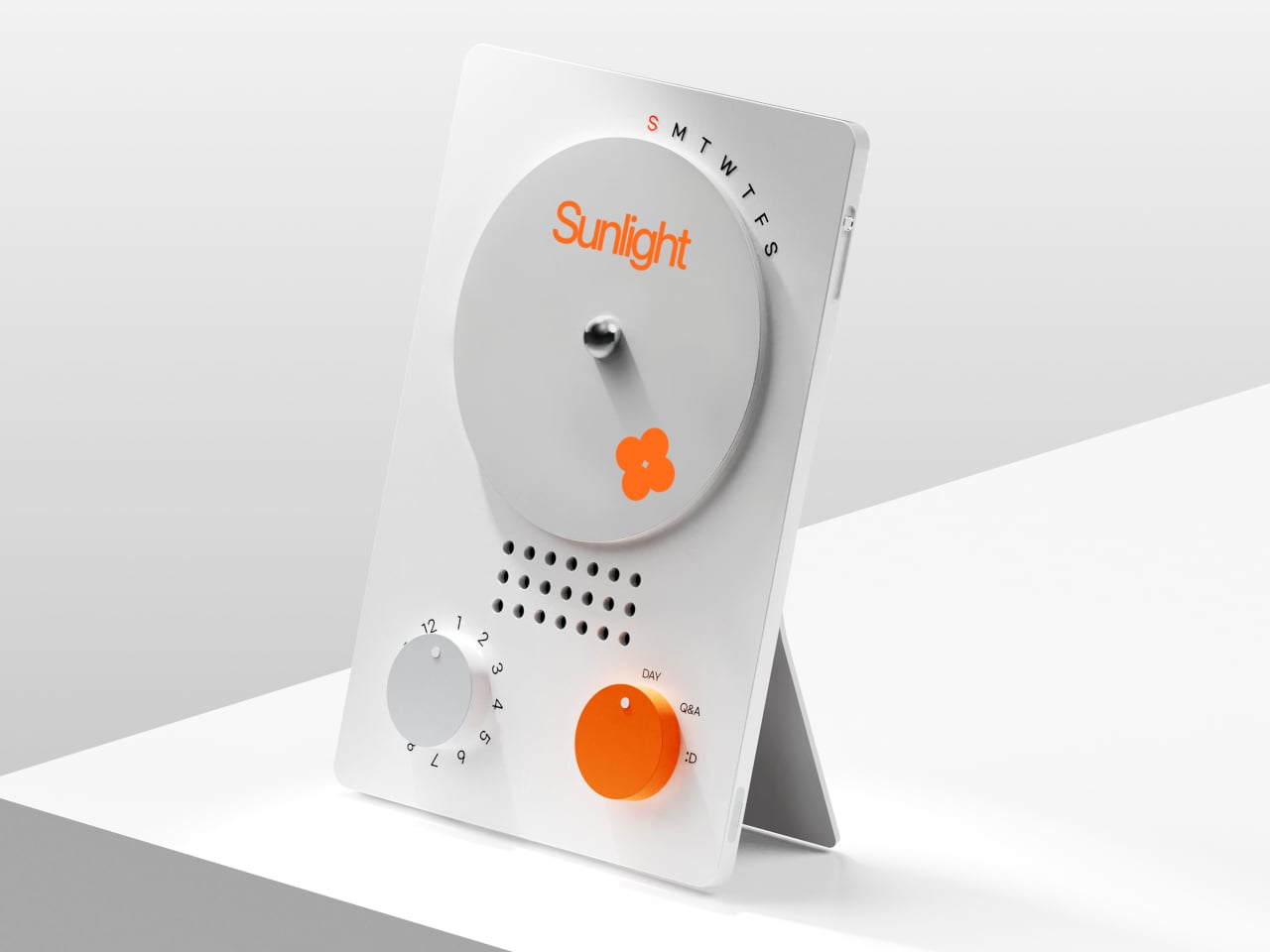
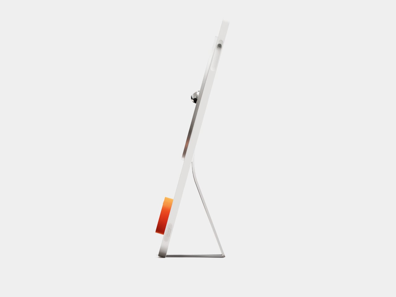
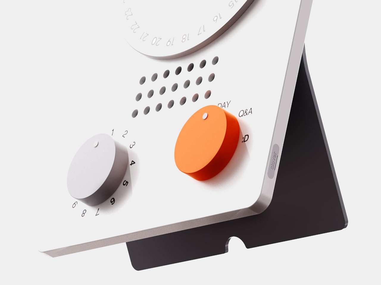
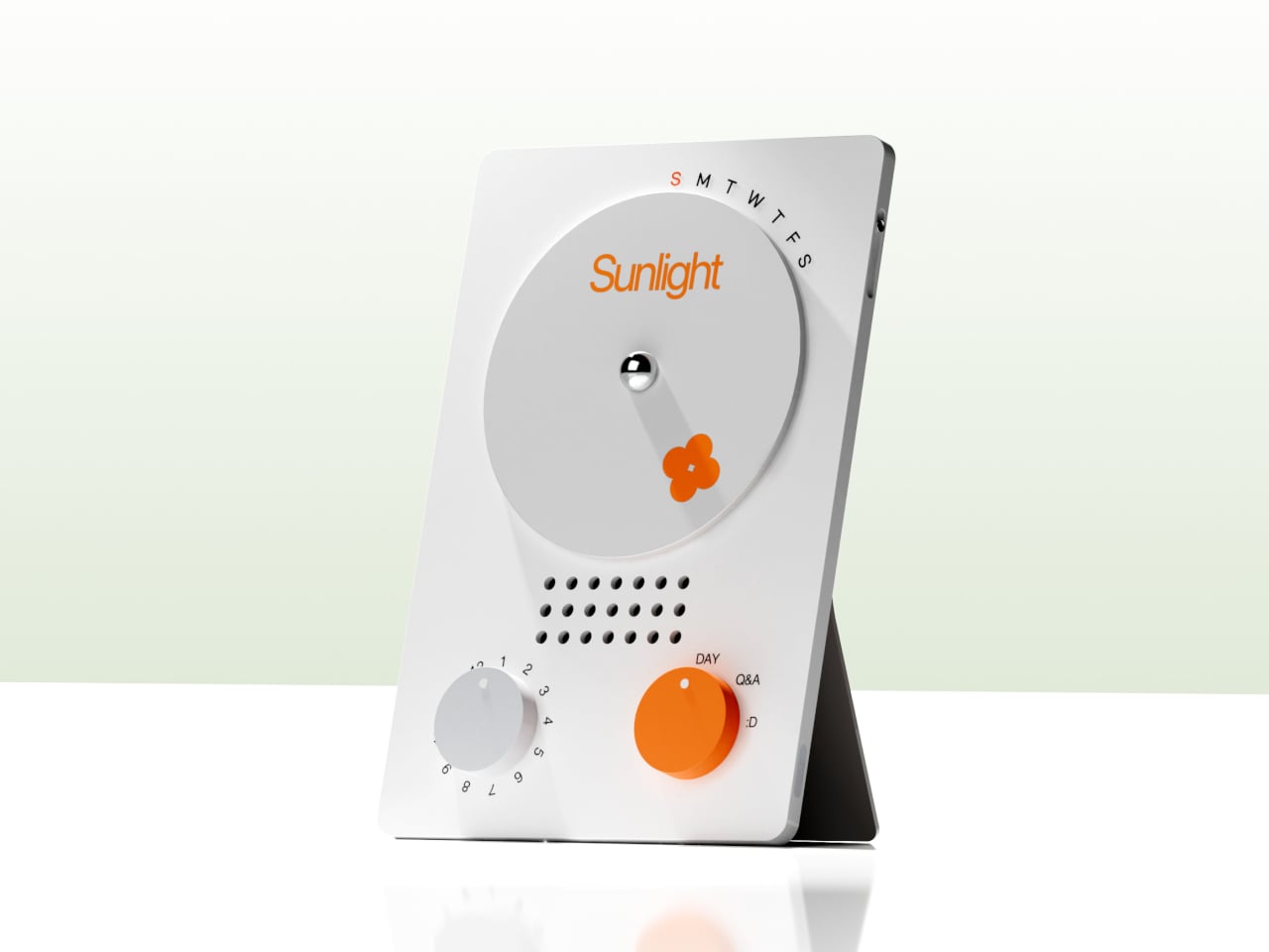
The desk calendar is a tilted white slab with a large circular dial labeled with days of the week and a small screen that displays words like “Sunlight” or “Spring.” It plays back or summarizes your voice recordings by day, and turning the dial lets you move between Day mode, Q&A mode, and long-term overview modes. Checking your emotional log becomes a physical ritual, more like flipping through a calendar than scrolling a feed or staring at another glowing interface.

1

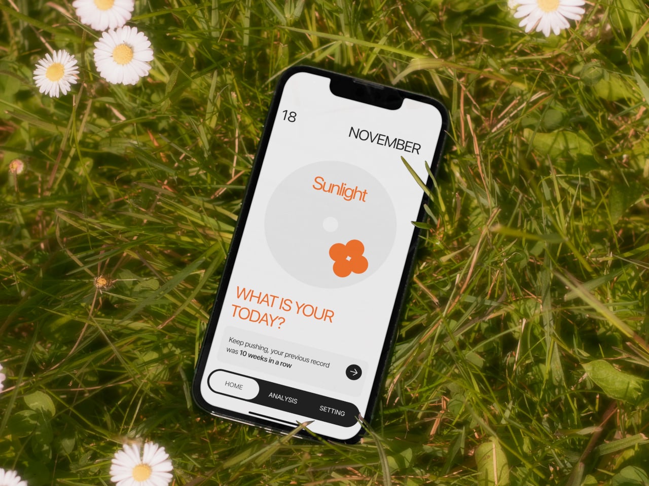
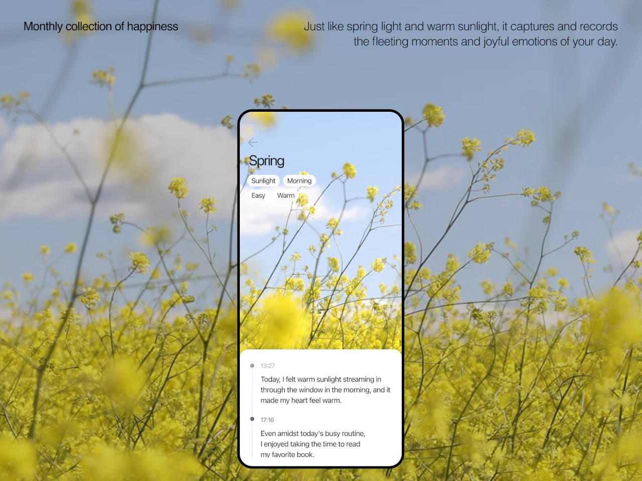
The app brings everything together, with daily cards asking “What is your today?”, weekly and monthly views full of dots and bars, and simple text insights that highlight recurring themes. You can tag entries by time, category, or keywords, and later see which people, places, or activities show up most often in your happiest moments. The analysis stays gentle, showing patterns without drowning you in numbers or making you feel like you failed when a week looks sparse.

1

Clover’s visual language, white and grey surfaces with orange accents, soft typography, and a clover icon that appears on hardware and UI, keeps the system from feeling like medical equipment. The core values, self-honesty, emotional balance, and everyday positivity, are baked into how it looks and behaves. It frames itself as a friendly desk object and app you would not mind seeing every day, not a reminder that something is broken.

Clover quietly flips the usual tracking script. Instead of asking you to monitor symptoms or productivity, it asks you to notice and collect small good things, then shows you that they happen more often than you think. For people who are tired of mood sliders and habit streaks, the idea of a physical recorder and calendar that simply help you remember what felt right might be the most calming part of the concept.

The post Clover Emotion Tracker Turns Small Happy Moments into a Daily Desk Ritual first appeared on Yanko Design.

Huawei FreeClip 2 Review: Open-Ear Audio at Its Best

PROS:


  • Featherlight 5.1g design disappears on your ears within minutes

  • Dual-diaphragm drivers deliver bass that open-ear rarely achieves

  • Nod to answer, shake to reject: head gestures feel futuristic

  • Intelligent Volume Adaptation matches audio to your environment automatically

  • 38-hour battery and IP57 durability: built for all-day adventure

  • Perfect, secure fit stays locked through runs, shakes, and sleep

CONS:


  • No ANC means loud environments will always win

  • Huawei Audio Connect app unavailable on Google Play Store

RATINGS:

AESTHETICS
ERGONOMICS
PERFORMANCE
SUSTAINABILITY / REPAIRABILITY
VALUE FOR MONEY

EDITOR'S QUOTE:

FreeClip 2 is proof open-ear audio doesn't have to compromise.
award-icon

Three million units. Huawei’s original FreeClip proved open-ear audio could sustain mainstream adoption, not simply exist as a design curiosity for early adopters willing to sacrifice bass for situational awareness. The FreeClip 2 is the engineering-driven response to that market validation.

Designer: Huawei

Refinements. Huawei’s engineering team reworked acoustic design, material selection, ergonomic architecture, and battery systems, each adjustment responding to friction points that first-generation users identified during extended daily wear cycles. These aren’t incremental changes. They required rejecting constraints the open-ear category had normalized as acceptable trade-offs.

Ergonomics & Design: Solving Gen 1’s Friction Points

The original FreeClip launched in Dubai, December 2023. Three million units later, Huawei knows exactly where it succeeded and where users pushed back. The FreeClip 2 arrives two years later, same city, same month, with a focused brief: fix the comfort complaints without abandoning what worked.

I’ve never worn open-ear earbuds before. My entire audio life has revolved around AirPods. The moment I clipped the FreeClip 2 on? Comfortable. Secure. It felt like they weren’t going anywhere, regardless of what I threw at them.

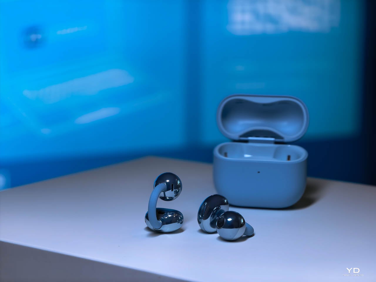
The architecture stays familiar: C-bridge, acoustic ball, comfort bean. Three components working as a unified clip mechanism. What changed is the material stack and dimensional tuning underneath.

The C-Bridge

Gen 1’s bridge gripped well but created pressure hot spots during extended wear. Huawei’s fix: a hybrid construction pairing skin-friendly liquid silicone over a shape-memory alloy core. The silicone adds 25% more flexibility. The alloy maintains consistent clamping force across temperature swings. No summer loosening. No winter tightening.
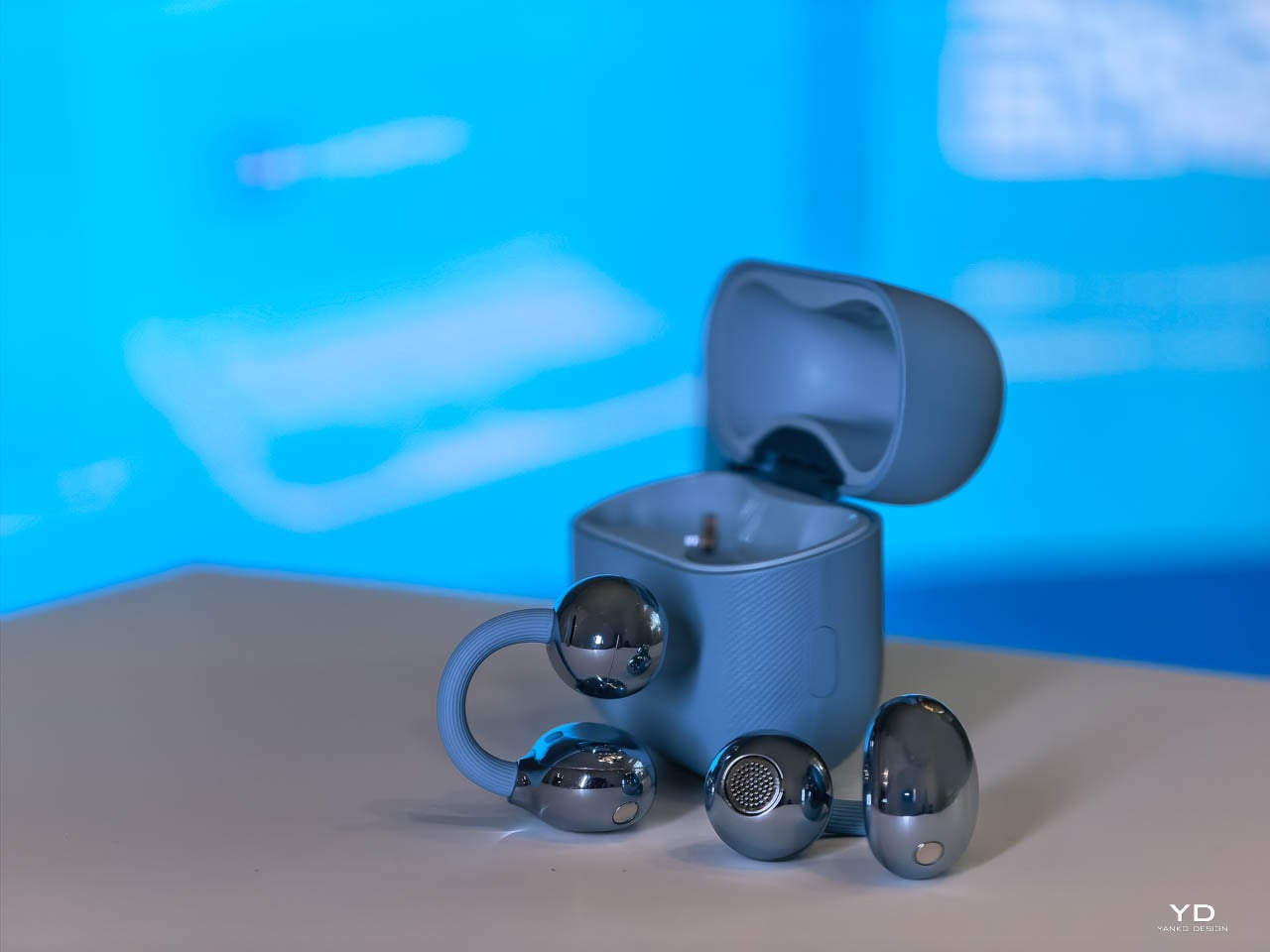
The new C-bridge doesn’t pinch. It doesn’t squeeze. It just… holds. Against my ear cartilage, the pressure distribution feels even rather than concentrated at specific contact points. “Cloud-like softness” sounds like marketing fluff until you’re six hours into a workday and realize you haven’t adjusted them once.

Huawei validated the design through 25,000 flex cycles. That’s lab durability. Real-world durability means the bridge returns to form after months of daily clipping and pocketing.

Acoustic Ball & Comfort Bean

The acoustic ball shrank by 11% in volume while achieving 95% internal space utilization. That’s engineering density: dual diaphragms, microphones, and acoustic venting packed tighter without adding visual bulk. The glossy finish on Denim Blue contrasts deliberately with the textured bridge.

The comfort bean, the counterweight behind the ear, reduced by 12.5% in volume. Huawei’s 10,000+ global ear scan database informed micrometer-level adjustments, expanding ear shape compatibility by 12.3%.
The bean tucks neatly into the anti-helix hollow, that curved ridge of cartilage behind your outer ear. It doesn’t fight for space or create awkward pressure points. The smaller footprint means it sits where anatomy intended rather than forcing the ear to accommodate the hardware. During head turns, it stays planted. During vigorous movement, same story.

Weight: The Competitive Edge

5.1g per earbud. Down from 5.6g. Half a gram matters because open-ear designs concentrate all mass on the helix rather than distributing it across the ear canal. At 5.1g, the FreeClip 2 is the lightest in its competitive set:

  • Bose Ultra Open: 6.5g
  • Shokz OpenDots One: 6.5g
  • SoundCore AeroClip: 5.9g

Glasses wearers gain the most. The softer bridge and smaller footprint reduce interference with temple arms.

Extended Wear Reality

After three to six hours, I forget I’m wearing them. That’s not hyperbole. That’s the actual experience. They disappear into background awareness the way a comfortable watch does.

Here’s where the open-ear advantage becomes obvious: car trips. The FreeClip 2 lets road noise through. Conversation reaches you unfiltered. But your podcast, your music, your navigation prompts, they’re all there too, layered on top of environmental audio rather than replacing it. Huawei’s “wear and forget” positioning isn’t aspirational marketing. It’s describing what actually happens.

The Sleep and Travel Test

Flying with AirPods is a gamble. Lean back in a business class seat, drift off, and wake up to find one earbud has slipped into the crevice where cushions meet armrest. Gone. The FreeClip 2’s clip mechanism eliminates that anxiety entirely. I wore them through an international flight, slept in them, and never once worried about losing a $200 earbud to upholstery.

They’ve become a sleep aid. For anyone managing tinnitus, the ability to wear comfortable earbuds to bed, playing low ambient audio to mask the ringing, is genuinely life-improving. Most earbuds create pressure points that make side-sleeping impossible. The FreeClip 2’s open design and featherweight construction don’t.

Case & Colorways

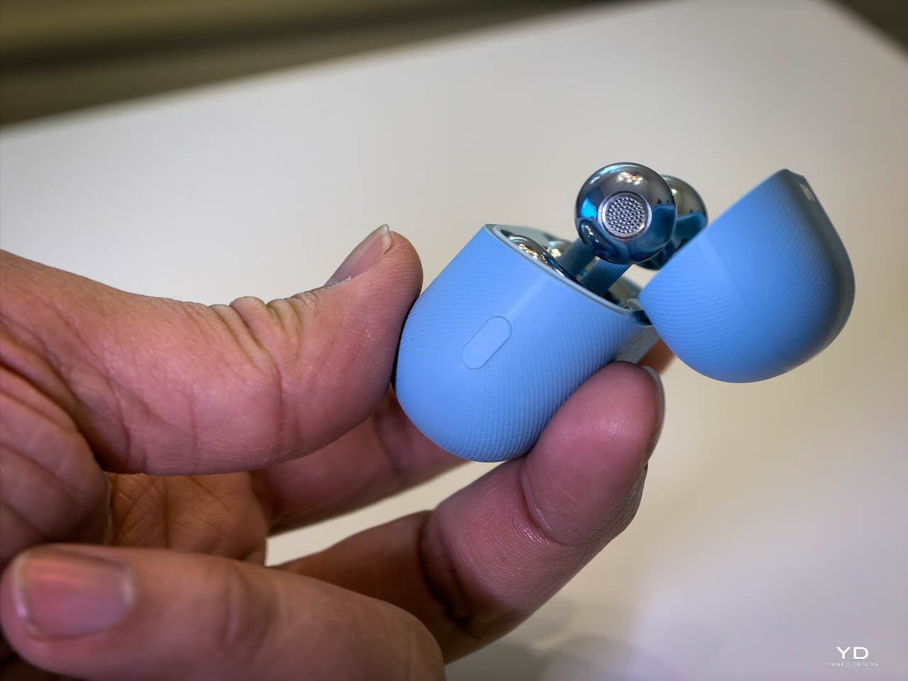
The case redesign matters for pocket carry. Crossed C-bridge arrangement inside achieves 17% narrower grip width and 11% smaller footprint. Case weight dropped 14%, from 45.5g to 37.8g. The larger 537mAh battery fits despite the shrinkage.

I love this form factor. The case slots perfectly into my jeans coin pocket, that small fifth pocket most people forget exists. It sits there all day without demanding attention. Always with me. Always ready.
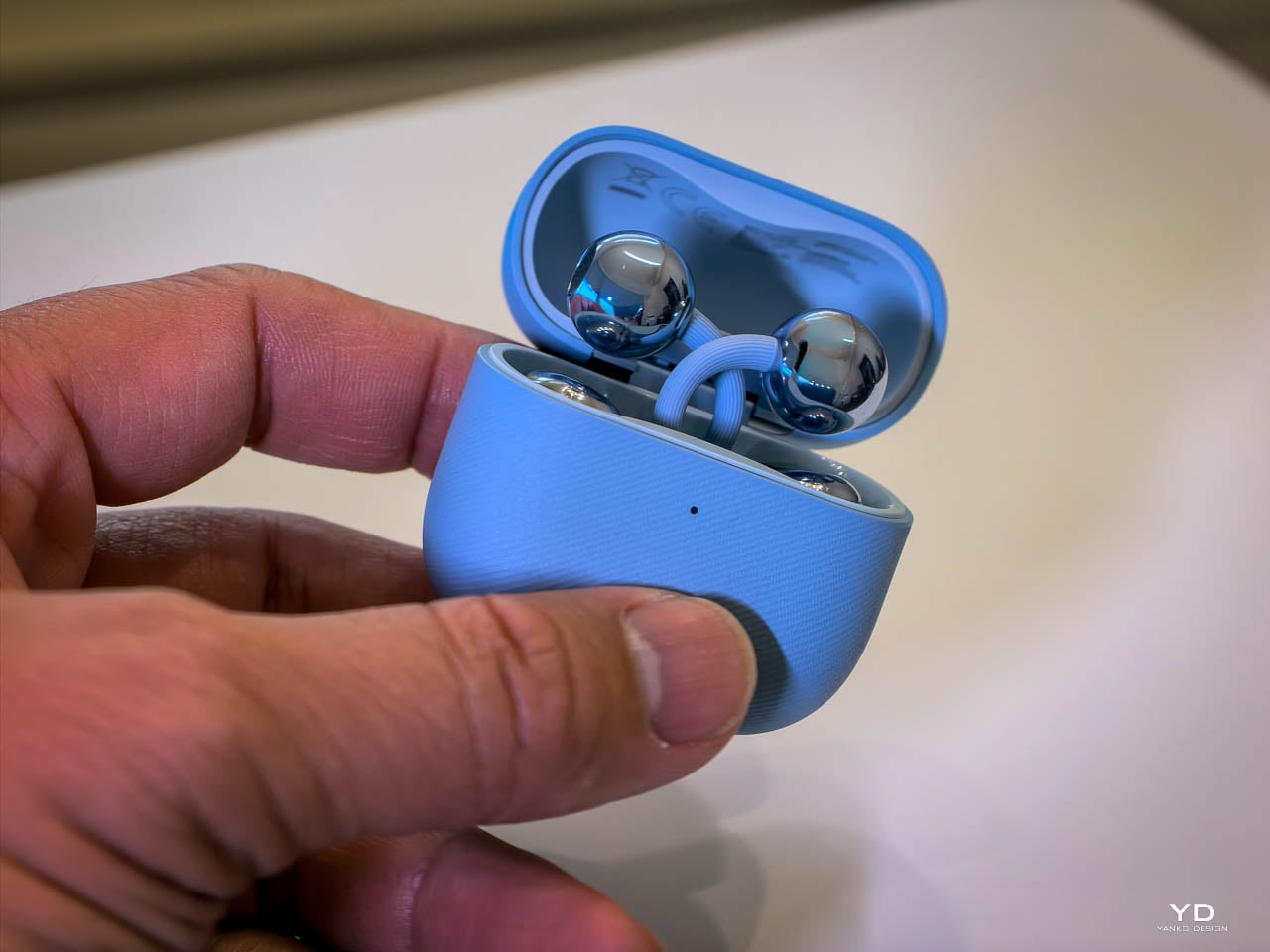
Here’s an unexpected bonus: the slight bulge it creates actually works as a physical gate, preventing my phone from sliding up and out. The AirPods case does the same thing, but the FreeClip 2’s narrower profile makes it less intrusive while still providing that pocket security. It’s a small detail, but it means I don’t fish around wondering where I left them. They’re just – there. The compactness isn’t just a spec sheet flex. It translates directly to daily carry confidence.

Huawei offers four colorways: Denim Blue, Feather Sand White, Modern Black, and Rose Gold. I’d have picked Modern Black, but Huawei didn’t have one available for review. The Denim Blue unit I received turned out to be fine. It’s clearly the hero color, the one Huawei leads with in every press image, and after wearing it everywhere for weeks, I don’t mind it at all. The blue reads as understated rather than attention-seeking.
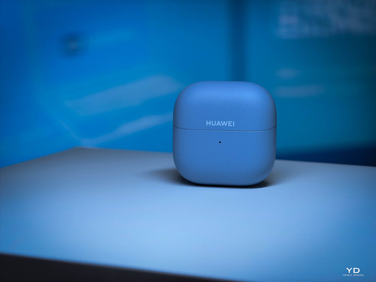
The Denim Blue and Feather Sand White cases feature micrometer-level molded denim weave texture, replicated from actual fabric. It’s stain-resistant (18 tests passed) and genuinely pleasant to the touch. The fabric-like surface adds grip without feeling gimmicky or cheap. Modern Black and Rose Gold ship with smooth matte finishes instead, trading the tactile detail for a more traditional premium look.

Durability

IP57 for the earbuds, up from IP54. The “7” rating certifies immersion to one meter for 30 minutes. Rain, sweat, accidental sink drops won’t end them. The case holds at IP54.

The Foundation

Here’s the thing about earbuds, headphones, any wearable audio that lives on your body: comfort isn’t a feature. It’s the prerequisite. Performance specs can dazzle on paper, but if the hardware pinches, slips, or annoys you into taking it off, none of those numbers matter. You won’t use them. They’ll collect dust in a drawer while you reach for something that actually feels right.

The FreeClip 2 nails this. Comfortable. Secure. Easy to forget you’re wearing them. Huawei got the foundation right, which means the performance conversation actually matters now. It’s worth having because you’ll actually wear these long enough to experience it.

So. How do they sound?

Performance: What Two Years of Engineering Buys You

Open-ear earbuds have always come with an asterisk. The form factor that keeps you connected to your environment also means no ear canal seal, no passive isolation, and historically, compromised bass. The first FreeClip accepted this trade-off. The FreeClip 2 challenges it.

The Dual-Diaphragm Difference

Huawei’s solution to open-ear bass limitations is architectural, not just algorithmic. The FreeClip 2 stacks two 11mm diaphragms inside the acoustic ball, sharing a single magnetic circuit. Think of it like a drum that can be struck from both sides simultaneously. The result: 100% more loudness and 100% more low-frequency power compared to Gen 1, all within a housing that’s actually 11% smaller.

On paper, that sounds like marketing. In practice, it translates to bass you can feel, not just hear. Electronic tracks have actual sub-bass presence. Podcast voices carry weight without sounding thin. The dual-diaphragm setup delivers what Huawei claims is the equivalent air volume of a 14mm driver, and my ears agree. Coming from AirPods, I expected the FreeClip 2 to sound hollow by comparison. It doesn’t. The bass extension surprised me, layered rather than boomy, with enough definition to distinguish kick drums from bass lines.

That said, let’s be realistic. These aren’t going to match the isolation and bass response of sealed in-ear monitors. They’re not trying to. The FreeClip 2 optimizes for a different use case: audio that coexists with your environment rather than replacing it. Within that constraint, the dual-diaphragm architecture delivers the best bass I’ve experienced from an open-ear design. And here’s the thing: these are on par with AirPods 4. Coming from someone who’s lived in Apple’s ecosystem for years, that’s not a statement I make lightly. The FreeClip 2 matches Apple’s latest in clarity, balance, and overall listening satisfaction. Different form factors, different philosophies, but the same tier of audio quality.

The elephant in the room: ANC. The FreeClip 2 doesn’t have it. It can’t, really. The open-ear clip form factor doesn’t create the seal needed for traditional active noise cancellation to work effectively. Huawei’s Intelligent Volume Adaptation compensates by boosting audio in noisy environments, but that’s fundamentally different from reducing ambient noise.

If you need to block out the world, the FreeClip 2 isn’t the answer. But here’s the thing: Huawei already makes that answer. The FreeBuds Pro 4 stays in the same ecosystem, uses the same Huawei Audio Connect app, and shares the same audio tuning philosophy. The difference is memory foam tips that create a proper seal and Ultra ANC mode that actually blocks external noise. I tested them on a Dubai-to-Dallas flight and they handled crying babies and engine drone beautifully. For Apple users, the AirPods 4 with ANC offers similar isolation in an open-ear-adjacent form factor.

The FreeClip 2 isn’t competing with those products. It’s serving a different need. Situational awareness first, isolation never. If that trade-off doesn’t work for your use case, Huawei has you covered with the FreeBuds Pro 4. Different tools, same ecosystem.

Sound Signature Across the Spectrum

Clarity over warmth. That’s the tuning philosophy here, and it works. Vocals sit forward with high stereo separation, positioned like you’re standing in front of a concert stage rather than lost in the crowd. High frequencies stay bright without crossing into harshness. Rich detail, zero sibilance. The mids avoid that muddy congestion that plagues open-ear designs trying to compensate for weak bass by boosting everything else.
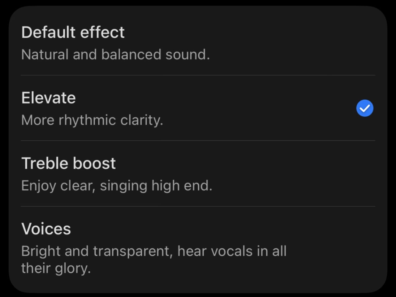
How does this translate to actual listening? Electronic tracks stay layered. Individual synth lines remain distinct even when the producer stacks fifteen of them. Podcast voices sound full rather than thin. Acoustic guitar has actual body to the low strings.

I’ve spent time with the competitors, and they all make different tuning choices. The Bose Ultra Open leans warm with emphasized bass, which some listeners prefer for relaxed listening. The Shokz OpenDots One delivers strong low-end impact, though complex tracks can get congested. The SoundCore AeroClip emphasizes treble detail, which works well for acoustic content but may feel bright on certain recordings. The FreeClip 2 takes a different approach: balanced across all three frequency bands with no obvious peaks or valleys. Whether that’s “better” depends on your preferences, but for my listening habits, the neutral tuning works.

The NPU and Adaptive Audio

This is where the FreeClip 2’s third-generation audio chip with NPU AI processor starts to matter. The chip delivers 10x the processing power of Gen 1, and Huawei uses that headroom for something genuinely useful: Intelligent Volume Adaptation.

Enable it, and the FreeClip 2 continuously monitors environmental noise and adjusts volume in real-time. Quiet office? Volume drops to comfortable levels. Step onto a busy street? It ramps up automatically. Enter a subway car during rush hour? The system not only increases volume but activates voice frequency enhancement, boosting the specific frequencies that help speech cut through ambient noise.

I was skeptical. Automatic volume adjustment sounds like the kind of feature that would constantly annoy you with unexpected changes. But Huawei’s implementation is subtle enough that I stopped noticing it was happening. The transitions feel gradual rather than jarring. After a few days, I realized I was no longer manually adjusting volume when moving between environments. The earbuds just – handled it.

Call Quality: The VPU Advantage

Open-ear earbuds have traditionally struggled with calls. No seal means environmental noise bleeds into your voice pickup. The FreeClip 2 addresses this with a three-microphone system plus a VPU, a Voice Pickup Unit that uses bone conduction to capture your voice directly. It’s the first implementation of this technology in the open-ear category.

The DNN noise reduction algorithm running on the NPU has 9x the parameters of Gen 1. What does that mean in practice? I took calls from a coffee shop, from the street during traffic, from my home office with the window open. Every time, the person on the other end reported my voice was clear, not competing with background noise. The VPU captures vocal vibrations through bone contact, which the algorithm blends with the microphone feed to isolate your voice from everything else.

This isn’t the same as noise-canceling earbuds creating a bubble of silence around you. You still hear your environment. But the person you’re calling doesn’t, or at least not as much. That distinction matters for the always-in use case. You can take a work call while walking through an airport and remain aware of gate announcements while your colleague hears you clearly.

Controls: Swipe Volume Changes Everything

Gen 1 offered tap gestures. Double-tap for play/pause, triple-tap for next track. The FreeClip 2 keeps those but adds something I didn’t know I needed: swipe volume control on the comfort bean.

Slide your finger up or down, and volume adjusts accordingly. AirPods 4 introduced the same capability with swipe gestures on the stem, so this isn’t a differentiator. It’s table stakes for premium earbuds now, and both execute it well. The FreeClip 2’s larger touch surface on the comfort bean makes the gesture slightly easier to hit accurately during movement, but the difference is marginal. What matters is that both get the job done without forcing you to reach for your phone.

Head motion control is the feature I didn’t expect to love. Nod to answer calls, shake to reject. AirPods 4 has the same capability with Siri interactions, nodding for “yes” and shaking for “no.” I use it constantly on both. When your hands are full, carrying groceries, mid-workout, cooking dinner, the ability to manage calls with a simple head movement feels like the future arriving quietly. The FreeClip 2 matches AirPods here, not exceeds it. Both implementations work reliably, and both have become muscle memory.

Auto L/R Detection

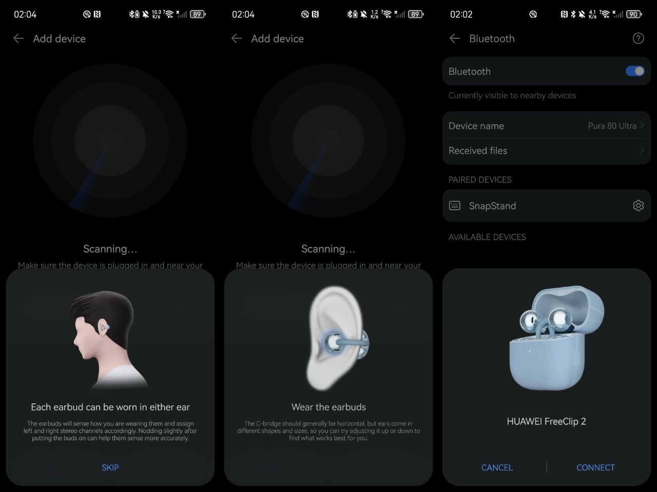
Thanks to a six-axis attitude sensor and intelligent channel correction, either FreeClip 2 earbud works in either ear. Pop them on however you grab them from the case. The system detects orientation and assigns left/right channels automatically.

This sounds like a convenience feature until you’ve lived with it. No more squinting at tiny L and R markings. No more swapping buds when you realize you’ve got them reversed. Just clip and go.

Battery: Incremental but Meaningful

Gen 1 delivered 8 hours per earbud and 36 hours with the case. Gen 2 pushes to 9 hours and 38 hours respectively. Not a dramatic leap, but notable given that Huawei also increased loudness by 100%. More power output with longer battery life means meaningful efficiency improvements in the audio chain.

Quick charging remains at 10 minutes for 3 hours of playback, which covers most emergency situations. The case now supports wireless charging and, in an industry first for open-ear earbuds, can charge from a smartwatch charger. That last detail probably won’t matter to most people, but for Huawei ecosystem users who travel with a watch charger anyway, it’s one fewer cable to pack.

In practice, I’ve been getting through full workdays without needing a case top-up. The 9-hour claim holds if you’re not pushing volume to maximum constantly. At moderate listening levels, I’ve stretched past the rated time.

The App Situation

Huawei replaced the AI Live app with Huawei Audio Connect, a dedicated audio app for pairing, device management, EQ presets, and custom sound profiles. It’s available on the Apple App Store and Samsung Galaxy Store.
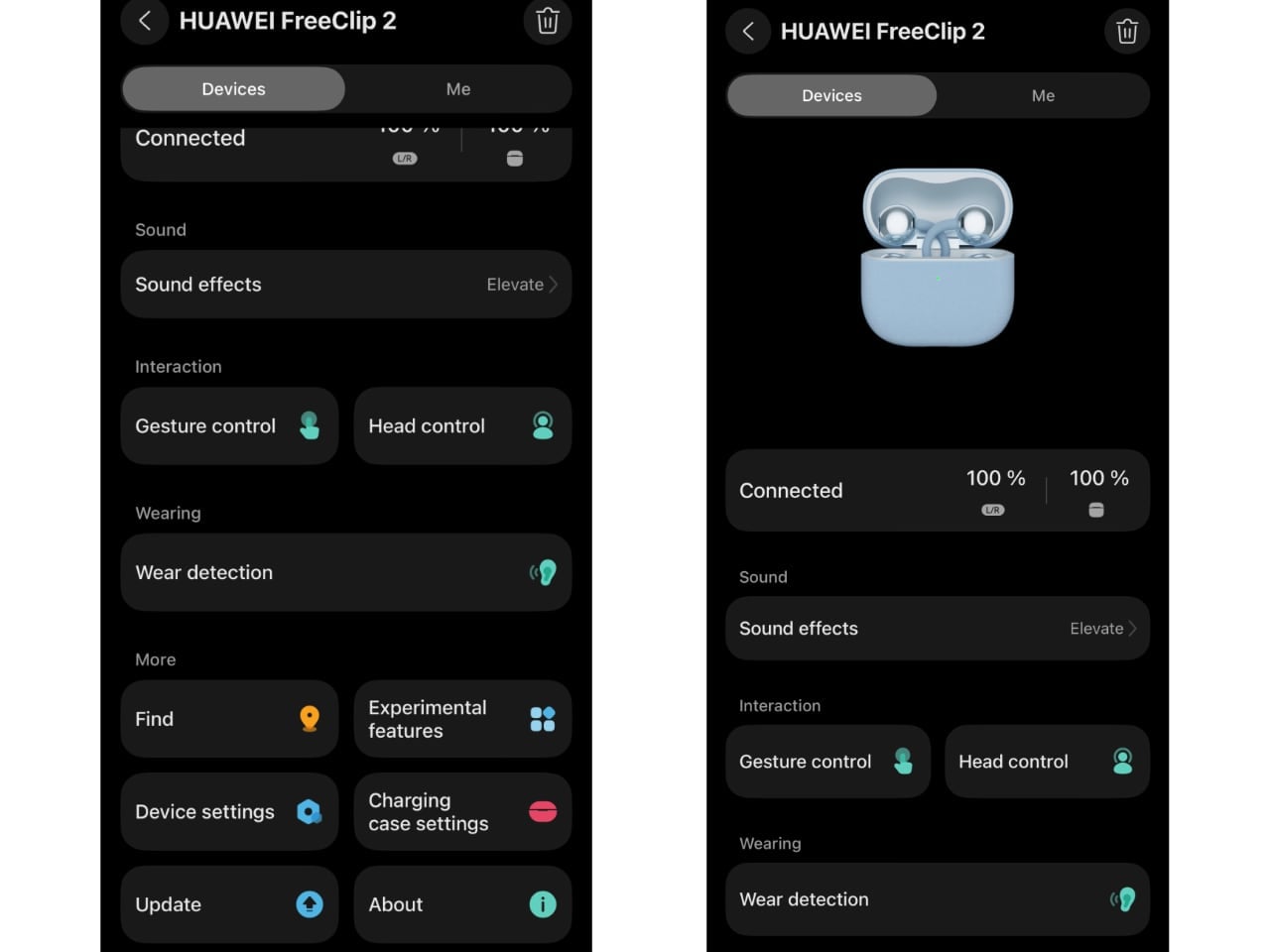
It’s not on Google Play.

For Pixel users or anyone running stock Android without Galaxy Store access, this means sideloading the APK or managing without the app entirely. The earbuds work fine via standard Bluetooth pairing, but you lose access to EQ customization, gesture configuration, and firmware updates. It’s not a dealbreaker, but it’s a friction point worth knowing about.
Spatial Audio 3.0 and Privacy Features

Two features worth mentioning, even if they won’t matter to everyone.

Spatial Audio 3.0 adds head tracking with 40% lower latency than Gen 1. Turn your head, and the soundstage adjusts. Three modes: Head Tracking, Fixed, and Off. The catch? You need compatible content. Huawei Music has a spatial audio library. Some streaming apps support Audio Vivid. But Spotify? Apple Music? The spatial features sit dormant. If you’re deep in the Huawei ecosystem, it’s a genuine enhancement. For everyone else, it’s a checkbox feature you’ll probably never activate.

More interesting: the reverse sound field system. Open-ear earbuds have always had a leakage problem. Your music becomes everyone’s music. Huawei’s solution uses openings at the rear of the acoustic ball to emit reverse sound waves that cancel what would otherwise leak outward. Does it work? Better than expected. At moderate volumes in a quiet room, someone sitting next to me couldn’t make out what I was listening to. Crank the volume in a silent library, and yeah, people will hear something. But for normal use? The privacy concern that plagued earlier open-ear designs feels mostly solved.

One more connectivity detail: dual-device connection. Pair to your laptop and phone simultaneously, switch between them without re-pairing. Useful if you’re bouncing between Zoom calls and mobile notifications. It’s table stakes for premium earbuds at this point, but worth confirming it works as expected. It does.

Performance Reality Check

The FreeClip 2 doesn’t rewrite the laws of physics. Open-ear audio will never isolate like sealed buds. In extremely loud environments, like a packed concert or a construction site, you’re going to struggle to hear your audio regardless of how much the NPU boosts volume.

But within the design constraints of the category, Huawei has pushed further than I expected. The dual-diaphragm architecture delivers bass that actually satisfies. The adaptive volume system works without being annoying. Call quality genuinely improved. The control additions, especially swipe volume, make daily use smoother.

For the always-in use case, situational awareness plus audio, the FreeClip 2 represents the most complete package I’ve tested in the open-ear space.

The Bottom Line

The FreeClip 2 lands in a category that’s still finding its identity. Open-ear earbuds don’t compete with AirPods Pro or Sony’s noise-canceling flagships. They serve a different need: audio without isolation. For runners who need to hear traffic. For office workers who can’t miss their name being called. For parents who want music but also want to hear if the kids are tearing the house apart.
Within that category, Huawei built something that feels genuinely refined rather than merely iterated. The comfort improvements matter because this form factor lives or dies by wearability. The dual-diaphragm architecture matters because open-ear bass has always been the weak point. The VPU matters because calls are half the reason people wear earbuds in the first place. The adaptive volume matters because open-ear listening happens in chaotic, shifting environments.

What works: Comfort across multi-hour sessions. Bass that actually shows up. Call quality that doesn’t embarrass you. Swipe volume control. Auto L/R detection. IP57 durability. The case size.

What doesn’t: No ANC (physics, not laziness). Spatial Audio limited to Huawei ecosystem content. The app isn’t on Google Play, which creates friction for Pixel users. Spatial audio content remains limited outside Huawei’s ecosystem.

Who should buy this: Anyone who wants all-day audio without cutting themselves off from their environment. Runners. Cyclists. Office workers. Parents. People with tinnitus who need sleep audio. Glasses wearers frustrated by traditional earbuds competing for ear real estate.

Who shouldn’t: Anyone who needs isolation. Loud environment workers. People who primarily listen in quiet spaces where open-ear leakage becomes more noticeable. If that’s you, consider the Huawei FreeBuds Pro 4 instead. Same ecosystem, same app, same Huawei audio tuning philosophy, but with memory foam tips that create a proper seal and Ultra ANC mode that actually blocks the world out. I tested them on a Dubai-to-Dallas flight and they handled crying babies and engine drone beautifully. For Apple users, the AirPods 4 with ANC offers similar isolation in an open-ear-adjacent form factor. Different tools for different jobs.

Three million Gen 1 units proved the market exists. The FreeClip 2 proves Huawei is serious about owning it. For the always-in use case, this is the most complete open-ear package available. It’s not perfect. Nothing is. But it’s the first open-ear earbud I’ve tested where the trade-offs feel worth making.

The post Huawei FreeClip 2 Review: Open-Ear Audio at Its Best first appeared on Yanko Design.
The World’s Smallest Full-Size Umbrella Has an OLED Screen

Look, I’ve broken my fair share of umbrellas. That satisfying snap when a gust of wind hits you at just the wrong angle, the metal rib poking through fabric like a broken bone, the awkward dance of trying to fold the thing back into submission. We’ve all been there. So when I first saw the Ori umbrella, my immediate thought was: wait, where’s the rest of it?

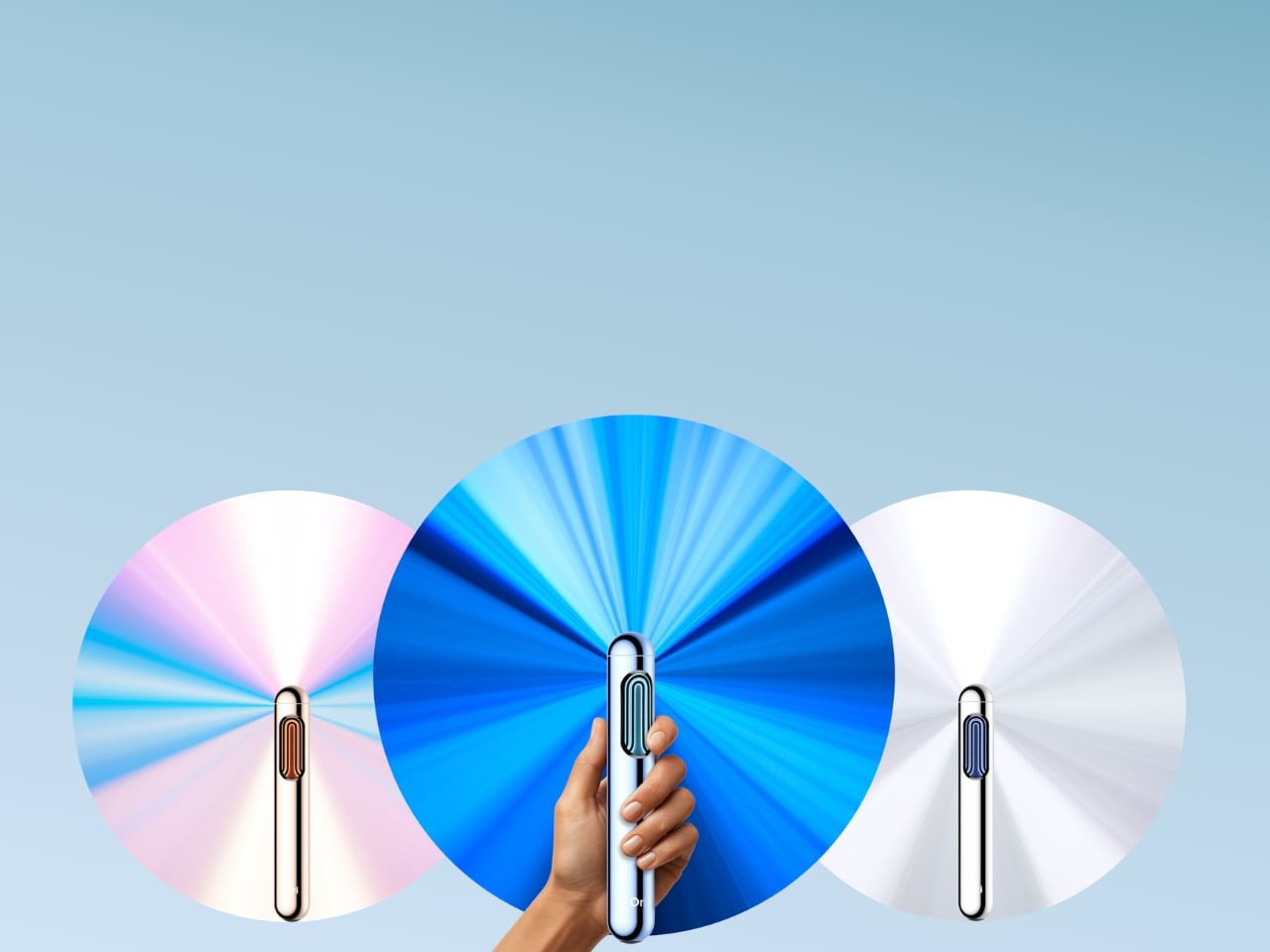
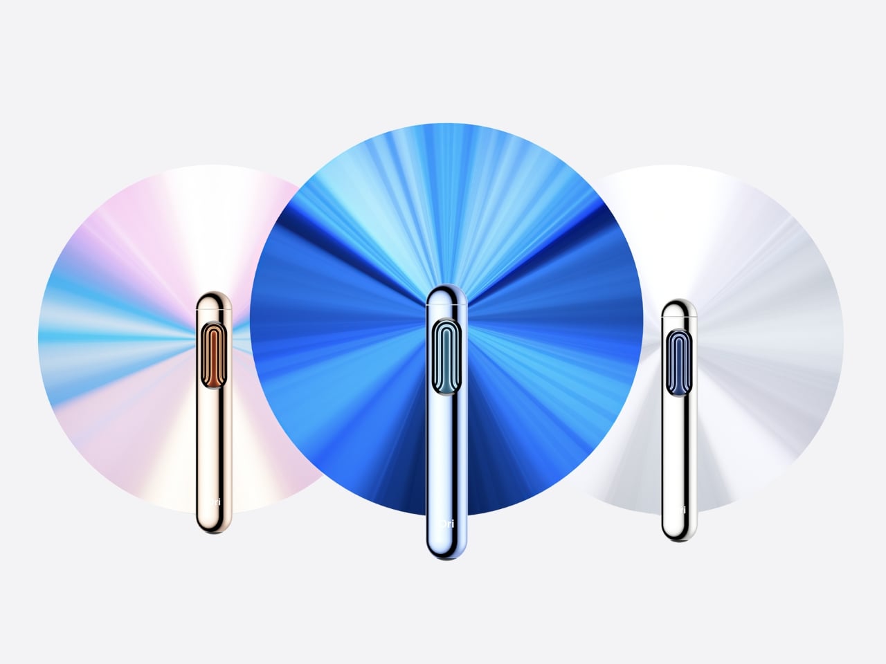
This sleek little cylinder looks more like a fancy pen or a futuristic flashlight than an umbrella. And that’s entirely the point. Ori just announced what they’re calling the world’s first frameless umbrella, and honestly, it’s one of those “why didn’t anyone think of this sooner” moments that makes you question everything.

Designer: Modestas Balcytis

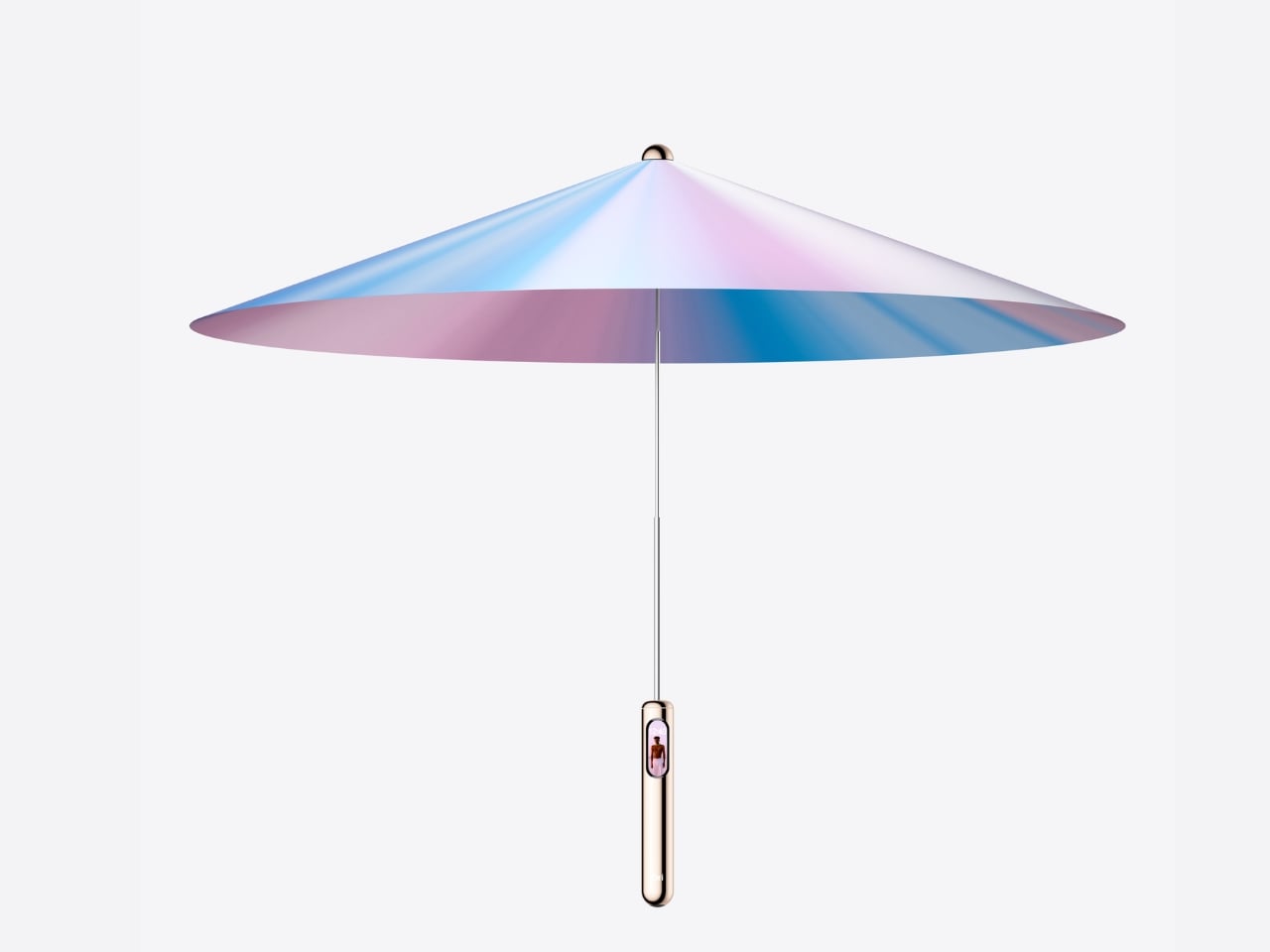
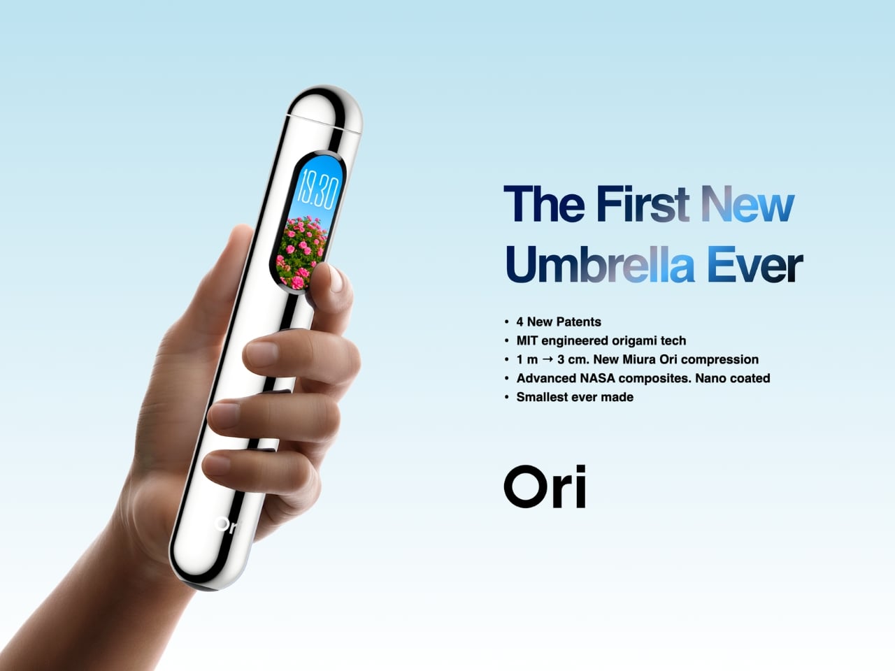
The magic is in the origami. Founded by MIT engineers and origami specialists, Ori uses a patented folding technique based on the Miura fold, which is the same kind of engineering NASA uses for deployable spacecraft structures. Instead of the traditional setup of metal ribs covered in fabric, the canopy itself becomes the structure. No ribs. No fabric stretched over a frame. No failure points waiting to betray you on a windy Tuesday.

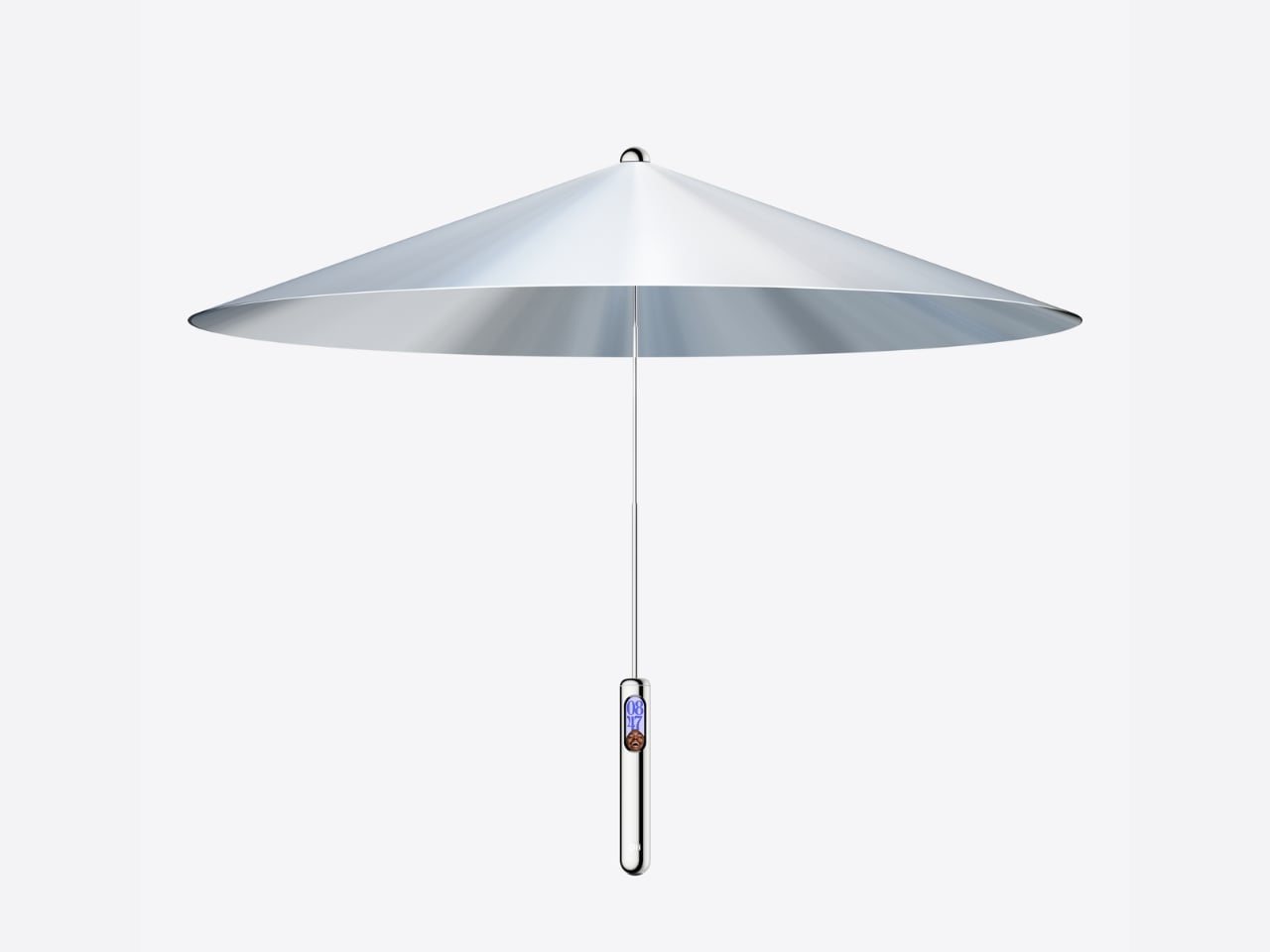
When folded, this thing measures just 3.5 by 23 centimeters. That’s genuinely pocket sized, and I’m not talking about cargo pants pockets either. It compresses a full one meter canopy into something smaller than most water bottles. The canopy unfolds with what they call “1-degree of freedom motion,” which is engineering speak for “it opens with one smooth movement and doesn’t fight you.”

But here’s where Ori gets really interesting. They didn’t just reinvent the umbrella’s mechanics. They added an OLED display right into the handle. This isn’t some gimmicky addition either. The display shows you real time air quality data through something called AirSense, measuring particles and UV levels right where you’re standing. There’s MoodShift, which adapts the display visuals based on weather and your preference. You can customize the display themes, and everything operates with a simple tap to open or close.

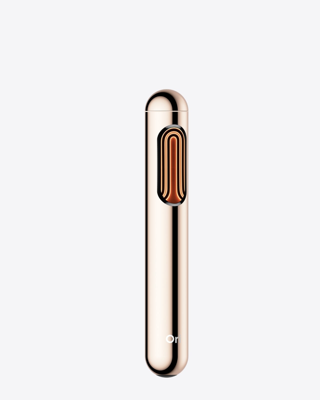
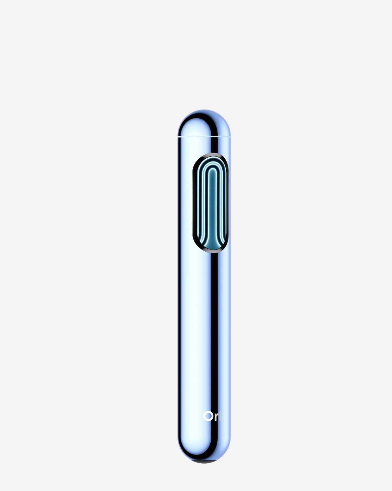
The design itself is gorgeous. Available in iPhone grade aluminum housing with finishes in silver, rose gold, and sky blue, it genuinely looks like something Apple would make if they decided to tackle rain gear. The comparison to Dyson and Apple isn’t just marketing speak. Founder and CEO Modestas Balcytis explicitly said that’s the goal: to become the premium design brand in a category that hasn’t seen real innovation in 170 years.

And he’s not wrong about that timeline. The basic umbrella design has remained essentially unchanged since the mid 1800s. Sure, we’ve gotten automatic open buttons and wind resistant frames, but the fundamental architecture of fabric on metal ribs hasn’t budged. Meanwhile, we’ve completely reinvented phones, watches, even how we vacuum our floors. The umbrella just sat there, breaking in the same predictable ways, generation after generation.

The umbrella market is massive too. We’re talking $7.4 billion annually, with 1.2 billion units sold every year. Yet there’s no iconic umbrella brand. No household name that owns the category. It’s a completely fragmented market of cheap airport kiosk purchases and forgotten drugstore impulse buys. Ori sees that gap and wants to fill it with something people actually want to own and show off.

At $249.99, this isn’t an impulse purchase. But neither was the first Dyson vacuum or the original iPhone. Premium pricing positions this as an investment piece, something that should last years instead of months. With four patents filed covering everything from the folding architecture to the locking system and smart core, Ori has built serious intellectual property around this design.

The first Founder Edition units are expected to ship globally in 2026. Whether Ori succeeds in becoming the Dyson of umbrellas remains to be seen, but they’ve definitely created something worth paying attention to. Sometimes the most innovative products come from rethinking the everyday objects we’ve stopped questioning. And honestly? I’m ready to see umbrellas get the glow up they deserve.

The post The World’s Smallest Full-Size Umbrella Has an OLED Screen first appeared on Yanko Design.
Japanese Minimalism: 7 Tools That Do More With Less

Japanese design philosophy has always understood something the rest of the world is only now catching up to: true sophistication comes from subtraction, not addition. This approach, rooted in centuries of aesthetic refinement, strips away the superfluous to reveal function in its purest form. The tools that emerge from this tradition don’t just accomplish tasks—they redefine how we think about everyday objects. Each piece becomes a meditation on purpose, where every curve, edge, and material choice serves a reason beyond mere decoration.



The seven tools featured here embody this principle completely. They’re not trying to impress with flashy features or unnecessary complexity. Instead, they achieve something far more difficult: they make the complicated simple. These designs prove that when you remove everything that doesn’t matter, what remains becomes not just functional but beautiful. From kitchen essentials to pocket-sized problem-solvers, each tool demonstrates how Japanese minimalism transforms ordinary objects into instruments of effortless living.
1. Craftmaster EDC Utility Knife

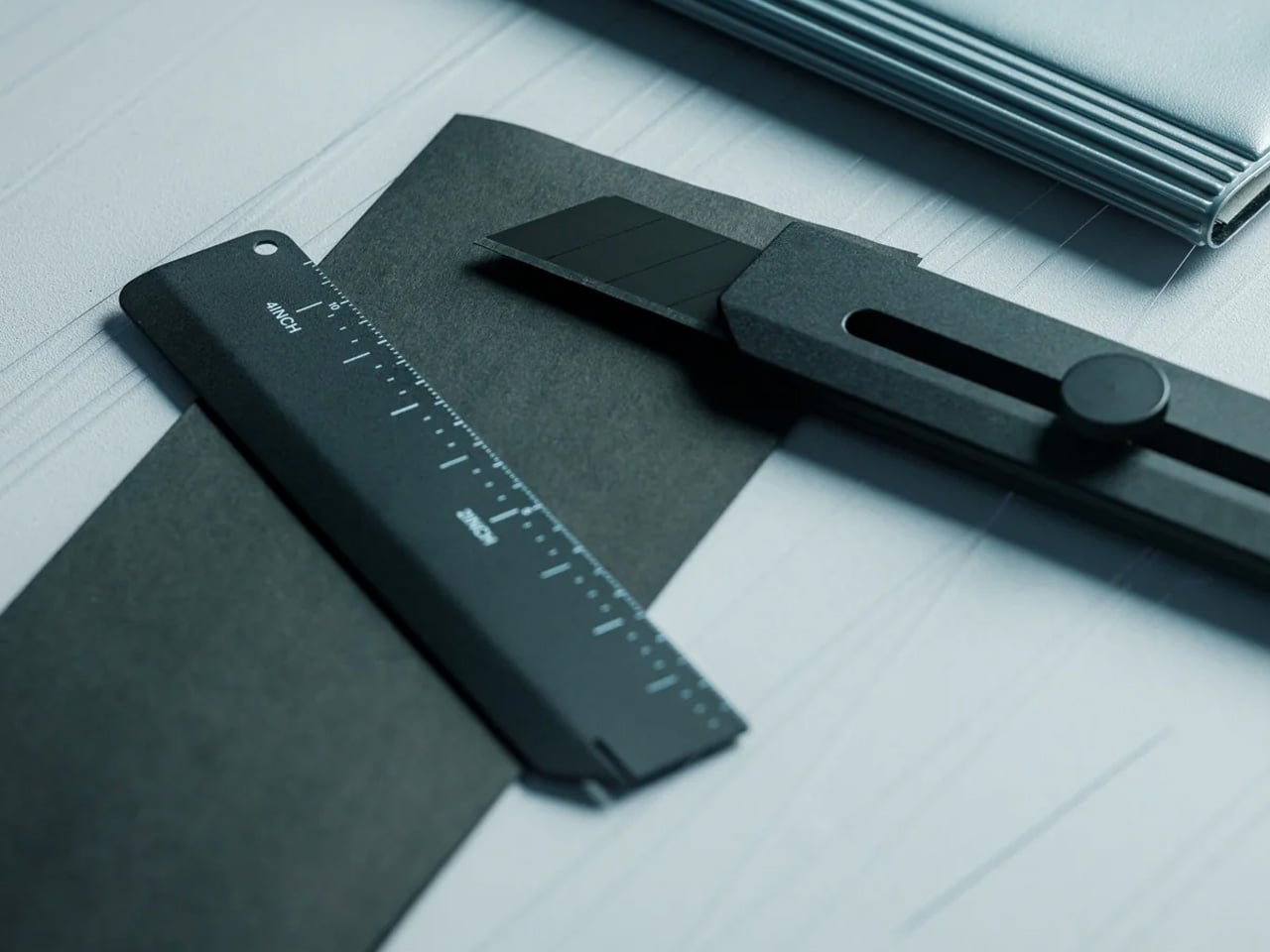
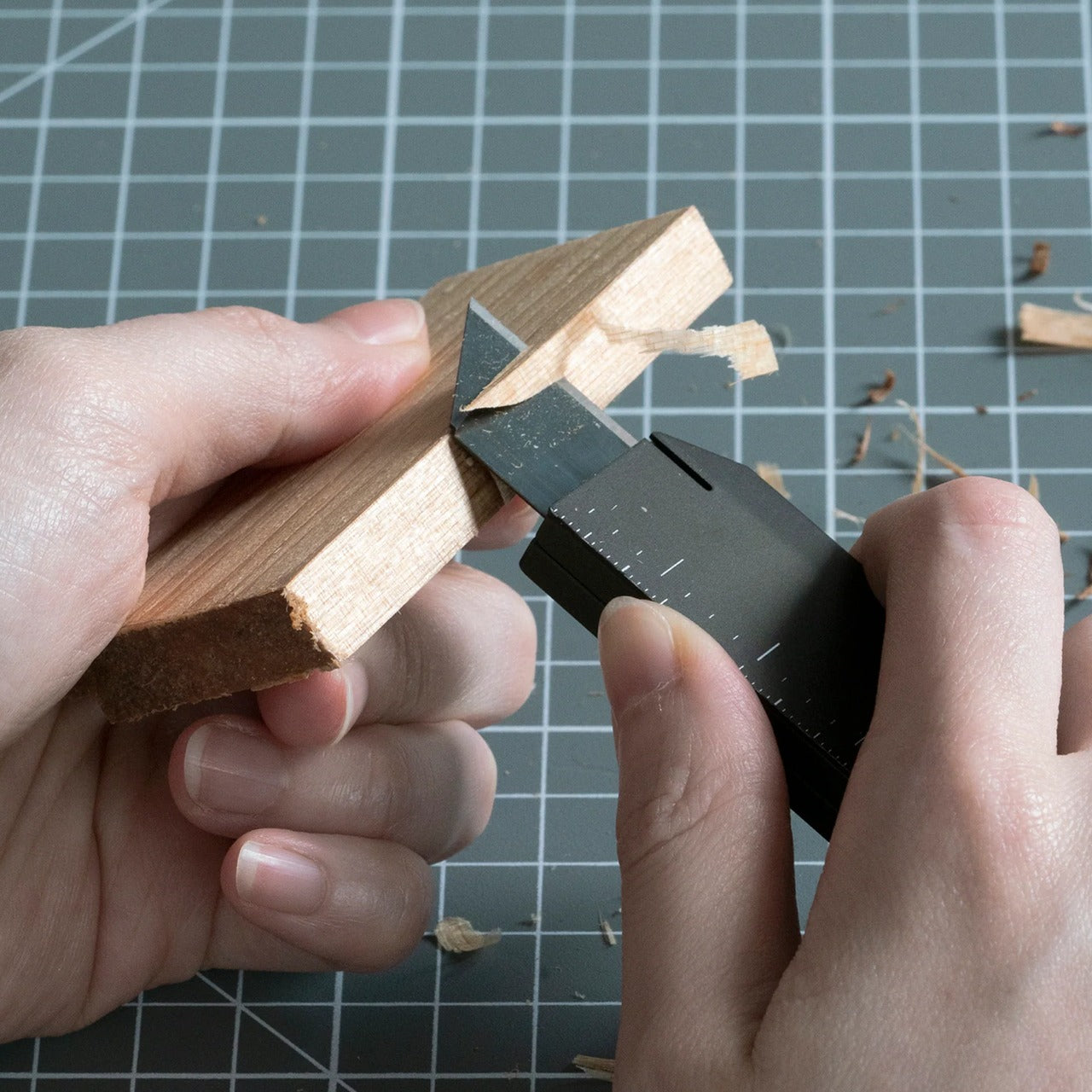
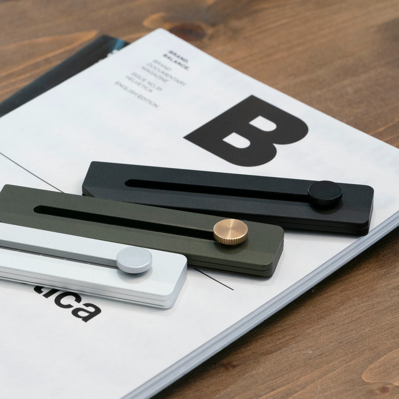
The Craftmaster EDC Utility Knife challenges everything you think you know about pocket tools. Its metallic body sits just 0.3 inches thick and stretches 4.72 inches long, creating a profile slim enough to disappear into any pocket while maintaining the heft that signals quality. The rotating knob deployment system feels tactile and deliberate, engaging an OLFA blade through a mechanism that rewards precision over speed. This isn’t a tool that screams for attention—it earns respect through its restraint, proving that powerful utility doesn’t require bulk or bravado.

The magnetic back serves dual purposes with characteristic Japanese efficiency. It transforms any metal surface into a storage solution, keeping the knife accessible without adding clutter to your workspace. The companion metal scale docks seamlessly to this magnetic base, featuring raised edges that make retrieval from flat surfaces effortless. Both metric and imperial markings ensure universal utility, while the integrated blade-breaker lets you snap off dulled edges without additional tools. The 15-degree curvature protects fingers during operation, and the 45-degree inclination angle makes box-opening safer. Every detail reflects the principle that good design removes friction between intention and action.

Click Here to Buy Now: $79.00

What we like

  • OLFA blade replacement system extends the tool’s functional lifetime indefinitely.
  • Magnetic docking transforms unused metal surfaces into organized storage.
  • The dual-scale ruler eliminates the need for separate measuring tools.
  • 8mm thickness allows the knife to live comfortably in any pocket.

What we dislike

  • The metal construction adds weight compared to plastic alternatives.
  • Blade snapping requires the companion ruler for optimal safety.

2. 8-in-1 EDC Scissors

Conventional wisdom says versatile tools sacrifice quality for quantity. These scissors prove that assumption wrong. The 13-centimeter design fits completely within your palm, creating a tool that travels anywhere without announcing its presence. Eight distinct functions emerge from a single elegant form: scissors, knife, lid opener, can opener, cap opener, bottle opener, shell splitter, and degasser. The oxidation film coating doesn’t just prevent rust—it creates a matte black finish that elevates the tool from utility to aesthetic choice.

The genius lies in how each function integrates without compromising the others. The scissor blades maintain their sharpness because they’re not forced into awkward multi-tool compromises. The bottle opener achieves proper leverage despite the compact form factor. The can opener actually works smoothly instead of becoming an emergency-only frustration. This integration happens because the design started with minimalism as the foundation rather than cramming features into an existing form. The result feels purposeful rather than accidental, proving that constraint breeds creativity when handled with skill and intention.

Click Here to Buy Now: $59.00

What we like

  • Eight genuinely useful functions integrated without bulk or complexity.
  • Oxidation film coating provides both protection and sophisticated aesthetics.
  • Palm-sized dimensions make it genuinely pocketable for daily carry.
  • Each function maintains full effectiveness despite the compact form.

What we dislike

  • The black finish may show wear over time with heavy use.
  • Small size might feel less substantial in larger hands.

3. Rodent Bottle Opener

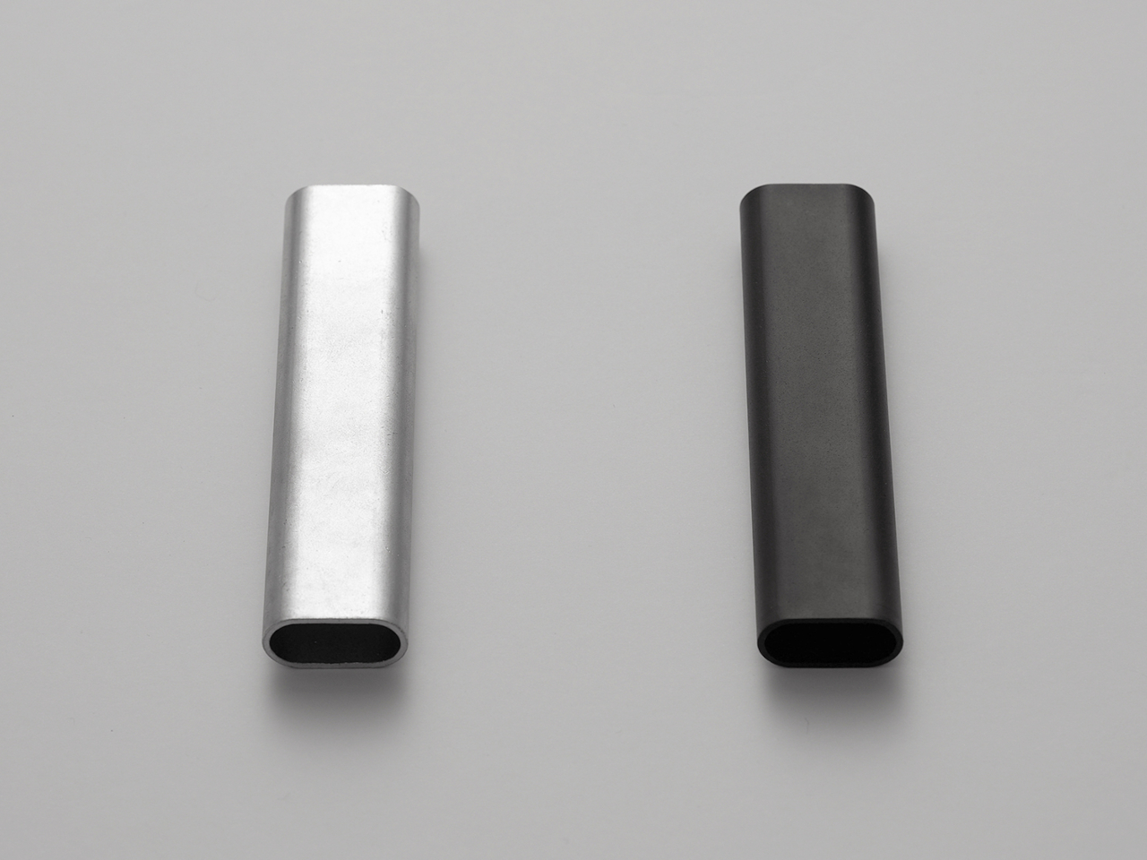
Kairi Eguchi’s Rodent bottle opener for WELD DESIGN STORE asks a radical question: what happens when you remove everything except absolute necessity? The answer arrives as a simple oval steel pipe, processed only at the section required for uncorking. Advanced 3D pipe laser technology creates the functional opening while leaving the rest of the material untouched, preserving the raw character of freshly cut metal. This approach produces an object that feels honest in a world drowning in overdesign, where the material itself becomes the primary aesthetic element.

The philosophy extends beyond mere appearance into something more profound about how we interact with objects. Using the Rodent requires engaging with the pipe’s industrial nature—there’s no rubber grip, no decorative flourishes to mediate the experience. The cold steel against your palm, the weight that comes from solid construction, the tactile feedback of metal against metal—these sensations connect you directly to the act of opening a bottle. This directness might seem harsh at first, but it creates a relationship with the tool that feels more genuine than cushioned alternatives. The opener becomes a small reminder that sometimes the best design simply reveals material truth.

What we like

  • Single-material construction eliminates weak points and potential failures.
  • Untouched pipe sections preserve the authentic character of industrial steel.
  • Minimal processing reduces manufacturing complexity and environmental impact.
  • The design achieves complete functionality without any superfluous elements.

What we dislike

  • The raw steel aesthetic may not suit every environment or preference.
  • Lack of grip coating means cold metal directly against the hand.

4. Painless Key Ring

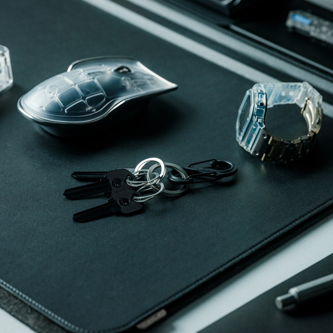
Key rings have operated on the same principle for decades: a tightly wound coil that requires finger-destroying force to manipulate. The wave spring key ring borrows technology from aerospace equipment and automotive applications to solve this everyday frustration. The innovative coil design maintains tension without the aggressive grip that damages nails and deforms rings. Adding or removing keys becomes genuinely stress-free, transforming a minor annoyance into a smooth operation that respects both your time and your fingertips.

The engineering reveals itself through performance rather than appearance. The wave spring construction achieves superior durability while reducing weight compared to traditional rings. This means the device in your pocket becomes lighter even as it grows more robust—a combination that seems impossible until you understand how the spring geometry distributes stress. Available in silver and black finishes, the ring adapts to personal aesthetic preferences without adding bulk or complexity. The design proves that solving problems often requires looking beyond established solutions to principles from entirely different fields, importing expertise that transforms the familiar into something better.

Click Here to Buy Now: $29.00

What we like

  • The wave spring mechanism eliminates the fingernail damage of traditional key rings.
  • Aerospace-grade durability ensures the ring won’t deform or fail over time.
  • Lighter construction reduces pocket bulk without sacrificing strength.
  • Silver and black options provide aesthetic flexibility.

What we dislike

  • The unfamiliar mechanism may require a brief adjustment period.
  • Slightly higher cost reflects the advanced spring technology.

5. Compact Modular Grill Plate

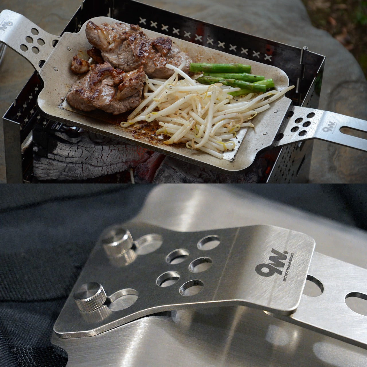
Outdoor cooking equipment typically forces a choice: lightweight portability or effective heat distribution. The Compact Modular Grill Plate rejects this false dichotomy through intelligent material layering. The three-layer steel plate construction ensures uniform heat conduction across the entire surface, maintaining the even temperatures that separate mediocre cooking from exceptional results. The modular handle system adapts to different situations—stable bases, unstable campfires, or quick movements between heat sources. When finished, everything packs into a remarkably compact form that defies the plate’s cooking capabilities.

The versatility extends to heat source compatibility that borders on remarkable. Campfire coals, gas burners, and induction stoves all work equally well with the plate’s construction. This universality means the same tool serves backyard gatherings, backcountry adventures, and indoor cooking with identical effectiveness. The even heat distribution preserves moisture in proteins while achieving proper browning, delivering restaurant-quality results in settings where such outcomes typically seem impossible. Available in Basic and Special configurations, the system scales to different needs without abandoning the core principle: proper heat management makes better food, regardless of setting.

Click Here to Buy Now: $89.00

What we like

  • Three-layer steel construction distributes heat evenly for consistent cooking results.
  • The modular handle system adapts to campfires, gas burners, or induction stoves.
  • Compact collapsed form enables easy transport and storage.
  • Material quality delivers professional cooking performance in outdoor settings.

What we dislike

  • Steel construction adds weight compared to aluminum alternatives.
  • Initial investment exceeds disposable camping cookware options.

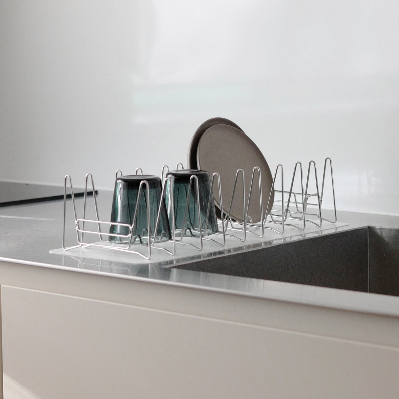
6. Slim Fold Dish Rack

The Slim Fold Dish Rack solves a problem so common we’ve stopped noticing it: permanent dish racks occupy valuable counter space even when empty. The patent-pending spring mechanism collapses the 14-inch rack down to 1.2 inches in one second, with deployment just as fast. This transformation happens smoothly enough to become genuinely practical rather than a clever trick you stop using after the novelty fades. The collapsed form actually fits in pockets, making it genuinely portable for camping trips, RVs, or anywhere space comes at a premium.

The minimalist structure provides ample ventilation while accommodating plates, utensils, and cookware of varying sizes. The design achieves this flexibility through strategic material placement rather than complex adjustments or attachments that add bulk and failure points. Cleaning becomes effortless—the rack is dishwasher-safe, removing the irony of hand-washing the thing meant to organize your dishwashing. The spring system maintains tension through repeated cycles without loosening or failing, proving that elegantly simple mechanical solutions often outlast their complicated electronic counterparts. Sometimes the best technology is just physics applied with precision and care.

Click Here to Buy Now: $89.00

What we like

  • Patent-pending spring system enables genuine one-second collapse and deployment.
  • Collapsed 1.2-inch profile fits in pockets for complete portability.
  • Dishwasher-safe construction eliminates cleaning friction.
  • Minimalist design provides proper ventilation for various dish sizes.

What we dislike

  • The spring mechanism requires periodic cleaning to maintain smooth operation.
  • Collapsed form may be too compact for users who prefer permanent setups.

7. Effortless Standing Letter Cutter

The Standing Letter Cutter transforms envelope opening from a mundane task into a moment of tactile satisfaction. Slide an envelope across the anodized aluminum bar and watch as it creates a clean incision along one side. The blade makes a surgical opening without generating paper scraps or mangled edges—just a smooth entry that preserves the envelope’s integrity. When not in use, the cutter serves as a paperweight or desk accent, demonstrating how functional objects can occupy space beautifully rather than apologetically.

The anodized aluminum construction achieves that rare balance between substance and refinement. The material feels substantial without being unnecessarily heavy, creating an object that announces quality through tactile experience rather than visual noise. The replaceable blade system extends the cutter’s lifetime indefinitely, embracing repair over replacement in a culture addicted to disposability. This serviceability reflects a deeper design philosophy: good tools should outlast their users, becoming heirlooms rather than landfill material. The simple act of opening mail becomes slightly more pleasurable, which might seem trivial until you realize how many small moments compose a life.

Click Here to Buy Now: $49.00

What we like

  • Anodized aluminum construction provides an elegant desk presence beyond pure utility.
  • Clean incision eliminates paper scraps and simplifies envelope opening.
  • Replaceable blade system extends product lifetime indefinitely.
  • Dual functionality as a paperweight maximizes usefulness per cubic inch.

What we dislike

  • The metal construction may scratch wooden or delicate desk surfaces.
  • Replacement blades require sourcing from the manufacturer.

Why Less Becomes More

These seven tools share a common thread that extends beyond Japanese origin or minimalist aesthetics. Each design starts by questioning assumptions about how objects should look and function. The Craftmaster knife asks why utility tools need bulky handles when slim metal suffices. The palm scissors challenge the notion that versatility requires size. The Rodent opener wonders whether bottle openers need any processing beyond what’s functionally necessary. These aren’t rhetorical questions—they’re design principles that produce tangible results. The tools work better precisely because they attempt less, focusing energy on core functions rather than dissipating effort across unnecessary features.

This approach resonates because it addresses a deeper cultural fatigue with overcomplicating everything. We’re surrounded by objects that try too hard, products that add features to justify price points rather than solve actual problems. Japanese minimalism offers an antidote: tools that respect your intelligence by trusting you don’t need hand-holding or distraction. They accomplish their purposes cleanly, then get out of the way. That restraint becomes its own form of luxury—the space to think, act, and exist without constant negotiation with poorly designed objects. In choosing tools that do more with less, you’re not just simplifying your carry or kitchen. You’re reclaiming mental space from the clutter of modern life, one thoughtfully designed object at a time.

The post Japanese Minimalism: 7 Tools That Do More With Less first appeared on Yanko Design.