5 Interactive Public Art Installations That Make You Part of the Design

Public art is often seen as a standalone feature, a striking sculpture or colorful mural that decorates a park or plaza. Yet its true impact goes far beyond visual appeal. When guided by thoughtful design, public art doesn’t just fill a space; it redefines it, shaping how people move, interact, and emotionally connect with their surroundings.

This seamless blend of art and environment is where design becomes transformative. By carefully considering scale, sightlines, materials, and community involvement, designers ensure that art integrates naturally into its setting. The result is a space that feels alive, engaging, memorable, and deeply connected to its community’s identity.

1. Designing Art with Context

For public art to truly connect, it must feel like it belongs. A site-specific approach begins with the environment itself, its history, architecture, pedestrian flow, and climate. By understanding these layers, designers ensure the artwork feels naturally rooted rather than placed, reflecting the spirit of its surroundings.

This thoughtful process helps art and place work in harmony. A sculpture in a historic district might echo local materials, while an installation in a park could invite interaction and rest. The goal is unity, where art enhances its setting and deepens the public’s connection to the space.


Cheng Tsung FENG’s Structural Botany: 25AP-263-43 is a compelling exploration of the intersection between art, nature, and modular construction. Installed at Swiio Villa Yilan in Zhuangwei, the work draws inspiration from the upright, clustered growth patterns of native plants, translating botanical forms into a sculptural rhythm. Standing between 2.5 and 5 meters tall, the installation consists of repeated modular “stems” that rise independently while maintaining deliberate spacing, echoing the equidistant patterns found in plant communities. FENG’s abstraction focuses on structural qualities rather than literal representation, highlighting resilience, interdependence, and the hidden patterns that govern natural growth.

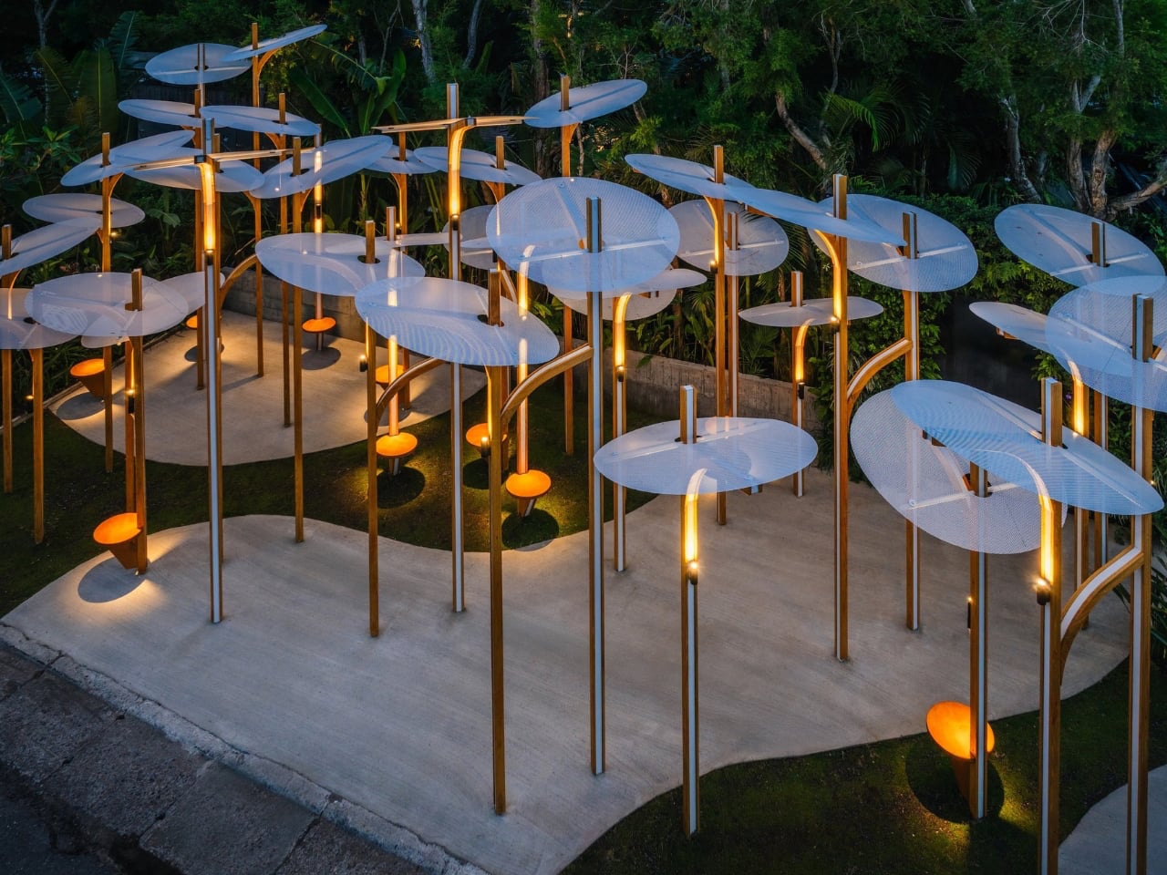
The modular design allows the work to adapt to different spaces, expanding or contracting like living plants responding to their environment. Its clean lines and muted palette integrate gracefully with the surrounding landscape, inviting visitors to move among the vertical forms. 25AP-263-43 transforms the space into an immersive experience, revealing how art can reflect the processes of growth, rhythm, and community inherent in nature.

2. Design That Shapes Interaction

The true power of design in public art lies in its ability to shape human behavior and foster connections. A well-placed installation isn’t static; it invites curiosity, conversation, and movement. The position of a sculpture, for instance, can turn it into a meeting point or encourage people to explore it from different angles, subtly guiding social flow through space.

Inclusive design ensures that everyone can experience this interaction. By considering pathways, seating, and lighting, designers make art accessible and inviting. The result is not just an artwork but a functional, social space that fosters comfort, inclusion, and community.


Interactive public art has a unique charm, and Love Continuum in London’s Chelsea area exemplifies this beautifully. Installed at Duke of York Square as part of Kensington + Chelsea Art Week, the piece immediately invites viewers—kids and adults alike—to touch, climb, or simply explore its form. At first glance, it appears to be a giant red spring or whimsical squiggly “worm,” a playful addition to the urban landscape.


The sculpture’s clever twist reveals itself from a certain angle: the word “love” emerges in elegant cursive, turning observation into a joyful discovery. Measuring 7.5 meters in length, Love Continuum continues artist Alter’s exploration of colorful, interactive forms that encourage engagement and play. Its hidden message adds a layer of delight, creating a shared experience for those who notice it. This combination of tactile fun, visual surprise, and thoughtful design makes it a memorable stop on London’s art trail.

3. The Power of Material and Durability

Material choice is one of the most crucial design decisions in public art, shaping its longevity and impact. Unlike gallery pieces, outdoor installations face constant exposure to weather, pollution, and human touch. Designers must therefore balance artistic vision with strength and endurance, using materials that preserve both beauty and integrity over time.

Selecting durable, often local options such as weathered steel, treated stone, or advanced composites ensures resilience and low maintenance. This thoughtful approach keeps the artwork safe, sustainable, and visually compelling for years, safeguarding the artist’s intent while respecting the realities of public spaces.


Kuo Hsiang Kuo’s “Flowers and Butterflies Are Dancing”, created for the 2018 Taichung World Flora Exposition in Taiwan, showcases the essence of contemporary public art. Using polished stainless steel, Kuo embraces the material’s reflective quality to mirror the vibrant flowers below and shifting clouds above, creating a constantly evolving dialogue with its surroundings. Sweeping arcs suggest the flutter of butterflies and the sway of flowers, while perforated panels cast intricate shadows. By night, strategically placed lighting transforms the sculpture into a glowing spectacle of purples and pinks, giving it a dynamic day-to-night presence.


The installation balances structural precision with ethereal beauty, inviting visitors to explore it from multiple angles. Referencing Taiwan’s native Formosa Lily and butterfly motifs, it connects local identity with universal themes of transformation and renewal. Its multi-layered appeal engages children, adults, and design enthusiasts alike. “Flowers and Butterflies Are Dancing” proves that public art can be both visually stunning and deeply meaningful, transforming spaces and perspectives.

4. Lighting and Experiential Impact

Public art should shine even after sunset, and this is where thoughtful lighting design transforms perception. Proper illumination enhances textures, casts dramatic shadows, and can introduce dynamic colors, turning a daytime piece into a captivating nighttime feature and making the artwork a continuous part of the cityscape.

Lighting also serves safety and experiential purposes. By subtly brightening pathways while highlighting the art, designers create secure, inviting spaces. This blend of functionality and drama deepens emotional engagement, turning ordinary public areas into memorable, enchanting urban stages that captivate visitors day and night.

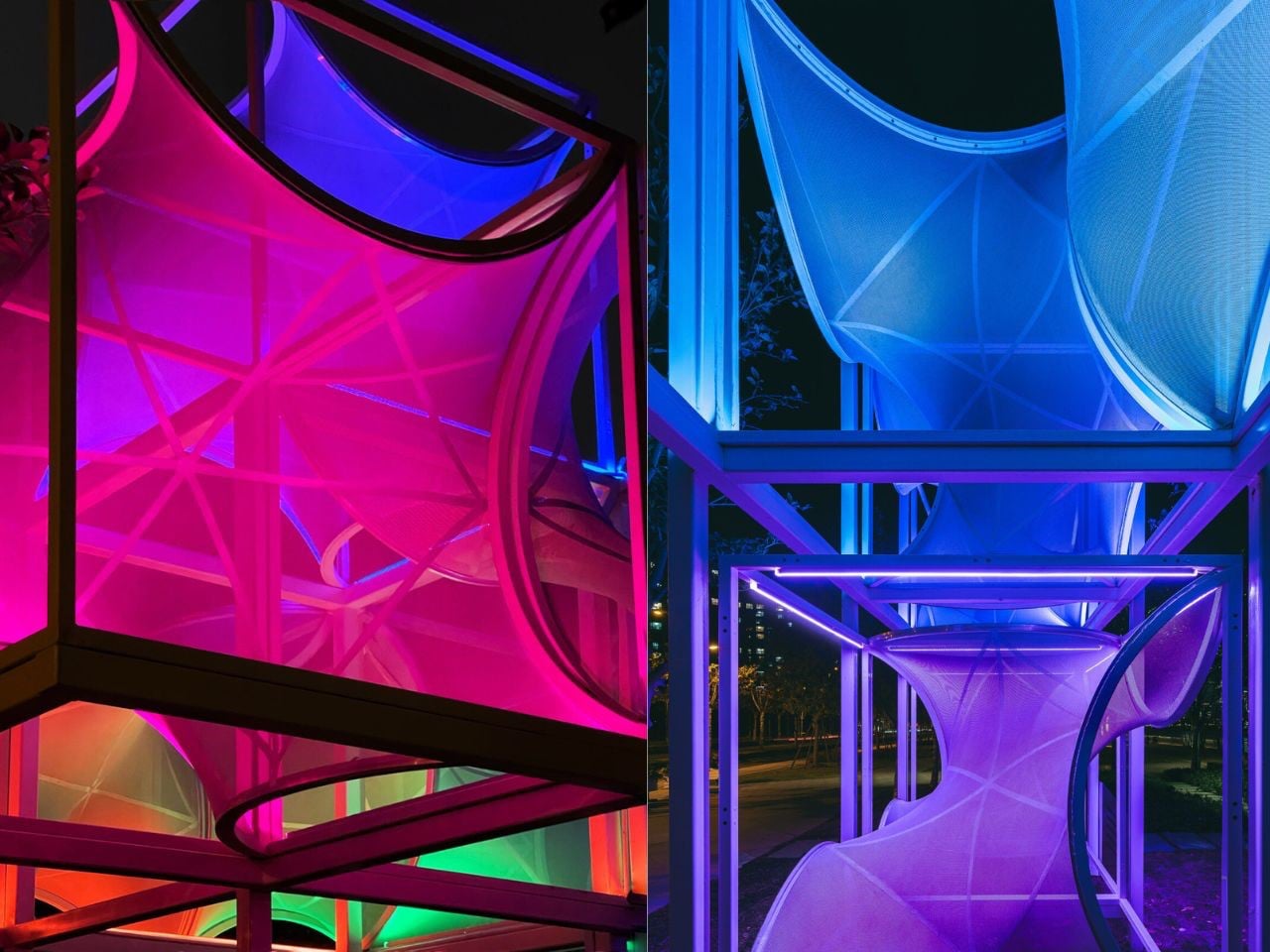
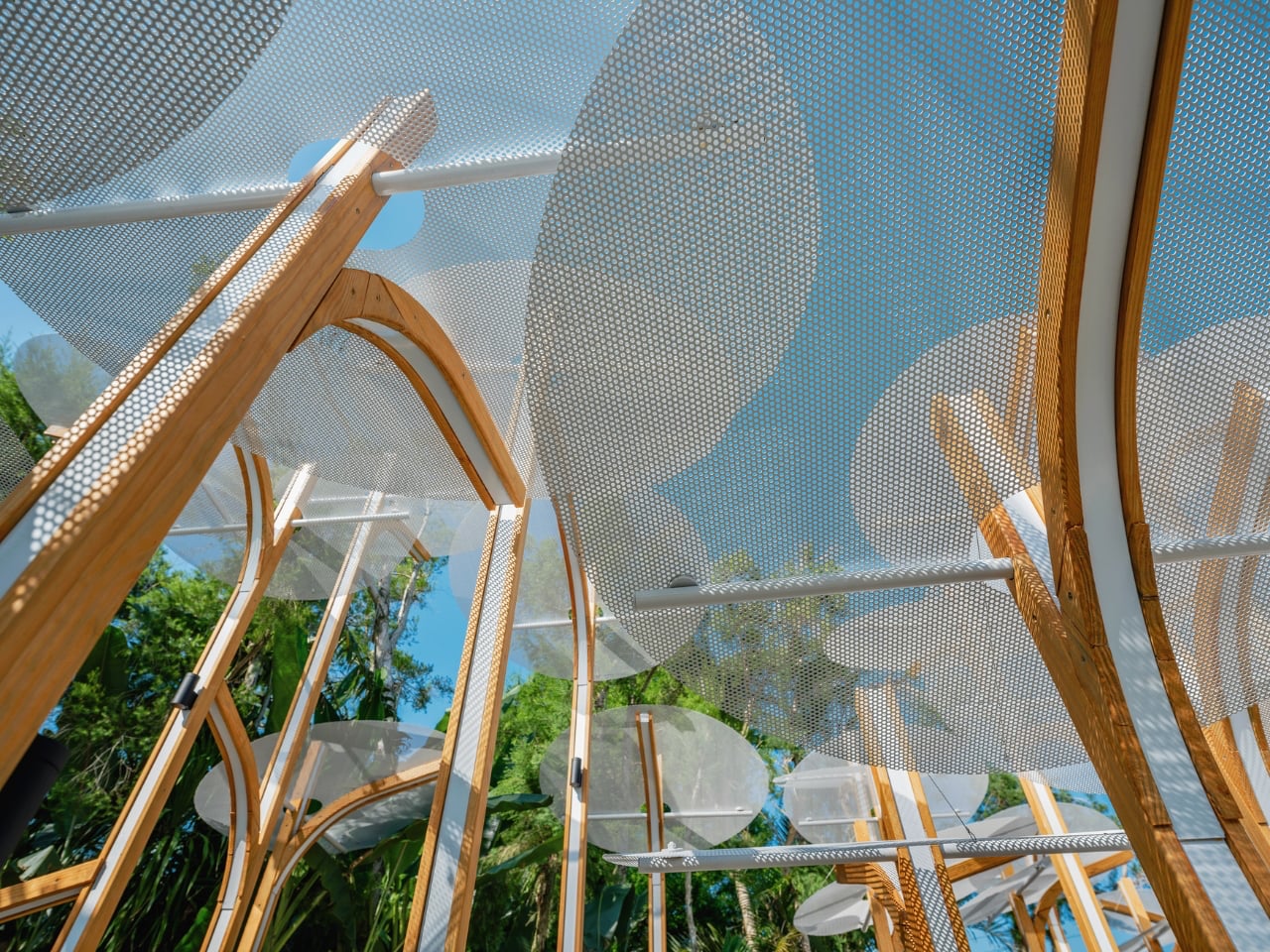
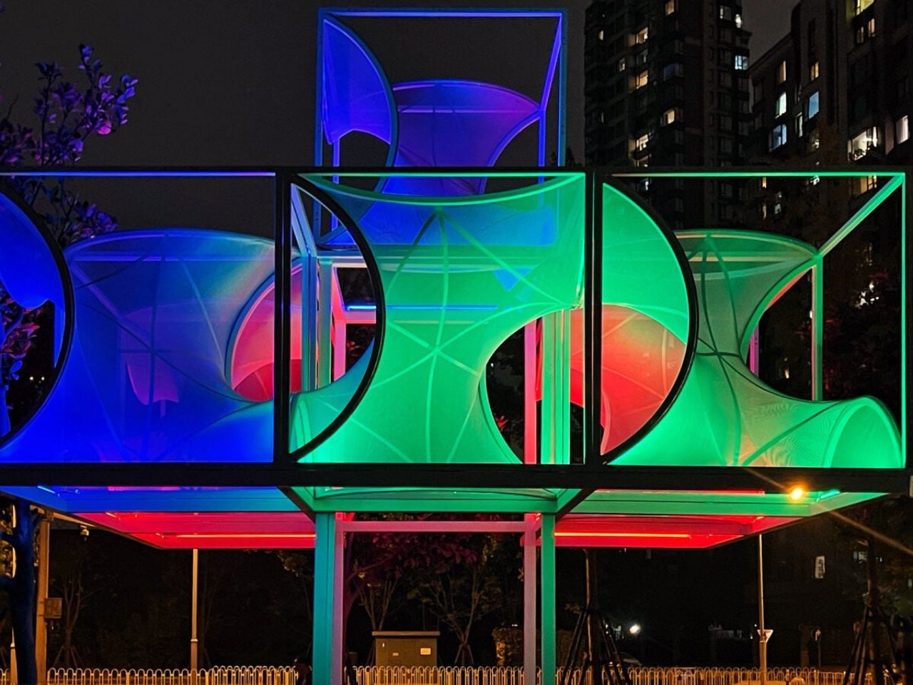
Along Shanghai’s Huangpu River, visitors encounter Curly Cube, a striking modular installation by the People’s Architecture Office (PAO). Combining flowing curves with sharp angles, it transforms an ordinary urban space into a dynamic playground of light, shadow, and interaction. Inspired by the Gyroid minimal surface, a natural form bridging mathematics and nature where the structure employs curvilinear tensile membranes stretched over lightweight square frames. The result is a form that appears both futuristic and organic, soft yet structured. By day, the translucent membranes filter sunlight into gentle, diffused patterns, offering shaded pockets where people can pause, explore, or relax amid the city’s bustle.


At night, integrated lighting casts shifting gradients across the silver membranes, turning the installation into a glowing social hub. Its modular design allows stacking, reconfiguration, or relocation, encouraging tactile and participatory engagement. Curly Cube showcases how adaptable public art can transform urban environments, transforming everyday walkways into immersive and memorable experiences for all visitors.

5. Community and Co-Creation

The most impactful public art grows from the community it serves, making co-creation essential. Designers act as bridges, translating local stories, needs, and identities into physical form. By involving residents, businesses, and leaders from the start, the artwork becomes a true reflection of the neighborhood’s spirit rather than an imposed object.

This collaborative process often enriches the project, making it more meaningful and relevant. When people see their ideas influence themes, materials, or placement, they become invested advocates. Inclusive design fosters public ownership, ensuring the artwork’s lasting cultural, social, and emotional impact.


Sitting on a public bench often reflects our comfort with social interaction. Extroverts may happily share a seat with strangers, while others prefer solitude. Martin Binder’s Balance Bench in Einbeck, Germany, challenges these habits by transforming a simple act of sitting into a shared experience. Constructed from oak slats atop a sleek steel frame, the bench rests on a single central cylinder, requiring at least two people on opposite ends to achieve balance. Attempting to sit alone either forces careful adjustment or playful observation, turning rest into cooperation and communication.


Located in the Garden of Generations, the 4.5-meter-long installation can accommodate up to eight people, encouraging dialogue and collective effort. By combining functional seating with interactive design, Binder’s work exemplifies how public art can foster connection, cooperation, and community engagement while making everyday urban experiences more playful and thought-provoking.

By harmonizing art with its site, guiding movement and interaction, ensuring durability, and creating safe, engaging environments day and night, thoughtful design transforms spaces into vibrant destinations. The result is artwork that enriches well-being, fosters community pride, and leaves a lasting social and cultural impact.

The post 5 Interactive Public Art Installations That Make You Part of the Design first appeared on Yanko Design.

Blueair 2‑in‑1 Pro Purify + Humidify Review: Clean Air, Skin Care in One

PROS:


  • Dual functionality in a single, well-designed form

  • Top-fill design prevents back strain

  • DermaSense skin mode with intelligent humidity control

  • Long-life, machine-washable components

  • Comprehensive hygiene features

CONS:


  • Large and heavy body feels imposing in small spaces

  • Only available in one neutral color

  • Premium price tag

RATINGS:

AESTHETICS
ERGONOMICS
PERFORMANCE
SUSTAINABILITY / REPAIRABILITY
VALUE FOR MONEY

EDITOR'S QUOTE:

The Blueair 2-in-1 Pro Purify + Humidify makes air quality feel like part of your skincare routine, blending serious performance with bedroom-worthy design.
award-icon

Air purifiers and humidifiers usually look like they belong in a hospital supply closet rather than a bedroom. Most are boxy white appliances with visible mist plumes, blinking lights, and a general vibe that says “I am here to solve a problem” rather than “I belong in this space.” Meanwhile, people who care about sleep quality and skin health are starting to realize that the air itself might be part of the routine.

The Blueair 2‑in‑1 Pro Purify + Humidify feels like Blueair finally designed for people who want both functions but refuse to sacrifice aesthetics or simplicity. It is a tall, sculptural tower that combines serious air purification with gentle, invisible humidification and a skin-focused mode that adjusts humidity based on time of day and room temperature, positioned as step zero in a nighttime skincare routine. Let’s dive in to see if it delivers on its promises.

Designer: Blueair x Above

Click Here to Buy Now: $400 $499.99 ($99.99 off, use coupon code “YANKO20”). Hurry, deal ends in 48-hours!

Aesthetics

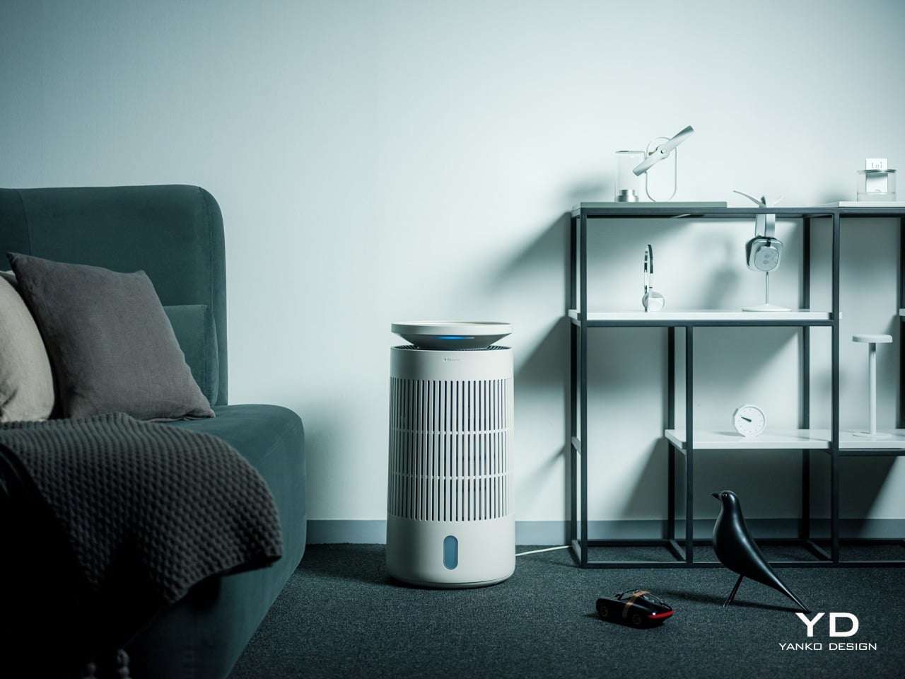
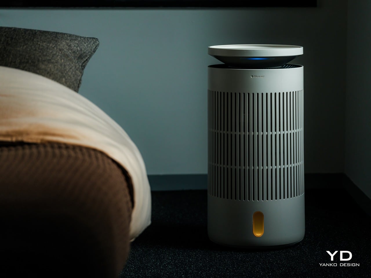
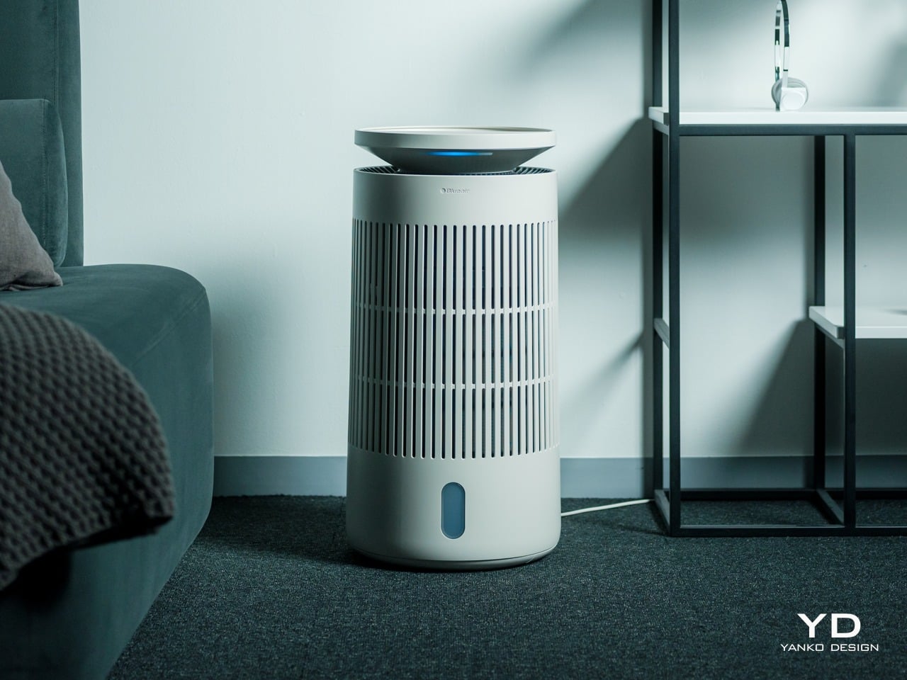
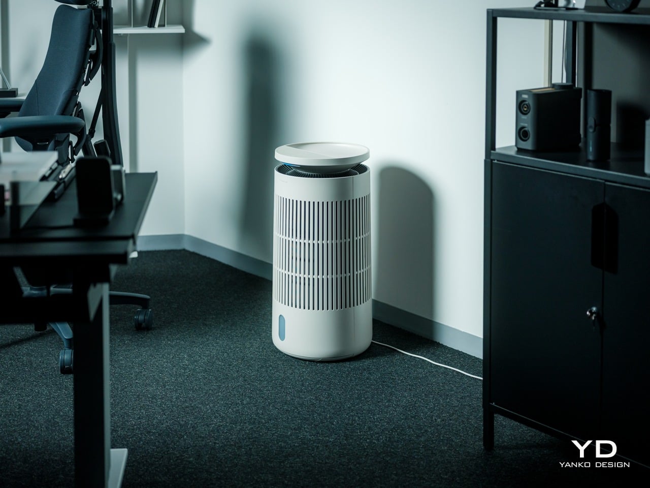
The first thing you notice about the Blueair 2‑in‑1 Pro is that it does not look like an appliance trying to hide. It is a cylindrical tower wrapped in evenly spaced vertical slats, finished in a soft off white that reads somewhere between warm beige and coastal linen, depending on the light. The proportions feel Scandinavian, tall enough to have presence but narrow without crowding the floor.

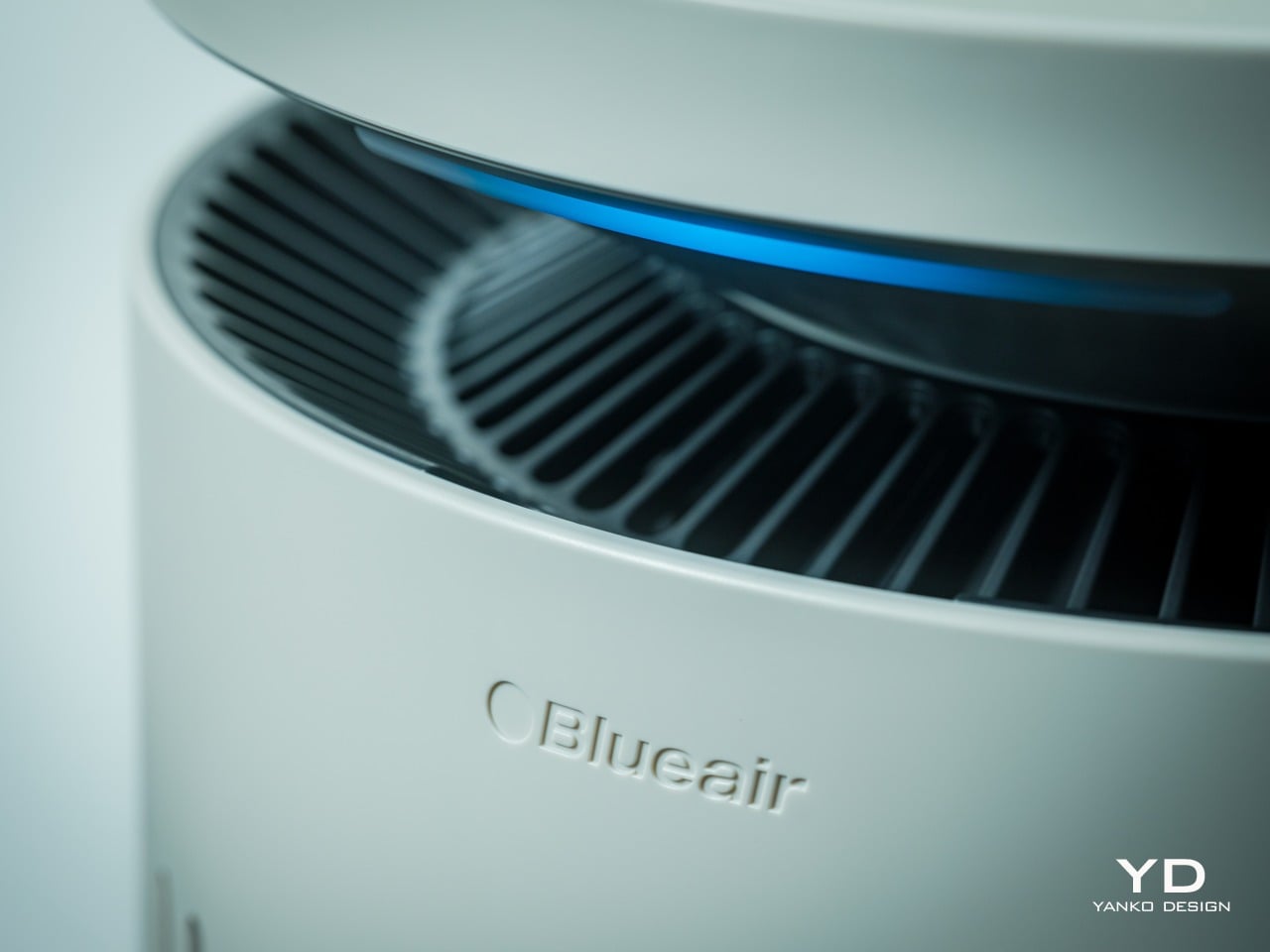
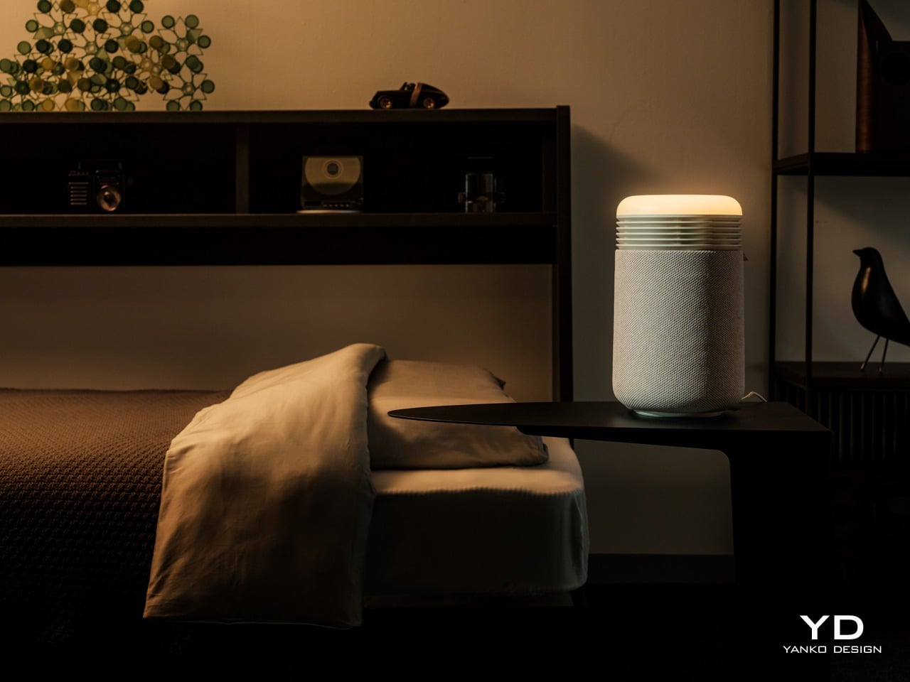
The top disc floats slightly above the body with a subtle gap, and when the device is running, a thin line of blue light glows in that gap, more like a bedside lamp than a status LED. The slats wrap 360 degrees around the body, which gives it a kind of architectural rhythm that works whether you see it from the front or the side.

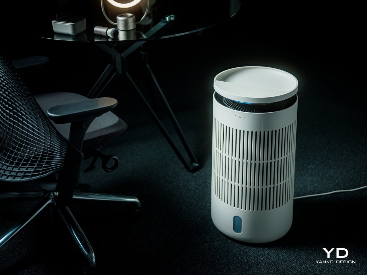
Near the base, there is a small vertical window that shows the water level and projects mood lighting when enabled in the Blueair app, but it is narrow enough that it does not break the visual flow. The top disc itself is smooth and plate-like, with a matte finish that does not collect fingerprints. The material is still primarily plastic, but it is clearly chosen to feel refined rather than cheap. The matte finish softens reflections and resists the glossy sheen that makes a lot of gadgets look disposable.

The tower looks comfortable in different contexts. In a bedroom next to wood furniture and neutral textiles, it reads as another piece of the interior rather than a piece of tech parked temporarily. In a small office with dark carpet, floating shelves, and a desk chair, it sits in the corner without clashing with the more technical surroundings, which makes it easy to imagine moving between spaces. The sense you get is that someone thought about how this object would age in a room where it runs every night.

Ergonomics

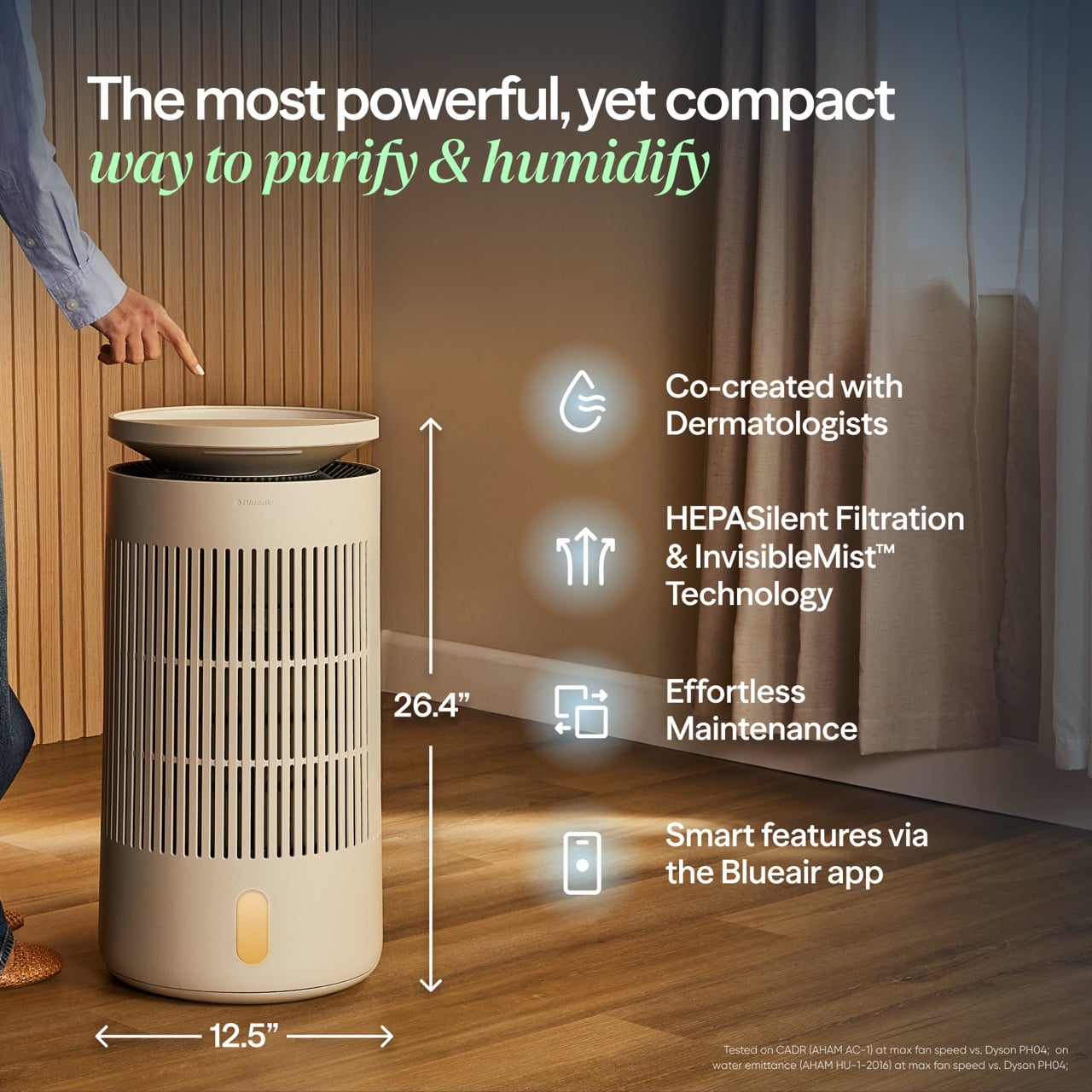
The Blueair 2‑in‑1 Pro is tall enough that you do not need to crouch to reach the controls, which sounds minor until you realize how many bedside devices force you to bend or kneel just to tap a button. The footprint is compact, roughly a foot in diameter, and the weight gives it enough stability that you can brush past it without worrying it will tip.

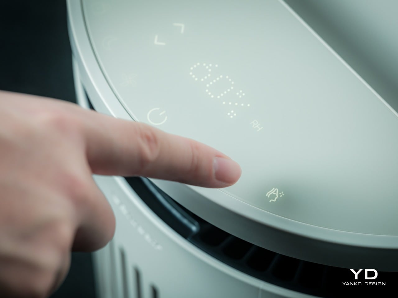
The top surface is where most of the interaction happens. A semi-circular ring houses clearly marked icons for power, fan speed, night mode, humidification toggle, and skin mode, along with indicators for air quality, humidity percentage, and water level. The layout is simple enough that you can understand it at a glance, so switching into auto mode or activating skin mode is a one-tap affair.

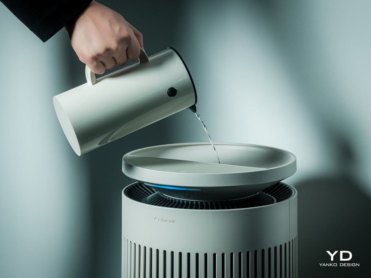
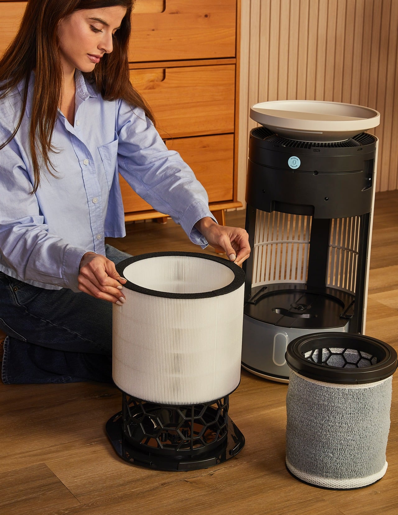
One of the most thoughtful ergonomic details is the top fill design. Most humidifiers require you to lift a heavy tank, carry it to a sink, fill it, then carefully carry it back and slot it into place, which gets old quickly and can be awkward if you have back or shoulder issues. The Blueair 2‑in‑1 Pro lets you simply lift the top disc slightly and pour water directly into the opening from a jug or carafe. The smart water sensor and real-time display remove worries by reminding you when the water level is low and alerting you when the tank is almost full.

It feels as easy as watering a houseplant, and for people who want to avoid bending and lifting, this small design choice makes day-to-day upkeep significantly less annoying. There is still the option to remove the tank entirely and fill it at a sink when you want to add a larger volume at once, but most of the time, the top fill is faster and easier.

Performance

Blueair boasts the 2-in-1 Pro Purify + Humidy as the most powerful of its kind, delivering balanced and superior performance in such a compact package. Compared to a leading competitor, its tests have proved it to offer 3x better purification and 2x cleaner humidification. Although we don’t have labs to verify these numbers, our own day-to-day use proved it to work as advertised.

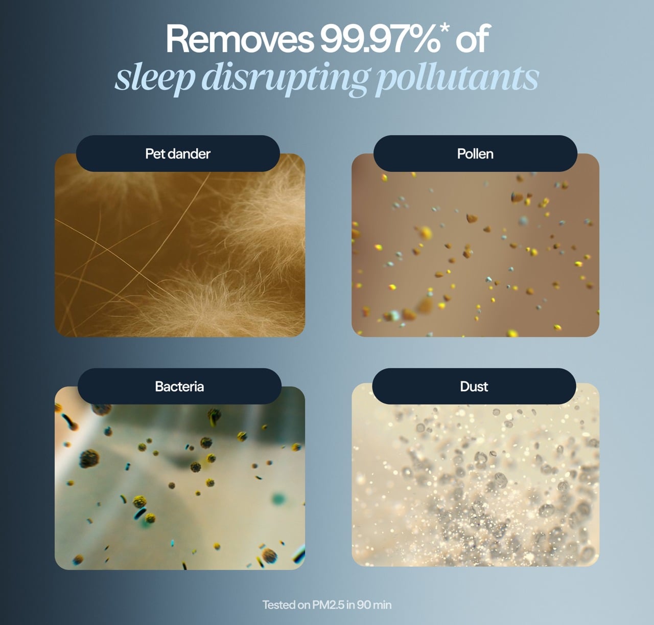
The Blueair 2‑in‑1 Pro is both a capable air purifier and a serious humidifier, which is a harder balance than it sounds. The purification side uses Blueair’s HEPASilent™ technology, which combines mechanical filtration with an electrostatic charge to capture fine airborne particles like dust, pollen, smoke, and volatile organic compounds. The intake and outlet are 360 degrees around the body, so it pulls air from all sides and pushes it back out clean.

The humidification uses evaporative technology that Blueair calls 360° InvisibleMist™. Instead of producing visible fog or mist, it adds moisture to the air in a controlled, gradual way that avoids white dust on furniture and damp spots on nearby surfaces. This matters especially in bedrooms and offices with electronics, books, or wood finishes, where you want comfortable air without worrying about residue or condensation.

The skin and beauty sleep focus is where the device starts to feel like something designed for wellness routines rather than just air quality. The dedicated skin mode keeps humidity in a range dermatologists typically recommend for skin comfort, roughly between 40-60%, and adjusts that target based on room temperature and time of day. At night, when your skin tends to lose more moisture, the device gently raises humidity levels.

In practice, this feels like setting skin mode before bed, going through your normal cleanse and treatment routine, and then falling asleep in a room that feels neither dry nor heavy. You do not wake up with that tight, parched feeling that dry winter air or overheated apartments tend to cause, and your skin does not feel irritated or raw the way it sometimes does when indoor air is harsh.

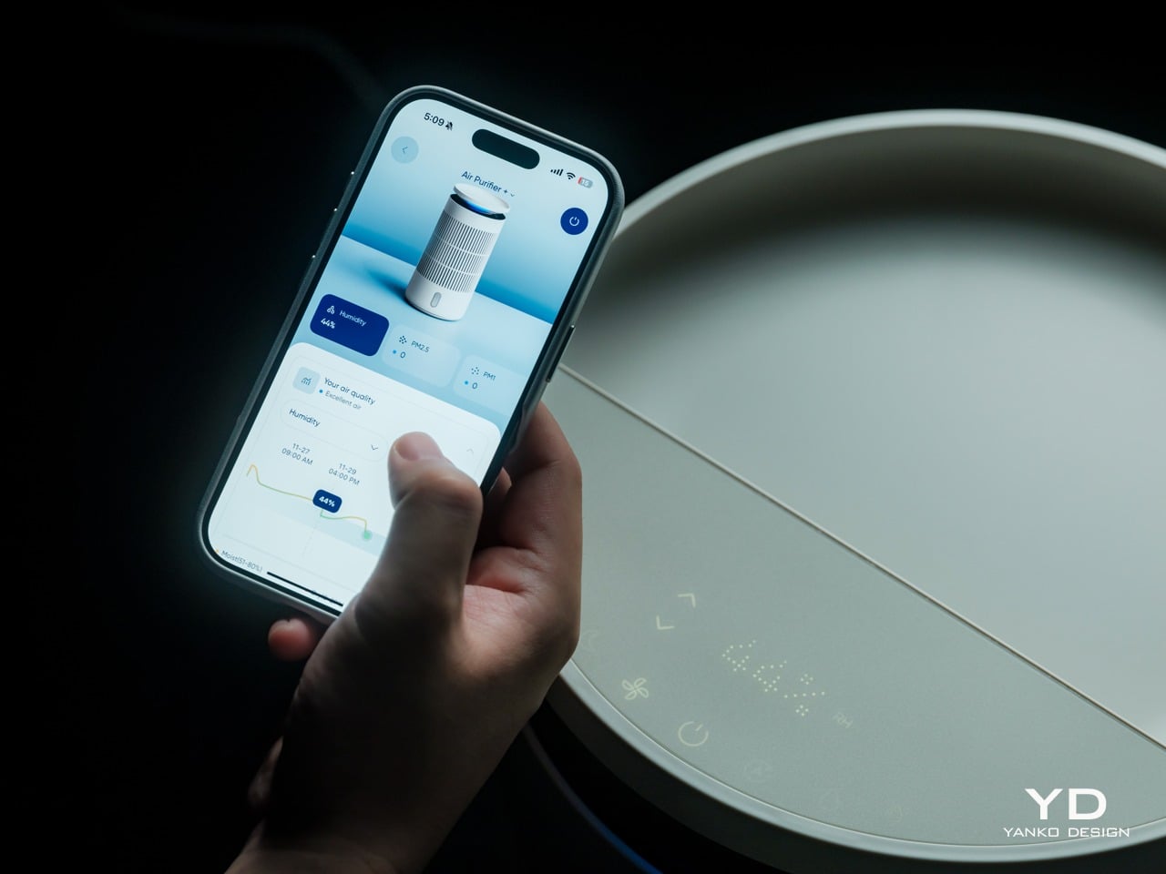
The Blueair app adds another layer of control and insight without being required for basic use. From your phone, you can set target humidity levels, create schedules for when the device runs, adjust display brightness, and choose between three mood lighting settings that turn the top ring into a warm, normal, or bright glow. You can also see air quality and humidity trends over time.

That said, most of the time you can leave it in auto or skin mode and let it manage itself quietly in the background. The app is there when you want precision or automation, but the device does not force you into it for everyday operation, which feels like the right balance for a bedroom appliance.

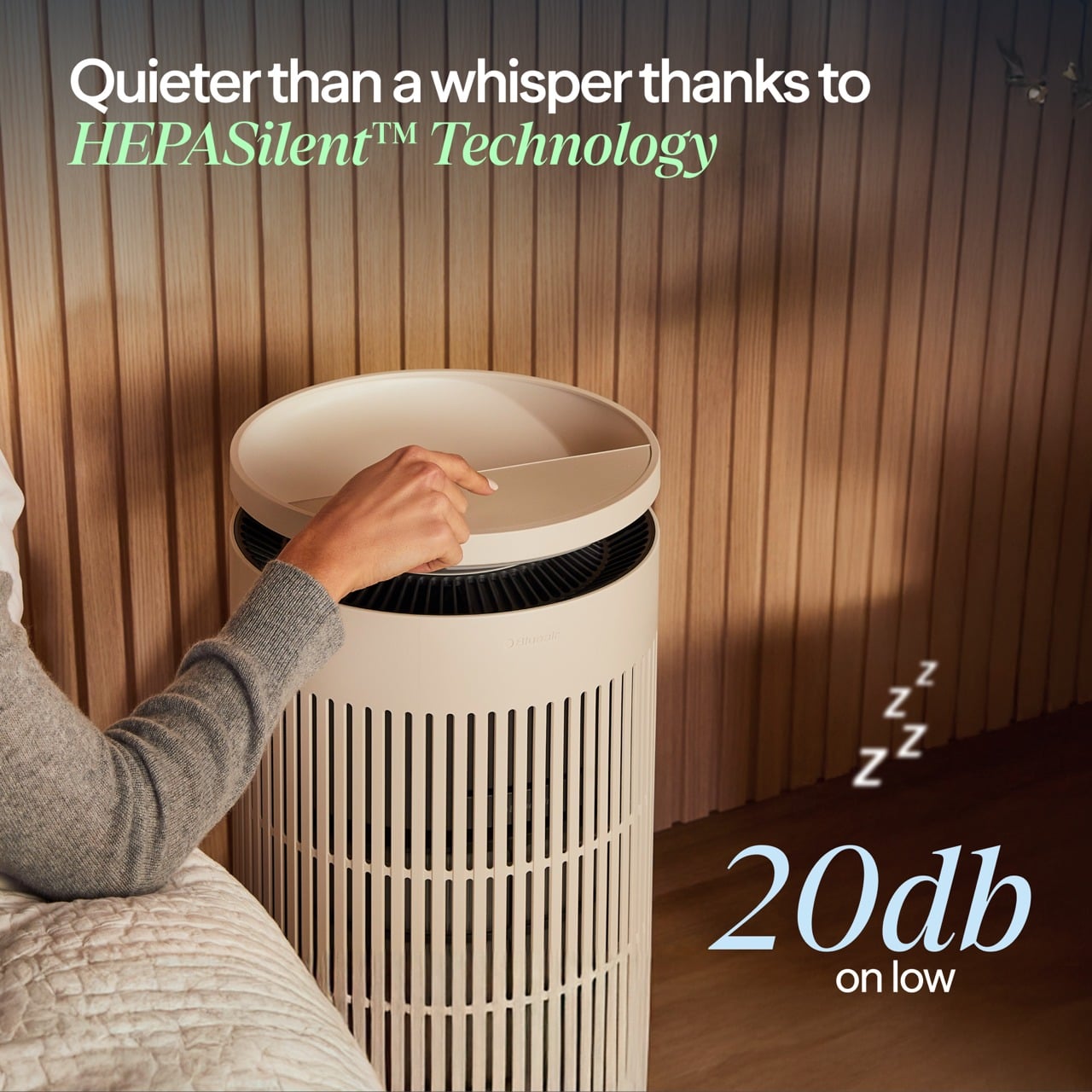
Noise is surprisingly gentle at lower speeds. In night mode, the sound profile is closer to a soft fan than a mechanical hum, which many people find soothing as a kind of background white noise. Higher speeds are audibly stronger when the device detects poor air quality and ramps up to clear it faster, but the ability to drop back into quiet operation keeps it compatible with light sleepers.

The device also includes several behind-the-scenes hygiene features that keep the humidifier side fresh over time. A built-in UV pump recirculates water to help inhibit bacterial growth, a wick dry mode runs automatically when the tank is empty, or the device goes to standby to prevent musty smells, and a water refresher module made of activated carbon helps absorb minerals and reduce discoloration.

Sustainability

Blueair is a Certified B Corp, which signals that the company has passed third-party audits for social and environmental impact. This does not magically make the device carbon neutral or eliminate its footprint, but it does suggest that longevity, energy use, and materials were part of the design conversation rather than afterthoughts. For a device designed to run every night, that kind of corporate positioning matters.

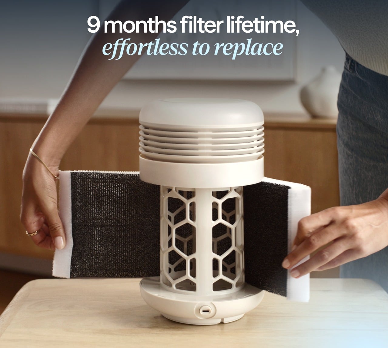
The 2‑in‑1 Pro is built around long-life, user-replaceable components. Both the air filter and the humidifier wick are rated for up to twelve months of use, which reduces the frequency of replacements and the amount of waste compared to devices that require new cartridges every few weeks. The wick is machine washable, which extends its life even further and keeps it feeling fresh without needing to buy a new one prematurely.

The hygiene features also support sustainability indirectly. A humidifier that stays clean and pleasant to use is less likely to be abandoned in a closet after one winter, which means fewer devices being replaced prematurely. The UV pump, wick dry mode, and water refresher all work together to keep the system feeling fresh, which encourages long-term ownership.

The housing is still primarily plastic, and this is an electrically powered device, so it has an environmental cost. But combining two machines into one does reduce the total number of housings, motors, and power supplies needed compared to buying a purifier and a humidifier separately. For someone who needs both functions, the 2‑in‑1 approach is a more efficient use of materials and space.

Value

The Blueair 2‑in‑1 Pro Purify + Humidify sits firmly in the premium category with its price tag, which is a real investment for a bedroom appliance. That figure makes more sense when you consider that it replaces a standalone purifier, a standalone humidifier, and in some ways a separate wellness gadget, while also adding design intelligence and app control that many basic units lack.

Space is part of the value equation. In bedrooms and small home offices, floor space and visual calm are both precious. Having one well-designed column instead of multiple mismatched boxes reduces clutter, simplifies cable management, and makes the room feel more intentional. For design-minded homeowners, that reduction in visual noise is a real form of value, not aesthetic preference alone.

The skincare and beauty sleep focus adds another dimension to the value story. For people already spending money on serums, moisturizers, and treatments, optimizing the air they sleep in is a logical extension of that investment. The fact that the device can quietly maintain a skin-friendly humidity range while filtering out airborne irritants makes it feel like a wellness tool that supports the rest of your routine.

Verdict

The Blueair 2‑in‑1 Pro Purify + Humidify is a carefully considered column that manages to be a capable purifier, a gentle humidifier, and a sleep-friendly presence without ever looking or feeling like a clinical appliance. It blends into bedrooms and small offices with the kind of visual ease that makes you forget it is technology, and the ergonomic details like top fill refilling and intuitive controls make it easy to live with day to day.

The 2‑in‑1 Pro makes the most sense for people who care about both design and wellness, who want their bedroom or office to feel like a calm, supportive environment, and who appreciate when technology quietly improves their routines without demanding constant attention. For that audience, this feels less like a splurge and more like a thoughtful upgrade to the air they live in every day.

Click Here to Buy Now: $400 $499.99 ($99.99 off, use coupon code “YANKO20”). Hurry, deal ends in 48-hours!

The post Blueair 2‑in‑1 Pro Purify + Humidify Review: Clean Air, Skin Care in One first appeared on Yanko Design.

Top 5 Non-Tech Gifts for Designers Who Have Every Gadget

Designers accumulate screens, tablets, and peripherals until their desks resemble mission control. Yet the most meaningful moments in creative work often happen away from pixels and processors. A perfectly weighted pen moving across paper creates a connection that no stylus can replicate. These analog tools offer something technology can’t: the tactile satisfaction of manipulating physical materials, the quiet pleasure of objects that don’t require charging or updates.

This collection celebrates the opposite of smart devices. Each piece proves that thoughtful design doesn’t need Bluetooth connectivity or app integration to elevate daily rituals. From writing implements engineered with surgical precision to candles that transform ambient lighting into meditation, these gifts remind us that the best tools sometimes do exactly one thing extraordinarily well. They’re for designers whose homes already hum with gadgets but whose souls crave something more deliberate and human.
1. Jetstream Edge

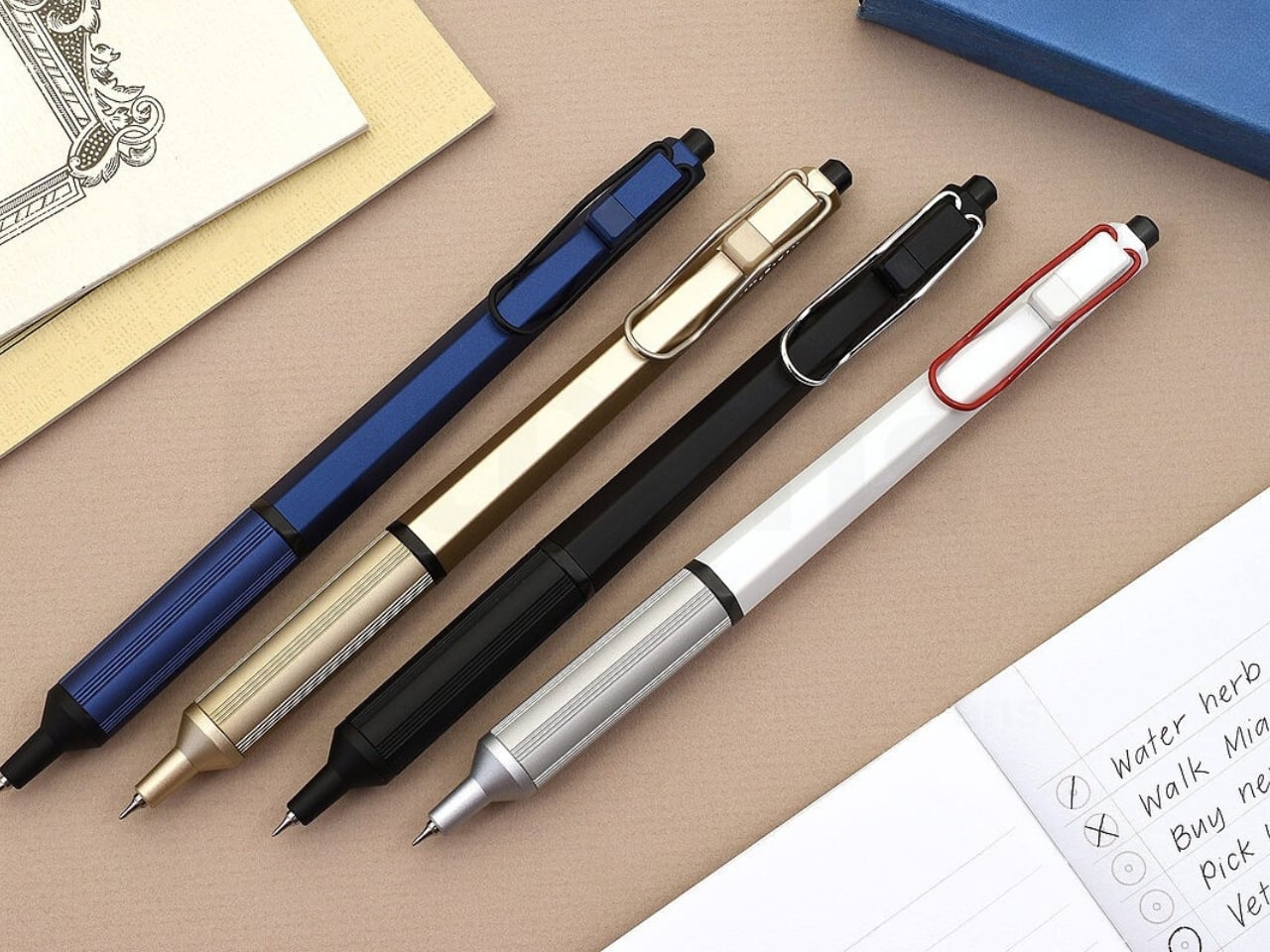
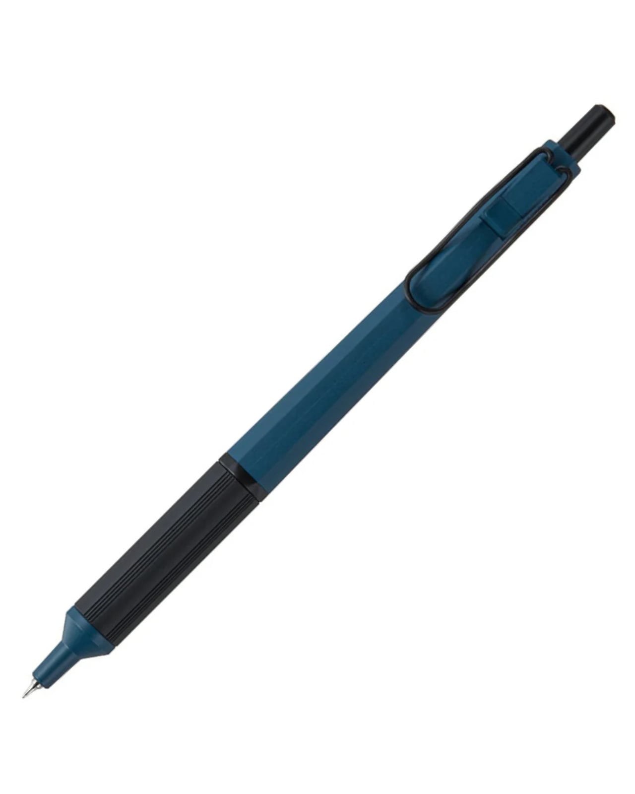
The world’s thinnest ballpoint pen sounds like marketing hyperbole until you drag the 0.28mm tip across paper and watch lines appear that rival technical drafting pens. This Uniball creation doesn’t just write thin; it writes with the kind of precision that makes handwritten notes feel like an intentional design exercise. The hexagonal black barrel catches light along its edges while the knurled metal grip provides just enough texture to keep your fingers anchored during extended writing sessions without causing fatigue or slippage.

What makes this pen exceptional lies in its hybrid ink formulation. The archival-quality black ink combines gel pen smoothness with ballpoint quick-drying properties, eliminating the smeared margins that plague lefties and rushed note-takers. The low center of gravity keeps the ultra-fine tip stable against paper, preventing the wobble that turns delicate linework into jagged scratches. The wire clip adds visual interest while securing the pen to notebook covers or shirt pockets. For designers who sketch concepts before digitizing them, this pen transforms rough ideation into refined mark-making.
What we like

  • The 0.28mm tip delivers drafting-pen precision in a portable ballpoint format.
  • Hybrid ink technology dries instantly to prevent smudging on fresh pages.
  • The hexagonal barrel and knurled grip provide ergonomic control during long sessions.
  • Archival-quality black ink ensures notes and sketches remain legible for years.

What we dislike

  • The ultra-fine tip requires quality paper to prevent catching or tearing.
  • Replacement refills may prove difficult to source compared to standard ballpoints.

2. Heritage Craft Unboxing Knife

Most box cutters hide in junk drawers because they’re aggressively utilitarian and vaguely dangerous-looking. This aluminum sculpture reimagines the ancient hand axe through precision machining, creating something you’ll want displayed on your desk rather than buried in a drawer. Carved from a solid aluminum block, its circular form echoes Paleolithic tools while the wave-like patterns from the cutting process provide grip and visual intrigue. The tapered shape fits naturally in the hand, making package opening feel less like a chore and more like wielding a carefully considered instrument.

The intentional blade angle prevents over-penetration that damages package contents while maintaining enough sharpness for clean tape slicing. Aluminum’s inherent luster gives the knife a refined presence that elevates the mundane ritual of receiving deliveries. Designers who appreciate when everyday objects receive serious design consideration will find themselves reaching for this piece even when scissors would suffice. It sits at the intersection of functional tool and desktop sculpture, proving that utilitarian objects don’t need to sacrifice beauty for practicality or effectiveness.

Click Here to Buy Now: $99.00

What we like

  • Paleolithic-inspired form transforms mundane unboxing into a satisfying ritual.
  • Precision-milled aluminum construction provides luxury weight and lasting durability.
  • Wave-pattern machining creates a natural grip while adding sculptural visual interest.
  • Angled blade design ensures safe cutting without damaging package contents.

What we dislike

  • The exposed blade requires careful handling despite thoughtful safety considerations.
  • Premium aluminum construction places it at a higher price point than standard cutters.

3. Japanese Lantern Candle

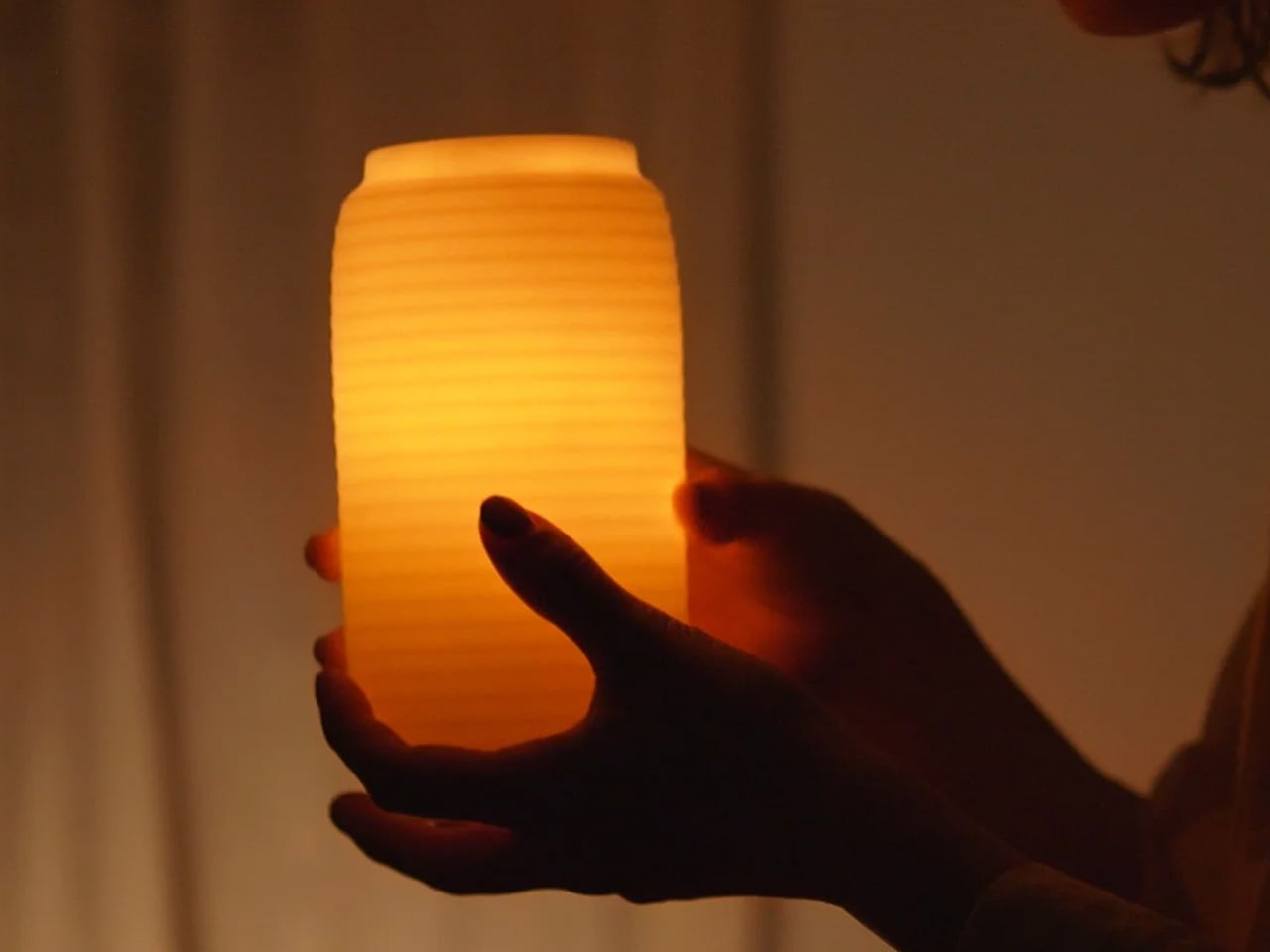
Chouchin lanterns once lit Japanese festival nights with a gentle glow that modern LEDs struggle to replicate. This contemporary interpretation captures that soft illumination through handmade candles crafted in Kurashiki by artisans who understand how light transforms space. The minimalist holder design lets the candle become the focal point while patented technology prevents the outer wax from melting, maintaining the lantern shape throughout its burn life. As the interior wax liquefies, light dances through the undulating surface, creating shifting patterns that turn any room into a contemplative sanctuary.

The ritual of lighting a candle creates a deliberate pause that screens and notifications constantly interrupt. For designers accustomed to blue light and digital stimulation, this analog light source offers a different quality of illumination—one that encourages winding down rather than ramping up. The traditional chouchin form brings Japanese design philosophy into Western interiors without feeling forced or appropriative. Each candle burns with the kind of warm ambiance that makes reading physical books or sketching in analog notebooks feel natural again, reclaiming evening hours from device dependency.

Click Here to Buy Now: $69.00

What we like

  • Handcrafted by Japanese artisans in Kurashiki using traditional candle-making methods.
  • Patented technology maintains the lantern shape as interior wax melts and liquefies.
  • Minimalist design integrates seamlessly into contemporary or traditional interior styles.
  • The undulating surface creates mesmerizing light patterns as the candle burns down.

What we dislike

  • Replacement candles require sourcing from specific suppliers rather than local stores.
  • The contemplative burn time means less instant gratification than switching on a lamp.

4. Penguin x MOEBE Book Stand

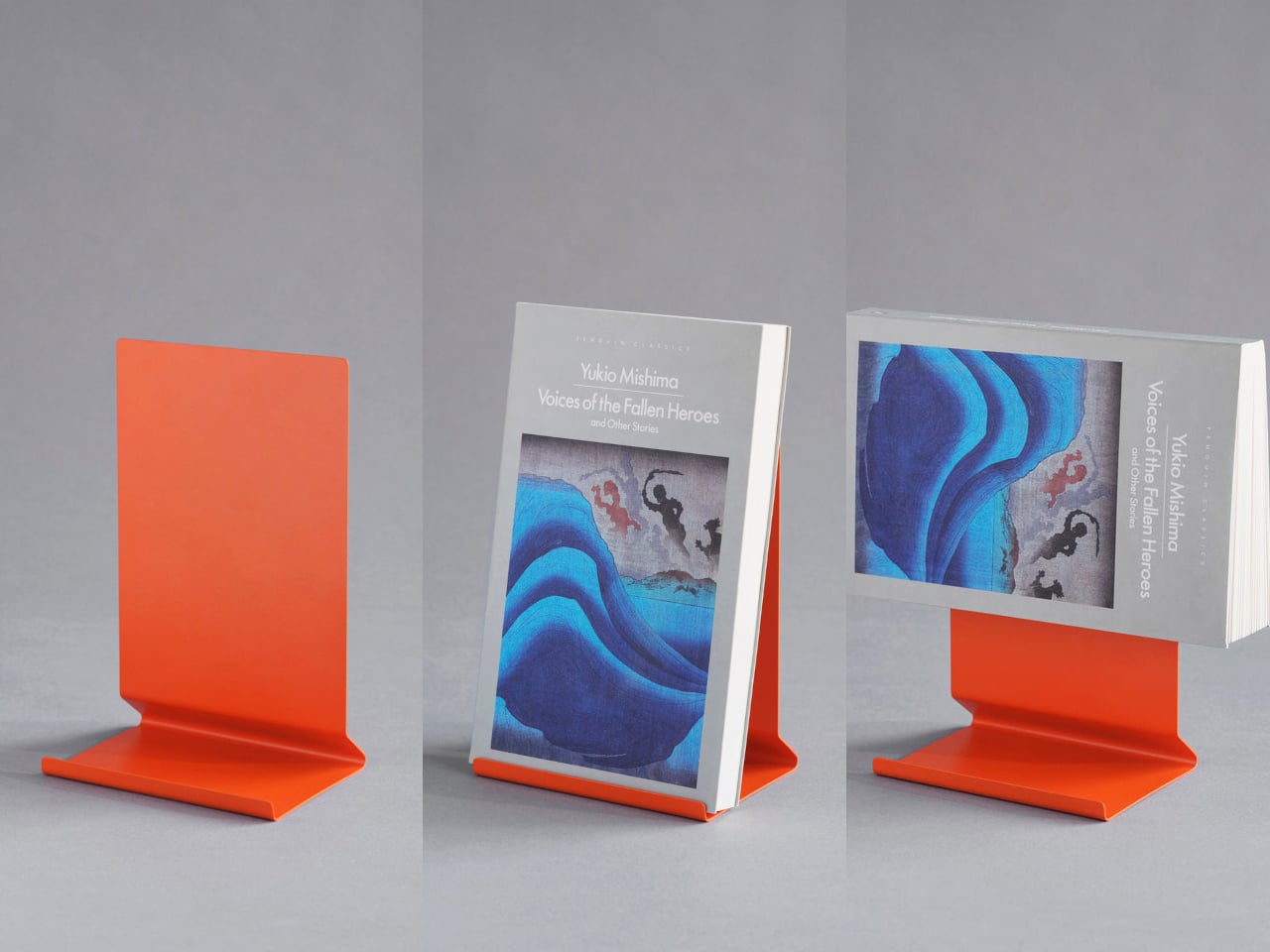
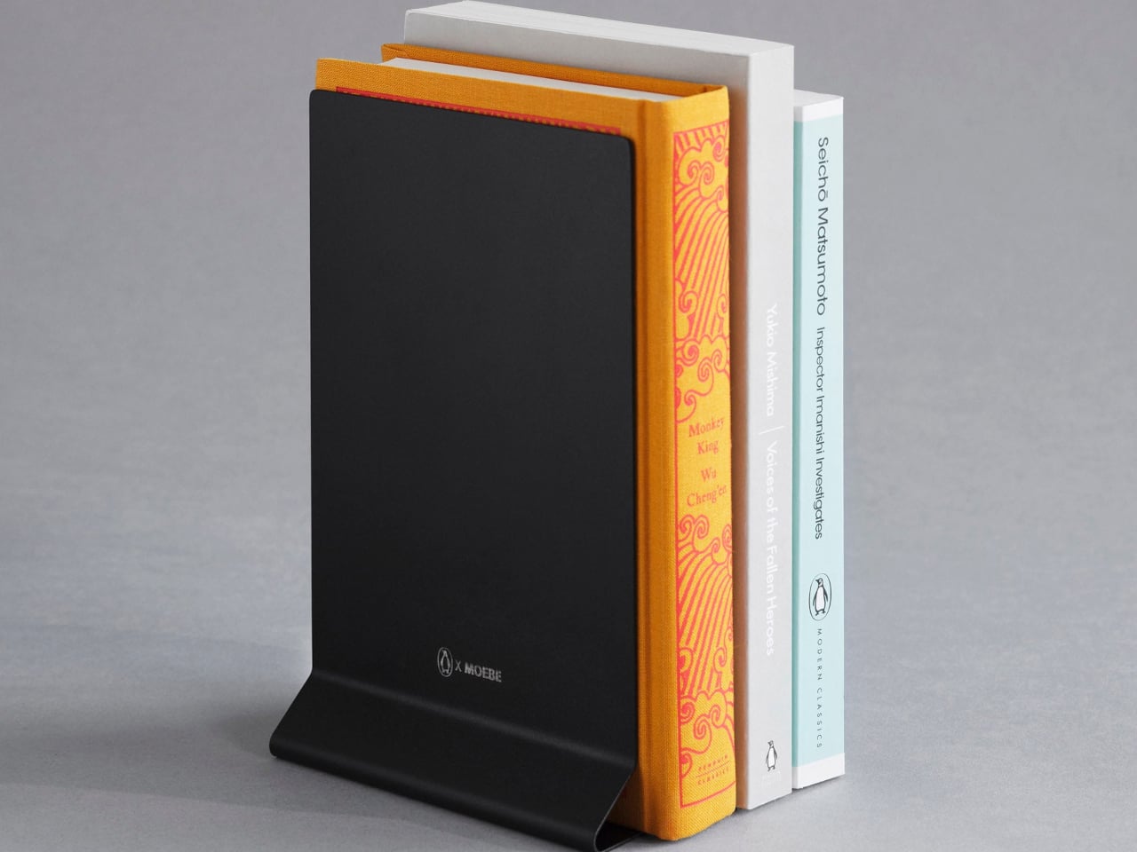
Books deserve better than lying face down with spines cracked or getting buried under device chargers. This collaboration between Penguin and MOEBE treats reading material as objects worth displaying, using bent steel to create a versatile stand that functions as a bookmark, display easel, or bookend depending on configuration. The single-sheet construction eliminates visible fasteners that would interrupt the clean lines, while the matte finish in stainless steel, cream, black, or Penguin orange lets you match existing desk aesthetics or add a pop of color.

The angled base supports everything from slim poetry collections to chunky design monographs without wobbling or tipping forward. Designers who collect physical books for reference and inspiration will appreciate how the stand keeps current reading visible rather than lost in stacks. Pair two stands to create bookends that frame a curated shelf section, or use a single piece to hold cookbooks open during kitchen experiments. Subtle Penguin and MOEBE branding sit on the base, where it remains visible without dominating the overall form. The stand quietly insists that books matter.

What we like

  • Single bent-steel construction creates seamless form without visible fasteners or joints.
  • Angled base supports books of varying thickness without wobbling or tipping.
  • Multiple colorways, including Penguin’s signature orange, integrate with existing decor.
  • Functions as a bookmark, display stand, or bookend depending on current needs.

What we dislike

  • The minimalist aesthetic may not provide enough visual presence for some interiors.
  • Steel construction adds weight that makes it less portable than plastic alternatives.

5. Personal Whiteboard

Digital note-taking apps promise searchability and cloud sync, yet many designers still think best with markers in hand. This portable whiteboard reduces the friction between thought and capture by fitting the essential ritual into a notebook form factor. The multi-functional cover wipes the surface clean, props the board at a comfortable viewing angle, and creates a pocket for loose papers. The Mag Force system turns the cover into both a handle for carrying and a magnetic pen holder that keeps your marker attached and accessible.

The genius lies in accepting that some notes are ephemeral. Sketch a quick concept, photograph it for the cloud, then wipe it clean for the next idea. The single reusable page eliminates the wasteful stack of marker-stained papers while maintaining the kinetic satisfaction of writing on a physical surface. Any standard whiteboard marker works, removing the premium-refill anxiety that plagues some reusable notebooks. For designers who facilitate workshops, lead brainstorming sessions, or simply think better while standing at a wall, this personal version brings that same energy to individual work.

Click Here to Buy Now: $49.00

What we like

  • Multi-functional cover serves as an eraser, an adjustable stand, and a document pocket.
  • The magnetic Mag Force system secures any whiteboard marker for transport and storage.
  • Photograph-then-erase workflow combines analog thinking with digital archiving.
  • Compatible with all standard whiteboard markers rather than proprietary refills.

What we dislike

  • The single-page format limits capturing multiple simultaneous thoughts or comparisons.
  • The whiteboard surface can develop ghosting over time with frequent use and inadequate cleaning.

Beyond the Charging Cable

The best gifts don’t always light up or connect to Wi-Fi. These five pieces prove that analog tools still have vital roles in creative work, offering textures and interactions that screens can’t replicate. From the meditative ritual of lighting a candle to the precise satisfaction of an engineered pen, each object does one thing superbly well without requiring updates or subscriptions. They’re investments in slowing down, in making everyday interactions feel intentional rather than automatic.

For designers drowning in devices, these non-tech gifts offer something increasingly rare: objects that work the same way in five years as they do today. No planned obsolescence, no compatibility issues, no battery anxiety. Just beautifully considered tools that make analog rituals feel luxurious again. They remind us that the most sophisticated technology sometimes means no technology at all, just materials and craftsmanship in service of human needs that haven’t changed in centuries.

The post Top 5 Non-Tech Gifts for Designers Who Have Every Gadget first appeared on Yanko Design.

Auk Mini Grows 4 Herbs on Your Counter, No App or Pump Required

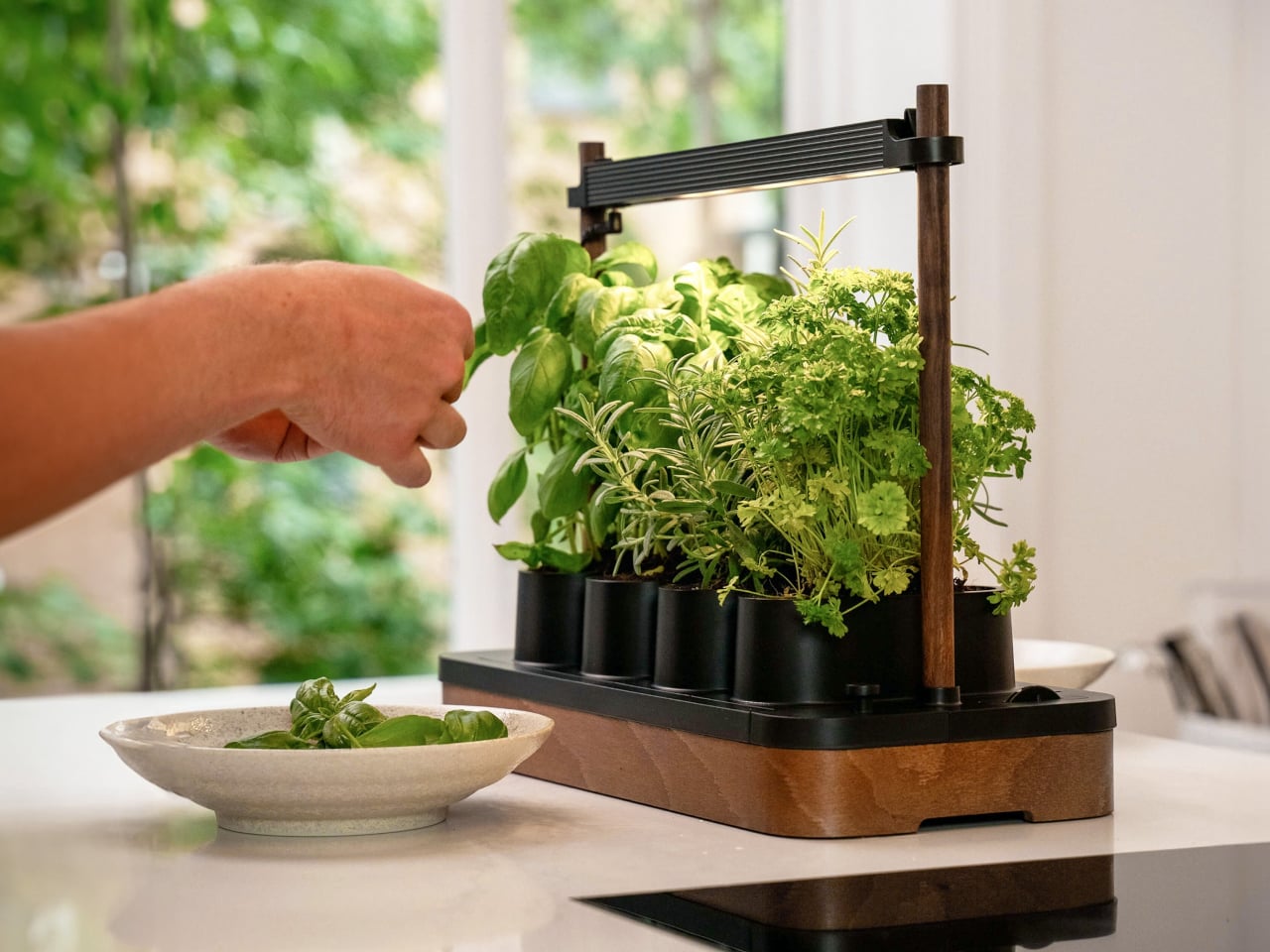
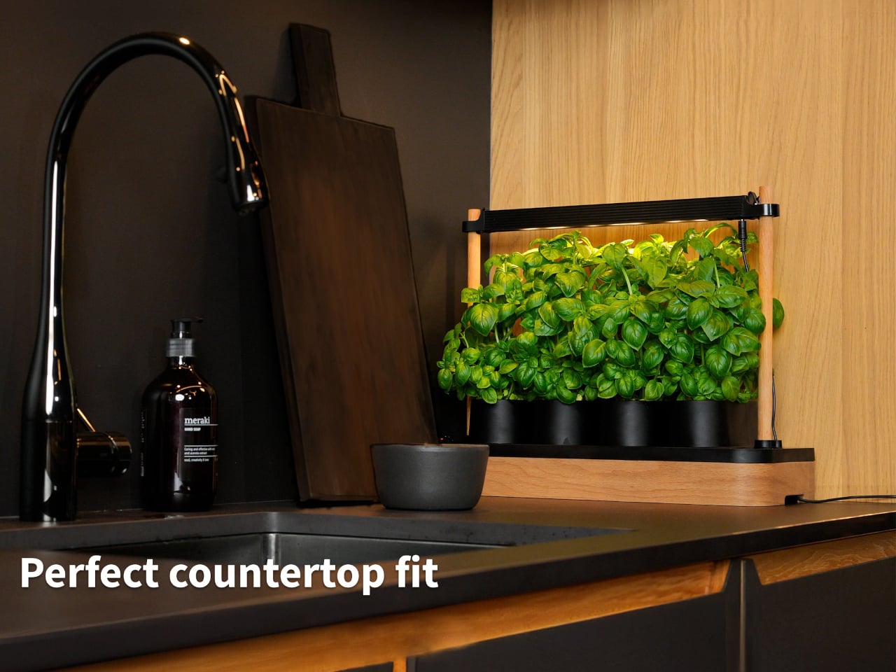
The usual indoor herb story goes like this: supermarket pots that die in a week, plastic hydroponic kits that look like lab equipment, and a general mismatch between those gadgets and a carefully considered kitchen. Auk Mini is a Scandinavian take on the problem, a compact indoor garden designed to live on the counter without screaming appliance, especially in its new cork-wrapped edition that adds sustainable texture to clean lines.

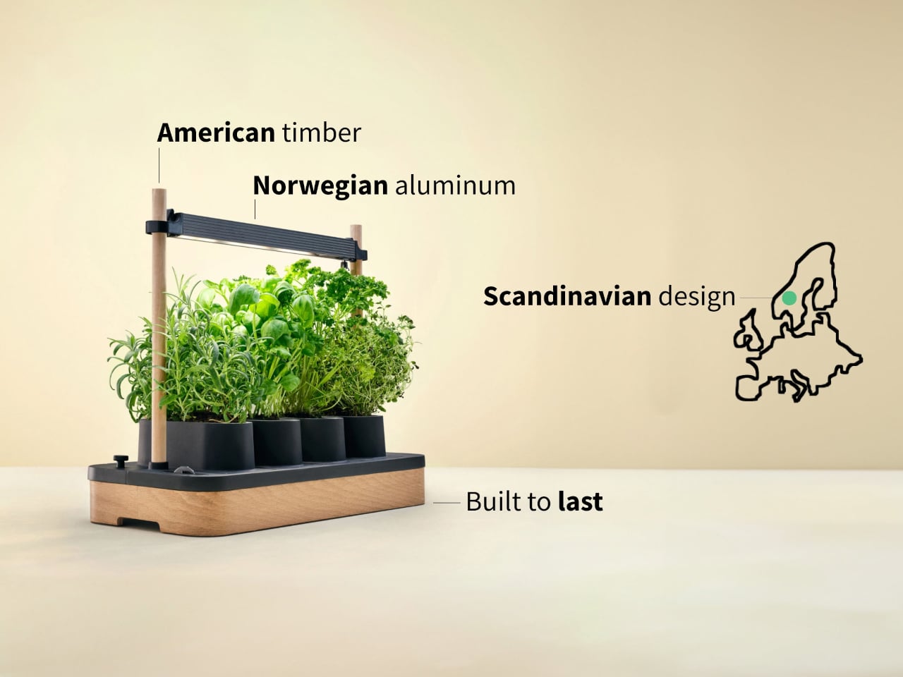
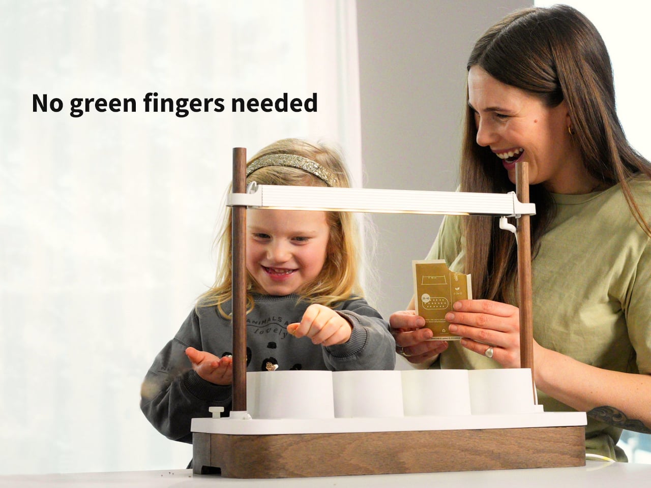
Auk Mini is the smaller sibling to Auk’s original six-pot system, a four-pot hydroponic planter that has already sold more than 100,000 units. The base is now available wrapped in natural cork, alongside oak and walnut finishes, turning the planter into something closer to furniture than a gadget. It ships with a 100-day money-back guarantee and has won awards from T3 and Esquire, but the story is the cork and how it changes presence.

Designer: Auk

The core hardware is a 17.5 × 8.5 inch base with four oval pots over a 0.8 gallon reservoir, flanked by wooden uprights holding a full-spectrum LED bar. There is no pump or app; you fill the tank, add nutrients, set the light cycle, and plants wick water through coco fiber. The light runs a long “summer day” schedule, and you top up water every week or two, checking the side wheel that turns red when empty.

The material mix uses recyclable ABS for the base, recycled aluminum for the light, and American timber for the uprights, then adds the cork wrap. Cork brings warmth, texture, and a sustainable story, softening the white plastic and metal into something that feels at home next to cutting boards and ceramics. The oak and walnut options do a similar job, but cork has a quieter, more neutral presence that works across more interiors.

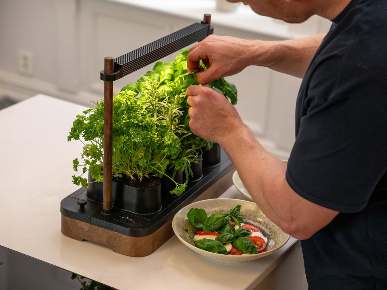
Auk Mini ships with basil and parsley seeds, but you can use any brand’s seeds, as the system deliberately avoids pod lock-in. Herbs and salads are usually ready in four to six weeks, tomatoes and chilies in eight to twelve. The ideal temperature is around 69–79 °F, and a single crop can last four to ten months if you harvest little by little from the top, encouraging new growth and keeping the plants productive.

Maintenance is a simple loop: refill water and nutrients, harvest regularly, and occasionally swap out the coco fiber. Auk sells refill kits with coco fiber and nutrients for $35, and recommends fresh fiber for each new crop, though you can reuse it. Cleaning between crops is a quick rinse and wipe, not a full teardown, which keeps the system feeling more like a kitchen tool than a science project.

Auk Mini, especially in cork, is designed to disappear into daily life. It is a planter that looks good enough to leave out, a light that doubles as a soft counter glow, and a routine that boils down to topping up water and snipping herbs. For people who want fresh basil without babysitting pots on a windowsill or dealing with finicky smart gardens, it feels like a quiet, well-designed compromise between nature and the realities of indoor living.

The post Auk Mini Grows 4 Herbs on Your Counter, No App or Pump Required first appeared on Yanko Design.

Clover Emotion Tracker Turns Small Happy Moments into a Daily Desk Ritual

People are more stressed than ever, yet still find it hard to talk honestly about how they feel, even with therapists or friends. Most mental health tools live inside apps that want you to rate your mood on a slider or fill out forms about your day, which can feel clinical or like homework you forgot to do. Clover is a concept that tries to make emotional check-ins gentler and more tangible, focusing on collecting small moments that went right instead of cataloging everything that went wrong.

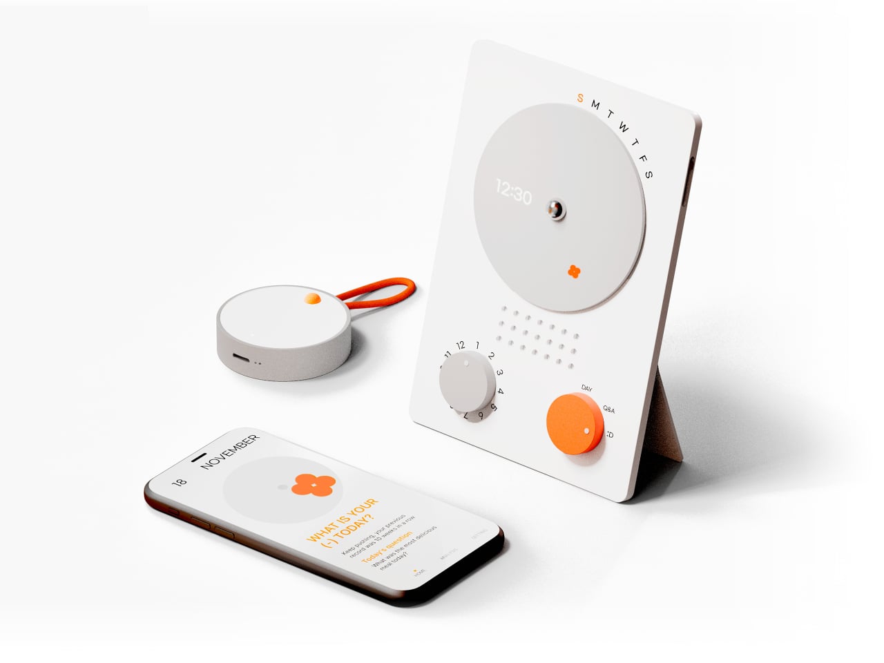
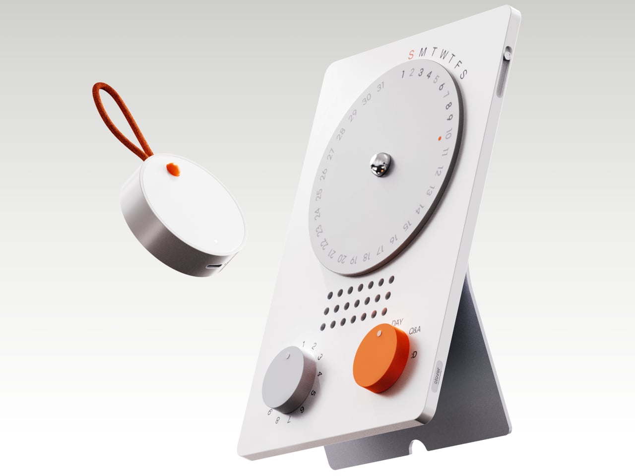
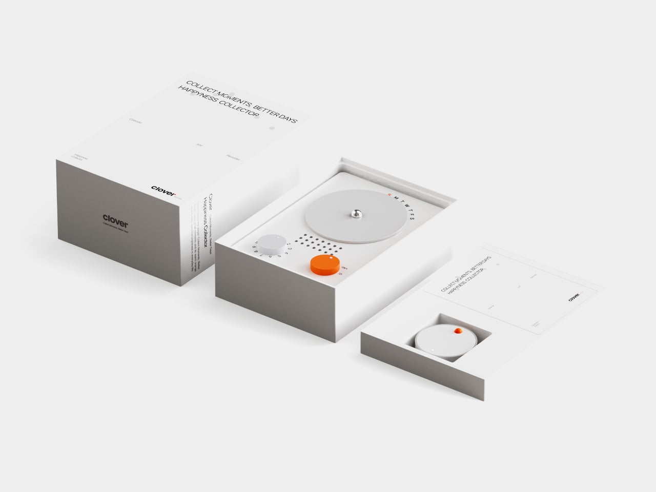
Clover is a small ecosystem built around three pieces: a pocketable voice recorder, a desk-calendar device, and a companion app. Instead of logging stress or symptoms, you press a button and record short voice notes whenever something makes you genuinely happy. Those moments are then visualized on the calendar and analyzed in the app, turning your week into a kind of happiness log that quietly reframes how you see your days.

Designers: Seyeon Park, Bhin Son, Yu Jin Song, Jiwon Park, Jinya Kim

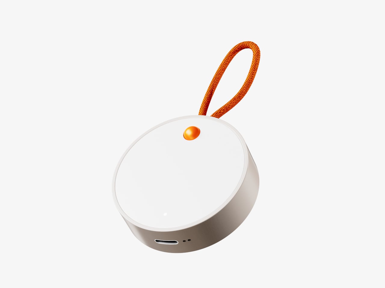
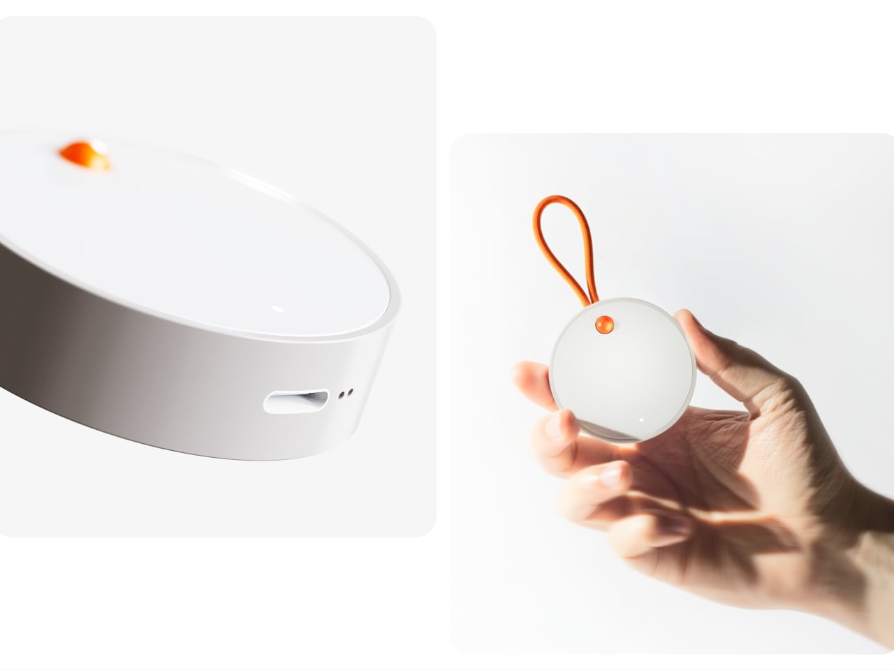
The recorder is a small, circular object with a single orange button and a loop strap, designed to be grabbed and pressed quickly. It is meant for capturing tiny, specific moments, sunlight on your desk, a good cup of tea, a joke from a friend, in your own voice. The goal is to lower the friction so much that recording a positive moment feels as easy as taking a photo, no unlocking, no tapping through screens, just press and speak.

1

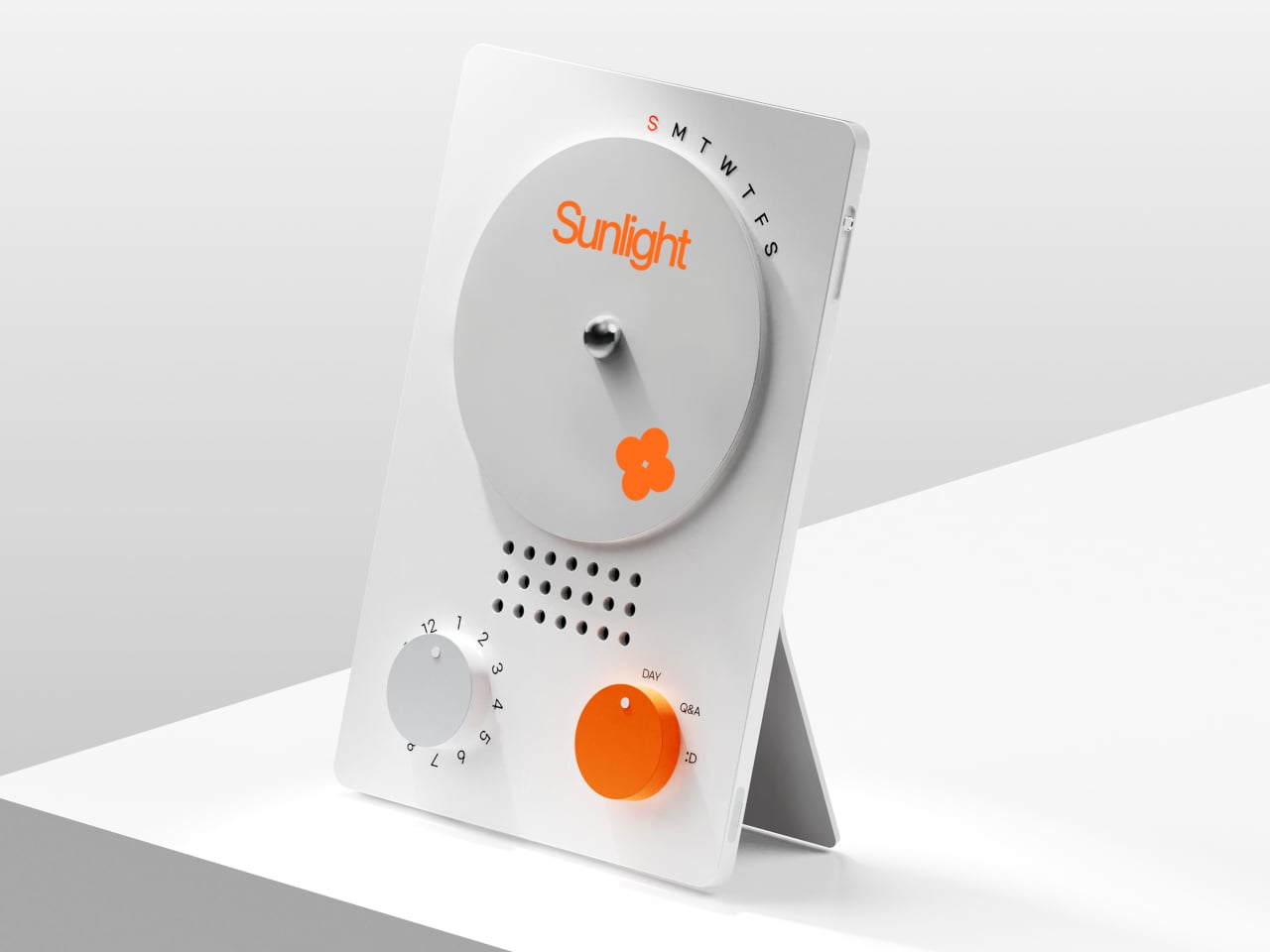
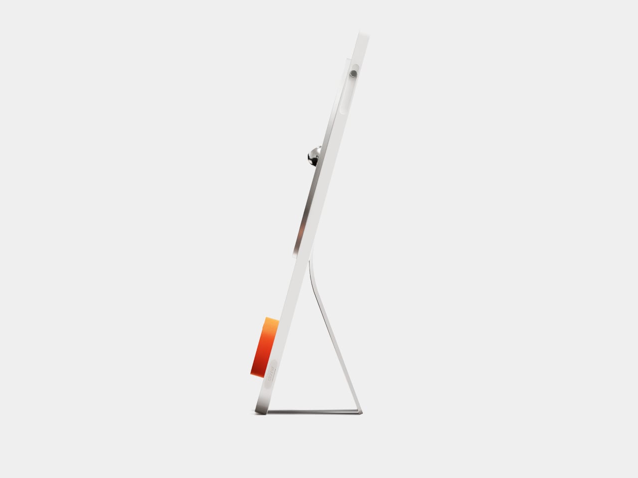
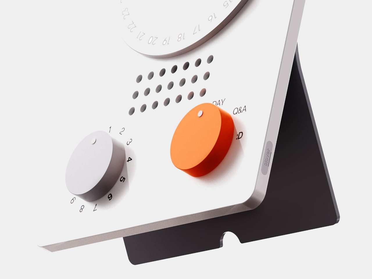
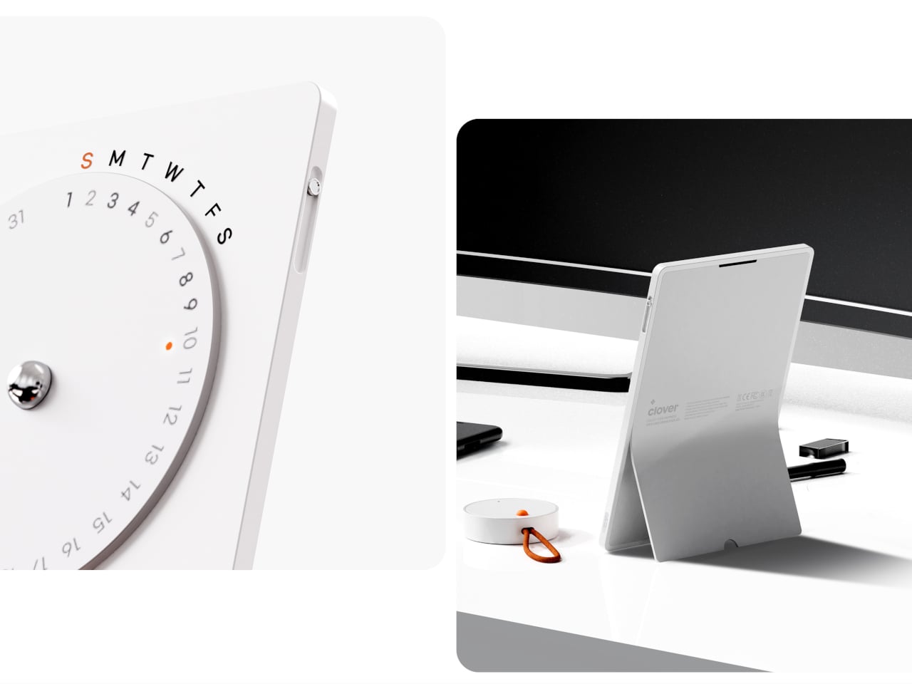
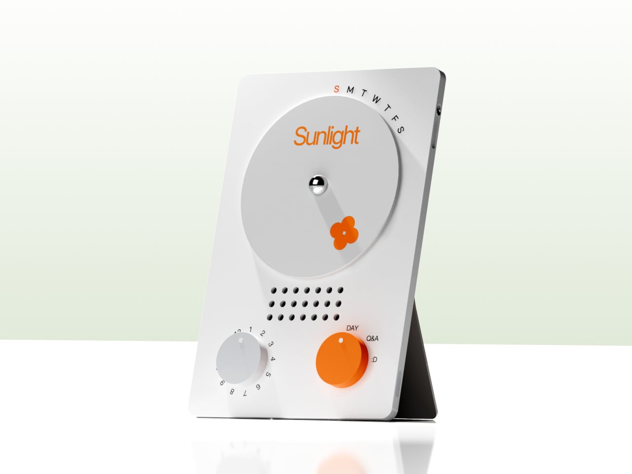
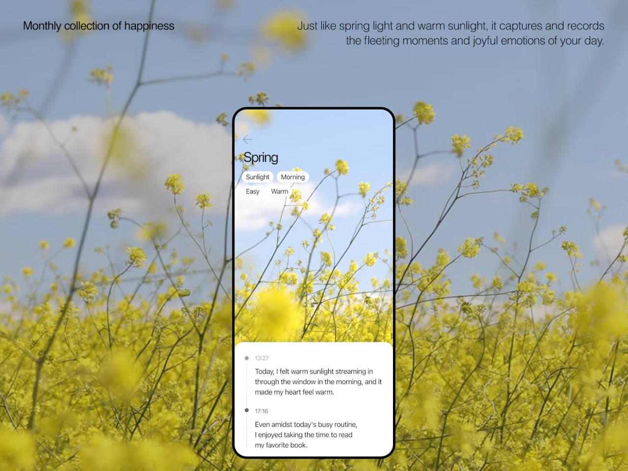
The desk calendar is a tilted white slab with a large circular dial labeled with days of the week and a small screen that displays words like “Sunlight” or “Spring.” It plays back or summarizes your voice recordings by day, and turning the dial lets you move between Day mode, Q&A mode, and long-term overview modes. Checking your emotional log becomes a physical ritual, more like flipping through a calendar than scrolling a feed or staring at another glowing interface.

1

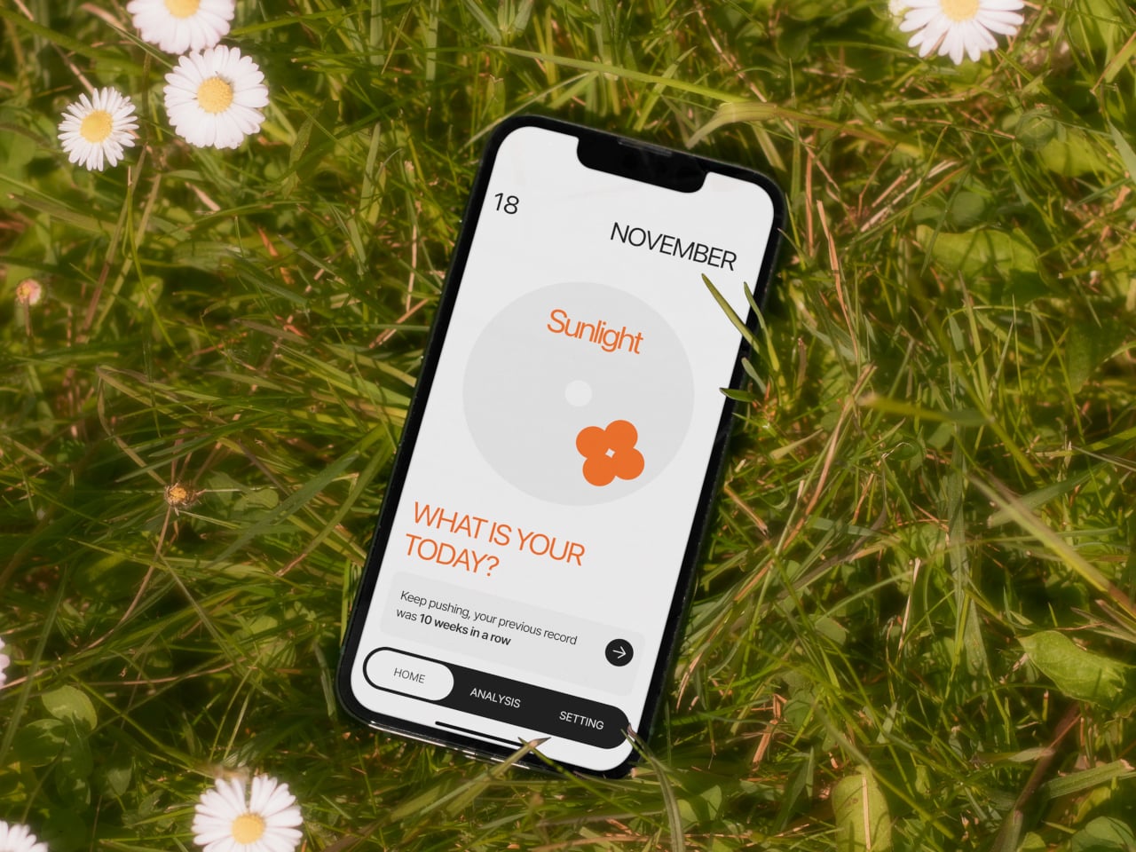
The app brings everything together, with daily cards asking “What is your today?”, weekly and monthly views full of dots and bars, and simple text insights that highlight recurring themes. You can tag entries by time, category, or keywords, and later see which people, places, or activities show up most often in your happiest moments. The analysis stays gentle, showing patterns without drowning you in numbers or making you feel like you failed when a week looks sparse.

1

Clover’s visual language, white and grey surfaces with orange accents, soft typography, and a clover icon that appears on hardware and UI, keeps the system from feeling like medical equipment. The core values, self-honesty, emotional balance, and everyday positivity, are baked into how it looks and behaves. It frames itself as a friendly desk object and app you would not mind seeing every day, not a reminder that something is broken.

Clover quietly flips the usual tracking script. Instead of asking you to monitor symptoms or productivity, it asks you to notice and collect small good things, then shows you that they happen more often than you think. For people who are tired of mood sliders and habit streaks, the idea of a physical recorder and calendar that simply help you remember what felt right might be the most calming part of the concept.

The post Clover Emotion Tracker Turns Small Happy Moments into a Daily Desk Ritual first appeared on Yanko Design.

Blueair Mini Restful(™) Sunrise Clock Air Purifier Review: The Only Air Purifier with a Sunrise Alarm Clock

PROS:


  • Soft, bedroom-friendly aesthetics

  • Multi-function bedside consolidation, including USB-C charger

  • Circadian-friendly lighting system

  • QuietMark certified for sleep

  • Simple maintenance with long filter life

CONS:


  • Single color temperature range might not fit some preferences

  • Premium price for small coverage area

RATINGS:

AESTHETICS
ERGONOMICS
PERFORMANCE
SUSTAINABILITY / REPAIRABILITY
VALUE FOR MONEY

EDITOR'S QUOTE:

The Blueair Mini Restful Sunrise Clock Air Purifier quietly merges clean air with gentle dawn into one compact, sleep-focused design object.
award-icon

Nightstands have quietly become cluttered charging stations over the past decade, with phones serving as alarms, small purifiers humming in corners, and separate wake-up lights trying to undo the damage of jarring ringtones at six in the morning. Sleep has turned into a wellness habit people track and optimize, but the tools meant to support it often feel scattered and visually chaotic.

The Blueair Mini Restful(™) Sunrise Clock Air Purifier is a compact attempt to pull some of those tools into one object. It is a small bedside cylinder that cleans the air, glows like a sunrise to wake you gently, plays soft sounds, shows the time, and charges your phone, all while looking more like a design piece than some cold, drab piece of appliance. But does this striking appliance work as advertised? We put it beside our comfy bed to find out.
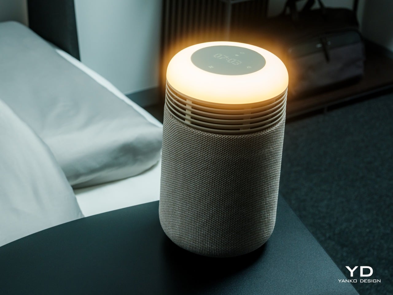
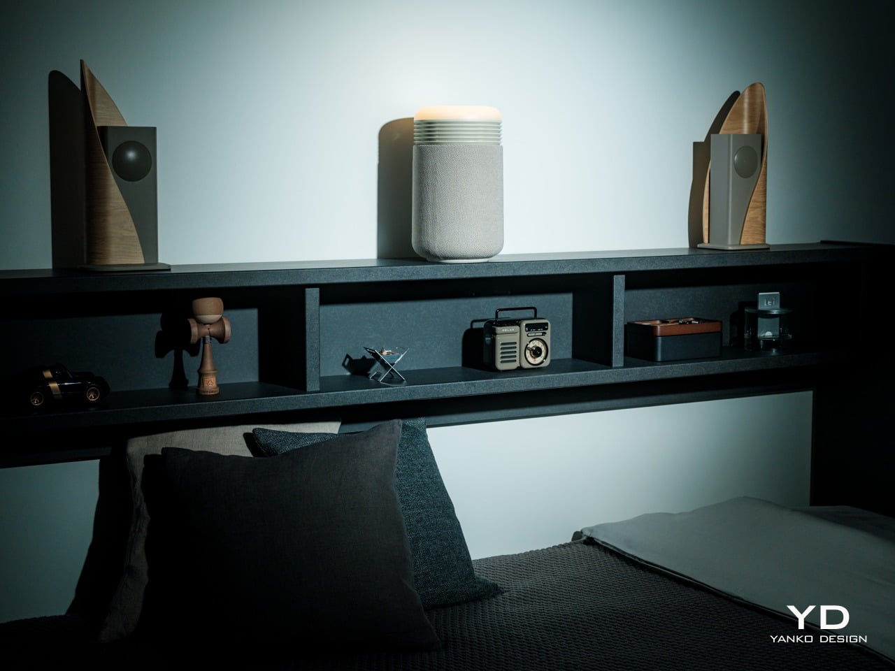
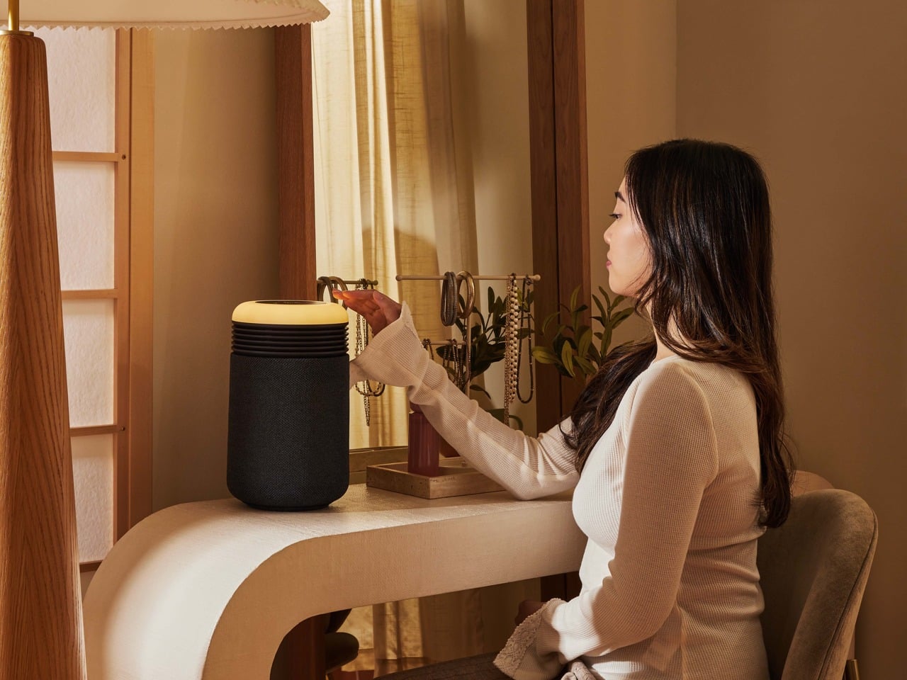
Designer: Blueair x Samuel Thoumieux

Click Here to Buy Now: $150 $199.99 (25% off, use coupon code “SAVE25”). Hurry, deal ends in 48-hours!

Aesthetics

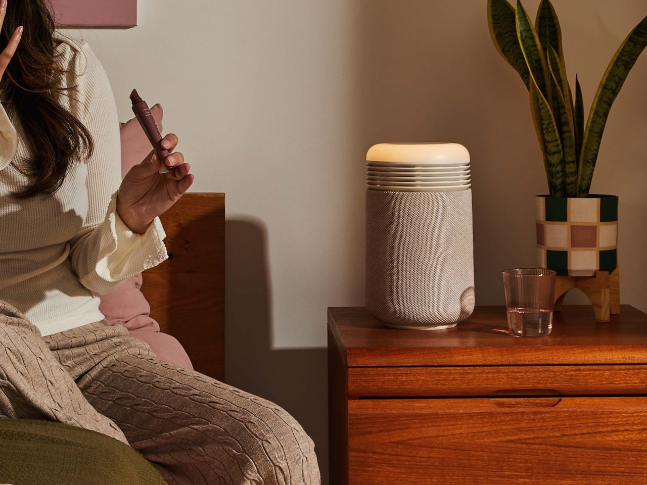
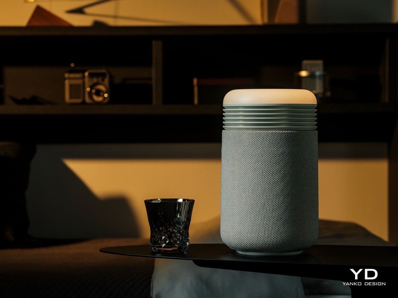
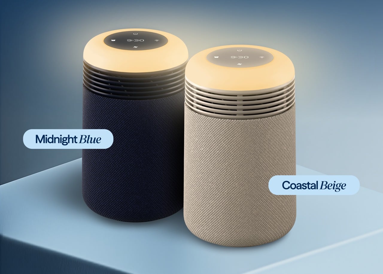
The Mini Restful is a short cylinder about eleven inches tall, wrapped in premium fabric with a smooth top disc. It looks closer to a smart speaker or a small bedside lamp than a traditional purifier, which makes it feel natural sitting on a nightstand. The proportions are deliberately compact and soft, with rounded edges and no visible vents.

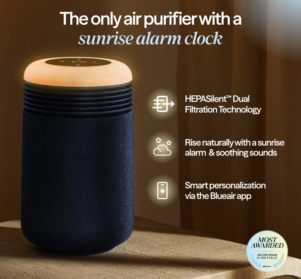
Two color options are available: Coastal Beige and Midnight Blue. Coastal Beige has a light oatmeal fabric with a warm off white top, which reads well in rooms with light wood furniture and neutral bedding. Midnight Blue uses a deep navy fabric, making it comfortable in darker, moodier bedrooms with richer tones.

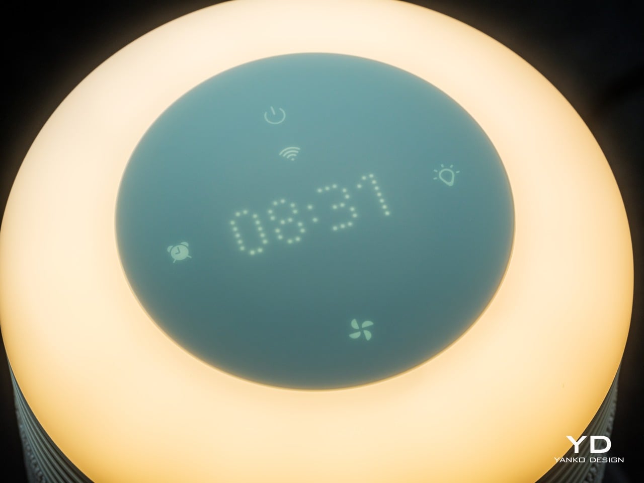
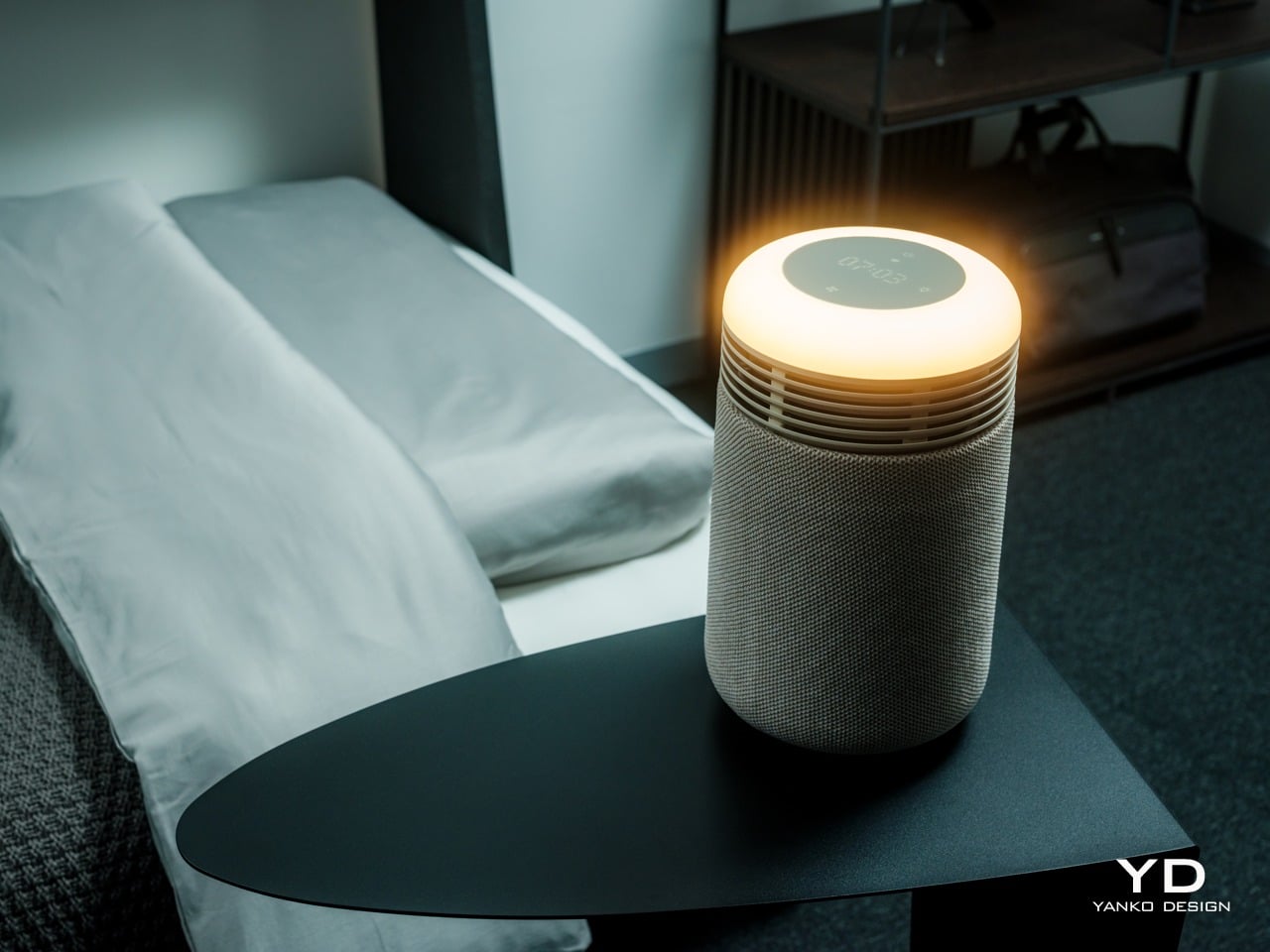
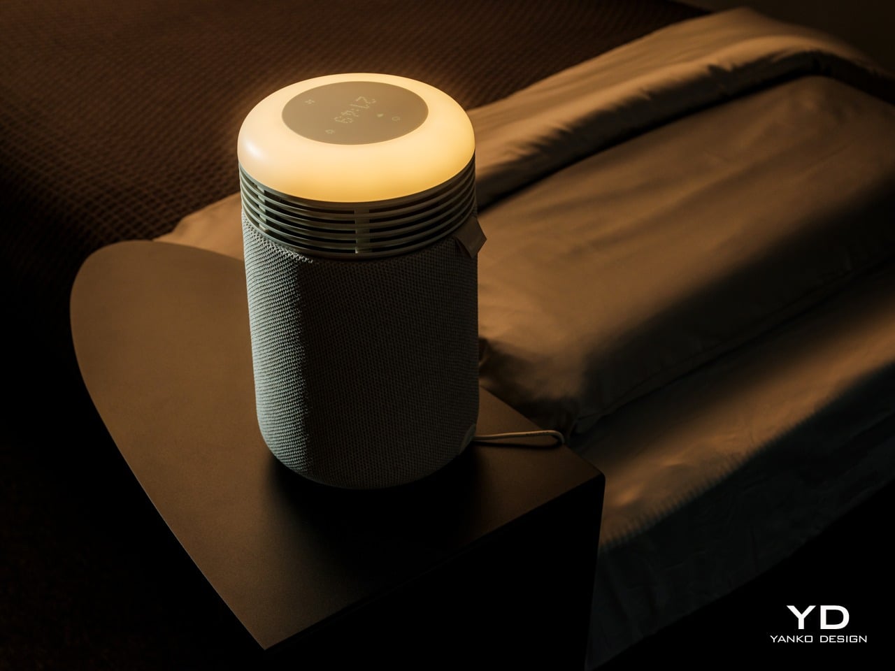
The top surface is where the aesthetic gets interesting. A circular user interface houses a dot matrix clock and touch controls, surrounded by a ring that glows when the wake-up light or mood lighting is active. When the sunrise alarm is running, the top looks like a tiny dawn, casting a warm halo onto the bedside table and wall.

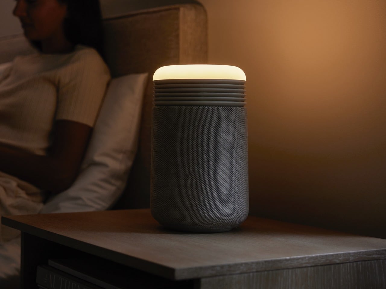
It is much more pleasant than the blinking LEDs most appliances default to, and it doubles the device’s role as both a functional purifier and a kind of ambient light. The glow feels intentional, like a small lamp designed to support sleep rather than disrupt it, which is a significant shift from typical purifier status lights.

The fabric wrap is a key design choice. It softens the entire object and makes it read as part of the room’s soft furnishings rather than a hard plastic box. The textile has a fine woven texture that feels closer to upholstery than speaker mesh, and it helps the Mini Restful blend into spaces where you want calm rather than tech on display. The overall look avoids the glossy plastics and aggressive styling that make a lot of gadgets feel cheap or temporary.

Ergonomics

At around two and a half pounds out of the box, the Mini Restful is genuinely portable. You can pick it up with one hand and move it between rooms or reposition it without any strain. The small footprint, roughly six and a half inches in diameter, means it takes up about as much space as a medium-sized speaker or a chunky candle.

The cylindrical shape means you can place it close to the bed without worrying about sharp corners poking you if you brush against it in the dark. The air intake and outlet are all around the body, so it does not need a lot of clearance to work effectively, which is helpful in tight bedrooms or smaller apartments where every inch of surface area counts.

The top controls and clock are designed for quick, low-effort interaction. The dot matrix display is readable without being glaring, and the surrounding touch icons handle basic tasks like setting alarms, adjusting light brightness, and likely fan speed. You can do the essentials without grabbing your phone, which is helpful if you are trying to reduce screen time before bed.

Filter access is straightforward. The fabric sleeve slips off, and the inner filter is a wraparound design with a simple closure, so replacing it does not require tools or wrestling with complicated cartridges. This kind of maintenance design makes it more likely that people will actually change the filter when it is due rather than giving up and buying a new device.

Performance

Inside the cylinder is a HEPASilent filter system that pulls in air from around the base, traps fine particles like dust, pollen, and smoke, and pushes cleaner air back out. The filtration is sized for small spaces, specifically bedrooms up to around one hundred forty square feet, which aligns with typical master bedrooms or nurseries. It is meant to clean the zone where you actually sleep.
The idea of a fresh air dome around the bed is central to how Blueair frames this product. Placing the Mini Restful on a nightstand or dresser top helps keep the immediate breathing zone cleaner, which can be especially helpful for people who deal with nighttime congestion, seasonal allergies, or asthma. The device cycles the air in a small bedroom multiple times per hour.
Noise performance is critical for a sleep device, and the Mini Restful is designed to be quiet. On its lowest settings, it is softer than most fans, more like a gentle whoosh than a mechanical hum. Higher speeds are audibly stronger when the device is working harder to clear the air, but the ability to drop back into whisper-quiet operation at night keeps it compatible with light sleepers.

The QuietMark certification adds third-party validation that the noise level is genuinely sleep-friendly, tested and approved by independent acoustic consultants. This matters because many purifiers claim to be quiet but still produce enough mechanical sound to disturb rest, while the Mini Restful can fade into the background entirely on low settings.

The wake-up light is where the Mini Restful starts to feel different from a standard purifier. You can set a time in the Blueair app, and then, in the fifteen to thirty minutes leading up to that time, the top light slowly brightens from a very dim glow to a warm, room-filling light. The color temperature stays in the warm range, mimicking the quality of a natural sunrise.

This gradual brightening is designed to help your body wake up more naturally than a sudden alarm. The light acts as a cue that morning is approaching, which can make the transition from sleep to wakefulness feel gentler and less abrupt, especially during darker winter months when natural light comes late or not at all.

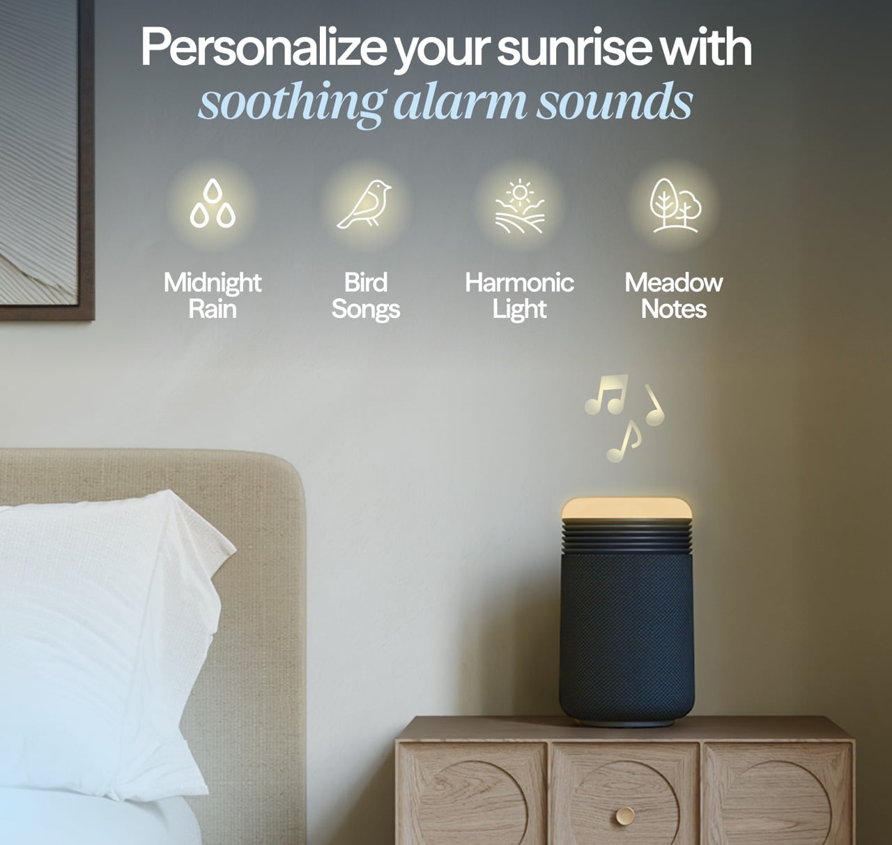
If you want more than light, you can add sound. The app includes a library of gentle wake-up tones and nature sounds, and you can choose one to start playing after the light has reached full brightness. The combination of light and sound is meant to guide you from deep sleep to wakefulness in a calmer way than a phone alarm blaring suddenly at full volume.

The same light that wakes you up can also help you wind down. In the evening, you can set the top to a very low amber glow as a night light or turn it up to a comfortable reading level, all in warm color temperatures that are gentler on melatonin production than bright white overhead lights or blue light-heavy phone screens.

The ability to adjust brightness on the device or in the app means it can match different routines, whether you are reading before bed or just want a soft ambient glow while you settle in. This dual role, supporting both wind down and wake up, makes the light feel integrated into the full sleep cycle rather than just a morning feature.

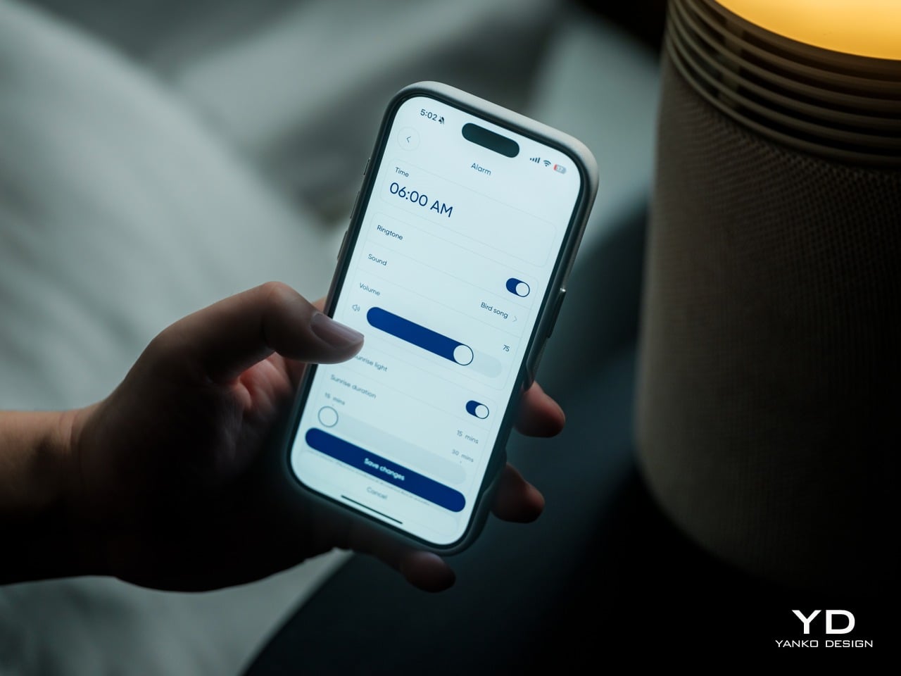
The Blueair app lets you fine-tune alarm times, choose how long the sunrise light takes to reach full brightness, select wake-up sounds, and create schedules so the device behaves differently on weekdays and weekends. The app also shows air quality and lets you adjust fan speed remotely, though most people will set a preference once. For people who like to see what is happening, the data is there, but the device does not force you into constant app interaction.

The integrated USB-C charging port on the back is a small but practical touch. It lets you plug in a phone or wearable directly into the Mini Restful, reducing the number of separate chargers and cables cluttering the nightstand. For people who currently use their phone as an alarm, this makes it easier to transition to the Mini Restful without losing charging convenience.

Sustainability

The Mini Restful uses a filter designed to last many months before needing replacement, which reduces how often you need to buy and discard new filters compared to some smaller purifiers with shorter lifecycles. The wraparound filter design with simple closure encourages full use of the filter’s lifespan and makes replacement straightforward, supporting longer ownership.

The device is relatively low power and Energy Star certified, which matters for something that might run many hours every day. At its lowest settings, the energy draw is modest, and even at higher speeds, it stays well within the range of efficient bedside appliances. Blueair, as a brand, positions itself with higher environmental standards as a Certified B Corp.

Value

The Mini Restful costs more than a basic purifier or a simple alarm clock. But that price starts to make sense when you consider the roles it plays at once: purifier, sunrise light, sound machine, clock, and phone charger, all in a single compact object designed for the nightstand. If you were to buy those devices separately, you would likely spend a similar amount while ending up with more clutter. The Mini Restful consolidates that into one cylinder that is easy to set up, easy to maintain, and designed to look intentional rather than accidental.

Space and visual calm are real forms of value, especially in small bedrooms or apartments where every object on a nightstand matters. Having one well-designed cylinder instead of multiple mismatched gadgets reduces the sense of clutter and makes the room feel more deliberate. For design-conscious consumers, that reduction in visual noise is worth something tangible, not just aesthetic preference alone.

The sleep focus is also part of the value story. For people who are already treating sleep as a wellness habit, investing in better mattresses, bedding, or blackout curtains, and adding a device that supports circadian rhythms and keeps the breathing zone cleaner is a logical next step. The fact that it is optimized for bedrooms makes it feel like a targeted tool.

The Mini Restful makes the most sense for people who care about both design and sleep quality, who want their nightstand to feel calm rather than cluttered, and who appreciate when technology quietly supports routines instead of dominating them. For users trying to break phone dependence at bedtime, or parents setting up nurseries, or anyone in a small space, it fits naturally.

Verdict

The Blueair Mini Restful Sunrise Clock Air Purifier is a compact, carefully designed object that manages to be a purifier, a sunrise light, a sound machine, and a clock without looking or feeling like four gadgets taped together. It blends into bedrooms with the kind of visual ease that makes you forget it is technology, and the combination of quiet air cleaning, warm light, and gentle sounds makes it feel integrated into sleep rituals.

As sleep continues to be treated as a key part of wellness, devices that treat air, light, and sound as one integrated experience will likely become more common. For homeowners who want their bedroom tech to be as considered as their furniture and as gentle as their nighttime routine, the Mini Restful feels like a thoughtful step in that direction, turning the nightstand into a quieter, calmer place where everything works together.

Click Here to Buy Now: $150 $199.99 (25% off, use coupon code “SAVE25”). Hurry, deal ends in 48-hours!

The post Blueair Mini Restful(™) Sunrise Clock Air Purifier Review: The Only Air Purifier with a Sunrise Alarm Clock first appeared on Yanko Design.

This Pocket Hydrator Adjusts Mist Strength Based on Face Distance

Skin loses the hydration war quietly in today’s modern world. Office air conditioning runs all day, planes recycle cabin air for hours, and cars blast heat or cold depending on the season. Most hydration routines still happen at a bathroom mirror with a cotton pad and a bottle, even though the real damage shows up at desks, in conference rooms, and halfway through a flight when your face feels tight and tired.

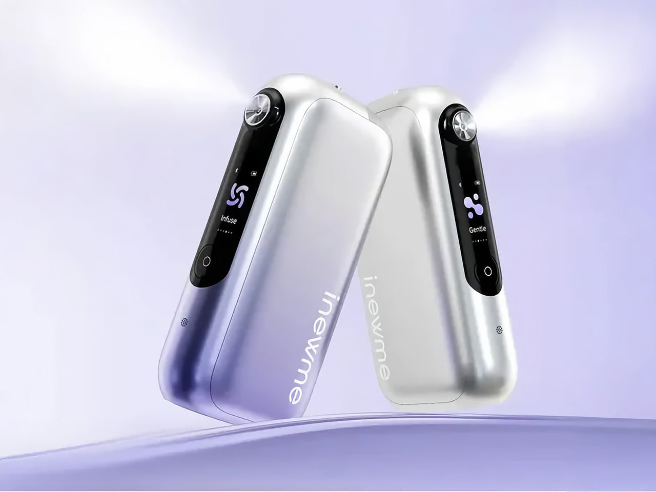
NanoHydra Pro tries to close that gap by shrinking a fairly advanced hydrator into something pocket-sized. It looks like a small metallic gadget with a gradient finish, the kind of thing that sits on a desk next to a phone or slips into a bag without announcing itself. A dual pump nano mist system atomizes toner or serum into a 10 micron droplet cloud, fine enough to sit on skin rather than drip off.

Designer: iNewMe

Click Here to Buy Now: $189 $269 (30% off). Hurry, only 121/200! Raised over $109,000.

The 10 micron mist feels different from a regular spray bottle. Most misters shoot larger droplets that either evaporate too fast or run down your cheeks, leaving streaks on your makeup or pooling near your jawline. NanoHydra Pro atomizes liquid into something closer to a soft fog, light enough to absorb quickly without leaving skin wet or sticky, and you can use the same toner you already have.

What makes it feel smarter is the ToF distance sensor built into the front. It reads how close the device is to your face and quietly adjusts mist output in real time. Hold it near, and the spray softens to avoid oversaturating small areas. Pull it back, and coverage expands for broader strokes. Step outside the detection range, and it shuts off automatically, saving product and avoiding accidental desk misting.

The design seems built for people who keep skincare at their desk rather than just in the bathroom. Five modes let you shift between everyday hydration, a gentler setting for sensitive days, a lifting mode when skin feels slack, an infuse mode for deeper serum sessions, and a manual option for one quick burst. Each mode adjusts mist intensity and duration to match the moment.

The battery lasts around a week with regular use, so it sits there ready without becoming another thing to plug in every night. You press a button, pick a mode on the small LCD screen, mist your face, and go back to work. It fits into the kind of routine where hydration happens between calls or emails rather than as a separate event you have to carve out time for at home.

Travel is where the leak-proof capsule starts to matter. The chamber locks toner or serum inside with enough seals that you can toss it into a bag, check it in luggage, or carry it through airport security without spills soaking into clothes or electronics. The compact body fits easily into a jacket pocket or backpack side slot. On a long flight or dry commute, pulling it out and misting your face takes less effort than digging through a toiletry kit.

A companion app adds a layer for people who like tracking routines. It lets you adjust mist intensity, log each session, and review hydration trends over time, turning a simple spritz into something more intentional. The app also offers guidance based on your skin type and habits, though the device still works perfectly well as a one-button hydrator if you would rather skip the data layer entirely.

NanoHydra Pro hints at a version of skincare tools that pay attention to context instead of just pushing liquid through a nozzle. It reads distance, tunes droplet size, and fits into spaces where traditional routines fall apart, like desks, cars, and airplane seats. As hydration stops being something that only happens at a mirror, a small object that adapts quietly in your hand starts to feel like the more useful kind of upgrade.

Click Here to Buy Now: $189 $269 (30% off). Hurry, only 121/200! Raised over $109,000.

The post This Pocket Hydrator Adjusts Mist Strength Based on Face Distance first appeared on Yanko Design.

7 Best Gifts for Him That Sold Out In 24 Hours Last Year

Last year’s holiday season revealed something about modern gift-giving. Men want tools that work, look exceptional, and tell stories worth sharing. The gifts that vanished fastest weren’t trendy gadgets destined for drawer exile. They were thoughtfully engineered pieces that balanced aesthetic sophistication with genuine utility. These weren’t impulse purchases. They were calculated acquisitions by people who understood quality.

The seven products that sold out within 24 hours shared common DNA. Japanese design principles met practical engineering. Everyday carry essentials elevated to conversation pieces. Emergency preparedness disguised as premium lifestyle goods. Each item justified desk space, pocket real estate, or shelf prominence through consistent daily value. These weren’t gifts that prompted polite thank-yous. They sparked genuine excitement and immediate use.

1. RetroWave 7-in-1 Radio

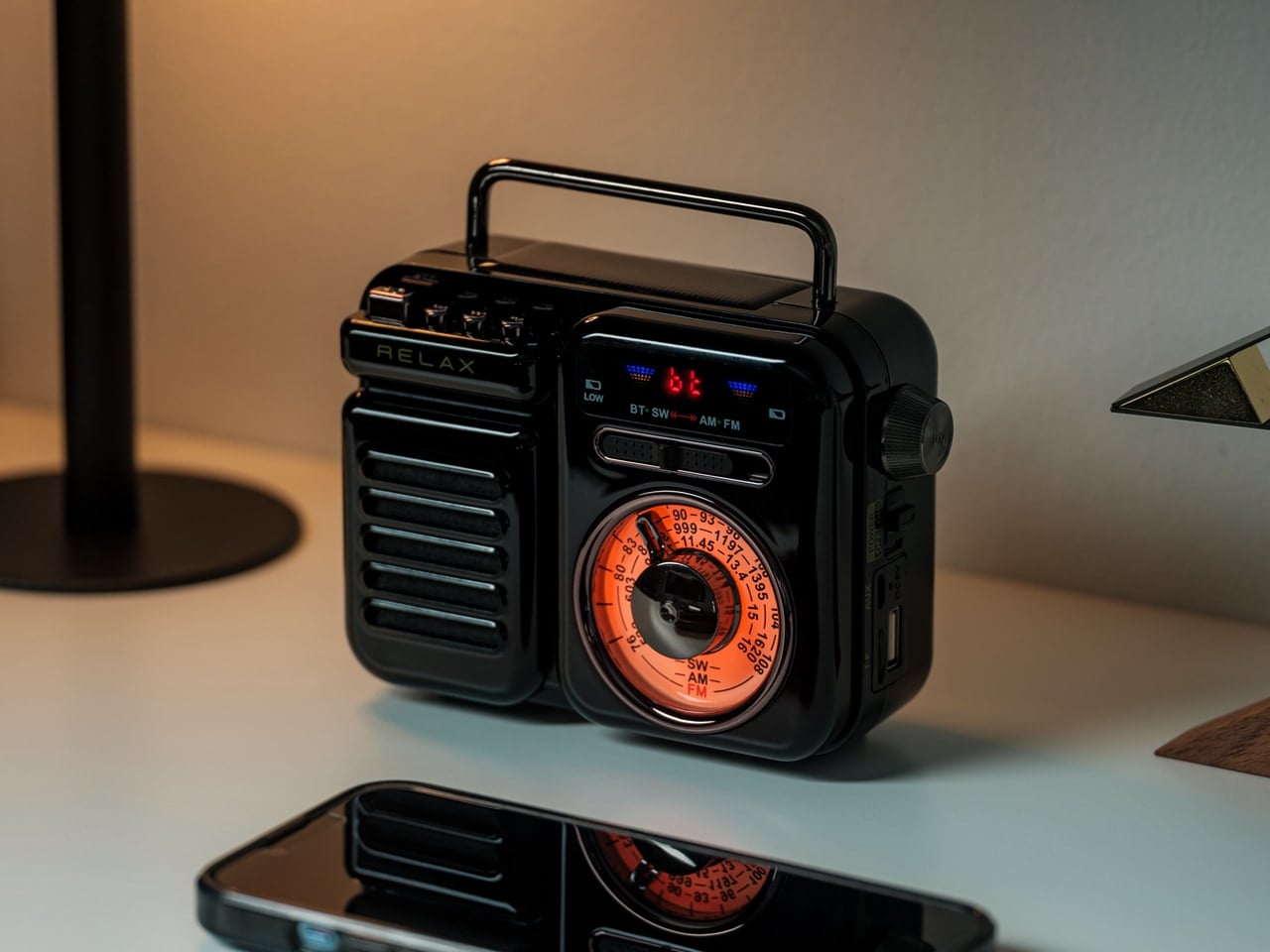
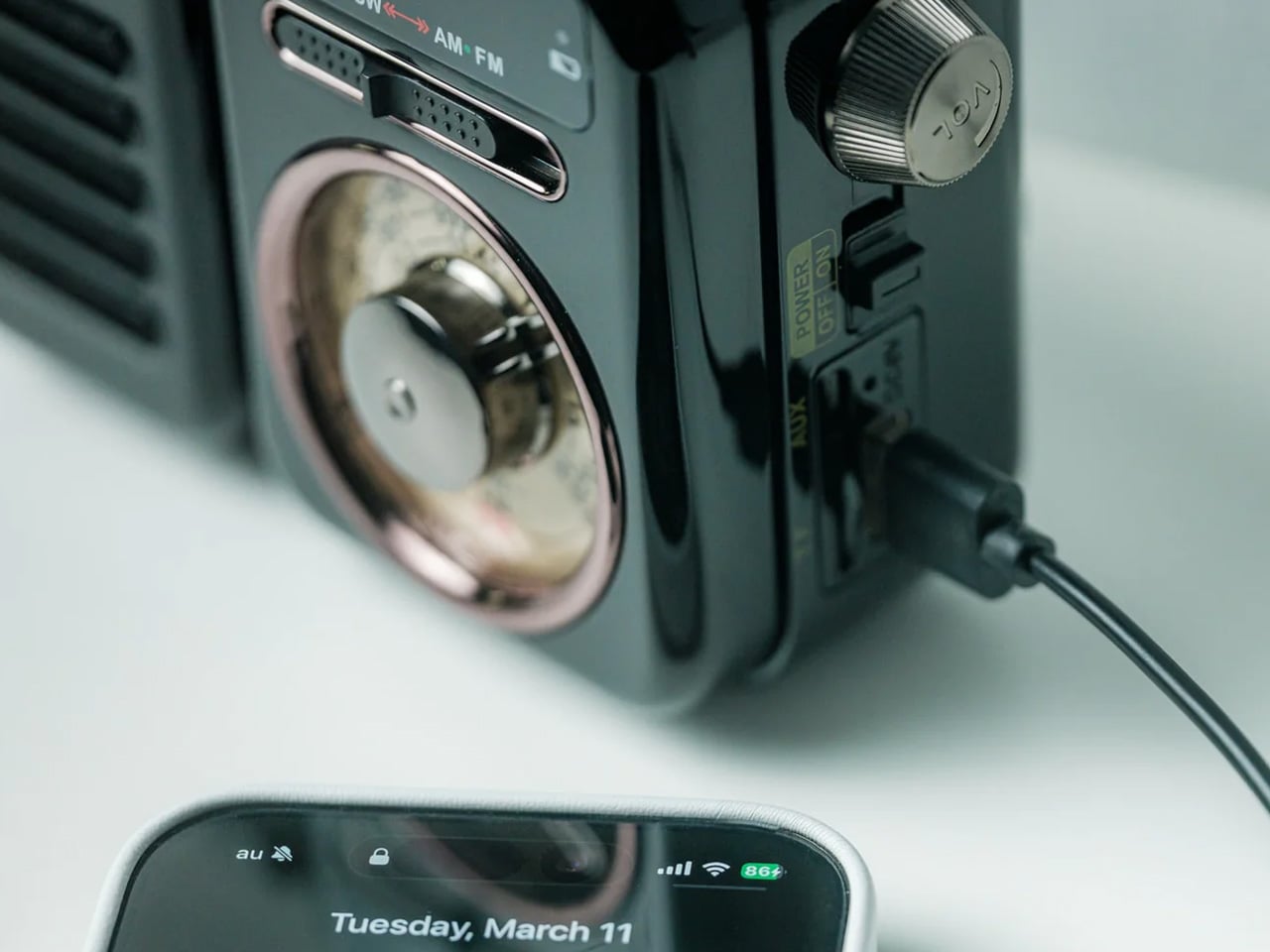
The RetroWave 7-in-1 Radio disappeared from inventory because it solved the preparedness paradox. Most emergency equipment looks utilitarian enough that people hide it away, defeating the purpose when actual emergencies strike. This radio’s retro Japanese aesthetic meant it belonged on display, ensuring availability when needed. The tactile tuning dial provided satisfying analog interaction in an increasingly touchscreen world. Seven functions consolidated into one compact unit addressed multiple needs without creating equipment sprawl across living spaces.

The engineering deserved attention beyond the vintage styling. Hand-crank charging and solar panel meant this radio functioned independently of grid infrastructure. The 2000mAh battery transformed it into a power bank for charging phones during outages. AM, FM, and shortwave reception covered local broadcasts through international stations. Bluetooth streaming and MP3 playback via USB or microSD bridged analog nostalgia with modern convenience. The built-in LED flashlight and SOS alarm addressed genuine safety concerns. Up to 20 hours of radio time or 6 hours of emergency lighting on full charge provided meaningful backup during extended power failures.

Click Here to Buy Now: $89.00

What we like

  • The combination of hand-crank, solar, and USB charging eliminates single points of failure in emergencies.
  • Retro Japanese design creates a display-worthy aesthetic that ensures the radio stays accessible rather than stored away.

What we dislike

  • The 2000mAh battery capacity provides phone charging in emergencies, but won’t fully charge modern smartphones multiple times.
  • Seven functions in one device mean compromises compared to dedicated equipment in each category.

2. StillFrame Headphones

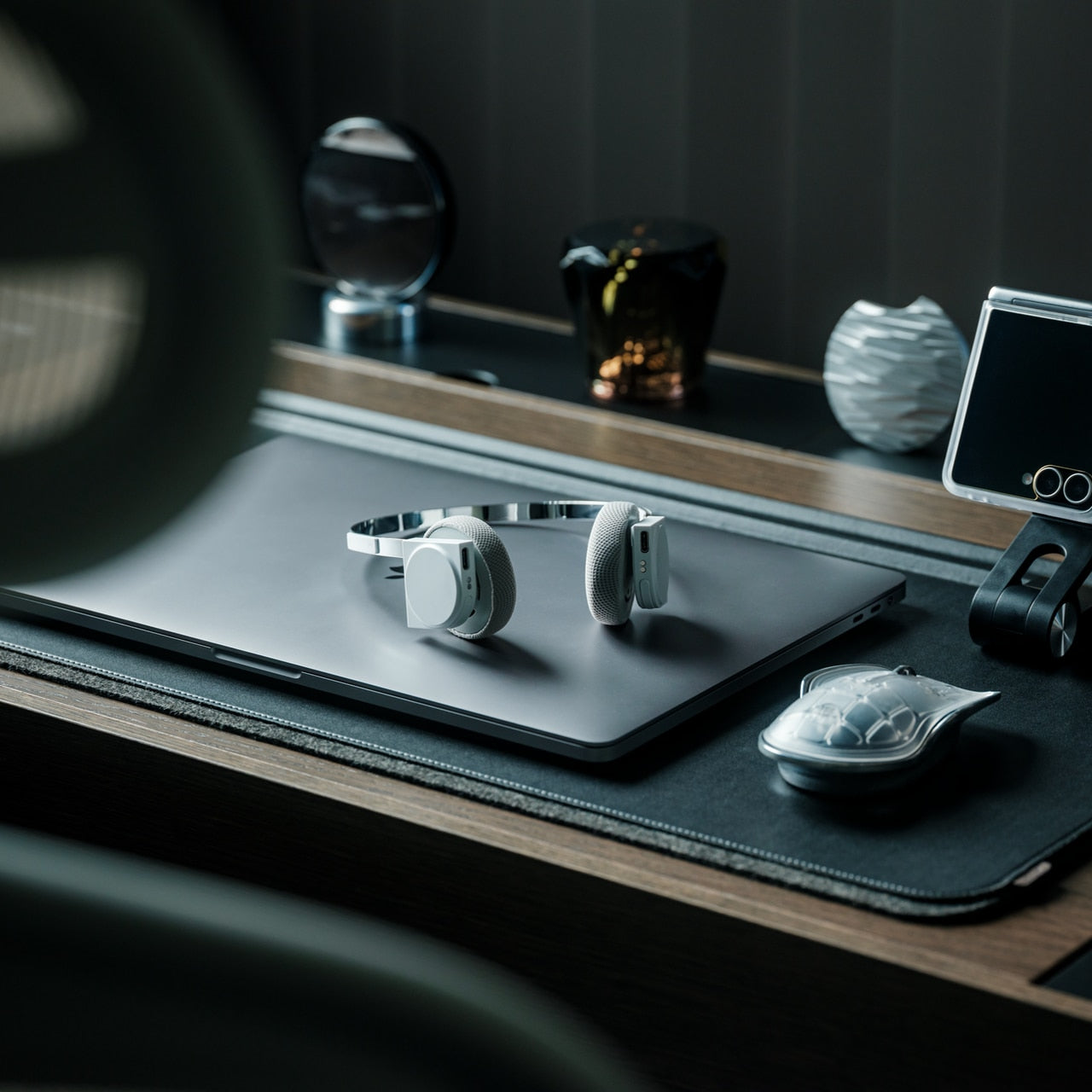
StillFrame Headphones occupy the neglected middle ground between in-ears and over-ears. At 103 grams, they felt nearly weightless during extended wear sessions. The 40mm drivers created open soundstages that made quiet tracks feel expansive. Designer Tatsufumi Funayama’s “MUSIC IN EVERY WAY” philosophy manifested through exposed circuit boards and magnetic fabric ear cushions that snapped on with satisfying precision. The stainless steel headband balanced strength with flexibility. This wasn’t audio equipment trying to disappear. It was technology presented as part of the experience.

The practical engineering matched the aesthetic ambition. Active noise cancelling silenced distractions when focus mattered. Transparency mode maintained environmental awareness during commutes or shared spaces. Twenty-four hours of battery life eliminated charging anxiety during long work sessions or international flights. Bluetooth 5.4 provided fluid wireless streaming, while a USB-C wired connection enabled high-resolution, low-latency playback for critical listening. Dual microphones with noise cancelling kept voice calls clear even in chaotic environments. Each white model included light gray and turquoise magnetic cushions for mood-based customization. The geometric fusion of circular and square housing created visual interest that elevated these beyond commodity audio gear.

Click Here to Buy Now: $245.00

What we like

  • The 103-gram weight and 24-hour battery life enable all-day wear without physical fatigue or charging interruptions.
  • Magnetic ear cushion swaps with included color options provide personalization without replacing entire headphones.

What we dislike

  • The exposed circuit board aesthetic appeals to design enthusiasts but may concern users worried about component durability.
  • The middle position between in-ears and over-ears won’t satisfy purists seeking either maximum isolation or complete openness.

3. AromaCraft Clothes Brush

The AromaCraft Clothes Brush transforms mundane garment maintenance into sensory ritual. Miyakawa Hake Brush Workshop’s century-old legacy manifested through the traditional Tsubokiri method, where each bristle received individual hand-planting by master artisans. The white boar hair bristles lifted dust and pollen from deep within fabric fibers without causing damage. The walnut wood handle finished with shea butter created tactile satisfaction during use. The innovative aromatic paper insert accepted essential oils for customizable fragrance, leaving clothes subtly scented with each brushstroke. This wasn’t clothing care. It was daily luxury ritual.

The engineering behind the aesthetics mattered for longevity. Hand-planted bristles prevented shedding that plagued mass-produced brushes, extending lifespan significantly. Boar bristles provided ideal firmness for effective cleaning while remaining gentle enough for delicate fabrics. The aromatic paper system enabled personalization through essential oil selection, adapting to seasonal preferences or mood. Each brush carried over a century of refinement from a family-owned workshop established in 1921. The walnut handle’s shea butter finish improved grip while developing rich patina through years of use. This brush treated wardrobe maintenance with the reverence typically reserved for fine woodworking or culinary tools.

Click Here to Buy Now: $149.00

What we like

  • The century-old Tsubokiri hand-planting method prevents bristle shedding and creates genuinely longer-lasting brush construction.
  • Customizable aromatic paper insert transforms functional garment care into personalized sensory experience through essential oil selection.

What we dislike

  • The premium hand-crafted construction commands prices far beyond standard lint rollers or basic clothing brushes.
  • The aromatic paper system requires ongoing essential oil purchases and maintenance to deliver the scent customization feature.

4. BlackoutBeam Tactical Flashlight

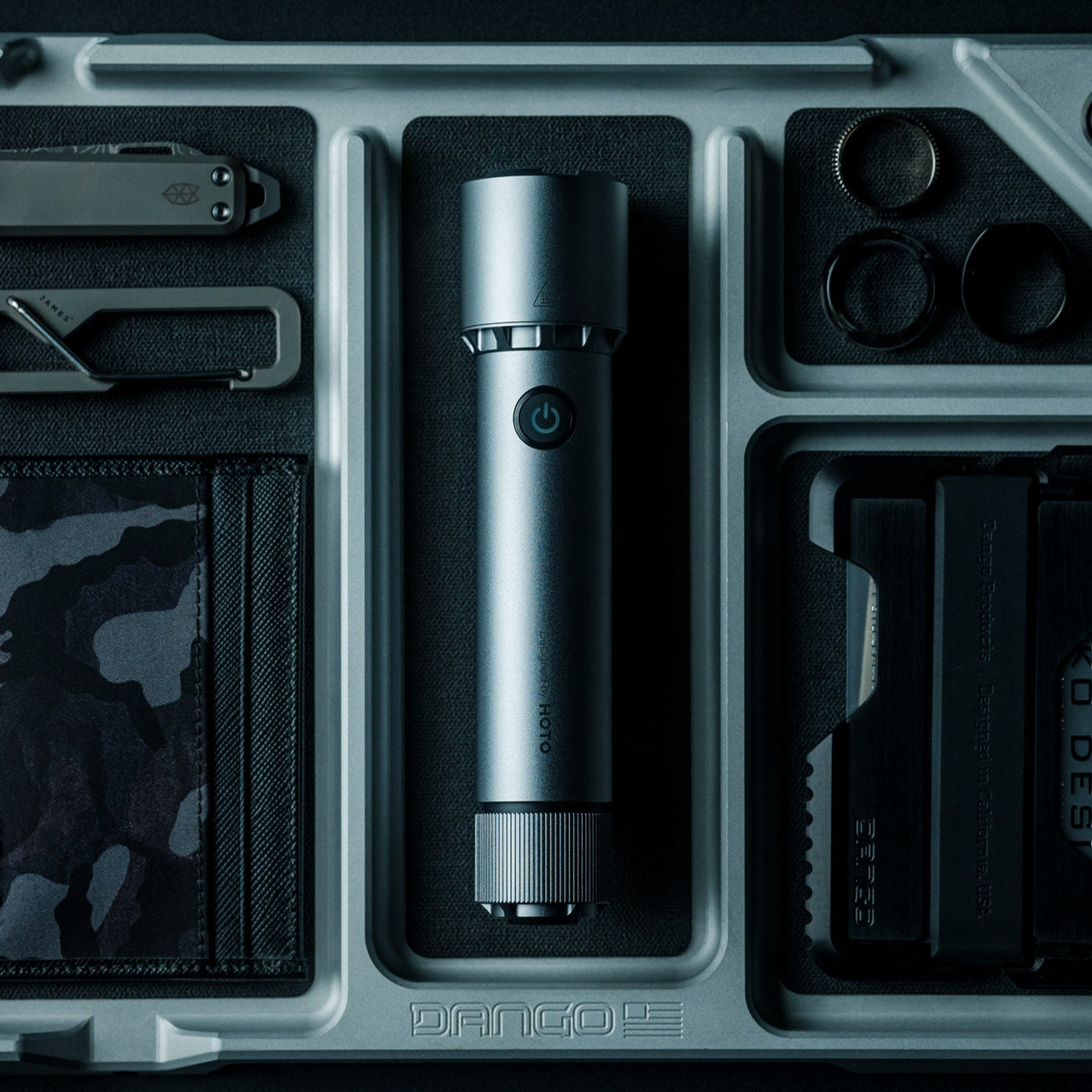
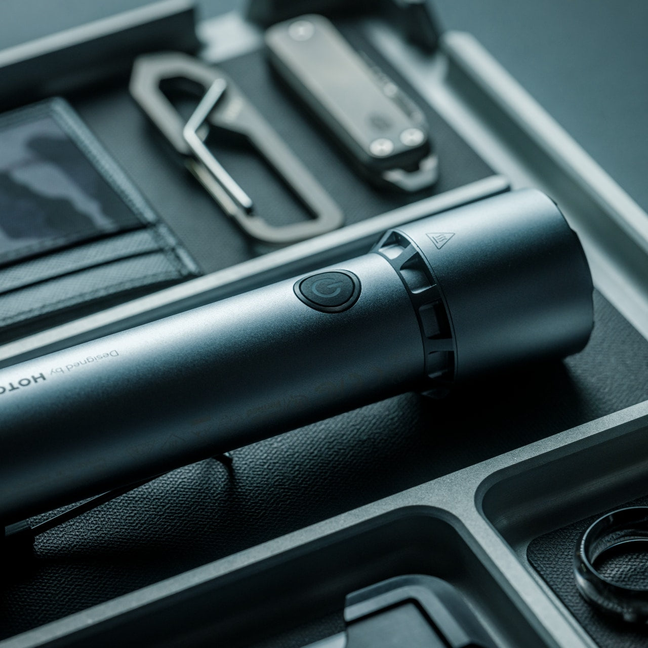
BlackoutBeam Tactical Flashlight delivers tactical performance without tactical aesthetics. The 2300-lumen output and 300-meter throw rivaled professional equipment while maintaining industrial design suitable for nightstand placement. Waterproof aluminum construction achieved an IP68 rating for dust and water resistance without adding bulk. The 0.2-second response time eliminated lag between activation and illumination. HOTO’s 100+ international design awards created brand credibility. This was a serious capability packaged for people who valued both preparedness and design coherence.

The engineering specifics mattered during actual use. Three brightness levels plus strobe and pinpoint modes are adapted to different situations. The 3100mAh lithium-ion battery recharged via USB but accepted two CR123A batteries as backup when outlets weren’t accessible. Six thousand five hundred Kelvin light temperature mimicked daylight for enhanced visibility and color accuracy. One-handed operation worked even while wearing gloves. The aluminum body survived impacts that would crack plastic housings. Power outages, roadside emergencies, and outdoor navigation all benefited from having 2300 lumens available instantly. The industrial design meant it looked intentional on shelves rather than apologetically hidden in drawers.

Click Here to Buy Now: $89.00

What we like

  • The 2300-lumen output and 300-meter throw provide professional-grade performance at consumer-friendly pricing.
  • IP68 waterproof rating and dual power options (USB rechargeable plus CR123A backup) eliminate common flashlight failure points.

What we dislike

  • The tactical-grade brightness drains battery faster during extended use compared to lower-output everyday flashlights.
  • The 6500K daylight temperature provides excellent visibility but may feel harsh for ambient lighting situations.

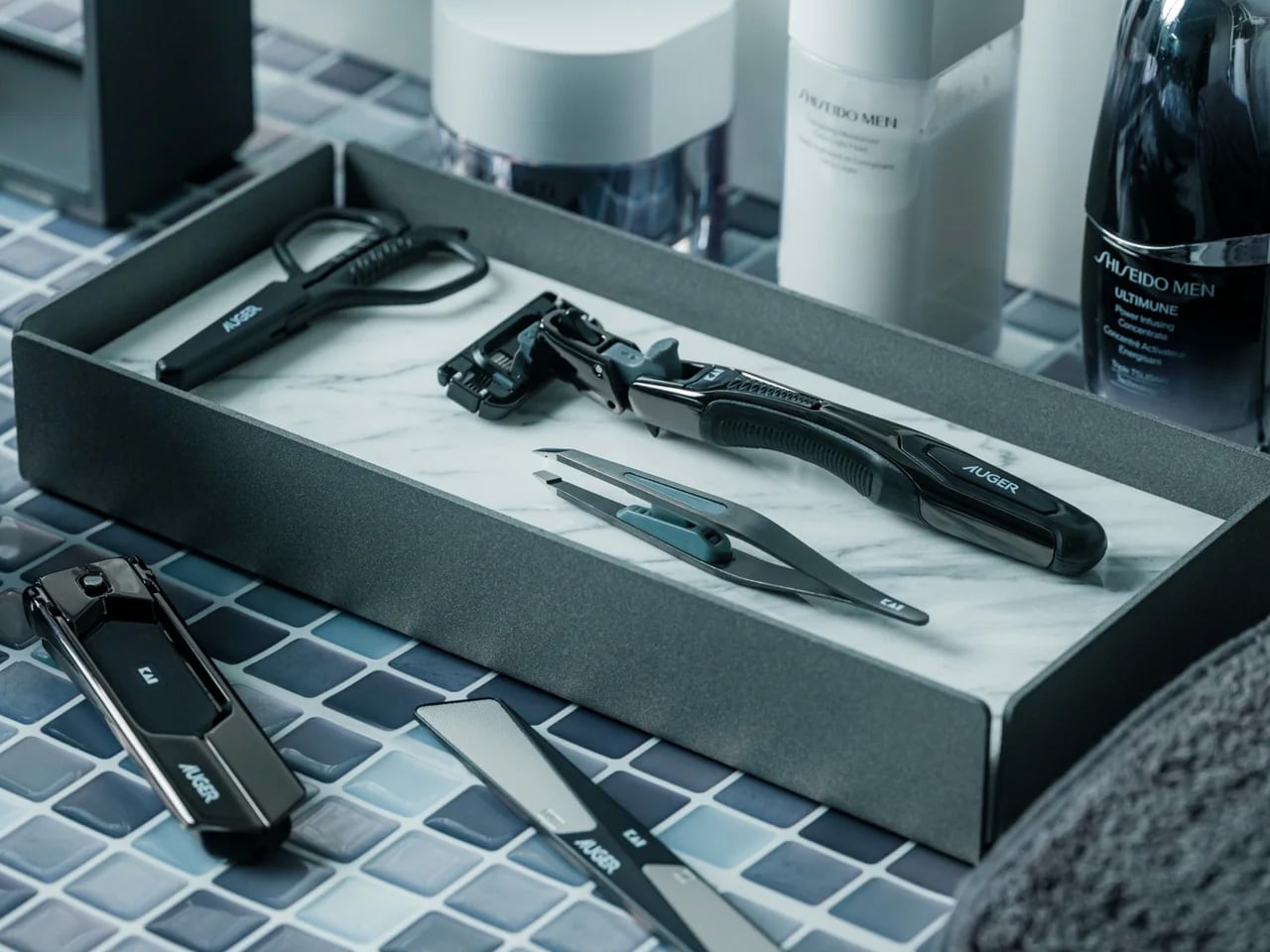
5. Auger PrecisionFlex Razor

The Auger PrecisionFlex Razor displays Kai Corporation’s 116 years of Japanese blade-making expertise, creating genuinely innovative shaving technology. The world-first 30-degree adjustable head angle changed blade positioning mid-shave without disrupting flow. The industry-leading 3D pivoting head and independent suspension mechanism delivered the widest range of motion available. Five re-engineered blades provided ultra-close shaves while reducing irritation. The raised anti-contact head design prevented blades from touching surfaces, maintaining sanitary storage and edge sharpness. This wasn’t an incremental improvement. It was a fundamental reimagining of how razors should function.

The ergonomic handle balanced sculptural minimalism with a textured elastomer grip. The all-black silhouette maintained visual coherence while ensuring secure handling during use. Shaping beard lines, defining mustache edges, and achieving smooth, even shaves all benefited from the adjustable head angle. The lever-activated 30-degree adjustment enabled seamless transitions between forward shaving and reverse detail work. Kai’s highest-specification blade technology delivered lasting sharpness that reduced replacement frequency. The magnetic attachment system made blade changes effortless. This razor treated daily grooming as a ritual worthy of precision engineering rather than a commodity consumable to endure.

Click Here to Buy Now: $45.00

What we like

  • The world-first 30-degree adjustable head angle provides unprecedented control for detailed beard shaping and reverse shaving.
  • Kai Corporation’s 116-year blade-making heritage and highest-spec five-blade system deliver professional performance for home use.

What we dislike

  • The premium blade technology and complex pivot mechanism create higher replacement cartridge costs than standard razors.
  • The all-black aesthetic and textured grip may show water spots and require more frequent cleaning to maintain appearance.

6. Levitating Pen 2.0 Cosmic Meteorite Edition

The Levitating Pen 2.0 Cosmic Meteorite Edition vanished immediately because it combined genuine meteorite material with gravity-defying desk sculpture. Each pen featured an authentic Muonionalusta meteorite, the oldest known meteorite on Earth, sourced through the International Meteorite Collectors Association. Acid-etching revealed unique patterns formed over 4.5 billion years, ensuring no two pens shared identical appearances. The numbered certificate of authenticity elevated these from mere writing instruments to collector’s pieces. The 23.5-degree levitation angle created conversation-starting desk presence. This was functional art that happened to be written.

The engineering matched the cosmic materials. Aircraft-grade aluminum unibody construction created a seamless form with a satin finish texture. The magnetic cap snapped into place with satisfying tactile feedback. A simple twist set the pen spinning gracefully for up to 20 seconds, providing a fidget-friendly mental reset during intense work. German-engineered Schmidt ink cartridges delivered smooth, precise writing without smudges or skips. The magnetic pedestal drew inspiration from the USS Enterprise design, creating the signature floating effect through precision engineering. Compatibility with standard D1-sized refills meant the pen functioned indefinitely beyond initial cartridge depletion. The balance of spacecraft aesthetics, genuine space material, and everyday writing utility justified the premium positioning.

Click Here to Buy Now: $399.00

What we like

  • Genuine Muonionalusta meteorite tip connects each pen to 4.5 billion years of cosmic history with acid-etched unique patterns.
  • The 23.5-degree magnetic levitation and 20-second spin function create a mesmerizing desk presence that sparks conversation.

What we dislike

  • The $248 price positions this firmly in luxury gift territory rather than the practical everyday writing tool category.
  • The magnetic levitation base requires desk space and careful positioning, limiting portability compared to conventional pens.

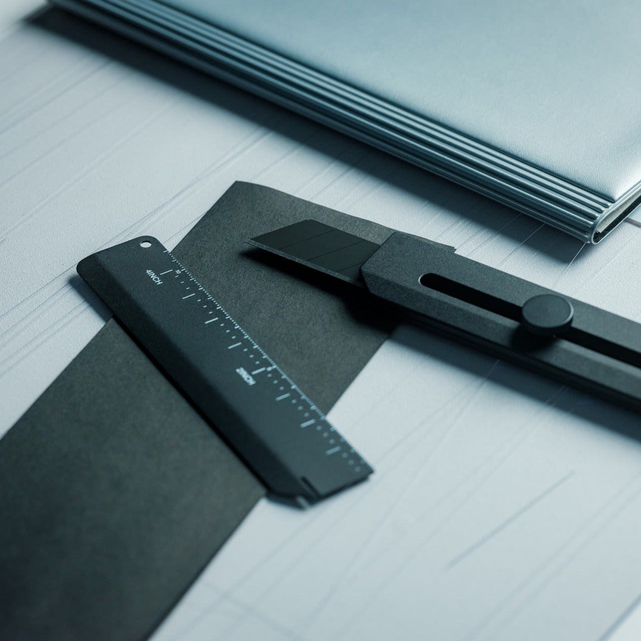
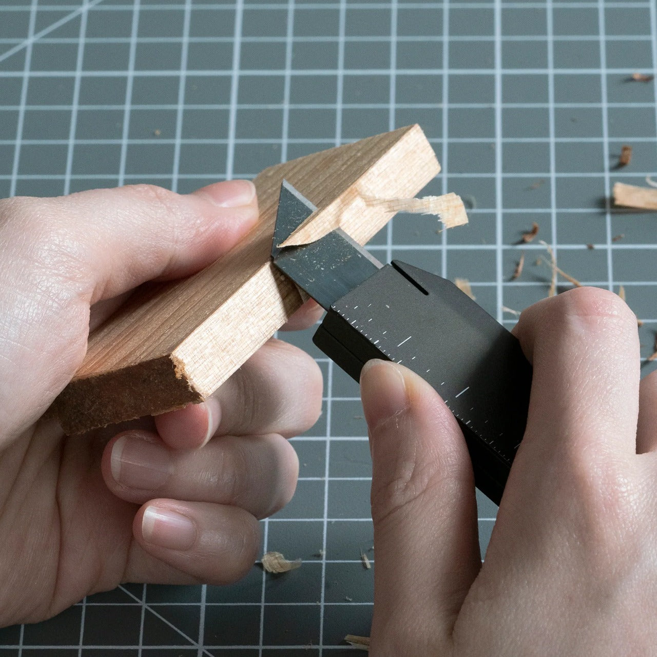
7. CraftMaster EDC Utility Knife

The CraftMaster EDC Utility Knife treats a utility knife design as a minimalist sculpture rather than a disposable commodity. The metal exterior created a hefty, reliable hand feel. At merely 0.3 inches thick and 4.72 inches long, it slipped into pockets without printing through fabric. The tactile rotating knob deployed OLFA blades through satisfying mechanical interaction. The magnetic back docked the knife to any metal surface for convenient access. The companion metal scale featured both metric and imperial markings, raised edges for easy lifting, and an integrated blade-breaker for snapping off dulled segments. This was everyday carry gear that looked intentional on desks or workbenches.

The thoughtful details elevated utility beyond basic box-cutting. The 15-degree curvature on the ruler prevented finger cuts during close work. The 45-degree inclination protected the package contents when opening boxes. The magnetic docking system meant the knife stayed within reach during projects requiring repeated cutting. OLFA blade compatibility ensured long-term usability through readily available replacements. The dual-scale ruler consolidated measurement and cutting into one pocket-sized tool set. The metallic aesthetic worked equally well in workshops, studios, or minimalist desk setups. This knife treated utility work as a craft deserving proper tools rather than tasks to suffer through with whatever’s handy.

Click Here to Buy Now: $79.00

What we like

  • The 0.3-inch profile and magnetic back create a genuine pocket-friendly EDC that docks conveniently on metal surfaces.
  • The companion ruler with blade-breaker consolidates measurement and blade maintenance into an integrated tool system.

What we dislike

  • The premium metallic construction and specialty features command higher prices than basic utility knives at hardware stores.
  • The magnetic docking system requires metal surfaces nearby, limiting organizational options in non-metallic environments.

Understanding the Pattern

These seven products shared fundamental characteristics that drove their rapid sellouts. Japanese design principles prioritized lasting quality over disposable convenience. Engineering innovation solved real problems rather than creating solutions searching for uses. Aesthetic sophistication meant these tools earned display placement instead of storage exile. Price points reflected genuine material quality and manufacturing expertise rather than artificial premium positioning. Each item delivered immediate utility while building long-term value through durability and timeless design.

The sellout speed revealed changing expectations for men’s gifts. Recipients wanted tools that worked beautifully and beautiful objects that worked practically. They sought products that sparked conversations about engineering philosophy and material choices. They valued everyday carry items worthy of daily interaction rather than occasional emergency deployment. These gifts succeeded because they treated the recipients as discerning adults who appreciated thoughtful design, not teenage boys impressed by aggressive styling. Quality recognition happened instantly when people encountered legitimate craftsmanship and innovative thinking.

The post 7 Best Gifts for Him That Sold Out In 24 Hours Last Year first appeared on Yanko Design.

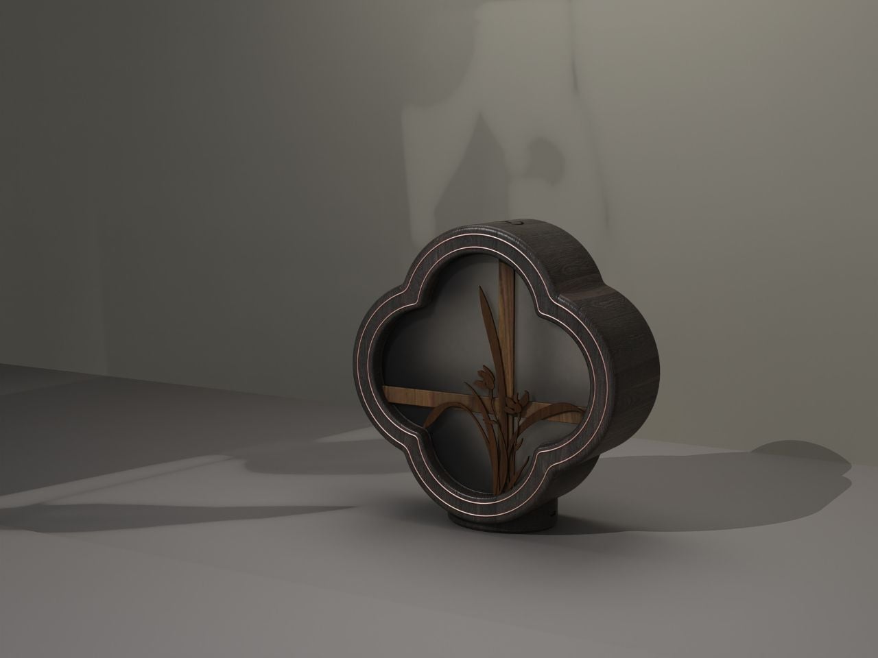
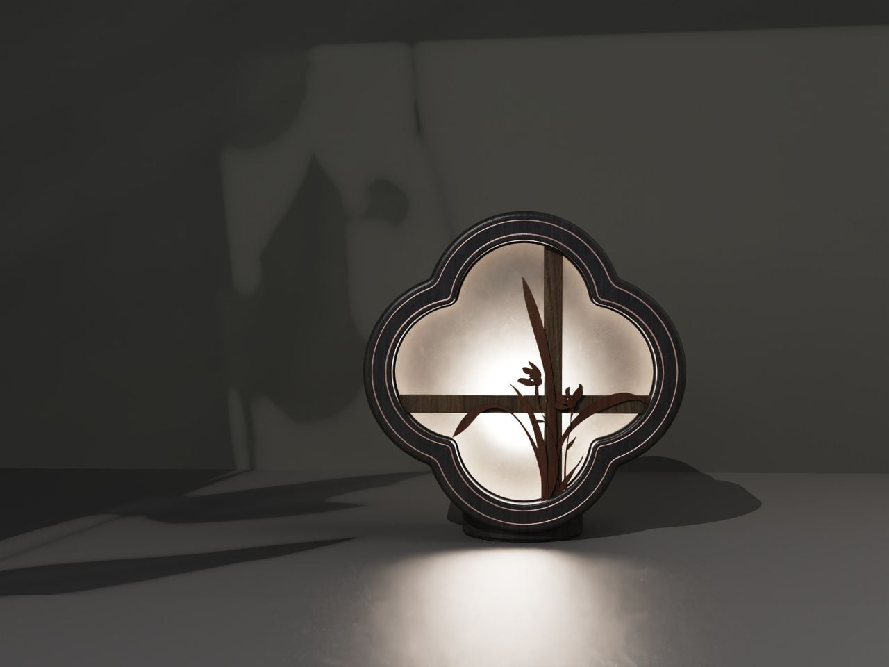
This Wooden Aromatherapy Piece Turns Cultural Memory Into a Multisensory Sanctuary

In contemporary product design, a growing interest in cultural memory, sensory ritual, and emotional well-being is shifting the way objects are conceived for domestic space. This aromatherapy piece stands as a compelling exploration of that movement, drawing from traditional Chinese aesthetics while speaking fluently to a modern lifestyle. Rather than merely referencing visual motifs, it attempts to translate centuries-old spatial philosophies into a multisensory experience.

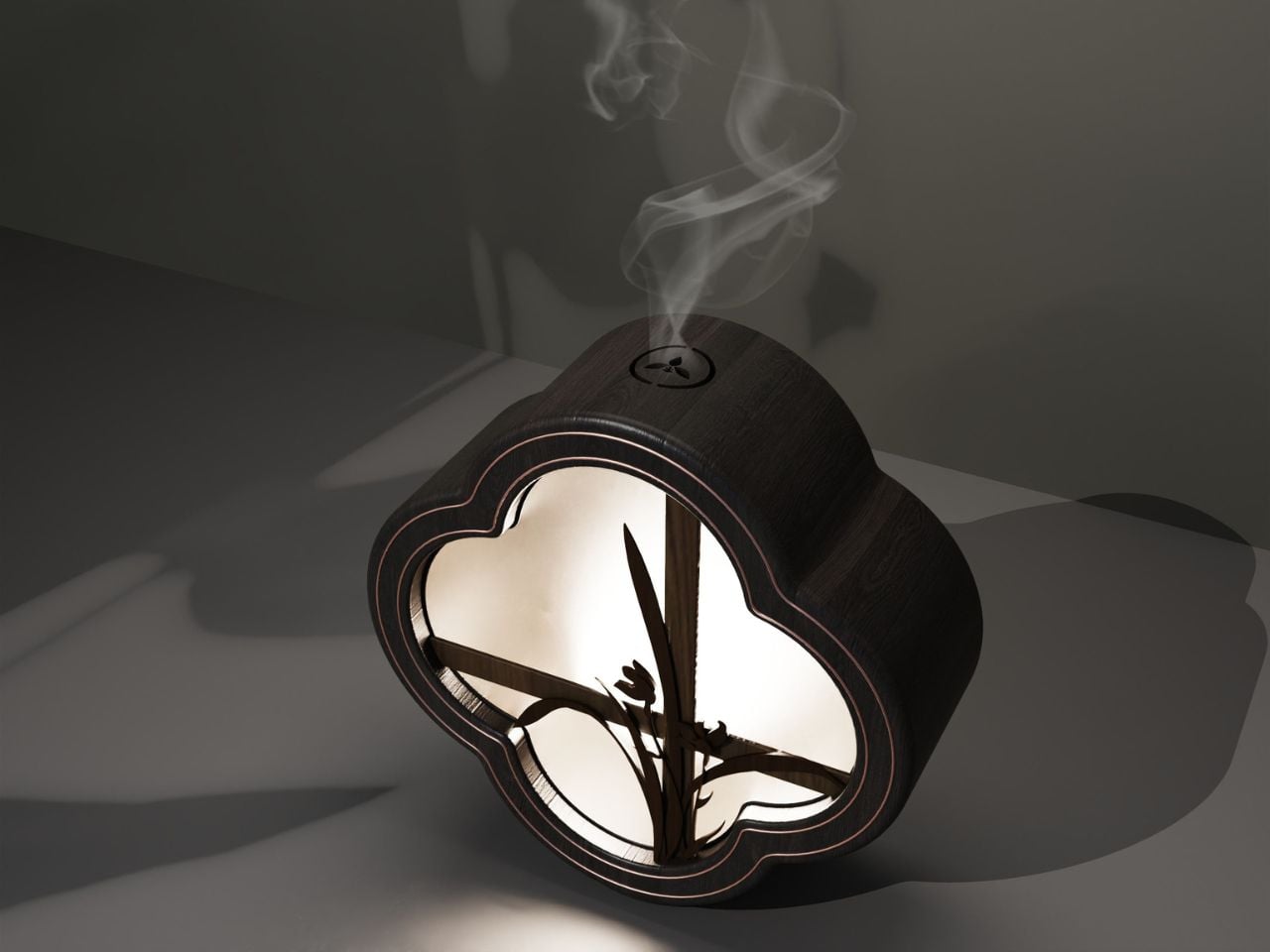
At the heart of the design is the orchid, a motif deeply embedded in Chinese literati culture. Beyond botanical elegance, orchids in classical painting and poetry symbolize moral integrity, modesty, and quiet refinement. They are often depicted growing in mountains or hidden valleys, admired not for spectacle but for restraint. By embedding orchid elements into the interior of the object, the designer is not simply decorating; they are activating a cultural code. The orchid becomes a messenger of ideals, humility, introspection, and the pursuit of spiritual clarity, values increasingly resonant in a world overwhelmed by speed and digital noise.

Designer: Chris233

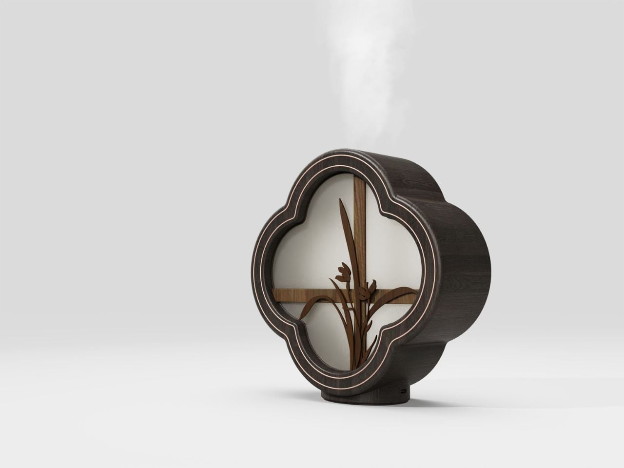
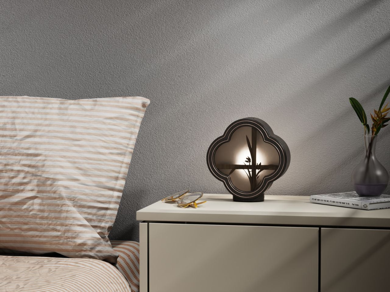
The silhouette draws inspiration from the “flower window” of traditional Chinese gardens and classical architecture. These windows, often carved in quatrefoil or geometric forms, frame selective views: a corridor leading to a bamboo grove, a sliver of sky reflected in water, or the blurred outline of stones. The design adopts a four-petal window motif, re-engraving that elegant architectural language into a compact household object. This is an intentional exercise in spatial thinking, borrowing scenery into the device. In miniature, it replicates the feeling of standing before a classical garden window, where sight, imagination, and interpretation all meet.

Materiality plays a central role. The use of wood deliberately mimics the warmth, softness, and moisture of traditional furniture and artifacts. In a design world dominated by polished metal and synthetic finishes, the choice of wood feels almost meditative. Its texture has historical memory; its scent, even before aromatherapy is added, suggests calm. It carries the tactile familiarity of objects that age with time, inviting touch, presence, and slowness.

What differentiates this product from typical aromatherapy diffusers is its philosophical approach to light. The designer uses a soft, light-transmitting structure, allowing illumination to filter through the flower window and orchid shapes. The result is a choreography of shadow, a gentle diffusion that transforms functional lighting into ambience. When fragrance begins to rise, scent interacts with this shadow play, creating a layered sensory environment. The visual quietness enhances olfactory comfort, offering a subtle ritual of healing for body and mind.

In this way, the design functions as both an object and an atmosphere. It reinvents oriental aesthetics in a distinctly contemporary voice, neither imitative nor nostalgic. It chooses not to replicate historical forms, but to reinterpret them through lifestyle relevance: how people seek serenity at home, how scent supports emotional well-being, and how small objects can shape mental space.

More broadly, this project reflects a movement in design toward cultural integration rather than symbolic quotation. It suggests that traditional Chinese culture can coexist with modern sensibilities when approached through meaning rather than ornament. The piece becomes a device of calm, introspection, and everyday spirituality, a quiet reminder that design does not need to shout to be profound. In a time when wellness routines are increasingly commodified, this aromatherapy object offers something different: a return to thoughtful ritual, poetic simplicity, and the ancient art of living with beauty.

The post This Wooden Aromatherapy Piece Turns Cultural Memory Into a Multisensory Sanctuary first appeared on Yanko Design.

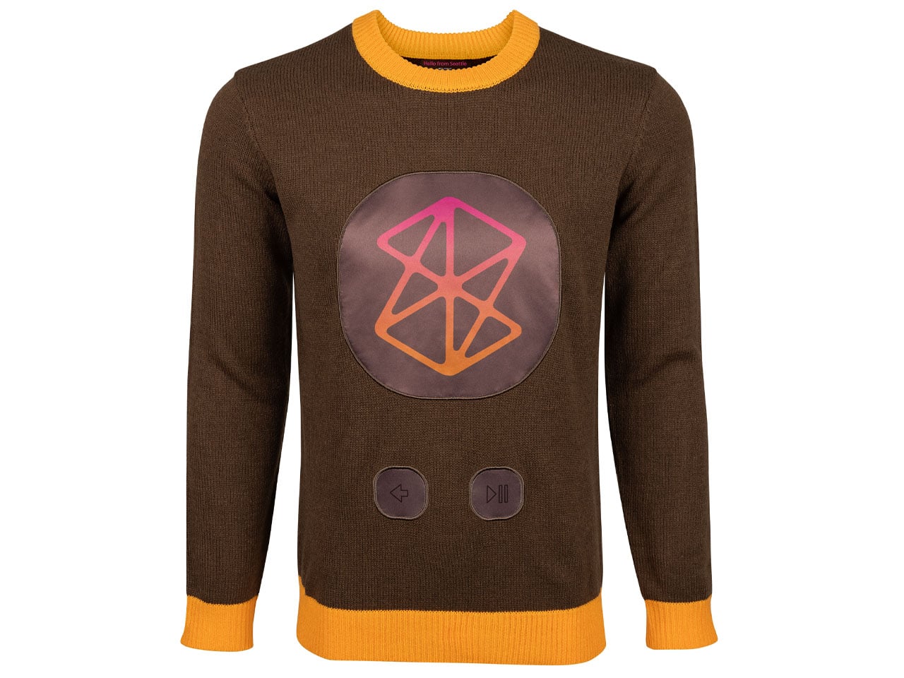
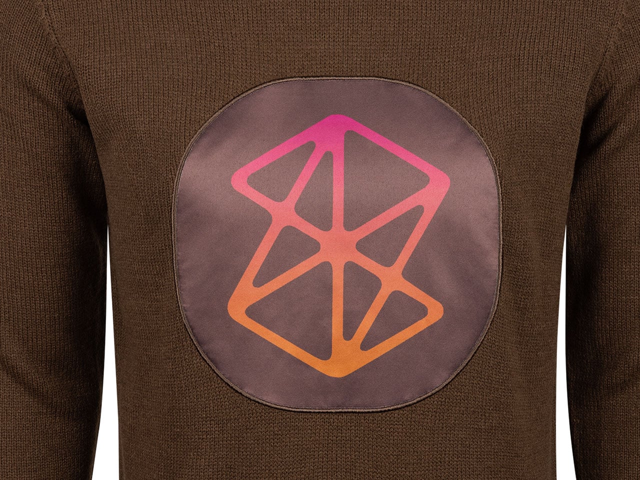
Microsoft’s ugly sweaters are back for this holiday season

Microsoft has an interesting tradition of releasing offbeat sweaters just in time for the holiday season. They call them the ugly sweaters as an ironic and humorous take on the garish holiday sweaters that were once deemed unstylish, especially in the 90s and early 2000 era. In 2002, the first ugly sweater parties were held in Vancouver to show off tacky sweaters bought from thrift stores. Over the decades, this bad fashion morphed into a collective celebration that now Microsoft also embraces.

The silicon giant released the first-ever ugly sweater limited edition collection in 2018 with the Windows 95 logo, followed by the Windows XP “Bliss” wallpaper in 2019, Minesweeper influence in 2021, Clippy vibes in 2022, and again the Biss wallpaper-themed sweater in 2023. For some reason, Microsoft didn’t release the winterwear in 2024, but this year, the ugly sweaters are making a comeback, celebrating the iconography from Windows’ glorious five-decade history, the Xbox gaming console, and the Zune logo. The release comes just in time to pair with your Xbox-themed crocs that were released a few days earlier.

Designer: Microsoft

The niche merchandizes this year, celebrating the company’s 50th anniversary, lets you choose from among three ugly Christmas sweaters. I find the Zune one to be the ugliest, the iconography sweater a bit too tacky, but the Xbox sweater is interesting on a serious note.

Artifact Sweater

This one is an ode to Microsoft’s hot pan of software flaws and ugly content that nobody ever bothered to remember. The Clippy Assistant paperclip from the 1990s takes the limelight with other ignore-worthy icons, including the MSN butterfly logo, Minesweeper bomb, Internet Explorer icon, Paint app, and Windows OS logos dotted all over. The background is a subtle off-white hue, with the blue border and the bright orange collar adding to the tackiness.

The Artifact Sweater is woven from soft acrylic and wool combo material, in a range of the gaudiest colors you would instantly ignore. Priced at $79.95, the Clippy edition sweater is the one for your craziest holiday celebrations. The first wave of the collection has already sold, so you better pre-order it the next time this ugly one arrives.

Zune Sweater

Highlighting the Zune portable music player, this sweater is giving me serious nausea owing to its color palette. The doomed music player of the music industry that couldn’t even make it past the mid-2000s will either make it to the closet of the craziest Microsoft fan or be completely ignored for its kitschy persona. Although I’m a music affectionate, and the sweater features landmark albums from OutKast and Coldplay on the inside of the cuffs, this one is not coming anywhere near me.

For those who might want to sport this for a Christmas party, the song names silhouetted in tiny typeface, and the headphone plug threads are appealing. There are back and play/pause buttons on the front with a big visualization adding to the gaudy effect. The material of the sweater is the same as the other one, and the brown-orange winterwear also costs $79.95.

Xbox Holiday Sweater

This one in the collection has my fancy as it is more subtle and cannot be deemed ugly. The color combos are more muted and basic, with black contrasting against the Xbox’s signature lime green, which looks cool. On closer look, the sweater has a controller outline, with the knit circles you can push. Also, there are the Halo rings with subtle silhouettes of the Master Chief in action. You can choose from the metallic thread material (bronze, platinum) for the achievement insignia that loops around the body.

Even better, it costs less than the two uglier options, priced at $59.99. The Xbox Holiday Sweater has a pattern that imitates falling snow. The knitted sweater is made from 100 percent polyester material; therefore, it won’t be as warm as the other two, still that isn’t a deal breaker in any way.

The post Microsoft’s ugly sweaters are back for this holiday season first appeared on Yanko Design.