ESR Atelier Magnetic iPhone 17 Pro Max Case Review: Vegan Leather Done Right

PROS:


  • Refined and elegant aesthetic with no visible magnetic ring

  • Animal-free silicone-based vegan leather with soft, warm feel

  • Built-in FlexStand doubles as camera guard when closed

  • Military-grade protection that stays out of sight

CONS:


  • Kickstand doesn't support full vertical placement

RATINGS:

AESTHETICS
ERGONOMICS
PERFORMANCE
SUSTAINABILITY / REPAIRABILITY
VALUE FOR MONEY

EDITOR'S QUOTE:

The ESR Atelier Magnetic Case is protection that's actually worth touching.

Phone cases occupy a strange middle ground in the accessories market. The more protective options tend to look utilitarian, all rugged textures and chunky frames that trade elegance for toughness. The ones that do look refined often use faux leather, which can stain, fade, or scuff with daily handling. Finding something that sits comfortably between both worlds has always been easier said than done.

ESR’s Atelier Magnetic Case for the iPhone 17 Pro and iPhone 17 Pro Max tries to answer that question. It’s the brand’s first vegan leather iPhone case, built from a silicone-based material that carries the soft, warm feel of leather without the upkeep that usually comes with it. Paired with an integrated FlexStand, strong MagSafe magnets, and layered protection, it feels more personal and more resolved than a typical protective shell. But is it all just marketing speak, or does it really pack more than what our eyes, and hands, perceive? We slap this bold new case on our large iPhone to find out.

Designer: ESR

Click Here to Buy Now: $45.99

Aesthetics

The ESR Atelier’s back is its most immediate and telling detail. The silicone-based vegan leather carries a refined grain texture and a warmth to the touch that doesn’t register as plasticky or clinical, the way many textured phone cases can. It’s the kind of surface that encourages contact rather than avoiding it, settling naturally into the hand in a way that plain silicone and polycarbonate cases rarely manage.
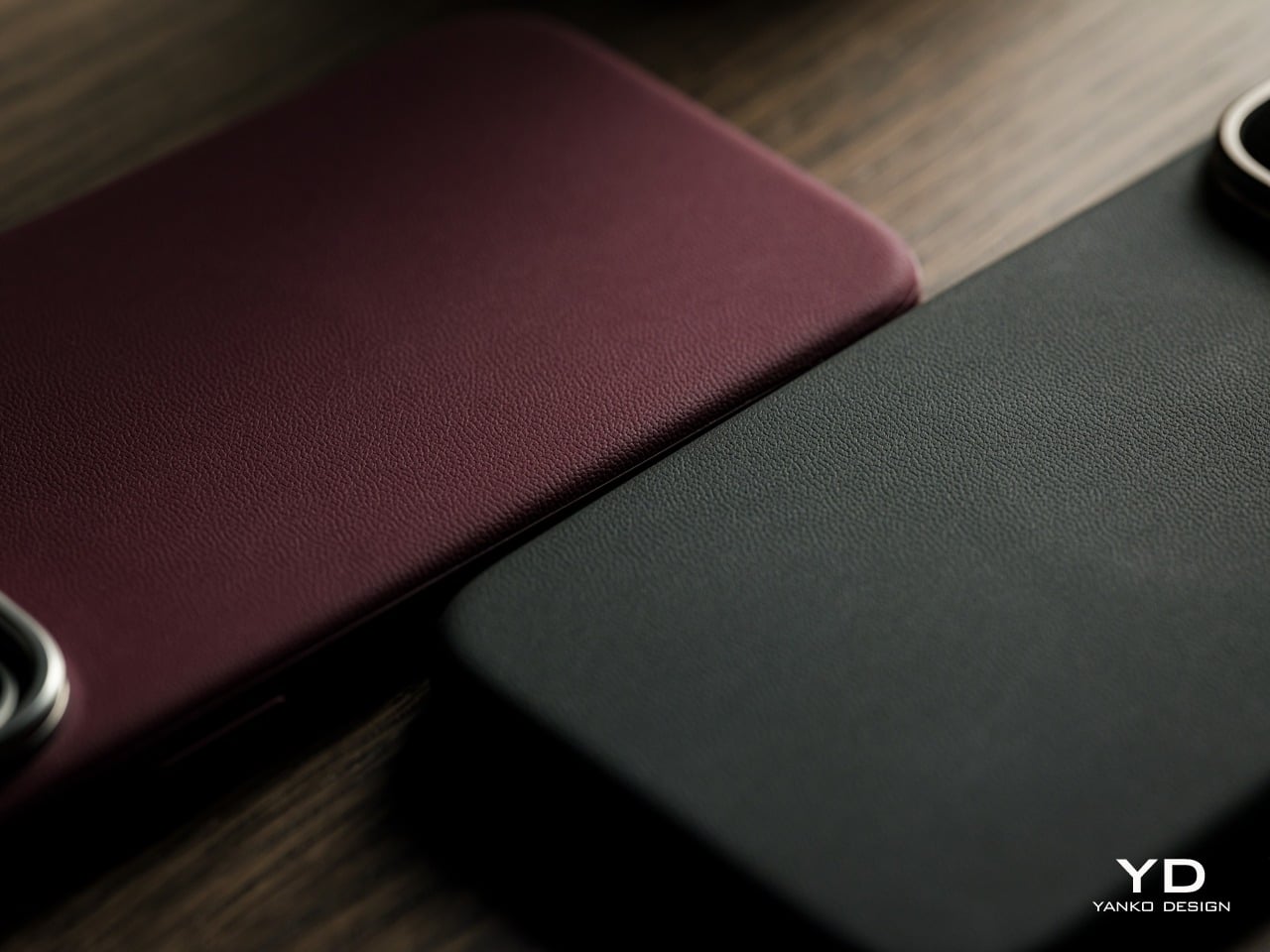
The leather finish is only part of what sets the back apart. Equally notable is what’s absent. Many MagSafe-compatible cases leave a visible circular ring pattern on their backs, a telltale sign of the magnets beneath. The Atelier keeps its rear surface completely smooth and unbroken, with no ring to interrupt the leather. That absence alone makes the overall look feel more cohesive and considered.

One of the more practical arguments for the Atelier’s vegan leather material is longevity. Designed for long-lasting everyday use, the material resists scratches, wear, and fading while maintaining its appearance over time. Traditional faux leather cases often start showing their age within months from regular holding and pocket wear, which means the case is likely to look considerably better after a year of daily handling than many alternatives in the same category.
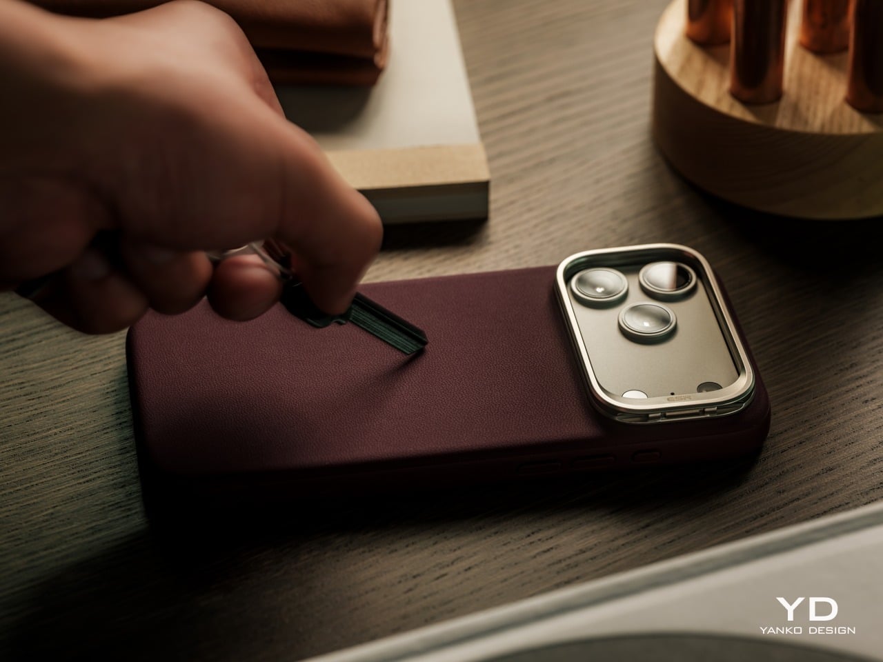
An anti-fouling surface coating and stain-resistant frame treatment add to that picture. Spills and smudges wipe away easily with a soft cloth, without needing specialized cleaning products. This silicone-based vegan leather, similar to the material pioneered in high-contact automotive interior surfaces, is designed to maintain its appearance under the kind of daily conditions that would visibly wear down most conventional leather finishes over time.

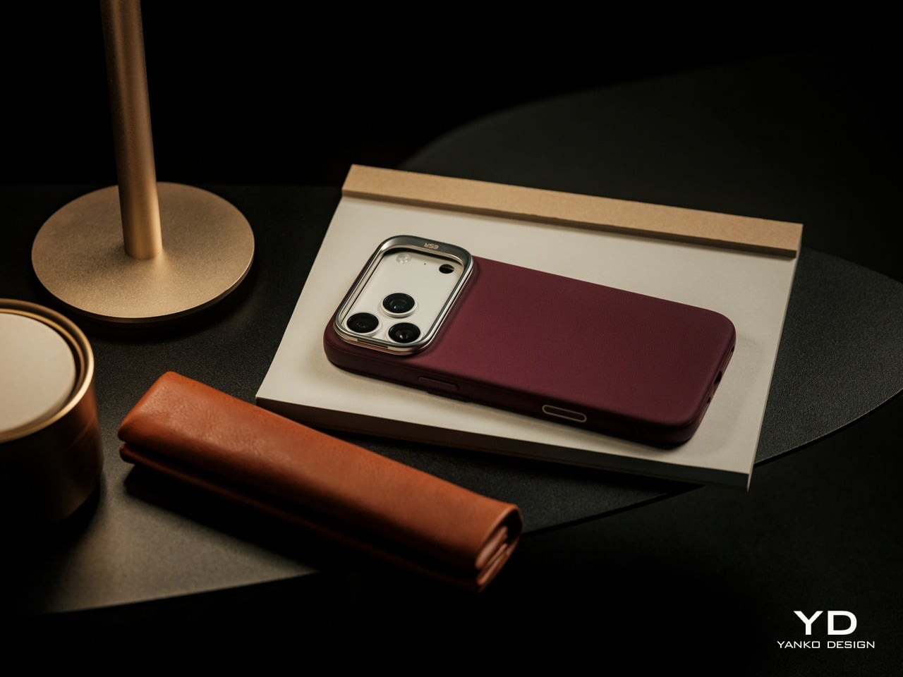
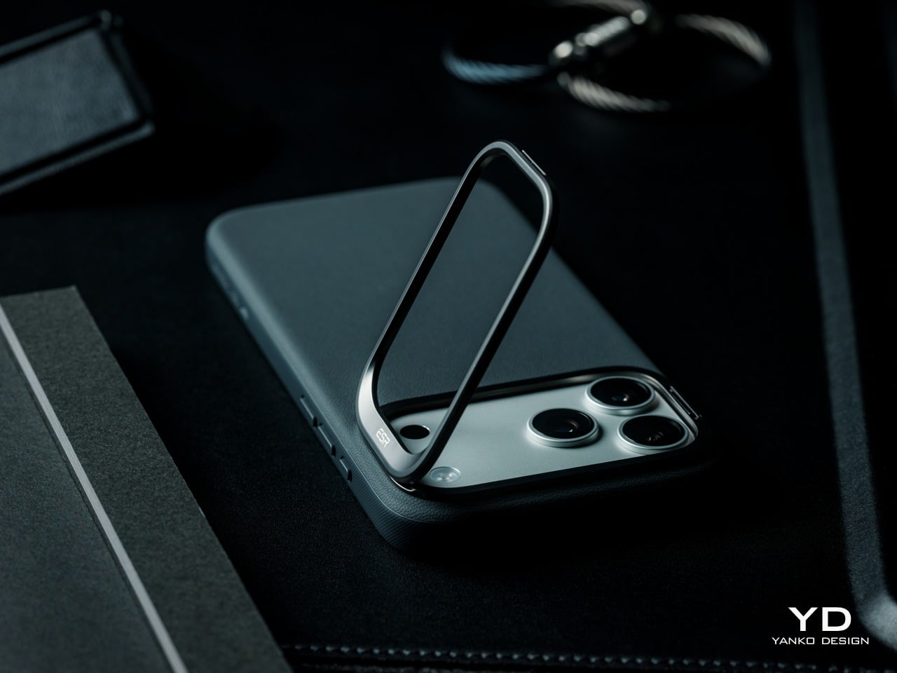
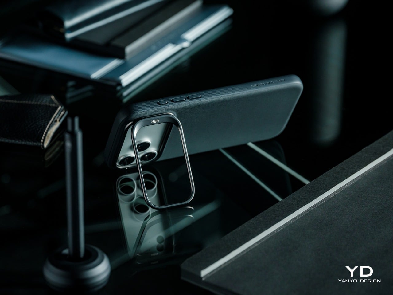
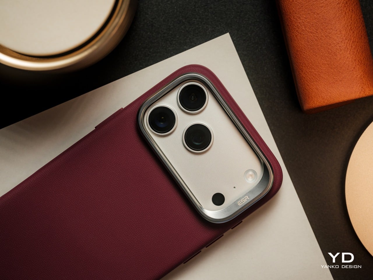
The camera surround anchors the Atelier’s visual identity while adding practical function. Rather than hiding the iPhone 17 Pro Max’s large camera island behind a flush cutout, ESR frames it with a distinctive metallic guard that immediately draws the eye and doubles as a camera-protecting stand. In its closed position, the guard sits flat and clean, giving the case a confident, top-weighted silhouette. When opened, it provides a convenient way to prop up the phone. It’s a design detail that does more than make the Atelier stand out; it makes the case stand out with purpose.
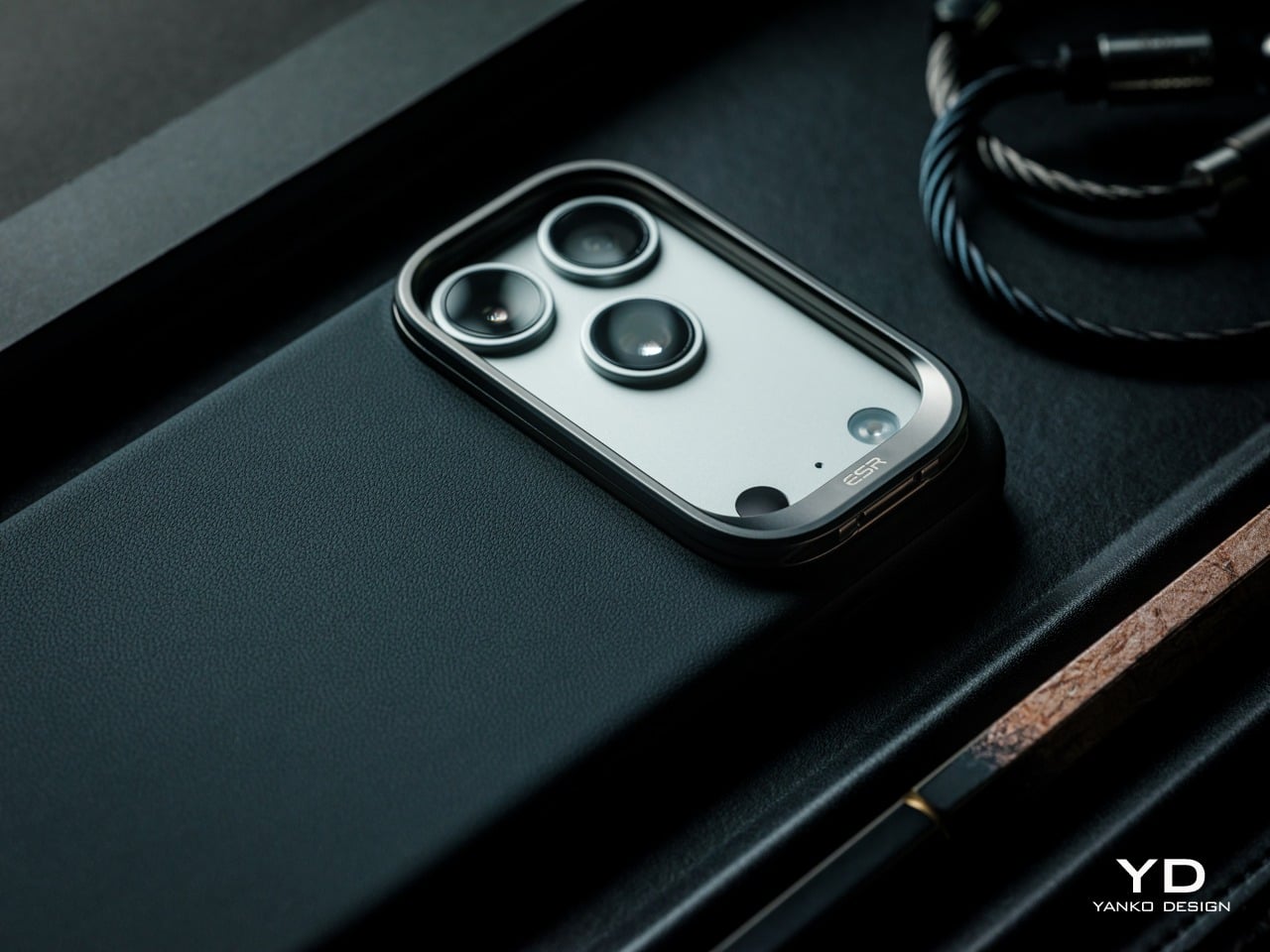
Running a thumb along the side reveals what the back suggests: the Atelier is more carefully constructed than it might initially seem. The TPU frame has a subtle micro-texture that feels slightly different from the smoother leather panel, providing grip without calling attention to itself. That material contrast is understated, but it adds some welcome depth to what is otherwise a clean and quiet form.

Two colors were available for this review, Black and Deep Burgundy, and both make a strong case for the Atelier’s design language. Black keeps things understated and versatile, almost disappearing as a deliberate choice. Deep Burgundy, on the other hand, is far more expressive, with a rich, wine-like tone that brings out the warmth and softness of the vegan leather even more.
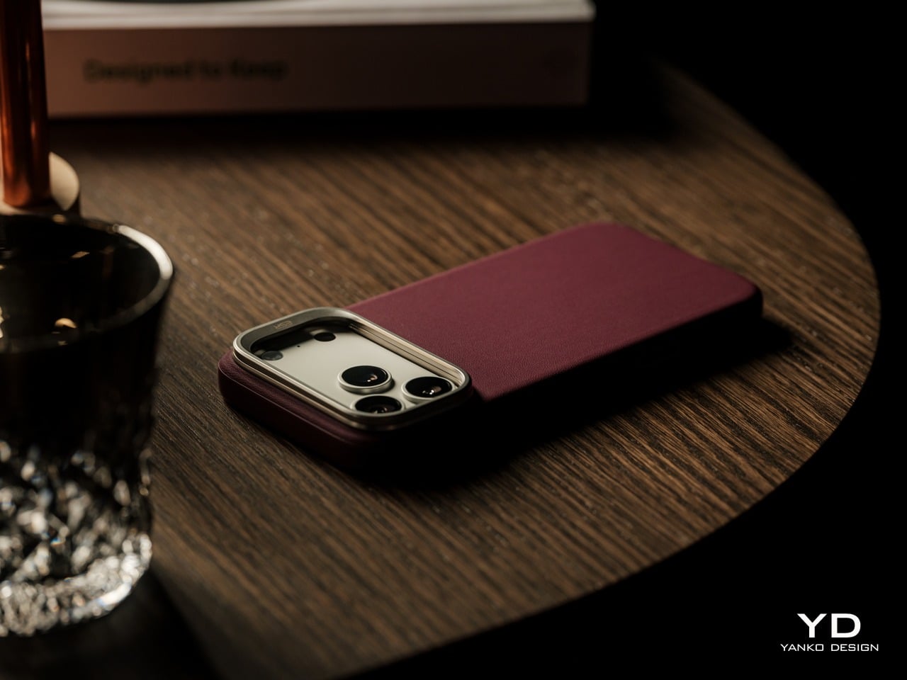
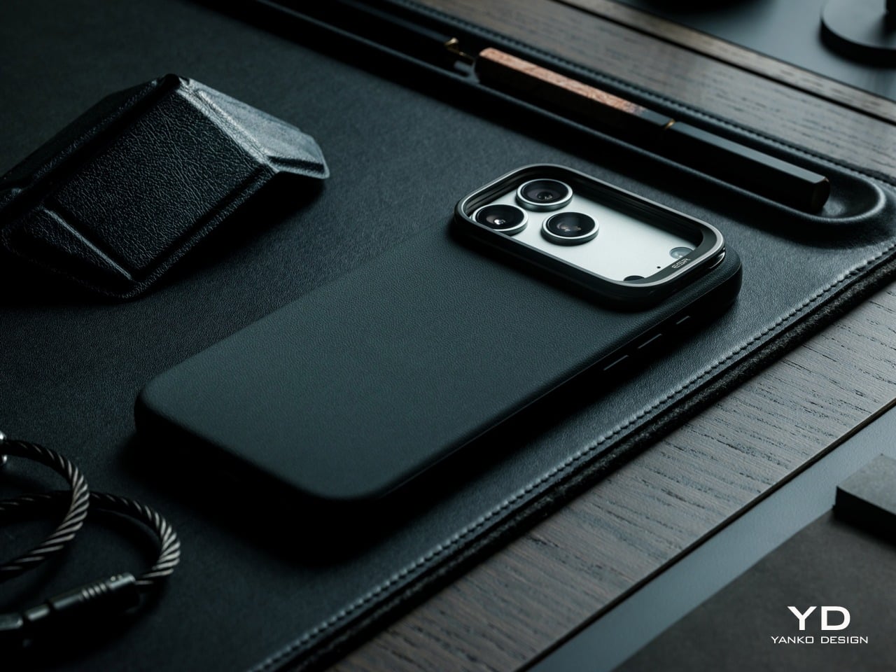
The Atelier rounds out its lineup with four colors in total, Light Gray and Misty Blue joining the Black and Deep Burgundy reviewed here. The palette is deliberately quiet and wear-anywhere, skipping bold or trend-chasing tones in favor of shades that feel considered rather than seasonal. That restraint runs through the whole design, where nothing on the surface feels accidental or arbitrarily decorative.

Ergonomics

Slipping the Atelier onto the iPhone 17 Pro Max for the first time, the fit is snug and confident. The case doesn’t shift or creak under pressure, and the soft microfiber lining helps the phone slide in cleanly. Button access is well handled, with the case’s profile keeping all controls accessible and tactile, so there’s no need to press hard through a thick wall of material just to adjust volume.
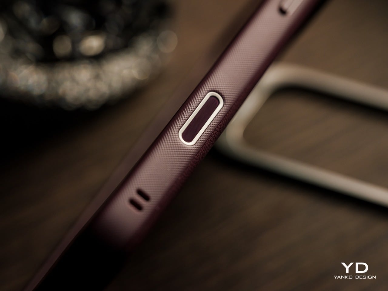
ESR includes a built-in Camera Control cover on the case’s side, a detail that’s easy to overlook but matters for anyone using that feature regularly. The cover preserves access without leaving an awkward gap in the frame. For a phone this size, the Atelier also adds enough grip to make single-handed use feel more manageable, without the bulk that typically comes with heavily protective cases.

Carrying the phone in a pocket with the Atelier on feels different from a plain silicone case. The material has a subtly grippier quality that keeps the phone from sliding around freely, and it doesn’t attract lint or dust the way softer cases sometimes do. Set it down on a desk or table, and it stays put, which is a small but consistently welcome trait.
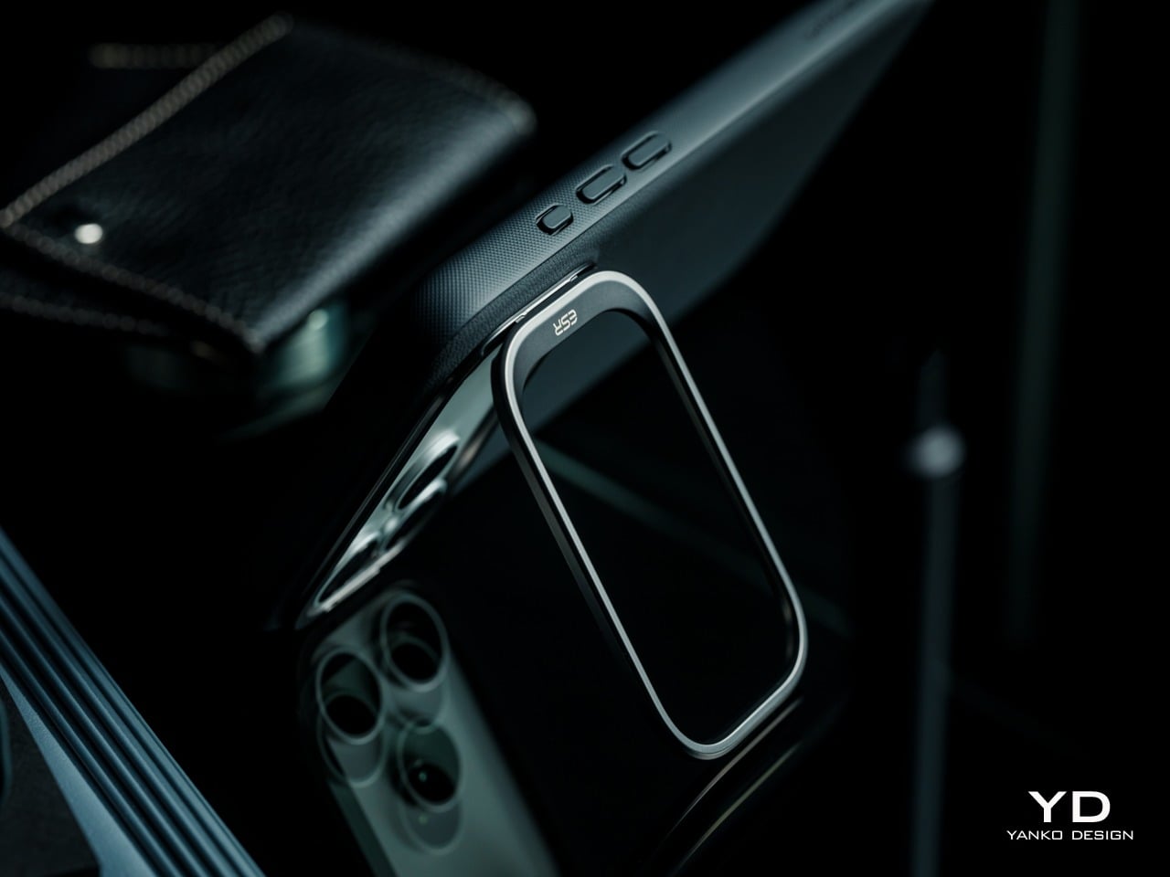
In practice, the headlining FlexStand’s mechanism feels smooth. Opening the guard takes a deliberate nudge rather than snapping open accidentally, and once propped, the stand supports both landscape and portrait viewing, with angles from 15 to 69 degrees. It works in landscape for video calls just as well as in portrait for reading or scrolling. When closed, the guard does raise the camera’s profile even higher than what it already has without any case, a necessary tradeoff for a creative solution to two problems in one.

Performance

The FlexStand is the Atelier’s most interesting functional detail, because it solves two problems at once. ESR’s FlexStand combines a camera guard to protect the device’s camera lenses when closed and an adjustable stand for hands-free viewing when open. On a phone with a camera island this large, exposed lenses are a genuine vulnerability, and folding that protection into the stand mechanism itself is a smarter solution than treating them as separate concerns.
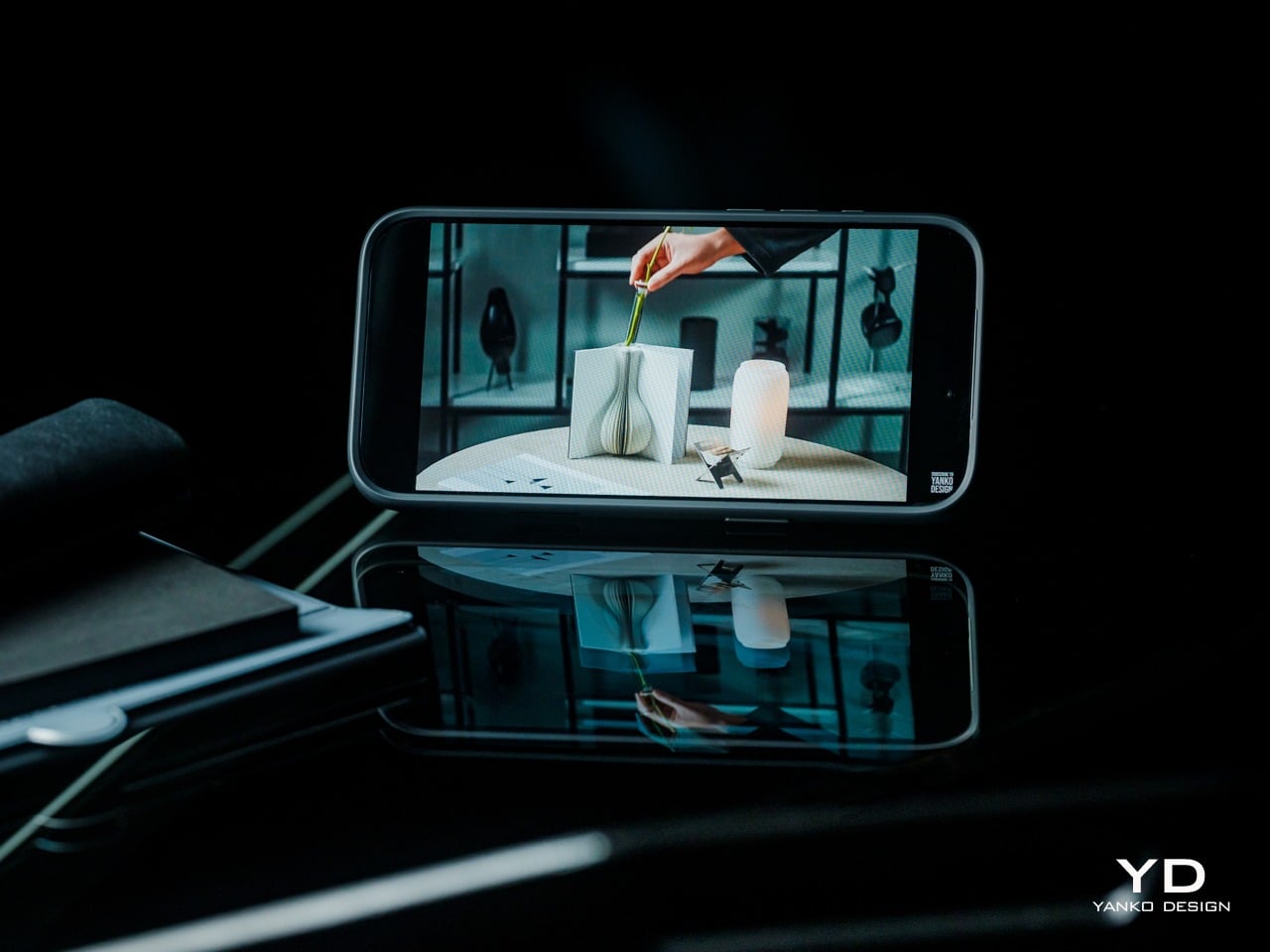
The stand supports viewing angles from 15 to 69 degrees, which covers enough range for upright reading and low-angle watching from across a desk. Shallower angles work well on uneven surfaces like an airplane tray table or a lap, while steeper ones put the screen more directly in view. Both portrait and landscape orientations are supported, with no additional mechanism or adjustment needed between the two. That said, vertical orientation pretty much means just tilting the back of the phone up, enough for scrolling or reading but definitely not for video calls.
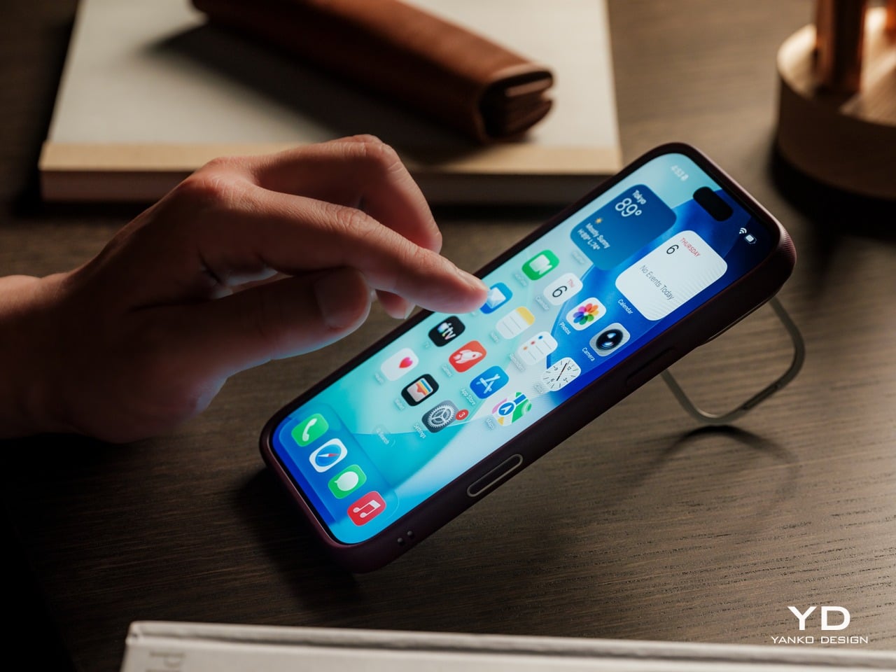
Beyond the stand, the Atelier handles everyday protection through a combination of a shock-absorbing TPU frame, and raised-edge protection. ESR rates the case for 3x military-grade protection, and the overall construction feels solid and deliberate rather than rubbery or flimsy. You can expect some added bulk and heft, but not more than any rugged protective case worth its salt.

MagSafe performance is strong. The Atelier uses built-in magnets rated at 1,400g of force, and compatible chargers and accessories snap on with a reassuring click. Because the back panel carries no visible ring or hardware, the magnetic experience feels clean and uncluttered from the outside.

Sustainability

Most phone cases don’t come with a sustainability story worth telling, and the ones that do tend to lean on recycled packaging rather than anything in the product itself. The Atelier’s more grounded argument is that a case built to resist early aging is more responsible than one that looks worn within months of purchase, and the silicone-based vegan leather is central to that reasoning.
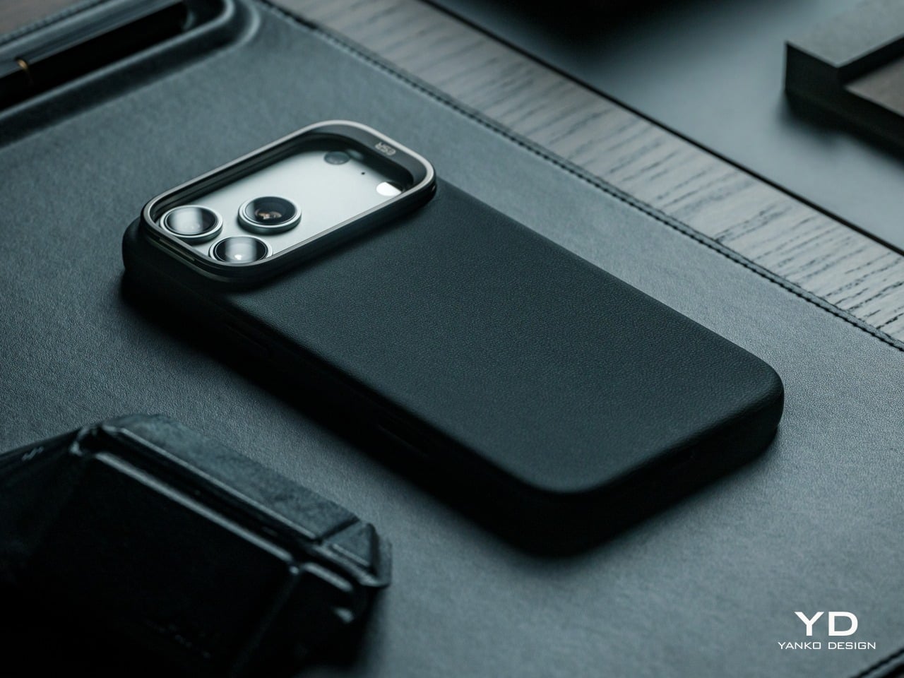
Being animal-free by construction, the vegan leather adds appeal for buyers thoughtful about materials but still wanting a leather-like aesthetic. It isn’t positioned as an environmental product in the way that a recycled-material case might be, but choosing a durable, easy-care surface that resists early replacement adds up meaningfully over time. A case that doesn’t need swapping out every few months is quietly a more sustainable choice.

Value

The Atelier is priced at $42.99 for Black and $45.99 for the remaining three colorways, including Deep Burgundy. Those figures sit toward the upper end of what most buyers expect to spend on a phone case, but the price reflects a package that bundles considerably more than leather. A built-in stand, strong MagSafe compatibility, and multi-layer protection are all part of what that cost covers.
For comparison, many premium leather-style cases fall into a similar price range, but often without integrated stand functionality, and a dedicated kick grip would be an added accessory on top of that. The Atelier handles both without making the back look overcrowded or adding any structural compromise. That combination, at this price, represents a reasonably compelling package for buyers who care about aesthetics and functionality in equal measure.
Where the Atelier’s value becomes most clear is in how long it’s designed to hold up. Buyers who regularly replace cases because of fading, stains, or surface wear will likely get considerably more time out of this one before that becomes a concern. That longevity also means less time hunting for a replacement case that ticks the same boxes, which is rarely as easy as it sounds.

Verdict

The ESR Atelier Magnetic Case finds its innovation in restraint, representing a new design direction for ESR’s protective case lineup and combining a more refined aesthetic with the everyday functionality ESR is known for. It finds a more sensible middle ground through better material choices, a stand that genuinely belongs to the case’s geometry, and a visual language that doesn’t rely on aggressive branding or drama to make an impression.
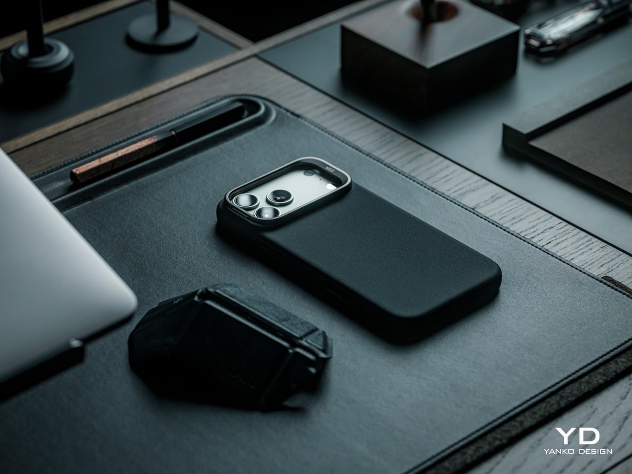
It suits buyers who want their iPhone 17 Pro Max to feel considered at every touchpoint, designed for users who appreciate the premium look and feel of leather but want a more durable and easy-to-maintain alternative for daily use. The Deep Burgundy variant, in particular, carries a character and warmth that’s genuinely hard to find in most protective cases, making it a compelling choice for sophisticated buyers who have grown tired of flashy and gimmicky accessories.

Click Here to Buy Now: $45.99

The post ESR Atelier Magnetic iPhone 17 Pro Max Case Review: Vegan Leather Done Right first appeared on Yanko Design.

8BitDo Made the N64’s 30th Anniversary Keyboard Every Millennial Wants

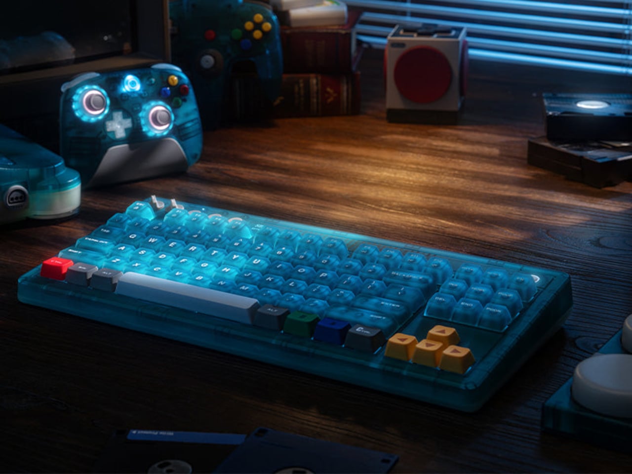
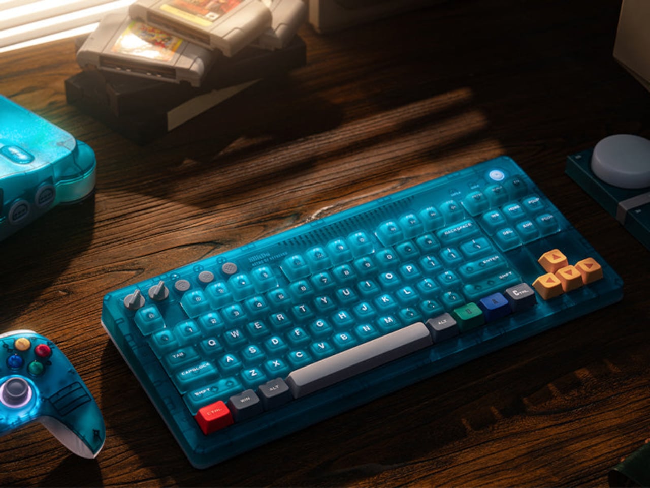
Nintendo’s “Funtastic” translucent plastic era tends to provoke a specific kind of nostalgia. The see-through consoles and controllers from the late 1990s made the hardware itself part of the aesthetic, and the ice blue variant of the N64 in particular developed a cult following that outlasted the console’s commercial run by several decades. The transparency wasn’t a gimmick then, and it still doesn’t feel like one now.

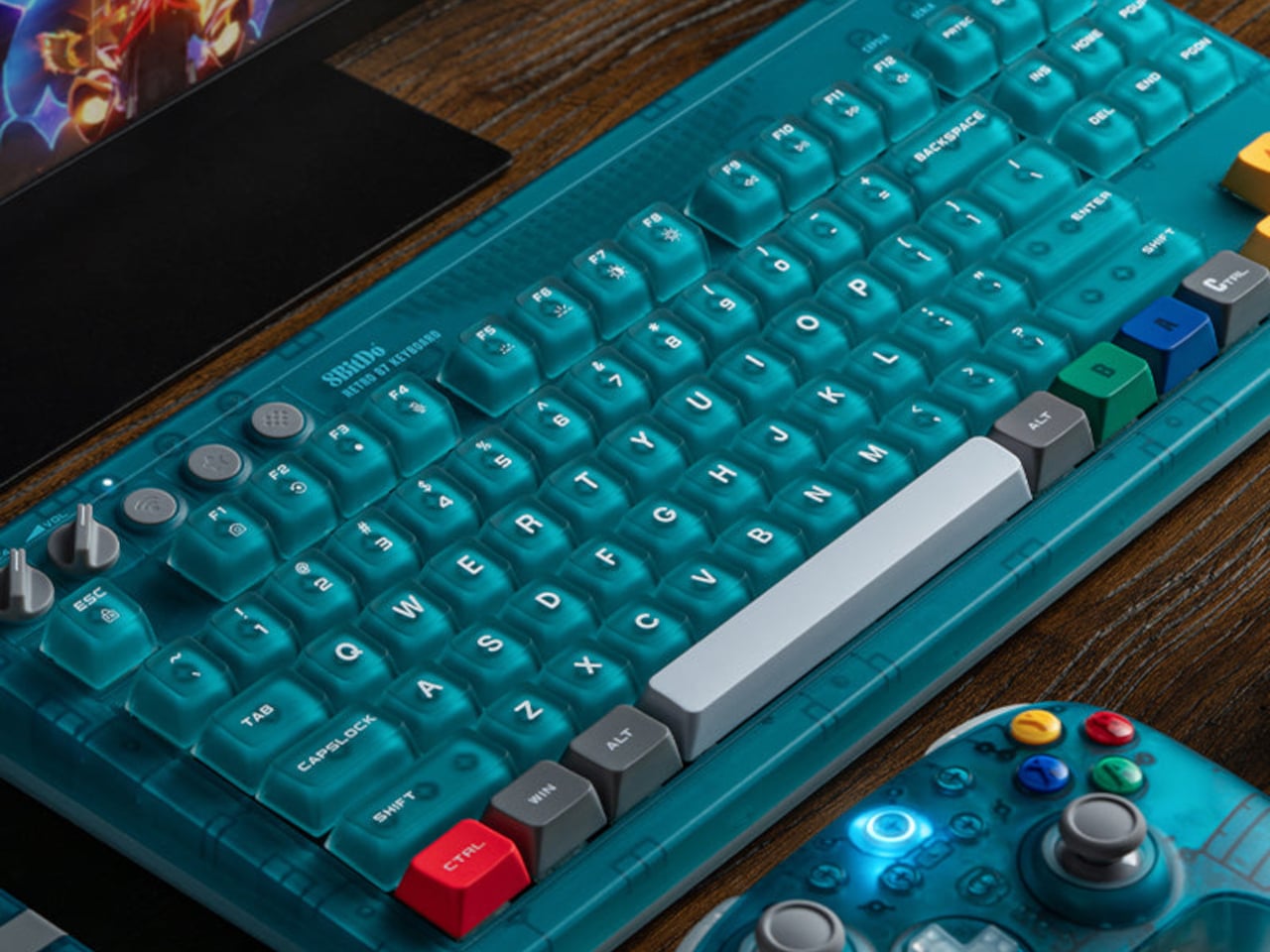
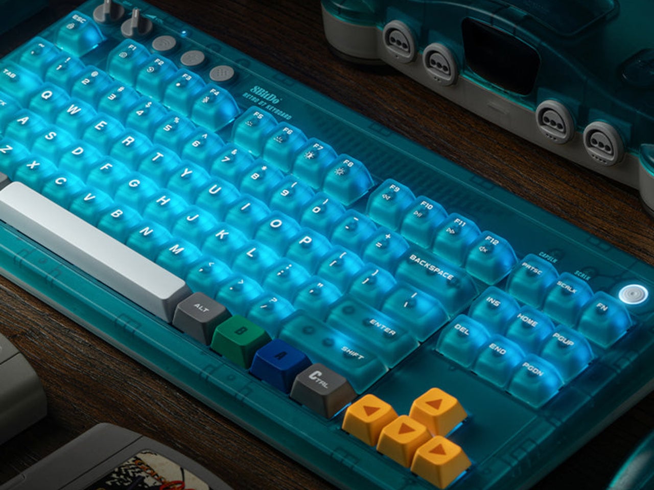
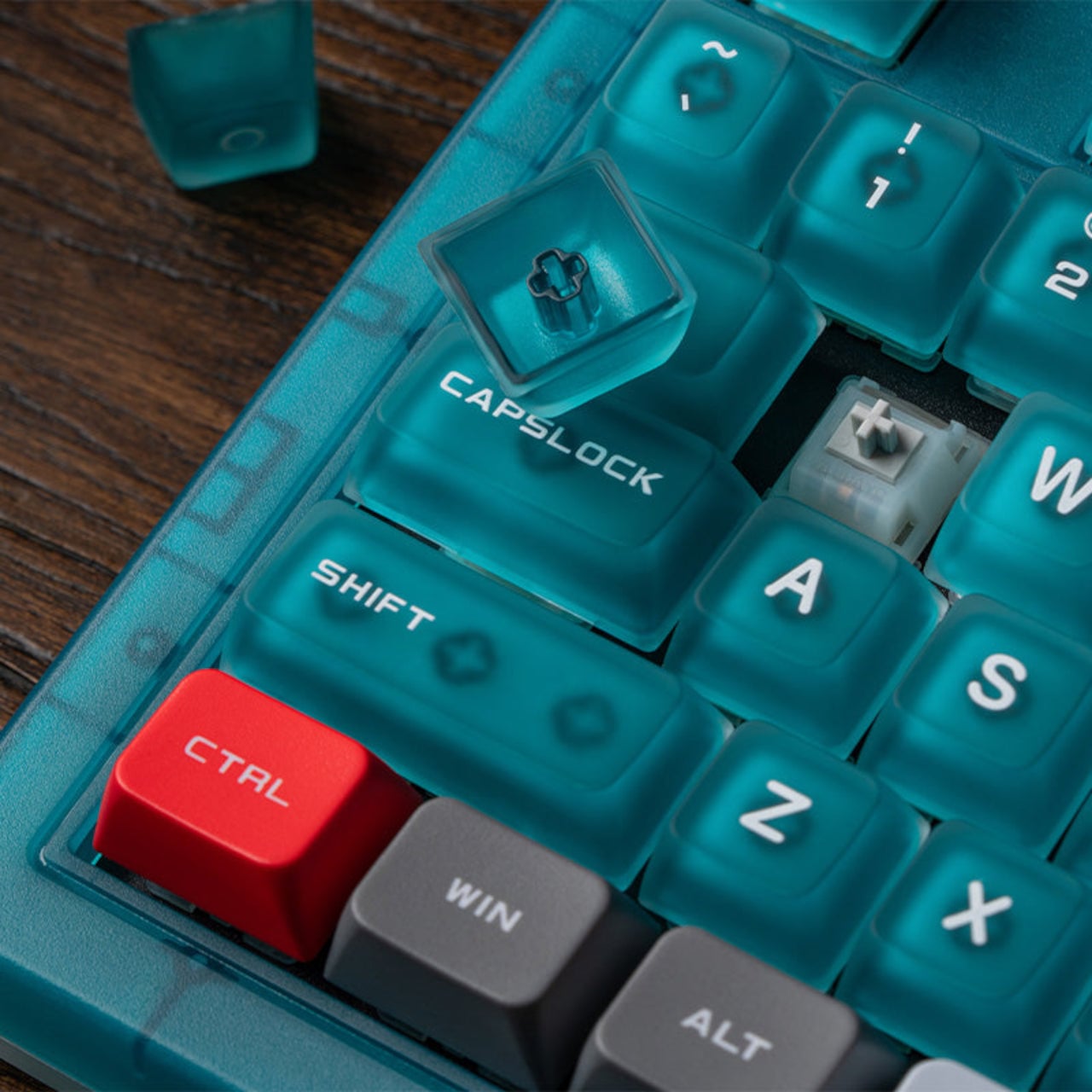
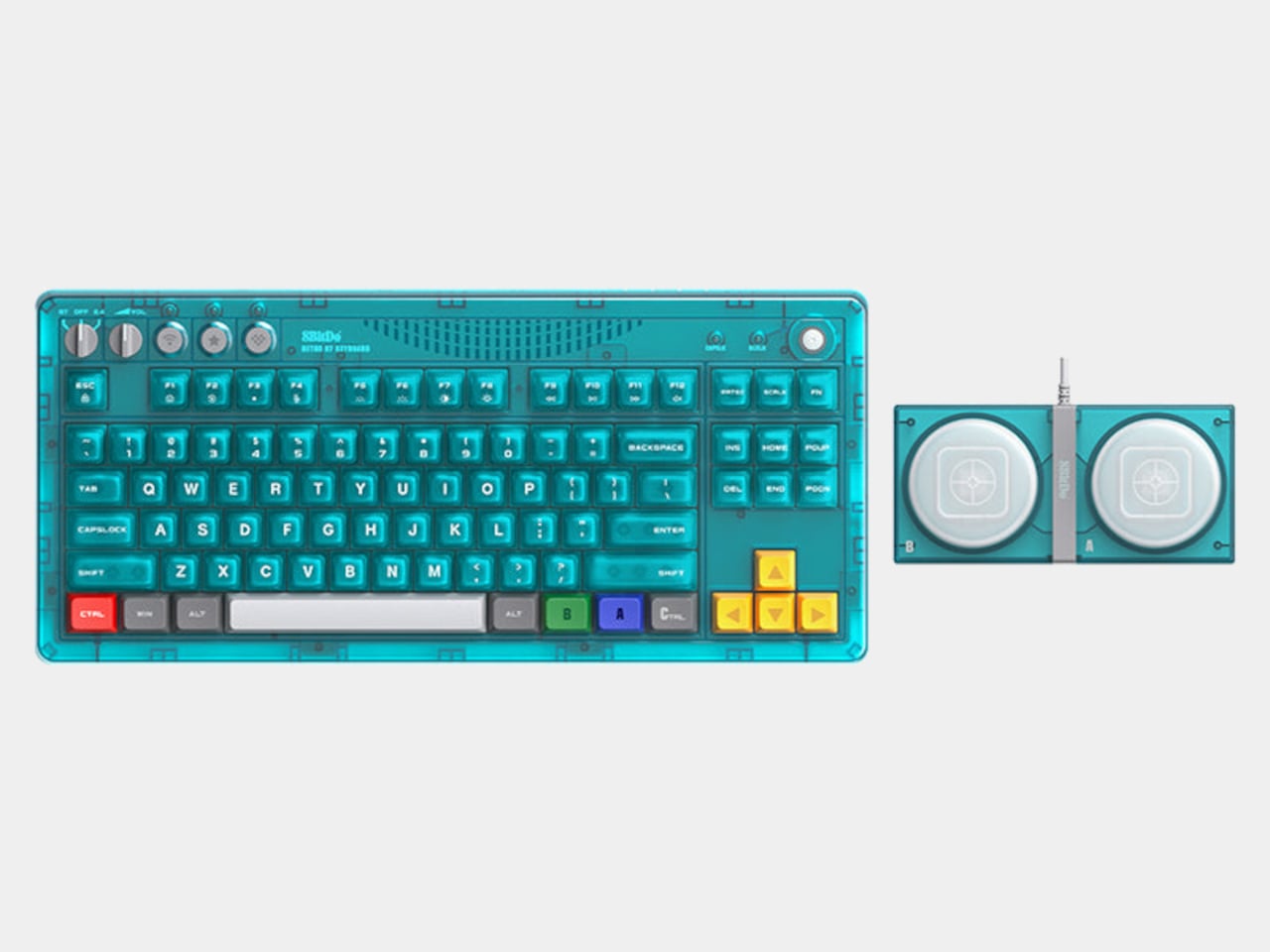
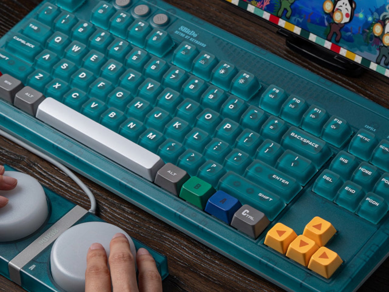
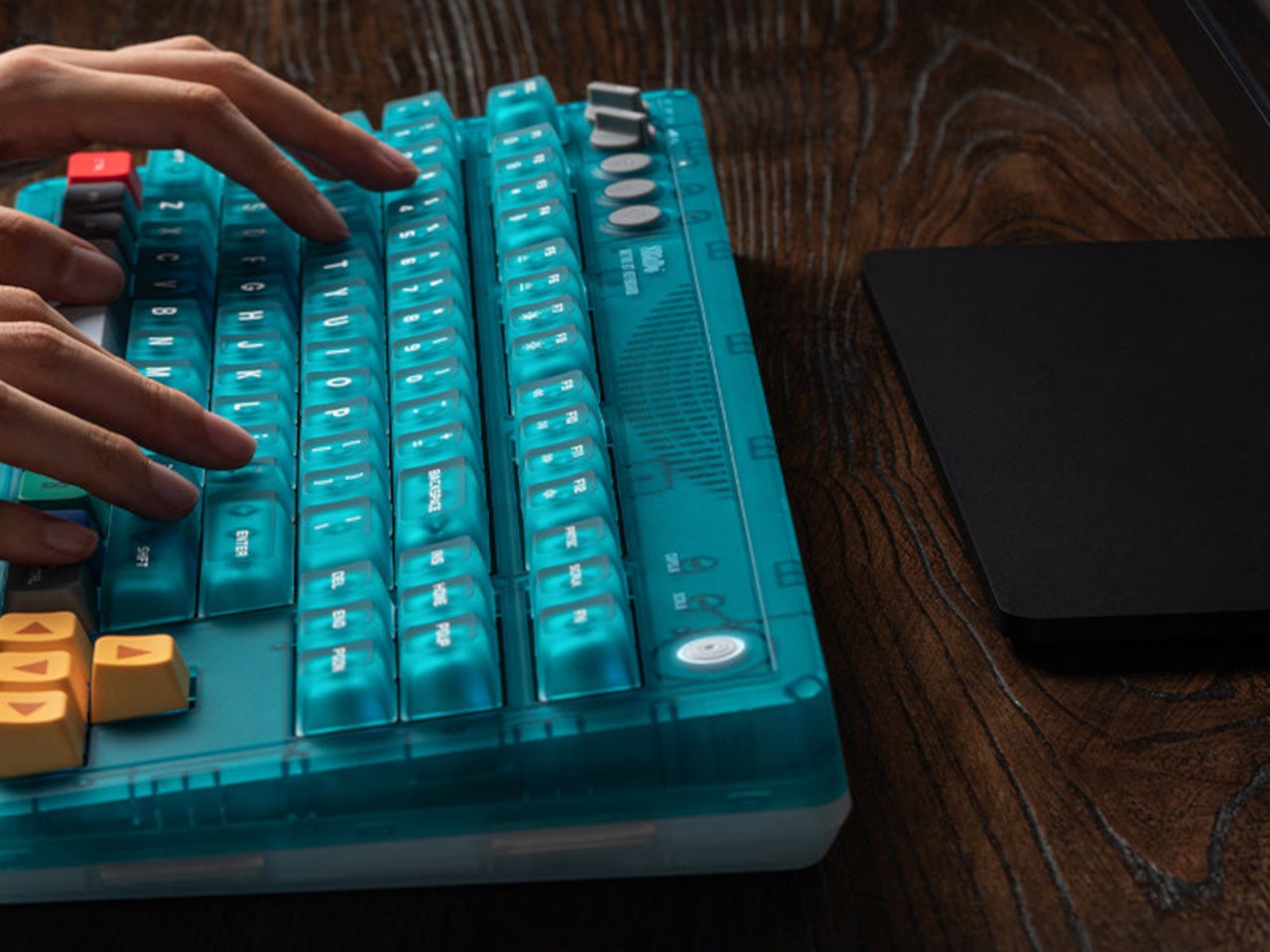
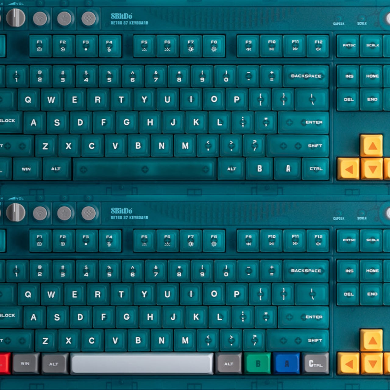
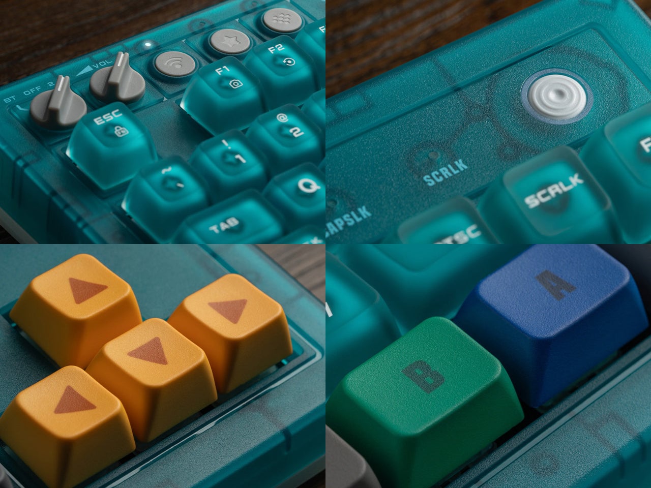
The 8BitDo Retro 87 Keyboard in Clear Blue arrives as part of the N64’s 30th anniversary and borrows that translucent blue finish directly. But the design doesn’t stop at the shell. Specific keys carry the actual color palette of the original N64 controller: yellow arrow keys for the C-buttons, blue and green A and B keys, and a red left Ctrl referencing the Start button. For anyone who logged enough hours with that particular controller, the color map reads immediately.

Designer: 8BitDo

The Clear Blue edition uses 8BitDo Cloud Gray Linear mechanical switches, co-developed with HUANO specifically for this version and distinct from the Kailh Box White switches in the Fami and N editions. The keycaps combine dye-sublimation PBT and ABS + PC double-shot construction with a matte UV coating, giving the legends both durability and a finish that suits the translucent shell better than a glossy alternative would.

Underneath, the hot-swappable PCB sits in a top mount configuration, which is a construction choice that tends to provide a softer, more cushioned typing feel compared to bottom mount builds. N-key rollover handles simultaneous inputs without dropping keystrokes. Per-key RGB backlighting runs through the whole board, visible through the translucent shell in a way that a standard opaque case would never allow. The 200-hour wireless battery life on a 2,000 mAh cell is rated for the 2.4 GHz wireless mode, with the adapter included in the box.

Connectivity covers three modes: Bluetooth, 2.4 GHz wireless, and wired USB, the standard trio for a modern keyboard that needs to move between devices and setups. A pair of programmable Super Buttons ships with the keyboard, matching the Clear Blue finish and assignable through 8BitDo Ultimate Software V2. They sit outside the main typing area and can take on whatever function is needed, from media controls to game inputs.

The 87-key tenkeyless layout drops the number pad but keeps the full navigation cluster, which is the practical choice for a keyboard meant to share desk space with other peripherals. The layout doesn’t commit to being purely a gaming board or purely a productivity tool, which suits a keyboard this visually distinctive rather well. Something that references a 30-year-old console doesn’t need to pretend it’s a neutral office accessory.

There’s a certain honesty to the approach here. The Clear Blue colorway isn’t a subtle nod or a distant reference; it’s an explicit callback to a specific era of hardware design that a generation of players grew up with. The translucent shell shows the PCB and internal components through the blue tint, carrying the same logic those original Funtastic consoles did: the inside of the hardware was worth looking at.

The post 8BitDo Made the N64’s 30th Anniversary Keyboard Every Millennial Wants first appeared on Yanko Design.
Most Macro Pads Top Out at 24 Keys, but This Keychron Has 100

Macro pads have always operated on the assumption that a handful of keys is enough. Most offer between six and 24 programmable buttons, which covers a tidy shortcut setup until it doesn’t, when a workflow shifts or a new application joins the rotation. Running out of keys usually means buying a second pad, stacking it beside the first, and accepting that the layout will never quite be what you originally wanted.

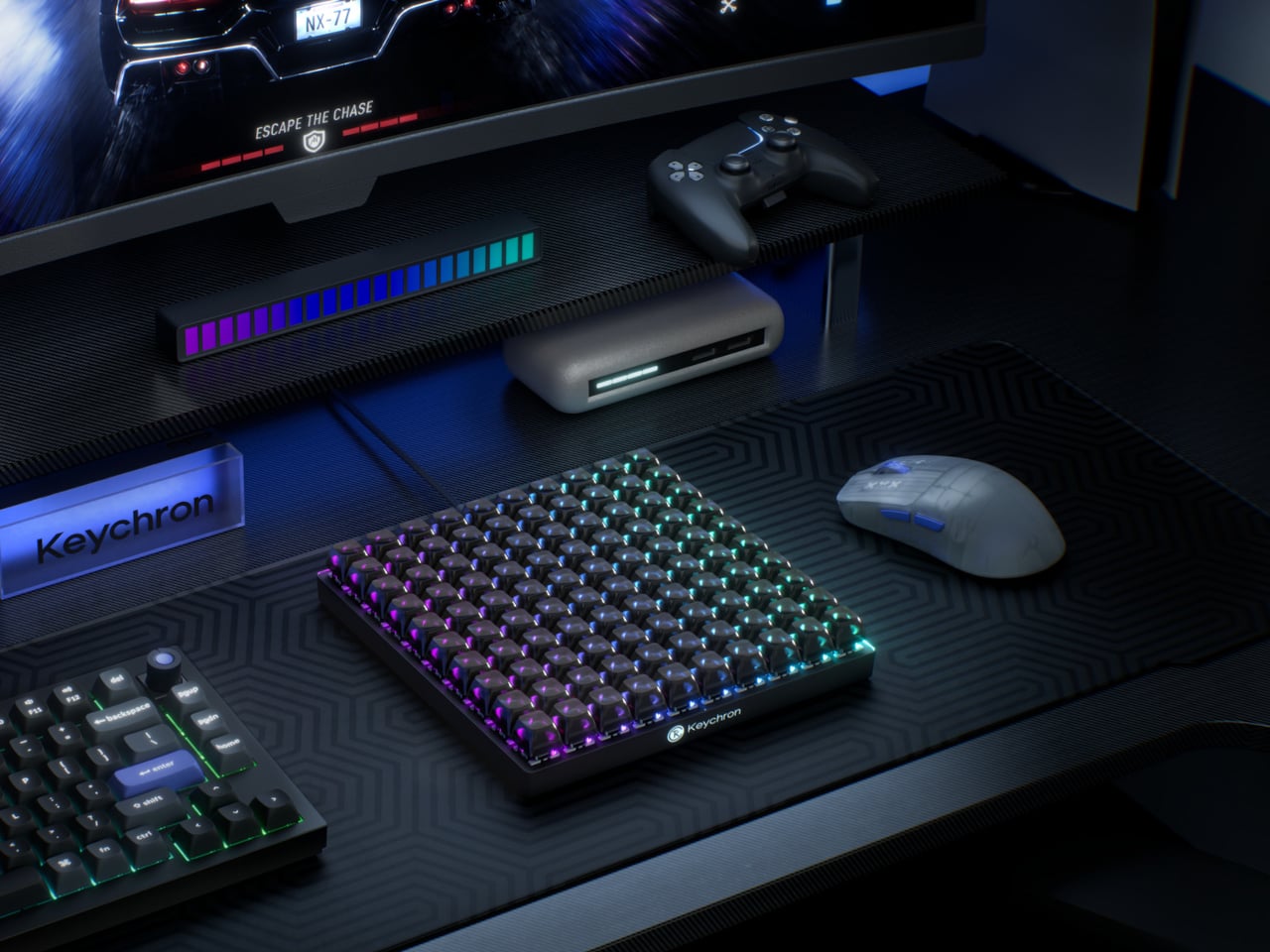
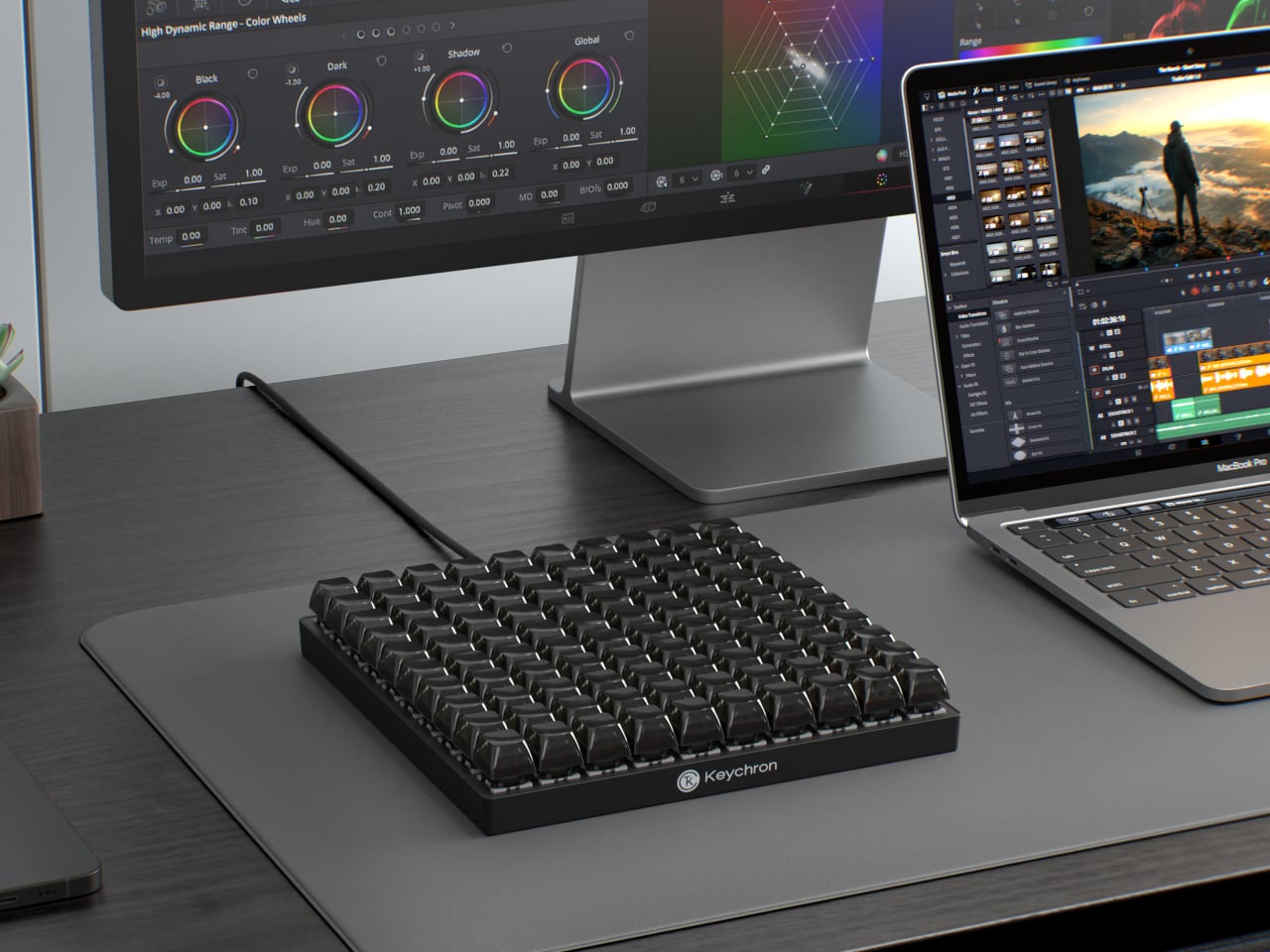
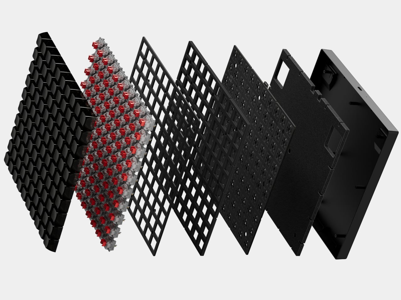
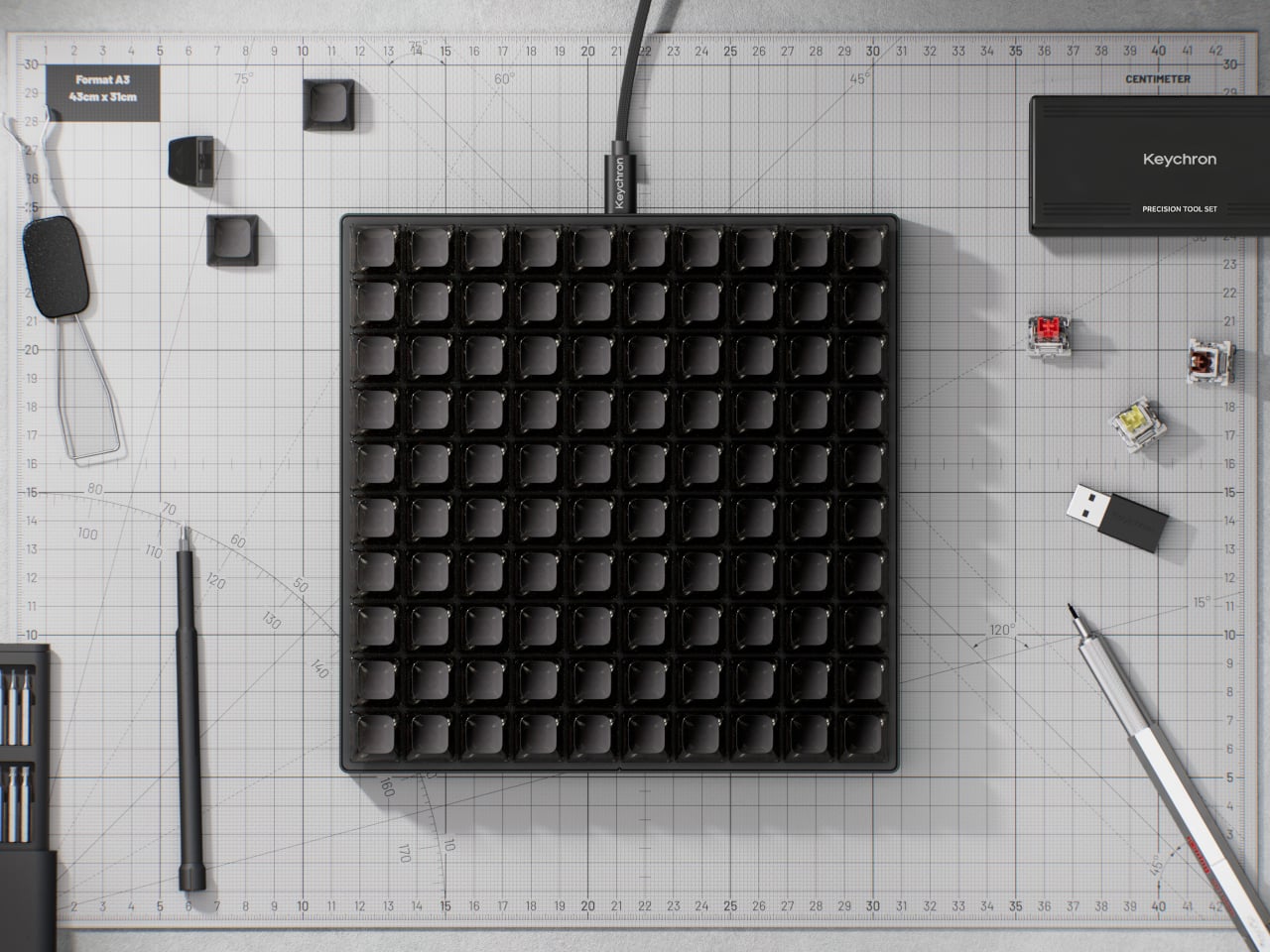
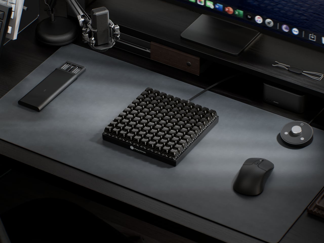
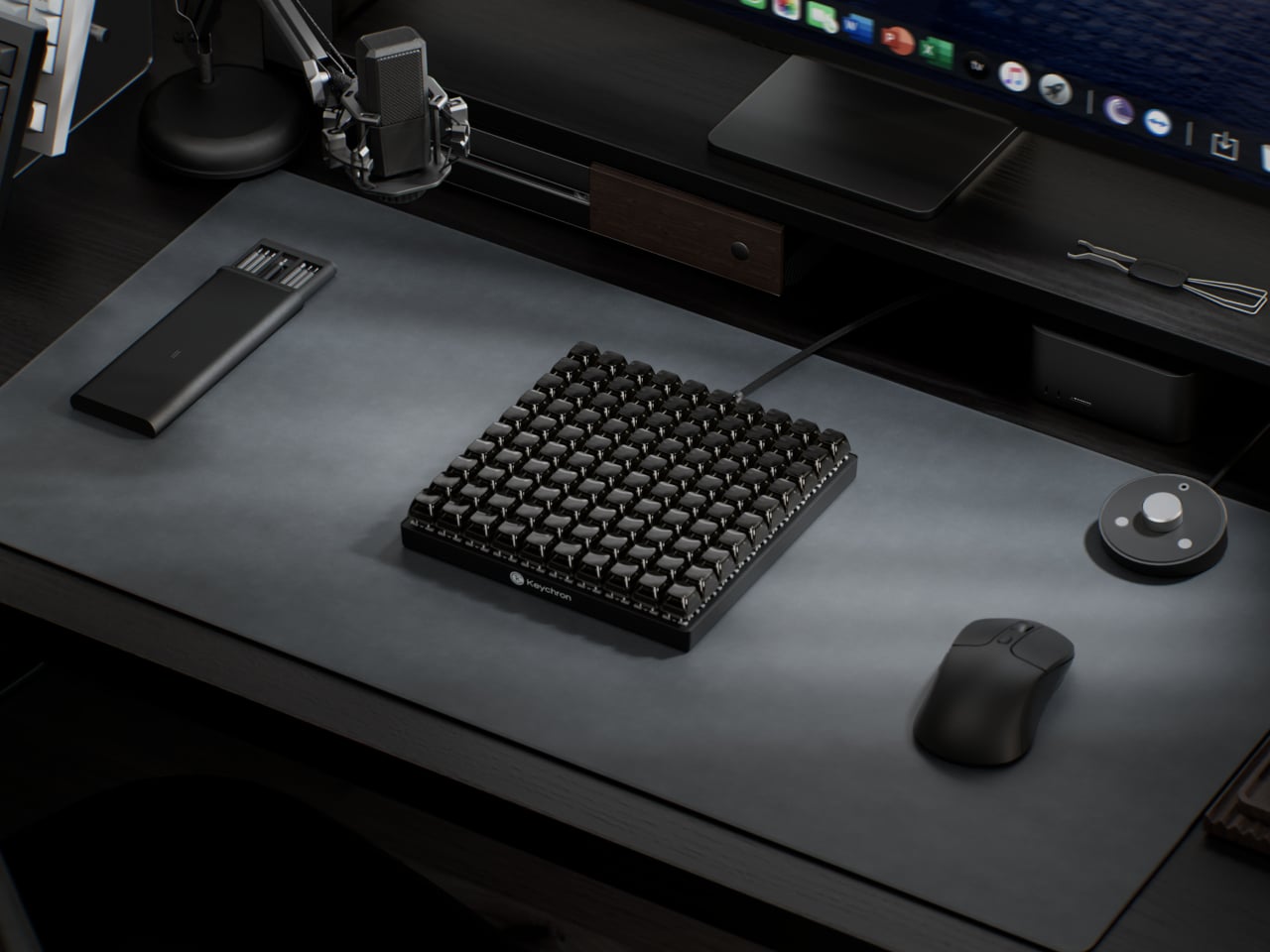
The Keychron C100 8K skips that problem entirely by starting with 100. Arranged in a 10-by-10 grid and taking up roughly the footprint of a full-size keyboard, it ships with every key completely unbound. There are no default shortcuts, no preset layouts, and nothing to undo. The entire surface is a blank canvas that users fill through Keychron Launcher, the brand’s browser-based configuration tool.

Designer: Keychron

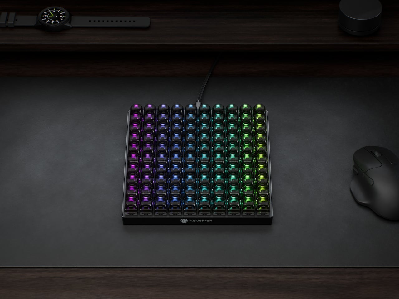
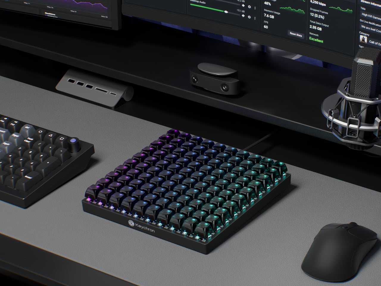
That software handles everything from key assignments and macro sequences to per-key RGB lighting. Color-coding matters more here than it does on a conventional keyboard, because it’s one of the more practical ways to navigate 100 unmarked keys. A cluster in red for video editing, a row in blue for streaming controls, and a section in green for communication apps turns a uniform grid into something immediately legible.

The switches underneath are Keychron’s own Apex Red linears, which ship installed but aren’t the only option. Hot-swappable sockets mean any MX-style switch fits without soldering, which opens the C100 to the deeper enthusiast habit of collecting and testing different switches across different zones. The transparent ASA-profile keycaps, made from a combination of PBT and polycarbonate, let the per-key RGB glow through without muddying the colors.

An 8,000Hz polling rate sits at the competitive end of the spec sheet, which matters most for gaming where input latency becomes meaningful. That puts the C100 in a different position from most macro pads, which treat speed as secondary to programmability. Having both in the same device means the 100 keys can cover reactive gaming inputs and slower productivity shortcuts with the same responsiveness.

The scale of the grid also changes how the device can be organized in practice. A standard macro pad tends to cluster tightly around a single application, leaving little room for secondary controls. The C100 has enough room to dedicate zones to different software contexts without overlap, so switching between a video editor and a 3D modeling tool doesn’t require reprogramming or layer-switching in the middle of a session.

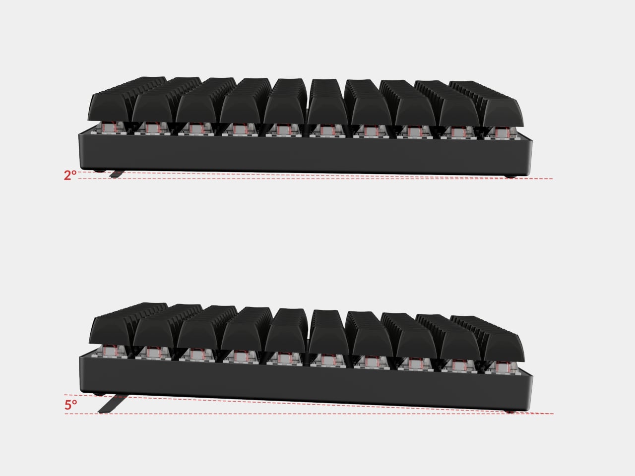
Connectivity is wired USB Type-C, which removes batteries and wireless latency from the equation. Adjustable feet let users dial in the typing angle, and the plastic body keeps the overall weight manageable for something this large. At 196.65mm x 196.65mm, the C100 forms a perfect square, which makes it geometrically distinctive at a glance and easy to position consistently on a desk.

The post Most Macro Pads Top Out at 24 Keys, but This Keychron Has 100 first appeared on Yanko Design.
The $29 Key Ring That Finally Fixed a 130-Year-Old Problem

While I have a lot of keychains, from pop culture to K-pop to travel-themed, I am truly annoyed with keyrings. To be honest, I don’t have any ability to open and close them, so I have to wait for my brother or a friend to attach my keychain of choice. It’s something we use every single day, yet there hasn’t been any improvement to them for the past hundred years or so, and they cause annoyance and sometimes even pain. That oversight, I think, is finally getting corrected.

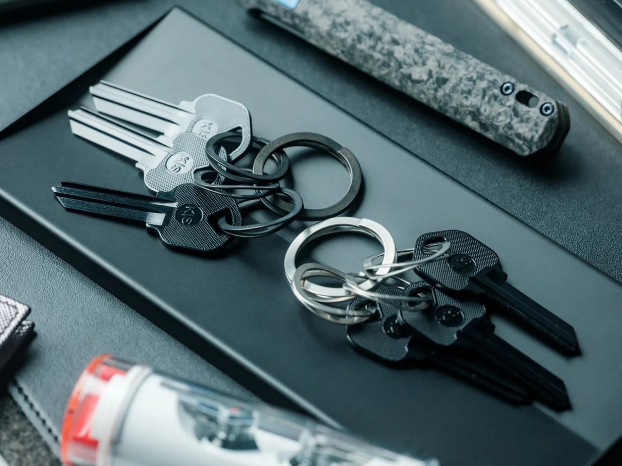
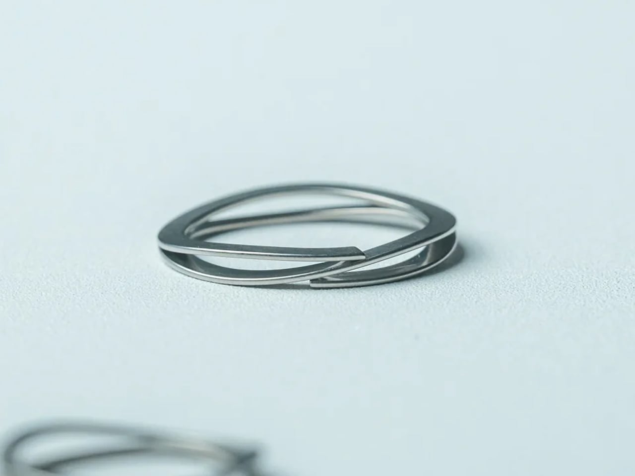
The Painless Key Ring is exactly what its name promises, which is both its greatest strength and possibly why it is not getting the attention it deserves. It sounds almost too simple. A key ring without the pain. But when you consider that the double-coiled split ring design has not meaningfully changed in over 130 years, a product that actually reimagines it from the inside out starts to feel less like a novelty and more like something that was long overdue.

Click Here to Buy Now: $29.00

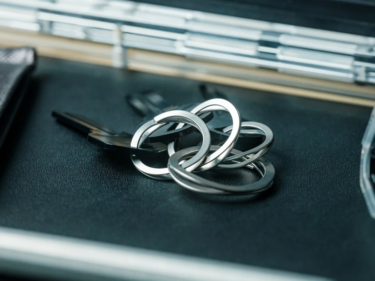
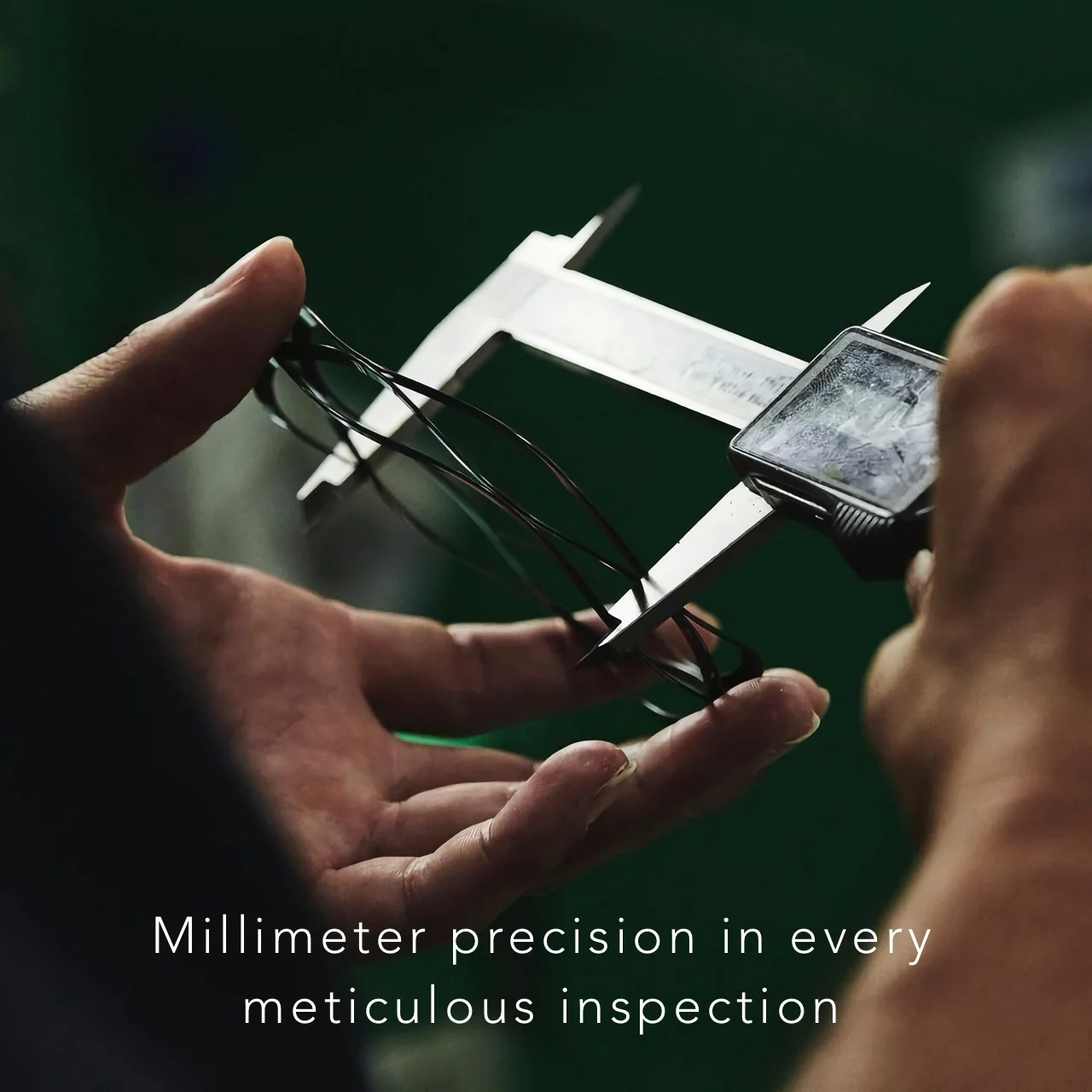
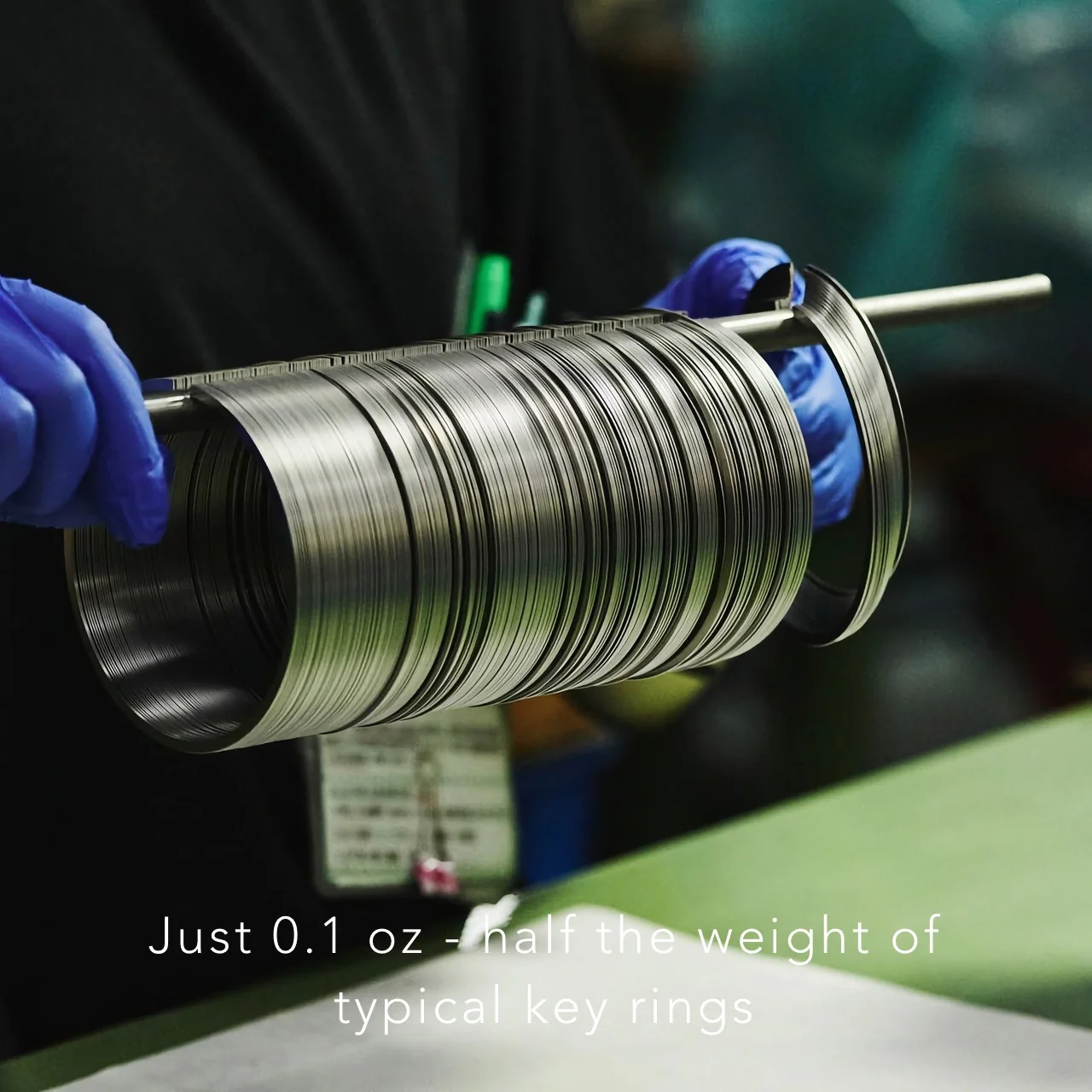
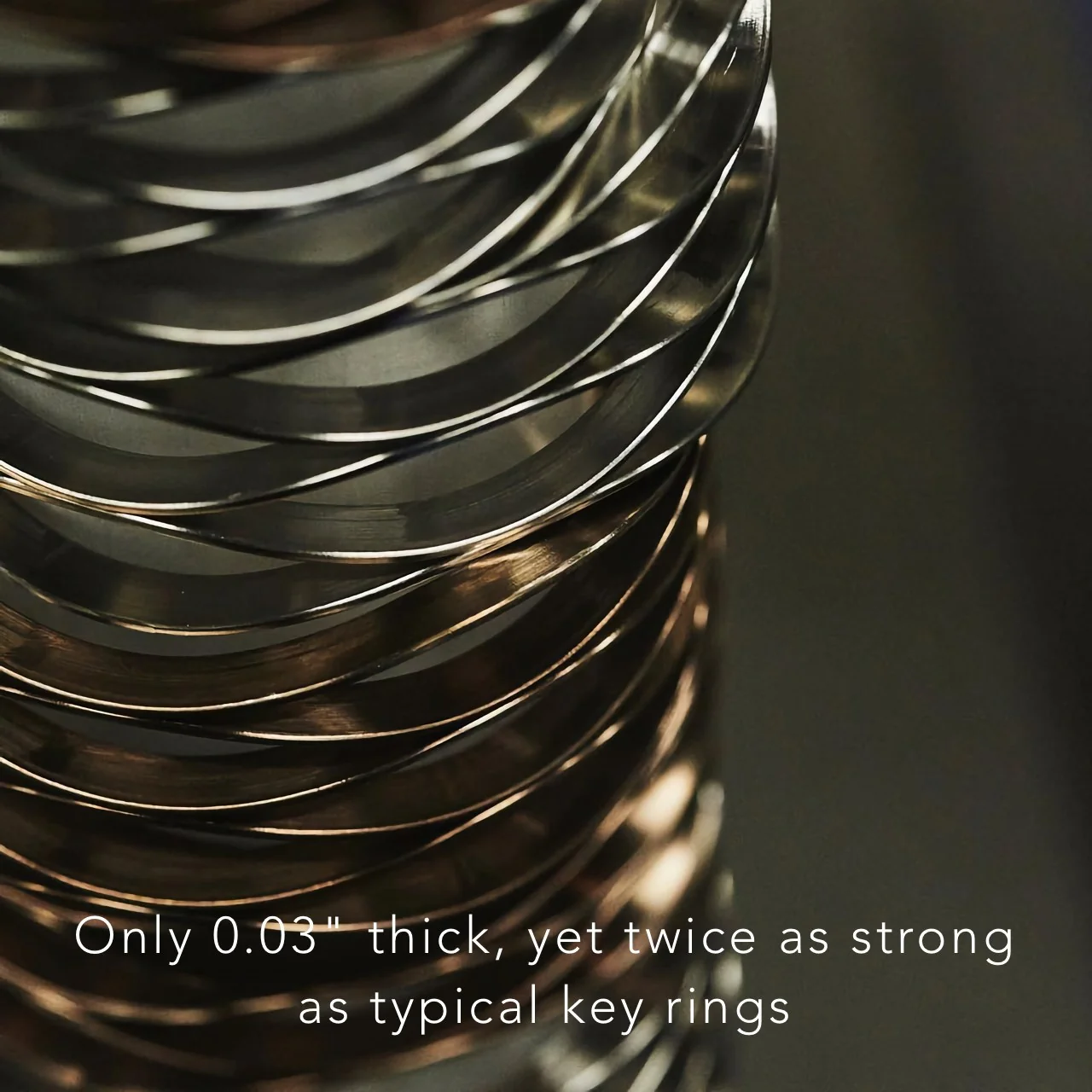
The engineering behind it borrows from places you would not typically associate with your front door key. The coiled wave spring technology used in this ring is the same mechanism found in aerospace equipment and bullet train systems. Japan, where the ring is made, is not exactly known for cutting corners on precision, and that pedigree shows in the numbers. At just 0.1 oz for the large version, it is half the weight of a standard key ring. At 0.03 inches thick, it is noticeably slimmer. And despite being lighter and thinner, it is twice as strong as a conventional ring, thanks to the high-tensile steel used in its construction.

The functional difference comes down to one motion. A traditional split ring makes you hunt for the gap in the coil, wedge a fingernail underneath, and pry it open millimeter by millimeter while the metal digs into your skin. The Painless Key Ring opens when you press the release point. Let go, and it closes. That is the entire operation. No gap hunting, no skin damage, no compromised manicure. The wave spring structure creates what you could describe as a “pre-warped” design, where the natural flex of the ring accommodates keys of any size without warping under stress or losing its shape over time.

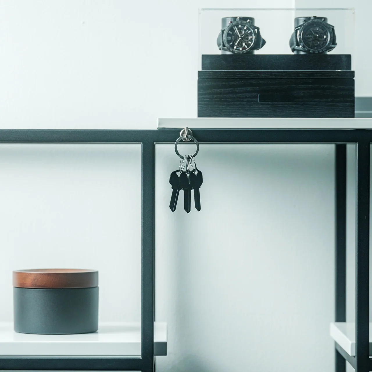
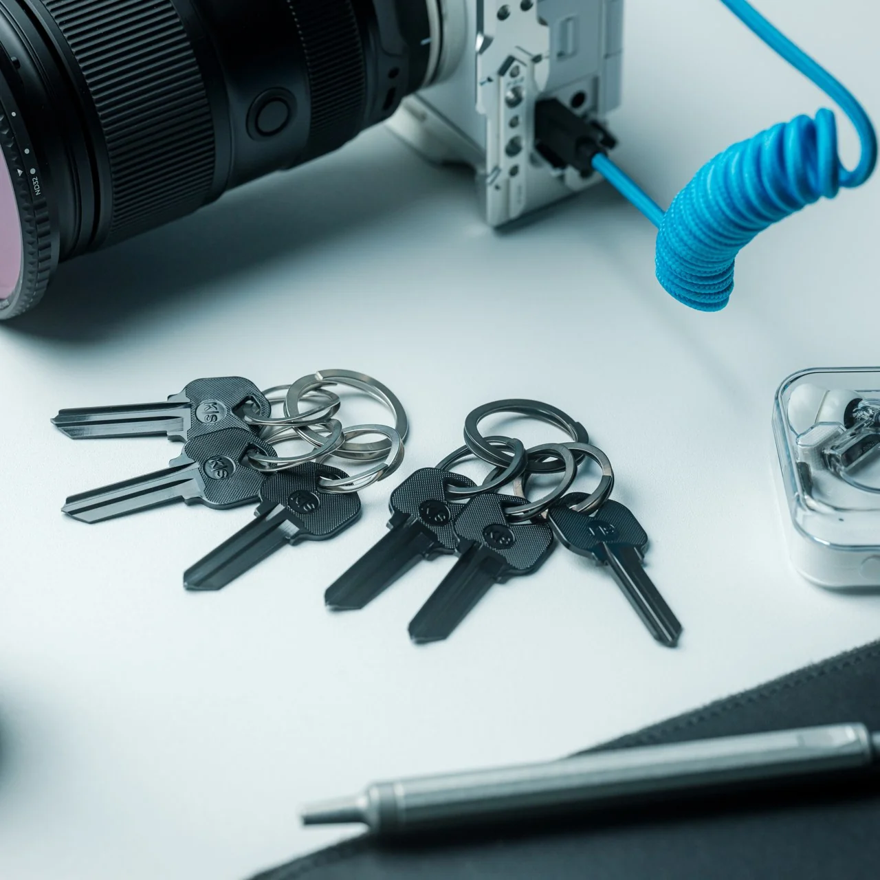
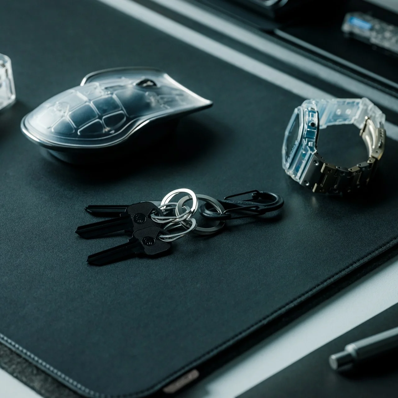
It comes as a set of one large ring and three smaller rings, available in silver and black. The black version is dyed rather than painted, which makes it more resistant to wear and scratches, not just aesthetically different. Both finishes hold up well against the daily context of being thrown into a bag, clipped to a carabiner, or dropped on a desk, which is most of our actual key ring experience.

At $29 for a set, the price sits in a range that feels proportionate to what you are getting. It is not an impulse buy, but it is also not a hard sell when you consider that most people spend more on a single decent pen without much deliberation. The comparison that keeps coming to mind is the razor that replaced the old disposable, or the notebook that made you stop picking up freebies at conferences. Once you use something engineered to actually work, the previous version becomes very difficult to go back to.

The design community talks a lot about objects that deserve more attention than they receive, and the key ring is probably the most obvious example of that gap. We carry our keys every day without any particular feeling about them, which is fine until you realize that feeling nothing about a daily object usually means it is only doing the minimum. The Painless Key Ring sets a different bar, one that takes the smallest, most neglected piece of your everyday carry and applies genuine engineering logic to it. Whether you are someone who obsesses over EDC setups or someone who just wants to stop destroying their nails every time you need a spare key, the upgrade reads the same either way.

The post The $29 Key Ring That Finally Fixed a 130-Year-Old Problem first appeared on Yanko Design.
This Collapsible Mouse Is So Flat It Shares a Sleeve With Your Laptop

Traveling with a mouse has always carried a specific low-level inconvenience. Full-size mice claim too much space in a slim bag, compact mice often sacrifice comfort for portability, and both still need their own compartment to avoid getting lost or damaged. The usual answer is a palm-sized wireless mouse that needs to be packed with some thought and unpacked with intention at every new stop along the way.

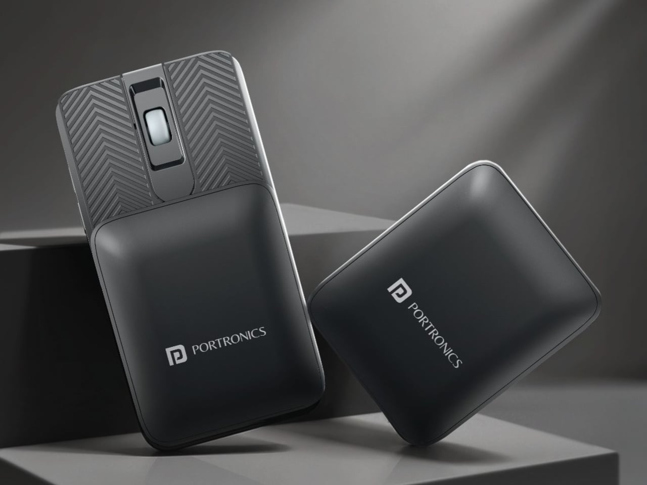
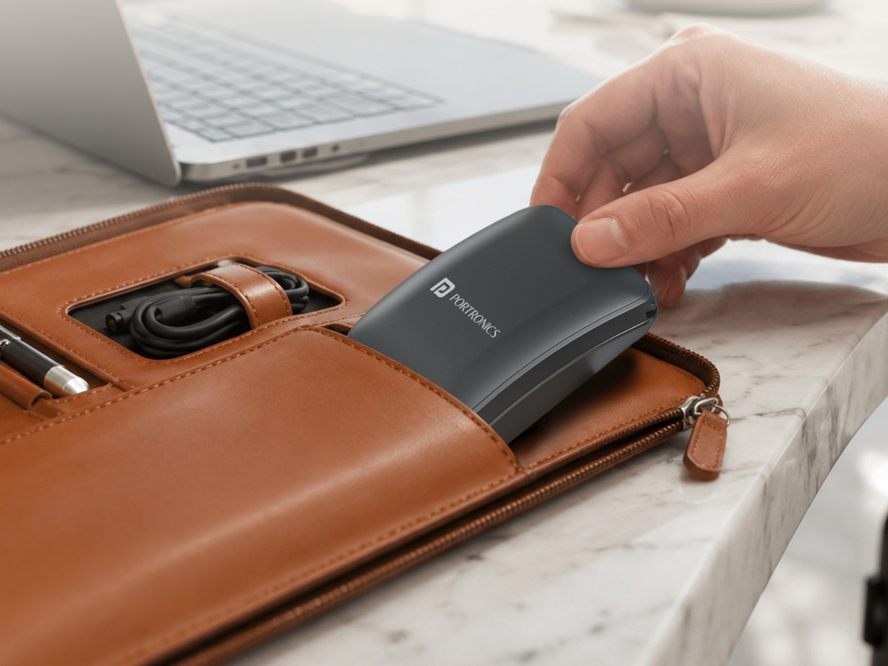
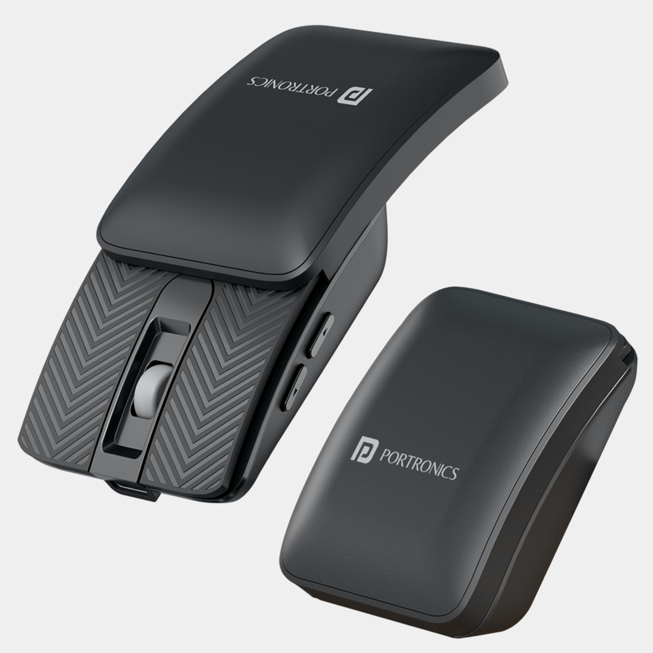
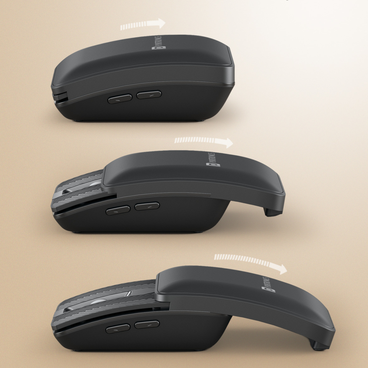
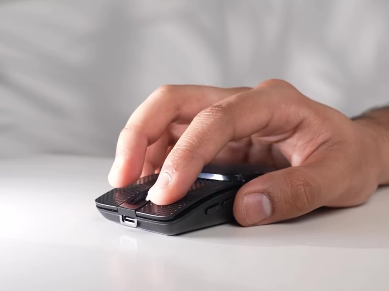
The Portronics Toad Fold approaches that directly. Rather than making a mouse smaller, it slides down in half with a magnetic snap mechanism, collapsing to a profile flat enough to slip into the same laptop sleeve as the laptop itself. At just 38g, it barely registers in a bag, and the snap closure means it doesn’t need a separate case or a dedicated compartment to stay protected during the commute.

Designer: Portronics

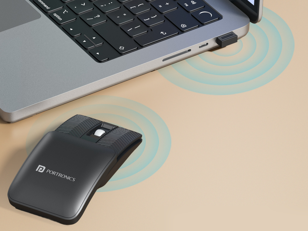
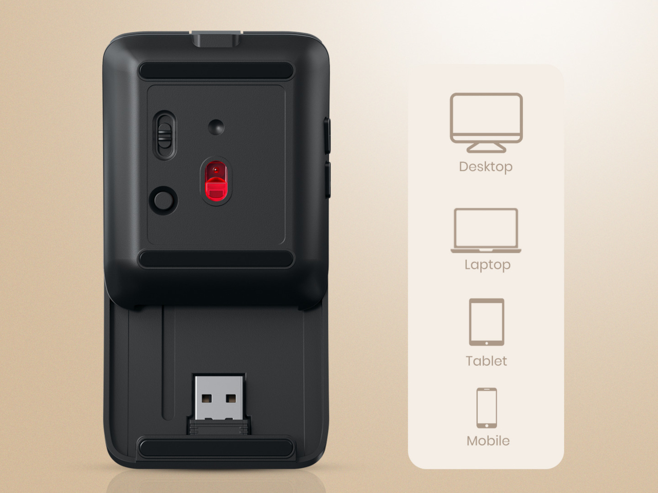
Connectivity covers both Bluetooth and 2.4 GHz wireless, and multi-device pairing allows the Toad Fold to work across several devices without swapping dongles or going through re-pairing every time. Moving from a laptop to an Android tablet becomes a matter of switching, not reconfiguring. The included USB receiver handles the 2.4 GHz side for scenarios where a stable, lag-free connection matters more than portless convenience.

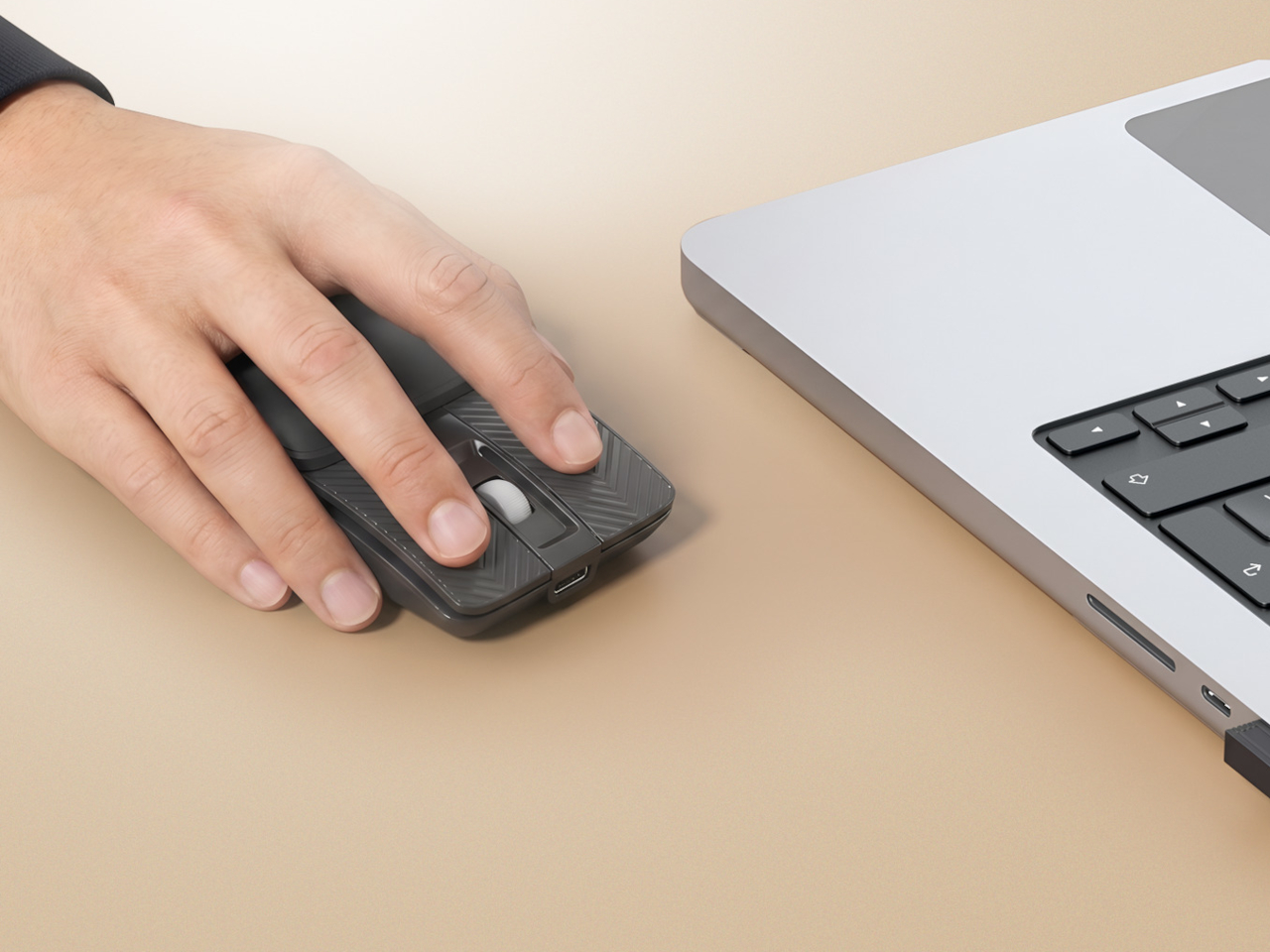
Opening the mouse reveals an ergonomic curved shape designed for extended use, with DPI adjustable up to 3,200 for precision across different tasks. The curve sits more naturally against the hand than most ultra-compact mice allow, since that category usually forces a nearly flat profile that gets tiring through long sessions. A matte black finish keeps the surface neutral and fingerprint-resistant without demanding any particular attention.

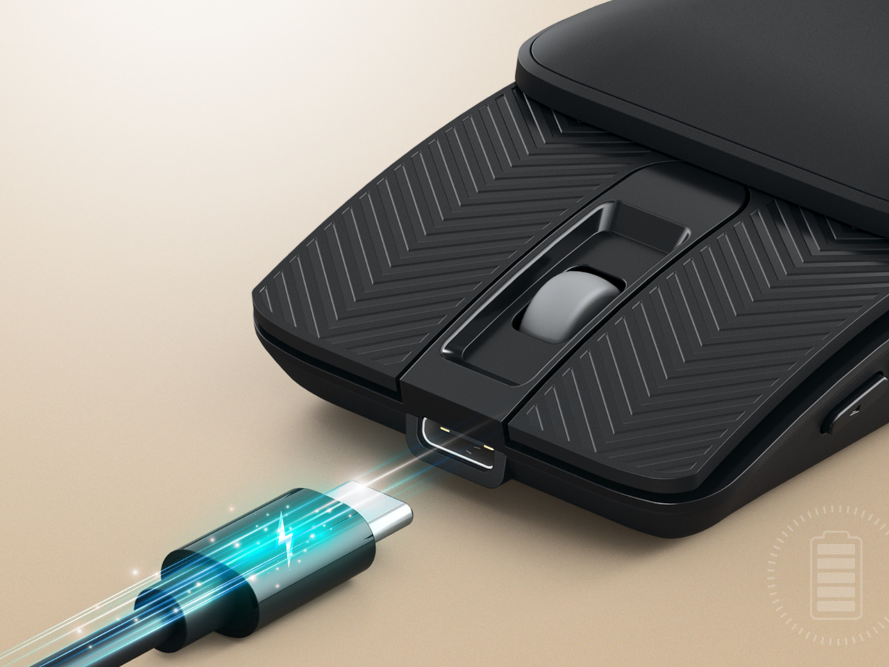
The built-in battery charges via USB-C, removing the need for replacement batteries, and an auto sleep mode stretches battery life during idle periods. That combination handles a full workday without needing to charge mid-session, which is the relevant concern for anyone moving between locations rather than sitting at a fixed desk with easy access to a charging cable at all times.

The Toad Fold is designed for a kind of worker who treats the mouse as the last thing to pack rather than the first. Students sharing library tables, remote workers bouncing between coffee shops, and professionals moving between offices all share the same friction with conventional mice, which tend to be an afterthought in bag organization despite being essential to how work actually gets done on a laptop every day.

Compatibility covers Windows, macOS, and Android, which handles most combinations of laptop and tablet a person might carry across locations. Multi-device pairing means a single mouse can stay connected to a laptop and tablet at the same time, reducing the friction of shifting between screens during a day that moves between different setups without a fixed home base. It’s a mouse built around the idea that the best portable peripheral vanishes into an existing bag without adding to the mental overhead of packing.

The post This Collapsible Mouse Is So Flat It Shares a Sleeve With Your Laptop first appeared on Yanko Design.
Heinz’s New Lid Has 3 Settings Based on Your Love Language

Ketchup people are serious people. Not in an uptight way, but in the way that they know exactly what they want: a precise drizzle over scrambled eggs, a controlled zigzag down a hot dog, or the kind of generous pour that basically constitutes a second course. Ketchup rituals are personal, and Heinz, after 157 years of watching people argue silently over the bottle, has finally decided to do something about it.

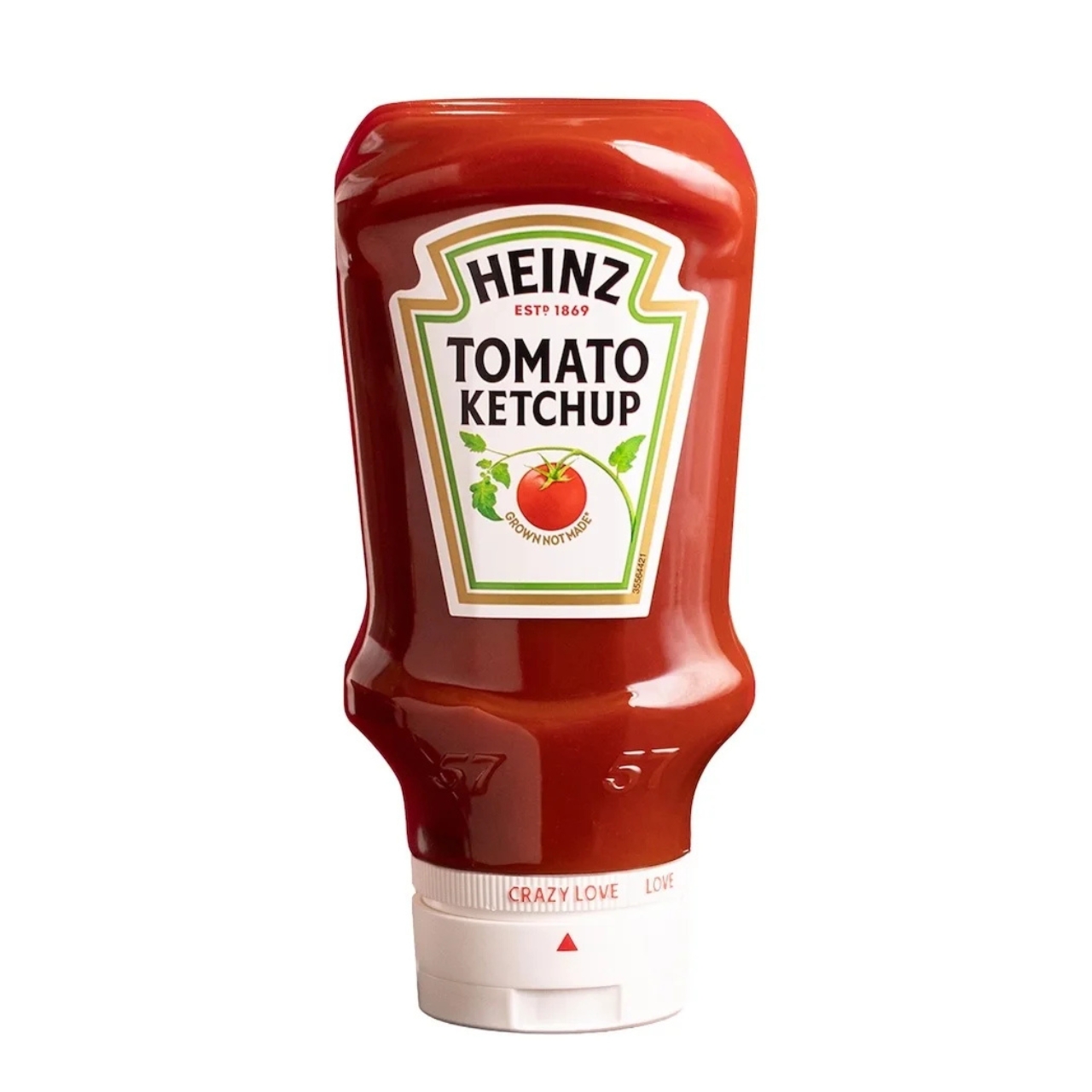
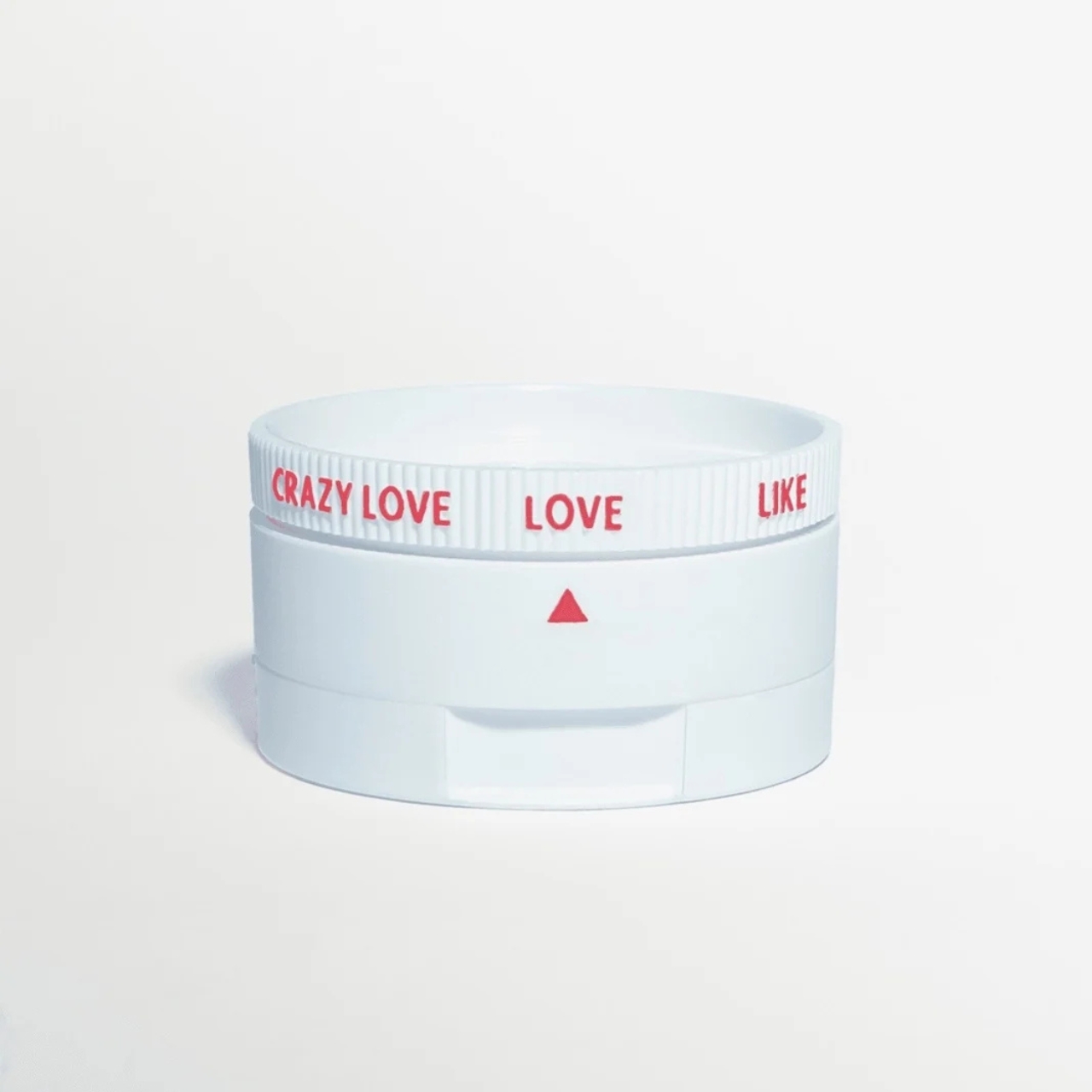
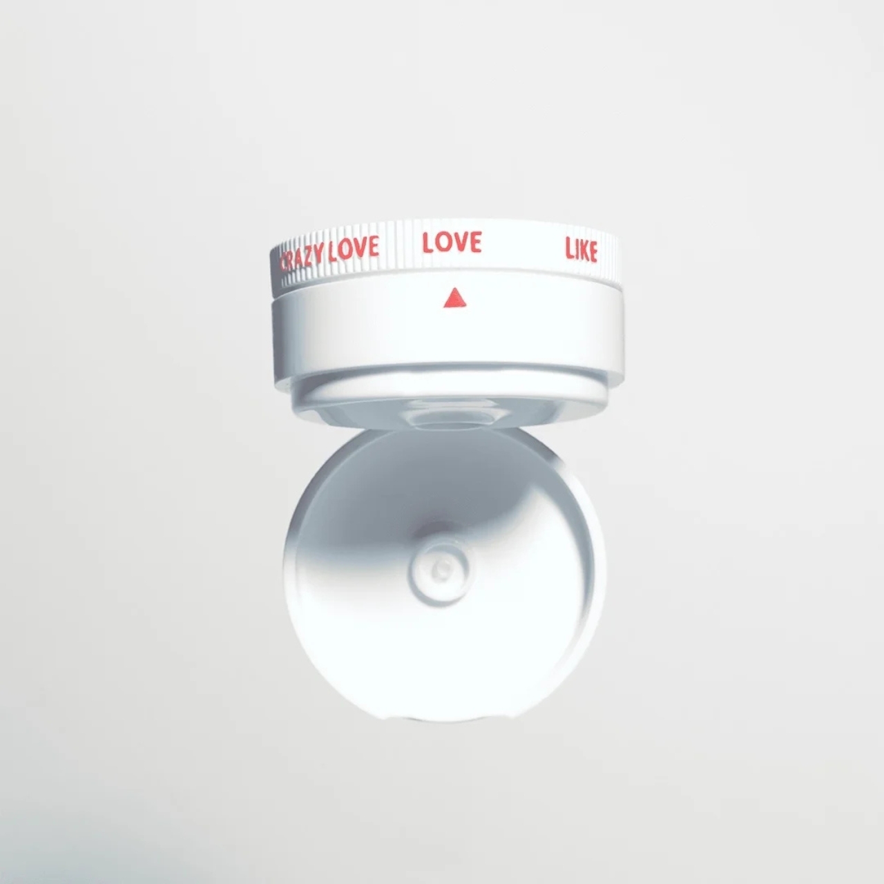
The Heinz Love Lid is a customizable ketchup lid, and yes, that is exactly as delightful as it sounds. It replaces the standard cap on any existing 20-ounce Heinz bottle and comes with a rotating dial that moves through three settings: Like, Love, and Crazy Love. Each one adjusts the flow by raising an internal core to widen the aperture, so the more love you dial in, the more ketchup comes out. It’s patented, it’s made from recyclable polypropylene, and it was developed in partnership with Beta Design Office and Wieden+Kennedy London.

Designer: Heinz

What makes the Love Lid genuinely interesting isn’t just that it’s functional. Plenty of products are functional. What makes it worth talking about is the design thinking behind the naming. “Like,” “Love,” and “Crazy Love” aren’t just cute marketing fluff; they’re actually communicating something true about how people relate to condiments. Not everyone wants the same amount, and more importantly, the amount they want changes depending on what they’re eating. A fries-and-dip situation calls for something very different from a burger situation, and treating those two moments as identical has never really made sense.

Packaging rarely gets this kind of attention. Most brands treat the cap as an afterthought, a functional necessity that doesn’t need to earn its place on the shelf. Heinz seems to have realized that the lid is actually where the entire experience lives. It’s the last thing between you and the food, the part that determines whether you’re satisfied or standing over the sink trying to salvage a plate. Getting that right is not a trivial design problem, and Heinz approached it with the same brand language it uses everywhere else. Warm, a little playful, rooted in the idea that ketchup is a love story. That coherence is what elevates this from a gimmick to a decision that actually makes sense.

The bundle is limited edition, available online during grilling season. It comes with one bottle of Heinz Tomato Ketchup, the lid itself, and a printed guide suggesting which setting to use for different foods. The guide is a nice touch. It’s the kind of thing that feels unnecessary until you’re standing at a backyard barbecue at noon in August and suddenly very grateful someone thought this through.

I’ll admit the cynic in me noticed that this is a limited run, not a permanent product shift. You can’t just walk into a grocery store and grab one, and there’s a real chance many people will never know it exists. That does take some of the wind out of the sails for a design that clearly had real engineering effort behind it. A patented two-part closure with a mechanical flow adjustment deserves more than a grilling-season window.

But the more generous read is that Heinz is testing an idea before committing to it at scale. They’ve been doing a version of this with recent packaging experiments, including the Heinz Dipper, a fry box with a built-in condiment compartment, also a limited run. The pattern suggests a brand that’s genuinely curious about where its packaging can go, not just chasing a headline. If this gets traction, it’s hard to imagine Heinz leaving it as a seasonal novelty.

Ketchup, at the end of the day, is one of the most democratic foods we have. It belongs to everyone, and Heinz has always known that its market isn’t a type, it’s a spectrum. The Love Lid is proof that they’re still paying attention to that spectrum, right down to the pour.

The post Heinz’s New Lid Has 3 Settings Based on Your Love Language first appeared on Yanko Design.
The $150 Charger That Explains Why Your Laptop Is Still at 60 Percent

Most multi-port chargers operate on faith. You plug in six devices, the indicator lights glow, and you assume everything is receiving the power it needs until something is still at 12 percent an hour later. The culprit is almost always shared output being split in ways the charger never bothered to explain, which leaves users guessing which port to prioritize and whether anything is actually charging at full speed.

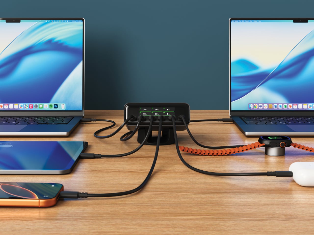
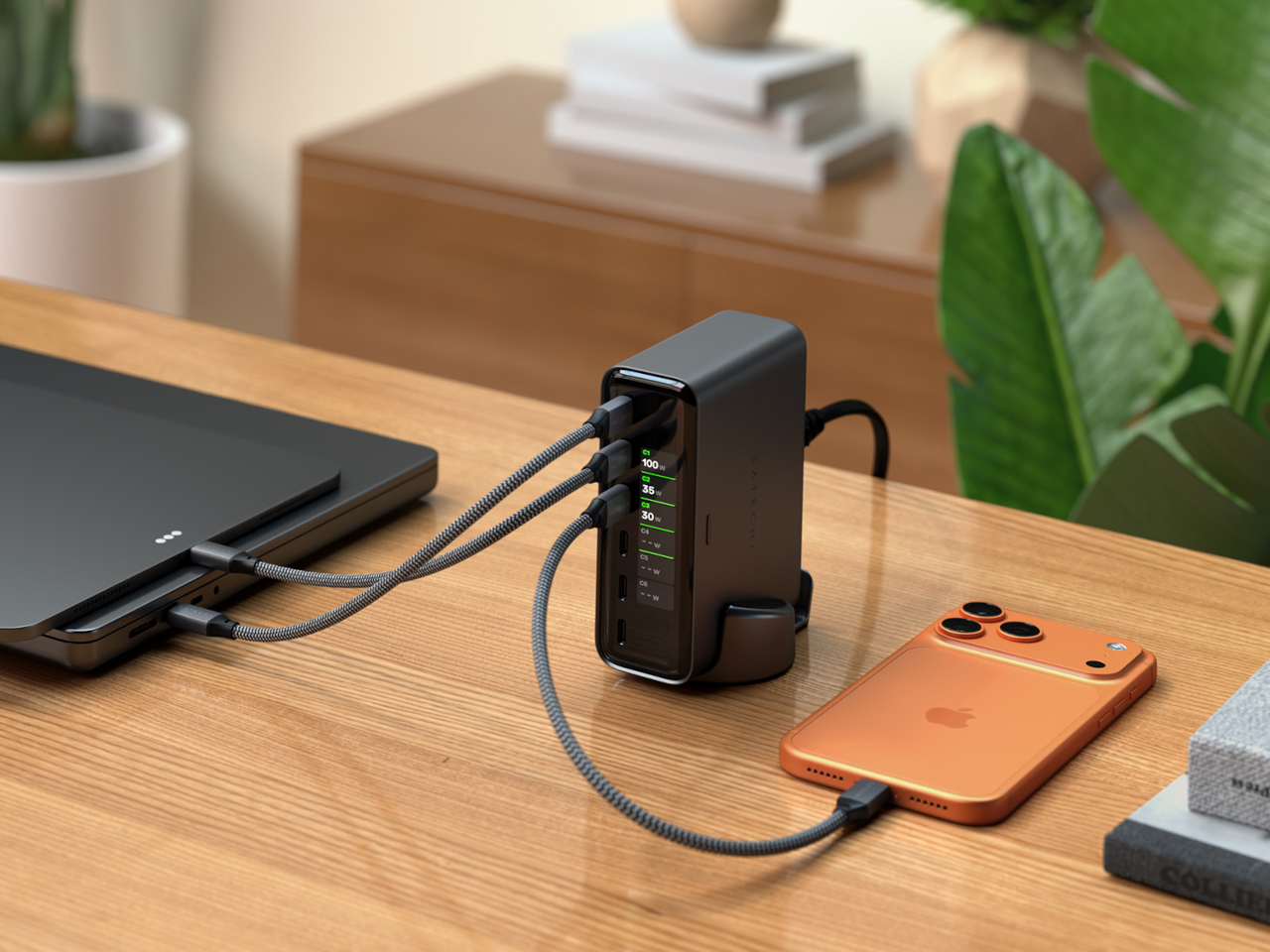
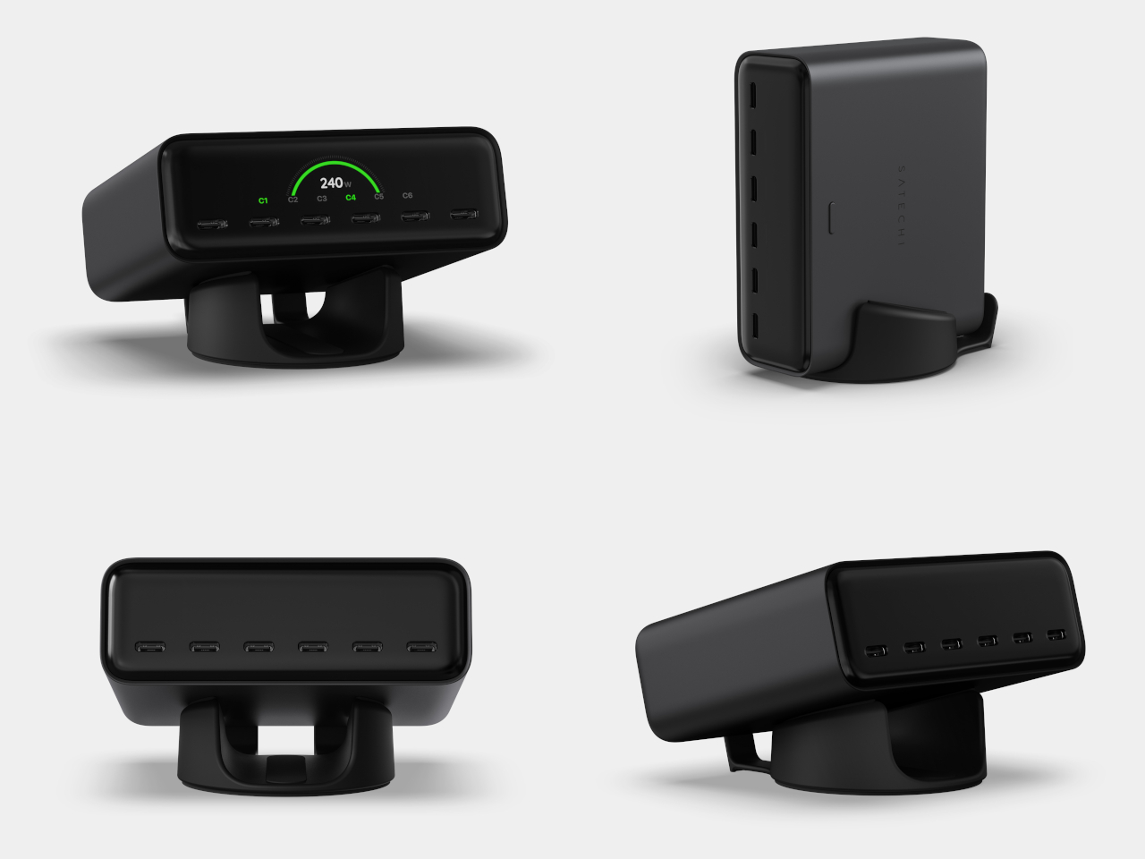
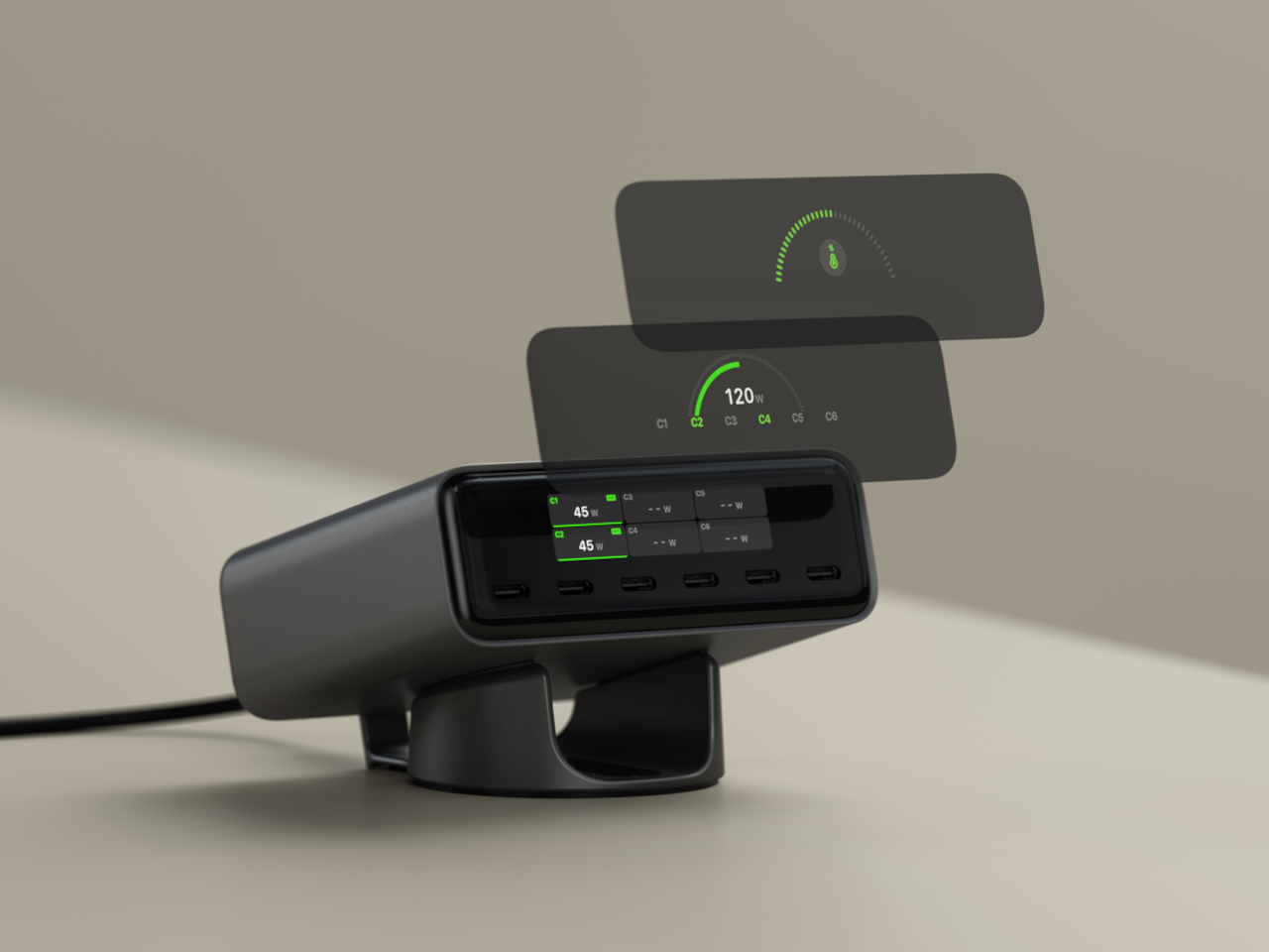
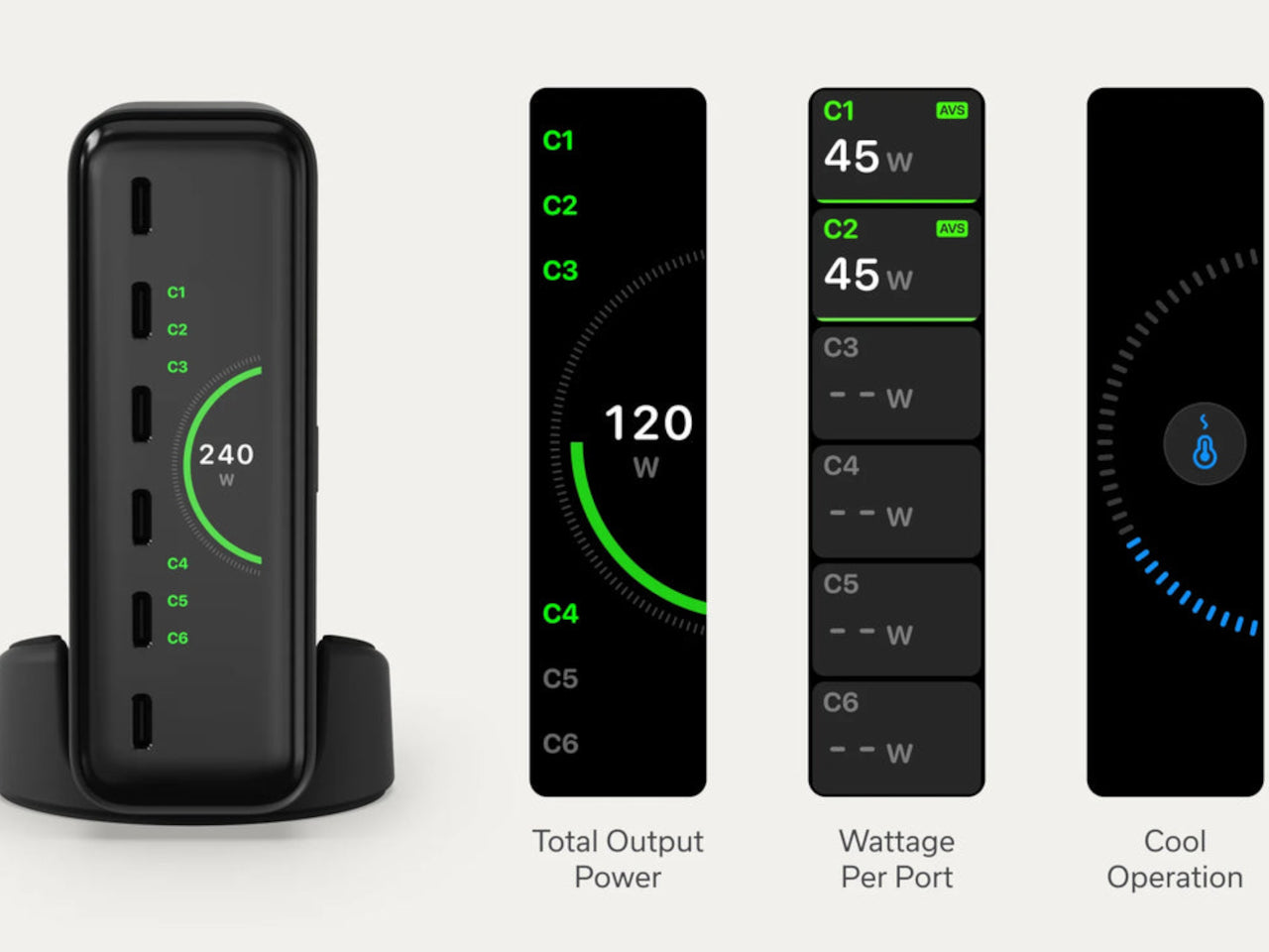
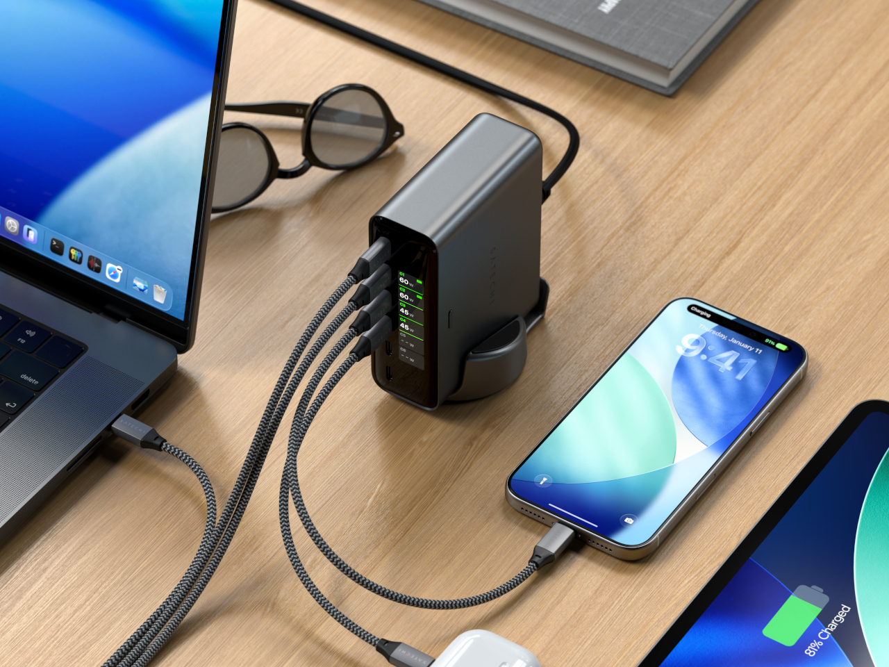
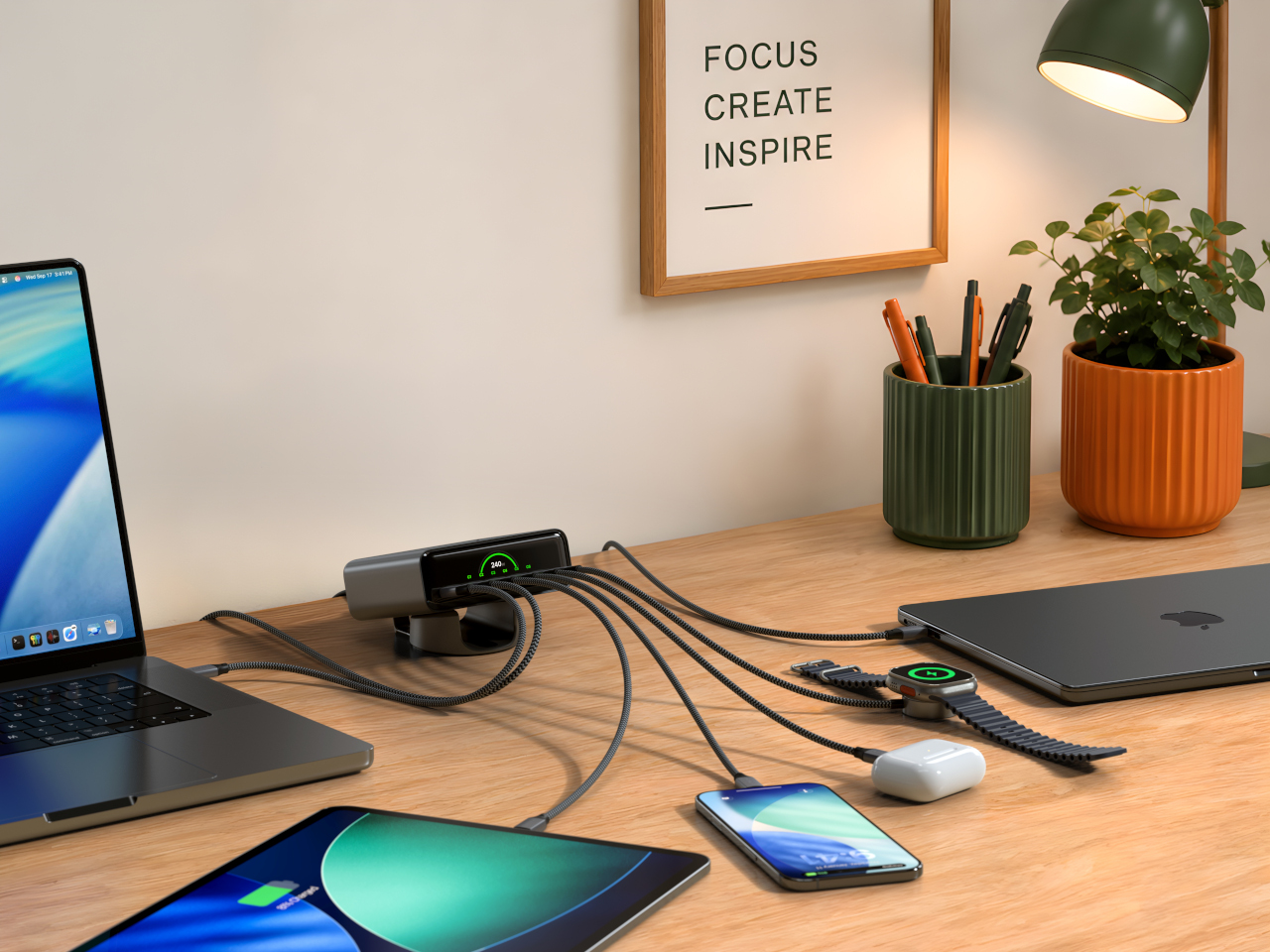
The Satechi ChargeView 240W Desktop Charger takes the guesswork out with an LCD on the front that shows live wattage readings for every port simultaneously. Plug in a laptop and see exactly how many watts it’s drawing. Add a tablet, a phone, and a pair of earbuds, and every number updates in real time. It’s a straightforward idea that most chargers, including expensive ones, haven’t bothered to implement.

Designer: Satechi

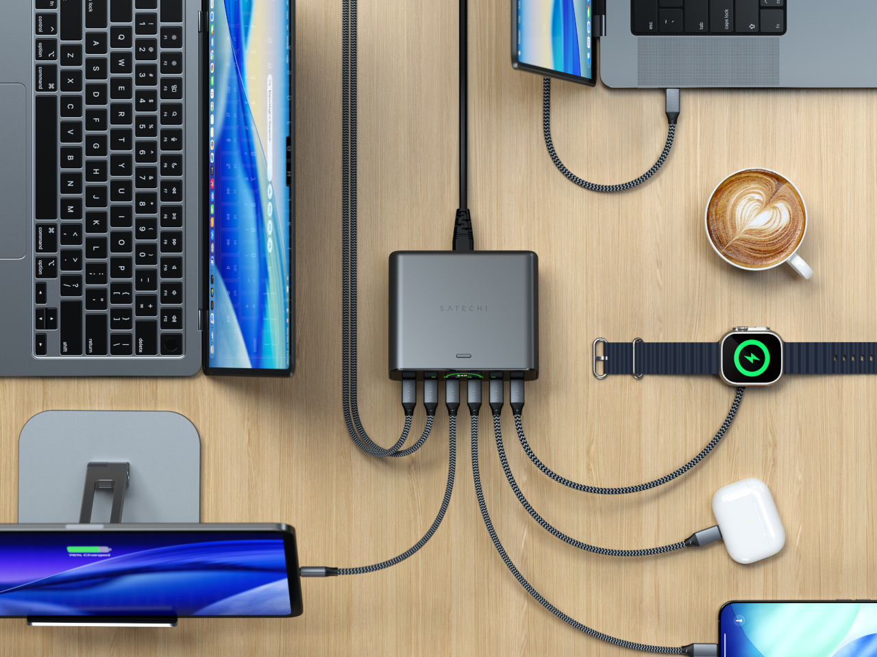
Six USB-C ports cover the range of what a loaded desk actually needs. The top two, C1 and C2, each deliver up to 140W using PD 3.2 AVS, making them capable of handling two MacBook Pros at full speed simultaneously. C3 and C4 go up to 100W each for tablets and lighter laptops, while C5 and C6 top out at 30W each for phones, earbuds, and accessories. The 240W total budget distributes intelligently across whichever ports are active.

That intelligence extends to how the ChargeView negotiates with each device. PD 3.2 AVS and PPS allow the charger and device to agree on precisely the right voltage in fine increments rather than jumping between fixed steps. In practice, that means a nearly full phone battery gets a gentle trickle rather than the same hard push used to top up a laptop from empty, which is easier on battery health over time.

The display does more than show wattage. It reads temperature across all ports simultaneously, and flags when thermal conditions shift, with the charger pulling back output before heat becomes a problem. That monitoring runs continuously without any intervention needed. The LCD auto-dims after about a minute of inactivity and wakes when a cable is plugged in, so it’s visible when useful and dark when not. The display also rotates to stay readable in either vertical or horizontal orientation, matching whichever position the included precision stand is set to.

GaN technology handles the power delivery without a fan, keeping the unit silent even when all six ports are running at capacity. At 4.3in x 3.6in x 1.5in, it’s roughly the footprint of a paperback book for something handling 240W. The Space Black metallic finish and borderless display cover sit comfortably next to darker-toned setups, and the stand’s horizontal position adds a slight forward tilt that makes the display easier to read from a seated position.
The ChargeView 240W retails for $149.99 and is covered by a two-year warranty. What this 240W charger offers that a standard multi-port product doesn’t is accountability. Every watt is visible, every device is reported, and the charger’s own thermal state is always on display. For anyone who has watched a laptop charge for two hours and wondered why it’s still at 60 percent, that kind of transparency turns out to be worth something.
The post The $150 Charger That Explains Why Your Laptop Is Still at 60 Percent first appeared on Yanko Design.