Google just announced a laptop with the worst possible name… and it’s filled with AI

Google just announced Googlebook. Not to be confused with Google Books, which is a separate Google service (even though if you search for Googlebook in Google, it autocorrects you to Google Books instead). This might just be the most frustratingly flawed naming strategy Google’s ever employed, especially after the company’s already had Chromebooks and Pixelbooks under their portfolio. It’s like Google launching a smart photo frame and calling it Googlephotos. Not the wisest idea, but once you look past the name, the laptop itself starts shaping up to raise even more questions.

Think of a laptop, but it’s just entirely AI. You know how most lower-end phones are filled with bloatware? Imagine if that bloatware was just AI everything. The OS has Gemini baked in, heck, even the cursor has AI injected into it like botox. It just feels puzzling considering not one single person I know has ever looked at a Windows laptop and gone – I need more of that CoPilot. Google somehow decided to double down on the AI aspect of the laptop experience, and I’m about to coin a word that I’d like the world to acknowledge henceforth. Google’s Googlebook might just be the world’s first ‘Sloptop’.
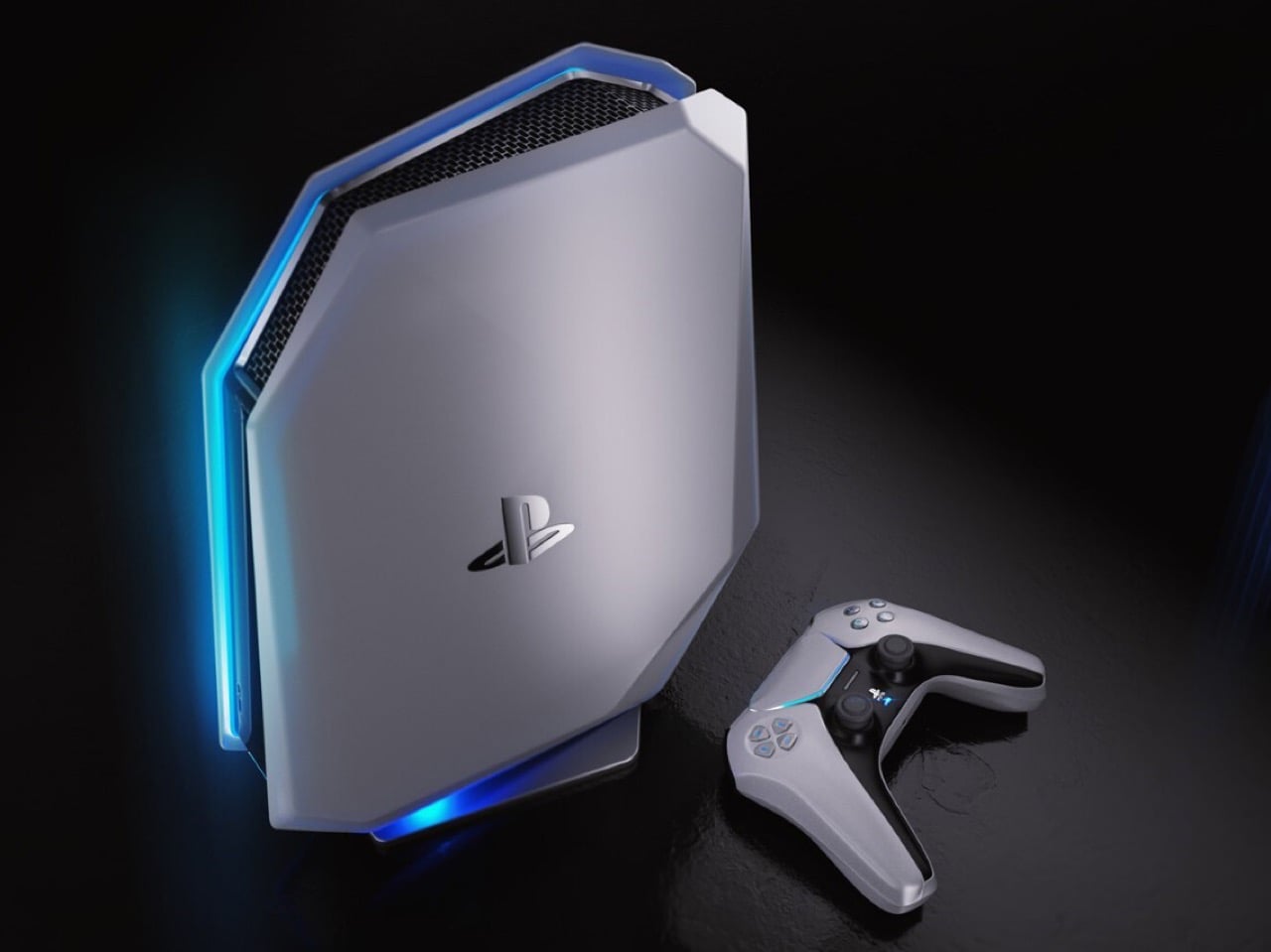
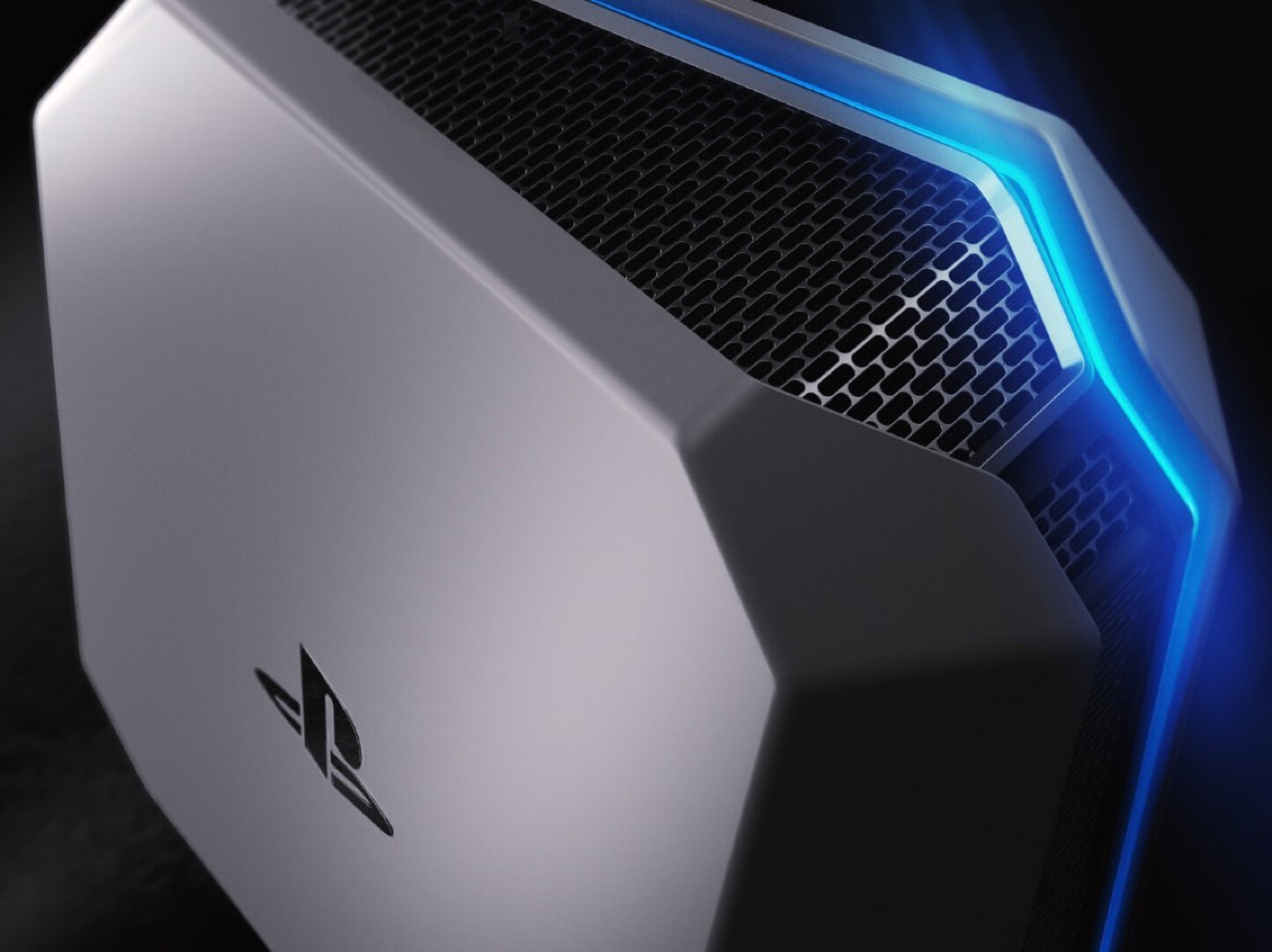
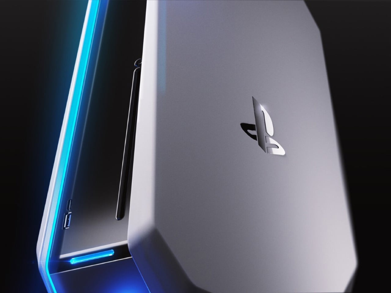
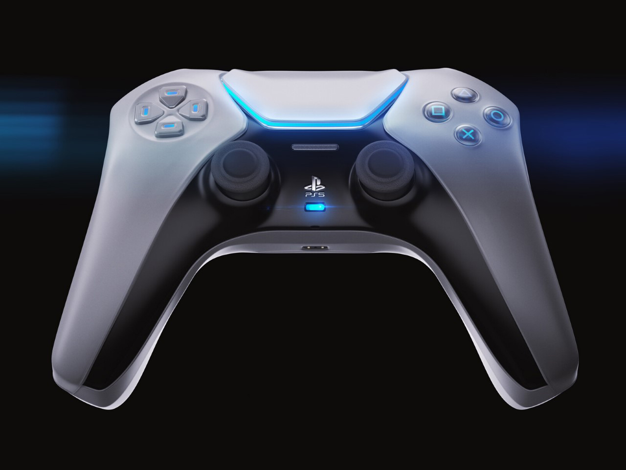
Designer: Google

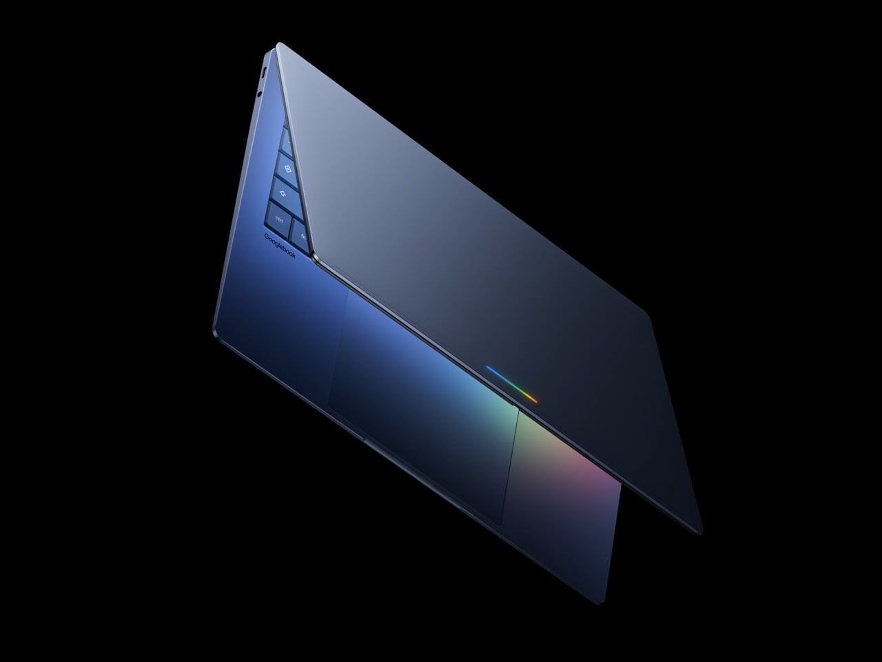
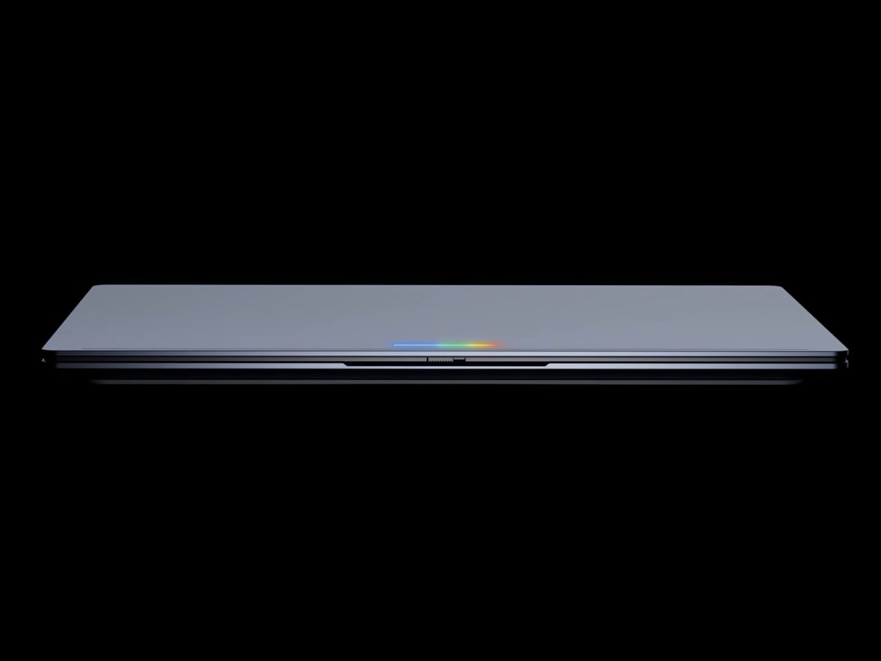
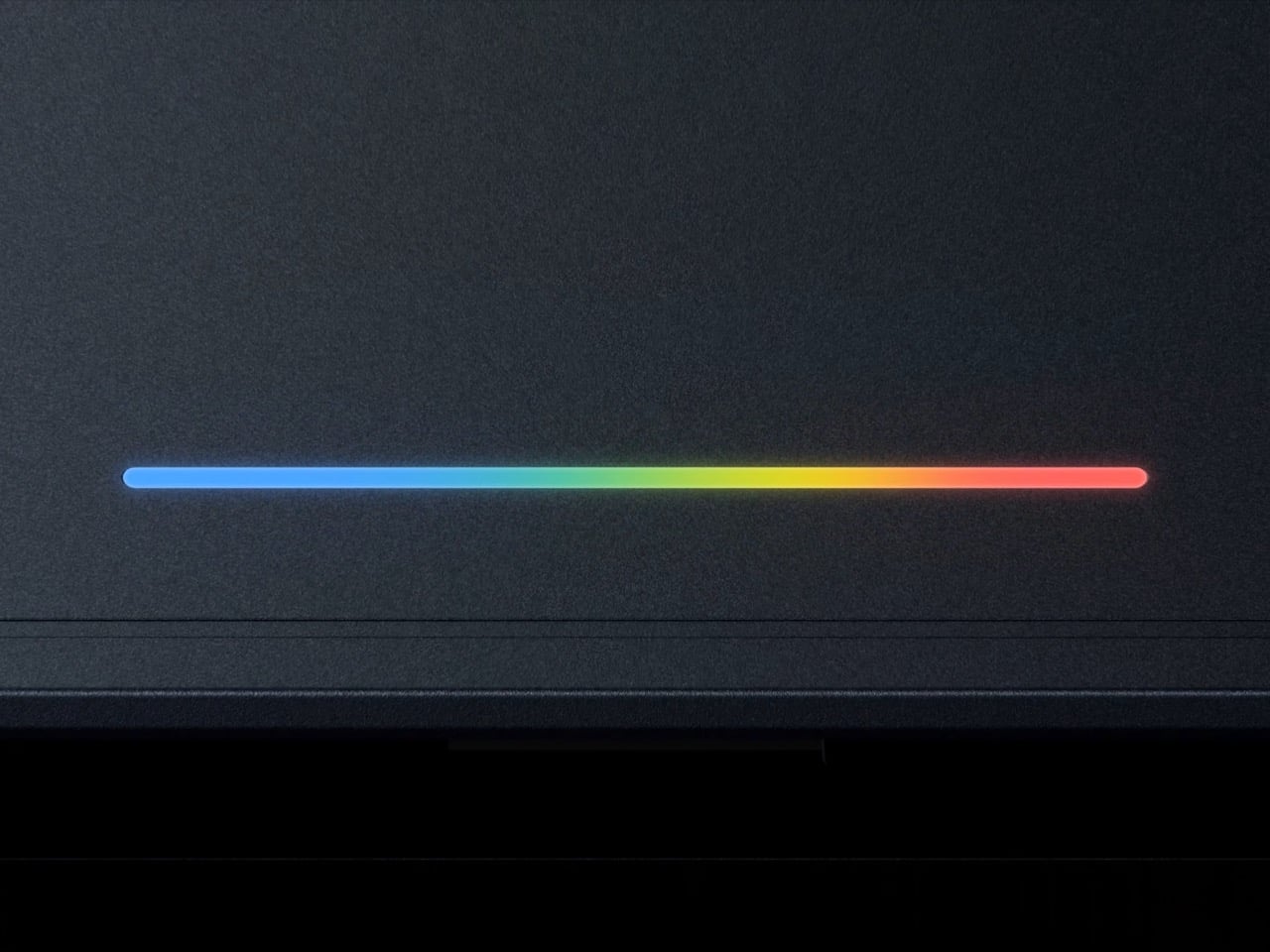
A Sloptop (combining the words Slop and Laptop) is a laptop where the selling point has nothing to do with the laptop. The hardware becomes secondary to whatever AI layer has been plastered over it, and the entire pitch is essentially “trust us, the AI makes it better.” Google describes Googlebook as laptops built with Gemini’s helpfulness at their core, designed to work seamlessly with your devices and powered by premium hardware. Premium hardware listed last, by the way. The star of the show is the Magic Pointer, a feature built with the Google DeepMind team that brings Gemini right to your cursor, offering contextual suggestions every time you point at something on your screen. You wiggle your mouse and Gemini wakes up. Which sounds exciting until you realize your Android phone has been doing exactly this for years. Google Lens already analyzes whatever is on your screen. Gemini is already in your notification bar. The Magic Pointer is functionally Google Lens wearing a blazer and billing itself as revolutionary. The jump from your phone to your laptop desktop does not constitute a new feature, it constitutes a port. Not to mention how annoyed most people will probably be while gaming or generally browsing the internet when they accidentally wiggle their cursors to only be interrupted by Gemini. If you own a mouse-jiggler for dodging workplace productivity rules, the Googlebook might just end up being your worst enemy.

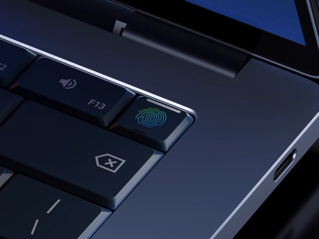
The redundancy runs deeper than just the cursor. Googlebook’s Quick Access lets you view, search, or insert your phone’s files on your laptop with no transfers needed, and you can tap a phone app directly on your laptop screen without ever leaving your workflow. Android mirroring is genuinely useful, and that part of the pitch makes sense. But Google is leading with Gemini widgets, AI-generated desktops, and a cursor that thinks for you, and all of that is already sitting in your pocket. The honest question is: if your phone handles all of this already, what problem is the Googlebook actually solving? A quick observation worth making here too, particularly for parents shopping back-to-school hardware: Google is essentially marketing a laptop that will summarize, suggest, write, and generate on demand. That’s a complicated value proposition when your kid has a history essay due Monday.

Meanwhile, the $599 MacBook Neo continues to have Windows laptop makers falling over themselves trying to build a competitor that matches its price and build quality. People are not lining up for the Neo because Apple Intelligence rewrites their emails. They’re buying it because it is a beautiful, fast, well-built machine at a price point that feels almost unfair. The lesson sitting right there on the table, waiting to be learned, is that consumers want great hardware first. The AI can come along for the ride, but it cannot be the destination.

Google seems to have missed that memo entirely, which brings up the uncomfortable question of whether Googlebook is a laptop at all, or a Gemini distribution strategy with a keyboard attached. Google hasn’t even confirmed what operating system Googlebooks actually run, though the company describes it as a modern OS designed for Intelligence that combines Android and ChromeOS. That vagueness is telling. The Pixelbook was quietly killed off. Chromebooks spent years in an identity crisis, perpetually caught between being a real laptop and a browser window with hinges. Google has a well-documented pattern of entering the laptop space with genuine ambition and then quietly losing interest, and nothing about the Googlebook announcement suggests that pattern is breaking.

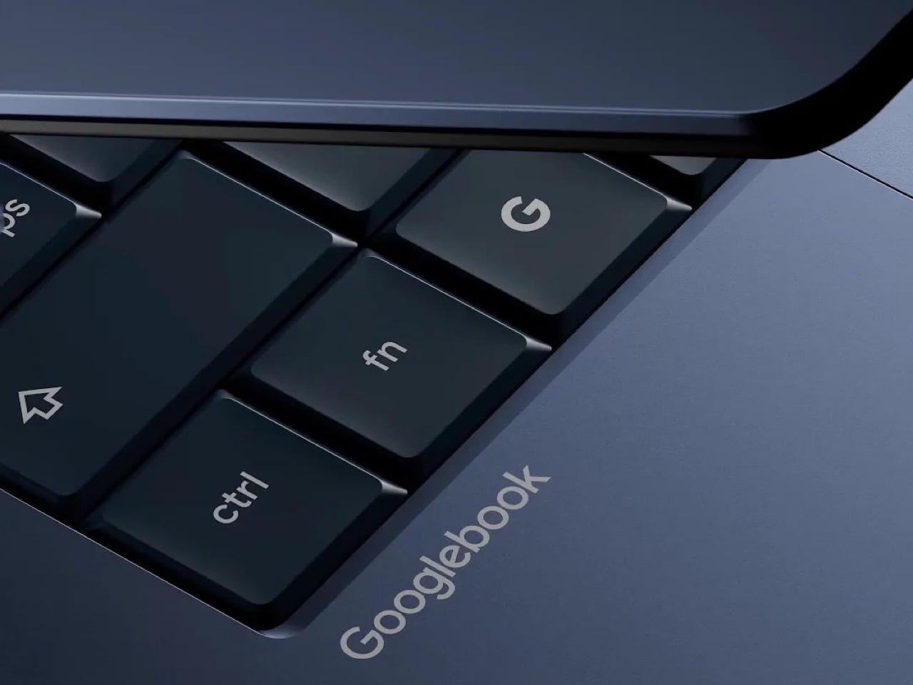
And then there’s the name. After everything above, the name somehow still deserves its own moment. Google is working with Acer, Asus, Dell, HP, and Lenovo on the first Googlebooks, which means this name is going on products from some of the most established hardware brands in the industry. Executives at those companies approved the word “Googlebook” on their machines. That’s a thing that happened. The Chromebook, for all its limitations, had a clean and descriptive name. The Pixelbook sounded premium. Googlebook sounds like what a five-year-old would name a laptop if you told them Google made it. However, I want to be proved wrong. Desperately. Google’s had such a stronghold over the Android space that it really did seem like Chromebooks would be their next magnum opus. I guess we’ll have to wait till Google I/O to get more information on this new endeavor – and hope it doesn’t hit the graveyard too soon like its predecessors.

The post Google just announced a laptop with the worst possible name… and it’s filled with AI first appeared on Yanko Design.

Tame Impala’s Kevin Parker Co-Designed a Synth So Good It’s Now a Collector’s Item

Transparency in tech has followed the classic arc of any design trend: radical, then referential, then mainstream, then meaningful. Nothing made it radical. Dozens of imitators made it referential. Beats and Casetify brought it mainstream. The interesting question now is which products use it meaningfully, where the visible internals are genuinely worth seeing, and the form of the object actually benefits from the revelation. A cheap Bluetooth speaker with a clear shell is just a clear shell. An instrument with carefully designed internal geometry, a speaker assembly, a green PCB, and ribbon cables threading between custom-designed synth hardware is something else.

That distinction is what makes the Clear Orchid: Arctic worth drooling over. Telepathic Instruments, the company Kevin Parker of Tame Impala co-founded with Ignacio Germade and a small team of music technology obsessives, has announced the fifth drop in its Orchid hardware line: a fully transparent, teal-based limited edition capped at 3,000 units worldwide, available May 11. The Orchid earned its place on TIME’s Best Inventions of 2025 list on the back of a chord-first synthesis system that separates root note, chord type, and voicing into independent controls. The Arctic edition puts all of that hardware on display and makes a visual argument that the guts of a well-designed instrument are as compelling as its sound.

Designer: Telepathic Instruments

If you haven’t encountered the Orchid before, the short version is this: where every other synthesizer on the market is built around individual notes, Orchid is built around chords. Press a key and you trigger a full harmonic voicing. Your left hand works a matrix of chord-type buttons, labeled Dim, Min, Maj, Sus, M7, 9, and a few others, while your right hand handles the keys and a large Chord Voicing encoder adjusts how those chords sit across the register. A patent-pending voicing system repositions harmonies across the equivalent of a full piano keyboard’s worth of range, far beyond what the compact one-octave keybed physically suggests. Three synthesis engines, a virtual analogue subtractive, FM, and a vintage reed piano emulation modeled on 1960s electric pianos by renowned German developer Stefan Stenzel, give the harmonic system genuine sonic depth rather than the thin, preset-cycling feel that plagues most beginner-friendly instruments. When we first covered the Orchid at launch, we described it as an “ideas machine,” a device for capturing musical intuition without requiring the theory background to justify it. That description still holds, and the Arctic edition makes it literal: you can see exactly where the ideas come from.

The transparent shell pulls double duty as both aesthetic statement and honest product communication. Look through the Arctic’s polycarbonate top and you see a green PCB laid out with visible intention, speaker grilles framed by the internal chassis, ribbon cables routed with the kind of care that only matters if someone will eventually see them. The teal-tinted base, slightly darker than the clear top, creates a subtle two-tone layering that stops the whole thing from reading as a prototype or an engineering sample. The yellow Sound, Perform, and FX knobs pop hard against the dark control surface above, the single red Bass button reads like a deliberate punctuation mark, and the OLED display at the center of the panel glows with Orchid’s skull mascot logo in a way that feels genuinely characterful rather than decorative. Telepathic Instruments clearly understood that a transparent enclosure raises the design bar: every component becomes load-bearing visually, and the Arctic clears that bar without much visible effort.

The Drop 5 release pairs the Arctic with the full launch of Pistil, Orchid’s companion VST plugin, now available on both Mac and Windows. Pistil brings Orchid’s three synthesis engines directly into any DAW, with ten new sounds in the full release, a rebuilt delay engine, and expanded fine parameter control. Existing Orchid owners get it at a discount, and standalone buyers can purchase it for $99 without the hardware. The practical implication is that the Orchid ecosystem has matured considerably since its initial 1,000-unit beta run: 12,000 units across 60 countries, placements at Abbey Road and Rue Boyer, and a featured role on Don Toliver’s Octane. Lewis Capaldi, Janelle Monáe, Fred Durst, Kid Cudi, and Diplo are all documented users. Josh Homme narrates the drop’s accompanying short film, a deadpan skewering of the creativity-guru industrial complex that is, frankly, funnier than most instrument launch content has any right to be.

The Arctic is limited to 3,000 units worldwide, with waitlist members getting priority access at 9 AM PDT for North America and 10 AM CEST for Europe on May 11, and the general public window opening an hour later. The classic Orchid colorway and the orange carry case are back alongside it. Join the waitlist at telepathicinstruments.com.

The post Tame Impala’s Kevin Parker Co-Designed a Synth So Good It’s Now a Collector’s Item first appeared on Yanko Design.

SHARPAL’s Credit Card Knife Sharpener Is the EDC Accessory You Didn’t Know You Were Missing

The most carried EDC is also, statistically, the most neglected one. Pocket knives get used daily and sharpened almost never, because the sharpening step requires a separate tool that most people don’t carry. Bench stones are too large. Pocket rods are awkward. Folding sharpeners add bulk and usually deliver mediocre results on any blade worth maintaining. The gap between “I should sharpen this” and “I have what I need to sharpen this, right now” stays wide for most knife carriers, and a dull edge is the tax they pay for it.

SHARPAL’s answer to that gap is the 113N, a sharpening stone built to credit-card dimensions so it lives wherever your cards live. The stainless steel base measures 3.5 by 2.12 inches and runs just 0.13 inches thick, making it genuinely wallet-compatible rather than merely wallet-adjacent. Industrial monocrystalline diamond abrasive is electroplated across the working face at 325 grit, a coarse cut that restores real edges rather than just polishing ones that don’t need it. A folding ring grip on the back keeps your fingers clear, and a mirror-polished reverse doubles as a signal reflector when the situation calls for it.

Designer: Sharpal Inc.

Click Here to Buy Now

Using the 113N in the field is a straightforwardly satisfying experience. The ring grip deploys with a simple fold, slipping over your middle finger and holding the card firmly against your palm while you work the blade across the surface. The contact feels authoritative in a way that smaller pocket sharpeners simply cannot replicate, because the working surface is large enough to take full strokes on a 3 or 4 inch blade without having to reposition mid-pass. The dry sharpening design means no oil, no mess, no preparation ritual, which matters enormously when you’re using it at a campsite, on a trail, or standing over a cutting board somewhere inconvenient. Steel swarf wipes off with a cloth, and the surface stays flat because there’s no hollow ceramic or soft bonded matrix to wear unevenly.

The abrasive choice separates the 113N from the pile of cheap credit-card sharpeners that populate the lower end of this category. Monocrystalline diamond means each abrasive particle is a single uninterrupted crystal structure, harder and more consistent than the polycrystalline alternatives found in bargain products. SHARPAL electroplates those crystals in nickel directly onto the stainless steel substrate, which keeps the surface flat and bonded over repeated use. The 325 grit rating places this firmly in coarse territory, 45 microns per particle, suited to reestablishing a proper edge bevel on a blade that’s gone genuinely dull. For finishing work or touch-ups on a maintained edge, SHARPAL also offers the same card format in 600 grit (114N) and 1200 grit (115N), and the three-pack of all three grits is one of the better value propositions in the entire sharpening category.

That’s just one side of the 113N, on the flip side of the abrasive knife-sharpener is a mirror-finish that has a unique feature. Any polished metal surface can redirect sunlight for emergency signaling, making it incredibly useful in a pinch. Sure, it’s not the primary reason to buy the 113N, but it’s a well-considered detail that fits the ethos of a tool designed to be carried rather than stored. The tan leather pouch included with the card completes the package in a way that feels considered rather than obligatory, protecting the abrasive face and giving the card a home inside a jacket or bag pocket.

The 113N lists for around $10 on Amazon for a single card, or $27 for a 3-pack that includes all three grits. Carrying the 113N alongside a decent folder like the Civivi Elementum or the Vosteed Vombat turns a passive carry into an active one, meaning the blade you grab in a pinch is actually sharp enough to matter. The one thing I’d love to see in a future revision is a dual-grit version with 325 on one face and 600 on the other, eliminating the need to carry two cards for a complete field sharpening session. Until then, the three-pack remains the obvious answer.

Click Here to Buy Now

The post SHARPAL’s Credit Card Knife Sharpener Is the EDC Accessory You Didn’t Know You Were Missing first appeared on Yanko Design.

The 5 Best Tech Gadgets of May 2026

May 2026 is a good time to be paying attention. Gadgets aren’t just getting faster or thinner; the best ones this month are getting more intentional. There’s a shared thread running through every standout: each was built around a real constraint, a real behavior, or a real cultural moment, rather than a spec sheet searching for an audience. Five products rose above the rest, and each earns its spot for a distinctly different reason.

From a foldable phone that demolishes the category’s $800 price floor to a Nintendo Switch add-on that turns a gaming console into a live production rig, the range here is unusually wide. What connects them is the quality of thinking underneath. These aren’t renders looking for investment. They’re real objects designed to change how you work, listen, create, and move through a day. That’s the only brief that actually matters.

1. NASA Artemis Watch 2.0

NASA’s Artemis II lifted off from Kennedy Space Center on April 1, 2026, carrying four astronauts on humanity’s first crewed lunar journey in over 50 years. CircuitMess timed the NASA Artemis Watch 2.0 directly into that cultural gravity. At $129, it’s a fully assembled, ready-to-use programmable smartwatch built around a dual-core ESP32 microcontroller, with a full-color LCD screen, accelerometer, gyroscope, compass, and temperature sensor packed into a wristband designed for anyone aged nine and up who wants more than a fitness tracker strapped to their wrist.

What makes it worth your attention is the depth it offers without demanding anything upfront. Out of the box, it pairs with iOS and Android over Bluetooth for activity tracking and notifications. When curiosity takes over, the firmware is fully open-source and reprogrammable in Python, CircuitBlocks, or the Arduino IDE. Build custom watch faces, write your own apps, and modify sensor behavior as far down as you want to go. The Artemis Watch 2.0 is one of the rarer gadgets at this price: it genuinely grows with the person wearing it.

What we like

  • Fully open-source firmware supports Python, CircuitBlocks, and Arduino, giving both beginners and experienced coders meaningful room to explore and build
  • Ships fully assembled and ready to use straight out of the box, lowering the barrier to entry without removing any of the technical depth underneath

What we dislike

  • At $129, it asks for more commitment than most impulse purchases in the kids’ tech category allow for
  • Screen performance in direct sunlight hasn’t been addressed in any available documentation

2. OrigamiSwift Mouse

Every frequent traveler has made the same quiet compromise: leave the proper mouse at home or carry something too small to work with comfortably for more than an hour. OrigamiSwift was built precisely around that problem. It’s a Bluetooth mouse that folds flat when not in use, weighs just 40 grams, and opens into full working position in under half a second. The origami-inspired form isn’t a styling exercise. It’s a structural answer to the oldest tension in portable peripherals: comfort has always cost you size.

The ergonomic shaping holds up across extended work sessions, which matters more than most product pages acknowledge. Whether you’re finalizing a presentation at an airport gate or editing documents in a co-working space, OrigamiSwift stays comfortable in your hand and disappears into a bag when you’re done. The ultra-thin profile and minimal build weight mean it never adds anything meaningful to your load. For anyone who genuinely works from wherever they happen to be, this is the mouse that finally makes sense to own.

Click Here to Buy Now: $85.00

What we like

  • 40-gram weight and flat-fold profile make it practically invisible in any bag, disappearing entirely until you actually need it
  • Sub-0.5-second activation means there’s no friction at all between being packed and being productive

What we dislike

  • Available listings don’t confirm DPI range or scroll wheel responsiveness for anyone doing precision work
  • Bluetooth-only connectivity may create compatibility friction with older desktop setups that lack wireless support

3. Ai+ Nova Flip

The foldable phone category has spent five years convincing itself that the flip experience carries a natural premium of $800 or more. Ai+ is testing that assumption head-on with the Nova Flip, launched in India at Rs 29,999, roughly $320, making it the most accessible foldable phone on the market. The inner display is a 6.9-inch AMOLED panel resolving at 2790 x 1188 pixels, complemented by a 3.1-inch AMOLED cover screen. MediaTek’s Dimensity 7300 handles processing, paired with 8GB of LPDDR4X RAM and 256GB of internal storage.

The spec list doesn’t read like a budget compromise. A 50-megapixel primary camera, a 32-megapixel front shooter, and a 4325mAh battery with 33W wired charging all hold credibly against devices at double the price. 5G, NFC, and an IP64 dust and splash rating close out a package that would feel serious in any category. The Nova Flip doesn’t just undercut the competition on price. It quietly forces a harder conversation about what the flip form factor has genuinely been worth at $1,000 all along.

What we like

  • $320 pricing opens the foldable phone experience to an entirely new audience that the category has ignored since its beginning
  • The 4325mAh battery is a genuinely surprising capacity for the flip form factor at any price point, let alone this one

What we dislike

  • The 2-megapixel depth lens reads as the weakest component in an otherwise strong and well-considered camera array
  • Long-term hinge durability at this price tier is unproven and worth tracking carefully over time

4. Akai MPC Switch

Alquemy’s Akai MPC Switch concept asks a question that feels obvious the moment someone finally puts it to you: if laptop-grade software can run on portable hardware, why can’t a capable gaming console handle serious music production? The MPC Switch is a pair of controller units designed to snap directly onto the sides of a Nintendo Switch, replacing the Joy-Cons with MIDI inputs, outputs, and a full DAW running on the console’s own screen. The control layout reflects real production workflows rather than a stylized render built for social media.

The appeal runs deeper than the novelty of the form. The concept treats the Switch as a legitimate interface surface: something you game on when you need to and produce or perform on when the moment calls for it. Swap the Joy-Cons for the MIDI setup, and you’re there. Whether Nintendo or Akai ever moves this into production is a separate question entirely, but Alquemy has made a persuasive case that the idea deserves a real answer. The best concepts don’t just look good. They make you wonder why nobody shipped it first.

What we like

  • MIDI integration and a credible DAW interface position the Switch as a serious production platform rather than a novelty peripheral
  • The Joy-Con snap mechanism makes the transition between gaming and music production genuinely seamless in concept

What we dislike

  • No confirmed production timeline means this remains aspirational, with no clear path in your hands
  • The Switch’s processing ceiling may be a real constraint for complex, multi-layer production sessions

5. StillFrame Headphones

Most headphone designs land at one of two poles: the over-ear build that announces itself before you even put it on, and the in-ear solution that disappears but gives nothing back in soundstage. StillFrame lands somewhere more considered than either. At 103 grams, it sits closer to weightless than wearable. The 40mm drivers are tuned for a wide, open soundstage that pulls spatial detail and melodic texture out of tracks that most headphones flatten into undifferentiated background noise.

Active noise cancellation closes you off when focus demands it. Transparency mode reconnects you to the room when the world around you matters more. Battery holds at 24 hours, covering a full workday, an overnight flight, and the morning after with no cable required. Switching between modes takes a single tap. StillFrame was designed around the premise that how you listen should adapt to where you are, not the other way around. That’s a harder brief to execute cleanly than it sounds, and the weight alone suggests it’s been taken seriously.

Click Here to Buy Now: $245.00

What we like

  • 103 grams is a genuinely rare achievement for an over-ear headphone carrying both ANC and full-size 40mm drivers
  • 24-hour battery life covers the kind of all-day, real-world use that most headphones in this category only claim to handle

What we dislike

  • No published information on codec support, like LDAC or aptX, for listeners who prioritize wireless audio fidelity
  • Colorway and finish options appear limited in current listings, which may be a sticking point for buyers who care about visual identity

The Only Standard That Matters Is the One You Can Feel

May 2026’s strongest gadgets share something harder to write into a spec sheet than battery life or pixel count. Each was designed around a specific friction point and resolved it with a precision that feels purposeful rather than accidental. The Artemis Watch converts a cultural moment into a learning platform. The Nova Flip resets the floor of an entire category. The OrigamiSwift solves a portability problem that dozens of mice before it never genuinely addressed.

StillFrame and the Akai MPC Switch represent opposite ends of the development spectrum, one shipping and one conceptual, but both make the same underlying argument: that considered design changes the terms of what a product is allowed to be. Whether you’re optimizing a travel bag or rethinking a music studio from a gaming console, the standard these five set is worth taking seriously. The best gadgets this month aren’t the loudest ones in the room. They’re the most resolved.

The post The 5 Best Tech Gadgets of May 2026 first appeared on Yanko Design.

This 4-in-1 Hands-free Flashlight Clips To Clothes, Snaps to Your Phone, and Stands on Its Own

A Red Dot Design Award and a $210,000 Kickstarter campaign are two very different kinds of validation. One comes from a jury of design professionals evaluating form, function, and coherence. The other comes from tens of thousands of people who looked at a product and handed over money before it shipped. SparkO, the compact wearable EDC flashlight from California’s ScoutLite, earned both. That combination suggests something specific about the object: it reads clearly to designers and solves something real for everyday people. At $45.99 and 40 grams, the barrier to entry is low enough that hesitation becomes difficult to justify.

Two photos of SparkO are enough to grasp the concept: a disc-shaped body, a silicone loop that clips and doubles as a kickstand arm, and a circular LED array wrapped in a fine prismatic lens ring. The anodized metal bezel is color-matched to whichever of the four options you pick, Forest Moss, Basalt Black, Glacier Blue, or Canyon Clay. It clips to a bag strap or jacket, snaps magnetically to a MagSafe iPhone, props upright on the optional ring stand, or rides on clothing as a hands-free wearable. That range of deployment is the whole argument for SparkO, and ScoutLite backs it with 300 lumens, three color temperatures, four brightness levels, a red light mode, CRI 95+ rendering, a 14.5-hour runtime, and USB-C charging. At a campsite, a workbench, or a dim restaurant table, the light adapts to the situation rather than demanding you adapt to it.

Designer: Ten

Click Here to Buy Now: $41.40 $45.99 (10% off, use coupon code “YK10”). Hurry, deal ends in 48-hours!

The disc form is a real departure from the cylindrical tube that has defined flashlight design for over a century. A cylinder forces you to hold it; a disc invites you to wear it, clip it, or set it down facing wherever light needs to go. The silicone loop is soft enough to flex over thick fabric and structured enough to hold position once seated, its geometry doubling as the kickstand arm when the magnetic ring base enters the picture. The circular LED face is surrounded by a concentric prismatic lens ring that distributes light broadly and evenly, borrowing visual language from photography ring lights rather than from tactical torches. That framing signals the breadth of SparkO’s intended audience: the tradesperson and the camper, but equally the commuter, the hobbyist, and the photographer working in low light.

Clipped to a chest pocket or jacket collar, SparkO illuminates whatever your hands are working on without requiring you to hold anything, which is the core use case that conventional EDC lights have historically fumbled. Snapped to the back of an iPhone Pro via the magnetic base, it becomes a fill light for close-up photography, turning a phone into something resembling a professional lighting rig for the cost of a decent lunch. The ring stand converts the same unit into a bedside reading lamp or a compact task light with a footprint smaller than a drink coaster. Each scenario calls for a different mounting method, and the transitions between them take seconds rather than a setup ritual. Four modes sounds like a marketing stretch right up until you’ve run through all of them in a single day, and then it starts to feel like the accurate count.

Three hundred lumens is the right range for a light this size: capable outdoors, tolerable at close range, and not so aggressive that it becomes a problem in tight spaces. The three color temperature options matter more than the lumen figure in daily use, covering the gap between a warm amber reading mode and a cooler beam suited to detailed work. CRI 95+ color rendering is what sets SparkO apart from most of the EDC lighting field, reproducing colors accurately enough that the light reads close to natural daylight, which makes a genuine difference for craftspeople and photographers. The red mode preserves night-adapted vision on a trail or at a campsite, a small but real addition for outdoor use. Runtime at 14.5 hours and USB-C charging put SparkO on a weekly recharge cycle with a cable it shares with everything else in a modern carry kit.

ScoutLite has built a product that lands on the right side of the three virtues the EDC community consistently responds to: compact, accessibly priced, and solving a problem the existing field handles poorly. The Red Dot Award carries credibility for an audience that pays attention to such things, while the $210,000 Kickstarter result is a harder signal to argue with, because crowdfunding backers are betting on a design that communicates its own value clearly enough that waiting feels unnecessary. At $45.99, the decision practically makes itself, especially given that the clip, the magnet, the stand, and the wearable mode collectively cover more scenarios than most EDC kits manage with multiple dedicated tools. Whether ScoutLite follows this up with accessories or a higher-output variant, SparkO sets a credible benchmark for what a wearable EDC light should cost, weigh, and do. The category has needed something this considered for a while.

Click Here to Buy Now: $41.40 $45.99 (10% off, use coupon code “YK10”). Hurry, deal ends in 48-hours!

The post This 4-in-1 Hands-free Flashlight Clips To Clothes, Snaps to Your Phone, and Stands on Its Own first appeared on Yanko Design.

Sony’s PS6 Could Triple the PS5’s Power. It Could Also Cost $800 and Land in 2029

Seven years is a strange unit of time. Long enough to finish a PhD, short enough to remember an event vividly, and apparently, exactly long enough for Sony to build, test, manufacture, and ship a new generation of PlayStation hardware. PS3 to PS4, PS4 to PS5: seven years, twice, with the precision of a Swiss movement. The console industry built its entire release calendar ecosystem around that cadence. Publishers scheduled their biggest titles around it. Retailers planned inventory cycles for it. Analysts forecast revenue curves based on it. So the news that Sony has not yet decided when the PS6 will launch, with Bloomberg and MST International both pointing toward 2028 at the earliest (if not 2029), carries weight well beyond a single product launch.

The culprit is DDR7 memory, or more precisely, the catastrophic shortage of it, as AI data centers absorb the global supply of high-bandwidth RAM faster than Samsung, SK Hynix, and Micron can produce it. One year of delay sounds manageable until you zoom out. GTA6, announced in December 2023 for a 2025 launch, has been publicly delayed three separate times and is currently targeting November 2026, with bettors still skeptical. Beyond the Spider-Verse slipped from March 2024 to June 2027, a three-year crater in the release calendar of one of the most acclaimed animated franchises in history. Apple is formally retiring the single annual iPhone event in favor of a split premium-then-standard cadence. The PS6 delay is a symptom of something structural, and the structure is bending.

Image Credits: Latif Ghouali

The memory crisis at the root of Sony’s problem is unlike previous supply chain disruptions in one important way: it is being driven by a competitor class that simply outclasses consumer electronics on every financial dimension. Samsung, SK Hynix, and Micron have made a calculated pivot toward high-bandwidth memory for AI accelerators, with demand expected to grow 70 percent year-over-year in 2026 alone. Meanwhile, Alphabet and Amazon have announced capital expenditure plans of roughly $185 billion and $200 billion respectively this year, among the largest in corporate history, further intensifying competition for advanced memory. Sony is not losing a bidding war. It is sitting in a market that has structurally reorganized around different priorities, and the PS6 is waiting at the back of a very long, very expensive queue.

Sony President and CEO Hiroki Totoki addressed the uncertainty directly at the FY2025 earnings briefing, saying through a translator: “We have not yet decided on at what timing we will launch the new console, or at what prices. So we would like to really observe and follow the situation.” That is an extraordinary statement from the head of one of the most strategically disciplined hardware companies on the planet. Sony does not typically observe and follow. It plans, announces, and executes. The fact that Totoki’s language sounds more like a macroeconomist reading a volatile market than a product chief managing a launch calendar tells you everything about how abnormal this moment is.

The hardware itself, when it arrives, looks genuinely transformative. Leakers and supply chain sources indicate Sony awarded the PS6 chip contract to AMD back in 2022, with the console expected to feature a custom Zen 6 CPU and RDNA 5 GPU architecture, targeting roughly triple the PS5’s rasterization performance with 4K gaming at 120 frames per second and advanced ray tracing. A companion handheld codenamed Project Canis is reportedly riding alongside the main console as part of a unified two-device platform strategy, which would represent the most significant structural shift in PlayStation’s hardware philosophy since the PS3’s disastrous Cell processor gamble. The specs, in other words, are not the problem. The atoms are.

The delay also arrives at a peculiar competitive moment. If supply chains stabilize by 2027, Sony could target a late 2028 launch with multiple SKUs and the handheld companion. If shortages persist, the PS6 could slip to 2029 or beyond, risking market momentum loss to rivals. Microsoft has been conspicuously quiet about its own next-generation plans, and a scenario where Xbox gets to market first, even with a smaller install base, would hand the competition a narrative advantage that Sony has not faced since the PS3 era. As of early April 2026, prediction markets showed only about 25 percent probability that Sony would announce the PS6 before 2027. The crowd is not optimistic.

What the PS6 situation actually exposes is the fragility of product cycles that have been treated as laws of nature rather than engineered outcomes. GTA6 has been delayed not once or twice but three times since its December 2023 reveal, bouncing from a 2025 window to May 2026, then to its current November 19, 2026 target, with Take-Two CEO Strauss Zelnick deploying identical “we feel really good about it” language each time a new date was announced. Beyond the Spider-Verse, a sequel to a film that grossed $690 million and earned a near-universal critical consensus as a generational achievement in animation, has been pushed from March 2024 to June 2027, a three-year gap that would have been unthinkable for a franchise at that level of commercial and artistic momentum. And Apple, the company that arguably invented the modern product launch as cultural event, is now formally splitting its iPhone releases across a fall premium window and a spring standard window, with Mark Gurman reporting the expectation that this pattern continues for years to come. Clockwork, everywhere, is slipping.

Sony will ship the PS6. The hardware is real, the AMD partnership is locked, and the performance targets are serious enough to make the wait feel justified when the box finally lands on a shelf. But the seven-year cycle, that beautiful, reliable, industry-organizing drumbeat, is not coming back on its original terms. The PS6 will arrive when the memory market allows it, which is to say when AI infrastructure spending pauses long enough for consumer electronics to get a turn. That is a sentence that would have read like science fiction in 2020, when the PS5 launched on schedule into a pandemic and sold out globally within minutes. The world has reorganized itself around different priorities. The PlayStation, for the first time in a long time, has to wait in line like everyone else.

The post Sony’s PS6 Could Triple the PS5’s Power. It Could Also Cost $800 and Land in 2029 first appeared on Yanko Design.

This Sculptural Glass Object Makes Flowers Feel Like a Van Gogh Painting

There is something instantly familiar about patterned glass. We have seen it in old windows, cabinet doors, bathroom partitions, and quiet corners of homes where privacy and light needed to exist together. It is a material that usually stays in the background, doing its job quietly. With Violet Frosted, designer Marius Boekhorst brings that overlooked material forward and turns it into something sculptural, expressive, and quietly poetic.

At its heart, Violet Frosted is a geometric glass object that plays with flowers, light, color, and texture. What makes it interesting is the way it changes how we see what is placed behind it. The frosted, patterned glass softens the flowers, turning bright petals and stems into blurred fields of color. A flower becomes a shadow, a brushstroke, a violet glow, or a faded green line depending on where you stand.

Designer: Marius Boekhorst

That is where the charm of the piece begins. Instead of presenting flowers directly, Violet Frosted filters them. It creates a gentle distance between the viewer and the arrangement. That distance makes you look closer. It asks you to slow down and notice how color shifts through glass, how a shape becomes unclear, and how something ordinary can feel painterly when it is partly hidden.

In many ways, Violet Frosted feels like a still life painting brought into the real world. Traditional still lifes capture flowers in one fixed composition, frozen in paint and time. This piece lets the still life move. The flowers change as they bloom and fade. The light changes throughout the day. The view changes as you move around it. From one angle, the arrangement may feel bold and graphic. From another, it becomes soft, quiet, and almost dreamlike.

The design feels especially beautiful because it does not try too hard. It avoids excess decoration. The form is clean and almost architectural, while the patterned glass gives it warmth and character. It feels contemporary without losing the memory of where the material comes from. That balance between old and new gives the piece its quiet confidence.

Violet Frosted also carries a museum-like feeling, though it never feels precious or untouchable. It brings the mood of a gallery into everyday space. A table, shelf, or windowsill suddenly feels more considered. A simple floral arrangement becomes an experience. You are looking at flowers through atmosphere, texture, and light.

Violet Frosted reminds us that design does not need to shout to stay with us. Sometimes, the most memorable objects are the ones that shift how we see familiar things. By turning patterned glass into a living frame, Marius Boekhorst creates a piece that sits between a vase, a sculpture, and a painting. It is functional, emotional, and deeply visual. It holds flowers, and it holds a moment.

The post This Sculptural Glass Object Makes Flowers Feel Like a Van Gogh Painting first appeared on Yanko Design.

Kohler’s Smart Shower Purifies and Recirculates up to 80% of Water per Shower

For a decade, the smart shower category was essentially a thermostatic valve with an app stapled to it. Not particularly useful unless you consider “Hey Alexa, switch on my shower” to be the pinnacle of smart home automation. Essentially, the water itself still ran the same path it always had: supply line, showerhead, drain, gone. Kohler’s Anthem EvoCycle, announced February 2026 and shown live at KBIS, is the first product from a major fixture brand that questions what a smart bathroom should be. The answer? Something more than a voice-activated or app-controlled shower. Something more like a shower that recycles 80% of its water every time you bathe.

The magic lies in your bathroom’s subfloor. The EvoCycle’s recirculation loop lives 4.5 inches below your shower base in a purpose-built receptor sump, paired with a pump, an ozone sanitation system, and a closed filtration loop that processes your shower water and sends it back through the showerhead mixed with 0.5 gallons of fresh water per cycle. Kohler’s claim is 80% water savings at full flow pressure, and the design work required to make that claim feel like a regular shower experience instead of a sustainability-driven compromise is perhaps the most interesting part about this entire product’s UX.

Designer: Kohler

The system runs in two modes. Standard Mode is exactly what it sounds like: fresh water, normal shower, nothing unusual happening. Cycle Mode is where the engineering earns its keep. Once activated, the system fills the subfloor reservoir, then begins running that water through a closed filtration loop while continuously mixing in fresh input. The result hits the showerhead at full pressure, which matters enormously because the biggest psychological hurdle any recirculating system faces is the moment the flow drops and you suddenly become very aware that something unconventional is happening beneath your feet. Kohler clearly stress-tested that experience, because maintaining full pressure wasn’t a given. Orbital Systems, the Swedish company that pioneered residential recirculation technology from aerospace-derived origins, solved the same problem at roughly $3,995. Kohler’s full system comes in at $5,625 for the smart shower hardware alone, with the receptor base and installation on top of that. The price delta is smaller than you’d expect, but Kohler brings something Orbital never had: contractor relationships, showroom presence, and a brand name that appears on spec sheets without requiring an explanation.

The sanitation story is where the hidden complexity really accumulates. Recirculated shower water is only as good as what’s been done to it between uses, and Kohler’s answer is ozone. The system runs an automated Rapid Clean ozone cycle after every single shower, no pods, no chemicals, no user action required. A monthly Deep Clean cycle goes deeper, and the receptor filter pulls out for a dishwasher run. That maintenance architecture was clearly designed for the person who will never read a manual, which is essentially everyone. The Kohler Konnect app handles remote start, temperature control, water usage tracking, and cleaning cycle management, so the whole system is accessible without ever touching the wall-mounted digital control panel.

There are five receptor size options ranging from 48 by 32 inches up to 60 by 42 inches, left and right drain configurations, and four finish choices: Vibrant Brushed Moderne Brass, Polished Chrome, Matte Black, and Vibrant Brushed Nickel. The system is also compatible with any Kohler showerhead or rainhead, so you’re not locked into a specific spray experience. What you are locked into is the construction timeline. The subfloor cutout has to happen during the building or renovation phase, which means this is a conversation you have with your contractor before the concrete goes down, not after. For luxury new builds and serious bathroom renovations, that’s a manageable constraint. For anyone hoping to retrofit an existing shower over a weekend, it isn’t.

That construction dependency is also, in a strange way, the product’s strongest design statement. Kohler built something that requires genuine commitment, a system that can’t be undone with a screwdriver and an afternoon. The smart shower category spent a decade adding features you could turn off. The EvoCycle is a feature you build your bathroom around.

The post Kohler’s Smart Shower Purifies and Recirculates up to 80% of Water per Shower first appeared on Yanko Design.

Galaxy S26 Ultra Buried the Note’s Boxy Soul, and Fans Are Split

The race to make flagship phones thinner, smoother, and more visually unified has become one of the defining stories in premium smartphone design. Hard angles and bold silhouettes that once gave each model its own character have been quietly traded for softer frames and tighter lineup coherence. It’s a direction that makes these phones easier to hold and sell, but not always easier to tell apart.

The Samsung Galaxy S26 Ultra, which hit shelves on March 11, 2026, fits squarely into that movement. Samsung pushed the chassis below 8mm for the first time on any Ultra, trimming it down to 7.9mm. Add to that a softer corner radius, an Armor Aluminum frame, and an anti-reflective Privacy Display, and it starts to feel like something more deliberate than a routine generational update.

Designer: Samsung

To understand why that matters, it helps to remember where the Ultra came from. When Samsung discontinued the Galaxy Note in 2021, it didn’t retire the design language that defined it. The Note’s boxy corners, flat sides, and upright proportions migrated into the Ultra line, giving those phones a distinctly tool-like character. The Ultra felt like a device built for serious use, and its shape made that clear.

Galaxy S25 Ultra

Galaxy S26 Ultra

The Galaxy S26 Ultra leaves most of that behind. Samsung rounded the corners, softened the edges, and made the phone look far more like the standard Galaxy S26 and S26+ than any Ultra model before it. That visual coherence is good design management, but it’s also the moment the Ultra stops looking distinctly like its own thing. It’s harder to spot in a lineup now.

Galaxy S25 Ultra

Those softer edges do make a real difference in how the phone sits in the hand over a long day. When you’re scrolling through a document or holding the device on a commute, the rounded frame distributes pressure more evenly across the palm. The 7.9mm chassis also disappears into a pocket more gracefully than its predecessor, which sounds minor until you realize how often you actually notice it.

Galaxy S26 Ultra

With the silhouette doing less visual heavy lifting, Samsung shifted the premium story into the surface itself. The Armor Aluminum frame carries the finish more evenly from back to edge, giving the phone a cleaner look that doesn’t need dramatic geometry to feel expensive. The anti-reflective Privacy Display adds a different kind of thoughtfulness, letting you check sensitive messages or browse in public without worrying about prying eyes.

What really puts the 7.9mm figure in perspective is the competition. The iPhone 17 Pro Max measures 8.75mm thick, and while a 0.85mm difference might not sound dramatic on its own, the context here matters quite a bit. Samsung is fitting a built-in S Pen into a phone that still comes in thinner than Apple’s stylus-free flagship, which is an engineering tradeoff worth acknowledging.

iPhone 17 Pro Max

What makes this shift more significant is what it says about Samsung’s intentions for the lineup as a whole. The Galaxy S26, S26+, and S26 Ultra now share the same curvature and visual language for the first time. That’s Samsung quietly admitting that the Ultra doesn’t need to look like a separate category; it’s a flagship, not a relic from a discontinued line.

Two months after launch, the Galaxy S26 Ultra’s design verdict has had time to settle, and the conversation is genuinely split. There’s something complete about how it all comes together now, smoother, thinner, and more coherent. The S Pen remains, but the body no longer insists on its Galaxy Note roots. Whether that reads as maturity or loss probably depends on how long you’ve been following the Ultra.

The post Galaxy S26 Ultra Buried the Note’s Boxy Soul, and Fans Are Split first appeared on Yanko Design.

7-in-1 Titanium Ruler That Draws Perfect Circles, Measures Angles, and Works as a Caliper. Yes, Really.

EDC and stationery have been moving closer together for years. Pens became precision objects. Rulers became desk jewelry. Pocket tools started borrowing the language of industrial design, while analog work tools picked up the portability and finish standards of everyday carry. Somewhere in that overlap, products began chasing a sharper balance between usefulness and desire.

UnioArc feels tailored for that exact overlap. It carries the visual language of titanium EDC, but its purpose lives firmly in the world of measurement, drawing, and layout. That combination gives it an immediate hook. It speaks to the person who keeps a notebook close, notices edge quality, values compact gear, and wants a tool that can move from workbench to sketchbook to shirt pocket without feeling out of place.

Designer: TiBang

Click Here to Buy Now: $55 $95 (42% off). Hurry, only a few left! Raised over $85,000.

Seven measurement and drawing functions collapse into a single folding titanium ruler. Closed, it measures 145mm, roughly smartphone length. One motion releases the magnetic lock, the sleeve joint clicks straight, and it extends to 295mm for full A4 coverage. No sliding mechanisms. No multi-step deployment. The transformation happens edge to edge, from zero to full length in a single click. Three scales cover metric, imperial, and a dedicated millimeter track. All markings are laser-engraved into the titanium surface, which means they will never fade, peel, or rub off. The zero point starts right at the tip, eliminating offset math when measuring depth or inserting the edge into tight spaces.

A 0.5mm recessed groove runs along the bottom edge. It catches a pen tip, holds it stable, and lets you mark immediately after measuring. That same groove improves grip when you’re holding the ruler at an angle or cutting against it. The flat middle edge guides craft knife blades flush against the surface for clean cuts without wobble. The top edge carries a 25-degree bevel to reduce glare and improve readability under direct light. Three edge profiles, three distinct jobs, one continuous form. This kind of multi-layer thinking shows up throughout the design, where individual features earn their place by doing multiple things well instead of one thing adequately.

Precision compass holes span 140mm in 10mm increments. Insert one pen through a hole near the pivot (the sleeve joint), insert another at the desired radius, and draw smooth circles from 10mm to 140mm diameter. No center puncture. No damaged paper or leather. Swap the stylus pen for a craft knife and you can cut perfect circles in paper, thin materials, or vinyl without leaving a center mark. For woodworkers and leather crafters, this solves a persistent workflow annoyance. A full 180-degree protractor sits engraved at 5-degree increments. Need to mark 35 degrees? 55 degrees? Read it directly, no interpolation required. A 90-degree quick-check corner handles faster right-angle verification. A small arrow indicator simplifies complementary angle reading: subtract the arrow-aligned angle from 180 degrees and you have the answer without rotating the tool or doing mental math.

Fold the ruler to 90 degrees, align the reference line with your scale, and set any spacing you want for parallel lines. The arms lock into a true right angle with no wobble or drift as you move across the page. For architectural sketches, textile patterns, or technical drawings, this turns a multi-tool task into a single-ruler operation. The locking mechanism holds firm enough for consistent spacing across long runs. The same two arms that handle linear measurement also slide apart while staying parallel, clamping around boards, straps, or stock to give direct thickness readings. It functions like a simplified caliper without requiring a separate tool. In workshops or on job sites where you need quick material checks, this compresses another measurement step into the same instrument you’re already holding.

No screws hold the sleeve joint together. No washers. Nothing to tighten or maintain. Resistance comes from precision fit between machined titanium surfaces. The two arms slide into each other and lock at 180 degrees with zero gap, zero step, zero play. That interlocking geometry prevents the common folding ruler problem where pen tips drop into gaps or lines skip at the hinge. The transition from one arm to the next reads as seamless. This is critical because any interruption in the edge breaks the flow when you’re drawing continuous lines or cutting long paths. TiBang solved it by making the joint itself part of the measurement surface instead of treating it as a hinge that happens to sit between two rulers.

Grade 5 Titanium throughout, CNC-machined from solid stock rather than stamped or cast. That process ensures consistent dimensional accuracy across every unit and allows for fine detail work in the compass holes, protractor markings, and edge profiles. Sandblasted titanium gives a raw, matte appearance that develops micro-patina over time. PVD Black applies a deep black coating with increased surface hardness for a technical, permanent look. Both finishes share identical machining tolerances and functional geometry. Weight sits at 66.5 grams, just over two ounces. Light enough to carry all day without noticing, heavy enough to feel substantial when you pick it up. The 5mm thickness keeps it shirt-pocket slim, fits inside notebook sleeves, slides into small tool rolls. Fold it shut and magnets snap the arms together with a tactile click. No rubber bands. No retention clips. It stays closed in your pocket and opens when you want it to.

Architects, product designers, woodworkers, leather crafters, engineers, and EDC enthusiasts will recognize the workflow this tool targets. Anyone who moves between sketching, prototyping, and layout work carries some version of this measurement kit already. UnioArc compresses that kit into a single pocketable object, which is exactly the kind of consolidation that makes sense for people who work across locations or keep minimal setups. TiBang has two previous Kickstarter campaigns behind them, both shipped with 100% fulfillment and zero missed deliveries. Mass production and backer surveys are scheduled for May and June 2026, with quality inspection and packaging slated for July and August 2026. The timeline accounts for buffer periods around international shipping and customs clearance, which suggests they’ve learned from previous campaigns how to build realistic delivery windows.

Close-up of a hand using a metal scale ruler over architectural sketches on a drafting mat.

UnioArc is live on Kickstarter with a Launch Day pricing of approximately $55 USD (42% off MSRP of $95) and Super Early Bird pricing climbing to $60. The ruler works standalone, but optional add-ons include a leather sheath in two colors for $12, a PVD Black finish upgrade for $15, and a Pocket Titanium Everlasting Mini Pen for $9. Shipping begins in July and August 2026 following quality inspection. All reward tiers include free worldwide shipping with no additional fees. TiBang manufactures, ships globally, and communicates throughout the process.

Click Here to Buy Now: $55 $95 (42% off). Hurry, only a few left! Raised over $85,000.

The post 7-in-1 Titanium Ruler That Draws Perfect Circles, Measures Angles, and Works as a Caliper. Yes, Really. first appeared on Yanko Design.