Dad Built a 4-Step Sequencer Synth Simple Enough for Age 3

A father built a portable synthesizer for his daughter’s third birthday, and the result looks almost too polished to be a first electronics project. It’s a four-step sequencer with sliders instead of keys, designed so a toddler can make looping melodies just by moving colorful controls. The synth is as much a design and learning story as it is a music gadget, documenting what happens when someone jumps into hardware with no experience and a clear deadline.

The idea started with a Montessori activity board full of switches and LEDs. Watching his daughter twist knobs and flip switches reminded Alastair Roberts of a synth control panel, and he wondered if he could build a musical version. He had no prior hardware experience, which turned the project into an excuse to learn microcontrollers, CAD, PCB design, and 3D printing along the way, all while trying to finish before her birthday.

Designer: Alastair Roberts
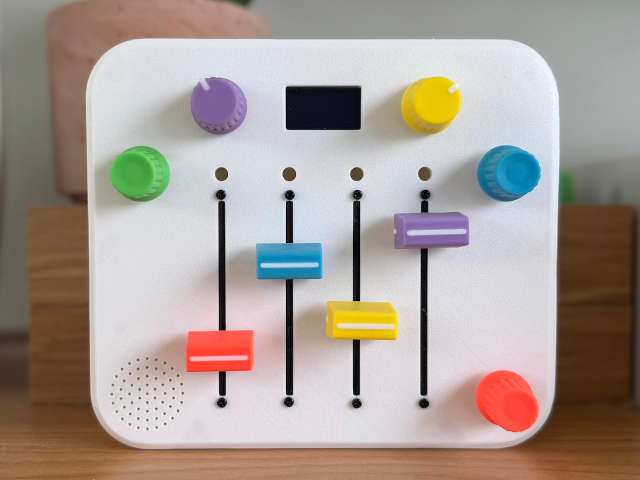
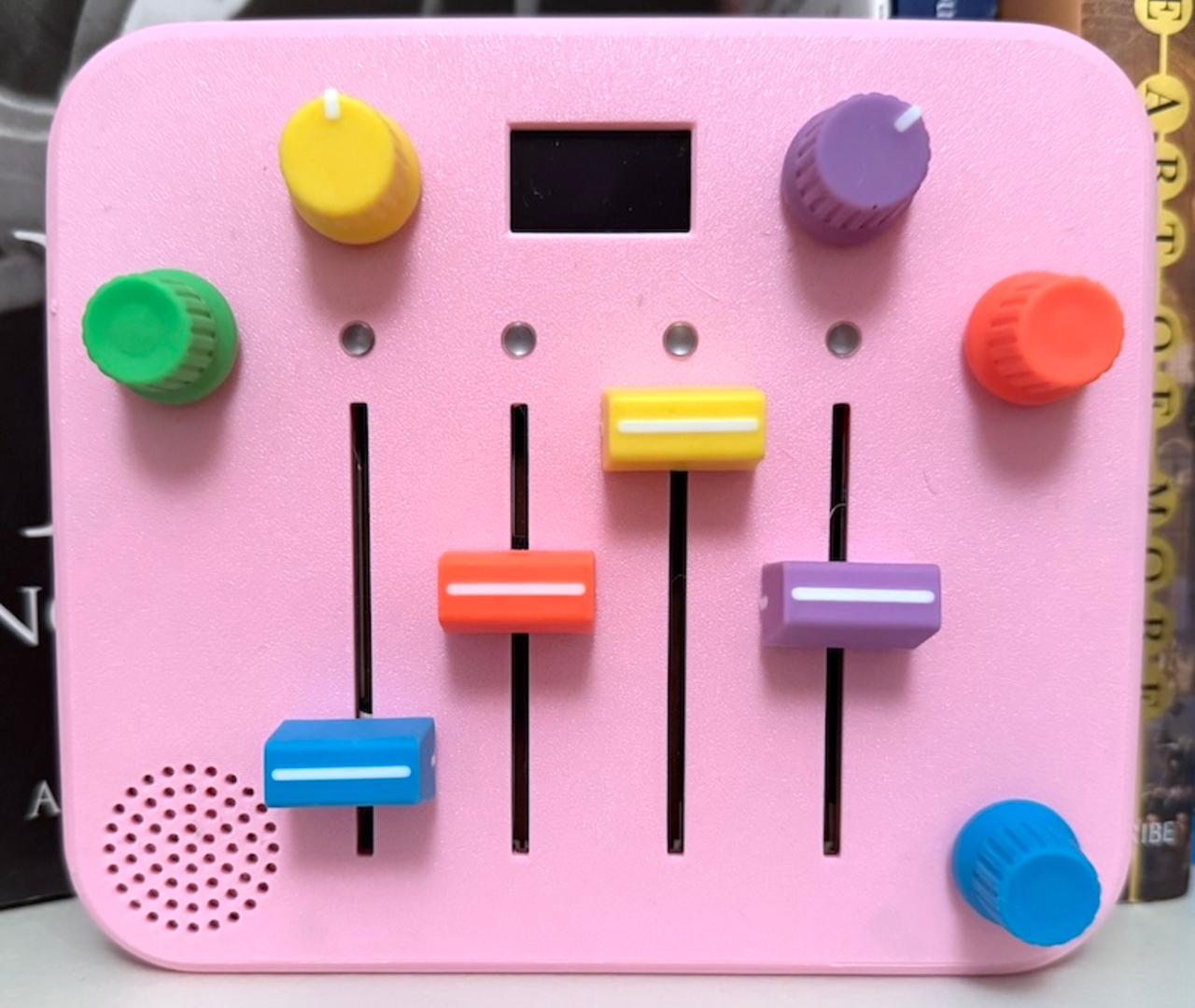
The finished synth is a rounded square box in pink or white, with four vertical sliders in bright colors and four matching knobs at the corners. Slide up for higher notes, down for lower, while a tiny OLED screen shows a dancing panda. There are no menus or hidden modes, just a looping sequence that keeps playing while little hands experiment with pitch and tempo, creating simple melodies that shift and evolve with every adjustment.
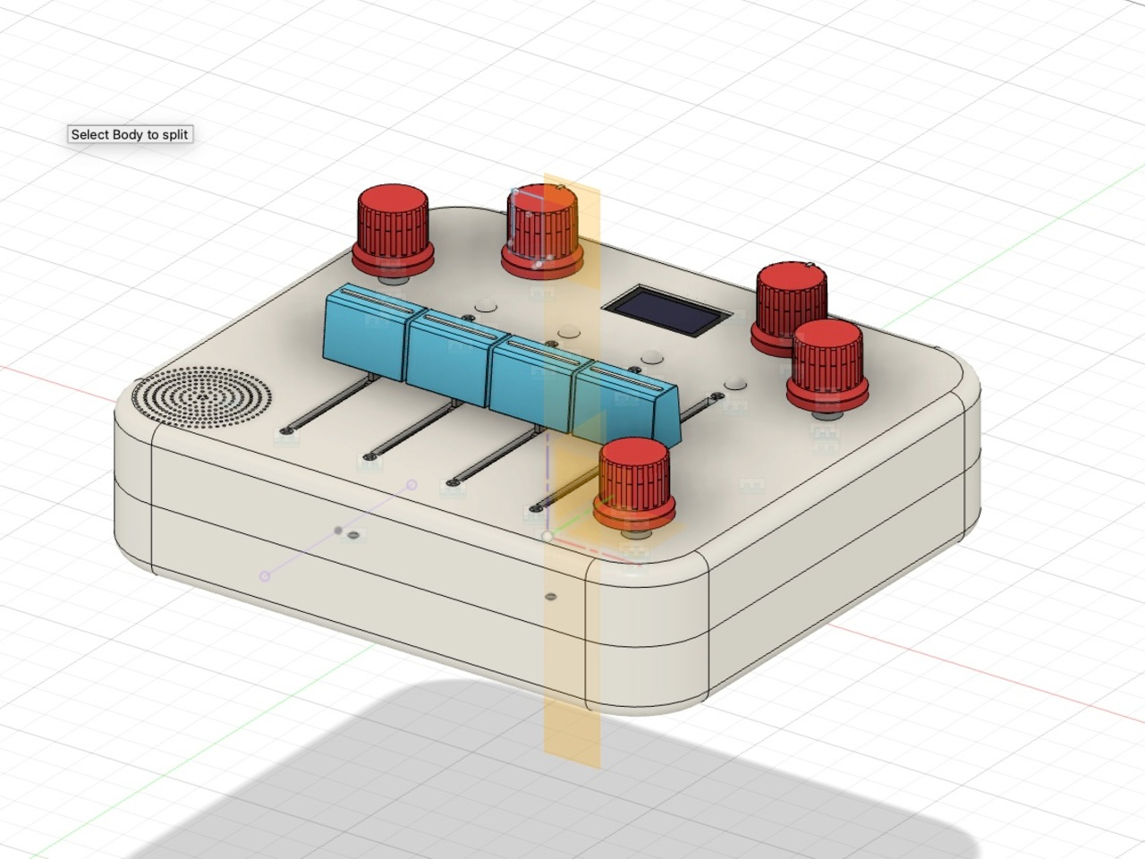
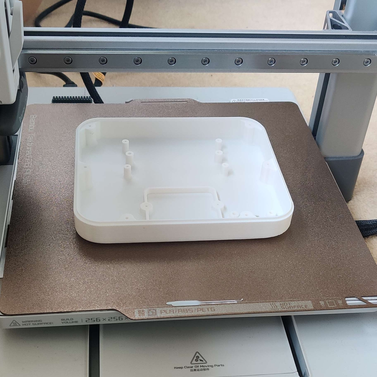
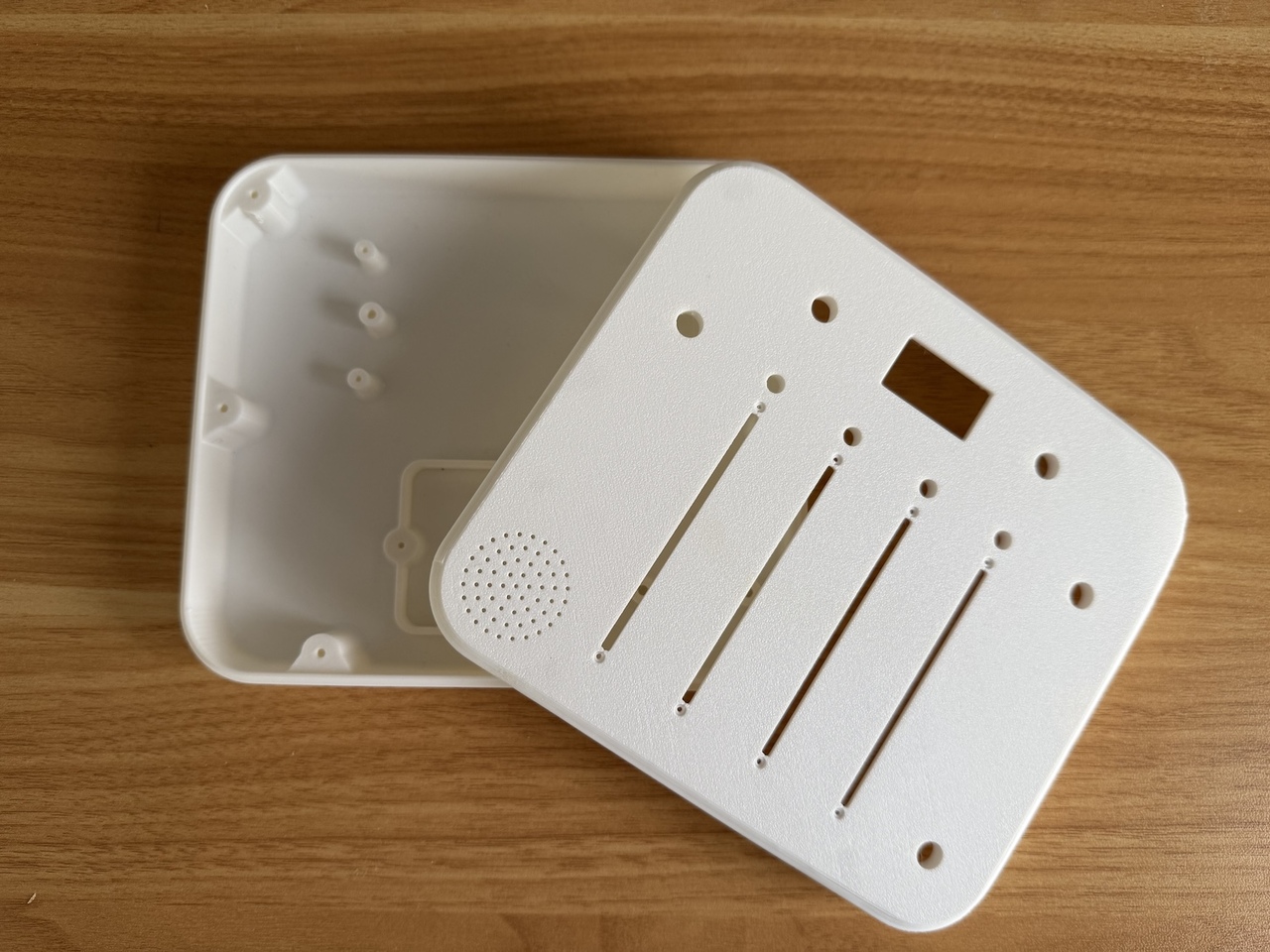
Roberts started on a breadboard, then realized he needed a proper enclosure that his daughter could actually hold. Off-the-shelf cases were the wrong size and the wrong colors, so he opened Fusion 360 for the first time and slowly modeled a custom shell. A friend’s 3D printer turned those sketches into a real, toy-like enclosure that feels closer to a commercial product than a hack, complete with rounded corners and smooth edges.

The first hand-wired version worked but was fragile, with a nest of wires that broke when he closed the case. That pushed him to design his first printed circuit board, using Fusion’s electronics tools to lay out sliders, knobs, and connectors in a neat, single layer. The PCB not only made assembly faster, but it also gave the interior the same sense of order and intention as the exterior, no hidden messes or shortcuts.

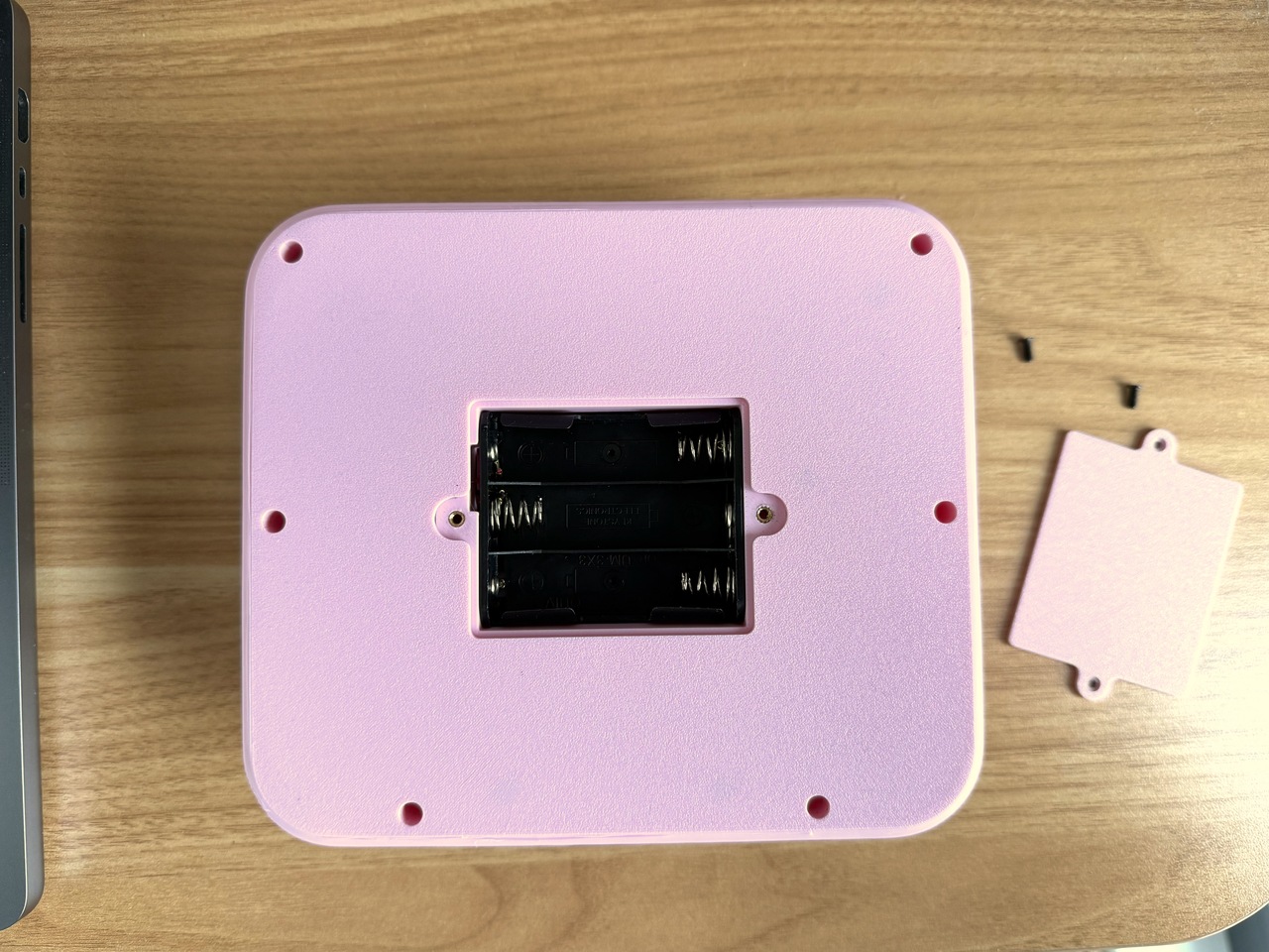
Small design touches make it feel finished. A dedicated battery compartment with a removable cover, mounting posts that let the board screw down securely, and a raised bezel around the OLED so it sits flush with the top surface. The front panel carries his daughter’s name, Alma, turning the synth into something personal. It now lives on a shelf with her other toys and, according to him, gets regular use.

The synth works at two levels. For kids, it’s a fun, tactile way to poke at sound without needing lessons or screens. For adults, it’s a reminder that you can go from zero hardware experience to a polished, gift-worthy object by following curiosity and learning each tool as you need it. Whether or not it ever becomes a product, it’s already a successful piece of design for the one user who mattered most.
The post Dad Built a 4-Step Sequencer Synth Simple Enough for Age 3 first appeared on Yanko Design.
This Finger Toothbrush Makes Oral Care Fun for Tiny Humans

Getting a baby to brush their teeth is basically an Olympic sport. You’ve got squirming, crying, and a tiny human who thinks the toothbrush is an enemy. But what if brushing teeth didn’t have to feel like dental warfare? That’s exactly what mmmdesign studio set out to solve with their Dino brush, a finger toothbrush that transforms tooth-brushing time from scary to playful.

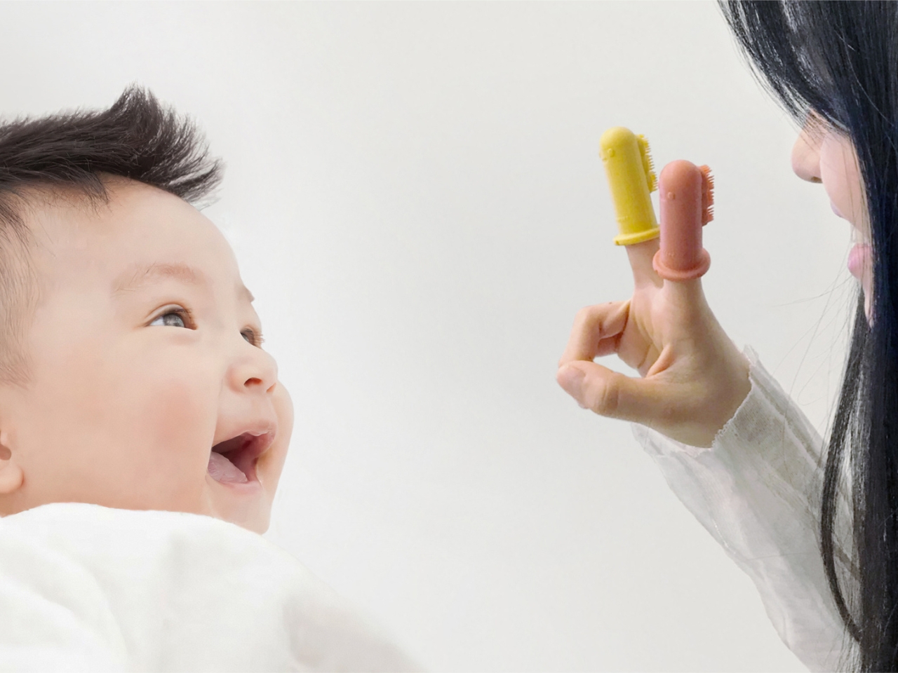
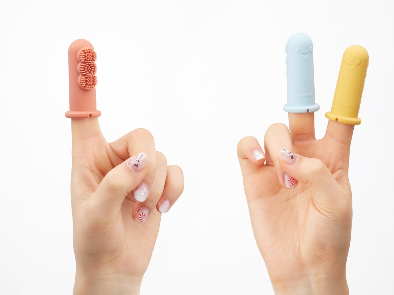
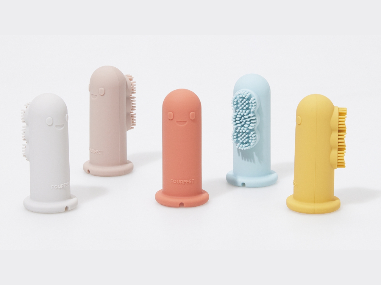
At first glance, the Dino brush looks more like a toy than a hygiene product, and that’s completely intentional. The design features an adorable dinosaur character that fits right over a parent’s finger, turning mom or dad into a friendly puppet that happens to clean teeth. It’s clever emotional engineering. Instead of approaching a baby with what looks like a clinical tool, you’re introducing them to a cute little dino friend. The psychology here is brilliant: babies are naturally curious and responsive to characters and faces, so this design taps right into that developmental sweet spot.

Designer: mmmdesign studio

The product addresses a genuine pain point for new parents trying to establish healthy oral care habits. That first introduction to tooth brushing often sets the tone for years to come, and if it’s traumatic, you’re in for battles at bedtime for the foreseeable future. By designing something that reduces fear and discomfort, the Dino brush isn’t just solving a functional problem but an emotional one too.

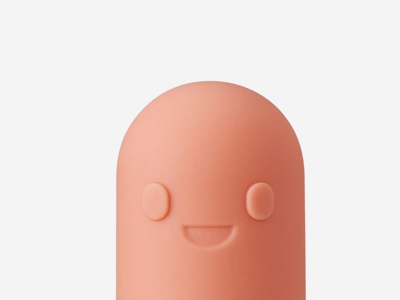
From a design perspective, what stands out is the thoughtfulness behind every curve and color choice. The soft, rounded forms feel non-threatening, while the bright, cheerful colors appeal to infant visual development. The dinosaur character has big, friendly eyes and a welcoming expression. There’s no sharp edges or intimidating features, just pure approachability. This kind of attention to psychological design shows that mmmdesign studio understands their end users on multiple levels: not just the babies using the brush, but also the stressed-out parents wielding it.

The finger-worn format is also genius from a practical standpoint. Parents get complete control and sensitivity, feeling exactly how much pressure they’re applying and being able to reach every corner of those tiny mouths. Traditional baby toothbrushes with handles can be awkward and imprecise, but with the Dino brush, you’re using your most dexterous tool (your finger) enhanced with gentle bristles. It’s intuitive in a way that makes the learning curve practically nonexistent.

What’s particularly interesting is how this design fits into a larger trend of “design for delight” in everyday objects. We’re seeing more and more products that don’t just fulfill a function but actively make mundane tasks more enjoyable. From gamified apps to character-based products, designers are realizing that emotional engagement isn’t frivolous but it’s actually essential to adoption and consistent use. A toothbrush that makes a baby smile is a toothbrush that actually gets used.

The Dino brush also reflects thoughtful consideration of the entire experience ecosystem. It’s not just about the moment of brushing but about building positive associations with oral care from the very beginning. That’s the kind of long-term thinking that separates good design from great design. You’re not just creating a product; you’re shaping behavior and attitudes.

For design enthusiasts, this project is a masterclass in empathy-driven design. mmmdesign studio clearly spent time understanding the real challenges of their target users and created something that addresses both practical and emotional needs. It’s product design that remembers people (even tiny people) are emotional beings first and functional ones second.

We’re constantly bombarded with overcomplicated gadgets and unnecessarily techy solutions but the Dino brush is refreshingly simple. It takes an age-old problem and solves it with charm, thoughtfulness, and a deep understanding of human (and tiny human) psychology. Sometimes the best innovations aren’t about adding more features but about making something fundamentally more human. Or in this case, more dino.

The post This Finger Toothbrush Makes Oral Care Fun for Tiny Humans first appeared on Yanko Design.
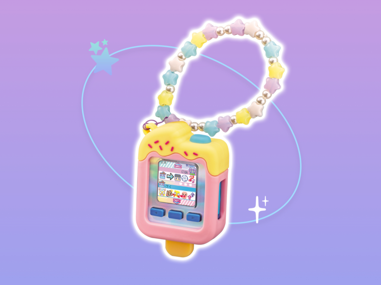
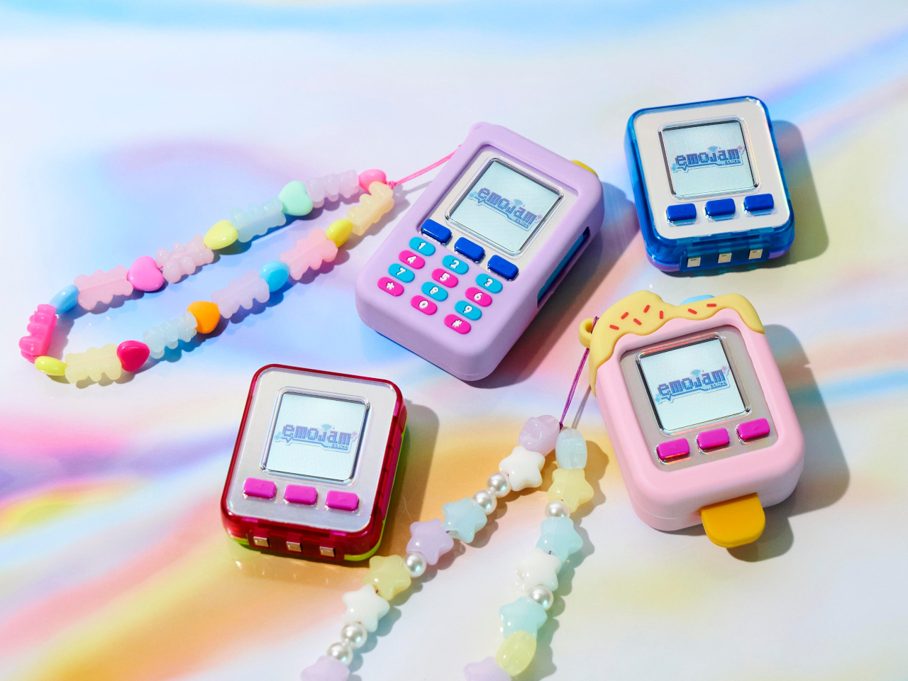
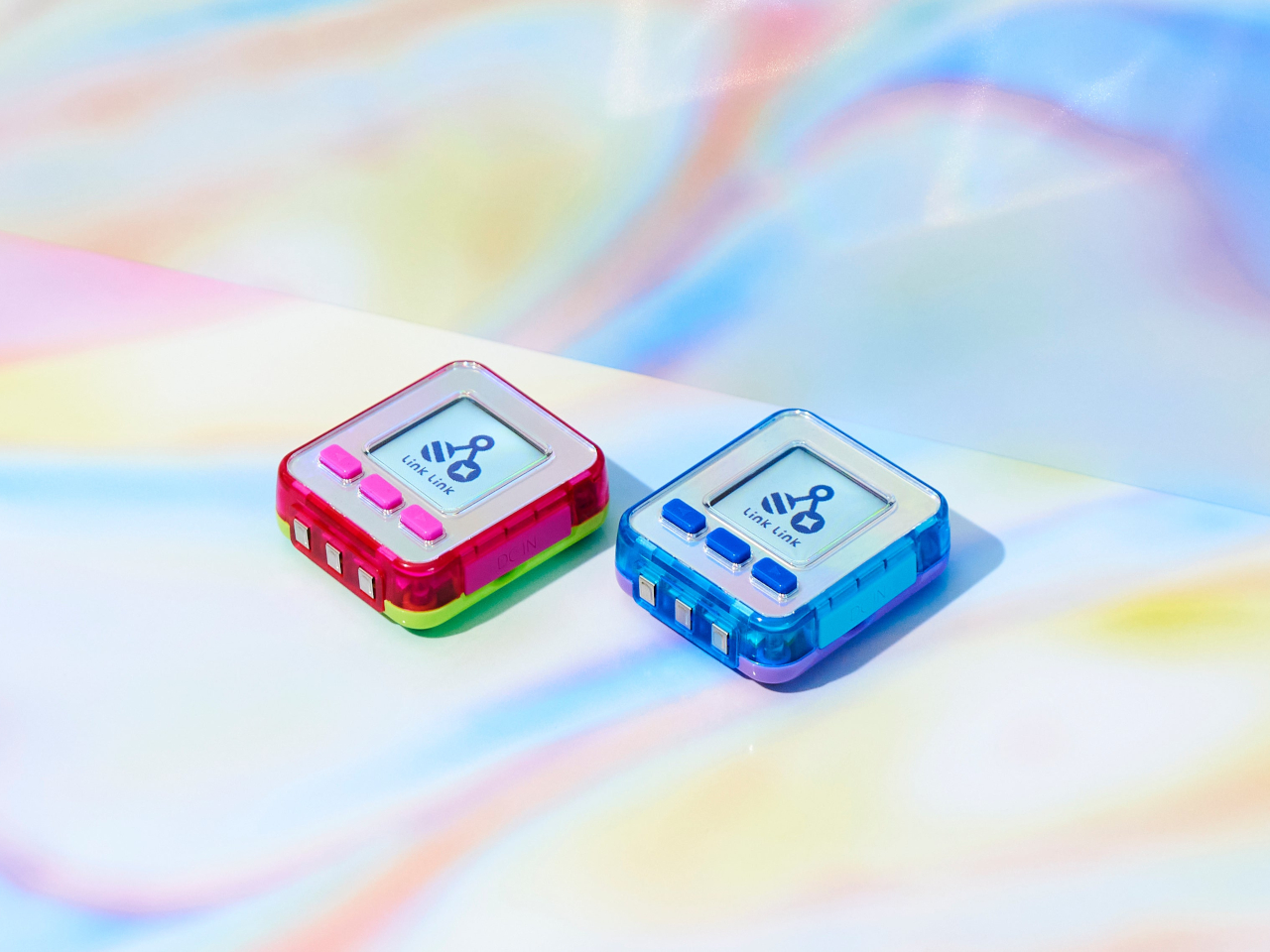
SEGA Emojam emoji pager for kids is a quirky clash of past and present cultures

You’ve probably heard about how some people bemoan the degradation of literacy thanks to “txtspeak” which abbreviated words to avoid hitting the SMS character count cap. Although that may be a thing of the past now that we have longer limits and more flexible messaging services, a newer trend is to completely replace words with their more expressive iconic equivalents: emojis.

In less formal settings, a string of emojis instead of a full paragraph could be more efficient and even fun, and SEGA thinks it could actually be a good thing for kids. Adults might roll their eyes at the thought, but these cute devices might remind them of their own past when text in a single scrolling line was the way to communicate. Of course, these kids have it easier with smileys and icons that can paint a dozen words.

Designer: SEGA

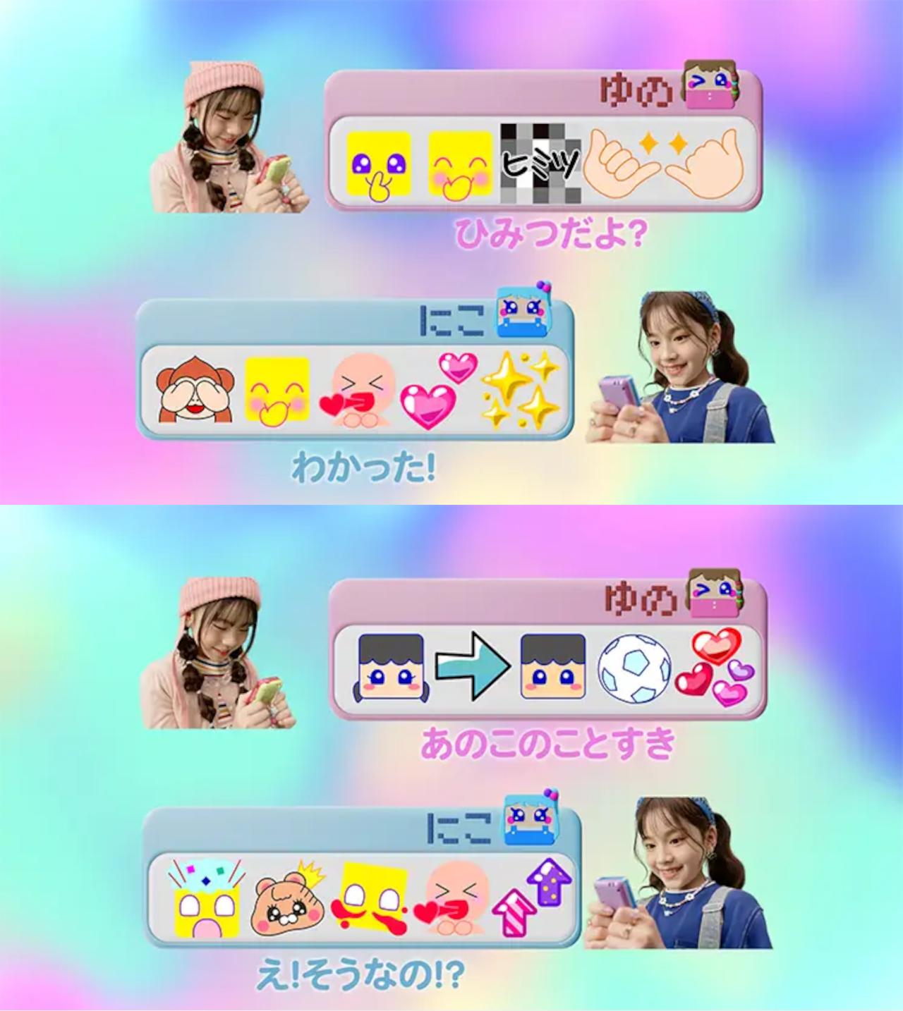
Given how many icons, objects, and faces are now included in the set of emojis almost universally understood by everyone, it wouldn’t be surprising to learn that some people can carry out conversations without typing a single character. Of course, just like any iconography, some images or expressions can be open to interpretation, but that’s also precisely the point with this “Emojam” pager from SEGA. It’s like developing a secret coded language that only you and your close friends can understand.

With this emoji pager, kids can “type” 10 emojis from a selection of 1,100 emojis to send to their friends. That’s quite a lot, especially when you consider that the device only has three buttons. Interpreting the sequence of icons correctly is also part of the fun, making communication more active and less mechanical like the way adults communicate with each other today.

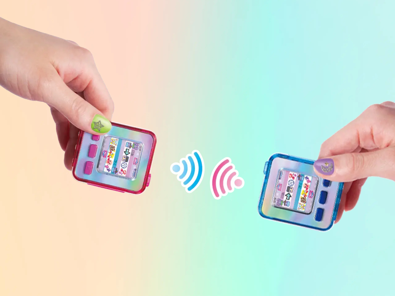
As a device designed for kids, SEGA Emojam has a few safety features to protect their emotional and mental states. It’s a Wi-Fi-only device that can only have 100 people on its friends list, and group chats are limited to five people only. More importantly, you can only add a friend after you physically tap two devices together, which means it will be someone you’ve at least met face-to-face once. The library of emojis, vast as it may be, doesn’t include harmful imagery either.

Admittedly, the idea of an emoji pager might sound cute but its commercial success might be a bit questionable. Still, SEGA definitely thinks it will be a hit among Japanese kids, especially with special emojis from popular franchises like Sanrio. The SEGA Emojam pager launches on December 10 for 7,150 JPY, around $47, though it isn’t clear if it will require a paid subscription to use.

The post SEGA Emojam emoji pager for kids is a quirky clash of past and present cultures first appeared on Yanko Design.

Ride-on suitcase for kids doubles as an in-flight bed or leg rest

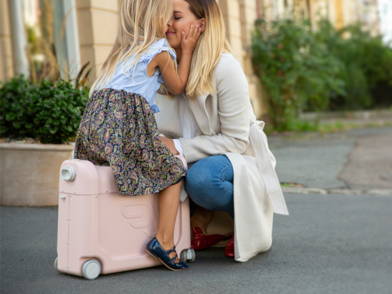
Rideable motorized suitcases are odd products, even more so when adults are the ones riding on them. They look more like fun toys for kids, but strangely enough, such products are in low supply or even non-existent. Of course, the dangers of sitting a kid on a moving vehicle, cute as it may be, can be frightening, but that doesn’t mean the basic design of a ride-on suitcase doesn’t have merits, especially if it doesn’t have motors in the first place. This unusual suitcase for toddlers takes that idea and gives it a little twist, giving it some other utility even when already boarded on the plane or train.

Designer: Frost Produkt

There are plenty of suitcases with colors and decorations catering to kids, but strangely enough, the majority of them aren’t exactly designed for kids. They function more like miniature suitcases for adults with zippers that are difficult to use and compartments that are difficult to access without having to first lay the suitcase down. That might just be a hassle for grownups, but it’s nothing short of a chore for kids, not unlike being told to clean up their closet.

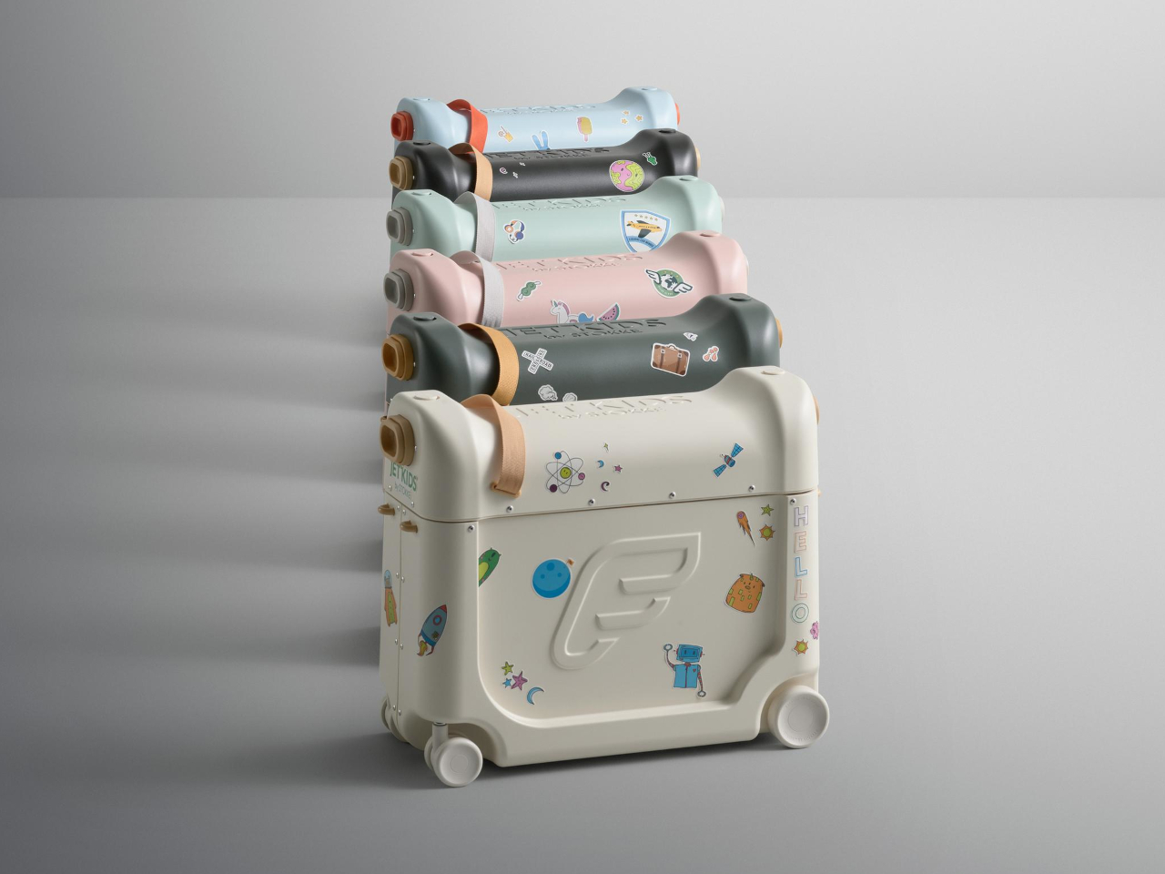
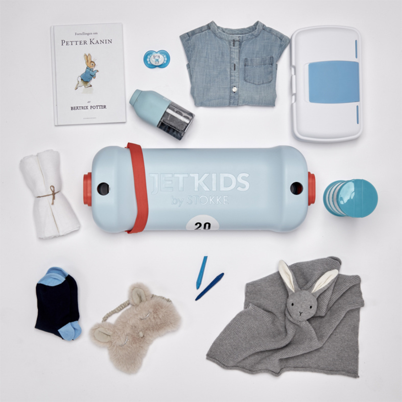
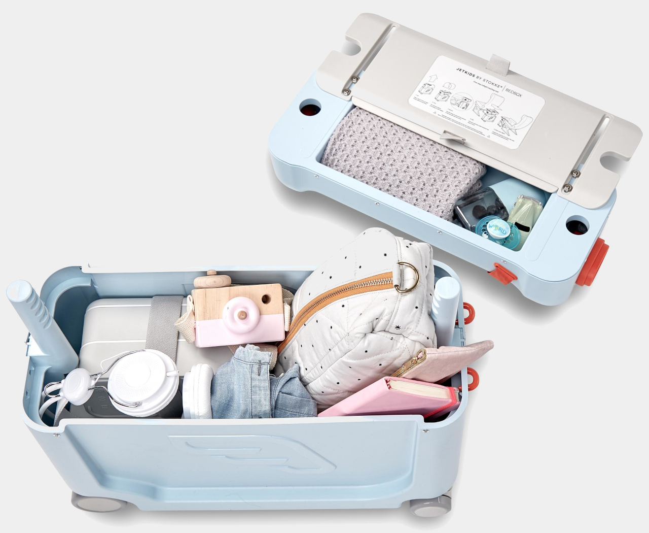
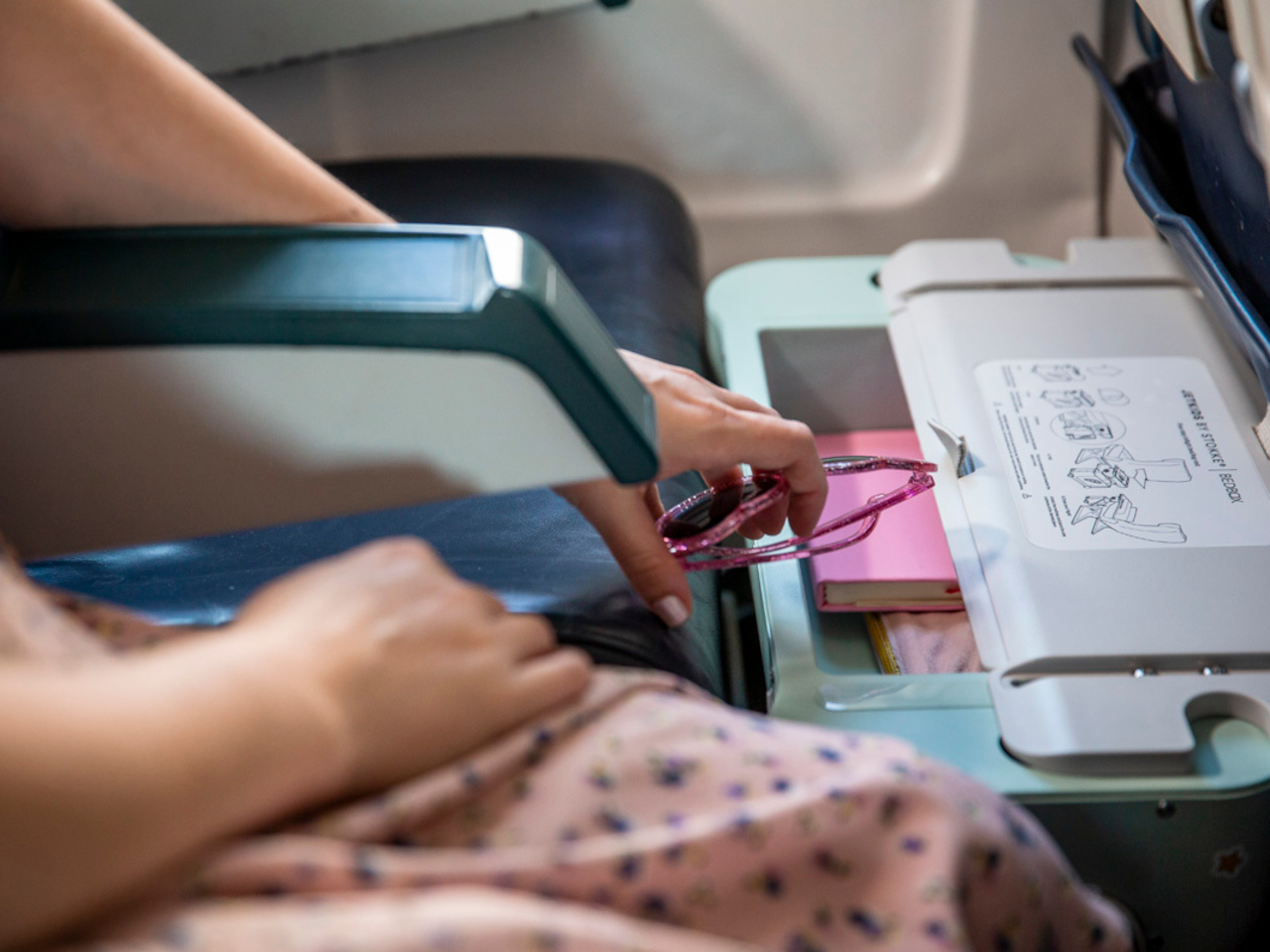
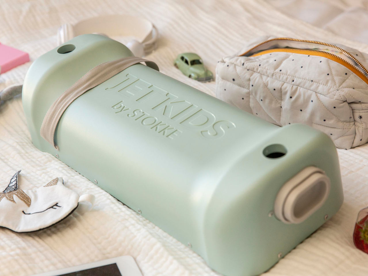
Jetkids is a ride-on suitcase truly designed with a young child in mind, and not just because of how fun it seems to sit on top of it. Instead of a zipper that opens from the front, this suitcase has a top cover that can be easily lifted to reveal the contents inside. The cover itself is actually a container as well, suitable for smaller items or things that the child or parent needs to access immediately.

That’s because this cover can be flipped over and placed on top of the suitcase, acting not only as a sort of desk but also as a leg rest or bed. The idea is to place the suitcase in front of the child’s seat on the plane, extending the area they can sit or even lie down on. And when the child is on the ground and about, the suitcase also offers a place for them to sit down and, if needed, be pulled by their family or guardian.

This unusual yet useful design does limit Jetkids, which was also marketed under the name Stokke Bedbox, to a certain age range that allows them to sit safely on the suitcase. It’s still an interesting design that really puts the ease of use and comfort of the child in mind rather than simply shrinking a product made for older people.

The post Ride-on suitcase for kids doubles as an in-flight bed or leg rest first appeared on Yanko Design.

Loog x Duolingo portable piano teaches you the language of music, the fun way

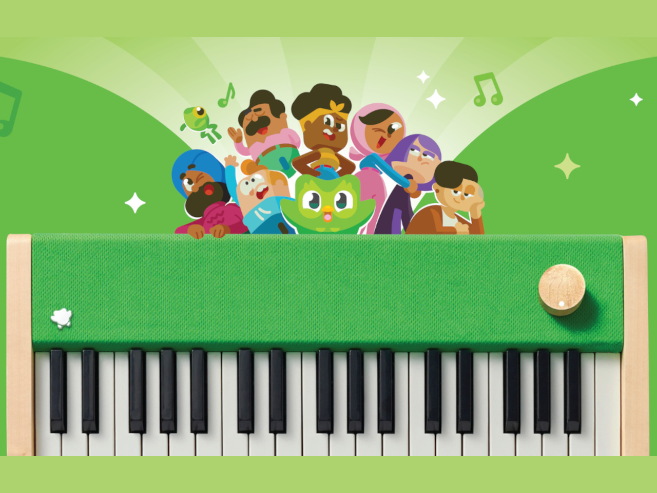
Learning a new language is never easy, whether it’s human language, programming language, or harmonic language. It takes time, effort, and more importantly, drive to go through the process, but it doesn’t have to a be painful and dreadful experience all the time. Of the many strategies that make learning languages both fun and effective, Duolingo is perhaps the best-known service. What few people realize, however, is that the green owl has been teaching music for over a year now, applying the same principles it uses in teaching Spanish or Mandarin to do-re-mi’s. Unlike smartphones and spoken languages, however, music has to be played to really be learned, which is why Duolingo has come out with a small digital piano so that you can do that anywhere you are.

Designer: Loog x Duolingo

A piano isn’t the only instrument you can use to learn music, but it’s one of the most convenient and can be designed into an electric and portable form that doesn’t require minding strings that could break. You don’t even need a full-sized piano to get started, but you do need one that’s small enough to be carried around yet has a decent size and a decent sound as well. Rather than relying on a smartphone piano app that doesn’t give the same tactile experience, Duolingo teamed up with Loog, a popular brand of musical instruments for kids and beginners, to make one.

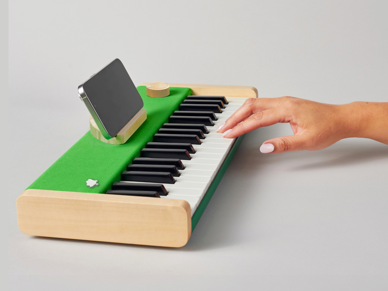
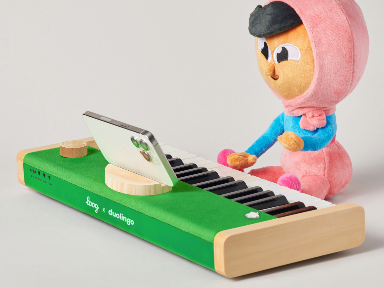
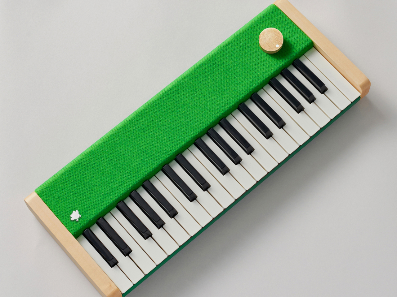
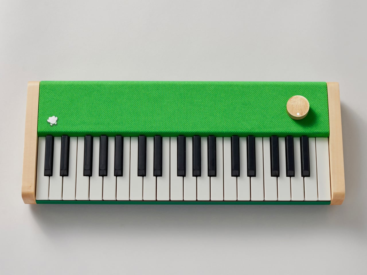
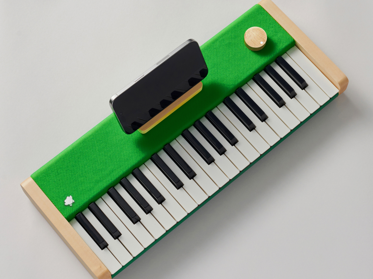
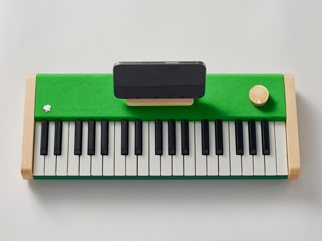
That’s what the Loog x Duolingo Piano brings to the table, figuratively and literally. It’s basically a special version of the Loog piano themed with Duolingo’s iconic green hue. It’s still the same piano made with solid wood panels that enhance the acoustics, making it sound almost like a real classical piano. It also has the same velocity-sensitive keys that implement proper dynamics, meaning that you can hit the keys harder to make the note sound louder, just like a real piano.

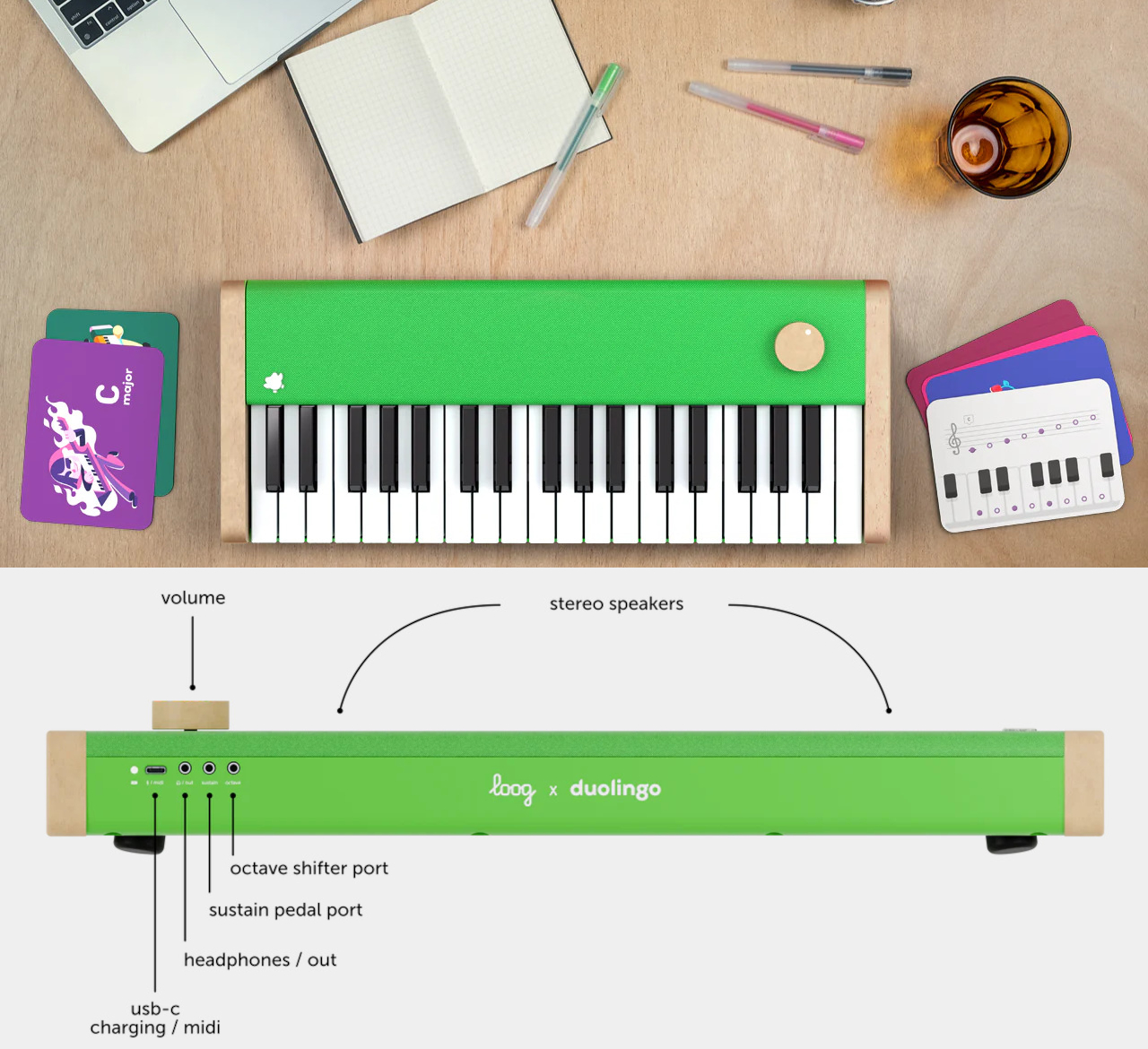
It’s not just a Duolingo-branded Loog piano, though, as this particular kit is designed with the easy-to-use and fun learning service in mind. There’s a wooden phone stand that matches the aesthetics of the piano, perfect for holding up the phone while you learn and play. And for a more offline learning experience, the package includes Piano Flashcards as well.

The Loog x Duolingo Piano is more than just a simple digital piano. It can be used as a MIDI controller when connected to an instrument via its USB-C port, and there are also ports not just for headphones but also for pedals and octave shifters. It might look like a kid’s toy, but this piano definitely has the guts to stand proudly as a proper musical instrument so that its use doesn’t stop after you’ve already mastered everything Duolingo has to teach.

The post Loog x Duolingo portable piano teaches you the language of music, the fun way first appeared on Yanko Design.
Nature-inspired toy-like calculator tries to get kids more interested in math

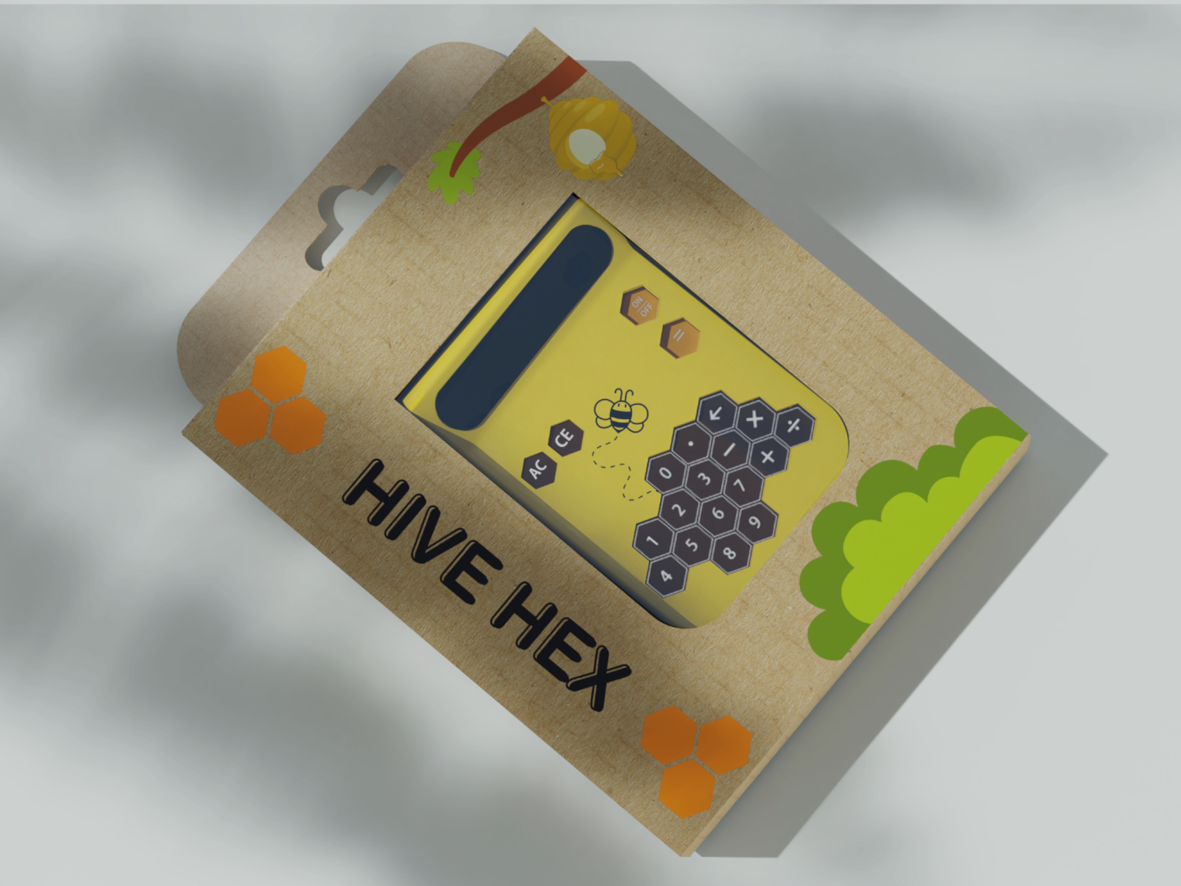
With plenty of phones and tablets around, kids are becoming more and more tech-savvy every generation. That, however, doesn’t always mean they are getting smarter or more skilled in other aspects of learning as well, particularly sciences and math that are more closely related to tech. There are plenty of apps that try to teach the basics, including reading and writing, but younger kids also need to develop their sense of touch, which requires more tactile experiences while learning. This calculator tries to pique children’s curiosity and engage not just their minds but also their senses, and it takes inspiration from one of nature’s hardest workers: bees and their geometric honeycombs.

Designer: Mohit Joshi

Calculator designs are not uncommon, but the vast majority of them utilize simple shapes like squares, circles, or even rounded squares, sometimes known as “squircles.” Not surprising, as these tools are designed for adults who value efficiency and performance primarily with aesthetics coming second only. The opposite is true for kids, however, whose short attention spans require designs that are captivating and intriguing, and keeping the design still functional is the challenge.

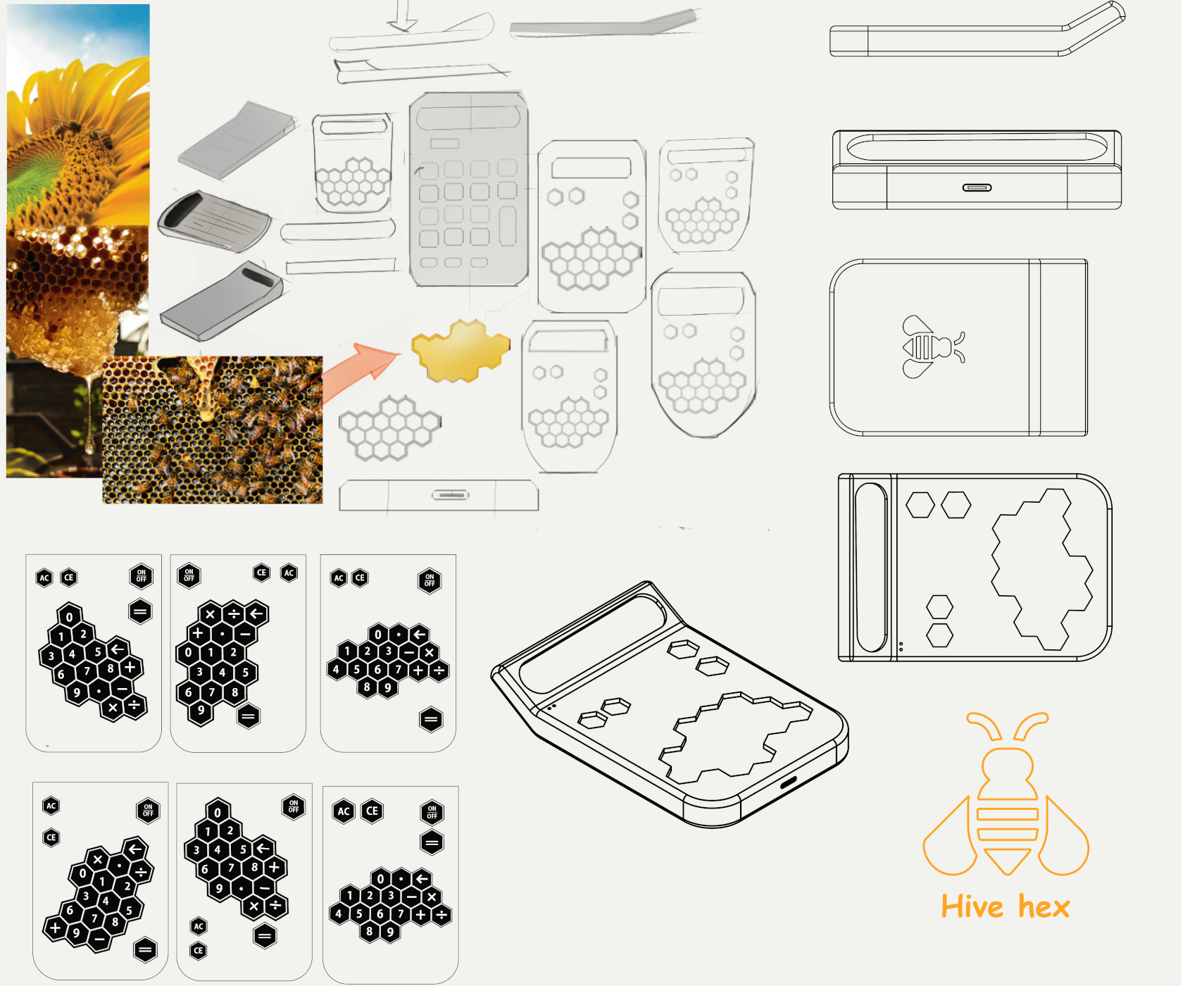
Some consider the hexagon to be the perfect shape because it isn’t flat like a square, can fit together better than circles, and is more space-efficient than triangles. Nature has a perfect example of this geometric shape in action as can be seen in beehives, particularly the honeycomb structures they form. While the real thing can be dangerous to children, bees are sometimes portrayed in fun and funny ways, especially given how hard they work and how well they guard their honey.

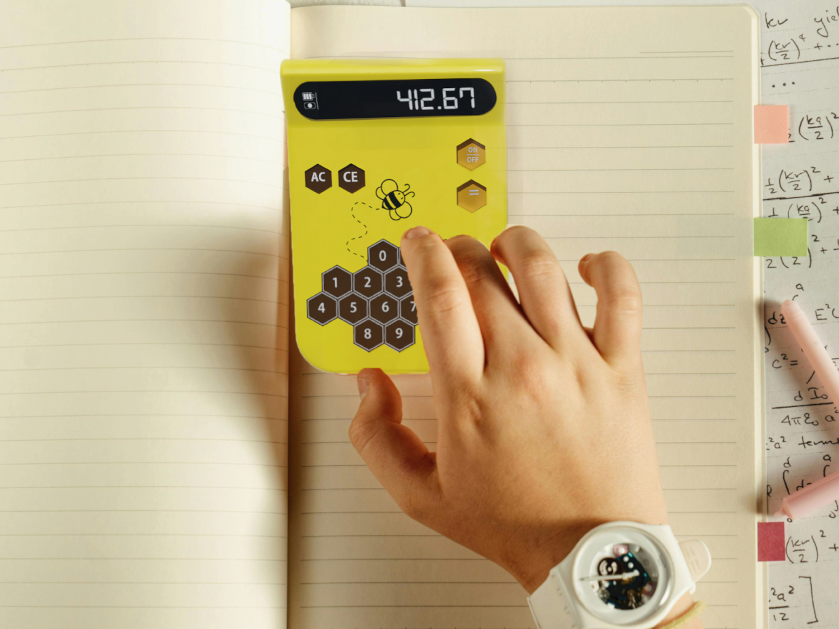
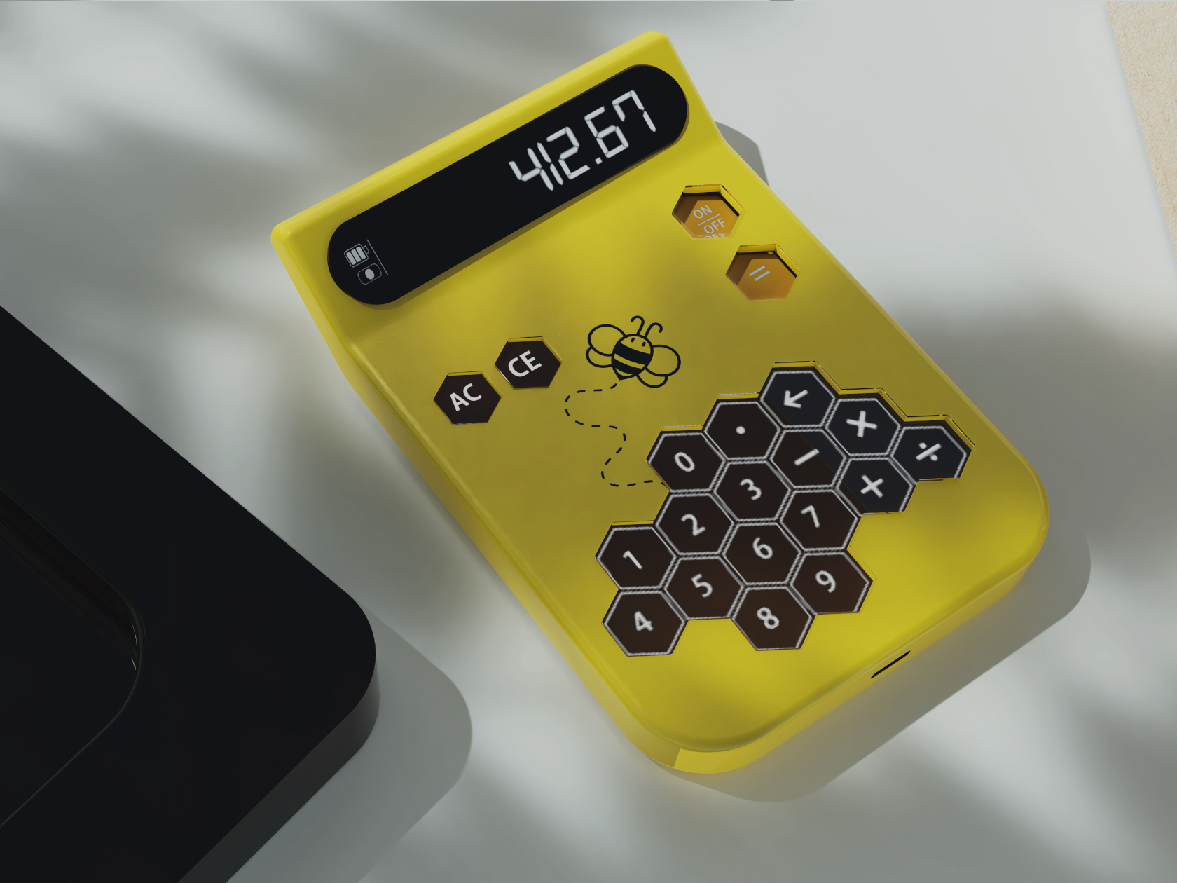
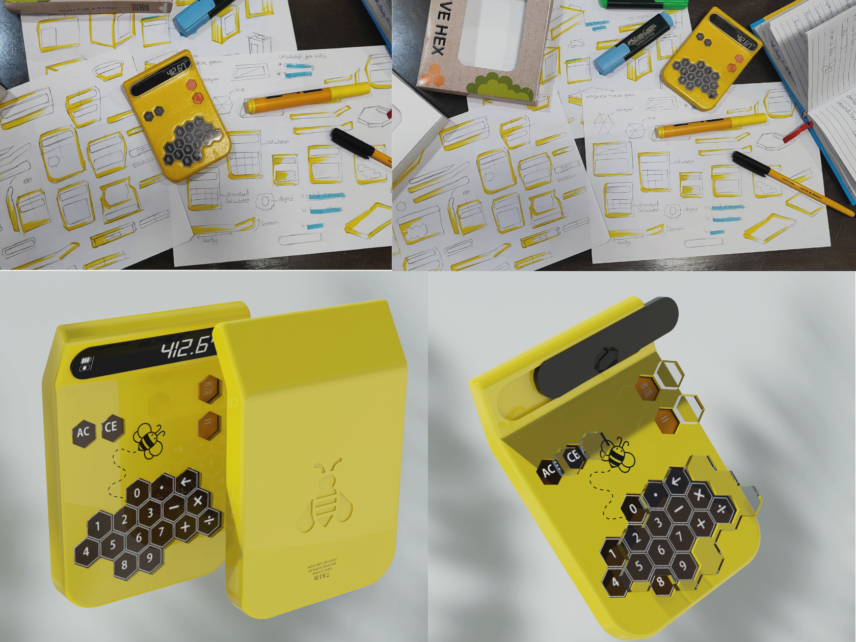
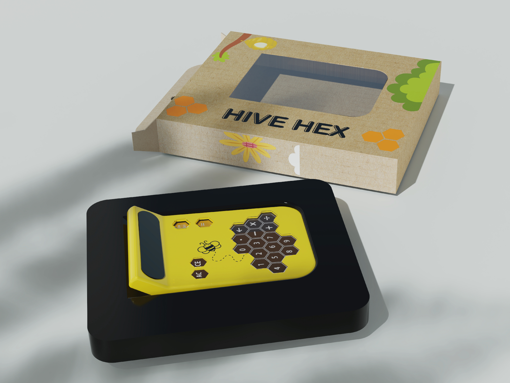
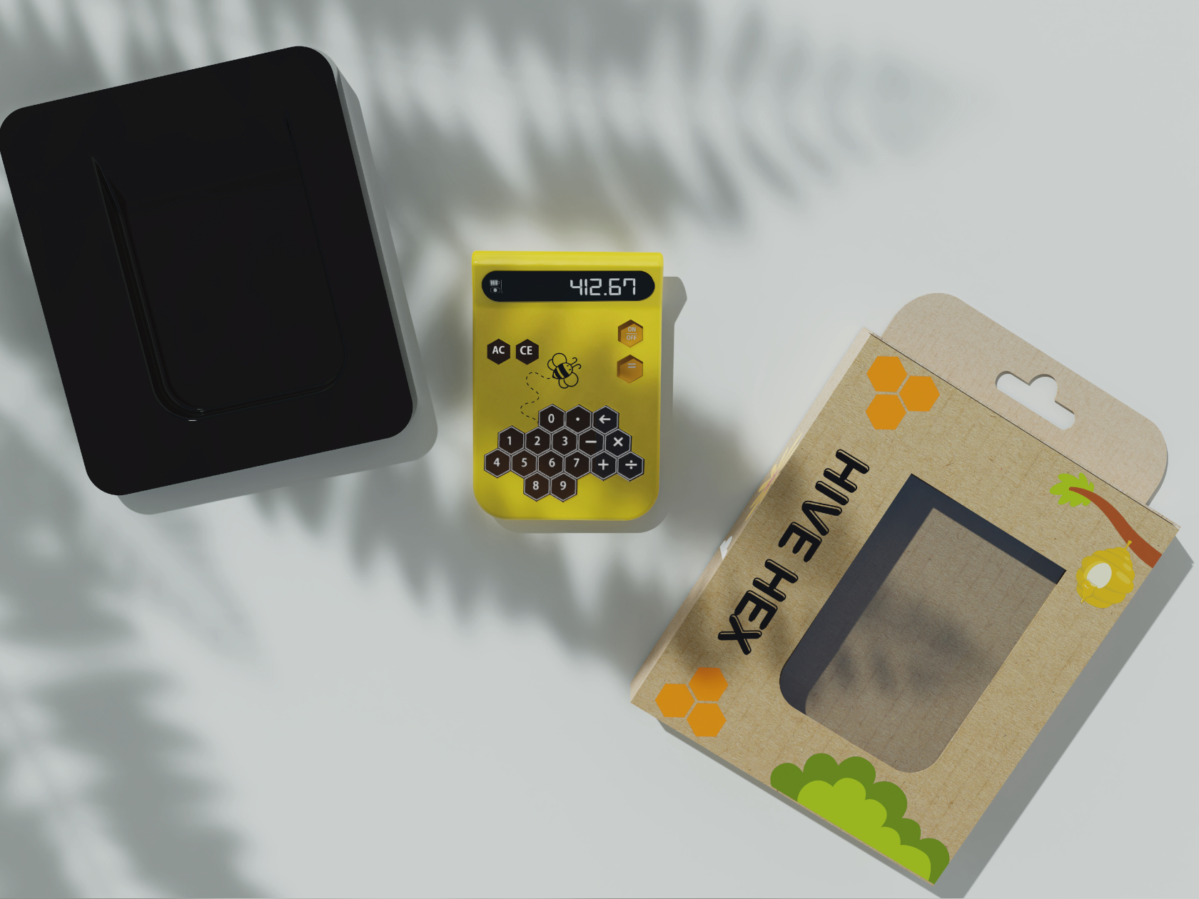
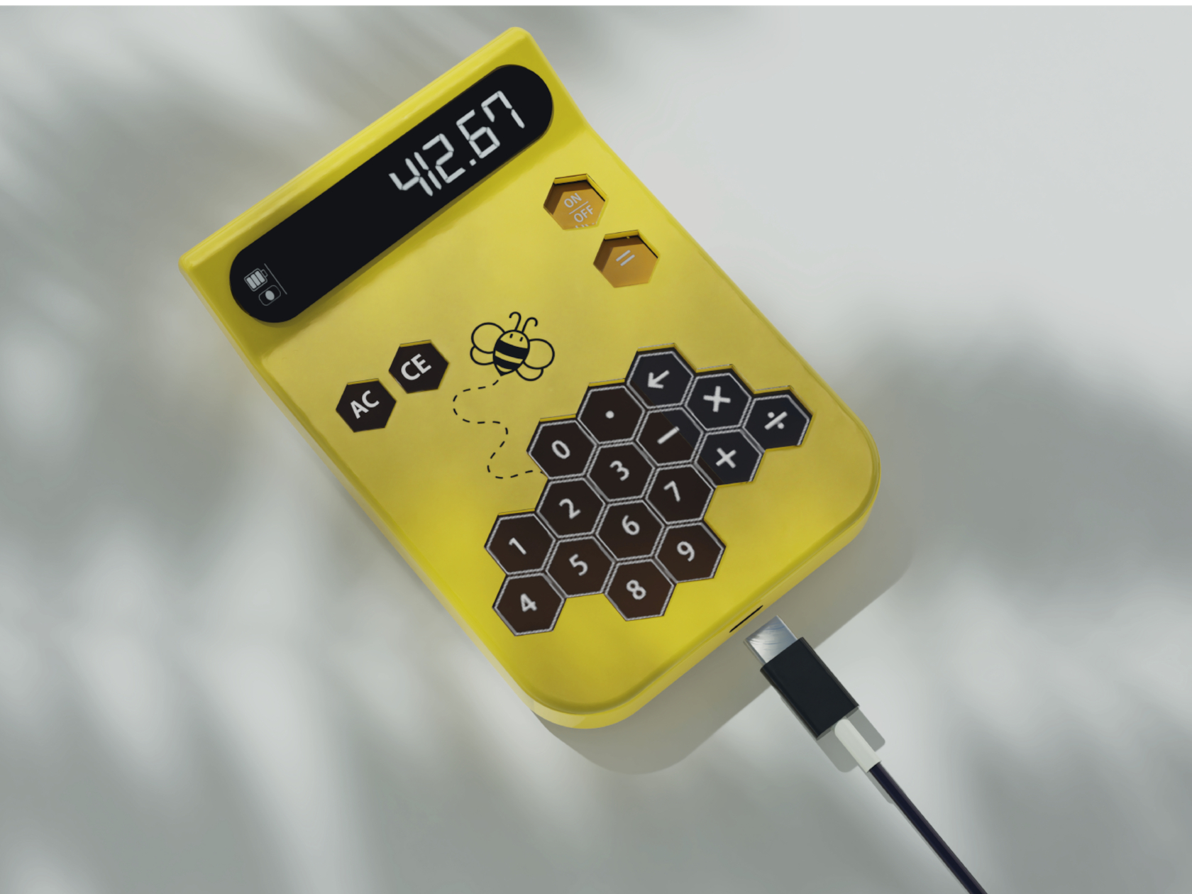
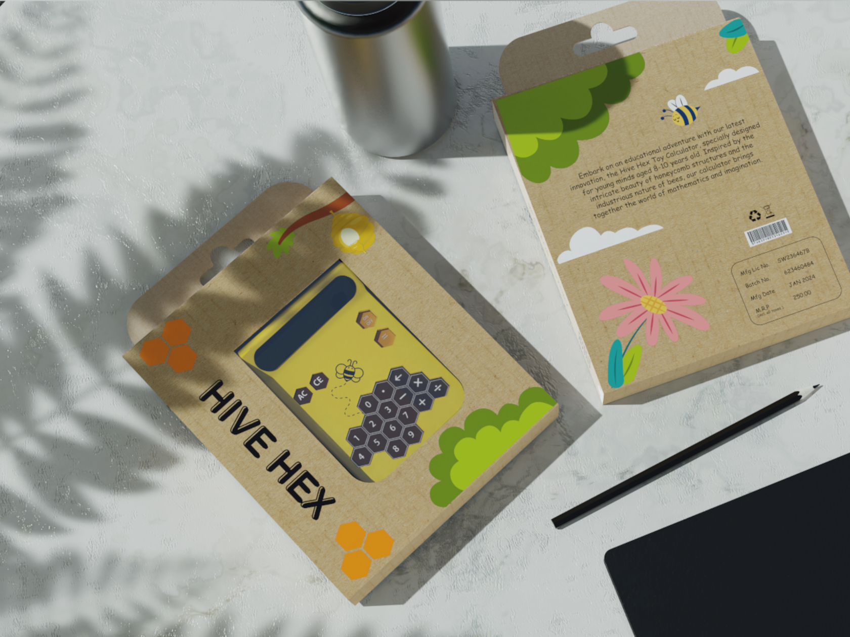
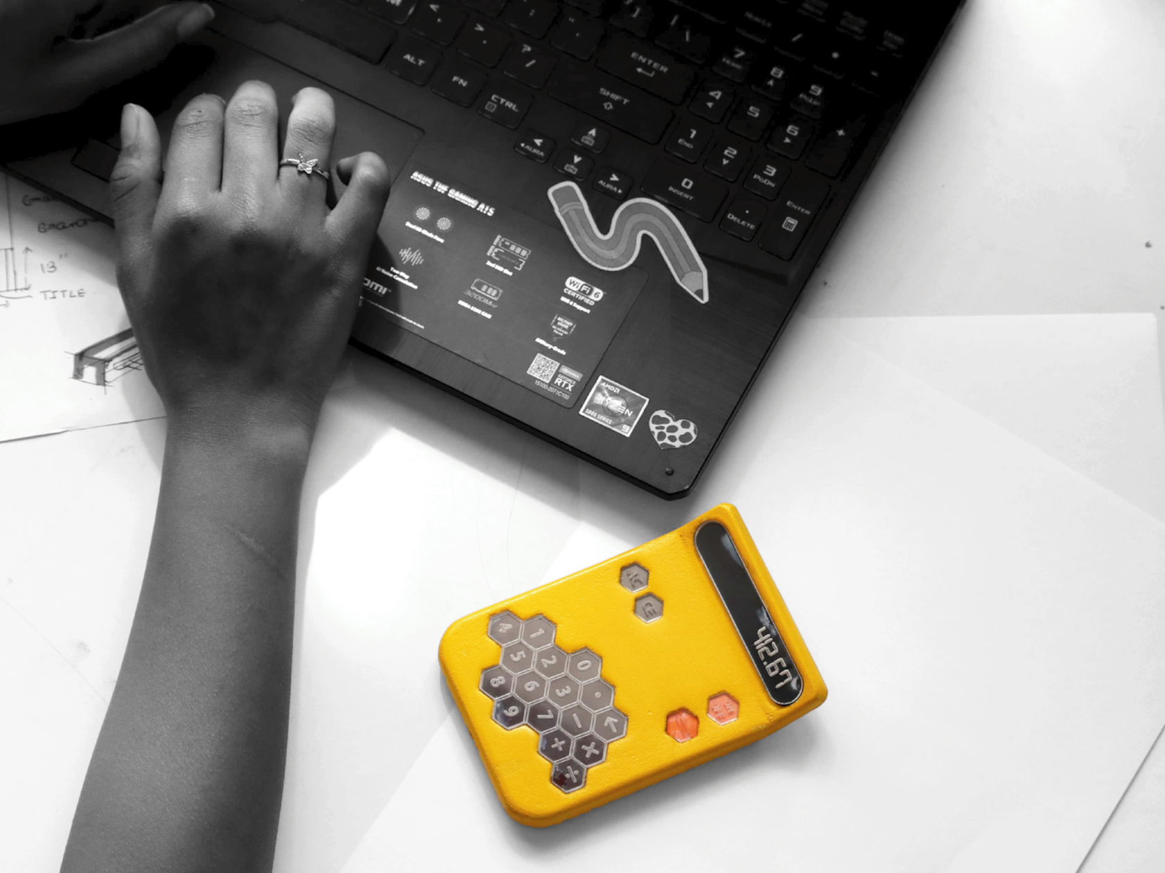
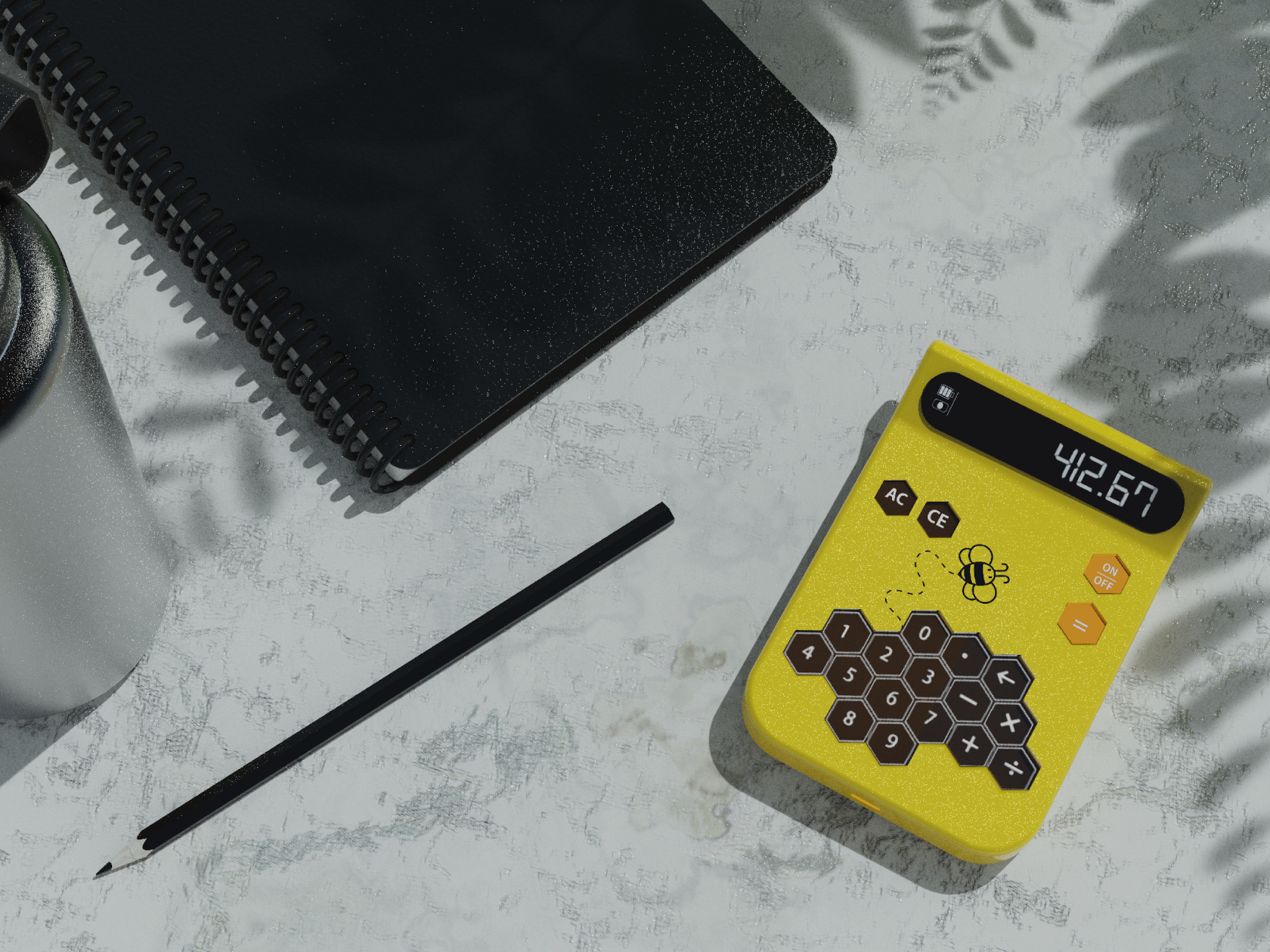
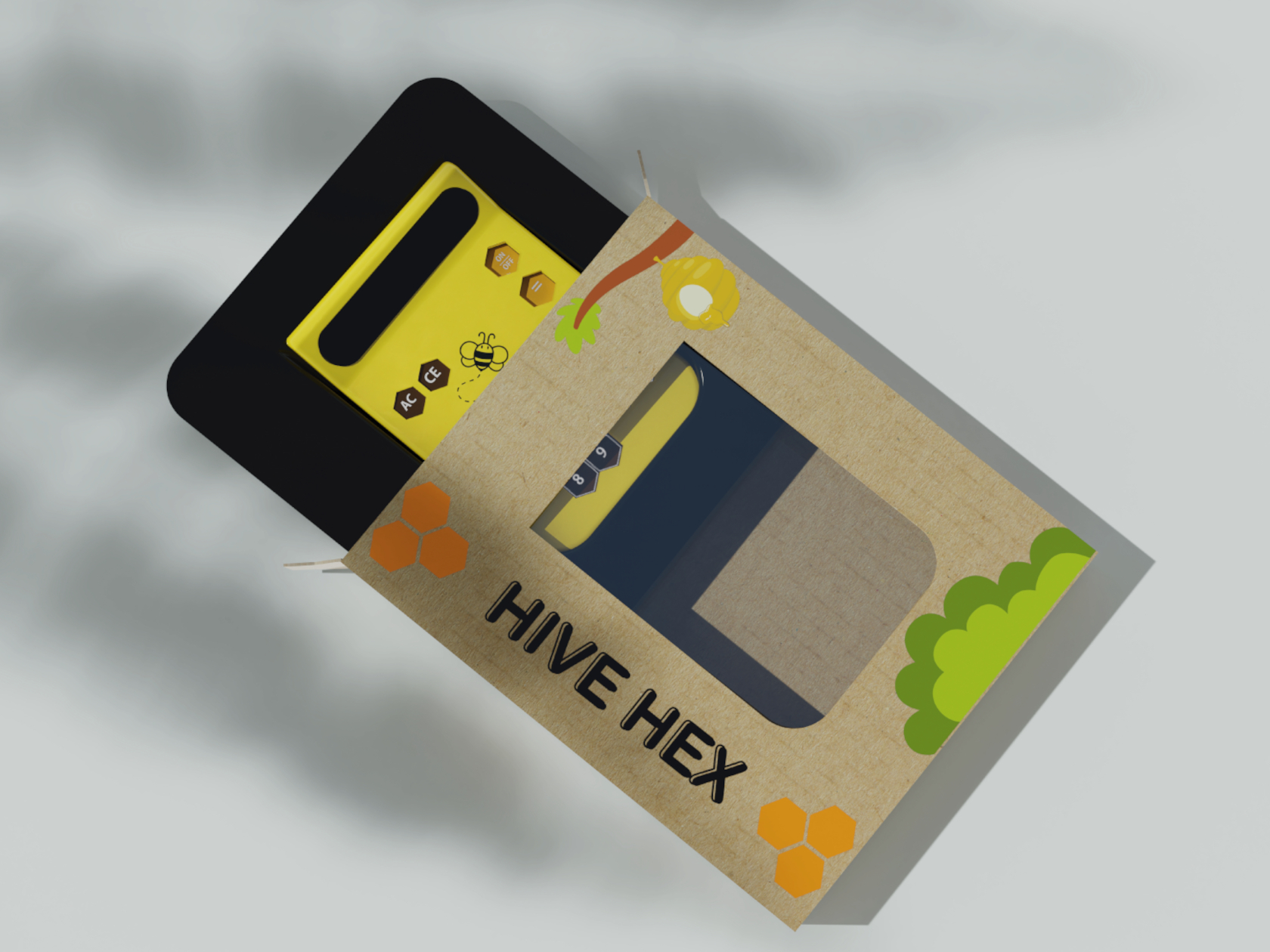
Hive Hex combines this shape and inspiration into a device that should be more interesting to use than even the sleekest and most minimalist calculator. The yellow color alone is eye-catching enough, but the puzzle-like hexagonal keys give a sense of whimsy and playfulness with their unbalanced composition, unlike the symmetrical arrangement of calculator buttons. That said, the non-standard layout of keys could prove to be confusing when the child “graduates” to grownup tools.

This toy-like yet functional calculator is a great example of how a bit of creative design can significantly change how a product appeals to different groups of people. Of course, some adults might criticize the use of calculators in the early stages of math education, but the calculator does more than just help kids solve number problems. The Hive Hex Toy Calculator could help give children a more lasting impression of how math doesn’t have to be boring or even scary, a positive attitude that they could carry with them throughout the rest of their lives.

The post Nature-inspired toy-like calculator tries to get kids more interested in math first appeared on Yanko Design.

Toy-like air purifier doubles as a baby monitor to help give parents some peace of mind

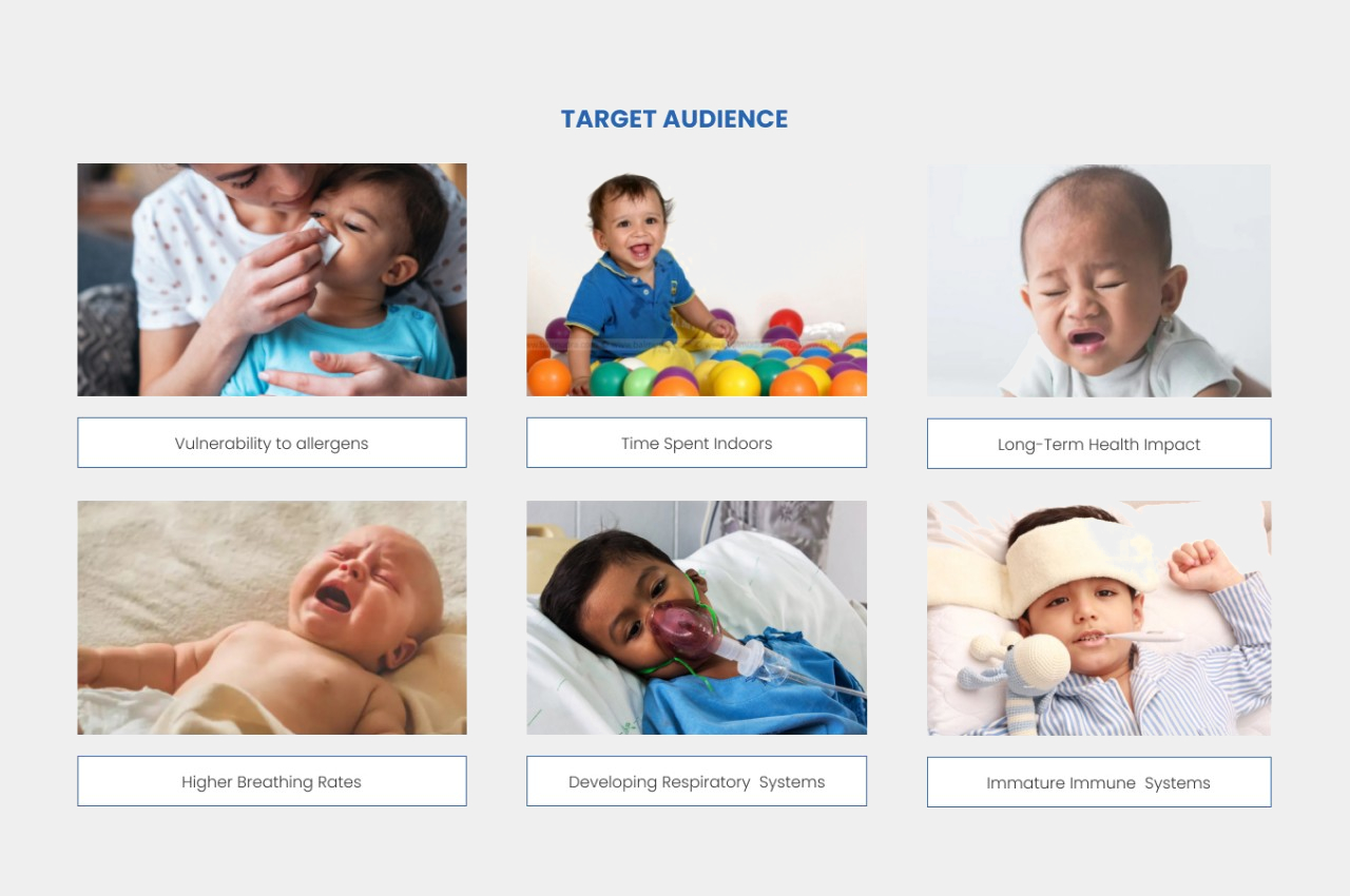
We’ve become more aware of the quality of the air we breathe indoors, which has led to an uptick in air purifier products and purchases. While that mostly works for the general population, the appliance isn’t always a good fit for all kinds of people, especially the most sensitive and at-risk members of our families: babies and toddlers. They also need to breathe clean air, perhaps even more than adults do, but most air purifier designs are clearly made for grownups. This product concept envisions one that is intended for the little ones, not only in the way it looks but in how it can keep watch over them when parents aren’t in the room or at home.

Designer: Swarali Satpute

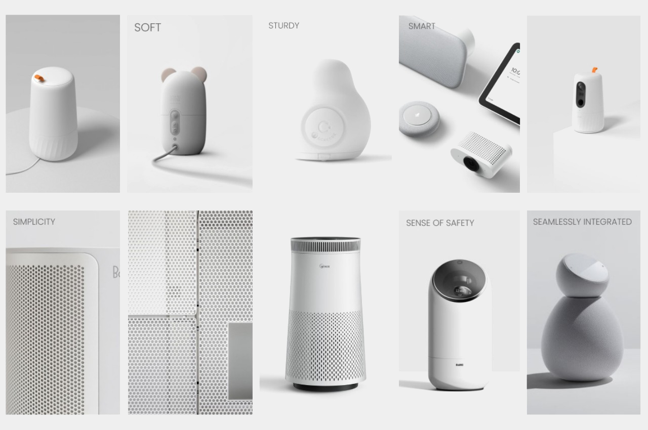
Until recently, the majority of air purifying machines looked simply like large cans or boxes that shouted their presence to everyone in the room, both visually and sometimes even audibly. The growing demand for these appliances, however, also meant that they needed to start catering to the aesthetic needs of customers. Fortunately, this has given rise to better-designed air purifiers that blend well with the rest of your home decor or, at the very least, look like a design object rather than an out-of-place appliance.

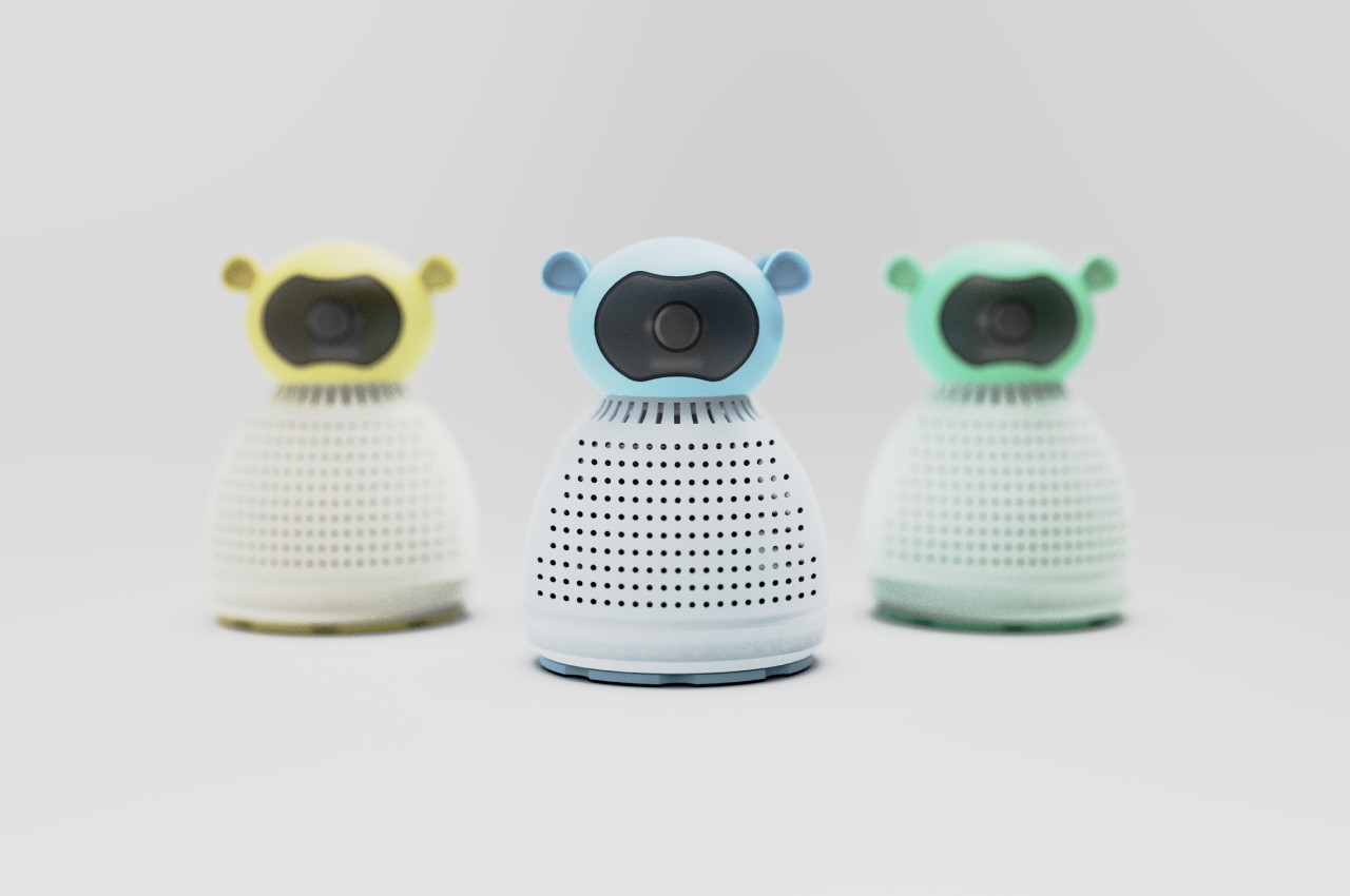
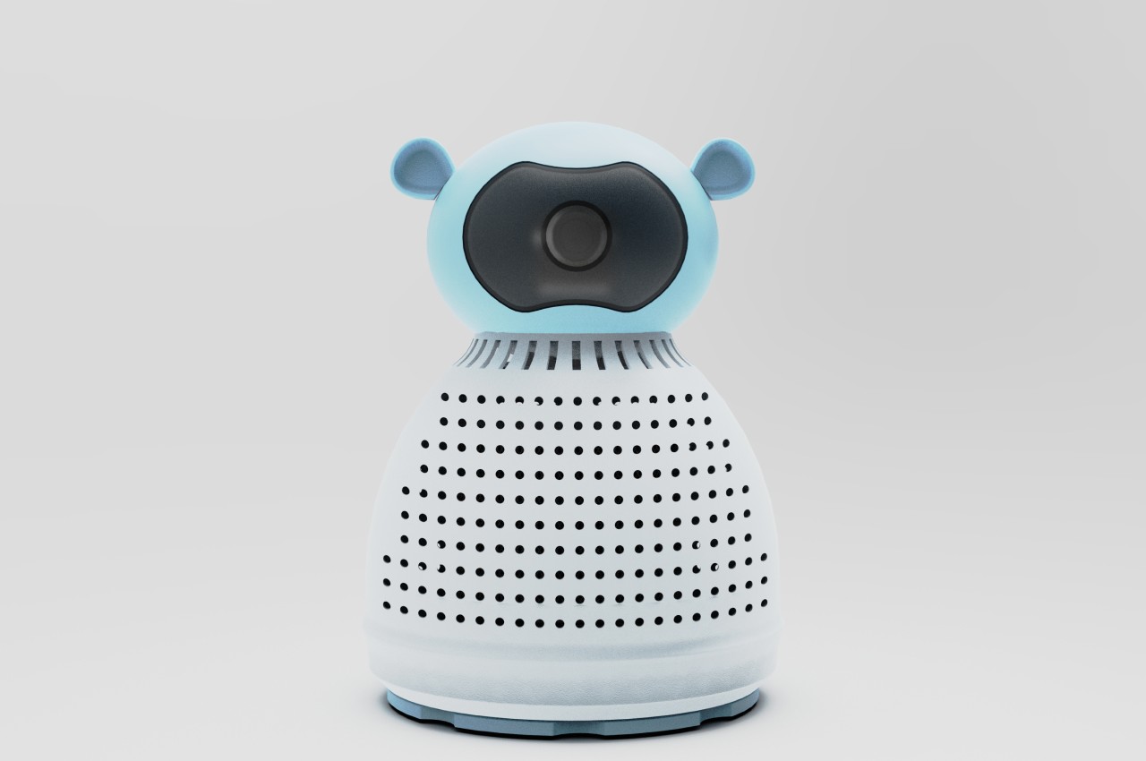
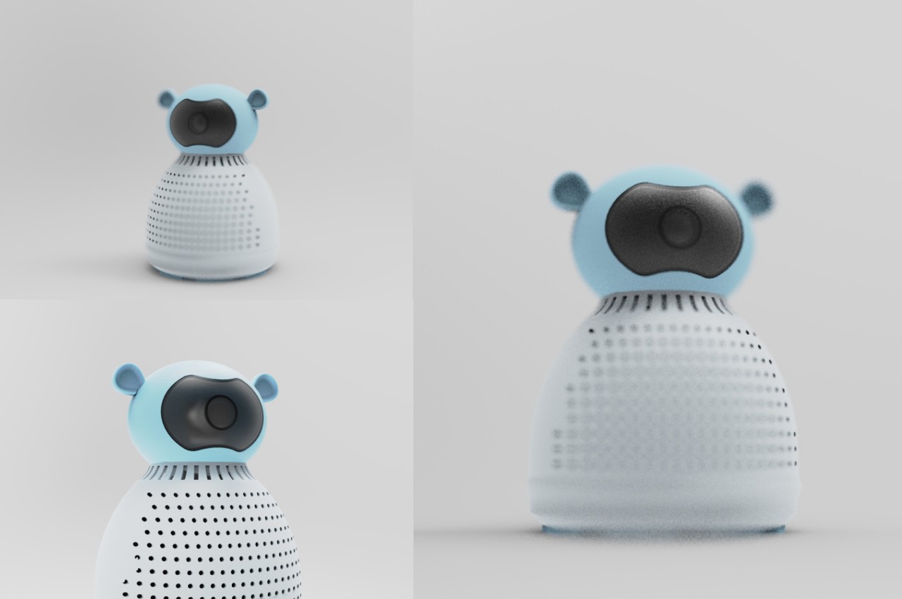
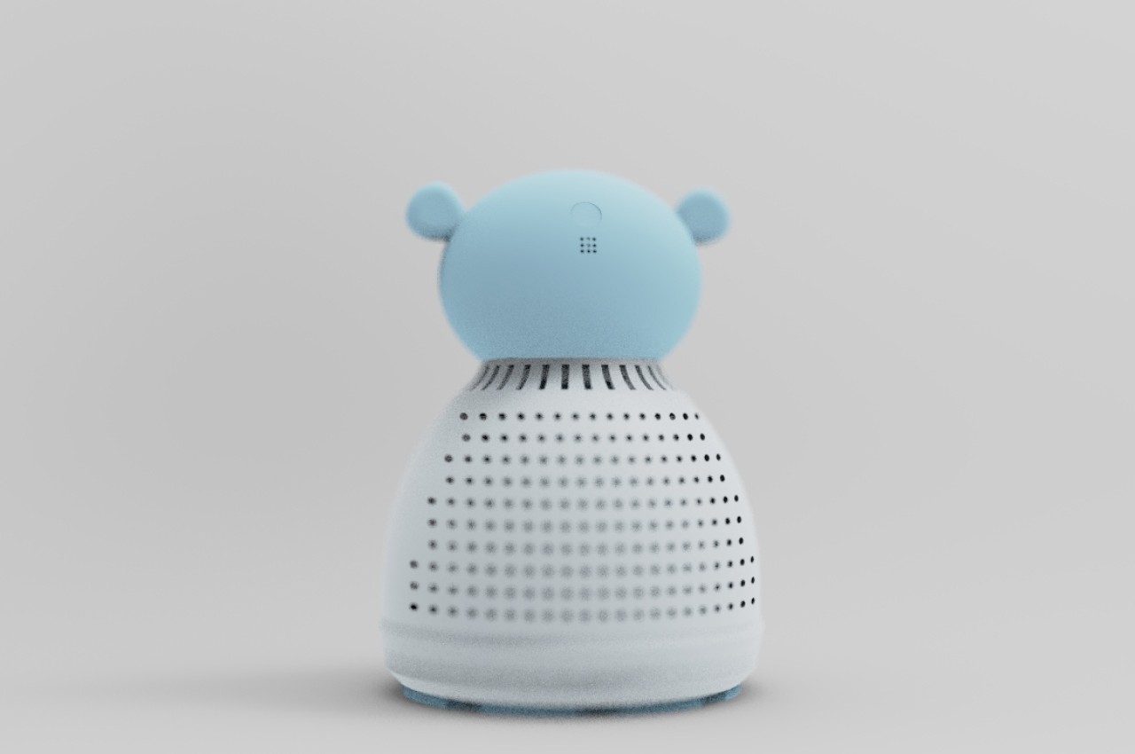
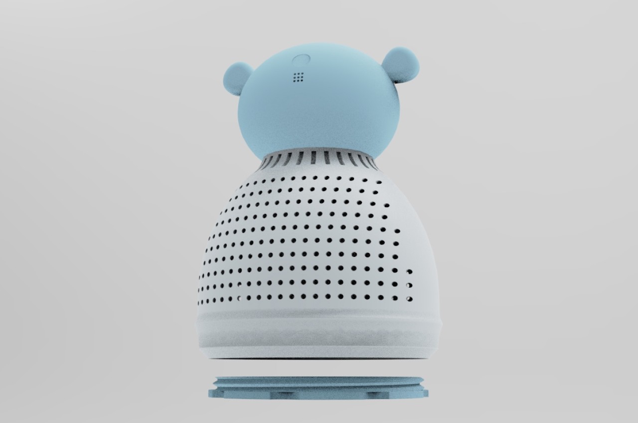
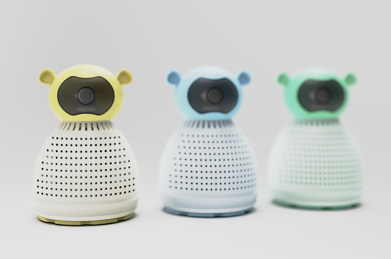
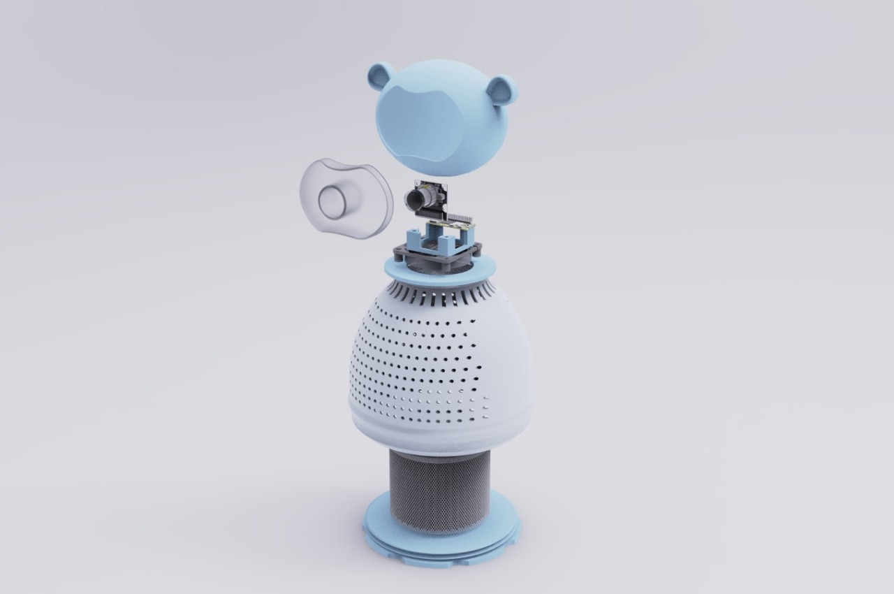
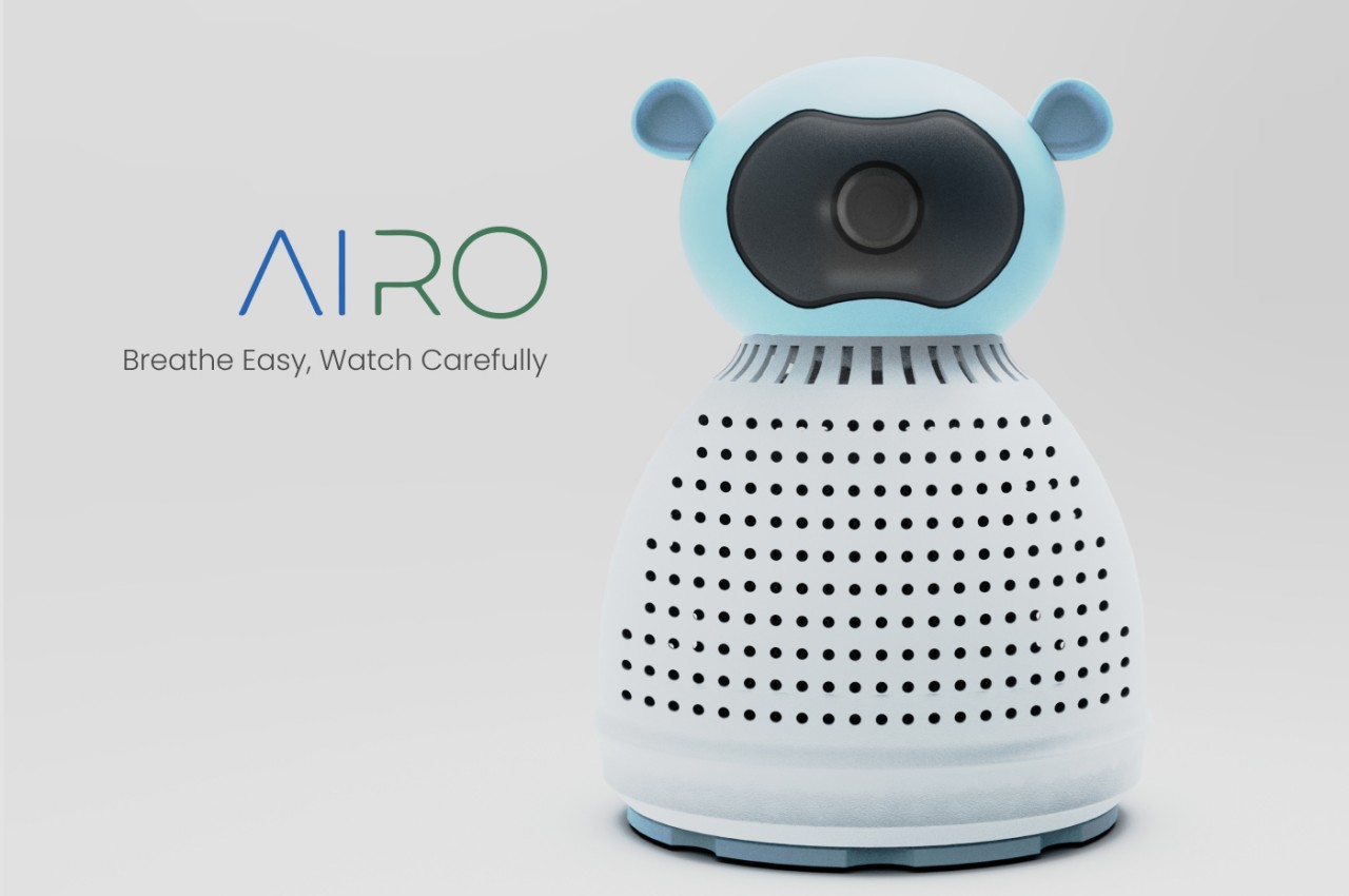
Airo is a concept air purifier that takes that trend in a slightly different direction, designing for the youngest members of the family rather than a general audience. It has a fun appearance, with a dome-like body and head topped by two ears, clad in soft pastel colors that are easier on the eyes, especially for babies whose eyes can easily latch onto bright colors and sharp shapes. But despite appearances, Airo is still meant to function as a proper air purifier, albeit one that is specifically tuned for the needs of babes and tots.

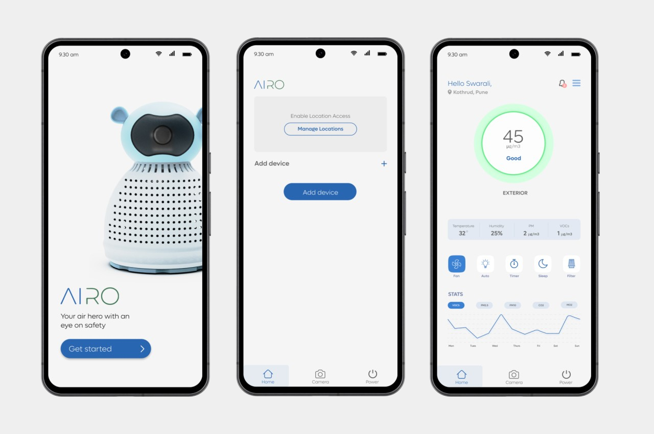
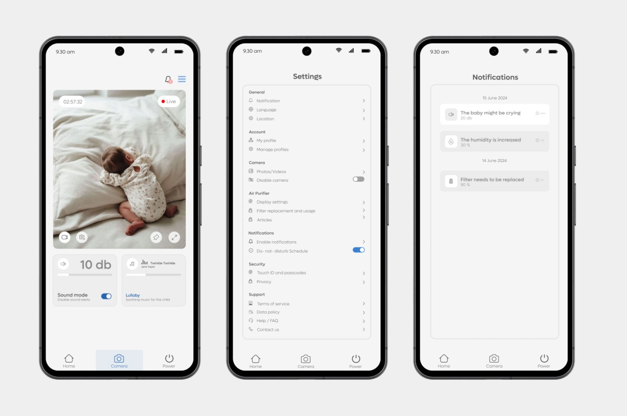
That isn’t the only function it serves, however. Since the appliance will be staying in the child’s room 24/7, it is also in the perfect position to monitor the baby remotely. To that end, it has a built-in camera, exactly where the face is, and comes with an app that has the expected bells and whistles for remote camera control. Thus, Airo offers a multifunctional package that offers parents some assurance that their babies are breathing clean air and are safe from harm.

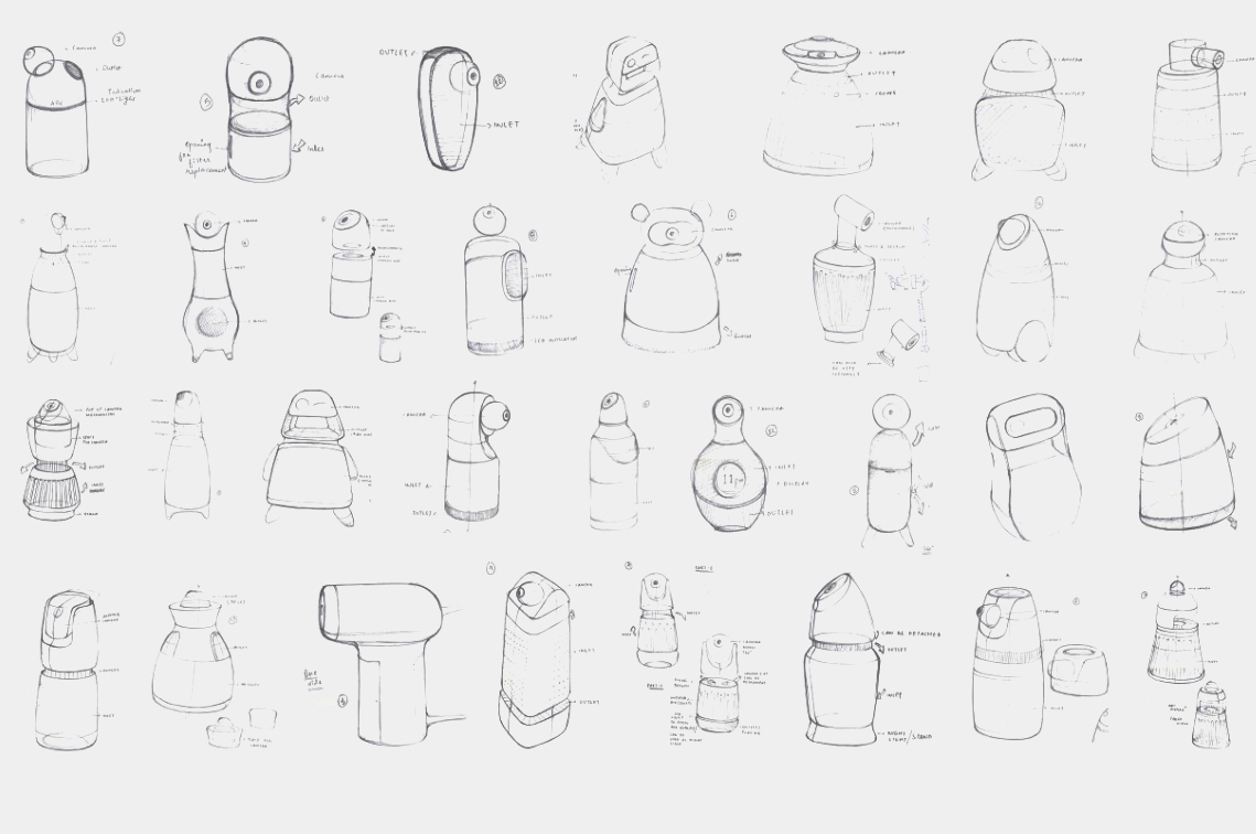
The concept design admittedly focuses on the form of the device as well as the user experience, so it leaves plenty of room for the actual implementation of the features. An air purifier for kids, for example, will need to be extra quiet, especially at night, and should be childproof from accidents. The latter might be a bit more difficult to ensure given how the toy-like design of the product could make kids actually want to play with it.

The post Toy-like air purifier doubles as a baby monitor to help give parents some peace of mind first appeared on Yanko Design.
Lightweight stroller concept transforms into a backpack when not in use

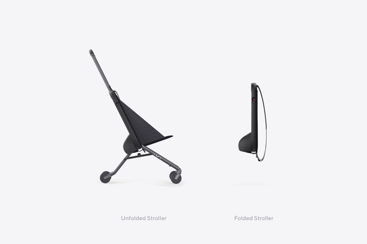
When I go to amusement parks, this single woman sometimes feels pity seeing parents lugging around heavy duty strollers for their kids who decided they prefer running around the area then later on deciding they’re too tired to walk. Most of the strollers are bulky and heavy, adding to back problems and joint problems for the parents (aside from the back pain from carrying the child around). This new concept says that it’s the most compact and lightest baby stroller even as the mechanism is still patent pending.

Designers: Mick Beliaev and David Popkov

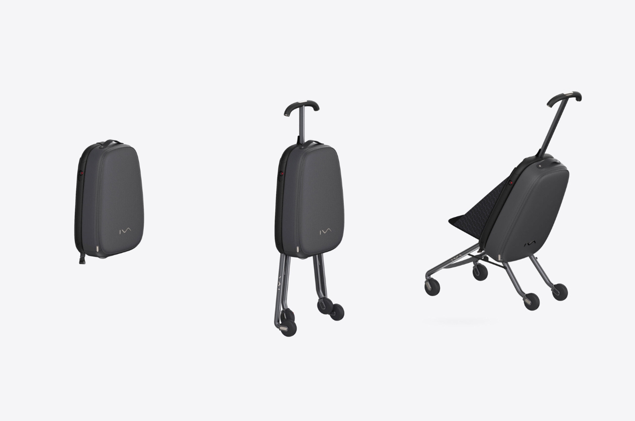
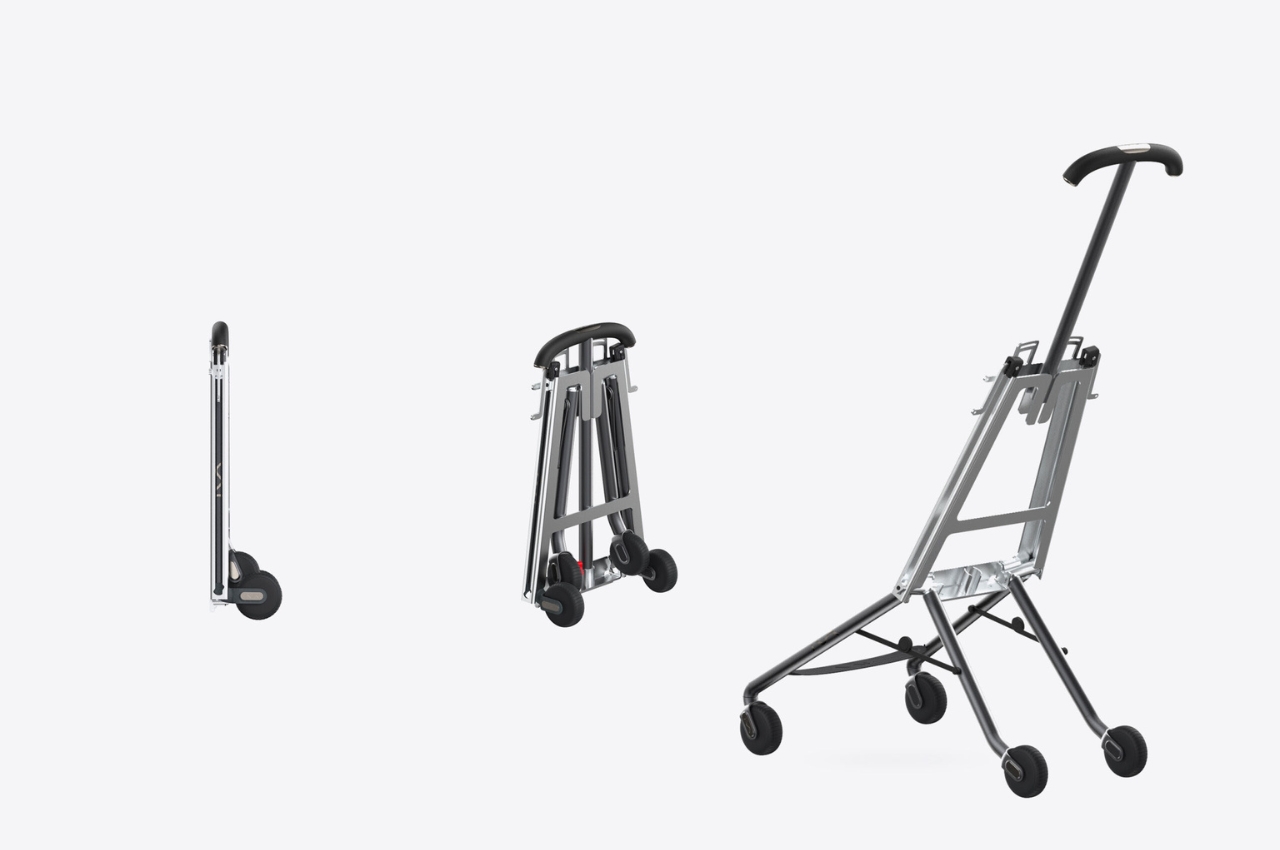
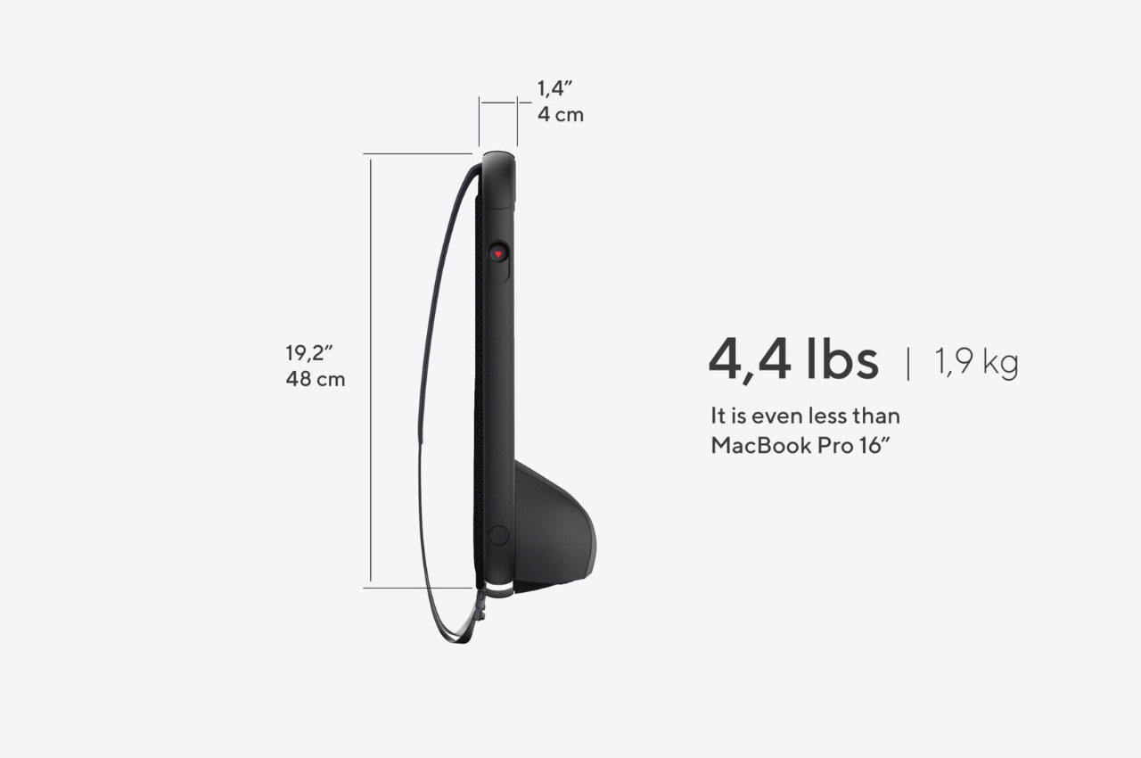
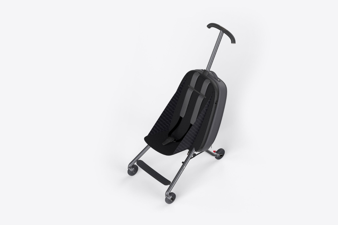
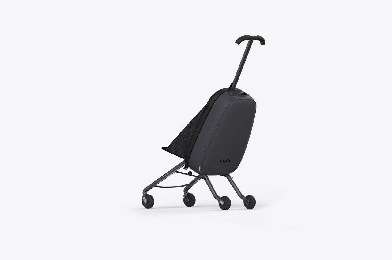
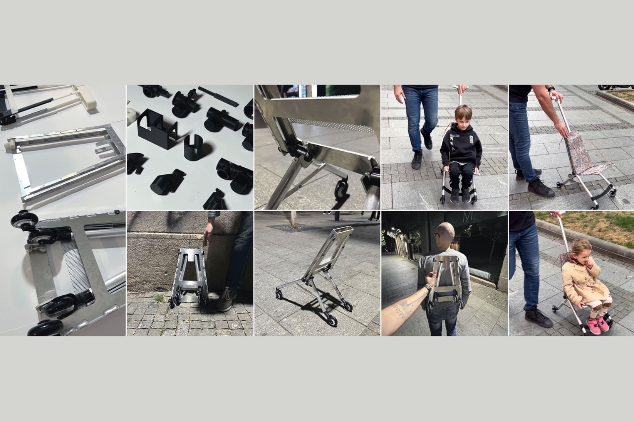
Iva is a stroller that can be stored into a backpack when not in use. It is 1.6 inches slim and 4.4 lbs light, which apparently is lighter than the 16-inch Macbook Pro. It is also pretty easy to assemble and pack, once you get the hang of the mechanism which seems a bit complicated at first. But once you’ve mastered it, it should only take around 60 seconds for you to fold and unfold.

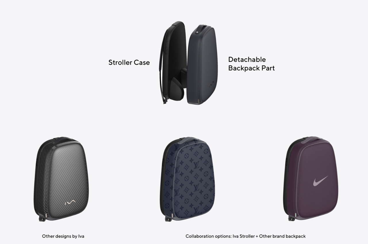
The stroller itself has an Aviation Aluminum 7075 frame-enclosure and includes four pipe-shaped legs with soft rubber wheels. It is designed according to the US Safety Standard F833 for carriages and strollers. You can also detach the backpack so if you want to get a new color or design, you can just buy a new backpack part. The video showing the designer’s 7-year old kid riding the stroller seems to show that it’s pretty durable and as comfortable as a stroller can get.

The Iva stroller isn’t as cushy or enclosed as most of the strollers we see in the market but those are probably some of the things you have to give up to create what is supposedly the lightest one. They said they are selling the project to a larger brand or it may also go on Kickstarter in the summer.

The post Lightweight stroller concept transforms into a backpack when not in use first appeared on Yanko Design.
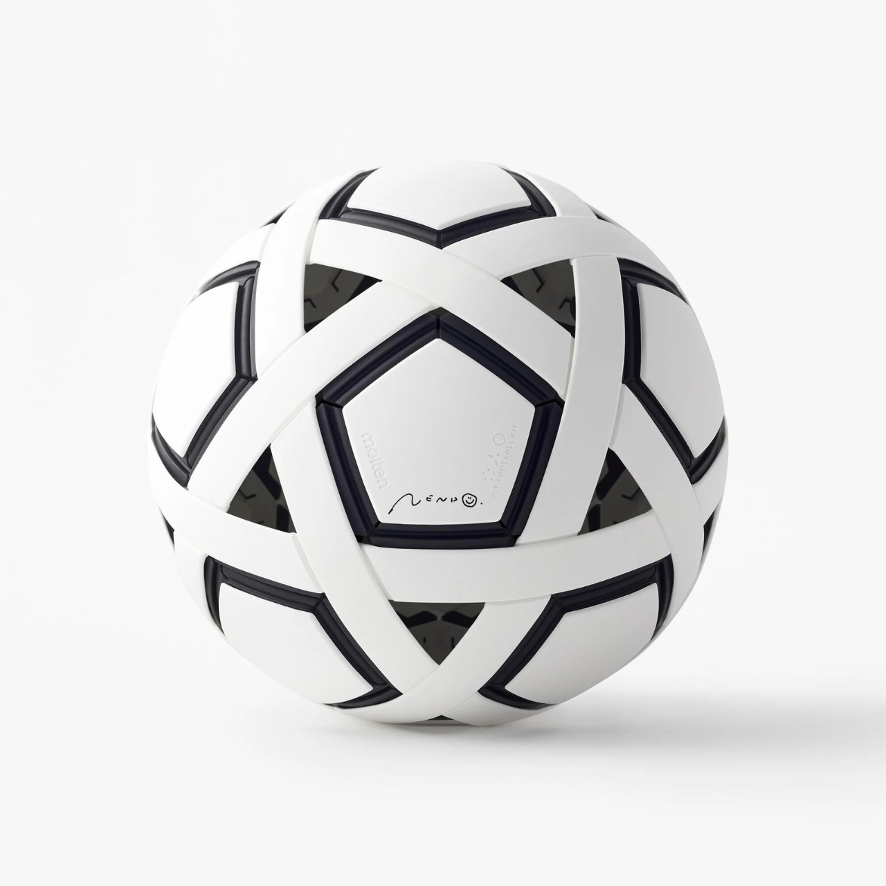
Nendo House My Football Kit is an airless ball you can assemble

While I’m a huge football fan (soccer to our friends in the U.S), I’ve never had the desire to actually play it. One of the reasons is the few times I’ve tried kicking a ball around, I always feel like I hurt my foot because the balls are just too hard. If there was probably a ball that was softer but still had the same quality as the regular football, then maybe I might have been convinced to play a few pick up matches. This new ball from Nendo House is one kind of ball that might have turned me into a (barely) passable football player if it was existed when I was younger.

Designer: Nendo House

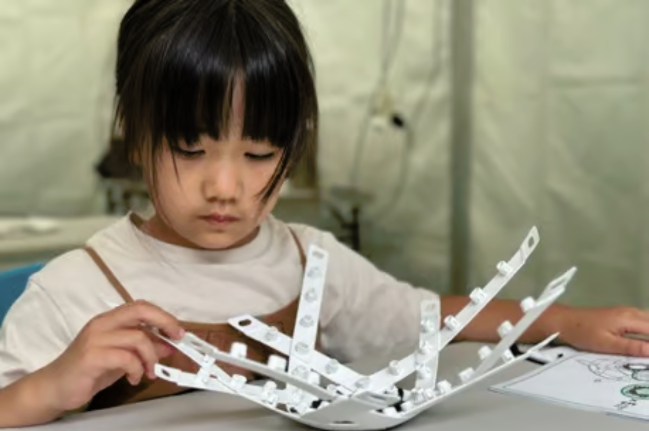
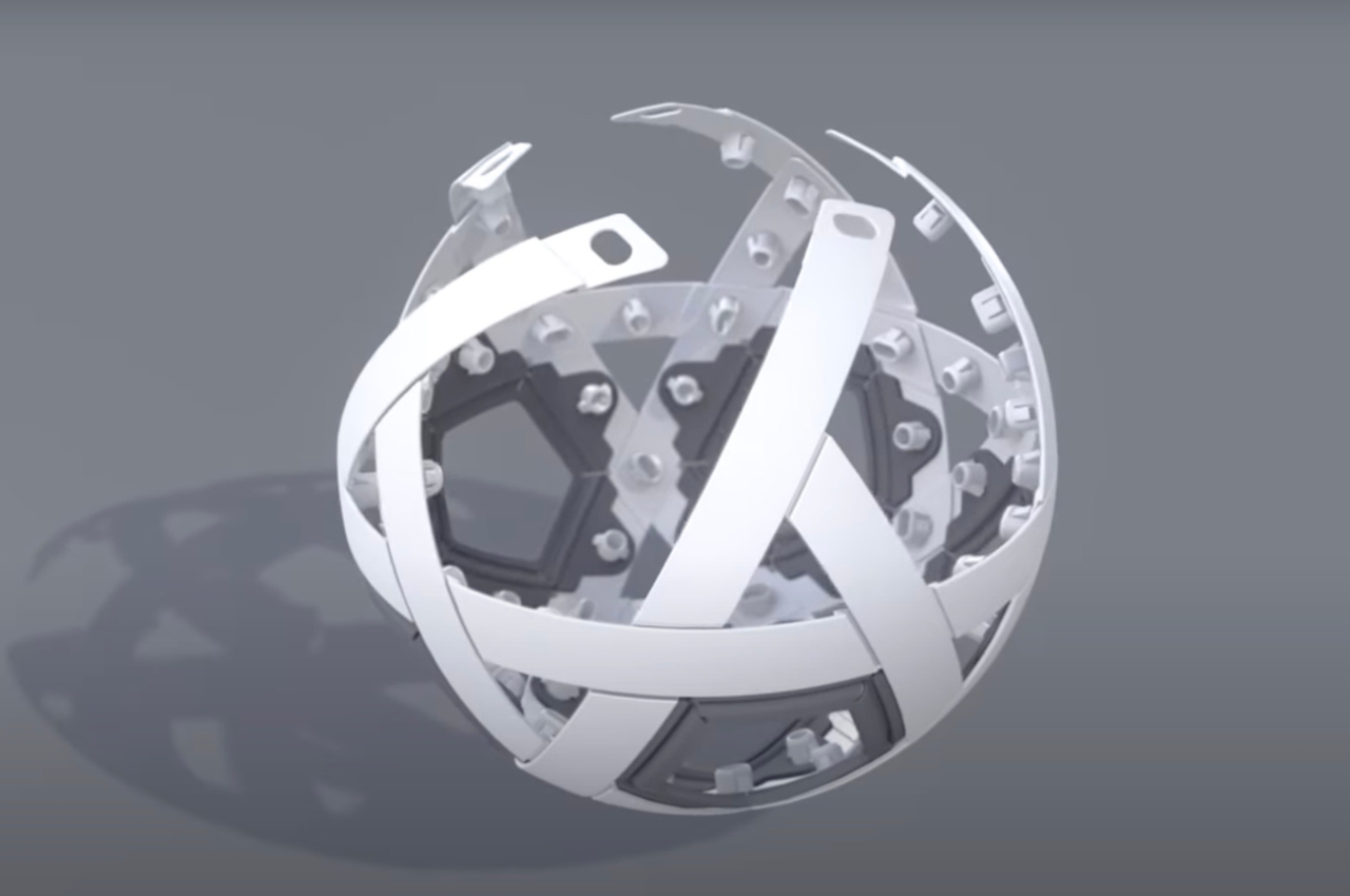
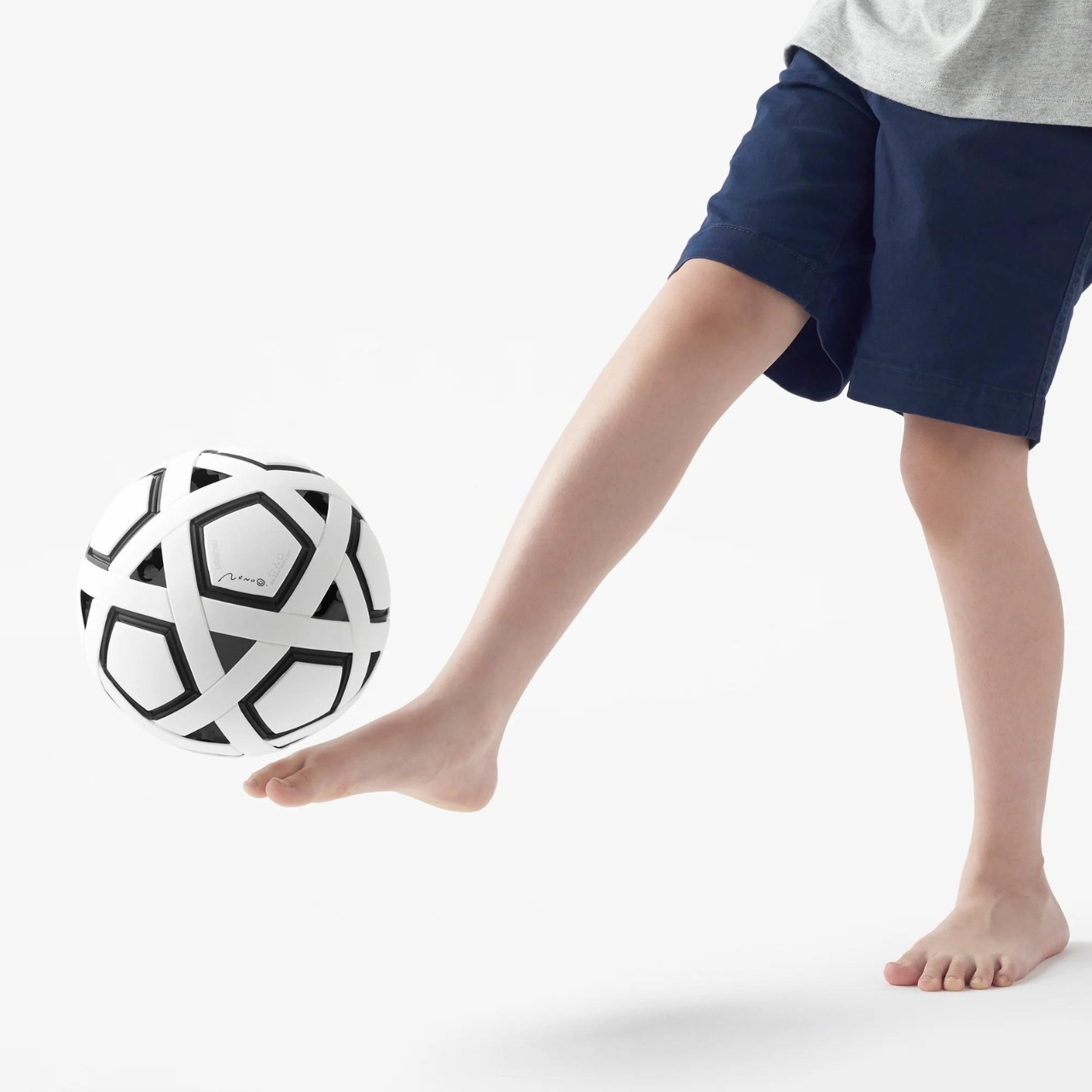
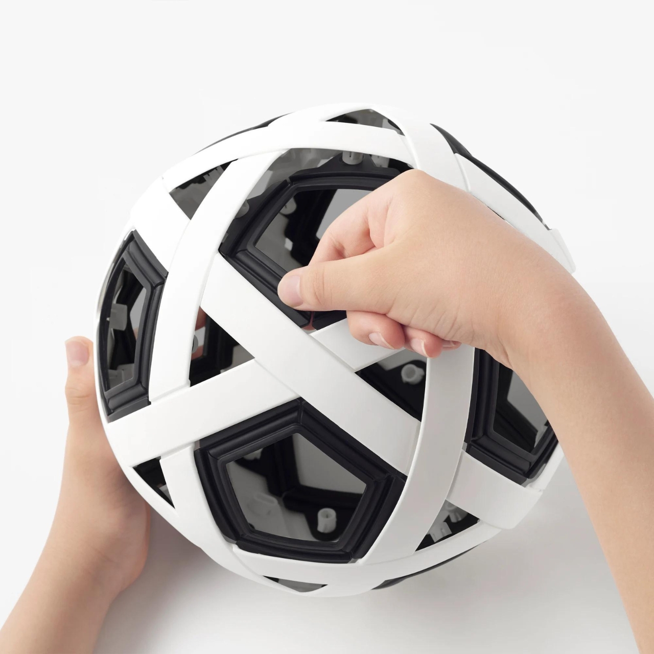
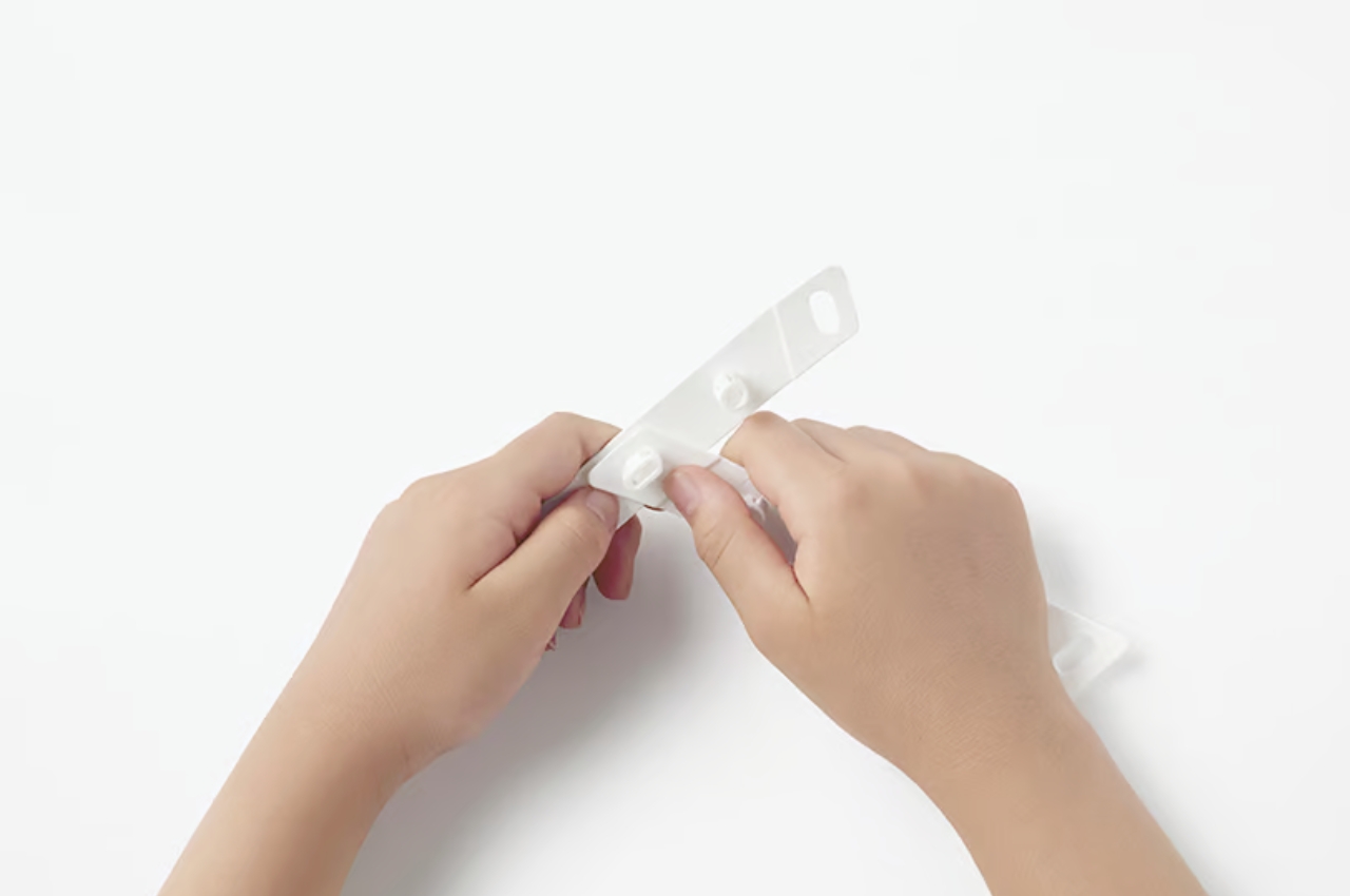
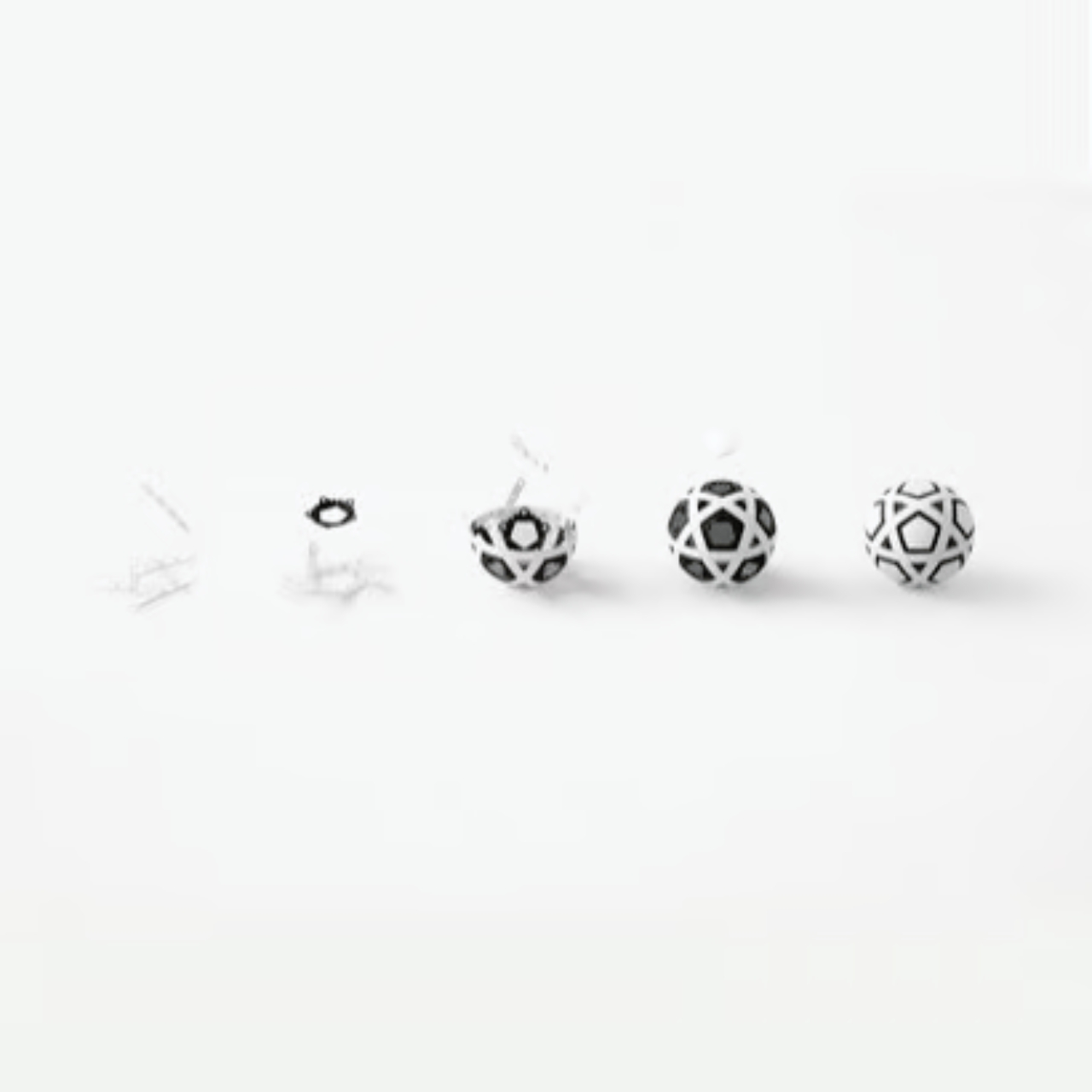
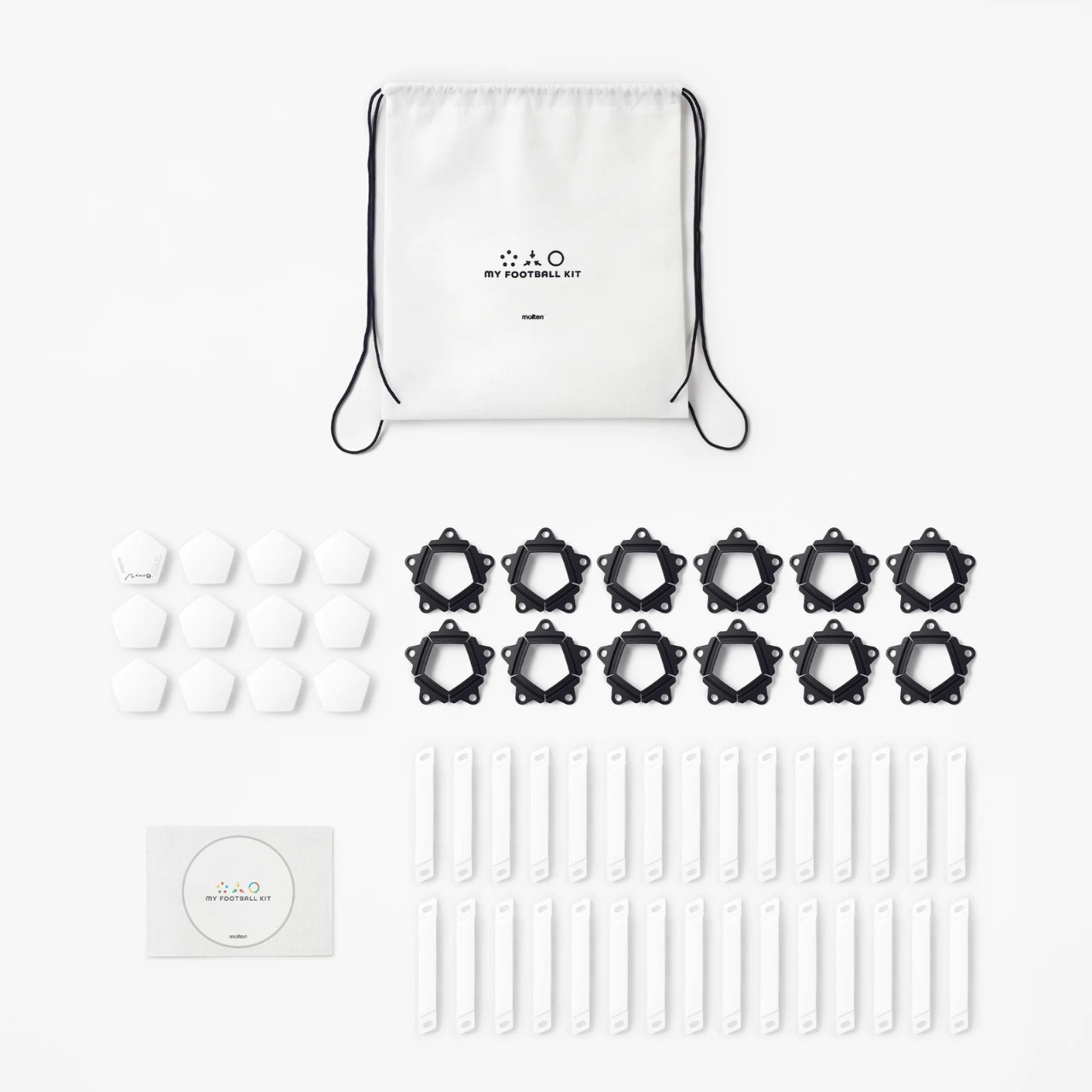
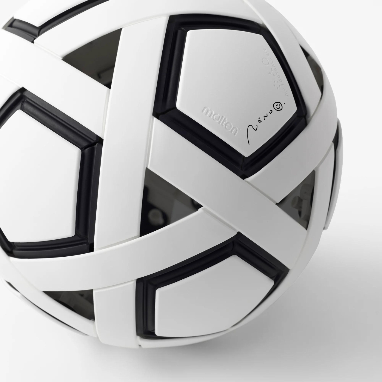
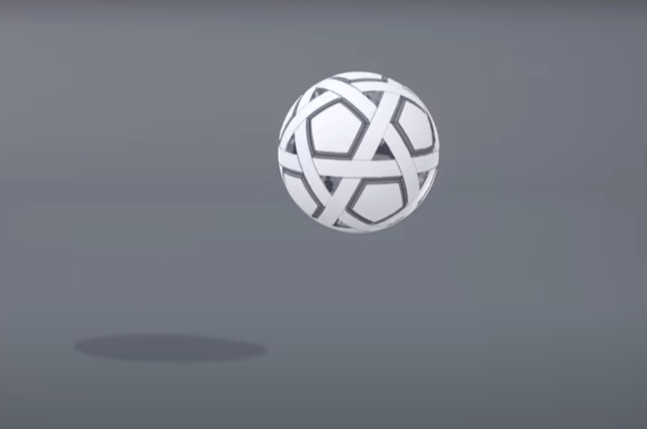
The “My Football Kit” is a lightweight football that you can assemble yourself and does not require any inflation. It is made from soft, recycled polypropylene and elastomeric synthetic resin components so they’re not as heavy as the regular football and won’t hurt feet even if you’re not wearing kicks. It is an airless football so it uses the resilience of its surface material instead of the internal air pressure.

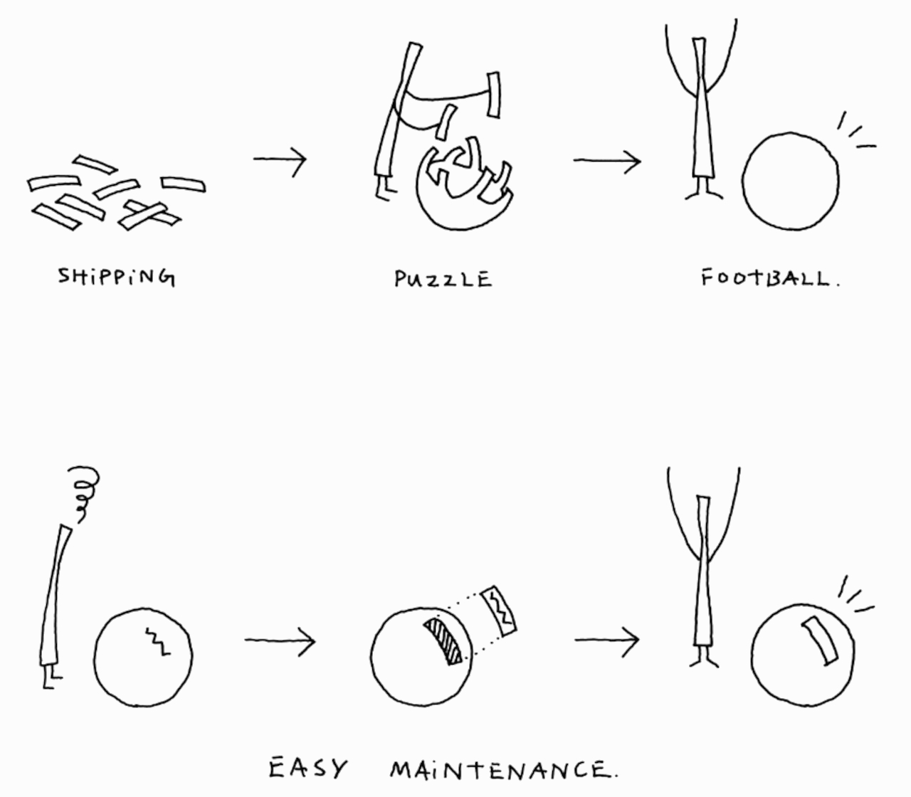
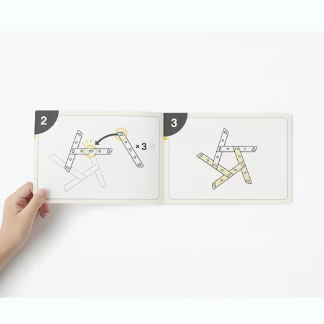
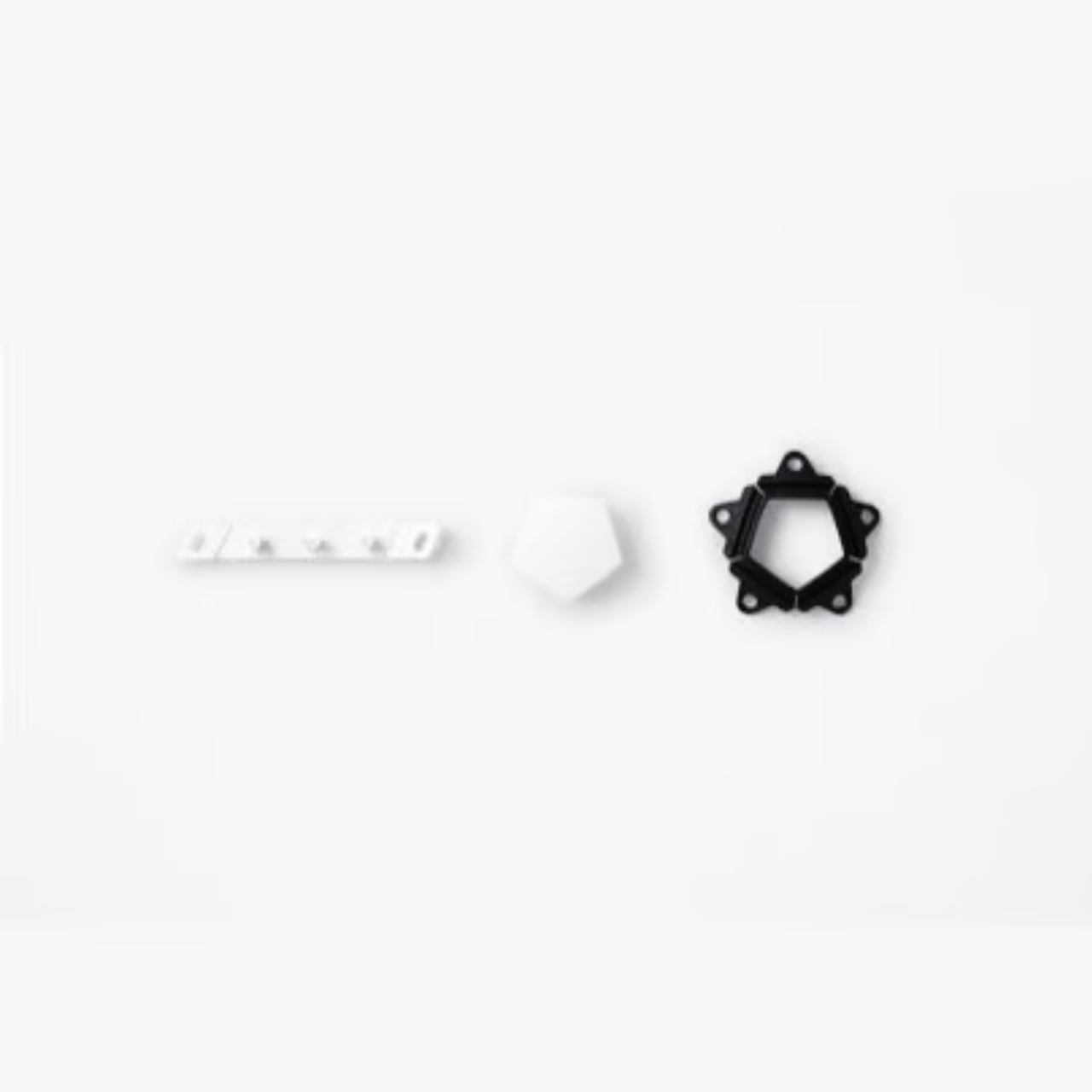
What’s more, you will assemble the football itself with its 54 individual parts that uses three types of components. The structure is inspired by the traditional Japanese woven bamboo ball. And even if one of the parts comes off when you’re playing, the ball will not fall apart since it has an interlocking structure. You can also replace the broken components so you can continue using the ball for a long time.

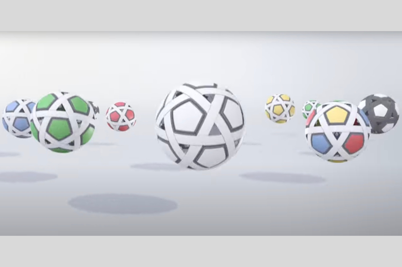
There’s also a pretty cool social aspect to this football. With every purchase you make, one ball will be donated. And for every 10 purchases, Molten will donate footballs to places like children’s homes or special support schools. The My Football Kit is available in just one color, a white and black combination. But the colors of the balls that will be donated will depend on the manufacturer and the availability.

The post Nendo House My Football Kit is an airless ball you can assemble first appeared on Yanko Design.

Fitbit Ace LTE smartwatch pulls kids from screens to indulge in rewarding playtime

The other day my 7-year-old nephew refused dinner until his father allowed him access to the smartphone after the meal. This was difficult for me – someone outside of parenting primary school children – to digest. I realized controlling screen time is a big issue for parents handling kids in this age group. These kids are distancing themselves from outdoor sports and playtime only means video games.
Smartwatches have very little share in this. Perhaps, the screen real estate makes them mere child trackers rather than motivators, while smartphones or game consoles enjoy the lion’s share. Even when the smartwatch has more potential to allow kids some distraction from eye-straining mobile screens. Google with Fitbit has been exploring this possibility for a couple of years; now it seems to be rolling out that potential wearable that could provide “benefits of a smartphone. Without the smartphone” in your child’s hand.

Designer: Fitbit

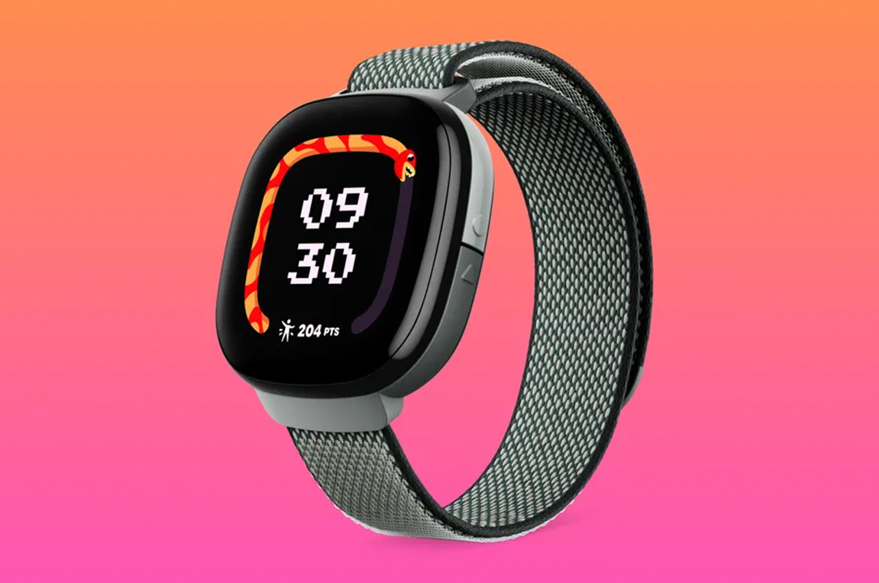
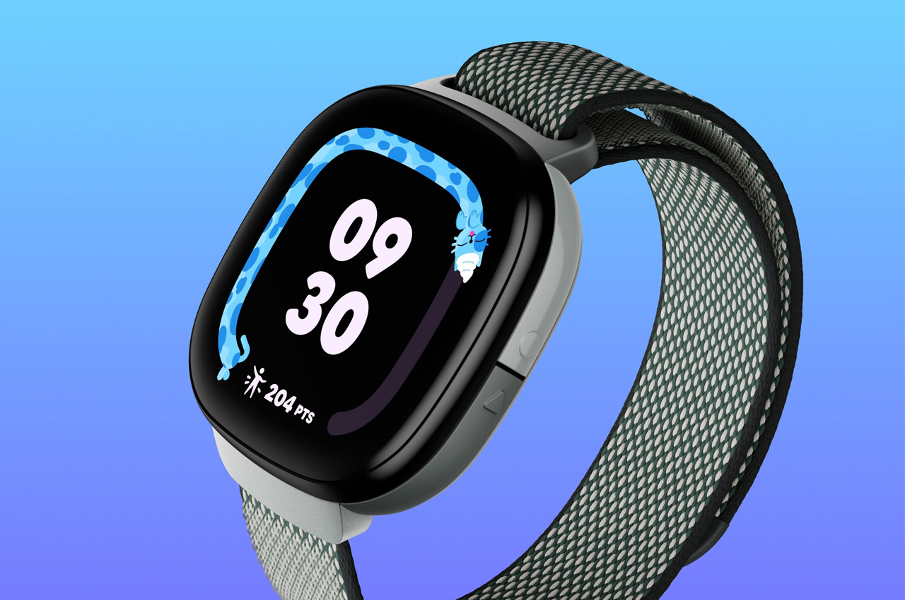
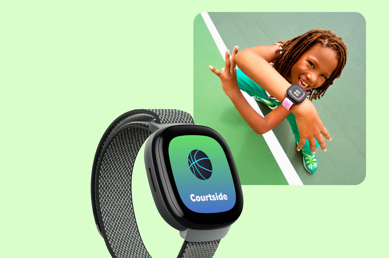
Enter the Fitbit Ace LTE, the first of its type wearable for kids ages 7+ that combines playtime with video games to get kids active without compromising too much on their ongoing lifestyle. By bringing immersive, interactive 3D games to the child’s wrist, Fitbit may have just crossed the line, but its interesting idea to align gametime with playtime really places the device in my good books.

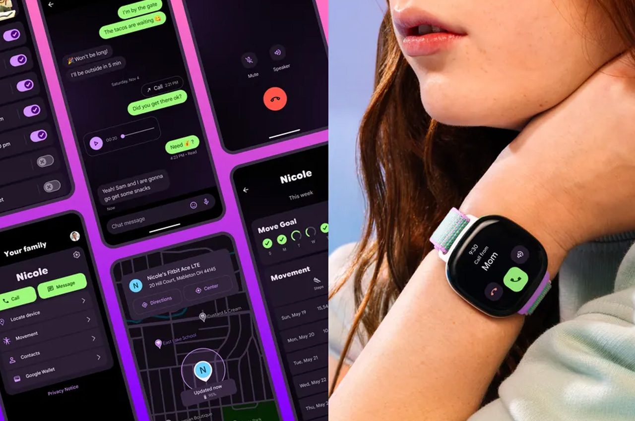
The more a child plays (moves) the more games they unlock on their Ace LTE. This is a simple motivation mantra around which the entire wearable is designed. Because it’s going to be on the child’s wrist all the time, this is not the only feature it packs: privacy and parental control are the driving pillars. Powered by webOS, the Fitbit Ace using Fitbit Ace Pass and the Fitbit Ace app, allows parents to track their child’s real-time location, call or text them, send and receive voice messages, and even set trusted contacts that are permitted to interact with the child. For safety, the child’s location or activity data is deleted every 24 hours while their activity data is erased after 35 days of backup.

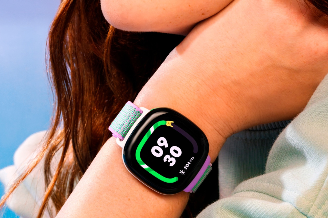
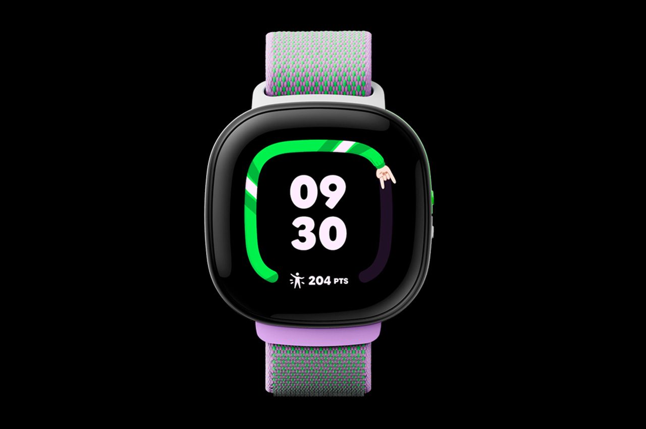
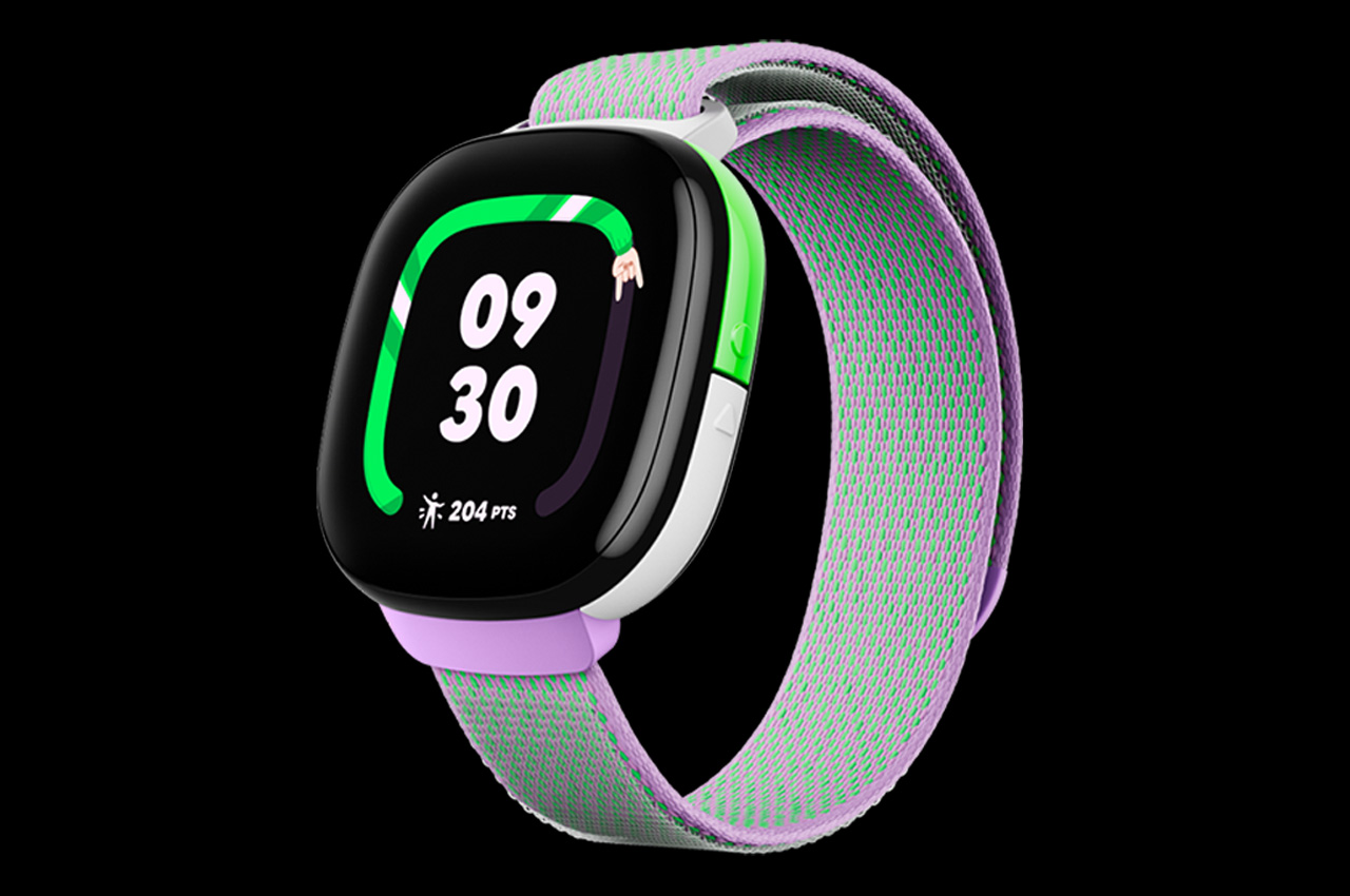
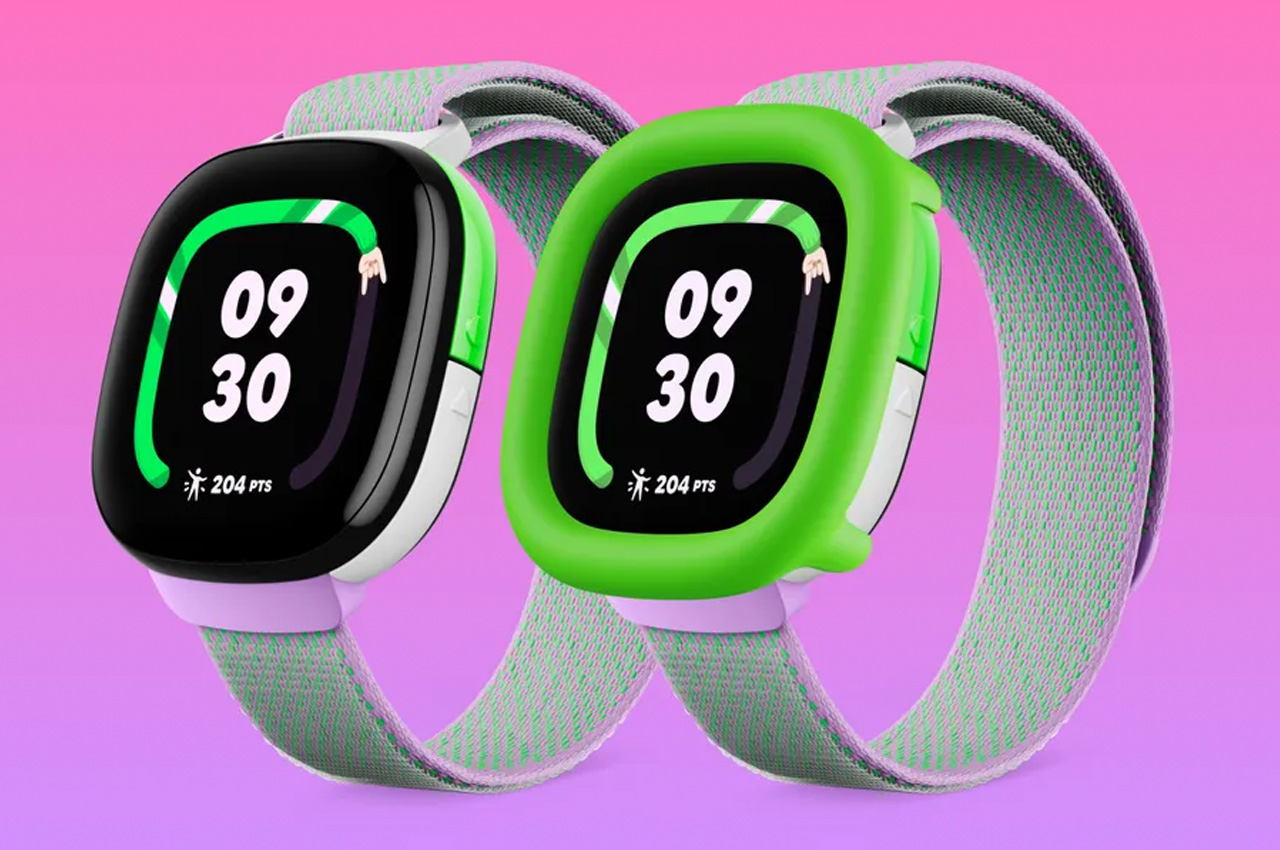
To recognize and reward, Fitbit Ace LTE kid’s smartwatch uses Google’s self-developed movement algorithm to accurately measure kids’ physical activity whether they’re “playing hide and seek, jumping on the bed or having a sibling dance-off,” Google notes. The idea is to encourage and motivate all types of movement – visible in ‘Noodle,’ an activity ring on the watch home screen – and reward the same with new games and more game time.

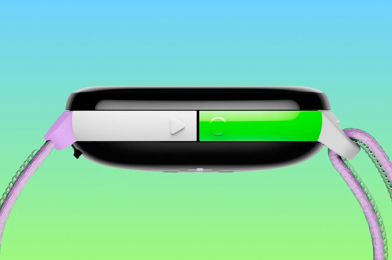
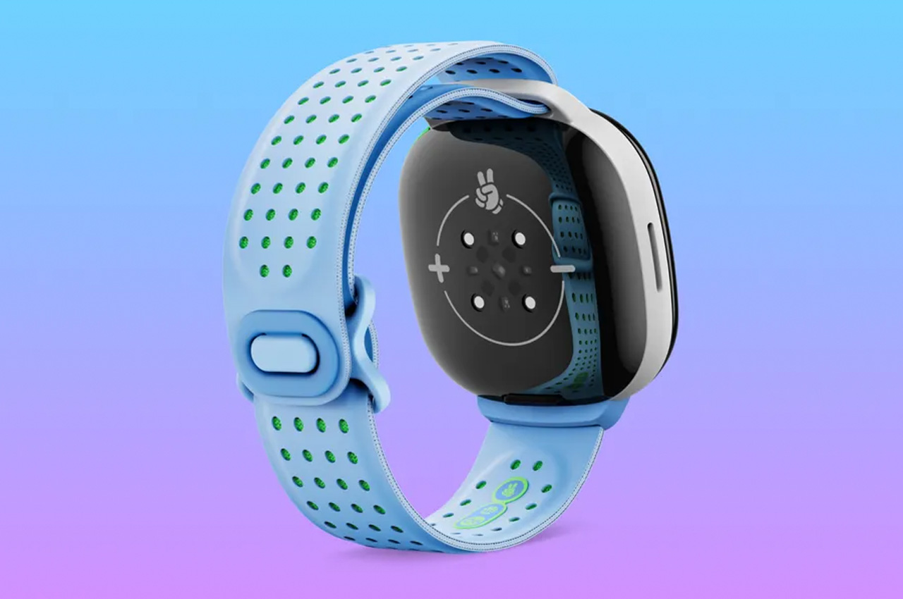
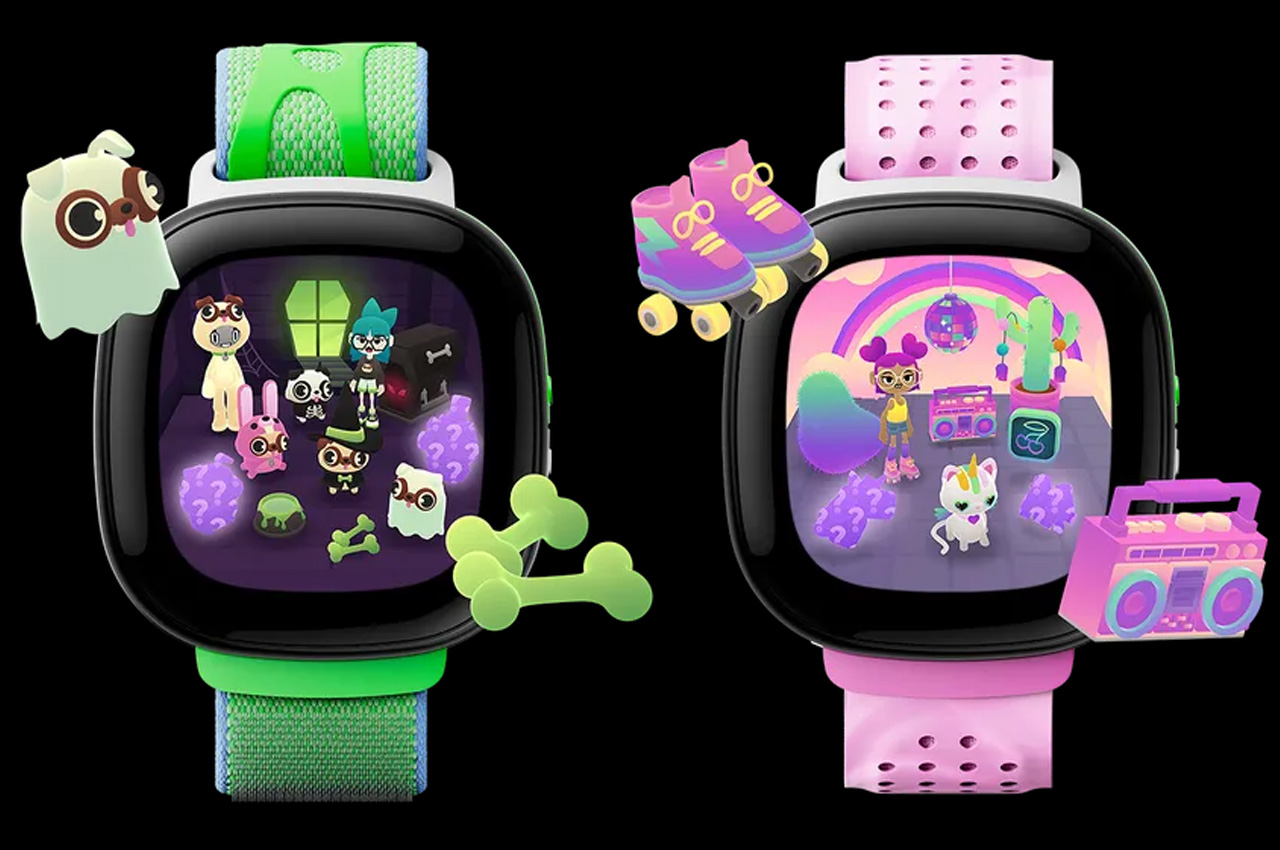
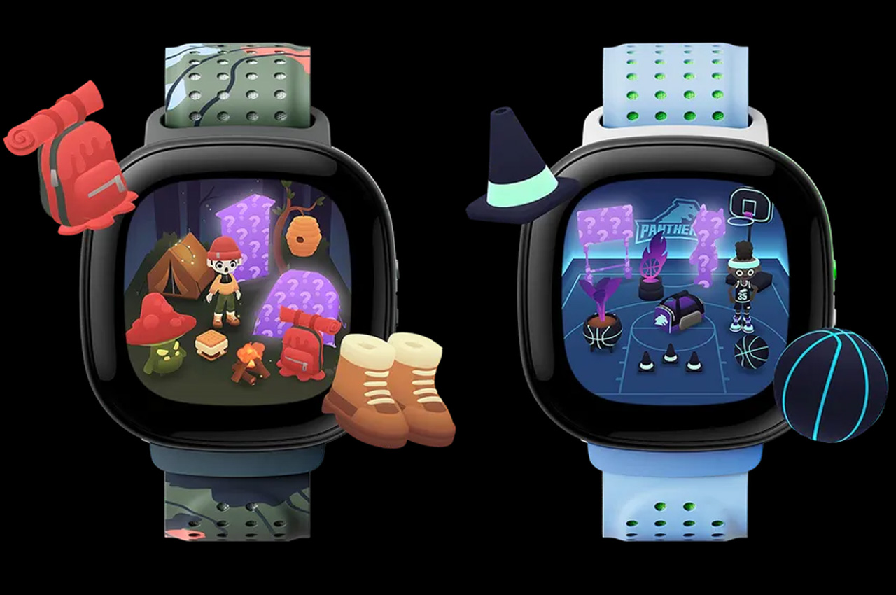
Noddle is not the only weirdo on the Fitbit Ace LTE. Kid’s get their own customizable Eejie that stays happy off the wearer’s daily physical activity. So, the more kids clock their activity goals the happier their Eejie gets. And besides customizing the Eejie, kids can also use different watch bands that clip on and unlock ‘different items, styles, rooms and Noodles’ to interact and play with. With 16 hours of playback time, 50-meter water resistance, and a scratch-resistant display, the Fitbit Ace LTE is available for preorder at $229.95.


The post Fitbit Ace LTE smartwatch pulls kids from screens to indulge in rewarding playtime first appeared on Yanko Design.