Some gifts say “I know you are a designer” better than any coffee table book ever could. HOZO’s tools fall squarely into that category, with a family of meticulously engineered rulers, blades, and blocks that speak the language of architects, engineers, and makers. Instead of chasing gimmicks, the brand focuses on reworking everyday instruments with tighter tolerances, smarter details, and a visual presence that feels at home on a carefully curated workspace.
For this holiday season, HOZO’s Neo quartet covers almost every corner of a creative workflow. NeoBlade handles precision cutting on models and mockups, NeoRuler and NeoRulerGo tackle measurement both at the desk and on the go, and NeoBlock brings a modular, almost playful approach to layout and alignment. Taken together, they form a compact ecosystem of gifts that quietly make a designer’s life easier while still delivering that satisfying “where did you find this?” moment when the wrapping comes off.
NeoBlade (20-25% off)
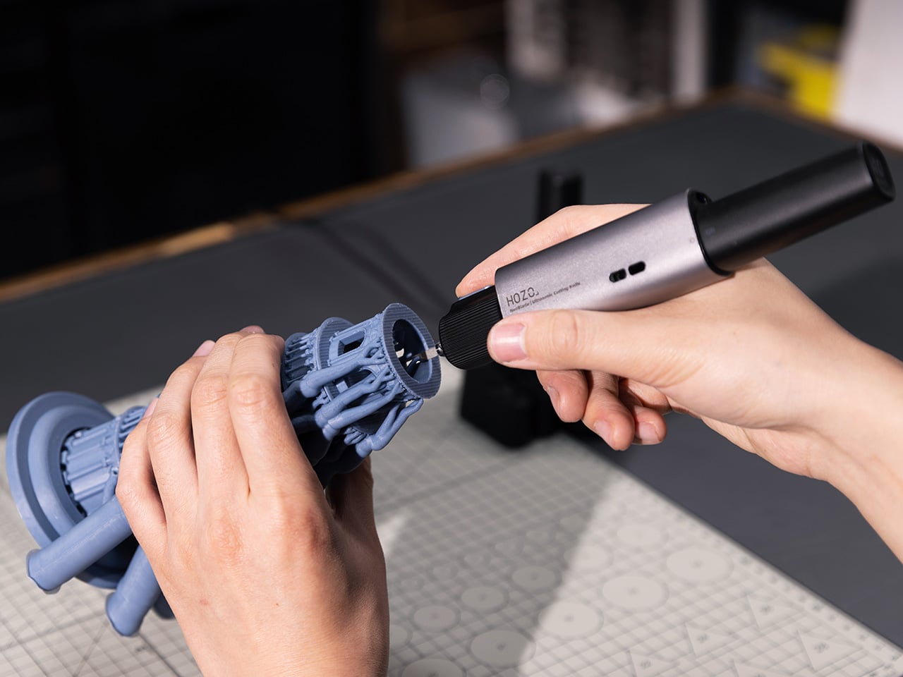
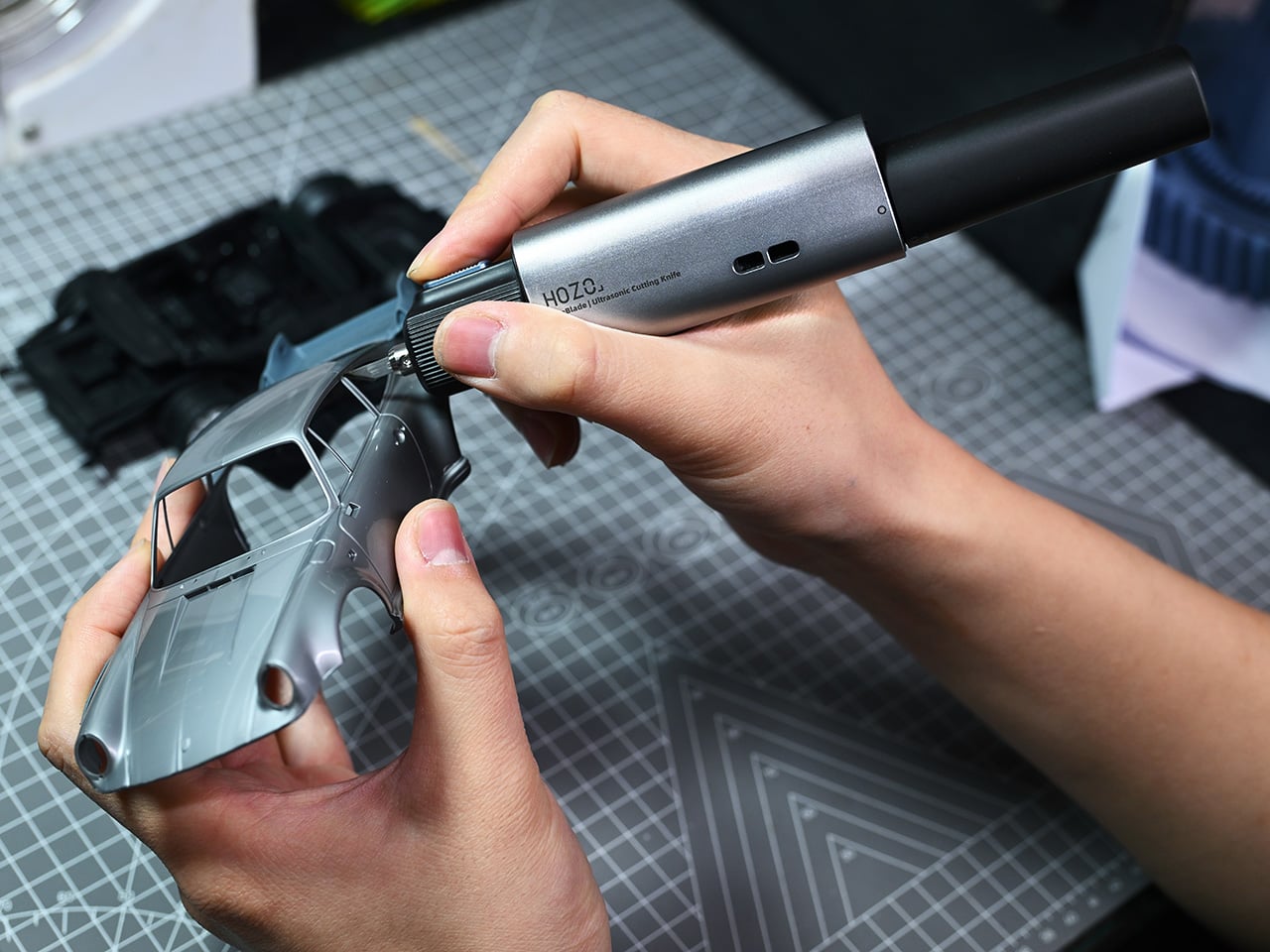
Ultrasonic cutters have been floating around maker spaces and professional studios for years, but they have always carried the same baggage: tethered cords, overheating, and body designs that feel more industrial than intentional. NeoBlade strips away all of that in favor of something much more useful. It runs completely wireless with a swappable 1300mAh battery system that hot-swaps in seconds, charges via USB-C in 30 minutes, and delivers 30 minutes of runtime per pack. The tool weighs just 124 grams without the battery, which makes it genuinely comfortable to hold for extended sessions trimming 3D prints, cutting leather patterns, or carving into foam core mockups. The ultrasonic engine itself operates at 40 kHz with adaptive power output between 9 and 40 watts depending on material density, so it adjusts on the fly whether you are slicing through 4mm acrylic or detailing cardboard templates.
HOZO built two cutting modes into the handle: Precision Mode works as a press-and-hold trigger for short, controlled cuts on intricate parts, while Continuous Mode toggles down for long, uninterrupted runs. The blade system deserves attention too. NeoBlade ships with a six-blade sampler set covering standard, long, chisel, mini chisel, curved, and double-edge profiles, all machined from SK5 steel that lasts two to three times longer than typical carbon steel hobby blades. They mount magnetically for quick swaps, and the tool accepts standard 9mm 30-degree snap-off blades from brands like OLFA if you want compatibility with what you already own. A 13,000 RPM turbo-cooling fan with dual exhaust vents keeps the internal temperature stable even during heavy use, which addresses one of the biggest weaknesses in older ultrasonic designs. HOZO also includes a child lock and designed the body with ambidextrous airflow, so it works cleanly for both right- and left-handed users. For the holiday bundles, HOZO offers the NeoBlade Combo at 25% off and the NeoBlade Premium Combo (also 25% off), which adds the TurboDock dual-channel fast-charging station and an extra battery pack for professionals running back-to-back projects. If you’re craving just the standalone NeoBlade, HOZO offers a pretty sweet 20% discount to begin with.
Why We Recommend It
Most precision cutters make you choose between portability and power, but NeoBlade solves that tradeoff by going fully wireless without sacrificing the high-frequency cutting performance that makes ultrasonic tools so effective in the first place. The swappable battery system is the real game-changer here, because it means you can keep a second pack charged and ready rather than pausing mid-project to wait for a tethered cord or a drained battery to recover. Combined with the variety of blade profiles and the adaptive power output that automatically adjusts to different materials, NeoBlade becomes one of those rare tools that handles both delicate detail work on resin prints and aggressive cuts through plywood or carbon fiber without needing a second device. At 20% for the standalone device and 25% off for both the Standard and Premium Combos, it lands at a price point that undercuts most corded ultrasonic cutters while delivering more flexibility and a cleaner workflow.
Click Here to Buy Now: $127.49 $149.99 (15% off) | NeoBladePremium Combo at 25% off Here. | NeoBlade Combo at 25% off Here. Hurry, deal ends in 48-hours!
NeoRuler (20% off)
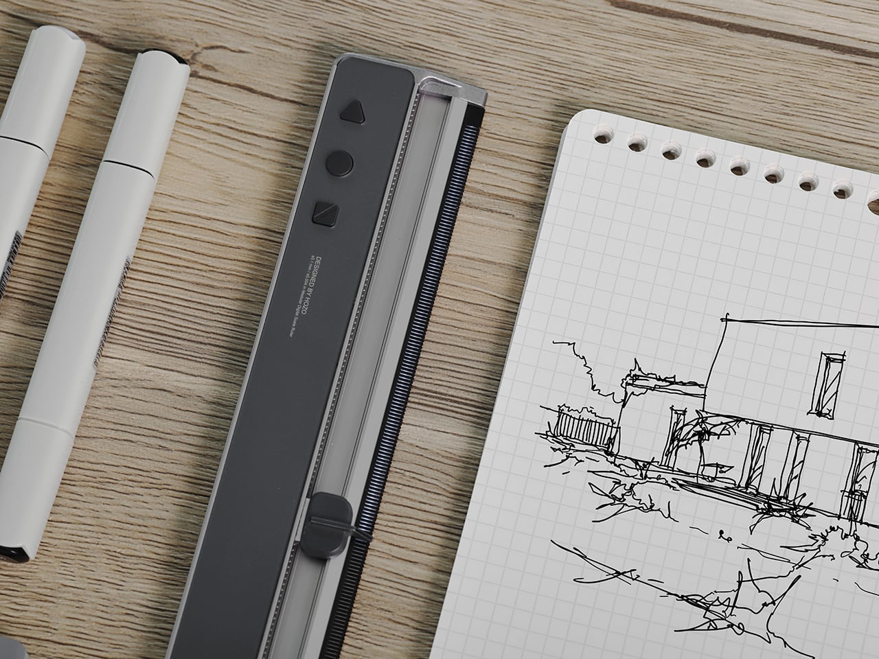
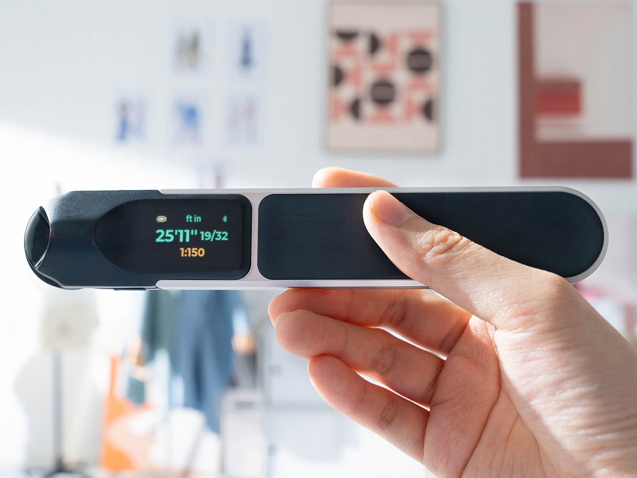
Most architects and engineers have a drawer full of scale rulers because no single tool covers all the ratios they actually need. NeoRuler collapses that entire collection into one 12-inch aluminum body with a 1.14-inch backlit LCD screen and a segmented LED strip running the length of the edge. Instead of fixed markings, you slide a pointer along the ruler and the display shows your measurement digitally with 0.1mm accuracy. The clever part is the zero-anywhere system, which lets you set any point along the ruler as your starting reference and measure bidirectionally from there without lifting the tool. NeoRuler ships with 93 built-in scales split across eight modes (architectural, engineering, metric, and more), covering ratios like 1:1, 1:50, 1:100, and everything in between. The MEAZOR app adds unlimited custom scales if your work involves non-standard ratios, and the device switches instantly between decimal inches, fractional feet, millimeters, centimeters, and other units without menu diving.
The 1000mAh battery charges via USB-C and delivers around 12 hours of active use or 180 days on standby, so it stays ready between projects. HOZO also offers the NeoRuler Premium Combo at 20% off, which bundles the ruler with NeoCaliper for object measurements, NeoMagnifier for fine readings, two NeoPointers (0.8mm and 1.2mm) for precise drafting, and a protective carrying case. The modular accessories snap onto the ruler body magnetically, turning it into a full desktop measurement system rather than just a single-purpose tool. The screen has a non-glare coating and adjustable color themes, which makes it genuinely easy to read under studio lighting or in the field.
Why We Recommend It
The real breakthrough with NeoRuler is how it eliminates the constant mental math and tool-swapping that comes with traditional scale rulers. If you are working from a drawing at 1:75 scale but need to convert that to actual dimensions in fractional inches, or if you are sketching at 1:20 and want to see the result in metric, NeoRuler handles the conversion in real time without forcing you to pull out a calculator or switch to a different ruler. The zero-anywhere feature is surprisingly useful in practice because it means you can leave the ruler positioned on a drawing and measure multiple segments without resetting or repositioning. At 20% off, the standard NeoRuler lands at just over $100, which undercuts what most people pay for a decent set of traditional scale rulers while delivering far more flexibility and precision in a single device.
Click Here to Buy Now: $103.20 $129 (20% off). | NeoRuler Premium Combo at 20% off. Hurry, deal ends in 48-hours!
NeoRulerGo (28% off)
Where NeoRuler solves the desk-bound measurement problem, NeoRulerGo tackles a completely different challenge: measuring things that aren’t flat, straight, or conveniently positioned in front of you. This is HOZO’s pocket-sized rolling digital tape measure, roughly twice the size of a USB flash drive at 3.4 x 1.2 x 0.7 inches and weighing just 1.6 ounces. Instead of a sliding pointer on a rigid ruler, NeoRulerGo uses a small rubber wheel that you roll along whatever surface you are measuring, while a built-in red laser cross (635nm Class I) marks your start and end points. The digital screen displays real-time measurements as you roll, and the tool handles curves, irregular contours, and odd shapes just as easily as straight lines. Accuracy sits at ±1mm plus 0.5% of the distance measured, with 0.5mm resolution, which is more than adequate for field measurements, site surveys, or quick checks on furniture dimensions and room layouts.
Like its bigger sibling, NeoRulerGo includes the same 93 built-in scales and connects to the MEAZOR app for custom scale creation and data logging via Bluetooth. The 300mAh battery charges over USB-C and the body carries an IP54 rating, so light rain or dusty job sites won’t shut it down. The form factor makes it genuinely pocketable or keychain-friendly, which means it can live in your EDC rotation rather than sitting in a toolbox. HOZO also offers a Premium Combo version that bundles the NeoRulerGo with a leather case, extra roller tire, and a set of drafting accessories for on-the-go sketching and note-taking.
Why We Recommend It
NeoRulerGo fills a very specific gap that traditional tape measures and rigid rulers both struggle with: quick, accurate measurements of non-flat surfaces without the awkwardness of trying to bend a metal tape or eyeball the curve. The rolling wheel mechanism makes it trivial to measure things like chair armrests, curved tabletops, pipe circumferences, or the actual walking distance along a hallway with corners, all while the laser guide keeps your path visible and the digital readout eliminates guesswork. At 28% off on Amazon, it lands well under $60, which makes it an easy add to any designer’s or maker’s travel kit, especially for people who do site visits, measure existing furniture for custom builds, or need to capture dimensions in spaces where pulling out a full tape measure feels cumbersome.
Click Here to Buy Now: $49.98 $69 (28% off). Hurry, deal ends in 48-hours!
NeoBlock Premium Combo (25% off)
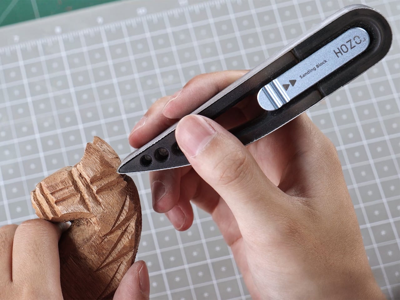
Sanding 3D prints or smoothing model parts usually means juggling multiple grits of sandpaper, wrestling with worn-out sheets, and constantly switching between flat blocks and flexible pads depending on the surface. NeoBlock takes the modular thinking HOZO applies to measurement tools and redirects it toward surface finishing. The Premium Combo includes one magnetic handle and three swappable sanding heads: S01 Basic for flat surfaces and rounded corners, S02 Pro for detailed precision work, and S03 Expert with a flexible body for curves and irregular contours. Each head clicks onto the handle magnetically in about five seconds without any tools, and the sanding belts themselves swap just as quickly thanks to a spring-loaded tension system. The kit ships with 60 industrial-grade cloth-backed belts covering six grits (120, 180, 240, 400, 600, and 800), with 10 belts per grit, so you can progress from aggressive material removal all the way through fine polishing without running out mid-project.
The belts measure 1.25 x 11 inches and wrap around the heads in a continuous loop, which means they last longer than equivalent sheets of sandpaper and distribute wear more evenly. The handle itself is machined from aluminum alloy and stainless steel with a PC+ABS body, giving it enough weight to feel controlled without causing hand fatigue during extended sessions. The S01 head works well for broad flat areas and can navigate inside corners cleanly. S02 narrows the contact patch for fine detail work on miniatures, prototypes, or tight spaces. S03’s flexible construction lets it conform to curved surfaces like rounded edges, cylindrical parts, or organic shapes without flattening the profile. The whole system fits into a premium storage box that keeps the heads, belts, and handle organized between uses.
Why We Recommend It
Most sanding block systems force you to commit to either rigid precision or flexible adaptation, but NeoBlock’s three-head approach covers both extremes and the middle ground without requiring separate tools. The magnetic quick-swap mechanism makes it genuinely fast to shift between tasks, so you can rough out a 3D print with 120-grit on the S01 head, switch to 400-grit on the S02 for detail cleanup, then move to 800-grit on the S03 to polish curved edges, all within the same workflow and without fumbling with adhesive-backed sheets or clamps. At 25% off, the Premium Combo lands at just over $70, which includes enough belts across six grits to handle dozens of projects before you need to restock. For anyone who regularly finishes 3D prints, builds scale models, or does any kind of surface prep on small parts, NeoBlock turns sanding from a tedious chore into a task that actually feels efficient and controlled.
Click Here to Buy Now: $71.25 $95 (25% off). Hurry, deal ends in 48-hours!
The post 4 Holiday Gifts for Designers Who Already Own Everything (But Need This) first appeared on Yanko Design.