The home office used to mean a fixed address. A monitor you couldn’t move, a dock you couldn’t pack, a microphone that lived on one corner of a desk and stayed there. That arrangement made sense when remote work was the exception. Now that it’s the default for a significant portion of the workforce, the gear still hasn’t caught up with how people actually want to work.
These five products make a different argument. Each one is compact enough to slide into a standard laptop bag alongside your computer, and each one eliminates a specific piece of furniture or peripheral that used to anchor you to a single room. Together they cover the full surface area of a home office: display, input, audio, connectivity, and video. The café table, the hotel desk, the airport lounge seat — all of them become the office.
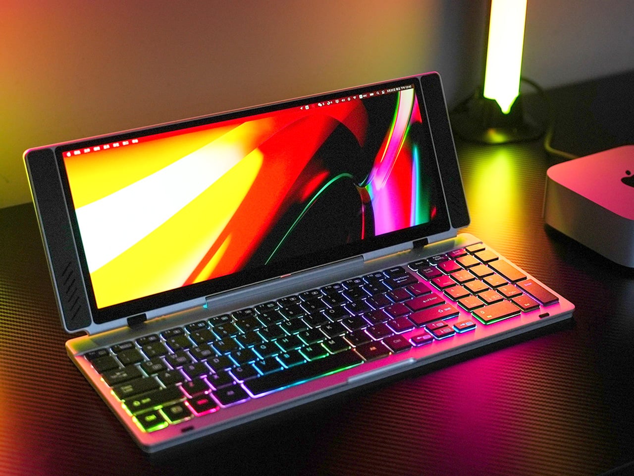
1. VitaLink Portable Keyboard + 4K Touchscreen

Closed, the VitaLink reads as a slim aluminum book, 20mm thick and roughly the footprint of a hardcover novel. Nothing on the outside hints at what’s inside. Open it at 180 degrees and a 13-inch, 3840×1600 touchscreen lifts above a full-width keyboard, the whole unit settling into a 34 by 15 centimeter footprint. That transformation from flat slab to dual-screen workspace is the core of the product’s appeal, and it holds up once you actually sit down with it for a full working session.
The screen runs at 298 pixels per inch, which puts it on par with Apple’s Retina displays and well above most portable monitors in this category. The 2.4:1 aspect ratio gives you enough horizontal span to run a document alongside a reference panel without either feeling squeezed. The keyboard uses 3.27mm key spacing and 0.8mm scissor switch travel, which makes extended writing feel deliberate rather than cramped. A single USB-C cable connects it to any laptop, tablet, or phone with no drivers required.
What we like
- The 298 PPI display at this form factor is genuinely rare — text stays sharp and color-sensitive work is viable with 100% sRGB coverage across the full panel
- Plug-and-play USB-C compatibility across Windows, macOS, Linux, Android, and even a Steam Deck means no adapter anxiety mid-trip
What we dislike
- At 1,200 grams, it’s the heaviest item in this kit and will be noticeable in a shoulder bag after a few hours of walking
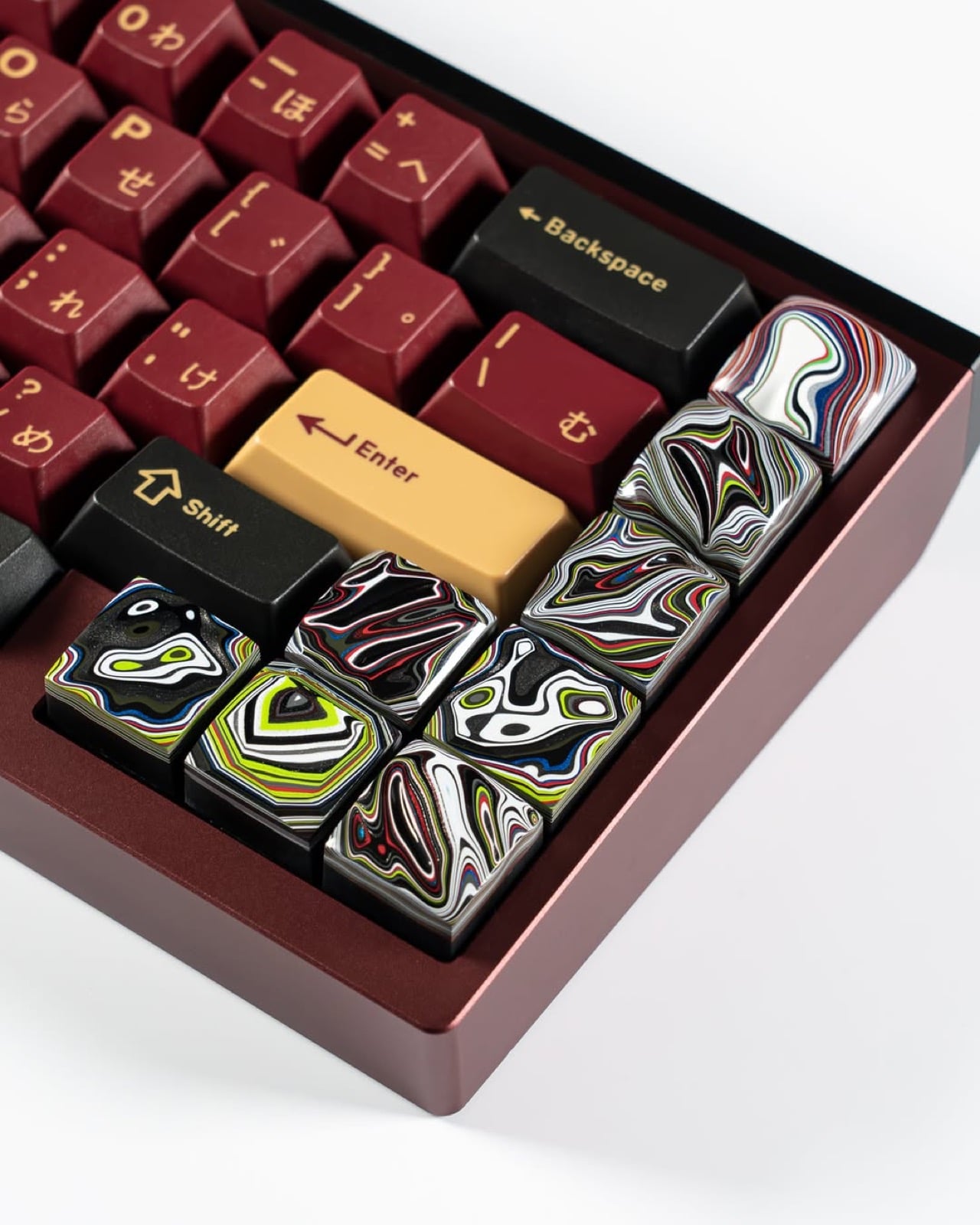
2. OrigamiSwift Mouse


The Origami Swift collapses flat when you’re done using it, taking up the kind of space that disappears into a bag pocket rather than demanding its own compartment. That folding mechanism draws from the same logic as the VitaLink: the product’s usefulness when open shouldn’t come at the cost of portability when closed. For anyone who has tried to fit a standard mouse into a travel bag and ended up compromising on both comfort and bag space, the design decision is immediately legible.
What makes the Origami Swift relevant to a mobile office setup specifically is that it doesn’t ask you to trade ergonomics for packability. A flat travel mouse is an easy product to design badly, the kind where you end up dragging your palm across a surface that was never shaped for sustained use. The Origami Swift’s folding structure means the grip geometry is restored when deployed, so a full day of work doesn’t leave your hand protesting by the afternoon.
What we like
- The folding mechanism eliminates the usual compromise between travel-friendly dimensions and a proper hand grip during actual use
- Works alongside the VitaLink’s built-in keyboard without competing for surface space when the display panel is fully unfolded
What we dislike
- The folding hinge introduces a mechanical point of failure that a standard mouse simply doesn’t have, so long-term durability after daily packing and unpacking deserves attention
- In dense café environments with Bluetooth congestion, wireless pairing can occasionally require a reconnect, which breaks flow at exactly the wrong moment
3. Satechi OntheGo Foldable Stand Hub

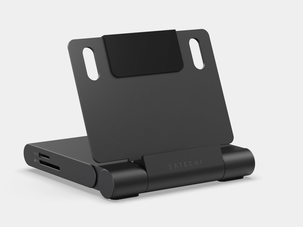
Four items in one is a claim most multi-function products make without fully earning, but the Satechi OntheGo Foldable Stand Hub earns it specifically. Folded flat at under 20mm and 187.5 grams, it contains a laptop stand, a USB-C dock, an SD card reader, and an HDMI output. A 17cm USB-C cable is built directly into its spine, so the hub comes alive the moment you unfold it and plug in, without a separate dongle, cable pouch, or adapter between you and a working setup.
The port selection is well-considered for the kind of work that actually happens on the road. HDMI 2.0 pushes a secondary display at 4K and 60Hz. The two 10Gbps data ports handle fast transfers without bottlenecking. The UHS-II card slots pull RAW files at up to 312 MB/s, which photographers working on location will feel immediately. The 100W USB-C passthrough keeps the host device fully charged through a heavy session, delivering 85W to the machine rather than sipping through a compromised power budget.
What we like
- The stand and hub share one folded form factor, so you’re not choosing between an elevated screen angle and a full set of ports — both arrive in the same 187.5-gram object
- 100W passthrough with 85W delivered to the host is genuinely useful throughput; this is not a hub that throttles your laptop to keep the indicator lights on
What we dislike
- The fixed 17cm cable length works well on a flat desk but becomes restrictive on configurations where the laptop sits further back or at an angle, leaving the hub’s placement feeling forced
- iPad mini 2021 owners are limited to 5Gbps on the data ports due to the tablet’s own USB specification, not the hub’s
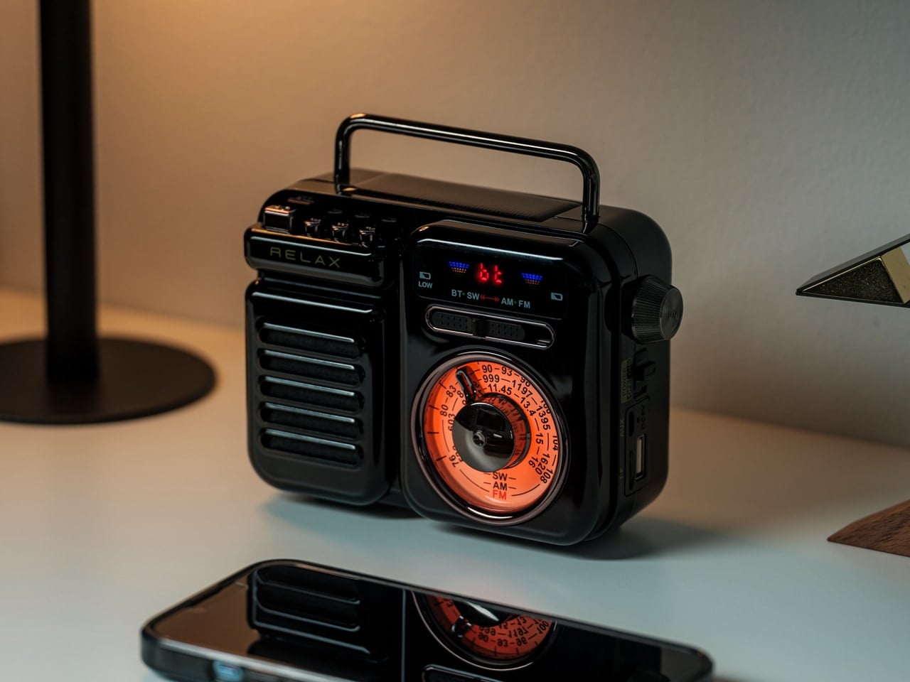
4. OBSBOT Tiny 3 4K PTZ Webcam
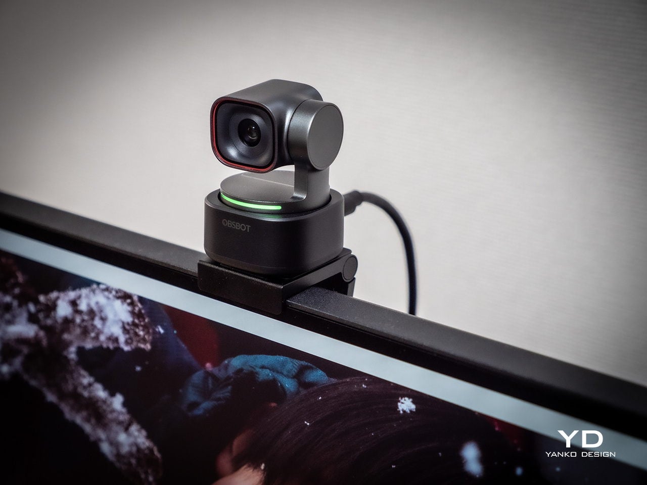
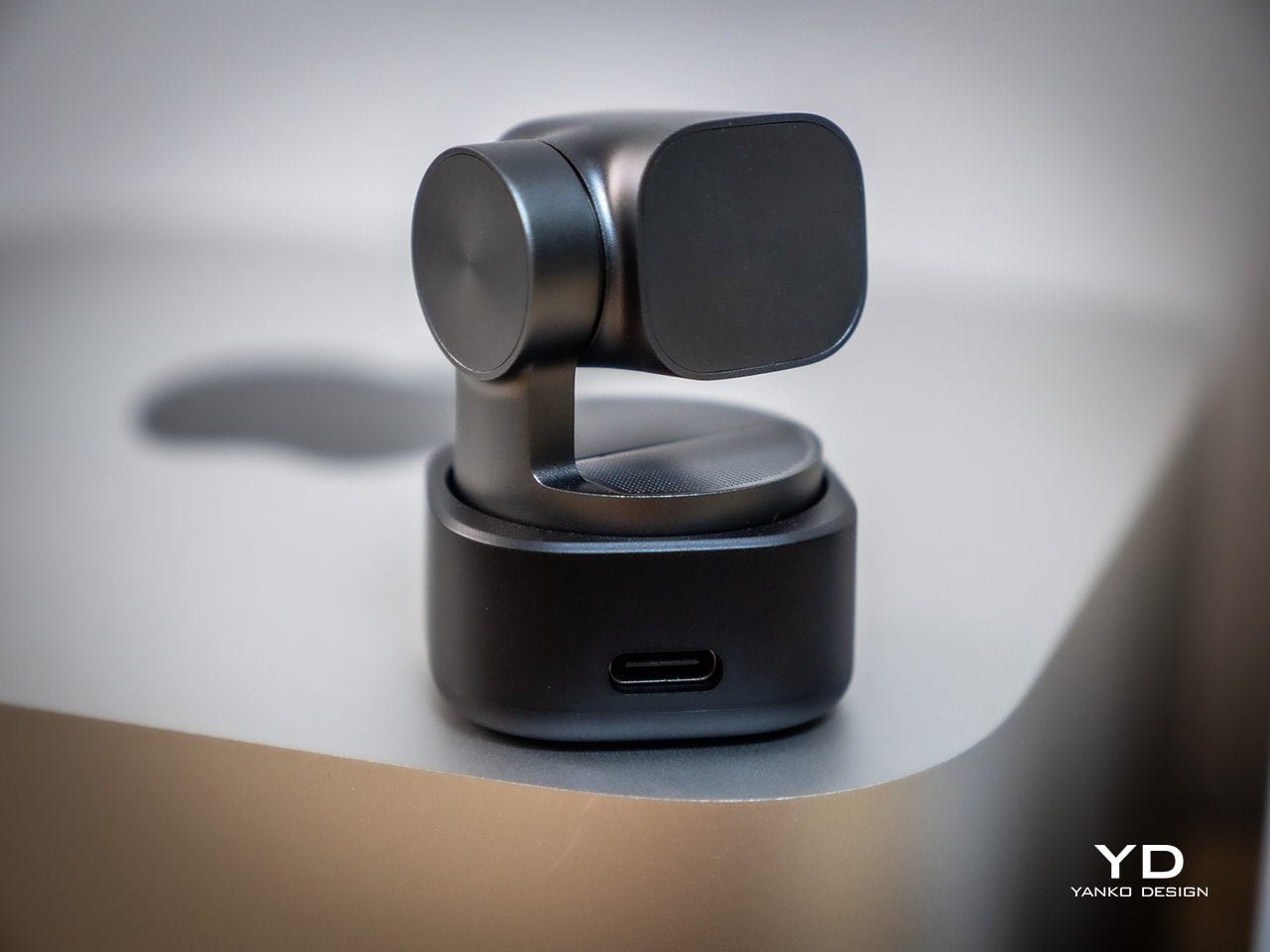
At 37 by 37 by 49 millimeters and 63 grams, the OBSBOT Tiny 3 occupies roughly the volume of a large die. Inside that footprint sits a 1/1.28-inch sensor, a 2-axis motorised gimbal, and a triple MEMS microphone array. That sensor size puts it closer to smartphone camera territory than the typical webcam chip, which shows up immediately in low-light performance and dynamic range. Plug it into a USB-C port, and it registers as a standard UVC device with no driver installation required.
The microphone system is where the Tiny 3 earns its place in this kit rather than just a streaming rig. Five discrete audio modes cover the full range of working scenarios: directional for solo calls, dual-directional for interviews, smart omni for meetings, and spatial audio for output that sounds like a room rather than a USB peripheral. The PTZ gimbal tracks at up to 120 degrees per second, so a full stand-up presentation or a pacing call stays in frame without any manual adjustment or reaching for a mouse mid-sentence.
What we like
- Combining a 4K sensor, motorised PTZ tracking, and a proper multi-mode microphone array in one object eliminates the webcam-plus-USB-mic stack that clutters most remote setups
- Voice commands and gesture control mean you can adjust framing mid-presentation without breaking the flow of what you’re saying or reaching across the desk
What we dislike
- At $349, it’s the most expensive item in this kit, and the integrated design means the gimbal, sensor, and mic are one non-serviceable unit with no modular repair path
- The depth of the companion app and the range of AI tracking modes and audio profiles takes real configuration time to dial in; arriving at a setup that matches your specific environment isn’t instant
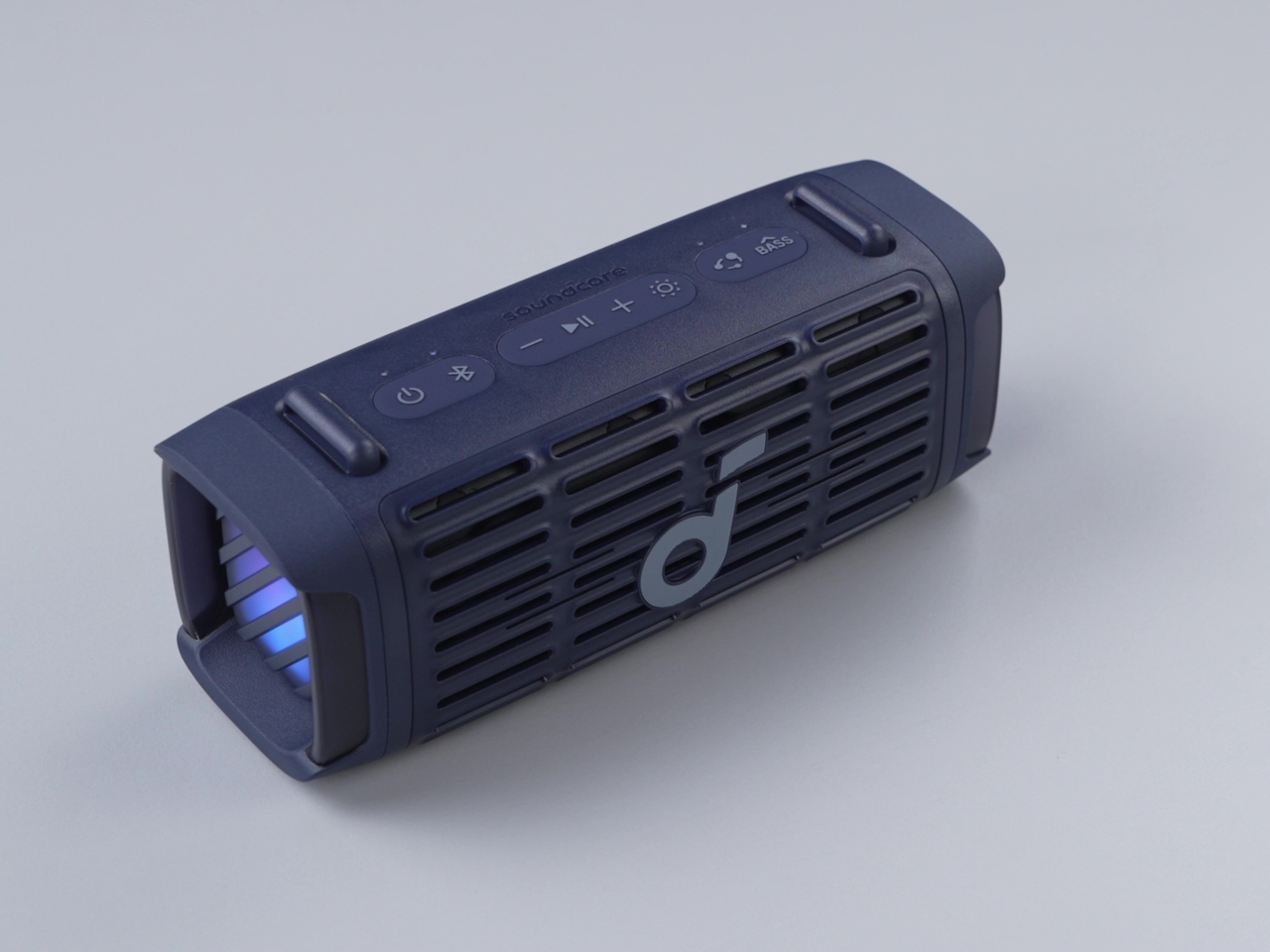
5. Battery-Free Amplifying iSpeakers
A speaker that draws its power from the USB-C port it connects through doesn’t sound like a revelation until you’re three days into a trip and realize you haven’t thought about its battery once. The Battery-Free Speaker removes the recharge cycle that turns most portable audio into a management task. There’s no charge indicator to watch, no cable to find at the end of the night, no morning ritual of checking whether it has enough power to make it through a working session.
The positioning in this kit is about what it replaces rather than what it adds. A home office desk speaker is typically a separate purchase, a separate power cable, and a separate piece of real estate on the desk. This one draws power through the same USB-C ecosystem running the rest of the kit, meaning the entire audio and display setup resolves into a single cable chain. The sound output trades some low-end depth for a profile slim enough to travel without consequence, which is an honest and reasonable exchange.
Click Here to Buy Now: $299.00
What we like
- Zero battery management means one fewer variable to track across a long travel day or a week-long work trip
- The USB-C power draw integrates cleanly into the kit’s single-cable connectivity approach, keeping the desk surface clear
What we dislike
- USB-powered audio output has physical limits on low-frequency response that a mains-powered desktop speaker doesn’t face
- Sound quality is best understood as travel-grade rather than desktop-grade — this replaces the home office speaker in function, not in fidelity
The Office Is Wherever You Open the Bag
Put these five products in a bag and the total weight is manageable, the cost is meaningful but not irrational, and the capability covers the full surface area of a working office. The VitaLink provides the display and the keyboard. The Origami Swift handles precise input. The Satechi ties everything together with connectivity, stand geometry, and port access. The OBSBOT closes the loop on how you appear and sound on calls. The Battery-Free Speaker handles the rest of the room.
None of these products are compromises dressed up as solutions. Each one is designed for the specific constraints of a laptop bag, a single USB-C cable chain, and a working day that doesn’t start or end at the same desk. The home office used to follow you reluctantly on a work trip — a cable bag, a laptop, and a hope the hotel had a decent surface. This kit makes the case that it doesn’t have to.
The post The 5 Best Travel Tech Gadgets That Fit in Your Laptop Bag But Replace Your Entire Home Office first appeared on Yanko Design.