These Chopsticks Glow at Dinner Without a Battery or Power Source

Chopsticks have been around for thousands of years, and their form has barely changed. The material varies, from wood and bamboo to polished metal and lacquered resin, but the design conversation rarely goes beyond surface decoration. They exist to serve a function, and that’s mostly where the thinking stops, quiet tools that have settled into the background of the dining table.

LUNARIS takes that very stillness as its starting point. A conceptual chopstick design, it reinterprets the traditional form as a collectible dining object built around the relationship between material, atmosphere, and light. It doesn’t try to reinvent how chopsticks work, but asks a quieter question: what if the object you pick up for dinner could change the feeling of the room around you?

Designer: Ivana Nedeljkovska

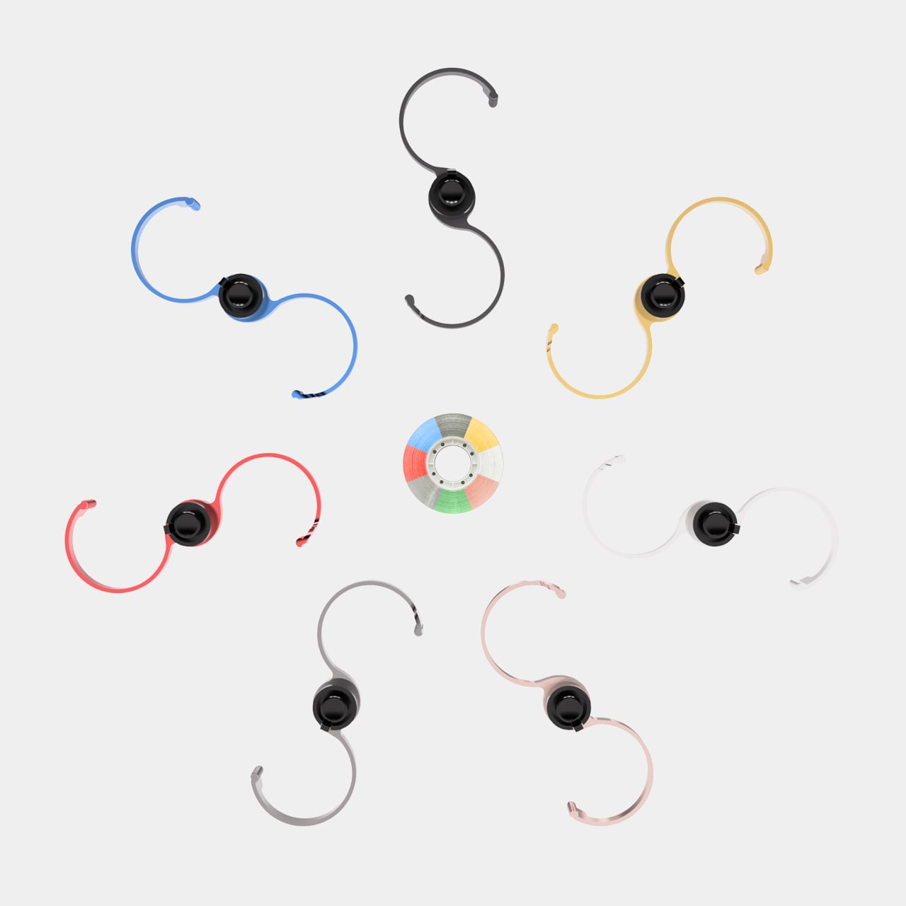
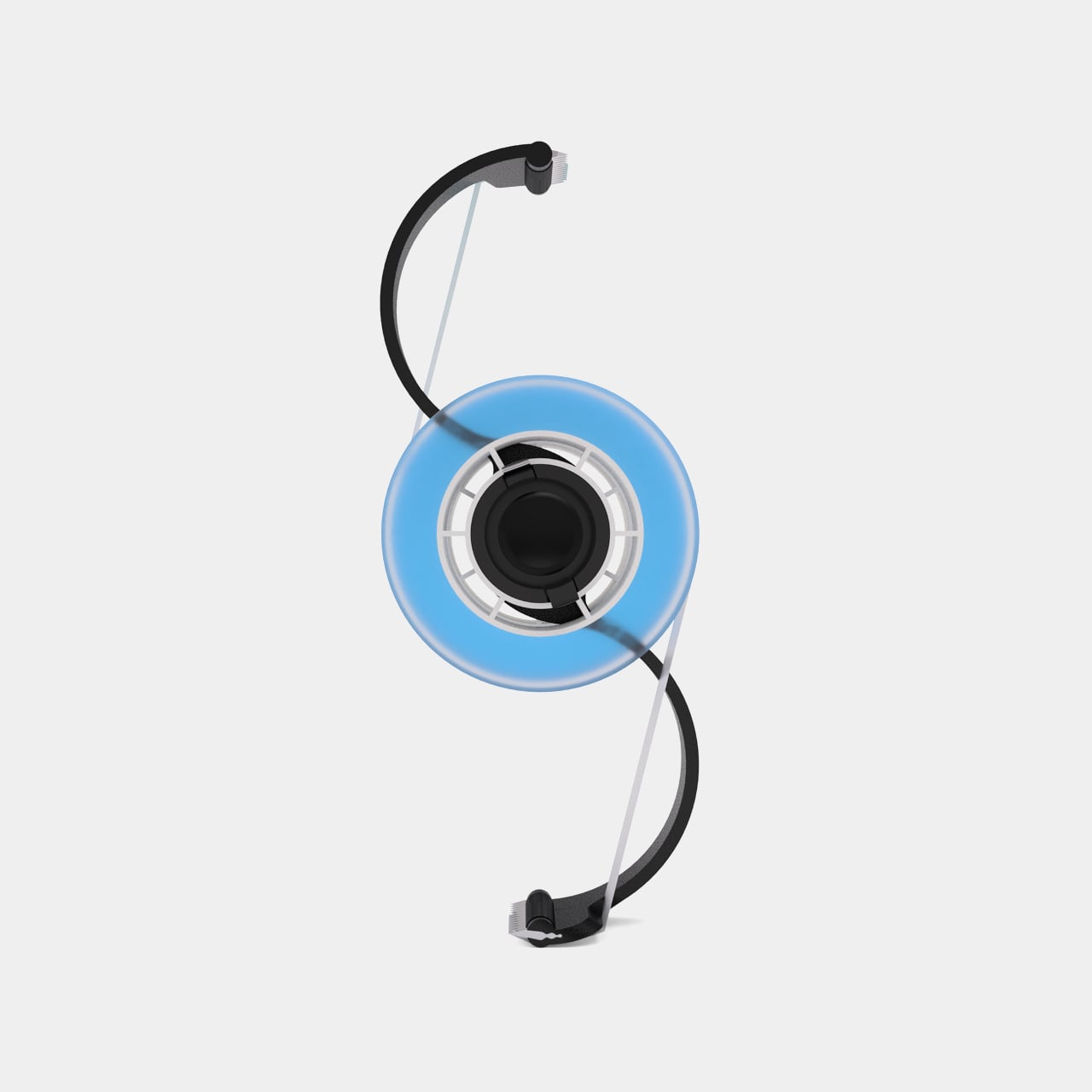
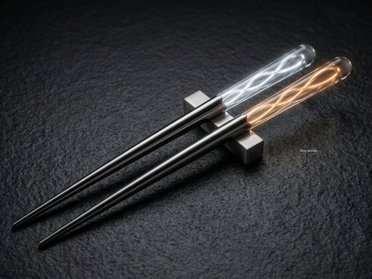
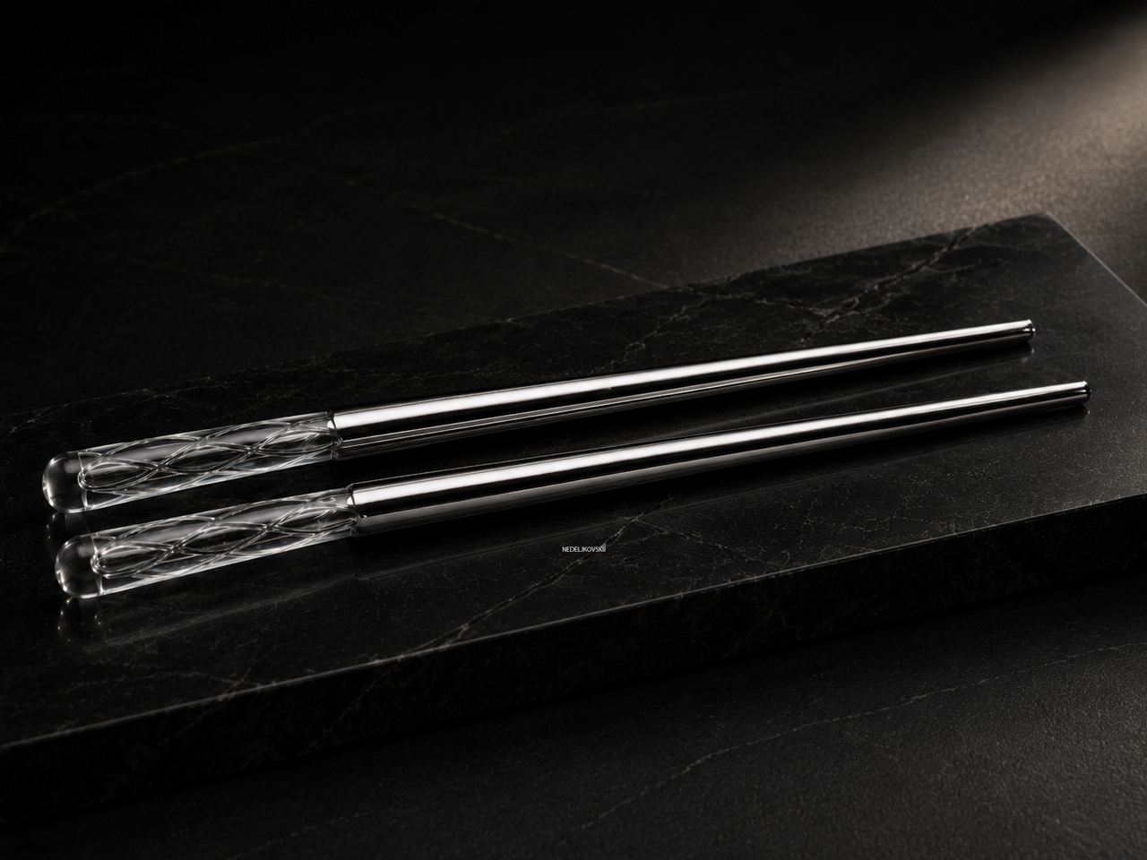
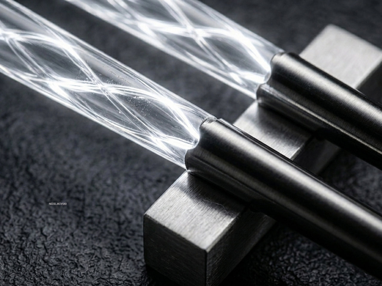
Each pair is made up of two materials that meet at a deliberately fluid transition. The lower section is polished stainless steel, shaped so the metal flows naturally into the upper element rather than meeting it with a hard edge. The result is a form that reads as unified rather than assembled, closer to a sculpted object than a utensil with two components joined together.

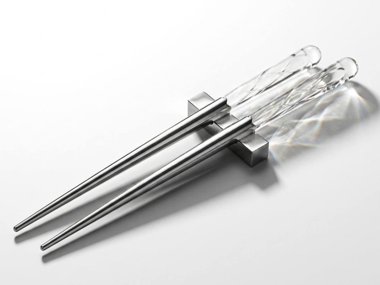
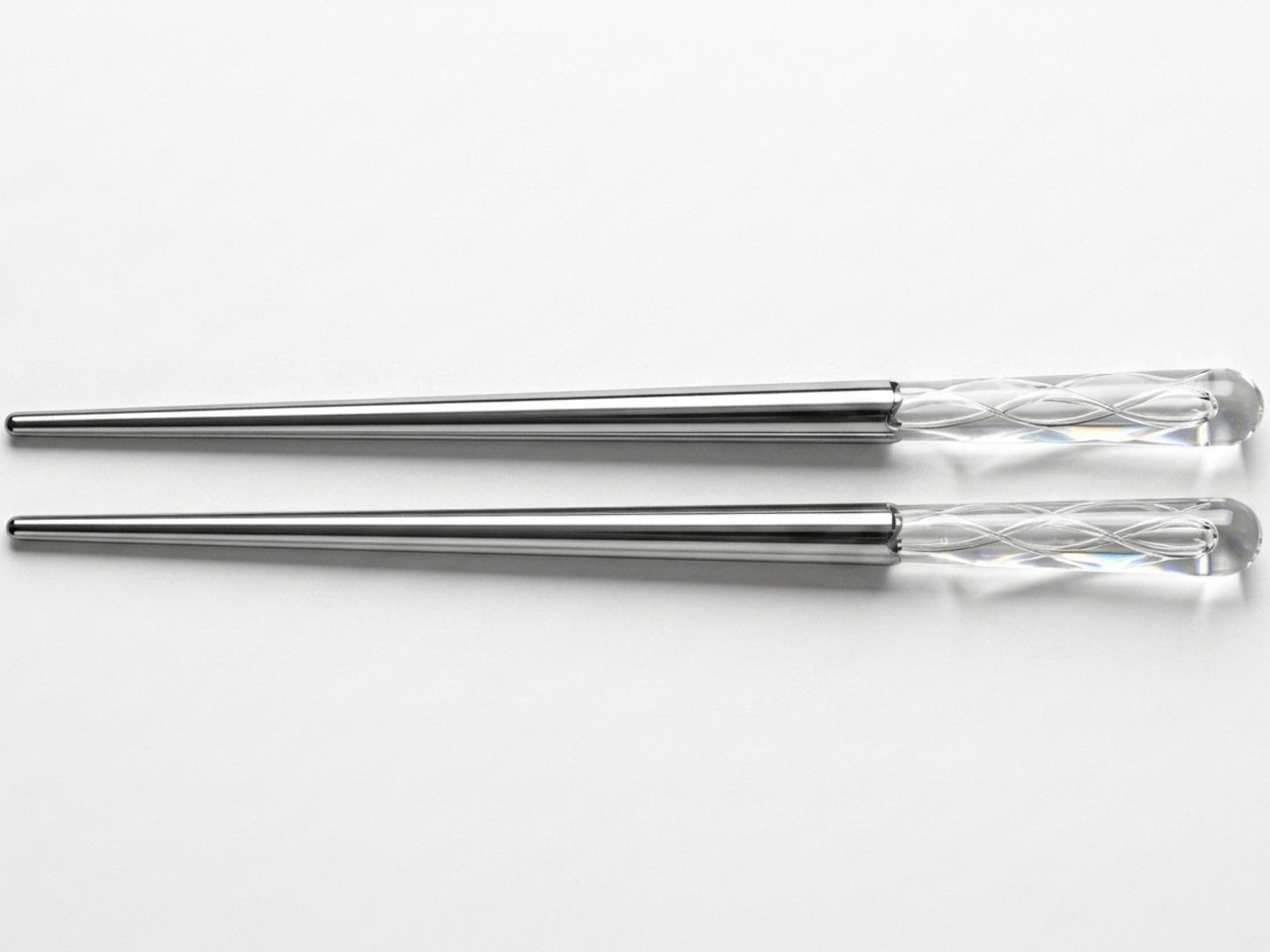
The upper section is where the concept lives. It’s a transparent epoxy resin body housing delicate curved tubes filled with a photoluminescent material. During the day, the object reads as clean and minimal, the resin catching light in ways that feel closer to decorative crystal than a dining tool. Nothing about it immediately gives away what happens once the lights go low.

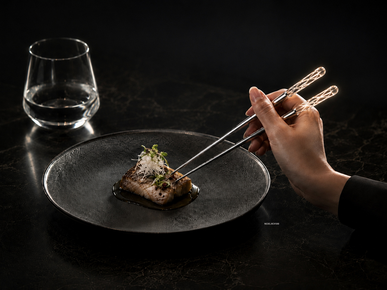
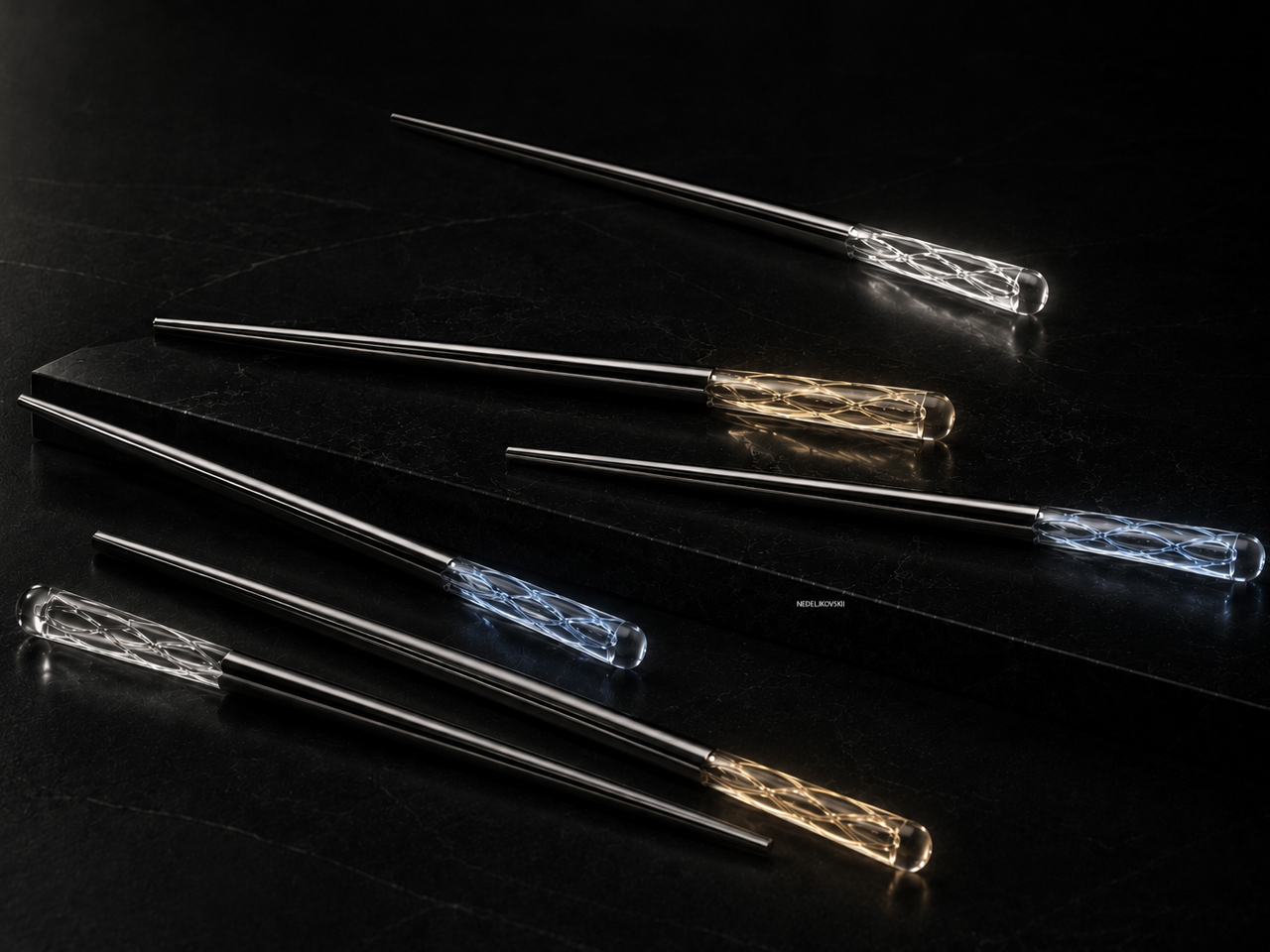
When the room dims, the photoluminescent tubes begin to release the light they’ve been quietly storing all day. Glowing lines emerge from within the resin, creating the impression of light trapped inside the form itself. The effect isn’t electric or sudden; it’s gradual and soft, more like something waking up than switching on. The glow comes in amber, white, and blue variants.

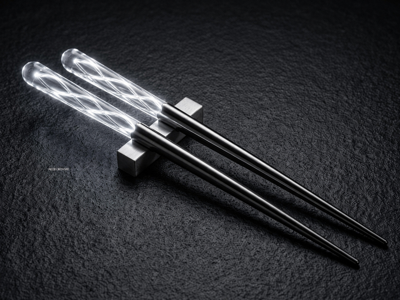
The point of LUNARIS isn’t to glow for the sake of glowing. The object is designed to create a different kind of interaction between person and object, one where atmosphere becomes part of the experience. Dinner at a dimly lit table takes on a different quality when the utensil in your hand starts contributing to the mood rather than simply doing its job.

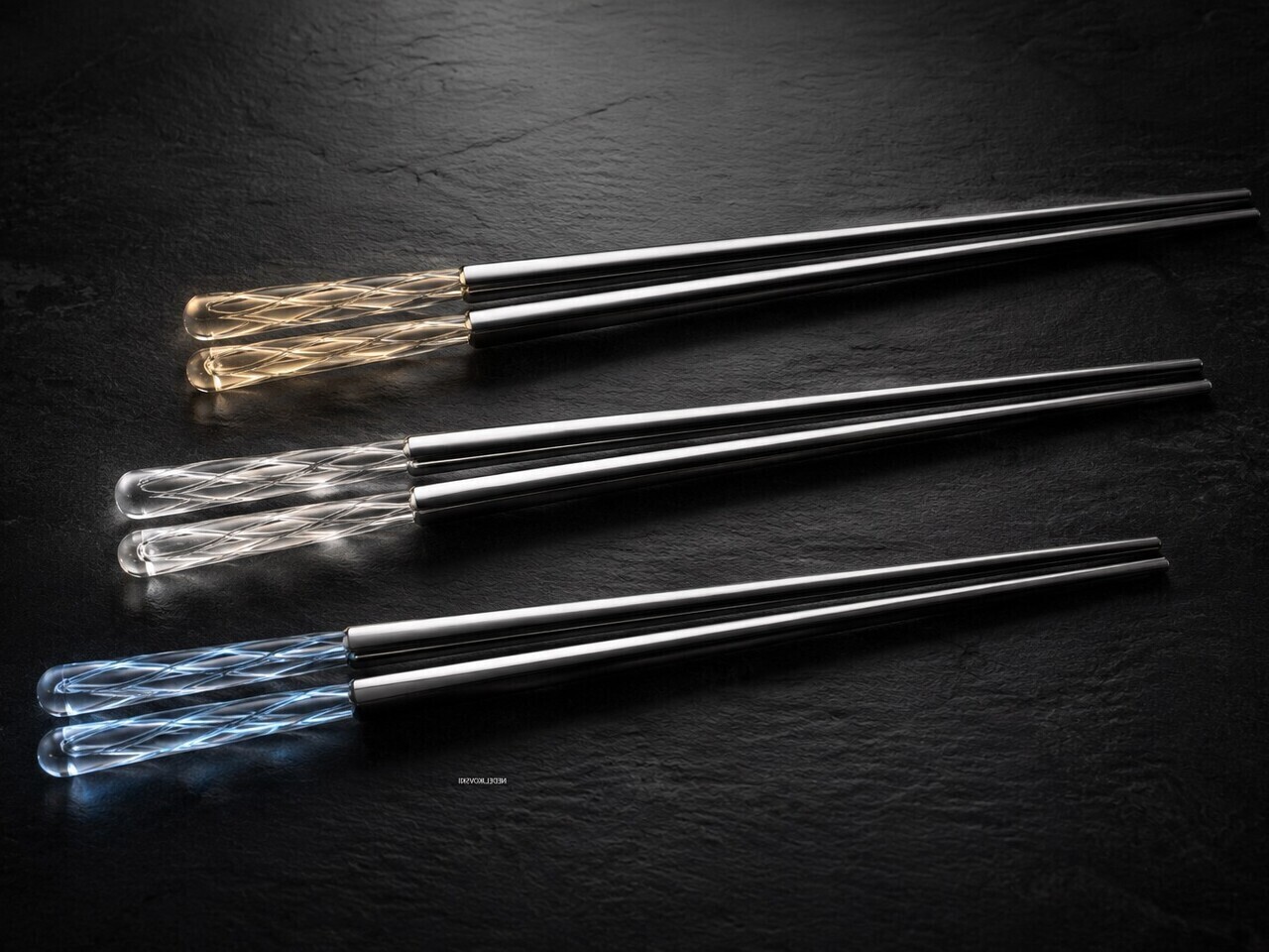
Collectible design rarely makes it to the dining table in such a literal sense. LUNARIS is positioned as an object worth keeping and displaying, not just reaching for at mealtimes. The stainless steel chopstick rest included with each pair functions as a small display stand as much as a holder, a quiet suggestion that the object still earns attention long after the meal is done.

What LUNARIS proposes isn’t technically complex. There’s no power source, no battery, and no mechanism hidden inside the resin. The photoluminescent material works passively, absorbing ambient light through the day and releasing it slowly once the room darkens. The restraint is the point, and it’s a reminder that even the smallest objects on a table carry considerably more potential than they’re usually given credit for.

The post These Chopsticks Glow at Dinner Without a Battery or Power Source first appeared on Yanko Design.

RIMOWA’s 2026 Prize Went to a Bracelet That Speaks Sign Language

The RIMOWA Design Prize doesn’t always produce furniture, and that’s precisely why I pay attention to it every year. The luggage brand’s annual student design competition has a way of surfacing ideas that sit at the uncomfortable, exciting edge of what design can actually do for people, and the 2026 winner is probably the best example of that yet.

Samuel Nagel and Paul Feiler, two students from Hochschule für Gestaltung Schwäbisch Gmünd, took home the fourth edition of the prize with NURA: a bracelet that uses EMG (electromyography) sensors to capture muscle signals in the forearm and translate sign language into audible speech in real time. It works the other way around too, converting spoken language into visible text for deaf users. The whole thing sits on your wrist, shaped by the silhouette of a manta ray, and it looks less like a medical device and more like the kind of accessory you’d spot on someone at a gallery opening.

Designers: Samuel Nagel and Paul Feiler

That last detail is actually the point, and I think it’s worth dwelling on. Assistive technology has a long and unfortunate history of making the people who need it feel conspicuous. Hearing aids, for decades, were designed to be invisible precisely because visibility carried stigma. The unspoken message was that needing help was something to hide. NURA takes a completely different position. It’s designed to be seen, worn with pride, styled rather than concealed. The gesture feels radical even though, rationally, it shouldn’t have to be.

The technology behind it is genuinely clever. EMG sensors are nothing new as a concept, but applying them to sign language translation in a form this compact and wearable is a meaningful design leap. The bracelet reads the electrical signals produced by muscle contractions in the forearm as the wearer signs, processes them, and produces speech output. The reverse channel picks up spoken language and renders it as text. Two-way, seamless, real-time. For anyone who has ever watched a deaf person navigate a conversation without an interpreter present, or felt the awkward pause that comes from communication breaking down mid-exchange, the implications of that are enormous.

I keep thinking about how many interactions become effortless with something like this on your wrist. Ordering at a counter. Talking to a doctor. A spontaneous conversation with a stranger on the street. These are moments that require logistics for deaf users in a way most hearing people never have to consider, and NURA collapses that distance without asking anyone to compromise.

The manta ray inspiration is a quiet masterstroke, too. It gives the object a reference point that feels alive and organic rather than mechanical or clinical. The form has been rendered in clean, sculptural white, with the kind of restraint you’d expect from a German design school sensibility. It doesn’t scream technology. It just sits there looking elegant, doing something extraordinary underneath.

Will NURA make it into production? That’s the question that always hovers over student prize winners, and it’s an honest one. The gap between a beautifully executed concept and a market-ready product is wide, and the challenges of real-world EMG accuracy across different body types and signing styles are not trivial. But I don’t think that’s entirely the point. The RIMOWA Prize exists, among other things, to expand the imagination of what design is for, to signal to the industry what problems are worth solving and what solving them beautifully might look like.

On that count, Nagel and Feiler have done something genuinely important. They’ve argued, through the language of form, that accessibility and desirability don’t have to be in opposition. That a wearable designed for a deaf person can be something a hearing person might be jealous of. That the most human design isn’t the kind that fixes a flaw and hides it, but the kind that celebrates capability and brings people closer together. The bracelet is beautiful. The idea behind it is even more so.

The post RIMOWA’s 2026 Prize Went to a Bracelet That Speaks Sign Language first appeared on Yanko Design.

Objects With Opinions: Ronen Kadushin’s Pieces

There are designers who make beautiful things, and then there are designers who make things that make you think. Ronen Kadushin belongs firmly in the second camp, and his latest collection, Pieces, is proof that a home accessory can be both genuinely useful and quietly subversive.

The collection consists of three objects: a candle holder called Echoes, a tealight holder called Reality TV, and a Piggybank. On paper, that sounds like a fairly ordinary lineup for a home accessories range. In practice, it’s anything but. The Pieces collection is an elegantly formed, humorously thought-provoking group of home accessories that highlight the tension between function and cultural narrative.

Designer: Ronen Kadushin

Each piece starts life as a flat sheet of laser-cut stainless steel, executed with Kadushin’s signature Twist-Hinge detail, making them easy and intuitive to bend by hand. They invite you to engage with the designs and co-create pieces that are an aesthetic statement with an edgy commentary. It’s a deliberate choice, not a shortcut. By asking you to participate in the assembly, Kadushin is making a point about who gets to be part of the creative process. You’re not just buying a finished object; you’re completing it.

That philosophy runs through everything he does. Kadushin is a pioneer of Open Design, freely sharing his designs to promote creativity, personal expression, and a positive social and economic impact. He embraces a “from the machine to the customer” approach, where extra manual processes and finishes are minimal, with pieces self-produced in Berlin in small-batch runs from high-grade stainless steel. There’s no bloated supply chain, no mass-market compromise. Just precision fabrication and a designer who has thought very carefully about what he wants his objects to communicate.

And communicate they do. The Piggybank is perhaps the most pointed piece in the collection. A traditional object redesigned to reflect a reality where saving is an illusion, it wears its cynicism openly. The pig is rendered as a flat stainless steel silhouette with a coin slot at the top, but there’s no belly to hold anything. Your coins rest on the surface. It’s funny, and it’s bleak, and it manages to be both of those things at once in the way that only good design pulls off. At a time when most people are watching their savings get swallowed by inflation, putting this on your shelf feels less like irony and more like cathartic honesty.

The Reality TV tealight holder takes a different angle. Shaped like a boxy, retro television set, it frames a tealight where the screen should be. When the flame is lit, you’ve got a broadcast. “Reflecting reality live, 24/7.” The concept is sharp without being heavy-handed. It makes you smirk, and then, a moment later, makes you think about the fact that we genuinely do stare at glowing rectangles all day as a form of comfort. Having a warm, flickering version of that sitting on your dinner table feels like Kadushin winking at us all.

Echoes, the candle holder, is the most sculptural of the three. A nuanced sculptural object echoing iconic 60s and 70s aesthetics with a contemporary edge, it’s the kind of object that earns a second and third look. The stacked, interlocking forms feel almost architectural, like a detail pulled from a midcentury design catalogue and rebuilt in stainless steel. Placed on a shelf without a candle, it still looks like it belongs in a gallery. With one lit, it earns its keep.

What ties Pieces together is the refusal to be decorative for decoration’s sake. Kadushin’s work is sculptural and communicates clever wit and free expression, and he designs user-assembled pieces that are an invitation to enjoy and participate in the creative process. The objects are funny, but they’re not novelty items. They’re precise, considered, and built from high-grade stainless steel that will still look good long after the trend cycle has moved on.

If you’re the kind of person who thinks about what your home objects say about you, and more and more people are, then Pieces is a collection worth paying attention to. Good design doesn’t just fill space. At its best, it holds an opinion. Kadushin’s does both.

The post Objects With Opinions: Ronen Kadushin’s Pieces first appeared on Yanko Design.

A Tape Dispenser Concept Finally Worth Keeping in Plain Sight

The standard tape dispenser holds one roll, cuts tape, and sits on a desk. It hasn’t changed much in decades, and it doesn’t need to because it does its job reliably. The problem is that it looks exactly as utilitarian as it sounds, and the design conversation around it has mostly been limited to making that single-function object look slightly more attractive without actually adding anything.

This concept takes a different approach. Instead of polishing the existing formula, the Dual Tape Dispenser starts from the premise that holding two rolls is more useful than holding one, and that a more sculptural form can make the whole interaction better. The result is an object built from flowing arches that feels different to use and looks different sitting on your desk when you’re not using it at all.

Designer: Sai Divakar Boddeti

The design rests on its own curves, so it can sit in different orientations depending on what’s most convenient. Two circular tape housings connect through flowing arches that also serve as natural hand guides, directing the grip toward the tape without any conscious adjustment. The whole motion feels more intuitive than reaching over a rigid, weighted box, which is how most interactions with a standard dispenser tend to go.

The dual-roll format addresses something familiar in most working studios and offices. Having two different tapes in one object, whether clear and masking or two different widths, means one less thing to hunt for mid-task. It’s a modest improvement in isolation, but the kind of friction it removes adds up across a busy day, and a single compact form keeps the desk considerably tidier overall.

Getting to that form wasn’t straightforward. Early explorations of the concept were bulkier and more complex, with feedback pushing the design toward something stronger, less cumbersome, and more restrained. The final form emerges from that iterative process, minimal in part count and clean in its assembly logic, which also points toward something that could be manufactured without excessive complexity if the concept moved into production.

The dispenser can be made available in multiple colors, giving it a range that spans from understated neutrals to more vivid options, depending on how much you want it to stand out on a desk. The soft circular geometry and balanced proportions keep it from feeling imposing, which is a real consideration for something that might end up between a monitor and a coffee mug. It’s visible without being demanding.

That quality is something the design leans into deliberately. The brief treats the dispenser as an object that could be a conversation starter as much as a practical tool, and the sculptural arch form supports that without overclaiming. A tape dispenser doesn’t need to draw attention to itself, but there’s no rule saying it can’t, and this one makes a reasonable case that it could do both at once.

The post A Tape Dispenser Concept Finally Worth Keeping in Plain Sight first appeared on Yanko Design.

This Handheld Concept Swaps Between Gamepad, D-Pad, and Keyboard

The retro handheld market has rarely been this crowded or creative. Manufacturers are shipping devices with sliding screens, dual-display clamshells, and rotating form factors, all competing for a growing nostalgia-driven audience. Yet for all that variety in hardware, the controls themselves rarely change. You get what you get, and if the layout doesn’t suit how you like to play, that’s not the manufacturer’s concern.

That’s the gap one Reddit user set out to address with the RG Modular, a fan-made concept that came shortly after the release of Anbernic’s RG Rotate. Rather than locking players into a single control layout, the concept centers on a core screen unit with swappable modules that slot into side and bottom rails. The game dictates the controller, not the other way around.

Designer: Snow (Snoo_6285)

At the center of the RG Modular is a 4-inch IPS display running at 1080×1080 pixels, a square format that works cleanly for both retro and modern titles. Android powers the device, offering full app access, proper sleep mode behavior, Wi-Fi 6, Bluetooth 5.4 for wireless streaming, and a 3.5 mm headphone jack for when you’d rather keep the audio to yourself.

Blast through a library of classic arcade titles or beat-’em-ups, and the D-pad module is all you’d need. It’s compact, locks cleanly into the bottom rail, and keeps the whole assembly slim enough to hold comfortably in portrait mode. The result feels close to something from the original Game Boy era, scaled up just enough to feel substantial but still pocket-friendly enough to bring along.

Pop on the horizontal configuration for something more demanding, and the RG Modular begins to feel like a contemporary gaming device. A left module with a D-pad and analog stick snaps to one side, a right module with face buttons and a second stick clicks onto the other, and suddenly the same screen unit that ran retro arcade titles now handles 3D games and wirelessly streamed content.

Perhaps the most unexpected addition in the lineup is the QWERTY keyboard module. Swapped in for the standard controls, it nudges the device toward productivity, text entry, or emulating handheld systems that relied on keyboards. It signals that the concept isn’t purely about gaming, and that a modular form factor can cover considerably more ground than any one fixed layout could manage.

The post drew enthusiastic praise, but the community did raise practical questions. Some users noted that a D-pad-only module might leave the device feeling top-heavy, and the broader modular concept raises fair concerns about cost, connection point durability, and whether the rail system can stay snug through regular use.

It’s not the first attempt at a shape-changing handheld console, either, with the likes of the GAMEMET E5 and ONEXSUGAR testing the waters first. It’s worth noting that the RG Modular is only a concept, but concepts like this one carry weight in the retro handheld community. Manufacturers have also occasionally taken cues from what enthusiasts build, turning fan ideas into products people didn’t know they needed.

The post This Handheld Concept Swaps Between Gamepad, D-Pad, and Keyboard first appeared on Yanko Design.

Alberto Essesi Just Designed the Lamp That Celebrates Mistakes

If you’ve ever assembled furniture, built a shelf, or wired anything with your own two hands, you know the feeling. You step back, you look at your work, and then you see it. That one thing. The screw facing the wrong way. The panel installed backwards. The “how did I miss that?” moment that you either have to fix or quietly learn to live with. Alberto Essesi, an L.A.-based industrial designer, decided to immortalize exactly that feeling, and then turned it into a lamp.

The Oops lamp is precisely what it sounds like. A hanging fixture that, at first glance, looks like something went sideways during installation. The design inverts the expected, which is Essesi’s own phrasing, and it delivers on that premise with clean, understated confidence. It doesn’t shout. It doesn’t over-explain itself. It just makes you look twice, register the joke, and then probably smile.

Designer: Alberto Essesi

Look at it long enough and the concept becomes delightfully clear. A slender, glowing rod descends from a ceiling mount, warm light running its full length like a lit fuse. At the very bottom sits a polished chrome globe, round and reflective, the universal shape of a light bulb. Except the globe isn’t glowing. The rod is. The light is coming from exactly where you wouldn’t expect it, and the bulb, the part that’s supposed to be the whole point, is just sitting there at the bottom looking beautiful and slightly confused. That’s the joke. That’s also, somehow, the most elegant part of the entire object.

The chrome finish on the globe isn’t incidental. It picks up the amber warmth of the glowing rod above it and bounces it softly into the room, so the globe contributes light without technically being a light source. It’s a small design decision that could have easily been an afterthought, but it ends up being one of the most considered details in the whole piece. The lamp works as a room object even before you process the humor in it.

Essesi has said this idea has been rattling around in his head for years. “This has been an idea I’ve had for a few years and always laugh when I think about it,” he shared when unveiling the design. That kind of creative patience is rare, and it shows in the final execution. The Oops lamp doesn’t feel rushed or gimmicky. It feels like exactly the right amount of thought went into it, no more, no less. Sometimes a concept just needs time to ripen before it’s ready to exist in the world.

Design humor is genuinely hard to pull off. Most attempts either try too hard or land too soft. The joke gets buried under layers of irony, or it gets explained to death until any charm it originally had is long gone. The Oops lamp sidesteps all of that. The humor is baked into the form itself. You don’t need a placard or a press release to get it. You just get it. That’s the mark of a strong design concept: the idea communicates itself without any assistance.

Essesi didn’t reach for something ornate or architecturally complex to subvert. He took the most ordinary object and made one small, deliberate deviation from it. That restraint is what makes the whole thing work. The joke only lands because the rest of the design plays it completely straight. The rod is precise. The globe is perfectly spherical. The ceiling mount is minimal and clean. Every element is serious, which makes the absurdity of the overall form land even harder.

A large version has also been added to the mix, which tells me Essesi is taking this seriously as a product concept and not just a portfolio piece. No production plans have been officially confirmed yet, but that feels like a matter of when rather than if. A design this instantly readable and this universally relatable has a built-in audience. People are genuinely tired of objects that require context. They want things that communicate the moment they enter a room.

That’s the real conversation the Oops lamp is opening. It’s a small but clear reminder that good design doesn’t have to be earnest all the time. It can have a point of view. It can be a little funny. A lamp named Oops, made by a designer who let the idea sit for years until it was truly ready, might be the most quietly optimistic object to come out of this year.

The post Alberto Essesi Just Designed the Lamp That Celebrates Mistakes first appeared on Yanko Design.

The Table Clock Isn’t Dead, This Folded Steel One Proves It

The tabletop clock has been one of the quieter casualties of the smartphone era. Most people stopped owning them the moment a phone took over nightstand duty, and those that survived tend to be either nostalgic holdovers or objects that lean so hard into decoration that the time-telling part becomes secondary. The ones that actually last tend to be the ones that got the balance exactly right from the start.

Braun managed that balance better than anyone with the AB 20, a 1975 travel clock by Dieter Rams and Dietrich Lubs that reduced the concept of a clock to almost nothing unnecessary. Argentina-based industrial designer Agustin Papadopulos had that same spirit in mind when he designed TYME, a conceptual table clock that pushes minimalism further by starting from a literal flat sheet of steel.

Designer: Agustin Papadopulos

The process starts with a single laser-cut steel sheet, pre-scored along fold lines. Fold the sides inward, interlock the tabs, and a rigid three-dimensional case takes shape without a single screw or adhesive. There are no separate structural components. The entire chassis emerges from one piece of material, with nothing added and nothing wasted, just the geometry of the fold doing all the work.

Once the body is formed, the clock mechanism drops in from behind. A standard quartz movement fits inside the folded cavity, with the shaft passing through the circular dial on the face. The hands, two muted gray blades for hours and minutes and a thin red sweep for seconds, slip onto the shaft. A brass hex nut anchors everything with a deliberately exposed, industrial touch.

The face itself is a direct nod to the Braun AB 20’s design language. Four pill-shaped markers at the cardinal positions stand in for numerals, and the circular dial is etched lightly into the face rather than applied as a separate element. It’s been stripped to its most essential logic, which is exactly what Dieter Rams and Dietrich Lubs were doing with the AB 20 back in 1975.

Using a single sheet for both the structure and the visible surfaces makes good sense from a production standpoint. Laser cutting eliminates the need for molds or complex tooling. The fold lines that hold the body together are the same cuts that shape the overall form, so each incision does double duty. Less material, fewer components, and a simpler process all follow from that one decision.

There’s a quieter idea at work in TYME that goes well beyond material efficiency. Papadopulos frames folding not as a simple assembly step, but as the moment you bring the clock into existence. You’re not receiving a finished object. You’re closing the form, installing the hands, dropping in the battery, and starting the mechanism. The first second it ticks is genuinely yours to claim.

The post The Table Clock Isn’t Dead, This Folded Steel One Proves It first appeared on Yanko Design.

This AC Does 5 Jobs at Once and Looks Like Furniture on Your Wall

The split air conditioner is one of the least loved objects in any home, which is a strange thing to say about something most people couldn’t live without. It works, technically, but it tends to make its presence known in all the wrong ways. The air is too direct, the noise is a constant background irritant, and the plastic box on the wall rarely belongs in any thoughtfully designed interior.

From that frustration comes WellFlow, a concept that reframes what air conditioning is supposed to do for the people living around it. Rather than engineering a better cooling box, the designers built something closer to a wellness device. It’s a concept that received validation through the iF Design Award in 2026 and was first revealed at IFA Berlin 2025.

Designer: Merve Nur Sökmen, Zehra Sarıarslan

The most immediate shift is in how air actually moves. Conventional units push output in one direction, landing directly on whoever is in the room. WellFlow uses four-way diffusion to spread conditioned air from all sides without targeting anyone in particular. Sensors also monitor occupancy and steer airflow accordingly, so the unit quietly adapts to the room rather than expecting the room to tolerate it.

Beyond airflow, the system also handles humidity, air purity, ambient lighting, and sound. A built-in humidifier balances moisture levels rather than leaving the air artificially dry, which is one of the most common complaints about running a conventional unit through the night. Circadian lighting and integrated speakers complete the picture, creating conditions that support sleeping, concentrating, or quietly winding down, depending on what the moment calls for.

All of this adjusts automatically. The system continuously monitors temperature, humidity, and air quality, then fine-tunes its output without any manual input. A baby’s room needs different conditions than a home office or a gym corner, and WellFlow is designed to recognize those differences. Its behavior was shaped through user research spanning new parents, older adults, and people with respiratory sensitivities, groups that conventional air conditioners routinely fail to address.

The physical form is just as deliberate as the behavior. Most air conditioners are conspicuously technical, with plastic housings that fight against any interior aesthetic. WellFlow uses a woven textile front panel with rounded corners and a matte finish, giving it a material quality far more associated with furniture than appliances. An ambient light halo behind the unit softly signals its presence on the wall without demanding any attention.

A pull-out front filter makes maintenance visible and intuitive, addressing something the design team identified as a recurring trust issue with conventional units. People often aren’t sure when or how to clean their filters, and that uncertainty quietly chips away at confidence in the device. WellFlow removes that ambiguity. For a machine designed around human comfort, even that seemingly small detail ends up mattering quite a lot.

The post This AC Does 5 Jobs at Once and Looks Like Furniture on Your Wall first appeared on Yanko Design.

Your Knife Block Has No Business Looking This Good

Most kitchen accessories come with an unspoken agreement: you accept that they look utilitarian, and in return, they do their job quietly in the background. Knife holders, in particular, have always been the least glamorous residents of the countertop. The wooden block is fine. The magnetic wall strip is practical. But neither has ever made anyone stop and stare. Samyuktha S’s Eclipse Edge concept breaks that agreement entirely, and I’m genuinely glad it does.

The Eclipse Edge is a magnetic knife holder inspired by the geometry of a lunar eclipse, specifically the moment when Earth aligns between the sun and moon, casting that iconic half-shadow silhouette into the sky. That form, an abstracted arc built from layered, concentric half-circles, becomes the entire design language here. Looking at it on a countertop, you wouldn’t immediately guess what it does. You’d probably assume it was a sculpture. That confusion is precisely the point.

Designer: Samyuktha S

Samyuktha’s design brief was direct: create a kitchen storage accessory that bridges functional utility and structural statement decor. The goal was to reimagine a standard tool organizer as a decorative landmark within the home, elevating it to a high-end sculptural piece. She achieved this without resorting to the usual tricks of adding color or unconventional materials. The Eclipse Edge is sand-casted aluminum with a hand-carved finish, and it leans entirely into that material’s dual nature: raw and refined at the same time.

The mechanics are equally considered. Hidden magnetic sheets inside the form hold knives parallel to the surface, which means blades are secured safely without any visible hardware or slots cutting into that clean silhouette. The oil and waterproof protective layering is built into the construction. Multiple knife sizes are accommodated without compromising the holder’s structural integrity or visual lines. It’s the kind of detail work that separates a pretty sketch from a design that actually holds up under scrutiny.

The ideation pages on Samyuktha’s Behance project tell you a lot. There are dozens of iterations, circular forms, crescent variations, abstracted lunar shapes explored and discarded before arriving at the stacked arch that became the final concept. Getting from a celestial reference to something that can hold a chef’s knife at the right angle and still look like contemporary sculpture takes a specific kind of problem-solving patience. The sketches make clear that nothing was accidental.

A physical prototype was also produced through aluminum sand casting using an MDF pattern, which means this design was tested in the real world, not just rendered beautifully and left to live on a screen. Seeing the actual object in photos alongside actual kitchen knives brings the concept into sharp focus. It looks grounded and serious in person, the kind of object that would hold its own on any well-styled countertop without asking for too much attention.

I do think about the practical day-to-day reality of owning something like this. Keeping polished aluminum pristine in a working kitchen takes effort, and the hand-carved finish, while gorgeous, would need care. But that’s not necessarily a flaw in the design. High-end kitchen objects have always required a little more commitment. A copper pot needs polishing. A cast iron pan needs seasoning. The Eclipse Edge feels like it belongs in that same category of objects you choose deliberately and tend to over time.

The broader conversation around kitchenware has been shifting for a while now. People increasingly want their kitchen tools to reflect how they live and what they care about, not just what they cook. The Eclipse Edge speaks to that shift with real confidence. It doesn’t apologize for being beautiful. It doesn’t hide its utility behind a costume. It just quietly insists that a knife holder can be, at the same time, an object worth looking at. Samyuktha S’s Eclipse Edge is a concept for now, but it’s the kind of concept that feels ready. The thinking is there. The craft is there. The prototype is there. Sometimes the only thing standing between a student project and a product is someone willing to bet on it.

The post Your Knife Block Has No Business Looking This Good first appeared on Yanko Design.

Why Does Every Kids Chair Feel Disposable? ROCCO Disagrees

Kids furniture has a peculiar habit of lying about its usefulness. You buy it, your child loves it for roughly eight months, and then it either disappears into a donation pile or gets repurposed as a makeshift step stool. The furniture industry has been quietly trying to solve this problem for years, but designer Nidhun K M may have found an answer worth paying attention to. ROCCO is a modular chair concept for children that challenges the idea of a seat being a single, fixed thing.

ROCCO isn’t just a small chair. It’s a modular system, which means its components can be reconfigured, reused, and adapted as a child grows and as the context around them changes. Shared on Behance, the concept has been picking up attention from the design community, and it’s easy to see why. The proposal isn’t flashy in the way that kids furniture often tries to be, with primary colors and cartoon motifs that scream “this is for children.” ROCCO looks like it was designed with a quieter kind of intelligence.

Designer: Nidhun K M

The modular approach to kids furniture is not a new idea, but it rarely gets executed with this kind of intention at the seating level. Most modular children’s furniture applies to beds, storage units, or room systems. A chair, by comparison, seems too small to bother with. And yet the chair is one of the most-used pieces of furniture in a child’s day. They sit to eat, to draw, to read, to play. A chair that could shift configuration as the child’s proportions change, or as the task at hand demands something different, is genuinely useful in a way that a novelty dinosaur sofa simply isn’t.

What makes ROCCO feel credible as a design concept is its commitment to the idea over pure aesthetics. The form is considered without being overdesigned. There’s no attempt to win the child’s attention through gimmick. Instead, the design seems to trust that a well-proportioned, adaptable piece of furniture is interesting enough on its own terms. That restraint is harder to achieve than it looks, especially in a market segment that tends to equate loudness with appeal.

The broader conversation that ROCCO fits into is one about sustainability and longevity in children’s product design. Parents who are thinking carefully about consumption are increasingly reluctant to replace furniture every two years. The global kids furniture market is projected to grow significantly over the next decade, with a meaningful portion of that demand driven by parents who want adaptive, durable pieces that don’t become obsolete. Modular systems address this directly. When you can reconfigure rather than replace, you reduce waste and, over time, potentially reduce cost.

There’s also a less practical dimension to this that I keep thinking about. Children learn by doing, by arranging, by making their environments their own. A modular chair invites a small but meaningful degree of participation. If a child can shift a piece, adjust a configuration, and see the result of that choice, the chair becomes part of how they understand space and autonomy. That might sound like a stretch for a piece of seating, but design has always had this double life: the functional and the formative.

Nidhun K M’s work is currently a concept, which means ROCCO doesn’t yet exist in the way that you could order one and have it arrive at your door. That’s actually fine. The value of concept work in product design is that it forces a conversation before manufacturing decisions set in. It asks: what if we took this more seriously? What if a child’s chair were worthy of the same design thinking we apply to adult furniture? I think the answer is yes. And ROCCO, even at the concept stage, makes a decent case for it.

The post Why Does Every Kids Chair Feel Disposable? ROCCO Disagrees first appeared on Yanko Design.