While it’s of course always a comfort to be working in a place with air conditioning, there are still times when it might be too cold for you. Or you may sometimes be working outdoors when the weather is a bit too cool / cold for comfort. Not all places have a heater for your convenience so a portable heater may just be the solution. But again, not all portable heaters are actually portable or convenient. This new one from DeLonghi may be the ideal one, and it’s also mindful of the environment.
Designer: Noi Creative for DeLonghi
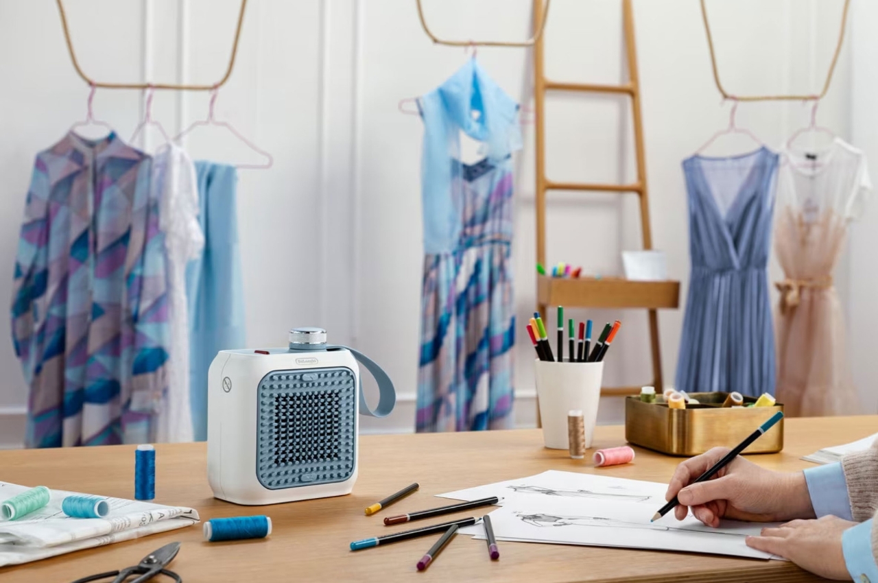
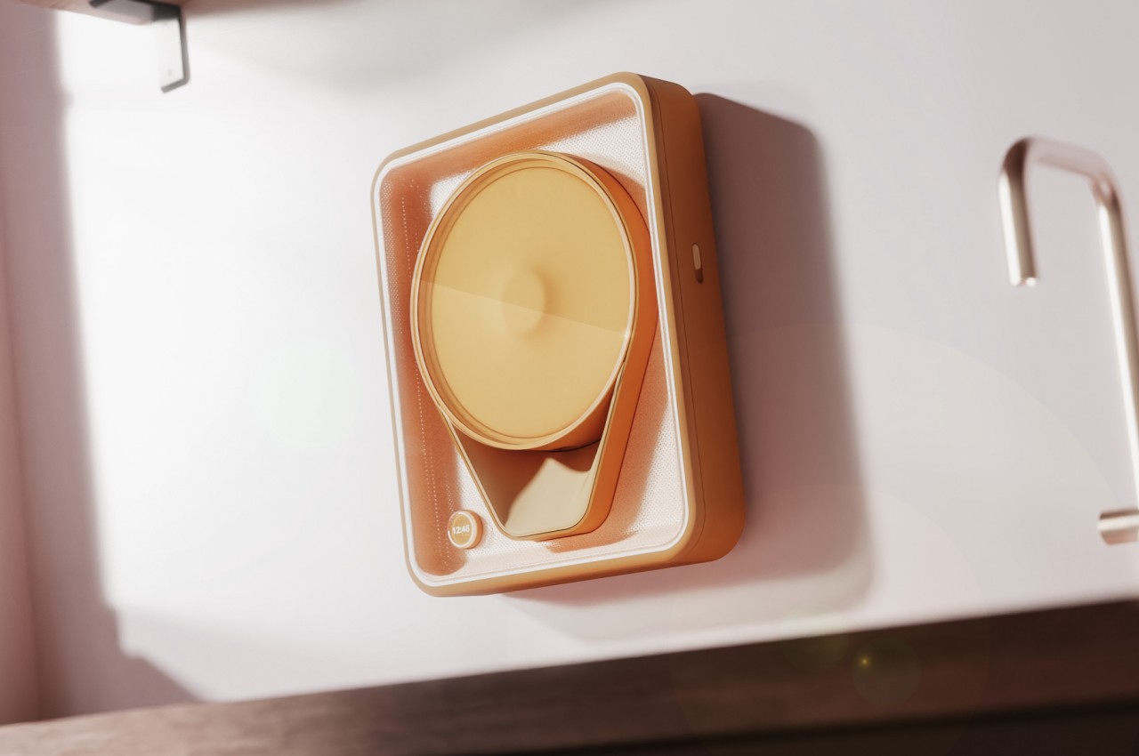
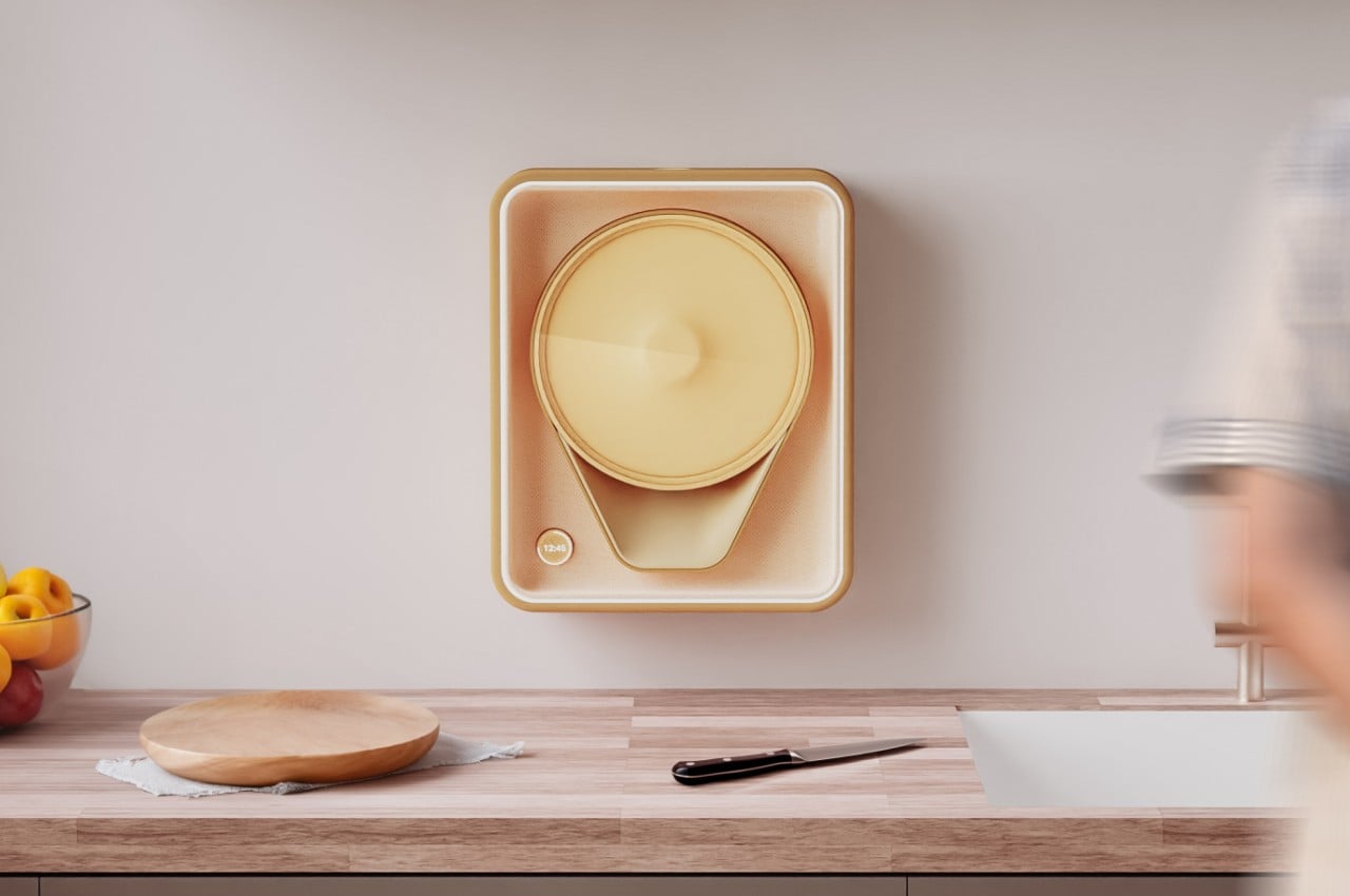
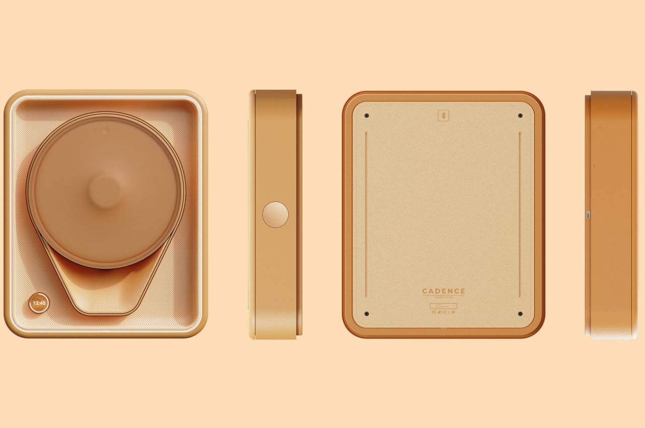
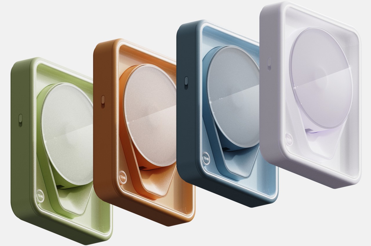
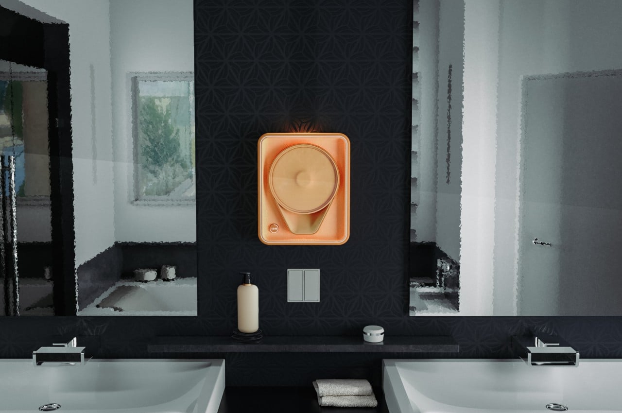
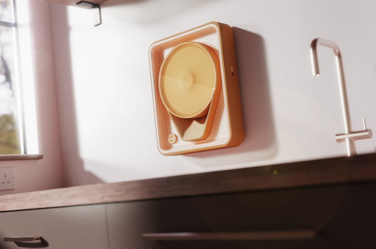
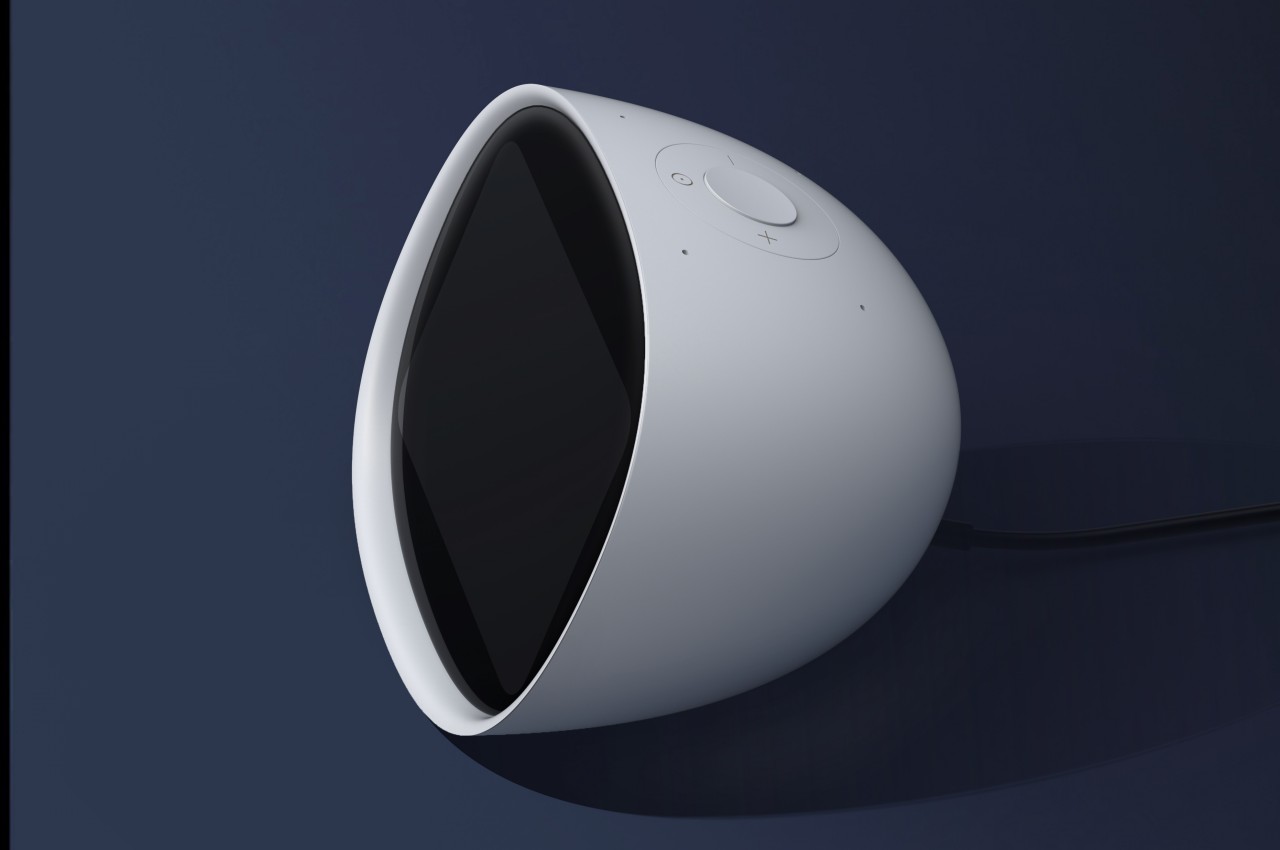
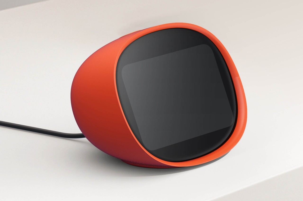
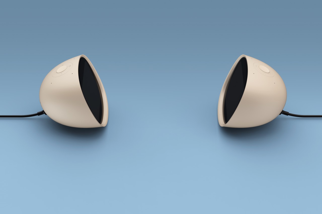
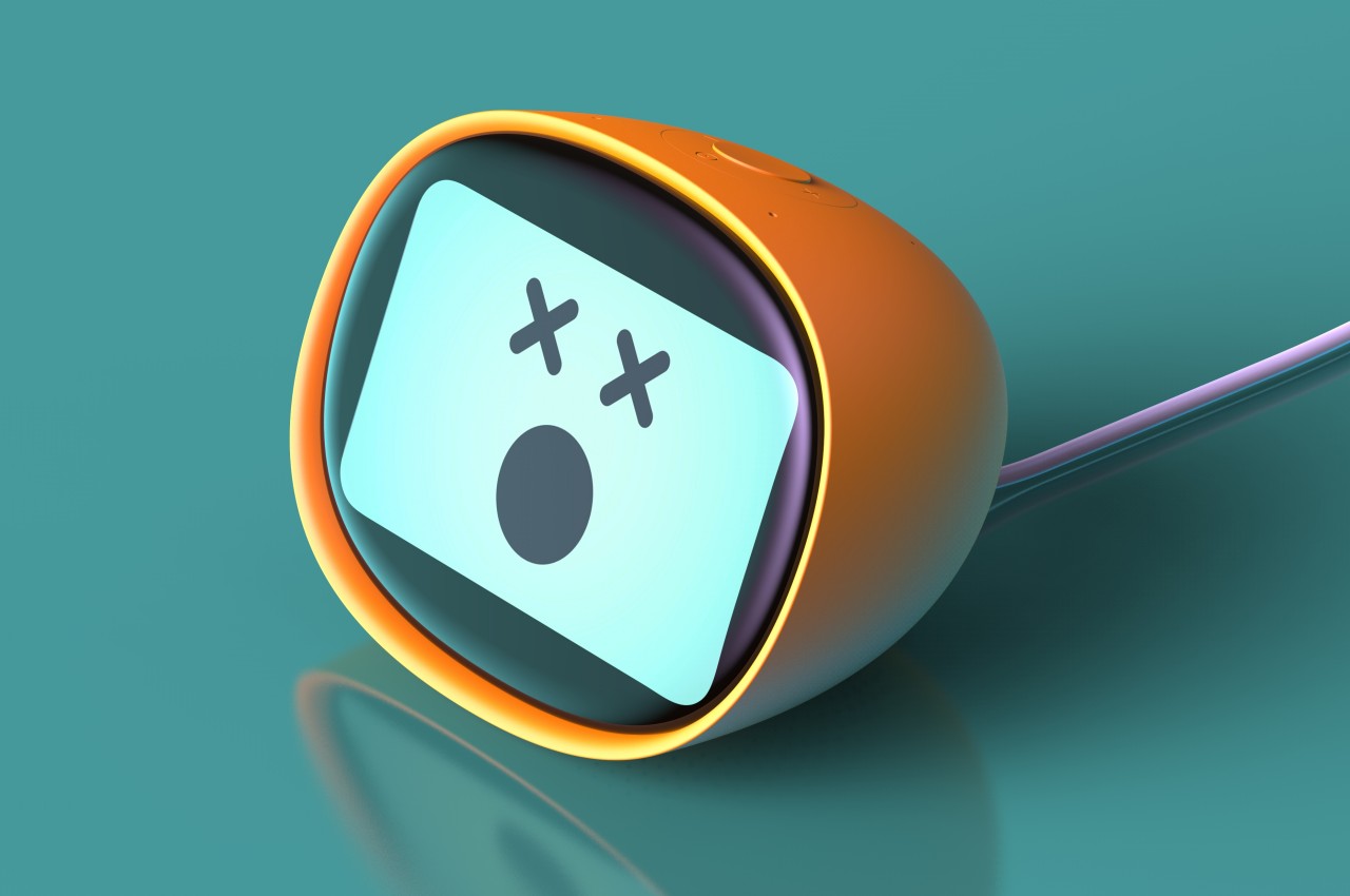
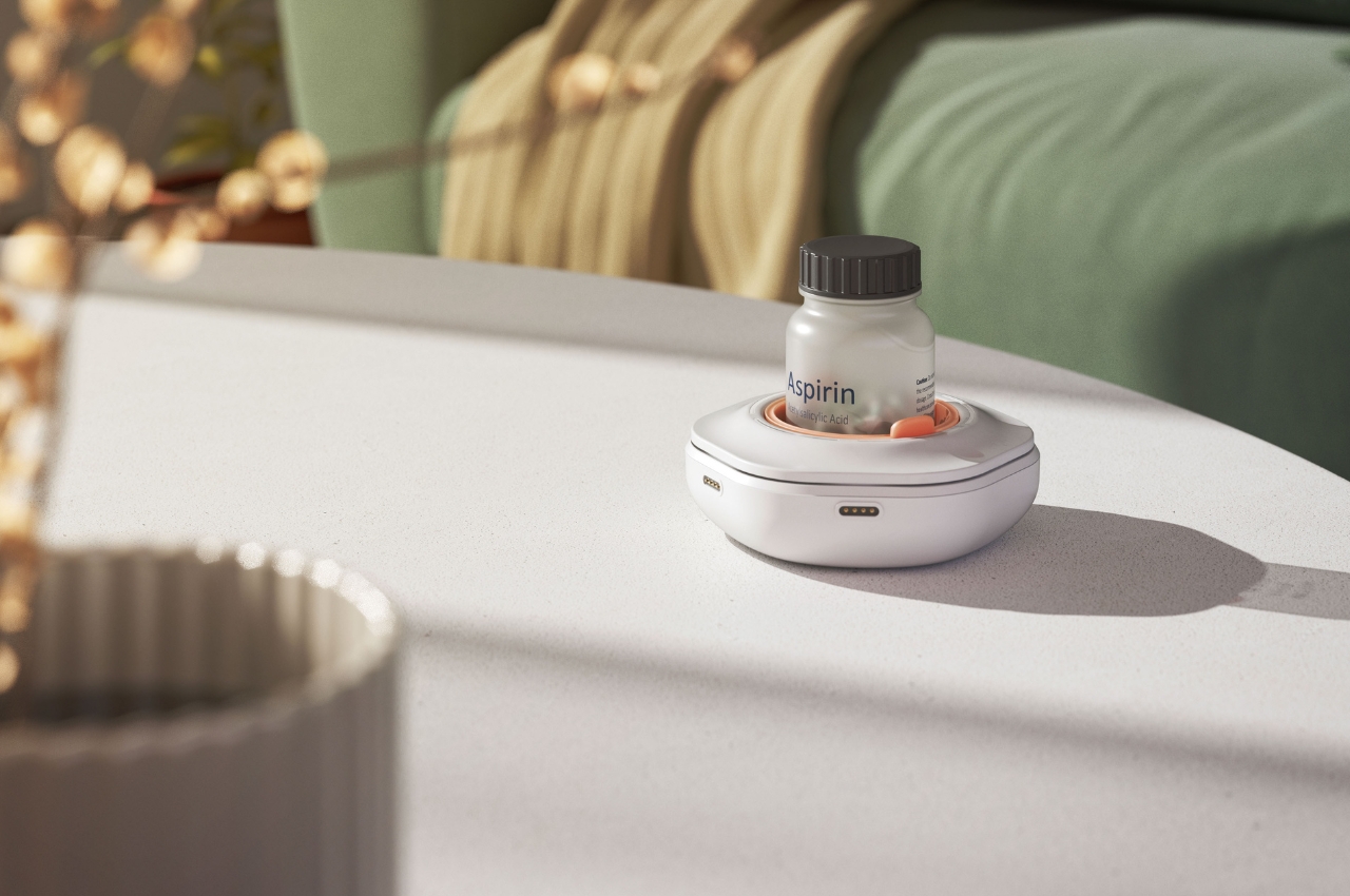
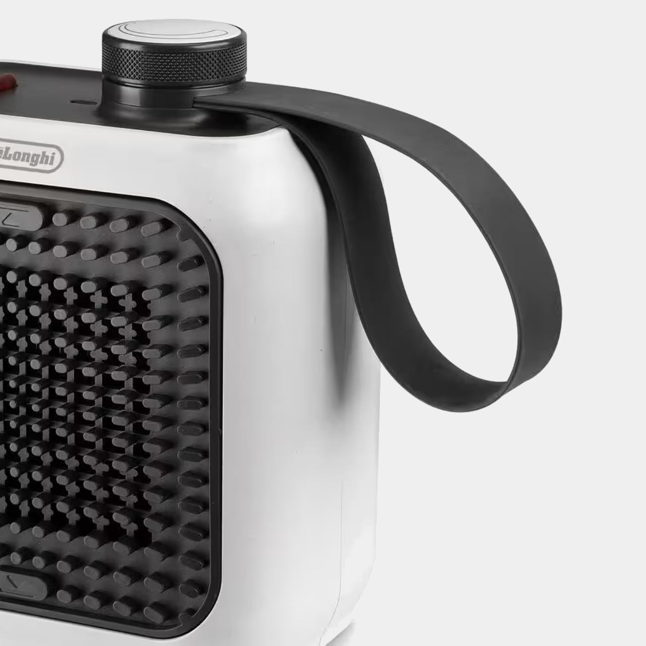
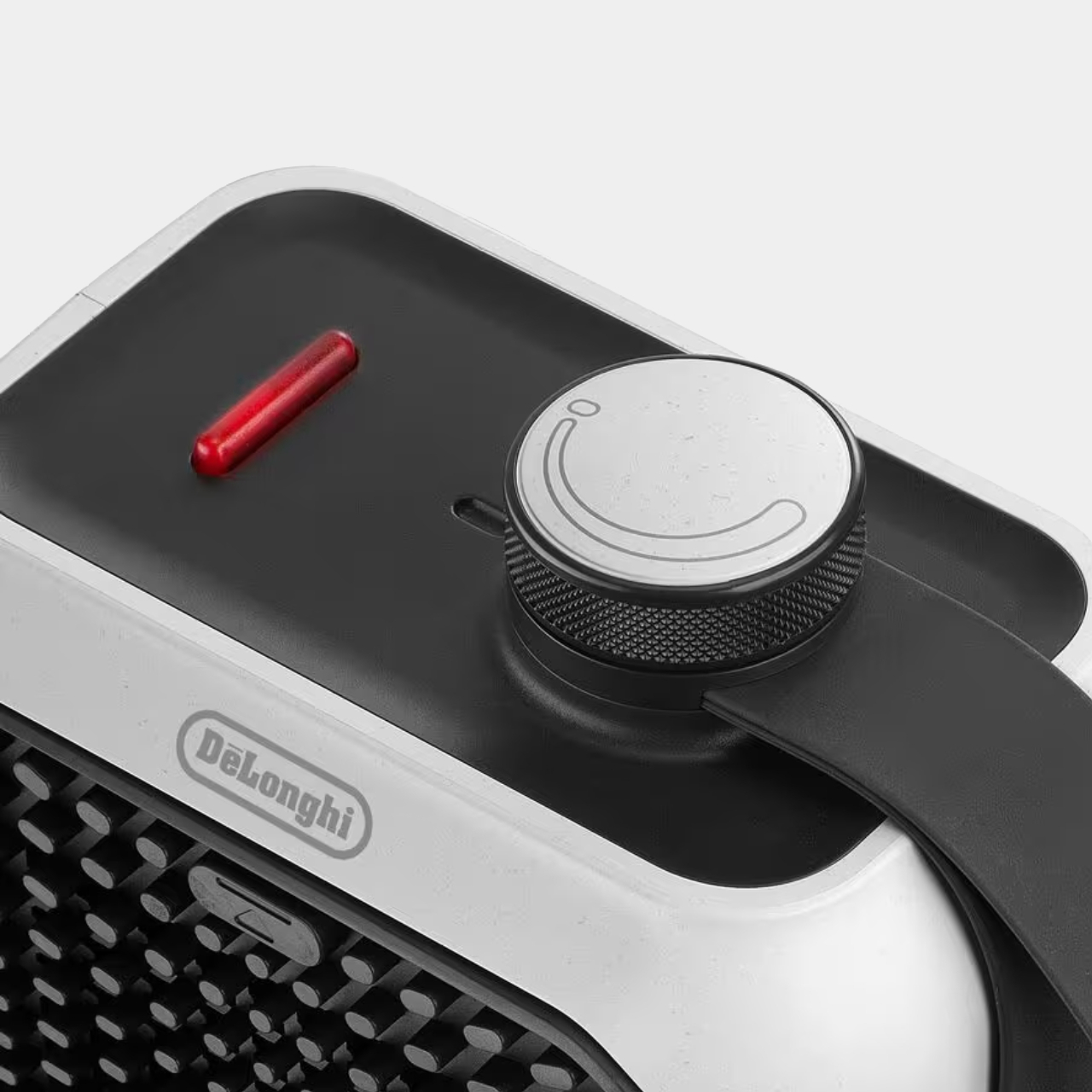
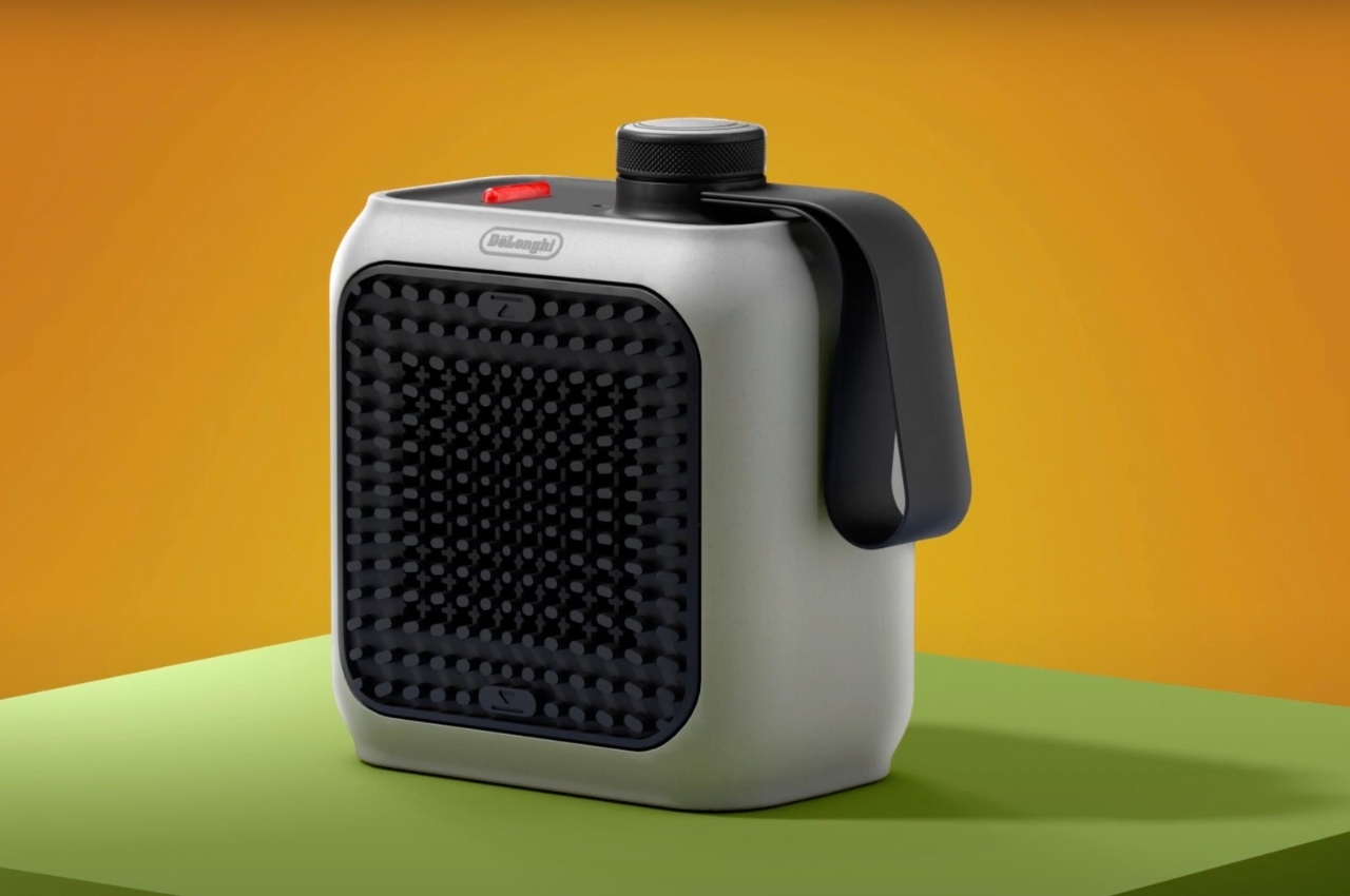
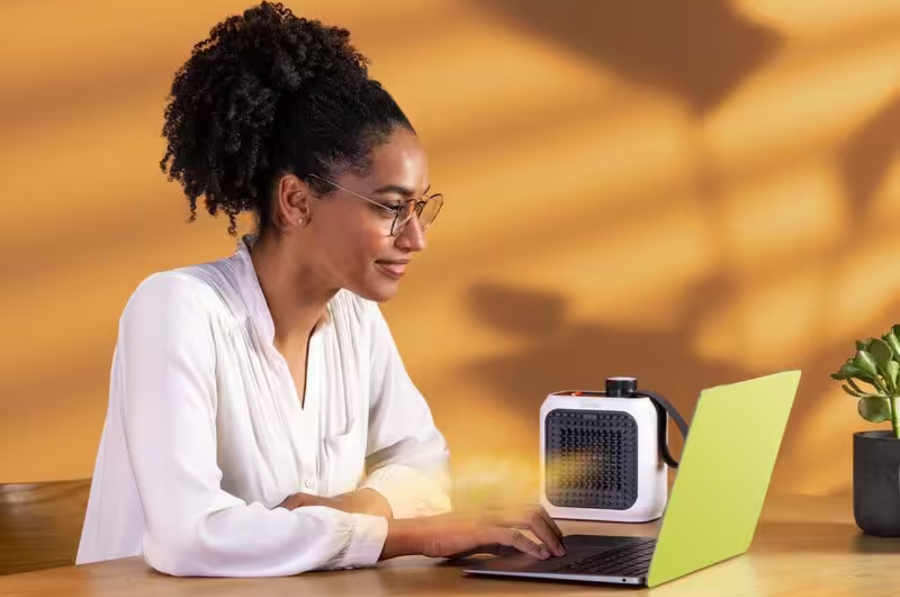
The DeLonghi Capsule Desk Loop is a personal fan ceramic heater that you can place on your desk or wherever you are working so you can “work or relax in peace.” It has a special air grid design that brings you a convenient airflow speed and distribution when you need that soft warmth for your sedentary activities. The designers call the air grid the Flame pattern which actually creates an illusion of heat and flames from your heating source.
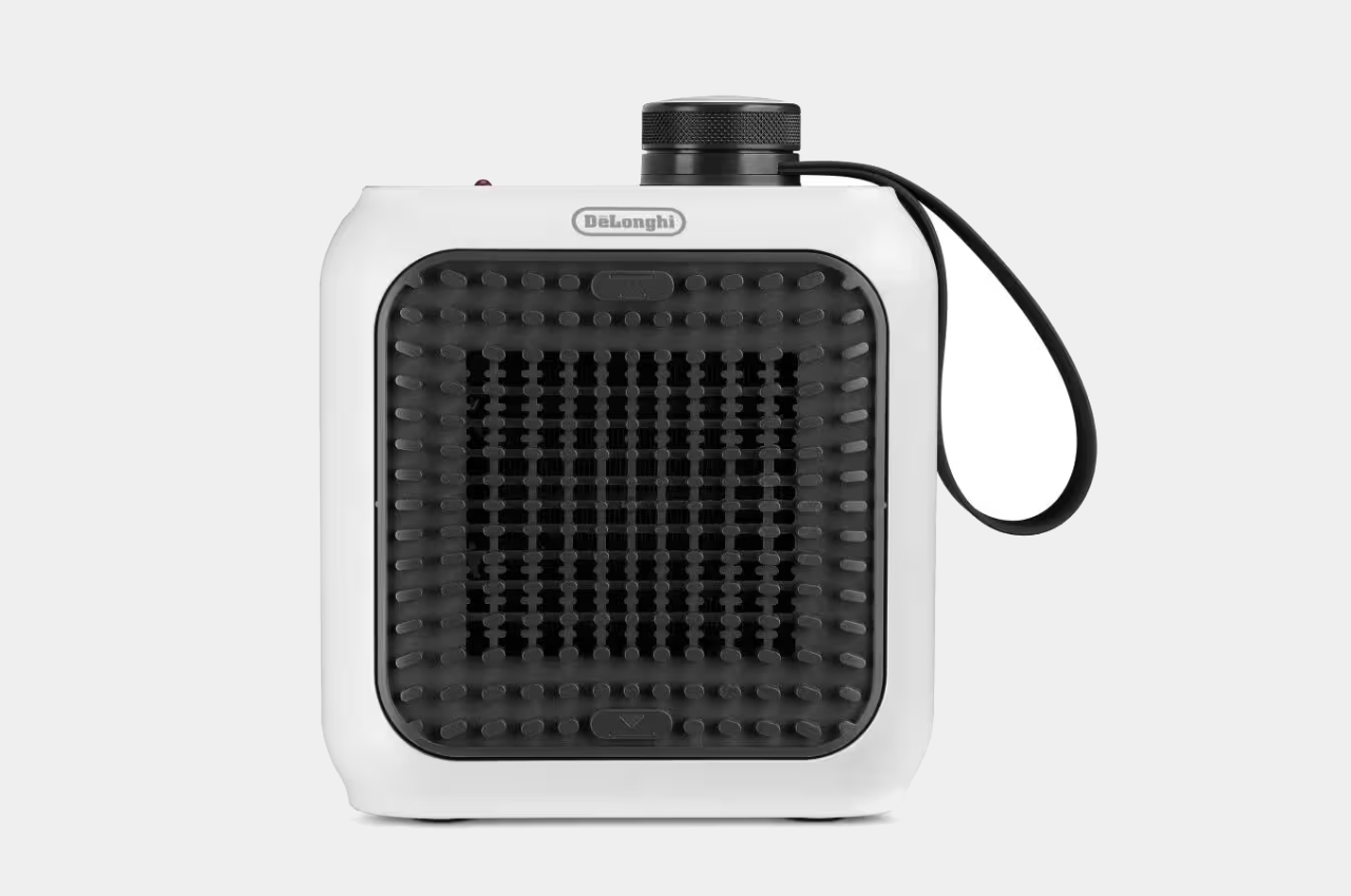

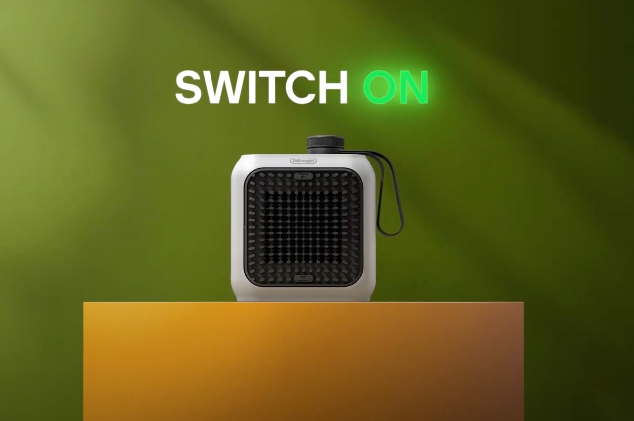
It looks like your typical heater but it’s small enough that you can carry it around with you and it’s also more stylishly designed. It is also more environmentally-friendly than most personal heaters as it uses 50% recycled plastic, a first for a DeLonghi product. It also uses 5.5 times lower energy consumption at just 360W, making it eco-friendly not just in the design but also in its function. It also is not as noisy as normal heaters as it just gives you a quiet 39dB operation so you can really work in peace without an annoying hum in the background.
Having a device that can create your very own micro-climate while working may not be a priority but it is pretty convenient to have especially if you work in places where you can get easily cold. That can solve some of the office arguments that can happen when there’s a mix of people who are either too cold or too warm.

The post DeLonghi portable heater is eco-friendly for your micro-climate needs first appeared on Yanko Design.