GaN Charger Lets You Swap Plugs, Stack Blocks, Pick Your Wattage

GaN chargers have gotten smaller and more efficient over the years, but they still look like anonymous black or white bricks. Most people toss them in a bag and forget about them, and if you travel frequently, you end up carrying a separate adapter for different plug types. It’s functional but incredibly boring, and the whole category feels like it stopped trying once the engineers got the size and wattage right.

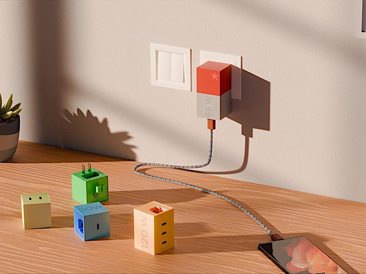
Bang Design’s LEGO-inspired GaN charger is an intern project that tries to make chargers fun and modular instead. The concept treats the charger as a colorful block system, with different cubes for different wattages and swappable plug modules for different countries. It’s patent-pending but still just a concept, though it looks polished enough that you could imagine buying a set off a shelf and arranging them on your desk like tiny toys.

Designer: Bang Design

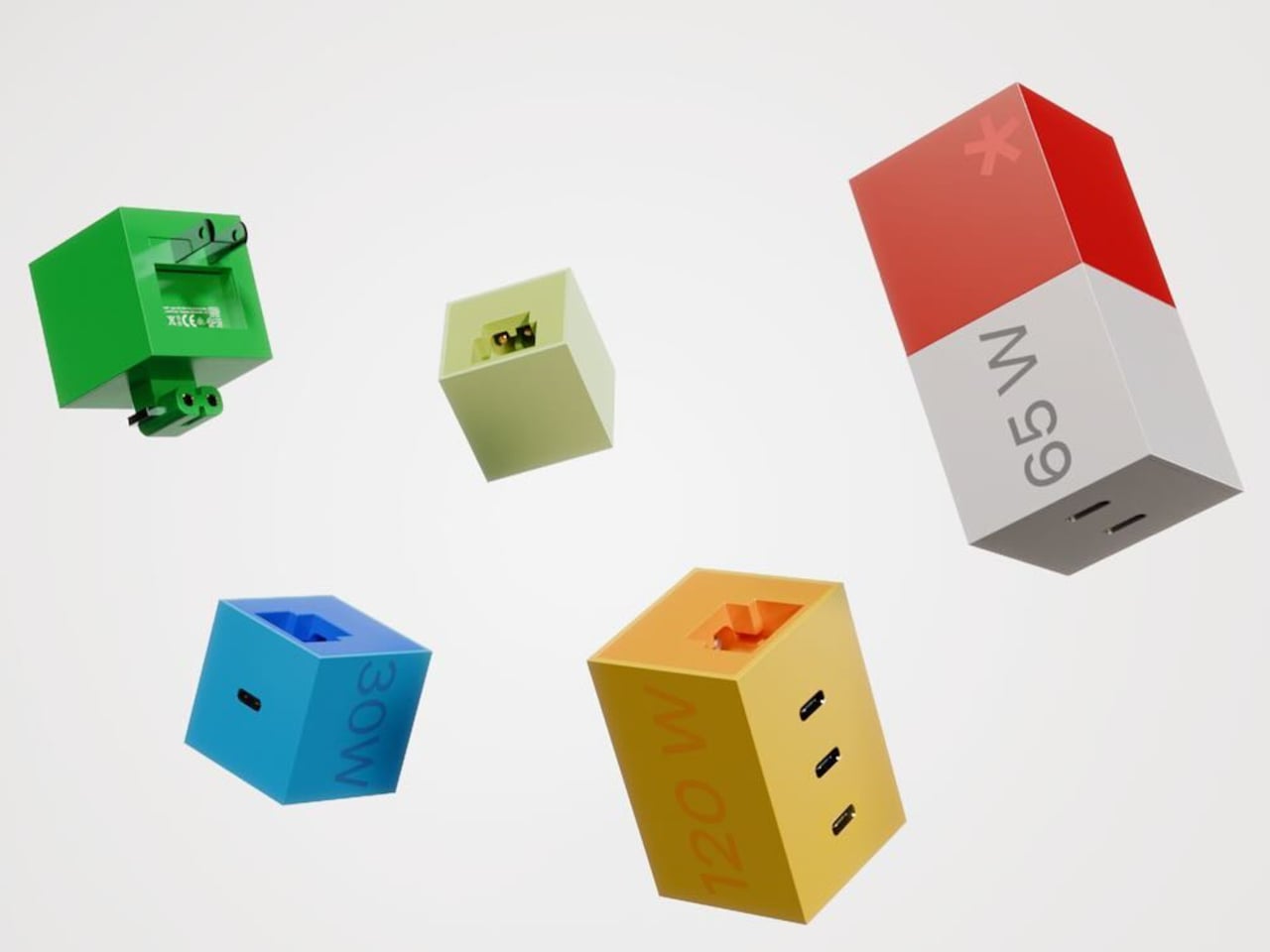
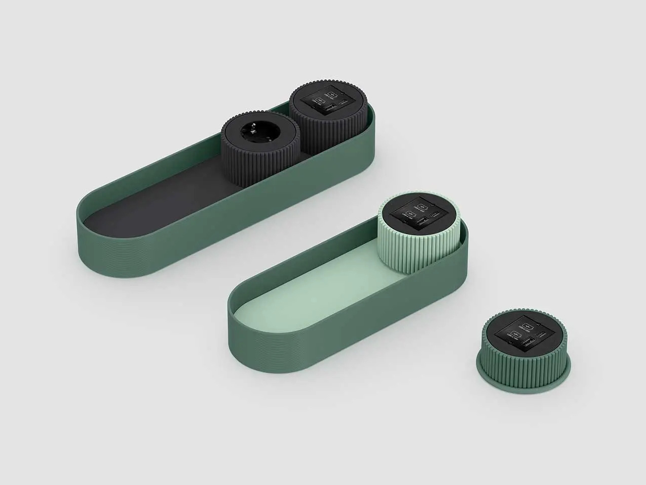
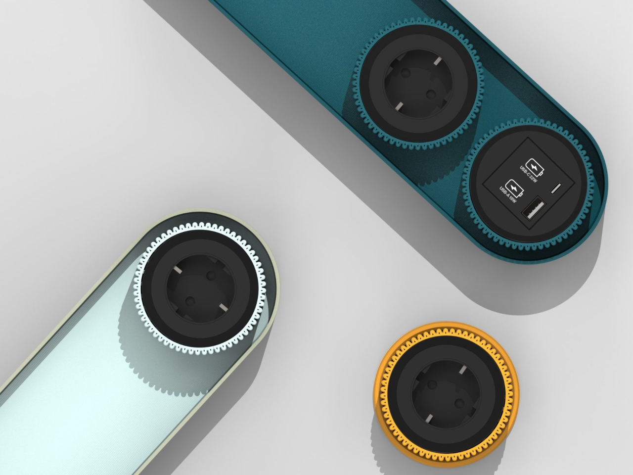
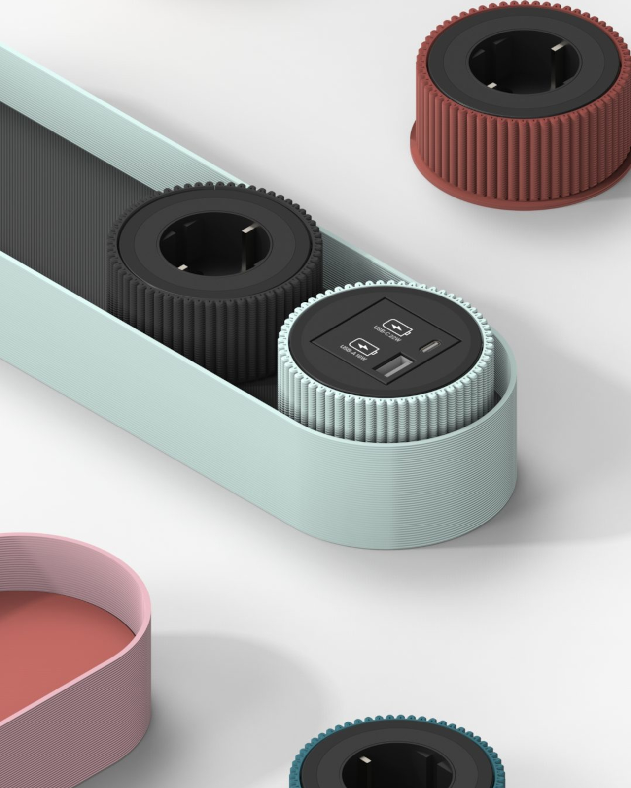
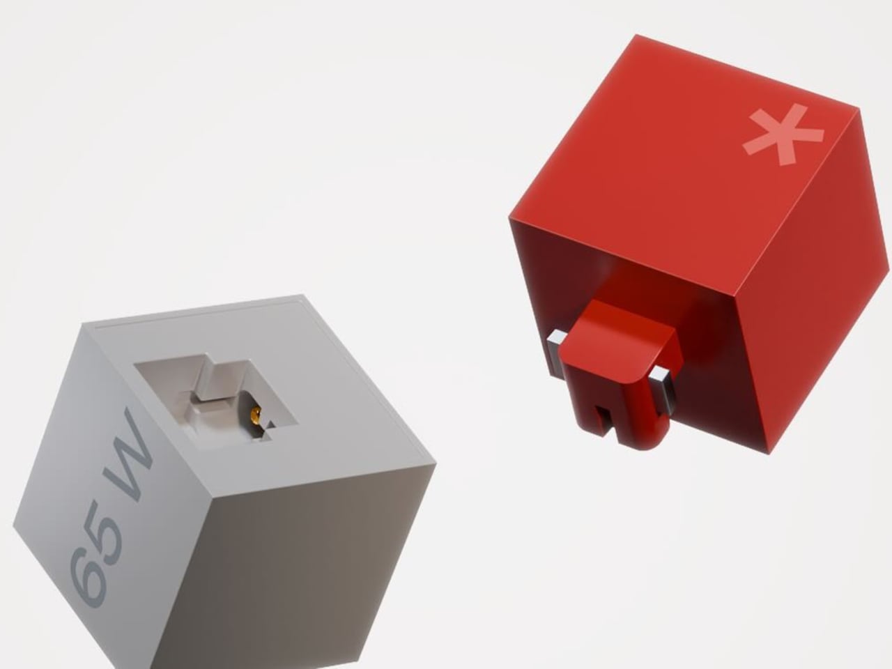
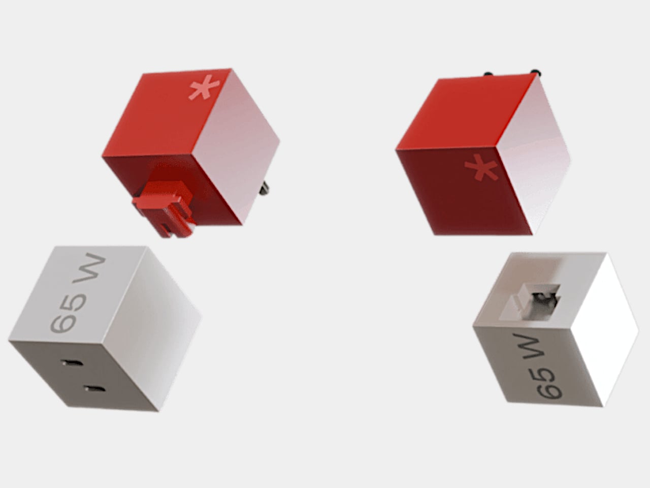
Every module is a perfect cube or tall cuboid with sharp edges and flat faces that instantly read as building blocks. The 65 W version has a red top half, white bottom half, and large “65 W” printed on one side in light gray type. A subtle asterisk mark on the top hints at a LEGO stud without copying it directly. The rest of the family uses green, blue, yellow, and pastel beige blocks with the same bold geometry.

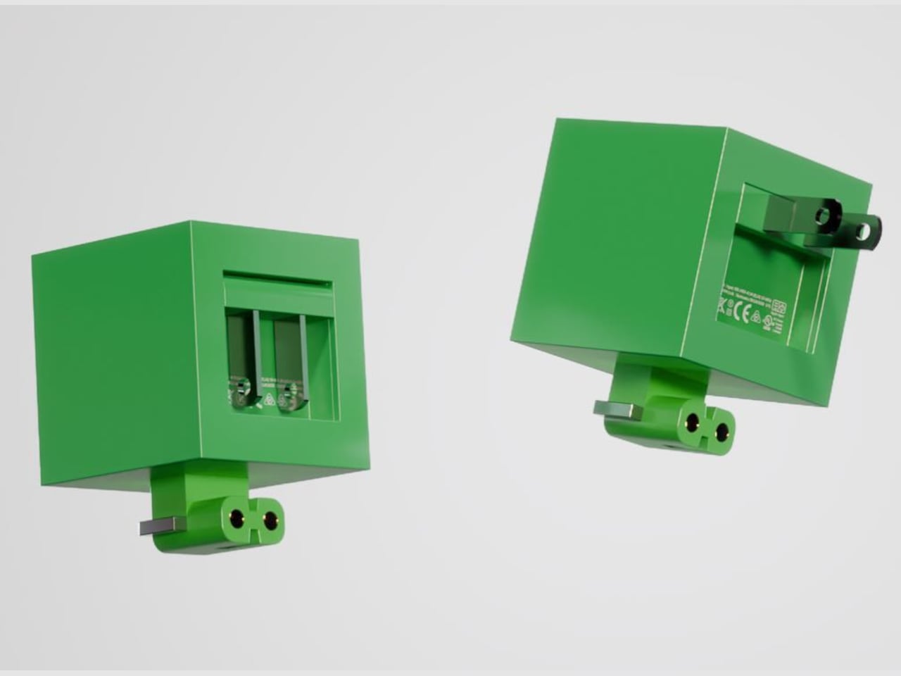
One green cube houses a sliding plug carriage with metal prongs that can be removed and replaced with different pin standards for US, Indian, or European outlets. A rectangular recess on one face holds the carriage, and gold contacts inside suggest a cartridge-style electrical connection. The plug becomes just another swappable piece of the system rather than something permanently wired to the charger, which is the whole point.

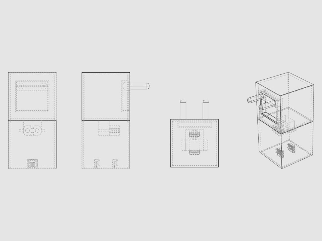
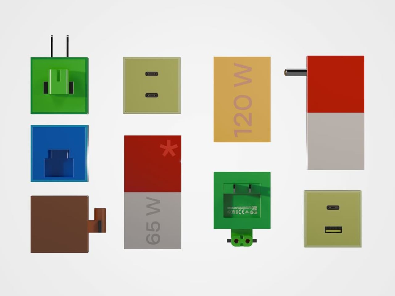
Different wattage blocks have different port configurations. The blue 30 W cube has one USB-C port, the yellow 120 W block has three outputs, and the beige version mixes USB-A and USB-C. Users could pick the block that matches their device or build a small family that shares the same plug module. The big printed wattage numbers make it easy to grab the right cube without squinting at tiny labels.

One cube plugs into the wall while the other blocks sit on the desk like small sculptures. The chargers stop being clutter to hide and start looking like a collection you might actually enjoy arranging. The LEGO reference makes the whole setup feel approachable and almost toy-like, especially compared to the usual tangle of anonymous black bricks and bulky travel adapters that most people carry around.

Turning this into a real product would mean solving serious issues around safety certifications, heat dissipation, and mechanical durability for those swappable parts. But the concept is still valuable because it shows how even a commodity accessory can carry personality and systems thinking. The LEGO-inspired GaN charger hints at a future where chargers are not just smaller and faster, but also more playful and easier to live with.

The post GaN Charger Lets You Swap Plugs, Stack Blocks, Pick Your Wattage first appeared on Yanko Design.

Bene Just Built Office Furniture You Can Reconfigure Without Any Tools

Offices keep buying furniture that looks permanent, which works fine until someone needs the room to do something different. A workshop space becomes a presentation area, a meeting room needs to turn into individual work zones, and nobody wants to wait three days for facilities to show up with screwdrivers. The furniture just sits there looking expensive and immovable while everyone works around it instead of with it.

PIXEL by Bene is designer Didi Lenz’s answer, and it looks almost suspiciously simple. Each piece is a 36 x 36 cm cube made from raw pine plywood with visible grain and knots all over the surface. Lenz says it isn’t really furniture, which makes sense when you see people stacking them into benches, flipping them into tables, or just using one as a side storage box with a handle cut into the side.

Designer: Didi Lenze (Bene)

The wood is completely untreated, so every cube looks slightly different depending on which part of the tree it came from. Some have dark knots near the corners, others show lighter grain patterns, and the plywood edges are exposed instead of hidden under veneer. It definitely reads as workshop material rather than corporate office product, which seems to be the whole point. You can see the screws holding the corners together.

The cubes stack easily because they’re all the same size, and the cutout handles on two sides let you carry them around or fold them over to connect boxes side by side. Add a white laminate top and a stack becomes a work table. Add casters to the bottom, and it rolls wherever you need it. PIXEL Rack adds metal frames that turn stacks into proper shelving or room dividers with slots for whiteboards and plants.

Bene shows photos of teams building entire project rooms by hand. Boxes stacked three high become benches for workshops, racks filled with boxes create semi-transparent walls between work zones, and tops laid across stacks turn into standing height tables. The setups look intentionally unfinished, like someone is still building them, which is probably the aesthetic Lenz wanted. Nothing looks bolted down or precious.

The system works because it assumes people will move things around themselves without asking permission. You need more seating for a presentation, so you grab some boxes from the storage wall and stack them into rows. The presentation ends, and those same boxes become side tables or go back to holding supplies. Heck, they can turn into a bar for an event if you add the right tops.

Raw plywood has obvious trade-offs. It’ll get dinged and stained over time, the surface isn’t smooth enough for detailed work, and the workshop look won’t suit every office brand. The fixed 36 cm dimension means everything is the same height whether you’re sitting, standing, or storing things, which can feel awkward. Some people will look at PIXEL and just see fancy storage crates, which isn’t entirely wrong.

But the system makes sense for spaces that need to change shape constantly. Co-working areas, design studios, classrooms, and pop-up shops can rebuild their layout between sessions without calling anyone. The wood looks honest and approachable instead of intimidating, and you don’t need instructions to figure out that boxes stack. PIXEL by Bene basically gives you building blocks that happen to be office furniture, or maybe it’s the other way around.

The post Bene Just Built Office Furniture You Can Reconfigure Without Any Tools first appeared on Yanko Design.

Finally, a Lamp That Changes Shape as Often as Your Mood

There’s something about lighting that can completely transform a space, isn’t there? You walk into a room with harsh overhead fluorescents and immediately feel different than when you step into a warmly lit corner with just the right glow. But here’s the thing: most lamps are stuck being one thing forever. That sleek floor lamp you bought? It looks great, sure, but what happens when you rearrange your furniture or want to read in bed instead of on the couch?

Enter MOODI, a modular stand lamp designed by Taehyeong Kim that’s challenging everything we thought we knew about lighting. Instead of being locked into one configuration, MOODI is basically the LEGO set of lamps. You can snap together different components, swap out parts, adjust heights and angles, and completely reconfigure the whole thing whenever your space (or mood) changes.

Designer: Taehyeong Kim

Create your own Aesthetic Render: Download KeyShot Studio Right Now!

The design takes inspiration from telescopic mechanical structures, and honestly, it shows. Those exposed joints and metal textures give it this industrial, almost mechanical aesthetic that feels refreshingly honest. Nothing’s hidden away or disguised. You can see exactly how the lamp works, which joints pivot, how the pieces connect. It’s functional beauty at its finest.

What makes MOODI particularly clever is how it addresses something many of us don’t even realize we’re missing. Kim’s philosophy centers on the idea that our homes aren’t just places to crash at the end of the day anymore. For millennials and Gen-Z especially, our spaces have become extensions of our personalities, stages where we live out our daily narratives. We’re curating our environments the same way we curate our Instagram feeds, and lighting plays a massive role in setting those scenes.

The modularity goes way beyond just being able to tilt the lamp head up or down. You can actually build different types of lights from the same set of components. Need a tall floor lamp for your living room? Done. Want a compact desk light for focused work? Rearrange a few modules. Heading out for a camping trip? Reconfigure it into a flashlight. It’s wild how versatile the system becomes once you start thinking about all the possibilities.

The lamp comes in three elegant finishes: white, black, and a warm beige tone that adds just a touch of softness to the industrial vibe. Each version maintains those signature exposed joints and clean lines, but the color options let you match it to your existing decor or create intentional contrast.

What really resonates about MOODI is how it puts control back in your hands. We’re so used to products dictating how we use them, but this flips that relationship. You’re not adapting your life to fit the lamp; the lamp adapts to fit your life. Morning coffee at the kitchen table? Adjust it for soft ambient light. Late-night reading session? Reconfigure for focused task lighting. Video call with friends? Move it to create that perfect ring-light effect.

There’s also something refreshingly sustainable about the approach. Instead of buying multiple specialized lights for different purposes (and contributing to more waste), you invest in one versatile system that grows and changes with you. When you move apartments, redecorate, or just feel like mixing things up, MOODI moves right along with you. The design manages to walk that tricky line between being statement-worthy and genuinely functional. It’s sculptural enough to be interesting, but never so precious that you’re afraid to actually use it. Those mechanical joints beg to be adjusted and played with, turning the simple act of repositioning a light into something tactile and satisfying.

The post Finally, a Lamp That Changes Shape as Often as Your Mood first appeared on Yanko Design.

SPOT ON Charger Makes Wireless Charging Feel Like a Bullseye

Wireless chargers have become common, but most are anonymous black discs that disappear into the desk. They do the job, but rarely feel personal or satisfying to use beyond the first week you own them. SPOT ON is a concept that tries to make charging feel more deliberate and expressive, combining a magnetic pad with a small lamp so the whole interaction has a bit more presence on your nightstand or desk.

SPOT ON is a wireless charger and ambient lamp concept designed around a bow-and-target motif. The charging pad is a circular target that snaps magnetically to the front of a tilted cylindrical lamp body. You can dock the pad to use it as a stand charger, or pull it off and lay it flat as a separate wireless pad while the lamp continues to glow in the background.

Designer: SEUNG-A-LEE

Inside the pad is a magnet that aligns the phone with the charging coil, so when you bring your device close, it snaps into place with a satisfying click. The designer explicitly likens this to hitting the target, turning the usual hunt for the right charging spot into a more playful, bullseye moment. The subtle cross mark on the pad reinforces that visual cue every time you place your phone.

The lamp body is a tilted cylinder with vertical grooves, mounted on a simple rectangular base. When lit, the ribbed surface diffuses a warm, gentle glow, more mood light than task lamp. It’s the kind of object that can sit on a bedside table or shelf without screaming tech, giving you a bit of atmosphere while your phone charges upright in front of it.

Because the pad attaches magnetically, it can be pulled off in one motion and used as a flat wireless charger anywhere on the desk or nightstand. The lamp stays behind as a standalone light. That separation lets users adapt SPOT ON to different environments and habits, whether they prefer a stand for video calls or a low pad for casual overnight charging without the upright position.

SPOT ON comes in soft, desaturated tones like warm beige, blush pink, and muted teal, each with a matching pad. The palette leans more toward interior decor than gadgetry, making it easier to blend into different rooms. The combination of simple geometry, gentle colors, and the bow-and-target metaphor gives the charger a character that feels more like a small object you chose than a piece of infrastructure you tolerate.

SPOT ON is a reminder that even something as mundane as charging a phone can be turned into a small ritual. By adding a magnetic snap, a bit of ambient light, and a form that shifts between stand and pad, it nudges the interaction from purely functional to quietly satisfying. For anyone tired of generic charging pucks, this kind of concept hints at a more thoughtful future for everyday tech.

The post SPOT ON Charger Makes Wireless Charging Feel Like a Bullseye first appeared on Yanko Design.

This Swedish Designer Just Turned Childhood Puzzles Into Furniture

You know that satisfying click when two puzzle pieces finally snap together? Swedish designer Gustaf Westman has blown that feeling up to furniture-size with his latest creation, the Puzzle Shelf, and honestly, it’s the kind of playful design we didn’t know we needed.

If you’ve been following Westman on Instagram (and you really should be), you’ve probably already fallen for his signature aesthetic: chunky, glossy objects in candy-bright colors that somehow manage to feel both nostalgic and completely modern. Think rounded edges, inflated geometry, and a sense of humor that most furniture seriously lacks. The Puzzle Shelf fits right into this universe while marking something new for the designer. It’s his first venture into modular shelving, and it’s exactly as delightful as you’d expect.

Designer: Gustaf Westman

The concept is brilliantly simple. Westman took inspiration from, well, puzzles. Actual jigsaw puzzles. “I usually get inspired by the most random things, and in this case, puzzles,” he explains in a recent Instagram Reel. Each shelf unit features those familiar protruding tabs and recessed slots that slide and lock together without any visible hardware. No screws, no Allen keys, no confusing instruction manuals with cryptic diagrams. Just pure, friction-based satisfaction.

What makes the Puzzle Shelf so compelling is how it transforms something functional into something sculptural. These aren’t just storage units. They’re bone-shaped, oversized blocks that you can stack, rearrange, and play with to create whatever configuration your space needs. Want a tall tower of shelves? Go for it. Prefer something low and horizontal? That works too. The system is completely flexible, giving you the kind of creative control that makes arranging your space feel more like art than organization.

Westman’s design process is also pretty fascinating. Before committing to full-scale production, he tests everything through 3D printed miniatures that mirror the final product almost exactly. It’s a smart approach that lets him work out all the kinks while keeping that essential puzzle functionality intact. The result is a system that actually works the way it promises to, which in the world of trendy furniture, is refreshingly rare.

And can we talk about how these pieces look? The glossy finish and those signature candy hues make the Puzzle Shelf feel like an oversized toy that somehow grew up without losing its sense of fun. It’s the kind of design that makes you smile when you walk past it, which is exactly what good furniture should do. Plus, the generous spacing between levels means you actually have room for your books, plants, ceramics, or whatever else you want to display.

This latest piece comes on the heels of Westman’s collaboration with IKEA earlier this year, a 12-piece collection that brought his playful aesthetic to a wider audience. That partnership showed how his rounded forms and informal approach to design could translate across different price points and product types. The Puzzle Shelf feels like the next logical step, proving that Westman’s chunky universe has plenty of room to grow.

What’s refreshing about Westman’s work is that it never takes itself too seriously. There’s a lightness to his designs, a sense that furniture doesn’t have to be stuffy or precious. The Puzzle Shelf embodies this philosophy perfectly. It’s functional without being boring, sculptural without being impractical, and playful without being juvenile. It invites you to interact with it, to rearrange it, to make it your own. It isn’t trying to revolutionize how we think about storage. It’s just making the everyday act of organizing your stuff a little more joyful, a little more tactile, and a lot more fun. And isn’t that what good design should do?

The post This Swedish Designer Just Turned Childhood Puzzles Into Furniture first appeared on Yanko Design.

This 3D-Printed Modular Power Strip Is Made From Recycled Plastic

Carefully curated desks always have one ugly secret hiding underneath them. Power strips are black plastic bricks with tangled cables, even in the most beautifully designed workspaces. You need the outlets and USB ports, but nobody wants to look at the usual tangle of cords and generic housings. The bFRIENDS Power Module treats power access as something that deserves the same design attention as pen cups and storage trays.

The bFRIENDS Power Module is a family of 3D-printed desk power hubs designed by Pearson Lloyd for Bene. It’s part of the broader bFRIENDS collection, which uses recycled bioplastic and additive manufacturing to create desk accessories. That same language now extends into sockets and USB chargers, turning a power strip into a small, modular object that sits proudly on the desk instead of hiding on the floor or under a cable tray.

Designer: Pearson Lloyd for bene

The basic form is a low, rounded tray with one or two ribbed cylinders that dock into it. The cylinders hold either a mains socket or a USB charger, while the tray doubles as a shallow organizer. Module S offers a single power point in a compact footprint. Module M adds one cylinder plus a shelf for pens and small items. Module L fits two cylinders and a wider storage area for more devices and desk clutter.

The modules are designed to be modular beyond their size. The cylinders can be specified with different country sockets or USB chargers, and the threaded sub-assembly simplifies swapping them out. Colour is also part of the system. The tray, cylinder body, and top insert can be mixed from the full bFRIENDS palette, so you can match brand colours, interior schemes, or other accessories instead of defaulting to anonymous black plastic.

The Power Module uses the same recycled bioplastic as the rest of bFRIENDS, sourced from food packaging waste diverted from landfill. Pieces are 3D-printed locally on demand, which eliminates injection-mould tooling and reduces warehousing and transport. That agile manufacturing approach makes it easier to offer many colour combinations and evolve the range without the usual constraints of mass production and minimum order quantities.

The combinations and uses are practically endless. For example, a Module M or L can rest against a fabric privacy panel, with the tray holding a phone and stationery while the cylinder powers a monitor or laptop. By bringing sockets and USB up onto the desk, the module makes plugging in less of a reach and turns cable management into part of the overall desk composition rather than an afterthought you hide under a grommet.

The bFRIENDS Power Module shows what happens when designers look at the boring parts of the office. By combining power, storage, recycled materials, and colour in a single object, it makes the everyday act of plugging in feel a bit more considered. It’s not trying to reinvent electricity, just the way it shows up on your desk, turning something functional into something you might actually want visible in your workspace.

The post This 3D-Printed Modular Power Strip Is Made From Recycled Plastic first appeared on Yanko Design.

BALOLO Setup Cockpit: Wood Monitor Stand That Adapts to Your Work

Most desks tell the same story. A monitor sitting too low, forcing you to hunch forward. A tangle of charging cables disappears behind the desk, where you’ll never find them again. Your phone wedged between the keyboard and a coffee cup, headphones draped over the back of your chair, and a growing pile of notebooks that never quite fit anywhere. It’s functional enough to get work done, but it’s also the kind of setup that makes you dread sitting down every morning.

The Setup Cockpit by BALOLO approaches this differently. Instead of adding more organizers that take up space or forcing you to commit to a fixed layout, it creates a foundation that adapts to however you work. The monitor stand itself is straightforward, a long walnut or oak shelf that raises screens to eye level while freeing up the desk underneath. What sets it apart is the patented mounting grid running along the bottom, a system of attachment points that lets you easily add accessories wherever they’re needed and rearrange them whenever your workflow changes.

Designer: Ruben Keferstein

Click Here to Buy Now: $237.92 $279.90 (15% off, use coupon code “BLACKBALOLO”). Hurry, deal ends in 48-hours!

The first thing you notice when unpacking the Setup Cockpit is how solid it feels. The wood is real American walnut or oak, hand-finished in Germany with natural oils and waxes that bring out the grain. The feet, made from MDF wood, are sturdy enough to keep the whole thing stable, even with two large monitors perched on top. It’s the kind of build quality you’d expect from furniture that costs a few hundred dollars, not something marketed as a desk accessory.

Setting it up is refreshingly simple. Slide your monitors onto the shelf, adjust the monitor height if needed, and tuck your keyboard underneath in the 3.9 inches of clearance. That alone transforms how your desk feels, raising screens to eye level and opening up space you didn’t realize you were wasting. But the real shift happens when you start adding accessories from BALOLO’s modular ecosystem, which is where the mounting grid earns its keep.

A laptop riser is perfect for those days when you need a second screen. A MagSafe holder keeps your phone charged and visible for notifications without cluttering the surface. Cable magnets attach to the grid, holding charging cables in place so they don’t slip behind the desk every time you unplug something. Heck, there’s even a headphone holder that keeps your cans within reach instead of draped over your monitor or tangled in your bag.

The modularity is what makes this feel genuinely useful instead of just another piece of furniture you buy once and forget about. Your workflow changes depending on what you’re working on, and the Setup Cockpit keeps up. Whether you need a tablet holder for sketching or more space for your accessories, the BALOLO Setup Cockpit lets you customize your desk to suit your preference, while leaving you with the freedom to expand and change it at any time.

What’s surprising is how much this changes the rhythm of your workday. Starting with a cleared surface instead of a pile of cables and peripherals makes sitting down feel less overwhelming. Everything has a spot, and that spot can change if you decide you want your phone on the left instead of the right. It’s the kind of flexibility most desks never offer, where adding one thing means removing something else or living with clutter.

The materials help too. The walnut finish warms up spaces that lean too heavily on black plastic and aluminum, while the oak or black-stained oak options fit minimalist setups without feeling cold. The wood is sealed, so spills and wear won’t ruin the finish, and the whole thing is built to support up to 50 pounds without wobbling. That’s reassuring when you’re stacking ultrawide monitors and laptops on top of a shelf.

The Setup Cockpit doesn’t reinvent what a monitor stand can do so much as it refines every detail until nothing feels compromised. BALOLO’s approach combines German craftsmanship with modularity that actually makes sense, creating furniture that transforms your desk without forcing you to tear everything apart first. It’s designed to adapt as your work evolves, which is exactly what premium workspace solutions should have been doing all along.

Click Here to Buy Now: $237.92 $279.90 (15% off, use coupon code “BLACKBALOLO”). Hurry, deal ends in 48-hours!

The post BALOLO Setup Cockpit: Wood Monitor Stand That Adapts to Your Work first appeared on Yanko Design.

This School Chair Concept Has 3D-Printable Replacement Parts

Old school chairs like the Mullca were built to survive decades of abuse, with welded steel frames and bolted parts that could outlast the building itself. That durability was impressive, but it also meant the chairs were impossible to take apart or repair at home if something did eventually break. Contemporary designers are questioning whether indestructibility is the only way to think about longevity, with design for disassembly and repair becoming just as important as raw toughness.

Carrousel is a chair concept by Thibaud Rollet that starts from the familiar silhouette of nostalgic school chairs but shifts the focus to how it is assembled and maintained. Instead of chasing the legendary durability of a Mullca, Carrousel is designed to be easy to produce, disassemble, and repair, with individual elements that can be replaced or even 3D printed by the user at home when parts wear out or need refreshing.

Designer: Thibaud Rollet

The basic construction is straightforward. A bent or laminated wooden frame forms the legs and backrest supports, while horizontal traverse pieces carry the structural load. The seat and backrest are separate panels fixed with four screws each, visible on the surface. Those screws bite into metal threaded inserts embedded in the wood, so panels can be removed and reattached repeatedly without damaging the material or stripping the threads.

The covering L-shaped pieces sit over the joints between the frame and the seat or backrest. These parts are held in place by the screws and inserts, and they are the most likely candidates for 3D printing. Users could swap them out to change colors, textures, or even shapes, turning a functional joint into a place for customization and personal expression without needing professional tools.

The visible screws and simple joinery send a clear message that the chair is meant to be taken apart, not treated as a sealed object. Instead of hiding the assembly, Carrousel uses it as part of the aesthetic language. That openness encourages people to replace worn panels, refresh the look, or tinker with new parts, extending the chair’s life in a way that feels approachable rather than intimidating.

Of course, swapping a backrest or changing the covering pieces can refresh the chair without replacing the whole thing, and the act of playing with those options adds emotional value. When you’ve customized or repaired something yourself, you are more likely to keep it around rather than send it to the curb when a screw loosens or a panel gets scratched.

Carrousel borrows the reassuring outline of a school chair but rewires the logic underneath, making it easy to disassemble, repair, and personalize. It suggests that the next generation of everyday chairs might be less about lasting untouched forever and more about being easy to live with, update, and care for. That shift from indestructible to repairable might end up keeping more furniture out of landfills than any amount of added steel ever could.

The post This School Chair Concept Has 3D-Printable Replacement Parts first appeared on Yanko Design.

These Nest-Like Pods Show Prefab Architecture Doesn’t Have To Look Prefab

Nestled within China’s Senbo Amusement Parks, a new architectural vision is taking root. The Forest Nests Treepod Project by Doarchiwow challenges everything we thought we knew about modular construction, transforming prefabricated building into an art form that breathes with its surroundings. These aren’t your childhood treehouses. Each dwelling rises from the landscape like a sculptural organism, its steel skeleton wrapped in layers of wood shingles, weathering steel, aluminum, and glass.

The genius lies in how these materials work together, creating structures that feel less constructed and more cultivated. They could be oversized cocoons suspended in time or nests woven by some mythical creature. What they don’t look like are typical modular buildings, and that’s entirely the point. Doarchiwow, a subsidiary of DO Architects specializing in high-quality prefabricated systems, spent years developing this concept. Design work began in 2021, with the 441.92-square-meter project finally completing in 2025 across two locations in Rizhao, Shandong and Wuhan, Hubei.

Designer: Doarchiwow

Step inside and the experience shifts. Smart home systems and digital networks handle the technical side while floor-to-ceiling glass opens up views of the canopy. The interior curves follow those same organic lines from the exterior. It’s surprisingly spacious for a micro-living unit. Doarchiwow was trying to solve a tricky problem here: how do you mass-produce something that still feels custom? The standardized shell allows for efficient construction, but the spaces inside feel tailored. The pods work as individual retreats while functioning as part of a larger network.

The sustainability angle goes deeper than surface-level green building tactics. Tang Jiajia, Wang Wenrui, and Jiang Hong led a design team that built a three-part environmental strategy into the project. Passive design, active environmental tech, and construction methods that respond to microclimate conditions. Prefabrication keeps ground disturbance minimal. Material waste drops. On-site labor requirements shrink. Each pod essentially runs as its own environmental system, capable of adjusting to different settings and weather patterns.

That adaptability matters because this model could theoretically pop up anywhere. Urban green spaces, protected natural areas, coastal zones, mountain forests. The fluid shapes refuse to look out of place, which is rare for modular buildings. Most prefab structures announce themselves loudly. These ones settle in quietly. It’s a replicable approach that doesn’t require starting from scratch each time.

Doarchiwow seems interested in changing how we think about vacation spaces and construction methods at the same time. They’re targeting boutique resorts, high-end campsites, rural tourism markets. Forest Nests makes the case that prefab doesn’t mean compromising on design or environmental responsibility. You can have efficiency and beauty. The structures prove it’s possible to build quickly without bulldozing the site or creating eyesores. Whether this becomes a widespread model remains to be seen, but it’s a compelling direction for sustainable resort development.

The post These Nest-Like Pods Show Prefab Architecture Doesn’t Have To Look Prefab first appeared on Yanko Design.

George & Willy’s Cafe Table Mounts to Walls and Lifts Off Daily

Small cafes and bistros face a constant battle with space. You need enough seating to make the business worthwhile, but cramming too many tables and chairs into a narrow sidewalk or patio turns the whole setup into an obstacle course. Floor-standing tables claim precious real estate even when they’re not in use, and moving them around every day to accommodate different crowds or weather becomes a hassle nobody wants to deal with.

George & Willy’s Wall-mounted Cafe Table solves this by eliminating the floor space problem entirely. The table attaches directly to the wall or a bench seat with a reversible bracket that lets you position it high or low depending on your needs. When the day’s done, you can slot the table out of its bracket and bring it inside, leaving nothing behind but a small wall plate. It’s a simple approach that makes flexible seating actually flexible.

Designer: George & Willy

The table itself features a round aluminum top available in two sizes, either 40 cm or 60 cm in diameter, both with a clean powder-coated finish in black or white. A curved stem extends from the wall bracket, creating a graceful arc that supports the tabletop without needing legs underneath. The whole thing weighs just 8.4 pounds but can hold up to 17.6 pounds, which is plenty for coffee, pastries, laptops, or small meals.

Of course, the real cleverness is in the bracket system. You can mount it in a tall orientation, where the table attaches to a bench seat and sits higher and closer to the wall, or in a short orientation, where it mounts directly to the wall and extends further out for more legroom. The same bracket handles both setups, so you’re not locked into one configuration when your space inevitably needs to change.

The table’s weatherproof construction means it works just as well outdoors as it does inside. Rain, humidity, and temperature swings won’t damage the aluminum or zinc-coated steel, which is why you see these tables installed on patios, sidewalks, and garden walls. The removable design also makes cleaning straightforward since you can take the whole thing down, wipe it off, and slot it back in without any tools.

What makes the Wall-mounted Cafe Table feel genuinely smart is how it adapts to different situations. You can install multiple tables in a row along a wall for group seating, space them out for solo customers, or mix tall and short orientations to accommodate benches and stools in the same area. That kind of modularity is rare in furniture that also looks this minimal and intentional.

The table’s slim profile and clean lines fit seamlessly into modern cafes, but the design works just as well in home settings where space is tight. Balconies, small patios, or even compact kitchens can benefit from a surface that doesn’t claim floor space and can be tucked away when you need the room. It’s the kind of simple, thoughtful design that makes you rethink how furniture occupies space.

The post George & Willy’s Cafe Table Mounts to Walls and Lifts Off Daily first appeared on Yanko Design.