What If Your Earbuds Could Help You Sleep After They Played Music And Podcasts All Day?

After roughly 14 years at Samsung and then more than 20 years engineering Bluetooth audio, much of it developing products for and alongside Samsung’s ecosystem, Juwon Heo began asking a new kind of question. He had dedicated his career to making earphones sound clearer and connect more reliably. He helped perfect the technology that allows people to fill their world with music and podcasts. He then wondered if that same small device could do something more, something to help people quiet their inner world, too.

The result of that inquiry is the HealingFit TWS, a product that reflects its creator’s deep background in audio hardware. Heo’s company, MobiFren, developed a unique system in which premium true wireless earbuds transform, through a single magnetic link-cable connection, into a wellness device for better sleep, stress relief, and improved focus and memory, whenever the user needs it. It represents a seasoned engineer’s attempt to evolve the earbud’s purpose, from a simple listening tool into a versatile daily companion.

Designer: Juwon Heo, Founder & CEO, MobiFren

Click Here to Buy Now: $169 $300 (44% off). Hurry, only 15/210 left! Raised over $51,700.

The core innovation lies in the product’s dual-mode architecture. HealingFit TWS operates as fully independent wireless earbuds most of the time, handling calls, music streaming, and podcast listening without any cable or physical link. The moment a user wants to engage the wellness features, they snap on the Magnetic TES Link™, a slender cable that magnetically attaches to both earbuds. During a session, it provides the pathway for the TES microcurrent signal between the two earbuds. If you detach the cable or remove the earbuds from your ears, the microcurrent is immediately cut off, just like turning off a light switch. This connection enables bilateral TES (Transcranial Electrical Stimulation) microcurrent delivery paired with binaural soundscapes. The design allows the product to preserve the freedom of true wireless audio while activating a wellness mode only when deliberately chosen. The architecture has received a U.S. patent application allowance and is proceeding to registration, signaling that the concept offers technical novelty beyond typical wellness add-ons.

Personal audio has followed a clear trajectory over the past two decades. Wired earphones removed the need for bulky speakers but kept listeners tethered to their devices. The first wireless models cut the cord, but still linked the two earbuds together with a neck cable. True wireless earbuds eliminated that last physical connection, turning a pair of earphones into two independent modules that communicate through Bluetooth alone. Each leap reduced constraints and simplified the user experience. Heo views HealingFit TWS as the next logical step in that evolution, a category he refers to as TES wellness earbuds. The product builds on the independence of TWS but reintroduces connectivity selectively, for a functional purpose rather than a technical limitation.

MobiFren began in 2002 as a contract-development business working on feature phones for Samsung Electronics. Around 2005, while continuing that Samsung feature-phone development work, the company moved into Bluetooth audio development in parallel. By 2006, it brought its first Bluetooth earphones to market. That two-decade stretch gave Heo and his team fluency in hardware miniaturization, acoustic tuning, and wireless protocol integration. HealingFit TWS draws on that accumulated expertise, especially in balancing audio fidelity with the demands of compact electronics.

The earbuds use the MobiFren Sound Tuning System (MSTS™), a proprietary approach to acoustic profiling. Everyone hears differently, so the My HealingFit app provides five fully tuned MSTS™ sound modes, like five great earphones in one pair. MobiFren Mode delivers clean, natural, and balanced sound. BassBoost Mode offers richer low-end energy. Enhance Mode adds clarity for vocals, podcasts, and acoustic detail. Tender Mode provides soft, gentle sound for calm listening. Space Mode creates a wider, more immersive soundstage. Rather than forcing one fixed sound on everyone, Heo built the equivalent of five separate high-end, high-fidelity earphones into a single device, so each listener can choose the one that matches their taste. At CES 2015, in a blind listening comparison against Westone’s W60, more than 92% of listeners preferred MobiFren’s tuning. Sound tuning is the founder’s life’s work, and this audio foundation is what the entire product is built on.
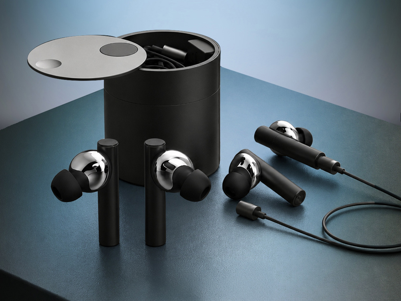
The physical design is built around everyday portability and comfort. The earbuds feature an anodized aluminum body with an in-ear fit, a form factor intended to remain stable during commutes, calls, and general daily wear. The charging case uses a cylindrical design with a magnetic docking mechanism, sized to fit comfortably in a pocket or bag. The TES Link cable stores inside the case alongside the earbuds, avoiding the need for separate accessories or additional carrying solutions. The entire system is engineered to minimize friction in both modes, whether the user is moving through the day untethered or settling in for a focused wellness session at night.

HealingFit TWS recently passed another technical milestone. The device has received FCC certification, a regulatory requirement that confirms compliance with electromagnetic interference and radio frequency standards in the United States. This approval follows the U.S. patent application allowance and a CES 2026 Innovation Awards Honoree designation in the Headphones & Personal Audio category. These markers suggest that the product has moved well beyond concept-stage validation and into formal manufacturing readiness. For a crowdfunding campaign, these certifications provide a measure of reassurance that the hardware is real, tested, and legally cleared for production distribution.
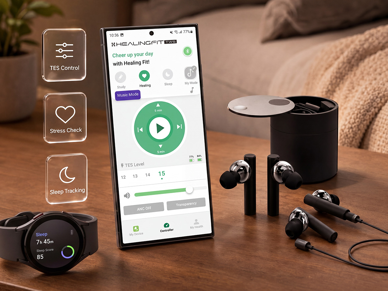
The wellness component of the system centers on user control and choice. The app, My HealingFit, offers three routine modes: Sleep, Healing, and Study. Each mode delivers a combination of gentle microcurrent and binaural audio designed to support a specific mental state. Users can adjust the TES intensity across 15 levels, tailoring the experience to their own comfort threshold. The device is designed as a wellness tool, explicitly disclaiming any medical diagnosis or treatment function. That distinction is important. It positions HealingFit TWS as a personal relaxation and focus aid, not a therapeutic device subject to medical regulatory oversight.

Heo’s question from the beginning was simple. Could earbuds designed for the noise and motion of the day also serve the stillness and quiet that follows? HealingFit TWS is his answer, a product that tries to bridge those two states without forcing the user to own two separate devices. Earbuds have already become an everyday essential of the smartphone era, worn for hours at a time by millions. What Heo proposes is that they are evolving from a device we listen with into a device we also heal with. Whether that vision takes hold will depend on how users experience the transition between modes, and whether the wellness routines prove meaningful enough to justify the added capability. For now, HealingFit TWS stands as a milestone in that shift, a thoughtful industrial design experiment from a team that understands audio hardware deeply and believes the next chapter of personal audio is about versatility across the full rhythm of modern life.

Click Here to Buy Now: $169 $300 (44% off). Hurry, only 15/210 left! Raised over $51,700.

The post What If Your Earbuds Could Help You Sleep After They Played Music And Podcasts All Day? first appeared on Yanko Design.
Korean Studio JAYUJAJE Just Made the Strangest Clock

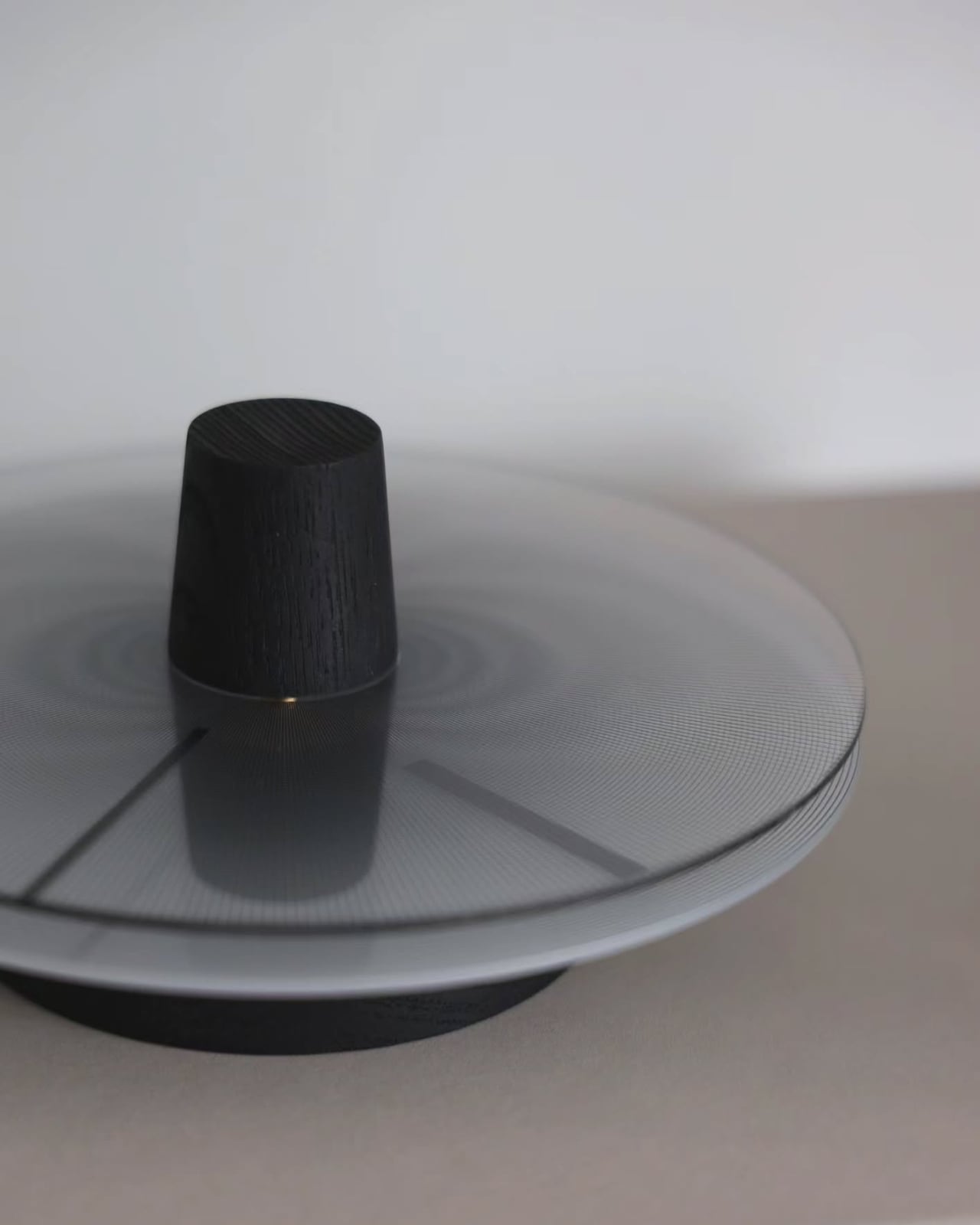
Most clocks want to be noticed. They arrive with Roman numerals, exposed gears, or oversized frames, working hard to earn their place on the wall. The NMK by Seoul-based studio JAYUJAJE takes the opposite position entirely. It barely announces itself. And yet it is, without question, one of the most visually arresting objects I have seen recently.

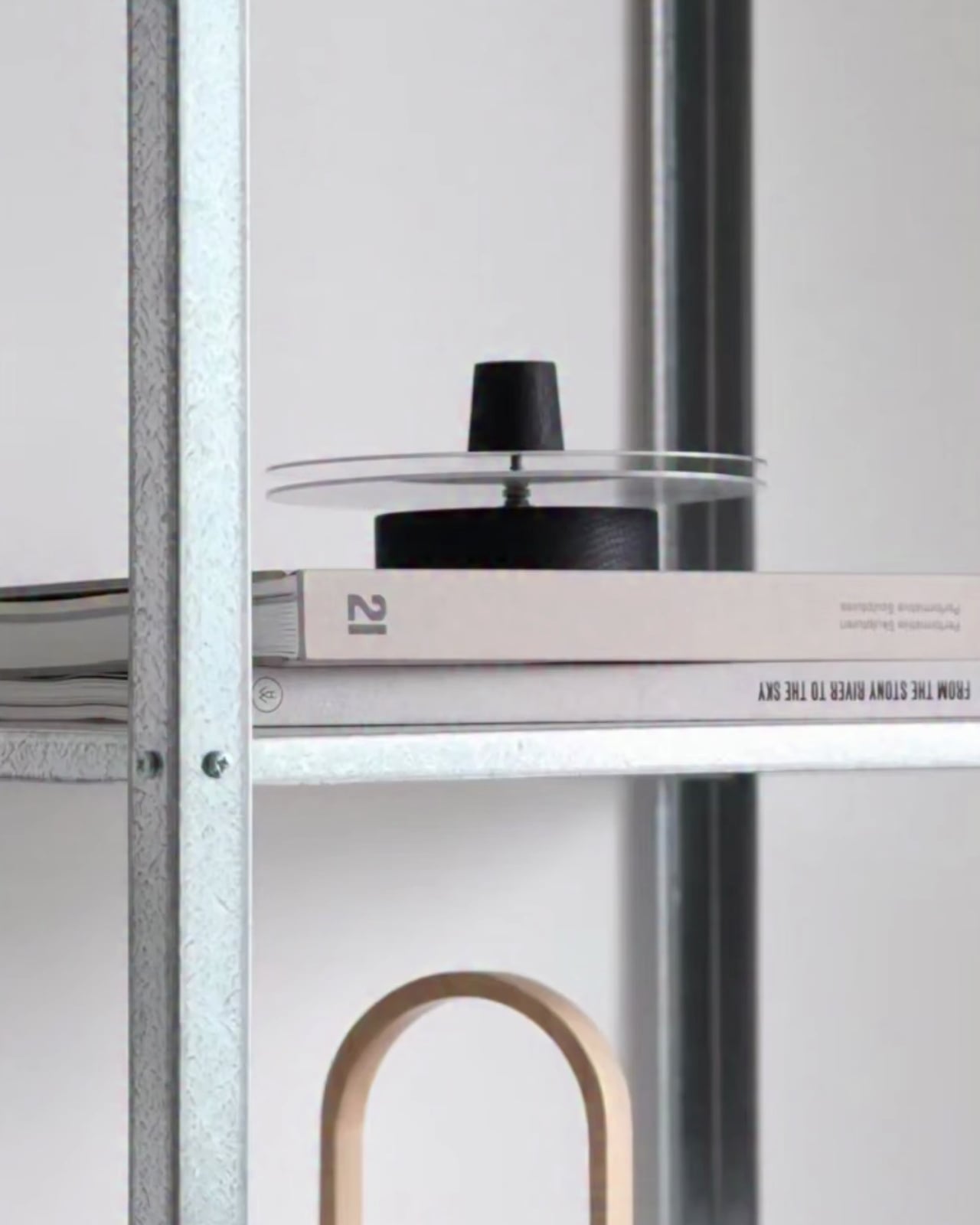
The NMK is a concept. It does not exist in a store. You cannot buy it. And yet designer Jin Kim of Seoul-based studio JAYUJAJE has photographed it with such care, placed it with such intention against galvanized steel shelving and paper lanterns and stacked design books, that it already feels like a fixture of a room you very much want to live in.

Designer: JAYUJAJE

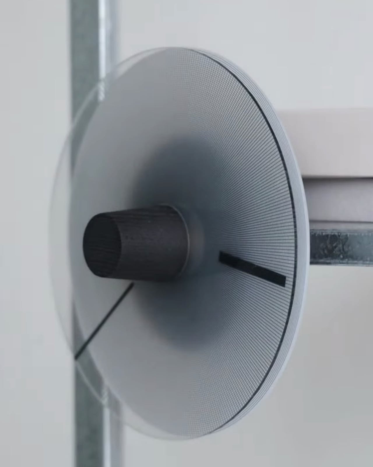
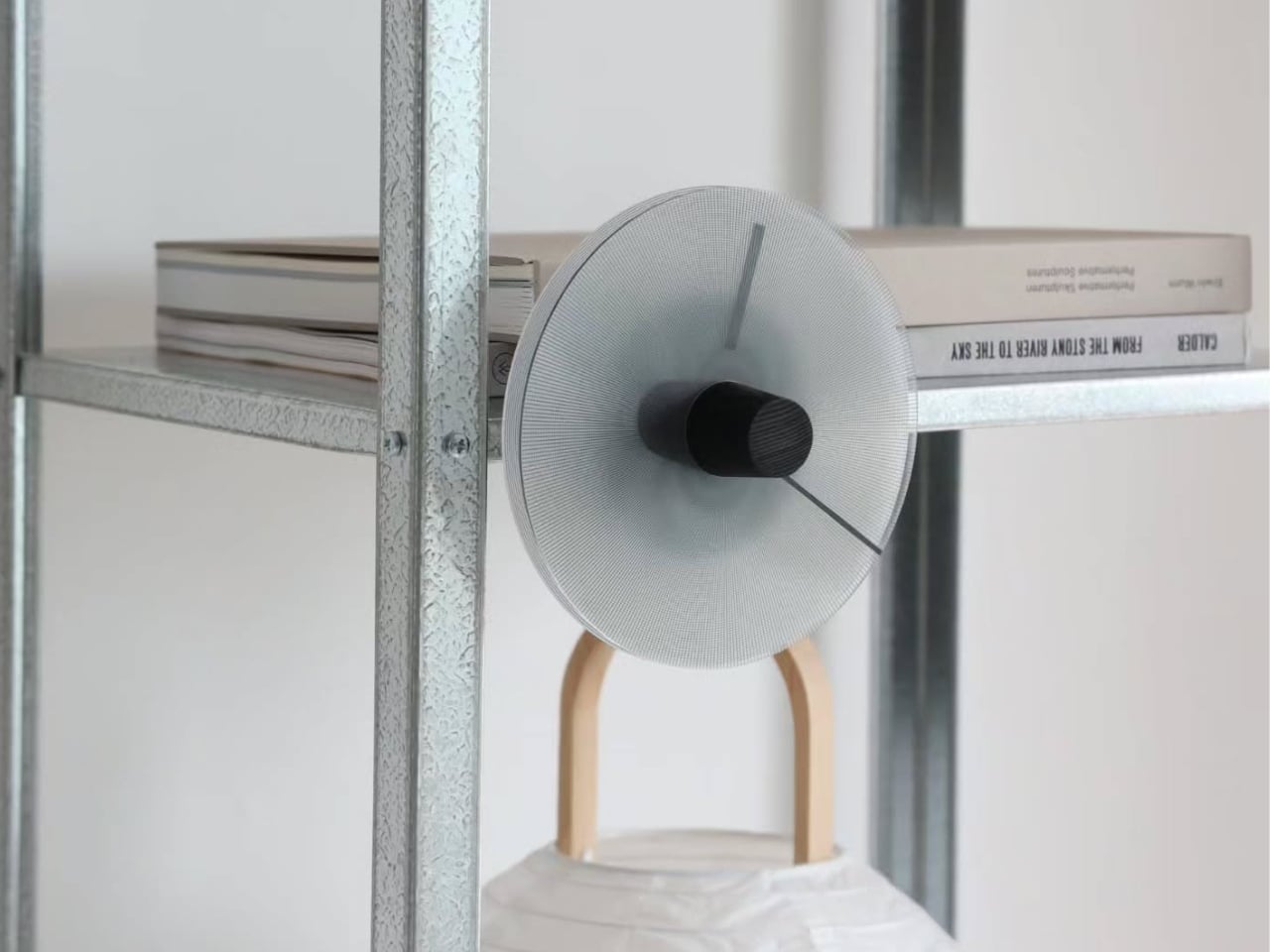
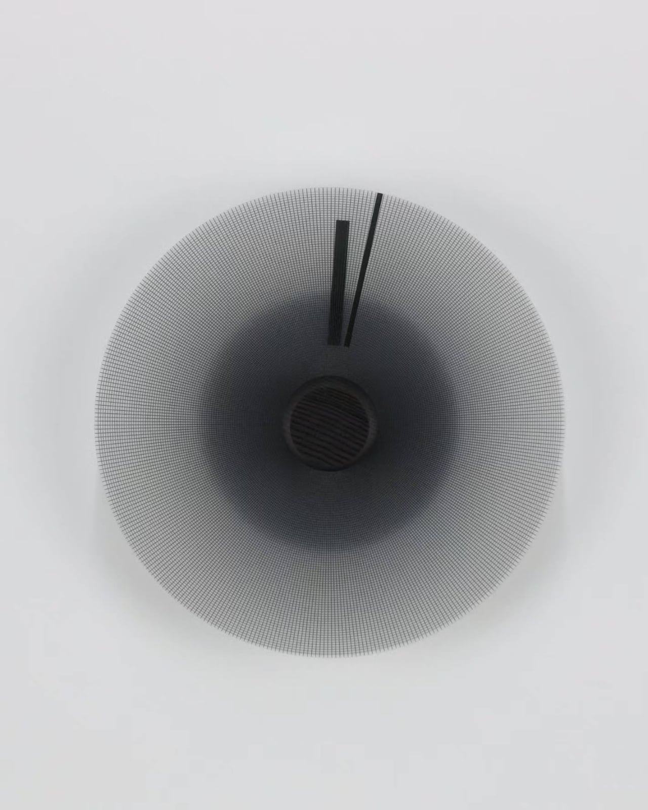
Start with the face, because that is where everything happens. It is a disc of tightly woven wire mesh, slightly concave, pulled into a shallow cone that draws the eye directly toward its center. The mesh is extraordinarily fine, the kind of density that creates its own optical behavior. At the outer rim it reads as pale silver, nearly transparent. Moving inward, the tone deepens gradually and consistently until the core becomes a near-black that feels less like a color and more like depth. The gradient is not printed or painted. It is a natural consequence of the curvature and mesh density interacting with light. The hands are two flat matte black bars, thin and unadorned, sitting flush against the face. No numbers. No markers. No hour dots. Just the slow movement of two lines across a surface that looks different depending on the angle you are standing at.

The center hub anchors everything. In the lighter version of the clock, it is a solid cylinder of blackened wood, its grain still faintly visible, sitting proud of the mesh face. In what appears to be a material study, the hub takes the form of a rougher, heavier truncated cone in dark stone or dense concrete, resting on a flat wooden disc that acts as a base. Both versions communicate the same thing: weight, presence, and a deliberate contrast between the industrial precision of the mesh and the warmth of a natural material at its core.

The concept draws from a specific philosophical tradition. Jin Kim has grounded the NMK in the worldview of Joseon-era scholars, who understood time not as a series of discrete and measurable units but as a continuous, gentle flow. That context changes how you look at the clock entirely. The absence of numbers is not minimalism for its own sake. It is a point of view. A clock face with nothing to count against refuses to let you fragment the day into anxious increments. The hands move, time passes, and the only reference point is the gradient itself, deepening toward the center like a slow exhale.

That philosophy is paired with a second intention: to record the structural aesthetics of Korean heritage within a contemporary interior. The wire mesh reads as industrial, but the concave disc form and the relationship between the circular face and the cylindrical hub echo the proportions and restraint of traditional Korean craft. The NMK does not announce its cultural references. It holds them quietly inside a form that looks, at first glance, like something from a design laboratory.

JAYUJAJE is the studio of Jin Kim, whose work consistently sits at the intersection of cultural memory and contemporary materiality. The Bugak stool, one of the studio’s earlier pieces, placed traditional Korean butterfly joinery at the structural center of an otherwise spare, modern object. The NMK continues that approach. The heritage is not decorative. It is load-bearing.

What makes a concept worth paying attention to is whether the idea is strong enough to survive the gap between intention and reality. The NMK clears that bar comfortably. The photographs show a physical object with real materials, real light behavior, and real presence in a room. The two-mode functionality, wall-hung or tabletop, works in both configurations without either feeling like a compromise.

Clocks are one of those design categories where the problem is already solved and everything else is a conversation. The NMK enters that conversation with something genuinely different to say: that time does not need to be counted, only felt. Whether it ever goes into production or remains a concept, it has already made its argument. Quietly, precisely, and without a single number on its face.

The post Korean Studio JAYUJAJE Just Made the Strangest Clock first appeared on Yanko Design.

Korean Studio JAYUJAJE Just Made the Strangest Clock

Most clocks want to be noticed. They arrive with Roman numerals, exposed gears, or oversized frames, working hard to earn their place on the wall. The NMK by Seoul-based studio JAYUJAJE takes the opposite position entirely. It barely announces itself. And yet it is, without question, one of the most visually arresting objects I have seen recently.

The NMK is a concept. It does not exist in a store. You cannot buy it. And yet designer Jin Kim of Seoul-based studio JAYUJAJE has photographed it with such care, placed it with such intention against galvanized steel shelving and paper lanterns and stacked design books, that it already feels like a fixture of a room you very much want to live in.

Designer: JAYUJAJE

Start with the face, because that is where everything happens. It is a disc of tightly woven wire mesh, slightly concave, pulled into a shallow cone that draws the eye directly toward its center. The mesh is extraordinarily fine, the kind of density that creates its own optical behavior. At the outer rim it reads as pale silver, nearly transparent. Moving inward, the tone deepens gradually and consistently until the core becomes a near-black that feels less like a color and more like depth. The gradient is not printed or painted. It is a natural consequence of the curvature and mesh density interacting with light. The hands are two flat matte black bars, thin and unadorned, sitting flush against the face. No numbers. No markers. No hour dots. Just the slow movement of two lines across a surface that looks different depending on the angle you are standing at.

The center hub anchors everything. In the lighter version of the clock, it is a solid cylinder of blackened wood, its grain still faintly visible, sitting proud of the mesh face. In what appears to be a material study, the hub takes the form of a rougher, heavier truncated cone in dark stone or dense concrete, resting on a flat wooden disc that acts as a base. Both versions communicate the same thing: weight, presence, and a deliberate contrast between the industrial precision of the mesh and the warmth of a natural material at its core.

The concept draws from a specific philosophical tradition. Jin Kim has grounded the NMK in the worldview of Joseon-era scholars, who understood time not as a series of discrete and measurable units but as a continuous, gentle flow. That context changes how you look at the clock entirely. The absence of numbers is not minimalism for its own sake. It is a point of view. A clock face with nothing to count against refuses to let you fragment the day into anxious increments. The hands move, time passes, and the only reference point is the gradient itself, deepening toward the center like a slow exhale.

That philosophy is paired with a second intention: to record the structural aesthetics of Korean heritage within a contemporary interior. The wire mesh reads as industrial, but the concave disc form and the relationship between the circular face and the cylindrical hub echo the proportions and restraint of traditional Korean craft. The NMK does not announce its cultural references. It holds them quietly inside a form that looks, at first glance, like something from a design laboratory.

JAYUJAJE is the studio of Jin Kim, whose work consistently sits at the intersection of cultural memory and contemporary materiality. The Bugak stool, one of the studio’s earlier pieces, placed traditional Korean butterfly joinery at the structural center of an otherwise spare, modern object. The NMK continues that approach. The heritage is not decorative. It is load-bearing.

What makes a concept worth paying attention to is whether the idea is strong enough to survive the gap between intention and reality. The NMK clears that bar comfortably. The photographs show a physical object with real materials, real light behavior, and real presence in a room. The two-mode functionality, wall-hung or tabletop, works in both configurations without either feeling like a compromise.

Clocks are one of those design categories where the problem is already solved and everything else is a conversation. The NMK enters that conversation with something genuinely different to say: that time does not need to be counted, only felt. Whether it ever goes into production or remains a concept, it has already made its argument. Quietly, precisely, and without a single number on its face.

The post Korean Studio JAYUJAJE Just Made the Strangest Clock first appeared on Yanko Design.

DJI built a parachute into their drones to protect the hardware… and people’s heads

Drones fall. Sensors fail, signals drop, batteries die at inconvenient moments, and until now the consequences of that failure were left largely to chance. Obstacle avoidance technology solved one half of the safety equation, keeping drones from flying into buildings, power lines, or each other. But avoidance only works while the aircraft is still flying. Once a drone loses power or control, all that sensor smarts becomes irrelevant, and physics takes over. Even a small consumer grade drone weighing 8 or 9 ounces turns into a falling object with real force behind it when it drops from 200 or 300 feet, and DJI’s Matrice 400 is a far heavier machine flying far more demanding missions.

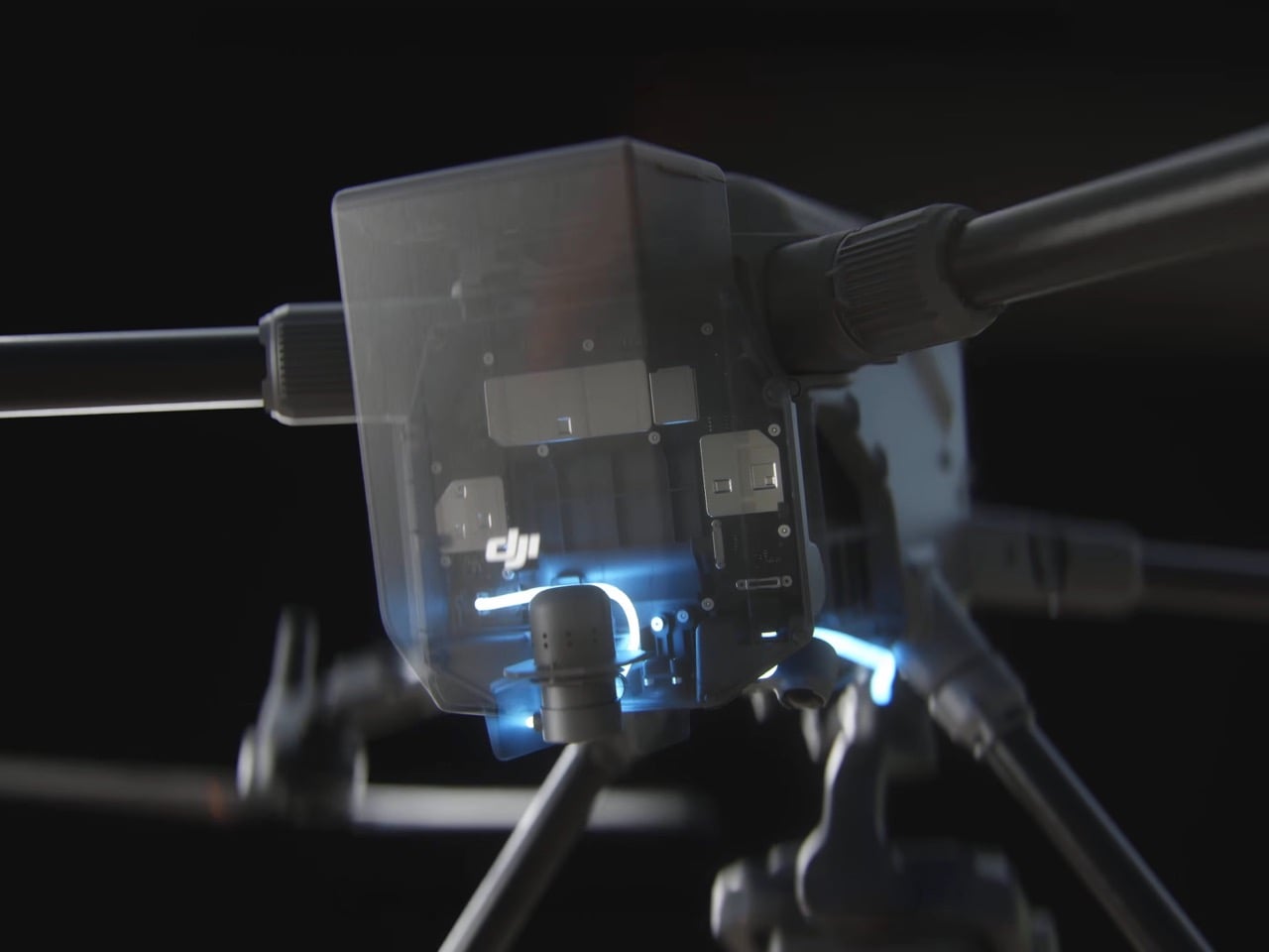
That is the gap the AP100 Parachute was built to close. It watches its own hardware in real time, running continuous checks so it knows the instant something looks off. Backup capacitors keep the system powered even if the drone itself loses electricity, which matters because a mid air failure rarely comes with a warning. Once triggered, deployment is instant, and the parachute slows descent to under 5 meters per second, turning what would be a crash into something closer to a controlled landing. Alarms then kick in after deployment, alerting anyone nearby and helping pilots track down exactly where their aircraft ended up.

Designer: DJI

The AP100 gives pilots three separate ways to pull the ripcord, so to speak. It can trigger itself automatically the moment it detects an anomaly or a geocaging breach, meaning the drone strays somewhere it should not be. Pilots who want manual control can swipe to deploy directly inside the DJI Pilot 2 app, no digging through menus required. There is also a remote option through FlightHub 2’s FTS page, useful for fleet operators managing multiple aircraft from a central hub. Layering automatic, manual, and remote deployment together means there is rarely a scenario where the parachute simply cannot be triggered in time.

None of this exists in a vacuum. Commercial drone missions flying over cities or beyond the pilot’s direct line of sight, what the industry calls BVLOS, have to satisfy strict safety categories like C5 and C6 before regulators sign off. Surveying a highway route or inspecting a pipeline that snakes through populated areas used to mean stacking on extra precautions just to get approval. A parachute rated to meet those standards effectively does the compliance heavy lifting on its own. That turns what used to be a drawn out approval process into something considerably more straightforward for operators trying to get missions off the ground, literally and legally.

The hardware itself is built for the grind of daily operations rather than sitting as a one time safety gimmick. Pilots can swap batteries without ever detaching the parachute, which sounds minor until you are the one doing it in the field between flights. It also carries the same IP55 rating as the Matrice 400 itself, so rain or dust does not take it out of commission. Full system self checks run automatically at startup, cross referencing communication links and hardware status before the drone even leaves the ground. These are the kinds of details that matter more to the operator running ten missions a week than to anyone reading a spec sheet once.

Here is the catch, though. The AP100 is built exclusively for the Matrice 400, DJI’s enterprise platform aimed at industrial inspection, surveying, and public safety work. Your Mavic will not be getting one, and neither will your FPV drone, at least not yet. That is not entirely surprising given the size and cost tradeoffs involved in strapping a parachute system to something meant to be light and nimble. But DJI has a track record of trickling enterprise safety features down into consumer lines once the engineering matures, and a company that just built a first party parachute for one drone rarely stops at just one.

Regulators keep pushing drones toward busier skies, over highways, over crowds, over exactly the kind of scenarios where a hardware failure stops being a minor inconvenience and starts being a genuine hazard. DJI building a parachute directly into its own ecosystem, rather than leaving it to third party add ons, suggests the company sees this as a standard feature rather than an optional extra. Whether that logic eventually reaches the Mavic or Air lineup remains to be seen, but the direction feels obvious. Falling should not be part of the risk calculus anymore, and DJI just made a very public bet on that idea.

The post DJI built a parachute into their drones to protect the hardware… and people’s heads first appeared on Yanko Design.

If Le Creuset and Instant Pot Had a Baby, It Would Look Exactly Like This $199 Pressure Cooker

Le Creuset built its legacy on color and craftsmanship. Instant Pot built its empire on speed and convenience. Our Place just tried to merge both into a single six quart pot, and the result is the Dream Cooker, a pressure cooker that takes its name seriously, because I’d definitely have it as the centerpiece of my dream kitchen, right beside this SMEG x Porsche coffee machine.

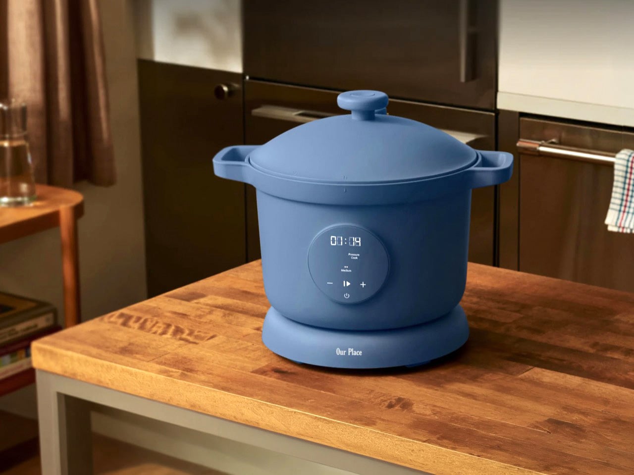
The dome lid, the matte pastel finish, the wooden style knob on top all borrow directly from heritage cookware. But underneath that soft exterior sits a digital control panel offering pressure cooking, slow cooking, searing, sauteing, and keep warm modes, making it one of the more versatile entries in Our Place’s growing appliance lineup. The result is literally the best of both worlds – the aesthetic beauty of a wonderfully enameled Dutch oven, along with the precise cooking ability of an electric pressure cooker.

Designer: Our Place

Click Here to Buy Now

I have owned an Instant Pot for six years and I still keep it in the cabinet under the counter, next to the waffle iron I use twice a year. It is a genuinely great appliance but I have never once wanted to look at it beyond the digital screen. That is the entire problem Our Place is trying to solve here, and honestly, it is the same problem they solved with the Always Pan back in 2019, when they figured out that people would happily pay a premium for cookware they were proud to leave sitting out. The Dream Cooker takes that exact playbook, the one that turned a nonstick pan into a genuine internet phenomenon, and points it at one of the least glamorous corners of the kitchen. Pressure cookers have never needed to be beautiful because nobody buys one for the way it looks. Our Place clearly thinks that is a market failure waiting to be corrected.

You can see the strategy in every curve of this thing. The dome lid sits high and rounded, closer to a French cocotte than anything with a locking pressure valve, and the little knob on top looks like someone turned it on a lathe rather than injection molded it in a factory in Shenzhen. The handles are chunky and soft edged, built more for the aesthetic of a farmhouse kitchen than the ergonomics of hauling a hot pot across a countertop, though they do that job fine too. None of it screams appliance, and that is precisely the point. Sit this next to an actual Dutch oven and the family resemblance is not subtle. Our Place is not hinting at heritage cookware here. They are co-opting it.

Our Place offers the Dream Cooker in 4 pastel shades – a subtle cobalt-y ‘blue salt’, a soft terracotta shade named ‘spice’, an anthracite grey/black called ‘char’, and a sandy neutral tone called ‘steam’, all finished in that chalky matte texture the brand has used since the Wonder Oven launched. Stainless steel pressure cookers disappear into a kitchen because they are trying to be invisible. These colors do the opposite. They behave like ceramic, like something a potter glazed rather than something an engineer specced, and lined up together in the marketing shots they look like a paint swatch card for a boutique hotel. Whether you find that charming or not probably depends on how many other Our Place products are already sitting on your shelves… or whether you’re hovering close to that ‘Add to Cart’ button.

Look beyond the gorgeous shell and you’ve got a six quart nonstick pot, and four modes covering pressure cooking, slow cooking, searing and sauteing, and keep warm, all controlled through a single dial instead of the twelve button command center most multicookers ship with. Our Place claims pressure mode cooks up to eighty percent faster than a stovetop, which if true puts it in the same conversation as the appliance it is clearly gunning for.

Here is my actual question, though. Instant Pot won by being the appliance nobody thought about twice, a workhorse that came, conquered, and retired back to its cabinet. Our Place is betting that a chunk of that audience actually wanted the opposite the whole time, an appliance they would leave out, photograph, maybe even feel a little smug about. That is a more interesting wager than another multicooker chasing one more preset button, and if the sear function sears the way it should and the pressure release feels as considered as the knob on top, Our Place will have done something most kitchen tech never bothers attempting. It will have given the pressure cooker a cultural makeover… here’s hoping Our Place does the Air Fryer next!

Click Here to Buy Now

The post If Le Creuset and Instant Pot Had a Baby, It Would Look Exactly Like This $199 Pressure Cooker first appeared on Yanko Design.
5 Best Home Gadgets & Accessories Worth Every Penny in July 2026

Most things that cost more justify it by doing more. The best ones justify it by doing something so well that the problem stops feeling like a problem. That’s the standard every product on this list is held to — not feature counts, not brand reputation, not spec sheets. Each entry earns its place by changing something about daily life in a way that a cheaper version simply cannot replicate, and that gap is specific enough to explain.

Five picks, spanning pool care, home cleaning, ambient lighting, kitchen tools, and atmosphere. The price range runs from $165 to $3,999, which is a deliberate spread — the argument for spending more looks different at every tier, and each one here makes it convincingly. Here’s the case for each.

1. 3-in-1 Luminous Mirror Diffuser

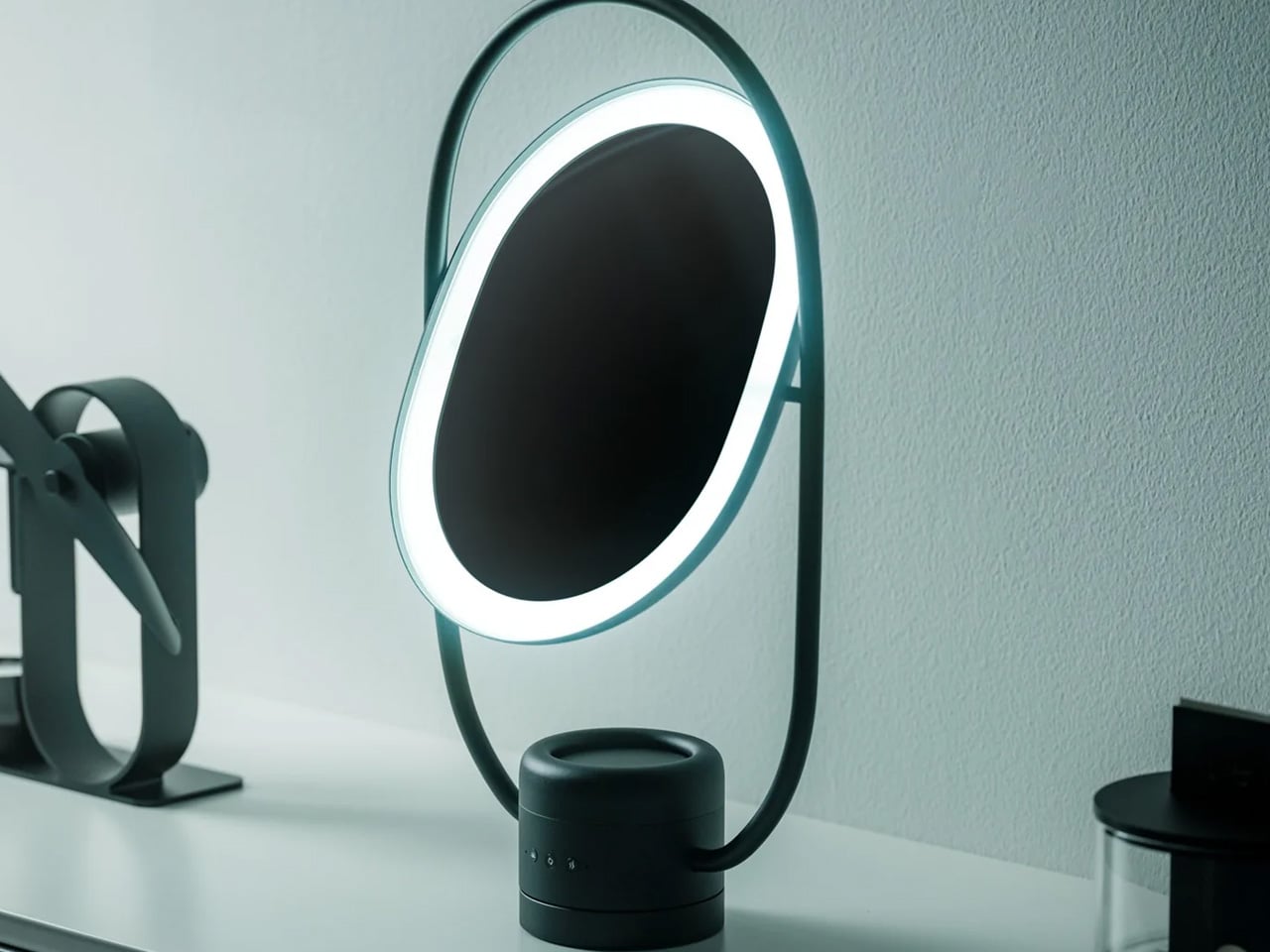
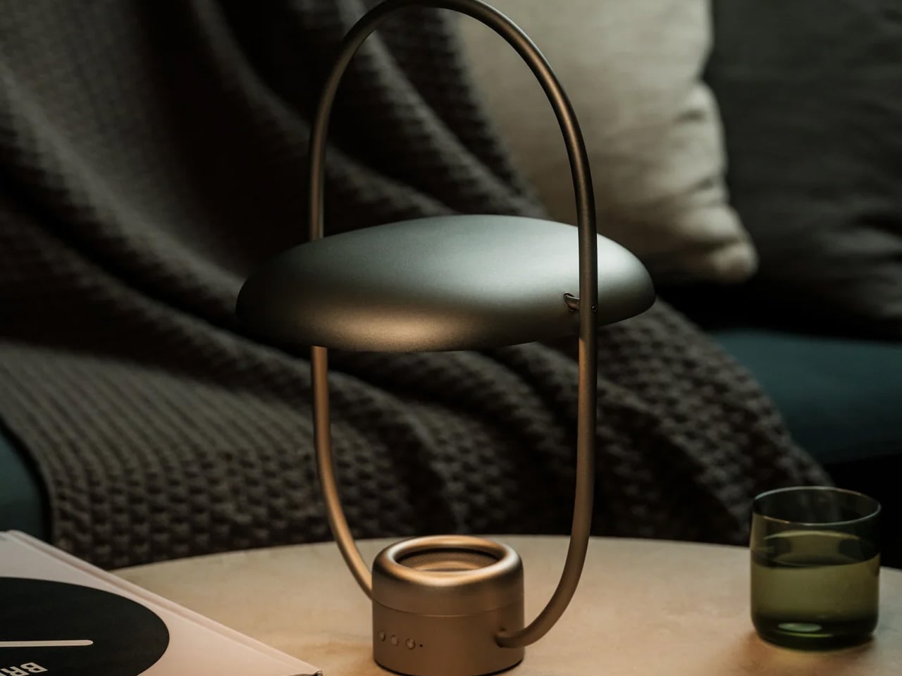
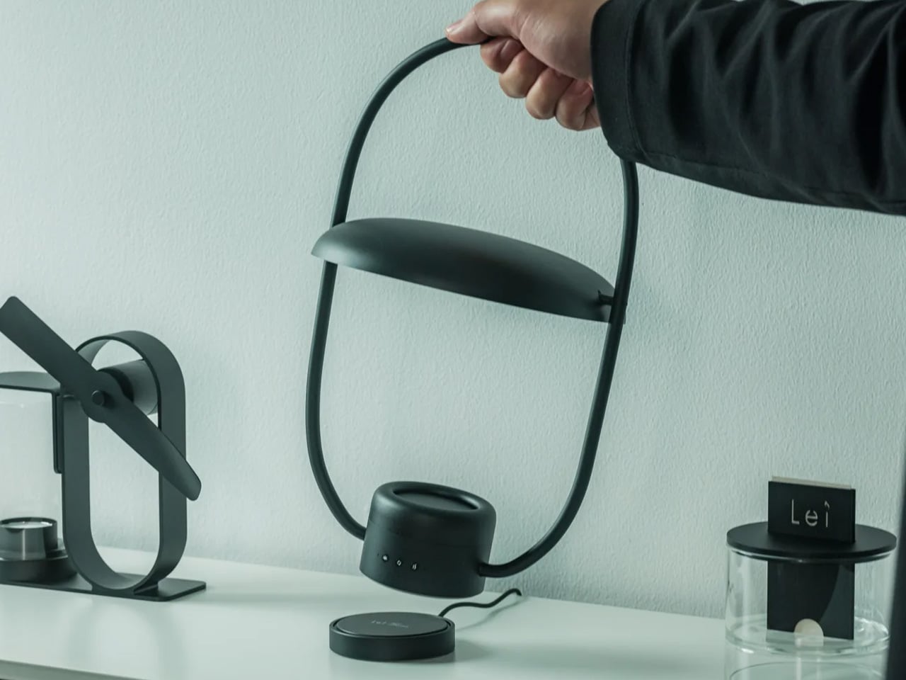
Most bedside setups are a quiet negotiation. The lamp is tolerable but too directional. The mirror is functional but positioned wrong. The diffuser is somewhere on a shelf, half-forgotten after the first week. The Luminous Mirror Diffuser collapses all three into a single oval object crafted from anodized aluminum, and the result looks better than any of the items it replaces. The 360-degree rotatable mirror pairs with shadow-free reflected light technology, so illumination reaches everywhere it needs to without the harsh contrast a single light source creates. It is, in the most literal sense, one object doing the work of three — and doing it more elegantly than any of them managed alone.

Three color temperatures anchor the lighting system. The 2400K warm setting creates the kind of low, amber glow that most lamps can’t reach without a separate bulb swap. A mid-range neutral handles focused tasks without visual fatigue. The 6000K daylight setting delivers precision clarity for grooming or makeup where color accuracy matters. Four adjustable brightness levels sit beneath each temperature, which means the same object serves a 6 am routine and an evening wind-down without compromise. The patented aroma plate uses an aluminum matrix to diffuse fragrance gently from a few drops of essential oil, & charges wirelessly.

Click Here to Buy Now: $800.00

What We Like

  • The 2400K warm mode creates a genuinely different atmosphere than a standard lamp, worth having for evenings alone
  • Anodized aluminum with a matte scratch-resistant finish feels premium at every point of contact

What We Dislike

  • At $800, this is a considered purchase — it rewards people who use all three functions regularly and will underserve those who don’t
  • A dedicated studio mirror or a standalone high-end diffuser will outperform it in those individual categories

2. Beatbot AquaSense X

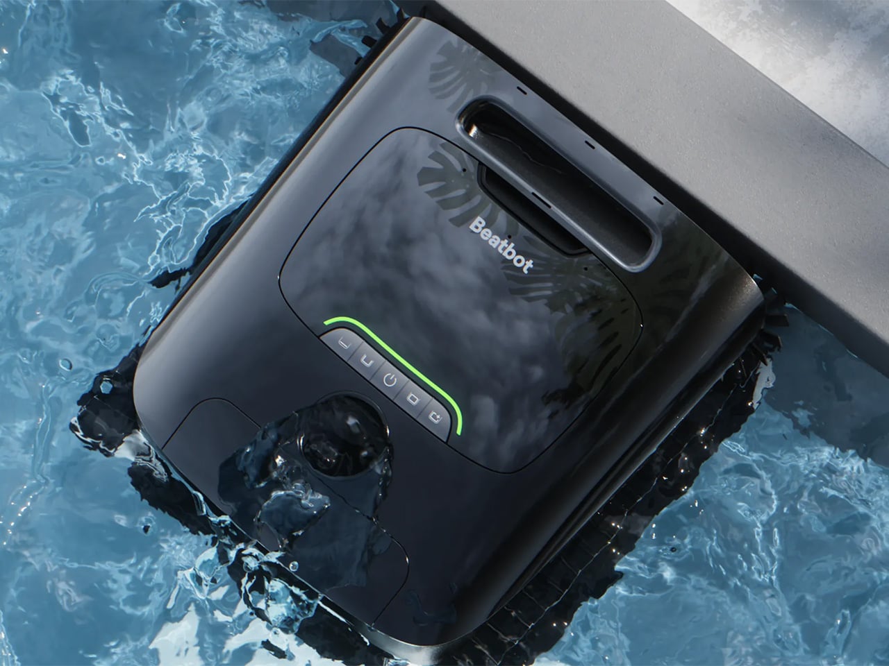
The standing criticism of pool robots is that they automate the cleaning but leave the cleanup to you — filter basket to empty, machine to rinse, ready for next time only if you remember. Beatbot designed the AquaSense X around that exact gap. The robot cleans the pool. The AstroRinse docking station cleans the robot. Once the machine docks, a high-pressure rotating nozzle enters the filter basket, backflushes trapped debris into the station’s sealed 22-liter bin, and initiates charging automatically. The filter basket opens from the bottom to make sure nothing gets stranded. The whole cycle takes about three minutes. You do not touch anything.

HybridSense AI Vision combines an onboard camera with infrared and ultrasonic sensing to identify 40 debris types, extending detection to the water surface as well as the pool floor. Eleven motors drive a submarine-style propulsion system that transitions between floating and diving to cover floors, walls, the waterline, and elevated surfaces like tanning ledges and shallow entry steps. As it cleans, it auto-dispenses AquaRefine clarifying agent — a formula derived from recycled crab shells — directly into the water. One 300mL kit treats up to 99,000 gallons. Voice control through Alexa, Google, and Siri handles scheduling and status from outside the pool. The 22-liter debris bin holds roughly two months of standard use before it needs emptying. Pool maintenance becomes, for most practical purposes, something that happens without you.

Click Here to Buy Now: $3999 $4250 ($251 off). Hurry, deal ends in 48-hours!

What We Like

  • The AstroRinse station is the genuine innovation — it’s the first pool cleaning system to close the loop on the maintenance the cleaning itself creates
  • Two months between bin empties means this goes from a weekly chore to a seasonal one

What We Dislike

  • At $3,999, the value equation only works for pools that are used regularly enough to justify the investment over a standard pool service
  • App-dependent scheduling means a connectivity issue or software update can disrupt an otherwise hands-off routine

3. Samsung Bespoke AI Jet Ultra

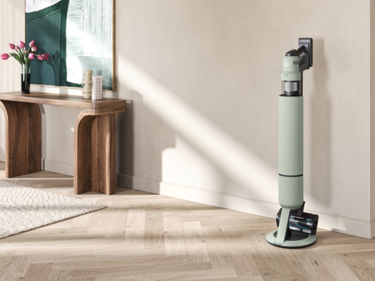
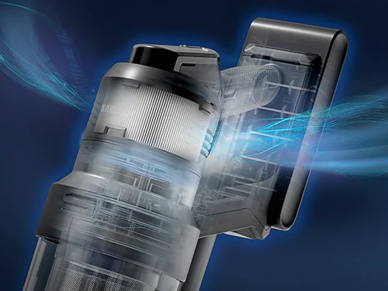
The cordless vacuum market has spent years iterating around a ceiling nobody wanted to admit existed — battery constraints kept power modest, and modest power meant cleaning that required faith rather than evidence. Samsung’s Bespoke AI Jet Ultra dismantles that ceiling with a HexaJet Motor producing 400W of suction, a figure that lands well beyond what the premium cordless category has previously managed. Two batteries ship in the box: a 100-minute large-capacity unit and a 60-minute lightweight alternative, combining for 160 minutes of runtime that makes a full home clean in a single session a realistic expectation rather than a careful calculation. The multi-layered HEPA system captures 99.999% of particles down to 0.3 microns, which matters in a way that lower-grade filtration quietly doesn’t.

What separates it from a high-powered machine that simply runs harder is AI Cleaning Mode 2.0. Brush load and air pressure sensors detect six distinct cleaning environments in real time — including carpet type variations and corner conditions — and adjust suction power and brush speed accordingly without any manual input. That intelligence reduces battery consumption by 21%, which is why the runtime figures hold up across different surface types rather than dropping the moment carpet enters the picture. A hands-off cleaning station handles dust collection after each session, an Active Dual Brush manages deep carpet cleaning, and a Slim LED Brush reaches the corners most heads ignore.

What We Like

  • 160 minutes of combined battery runtime is a genuine category leap — enough to clean a large home without recharging mid-session
  • AI Cleaning Mode 2.0 adjusts in real time to surface conditions rather than applying uniform suction that wastes power on easy floors

What We Dislike

  • At $1,099, it sits at the upper end of the cordless market and demands consistent, high-frequency use to justify the cost over capable alternatives
  • Samsung’s smart home ecosystem integration adds value only for households already running SmartThings — for everyone else, it’s unused overhead

4. Fellow Stagg EKG Pro

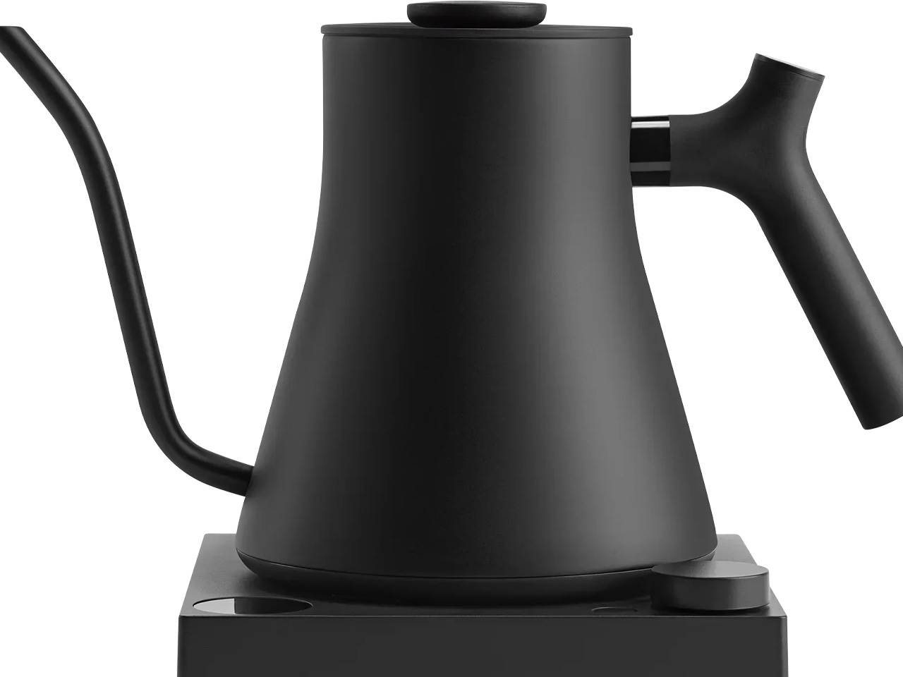
The Fellow Stagg EKG Pro is what happens when a category gets redesigned from first principles rather than iterated on incrementally. A kettle is among the most-used objects in any kitchen and almost universally treated as a commodity. Fellow disagreed. The counterbalanced handle changes the feel of a slow pour from effortful to precise. The gooseneck spout narrows flow to a steady, controlled stream that a standard kettle spout cannot match. Variable temperature control accurate to one degree serves pour-over coffee and temperature-sensitive teas where a few degrees in either direction changes the result. The matte finish and minimal base make it the first kettle worth leaving on the counter rather than hiding in a cabinet.

The hold function maintains the target temperature for up to 60 minutes, which matters between pours when cooling water would otherwise alter the brew. Bluetooth connectivity links to the Fellow app for programmable presets, and a memory feature recalls the last-used temperature at startup. Neither of those features changes the daily ritual in a dramatic way — but the sum of the details does. Objects used every morning have a cumulative effect on how a kitchen feels, and the Stagg EKG Pro is the version of a kettle that earns its place on the counter through precision that everything else in the category quietly lacks.

What We Like

  • Variable temperature to one degree is useful rather than theoretical — it produces a measurably different result for specialty coffee and delicate teas
  • The counterbalanced handle makes slow, precise pouring feel natural rather than controlled

What We Dislike

  • The 0.9L capacity is limiting for households that regularly need to boil larger quantities in a single fill
  • Bluetooth and app connectivity are secondary to the hardware quality — most users will never set them up

5. Harmony Flame Fireplace Lamp

Some rooms need a fireplace and cannot have one. Apartments, rental spaces, rooms where the architecture simply doesn’t allow for installation — most living situations quietly rule it out before the question is properly asked. The Harmony Flame is the answer to that problem, and it works because it doesn’t try to replicate a fireplace exactly. It leans into atmosphere: the quality of light a flame produces, the way movement at the center of a room changes how it feels, the particular kind of calm that comes from something glowing at a low, steady intensity. That quality of atmosphere is the design brief, and at $240, it delivers on it.

That price places it in a category where the object begins to justify itself beyond pure function. A candle creates atmosphere but demands attention and burns out. A projector creates color but not warmth. The Harmony Flame sits in the space between those options — persistent, low-maintenance, and designed with enough visual intention to work in rooms where aesthetics matter. It is the kind of product that solves a problem most people have stopped thinking about solving, which is often the clearest sign that a design is working as intended. It closes this list as the smallest argument — $240 for a room that feels better — and that argument requires very little further explanation.

Click Here to Buy Now: $240.00

What We Like

  • Creates genuine ambiance in spaces where a real fireplace isn’t possible — the answer renters and apartment dwellers have been looking for
  • At $240, it is the most accessible product on this list and the one with the lowest barrier to an immediate change in a room’s atmosphere

What We Dislike

  • The effect reads best in low-light conditions — in a well-lit room, the visual impact is significantly reduced
  • The flame effect produces no radiant heat, so buyers expecting warmth alongside atmosphere will need to manage that expectation

The Difference Is Always Specific

There is a version of spending more that is simply spending more. And there is a version where the extra cost corresponds to a specific, identifiable gap between the cheaper option and the one that actually solves the problem. Every product on this list belongs to the second category. The Luminous Mirror Diffuser replaces three compromises with one resolved object. AquaSense X finishes the job every other pool robot leaves half-done. The Samsung Bespoke AI Jet Ultra applies intelligence to a problem raw power alone never solved. The Stagg EKG Pro turns the most routine kitchen task into something precise.

The Harmony Flame closes the list at the accessible end — $240 for atmosphere in rooms that go without it. That is the simplest version of worth every penny. The best-designed products change how a space feels without asking for much in return, and you tend to notice them only when they’re gone. These five are the ones worth making room for.

The post 5 Best Home Gadgets & Accessories Worth Every Penny in July 2026 first appeared on Yanko Design.

The $185 Modern Palm Pilot That Keeps You Off Your Smartphone

Most productivity apps on smartphones are fighting a losing battle against the same device that hosts them. The screen reminding you to focus is the one delivering the notification that derails it. People have tried everything from grayscale mode to app blockers, and those who find none of it sufficient have started looking at dedicated hardware as the more honest answer to the problem.

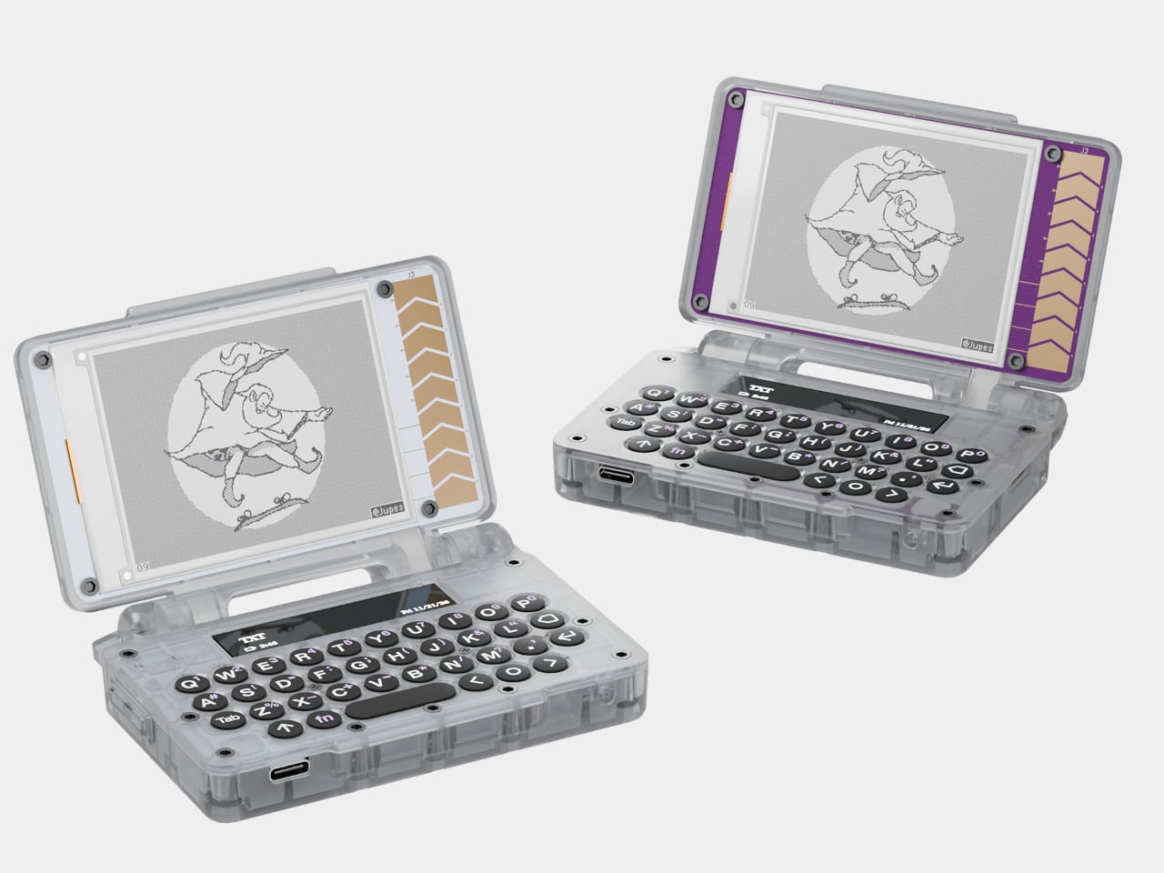
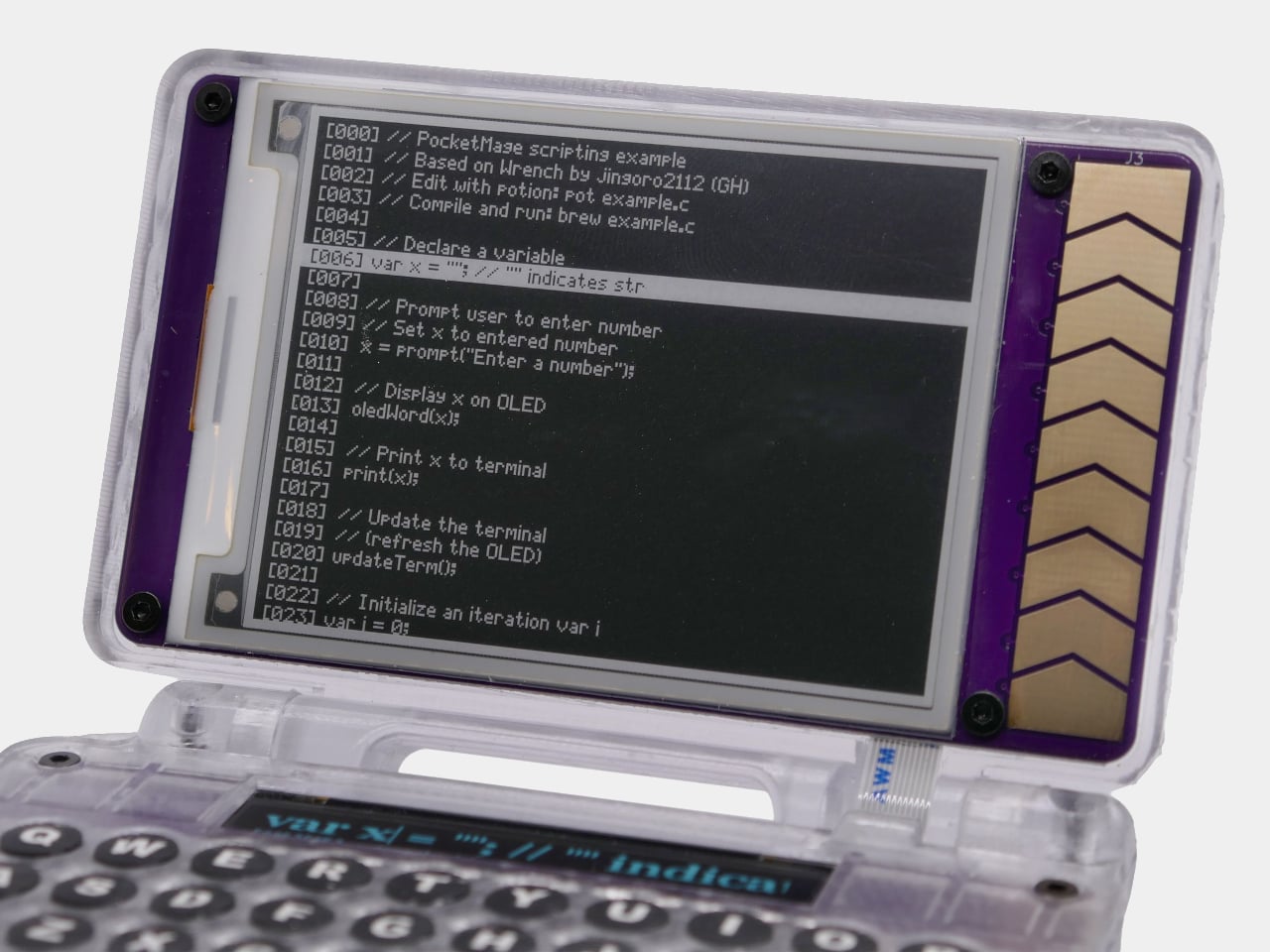
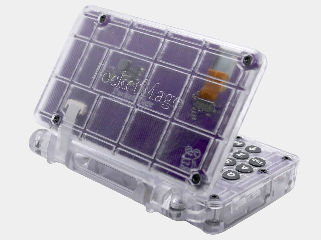
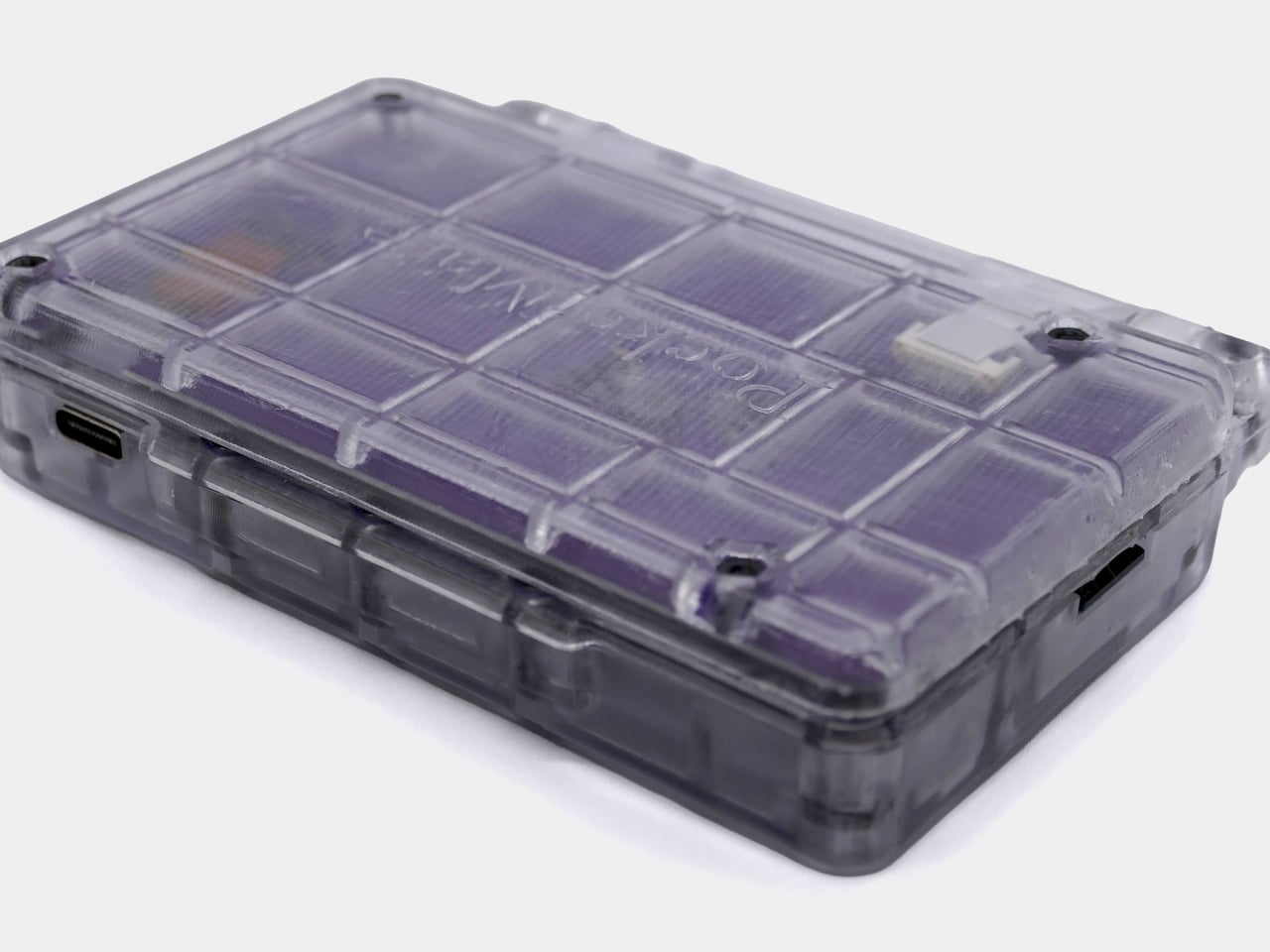
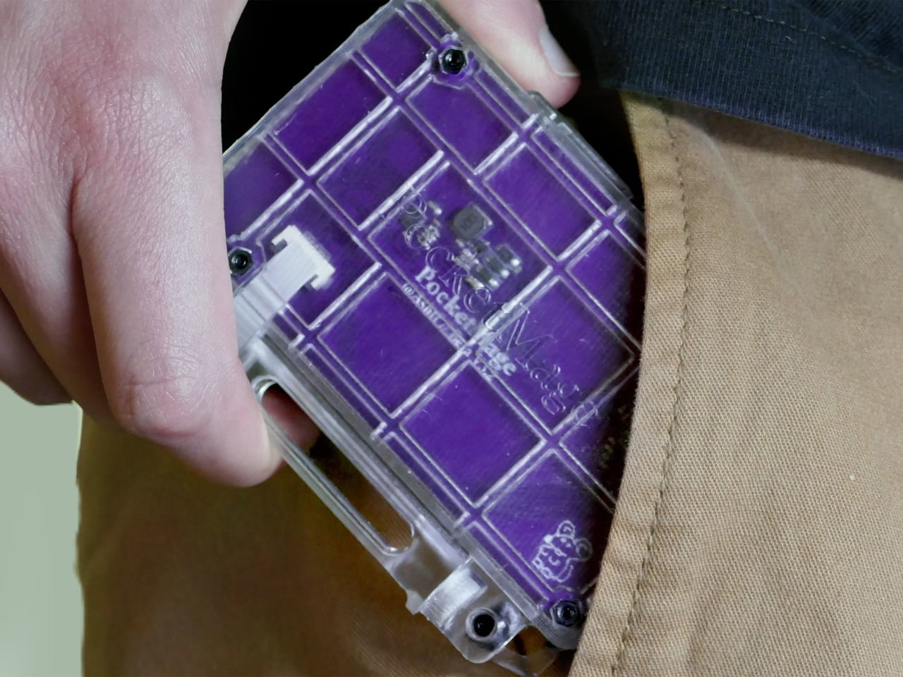
The PocketMage PDA started as a DIY project published online, a clamshell gadget running on an ESP32-S3 microcontroller with an E Ink display and a physical QWERTY keyboard. What began as a hobbyist prototype built around the idea of a modern Palm Pilot has since turned into an actual device with a price that starts at $185.

Designer: Ashton F. (Ashtf)

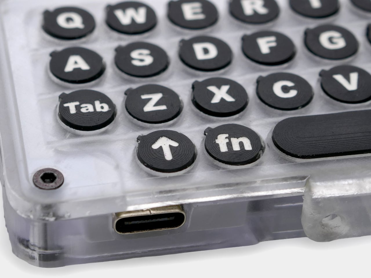
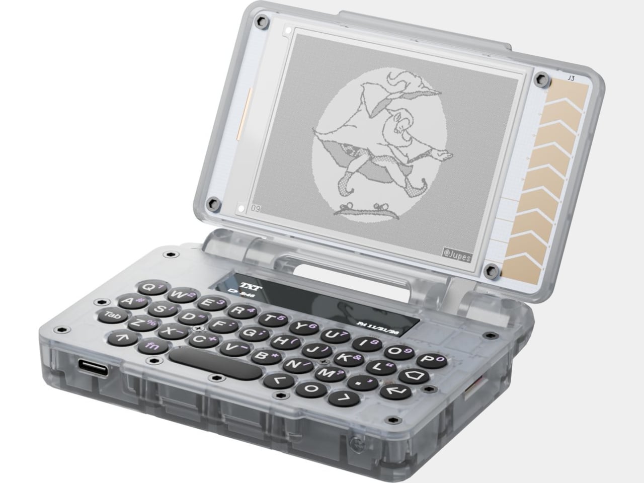
The clamshell body measures 100mm x 73mm x 21.7mm, roughly the footprint of a large credit card holder. Opening it reveals a 3.1-inch E Ink main display and a full tactile QWERTY keyboard, alongside a slim 1.8-inch OLED secondary screen above it. The two-display setup balances the E Ink’s eye comfort and battery efficiency against the OLED’s speed, so typing feedback appears instantly rather than waiting for a slow screen refresh.

Pull it out of your pocket on a train and start writing. The E Ink screen is readable in direct sunlight, doesn’t draw the eye with its own light, and lets you hold a thought without a notification pane sliding in from the edge. A 1,200 mAh battery keeps the whole thing running for about seven days between charges, which makes it genuinely grab-and-go.

The built-in PocketMageOS runs on FreeRTOS and comes with a Markdown text editor, a daily journal, a calendar, a task manager, a dictionary, and a file manager. There’s also a Bazaar, an app store where community-built software can be side-loaded, which already includes a text-based web browser, a calculator, and an e-book reader. The whole OS and hardware are open source under the Apache 2.0 license.

For engineers, the expansion port opens up a different set of possibilities entirely. It breaks out I2C, SPI, UART, and GPIO connections, meaning hardware modules can be attached and communicated with directly from the device. LoRa and Meshtastic add-on modules are already listed as planned accessories, and USB keyboard support means the built-in keys don’t have to be the limit of the typing experience.

The campaign offers two versions. The $185 DIY kit includes the PCBs, case parts, LiPo battery, microSD card, all hardware, and an assembly guide, making it the option for anyone who actually wants to build it themselves. The $235 pre-assembled version ships complete. Both come in Parchment white and Royal Purple. Either way, shipping to the US is free, with a $12 flat rate internationally.

Backers will need patience since deliveries aren’t expected until March 2027, and the campaign still needs to hit its $100,000 funding goal on Crowd Supply by September 2026. None of that is unusual for independent hardware crowdfunding. What is unusual is the combination: a pocketable clamshell with a real keyboard, an eye-friendly display, a week’s worth of battery life, and no notifications competing for your attention.

The post The $185 Modern Palm Pilot That Keeps You Off Your Smartphone first appeared on Yanko Design.
Bug Saber Turned Lightsaber Fantasy Into a 4,000V Bug Zapper

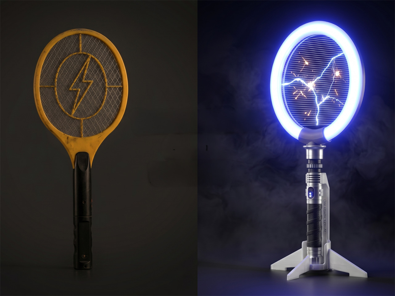
Bug zappers haven’t had a design moment yet. They’ve existed in more or less the same form for decades, somewhere between forgettable and mildly unpleasant to look at. Most of them get tucked into corners or mounted out of sight, which is exactly where most people prefer them. They do the job, roughly speaking, but nobody’s ever been genuinely excited to reach for one.

Brightbeam Solutions seems to have taken that as a challenge. Bug Saber is the brand’s attempt at rethinking what a bug zapper can feel like, not just what it can do. The concept is simple enough: take pest control, which has always been a thankless task, and design it to be something you’d actually want to pick up. Nobody in the category had really tried.

Designer: Jonathan Barraclough

Click Here to Buy Now: $24. Hurry, only a few left!

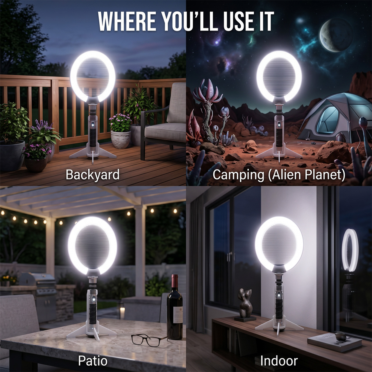
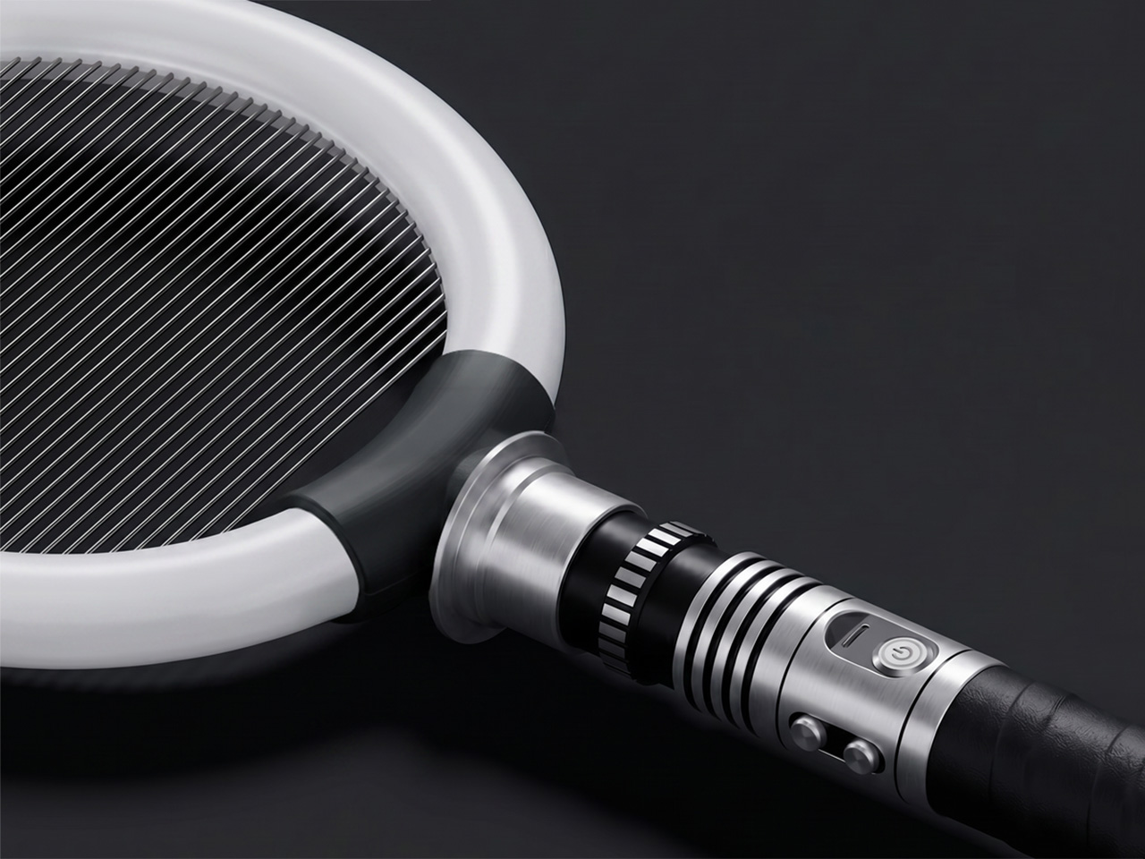
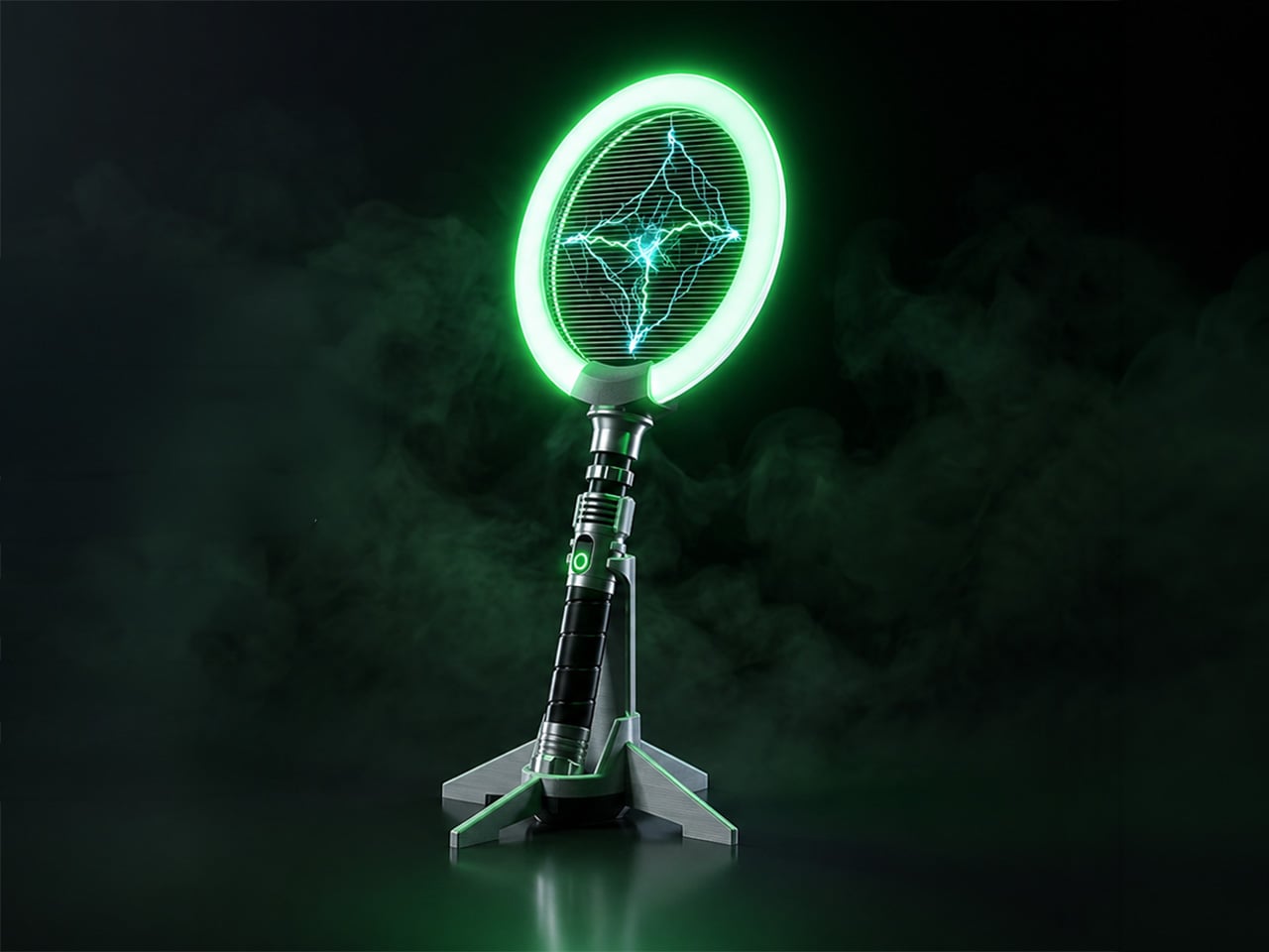
The design makes that clear immediately. Bug Saber is built around a high-voltage zapping grid framed by a glowing LED ring, mounted on a lightsaber-style hilt with a distinctly mechanical character. It doesn’t look like anything from a hardware store, and that’s entirely the point. The aesthetic borrows from sci-fi gadget culture rather than home appliance conventions, and it’s surprisingly hard to ignore when it’s nearby.

Switch it on, and everything shifts. The LED ring glows, saber-style sound effects kick in, and insects are naturally drawn toward the light. When one gets close enough, the 4,000V high-voltage grid takes care of it instantly, with no waiting and no cleanup. The entire sequence takes only seconds, and the combination of light, sound, and immediate result makes each instance feel surprisingly satisfying.

That satisfaction makes sense in practice. Picture a summer evening on the back porch, a fly that’s made itself at home, and the usual frustration of swatting blindly at the air. With Bug Saber in hand, you’re in control rather than reacting. The act feels deliberate in a way that pest control rarely does, which is a strange thing to say and yet completely accurate.

Not every situation calls for hands-on use, though. Bug Saber can sit on its vertical stand with the illuminated ring running on its own, drawing in insects without you having to do anything. This works especially well at night, when flying pests are most active, and you’d rather not be involved. It handles things quietly in the background, whether you’re inside or out on the patio.

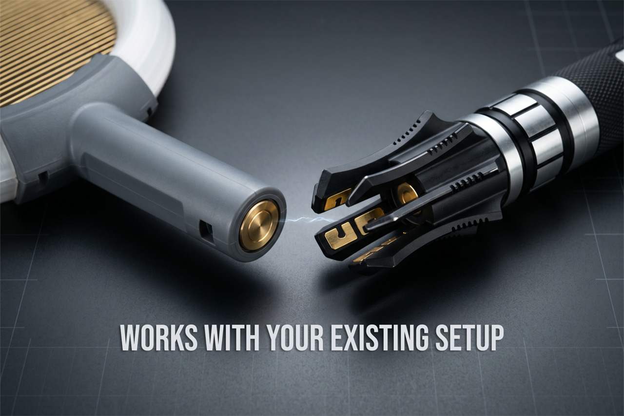
Bug Saber is built around three core components: the Bug Saber Head, which houses the ring and zapping grid; an entry-level hilt for those starting fresh; and the vertical stand. People who already own a compatible saber-style hilt, the kind used in cosplay or collecting communities, can swap in the head directly, converting their existing setup into a functional bug-control device without needing anything else.

What makes Bug Saber work so well is how the experience reinforces itself over time. The glow, the sound, and the instant result work together to create something that feels rewarding rather than routine. You pick it up the first time because there’s a fly in the room. The second time, you reach for it a little more quickly than strictly necessary.

There’s a broader shift in product design, one where objects that used to be purely functional are being reconsidered as things worth looking at. Routers, speakers, and kitchen appliances have all gone through some version of this. Bug Saber brings that same sensibility to a category that’s rarely had it, which on paper sounds like a stretch and in practice feels entirely overdue.

The strangest thing about Bug Saber might also be the most telling. A bug zapper with a sci-fi hilt, a glowing LED ring, and sound effects that respond to movement really shouldn’t feel like a natural addition to a patio or living room shelf, and yet here we are, genuinely glad that someone decided this particular category was finally worth a proper redesign.

Click Here to Buy Now: $24. Hurry, only a few left!

The post Bug Saber Turned Lightsaber Fantasy Into a 4,000V Bug Zapper first appeared on Yanko Design.

A Toy-Inspired Lamp Collection That Makes the Candelabra Feel New

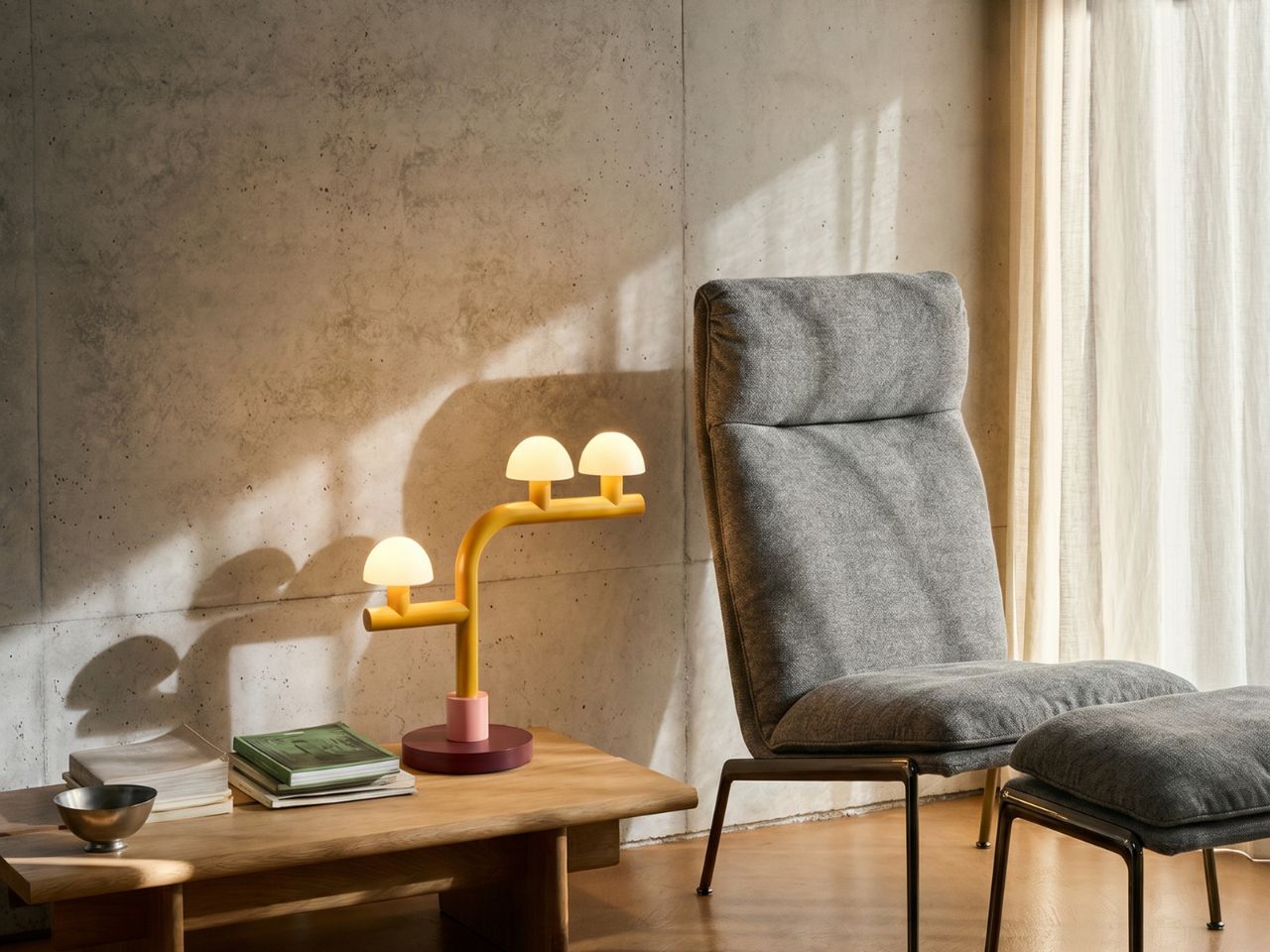
Lighting often sits at the meeting point of function and feeling. A lamp is expected to brighten a room, but the best ones do more than that: they shift the mood, add character, and sometimes become the object people remember most when they leave. With the Woaw collection, Dubai-based lighting designer Nader Gammas takes this idea in a playful and unexpected direction. Instead of treating the candelabra as a formal, traditional object, he reimagines it through bold color, simplified geometry, and the joyful memory of childhood toys.

Introduced through his brand Mr. John’s Goods, the Woaw collection feels like a deliberate break from the seriousness often associated with designer lighting. These table and floor lamps are not quiet background pieces. They are bright, sculptural, and full of personality. Inspired by toy-like forms and vivid color combinations, each lamp brings a sense of fun into the home while still remaining refined enough to sit comfortably in a modern interior. The result is a lighting collection that feels both nostalgic and contemporary.

Designer: Nader Gammas

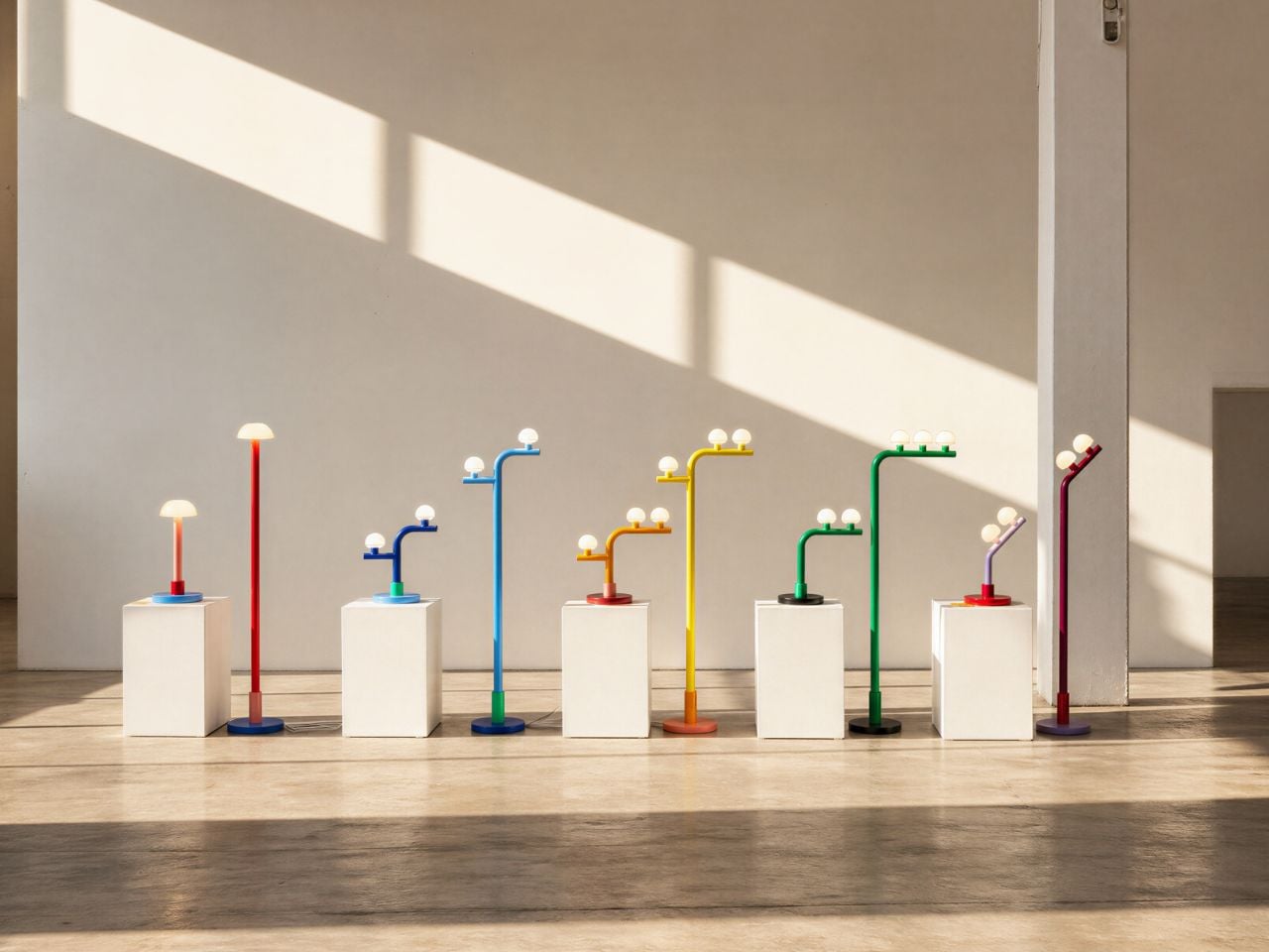
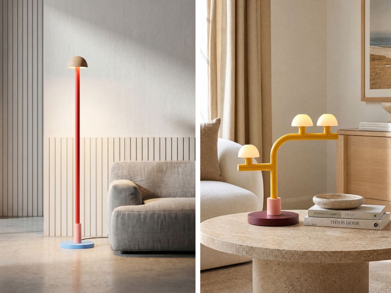
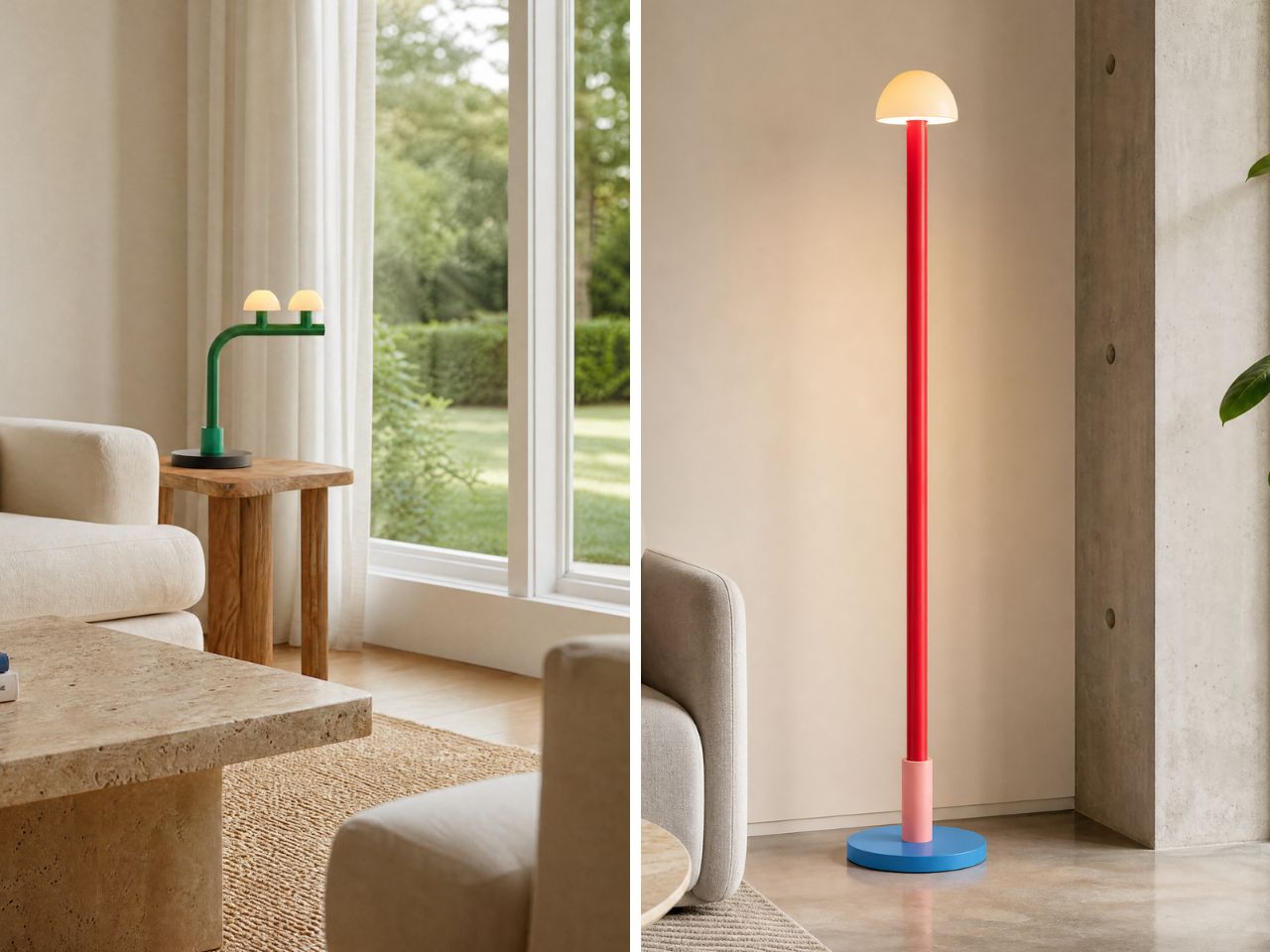
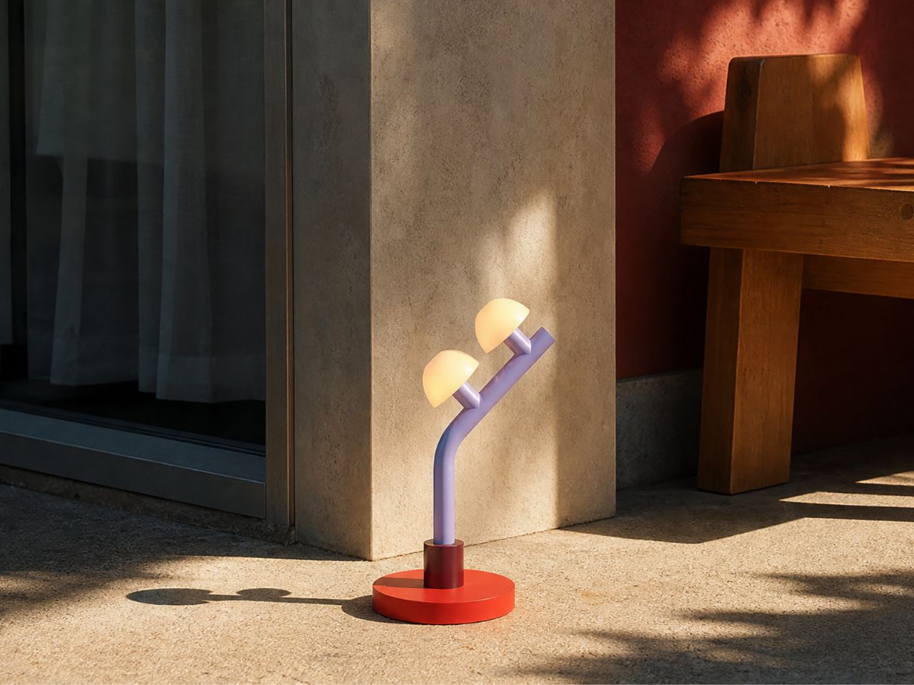
What makes Woaw especially interesting is the way it transforms a familiar object. The candelabra has long been associated with elegance, tradition, and ornamentation. Gammas keeps the idea of multiple light sources, but strips away the heaviness and formality. In its place, he introduces clear shapes, clean lines, and unexpected color blocking. The lamps almost feel like they have been built from oversized toy blocks, yet their proportions and material choices keep them from feeling childish. They are playful, but not silly; expressive, but not chaotic.

There is also a subtle connection to the spirit of the Memphis Group, especially in the use of bold colors and geometric expression. However, Woaw feels more restrained. Rather than relying on busy patterns or visual excess, the collection uses color as its main tool of reinvention. The forms are simple and direct, allowing the palette to carry much of the emotion. This balance gives the lamps their charm: they are instantly eye-catching, but still easy to imagine in a real living space.

That sense of visual surprise also makes Woaw a natural conversation starter. In a room filled with familiar furniture and expected design choices, these lamps interrupt the ordinary in the best way. Their toy-like silhouettes, cheerful colors, and reworked candelabra structure invite people to pause, look closer, and ask about them. They carry just enough nostalgia to feel familiar, and just enough strangeness to feel fresh. A guest might see one and think of building blocks, candy colors, retro design, or childhood objects, which is exactly where the charm lies. Woaw does not simply sit in a space; it gives people something to respond to.

The collection is also flexible in scale and arrangement. The table lamps come in single, single single, single double, double, and double tilt versions, making them suitable for desks, shelves, side tables, or smaller corners. The floor lamps are designed for larger spaces and come in single, single single, single double, triple, and double tilt versions. This variety allows the collection to move between being a small accent piece and a major focal point in a room. Whether placed beside a sofa or on a work desk, the lamps bring an immediate sense of energy.

Beyond their visual appeal, the Woaw lamps are designed with durability and usability in mind. Both the table and floor versions combine sturdy steel bodies with ceramic shades, which help soften the light and give the object a crafted quality. The use of 6W LEDs adds an energy-conscious layer to the design, while the 3-region plug makes the lamps suitable for homes across the US, UK, and EU. This practical detailing supports the larger goal of Mr. John’s Goods: making designer lighting feel more accessible without losing its sense of imagination.

The Woaw collection succeeds because it understands that functional objects do not have to be visually ordinary. A lamp can illuminate a room, but it can also spark memory, joy, and conversation. By bringing together the language of toys, the structure of the candelabra, and the clarity of modern sculpture, Nader Gammas creates lighting that feels fresh, approachable, and full of life. Woaw is not just about seeing better; it is about making a room feel more alive.

The post A Toy-Inspired Lamp Collection That Makes the Candelabra Feel New first appeared on Yanko Design.

MacBook Ultra 2026: Samsung ships OLED panels for Apple’s first touchscreen MacBook

Every major Apple hardware shift leaves a paper trail in someone else’s factory first. Samsung Display’s decision to begin shipping hybrid tandem OLED panels to Apple this month is that kind of trail, and it points toward something Apple fans have speculated about for years: a MacBook with a screen built for touch.

What Samsung is shipping isn’t just any old OLED, either. This is a dual-layer architecture that stacks two emissive panels, a trick that lets them crank up the brightness and improve longevity. It’s the kind of high-end, durable tech you’d want for a machine reportedly being called the MacBook Ultra. The most reliable analyst in the game, Ming-Chi Kuo, is pegging mass production for late 2026. In the world of hardware, when the screens start moving, the rest of the machine usually isn’t far behind.

I get it, we’ve all grown a little tired of the yearly touchscreen MacBook rumors. But this feels different. What separates this moment from all the others is the sheer physicality of the evidence. We’re moving past analysts reading tea leaves and into the realm of logistics. A company like Samsung doesn’t build out a custom, high-spec panel production line for a product that might not happen. This is hardware, in motion. It’s the kind of supply-chain event that turns a long-running prediction into a production schedule.

But here’s the part of the story that most rumor pieces tend to gloss over. Adding a touchscreen isn’t like adding a new port; it forces a complete rethink of the laptop’s physical design. A MacBook is engineered with the assumption that you’ll never push on the screen. Introduce touch, and suddenly you have to solve for hinge wobble, for chassis stiffness, for the simple ergonomics of reaching up to poke at a vertical display. It’s a design problem Apple has deliberately avoided for over a decade.
Remember Steve Jobs’ whole “gorilla arm” argument? The term itself came from the iPad launch in 2010, and the underlying logic is pretty intuitive. When you use a touchscreen on a phone or tablet, your arm is resting. Touch a vertical laptop display repeatedly, and your arm is out in front of you, elevated, working against gravity the whole time. The fatigue that builds up is what Jobs called the gorilla arm, that tired, heavy feeling that sets in faster than you’d expect. He argued it made touchscreen laptops fundamentally uncomfortable, and for anyone who has used a Windows touch laptop for more than a few minutes, the assessment is spot-on.

There’s also a telling piece of Mac history that doesn’t get brought up enough here. Apple introduced the Touch Bar in 2016, a slim OLED strip that replaced the physical function keys with a context-sensitive touch surface. The idea was interesting on paper, but in practice, most users found it awkward, and app support never really materialized. By 2021, Apple quietly killed it on the new MacBook Pros, bringing physical function keys back. That retreat matters because it shows Apple will walk back a touch-related Mac experiment when it fails. The difference this time is that a full touchscreen is a much more compelling proposition than a strip of shortcuts nobody knew what to do with.

You have to imagine that a big part of what changed their minds has been staring them in the face for years: the iPad Pro. Apple successfully built and sold a pro-grade computing device where direct manipulation is the entire point. They proved people will pay a premium for a brilliant screen they can interact with. After a while, the argument that this experience has no place on their other pro-grade device starts to wear a little thin.

And if that “MacBook Ultra” name sticks, you can bet it’ll have an Ultra price tag. Apple seems to be positioning this not as the next MacBook Pro, but as a new tier above it. That strategy would frame the touchscreen as an exclusive, high-end feature, at least for the first generation. It gives them a way to introduce the concept to the Mac lineup without having to immediately solve it for every price point.

Of course, there’s still a ton we don’t know. Will macOS get a subtle facelift to better accommodate fingers? Will the hinge be radically different? Is Apple Pencil support on the table? With some sources pointing toward a fall event, we might not have to wait too long for the first real answers. Until then, those OLED panels are the most solid clue we have. That’s what makes this whole cycle feel so much more concrete. When components from one of the world’s biggest display makers are in transit, you’re not really talking about a rumor anymore. You’re talking about a timeline.

The post MacBook Ultra 2026: Samsung ships OLED panels for Apple’s first touchscreen MacBook first appeared on Yanko Design.