Most portable speakers end up on a shelf somewhere, playing lo-fi beats while someone makes coffee. There is nothing wrong with that, but it is not what these five were made for. We picked speakers that actually want to leave the house, products built around weather resistance, battery stamina, and the kind of design thinking that considers mud, rain, and a campfire playlist as standard operating conditions. Spring 2026 has delivered some interesting options, from retro survival radios to subwoofer-equipped tanks that laugh at puddles.
What makes this list different from the usual roundup is the lens we are looking through. These are not ranked by loudness or spec-sheet one-upmanship. We looked at form factor, material durability, portability logic, and whether each speaker solves a real outdoor problem or just pretends to with an IP rating sticker. Some are brand new releases, others are designs that aged into relevance this season. All five belong outside.
1. RetroWave 7-in-1 Radio

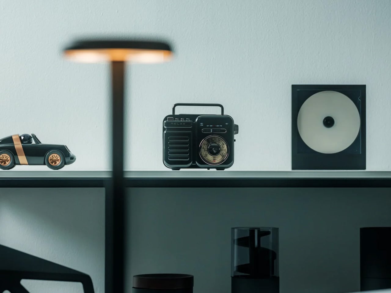
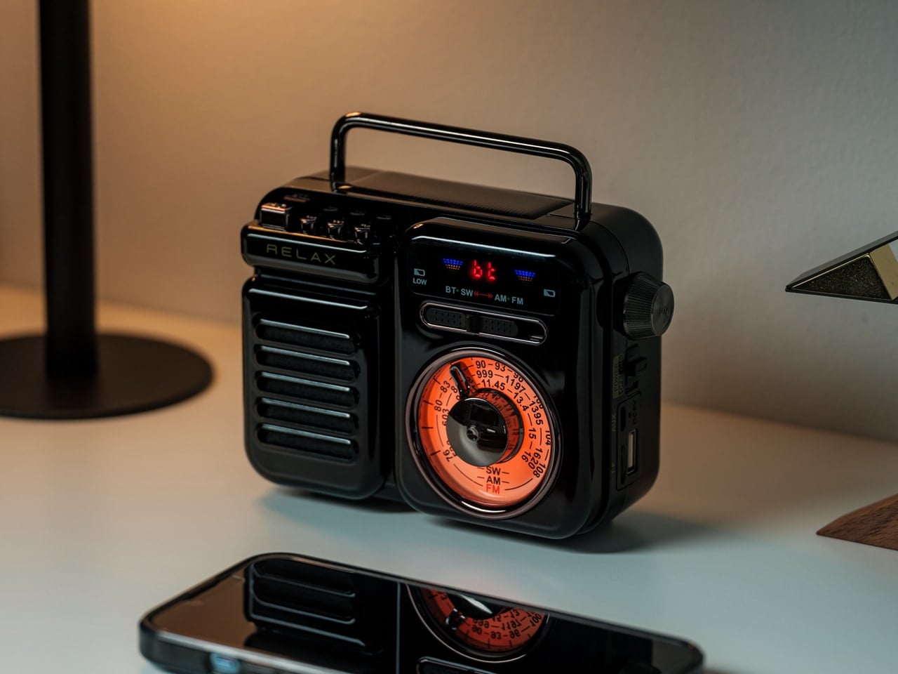
Emergency radios tend to look like emergency radios: bulky, utilitarian, designed to sit in a basement kit next to expired granola bars. The RetroWave wraps seven functions inside a form factor borrowed from mid-century Japanese transistor radios, with a tactile tuning dial and a design warm enough to earn kitchen counter space. Those seven functions: Bluetooth speaker, MP3 player (USB and microSD), AM/FM/shortwave radio, flashlight, clock, SOS alarm, and power bank. Hand-crank charging and a solar panel provide off-grid power when outlets vanish, a capability no Bluetooth-only speaker on this list can match.
The outdoor logic differs from the rest of this roundup. The RetroWave competes on self-sufficiency, not audio fidelity. A hand crank and solar panel mean it never truly dies. The flashlight and SOS siren add safety utility for trail emergencies. Bluetooth and MP3 playback handle entertainment with respectable sound for a multi-function device, though the tuning-dial analog radio experience is where the personality lives. Shortwave reception opens up international broadcasts and emergency channels that streaming apps cannot access. As an everyday speaker, it has charm. As an emergency tool that also plays music, it is hard to argue against keeping one in a daypack. It belongs on this list not because it sounds the best, but because it is the only speaker here that could keep working days after every other device has gone dark.
What we like
- Hand-crank and solar charging make it the only speaker here that generates its own power, a genuine survival feature for off-grid situations.
- Seven functions (speaker, radio, flashlight, clock, SOS alarm, MP3 player, power bank) consolidate multiple pieces of outdoor gear into one device.
What we dislike
- Audio quality does not match dedicated Bluetooth speakers on this list, as the multi-function design compromises driver space and tuning.
- The retro aesthetic, while appealing, may feel out of place for users who prefer minimal, modern gear in their outdoor kits.
2. Marshall Emberton III
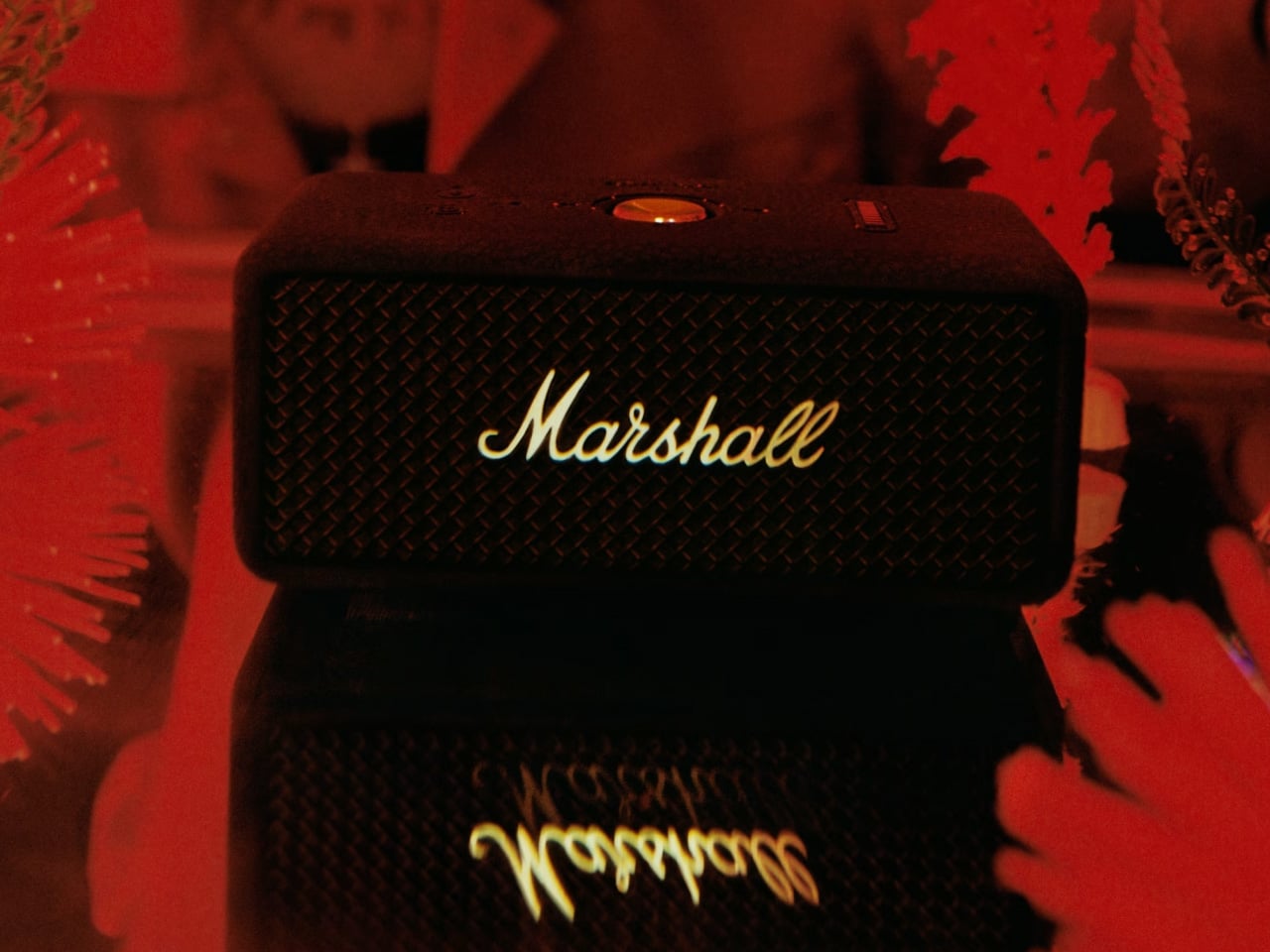
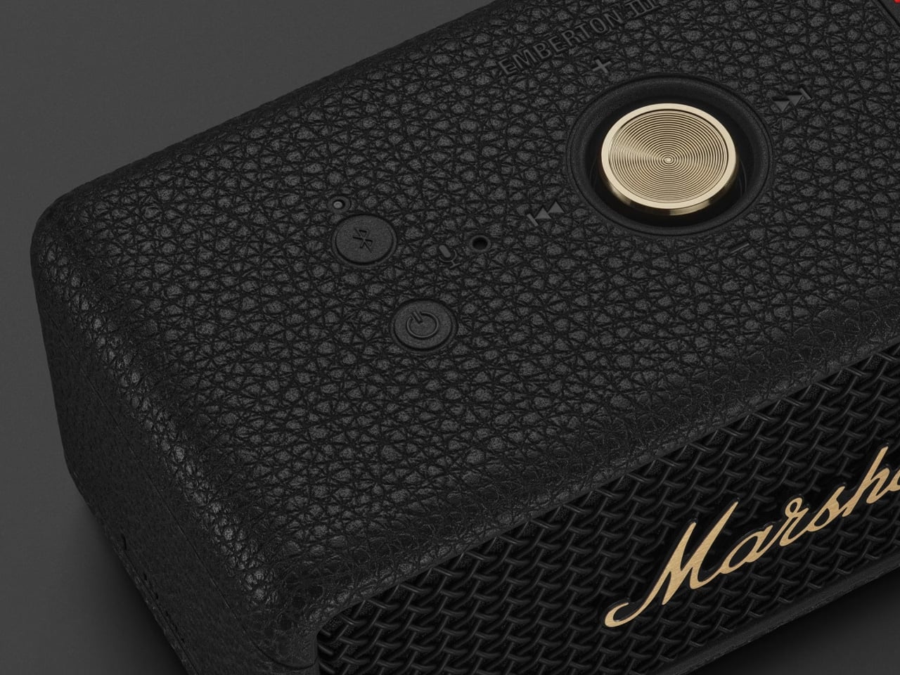
The Emberton III wraps textured silicone and metal grille construction around meaningful upgrades over its predecessors. Two 2-inch full-range drivers and two passive radiators push 360-degree sound through Marshall’s True Stereophonic system, so placement on a picnic blanket or backpack strap matters less than it would with front-firing alternatives. An IP67 rating allows submersion in one meter of water for 30 minutes, and the 32+ hours of battery life cover an entire weekend trip without an outlet. A 20-minute quick charge returns six hours of playback, the kind of math that matters when departure is in half an hour, and the speaker is dead.
Bluetooth 5.3 with LE Audio readiness and upcoming Auracast support means multi-speaker setups are on the horizon. A built-in microphone, absent from earlier Embertons, handles hands-free calls. The signature brass control knob manages volume, track skipping, and play/pause with tactile precision that wet or gloved hands appreciate far more than a touchscreen. At $159, it sits in a competitive zone against the Sonos Roam 2 and JBL Flip 6, but neither offers this battery endurance. Marshall’s sound leans warm and full at moderate volumes, though pushing past 85% introduces harshness common to speakers this size.
What we like
- 32+ hours of battery life covers multi-day trips, and the 20-minute quick charge for six hours of playback is a practical safety net.
- IP67 rating handles submersion, dust, and sand, making it one of the most weather-resistant speakers at this price.
What we dislike
- Sound gets harsh at very high volumes, a physical limitation of the small driver size that DSP tuning cannot fully solve.
- No 3.5mm auxiliary input means Bluetooth is the only connection option, eliminating wired backup for devices with dead wireless.
3. Brane X
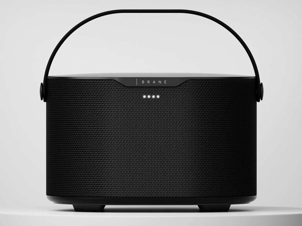
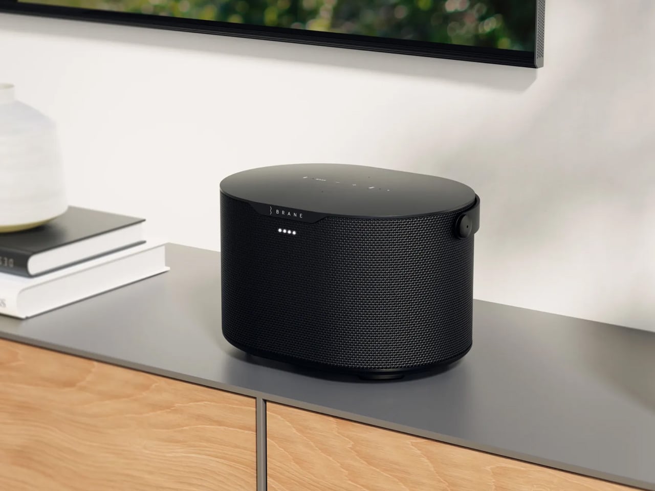
Most portable speakers fake bass by boosting mid-bass frequencies and letting psychoacoustics fill the gaps. Brane X uses a proprietary Repel-Attract Driver (RAD) that cancels internal air pressure forces, producing real sub-bass down to 27.1 Hz from a speaker just 9.3 inches wide. Five drivers total, including a 6.5 x 9-inch RAD subwoofer, two midrange drivers, and two dome tweeters, are powered by four class-D amplifiers exceeding 200 watts combined. A 72 watt-hour battery provides up to 12 hours of runtime, and full IP57 waterproofing means rain and poolside splashes are non-issues.
Outdoors, the five-driver array creates a soundstage that holds up when listeners spread across a campsite or patio. A custom DSP engine runs 500 million EQ calculations per second, maintaining clarity at volumes where competitors distort. Wi-Fi adds Spotify Connect and SiriusXM streaming, Alexa handles voice control, and the Brane app offers custom EQ and grouping for up to eight speakers. At 7.7 pounds, it is heavier than pocket alternatives, but the acoustic payoff justifies the weight for anyone tired of thin, tinny campsite sound. A 3.5mm auxiliary port also accommodates turntables, a rare inclusion in the wireless-first portable category.
What we like
- Bass response down to 27.1 Hz from a portable form factor is a genuine engineering achievement unmatched in this size class.
- IP57 waterproofing combined with 200+ watts of amplification delivers serious sound in weather that would sideline most premium speakers.
What we dislike
- 7.7 pounds limits grab-and-go spontaneity for hiking or cycling trips compared to sub-2-pound alternatives.
- Battery tops out at 12 hours at moderate volume, less than half of what the Emberton III offers on a single charge.
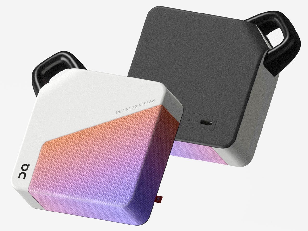
4. The Harman Kardon Traveller Concept
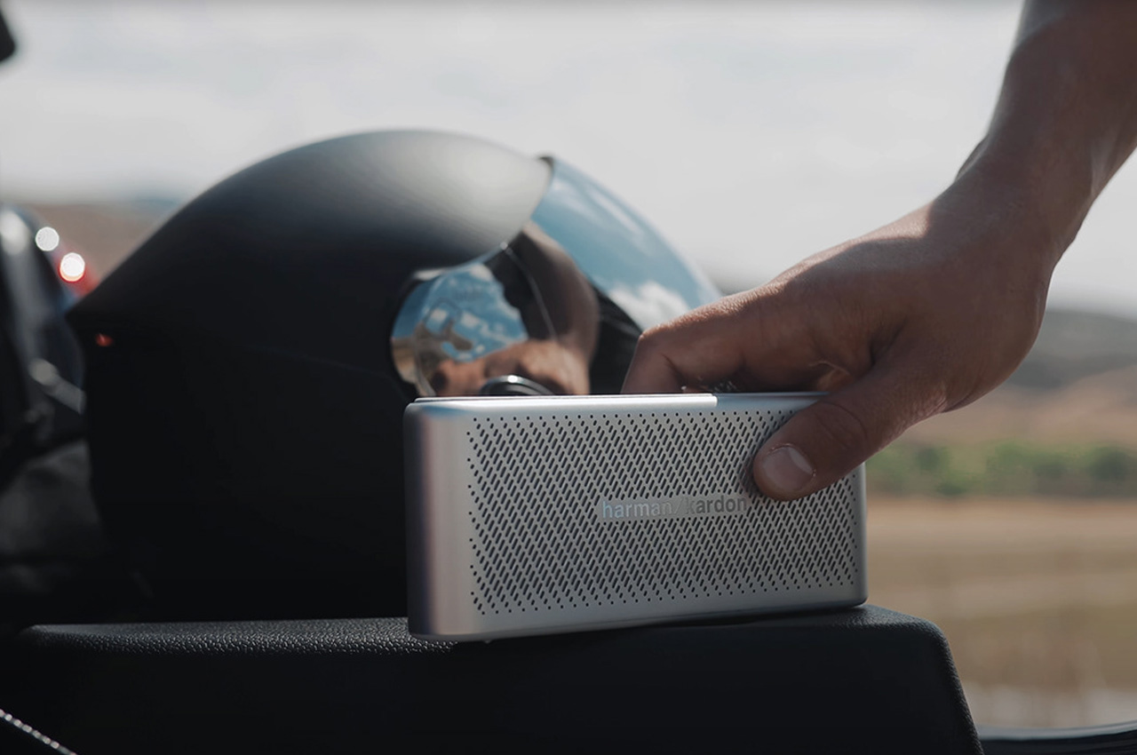
The Traveller rethinks what a portable speaker should look like for people who actually travel with one. The form factor draws from Sony point-and-shoot cameras, producing a slab so slim it fits alongside a passport wallet. Touch controls and LED indicators sit on top, maintaining the clean design language of the Harman Kardon Esquire Mini 2. A high-density battery delivers up to 10 hours of playback, and reverse charge functionality turns the speaker into an emergency power bank when a connected phone dies mid-hike. Dual microphones with echo and noise cancellation handle calls in windy outdoor conditions.
The outdoor advantage here is not ruggedness but presence. The slimmest speaker is useless if it stays home because packing it is inconvenient. The Traveller solves that by occupying almost no space, fitting into a carry pouch alongside chargers and cables. Three planned colorways (black, silver, electric blue) suggest a product designed to be seen, not hidden. Sound quality carries the Harman Kardon name, though the slim profile necessarily limits low-end output compared to thicker options on this list. For backpackers and frequent flyers who treat portability as the primary feature, this concept points toward a smarter kind of outdoor speaker: one designed to be forgotten in the bag until needed.
What we like
- Reverse charge functionality doubles the speaker as an emergency power bank, solving two travel problems with one device.
- Ultra-slim form factor fits in jacket pockets and travel pouches, the most packable option on this list by a wide margin.
What we dislike
- This is a concept design, not a production product, so availability and final specs remain unconfirmed.
- Slim profile inherently limits bass depth and volume ceiling compared to thicker, driver-stacked competitors.
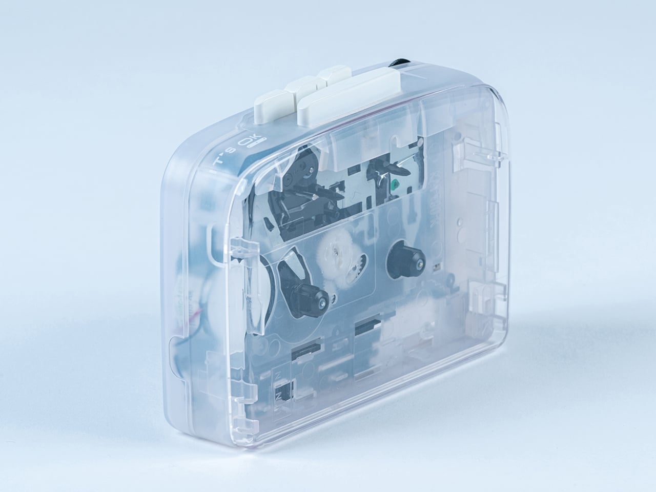
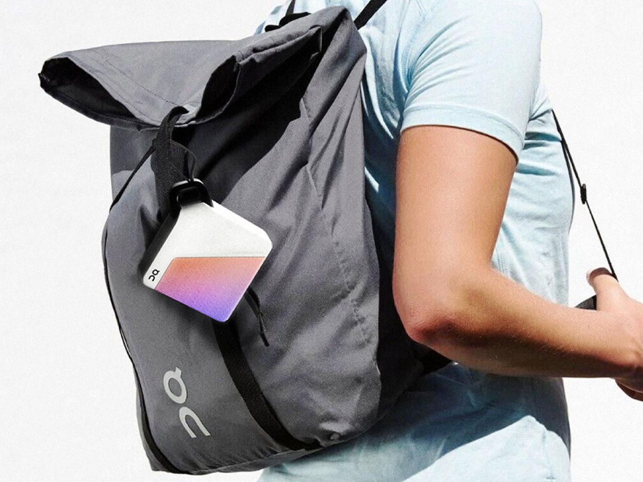
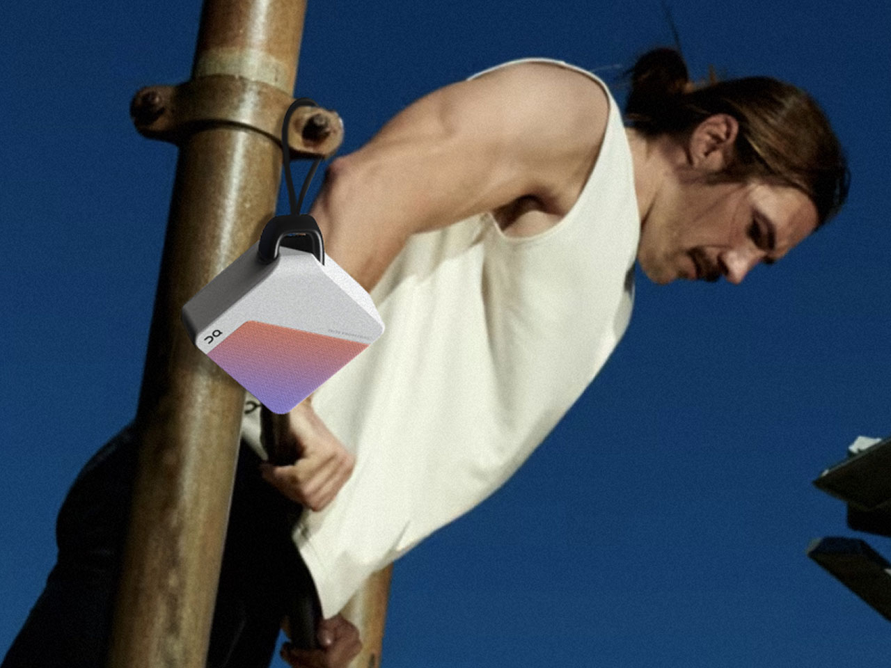
5. Side A Cassette Speaker


Somewhere between a novelty gift and a legitimate audio device, the Side A leans closer to legitimate than the shape suggests. Styled after a real mixtape with a transparent shell and a Side A label, it hides a Bluetooth 5.3 speaker inside a back-pocket form factor. The cassette shape forced designers to tune for warm, analog-flavored sound within the tightest enclosure possible, and the result has a cozy quality that bigger, flatter-response speakers do not replicate. MicroSD support adds offline MP3 playback, useful on trails where phone battery conservation matters more than streaming. A clear case doubles as a display stand for desk use indoors.
Outdoors, the Side A works best as a personal-zone speaker. It will not fill a campsite, but clipped to a bag or perched on a rock beside a hammock, it handles solo listening and small-circle hangouts without the bulk of a larger unit. Bluetooth 5.3 delivers stable pairing, and range holds reliably when a phone is in a tent and the speaker is by the fire. At sub-$50, it is a low-risk purchase and an easy gift for anyone nostalgic about cassette culture. The trade-off is clear: do not expect room-filling volume or chest-thumping bass. This is a speaker for people who value character and portability over raw performance, and within that lane, it delivers more than the price suggests.
What we like
- Bluetooth 5.3 and microSD playback cover both streaming and offline listening, handling connectivity gaps common on outdoor trips.
- Pocket-sized cassette form factor weighs almost nothing, lowering the barrier to actually bringing a speaker on every outing.
What we dislike
- Volume and bass are physically limited by the tiny enclosure, making it unsuitable for group listening in open spaces.
- MicroSD support handles MP3 files only, excluding FLAC, WAV, and other formats that audio-conscious users may prefer.
Where spring leaves us
These five speakers share one trait that separates them from the hundreds of Bluetooth speakers released every quarter: they were designed with an awareness that speakers leave houses. That sounds obvious, but most portable speaker design still optimizes for countertops and nightstands, treating water resistance and battery life as checkbox features rather than core design drivers.
The Emberton III and Brane X represent two ends of the outdoor audio spectrum, one betting on endurance, the other on acoustic performance that refuses to compromise because the ceiling is sky instead of drywall. The Traveller and Side A cassette challenge the assumption that outdoor speakers need to be chunky, proving slimness and personality coexist with genuine trail usefulness. And the RetroWave reminds us that the most capable outdoor device might be the one that never needs charging at all. Spring is for getting outside. These are the speakers who want to come along.
The post 5 Best Portable Bluetooth Speakers of Spring 2026 — Designed for the Outdoors, Not Your Bookshelf first appeared on Yanko Design.