A Wind-Powered Sculpture Is Lighting Up Tanzania’s Plains

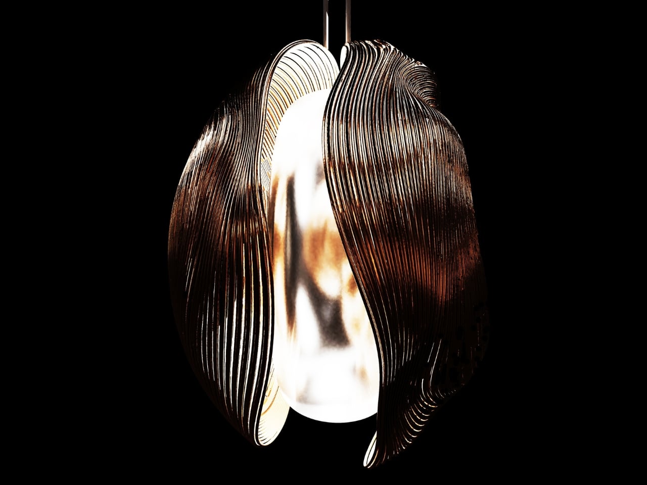
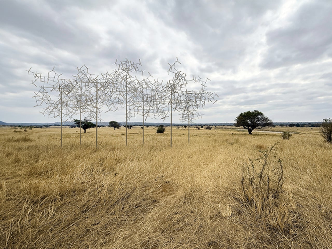
There’s something almost unsettling about a structure that appears to breathe. Not in a horror movie kind of way, but in that quiet, mesmerizing way that makes you stop, squint, and wonder if what you’re seeing is really happening. That’s exactly what Vincent Leroy’s Fractal Swarm does to people. It sits in the vast openness of the Tanzanian plains, and it moves. Not because of motors or hidden mechanisms, but because of the wind.

Leroy is a Paris-based French artist who grew up in rural Normandy tinkering with whatever he could get his hands on. That early habit of experimenting turned into a full-blown obsession with movement, which led him to study industrial design at the Ecole Nationale Supérieure de Création Industrielle in Paris. By the time he graduated, he was already making kinetic work that galleries wanted to show. Since then, he has built a practice that sits comfortably between sculpture, installation art, and something that doesn’t quite have a name yet. His work has appeared everywhere from Parisian museums to Zanzibar’s shoreline, and the thread that runs through all of it is the same: movement as a material, not just as an effect.

Designer: Vincent Leroy

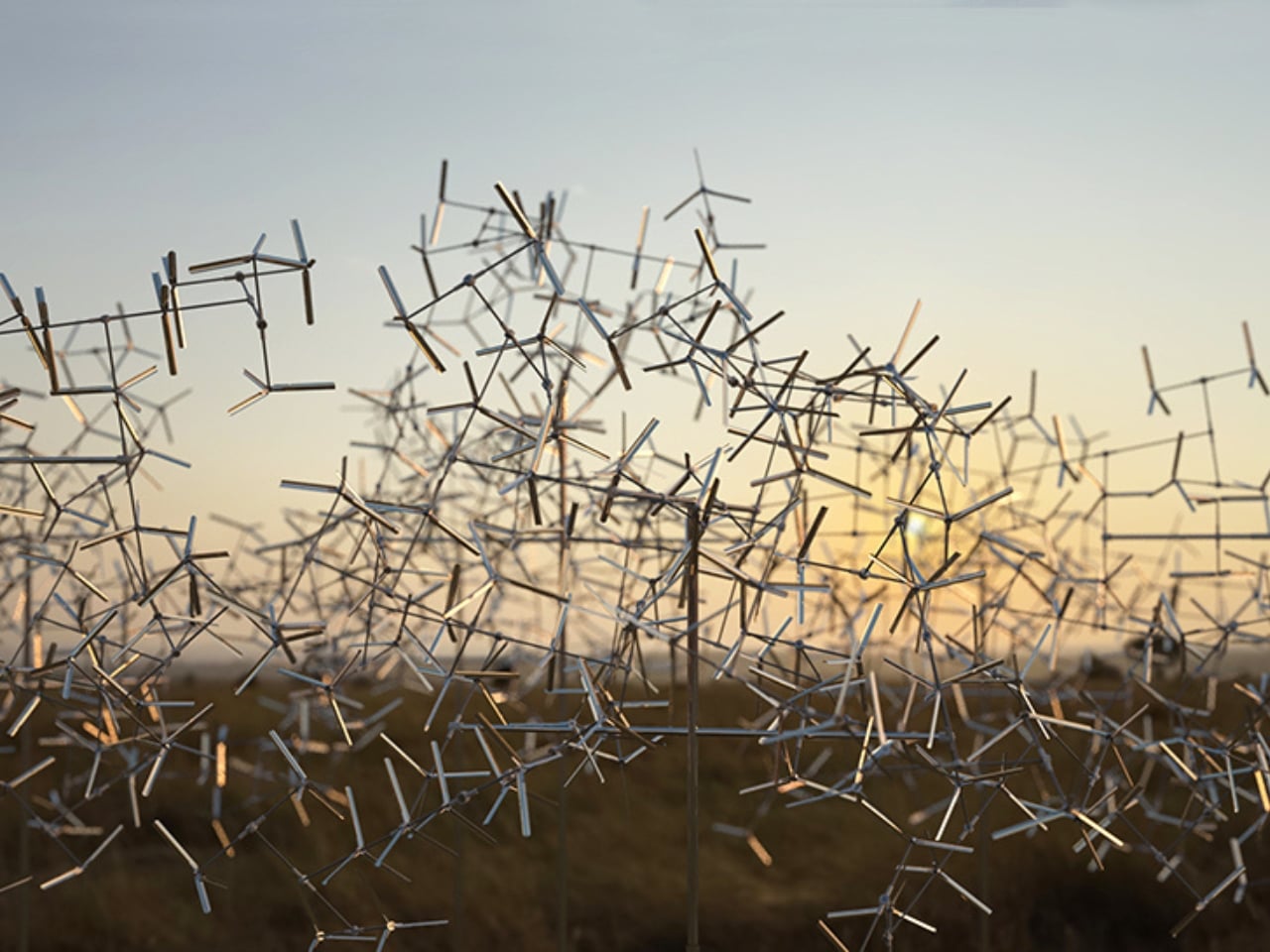
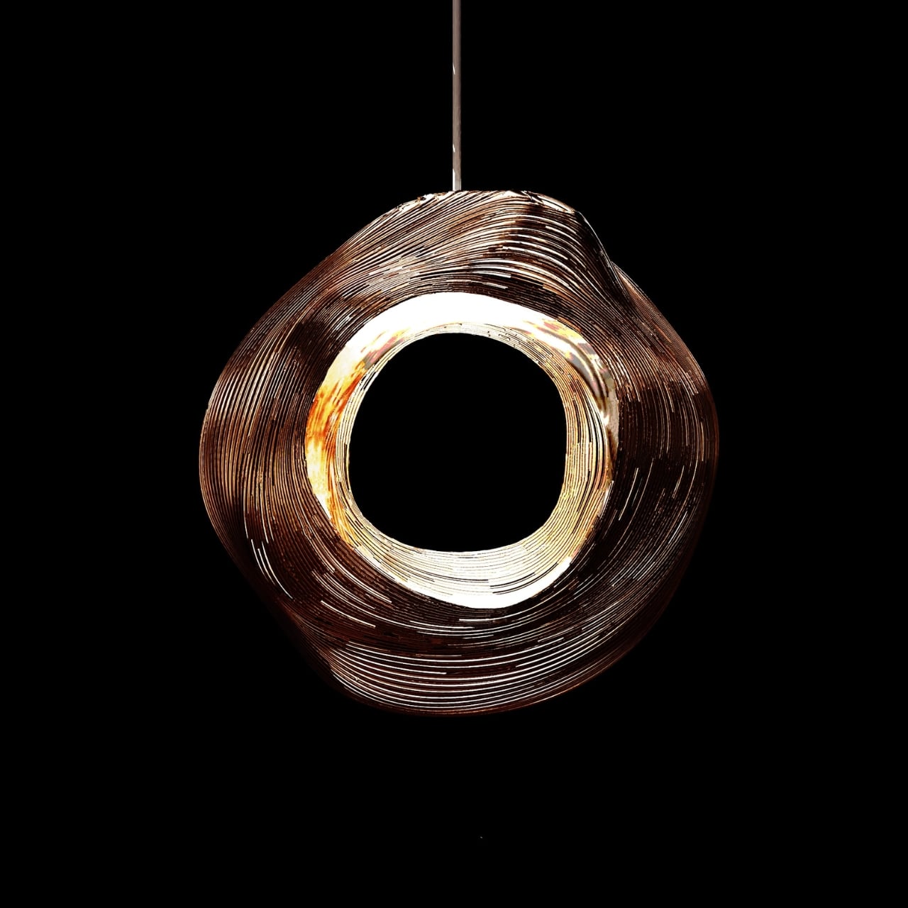
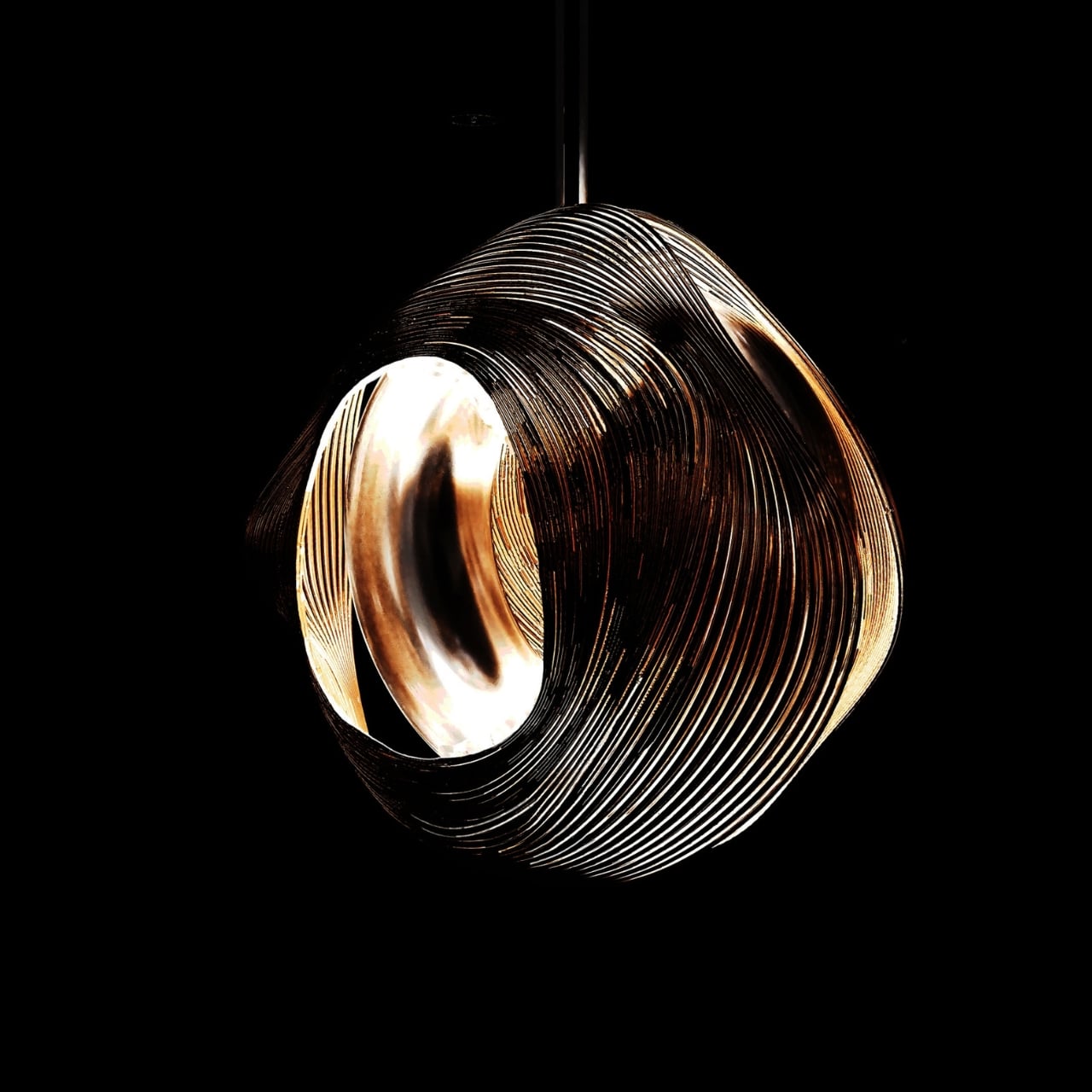
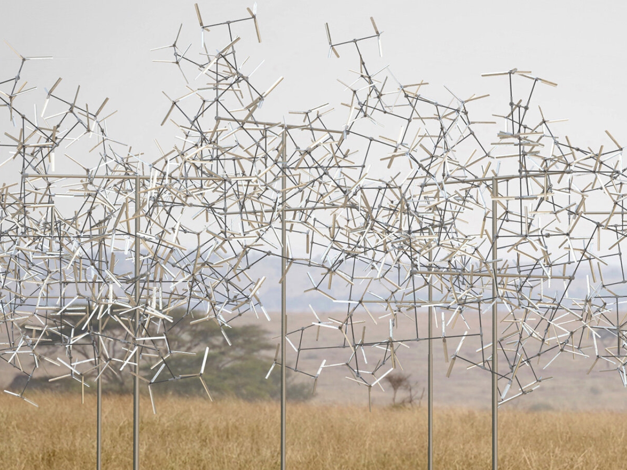
Fractal Swarm is his latest statement on that idea, and it might be the most ambitious one yet. The installation is built around the logic of fractal geometry, which is the kind of math that describes the way nature repeats itself at different scales. Think of the branching pattern of a tree, or the way a fern unfolds, or the texture of a coastline seen from above. Nature uses this structure constantly, and Leroy decided to make it visible in a landscape where that pattern is already everywhere.

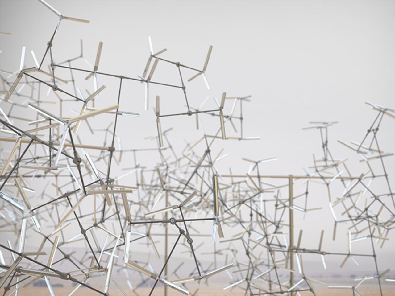
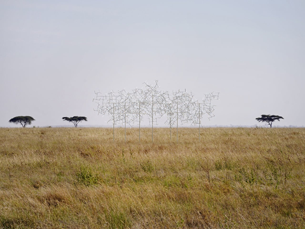
The Tanzanian plains during the dry season are stripped down to essentials. Acacia trees stand with bare, branching silhouettes against the sky. The ground breaks into fragmented, textured patches of arid vegetation. Leroy’s installation mirrors all of that. Its branching configuration echoes the acacia silhouettes so closely that from a distance, it reads more like something that grew there than something that was built. That’s the point. Rather than imposing itself on the landscape, Fractal Swarm extends it.

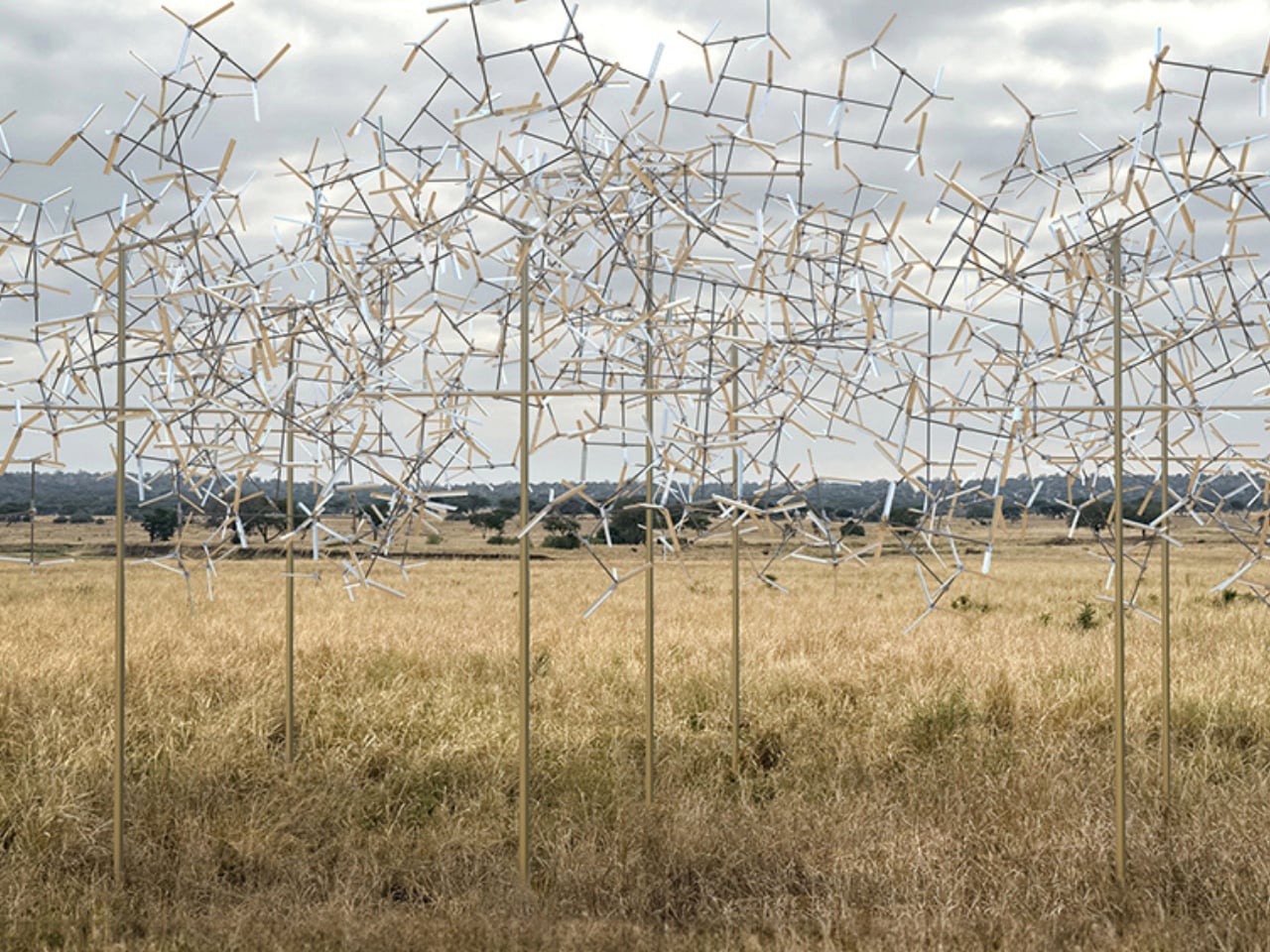
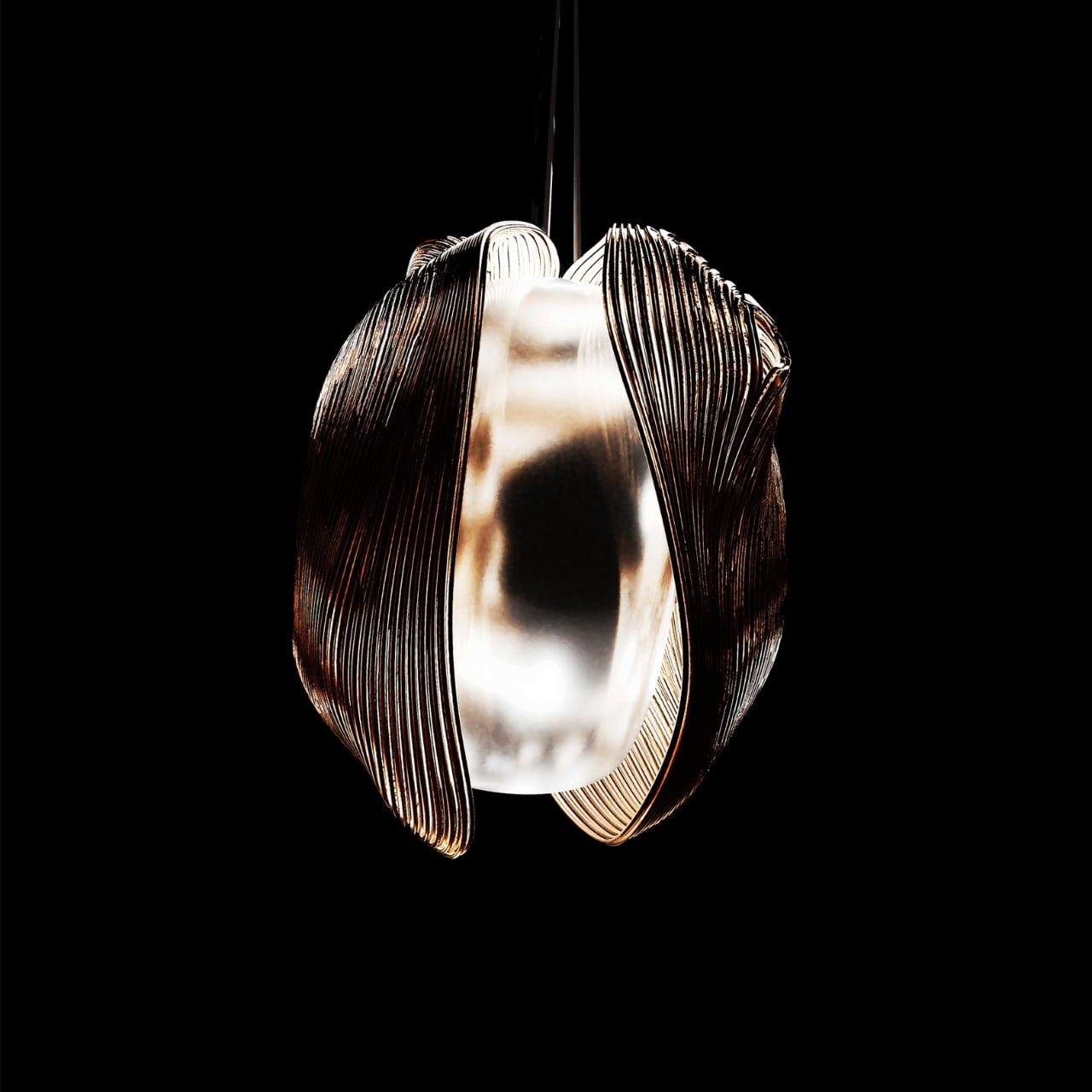
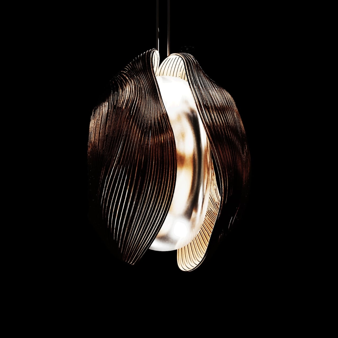
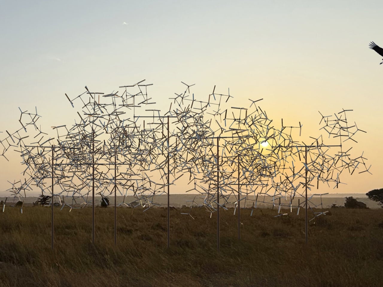
What makes it come alive, literally, are the mirrored fins embedded within the structure’s modules. Thin and precisely placed, these fins catch and refract the intense light of the plains as they move. The wind sets everything in motion, and the fins respond by scattering light in constantly shifting patterns across the ground and the air around them. The result is something that changes every second depending on where you’re standing, what direction the wind is coming from, and what time of day it is. No two moments of looking at it are the same.

This is what Leroy keeps coming back to in his practice: the idea that slowing down and watching something move can completely change how you see it. His work tries to reveal the gaps that usually go unnoticed in today’s frenetic race for speed and performance. Fractal Swarm does that on a grand scale. It puts you in front of something enormous and quietly says: stand here. Watch this. Let the wind do something beautiful.

It’s also worth noting that Leroy isn’t new to working with wind in dramatic outdoor settings. His Drifting Cloud installation on Zanzibar’s east coast used rotating canvas discs that interacted directly with the shoreline’s breeze. Fractal Swarm takes that same sensibility deeper into the continent and scales it up into something more structural and mathematically precise.

What’s quietly radical about all of this is that Leroy uses some of the most rigorous abstract math available (fractal geometry) and turns it into something you feel before you think about it. You don’t need to understand the Mandelbrot set to be moved by Fractal Swarm. You just need to stand near it when the wind picks up and watch the plains light up like they’re waking. That’s the kind of art that sticks with you long after you’ve walked away.

The post A Wind-Powered Sculpture Is Lighting Up Tanzania’s Plains first appeared on Yanko Design.

This Pen Flashlight Is Thinner Than an iPhone and Blasts 500 Lumens

Most people don’t carry a flashlight, which is something they only realize when they’re already crammed under a sink, squinting at a fuse box, or trying to read a label in a poorly lit corner of a garage. Cylindrical lights are bulky, they roll off surfaces, and they feel overbuilt for the kind of everyday moments where you just need a quick, reliable beam. So they get left at home, and your phone flashlight ends up doing all the work.

The Wedge SL is a USB-C rechargeable inspection light with a sleek, modern design built to actually stay in a pocket. The ultra-thin unibody construction puts the dimensions closer to a pen than a flashlight, 5.65 inches long, 0.28 inches thick, and about 1.14 oz light, which means it doesn’t fight for space with keys and a wallet. A stainless steel injection-molded pocket clip also lets it ride on a shirt pocket or tool pouch without bouncing around.

Designer: Streamlight

One-handed operation was clearly part of the brief. The tail switch handles momentary or constant-on use, so one hand can hold a panel, a wire bundle, or an awkward hatch while the other hand aims the light exactly where it needs to go. TEN-TAP programmable switch lets users choose whether constant-on defaults to High or Low intensity, which means the light can match your habits rather than forcing you to cycle through modes every time you switch on.

For an inspection light, the available modes are spot on, pardon the pun. Constant-on High runs at 100 lumens for 1.75 hours, Low drops to 50 lumens for 3.5 hours, and THRO (Temporarily Heightened Regulated Output) mode pushes 500 lumens with an 80m beam when you need maximum brightness fast. THRO is activated by a 3-second press, which keeps it from firing accidentally during sustained work while still making it quick to trigger when a tight space needs a real burst of light.

The battery side holds up well. USB-C charging and a four-level LED battery status indicator with charge alerts mean you always know roughly how much is left, without deciphering blink codes. A full charge takes about four hours. The field serviceable, user-replaceable lithium polymer battery is also worth calling out, since many rechargeable lights eventually become e-waste once the cell degrades inside a sealed body.

Durability gets the same careful treatment, as the extruded aluminum alloy case comes with a Type II MIL-Spec anodized finish. The lens is also unbreakable acrylic, and the light is IPX4-rated with 1m impact resistance testing. A bite boot is also included, which lets you grip it with your teeth during two-handed work without scratching the finish or the inside of your mouth.

The Streamlight Wedge SL earns pocket space by being thin, predictable, and quick to operate instead of trying to be a tactical statement piece. A flashlight that’s actually on you is always going to matter more than one that performs better on a spec sheet but gets left on the workbench because it’s too big to bother carrying every day.

The post This Pen Flashlight Is Thinner Than an iPhone and Blasts 500 Lumens first appeared on Yanko Design.

These Magnetic LED Blocks Snap Together Like LEGO Lighting

Most lighting is still sold as fixed objects: a floor lamp for the living room, a task lamp for the desk, a strip for the TV, each designed for one spot and one job. That clashes with the way people actually live now, moving desks, rearranging rooms, switching from work to play in the same corner, while the lamps stay stubbornly tied to a single idea of the space.

LumiBlocks V1 is a magnetic RGBCW block lamp that treats light as something you build and rebuild. Instead of one rigid bar or panel, it is made from individual light blocks that snap together magnetically, power up as soon as they connect, and can be added or removed to match the length and shape your current setup needs, whether that is a short strip behind a monitor or a longer run along a wall.

Designer: Peter Wu (Decktok)

Click Here to Buy Now: $79 $149 (47% off). Hurry, only 9/27 left! Raised over $53,000.

Each block can rotate a full 360 degrees, so you aren’t locked into the direction the base is pointing. You can twist segments to throw light onto a keyboard, bounce it off a wall for a softer wash, or angle a few blocks down for a reading nook while others point up for ambient glow. The magnets handle alignment and power, which turns rearranging into a quick, almost fidget-like action rather than a wiring project.

1

The blocks emit RGBCW LEDs that can handle both full color and practical white light. With ten blocks, you get up to 1,500 lumens, enough to light a small room, and you can tune the white from a warm 2,700 K to a crisp 6,500 K. That means the same strip can be a focused work light during the day, a neutral wash for video calls, and a low, saturated accent at night.

Control layers on top of the physical system. Simple buttons when you’re standing next to it, an app when you’re on the sofa, and voice control through Alexa or Google Home when your hands are busy. The app lets you treat each block as its own pixel, adjusting brightness and color per segment, or you can lean on the 49 built-in scenes and music-reactive modes when you just want the room to feel different with a tap.

1

LumiBlocks V1 is not locked to one mounting style. With the right kit, the same blocks can sit on a desk as a low ambient bar, hang on a wall as a linear sconce, or drop from the ceiling as a pendant. Because the system runs on low-voltage DC and talks over Bluetooth and 2.4GHz Wi-Fi, you’re mostly thinking about where you want light, not where the original lamp designer assumed you would put it.

1

This shifts the way you think about buying lights. Instead of collecting separate fixtures for every corner, you start with a set of blocks that can follow you from apartment to apartment, desk to desk, and phase to phase. The magnetic joints, 360-degree rotation, RGBCW output, and per-block control turn LumiBlocks V1 into a kind of lighting toolkit, one that can keep up as your spaces and routines keep changing.

Modularity is not new, but LumiBlocks V1 executes it well, making the blocks easy to snap and rotate, the app intuitive enough to actually use, and the mounting options flexible enough that the same kit can cover a bedroom, office, and gaming corner without needing three separate purchases. For people who rearrange often or who want their lighting to feel as adaptable as their furniture, a system that you can literally pull apart and rebuild feels more honest than another fixed lamp pretending to be smart.

Click Here to Buy Now: $79 $149 (47% off). Hurry, only 9/27 left! Raised over $53,000.

The post These Magnetic LED Blocks Snap Together Like LEGO Lighting first appeared on Yanko Design.

The Sculptural Stand That Curates Jewelry Like a Miniature Modernist Gallery

Most jewelry stands are passive objects. They sit quietly on dressers, functioning as background tools for storage. But jewelry stand challenges that expectation by repositioning the humble organizer as an active curator, one that stages jewelry the way a gallery stages art. Designed exclusively for the MoMA Design Store and distributed internationally, the piece reframes what a daily-use object can be: not just a holder, but a display system, a sculpture, and a small architectural experiment.

Instead of approaching the project as a decorative accessory, Arora treated it as a spatial design problem. The stand consists of two powder-coated iron panels that interlock to form a stable three-dimensional structure. This construction method eliminates fasteners entirely, allowing the object to assemble intuitively while maintaining structural strength. The gesture feels architectural, like slotting together planes in a scale model, suggesting that the designer is thinking less like a stylist and more like a builder of systems.

Designer: Nihaarika Arora

What makes the object particularly compelling is how it transforms jewelry into part of its visual composition. A rhythmic field of geometric perforations allows stud earrings to pass directly through the surface, effectively turning the panel into a customizable exhibition wall. Integrated hooks accommodate necklaces and bracelets, suspending them in clean vertical lines. Rather than hiding accessories, the stand frames them, making everyday items feel intentional and composed. When empty, it still retains a sculptural presence; when filled, it becomes collaborative, co-designed by the wearer’s collection.

This sense of precision did not emerge accidentally. The project evolved through an iterative prototyping process that included cardboard mockups, laser-cut tests, and extensive material trials. Arora adjusted metal thickness, balance, and joint tolerances repeatedly to achieve an equilibrium between stability and visual lightness. Early prototypes were reviewed with MoMA’s editorial and buying teams, whose feedback informed refinements to perforation spacing, detailing, and color direction. The process reflects a designer committed to testing assumptions and refining decisions through interaction rather than relying solely on intuition.

Historically, the design draws subtle influence from early modernist thinking. The interlocking planes recall Bauhaus experiments in structural clarity, while the perforation patterns nod to Josef Hoffmann’s explorations in metalwork geometry. Yet the stand never feels retro. Instead, these references are distilled into a contemporary language defined by restraint, proportion, and disciplined form. Color selection developed through trend and material study leans toward cool, playful tones that complement the iron substrate while allowing the piece to integrate into a wide range of interiors.

Arora has described her practice as driven by a desire to design with purpose and to imagine equitable and sustainable futures through collaboration. In this context, the jewelry stand becomes more than a product. It becomes a manifesto in miniature. It demonstrates that even the smallest domestic object can embody architectural logic, historical awareness, and user-centered thinking. By elevating storage into display and function into form, the Modern Geometry Jewelry Stand does not just organize belongings. It reorganizes expectations of what everyday design can be.

The post The Sculptural Stand That Curates Jewelry Like a Miniature Modernist Gallery first appeared on Yanko Design.

When Light Learns to Dance: A Sculpture That Moves on Purpose

There’s something mesmerizing about watching objects move with intention. Not random chaos or frantic spinning, but deliberate, mechanical motion that feels almost choreographed. Kutarq Studio’s Totem de Luz captures that magic perfectly. It’s a kinetic lighting sculpture that sits somewhere between functional lamp and art installation, refusing to pick a lane and somehow being better for it.

At first glance, Totem de Luz looks like a sleek vertical column made from stainless steel and glass. But the real show starts when you interact with it. The piece uses exposed mechanical components to move its light source up and down along the structure, transforming not just where the light goes, but how your entire space feels.

Designer: Kutarq Studio (photos by Iñaki Domingo)

When the light sits in its upper position, it shines toward an onyx diffuser that softens and scatters the illumination upward, creating that warm, ambient glow perfect for winding down after a long day. Lower the light source, though, and everything changes. The beam redirects through an oval opening on the side of the structure, producing focused, concentrated light that’s ideal for reading or getting work done. It’s like having two completely different lamps in one sculptural package.

What makes Totem de Luz particularly compelling is how openly it wears its mechanics. Many contemporary designs hide their inner workings behind smooth casings, but Kutarq Studio, led by designer Jordi Lopez Aguilo, takes the opposite approach. The gears, pulleys, and mechanical systems that make the movement possible are all visible, transforming the technical aspect into part of the aesthetic experience. There’s a steampunk quality to it without leaning into that aesthetic fully. Instead, it feels industrial and refined at the same time.

The materials tell their own story too. Stainless steel gives the piece its structural backbone and modern edge, while the glass components add fragility and elegance. Then there’s that onyx diffuser, a material choice that elevates the entire piece from “cool lamp” to “investment-worthy sculpture.” Onyx isn’t just pretty. It has natural translucent properties that interact beautifully with light, creating depth and warmth that cheaper materials can’t replicate.

Beyond its obvious visual appeal, Totem de Luz raises interesting questions about how we interact with our spaces. In an era where everything is becoming smart, automated, and voice-controlled, there’s something refreshingly tactile about physically adjusting your lighting. The kinetic mechanism asks you to engage with the object, to participate in shaping your environment rather than just commanding it from across the room.

This kind of design philosophy feels particularly relevant right now. We’re surrounded by technology that prioritizes convenience over connection, efficiency over experience. Totem de Luz pushes back against that trend. It’s not trying to disappear into your smart home ecosystem. It demands presence and attention. You can’t ignore a six-foot kinetic sculpture in your living room, nor would you want to.

The piece also plays beautifully with how we perceive time and movement in interior spaces. Most lighting is static. You flip a switch, and that’s it. But with Totem de Luz, light becomes performance. The slow mechanical adjustment creates a transitional moment, a small ritual that marks the shift from one activity or mood to another. It’s meditative in a way that pressing a button never could be.

Kutarq Studio has created something that feels both timeless and thoroughly modern. The mechanical movement nods to pre-digital craftsmanship, while the sleek materials and minimalist form language speak to contemporary sensibilities. It’s the kind of piece that could sit comfortably in a loft apartment, a mid-century modern home, or even a more traditional space that needs a bold accent. Totem de Luz proves that lighting doesn’t have to choose between being practical or beautiful, functional or artistic. Sometimes the most interesting designs exist in the tension between categories, refusing easy classification and becoming something more interesting in the process.

The post When Light Learns to Dance: A Sculpture That Moves on Purpose first appeared on Yanko Design.

These Lace-Shade Lamps Transform Family Heirlooms Into Memorable Floor Lighting

In Lana Launay’s Kinship series, light does more than illuminate space. It acts as a living archivist, revealing, preserving, and narrating stories embedded within inherited textiles. Through works such as Kinship I and Kinship II, the artist transforms antique doilies, lace fragments, and stockings passed down through generations into sculptural lighting forms that do not simply display history but actively project it into the present.

At a distance, the sculptures appear softly abstract, glowing with fluid patterns that seem almost atmospheric. As viewers move closer, those patterns resolve into delicate lace surfaces. The forms are constructed by stretching and wrapping textile fragments across stainless steel frameworks, which are then illuminated from within using LED elements housed in aluminum structures. This meeting of industrial material and fragile cloth establishes a compelling tension between permanence and delicacy, between manufactured precision and inherited memory.

Designer: Lana Launay

Each textile used in the works carries its own lineage. These are not fabrics chosen for decoration, but heirlooms gathered from families who preserved them across generations. Once domestic objects that quietly occupied tables, drawers, or cabinets, the doilies and fabrics are repositioned as visible ancestral surfaces. In their new form, they shift from private keepsakes to shared visual artifacts, allowing personal histories to exist within public space.

The transformation becomes most evident when light passes through the textiles. When unlit, the sculptures appear restrained, their patterns subtle and quiet. When illuminated, the surfaces come alive. Light filters through each stitch and fiber, projecting intricate webs of shadow across surrounding walls. The negative spaces within the lace become as expressive as the threads themselves, creating an interplay in which absence holds as much presence as material.

Stockings layered across the frameworks introduce an additional dimension. Their woven fibers soften and diffuse the light, allowing it to seep gently outward rather than shine directly. Overlapping fabrics create layered visual grids in which lines intersect and reconnect, resembling maps or diagrams. These networks evoke relationships and generational links, suggesting that the textiles themselves chart histories of connection, care, and continuity.

Every sculpture is assembled by hand, ensuring that each piece remains unique. The steel frame adapts to the dimensions of the textile rather than forcing the fabric into a predetermined shape. Signs of age, such as fading, discoloration, and repair, remain visible, reinforcing the idea that time is not erased but honored. The inherited material determines the structure, allowing memory to guide design.

Through the Kinship series, Launay proposes that preservation does not require stillness. Instead, history can be animated. Light becomes a tool that activates memory rather than simply revealing form. These sculptures function as living archives where ancestry is not stored away but made visible, where inherited textiles continue to participate in the present. In this way, the works suggest that memory, like light, does not disappear. It travels, expands, and quietly illuminates everything it touches.

The post These Lace-Shade Lamps Transform Family Heirlooms Into Memorable Floor Lighting first appeared on Yanko Design.

Twist This Minimalist Side Table’s Handle, and It Becomes the Lamp

Side tables and lamps behave awkwardly in small apartments. The drink and book migrate from sofa to armchair throughout the day, but the lamp never seems to be where you need it, and the cable gets dragged across the floor. Most furniture still assumes a fixed layout, even though habits are much more fluid, especially in spaces where the same corner has to function as office, living room, and dining area by Thursday.

Grab & Glow is a portable side table with a clever twist. Its legs pass through the tabletop and continue upward to form a single handle. That handle is the thing you instinctively reach for when you want to move it, so the table, light, and whatever is on top travel together instead of you juggling a tray in one hand and a lamp in the other while trying not to trip over the cord.

Designer: Liam de la Bedoyere

The handle is also the light source. You loosen a small bolt at the edge, rotate the handle, and a hidden light flicks on at the curved end. The same tube that makes the table easy to carry becomes an arm that throws a pool of light onto the surface below, so the gesture of settling in somewhere new and turning on the lamp is literally the same motion, one twist.

The tabletop is a powder-coated metal disc with a slight lip that keeps books and glasses from sliding when you move it. The finish is built for everyday use, resistant to scratches and rings, so it can live next to a sofa, bed, or reading chair without feeling precious or needing coasters. The circular footprint keeps it compact, which matters when you’re threading it between furniture or tucking it under a desk.

Integrated cable management means the power cord runs neatly down one leg, held by discreet clips, and can be wrapped when you need to tidy up. A small cut-out on the tabletop rim lets the plug or a charging cable pass through without getting pinched, so you can route power to the lamp or a laptop without a tangle, even as the table moves around the room throughout the week.

A day with Grab & Glow might start with it acting as a coffee perch in the morning, a laptop stand by the sofa in the afternoon, and then a reading light by the bed at night. The height and handle make it easy to lift without bending much, and the light always ends up exactly where your book or keyboard is because it’s attached to the same object you’re already carrying from room to room.

Grab & Glow treats a side table less like a static piece of furniture and more like a personal tool you carry around the house. By letting the legs pierce the tabletop to become a handle and lamp, and by quietly solving the cable problem, it shows how a single structural idea can make flexible living feel less improvised and more designed, one grab at a time.

The post Twist This Minimalist Side Table’s Handle, and It Becomes the Lamp first appeared on Yanko Design.

This Concept Fixes the Logitech Litra Glow’s Biggest Problems

Logitech’s Litra Glow sits on top of monitors as a small plastic square with no case, no real protection, and controls you reach over your screen to adjust. Creators toss them into backpacks wrapped in T‑shirts, or bolt them to third‑party arms that make the whole setup bulkier and less portable than the light intended. It works well enough at a desk, but it travels poorly and feels awkward the moment you move it.

Athul Krishnav’s Logitech Litraglow concept asks what a more travel‑friendly, ergonomically sane version could look like. The student project keeps the idea of a compact, soft light for creators but turns it into a circular head on an integrated clamp and handle, with built‑in rotation, tilt, and protection. It behaves more like a proper tool than a naked accessory needing extra hardware just to stay safe in transit.

Designer: Athul Krishnav

Picture a streamer packing a bag for a trip, sliding the circular Litraglow into a sleeve without worrying about scratching the diffuser or snapping the mount. At the destination, they clamp it to a laptop lid, shelf, or tripod, rotate the head to frame their face, and tilt it precisely without wrestling with a separate arm or stand that adds weight and friction to every adjustment.

The concept builds 360‑degree rotation and smooth tilt into the head and stem, so you can swing the light from one angle to another mid‑call or mid‑shoot without loosening knobs or repositioning the whole clamp. It’s the difference between nudging a spotlight with your fingers and re‑rigging a mini studio every time you change posture or move your camera, which happens more often once you start shooting anywhere other than a fixed desk.

The rotary control dial at the base of the head has simple icons for off, low, and higher brightness, plus tap‑and‑hold gestures for color temperature. You can reach up, feel one control, and know what it’ll do without hunting for tiny buttons on the back. In the middle of a live session, that low cognitive load matters more than a long feature list nobody remembers under pressure.

Of course, the circular head, soft edges, and subtle “logi” branding pull from Logitech’s existing design language, so the light looks at home next to MX mice and keyboards instead of like a random third‑party gadget. Neutral color options keep it from stealing focus on camera, and the integrated clamp and handle mean you aren’t adding another mismatched piece of hardware to an already crowded desk or backpack.

The Litraglow concept doesn’t reinvent lighting but just fixes the small, annoying things around it: the lack of a case, an awkward reach, and clumsy mounts. For creators who live out of backpacks and shoot in whatever corner they can find, a light that travels safely, clamps cleanly, and adjusts with one hand is the kind of quiet upgrade that makes more difference than another spec bump or lumen count increase.

The post This Concept Fixes the Logitech Litra Glow’s Biggest Problems first appeared on Yanko Design.

Fold the Corners of This Wooden Cube Lamp and Watch the Light Change

Most contemporary lamps are adjusted with a dimmer on the cord, a touch sensor on the base, or a slider in an app. That makes light feel like another setting in a menu, slightly detached from the object itself. There is something satisfying about changing light by physically moving parts, as if you are sculpting both the fixture and the atmosphere around it, which is what smart bulbs and app-controlled RGB strips quietly leave out.

Michael Jantzen’s Interactive Folding Lamp is a small, painted wooden cube that quietly invites that kind of interaction. Four corners of the cube have been cut into different geometric shapes and hinged, so they can swing open and closed. When you start to move them, you aren’t just revealing the light but also changing how much of it escapes. At the same time, you are also changing what the lamp looks like from every side, turning the adjustment into a compositional act.

Designer: Michael Jantzen

A single energy-efficient bulb sits at the center, wrapped in a light-diffusing shield and surrounded by six horizontal yellow planes, evenly spaced like a tiny louvered tower. As you open the hinged corners, more of those yellow planes come into view, catching the light and turning it into a warm, layered glow that spills out through the gaps you have created, contrasting with the cool white painted exterior.

This plays out over a day. The lamp closed down to a near-solid cube with just thin seams of light when you want a soft background presence. One corner folded out to throw a slice of light across a book or keyboard. Multiple panels opened wide when you want the object to become a small, glowing sculpture in the room. Each adjustment is a quick, tactile decision rather than a number on a scale, making the ritual feel manual and deliberate.

Jantzen sees the lamp as part of a larger exploration into re-inventing the built environment through unexpected interactivity. The cube can be read as a piece of micro-architecture, its hinged faces acting like tiny façades or shutters that you reposition to modulate light and form. It compresses the logic of folding pavilions and responsive buildings into something that fits on a side table or desk, letting you interact with architectural ideas at hand scale.

The Interactive Folding Lamp gives you a direct, analog way to tune your space, asking you to touch wood, feel hinges, and watch how light responds. It turns a basic act, turning on a lamp, into a small moment of play and composition. In a time when so much interaction is mediated by screens and voice commands, a lamp that responds only to your hands, opening and closing its own geometry to let light out or hold it in, feels like a quiet reset worth keeping in a corner.

The post Fold the Corners of This Wooden Cube Lamp and Watch the Light Change first appeared on Yanko Design.

This Award-Winning Lamp Is Made From Millions of Metal Threads

There’s something deeply poetic about borrowing from nature, especially when it comes to design. Tzuhsiang Lin’s Nest Lamp does exactly that, and the result is a lighting fixture that feels less like a product and more like a piece of quiet conversation. Drawing inspiration from bird nests, this award-winning lamp transforms the delicate chaos of intertwined twigs into something you can hang in your home.

Created during Lin’s studies at Pratt Institute, the Nest Lamp takes shape through millions of interwoven metal threads that form two organic sheets wrapped around a central light source. The technique is intricate, relying on advanced metalworking to achieve that natural, almost messy quality that makes real nests so captivating. But here’s where it gets interesting: this isn’t just visual trickery. Lin embedded layers of meaning into those twisted metal strands.

Designer: Tzuhsiang Lin

The lamp’s design intentionally echoes the bonds between family members. Each metal thread represents connection, support, and the tangled beauty of relationships that hold us together. There’s even a nod to Chinese culture woven in, where silk carries connotations of longing because of its pronunciation. While the lamp uses metal instead of silk, that cultural reference adds weight to what might otherwise be simply a pretty light.

When you look at the Nest Lamp from different angles, it shape-shifts. The two metal sheets create varying patterns and shadows depending on your perspective, making it a dynamic presence in a room rather than static decoration. Light filters through the woven threads, creating a soft, ambient glow that changes as you move around it. At the center sits a donut-shaped light tube, and the way illumination radiates through that circular opening adds another layer to the visual experience.

Let’s talk about sustainability for a second, because it matters here. In a market flooded with cheap plastic fixtures that barely last a season, Lin chose metal. It’s a deliberate decision that speaks to durability and environmental consciousness. Metal can be recycled, it ages gracefully, and it doesn’t contribute to the mountain of disposable lighting that ends up in landfills. The lamp isn’t just meant to look good; it’s built to stick around.

The design world has certainly noticed. The Nest Lamp has collected an impressive roster of accolades, including a Silver A’ Design Award in 2025, a Silver at the International Design Awards, recognition at the MUSE Design Awards, the NYCxDESIGN Awards, and a nod from the LIT Lighting Design Awards. That’s not a small feat for a design that originated as a student project.

What makes this lamp resonate beyond its trophy case is how it bridges the gap between nature and technology. Bird nests are engineering marvels in their own right, structures that balance weight, flexibility, and protection. Lin’s lamp captures that essence while introducing modern materials and manufacturing processes. It’s biomimicry with emotional intelligence.

The real magic happens when you place it in your home. Suspended from the ceiling, it becomes a focal point that shifts throughout the day. Morning light interacts with it differently than evening illumination. Shadows dance across walls. The space around it feels transformed, not just lit up. That’s the difference between functional lighting and thoughtful design, when an object contributes to the atmosphere rather than simply serving a purpose.

For anyone who appreciates when form and meaning align, the Nest Lamp offers that rare combination. It’s sculptural without being pretentious, functional without being boring, and meaningful without hitting you over the head with symbolism. Lin managed to create something that works on multiple levels: as art, as light, as metaphor, and as everyday object. It stands as proof that good design doesn’t need to choose between beauty, sustainability, and significance. Sometimes, if you look to nature and really pay attention, you can have all three.

The post This Award-Winning Lamp Is Made From Millions of Metal Threads first appeared on Yanko Design.