This Grungy Metal Case turns your iPhone 17 Pro into an iPod Classic

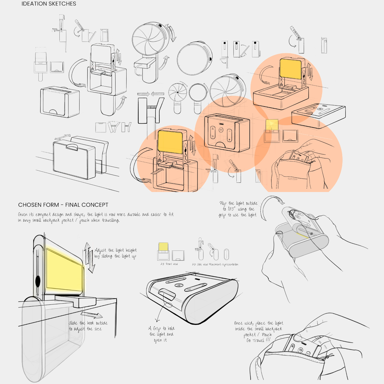
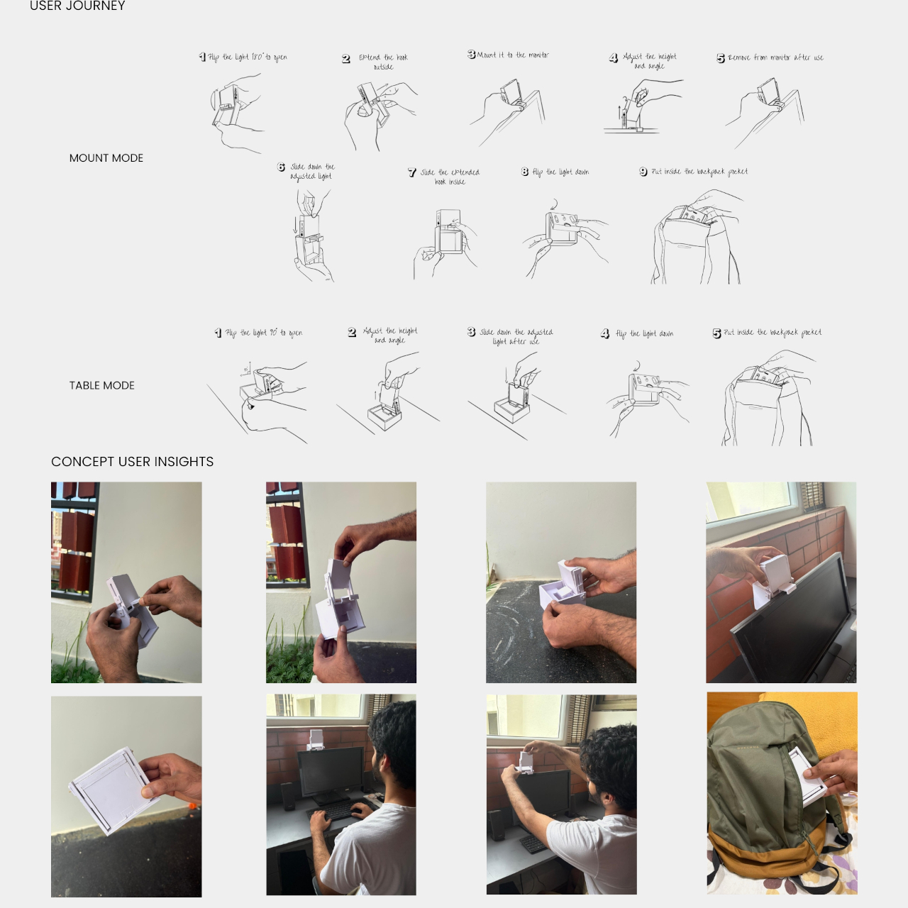
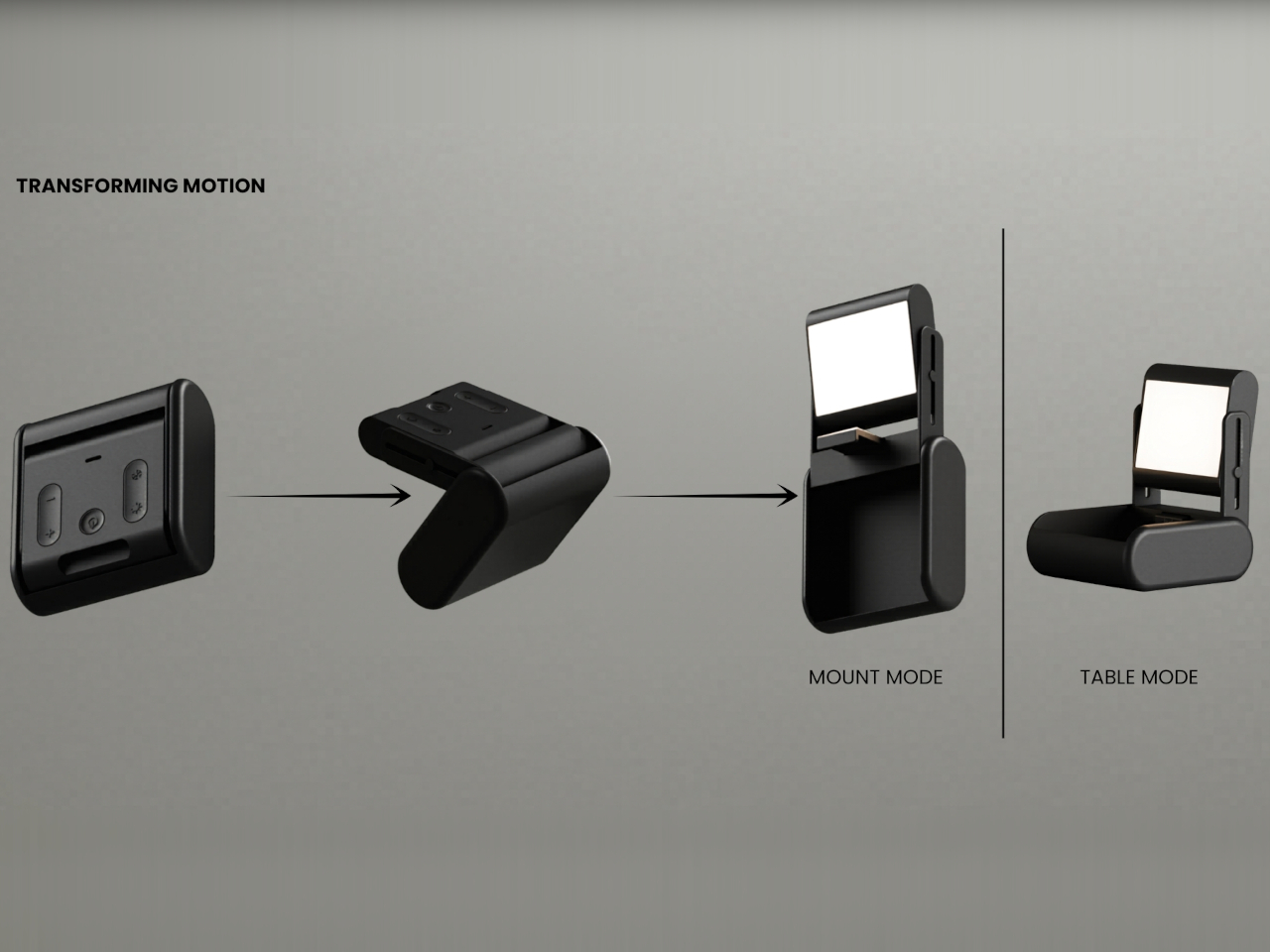
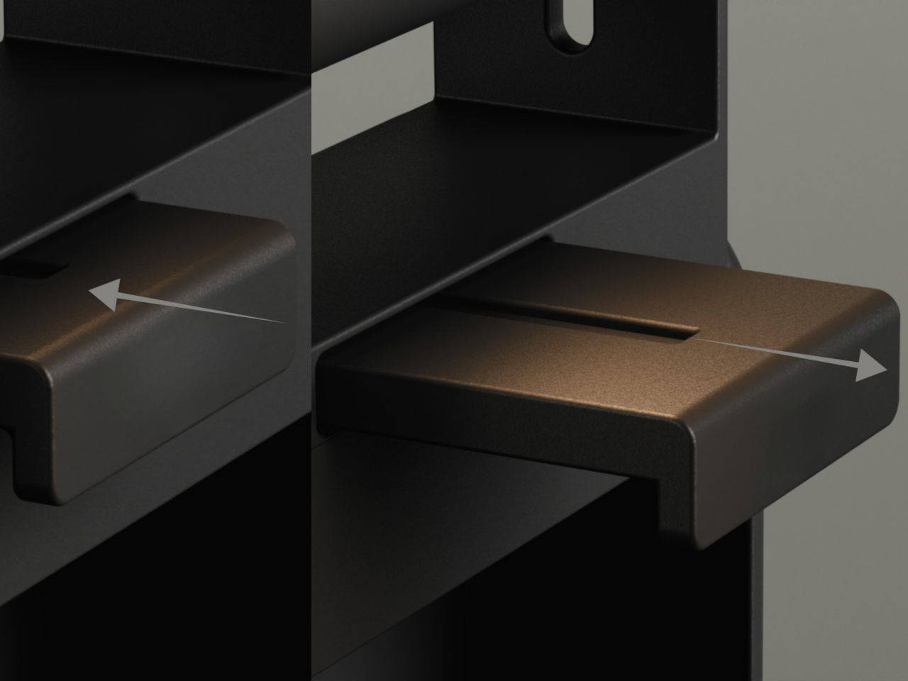
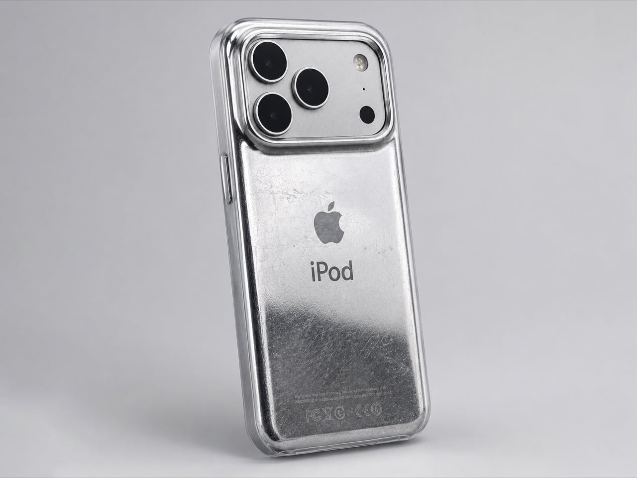
The original iPod (even the iPhone) was designed to scratch. Contrary to the idea of Steve Jobs and Jony Ive chasing perfection, the idea behind having an iPod that wears and tears with use was that A. it would be less of a hurdle to get you to upgrade, but also B. it would make each iPod uniquely different.

The term designers and craftspeople use to describe this phenomenon is ‘Patina’, it’s when iron rusts a certain way, when bronze oxidizes in a unique style, or when leather wears down in a distinct manner that’s unique to each individual product and how it’s used. The back of the iPod would scratch based on whether you’d keep it on tables or in pockets, whether your pocket had keys, whether you accidentally scuffed it against your belt buckle or the railing of a flight of stairs. That patina was ‘by design’, and even though the new iPhones don’t have that feature, David Delahunty designed a case that lets you relive exactly that.

Designer: David Delahunty

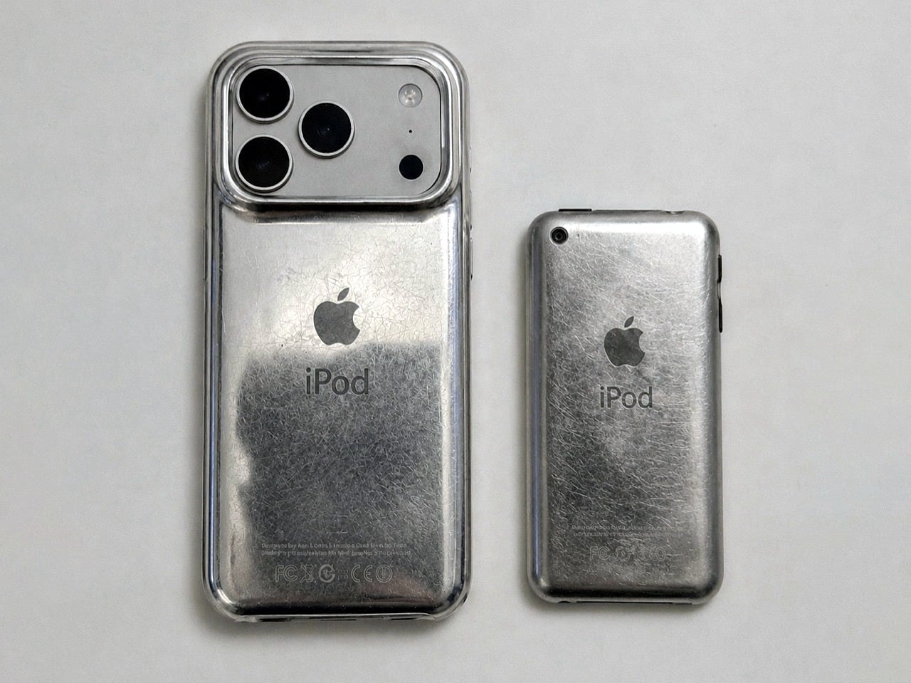
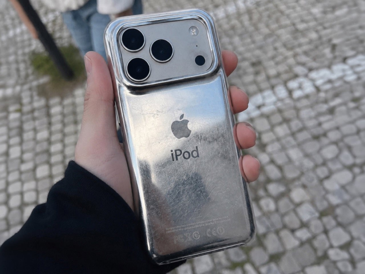
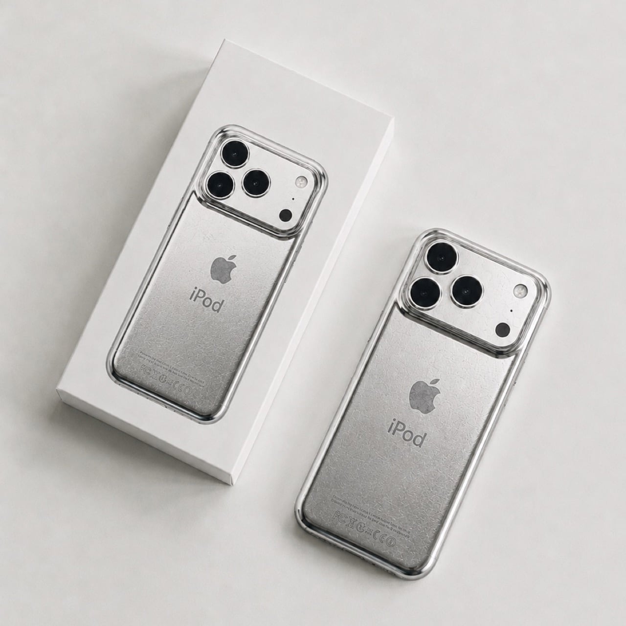
Rather simply put the iPod Classic iPhone 17 Case, this distressed metal case was designed to fit around any iPhone 17 Pro or Pro Max, giving your phone the same grunge-ish vibe. It has the exact same curved body that the iPod Classic had, making the product feel almost identical to the original when held in your hand (bye bye sharp edges on the iPhone, you won’t be missed). The case sports the same artwork on the back too, with an iPod symbol and the Apple logo, along with even the certification text at the bottom… but what steals the show are the scratches.

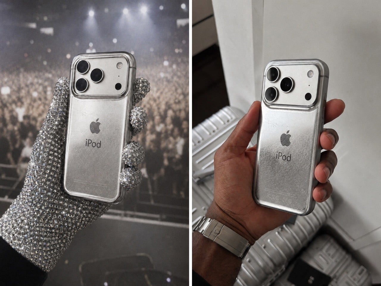
Now it’s difficult to say if Delahunty designed each case to be unique, but that’s because these are just conceptual… for now. The designer, who goes by ‘delahuntagram’ on social media, churns out unique ideas of quirky products (like this MS paint makeup kit or this Apple Spinning Wheel Tennis Ball). Some products end up making it to reality, like the MacOS Folder SSD that is now available for sale. With enough interest, I don’t see how such a product couldn’t hit the mainstream. Delahunty even rendered an image of Drake (although I choose to see MJ) holding the phone in his hand while wearing those bejewelled gloves.

It isn’t the first time the iPhone’s been used as a canvas for Apple-of-the-past. Spigen routinely releases cases that transform the iPhone into Apple icons like the Lisa/Macintosh, or the iMac G3, or even the original iPhone 3G. The ‘scratched’ iPod is a fairly new design take, and something you could totally expect from the mind of Delahunty. I wonder if the case has a faux 3.5mm jack just for kicks…

The post This Grungy Metal Case turns your iPhone 17 Pro into an iPod Classic first appeared on Yanko Design.

Coca-Cola Just Turned Its Iconic Bottle Into Chopsticks

If you visit most parts of East Asia and Southeast Asia, you will find something on almost every dining table, whether it’s at home or a public dining establishment: a pair of chopsticks. If you live there, then you learned to use them starting when you were a young child. If you’re visiting, then you will have to learn to use a pair when eating, or else you embarrassingly ask for other utensils. But in any case, chopsticks are part of every dining experience in that part of the world. They are more than just tools; they are a cultural staple, passed down through generations and deeply woven into the rituals of everyday life.

Wherever you live in the world, chances are you’re familiar with Coca-Cola’s iconic contour bottle, whether or not you drink it. Yes, there are cans and plastic bottles now, but even the latter has that distinct shape that was introduced in 1915 to make the brand identifiable wherever you see it, even if broken, even in the dark. That silhouette has since become one of the most recognizable forms in consumer branding history. Coke wants to bring the two together, as many parts of Asia don’t necessarily have the Coke bottle as a regular part of their dining table. So they decided to launch a campaign and create a product that would bridge the two worlds: CokeSticks.

Designer: Coca-Cola

The product is just like what its name sounds like. It reimagines the famous contour bottle as chopsticks that people can actually use when eating. They’re not relying on a logo or any label, but purely on the power of its most iconic form and of course, the equally iconic Coke red color. It’s the kind of idea that feels both obvious and brilliant once you see it: strip away everything but the silhouette and the color, and the brand is still unmistakably there. It proves that this bottle is so distinctive that it can function as something else entirely, because it has its own design language that needs no introduction.

The CokeSticks are made from food-grade stainless steel and are designed to be fully usable despite their unconventional source of inspiration. They are also a clever crossover between packaging design and product design, which has been one of the brand’s strongest suits over the past decades. Coca-Cola has long understood that their bottle is more than just a container; it’s a visual icon, and CokeSticks is perhaps the boldest proof of that yet.

This concept and the campaign are also very specific to Asian dining culture, which goes to show that this is a market they really want to pick up, pun intended. The functional nature of the product can also be seen as both a branding exercise and an industrial design object. And if you’re a fan of the brand and love using chopsticks, then this could easily become part of your daily dining experience. It sits at a fascinating intersection: something that is both deeply familiar and completely new.

There’s also something satisfying about the idea that an object as everyday as chopsticks can carry that much brand storytelling. You don’t need the logo. You don’t need the label. Just those curves, that Coke red, and you already know exactly what you’re holding. It’s the kind of design thinking that collectors and design enthusiasts will appreciate, because it’s not just a gimmick. It’s a genuine extension of one of the world’s most iconic visual identities into a new, functional form.

Well, that is, if you’ll be able to get them. It doesn’t seem like something they’ll be selling anytime soon, as CokeSticks will be distributed to restaurants and food delivery experiences in the region. They are targeting this to reach 700,000 people, so hopefully, if you live in Southeast Asia, this will eventually make its way to your table.

The post Coca-Cola Just Turned Its Iconic Bottle Into Chopsticks first appeared on Yanko Design.

This Streaming Light Concept Is Its Own Carrying Case

Streaming lights have quietly become a staple of the modern content creator’s travel kit. The compact ones clip onto a laptop screen and add professional-grade lighting without adding much bulk. That portability comes with a real catch, though. Without built-in protection, the light panel is vulnerable once it’s packed alongside cables, drives, and adapters. Few of these devices ship with any kind of case, and creators often have to improvise.

Litra Lumen is an unofficial concept, not affiliated with or made by Logitech, that takes the Litra Glow as its starting point and rethinks it for creators constantly on the move. The central idea is straightforward: instead of needing a case, what if the device simply became one? That single premise shaped almost every decision that followed, from the overall form factor down to how the light opens and deploys.

Designer: Koushik Viragani

The mechanism at the heart of the concept is a rotation. The light panel pivots inward, nestling into a hollow protective body that shields it completely during transport. The result is a compact rectangular block with a pill-shaped base, small enough to slip into a backpack side pocket without a second thought. Nothing protrudes, nothing needs wrapping, and there’s no dedicated pouch to hunt for before heading out.

Flipping the light panel 90 degrees is all it takes to go from travel mode to working mode. In mount mode, an extendable hook slides out from the base and clips onto the top edge of a monitor or laptop screen. The light can then be slid up or down the arm to find the ideal height, the same way you’d adjust any conventional monitor-mounted key light.

For setups without a screen to clip onto, a table mode turns the base into a freestanding stand. The light panel rotates up and angles toward the subject, making it just as capable on a café table or a hotel desk as it would be in a full home studio. Physical buttons on the back panel control brightness and color temperature, keeping essential adjustments simple and tactile.

The design draws from Logitech’s existing visual language, with matte surfaces, rounded proportions, and a restrained control layout that feels familiar without being derivative. Two colorways, a dark charcoal and a light off-white gray, give the concept a quiet, product-ready confidence. A complementary visual identity was also developed alongside the hardware, imagining how this kind of device might communicate its purpose as a distinct product line.

What makes Litra Lumen compelling isn’t any single feature but the discipline behind all of them. The rotational mechanism, the extendable hook, and the base that doubles as a stand, each answers the same question in a different context. For a creator moving between a studio, a café, and an overnight bag in the same week, a streaming light that packs without thought is one that actually comes along.

The post This Streaming Light Concept Is Its Own Carrying Case first appeared on Yanko Design.