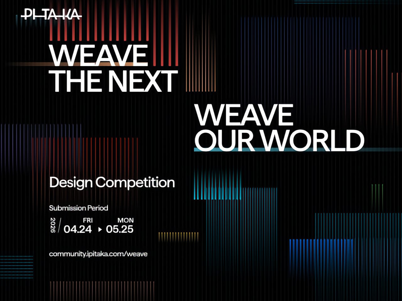
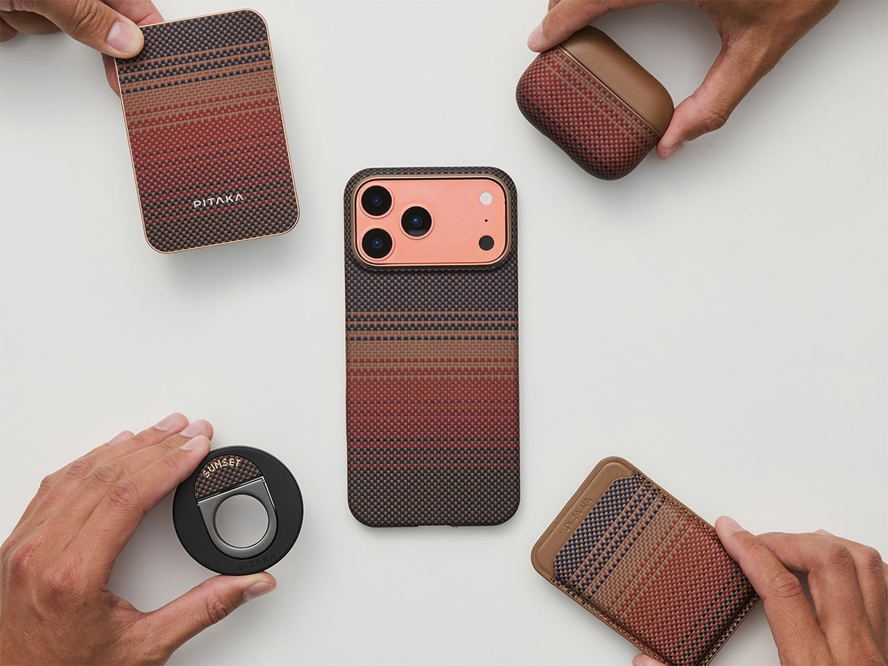
Tech accessories have hit a curious inflection point. The last year trained us to worship thinness and glass, but somewhere between the tenth identical ‘Air’ or ‘Edge’ smartphone and the fifteenth glossy case, a countermovement quietly took root. Texture matters again. Grip, weave, and tactile identity are no longer afterthoughts, they’re the differentiators that keep objects from sliding into the sea of sameness. PITAKA, a brand built on aerospace-grade aramid fiber and what it calls “fusion weaving,” has spent years proving that phones don’t have to feel like jewelry-store display pieces. Now, with the launch of “Weave the Next, Weave Our World,” the company is turning that philosophy outward, inviting designers worldwide to imagine the surfaces and visual languages that will define the next generation of tech we carry, hold, and interact with every day.
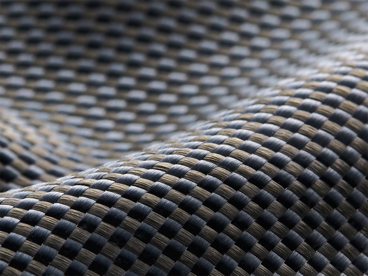
Launching April 24th, 2026, the competition is framed explicitly around the intersection of technology and art, which is less marketing speak and more PITAKA’s operational DNA. The brand’s cases have always leaned hard into material science, using woven aramid fibers (the same stuff in bulletproof vests and aircraft components) that are five times stronger than steel and a fraction of the weight. But strength alone doesn’t sell. What makes PITAKA cases notable is the texture vocabulary they’ve developed over years of refining weave patterns, experimenting with 600D and 1500D aramid densities, and pushing techniques like “fusion weaving,” where multiple patterns coexist on a single loom to create intricate, layered surface designs. “Weave the Next, Weave Our World” extends that exploration beyond the company’s internal design studio and into the hands of students, professionals, and independent creators who might see texture, pattern, and tactility from entirely different cultural or aesthetic starting points.
Click Here to Submit Now. Hurry, Competition Ends: May 25, 2026.
The Brief
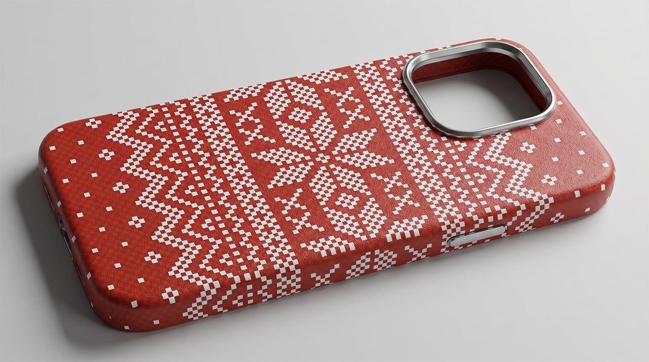
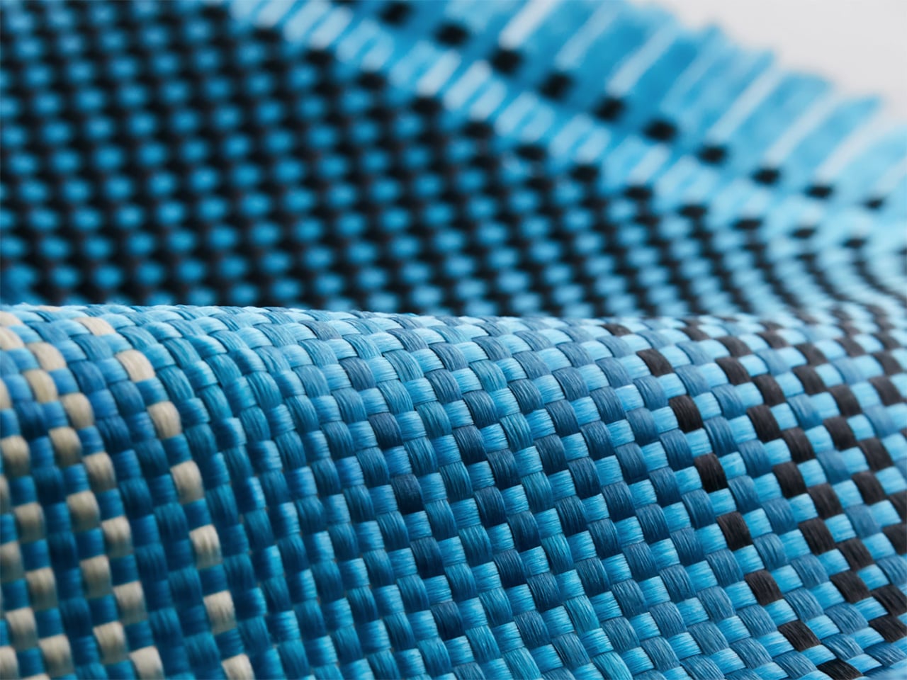
Nordic Knit Dream
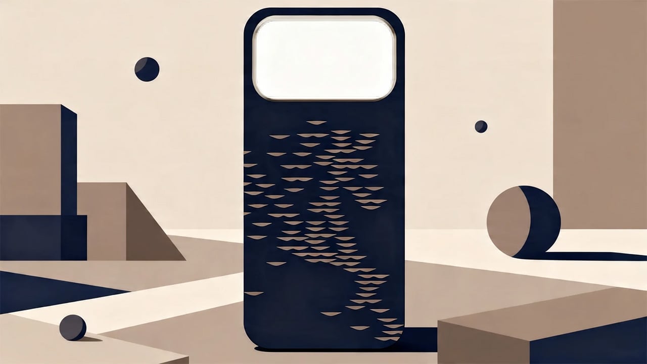
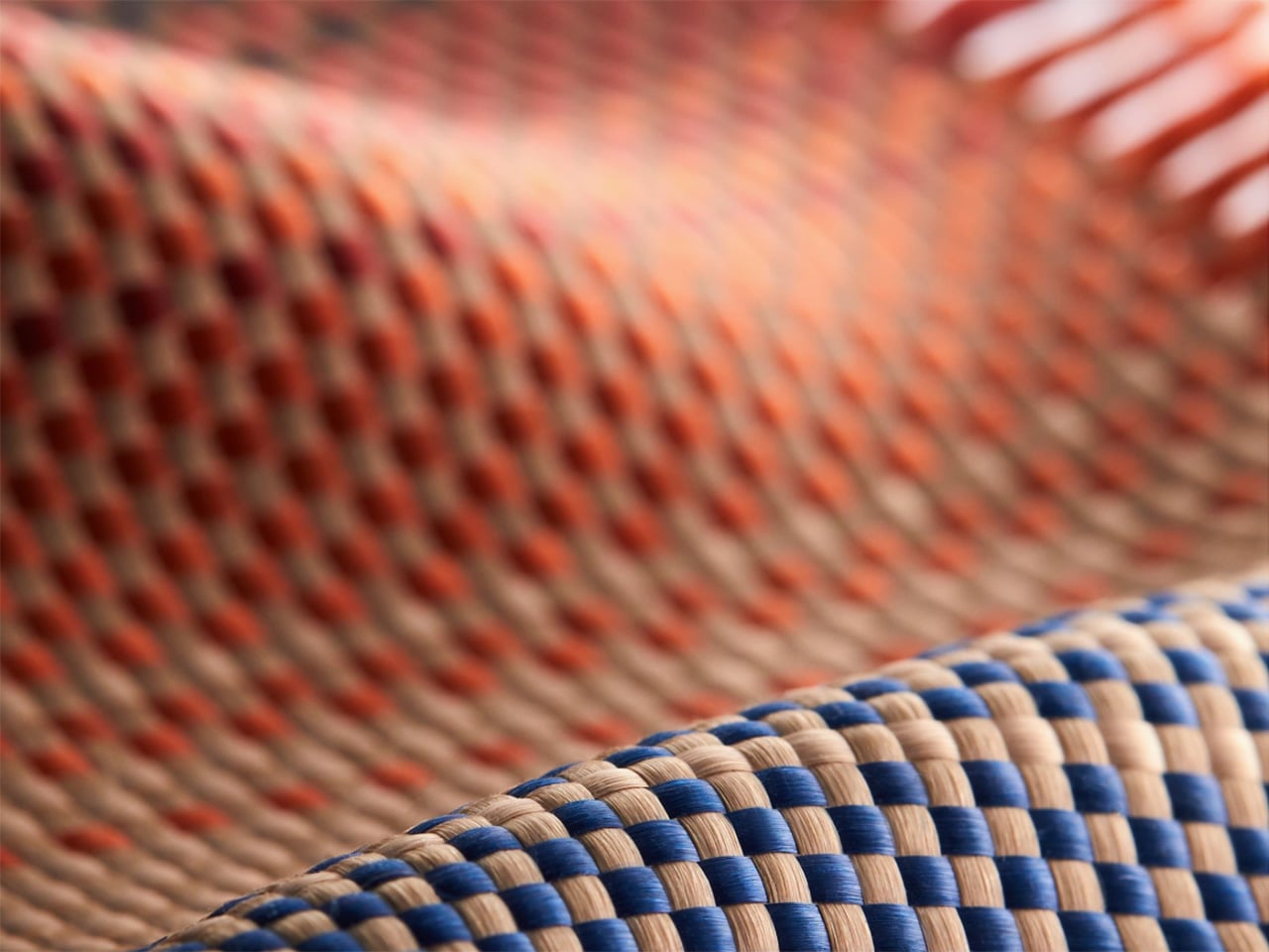
Drifting Shadows
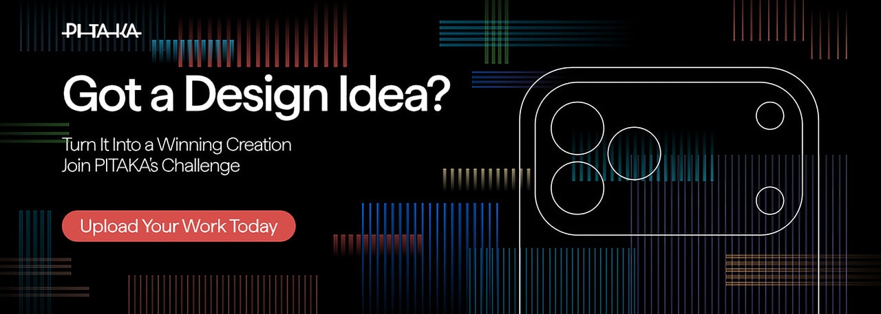
PITAKA’s “Weave the Next, Weave Our World” global design competition invites designers to create texture and visual language systems for the brand’s future product series, positioned explicitly at the intersection of technology and art. Participants choose from four thematic directions: “These Moments,” which captures the raw beauty and shifting rhythms of the natural world; “Timeless Threads,” weaving stories of culture, memory, and human journeys; “Beyond Tomorrow,” exploring visionary futures where innovation reshapes daily life; or “Roots of Rhythms,” celebrating the textures, symbols, and spirit born from each land’s heritage. The competition aims to explore emerging global trends in tactile and visual design, strengthen PITAKA’s art-tech identity, and potentially commercialize winning designs through royalties, co-branding, and official recognition.
How To Participate
- Visit the official competition website or Dribbble page to submit your entry
- Provide participant information and upload your texture designs
- Include a written design explanation with your submission
- Entries will be evaluated through a combination of professional jury review and public voting
- Winners will be announced and showcased in an online exhibition
Competition Dates
- Competition Launch: April 24, 2026
- Submission Period: April 24 – May 25, 2026
- Judging Period: May 26 – May 31, 2026
- Winners Announcement: June 9, 2026
Jury Panel
- Qiongzhi Xie (Artist; Founder of Daxing Jizi Studio)
- Matteo Menotto (Head of Design, Prints & Textile Accessories at Bulgari)
- Sarang Sheth (Editor-in-Chief, Yanko Design)
- James (Founder / CEO, PITAKA)
Important Information
The most compelling entries are likely to do three things at once:
- Treat texture as a system, not a single image
PITAKA’s products live across multiple form factors, so a strong entry will propose a visual/tactile system that can scale and adapt, not just a one-off pattern. - Anchor the concept in one of the four themes without being literal
“These Moments” does not need a photo-real print of a wave; “Roots of Rhythms” does not need a direct copy of a folk motif. Abstraction, distillation, and translation into a tech-accessory context will matter. - Consider manufacturability and user experience
Even in a speculative competition, the jury includes industrial design and brand leadership. Textures that look stunning in render but collapse in real material or feel uncomfortable in hand will likely be deprioritized.
If you already experiment with materials, parametric patterns, or culturally rooted visual systems, “Weave the Next, Weave Our World” is essentially an invitation to push that work into a space where it might actually ship.
Click Here to Submit Now. Hurry, Competition Ends: May 25, 2026.
Click Here to Submit Now. Hurry, Competition Ends: May 25, 2026.
The post PITAKA Is Letting the World Design Its Next Phone Cases, Royalties Included. Here’s How To Participate first appeared on Yanko Design.