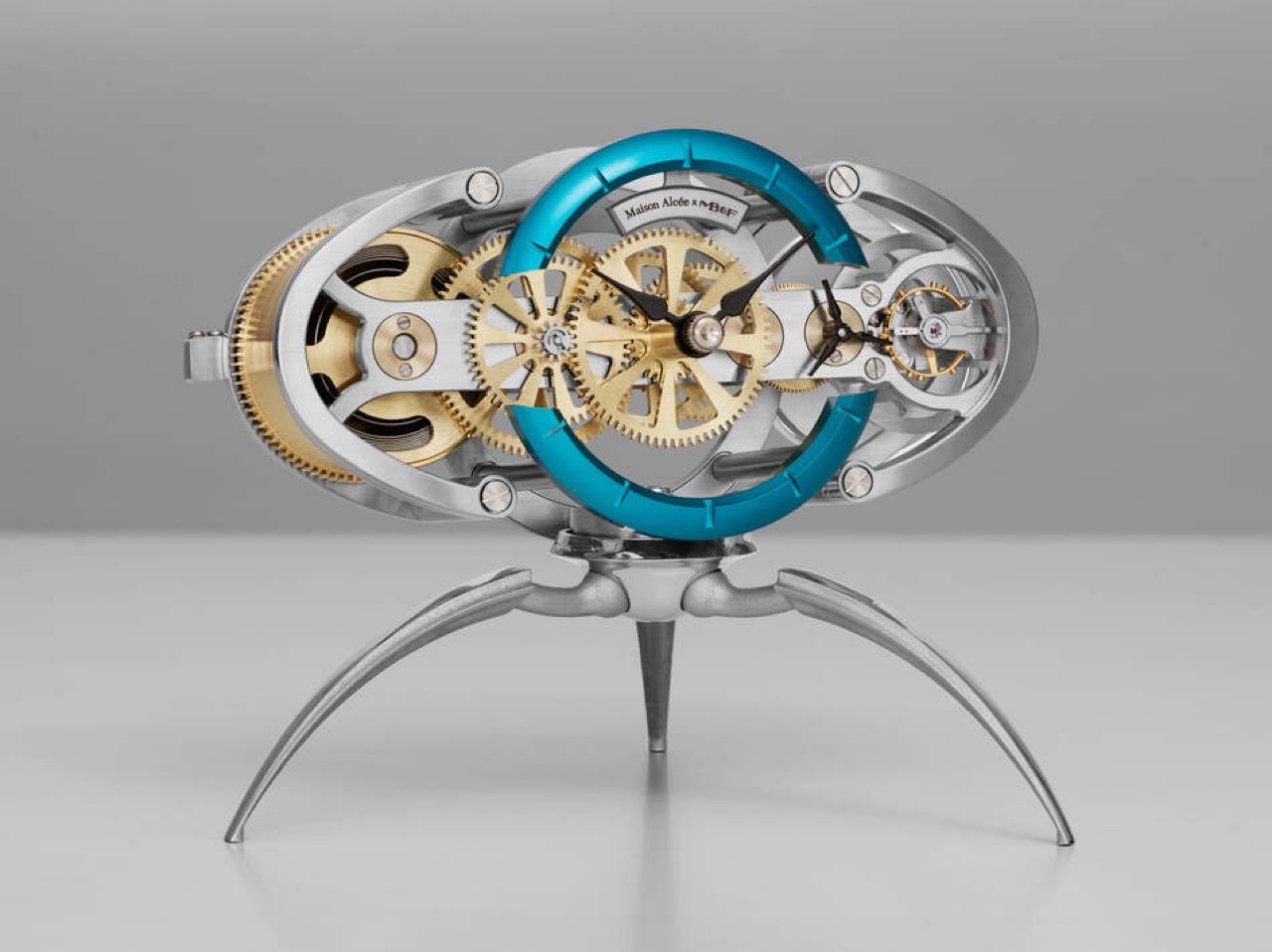
Ever wondered how gearboxes and torque work? MetMo’s latest EDC turns the physics into fidget fun

There is a piece by kinetic artist Arthur Ganson called Beholding the Big Bang, a gear train stretching over a meter long, where the final gear is embedded in solid concrete. With a motor running at one end, the reduction is geared down so severely that even with the first gear spinning at speed, it would take 13.7 billion years for the last gear to turn. Ganson built it as an art piece, a meditation on cosmic time. But buried inside that sculpture is an engineering principle so tactile and immediate that it feels almost criminal to lock it in a gallery. Gear reduction, in its raw form, is one of the most satisfying mechanical phenomena a person can interact with.

MetMo appears to have agreed with that assessment. The Brass Gear Train takes the same physics and compresses it into a palm-sized, hand-assembled object machined to aerospace tolerances in a UK workshop. The reduction ratio is 16,384:1, which means the top gear and the bottom gear are functionally living in different time zones. Every gear in the stack doubles the torque of the previous one. What reads on paper as an engineering spec feels, in practice, like a magic trick that happens to be fully explainable… and a treat for the eyes and hands.

Designers: Sean Sykes & James Whitfield (MetMo)

Click Here to Buy Now: $148.58.

The trick plays out immediately the moment you start turning the gears. Spin the topmost gear at a comfortable pace, and the lowest gears in the stack appear frozen, barely registering motion. The visual disconnect is mesmerizing because your brain knows they should be moving, but the reduction is so steep that a full rotation at the top translates to near-invisibility at the bottom. You can reverse the operation too, gripping the lower gears and turning them while the top spins wildly out of control, the torque climbing exponentially as you work your way down the train. The interaction is simple enough for anyone to understand within seconds, but satisfying enough that most people who pick it up will keep spinning it for several minutes straight. If you are someone who thinks while touching things, who solves problems by turning objects over in your hands, or who just appreciates when engineering reveals itself rather than hiding behind a housing, this is built for exactly that impulse.

Each gear in the stack doubles the torque input from the gear above it, which means by the time you reach the bottom of the train, your effort has been multiplied 16,384 times over. Turning the first gear feels effortless, barely any resistance. Move down one level and there is a slight increase in drag. By the third or fourth gear, you start feeling real resistance. By the sixth gear, most people will struggle to turn it with just their fingers. The lower you go, the more mechanical advantage you are fighting against, and the feedback is immediate, visceral, and surprisingly addictive. It turns an abstract engineering principle into a tangible workout for your hand, and the challenge of working your way down the entire gear stack becomes a desk-toy dare that most visitors cannot resist attempting.

The gears are precision CNC-machined from solid brass, chosen specifically to echo the clockwork mechanisms of old. The warm metallic tone, the weight distribution, and the smooth meshing of teeth all call back to antique engineering, when gears were visible, celebrated, and built to outlast their makers. The gears sit on a hard anodized aluminum base, which serves a dual purpose: it provides a low center of gravity that makes the object comfortable to hold, and the hard anodizing prevents corrosion, ensuring the base stays flawless even after years of desk duty. The Gear Train comes with a pin that holds everything in place – taking the pin out lets you fidget with the gear’s movement. When you’re done testing the laws of physics, you can slide a pin back through the gears, locking them in place so they don’t shift around in your pocket and accidentally snag your earphone cable.

The only way to reinsert the pin is to rotate the gears back into perfect alignment, a 16,384-revolution journey where all the holes must line up simultaneously. It is planetary alignment in miniature, a needle threading that requires patience, memory, or just a willingness to turn the stack slowly until everything clicks into place. Some users will treat this as a one-time puzzle, solving it once and leaving the pin in. Others will pull it out deliberately, turning the Gear Train into an ongoing fidget challenge that resets itself every time.

Every component is machined by Metmo in their UK workshop, running solid metal stock through CNC mills to the same tolerances used in aerospace engineering. There are no mass-manufactured parts anywhere in the assembly. Each gear is hand-finished, with edges smoothed to perfection so there are no sharp bits, no rough patches, nothing that interrupts the tactile pleasure of turning the stack over in your hands. The gears mesh perfectly, tight enough to eliminate backlash but smooth enough that the motion feels like silk. When the product page says the gears fit together like a Swiss watch, that is not marketing poetry, it is an accurate description of what you feel when you spin them.

MetMo built this object to live on a desk, and the visual presence reflects that intent. The stacked brass gears catch light beautifully, the gear-tooth profiles creating a repeating pattern that reads as both mechanical and decorative. The weight feels substantial without being cumbersome, and the passivated brass doesn’t patina like regular brass does, ensuring your gear-train looks shiny and precise even after years. People walking past will stop and ask what it is, which gives you the opportunity to demonstrate the reduction ratio in real time, and most onlookers will immediately want to try it themselves. It functions as a conversation piece, an engineering demo, and a desk sculpture simultaneously, occupying the same category as premium perpetual motion toys or kinetic sand timers, objects that justify their presence through sheer fascination rather than utility. For designers, engineers, makers, or anyone whose workspace doubles as a place to think, this belongs within arm’s reach.

The Brass Gear Train is available in two material configurations. The brass version featured here uses solid brass gears with a hard anodized aluminum base, delivering that warm, vintage-clockwork aesthetic MetMo designed it around. There is also a stainless steel variant, which trades the brass warmth for a more industrial, corrosion-resistant finish with a heavier feel in hand. Both versions are hand-assembled, both carry the same 16,384:1 reduction ratio, and both come with the removable alignment pin for puzzle play. MetMo backs both configurations with a 200-year guarantee, the same confident warranty they extend across their entire product line, a statement that this object was built to outlast you, your desk, and probably your great-grandchildren.

The MetMo Brass Gear Train is priced at £99 GBP (approx $149 USD) and ships directly from MetMo’s UK workshop. For those interested in the stainless steel version, pricing and availability can be found on the MetMo website. Both versions qualify for free shipping on orders over £200.

Click Here to Buy Now: $148.58.

The post Ever wondered how gearboxes and torque work? MetMo’s latest EDC turns the physics into fidget fun first appeared on Yanko Design.

Galaxy Z Fold 8: July 22 date confirmed, S Pen returns

Samsung has spent years pushing the Galaxy Z Fold toward a cleaner, slimmer silhouette, treating thinness like the ultimate expression of foldable progress. That approach gave the Fold 7 a sharper visual identity, but it also stripped away one of the features that helped define the device as a serious productivity tool. Now, with the Galaxy Z Fold 8 expected to bring back S Pen support, Samsung seems ready to revisit the balance between elegance and utility.

That shift could make the Fold 8 one of the most revealing foldables the company has made yet. A fractionally thicker body may sound minor on paper, yet in design terms it signals a broader change in priorities. The next Fold may show that maturity in foldable design comes from restoring capability, refining ergonomics, and building a device people want to live with every day.

Designer: Samsung

The Fold 7 was a genuinely impressive piece of engineering, arriving at 4.2mm when unfolded and claiming the title of the thinnest book-style foldable on the market at the time. That number made headlines and performed well in comparison videos. What it cost, though, was the S Pen digitizer layer, a piece of hardware Samsung had to physically remove to achieve that profile. For users who bought into the Fold precisely because of its large-screen, stylus-ready workflow, that tradeoff landed hard.

The S Pen on earlier Galaxy Z Fold devices was never a casual accessory. It turned the inner display into a note-taking canvas, a sketching board, and a precision annotation tool, especially useful for professionals bouncing between documents and apps on the go. Removing it reduced the Fold 7 to a premium hardware story without the software depth to back it up for power users. Thinner, yes. More complete, arguably not.

What makes the lead-up to July 22 particularly interesting is how complicated the S Pen picture has become. According to multiple leaked spec sheets and tipster reports, the standard Galaxy Z Fold 8 and the new Fold 8 Wide variant may both launch without S Pen support, with Samsung reportedly continuing its thinness-first approach for those models. The standard Fold 8 could come in at 4.1mm unfolded, the Wide at an even leaner 3.9mm (pre-empting Apple’s own wide iPhone Ultra), numbers that suggest Samsung has no intention of walking back the Fold 7 philosophy across the board. The S Pen story, if it holds, belongs to a third model entirely. A Fold 8 Ultra appears to be where Samsung is routing the stylus comeback, alongside a wider display orientation and a 5,000mAh battery that would represent the first meaningful capacity upgrade for the Fold line since the Fold 3.

The Fold 7 used a titanium backplate, a strong and lightweight choice that also happens to be poorly suited to the digitizer layer S Pen functionality requires. Reports have suggested Samsung may shift the Fold 8 Ultra to a combination of titanium and carbon fiber reinforced plastic, a material used in earlier Fold models that works far more naturally with stylus hardware. The material choice, in other words, may be less about aesthetics and more about what the device is structurally allowed to do.

Samsung is also reportedly researching a digitizer-free stylus solution that would remove the hardware dependency altogether, potentially allowing S Pen-style input on ultra-thin builds in future generations. That research, if it eventually ships in a product, would be one of the more significant industrial design developments in the foldable category, because it decouples a core productivity feature from physical bulk entirely.

What Samsung appears to be attempting with the Fold 8 lineup is something more architecturally ambitious than a single model update. A tiered approach, with the standard Fold chasing thinness, the Wide offering a tablet-like aspect ratio, and the Ultra absorbing the S Pen and flagship camera system, is a bet that different foldable buyers want fundamentally different things from the same category. Whether that structure serves users better than one well-resolved device is a question worth raising, because fragmentation across three models can dilute the identity of each one. Ask Apple how they felt about launching 3 iPhone SKUs in the same September launch. Rumor has it Ternus is changing that, and only announcing the Pro iPhones this September.

Still, the design direction Samsung is pointing toward with the Ultra is the more honest one. A foldable that accepts a few extra millimeters in exchange for a stylus, a bigger battery, and a wider display is a device making peace with what the form factor actually needs to be useful. Thinness is a compelling engineering goal. Usability is a more durable design ambition, and the Fold 8 Ultra, if the leaks hold, may finally be the version of this phone that stops apologizing for being a productivity tool.

The July 22 Unpacked event in London will confirm how much of this actually ships. But the shape of what Samsung is building already says something worth paying attention to.

The post Galaxy Z Fold 8: July 22 date confirmed, S Pen returns first appeared on Yanko Design.

A LEGO Fan Recreated Gustav Klimt’s Iconic Artwork ‘The Kiss,’ Gold Studs and All

At the start of the twentieth century, a group of Austrian artists got tired of the stuffy academic painting establishment in Vienna and broke away to form their own movement. They called it the Secession, and their unofficial leader was Gustav Klimt, a man with a gold fixation and a habit of scandalizing polite society with erotically charged, symbol-heavy paintings. The Kiss, finished in 1908, became the movement’s defining image, a couple locked in an embrace inside a cocoon of gold ornament.

More than a century later, that same image has found an unlikely new medium. Builder CYM-Create_Your_Mind has translated Klimt’s masterpiece into a LEGO mosaic spanning 44 by 44 stud compartments, deliberately built as a perfect square to honor the artist’s own preference for square canvases, right down to a detachable minifigure of Klimt himself sitting in a chair beside the piece.

Designer: CYM-Create_Your_Mind

Klimt painted most of his major works on square canvases, a stubborn formal choice that gave his compositions a strange, almost claustrophobic intimacy. The original Kiss measures 180 by 180 centimeters, and CYM-Create_Your_Mind has mirrored that exact ratio in brick form, using pearl gold pieces across the entire background to chase the effect of real gold leaf, since Klimt was known widely enough as the Painter of Gold that his contemporaries used the nickname as a compliment and an accusation in equal measure. Getting that shimmer right in LEGO, a material with all the metallic subtlety of a cereal box, is a genuinely tricky bit of engineering, and the built up layers of gold tiles and plates manage to catch light in a way flat mosaics usually cannot.

The figures share an uncanny similarity, which is rare considering LEGO tends to abstract details – here the details really aren’t lost as much as they’ve been caricatured in brick. The man’s robe is rendered in a strict, angular pattern of black rectangles, while the woman’s dress dissolves into circles and floral bursts, a distinction Klimt used deliberately to separate masculine and feminine visual language within the same golden shroud. Around 2,850 pieces went into achieving that contrast, and the level of facial detail, from the woman’s tilted head to the man’s mostly hidden profile, holds up remarkably well at mosaic resolution, which is where most brick portraits tend to fall apart into mush. My favorite touch is the tiny tile bearing a copy of Klimt’s actual signature, tucked quietly beside the figures the way it appears in the original painting, a small detail that turns a tribute into something closer to a facsimile.

CYM-Create_Your_Mind added a separate, removable minifigure of Klimt himself, seated in a chair beside his own creation. The reasoning, as the designer explains it, comes from an image of the painter sitting quietly in his studio, a symbolic gesture toward an artist who was famously private and rarely photographed working. It is a small addition that adds a layer of narrative to what could have otherwise been a straightforward wall piece.

The project is currently sitting at 759 supporters on LEGO Ideas, with 527 days left on the clock to reach the 5,000 needed to trigger an official review. Klimt fans, art history nerds, and anyone who has ever walked past a poster print of this painting in a dorm room hallway without really looking at it now have a good excuse to look twice. You can head to the LEGO Ideas page and cast your vote.

The post A LEGO Fan Recreated Gustav Klimt’s Iconic Artwork ‘The Kiss,’ Gold Studs and All first appeared on Yanko Design.

Lenovo Fit a 16GB Intel Lunar Lake PC Into the Size of a Coffee Table Book

Here’s a business plan Lenovo isn’t charging me for. Take the ThinkCentre Neo 50q Gen 6, wrap it in a fake hardcover dust jacket, maybe something moody like a Wes Anderson film still or a Rothko print, and suddenly you’ve got a Windows PC that looks like Design Within Reach decor instead of IT department surplus. The dimensions practically beg for it already, a 7 by 7 inch footprint with the thickness of an actual coffee table book sitting on your shelf. Nobody’s ever accused a mini PC of being aspirational furniture before, but this one has the bone structure for it. Every competitor in this category is still shipping matte black rectangles that scream “asset tag pending,” while Lenovo accidentally built something you’d want visible on a shelf. All that’s missing is the marketing team connecting the dots.

Underneath the cosplay, the Neo 50q Gen 6 (Intel) starts at $1,179 with a Core Ultra 5 226V, 16GB of soldered LPDDR5X-8533 RAM, and a 512GB SSD, replacing the Snapdragon X1-26-100 that powered the previous version of this exact chassis. That base chip brings 8 cores, clock speeds up to 4.5 GHz, a 40 TOPS NPU for local AI tasks, and Intel Arc 130V graphics, which is a lot of silicon to hide behind a fake book cover. Stepping up to the Core Ultra 7 256V for $1,619 doubles storage to 1TB and adds a faster NPU with Arc 140V graphics. Ports hold steady across both configurations, including a 10Gbps USB-C port, Wi-Fi 6, Bluetooth 5.1, HDMI 2.1, DisplayPort 1.4, and Gigabit Ethernet. At 5.27 lbs, this thing has actual heft to it, further selling the illusion that you’ve got a hardback sitting there instead of a full Windows desktop.

Designer: Lenovo

Swapping Snapdragon for Lunar Lake says something about how the ARM-on-Windows experiment is actually going. Qualcomm’s chip inside the original Neo 50q promised efficiency and always-on connectivity, the same pitch Microsoft has been making since Windows on ARM first launched. Lenovo clearly wanted an Intel option sitting right next to it on the shelf rather than retiring the ARM version outright, which suggests demand for x86 compatibility hasn’t disappeared just because Copilot+ PCs got a marketing push. Lunar Lake specifically brings a 40 TOPS NPU into a category that rarely got AI acceleration until recently, putting a genuinely modern chip inside a chassis that hasn’t changed its footprint at all. That’s the quiet story buried under the spec sheet, a company hedging its bets on which architecture actually wins the office desktop in 2026.

Positioned against the rest of the mini PC market, the pricing lands in a strange middle ground. Intel NUC successors and Beelink boxes routinely undercut this by a few hundred dollars while offering comparable specs, though usually without Lenovo’s enterprise support and warranty backing. Mac mini buyers get more raw performance per dollar from Apple silicon, but obviously lose Windows compatibility entirely, which matters for any office still running legacy software. The ThinkCentre badge itself carries weight here too, since IT departments buying in bulk care more about fleet management and driver support than they do about a machine’s coffee table book cosplay. Lenovo isn’t trying to win on raw value against the Beelinks of the world. It’s selling reliability with a side of, apparently, unintentional interior design cred.

Whether Lenovo ever leans into the aesthetic angle on purpose remains the real open question here. Right now the ThinkCentre Neo 50q Gen 6 is being sold purely on specs and price, with nobody at Lenovo seemingly aware that they’ve built something small and handsome enough to just leave out in the open. Somebody in an office is going to genuinely mistake this for a book at some point, and honestly, that’s a better problem to have than another beige box nobody wants to look at. Until Lenovo catches on, you’ll just have to buy the sleeve yourself.

The post Lenovo Fit a 16GB Intel Lunar Lake PC Into the Size of a Coffee Table Book first appeared on Yanko Design.

I’m tired of ugly chargers, this concrete and wood 25W Qi2 charger looks gorgeously sculptural

Concrete and hardwood have no business being inside a wireless charger. Those are architecture materials, furniture materials, the kind of surfaces you find on kitchen countertops and mid-century shelving units. Accessories that typically live behind a cable tangle rarely get anywhere near them. Modhaus seems to have found that contradiction interesting enough to build a product around it. The result is Upright, a 25W Qi2.2 charging stand reimagined as an architectural object, with a triangular cast-concrete base, a solid hardwood face, and a silhouette that looks more at home on a designer’s desk than in a tech drawer.

Weighing in at over 600 grams, Upright sits heavy enough that one-handed docking and undocking require no steadying hand, preventing the stand from lifting off the table when a phone is pulled free, which is a deceptively simple design win most chargers miss. The charging pad is soft-touch to protect bare phones, and the bottom of the base is lined with a soft bumper to protect the surface it sits on. Paired with a 30W charging adapter, a compatible device can go from 0 to 50% in about 30 minutes. Six finishes across three wood tones and two concrete colorways means it works with any home aesthetic.

Designer: Aaron von Kreisler (Founder & Designer, Modhaus)

Click Here to Buy Now: $78 $98 (20% off). Hurry, only 184/300 left! Raised over $63,000.

The form is a tapered pyramid, deliberately proportioned and weighted at the base so that docking a phone feels more like setting a book on a nightstand than fumbling with a cable. Upright holds the phone at a 30-degree viewing angle, keeping the screen readable for Face ID, FaceTime, and standby while it charges, and crafted to blend effortless, one-handed docking into your daily routine across your desk, nightstand, or living space. It is a small ergonomic detail, but it meaningfully changes the relationship between the stand and the room it sits in, turning the charging process into something closer to a display mode. The physical dimensions land at 4.9 inches tall and 3 inches wide, compact enough to fit a nightstand without dominating it.

Spend any time with the product imagery and the material palette becomes the dominant story. Upright is crafted from premium natural materials that are both beautiful and durable, specifically solid hardwood and hand-cast concrete, chosen for their weight, presence, and organic aesthetic. The top section is available in Walnut, Oak, or Black-Stained Oak, and the wood carries a clear, matte finish that preserves its natural grain, with no two pieces looking exactly alike. Walnut and Oak are finished in their natural unstained color, meaning the wood you see is the wood you get, with natural variation between units giving Upright a handcrafted quality that is difficult to find in consumer electronics at this price level.

At up to 25W, Upright charges significantly faster than most wireless chargers, which typically top out at 7.5 to 15W. Modhaus positions it as roughly three times faster than a typical stand. That performance runs through Qi2.2 and MagSafe compatibility, which handles magnetic alignment automatically, snapping the phone into position without manual repositioning. Reaching the full 25W output requires a 30W or higher USB-C power adapter, which is sold separately; the package ships with a 2-meter nylon braided USB-C cable included in the box.

Upright works with any MagSafe-compatible iPhone from the iPhone 12 onward, and any Qi-enabled Android device with a MagSafe-compatible case, with case compatibility extending to those 3mm thick or less. That brings in Samsung Galaxy S24, S25, and S26 users as well as Google Pixel owners, among others. Apple AirPods with a MagSafe case are also supported, and an elevated charging puck design accounts for different camera bump profiles across device generations.

Each Upright is built with high-quality materials that are meant to be timeless and long-lasting, and it is built around the fastest wireless charging standard currently available, meaning it will stay fast and relevant as more devices adopt higher wireless charging speeds in the years to come. Modhaus is a small design studio founded by Aaron von Kreisler to live at the intersection of technology and interior design, bringing natural materials and thoughtful design to the everyday, often overlooked tech in the home, starting with the phone charger, and Upright is the clearest expression of that brief so far.

Upright carries an MSRP of $98 and ships to the US, Canada, the UK, and the EU. The six colorways pair Stone or Charcoal concrete bases with Walnut, Oak, or Black-Stained Oak hardwood tops, with an optional 45W charging adapter available as an add-on for US buyers. Modhaus backs each unit with a 2-year limited manufacturer’s warranty covering defects in materials, manufacturing, and workmanship under normal use.

Click Here to Buy Now: $78 $98 (20% off). Hurry, only 183/300 left! Raised over $63,000.

The post I’m tired of ugly chargers, this concrete and wood 25W Qi2 charger looks gorgeously sculptural first appeared on Yanko Design.

Insta360 X6 Leak Reveals a Shorter, Stockier Body, and I Have Battery Concerns

The internet has spent actual years begging for a mini smartphone. Compact flagships, tiny bezels, something that fits in a single palm without needing a spreadsheet to justify the screen size. Samsung teased it, forums campaigned for it, and every rumor cycle ends the same way, with a phone that somehow got taller instead of smaller. Insta360 looked at all that unmet demand and, whether on purpose or by accident, decided to answer it in the one product category nobody was petitioning about. Their upcoming X6 leaked this week, and the headline isn’t just the spec bump, it’s the shape. Shorter. Stockier. A real departure from the elongated body the X series has worn since the X3.

Roland Quandt of WinFuture broke the story, spotting the camera listed early at a retailer alongside official marketing images that confirm the redesign in full. The X6 keeps the dual fisheye lens setup on front and back for capturing 360 degree footage, along with the small side mounted display that’s handled preview and settings duties since earlier generations. What’s changed is everything around that formula. Performance climbs to 8K at 50 frames per second in full 360 mode, up from the X5’s 30fps ceiling. Pricing leaks put the base model at 689 euros, with an Essentials Bundle running 789 euros. No official launch date has surfaced yet, though a retail listing at this stage usually means an announcement isn’t far behind.

Designer: Insta360

Nobody asked Insta360 for a smaller camera specifically, but the timing scratches an oddly similar itch to the mini phone conversation. We wanted small and premium in our pockets, they’re apparently delivering small and spherical instead, and the resemblance to a standard action cam silhouette is doing a lot of the visual work here. Gone is the candy bar proportions that made the X5 and X3 instantly recognizable from across a gear bag. In its place sits something that could plausibly be mistaken for a GoPro at a glance, at least until you clock the second lens staring back at you from the rear.

That shrink isn’t free – the X5’s battery wasn’t tucked into a corner somewhere convenient, it ran along nearly the entire length of that longer chassis, functioning almost like a structural spine as much as a power source. Compress the spine and you’re left with a real engineering decision to make. Either the cell itself shrank, sacrificing some runtime in the process, or Insta360 found a differently shaped battery that fits the new footprint without giving up capacity, or there’s some internal repackaging happening that redistributes components in ways this product line hasn’t tried before.

None of this has been confirmed yet, and that’s precisely the fun part of covering a leak this early. The images give us the exterior story clearly enough, right down to the reshaped corners on that side display and a button layout that looks reorganized to fit the tighter shell. What they don’t give us is a teardown, a battery spec sheet, or any hint of how Insta360 is managing thermals for a higher frame rate inside a smaller volume. Cramming more compute into less space usually means better heat engineering somewhere, or a compromise the company hasn’t disclosed. We’ll be watching for the official reveal, because this is the kind of redesign that deserves receipts, not just render leaks.

The post Insta360 X6 Leak Reveals a Shorter, Stockier Body, and I Have Battery Concerns first appeared on Yanko Design.

Polestar’s Sudden U.S. Exit Reveals the Hidden Risk of Buying a Connected Car

Somewhere in Washington state, a man named D.L. Byron recently bought a certified pre-owned Polestar 2. He did what most careful buyers do, researched the brand, appreciated the Scandinavian design, weighed the range and the reputation, and made a considered decision. Then, within days of that purchase, Polestar announced it would stop selling new vehicles in the United States from the 2027 model year onward, after the U.S. Department of Commerce denied the Swedish automaker authorization under the Connected Vehicle Rule. Byron’s reaction, reported by The Verge, was immediate and unambiguous. “It feels like we’re the ones left holding the bag, with no compensation for the sudden loss in market value on cars we just bought or leased.”

What Byron experienced is becoming the defining anxiety of the connected-car era. A modern EV purchase comes bundled with software ecosystems, service networks, regulatory standing, and brand-dependent resale value, all of which can shift dramatically on a government decision, a quarterly earnings report, or a geopolitical pressure point that the buyer had no awareness of on signing day. The car itself may run perfectly fine for years. The broader infrastructure that gives it value, the OTA updates, the service continuity, the dealer footprint, and the market confidence of potential used-car buyers, operates on forces that have very little to do with how capable the vehicle actually is. Polestar owners in the U.S. are learning this the hard way, watching resale anxiety arrive before the service network has missed a single appointment, and the lesson extends well beyond this brand and this moment.

The Connected Vehicle Rule, finalized by the Department of Commerce’s Bureau of Industry and Security, targets vehicles with a “sufficient nexus” to China or Russia, covering telematics, cameras, GPS, Bluetooth, cellular modules, and automated driving systems. The software restrictions kick in at model year 2027 with hardware restrictions following in 2030. Polestar’s problem was never where its cars were built. The Polestar 3 is assembled in South Carolina alongside Volvos from the same Zhejiang Geely Holding Group, yet local manufacturing provided no shield from the authorization denial. The rule targets ownership structure and software entanglement, and Polestar’s Geely-majority ownership, combined with its reliance on the Geely ecosystem, gave the Bureau its grounds. Volvo, operating as a separately listed entity with a decoupled software stack and a more established U.S. footprint, secured a waiver. Polestar did not.

Polestar CEO Michael Lohscheller positioned the retreat as forward strategy, noting that Europe accounts for the largest share of the brand’s sales, and the company’s messaging on owner support has been consistent: warranties honored, existing Polestar 2, 3, and 4 owners continuing to receive service, and remaining Polestar 3 and 4 inventory sold at an aggressive discount until stock runs out. The brand had warned as early as 2024 that the Connected Vehicle Rule could effectively block its U.S. sales, yet when the formal exit became official, it still landed hard for buyers who had only just signed their paperwork. Matthew Haiken, owner of Polestar Short Hills in New Jersey, captured the dealer position precisely: “At this point, I have to trust that Polestar will honor its warranty and service commitments. We deserve better. This is the first time that anyone has said, ‘Hey, this is not us. It’s outside our control. It’s the government.’ So we’re left very vulnerable.” The warranty is still valid on paper. Whether the used-car market reads the situation as generously is a separate question, and used-car buyers are rarely sentimental.

Buying a connected car in 2026 without evaluating the brand’s regulatory standing, software continuity, and commercial presence in your market is a gap that Polestar owners are now navigating in real time. Fisker’s collapse last year was the more total and immediate version of this lesson, and while Polestar’s situation is structurally different, the emotional experience for current owners is uncomfortably familiar. The Polestar 2, 3, and 4 are genuinely well-designed vehicles that many owners will hold onto for exactly that reason. But resale value is a market sentiment measure, and market sentiment on a brand that has exited your market corrects fast and waits for no one. Polestar’s predicament makes the broader case: every connected-car buyer should be stress-testing the brand’s software stack, regulatory profile, service infrastructure, and long-term commercial standing before they sign, and those variables matter as much as the range figure on the window sticker.

The post Polestar’s Sudden U.S. Exit Reveals the Hidden Risk of Buying a Connected Car first appeared on Yanko Design.

This Kia PV5 Modular Camper Kit Disappears Completely When the Weekend Is Over

Camper conversions usually leave a mark. Cabinets get bolted in, headroom gets swallowed by a pop top roof, and the donor vehicle spends the rest of its life looking and feeling like a camper even when it is just running errands. Dutch outfit Vantrack decided that trade off did not have to be permanent, at least not for the Kia PV5 Passenger. Its Lightcamp package turns the compact electric van into a four person mini camper on Friday and hands it back as a stock e-MPV on Monday, with almost nothing left behind to prove the transformation happened.

The trick lies in how little of the kit actually stays attached. A slide out kitchen, an inflatable sleeping platform, and a rooftop tent all come off in minutes, leaving only a fixed skylight as evidence anything changed. Vantrack plans to reveal the production version in September at the Netherlands’ Camper Trade Fair, with complete conversions starting around €65,000 based on the PV5 Passenger Essential trim.

Designer: Vantrack

The exterior graphics set the tone before you even open a door. Large, neat lettering spells out “LC LightCamp” along the flank, paired with a stark X logo that reads more like a Scandinavian furniture brand than a typical outdoor equipment maker. That restraint suits the PV5 itself, a van whose crisp panel lines and boxy proportions already look like they were drawn with a ruler. The single splash of orange canvas on the roof, visible from a drone shot as clearly as from the ground, keeps the whole package from feeling clinical. It is minimalism doing actual work, not just decoration for a trade show floor.

Vantrack’s real party trick sits at the tailgate. Instead of the thick, stacked foam mattress that most camper kits rely on, Lightcamp uses a slim pull out bed platform paired with two Exped Luxemat inflatable sleeping pads, each one rolling down to about 26 x 8 inches for storage underneath the platform itself. That frees up cargo space for gear rather than burying it under bedding. Below that platform rides the kitchen module, a compact unit with an induction cooktop, a bamboo cutting board, a small sink, and a Dometic Go faucet drawing from an 11-liter water canister. Slide it out on its own folding legs and it works as either a tailgate galley or a standalone cook station away from the van entirely.

Rather than fitting a heavy pop up roof, the company installed a fixed skylight that doubles as an access hatch into a rooftop tent it calls its Rooftop Architecture. The tent itself packs down small enough to sit on the rear of the roof rack, unfolding forward to create a two person sleeping area roughly 51 by 79 inches. That is lighter than a traditional pop top and, more importantly, it stays out of the way entirely when the tent gets pulled off for the off season. Vantrack has done similar rear cargo racks on its Volkswagen T6.1 builds, and Lightcamp borrows that same building block logic throughout.

None of this would matter much without a capable base vehicle underneath it. The PV5 Passenger’s Utility Mode lets owners tap the traction battery for climate control and V2L power while parked, running lights, a speaker, or a coffee maker without a separate leisure battery. Combined with a 256 mile WLTP range and 30 minute fast charging from 10 to 80 percent, the PV5 handles the drive to a campsite with more confidence than most dedicated camper vans manage on a full tank.

What makes Lightcamp worth watching is not any single component but the discipline behind leaving so much of it removable. Full pop top conversions commit an owner to a camper shaped life whether they are camping that week or not, while Vantrack’s kit lets the PV5 Passenger slide back into being an ordinary five seat van the moment the trip ends. Whether that modularity survives the jump from concept to the finished September reveal is the real question, but the underlying idea, that a camper should be something you deploy rather than something you permanently become, feels overdue.

The post This Kia PV5 Modular Camper Kit Disappears Completely When the Weekend Is Over first appeared on Yanko Design.
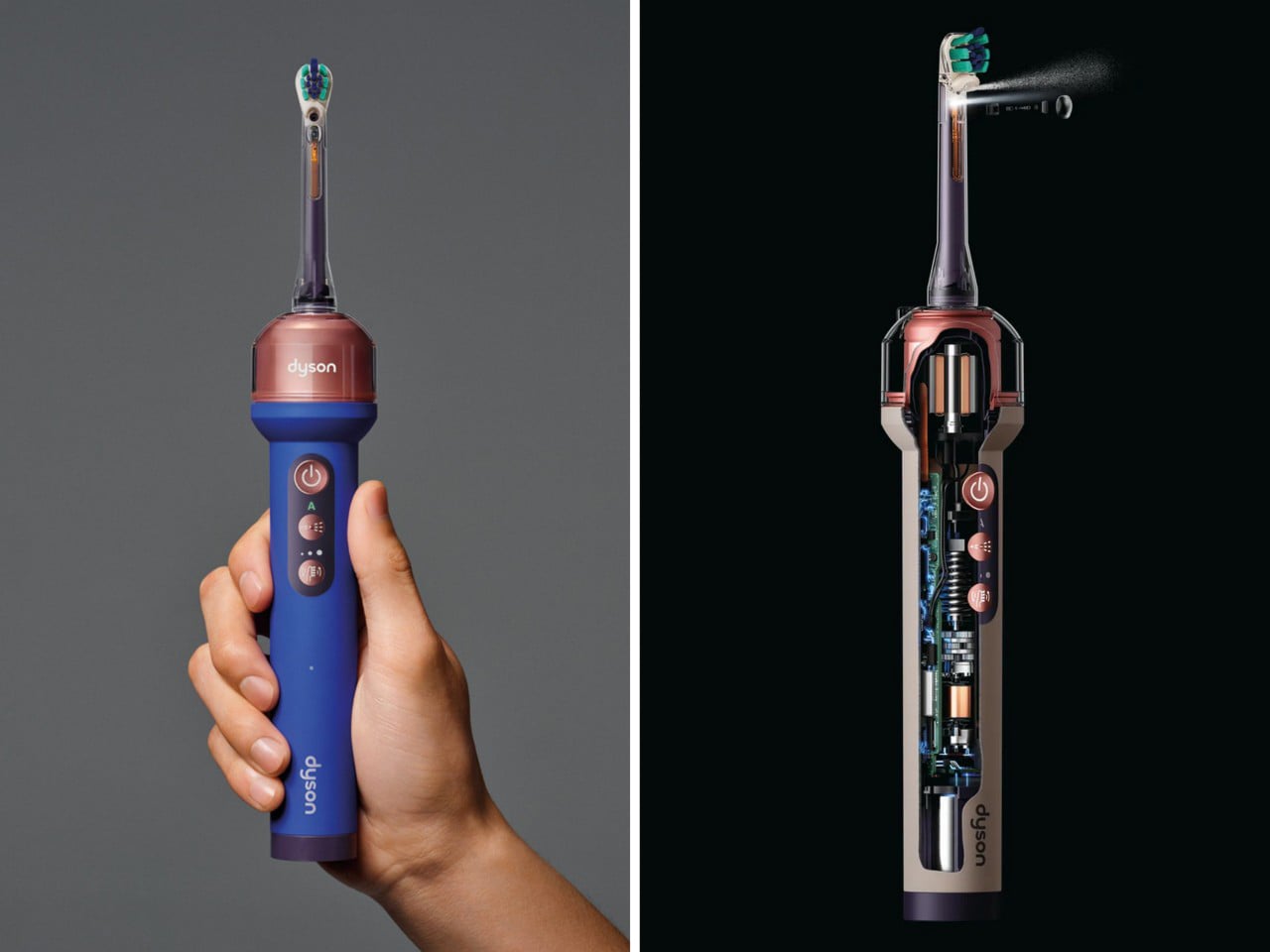
Beatbot Wants To Sell a Better Pool Experience, Not Just a Better Robot

At CES, the annual spectacle of technological progress, most companies come to show you a new feature. At CES 2026, Beatbot arrived to propose a new feeling. The introduction of its flagship AquaSense X system was deliberately paired with a full brand evolution, a signal that the company’s ambitions had scaled up. The hardware, with its advanced AI and automated cleaning station, was impressive, but it was also evidence for a much larger argument the brand was making about itself and its category.

That argument is centered on the idea of “perfecting pool living.” This is a deliberate shift in vocabulary, moving the conversation from mechanical chores to an elevated, frictionless lifestyle. The new identity, the award-winning industrial design, and the underlying software intelligence all work in service of this one goal. Beatbot is building a world where the owner’s relationship with their pool is defined by enjoyment and aesthetics, while the complex work of robotics recedes so far into the background it becomes ambient.

Designer: Beatbot

Click Here to Know More

Siler Wang, who spent over a decade in home robotics before founding Beatbot in 2022, identified the backyard pool as the category where the consumer had been most thoroughly failed by design. Pool equipment had evolved in increments, each generation marginally more efficient than the last, but the fundamental experience of ownership had remained unchanged: loud, fiddly, and thoroughly unglamorous. Wang’s bet was that a company structured around deep R&D, with over 500 patents and 70% of its team in engineering and product development, could build something the category had never seen, a premium tier where performance and aesthetic intention existed on equal footing.

Before – After

In the mid-1990s, computer scientists Mark Weiser and John Seely Brown at Xerox PARC coined the term “Calm Technology” to describe systems that serve human needs by retreating from consciousness rather than demanding it. The idea was counterintuitive in a tech industry built on features and interfaces: the best technology, they argued, moves between the periphery and center of attention only as needed, never more. Beatbot has adopted this as a foundational design principle, and applied to a pool robot, it is unusually coherent. The goal of a pool-cleaning system is precisely to make itself invisible. Success is measured by the owner forgetting it is there at all.

Beatbot AquaSense 2 Ultra

Beatbot’s AquaSense 2 Ultra, which won the iF Design Award 2025, takes its form cue from a turtle’s shell, a fluid, nature-inspired geometry that reduces water resistance while giving the device a visual lightness unusual in pool equipment. The AquaSense X, unveiled at CES 2026, extends this design language with smooth contours and clean lines, and pairs with the AstroRinse cleaning station, an automated dock that empties and rinses the robot’s filter without user intervention. The system cleans the pool; the station services the system. The owner does nothing except, as the brand puts it, enjoy.

Beatbot Sora 30 Robotic Pool Cleaner

Of course, any company can call itself design-driven. The real test is whether the professional design world agrees, and Beatbot has the receipts. Winning a single award can be a fluke; winning the prestigious iF Design Award in two consecutive years, first for the AquaSense 2 Ultra and then for the Sora 30 in 2026, suggests a consistent, embedded culture of design. When you add in recognition from Red Dot, a Platinum A’ Design Award, and a sweep of eight different press awards at CES 2026, the claim to design leadership starts to feel less like marketing and more like a statement of fact.

This brings us back to the timing of the rebrand. It was not an arbitrary refresh; it was a strategic signal. The new identity was unveiled just after Beatbot made a significant European push at IFA Berlin and as IDC forecasts show the pool robotics market is set for major growth. With a reported 85 percent share of the premium market segment, the rebrand acts as a unifying flag for a company that is moving from a successful product launch into a global brand proposition. It is a declaration that Beatbot is no longer just competing in the category; it intends to define it.

Click Here to Know More

The post Beatbot Wants To Sell a Better Pool Experience, Not Just a Better Robot first appeared on Yanko Design.

Self-Watering Origami Pot Expands With Your Plant So You Never Have to Repot in Panic Again

Nature never repots anything. A tree does not pause its growth every eighteen months so someone can slide it out of its current location, dust off the roots, and drop it into a bigger hole. Growth just happens, slowly and continuously, in whatever direction the soil and light and water allow. The concept of a container that limits that process and then demands human correction is, at its core, a workaround for a problem that outdoor plants never encounter. It is a constraint that indoor gardeners have simply accepted as part of the deal.

The Helix from POTR makes a case for reconsidering that acceptance. The pot uses a folding origami structure that can be expanded over time as the plant develops, growing from seed-stage dimensions into a full 2-liter planter. A built-in self-watering system handles moisture through capillary action, pulling from a reservoir in the base and letting the plant regulate its own intake. Paired with modular accessories for germination, propagation, and climbing support, it functions as a complete growing system inside a single sculptural object.

Designer: POTR

Click Here to Buy Now: $29 $39 (27% off). Hurry, only a few left! Raised over $96,000.

If you have ever delayed repotting because the plant looked too young, too fragile, too dramatic, or simply too likely to collapse in your hands, Helix gets the appeal immediately. Repotting has always felt like one of those chores that is somehow both necessary and vaguely violent. You are trying to help, but the process involves uprooting the plant, disturbing the soil, exposing the roots, and hoping your sapling interprets the whole ordeal as an act of love. Helix sidesteps that ritual by keeping the plant in the same home from the beginning, with a pot that can be manually expanded as needed instead of uprooting and forcing a move into a larger container.

The structural mechanism draws on what engineers call Kresling-style origami geometry, a folding pattern that has found applications in aerospace and medical devices before making its way into a planter. The faceted walls gently expand away from the root ball as the user twists the pot open, increasing the volume up to eightfold from seed starter to 2-liter pot. That gives growers room to top up with fresh soil while allowing the plant to continue growing in the same container. The process is far less disruptive than traditional repotting, since the roots stay in place and the pot opens around them rather than requiring a full transplant. That same folding geometry gives the Helix its distinctive sculptural appearance, a faceted form that looks considered rather than utilitarian, even while housing herbs on a kitchen shelf. The flat-pack format also keeps shipping significantly more compact compared to conventional moulded planters.

The self-watering system adds a second layer of relief. Helix uses a discreet capillary wick to draw water from a reservoir in the base into the surrounding soil, giving the plant access to moisture as needed for up to two weeks. In other words, it helps smooth out the very human habit of either forgetting to water entirely or overcompensating with a dramatic soak the second a leaf starts drooping. Twist the base, fill the reservoir, twist it shut, and the planter handles the rest with far more consistency than most of us manage on our own.

POTR has also designed Helix as a system rather than a single object. The Sprout Plate turns the pot into a seed-starting setup, so herbs and seedlings can begin life in the same place they continue growing. The Sprig Plate supports cuttings while they root, transforming the planter into a propagation station. Then there is the Trellis, which gives climbing plants a flexible support structure that can gain height in stages. Seen together, the accessories make a strong case for Helix as a 4-in-1 growing system, covering seed germination, cutting propagation, self-watering care, and expandable support for climbers, all linked by the same grows-with-your-plant concept.

Thanks to the tessellating geometry of the planter, multiple Helix units can be grouped together to create a compact indoor herb garden or small edible growing setup at home. That makes the ecosystem feel bigger than a single pot plus accessories. Users can start with one unit for a few herbs or a first houseplant, then add more as their confidence grows, building out a modular growing arrangement that stays visually cohesive on a windowsill or kitchen counter. For anyone interested in growing their own food at home, that flexibility feels especially useful. Start with basil, mint, or microgreens in one Helix, then gradually turn the collection into a small personal garden without changing the overall system.

That long-term thinking extends to the materials and logistics too. Helix is made from recycled polypropylene, with recycled nylon used for the wick, and the folding structure means it ships flat-pack instead of occupying the bulky footprint of a traditional planter. POTR says the design was developed with sustainability in mind, both in terms of recycled content and reduced shipping volume. It also helps that the object looks good enough to leave out in the open, because plant care products tend to work best when they do not need to be hidden the second guests arrive.

POTR, based in Glasgow, was founded in 2019 by Andrew Flynn and Eilidh Cunningham and has already sold more than 100,000 units of its earlier self-watering origami planter. The studio’s first Kickstarter campaign ended 4,252% funded, and Helix has already crossed its goal many times over, with more than $86,000 pledged from over 900 backers at the time of writing. The design was also named a finalist for Sustainable Product of the Year at the RHS Chelsea Flower Show 2026, which gives the project a little more weight than the average beautiful thing on crowdfunding.

The Helix Standalone covers the expanding self-watering pot on its own, while the Helix Complete brings in the full growing system. The Standalone is available at an early bird price of $29 against a retail MSRP of $40. The Complete bundle, covering the pot plus the Sprout Plate, Sprig Plate, and Trellis, is currently $55 at the best early bird tier and $75 at standard Kickstarter pricing, against a full MSRP of $100. Two-unit bundles are available for $129. The pot ships in three colorways, selected via post-campaign survey, and works equally well as a standalone kitchen planter or as part of a larger indoor growing setup. Global shipping is expected to begin in September 2026, with UK domestic shipping starting from £4.

Click Here to Buy Now: $29 $39 (27% off). Hurry, only a few left! Raised over $96,000.

The post Self-Watering Origami Pot Expands With Your Plant So You Never Have to Repot in Panic Again first appeared on Yanko Design.