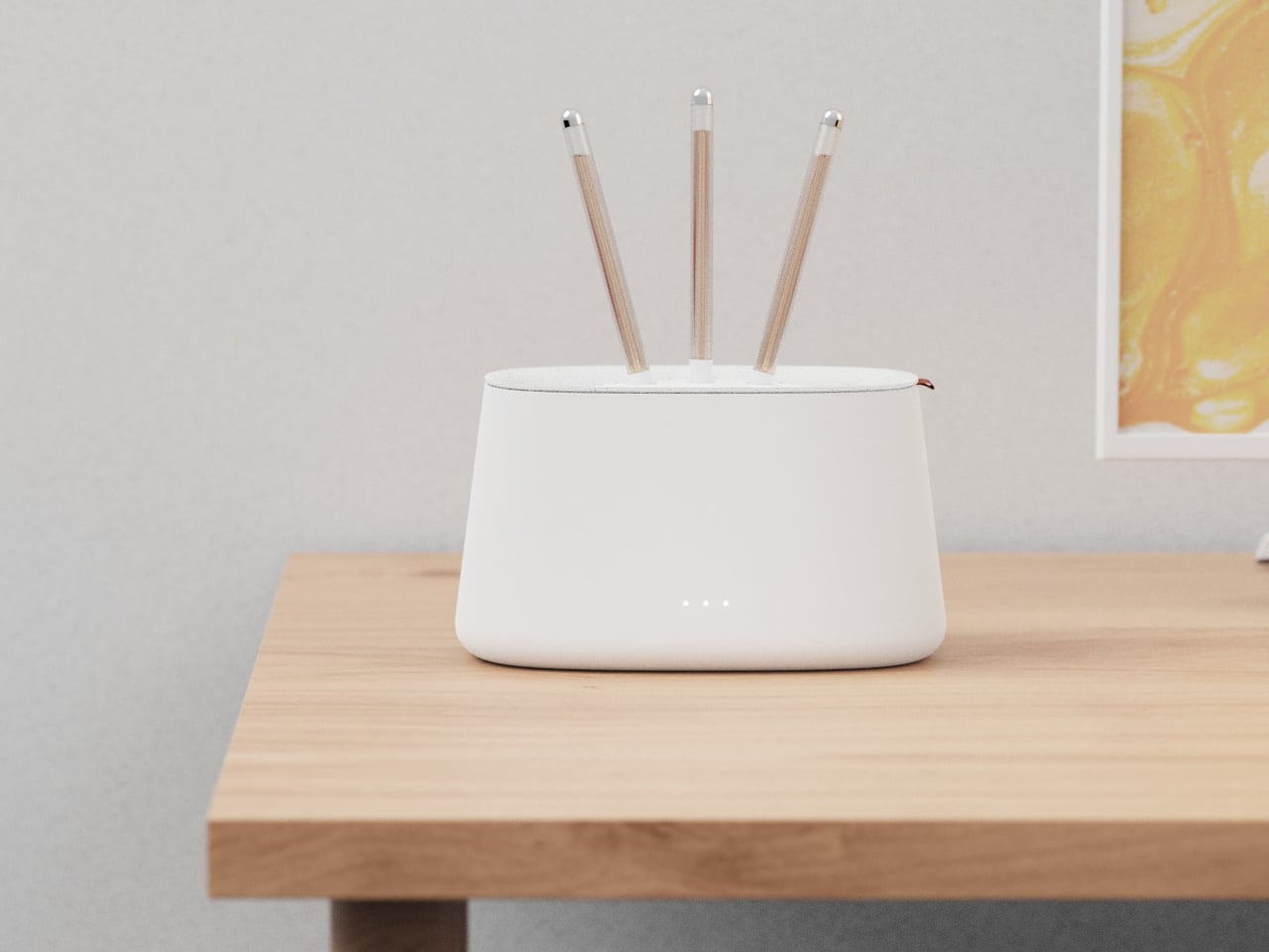
Air purifiers tend to look like medical equipment and come with apps you didn’t ask for. They arrive with dashboards, push notifications, and Wi-Fi setup rituals that turn “cleaner air” into another thing to manage on a phone. Most of them sit in corners behind plants because they look clinical, and no one wants to acknowledge the white plastic box while having guests over for dinner.
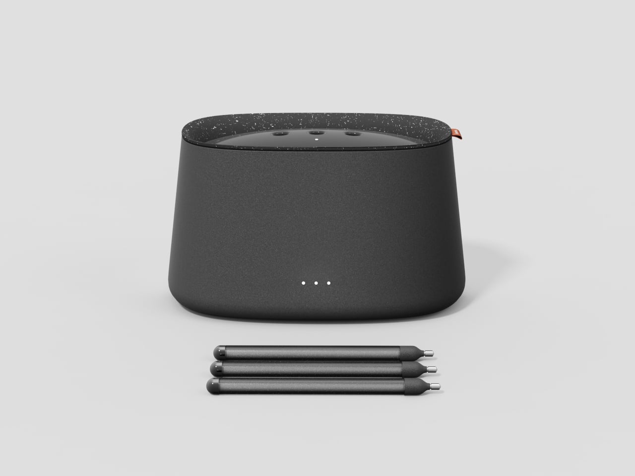
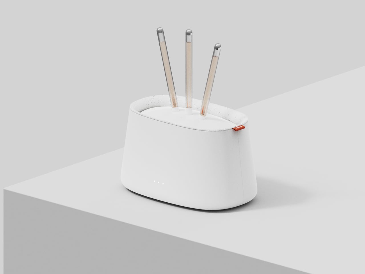
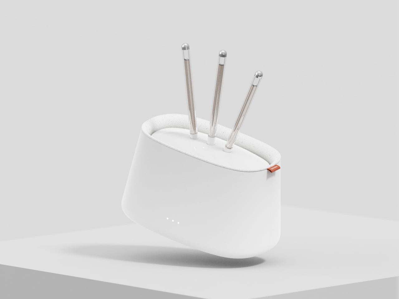
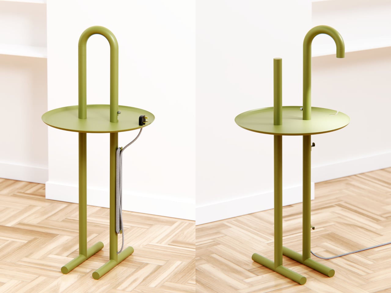
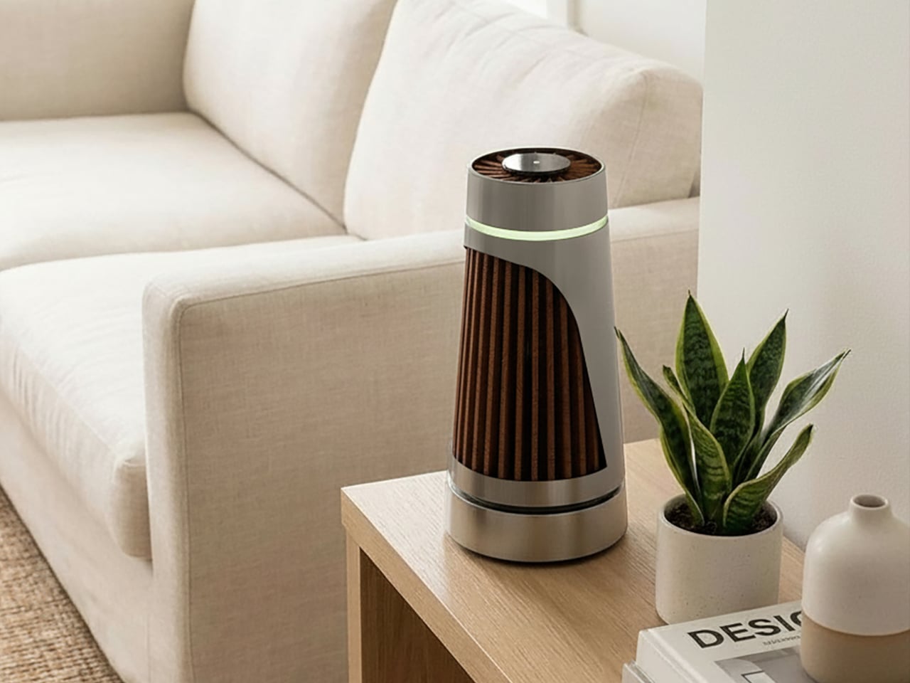
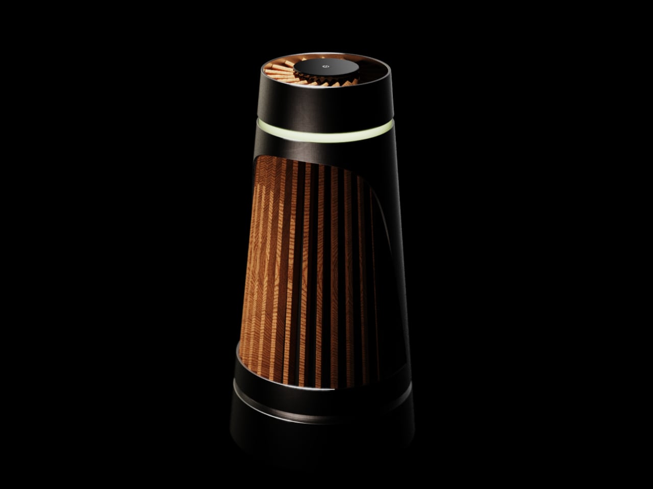
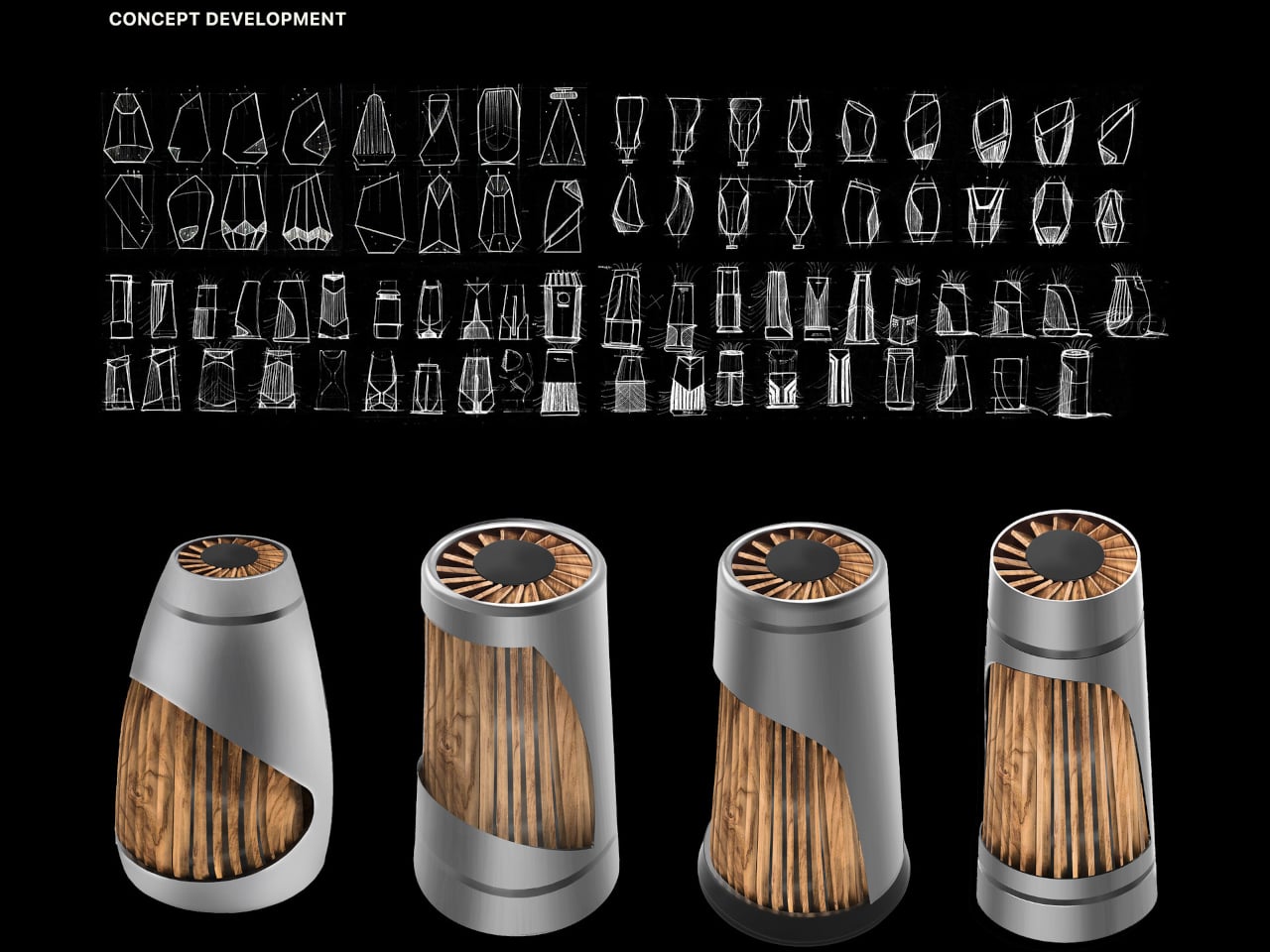
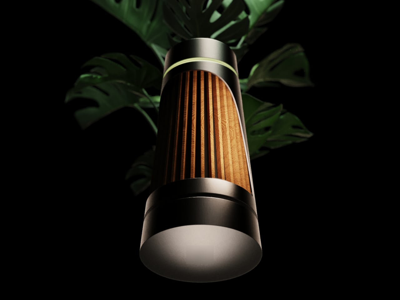
The Beolab Air 1 is a concept air purifier designed to sit in a room without announcing itself. It was developed as a student project and draws inspiration from the calm, material-driven design language of Bang & Olufsen’s Beolab line, though it’s not affiliated with the company in any way. The goal was to see what happens when you apply that kind of sculptural thinking to clean air, instead of just adding another screen to the wellness toolkit.
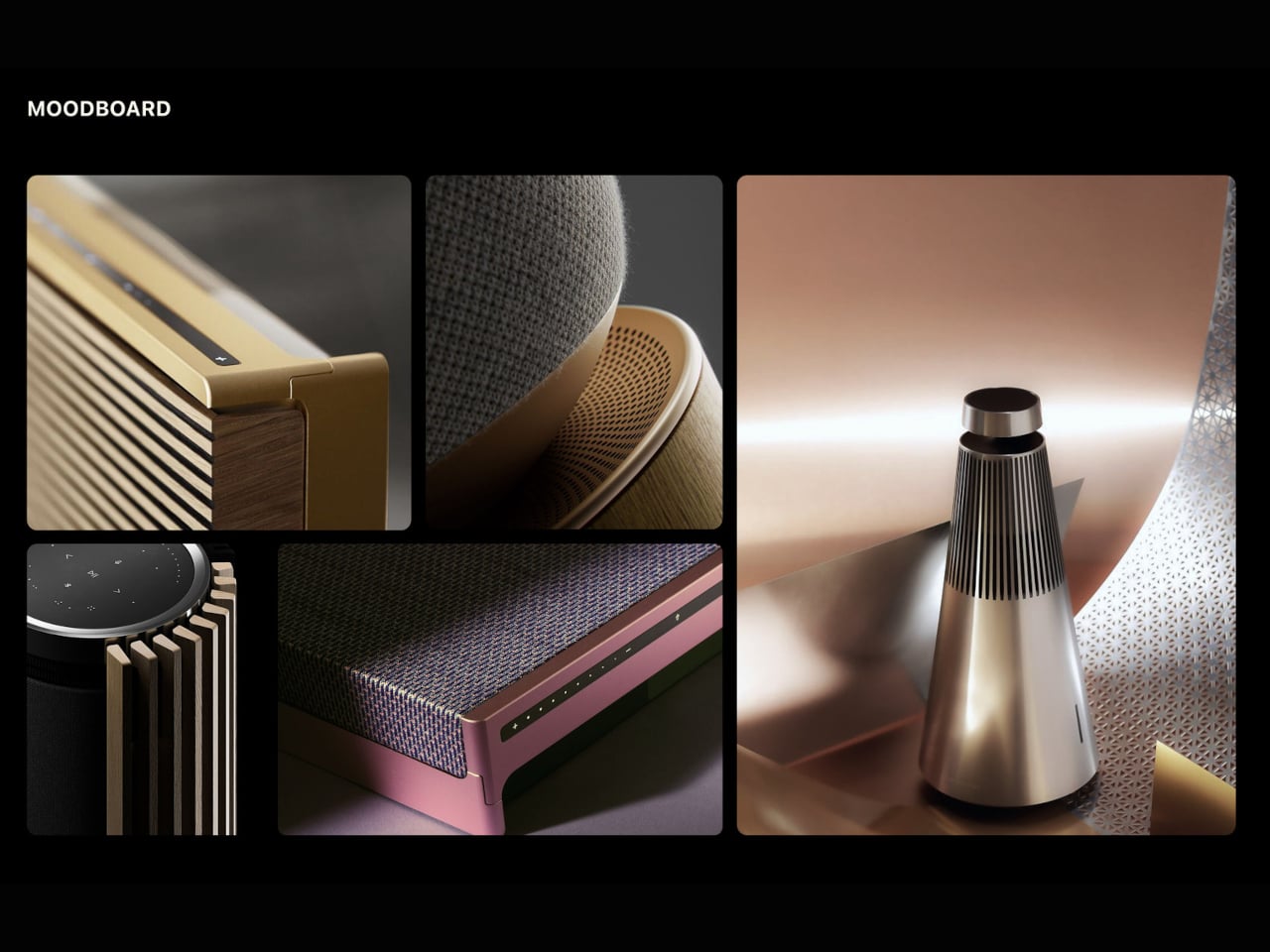
Designers: Ahaan Varma, Malhar Gadnis, Michelle Sequeira, Sharanya Karkera
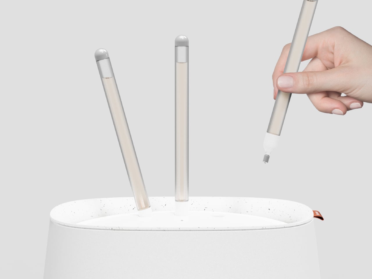
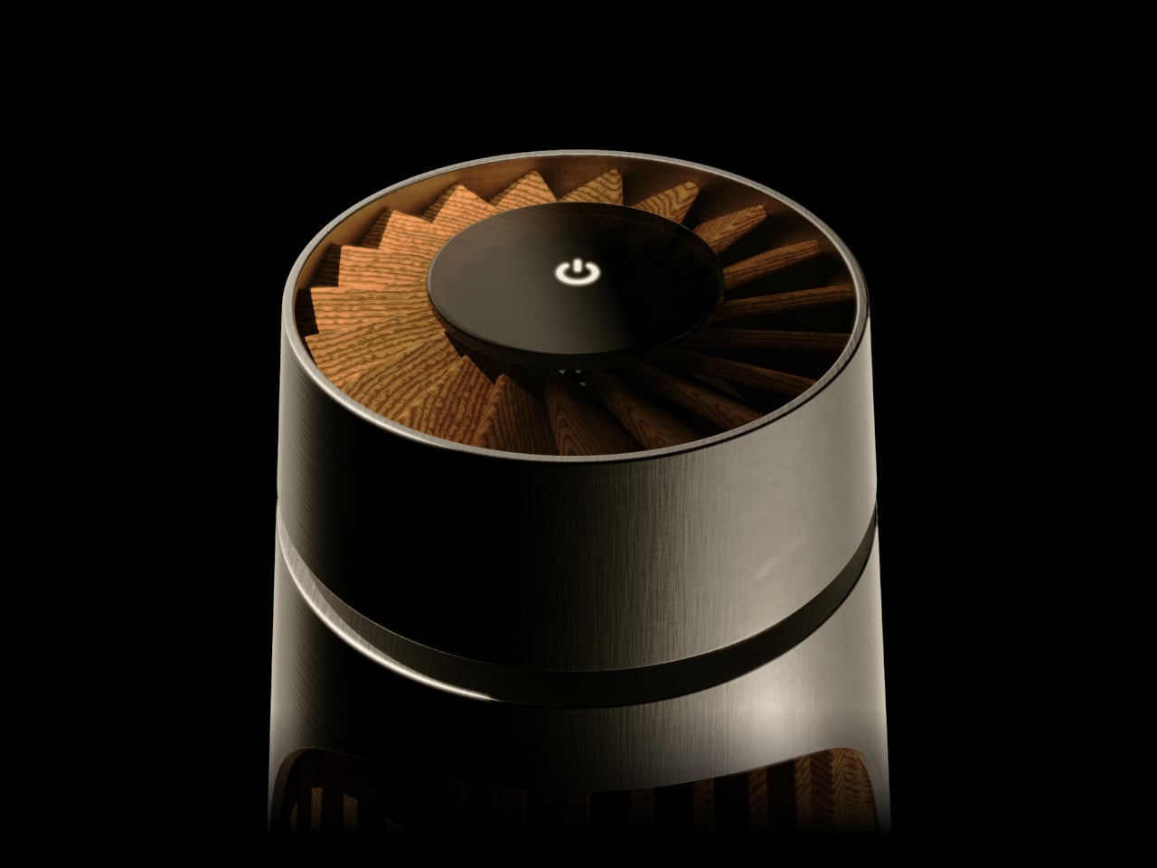
The most refreshing part of the concept is the interaction model. A single button press is all it takes to start, with no app pairing, no IoT setup, and no onboarding routine. The project frames this as “digital detox,” which is a reasonable description when most purifiers try to sell you sensor graphs and weekly air quality reports. You turn it on the way you’d turn on a lamp or a speaker, then leave it to work.
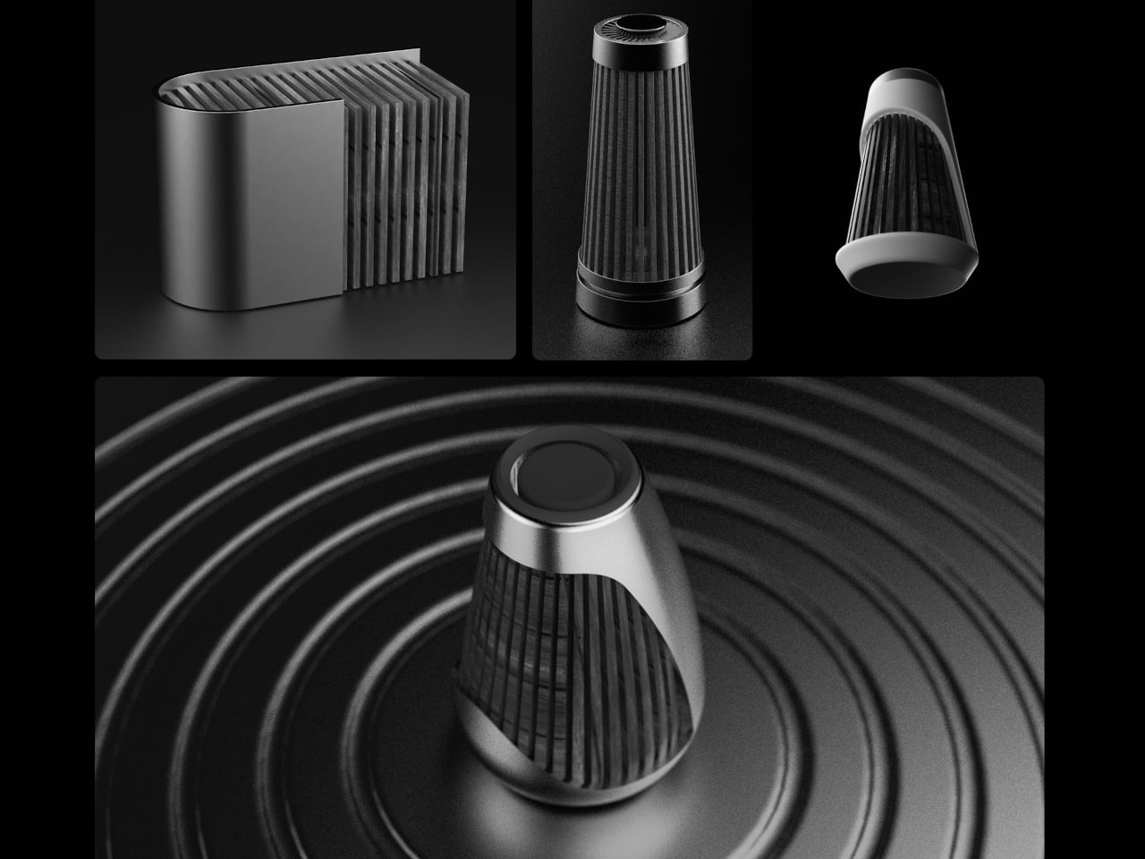
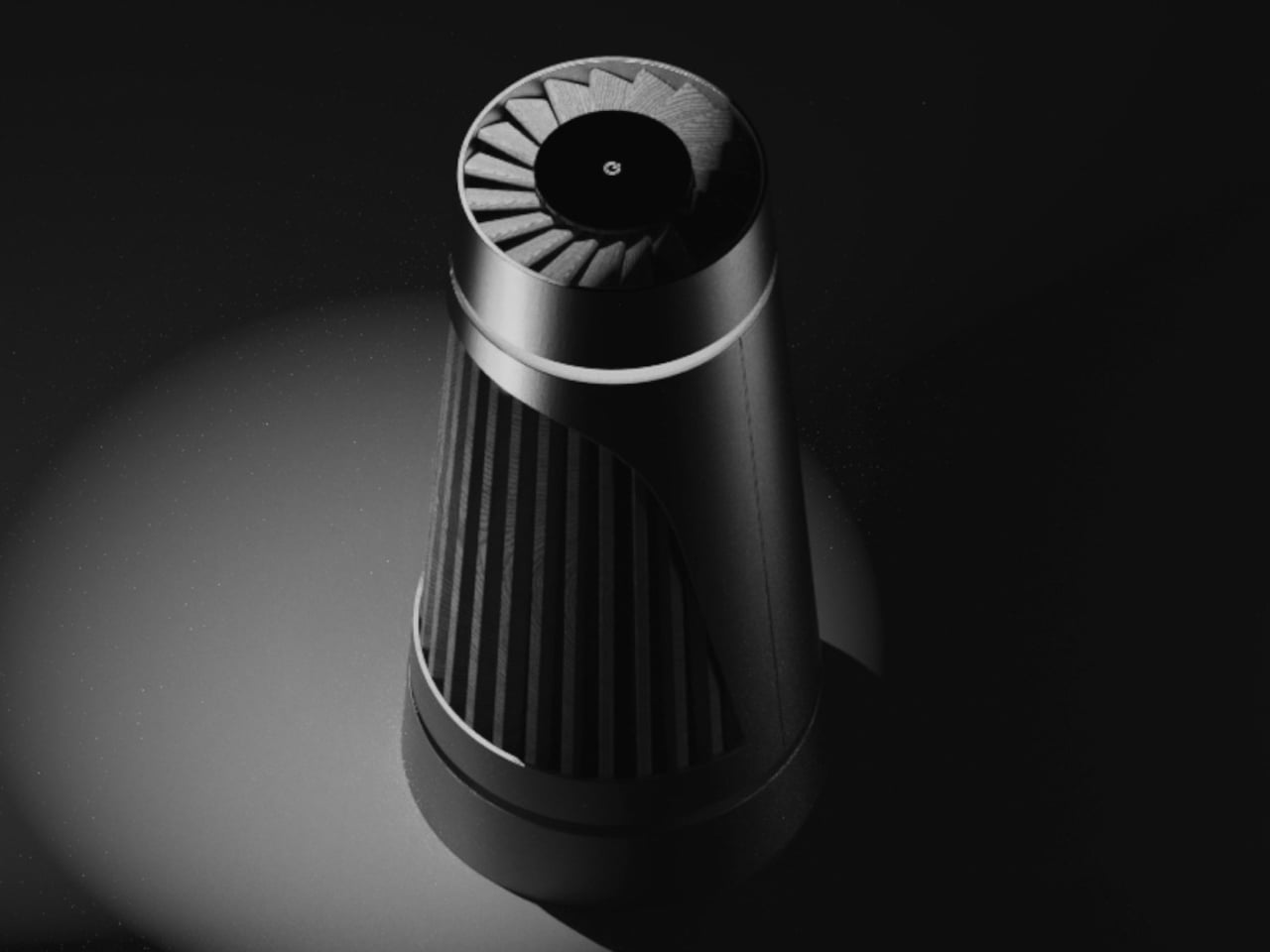
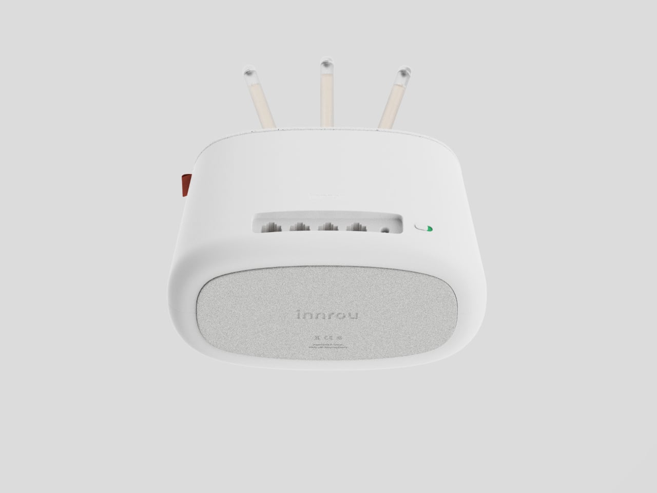
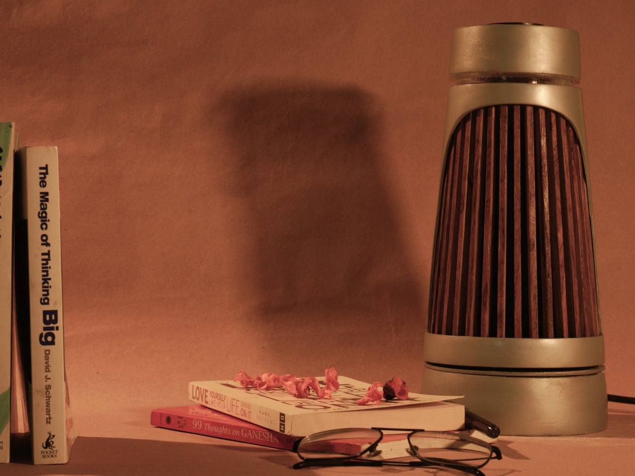
The materials do a lot of the talking. Angled teak wooden ridges wrap the body and function as vents for filtered air, so the aesthetic choice also serves a purpose. Textured aluminum handles the rest of the exterior. The project’s own critique of the category is blunt: plastic yellows and looks cheap over time, while wood and metal age better. A purifier built to look like a piece of considered furniture has a better chance of earning a spot on a sideboard than one that resembles a hospital accessory.
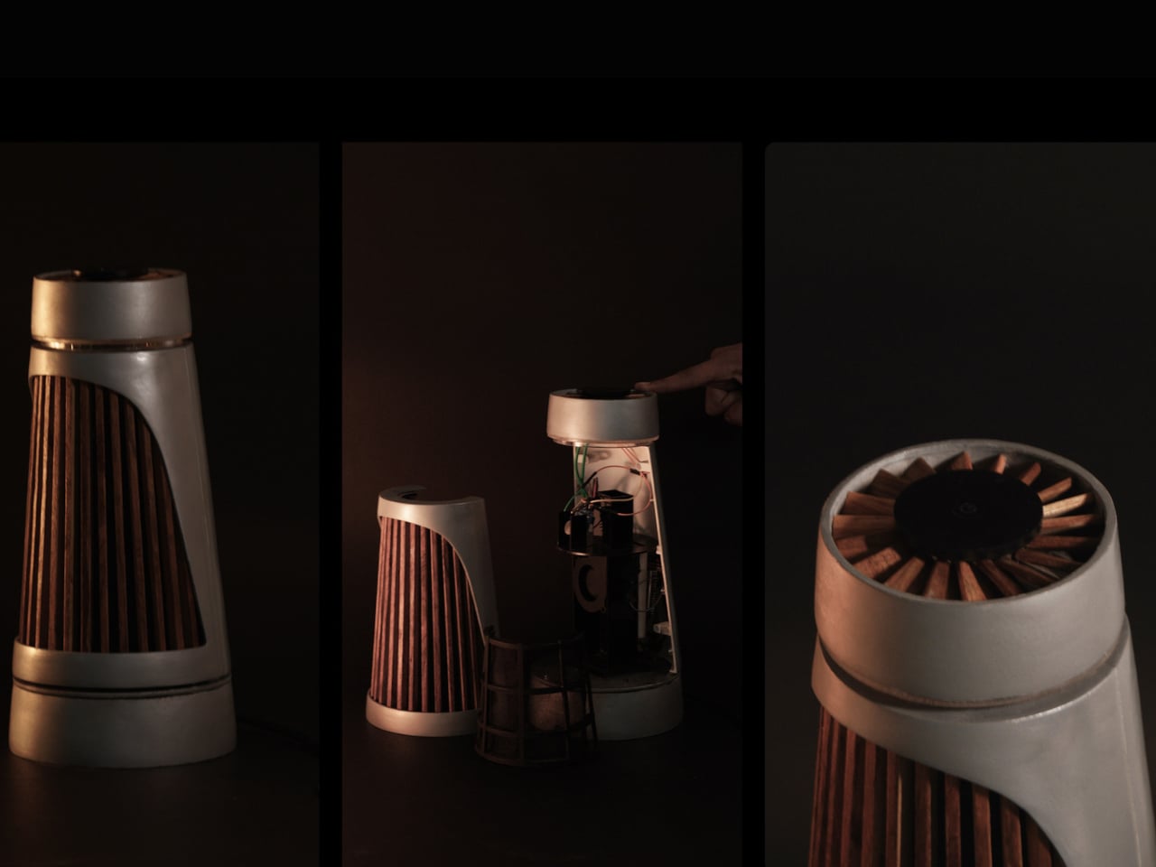
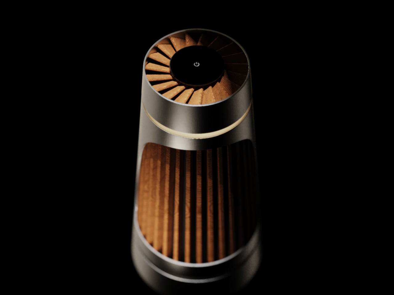
Under the surface, there’s a plausible engineering stack. A high-efficiency BLDC fan delivers strong airflow while staying quiet, a HEPA filter handles particulate capture, and an MQ135 gas sensor pairs with PM2.5 sensing to monitor air quality without forcing anyone into an app. The concept keeps the monitoring internal and the feedback subtle, a soft ambient light band that changes gently rather than a display demanding attention.
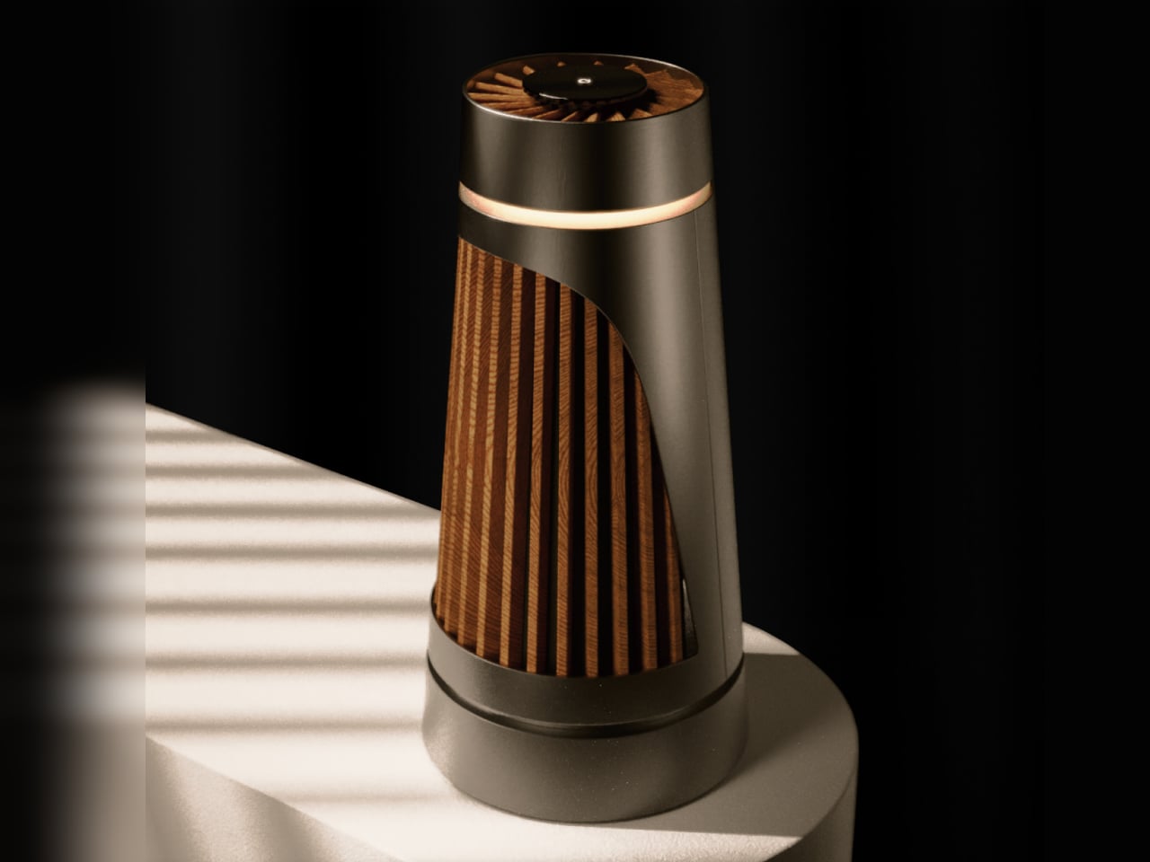
Of course, that ambient feedback is the whole point. Clean air is invisible and usually silent, and a purifier that communicates the same way feels more appropriate than one with a scrolling PM2.5 count on a bright panel. You can check in when you feel like it, and the rest of the time it just works.
The concept calls out a genuine gap in the category: people want wellness that integrates quietly into a room, not hospital aesthetics, and yet another app. Whether or not Beolab Air 1 ever gets built, asking what a purifier looks like when treated with the same care as a premium speaker is a question the category probably needed someone to ask.
The post This Air Purifier Concept Looks Like Scandinavian Audio Gear first appeared on Yanko Design.