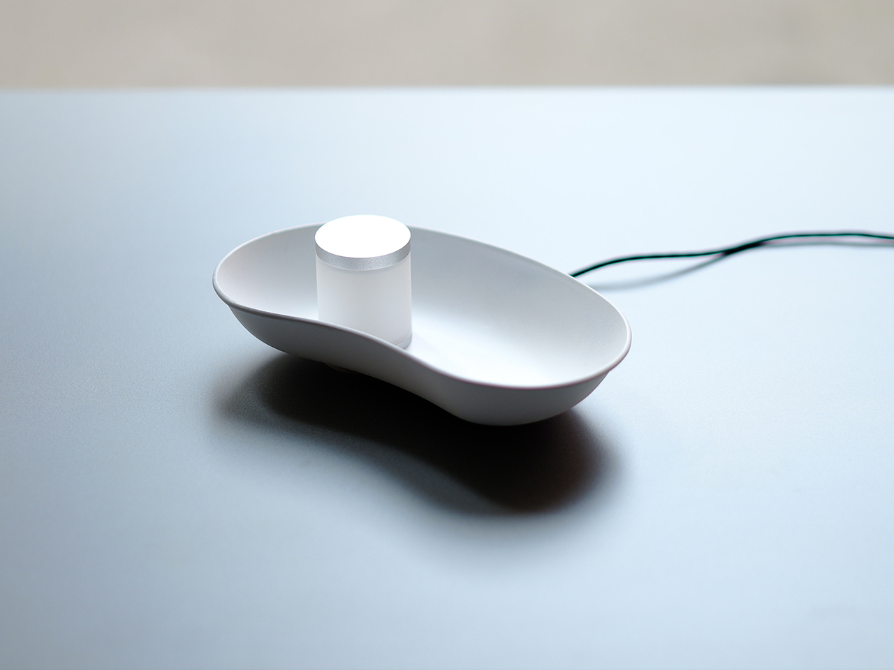
Thanks to Apple’s adoption and improvement of the technology, wireless chargers for smartphones have grown and thrived. There are quite a number of different designs, though the majority of them have a common purpose. They make it easy to still use the phone even while charging, or at the very least see its display. That could be useful in some cases but it is Kryptonite for those who actually want to keep their phones out of sight. That’s especially true in bed when phones tempt you to scroll all the way to morning. This concept design proposes a simple yet elegant solution that keeps the phone out of sight while charging but still displays the most important information you need to see at a glance.
Designer: Ahmed Rashad
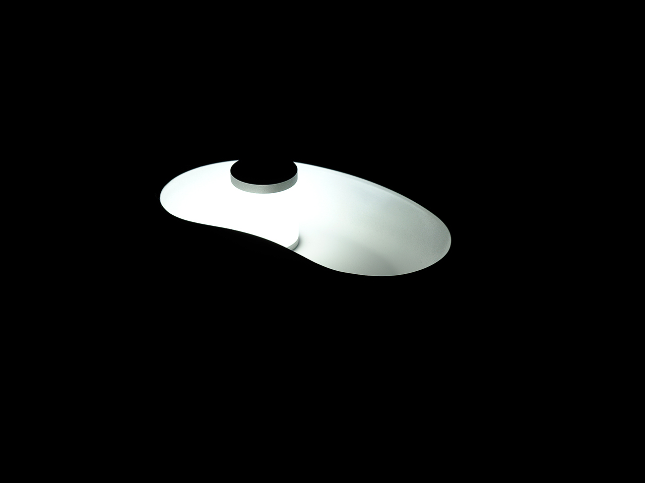
Although flat horizontal “beds” are the most common design for wireless chargers, the most popular put the phone at an angle so that you can still see the phone’s screen while charging. This position is useful for taking video calls or watching a video, and some even have special modes that show a minimalist UI like a clock. Unfortunately, this also increases the potential for distraction, or at least the temptation to reach out for your phone. You could, of course, simply charge your phone far away, but then you lose access to important and timely information like your next appointment.
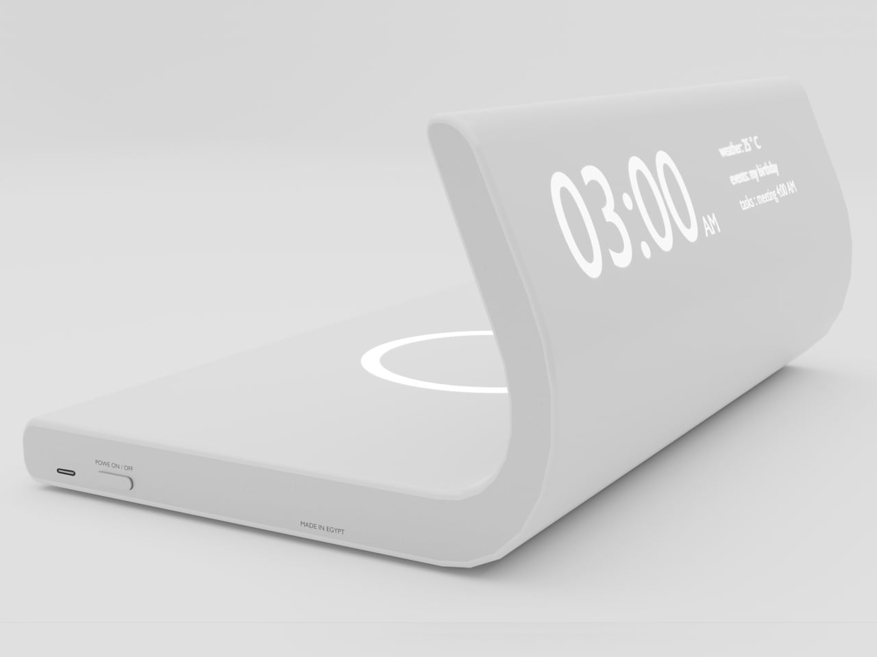
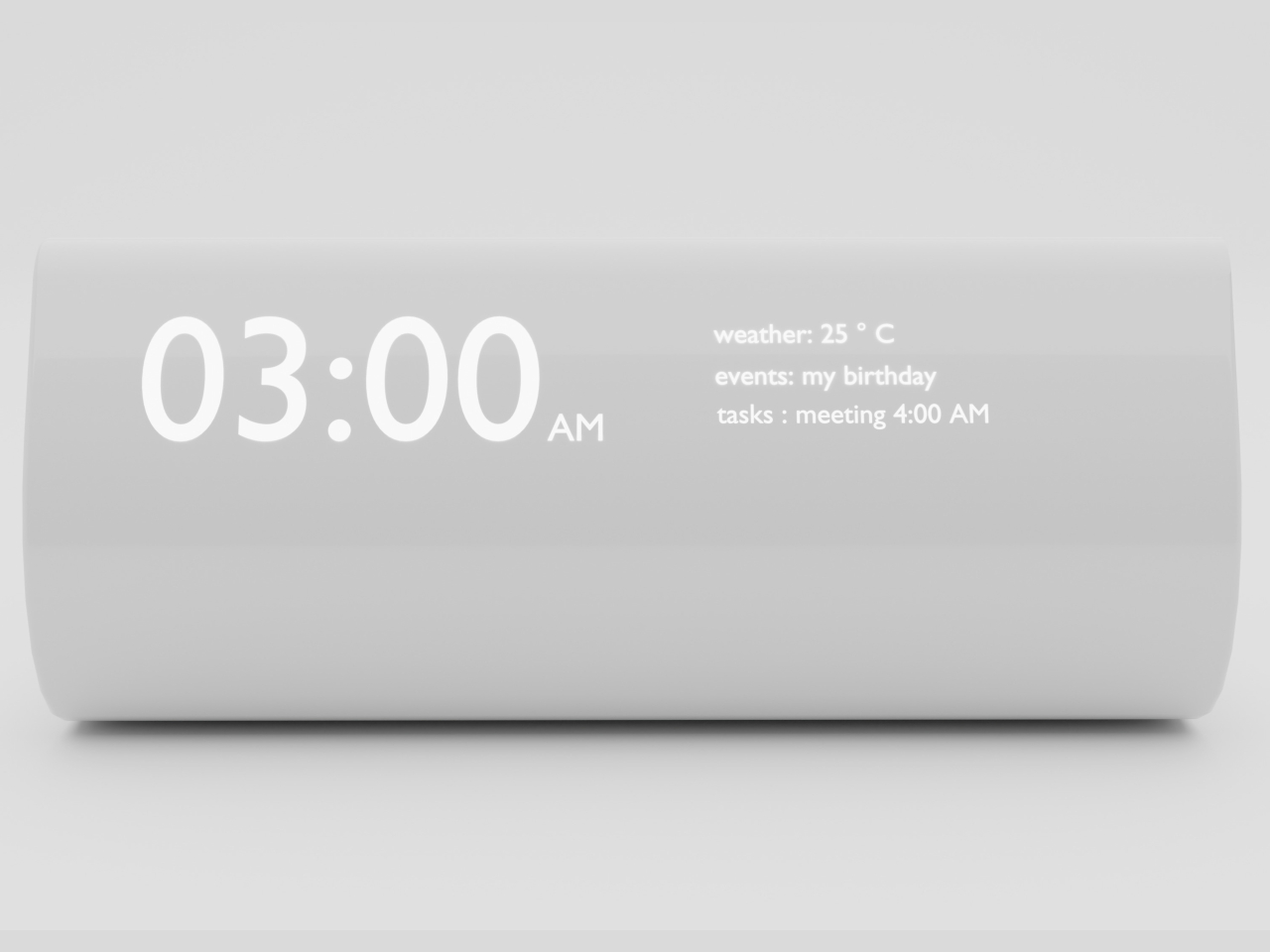
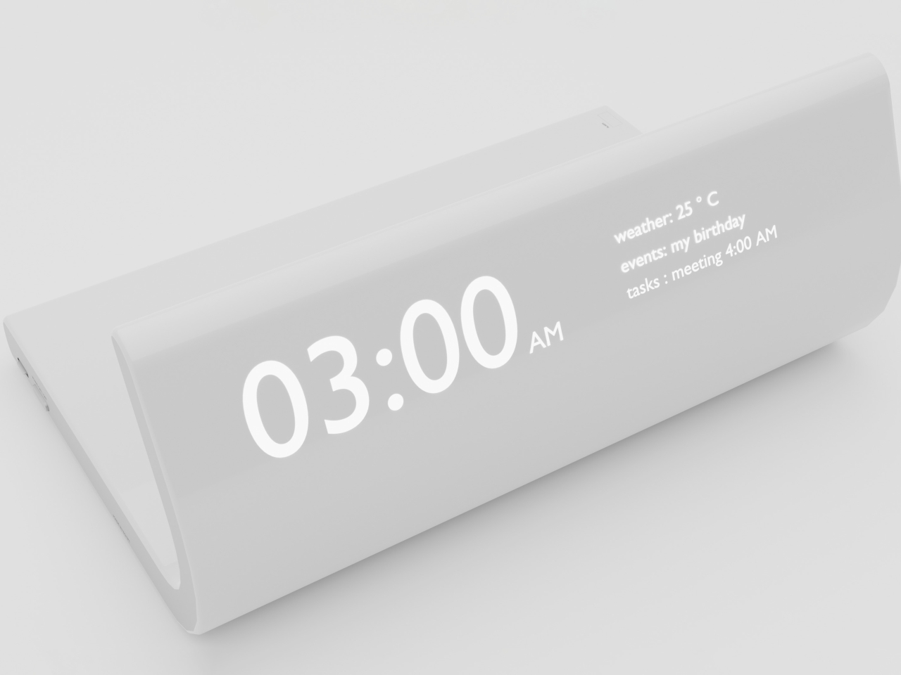
This wireless charger concept suggests a solution that is simple yet also ingenious. It combines the functionality of a simple, horizontal wireless charger with a digital clock. The clincher is that the clock also displays data like the weather, today’s most important event, and your next appointment. The concept doesn’t exactly make it explicit, but this information is possibly taken from the charging phone itself, whether through NFC or Bluetooth.
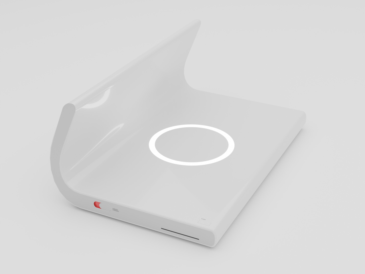
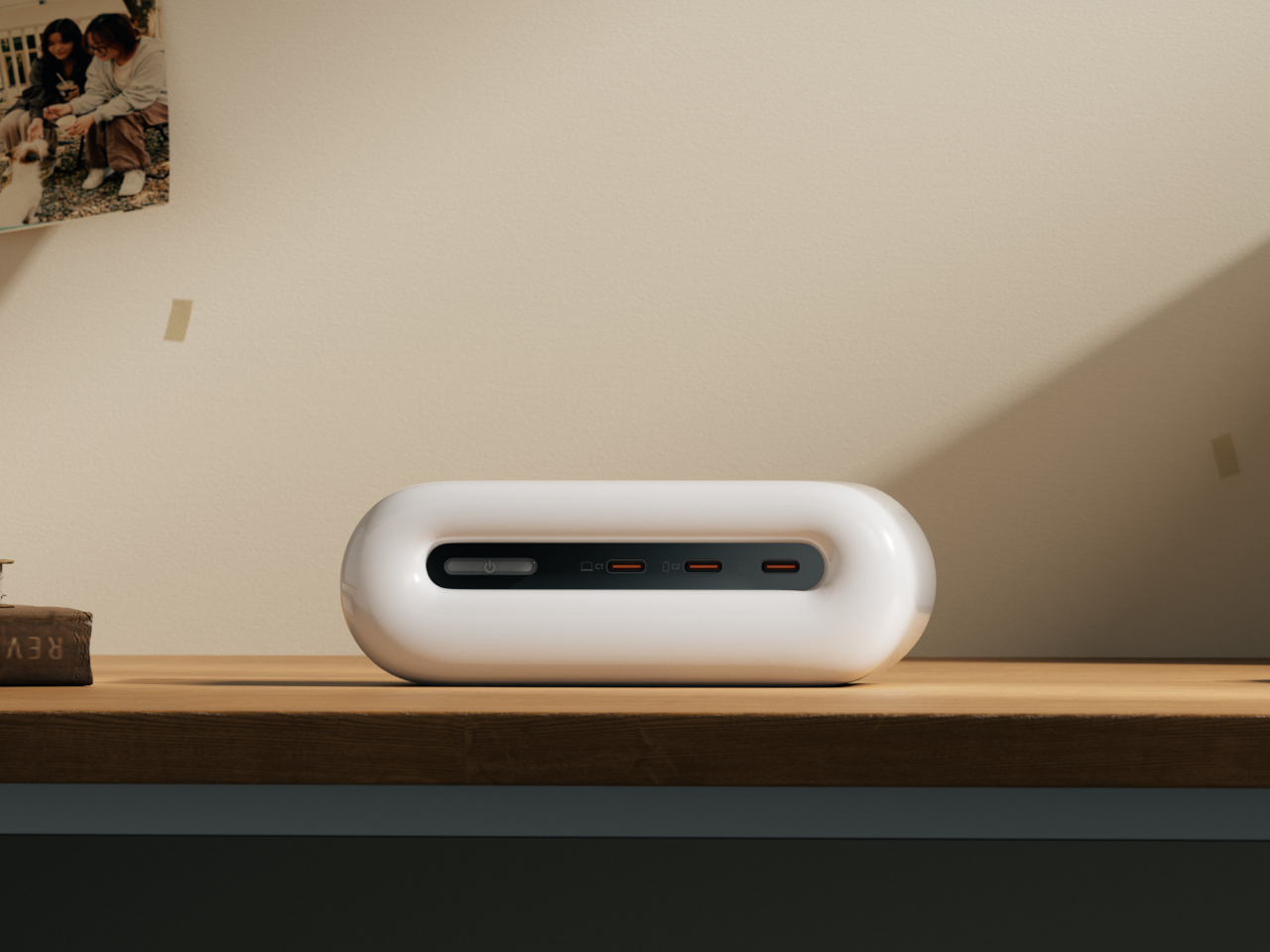
The big difference here is that the wireless charger lies behind the clock, so the phone will not only be hidden from view but also difficult to reach. It puts physical and conceptual barriers that discourage instant gratification by increasing the friction and amount of effort to do that action. The design would be best used on a bedside table, ensuring that the phone is really out of reach but still charging conveniently.
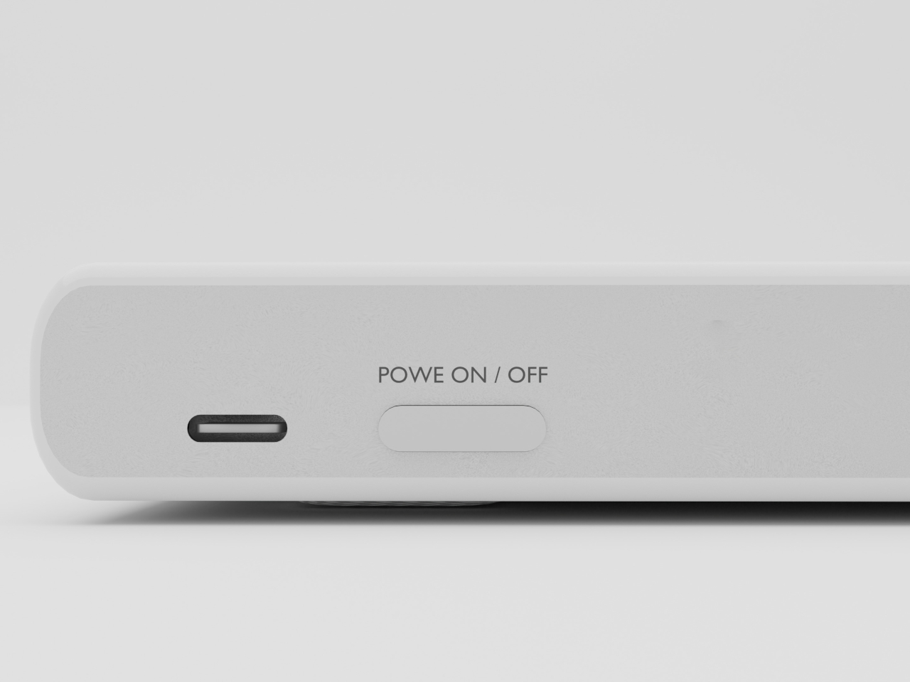
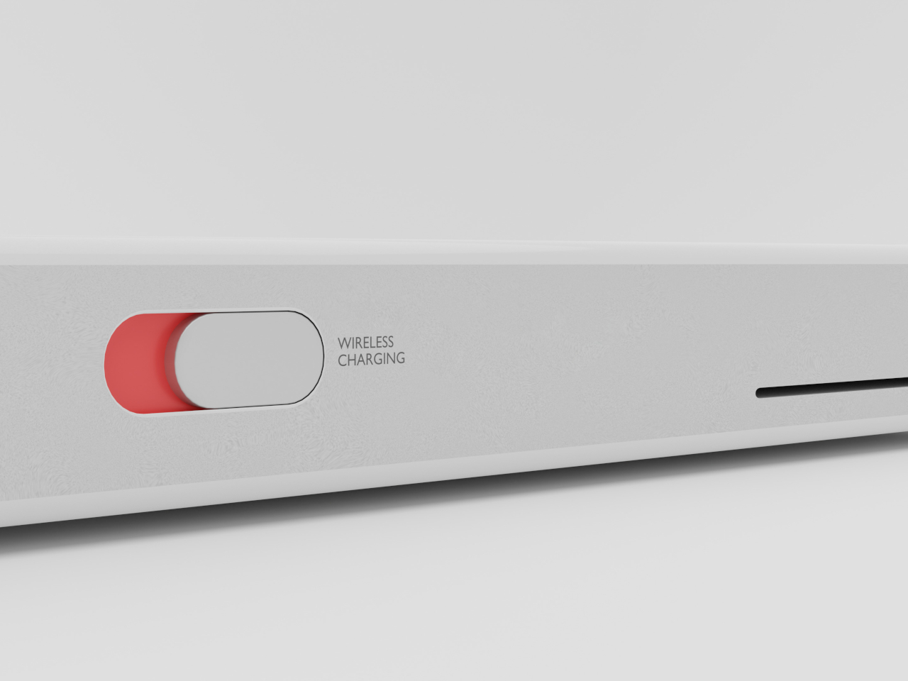
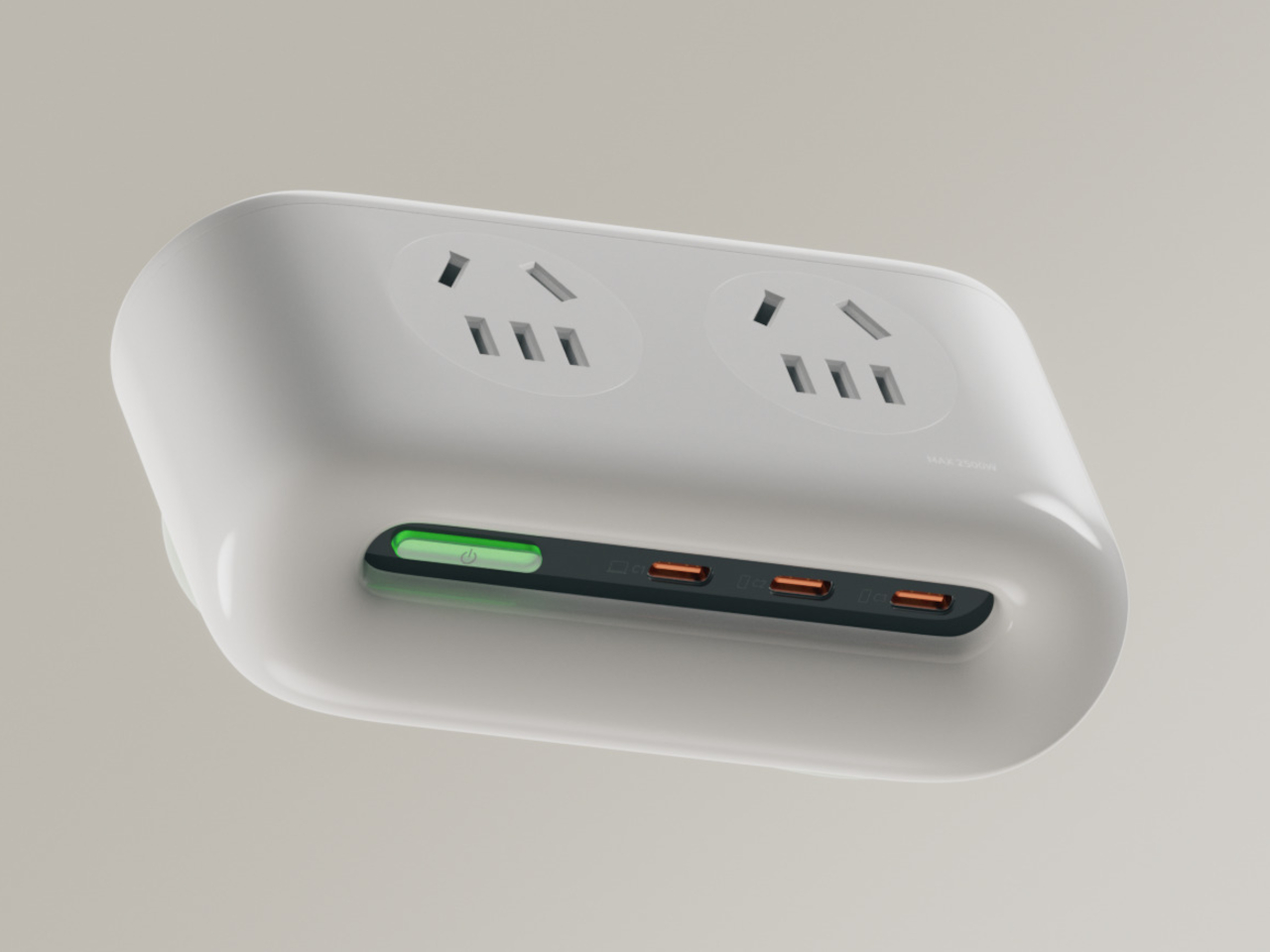
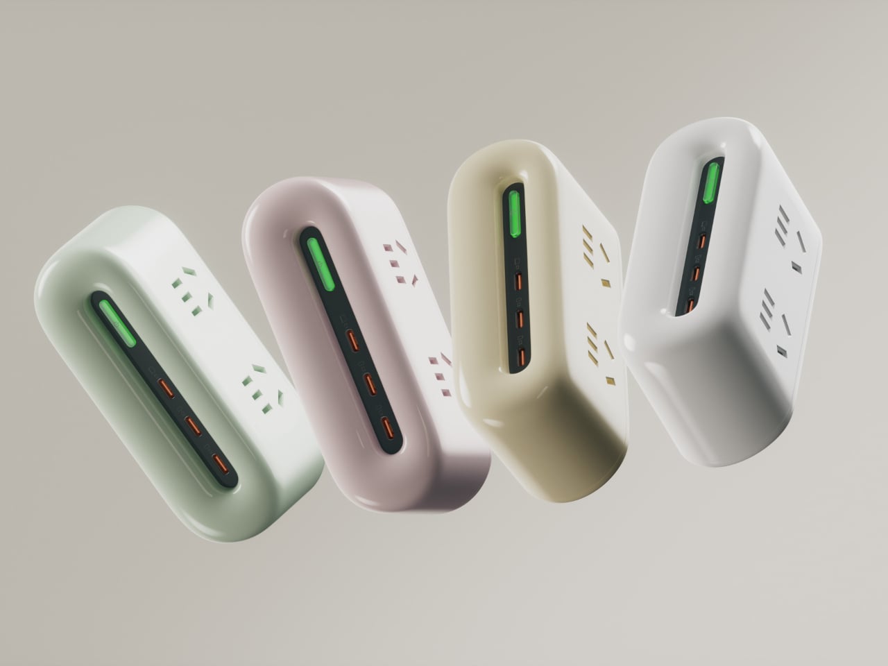
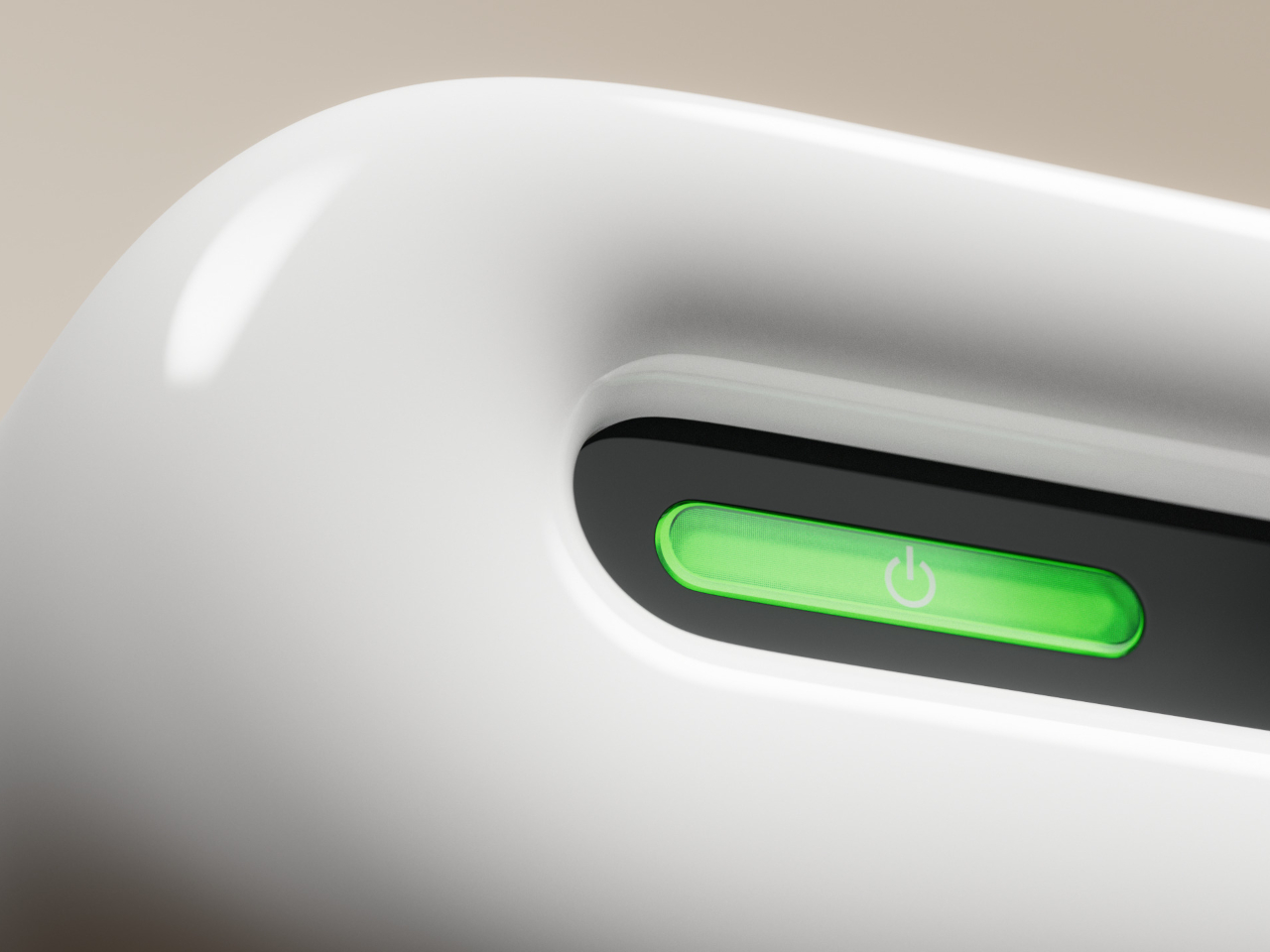
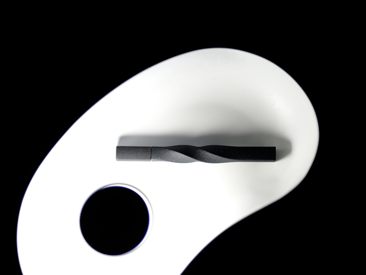
The wireless charging clock also carries a striking aesthetic that will fit many minimalist motifs, including and especially Apple designs. The sleek curve gives it a rather elegant appearance, while the clean and white finish makes it stand out against most furniture colors and materials. There’s also a distinct absence of extraneous features, including buttons aside from the power and charging switches, making the accessory effortless to use.
The post Sleek clock and wireless charger concept offers a distraction-free experience first appeared on Yanko Design.