Onyx BOOX Go Color 7 E-reader Review: Bringing Back the Simple Joys of Reading

PROS:


  • Compact and comfortable size for long reading

  • Stylish textured back cover

  • Impressive color E Ink display and performance

  • Google Play support out of the box

CONS:


  • Gapless page turn buttons

  • Some ghosting with color content

  • Fine-turning display settings per app can be overwhelming

RATINGS:

AESTHETICS
ERGONOMICS
PERFORMANCE
SUSTAINABILITY / REPAIRABILITY
VALUE FOR MONEY

EDITOR'S QUOTE:

Wrapped in a highly portable and stylish design, the BOOX Go Color 7 delivers a joyful reading experience without the distracting and sometimes confusing extra features.

Onyx BOOX is one of the more prolific E-book Reader manufacturers in the market today, always pushing the envelope of what these devices can do. It has almost a dozen models under its name, not counting discontinued ones, and every new release adds a few more features on top of the pile. While it’s good to advance the state of E-readers, sometimes one can mistake the forest for the trees and lose sight of what’s important. With the new BOOX Go line, the company is stepping back and focusing on the essentials, and while the BOOX Go 10.3 is presenting itself as a replacement for paper notebooks, the BOOX Go Color 7 is promising a return to what E-readers are meant to do: make reading pleasurable anytime, anywhere. So we pull off the shrink wrap and press the power button to see where the BOOX Go Color 7 stands in this growing sea of similar E Ink devices.

Designer: BOOX

Aesthetics

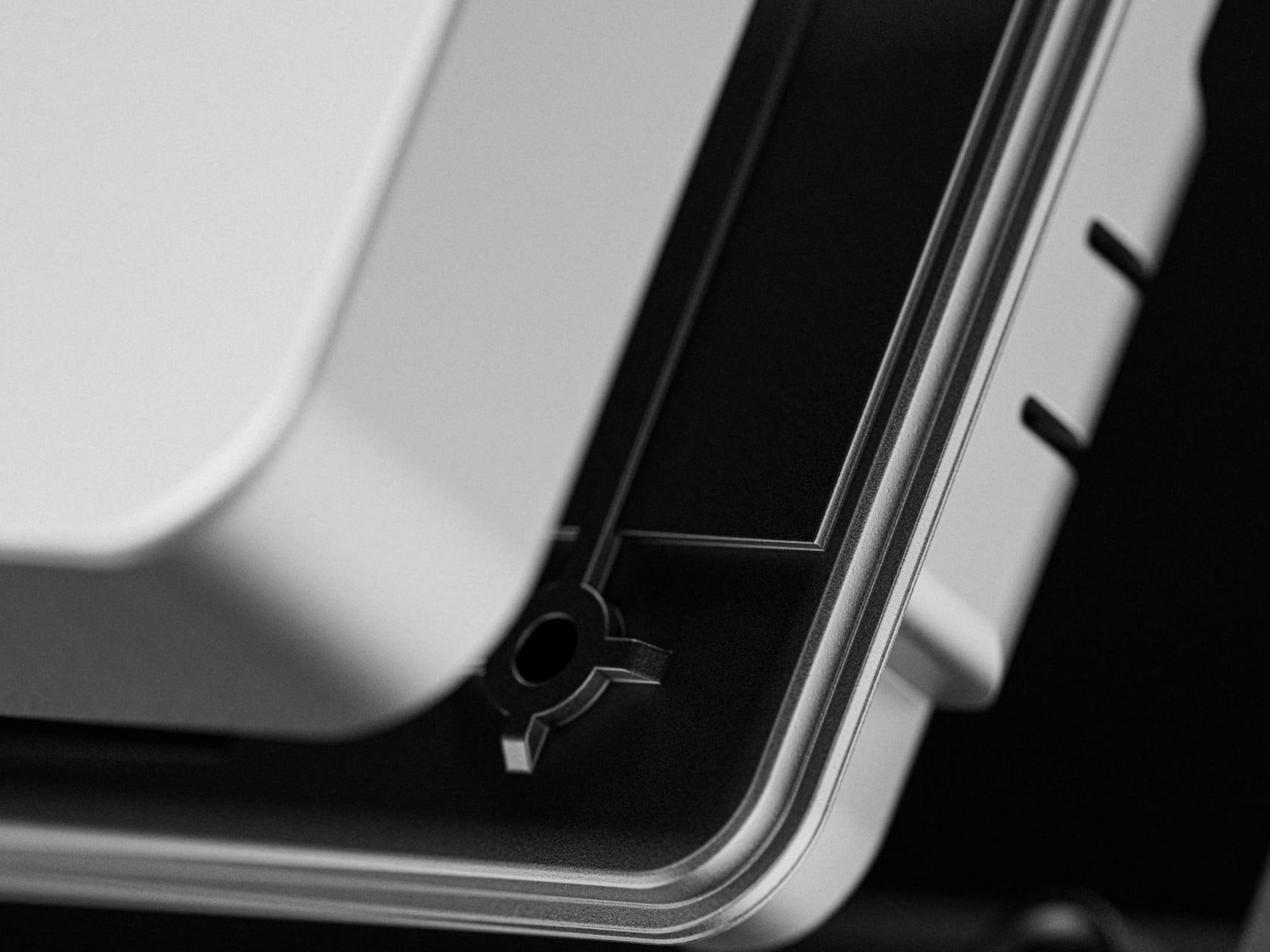
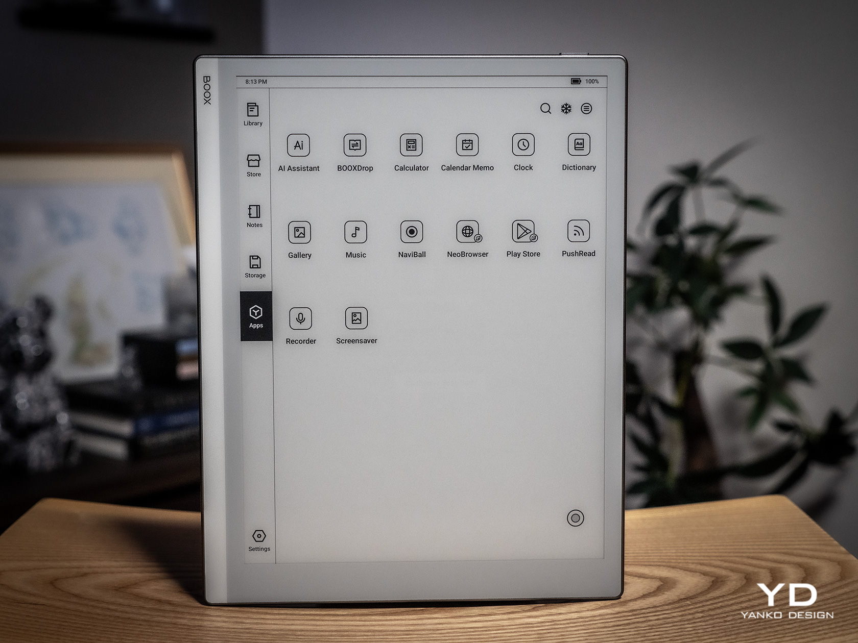
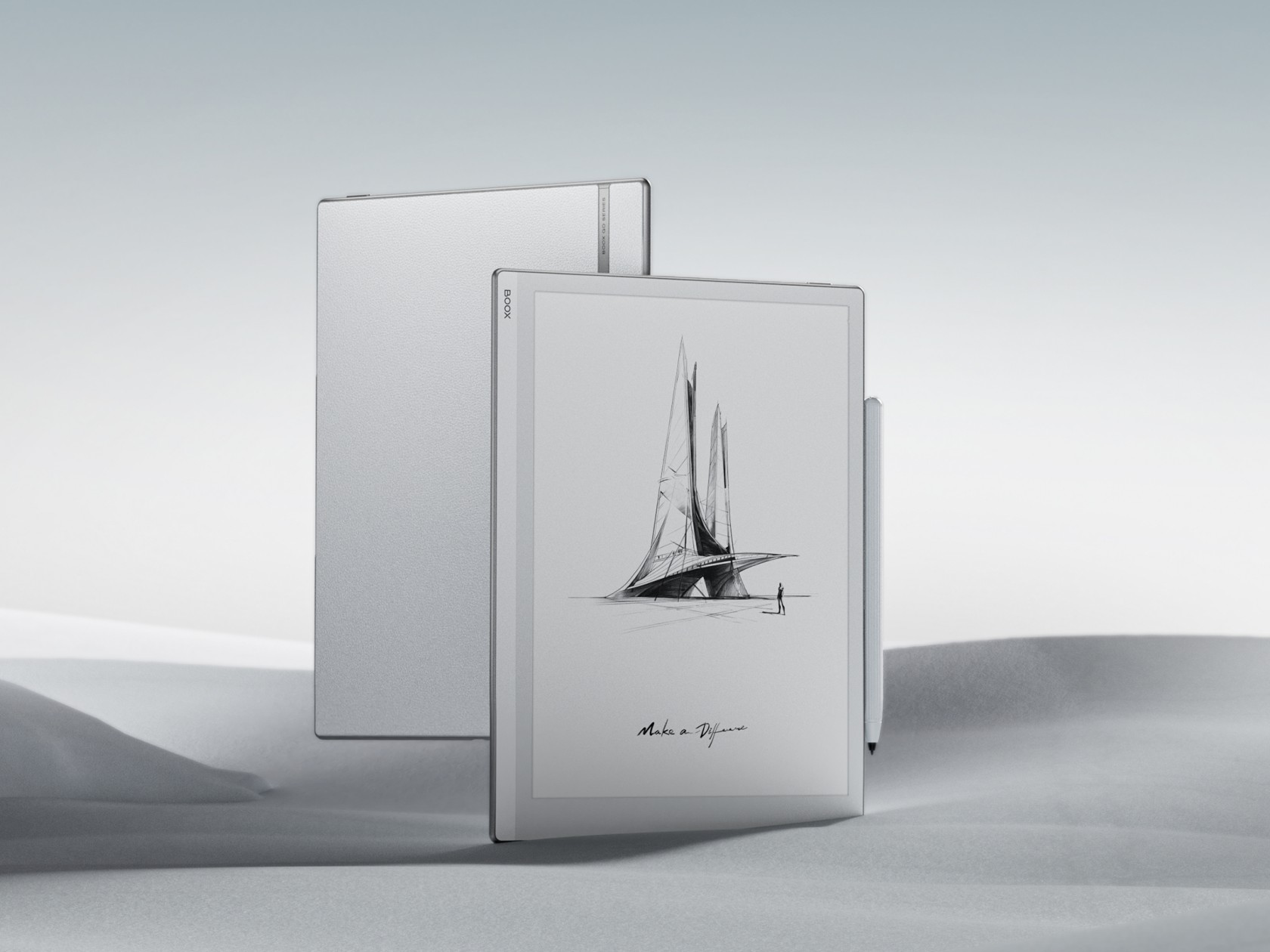
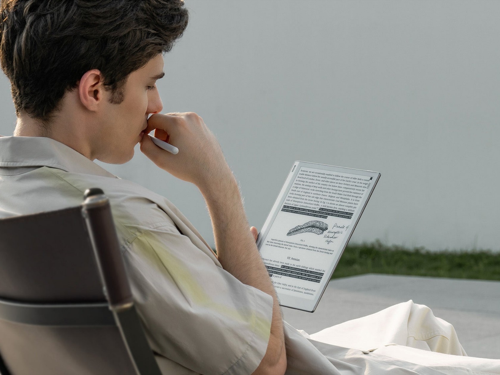
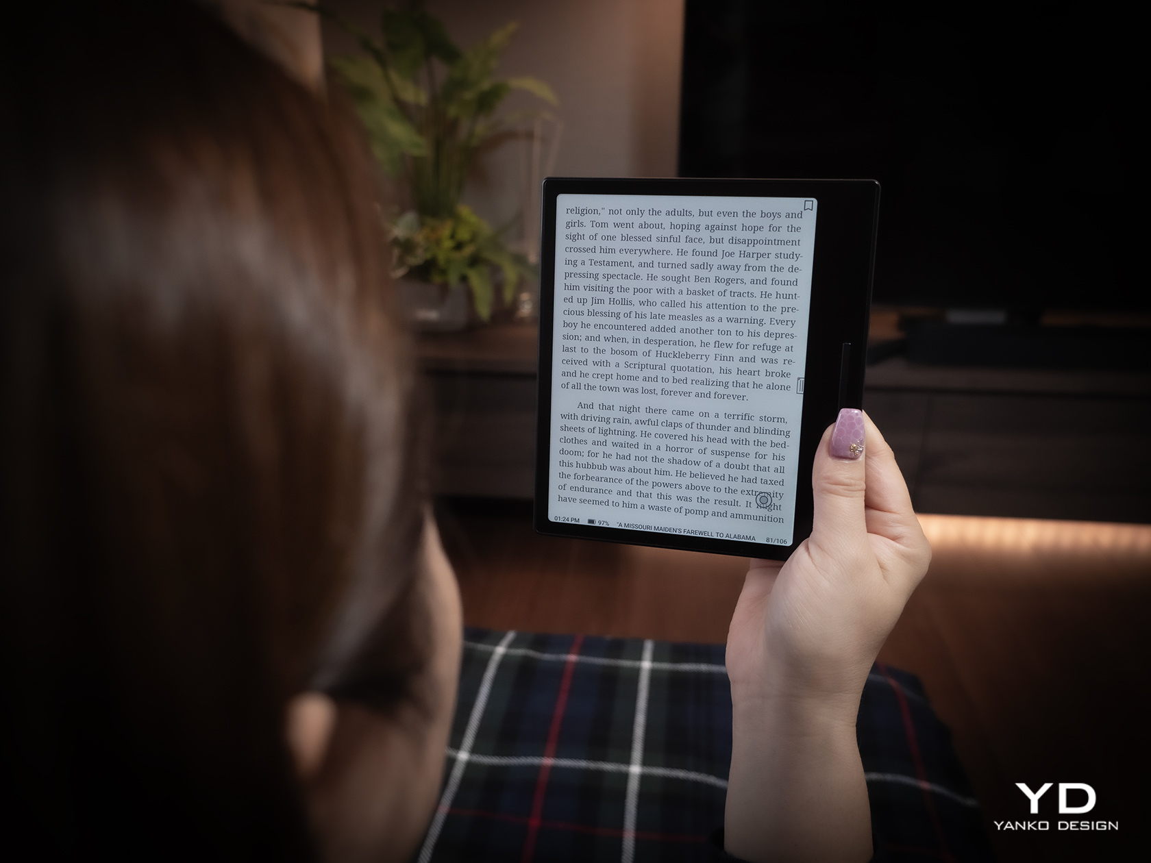
The Onyx BOOX Go Color 7 is at once both minimalist and stylish, depending on which side you’re looking at. The front has your typical asymmetrical design where one side extends beyond the screen bezel, creating not only a convenient place to hold but also a home for the physical page-turn buttons. It’s extremely bare, without even the BOOX name, making the 7-inch E Ink Kaleido 3 the sole focus of your attention. The glass protecting the screen sits flush with the bezels, creating a seamless and clean appearance that speaks to the maturity of this design.

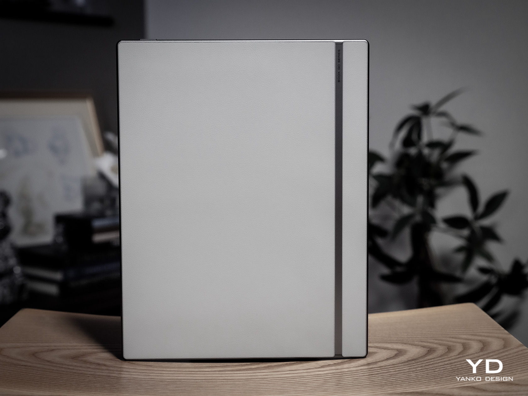
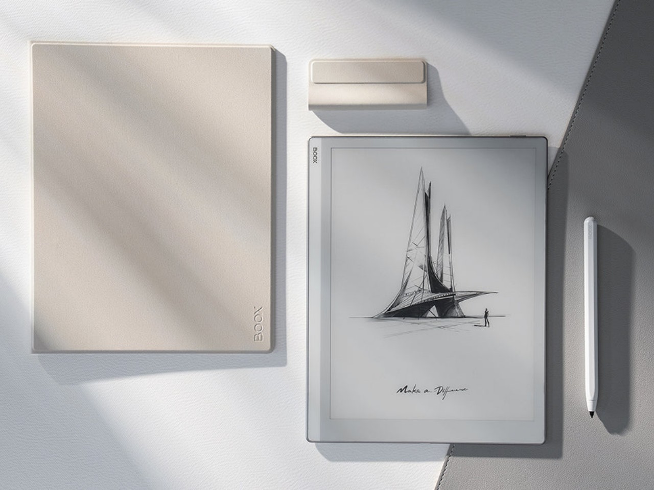
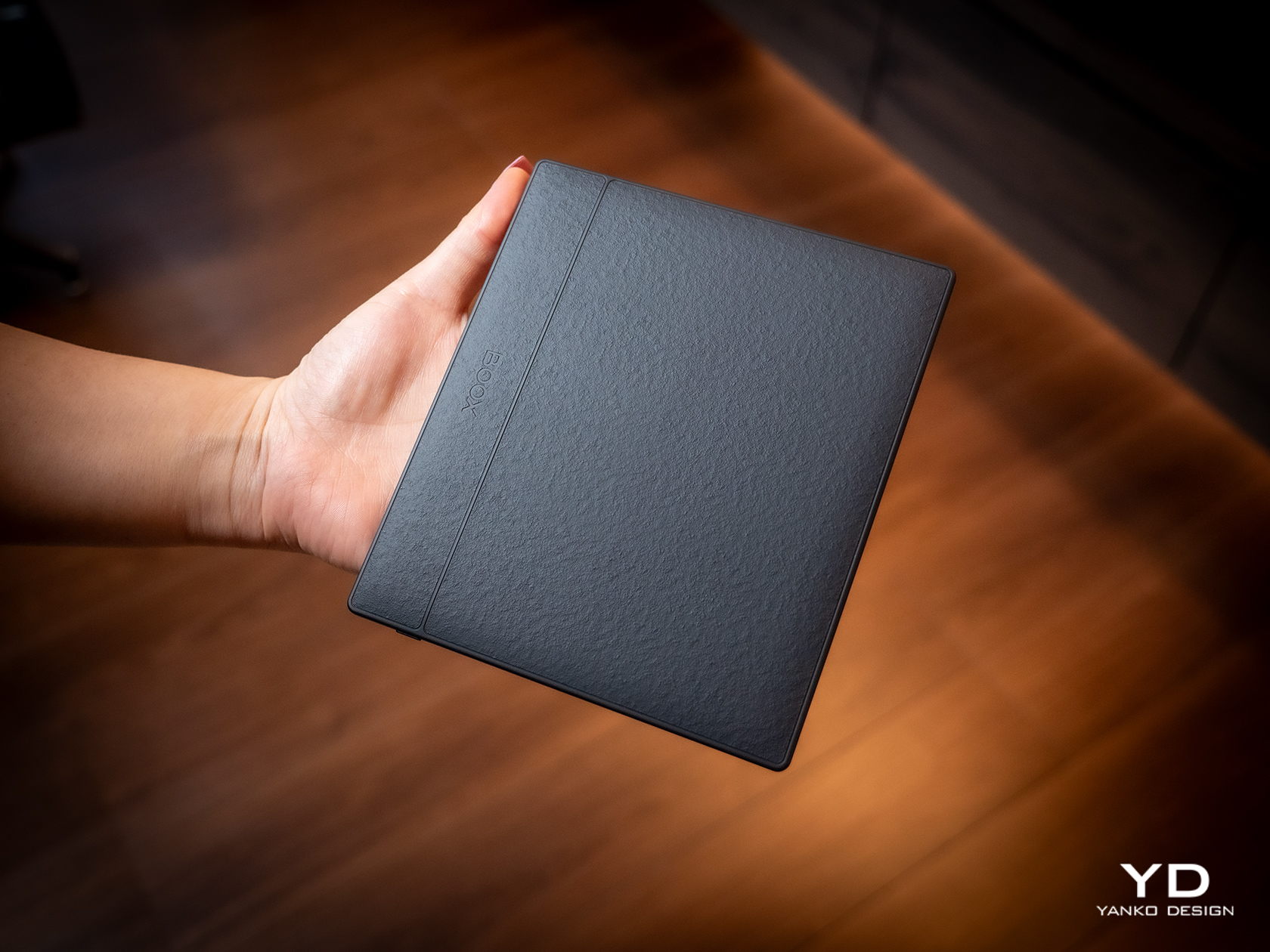
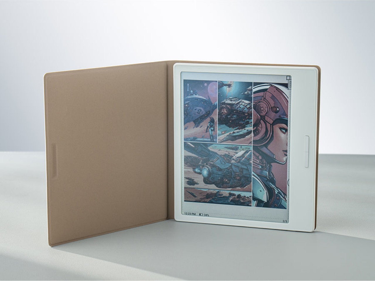
Flip the device over and you have something more interesting, both for your eyes and your fingers. Eschewing the typical matte plastic cover on these devices, BOOX uses a paper-like material that adds not just texture but also improves your grip. In a way, it tries to bring back the tactile experience of holding a paper book in your hands, a small pleasure that is lost with these devices.

The BOOX Go Color 7 is hardly the thinnest nor the lightest, even among 7-inch E-readers, but it is definitely in that group. Its compact and portable design makes it a familiar face, one that makes it clear that this is a device for reading books. It just so happens to run Android, just like a tablet.

Ergonomics

While the BOOX Go 10.3 aimed for maximum thinness and minimum weight, its smaller but more colorful sibling is admittedly a bit all over the place. Compared to BOOX’s other 7-inch devices, it’s only slightly lighter but a bit thicker than the monochrome BOOX Page, but it definitely trumps the BOOX Tab Mini C in every dimension. Suffice it to say, it’s not going to break records, but it won’t break your wrist either.

The BOOX Go Color 7 is designed with ergonomics at its core, and not just because it’s small and light. That textured back cover does more than just make the E-reader look good, it also adds to its grippiness. You definitely won’t have to worry too much about the device slipping off your hand, nor do you even have to fret about leaving greasy fingerprints on the paper-like material.

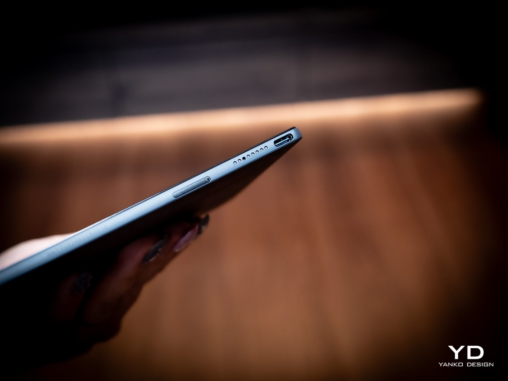
The small E-reader is also designed for one-handed use, even for turning pages. The physical buttons, or button rather, are positioned precisely where you’d rest your thumb, so you easily press down either end to move forward or backward. It doesn’t even care if you’re right-handed or left-handed, because thanks to its support for auto-rotation, the buttons know which way is up all the time. The one design gripe we have is that the page-turn button is just a single, indistinguishable bar with no gap to separate the two functions. You’ll find yourself losing a few precious seconds either trying to feel for which end is which or, more likely, looking at the button to make sure you’re hitting the right half.

Performance

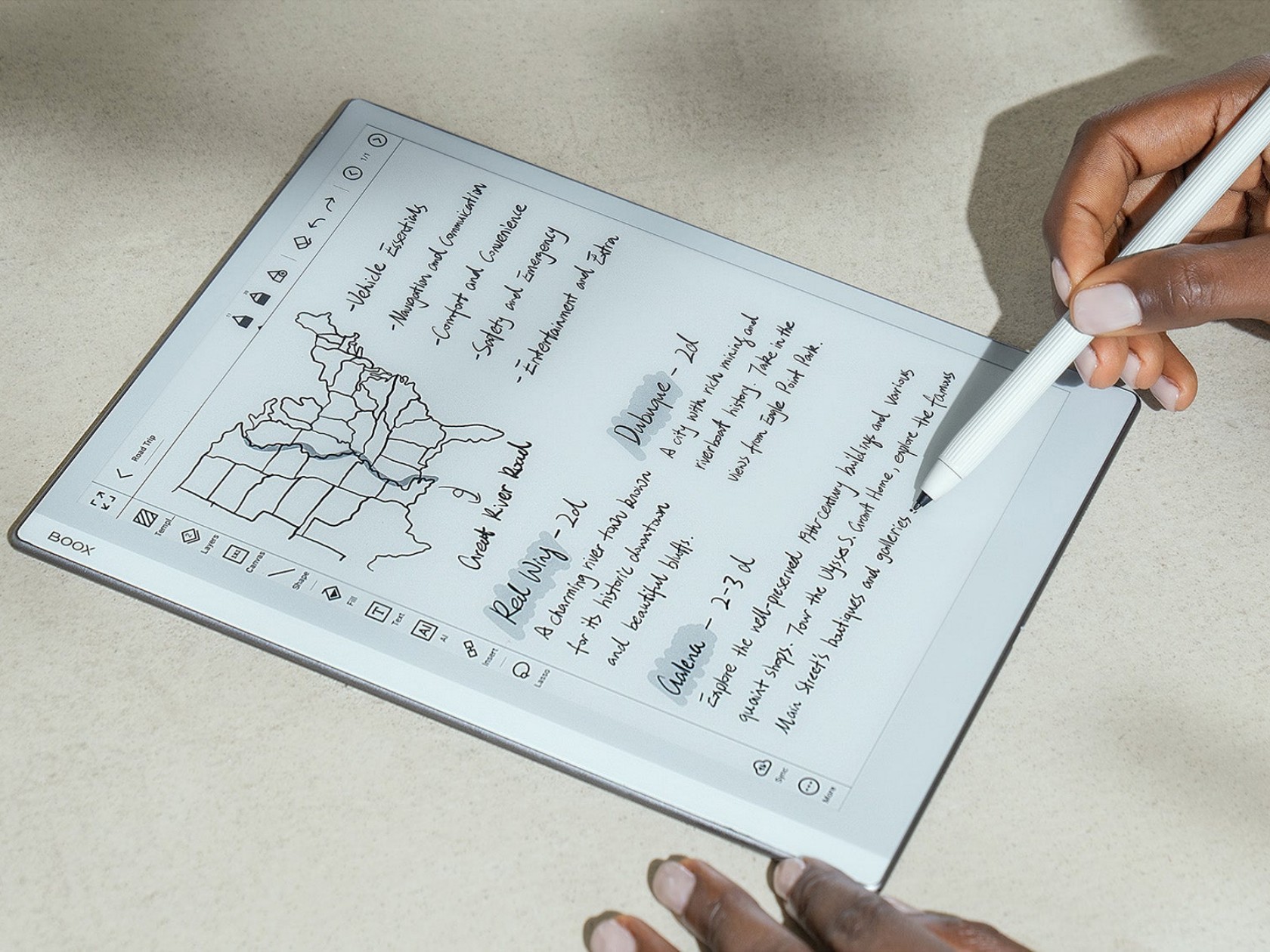
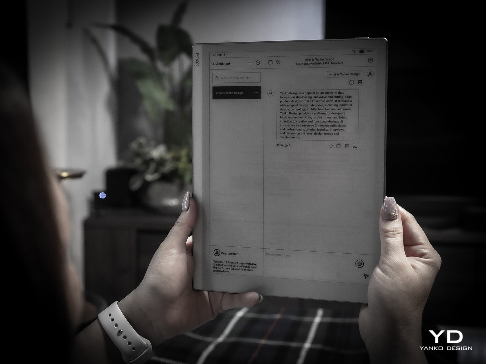
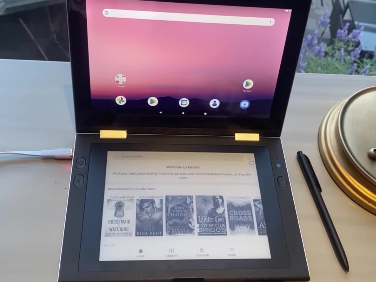
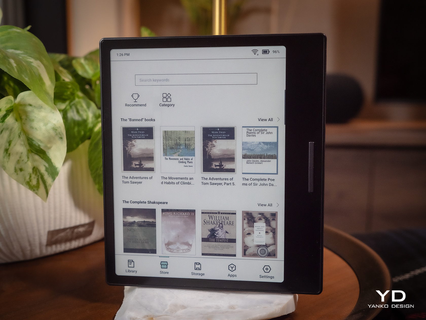
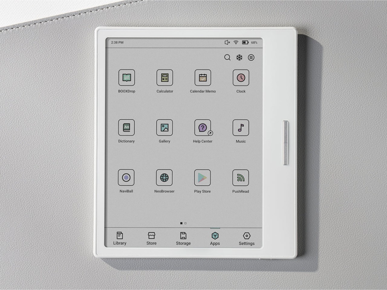
Anyone familiar with the BOOX family of devices pretty much knows its DNA. Every single one at this point is practically an Android device decked with an E Ink panel, not the custom operating systems used by Kindles and Kobos. Even better, it actually has Google Play support already built-in, which means you have access to almost all Android apps available, including those that you can sideload on your own.

Of course, you’ll have to set your expectations correctly, despite all the potential that the platform has. This is not a powerful Android device, not with an aging Qualcomm Snapdragon 665 processor and just 4GB of RAM. It’s enough to run a few apps, especially those related to reading or even browsing the Web, but it won’t be as fluid an experience, especially with the E Ink display, which we’ll get to later. There’s 64GB of onboard storage that you can expand up to 1TB with a microSD card. Definitely plenty of room for books and even audio files or recordings.

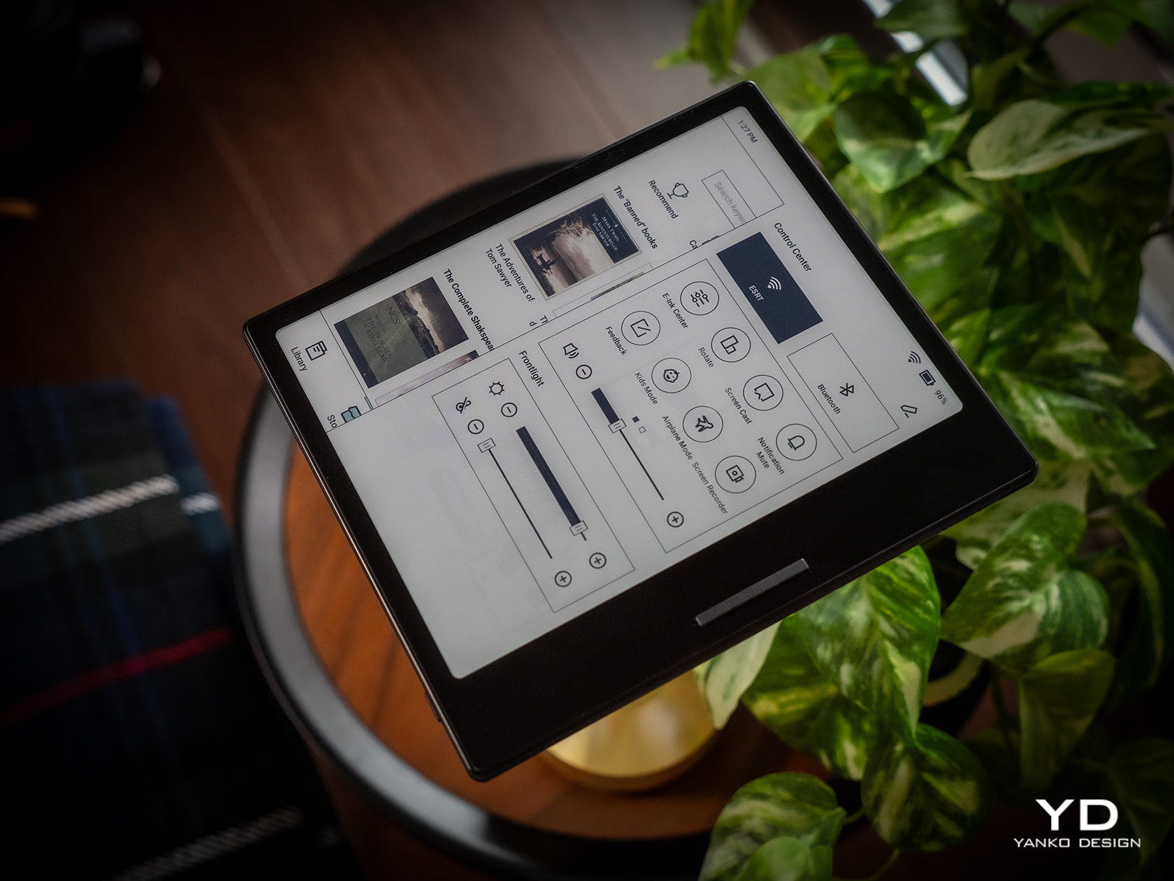
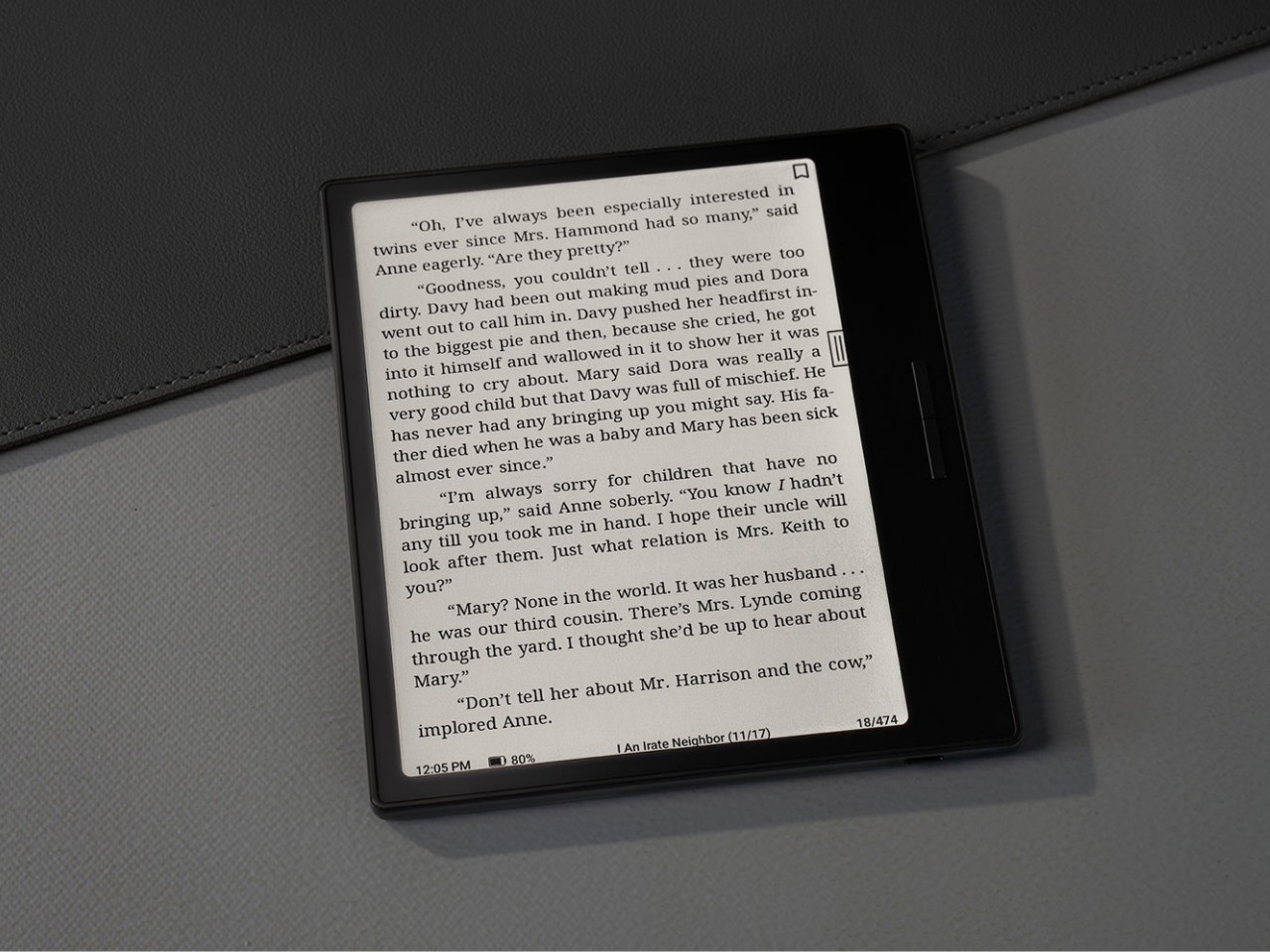
The killer feature is, of course, the E Ink Kaleido 3 screen, which also separates the BOOX Go Color 7 from the almost identical BOOX Page. This former supports 4,096 colors while the latter is just different shades of black and white. On top of this, BOOX adds its own technologies to tweak the performance of the E Ink panel, like introducing different refresh modes to make you choose between quality and speed, among other things. Suffice it to say, Onyx’s expertise in this area clearly shows how clear, crisp, and colorful the screen can be. Plain black and white text renders at 300ppi and is a joy to read, while colored content is halved at 150ppi, which is typical for this display. Nonetheless, reading comics and magazines is still comfortable and meaningful, even with muted tones.

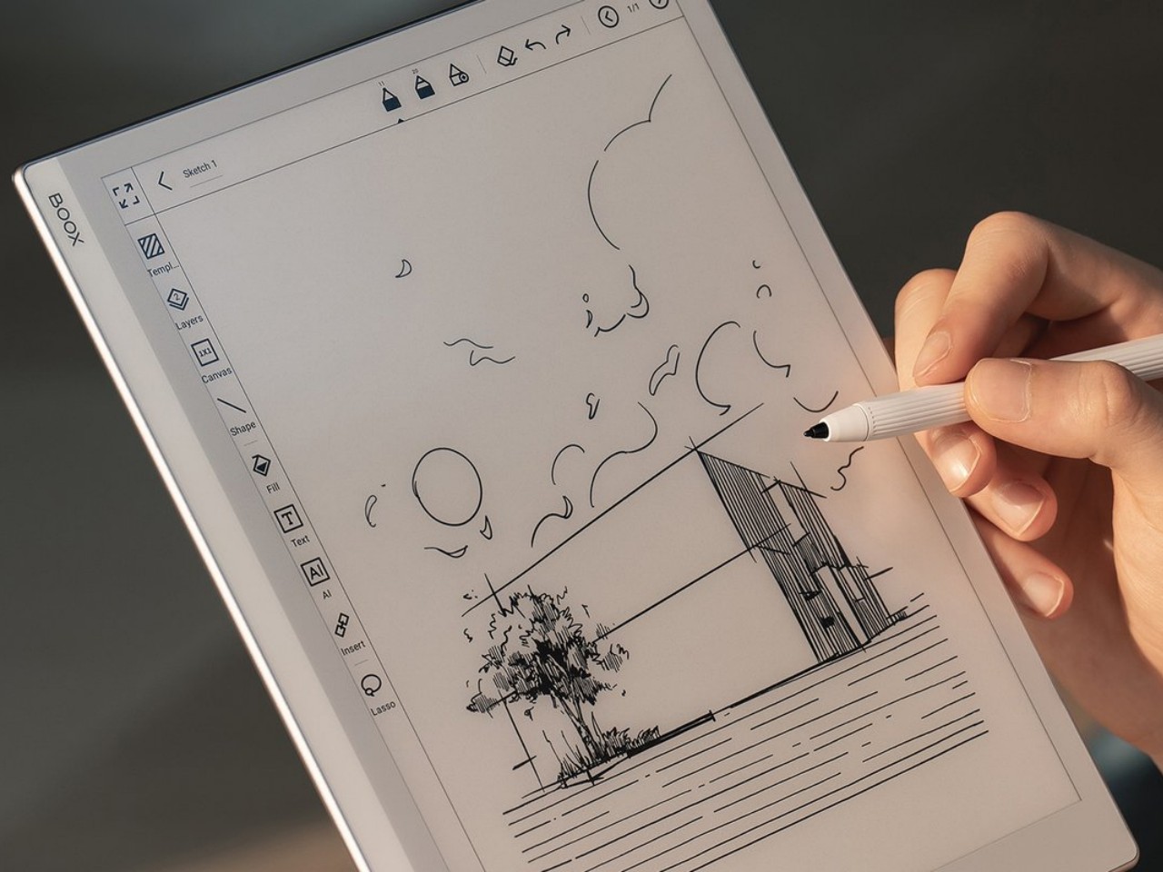
The BOOX Go Color 7 brings back a bit of sanity by having front lighting and configurable light temperature, something that the BOOX Go 10.3 removed for the sake of thinness. This means you can easily read with the device at night, in the dark, or in any low-light situation, whenever and wherever you feel the urge to knock a few pages off your reading list. Onyx, however, did exclude a few features to keep the product light not only in weight but also in cost. There is no Wacom digitizer for scribbling notes, for example. It also doesn’t feature the company’s famed BOOX Super Refresh or BSR, a technology that significantly reduces ghosting at the expense of battery life. Otherwise, the E-reader’s 2,300mAh battery wouldn’t last the days that it did.

At the end of the day, the Onyx BOOX Go Color 7 is hyper-focused on doing only one thing and one thing well: be an enjoyable E-book Reader, whether that’s a plain-text book or a colorful magazine. It doesn’t distract you with features only tangential to that activity, like taking notes, making sketches, or even watching videos. While you can install almost any Android app under the sun, the hardware limitations actually serve to dissuade you from subverting the product’s spirit and purpose. And when it comes to that, the BOOX Go Color 7 is definitely one of the best choices in the market today.

Sustainability

Onyx is a company that has grown by leaps and bounds over the past few years. The number of devices it has launched is quite significant, but that also means the amount of material waste that comes from these devices is substantial as well. Fortunately, these devices are made for long-term use, unlike phones and tablets which still have a very high turnover. That only delays the inevitable, however, so we’re still looking forward to the day that the company starts switching to more sustainable materials or recycled plastics for its products.

Although Onyx does make devices with longevity in mind, the same can’t be said for the version of Android they use. The BOOX Go duo, for example, uses a nearly three-year-old Android 12, and most of its products were using Android 11 before that. Granted, E-readers aren’t exactly known for keeping up with the latest software fads, but those don’t run Android either. What this means is that not only are BOOX devices behind in terms of potentially useful features and optimizations, they’re also lagging in security patches and bug fixes that would protect users from digital harm.

Value

The Onyx BOOX Go Color 7 is a delightful little device designed to make reading enjoyable anywhere you are. It has a solid set of capabilities that focus on this core use case and isn’t encumbered by extraneous features, though it still leaves the door wide open for other experiences. On its own, it is quite a competitive product, especially with a $249.99 tag, but it doesn’t exist in a vacuum and, in a way, even competes with BOOX’s other 7-inch readers. Fortunately, the distinction between them is quite clear, especially when it comes to their price tag.

Closest to it is the BOOX Page, to the point that it could have very well been called the BOOX Page Color. They share many things in common but are ultimately separated by color or the lack of it. If all you need is a plain E-book reader and don’t mind reading colored content in shades of gray, the BOOX Page actually offers a sharper screen and a slightly more affordable $219.99 price tag. On the opposite side stands the BOOX Tab Mini C, which is the portable productivity partner. It has all the bells and whistles, including a stylus, but also a heavier figure and a heavier cost at $399.99. If all you really want to do is read and enjoy it in color, then you can’t go wrong with the BOOX Go Color 7.

Verdict

BOOX’s new Go devices are quite bold, but not because they’re debuting something new and exciting. On the contrary, their audacity comes from going in the completely opposite direction, shedding off the baggage that they’ve accumulated over the years. It’s not like all those powerful features are bad, just that they’re not everyone’s cup of tea. And for those who truly love sneaking in a page or two during unexpected moments of freedom, the portability and clarity that the Onyx BOOX Go Color 7 brings could very well be what they need.

The post Onyx BOOX Go Color 7 E-reader Review: Bringing Back the Simple Joys of Reading first appeared on Yanko Design.

8BitDo SN30 Pro Gold and Silver controllers are as heavy as they look

It seems that we’re seeing a rather curious design trend in the gaming market. Once filled with plastic-encrusted designs, there are a few coming out with more stylish cases, be it for the device itself or for its accessories. Analogue just recently launched its CNC aluminum limited edition Pocket, but 8BitDo was actually a few steps ahead of it. Although one’s eleventh anniversary isn’t actually associated with metal (it’s Turquoise, by the way), the famed maker of throwback controllers released metal versions of its widely popular SN30 Pro, giving fans of the brand a collectible they can actually use and, in case of an emergency, even throw like a deadly weapon.

Designer: 8BitDo

Game controllers are made to be light enough not to cause hand strain but still have enough weight to feel substantial and improve gameplay. Gamers have come to expect that bulkier controllers that follow the Xbox and PlayStation designs would be heavier than most, especially controllers that are patterned after the designs of yesteryears. Not so this variant of the SN30 Pro, itself designed after the super lightweight Super Nintendo gamepad, mostly because most of its body is made of metal.

The Gold and Silver editions of the SN30 Pro aren’t just cheap paint jobs, though you might be forgiven for making that presumption given the resemblance to powder-coated metallic paint. It’s true metal, or as 8BitDo calls it, metal zinc alloy, and it’s used not just for the main body but for almost every part visible to the eyes. That includes buttons, triggers, and, yes, even the joysticks. The gold edition gets a matte paint finish while the silver version undergoes electroplating. The cables aren’t metal, though, which is probably for the best.

More than just visual oddities, the SN30 Pro Gold/Silver Edition controllers also have one other advantage over their plasticky older siblings. They’re built to last, at least more than the common controller, as metal will not warp or deform over time. It’s also less likely to crack when accidentally dropped, though you might dent this here and there. And drop it you might indeed, given how heavy it is 381g. For comparison, the normal SN30 Pro weighs a mere 114g and even the Xbox Wireless Controller is just around 287g.

Not all that glitters is gold, as they say, and despite the luster and heft of these limited edition controllers, their feature set might leave gamers sorely disappointed. They’re definitely more like functional collectors’ editions rather than serious gaming weapons (unless you throw it like one), and the $99.99 price tag definitely cements, or rather forges, that image.

The post 8BitDo SN30 Pro Gold and Silver controllers are as heavy as they look first appeared on Yanko Design.

Lenovo Legion 9i Gen 9 (2024) Review: (Carbon) Forging Ahead

PROS:


  • Sleek, stylish, and distinctive design

  • Best-in-class performance for 16-inch gaming laptops

  • Bright, vibrant, and beautiful 16-inch 3.2K Mini LED screen

CONS:


  • Small and cramped touchpad

  • 330W GaN charger is a gigantic brick

  • Relatively pricey

RATINGS:

AESTHETICS
ERGONOMICS
PERFORMANCE
SUSTAINABILITY / REPAIRABILITY
VALUE FOR MONEY

EDITOR'S QUOTE:

The Lenovo Legion 9i Gen 9 continues to wrap the best performance that money can buy in a design that looks equally stunning and luxurious.

Gaming laptops are pretty much like miniature desktops on (your) legs, but their power has traditionally come at the expense of their design. The majority of these portable gaming computers are built like tanks, so when somewhat slim laptops come along, people definitely stop and take notice. Last year, Lenovo made quite a bold and ambitious move with the 8th-gen Legion 9i, a gaming laptop that was as much beauty as it was brawn. As with any other product line, the PC maker followed it up this year with the Lenovo Legion 9i Gen 9 (16IRX9), promising the same stunning good looks but with upgraded specs and, of course, more AI. But was Lenovo able to manage a repeat of last year’s groundbreaking success or is this the generation to pass? We give this distinctive gaming laptop a spin to see whether it flies or flops.

Designer: Lenovo

Aesthetics

If you were worried that the Legion 9i Gen 8’s design was a one-off experiment, you’d be pleasantly surprised that isn’t the case, at least not yet. Right off the bat, the Lenovo Legion 9i Gen 9 gives off that same eye-catching aura that makes it a mix of a rugged gaming machine and a trendsetting office laptop. The forged carbon chips are still the star of the show, at least when it comes to first impressions. Chosen for their lightweight properties, the random mix of pieces gives each laptop a unique personality. Admittedly, some might not like its camo-like design, but it’s hard to argue that it’s different from the RGB-laden black surfaces of common gaming laptops.

The die-cast magnesium chassis is still here and still 90% made from recycled materials. It gives the Legion 9i Gen 9 its light 5.51 lbs (2.49kg) weight without sacrificing its durability and structural integrity. That said, these figures must be taken in the context of other gaming laptops, not conventional notebooks like the sleek MacBook Pro. Yes, it’s relatively thin and light compared to others, but it has the unmistakable design of a gaming powerhouse. That thick extended rear is a testament not only to the variety of ports available but also to how much room Lenovo had to make to fit all those powerful components inside.

As with any gaming laptop, RGB lighting is a staple feature of the Legion 9i Gen 9, and every area is customizable and controllable, including completely turning them off, like the backlit icons for the ports on the back, for example. Aside from the keyboard, the amount and placement of lighting are tasteful and add a beautiful accent to the equally beautiful profile of the laptop without being gaudy or obnoxious. All in all, the Gen 9 gaming laptop carries on its predecessor’s title as one of the most striking of its kind.

Ergonomics

The size and weight of a gaming laptop aren’t just for bragging rights, of course. They go a long way in providing comfort and convenience, especially when carrying the computer from one place to another. Granted, the Lenovo Legion 9i Gen 9 is hardly the thinnest nor the lightest, but it balances portability and power quite well. You won’t have any trouble shoving it into a backpack or laptop bag, perhaps aside from the fact that it is closer to a 17-inch laptop thanks to that protruding back portion.

Using the laptop itself is quite enjoyable, especially the tactile and responsive keyboard. With a decent amount of trouble, the full keyboard layout is both pleasurable and productive, freeing you from the need to look for external numeric keypads or do finger gymnastics to get to common functions. Of course, there’s plenty of RGB lighting underneath the keys, all of them configurable. A nifty trick is how the laptop can light up the most common shortcut keys by holding down the Fn key.

Unlike most laptops, including gaming ones, the Legion 9i Gen 9’s keyboard is pushed lower, closer to the user, to make room for cooling elements. While that does mean you don’t have to extend your arm too far to reach the keys, it also means that there isn’t enough room for the touchpad. Yes, the same gripe we had with last year’s model remains unchanged this year, and we have little hope the situation will improve any time soon. Granted, many gamers will probably reach for their favorite gaming mouse anyway, but this unfortunate design decision does make the laptop feel less appealing as an all-rounder.

Performance

While the Lenovo Legion 9i Gen 9 hasn’t changed at all on the outside, it has a few upgraded parts inside that warrant a bump in model number. There’s the 14th-gen Intel Core i9-14900HX as well as an NVIDIA RTX 4090 graphics, both top-of-the-line as far as gaming laptops go. Our review unit was equipped with 32GB of RAM and a 2TB SSD, though other configuration exists. The biggest upgrade from last year’s model, however, is really the Lenovo LA3-P AI chip, the intelligence that fine-tunes the laptop’s performance on the fly, faster than a human could. And it’s not just some buzzword-filled AI that makes funky images or answers questions but a true demonstration of what AI can actually do for us.

In terms of performance, the Legion 9i Gen 9 doesn’t disappoint, and the AI-powered Smart FPS manages to squeeze out every bit of performance compared to, well, the Performance profile. It’s not perfect, mind, and the difference between the two isn’t that staggering. It is, hopefully, just a portent of things to come as Lenovo continues to improve its AI.

Lenovo made a rather unusual decision in choosing a 3200×2000 resolution for the screen, but this 3.2K figure works just as well in balancing quality and power efficiency. The 16-inch 165Hz Mini LED is absolutely gorgeous and bright, easily rivaling OLED displays. The refresh rate might be a bit of a letdown, but 16-inch laptops that boast 240Hz also have a lower 2K resolution.

It’s not all sunshine and roses, though, as the Lenovo Legion 9i Gen 9 feels like it made a few trade-offs as well. Audio, while loud, feels a little insufficient and thin. The fans can get pretty loud as well, even with the boasted true liquid cooling. That doesn’t seem to kick in often to keep temperatures consistently cool and feels more like an emergency feature when things are about to start burning up. The biggest gripe in this area is the lack of improvement in battery life, which still scores less than two hours when gaming even at medium settings. As if adding insult to injury, the fast-charging 330W GaN charger is still a literal charging brick, a veritable dangerous weapon if you ever decide to start swinging it around to clear people away from the power outlet you’ll desperately be aiming for.

Long story short, the Lenovo Legion 9i Gen 9 (2024) definitely delivers on its promise of big power, but the cost of that promise is also starting to show. Make no mistake, it’s the kind of power that gamers want and need, but there will be more compromises and sacrifices along the way. More importantly, the gap between it and its predecessor might not look too big, making it an even more difficult choice, as we shall see later.

Sustainability

It’s definitely encouraging to see PC manufacturers starting to make big strides in changing the formula for their laptop designs. That’s not just about the appearance but, more importantly, the materials being used. Using post-consumer recycled (PCR) plastics is one thing, but reducing the use of plastic in the first place is an even more effective solution.

The Legion 9i Gen 9 doesn’t just use metal for its chassis. It uses 90% recycled metal instead of raw materials. That not only reduces material waste but also reduces energy consumption when creating fresh new metal. Lenovo is also slowly but surely improving the repairability of its products, a family trait being shared by many Lenovo laptops, not just the Legion 9i.

Value

There’s no denying that the Lenovo Legion 9i Gen 9 offers one of the best laptop gaming experiences in the market today, from its impressive performance to its gorgeous display to its intelligent lighting that can sync to any video or audio that’s playing. And while beauty is still in the eye of the beholder, few will argue that it commands a striking presence in any room either. It’s not without its shortcomings, but many of those can admittedly be taken for granted given how much power it offers.

The biggest hurdle to its adoption, however, will be that $3,200 price tag hanging over its head, and that’s just for the starting configuration. A maxed-out Legion 9i Gen 9 could very well cost you more than $4,000 even with a discount. Unfortunately, the 16-inch gaming laptop market has quite a few competitive entries this year as well, making the choice even harder. Fortunately, you don’t have to go far because Lenovo has quite a few offerings as well that could better fit your budget, including last year’s Legion 9i Gen 8.

Verdict

Gone are the days when gamers just took whatever kind of laptop was thrown at them just because those were the only designs possible. People have become more discerning as well as more sensitive to how their gear looks and many don’t just want some neon billboard masquerading as a laptop. The Lenovo Legion 9i Gen 9, just like its predecessor, puts design on the same pedestal as performance, delivering a gaming experience that isn’t just powerful but also pleasing to look at. It doesn’t carry a rather high price tag, enough to deter some early adopters, but it’s an investment that will keep on giving long after other laptops have gone out of fashion.

The post Lenovo Legion 9i Gen 9 (2024) Review: (Carbon) Forging Ahead first appeared on Yanko Design.

Analogue Pocket is getting classy with a limited-edition Aluminum chassis

Gaming handhelds are making quite the trend in the video game industry these days, from small DIY gadgets the size of key fobs to hulking computers crammed in a questionably portable form factor. But with the exception of the more expensive handheld PCs, the vast majority of these handheld consoles are made of plastic, at least for their bodies. Plastic, after all, is durable, lightweight, resilient, and, more importantly, cheap, and the products made with it sometimes come out feeling that way too. Once in a while, however, someone gets the idea to turn a geeky device into a glamorous product, like this aluminum-clad version of the Pocket Analogue that makes it one of the most stylish, let alone distinctive, gaming handhelds to grace the market today.

Designer: Analogue

It has been years since Analogue pulled off what can probably be considered a miracle in this industry. It launched what looks like a homage to the Game Boy, one that can actually play original Game Boy cartridges, that hasn’t hit any legal roadblocks considering how popular it is. Over the years, it has launched various limited editions of the Analogue Pocket, but this Aluminum Edition is its most ambitious one yet.

Precision CNC’d from solid billet 6061 aluminum, the limited edition Analogue Pocket Aluminum looks and feels more like a designer product than a functional gaming device, one that’s just meant to honor the original and be put on display but not used. That wouldn’t be much fun, of course, and thankfully this is not the kind of product that Analogue is putting out. It’s the same gaming experience offered by any Analogue Pocket, except now in a chassis that’s designed to really outlast those games.

If Analogue had left the Aluminum edition unfinished, it would have resulted in a striking and unique industrial aesthetic. But for those who still prefer a pinch of style and class, the limited-run gaming handheld is being offered in four anodized colors. Natural is as closest as you’ll get to that raw aluminum look, while Noir (Dark Gray) and Black both offer subdued hues. Bluish Indigo, on the other hand, stands out the most and is probably reminiscent of the transparent Atomic Purple case of the Game Boy Color.

Given its name, it probably shouldn’t come as a surprise that the Analogue Pocket Aluminum Limited Edition will be, well, limited. There’s no word on how many units will be made, but the $499.99 price tag and difficulty of machining a block of aluminum suggest there won’t be much. Judging by how fast previous limited editions disappeared, this will probably be gone before you know it.

The post Analogue Pocket is getting classy with a limited-edition Aluminum chassis first appeared on Yanko Design.

Nature-inspired toy-like calculator tries to get kids more interested in math

With plenty of phones and tablets around, kids are becoming more and more tech-savvy every generation. That, however, doesn’t always mean they are getting smarter or more skilled in other aspects of learning as well, particularly sciences and math that are more closely related to tech. There are plenty of apps that try to teach the basics, including reading and writing, but younger kids also need to develop their sense of touch, which requires more tactile experiences while learning. This calculator tries to pique children’s curiosity and engage not just their minds but also their senses, and it takes inspiration from one of nature’s hardest workers: bees and their geometric honeycombs.

Designer: Mohit Joshi

Calculator designs are not uncommon, but the vast majority of them utilize simple shapes like squares, circles, or even rounded squares, sometimes known as “squircles.” Not surprising, as these tools are designed for adults who value efficiency and performance primarily with aesthetics coming second only. The opposite is true for kids, however, whose short attention spans require designs that are captivating and intriguing, and keeping the design still functional is the challenge.

Some consider the hexagon to be the perfect shape because it isn’t flat like a square, can fit together better than circles, and is more space-efficient than triangles. Nature has a perfect example of this geometric shape in action as can be seen in beehives, particularly the honeycomb structures they form. While the real thing can be dangerous to children, bees are sometimes portrayed in fun and funny ways, especially given how hard they work and how well they guard their honey.

Hive Hex combines this shape and inspiration into a device that should be more interesting to use than even the sleekest and most minimalist calculator. The yellow color alone is eye-catching enough, but the puzzle-like hexagonal keys give a sense of whimsy and playfulness with their unbalanced composition, unlike the symmetrical arrangement of calculator buttons. That said, the non-standard layout of keys could prove to be confusing when the child “graduates” to grownup tools.

This toy-like yet functional calculator is a great example of how a bit of creative design can significantly change how a product appeals to different groups of people. Of course, some adults might criticize the use of calculators in the early stages of math education, but the calculator does more than just help kids solve number problems. The Hive Hex Toy Calculator could help give children a more lasting impression of how math doesn’t have to be boring or even scary, a positive attitude that they could carry with them throughout the rest of their lives.

The post Nature-inspired toy-like calculator tries to get kids more interested in math first appeared on Yanko Design.

Eight-pointed start censer adds a regal and mystical presence to your space

There is no shortage of censers and incense holders these days, and considering how many of them are either designed for the home or for travel, it’s no surprise that the majority of them embrace more minimalist aesthetics. These can fit in almost any kind of interior design theme and they tend to avoid being distracting. Some people, however, prefer to have a different kind of imagery when trying to settle their minds, one that may remind them of worlds beyond what we can see or physically feel. This wood and metal censer may look simple at first glance, but it can easily evoke feelings of awe and wonder thanks to its use of one of the most mystical symbols known to man: a star.

Designer: Rafael Maia

Given their distant and almost ethereal appearance, stars have always symbolized not just the heavens but also the majesty associated with it. Human history is filled with symbolism, art, and jewelry that use these heavenly bodies for inspiration, so what’s to stop modern designers from applying the same tradition to products intended to relax or elevate people’s consciousness to new heights? The eight-pointed star design, in particular, has associations with some religions and is an interesting geometric figure in its own right.

Star of the Orient is a censer inspired by religious themes, though the emotional and psychological effects of the design often apply universally, regardless of people’s inclinations. The censer’s star-like shape can be fully appreciated when looking at it from the top, usually when preparing the incense or cleaning the censer. The repeating pattern of lines radiating from the center and following the shape of the star creates a mesmerizing effect as if the golden star is pulsating and flickering like a real star in the sky.

In addition to this stellar theme, the censer’s tall form is also a bit contrary to the often diminutive sizes of most home censers. It has an almost imposing character, standing majestically on any surface while also blending with its surroundings. The combination of wood and bronze creates a sense of duality, not unlike the separation of the Earth and the sky where the star resides. At the same time, the sustainable materials also give off a guiltless feeling as you focus on the gentle puff of smoke rising from the top.

The censer’s design is simple without falling into the minimalist box. At the same time, the details and non-trivial shape create a point of visual interest that won’t distract you from lofty thoughts. And when you’re not using the censer, the Star of the Orient stands as a majestic piece of home decoration that adds a bit of a mystical accent to your space.

The post Eight-pointed start censer adds a regal and mystical presence to your space first appeared on Yanko Design.

Onyx BOOX Go 10.3 E-reader Review: Hitting the Brakes to Go Back to the Roots

PROS:


  • Incredibly slim and lightweight design

  • Pleasurable reading and note-taking experience

  • Google Play Store support

  • More accessible price tag

CONS:


  • No front lights for reading in the dark

  • No microSD card slot

  • Included pen has no eraser function

RATINGS:

AESTHETICS
ERGONOMICS
PERFORMANCE
SUSTAINABILITY / REPAIRABILITY
VALUE FOR MONEY

EDITOR'S QUOTE:

The BOOX Go 10.3 brings a refreshing change in pace that focuses on comfort and enjoyment for both reading and note-taking, but be sure to read the fine print to know what you'll be getting for that super slim profile.

E-book Readers or E-readers have come a long way since the earliest days of the Amazon Kindle, and much of the innovation in that space can perhaps be credited to companies like Onyx BOOX. The brand has been aggressive in pushing new technologies and designs, from E-readers that are actually Android tablets in disguise to bringing a pinch of color to this predominantly monochrome world. In fact, it might have gotten too aggressive with almost a dozen models under its belt. The competition is tough, of course, but it’s also easy to lose sight of the gold in the heat of the race. It seems that BOOX took a step back to take stock of where it is now and out of that introspection came out what is probably the thinnest E-reader or even tablet in the market. But what sacrifices did the Onyx BOOX Go 10.3 make to reach that achievement? We give it a spin to give you that answer.

Designer: BOOX

Aesthetics

The first thing you’ll notice about the BOOX Go 10.3 will naturally be its thickness or rather its lack of it. At only 4.5mm, it is undeniably the thinnest E Ink device in the market, at least in the 10-inch or larger category. It’s probably not a coincidence that Onyx launched this reading and note-taking wonder a little after the launch of the thinnest iPads ever, so drawing parallels isn’t exactly that difficult. For a device category that was once characterized by bulky chassis and cheap plastic, such a slim and sleek entry is a breath of fresh air.

The BOOX Go 10.3’s beauty goes beyond its remarkable (no pun intended) profile, however. It carries a minimalist and clean aesthetic that makes sure your focus is on the page and not on any extraneous decoration around it. The 10.3-inch screen is surrounded by an admittedly thick bezel, but its light gray tone makes it look less offensive as it almost blends with the white theme of the UI. The left side of the device has a white border, mimicking the margin of a notebook or the spine of a book, and is one of only two places you will see the BOOX branding.

Flip the device over and you will see a design that BOOX has never tried before. Instead of a matte metal or plastic surface, you get something akin to fabric or faux leather, definitely a much-welcome stylish detail. The metal-like strip that runs down the side, however, is an accent that will probably prove to be a bit controversial. It’s not that bad a design, just a little distracting both for the eyes as well as the fingers that will be touching that part.

All in all, there’s a very good reason for all the buzz surrounding the BOOX Go 10.3. Its mind-blowing thinness is definitely one, but its simple yet beautiful design also elevates its character even among its other BOOX siblings. And it’s definitely not just for show, because that slimness does have other usability implications as well.

Ergonomics

The Onyx BOOX Go 10.3 isn’t just incredibly thin, it’s also extra light as well at only 365g (0.8 lbs). OK, that’s not exactly the lightest figure, but it is when you put it side-by-side with other 10-inch E-readers, let alone 10-inch tablets. That’s already enough for bragging rights, but it also has an important consequence: it’s comfortable to hold up for long periods of time.

Unlike desktops and laptops and even some tablets, you often hold E-readers while using them, whether you’re sitting back or lying down in bed. With a typical 10-inch screen, your hand and your arm are bound to tire out quickly, but not so with such a lightweight device. It also helps that the BOOX Go 10.3’s textured back helps improve the grip so you can hold it with confidence for longer periods of time. Of course, smaller and lighter BOOX readers do exist, but you’ll miss out on some features like an expansive screen or note-taking.

It bears noting here that the stylus that comes with the device is also designed for better ergonomics. This special version of the Onyx BOOX Pen2 Plus has vertical ridges on its barrel for a better hold, but even the “vanilla” design of the stylus has a faceted design that makes it easier to grip like a traditional wooden pencil. Considering writing down notes or even sketching is the secondary purpose of this slate, any improvement in the pen’s ergonomics goes a long way in making that a more enjoyable experience.

Performance

Given the thinness of the BOOX Go 10.3, you’ll be forgiven for wondering if there’s any catch to that impressive design. You’d be right, of course, since there’s only so much you can cram inside a very cramped space. Onyx naturally had to drop a few things from its usual repertoire, but it didn’t do so willy-nilly. It made a conscientious effort to only cut off features that won’t be essential to reading and writing enjoyment, except for one rather controversial thing.

There is no front light, or what other brands would call a glowlight, which sounds like a rather critical flaw at first brush. It means you won’t be able to read in the dark without some external light, but even some low-light situations can prove to be challenging given the nature of E Ink screens. That said, the removal of built-in lighting does also have some advantages, and not just for the sake of making the tablet super-thin.

Having no front light means there is one less layer in between the E Ink panel and the protective glass, so there is barely any gap that could diffuse and blur the content being shown. In other words, text on the BOOX Go 10.3 looks extra sharp and crisp, which means they’re also easier on the eyes. The same principle holds for the lack of color support since the device uses the E Ink Carta Plus rather than the now-popular Kaleido 3, which removes yet another layer of interference. Yes, you give up seeing a limited number of colors, but in exchange, you get one of the best reading experiences in the market, at least with sufficient lighting.

This “gapless” display also has some bearing on the second thing that the BOOX Go 10.3 is great at: note-taking and even a bit of sketching. Thanks to a more direct interaction with the panel and Wacom digitizer, there is very little lag or parallax when writing on the screen. There’s still a bit, given the nature of E Ink displays, but it’s almost unnoticeable except to well-trained eyes. The texture of the screen, paired with the nib of the stylus, also produces this scratchy sound that makes it really feel like you’re writing on paper. If you’re the type who loves to write by hand, you’ll definitely love the device’s writing experience, along with some of the apps and features that support it. In fact, Onyx itself calls the BOOX Go 10.3 an “E-paper Notepad” to emphasize this use case and, in a way, temper the expectations of reading aficionados.

With how thin the device is, it’s probably more impressive how much BOOX was able to cram inside than how much it left out. It’s still a true Android device, running on an 8-core processor with 4GB of RAM and 64GB of internal storage. It even has some decent-sounding speakers and a mic, though you’ll probably find few uses for those outside of recording and playing back lectures and talks. There’s a large 3,700mAh battery that’s going to last you days if not weeks, considering there will be no lights or colors to drain it quickly. Unfortunately, it does leave out the microSD card slot, so you’ll have to be smarter about the apps you install or the books you save on the device.

The BOOX Go 10.3 is clearly not your average E-reader, not just from its looks but also from the way it works. With a 300ppi pixel density, it has one of the sharpest E Ink displays in the market rivaled only by the 10-inch Amazon Kindle Scribe. The lack of front light and color is responsible for that feat, but it will also be a deal-breaker for many E-reader fans. Suffice it to say, it won’t be for everyone.

Sustainability

As mentioned earlier, Onyx has been making a rather aggressive push in the E-reader market, bringing out new products regularly. For better or worse, that also means it is also contributing to the growing volume of material waste from production as well as carbon emissions. Thankfully, it designs its devices for longevity, and some even use more sustainable materials like aluminum, but the overall situation isn’t looking too positive as far as eco-friendliness is concerned. As the company grows, we hope that it will also shift its focus on such issues to help make every device not only enjoyable but also a guilt-free purchase as well.

Value

The Onyx BOOX Go 10.3 definitely turned heads and raised eyebrows with its super slim design and, consequently, its lack of a front light. It’s definitely a unique design, even among other BOOX products, but it doesn’t exist in a vacuum either. Despite its distinctiveness, it actually aims for a rather specific market known to many E-reader fans, a market currently dominated by the Remarkable 2 and the Supernote A5 X. These 10-inch devices, while more than capable of displaying e-Books, are geared more as paper notebook replacements than plain E-readers.

That’s pretty much the same proposition that the BOOX Go 10.3 is making but with a twist. It’s still a BOOX device, which means having most of the features that define the brand, including full Google Play support. This immediately takes it beyond just being an e-Paper Notepad slash E-reader into almost anything you want it to become, at least within the limits of an E Ink display that doesn’t have any lighting whatsoever. For avid note-takers who also happen to love reading plain-text books on large screens, that $379.99 price tag might not look so bad after all.

Verdict

Even with the prevalence of computers and smartphones, there is still a strong culture that extols the benefits of writing things down by hand. But while paper notebooks and layouts have gained a cult following, there are many who consider digital solutions to still be more efficient and, in the long run, less expensive. The Onyx BOOX Go 10.3 is designed for such people, trying to recreate the experience of writing on paper but with a stylus. And just like paper, it doesn’t have a light of its own, which may make it sound less convincing as an E-reader. It’s admittedly still a niche market, but for those squarely living in it, the BOOX Go 10.3 offers a striking and slim design focused just on the essentials, no more, no less.

The post Onyx BOOX Go 10.3 E-reader Review: Hitting the Brakes to Go Back to the Roots first appeared on Yanko Design.

SwitchLens Pro Camera System turns any Smartphone into a Photography Powerhouse

Smartphone cameras have come a long way and have become quite capable tools in preserving memorable moments for posterity. There is, however, still a very good reason why they haven’t completely overthrown pro cameras. You can only squeeze so much hardware into a slim smartphone, and you can’t really have large lenses or even a lens mount bulging out from the back of the phone. There are admittedly a few accessories that try to bring some of that interchangeable lens experience but usually limit themselves to small lenses made just for smartphones. Bringing a true “pro camera” experience to mobile requires taking a few cues from pro cameras themselves, and that is exactly what the SwitchLens does to level up your mobile photography game.

Designer: sneaki design

Click Here to Buy Now: $199 $329 ($130 off). Hurry, 33/450 left! Raised over $490,000.

SwitchLens is a complete pro camera system that not only takes the lessons learned from digital cameras but even the technologies employed there. In particular, it embraces the popular micro four thirds or MFT system that leverages large sensors and interchangeable lenses to create highly detailed and breathtaking shots. The large 20.75MP 1.33-inch CMOS sensor that SwitchLens uses is unmatched by even flagship phones, which means it can take in more light and record more details just with the hardware alone, no post-processing or AI touch-up required.

And just like the MFT used in compact digital cameras, you can also swap out lenses to get the best shot out of a scene, whether that’s a 25mm f1.8 portrait lens for closeups or a 12mm f2.8 wide-angle lens for sweeping panoramic shots. What makes the SwitchLens system even more impressive is that it can actually support MFT lenses from Panasonic or Olympus that you might have lying around. You are no longer limited to what the manufacturer provides, and you are definitely not limited to tiny lenses that compromise on performance in return for their pretty sizes.

1

Unlike other such accessories, SwitchLens is a powerful device that can function even when detached from the back of your phone. Using a stable and fast Wi-Fi connection, you can control SwitchLens remotely for more difficult shots, or magnetically stick it to the back of your iPhone or Android phone to recreate the experience of using a digital camera but with a much larger and clearer viewfinder. From selfies at extremely low angles to macro photography, SwitchLens gives you the flexibility to take a shot in the most comfortable and most convenient way.

1

The pro camera experience doesn’t end there. SwitchLens’s Peaking Focus assistance feature easily marks out which objects are in focus with vibrant, eye-catching colors to ensure sharp and in-focus images every time. With support for microSD cards up to 1.5TB in capacity, you have nearly limitless room for taking thousands of RAW photos and recording 4K 30fps videos without filling up your phone storage. With the SwitchLens MFT modular camera system, your phone is no longer a stumbling block for a pro photography experience and becomes the launch pad for taking stunning photos and videos like a pro.

Click Here to Buy Now: $199 $329 ($130 off). Hurry, 33/450 left! Raised over $490,000.

The post SwitchLens Pro Camera System turns any Smartphone into a Photography Powerhouse first appeared on Yanko Design.

Dual-screen Android tablet combines LCD and E Ink screens with some compromises

It seems that the Microsoft Duo dream, and that of the Courier concept before it, is pretty much dead in the water. While the idea looked tantalizing, execution left much to be desired, especially when it came to using a mobile platform such as Android. A tech giant’s failure, however, never stopped anyone from dreaming up other designs, as can be seen in some of the dual-screen Windows laptops being sold by the likes of ASUS and Lenovo. Of course, those are large and expensive devices that don’t capture the flexibility and agility of earlier concepts. Unsurprisingly, someone is trying to bring that idea to life again, this time with a combination that somewhat makes sense, if only the implementation does as well.

Designer: Bluegen

To be clear, this isn’t the first device that put a regular colored LCD screen and a monochrome E Ink display side-by-side. Ever the bold explorer, Lenovo launched the Windows-powered Yoga Book C930 half a decade ago, and the fact that it isn’t as widely known is probably proof of how popular the design was. To be fair, the idea had merit on its own, combining a colorful and vibrant screen with an eye-friendly and battery-efficient display to have the best of both worlds.

Lenovo Yoga Book C930

That’s the same proposition that the OKPad is making but on a smaller scale and a significantly lower price point. With an 8.9-inch IPS LCD screen paired with a 7.8-inch E Ink screen, it’s aiming for portability and convenience more than power and performance. It’s more like a sidekick than a main mobile device, useful for taking notes, typing out quick documents, or even giving a business presentation off-site.

1

There are, however, some details that make the OKPad a little less convincing. The aluminum alloy shell does have some aesthetic appeal, but the large bezels around both screens make it look more like a prototype or a blast from the past. There is also some confusion about the exact specs of the device, but it sounds like a mish-mash of modern hardware like USB-C and Wi-Fi 5 as well as an unidentified Snapdragon processor that might be from 2018 or earlier. And then there’s the fact that it’s running Android 10, a version that’s almost ancient by now, both in terms of features and, more importantly, security updates.

Admittedly, the OKPad concept is quite intriguing, and for people who love to read and take quick notes on the go, it does offer the best of both worlds of regular Android tablets and E Ink readers. There might be some concerns about apps, not to mention the uncertainty of a crowdfunded device, but at its price point, it’s almost too tempting not to take the risk. Then again, there are now E Ink readers with colored screens, more powerful hardware, and more recent Android versions, so those two worlds have already been bridged in some other way as well.

The post Dual-screen Android tablet combines LCD and E Ink screens with some compromises first appeared on Yanko Design.

Modular office furniture brings the freedom and flexibility of LEGO to the workplace

Gone are the days of uniform-looking office cubicles that feel designed to suck the soul out of employees. Although they have their own downsides, the so-called “open floor plans” bring a bit of customization to office spaces, letting people’s and companies’ characters shine. Of course, office space is never infinite, and workers have to make do with the sometimes cramped horizontal allowance they have. Maximizing every inch of that space requires not only being creative but also furniture that delivers the functionality that you need while being space-efficient as well. This office furniture collection offers exactly that with a modular system that you can mix and match to your needs, taking inspiration from one of the most popular modular designs in modern history: LEGO blocks.

Designer: Form Us With Love for String Furniture

OK, they might not connect to each other like LEGO bricks, which would be impractical and tedious to use anyway, but the way you can combine different “block” sizes in almost endless ways is reminiscent of the creative toy. There are six different sizes of components, ranging from cube storage to rectangular shelves, and you can arrange them in any way you see fit, as long as you have horizontal and vertical clearance. You can put them side by side like a long shelf, stack them on top of each other like a cabinet, in a straight line, or in an L-shaped corner configuration. Your creativity and space are the limits.

The pieces almost look like LEGO blocks, at least metal LEGO blocks. They are made from thin with a perforated grid pattern that is meant to give them an industrial aesthetic. Of course, these holes can serve functional purposes as well, allowing you to hang hooks, screw in handles, and maybe even decorate the surfaces with your personal photos and mementos. Presuming you or your company purchases different colored sets, you might even be able to mix up colors to add even more personality to your office space.

The concept of modular furniture is nothing new, but most of these designs tend to have a fixed appearance or mode of operation, allowing owners to only remove or add parts that are specifically designed for the system. With a minimalist design that adopts the simplest shapes of squares and rectangles, Center Center allows for maximum flexibility and, more importantly, encourages creativity and individuality that are easily lost in many work environments these days.

The post Modular office furniture brings the freedom and flexibility of LEGO to the workplace first appeared on Yanko Design.