This Furniture Collection Was Designed By Your Inner 5-Year-Old

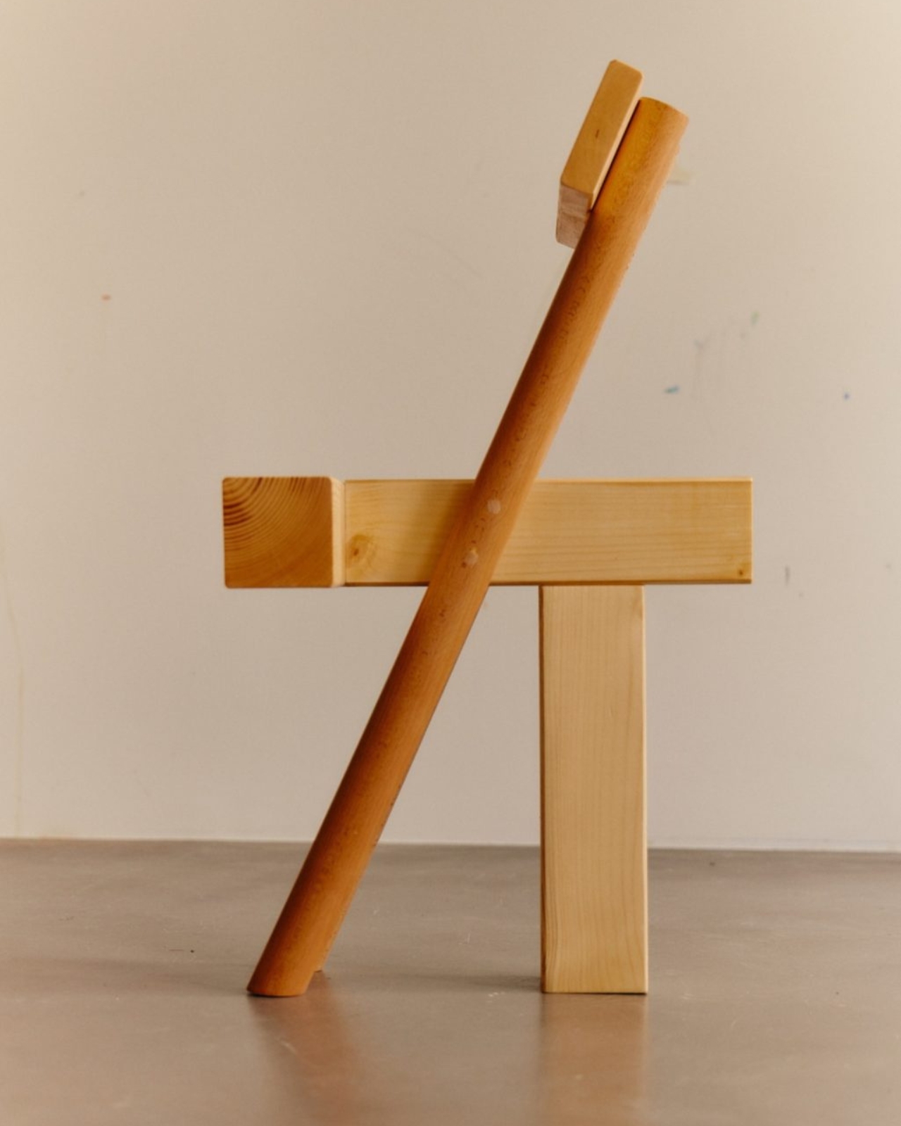
Remember the pure joy of stacking blocks as a kid? That satisfying click when you balanced a square on a circle, or the creative rush when you toppled everything and started fresh? Yellow Nose Studio remembers, and they’ve turned that childhood magic into furniture that actually makes sense for adults. Their INDERGARTEN collection is basically what happens when you let your inner five-year-old design chairs, and honestly, it’s brilliant.

The Berlin-based Taiwanese design duo behind Yellow Nose Studio did something clever with the name itself. They dropped the “K” from kindergarten, and in doing so, opened up a whole new way of thinking about design. It’s not just a cute play on words. It’s an invitation to approach furniture the same way we approached play: with curiosity, experimentation, and zero pretension.

Designer: Yellow Nose Studio
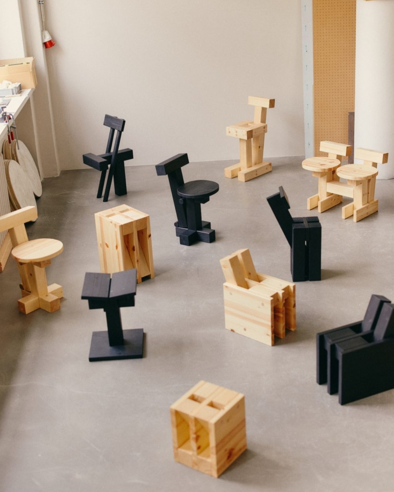
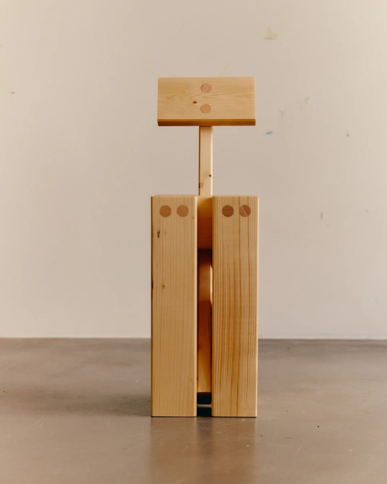
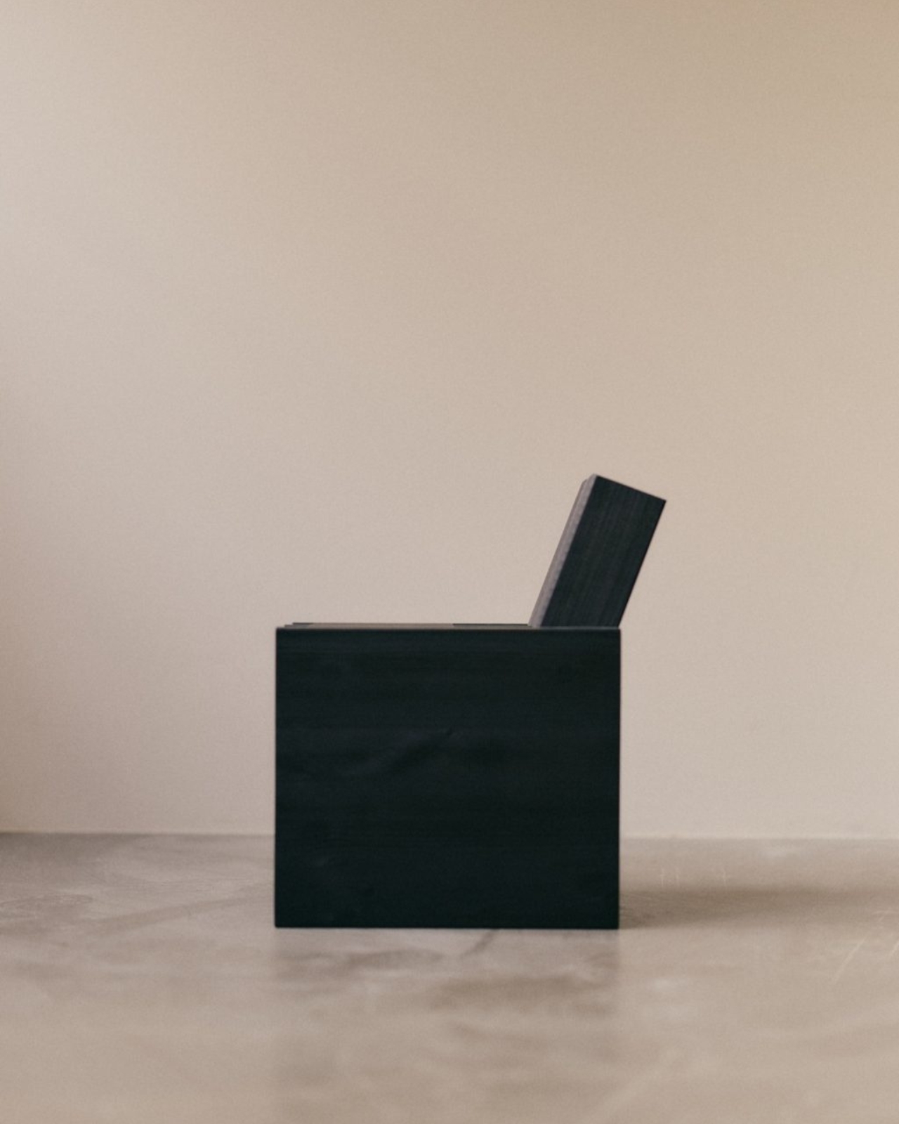
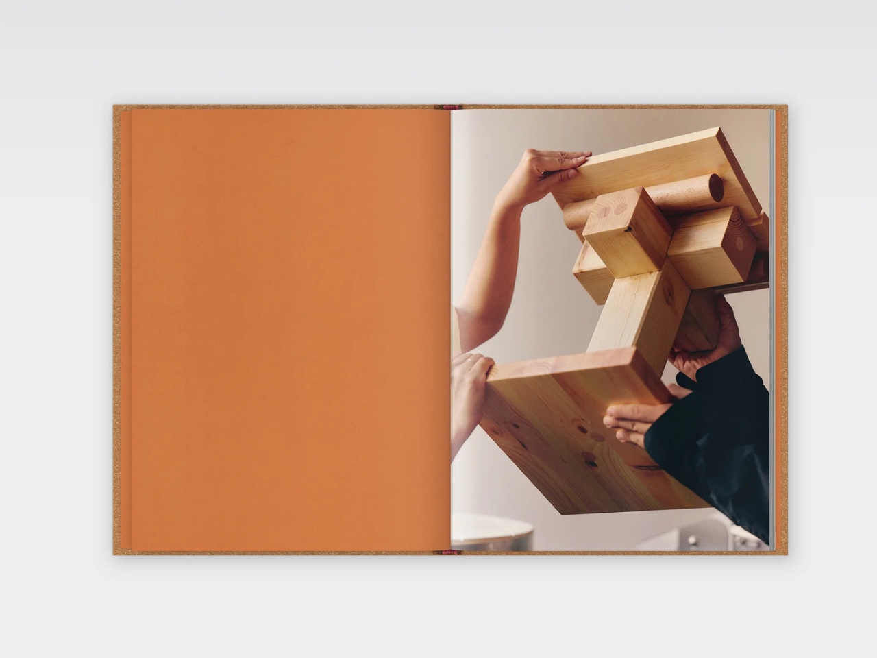
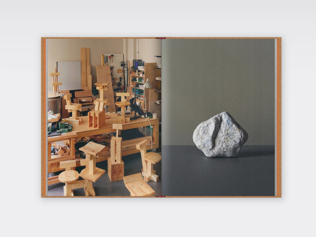
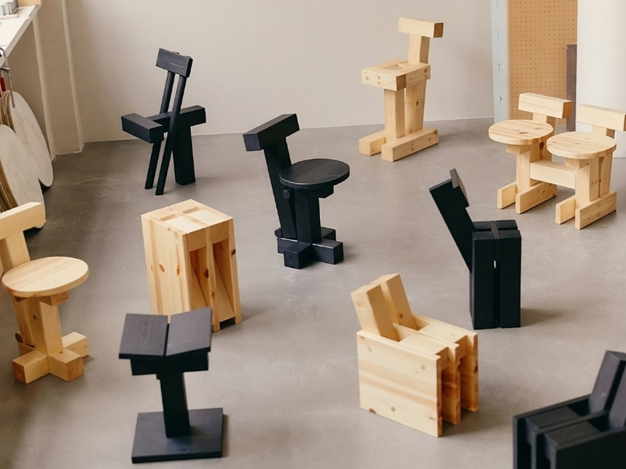
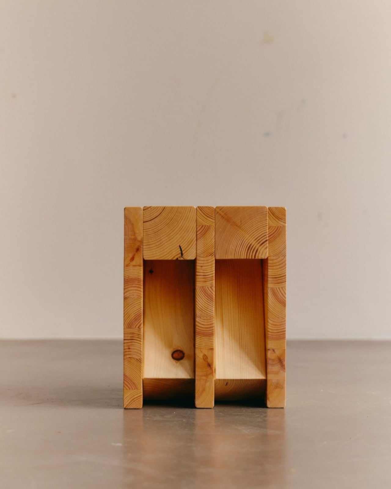
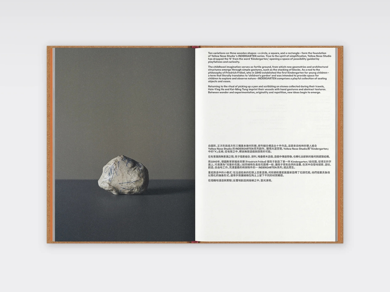
Here’s the concept in its simplest form. Take three basic wooden shapes: a circle, a square, and a rectangle. Stack them. Rotate them. Layer them differently. What you get is ten distinct variations that somehow look like they belong in a contemporary art gallery and your living room at the same time. The pieces function as seating objects and vases, all handcrafted from beech, cedar, and pine.
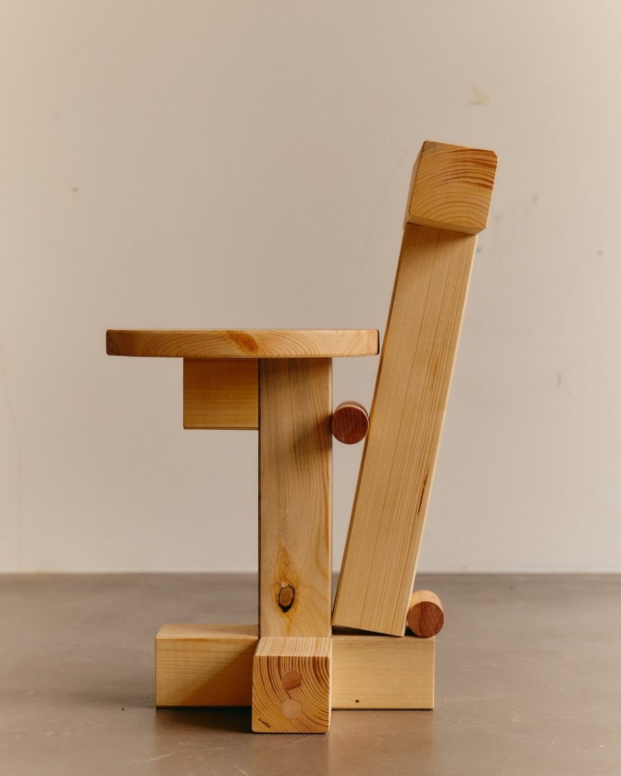
What makes this collection so fascinating is how the duo actually creates these pieces. They don’t just sketch ideas and hand them off to manufacturers. Each designer makes ten pieces, then they swap and literally deconstruct each other’s work, adding new elements until they both agree on the final ten designs. It’s collaborative in the truest sense, with every piece containing both perspectives. That back-and-forth, that willingness to take apart and rebuild, echoes exactly how kids play with blocks, and it’s what gives these pieces their unique energy.
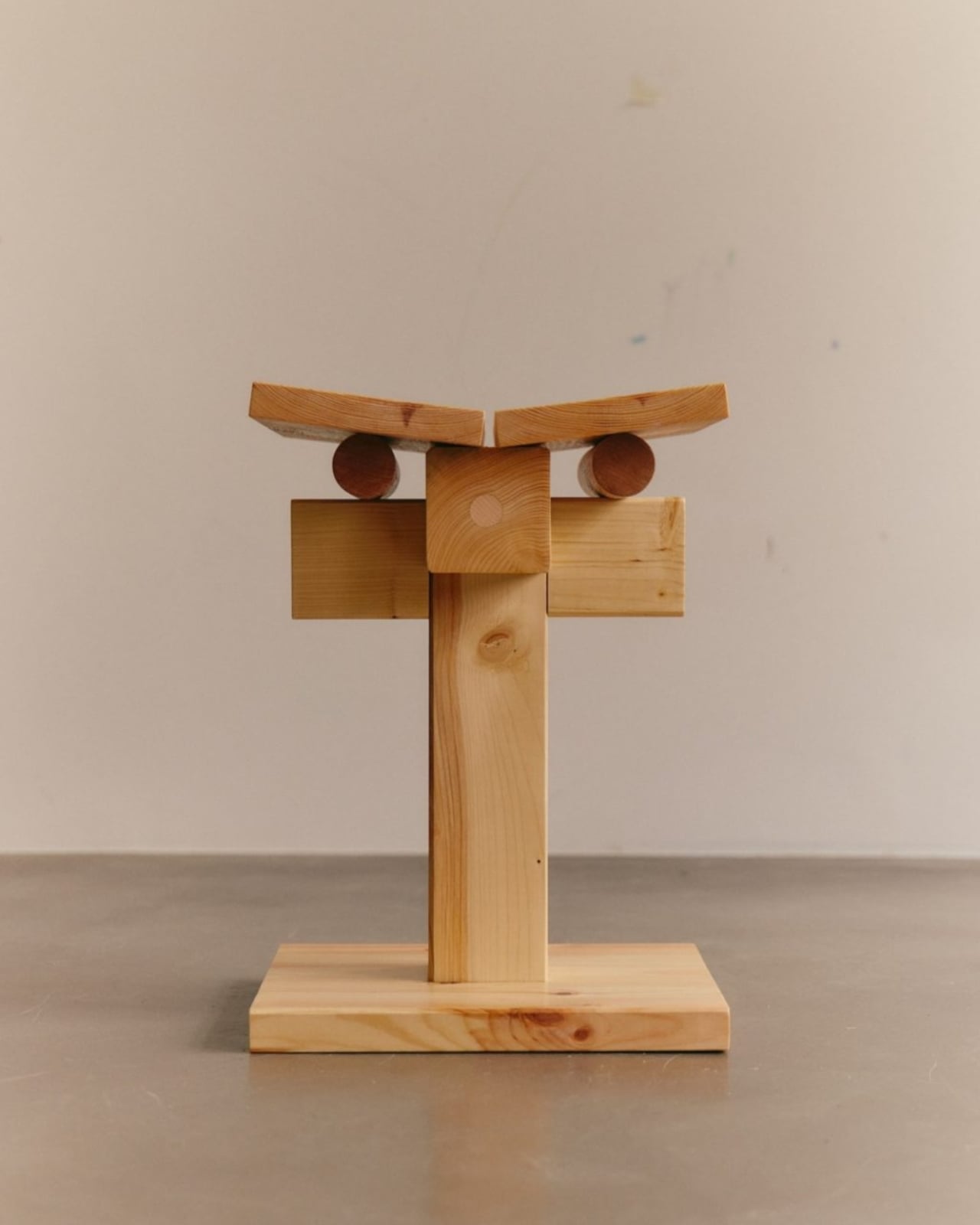
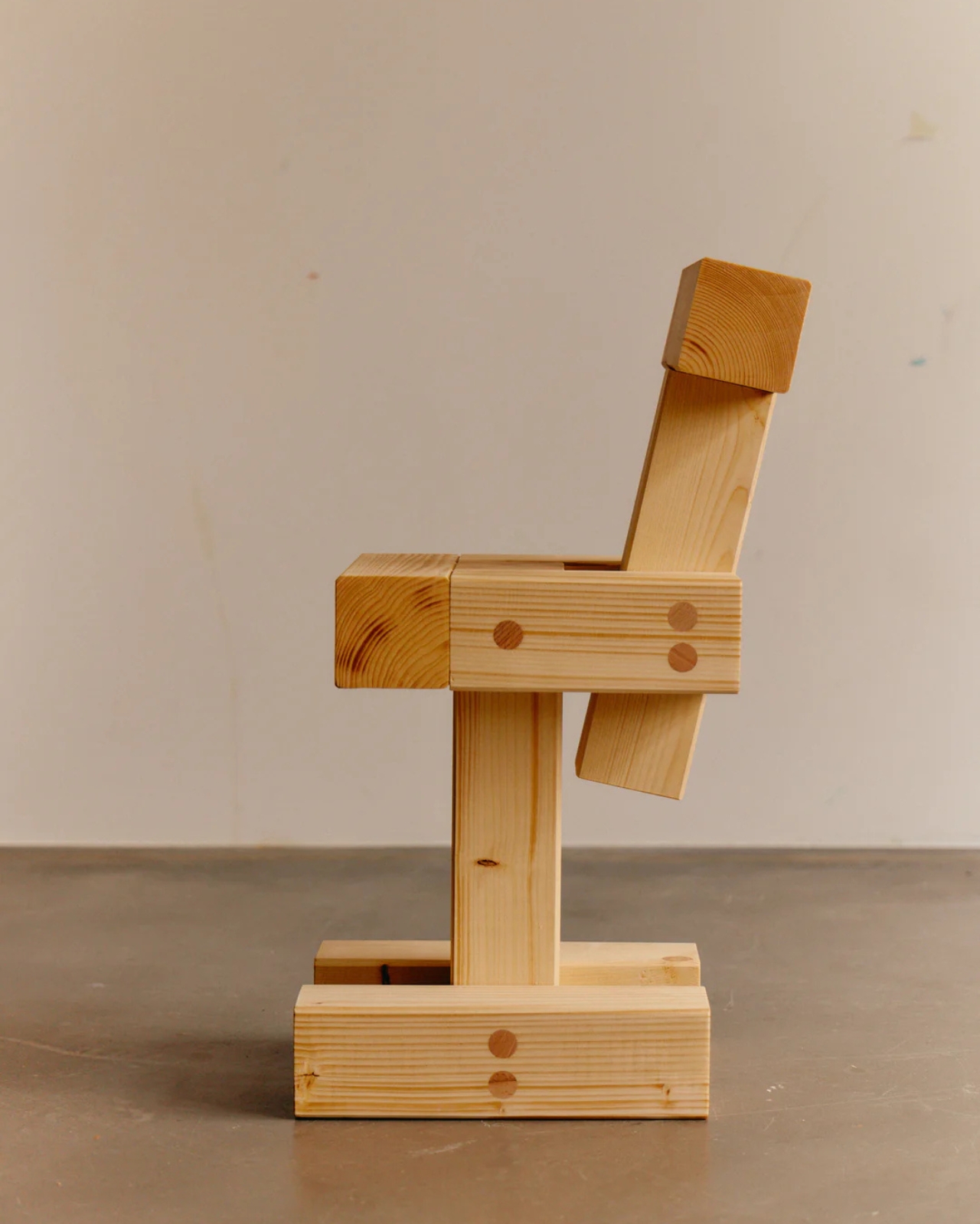
The philosophy behind INDERGARTEN nods to Friedrich Froebel, who established the first kindergarten in 1840 with the radical idea that children learn best through play and hands-on experimentation. Yellow Nose Studio has taken that concept and applied it to their entire creative process. The result is furniture that feels both architectural and organic, structured yet playful. New geometries emerge from simple gestures, the same way a tower appears when you stack blocks one on top of another.
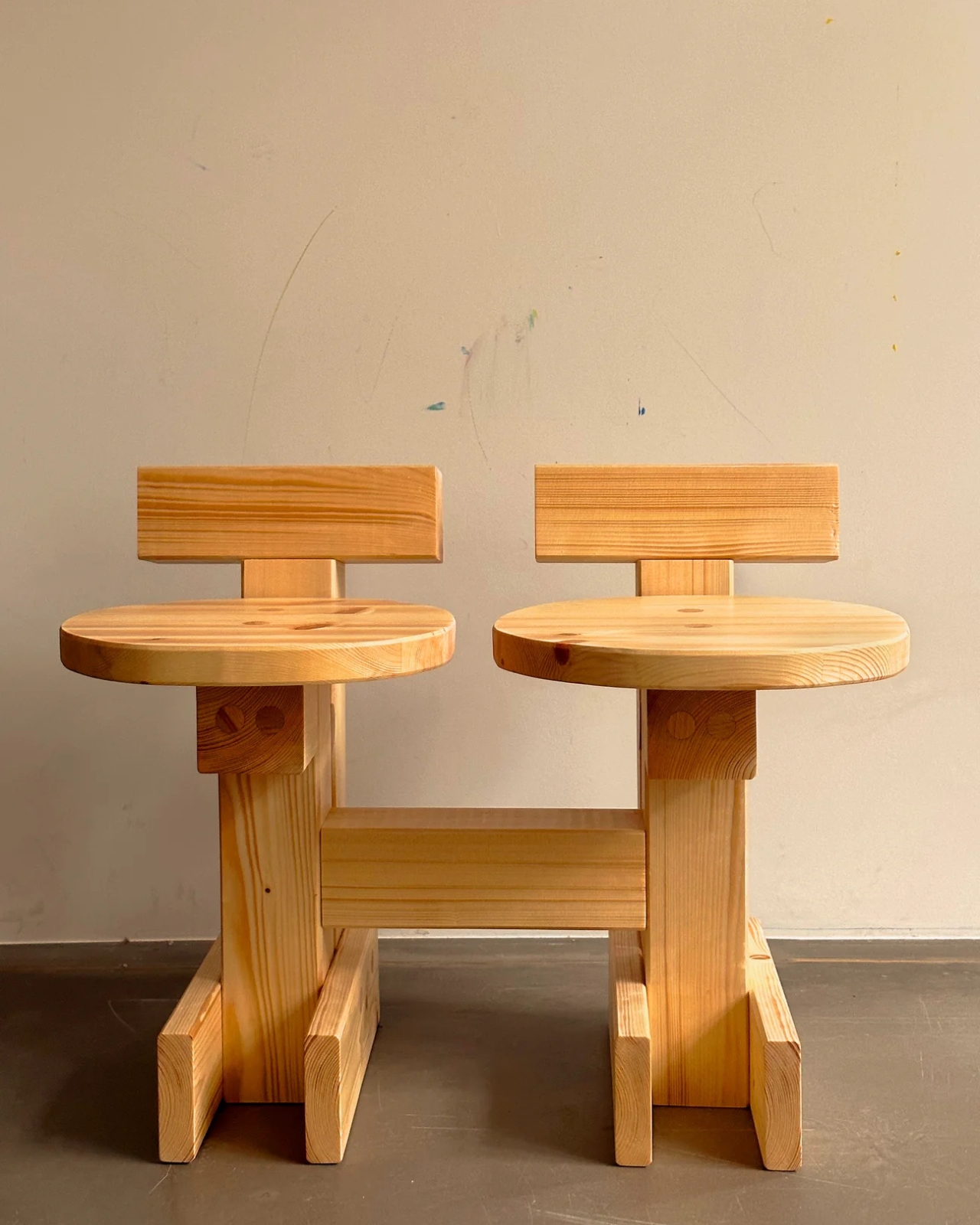
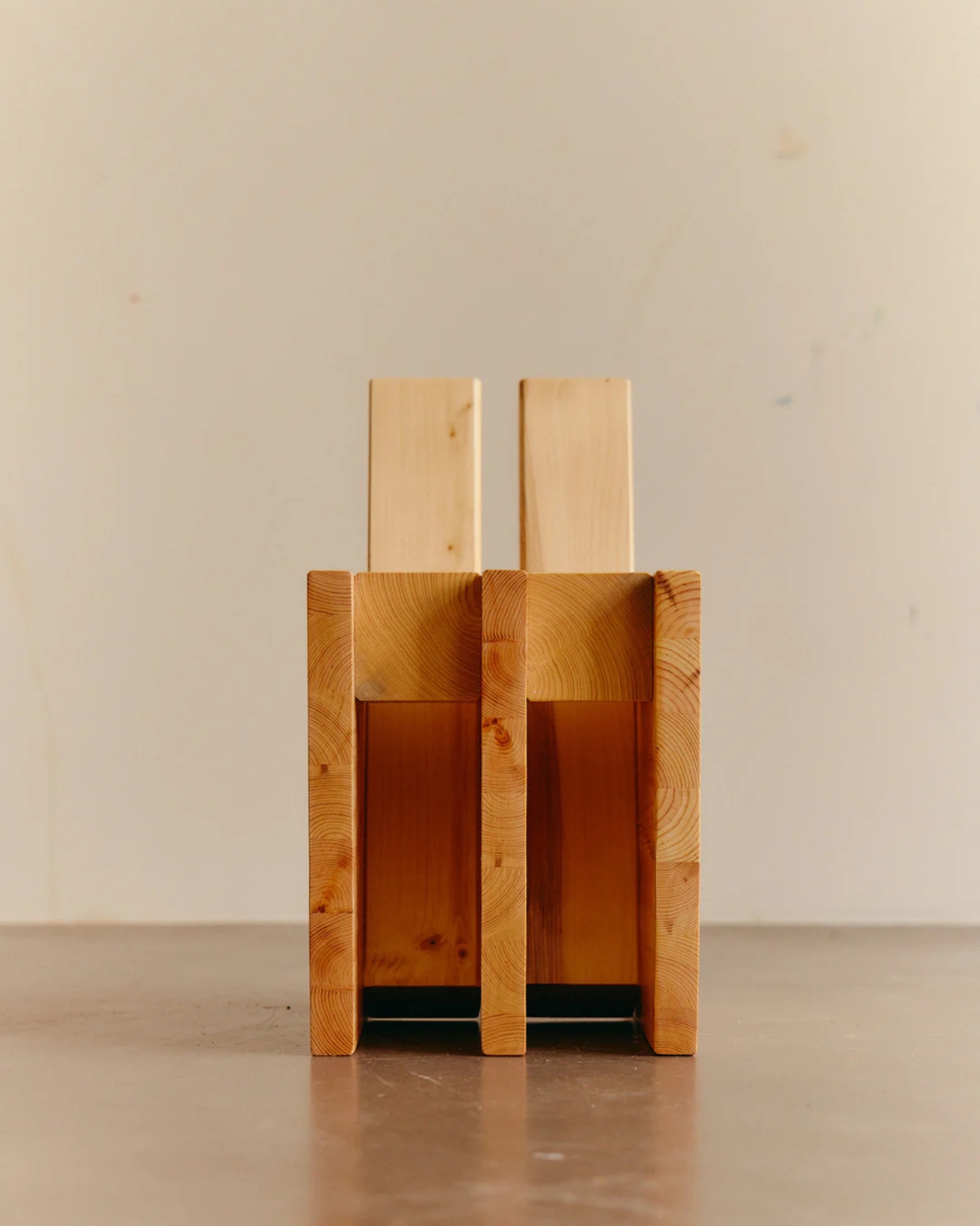
The collection made its debut and has since traveled to exhibitions, including “A Second Field” at Tokyo’s LICHT Gallery in 2025. The gallery’s director gave them total creative freedom, telling them to create whatever they wanted with no restrictions. That kind of trust speaks to how well this collection bridges the gap between functional design and art. These aren’t just chairs you sit on. They’re conversation pieces that challenge how we think about form, function, and the creative process itself.
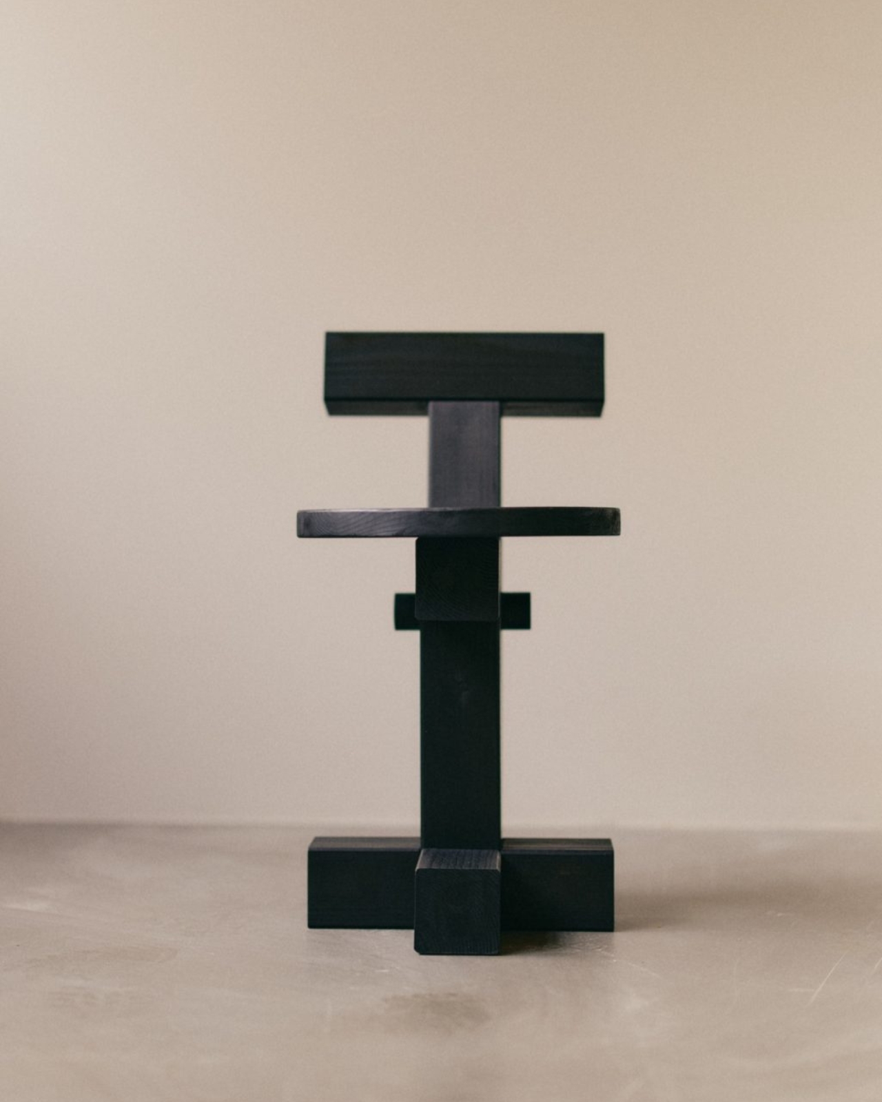
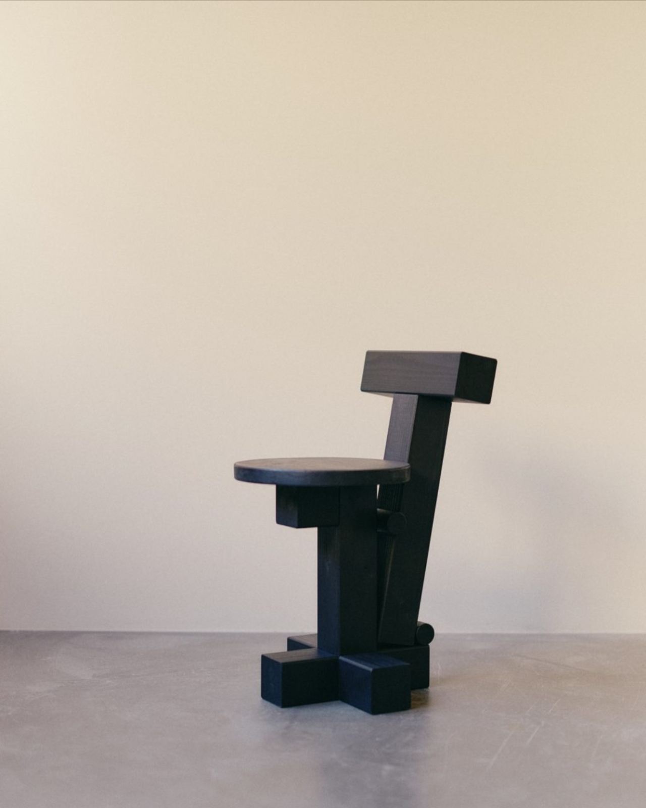
In a design world that often takes itself too seriously, INDERGARTEN feels refreshing. The pieces are sophisticated without being stuffy, minimal without being cold, and playful without being childish. They prove that you can make something grown-up and refined while still channeling the experimental spirit of play. Whether you’re a design enthusiast, someone who appreciates contemporary craft, or just someone who wants furniture that makes people do a double-take, this collection delivers.
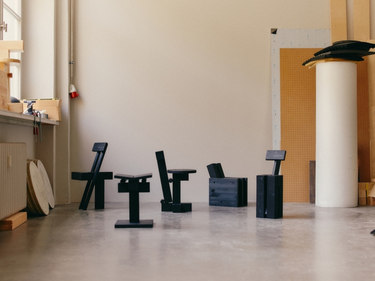
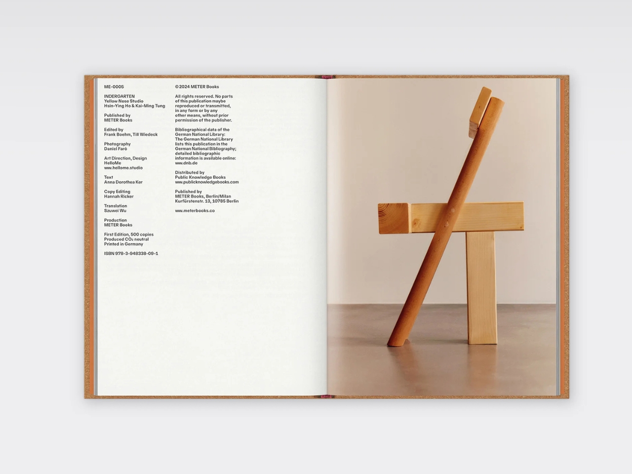
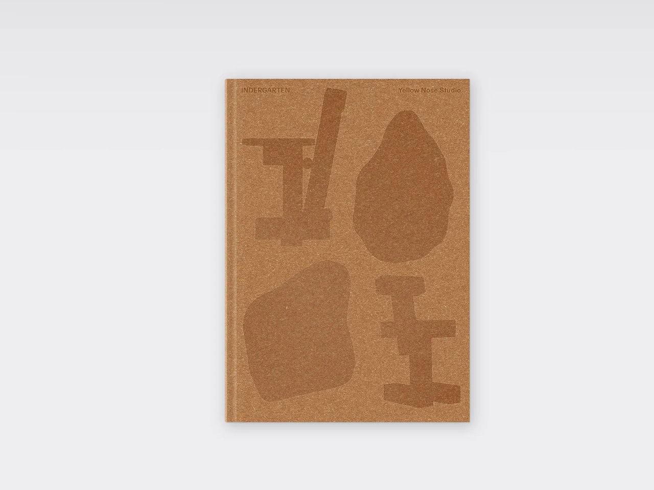
Yellow Nose Studio has even published a monographic book documenting the series, complete with stunning photography by Daniel Farò. The hardcover publication emphasizes the duo’s fluid practice between design, craft, art, and architecture, showing how blurry those boundaries can get when you’re working from a place of genuine curiosity. What’s next for INDERGARTEN? The designers hope curators will imagine these ideas evolving into bigger projects. They’re following the same playful, exploratory process to see where it leads. And if their wooden blocks have taught us anything, it’s that the best creations come from stacking, unstacking, and being willing to start over when the spirit moves you.
The post This Furniture Collection Was Designed By Your Inner 5-Year-Old first appeared on Yanko Design.
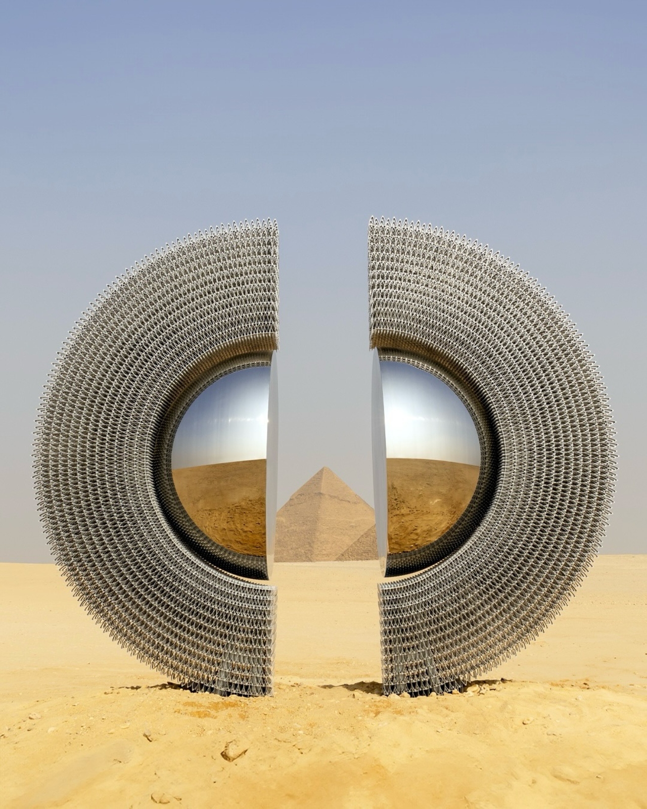
A Ring of Light: Ancient Symbols Meet Modern Art at Giza

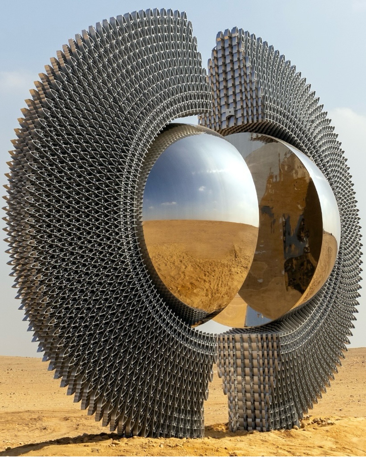
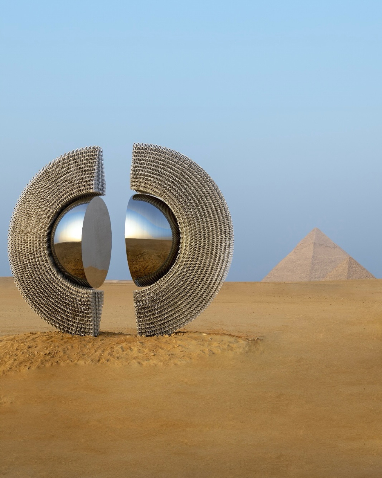
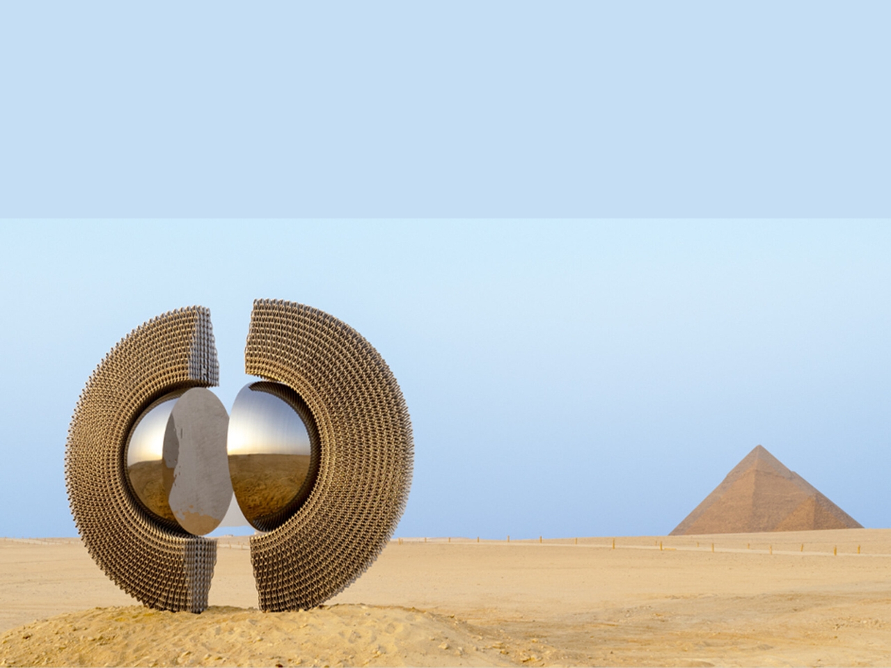
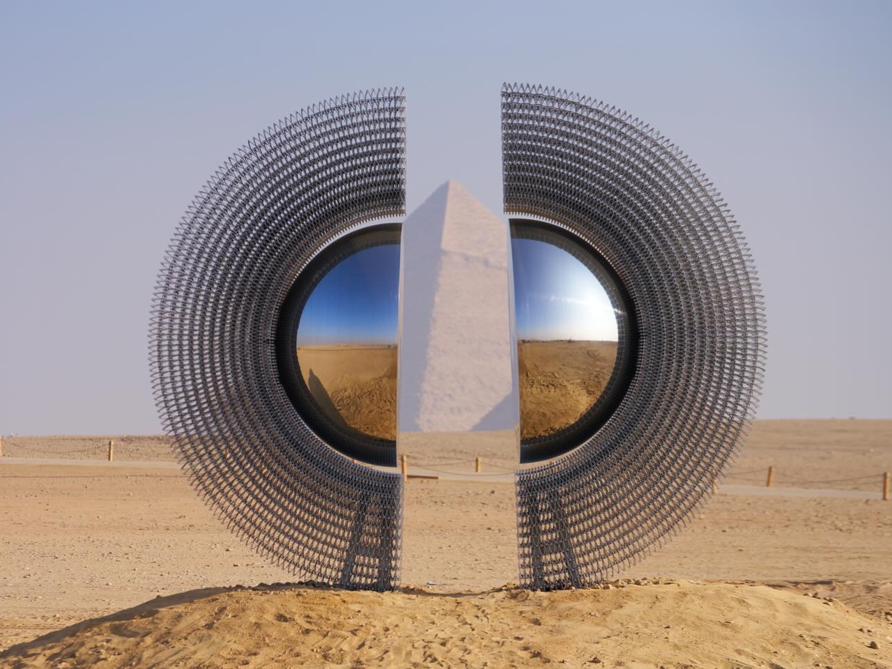
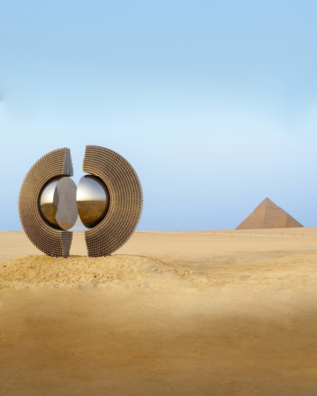
Picture this: you’re standing on the Giza Plateau, the Great Pyramids towering behind you as they have for 4,500 years, and suddenly there’s something new in this ancient landscape. A massive aluminum ring that looks like it fell from the future, catching sunlight and throwing it back at history itself. That’s exactly what Turkish artist Mert Ege Köse just dropped on us with “The Shen,” and honestly, it’s the kind of art installation that makes you stop scrolling and actually want to book a flight to Egypt.

“The Shen” is currently on display as part of Art D’Égypte’s “Forever Is Now” exhibition, now in its fifth edition, and it’s doing something really special with how we think about contemporary art in historical spaces. The sculpture isn’t trying to compete with the pyramids or overshadow them. Instead, it creates this incredible dialogue between ancient Egyptian symbolism and modern design sensibility.

Designer: Mert Ege Köse

The name itself is a clue to what Köse is up to. In ancient Egyptian hieroglyphics, the Shen symbol represented eternity and protection, depicted as a circle of rope with no beginning or end. It’s basically the OG infinity symbol, showing up in royal cartouches and religious texts throughout pharaonic history. Köse took that concept and supersized it into a monumental aluminum structure that frames the pyramids like the world’s most epic viewfinder.

What makes this work so compelling is how it plays with reflection and perception. The polished aluminum surface doesn’t just sit there looking pretty. It actively engages with its surroundings, capturing the shifting desert light, the blue Egyptian sky, and the ancient stones in a constantly changing display. Depending on where you stand and what time of day you visit, you’re basically looking at a different artwork. It’s responsive design taken to a literal, sculptural extreme.

Köse has built his practice around creating these kinds of sculptural works that bridge tradition and innovation. His pieces typically feature smooth surfaces and malleable aluminum alloys, materials that feel distinctly contemporary while still carrying a sense of timelessness. There’s a poetic quality to his work that doesn’t hit you over the head with meaning but instead invites you to find your own connections.

The location matters enormously here. Art D’Égypte has been pushing boundaries with “Forever Is Now” since 2021, transforming the Giza Plateau into an open-air gallery where contemporary artists from around the world respond to one of humanity’s most iconic historical sites. It’s not just about plunking modern art next to ancient wonders for the shock value. The exhibition carefully considers how contemporary creative practice can illuminate and honor historical context rather than clash with it.

“The Shen” succeeds because it understands this balance. The circular form echoes not just the ancient Egyptian symbol but also the eternal cycle that the pyramids themselves represent: life, death, and the continuity of human creative expression across millennia. When you look through the ring toward the pyramids, you’re literally framing history through a contemporary lens. It’s a visual metaphor that works on multiple levels without feeling forced or pretentious.

There’s also something to be said about accessibility here. Unlike a lot of monumental sculpture that feels designed for art world insiders, “The Shen” is immediately photographable and shareable. It gives visitors a way to interact with both the artwork and the pyramids in a fresh way. In our current moment where experience and documentation are so intertwined, that matters. The sculpture becomes a portal, not just literally but also digitally, connecting people worldwide to this ancient site through contemporary art.

As an emerging voice in Turkish contemporary art, Köse is making moves that position him well beyond regional recognition. Bringing “The Shen” to Egypt, working at this scale, and creating something that genuinely enhances one of the world’s most significant historical sites is the kind of project that defines careers. What “The Shen” ultimately offers is something increasingly rare: art that makes you feel something without requiring an art history degree to understand it. It’s beautiful, it’s thoughtful, and it reminds us that the conversation between past and present doesn’t have to be complicated to be profound. Sometimes all you need is a perfect circle of light.

The post A Ring of Light: Ancient Symbols Meet Modern Art at Giza first appeared on Yanko Design.

Designer Turned the Boring Umbrella Stand Into Wall Art

You know that awkward moment when you walk into someone’s home and realize your dripping umbrella is about to become everyone’s problem? We’ve all been there, clutching a soggy umbrella while desperately looking for somewhere (anywhere) to stash it that won’t create a puddle or knock things over. Enter the Justin Case umbrella stand by Eduardo Baroni, a piece that proves even the most mundane household items deserve a glow-up.

First, let’s talk about that name. Justin Case. Just in case. It’s the kind of clever wordplay that makes you smile before you even see the product. And honestly, it perfectly captures the whole vibe of this design: something you keep around just in case, but that looks so good you’ll actually be glad it’s there rain or shine.

Designer: Eduardo Baroni

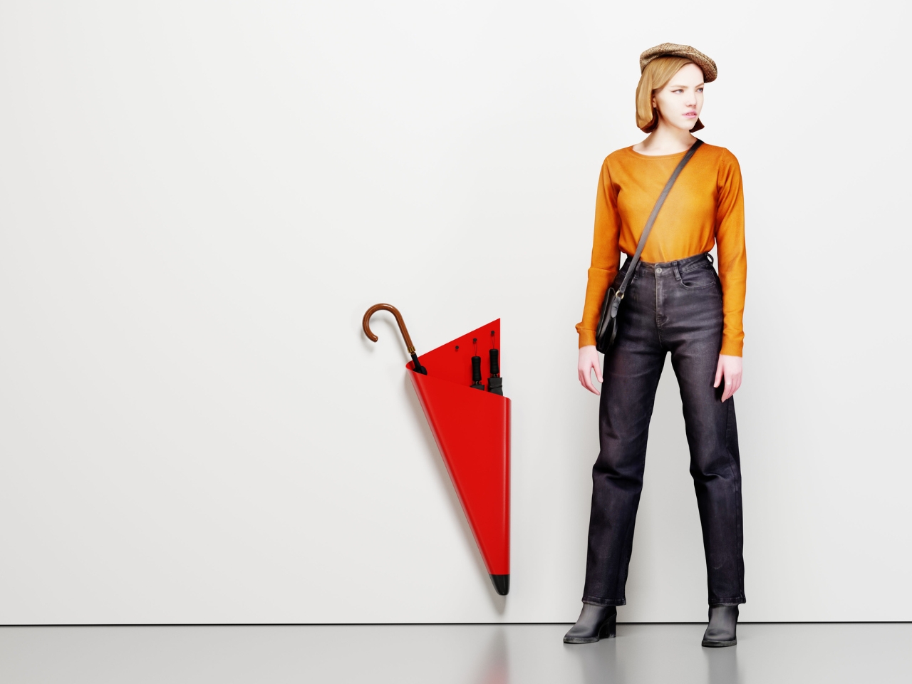
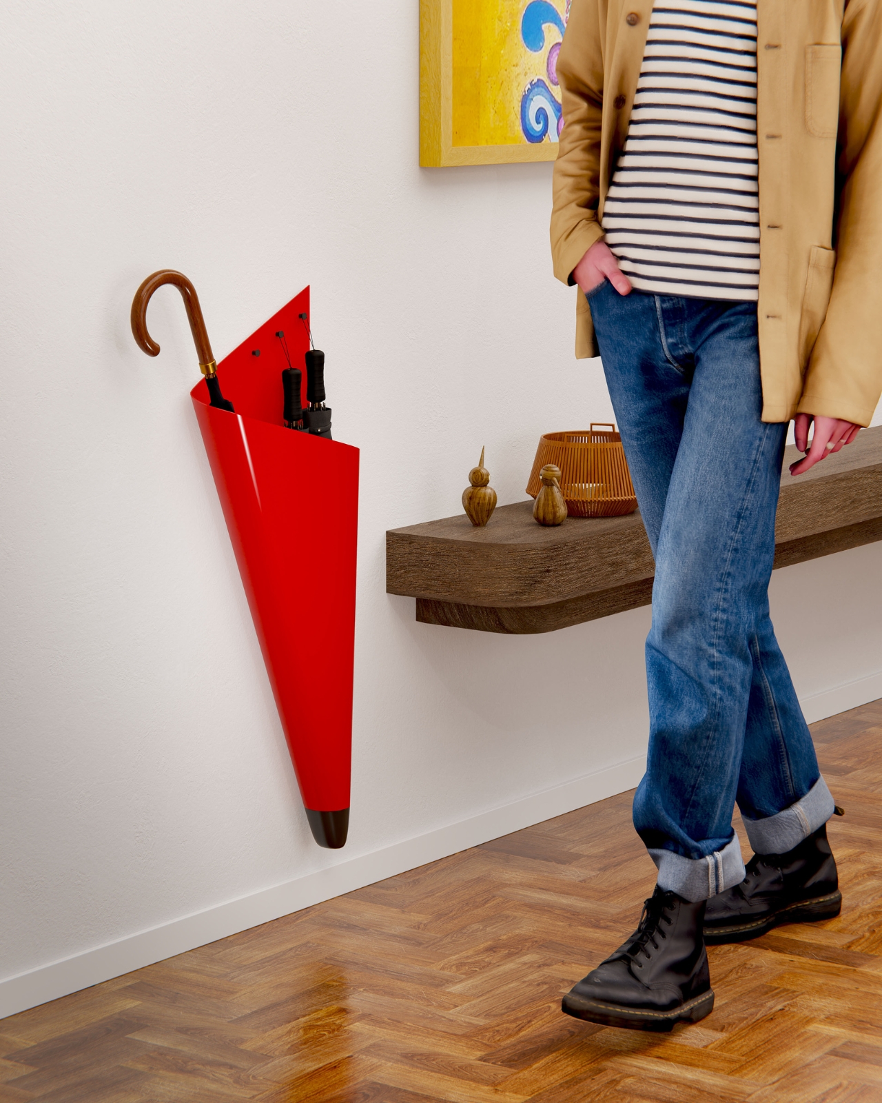
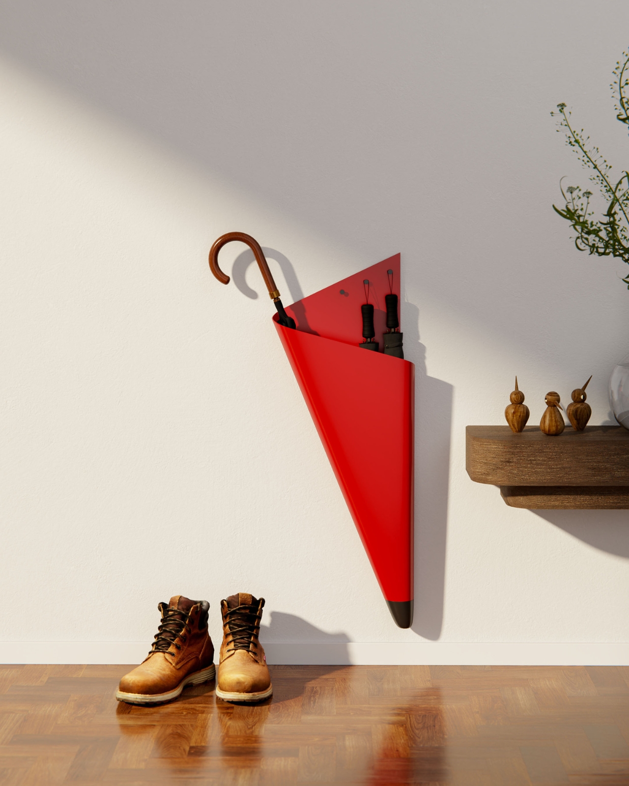
What strikes you immediately about this piece is how it refuses to be just another boring storage solution hiding in the corner. Made from powder-coated steel sheet, the Justin Case has this bold, angular presence that reads more like wall art than a utilitarian object. It’s essentially a sculptural triangle that leans away from the wall at just the right angle, creating this dynamic, almost defiant stance. You could hang it in your entryway empty and it would still make a statement.

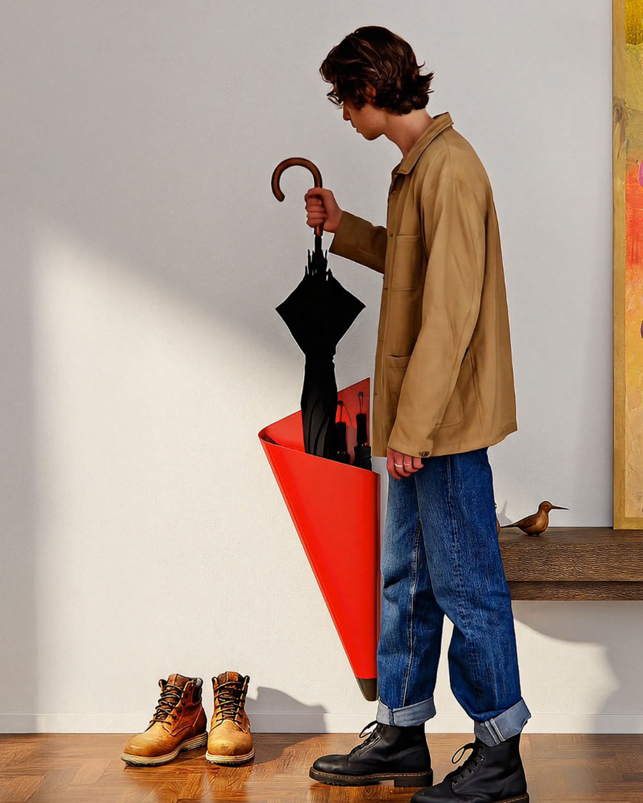
But here’s where the design gets really smart. That lateral tilt isn’t just for show. The angle naturally cradles your full-size umbrellas, keeping them secure without any fussy clips or complicated mechanisms. Gravity does the work. Meanwhile, three dedicated hooks accommodate your compact umbrellas, so you’ve got room for up to five total. It’s that perfect balance of form meeting function that makes you wonder why all umbrella stands aren’t designed this way.

The wall-mounted aspect is another game-changer, especially if you’re dealing with a small entryway or apartment living. Traditional umbrella stands take up precious floor space and always seem to be in the way, creating an obstacle course right where you’re trying to get in and out the door. By moving everything vertical, Baroni frees up that floor real estate entirely. You can mount it right next to your entrance without blocking the flow of traffic, which is pretty much the dream scenario for anyone who’s ever tripped over an umbrella stand in the dark.

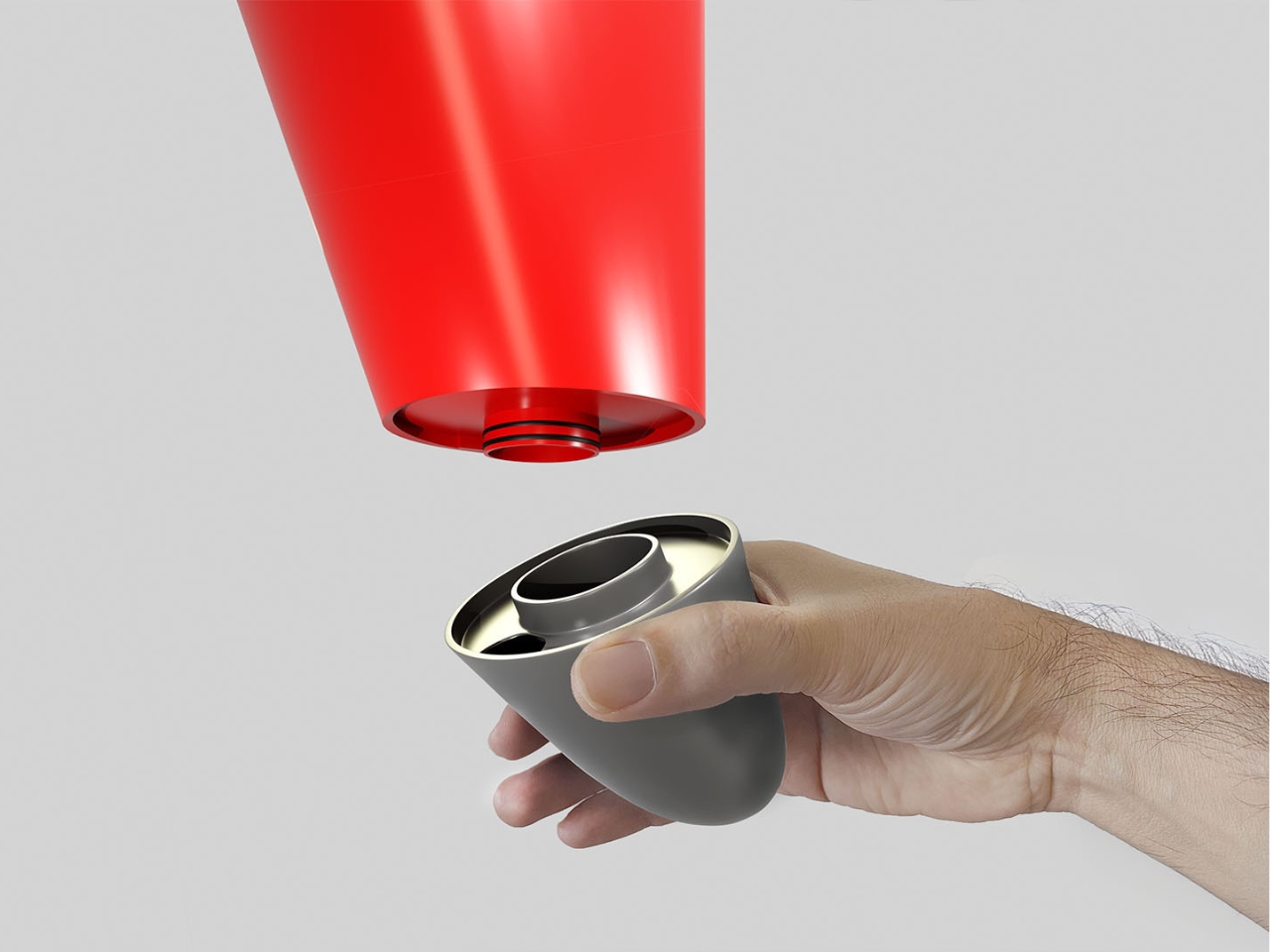
And let’s talk about the practical details, because good design isn’t just about looking cool. At the bottom of the stand sits a removable plastic reservoir that catches all the water dripping from your wet umbrellas. No more mysterious puddles forming on your hardwood floors or entryway rugs. When it fills up, you just pop it out, dump the water, and snap it back in. It’s such a simple solution, but it addresses the actual reason you need an umbrella stand in the first place: to contain the mess. The powder-coated finish means this thing is built to last, too. It’s going to stand up to the constant wet-dry cycle of umbrella storage without rusting or degrading. And while the images show it in a vibrant red that practically demands attention, the beauty of powder coating is that it can come in virtually any color to match your space.

What really makes the Justin Case stand out in the crowded world of home accessories is how it elevates something we usually try to hide. Most organizational products are designed to be invisible, to fade into the background. But Baroni took the opposite approach, creating something with such a strong visual identity that it becomes part of your home’s aesthetic narrative. It’s discreet in terms of space (that slim profile barely projects from the wall), but it’s definitely not shy about making its presence known.

This is the kind of design that makes everyday life just a little bit better. It solves a real problem without sacrificing style, proving that functional doesn’t have to mean boring. Whether you’re a design enthusiast or just someone who’s tired of umbrella chaos, the Justin Case makes a compelling argument that sometimes the smallest details make the biggest difference in how we experience our homes.

The post Designer Turned the Boring Umbrella Stand Into Wall Art first appeared on Yanko Design.

This Interstellar-Inspired Robot Actually Walks and Rolls

Remember that sarcastic rectangular robot from Interstellar that somehow managed to walk, roll, and save humanity while delivering deadpan one-liners? Yeah, turns out someone actually built a working version of TARS, and it’s just as mesmerizing as you’d hope.

Meet TARS3D, the brainchild of roboticist Aditya Sripada and his longtime collaborator Abhishek Warrier. What started as what Sripada calls “a desire to reconnect with the simple joy of building robots” has turned into something that looks like a collapsing sculpture decided to get up and move across your living room floor. It’s weird, it’s wonderful, and it’s earning serious academic recognition.

Designers: Aditya Sripada and Abhishek Warrier

If you’ve seen Christopher Nolan’s Interstellar, you know TARS. That blocky, impossibly versatile assistant robot that accompanied astronauts across alien landscapes, morphing from a walking tower of metal rectangles into a rolling wheel when speed was needed. The movie version was actually a human-sized puppet with operators digitally erased from scenes, and its wheel form was attached to a motorized dolly. Movie magic, not actual robotics. But Sripada, who holds a master’s degree from Carnegie Mellon University’s Robotics Institute and works as a senior robotics engineer at Nimble.ai, wasn’t satisfied with movie illusions. He wanted the real deal.

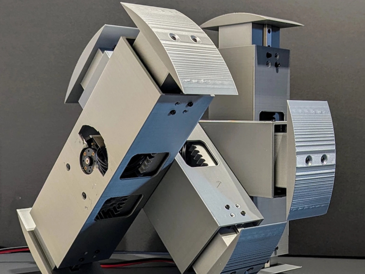
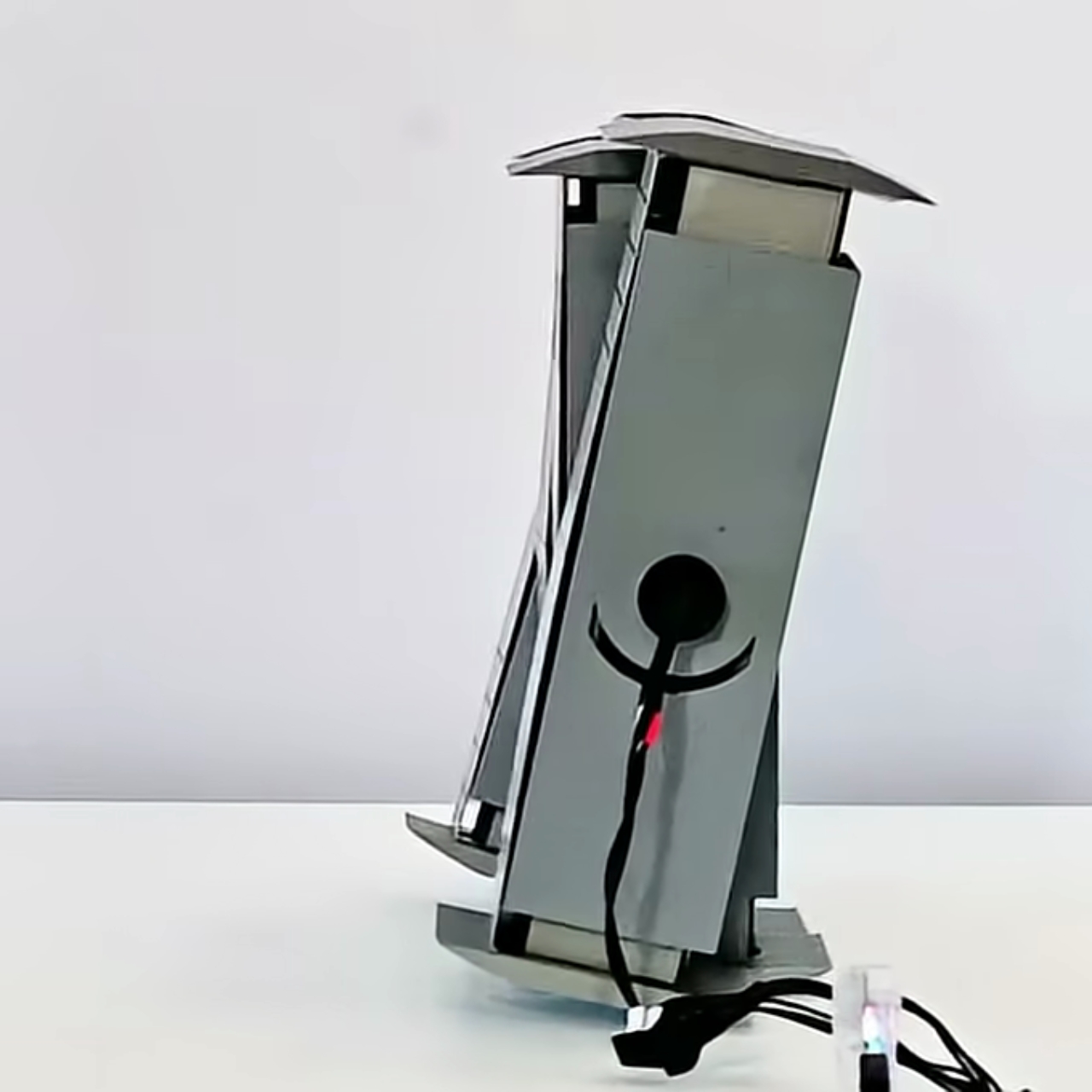
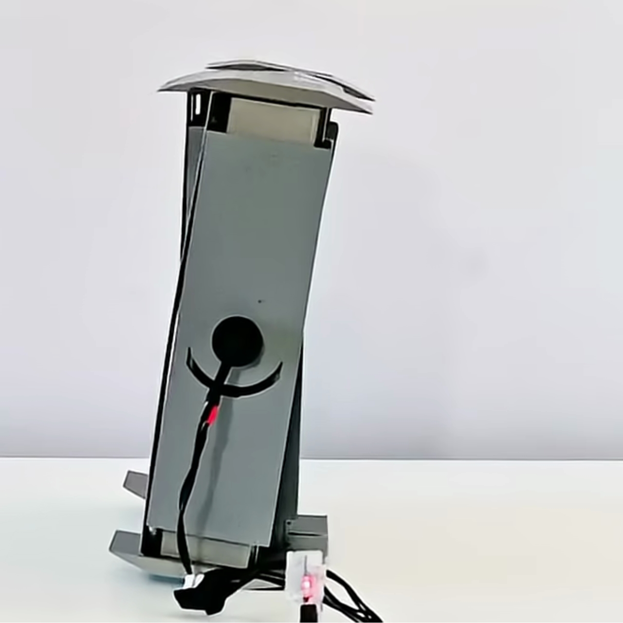
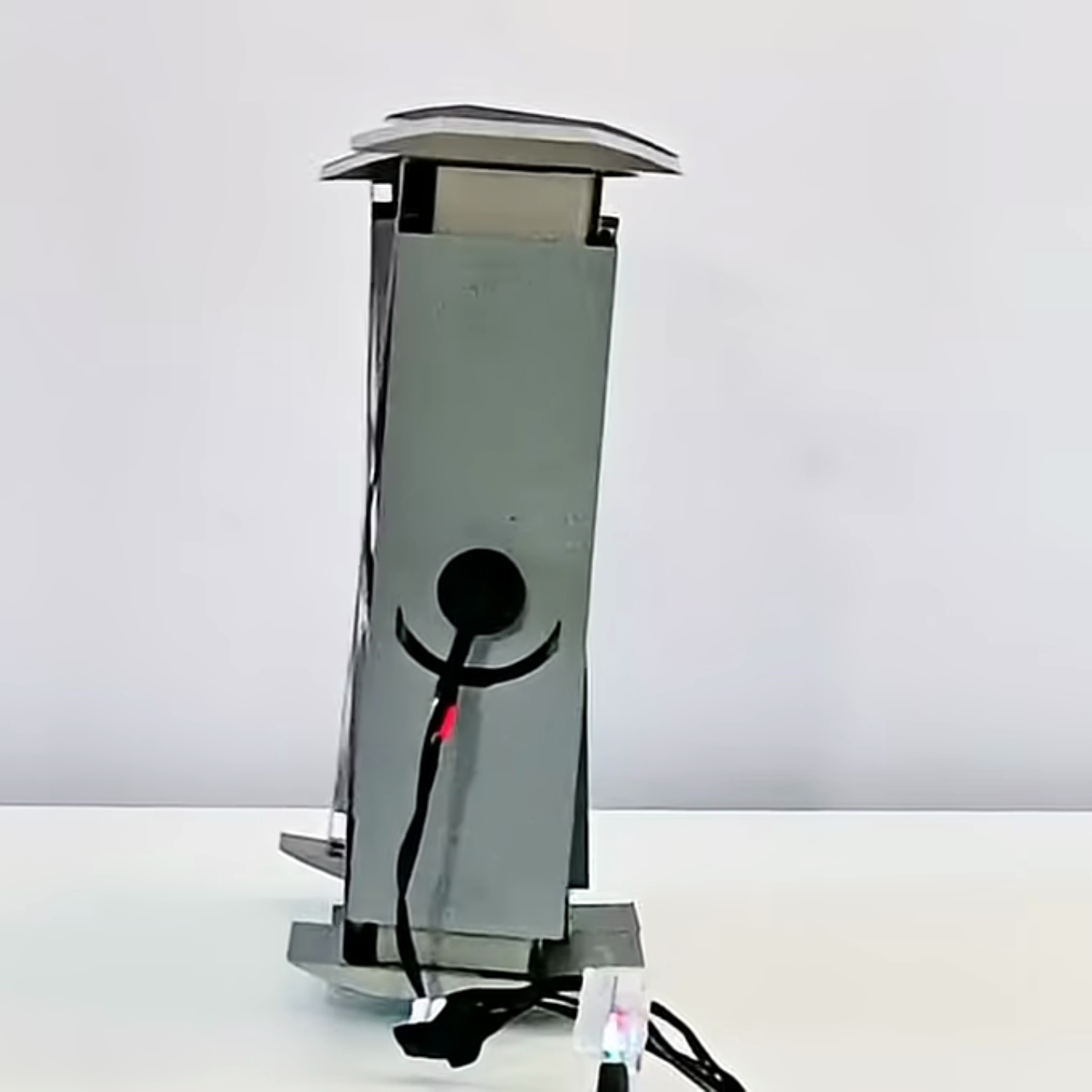
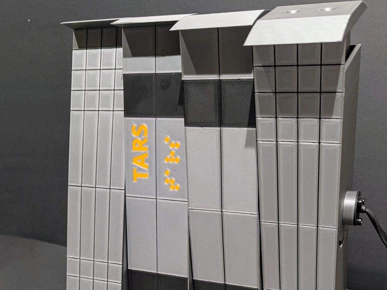
TARS3D features four independently articulated telescopic pillars that transform into an X-shape faster than you can say “Cooper, this is no time for caution.” Pillars one and three rotate forward while pillars two and four swing back, and curved pads extend from the tops and bottoms of each pillar to serve as feet. The result? An eight-spoke double rimless wheel that actually rolls. According to Sripada, this is the only recreation of TARS that can genuinely both walk and roll.

What makes this even cooler is the tech behind the transformation. Sripada and Warrier wrote an entire research paper titled “Walking, Rolling, and Beyond: First-Principles and RL Locomotion on a TARS-Inspired Robot,” which explores reinforcement learning-based control for the robot’s gait. They’re combining first-principles physics with modern learning techniques, a hybrid approach that opens new possibilities for adaptable locomotion in robotics. The paper was named a finalist for the Mike Stilman Award at the 24th IEEE RAS Humanoids Conference in Seoul, which is essentially the Olympics of humanoid robotics research. Pretty impressive for what started as a curiosity project.

Here’s the thing that makes TARS3D particularly fascinating: it challenges our assumptions about what robots should look like. Most robotic locomotion research focuses on biomimicry, trying to recreate how animals and humans move. But Sripada and Warrier note in their research that robots operating in human-engineered environments might actually benefit from non-anthropomorphic forms. Why make a robot look like a person when you can make it look like an alien geometry problem that somehow solves itself?

The implications reach beyond just being a really awesome tribute to a beloved sci-fi film. This kind of adaptable, multi-terrain locomotion could have real applications for space exploration. NASA and planetary robotics programs are always looking for designs that can handle unpredictable alien landscapes. A robot that can walk carefully across rough terrain, then transform into a wheel to speed across flat surfaces? That’s the kind of versatility you want on Mars or the Moon.

There’s something refreshing about TARS3D’s existence in our current robotics landscape dominated by humanoid bots trying to walk like people or dog-like machines trotting around warehouses. This project reminds us that inspiration can come from anywhere, even a fictional robot from a movie about wormholes and time dilation. And sometimes the best solutions don’t look like anything nature ever designed.

What Sripada and Warrier have created proves that with enough engineering know-how, determination, and probably more than a few late nights, you can turn movie magic into reality. TARS3D might not crack jokes about its humor setting being at 75%, but watching it transform from walker to roller is its own kind of entertainment. Science fiction has a way of becoming science fact when the right people decide to make it happen.

The post This Interstellar-Inspired Robot Actually Walks and Rolls first appeared on Yanko Design.

This Tiny AI Device Turns Awkward Solo Travel Into Adventure

While I love traveling with friends and family, I also enjoy traveling alone. My time is my own and I can do whatever I want. But let’s be honest: solo travel also comes with its own unique challenges. Getting lost in translation at a local market, struggling to take a decent photo of yourself without looking like you’re holding a selfie stick, or standing paralyzed at a subway station trying to decode which train goes where. We’ve all been there.

Designer Siwoo Kim clearly understands these moments because Comes, their latest design concept, feels like it was born from real solo travel experiences. This isn’t just another gadget trying to solve problems that don’t exist. It’s a thoughtful response to the growing culture of solo exploration that’s taken over social media feeds and reshaped how we think about travel.

Designer: Siwoo Kim

The rise of solo travel isn’t just a trend anymore. It’s become a full-blown cultural movement. YouTube channels dedicated to solo journeys rack up millions of views, not just because people want travel tips, but because there’s something deeply relatable about watching someone navigate a foreign city alone. These videos lower the psychological barrier that once made eating alone at a restaurant feel awkward or booking a solo trip seem lonely. Now? It’s empowering.

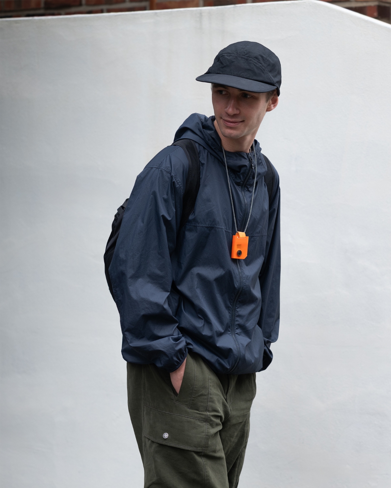
Comes taps into this shift with an approach that’s refreshingly human-centered. It’s a small AI-powered companion device equipped with a high-performance camera that can observe your surroundings and offer assistance exactly when you need it. But here’s where the design gets interesting: Comes features a modular, detachable structure that adapts to different travel situations. Think of it as a Swiss Army knife for the modern solo traveler, but way more elegant.

Picture this scenario. You arrive in a new city, step off the train, and immediately feel that familiar flutter of “okay, now what?” Just tell Comes where you want to go, and it becomes your personal guide, helping you take those first uncertain steps into unfamiliar territory. The device walks you through navigation in a way that feels supportive rather than intrusive.

The real genius shows up in how Comes splits apart. The head can attach to a necklace module around your neck, capturing your point of view while recording your journey. Meanwhile, the body remains accessible in your hand or pocket, ready to provide information about whatever you’re looking at. It’s like having a curious travel companion who can answer questions on the fly without you having to pull out your phone and break the moment.

For those who love zipping around cities on shared bikes or scooters (because who doesn’t anymore?), Comes includes a strap module that securely mounts the device onto various mobility options. It guides your route while documenting your ride, turning practical navigation into visual storytelling.

But perhaps the most valuable feature addresses every solo traveler’s occasional nightmare: the language barrier. Standing in front of a menu board, making awkward gestures at a shopkeeper, desperately trying to communicate something simple. Comes looks at both faces in a conversation and translates in real time. You speak naturally in your language, they respond in theirs, and Comes bridges the gap. No fumbling with translation apps or pointing desperately at pictures.

And then there’s the social aspect. You find the perfect spot for a photo, but you’re alone. Asking strangers for help can feel awkward, but Comes makes it easier. Because the device detaches, you can hand someone the camera module while keeping the main body with you to check the frame in real time. Composition slightly off? Comes relays your feedback instantly, even from across the plaza. It transforms what could be a frustrating experience into an opportunity for genuine human connection. Who knows, you might even learn about a hidden local gem in the process.

What makes Comes compelling isn’t just its functionality but its underlying philosophy. Solo travel has always involved embracing uncertainty and turning unexpected moments into memorable experiences. This design doesn’t eliminate those variables. Instead, it provides just enough support to help travelers feel confident facing them. It’s the difference between removing adventure and enabling it. Comes offers something different: a tool designed to help solo travelers engage more deeply with the world around them, not retreat from it.

The post This Tiny AI Device Turns Awkward Solo Travel Into Adventure first appeared on Yanko Design.

PENT Made Dumbbells Too Pretty to Actually Work Out With

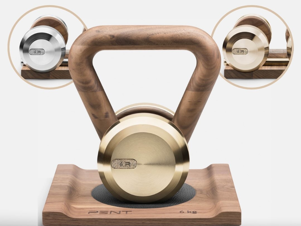
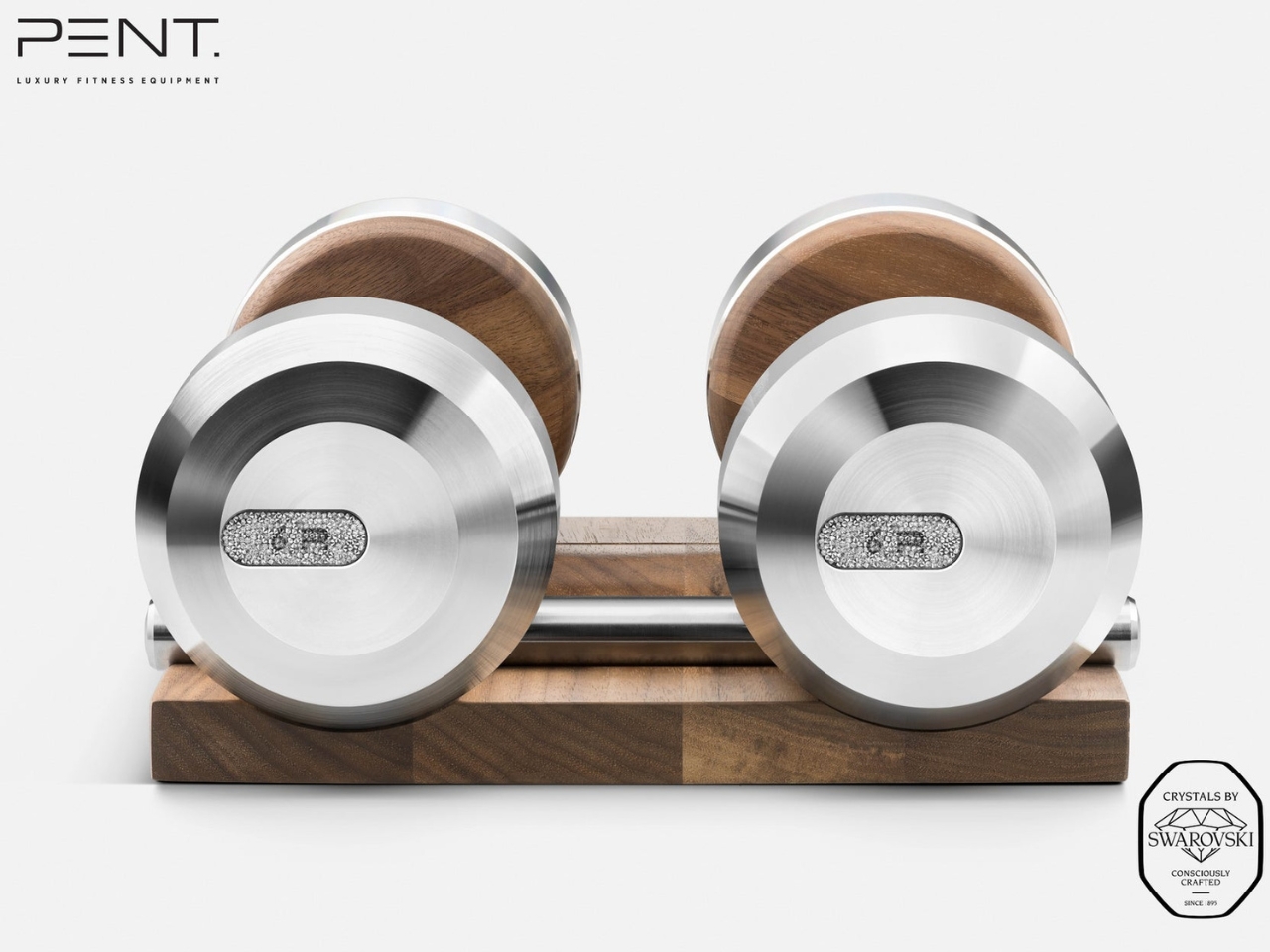
There’s something slightly absurd yet completely mesmerizing about the idea of working out with equipment covered in Swarovski crystals. But here we are in 2025, and Polish luxury fitness brand PENT has partnered with Swarovski to create gym equipment that looks like it belongs in a museum rather than your basement workout space.

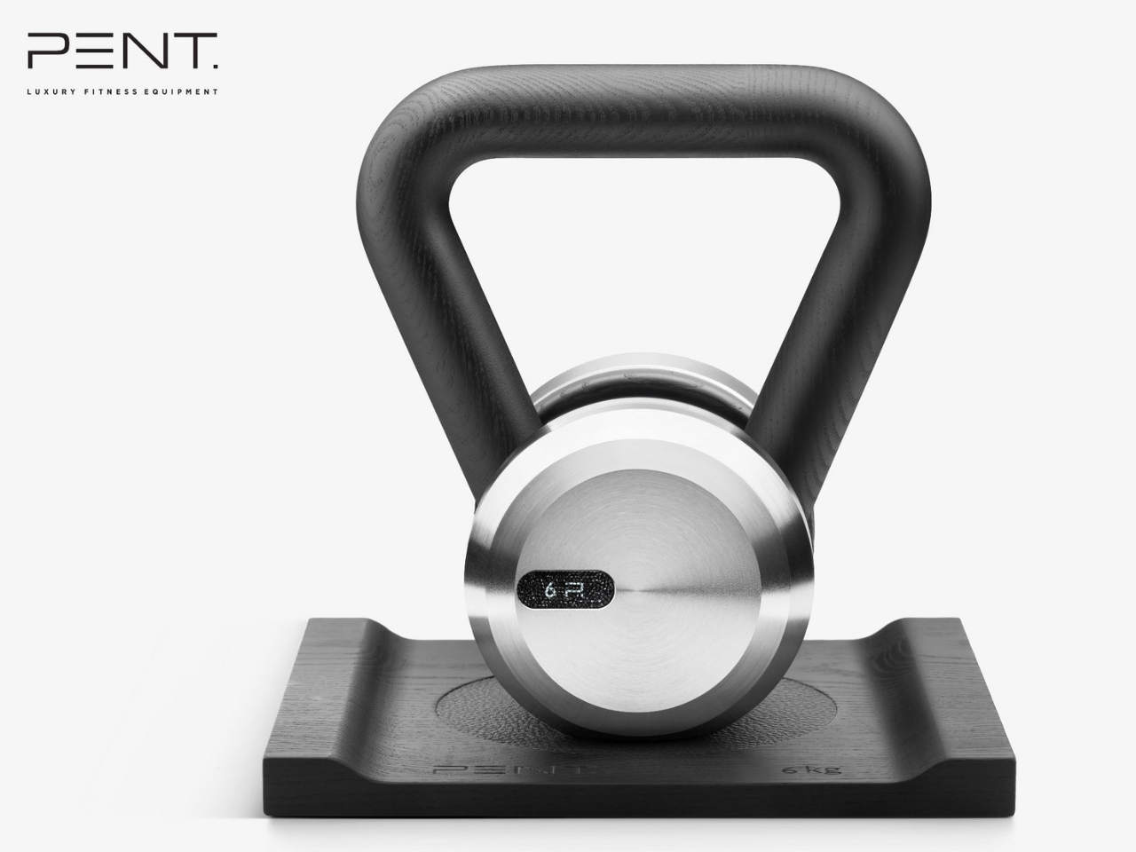
Let’s be honest. Most of us have dumbbells tucked away in closets or gathering dust under the bed. They’re functional, sure, but they’re not exactly objects you’d want to display on your coffee table. PENT is completely flipping that script with their “Embellished with Crystals by Swarovski” collection, which features handcrafted dumbbells and kettlebells that are as much about aesthetics as they are about bicep curls.

Designer: PENT x Swarovski

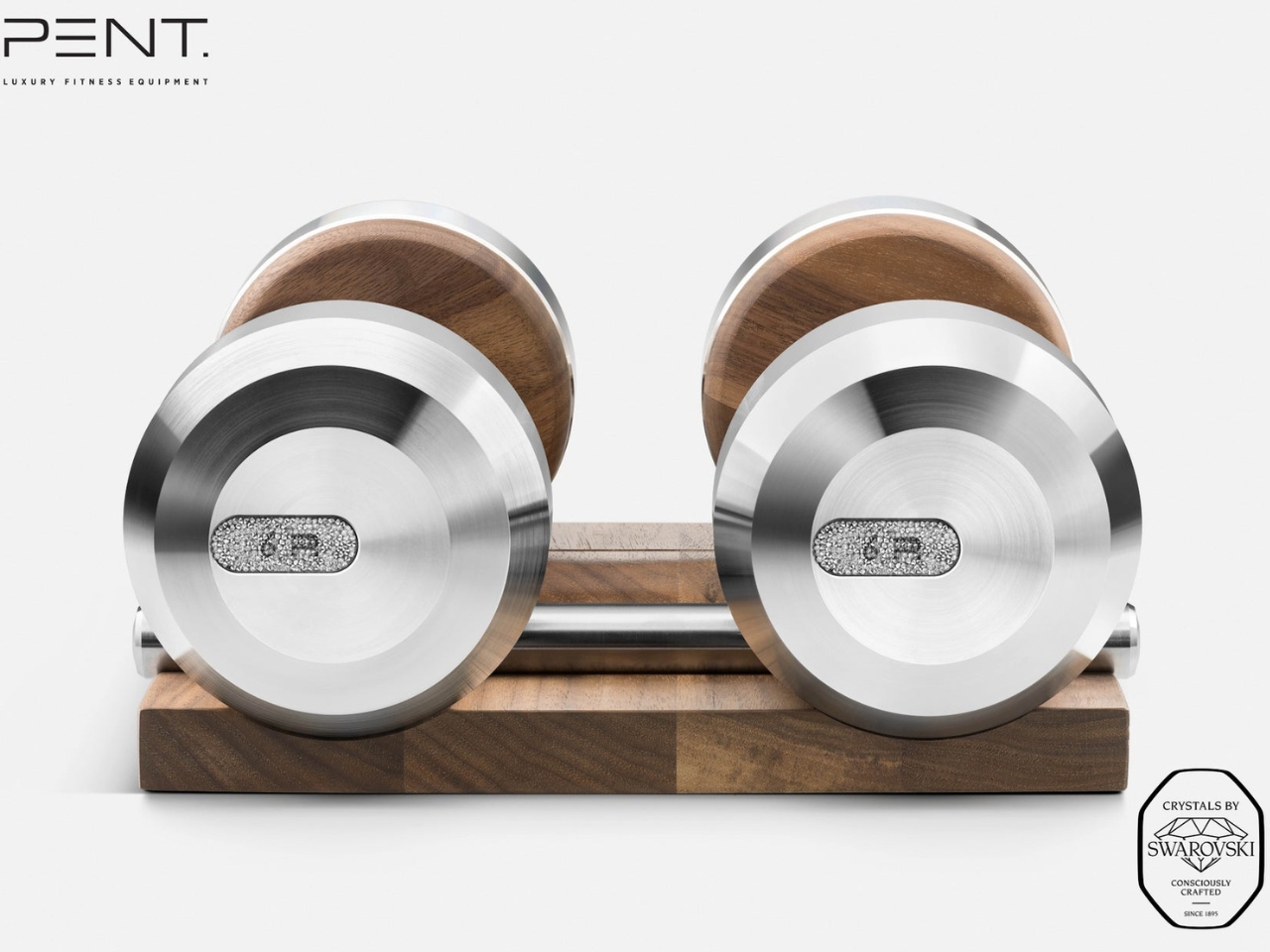
The collection includes the COLMIA dumbbells and LOVA kettlebells, each one meticulously handmade in Poland using materials that sound more suited to a luxury yacht than a home gym. We’re talking walnut or ash wood handles, Italian leather, stainless steel, and of course, those signature Swarovski crystals hand-applied to every piece. Even the storage racks are designed with architectural precision, so the equipment becomes a sculptural element in your space rather than something you need to hide away.

What makes this collaboration particularly interesting is how it challenges our assumptions about where luxury belongs. Fitness equipment has traditionally been purely utilitarian. You want something that works, not something that sparkles. But as home wellness spaces have evolved from dingy garage setups to carefully curated environments, there’s clearly a market for equipment that doubles as design objects. According to Iron House Design, which is bringing the collection to the U.S. market, these pieces are intended for luxury home gyms, private spas, hotel suites, and superyacht interiors.

The price tag reflects this positioning. The collection starts at around $613 for dumbbells with a wooden stand and goes up to $681 for kettlebells, though more customized sets can reach $25,000 depending on the level of crystal detailing and personalization you want. That’s a significant investment for equipment you could theoretically replace with a $30 set from a sporting goods store.

But that misses the point entirely. These aren’t meant to be practical purchases in the traditional sense. They’re statement pieces that happen to be functional. Tanya Ryno, founder of Iron House Design, describes them as being “for those who make bold statements with every choice.” It’s for the person who wants every element of their home to reflect a certain level of taste and refinement, from the artwork on the walls to the weights on the floor.

The collaboration also taps into a broader cultural shift around wellness and self-care. Exercise is no longer just about breaking a sweat or hitting certain fitness goals. For many people, especially in the luxury market, it’s about the entire experience. The space you work out in matters. The equipment you use matters. And increasingly, people are willing to invest in making those experiences feel special.

That said, there’s an inevitable question hovering over the whole thing: would you actually work out with crystal-covered dumbbells, or would you just keep them on display? According to reports, many owners treat them more like collectible art pieces or conversation starters rather than everyday workout tools. Some designers are even using them purely as decorative elements in high-end spaces. Technically, these pieces are engineered to meet professional fitness standards, so you absolutely could use them for your actual workouts. The wooden handles are smooth and ergonomically designed, and the stainless steel ends are weighted properly. But when something is that beautiful and that expensive, there’s an understandable hesitation to actually get your sweat all over it.

What the PENT x Swarovski collection really represents is the ongoing blurring of boundaries between different design categories. Furniture looks like art. Kitchen appliances become sculptural centerpieces. And now, gym equipment gets the high-jewelry treatment. It’s all part of a world where the objects we surround ourselves with are expected to be both functional and beautiful, practical and aspirational.

The post PENT Made Dumbbells Too Pretty to Actually Work Out With first appeared on Yanko Design.

This Glowing Dome Just Turned Shanghai’s Park Into a Moon

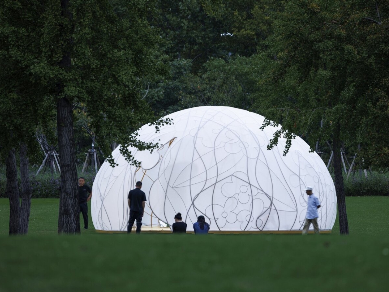
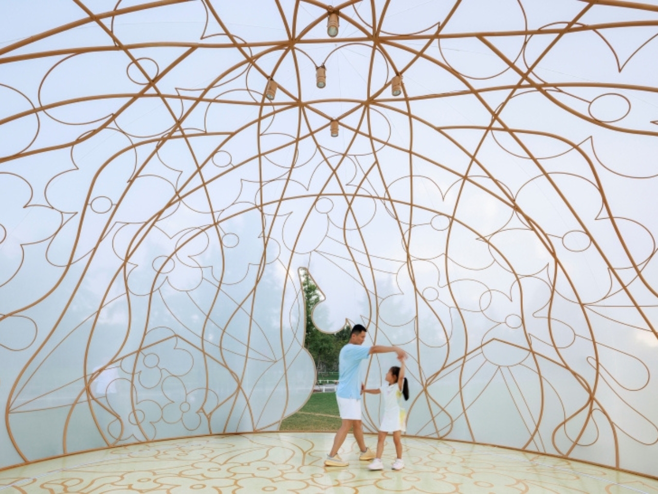
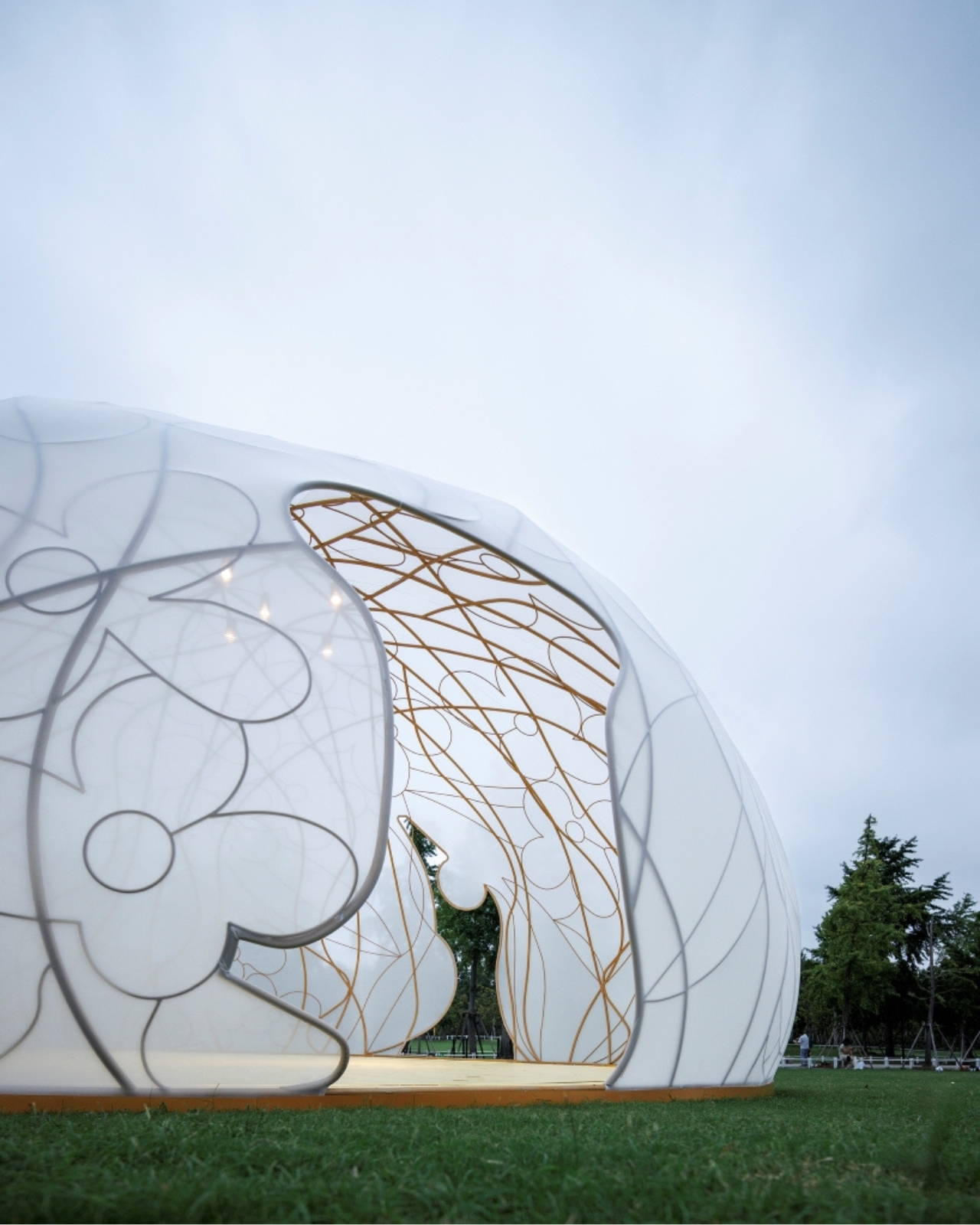
There’s something magical about stumbling upon an unexpected glow in a city park. Shanghai’s Century Park recently hosted one of those rare moments where art, architecture, and cultural tradition converge into something you can actually walk inside and experience. The Osmanthus Moon, a temporary installation by HCCH Studio, turned a semicircular lawn into an enchanted space that reimagined what public art can be.

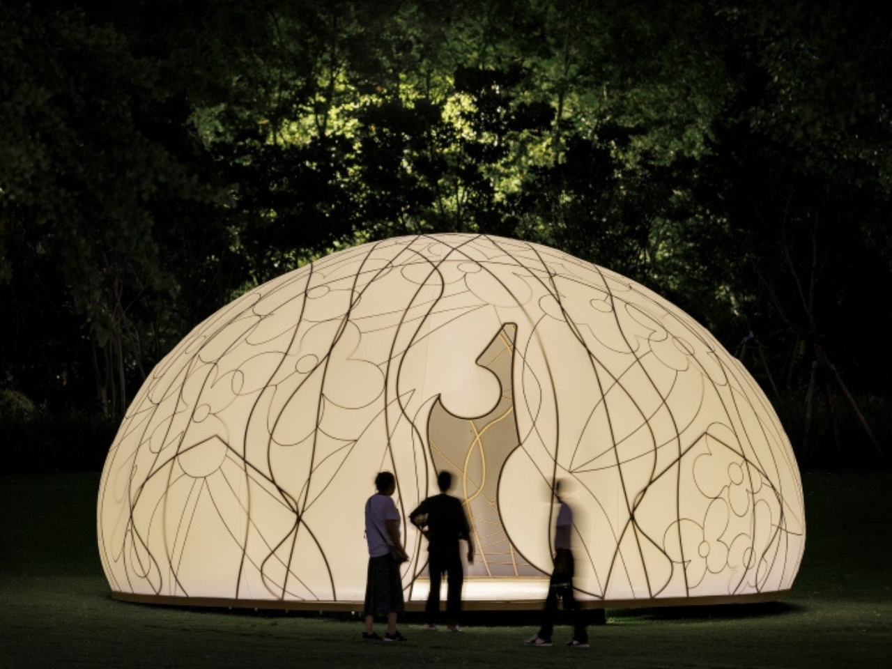
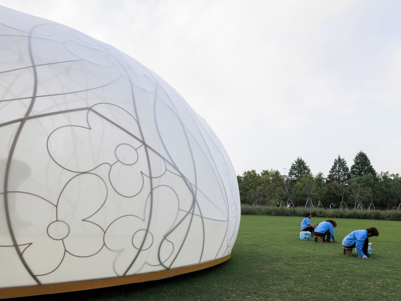
Picture this: a translucent dome that looks like someone captured the full moon and gently placed it on the grass. It’s not just pretty to look at, though that’s certainly part of the appeal. The structure is actually a sophisticated dance between old and new, tradition and innovation. The framework itself is made of bronze lattice patterned with osmanthus flowers, those tiny blooms that perfume Chinese autumns and carry centuries of cultural meaning. The vines seem to twist and intertwine across the surface, creating shadows and light that shift throughout the day.

Designer: HCCH Studio (Photos by Guowei Liu)

The designers at HCCH Studio stretched a lightweight, elastic fabric across this bronze skeleton, and the result is something that breathes and glows. During daylight hours, natural light filters through, creating this soft, diffused atmosphere inside that feels almost meditative. You enter through irregular openings (because perfect circles would be too predictable), and suddenly you’re cocooned in this luminous space where the outside world feels both close and distant at the same time.

But here’s where it gets really interesting. This wasn’t just about creating something beautiful for Instagram. The installation was commissioned by the Power Station of Art in Shanghai specifically for the Mid-Autumn Festival, that traditional Chinese celebration when families gather to admire the full moon and eat mooncakes. The osmanthus flower isn’t randomly chosen either. In Chinese culture, these tiny golden blooms are practically synonymous with autumn, appearing in everything from tea to poetry to folk tales about moon palaces.

What makes this project stand out is how it connects with folk art heritage. HCCH Studio collaborated with a Zao Hua artist, someone who practices the traditional craft of stove flower painting, which is actually recognized as intangible cultural heritage. The patterns painted on the ground mirror the bronze lattice overhead. It’s like they’re having a conversation across space, each one a reflection of the other, grounding the ethereal structure in literal earth and tradition.

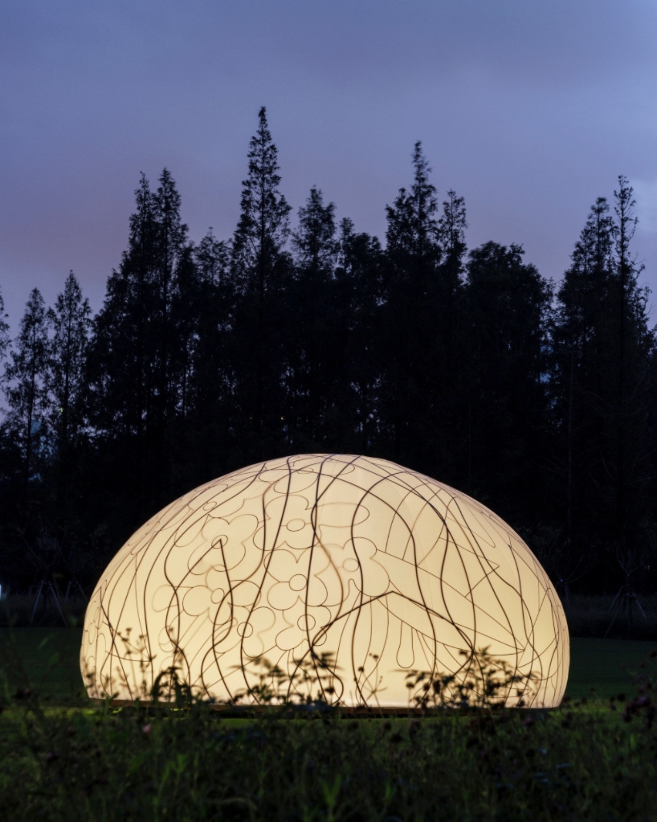
When night falls, though, that’s when the Osmanthus Moon really comes alive. Internal lighting transforms the pavilion into this semi-transparent beacon that seems to float in the darkness. The bronze framework casts shifting shadows across the glowing fabric, creating gradients of light that change as you move around and through the space. It becomes less of a building and more of an experience, something that exists between sculpture and shelter.

The whole thing only lasted twelve days, which feels both generous and tragically brief. That temporariness is part of the point, though. Like the Mid-Autumn Festival itself, like the brief season when osmanthus blooms fill the air with fragrance, this installation was meant to be a moment rather than a monument. At 7.2 meters in diameter and 3.6 meters high, it wasn’t trying to dominate the landscape or make some grand permanent statement. Instead, it created an intimate space for contemplation and celebration.

HCCH Studio, a Shanghai-based practice that’s been gaining recognition for their innovative approach to materials and form, managed to pull off something genuinely special here. They took cultural symbols that could have felt heavy-handed or purely decorative and wove them into a structure that feels contemporary without abandoning its roots. The technical execution, from the fabric tension to the lighting design by ADA Lighting, serves the conceptual vision rather than overshadowing it.

The Osmanthus Moon found that sweet spot where beauty, meaning, and accessibility overlap when public either too obscure or too obvious. It proved that temporary installations can create lasting impressions, and that looking backward to traditional motifs doesn’t mean you can’t move forward in how you bring them to life.

The post This Glowing Dome Just Turned Shanghai’s Park Into a Moon first appeared on Yanko Design.

Why This Alarm Clock Might Actually Make You a Morning Person

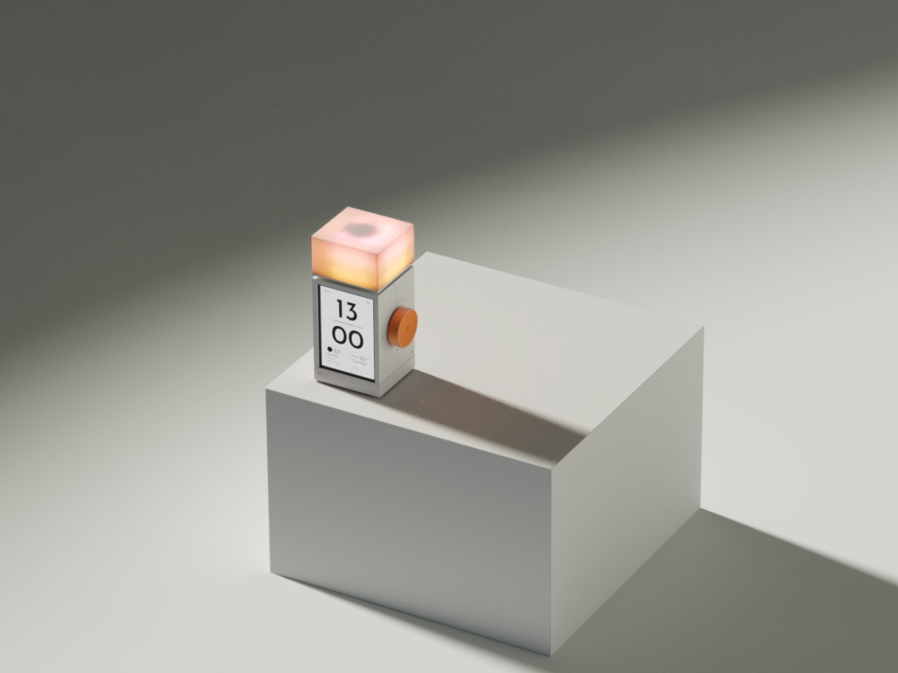
Let’s be real: most of us have a complicated relationship with our alarm clocks. When I say most of us, I mean me. It’s my least favorite necessary thing even though it’s just basically on my phone . I get jolted awake with aggressive beeps, sometimes it glows too brightly in the dark, and honestly, they’re not exactly objects we want to look at or hear first thing in the morning.

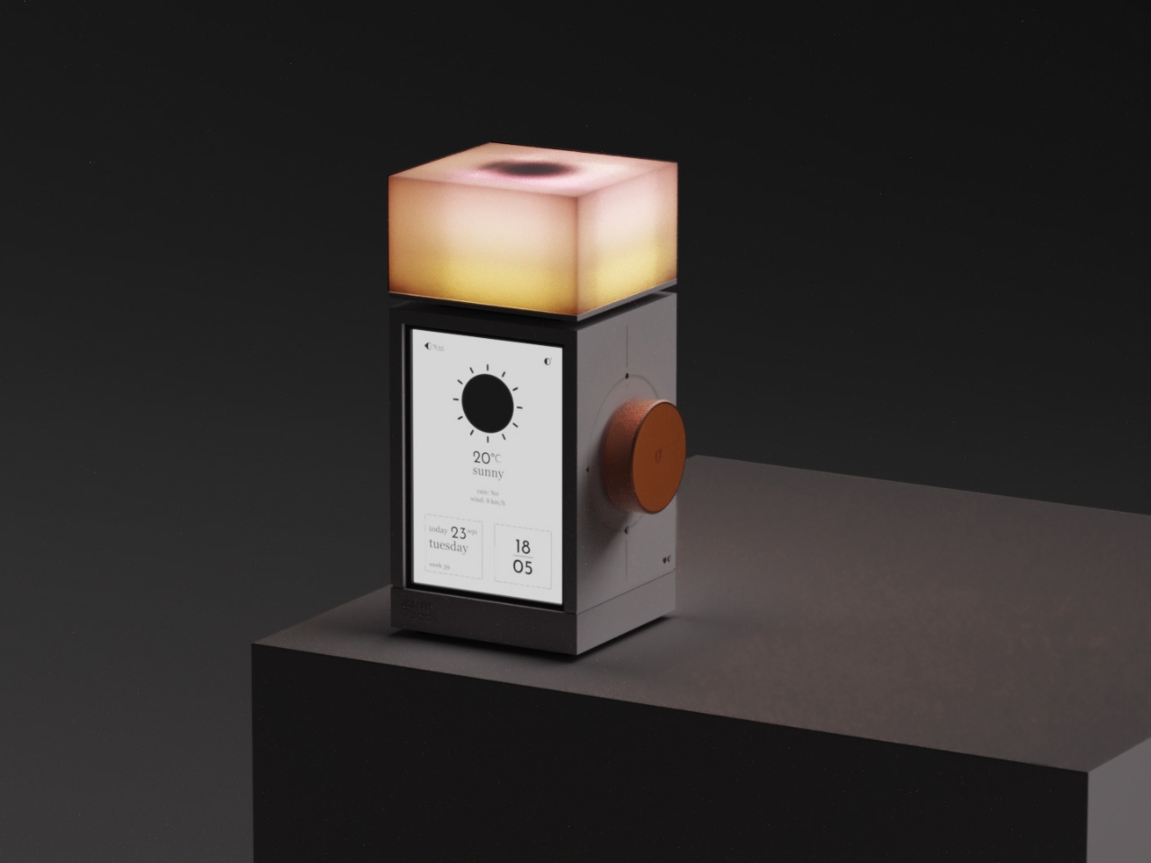
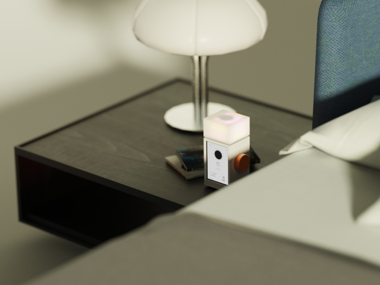
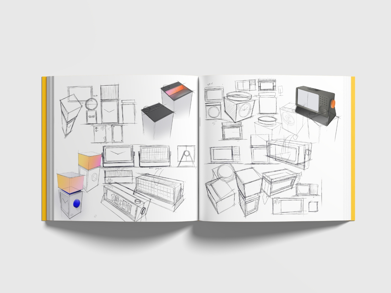
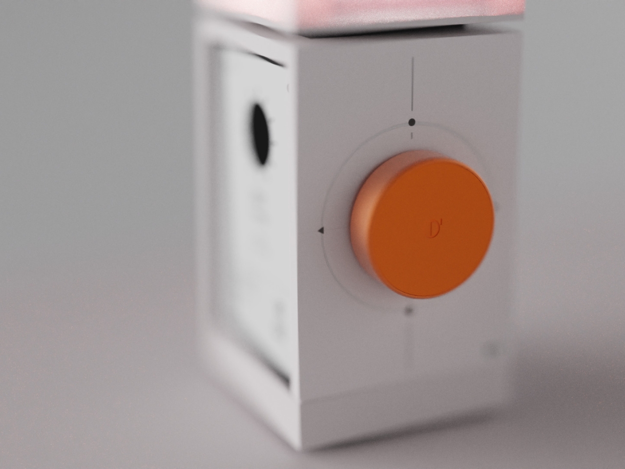
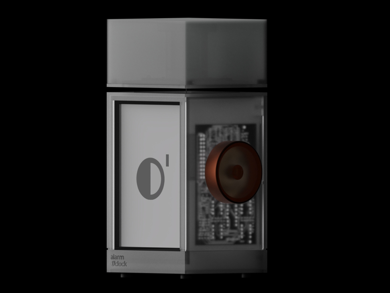
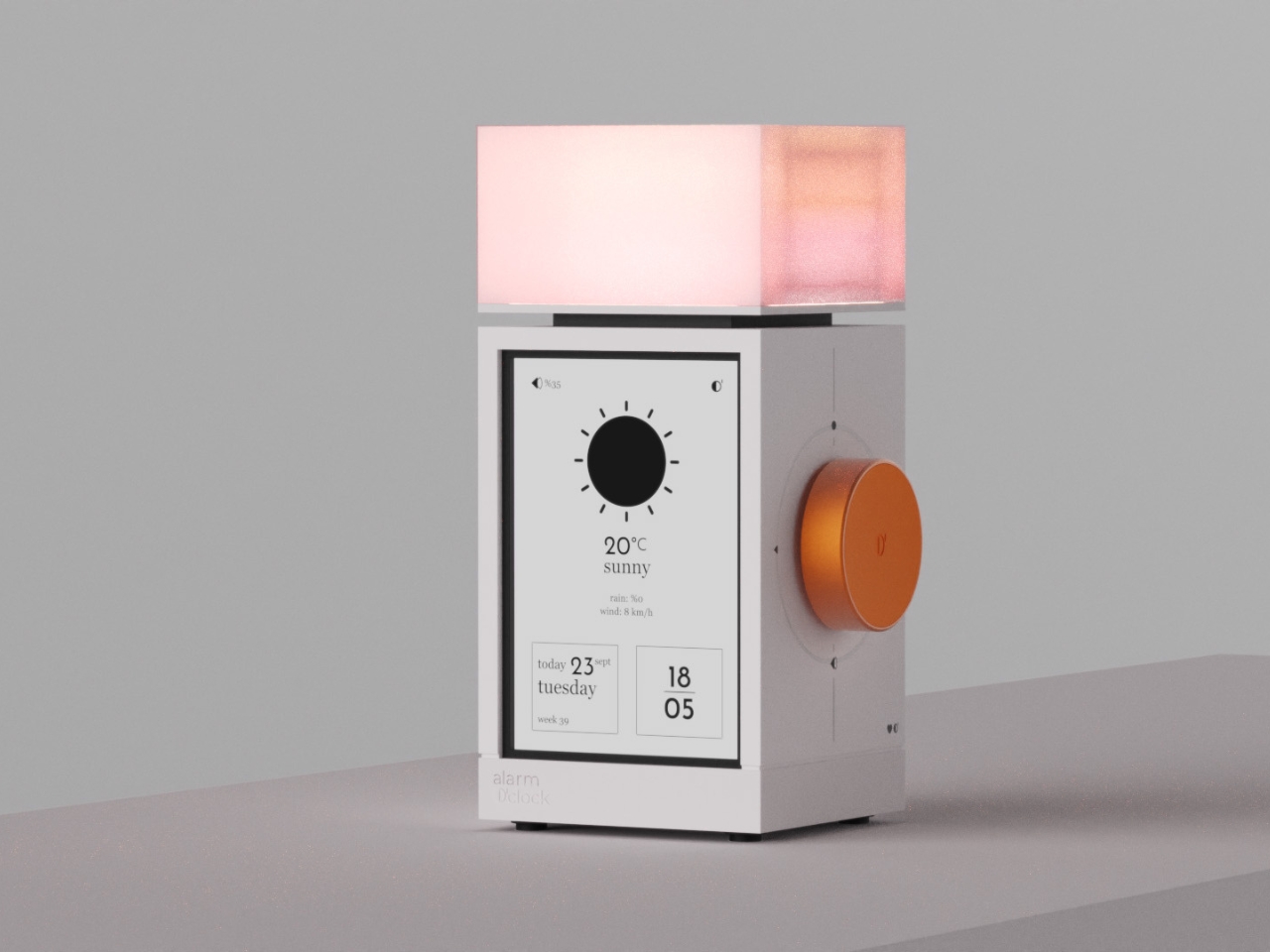
But what if your alarm clock could actually make waking up feel less like a punishment and more like a gentle invitation to start your day? That’s exactly what The Real Objects, a Milan-based design studio, seems to be thinking with their latest concept, Alarm O’clock. And yes, that apostrophe is intentional, giving it a playful Irish lilt that already makes it more charming than your phone’s default alarm.

Designer: The Real Objects

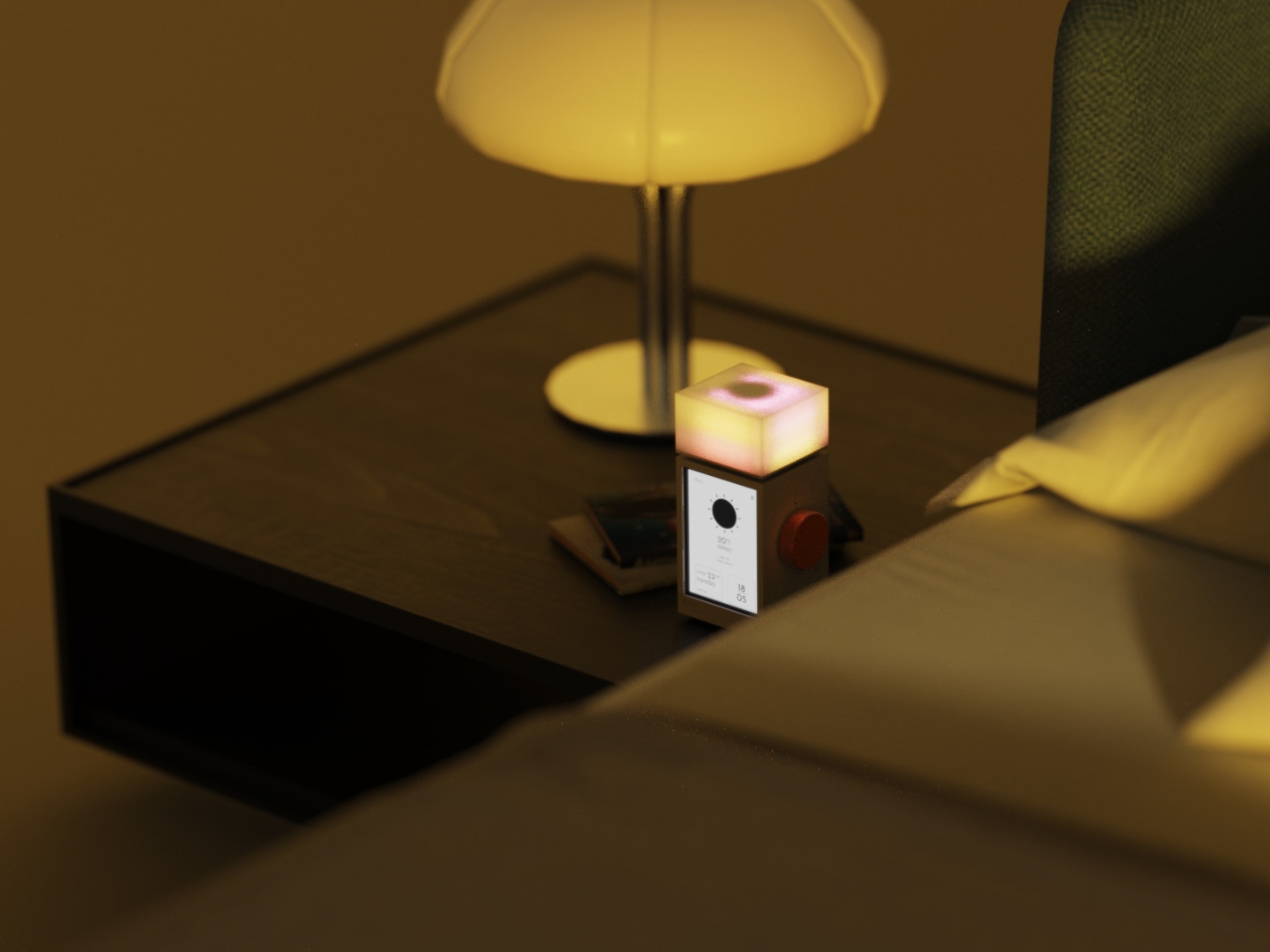
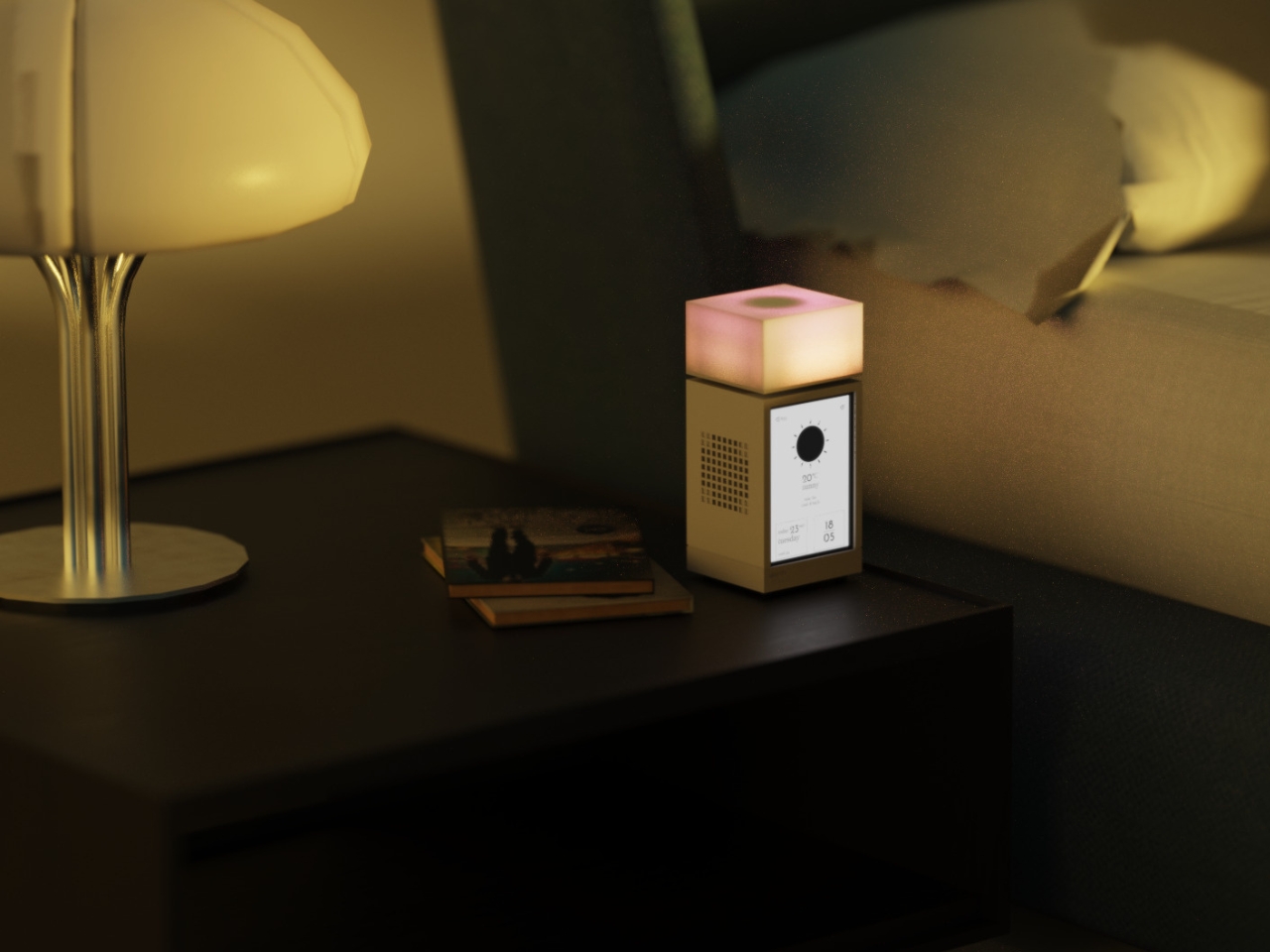
The design is described as “a bedside companion designed to bring calm, clarity, and personality to the way we wake up,” and I’m here for it. Because let’s face it, we spend way too much time thinking about productivity hacks and morning routines while completely ignoring the object that literally defines how our day begins.

From what I can see, Alarm O’clock isn’t trying to be smart or connected or packed with features you’ll never use. Instead, it looks like it’s going back to basics, but with a thoughtful, contemporary twist. The Real Objects describes it as blending “light, sound, and simplicity into one object,” which honestly sounds like exactly what we need in a world where everything is trying to do a million things at once.

There’s something refreshingly analog about this approach. While everyone else is using their phones as alarm clocks (guilty), we’re also scrolling before bed and checking notifications the second our eyes open. Having a dedicated alarm clock means you can actually leave your phone in another room, which sleep experts have been begging us to do for years.

The Real Objects was co-founded in Milan in 2024 by designers who are “dedicated to pushing the boundaries of product design.” But pushing boundaries doesn’t always mean adding more tech or making things more complicated. Sometimes it means rethinking everyday objects and asking why they’ve been designed the way they have.

What strikes me about Alarm O’clock is that it seems to prioritize the experience over the function. Yes, it needs to wake you up, but how it wakes you up matters. The emphasis on “calm” and “clarity” suggests this isn’t going to be one of those alarms that sounds like a fire drill. And the mention of light integration hints at something closer to a sunrise alarm, which studies have shown can make waking up feel more natural.

The design itself appears minimal and sculptural, the kind of object that could sit on your nightstand without feeling like a piece of electronics invading your bedroom. In an era where we’re all trying to make our spaces feel more intentional and less cluttered with gadgets, that matters more than you might think. I love that they’re calling it a “bedside companion” rather than just an alarm clock. It’s a small word choice, but it signals a different philosophy. Your bedside table is intimate space. It’s the last thing you see before sleep and the first thing you see when you wake up. The objects there should feel like they belong, not like they’re just functional necessities you tolerate.

There’s also something to be said for designers who focus on the rituals of daily life. We get excited about revolutionary new products, but the truth is, the objects that actually improve our lives are usually the ones that make ordinary moments a little bit better. Waking up is one of those moments we experience every single day, and yet most of us haven’t thought critically about how we could make it better. Will Alarm O’clock change your life? Probably not. But could it make your mornings feel a little more human, a little less jarring? Absolutely. And in a world where we’re all trying to figure out how to have healthier relationships with technology, that feels like a step in the right direction.

The post Why This Alarm Clock Might Actually Make You a Morning Person first appeared on Yanko Design.

Layer Just Built the AI Chair Remote Workers Need

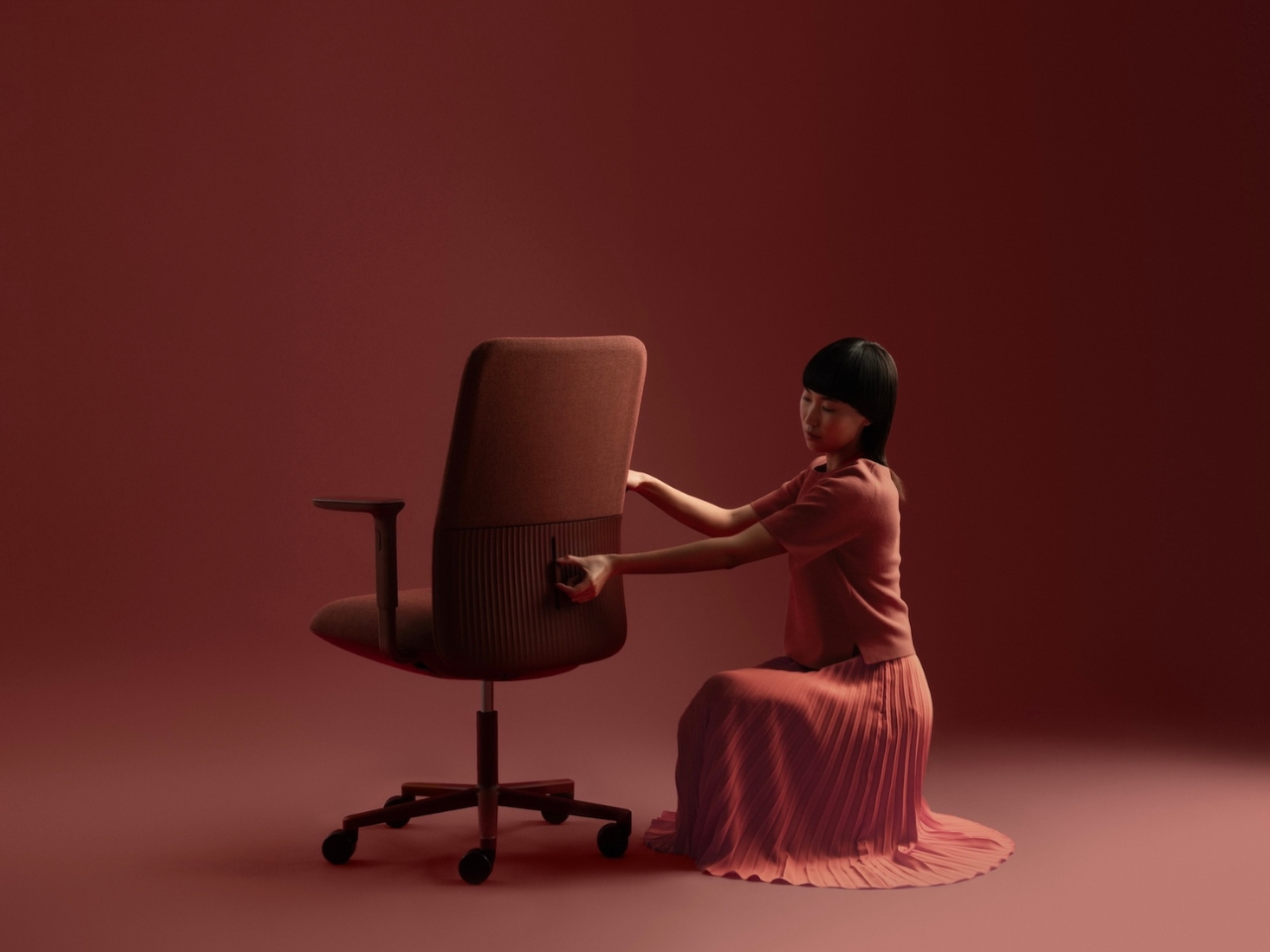
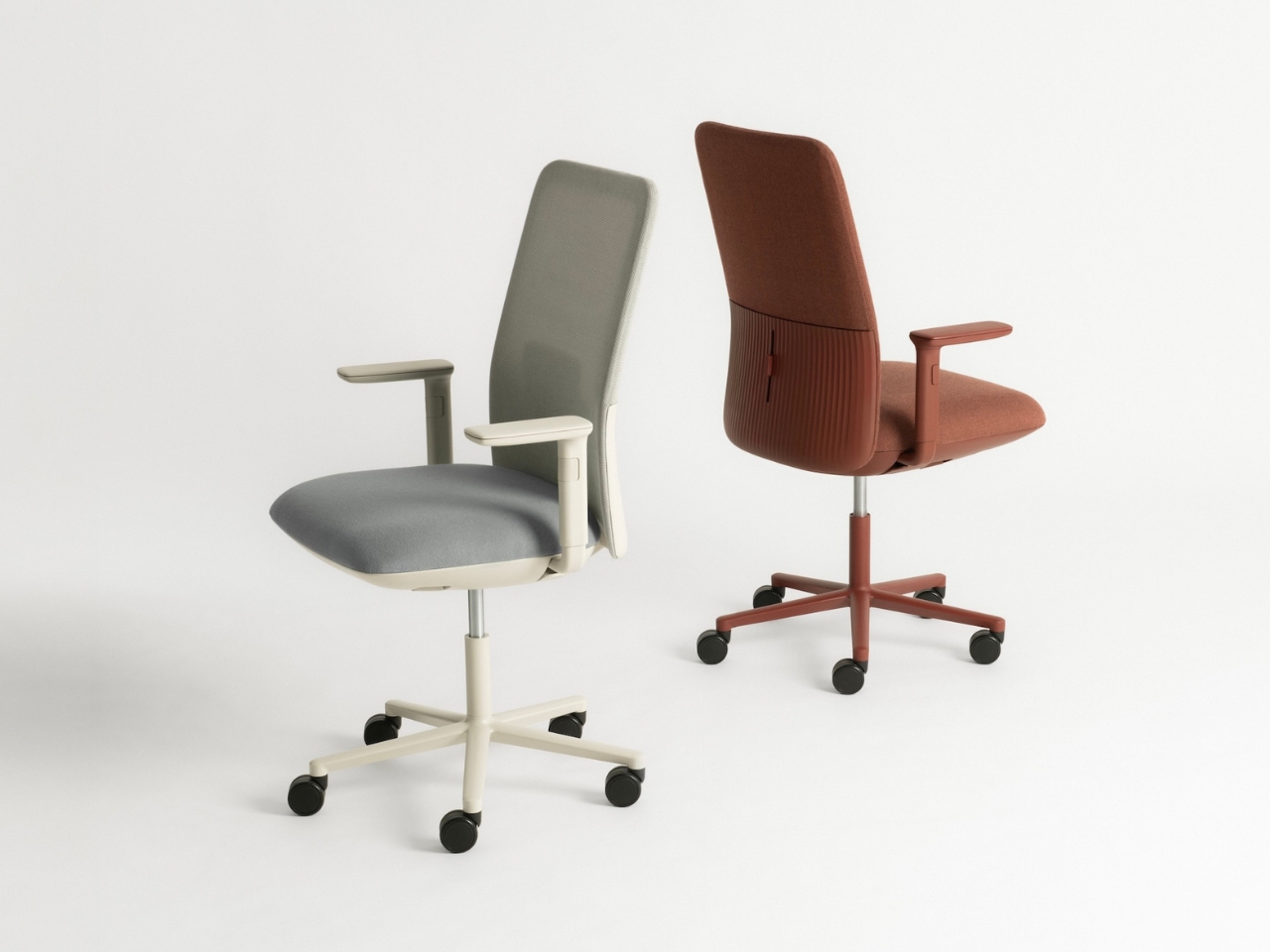
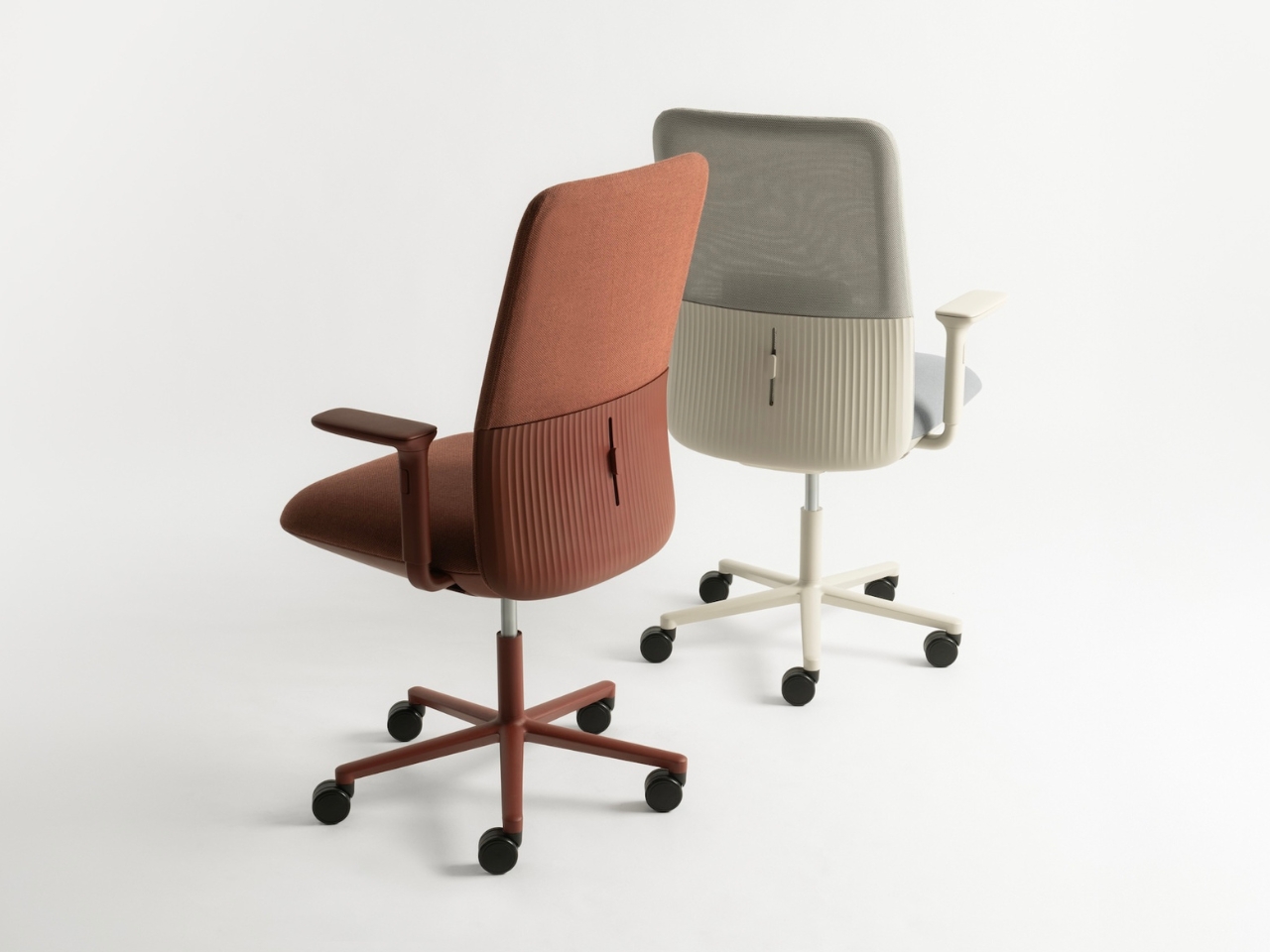
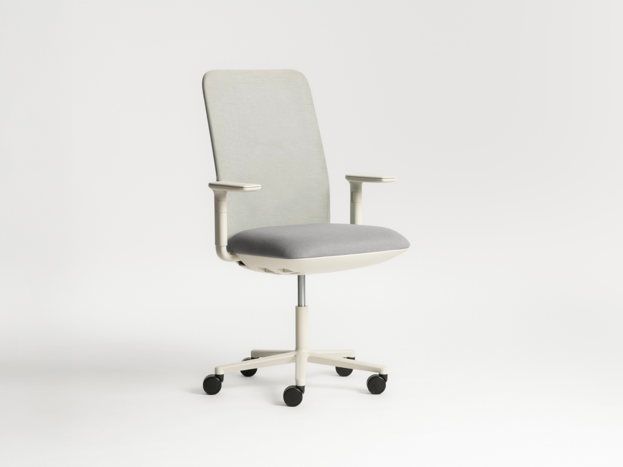
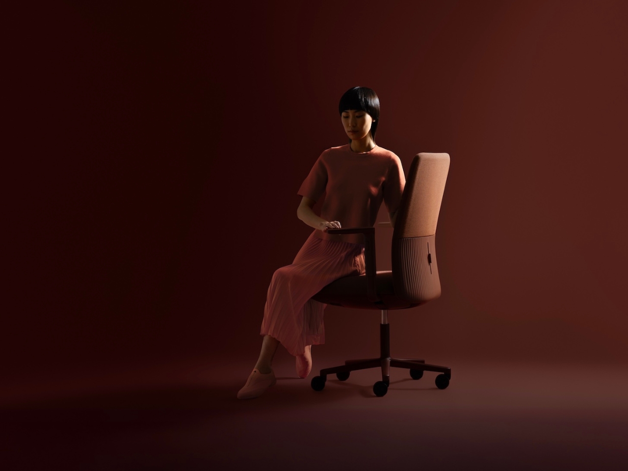
There’s something quietly revolutionary happening in office furniture, and it doesn’t involve more buttons, levers, or adjustment knobs. LAYER, the London-based design studio founded by Benjamin Hubert, has partnered with Spanish furniture maker Andreu World to create Velo, a task chair that throws out the instruction manual and replaces it with something far more intuitive: material intelligence.

If you’ve ever sat in a high-end office chair, you know the drill. There are usually about seven different levers under the seat, each controlling a specific function, and you’re expected to become an amateur ergonomics expert just to sit comfortably. Tilt tension here, lumbar support there, armrest height, armrest width, seat depth. It’s exhausting before you even start working. Velo takes a different approach entirely, one that feels almost obvious once you experience it.

Designer: LAYER x Andreu World

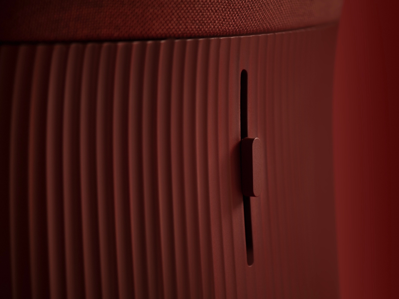
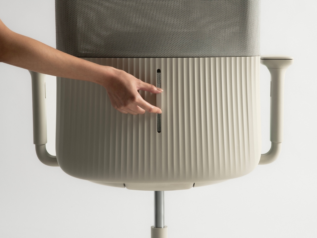
At the heart of this chair is a weight-activated mechanism that LAYER developed specifically for this project. Instead of requiring you to manually adjust anything, the chair simply responds to how you’re sitting. Lean back, and it flexes with you. Shift your weight forward, and it adapts. The contoured backrest moves in real time with your body, providing ergonomic support that feels less like furniture and more like the chair is actually paying attention to you.

This isn’t some gimmick hiding behind sleek marketing language. The technology here is genuinely clever. LAYER engineered a system that uses the sitter’s own body weight to activate the mechanism, eliminating the need for springs, gas lifts, or complex pivot points that typically make task chairs feel like miniature machines. The result is a chair that looks refreshingly simple but performs with sophisticated precision.

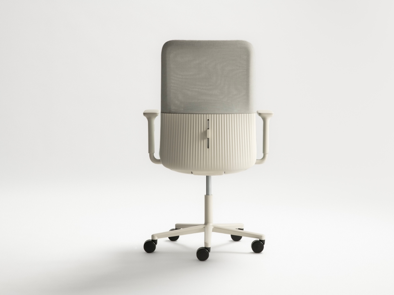
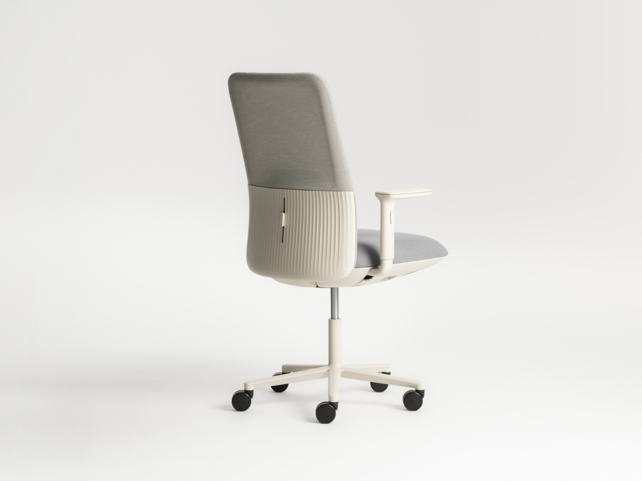
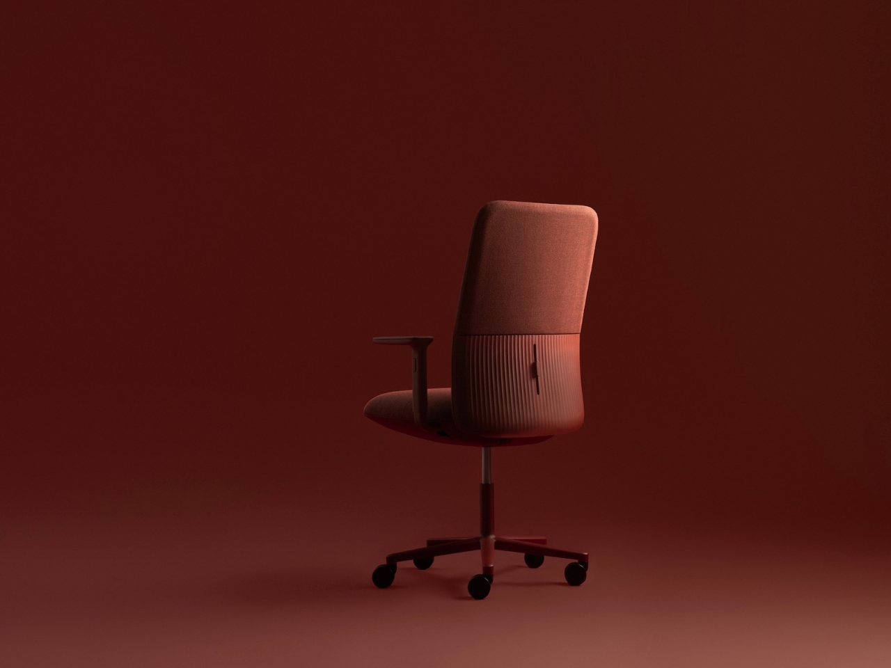
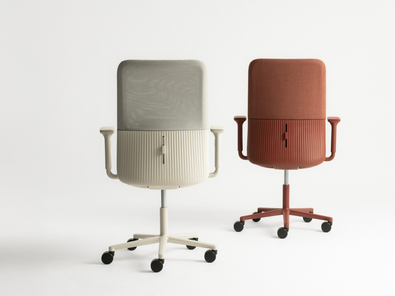
Visually, Velo is a departure from the aggressively technical aesthetic that dominates the office furniture world. Where most task chairs announce their functionality with exposed mechanisms and industrial details, Velo opts for soft, organic lines and a sculptural silhouette. It’s the kind of chair that wouldn’t look out of place in a contemporary home office, which is exactly the point. With more people working from home or splitting time between multiple locations, the old distinctions between commercial and residential furniture are breaking down. Velo was designed for that fluid reality.

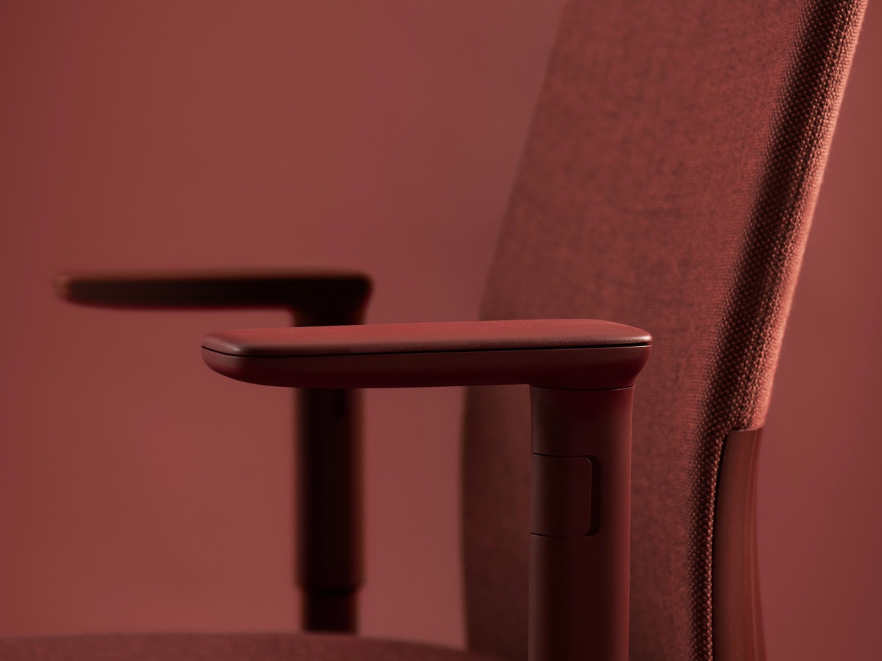
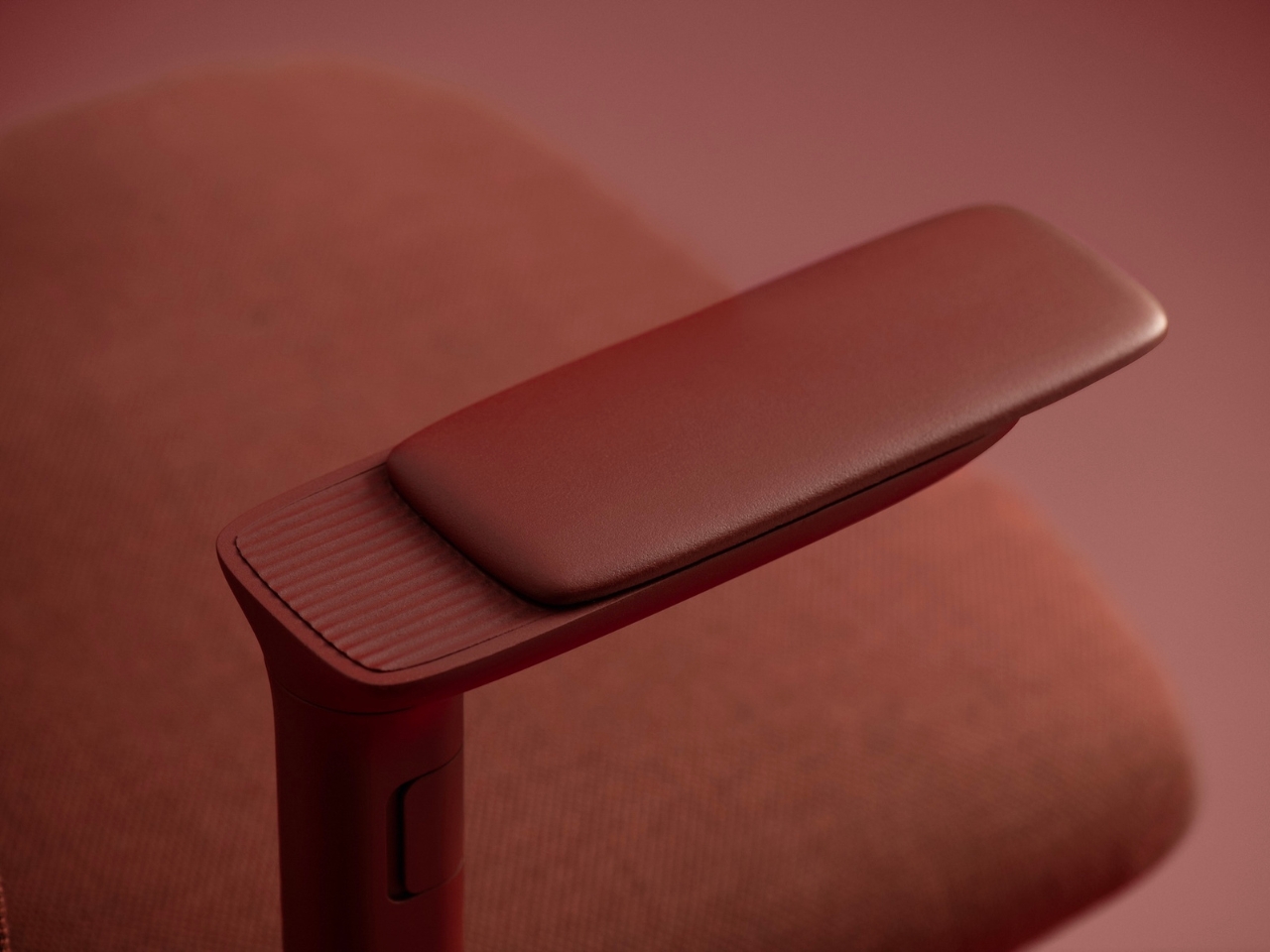
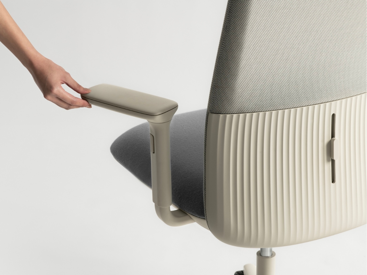
You can spec the chair in two main configurations. The mesh backrest version offers breathability and a lighter visual presence, perfect for warmer climates or minimalist spaces. The fully upholstered version provides a softer, more enveloping feel. Both options feature adjustable lumbar support, and you can choose between standard armrests or 4D movement arms that adjust in multiple directions. The base comes in Andreu World’s range of powder-coated finishes, and the upholstery options pull from their sustainable textile collection.

Speaking of sustainability, Velo was designed with end-of-life in mind from the very beginning. The lightweight frame and base are manufactured from recycled thermopolymer, a high-performance material that maintains durability while reducing environmental impact. The chair uses a minimal part count, which not only simplifies manufacturing but also makes disassembly straightforward when it’s time to recycle. The upholstery fabrics are either low-impact or fully recyclable, continuing Andreu World’s commitment to circular design principles.

Benjamin Hubert’s perspective on the project gets at something essential about where design is heading. As he puts it, people don’t want overly technical products anymore. They want intuitive, adaptable things that fit into their lives without requiring a learning curve. Velo strips back complexity and focuses on the fundamental question: what does a chair actually need to do? It’s not trying to reinvent sitting, but it is rethinking how a chair can support the way we actually work now, without making us work to figure out the chair itself.

The post Layer Just Built the AI Chair Remote Workers Need first appeared on Yanko Design.
This Robot Changes Shape to Match Any Terrain You Throw at It

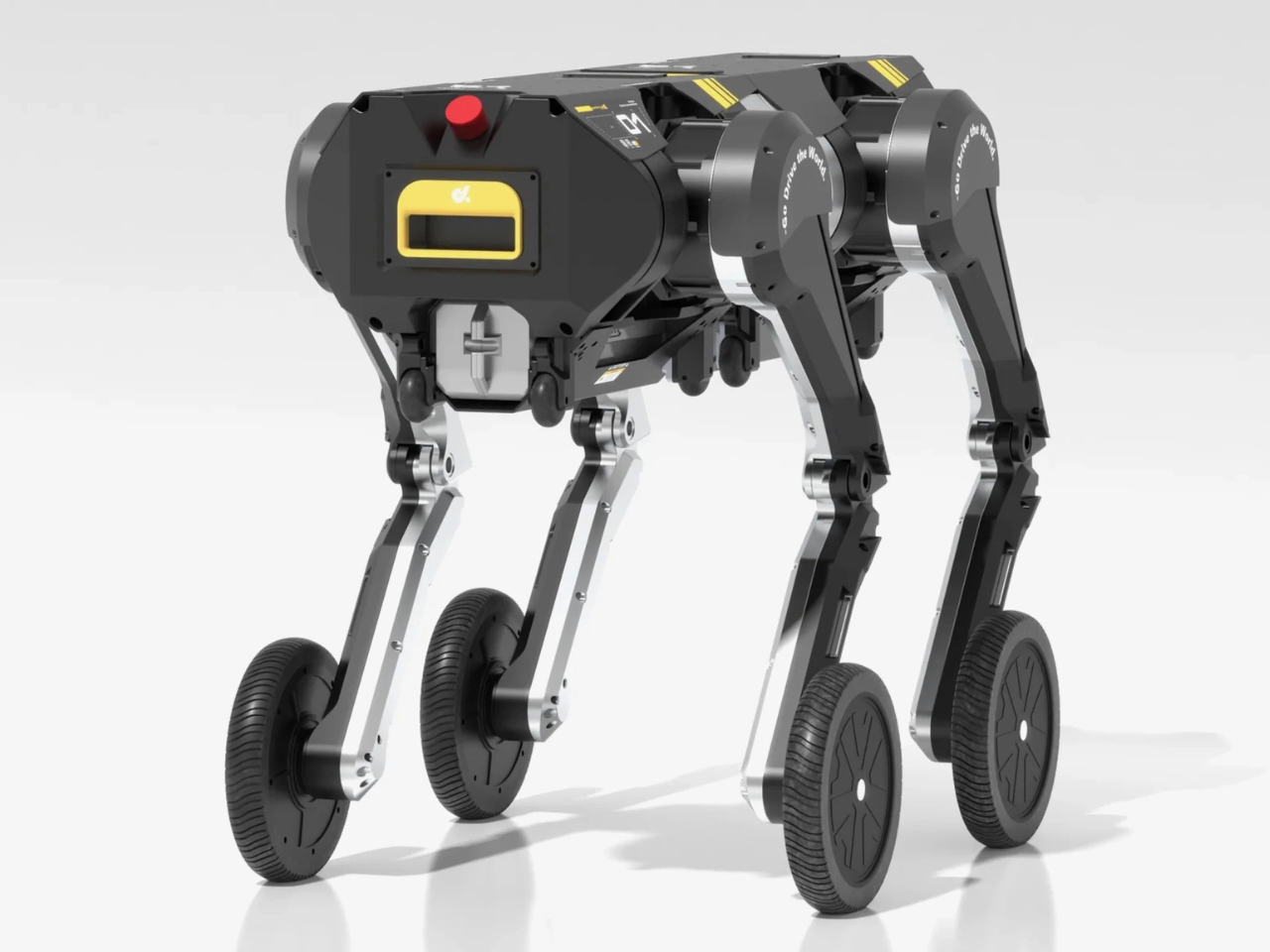
Imagine a robot that can’t decide whether it wants to be a dog or a person, so it just becomes both. That’s essentially what Hong Kong’s Direct Drive Technology has created with the D1, a shape-shifting machine that’s making waves in the robotics world.

This isn’t your typical tech demo that looks cool but has zero practical use. The D1 is a seriously clever piece of engineering that addresses a real problem: different terrains require different types of movement. Need to haul something heavy across rough ground? The D1 becomes a stable four-legged robot that can carry up to 220 pounds without breaking a sweat. Got a narrow hallway or smooth surface to navigate? It splits into two sleek bipedal units that roll along at speeds up to 7 mph.

Designer: Direct Drive

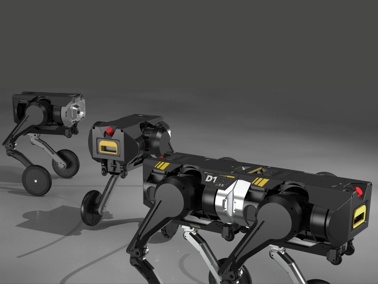
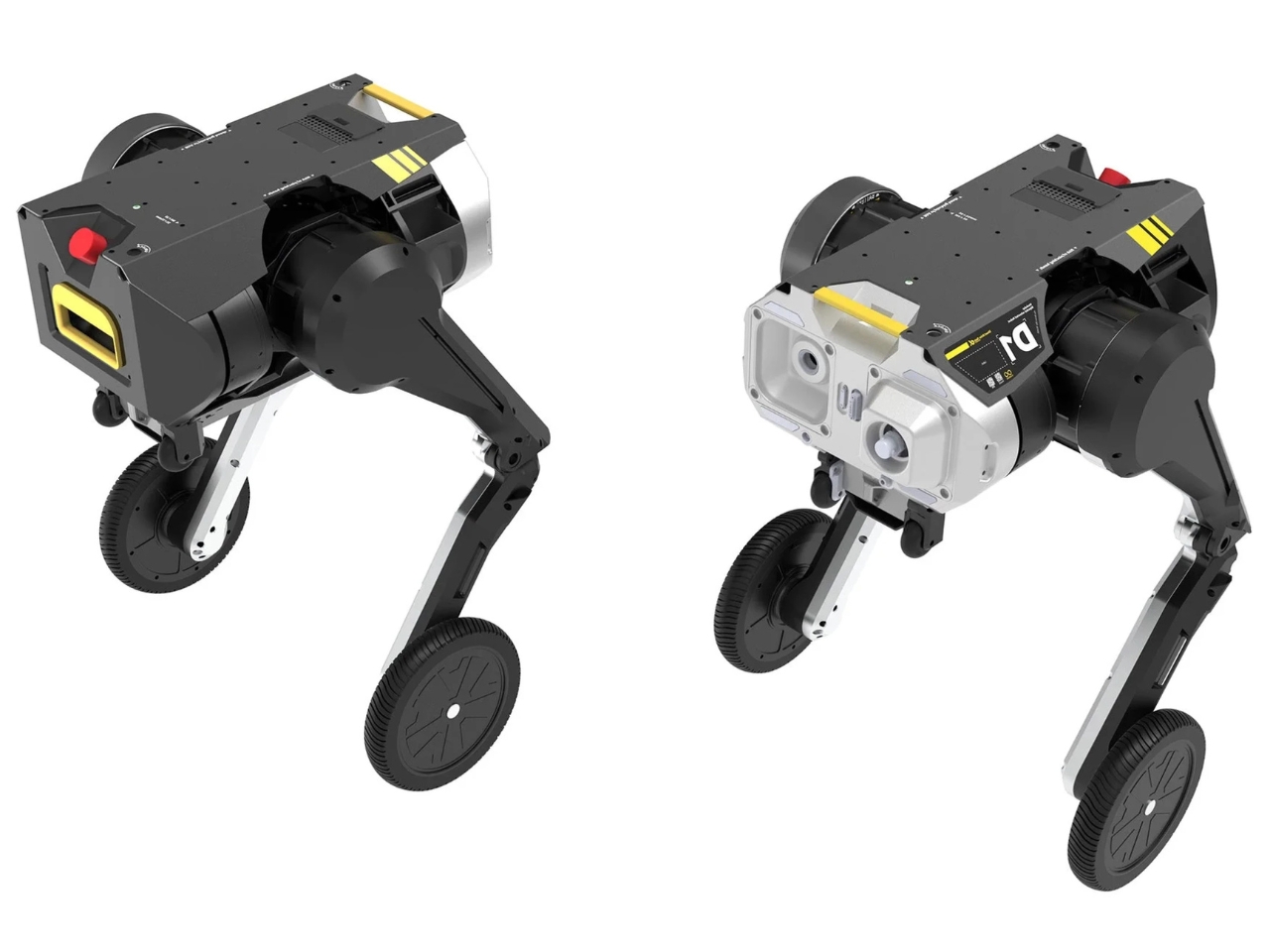
What makes the D1 truly fascinating is its modular design philosophy. Rather than trying to create one robot that does everything mediocrely, Direct Drive Technology took a different approach. They built two independent bipedal robots that can operate solo or dock together to form a quadruped when the situation demands it. It’s like having a transformer that actually serves a purpose beyond looking awesome in action sequences (though it does that too).

Each half of the D1 weighs about 54 pounds and runs on a lithium battery that provides over five hours of operation per two-hour charge. The brains behind the operation is a Jetson Orin NX 8GB processor running Ubuntu, which enables both remote control and autonomous decision-making. This means the D1 can figure out on its own when it needs to split apart or come together based on what it’s facing.

The real-world testing footage shows the D1 tackling scenarios that would trip up most robots. In one clip, it takes a nasty fall on rough terrain but recovers its balance with the kind of precision that makes you wonder if someone’s secretly controlling it. Another scene shows it rolling across water without losing its footing, which is the kind of versatility that could make this robot genuinely useful in disaster response, industrial inspection, or military applications.

What’s particularly smart about this design is how it leverages the strengths of both biped and quadruped configurations. Four-legged robots are notoriously stable and excel on uneven surfaces, which is why we see so many robotic dogs being developed for rough terrain exploration. Meanwhile, bipedal robots are typically lighter, more compact, and better suited for flat surfaces where speed and efficiency matter more than stability. Direct Drive Technology essentially looked at that trade-off and said, “Why choose?” The result is a robot that doesn’t have to compromise. When it needs to be a scout vehicle patrolling smooth terrain, it operates in its speedy biped mode with wheels. When stability and payload capacity become priorities, it transforms into a sure-footed quadruped that can handle chaos.

The timing of this innovation is interesting too. As robots move out of controlled factory environments and into the messy real world, adaptability becomes crucial. A delivery robot that can handle both indoor corridors and outdoor terrain without needing two different machines makes a lot of economic sense. The same goes for search and rescue operations where conditions can change dramatically within a single mission.

Direct Drive Technology is calling the D1 the world’s first fully modular embodied intelligence robot, which is a bold claim in a field that’s moving incredibly fast. But watching the demonstration video, it’s hard to argue with the innovation on display. This is a robot that fundamentally rethinks how we approach locomotion in machines. Whether the D1 becomes commercially successful or remains a fascinating proof of concept, it represents something important: a shift from specialized robots toward truly adaptable ones that can handle whatever environment you throw at them. And in a world that’s increasingly complex and unpredictable, that kind of flexibility might be exactly what we need.

The post This Robot Changes Shape to Match Any Terrain You Throw at It first appeared on Yanko Design.