A Student Just Made a Pen From One Bamboo Stalk. No Factory Needed.

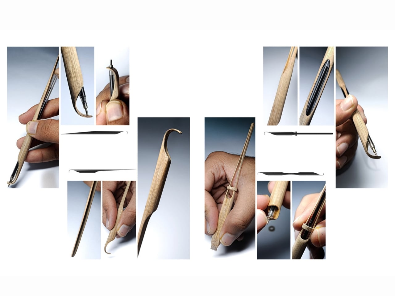
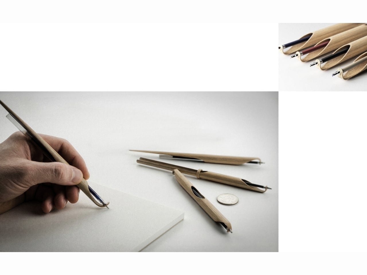
We don’t usually stop to think about pens. They show up in our bags, our drawers, the bottom of every tote we own, and when the ink runs out, they quietly end up in a landfill. That’s the mundane life cycle of the humble ballpoint, and most of us have just accepted it. Which is exactly why Shoot, a bamboo writing instrument designed by Sarthak Prajapati, feels like a quiet rebuke dressed up as a very beautiful object.

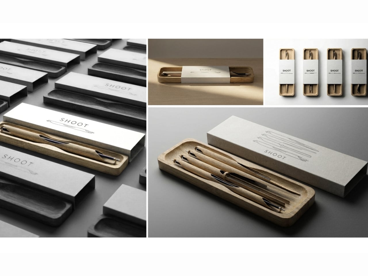
Prajapati is an Industrial Design undergraduate at the National Institute of Design in Assam, India, and Shoot is his entry in the 2026 Green Product Award, currently shortlisted as a finalist in the Consumer Goods category. At first glance, it’s a precision pen carved from a single piece of bamboo. But the more you learn about how it was made and why, the more it becomes a kind of design manifesto condensed into something you can hold in your hand.

Designer: Sarthak Prajapati

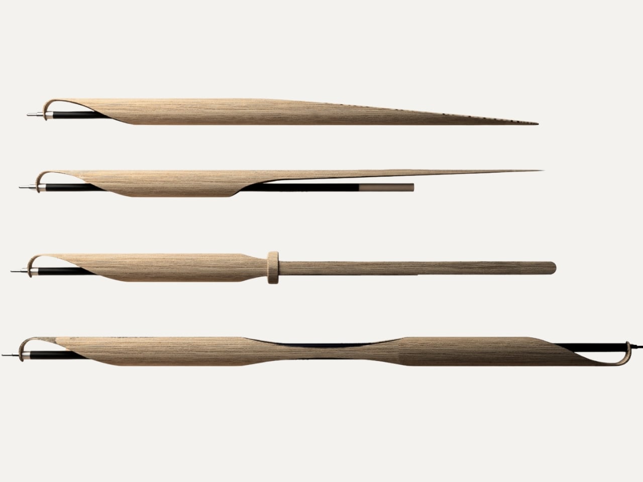
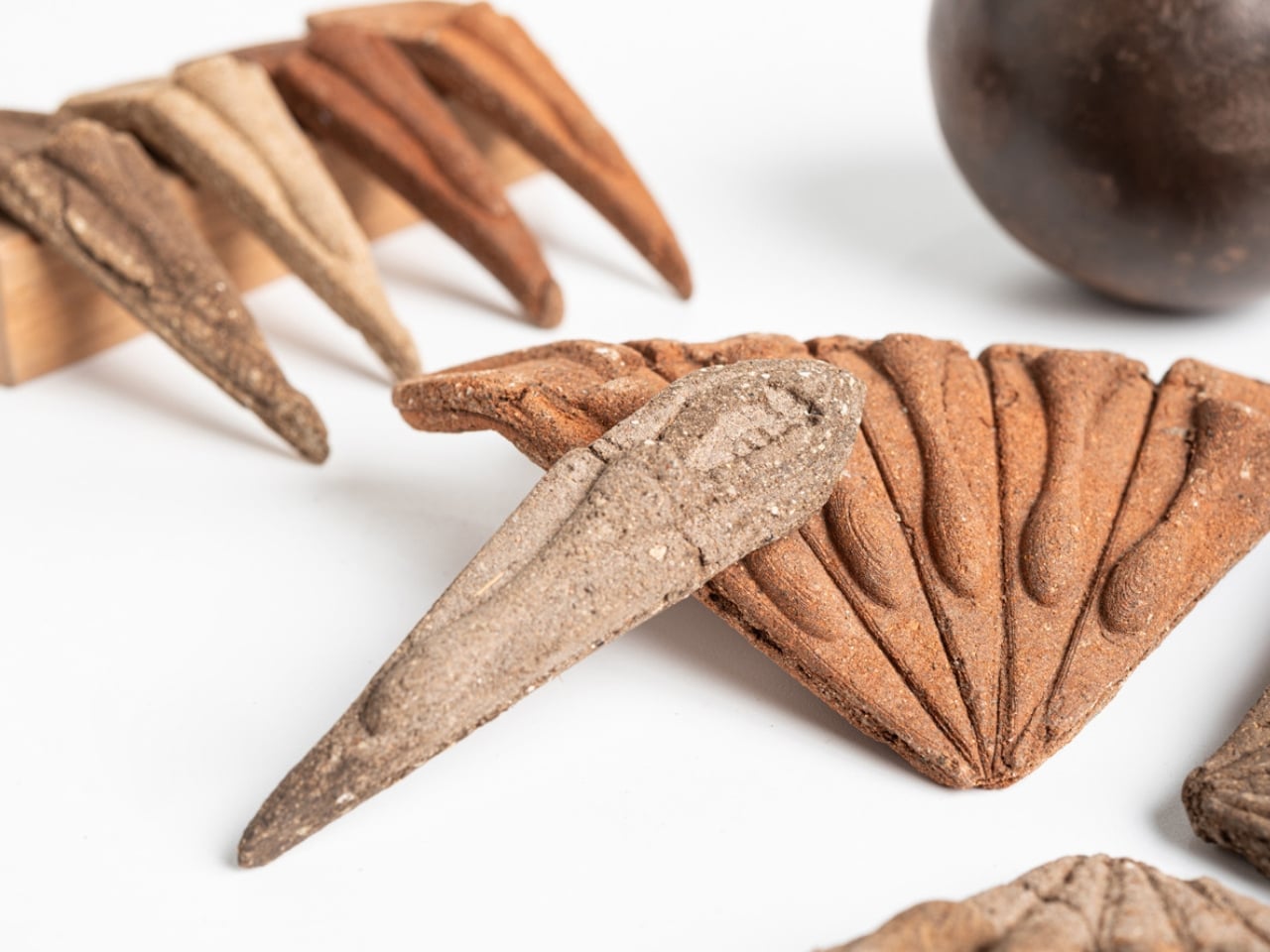
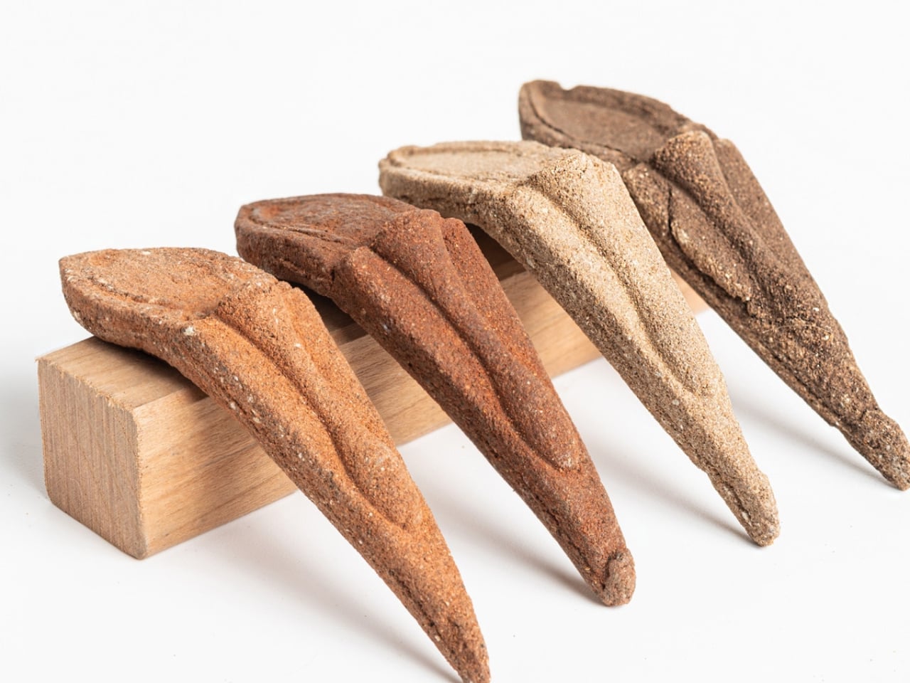
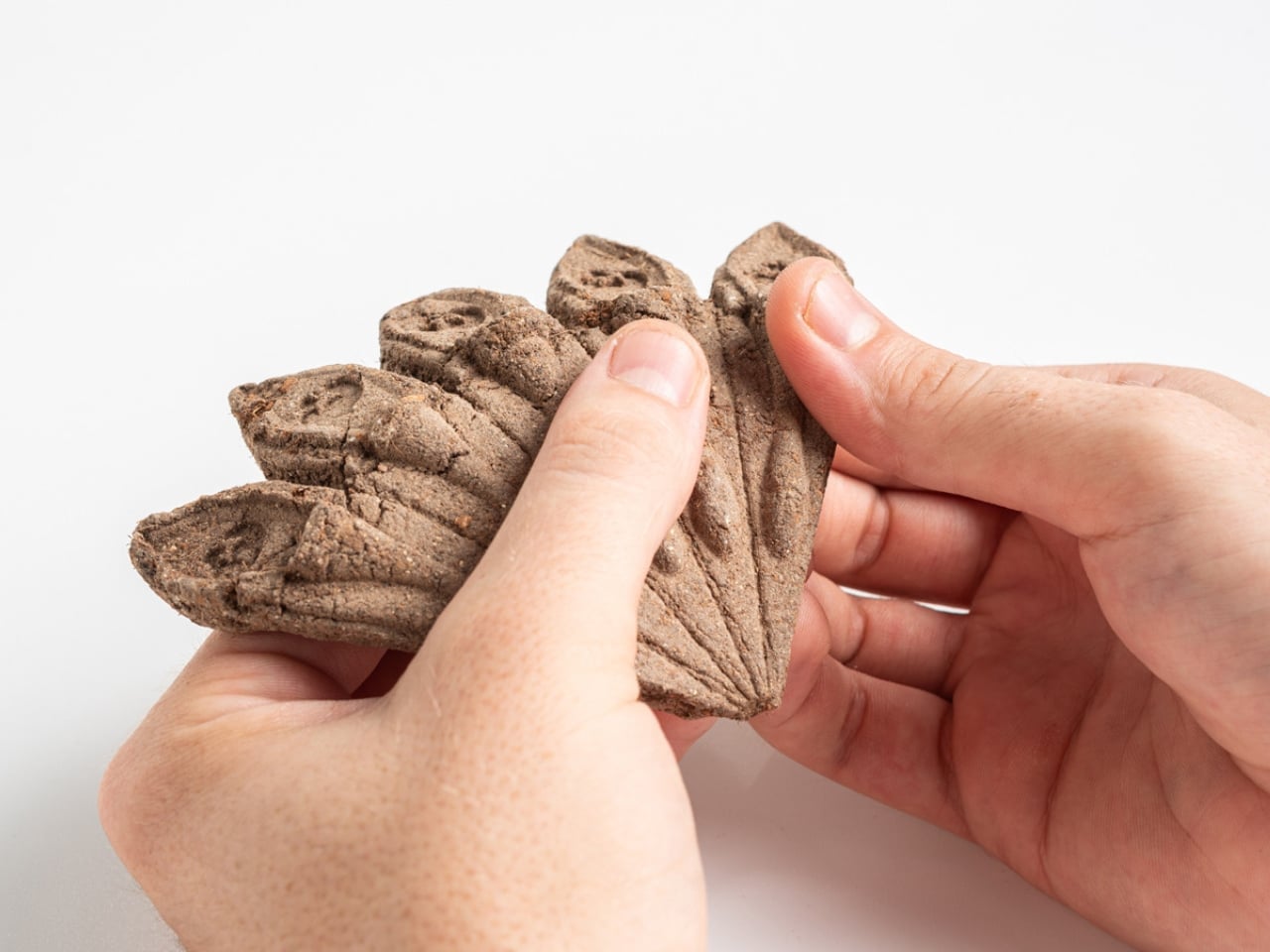
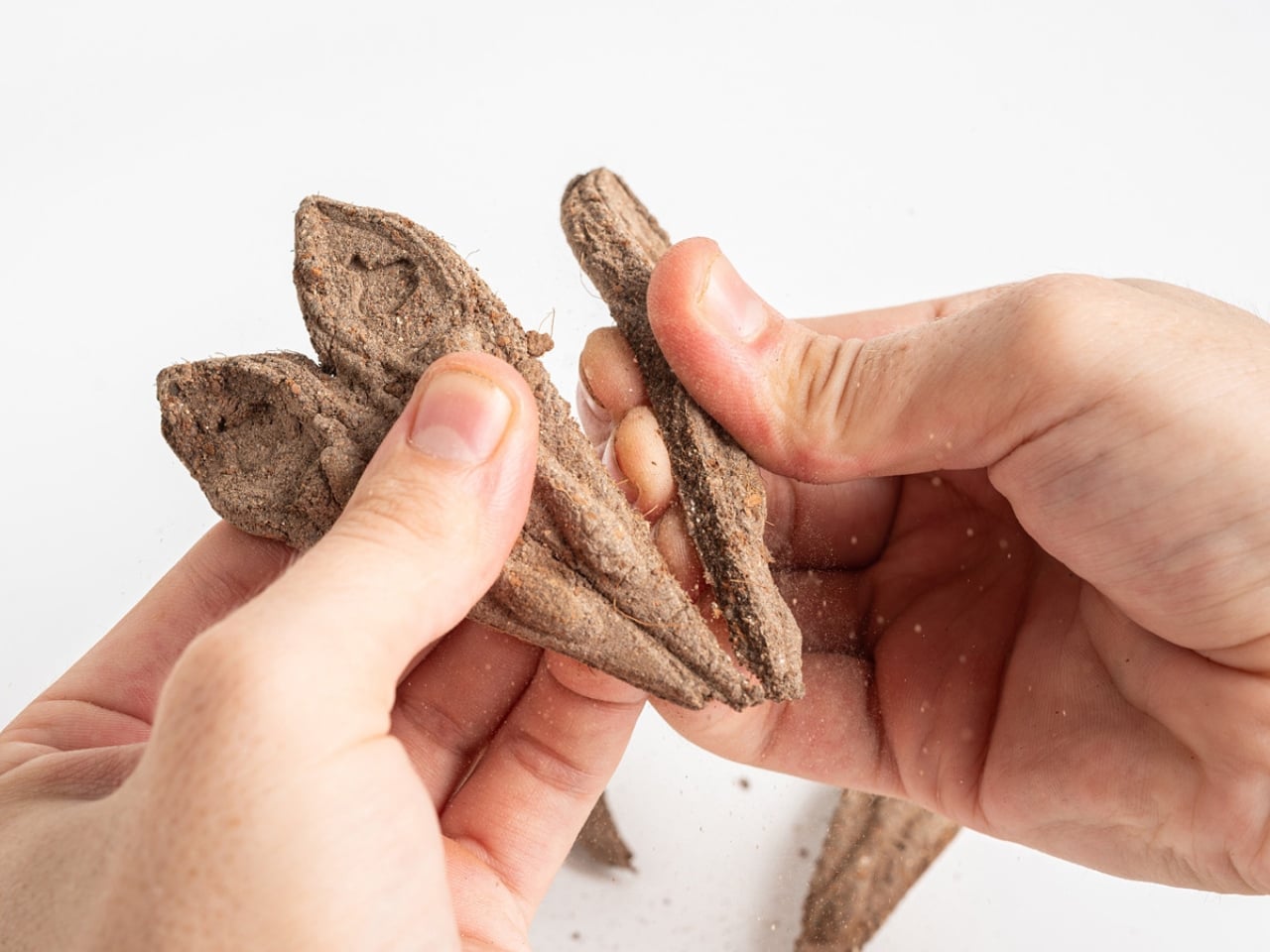
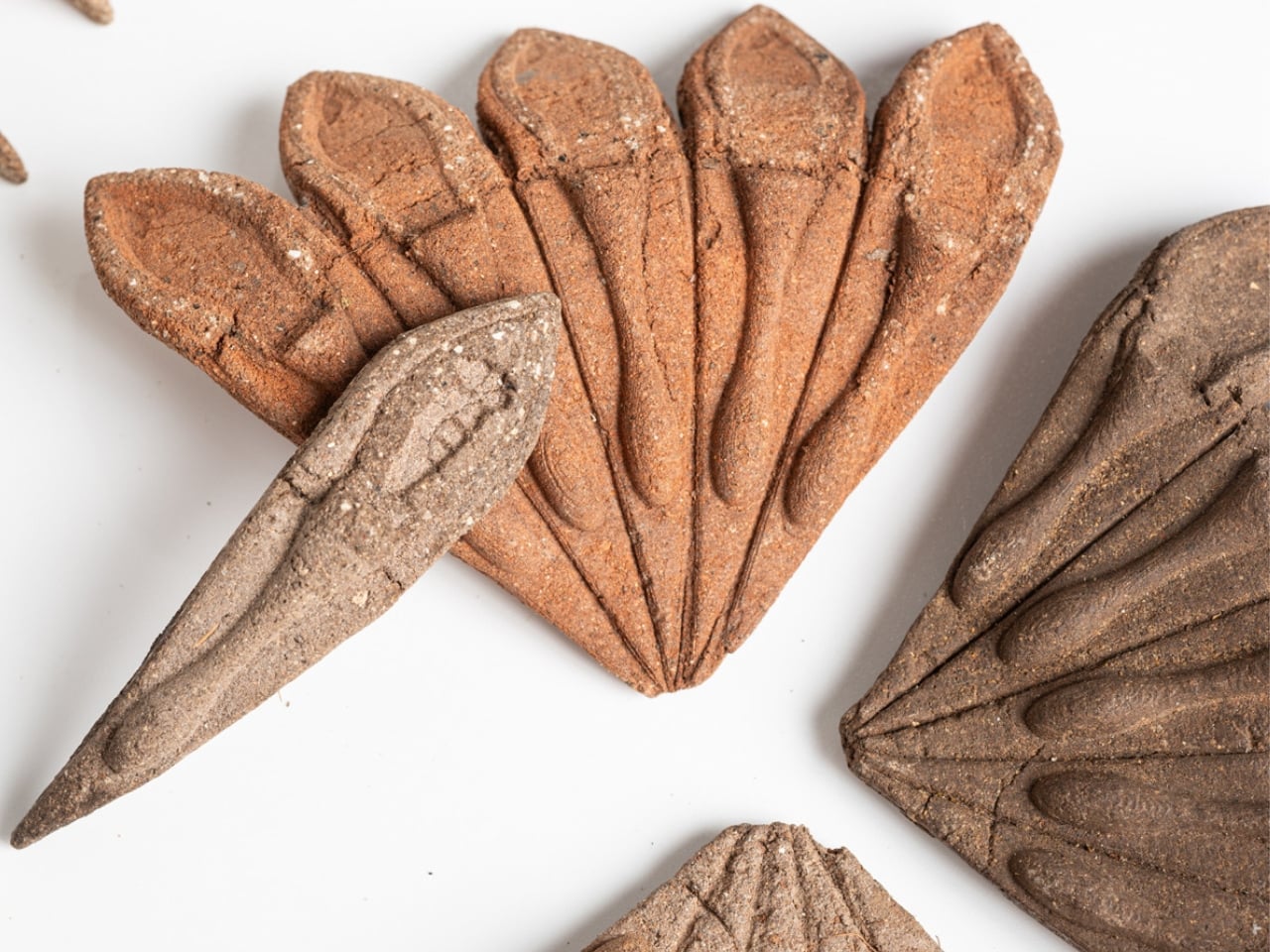
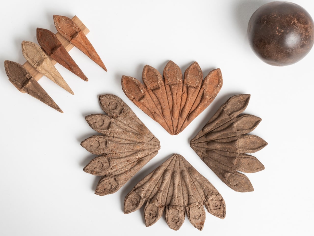
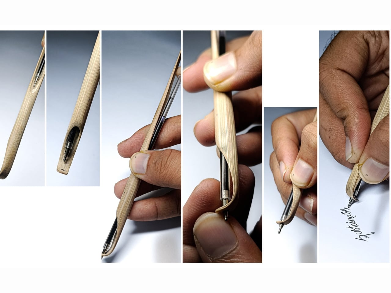
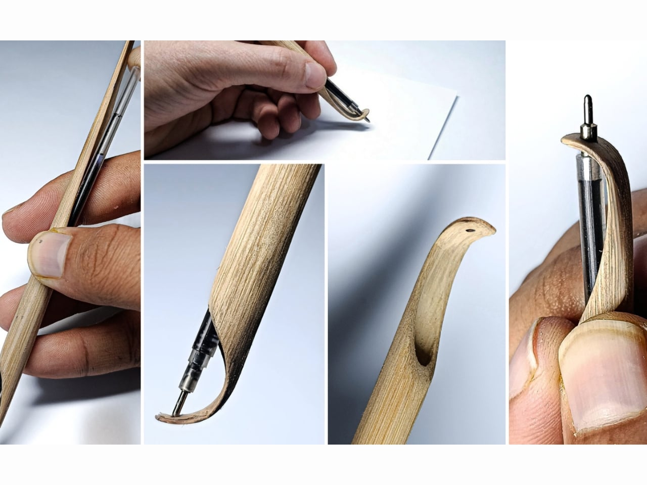
The name itself is a clever one. A “shoot” is the young, fast-growing sprout of a bamboo plant, and that material is the entire premise of the object. Bamboo is one of the fastest-regenerating plants on earth, and Prajapati uses it here not as a trendy green overlay but as a functional, structural choice. The bamboo handles the grip. The bamboo handles the form. The bamboo is the design. There’s no layer of branding on top trying to convince you it’s sustainable. The material speaks for itself.

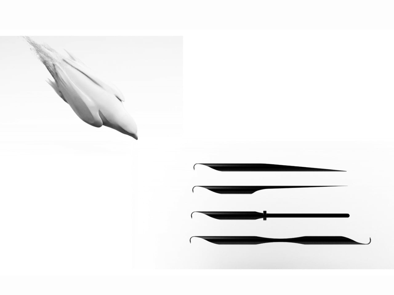
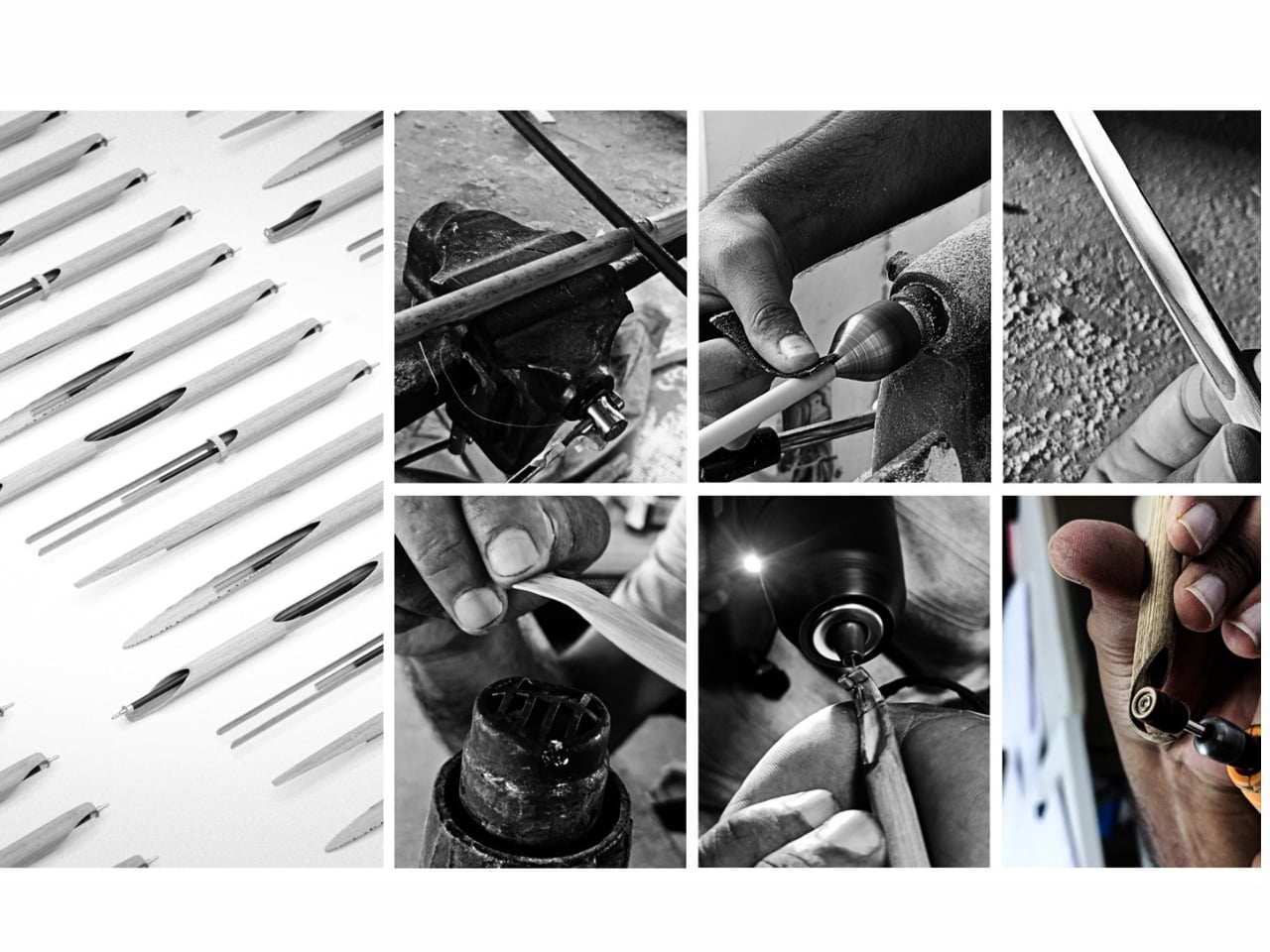
Shoot’s most compelling quality isn’t even the material. It’s the thinking behind how it was made. No electricity. No factory floor. No complex supply chain. Prajapati built this using low-energy, hands-on craft methods, which aligns with a wider movement in design circles pushing back against the idea that innovation always has to be high-tech to be meaningful. Sometimes innovation looks like stepping back and asking whether the thing we already have, meaning the plant, the material, the traditional skill, was actually good enough all along.

The pen is also refillable, which sounds like a small detail but isn’t. Disposable pens are a genuinely staggering problem. Billions are discarded every year globally, and most of them are made from mixed plastics that can’t be easily recycled. The refillable design of Shoot positions it directly against that culture of single-use convenience, and it does so without requiring the user to sacrifice function. You still get a proper writing instrument. You just don’t throw the whole thing away when it’s done.

I’ll be honest: I have a soft spot for design that comes from a student context. There’s a kind of fearlessness to it. Prajapati isn’t working within a corporate brief or trying to satisfy a retailer’s margin requirements. He’s solving a real problem the way he actually believes it should be solved, and the result has the clarity that comes with that freedom. The pen looks exactly like what it is. A bamboo stalk. A writing tool. Nothing more, nothing less, and somehow that is enough.

The Green Product Award itself, now in its eleventh year, evaluates submissions on approach, innovation, sustainability, and design. The fact that Shoot made the final shortlist tells you a lot about the kind of thinking that’s being rewarded right now. The jury isn’t looking for products that simply add a bamboo component to something otherwise unchanged. They’re looking for objects where the sustainability logic runs all the way through, from material to manufacturing to end of life.

If Shoot ever goes into production, I’d buy one. Not because I’m trying to make a statement, but because it looks good, it works, and it represents a genuinely more considered way of making things. The design world produces a lot of concepts that never leave the rendering stage, but Shoot has a physicality and simplicity to it that makes it feel ready. It’s a pen. From a bamboo shoot. Made by hand. And right now, that feels surprisingly radical.

The post A Student Just Made a Pen From One Bamboo Stalk. No Factory Needed. first appeared on Yanko Design.

A Student Just Designed a Seed Kit That Dissolves Into Your Garden

Most gardening products arrive in a blizzard of plastic. Clamshell trays, foil seed packets, twist ties, instruction cards laminated in polyester. You buy them, use them, then spend 20 minutes figuring out what you can recycle and what you can’t. It’s a frustrating little ritual that, frankly, undercuts the whole point of growing something in the first place.

So when I came across Terra Seeds, a student project by Israeli designer Tom Fosbery from Shenkar College of Engineering, Design and Art, I had to stop and actually sit with it. Not because it’s revolutionary in a loud, tech-forward way. But because it’s quietly, elegantly obvious once you understand it. The kind of obvious that makes you wonder why it took so long.

Designer: Tom Fosbery

Terra Seeds is a planting kit for hobbyists, families, and urban gardeners. The concept is built around fan-shaped units made of compressed local soil, tapioca starch, nutrients, and seeds. You plant the unit directly into the ground, no tools required. It breaks down completely, feeds the soil, and helps the seeds germinate. There is no packaging to throw away, because the packaging is the product. The product is the garden.

The materials are worth paying attention to. Tapioca starch binds the unit together during handling and transport, then dissolves harmlessly once it meets moisture and soil. Local compressed soil means the unit is literally made from the same ground it’s meant to go into. The nutrients are already mixed in. Everything about the design reduces friction, physical and psychological, so that the act of planting feels as simple as pressing a small disc into the earth and walking away.

Fosbery describes his practice as one rooted in ecological design, in creating products that leave no waste. He’s passionate about exploring unexpected materials and finding their surprising possibilities. That ethos shows clearly in Terra Seeds. The fan shape is both aesthetically considered and functionally smart, giving the compressed unit enough surface area to hold together while fitting naturally into a small planting hole. It feels like a design where thinking about materials came before thinking about aesthetics, and the visual result is stronger for it.

I think about how many times I’ve seen sustainable design that mostly amounts to swapping one material for another. Plastic replaced with paper, foam replaced with cardboard, single-use replaced with slightly less single-use. Those swaps matter, but they’re incremental. Terra Seeds takes a different position. Rather than asking what material should hold the seeds, Fosbery asked what if the packaging itself contributed to growth. That’s a shift in the underlying question, and that shift produces a completely different kind of answer.

The intended audience matters here, too. Fosbery designed it for hobbyists, families, and urban gardeners, not for large-scale agriculture or commercial nurseries. That’s a crowd that often comes to gardening with enthusiasm but not expertise, people who want the satisfaction of growing something without the overhead of figuring out what goes where, how deep, with which tools. Terra Seeds removes those barriers gently, without making the experience feel dumbed down. The form factor does the work of instruction.

I’ll acknowledge the practical questions that a concept like this still has to answer: shelf life, moisture sensitivity before planting, how the units hold up in humid storage conditions. Those are real design challenges that tend to emerge more fully in production than in prototyping. But they don’t undermine the idea. They’re the kind of problems worth solving precisely because the idea is genuinely good.

The Green Product Award recognized Terra Seeds, and the recognition feels deserved. Not because it’s flashy, but because it demonstrates something that good design often does quietly: it makes you wonder why we were doing it the old way at all. The plastic seed packet had a good run. But pressing a fan of compressed earth into the ground and watching something grow from it, with nothing left over, is a more satisfying loop. That’s the whole point, isn’t it?

The post A Student Just Designed a Seed Kit That Dissolves Into Your Garden first appeared on Yanko Design.

No Battery, No Tech: A Grad Just Solved Outdoor Worker Heat Stress

The numbers are hard to ignore. More than 2.4 billion workers are exposed to excessive heat globally, and according to the WHO and WMO, worker productivity drops by 2 to 3 percent for every degree above 20°C. In 2023 alone, high temperatures contributed to an estimated 28,000 workplace injuries in the United States. Yet very little of this conversation gets directed at the people who feel it most: those working outdoors, in the sun, in gear that was never designed to help them stay cool.

That’s what makes Teron°, a cooling workwear concept by German design graduate Jorin Frenzel, feel so refreshingly grounded. Frenzel, who completed his Bachelor of Arts in Product Design at Hochschule Hannover in early 2025, didn’t reach for a tech-heavy solution. No battery packs, no wearable air conditioning units, no app to pair it with. He went back to basics: evaporation.

Designer: Jorin Frenzel

Teron° is built around the principle of natural evaporative cooling, using breathable fabrics, hidden ventilation layers, and targeted cooling zones to keep workers comfortable without introducing direct moisture to the skin. The vest, which handles upper body cooling, uses integrated elements that activate through water evaporation while keeping the wearer completely dry. The trousers take a different approach, using an overlapping cut to enhance air circulation, with additional cooling elements at the thighs to address heat where it tends to build most. The whole system prioritizes freedom of movement, which matters a lot when you’re on a construction site and actually need to get things done.

There’s a quiet intelligence to the design. Frenzel didn’t try to reinvent the trades. He listened to what craftspeople actually deal with on the job and responded with a garment that slots into existing routines rather than disrupting them. Cleverly integrated storage, breathable materials, and a sporty silhouette that communicates confidence and function without looking like a science experiment. The design conveys strength, which turns out to matter quite a bit when you’re asking tradespeople to adopt something new. That’s a layer of thinking most student projects simply don’t get to.

The timing of Teron° is not incidental. The WHO and WMO issued a joint report in August 2025 calling out occupational heat stress as a growing global health crisis, one no longer confined to equatorial regions. Europe has been having its own reckoning with this. Earlier in 2025, the death of a Spanish street cleaner from acute heat stress became a rallying point in conversations about how poorly equipped many outdoor workers still are. Design alone can’t solve climate change, but it can help close the gap between the conditions people work in and the gear they’re given to do it.

What elevates Teron° beyond a clever school project is its commitment to longevity. The garment uses durable, repairable textiles that extend its useful life and reduce waste over time. That puts it squarely in conversation with what responsible design looks like right now: not just functional and attractive, but genuinely built to last. It isn’t about making something sleek and disposable. It’s about making something that earns its place in a worker’s daily kit, season after season.

Teron° was recognized by the Green Product Award and featured among the German Design Graduates class of 2025, which is meaningful recognition for a debut project. But more than any award, what strikes me about Frenzel’s work is the clarity of its intent. He identified a real, pressing problem affecting millions of people and answered it with a solution rooted in material intelligence and plain human dignity.

The design world has a habit of celebrating the spectacular, the provocative, and the conceptually avant-garde. Projects like Teron° remind us that the most pressing problems don’t always need the most theatrical answers. Sometimes the most meaningful thing a designer can do is pay attention to who’s struggling and ask one simple, serious question: what would actually help? Frenzel asked it. The answer is worth wearing.

The post No Battery, No Tech: A Grad Just Solved Outdoor Worker Heat Stress first appeared on Yanko Design.

The Umbrella That Makes Kids Chase Their Own Shadow

Most sun safety products for kids follow the same playbook: bright colors, cartoon prints, maybe a fun shape. They’re designed to appeal to parents, not children, which is probably why half of them end up abandoned in school bags by 10 a.m. Studio torinoko, a Japanese design studio, took a very different approach.

Their latest project is called Kage no Otomodachi, which translates to Shadow Friends, and it’s a children’s umbrella that projects illustrated characters onto the ground when held open in direct sunlight. That’s the entire premise, and it’s so elegantly simple that you wonder why no one thought of it before.

Designer: studio torinoko

The way it works is almost effortlessly clever. The umbrella’s canopy features illustrated cutouts that cast playful, character-like figures onto the pavement below. When a child opens it on a sunny day, a little shadow companion appears at their feet, inviting them to follow, chase, and walk alongside it. The child stays under the umbrella. The umbrella keeps them out of the sun. Nobody had to argue about it.

This is behavioral design doing exactly what it’s supposed to do: shifting behavior not through enforcement but through genuine appeal. The studio describes it as a move away from “forcing protective behaviors” toward creating the conditions that make children want to protect themselves. It’s a subtle but important distinction, and it matters a lot in the context of where we’re heading with summer temperatures globally. We’re not just dealing with a UV index inconvenience anymore. We’re dealing with heat that poses real risk, especially to kids who are outside walking to school or playing during peak sun hours.

What stands out most about this design is that it respects the child as a user, not just a passive recipient of adult decisions. Children have a near-universal fascination with shadows. They stomp on them, race them, try to escape them. Studio torinoko didn’t just understand that; they built an entire product philosophy around it. The result is an umbrella a kid will actually want to carry, which is arguably the hardest design problem of all.

The umbrella debuts in a single turquoise-blue colorway, chosen specifically for visibility and ease of recognition outdoors. It also features reflective details for added safety during rainy weather and evening walks, which shows the team was thinking beyond the obvious use case. It’s a considered, holistic design rather than a one-trick novelty.

From a purely aesthetic standpoint, I love how restrained it is. The magic isn’t in the umbrella itself but in what it casts below, which means the object doesn’t need to work hard visually. It doesn’t scream at you. It just quietly does something wonderful when the sun hits it right. That kind of understated design intelligence doesn’t come around often, especially in the children’s products market, where “louder” almost always wins.

Studio torinoko has also stated that they hope future production runs will expand into additional colors and further refinements, with a broader goal of normalizing parasol use among children in general. That cultural angle is worth noting. Parasol culture is well-established in Japan and parts of East Asia as a practical, everyday sun protection habit, but it remains far less common in Western markets for kids specifically. If Shadow Friends helps shift that, even slightly, it’s doing something well beyond its immediate design brief.

It’s rare to come across a product that feels genuinely joyful without being gimmicky. Shadow Friends manages that balance. It’s not trying to be a toy. It’s not trying to be a collectable. It’s trying to be a useful, protective everyday object that a child will actually form a relationship with, and the shadow play is the bridge that makes that relationship possible. If good design is about solving real problems beautifully, this is a near-perfect example. The problem is real, the solution is beautiful, and the mechanism is pure delight. That doesn’t happen as often as it should.

The post The Umbrella That Makes Kids Chase Their Own Shadow first appeared on Yanko Design.

The Thermostat That Finally Looks Like It Was Designed

At some point, every well-designed room has a thermostat on the wall. And at some point, nearly every well-designed room has been slightly let down by it. That’s the quiet irony of home design. We agonize over paint colors, hunt for the perfect light fixtures, spend weekends debating sofa legs, and then right there at eye level lives a beige plastic rectangle covered in tiny buttons that no one fully understands. We’ve simply accepted it as the ugly compromise of functional living.

Uriel Electronics, a design-focused electronics brand, apparently decided that compromise is no longer necessary. Their new temperature controllers, the USH-02 and the UEH-02, make a surprisingly compelling argument that utility and beauty don’t have to negotiate a truce. They can just coexist, elegantly, without one apologizing to the other.

Designer: Uriel Electronics

I’ll be upfront: I didn’t expect to have strong opinions about thermostats. But these two pieces carry a clarity of intention that’s difficult to walk past. Both models are built around the same core idea: strip away the complexity, keep only what matters, and make it look like it belongs on the wall rather than just stuck to it. A single rotary dial. A clean display showing the temperature. A refined body that reads more like a considered object than a hardware accessory. No confusing menu navigation, no crowded button grid, no searching through a manual to figure out how to lower the temperature by two degrees.

The USH-02 is the surface-mounted version, and it’s the one with visible personality. Its translucent skeleton design lets you glimpse the hardware inside, which feels like a little gift to anyone who appreciates how things are made. The graphic detailing adds visual wit to what could have easily been a clean but flat minimalist slab. It sits on the wall in a way that makes you actually stop and look, which is a strange thing to say about a thermostat, but here we are. It doesn’t disappear into the surface; it quietly introduces itself.

The UEH-02 takes the opposite route. Flush-mounted and incredibly slim, it’s designed to nearly vanish. The profile barely protrudes from the wall, creating the kind of visual quiet that interior designers specifically obsess over. If the USH-02 says “notice me,” the UEH-02 says “I’m here, I work perfectly, and I won’t interrupt your space.” Both approaches are valid. Both are well-executed. The choice between them is really just a question of how much personality you want your walls to carry.

The discipline behind this project is worth calling out. It is genuinely difficult to design something that is both beautiful and immediately intuitive, especially in a category most manufacturers have treated as purely functional. Removing complexity rather than adding features is a confident design move, and we’re living through a moment when more is still frequently mistaken for better in tech. Seeing a product that resolves itself into a single tactile dial and a clear display feels almost like a statement. The rotary control has a satisfying physicality that touchscreens never quite manage to replicate. High-end audio equipment and quality appliances have kept the dial alive for exactly this reason: turning something to get a result is one of the most natural gestures there is. It’s a reminder that good design often means returning to what already worked, done with more intention.

The engineering side, visible in the controllers’ back panels, confirms this isn’t just a surface-deep exercise. Components are neatly organized, an Omron relay handles the heavy work, and the specs support voltages between 85V and 265VAC with a max current of 18A. The function is serious. The form just happens to be beautiful.

That balance is rarer than it should be. Home tech has long been given a pass on aesthetics in a way that furniture or lighting simply would not tolerate. Uriel Electronics is quietly making the argument that it shouldn’t. Your thermostat is on your wall every single day, in full view of everyone who walks into that room. It might as well earn its place there.

The post The Thermostat That Finally Looks Like It Was Designed first appeared on Yanko Design.

A Student Built a Buoy That Could Fix Seaweed Farming

Most of us don’t spend a lot of time thinking about seaweed. It turns up in sushi, drifts around in the ocean, and occasionally ruins a beach day. But seaweed farming is quietly becoming one of the more compelling conversations in sustainable food and ocean health, and the tools that support it are finally starting to catch up with the ambition. Enter Symbios, a buoy system designed by Aaron Mooser as his bachelor thesis project at Bauhaus University Weimar, and one of the more quietly impressive things to come out of student design in recent memory.

The core idea is straightforward, but the thinking behind it is genuinely sharp. Symbios is an automated buoy system built for Nordic nearshore seaweed farmers. Its central feature is depth regulation, allowing the buoys to move seaweed into cooler, deeper waters during warmer months. This solves one of the most persistent problems in seaweed cultivation: ocean temperatures fluctuate enough to disrupt or completely derail a harvest season. By managing that shift automatically, Symbios makes year-round cultivation and partial harvesting not just possible, but practical.

Designer: Aaron Mooser

That might not sound like a design story, but it absolutely is. The challenge Mooser was solving wasn’t purely biological. It was logistical, environmental, and deeply human. Seaweed farmers in Nordic regions deal with the compounding pressure of climate variability and the sheer labor of monitoring a harvest that lives underwater. Every unnecessary boat trip costs time, fuel, and money. Symbios addresses this through remote monitoring built directly into the system, reducing the number of trips farmers need to make without losing visibility into what’s happening below the surface.

There’s an elegance here that feels distinctly Bauhaus-trained. Mooser completed his bachelor’s in product design at Bauhaus University Weimar and is now pursuing a Master’s in Industrial Design at FH Joanneum, where he’s focused on Eco-Innovative design. That background shows. The buoys are modular, built to be repaired rather than replaced, and designed for durability in conditions that would wear most things down quickly. It’s the kind of systems thinking that doesn’t get enough attention in sustainability discussions, because repairability rarely makes a headline. But designing for longevity in a marine environment is a serious commitment, and it’s a far more honest environmental gesture than a lot of what gets labeled green.

What Symbios also does, somewhat unexpectedly, is create stable marine habitats. Because the seaweed is cultivated continuously in a regulated environment, it offers more consistent ecosystem support for the marine life around it. The design doesn’t just serve the farmer. It serves the water, too. That dual benefit, where agriculture and ecology work together rather than in opposition, is what makes Symbios feel like more than a polished student project. It reads as a genuine proposal for how nearshore food systems could be structured.

The fact that this began as a bachelor thesis is worth sitting with. Student design can sometimes feel speculative, imaginative but distant from actual use. Symbios pushes back on that assumption. It’s detailed, practical, and built around a real user: the Nordic seaweed farmer navigating a genuinely complex set of conditions. The design process clearly involved deep engagement with that context, not just a convincing visual presentation.

Aaron Mooser’s work has been recognized by the Green Product Award, and it earns that recognition. Not because it’s flashy, but precisely because it isn’t. Symbios doesn’t try to solve everything at once. It addresses specific problems cleanly, considers the full lifecycle of the product, and respects both the people who will use it and the environment it operates within. That kind of restraint, in a design culture that so often rewards novelty over genuine usefulness, is worth paying attention to.

Seaweed farming isn’t going anywhere. If anything, it’s going to become more prominent as food systems shift toward more sustainable sources. The real question is whether the infrastructure supporting it can evolve fast enough. If Symbios is any indication, the answer might surprise you.

The post A Student Built a Buoy That Could Fix Seaweed Farming first appeared on Yanko Design.

Fritz Hansen and Technics Found Their Color: Burgundy

Some collaborations make perfect sense the moment you hear about them. Fritz Hansen and Technics pairing up feels like that kind of announcement, the sort that makes you stop scrolling and actually read the press release. A Danish design house with a lamp rooted in 1936 Bauhaus tradition, and a Japanese audio brand whose turntables have been part of serious listening rooms for decades. On paper, it sounds almost too considered. And yet, the result is exactly that: deeply considered.

The collaboration brings two limited-edition objects together under a shared identity: the Kaiser idell Luxus 6631-T lamp and the Technics SL-40CBT turntable, both finished in a matte deep burgundy that reads quietly elegant rather than bold. It is the kind of color that does not announce itself but still shifts the entire mood of a room the moment you place it in one. Fritz Hansen will produce 200 lamps, Technics will offer up to 300 turntables, and both launch in October 2026. Those numbers alone tell you this is not a product launch so much as an edition, something that is meant to be lived with rather than simply owned.

Designers: Fritz Hansen and Technics

The Kaiser idell 6631-T is worth talking about on its own. The lamp traces its origins back to 1936, a Bauhaus-era design reissued by Fritz Hansen, featuring a conical shade, an adjustable arm, and a brass base that develops a patina over time. It is one of those designs that feels neither vintage nor modern because it has simply always been correct. Pairing it with a contemporary turntable could have gone sideways quickly, forced nostalgia dressed up in burgundy, but the Technics SL-40CBT holds its own. It is a direct-drive turntable with Bluetooth capability, the kind of piece that respects the ritual of vinyl while being honest about the fact that convenience matters too.

What makes this collaboration genuinely interesting is not just the color match but the philosophical argument behind it. Dario Reicherl of Fritz Hansen put it well: “Sound and light both change how a space feels without touching its structure.” That sentence cuts right to the point. We talk a lot about interior design in terms of furniture and materials, but light and sound are arguably the two most powerful variables in how a room actually feels to be in. The fact that two heritage brands decided to frame a product launch around that idea rather than simply trading on each other’s prestige feels like a more honest creative decision.

The collaboration was previewed at 3 Days of Design 2026 in Copenhagen, where the two pieces were displayed on original Fritz Hansen Bauhaus-style tables pulled from the archive. That context mattered. Seeing them in a listening bar setting, as part of the Fritz Hansen Sound Club installation, gave the objects a sense of purpose rather than just aesthetic. They were not styled for a campaign. They were placed the way you would actually use them, together, in a room designed for paying attention.

Ryo Ogasawara from Technics offered a different angle on the same idea: “Music is an art of time.” He described how sound quietly imprints itself on our emotions, and how light shapes the space in which that happens. It is a poetic framing, but it is not empty. It reflects something real about the experience of listening to music at home, the way a good lamp and a record player together create a setting that invites you to slow down.

At £819 for the lamp and €999 for the turntable, this is not an impulse purchase. But then, it was never meant to be. These are objects for people who think carefully about the things they bring into their homes, who understand that a limited run of 200 or 300 units means something will eventually hold both sentimental and material value. The deep burgundy will age. The brass will develop character. The records will keep playing. And the room they exist in will be better for all of it.

The post Fritz Hansen and Technics Found Their Color: Burgundy first appeared on Yanko Design.

A Folding Chair Designed to Stay Out, Not Hide Away

I have a complicated relationship with folding chairs. Not a hostile one, just complicated. They are one of those objects that exist in a permanent state of apology: useful when you need them, embarrassing when you don’t, and almost always the first thing you hide before company arrives. The folding chair has never quite managed to transcend its reputation as a placeholder for “real” furniture, and for decades, most designers haven’t really bothered trying. That’s what made the Kael Walnut Folding Chair by Esspur stop me mid-scroll.

It doesn’t announce itself as a folding chair. If you saw it sitting in someone’s dining room, you’d probably assume it was a permanent fixture, a considered purchase, a statement piece. The seat and curved backrest are solid walnut, warm in tone and shaped to suggest permanence rather than portability. The frame is polished stainless steel, slim and structured without feeling cold or industrial. Taken together, the chair reads more like something you’d find in a well-edited boutique hotel lobby than something you’d unfold for a dinner party and tuck back behind a door before your guests could notice. The proportions are right. The materials are at least photographically convincing. And the overall silhouette holds a kind of quiet confidence that most folding chairs never come close to.

Designer: Esspur

The design carries echoes of mid-century classics, and those references don’t feel like a stretch. There’s a rotational elegance to how the chair collapses that feels deliberate, almost theatrical, as if the whole point of the folding mechanism is to be watched. That’s not a common quality in budget-adjacent furniture. Most folding chairs fold in the most graceless way possible, a series of clicks and reversals that feel like you’re solving a problem rather than using a product. The Kael seems to understand that the fold is part of the design, not an afterthought.

Esspur is a brand with virtually no history and no disclosed location, and their online presence raises more questions than it answers. The product description calls the seat and backrest solid wood in one place, then references veneer craftsmanship in the fine print. I think that’s worth sitting with for a moment. We live in an era of very convincing product photography, and the gap between how something looks on a screen and how it feels in your hands has never been wider. The walnut might be veneer rather than solid. The steel might feel lighter than it looks. These are legitimate concerns, and if you’re the kind of person who expects heirloom-grade furniture, this probably isn’t it. Shopping from an unknown brand with no verifiable track record is always a calculated risk.

But here’s the thing I keep turning over: the idea itself is nearly flawless. Whatever the material quality ends up being, someone thought carefully about the problem of the folding chair and came up with a solution that doesn’t feel like a compromise. The design respects the object. It doesn’t try to disguise the fact that it folds; the mechanism is visible, structural, part of the aesthetic. But it also doesn’t apologize for it. That’s a harder line to walk than it looks.

For anyone living in a city apartment, a studio, or a home where space is a constant negotiation, the Kael makes a quiet argument: good design shouldn’t require a permanent footprint. The best extra chair is one you’d want to leave out even when you don’t need it. Most folding chairs fail that test spectacularly. This one, at least in concept, passes with something to spare.

Whether Esspur refines the build quality over time or quietly disappears from the internet, the design itself has already done something useful. It’s asked the right question: what if the folding chair wasn’t the awkward option, but the intentional one? It’s a question the furniture industry hasn’t had much urgency to answer. Maybe now it does.

The post A Folding Chair Designed to Stay Out, Not Hide Away first appeared on Yanko Design.

CamelBak and Crayola Just Made the Most Nostalgic Water Bottle

Remember holding a fat crayon between your fingers as a kid? The waxy smell, the satisfying peel of the paper label, that specific weight in your hand that felt like pure creative possibility? CamelBak and Crayola are betting you do, because their new limited-edition Chug Water Bottle Collection is practically a love letter to that memory.

The collaboration transforms the classic crayon into functional hydration gear, and the execution is genuinely clever. The standout feature is the lid shaped to mimic the iconic Crayola crayon tip, a small but deliberate design choice that does a lot of heavy lifting. It’s not just a slap-on logo deal or a crayon-print graphic splashed across a generic bottle. The actual form of the crayon is carried through to the cap, which makes it feel like a real design statement rather than a quick licensing cash grab.

Designer: Camelbak x Crayola

The collection comes in three sizes: a 14oz, a 16oz insulated stainless steel version, and a 25oz option made with Tritan Renew plastic. The 16oz model is vacuum-insulated, keeping drinks ice cold for hours, while the larger 25oz is lightweight and non-insulated, ideal for someone who just wants a grab-and-go bottle without the extra weight. Both are BPA-free, and the 25oz is built with Tritan Renew, which incorporates reclaimed plastic material into its construction. That feels like a thoughtful nod to sustainability, and it’s the kind of detail that tends to get overlooked in the excitement over aesthetics.

Where the collection really delivers is in the color palette. Crayola didn’t just hand over its logo and call it a day. The bottles arrive in shades pulled straight from the classic 64-count box: Cherry Red, Carnation Pink, Sky Blue, Aquamarine, Green, and more. These aren’t muted, “adultified” interpretations of those colors. They’re unapologetically vivid, exactly the kind of saturated tones that made opening a new box of crayons feel like an event. For anyone who has strong feelings about how many “adult” product lines water down color until it becomes something beige and forgettable, this collection is a welcome counter-argument. It’s rare to see a brand commit fully to the bit, and Crayola’s signature palette, deployed here at full intensity, is genuinely satisfying.

Nostalgia-driven collaborations are everywhere right now, and they can be exhausting when they feel cynical. A well-known consumer brand slaps its logo on something unrelated, leans hard on your childhood memories, and hopes the emotion carries the sale. The CamelBak x Crayola partnership sidesteps that trap because the two brands actually share the same lane. Both are built around accessibility, creativity, and the idea that the best products go everywhere with you. Crayola has been a household name since 1903, and CamelBak has spent decades designing hydration products that live in backpacks, gym bags, and school hallways alike. Putting them together isn’t a stretch. If anything, it’s the kind of collab that makes you wonder why it didn’t happen sooner.

The pricing sits at around $28 for the insulated 16oz bottle and closer to $19 to $23 for the 25oz Tritan version. Neither is bargain-bin territory, but they’re reasonable for what you’re getting: a genuinely well-made hydration product with design details that go beyond surface level.

Is this a bottle that will change the way you think about hydration? No. But that’s also not the point. The CamelBak x Crayola Chug Collection is a product that understands the quiet power of play, that the objects we carry around every day say something about who we are and what we choose to care about. Choosing a water bottle shaped like a crayon is a small, deliberate act of joy, and in a product category that has been dominated by matte black cylinders and relentless “wellness” branding, a little color goes a long way. Literally. The collection is limited edition and available now on Amazon and through CamelBak’s website.

The post CamelBak and Crayola Just Made the Most Nostalgic Water Bottle first appeared on Yanko Design.

An Office Wall That Moves, Opens, and Looks Like Art

The first thing you notice about FLIP is the texture. The BRICKS panels that make up the surface are three-dimensional, each unit raised and grooved in a pattern drawn from the form of actual building bricks. Up close, the natural hemp and flax version has the kind of warm, sandy grain you’d expect to find in a high-end material library rather than a commercial office. The blue rPET version reads more like a dense, structured felt. Both are bold design choices, and neither looks like anything already sitting in a conference room near you.

FLIP is a modular acoustic wall system designed by Anna Vonhausen and Maciej Bidermann for Polish brand VANK, and it earned a Green Product Award 2026 for good reason. The premise is straightforward: instead of installing fixed partitions or accepting the noise chaos of open-plan offices, you build walls that move, reconfigure, and open up exactly when you need them to. The mechanics behind the name are literal. Individual panel segments are hinged so they can pivot open, creating access points within what would otherwise be a solid wall. No door frame required, no architectural work, just a flip.

Designers: Anna Vonhausen & Maciej Bidermann

The modular base system rolls on castors, which means entire configurations can shift whenever a space needs to change. You can build a straight wall, an L-shape, a U-shaped focus nook, or a more enclosed collaborative zone depending on how you connect the screens. The panels link together using a visible horizontal rail system that runs between each row, and those rails do double duty as mounting tracks for a range of black metal accessories. The shelves sit cleanly within the panel grid without protruding awkwardly or breaking the visual rhythm of the wall.

The accessory system is one of the more considered details in the whole design. Small angular shelves clip directly onto the rails and sit flush against the brick surface, giving users a place to rest a lamp, a plant, or whatever makes a temporary workspace feel less temporary. It shifts FLIP from a partition into something closer to a personal environment. The surface is also pin-friendly, meaning the fabric panels pull double duty as a work wall where mood boards, documents, and references can go up without any additional hardware.

The curtain option adds another layer of flexibility. A slim overhead rail can be fitted to the top of certain configurations, suspending a draped curtain that softens the threshold between zones. It doesn’t seal a space off completely, but it creates enough visual and acoustic separation to make a focus nook feel genuinely sheltered rather than just screened. That distinction matters more than it sounds.

On the acoustic side, the three-dimensional surface structure isn’t just decorative. The raised geometry of the BRICKS panels disperses sound waves rather than absorbing them in a single flat plane, achieving a sound absorption coefficient of αw = 0.90. The double-sided construction means both faces of the wall are performing at the same time, and the acoustic performance has been confirmed through scientific modeling rather than just cited on a spec sheet. For a mobile, reconfigurable system, that’s a serious number.

The color range deserves attention too. Natural hemp sits at one end of the palette, a warm sand tone with visible fibre that shifts in different light. At the other end are deep charcoal and vivid yellow rPET options, along with mid-tone grey and a saturated blue. Mixing finishes within a single configuration, which the system fully supports, produces results that look intentional rather than accidental.

FLIP won its award in the Workspace category, but the system is flexible enough to work in retail, hospitality, or any environment that needs fast spatial zoning without permanent construction. Vonhausen and Bidermann built something that performs well, looks even better, and treats the office wall not as background infrastructure but as a designed object worth your full attention. That’s a harder brief to fulfill than it sounds, and FLIP pulls it off.

The post An Office Wall That Moves, Opens, and Looks Like Art first appeared on Yanko Design.