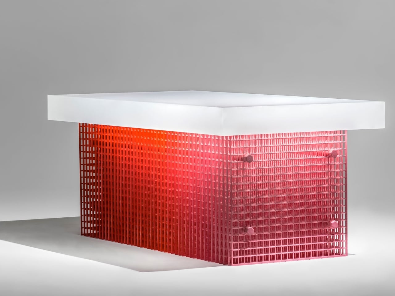
There’s something quietly revolutionary happening when a designer teams up with traditional artisans to create furniture that looks like it exists in two realities at once. Dhruv Agarwwal’s Blur Coffee Table is exactly that kind of beautiful paradox. Picture this: a coffee table that appears to shift and shimmer depending on where you’re standing. Not through fancy electronics or LED tricks, but through the marriage of precise steel mesh and centuries-old Meena enamel techniques. It’s the kind of piece that makes you do a double-take, wondering if your eyes are playing tricks on you.
The story behind Blur is rooted in Moradabad, a city in India known for its metalwork heritage. Agarwwal didn’t just commission artisans to execute his vision. He collaborated with Meena craftspeople for months, experimenting and problem-solving together to develop a thicker coat of enamel that could interact with steel mesh in completely new ways. This wasn’t about slapping traditional techniques onto modern forms. It was about pushing both the craft and the material into uncharted territory.
Designer: Dhruv Agarwwal
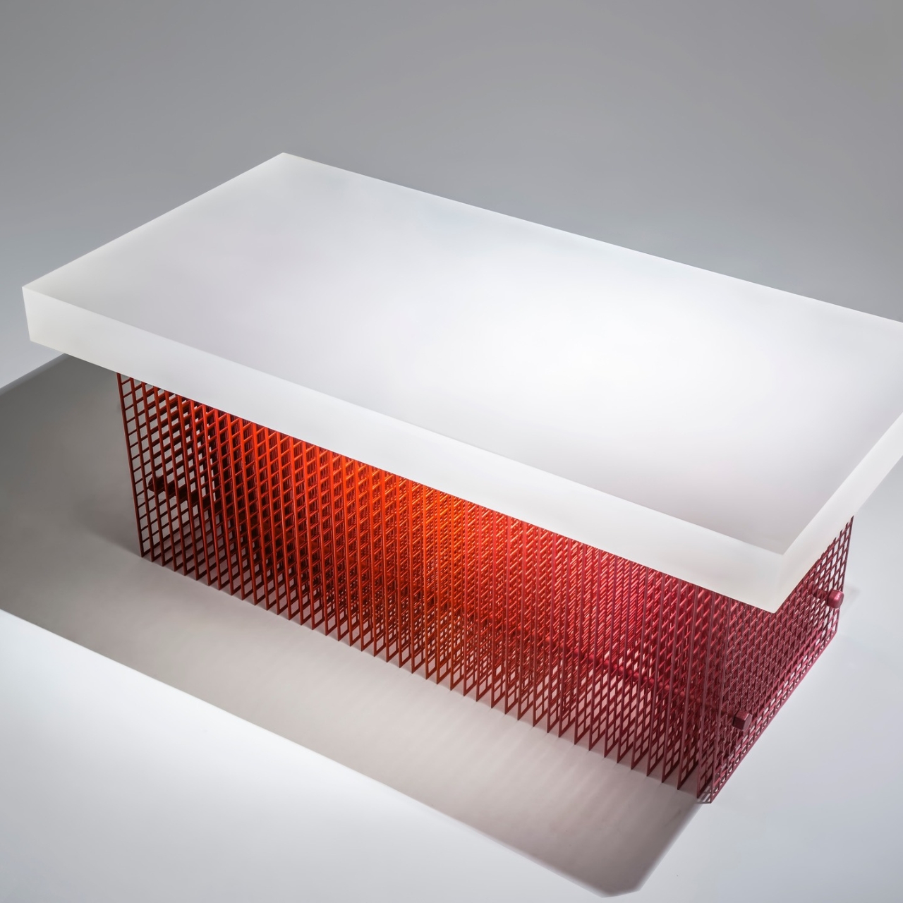
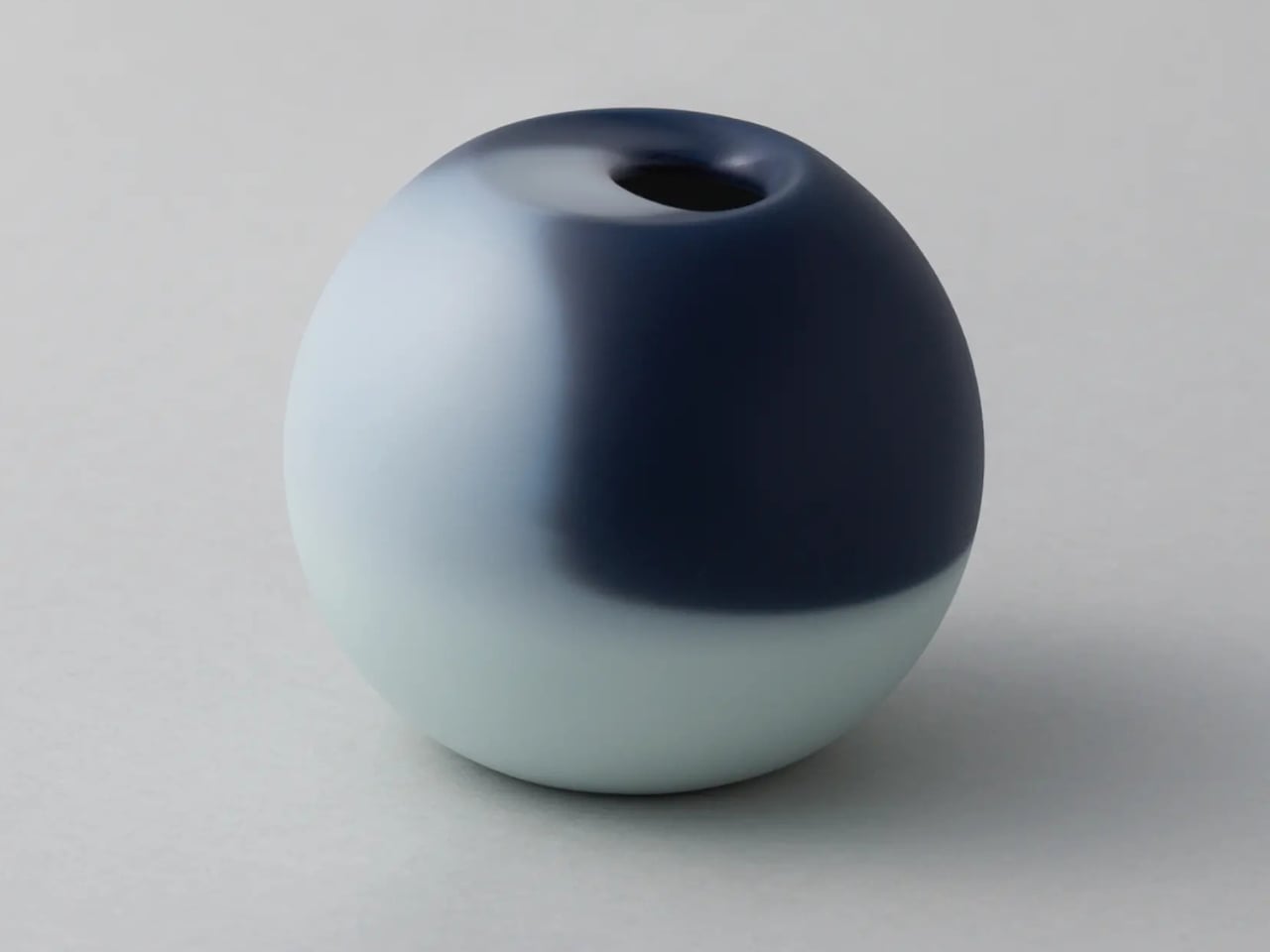
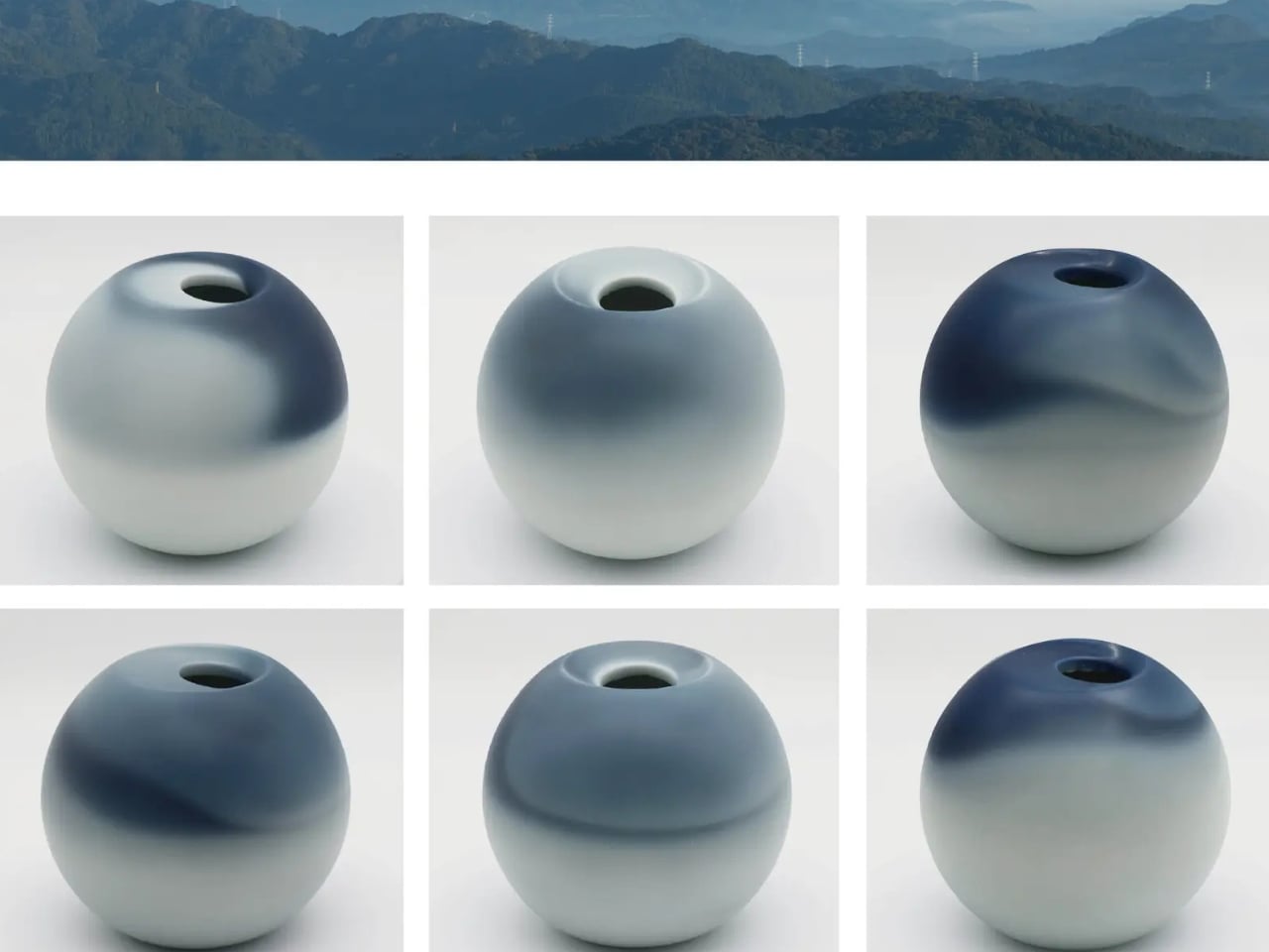
What makes this table so visually arresting is the tension between precision and imperfection. The steel mesh is cut with exacting accuracy, creating a consistent, geometric foundation. But the hand-applied enamel? That’s where the magic happens. Each brushstroke, each slight variation in thickness creates zones where colors appear to float, disappear, and reappear. The technical precision becomes the canvas for human imperfection, and together they create something that feels alive.
This play between control and spontaneity echoes a larger conversation happening in contemporary design right now. We’re surrounded by machine-made perfection, products that look identical whether you buy them in Tokyo or Toronto. Blur pushes back against that uniformity without being precious about it. It’s not trying to be rustic or nostalgic. Instead, it uses traditional craft to create something thoroughly contemporary, a visual experience that couldn’t exist without both the old techniques and new thinking.
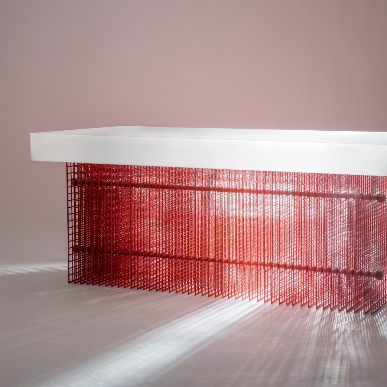
The shifting colors and optical effects serve a purpose beyond aesthetics. They transform the table into a kind of mood ring for your living space. Different lighting throughout the day reveals different aspects of the enamel work. The table you glance at during morning coffee looks subtly different from the one you see during evening drinks. It’s furniture as timekeeper, marking the day’s passage through color and light.
There’s also something to be said about what this project represents for traditional artisans. The Meena craftspeople weren’t just executing someone else’s design. They were active collaborators, bringing their expertise to bear on technical challenges. Developing that thicker enamel coat required their deep knowledge of materials and techniques. This kind of partnership offers a sustainable path forward for heritage crafts, one that doesn’t trap them in amber but allows them to evolve and remain economically viable.
Agarwwal has built his practice around this intersection of heritage and innovation, creating work that sparks what he calls “cross-cultural dialogues.” Blur succeeds because it doesn’t pander to either tradition or modernity. It respects the craft enough to let it be challenging and experimental. It’s contemporary enough to fit in spaces that have never seen a piece of traditional Indian metalwork.
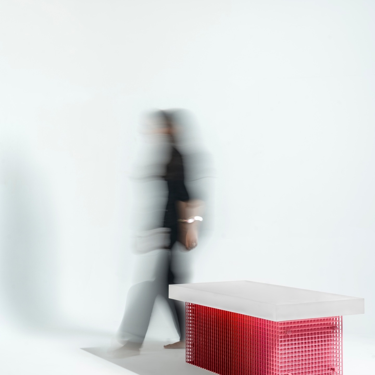
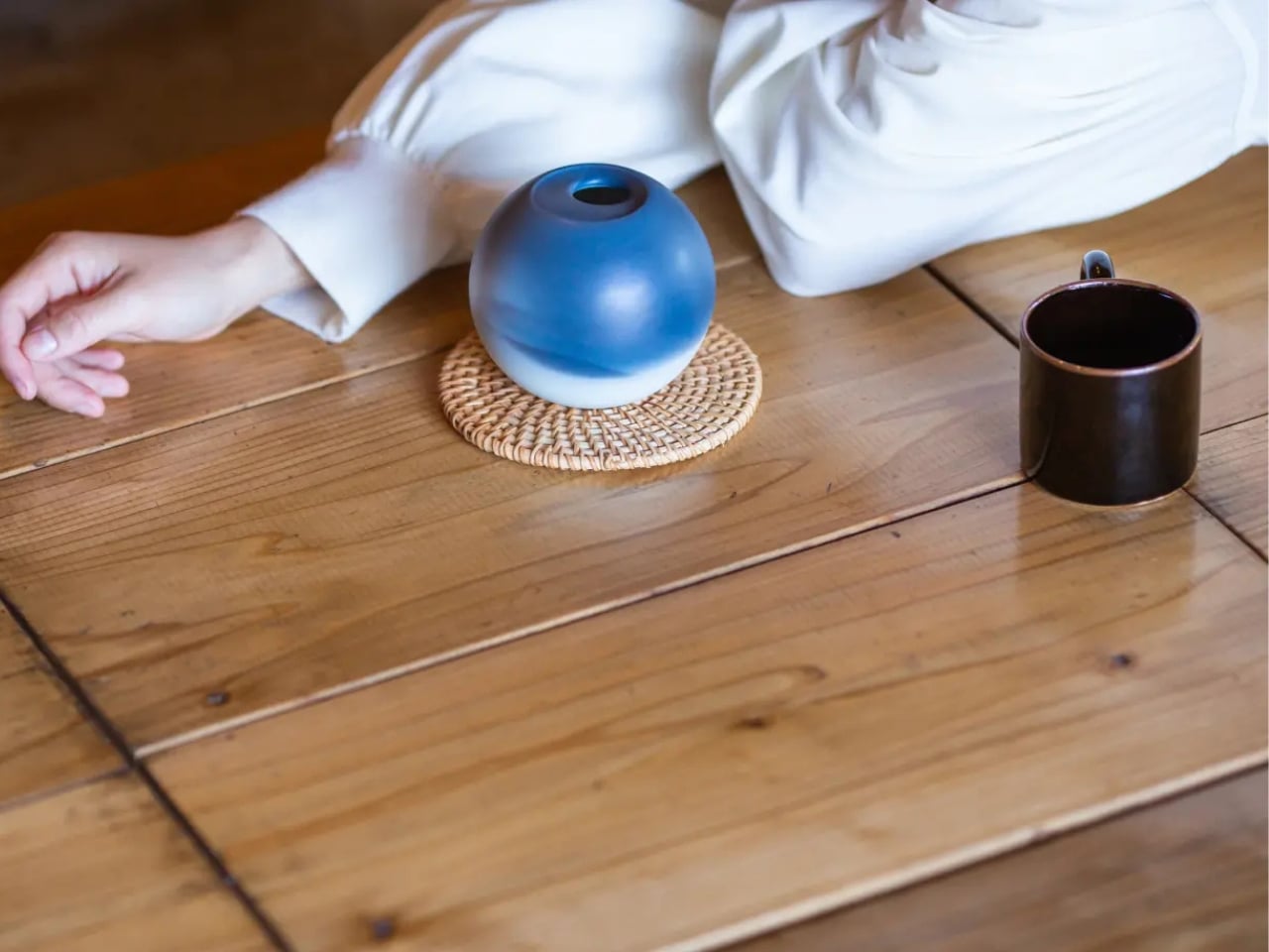
The coffee table format itself is interesting here. It’s domestic furniture, the kind of piece that sits at the center of everyday life rather than on a gallery pedestal. You’ll set your coffee mug on it, stack magazines on its surface, prop your feet up during movie night. This integration of serious craft and optical artistry into functional daily life feels democratic in the best way. Beauty and innovation aren’t cordoned off in museums. They’re right there in your living room. That’s what makes this coffee table more than just a pretty piece of furniture. It’s a manifesto in steel and enamel about collaboration, evolution, and the enduring power of imperfect human hands to create something that no machine ever could.
The post When Perfect Imperfection Becomes Your Living Room Centerpiece first appeared on Yanko Design.