Believe It: The LEGO Naruto Ramen Shop Might Actually Happen

If you grew up watching Naruto slurp down bowl after bowl of ramen at Ichiraku, you already know that the little noodle shop tucked in the village of Konoha carries more emotional weight than most fictional restaurants ever could. It is the kind of place that shows up at every turning point in the story, the quiet anchor in a series full of big fights and even bigger feelings. So when twin brothers David and Diego Escalona, known as DadiTwins, decided to recreate it in LEGO form, they were not just building a set. They were building a piece of pop culture memory, brick by brick.

The project, officially titled Naruto: Ichiraku Ramen Shop, was moved into LEGO Ideas’ “Parking Lot” on July 14, 2026, marking the first time in the concept’s long history that LEGO has genuinely entertained the possibility of turning it into an official product. To understand why that matters, you have to know that this is the fourth time DadiTwins have submitted this project. Fourth. They first reached the required 10,000 supporter votes in August 2020. Then again in October 2021. Then a third time in 2023 to mark Naruto’s 25th anniversary. Each time, LEGO passed. Each time, the community came back and voted again.

Designer: DadiTwins
The Parking Lot, for the uninitiated, is LEGO Ideas’ version of “we’re not saying no, we’re just saying not yet.” It is a holding stage where projects that weren’t immediately greenlit are kept under consideration for potential official release. It has produced actual sets before. Downton Abbey made it through. So did The Old Man and the Sea. The status does not guarantee anything, but it is a meaningful shift from flat-out rejection, and for a project that has been rebuilt and resubmitted across more than half a decade, it feels like a long-overdue acknowledgment.
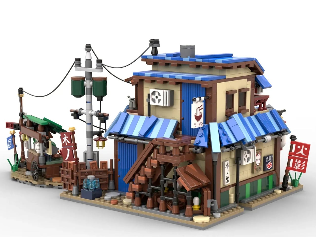

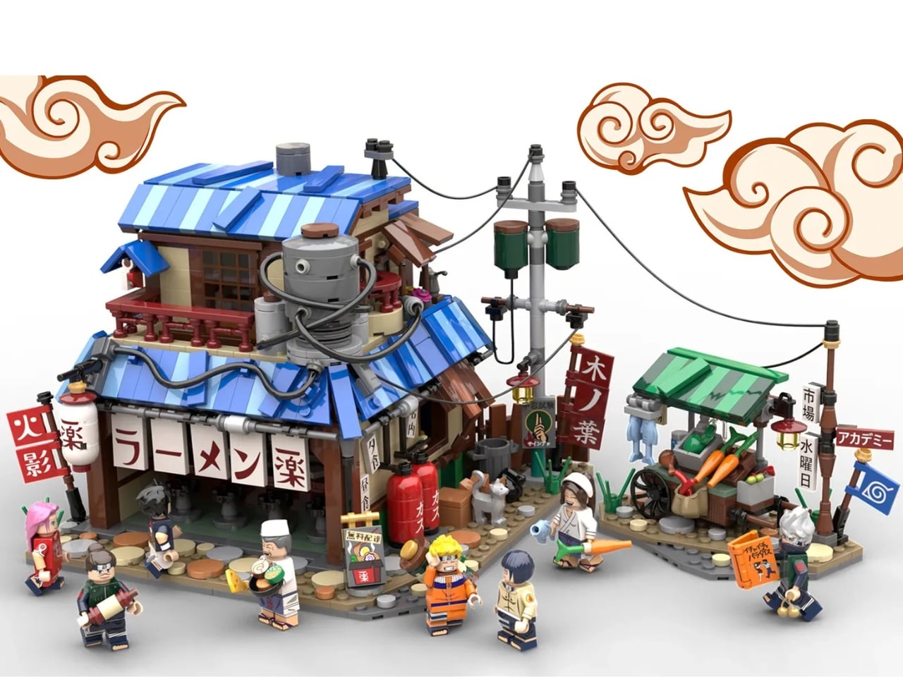
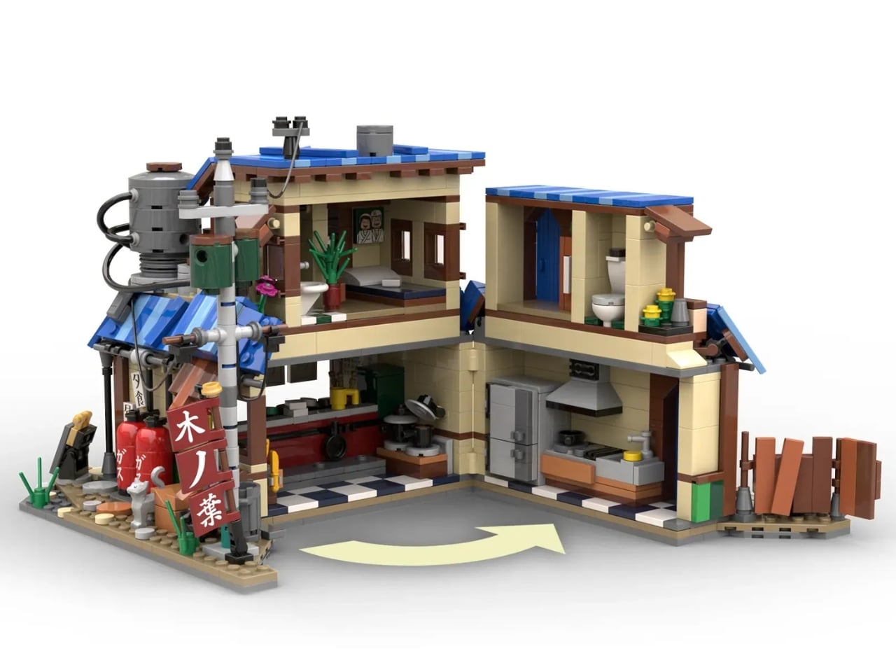
The set itself is genuinely impressive. At roughly 1,600 pieces across a 22-by-24-stud footprint, it recreates Ichiraku as it appears during the Land of Waves arc, right at the beginning of the series before everything gets complicated. The ground floor has a working kitchen and a four-seat ramen bar. The upper floor, which was never actually shown in the anime, was invented by the designers as Teuchi’s apartment, complete with a bedroom and bathroom accessible via a rear staircase. That choice tells you a lot about how much thought went into this. It is not just a replica. It is an expansion of a world people already love.


Eight minifigures round out the set: Naruto, Sasuke, Sakura, Hinata, Kakashi, Iruka, Teuchi, and one more. The designers also made the case that ramen itself, now a global obsession that has arguably outpaced sushi in worldwide popularity, gives this set crossover appeal for people who have never touched a manga in their lives. A beautifully detailed ramen shop, built from 1,600 pieces, with a cozy interior and a blue-striped awning? That is an easy sell, dattebayo or not.


What makes this story genuinely moving is the persistence behind it. DadiTwins did not submit once, get rejected, and move on. They revised. They commemorated anniversaries with updated designs. They kept making the case for a concept that tens of thousands of people clearly wanted to see made real. That kind of dedication from fan creators is rare, and LEGO Ideas, for all its genuine appeal as a platform, does not always reward it quickly.
Whether the Ichiraku Ramen Shop becomes an official LEGO set remains to be seen. LEGO’s July 2026 update says the company is “looking into the possibility,” which is cautiously optimistic phrasing at best. But the fact that it made it to the Parking Lot after four attempts says more about what fans are willing to fight for than any official statement ever could. And if LEGO does eventually greenlight it, I think this set would be one of the more emotionally resonant releases the line has ever produced. Some places, fictional or not, just mean something.

The post Believe It: The LEGO Naruto Ramen Shop Might Actually Happen first appeared on Yanko Design.
China’s New Coastal Installation Looks Like It Belongs in Space

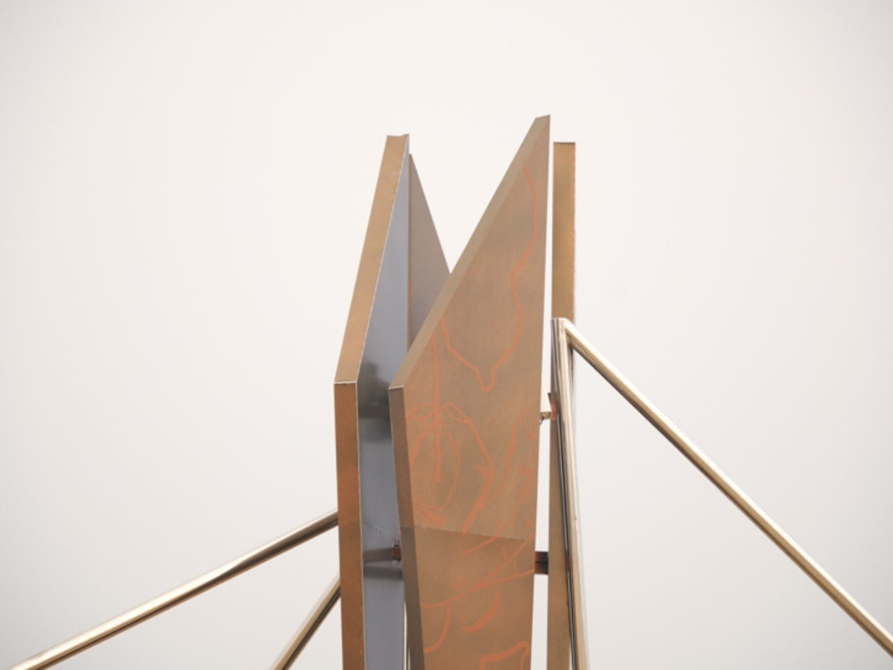
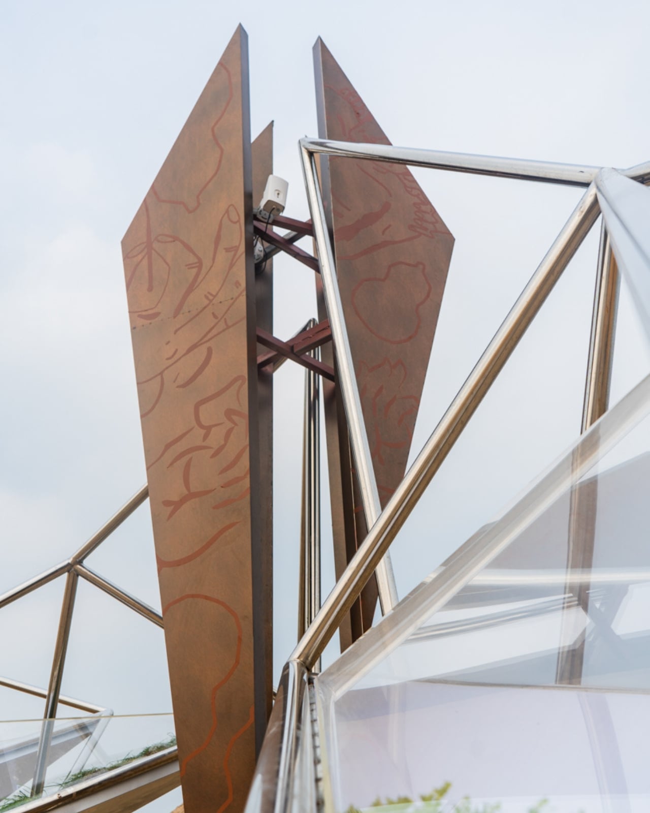
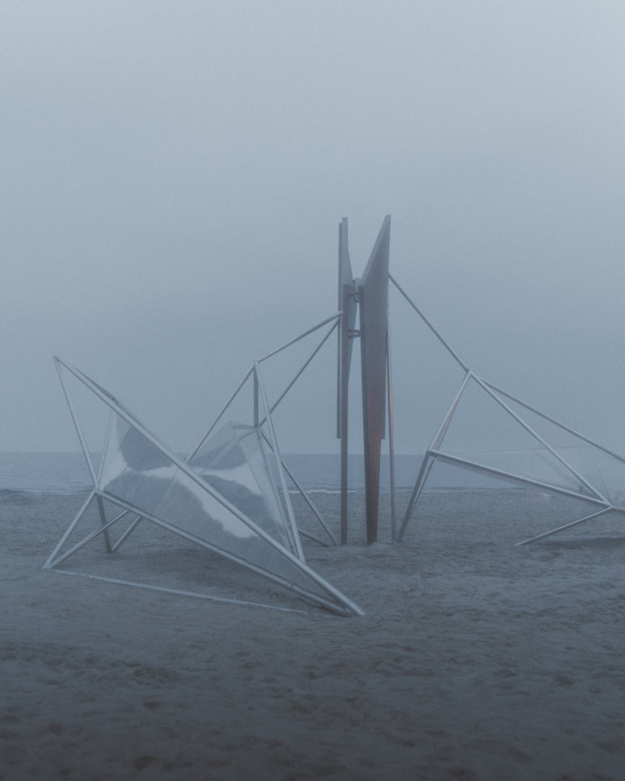
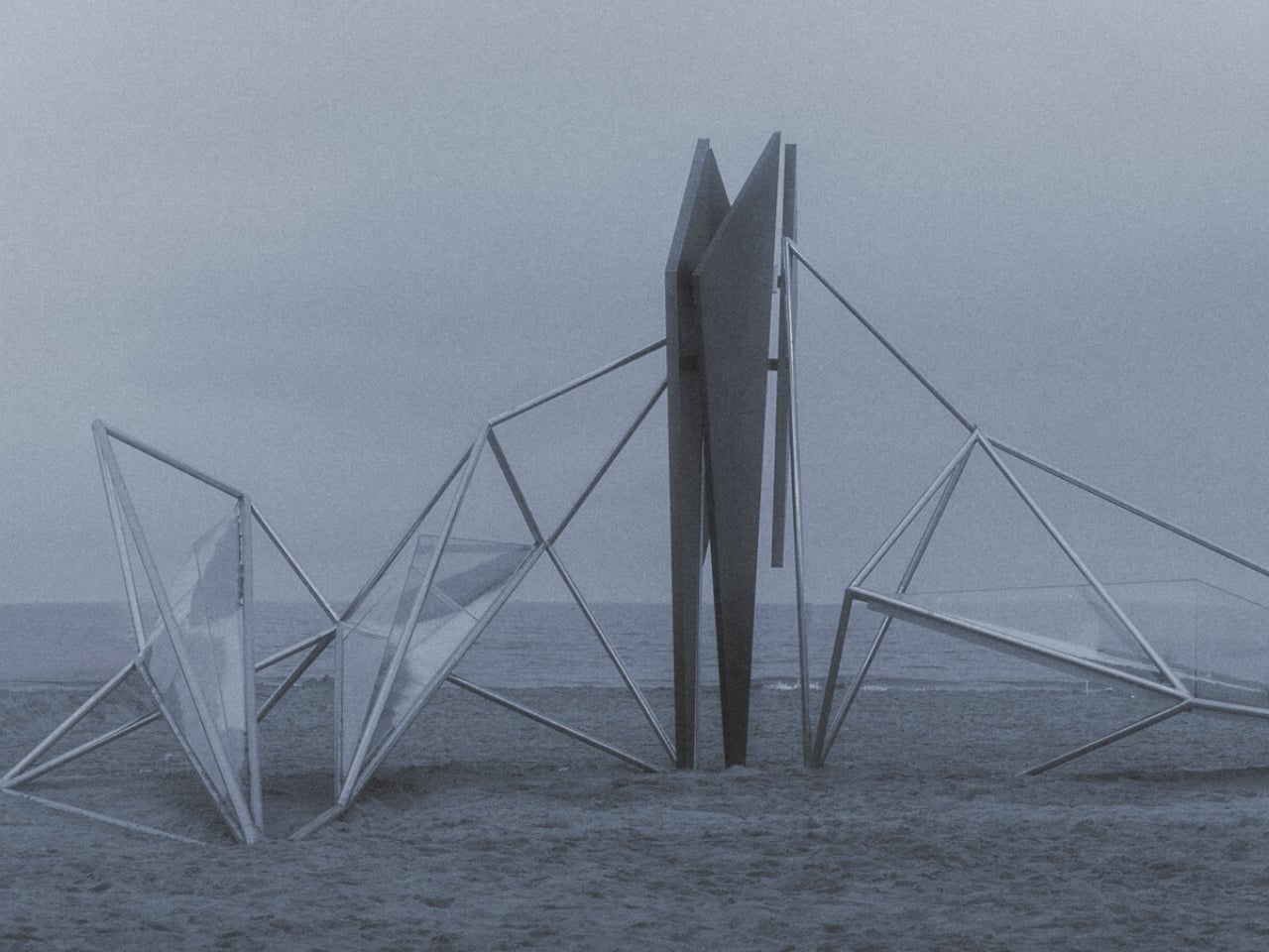
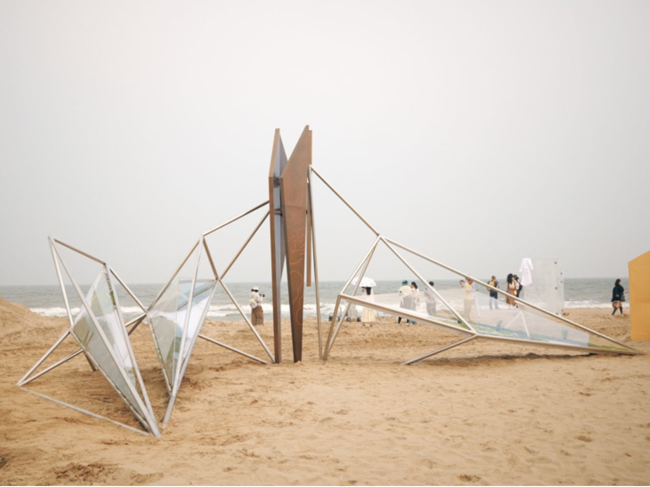
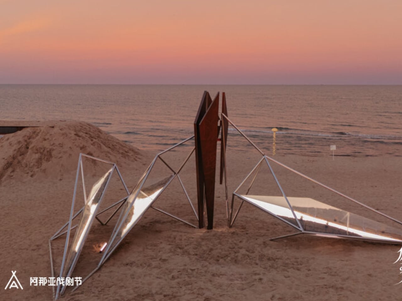
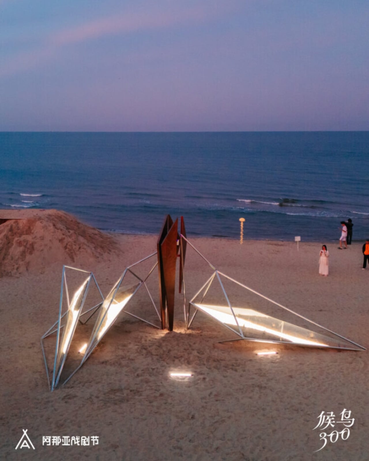
Not every art installation earns the right to exist in a landscape. Most feel like intrusions, objects dropped into nature rather than grown from it. OAS/S-AETHER, the latest work from Beijing-based Zhide Architectural Design Consulting (ZDC), is one of the rare exceptions. Standing on the sandy coastline of Aranya in Qinhuangdao, Hebei Province, this winged structure of interconnected metal rods and glowing acrylic lightboxes manages to feel both ancient and alien at the same time, and that tension is the whole point.

The installation was created for the “Migratory Birds 300” section of the 2026 Aranya Theater Festival, led by architects Zhengdong Li, Rubing Bai, and Xu Wen. The concept draws from “Aether,” the fifth element in classical philosophy, that invisible, luminous substance believed by the ancient Greeks to fill the heavens beyond the earthly realm. It’s a heady starting point, but ZDC pulls it off. The piece doesn’t just reference the idea of Aether. It actually makes you feel it.

Designer: Zhide Architectural Design Consulting (Beijing) Co., Ltd.

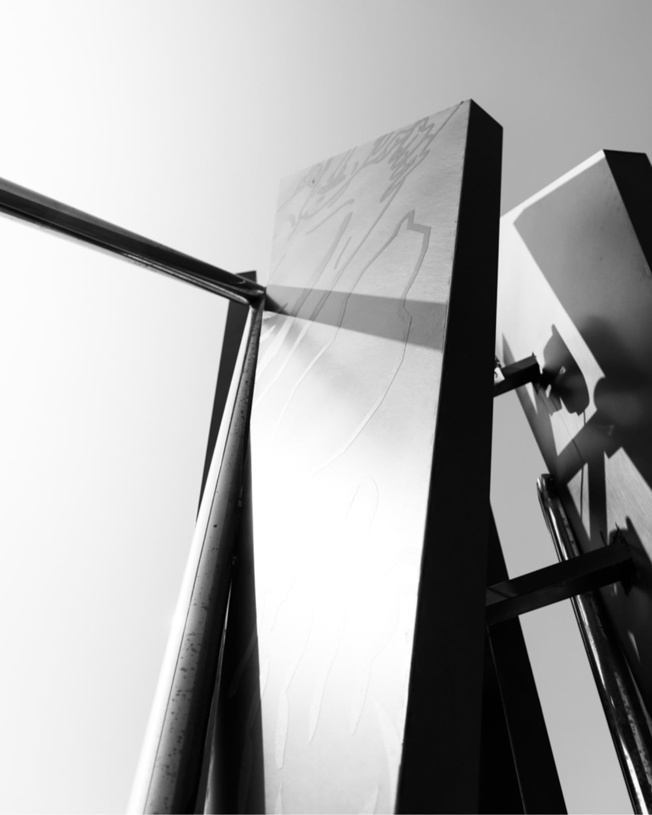
At first glance, OAS/S-AETHER reads as a geometric silhouette against the sky, a skeletal wing shape built from precisely arranged metal rods that catch light differently depending on the hour. Get closer, and the details reveal themselves. Embedded within the framework are acrylic lightboxes that glow from within, engraved copper plates that bring texture and a sense of history to the industrial structure, and, perhaps most surprisingly, living plants tucked inside the illuminated boxes. That last element is the one I keep turning over in my mind. Placing living, breathing vegetation inside a steel and acrylic structure is not a subtle gesture. It’s a declaration. Life and industry don’t just coexist here; they hold each other up.

The choice of location matters too. Aranya is not just any beach town. The coastal community in Qinhuangdao has quietly become something of a pilgrimage site for design-conscious travelers and cultural tourists across China, recognized for its commitment to thoughtful architecture and carefully curated experiences. Placing a work of this ambition in that environment makes sense, but it also raises the stakes. When the bar is already high, every new installation has to work harder to justify itself.

OAS/S-AETHER justifies itself. The way the piece interacts with its natural setting over the course of a single day is genuinely impressive. Sunlight shifts the shadows cast by the metal rods across the sand in slow, changing patterns. At night, the acrylic panels take over, turning the structure into something closer to a lantern than a sculpture. The piece never looks exactly the same twice, which keeps it from becoming the kind of static landmark that gets photographed once and forgotten.

ZDC has been building this design vocabulary for a while now. Their OAS/S series, which also includes OAS/S-NEST in Qinhuangdao and OAS/S-NOMAD in Inner Mongolia, consistently explores what happens when temporary structures are made to feel permanent, and when materials that should clash somehow harmonize instead. AETHER is the most ambitious entry in that series so far, and it shows. There is a quiet confidence to the design that feels earned rather than assumed.

What makes all of this worth discussing beyond the architecture world is the broader question it raises. As public art becomes more globally visible through social media, the pressure on installations to be photogenic often overshadows the pressure to be meaningful. OAS/S-AETHER manages to be both, but the meaning clearly comes first. You can feel the thought behind it before you even see it in full. That is a harder thing to achieve than most people realize, and it is precisely why the work stands out.

Whether you encounter it in person on that Hebei coastline or through photographs shared online, OAS/S-AETHER leaves an impression that is hard to shake. It asks what it means to exist between worlds, between the man-made and the natural, between the visible and the intangible. Most art asks questions. The best art makes you forget it is asking at all.

The post China’s New Coastal Installation Looks Like It Belongs in Space first appeared on Yanko Design.

The Open-Source Printer With No Ink Locks Now Has a Prototype

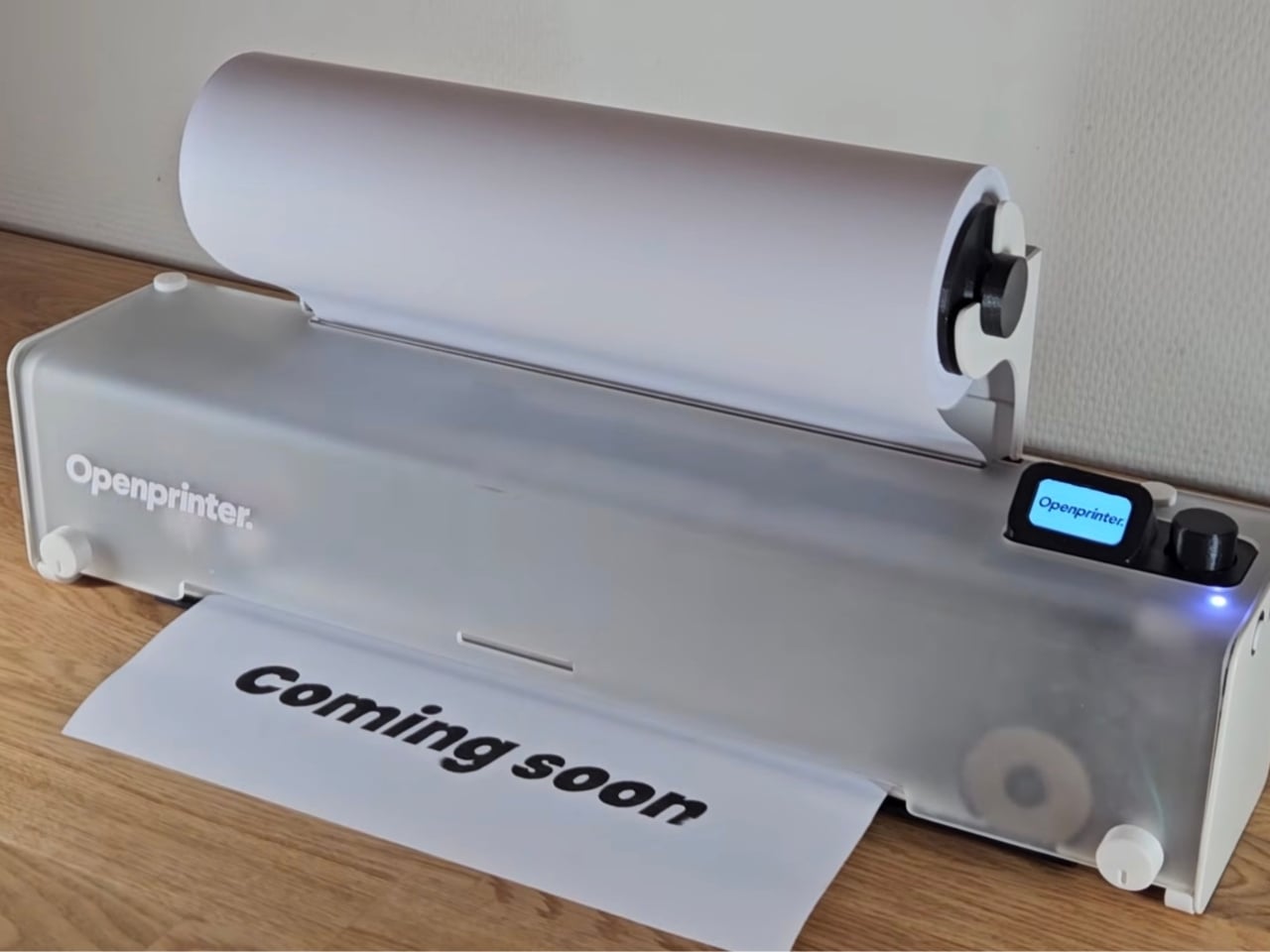
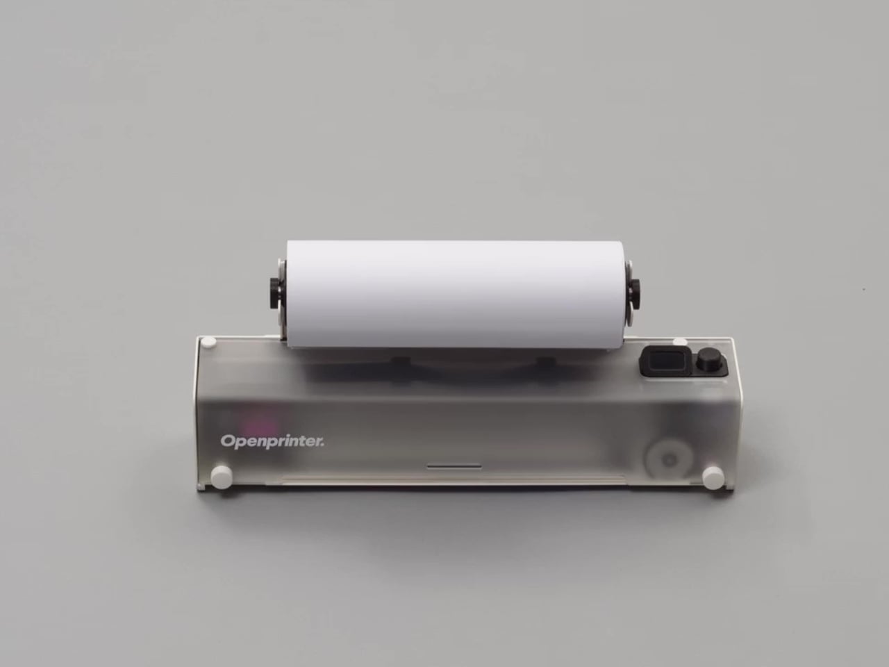
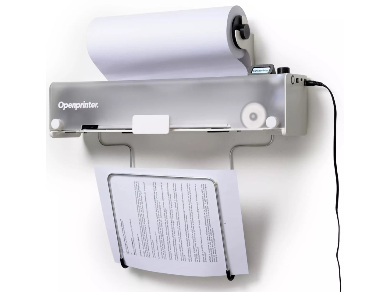
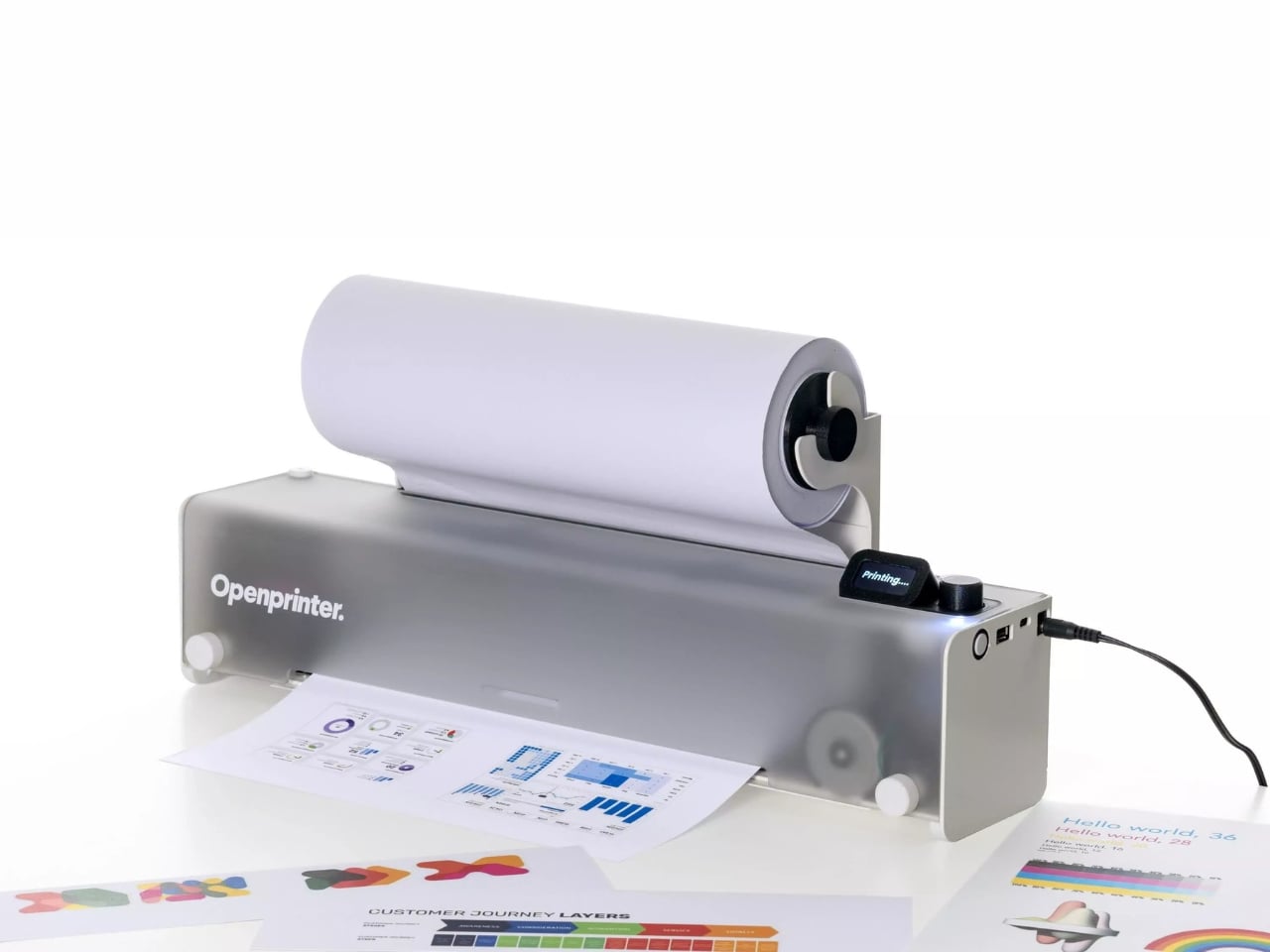
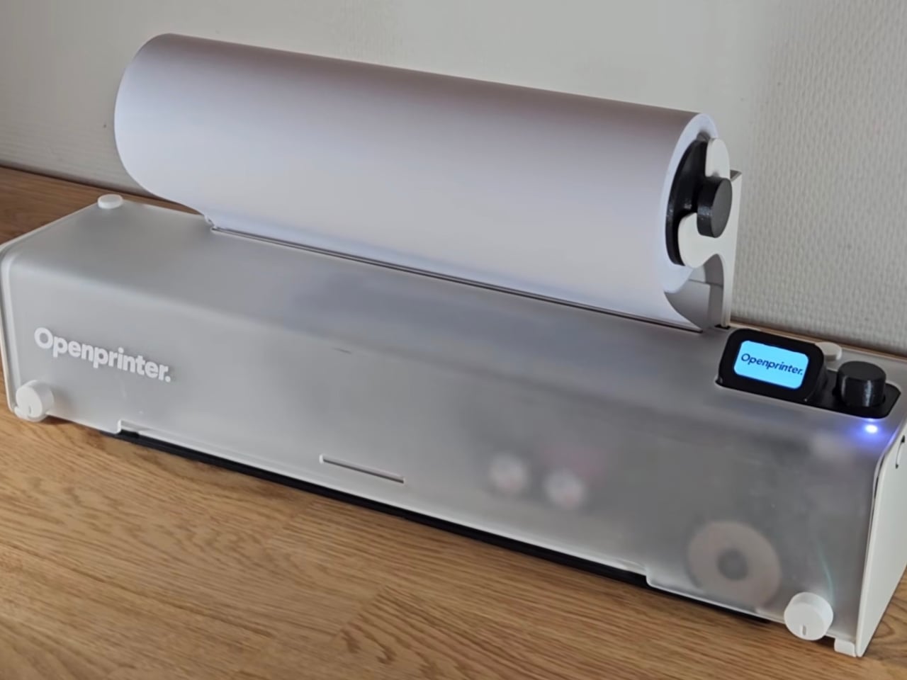
Nearly a year after Open Tools first introduced the idea, the Paris-based startup has released its first video of a working prototype of the Open Printer, a fully open-source inkjet that prints in both monochrome and full color. For a project that’s been generating buzz since its Crowd Supply debut in 2025, actually watching the thing print is a meaningful moment. Concepts are easy. Hardware is hard.

That said, the prototype arriving is only part of the story. Pricing hasn’t been confirmed, a shipping timeline hasn’t been locked in, and print speed figures are still undisclosed. So while the milestone is real, it’s also a reminder that the road from working prototype to finished product is rarely a short one. Still, the fact that the machine exists and functions is worth paying attention to, because what Open Tools is trying to do is genuinely unusual in a category that has spent decades doing the opposite.

Designer: Open Tools

Most of us have a complicated relationship with our printers. Not a love-hate situation so much as a hostage situation. The ink runs dry, and suddenly you’re buying a cartridge that costs more than the printer itself, only to get a pop-up warning that it’s been chipped to stop you from refilling it. It is, when you think about it, a strange arrangement to just accept. And yet, for decades, we have.

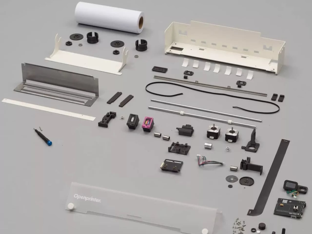
The Open Printer is built as a direct response to that. No proprietary drivers. No cartridge DRM locking you to a single brand. No subscription fees or ink-monitoring systems quietly draining your wallet. It runs on a Raspberry Pi Zero W, uses refillable HP cartridges with no digital restrictions attached, and connects to Windows, macOS, Linux, Android, and iOS through CUPS, an open-source print server. The whole point is that once you own it, you actually own it.

The design has a refreshingly honest quality to it. It’s modular, built from standard mechanical components, and comes either as a self-assembly kit or pre-assembled. It can sit on a desktop or mount to a wall. You can even 3D print custom parts and choose from different color finishes. These feel like small details, but they collectively signal something: the people behind this actually considered the user as someone with preferences and agency, rather than a recurring revenue stream.

Open Tools has released the project under Creative Commons BY-NC-SA 4.0 licensing, which means you can use, share, and modify it freely for non-commercial purposes. There has been debate in open-source communities about whether this fully qualifies under the strictest definitions of “open source,” and that’s a legitimate conversation. The non-commercial clause does limit what some users can do with it. But for a hardware startup trying to build something sustainable while keeping it genuinely accessible, the approach is at least pointed in the right direction. The project has also been nominated for a French Design Award in two categories, which suggests the idea is resonating well beyond just the maker community.

Printing might feel like a solved problem, so mundane it barely registers as a design category worth getting excited about. But the fact that it has become so reliably frustrating and expensive is itself a design failure, one that’s been normalized so gradually that most people stopped questioning it. We just assumed that’s what printers are.

The working prototype doesn’t change the industry overnight, and there are still plenty of unknowns before anyone can actually order one. But it does prove the concept is more than a crowdfunding pitch. For a project asking people to imagine a printer that works for them instead of against them, that’s not nothing.

The post The Open-Source Printer With No Ink Locks Now Has a Prototype first appeared on Yanko Design.

The Fortune Teller Just Got an AI Upgrade and It Knows Too Much

Remember the movie Big? Tom Hanks, the carnival Zoltar machine, a kid who just wanted to grow up overnight. That film had a way of making wish-granting feel both magical and slightly unsettling, because the machine didn’t really know you. It just read the room and gave you what you asked for. Now, almost four decades later, Australian art and technology studio ENESS has built something that does the same thing but with significantly more data points, and the result is one of the more thought-provoking design pieces to come out of the 2026 festival circuit.

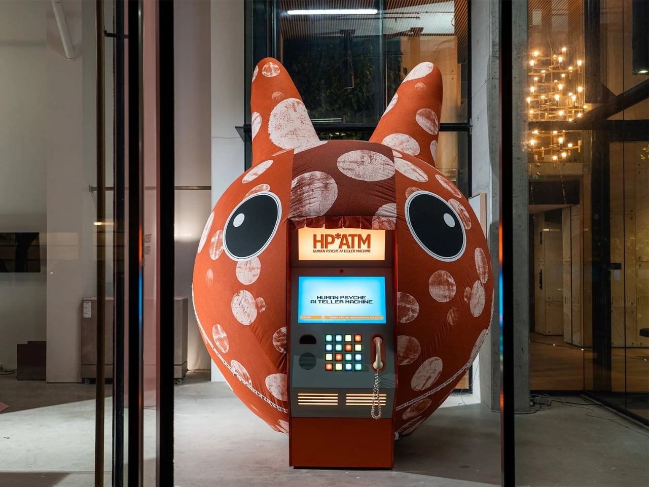
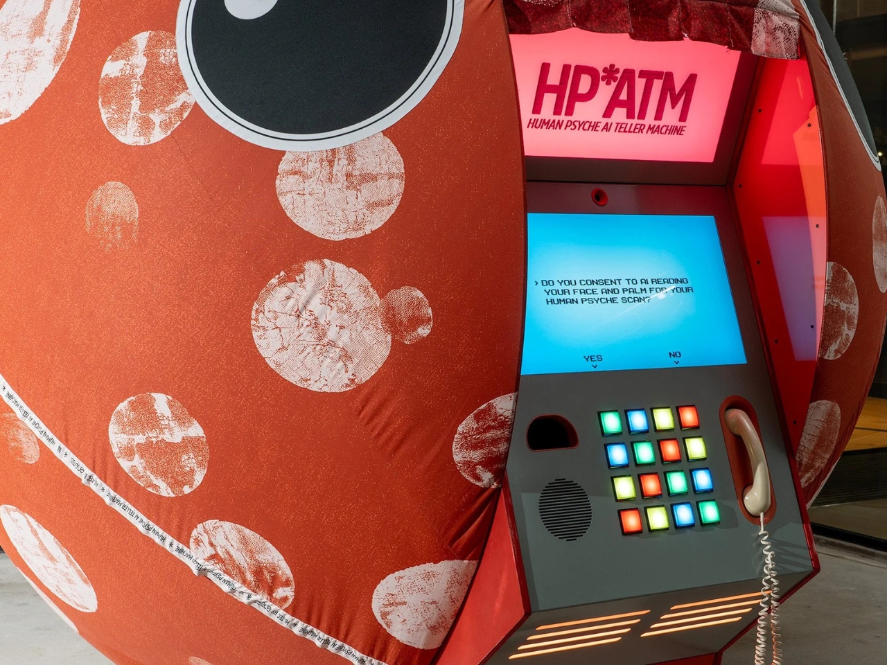
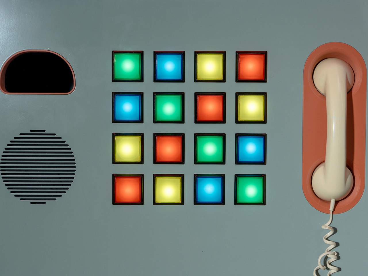
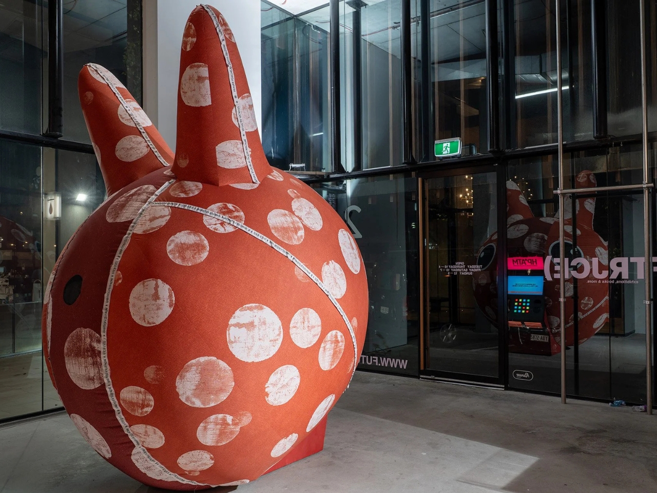
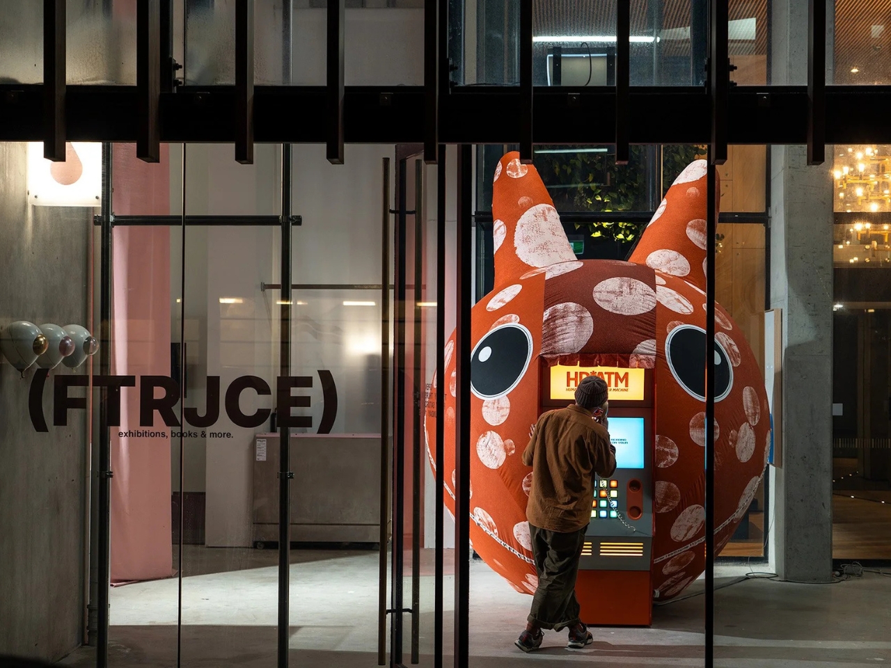
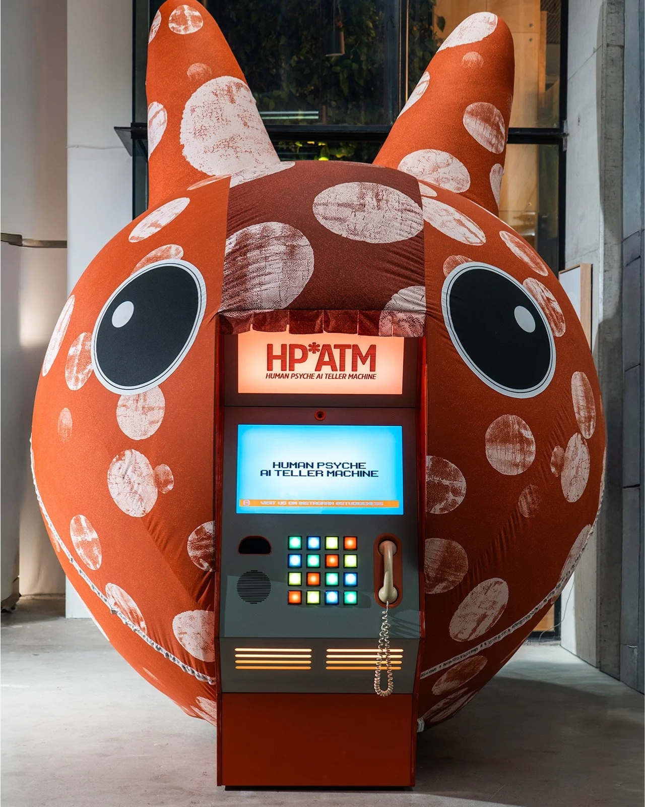
HP*ATM, which stands for Human Psyche AI Teller Machine, debuted at Illuminate Adelaide 2026 as part of an exhibition called Automation Bias. It looks exactly like what you’d expect from an old ATM, boxy and vintage, with colored buttons and a telephone handset forming part of the interface. But instead of dispensing cash, it dispenses something far more personal: a psychological reading based on your face, your palm, and a series of choices you make in the moment. ENESS founder Nimrod Weis drew direct inspiration from the Zoltar machine in Big, and the connection makes complete sense once you’re standing in front of it.

Designer: ENESS

The premise is deceptively simple. You walk up, you consent (the screen literally asks, which is already more than most apps do), and the machine reads you. It analyzes your face and your palm, processes your button selections, and produces what the studio calls a “lyrical psychological reading.” You get a portrait of yourself, filtered through AI. And maybe that portrait is accurate. Maybe it’s not. But the more interesting question is: does it even matter? The moment you step up and say yes, you’ve already told the machine something about yourself.

That’s exactly the territory ENESS is navigating here, and they do it in a way that feels playful rather than preachy. The installation isn’t trying to scare you about AI. It’s asking you to notice something you’re already doing in your daily life, handing over intimate data to systems that claim to understand you, often without the ceremony of a formal machine with colored buttons formally asking for your consent. The irony is that HP*ATM might be the most transparent AI interaction many people have ever had, because at least it’s honest about what it’s doing.

There’s a layer of humor baked into the whole thing, which is very much part of ENESS’ design language. The vintage ATM aesthetic is a deliberate choice. Weis has said the installation is meant to remind visitors that current AI systems might eventually look as dated as cash machines and landline phones. That’s a point worth sitting with. The technologies we currently regard with either reverence or a low-grade anxiety tend to look a lot less intimidating in hindsight, and ENESS is nudging you toward that perspective while you’re still in the middle of it all.

The act of not participating also becomes part of the artwork, and that’s where the piece gets genuinely interesting. If you walk up and decide not to engage, that choice still belongs to the installation. The machine doesn’t require you to perform for it, but it does invite you to think about why you’d hesitate. Why would you say no to an AI reading your face when you’ve already handed that same data to your phone, your laptop camera, and roughly half the apps you downloaded last year without bothering to read the terms? The answer probably says more about you than the machine ever could. The question isn’t rhetorical. It’s just honest.

HP*ATM runs through August 30, 2026, at FutureJuice in Adelaide, Australia. If you happen to be near it, stepping up to that machine and choosing yes or no is probably more thought-provoking than most things you’ll do on your phone that day. And if you’re not in Adelaide, the work still travels with you, because the questions it raises don’t stay in the gallery. They follow you home.

The post The Fortune Teller Just Got an AI Upgrade and It Knows Too Much first appeared on Yanko Design.

Burying Your House Sounds Extreme. HiberTec Makes It Make Sense.

The first time I saw footage of a neighborhood completely leveled by wildfire, nothing left but chimneys and twisted metal, I had the same thought most people do: why do we keep building the same way? We’ve watched communities in California, Colorado, and beyond get erased in a matter of hours, and the standard response has largely been to rebuild in the same spot with slightly better fire-resistant cladding. It’s determined, in its own way. It’s also starting to feel like wishful thinking.

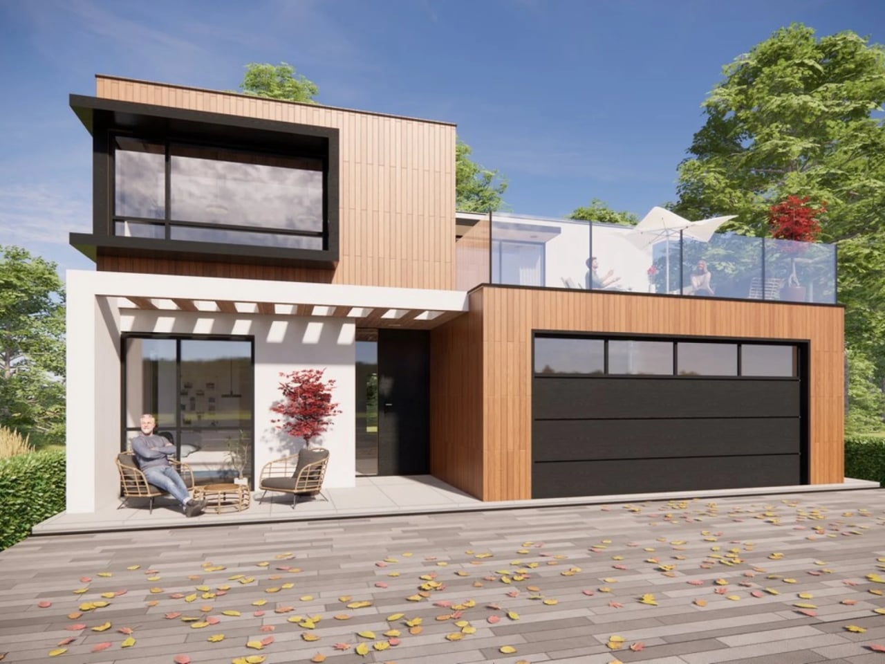
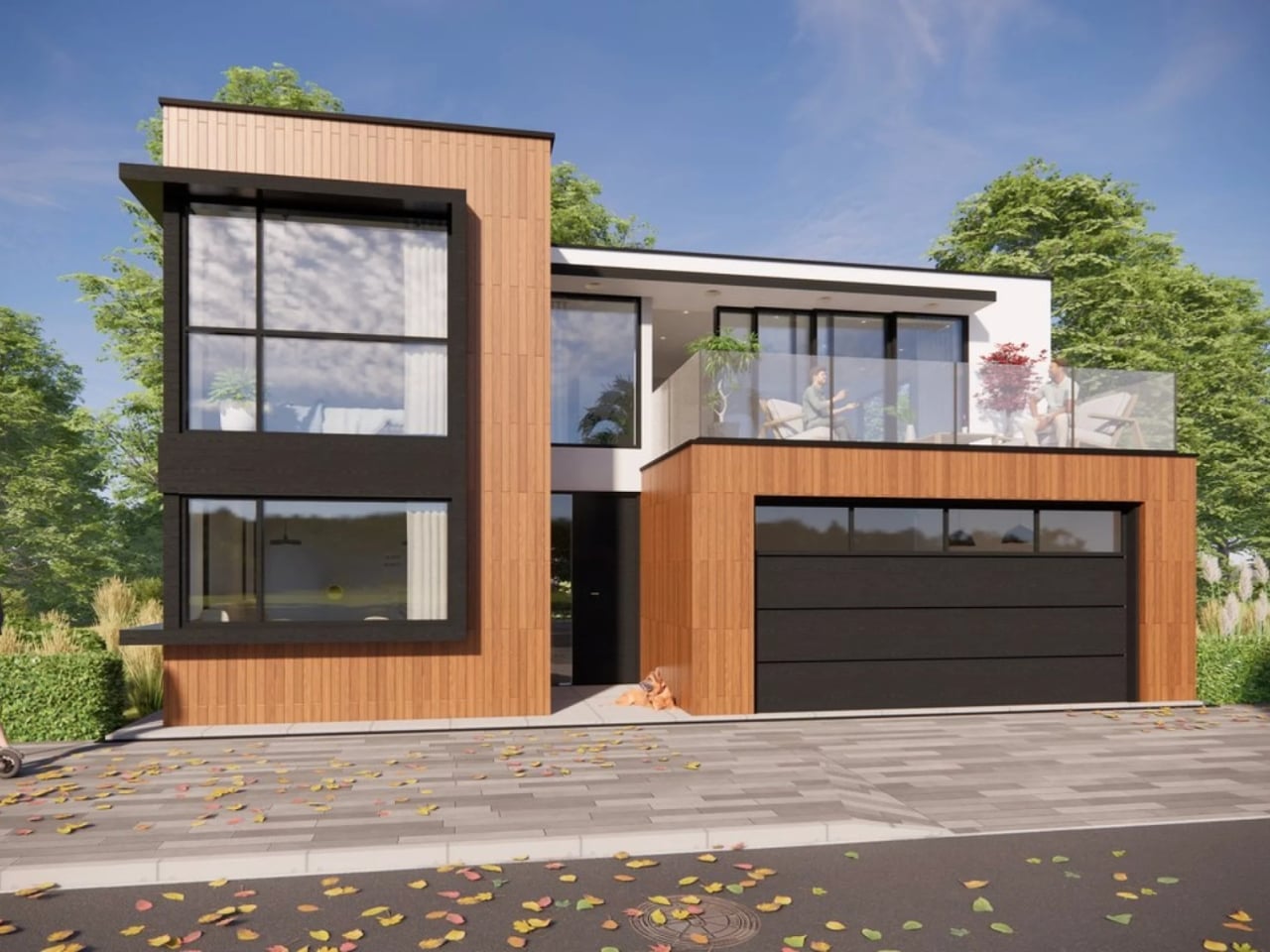
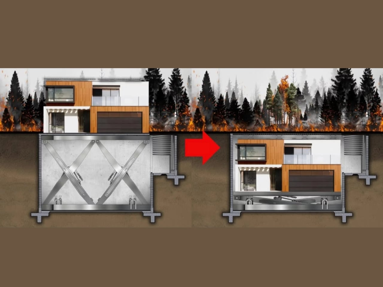
HiberTec Homes is proposing something entirely different. Their fully patented design allows a modular home to automatically lower itself underground when a wildfire or tornado threat is detected, then resurface completely unharmed once the danger has passed. The whole process takes 15 minutes or less. You press a button, the utilities shut off automatically, a fire-retardant system activates, a protective shell seals the structure, and the house descends into a sealed underground vault. Then you wait. Then you come back to a home that’s still standing.

Designer: HiberTec Homes

Founder Holden Forrest first conceived the idea in 2019 and spent several years developing it with a team of engineers specializing in thermal systems and structural design. He self-funded the project to the tune of $500,000 before appearing on Shark Tank Season 17, where he secured a deal with Barbara Corcoran for $1 million at 20% equity, plus a contract to build the first real working model at $1,000 per square foot. That price point is admittedly steep, but HiberTec’s stated goal is to eventually bring costs down to around $400 per square foot, which would put it within reach of a much wider audience.

And the audience that needs it is enormous. Over 300,000 homes are destroyed globally every year. In the U.S. alone, more than 25,000 homes are lost annually to wildfires and high winds. Perhaps the most staggering figure: more than 8 million American homeowners currently cannot obtain property insurance. The economic losses from Southern California wildfires alone have crossed $300 billion. At some point, fire-resistant landscaping and defensible space stop being sufficient answers to what has become a genuine housing crisis.

Beyond the visual drama of a house literally sinking into the earth, what makes HiberTec’s approach feel genuinely smart is its open platform model. Rather than operating as a closed, proprietary system, the company has designed its hydraulic technology to integrate with dozens of existing homebuilders and their modular models, with little to no modification required. That’s a meaningful distinction. It means this isn’t a niche luxury product for a handful of custom home clients. It’s being positioned as infrastructure, something that can scale across the industry instead of living at the edges of it.

The skeptics will have fair points to raise. The technology is still in the prototype phase, and until a real home descends underground and resurfaces in an actual fire event, all of this lives in the realm of engineering promise. Hydraulic systems are complex. Underground environments bring their own challenges around moisture, soil shifting, and structural integrity. These aren’t small details to work out. There’s also the question of what happens to everything around the home. You save the structure, but the neighborhood, the trees, the infrastructure that connects you to the rest of the world, all of that remains vulnerable.

Still, the premise refuses to leave your mind. We’ve spent decades trying to make homes better at withstanding fire. HiberTec’s answer is to simply remove the home from the equation entirely, if only for a few hours. It’s the kind of lateral thinking that sounds absurd right up until you realize the conventional approach keeps failing people at catastrophic scale.

Whether HiberTec becomes the future of housing or a fascinating proof-of-concept that reshapes the conversation, it’s already doing something valuable: forcing the question of whether we need to rethink not just how homes are built, but how they survive. When whole towns can disappear in a single afternoon, that question deserves a serious answer.

The post Burying Your House Sounds Extreme. HiberTec Makes It Make Sense. first appeared on Yanko Design.

Merrell Just Made Hiking Shoes That Look Like They’re Alive

The shoes that make you look twice usually have a story behind them. The Merrell x P.A.M. (Perks and Mini) collaboration is that kind of story, and it starts, surprisingly, in a swamp.

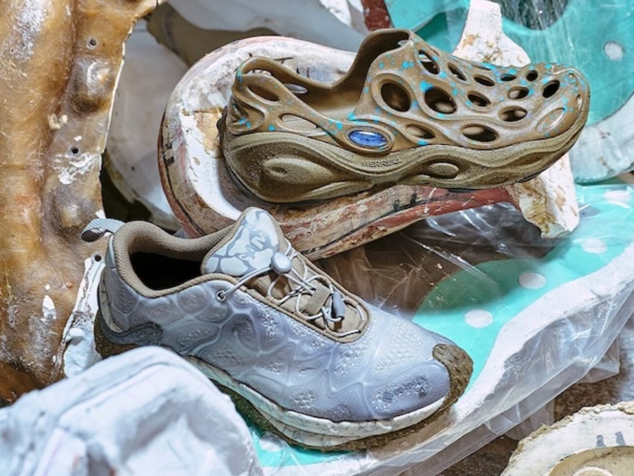
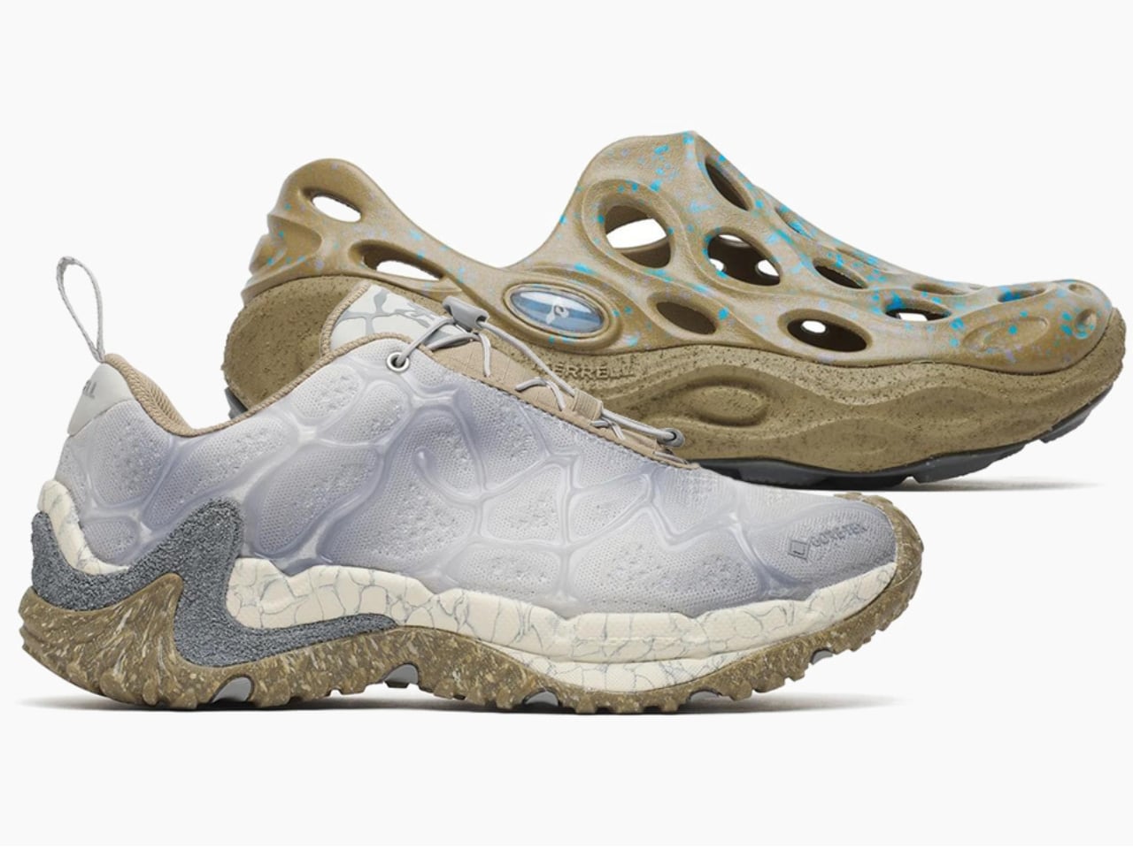
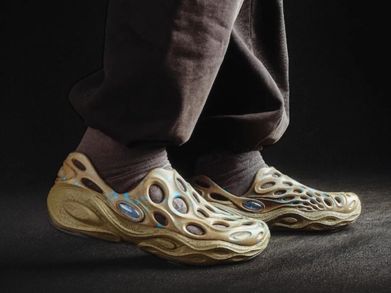
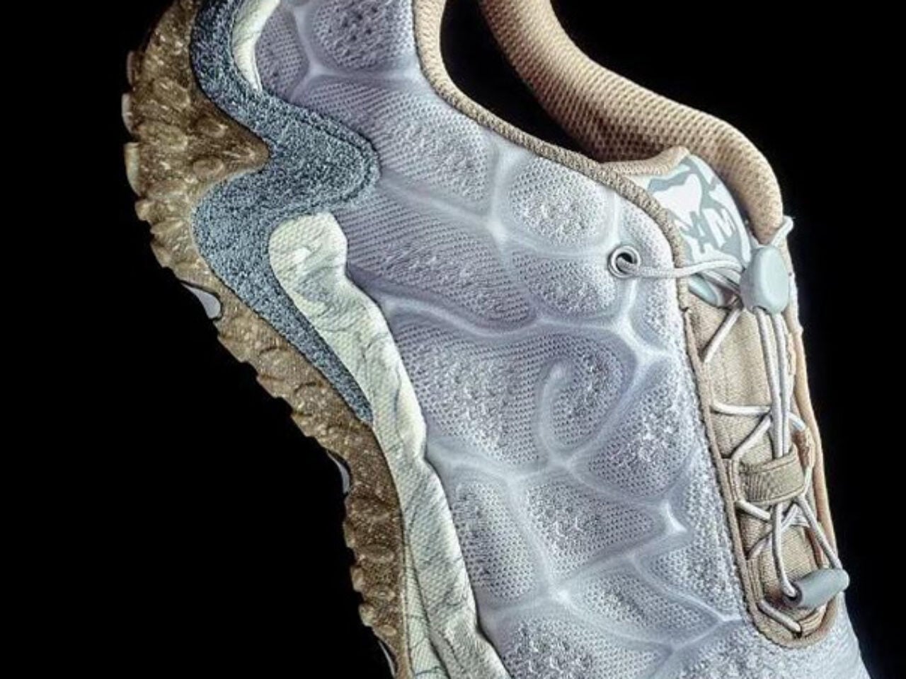
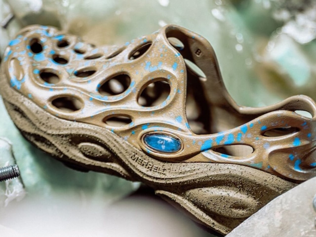
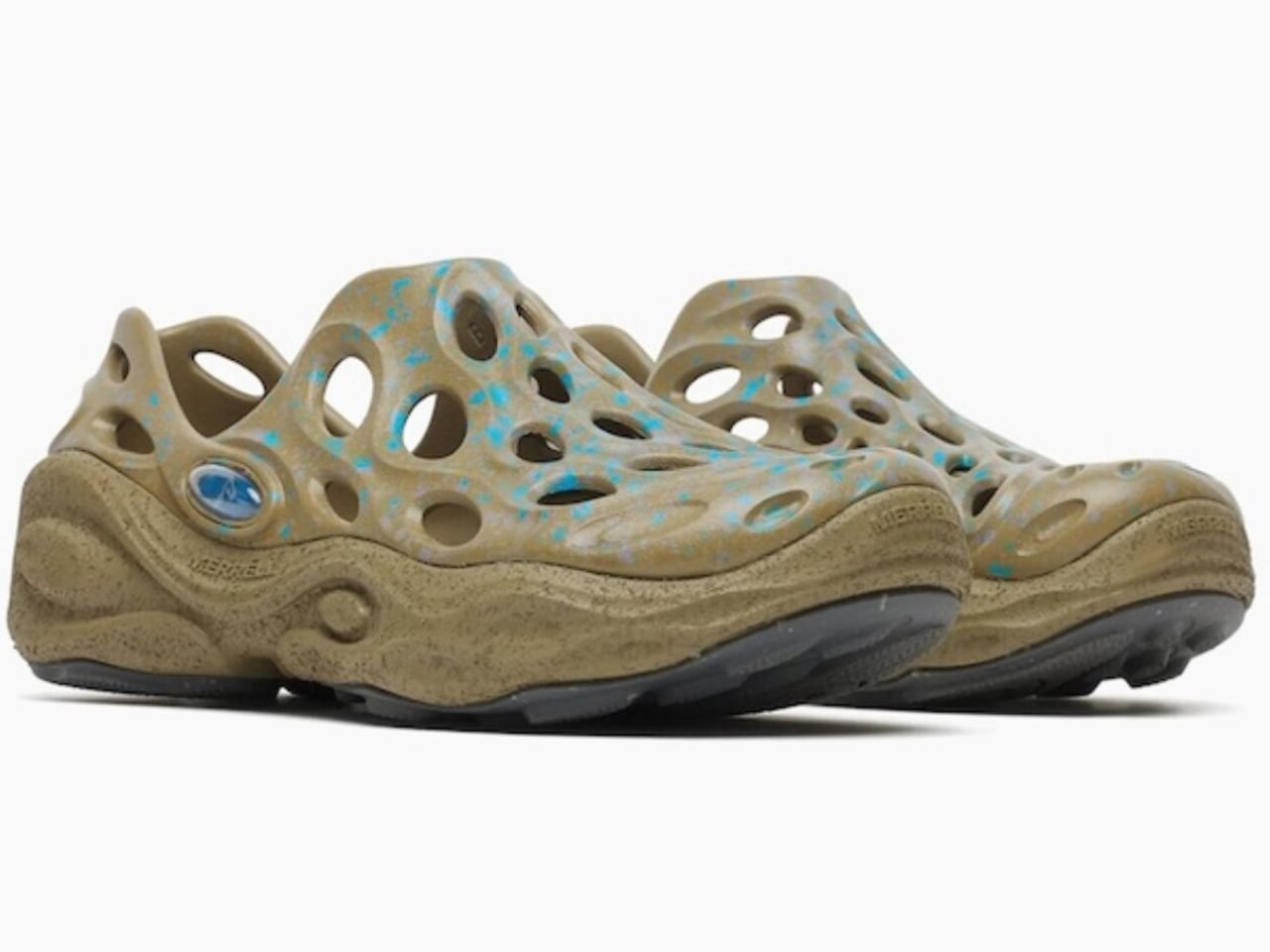
The Australian creative label Perks and Mini teamed up with Merrell to explore two silhouettes you already know: the Chameleon and the Hydro Moc. But the brief wasn’t to simply freshen them up with new colorways or slap a logo on the tongue. The directive was weirder and much more interesting than that: explore amphibian life through form, texture, and function. The result is the Cham Storm GTX and the Hydro Next Gen Moc, two shoes that feel like they were designed at the intersection of a nature documentary and a design school thesis.

Designers: Merrell x P.A.M. (Perks and Mini)

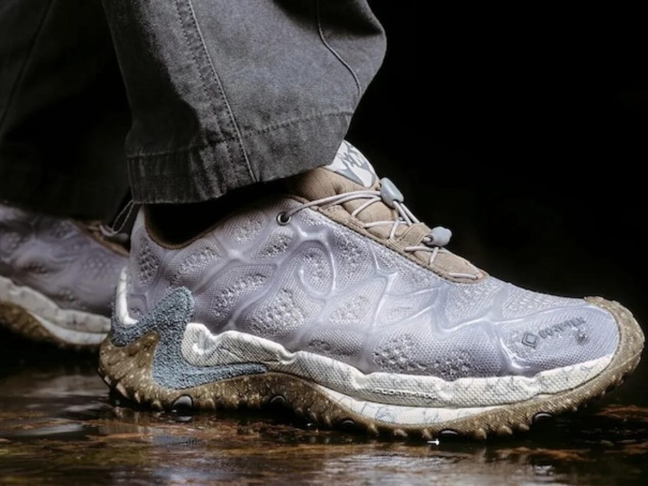
I’ll start with the Cham Storm GTX because it’s the one I keep staring at. The engineered mesh upper gets a custom 3D silicone treatment that reads, unmistakably, as reptile skin. Not in a costume-y way, but in a way that feels considered and intentional, like the design team spent real time studying scale patterns before drawing a single line. A rough sand spray finish adds another layer of texture, and the molded TPU heel counter keeps the whole thing structurally anchored. Underneath all that visual storytelling is a FloatMax foam midsole and Gore-Tex waterproof technology, which means this shoe isn’t just doing aesthetic work. It can handle rain, trails, and whatever else you decide to put it through. The toggle quick-lace system makes getting in and out effortless, which is a small detail but one that matters when you’re moving quickly between environments.

The Hydro Next Gen Moc takes a softer approach. Where the Cham Storm is textured and almost aggressive in its visual language, the Hydro Moc leans into speckle. The EVA foam upper carries a speckled pattern with flecked sidewalls that reads less like armor and more like a frog’s underbelly, in the most complimentary possible way. It’s still loaded with FloatMax foam cushioning, and the easy on/off design makes it the kind of shoe you’ll reach for on days when you need to move from the house to the street to somewhere else without thinking too hard about your feet. The weight barely registers.

What makes this collaboration feel different from the usual outdoor-brand-meets-streetwear-label formula is the conceptual rigor behind it. P.A.M. didn’t just bring an aesthetic direction; they brought a worldview. Amphibious creatures exist in a perpetual in-between state, equally at home on land and in water, which is exactly the kind of cultural positioning that resonates right now. The boundaries between outdoor gear and everyday style have been dissolving for years, and the Merrell x P.A.M. shoes lean into that rather than apologizing for it.

Merrell has always been a brand that lives and dies by its performance credibility. Adding Gore-Tex to a shoe that could easily have coasted on aesthetics alone is a deliberate statement. It’s saying the design and the function are non-negotiable, and that you shouldn’t have to choose between looking interesting and being properly equipped for the day.

The broader conversation this drop enters is about what outdoor footwear is allowed to be. For a long time, “technical” meant beige, and “style-forward” meant sacrificing waterproofing. The Merrell x P.A.M. collaboration doesn’t accept that trade-off. It asks whether a shoe can be inspired by a chameleon, built for wet conditions, carry the creative vision of an independent Australian label, and still be worth wearing on a Tuesday afternoon when nothing remotely swamp-like is happening. The answer, based on what Merrell and P.A.M. put together, is yes.

The Cham Storm GTX and Hydro Next Gen Moc are both available now. Whether you’re buying them for the design, the function, or just the sheer novelty of wearing something that nods to a salamander, they’re worth a closer look.

The post Merrell Just Made Hiking Shoes That Look Like They’re Alive first appeared on Yanko Design.

Korean Studio Just Designed a Pencil That Looks Like an Idea

If you’ve ever sat down with a blank notebook and a good pencil and felt your brain finally slow down enough to actually think, you already understand what Korean design studio QSEODESIGN is getting at with their IDEA Pencil. This concept design just makes that feeling visible.

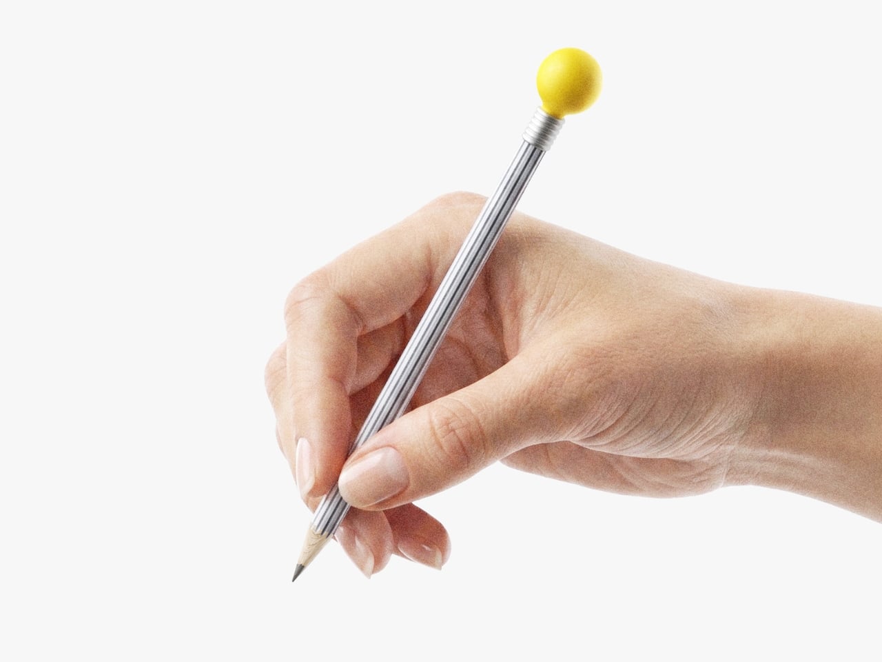
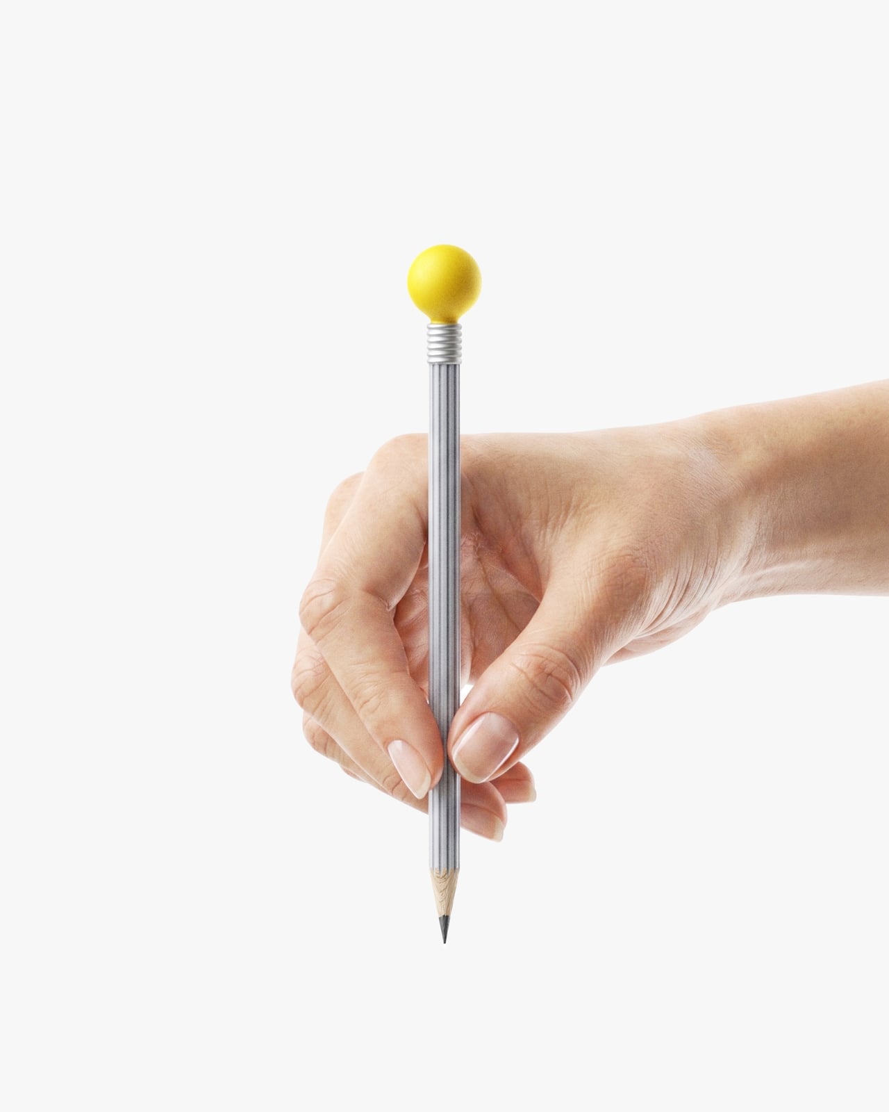
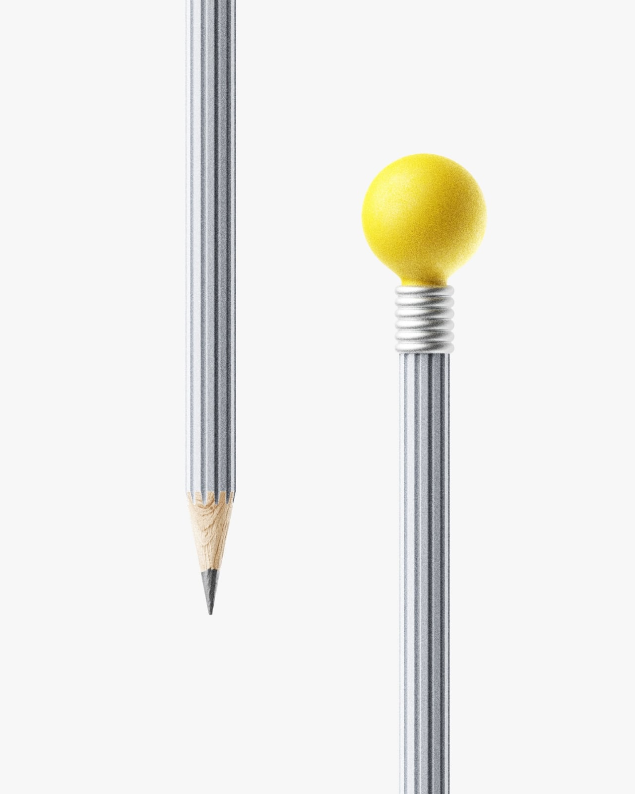
The idea is elegantly simple: a pencil designed to physically embody the act of having an idea. The body is shaped from an extruded gear form, a visual metaphor for the grinding, turning, iterative process of refining a thought. The eraser at the top? Shaped like a light bulb. Not in a cheesy, clip-art way, but with real restraint and intention. That little light bulb eraser is doing a lot of conceptual heavy lifting, referencing the universal symbol for the “aha” moment while sitting at the one end of the pencil most associated with second-guessing and starting over. It’s sharp design thinking and a quiet bit of wit in one object.

Designer: QSEODESIGN Studio

QSEODESIGN is the studio of MinGyu Seo, a South Korean industrial designer trained at ArtCenter College of Design in Pasadena, one of the most rigorous product design programs in the world. Based in Daegu, South Korea, his studio has a consistent aesthetic DNA: minimal, considered, grounded in quiet observation. Whether he’s designing watches or furniture, the approach doesn’t change. The IDEA Pencil fits exactly into that lineage. It doesn’t shout. It doesn’t over-explain. It simply presents an idea about ideas, and trusts you to get it.

What makes the concept interesting beyond the form is the framing. QSEODESIGN positions the IDEA Pencil specifically as an analog alternative to the digital keyboard. That choice of words feels deliberate, almost defiant, and I think it speaks to a broader tension a lot of us feel right now. We spend most of our hours typing, scrolling, prompting AI to generate things for us, and somewhere in all of that, the physical act of writing something by hand has started to feel almost transgressive. Reaching for a pencil instead of a laptop is a small rebellion, and designing a pencil that looks like it belongs in that rebellion is a smarter product position than it might seem.

There’s also a conversation happening right now in design and tech circles about whether we’ve overcomplicated our tools for thinking. The analog revival isn’t nostalgia for its own sake. Whiteboards covered in Post-it notes, sketchbooks, index cards on a wall, these are still the methods that show up in every serious creative and innovation process, from architecture studios to screenwriting rooms. The pencil hasn’t been improved upon as a thinking tool. It just got aesthetically neglected. The IDEA Pencil argues, persuasively, that even the most humble everyday object deserves to be considered carefully.

The packaging concept follows the same philosophy. QSEODESIGN describes it as elegant, minimal, and multifunctional, which sounds like standard design-speak until you remember that most pencil packaging is either a cardboard sleeve or a tin that gets repurposed as a button holder. When a studio extends its conceptual care all the way to the box, that’s a signal about how seriously the whole object is being treated.

I’ll say this clearly: the IDEA Pencil hasn’t reinvented what a pencil does. It still writes, still smudges, still snaps in your bag if you’re careless. But that was never the point. The point is that MinGyu Seo looked at one of the most ordinary objects on any desk and asked what it should look like if we actually thought about it. The answer he came up with is warm and smart and quietly joyful.

At a moment when most “innovative” products are competing for screen real estate or begging for a subscription fee, it’s worth pausing over a concept like this one, a studio putting serious thought into a pencil. The IDEA Pencil may still be a concept, but the argument it makes is already fully formed: the right design doesn’t just hold an idea. It looks like one.

The post Korean Studio Just Designed a Pencil That Looks Like an Idea first appeared on Yanko Design.

LEGO Icons Hubble Space Telescope: A Build for Space Lovers

Those of a certain generation grew up in an era where space travel and discoveries were fascinating topics. A lot of young boys and girls dreamed of becoming astronauts and going into space to make amazing discoveries. While there were probably some who eventually did (or at least worked on it in some capacity), most of us stayed on Earth and just consumed various news and pop culture content that made us live vicariously through them. The fascination with space may have waned for some, but there are still those who love anything space-related, especially after the recent success of the Artemis mission.

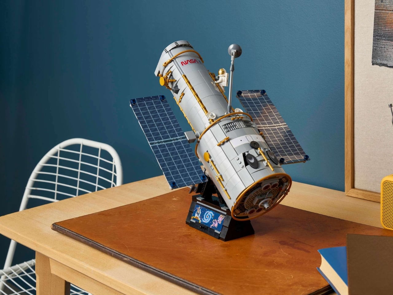
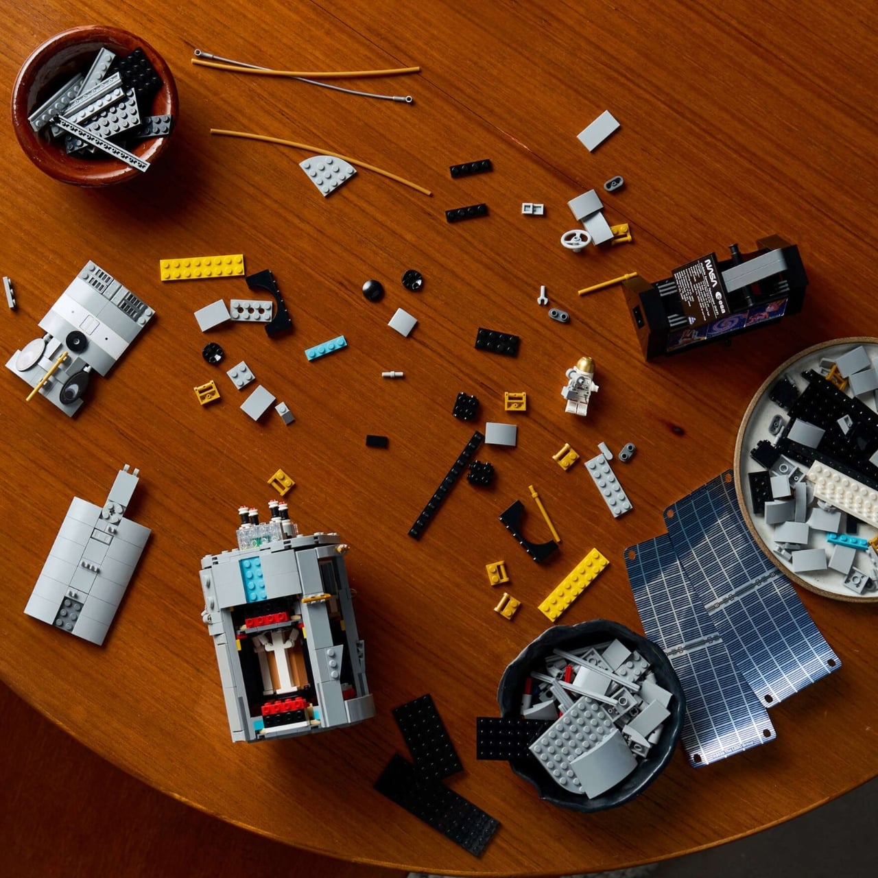
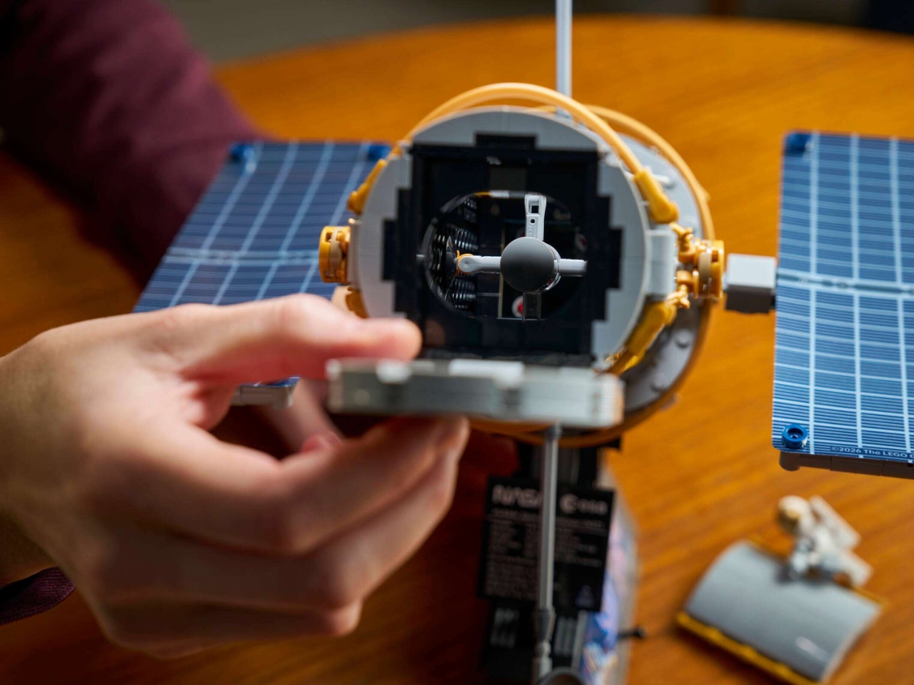
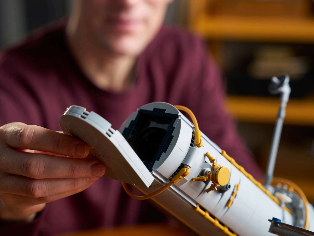
If you’re one of those who still dream of Moon landings or deep-space explorations, this newest build from LEGO will be the next thing to add to your collection. The LEGO Icons Hubble Space Telescope is an upcoming build meant for grown-ups (18+). It has 1,252 pieces, so it might be a bit intimidating for younger space lovers, but adults will definitely have fun putting together this version of the legendary telescope and displaying it proudly on their shelves alongside other space-related memorabilia.

Designer: LEGO

Before diving into the details of the set, it’s worth taking a moment to appreciate what makes this subject matter so special. The real Hubble Space Telescope, launched in 1990, completely changed the way humanity sees the universe. It helped scientists determine that the universe is approximately 13.8 billion years old, discovered two of Pluto’s moons, and captured some of the most breathtaking images of deep space ever seen. These photos have since become some of the most iconic in human history. It’s one of the greatest scientific instruments ever built, and now you can have your very own version of it sitting right on your desk.

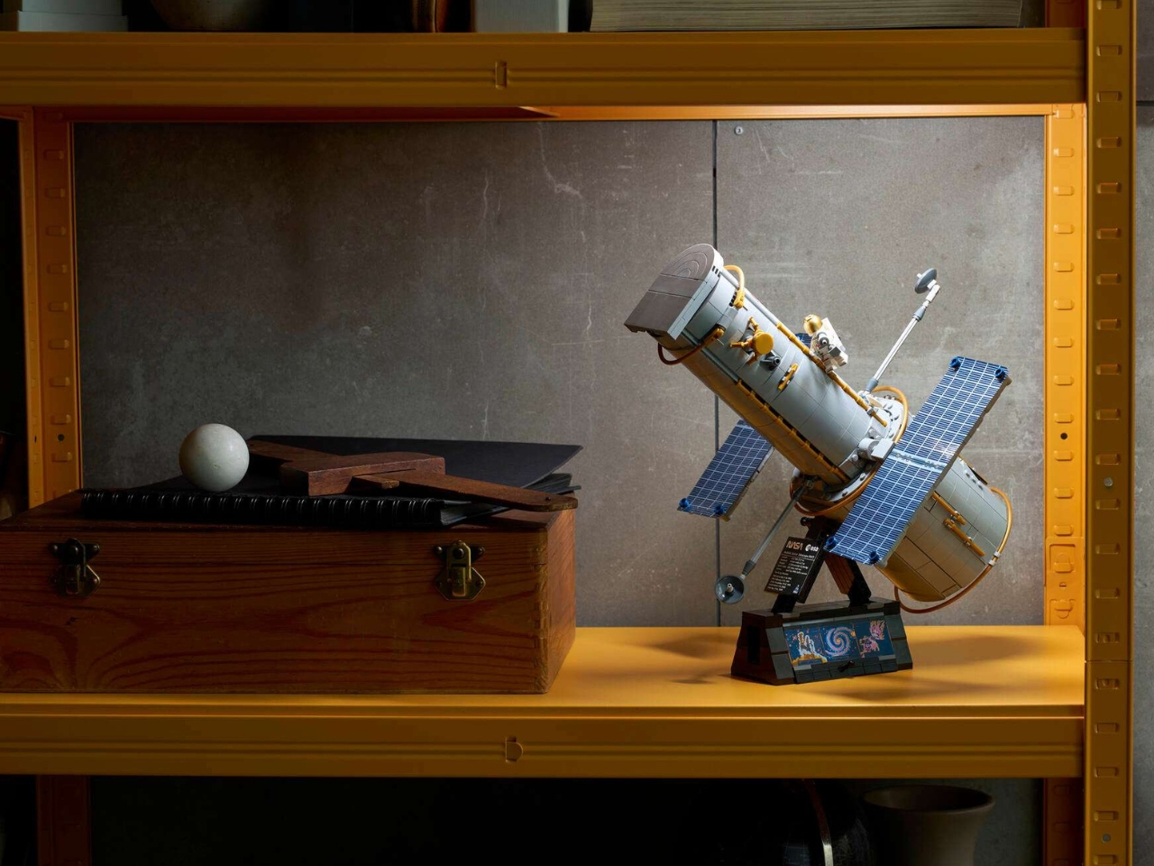
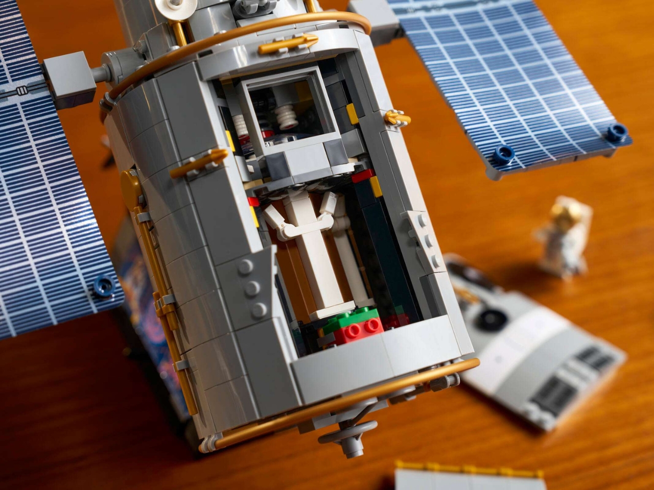
Once you finish putting together this build, you’ll have a finished model that stands 12.5 inches tall, making it a bold and impressive display piece that captures the real telescope’s iconic silhouette with remarkable detail. You’ll be able to reposition the solar arrays and antennas for a dynamic display to complement whatever other cool pieces you might have on your shelf or display table. It also comes with an opening aperture door that mimics the real Hubble Telescope’s mechanism, adding a satisfying interactive element to the finished build. The level of care put into the design is evident from every angle, and this is clearly a set that was built with true fans in mind.

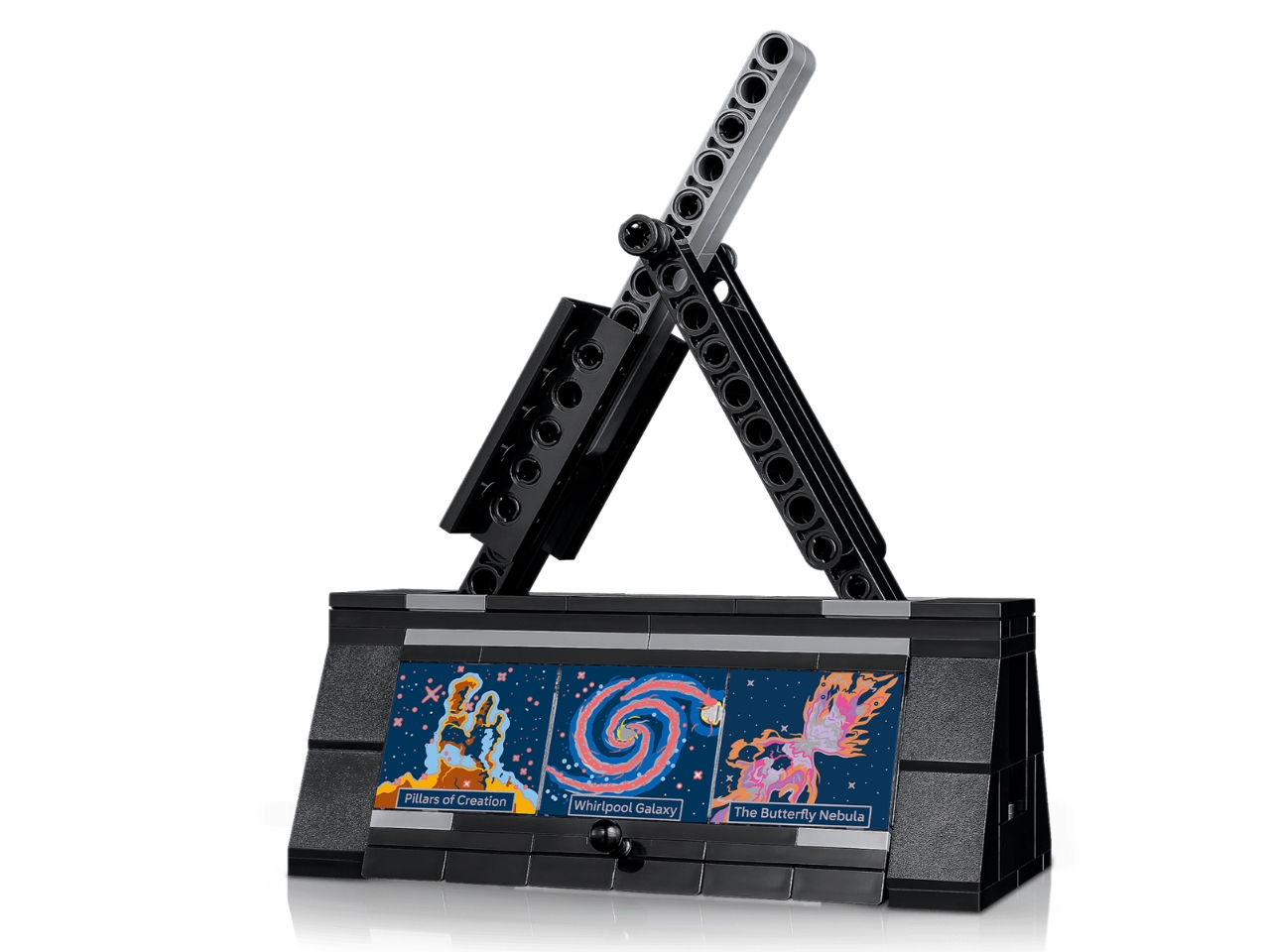
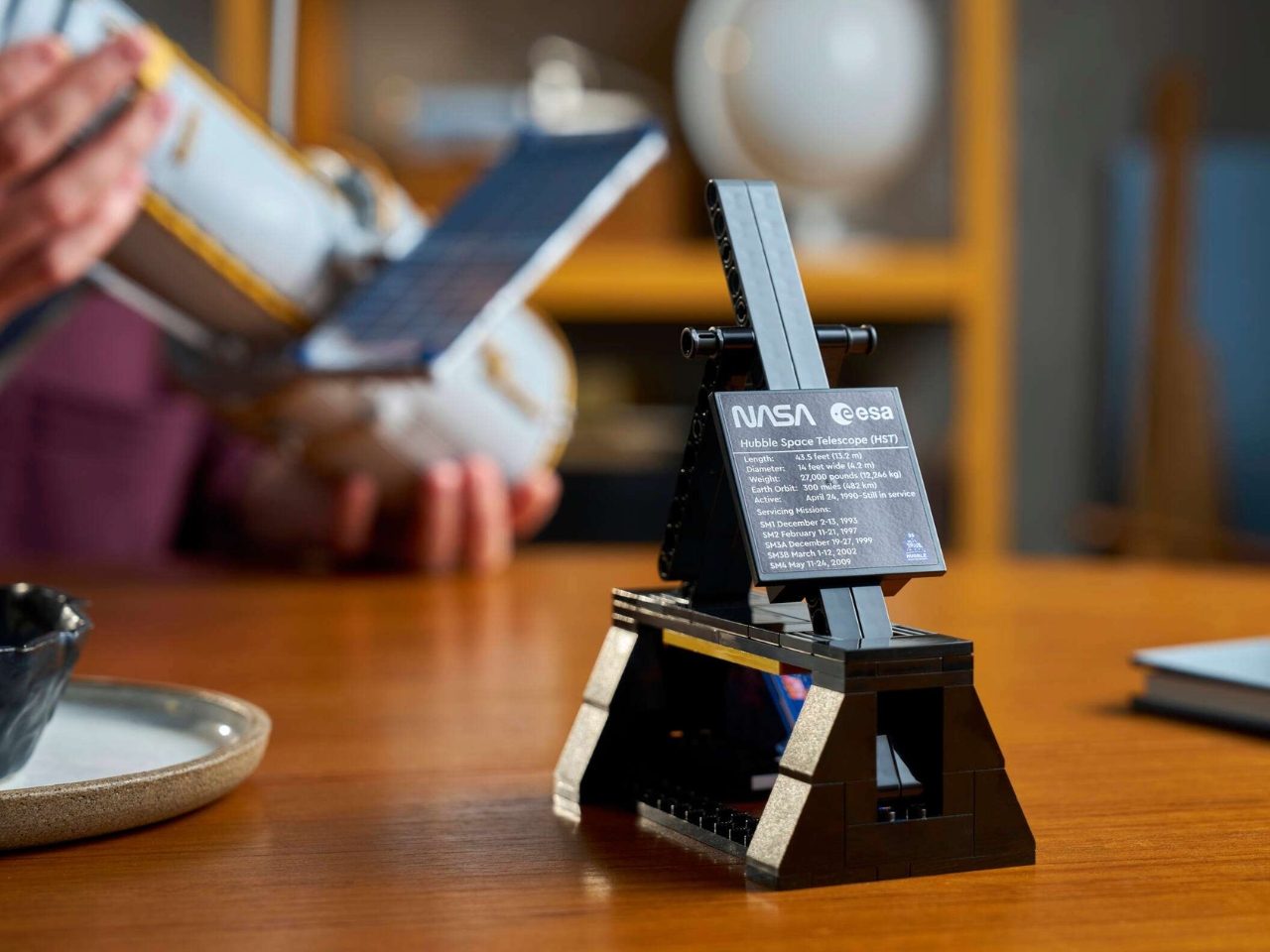
The instrument bay is also pretty detailed, giving you a peek into the inner workings, at least the LEGO version of it. You will also get a NASA astronaut minifigure, included primarily for scale representation, which adds a nice layer of storytelling and authenticity to the display. It also comes with a display stand and an informative plaque, so your finished showpiece is more than just decorative. It’s a genuine conversation starter.

The LEGO Icons Hubble Space Telescope (Set #11382) is set to release on August 1, 2026, and will retail for $139.99 USD (£119.99 GBP / €129.99 EUR / $229.99 AUD). For a 1,252-piece, display-quality set, it sits at a very reasonable price point, especially considering how striking the finished model looks. Whether you’re treating yourself or looking for the perfect gift for the space lover in your life, this is one build that checks all the right boxes.

Space may feel like a distant dream for most of us, but LEGO has always had a wonderful way of bringing those dreams a little closer to home. The Hubble Space Telescope set is more than just a building project. It’s a tribute to one of humanity’s greatest scientific achievements, packaged in a way that’s accessible, engaging, and genuinely beautiful to display. Whether you’re a seasoned LEGO collector, a science enthusiast, or just someone who has always gazed up at the night sky with a sense of wonder, this is one build that truly has it all. Mark your calendars for August 1, 2026, and make sure it’s at the top of your wishlist.

The post LEGO Icons Hubble Space Telescope: A Build for Space Lovers first appeared on Yanko Design.

Sicily’s New Concrete Church Is Quietly Rewriting Sacred Design

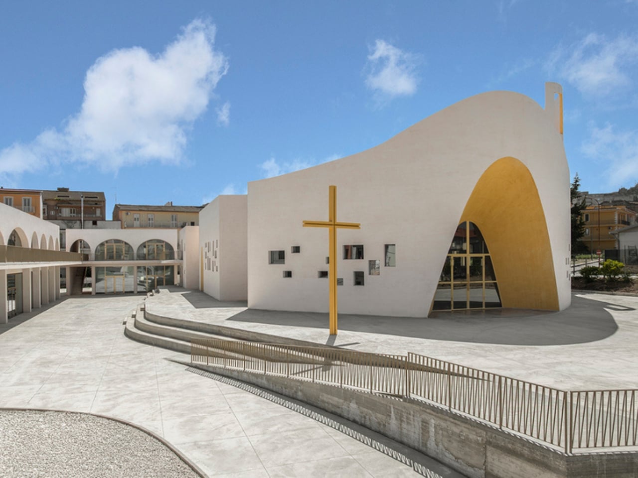
When you think of a church in Sicily, your mind probably goes somewhere ancient. Mosaic floors, Byzantine domes, the kind of gold that took centuries to accumulate. So when I came across the new Santa Barbara Parish Complex in Licata, a small coastal city in the island’s southern province of Agrigento, it stopped me completely.

The complex was designed by architects Francesco Lipari, Lillo Giglia, and Giuseppe Conti, the team behind OFL Architecture, and it is one of the most compelling pieces of sacred architecture I’ve seen in years. It won a two-stage invited competition promoted by the Archdiocese of Agrigento and the Santa Barbara Parish, with funding from the Italian Episcopal Conference through the ‘8xmille’ program, and what came out of it is genuinely unlike anything you’d expect from a church commission.

Designers: Francesco Lipari, Lillo Giglia, and Giuseppe Conti

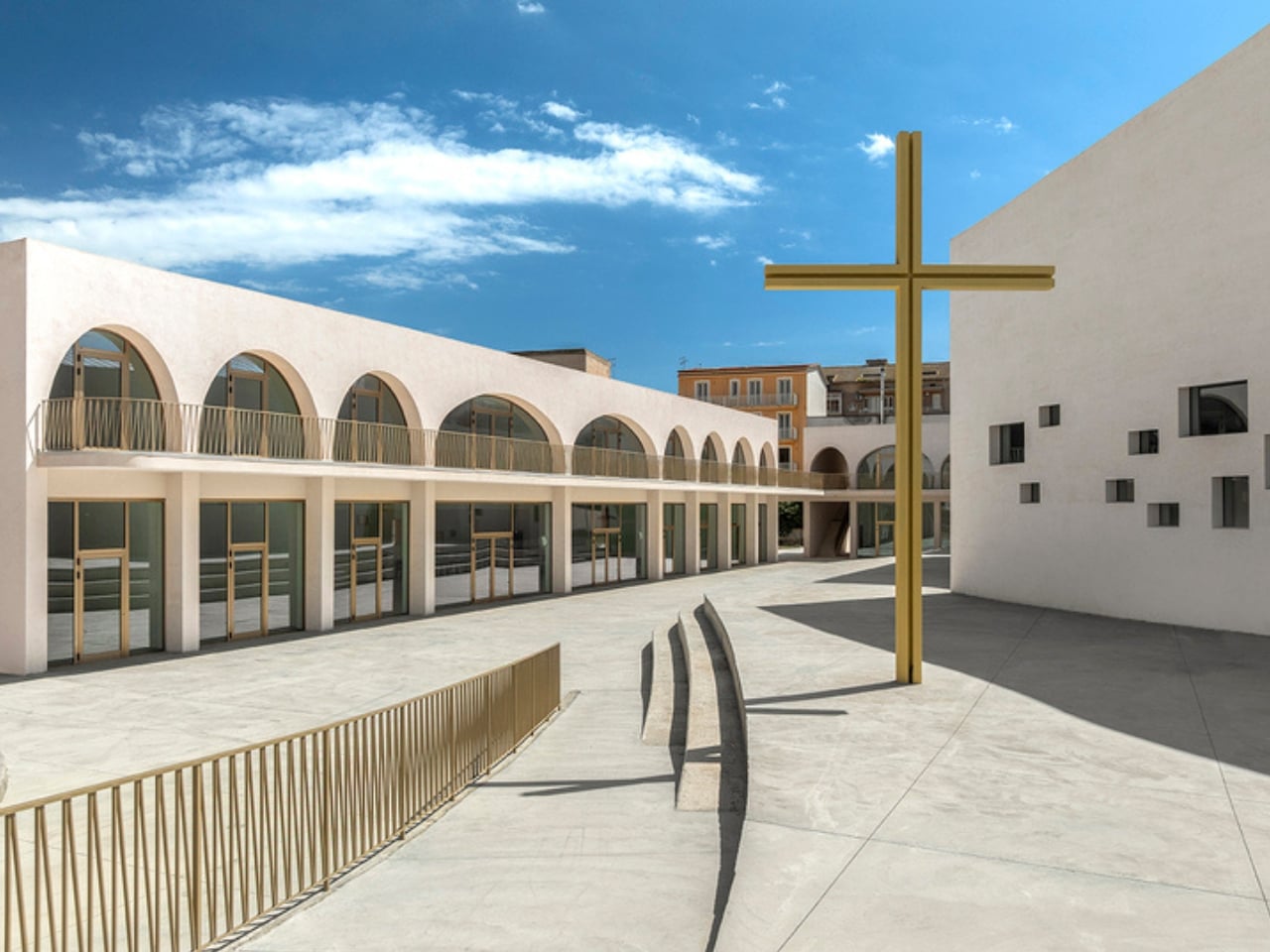
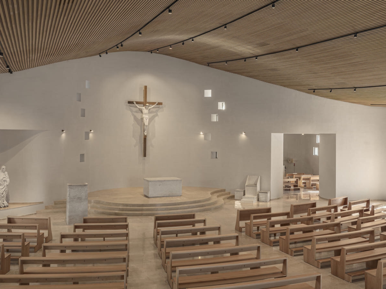
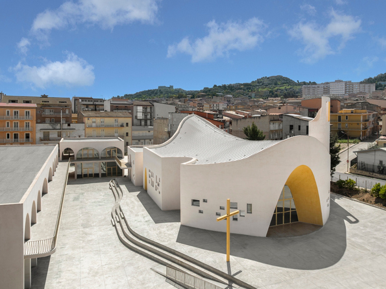
The concept is described as a “campus of faith,” and that framing tells you everything. Rather than positioning the church as a monument to be looked at from the outside, the architects designed it as a permeable, walkable space where the building and its surroundings flow into each other. The churchyard functions as an open civic square, directly connecting the complex to the city around it. On the western edge of Licata, a city that doesn’t get nearly enough architectural attention, this project becomes a new kind of civic landmark, the kind that earns its place in a neighborhood rather than simply occupying it.

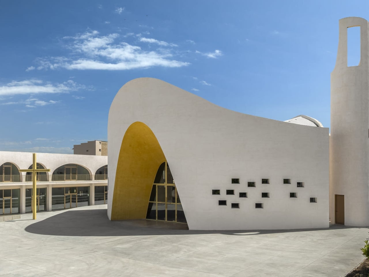
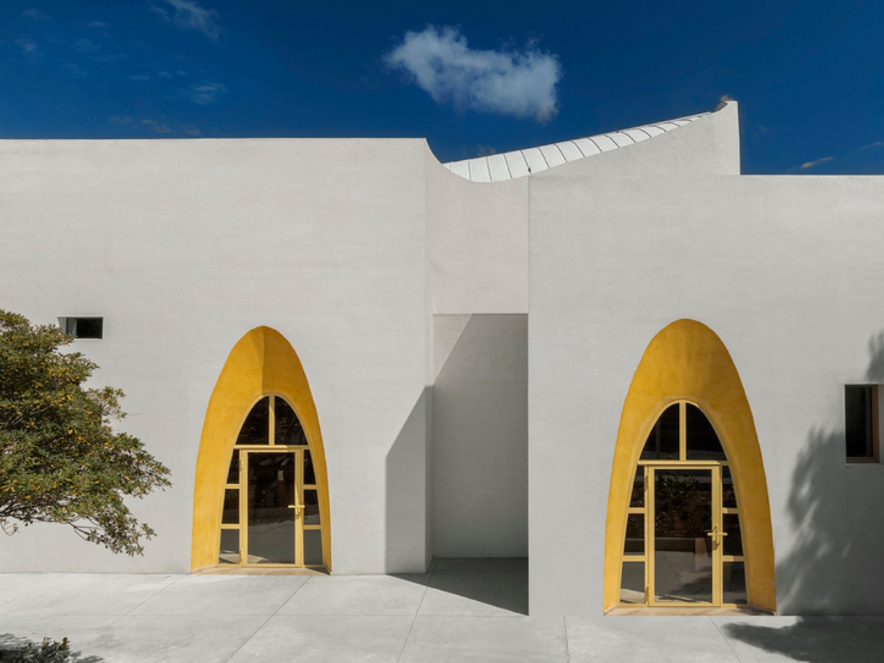
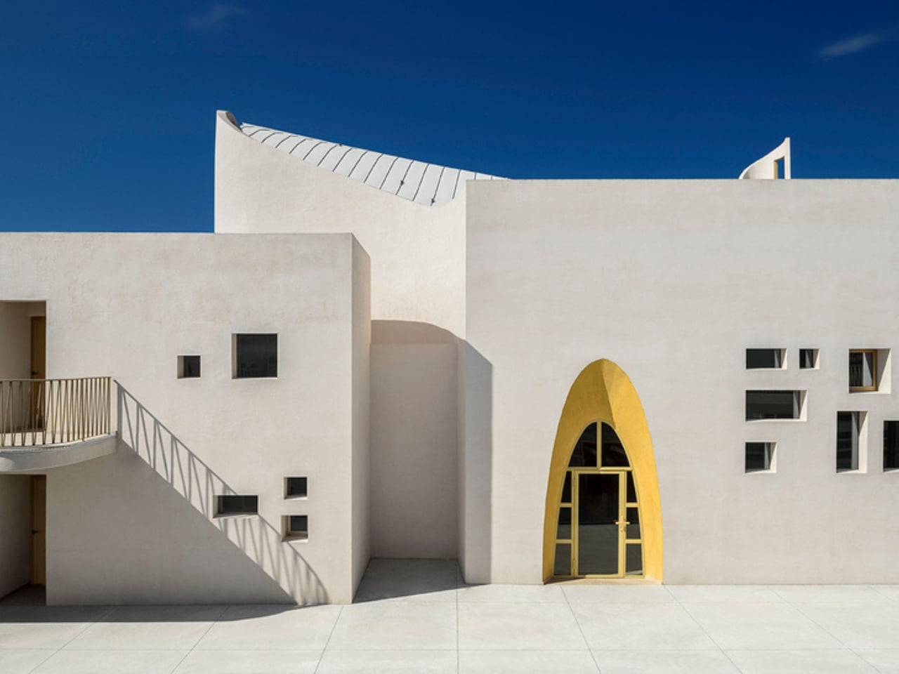
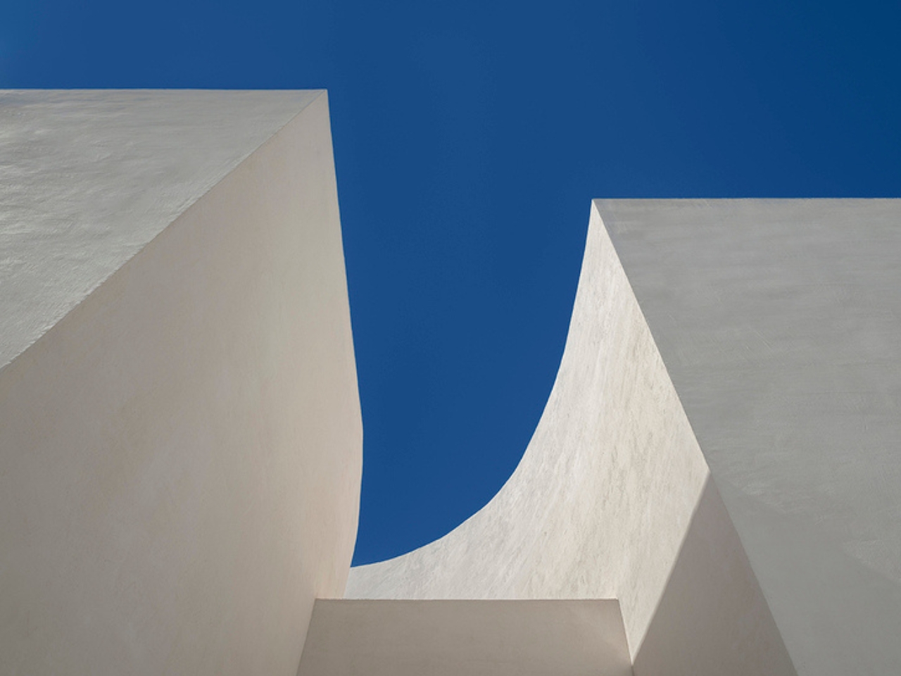
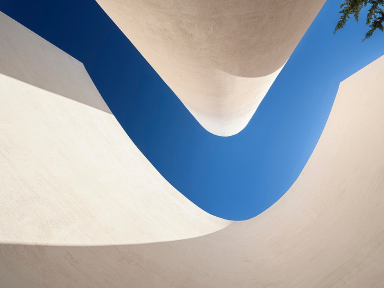
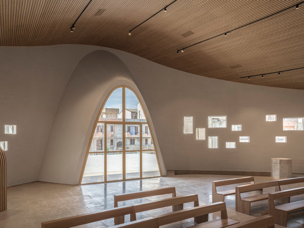
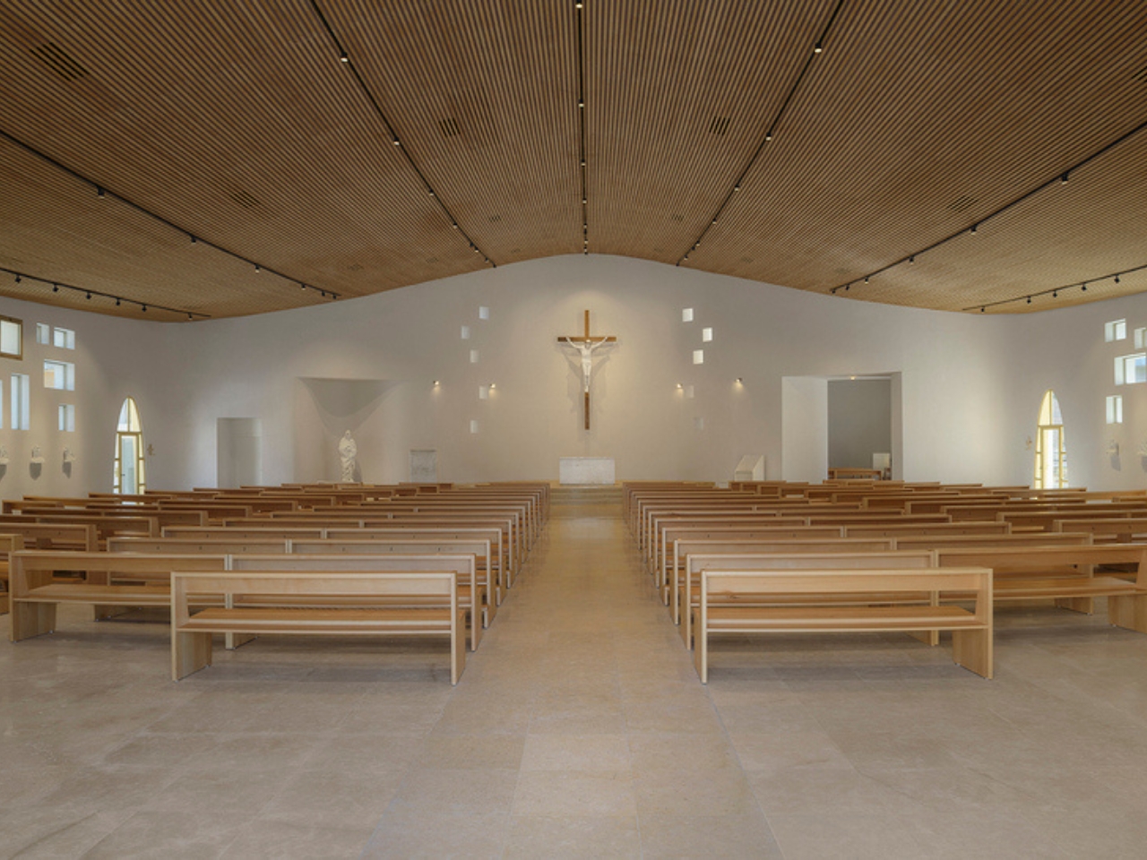
Visually, the building is striking in a way that feels earned. Curved white surfaces define the liturgical hall, punctuated by small square openings and anchored by a golden portal that works as both entrance and visual statement. The flowing roof is where the design gets genuinely poetic, its sinuous edge framing the sky in a way that feels both deliberate and effortless. Inside, a suspended timber ceiling mirrors the curvature of the roof above it, creating a quiet continuity between form and material that’s hard to achieve and even harder to fake. Concrete here is not the heavy, utilitarian material we’re used to seeing in brutalist structures. It’s fluid, almost organic, moving in ways that concrete isn’t really supposed to move.

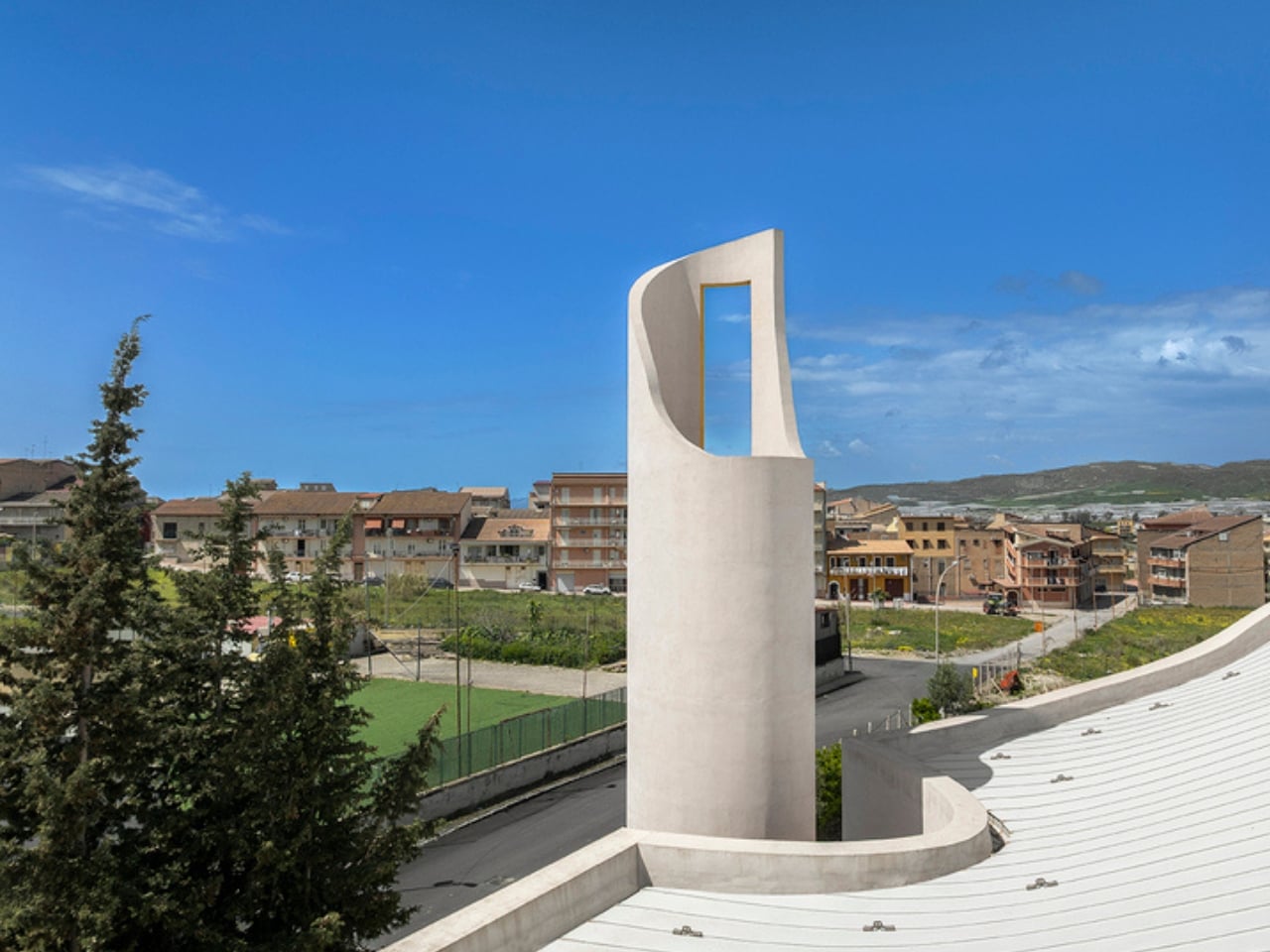
The cylindrical bell tower stands separately as a vertical landmark, a classical reference rendered through an entirely contemporary lens. It’s the kind of design decision that could easily feel gratuitous but doesn’t, because the rest of the complex earns it. The whole project has a consistency of thinking that’s rare, where no single element feels like it wandered in from a different brief.

Beyond its striking form, this project says something meaningful about the role of sacred architecture today. Churches are not the cultural anchors they once were in many parts of the world, and commissions like this come with real pressure to be relevant without being gimmicky. Lipari, Giglia, and Conti seem to have understood that the best way to honor that tension is to make a building that genuinely belongs to its community, not just spiritually but physically and socially. A church that also functions as a civic square, a campus that connects education, worship, and daily life, is an architectural idea that feels more urgent now than it probably did when the project began in 2016.

It took years to get here. The project period ran from 2016 to 2022 and the complex has since been making its way to completion, a timeline that speaks to the scale and structural complexity involved. The free-form reinforced concrete geometry required state-of-the-art structural engineering, and the result is a building whose ambition is matched by its technical rigor.

Sacred architecture has always had to carry more weight than almost any other building type. It has to mean something beyond its walls. The Santa Barbara Parish Complex makes a compelling case that meaning doesn’t have to come from tradition alone. Sometimes it arrives through fluid concrete, warm timber, and an open square that anyone can walk through.

The post Sicily’s New Concrete Church Is Quietly Rewriting Sacred Design first appeared on Yanko Design.
Anoma’s A1 Prehistoric Is Proof That Scars Can Be Art

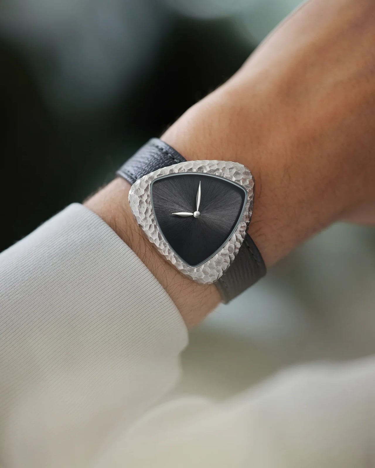
I’ve been staring at this watch for a while now, trying to figure out exactly what it is about it that makes me want to keep looking. It doesn’t gleam. It doesn’t catch the light the way luxury watches are supposed to. And yet, the Anoma A1 Prehistoric might be the most interesting watch to come out of 2026.

The story behind it starts at the Centre Pompidou in Paris, where Anoma founder Matteo Violet Vianello found himself standing in front of a Constantin Brâncuși exhibition. Brâncuși, one of the most celebrated sculptors of the 20th century, was famously fascinated by primitive artifacts. He collected ancient hand axes, arrowheads, and flint tools, not as relics, but as art. He believed they represented something pure: human creativity stripped of everything unnecessary. Vianello walked away from that exhibition with an idea that would become the A1 Prehistoric.

Designer: Anoma

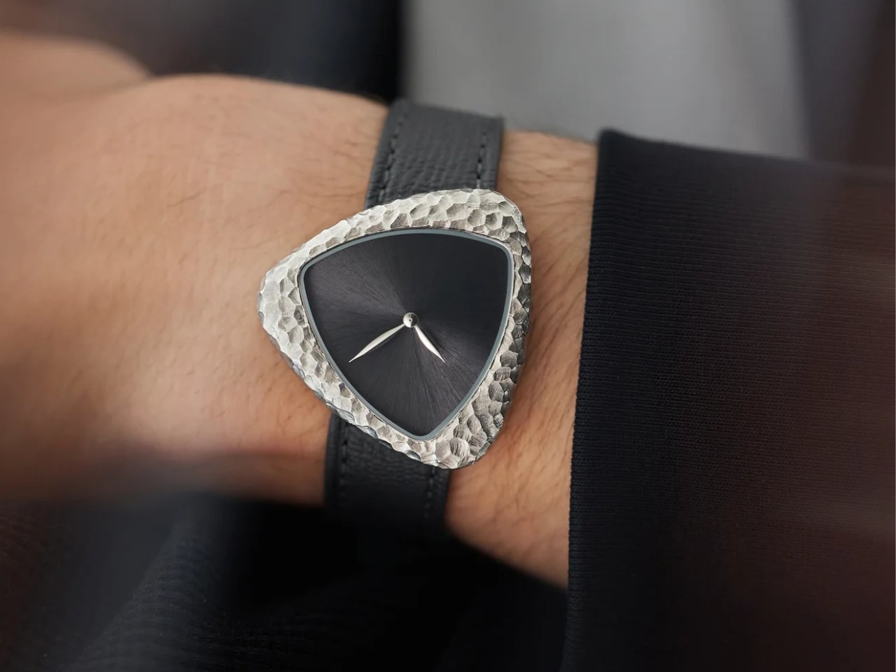
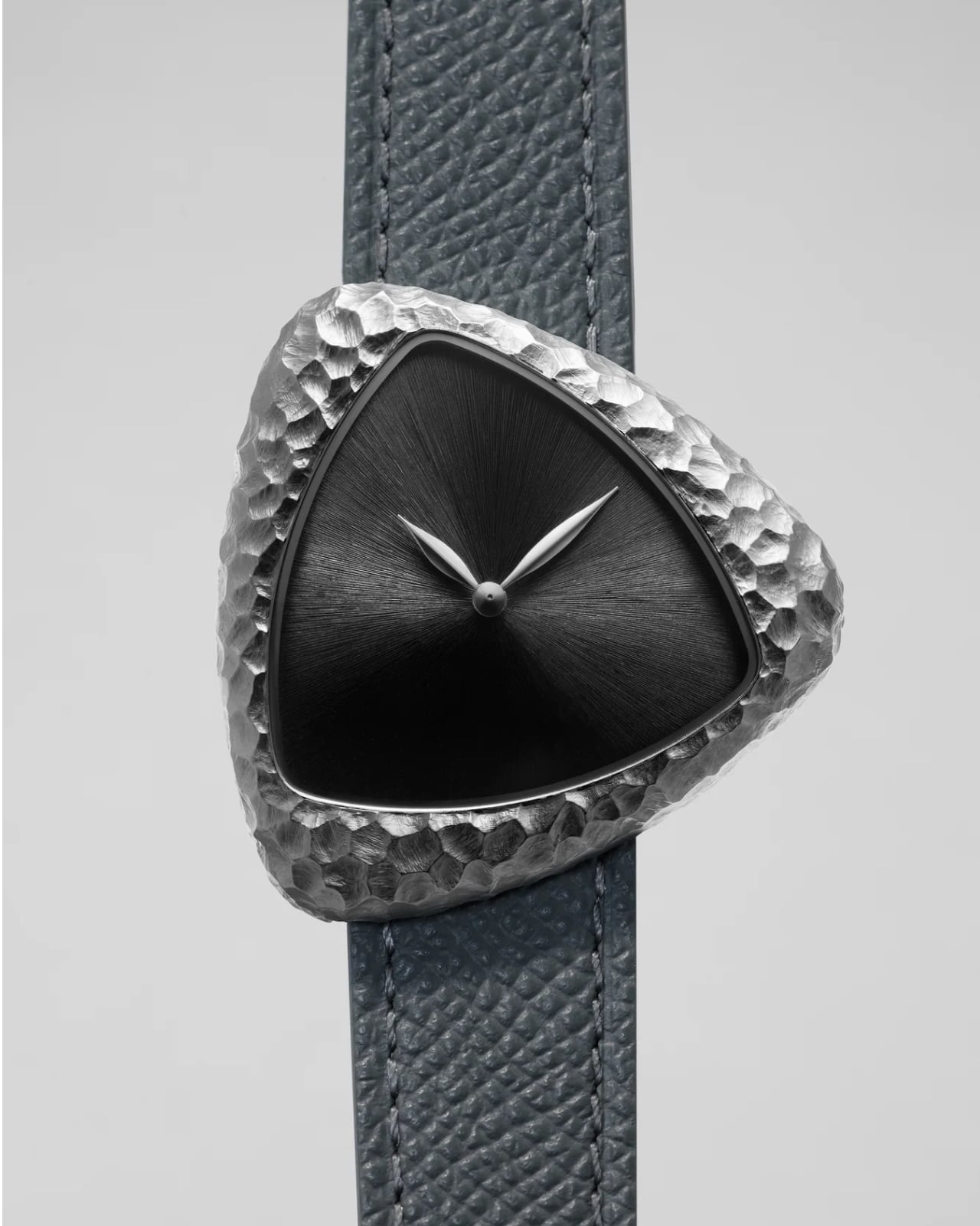
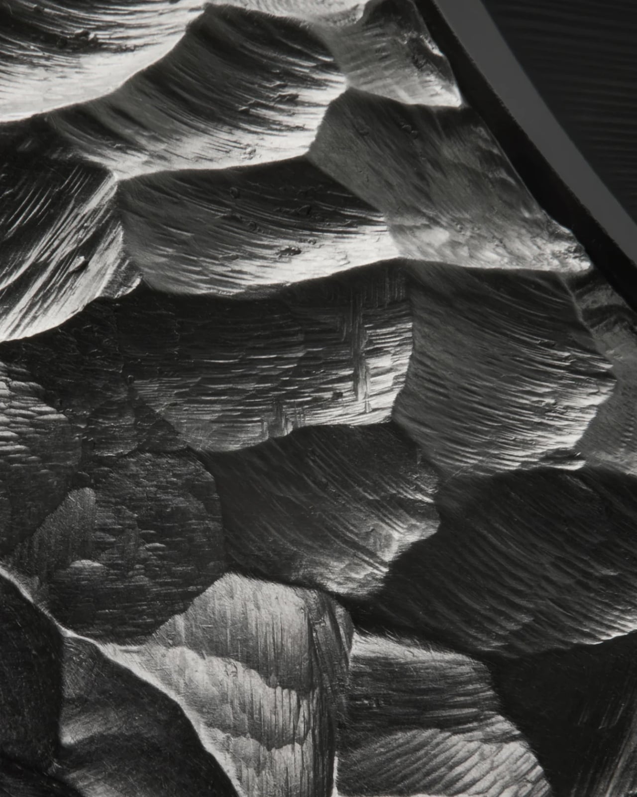
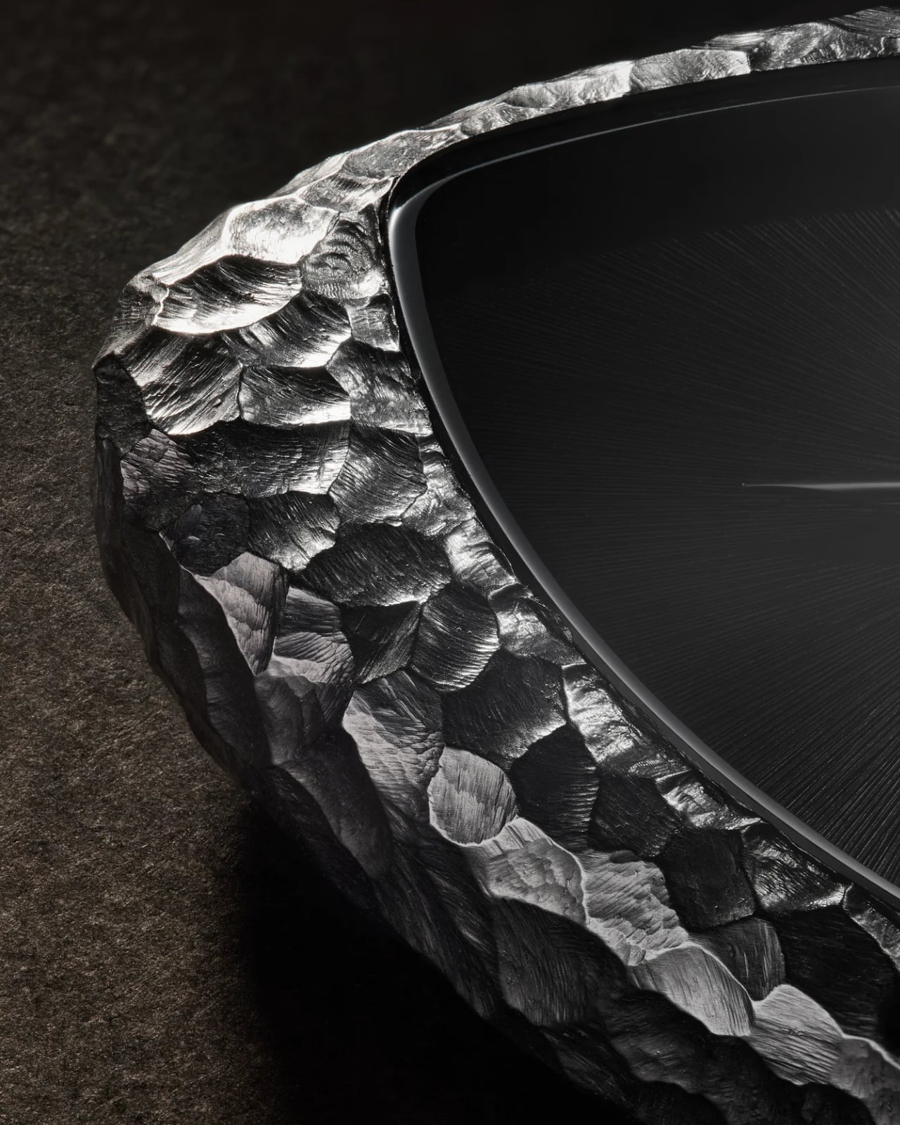
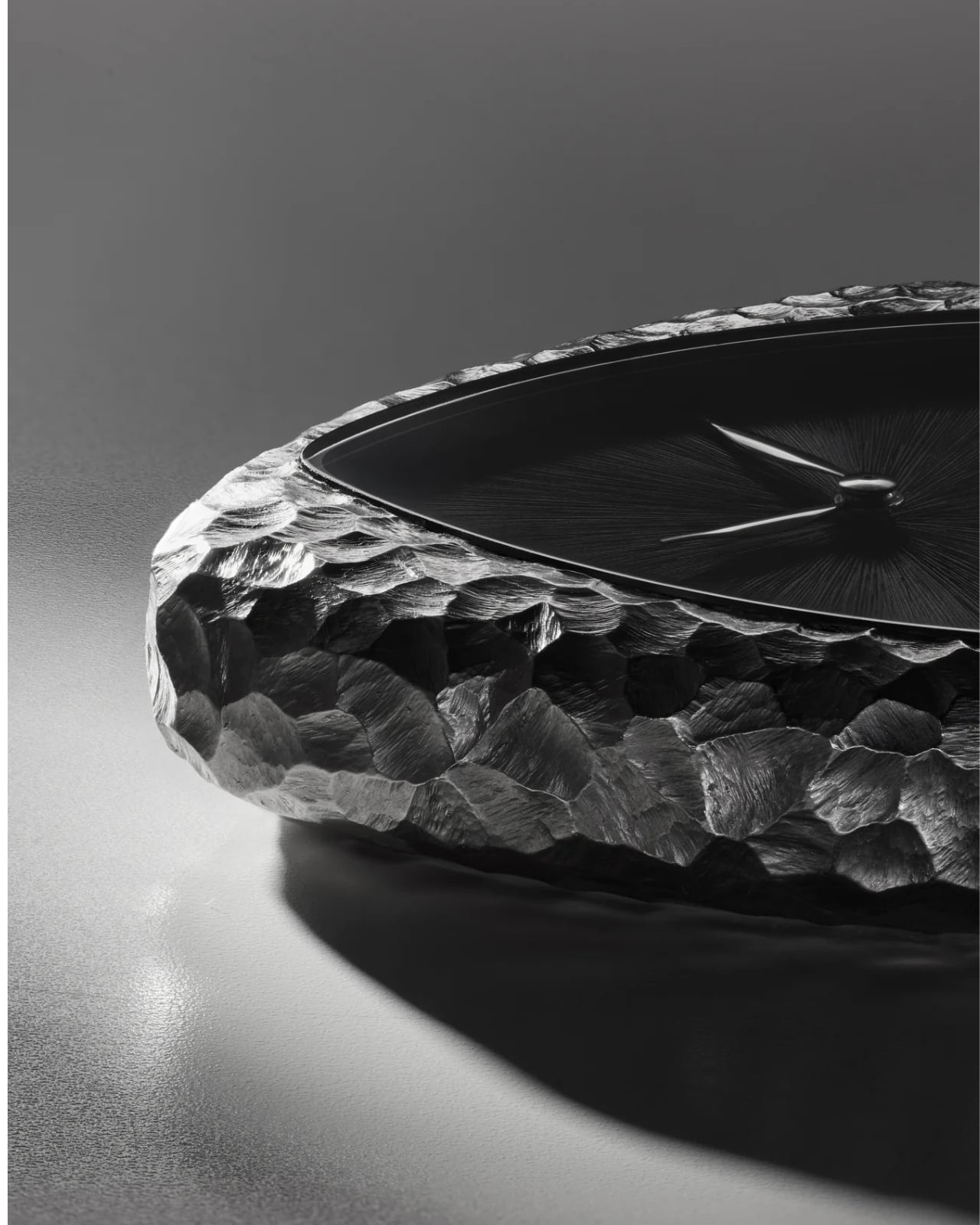
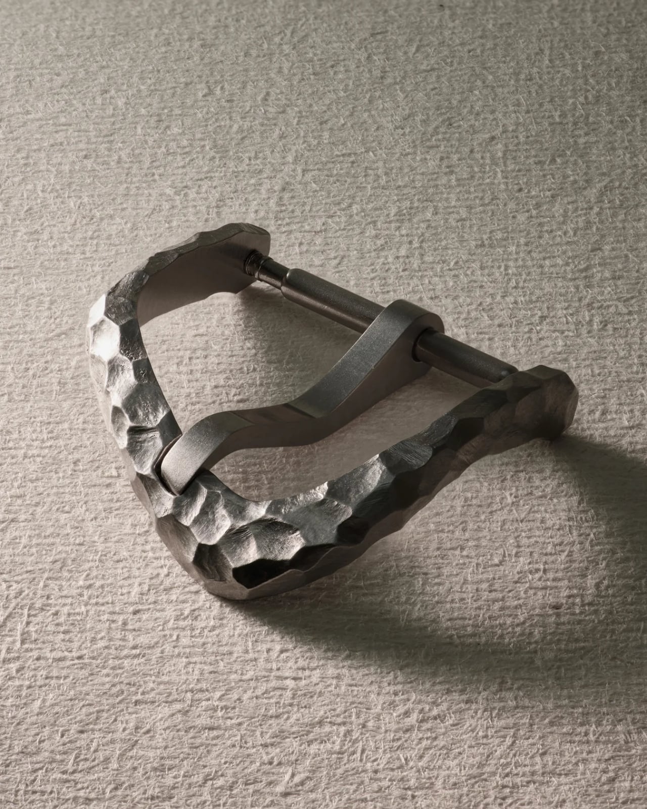
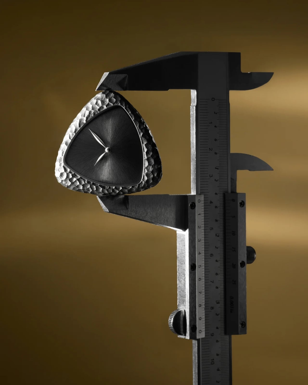
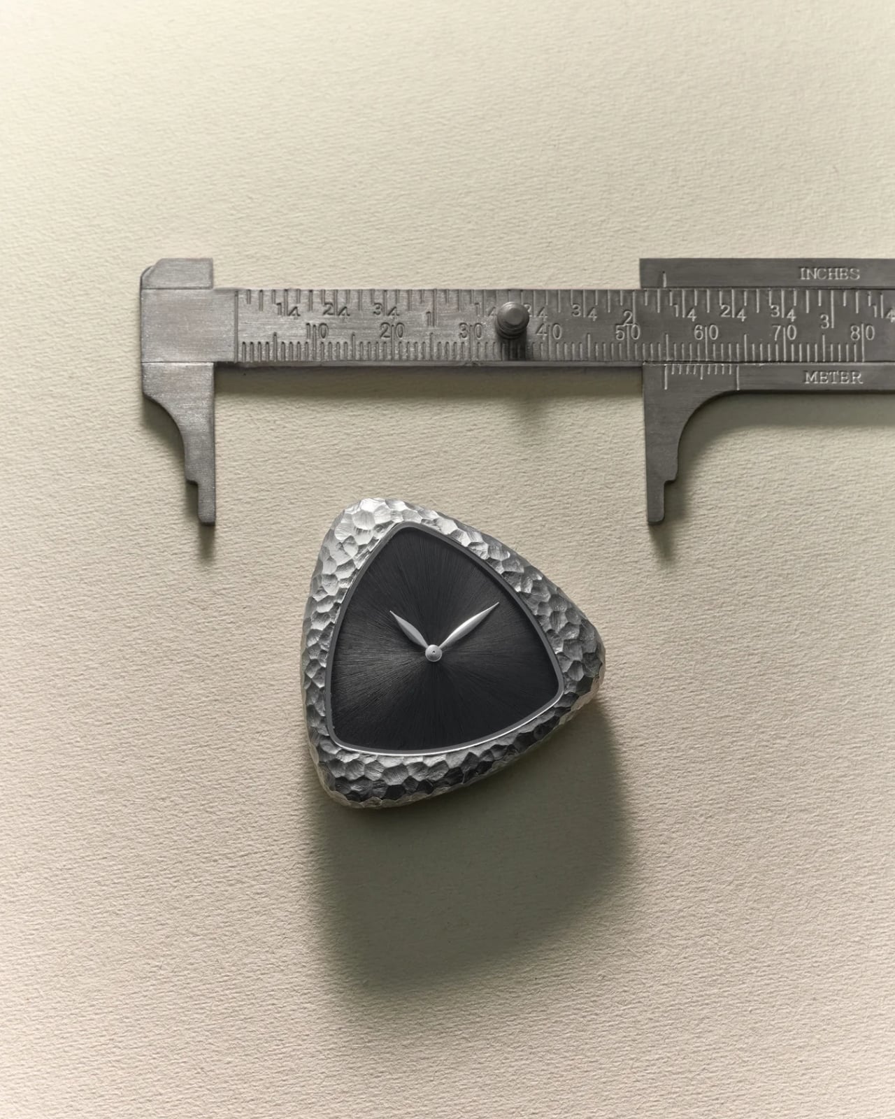
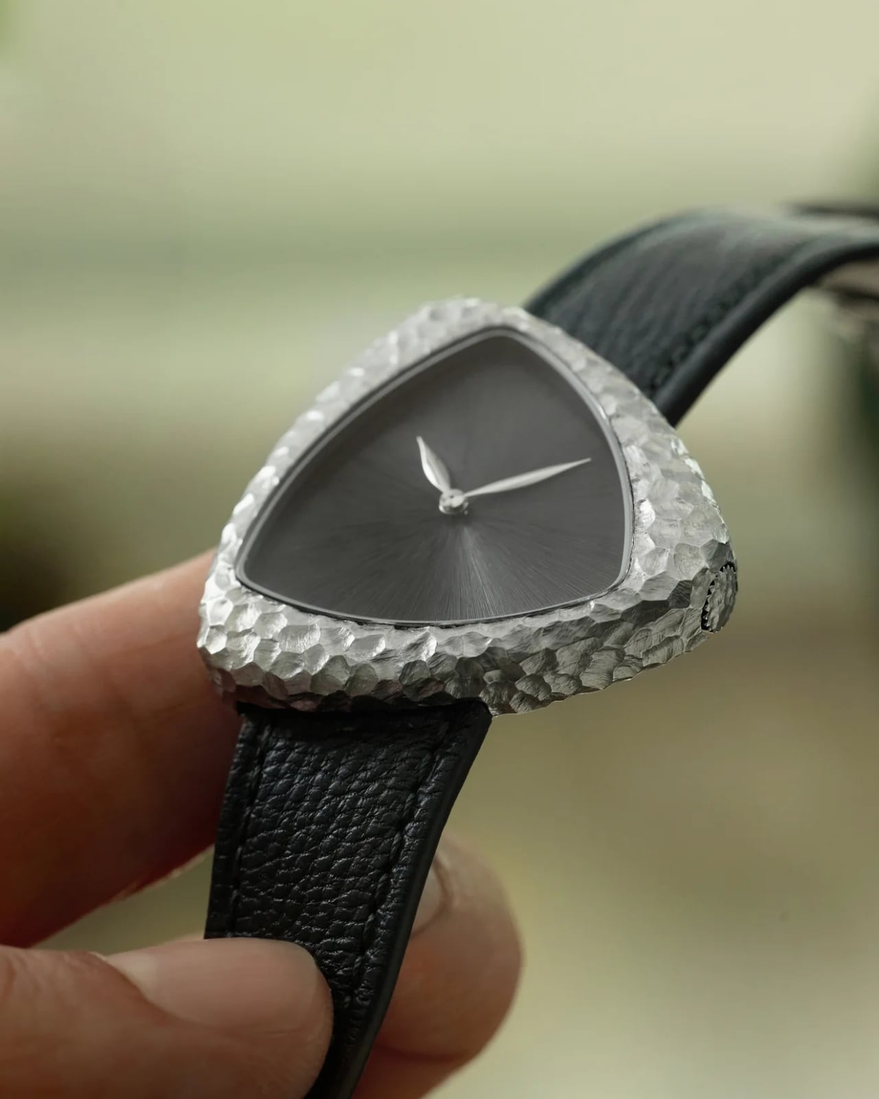
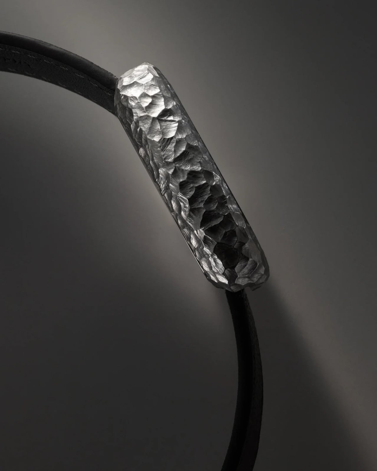
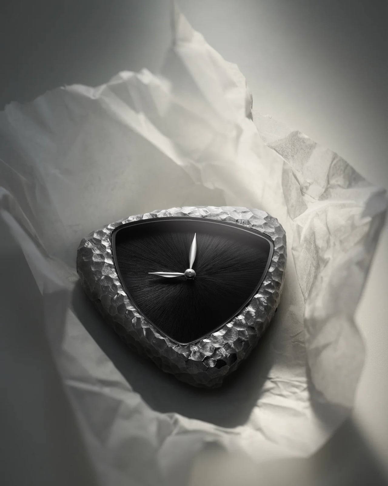
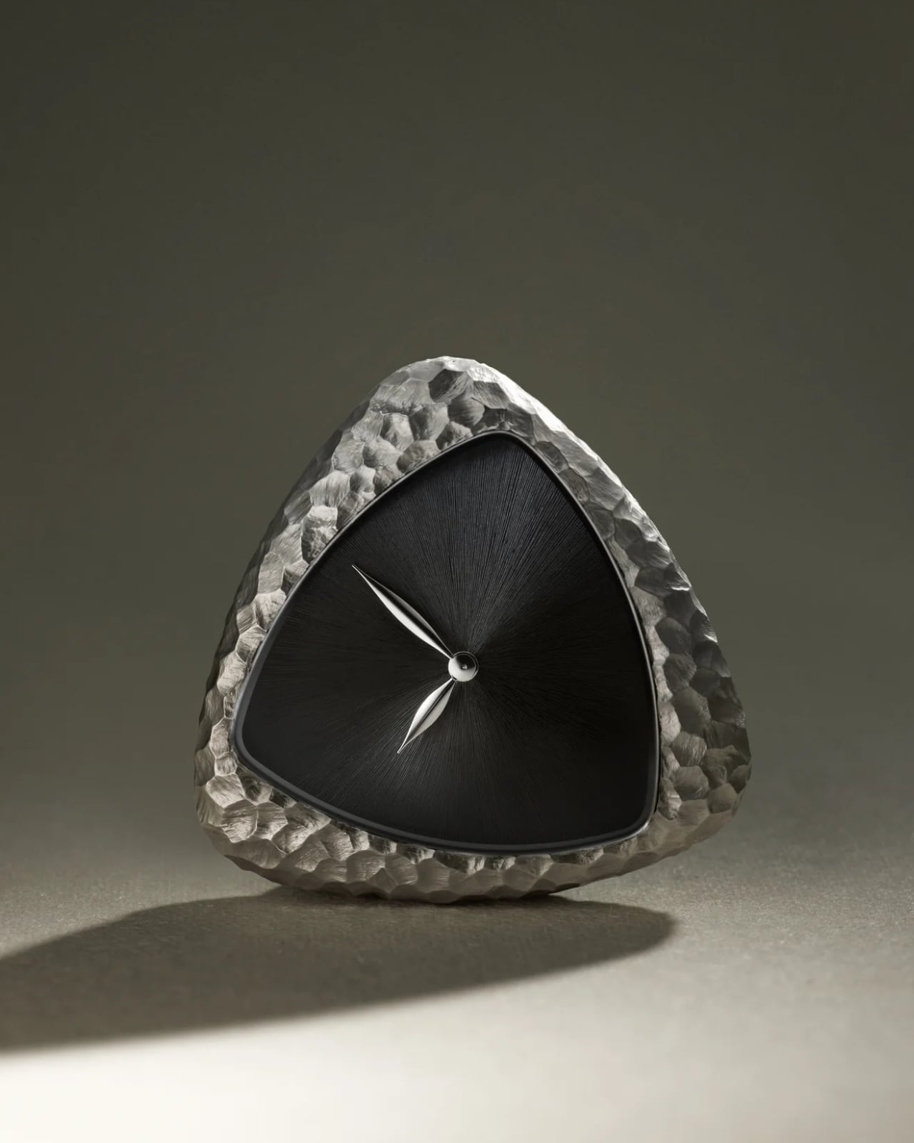
What followed was a deliberate rejection of polish. The A1’s signature triangular stainless steel case, already one of the more distinctive shapes in contemporary watchmaking, was handed over to French engraver Steven Brunel, whose work has been exhibited at the Louvre. Brunel works from a remote workshop in the Loire region of France, and for each watch, he spends approximately five hours with a chisel, striking the metal by hand over and over until the case looks less like a precision instrument and more like something you might unearth from a dig site. No two watches come out the same. The marks are freehand, the planes are uneven, and the surfaces bear the unmistakable evidence of human effort.

That process deserves a moment of appreciation. We live in an era of flawless machining and mirror-polished bezels, where the goal is often to make it look like no human ever touched it at all. The A1 Prehistoric does the exact opposite. It leans into the marks, the cuts, the irregular facets that would normally be buffed away. The technique echoes knapping, the ancient method used to shape flint and obsidian into early tools, but applied here to 316L stainless steel, which absorbs each impact differently, creating a finish that’s somehow both rough and refined.

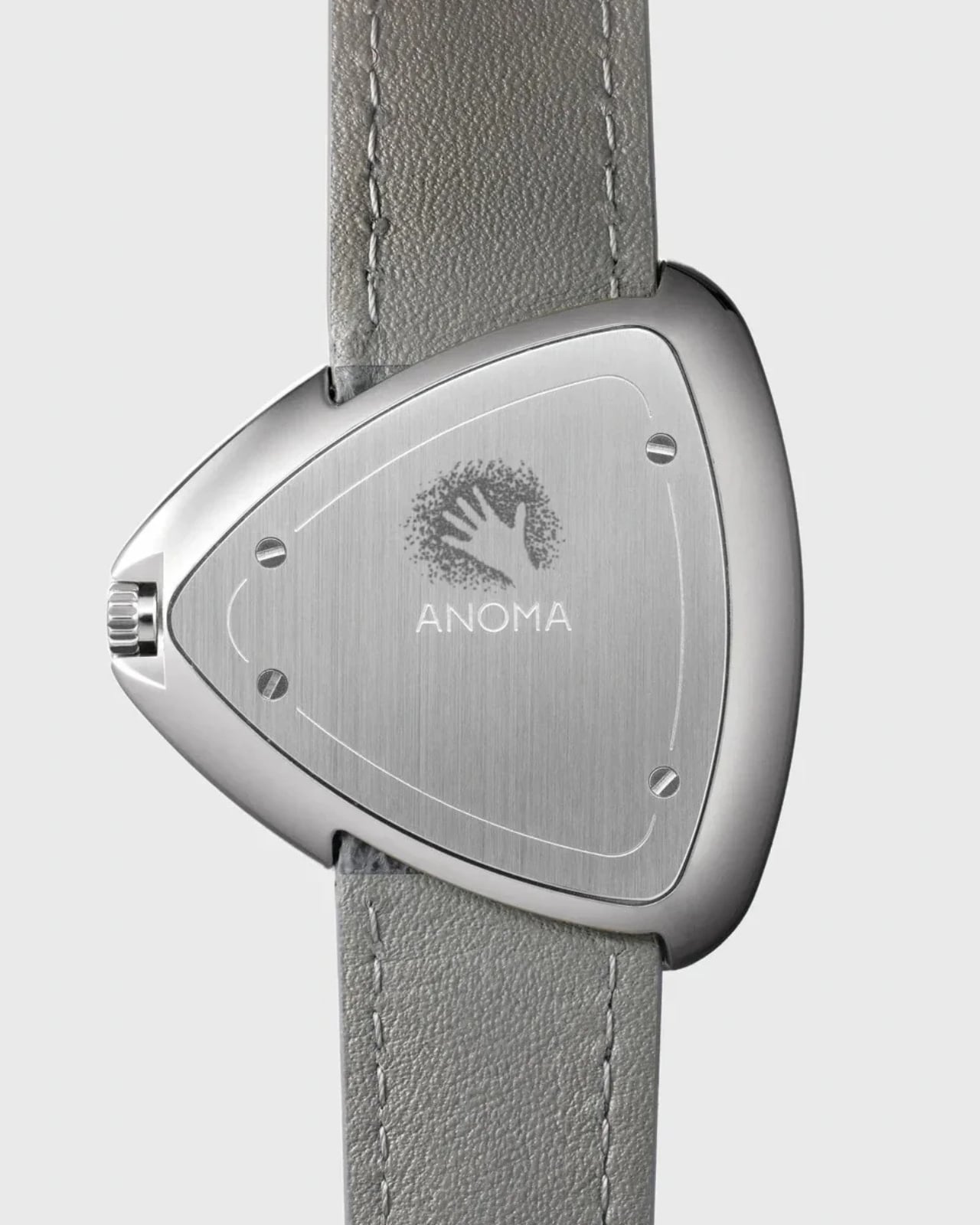
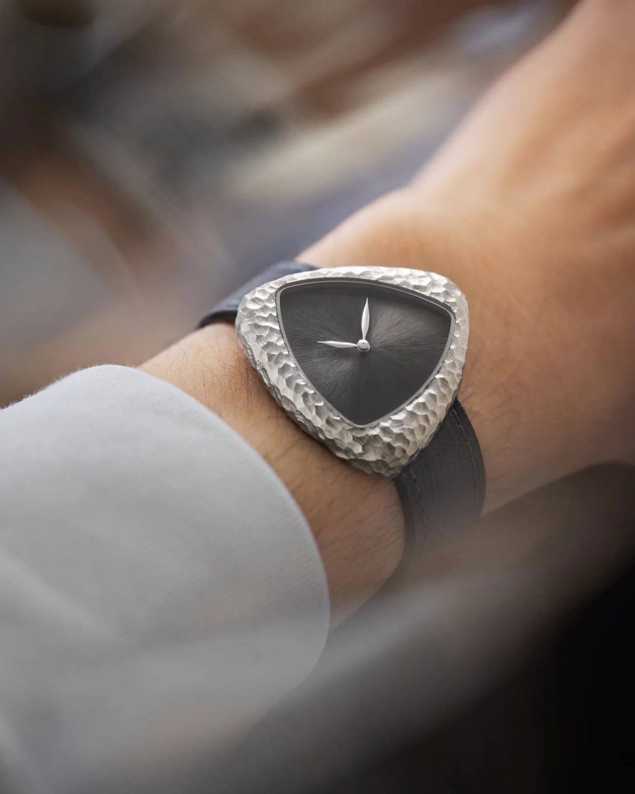
The dial continues that commitment to handwork. About 600 individual sunburst lines are engraved by hand into a brass base, then finished in deep anthracite. The result is monochromatic and deliberate, with curved leaf-shaped hands as the only interruption. It’s the kind of dial that rewards looking closely. The case measures 39mm by 38mm, which sounds sizeable, but because the A1 is lugless and triangular, it actually wears closer to 37mm, sitting comfortably without making demands on your wrist. At 9.45mm thick with 50 meters of water resistance, it’s very wearable for something that looks this sculptural.

Inside is a Swiss automatic Sellita SW100 movement running at 28,800 beats per hour, displaying only hours and minutes. The 38-hour power reserve is on the shorter side, though daily wear handles that easily enough. A grey grained Italian leather strap keeps the focus exactly where Anoma wants it: on that case.

The price sits at £2,900 (approximately $3,700 USD), which puts it firmly in independent watchmaker territory, and that feels right. This isn’t a brand chasing volume or recognition through a long heritage alone. Anoma is London-based, relatively young, and clearly more interested in objects that make you think than objects that announce status. Only 100 pieces are being made, orders opened July 8th, and deliveries are expected in October 2026.

But what stays with me, even beyond the craft, is the philosophical position the A1 Prehistoric takes. At a moment when AI is generating synthetic perfection by the second, here is a watch that insists on the value of a human hand leaving a visible mark. The violence of the chisel, the irregularity of each case, the five hours of labor that go into something no algorithm could replicate: that feels like a statement worth wearing.

The post Anoma’s A1 Prehistoric Is Proof That Scars Can Be Art first appeared on Yanko Design.