A Chair With a Drawer, a Calendar, and a Point of View

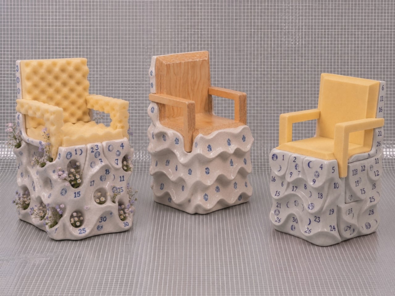
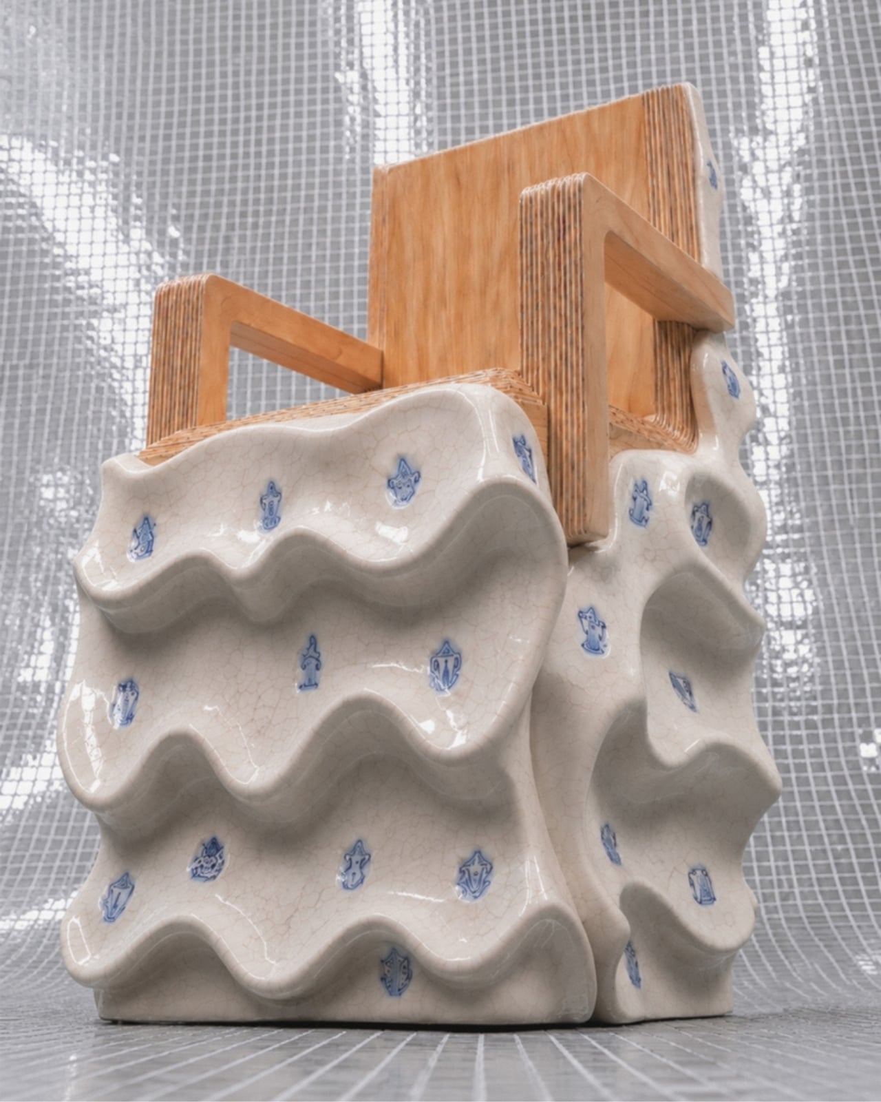
The first thing you notice about Massimiliano Malagò’s chairs is that the bottom half looks like it’s giving up. The ceramic bases appear to be softening, pooling, their surfaces undulating in slow waves as if the weight of everything sitting on top has finally gotten to them. The upper halves, either blond plywood cut with clean geometric precision or yellow foam dense as old mattress padding, hold their shape with complete indifference. The contrast is the whole conversation.

Malagò is an Italian architect based in New York who teaches at Columbia University’s Graduate School of Architecture and runs the practice HHMM with set designer Helene Helleu. His body of work has a recurring habit of using furniture as intellectual argument, treating each piece as a spatial essay. These chairs, created as part of On the Calculation of Volume for a Greenpoint apartment renovation he developed alongside client Kathleen Pongrace, are his most layered statement yet. Literally and figuratively.

Designer: Massimiliano Malagò
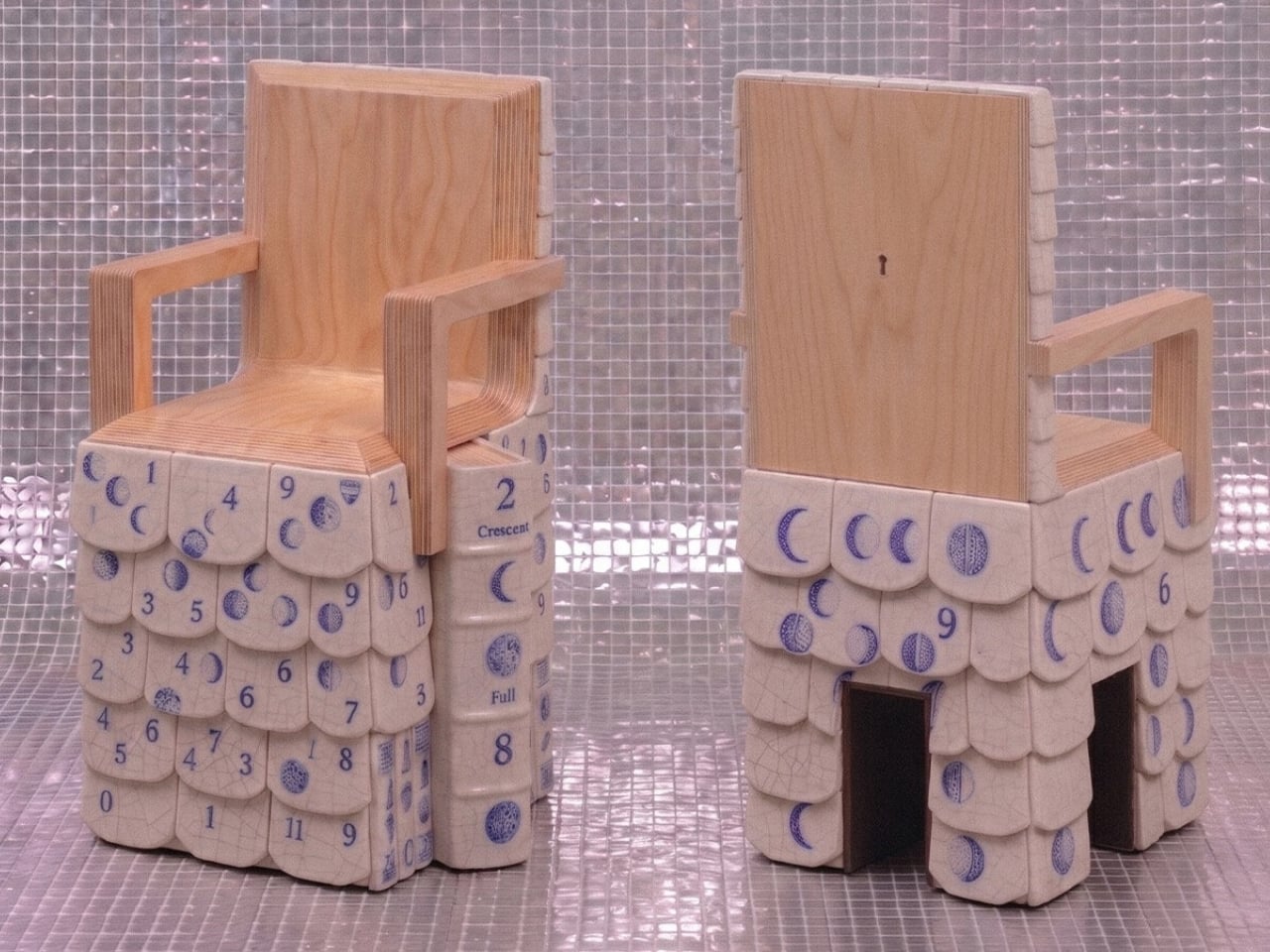
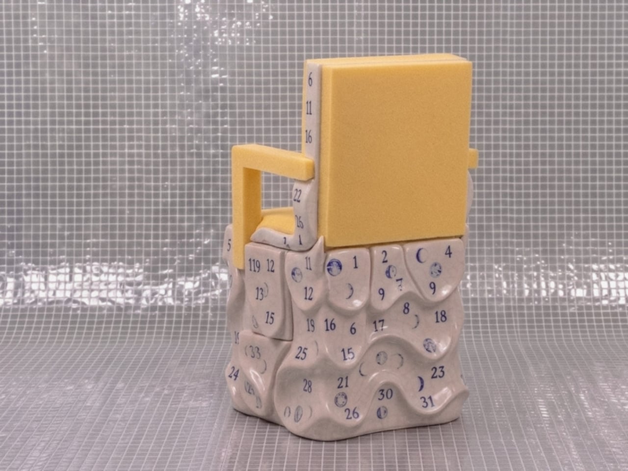
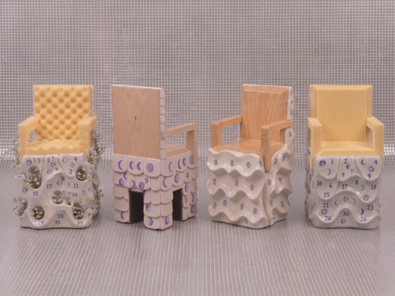
Each chair is essentially two objects in a standoff. The bases are hand-sculpted ceramic glazed in a crackled off-white, decorated with small blue motifs that range from heraldic figures and crests to lunar phase calendars marked with numbers from one to thirty. Depending on which chair you’re looking at, the surface texture shifts too. Some bases have a wavy, rippled undulation. Others are pocked with circular voids, perforations from which actual small flowers grow, as if nature has decided to quietly move in through whatever gaps the city left open.
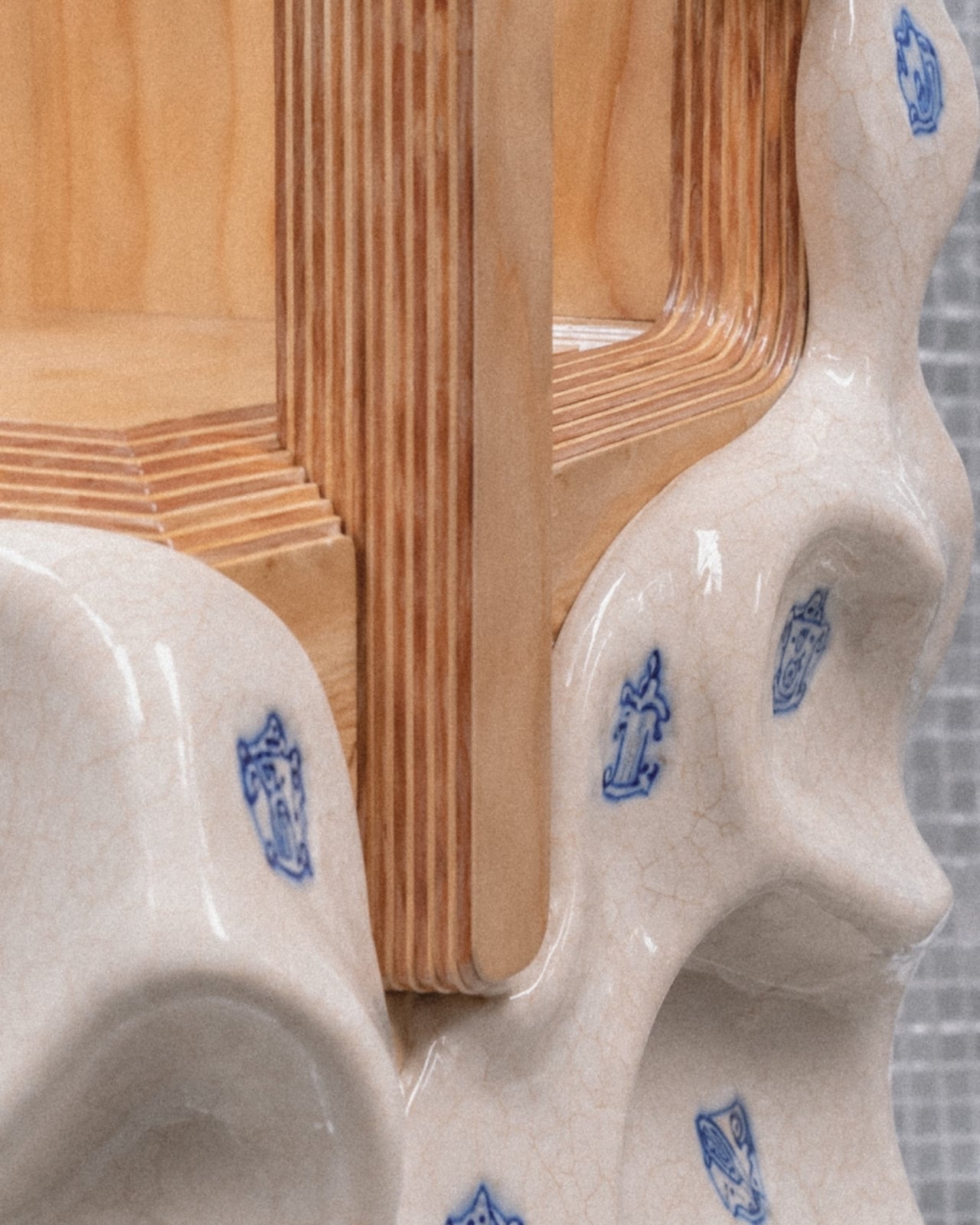
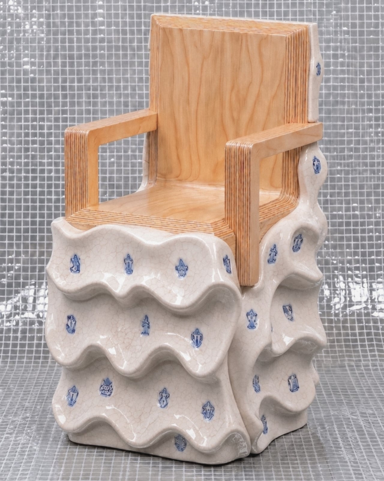
The upper chair structures sit on top of these organic, softened bases like they arrived from a different address entirely. The plywood versions are laminated and layered, their cut edges revealing the strata of material inside like a cross-section of something ancient, while the foam versions have a raw, utilitarian quality that reads somewhere between construction material and domestic comfort. Both feel deliberately unfinished in a way that is not careless but considered. Malagò is clearly not interested in making the perfect chair. He is interested in making a chair that has something to say about what living in New York actually costs you, in time, in money, and in compromises.
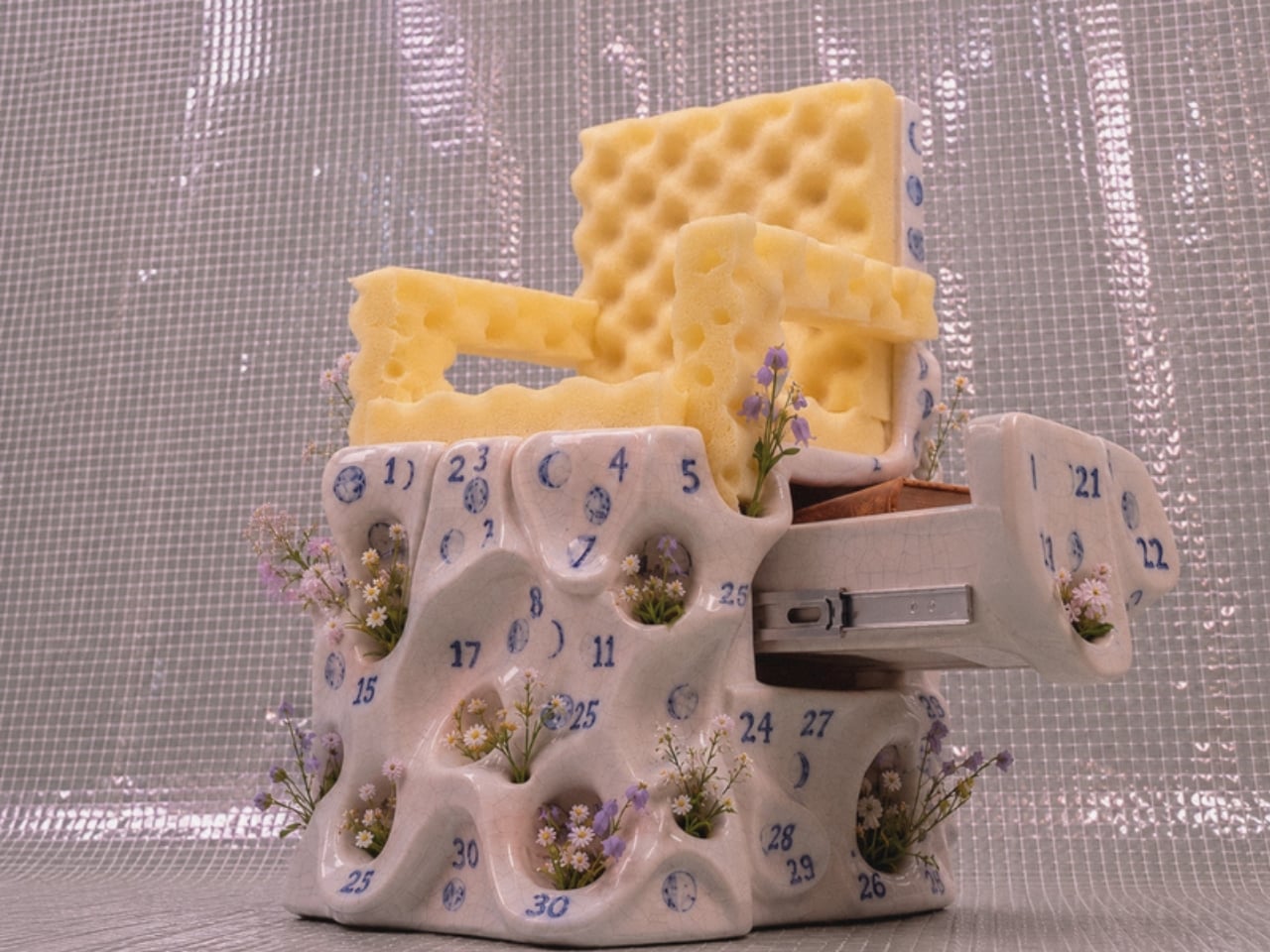
The storage element is where it gets genuinely clever. Pull open a drawer concealed within the ceramic base and you find a sliding metal mechanism holding books. The idea that a chair can house your library inside its own body, that seating and storage are so compressed in a small New York apartment that they must physically merge, is either a practical solution or a quiet diagnosis of how little room the city actually allows. I’d argue it’s both.
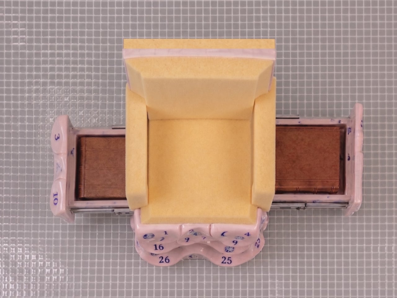
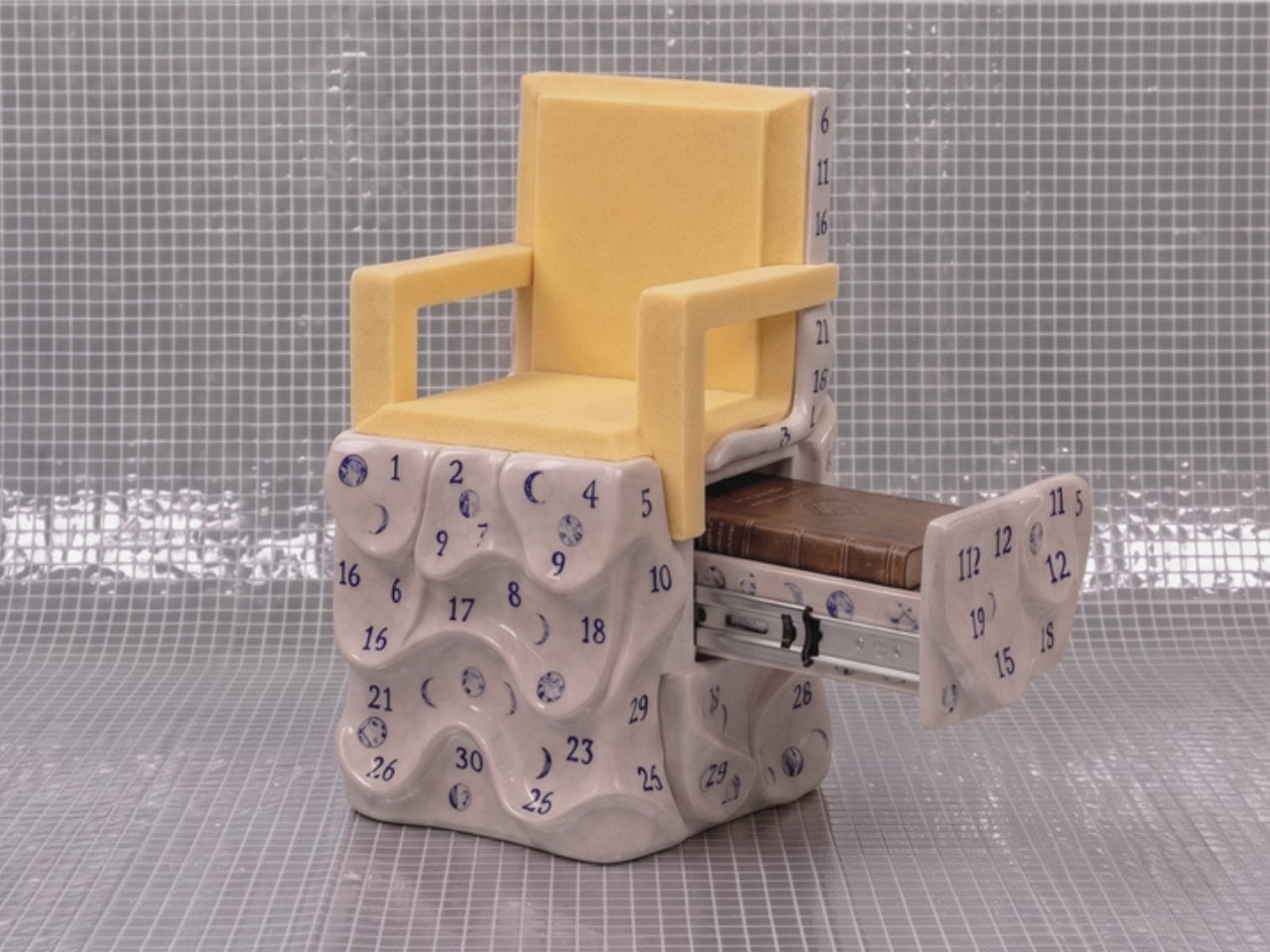
The lunar calendars printed across the ceramic surfaces in blue add another layer. Numbers arranged around moon phases suggest cycles, passing time, the rhythm of days that accumulate in a place where rent comes due whether you’re thriving or barely holding on. These aren’t decorative flourishes. They’re documentation. Malagò treats the surfaces of these chairs the way someone might treat the margins of a notebook, filling them with information that only makes full sense once you step back and read the whole thing together.
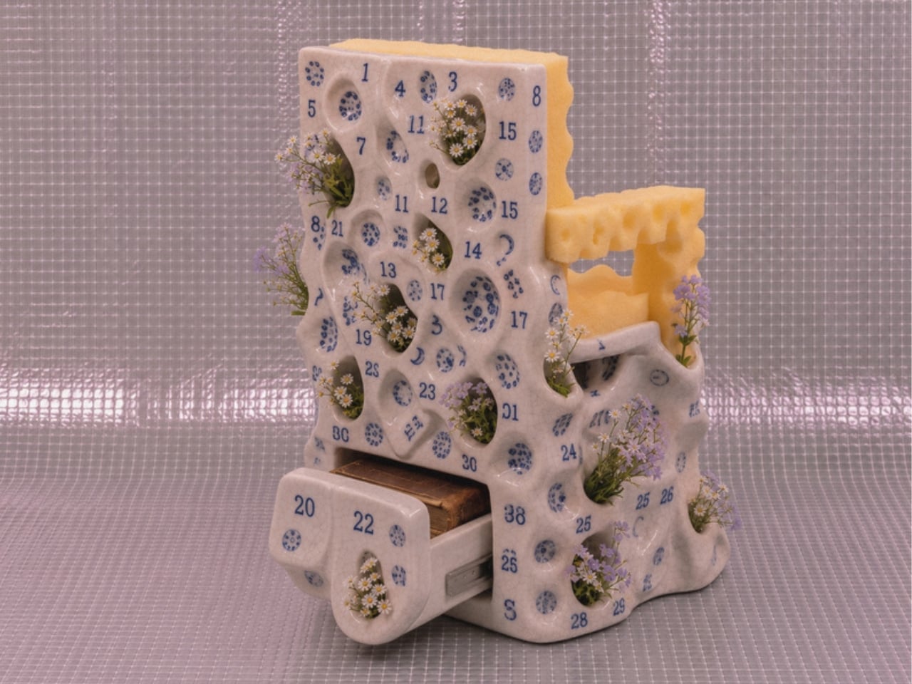
The material pairings are where the real honesty lives. Ceramic is permanent, archival, the kind of material you associate with objects meant to outlast the people who made them. Foam and plywood are impermanent, budget-conscious, the materials of first apartments and temporary solutions. Putting them together isn’t a design provocation for its own sake. It’s a portrait of how most people actually live, reaching for something lasting while working with whatever is available. The chair holds that tension without resolving it, which feels exactly right.
Design that tries to tell you something about city life usually does so at a comfortable, critical distance. These chairs plant themselves in the middle of it. They sit in a real apartment, used by a real person, and they carry the full weight of that reality in every surface.
The post A Chair With a Drawer, a Calendar, and a Point of View first appeared on Yanko Design.

Someone Built a Clock With 60 Water Pumps and Zero Regrets

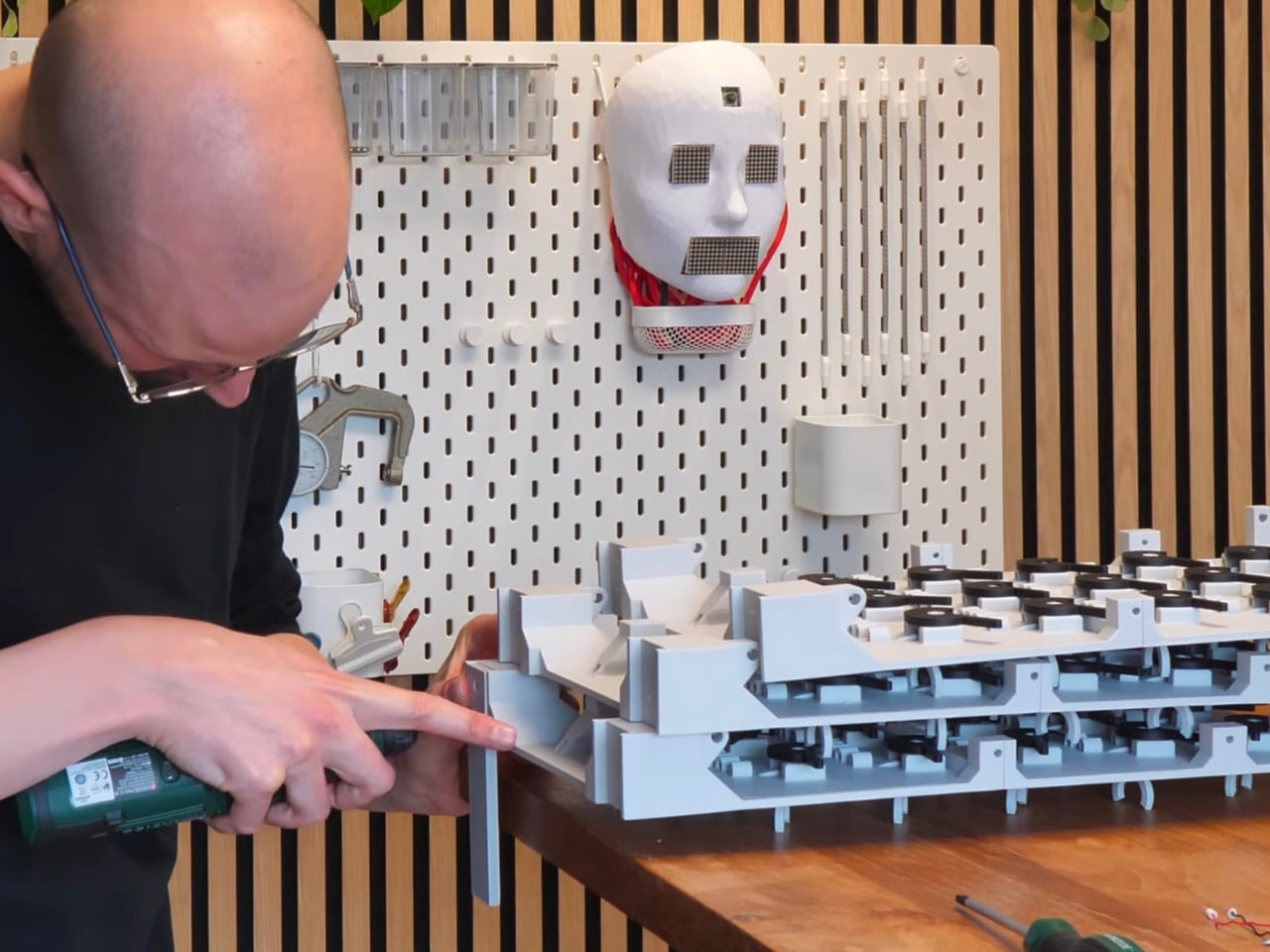
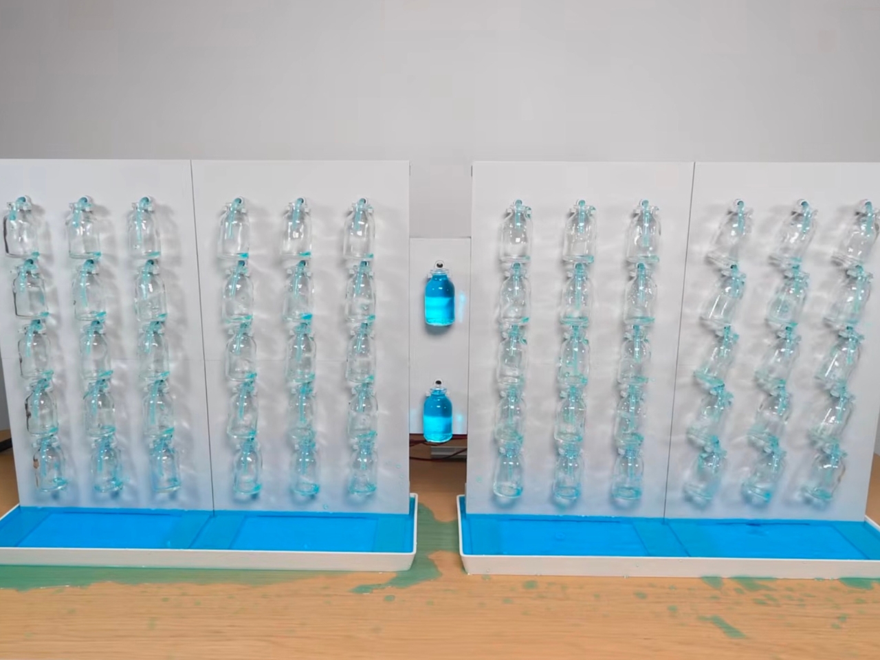
When I first saw the Water Tower Clock by Strange Inventions, I genuinely had to watch it twice. Not because I didn’t understand it, but because I couldn’t quite believe that someone looked at a pile of 10-cent glass bottles and thought: yes, this is how I’m going to display the time.

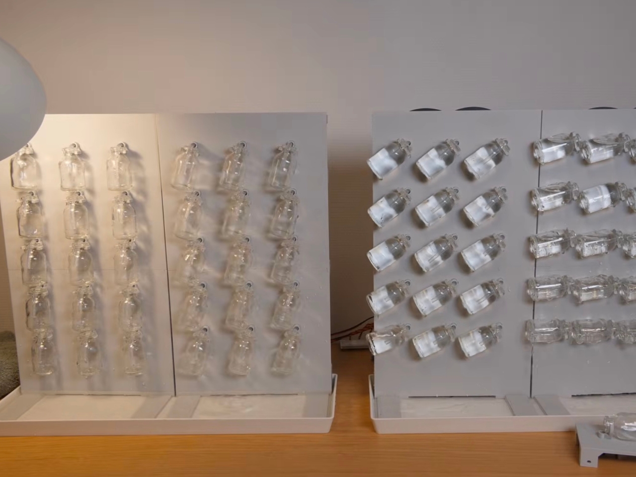
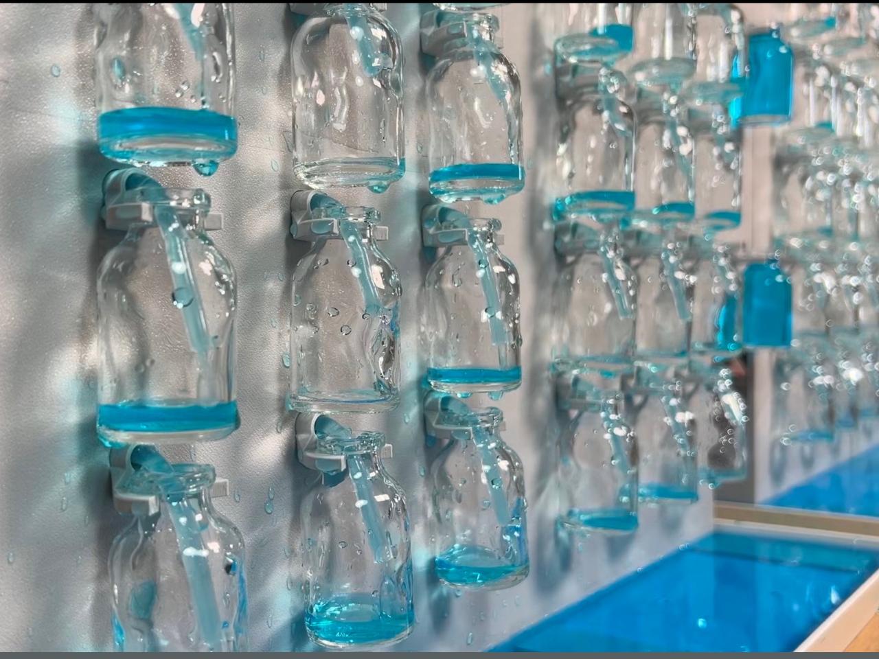
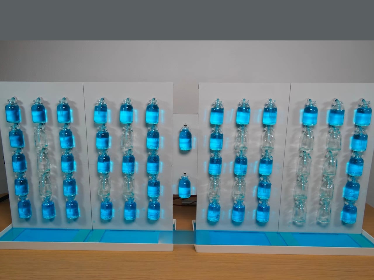
The concept is deceptively simple. Each digit on the clock is made up of a fifteen-segment display, except instead of LEDs, each segment is a small glass bottle. When a bottle is filled with dyed water, the segment is active. Empty it, and it disappears. Put enough bottles together in the right configuration and you get numbers. Numbers that tell you it’s 4:37 in the afternoon, rendered entirely in colored water. It’s the kind of idea that sounds ridiculous until you see it running, and then it seems almost obvious.

Designer: Strange Inventions

I love this for a lot of reasons, but the biggest one is that Strange Inventions didn’t try to make something efficient. He made something worth looking at. That’s a design philosophy I respect more than I can easily put into words. There’s an entire industry dedicated to optimizing displays, making them thinner, brighter, more power-efficient. And then someone comes along and asks, what if we pumped water into tiny bottles instead? And somehow, it works.

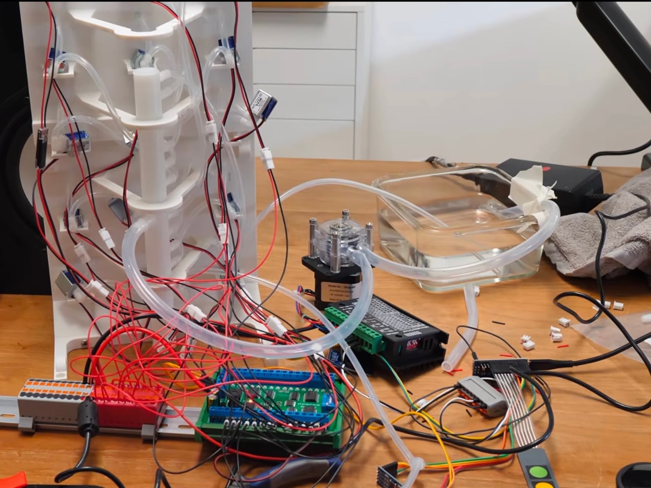
Behind the scenes, the build is genuinely complex. The clock uses 60 pumps in total, a stepper-driven peristaltic pump paired with membrane-pump boosters, to route dyed water into the precise bottles needed for each digit. The water isn’t doing any actual timekeeping here. It’s purely the display medium. The electronics handle the time; the water handles the theater.

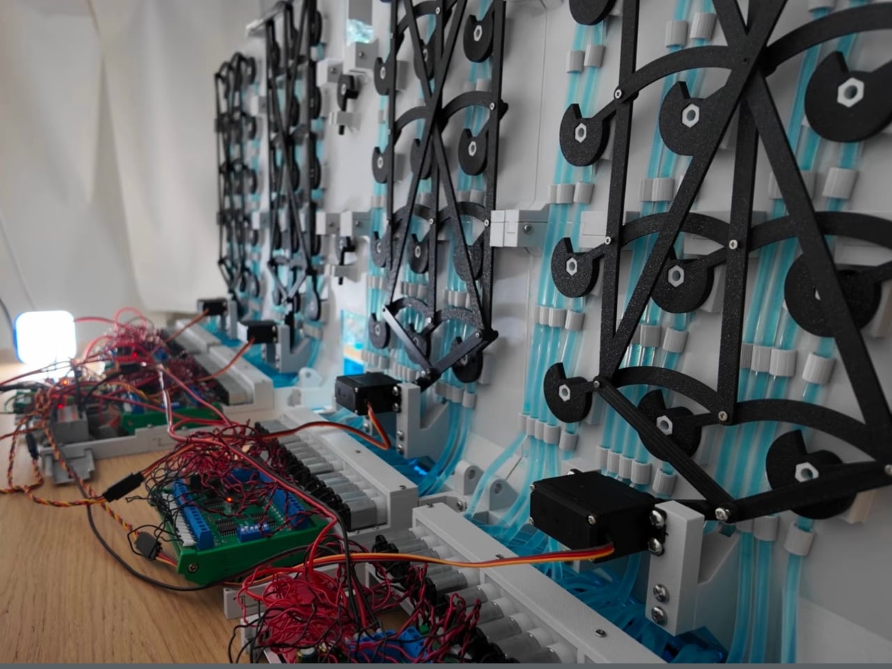
The mechanism for emptying the bottles is particularly clever. Rather than individually draining each one with a separate pump, Strange Inventions engineered a servo-driven linkage that flips all nine bottles in a single digit at once. It’s one motion, one satisfying dump, and the digit resets. Getting that 3D-printed mechanism to work took significant troubleshooting, but watching the finished result operate, you’d never guess it was anything other than effortless.

The tiny bottles, by the way, were found in a random shop for 10 cents apiece. Sounds affordable, right? Until you scale it up to a full clock and the total project cost lands somewhere around $580. That gap between cheap materials and expensive obsession is actually one of my favorite things about independent makers. The individual components are humble. The vision is not.

Visually, the Water Tower Clock sits in a category I struggle to name. It’s not exactly art, though it absolutely qualifies. It’s not just a gadget, though it functions as one. It has the patience of a kinetic sculpture and the practicality of something that actually tells you what time it is. The dyed water catching the light, the slow fill of each segment, the deliberate dump when a digit changes: all of it has a rhythm that most digital objects simply don’t have.

I think what makes projects like this matter to the broader design conversation is that they challenge our assumptions about what a display should look like. We’ve become so accustomed to LEDs and screens that we’ve stopped asking whether there might be a more interesting material to work with. Strange Inventions answered that question with dyed water and glass bottles from a random shop, and the result is one of the more memorable pieces of functional design I’ve come across this year.

It’s also, for what it’s worth, completely impractical in the best possible way. The water will need maintenance, the pumps add complexity, and the whole thing would be thoroughly confused by a power outage. None of that matters. The point isn’t that this is the future of clock displays. The point is that it makes you feel something when you look at it, which is more than most technology ever manages to do. Strange Inventions earns the name.

The post Someone Built a Clock With 60 Water Pumps and Zero Regrets first appeared on Yanko Design.
VIBRYX Is the Furniture Collection That Treats Sound as a Material

I’ve looked at a lot of furniture collections over the years. Most of them ask the same question: how do you make a sofa or a coffee table feel special? Trueba Studio, the Madrid-based architecture and design firm founded by Marcos Trueba, decided to ask a completely different one: what if sound itself was a material you could actually build with?

VIBRYX, the studio’s latest furniture drop, is the answer. And it’s one of those releases that makes you stop scrolling and actually look. The name alone is doing a lot of work before you even see the pieces. Trueba Studio built it from vibr- for vibration, the physical origin of sound, and the letter X as a symbol of crossover: design meeting sound meeting the future of how we live at home. It reads like a new periodic element, or the codename for something that doesn’t exist yet but probably should. Precise. Energetic. Engineered. For a collection that treats vibration as a design material rather than an afterthought, the name earns its keep.

Designer: Trueba Studio

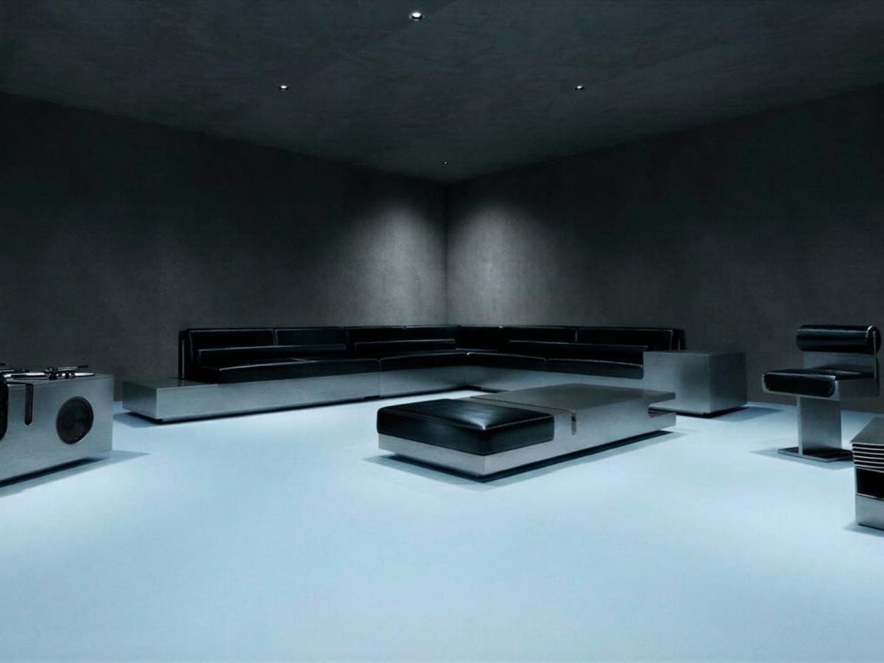
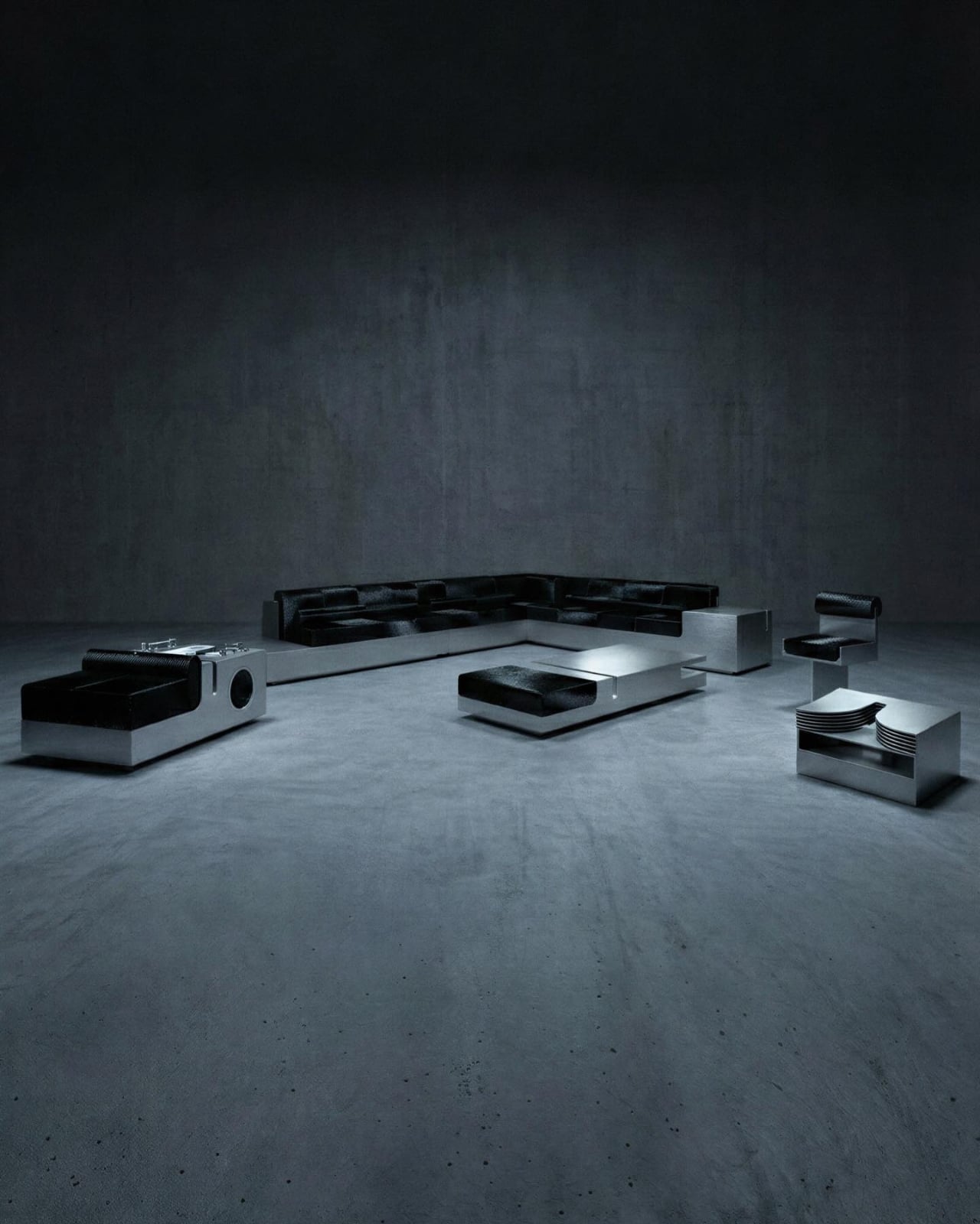
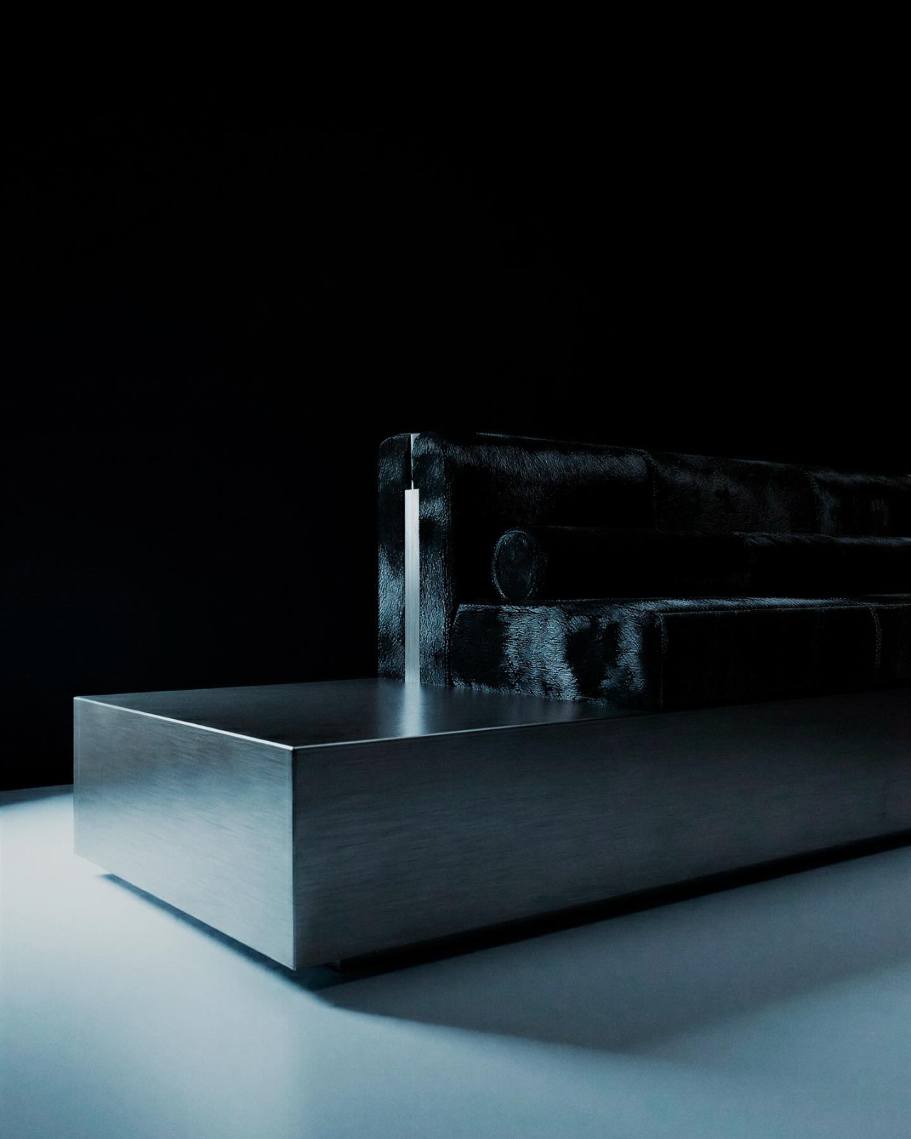
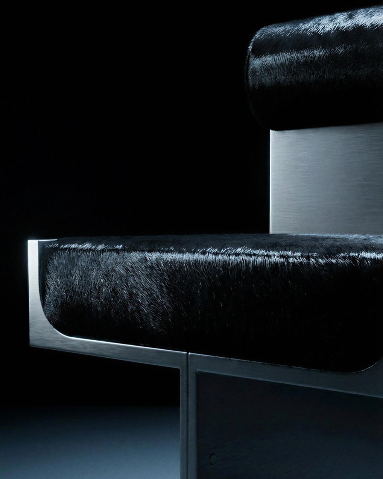
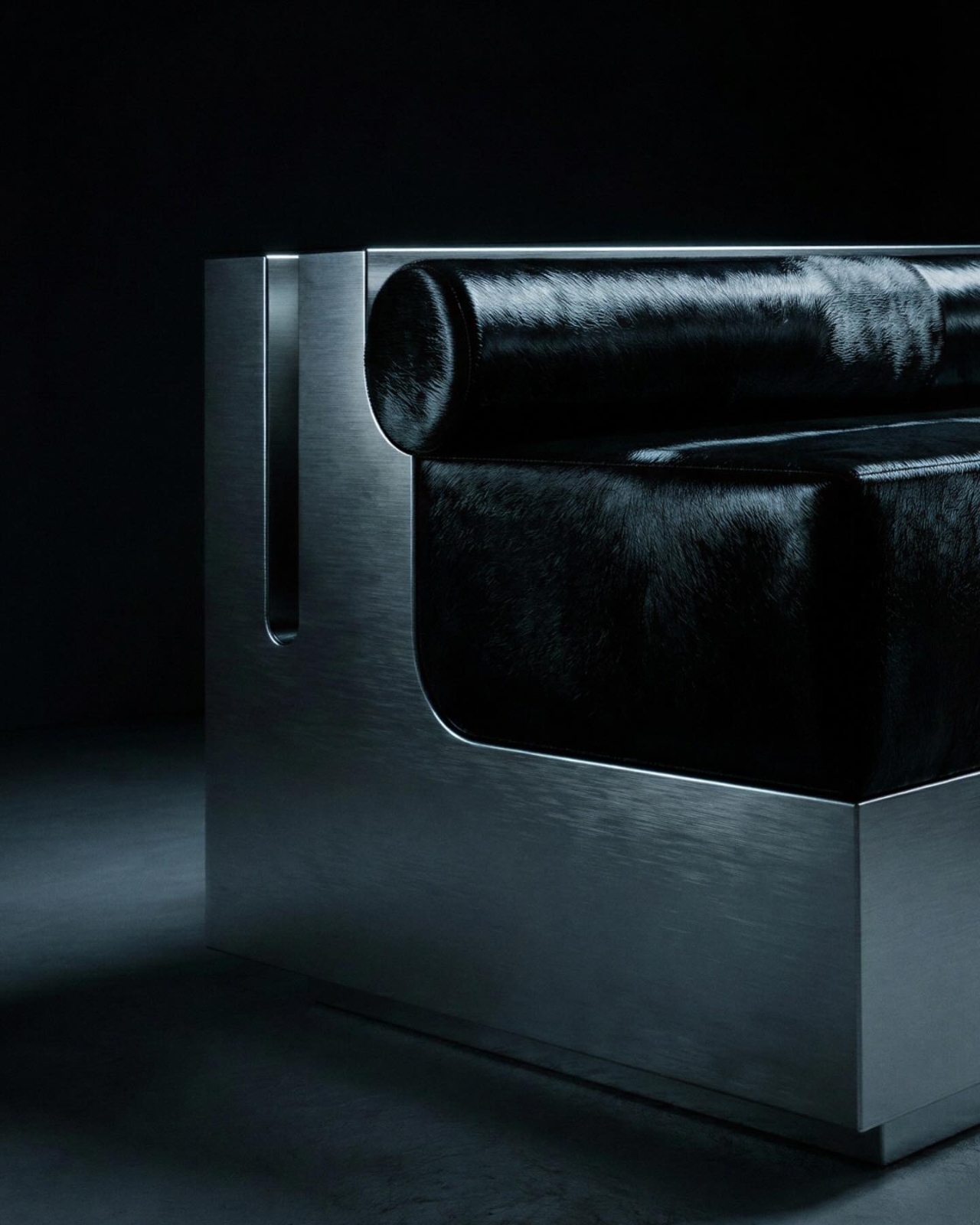
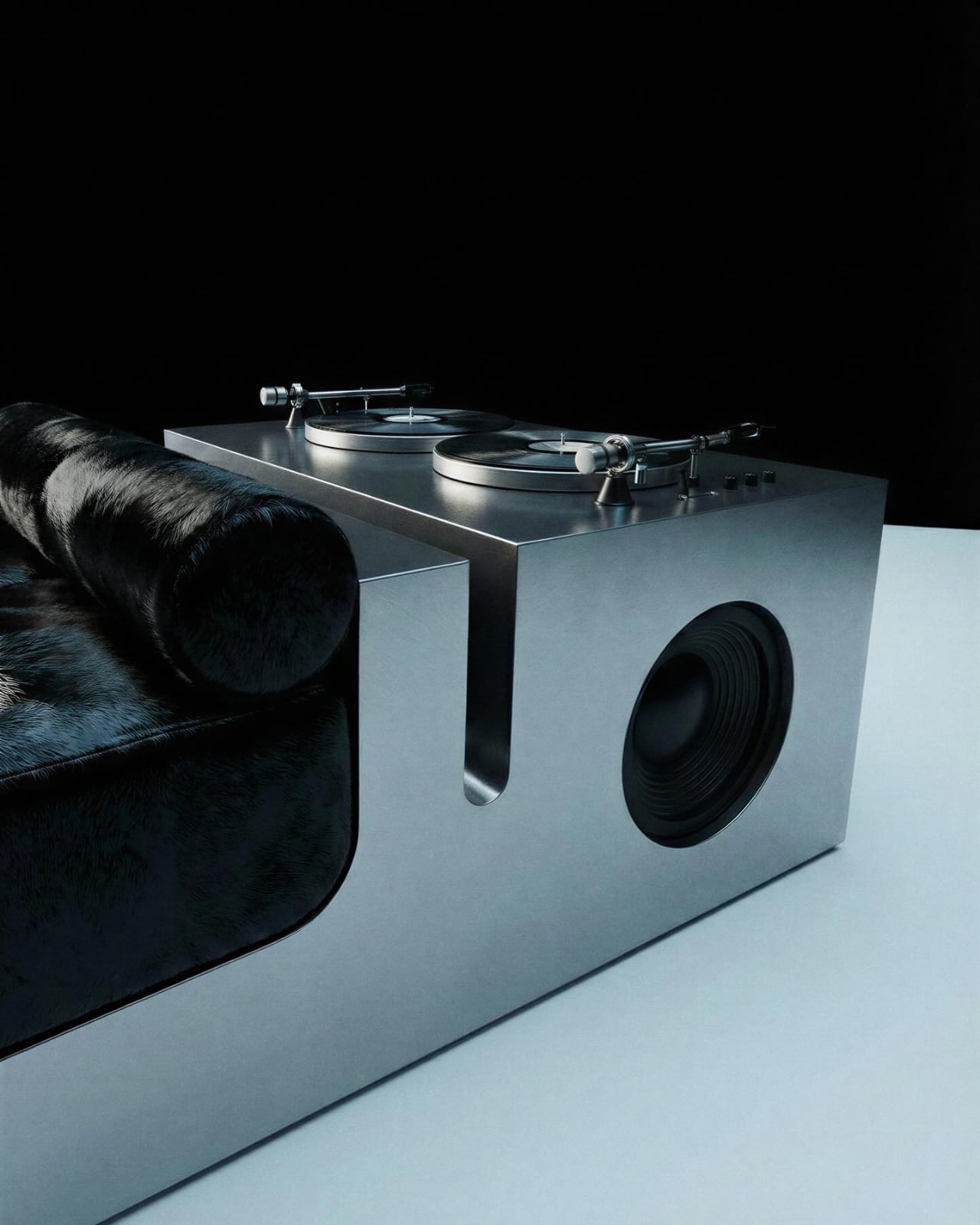
What the photographs reveal is a room that feels more like a score than a showroom. The collection spans sofas, seating, and tables, all rendered in brushed stainless steel with upholstery in deep black hair-on hide. The contrast is deliberate and sharp: the warmth and texture of the hide set against the cold, architectural precision of the metal. One sofa sits low to the floor with a stainless steel base that doubles as a speaker housing, a woofer set flush into the body as if it always belonged there. On top, a turntable rests in its own integrated cradle. The whole piece looks less like a living room setup and more like an instrument you happen to be able to sit on.

That is, I think, entirely the point. Trueba Studio isn’t positioning VIBRYX as “speaker furniture,” a phrase that tends to conjure images of branded Bluetooth boxes dressed up with upholstery. The language they use is more interesting than that. The collection is described as furniture with a sound presence, one that holds the room visually and activates it emotionally. It’s a quiet but confident distinction. The difference between a room that plays music and a room that is musical.

The aesthetic speaks to a very specific kind of person, and I mean that as a compliment. Someone who owns vinyl but also cares deeply about the chair they listen to it in. Someone whose living room is a curated environment, not just a set of furniture. The VIBRYX world is dark, focused, and deliberately stripped of decoration for decoration’s sake. There are no ornamental details here, no flourishes that don’t earn their place. The geometry is clean and the edges are softened just enough to keep the pieces from feeling cold. It walks a careful line between industrial and intimate, and it mostly lands on the right side of it.

Madrid has been producing some quietly compelling design work in recent years, and Trueba Studio is consistently one of the studios worth paying attention to. Their previous collectible pieces, including the Pol Ann sofa and the PL4 chair series, showed a consistent aesthetic vocabulary: architectural framing, considered proportions, materials chosen for character rather than trend. VIBRYX extends that vocabulary into new territory. It asks what happens when the room itself becomes the speaker, when the furniture isn’t staging a performance but is the performance.

My honest take? The collection is ambitious in the best way, and the execution looks like it matches the concept. Whether it translates into something that actually sounds as good as it looks is a question only a listening session could answer. But as a design statement, as a proposition about how we might live with music rather than just near it, VIBRYX makes a compelling case. Not every furniture collection needs to have something to say. This one does.

The post VIBRYX Is the Furniture Collection That Treats Sound as a Material first appeared on Yanko Design.
Objects With Opinions: Ronen Kadushin’s Pieces

There are designers who make beautiful things, and then there are designers who make things that make you think. Ronen Kadushin belongs firmly in the second camp, and his latest collection, Pieces, is proof that a home accessory can be both genuinely useful and quietly subversive.

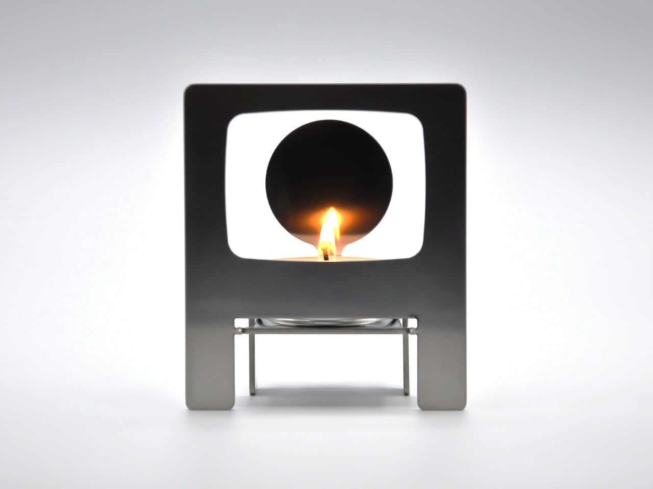
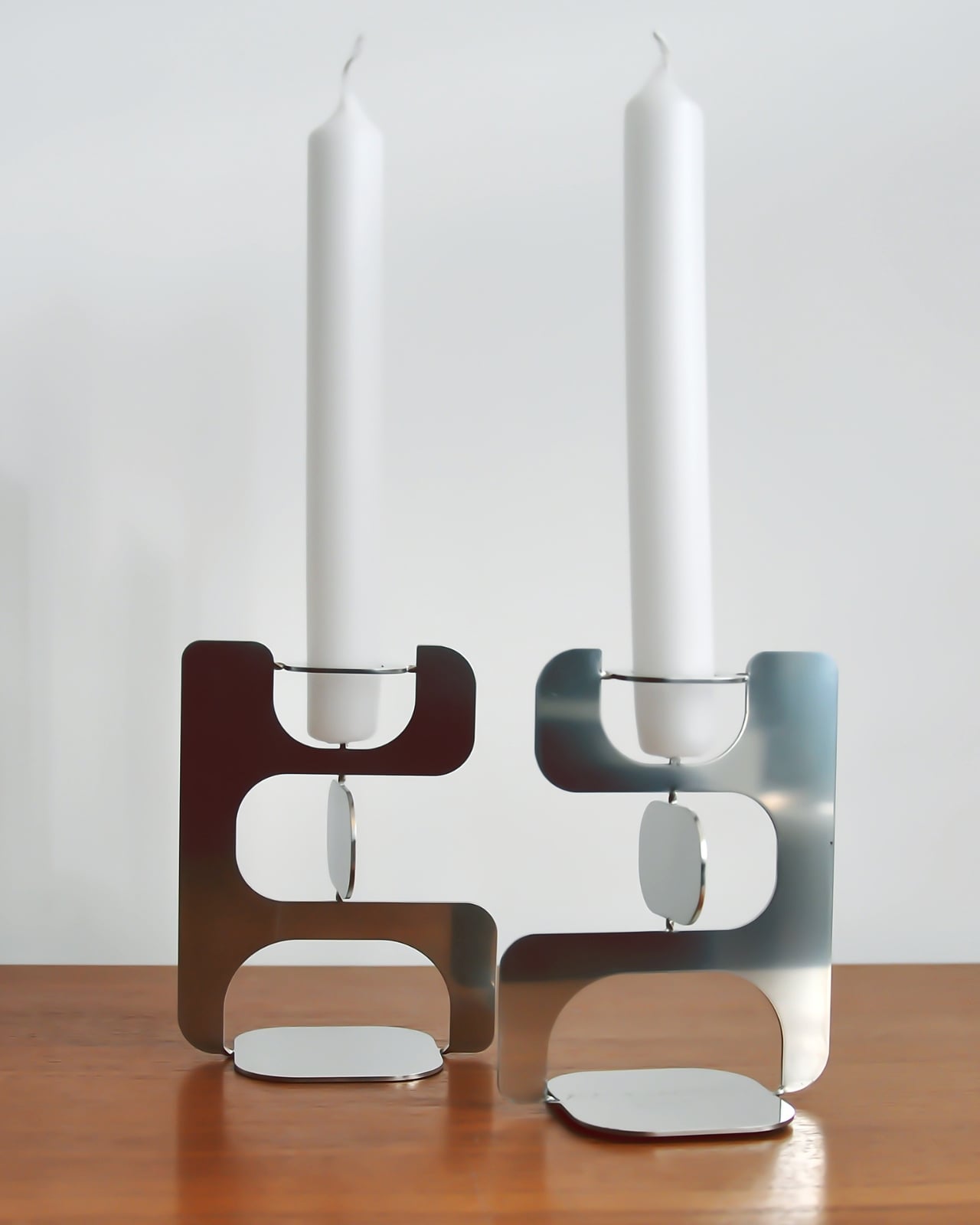
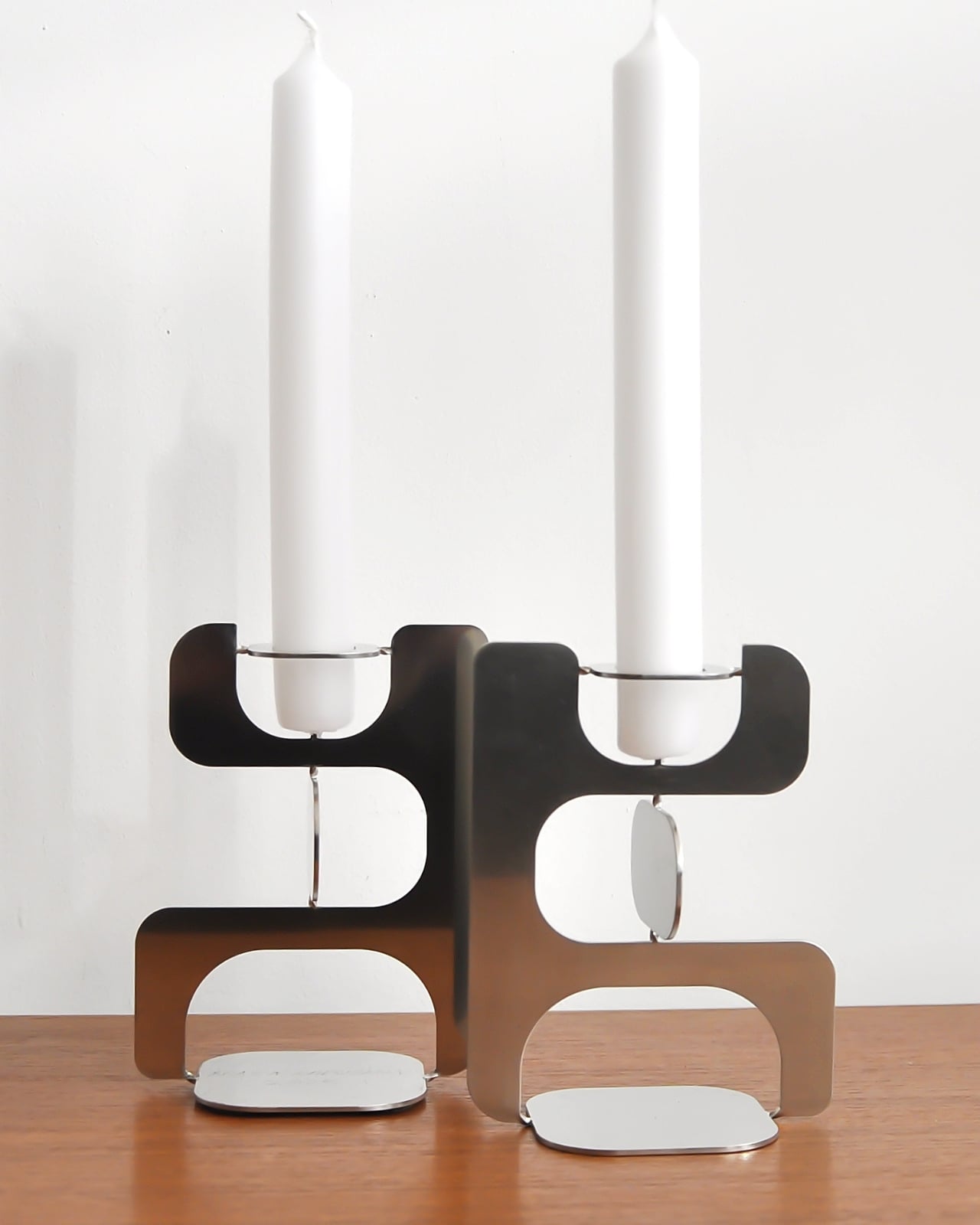
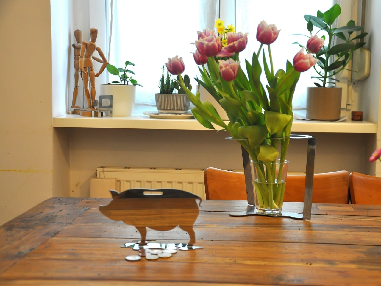
The collection consists of three objects: a candle holder called Echoes, a tealight holder called Reality TV, and a Piggybank. On paper, that sounds like a fairly ordinary lineup for a home accessories range. In practice, it’s anything but. The Pieces collection is an elegantly formed, humorously thought-provoking group of home accessories that highlight the tension between function and cultural narrative.

Designer: Ronen Kadushin

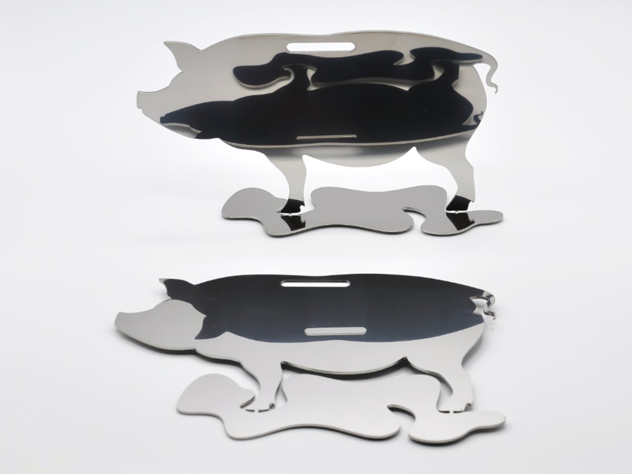
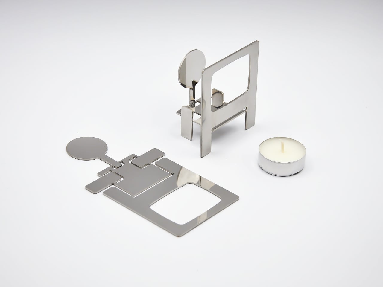
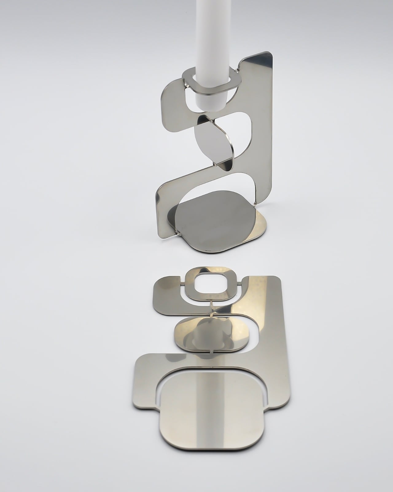
Each piece starts life as a flat sheet of laser-cut stainless steel, executed with Kadushin’s signature Twist-Hinge detail, making them easy and intuitive to bend by hand. They invite you to engage with the designs and co-create pieces that are an aesthetic statement with an edgy commentary. It’s a deliberate choice, not a shortcut. By asking you to participate in the assembly, Kadushin is making a point about who gets to be part of the creative process. You’re not just buying a finished object; you’re completing it.

That philosophy runs through everything he does. Kadushin is a pioneer of Open Design, freely sharing his designs to promote creativity, personal expression, and a positive social and economic impact. He embraces a “from the machine to the customer” approach, where extra manual processes and finishes are minimal, with pieces self-produced in Berlin in small-batch runs from high-grade stainless steel. There’s no bloated supply chain, no mass-market compromise. Just precision fabrication and a designer who has thought very carefully about what he wants his objects to communicate.

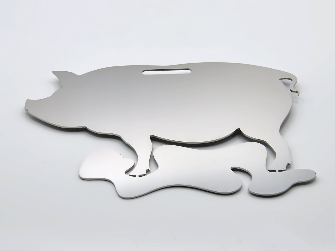
And communicate they do. The Piggybank is perhaps the most pointed piece in the collection. A traditional object redesigned to reflect a reality where saving is an illusion, it wears its cynicism openly. The pig is rendered as a flat stainless steel silhouette with a coin slot at the top, but there’s no belly to hold anything. Your coins rest on the surface. It’s funny, and it’s bleak, and it manages to be both of those things at once in the way that only good design pulls off. At a time when most people are watching their savings get swallowed by inflation, putting this on your shelf feels less like irony and more like cathartic honesty.

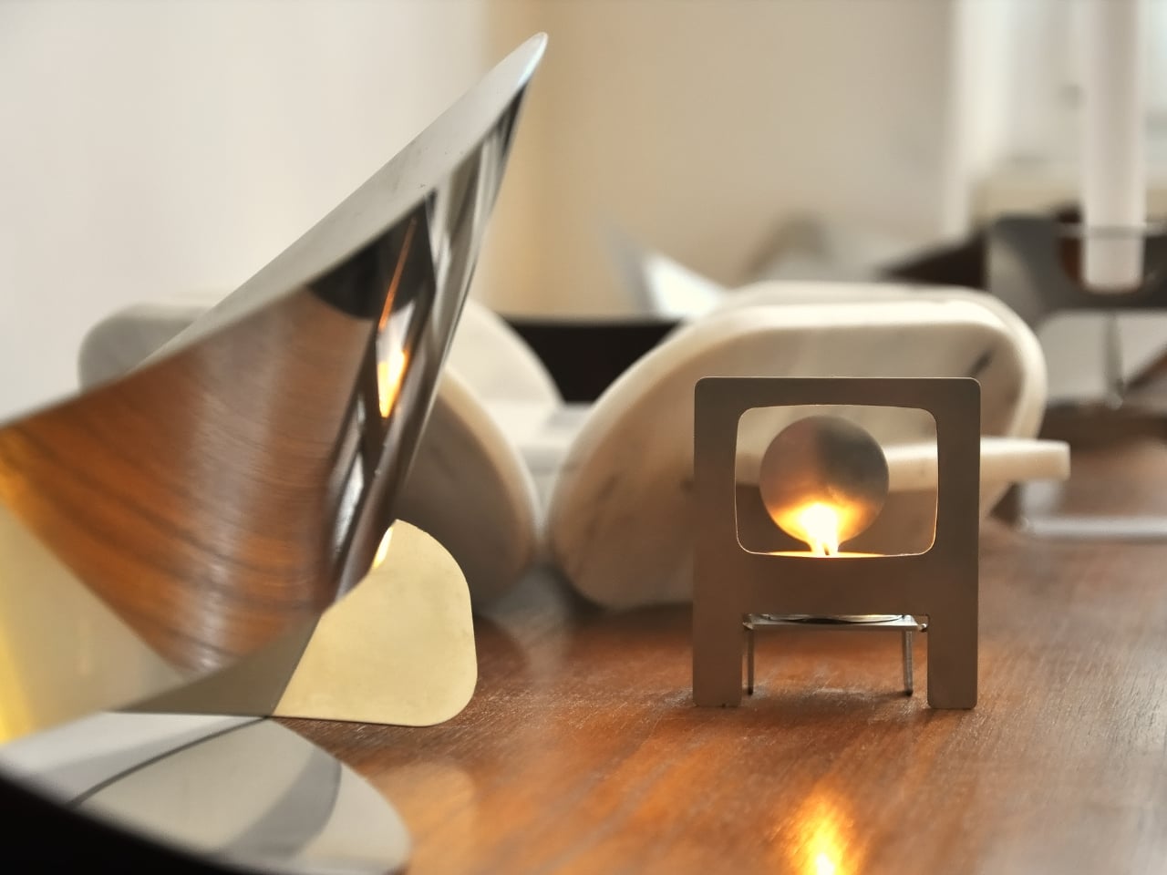
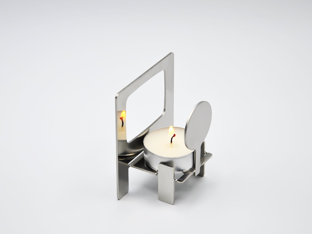
The Reality TV tealight holder takes a different angle. Shaped like a boxy, retro television set, it frames a tealight where the screen should be. When the flame is lit, you’ve got a broadcast. “Reflecting reality live, 24/7.” The concept is sharp without being heavy-handed. It makes you smirk, and then, a moment later, makes you think about the fact that we genuinely do stare at glowing rectangles all day as a form of comfort. Having a warm, flickering version of that sitting on your dinner table feels like Kadushin winking at us all.

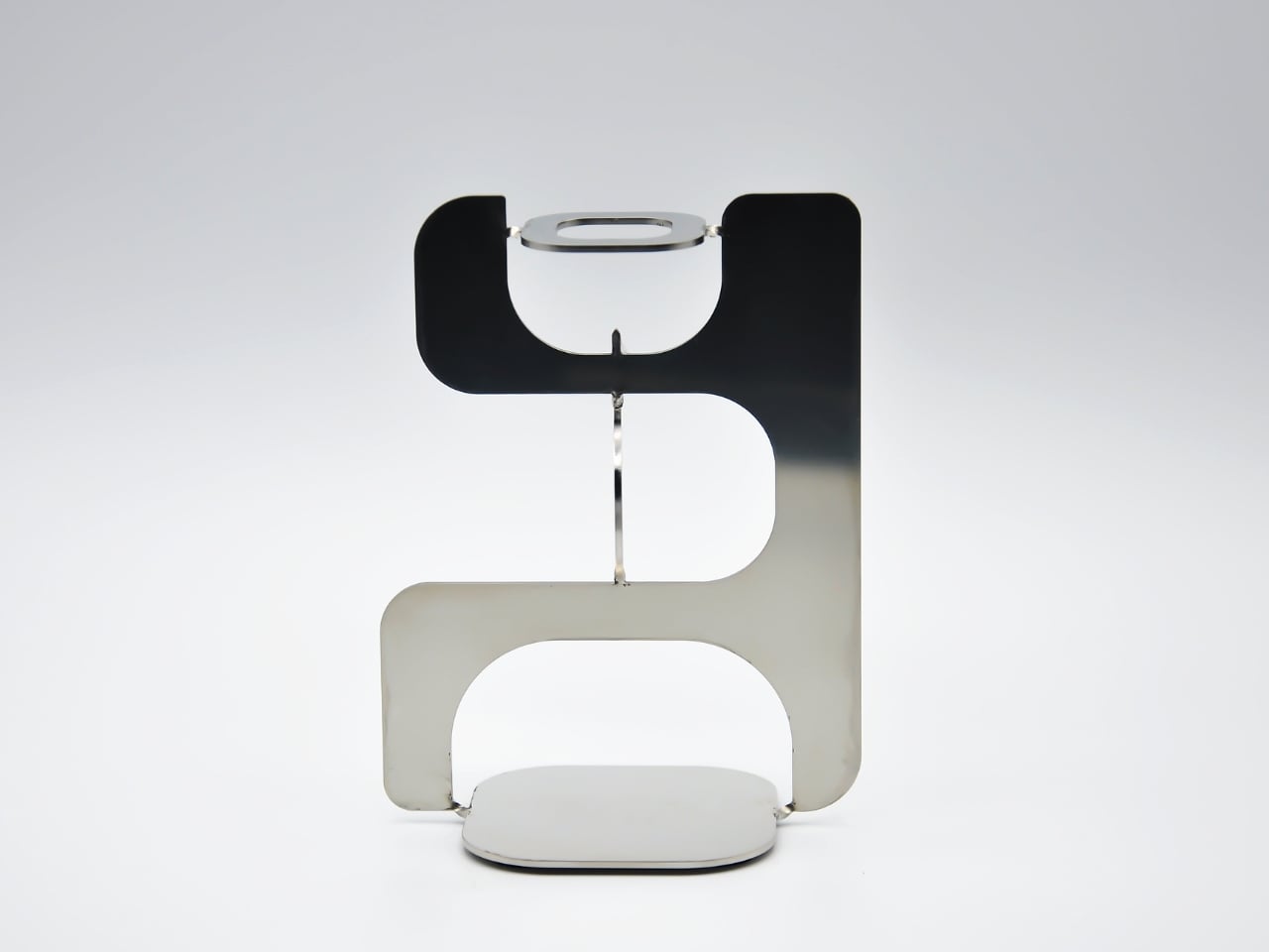
Echoes, the candle holder, is the most sculptural of the three. A nuanced sculptural object echoing iconic 60s and 70s aesthetics with a contemporary edge, it’s the kind of object that earns a second and third look. The stacked, interlocking forms feel almost architectural, like a detail pulled from a midcentury design catalogue and rebuilt in stainless steel. Placed on a shelf without a candle, it still looks like it belongs in a gallery. With one lit, it earns its keep.

What ties Pieces together is the refusal to be decorative for decoration’s sake. Kadushin’s work is sculptural and communicates clever wit and free expression, and he designs user-assembled pieces that are an invitation to enjoy and participate in the creative process. The objects are funny, but they’re not novelty items. They’re precise, considered, and built from high-grade stainless steel that will still look good long after the trend cycle has moved on.

If you’re the kind of person who thinks about what your home objects say about you, and more and more people are, then Pieces is a collection worth paying attention to. Good design doesn’t just fill space. At its best, it holds an opinion. Kadushin’s does both.

The post Objects With Opinions: Ronen Kadushin’s Pieces first appeared on Yanko Design.
Woven by Hand in the Philippines, Sold in Milan

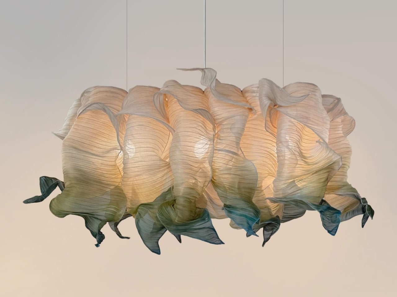
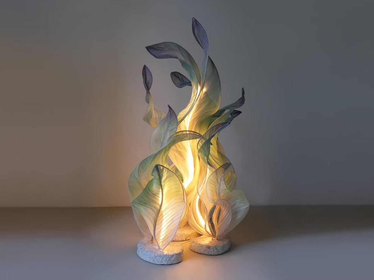
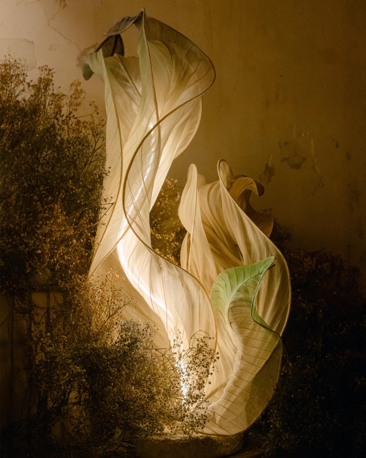
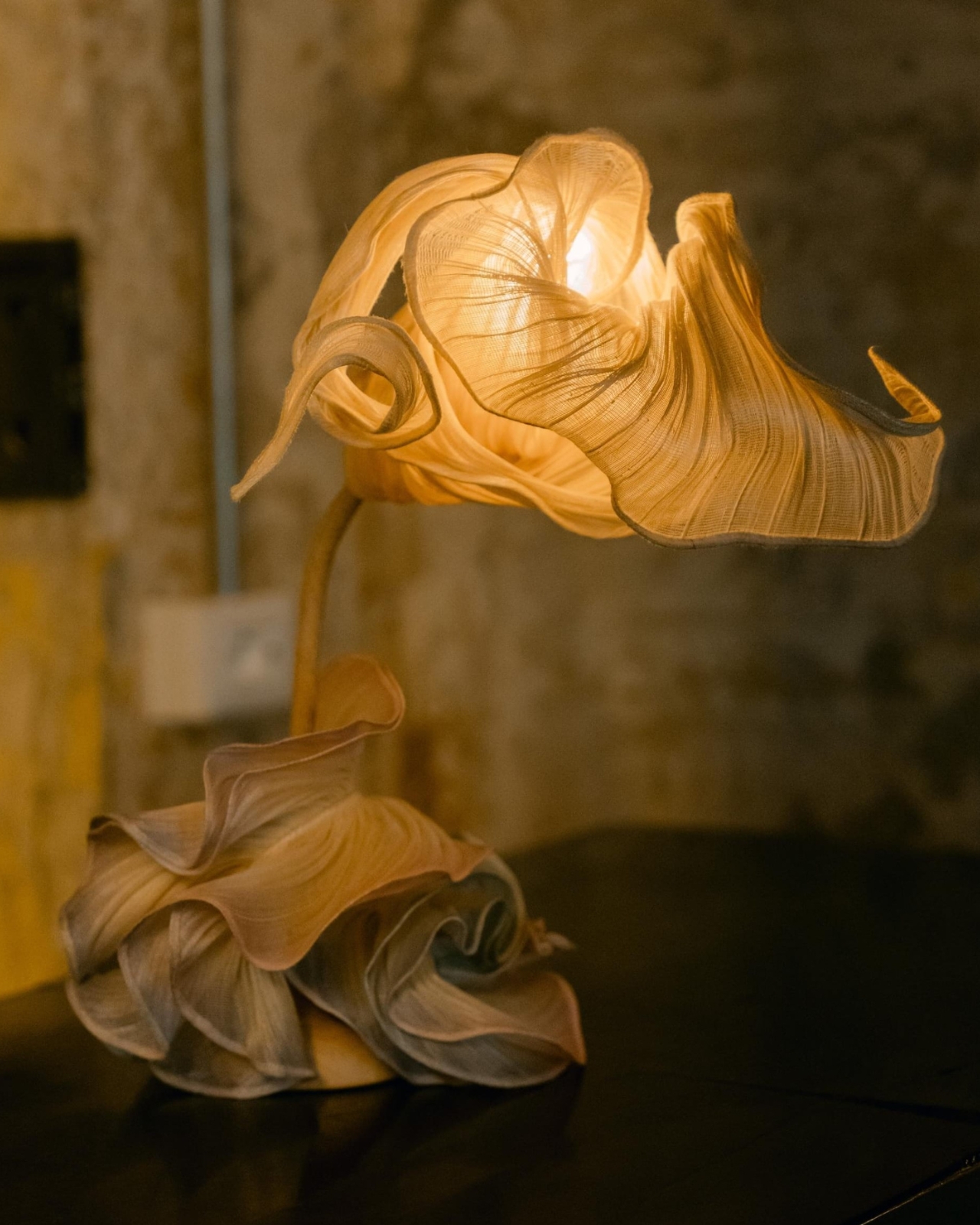
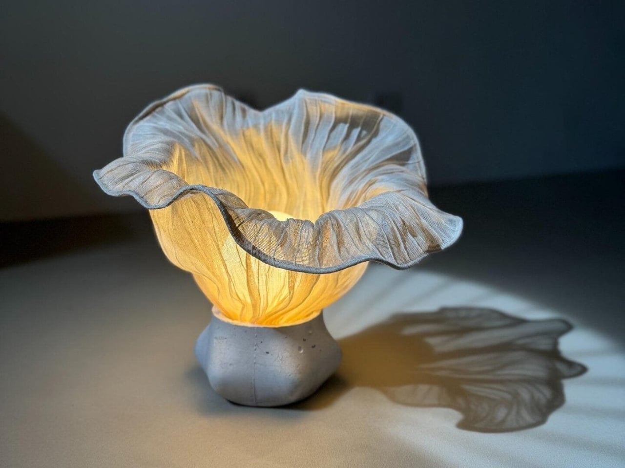
Most lamps just sit there. They do their job, emit their light, and fade into the background of a room. Mirei Monticelli’s lamps are the kind you keep looking at.

The Milan-based Filipina designer has built her practice around a single material: banaca, a woven textile made from the fibers of the banana-abaca plant, harvested by hand on the island of Catanduanes in the Bicol region of the Philippines. It’s not exactly the kind of material you’d expect to find at the center of a glossy Milanese design studio, and that’s exactly the point.

Designer: Mirei Monticelli

Monticelli studied at Politecnico di Milano, earning her Masters in Design and Engineering, but her roots have always pulled her back to the Philippines. Her mother, celebrated fashion designer Ditta Sandico, actually pioneered the banaca textile itself, a blend of banana and abaca fibers that is both remarkably durable and incredibly malleable. Working with renowned rattan designer Kenneth Cobonpue also shaped her early understanding of how natural, traditional materials can carry enormous aesthetic power. In 2019, she founded Studiomirei, and by the end of that same year, her Nebula lamp had already won the Salone Satellite Award at Milan Design Week.

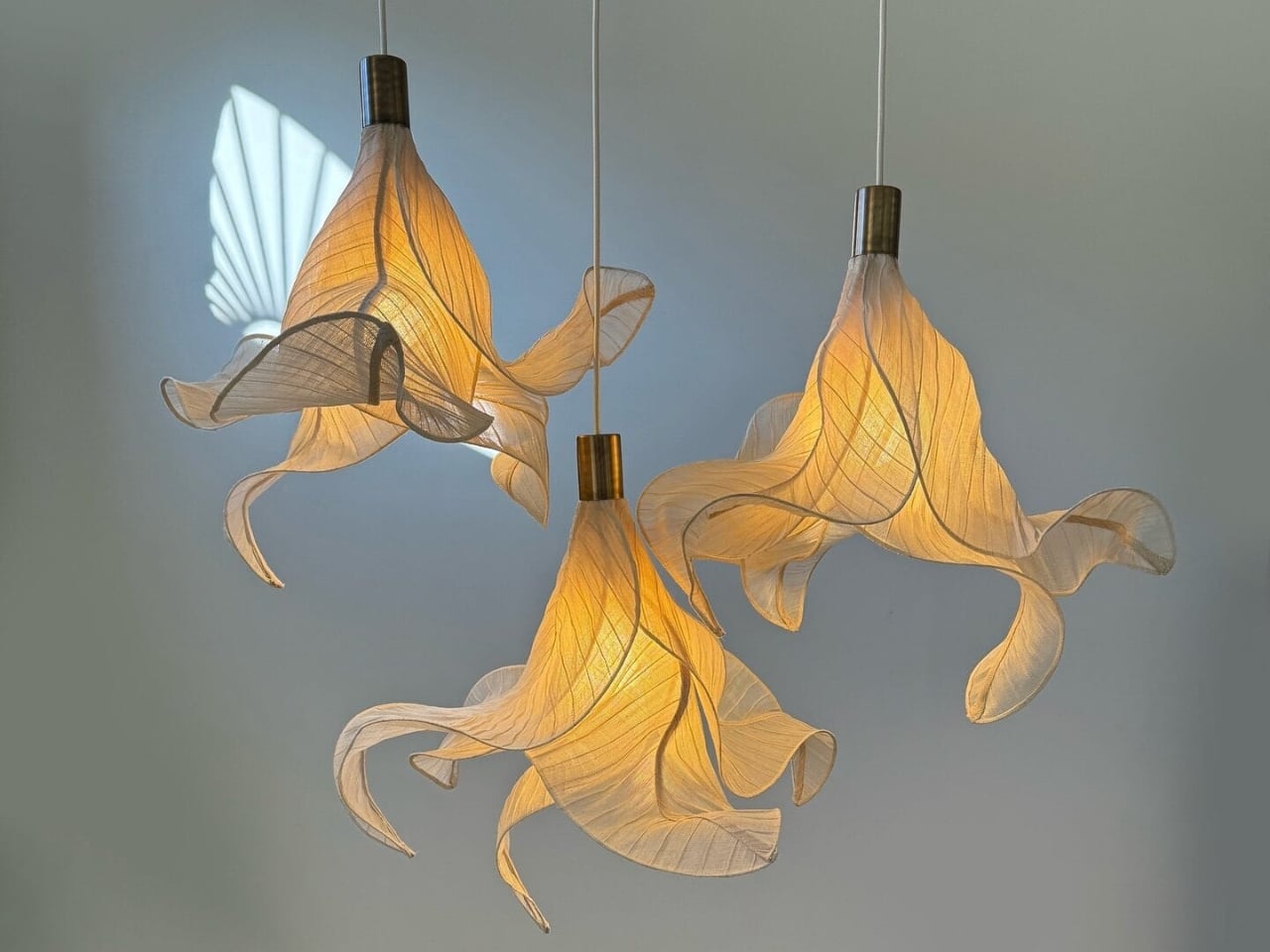
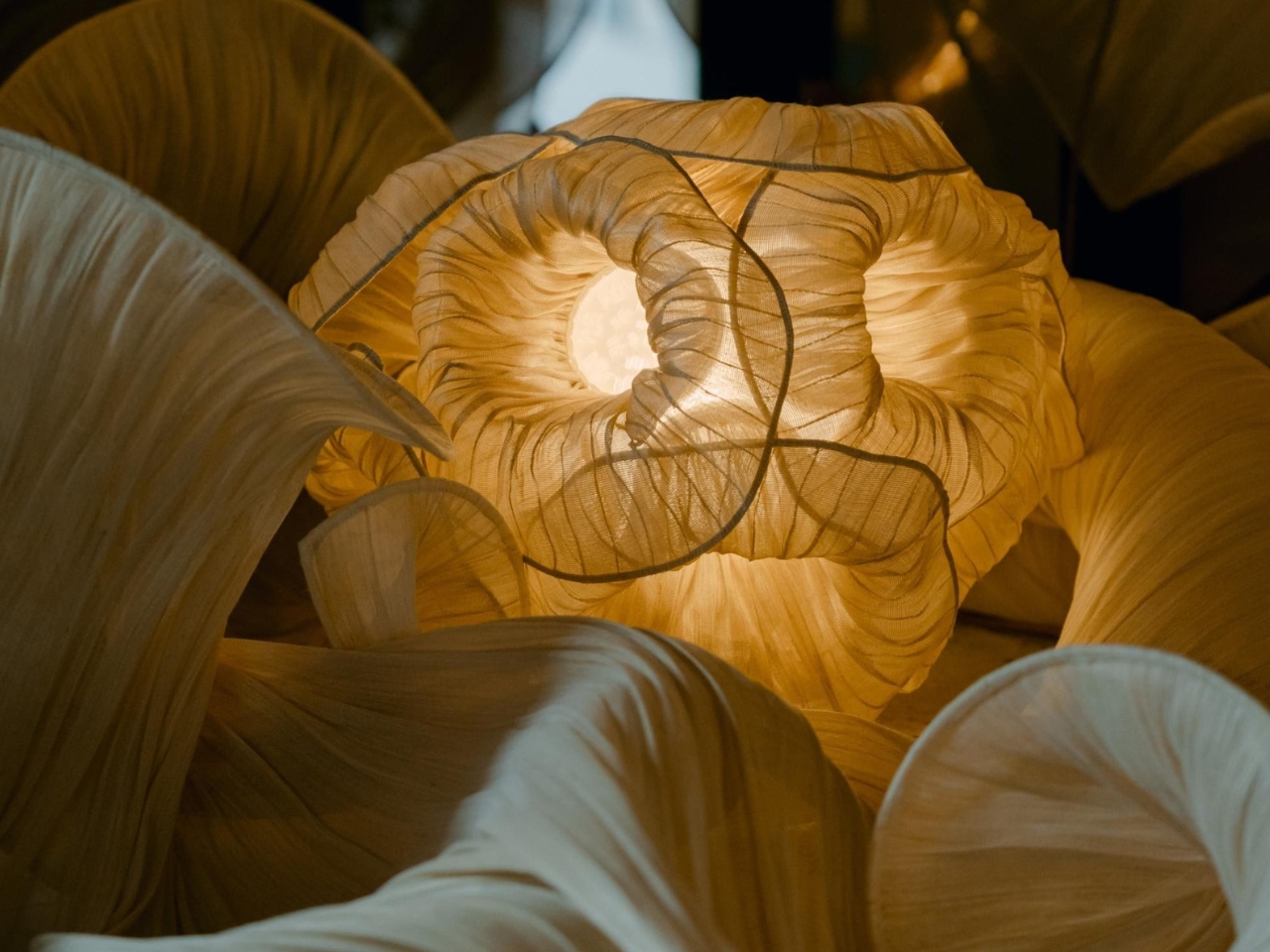
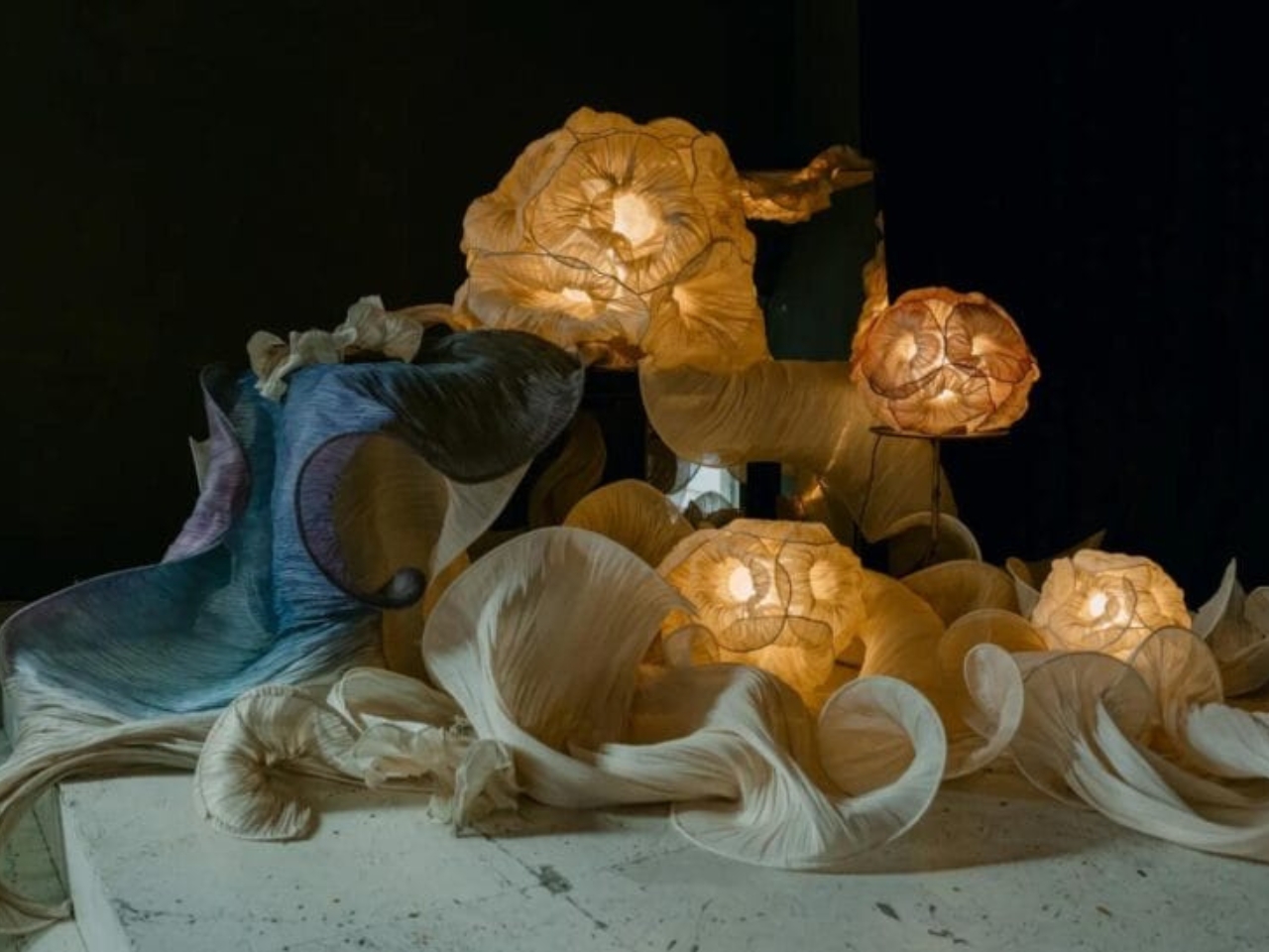
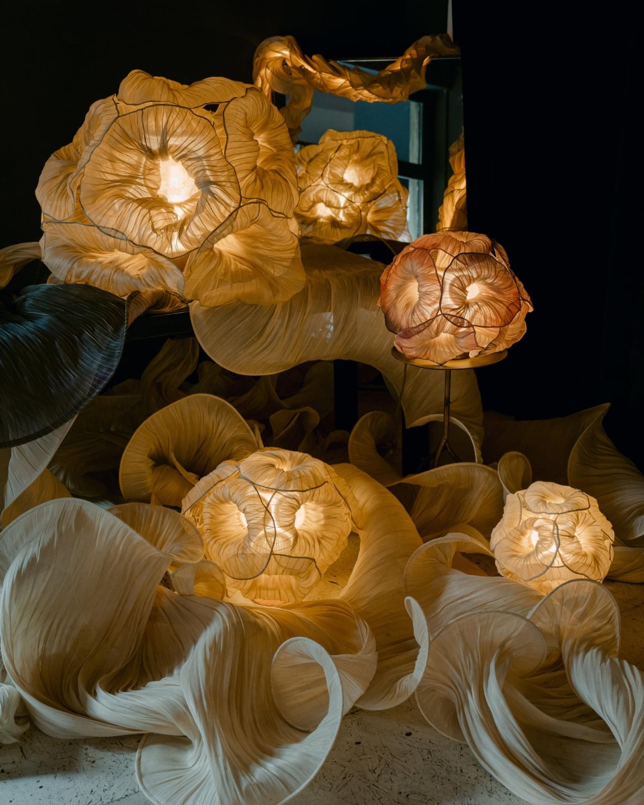
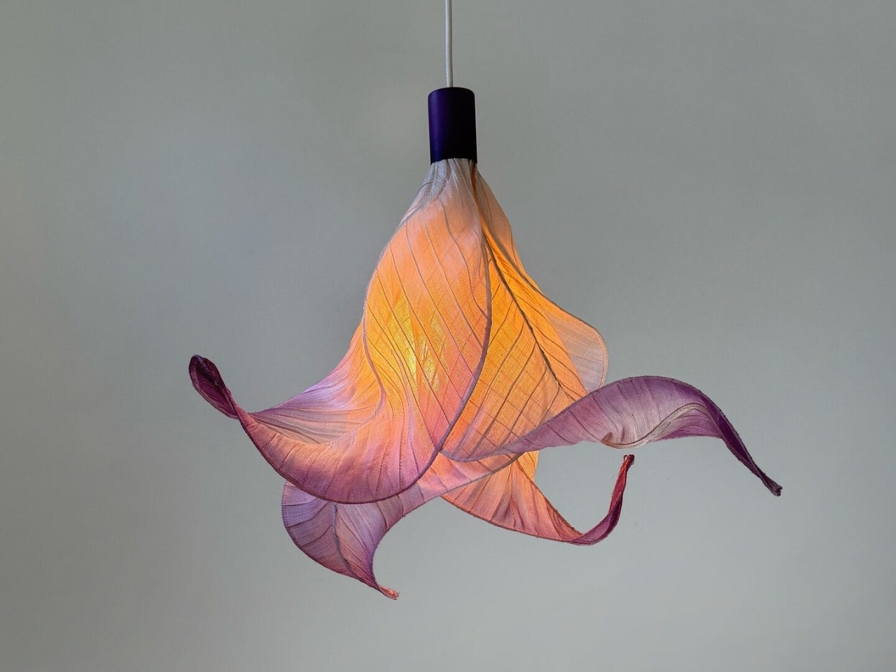
Since then, she has used banaca almost exclusively for her lighting pieces, and the results are genuinely hard to categorize. They hover somewhere between sculpture and utility, between craft object and fine art. When light passes through the woven fibers, the pieces seem to breathe. The way the material catches and filters illumination gives each lamp a softness you don’t usually expect from a functional object. The forms manage to feel both ancient and completely contemporary.

The newest work carries that same visual language forward. Biomorphic shapes, swells and folds that recall sea creatures, coral reefs, and natural formations, seem to suspend mid-motion. The organic quality of banaca lends itself to this perfectly. Unlike glass or metal, the material doesn’t impose rigidity; it holds form while still suggesting movement. Looking at them, you get the sense that if you turned the light off, the shape might slowly release and unfold.

The material story goes deeper than aesthetics, and it’s the part that tends to get overlooked in design coverage. Each lamp is the result of an entire chain of human hands. Farmers in Bicol harvest the banana-abaca trunks by hand when the plants reach maturity. The fibers are extracted, brought to the community, and woven by artisans using techniques passed down through generations. By the time a finished lamp reaches a room in Milan, it carries the labor and heritage of an entire province in the Philippines.

Monticelli has said explicitly that her studio works at the intersection of sustainable materials, craft, technology, and community empowerment. It sounds like a mission statement, and maybe it is, but the work itself proves it isn’t just positioning. The banaca lamps are not mass-produced. They are made to order, with lead times that reflect the reality of handcraft. Customizable in size and color, they are objects you commission with intention rather than objects you add to a cart.

A real tension exists in sustainable luxury design between the genuine and the performative, and it’s worth naming. Many brands talk about ethical sourcing while scaling in ways that hollow out what made the material meaningful in the first place. Monticelli’s studio, still rooted in direct relationships with the farmers and weavers of Bicol, has navigated that tension well. The limited production isn’t a constraint; it’s the whole point.

The design world loves a good material story, and banaca has a genuinely good one. A plant grown on a remote Philippine island, harvested by hand, woven by a community of artisans, shaped by a designer navigating two cultures, and ultimately glowing softly in rooms that could not be further from the landscape that produced it. That kind of distance, traveled with integrity, is what turns a lamp into something worth writing about.

The post Woven by Hand in the Philippines, Sold in Milan first appeared on Yanko Design.
A 4D-Printed Cast You Can Actually Shower In

Most medical devices evolve quietly over decades. Surgical tools get sharper, imaging machines get faster, drug delivery systems get smarter. But the orthopedic cast has remained stubbornly unchanged for most of its existence. Plaster, fiberglass, a messy application process, and six to eight weeks of itching, sweating, and avoiding puddles. For something that millions of people wear every year, it has always felt like a design problem nobody wanted to solve.

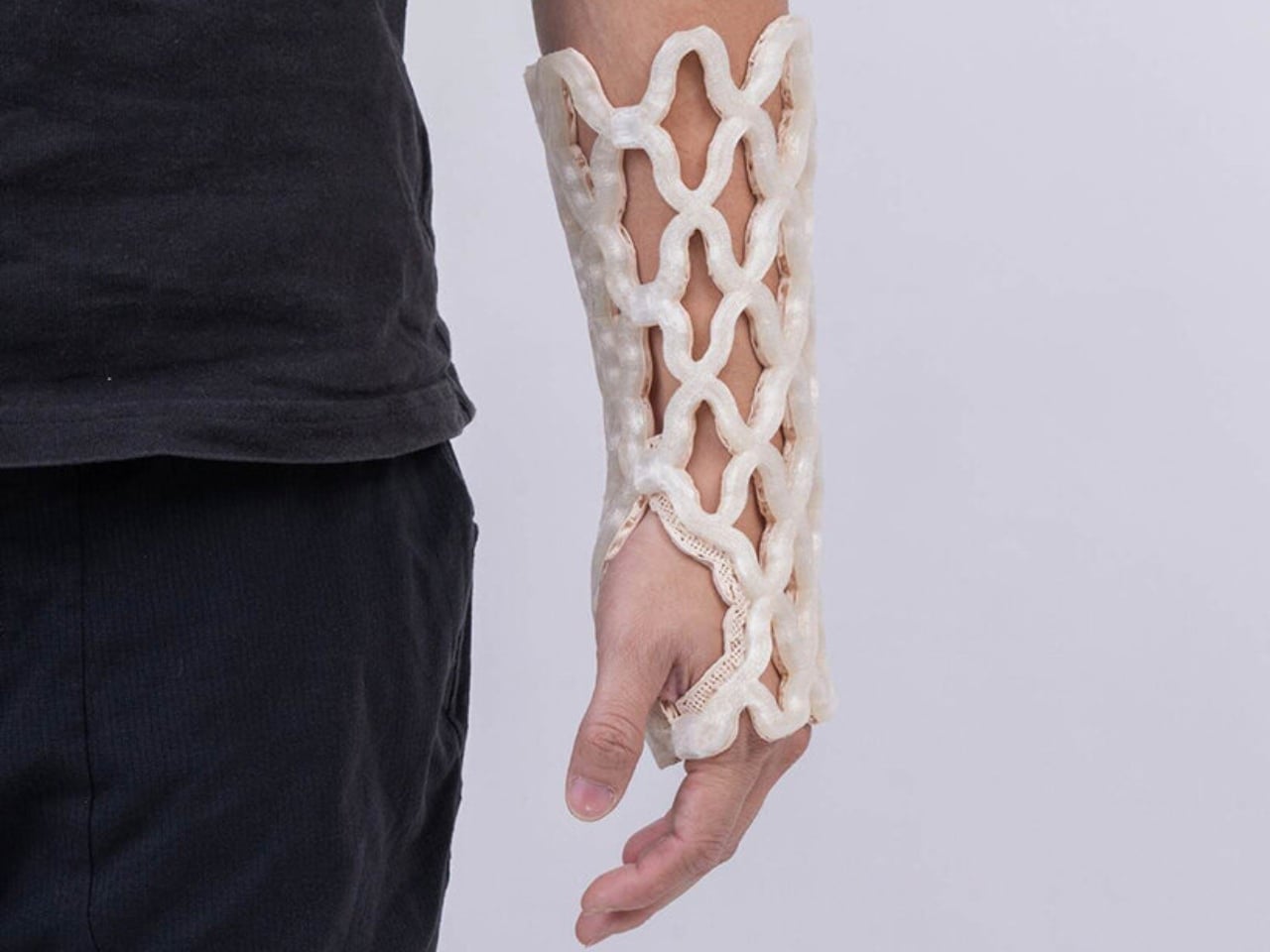
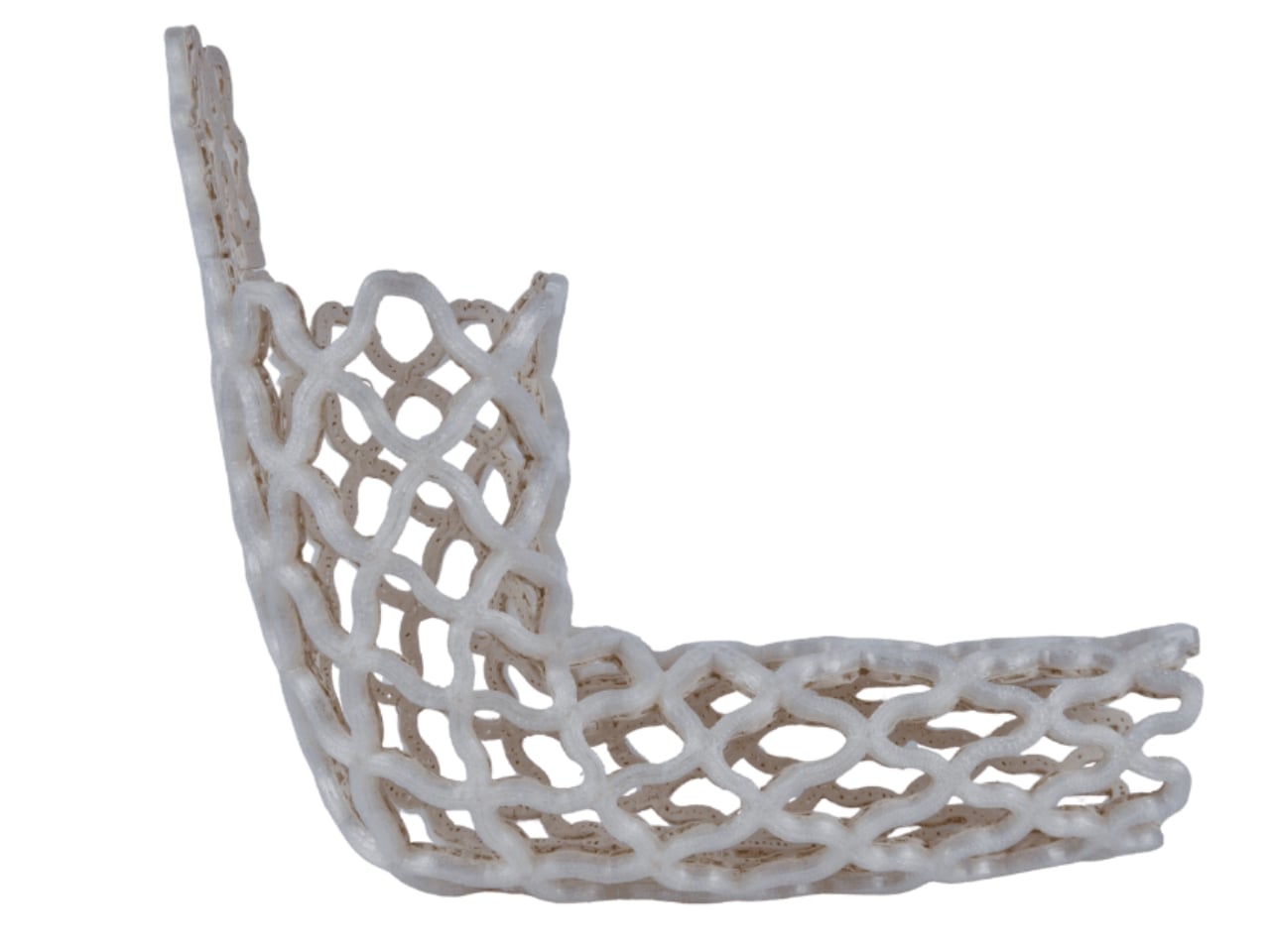
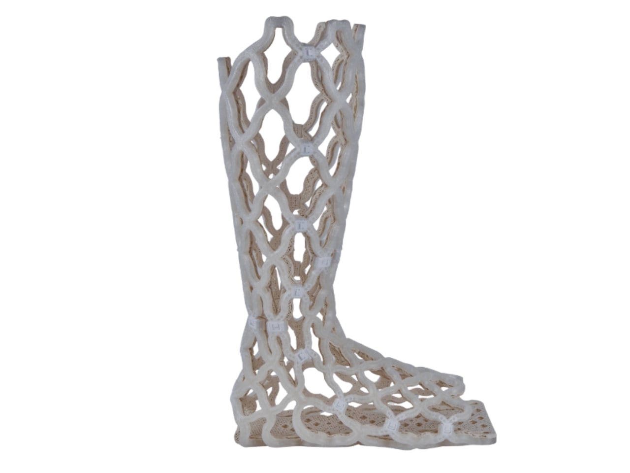
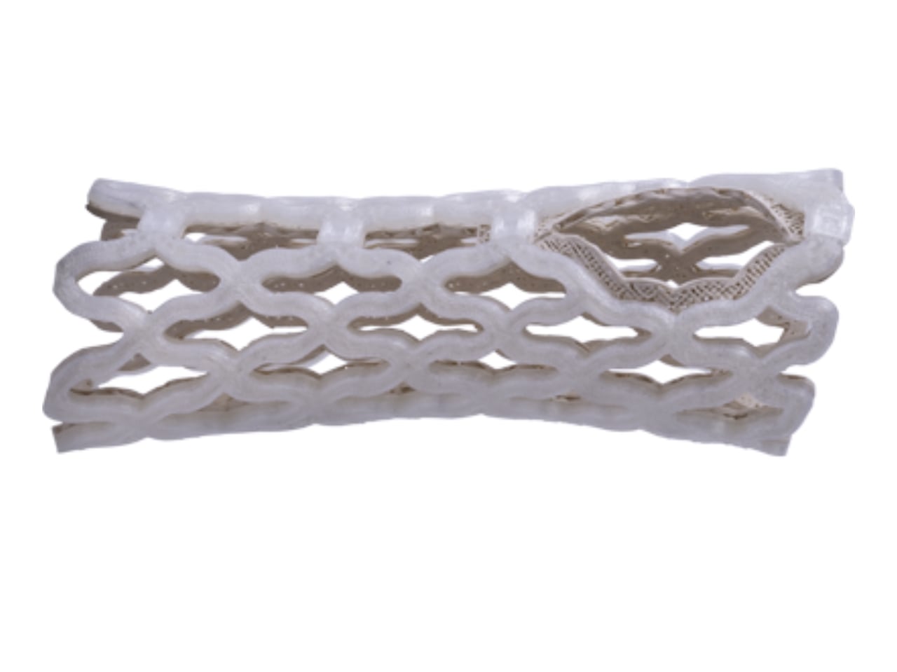
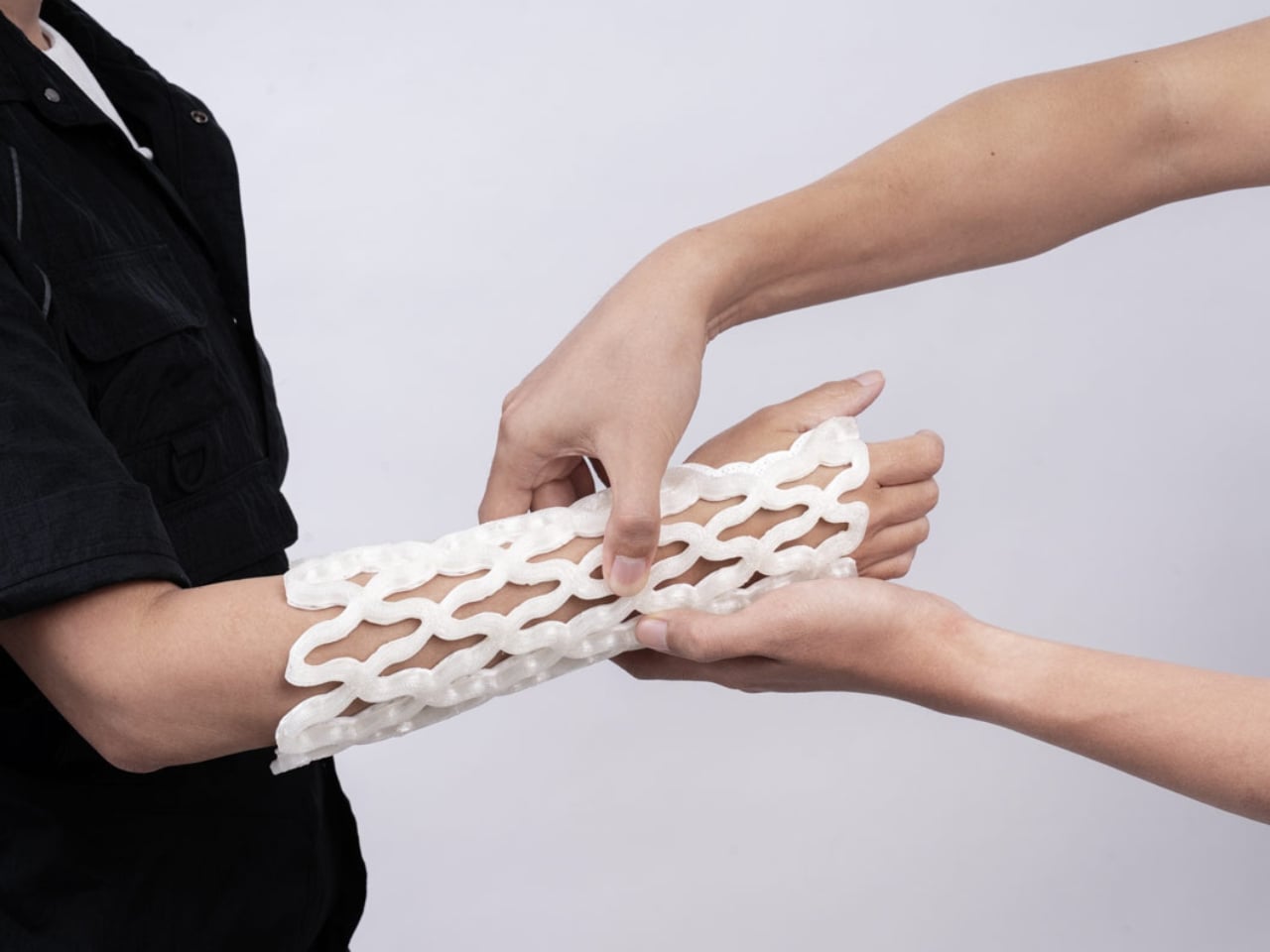
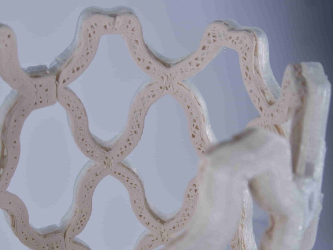
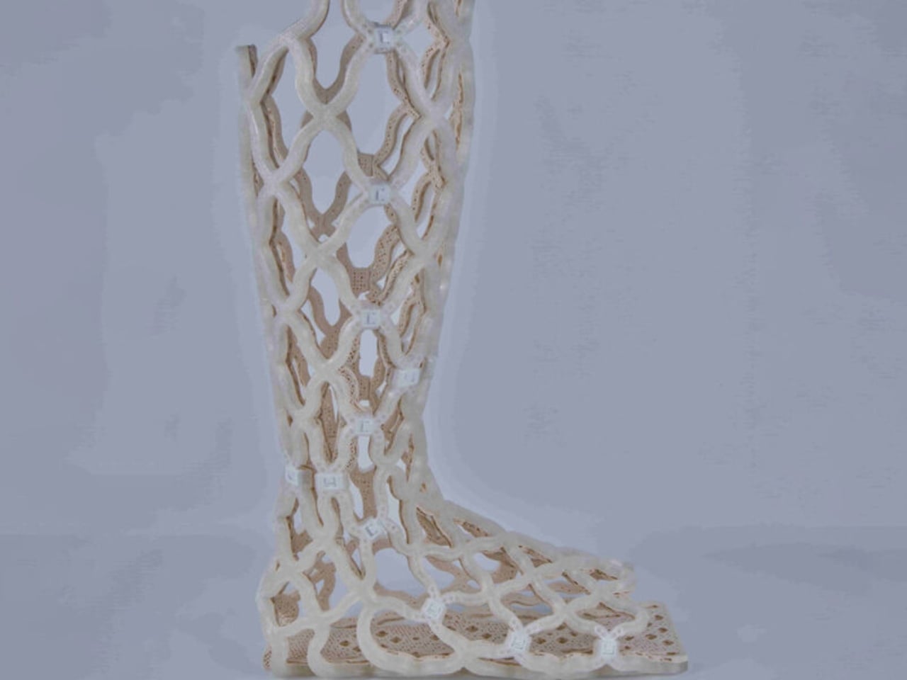
Castomize, a startup out of Singapore, decided to solve it. Their cast, TessaCast, uses what the company calls 4D printing. The terminology is worth pausing on, because it’s easy to assume it’s just marketing language. It isn’t. The fourth dimension here is time. The cast is 3D printed in advance from smart thermoplastic materials, but the real transformation happens at the clinic, when heat is applied. Once warmed, the rigid lattice shell becomes pliable. A clinician wraps it around the patient’s wrist, forearm, elbow, or ankle, clips it into position, and lets it cool. As it hardens, it conforms to the exact shape of that particular limb.

Designer: Castomize

No 3D scan. No casting tape. No plaster dust. The removal process is just as elegant. A simple pin releases the buckles, and the cast slides off. No cast saw, which anyone who has had one used near their skin can tell you is not a small thing. The anxiety of that vibrating blade hovering millimeters from your arm is its own minor trauma, even when you know it won’t cut skin.

Castomize’s design brief reads almost deceptively simple: a cast should hold the body securely while allowing skin to breathe, water to pass through, and clinicians to make adjustments without destroying the device. That sounds obvious when you read it out loud. And yet, until now, no cast on the market had actually delivered on all three at once.

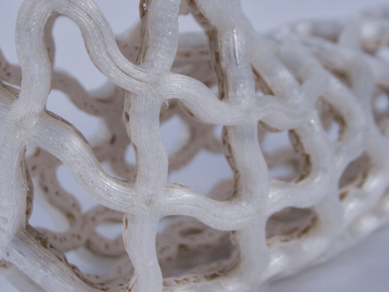
The open lattice structure of TessaCast allows air to circulate continuously against the skin, addressing the itching and sweating that make the traditional cast experience so miserable for patients. It is also fully waterproof. Not water-resistant, waterproof. The team at Castomize notes that it can even be worn while swimming, though they sensibly leave specific medical guidance to clinicians. For anyone who has wrapped a limb in a plastic bag before a shower for weeks on end, this is not a minor feature.

One detail I keep returning to is how this design manages to skip the expensive, time-consuming step of individual 3D scanning. Competitors in the printed cast space often require a custom scan per patient, which raises both cost and complexity. Castomize uses pre-made standard sizes for adults and children that become personalized through the heating and molding process. It’s a smarter workflow, one that clinics can adopt without rebuilding their entire process from scratch.

The startup originated as a student project at the Singapore University of Technology and Design in 2017, which makes its trajectory fairly remarkable. Eleora Teo, Abel Teo, and Johannes Sunarko launched it as a proper company in 2022, and TessaCast reached the market in 2025. It currently holds regulatory approval in Singapore, Australia, South Korea, and Taiwan, with FDA and CE mark applications in progress.

The cost picture is nuanced. TessaCast costs about 30 to 50 percent more to manufacture than a traditional fiberglass cast. But one hospital trial in Singapore recorded average savings of 25 percent overall, because the cast can be reheated and adjusted as the patient heals rather than replaced. Fewer return visits, less material waste, and fewer complications from casts applied too tightly or too loosely all contribute.

The traditional casting process involves ten separate steps and multiple materials, and errors during application can lead to pressure injuries. That’s a significant design failure dressed up as standard practice for a very long time. Castomize has looked at all of it and built something better. The orthopedic cast has been waiting for this moment for a very long time.

The post A 4D-Printed Cast You Can Actually Shower In first appeared on Yanko Design.
Pininfarina’s Forever Pen Needs No Ink, Ever

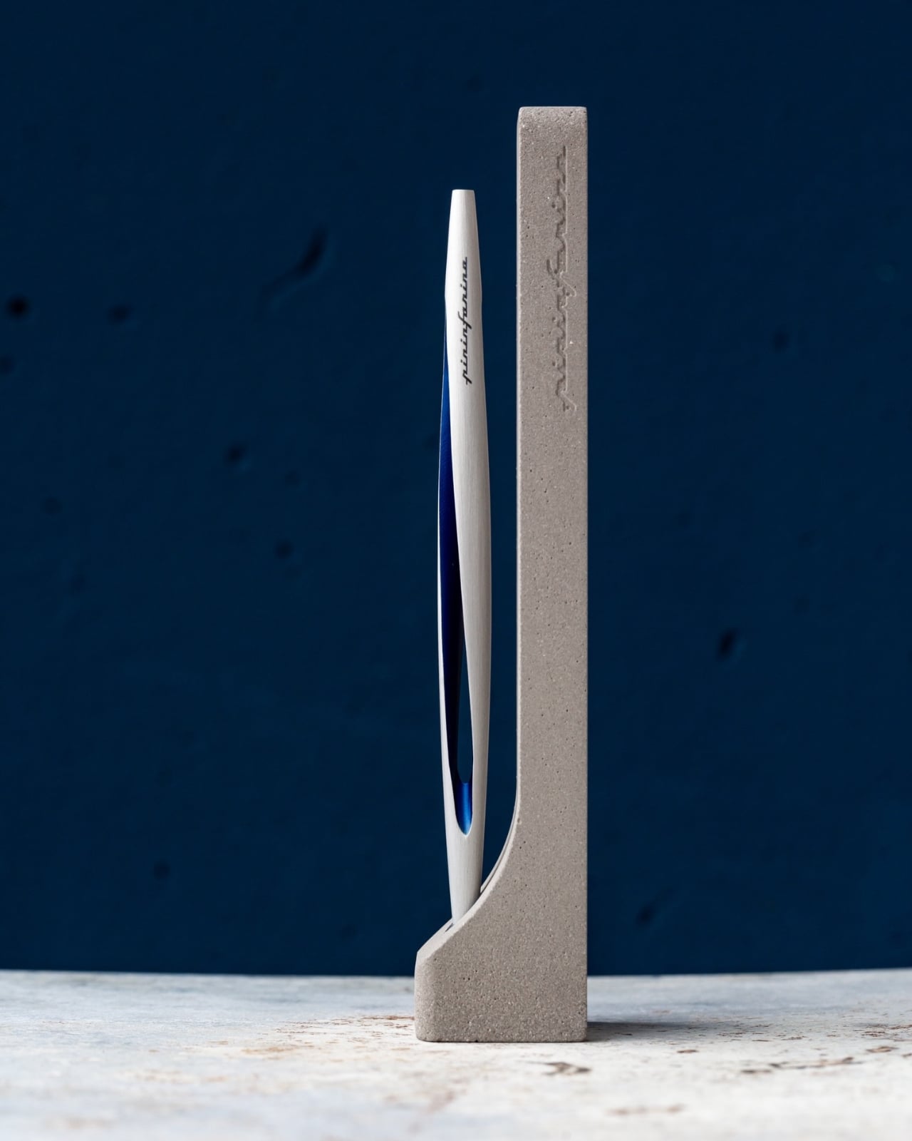
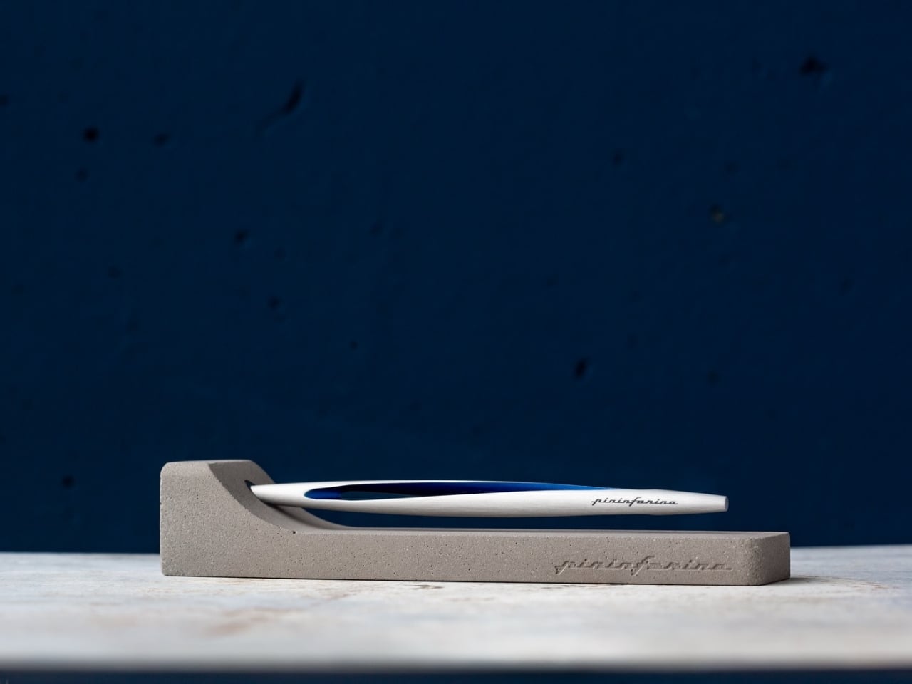
I’ve spent a lot of time thinking about what makes an object truly worth keeping. Not just useful, but worth keeping. The kind of thing you’d take with you when you move, that earns its place on whatever desk you end up at next, without ever needing to explain itself. The Pininfarina Aero Ethergraf is one of those objects, and the reason it works so well has everything to do with how quietly it dismantles what we think a pen is supposed to be.

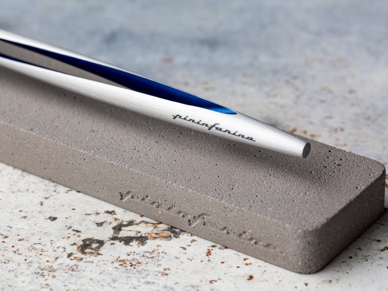
Let’s start with the most obvious thing: it has no ink. No cartridges, no refills, no cap to inevitably lose behind a couch cushion. The Aero Ethergraf writes through an Ethergraf® metal alloy tip that works via oxidation, leaving a graphite-like mark on paper through an ancient technique of letting metal trace itself across a surface. The result is a line that is light, precise, and smudge-proof. It doesn’t bleed through paper. It doesn’t dry out when left uncapped. And it never runs out, which is either deeply satisfying or slightly unnerving, depending on how much you’ve spent on fountain pen ink over the years.

Designer: Pininfarina

Pininfarina, for the uninitiated, is the Italian design house responsible for some of the most iconic automotive silhouettes ever made, including decades of Ferrari and Maserati bodies. Their design language has always been about the line: a single, confident stroke that communicates both speed and restraint at once. You can see that same philosophy in the Aero. The body is aerodynamic in a way that feels earned rather than decorative. Crafted from aerospace-grade aluminum, it weighs 17 grams and measures 160mm in length, and it sits in the hand with a kind of quiet, intentional presence.

The pairing with the raw concrete stand is where the design story gets genuinely interesting to me. Concrete is heavy, permanent, and entirely unpretentious. It doesn’t try to impress you. Placed beside the precision-machined aluminum of the pen body, the contrast is deliberate and considered. One material is ancient and rough. The other is modern and precise. Together, they say something about the object’s relationship with time, and that feels like a very intentional editorial choice on Pininfarina’s part.

Most writing tools are built around the assumption of disposability. You use them, you lose them, you replace them. The Aero Ethergraf operates from an entirely different premise. It assumes you want to keep it. It assumes that the act of writing is not just a task to check off but a gesture with some weight behind it. Whether you’re signing something important, sketching an idea before it disappears, or just making a note to yourself at the end of a long day, the pen makes you feel like the action matters. That shift in expectation is subtle, but once you notice it, it’s hard to go back.

I’ll be honest about who this is for: there is a specific kind of person this appeals to, and I’m perfectly comfortable being that person. If you are deliberate about the objects around you, if the pen on your desk says something about how you approach your work, if you believe that design is never purely aesthetic but always also philosophical, then the Aero Ethergraf was made with you in mind.

It is also, genuinely, a beautiful thing to look at. The blue accent running along the aluminum body catches light the way a car door does at the right angle, which makes sense given the studio behind it. Sitting in its concrete cradle on a desk, it reads less like an office supply and more like a considered piece of sculpture.

Made in Italy, handcrafted, built to last without maintenance, and rooted in a technique far older than the ballpoint pen as we know it, the Pininfarina Aero Ethergraf is a quiet argument for choosing objects with intention. Not because they’re expensive or rare, but because some things genuinely deserve to stay.

The post Pininfarina’s Forever Pen Needs No Ink, Ever first appeared on Yanko Design.
MAD Just Opened a 46,000 sqm Silver Cloud Museum in China

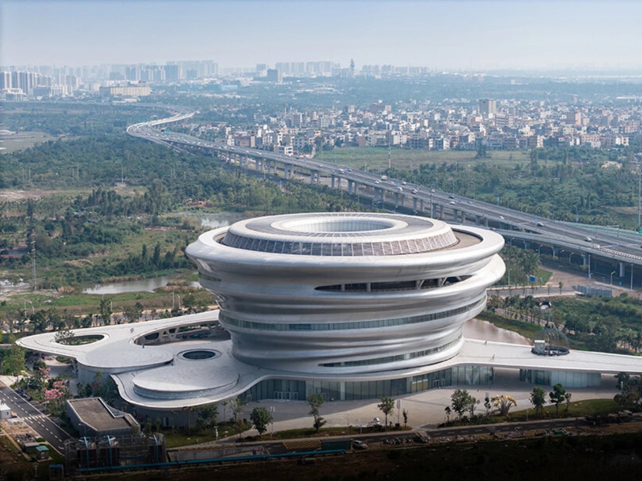
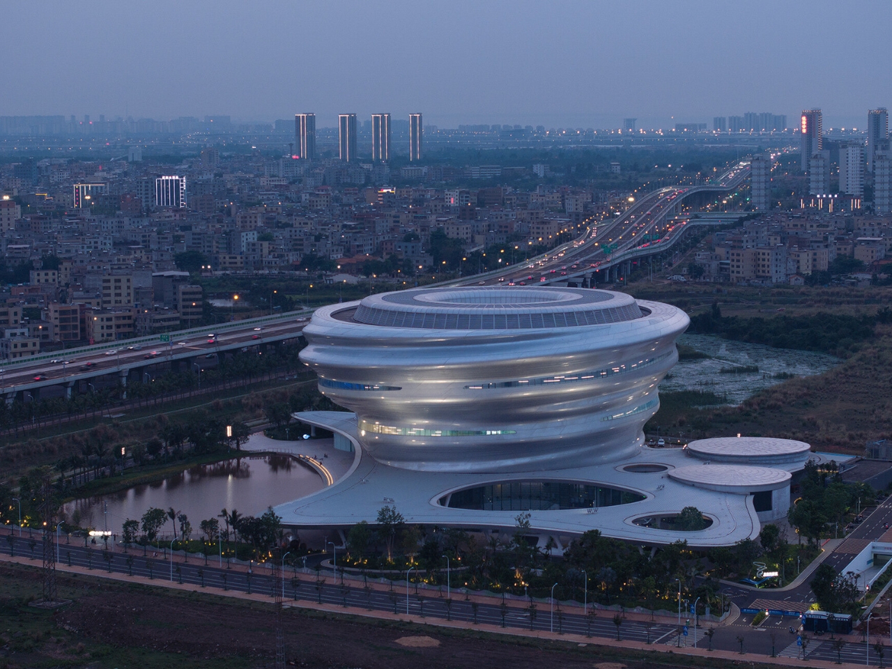
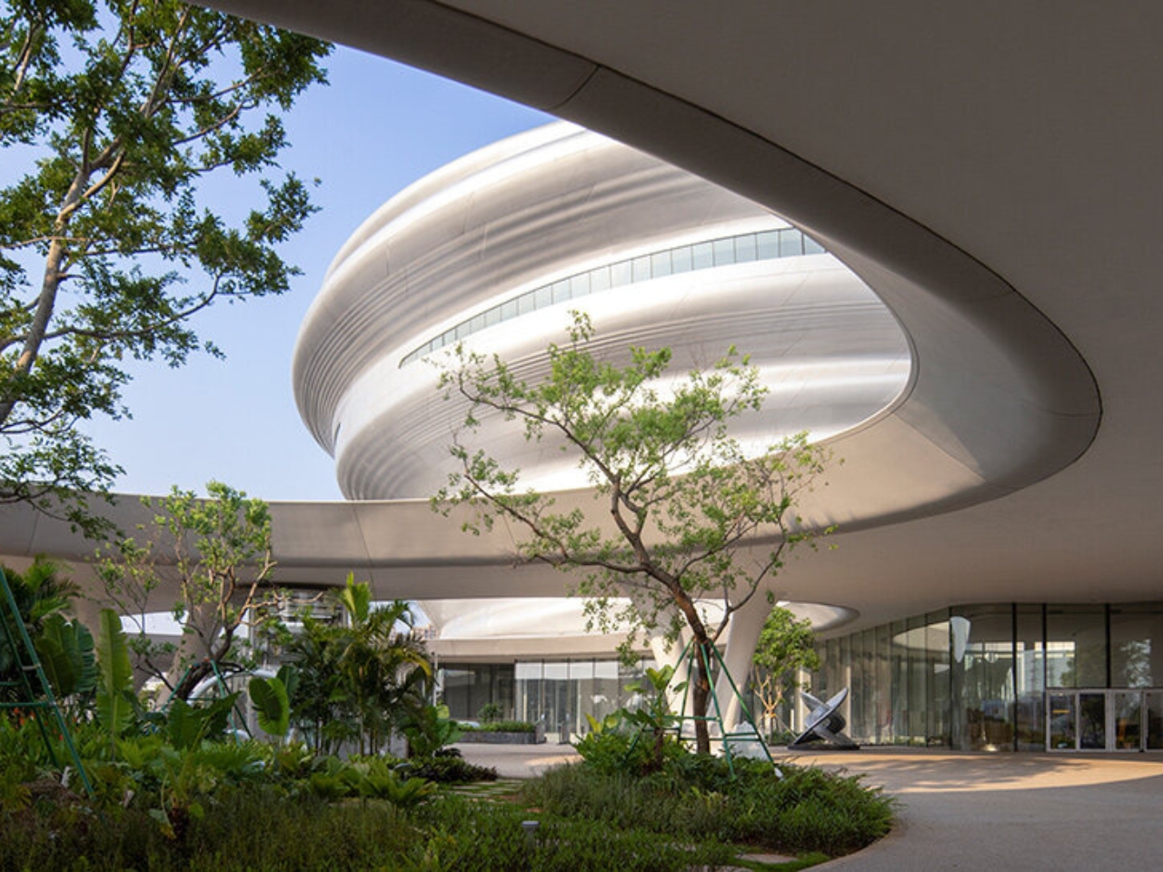
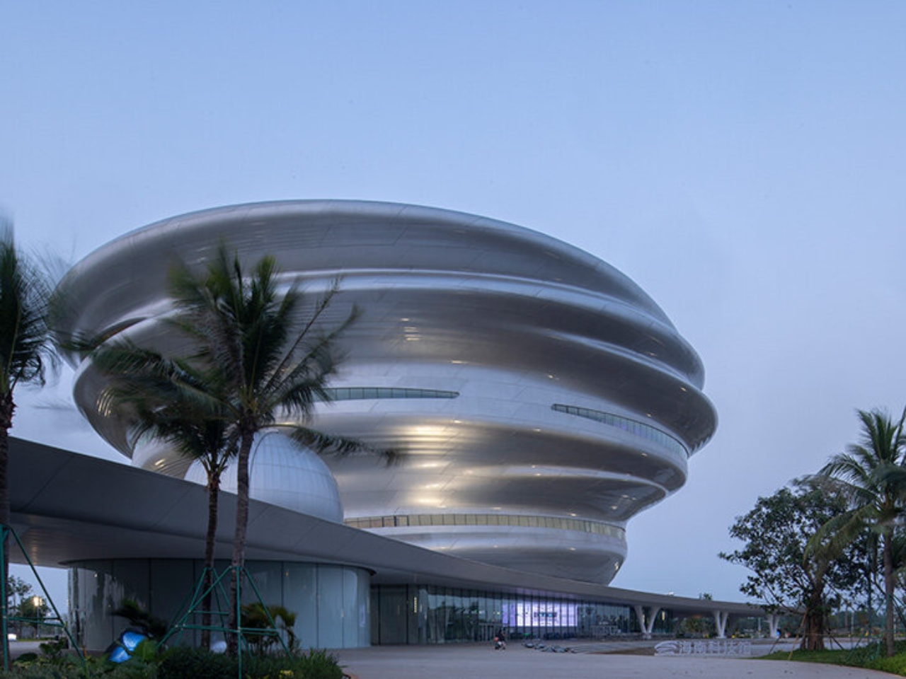
When we covered the Hainan Science Museum back in 2024, it was still a promise on renderings. The images showed a billowing silver form rising above a tropical wetland, and the honest reaction was: is this actually going to get built? It looked too cinematic, too untethered from the logic of real construction. It’s open now. And it looks almost exactly like the renders promised.

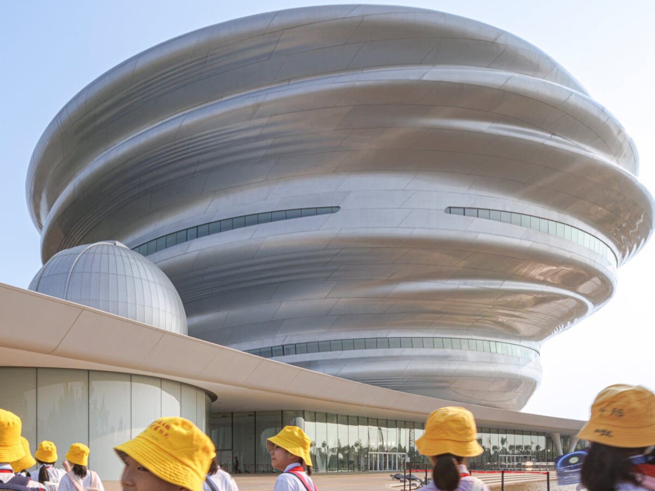
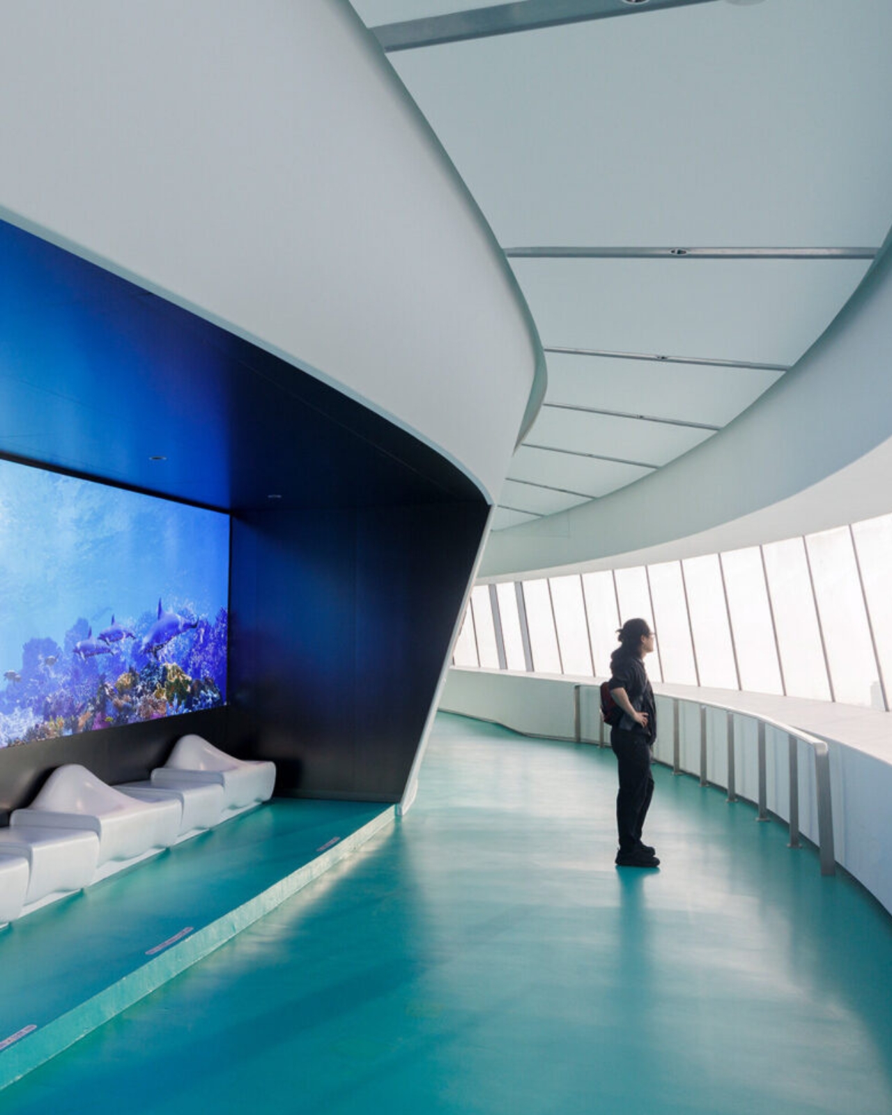
The museum sits on the edge of Wuyuan River National Wetland Park on the west coast of Haikou, in China’s Hainan Province, designed by Ma Yansong and MAD Architects. The shimmering silver exterior is made up of 843 individual pieces of fiberglass-reinforced plastic, fitted together to create a form that ripples and spirals upward like a thermal updraft. That is quite literally the design reference: the movement of warm air rising from the earth’s surface. From a distance, the structure reads as a cloud that materialized above the jungle. Up close, the seams and surface geometry become visible, but it doesn’t break the spell. It deepens it. The material choice matters too. The reflective quality of the panels shifts depending on light and weather, which means the building never quite looks the same twice.

Designer: MAD Architects

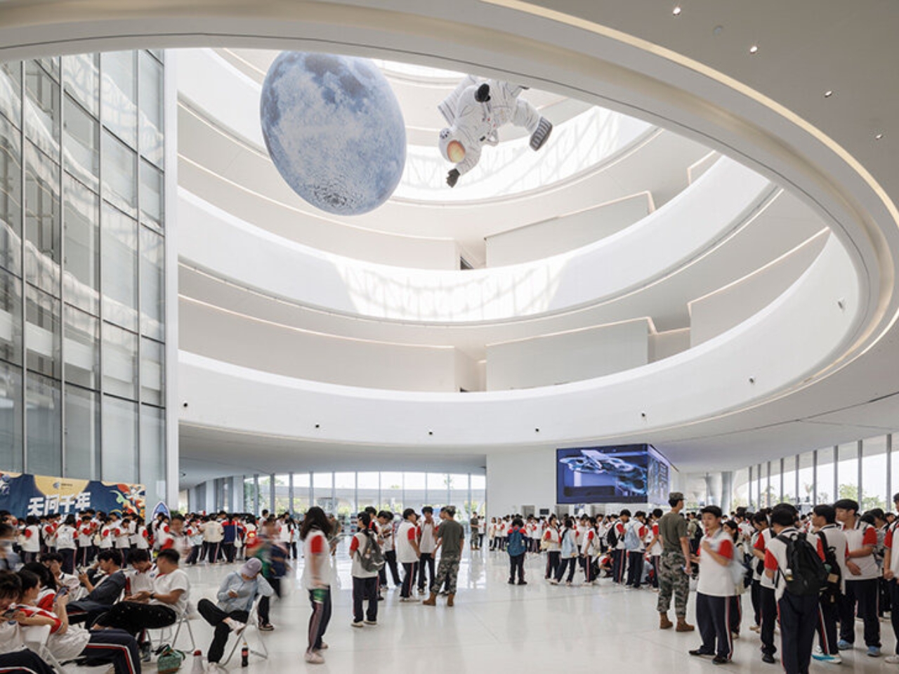
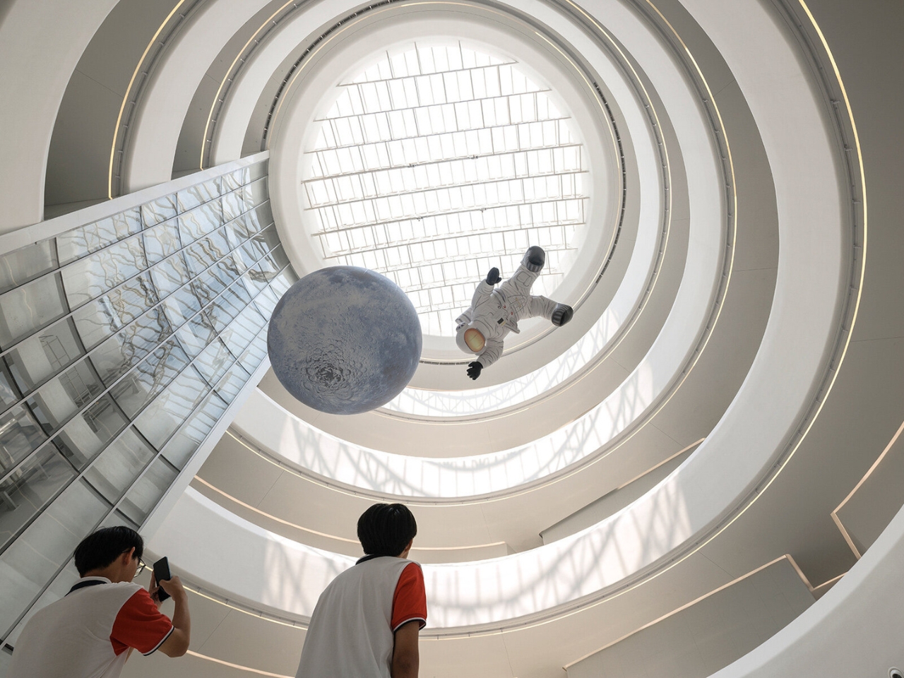
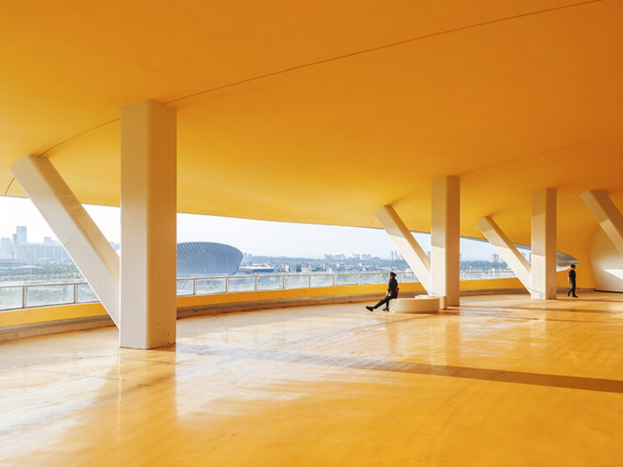
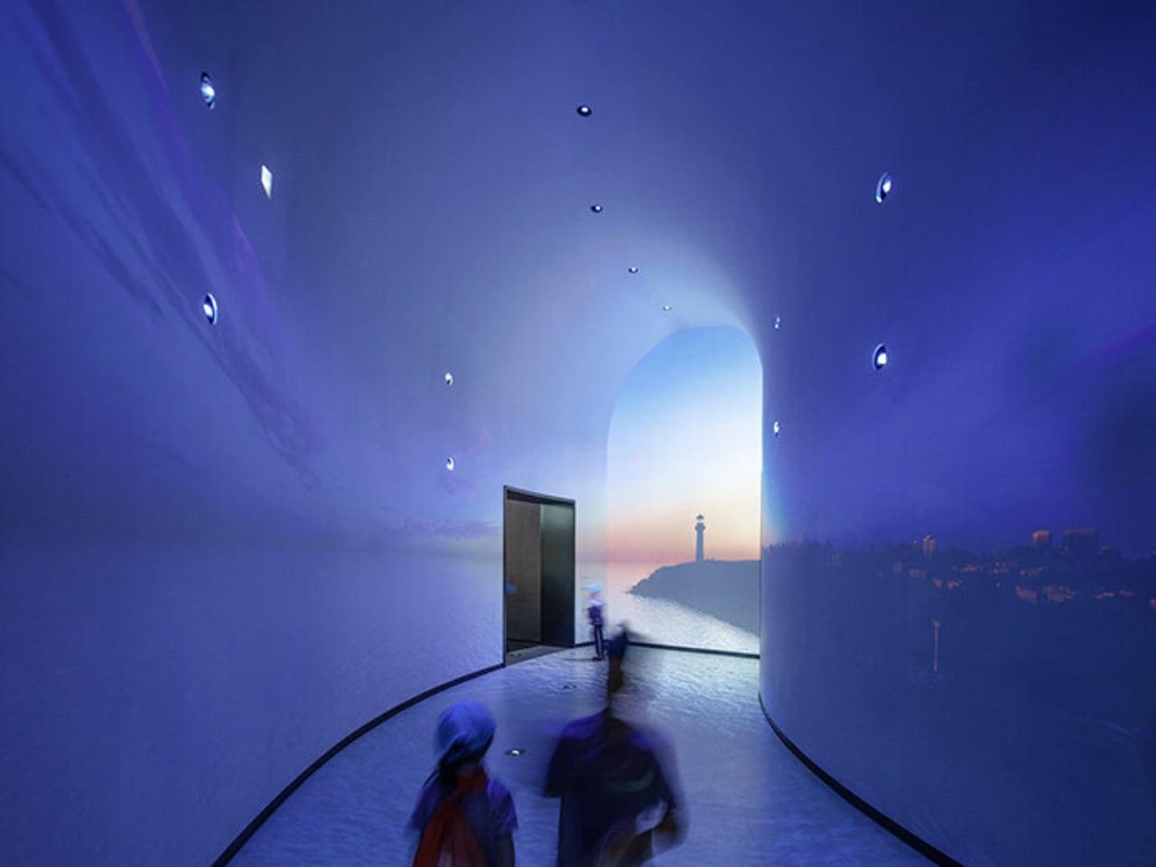
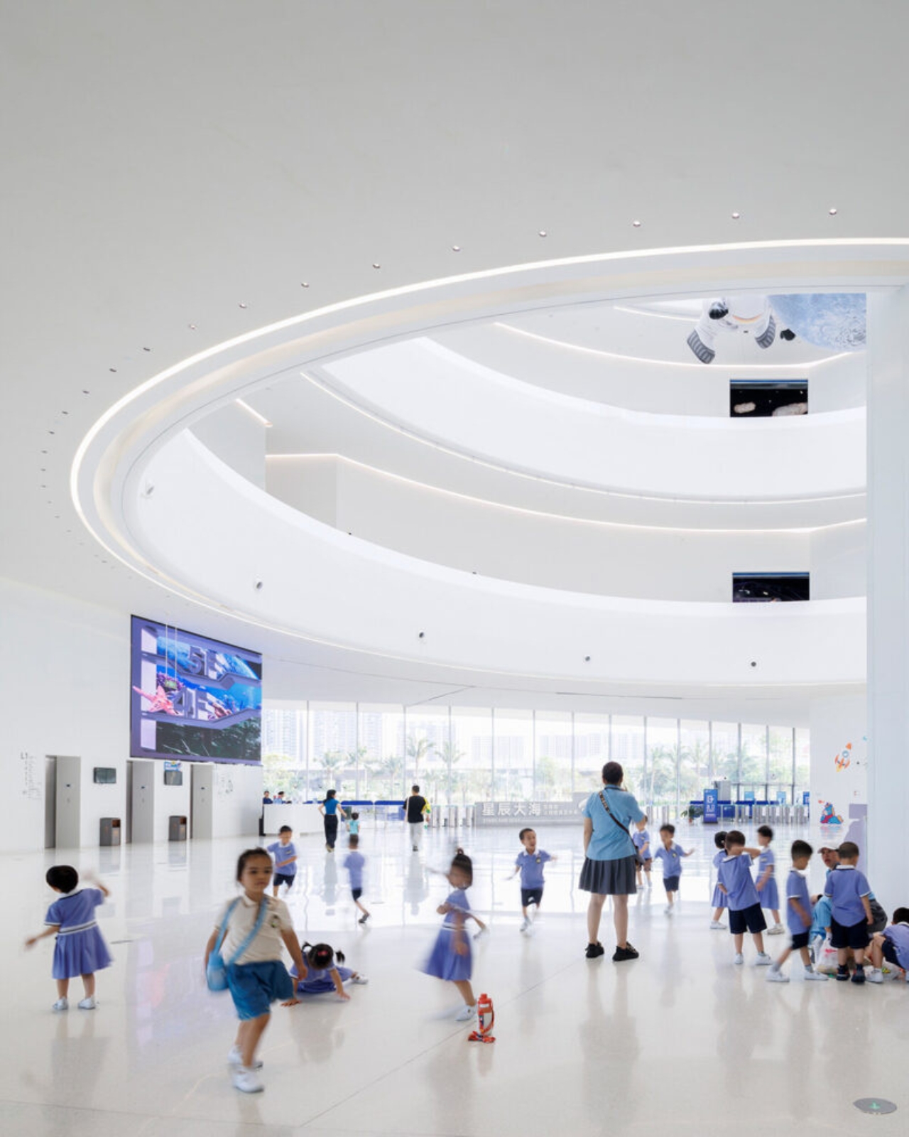
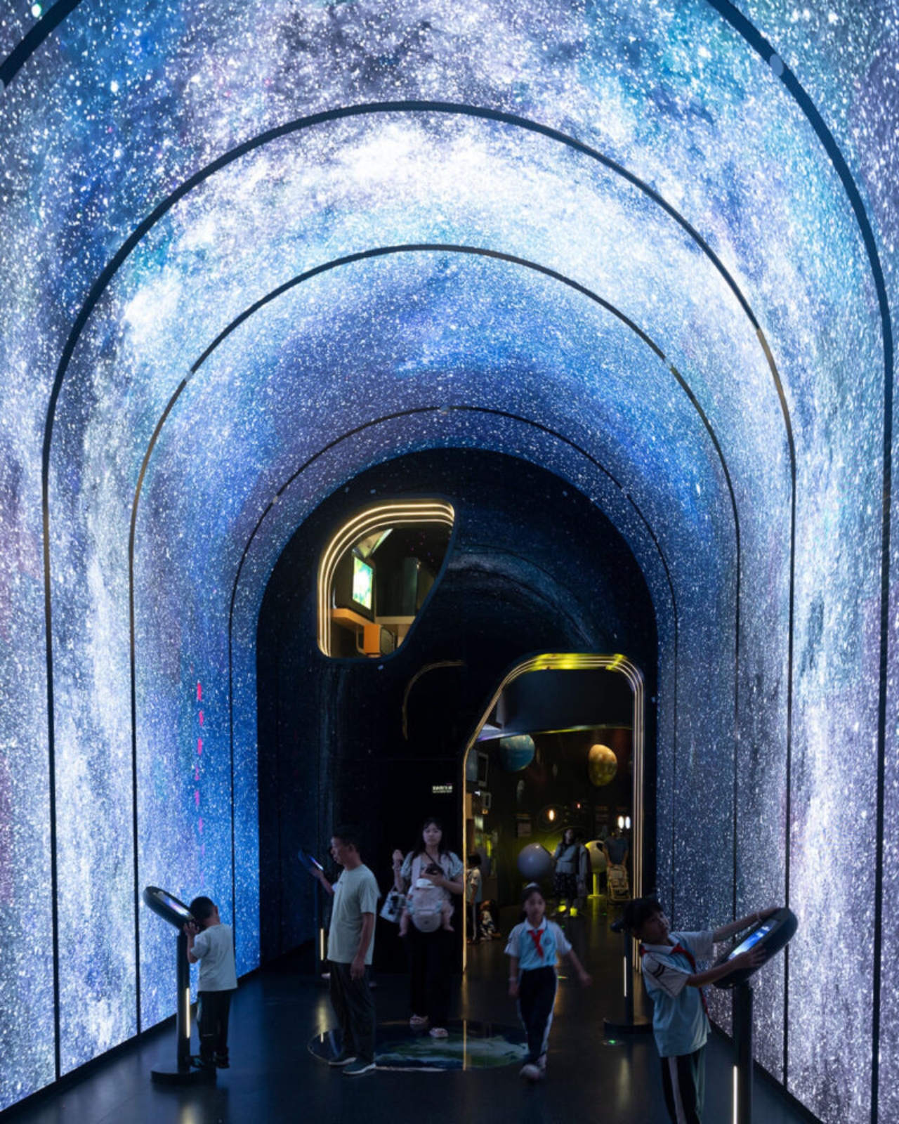
The interior is where things get genuinely impressive. The main structure is column-free, which is a structural achievement worth acknowledging on its own. The total building area is approximately 46,528 square meters. Visitors move through the museum via a spiraling ramp that ascends from the central hall across five floors, with the exhibition experience beginning at the top level on a 360-degree viewing platform with open views of both the sea and the city below. A skylight dome floods the central atrium with natural light, and the whole space feels deliberately open and unhurried. That matches MAD’s stated philosophy around what a science museum should actually feel like. As Ma Yansong put it: “A science museum is about education and imagining the future; we want nature to be part of that vision as well.”

That quote is worth sitting with. Science institutions have historically been designed to feel authoritative. Imposing facades, grand columns, marble lobbies. The architecture announces itself as serious and expects visitors to match. MAD is proposing something different: that curiosity and wonder are better triggered by a space that already inspires both. The science content doesn’t need to be communicated through the building itself; the building just needs to make you feel open to receiving it. Whether you fully buy into that idea philosophically, you can’t argue that the Hainan Science Museum fails to create a mood before you’ve even stepped inside.

The building is also elevated off the ground, which allows the wetland landscape to continue flowing underneath it. That relationship between the structure and the site feels considered rather than incidental. It prevents the building from swallowing its environment whole, which matters here given that the natural setting is precisely what the whole project is in conversation with. Standing underneath it, the ground remains soft, green, and alive. For a structure this visually assertive, it sits lightly in a way that isn’t easy to pull off.

This is MAD’s second major public project in Hainan, following the Cloudscape of Haikou, which opened back in 2021. Together, they’re beginning to form a kind of visual language along the Haikou coastline, a series of dreamlike structures that feel more like environmental installations than civic buildings. For a city actively building its identity within China’s free-trade port framework, having work like this on the waterfront is a deliberate cultural statement about where Haikou wants to stand on the global stage.

Design began in 2020. Groundbreaking was in 2021. The main structure wrapped in 2023. Five years from concept to opening doors is a reasonable arc for a project of this ambition and scale. Seeing it finally receive visitors closes a loop that many who followed its construction had been waiting for. Sometimes the renders really do deliver. This is one of those times.

The post MAD Just Opened a 46,000 sqm Silver Cloud Museum in China first appeared on Yanko Design.
Sydney Just Opened a 42-Metre Steel Lookout Over a Former Quarry

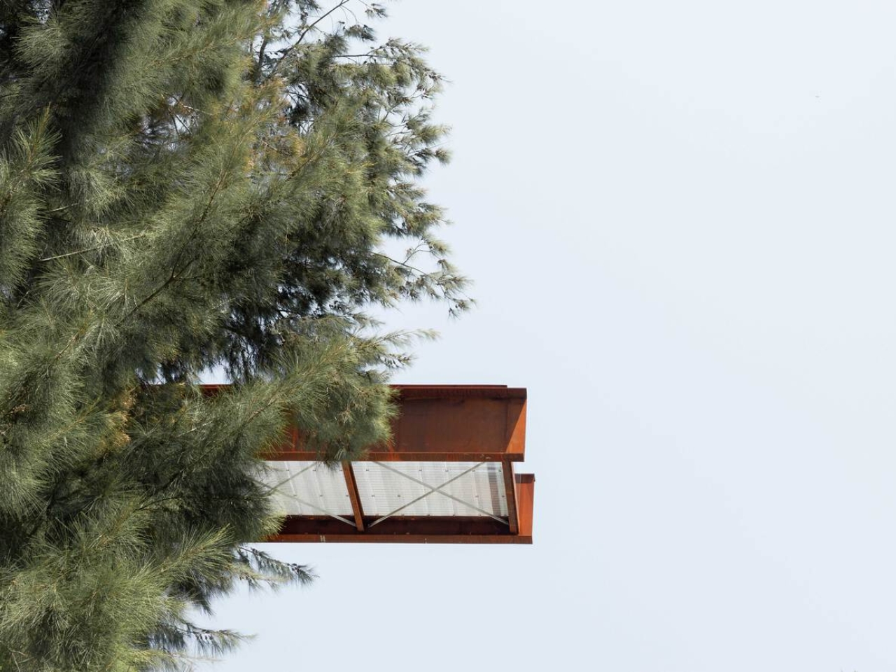
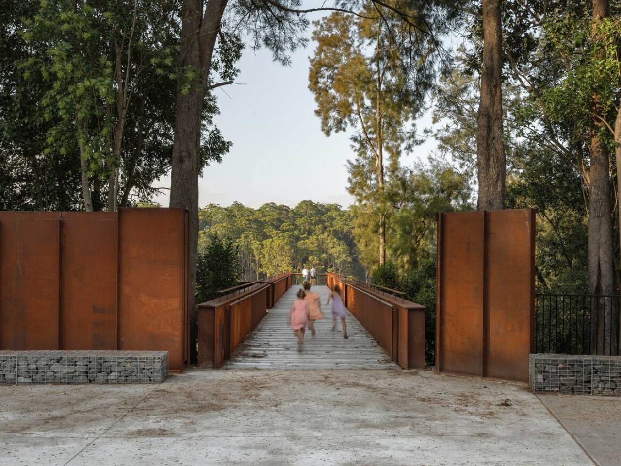
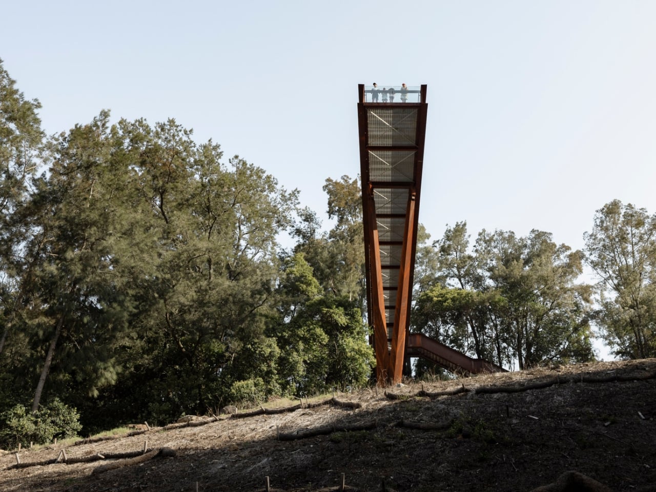
If you told me a 42-metre platform made of weathering steel, suspended over a former rock quarry, would be one of the most compelling pieces of public architecture right now, I’d say I believe you completely. The Southern Lookout at Hornsby Park in Sydney is exactly that. And it is worth every bit of attention it’s getting.

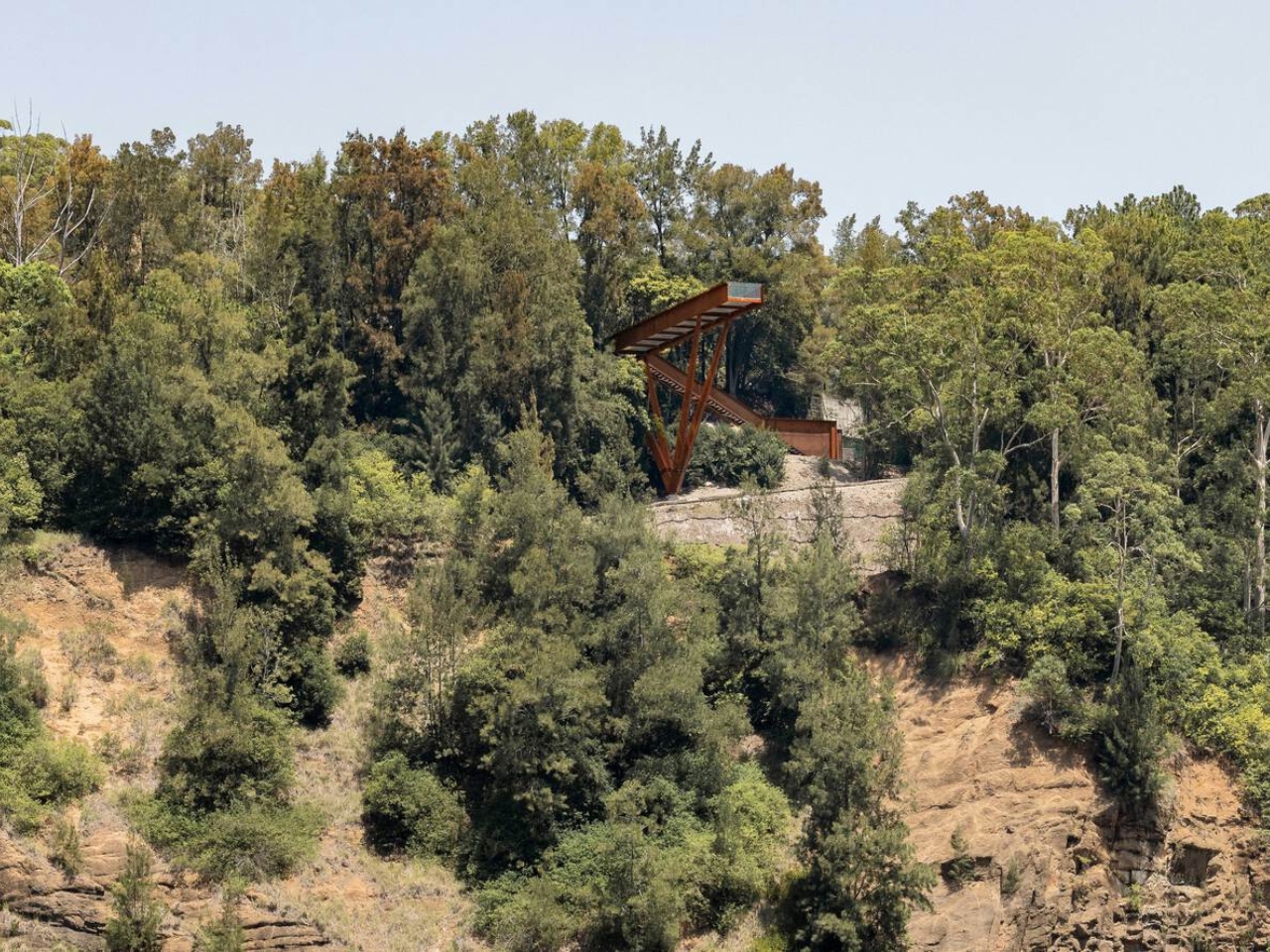
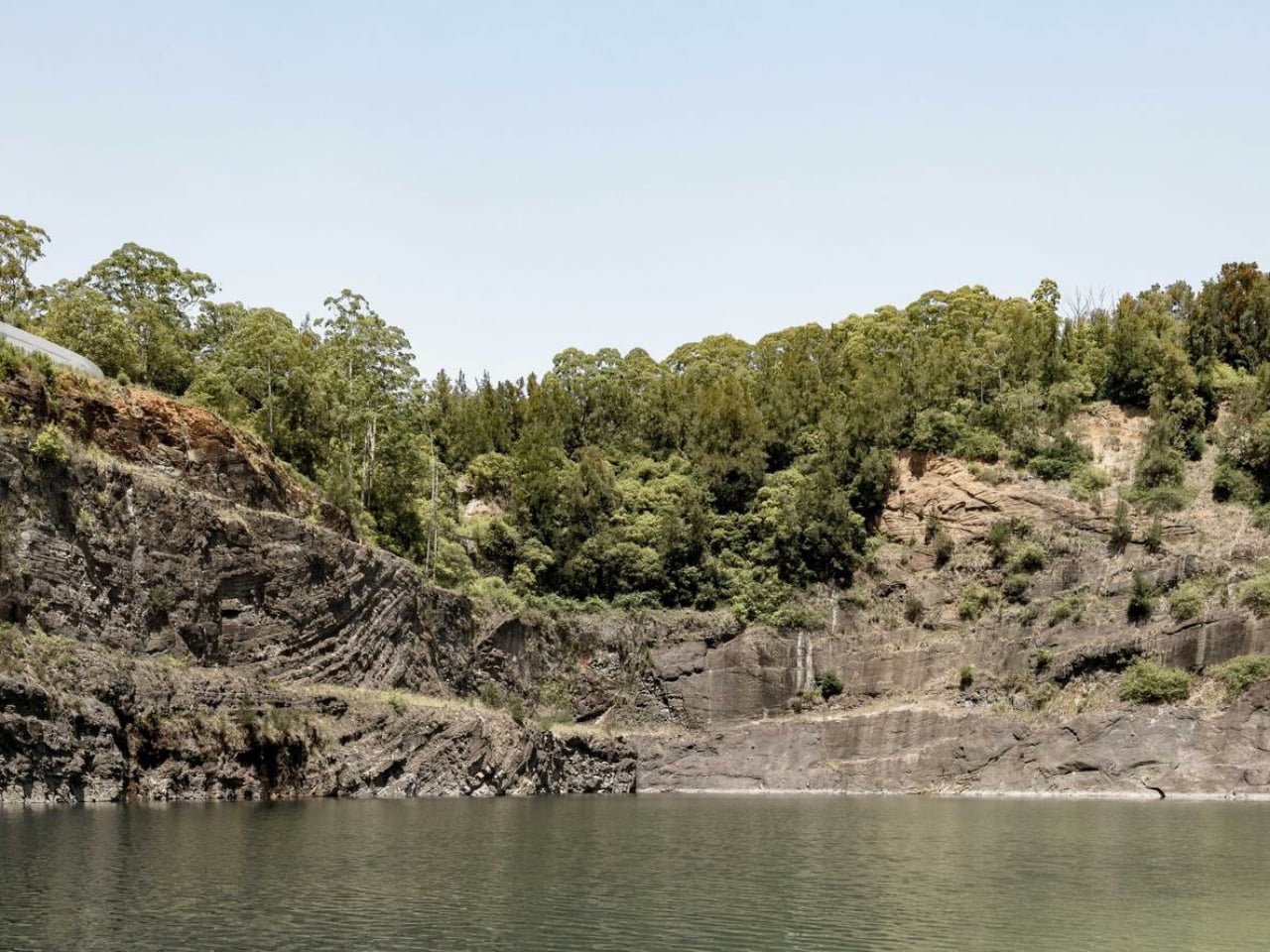
Designed by AJC Architects in collaboration with Clouston Associates, the structure sits on the northern edge of Sydney, overlooking the dramatic topography of Hornsby Quarry. The site itself has a remarkable backstory. For over a century, the quarry was completely inaccessible to the public. A place that had been carved out and worked, left to become something between ruin and wilderness, invisible to the city that had grown up around it. The Southern Lookout is the first completed architectural piece of a much larger 60-hectare landscape masterplan. It is, in the most literal sense, an opening.

Designer: AJC Architects

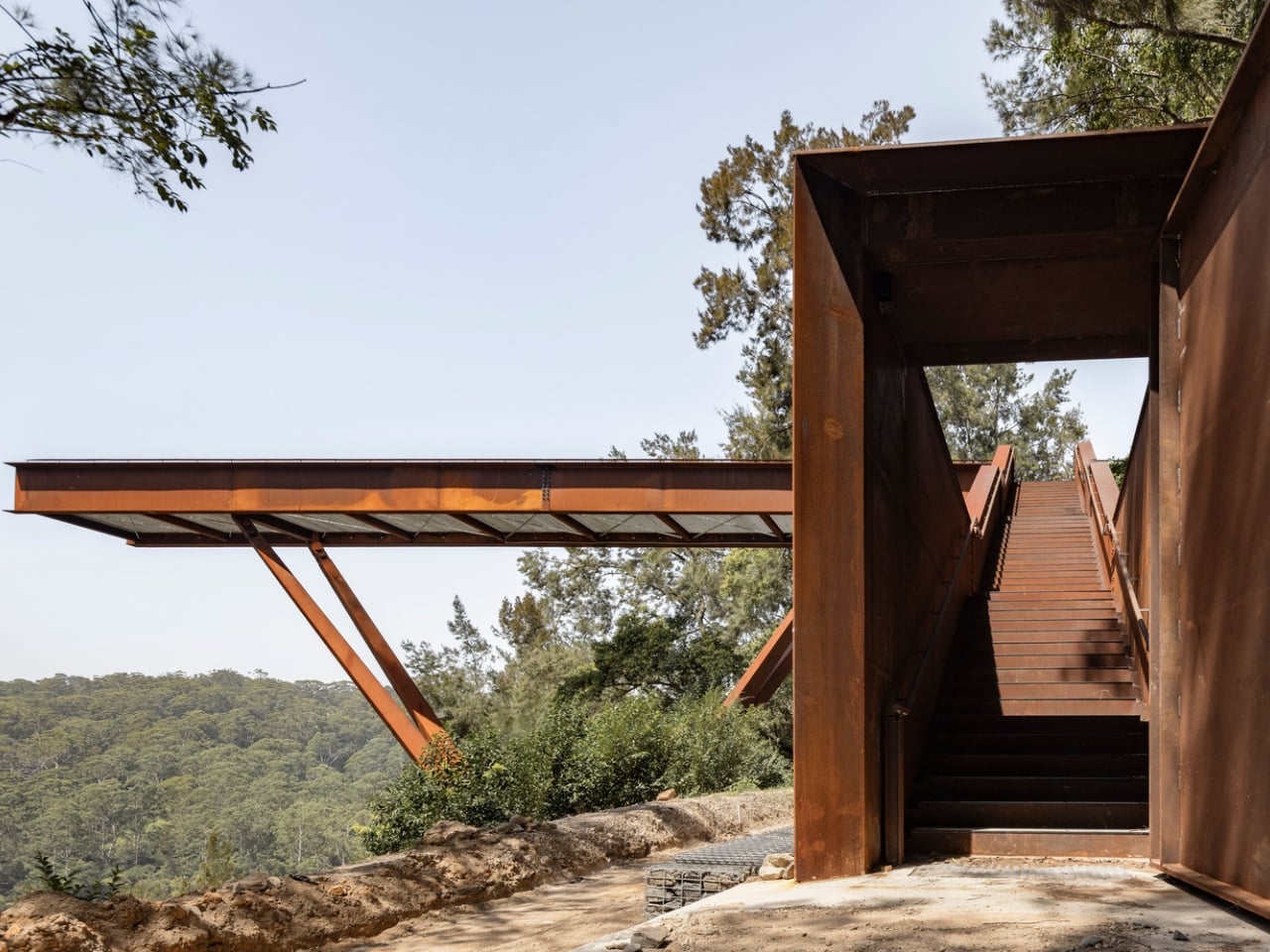
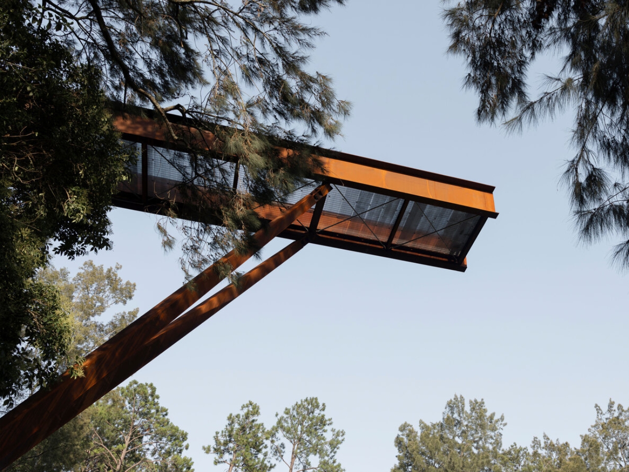
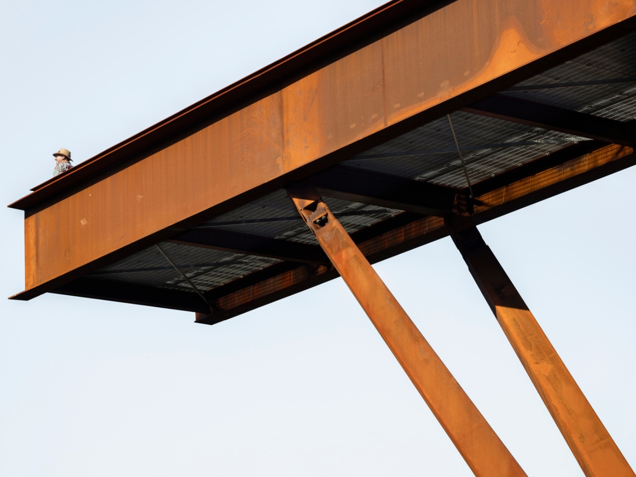
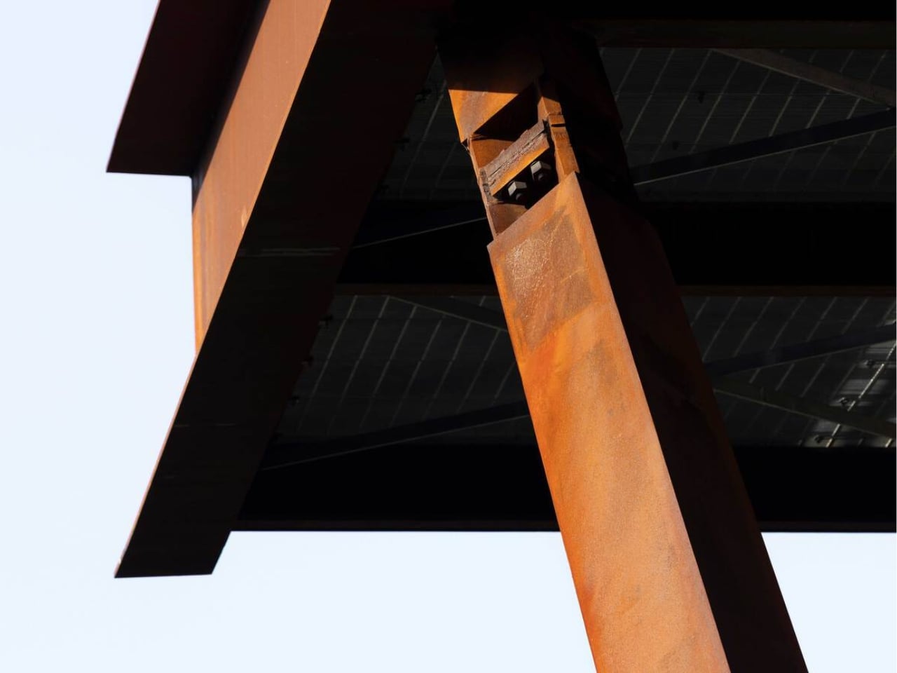
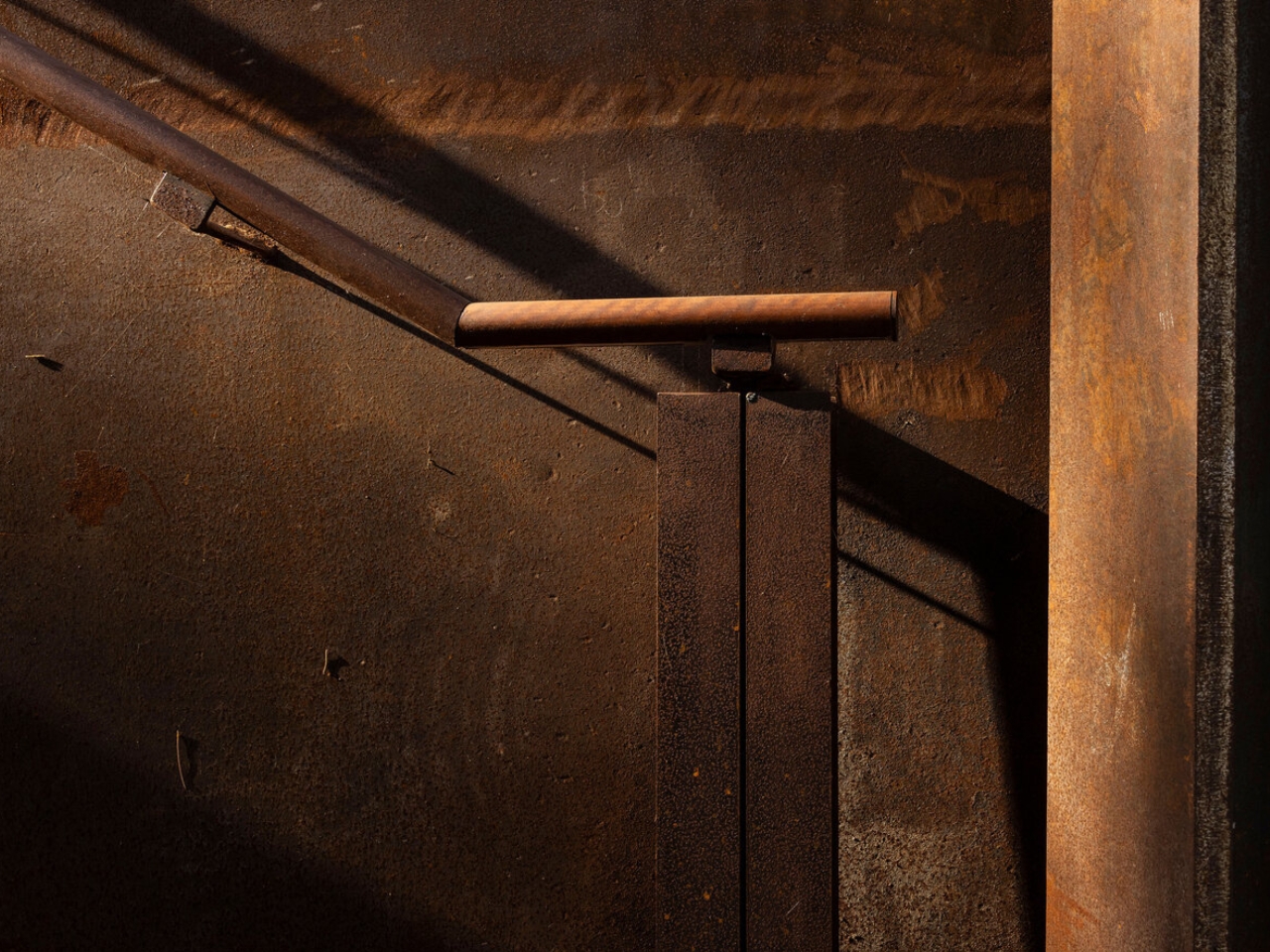
The choice of weathering steel is the first thing that makes you stop and think. Cor-Ten, as it’s commonly known, is a material that rusts deliberately. It forms a stable oxidized layer on its surface that protects the steel beneath while giving it that signature warm, amber-brown tone. It is a material that ages visibly and honestly, and for a project like this one, placed on the edge of a quarry whose story is entirely about time and transformation, it feels less like a design decision and more like a point of view.

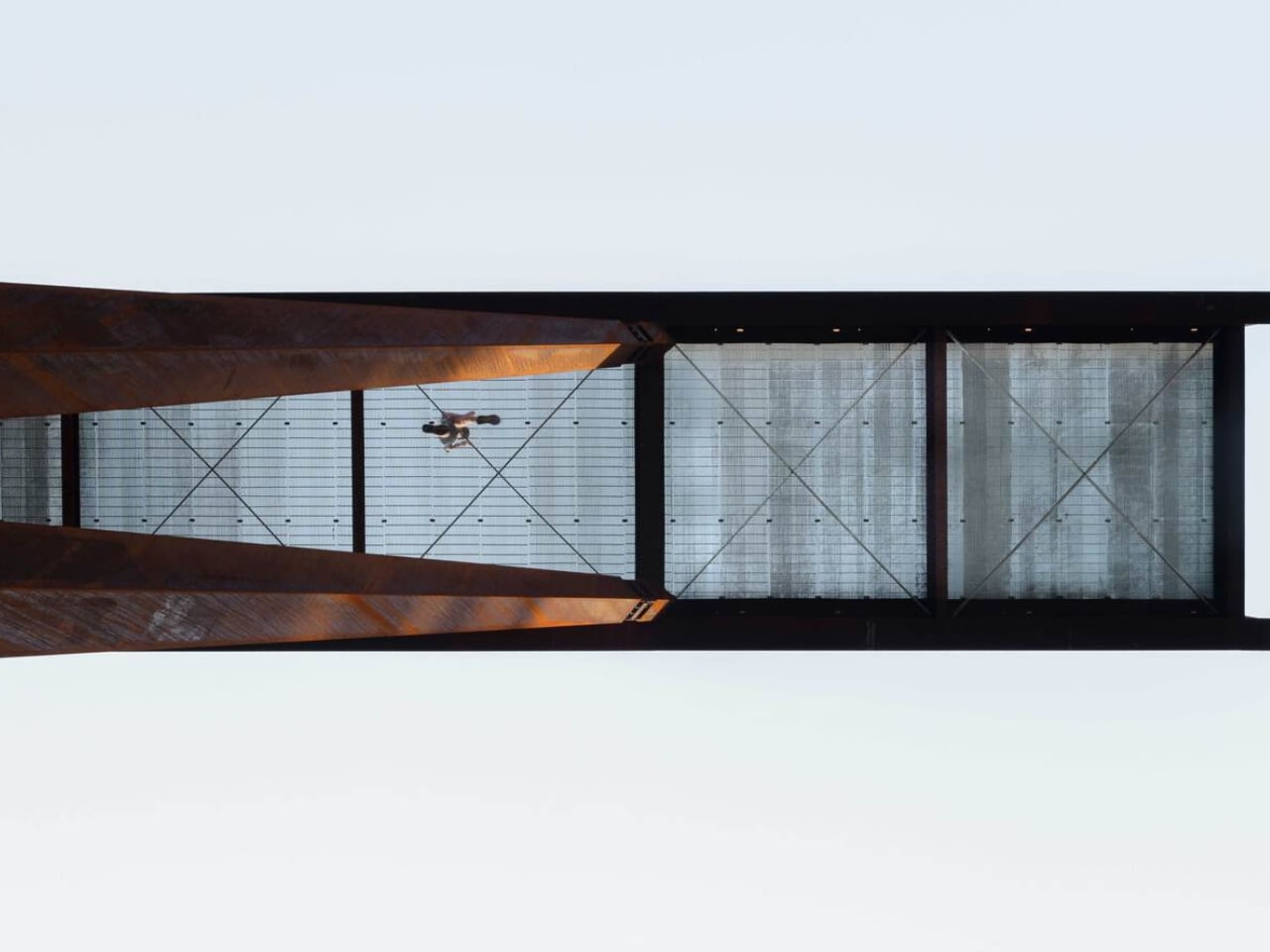
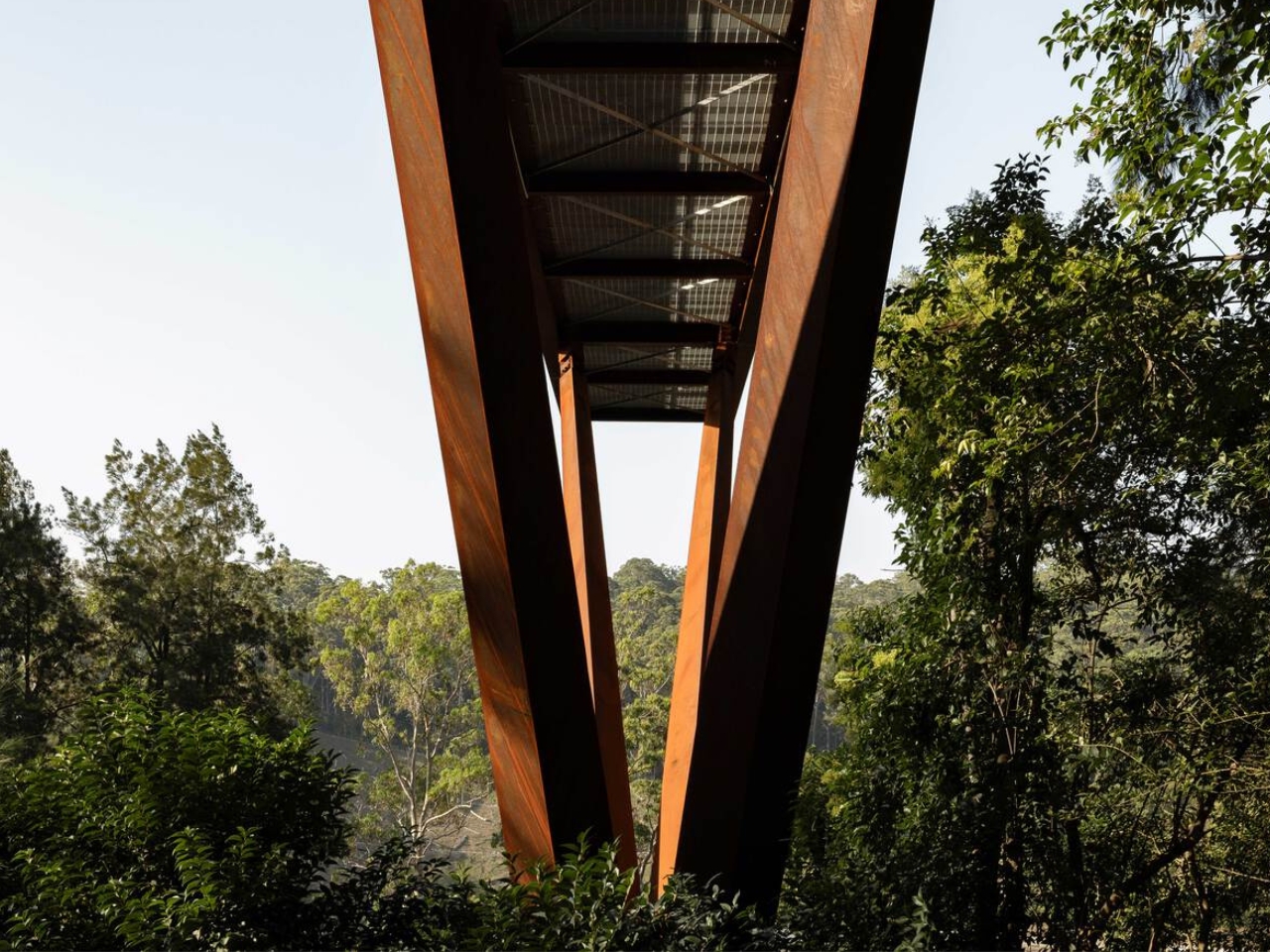
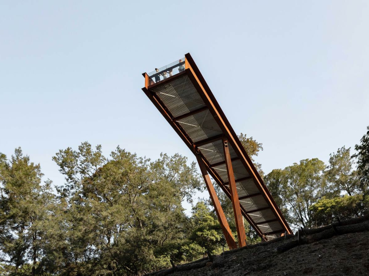
The platform runs 42 metres through the forest canopy, anchored into the embankment and balanced on four angled columns that converge on a single central footing below. That minimalism is intentional. The architects worked specifically to keep ground disturbance on the sensitive slope to a minimum. The result is a structure that feels both bold and careful, which is a hard balance to get right, and one AJC Architects manages convincingly.

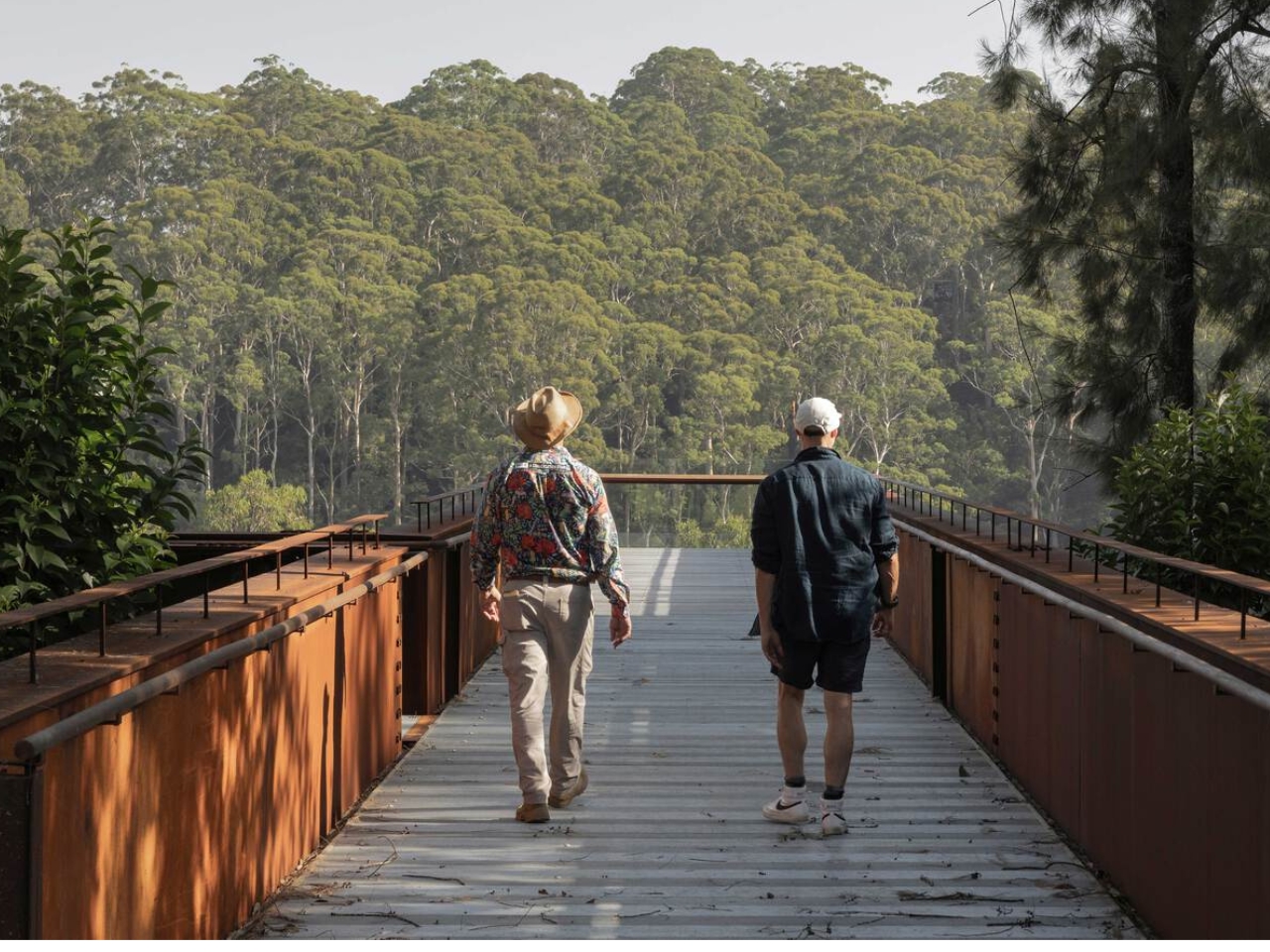
Walking it is designed to be as much of an experience as looking at it. The rhythmic sound of footsteps on the metal, the glimpses of the falling topography beneath one’s feet, the steady build of height as you move further along the platform create a physical connection to the sheer scale of the man-made canyon. Every design choice is oriented toward making you feel exactly where you are. That kind of sensory engagement is something the best public infrastructure delivers and so rarely does. Most walkways just take you somewhere. This one makes you reckon with the place itself.

The entrance is framed by steel portals and gabion stone walls, the kind of raw structural language that references the quarry’s industrial character without cosplaying it. It doesn’t try to look cute or approachable. It looks like something that belongs to the site. That restraint is refreshing at a time when so many public design projects err on the side of spectacle for its own sake.

The broader context matters here too. The Southern Lookout is the inaugural phase of an ambitious plan to open Hornsby Quarry up as a 60-hectare public park. That kind of urban regeneration project usually moves at a pace that frustrates everyone involved, so the fact that this lookout is already open, already drawing visitors, already giving people a reason to show up, feels like a meaningful start rather than a placeholder.

AJC Architects, working in collaboration with Hornsby Shire Council, has delivered something that respects the complexity of the site without over-explaining it. The architecture doesn’t lecture you about the quarry’s history. It simply places you inside it. It gives you the height, the steel, the sound, the view, and leaves you to do the thinking.

Public architecture at its best creates a relationship between a person and a place they might not have noticed otherwise. The Southern Lookout does exactly that. Sydney has always had dramatic natural geography. Now, at the edge of a former quarry, it has something that finally lets you see it.

The post Sydney Just Opened a 42-Metre Steel Lookout Over a Former Quarry first appeared on Yanko Design.
Japan Just Built a Pokémon Footbath and It’s Genuinely Moving

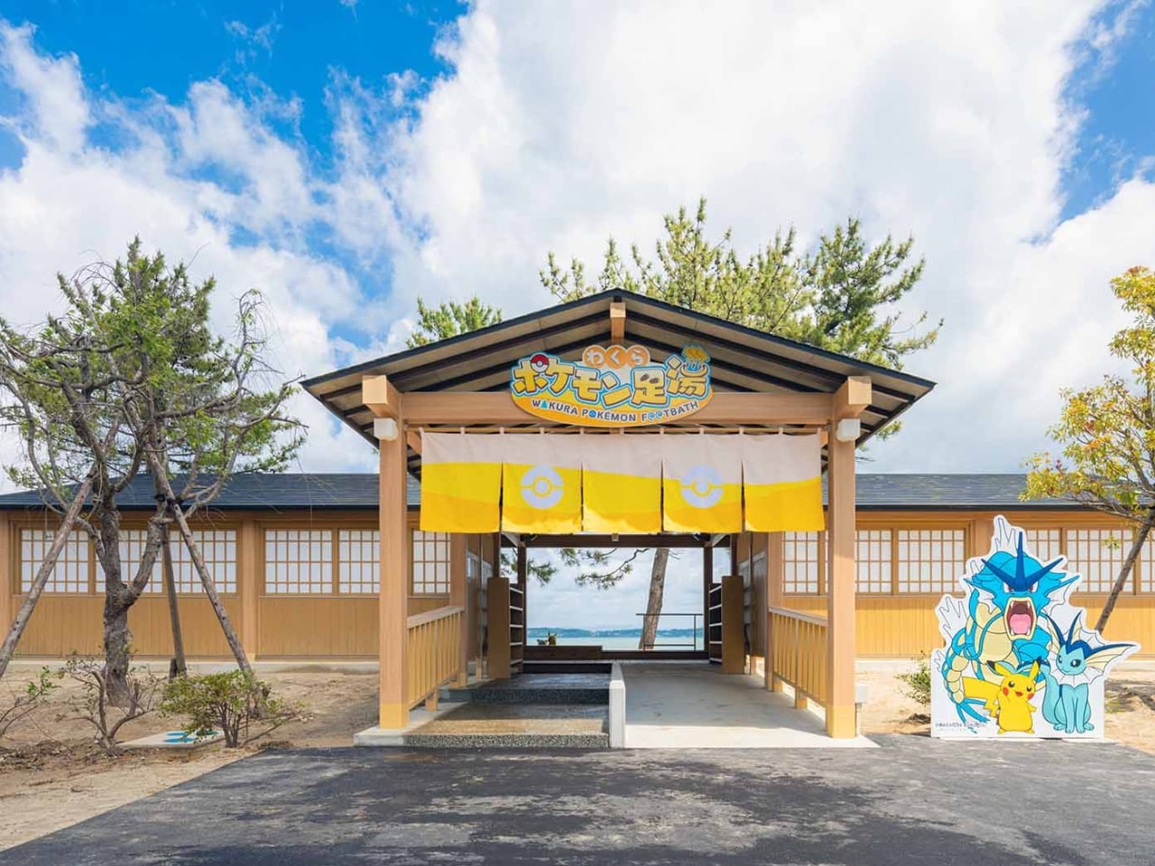
When you hear “Pokémon footbath,” your brain probably goes one of two places: either immediate delight or mild confusion. Both reactions are fair. But when you actually see what just opened in the small coastal town of Wakura Onsen in Nanao City, Japan, the response tends to land somewhere more unexpected than either. It lands in quiet, genuine warmth.
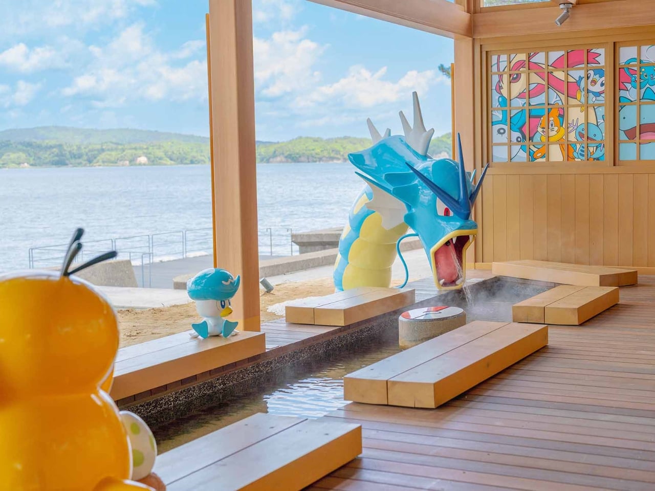
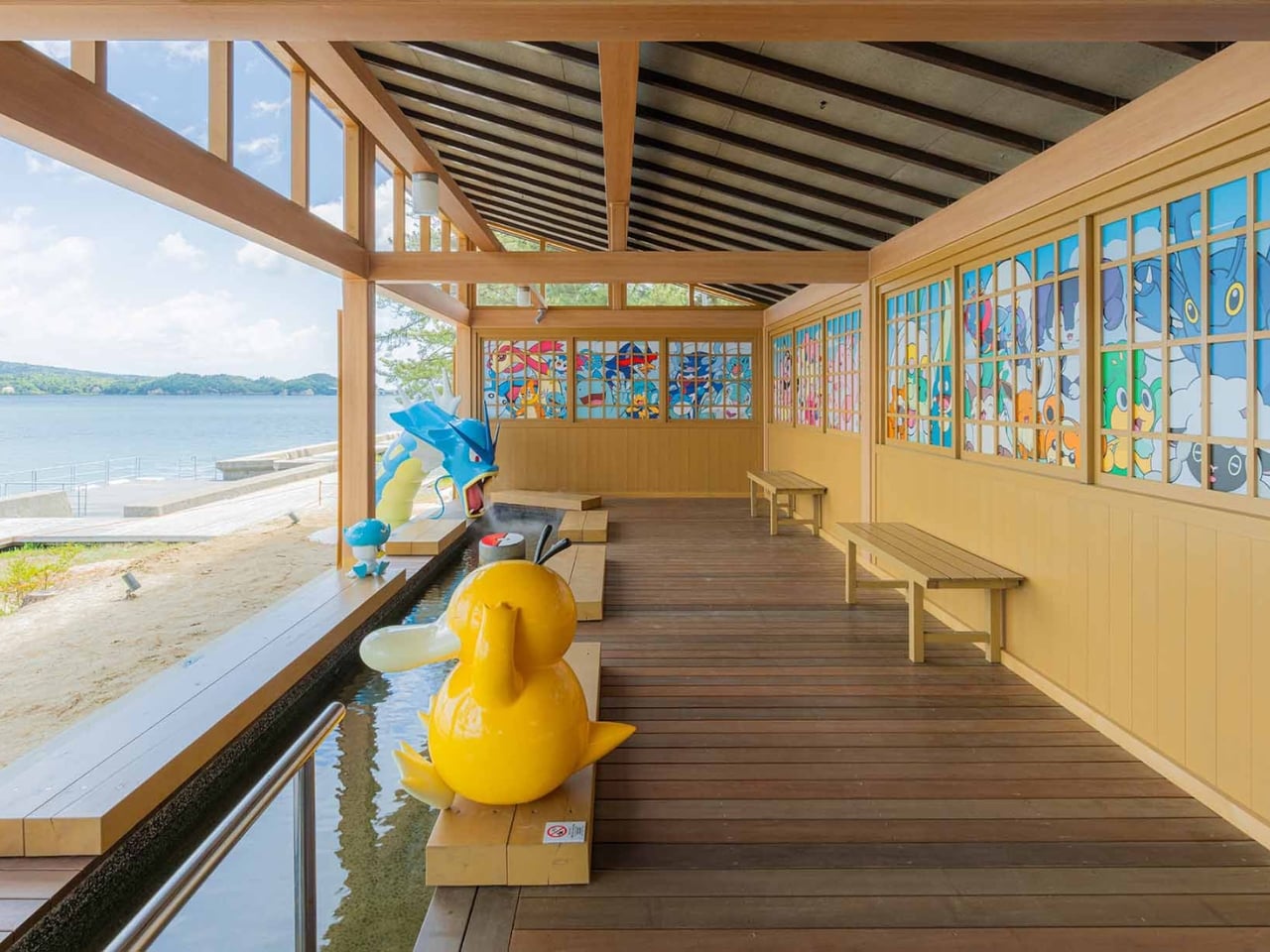
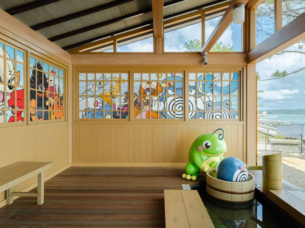
The Wakura Pokémon Footbath officially opened on May 12 inside Yuttari Park in Ishikawa Prefecture, and it is exactly what it sounds like: a public footbath surrounded by beloved Water-type Pokémon. Gyarados towers over the soaking pool, appearing to blast water in with its Hydro Pump. Psyduck perches nearby, looking stressed as always. Vaporeon, Pikachu, Poliwag, Poliwhirl, and Quaxly are scattered throughout the wooden structure, each one in character, each one impossibly charming. The facility is free to use and open daily from 7 AM to 7 PM, though it may close depending on weather conditions.

Designer: Wakura Onsen

From a pure design standpoint, it works. The Pokémon figures feel integrated into the space rather than slapped onto it as an afterthought. The Gyarados placement especially is clever: positioning a creature historically associated with destruction as the one filling a community wellness space with warm water is a quietly subversive design choice. It takes a familiar icon and gives it a new job, and the whole thing is better for it. Good character-led design usually does this. It finds the emotional logic of the IP and builds something genuinely functional around it, instead of just stamping a logo on a wall and calling it a day. The wooden structure keeping everything together also helps ground the Pokémon elements in something tactile and traditionally Japanese, which keeps it from reading as pure merchandise and more as a genuine place to be.

But the design story here is only part of the picture. What elevates the Wakura Pokémon Footbath beyond a cute novelty is the context surrounding it. Wakura Onsen is still recovering from the 2024 Noto Peninsula earthquake, which caused major damage to local tourism infrastructure. The footbath was renovated and developed through a collaboration between Nanao City and the Pokémon With You Foundation, an organization that has long used Pokémon’s reach to support communities facing hardship. Local officials are hoping the new attraction will draw visitors back to a region that urgently needs them. On opening day, a dedication ceremony was held, and children from a local nursery school were among the first to try it out.

That detail matters. It reframes the entire project. A giant Gyarados shooting water into a hot spring pool is fun in isolation. A giant Gyarados shooting water into a hot spring pool in a community rebuilding after a disaster, inaugurated by children experiencing something joyful, is a different kind of story. It is design as care. It is pop culture as infrastructure.

I think we underestimate how much deliberate playfulness can do for a place in recovery. A footbath is not a hospital. It is not a new road or a rebuilt building. But public spaces designed to give people a reason to show up, to sit down, to stay a while, do real work. They signal that a place is worth visiting again. That it has something to offer. That life, in some form, is continuing. And sometimes the difference between a place that comes back and one that does not comes down to whether people believe it is worth returning to.

The footbath also ties into the newly installed Pokémon manhole covers placed around Nanao City, part of Japan’s Pokéfuta initiative, which uses collectible Pokémon-themed covers to encourage visitors to explore lesser-known regions. It is a broader ecosystem of soft infrastructure pointing in the same direction: come here, look around, stay awhile.

Wakura Onsen may not be the first destination that comes to mind for a travel itinerary. But a free footbath where a reformed Gyarados keeps your feet warm while Psyduck quietly spirals next to you? That is a genuinely compelling reason to make the trip. And right now, Nanao City could use a few more of those.

The post Japan Just Built a Pokémon Footbath and It’s Genuinely Moving first appeared on Yanko Design.