Apple’s LA Event Just Leaked: M5 Max MacBook Pros Coming

Apple’s LA Event Just Leaked: M5 Max MacBook Pros Coming

Apple is preparing to host an exclusive event in Los Angeles from January 27th to 29th, 2026, where it will unveil its latest high-performance MacBook Pros powered by the advanced M5 Pro and M5 Max chips. This private gathering is tailored for a select group of professional creators, emphasizing Apple’s strategic focus on showcasing its […]

The post Apple’s LA Event Just Leaked: M5 Max MacBook Pros Coming appeared first on Geeky Gadgets.

Posted in Uncategorized

This Insane Vertical MMO Mouse Packs 10 Thumb Buttons And A 45-Degree Grip For Your Wrist

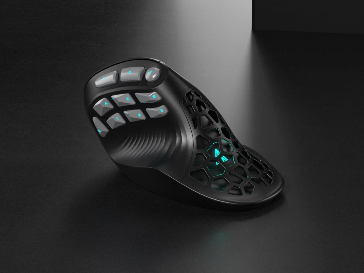
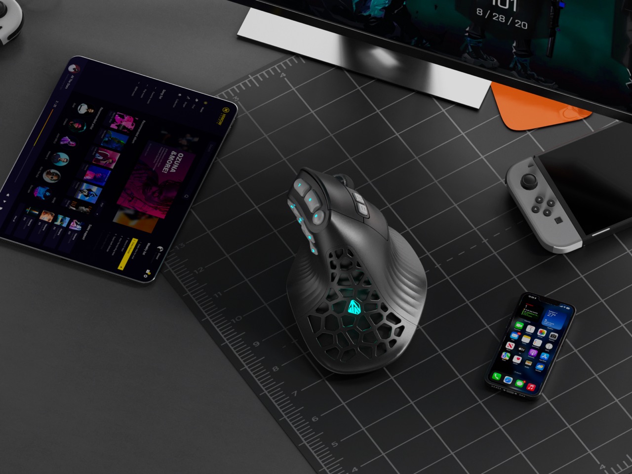
Vertical mice promise ergonomic relief. MMO mice deliver tactical control. Pick one, because the market says you can’t have both. Except SOLAKAKA apparently didn’t get that memo. The E9 Pro arrives as the first vertical MMO mouse, featuring a 45 degree ergonomic grip alongside a 10 button thumb panel that would make World of Warcraft players weep with joy. It feels like the peripheral equivalent of discovering your favorite coffee shop also serves excellent ramen.

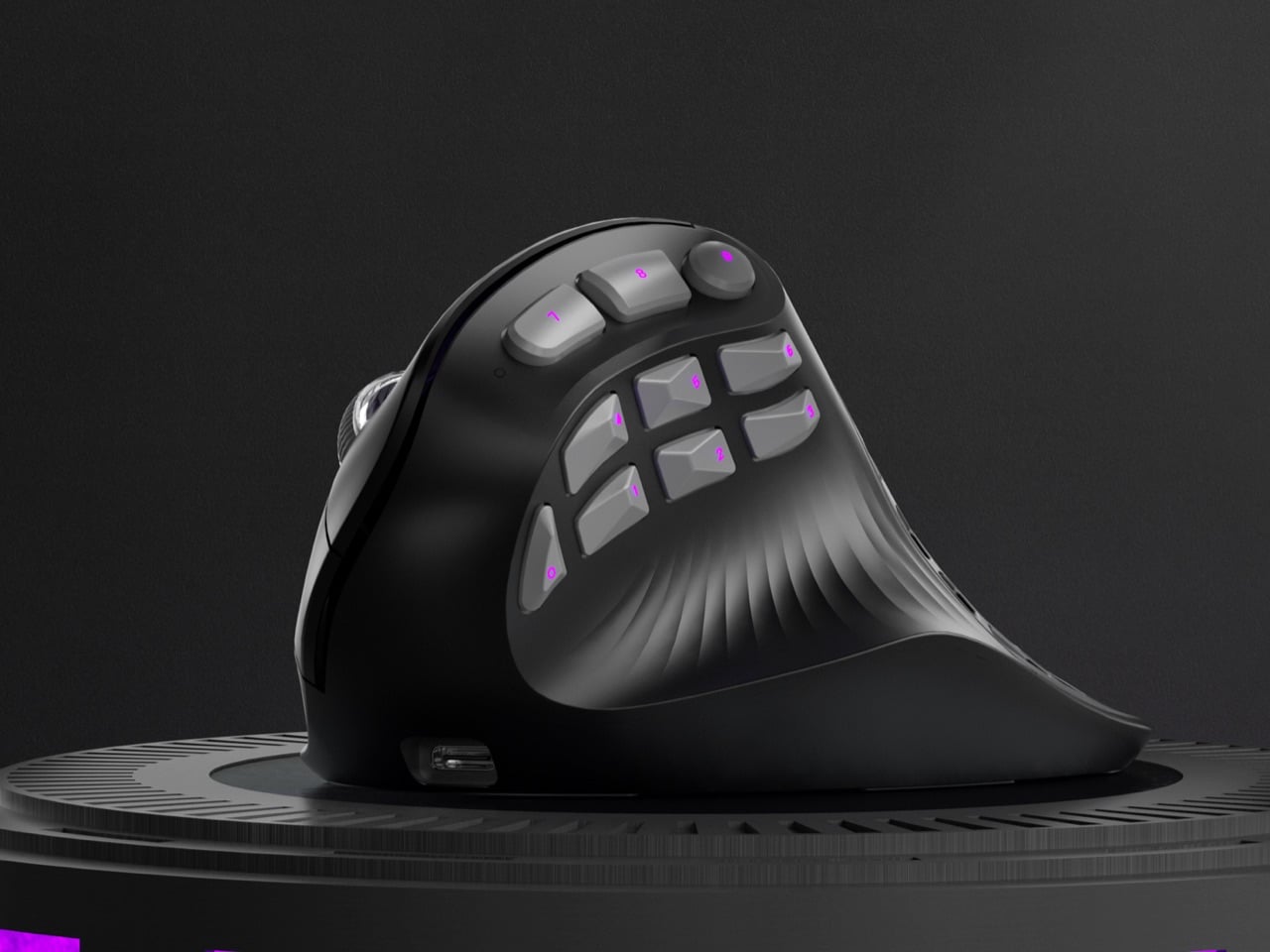
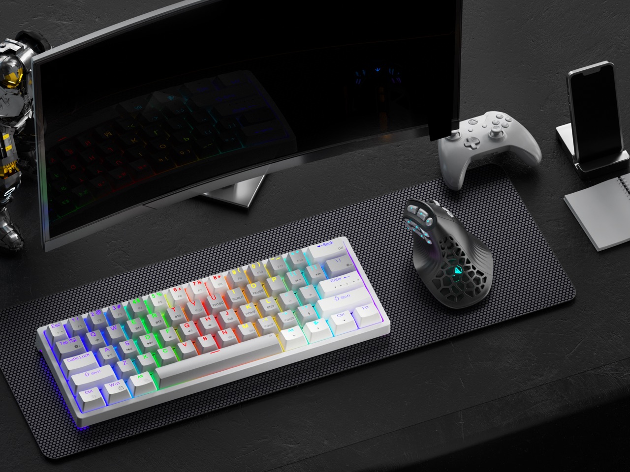
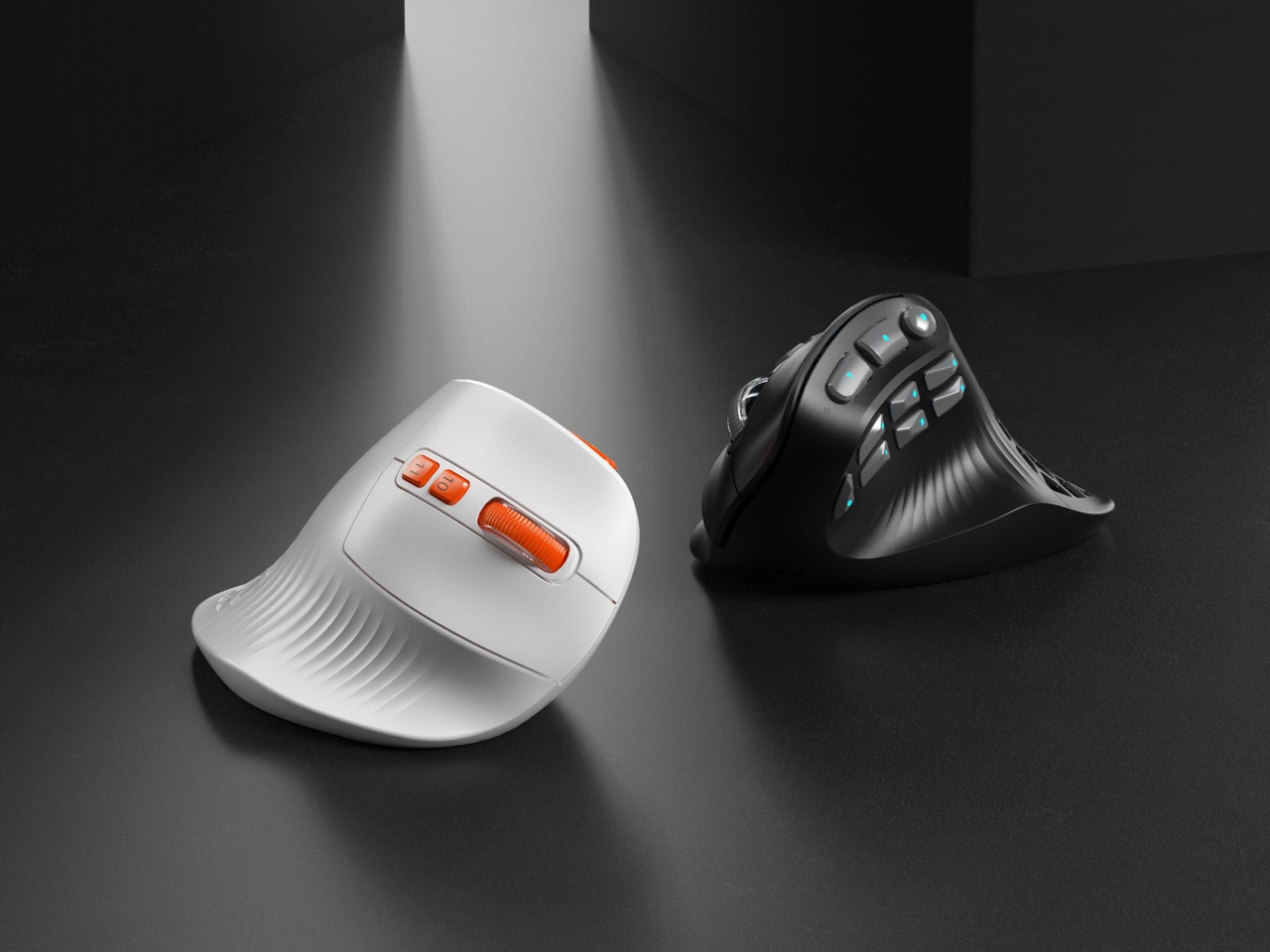
The design centers on a tactical thumb zone where all 10 side buttons follow the natural arc of your thumb movement. No stretching, no hunting, just muscle memory doing its thing. The vertical orientation keeps your wrist in a handshake position rather than the pronated twist that causes repetitive strain. A grille style cutout pattern ventilates the palm rest while dropping weight to 97 grams, and the PAW3395 sensor handles up to 36,000 DPI for people who like their precision surgical. Offered in understated black gray and louder white orange colorways, the E9 Pro targets anyone who refuses to choose between comfort and capability.

Designer: SOLAKAKA

Click Here to Buy Now: $69 $89 ($20 off) Hurry! Only 41 left of 850.
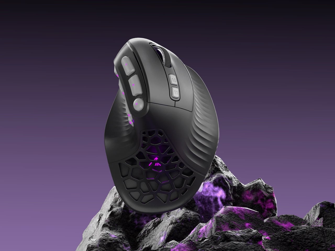
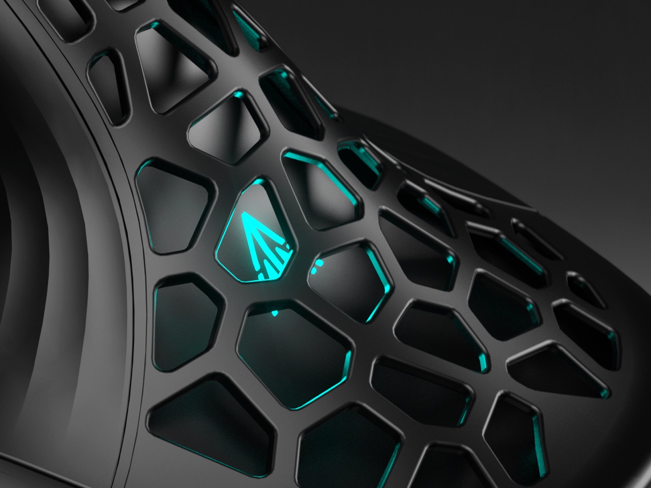
You just have to admire the silhouette for a second. Most ergonomic mice look like orthopedic devices that got lost on the way to the pharmacy. The E9 Pro, however, still reads as a performance machine. Its shell is all sharp planes and deliberate curves, giving it a confident, architectural presence on a desk. That grille cutout on the palm rest is a brilliant piece of multi-tasking design; it slashes weight, creates a distinct visual identity, and provides some welcome ventilation for those marathon gaming sessions. It’s a design that feels both aggressive and intelligent, which is a tough needle to thread.

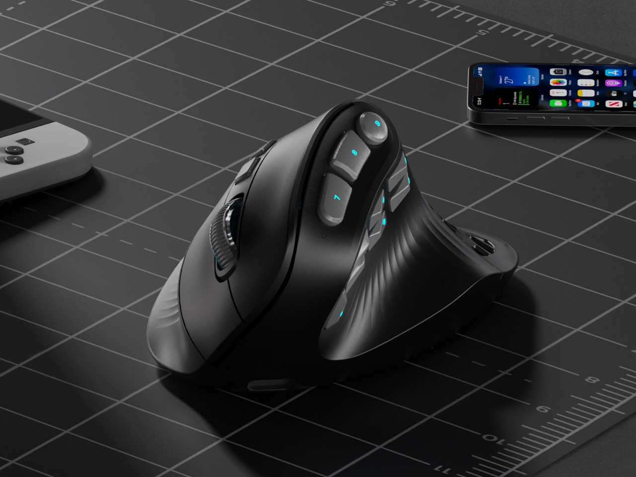
That 45 degree tilt is the perfect middle ground, offering a natural handshake grip that takes the strain off your forearm without feeling as alien as some of the more extreme 90 degree vertical mice. You can feel the logic behind it instantly. SOLAKAKA says they landed on this angle after 300 hours of testing across gaming, coding, and design, and it shows. The sculpted palm and thumb supports provide a secure anchor for your hand, letting you relax your grip instead of constantly pinching the mouse. It feels less like you’re holding a device and more like the device is an extension of your hand’s natural posture.

But let’s be real, we’re all here for that thumb cluster. Ten buttons on a vertical mouse sounds like a recipe for chaos, but the execution is incredibly clever. Instead of a boring grid, the buttons are laid out in a gentle arc that follows the natural sweeping motion of your thumb. It’s a racetrack for your digit, with each button acting as a distinct landmark. This is a massive leap forward for muscle memory, turning what could be a fumbling mess into an intuitive control panel. For anyone juggling macros, creative tool palettes, or complex skill rotations, this layout is a game changer.

And the performance hardware inside is absolutely top-tier. The PixArt PAW3395 is the same flagship sensor you find in elite esports mice, capable of a wild 36,000 DPI, 650 IPS tracking, and 50g of acceleration. This isn’t an ergonomic mouse with gaming parts bolted on; it’s a legitimate performance mouse built on an ergonomic chassis. The polling rate ramps up to 8,000 Hz in wired mode for near-zero latency, and the tri-mode connectivity gives you the freedom to switch between a lag-free 2.4 GHz dongle, Bluetooth, and a direct USB C connection. A beefy 1000 mAh battery keeps the whole operation running for ages.

This brings us to the weight. Vertical mice with this many features often have some heft, easily tipping the scales at 120 grams or more. The E9 Pro comes in at a nimble 97 grams, and that makes a world of difference. The lighter weight, combined with the ergonomic grip, means less inertia and less torque on your wrist when you’re making fast, sweeping movements or quick flick shots. It’s a detail that shows a deep understanding of how ergonomics and performance are intertwined. That grille isn’t just for looks; it’s a core part of a thoughtful weight-reduction strategy that pays off every time you move the mouse.

The whole package comes in two distinct flavors. The black and gray model is pure stealth, ready to blend into a professional workstation or a minimalist gaming setup. Then you have the white and orange version, which looks like it drove right off a sci-fi movie set, with vibrant orange accents highlighting the buttons and grille. It’s a fantastic bit of personality. Through its Kickstarter campaign, the E9 Pro is available for around $69 for early backers, which is an incredibly competitive price for a mouse that’s not just entering a category but creating a new one. This is one of those designs that feels so right, you wonder why nobody did it sooner.

Click Here to Buy Now: $69 $89 ($20 off) Hurry! Only 41 left of 850.

The post This Insane Vertical MMO Mouse Packs 10 Thumb Buttons And A 45-Degree Grip For Your Wrist first appeared on Yanko Design.

NYXI Hyperion 3 Finally Gives the Switch 2 a Grown-Up Controller

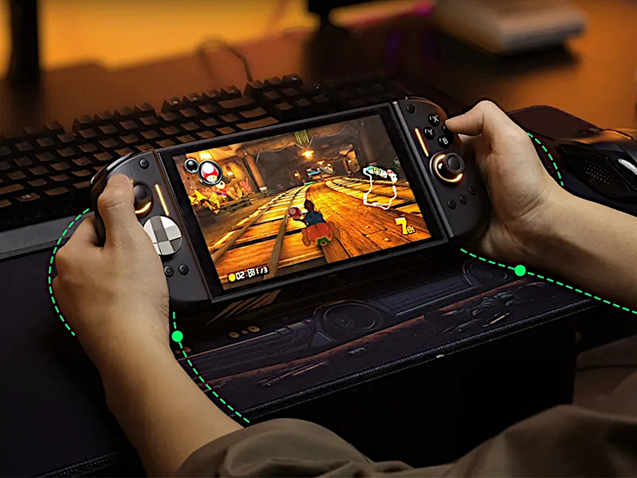
Playing the Switch 2 for more than an hour in handheld mode means the flat Joy-Cons and small buttons start to feel like a compromise. Your hands end up clawed around the rails, drift anxiety creeps in, and you start shifting your grip to avoid cramping. NYXI’s Hyperion 3 is built for people who treat the Switch 2 like a main console, not a travel toy used in short bursts.

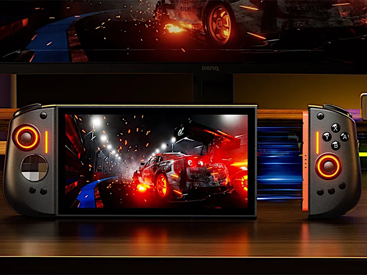
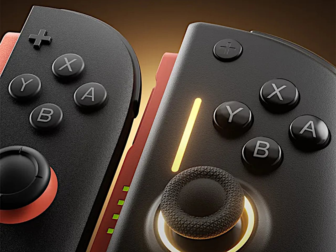
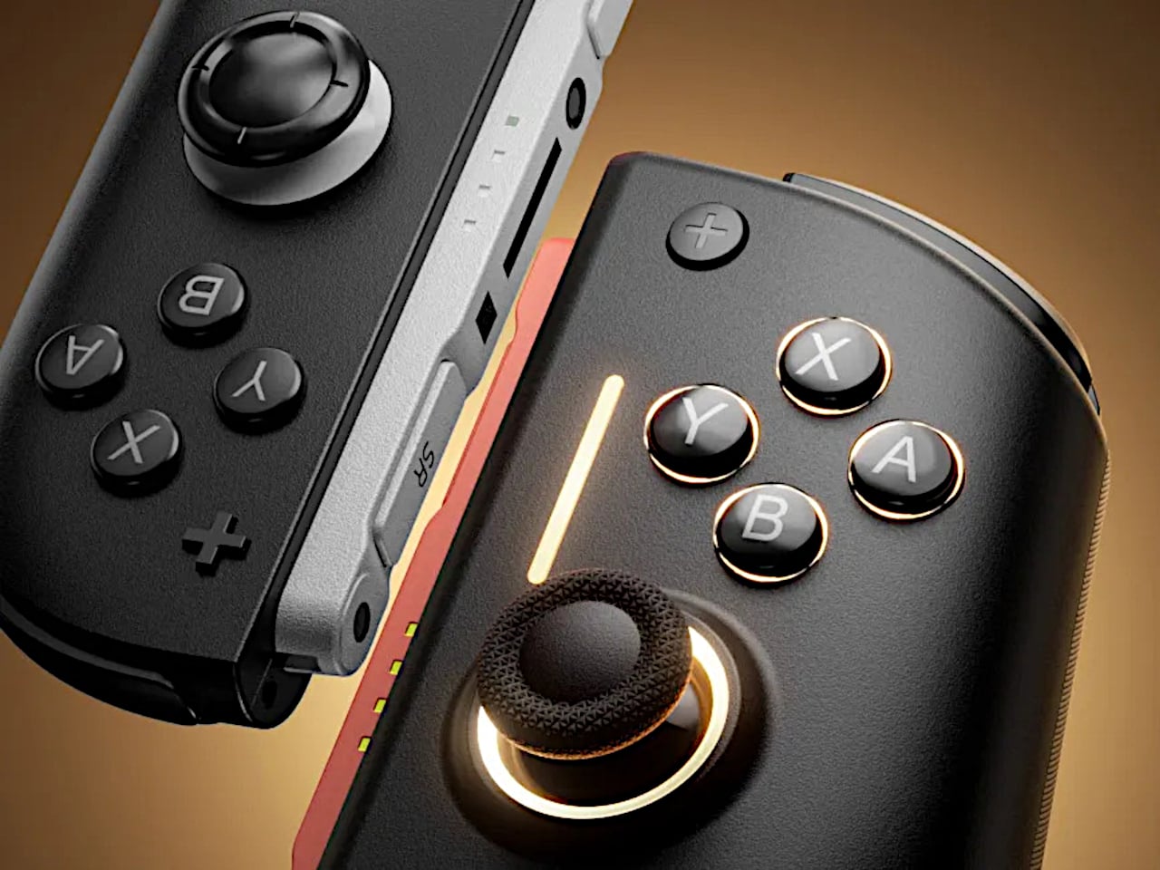
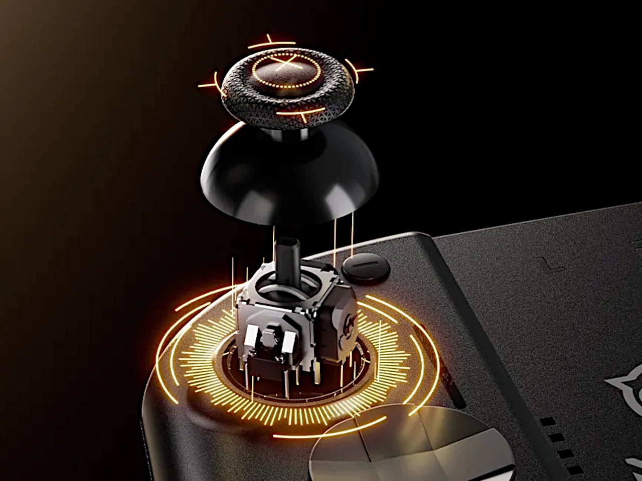
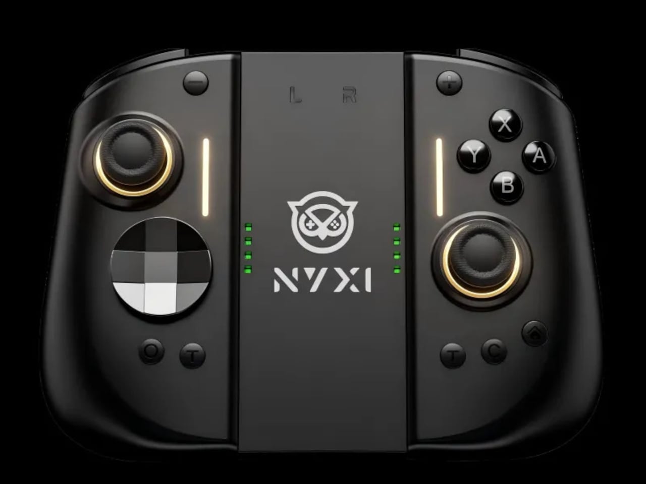
NYXI’s Hyperion 3 is a wireless JoyPad that snaps onto the Switch 2 for handheld play and works as a standalone pad when docked. It adds real grips, larger sticks, and more spaced-out buttons, swapping the usual potentiometer sticks for hall-effect joysticks designed to be drift-free over the long haul. It is pitched as the world’s first ergonomic JoyPad for Switch 2, treating comfort and reliability as primary goals.

Designer: NYXI

Settling into a long RPG or racing game in handheld mode, the full-size grips let your hands relax instead of pinching edges. The hall-effect sticks feel smooth and precise, and you are not waiting for the first sign of drift that ruined your last controller. The strong magnetic lock keeps everything solid, so the console feels like one piece rather than a screen with two wobbly handles threatening to flex apart.

The larger micro-switch face buttons and D-pad click with a clear, mechanical feel, making fast inputs and diagonals more reliable in fighters or platformers. The 9-axis gyro gives you fine motion aiming in shooters or steering in racers, so you can lean on tilt controls without fighting laggy sensors or imprecise calibration that drifts halfway through a match.

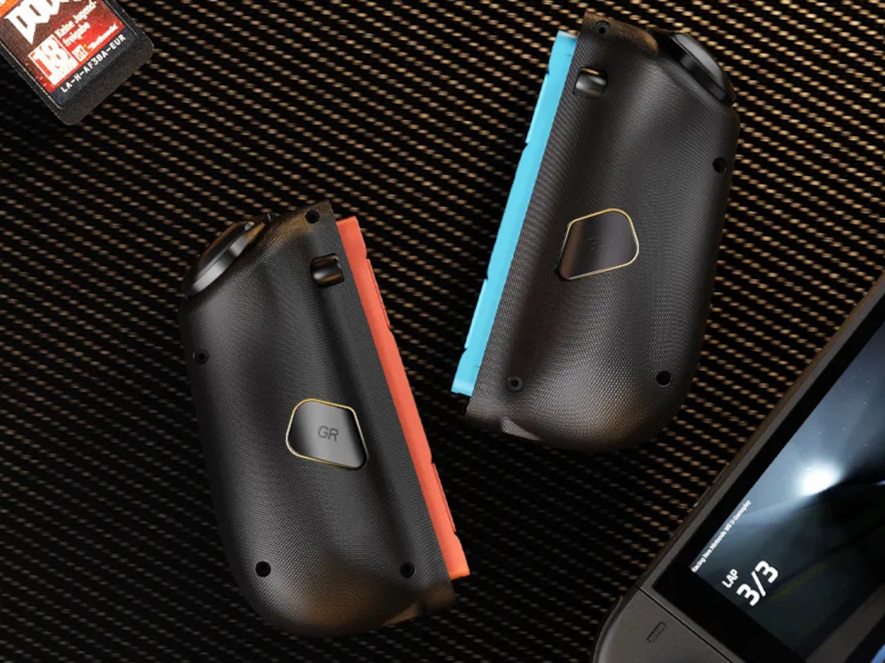
The programmable back buttons let you move key actions off the face buttons, so your thumbs can stay on the sticks more often. Mapping jump, reload, or item use to the back means fewer awkward stretches, especially in games designed around a traditional pad. Over time, that small shift in where your fingers land makes the controller feel tailored to your habits instead of forcing you into Nintendo’s layout.

Hyperion 3 is not as slim or neutral as Nintendo’s own Joy-Cons. The full-size grips and gaming-centric styling make the Switch 2 less pocketable and more like a small console with a screen. That is exactly the point, though, a handheld that finally feels built for adult hands, even if it means giving up a bit of throw-in-a-bag convenience.

Hyperion 3 shows what happens when a third-party accessory takes the Joy-Con format seriously as a starting point, not a template to clone. By fixing drift, upgrading buttons, adding back paddles, and leaning into ergonomics, it treats the Switch 2 like a platform deserving of pro-level hardware. Playing on Nintendo’s hybrid for hours makes that kind of overkill feel pretty reasonable.

The post NYXI Hyperion 3 Finally Gives the Switch 2 a Grown-Up Controller first appeared on Yanko Design.
This Tea Brand Just Turned Packaging Into a Playful Puzzle

There’s something oddly satisfying about counting things. Maybe it’s the same reason people find numbered lists so appealing, or why we instinctively organize our world into sequences. By-Enjoy Design seems to understand this perfectly with their OneToTea packaging for CHASHAN’s white tea pearls, turning what could have been just another tea box into something that feels almost like a playful puzzle.

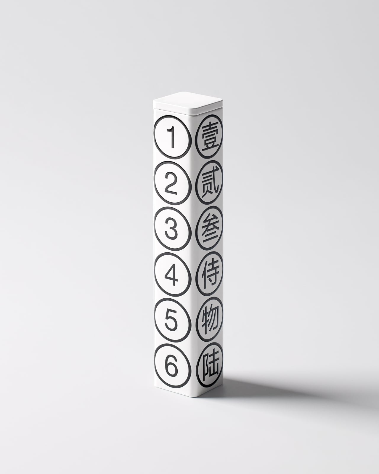
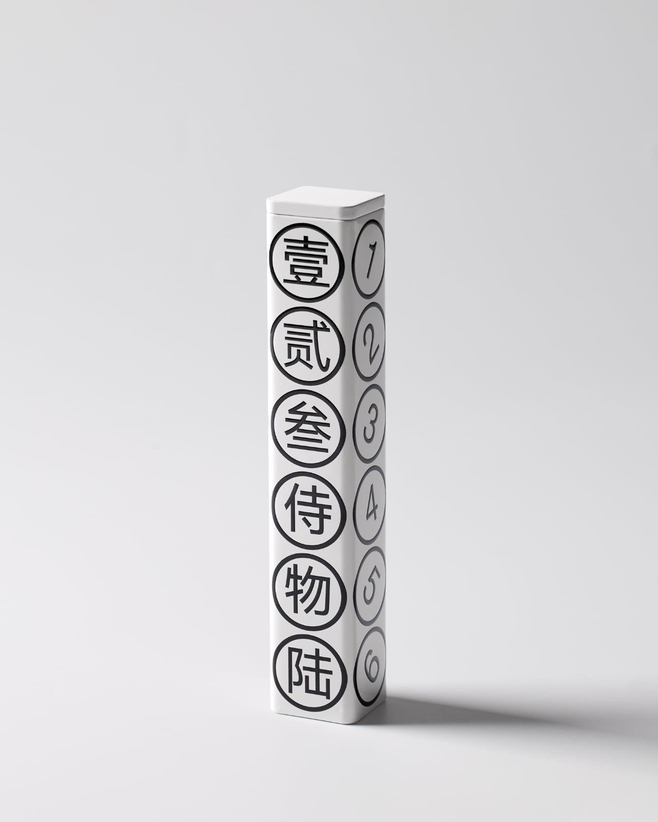
The concept is beautifully simple. Six white tea pearls, six numbers, one hexagonal tube. Each face of the package displays both a Chinese character and its corresponding Arabic numeral, from one through six. It’s the kind of design that makes you wonder why nobody thought of it sooner, which is usually the hallmark of really smart packaging.

Designer: By-Enjoy Design

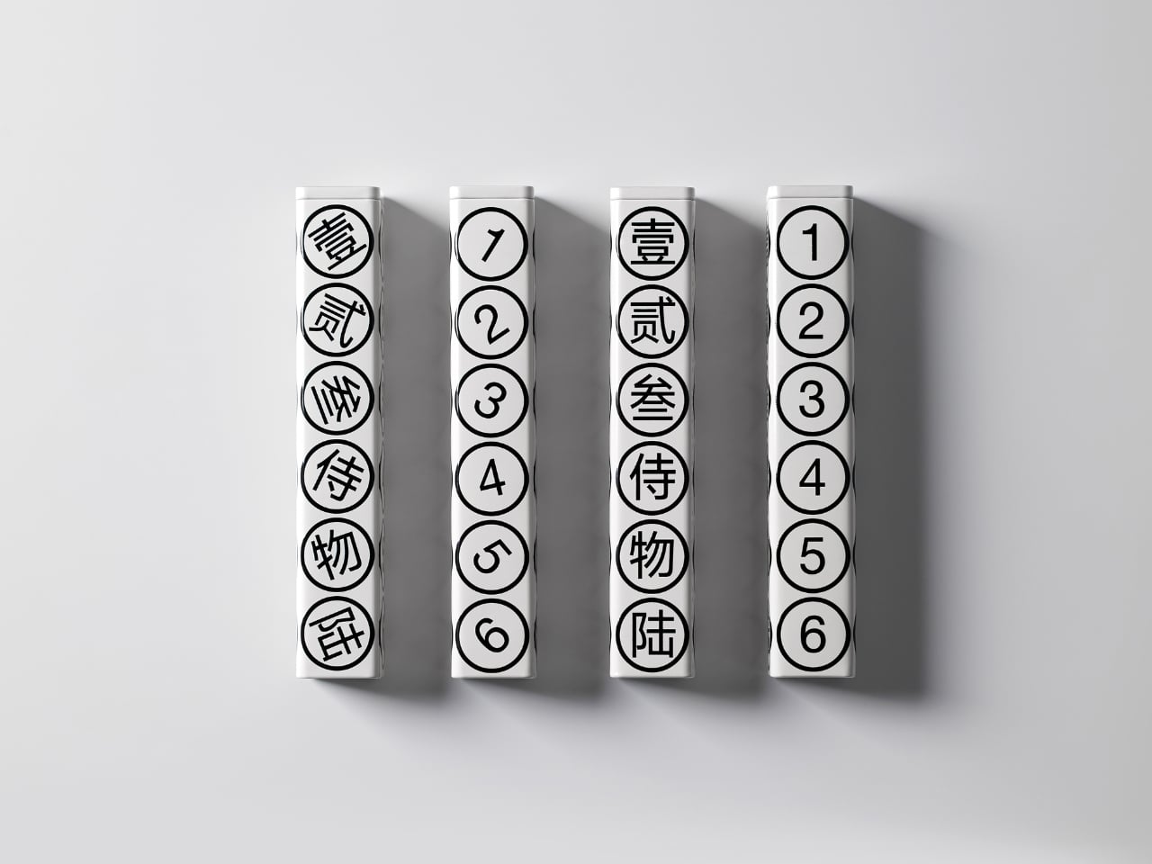
What strikes me first is the restraint. The color palette is strictly monochrome, with black graphics on a pristine white background. No gradients, no metallic finishes, no desperate attempts to scream luxury through gold foiling or embossing. Instead, the design whispers sophistication through its geometric precision and typographic clarity. The circles containing each number create a rhythmic pattern down the length of the tube, making something as straightforward as counting feel deliberately composed.

But here’s where it gets interesting. The packaging doesn’t just look good sitting on a shelf. According to the designers, a gentle shake brings the whole thing to life, making it playful and dynamic. Imagine holding this tube and feeling those tea pearls shift inside, each one rolling to match its designated number. It transforms a static object into something tactile and interactive, which is pretty rare in the tea world where most packaging is designed to sit pretty and do nothing else.

The bilingual approach serves multiple purposes beyond just translation. The Chinese characters carry cultural weight and authenticity, grounding the product in tea’s traditional origins. The Arabic numerals provide universal accessibility, ensuring anyone can engage with the numbering system regardless of language. This dual identity feels especially relevant for contemporary Asian brands trying to speak to both local and global audiences without losing their cultural identity in the process.

Each tea pearl comes individually wrapped, and naturally, it bears the same number as its spot on the tube. This kind of consistency creates a complete experience rather than just packaging. You’re not randomly grabbing a tea pearl. You’re selecting number three, or saving number six for later. It gamifies the consumption process in a subtle way, adding a layer of intentionality to your tea ritual.

The hexagonal form itself deserves attention. It’s not the easiest shape to manufacture or ship, but it offers six equal faces for that perfect one-to-six display. It also stacks and arranges beautifully, as shown in the images where multiple tubes create their own geometric compositions. From a retail perspective, these tubes photograph incredibly well, which matters immensely in our Instagram-driven market where packaging needs to perform on screens as much as on shelves.

What really works here is how the design manages to be both minimal and maximal at once. Minimal in its aesthetic choices, with that stark black and white palette and clean typography. But maximal in its thoughtfulness, with every element serving both function and form. The numbers aren’t just decorative. They’re an organizational system, a design motif, a playful interaction, and a cultural bridge all at once.

This kind of packaging also taps into something collectors understand well. When design is this cohesive and clever, you don’t want to throw the box away. That tube becomes an object worth keeping, maybe for storing other small treasures or just displaying because it looks that good. It’s the opposite of disposable packaging, and that sustainability angle (even if unintentional) resonates with contemporary values around consumption and waste.

By-Enjoy Design has created something that works on multiple levels. It’s functional enough for everyday use, beautiful enough for gift-giving, clever enough to spark conversation, and simple enough that its brilliance doesn’t require explanation. Sometimes the best design solutions are the ones that make you smile because they just make sense.

The post This Tea Brand Just Turned Packaging Into a Playful Puzzle first appeared on Yanko Design.
Hourglass-like Lamp Changes Lighting When You Flip It Upside Down

Most table lamps quietly disappear into the background, doing their job without much thought. There is the usual formula: a base, a stem, a shade, and how they become part of the furniture, you stop noticing. JAL from Barcelona studio Som by Mos leans into that ordinariness on purpose, then uses a very small twist to make the everyday feel a bit more deliberate and less forgettable.

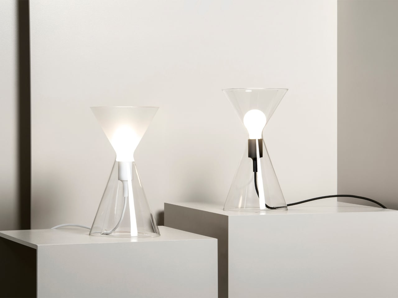
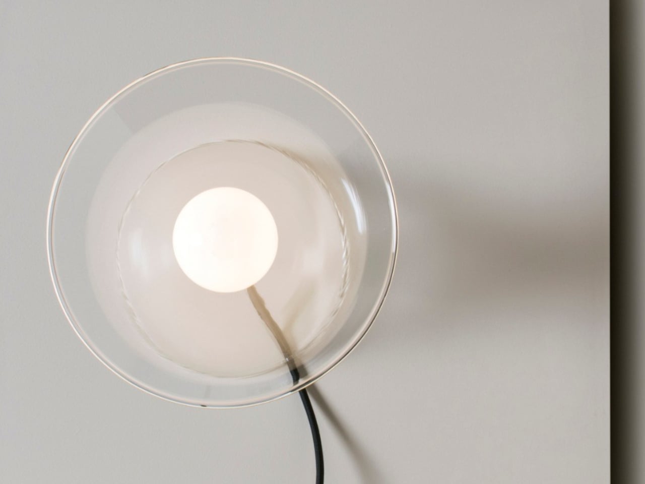
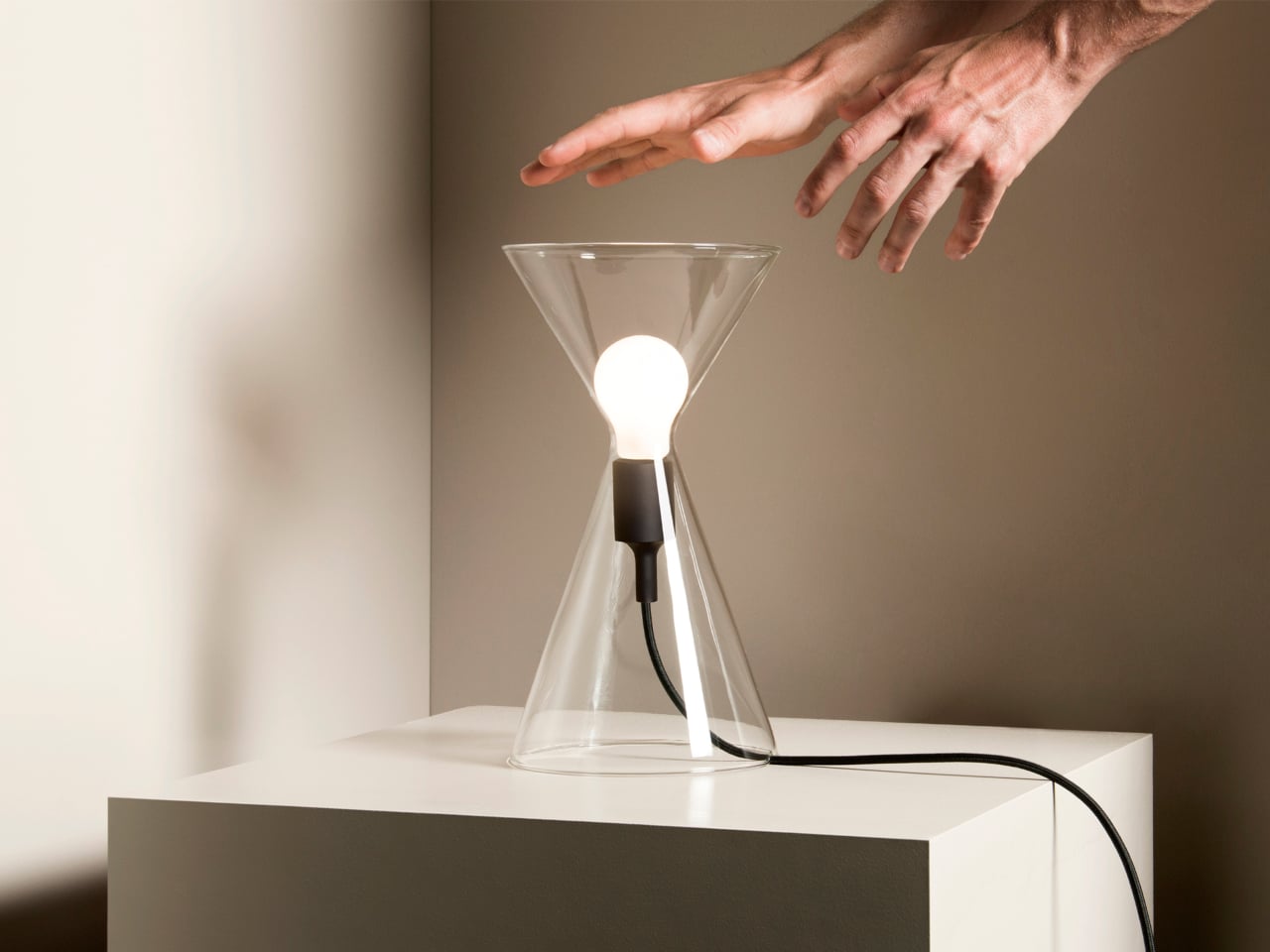
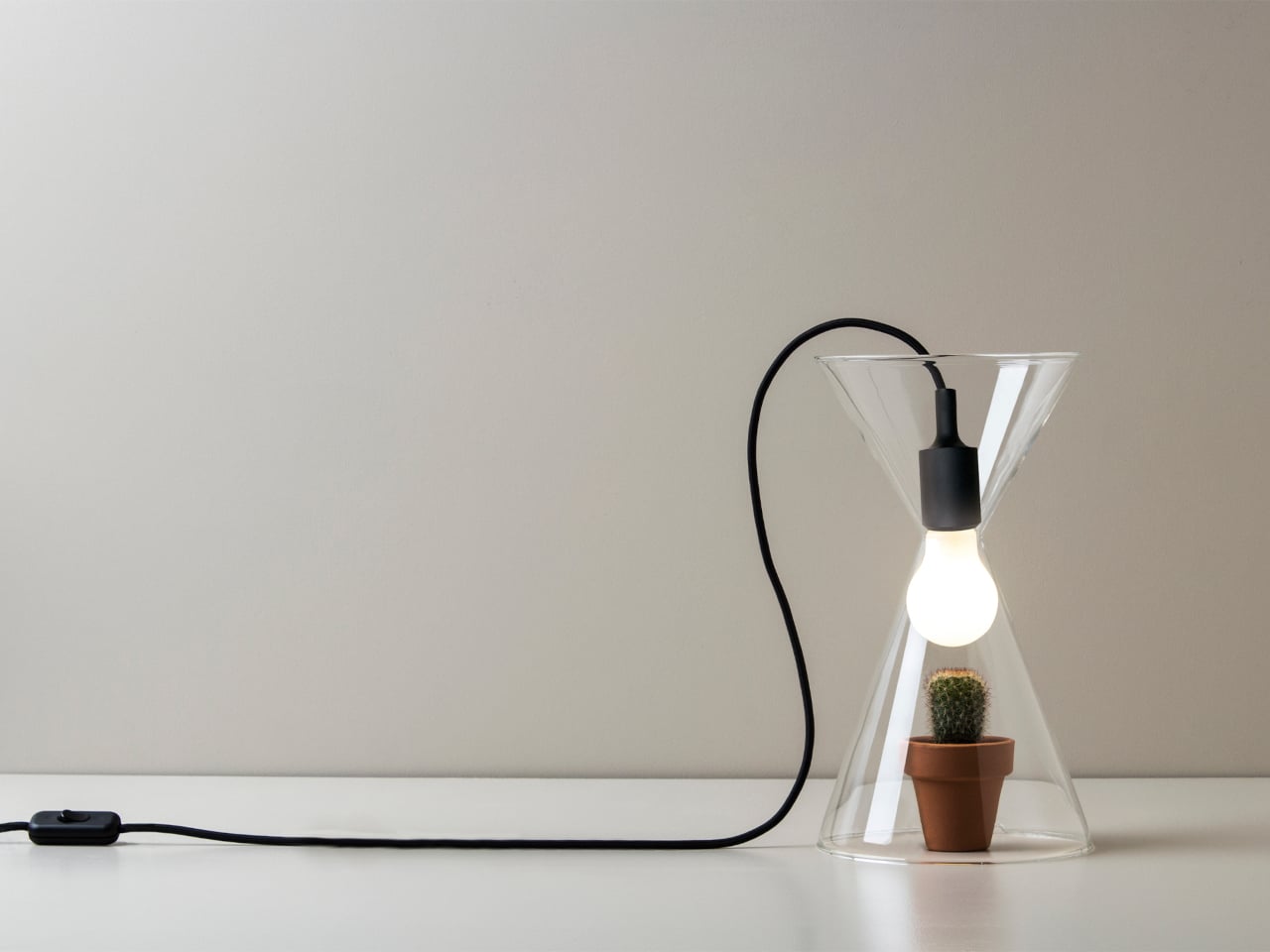
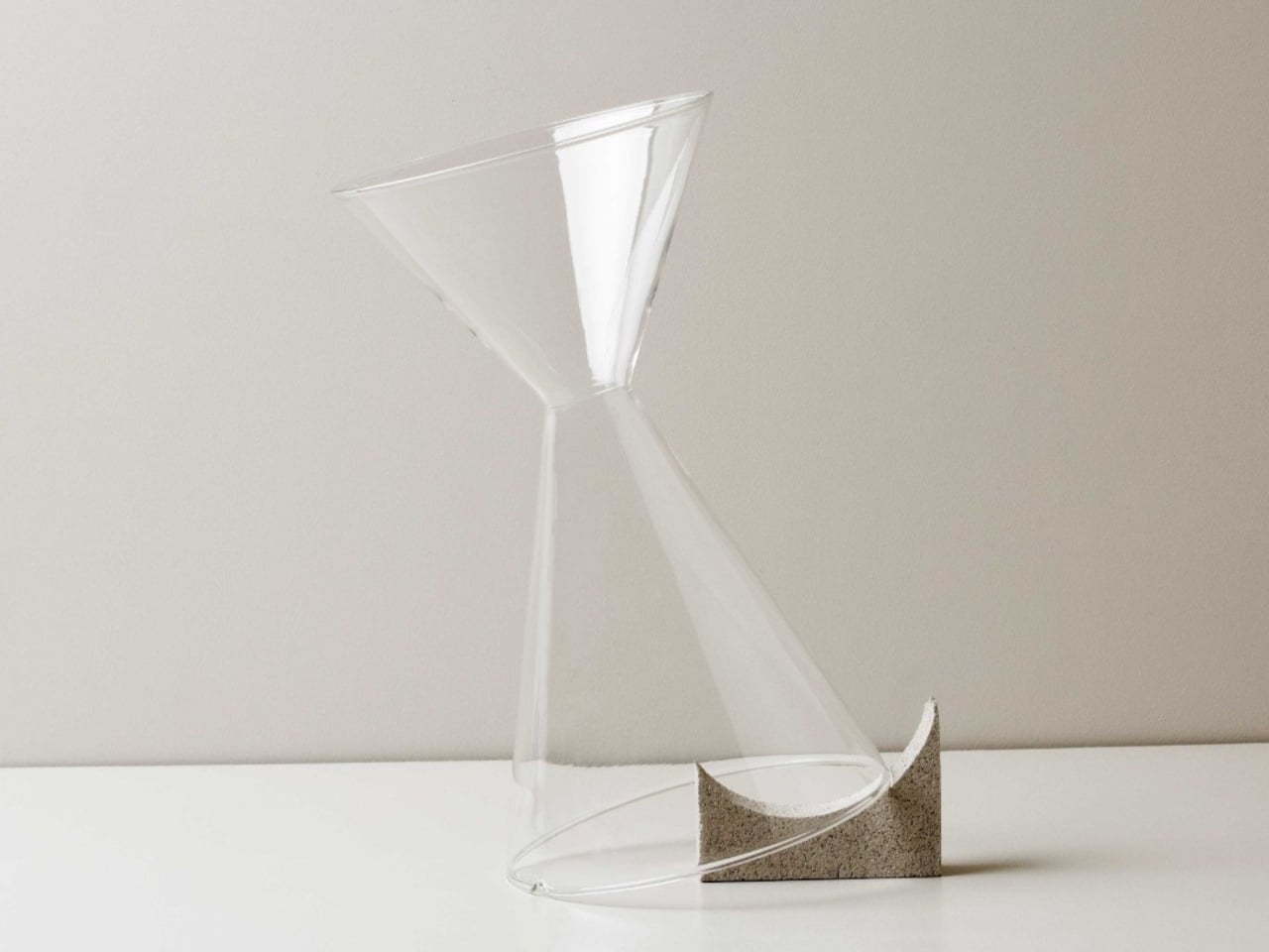
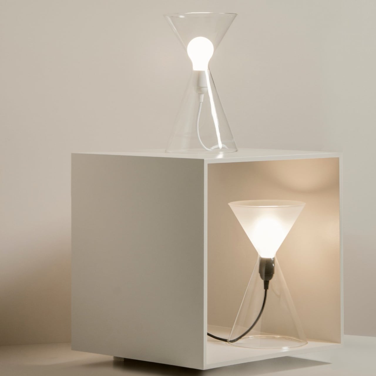
JAL is a table lamp built around two glass cones joined tip to tip, like a clear hourglass. The bulb sits inside this double cone so it appears to float in the air, and the whole piece is available in transparent or frosted glass. The only other visible element is the cable, which comes in different colors and quietly sets the tone.

Designer: SOM by MOS

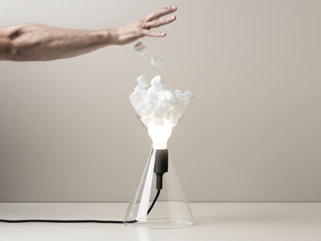
Placing JAL with the bulb facing upward on a sideboard, it behaves like a familiar table lamp, throwing light onto the wall and ceiling. Flip it so the bulb points downward, and it turns into more of a glowing object that pools light on the surface below. That simple rotation changes how you use the lamp, from reading companion to ambient accent.

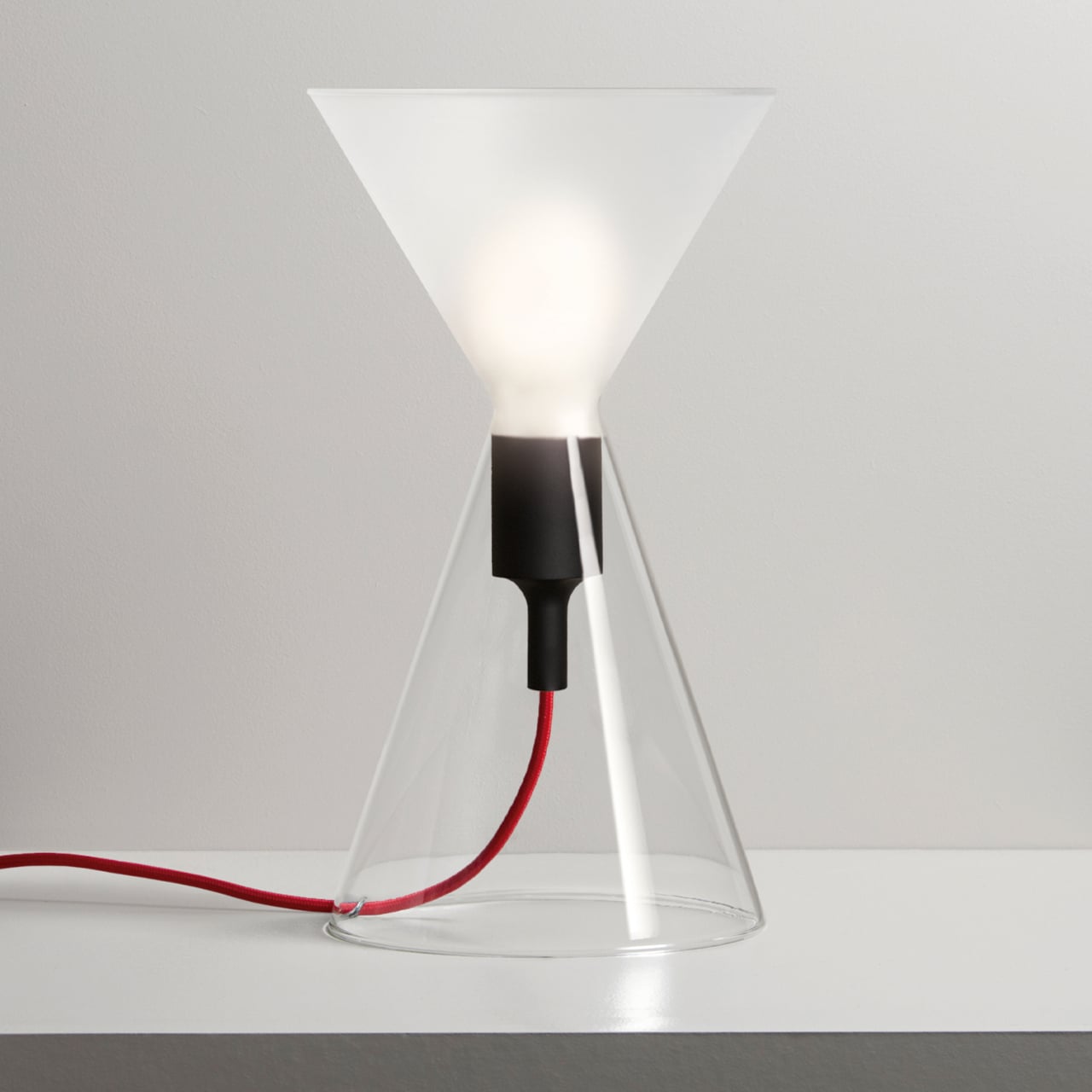
The clear-glass version makes the bulb and its reflections the main event, better suited to a living room corner or a shelf where you want a bit of sparkle. The frosted version softens everything, turning the hourglass into a diffuse glow that feels more at home on a bedside table or a quiet desk. The form stays the same, but the way it holds light shifts with the finish.

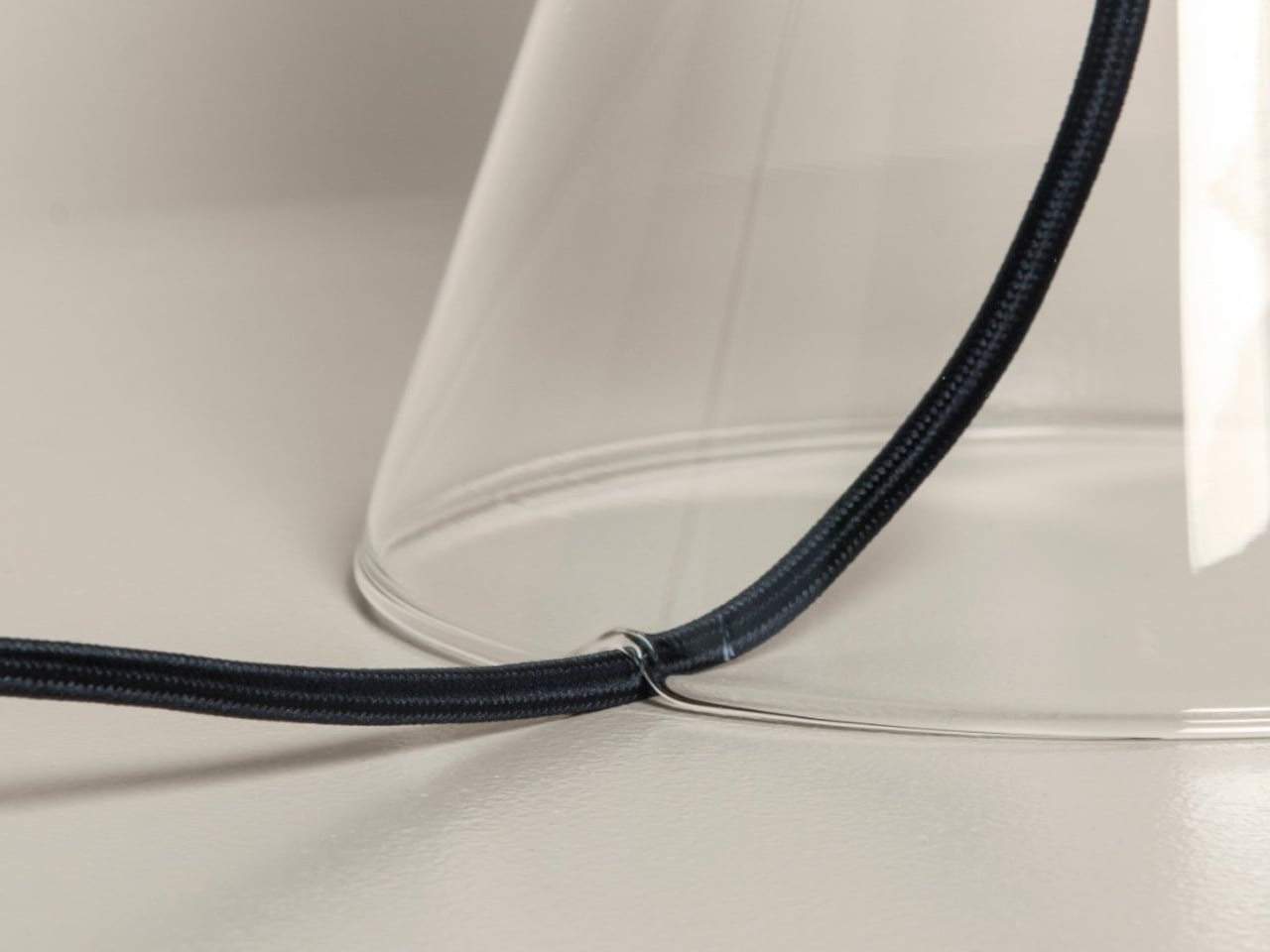
Som by Mos offers a selection of cable colors, so the one strong line cutting through the glass can either disappear or become a graphic detail. A neutral cable lets the lamp fade into a minimal setup, while a bolder color makes it feel more playful. Those small decisions, orientation, glass type, cable, are how the lamp becomes “whatever you want it to be.”

Som by Mos talks about objects that are not just used but experienced and interpreted. JAL fits that idea because it does not force a single reading. It is a lamp you can turn, soften, or sharpen with tiny choices, and over time, those choices are what give it personality. Loud lighting fills rooms with fixtures demanding attention, but a quiet hourglass of glass and light can feel like exactly the right kind of “just another lamp.”

The post Hourglass-like Lamp Changes Lighting When You Flip It Upside Down first appeared on Yanko Design.
Cambridge Just Designed the Voice Device Every Stroke Survivor Wanted

There’s something almost poetic about a piece of technology that looks like a fashion accessory but can fundamentally change someone’s life. That’s exactly what researchers at the University of Cambridge have created with Revoice, a soft, flexible choker that helps stroke survivors speak again.

Around 200,000 people in the U.S. experience speech difficulties after a stroke each year. Many lose the ability to form words clearly or struggle to express complete thoughts, a condition called dysarthria. For years, the options have been limited to speech therapy, typing on communication boards, or experimental brain implants that require surgery. Revoice offers something different: a wearable device you can put on like jewelry and throw in the wash when you’re done.

Designer: scientists from the University of Cambridge

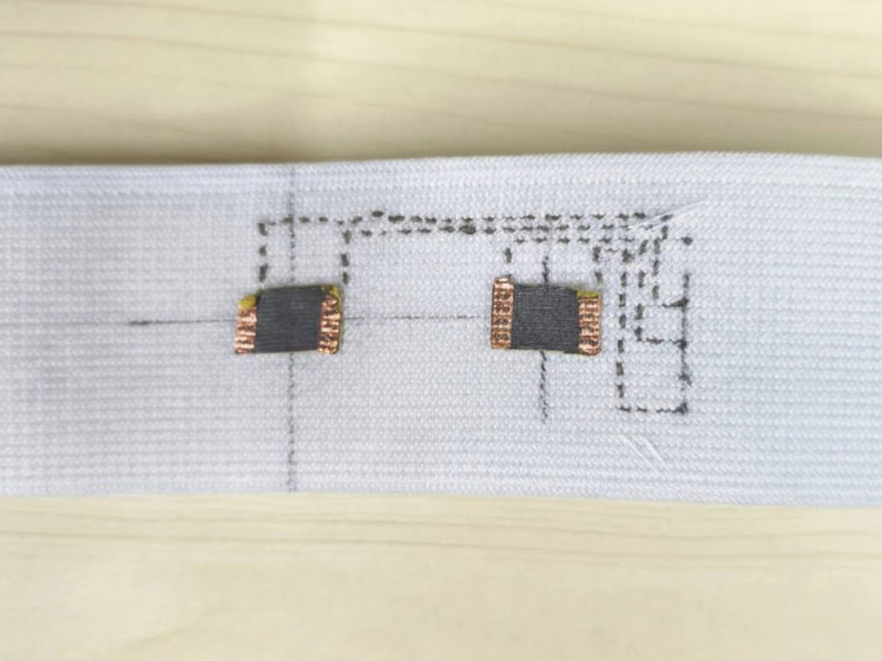
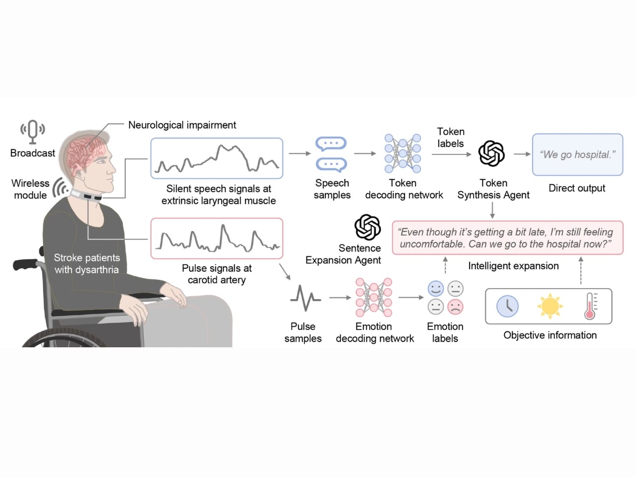
What makes this device fascinating is how it works. The choker sits comfortably against your throat and does two things at once. First, it picks up the tiniest vibrations from your throat muscles when you mouth words, even if no sound comes out. Second, it tracks your heart rate, which gives clues about your emotional state, whether you’re frustrated, anxious, or calm.

These signals get sent to two AI systems working together. The first AI agent focuses on reconstructing what you’re trying to say based on those throat vibrations. It’s essentially reading the intention behind silent or partial speech. The second agent takes things further by expanding short phrases into full, natural sentences. So if you manage to mouth “need help,” the system might generate “I need help with something, can you come here?” complete with the right emotional tone based on your heart rate data.

Think about what this means. Instead of laboriously spelling out every word on a screen or pointing at pictures on a board, you can have fluid conversations again. Your family hears full sentences. You can express nuance and emotion, not just basic needs. The device aims to give people back something invaluable: their natural communication style. The technology builds on recent advances in AI and sensor miniaturization. These aren’t the bulky medical devices of the past. The choker is designed to be discreet and comfortable enough to wear all day. It’s washable, which means it fits into normal life without requiring special care or maintenance. You’re not announcing to everyone that you’re using assistive technology unless you want to.

What’s particularly clever is how the system learns. Current speech assistance tools often require extensive training periods where users must adapt to the technology’s limitations. Revoice flips this approach by using AI that can understand variations in how people try to speak. It works with what you can do rather than forcing you to work around what it can’t. The emotional intelligence aspect shouldn’t be overlooked either. When the device detects an elevated heart rate, it can adjust the tone of generated speech to reflect urgency or stress. This might seem like a small detail, but emotional expression is fundamental to human communication. Being able to convey that you’re upset or excited transforms a conversation from transactional to genuinely human.

Right now, Revoice is still in development and will need more extensive clinical trials before it reaches the market. The research team published their findings in the journal Nature Communications. They’re also planning to expand the system to support multiple languages and a wider range of emotional expressions, which would make it accessible to diverse populations worldwide. For the design and tech communities, Revoice represents a perfect intersection of form, function, and empathy. It’s a reminder that the best innovations don’t just solve problems technically, they solve them in ways that respect dignity and daily life. No surgery, no stigma, just a well-designed tool that helps people communicate.

The post Cambridge Just Designed the Voice Device Every Stroke Survivor Wanted first appeared on Yanko Design.
Report reveals that OpenAI’s GPT-5.2 model cites Grokipedia

OpenAI may have called GPT-5.2 its "most advanced frontier model for professional work," but tests conducted by the Guardian cast doubt on its credibility. According to the report, OpenAI's GPT-5.2 model cited Grokipedia, the online encyclopedia powered by xAI, when it came to specific, but controversial topics related to Iran or the Holocaust.

As seen in the Guardian's report, ChatGPT used Grokipedia as a source for claims about the Iranian government being tied to telecommunications company MTN-Irancell and questions related to Richard Evans, a British historian who served as an expert witness during a libel trial for Holocaust denier David Irving. However, the Guardian noted ChatGPT didn't use Grokipedia when it came to a prompt asking about media bias against Donald Trump and other controversial topics.

OpenAI released the GPT-5.2 model in December to better perform at professional use, like creating spreadsheets or handling complex tasks. Grokipedia preceded GPT-5.2's release, but ran into some controversy when it was seen including citations to neo-Nazi forums. A study done by US researchers also showed that the AI-generated encyclopedia cited "questionable" and "problematic" sources.

In response to the Guardian report, OpenAI told the outlet that its GPT-5.2 model searches the web for a "broad range of publicly available sources and viewpoints," but applies "safety filters to reduce the risk of surfacing links associated with high-severity harms."

This article originally appeared on Engadget at https://www.engadget.com/ai/report-reveals-that-openais-gpt-52-model-cites-grokipedia-192532977.html?src=rss

Google says it’s fixed the Gmail issue that led to flooded inboxes and increased spam warnings

Your Gmail inbox should now be back to normal after Saturday’s hiccups. Google said in an update on X on Saturday night that the issue, which affected the automatic filters that keep Gmail users’ inboxes free from the clutter of promotional emails, non-urgent updates and spam, “is now fully resolved for all users.” On its Workspace status dashboard, it added that an investigation is underway, and an analysis will be published once complete.

Gmail users on Saturday reported that their inboxes were flooded with promotional emails that had not been properly sorted out of the main tab, and some said they were seeing notices that emails had not been scanned for spam. On social media and DownDetector, some Gmail users also reported delays in receiving messages, leading to issues with two-factor authentication logins. After confirming the issue, Google noted in an update on its Workspace dashboard that the problem resulted in the "misclassification of emails in their inbox and additional spam warnings," including a banner that says, “Be careful with this message. Gmail hasn't scanned this message for spam, unverified senders, or harmful software.”

In a statement to Engadget, a Google spokesperson echoed the message from its dashboard, saying, "We are actively working to resolve the issue. As always, we encourage users to follow standard best practices when engaging with messages from unknown senders."

Update, January 25 2026, 9:53AM ET: This story has been updated to reflect that the issue has been resolved.


This article originally appeared on Engadget at https://www.engadget.com/apps/google-says-its-working-to-fix-gmail-issue-thats-led-to-flooded-inboxes-and-increased-spam-warnings-183358654.html?src=rss

STIPFOLD’s AltiHut Cottages Let the Mountain Stay the Main Character

Reaching AltiHut on Mount Kazbek means a refuge is no longer just a roof over climbers’ heads, but a statement about standing lightly on a fragile landscape. The original hut was conceived as Georgia’s first sustainable high-altitude destination at 3,014 meters, helicopter-delivered and sun-powered, uniting comfort with responsibility. What it offers is not conquest, but a place to pause and pay attention to where you actually are.

The new AltiHut Cottages are STIPFOLD’s way of making that experience more intimate. Designed for families and small groups, they are small satellites expanding the main hut’s ecosystem without turning the mountain into a resort. Each unit is a compact retreat with a children’s room, central living area, and open mezzanine bedroom facing the horizon, keeping the layout simple enough to disappear into the routine of waking, eating, and sleeping.

Designers: Beka Pkhakadze, George Bendelava, Nini Komurjishvili, Luka Chiteishvili, Nikusha Kharabadze (STIPFOLD)

Approaching a cottage across the snow, you see a single opening in a smooth fiber-concrete shell. From outside, it reads less like a house and more like a weathered rock or snow-carved form. Crossing the threshold, you move from wind and glare into a warm wooden interior that still keeps the mountain in full view, so arrival is about balance rather than escape from the cold.

Inside, natural wood wraps walls and ceiling, turning the shell into a continuous, quiet envelope. The central living area becomes the social core, with the children’s room tucked into a protected corner and the mezzanine bedroom hovering above, open to the main space and oriented toward the view. Waking up means looking straight at the horizon, not a wall, which quietly resets what a bedroom is for at altitude.

The fiber-concrete exterior is meant to age and merge with the terrain, picking up the same tones and textures as the surrounding rock over time. Inside, the wood stays calm and enduring, balancing warmth with restraint. The large glass opening turns the landscape into the main interior element, so the view itself becomes part of the design rather than something framed through a small window.

The cottage ties back to the original AltiHut discipline, where every component is delivered by helicopter and powered by the sun. The compact layout, continuous shell, and restrained material palette are not just aesthetic choices; they are ways to reduce impact and simplify construction where every kilogram matters. Comfort is treated as compatible with awareness, not as an excuse to ignore the cost of being there.

AltiHut Cottage reframes shelter at altitude as a place where joy and responsibility meet. Each unit is conceived as a continuation of nature rather than an object placed within it, fading into the terrain while holding a pocket of silence inside. The architecture steps back so that what you remember most is not the cottage itself, but the feeling of the mountain it quietly frames.

The post STIPFOLD’s AltiHut Cottages Let the Mountain Stay the Main Character first appeared on Yanko Design.

US Congress members call for ‘thorough review’ of EA’s $55 billion sale

Before Electronic Arts goes private in a groundbreaking sale, some US lawmakers are pleading for some federal oversight. Democratic members of the US Congress, as part of the Congressional Labor Caucus, penned a letter asking the Federal Trade Commission to "thoroughly review" the $55 billion acquisition of EA.

EA confirmed the sale to the Public Investment Fund, or the sovereign wealth fund of Saudi Arabia, Silver Lake and Affinity Partners in September, but the deal is expected to close in the first quarter of 2027. Before the official change of ownership, the 46 House Democrats who signed the letter to the FTC are calling for more scrutiny into the impacts of the deal. 

The letter noted some of the most consequential effects, including the worsening of an unstable industry, the potential for more layoffs and increased market dominance for EA. "We respectfully urge the Commission to conduct a thorough investigation into the labor market consequences of this proposed acquisition, including EA’s existing wage-setting power, the likelihood of post-transaction layoffs, the degree of labor-market concentration in relevant geographic and occupational markets, and the role of cross-ownership in shaping labor outcomes," the letter read.

The letter already earned support from the Communications Workers of America union, who also supported a petition from the United Video Games union. As spotted by Eurogamer, the petition calls on regulators and elected officials to "scrutinize this deal and ensure that any path forward protects jobs and preserves creative freedom."
This article originally appeared on Engadget at https://www.engadget.com/gaming/us-congress-members-call-for-thorough-review-of-eas-55-billion-sale-175851429.html?src=rss