Health Apps Know You’re Stressed, HealingFit TWS Helps You Act on It

Health apps and wearables have become remarkably precise at reading the human body. They can tell you how restorative last night’s sleep was, how stressed your body was during a presentation, and whether your recovery is on track after a hard week. What most of them don’t do, at least not in any concrete way, is hand you a tool to act on what they’ve just told you.

That’s the gap MobiFren founder and CEO Juwon Heo set out to address with the HealingFit TWS, a true wireless earbud built to go beyond standard listening. It earned a CES 2026 Innovation Awards recognition in Headphones and Personal Audio, but the more compelling aspect isn’t the accolade. It’s the design thinking underneath it, and what that thinking could mean for the broader world of digital health.

Designer: Juwon Heo, Founder & CEO, MobiFren

Click Here to Buy Now: $169 $300 (44% off). Hurry, only 11/290 left! Raised over $67,000.

During normal use, HealingFit TWS functions as a premium pair of true wireless earbuds with Bluetooth 6.0, Hybrid ANC, and five tunable sound modes built on MobiFren’s own MSTS sound tuning system. The shift into wellness mode happens when you attach the Magnetic TES Link, a cable that snaps magnetically onto both earbuds. There’s no separate gadget involved, and no new category of hardware to carry.

TES, or Transcranial Electrical Stimulation, is a non-invasive approach widely studied in neuroscience. HealingFit TWS translates it into a controllable daily routine, running calibrated microcurrents through skin-contact electrodes built into each earbud. The intensity is adjustable across 15 levels, and most people describe the sensation as a subtle, rhythmic pulse. It’s designed to support the nervous system’s natural shift toward rest or focus, not force it there.

Three wellness modes organize the experience. Sleep is the bedtime routine, pairing TES with binaural audio tracks to help you gradually settle for the night. Healing is a shorter session for mid-afternoon or post-work moments when the day has felt relentless. Study is a focus-priming routine to run before anything demanding real concentration. Each mode comes with five dedicated tracks, though you can also layer TES over your own music.

That three-mode framework reads differently from the perspective of a digital health platform. Platforms like Samsung Health, Apple Health, Google Health, and Fitbit have become genuinely capable at detecting sleep quality, stress levels, recovery readiness, and daily activity. They generate scores, flag patterns, and surface recommendations. What they don’t typically offer is a connected, device-level way to act on those signals in the moment they appear.

HealingFit TWS addresses that with an open Bluetooth LE interface that developers and platform teams can connect to without a licensing fee or a proprietary SDK. The technical entry point is UUID 0xBE00, and documentation is publicly available through mobifrenglobal.com. The intent is clear: the earbud becomes the intervention hardware, while the app or platform provides the health context that determines when and which session a user might benefit from.
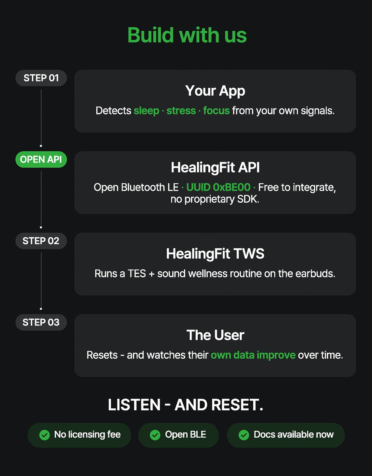
Think about what that could look like in practice. A sleep app detecting elevated pre-bed stress could suggest a Sleep session. A recovery platform flagging low readiness after a demanding training week could prompt a Healing routine. A focus tool that spots declining concentration before a deadline could surface the Study mode. In each case, the platform has done its analysis. HealingFit TWS handles what comes after.

The core architecture places a TES-generating circuit inside one earbud, with electrodes on the front of each earbud that contact the ear canal, and a TES Link cable that connects both earbuds. Detached, it functions as flagship-grade wireless earbuds; connected, it transforms into a wellness device designed to support sleep, stress relief, focus, and memory.
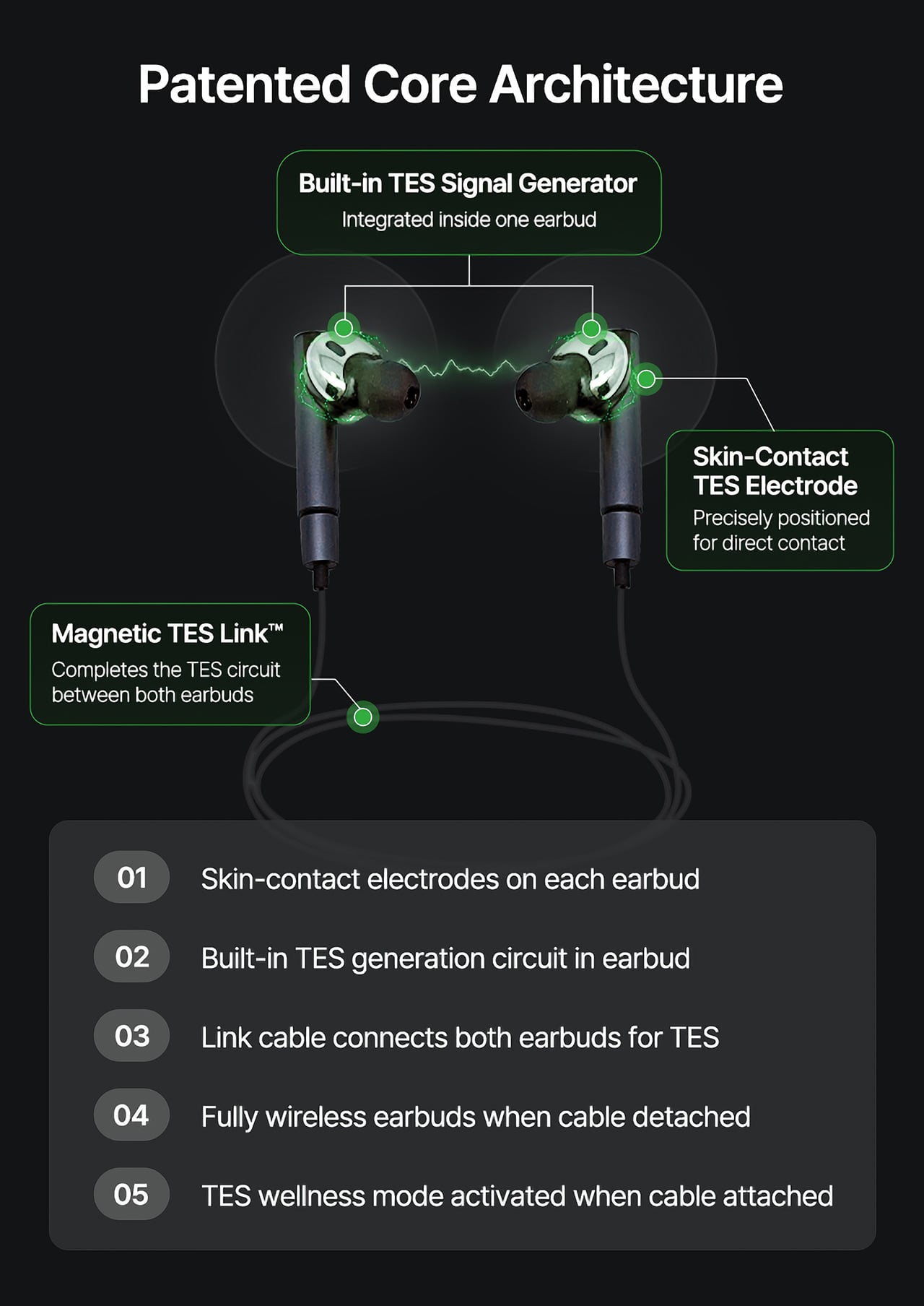
What makes the TES architecture appealing to hardware teams isn’t just the open API. The circuit that generates TES signals relies on entirely standard, commercially available components, totaling just 18 parts: a dual-transistor chip, one FET, and a set of RLC components. The earbud’s existing charging contacts also serve as the TES link contacts, so no extra contact points or major structural changes are needed.

The design has received formal IP recognition across multiple jurisdictions. The U.S. patent application covering the core architecture has been allowed and is proceeding to registration, with the patent expected to be granted soon. There are also registered patents in Korea and Japan, as well as a published application in Europe. FCC certification was granted on July 1, 2026.

Heo founded MobiFren in February 2002, originally as a contract developer for Samsung Electronics feature phones. The company started building its own Bluetooth audio products in 2005 and brought its first Bluetooth earphones to market in 2006. MobiFren has maintained an ongoing relationship with Samsung through smartphone software verification work ever since. That two-decade grounding in Bluetooth audio is what gives HealingFit TWS its engineering footing.

The choice to build this platform on earbuds specifically is, in that context, a deliberate one. Earbuds are already the personal technology closest to the human body for most of the waking day. They’re phone-paired, habitually worn, and typically owned by the same people most likely to be using a health app. Embedding TES therapy into a device people already carry daily removes most of the adoption barrier entirely.

The hardware reflects that audio-first foundation. Alongside the TES system, HealingFit TWS delivers up to 6.5 hours of playback and up to 4.5 hours in TES mode, with Hybrid ANC, three microphones per side, and wear detection for auto-pause when an earbud is removed. Both earbuds and the Magnetic TES Link cable dock in a cylindrical charging case finished in anodized aluminum, designed to carry without fuss.

What Heo is ultimately proposing is a platform category that doesn’t quite have a name yet. His comparison is to how true wireless earbuds, from AirPods to Galaxy Buds, turned personal audio into a mainstream daily habit. The longer ambition is for this patented TES architecture to be adopted into future products from those same companies, giving their health platforms a connected hardware layer for the signals they already detect.

The more compelling case might be for the health platforms themselves. Apple Health, Google Health, Samsung Health, and Fitbit have spent years becoming sophisticated at detecting when something is off: poor sleep, elevated stress, slow recovery. What they don’t yet widely offer is a hardware path from that detection to user-controlled action. HealingFit TWS was built to be exactly that path, and it’s open to anyone willing to test it.

That’s a bold bet, and the category he’s describing doesn’t fully exist yet. But HealingFit TWS makes a credible early case for it, with a patent-allowed architecture, open developer access, and a hardware design that doesn’t ask users to change anything about how they already carry and use earbuds every day.

Click Here to Buy Now: $169 $300 (44% off). Hurry, only 11/290 left! Raised over $67,000.

The post Health Apps Know You’re Stressed, HealingFit TWS Helps You Act on It first appeared on Yanko Design.

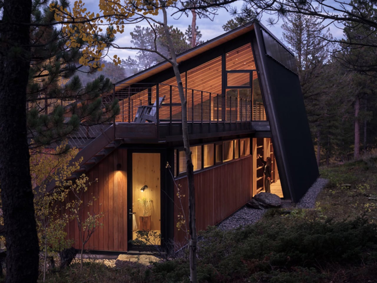
This Zero-Carbon Colorado Cabin Was Built for a Family — and the Next Century of Mountain Living

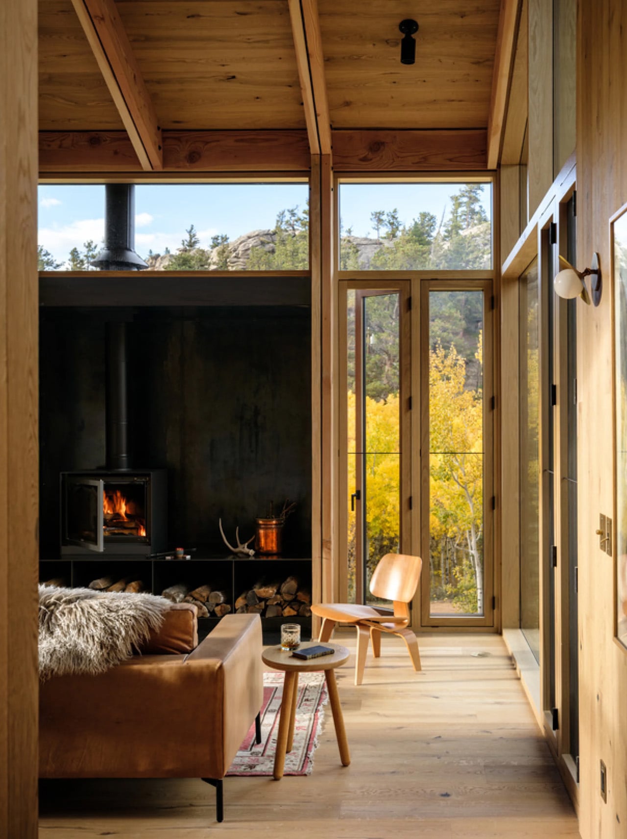
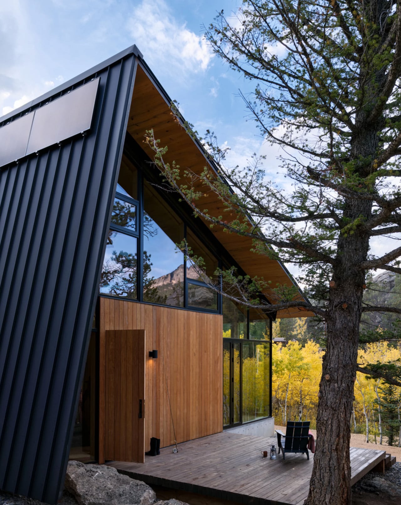
There are cabins built for weekends, and then there’s Camp Meeker. Designed by Renée del Gaudio Architecture and completed in 2026, this 2,100-square-foot retreat in Allenspark, Colorado sits at the base of Mt. Meeker — a landscape a single family has returned to for nearly a century. The cabin wasn’t designed to impress. It was designed to endure.

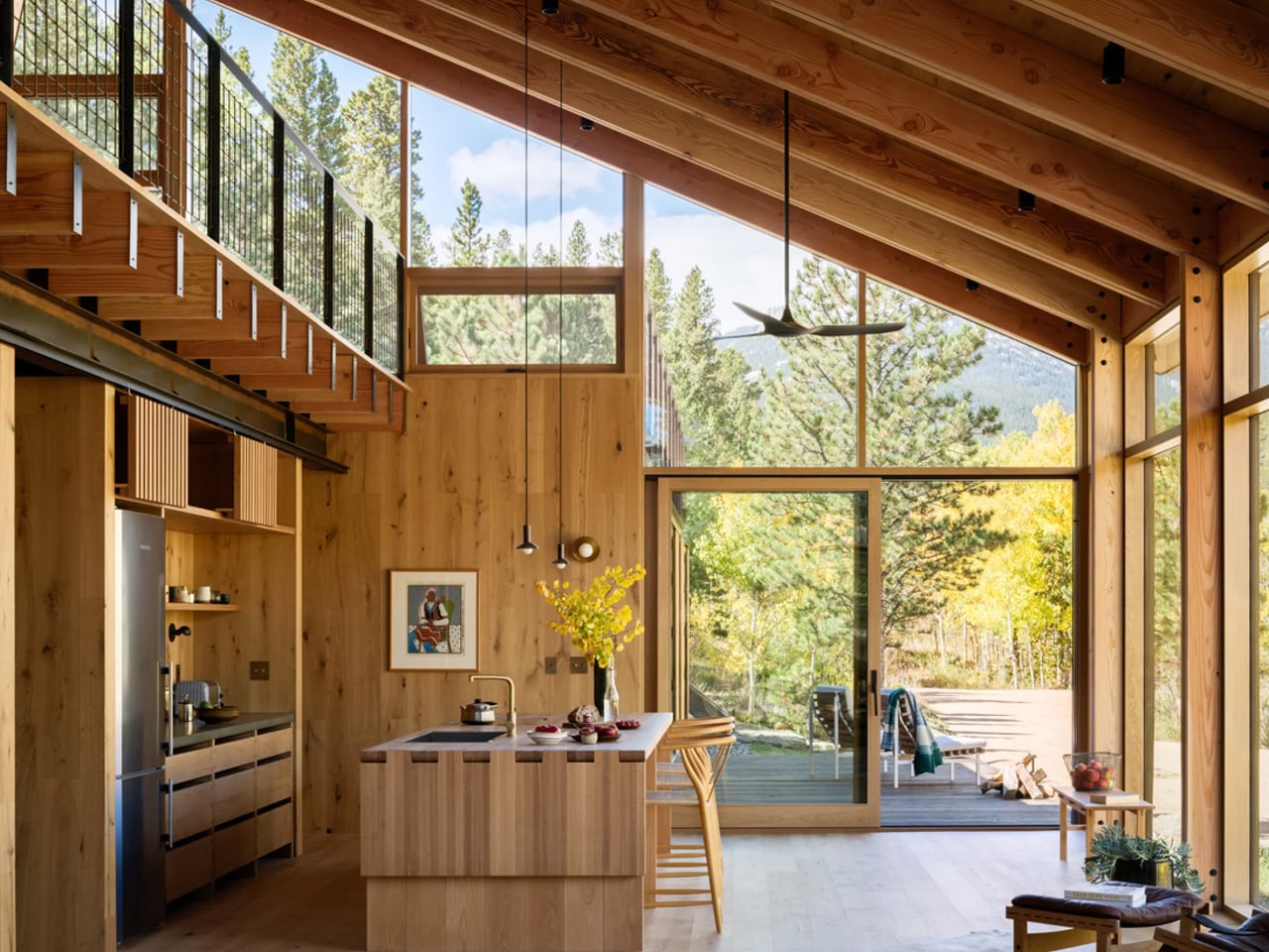
The brief was rooted in something rare in contemporary architecture: restraint with purpose. Rather than loading the home with the usual domestic conveniences, the architects stripped the program back entirely. No television. No dishwasher. No microwave. What remains is exactly what a mountain retreat should be — a place that places the landscape first and forces you to look at it.

Designer: Renée del Gaudio Architecture

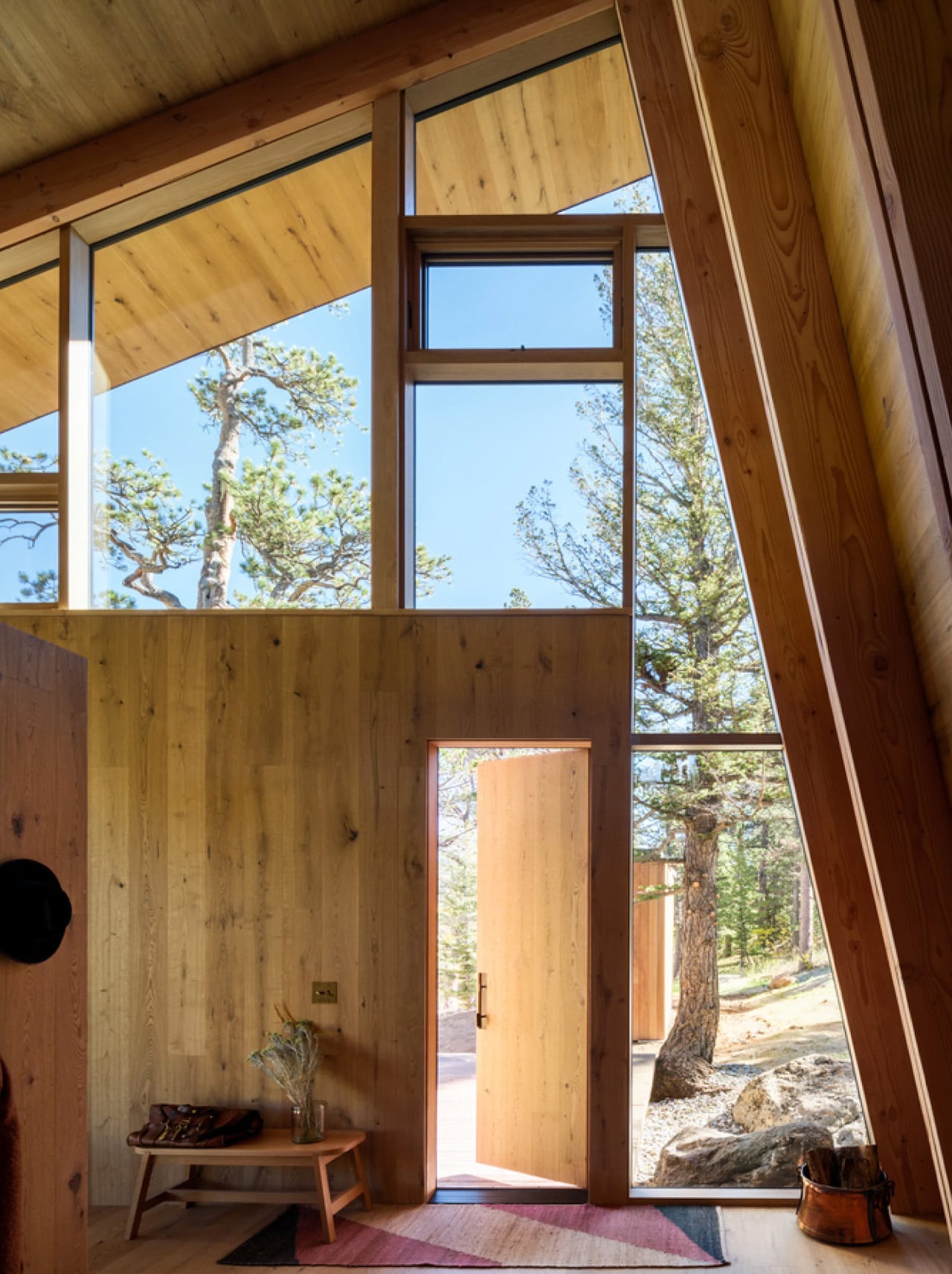
Structurally, the cabin is built for the realities of its environment. A concrete base and steel frame anchor the building to the site, while ironwood siding wraps the exterior in a material chosen specifically for fire resistance — a non-negotiable in Colorado’s high-elevation terrain. The steep metal roof does double duty: it deflects winter winds and gains enough height to accommodate a sleeping loft above the main floor, designated as the children’s quarters, giving the whole structure a playful, camp-like energy that its name earns honestly.

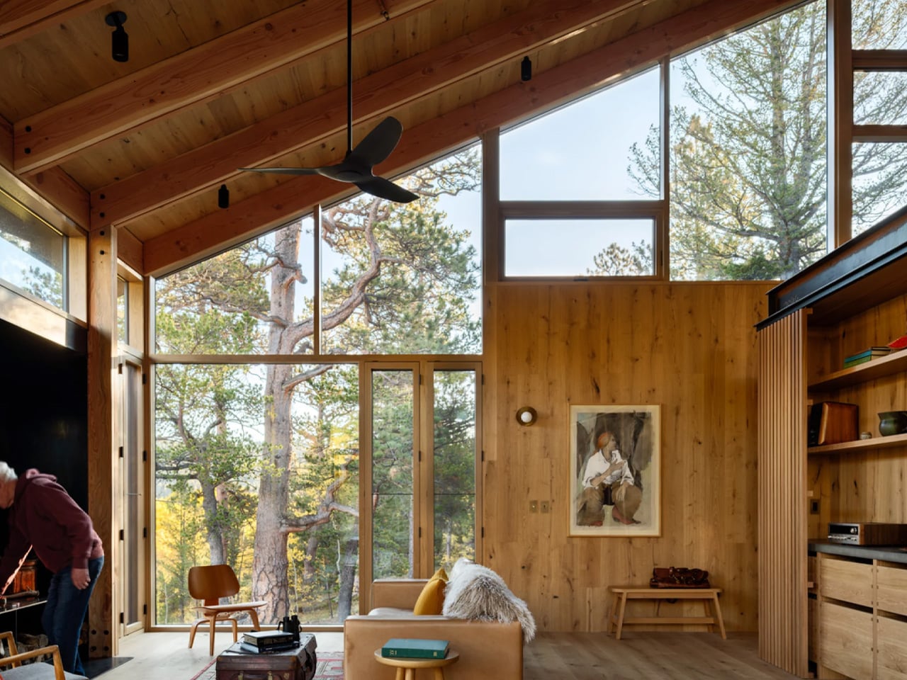
Inside, Renée del Gaudio made one decisive material call and committed to it completely. Rustic-grade oak covers the floors, walls, and ceilings in a continuous warm finish that collapses the boundary between surfaces. The main living area is organized around a central fireplace, flanked by vaulted timber ceilings and floor-to-ceiling windows that pull the surrounding alpine scenery directly into the room. Two double bedrooms and a single bedroom anchor one end of the main floor, each connected to a large outdoor terrace. Above, a rooftop deck offers unobstructed views of the mountain — built equally for afternoon sun and sleeping under open sky.

What makes Camp Meeker genuinely forward-looking is what’s hidden beneath it. A geothermal system draws on the earth’s stable temperature to heat and cool the cabin, replacing conventional fuel-based systems and bringing the home’s day-to-day operational carbon to zero. It’s sustainability framed not as a feature, but as a baseline expectation.

The architects describe it as a model for the next century of cabin design in the region. Looking at it, that doesn’t feel like overreach. Camp Meeker isn’t a trophy house dressed in rustic materials. It’s a building that understands exactly what it is, where it is, and who it’s for — and builds every decision around that clarity.

The post This Zero-Carbon Colorado Cabin Was Built for a Family — and the Next Century of Mountain Living first appeared on Yanko Design.

A Duck, Some Bent Tubes, and the Most Charming Lamp of 2026

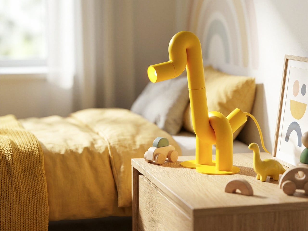
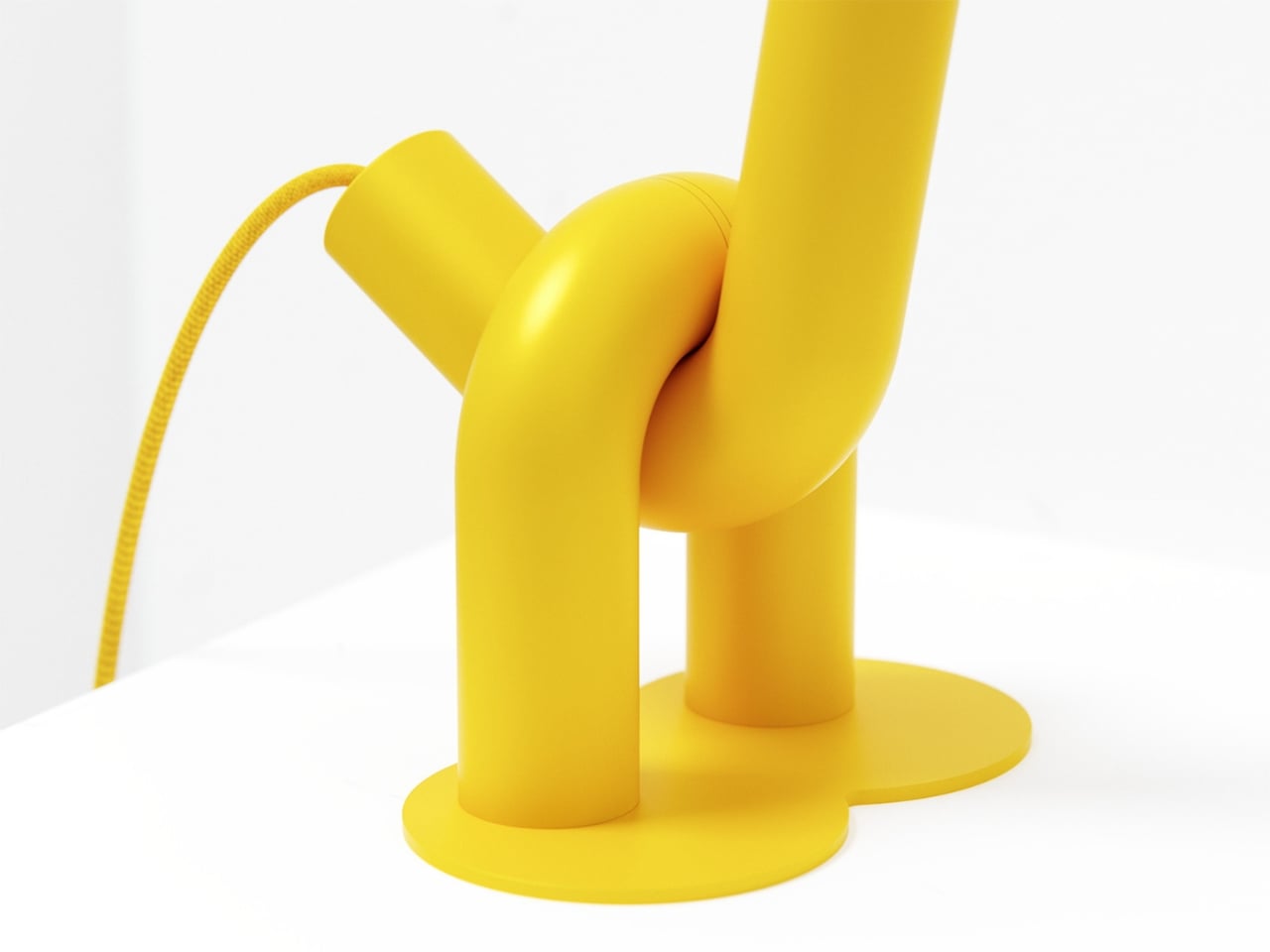
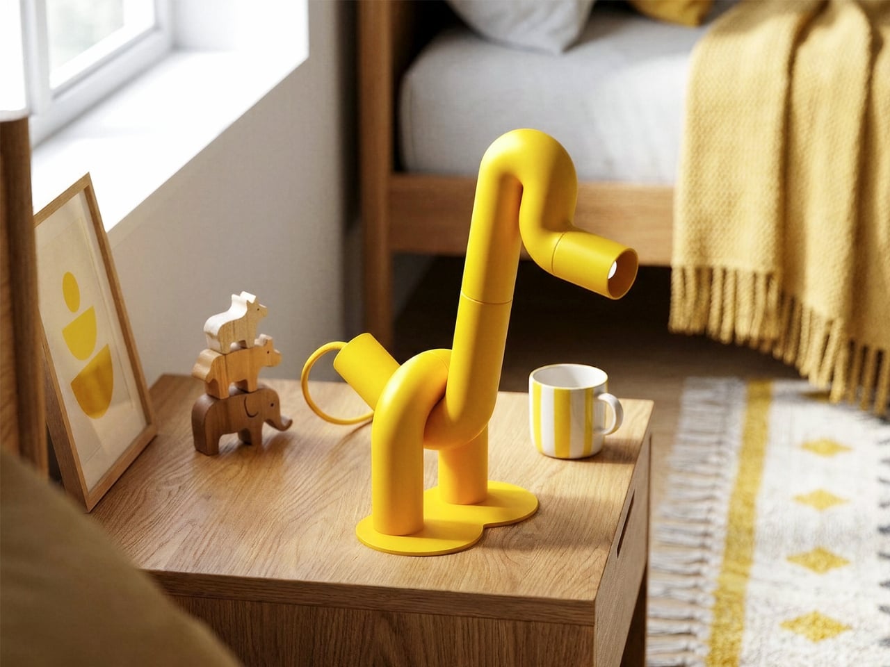
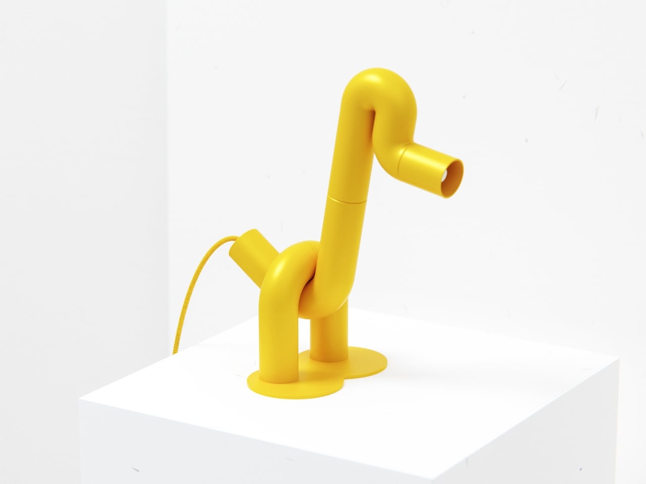
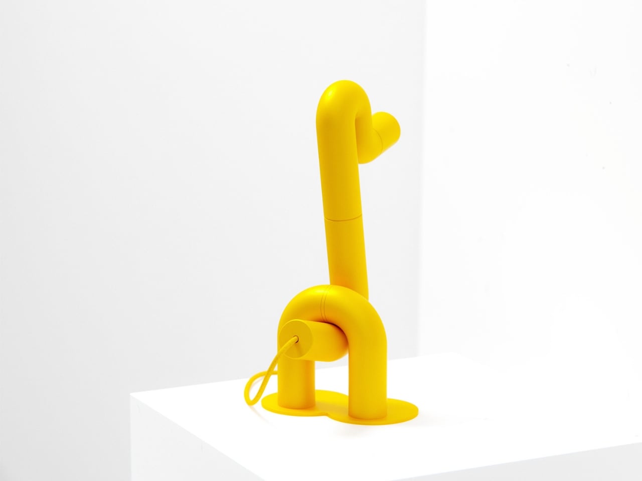
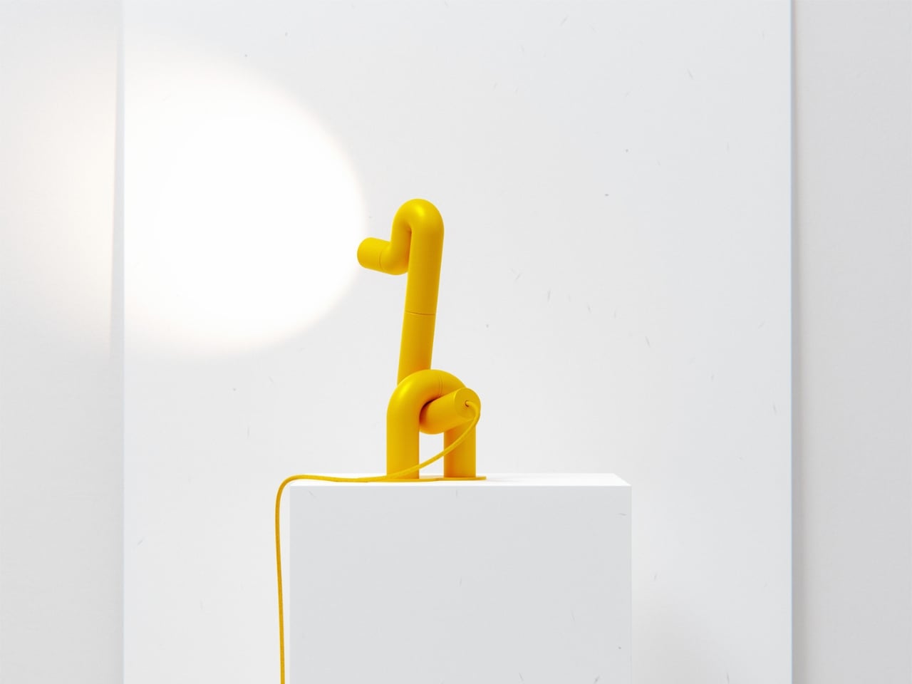
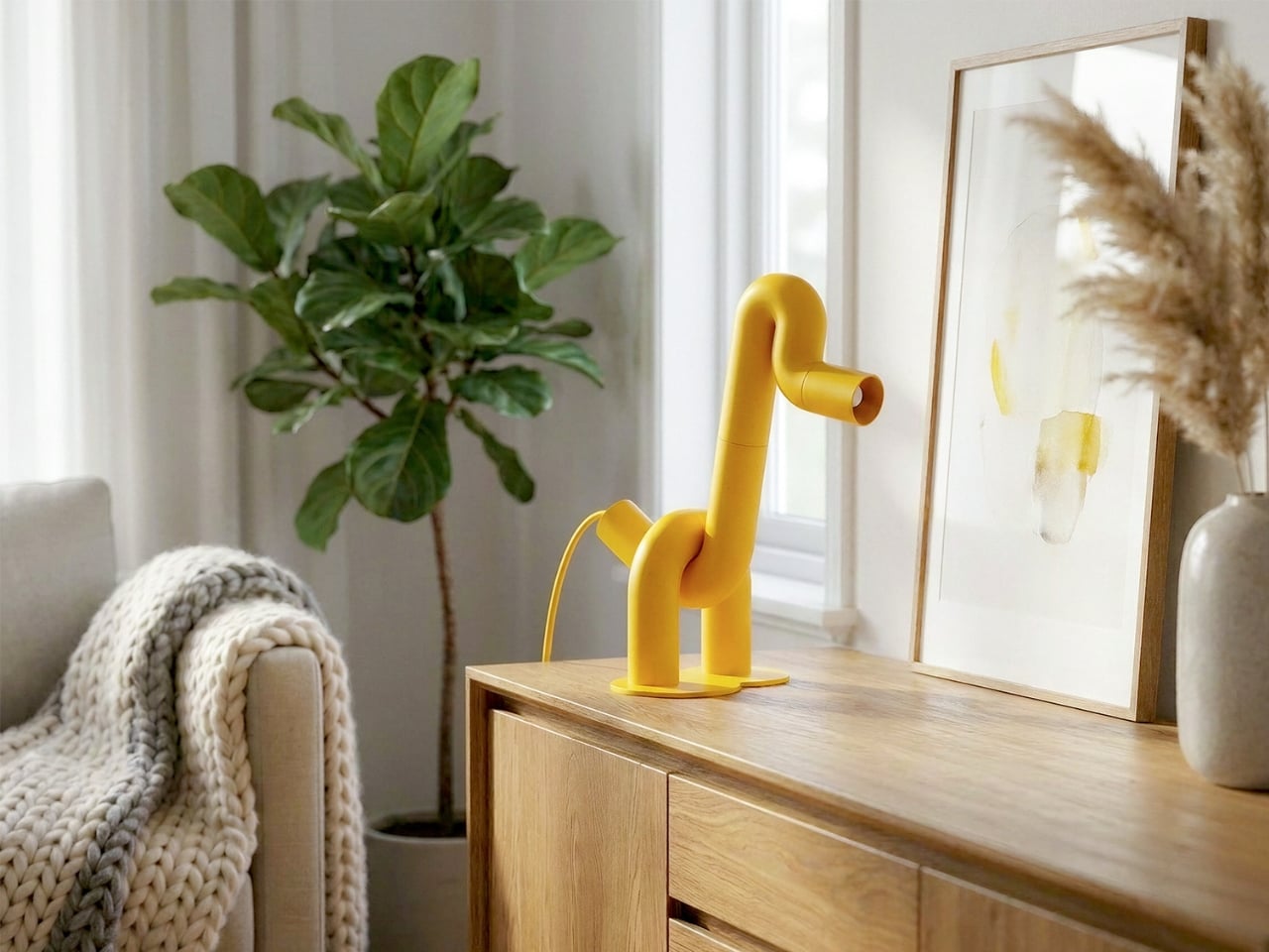
The first thing you notice is the yellow. Not a soft, hedging yellow, but a full-commitment, matte, warm yellow that coats every millimeter of the piece without apology. Then you notice the shape. A long, arching neck. Two sturdy legs. A horizontal head that doubles as the light source. Duke, the table lamp designed by Liam de la Bedoyere of Bored Eye Design, is a duck. More precisely, it’s a duck drawn by someone who decided that one continuous tube was all they needed.

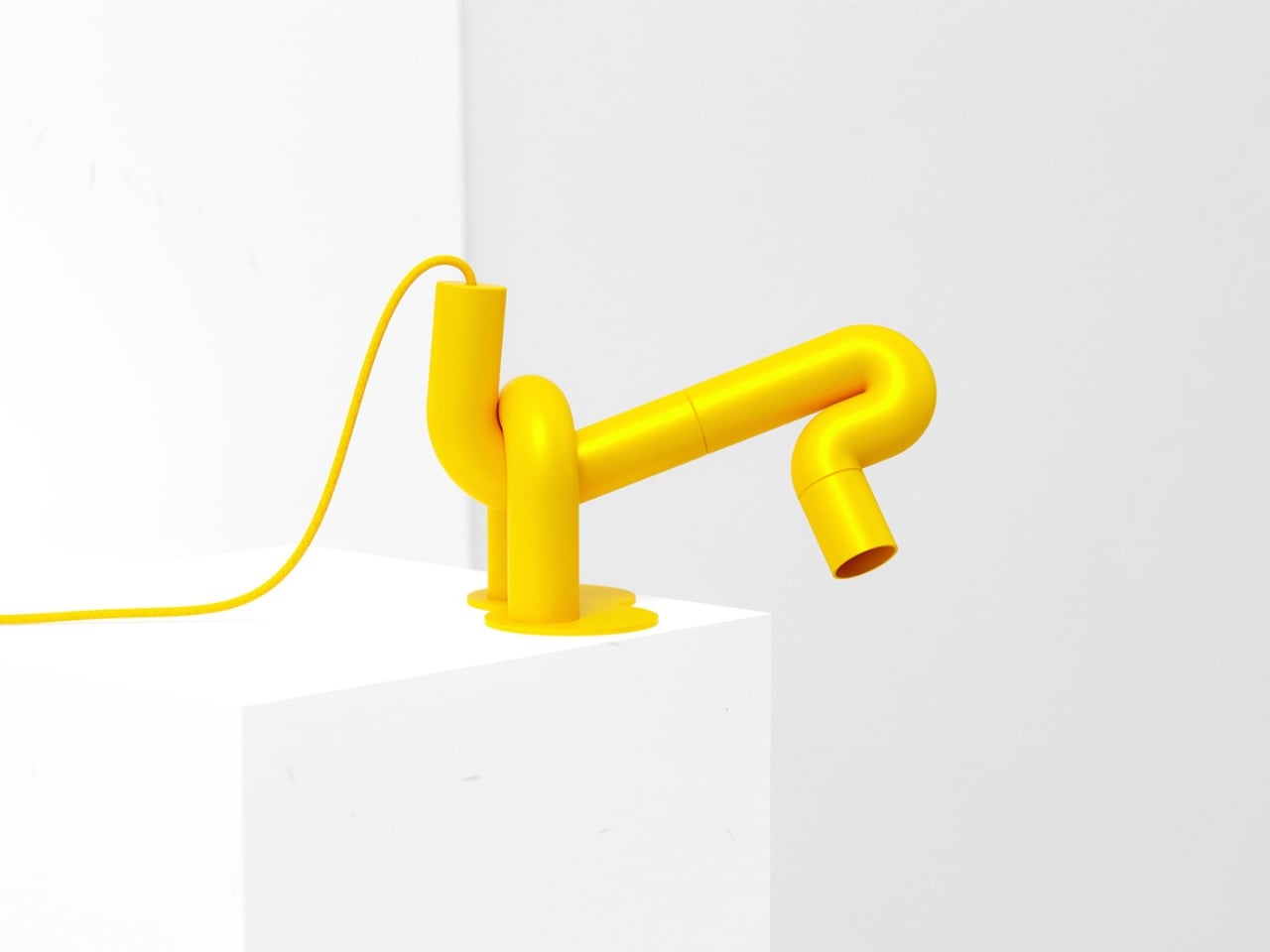
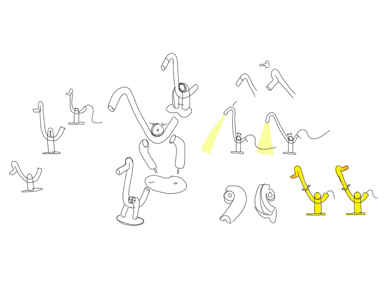
That’s the central idea, and it’s worth sitting with. De la Bedoyere’s design vocabulary here is essentially a single rule: take a tube, bend it, and let the animal emerge from the bends. No additional elements, no decorative flourishes, no mixed materials. Just the tube, its curves, and the form they describe. The result is a piece that communicates immediately. You read it as an animal before you register that it’s a lamp, which is the correct order of things.

Designer: Liam de la Bedoyere

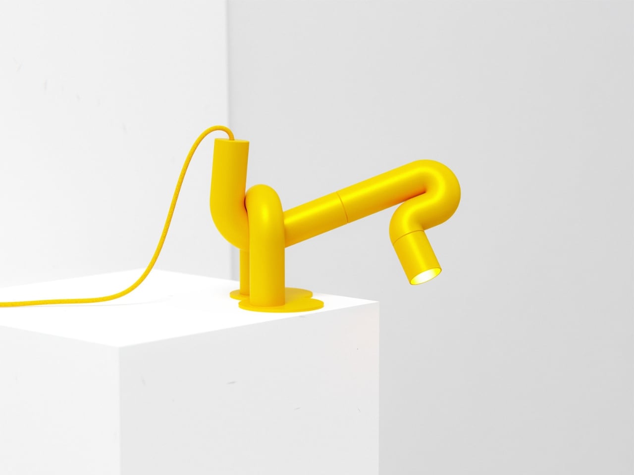
Up close, the construction rewards attention. The tubular sections connect in visible segments, and those joints give the piece a modular, almost architectural quality that tempers the playfulness with something more considered. The bends themselves are generous and smooth, with a radiused curve that keeps everything feeling soft rather than rigid. The head is a cylinder open at the end, functioning as the spotlight, and that detail is quietly clever. The light doesn’t interrupt the form. It completes it, pointing forward from the duck’s snout like the whole thing was always meant to do exactly this.

The base is a flat circular disc, minimal and low to the surface. Two legs rise from it and immediately branch into the body, giving the lamp a planted, grounded stance that stops it from reading as fragile. And then there’s the cord, a braided yellow cable that matches the body exactly, looping out near the base. Most designers treat the cord as a problem to solve or something to hide. Here it’s an afterthought that became a feature, trailing away from the lamp like a tail. It’s one of those small decisions that reveals how thoroughly this design was thought through.

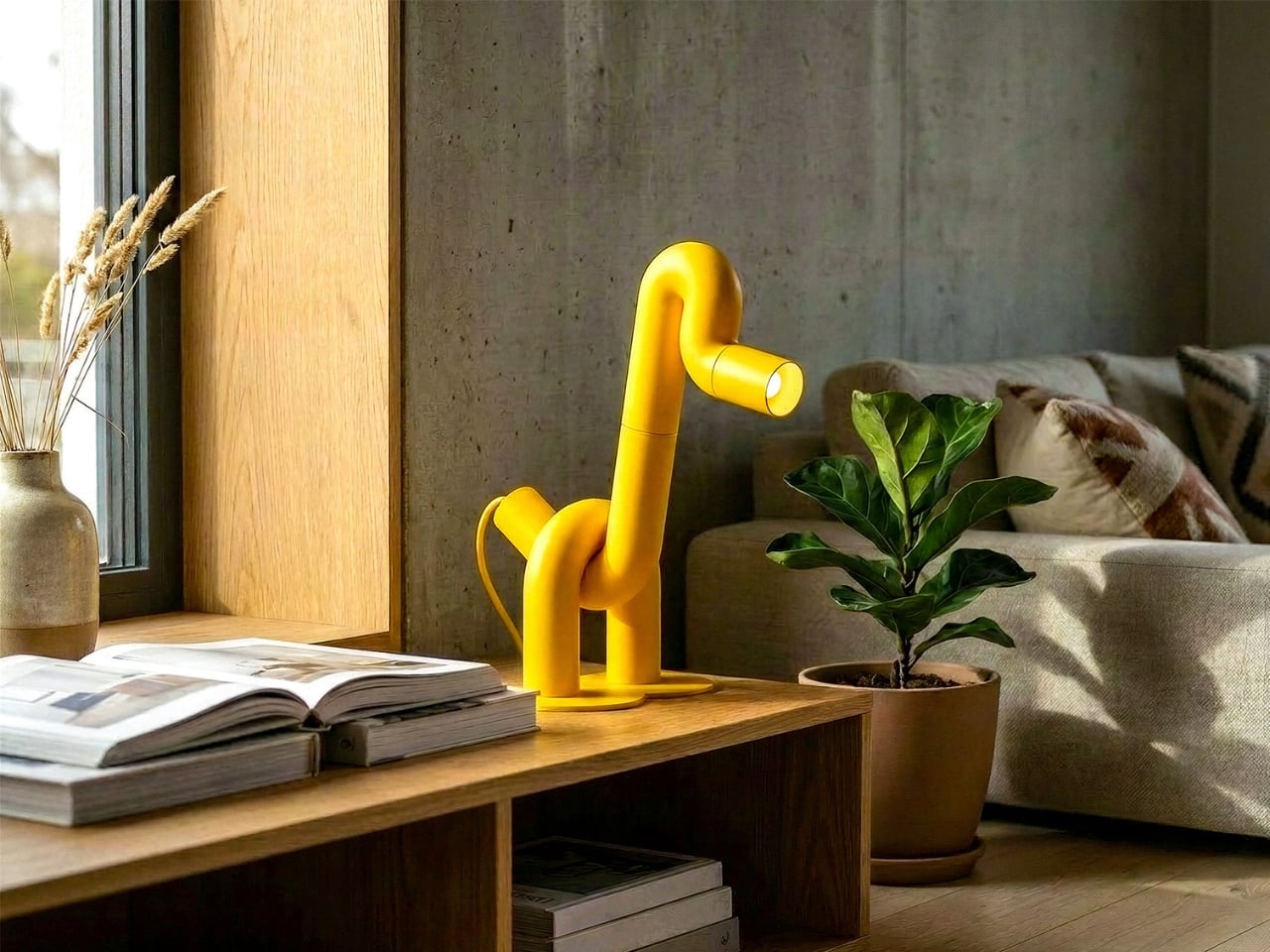
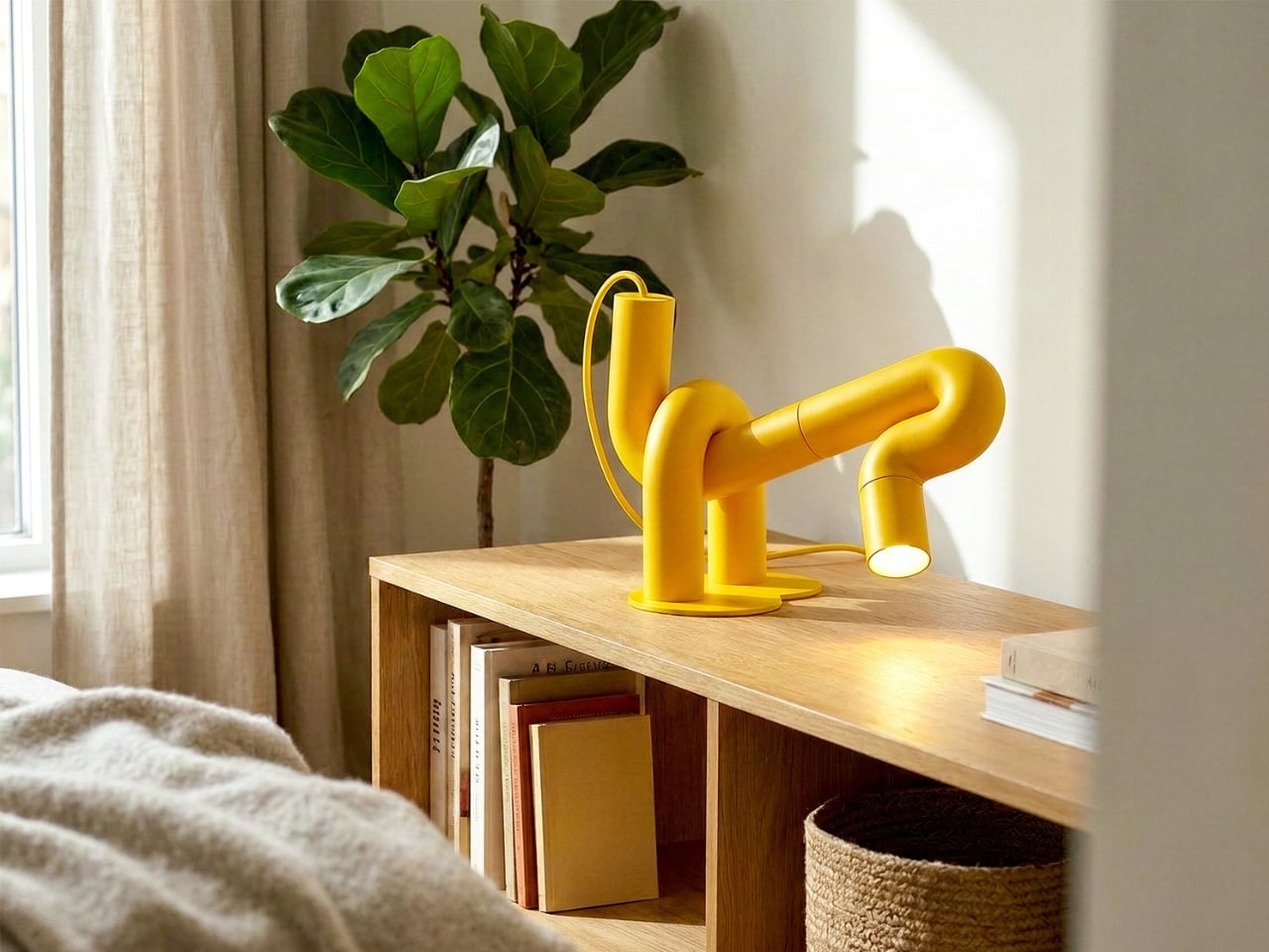
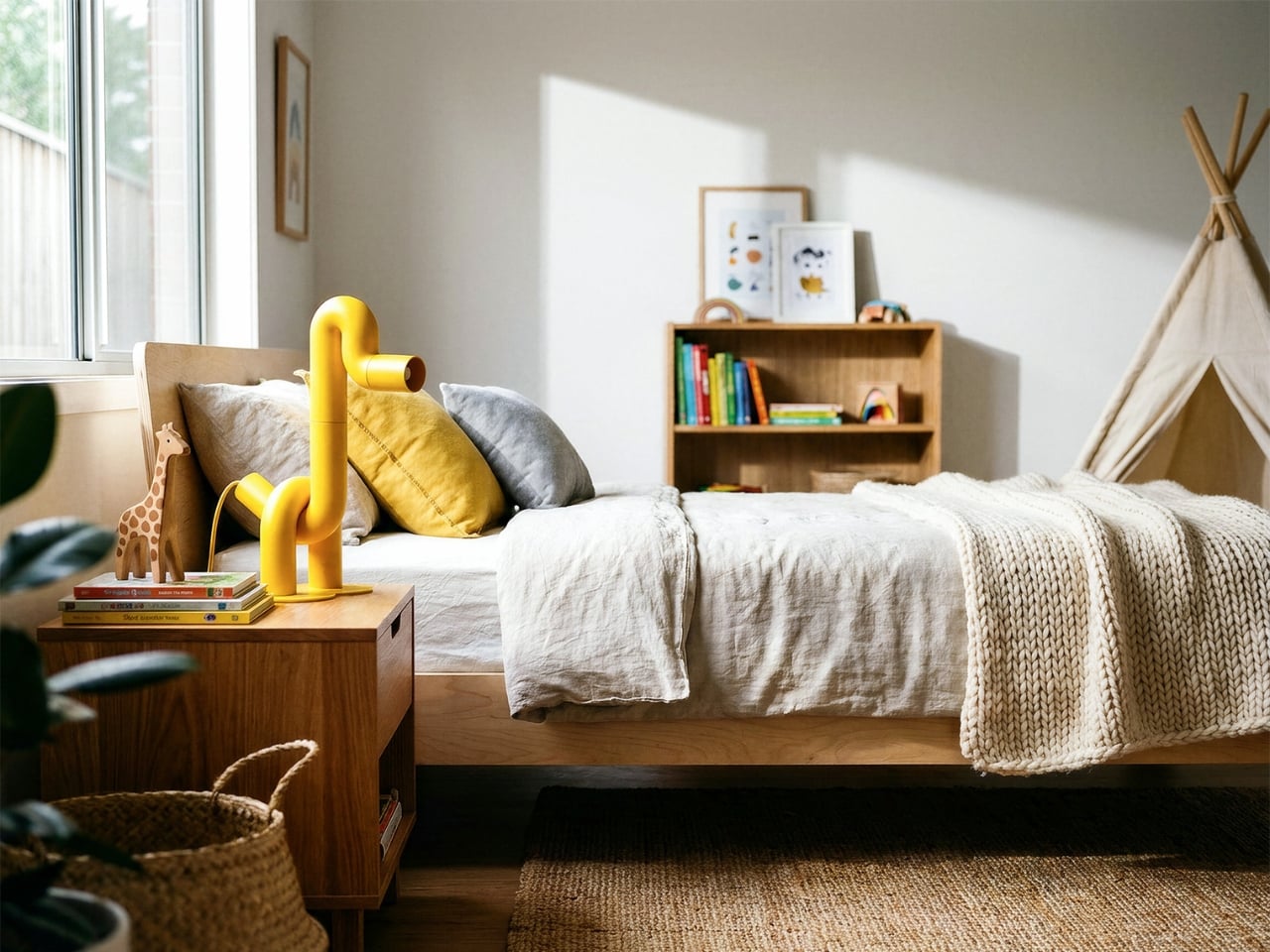
The monochromatic yellow does something important for how the silhouette reads. By removing any tonal contrast within the piece itself, the animal form becomes purer and more immediate. Your eye traces the outline rather than getting pulled into detail, which is exactly what you want from a lamp that’s also functioning as sculpture. The color also travels. Looking at Duke placed against warm wood, concrete, white walls, and natural linen, it doesn’t clash with any of them. Yellow at this saturation and matte finish is warmer than it is aggressive, and it reads more like a material choice than a color choice.

The design is also genuinely versatile, which isn’t something you can say about most statement objects. Duke works in a child’s bedroom because it looks like a toy. It works on a bookshelf or a credenza in an adult living space because the construction is clean and the form is abstract enough to read as sculptural. Place it next to a magazine on a coffee table and it looks like something you’d find in a design gallery. That range of contexts isn’t accidental. It comes from the clarity of the underlying concept. When a design is resolved at the idea level, it adapts.

What makes Duke feel significant beyond its charm is that de la Bedoyere is clearly developing a language, not just making individual pieces. The Flamingo Lamp came first, and the same logic runs through both, which means the interest is in the system as much as the object. A lamp collection built entirely on the premise of one continuous tube tracing an animal is a genuinely interesting editorial position for a designer to take. It’s a constraint that produces rather than limits, and that’s the kind of thinking that tends to produce lasting work.

Duke doesn’t try to do many things. It tries to do one thing very well, and in design, that’s harder than it sounds.

The post A Duck, Some Bent Tubes, and the Most Charming Lamp of 2026 first appeared on Yanko Design.

Blackwing’s $400 Crate Is Every Writer’s Dream Gift Set

Pencils don’t usually make people emotional. But Blackwing pencils have always been a little different. The brand, which revived the legendary Blackwing 602 after its original discontinuation in 1998, has spent years building something that goes beyond the pencil itself. It’s a whole philosophy about the act of writing by hand. And with the new Blackwing Crate Gift Set, priced at $400, they’ve essentially packaged that philosophy into a matte black box and sent it out into the world.

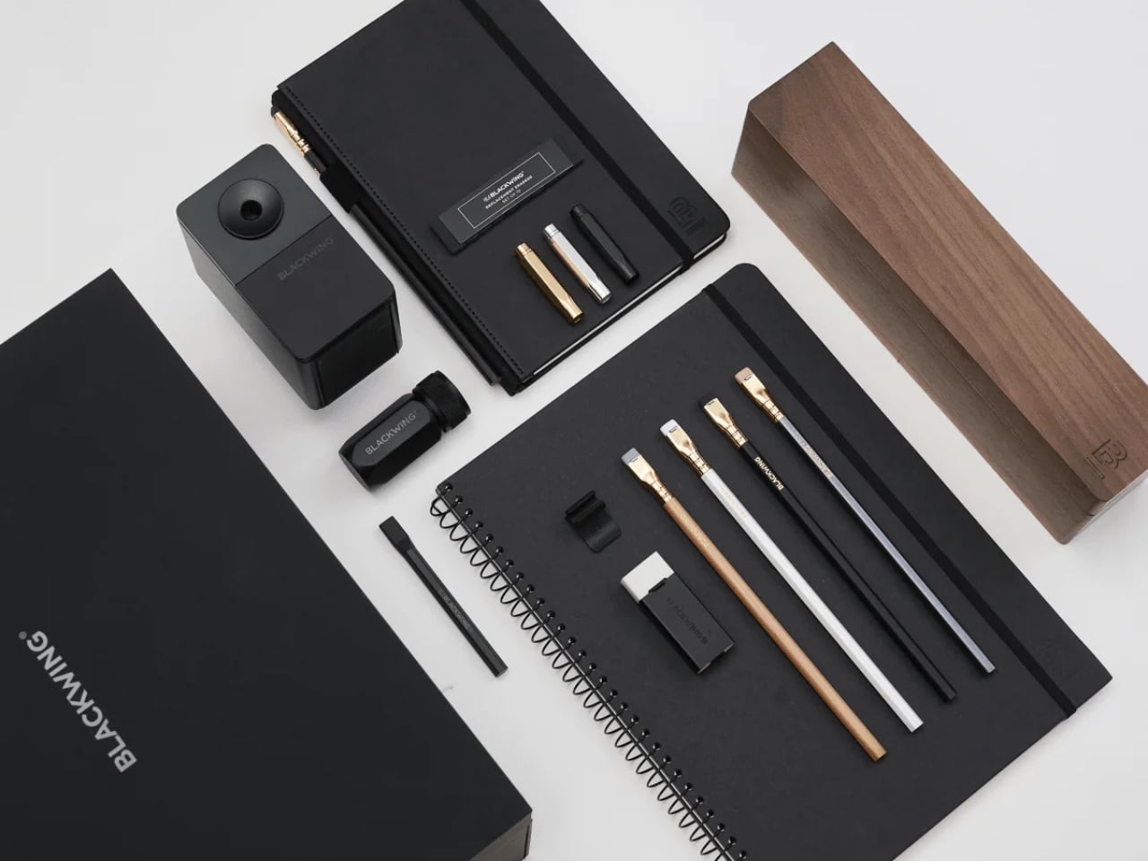
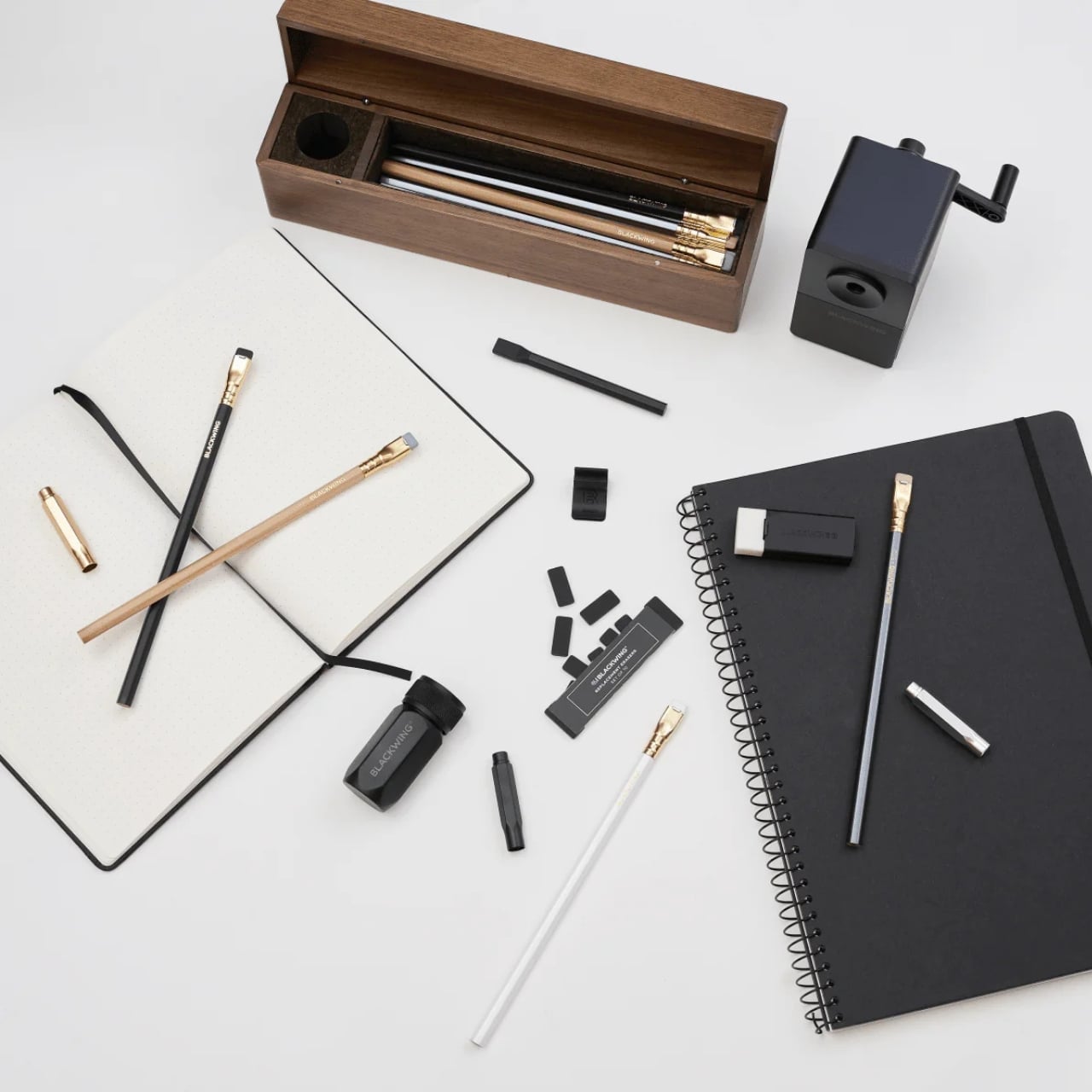
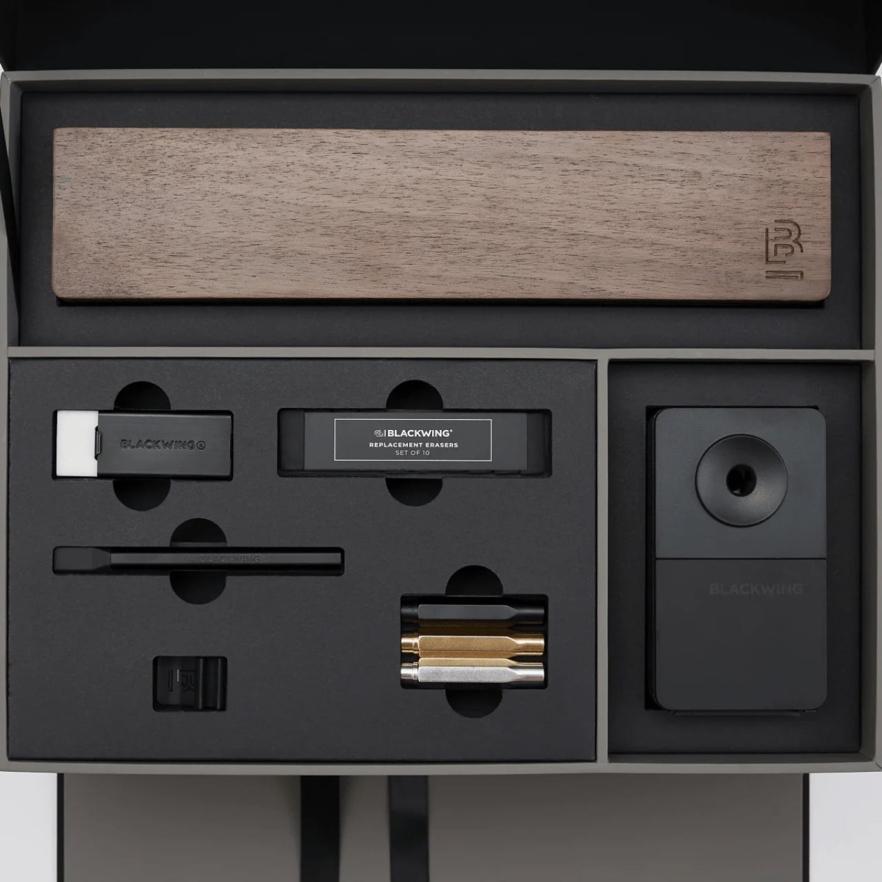
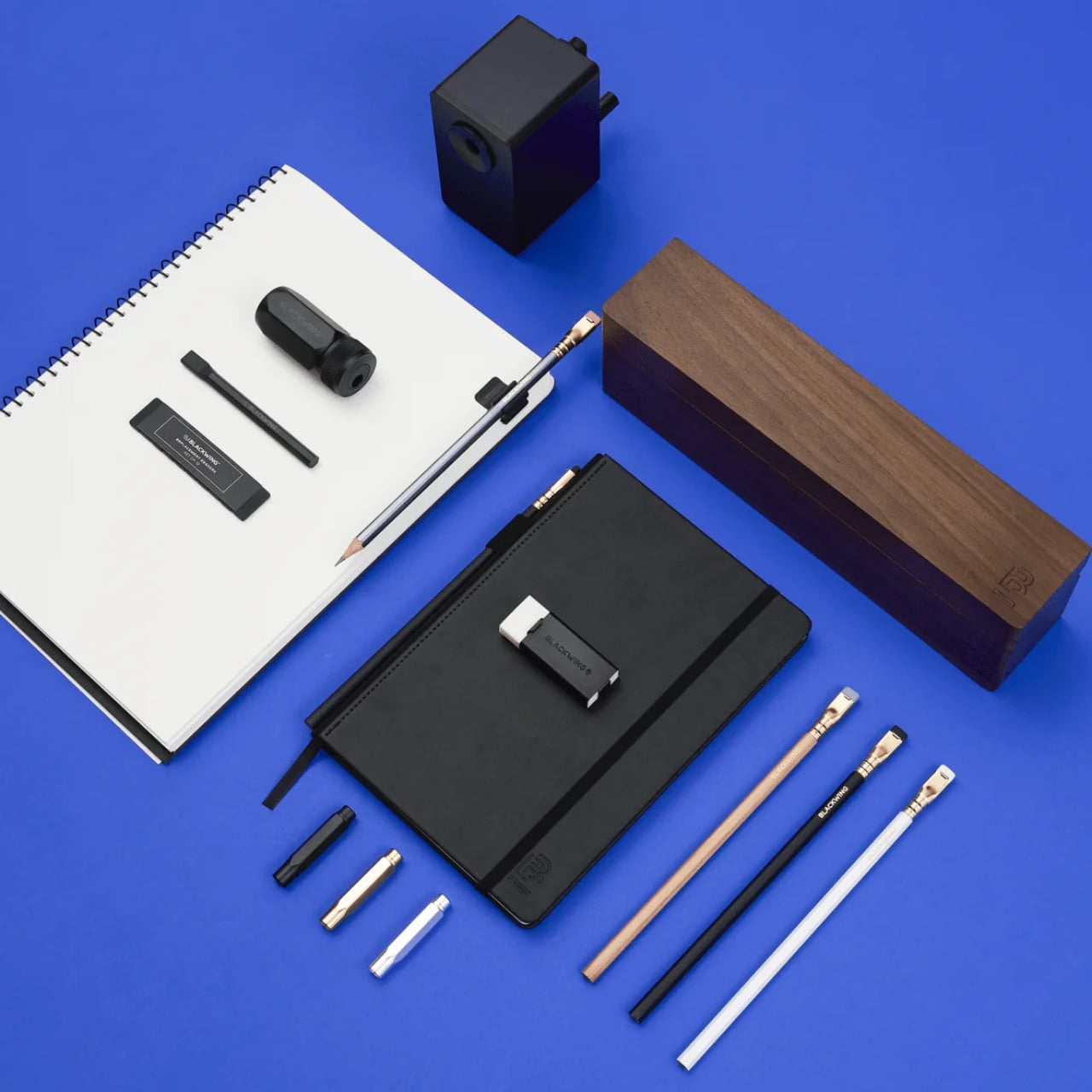
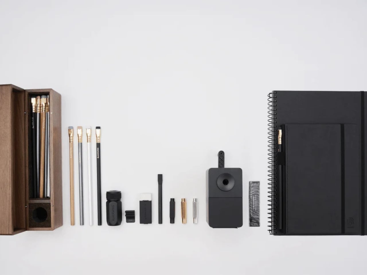
Let’s talk about what’s inside, because it’s genuinely a lot. The Crate includes 24 Blackwing pencils housed inside a walnut gift box, a One-Step Long Point Sharpener, a desktop sharpener, replacement erasers, a handheld eraser, three point guards, a pencil extender, a notebook clip, a Medium Slate Notebook in dot-grid, and an A4 spiral notebook in blank. If you’ve ever casually shopped the Blackwing site and found yourself adding one thing after another to your cart, this is essentially that cart, but curated and given a walnut home.

Designer: Blackwing

The walnut box alone is something worth pausing on. It has a cork-lined interior and a satisfying magnetic closure. It’s the kind of object you want to leave on your desk not because it needs to be there, but because it makes the desk look like it belongs to someone who takes their work seriously.

Blackwing’s four core pencils are all represented here: the 602, the firm-graphite original that built the brand’s reputation and was beloved by creatives from John Steinbeck to Stephen Sondheim; the Matte, which shares the same soft and expressive formula as the very first Blackwing; the Pearl, with its smooth and balanced Japanese graphite; and the Natural, a stripped-back version with an uncoated cedar body for a rawer, more honest feel. Each one writes differently. That variety isn’t just a marketing point. It means the set can genuinely work for a writer, an artist, a student, or someone who just wants their notes to feel a little more intentional.

I’ll admit there’s a case to be made that $400 is a lot for what is, technically, a pencil set. But I think that argument misses the point of what Blackwing has always been doing. These aren’t pencils in the same way a yellow No. 2 is a pencil. The brand occupies the same space as a well-made fountain pen or a leather-bound notebook: objects that are ordinary in function but considered in execution. When you buy something from Blackwing, you’re buying into a certain idea of how writing should feel, and the Crate makes that idea as complete and giftable as it’s ever been.

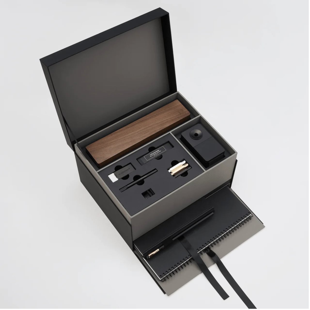
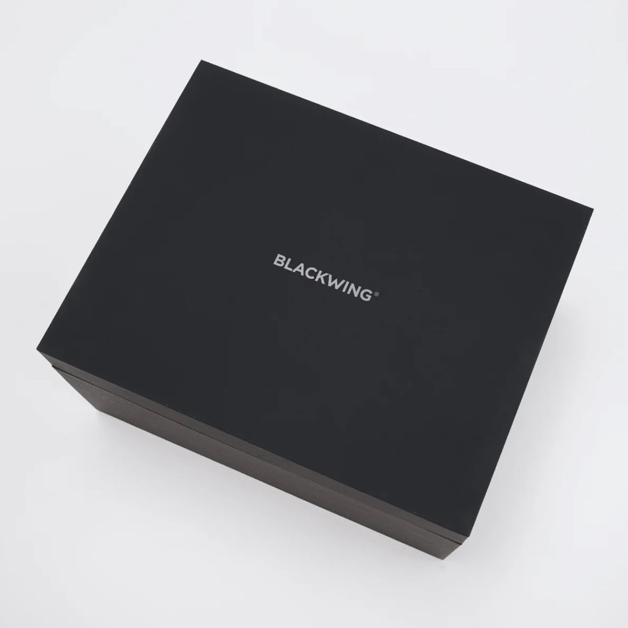
The packaging itself shows thought. The outer box is matte black with the Blackwing name in white. Clean, confident, minimal. It doesn’t shout. It doesn’t need to. The layered reveal inside, with a pull-out drawer for the notebooks, feels like the kind of unboxing experience that design enthusiasts and stationery lovers will genuinely appreciate. Gift sets at this price point need to justify themselves beyond just the contents, and the presentation here does a lot of that work.

What makes the Crate feel special rather than just expensive is how it covers every phase of the writing process. You have your pencils, your sharpeners for both at-desk and on-the-go use, your erasers, protection for your pencil tips when they’re not in use, and actual notebooks to write in. Nothing feels like filler. Everything has a job.

If you’re shopping for someone who already loves Blackwing, this is a clear yes. If you’re introducing someone to the brand for the first time and want to do it properly, this is also the move. And if you’ve been slowly accumulating Blackwing products one purchase at a time and wondering when you’ll finally have it all, the Crate is the answer to that question in one very satisfying delivery. The Blackwing Crate Gift Set is available now at blackwing602.com for $400.

The post Blackwing’s $400 Crate Is Every Writer’s Dream Gift Set first appeared on Yanko Design.
The Floating House Built From Strangers’ Wishes

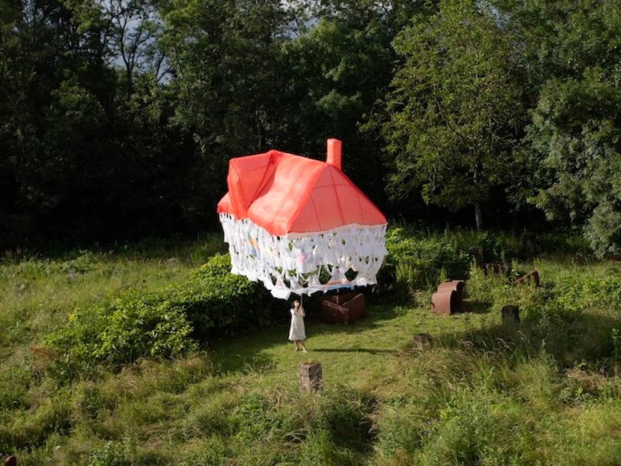
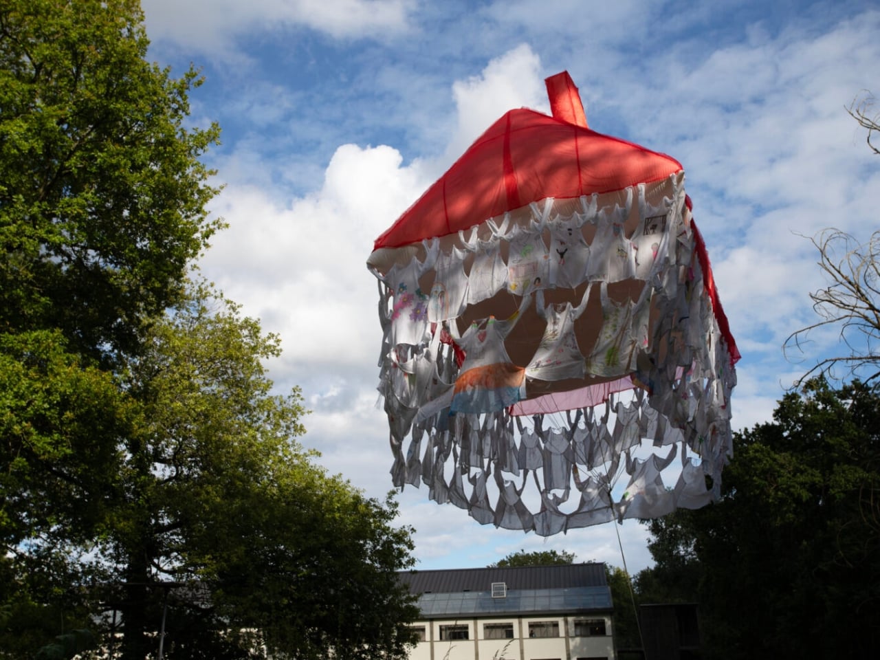
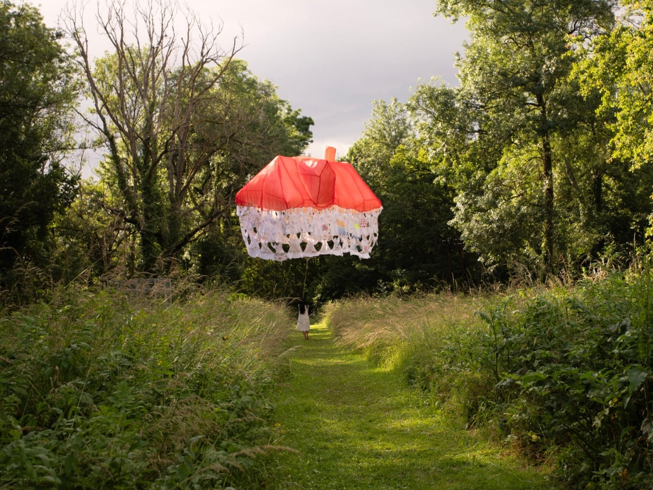
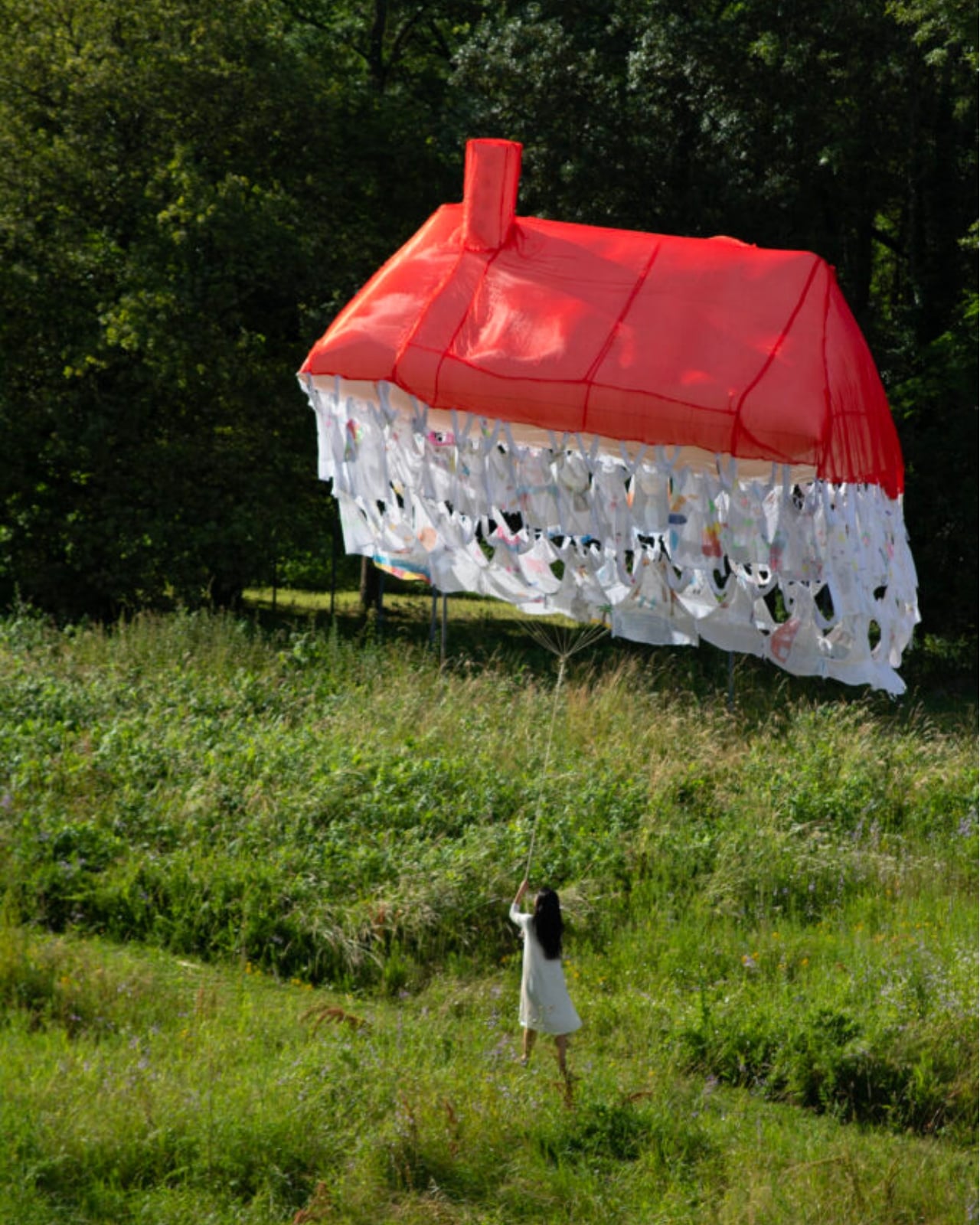
Most houses start with a blueprint. Jisoo Yoo’s Dream House started with a question: how do the dreams and desires we carry shape the landscape of the world we inhabit? The answer, it turns out, is a floating structure made of clothing.

Yoo, a Seoul-born artist who lives and works in France, has been quietly building one of the more compelling bodies of work in contemporary art, one that orbits around the domestic, the ephemeral, and the barely-visible structures that hold our lives together. Dream House, her latest installation presented at (F)ESTIVALES at Les Tanneries, Centre d’art contemporain, is exactly the kind of project that makes you stop and genuinely reconsider what a home actually is.

Designer: Jisoo Yoo

Here’s how it works. Participants are invited to contribute a garment, something personal, something worn, and mark it with handwritten texts and drawings. These pieces of clothing then become the literal building blocks of the structure, each one a personal archive, each one a load-bearing element. The result is a house that floats, literally and conceptually, held aloft not by concrete or steel, but by the private wishes of strangers.

That’s a beautiful idea, and I mean that without a trace of irony. We spend so much time thinking about homes in terms of square footage, property value, and interior aesthetics that we rarely stop to ask what a home is actually made of. Yoo forces the question. Her installation suggests that the answer has less to do with materials and more to do with desire, with the accumulated weight of what people want, need, and imagine for themselves and for each other.

Art that treats the domestic as a lens for examining social and cultural forces is nothing new. But Yoo brings something specific to it. Born in Seoul and trained in France, she operates between two very different cultural frameworks around the idea of home, and her practice reflects that quietly felt tension. Her works often feature spaces that feel familiar but refuse to stay solid. Rooms that waver. Houses that float. Structures that appear and then dissolve. It’s a recurring language across her portfolio, and with Dream House, it feels most fully realized.

Dream House is not trying to comfort you. It’s trying to make you notice something. The garments contributed by participants carry real personal weight: literal handwriting, actual drawings, the residue of real lives. And yet the house they form is temporary. It rises, exists briefly, and then it’s gone. Yoo describes the floating structure as embodying both the creative force of desire and the fleeting nature of existence. The house briefly emerges through people’s dreams, and that, apparently, is enough.

I think that’s the most honest thing any artist has said about housing in a long time. We build our ideas of home from desire, from inherited images of what shelter is supposed to look like, from what we were told to want, and from what we quietly imagine when no one is watching. And all of it is more temporary than we tend to admit. The average person moves multiple times in their life. Neighborhoods change. The house you grew up in gets renovated beyond recognition or torn down entirely. The physical structure of home has always been more fragile than we want it to be.

What Yoo does is make that fragility visible without making it tragic. The floating structure is genuinely striking to look at. The garments create a soft, almost organic texture that reads as intimate rather than architectural, which is exactly the point. You’re not looking at a building. You’re looking at a collective act of imagination, briefly held together by shared hope. Jisoo Yoo is an artist worth paying close attention to. Her work doesn’t announce itself loudly, but it asks questions that stick. Dream House is a reminder that the spaces we live in are not neutral. They are built, always, from something we wanted.

The post The Floating House Built From Strangers’ Wishes first appeared on Yanko Design.
Forget Smart Homes, Moooi Is Designing Homes That Feel Alive

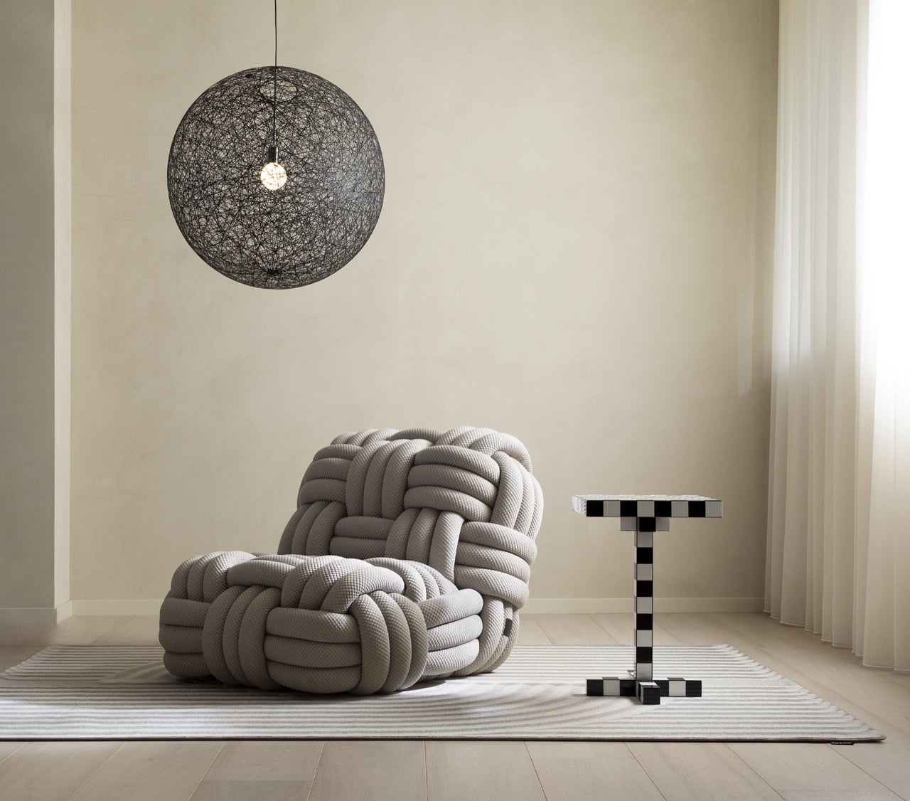
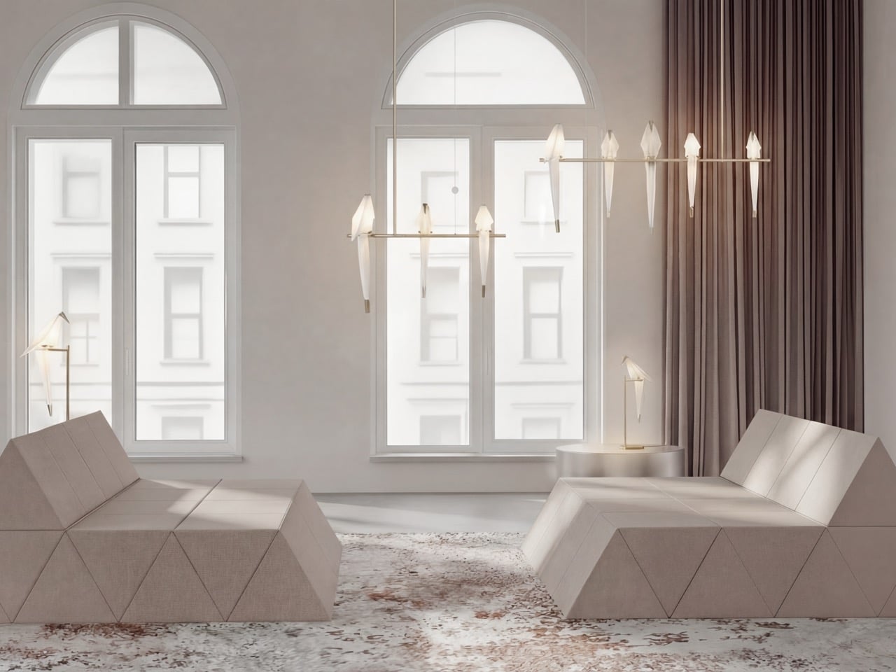
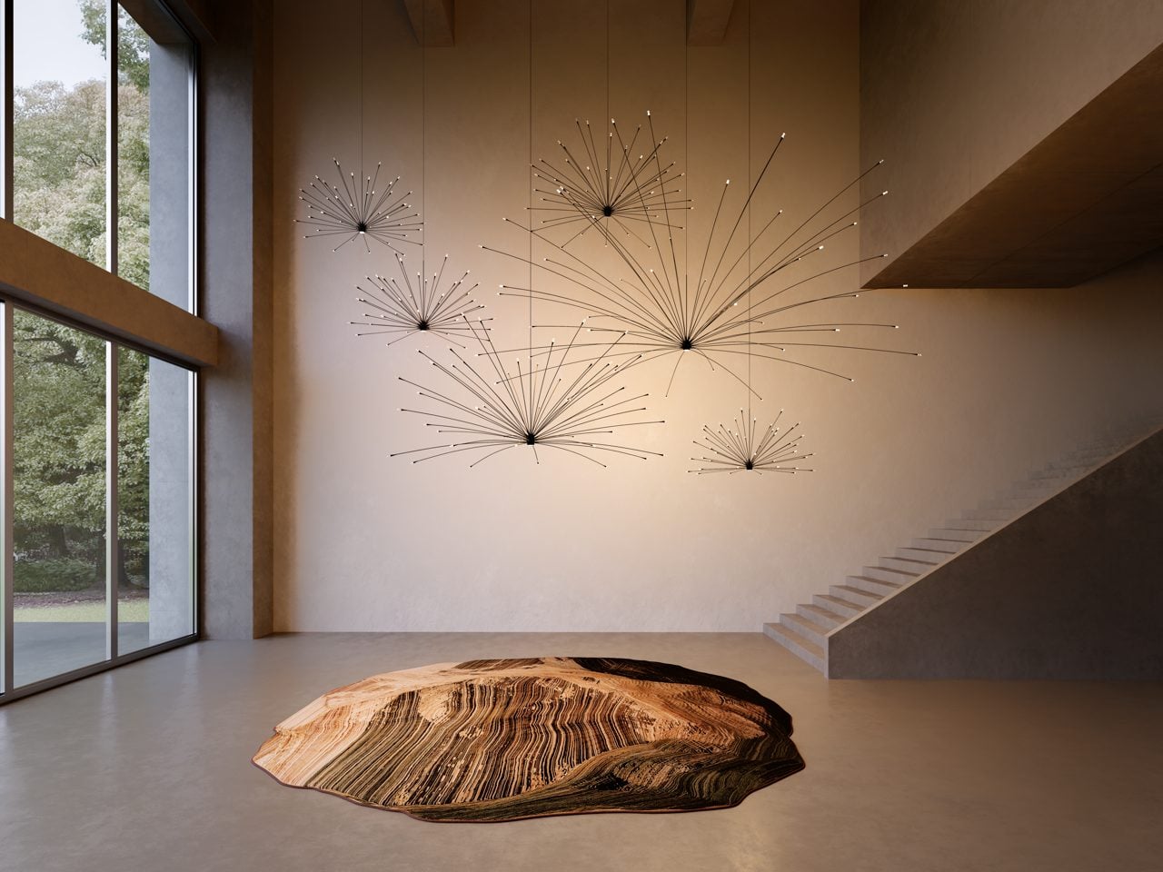
Light moves through trees. Shadows stretch and shrink. No two afternoons ever look quite the same. Moooi wants your living room to borrow that same restlessness. In a conversation with Yanko Design, the Dutch design house laid out a vision for interiors that respond to time, mood and the people living inside them, rather than staying frozen in one fixed arrangement from the day they’re installed.

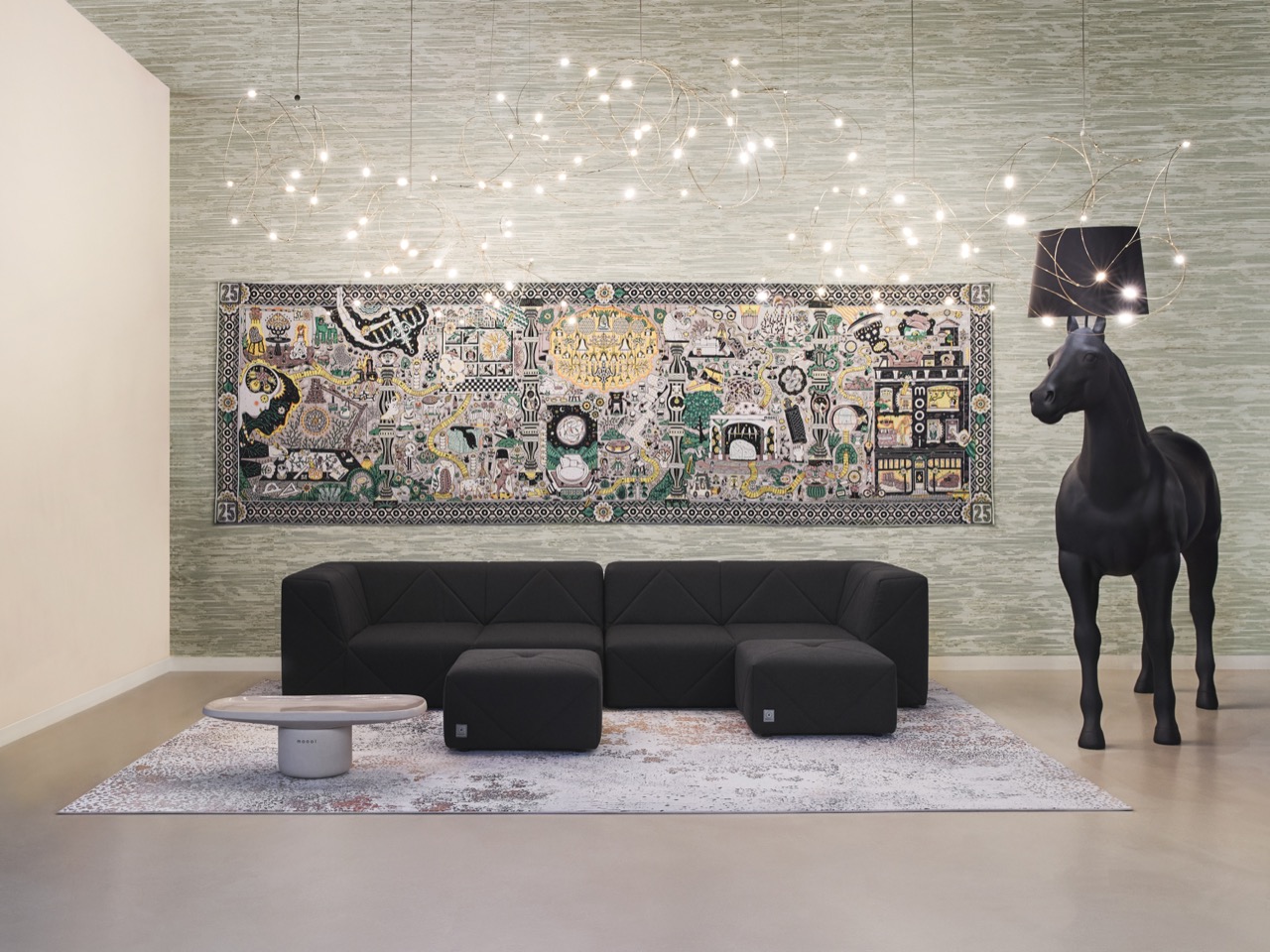
It is a strange kind of ambition for a furniture brand to have. Strange but brilliant. Moooi has spent 25 years refusing to make boring things, and its next chapter looks less like a product catalog and more like a philosophy for how homes should feel. Not smarter. Not more automated. Just more alive, in the same unpredictable way the outside world already is.

Designer: Moooi

The concept has a name, The Living Room, and it started as a simple question the brand kept circling back to. What if an interior never sat still, but moved through a day the way the world outside a window does, gradually and without announcing itself. Lighting could soften as morning turns to afternoon. Objects could shift subtly in response to who’s in the room and what they’re doing. Nothing about it reads as gimmick or gadgetry, which is deliberate, since Moooi keeps insisting this has nothing to do with sensors or automation. It reads instead like weather indoors, a mood that drifts rather than a setting you toggle. That distinction matters more than it sounds.
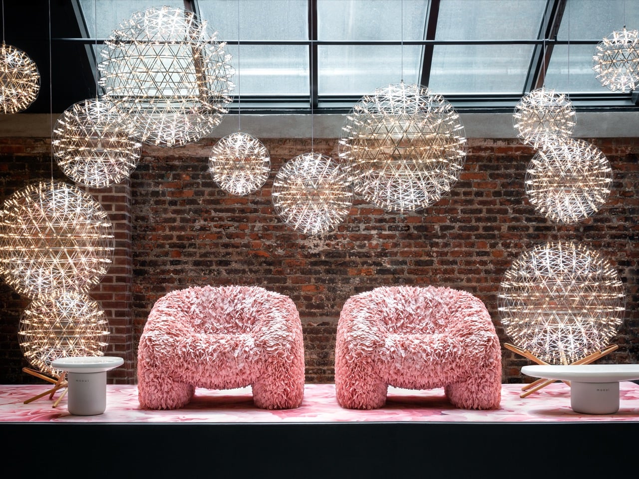
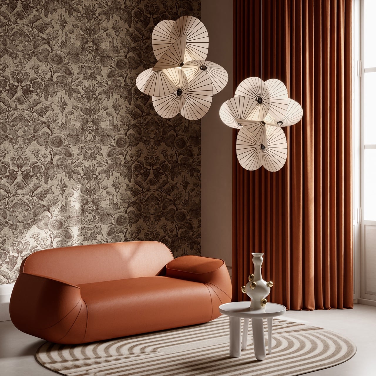
Atmosphere has subtly become the real product Moooi sells, and everything else follows from it. The brand says its process now starts with a single question, how do people want to feel the moment they walk in, long before anyone picks a fabric or a finish. That thinking explains why Moooi’s catalog has crept well past furniture and lighting into wallcoverings, carpets, ceramic tiles and even bespoke scent. Each addition exists to thicken the sensory layer of a room rather than decorate its surface. Building a mood board was never the goal. Building an entire world was.

Personalization is where the philosophy stops being poetic and starts getting genuinely strange, in the best sense. Moooi’s collaboration with EveryHuman uses AI to translate a person’s mood into a custom room fragrance, treating scent as another material a designer can shape rather than an afterthought sprayed in before guests arrive. That same instinct extends to digitally printed carpets and layered surfaces built around individual taste instead of a single house style. The brand frames this as giving creative tools to people rather than finished products, which flips the usual furniture relationship on its head. You are not buying a chair here. You are being handed the freedom to keep shaping a space as your own taste evolves.

None of this would land without Moooi’s oldest habit, which the brand still describes as an ambition to stop the boring business. That mantra showed up loudly at the brand’s 25th anniversary installation in Milan this year, a mirrored, multi sensory environment built at Superstudio Più with choreographer Yoann Bourgeois, layering light, movement and scent into something meant to be felt rather than simply viewed. Marcel Wanders has said there’s no one who walks through a Moooi installation feeling nothing, and that stubborn refusal to be neutral is the connective tissue between a 2001 startup and a 2026 AI fragrance experiment.

Where this goes next is of more consequence than where it started. Moooi has been clear that technology should function as another creative material, sitting alongside craft and color rather than steering the whole show. If The Living Room concept ever leaves the realm of installation and lands inside actual homes, it will be a genuinely different pitch than anything coming out of the smart home industry right now. Not a house that watches you. A house that keeps you company.

The post Forget Smart Homes, Moooi Is Designing Homes That Feel Alive first appeared on Yanko Design.