MWC 2026 is arriving in Barcelona next week under the theme “The IQ Era,” and the foldable conversation has never had more momentum behind it. The worldwide foldable smartphone market is forecast to grow 30% year-over-year in 2026, and with names like Samsung, Apple, and HONOR all moving pieces on the same board, the show floor feels electric. The race isn’t just about who ships first; it’s about who ships something worth keeping.
But the most interesting foldable ideas rarely make it to the keynote stage. Some live in patents. Some debut at design expos and disappear into concept archives. Others surface on design blogs and quietly accumulate a following of people who can’t stop thinking about them. These five concepts represent everything the foldable category could become if ambition and engineering ever fully agreed with each other. Barcelona feels like the right backdrop for that conversation.
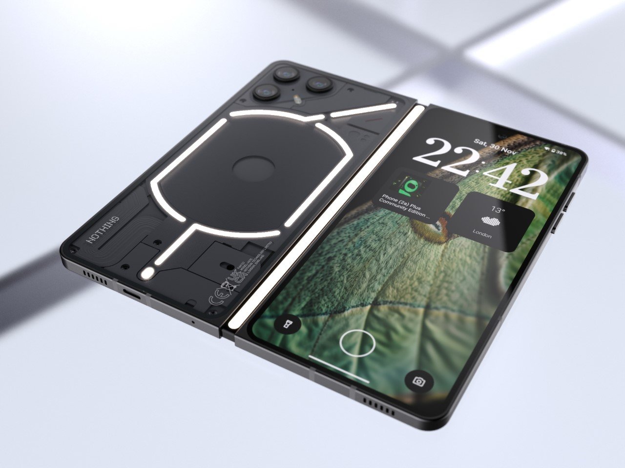
1. Nothing Fold (1) — The Foldable With a Spine That Speaks
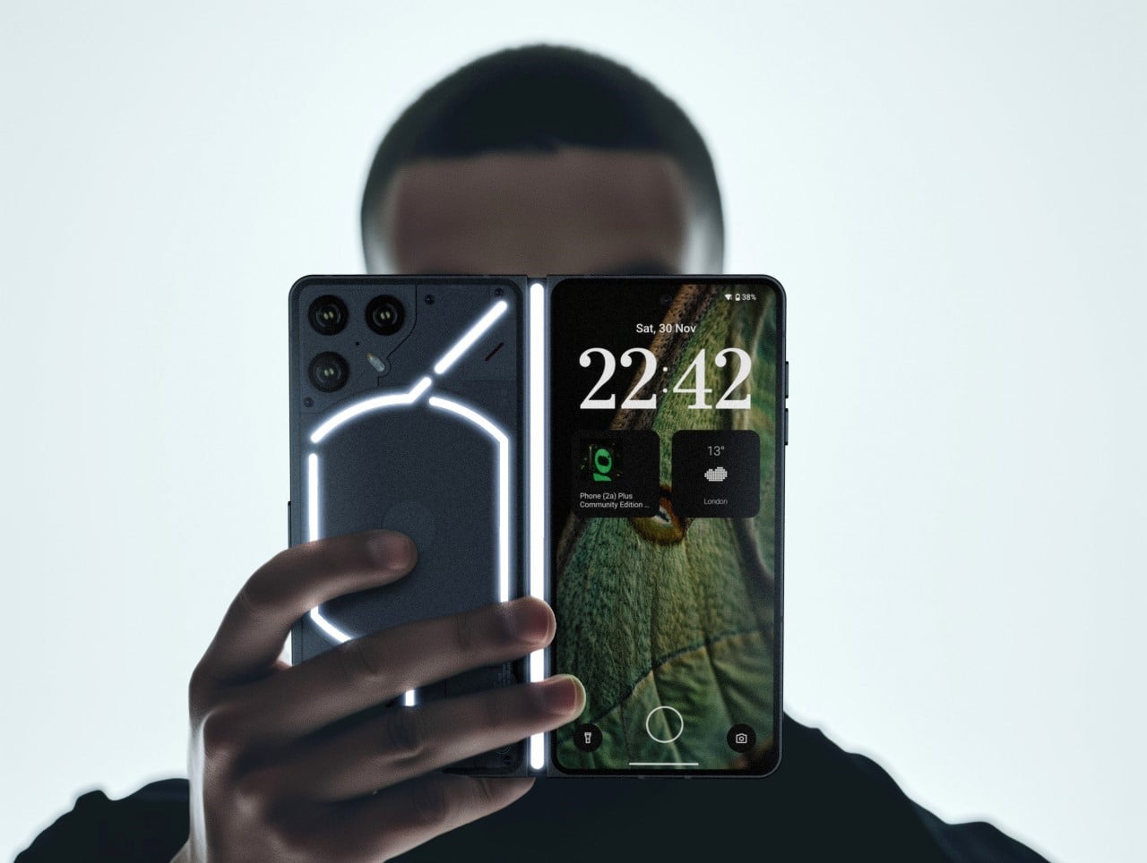

Nothing has always understood that a phone is a surface before it is a device. The brand built its entire identity on making the invisible visible — circuit boards through glass, notification patterns through LEDs, and the Fold (1) concept carries that thinking directly into foldable territory. The Glyph Interface, Nothing’s signature grid of programmable lights, doesn’t just live on the back panel here. It wraps around the spine, and at boot, it traces the number “1” across the edge like a signature being written in real time.
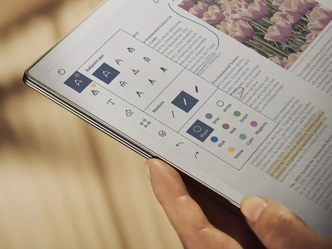
Once the phone is running, the spine transforms into something genuinely new: a monochrome ticker-tape display that scrolls live notifications along the fold without requiring the user to open anything or wake a screen. Inside, an 8.37-inch display gives the Fold (1) the kind of canvas that makes a book-style foldable feel worth carrying. A MediaTek Dimensity 9400 chip handles the processing alongside a dedicated neural unit for on-device AI, while a 5,500mAh battery keeps the whole system running well past a single day. Five cameras — split across the rear, the spine-side flap, and dual hole-punches on both displays — mean no shooting scenario goes uncovered. This is a concept that treats the fold itself as a feature rather than a compromise.
What We Like
- The spine-mounted ticker display turns passive notification delivery into an active design statement that no shipping foldable currently replicates.
- Pairing a 5,500mAh battery with a power-efficient flagship chip gives this concept the endurance its ambitions genuinely require.
What We Dislike
- Five cameras on a foldable form factor raise legitimate questions about thickness — the hardware demands and the slim silhouette are in direct tension.
- Nothing OS remains a compelling but narrow platform, and its app ecosystem still asks more patience from users than mainstream Android does.
2. 0/1 Phone — The Foldable That Knows When to Go Quiet
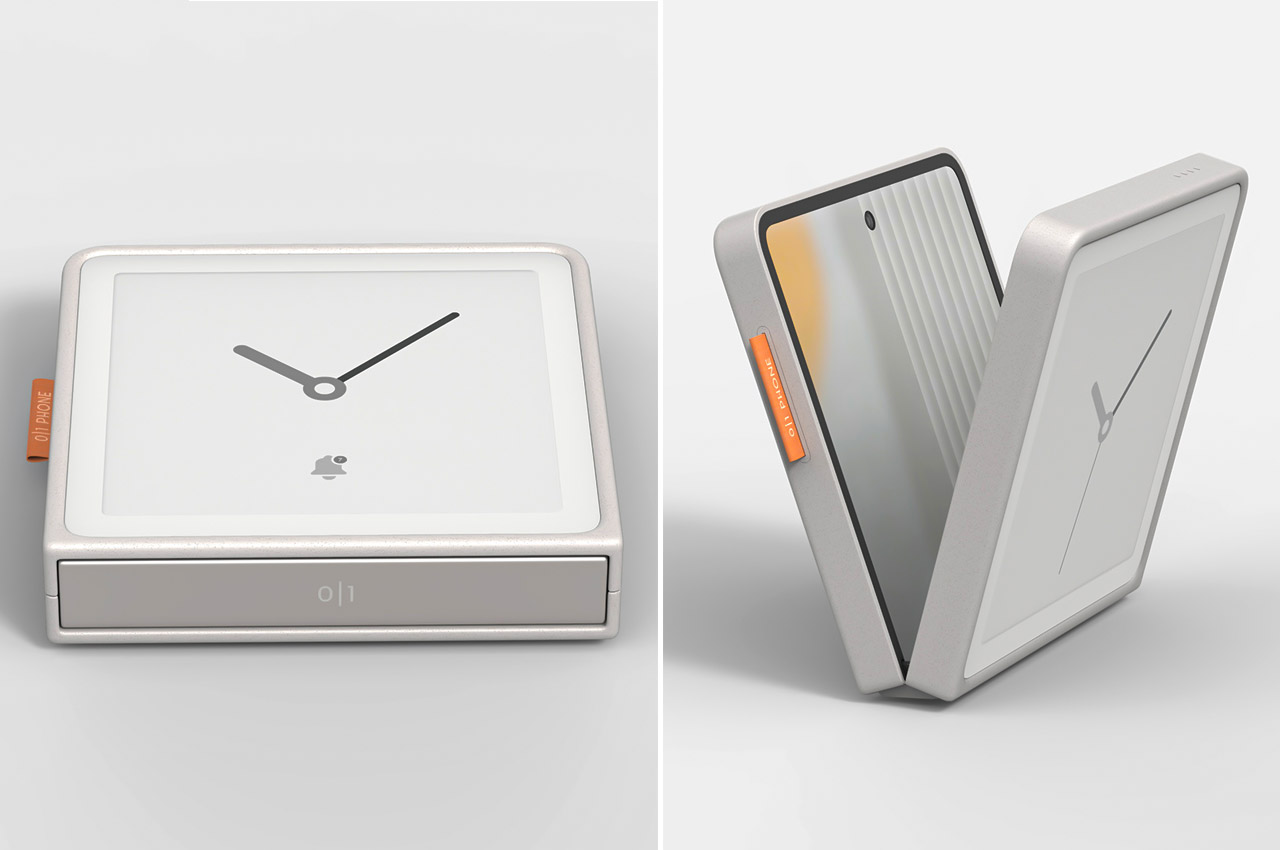
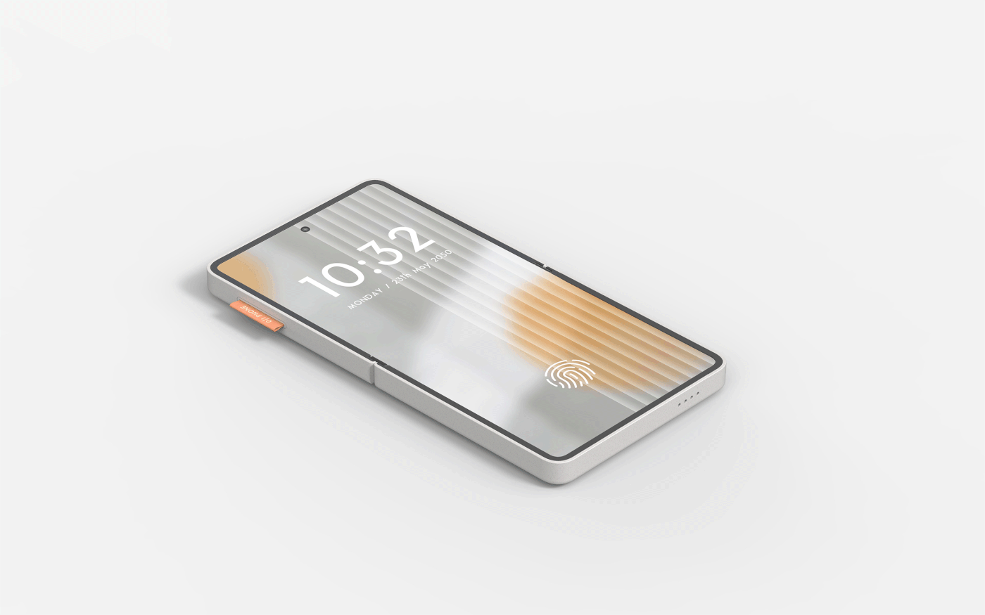
Most digital wellness tools are built on a contradiction. They ask sthe oftware to solve a problem that the software created. The 0/1 phone cuts through that logic by putting the solution in the hardware itself. Closed, the phone presents an e-ink display — customizable with analog clock faces, a calendar, a music player, or whatever belongs in a calmer version of a day. There are no feeds to scroll, no notifications engineered to demand attention, no app icons arranged to maximize tap frequency. Just the time, and whatever you decided mattered before distraction had a vote.
Open it, and the phone becomes something else entirely. A flexible display running at 1080×2640 resolution gives full access to every app, every platform, every habit the closed state was holding at arm’s length. The transition between modes isn’t managed by a screen time setting buried in a menu; it’s a physical gesture. Closing the phone is the act of choosing focus, and opening it is a deliberate decision rather than a reflexive one. That distinction sounds small until you’ve spent a week with a phone that makes you conscious of every time you reach for it. The 0/1 concept understands that people don’t want less technology. They want better control over when it starts.
What We Like
- Mapping distraction-free mode to a physical action rather than a software toggle is a smarter and more honest approach to attention management.
- Customizable e-ink clock faces give the closed state genuine personality, making minimalism feel like a choice rather than a penalty.
What We Dislike
- E-ink displays still lag on refresh rate and struggle with colour depth, which could make the closed-state experience feel dated compared to what users are used to.
- Building a dual-display device that stays genuinely slim is a serious engineering challenge, and added bulk would directly undermine the concept’s entire premise.
3. Samsung L-Fold Patent — The Tetris Block the Industry Wasn’t Ready For
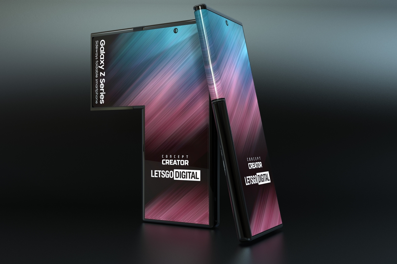
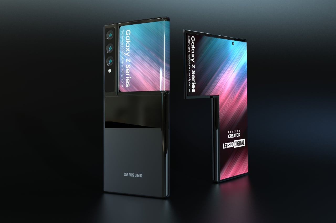
Samsung’s patent library is enormous, and most of what lives inside it will never become a product. But occasionally something surfaces that reframes what a foldable phone could look like at a structural level. The L-shaped concept — which, unfolded, mirrors the elongated corner-piece of a Tetris grid — is one of those designs. The top section of the display extends to one side and then folds back on itself like a flap, bringing the phone from an asymmetric L-shape into a more conventional rectangle. It’s a transformation that takes about a second to understand and considerably longer to stop thinking about.
What makes the concept genuinely interesting isn’t the shape — it’s what the folded flap can do once it’s in position. Facing outward alongside the main cameras, it becomes a live viewfinder, letting users frame selfies through the primary camera array rather than a secondary front-facing sensor that typically offers a fraction of the optical quality. The curved strip of display wrapping the spine edge serves as an ambient information surface — battery level, the time, notification tickers — visible without waking the main screen. It draws an obvious comparison to the LG Wing’s T-shaped swivel design, but the folding mechanism introduces a layer of versatility that the Wing could never access. The L-fold isn’t trying to be novel. It’s trying to be useful in ways the rectangle hasn’t figured out yet.
What We Like
- A folded flap that doubles as a selfie viewfinder for the main cameras is one of the most practically useful ideas to emerge from any foldable concept in recent memory.
- The spine-edge ambient display strips away the need to fully wake the phone for low-stakes information — a subtle but genuinely valuable interaction shift.
What We Dislike
- Asymmetric form factors demand new muscle memory from users, and history suggests the mass market is slow to warm to anything that doesn’t fit an established shape.
- Samsung patents ideas prolifically, and the distance between a filed concept and a retail device is wide enough that this design may never leave the archive.
4. OPPO x nendo Slide-Phone — The Triple-Fold That Earns Every Stage
When OPPO partnered with Japanese design studio nendo for the slide-phone concept, the goal wasn’t to make a foldable that could compete on spec sheets. The goal was to design a phone that understood how humans actually move through a day — glancing, then engaging, then working — and matched each state with exactly the right amount of screen. The mechanism unfolds in three progressive steps, each one surfacing a different display area calibrated to a specific type of task. Nendo described the motion as caterpillar-like, and the metaphor holds. This phone doesn’t hinge open. It extends with intention.
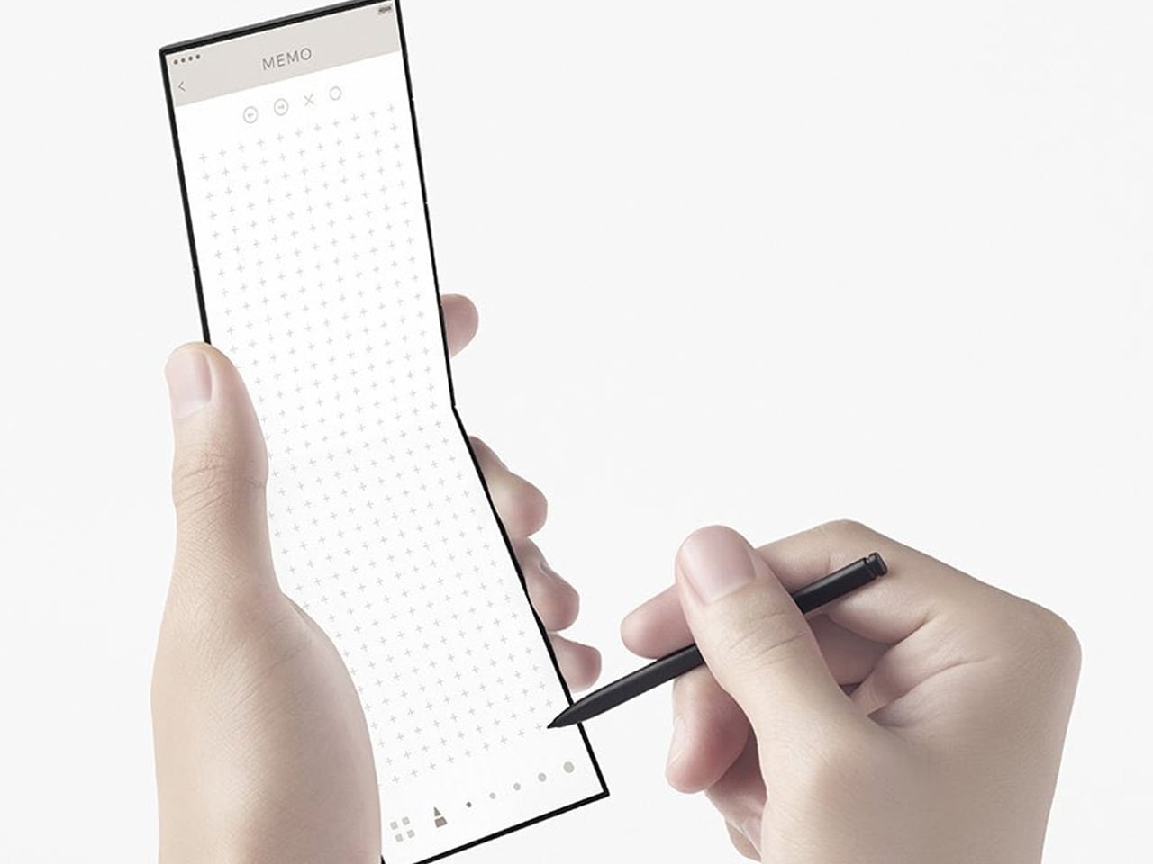
The first stage reveals 1.5 inches of display, enough for a notification glance, music control, and an incoming call. The second opens to 3.15 inches, suited to photography, video calls, and light gaming. The third and final stage unlocks the full 7-inch widescreen panel, wide enough to run on-screen game controllers across both flanks simultaneously or to frame a proper panoramic shot. A stylus is included, pushing the concept firmly into professional productivity territory. What distinguishes this design from every other multi-fold proposal isn’t the screen count; it’s that each screen size exists for a reason. That level of purposefulness in a concept is rarer than it sounds, and it’s exactly the kind of thinking MWC 2026 needs more of.
What We Like
- Three screen sizes, each assigned to a specific use context, is the most functionally coherent multi-fold proposal the category has produced.
- The OPPO x nendo collaboration brings genuine design philosophy to a product type that has historically been defined by engineering decisions alone.
What We Dislike
- Three-fold points mean three mechanical vulnerabilities, and the durability science around multi-fold hardware still hasn’t caught up to the ambition.
- The credit card form factor, when fully closed, is irresistible in theory, but the real-world pocketability of a 7-inch unfolded device still requires a convincing answer.
5. TCL Fold ‘n’ Roll — The Concept That Refused to Choose a Size
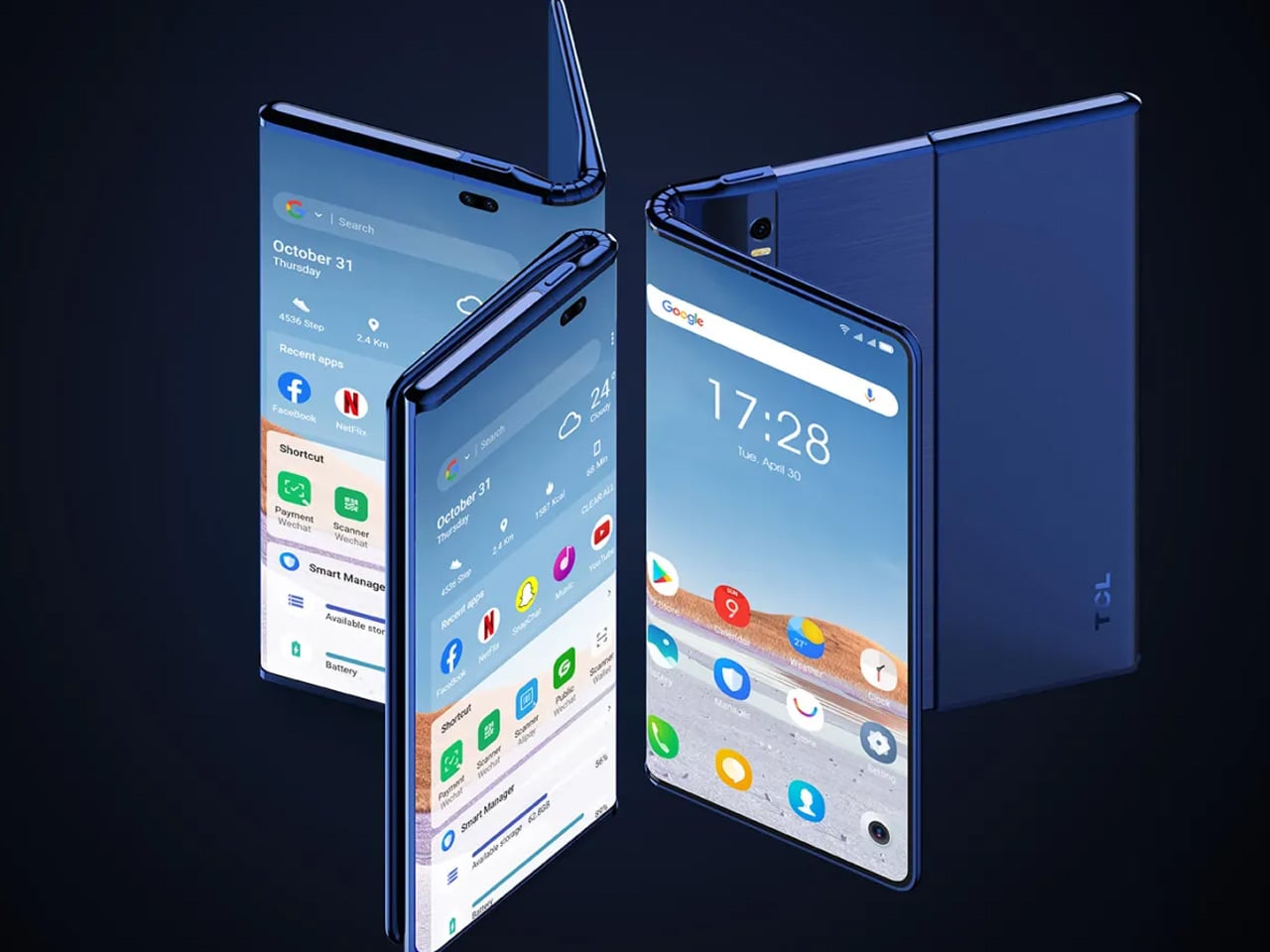
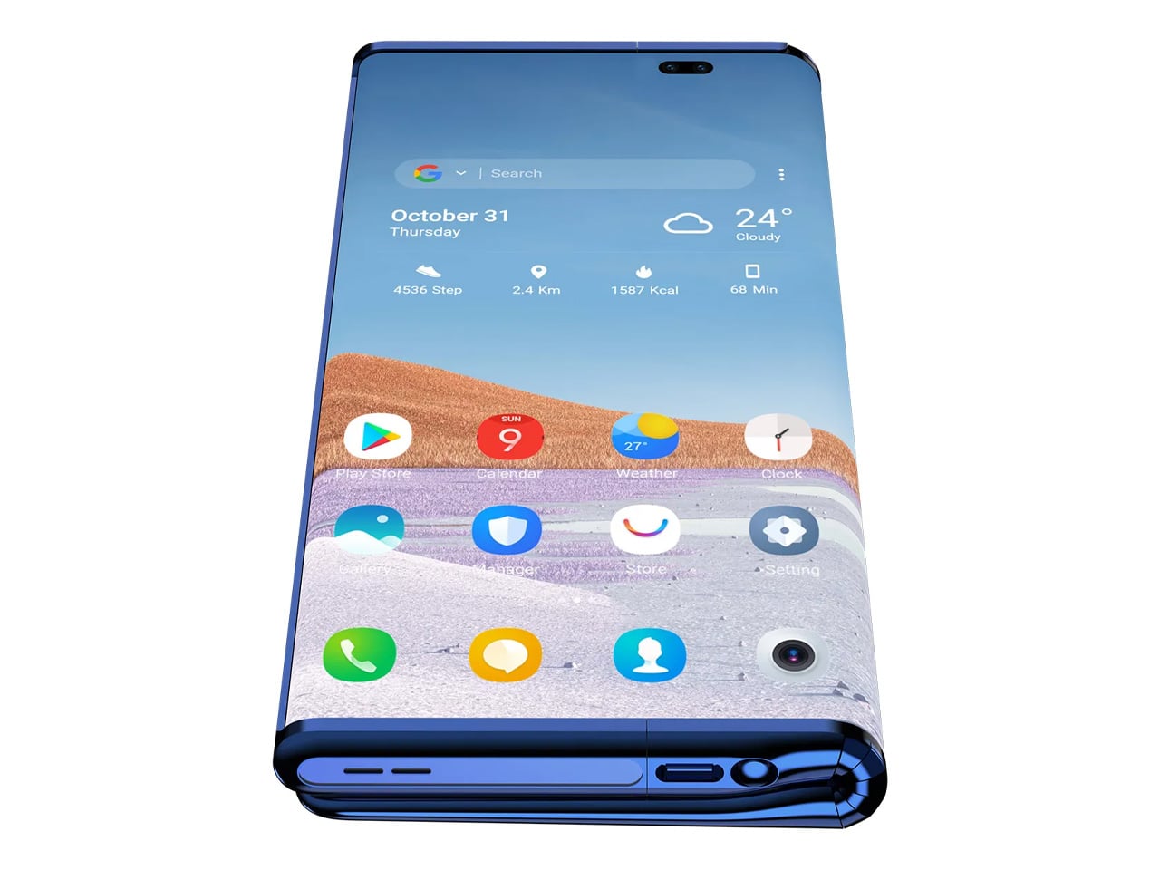
Every other foldable phone on this list commits to a fixed set of screen configurations. The TCL Fold ‘n’ Roll doesn’t. Using a combination of the brand’s proprietary dragonhinge folding mechanism and a rollable panel that extends from the chassis, the device starts as a 6.87-inch smartphone, unfolds into an 8.85-inch phablet, and then rolls out fully to become a 10-inch tablet. Three screen sizes. One device. No trade-off required. As a concept, it reads less like a product proposal and more like a direct challenge issued to every manufacturer in the room.
TCL was candid about the technical specifications still being in development when the concept was first revealed — an admission that actually made the idea more credible, not less. It signalled a team working through real problems rather than rendering a fantasy. The rollable display space has since moved meaningfully closer to commercial viability, and with the broader foldable market accelerating sharply heading into 2026, the engineering distance between this concept and a shippable product is closing. The dragonhinge gives the Fold ‘n’ Roll a mechanical foundation most conceptual devices lack. What it still needs is a manufacturer willing to see the build all the way through, and a Barcelona stage to announce it from.
What We Like
- Phone, phablet, and tablet in a single chassis is the most versatile screen configuration concept the foldable category has put forward to date.
- The dragonhinge technology gives this proposal a legitimate engineering backbone, separating it from pure speculation.
What We Dislike
- Combining folding and rolling mechanisms in one device layers mechanical complexity that no manufacturer has yet solved at the consumer scale.
- TCL has introduced multiple foldable concepts across several years, and relatively few have made the jump from concept to shelf, which tempers excitement with reasonable caution.
The Floor Is Set — Now Someone Has to Build It.
MWC 2026’s “The IQ Era” framing is ultimately about intelligence meeting design, and these five concepts each demonstrate what that looks like when executed with real conviction. One bets on identity and spectacle. One bets on restraint. Another bets on geometric reinvention, one on human-centric layering, and the last on sheer configurability. The foldable market expanding 30% year-over-year isn’t a coincidence; it reflects a growing recognition that the rectangle-shaped smartphone has stopped being interesting.
Not all of these concepts will ship. Some may arrive in forms barely recognizable compared to the original vision. But the questions they ask…about how a phone should behave when closed, how many screens a device actually needs, whether a hinge can carry a brand identity, are already changing how the industry thinks.
The post 5 Best Foldable Phone Concepts We’re Still Waiting To See At MWC 2026 first appeared on Yanko Design.

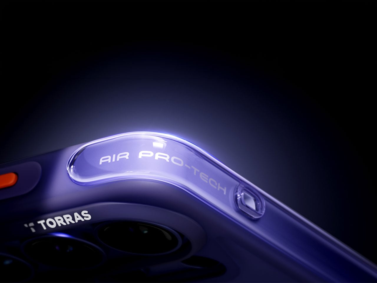
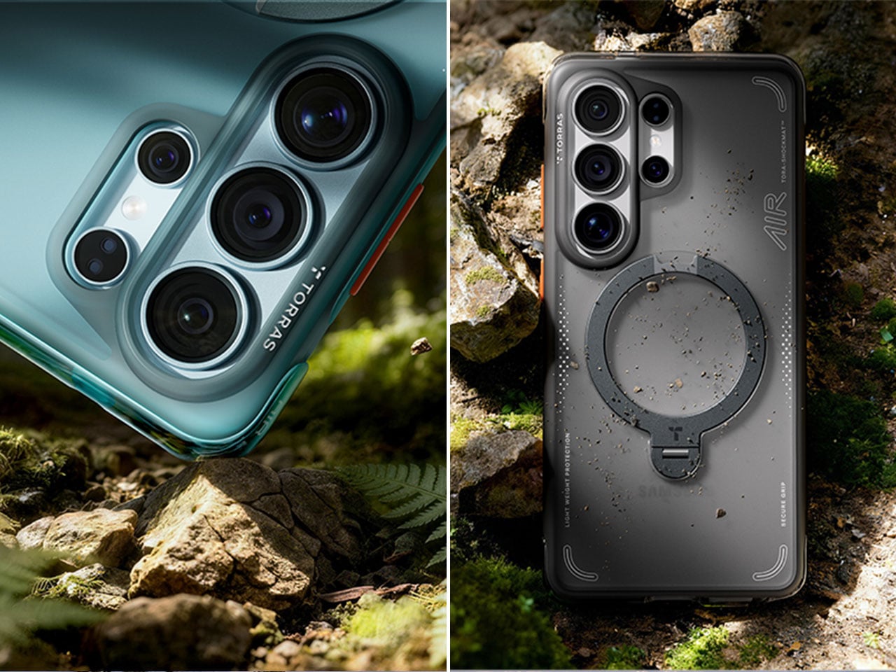
 to the S26 Ultra with design refinements specifically engineered for Samsung’s latest flagship. The Q3 Air wraps your device in precision-engineered air cushions that absorb up to 98% of impact energy with certified 12-foot drop protection. We love how TORRAS has achieved serious protection without adding bulk. The edge-to-edge airbag system cushions all four corners while keeping the profile slim enough for comfortable everyday carry.

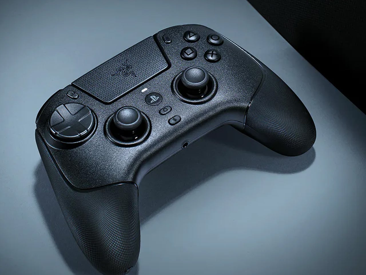
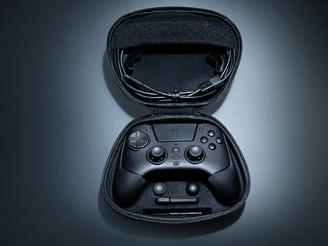
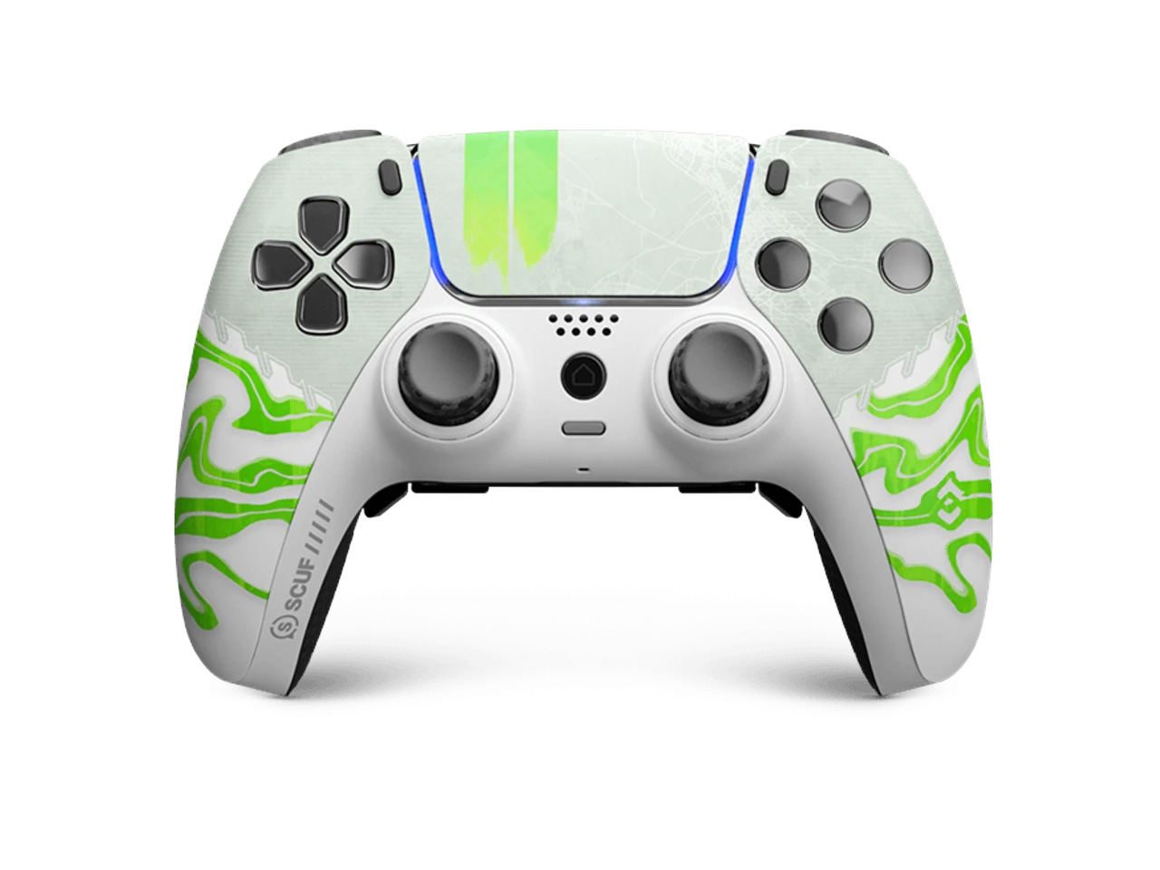
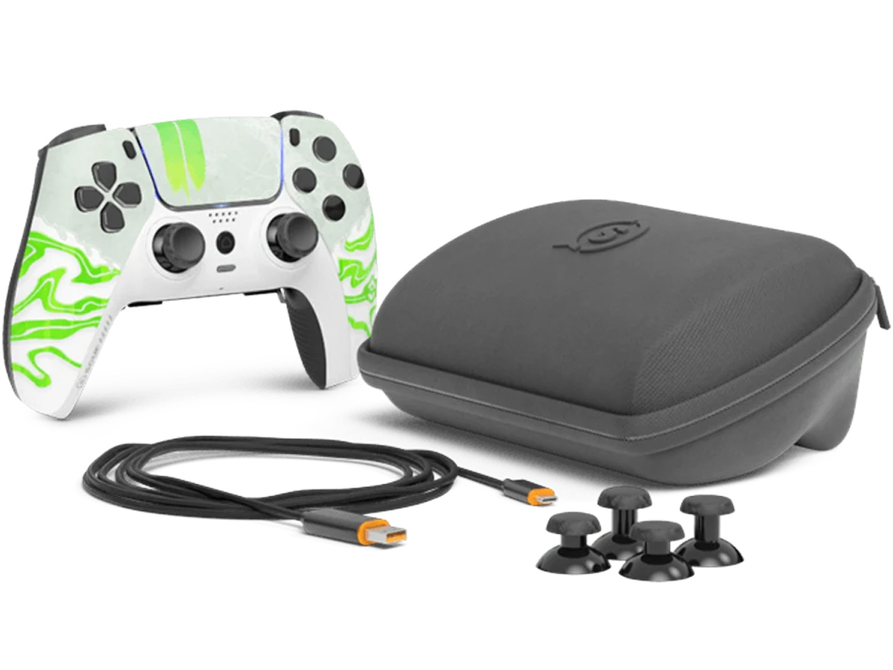 SCUF has spent years earning credibility with competitive console players, and