Spending hours in front of a glowing screen is unavoidable for most people, and the toll it takes on the eyes is a problem the monitor industry hasn’t truly solved. E Ink displays offer a gentler, paper-like alternative that’s far easier to stare at for long stretches, but most of them are painfully slow, limited in resolution, and not really up to the demands of daily computing.
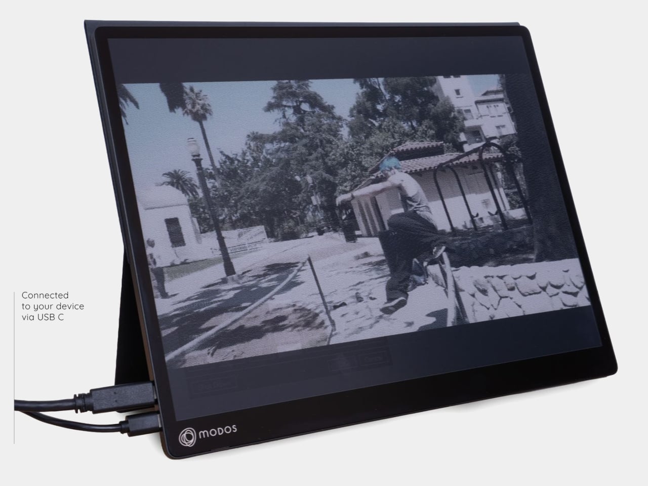
The Modos Flow is Modos Tech’s answer to that problem. Built by a Boston-based hardware startup, it’s a 13.3-inch E Ink portable monitor designed not just for casual reading but for all-day, focused work. It targets the kind of person who needs a real secondary screen but wants to spend less time squinting and more time actually getting things done.
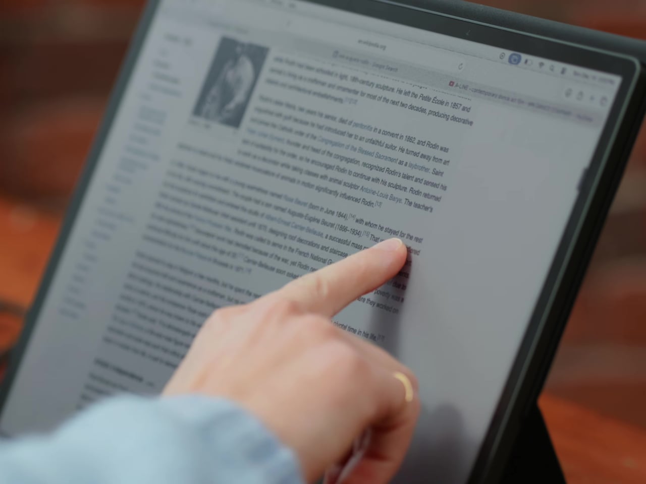
Most E Ink monitors struggle as daily drivers because of their refresh rate. Traditional panels tend to crawl, making anything beyond static document reading a frustrating experience. The Modos Flow uses a custom board with open-source firmware to push its display to 60 Hz, enough to scroll through pages, type without noticeable lag, and use the screen as a functional everyday monitor rather than a glorified e-reader.
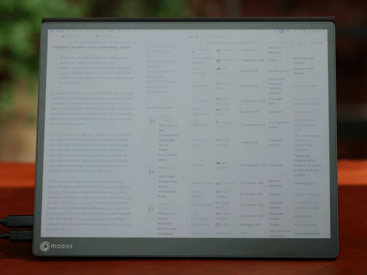
Resolution is also where the Modos Flow separates itself. In black-and-white mode, it renders at 3,200 x 2,400 pixels with a pixel density of 300 PPI, making text crisp enough to satisfy anyone used to retina-grade displays. Color mode brings the resolution down to 1,600 x 1,200 pixels at 150 PPI, which is a fair trade given how rarely E Ink panels offer color at all.
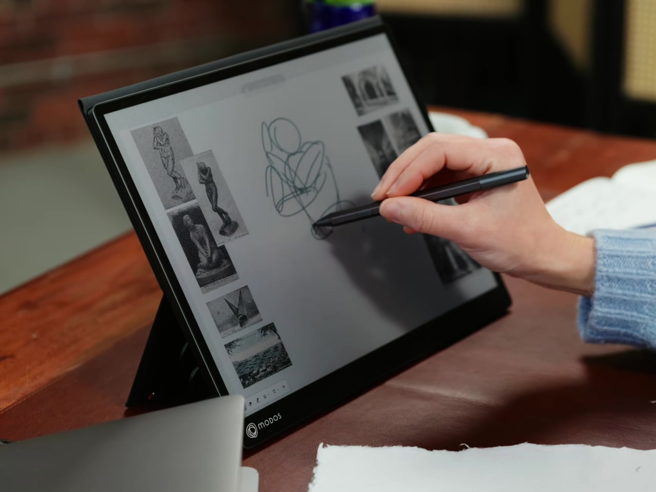
Touch and stylus support round out what’s becoming a surprisingly versatile display. Modos brought the latency down to under 100ms, so annotating a document, sketching ideas, or jotting notes with a stylus actually responds the way you’d want it to. It won’t replace a dedicated drawing tablet, but for someone who routinely works between a laptop and a secondary screen, having that input option without swapping devices is genuinely useful.
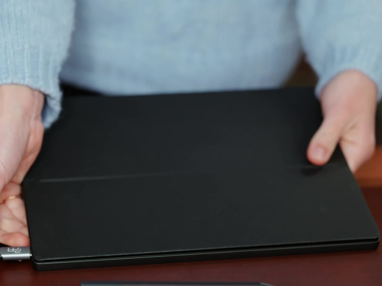
Its physical design is straightforward and practical. A built-in cover doubles as a stand and folds flat for travel, while VESA mounting holes on the back make it easy to attach to a monitor arm or desk mount. Three side buttons let you adjust brightness, contrast, and display mode without touching your computer. Connectivity runs through USB-C with DisplayPort Alt-Mode support, which keeps the setup clean with a single cable.
One of the quieter advantages of E Ink over LCD or OLED is power consumption, and that matters here. When connected to a laptop via USB-C, the Modos Flow draws significantly less power than a conventional secondary monitor, meaning your battery isn’t taking nearly the hit it normally would. It works with Windows, macOS, and Linux out of the box, so there’s no particular setup hurdle to clear. Pricing hasn’t been confirmed yet, but Modos has indicated it should be comparable to other portable monitors.
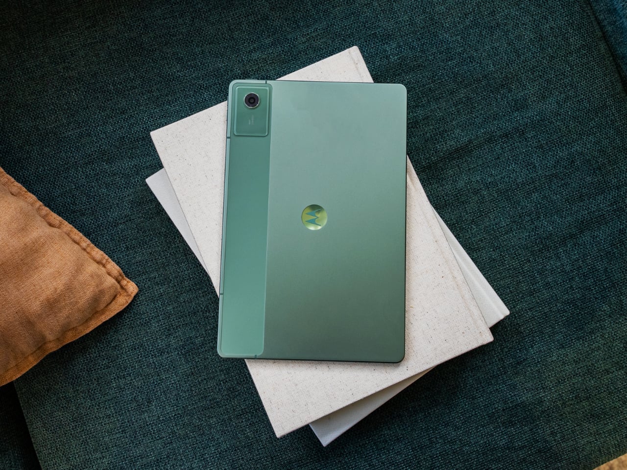
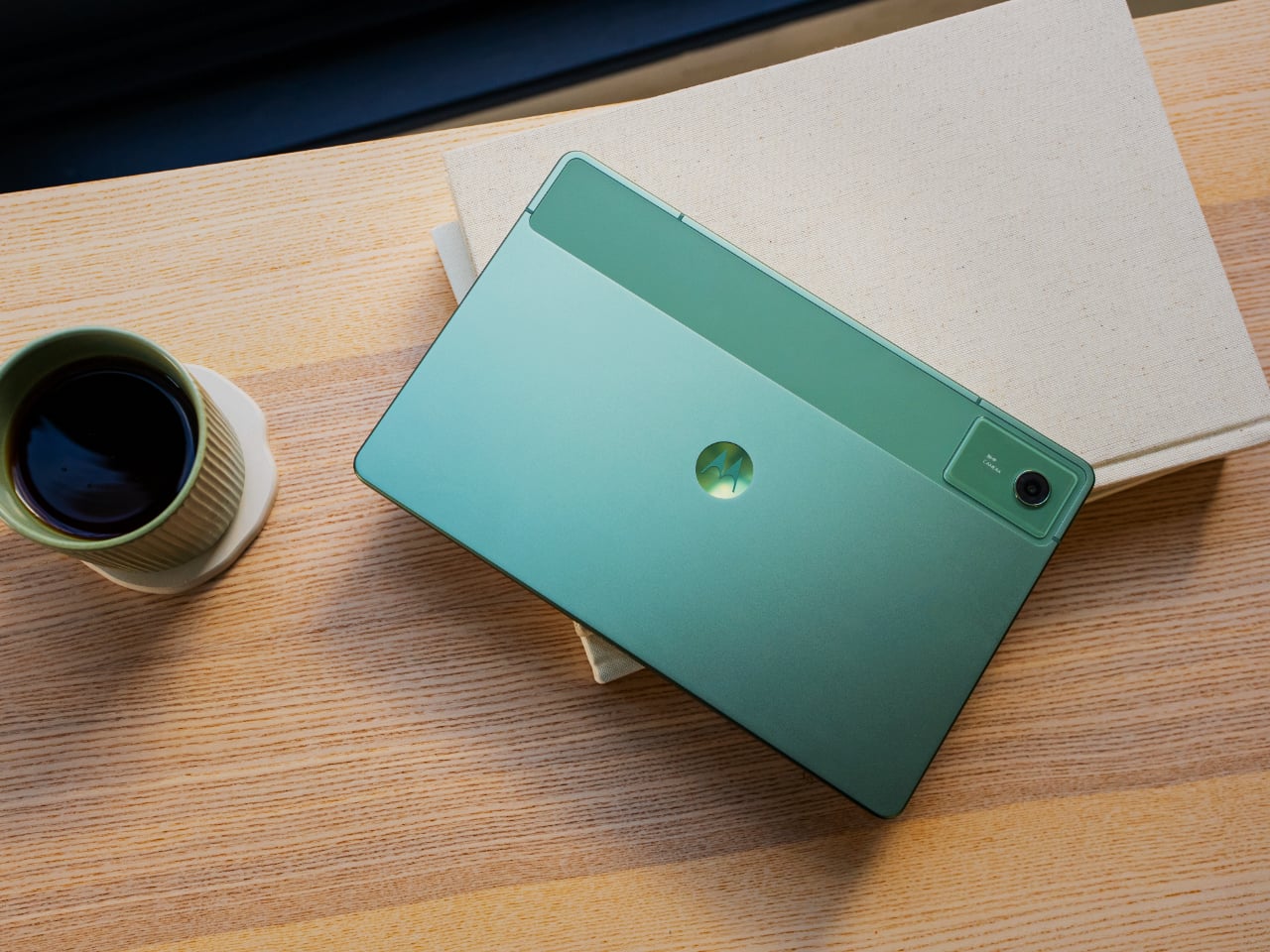
Motorola has introduced the moto pad – 2026, a new Android tablet that expands the company’s device lineup beyond smartphones and into a more connected cross-screen experience. Announced alongside the moto g stylus – 2026, the tablet is positioned as a larger-screen companion for productivity, entertainment, and everyday multitasking. Based on its specs and overall appearance, the device also appears to be a rebranded version of the Moto Pad 60 Neo, which launched in India last year.
That resemblance matters because the moto pad – 2026 does not arrive as a dramatic reinvention of the Android tablet formula. Instead, it looks like Motorola is leaning on a familiar hardware base and repositioning it for a wider audience under a simpler product name. In that sense, the story here is not just about a new tablet, but about how Motorola is continuing to build out a broader ecosystem around its existing devices.
Designer: Motorola
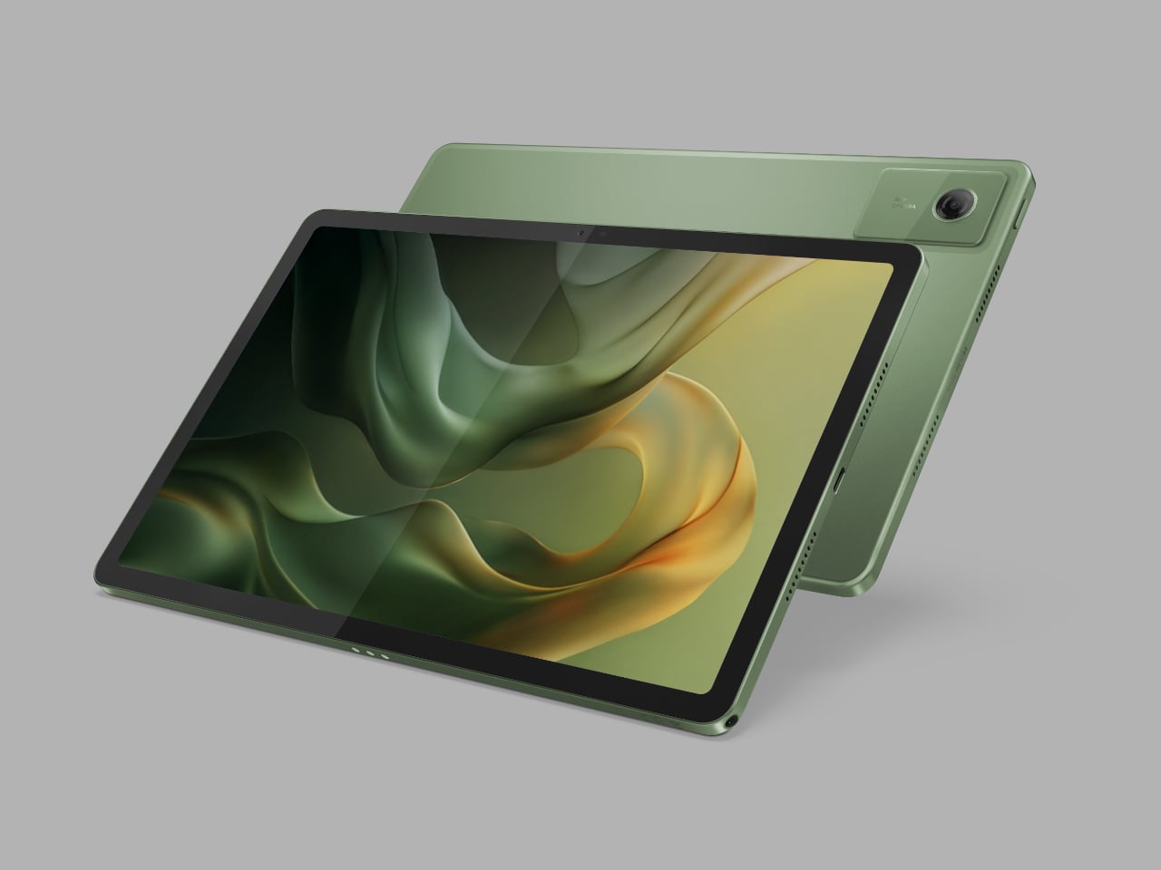
The moto pad – 2026 centers on an 11-inch display with 2.5K resolution and a 90Hz refresh rate, giving it a hardware foundation aimed at streaming, reading, and light productivity. Motorola says the screen reaches up to 500 nits in High Brightness Mode, which should make it usable in a wider range of lighting conditions. The tablet’s 6.99mm profile and roughly 480g weight also suggest a design meant to feel portable rather than bulky, whether it is being used on a desk, on a couch, or on the go.
The spec sheet also points to an anti-fingerprint finish and a PANTONE Bronze Green metal design. Those details give the device a cleaner and slightly more refined visual identity than many budget-focused tablets that tend to settle for plain plastic shells. Even if the overall hardware looks familiar, Motorola is clearly trying to make the tablet feel more polished and lifestyle-friendly in the way it is presented.
Performance is handled by the MediaTek D6300 5G processor, paired with 8GB of LPDDR4x memory and 128GB of built-in storage. The tablet also supports microSD expansion up to 2TB, adding flexibility for users who want to keep more video, downloads, apps, and documents locally. That combination should be enough for everyday streaming, browsing, reading, casual gaming, and light multitasking, even if it is not positioned as a high-end productivity machine.
One of the more practical additions is 5G connectivity, which gives the moto pad – 2026 an advantage over Wi-Fi-only tablets that lose some of their usefulness away from home or office networks. That makes the device easier to imagine as a portable screen for students, travelers, or anyone who wants a larger display without constantly relying on hotspot connections. It also helps reinforce the idea that this is meant to be a flexible everyday tablet rather than a stay-at-home media slab.
Audio appears to be one of the stronger parts of the package. The moto pad – 2026 includes quad speakers with Dolby Atmos, which should give it a better foundation for movies, streaming, and casual gaming than entry-level tablets with simpler speaker setups. A 3.5mm headphone jack is also included, which remains a practical feature for users who still prefer wired audio or want an easy connection for older accessories.
The software story here is less about reinvention and more about ecosystem fit. Motorola says the moto pad 2026 supports Smart Connect, allowing it to work more closely with phones and PCs for multitasking and content sharing across screens. It also includes Circle to Search, extending one of Android’s more useful recent features to a larger display and giving the tablet a more modern software feel.
Battery life is backed by a 7,040mAh cell, while charging tops out at 20W. The spec sheet also lists an IP52 rating, along with a 5-megapixel front camera and an 8-megapixel rear camera, reinforcing the sense that this is primarily a media and productivity tablet rather than a device built around photography or premium flagship ambitions. Taken as a whole, the moto pad 2026 looks like a practical addition to Motorola’s lineup, even if its strongest selling point may be how familiar it already seems.
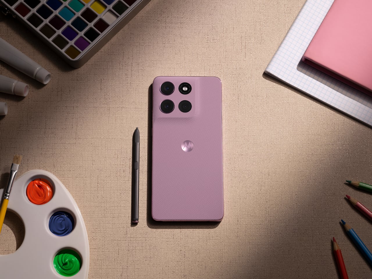
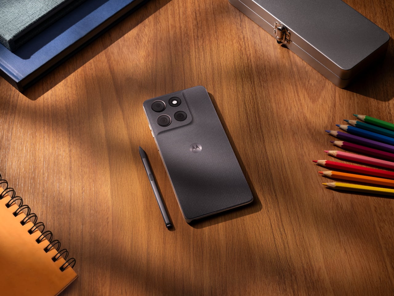
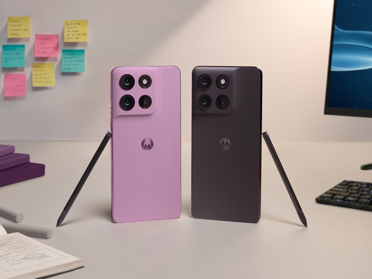
Motorola has introduced the moto g stylus – 2026, refreshing one of its more popular smartphone lines with an upgraded built-in stylus, added durability, and a feature set aimed at users who want productivity tools without stepping into flagship pricing. The moto g stylus has become one of Motorola’s more popular models by offering a built-in stylus in a segment where that feature remains relatively rare. With the 2026 version, Motorola is clearly building on one of the line’s biggest points of differentiation.
The stylus is central to the phone’s updated experience. It now supports tilt and pressure sensitivity in supported apps, allowing for broader shading, finer lines, and a more natural pen-on-paper feel when sketching, jotting notes, or marking up ideas on the fly. That functionality extends to a refreshed Notes experience, where handwritten notes, doodles, and brainstorms live in one place.
Designer: Motorola
Beyond the pen features, the moto g stylus – 2026 brings together a hardware package aimed at broadening its appeal. The phone includes a 6.7-inch AMOLED display with 1.5K resolution and a 120Hz refresh rate. Peak brightness has been increased to 5,000 nits, up from 3,000 nits on the previous model.
The camera hardware, however, looks rather familiar. Motorola lists a 50-megapixel main camera with Sony’s LYTIA 700C sensor, along with a 13-megapixel ultrawide and macro camera and a 32-megapixel front-facing camera. That mirrors the setup used on the 2025 model on paper, suggesting the bigger story this year is the stylus and durability rather than a major imaging overhaul.
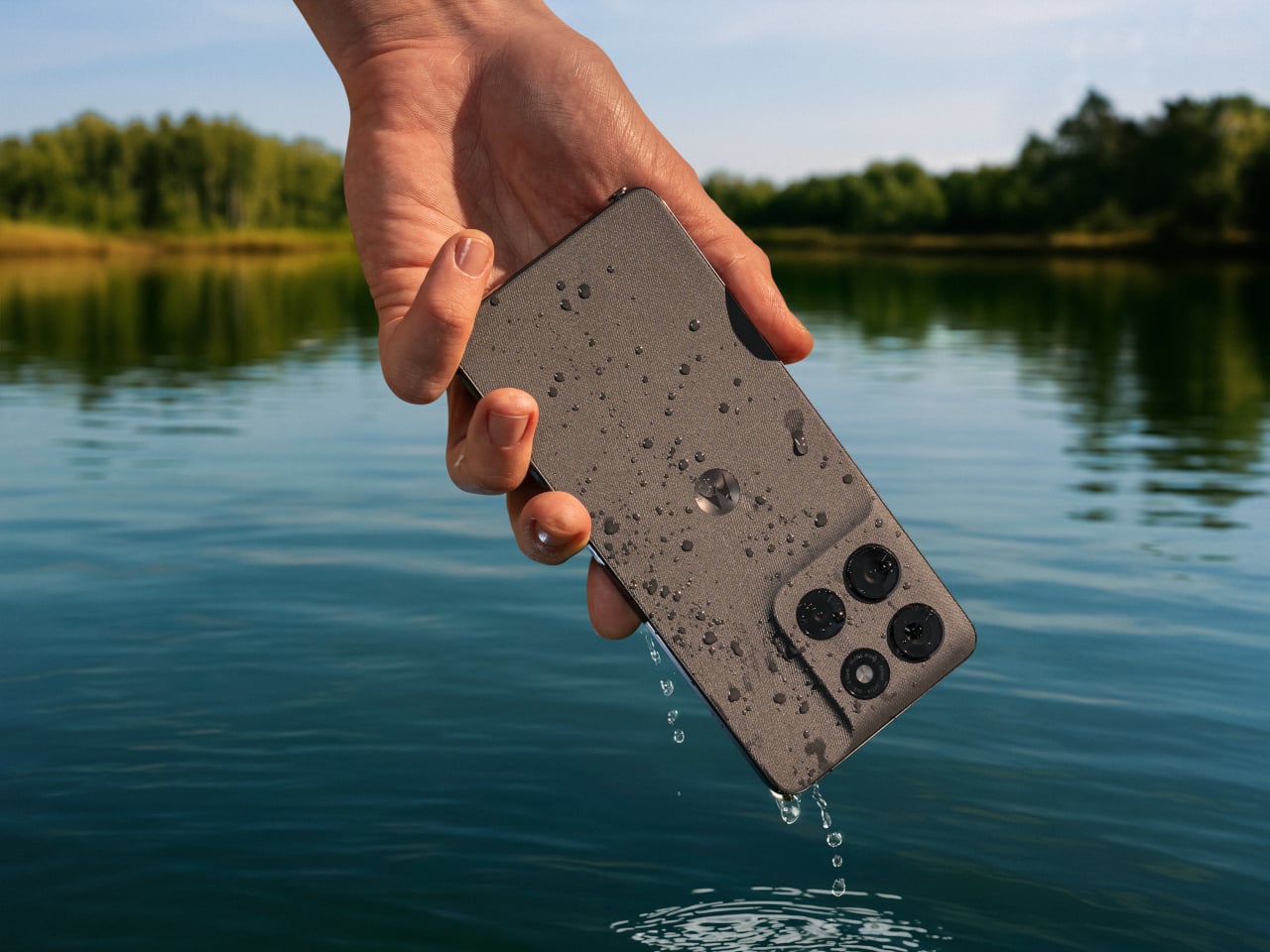
Motorola is also putting more emphasis on durability this year. The moto g stylus – 2026 adds IP69 protection and SGS-certified military-grade toughness, building on the IP68 resistance already offered by the previous model. That should help the phone better handle dust, water exposure, drops, and more demanding day-to-day conditions.
Battery life remains another key part of the package. The phone includes a 5,200mAh battery that Motorola says can deliver up to 44 hours of use, along with support for 68W wired charging and 15W wireless charging. On the software side, the device ships with Android 16 and includes Google Gemini, Motorola’s Hello UX customization layer, Smart Connect for multi-device experiences, and Moto Secure.
The new model continues Motorola’s design-forward approach, pairing its feature set with a leather-inspired finish and twill-like texture. It will be offered in Pantone-curated Coal Smoke and Lavender Mist color options. Motorola announced the phone alongside the Moto Pad 2026, a new tablet intended to complement the smartphone across productivity and entertainment use cases.
The Moto G Stylus 2026 will go on sale on April 16 as an unlocked device through Best Buy, Amazon, and Motorola.com, with a starting price of $499.99. We are expecting to receive a review unit, and we will have more to say once we have had the chance to test the stylus, camera system, battery life, and day-to-day performance. Stay tuned for our full review.
Smartphone colors have become one of the more formulaic aspects of mobile design. Most brands cycle through the same soft pastels and stone-inspired neutrals, year after year, with names like Moonstone, Fog, and Porcelain doing most of the heavy lifting. It’s a safe approach that generally works, but there’s rarely any real meaning behind these choices. A color is just a color, and that’s often where the story ends.
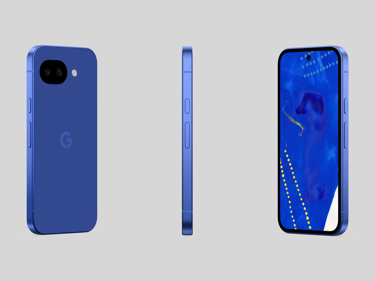
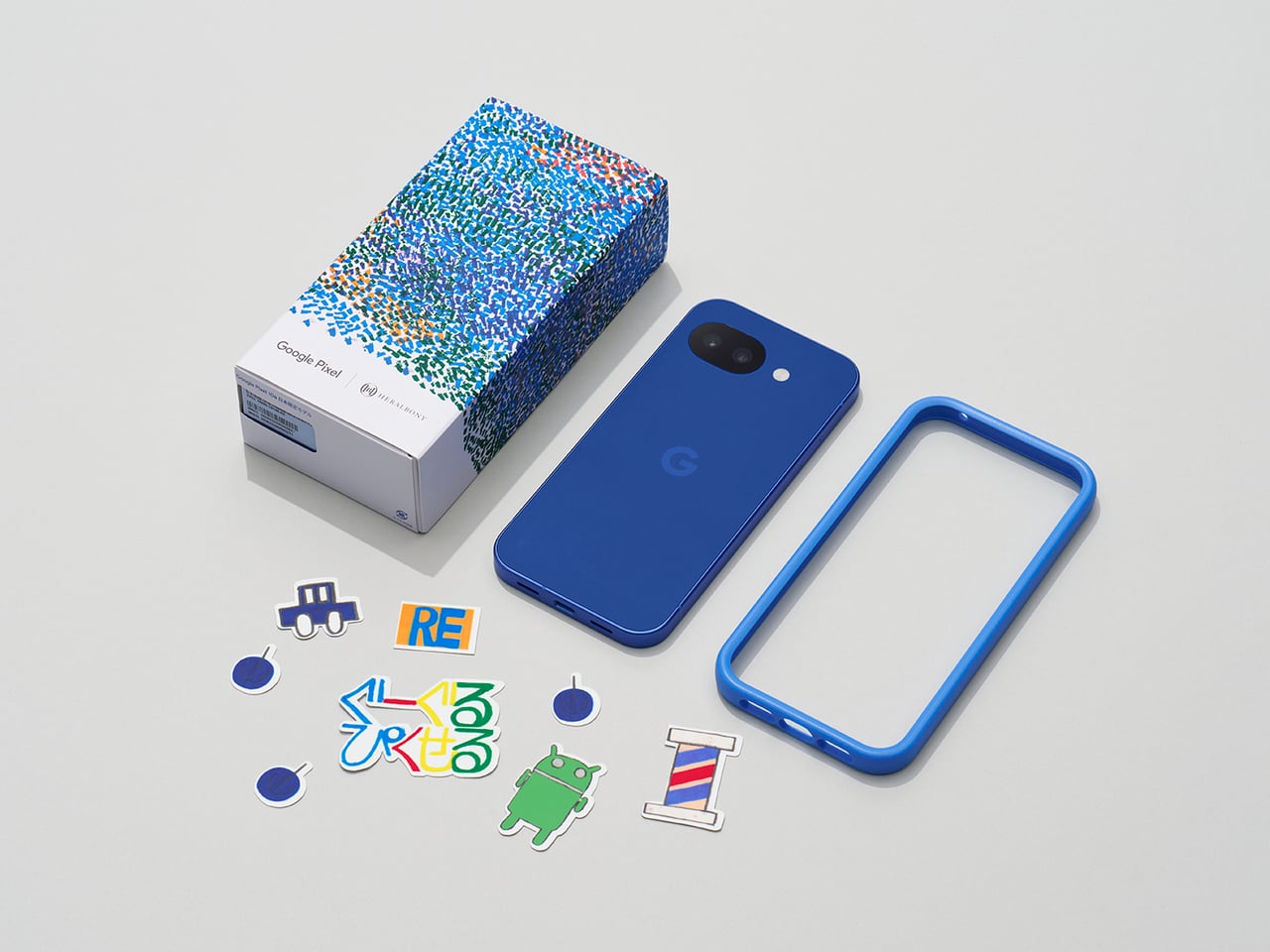
Google seems to have had the same thought, at least for Japan. The Pixel 10a Isai Blue is a Japan-exclusive model developed in collaboration with Heralbony, a creative company that works with artists with disabilities to produce new forms of cultural expression. It celebrates a decade of Pixel phones, and rather than simply marking the occasion with a new shade, Google made the color itself worth talking about.
Japan didn’t get the Pixel 10a when it first launched globally in February, which was a bit of an odd omission given how well the A-series has performed there. The country has quietly grown into one of Google’s stronger Pixel markets, so the wait wasn’t really a sign of indifference. Returning to Japanese fans with something made specifically for them says a lot more than a straight regional rollout would.
The name alone sets this apart from anything Google has done before. “Isai” translates to unique and unparalleled individuality, and this is actually the first time a Pixel color has been given a Japanese name. Most Pixel colors borrow from the natural world, but Isai Blue is built around something more conceptual: a deep navy shade tied to Heralbony’s own brand identity and its mission to celebrate human difference.
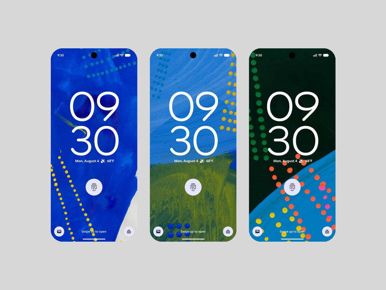
That philosophy runs all the way through to the software, too. Three Heralbony-contracted artists, Shigaku Mizukami, Midori Kudo, and Kaoru Iga, each contributed original designs that became exclusive wallpapers on the device. Pick one of the nine available artworks, and Material You automatically reshapes the phone’s icon colors and styling to match. It’s the kind of visual cohesion you don’t usually get with a phone at this price.
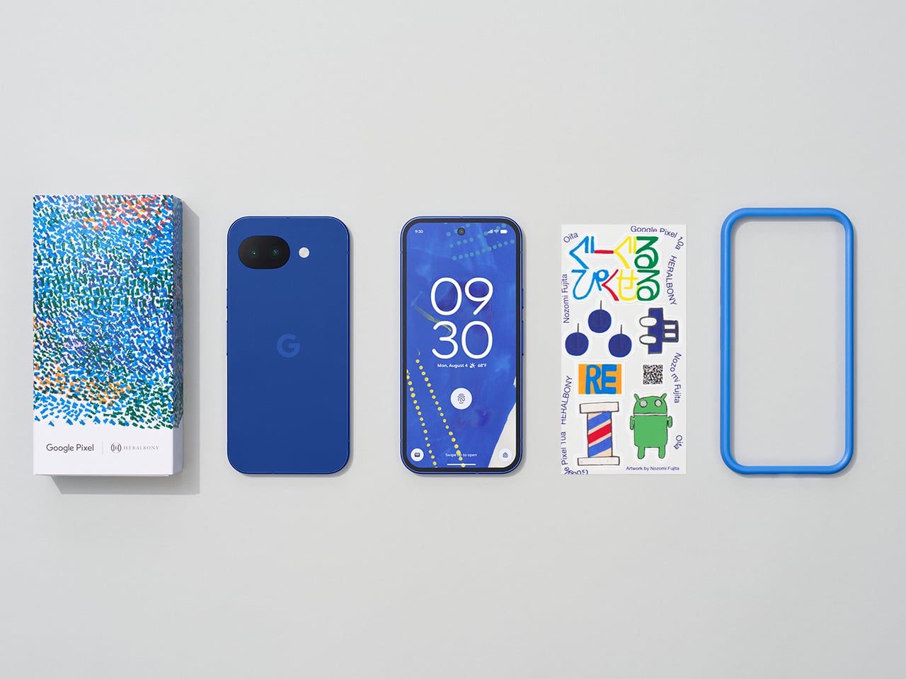
Of course, the collaboration doesn’t stop at the screen. Every unit comes bundled with an exclusive bumper case designed around the Pixel 10a’s completely flat back, which does away with any camera protrusion and makes the phone far easier to set down. Original stickers are also included, and the box sleeve carries artwork by Midori Kudo, so the whole unboxing feels deliberately curated.
The Isai Blue comes in a single 256GB configuration, priced at ¥94,900 (roughly $594) and available for pre-order in Japan ahead of its May 20 sale date. It’s only available while supplies last, which fits for something that was never really meant to be a mass-market offering. Google took the time to make this feel like a genuine gesture rather than a routine launch, and Japan has every reason to feel appreciated.
There’s a reason it’s called a charging ‘brick’. It charges, and it’s honestly brick-shaped. Laptops and phones have gotten thinner in the past decade, but their chargers honestly haven’t. GaN technology changes that. I’ve sung praise for GaN chargers in the past, and I swear by the one in my laptop bag right now, which replaces 4 different chargers while being the size of a hockey puck. Now Rolling Square’s gone and made the GaN charger even smaller.
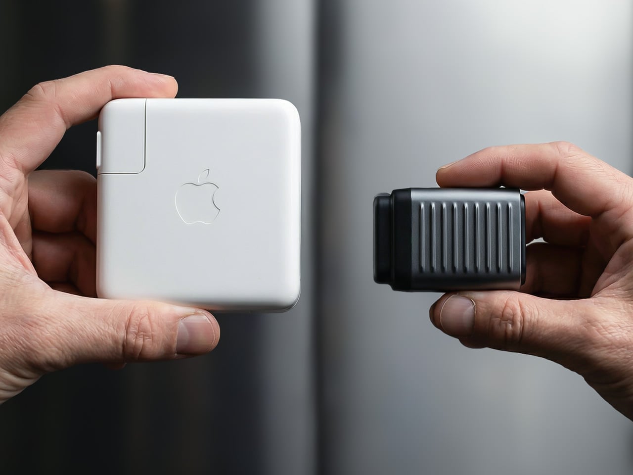
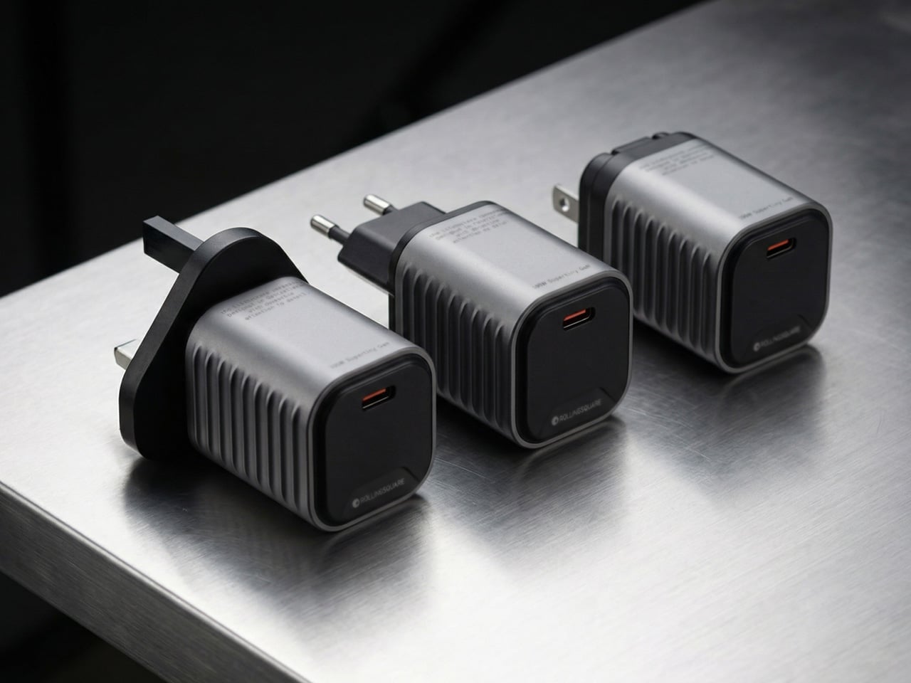
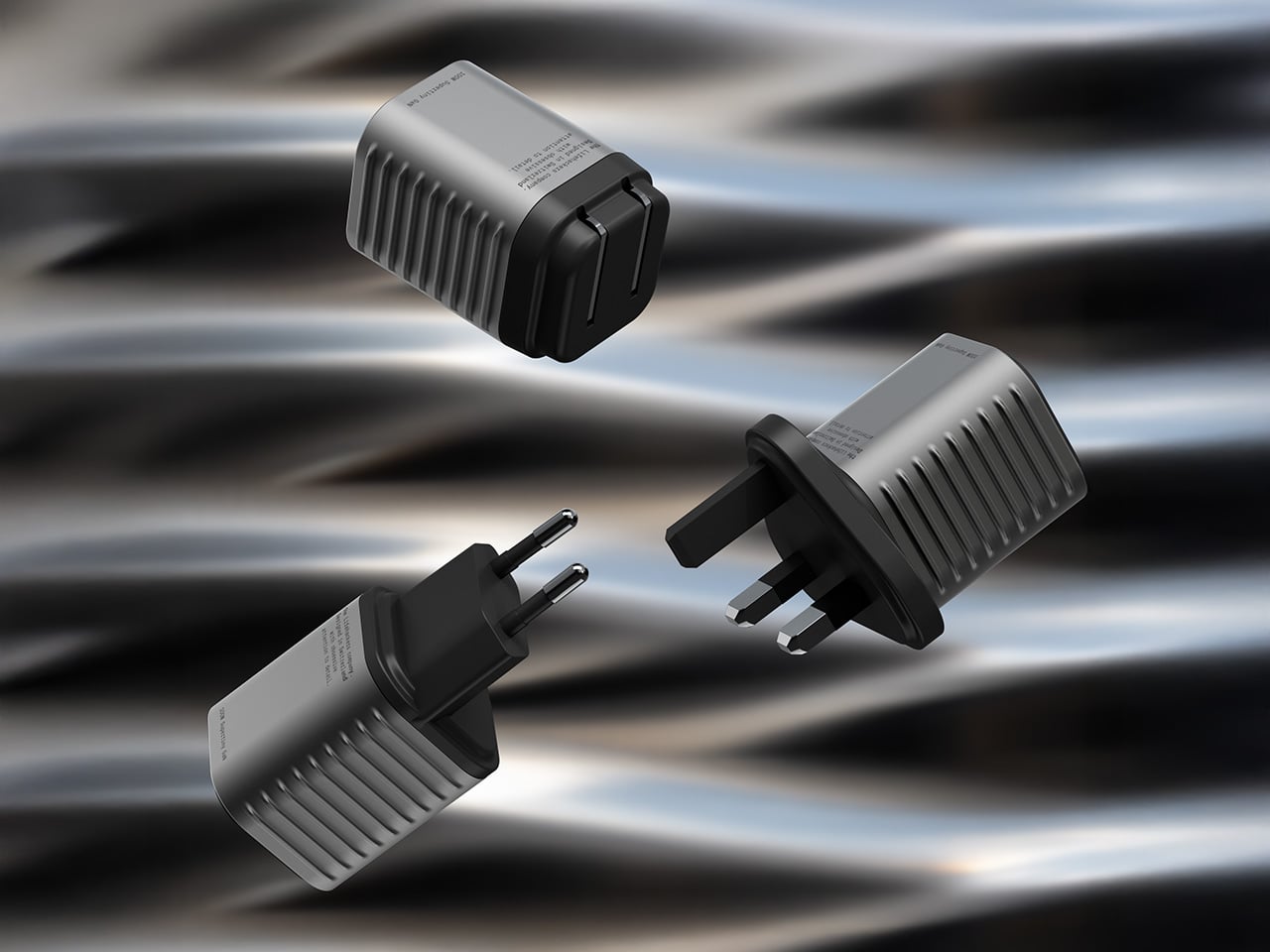
Holding the title of the world’s smallest 100W charger, the aptly named Supertiny is 65% smaller than Apple’s 96W charging brick, but packs enough power to fast-charge your laptop without breaking a sweat. At just 2 inches long and 1.38 inches wide, the Supertiny is as small as your Airpods case, fitting in your palm or even your pocket. It comes in three global plug formats (US with foldable prongs, EU, and UK), weighs between 100 and 115 grams depending on the variant, and packs a single USB-C port to supercharge your laptop. But pair it with Rolling Square’s inCharge Life 2in1 cable and you can now fast-charge your laptop as well as your phone together.
Gallium Nitride has been around since the 1990s, first used in LEDs and satellite solar cells, but it took decades for the tech to migrate into consumer charging. The advantage is straightforward: GaN produces significantly less heat than traditional silicon, which means you can push more power through a smaller chipset without needing massive heat sinks or bulky casings to prevent thermal meltdown. Silicon-based chargers lose a chunk of energy as heat, which is why your old laptop brick could double as a hand warmer after an hour of use. GaN flips that equation. It’s ruthlessly efficient, converting around 95% of the energy from the wall into actual charging power, with only 5% lost to heat. That efficiency gain is what allows Rolling Square to cram 100W of power delivery into a form factor that genuinely feels like it shouldn’t be possible.
The Supertiny measures 2 inches long on the US version with foldable prongs, 3.19 inches on the EU model, and 2.81 inches on the UK variant (the EU and UK versions come with fixed prongs). To achieve this ridiculously compact format, the company rebuilt the internal voltage transformer from scratch, optimizing how components align to reduce wasted space and lower operating temperatures. Advanced heat conduction silicon and thermal sheets route heat away from critical areas, and the exterior design plays a functional role too. The ribbed pattern running along the sides prevents your fingertips from making full contact with the surface when you unplug it after charging. Flat surfaces conduct heat directly to your skin, ribbed surfaces don’t. It’s a small detail, but it’s the kind of thing that separates thoughtful industrial design from spec-sheet engineering.
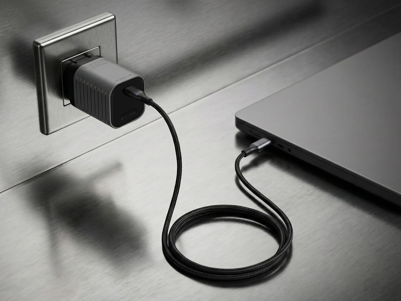
The charger outputs 100W max through its single USB-C port, with support for Power Delivery 3.0 and PPS (Programmable Power Supply) that adjusts voltage between 3.3V and 21V depending on what your device needs. That means it’ll fast-charge a MacBook Pro, a Dell XPS, a Lenovo ThinkPad, or any other USB-C laptop at full speed. In case you’re wondering, yes, it can handle e-bikes and e-scooters too, albeit at 100W. For phones and tablets, it delivers fast charging across iPhones, Samsung Galaxy devices, Google Pixels, and pretty much anything else with a USB-C port. The lack of multiple ports is deliberate. Rolling Square designed this charger for people who want maximum power in minimum space, and adding extra ports would have inflated the size.
If you need to charge two devices simultaneously, Rolling Square offers the inCharge Life 2in1 cable as an optional add-on. This modular cable splits the 100W output intelligently between two devices, letting you charge your laptop and phone together from a single power source. The cable stretches 1.5 meters (about 5 feet), features a durable nylon braid reinforced with aramid fiber, and uses premium metal connectors built to last. Rolling Square backs it with a lifetime replacement guarantee: if the cable ever fails, you submit a short video showing it fully cut along with your order number, and the company ships a replacement immediately. No returns, no forms, no hassle.
Rolling Square is a Switzerland-based company that’s been refining everyday tech problems since 2014, starting with the original inCharge keyring cable that packed multiple charging connectors into a tiny form factor you could attach to your keys. The company followed that up with the AirCard wallet tracker, the TAU keyring power bank, and a lineup of modular MagSafe accessories under the EDGE Pro branding. The Supertiny is their 19th product launch, and it fits the company’s design philosophy cleanly: solve one specific problem extremely well, make it as small as physics allows, and build it to last. Rolling Square products tend to be the kind of gear you don’t notice until you need them, at which point you wonder how you ever lived without them.
The Supertiny 100W GaN Charger comes in three versions: US, EU, and UK plugs. Early pricing starts at $46 for a single unit, or a $68 bundle that also includes the inCharge Life 2in1 cable. Rolling Square is shipping the chargers globally starting in May 2026, and all three versions carry full international safety certifications including TUV Rheinland. The company backs the product with a two-year warranty and a 30-day return policy. I touted GaN chargers as a tech must-have in 2025, so if you’re reading this now and you still don’t own one, take it from me. You, your cluttered workdesk, and your heavy laptop bag will thank me.
At a time when living spaces are shrinking while expectations from them continue to expand, this design presents a thoughtful response that is both rooted in tradition and aligned with contemporary needs.
Emerging from the context of rising housing pressures in Taiwan, where compact homes are increasingly becoming the norm, the project addresses a fundamental question: how can furniture adapt to limited space without compromising comfort or experience? Rather than treating furniture as static, single-purpose objects, the designer reimagines them as dynamic systems capable of transformation.
Designer: Che-Chia Hsu
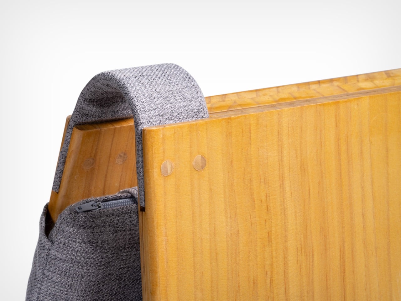
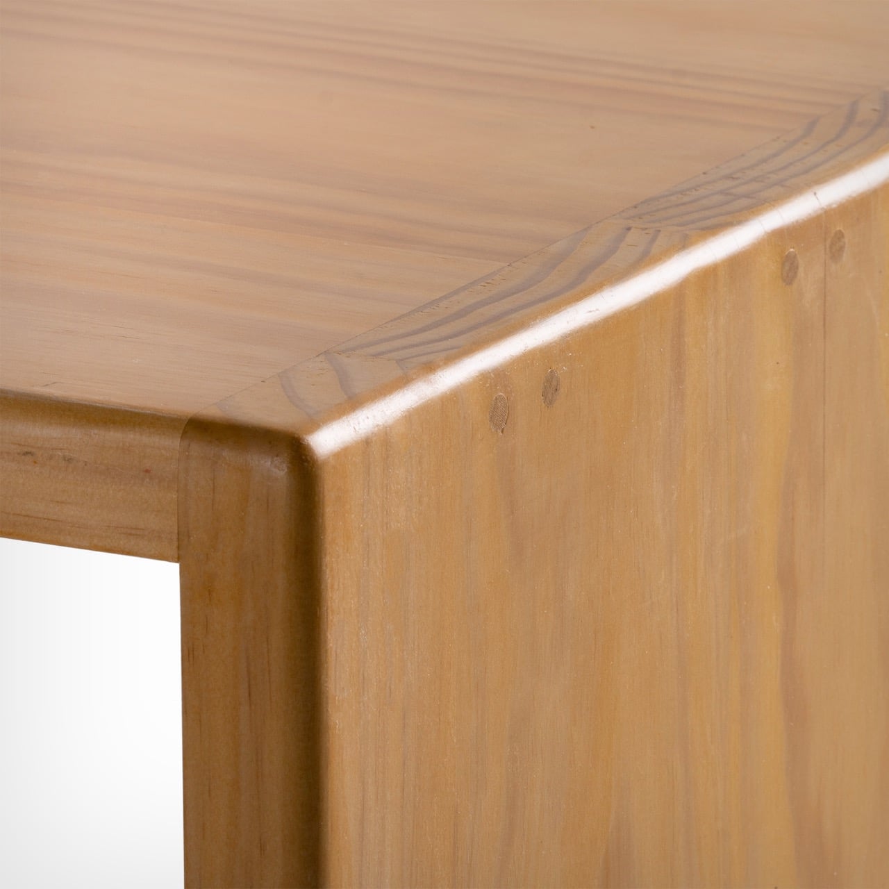
At the heart of this piece lies a deep engagement with traditional Chinese woodworking techniques, particularly the precision of tenon joints. These joints move beyond being structural solutions and become expressions of calculated craftsmanship, where geometry, material behavior, and human interaction converge. The result is a construction that feels both minimal and robust, relying on accuracy instead of excess.
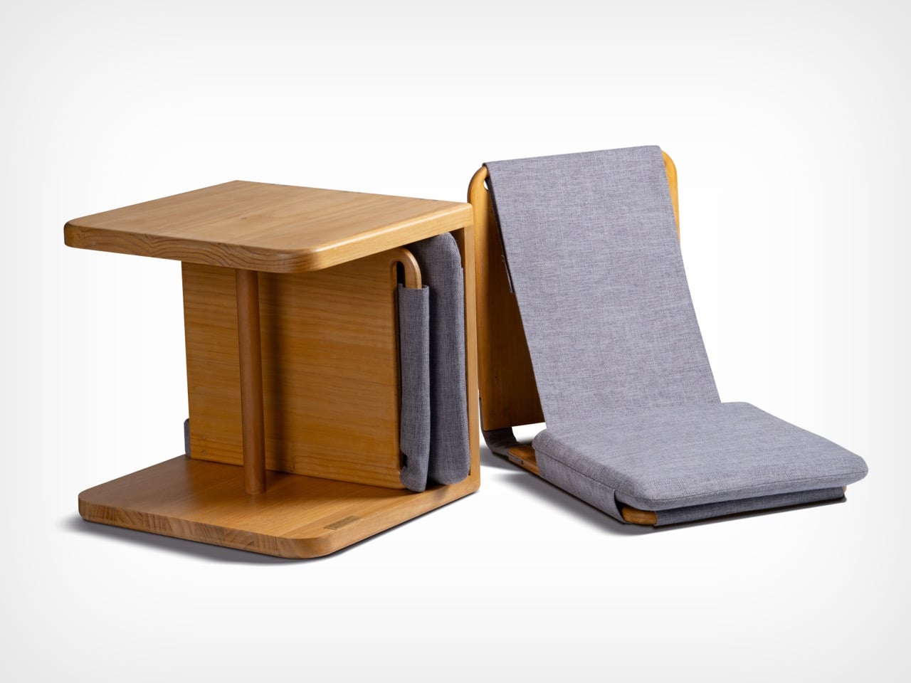
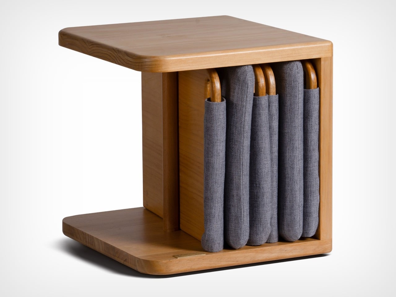
The furniture set is designed to integrate storage and seating within a compact footprint. A chair is concealed within the table and can be pulled out, unfolded, and expanded into a functional seat. The process is intuitive: the chair is extracted, the seat and backrest are opened, and the backrest angle is adjusted using velcro. The transformation is smooth and unobtrusive, allowing the object to shift roles effortlessly.
What distinguishes this design is its reliance on the user’s own body as part of the structural system. Instead of depending entirely on rigid supports, the chair uses the tension generated by the sitter to stabilize the backrest. This introduces a subtle interaction between user and object, where the act of sitting becomes integral to how the design performs. The experience feels efficient, responsive, and quietly intelligent.
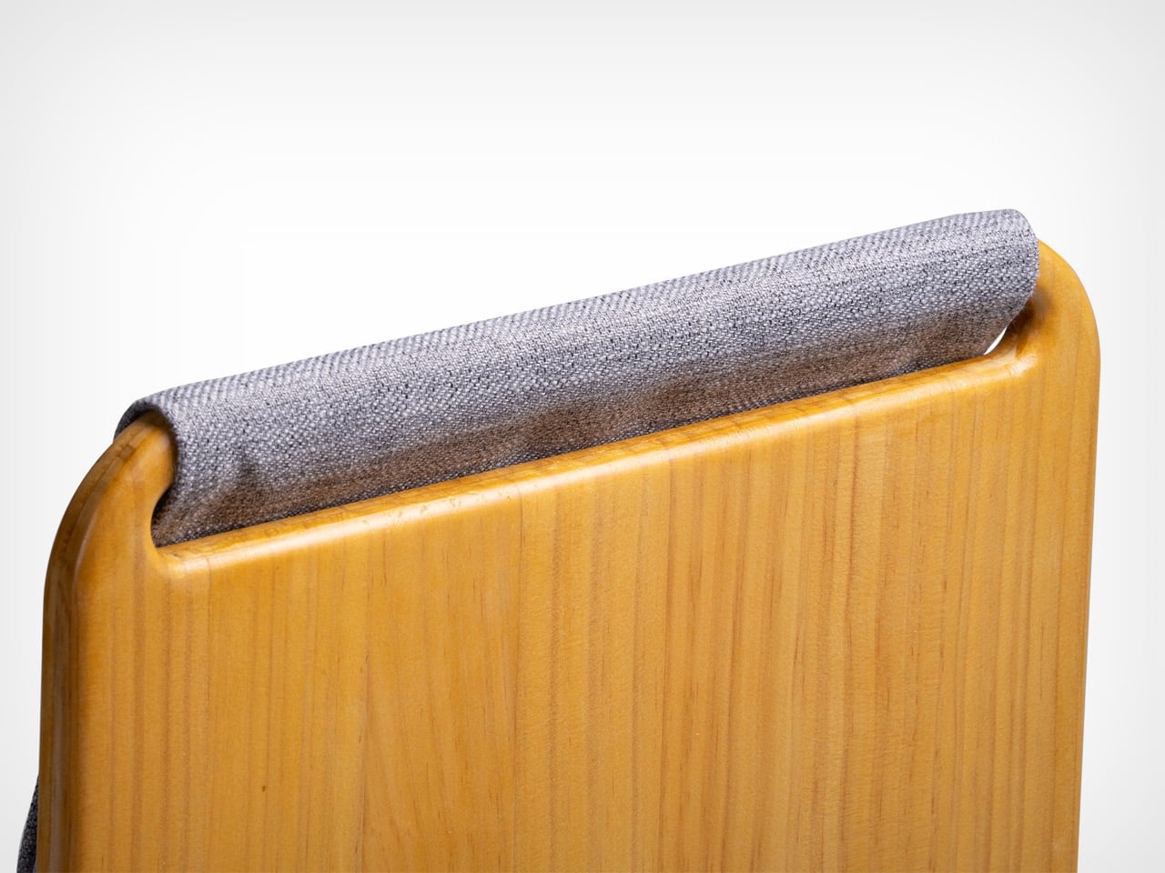
Material choices reinforce this balance between function and experience. Lightweight pine wood panels provide durability while ensuring ease of movement. Paired with gray cotton linen fabric, the design introduces a tactile softness that enhances comfort. The fabric is breathable and visually understated, complementing the natural warmth of the wood. Together, these materials create a calm, cohesive aesthetic suited to contemporary interiors.
The development of the project reflects a layered and rigorous process. The designer began by studying traditional joinery techniques through literature, followed by hands-on training under a woodcraft master. This immersion enabled a deeper understanding of the craft beyond theory. Building on this foundation, the designer explored ways to translate these techniques into a modern, functional context through research and experimentation.
What emerges is a design that treats constraint as a starting point rather than a limitation. The piece brings together traditional knowledge and contemporary living patterns, shaping an object that adapts, responds, and participates in everyday use. It reflects a way of designing where space, material, and human interaction are considered together, resulting in furniture that feels considered, purposeful, and in tune with the realities of modern living.
At a time when living spaces are shrinking while expectations from them continue to expand, this design presents a thoughtful response that is both rooted in tradition and aligned with contemporary needs.
Emerging from the context of rising housing pressures in Taiwan, where compact homes are increasingly becoming the norm, the project addresses a fundamental question: how can furniture adapt to limited space without compromising comfort or experience? Rather than treating furniture as static, single-purpose objects, the designer reimagines them as dynamic systems capable of transformation.
Designer: Che-Chia Hsu
At the heart of this piece lies a deep engagement with traditional Chinese woodworking techniques, particularly the precision of tenon joints. These joints move beyond being structural solutions and become expressions of calculated craftsmanship, where geometry, material behavior, and human interaction converge. The result is a construction that feels both minimal and robust, relying on accuracy instead of excess.
The furniture set is designed to integrate storage and seating within a compact footprint. A chair is concealed within the table and can be pulled out, unfolded, and expanded into a functional seat. The process is intuitive: the chair is extracted, the seat and backrest are opened, and the backrest angle is adjusted using velcro. The transformation is smooth and unobtrusive, allowing the object to shift roles effortlessly.
What distinguishes this design is its reliance on the user’s own body as part of the structural system. Instead of depending entirely on rigid supports, the chair uses the tension generated by the sitter to stabilize the backrest. This introduces a subtle interaction between user and object, where the act of sitting becomes integral to how the design performs. The experience feels efficient, responsive, and quietly intelligent.
Material choices reinforce this balance between function and experience. Lightweight pine wood panels provide durability while ensuring ease of movement. Paired with gray cotton linen fabric, the design introduces a tactile softness that enhances comfort. The fabric is breathable and visually understated, complementing the natural warmth of the wood. Together, these materials create a calm, cohesive aesthetic suited to contemporary interiors.
The development of the project reflects a layered and rigorous process. The designer began by studying traditional joinery techniques through literature, followed by hands-on training under a woodcraft master. This immersion enabled a deeper understanding of the craft beyond theory. Building on this foundation, the designer explored ways to translate these techniques into a modern, functional context through research and experimentation.
What emerges is a design that treats constraint as a starting point rather than a limitation. The piece brings together traditional knowledge and contemporary living patterns, shaping an object that adapts, responds, and participates in everyday use. It reflects a way of designing where space, material, and human interaction are considered together, resulting in furniture that feels considered, purposeful, and in tune with the realities of modern living.
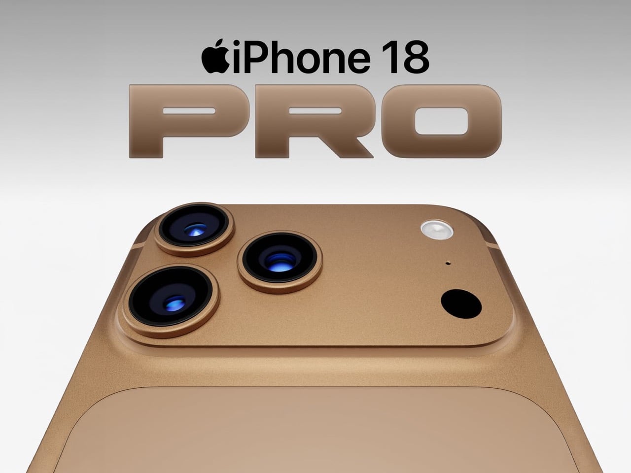
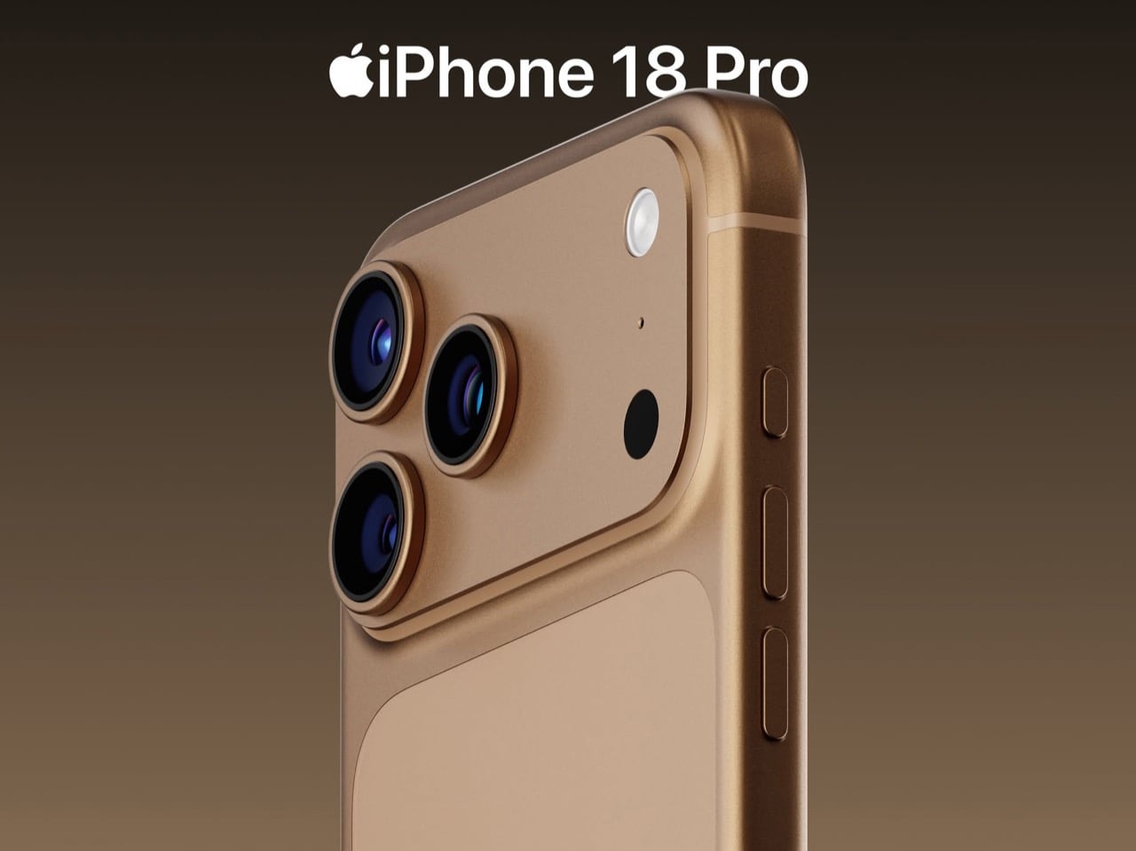
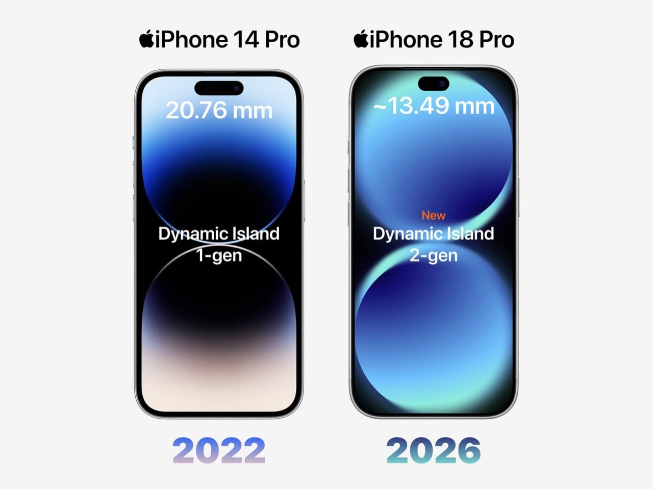
Apple has spent four years refusing to touch the Dynamic Island, treating it like some untouchable monument to software-hardware integration. Samsung cycled through three foldable generations in that time. Google rebooted the Pixel lineup twice. Nothing went from startup curiosity to legitimate competitor. And the iPhone 14 Pro’s pill-shaped cutout just sat there, exactly the same width, height, and visual footprint on the 15 Pro, 16 Pro, and 17 Pro. Leaked screen protectors sourced from Weibo now suggest Apple has finally decided four years is long enough, and the company is gearing up to shrink the Dynamic Island by roughly 35 percent on the iPhone 18 Pro. The mechanism is straightforward: move the Face ID flood illuminator under the display, leave only the infrared camera and front lens in the cutout, and suddenly that wide pill becomes a narrow sliver sitting unobtrusively at the top of the screen. The infrared flood illuminator that powers Face ID is moving under the display on the iPhone 18 Pro, leaving only the infrared camera requiring a physical cutout alongside the front-facing lens.
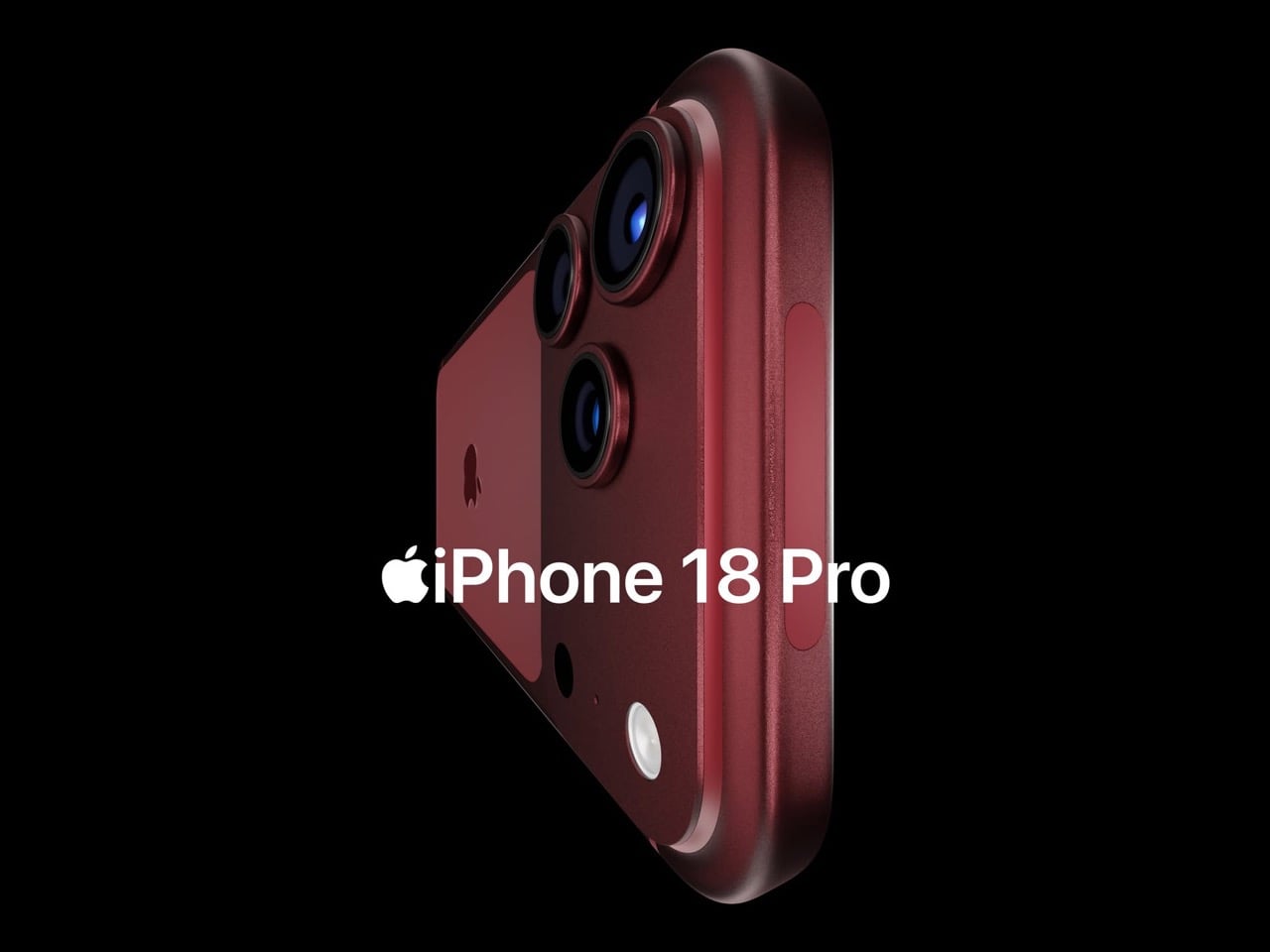
But the Dynamic Island shrinkage is hardly the headline here, because the iPhone 18 Pro is also the phone where Apple trades in its most iconic color for something it has never tried before on a Pro model. Bloomberg’s Mark Gurman reports that Apple is testing a deep red finish for the 18 Pro lineup, a shade closer to burgundy than the bright Product Red tones the company used on standard models years ago. Apple removed black from the Pro lineup with the iPhone 17 Pro, the first time in the series’ history that no dark option existed, and the 18 Pro appears set to continue that direction rather than course-correct. September 2026 is the expected launch window, which makes this arguably the most important incremental iPhone in years. It is widely believed to be the last model in this design language before Apple delivers a radical overhaul for the 20th anniversary iPhone in 2027, so whatever ships this fall is likely your final chance to buy an iPhone that looks like an iPhone has looked since 2017.
Designer: Volodymyr Lenard
Leaker Ice Universe claimed the Dynamic Island cutout on the iPhone 18 Pro models will be approximately 35% narrower than it is on the iPhone 17 Pro models, with a width of around 13.5mm down from around 20.7mm. That figure refers to the default on-screen Dynamic Island width including surrounding black pixels, not the physical hardware cutout itself, but the visual difference should be immediately apparent in daily use. The iPhone 17 Pro’s Island is a wide, commanding presence even at rest. The 18 Pro’s leaked cutout reads almost delicate by comparison, a narrow pill sitting unobtrusively at the top of the screen. Apple will still need to revisit four years of Live Activities design and the entire interaction vocabulary built around the existing Island’s dimensions, which is a reasonable explanation for why this transition is taking as long as it is. Android manufacturers have shipped under-display cameras for years, with visible quality tradeoffs that Apple’s user base simply would not accept on a thousand-dollar phone. Holding the line until the technology meets the standard, rather than shipping it to win a spec sheet argument, is the kind of call that frustrates people in the short term and builds loyalty over time.
Under the hood, the A20 Pro chip built on TSMC’s advanced 2nm process promises roughly 15% faster performance and up to 30% better power efficiency compared to the current 3nm A19 Pro. Paired with 12 GB of RAM across the lineup, the new silicon should power smoother Apple Intelligence features, enhanced on-device AI processing, and better multitasking. Connectivity upgrades include Apple’s first in-house C2 5G modem, replacing reliance on Qualcomm components. The modem supports improved mmWave performance and expanded satellite connectivity, potentially enabling always-connected cellular service via NR-NTN standards for emergency messaging and basic data in remote areas without traditional coverage. Battery life stands out as a major highlight, especially for the iPhone 18 Pro Max. Leakers report a capacity jump to 5,100 to 5,200 mAh, the largest ever in an iPhone, enabled by a slightly thicker chassis measuring around 8.8mm up from 8.75mm on the iPhone 17 Pro Max. The added thickness and weight would accommodate the bigger cell while the more efficient 2nm chip helps stretch usage even further. Some projections suggest up to 40 hours of mixed use on a single charge.
The deep red finish represents a significant departure for a Pro lineup that has historically favored controlled, conservative colors like graphite, silver, gold, and muted titanium shades. Rumors of purple and brown finishes have also circulated, but Gurman believes those are just variants of the same red idea. The decision to skip black for a second consecutive year has already generated polarized reactions among enthusiasts, with some welcoming the bold direction and others mourning the loss of the classic understated aesthetic. For buyers who want black, Gurman specifically noted that the foldable iPhone is being designed with conservative space gray and silver finishes, suggesting Apple is deliberately separating its color identity across product lines. The iPhone 18 Pro may read as a modest update on paper, but as the final iteration of a design language that has defined the modern iPhone for nearly a decade, it carries more symbolic weight than any spec sheet can communicate.
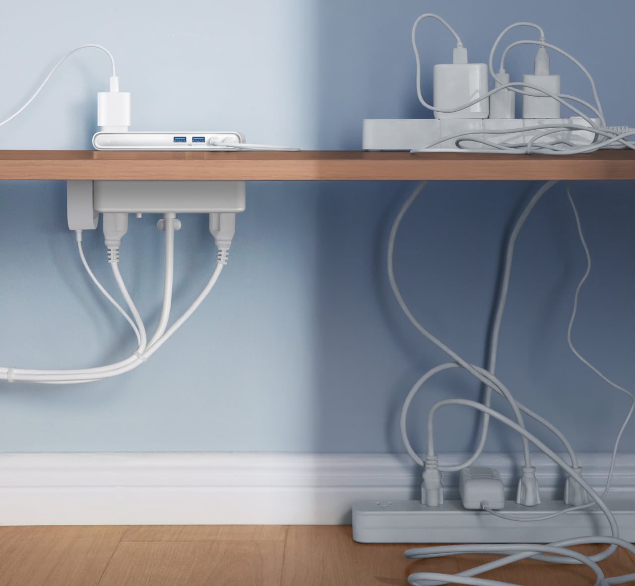
Desks have gotten more crowded. Between the laptop, the monitor, the phone, and whatever Bluetooth peripherals have accumulated over the past few years, keeping everything charged without making a mess has become its own challenge. Power strips have always been the go-to solution, but most still end up on the floor or behind furniture, at the end of a cable that creates the very clutter it was supposed to fix.
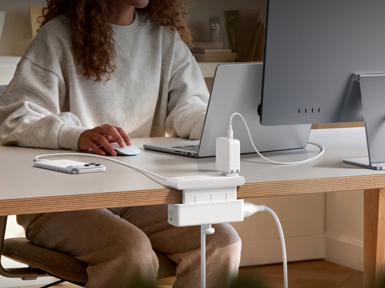
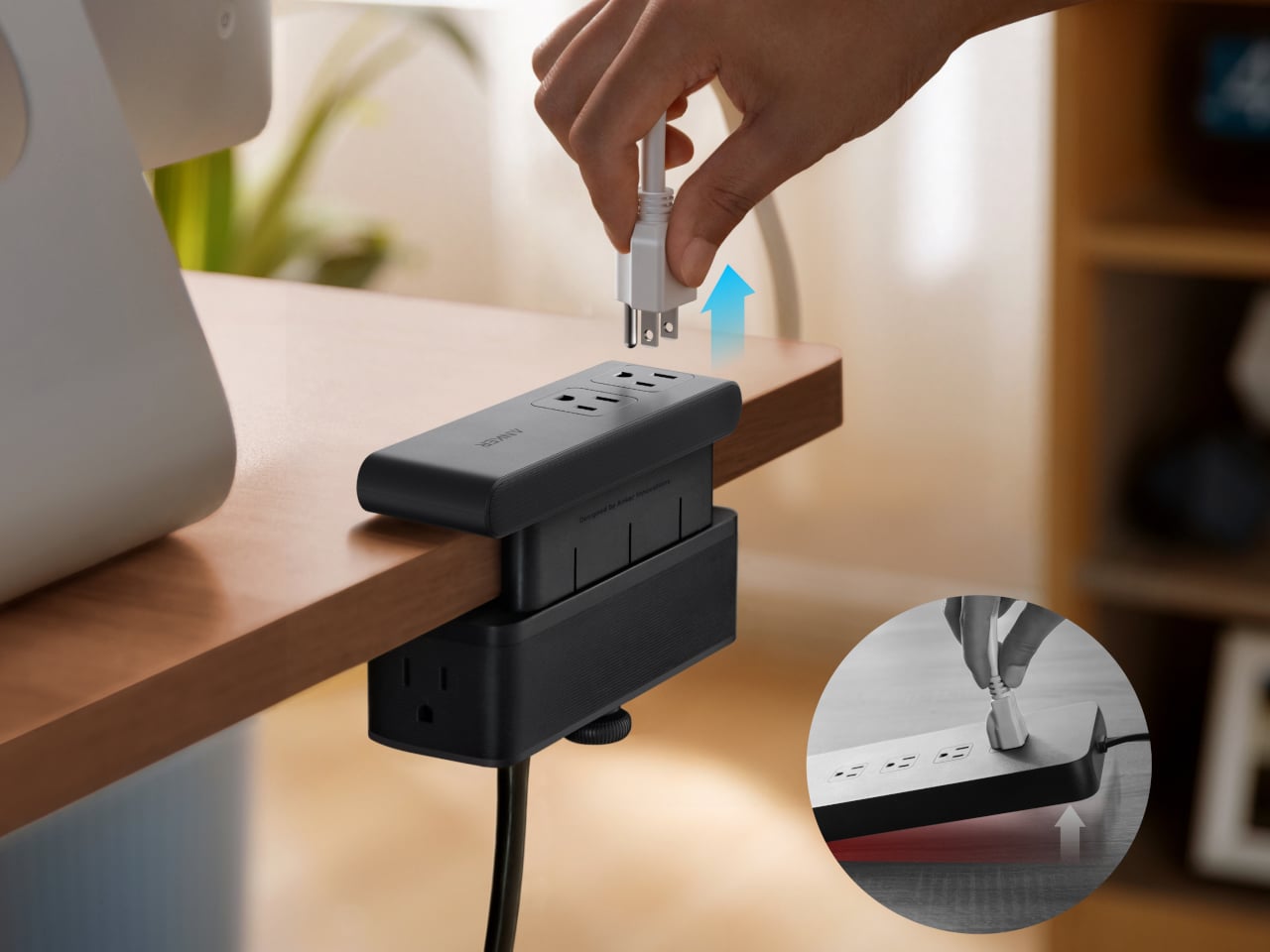
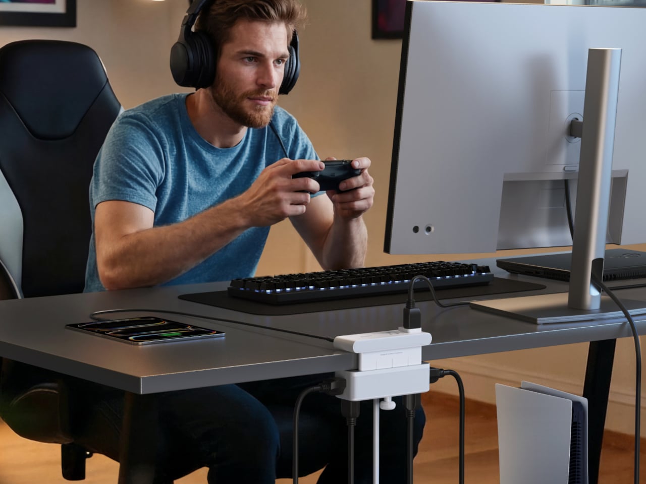
Anker’s Nano Power Strip (10-in-1, 70W, Clamp) approaches that problem from a different angle, quite literally. Instead of sitting on a surface or hiding under a desk, it clamps onto the desk edge, putting 10 ports right where they’re actually useful. First unveiled at CES 2026 and now available in the US for $69.99, it aims to reduce the mess that most power strips quietly make worse.
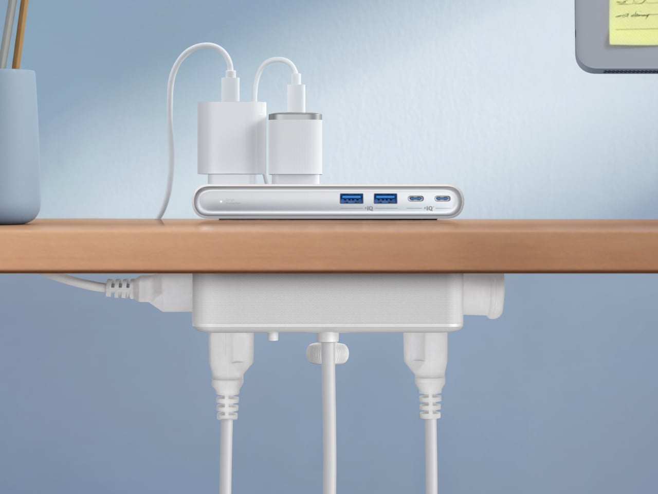
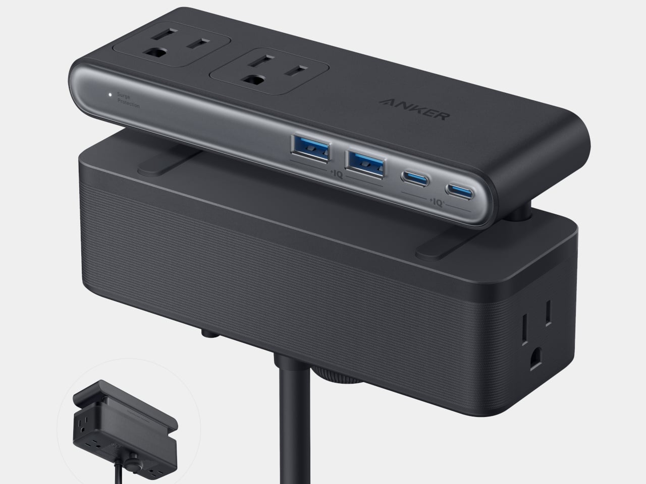
The clamp structure sits on either side of the desk edge, with ports distributed across its upper and lower sections. Six AC outlets handle the larger plugs, while two USB-A and two USB-C ports take care of smaller devices. Splitting the ports between two zones keeps things from crowding on one side, a small but practical detail that makes the strip feel properly considered rather than just generously stocked.
The USB-C charging capability is where the performance stands out. A single USB-C port can deliver up to 70W, enough to run a MacBook or most other laptops without needing a separate wall adapter. That output relies on GaN technology, which keeps the strip slim at just 0.75 inches thick despite the power output, and avoids the extra heat and bulk that older charging components tend to generate.
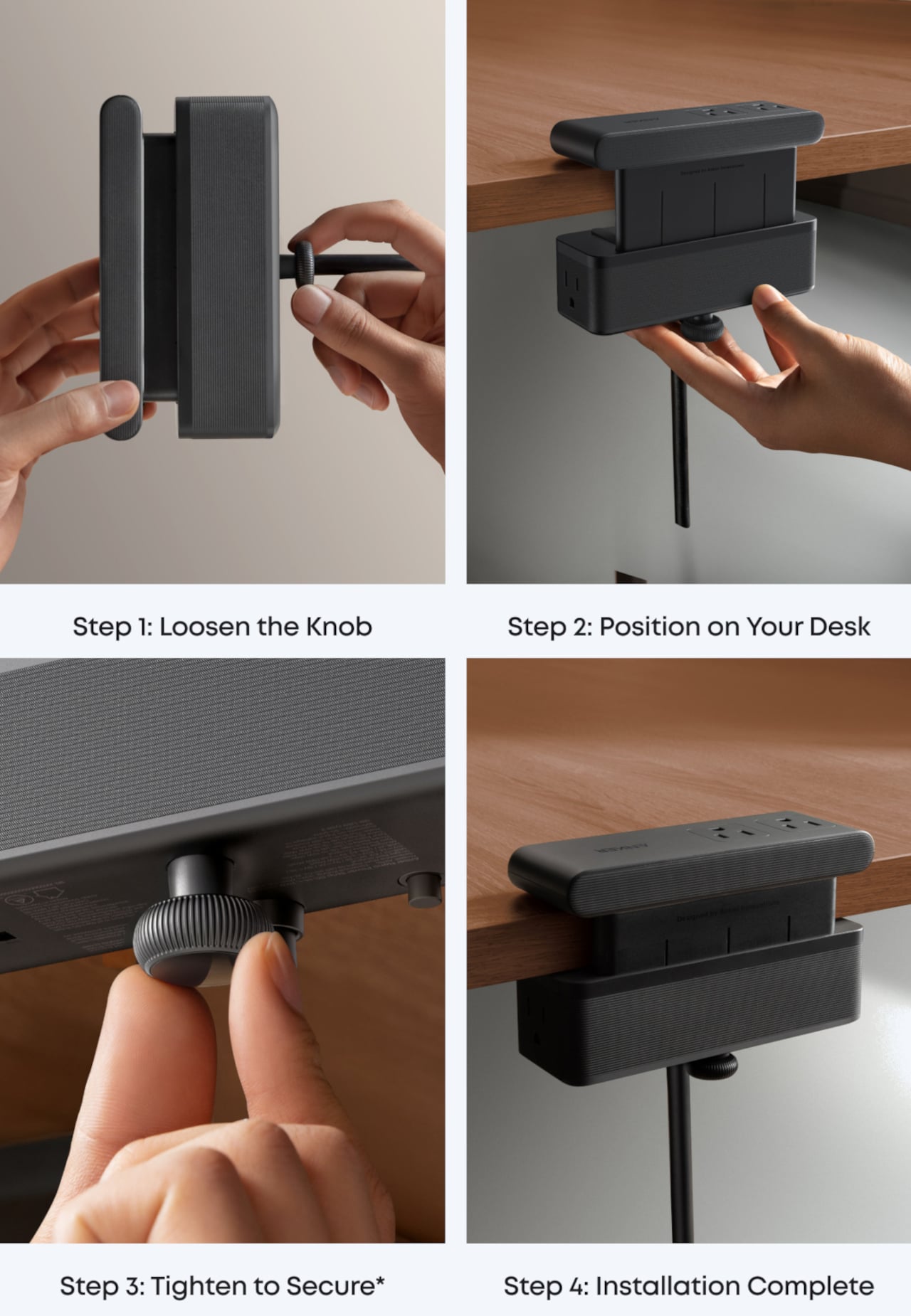
Installing it takes seconds. The adjustable clamp fits desk edges between 0.6 and 1.8 inches thick, covering most standard desks, and locks in firmly enough for one-hand use. That might sound like a minor detail, but plugging in a cable while the strip shifts around is exactly the kind of daily irritation that compounds. A stable mount means you’re not bracing the strip with your other hand every single time.
Anker also built in 1,500J of surge protection, along with a smart overload mechanism that includes a reset button. When it trips, the button pops out to cut power instantly. Press it again, and it’s back to normal. It’s a simple failsafe, but a useful one on a strip mounted at desk height, where a sudden power surge or overloaded circuit could easily go unnoticed until something stops working.
Anker markets it for gaming and office setups alike, and it’s easy to see why. Gaming desks accumulate powered accessories faster than most, from peripherals to controllers to headset chargers. The dual-zone layout helps spread those cables rather than pile them in one corner, and the 0.75-inch profile doesn’t take up surface space or interfere with the kind of clean, organized desk that people actually put effort into building.
Cable clutter isn’t going anywhere, but it can at least be contained. The Nano Power Strip doesn’t reinvent the power strip so much as it rethinks where one should live. At $69.99, it’s a reasonable ask for 10 ports, 70W of GaN-powered fast charging, and a desk-mounted solution that keeps the tangle off the floor and closer to where it actually gets used.
The Japanese Grand Prix is underway this weekend at Suzuka, and it has done what it always does: pulled attention back toward Japan with a kind of quiet, inevitable force. There’s something about watching a sport built on engineering precision staged in a country that has made precision its cultural identity that makes you want to look beyond the circuit. Japan’s design culture runs on the same engine as its racing teams. Nothing is wasted. Nothing is performed. Every decision earns its place, and every object that comes out of that sensibility carries a particular weight.
Japanese design has always understood something the rest of the world is still working out. Restraint is not a lack of ambition. It is the hardest expression of it. The five objects below range from a razor to a kitchen knife to a bath towel, but they all speak the same language. They each solve one problem completely, and they look like nothing else needs to be added. That is the thing about great Japanese design. It doesn’t just make a good product. It makes everything else in the room look like it’s trying too hard.
1. The Paper Razor
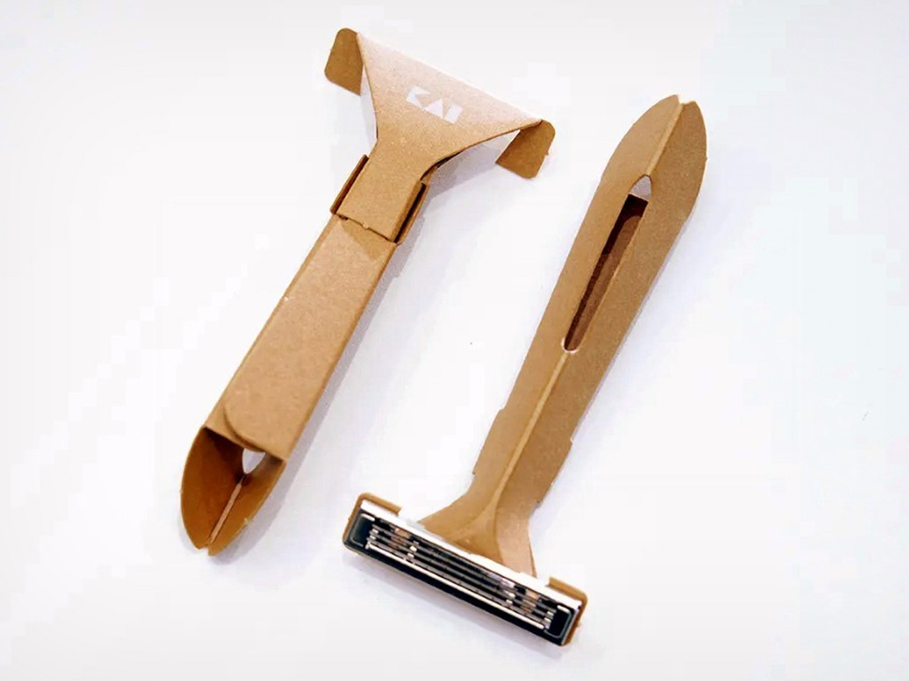
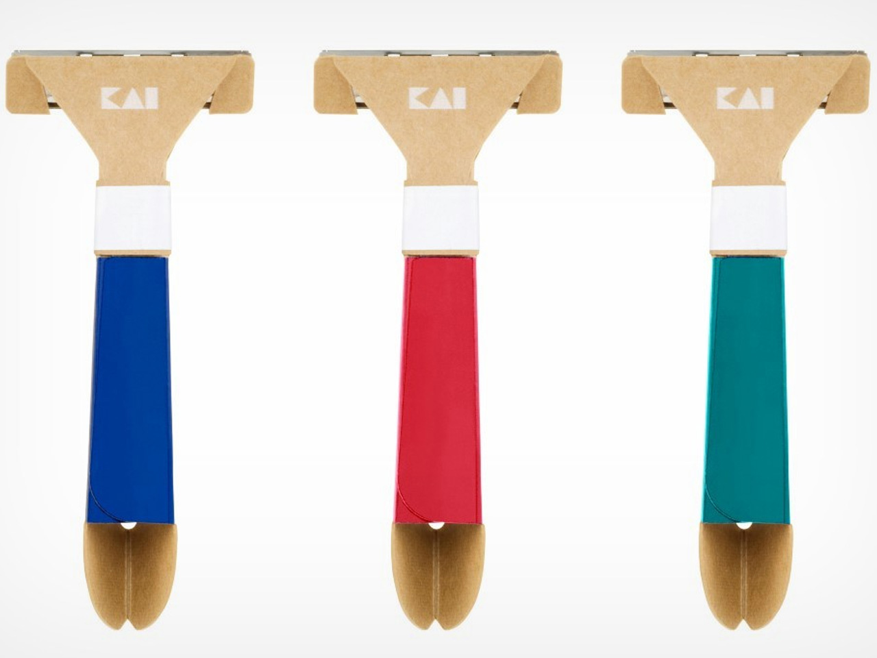
There’s something almost provocative about the Paper Razor. Designed by Japan’s Kai Group, it is a single-use disposable razor built almost entirely from paper, reducing plastic use by 98% without compromising function. The origami-inspired body folds completely flat for shipping, then snaps into a rigid, ergonomic handle in seconds. At just 4 grams and 5mm thick when flat-packed, it ships across five colorways: ocean blue, botanical red, jade green, sunny yellow, and sand beige.
The obvious question is water, and the Kai Group answered it practically. The paper body is made from a water-resistant grade similar to milk carton stock, holding up to temperatures of 104°F. The metal blade head features a notched channel on top for easy rinsing between strokes. Designed primarily for travelers, the Paper Razor is the kind of product that feels less like a shaving tool and more like a position statement on what disposable objects are capable of being when someone takes the design seriously.
What We Like:
The origami-fold construction assembles in seconds and ships as a 5mm flat-pack, making it one of the most logistically elegant disposables ever designed
Reduces plastic use by 98% while maintaining the ergonomics and shave quality of a standard disposable
What We Dislike:
Single-use by design, which limits its appeal for anyone building a more sustainable long-term shaving routine
Water resistance caps at 104°F, meaning it isn’t suited for anyone who prefers very hot water while shaving
2. Levitating Pen 2.0: Cosmic Meteorite Edition
The Levitating Pen 2.0 Cosmic Meteorite Edition is the kind of desk object that stops a conversation the moment someone notices it. It suspends at a precise 23.5-degree angle, creating a floating illusion that is genuinely difficult to look away from. The design draws its visual language from spacecraft aesthetics, referencing silhouettes like the USS Enterprise, bringing a sci-fi sensibility to something as familiar and grounded as a ballpoint pen sitting on a work surface.
The detail that separates this edition from the standard series is the meteorite tip. The pen incorporates a genuine Muonionalusta meteorite, a fragment older than Earth by 20 million years, shifting this object from clever desk accessory to something rare and worth owning on its own terms. A simple twist sets it spinning for up to 20 seconds. It is a fidget-worthy, collector-grade piece that makes a compelling case that good design doesn’t always need to justify its existence through usefulness alone.
The genuine Muonionalusta meteorite tip gives this pen a provenance no other writing instrument on any desk can match
The floating 23.5-degree angle creates an immediate visual anchor on a desk surface without taking up meaningful real estate
What We Dislike:
The limited edition nature makes availability unpredictable, and the pricing reflects exclusivity as much as it does materials
The spacecraft-inspired aesthetic is deliberate and specific, meaning it will feel out of place on a desk that skews quieter or more minimal
3. Kuroi Hana Knife Collection
The Kuroi Hana knives begin with Japanese AUS-10 steel sourced from Aichi Steel Corporation, rated between 58 and 60 HRC for hardness and chosen specifically for its combination of toughness, sharpness, and corrosion resistance. Each blade is built from 67 layers of high-carbon steel, producing the Damascus layered structure that defines the collection’s character. Kuroi Hana translates to “black flower,” and the dark floral pattern that emerges across each blade makes that name feel entirely earned rather than marketed.
The pattern isn’t applied to the surface. It is drawn out from within. Skilled artisans manually submerge each blade into an etching solution that penetrates the steel layers and reveals the Damascus patterning in a deep, dark floral form. Because the process is done by hand and each blade’s steel structure is unique, no two knives carry the same pattern. This is a kitchen tool that respects the cook enough to make the knife itself a considered, genuinely beautiful object worth picking up before you even start cooking.
What We Like:
Every blade carries a unique dark floral pattern drawn from the steel itself, making each knife a one-of-a-kind object rather than a manufactured product
AUS-10 steel at 58–60 HRC delivers professional-grade sharpness and toughness that performs as well as it looks, sitting on a magnetic strip
What We Dislike:
The artisanal Damascus etching process makes these a premium investment that sits well outside casual kitchen knife territory in terms of price
The distinctive dark floral aesthetic is polarizing for cooks who prefer clean, unmarked blades in a working kitchen environment
4. The Invisible Shoehorn
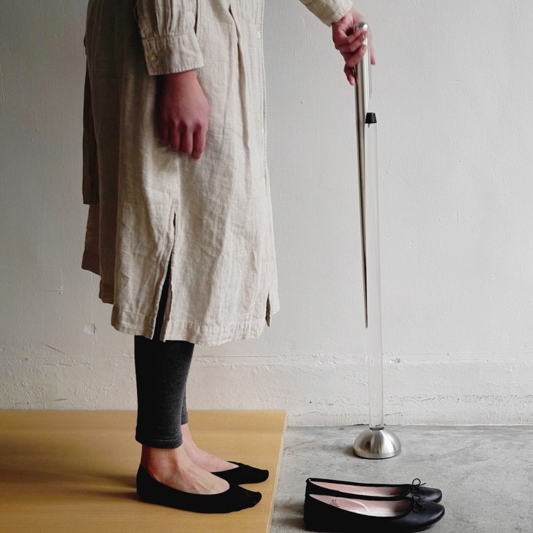
The Invisible Shoehorn is the kind of product that earns its place by solving something so specific and so quietly that you find yourself wondering why every shoehorn hasn’t been designed this way. The long stainless steel body eliminates the need to hunch over, protecting your lower back from the kind of daily accumulated strain that nobody tracks until it’s a problem. The smooth, polished surface slides cleanly against socks and stockings without snagging. It performs one job with a material confidence that feels entirely Japanese.
The transparent stand is the decision that lifts this from a functional object to something worth displaying. Mounted in its clear acrylic holder, the shoehorn practically disappears into its surroundings, reading less like a bathroom utility and more like a considered piece of interior design. In a category full of objects people hide at the back of a closet, this one earns a place on the shelf. That shift from something concealed to something displayed is precisely what separates a good tool from a genuinely designed one.
The transparent acrylic stand transforms a purely utilitarian object into something display-worthy that holds its own in a well-designed home
The long stainless steel handle removes real daily lower back strain without requiring any change in how you put your shoes on
What We Dislike:
Polished stainless steel and a transparent stand both attract fingerprints readily, requiring consistent upkeep to maintain the invisible aesthetic the design promises
The extreme restraint of the form may feel underwhelming to people who expect more visual personality from their home accessories
5. Sento 2 Towel
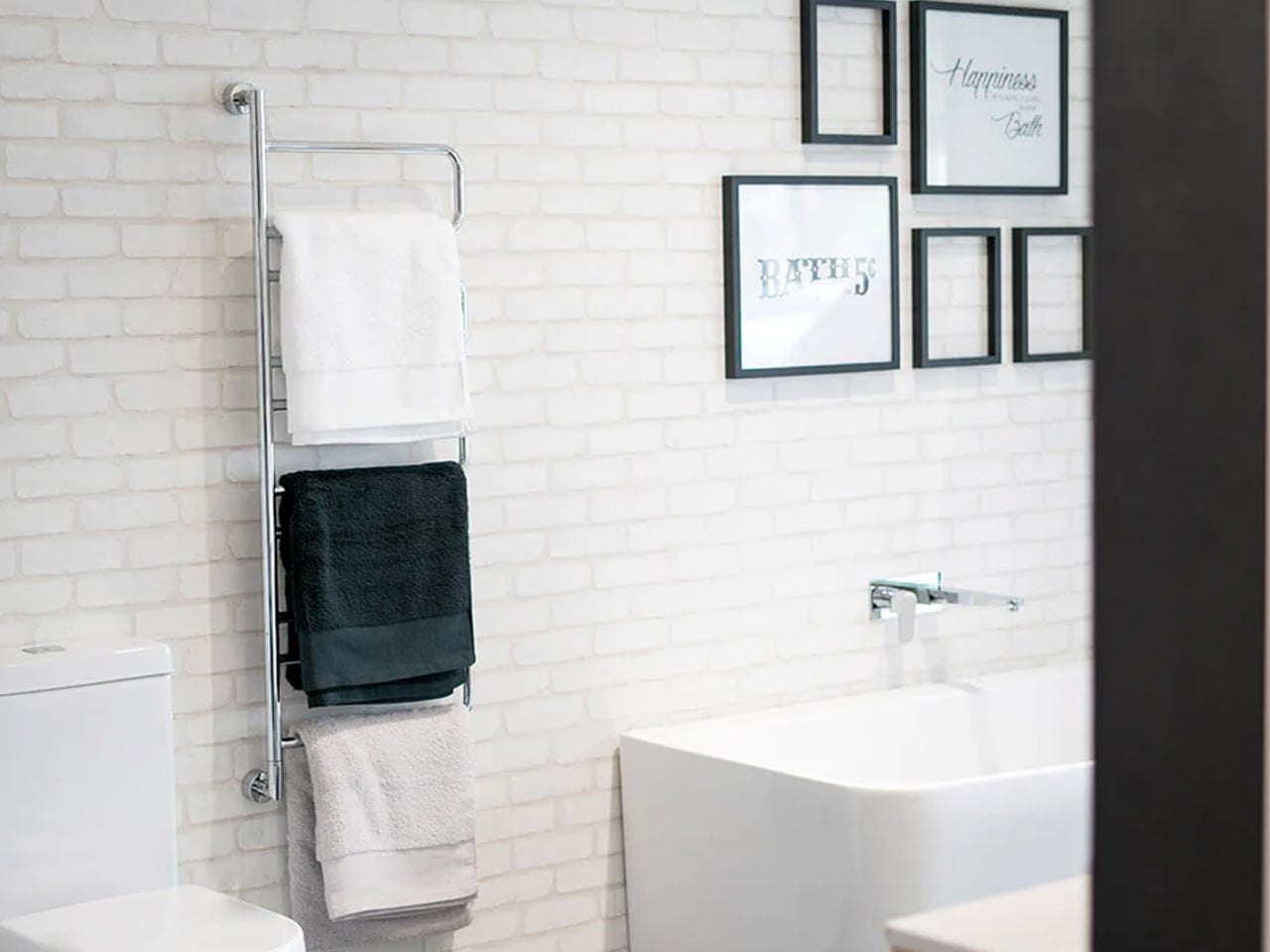
Most towels are made by twisting cotton fibers into dense, rope-like loops, a production method that prioritizes speed and cost over softness or absorbency. The Sento 2 goes the other way entirely. Using a zero-twist design developed through specialized manufacturing techniques refined in Japan, the natural cotton fibers are left loose and uncompressed, producing a towel that is softer, more absorbent, and faster-drying than standard terry cloth. The process is slower, more demanding, and the finished result communicates every bit of that effort on first contact.
The zero-twist construction leaves natural cotton in a state that feels fundamentally different from anything mass-produced. The towel is light enough to feel like almost nothing in your hands, and absorbent enough that the job is done before you’ve consciously started it. There is an effortless quality to the whole experience that is harder to explain than it is to feel. It is a towel. It is also a quiet argument for buying fewer things, buying them properly, and understanding that the best version of an everyday object is worth far more than the cheapest one.
What We Like:
Zero-twist construction produces a softness and absorbency level that standard terry cloth towels genuinely cannot replicate, and the difference is apparent immediately
The quick-drying design makes it practical enough for daily rotation, not just a display-shelf luxury that performs better as a photograph
What We Dislike:
Zero-twist fibers are more delicate than standard loops and require careful laundering to preserve their structure and softness over repeated washing
The premium construction comes at a price that becomes harder to justify when buying multiples to fully outfit a bathroom
Japan Has Been Designing This Way Forever. The Rest of the World Is Still Catching Up.
What these five objects share is not a visual style. It is a philosophy. Japanese design has always understood that the most powerful thing a product can do is remove everything that shouldn’t be there. The Paper Razor removes plastic. The Invisible Shoehorn removes visual noise. The Sento 2 removes the compromise built into every standard terry loop. What remains in each case is an object that works so cleanly it feels inevitable, as though no other version was ever possible.
The Japanese Grand Prix reminds us every year that Japan operates at a level of precision most cultures aim for and fall short of. Its design culture runs on the same engine. These five products are proof that restraint is not a limitation. It is the hardest discipline to master and the most rewarding thing to live with. Every one of them earns its place, whether on a shelf, in a kitchen drawer, mounted by the door, on a desk at a 23.5-degree angle, or wrapped around you right after a shower.