The Nova Chaise Lounge That’s More Sculpture Than Furniture

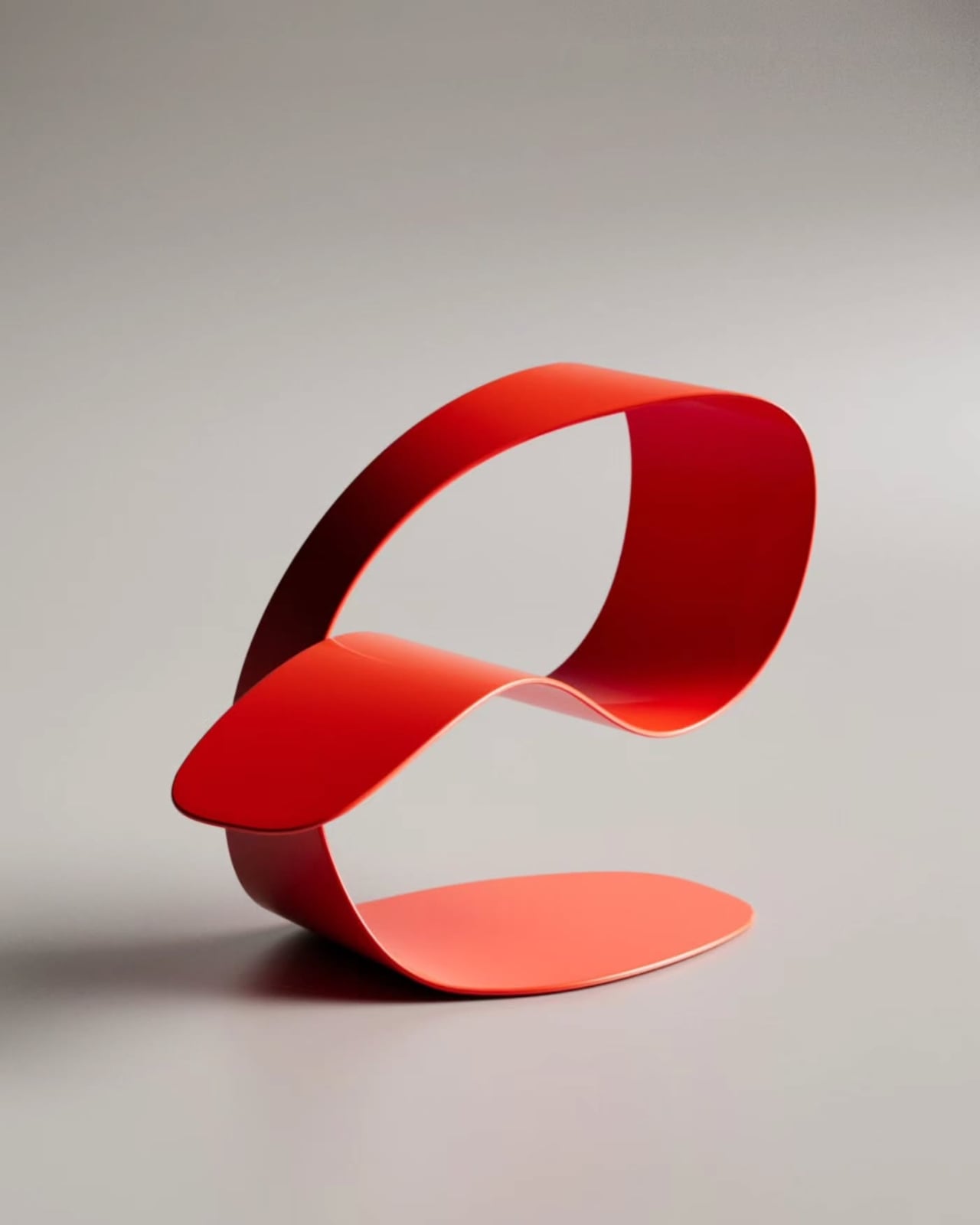
Most furniture earns its place in a room by being useful. The Nova Chaise-Lounge, designed by Stuttgart-based designer Deniz Aktay, earns it by being unforgettable. It is the kind of piece that stops a conversation the moment someone walks into the room, not because it announces itself loudly, but because it simply looks like nothing else you’ve ever seen in a living space.

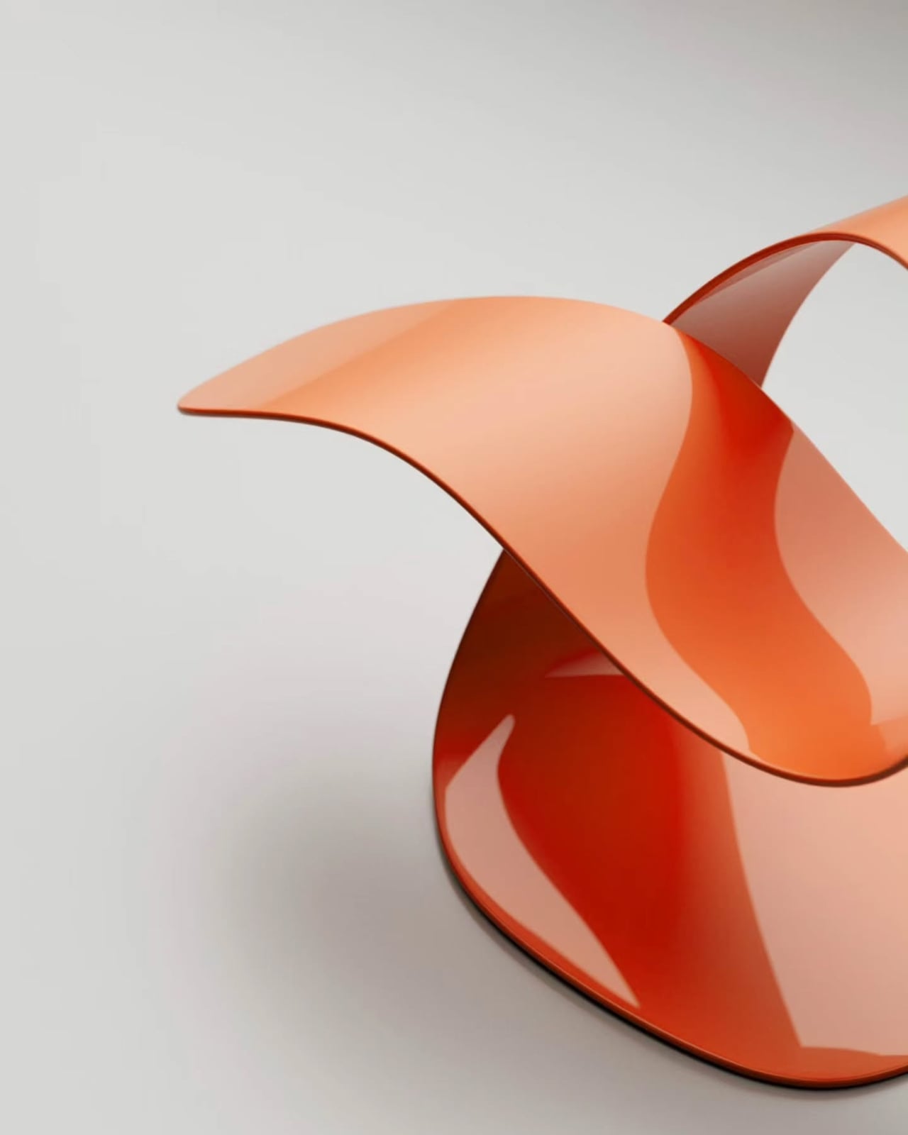
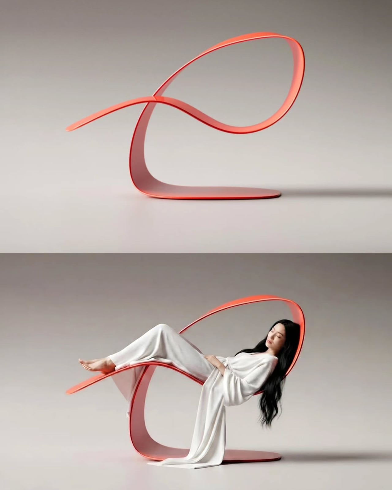
The Nova is built from a continuous ribbon of strong metal, bent and looped into a flowing form that cradles the body without a single traditional leg, joint, or rigid support system to speak of. On first glance, you might not even register it as furniture. It looks more like a sculpture someone left behind, a coral-red loop frozen mid-movement, balanced with a kind of casual confidence that only great design can pull off. That tension between lightness and stability is, to me, the most compelling thing about it. It looks like it could take off at any moment, and yet it holds.

Designer: Deniz Aktay

Aktay, who studied Architecture and Urban Planning before turning his focus to furniture and object design, approaches his work with a very particular philosophy. Nova was designed from the inside out, starting with the human posture of rest, then wrapping a continuous loop around it in the most minimal way possible. That methodology shows. The shape isn’t decorative for the sake of it. Every curve has a reason. The looping form that arches over the sitter isn’t just dramatic framing, it provides a sense of enclosure, a soft architectural shelter for the body, without any material bulk getting in the way.

Looking at the campaign images, where a figure in white draped fabric rests within the looping structure, hair falling loose, eyes closed, it becomes clear that the chair was conceived as an experience as much as an object. The whole composition reads less like product photography and more like a still from a film you wish you’d seen. That’s a deliberate quality, and it works. Nova invites you to imagine yourself in it, and that’s harder to achieve than it sounds.

The color choices across the presented versions are worth noting too. The gradient between that soft coral-pink and deeper warm red isn’t accidental. It gives the piece a kind of warmth that pure minimalism often lacks, grounding what could easily have been a cold, clinical form into something that feels alive, almost organic. The glossy finish on some versions catches light beautifully, shifting the reading of the piece depending on where you’re standing. From one angle it looks almost weightless. From another, it looks like a sea creature at rest.

Now, the honest question people ask about design like this: is it actually comfortable? Aktay says there are no heavy legs, no rigid structure, just a fluid design that supports the body, and that Nova challenges the expectation that comfort requires complexity. That’s a claim worth taking seriously, because the design logic actually supports it. The curve of the seating surface follows the natural recline of the spine. The looping back provides something to lean into without forcing the body into a fixed position. Whether the final manufactured version delivers on that promise depends entirely on the material engineering, but from a purely structural standpoint, the concept is sound.

Pieces like Nova are interesting because they sit at a crossroads that furniture rarely occupies so confidently. They are too sculptural to be purely functional, too functional to be purely art, and uninterested in resolving that tension. Instead, they let it coexist. That’s a confident position for a designer to take, and it’s one of the reasons Nova feels significant beyond its visual appeal. Whether Nova becomes a production piece or remains a concept, it belongs to a growing conversation about what furniture is allowed to be. The bar for beautiful objects has never been higher, and Deniz Aktay just raised it a little more.

The post The Nova Chaise Lounge That’s More Sculpture Than Furniture first appeared on Yanko Design.

The Hidden Step in Chair Design Nobody Ever Shows You

If you follow design at all, you’ve probably seen hundreds of polished chair photos. The perfect angle, the right lighting, a finished product posed against a white backdrop or styled in a beautiful room. What you almost never see is what came before any of that. Not the sketches, not the CAD renders, but the actual physical thinking that happens in a studio before a chair even has a name.

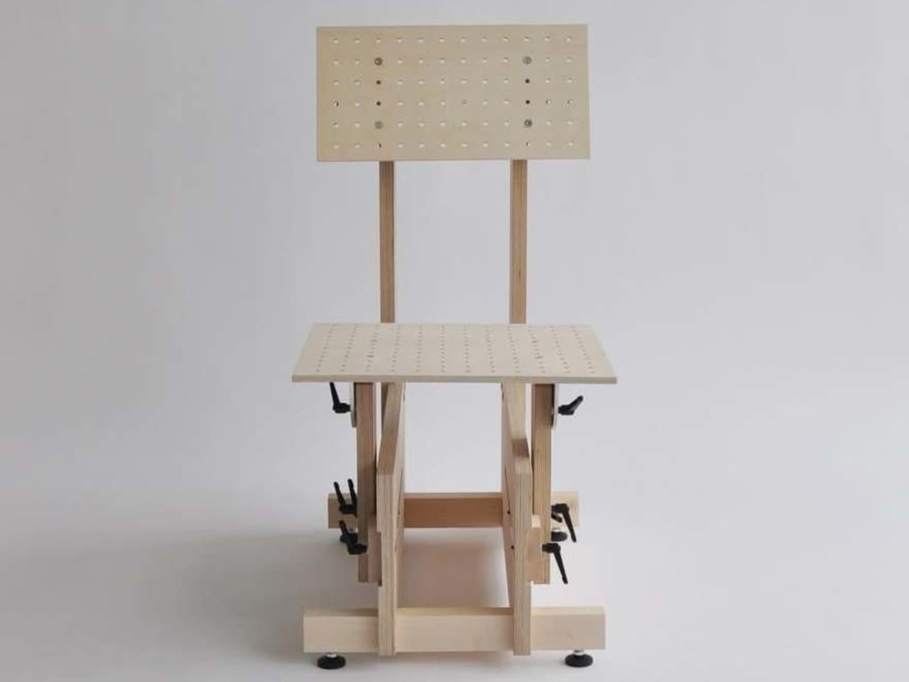
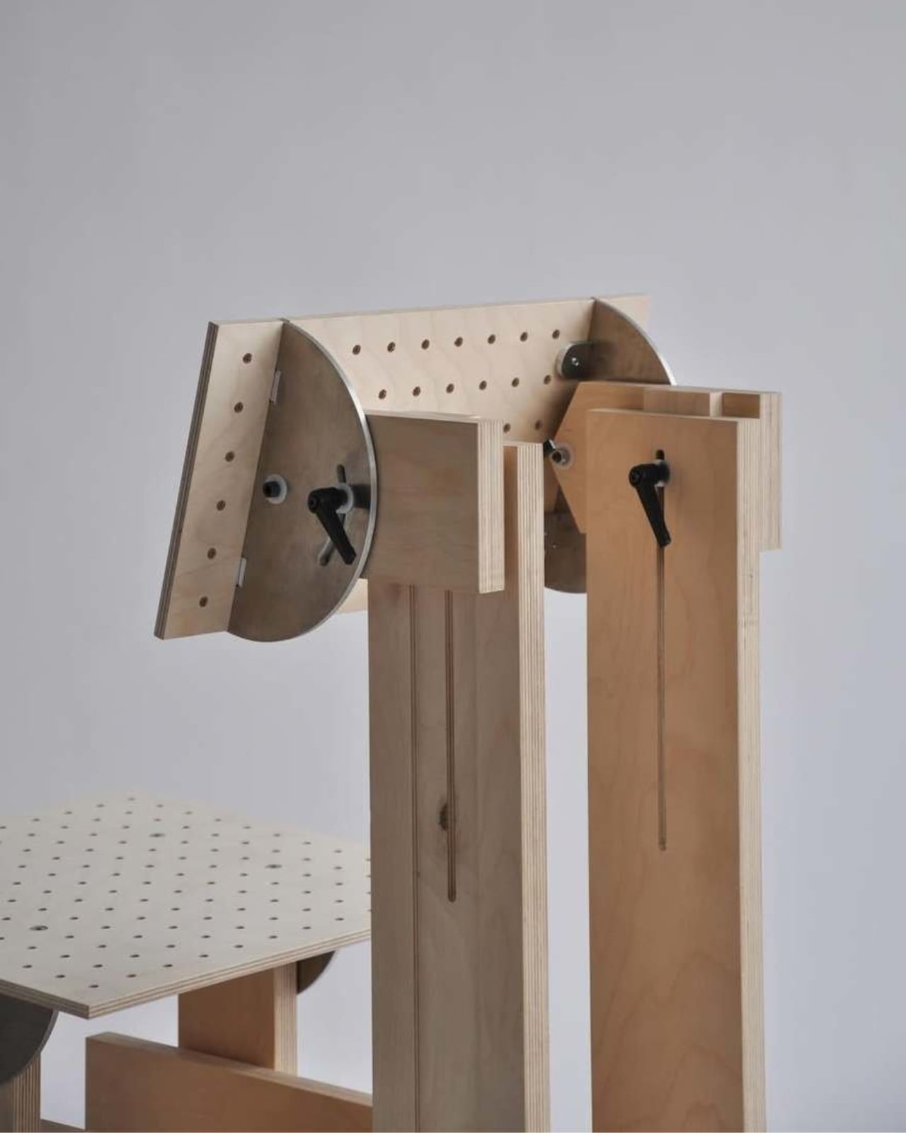
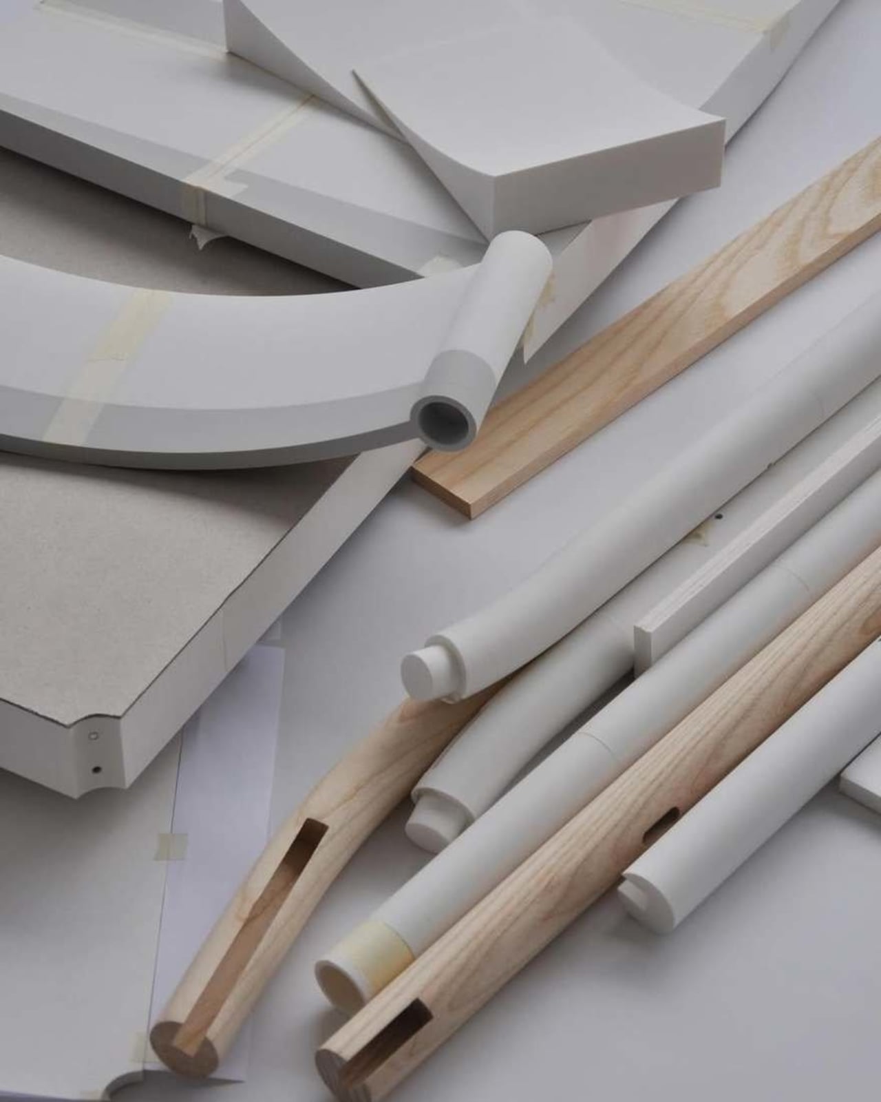
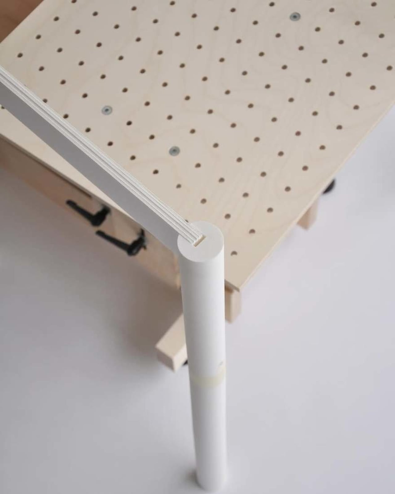
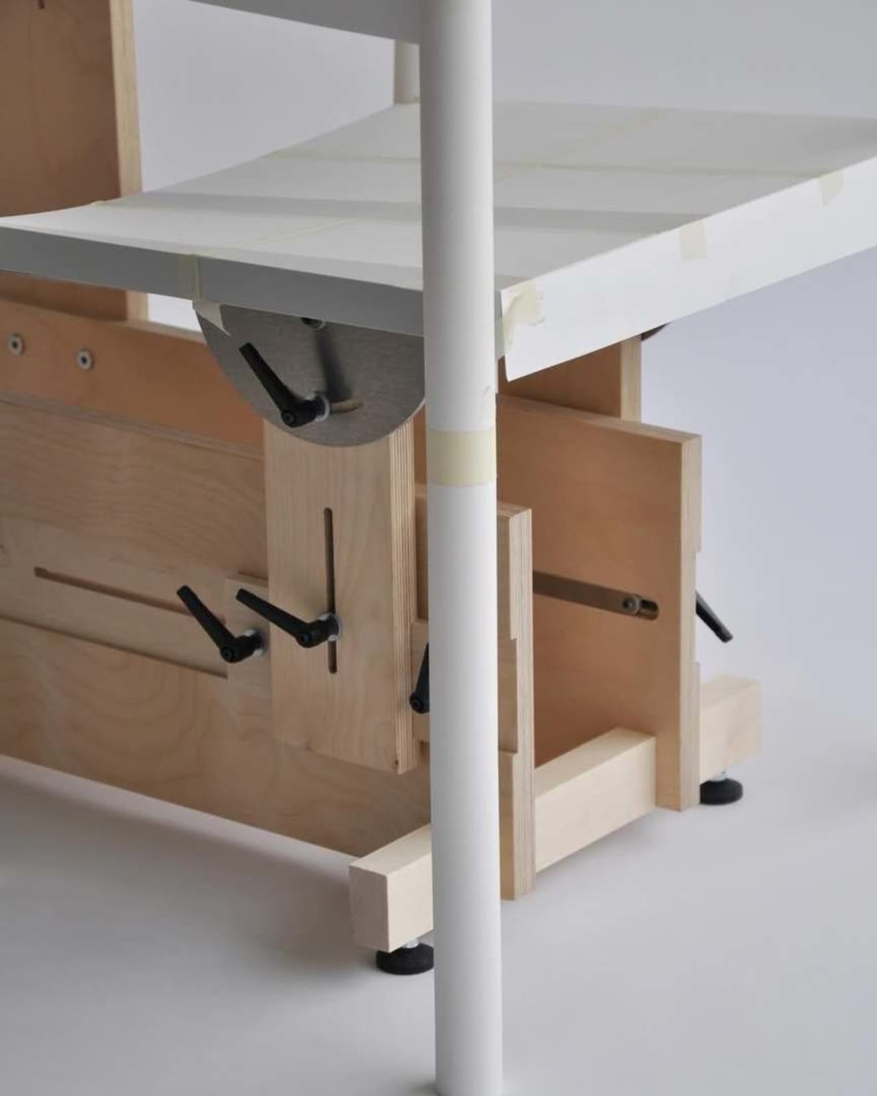
That’s what makes Paris-based industrial designer Timothée Mion’s chair buck such a compelling thing to stumble across. A chair buck, for the uninitiated, is an adjustable rig used to map out the geometry of a chair before committing to any final form. Seat height, seat angle, backrest tilt, all of it gets dialed in on this contraption before a single joint is cut. Mion uses his to work out the exact heights and angles of contact points, then physically sketches in hypothetical supports to see how they feel in real space.

Designer: Timothée Mion

It sounds deceptively simple, but the implications of that process are worth sitting with. We live in an era where the default assumption is that better design tools mean more screen time. Better software, better renders, better simulations. And those tools matter enormously. But Mion’s chair buck is a reminder that some problems still require a body. You can render a chair at any angle and tweak dimensions to the millimeter, but you cannot feel it through a monitor.

This is part of why the chair buck feels quietly radical. It’s an analog tool being used at the front end of a very intentional design practice. Mion studied at Central Saint Martins, trained at studios like Barber & Osgerby, and worked with Hermès before completing his master’s at ECAL in Switzerland. He received the Design Guild Mark award in 2016 for excellence in the British furniture industry. His work is precise, thoughtful, and deeply rooted in materials and craft. The chair buck isn’t a workaround; it’s a deliberate choice to test ideas in the physical world before formalizing them.

Core77, which featured Mion’s buck earlier this month, noted that these rigs are used widely among industrial designers but are rarely shared publicly. That scarcity feels telling. Design culture tends to celebrate the final object and occasionally the sketch, but the awkward in-between stages? Those usually stay in the studio. There’s a vulnerability to showing a contraption of adjustable parts and raw materials. It doesn’t look polished. It looks like problem-solving, and apparently, we’re more comfortable with the solved version.

But the messy middle is often the most interesting part. Mion describes the process as one where “the act of making becomes part of the design itself.” The proportions get explored in real space. The angles get tested by an actual body. The design doesn’t just live on a screen; it gets inhabited before it’s finished. That reframes the chair buck not as a preliminary step but as a core part of the creative act.

This approach isn’t exactly new, but it is becoming rarer, and that’s worth paying attention to. Before software like CAD put ergonomic data at everyone’s fingertips, chair bucks were a standard part of the furniture design process. They were how you figured out if something would actually feel good to sit in. Now that information largely lives in databases and simulation tools, and the physical prototype often comes much later in the process, if at all.

Mion’s chair buck feels like a quiet argument for slowing down. Not in any nostalgic sense, and not a rejection of digital tools, but a genuine belief that physical intuition belongs in the process too. It’s the kind of design thinking that doesn’t make headlines, but tends to produce chairs that are genuinely good to sit in. And at the end of the day, that might be the most honest benchmark there is.

The post The Hidden Step in Chair Design Nobody Ever Shows You first appeared on Yanko Design.

Marka Is The Chair That Carries Culture and Quietly Connects People

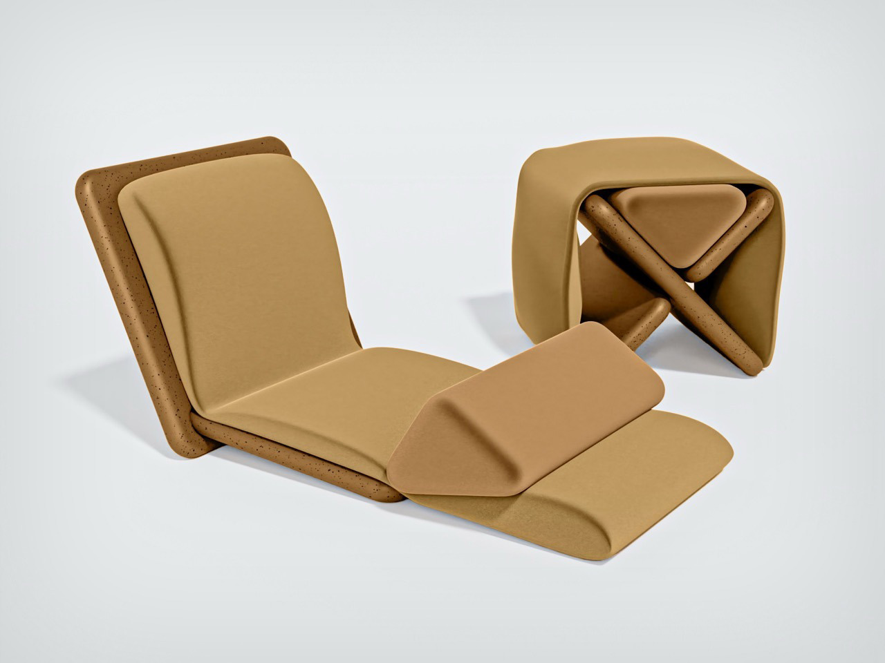
Marka feels less like furniture and more like a cultural memory taking shape in the present. The idea comes from the Bedouin way of life, where movement, adaptability, and shared living shaped everything. In that world, objects had to be light, versatile, and deeply connected to how people lived together. Marka brings that spirit forward and places it into the context of contemporary living. At its core, Marka raises a simple question. Can furniture bring people closer together again?

The story begins in the desert. For Bedouin communities, mobility defined life. Objects were designed to move with people, to shift between uses, and to serve multiple roles. What was once a saddle support for camel riding slowly evolved into a low seating form when nomadic groups began to settle. That transition reflects something meaningful. It shows how design evolves when lifestyles shift, and how culture is carried through objects.

Designer: Adel Alserhani

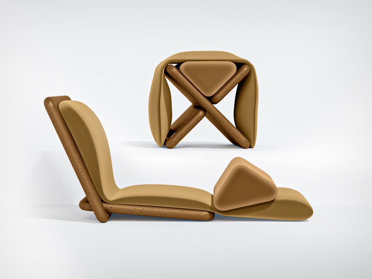
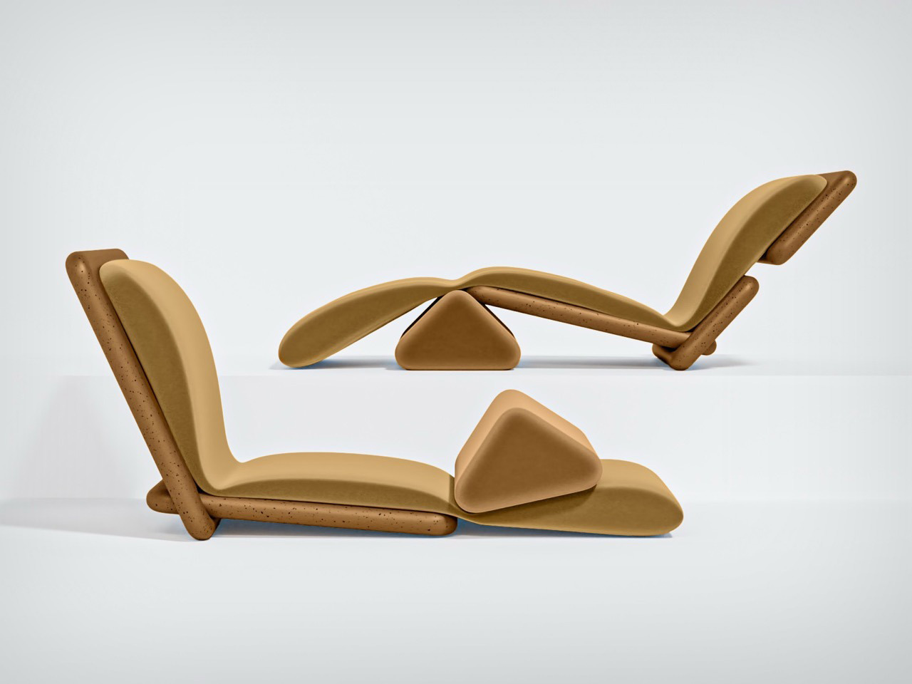
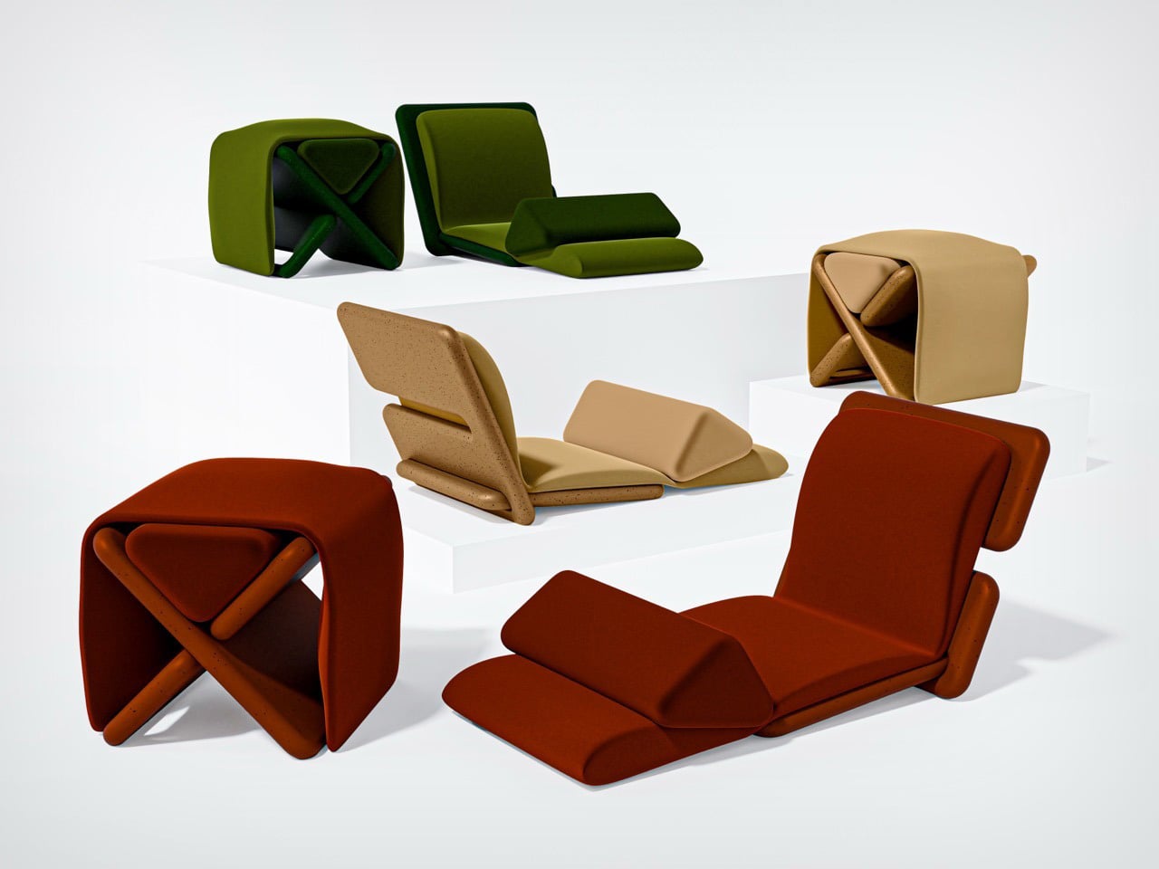
Marka builds on that idea. It reinterprets a traditional object through the lens of modern needs. The design is a modular seating system that changes form without the need for tools. It invites the user to assemble and reassemble it with ease. One configuration supports two people sitting close, encouraging conversation and shared time. Another configuration transforms into a low personal chair designed for solitude, comfort, and reflection. These changes happen through simple interlocking joinery, which makes the object playful and intuitive to use.

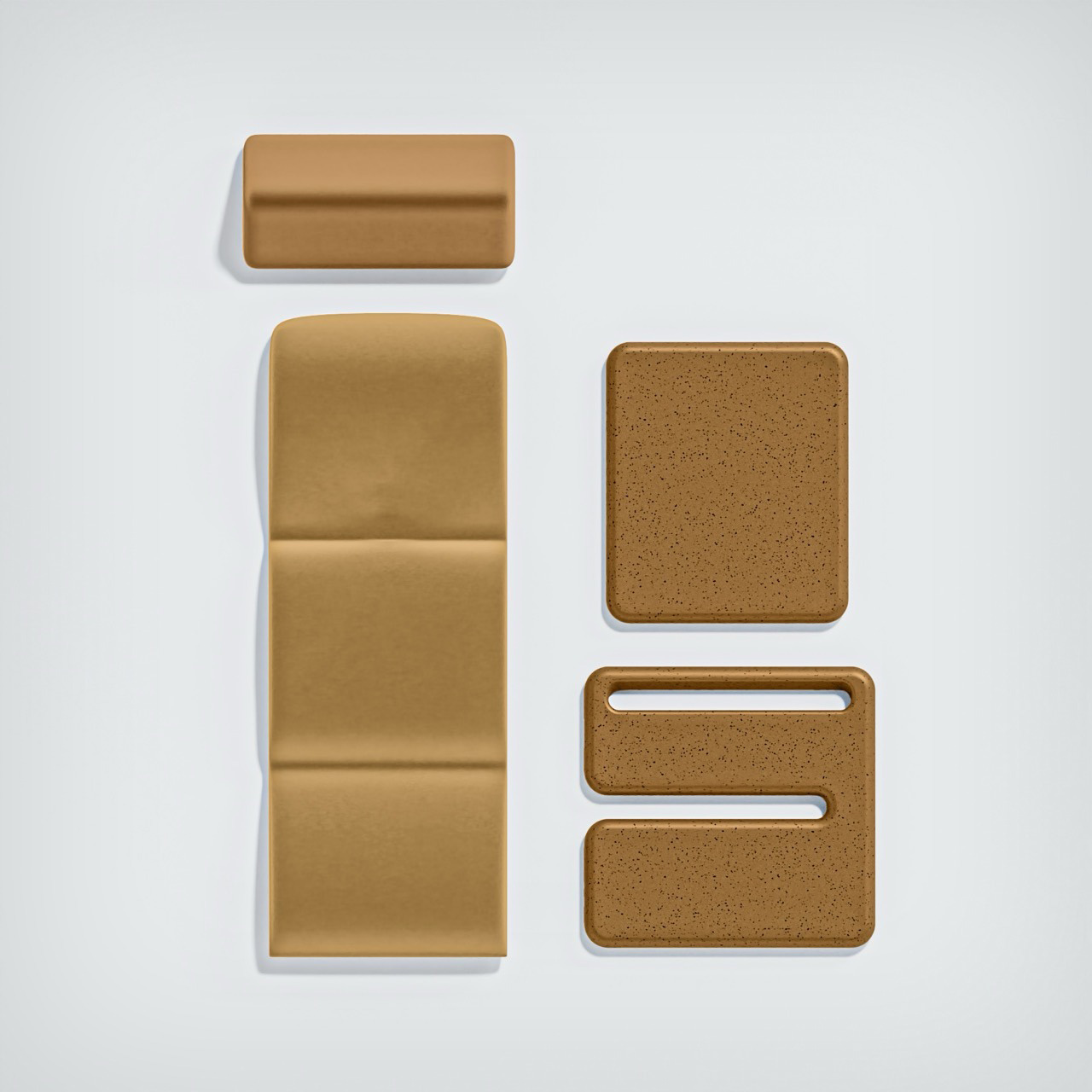
The two structural panels and the padded cover come together to create a flexible and tactile experience. The triangular cushion allows different sitting postures, making it easy to shift between relaxation, conversation, and quiet personal moments. There is a subtle intention behind this flexibility. The design acknowledges the human need to connect, and the equally important need to be alone.

The choice of material adds another layer of meaning. The structure is made from recycled and recyclable polypropylene sourced from local manufacturing waste. This choice reflects a conscious approach to sustainability and an understanding of resourcefulness that aligns with the traditions that inspired the design.

Marka also responds to a larger social shift. Research conducted during the project explored how urban development and economic growth have changed social behaviors. Many people living in fast-growing cities experience loneliness and a weakening of community bonds. Digital tools keep people connected across distances, yet face-to-face interaction is becoming less frequent. This shift can create feelings of isolation and a loss of belonging.

Marka does not claim to fix these issues. Instead, it creates small opportunities for connection. Placed in a home or shared space, it invites people to sit, talk, and spend time together. It encourages presence without forcing interaction. It allows a quiet space for solitude when needed. In doing so, it gently brings back the idea of shared moments in a world that often moves too quickly.

Marka stands as a reminder that design can hold memory and respond to contemporary needs at the same time. It blends heritage, function, and social intention into one object. In a quiet and thoughtful way, it asks us to slow down, gather, and find moments of human connection again.

The post Marka Is The Chair That Carries Culture and Quietly Connects People first appeared on Yanko Design.

A Modular Form Where Geometry Quietly Becomes Furniture

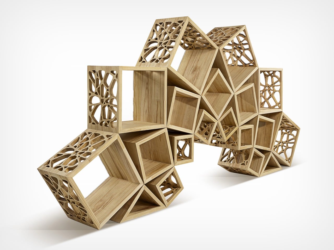
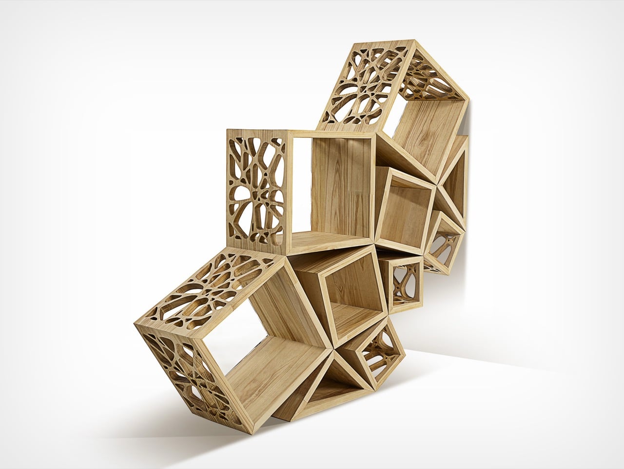
Fractal 9 began not as a formal design project but as a response to a simple, everyday need. The goal was to make use of an empty corner in the living room by creating something that felt meaningful in the space, not just a functional object. The intention was to design a piece that could quietly anchor the room while offering both aesthetic presence and practical value. Over time, what started as a personal experiment grew into a deeper exploration that ultimately led to the creation of Fractal 9, a modular sculptural furniture piece rooted in geometry, materiality, and conceptual depth.

At the core of Fractal 9 lies a strong relationship with mathematical principles, particularly the square, the golden ratio, and the number nine. These elements are not decorative references but foundational to the structure of the design. A significant turning point came when the first model was analyzed through the lens of the Digital Root, a mathematical concept that reduces numbers to a single digit. This analysis revealed meaningful numerical patterns within the form. What began as an intuitive structure gradually revealed an underlying mathematical coherence, suggesting that the design was guided by a deeper internal logic rather than chance.

Designer: Miguel Espejo

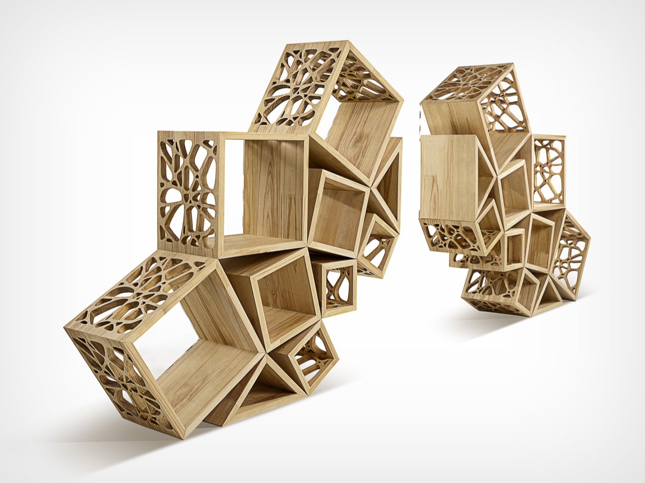
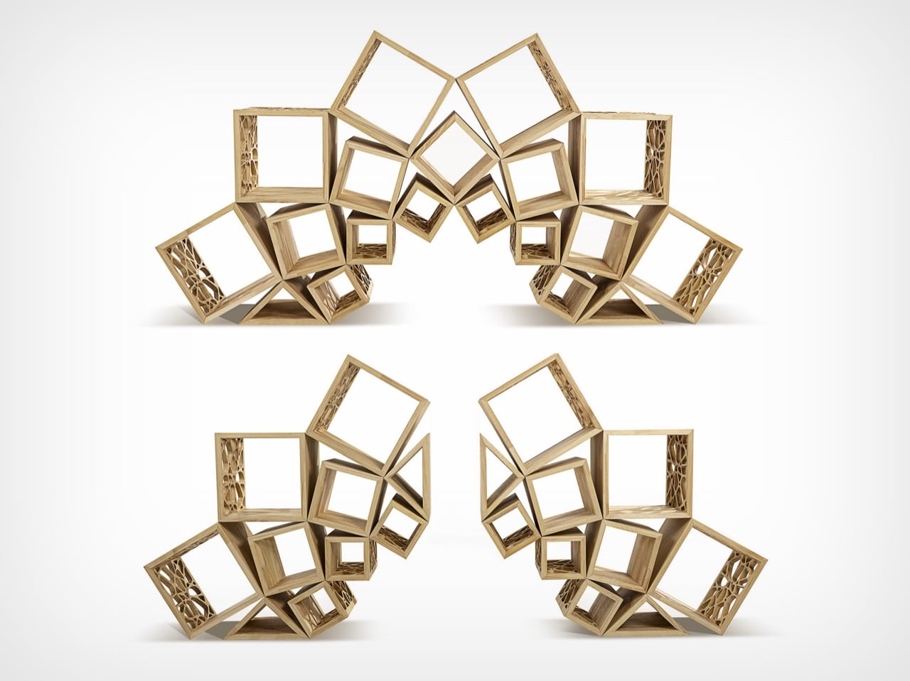
The design takes inspiration from fractal patterns found in nature, where forms repeat across scales while maintaining harmony and balance. This thinking informs the modular nature of the piece. Fractal 9 can function as a single integrated unit or be separated into two independent units, allowing it to adapt to different spaces and uses. Whether serving as a bookshelf, a display surface, or a sculptural centerpiece, the piece encourages interaction, experimentation, and creative reconfiguration.

The assembly system plays a key role in the user experience. The entire structure can be assembled using an Allen wrench, allowing the piece to be put together or taken apart without adhesives. This mechanical approach preserves the material integrity while offering flexibility and durability. Designing the connection system was one of the most challenging aspects of the project. The structure needed to be strong and stable while also appearing visually subtle so that the form remained uninterrupted.

The choice of materials is central to the identity of the piece. FSC certified wood forms the structural base, reflecting a commitment to sustainable sourcing. Transparent acrylic components, produced using precise laser cutting, introduce lightness and clarity while allowing the structural connections to remain visible. Stainless steel fasteners provide strength and long term durability. A natural beeswax finish is applied by hand, enhancing the grain of the wood and adding a tactile warmth that complements the precision of the fabrication methods.

The development of Fractal 9 was supported by applied research. The aim was to validate the geometric and mathematical integrity of the design using the Digital Root method. Through careful measurement of angles, proportions, and modular relationships, recurring numerical patterns were identified. Stability tests conducted across different configurations confirmed the structural reliability of the system. These findings demonstrated that the design has potential beyond furniture, with possible applications in architecture, spatial systems, and educational contexts related to geometry and applied mathematics.

One of the most demanding aspects of the project was conceptual. Establishing a meaningful connection between the square, the golden ratio, and the number nine required extensive exploration and refinement. This process revealed a framework that extends beyond the object itself and opened the door to ongoing research into modular systems and mathematical structures in design.

Fractal 9 is ultimately an exploration of structure, meaning, and human interaction. By combining mathematical principles, sustainable materials, and modular adaptability, it reflects a belief in balance and interconnectedness. It is a reminder that design, much like nature, exists as part of a larger system where every element has purpose and contributes to the whole.

The post A Modular Form Where Geometry Quietly Becomes Furniture first appeared on Yanko Design.

These 5 Playful Everyday Objects Were Designed to Make You Feel Like a Kid Again

For decades, “form follows function” shaped how you designed and lived. Minimalism stripped objects down to pure utility, where functional products like a chair were only a chair, or a lamp was only a source of light. That clarity once felt essential, but now it feels incomplete. We are moving into an era of playful functional design, where everyday objects reclaim character, becoming whimsical, unexpected, and slightly strange.

This shift is not about excess but about emotional precision. Function no longer ends at performance, but it extends into experience. Objects are designed to engage, surprise, and evoke emotion. A well-designed piece does not simply serve a purpose; it leaves a lasting impression.

1. Interactive Furniture Design

The era of the static, rigid sofa is fading as furniture begins to take on a more expressive role. Pieces are no longer designed to sit quietly in the background, but they carry presence through bold forms and modular compositions. Soft, blobby silhouettes and subtle anthropomorphic details transform chairs and stools into objects that feel almost alive, inviting interaction.

The real transformation lies in how people engage with these designs. Materials like memory foam and recycled plastics allow furniture to adapt to the body, shifting from passive to responsive. As a result, furniture moves beyond function and begins to feel more like a companion within a space. This shift creates interiors that are more intimate, expressive, and dynamic, where everyday objects actively shape the playful atmosphere.
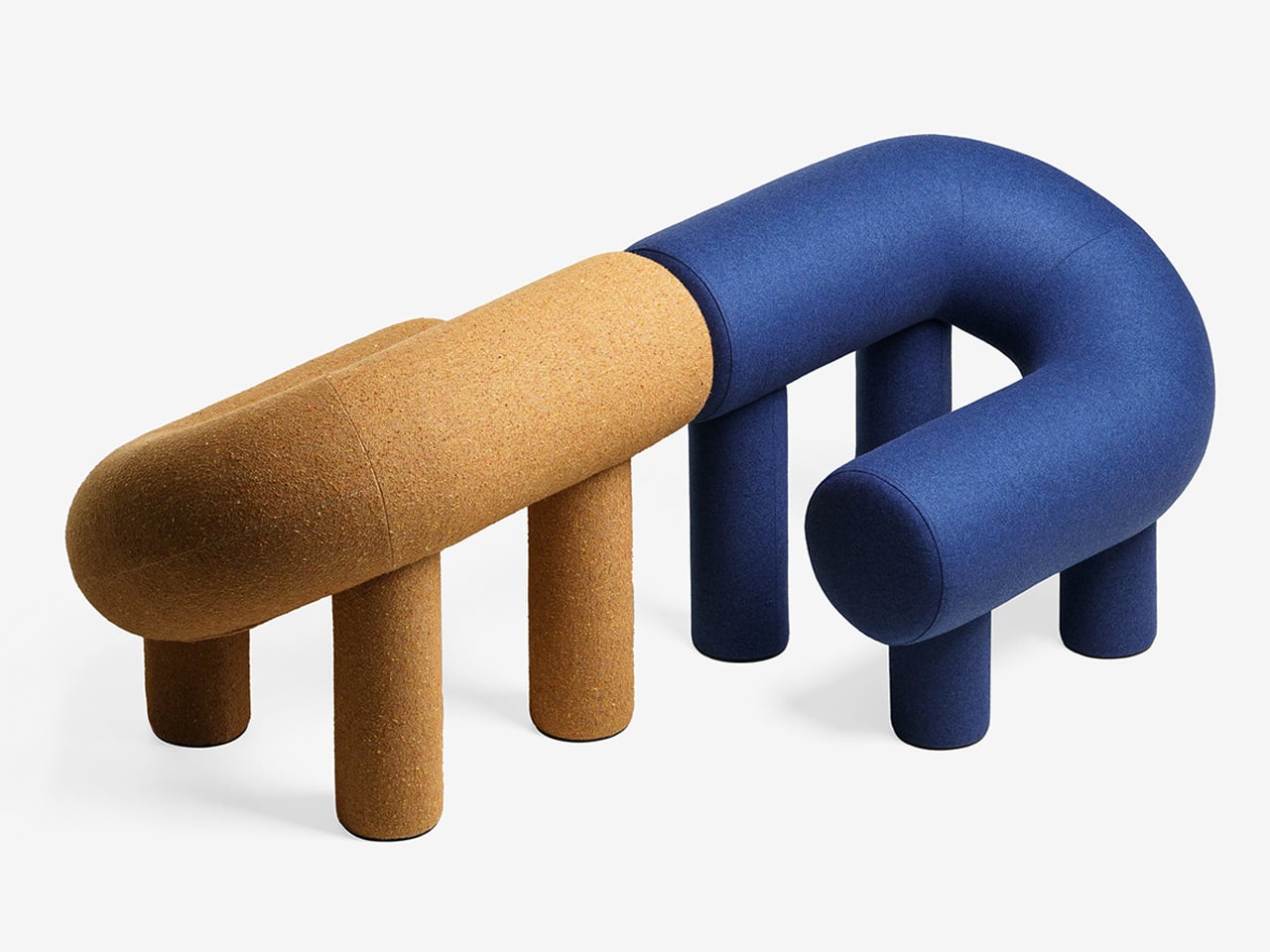
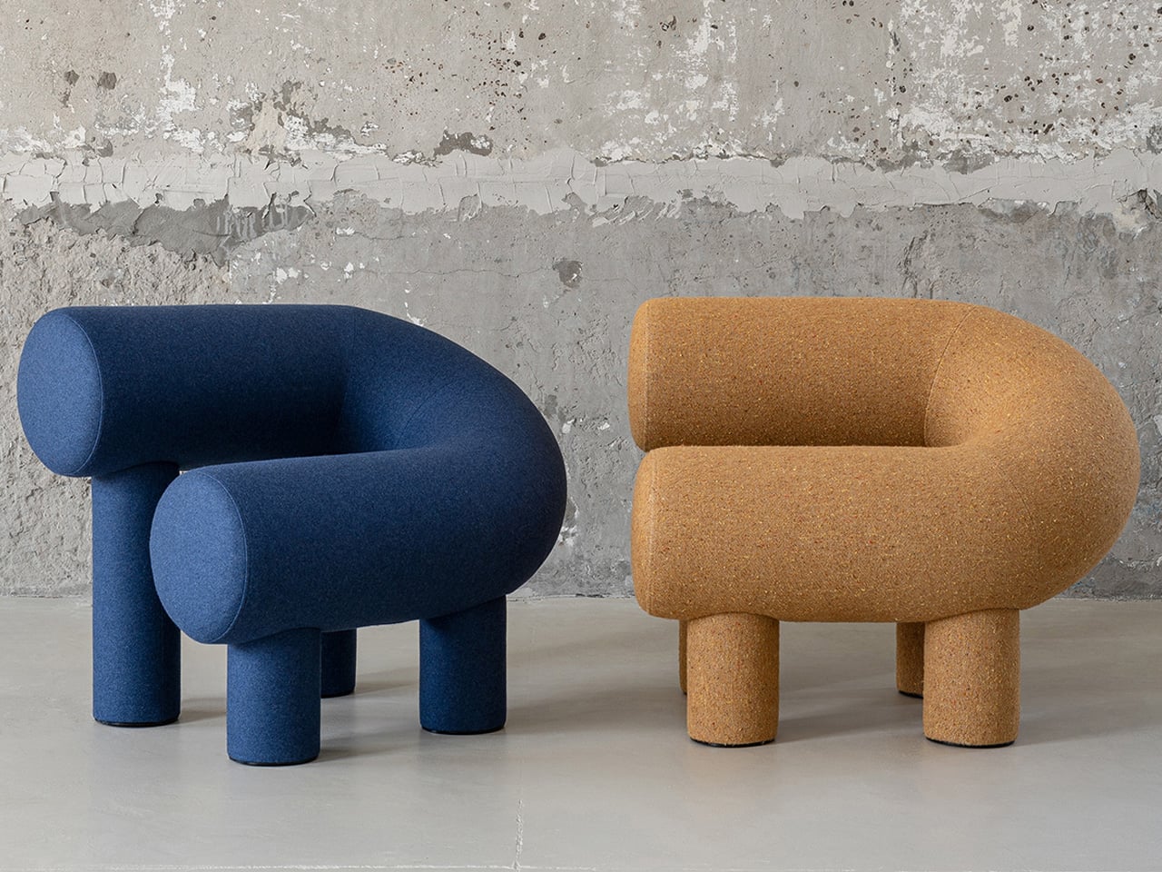
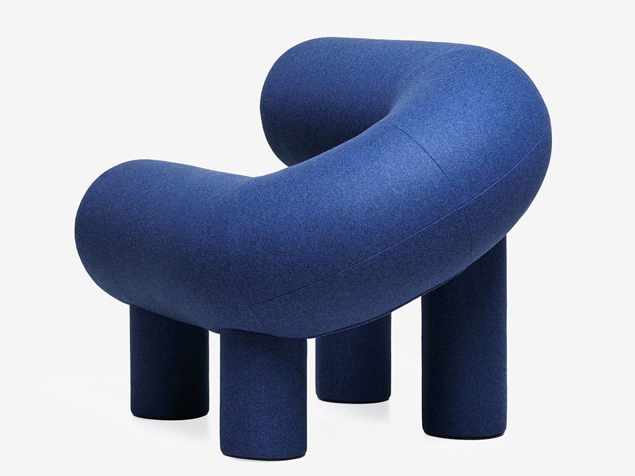
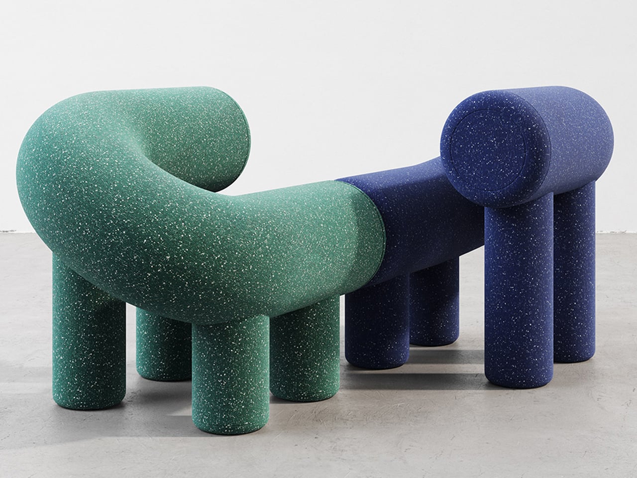
Playful furniture is reshaping everyday living, and the UMI Armchair by Rostislav Sorokovoy for Woo reflects this shift with ease. It moves beyond conventional seating, becoming an interactive object that sparks curiosity. Its bold, chunky form carries a soft, sculptural presence, giving it the character of a modern art piece. Designed to invite engagement, the chair encourages relaxed lounging and a more instinctive, almost childlike interaction.
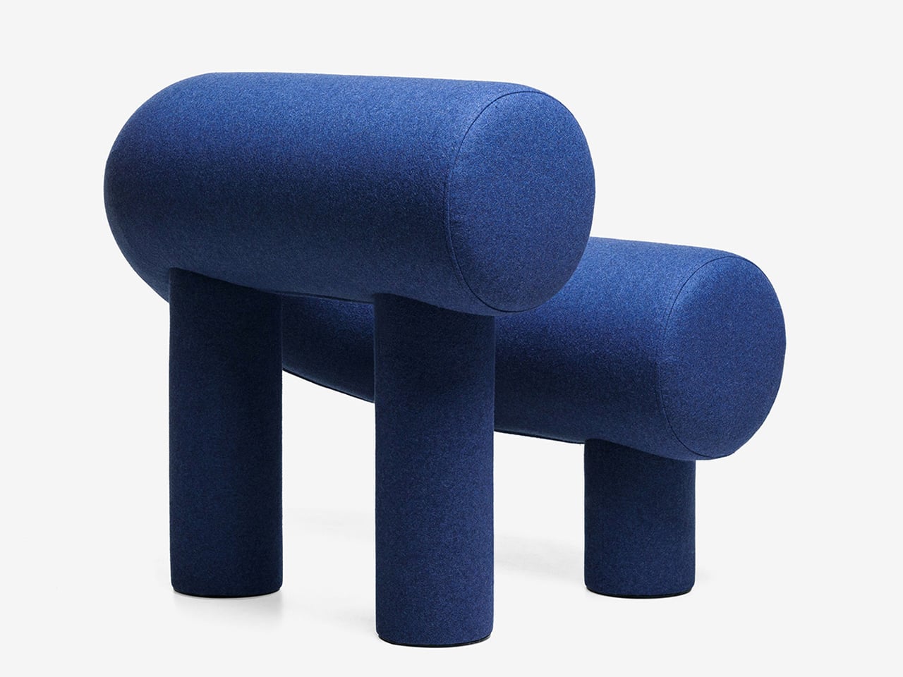
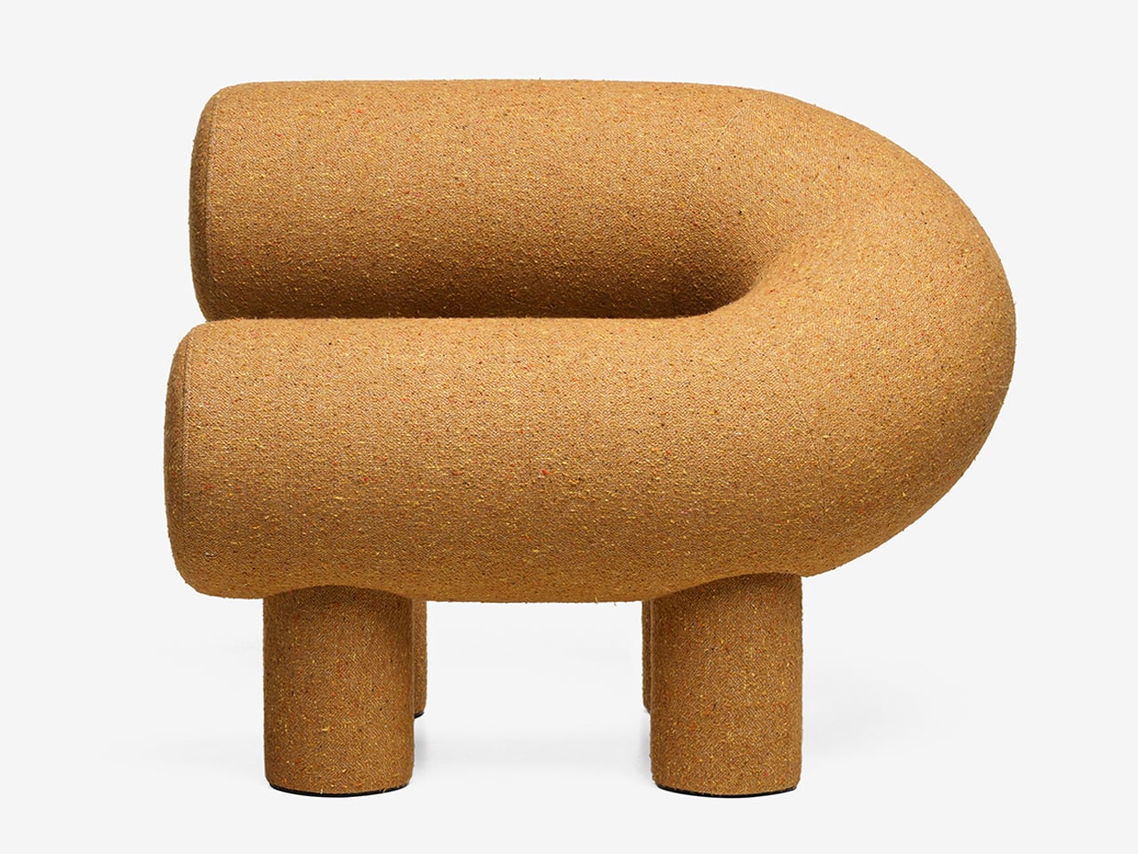
Its distinctive horseshoe shape is created using two cylindrical volumes, supported by four plush legs that provide both stability and visual charm. Constructed with a plywood frame, polyurethane foam, and textile upholstery, it delivers comfort alongside strong design appeal. While its scale may not suit compact interiors, it works effortlessly in larger spaces where its expressive form can stand out. Whether used alone or in pairs, it creates a seating arrangement that feels tactile, inviting, and visually dynamic.

2. Sculptural Light Design

Lighting has moved beyond pure function, evolving into something sculptural, immersive, and subtly performative. A fixture is no longer just a source of illumination as it becomes an object that encourages interaction. With hidden LEDs and responsive sensors, even the simple act of turning on a light feels more intentional, almost ritual-like.

The experience is defined by engagement. Some lamps require a physical gesture, like placing a glowing orb to activate them, while others shift form as they dim, echoing organic movement. When light is treated as a material to shape and experience, rather than just a utility, it transforms the mood of a space. Shadows gain depth, and dim corners turn into moments of intrigue, adding a layer of quiet wonder to everyday environments.
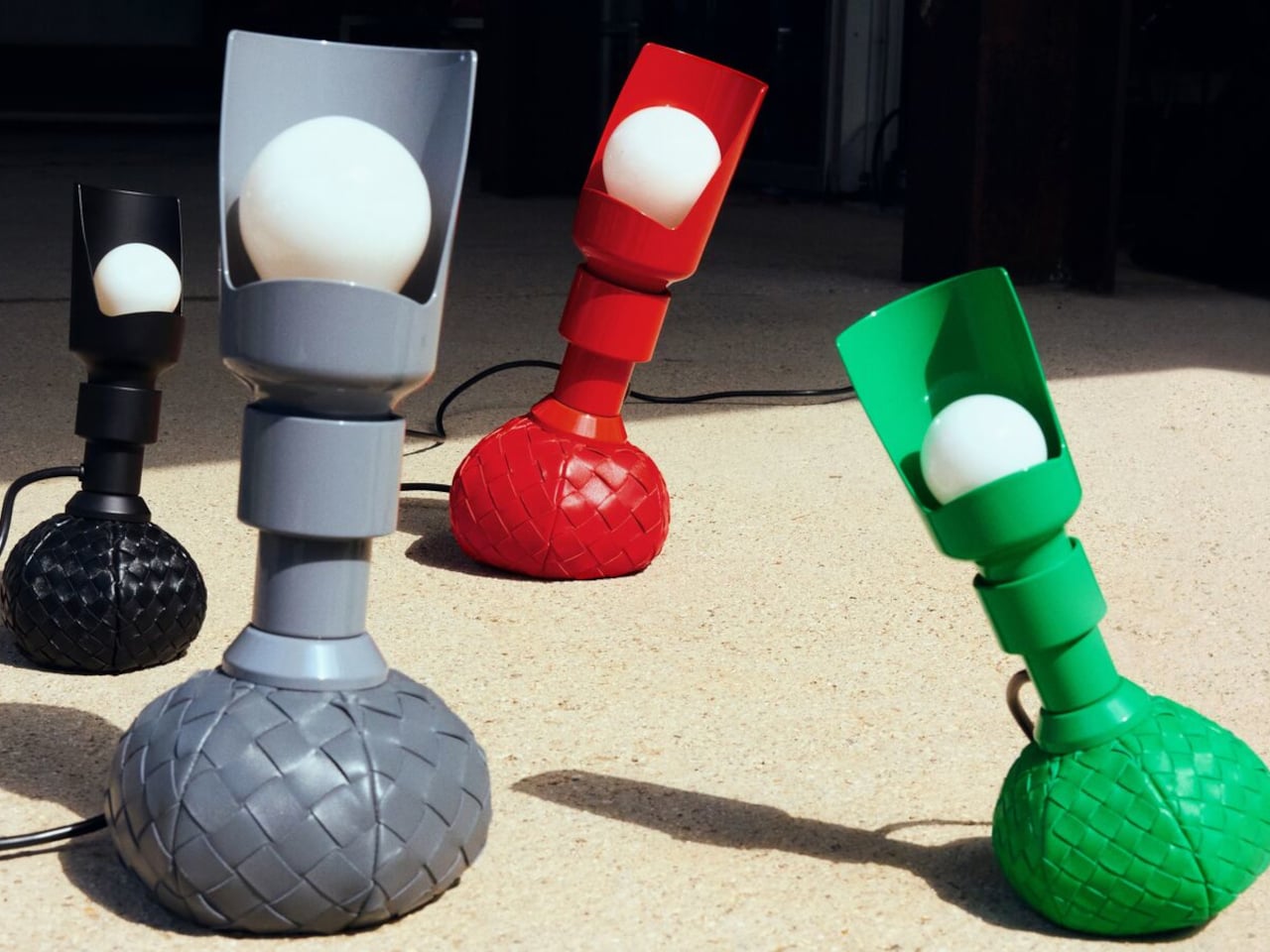
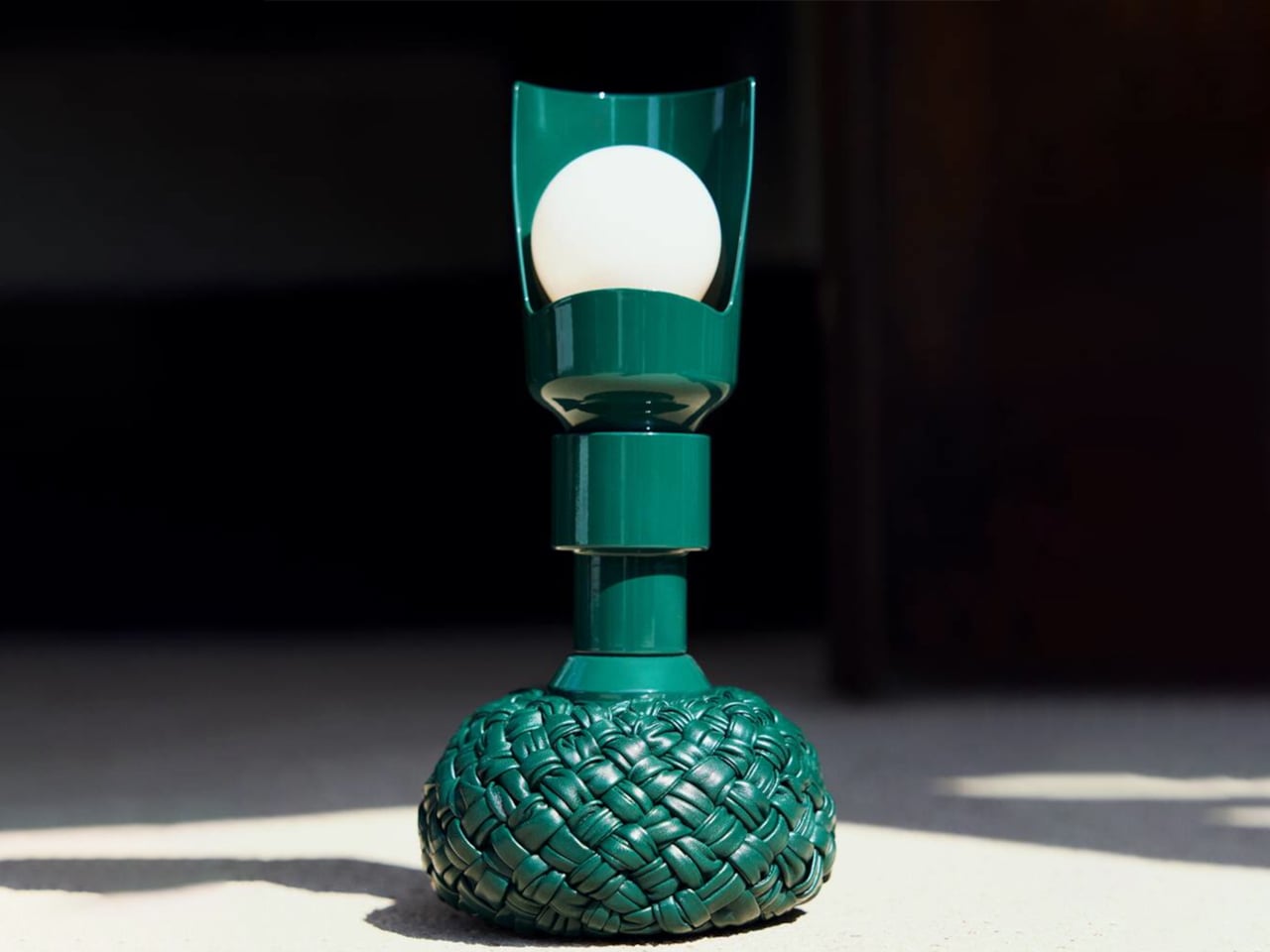
Lighting is often viewed as purely functional, designed to illuminate and enhance a space. Yet some designs move beyond utility, introducing interaction and character without feeling overly whimsical. The reimagined Model 600 by Bottega Veneta x Flos, created by Gino Sarfatti, captures this balance with ease. Its rounded base offers a soft, inviting presence, while the slender metal stem adds a refined contrast, resulting in a form that feels both approachable and sophisticated.
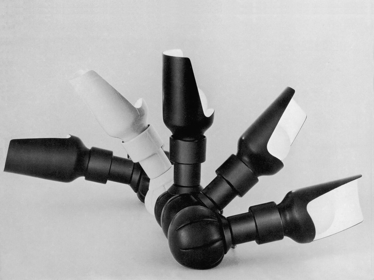
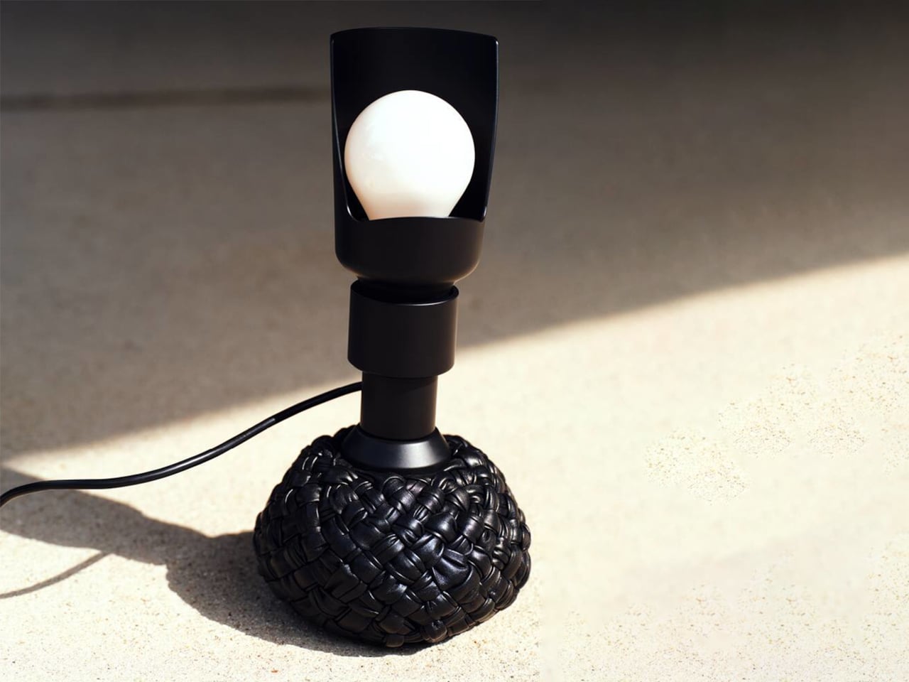
The original 1960s design embraced experimentation with a weighted leather base that could tilt without falling. The updated version retains this dynamic feature while introducing an interwoven leather texture that enhances its visual depth. Functionally versatile, it serves as a desk and floor lamp, with adjustable light direction through a curved reflector. Available in multiple sizes and colors, it merges structure with softness, creating a lighting piece that feels engaging, elegant, and enduring.

3. Playful Gadgets

Technology has long been defined by precision and restraint, often creating a sense of distance through its polished perfection. That gap is now narrowing, as a new generation of gadgets introduces softness, charm, and tactility. Drawing from “kawaii” influences and responsive design, these objects invite touch and emotional connection, from companion-like power banks to speakers that move and respond with sound.

The real shift is in how these devices are perceived and experienced. Tools once valued solely for efficiency are now designed as sensory interactions. A hard drive wrapped in soft silicone, yielding like a stress ball, blurs the line between utility and play. In this transition, technology becomes more personal and approachable, transforming everyday use into something warmer, lighter, and more human-centered.
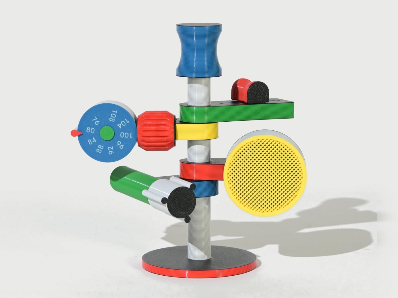
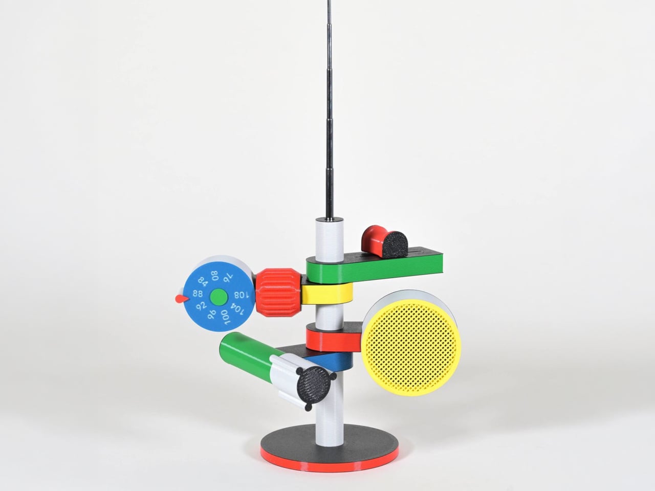
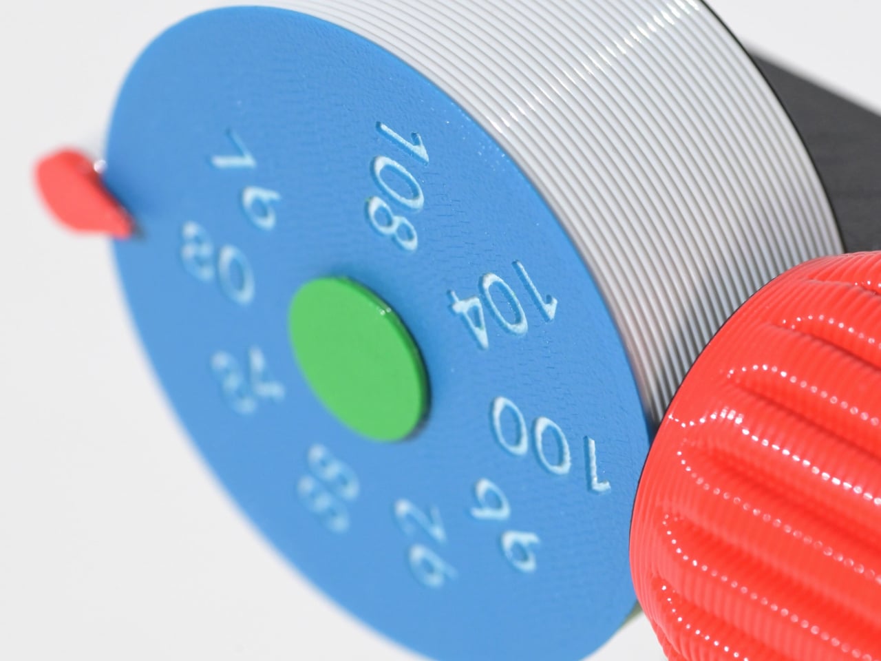
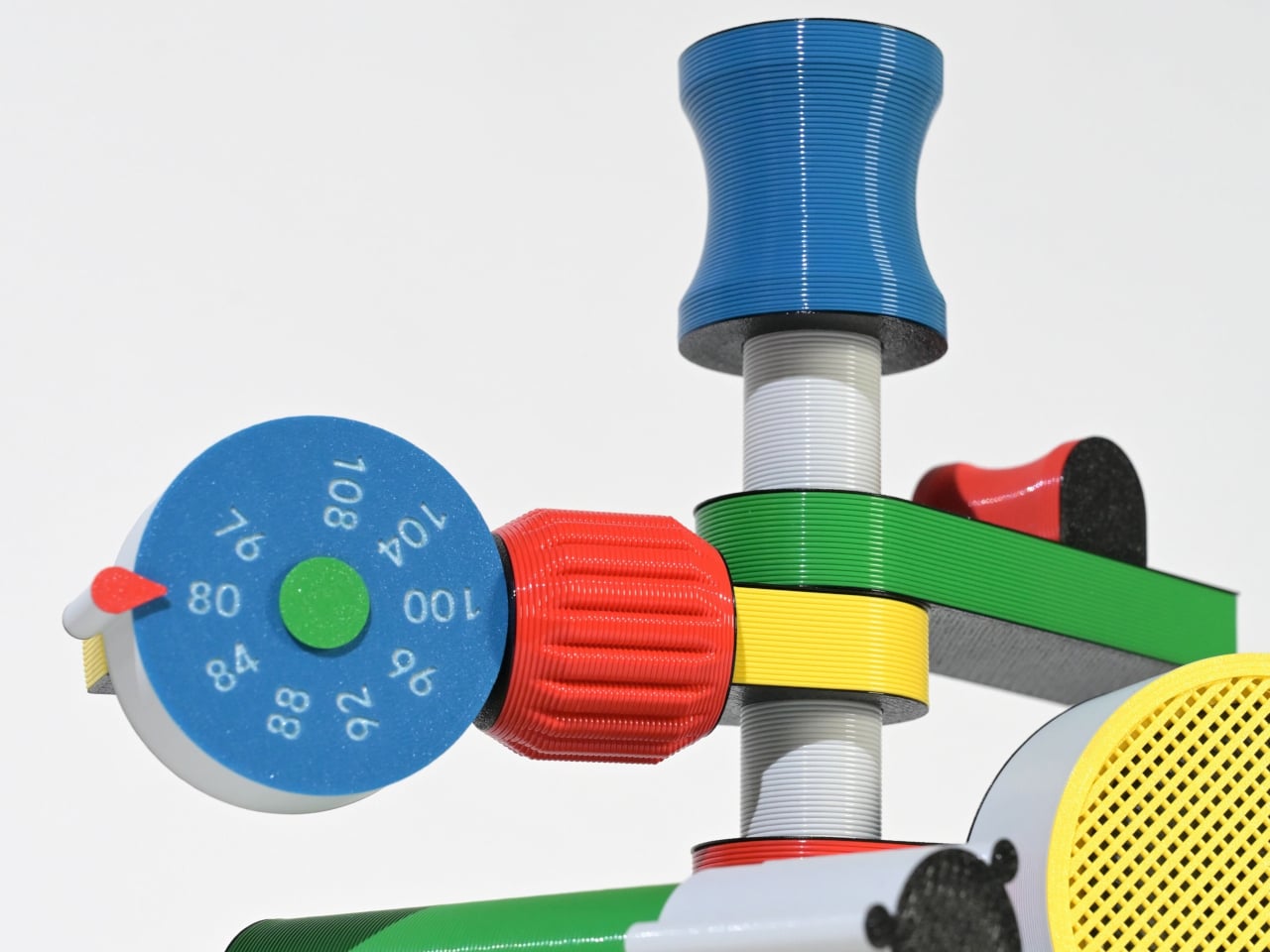
Some gadgets stand out not for precision or minimalism, but for their sense of character. The Anomalo FM radio by SHINKOGEISHA leans into this idea, presenting itself as an object that feels closer to a playful sculpture than a conventional device. With its bold colors and exaggerated form, it instantly grabs attention, sparking curiosity even before it’s switched on. The tall antenna anchors the design, while branching, limb-like extensions give it an almost animated presence.
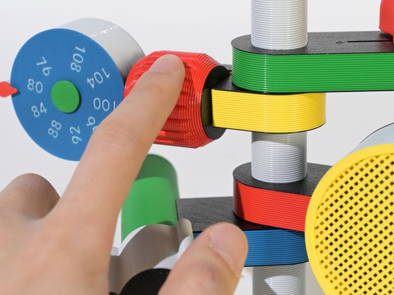
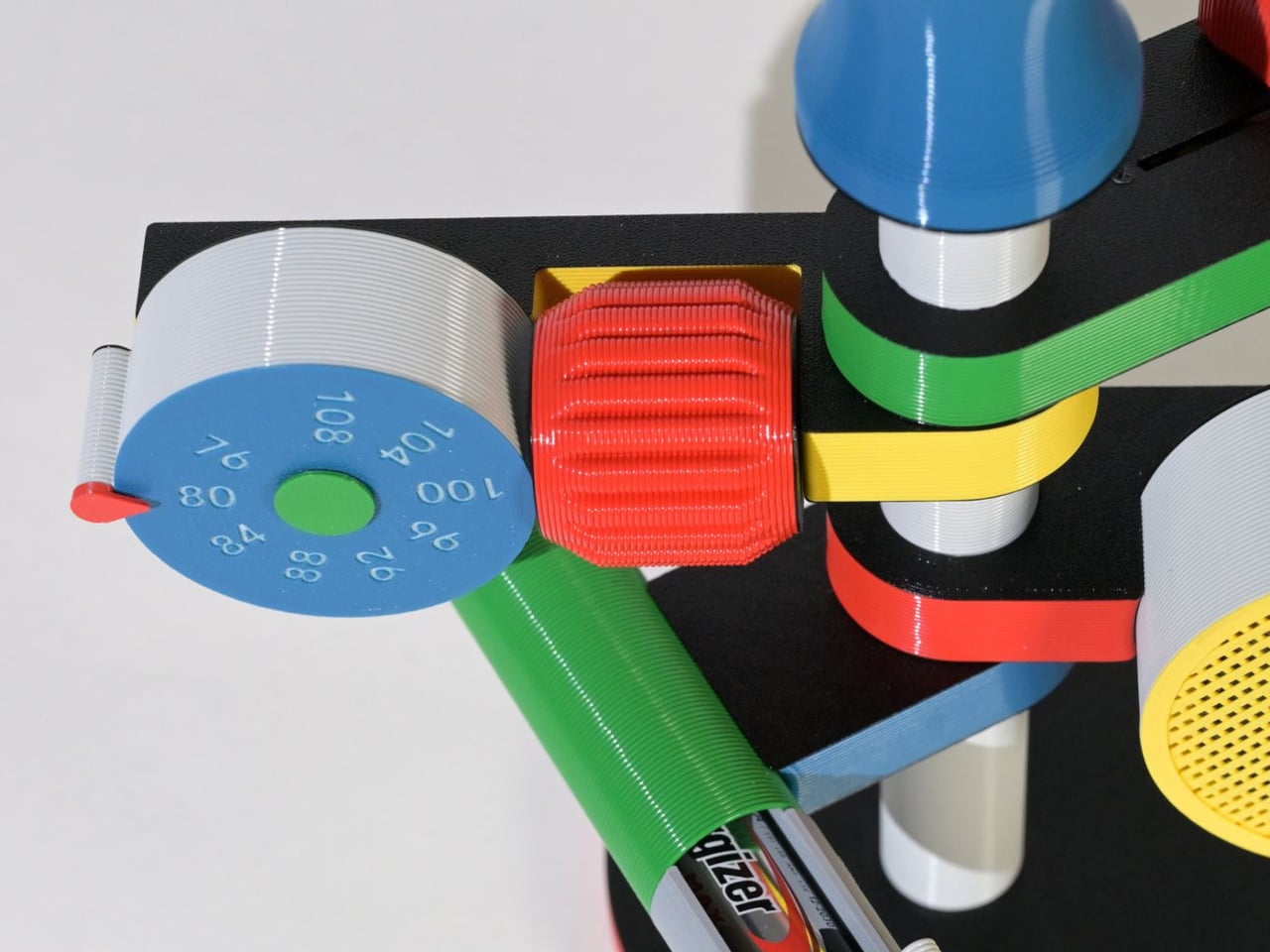
Each extension serves a clear function, creating a tactile, engaging experience. A roulette dial scans stations, a barrel controls volume, and a bold speaker projects sound, while exposed wiring enhances its expressive look. Made with PLA through digital fabrication, it favors creativity over polish, reflecting a shift toward more personal, experimental electronics.

4. The Joy of Stationery

Even in a digital world, the desk is becoming a space for quiet play. Stationery is no longer purely functional as it engages the senses. The focus has moved beyond simple aesthetics to how tools feel, respond, and enhance the act of making.

Erasable inks react to friction, washi tapes create layered compositions, and modular notebooks connect with magnetic precision. Writing no longer feels routine as it transforms into a small ritual, where thinking on paper feels intentional, creative, and deeply satisfying.
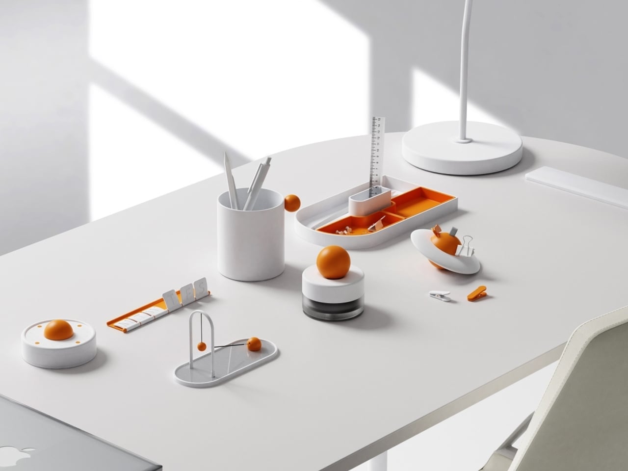
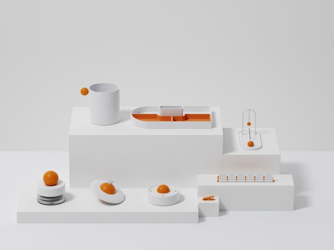
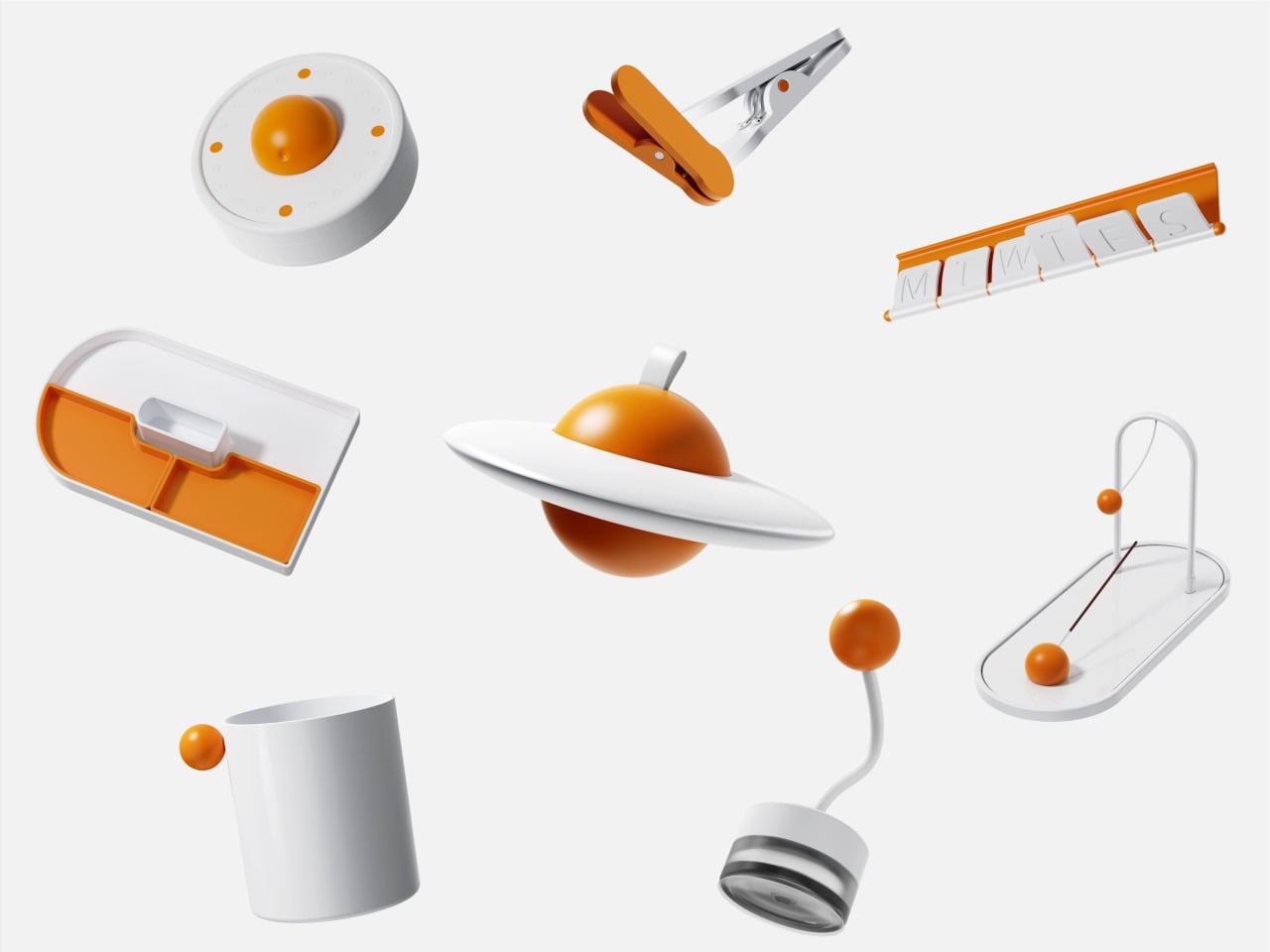
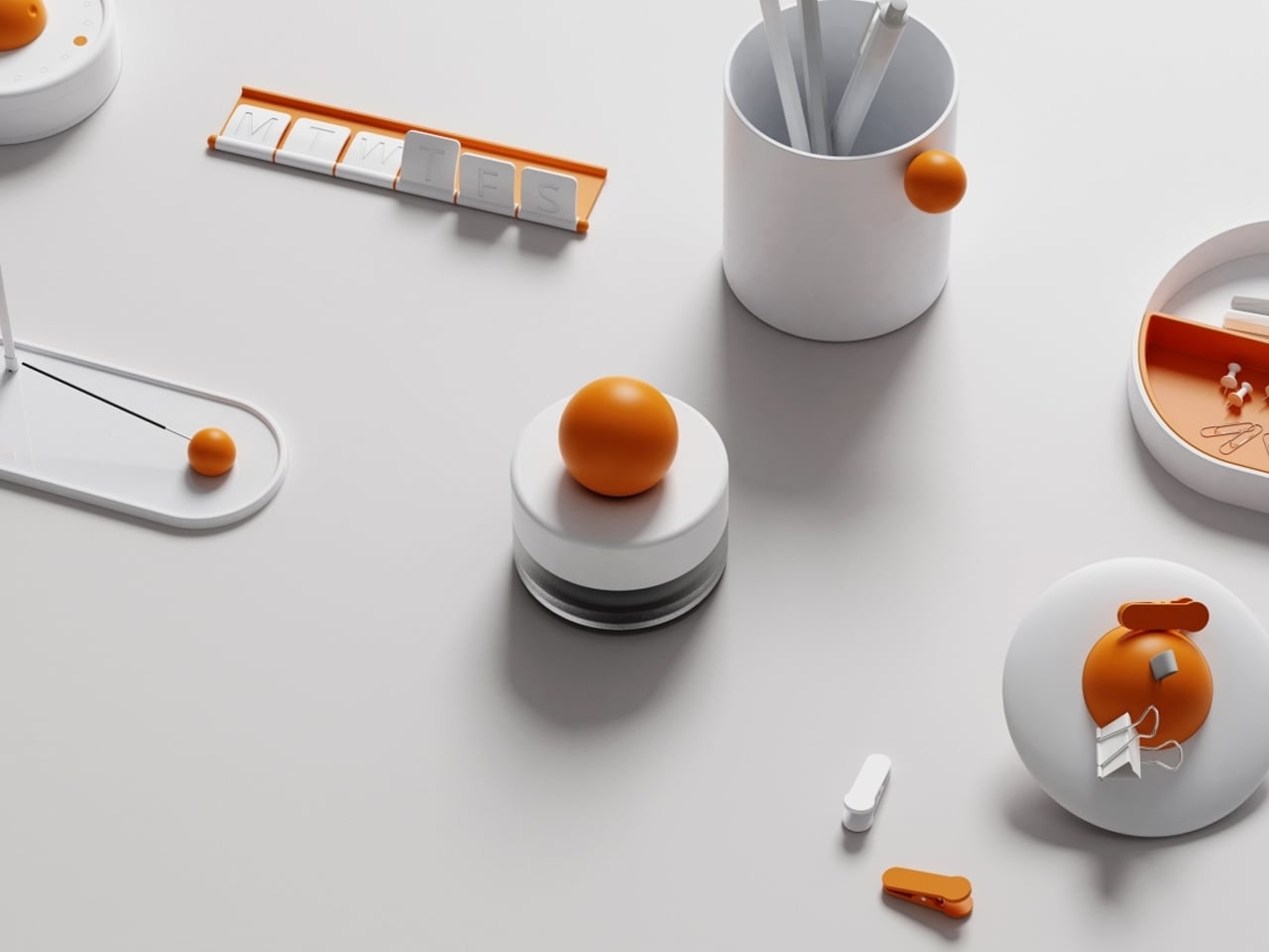
Objects on a desk quietly influence mood and thought throughout the day. While some environments lean toward minimal setups for clarity, others incorporate subtle moments of joy. The Madang collection by Jiung Yun, Siwook Lee, Jihyun Hong, and Junsu Lee brings these ideas together, balancing simplicity with a gentle sense of play inspired by traditional Korean childhood games.
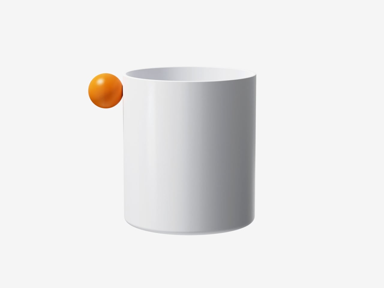
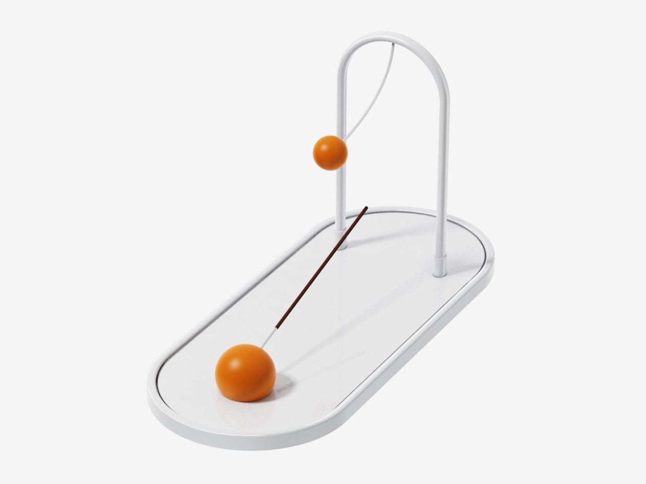
Each piece translates a familiar activity into a functional object. A wrist tool references tug-of-war, trays mirror playful ground layouts, and clips echo movement-based games, turning routine actions into engaging interactions. Even more abstract elements, like a circular timer or sculptural pen holder, carry narrative undertones. Finished in a soft white and orange palette, the collection remains visually calm yet expressive, adding character without clutter while making everyday work feel lighter and more thoughtful.

5. Joyful Building Design

Playful thinking is extending into architecture, reshaping how buildings and cities are experienced. The rigid “gray box” is gradually giving way to environments that encourage curiosity and movement. Designers are introducing spatial surprises into everyday settings, from slides integrated into workspaces to hidden gardens within facades and windows that break rigid grids to filter light in unexpected ways.

These interventions go beyond visual appeal. They disrupt routine and draw attention to the surroundings. A burst of color or an unconventional pathway shifts perception, encouraging awareness and engagement. As a result, architecture moves beyond shelter, becoming more interactive and expressive while transforming the built environment into something dynamic, human-centered, and quietly uplifting.
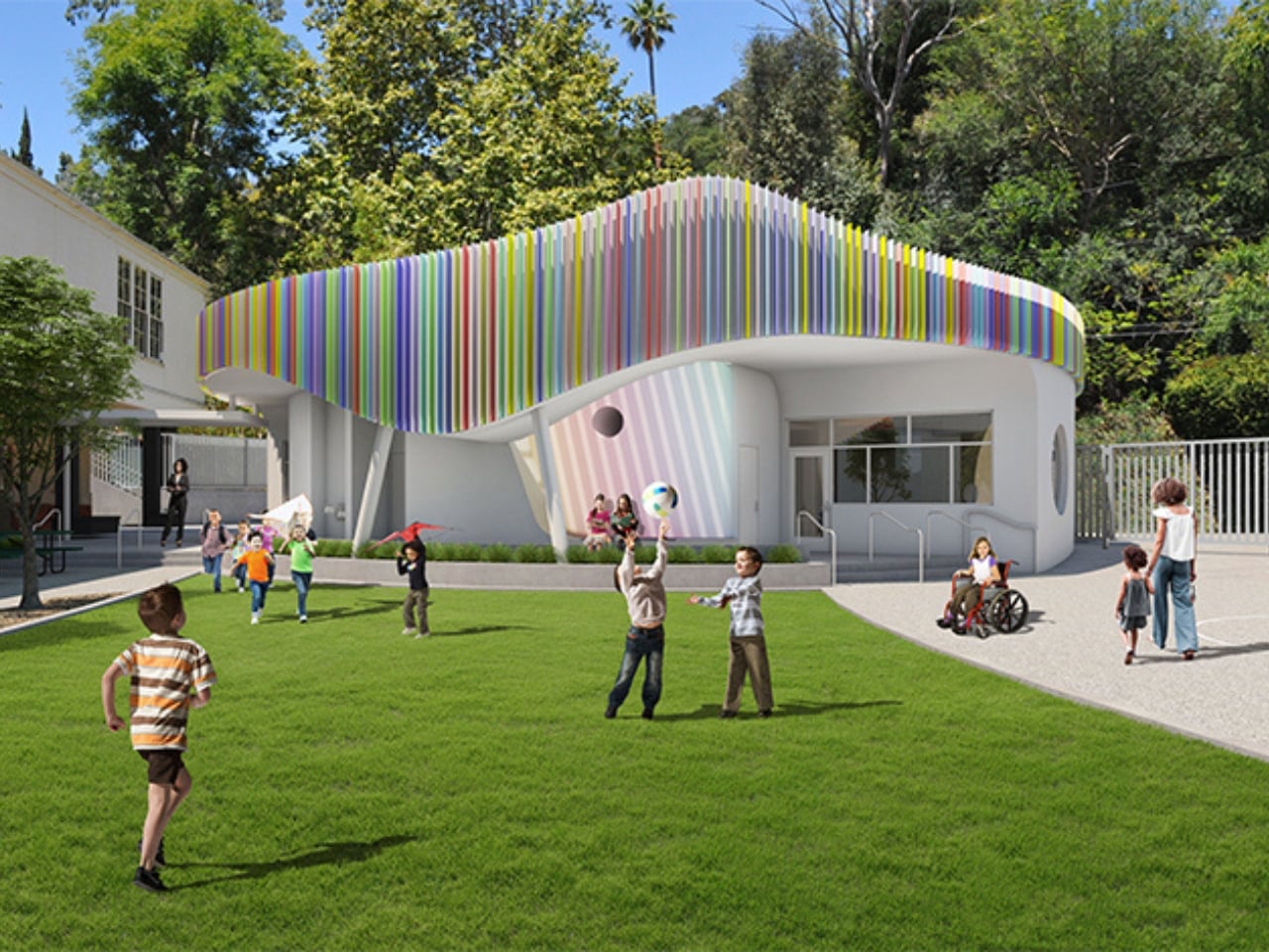
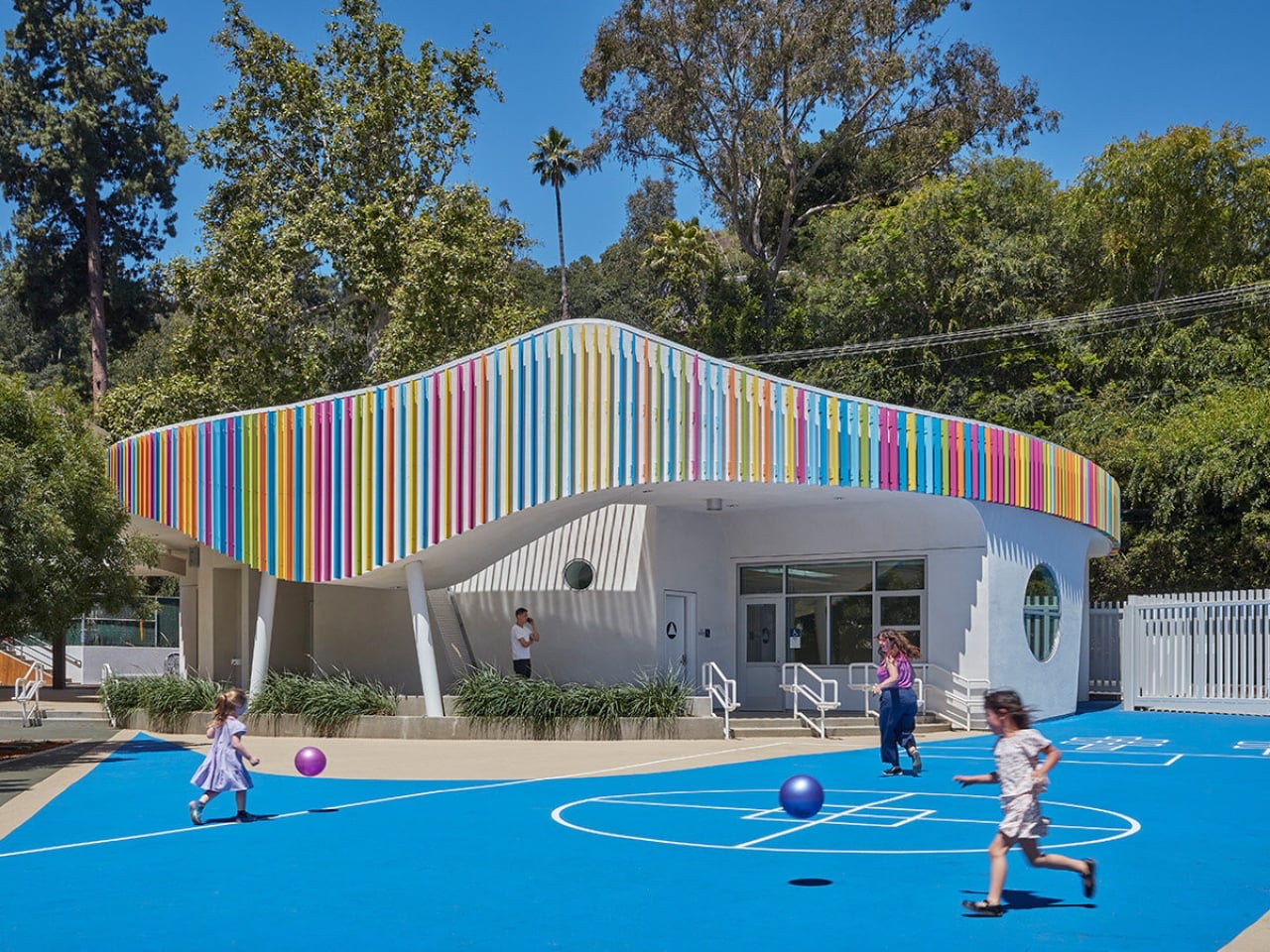
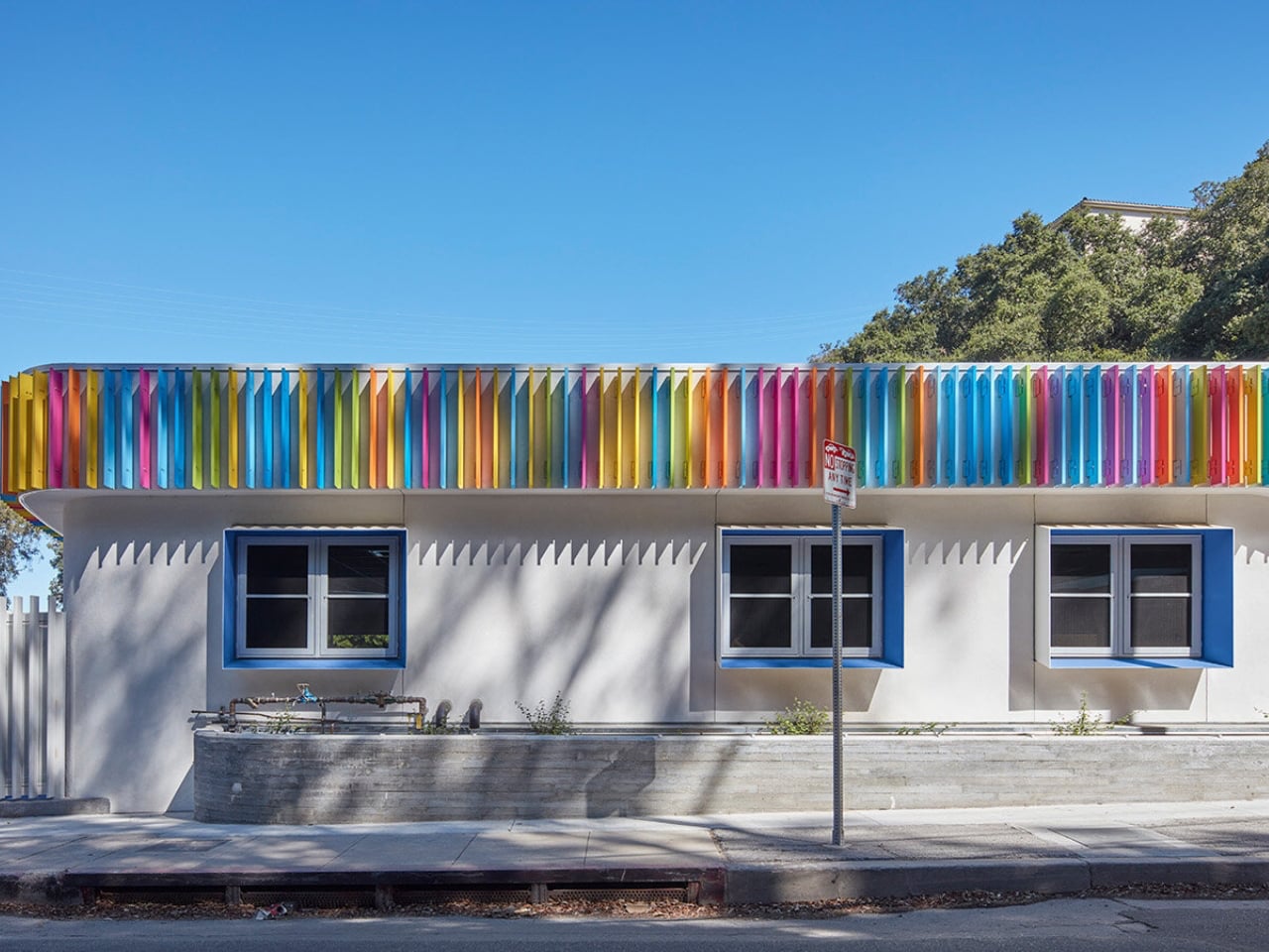
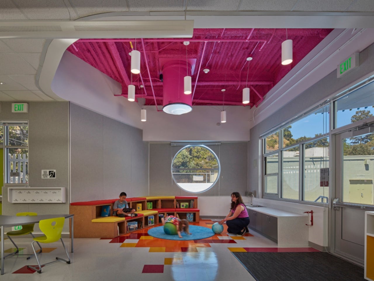
Most early school memories are tied to plain, boxy classrooms that felt more functional than inspiring. Spaces like these rarely encourage curiosity or creativity, making learning feel routine rather than exciting. In contrast, thoughtfully designed environments can shape how children engage with education. In Laurel Canyon, Los Angeles, Wonderland Elementary School’s new kindergarten building by John Friedman Alice Kimm Architects (JFAK) reimagines this experience through a design that feels open, engaging, and visually dynamic.
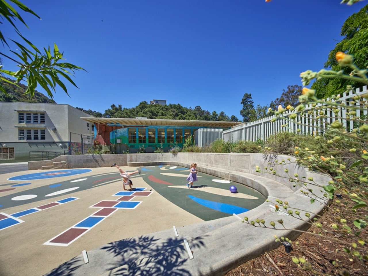
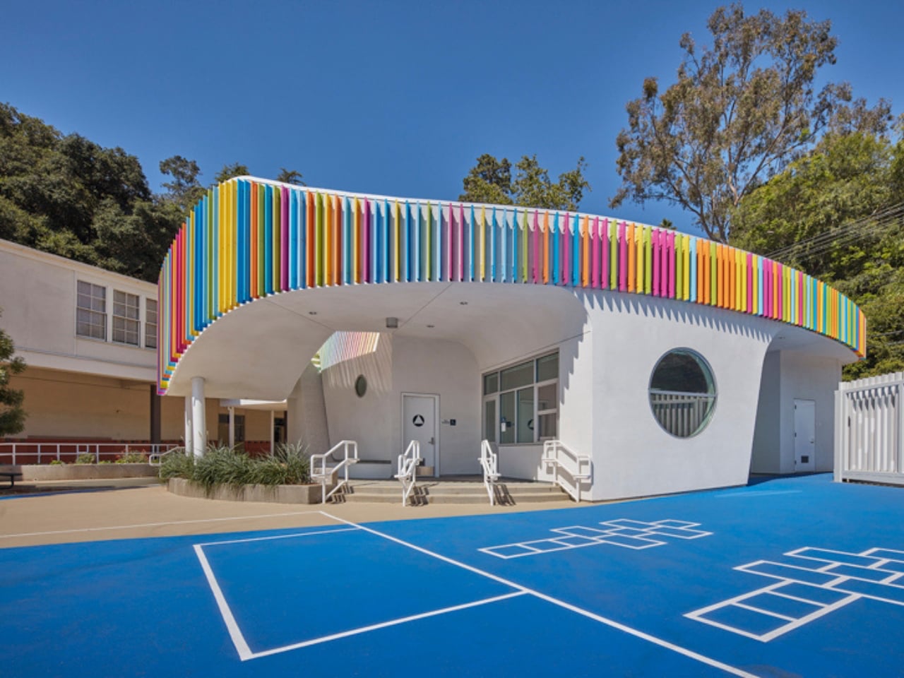
The structure stands out with its soft, curved form and colorful exterior louvers that filter sunlight into shifting patterns across the interiors. Inside, natural light pours in through skylights and solar tubes, creating a warm and welcoming atmosphere. Classrooms feature circular reading nooks, low seating, and accessible storage tailored for young learners. A semi-covered outdoor space encourages interaction and play, while exposed ceilings reveal structural elements, sparking curiosity. Designed with sustainability in mind, the building blends function with imagination, turning everyday learning into a more engaging and enriching experience.

Everyday objects still hold the power to surprise. When play enters function, design softens decision fatigue and digital burnout. Objects with wit and warmth transform spaces, turning routine into experience and making daily life feel more engaging, expressive, and alive.

The post These 5 Playful Everyday Objects Were Designed to Make You Feel Like a Kid Again first appeared on Yanko Design.
The Zig-Zag Chair That Shows Rimadesio at Its Most Expressive

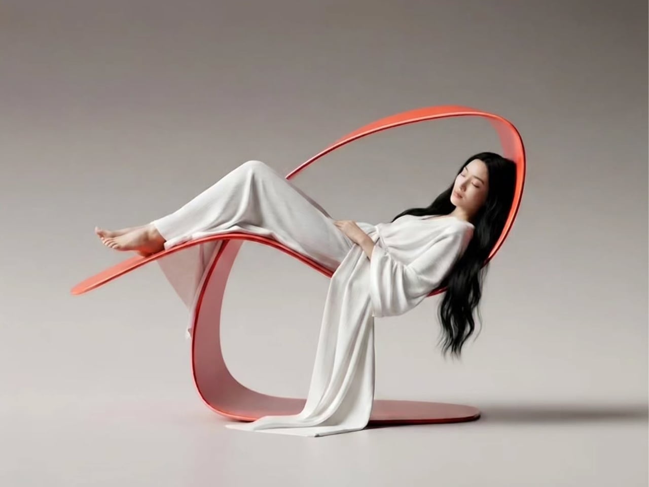
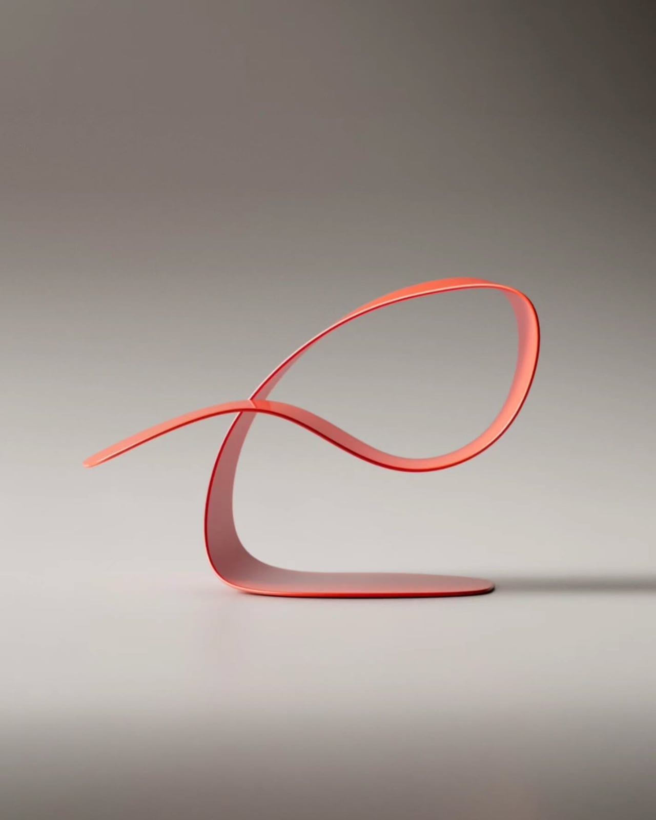
Every April, you could spend an entire week in Milan chasing novelty. Salone del Mobile is full of it: the flashy, the concept-heavy, the beautifully photographed pieces that look better in a press release than they ever would in a real room. That’s what makes the Ori chair by Giuseppe Bavuso for Rimadesio so easy to stop at. It looks just as interesting on paper as it probably does in person, and against everything else being shown this week, that’s already a significant thing.

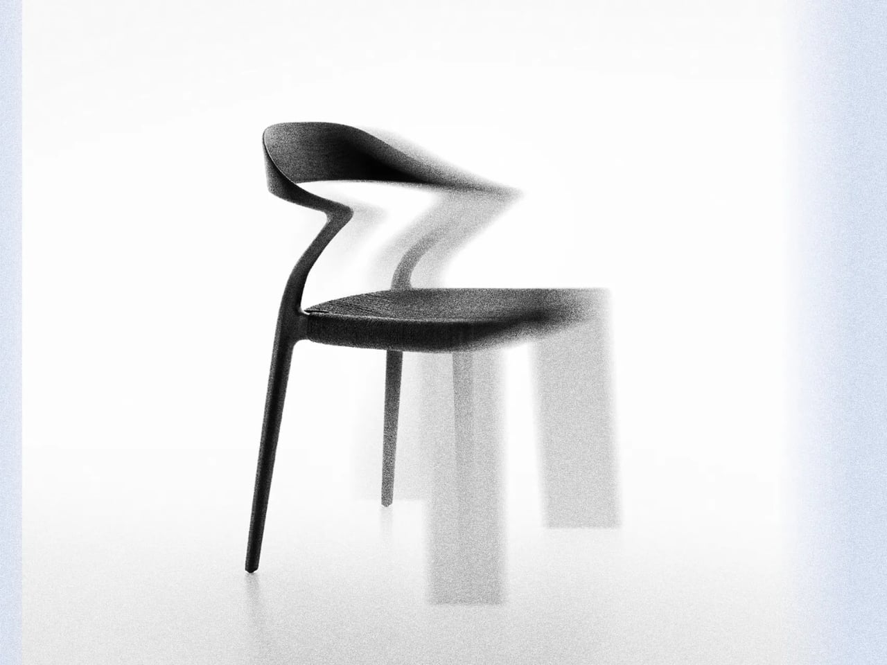
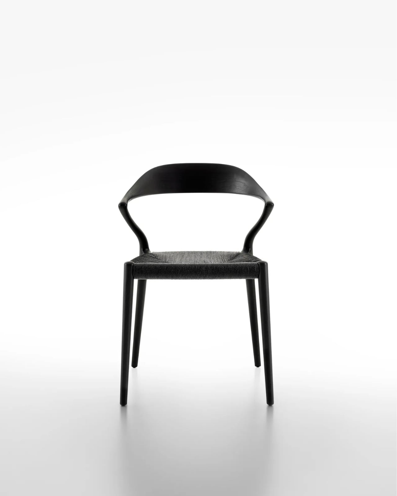
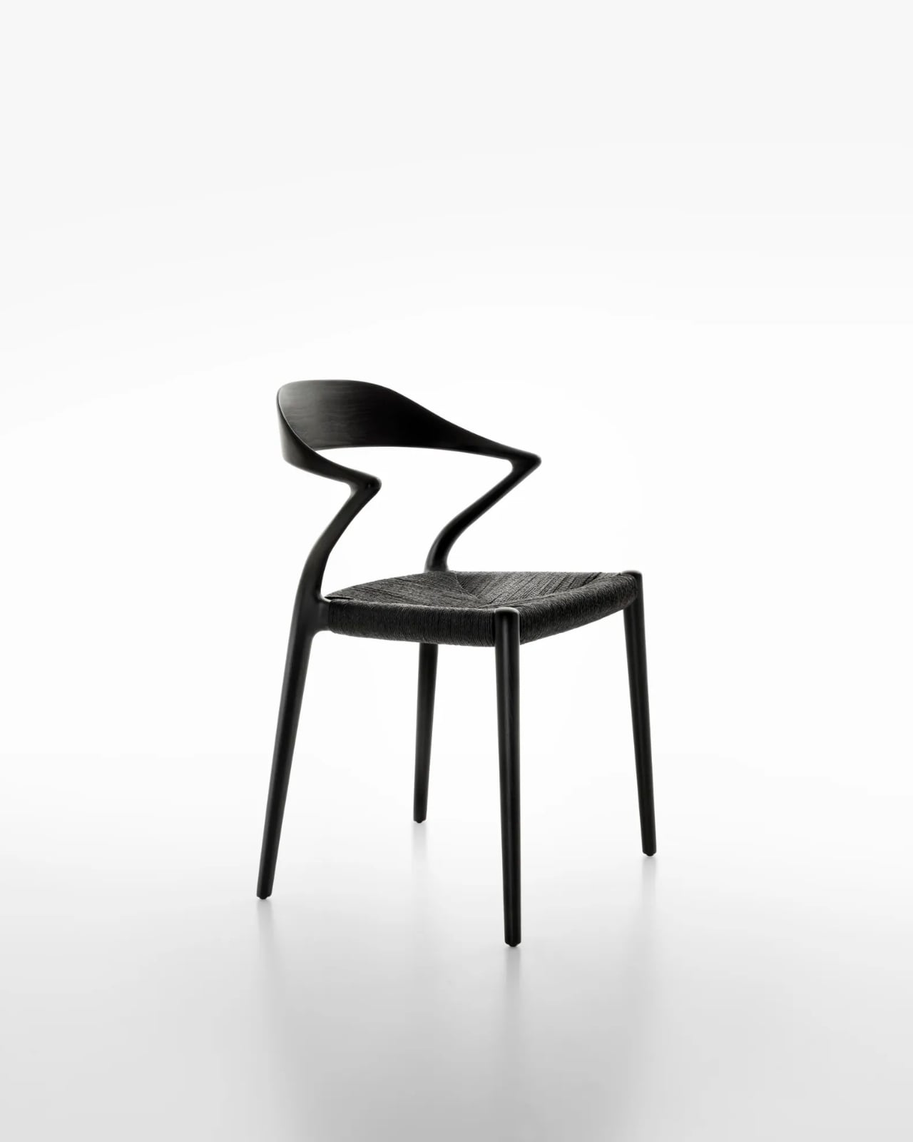
At its core, it’s a solid ash chair with a backrest. Except the backrest doesn’t go straight. It zigs. It zags. And somehow, it works with a kind of quiet conviction that makes you want to understand why.

Designer: Giuseppe Bavuso for Rimadesio

Rimadesio is not exactly a newcomer to this conversation. Founded in 1956 in the Brianza district north of Milan, the Italian brand has built its reputation around precision manufacturing and architectural intelligence. For decades, it has been the brand that architects reach for when they need sliding panels, modular shelving, or doors that close with the kind of satisfying weight that makes you feel like you live in a well-designed life. Furniture, in the traditional sense, has always played a supporting role. Ori feels like a shift.

Giuseppe Bavuso has been Rimadesio’s designer and art director for years, and the long-term relationship is visible in the collection’s consistency. There’s a particular design language at Rimadesio, one that values restraint without ever feeling cold. But Ori does something slightly different. The zig-zagging backrest introduces a kind of visual energy that isn’t typical of the brand. It feels expressive in a way Rimadesio rarely allows itself to be, turning the brand’s famous manufacturing precision toward something more overtly sculptural.

The choice of material matters here. Solid ash is warm, tactile, honest. It doesn’t pretend to be anything it isn’t, which makes it the right call for a piece that’s already making a visual argument with its form. Against the angular drama of the backrest, the naturalness of the wood acts as a stabilizer. The chair doesn’t feel aggressive or purely decorative. It feels considered. Like a piece that was worked out over a long time before anyone was allowed to see it.

The timing is also interesting. Rimadesio is celebrating its 70th anniversary at Salone del Mobile 2026 under the concept BECOMING, a theme that brings together design, architecture, art, and relationships. Introducing a chair as expressive as Ori at this particular moment feels intentional. Seventy years is long enough to have a strong point of view. It’s also long enough to know when to surprise people.

I think about this whenever I see brands with deep institutional histories try to evolve. It doesn’t always land. Sometimes it reads as a brand chasing relevance instead of generating it, making louder and louder declarations in the hope that someone notices. But Ori doesn’t feel like that. It feels like a designer who has been sitting with an idea for a while, one that has been refined until it became undeniable.

Design, at its best, has an opinion. It makes a choice and defends it without apology. The Ori chair’s backrest could have been straight. It wasn’t. That single decision, seemingly small, changes the entire character of the piece. It makes a chair worth looking at twice, which is harder to achieve than it sounds when you’re working in a material as familiar as wood. Whether or not you’d put it in your home is almost beside the point. Ori is the kind of piece that expands the conversation about what a chair can be, especially within the vocabulary of a brand that has spent seven decades being impeccably precise rather than openly expressive. The fact that both qualities now exist side by side in this chair is what makes it compelling.

Milan Design Week runs April 20 to 26, and if you’re in the area and you’re curious to see Ori in person, you should go. Some pieces change when you’re standing in front of them. I have a feeling this is one of them.

The post The Zig-Zag Chair That Shows Rimadesio at Its Most Expressive first appeared on Yanko Design.
Ripple Shelf’s Wavy Wooden Sides Are Actually a Tool-Free Height System

Most adjustable shelving systems make a quiet trade-off. To offer flexibility, they rely on rail channels, pin holes, or brackets that work well enough but bring a decidedly utilitarian look to any room. The result is a shelf that adapts to your needs but rarely looks like it was designed with much intention beyond storage. Hiding the hardware means losing flexibility; keeping it means living with it.

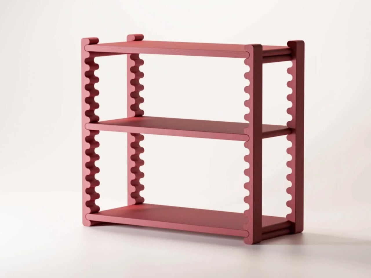
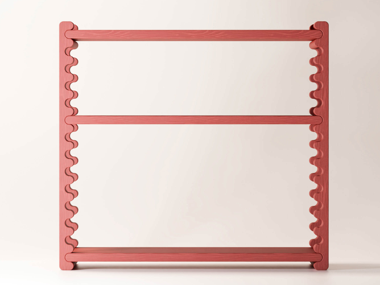
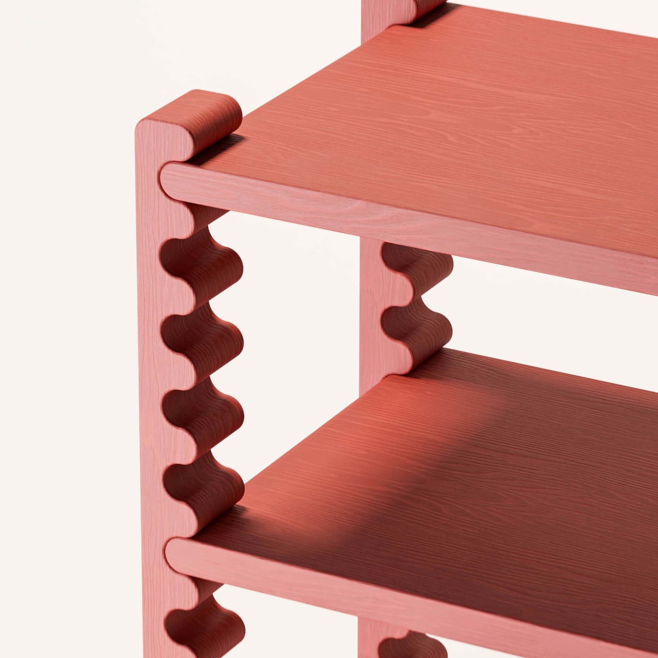
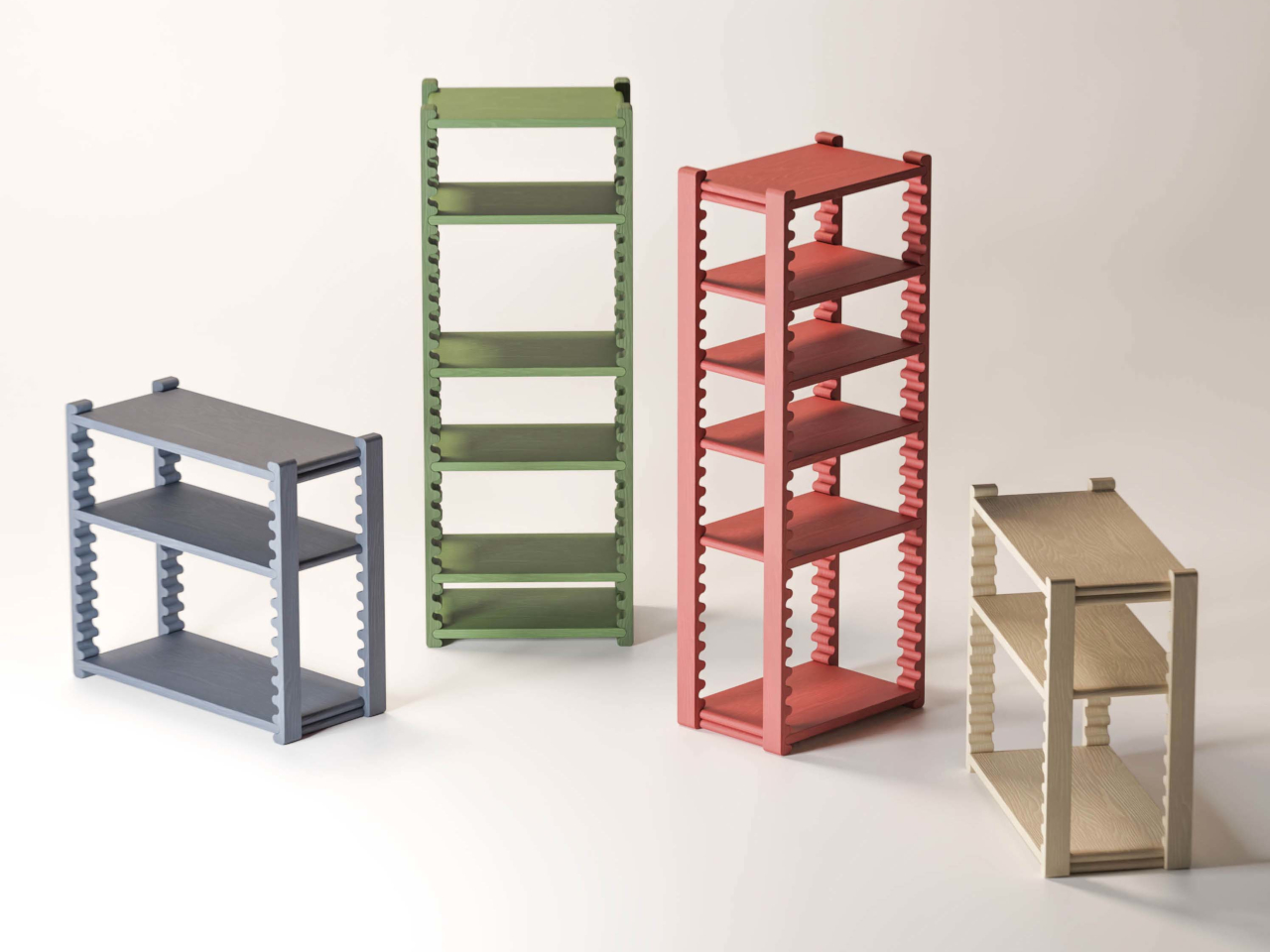
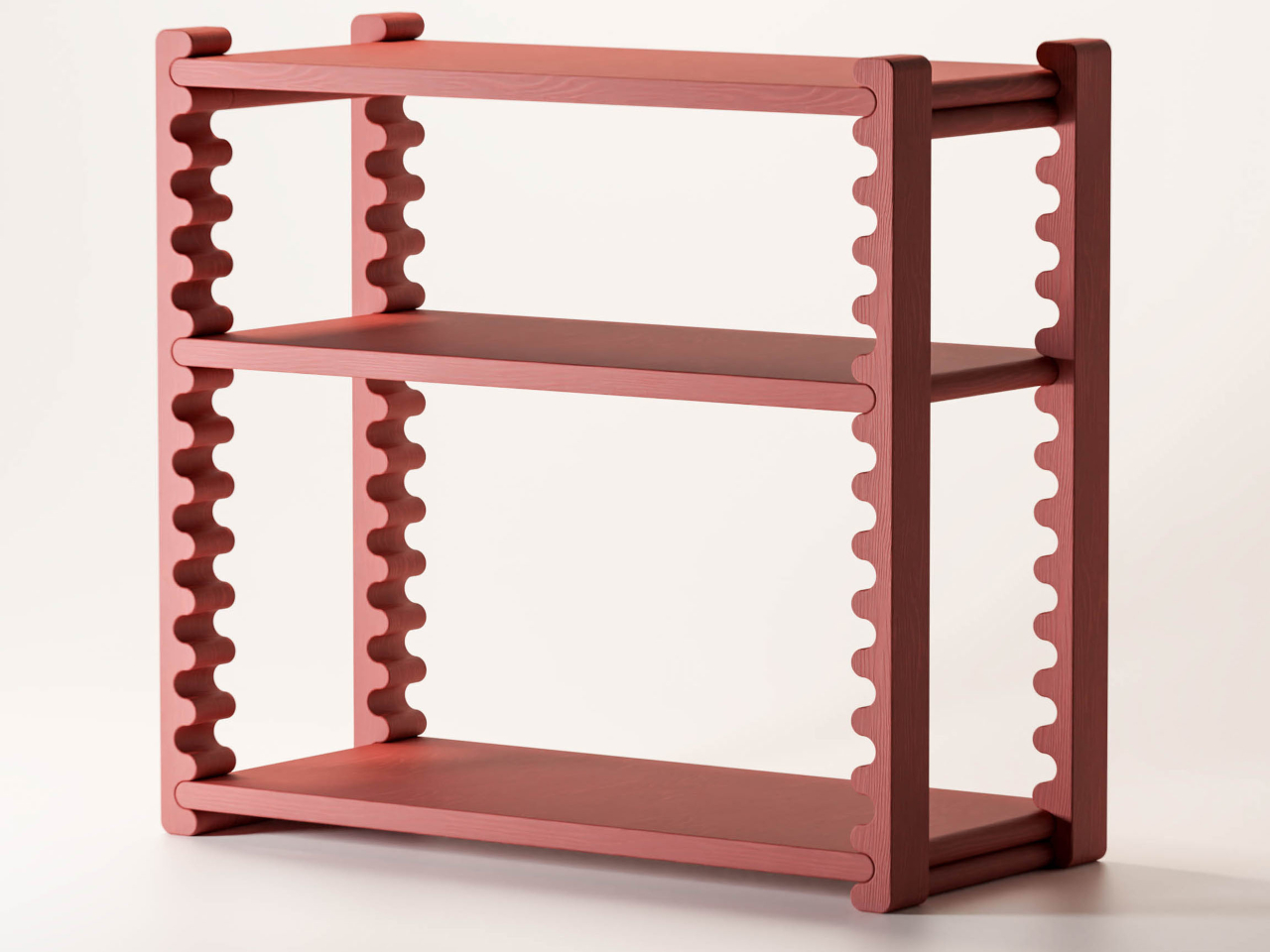
The Ripple Shelf from Sarajevo-based Dilema Studio takes a different approach, one where the shelf’s most visually distinctive element is also its adjustment mechanism. The vertical supports on each side run the full height of the frame in an undulating rippled profile. Those waves aren’t decorative flourishes; they’re guides. The middle shelves slot into them and can be repositioned to different heights without any tools or additional hardware.

Designer: Ermin Alić (Studio Dilema)

The logic here is pretty satisfying. Instead of adding a separate tracking or pinning system, Dilema embedded the mechanism directly into the form. The rippled surface of each support creates natural stopping points along the length of the frame, so positioning a shelf is as intuitive as sliding it into place. There’s nothing to install, nothing to adjust, and nothing to lose at the back of a drawer.

That practicality matters more than it might seem. Someone styling a home office one season and reorganizing it as their book collection doubles doesn’t need to buy a new shelf; they just move the existing ones. A family using the same unit to hold kids’ toys and, later, a collection of records and plants has one piece that grows with the space. The shelf changes; the shelf unit doesn’t.

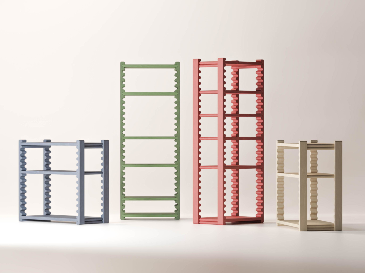
The frame’s fixed top and bottom shelves keep everything stable while the interior remains open to change. Made from beech wood and measuring 750 × 350 × 800 mm, it comes in several color options, including terracotta, sage green, slate blue, and a natural off-white, each with a solid stain that lets the grain show through. The compact footprint makes it workable in tighter rooms without sacrificing capacity.

The system shows up in multiple size configurations, from compact low units to taller multi-shelf towers, giving it range across different rooms and storage needs. That versatility suits living rooms particularly well, where displaying and organizing things often need to share the same piece of furniture. A shelf for ceramics, a lower one for books, a bottom slot for a basket; the spacing adjusts to whatever the situation asks for.

What keeps the Ripple Shelf from being just another clever-but-impractical furniture concept is that it’s genuinely usable. The ripple mechanism doesn’t require any special technique or learning curve; you move a shelf, and it sits where you put it. It’s the kind of furniture that gets better over time, not because it wears in any particular way, but because it stays genuinely useful as what you put on it changes.

The post Ripple Shelf’s Wavy Wooden Sides Are Actually a Tool-Free Height System first appeared on Yanko Design.
A Bookrack That Started as a Rectangle and Refused to Stay One

Most furniture design starts with a question about function and ends there. Deniz Aktay, the designer behind the studio @dezinobjects, apparently decided to start with geometry instead, and the result is one of the most quietly clever storage pieces I’ve come across in a while: the Barrow Bookrack.

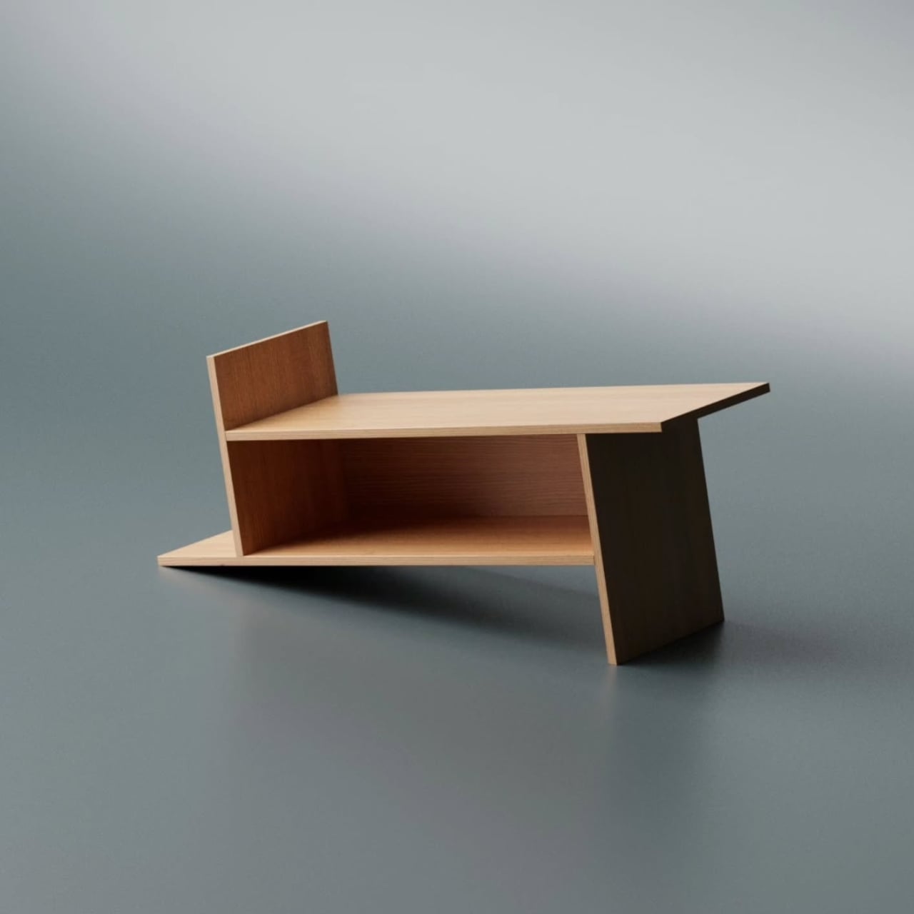
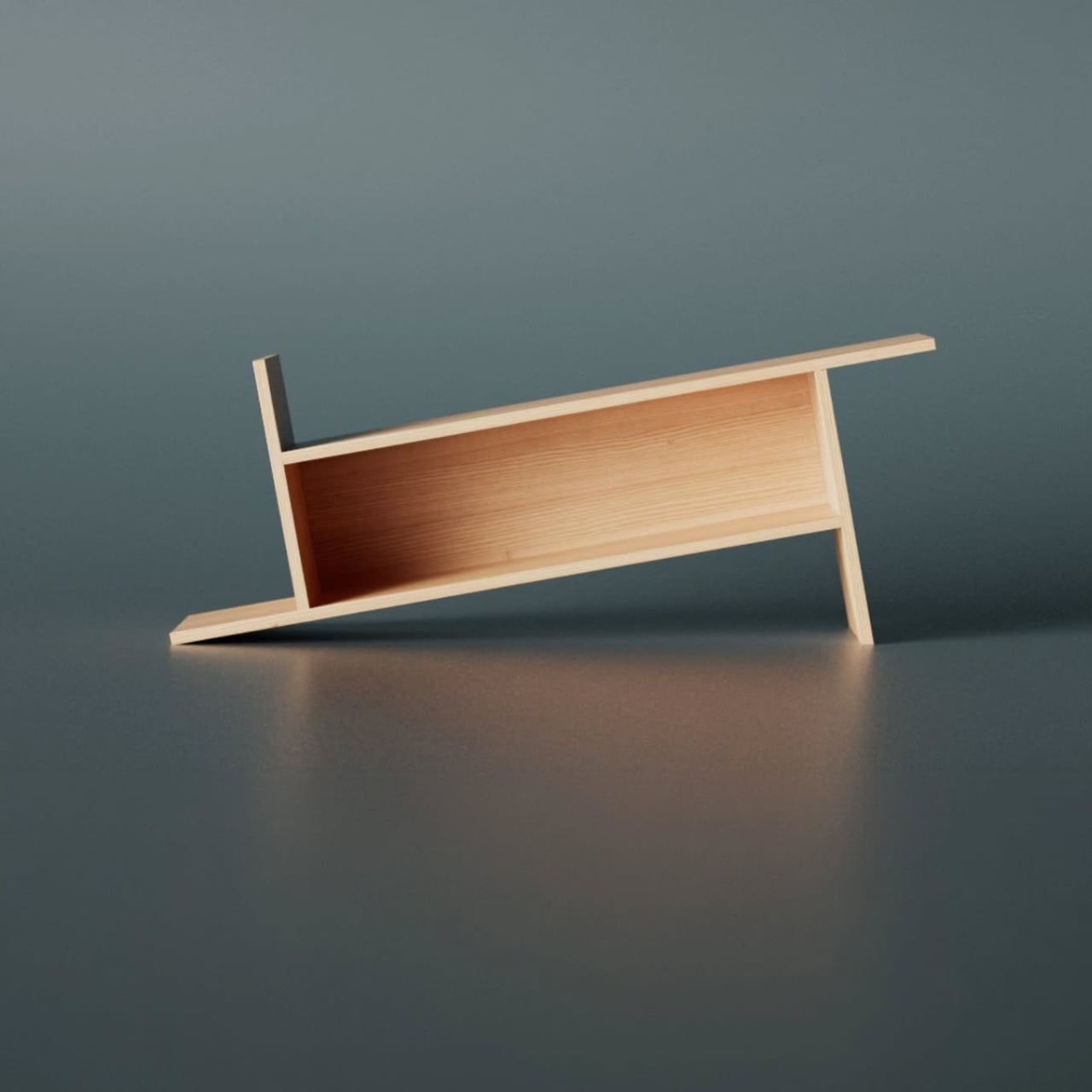
The concept is almost laughably simple to explain, which is exactly why it works. Take a rectangle. Extend each of its lines on one side only. That’s it. That’s the whole idea. And yet, what comes out the other end of that single decision is a bookrack that feels caught mid-motion, leaning into itself, its proportions oddly satisfying in a way that’s difficult to immediately place. On paper, it barely sounds like a design at all. In person, it’s all you notice.

Designer: Deniz Aktay

Looking at it from a distance, the Barrow tilts at an angle that initially reads as precarious. It looks like it could tip at any moment, like a shelf that forgot to stand up straight. But it doesn’t. The asymmetry is intentional and controlled, and that’s exactly the kind of design choice that separates a well-considered piece from something that only looks interesting in renders. The structure holds, both physically and visually. The angular feet, the jutting top ledge, the open body sitting between them: everything is doing something.

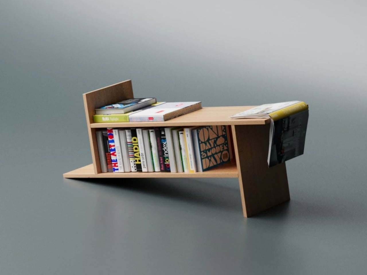
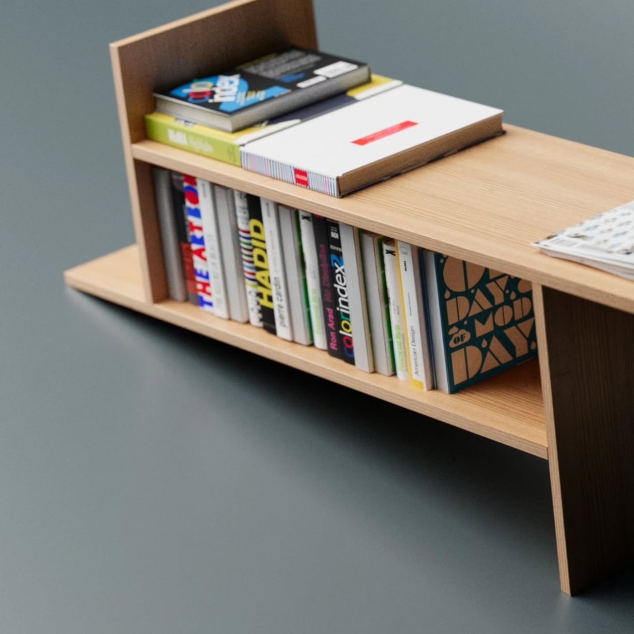
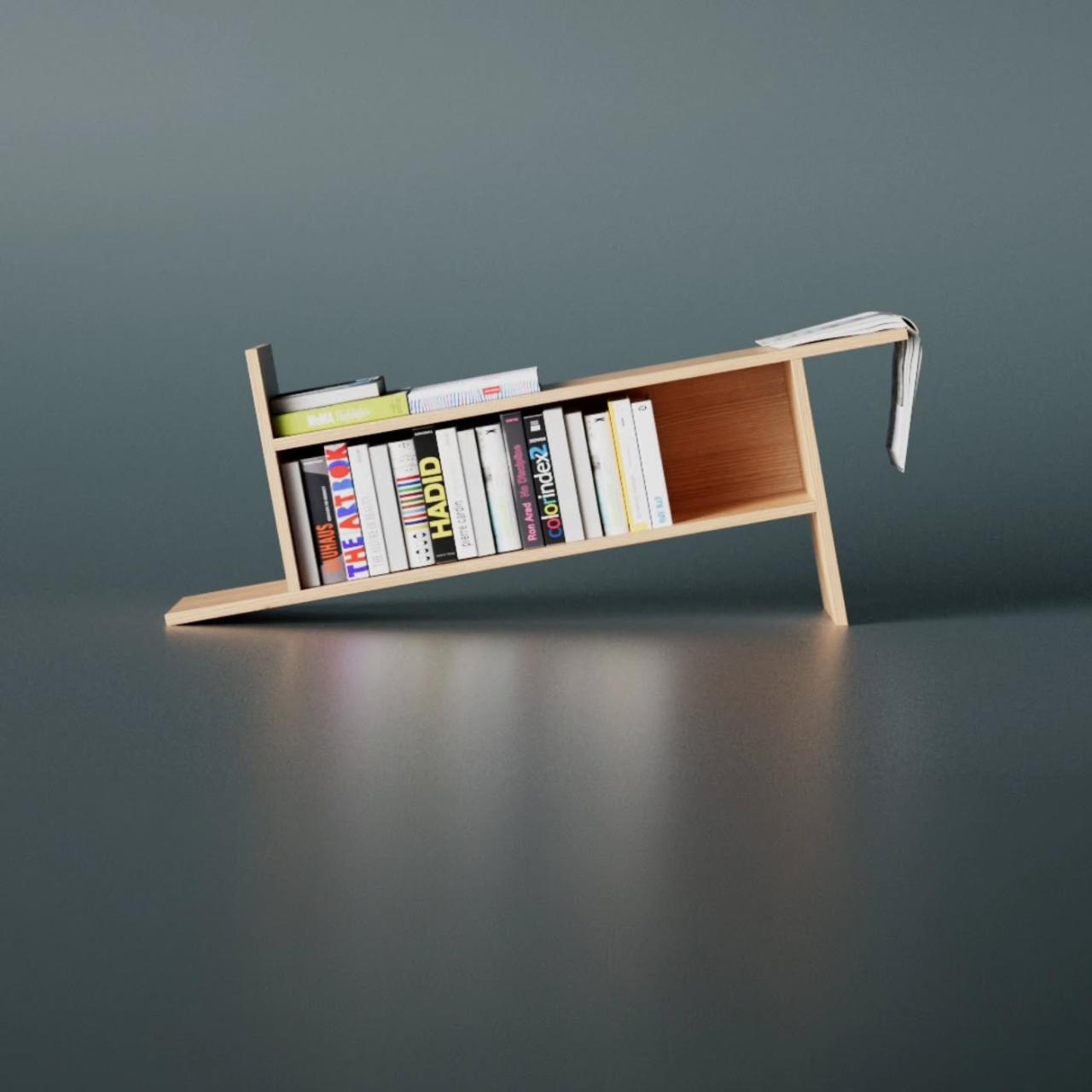
The name is worth pausing on. A barrow, the traditional kind, is a simple carrying frame stripped back to its essential parts. Nothing extra, nothing decorative, just the minimum structure required to move something from one place to another. Aktay’s Barrow carries that same philosophy. Every extended edge and protruding surface earns its place. The result is a range of storage spots, each with its own character. Books stand upright in the central cavity. Larger volumes or stacked titles settle onto the flat extended surfaces. A magazine slipped sideways into one of the outer ledges feels like it was always meant to sit there.

This is the kind of piece that rewards being actually used. A lot of beautiful storage objects suffer from what I’d call the trophy problem: they look better empty than full. Barrow is the opposite. Load it with design books, art monographs, a worn paperback or two, and it genuinely improves. The varying heights, the mix of orientations, the textures of spines pressed against pale wood, it all adds up into something that feels lived in rather than staged. The structure becomes a frame for your reading life rather than something competing with it.

Aktay has explored this kind of thinking before. His earlier Bookgroove piece was a sculptural bookrack-table hybrid that played with the idea of furniture as form. Barrow feels like a sharper, more edited version of that same instinct: fewer moves, more precision. There’s less drama in the silhouette, but the restraint makes it more liveable. A piece like this can sit in a living room, a studio, or a bedroom and feel contextually right without demanding too much visual real estate from the room around it. It has presence without insistence, which is a harder balance to strike than it sounds.

The part that keeps pulling me back to this design is how naturally it moves from a flat idea to a physical one. The Barrow is essentially a graphic concept made tangible, a line drawing that decided to become furniture. The form evolved directly from extending lines on a flat surface before anything was actually built, and seeing that logic translated so cleanly into wood makes the whole thing click. The render and the physical piece are telling the same story, which is rarer in furniture design than it ought to be.

Furniture, at its best, makes you reconsider something you assumed was already settled. You’ve seen hundreds of bookshelves. You’ve probably owned a few. The Barrow doesn’t try to be revolutionary. It just extends a line a little further than expected, and somehow that’s enough to change the whole conversation.

The post A Bookrack That Started as a Rectangle and Refused to Stay One first appeared on Yanko Design.
A Bookrack That Started as a Rectangle and Refused to Stay One

Most furniture design starts with a question about function and ends there. Deniz Aktay, the designer behind the studio @dezinobjects, apparently decided to start with geometry instead, and the result is one of the most quietly clever storage pieces I’ve come across in a while: the Barrow Bookrack.

The concept is almost laughably simple to explain, which is exactly why it works. Take a rectangle. Extend each of its lines on one side only. That’s it. That’s the whole idea. And yet, what comes out the other end of that single decision is a bookrack that feels caught mid-motion, leaning into itself, its proportions oddly satisfying in a way that’s difficult to immediately place. On paper, it barely sounds like a design at all. In person, it’s all you notice.

Designer: Deniz Aktay

Looking at it from a distance, the Barrow tilts at an angle that initially reads as precarious. It looks like it could tip at any moment, like a shelf that forgot to stand up straight. But it doesn’t. The asymmetry is intentional and controlled, and that’s exactly the kind of design choice that separates a well-considered piece from something that only looks interesting in renders. The structure holds, both physically and visually. The angular feet, the jutting top ledge, the open body sitting between them: everything is doing something.

The name is worth pausing on. A barrow, the traditional kind, is a simple carrying frame stripped back to its essential parts. Nothing extra, nothing decorative, just the minimum structure required to move something from one place to another. Aktay’s Barrow carries that same philosophy. Every extended edge and protruding surface earns its place. The result is a range of storage spots, each with its own character. Books stand upright in the central cavity. Larger volumes or stacked titles settle onto the flat extended surfaces. A magazine slipped sideways into one of the outer ledges feels like it was always meant to sit there.

This is the kind of piece that rewards being actually used. A lot of beautiful storage objects suffer from what I’d call the trophy problem: they look better empty than full. Barrow is the opposite. Load it with design books, art monographs, a worn paperback or two, and it genuinely improves. The varying heights, the mix of orientations, the textures of spines pressed against pale wood, it all adds up into something that feels lived in rather than staged. The structure becomes a frame for your reading life rather than something competing with it.

Aktay has explored this kind of thinking before. His earlier Bookgroove piece was a sculptural bookrack-table hybrid that played with the idea of furniture as form. Barrow feels like a sharper, more edited version of that same instinct: fewer moves, more precision. There’s less drama in the silhouette, but the restraint makes it more liveable. A piece like this can sit in a living room, a studio, or a bedroom and feel contextually right without demanding too much visual real estate from the room around it. It has presence without insistence, which is a harder balance to strike than it sounds.

The part that keeps pulling me back to this design is how naturally it moves from a flat idea to a physical one. The Barrow is essentially a graphic concept made tangible, a line drawing that decided to become furniture. The form evolved directly from extending lines on a flat surface before anything was actually built, and seeing that logic translated so cleanly into wood makes the whole thing click. The render and the physical piece are telling the same story, which is rarer in furniture design than it ought to be.

Furniture, at its best, makes you reconsider something you assumed was already settled. You’ve seen hundreds of bookshelves. You’ve probably owned a few. The Barrow doesn’t try to be revolutionary. It just extends a line a little further than expected, and somehow that’s enough to change the whole conversation.

The post A Bookrack That Started as a Rectangle and Refused to Stay One first appeared on Yanko Design.
Konstantin Grcic Finally Designed the Office Desk We Needed

We’ve been designing office desks essentially the same way for decades. Four legs, a flat surface, maybe a drawer if you’re lucky, and an ergonomic chair that costs more than your first car. So when Vitra and German industrial designer Konstantin Grcic quietly dropped the Scout Work Mobile just last month, I paid close attention.
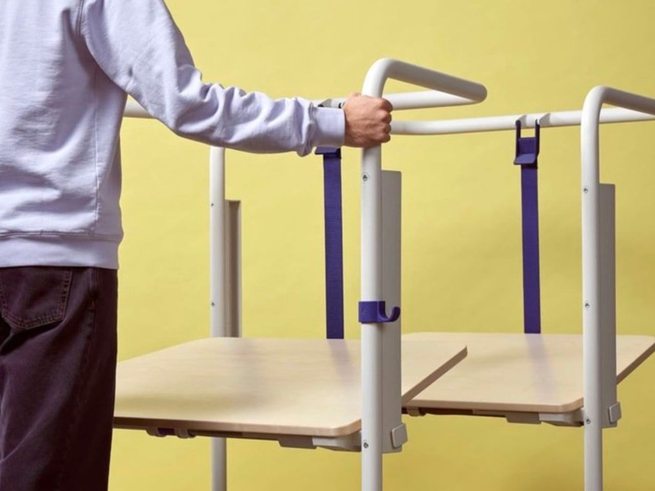
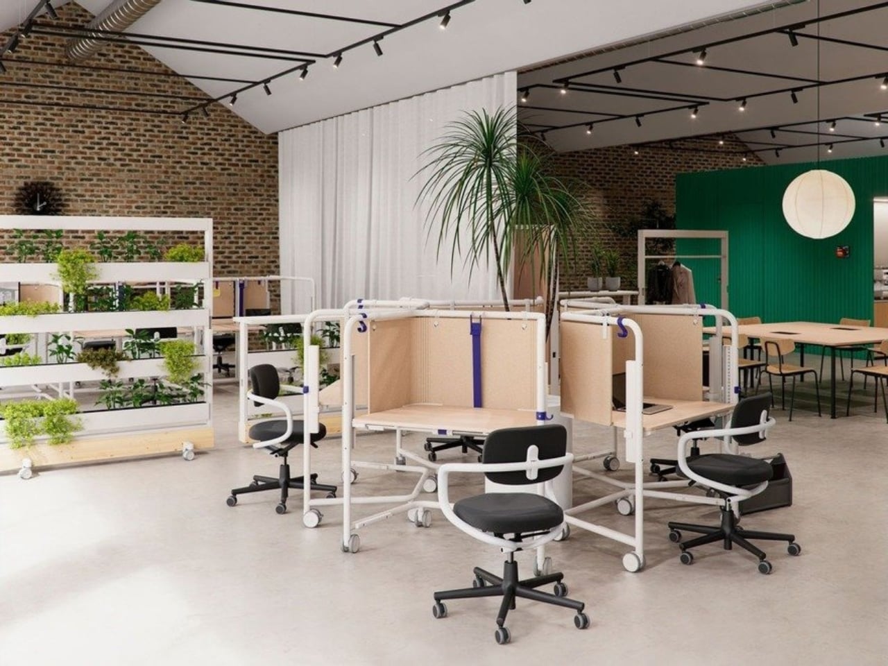
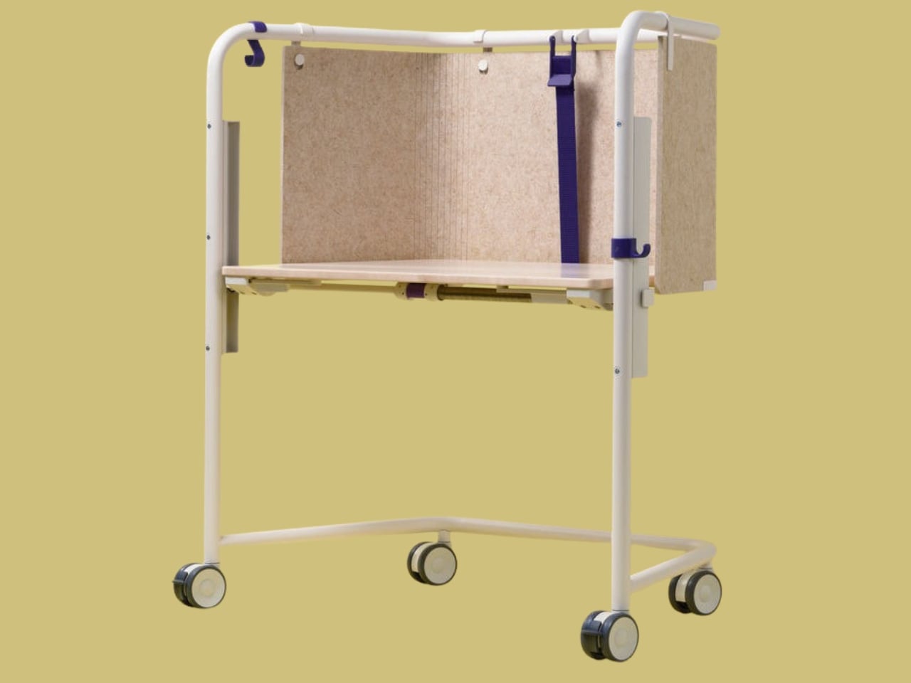
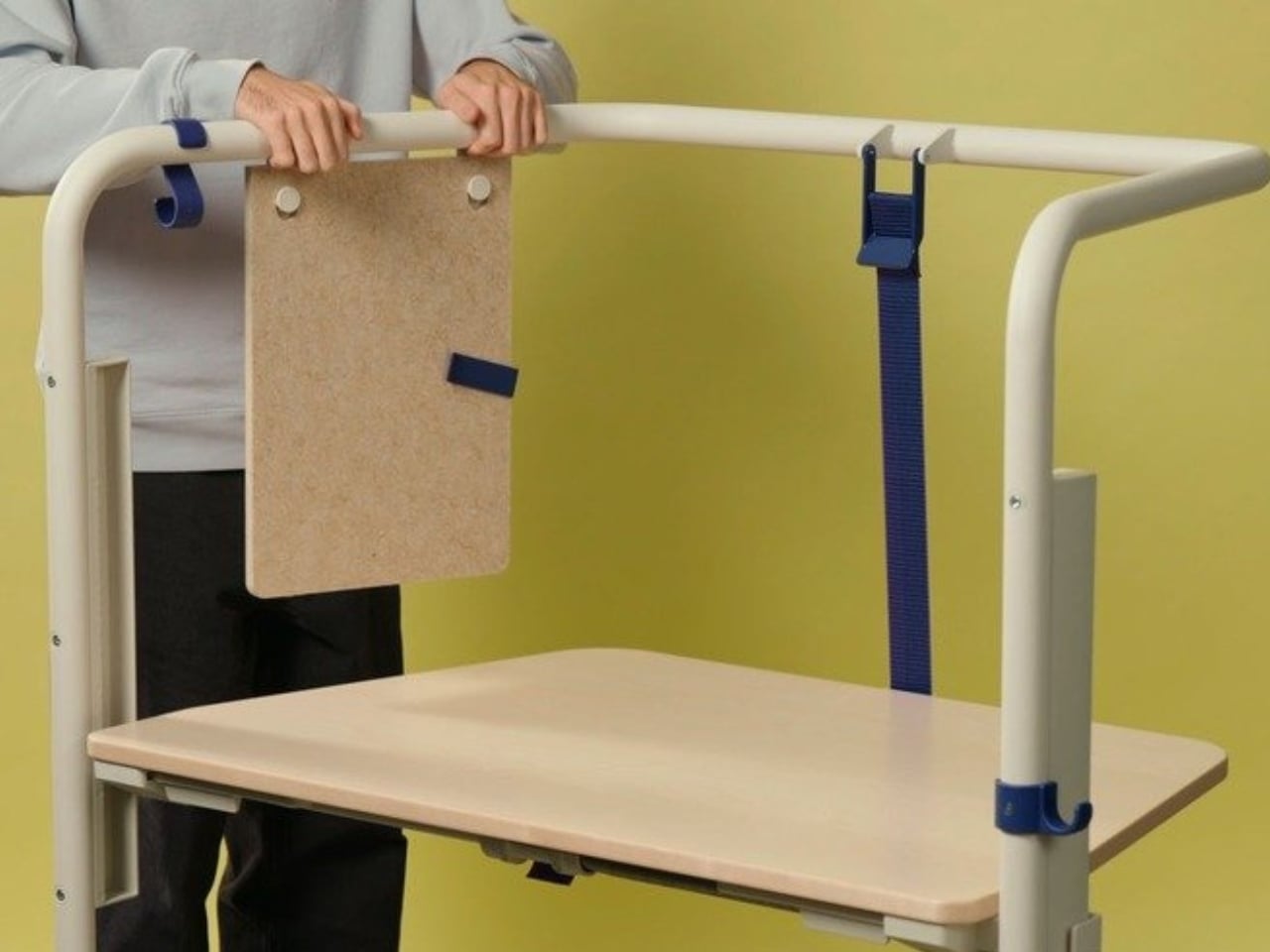
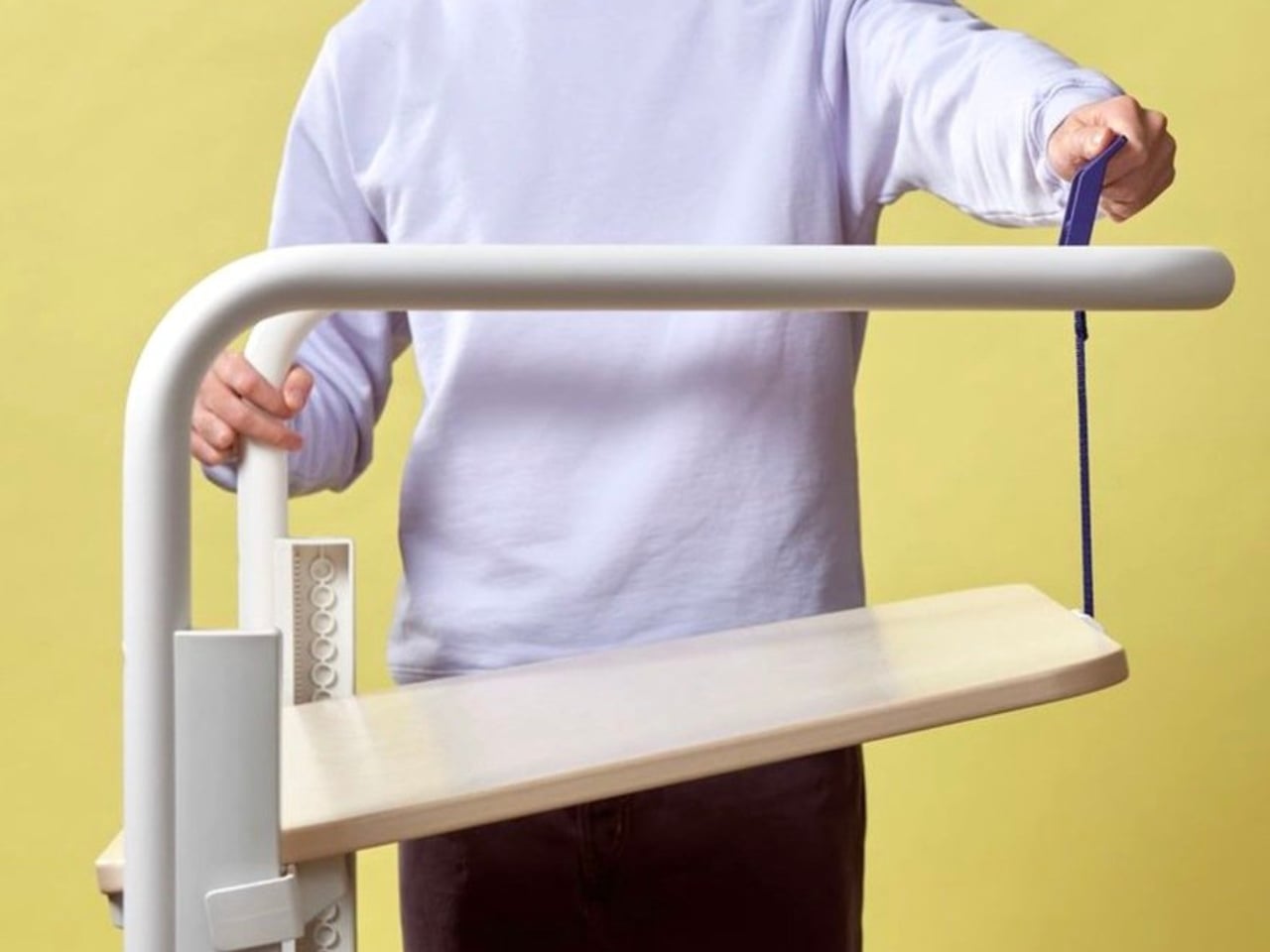
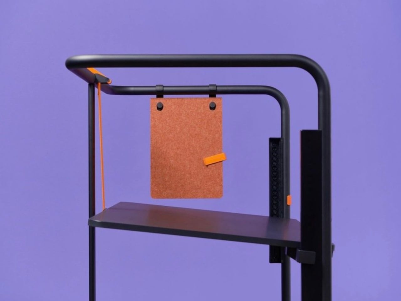
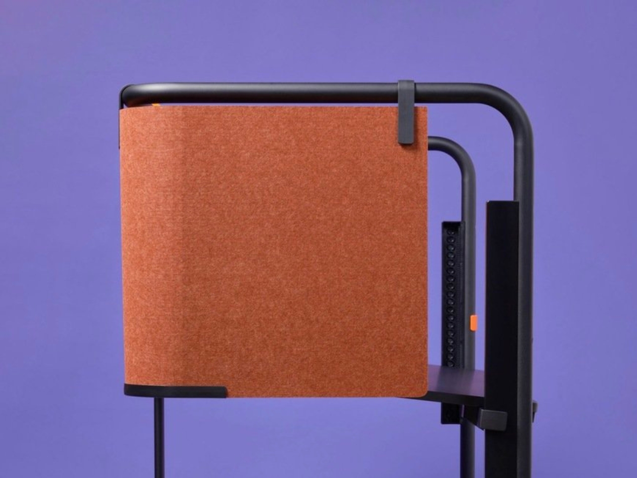
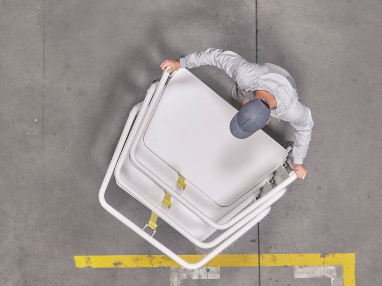
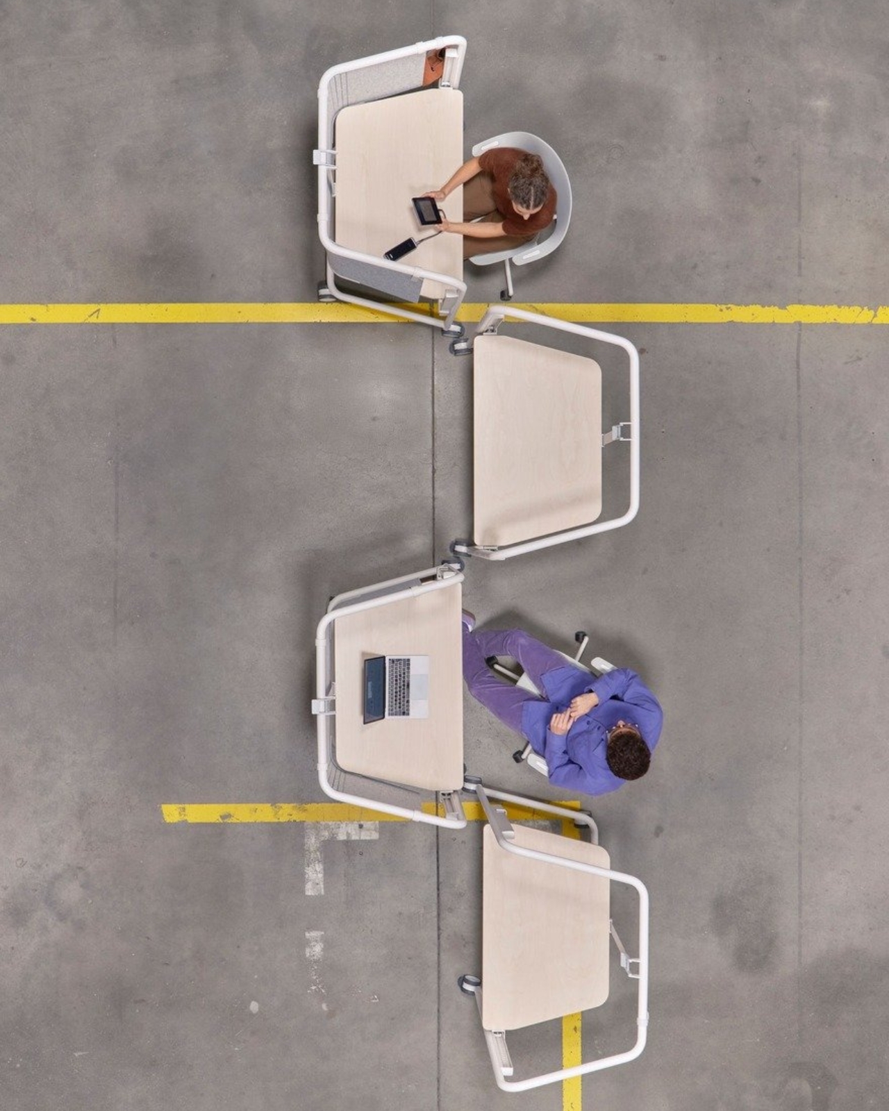
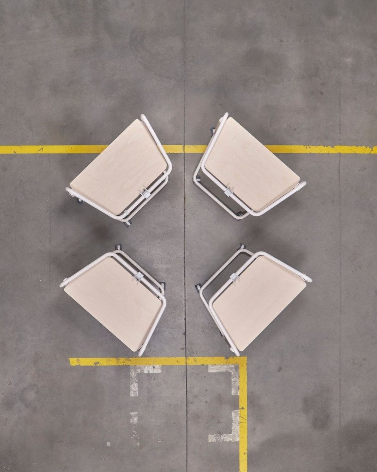
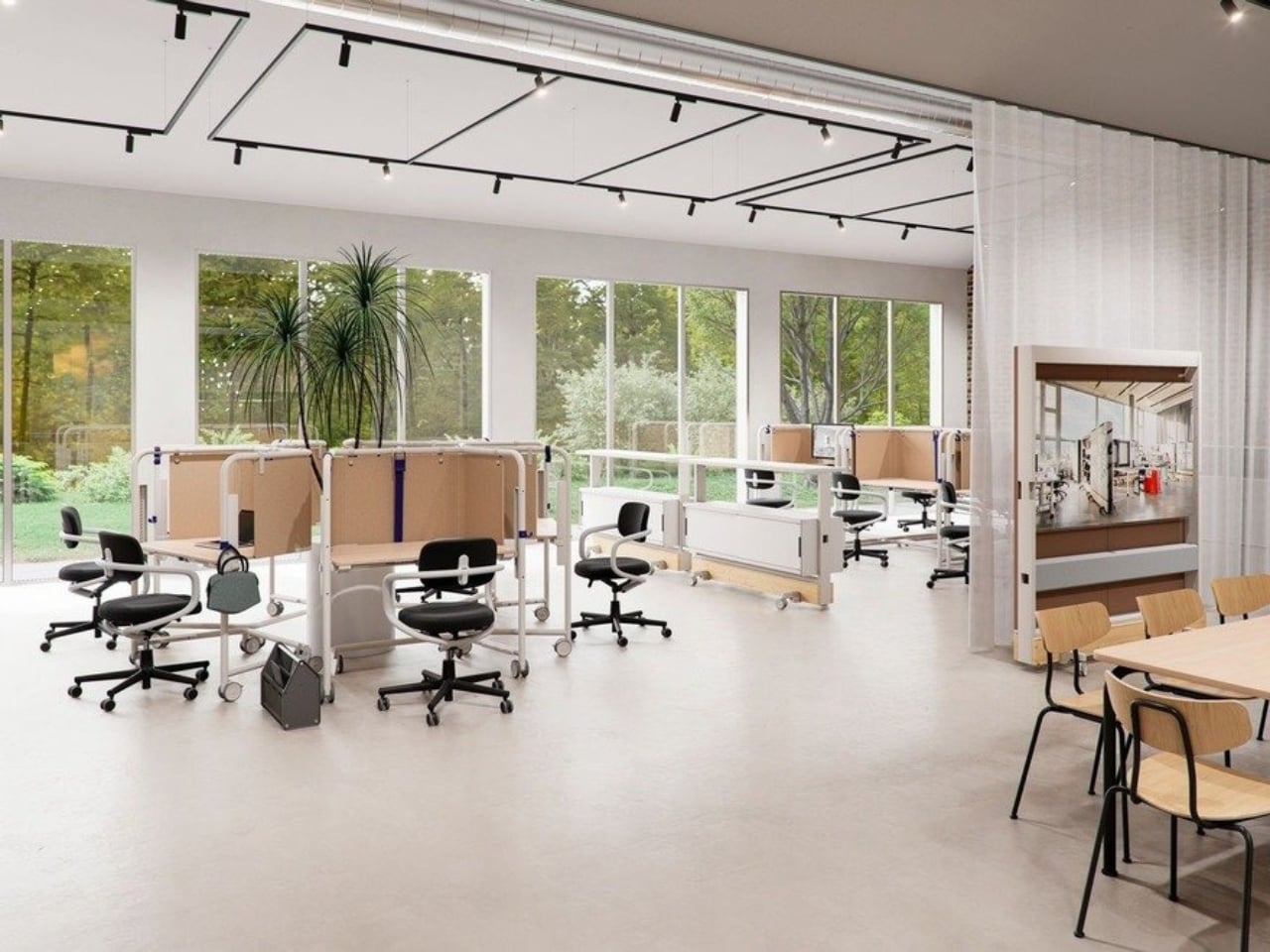
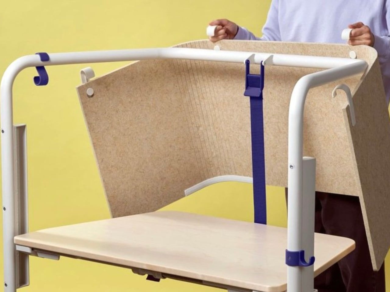
The Scout Work Mobile is part of a larger family of workstation and meeting tables simply called Scout, launched on March 19 of this year. The collection comprises five pieces ranging from stationary desks to mobile variants, and it’s Grcic’s response to how offices actually function today versus how they were designed to function twenty years ago. The Scout Work Mobile is the one that caught my eye: a compact, trapezoidal desk on wheels with a tubular steel frame that rises up and encircles the work surface.
Designer: Konstantin Grcic

That frame is the whole story, really. It’s not decorative. It’s not there to look good in a mood board (though it absolutely does). The frame acts as a grab handle when you’re rolling the thing across a room, a mounting point for privacy screens, and a place to hang accessories. Without any attachments, it still creates what Vitra describes as a “room-within-a-room” effect, a bit of visual and psychological separation from whatever chaos is happening around you. For those of us who’ve had to MacGyver focus time in open-plan offices using noise-cancelling headphones and pure denial, that feels like a genuine design insight rather than a marketing afterthought.

Grcic is known for what Vitra calls a “severely simple” aesthetic. He doesn’t add things for the sake of adding them, and the Scout Work Mobile reflects that clearly: the height adjustment and tilting function work entirely without electricity. No motors, no app, no firmware updates required. It adjusts by hand. That might sound unremarkable, but compared to the increasingly tech-dependent office furniture being released right now, it reads almost like a radical statement.

The mobile aspect of Scout is where the design really earns its name. Return-to-office mandates are reshaping how companies think about their physical spaces, and the rigid assigned-desk model is quietly becoming a liability. Hot-desking, collaborative hubs, project clusters, training rooms that double as focus spaces. Modern offices are being asked to do a lot more with the same square footage. Scout was built for exactly that kind of environment. You grab it, roll it where you need it, work, and move on. No teardown required. No reconfiguration meeting on the calendar.

Grcic put it plainly in an interview with Vitra Magazine: “The aim is not to replace what already exists. Rather, the system is an extension or complementary offering that responds to different levels and styles of work.” That kind of restraint is rare in product design, where the temptation is always to pitch your thing as the only thing. Scout doesn’t ask to own your whole office. It just wants to be useful wherever you put it.

Aesthetically, it sits in that satisfying middle ground between industrial and refined. The tubular steel frame reads as utilitarian at first glance, but the trapezoidal silhouette and deliberate proportions make it feel considered rather than clinical. It’s the kind of furniture that would look at home in a forward-thinking tech company, a design school studio, or a well-curated co-working space. It isn’t trying to disappear into the background, and it certainly doesn’t need to.

What makes Scout genuinely interesting is that it treats mobility as a first principle rather than a feature tacked on after the fact. Desks on wheels have existed forever, but most of them feel like an afterthought, as if someone just bolted casters onto a standard table and called it agile. Grcic designed the Scout Work Mobile from the ground up with movement in mind, and the difference is visible in every element. Office furniture rarely makes me stop and think twice. The Scout Work Mobile managed to.

The post Konstantin Grcic Finally Designed the Office Desk We Needed first appeared on Yanko Design.