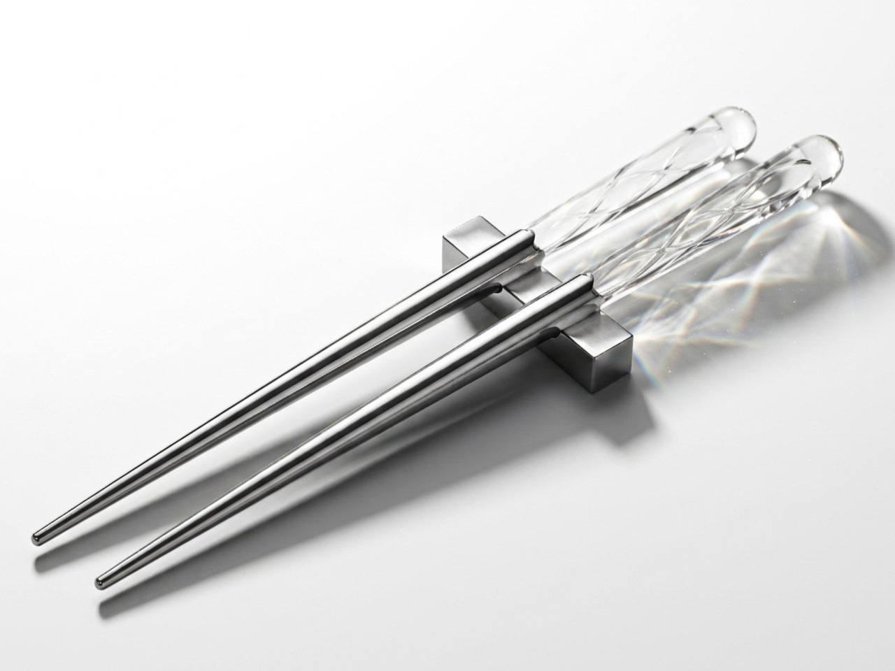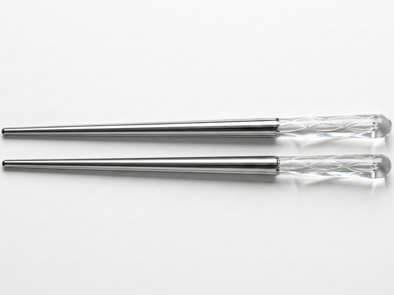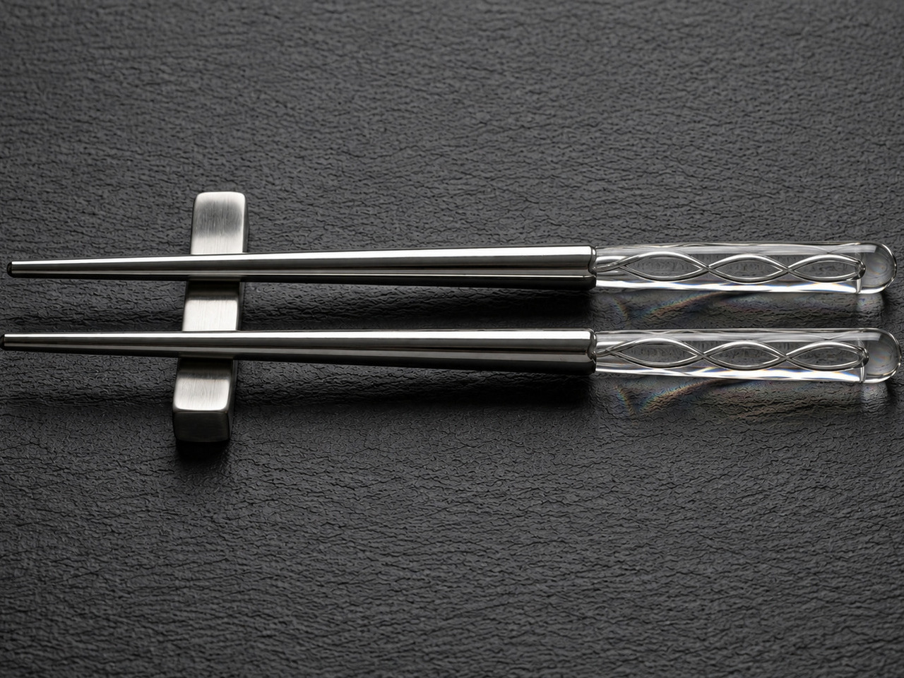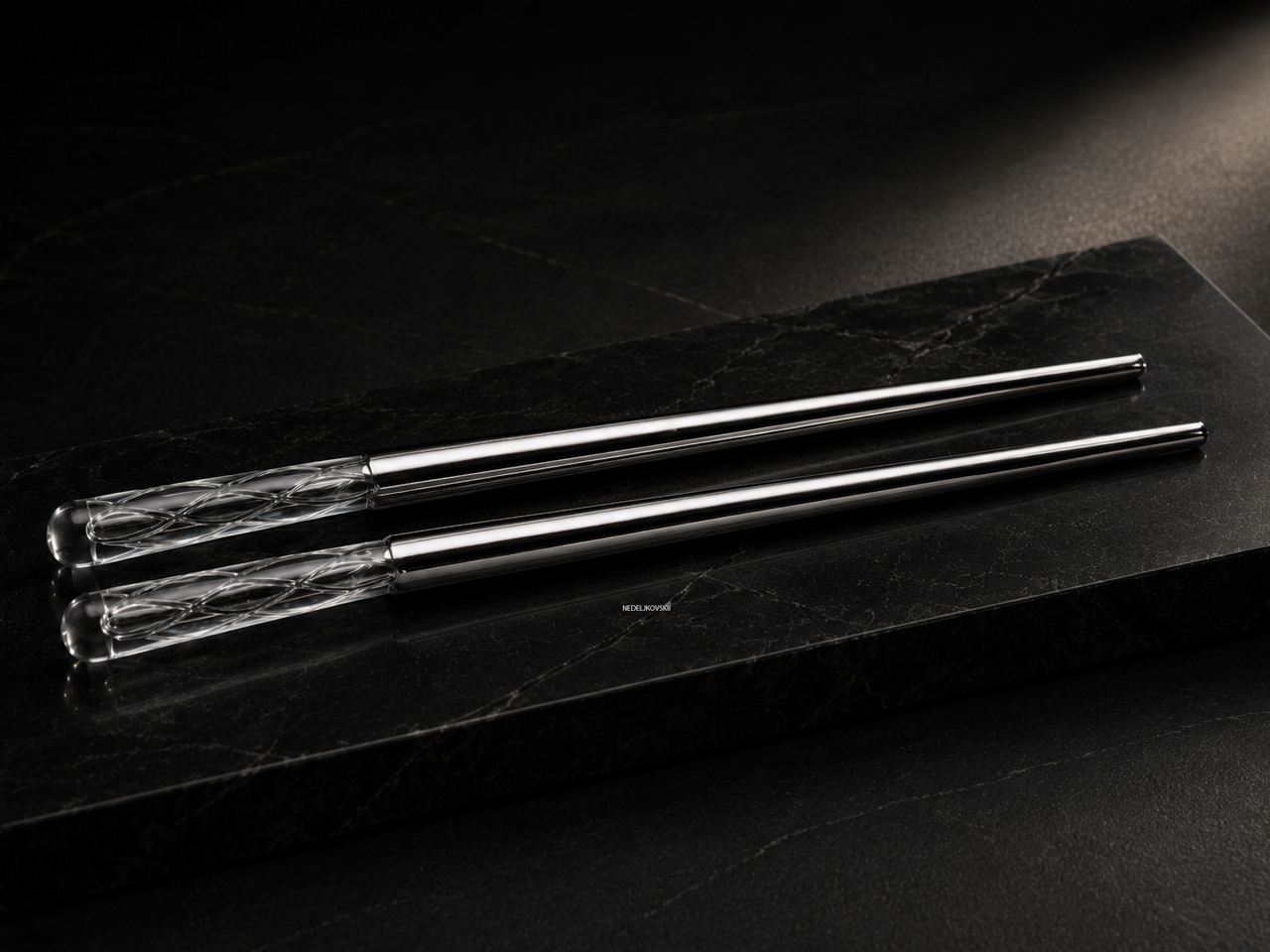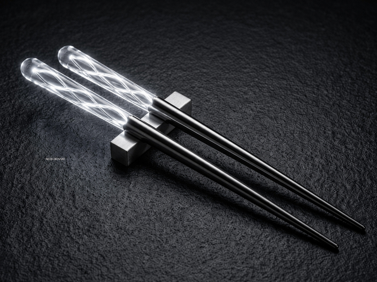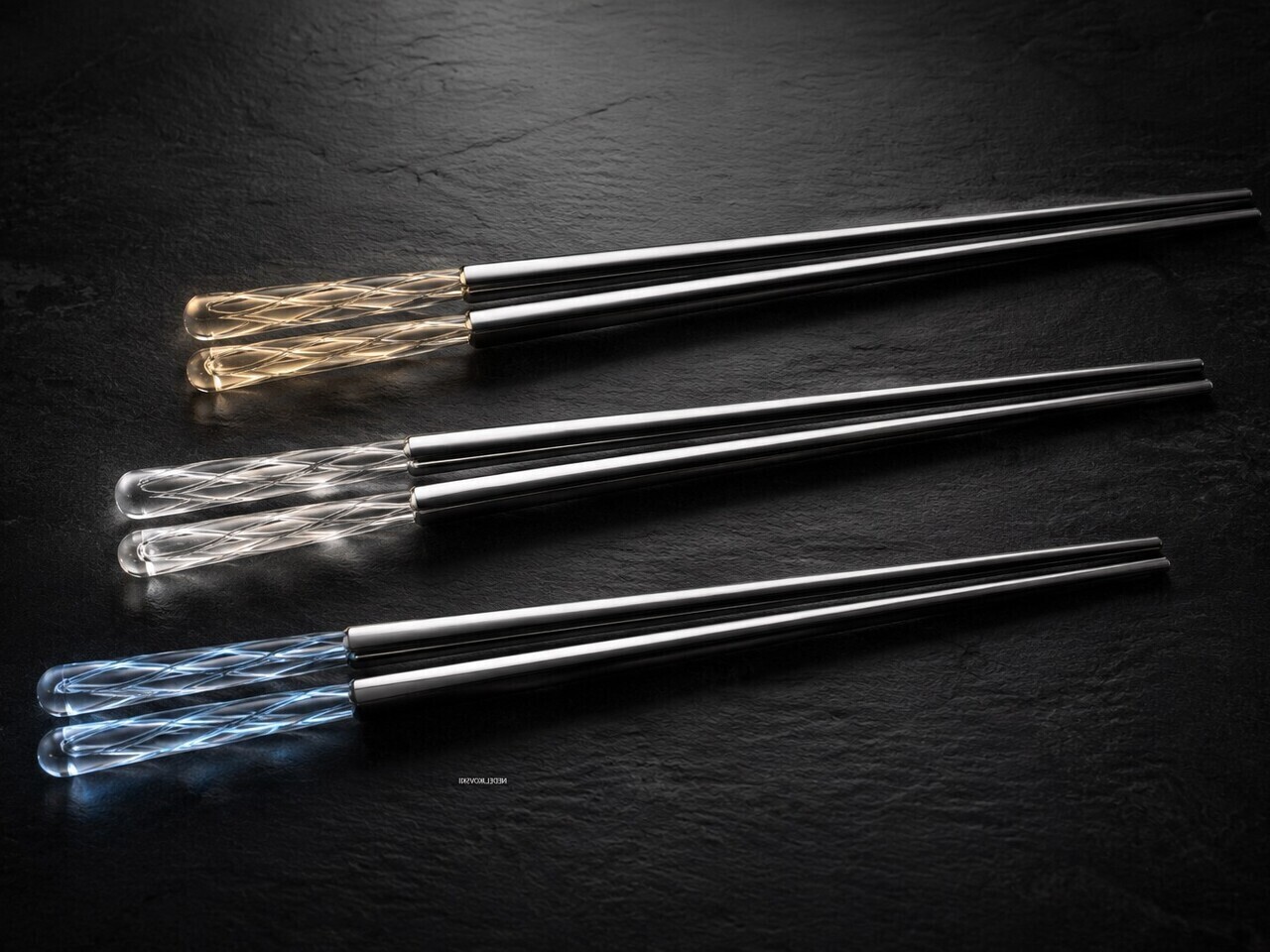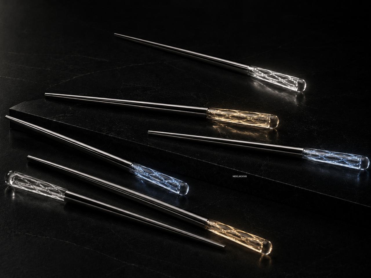
This 1.5mm Japanese Chopstick Might Ruin Ordinary Ones for You

Most chopsticks are never designed. They’re just made. Wide enough to produce cheaply. Consistent enough to ship by the millions. Familiar enough that nobody questions them.

Until someone finally did.

The FineLine Aluminum Chopsticks are the result of more than 40 rounds of refinements in Tsubame-Sanjo, Japan—adjusting the tip diameter, taper angle, grip texture, and balance in increments as small as 0.1mm.

Not to reinvent chopsticks. Just to remove the small frustrations people stopped noticing years ago. And surprisingly, most of those frustrations start with rotation.

Neatly arranged colored pencils in a rainbow gradient across a gray desk, with color swatches in the background on the right.

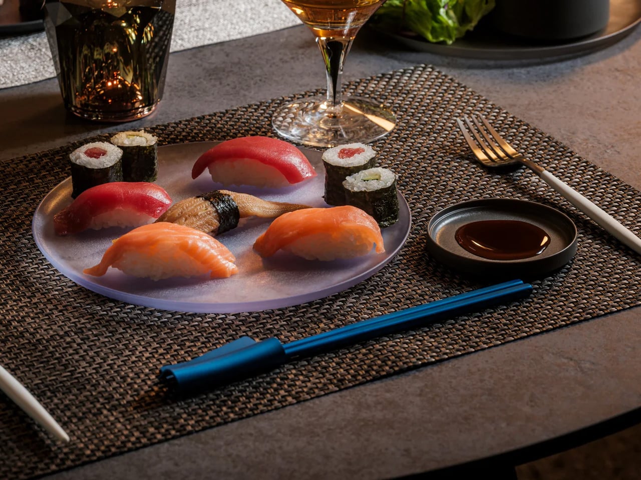
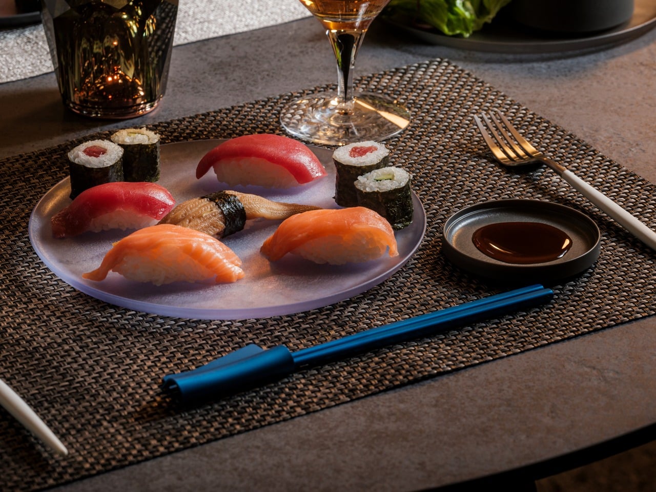
Plate of assorted nigiri and maki sushi on a gray platter, with soy sauce, a wine glass, and blue chopsticks on a woven placemat.

The Chopsticks That Changed How Dinner Felt

At first, the difference felt almost too small to explain. Then I noticed I wasn’t squeezing sashimi as hard. I wasn’t correcting the tips halfway through a bite. I wasn’t adjusting my grip every few minutes without realizing it.

The chopsticks stayed aligned. The tips held cleanly. Long meals felt calmer somehow. And once I noticed that, ordinary chopsticks started feeling strangely unfinished.

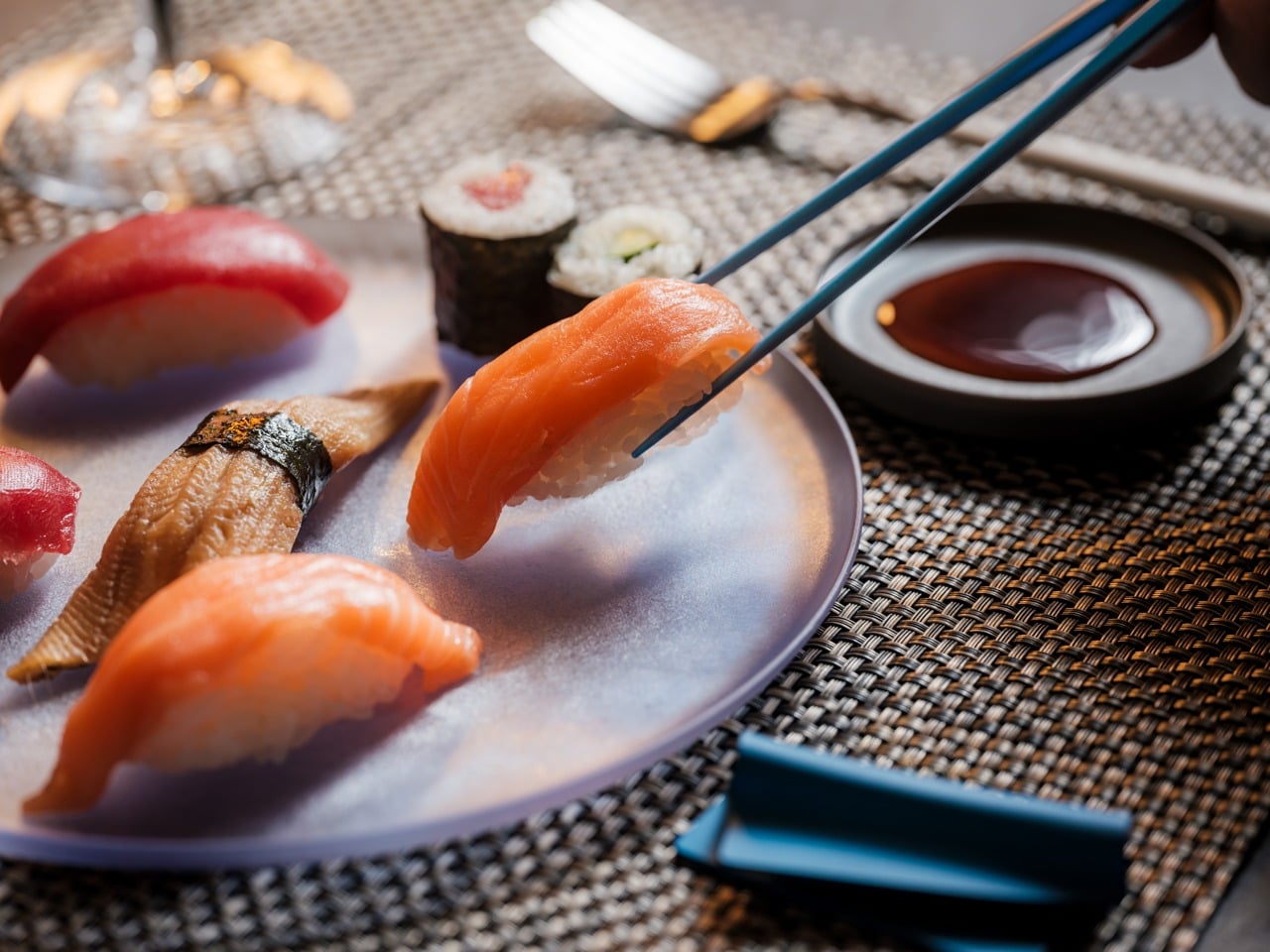
Salmon nigiri being picked up by chopsticks over a plate of assorted sushi and soy sauce nearby.

Designed for the Details

  • 1.5mm precision tip: Roughly half the diameter of most standard chopsticks, creating cleaner contact and more precise control.
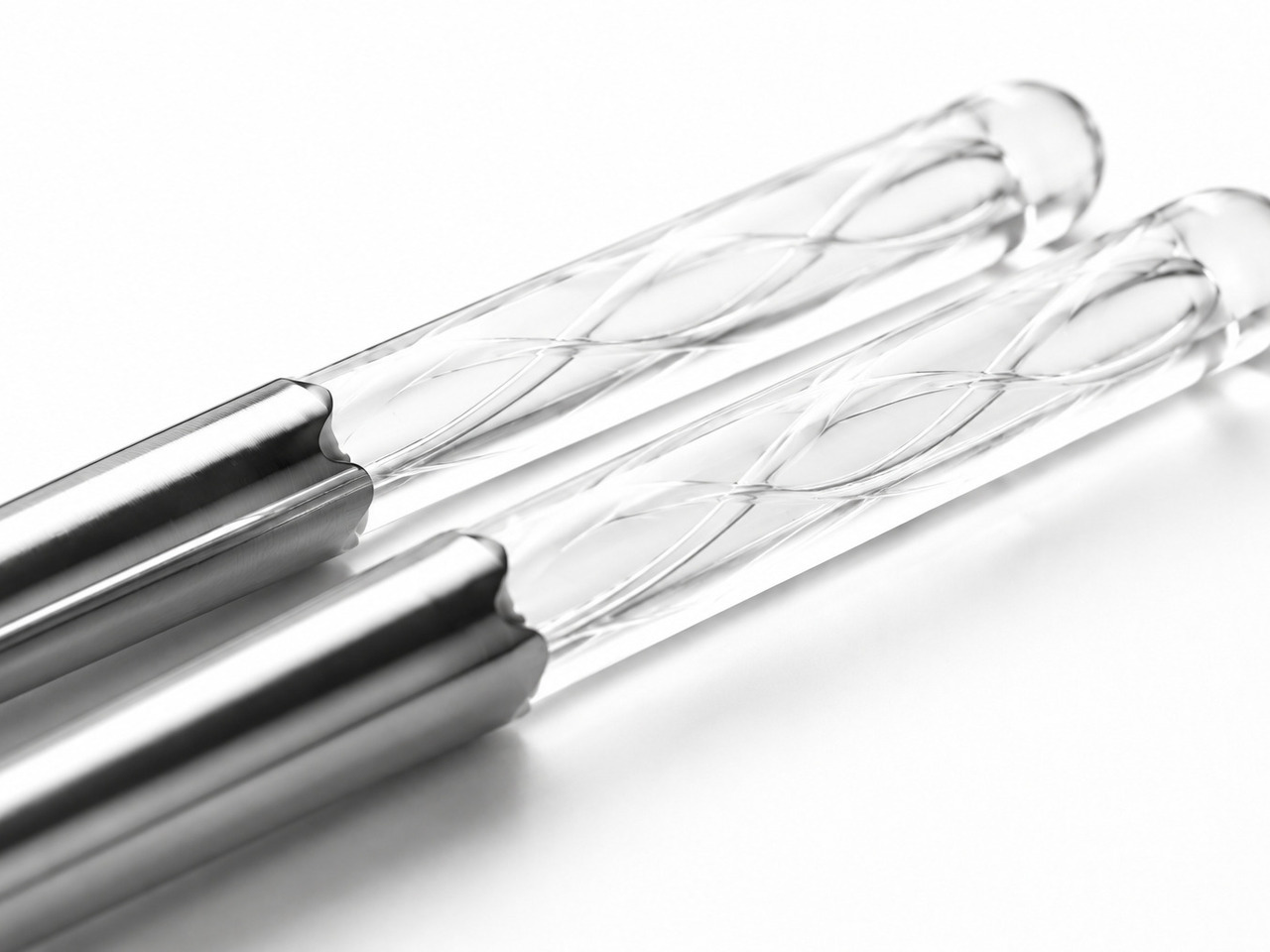
  • Faceted anti-rotation body: Prevents the constant drifting and micro-corrections caused by round chopsticks.
  • Machined anti-slip texture: Built directly into the tip instead of added as a coating that eventually wears away.
  • 40 rounds of refinements: Tip diameter, taper angle, grip texture, and balance were adjusted repeatedly in increments as small as 0.1mm.
  • 14.5g balanced weight: Controlled enough for precision without becoming tiring across a full meal.
  • Anodized aluminum construction: Resists moisture, warping, stains, and dimensional drift over time.

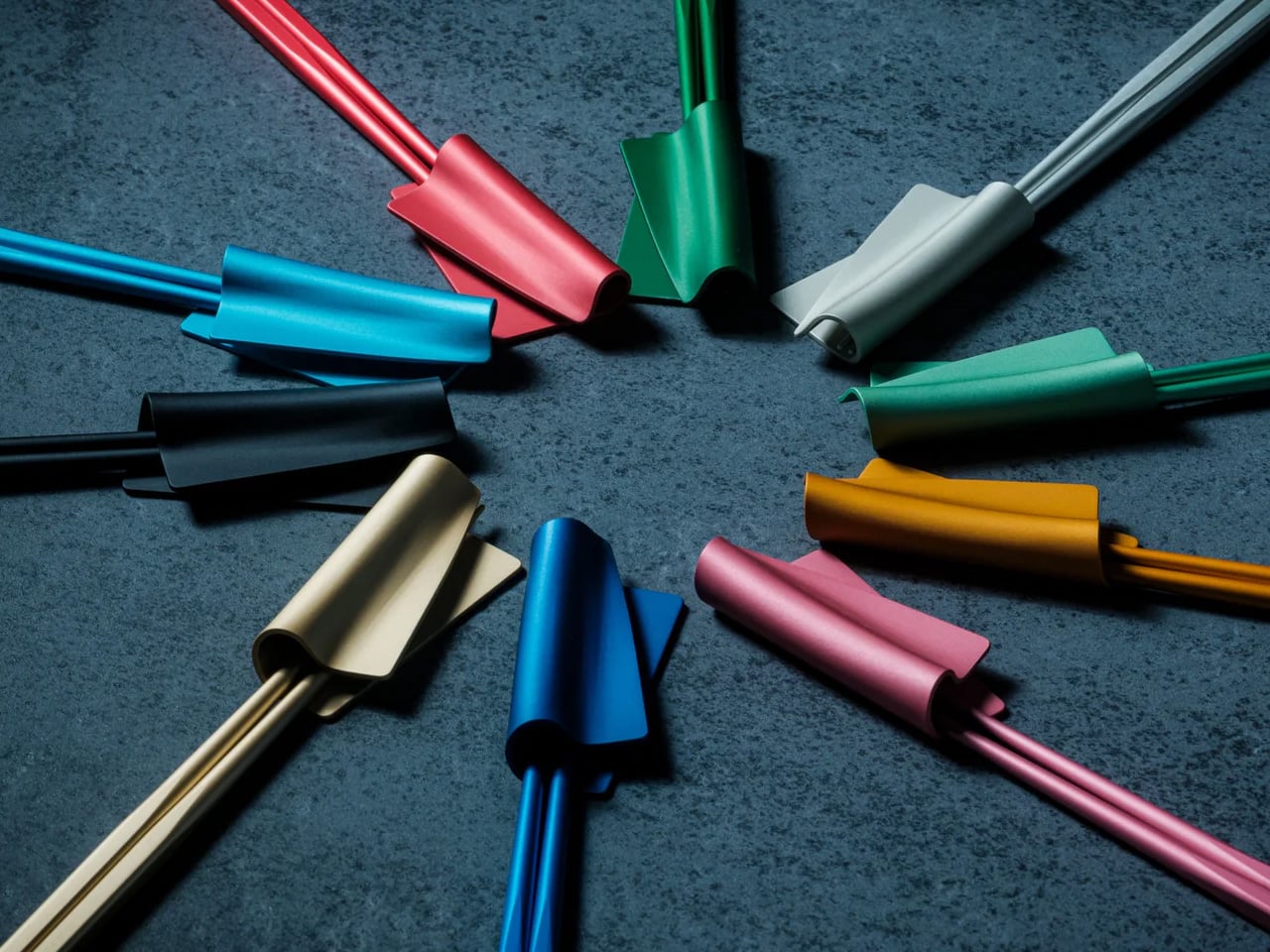
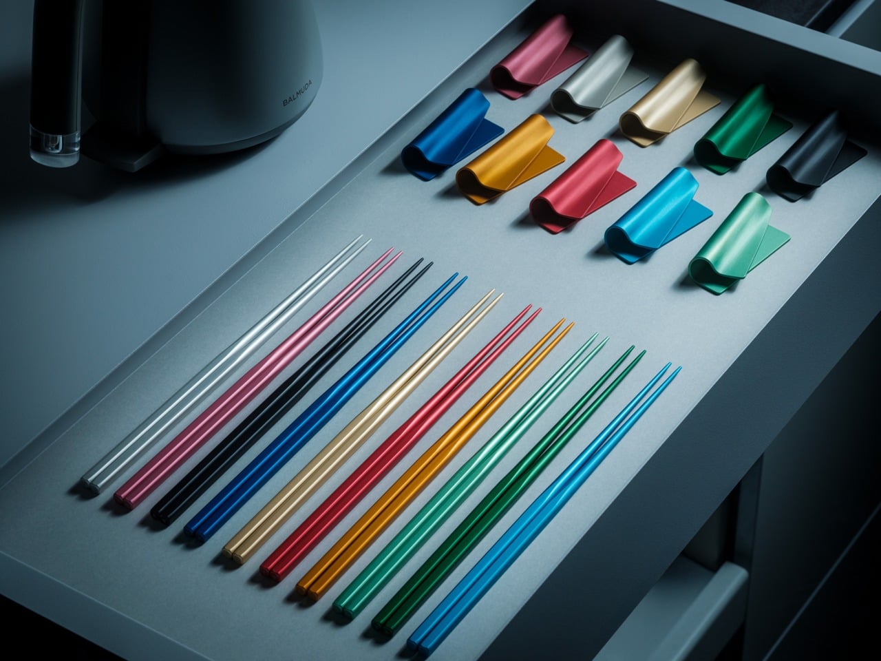
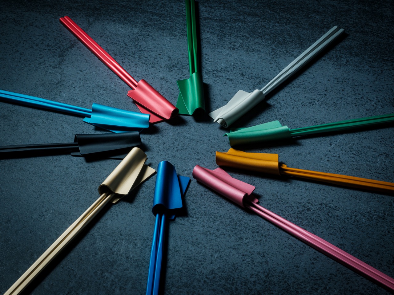
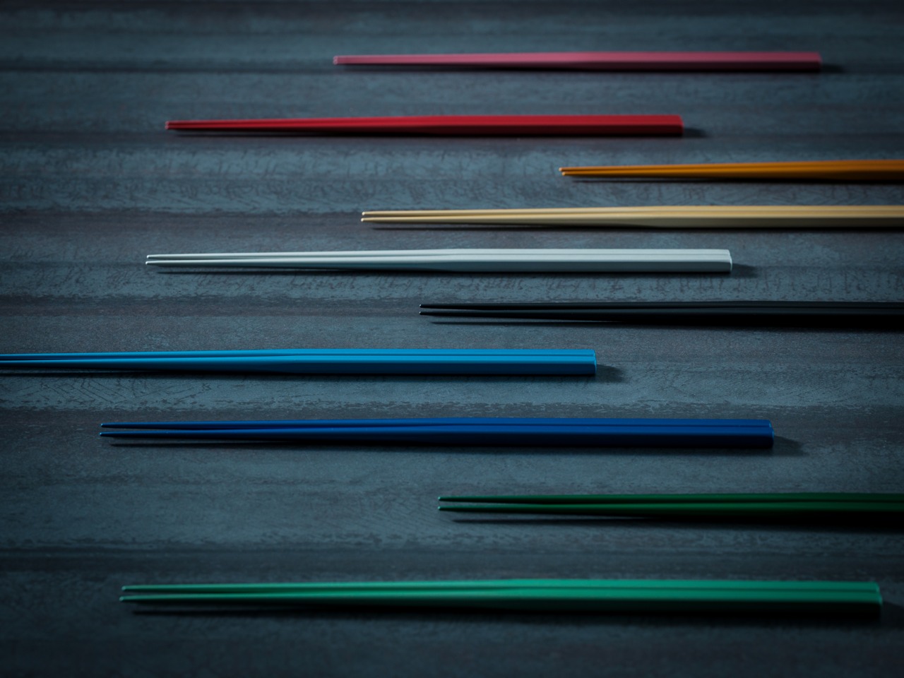
Available in ten satin anodized tones, the finish adds grip without roughness while maintaining the same feel years later as it did on day one.

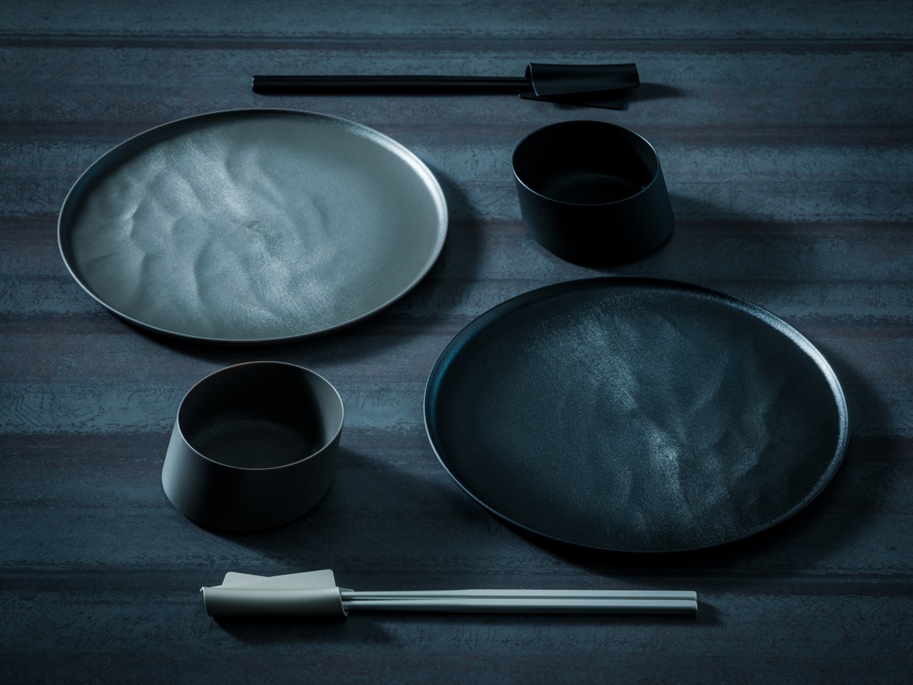
Flat lay of black minimalist dinnerware: two large round plates, two cups, and a pair of chopsticks on a dark textured surface at top and bottom center.

The Friction You Stop Noticing

Standard chopsticks taper to around 3–4mm at the tip. That’s not really a design decision—it’s a manufacturing default. It works, but it quietly asks something of you every time you eat. A little extra pressure to hold slippery food. A slight grip adjustment. A constant realignment of the tips.

Round profiles make it worse. They rotate in your fingers constantly. Subtly, continuously—your hand is always correcting them, always bringing the tips back into alignment. It’s the kind of friction that never rises to the level of complaint but accumulates quietly across every meal.

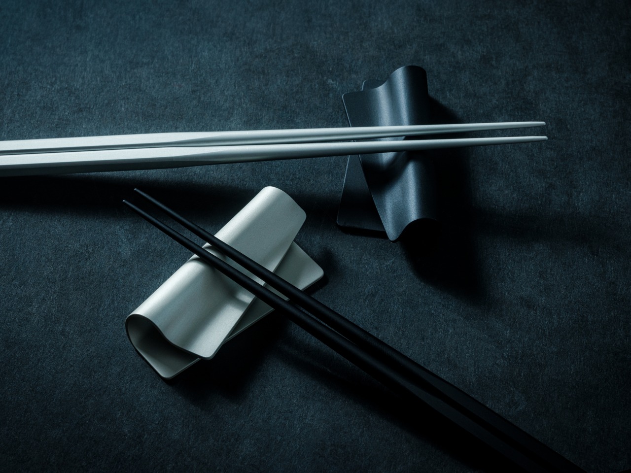
White chopsticks laid across a curved ceramic rest on a dark textured surface with black chopsticks nearby.

Most people never notice it because they’ve adapted to it for years.

The FineLine was designed to remove that friction entirely. Not through dramatic reinvention, but through refinement precise enough that the tool eventually disappears from your awareness altogether.

Colorful plastic twist ties arranged in a circle around a central point on a dark textured surface, creating a starburst pattern.

Design That Disappears

The workshop behind the FineLine was founded in Tsubame-Sanjo in 1907, a region known for precision metalworking where tolerances measured in fractions of a millimeter completely change how a tool feels in use.

That same philosophy shaped these chopsticks.

Metal chopsticks done poorly feel clinical and slippery because aluminum hides nothing. Wood and bamboo naturally absorb small inconsistencies in manufacturing. Aluminum doesn’t. Every imbalance in taper, texture, and weight becomes immediately obvious in the hand.

That’s precisely why this level of precision mattered here. The same discipline required to hold 0.1mm tolerances across professional tools is what allows a 1.5mm aluminum tip to feel stable instead of precarious.

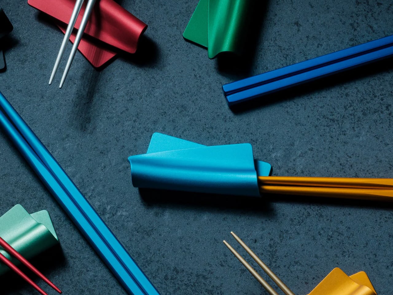
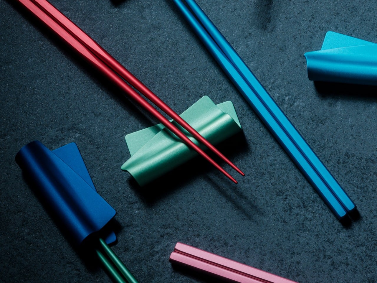
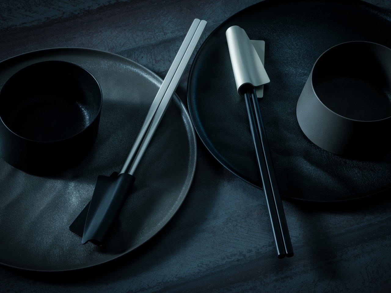
The matching FineLine Chopstick Rest completes the system, carrying the same anodized finish, color language, and quiet restraint. Together they create a table setting that feels considered without asking for attention.

Colorful chopsticks laid diagonally across a dark textured surface, forming a rainbow arrangement.

Who It’s For

  • Daily Chopstick Users
    Once you’ve used a 1.5mm tip on a properly balanced stick, ordinary chopsticks start feeling strangely unfinished.
  • Japanese Craft Enthusiasts
    This isn’t craft as decoration. It’s a century of metalworking precision applied to one of the most ordinary tools on a Japanese table.
  • Gift Givers with Taste
    Not displayed. Not saved for guests. Just quietly reached for without thinking—which is exactly the point.

Minimal black tableware setting: two plates with a small black bowl and a pair of chopsticks resting on the plates on a dark textured surface.

Where The Meal Takes Over

You don’t think about chopsticks when they work. You think about the food, the conversation, the rhythm of the meal. That’s the quiet achievement of the FineLine Aluminum Chopsticks. The grip stays aligned. The tip holds cleanly. The weight never asks for attention.

Not just chopsticks. A better way to feel every meal. The FineLine Chopsticks are available now for $30.

The post This 1.5mm Japanese Chopstick Might Ruin Ordinary Ones for You first appeared on Yanko Design.
5 Gifts for the Person Who Takes Beer More Seriously Than Anyone Else You Know

Some people drink beer. Others study it, serve it with real intention, and actually feel the difference between a proper pour and a careless one. For that person in your life — the one who owns a specific glass for a specific brew and can tell you exactly why foam matters — a six-pack isn’t enough. What they need is something that matches the level of care they bring to every drink.

These five picks range from precision glassware engineered in Japan to a machine that replicates a professional draft tap at home. Each was designed with the same quiet seriousness your beer person applies to every single pour. If they treat drinking as a practice rather than a pastime, these are the gifts that speak their language — objects built with intention for someone who notices the difference between good and exceptional.

1. DraftPro Top Can Opener

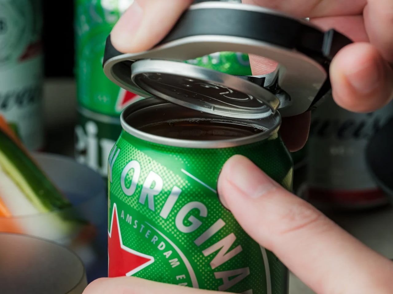
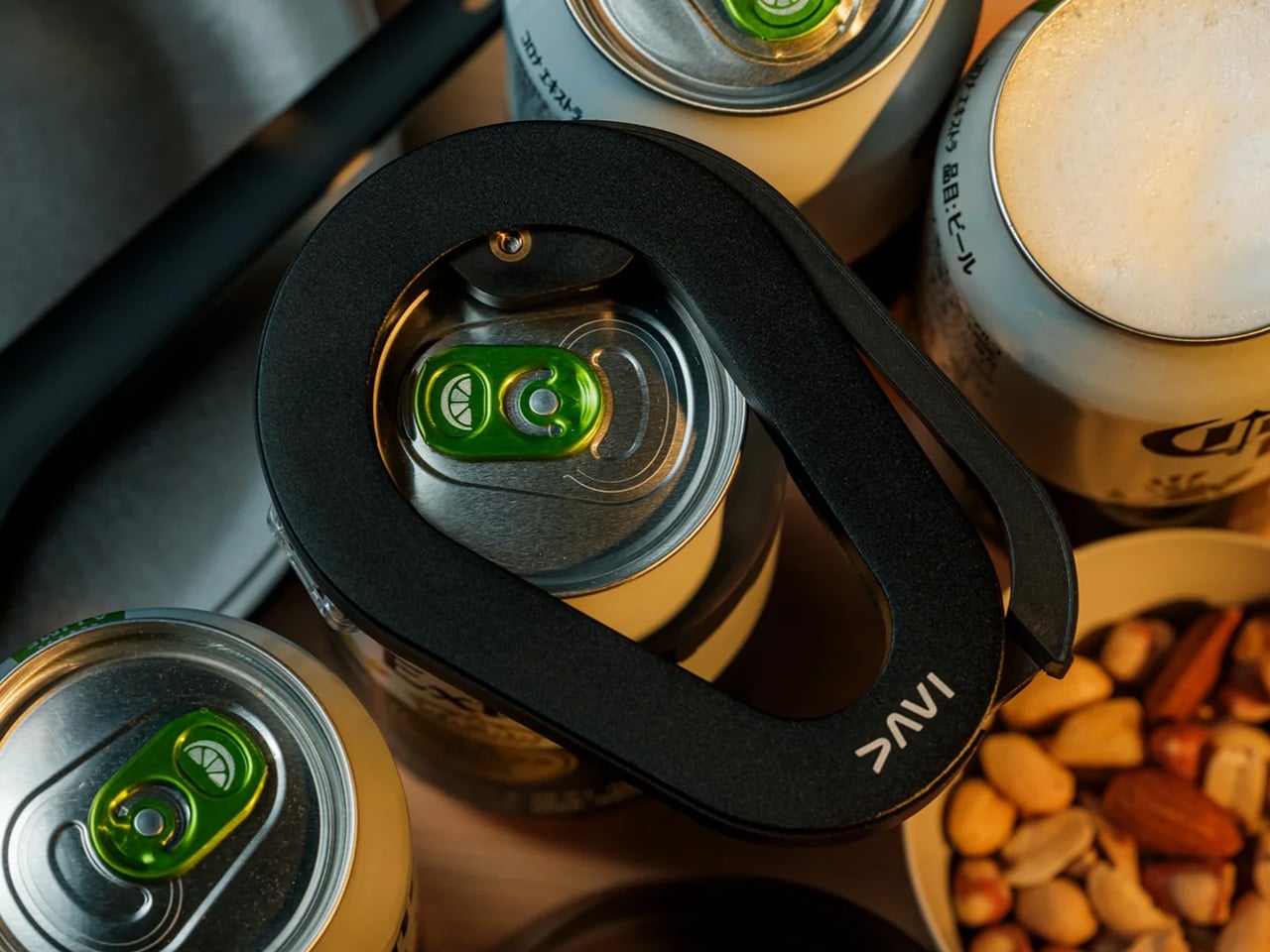
There’s a version of drinking from a can, and then there’s the DraftPro version. Designed by award-winning Japanese designer Shu Kanno, this tool removes the entire top of a can with one clean motion, transforming it into something far closer to drinking from a proper glass. The wide-mouth opening lets aroma escape freely and allows the beer’s full range of flavor to come through completely unobstructed. For someone who selects their beer thoughtfully and actually wants to taste what they chose, this simple tool changes the nature of the experience entirely. It’s quiet, precise, and turns the ordinary act of cracking a can into something that feels far more considered and deliberate.

Beyond the drinking experience itself, the DraftPro functions as a capable bar tool in the most compact form possible. With the top removed, ice goes directly into the can for fast chilling on a hot day, or the can becomes the vessel for a quick cocktail with no shaker and no extra glass to clean afterward. It’s lightweight, portable, and compatible with both domestic and international can sizes, so it works wherever the drinking happens to be. The kind of object that earns a permanent place in a bag or kitchen drawer because it quietly solves problems you didn’t know you had until the first time you actually put it to use.

Click Here to Buy Now: $60.00

What We Like

  • Removes the entire top to create an open, aroma-forward experience that genuinely mirrors drinking from a glass
  • Universal compatibility with domestic and international can sizes makes it useful at home or anywhere else

What We Dislike

  • Designed exclusively for cans, with no application for bottles or other containers
  • The fully open-top format may feel less practical or contained depending on the setting

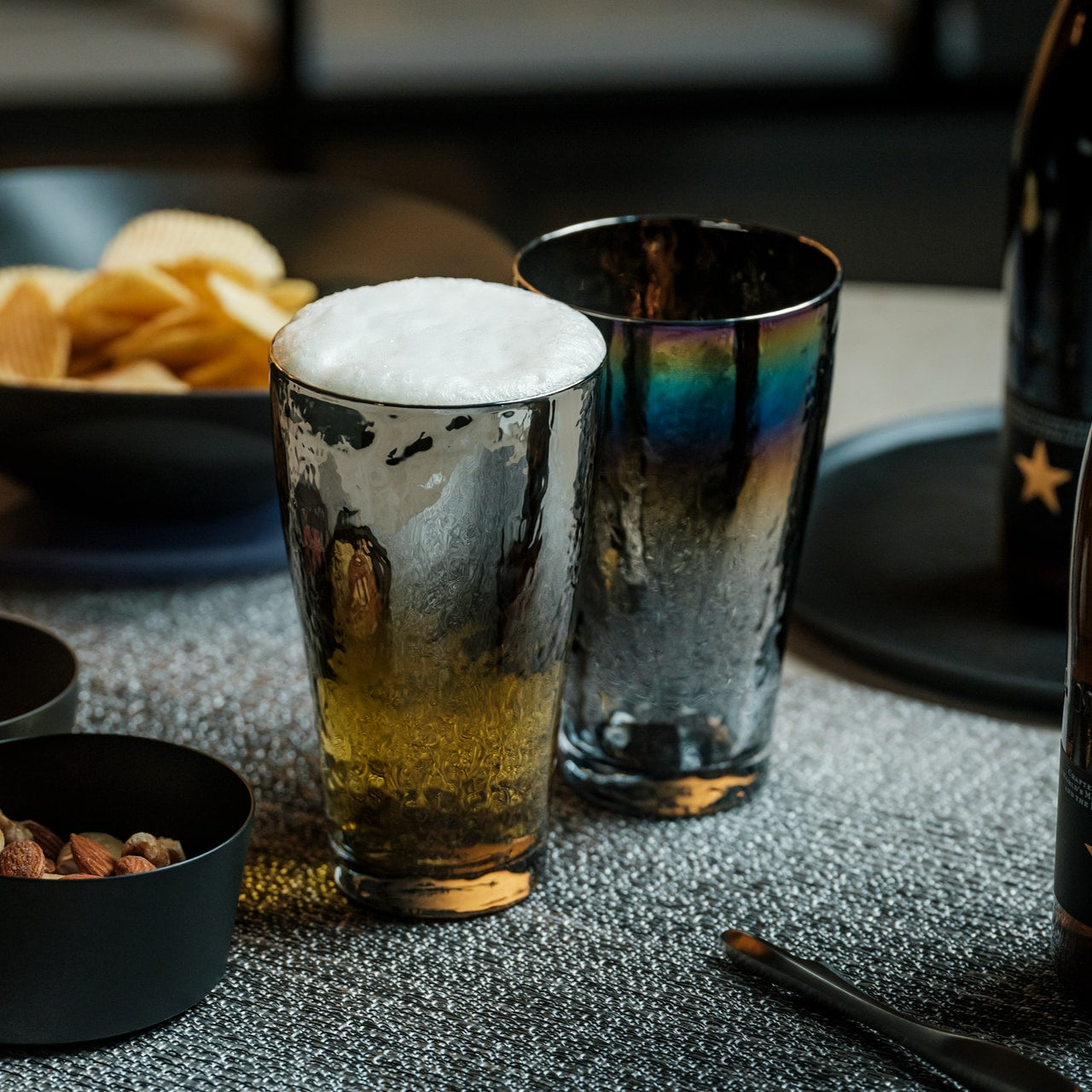
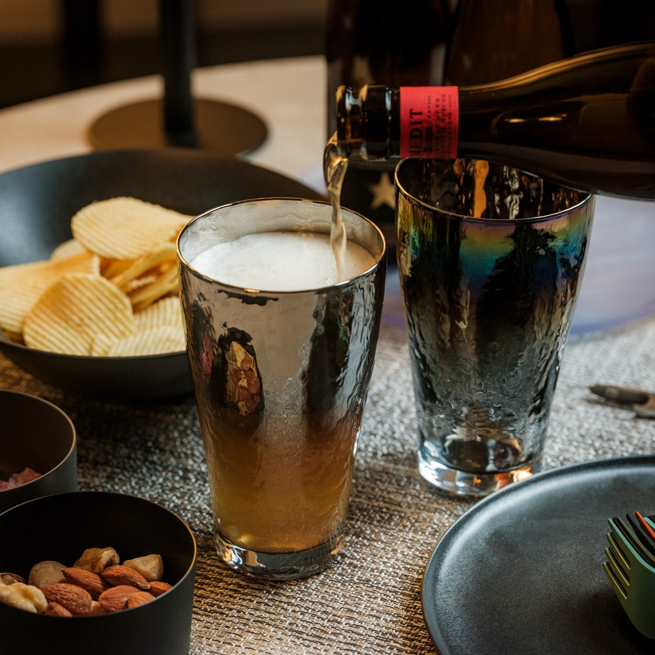
2. Prism Titanium Beer Glass

Most beer glasses do one thing: hold the beer. The Prism Titanium Beer Glass does something more carefully considered. Lined with 99.9% pure aerospace-grade titanium, it neutralizes metallic aftertastes and gently breaks down off-notes, leaving only the true, refined flavor of what’s been poured. Its gently flared rim softens texture and guides beer across the palate in a way that feels deliberate rather than incidental. Available in the timeless Silver with its quiet luster, or the Infinite with its shifting aurora of color, each version is finished with symbolic patterns that evoke longevity and prosperity. It’s the kind of glass that quietly resets the standard you hold everything else to.

This is a glass for someone who treats drinking as a ritual rather than a reflex. Clear glass meets softly reflective titanium inside, creating a visual interplay that reveals the beer’s true color with a quiet, elegant glow. The combination of material and shape means what you’re tasting stays as close to the brewer’s original intention as possible, without interference from the vessel itself. Japanese precision runs through every detail, from the balance of it in your hand to the way light plays across its surface at the table. For the person who thinks carefully about what they drink and how, this is the glass they’ve been looking for without quite knowing what to call it.

Click Here to Buy Now: $100.00

What We Like

  • Aerospace-grade titanium lining preserves pure flavor by neutralizing metallic aftertastes and off-notes that would otherwise interfere
  • The gently flared rim simultaneously improves both aroma delivery and mouthfeel for a more complete tasting experience

What We Dislike

  • Premium material and Japanese craftsmanship come at a higher price point than conventional glassware
  • The titanium interior may feel unfamiliar to those accustomed to standard glass or ceramic vessels

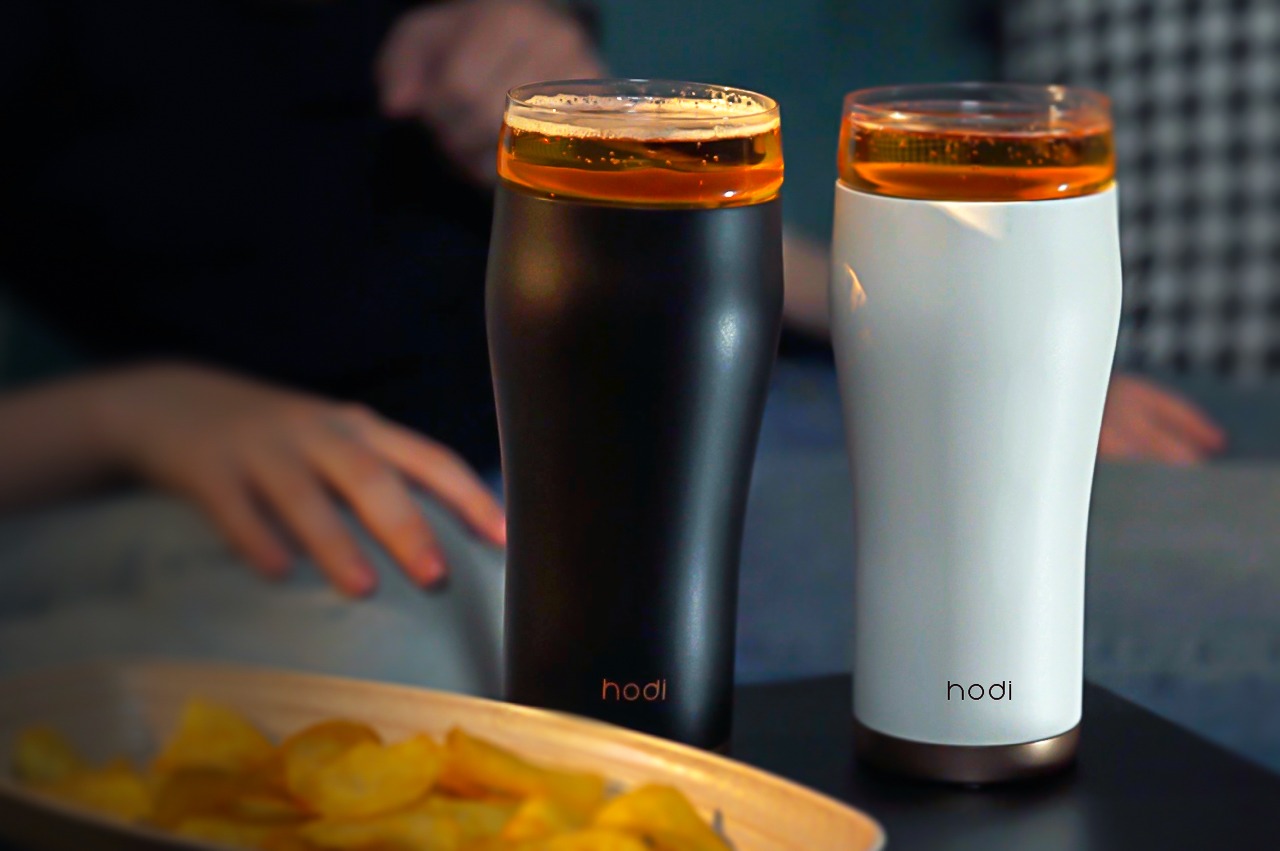
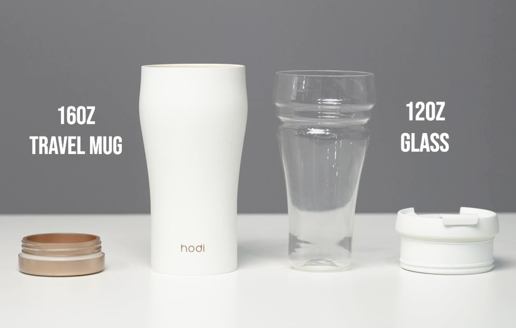
3. Hodi

The hodi is what happens when someone asks what a travel mug could genuinely be if it actually tried harder. Its unique two-part design splits into two separate glasses — one for hot drinks, one for cold — while an airtight lid doubles as a snack container and a built-in mesh filter handles all the brewing on the go. Coffee, tea, beer, wine, juice, milkshakes: hodi takes all of it, making it the kind of object a serious drinker carries without compromise.

What makes hodi visually impossible to ignore is the shape. Its curvy, tapered silhouette is directly reminiscent of the iconic Guinness glass — one of the most recognizable beverage vessels ever made —, and that’s entirely the point. Carry it anywhere, and it reads as intentional, not utilitarian. Functionally engineered to handle everything from a cold craft beer to a hot brew, yet portable enough to go wherever a standard travel mug would, hodi doesn’t ask you to trade form for function.

What We Like

  • The two-part split design offers two separate glasses for hot and cold drinks, making it genuinely versatile for every drink in a beer person’s rotation
  • Its Guinness-inspired silhouette carries the visual language of fine glassware into a portable, travel-ready format

What We Dislike

  • The multi-part construction means more components to keep track of and clean after every use
  • Its Swiss Army Knife versatility may feel like overkill for someone who wants a single-purpose, dedicated beer vessel

4. Fizzics DraftPour

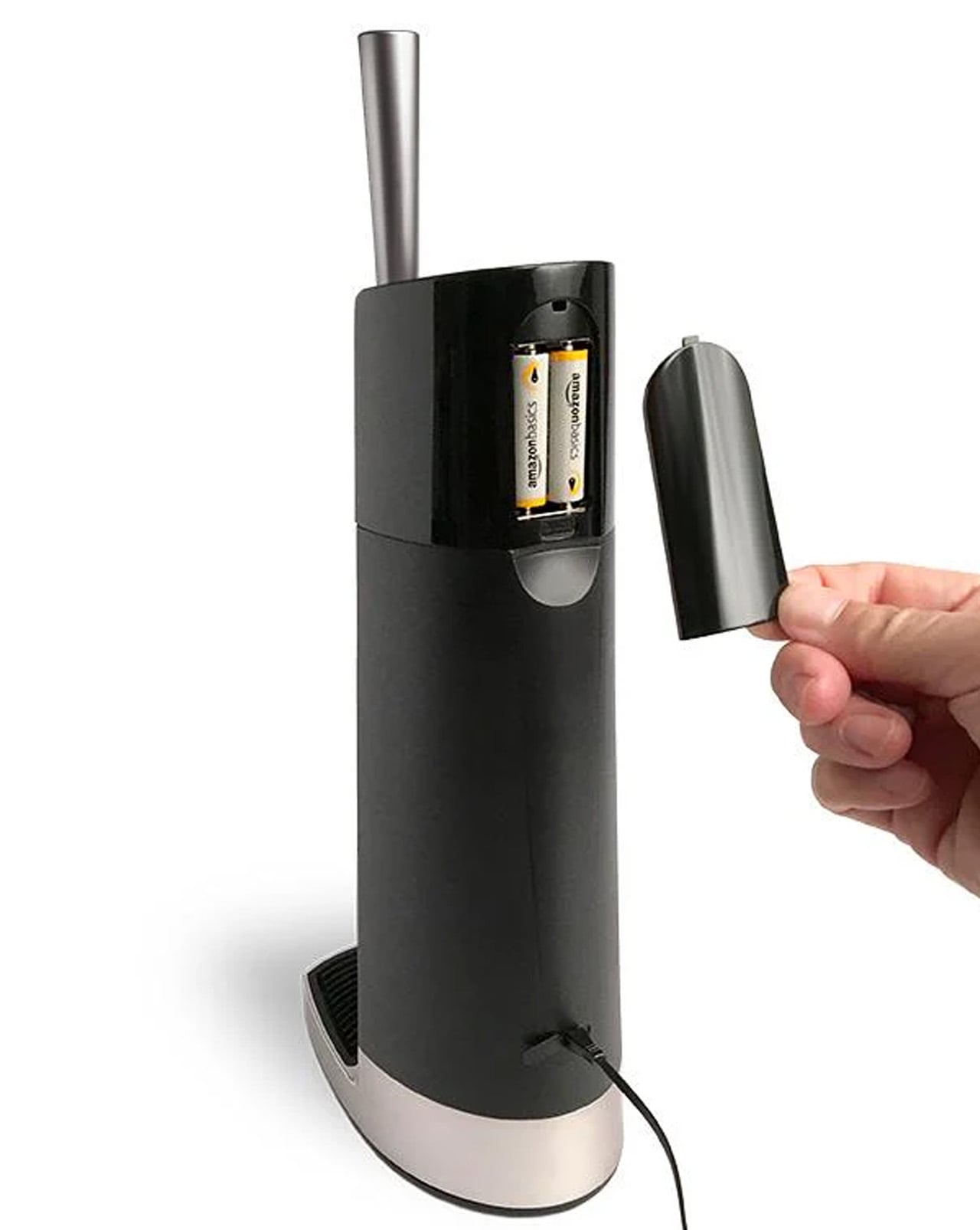
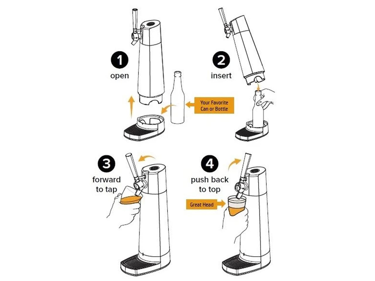
The Fizzics DraftPour does something most people assume requires a full bar setup: it turns any can or bottle of beer into a creamy, nitro-style draft pour without leaving the house. Using patented Micro-Foam technology, it converts the beer’s existing carbonation into uniformly sized micro-bubbles that enhance aroma, flavor, and mouthfeel in a way a straight hand pour simply can’t replicate. It works across every beer style from IPAs and lagers to porters and stouts, and fits cans up to 32oz and bottles up to 750ml. No beer is excluded, and no special additives or gas cartridges are required to get that result at home.

What makes it exceptional as a gift is that it asks nothing extra from the beer itself. No CO2 cartridges, no nitro canisters, no complicated setup. Plug it in or run it on two AA batteries and take it wherever the occasion calls. The technology optimizes all three phases of foam production: nucleation, beading, and disproportionation — the same metrics brewers and cicerones rely on when evaluating the quality of a proper draft pour. For the person who knows what those words mean and cares enough to apply them at home, this is the most meaningful upgrade their home bar has ever seen.

What We Like

  • No CO2 or nitro cartridges required — the machine works entirely with the beer’s own existing carbonation
  • Compatible with all beer styles and most standard can and bottle sizes, making it broadly and consistently useful

What We Dislike

  • Requires a power source via plug or AA batteries, which adds a layer of setup compared to more passive tools on this list
  • Functions as a countertop appliance rather than a compact or easily portable bar accessory

5. Nendo Perfect 3Way Beer Glass

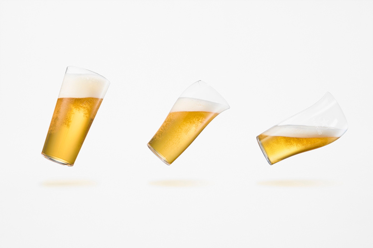
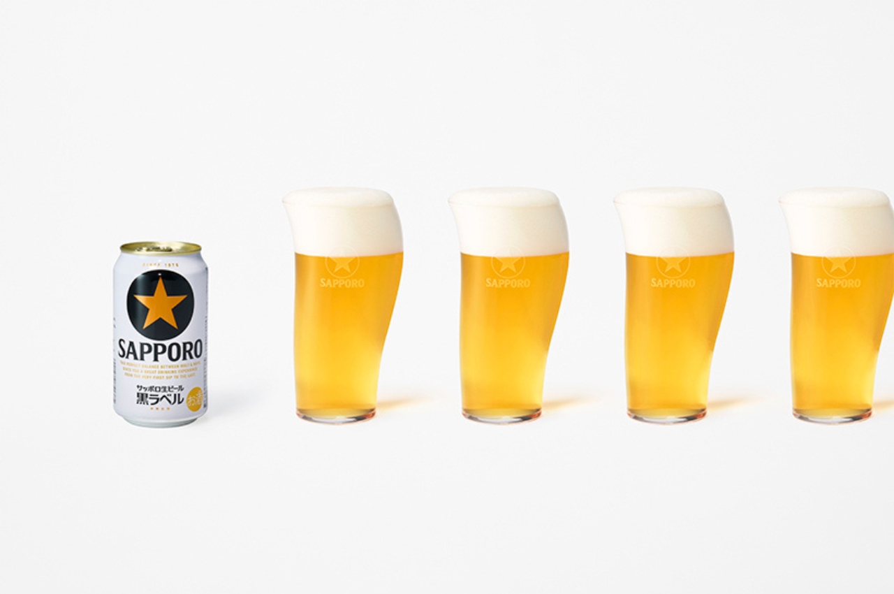
Japanese design firm Nendo built the Perfect 3Way Glass specifically around the flavor and aroma of Sapporo’s Kuro Label draft beer, and the result is one of the most intentional drinking vessels ever produced. The glass is asymmetrical by design, with three distinct zones that each deliver a different mouthfeel when you drink from them. Start at the straight side: the beer travels to the center of the tongue and flows toward the back of the mouth, delivering the initial crisp, clean finish that defines a well-served draft. That first side is the foundation, and what follows on the other two makes this glass genuinely unlike anything else on the market.

Move to the left side, where the curvaceous, wider rim fills the mouth with a mellow, rich aroma and bouquet of liquid. Then shift to the right, where the bulbous shape hits the middle of the tongue and controls the flow for a third, completely distinct sensation. Three sides, three moments, one glass. This isn’t a novelty. It’s a precision instrument for someone who understands that how beer enters the mouth shapes what they ultimately taste. For anyone who takes draft beer seriously, the Perfect 3Way Glass turns a single pour into three separate, considered experiences without ever needing to refill the glass or reach for something else.

What We Like

  • Three distinct mouthfeel zones deliver three genuinely different tasting experiences from a single pour
  • Built with draft beer specifically in mind, making it a meaningful and focused tool for serious enthusiasts

What We Dislike

  • The asymmetrical shape requires some orientation before the full experience lands as intended, which takes practice
  • Conceived around a specific style of draft beer, which may feel limiting for drinkers with broader or more varied tastes

The Right Gift for the Right Pour

The best gifts for a beer person aren’t about quantity. They’re about showing you understand exactly how they think about what they drink — the attention they give to temperature, aroma, foam, and the weight of a glass in the hand. Every pick here reflects that same level of care in how it was designed and what it was built to achieve. One thoughtful gift says more than any case could.

Pick one, and let the presentation carry the message. These aren’t items you grab from a shelf because the occasion demands something wrapped. They’re tools built by craftspeople and designers who understand what it means to give a drink the respect it deserves. For the person who brings that same respect to every pour, that’s a language they’ll recognize immediately — and appreciate far longer than anything else you could choose.

The post 5 Gifts for the Person Who Takes Beer More Seriously Than Anyone Else You Know first appeared on Yanko Design.
Nytrus Reserve Just Put a Meteorite in Your Whiskey Glass

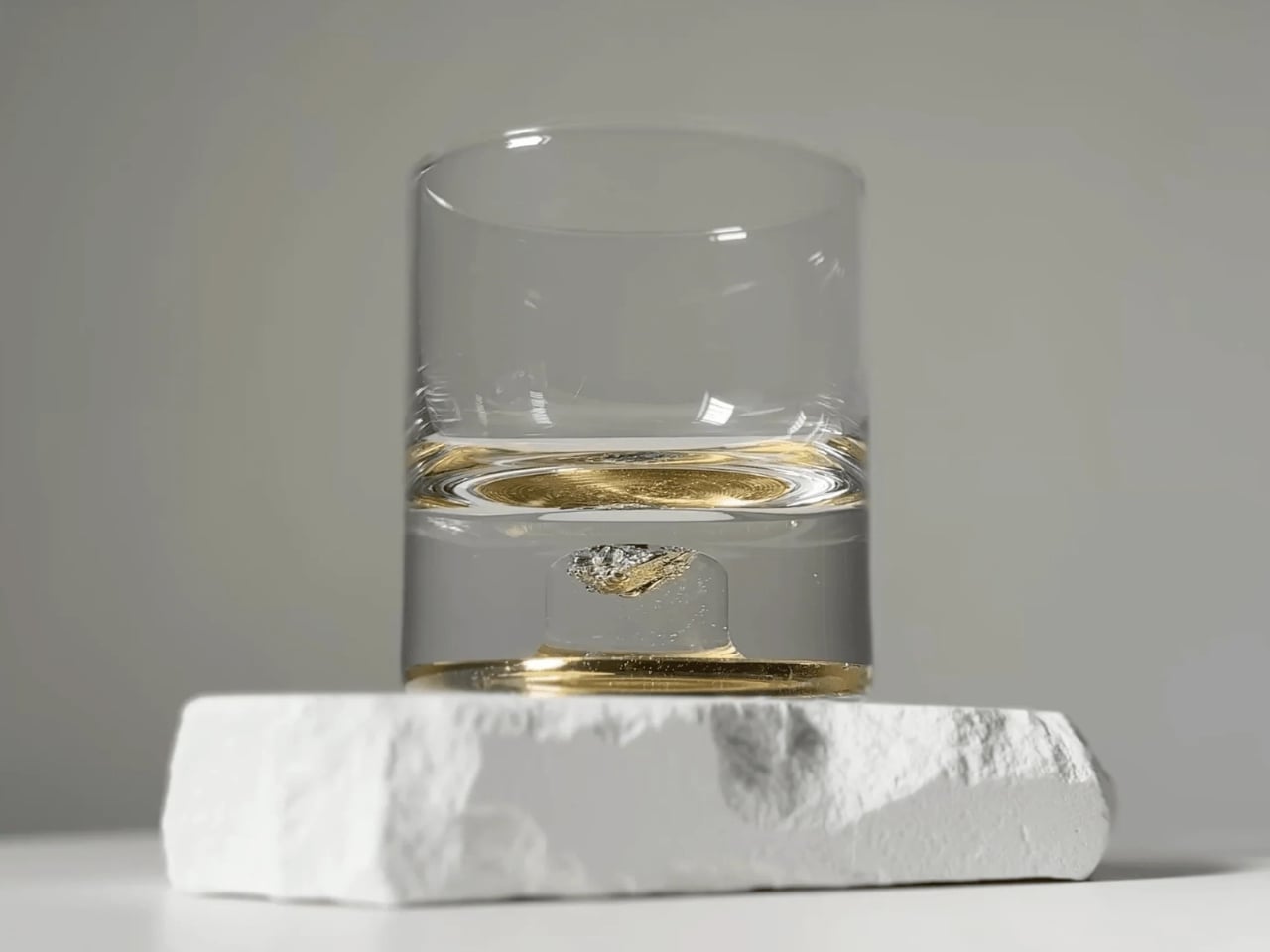
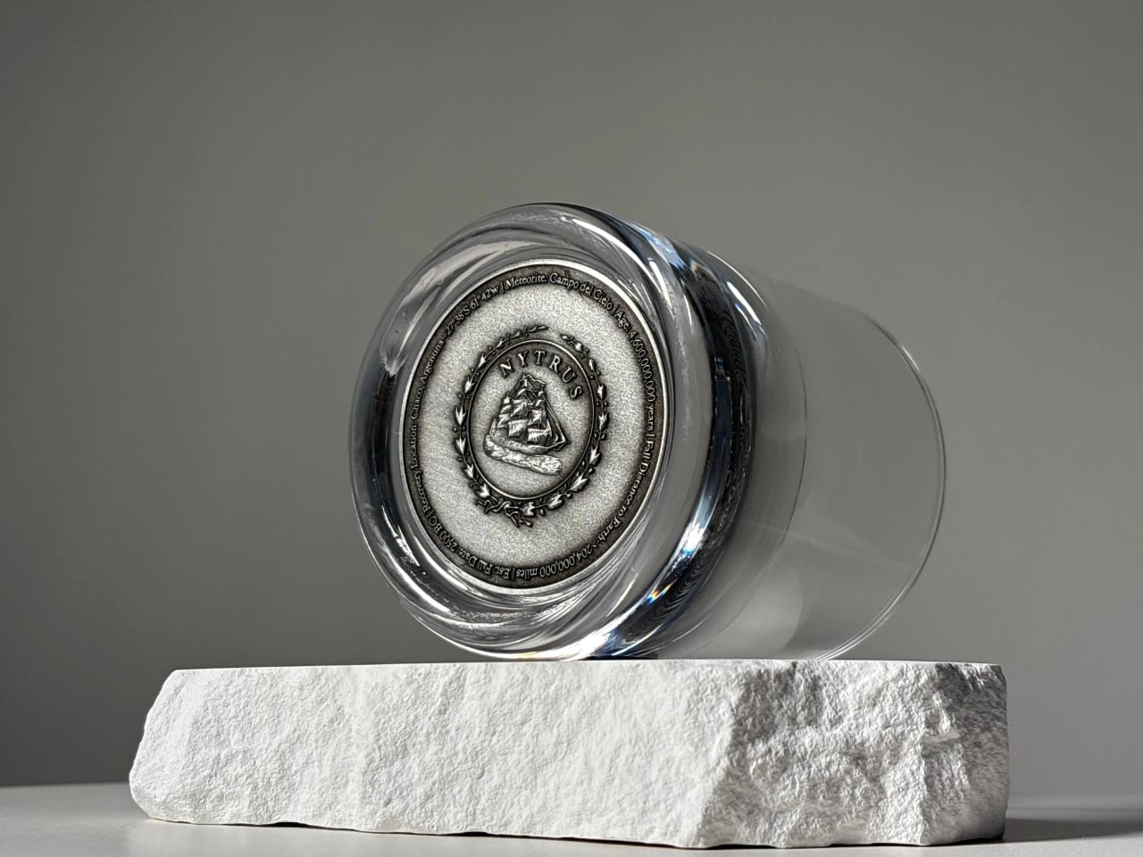
Before we talk about the glass itself, let’s take a moment to appreciate the audacity of the idea. Someone looked at a 4.6-billion-year-old space rock, pulled from the ground in northern Argentina, and thought: what if we put it inside a whiskey tumbler? The result is the Nytrus Reserve Meteorite Tumbler, and I have to say, it’s one of the more genuinely fascinating objects I’ve come across this year.

The Campo del Cielo meteorite has a story worth knowing. It broke apart over northern Argentina around 2500 BCE, scattering across a region now called Chaco. The name itself translates to “Field of Sky,” which feels almost too poetic for something so ancient. It was first mined in 1926, and fragments have since traveled everywhere from museum display cases to private collections. Now, a piece of it lives at the bottom of a crystal tumbler, and I think that’s a fitting next chapter.

Designer: Nytrus Reserve

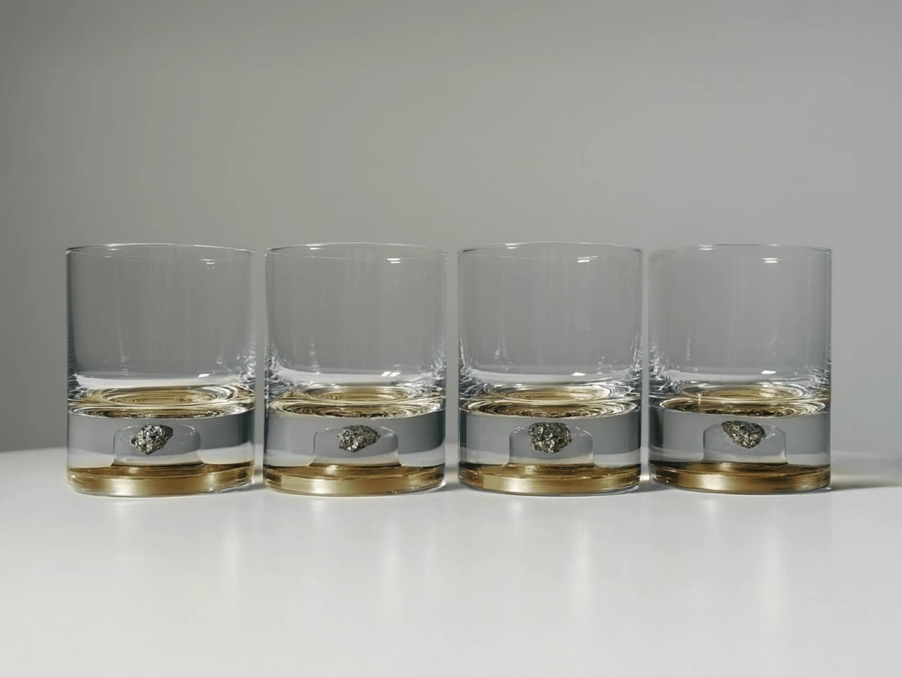
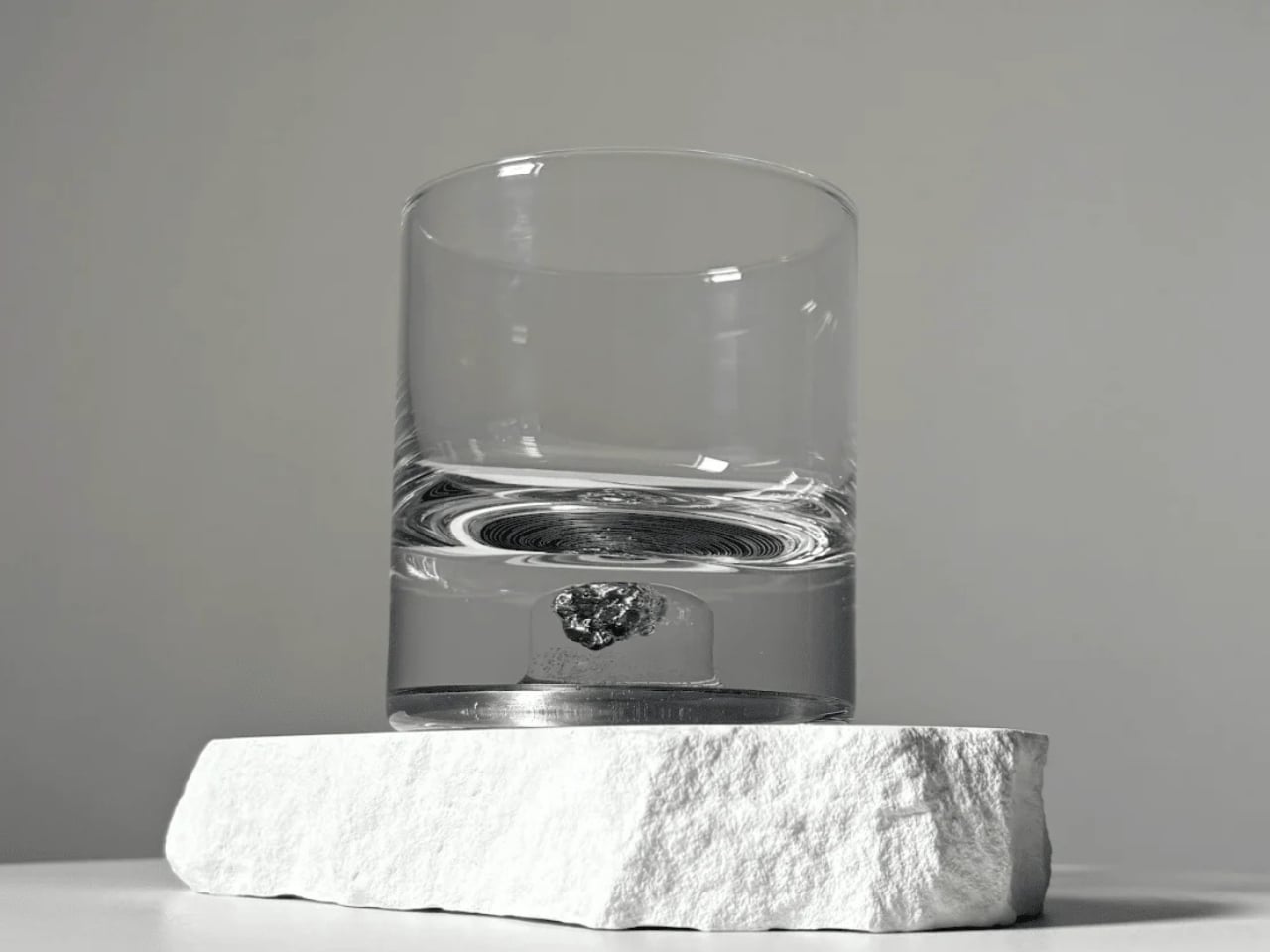
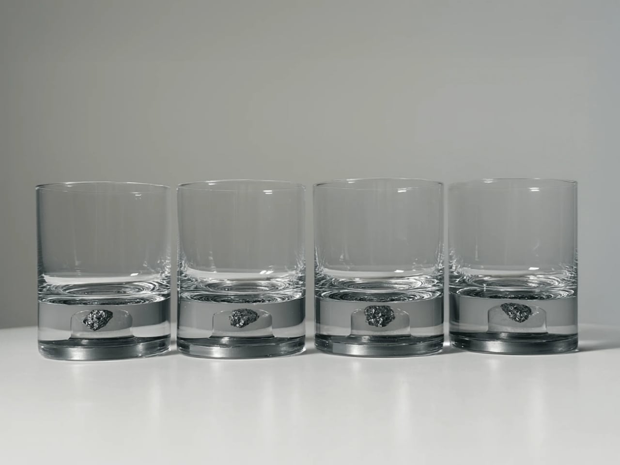
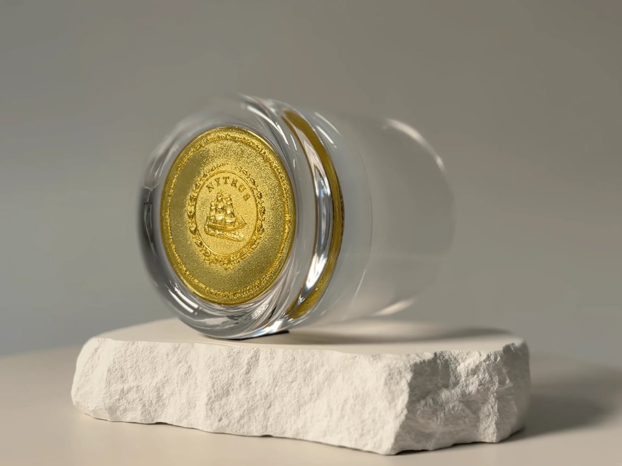
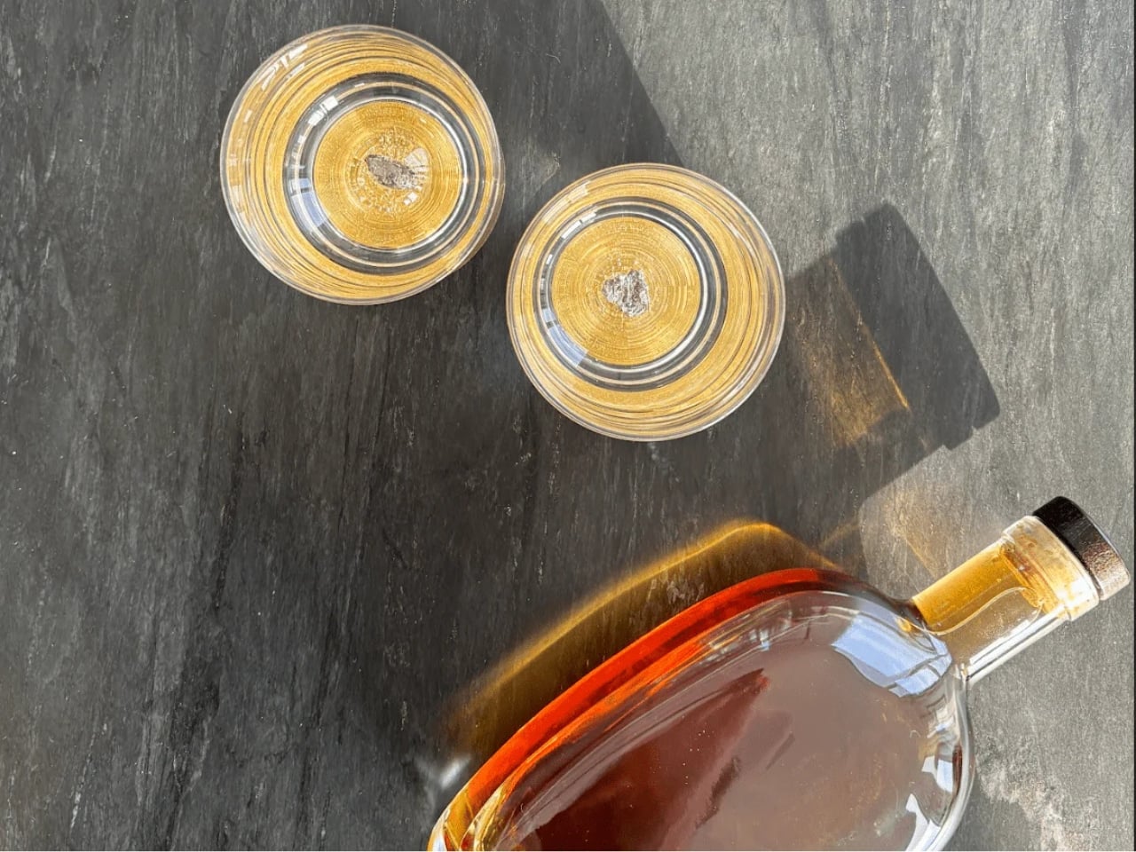
Each Nytrus tumbler is 8.5 oz and hand-blown from high-clarity glass, with the meteorite fragment suspended in the thick base. The design stays clean and minimal so the eye goes straight to the artifact. You can see it from every angle: the rough-edged, ancient rock sitting there like a period at the end of a very long sentence. No two fragments are identical, which means no two tumblers are exactly the same. A Coin of Authenticity sits beneath the fragment as a finishing detail, and it’s the kind of small gesture that signals a brand takes provenance seriously rather than just treating it as a selling point.

The tumbler is available in two finishes: Antique Tin and Amber Gold. Both are understated enough to work across different aesthetics, which matters more than people admit. A beautifully made object still has to fit where you live. The Amber Gold leans warmer, the Antique Tin more cool and contemporary. I’d probably go Antique Tin just for the visual contrast against the darker meteorite fragment, but that’s entirely personal preference.

Nytrus has been releasing these in limited series, each capped at 300 editions. They’re currently on Series IV, and previous series have sold out. That doesn’t surprise me at all. For a product sitting so specifically at the intersection of science, craft, and ritual, that kind of traction makes sense. It’s not trying to be for everyone, and the people it’s for seem to know it immediately.

The weight and presence of the glass is something that comes up again and again in reviews. It feels solid in the hand, which matters when you’re drinking something worth savoring slowly. Luxury drinkware often gets the look right and then fails on feel, so it’s reassuring that the craftsmanship follows through on what the concept promises. Over 1,200 collectors have bought in, with the tumbler holding a 4.9-star rating, which for a product this specific is pretty telling.

I’ll be honest about something. Products pitched as “conversation starters” can sometimes feel like a lazy shortcut for things that don’t have much else going on. But the conversation a meteorite tumbler actually starts is a good one. How did this thing get here? What was happening on Earth when this rock was falling through space? When you can trace a drinking glass back to a fragment that traveled 204 million miles from the asteroid belt, that’s not a gimmick. That’s just a legitimately extraordinary object.

Whether or not you drink whiskey, the Nytrus Reserve Meteorite Tumbler earns its place in a rare category of design objects that justify their asking price through real rarity and genuine craft. The fragment is authentically ancient. The glass is authentically handmade. The scarcity is real. That combination doesn’t come together very often, and when it does, it’s worth paying attention. If you want to feel a little more connected to the universe the next time you sit down with a drink, this is a pretty direct route.

The post Nytrus Reserve Just Put a Meteorite in Your Whiskey Glass first appeared on Yanko Design.
B!POD’s DRO!D Finally Makes Food Storage Worth Showing Off

Most kitchen gadgets follow an unspoken agreement: the more useful they are, the uglier they get. Vacuum sealers are probably the worst offenders. Big, loud, plasticky things that you dig out from the back of a cabinet twice a year and promptly hide again. Italian company B!POD decided to ignore that agreement entirely, and the result is DRO!D, a rechargeable food vacuum system that looks less like a kitchen appliance and more like something that rolled off a design studio table.

I’ll be upfront: I don’t usually get excited about food storage. It’s not exactly a glamorous category. But DRO!D genuinely surprised me, and a lot of that starts with how it looks. The unit itself is compact, black, and almost architectural in its restraint. A deep V-shaped channel runs down the front face, creating shadow and depth that make it feel sculpted rather than manufactured. The ventilation grilles on either side are flush and minimal. The only real pop of color comes from two small orange rings at the base, the legs that dock into the container lids. It’s a considered detail — functional, but also the kind of thing that makes you look twice. On a white shelf, it reads more like a design object than a kitchen tool.

Designer: B!POD

The containers are where the palette really opens up. They come in a deep matte red, a rich navy, and a soft teal, all with the same rounded, low-profile bowl shape and clear lids. The lids themselves have a sculptural quality, two circular ports with a valve mechanism that catches light in an interesting way. From above, it almost looks like a face. Whether that’s intentional or not, it gives the whole system a personality that most food storage products completely lack.

The system removes up to 95% of the oxygen from those containers, slowing the oxidation process that makes leftovers go stale, mushy, or moldy. B!POD describes the technology as working on a molecular level, essentially slowing how quickly your food ages from the inside. The claim is that it keeps food fresh up to five times longer than conventional storage. That’s not a small number. That’s the difference between meal prepping on Sunday and still having something worth eating on Friday.

Using it is deliberately simple. One button, two vacuum power modes, and a 30-second cycle monitored by a small circular OLED display at the top of the unit. There’s a gentler setting for delicate foods and a stronger one for everything else. The battery charges fully in under two hours and gives you 15 to 20 sessions per charge.

What really sells the design though is how the system looks when it’s not in use. The containers stack cleanly, and with the chalkboard-style labeling that B!POD leans into in their own photography, a shelf full of them becomes something you’d actually want people to see. Pasta, coffee, granola, matcha — written in chalk across those matte bowls, it looks more like a still life than a pantry. That’s a rare thing to say about food storage.

The sustainability angle also deserves more than a footnote. Food waste is one of those issues that sounds abstract until you think about how often the wilted greens or forgotten leftovers quietly end up in the trash. If DRO!D delivers on its promise to extend food life by five times, that’s a meaningful reduction in daily household waste. B!POD even offers free green shipping across their range, which reads less like a marketing gesture and more like a real alignment of values.

Is it perfect? Probably not. Like most closed-system products, you’re investing in an ecosystem. The containers are proprietary, so once you’re in, you’re in. That’s a commitment, and not everyone will be ready for it. That said, the premise is genuinely compelling. We’re in a moment where people are thinking harder about what they buy, where it goes when they’re done with it, and whether it was worth making at all. DRO!D sits at the intersection of good design, real utility, and conscious consumption. It’s not trying to be a luxury object, but it carries the aesthetics of one. If kitchen appliances got the same cultural attention as sneakers or headphones, DRO!D is exactly the kind of product people would be talking about. Maybe it’s time to start.

The post B!POD’s DRO!D Finally Makes Food Storage Worth Showing Off first appeared on Yanko Design.
This $60 Japanese tool might ruin canned beer forever, and that’s actually the point

There was a time when opening a can was just that, opening a can. A quick crack, a cold sip, and on with your day. Convenient, sure. But never especially satisfying. The drink stayed trapped behind a narrow opening, the aroma muted, the experience flattened into something functional instead of memorable.

Hands lift and pull back the tab on a green beer can, revealing the opening. The can sits among other cans on a surface.

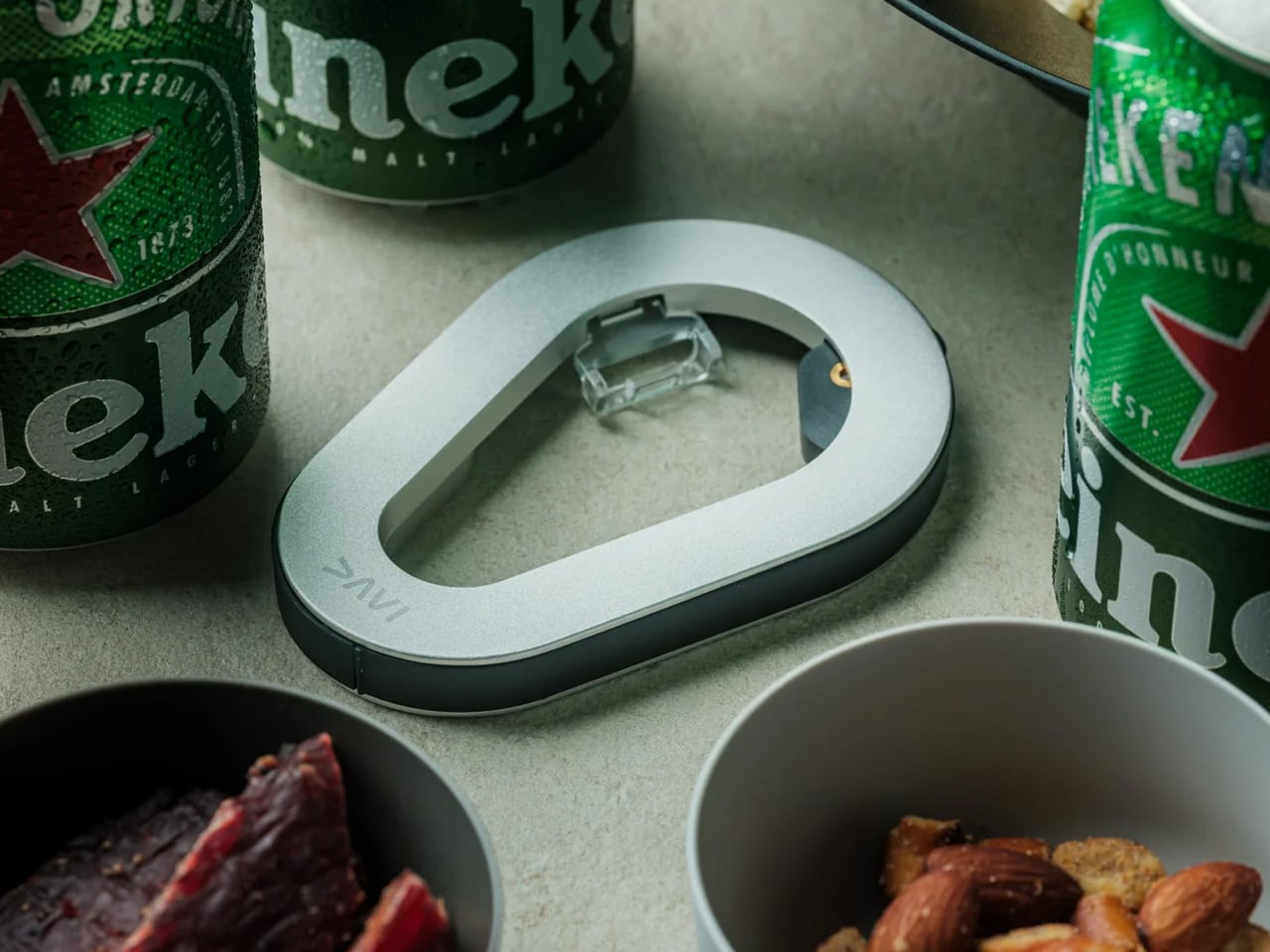
But as more of us start paying attention to the objects we use every day, even the smallest rituals begin to matter. The DraftPro Top Can Opener quietly changes one of the most overlooked ones. Not as a gimmick or party trick, but as a beautifully resolved tool that turns an ordinary can into something closer to a proper pour.

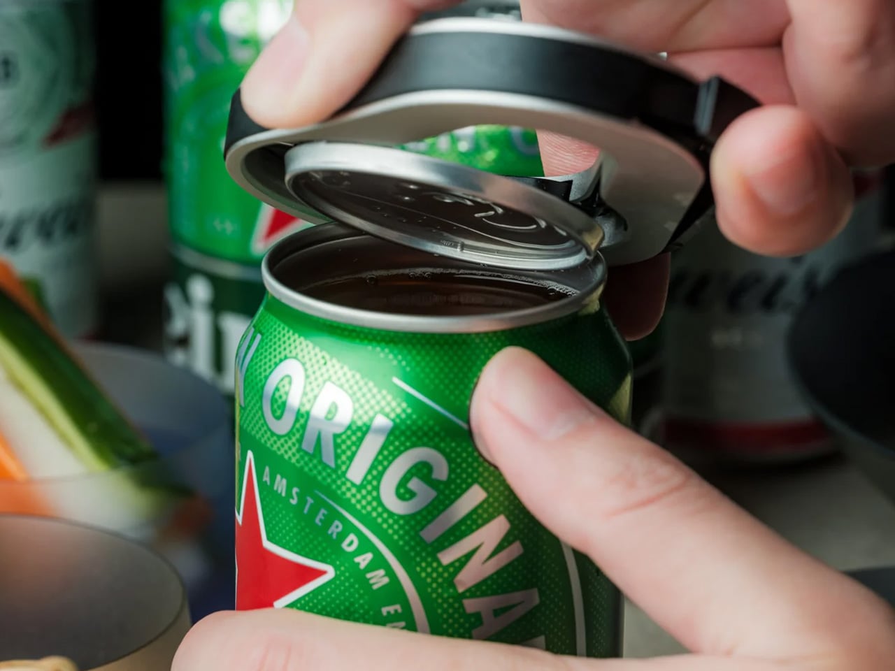
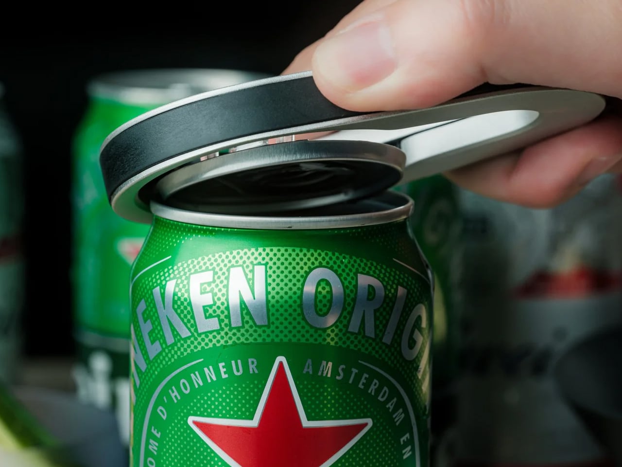
Close-up of a hand opening a green Heineken can with a pull tab, revealing the metal lid edge

The Tool That Changed How I Drink From a Can

At first, I thought DraftPro was just a clever little accessory, the kind of thing you admire once, use twice, and forget in a drawer. But after a few days, I realized it had changed how I approached even the most casual drink.

  • I started reaching for it with beer at the end of the day.
  • Then with sparkling water on hot afternoons.
  • Then with canned cocktails when I didn’t feel like dealing with glassware or cleanup.

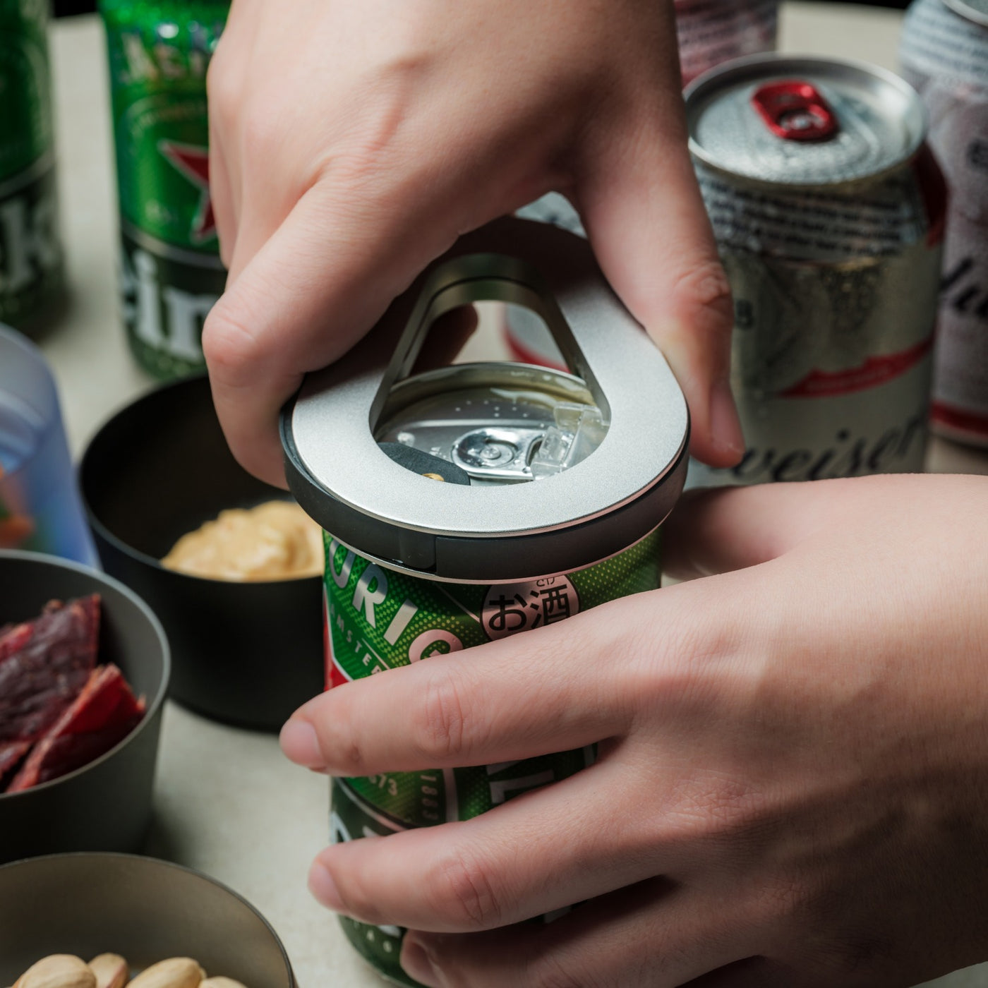
There’s something surprisingly satisfying about the motion itself. A smooth twist, a clean release, and suddenly the whole top is gone. The aroma lifts instantly. The first sip feels more open, more direct, more intentional. It turns out the difference between drinking from a can and actually enjoying what’s in it is smaller than I thought, but much more noticeable.

Coca‑Cola can with ice and a lime wedge, condensation on the can.

Designed for the Details

  • Full-top removal: Turns a standard can into a wide-mouth, glass-like drinking experience.
  • Better aroma, better taste: With the top fully removed, you smell more of the drink before you even take a sip.
  • Ice-ready opening: Drop in ice cubes directly when the drink isn’t cold enough or the day is too hot.
  • Cocktail-friendly format: Add citrus, mixers, or garnish right in the can without needing extra tools.
  • Universal compatibility: Works with domestic and international cans, so it travels easily between setups.
  • Compact, portable design: Small enough to pack for a backyard hang, picnic, hike, or cabin weekend.

DraftPro doesn’t add complexity. It removes it. That’s what makes it feel smart.

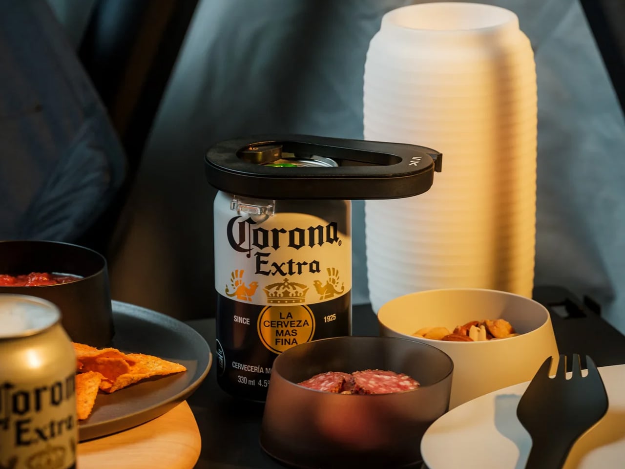
Corona Extra beer bottle at a campsite-style table with snacks, plastic cups, and a black lid or opener on top of the bottle cap

Why Convenience Doesn’t Have to Mean Compromise

We’ve been taught to think of canned drinks as the convenient option, not the ideal one. They’re easy to store, easy to carry, easy to open, but never really treated as something worth savoring. DraftPro challenges that assumption in the most understated way possible.

It doesn’t change the drink itself. It changes your relationship to it.

Suddenly, a beer feels less like something you grab and more like something you serve. Sparkling water feels less utilitarian. Even a simple canned cocktail becomes a little more considered. In a world built around speed and shortcuts, that shift matters more than it should, and maybe exactly as much as it needs to.

Close-up of several beer cans with green pull-tabs and a black curved strap resting across the tops, a bowl of mixed nuts visible in the background.

Design That Reflects Discipline

Designed by award-winning Japanese designer Shu Kanno and built in Japan, DraftPro has the kind of restraint that makes good tools feel inevitable. Nothing about it is overworked. The grip is subtle, the motion is controlled, and the result is clean without calling attention to itself.

It doesn’t shout “innovation.” It just works with a kind of quiet precision that makes most everyday tools feel clumsy by comparison. The clean cut edge, the balanced form, the lack of visual clutter, it all reflects a design philosophy rooted in discipline rather than excess.

Silver oval metal loop resting across the tops of stacked dark beverage cans in a moody lighting setup

Who It’s For

  • Design Enthusiasts

A small, useful object that feels thoughtfully made from every angle.

  • Ritual Seekers

For anyone who believes even a casual drink can deserve a better moment.

  • Gift Givers with Taste

The kind of gift that doesn’t shout “tool”—it quietly becomes a favorite.

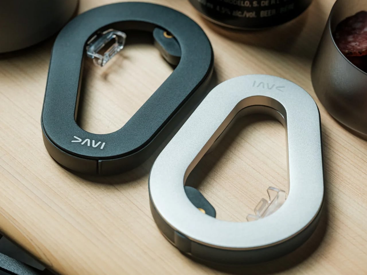
Two oval metal carabiner-style clips (one dark gray, one silver) resting on a light wood desk, with small latch mechanisms visible.

Where Form Becomes Ritual

You don’t realize how many everyday experiences have been reduced to habit until one object slows you down just enough to notice them again. DraftPro won’t transform your life. But it does transform a cold can into something more open, sensory, and satisfying.

At the end of the day, it’s still a can opener. But sometimes, the right tool changes the entire ritual around it. The DraftPro Top Can Opener is available now for $60.

The post This $60 Japanese tool might ruin canned beer forever, and that’s actually the point first appeared on Yanko Design.
The Lunch Box Where One Ring Holds Everything Together

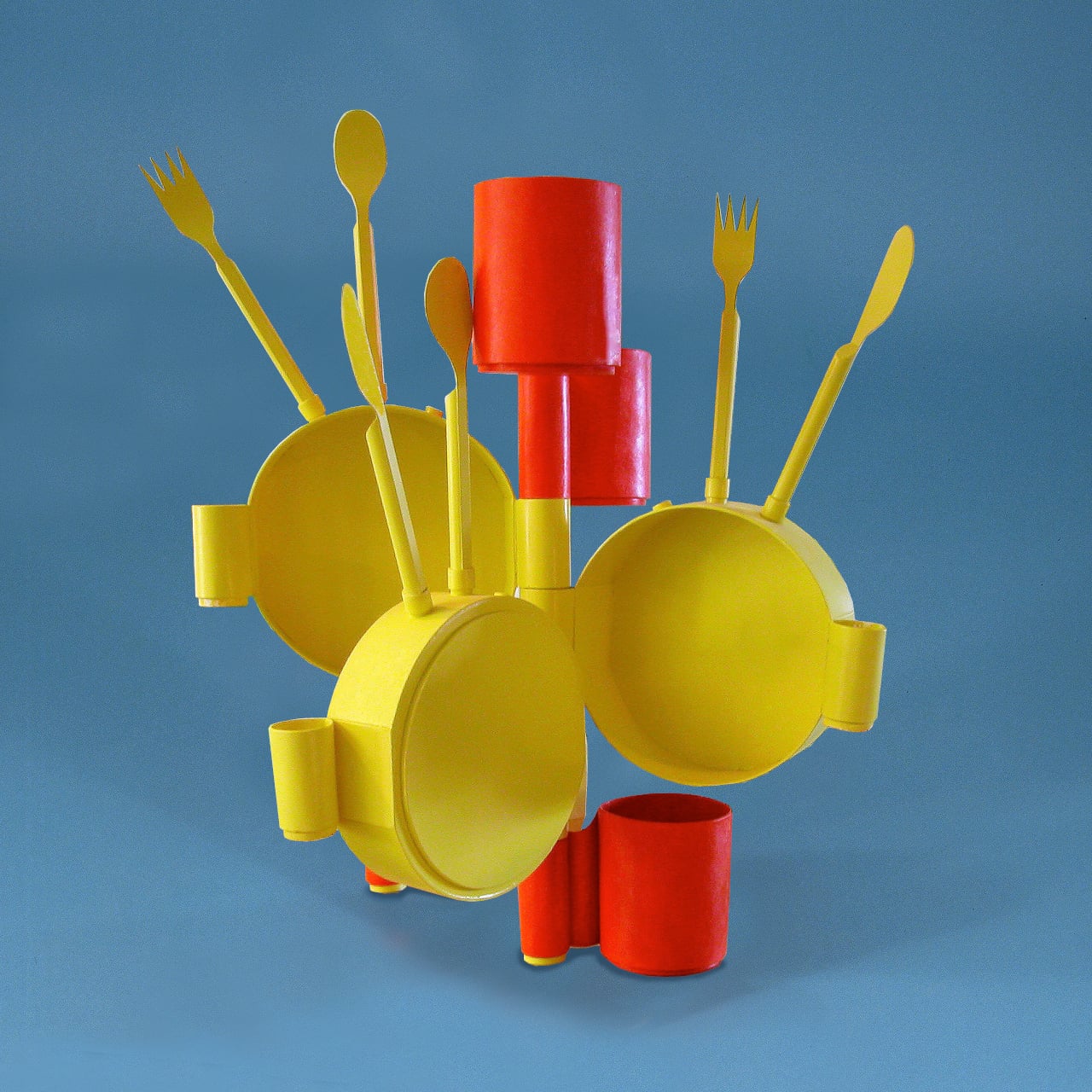
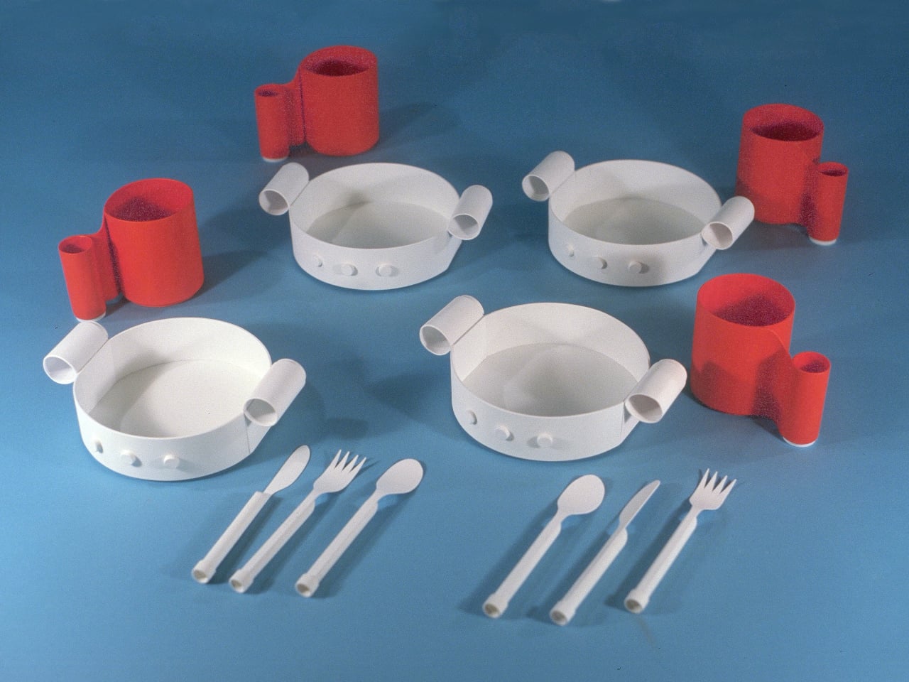
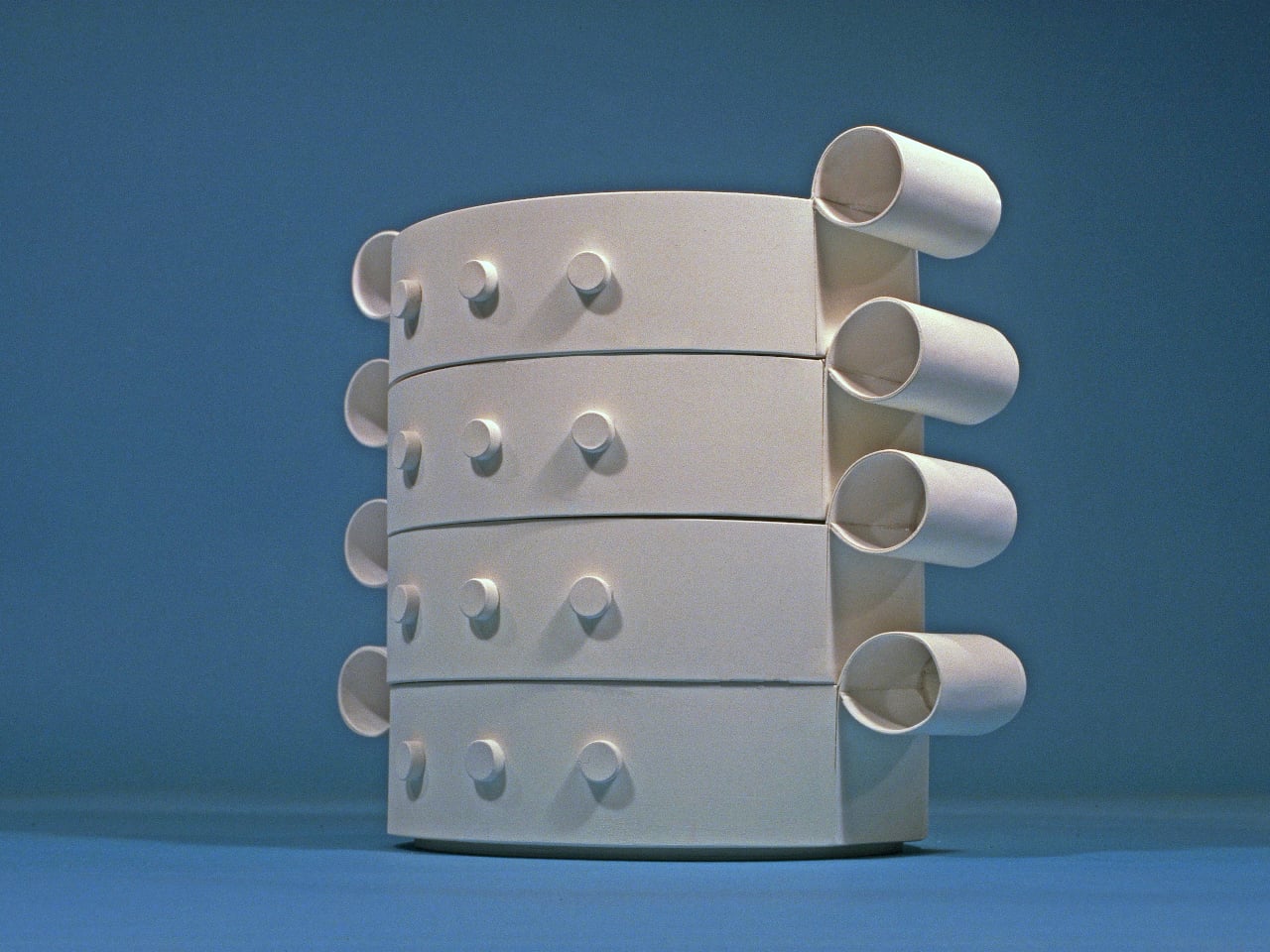
Most lunch boxes start with the food. Designer Heegun Yun started with the spoon. The result is the Ring Lunch Box, a three-tier modular meal kit from the Seoul-based industrial designer that flips the logic of how we think about everyday carry and, frankly, makes you wonder why nobody did this sooner.

The concept is deceptively simple: a central utensil holder, cylindrical in form, sits at the core of the entire system. Three ring-shaped food containers then slot and stack around it, each one designed to clip onto that central hub in a clean, satisfying sequence. The structure is compact, the assembly is intuitive, and the whole thing comes apart without fumbling. It looks like it belongs in a design museum. It also looks like it actually works, which is a genuinely rare combination.

Designer: Heegun Yun

What makes the Ring Lunch Box so satisfying to look at is the way the ring form makes visual sense even before you fully understand the function. The geometry is honest. The containers are rings because they literally surround something. The central piece is cylindrical because it needs to be gripped and carried. Nothing here is decorative for decoration’s sake, and that restraint is what good industrial design looks like when it’s operating with confidence. A lot of design concepts at this level of sophistication tend to overcomplicate things as a way of signaling cleverness. Yun goes in the opposite direction entirely, and the result is more impressive for it.

Yun is a young Korean industrial designer who has already proven that he’s not just technically skilled but conceptually precise. He’s a 2024 iF Design Student Award winner, a European Product Design Award winner from 2023, and a Spark Design Award finalist in 2025. For a designer still in the early stages of building his professional portfolio, that’s a track record that commands real attention and suggests this Ring Lunch Box is far from the last we’ll hear from him.

It’s also worth noting that Korean design culture has been quietly rewriting the rules of everyday product design for a while now. From kitchenware to tech accessories, Korean designers tend to operate with a kind of disciplined elegance that doesn’t perform minimalism so much as just live inside it comfortably. The Ring Lunch Box feels like a natural extension of that sensibility. It doesn’t announce itself. It just works, and it works beautifully.

I’m particularly drawn to how the design treats the utensil not as an afterthought but as the literal axis of the whole system. Every lunch box I’ve ever owned had the spoon rattling around somewhere, tucked into a side pocket I eventually forgot about, or worse, kept separately and left behind. The Ring Lunch Box makes the utensil the reason the containers exist in the shape they do. That’s a philosophical shift, not just a practical one, and it changes the way you interact with the object before you’ve even touched the food.

The modular structure also matters in ways that go beyond aesthetics. Each container separates independently, which means cleaning is easier, portion control is genuinely flexible, and you can carry fewer tiers on lighter days without the whole thing feeling incomplete. Modularity in everyday products often sounds better in a brief than it actually functions in practice. Here, the ring geometry enforces the modular logic in a way that’s almost impossible to mess up.

Will the Ring Lunch Box become a commercial product? That part remains to be seen. Right now it lives on Behance as a design concept, but it has the kind of structural clarity that tends to attract attention from the right people in manufacturing and licensing. It doesn’t feel speculative in the way student concepts sometimes do. It feels considered, finished, and ready. And sometimes the best designs are the ones that make you ask not whether they should exist, but why they don’t already.

The post The Lunch Box Where One Ring Holds Everything Together first appeared on Yanko Design.

This Cup Replaces the Kettle So Visually Impaired Users Make Tea Alone

For most people, making a morning cup of tea or coffee is an almost automatic routine. But for someone who can’t see, the same steps involve a level of risk that kitchenware has never really been built to handle. Hot liquids, unfamiliar controls, and the constant need to pour from one vessel to another can turn a simple habit into a genuine obstacle.

Designer Ivana Nedeljkovska’s Smart Cup for Visually Impaired Users tackles that problem head-on. Built from scratch with blind and visually impaired users as the primary audience, it combines the roles of a kettle, a teapot, and a drinking cup into one integrated form designed to be navigated entirely by touch, so there’s no need to move hot liquid between containers at any point.

Designer: Ivana Nedeljkovska

The challenge isn’t a small one. Conventional kitchen tools, from kettles to electric water heaters, were all designed for someone who can see them. They offer no tactile feedback on whether they’re on or off, no way to safely judge when water is ready, and no guidance on where to set things down. For visually impaired users, the kitchen is full of small ambiguities that add up to real risk.

That matters because every transfer of liquid is a risk. Pouring boiling water from a kettle into a separate cup is the kind of step that can go wrong for anyone, but for a blind user, the consequences are far more serious. Keeping the entire heating and drinking process within one vessel removes those moments before they can become a problem.

Every tactile detail carries that same logic through the design. A circular base guides the cup into the correct position when placed down, taking the guesswork out of a step that most products never consider. Raised Braille ON/OFF markings let the user activate and control the heating function entirely on their own, with no visual feedback or anyone else’s input required.

As for the cup itself, the same thinking applies. Its rounded, barrel-like body fits comfortably in the hand, and the handle’s adaptive shape ensures a secure grip without needing to search for the right position. The heat-resistant material keeps the exterior manageable even at full temperature, a detail that matters quite a lot when touch is the primary way of reading what’s inside.

Taken together, these choices reflect something that product design rarely gets around to prioritizing: dignity. Blind and visually impaired users shouldn’t have to depend on others or work around tools that were never built with them in mind just to make a hot drink. The Smart Cup treats independent use not as a bonus feature but as the foundational premise of the entire design.

It’s also worth noting that aesthetics aren’t treated as secondary here. The warm-toned form and sculpted handle give the cup a polished quality that would feel at home on any kitchen counter, not just in a specialized or assistive context. Accessible design has long leaned on utilitarian looks, as if beauty and function were incompatible, and this concept quietly pushes back against that assumption.

The post This Cup Replaces the Kettle So Visually Impaired Users Make Tea Alone first appeared on Yanko Design.

The Tray That Knows You Eat in Bed

Most of us don’t eat at the dining table anymore. Not really. The pandemic accelerated something that was already quietly happening: meals migrating from the kitchen to the living room, the bedroom, the desk, the floor. We eat while watching something, while scrolling something, while half-working and half-resting. The dining table still exists, sure, but as a concept, it has become more aspirational than actual.

And yet, the tools we use to manage the air around our food haven’t moved with us. Range hoods are bolted to the ceiling above a stove. Portable air purifiers sit in corners, doing their best from across the room. Even the newer tabletop options ask you to position them just right, or carry them separately, adding friction to something that should feel effortless. For a culture that has fully embraced eating anywhere, the air solutions available to us are still very much designed for eating in one place.

Designer: Junho Han

Junho Han’s Notrace:Null addresses this with a level of clarity that makes you wonder why no one thought of it sooner. The concept is simple: instead of building a separate device that you need to carry alongside your food, the air purification system is built directly into the tray. You pick up your food, and the solution comes with it. No extra steps, no reconfiguration, no reminder to bring the device. The tray is the device.

Visually, Notrace:Null makes almost no noise about what it does. The design is quiet and off-white, with a flat surface that opens to reveal an internal filter system underneath. A small button sits flush against the side, the only visible sign that this tray does anything beyond hold a bowl of ramen. The fine venting grid along the underside is equally understated. That restraint feels deliberate, and it is the right call. The best-designed things tend to look like they were always supposed to exist, and Notrace:Null has that quality.

What strikes me about this concept is that it doesn’t try to change behavior. It slots into the routine that already exists. You grab the tray, put your food on it, carry it to wherever you’ve decided to eat tonight, and that’s it. The air filtration happens as a byproduct of your usual movement. Han describes this as “the most natural solution,” and the framing holds up. Good design doesn’t demand that users adapt to it. It adapts to users instead.

The project also makes a quiet cultural observation worth sitting with. The rise of single-person households, convenience foods, and personalized streaming content has fundamentally changed where and how people eat. We don’t just eat in the kitchen anymore. We eat throughout the entire home, and that shift has real consequences for air quality. Food odors that once stayed contained now travel freely. Bedrooms carry the memory of last night’s dinner. Living rooms hold the ghost of lunch. Notrace:Null is designed around this reality rather than around the home we’re told we should have.

It’s still a concept, and that’s worth noting. As a Behance project, Notrace:Null exists in that productive space between idea and product, where the thinking is fully formed but the execution remains hypothetical. The concept feels mature enough to be producible, though. The form factor is practical, the use case is real, and the need is clearly there. If it ever makes it to market, it would fill a gap in the air quality space that nobody has managed to articulate this well before.

Design concepts like this remind me why speculative design matters. Not everything needs to ship immediately to be valuable. Sometimes a well-considered idea just needs to exist, to put the question on the table and make it harder to ignore. Notrace:Null asks a simple question: if how we eat has changed, shouldn’t the tools that support it change too? The answer is obvious. The solution, it turns out, was hiding in a tray.

The post The Tray That Knows You Eat in Bed first appeared on Yanko Design.
This 4-in-1 Dispenser Ends the Sticky Sauce Bottle Chaos

There is a particular kind of table chaos that happens at a backyard barbecue or a casual dinner. Four or five sauce bottles crowd around the food, each one sticky at the cap, half of them tipped on their side. It is a small problem but a persistent one, and it is the exact friction that the Drippl is designed to remove. The device consolidates four condiments into a single, upright dispenser.

The Drippl stands 20cm tall and 7cm wide, sized to sit comfortably in one hand. Its four wedge-shaped compartments each hold 150ml of sauce for a combined capacity of 600ml. The form is composed: a white base with frosted, semi-transparent chambers that let you see the sauce inside without fully exposing it, keeping the table looking calm rather than congested with mismatched packaging.

Designer: Drippl

The interaction is straightforward. Rotate the selector dial at the base to the sauce you want, feel a tactile click when it locks in, and squeeze. Only the selected chamber opens; the remaining three stay fully sealed. Turn to the fully closed position, and all outlets are blocked, which matters when the unit is in a bag on the way to a picnic or packed into a cooler for an outdoor cookout.

1

1

The valve system treats sauce viscosity as a variable worth solving for, rather than applying a single nozzle to everything. A large valve handles creamy, thick sauces like mayo; a medium valve suits ketchup and mustard; a small valve controls thinner pours like soy sauce or hot sauce. The valves are interchangeable, so the configuration adapts to whatever combination you fill it with on a given day.

Cleanup is just as stress-free thanks to a fully detachable design. Every compartment, spout, and the selector base separates for hand washing or the dishwasher. The materials are food-grade and BPA-free, with compartments designed to resist staining and odor absorption. The unit also handles sauces up to 70°C (158°F), covering warm applications like heated barbecue sauce, though anything beyond that temperature falls outside its range.

What the Drippl addresses, beyond pure consolidation, is the presentation problem that standard sauce bottles ignore entirely. Most condiment packaging is designed for storage and retail shelf presence, not for the experience of using it at a table. The frosted compartments and white base give it the visual grammar of a considered object, rather than a row of utilitarian squeeze bottles.

That said, the design raises practical questions worth sitting with. At roughly 800 to 850g when fully filled, it is not a lightweight carry. Consolidating four sauces works smoothly when your preferences stay consistent, but swapping out one sauce mid-rotation requires cleaning that compartment first, reintroducing some of the same friction the product is trying to eliminate.

The Drippl is currently in prelaunch, so there are no answers yet on how the sealed valve system holds up across repeated use with thicker sauces, or whether the tactile selector stays reliable after months of daily rotation. Those are fair questions for any mechanism-dependent kitchen product. The concept is well-reasoned, but durability at the valve level will ultimately determine whether this stays on the table or gets retired to a shelf.

The post This 4-in-1 Dispenser Ends the Sticky Sauce Bottle Chaos first appeared on Yanko Design.

6 Camping Mugs From Japan That Make Coffee Taste Better (Science Says So)

You know that first sip of coffee in the morning, the one where everything just clicks? Turns out, the mug you’re drinking from has more to do with that feeling than you might think. Research has shown that ceramic mugs maintain temperature better, have a neutral flavor profile that won’t interfere with your brew, and even influence how your brain perceives taste. Studies suggest that the shape, material, and even the color of a cup can shift how sweet, intense, or satisfying a coffee actually tastes. In short, your vessel is not just a vessel. It is part of the experience.

And when it comes to vessels, Japanese ceramics have been quietly setting the standard for centuries. Right now, Japanese design is having a well-deserved moment in the spotlight, with hot beverage lovers drawn to its philosophy of wabi-sabi, finding grace in imperfection, and a deep respect for intentional, handcrafted beauty. A Japanese ceramic mug is not mass-produced or cookie-cutter. It carries the marks of its maker, the character of its kiln, and a quiet soul that only deepens with use. Bring one to your next camping trip, and that early morning brew by the fire? It just became a whole experience. These six Japanese camping mugs are proof of that.

1. Ceramic Cup

Japan’s relationship with coffee is a serious one, and the objects surrounding that ritual tend to reflect it. This Ceramic Cup is a product of that culture: a 350ml vessel crafted from Japanese ceramic with a smooth, refined finish and a natural wood handle, designed to slow the act of drinking down into something closer to meditation. It’s the kind of cup you buy because you’ve decided your daily coffee deserves better than whatever was left in the cabinet.
The pairing of ceramic and wood isn’t accidental. The ceramic body holds heat beautifully, keeping your pour at temperature while you linger over it, while the wood handle stays cool and grounded in your grip. At $60, the Ceramic Cup sits in that satisfying range of objects that feel like a genuine investment in small daily pleasures, the kind you notice every single morning and never quite get tired of.

Click Here to Buy Now: $60.00. Hurry, only a few left!

Why do we love this mug?

Bring it camping and it becomes something else entirely. Picture a particular kind of morning: cold air, slow light, the sound of a stove clicking to life. That morning deserves a proper cup. The sturdy ceramic and warm wood handle make that ritual feel intentional, even deliberate. It’s not just a mug. It’s a reason to wake up a few minutes earlier.

2. Haori Cup

When designer Tomoya Nasuda set out to revive the 400-year-old Japanese craft of Hakata Magemono, the painstaking art of hand-bending thin cedar wood plates into curved forms, the world took notice. The response was a resounding answer to the question of whether people still care about objects made with genuine cultural depth and human skill. Named after the haori, the traditional Japanese garment that wraps itself around the body, the cup follows the same principle: a single wooden plate, coaxed by hand into a form that feels both ancient and entirely new.

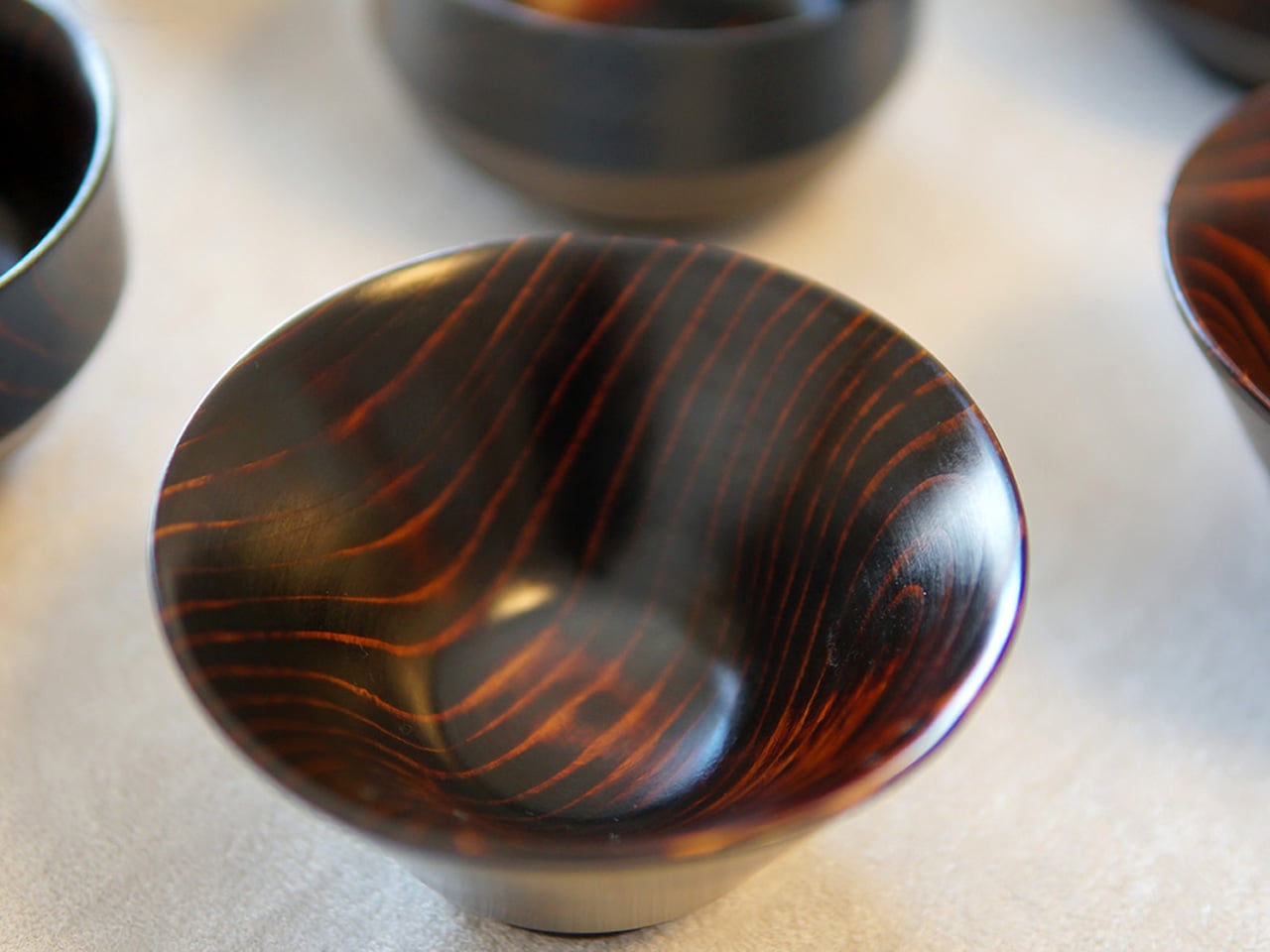
What elevates the Haori Cup from beautiful object to exceptional mug is how it actually performs. The bentwood construction provides natural insulation, keeping your coffee comfortable to hold whether it’s steaming hot or poured over ice, with no burning fingers and no sweating cup. The cedar wood lends a subtle, clean fragrance to each sip: a whisper of forest, not a shout. Available in several colorways including the delicate “Sakura,” every cup is handmade and genuinely one of a kind, shaped by the same grain patterns and hands that define any true craft object.

Why do we love this mug?

Bring the Haori Cup camping and something clicks into place. Holding warm coffee in a vessel bent from a single piece of Japanese cedar, sitting among trees that look not so different from the ones that made it, that’s the kind of moment you came outside for. It’s lightweight, it’s alive with history, and it makes your first cup of the morning feel less like a caffeine delivery system and more like a ceremony worth showing up for.

3. Earth Friendly Tumbler

There’s something poetic about a vessel that eventually gives itself back to the earth. The Earth Friendly Tumbler from Japan’s EcoCraft line is made from a biodegradable resin derived from paper and corn, meaning that when its long life finally ends, it quietly decomposes into water and CO₂ through natural microbial action. It’s a cup that carries the philosophy of the country that made it: thoughtful, restrained, and deeply intentional about its place in the world.

What keeps you reaching for it, though, is how it feels. The surface has a distinctive texture that sits somewhere between ceramic and wood, warm to the touch, satisfying in the palm, and nothing like the cold uniformity of plastic. Its minimalist design is clean enough for a city desk but earthy enough for the forest, and starting at just $25, it’s an easy yes. Because each tumbler’s material is shaped naturally through the biodegradable process, no two are exactly alike, a quiet nod to the Japanese ideal of wabi-sabi.

Click Here to Buy Now: $25.00. Hurry, only a few left!

Why do we love this mug?

For the camper who takes their environmental footprint as seriously as their coffee, this tumbler is a natural match. It’s light enough for a day hike, beautiful enough to sit on a camp table at sunrise, and carries with it the rare satisfaction of knowing the mug in your hand is doing the planet a quiet favor.

4. Titanium Mug

Titanium has always been the material of people who won’t compromise, and Japan’s precision metalworkers know how to honor that reputation. This mug is engineered from pure titanium, a material roughly 45% lighter than stainless steel yet equal to it in strength, which means the first time you pick it up, the lightness will catch you off guard. It feels almost implausibly slight in your hand for something this solid.

But the real story is what titanium does for your coffee. Unlike stainless steel, titanium imparts zero metallic taste or odor to your drink, so your coffee arrives exactly as it was brewed, nothing added, nothing taken away. Its lower thermal conductivity also means heat moves through the walls more slowly, keeping your drink warmer for longer on cold mornings. And with use, the titanium surface develops a gradual oxide film, a deepening, iridescent patina that makes each mug grow more beautiful and personal over time.

Why do we love this mug?

This is gear built for the outdoors without apology. It can be placed directly over a camp stove, it’s impervious to rust even in wet conditions, and its ultralight profile makes every gram-counting backpacker smile. It’s the mug you bring on every trip and eventually can’t imagine leaving behind.

5. T-Go Mini

The premise of the T-Go Mini is a simple one: great coffee shouldn’t require you to leave your standards at the trailhead. This compact travel mug was designed for people who refuse to accept that “outdoor coffee” has to mean bad coffee. Small enough to disappear into any pack, it strips the camping mug back to its most essential form and then gets every detail of that form exactly right.

“Mini” here means refined, not reduced. The T-Go Mini is shaped by the Japanese design principle of doing more with less: a tighter footprint, a secure seal, heat retention that punches above its size, and a construction that speaks of deliberate craft rather than cost-cutting. It’s the kind of object that reveals itself slowly. The more you use it, the more you appreciate what its designers chose not to include, and why.

Why do we love this mug?

For the hiker, the trail runner, or the minimalist camper who’s already decided every gram matters, the T-Go Mini is an easy decision. Slip it into a chest pocket, a jacket pouch, or a side sleeve, and let it quietly prove that the best outdoor gear doesn’t ask you to compromise. It just asks you to pay attention.

6. Pilmoa Mug

The Pilmoa Mug is a second-generation design refined through real-world feedback and use. It represents something increasingly rare in the outdoor gear market: a mug designed by people who actually think carefully about what it means to drink coffee well, not just to drink it conveniently.

The Pilmoa is built around the small details that most camping mugs overlook: the feel of the rim against your lips, the balance of the cup in a cold hand, the way heat distributes through its walls on a slow morning. These are the quiet, almost invisible considerations that separate a mug you tolerate from one you genuinely look forward to. It’s not trying to do everything, just trying to do one thing with the kind of focus that Japanese product design consistently brings to the table.

Why do we love this mug?

Compact and carefully conceived, the Pilmoa earns its place in any outdoor kit. Whether you’re setting it beside a stove in the backcountry or pulling it from a hip pack mid-hike, it holds its ground. It’s the kind of mug that reminds you, every time you use it, that good mornings outdoors are worth planning for.

Six mugs, six philosophies, one shared conviction: that how you drink matters as much as what you drink. Whether you reach for the biodegradable quiet of the Earth Friendly Tumbler, the handcrafted soul of the Haori Cup, or the no-compromise precision of the Titanium Mug, each of these objects carries the same Japanese understanding that a well-made vessel is never just a vessel. It is an argument, made in clay or cedar or titanium, that ordinary moments deserve extraordinary attention. Science already told us that the cup shapes the experience. Japan has known that for centuries. So the next time you find yourself at a campsite with cold air in your lungs and a stove hissing to life, think carefully about what you pour your coffee into. The right mug won’t just hold your drink. It will hold the whole morning.

The post 6 Camping Mugs From Japan That Make Coffee Taste Better (Science Says So) first appeared on Yanko Design.