Look, here’s a design problem that most people never think about: what happens when wheelchair users get caught in the rain? Traditional umbrellas require a free hand, ponchos bunch up awkwardly, and standard rain gear just wasn’t designed with wheelchair ergonomics in mind. Nicolas Odorizi’s Mobidry tackles this overlooked challenge with a solution that’s both elegantly simple and surprisingly sophisticated.
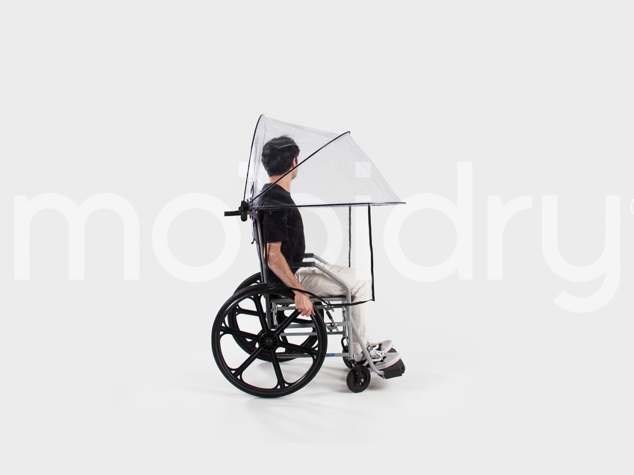
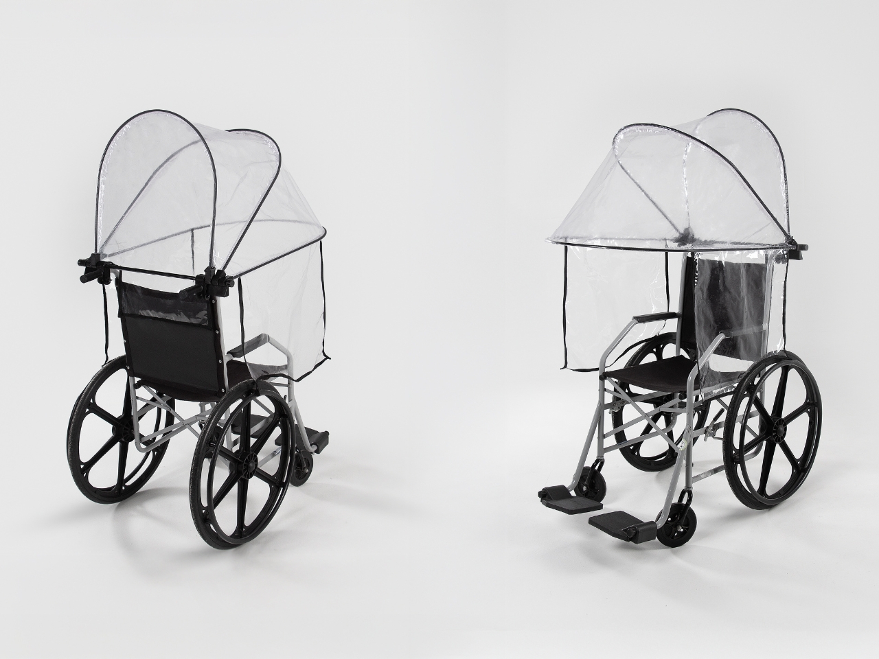
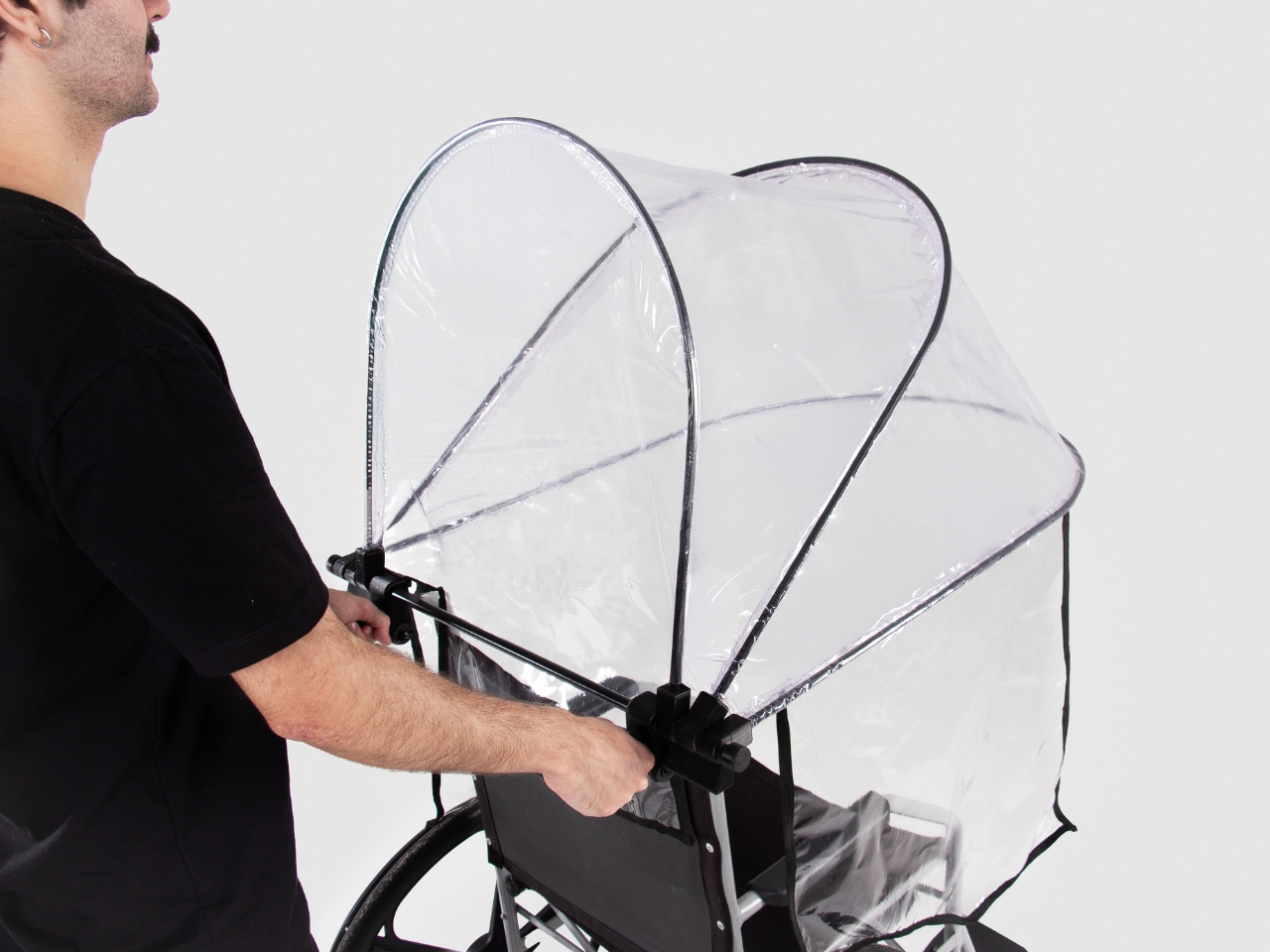
At first glance, Mobidry looks almost futuristic. A transparent dome-like canopy wraps around the wheelchair and user, supported by a minimal aluminum frame. But what makes this design genuinely clever isn’t just how it looks. It’s how thoroughly Odorizi thought through every detail of the user experience. The frame itself is lightweight aluminum, which matters more than you might think. Wheelchair users are already managing equipment weight with every push and transfer. Adding bulky protective gear to that equation creates real physical strain. The aluminum structure keeps things light while maintaining enough rigidity to hold the canopy securely in place, even when wind tries to turn it into a sail.
The canopy material is transparent and waterproof, which solves two problems simultaneously. Waterproofing is obvious, but transparency is crucial for maintaining visibility and reducing that closed-in feeling that opaque covers create. You can see the careful seaming along the edges where the material curves around the frame, following the wheelchair’s contours rather than fighting against them. This isn’t just fabric draped over a frame. It’s a precisely engineered shape.
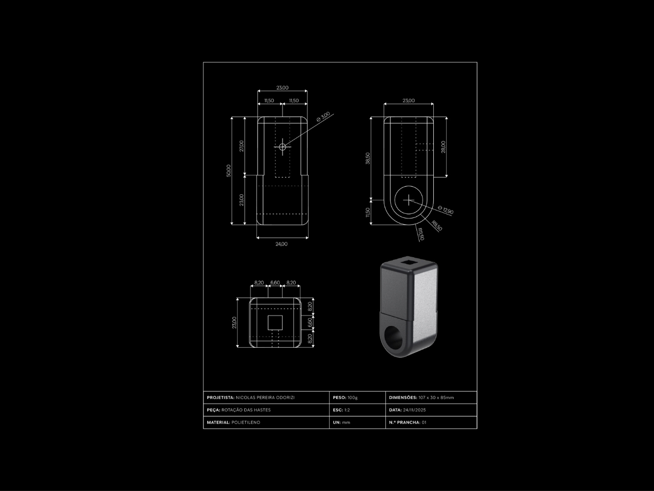
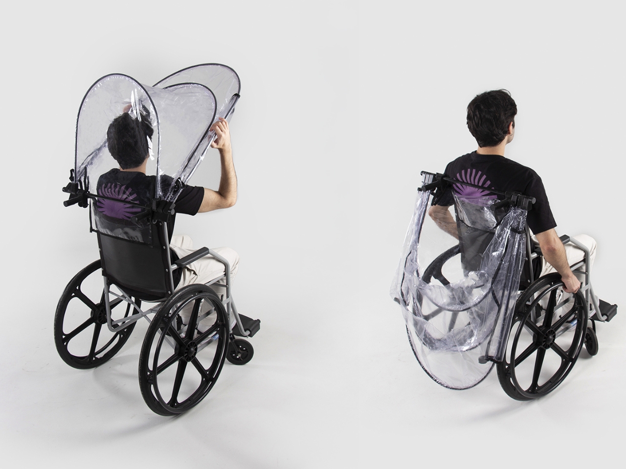
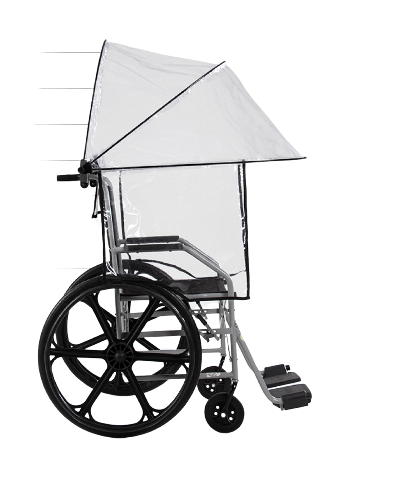
One of the standout features is the rotation and fixation system. The entire canopy structure can pivot and lock into position, which means users can adjust coverage based on wind direction or simply fold it back when the rain stops. This kind of flexibility transforms Mobidry from a single-purpose rain shield into something more versatile. The mounting mechanism appears robust but unobtrusive, integrating with the wheelchair frame without requiring permanent modifications.
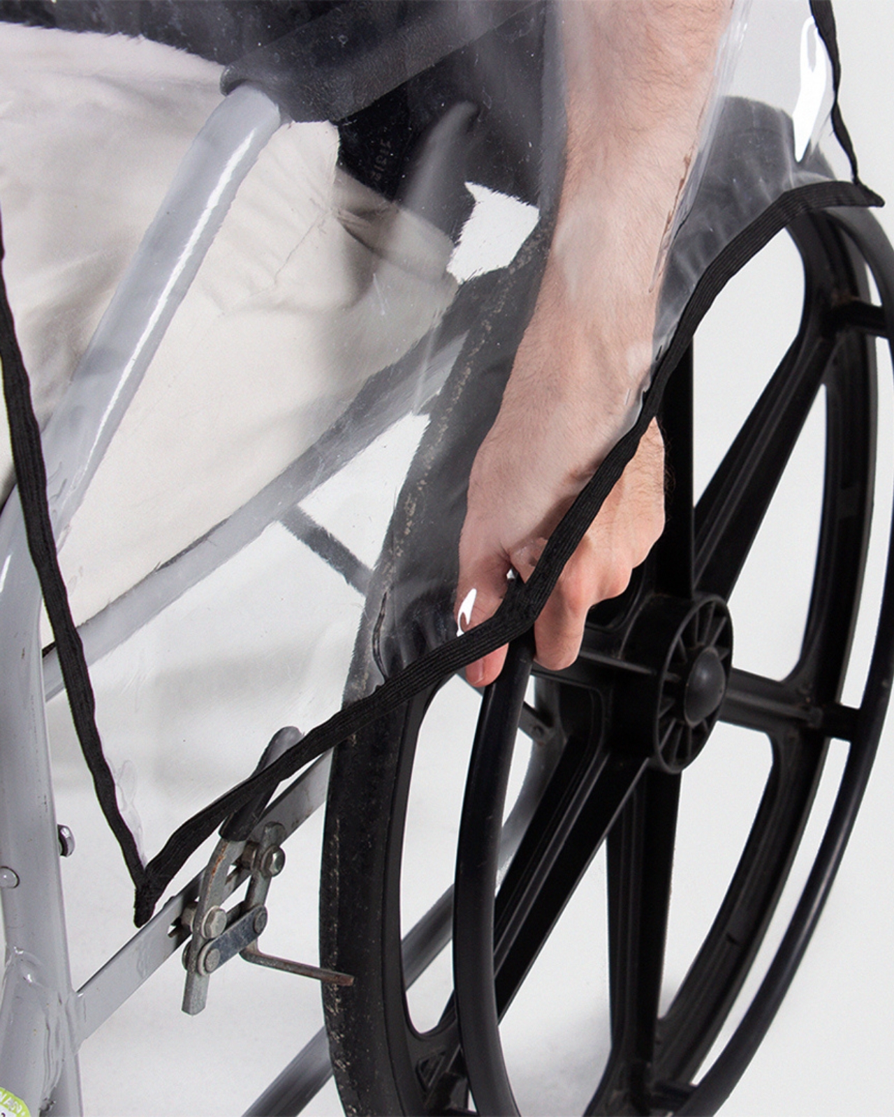
The coverage itself is comprehensive. Top, front, sides, and rear protection work together to create an enclosed protective zone. But look closely at how the design handles the transition points. Where the canopy meets the wheelchair frame, there’s a bias-tape finish that contours around the wheels. This detail prevents the material from catching on moving parts while maintaining a weather-tight seal. It’s the kind of thoughtful touch that separates good design from great design.
What really strikes me about this project is how it balances protection with dignity. Accessibility products often veer into two extremes: either aggressively medical-looking or trying too hard to be “inspirational.” Mobidry just looks like well-designed gear. The transparent material and clean lines give it an almost architectural quality, like a tiny modern pavilion that happens to travel with you.
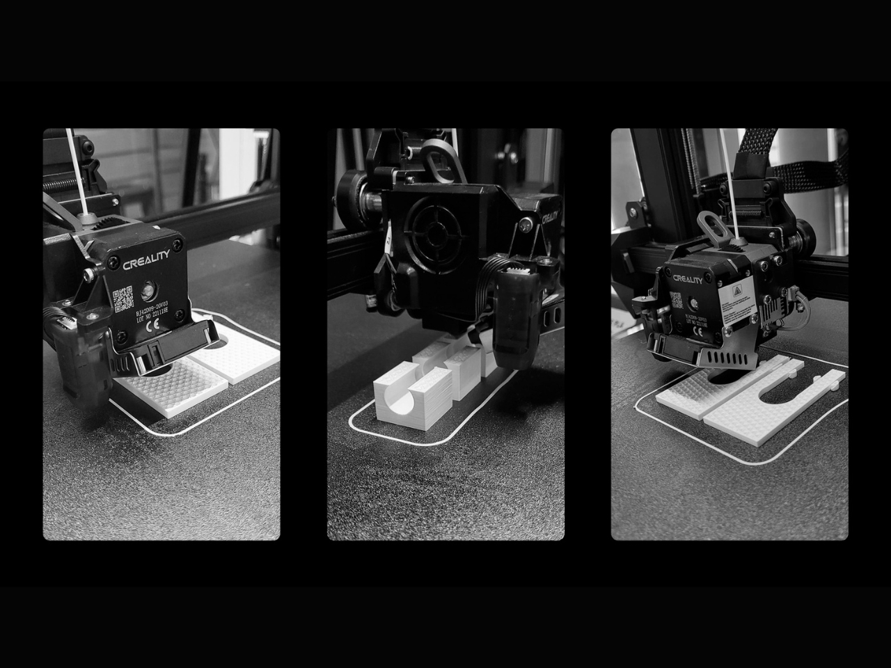
The project documentation shows Odorizi worked through multiple prototypes, refining the form and testing the mechanics. You can see evidence of 3D printing used for component development, suggesting an iterative design process that prioritized function over flash. The technical drawings reveal careful attention to dimensions and clearances, ensuring the canopy provides adequate coverage without restricting arm movement or visibility. There’s a quote in the project materials that really captures why this matters: “Rain affects our independence and autonomy to go places.” That’s the core insight driving this entire design. It’s not about staying dry for comfort’s sake. It’s about maintaining the freedom to move through the world on your own terms, regardless of weather.
From a broader design perspective, Mobidry represents a shift in how we think about accessibility products. Rather than adapting existing solutions poorly or creating specialized equipment that screams “medical device,” it asks what a purpose-built solution could look like when designed from the ground up with wheelchair users in mind. The result respects both the technical requirements and the aesthetic expectations of its users.
Nicolas Odorizi, working from Porto Alegre, Brazil, has created something genuinely useful here. Not revolutionary in the sense of reinventing wheelchairs, but revolutionary in addressing a specific, frustrating gap in the market with intelligence and style. Sometimes the best design isn’t about grand gestures. It’s about solving real problems with grace and precision. Mobidry does exactly that.
GaN chargers have gotten smaller and more efficient over the years, but they still look like anonymous black or white bricks. Most people toss them in a bag and forget about them, and if you travel frequently, you end up carrying a separate adapter for different plug types. It’s functional but incredibly boring, and the whole category feels like it stopped trying once the engineers got the size and wattage right.
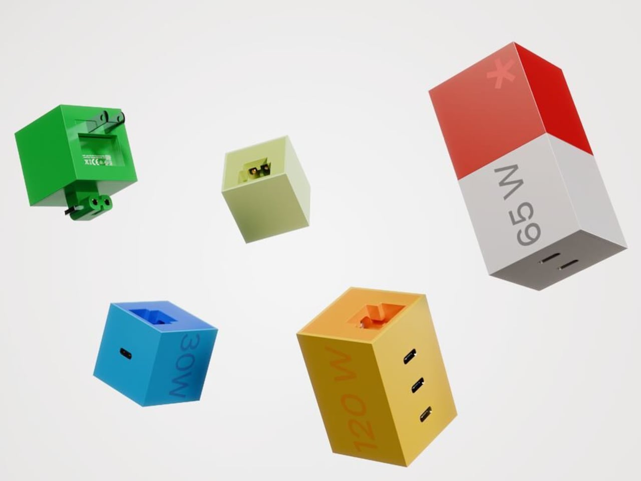
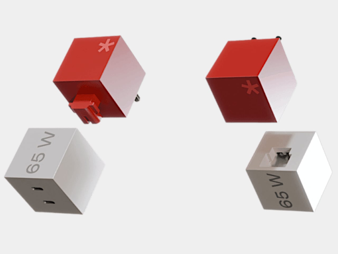
Bang Design’s LEGO-inspired GaN charger is an intern project that tries to make chargers fun and modular instead. The concept treats the charger as a colorful block system, with different cubes for different wattages and swappable plug modules for different countries. It’s patent-pending but still just a concept, though it looks polished enough that you could imagine buying a set off a shelf and arranging them on your desk like tiny toys.
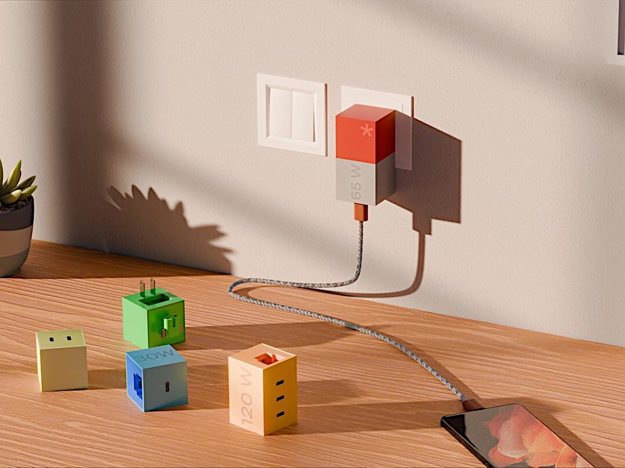
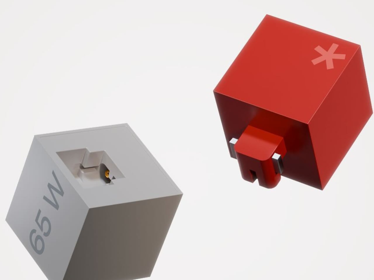
Every module is a perfect cube or tall cuboid with sharp edges and flat faces that instantly read as building blocks. The 65 W version has a red top half, white bottom half, and large “65 W” printed on one side in light gray type. A subtle asterisk mark on the top hints at a LEGO stud without copying it directly. The rest of the family uses green, blue, yellow, and pastel beige blocks with the same bold geometry.
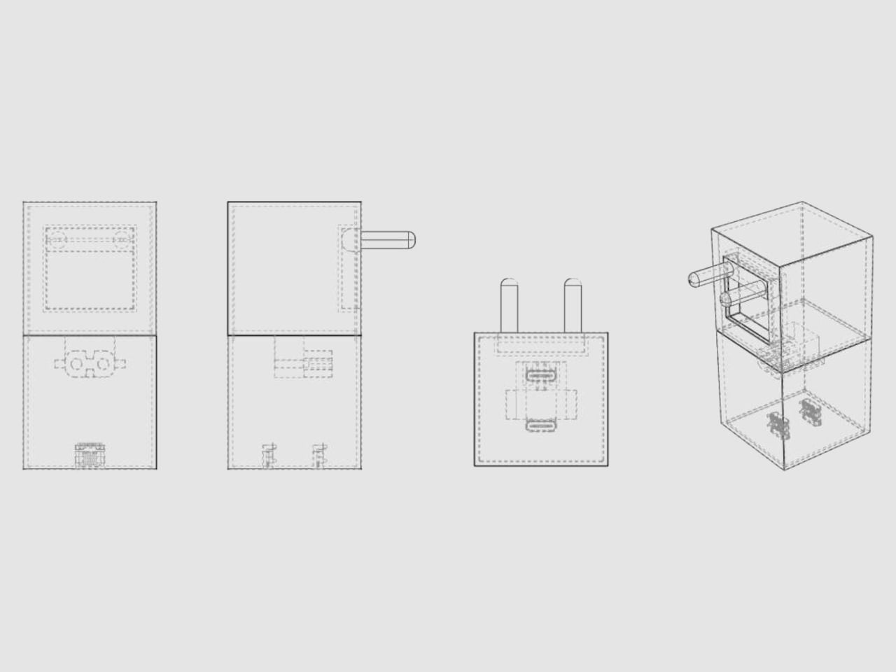
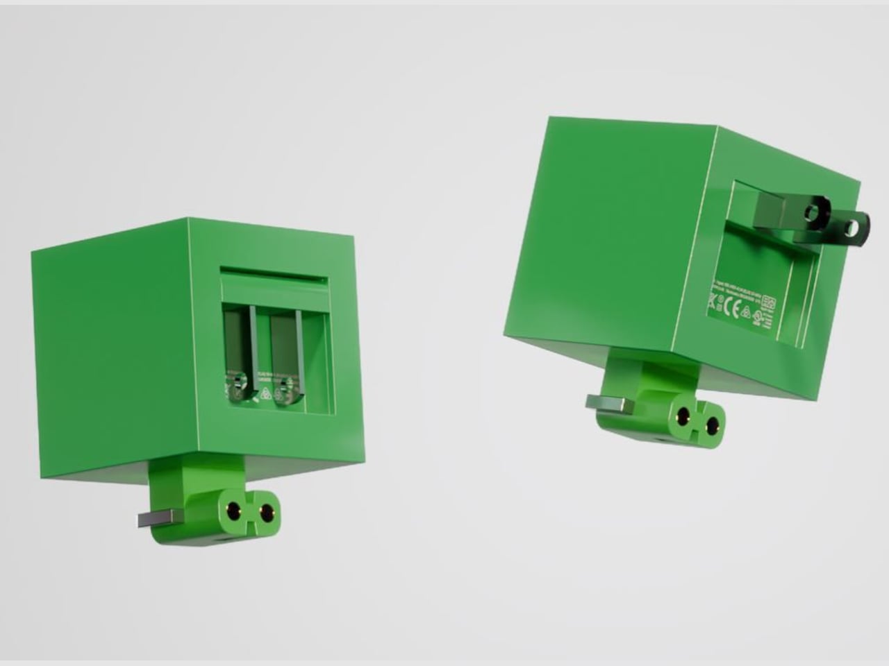
One green cube houses a sliding plug carriage with metal prongs that can be removed and replaced with different pin standards for US, Indian, or European outlets. A rectangular recess on one face holds the carriage, and gold contacts inside suggest a cartridge-style electrical connection. The plug becomes just another swappable piece of the system rather than something permanently wired to the charger, which is the whole point.
Different wattage blocks have different port configurations. The blue 30 W cube has one USB-C port, the yellow 120 W block has three outputs, and the beige version mixes USB-A and USB-C. Users could pick the block that matches their device or build a small family that shares the same plug module. The big printed wattage numbers make it easy to grab the right cube without squinting at tiny labels.
One cube plugs into the wall while the other blocks sit on the desk like small sculptures. The chargers stop being clutter to hide and start looking like a collection you might actually enjoy arranging. The LEGO reference makes the whole setup feel approachable and almost toy-like, especially compared to the usual tangle of anonymous black bricks and bulky travel adapters that most people carry around.
Turning this into a real product would mean solving serious issues around safety certifications, heat dissipation, and mechanical durability for those swappable parts. But the concept is still valuable because it shows how even a commodity accessory can carry personality and systems thinking. The LEGO-inspired GaN charger hints at a future where chargers are not just smaller and faster, but also more playful and easier to live with.
Minimalism transforms spaces through intentional choices that celebrate quality over quantity. The right accent piece brings character to your home while maintaining the clean lines and uncluttered aesthetic that defines this beloved design philosophy. These carefully selected items demonstrate that you don’t need a substantial budget to curate a space that feels both thoughtful and refined, where every object earns its place through both beauty and purpose.
Finding minimalist home accents under $100 means discovering pieces that work harder than their price tags suggest. These selections blend Japanese craftsmanship with contemporary sensibilities, creating functional art that enhances daily routines. From lighting that sets the mood to organizational tools that simplify your life, each piece demonstrates how restraint in design often yields the most memorable results. Your space deserves accents that spark joy without creating visual noise.
1. Japanese Lantern Candle
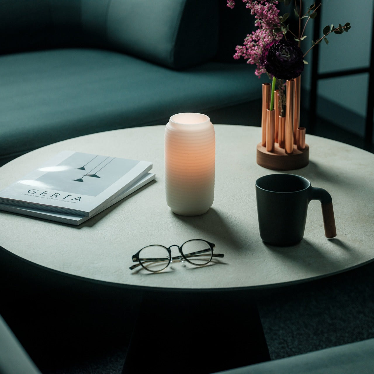
The soft flicker of candlelight carries a magic that electric bulbs can never quite replicate, and this modern interpretation of the traditional chouchin lantern brings that enchantment home. The undulating surface catches and releases light in mesmerizing patterns that shift as the candle burns, creating an ever-changing display that rewards quiet contemplation. This piece connects contemporary spaces to centuries of Japanese festival tradition while maintaining the restraint that makes it suitable for today’s interiors.
Placement options abound with this versatile accent, from bedside tables where it encourages evening wind-down rituals to living room surfaces where it adds ambient warmth during gatherings. The handcrafted candles from Kurashiki bring authenticity that mass-produced alternatives lack, with craftsmen applying techniques passed down through generations. The patented technology preventing outer wax melting means you get consistent performance throughout the candle’s life, maintaining that distinctive shape that makes this lantern so captivating to watch.
The traditional chouchin design translates beautifully to modern minimalist spaces without feeling dated or out of place
Handmade candles from Japanese craftsmen ensure quality that you can see and feel in every burn
Patented wax technology maintains the sculptural form throughout use
The undulating surface creates hypnotic light patterns that enhance meditation and relaxation practices
What we dislike
Replacement candles may require ordering from specialty sources rather than standard retailers
The delicate nature of the design means careful handling is necessary during moves or cleaning
2. Key Holder Wakka
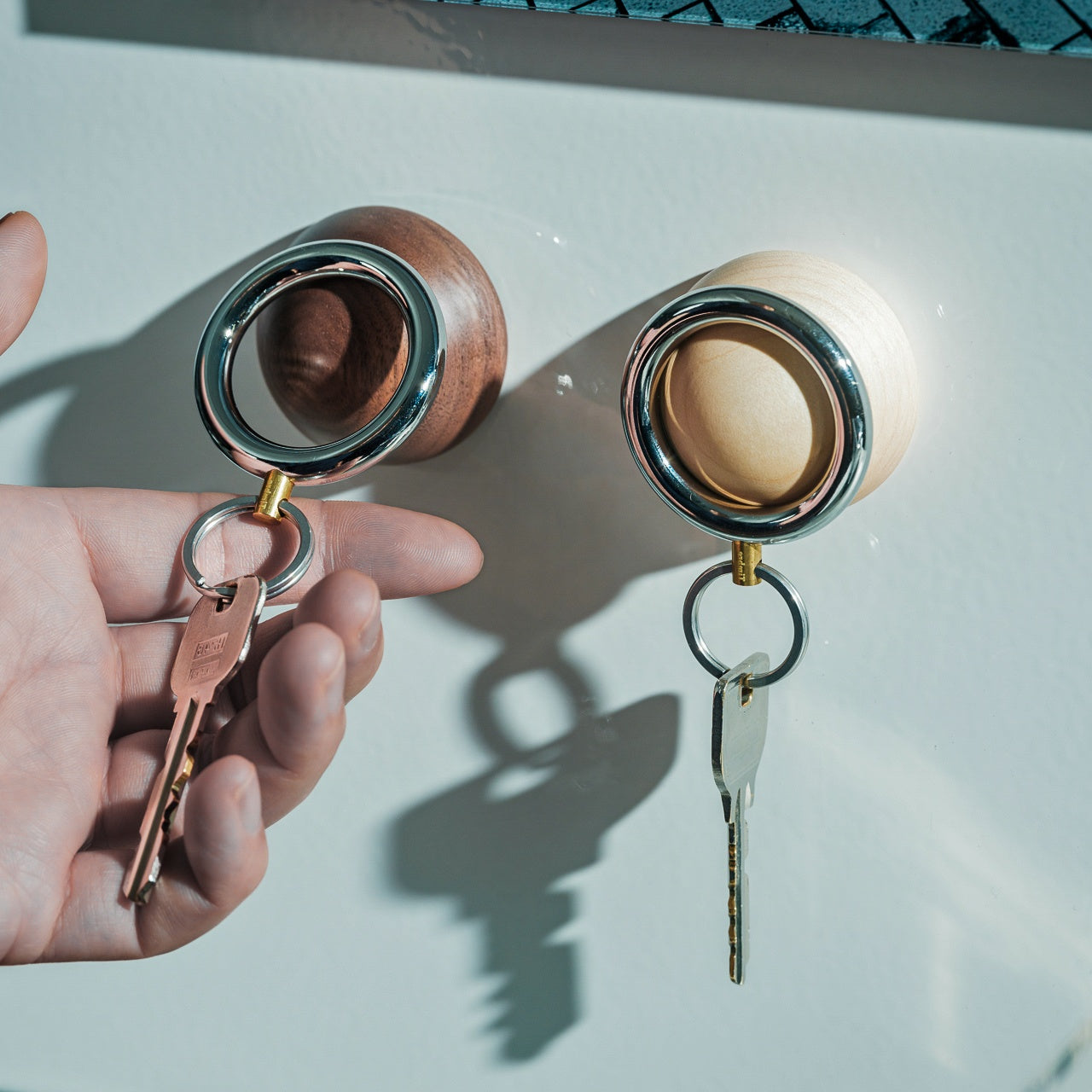
Your daily habits shape your life more than grand gestures ever could, and this magnetic key holder transforms the mundane act of coming home into something approaching a ceremony. The satisfying tap of metal meeting wood creates an auditory cue that signals the transition from outside chaos to interior calm. Crafted from contrasting materials that complement rather than compete, the Wakka sits at the intersection of utility and sculpture.
The powerful neodymium magnet ensures your keys stay exactly where you place them, eliminating the frantic morning searches that start days on the wrong foot. Choose between Silver/Maple for lighter Scandinavian-inspired interiors or Silver/Walnut for spaces with warmer, richer tones. The keyring itself combines iron, brass, and stainless steel in proportions that feel substantial without adding bulk to your pocket, proving that thoughtful design extends beyond the base to every component of the system.
The distinctive tapping sound creates a satisfying ritual that makes key storage memorable and consistent
Strong magnetic hold prevents accidental displacement even in high-traffic areas
Multiple wood finish options allow coordination with existing furniture and trim
Compact footprint works in entryways of any size
What we dislike
The metal keyring adds slight weight compared to standard plastic or leather options
Only accommodates one set of keys per base unit
3. Miniature Bonfire Wood Diffuser Set
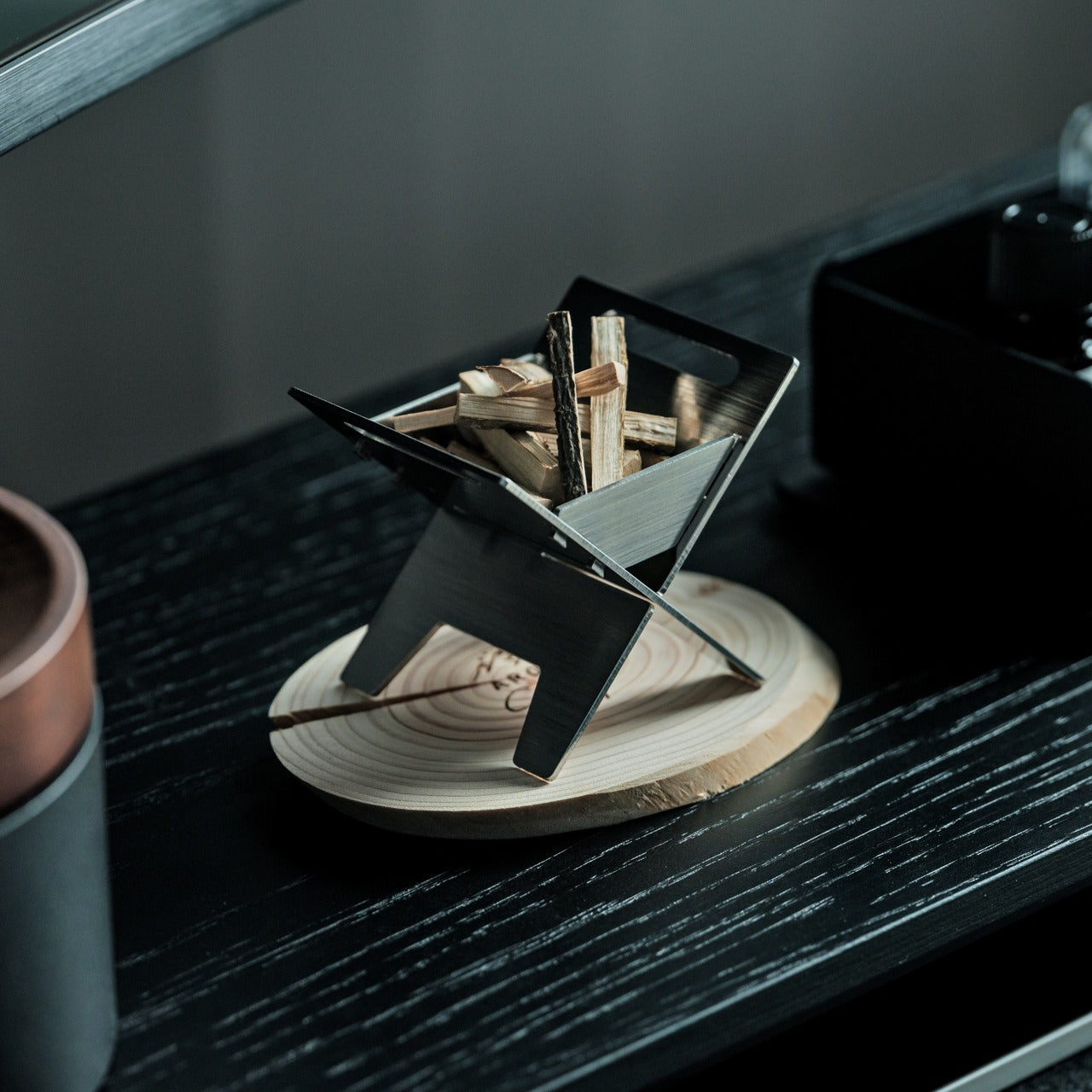
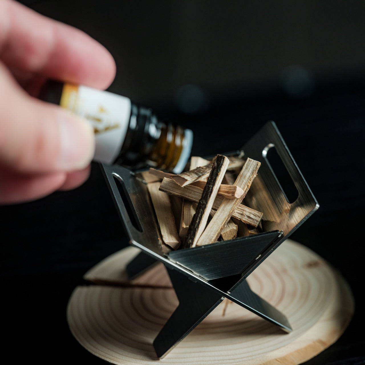
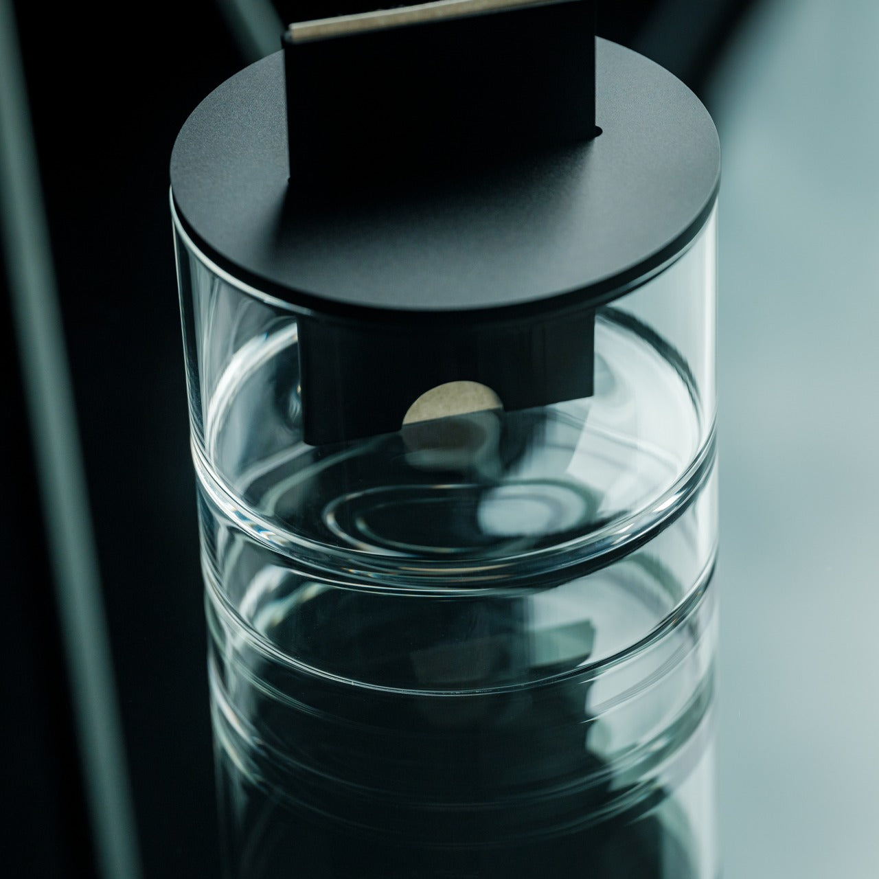
Scent memory connects powerfully to emotion and place, and this charming miniature bonfire brings mountain air into spaces that have never seen a hiking trail. The tiny bundled firewood pieces soak up essential oils and release them gradually, mimicking the gentle way forest breezes carry pine and earth notes through the trees. Beyond aromatherapy, the stainless steel construction and included trivets transform this diffuser into a functioning pocket stove for truly committed ambiance seekers.
Visual interest matches olfactory delight with this centerpiece-worthy accent that starts conversations while improving air quality. The rust-resistant stainless steel ensures longevity even in humid environments like bathrooms or coastal homes, where other diffuser materials might deteriorate. The Mt. Hakusan essential oil captures a specific place with botanical accuracy, though the system works equally well with your preferred oil blends once you’ve experienced the signature scent. The bundled firewood with its authentic tying knot shows attention to detail that elevates this beyond typical diffuser designs.
The bonfire aesthetic adds playful visual interest while maintaining minimalist principles through simple forms
Stainless steel construction resists rust and ensures years of reliable use
Versatility extends beyond diffusion to actual cooking with included trivets
Mt. Hakusan essential oil offers an authentic Japanese mountain forest experience
What we dislike
Small wood pieces require careful handling during oil application to avoid a mess
The cooking function works best for very small portions rather than actual meal preparation
4. Oboro Silver Moon Calendar
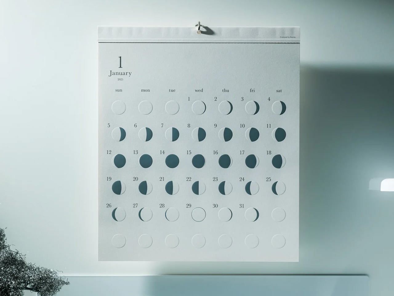
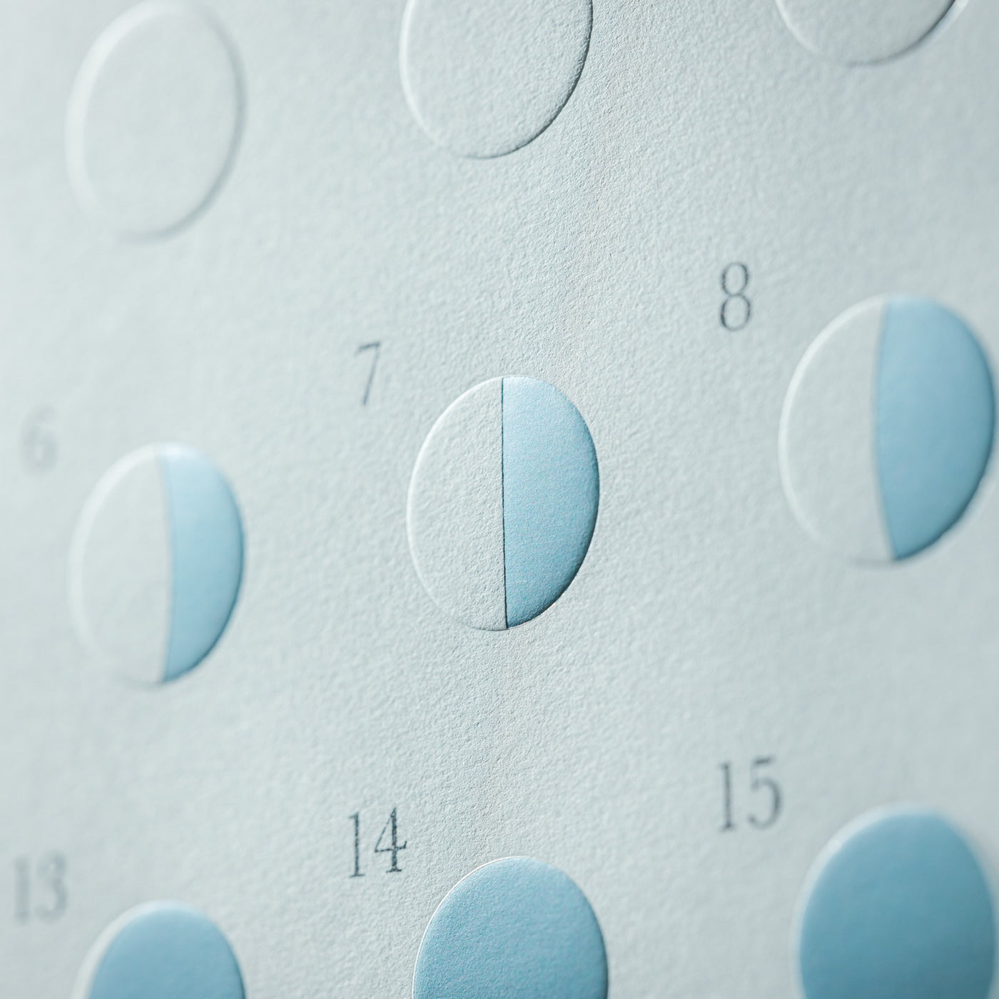
Lunar cycles govern tides, growth patterns, and ancient calendars, yet modern life often disconnects us from these celestial rhythms that shaped human civilization. This 10th Anniversary edition moon calendar from Replug reestablishes that connection through material choices that interact beautifully with ambient light. The moonlit greige paper creates soft illumination that changes character from dawn to dusk, while reflective silver foil captures passing light in ways that transform throughout the day.
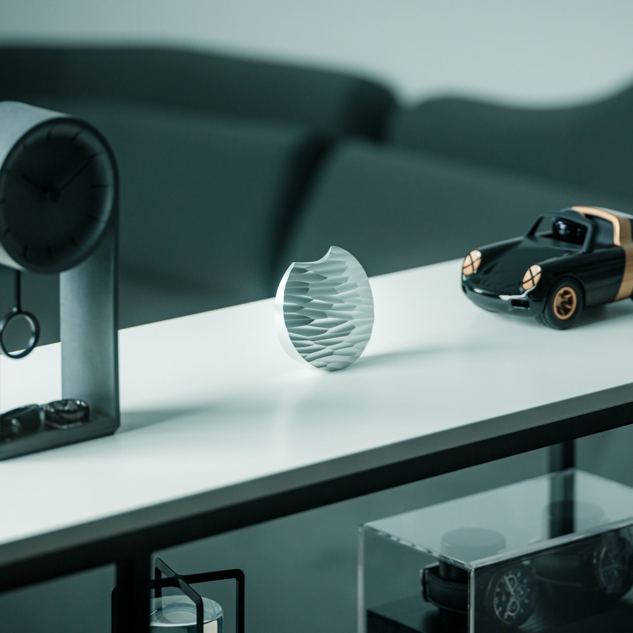
Embossed lunar textures invite touch, turning abstract time-tracking into a tactile daily ritual that grounds you in something larger than your calendar appointments. The piece functions as functional art that serves practical needs while elevating wall space beyond mere decoration. Limited edition status means this represents a moment in design history, celebrating a decade of Japanese craftsmanship that honors traditional aesthetics while embracing contemporary minimalism. The effect shifts with your lighting conditions, creating a dynamic presence that static artwork can’t match.
Limited edition status adds collectibility and exclusivity to an already beautiful functional object
Embossed texture provides tactile engagement that deepens the connection to lunar cycles
Reflective silver foil creates dynamic lighting effects that change throughout the day
Soft greige paper brings warmth that complements rather than dominates the surrounding decor
What we dislike
Limited edition nature means replacement becomes impossible once the stock depletes
The delicate paper construction requires protection from moisture and direct sunlight
5. Ritual Card Diffuser
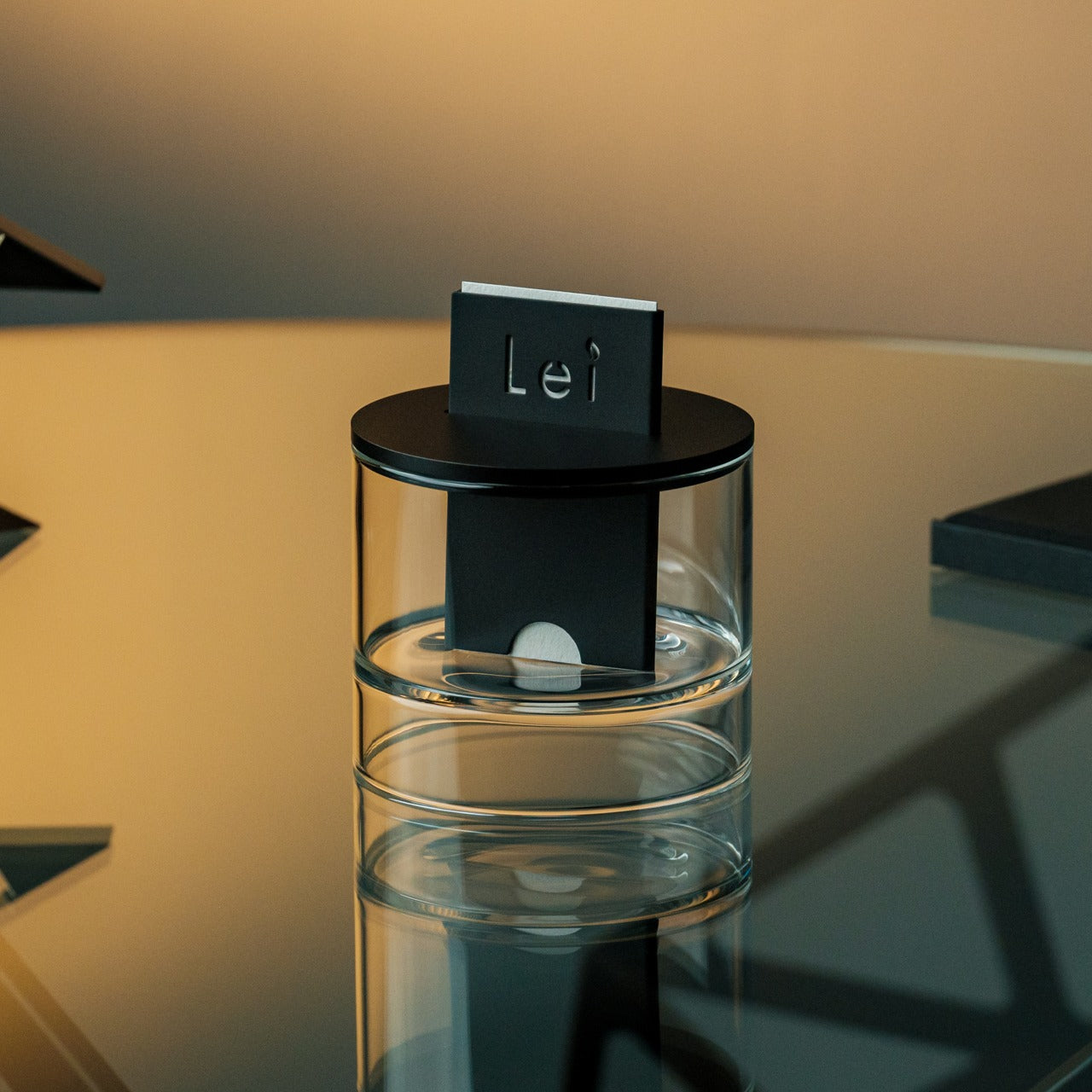
Most diffusers plug in, heat up, or bubble away with mechanical precision that strips away any sense of intention from the scenting process. This card-based system replaces automation with deliberate action, asking you to physically insert a handcrafted washi paper card that begins the fragrance journey. The gesture recalls ticket gates and old library card catalogs, familiar motions repurposed for sensory rather than transactional purposes, creating meaning through the ceremony of beginning.
The patented mechanism draws alcohol-based fragrance oils upward through capillary action, dispersing scent without heat that can alter molecular composition or mist that leaves surfaces damp. Hand-poured oil bases and anodized aluminum bodies demonstrate material quality that mass-market diffusers rarely approach. The washi paper cards themselves become part of the aesthetic, their visible presence within the minimalist housing creating visual interest that evolves as the card gradually releases its fragrance. This approach encourages mindful scent rotation, with card changes marking transitions between seasons, moods, or chapters of life.
The card-insertion ritual transforms scent diffusion into a mindful daily practice rather than a background process
Alcohol-based fragrance compatibility works with premium oils designed for reed diffusers
Anodized aluminum and handcrafted washi paper showcase material quality rarely found at this price
No heat or electricity requirements mean silent operation and placement flexibility
What we dislike
Replacement washi cards represent an ongoing cost beyond the initial investment
The slower diffusion rate works better for personal spaces than large open-plan areas
6. Jewelry Display Clock
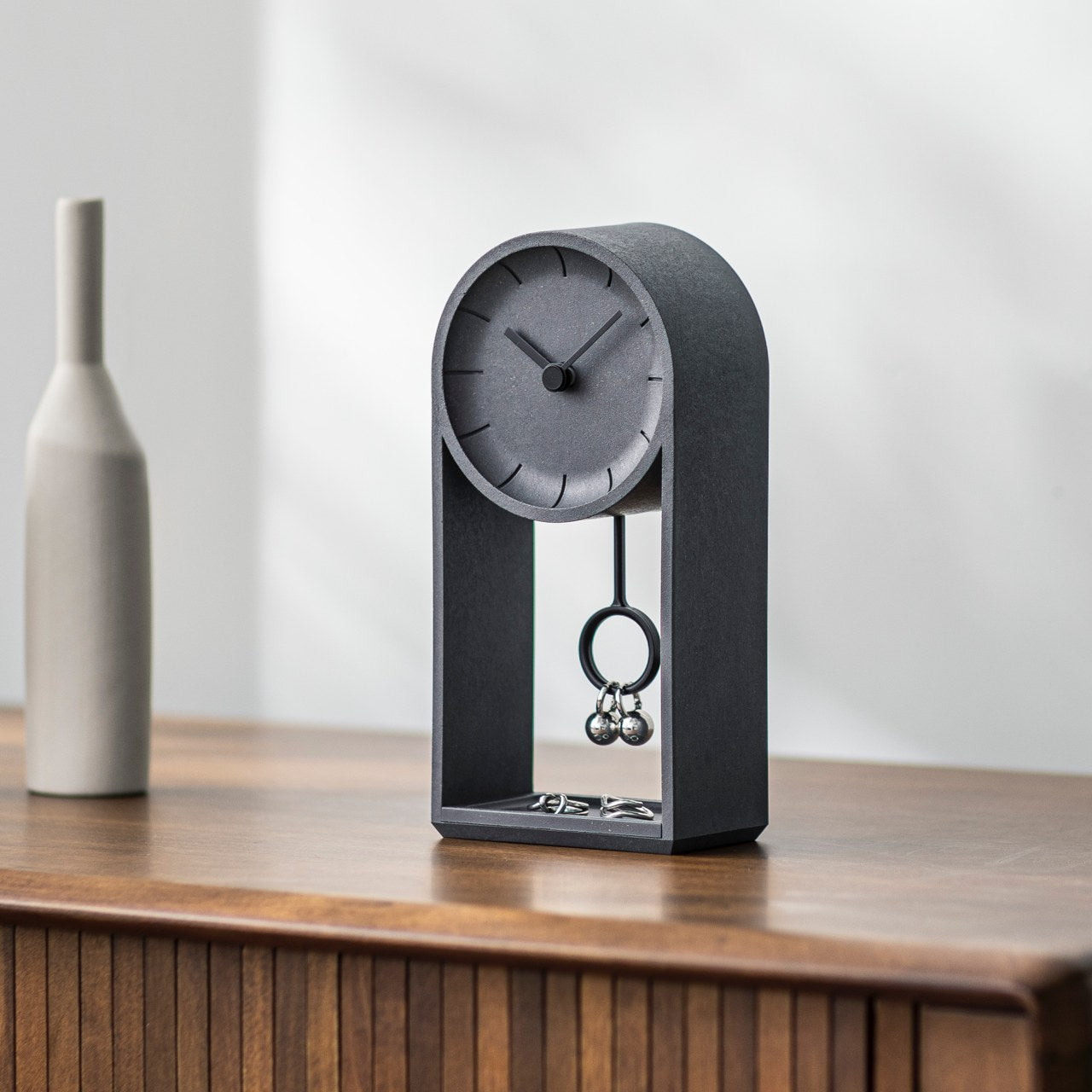
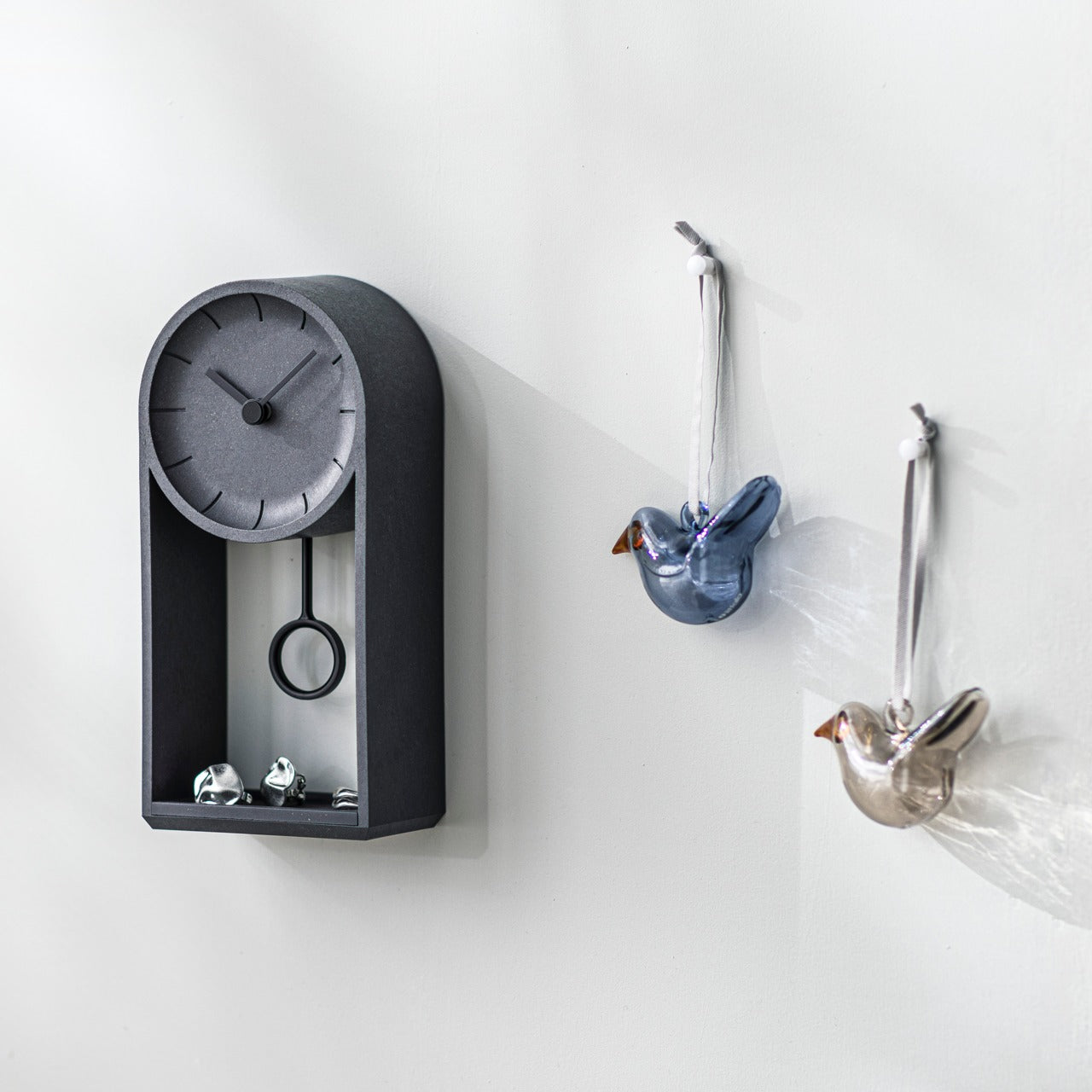
Functional overlap delights minimalists who appreciate objects that earn their footprint through multiple uses, and this hollow clock provides both time-telling and jewelry storage in a single elegant form. The negative space becomes positive storage, creating a home for rings, earrings, and small accessories that might otherwise scatter across dresser surfaces. The pendulum doubles as an earring display, putting favorite pieces on view rather than hiding them in boxes where they’re easily forgotten.
Quartz movement ensures accuracy, while the distinctive bioplastic construction containing rice husks brings textural interest and environmental consciousness to the design. Whether wall-mounted or shelf-displayed, this piece adapts to your space constraints and aesthetic preferences. The open design keeps jewelry visible and accessible, encouraging rotation of favorite pieces while preventing the tangle disasters that plague traditional jewelry boxes. Time becomes intertwined with adornment, both temporal and personal decoration unified in one thoughtful object.
Dual functionality maximizes value and minimizes clutter in small spaces
Rice husk bioplastic represents an innovative, sustainable material choice
Quartz movement provides reliable timekeeping with minimal maintenance
Both wall-mounting and shelf-display options accommodate different spatial needs
What we dislike
The open storage leaves jewelry exposed to dust accumulation between wearings
Limited capacity works for curated collections, but not extensive jewelry wardrobes
7. ClearMind Kendama
Play objects deserve places in adult spaces when they bridge entertainment and skill development, and this precision kendama transforms idle moments into opportunities for flow states and coordination improvement. The traditional Japanese toy gets recalibrated through contemporary materials and proportions that make initial success more likely while leaving plenty of room for mastery. Larger cups and tama holes reduce frustration during the learning curve, building confidence that sustains practice rather than creating early discouragement.
The bearing system prevents string tangling that interrupts play and breaks concentration, maintaining the smooth experience necessary for sustained engagement. As a desk object, it invites brief breaks that restore focus better than scrolling through devices, offering physical challenge that grounds you in the present moment. The clean aesthetic fits a minimalist interior, while the graduated difficulty of tricks provides long-term engagement that cheap fidget toys can’t match. Whether pursuing specific tricks or simply enjoying the meditative rhythm of catch and release, this kendama rewards the time you invest.
Larger cups and holes accelerate the learning curve for beginners while maintaining challenge potential
The bearing system eliminates string twisting that frustrates continuous play
Physical skill development offers screen-free breaks that restore focus and creativity
Minimalist aesthetic allows display as a sculptural object between play sessions
What we dislike
Mastering advanced tricks requires significant time investment and patience
The learning process involves repeated drops that may disturb quiet environments
8. RetroWave 7-in-1 Radio
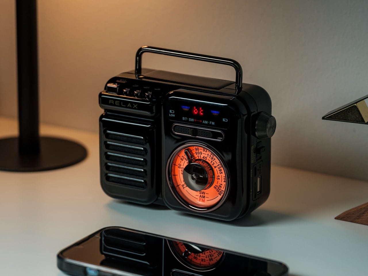
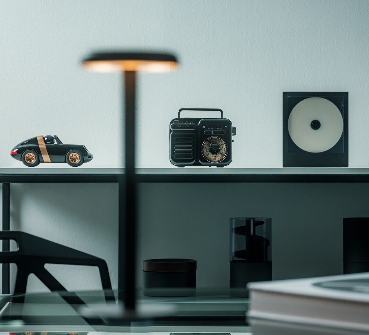
Preparedness meets daily pleasure in this multifunctional radio that refuses to choose between vintage charm and contemporary capability. The tactile tuning dial and retro Japanese design language create nostalgic appeal while Bluetooth connectivity, USB playback, and MP3 support bring modern conveniences. Beyond entertainment, the integrated flashlight, SOS alarm, hand-crank charging, solar panel, and power bank functions transform this into essential emergency equipment that you’ll actually want visible in your space.
Traditional AM, FM, and shortwave reception maintains a connection to broadcast media that doesn’t depend on internet infrastructure, valuable during storms or in remote locations where streaming fails. The solar panel and hand-crank options mean power outages won’t silence your music or leave you without emergency lighting and phone charging capability. This convergence of features typically requires multiple devices, yet the compact form factor and cohesive design prevent the gadget clutter that undermines minimalist spaces. Beauty meets utility without compromise.
Seven functions in one device dramatically reduce the number of individual items needed for entertainment and emergency preparedness
Multiple charging methods, including solar and hand-crank, ensure functionality during power outages
Traditional radio reception provides a connection independent of the internet infrastructure
Retro design aesthetic makes practical emergency equipment display-worthy rather than something to hide away
What we dislike
The feature-rich nature creates a learning curve to access all capabilities effectively
Retro styling may not suit ultra-contemporary or industrial interior schemes
9. Pop-Up Book Vase Edition 4
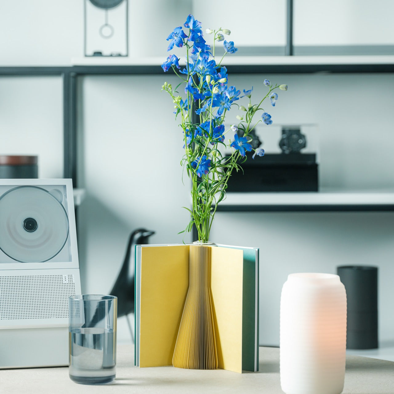
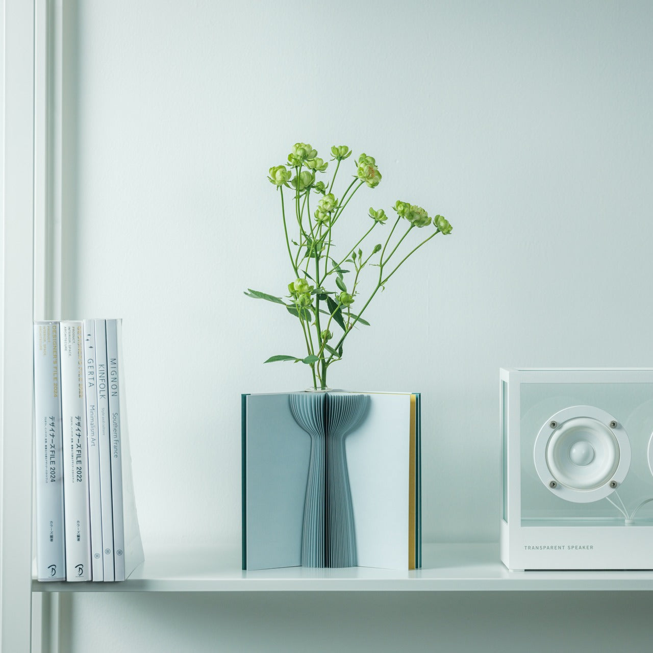
Fresh flowers deserve presentation that matches their ephemeral beauty, and this pop-up book vase provides ever-changing display options through simple page-turning. Three distinct vase designs in gray, yellow, and green emerge from the pages, each offering different proportions and color interactions with your floral selections. The water-resistant coating on natural pulp construction protects the book structure while maintaining the organic material quality that synthetic alternatives lack.
Flip the book upside down and suddenly your arrangements take on entirely new character, the same flowers reading differently against shifted backgrounds and altered vase shapes. This flexibility means one accent piece provides the variety usually requiring multiple vases, perfect for small spaces where storage limits collecting options. The whimsical concept brings playfulness to minimalist interiors without undermining the restraint that defines the style, proving that simplicity need not mean severity. Between floral displays, the closed book becomes sculptural in its own right, its purpose mysterious until revealed.
Three vase designs per book provide variety without requiring storage space for multiple physical vases
Natural pulp construction with water-resistant coating balances organic materials with practical durability
The ability to flip the book upside down doubles display options
Whimsical concept adds personality to minimalist spaces without creating visual clutter
What we dislike
The paper construction requires more careful handling than ceramic or glass vases
Capacity limitations work better for small bouquets rather than large arrangements
10. Heritage Craft Unboxing Knife
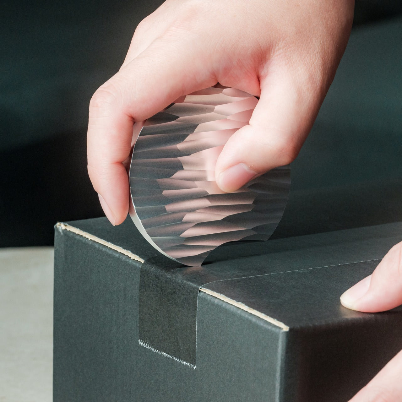
Tool storage presents a challenge for minimalists who want functional items accessible but not creating visual chaos, and this sculptural box cutter solves that problem through form so compelling you’ll want it prominently displayed. Inspired by Paleolithic hand axes, the circular aluminum body gets precision-milled from solid metal, creating wave-like patterns that provide a secure grip while delivering visual interest. The tapered shape feels intentional in hand, connecting contemporary package opening to ancient human tool use.
Aluminum’s historical value exceeding gold adds conceptual weight to match the satisfying physical heft of this precision instrument. The machined finish showcases material quality while the deliberate retention of cutting marks celebrates manufacturing processes rather than hiding them. Every package opening becomes an opportunity to appreciate thoughtful design rather than fumbling with hidden utility blades or improvising with scissors. Placed on your desk, this piece sparks conversations about the elevation of everyday tools into objects worthy of contemplation, questioning the boundary between utility and art.
The sculptural form transforms a utilitarian tool into display-worthy desk art
Solid aluminum construction provides satisfying weight and luxurious feel during use
Wave-like machining patterns deliver a secure grip while creating visual interest
Paleolithic hand axe inspiration connects contemporary design to ancient human tool-making traditions
What we dislike
The metal construction adds weight that some users may find cumbersome during extended use
The artistic form may feel less intuitive than standard box cutter designs initially
Creating Space for What Matters
These ten accents demonstrate minimalism’s true potential—not deprivation, but deliberate curation of objects that enhance life through beauty and utility combined. Each piece earns its presence through either solving problems elegantly, creating moments of joy, or preferably both. Your space becomes more than a collection of surfaces; it transforms into an environment that supports your daily rituals and long-term wellbeing through thoughtful details.
The under-$100 price point makes quality minimalist design accessible without requiring wholesale interior overhauls or significant financial commitment. Start with one piece that addresses a specific need or fills a gap in your current space. Let it prove how the right accent can shift the entire feeling of a room, then build from there. Minimalism succeeds when every object matters, and these designs certainly qualify.
Foldables promised to squeeze tablet screens into pocketable phones, but most of them still feel like a compromise. You get one big crease down the middle and an aspect ratio that makes everything look stretched or squashed, depending on what you’re doing. The real challenge isn’t just adding more screen, it’s getting enough space to actually work like a small laptop instead of a phone that got wider and heavier.
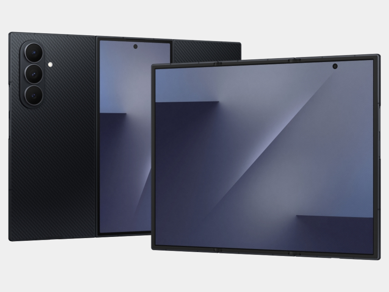
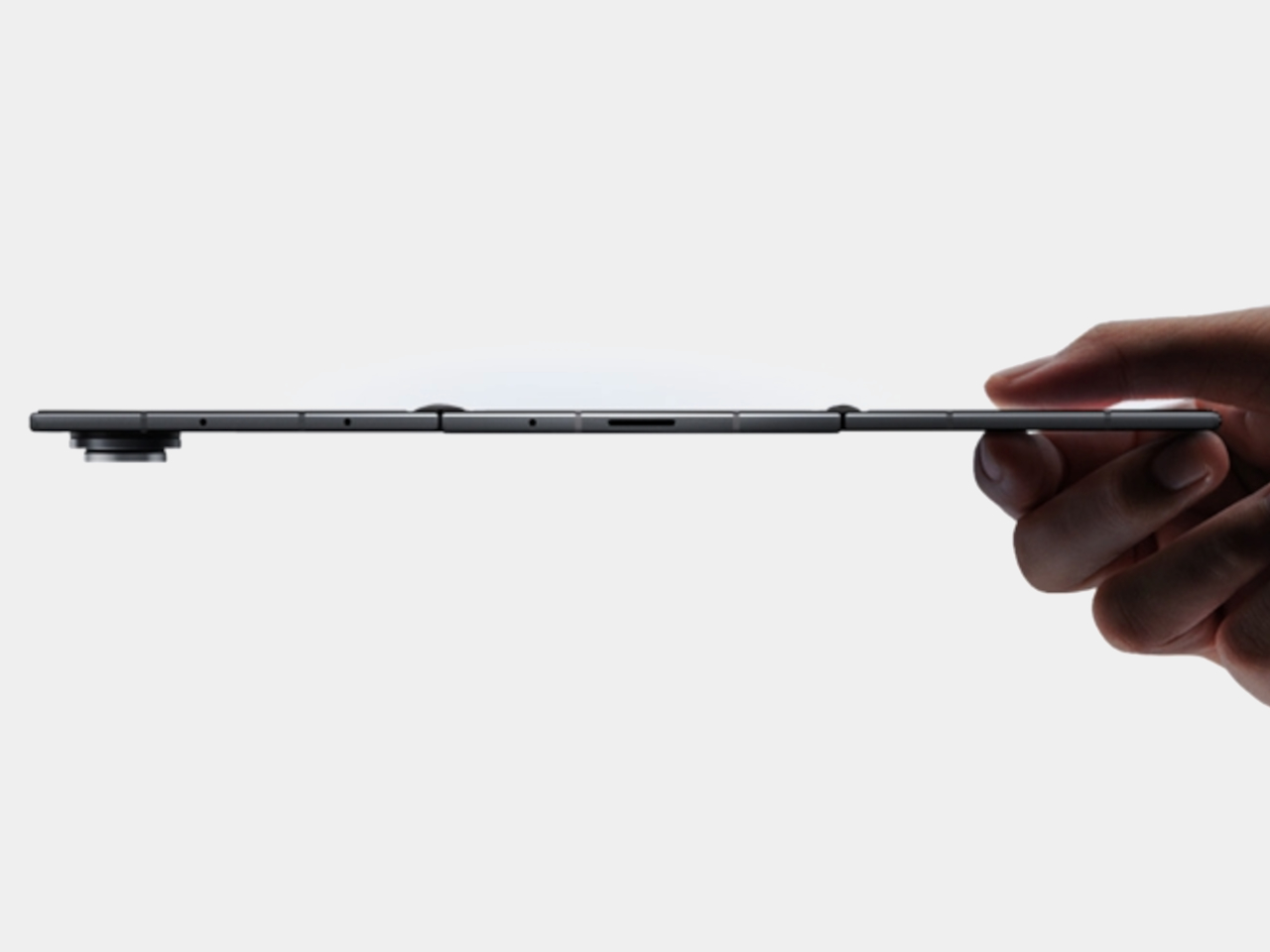
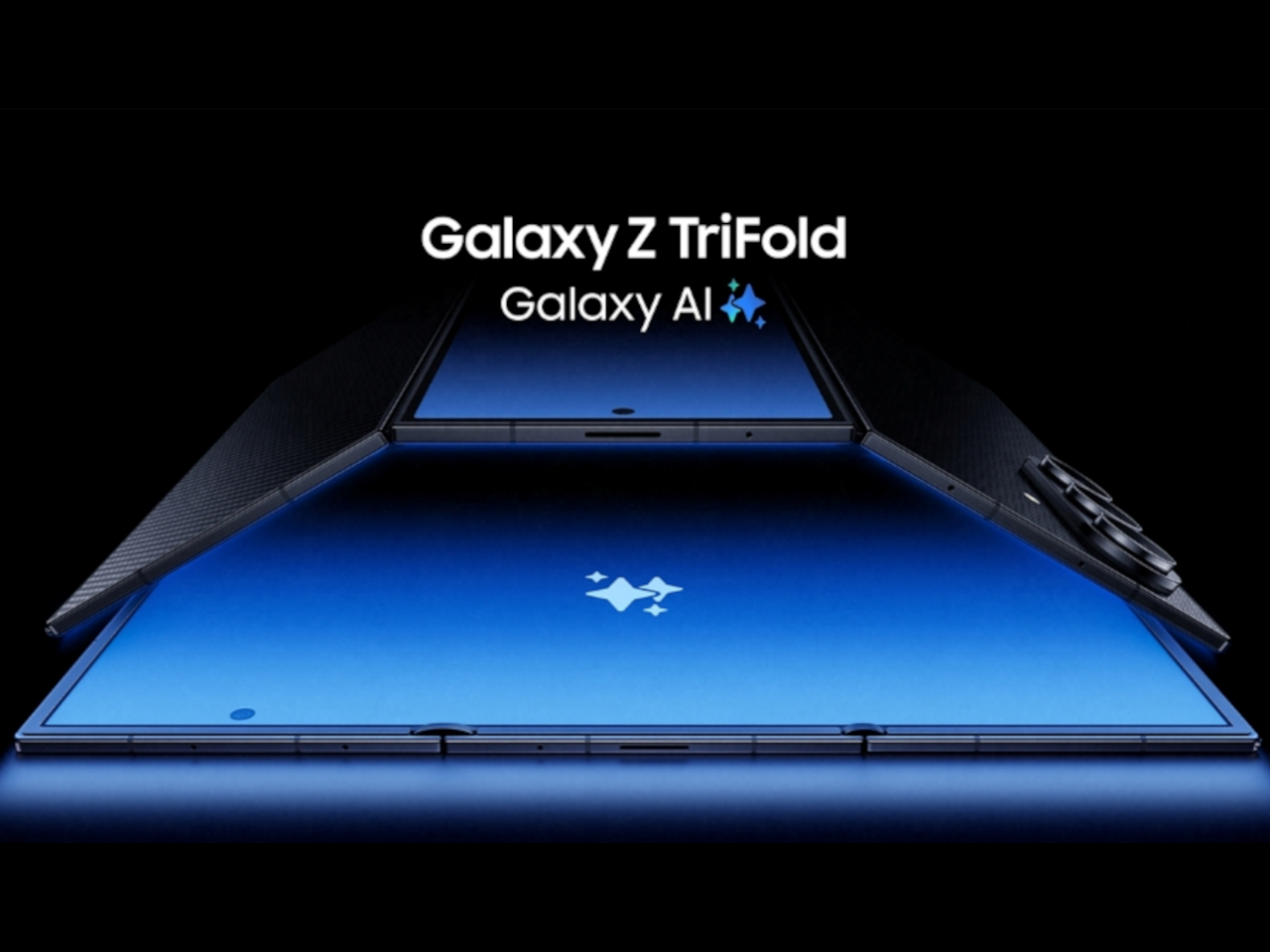
Samsung’s Galaxy Z TriFold tries to solve that by folding twice instead of once. Open it fully, and you’re holding a 10-inch Dynamic AMOLED 2X display that measures 3.9 mm thick at its thinnest point, basically three 6.5-inch phone screens laid side by side. Fold it back up, and the whole thing collapses to 12.9 mm thick, which is about as thick as a regular phone in a case, except this one weighs 309 grams and hides a full-sized tablet inside.
Designer: Samsung
The device is aggressively thin when open. It looks like three glass sheets joined by two subtle hinge bumps, thin enough to hold between fingertips without much visual mass. The frame uses Advanced Armor Aluminum for rigidity, the hinge housing is titanium, and the back panel is a ceramic-glass reinforced polymer that resists cracks. The camera bump and hinges interrupt the silhouette slightly, but the overall impression is of a very thin, very dense slab of screen.
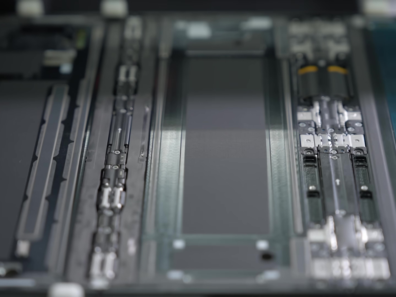
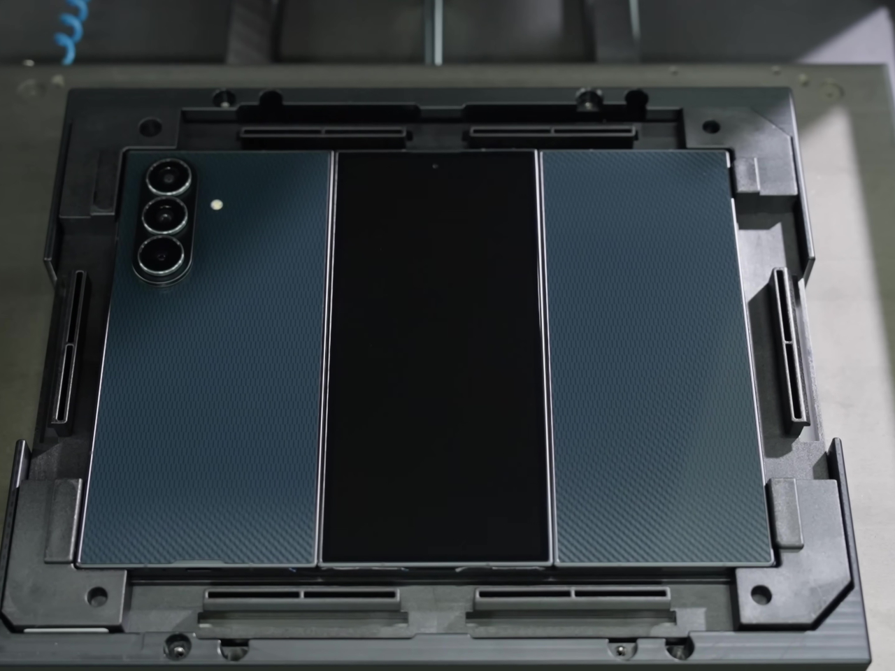
Samsung reworked its hinge system into two differently sized Armor FlexHinges with dual-rail structures that let the three panels close with minimal gaps between them. The display stack includes a new shock-absorbing layer and reinforced overcoat designed for a screen that folds twice instead of once. Samsung CT scans flexible circuit boards and uses laser height checks for internal components, unusual quality control steps that suggest the company knows people are worried about reliability with this many moving parts.
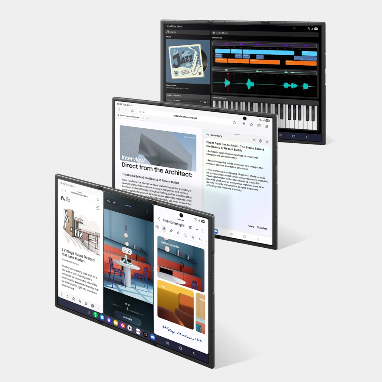
The 10-inch QXGA+ main screen behaves like three portrait phones across, giving you room for three apps side by side without everything feeling cramped. Samsung’s examples show an architect running blueprints, notes, and a calculator at once, or a music producer editing audio while browsing references and messaging. The crease is minimized, the panel runs at 1 to 120 Hz adaptive refresh, and brightness hits 1600 nits to make it feel more like a small monitor than a tablet.
Standalone Samsung DeX turns the TriFold into a tiny multi-desktop machine, with up to four virtual workspaces each running five apps simultaneously. Add an external monitor in Extended Mode, and you can drag windows between screens like a laptop setup. Galaxy AI features adapt to the larger canvas too, with Photo Assist, Browsing Assist, and Gemini Live that can summarize pages, edit images side by side, or give design advice when you show it a room and a shopping site at the same time.
For entertainment, the 10-inch screen works well for films, comics, or YouTube with comments running alongside the video. The 6.5-inch cover screen hits 2600 nits and 120 Hz for quick tasks when you don’t want to unfold everything. Vision Booster keeps content readable in bright light, and the minimized crease tries to keep everything smooth, whether you’re indoors or outside.
Inside there’s a Snapdragon 8 Elite for Galaxy, 16 GB RAM, up to 1 TB storage, and a 200 MP main camera with 3x telephoto and 12 MP ultra-wide. The 5,600 mAh three-cell battery spreads across the panels for balanced weight, charges at 45 W wired or 15 W wireless, and supports reverse wireless charging. The Galaxy Z TriFold launches in Korea on December 12, 2025, with other markets including China, Taiwan, Singapore, the UAE, and the U.S. following after.
The trade-offs are obvious, though. At 309 grams with two hinges, this will feel heavy and complex for anyone who just wants a phone that fits in their pocket and works. Samsung doesn’t mention S Pen support, which seems like a missed opportunity for artists and designers who’d want to use this 10-inch canvas for sketching or illustration in a device that still fits in a bag.
Long-term durability remains an open question, even with IP48 and all the quality control Samsung mentions. But for people who already push their phones into laptop territory and want the biggest possible screen in the smallest possible folded size, the TriFold makes a clear statement about where high-end mobile is heading. It’s excessive, complicated, and not for everyone, but that seems to be the whole point.
Foldables promised to squeeze tablet screens into pocketable phones, but most of them still feel like a compromise. You get one big crease down the middle and an aspect ratio that makes everything look stretched or squashed, depending on what you’re doing. The real challenge isn’t just adding more screen, it’s getting enough space to actually work like a small laptop instead of a phone that got wider and heavier.
Samsung’s Galaxy Z TriFold tries to solve that by folding twice instead of once. Open it fully, and you’re holding a 10-inch Dynamic AMOLED 2X display that measures 3.9 mm thick at its thinnest point, basically three 6.5-inch phone screens laid side by side. Fold it back up, and the whole thing collapses to 12.9 mm thick, which is about as thick as a regular phone in a case, except this one weighs 309 grams and hides a full-sized tablet inside.
Designer: Samsung
The device is aggressively thin when open. It looks like three glass sheets joined by two subtle hinge bumps, thin enough to hold between fingertips without much visual mass. The frame uses Advanced Armor Aluminum for rigidity, the hinge housing is titanium, and the back panel is a ceramic-glass reinforced polymer that resists cracks. The camera bump and hinges interrupt the silhouette slightly, but the overall impression is of a very thin, very dense slab of screen.
Samsung reworked its hinge system into two differently sized Armor FlexHinges with dual-rail structures that let the three panels close with minimal gaps between them. The display stack includes a new shock-absorbing layer and reinforced overcoat designed for a screen that folds twice instead of once. Samsung CT scans flexible circuit boards and uses laser height checks for internal components, unusual quality control steps that suggest the company knows people are worried about reliability with this many moving parts.
The 10-inch QXGA+ main screen behaves like three portrait phones across, giving you room for three apps side by side without everything feeling cramped. Samsung’s examples show an architect running blueprints, notes, and a calculator at once, or a music producer editing audio while browsing references and messaging. The crease is minimized, the panel runs at 1 to 120 Hz adaptive refresh, and brightness hits 1600 nits to make it feel more like a small monitor than a tablet.
Standalone Samsung DeX turns the TriFold into a tiny multi-desktop machine, with up to four virtual workspaces each running five apps simultaneously. Add an external monitor in Extended Mode, and you can drag windows between screens like a laptop setup. Galaxy AI features adapt to the larger canvas too, with Photo Assist, Browsing Assist, and Gemini Live that can summarize pages, edit images side by side, or give design advice when you show it a room and a shopping site at the same time.
For entertainment, the 10-inch screen works well for films, comics, or YouTube with comments running alongside the video. The 6.5-inch cover screen hits 2600 nits and 120 Hz for quick tasks when you don’t want to unfold everything. Vision Booster keeps content readable in bright light, and the minimized crease tries to keep everything smooth, whether you’re indoors or outside.
Inside there’s a Snapdragon 8 Elite for Galaxy, 16 GB RAM, up to 1 TB storage, and a 200 MP main camera with 3x telephoto and 12 MP ultra-wide. The 5,600 mAh three-cell battery spreads across the panels for balanced weight, charges at 45 W wired or 15 W wireless, and supports reverse wireless charging. The Galaxy Z TriFold launches in Korea on December 12, 2025, with other markets including China, Taiwan, Singapore, the UAE, and the U.S. following after.
The trade-offs are obvious, though. At 309 grams with two hinges, this will feel heavy and complex for anyone who just wants a phone that fits in their pocket and works. Samsung doesn’t mention S Pen support, which seems like a missed opportunity for artists and designers who’d want to use this 10-inch canvas for sketching or illustration in a device that still fits in a bag.
Long-term durability remains an open question, even with IP48 and all the quality control Samsung mentions. But for people who already push their phones into laptop territory and want the biggest possible screen in the smallest possible folded size, the TriFold makes a clear statement about where high-end mobile is heading. It’s excessive, complicated, and not for everyone, but that seems to be the whole point.
We’re in the great age of unbundling. We’ve unbundled our power grids with solar panels, our entertainment with streaming, and our communication with the internet. We’re systematically severing the cords that tie us to centralized, aging systems. But what about the most essential utility of all – the water pipe? For decades, that’s been the one connection we couldn’t cut. You could go off-grid with power, but you were still tethered to the municipal water main. Until now. What if your home could perform a little bit of everyday alchemy? What if it could breathe in the invisible humidity hanging in the air and exhale pure, rich drinking water? This isn’t a far-future concept; it’s the game-changing revolution happening inside the all-new Kara Pure 2. This sleek, stainless steel tower isn’t just a water dispenser; it’s your home’s personal atmospheric hotspot. The award-winning technology doesn’t filter water from the grid; it creates the water instead, offering a glimpse into a future where the most precious resource on earth is no longer piped in, but simply harvested on demand.
At first glance, the Kara Pure 2 is a study in minimal-yet-effective industrial design. Standing at a confident 44 inches tall, its brushed stainless steel body feels both substantial and elegant, designed to complement a modern kitchen rather than dominate it. Its upgraded internal copper piping and five-stage water filtration signal a commitment to quality, suggesting this is a permanent fixture, not a temporary solution. The front is punctuated by a clean, 40% larger touchscreen and a gracefully curved dispensing area. There are no awkward plastic jugs, no complex pipework, no visible signs of the powerful process happening within. This deliberate minimalism is central to its appeal; it domesticates an industrial-grade technology, making the extraordinary feel approachable. The magic trick is only impressive if the magician makes it look easy, and the Kara Pure 2 looks effortless. Its only demand is a standard power outlet, and in return, it offers a bottomless well of 9.2 pH-balanced Alkaline water.
Kara Pure 2’s Patented AirDrive technology uses a clever desiccant material that acts like a super-sponge, aggressively grabbing water molecules from the air. Once saturated, the machine gently heats the desiccant, forcing it to release the captured moisture as perfectly pure water vapor, leaving dust and other airborne gunk behind. It’s an elegant and efficient method of harvesting, allowing the machine to perform even when the air feels less than tropical. This isn’t merely condensation; it’s a targeted extraction.
Once the water is harvested, it begins a journey through a multi-stage purification gauntlet. The process starts before the air even enters the machine, with a commercial-grade EPA air filter that scrubs the intake air, providing the side benefit of purifying about 200 cubic feet of room air per minute. After the water is condensed, it passes through a system that includes an advanced ultrafiltration (UF) membrane. With a pore size of just 0.01 microns, this stage is designed to physically block contaminants like bacteria, viruses, and microplastics. Finally, the water is exposed to a medical-grade UV-C sterilizer, which neutralizes any remaining microorganisms to ensure the final product is 99.99% pure.
But anyone who has tasted distilled water knows that “pure” can be boring. The filtration process strips out everything, good and bad, leaving a flat, lifeless liquid. Kara brings the water back to life in the final step by enhancing it with a carefully balanced cocktail of essential minerals like calcium and magnesium. This not only gives the water its clean, crisp taste but also nudges the pH up to an alkaline 9.2+, a nod to the modern wellness enthusiast. It even gets an antioxidant boost, completing its journey from humble humidity to what you might call high-performance hydration.
That whole process nets you up to 10 liters (or about 2.6 gallons) of water a day, storing it in an 11.5-liter reservoir so it’s always ready. Standing 44 inches tall and weighing a hefty 70 pounds, the Kara Pure 2 is a stainless steel monolith that feels more like a piece of modern sculpture than a kitchen appliance. The premium feel extends to the internals, with upgrades like 99% pure copper piping that signal this is a forever-appliance, not a disposable gizmo. The user experience gets the same love, with a spout moved forward for easy access and a pouring area now 20% larger, big enough to fit that ridiculously oversized 64-ounce water bottle you carry around.
The day-to-day command center is a 40% larger touchscreen that lets you dial in everything, including instant hot and cold water. But the most impressive feature might be what you don’t notice. At just 32 decibels, the Kara Pure 2 is quieter than your fridge’s late-night humming. This is the critical detail that makes it a viable housemate, allowing it to quietly perform its magic in the background of your life without driving you insane. It’s a testament to the engineering that went into making this complex process feel effortless and unobtrusive.
Naturally, a device this forward-thinking is making its debut on Kickstarter, the go-to platform for launching category-defining hardware. This is where early adopters can secure the Kara Pure 2 before it hits the broader market. The super early bird pricing is set at $3,899, which feels like a pretty good investment considering the average family spends upwards of $1,350 a year on bottled water (even more for 9.2pH+ alkaline water)… And after all, it’s an investment in a new kind of infrastructure for your home. I mean, you’re literally turning air into alkaline drinking water. Rumor has it that Kara’s next appliance will turn that water into wine!
We’re in the great age of unbundling. We’ve unbundled our power grids with solar panels, our entertainment with streaming, and our communication with the internet. We’re systematically severing the cords that tie us to centralized, aging systems. But what about the most essential utility of all – the water pipe? For decades, that’s been the one connection we couldn’t cut. You could go off-grid with power, but you were still tethered to the municipal water main. Until now. What if your home could perform a little bit of everyday alchemy? What if it could breathe in the invisible humidity hanging in the air and exhale pure, rich drinking water? This isn’t a far-future concept; it’s the game-changing revolution happening inside the all-new Kara Pure 2. This sleek, stainless steel tower isn’t just a water dispenser; it’s your home’s personal atmospheric hotspot. The award-winning technology doesn’t filter water from the grid; it creates the water instead, offering a glimpse into a future where the most precious resource on earth is no longer piped in, but simply harvested on demand.
At first glance, the Kara Pure 2 is a study in minimal-yet-effective industrial design. Standing at a confident 44 inches tall, its brushed stainless steel body feels both substantial and elegant, designed to complement a modern kitchen rather than dominate it. Its upgraded internal copper piping and five-stage water filtration signal a commitment to quality, suggesting this is a permanent fixture, not a temporary solution. The front is punctuated by a clean, 40% larger touchscreen and a gracefully curved dispensing area. There are no awkward plastic jugs, no complex pipework, no visible signs of the powerful process happening within. This deliberate minimalism is central to its appeal; it domesticates an industrial-grade technology, making the extraordinary feel approachable. The magic trick is only impressive if the magician makes it look easy, and the Kara Pure 2 looks effortless. Its only demand is a standard power outlet, and in return, it offers a bottomless well of 9.2 pH-balanced Alkaline water.
Kara Pure 2’s Patented AirDrive technology uses a clever desiccant material that acts like a super-sponge, aggressively grabbing water molecules from the air. Once saturated, the machine gently heats the desiccant, forcing it to release the captured moisture as perfectly pure water vapor, leaving dust and other airborne gunk behind. It’s an elegant and efficient method of harvesting, allowing the machine to perform even when the air feels less than tropical. This isn’t merely condensation; it’s a targeted extraction.
Once the water is harvested, it begins a journey through a multi-stage purification gauntlet. The process starts before the air even enters the machine, with a commercial-grade EPA air filter that scrubs the intake air, providing the side benefit of purifying about 200 cubic feet of room air per minute. After the water is condensed, it passes through a system that includes an advanced ultrafiltration (UF) membrane. With a pore size of just 0.01 microns, this stage is designed to physically block contaminants like bacteria, viruses, and microplastics. Finally, the water is exposed to a medical-grade UV-C sterilizer, which neutralizes any remaining microorganisms to ensure the final product is 99.99% pure.
But anyone who has tasted distilled water knows that “pure” can be boring. The filtration process strips out everything, good and bad, leaving a flat, lifeless liquid. Kara brings the water back to life in the final step by enhancing it with a carefully balanced cocktail of essential minerals like calcium and magnesium. This not only gives the water its clean, crisp taste but also nudges the pH up to an alkaline 9.2+, a nod to the modern wellness enthusiast. It even gets an antioxidant boost, completing its journey from humble humidity to what you might call high-performance hydration.
That whole process nets you up to 10 liters (or about 2.6 gallons) of water a day, storing it in an 11.5-liter reservoir so it’s always ready. Standing 44 inches tall and weighing a hefty 70 pounds, the Kara Pure 2 is a stainless steel monolith that feels more like a piece of modern sculpture than a kitchen appliance. The premium feel extends to the internals, with upgrades like 99% pure copper piping that signal this is a forever-appliance, not a disposable gizmo. The user experience gets the same love, with a spout moved forward for easy access and a pouring area now 20% larger, big enough to fit that ridiculously oversized 64-ounce water bottle you carry around.
The day-to-day command center is a 40% larger touchscreen that lets you dial in everything, including instant hot and cold water. But the most impressive feature might be what you don’t notice. At just 32 decibels, the Kara Pure 2 is quieter than your fridge’s late-night humming. This is the critical detail that makes it a viable housemate, allowing it to quietly perform its magic in the background of your life without driving you insane. It’s a testament to the engineering that went into making this complex process feel effortless and unobtrusive.
Naturally, a device this forward-thinking is making its debut on Kickstarter, the go-to platform for launching category-defining hardware. This is where early adopters can secure the Kara Pure 2 before it hits the broader market. The super early bird pricing is set at $3,899, which feels like a pretty good investment considering the average family spends upwards of $1,350 a year on bottled water (even more for 9.2pH+ alkaline water)… And after all, it’s an investment in a new kind of infrastructure for your home. I mean, you’re literally turning air into alkaline drinking water. Rumor has it that Kara’s next appliance will turn that water into wine!
The market is flooded with charging cables and MagSafe chargers. But both standalone ones only add to the inconvenience of carrying them. The endless toil in the bag for a cable is an everyday chore for me. I’m sure many of you have fished endlessly at the bottom of the backpack/handbag for a charging cable? To find a solution to this problem, I was scrolling through options for accessories with built-in charging cables, when I came across this interesting project for a MagSafe Multipurpose Charging Cable Case on Behance.
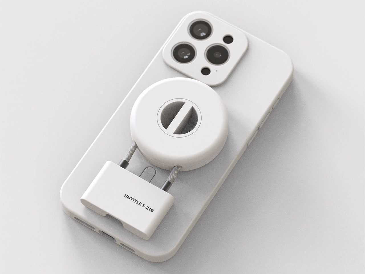
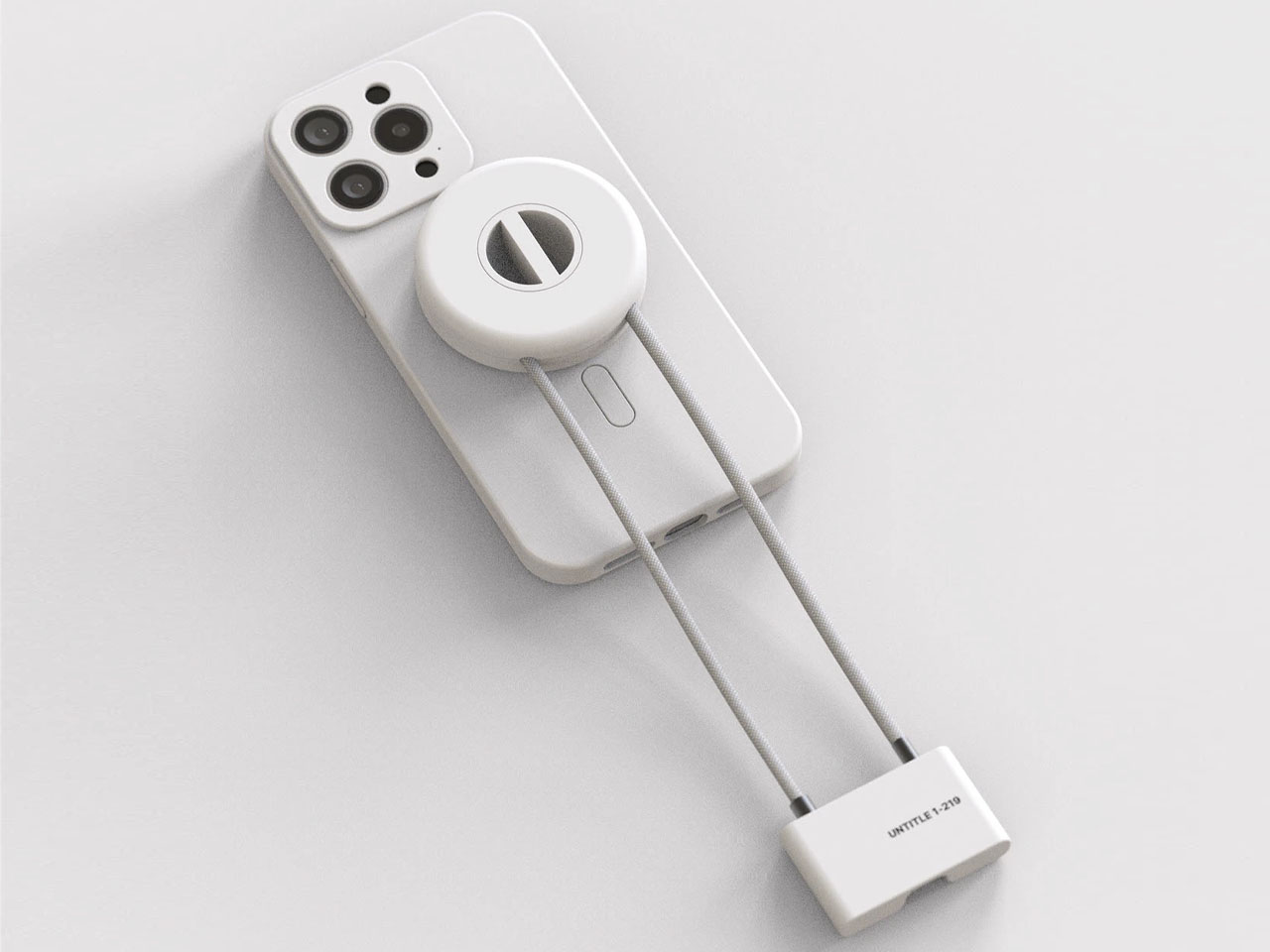
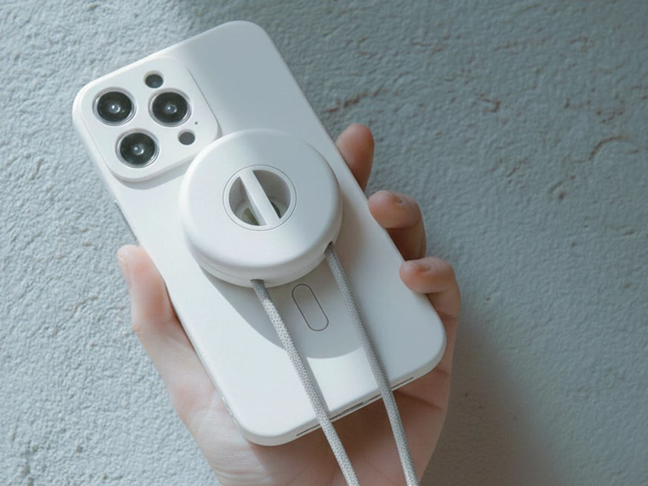
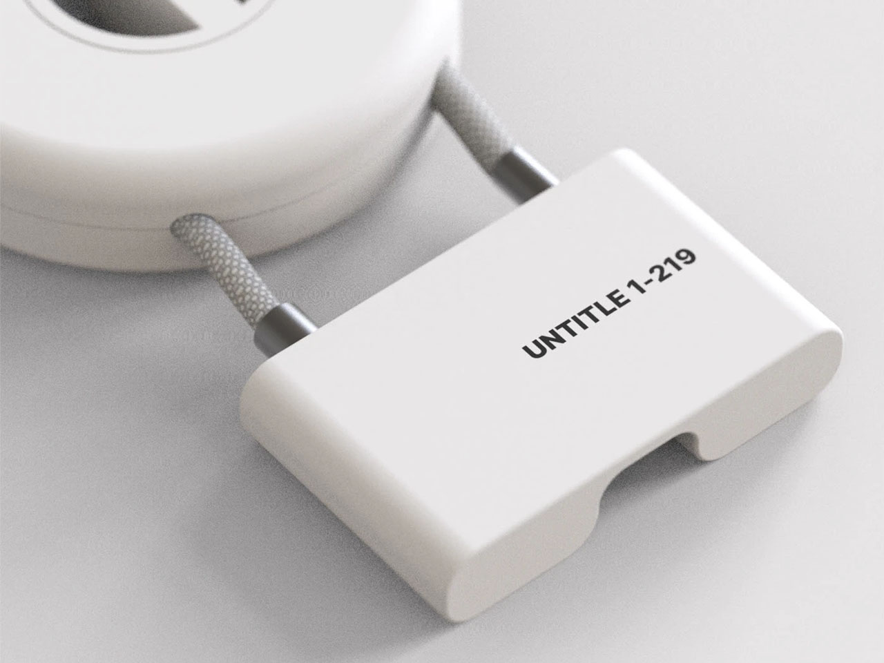
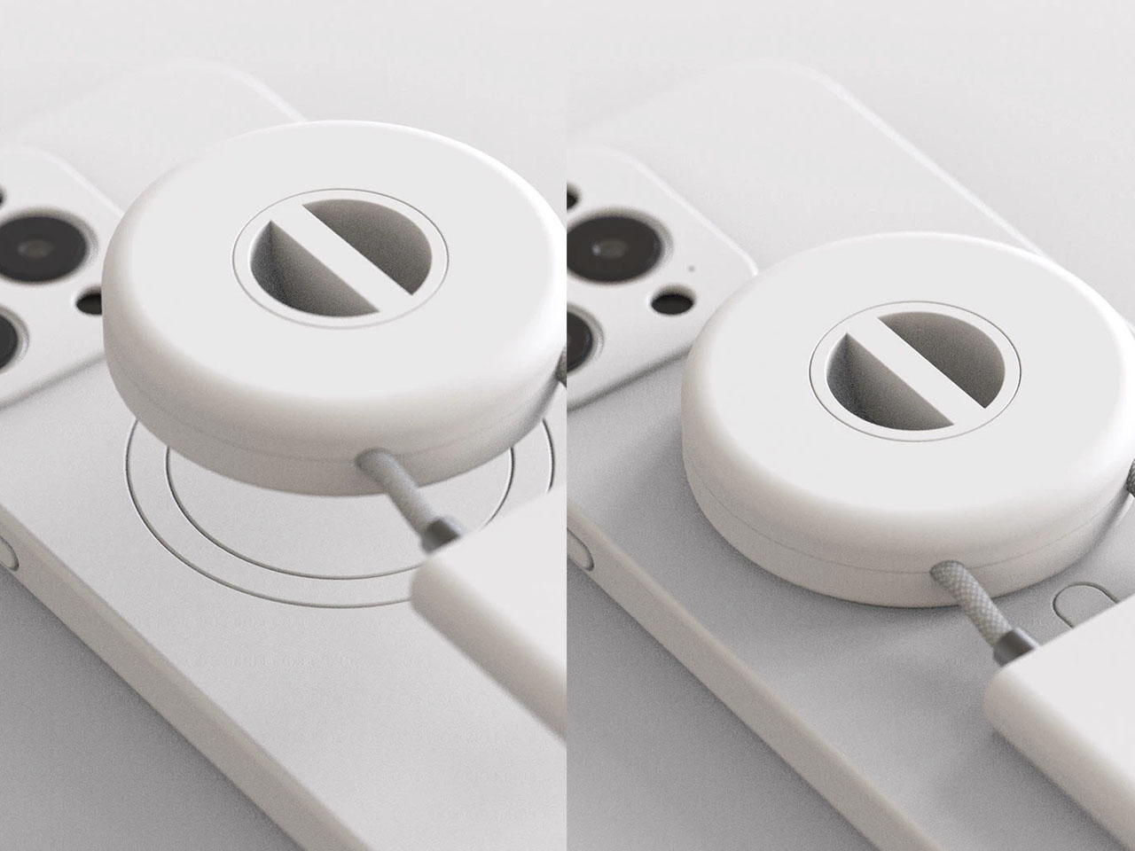
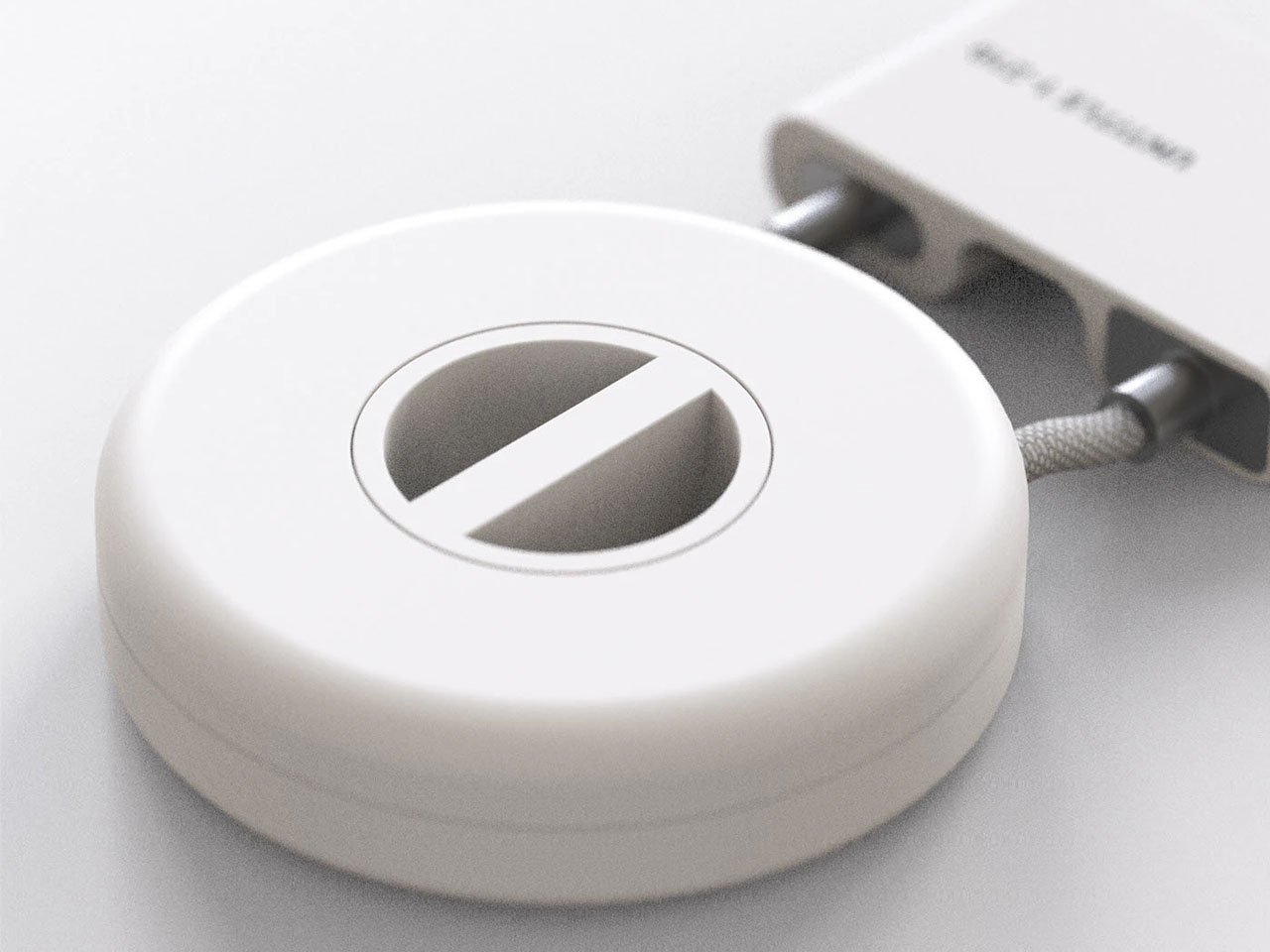
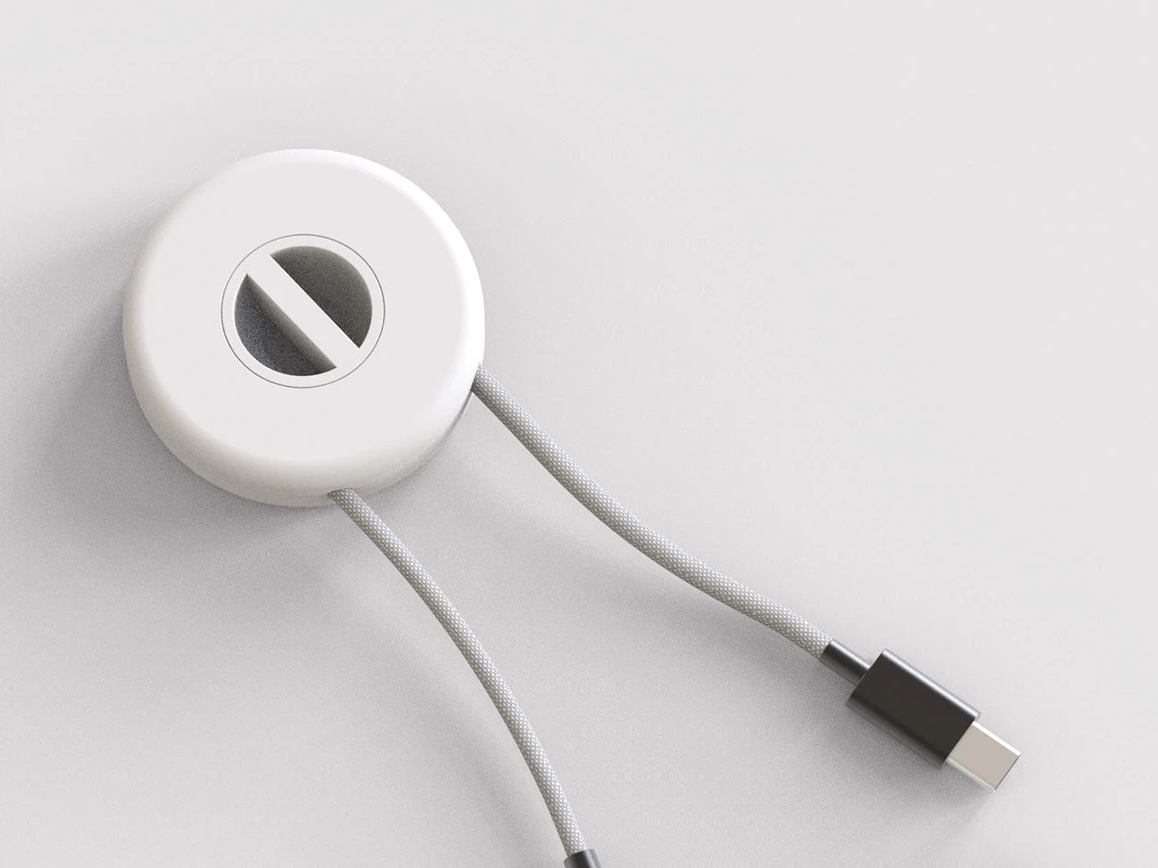
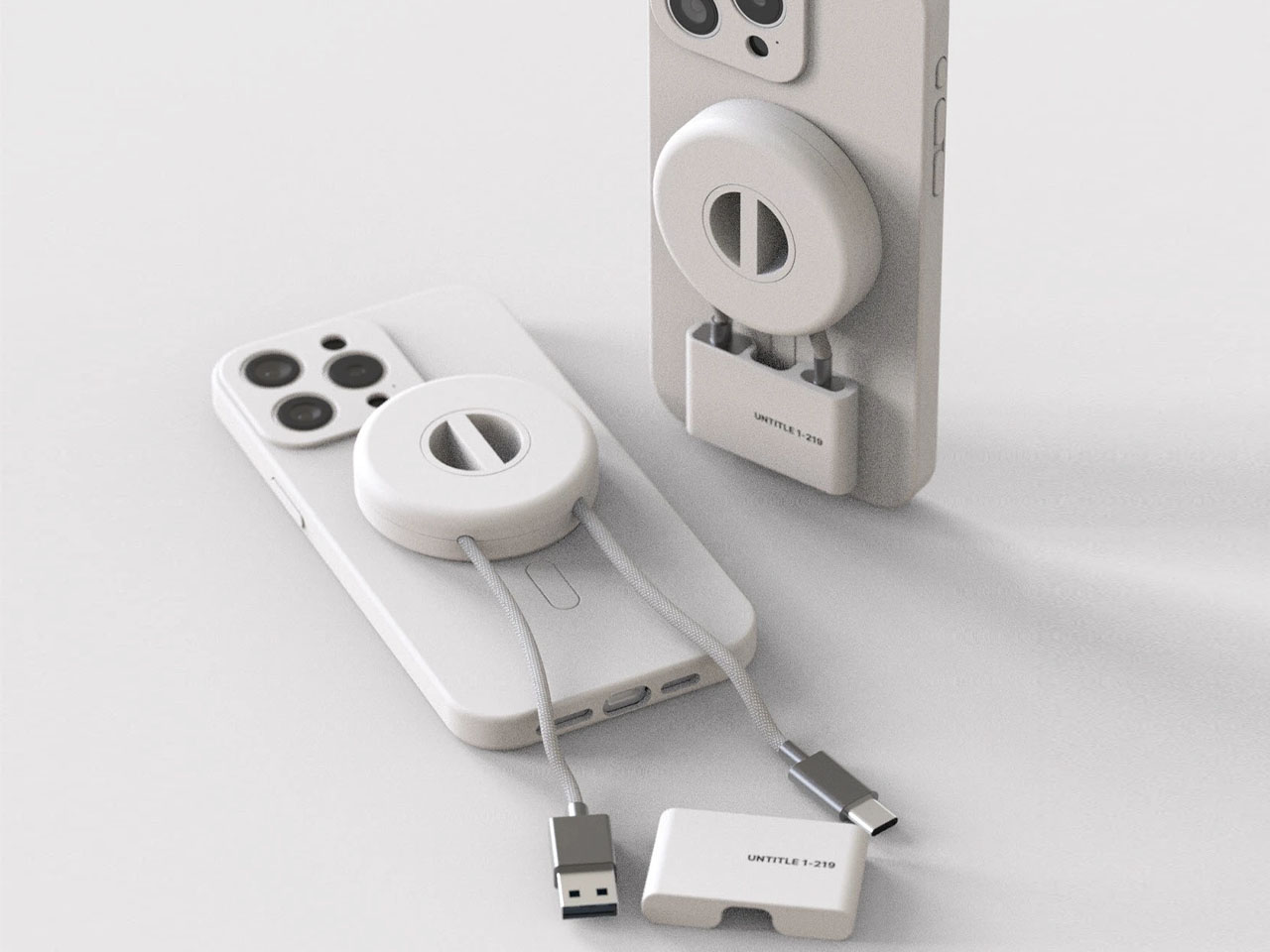
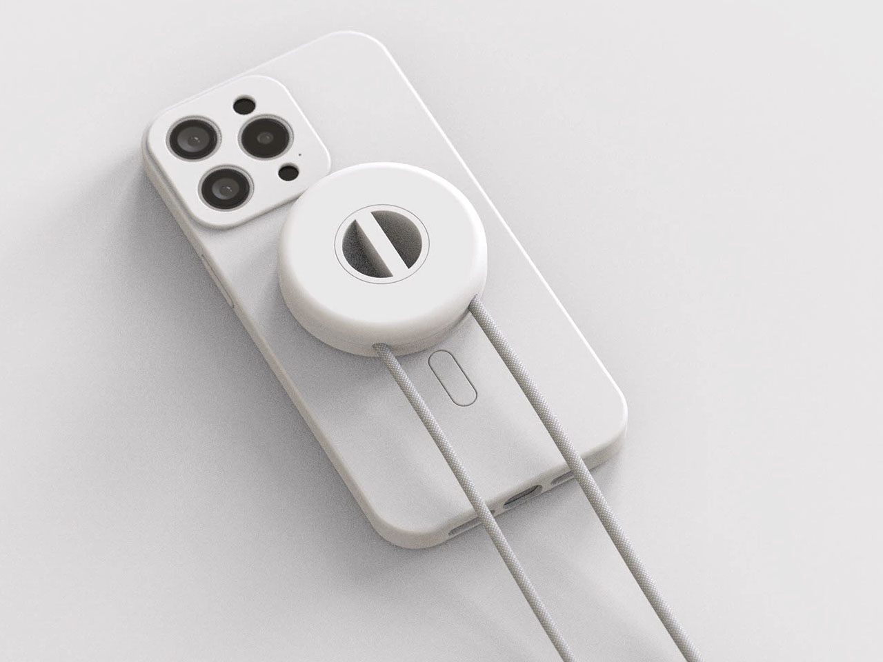
It is designed like a hand grip mobile holder, which I first presumed this guy to be, until I saw the dangling cable and thought there was more to it than its design. The cable case is designed in a way to store a charging cable within a MagSafe-compatible accessory. Sounds unfamiliar? It probably is, I haven’t seen a similar concept before.
If you look over the last decade, charging cables (which still remain important after wireless charging and MagSafe options) haven’t meaningfully changed. Of course, universal acceptance of USB-C cable does help, but the standardization doesn’t stop the cables from tangling and getting lost in the bag. Maybe, a MagSafe case that allows the changing cable to literally attach to the back of your iPhone, could, in a way limit that.
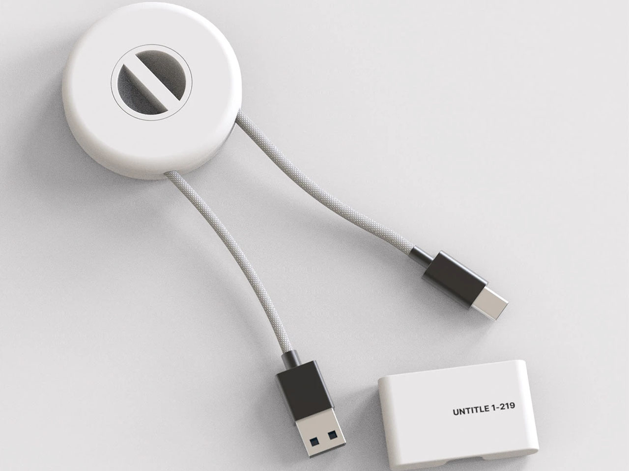
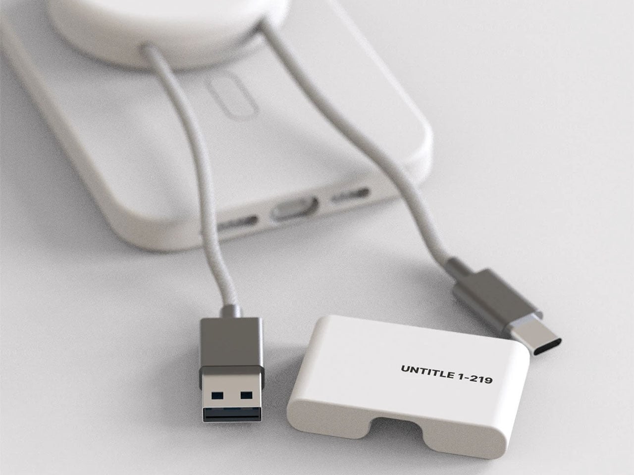
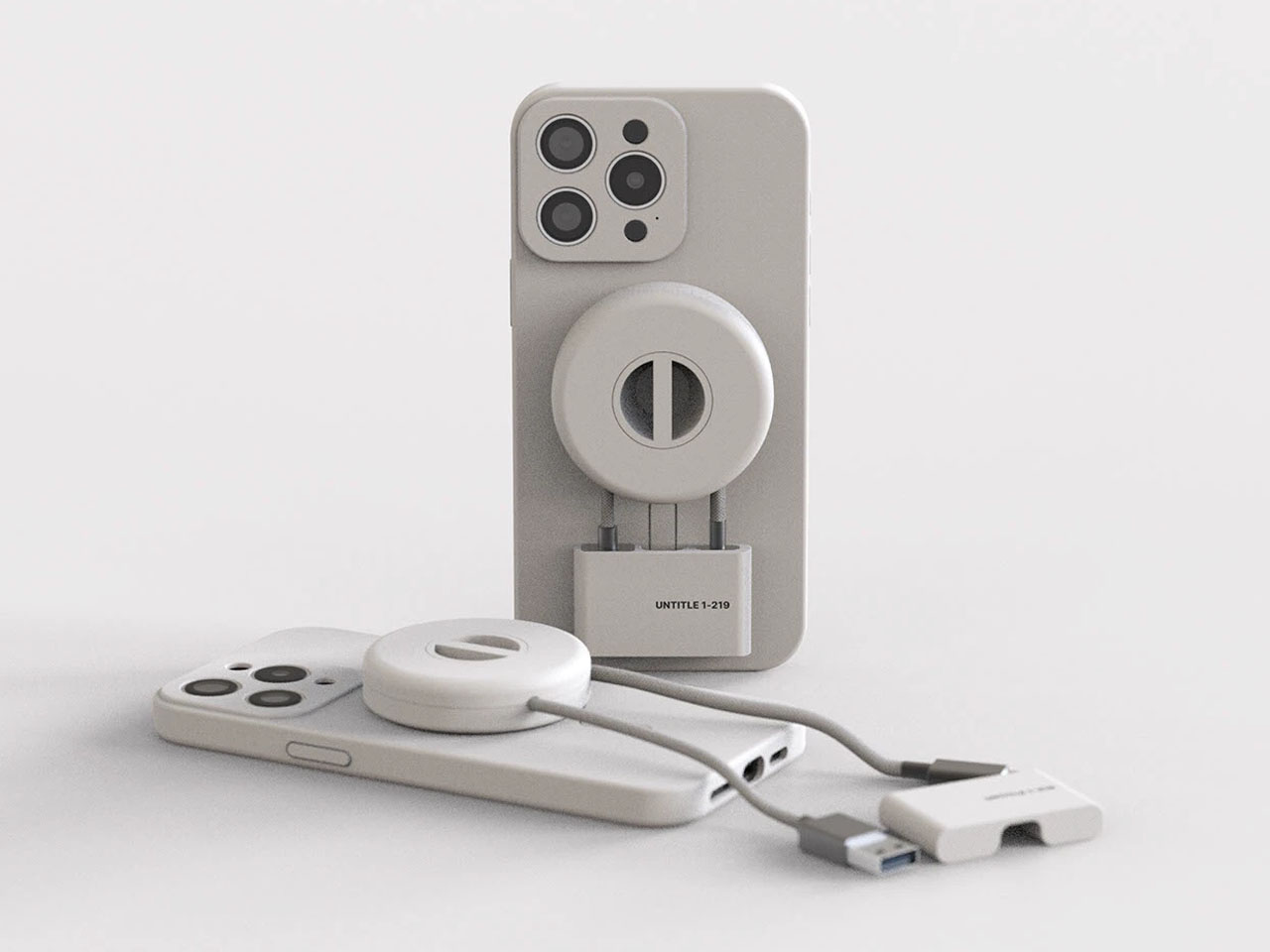
Therefore, Jinkyo has conceived this idea with a focus on convenience: “easy portability and instant charging when needed.” The accessory – called UNTITLE 1-219 – as imprinted on it, is divided into three parts, the MagSafe cable case, the changing cable that coils within it, and the clip end, which secures the dangling USB-A and USB-C ends on either side. This design does not consider the case and the cable as two easily lost appendages, instead imagines it as a MagSafe-compatible puck that snaps to the back of your phone and doubles as a storage, allowing changing cable to be coiled right inside; so, you can pull it out when you need to power your device.
And when you’re not using it, the case becomes a bit of drop prevention for the iPhone. The accessory may seem like a small – even useless – tweak to some, but for me, it is an accessory that has the potential to evolve past the drawing board. The idea of allowing the changing case to live on the phone instead of in the backpack is a logical option to the problem of tangling and lost cables. But how thick would this accessory make the phone and how much of an inconvenience it will be in daily usage, is, of course questionable. From where I see though, this accessory would mean one less thing to buy or lose.
Streaming services turned album covers into tiny squares you scroll past on your way to something else. Phones made music convenient, but also turned it into background noise competing with notifications, emails, and every app demanding attention at once. You used to hold a record sleeve and feel like you owned something specific. Now your entire library is just files in a folder somewhere, and nothing about that experience feels remotely special or worth paying attention to.
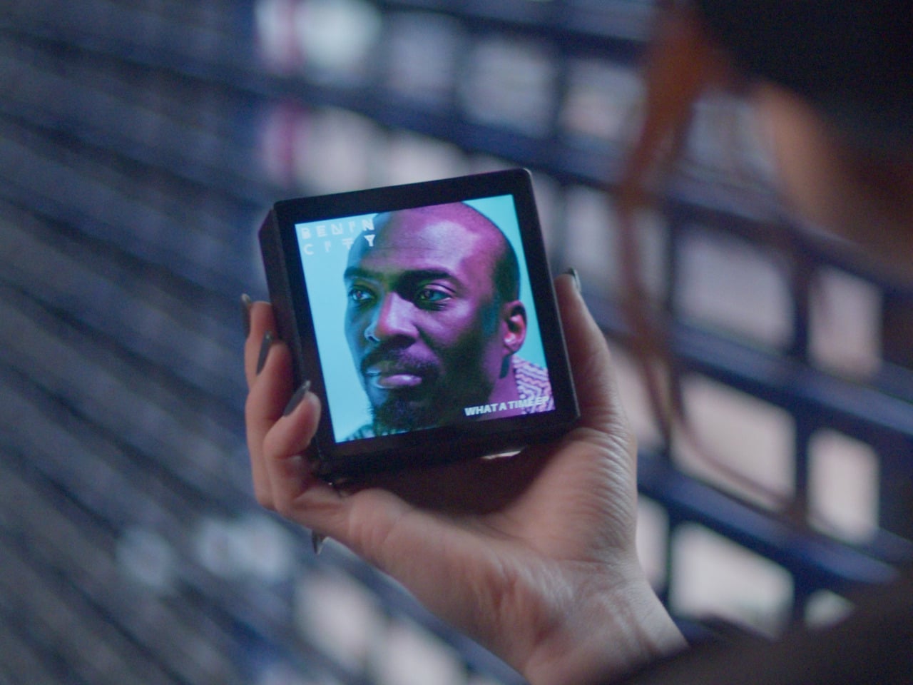
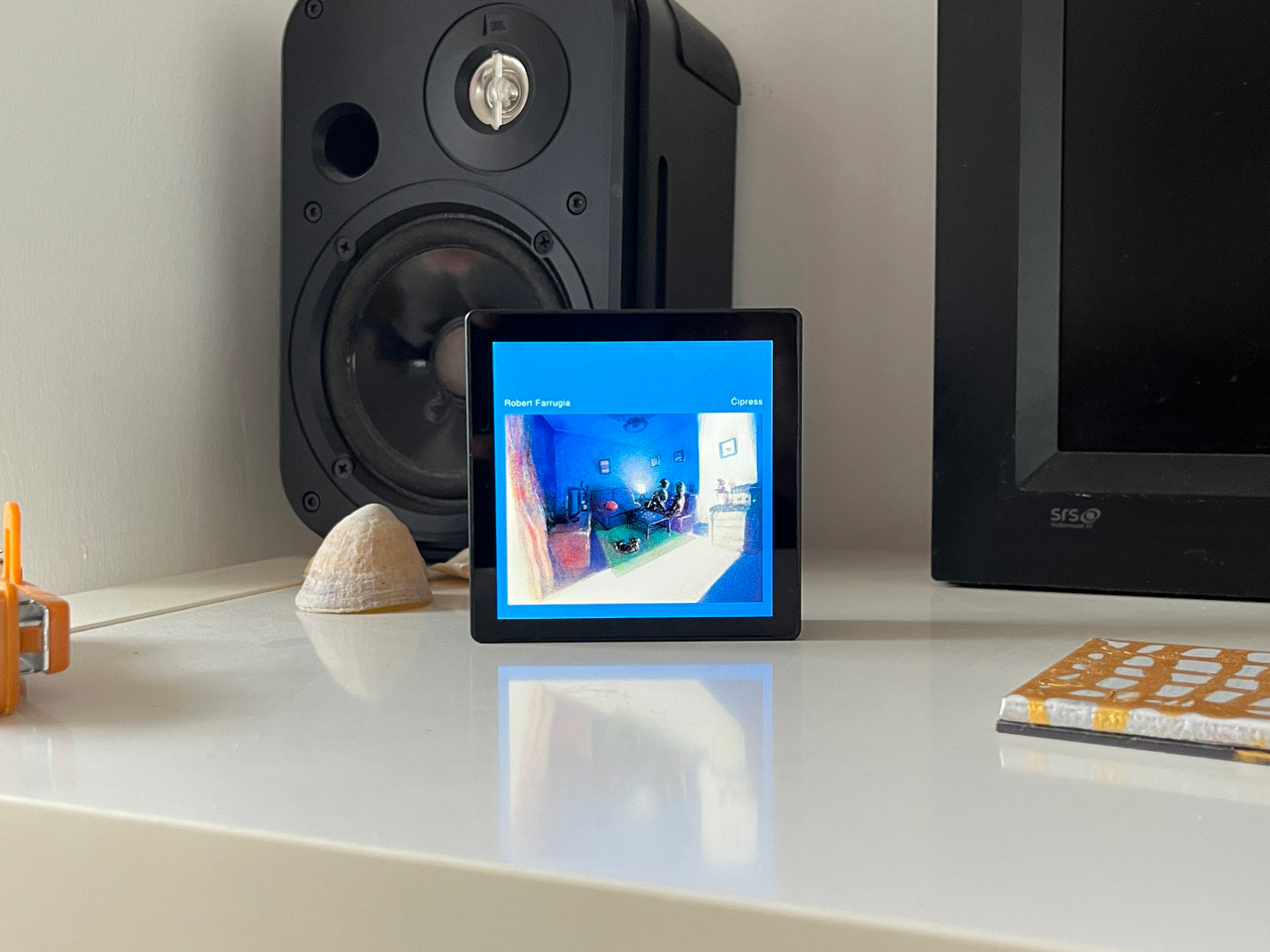
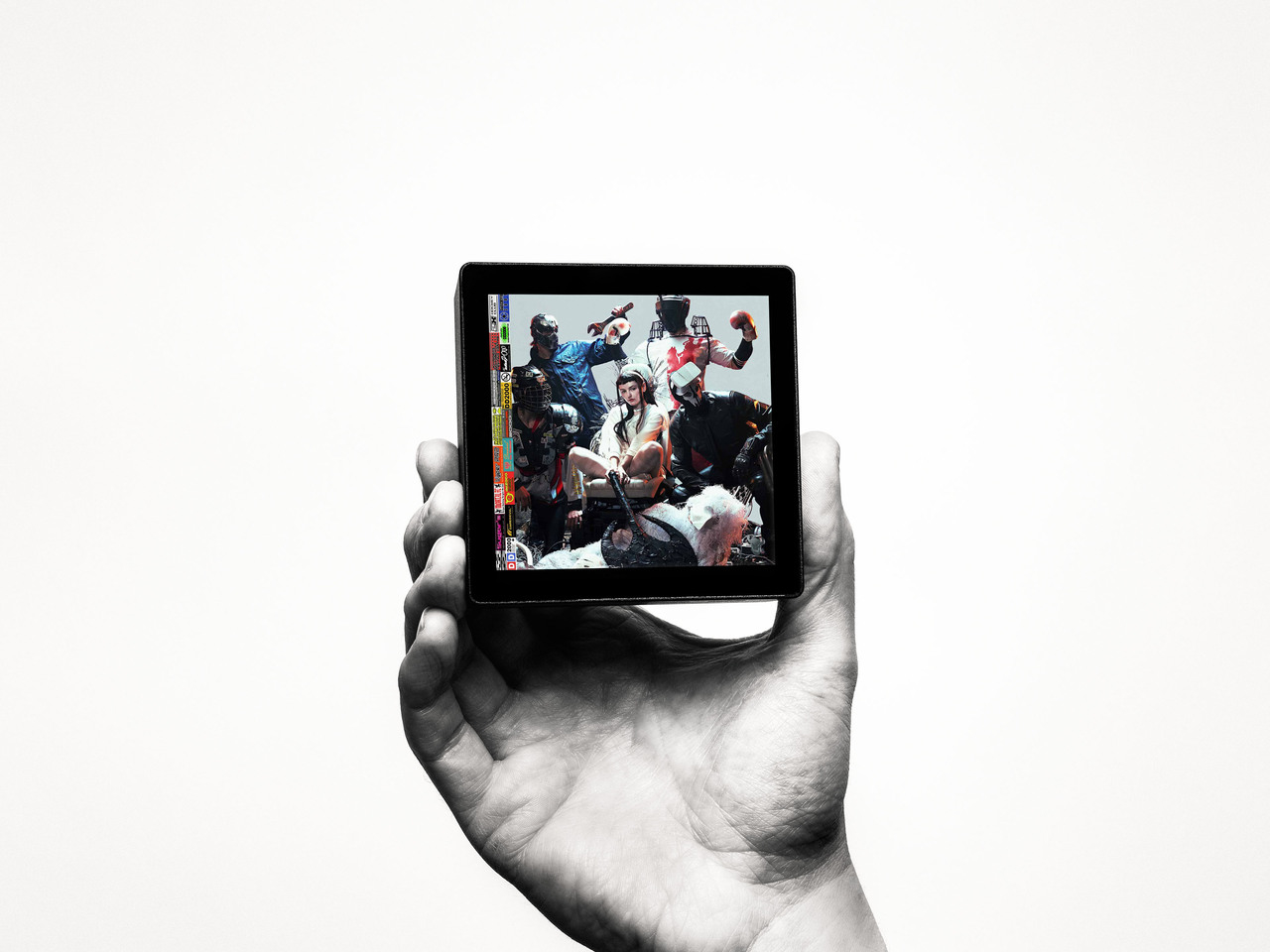
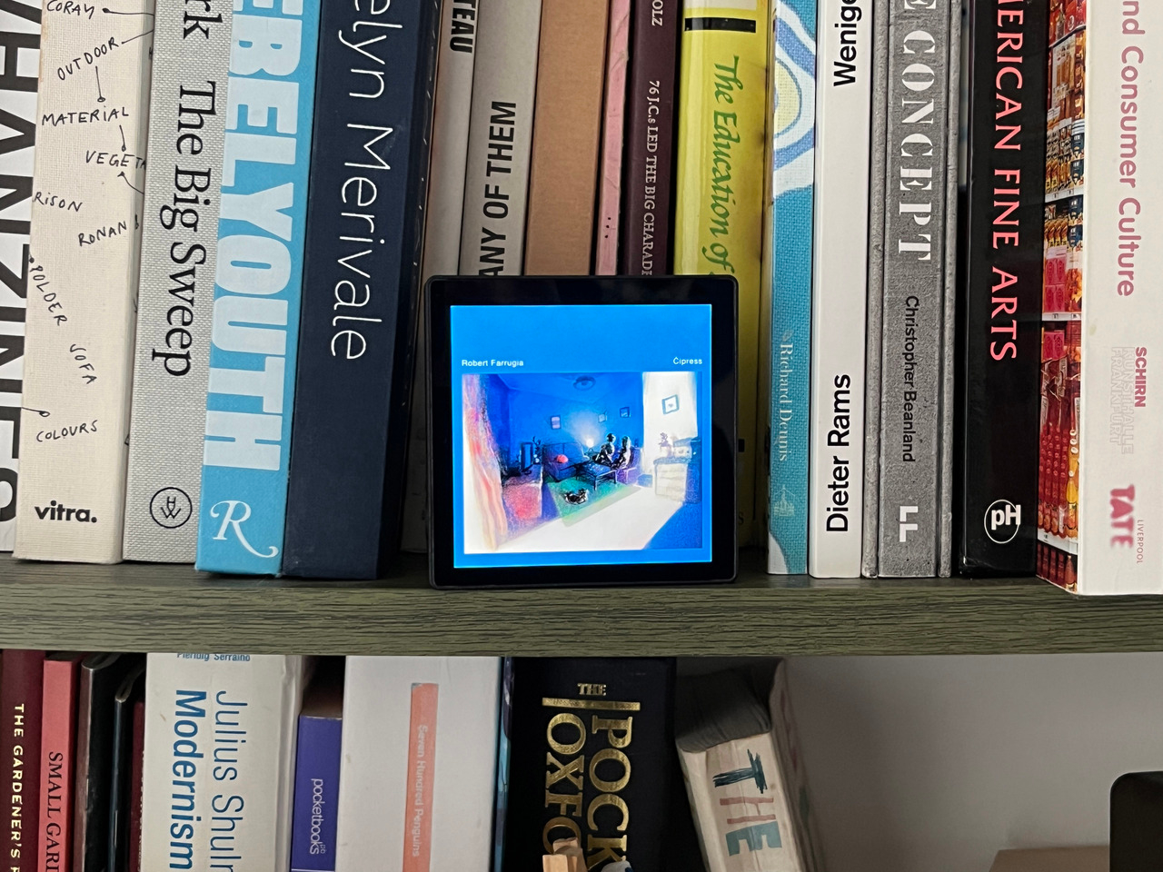
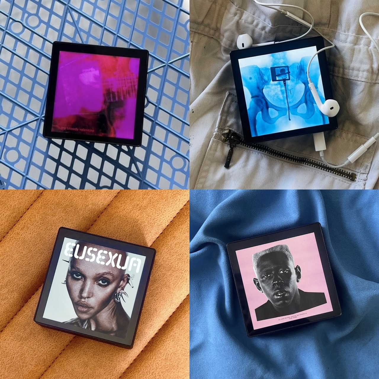
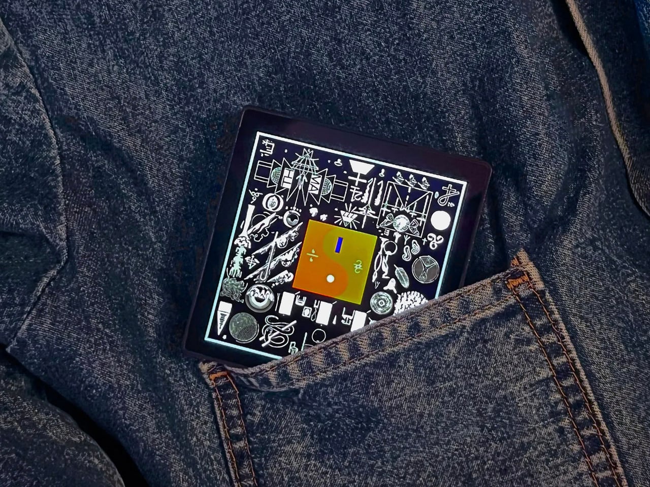
Sleevenote is musician Tom Vek’s attempt to give digital albums their own object again. It’s a square music player with a 4-inch screen that matches the shape of album artwork, designed to show covers, back sleeves, and booklet pages without any other interface getting in the way. The device only plays music you actually buy and download from places like Bandcamp, deliberately skipping Spotify and Apple Music to keep ownership separate from the endless scroll.
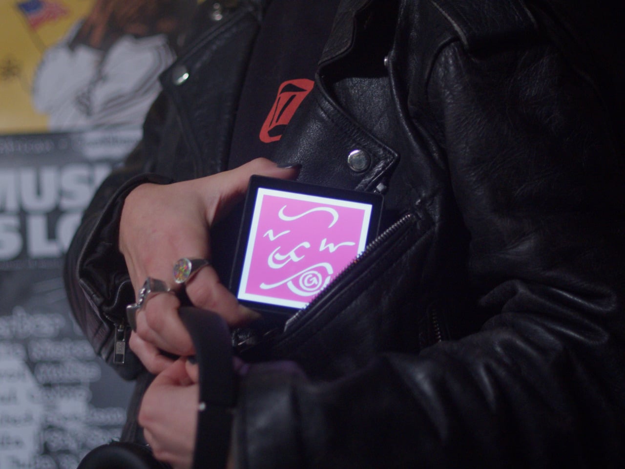
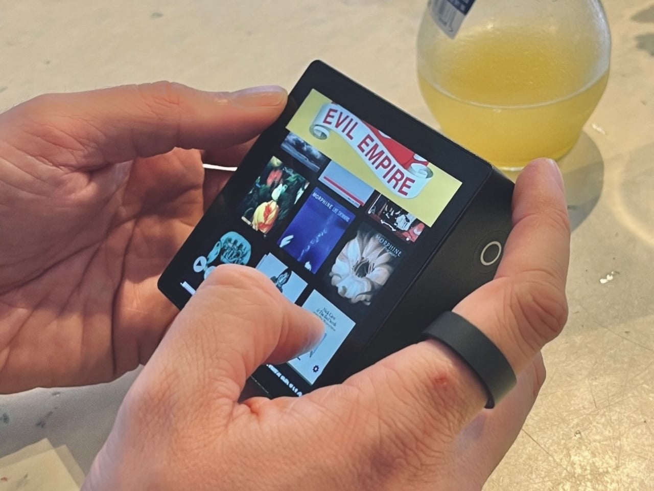
The hardware is a black square that’s mostly screen from the front, with a thick body and rounded edges that make it feel more like a handheld picture frame than a phone. Physical playback buttons sit along one side so you can skip tracks without touching the screen. When you hold it, the weight and thickness are noticeable. This isn’t trying to slip into a pocket; it’s trying to sit on your desk or rest in your hand like a miniature album sleeve.
The screen shows high-resolution artwork, back covers, lyrics, and credits supplied through the Sleevenote platform. You swipe through booklet pages while listening, and the interface stays out of the way so the album art fills the entire square without overlays or buttons. The whole point is that the device becomes the album cover while music plays, which works better in practice than it sounds on paper when you describe it.
Sleevenote won’t let you stream anything. It encourages you to “audition” music on your phone and only put albums you truly love on the player, treating it more like a curated shelf than a jukebox with everything. This sounds good in theory, but means carrying a second device that can’t do anything except play the files you’ve already bought, which feels like a lot of friction for album art, no matter how nice the screen looks.
Sleevenote works as a small act of resistance against music as disposable content. For people who miss having a physical relationship with albums, a square player that only does one thing might feel like a shrine worth keeping. Whether that’s worth the price for a device with a screen barely bigger than your phone is a different question, but the idea that digital music deserves its own object makes more sense than cramming everything into the same distracted rectangle.
Offices keep buying furniture that looks permanent, which works fine until someone needs the room to do something different. A workshop space becomes a presentation area, a meeting room needs to turn into individual work zones, and nobody wants to wait three days for facilities to show up with screwdrivers. The furniture just sits there looking expensive and immovable while everyone works around it instead of with it.
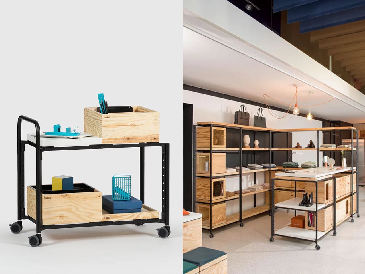
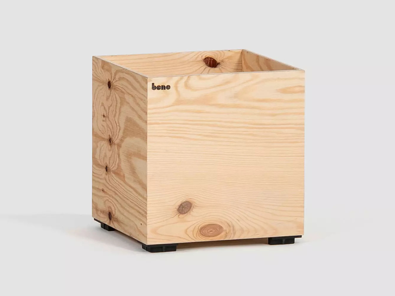
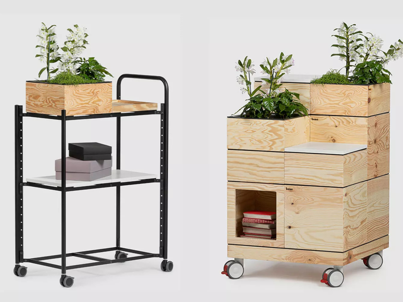
PIXEL by Bene is designer Didi Lenz’s answer, and it looks almost suspiciously simple. Each piece is a 36 x 36 cm cube made from raw pine plywood with visible grain and knots all over the surface. Lenz says it isn’t really furniture, which makes sense when you see people stacking them into benches, flipping them into tables, or just using one as a side storage box with a handle cut into the side.
The wood is completely untreated, so every cube looks slightly different depending on which part of the tree it came from. Some have dark knots near the corners, others show lighter grain patterns, and the plywood edges are exposed instead of hidden under veneer. It definitely reads as workshop material rather than corporate office product, which seems to be the whole point. You can see the screws holding the corners together.
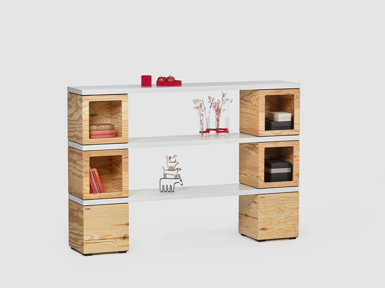
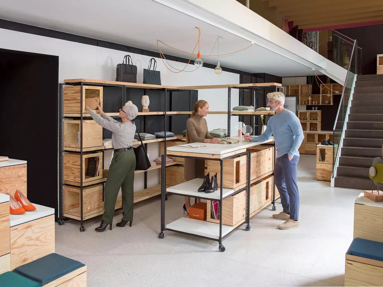
The cubes stack easily because they’re all the same size, and the cutout handles on two sides let you carry them around or fold them over to connect boxes side by side. Add a white laminate top and a stack becomes a work table. Add casters to the bottom, and it rolls wherever you need it. PIXEL Rack adds metal frames that turn stacks into proper shelving or room dividers with slots for whiteboards and plants.
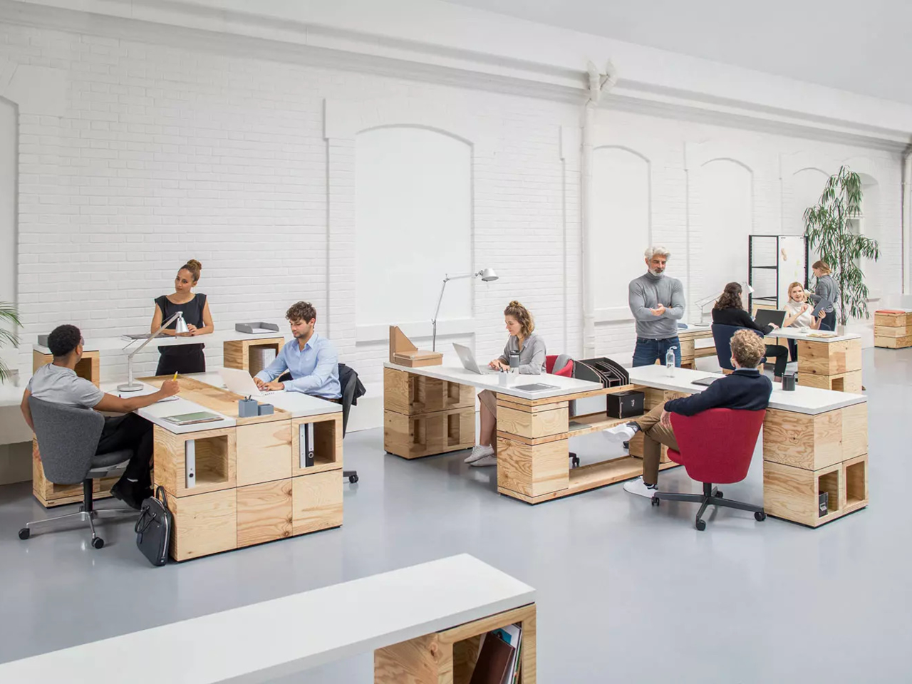
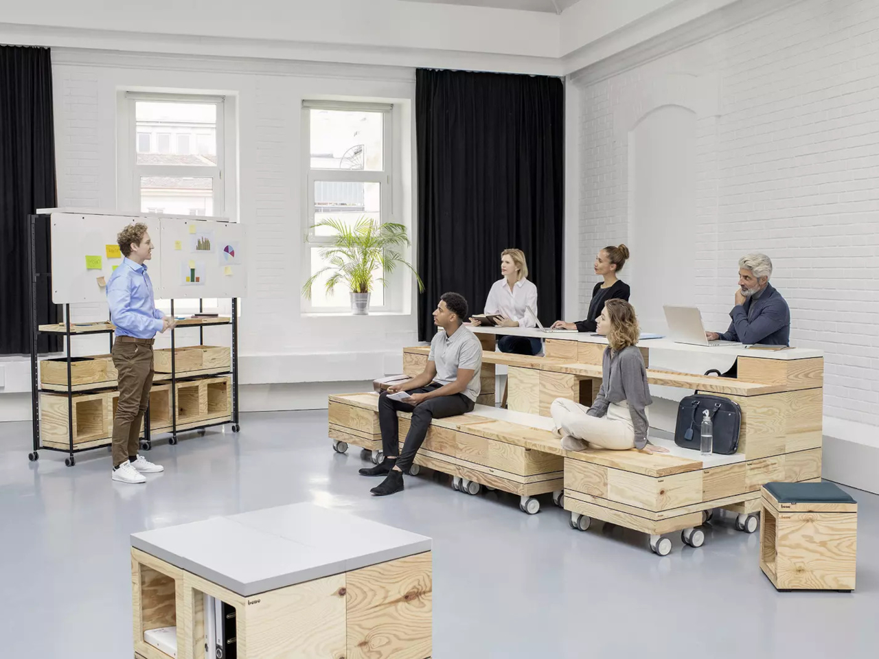
Bene shows photos of teams building entire project rooms by hand. Boxes stacked three high become benches for workshops, racks filled with boxes create semi-transparent walls between work zones, and tops laid across stacks turn into standing height tables. The setups look intentionally unfinished, like someone is still building them, which is probably the aesthetic Lenz wanted. Nothing looks bolted down or precious.
The system works because it assumes people will move things around themselves without asking permission. You need more seating for a presentation, so you grab some boxes from the storage wall and stack them into rows. The presentation ends, and those same boxes become side tables or go back to holding supplies. Heck, they can turn into a bar for an event if you add the right tops.
Raw plywood has obvious trade-offs. It’ll get dinged and stained over time, the surface isn’t smooth enough for detailed work, and the workshop look won’t suit every office brand. The fixed 36 cm dimension means everything is the same height whether you’re sitting, standing, or storing things, which can feel awkward. Some people will look at PIXEL and just see fancy storage crates, which isn’t entirely wrong.
But the system makes sense for spaces that need to change shape constantly. Co-working areas, design studios, classrooms, and pop-up shops can rebuild their layout between sessions without calling anyone. The wood looks honest and approachable instead of intimidating, and you don’t need instructions to figure out that boxes stack. PIXEL by Bene basically gives you building blocks that happen to be office furniture, or maybe it’s the other way around.




 technology uses a clever desiccant material that acts like a super-sponge, aggressively grabbing water molecules from the air. Once saturated, the machine gently heats the desiccant, forcing it to release the captured moisture as perfectly pure water vapor, leaving dust and other airborne gunk behind. It’s an elegant and efficient method of harvesting, allowing the machine to perform even when the air feels less than tropical. This isn’t merely condensation; it’s a targeted extraction.