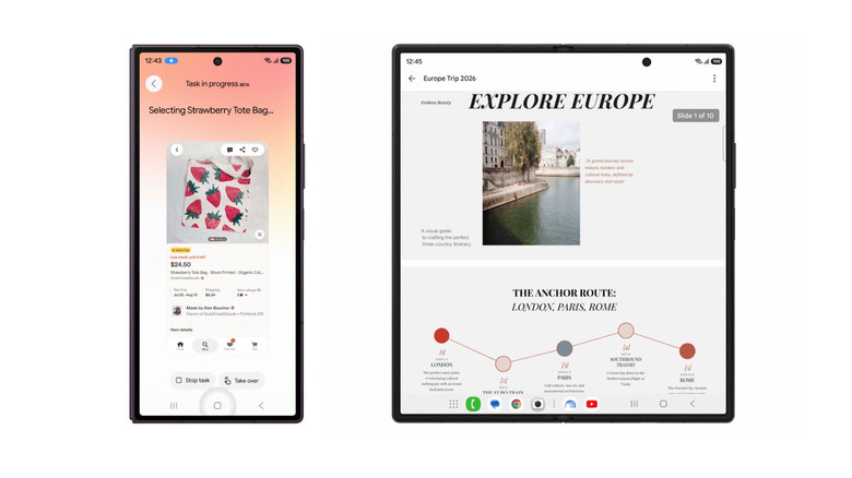
Samsung’s new foldables come with Gemini Notebook pre-installed Posted on 22/07/2026 by Mariella Moon Google and Samsung have revealed the Gemini-powered AI tools coming to the new Galaxy foldables and smartwatches.
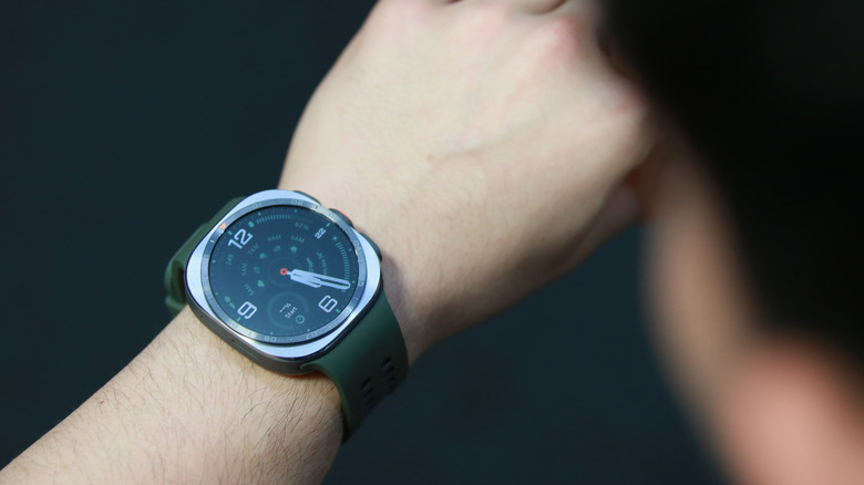
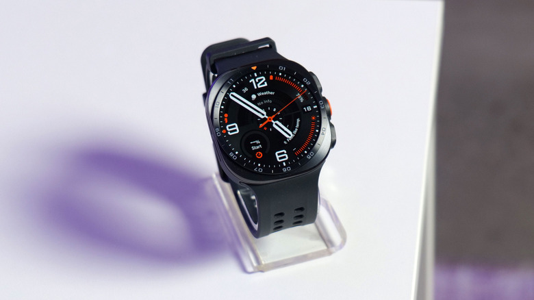
Samsung’s Galaxy Watch 9 is a gentle evolution of its predecessor Posted on 22/07/2026 by Daniel Cooper Following on from last year's Galaxy Watch redesign, the Watch 9 doesn't fix what wasn't broken.
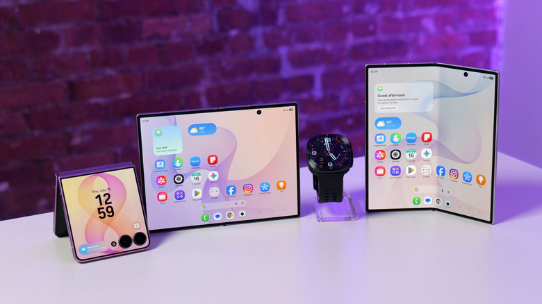
Everything announced at Samsung Unpacked 2026: Check out the company’s latest Galaxy foldables and watches Posted on 22/07/2026 by Kris Holt Thinner watches, wider foldables, higher prices.
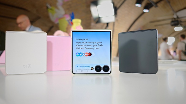
Samsung Galaxy Z Flip 8 hands-on: Slightly thinner, but more expensive Posted on 22/07/2026 by Mat Smith It's a year of minor upgrades for the Z Flip series.
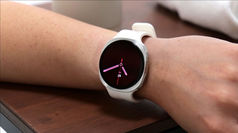
A week with the Samsung Galaxy Watch Ultra 2: Big, bright and sometimes helpful Posted on 22/07/2026 by Cherlynn Low We've had Samsung's latest Ultra smartwatch for about a week, and here are our first impressions.
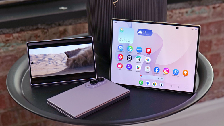
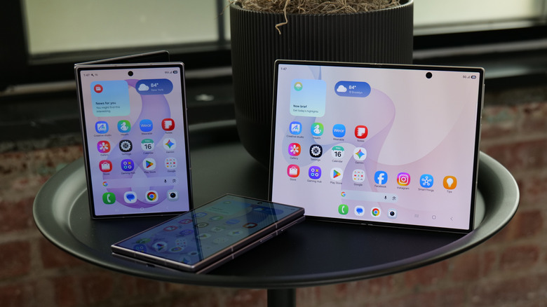
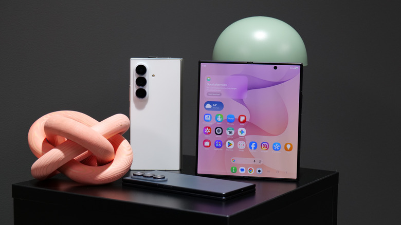
Samsung Galaxy Z Fold 8 hands-on: Wider is better Posted on 22/07/2026 by Sam Rutherford The new base version of the Z Fold 8 has reworked aspect ratios for both its interior and exterior displays.
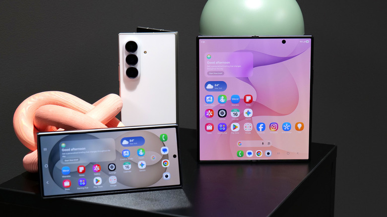
Samsung Galaxy Z Fold 8 Ultra hands-on: Upstaged by the base model Posted on 22/07/2026 by Sam Rutherford The Z Fold 8 Ultra's improved performance, faster charging and a new ultra-wide camera are nice, but what we really want is the regular model's wider screens.
Samsung’s Galaxy Z Fold 8 has a new wider design Posted on 22/07/2026 by Mariella Moon Samsung has unveiled a base Galaxy Z Fold 8 model that comes in a different shape than previous Fold devices.
Samsung’s Galaxy Watch Ultra 2 is both slimmer and tougher than its predecessor Posted on 22/07/2026 by Mariella Moon The Samsung Galaxy Ultra Watch 2 has a slimmer and more rugged design than the first Ultra.
Samsung’s Galaxy Z Fold 8 Ultra has a sharper ultrawide camera and a bigger battery Posted on 22/07/2026 by Steve Dent Samsung has officially announced the Galaxy Z Fold 8 Ultra foldable smartphone, the flagship in the expand Z Fold lineup.