PROS:
- Compact, comfortable, and premium design
- Powerful 50MP main and telephoto cameras
- Large battery with fast wired and wireless charging
- Long-term software support
CONS:
- Mediocre 8MP ultra-wide camera
- Uncommon horizontal camera design
- A bit pricier than most "small flagships"
Premium smartphones have been trending bigger, heavier, and more visually imposing for years. It’s reached the point where “flagship” is almost synonymous with large, and carrying one all day feels less like convenience and more like a commitment. The compact phone hasn’t disappeared, but finding one that doesn’t sacrifice performance, battery life, or camera quality in exchange for a smaller footprint has been genuinely difficult.
That’s the gap the vivo X300 FE is aiming to fill. It pairs a 6.31-inch flat display with a Snapdragon 8 Gen 5 chipset, a 6,500 mAh battery, and a ZEISS co-engineered camera system, all within a compact design that stays remarkably light for its class. On paper, it reads like a phone that shouldn’t be this compact. But does it actually work in practice? We give it a spin to find out.
Designer: vivo
Aesthetics
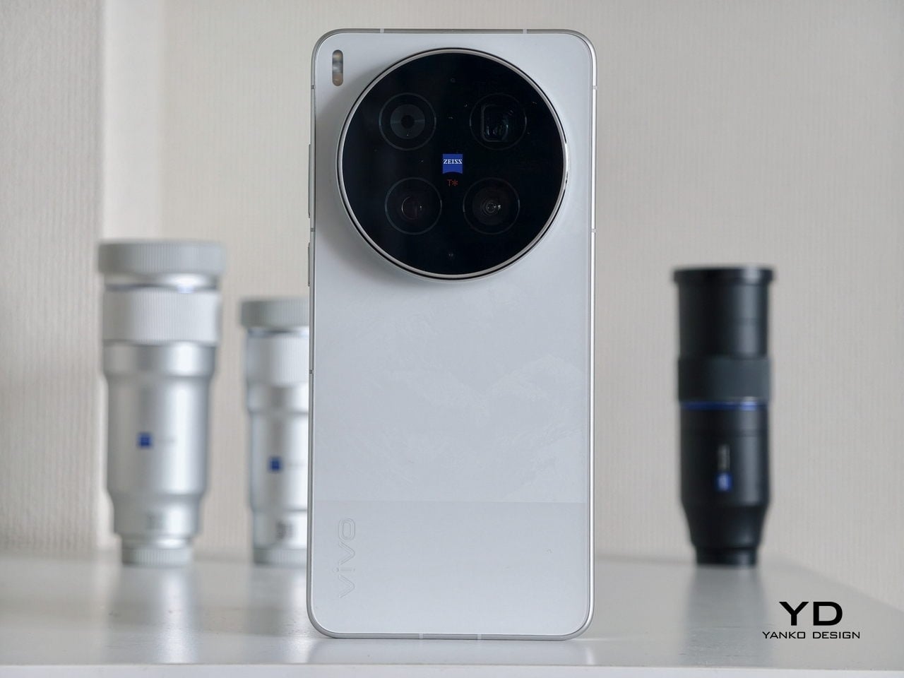
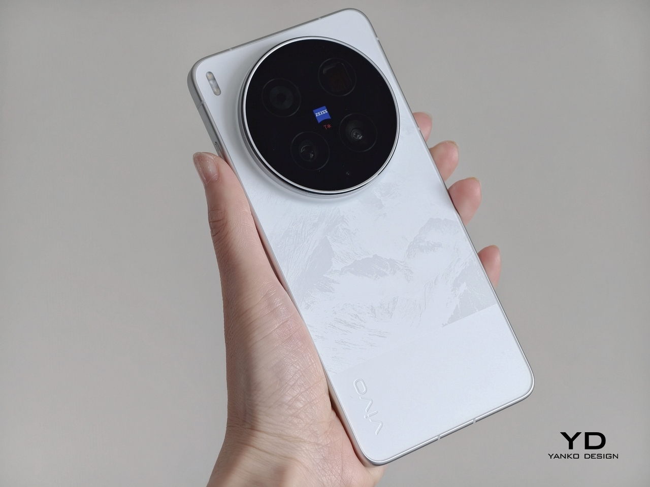
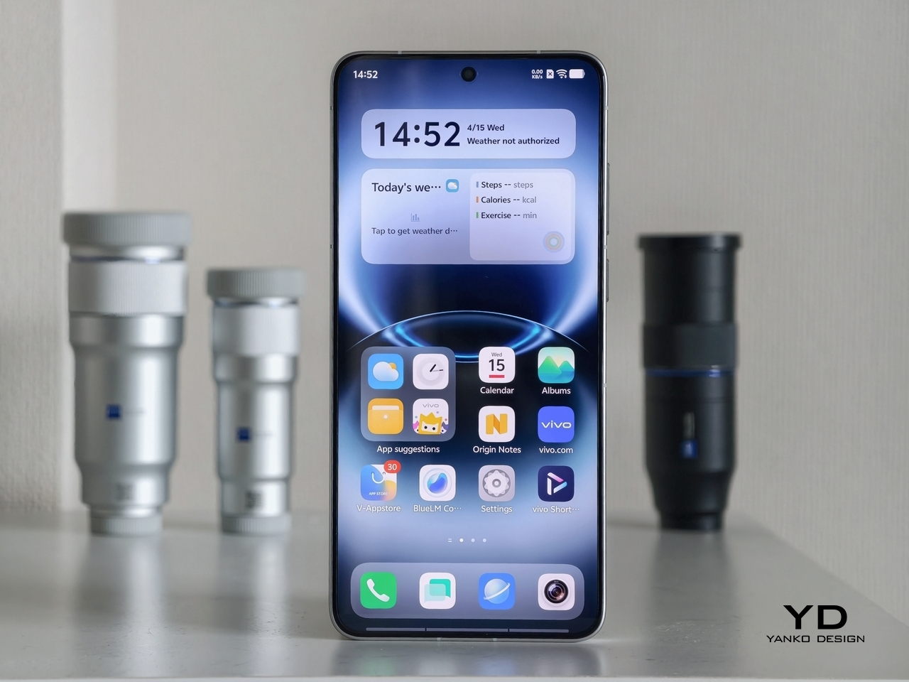
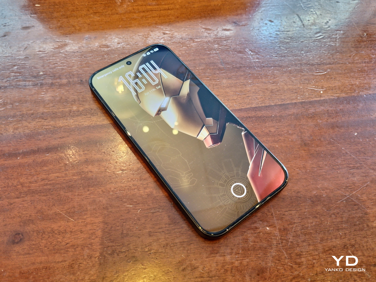
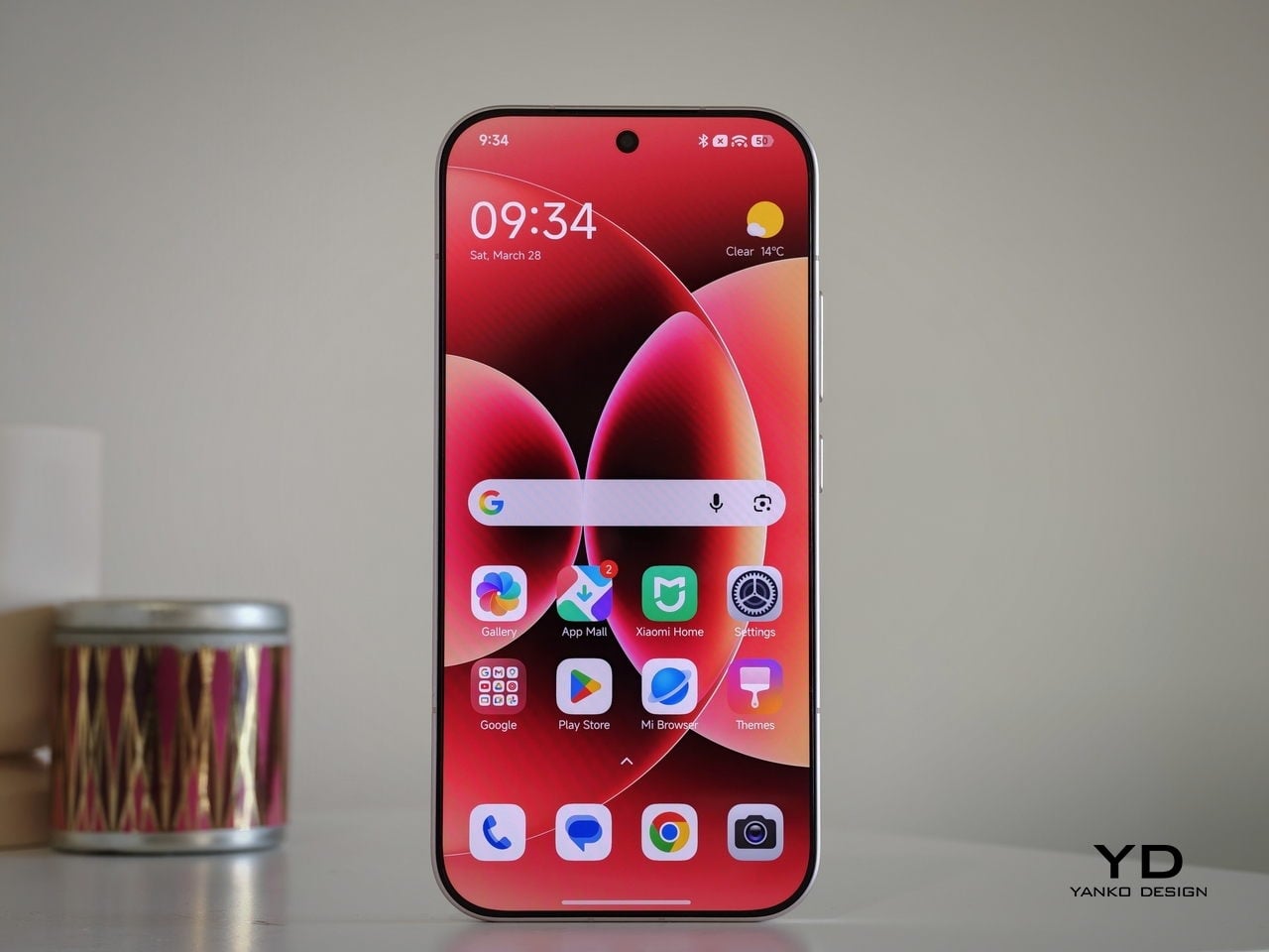
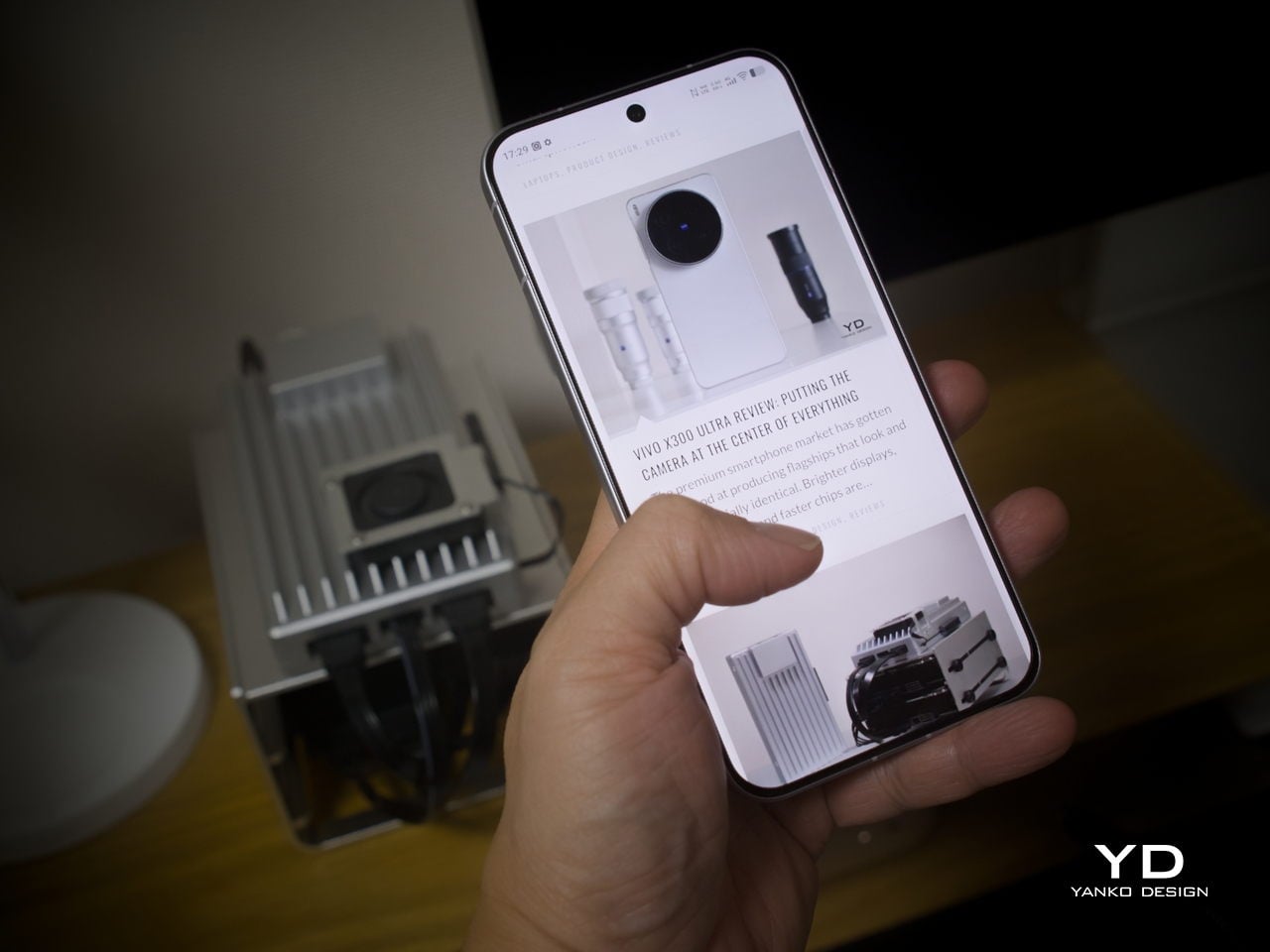
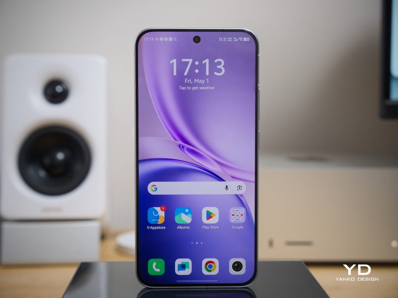
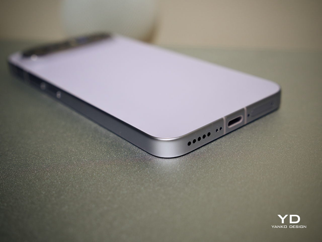
The X300 FE follows a flat-design language that’s become increasingly standard among more expensive flagships. There aren’t any curved glass edges or aggressively contoured surfaces, just a clean, rectangular form with ultra-narrow bezels, an aerospace-grade aluminum frame, and a front face that looks symmetrical and composed. The centered punch-hole is small and unobtrusive, and those slim borders give the display a neat, purposeful presence that doesn’t need theatrics to feel premium.
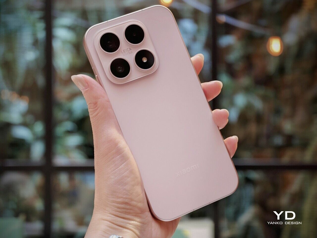
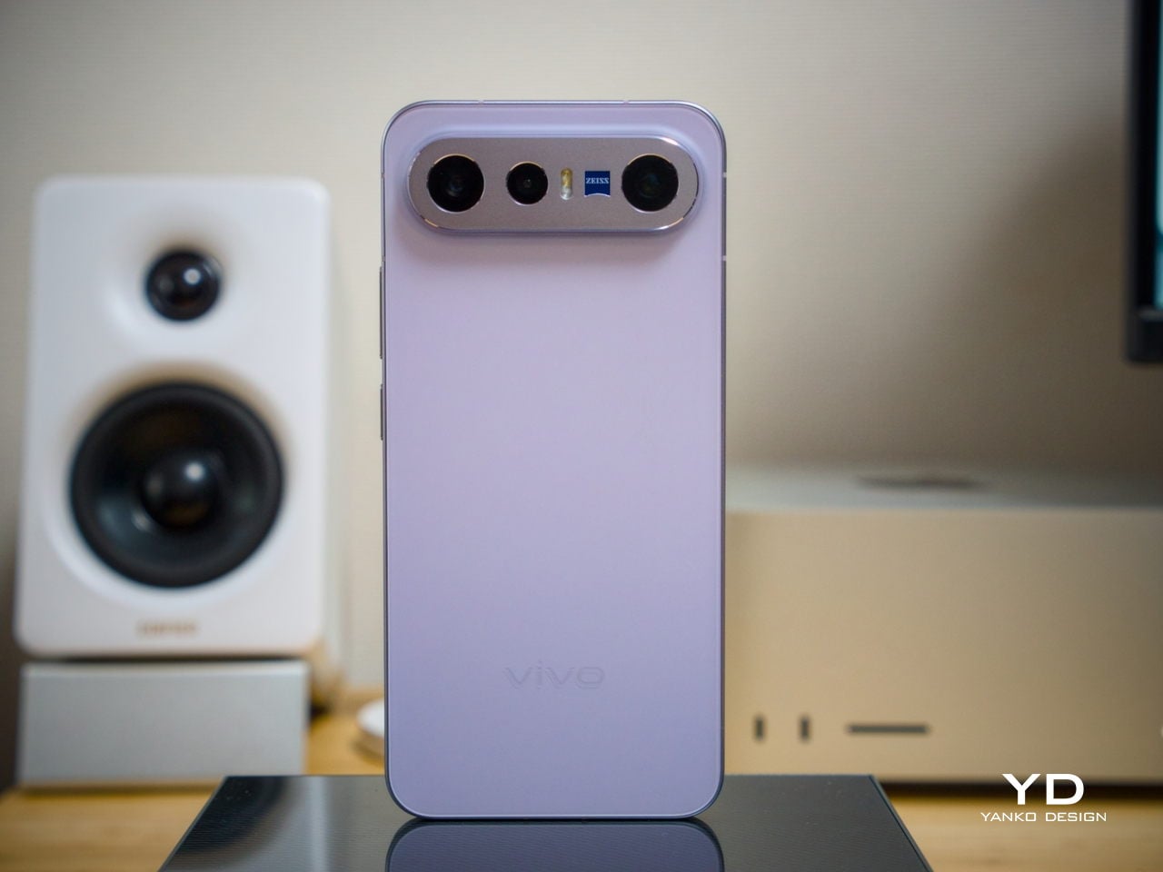
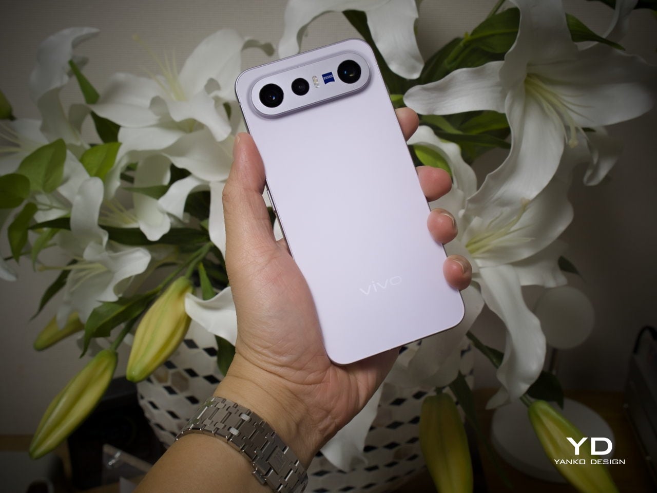
Our review unit came in white, which turns out to be a great choice for a phone this carefully considered. The matte rear panel uses vivo’s Metallic Sand AG glass treatment, giving it a soft, slightly chalky texture that resists fingerprints well and picks up ambient light in a way that shifts subtly between warm and cool tones. It doesn’t try to be eye-catching; it just looks well-made.
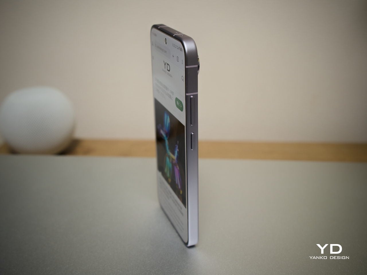
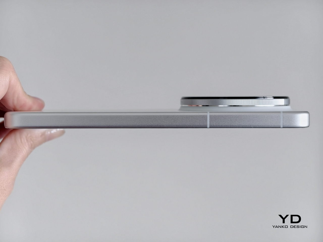
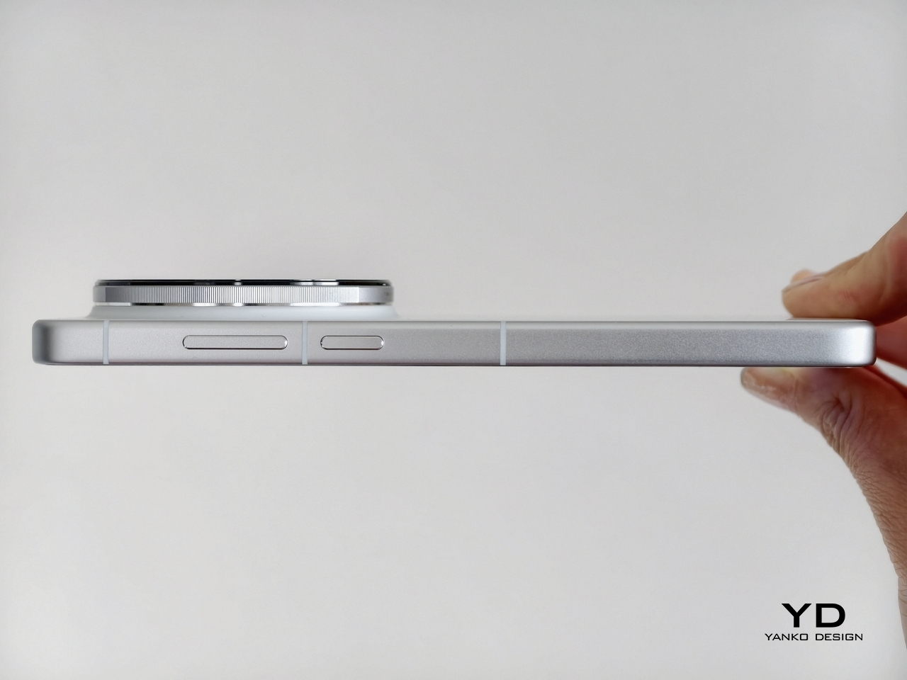
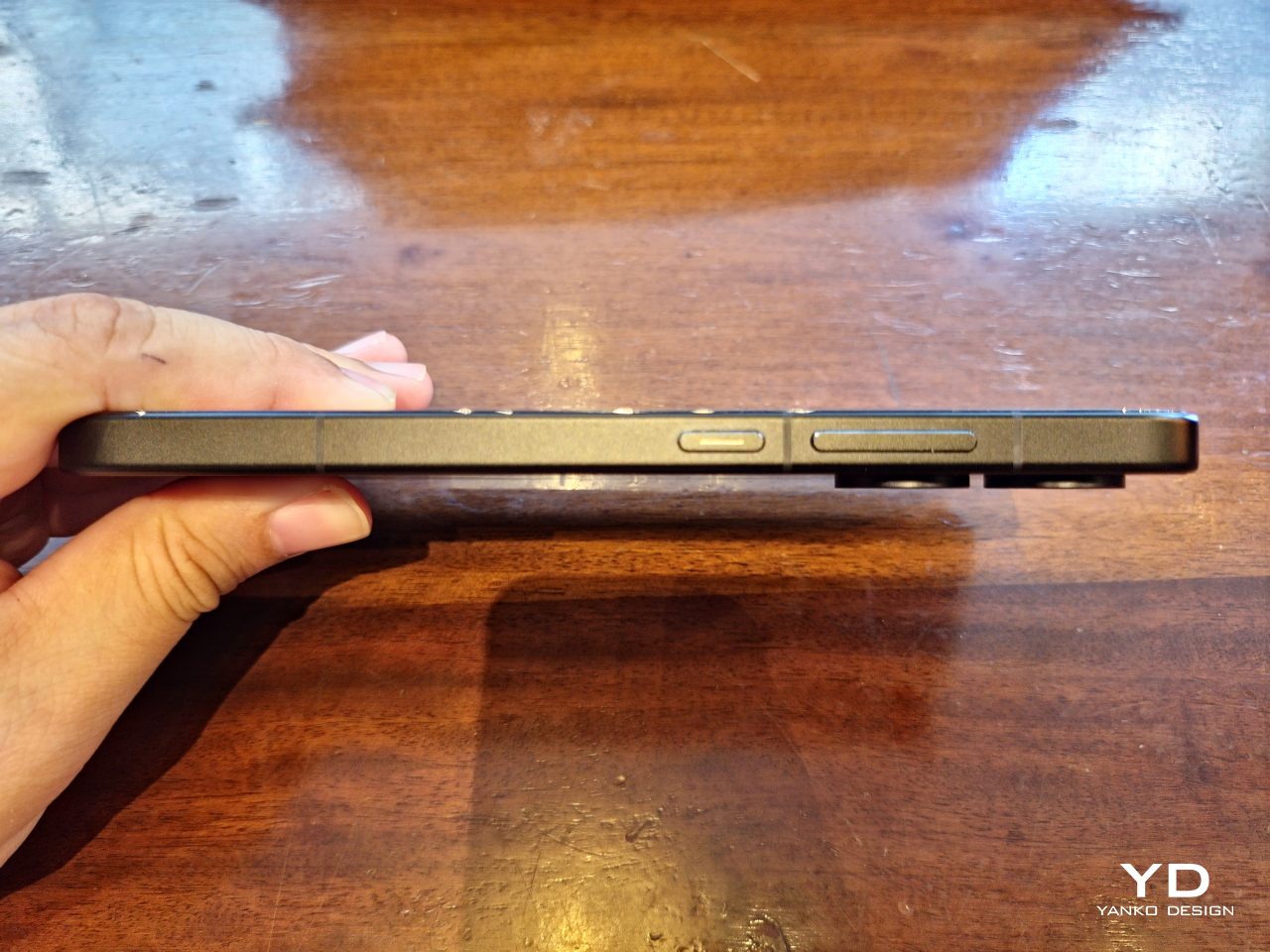
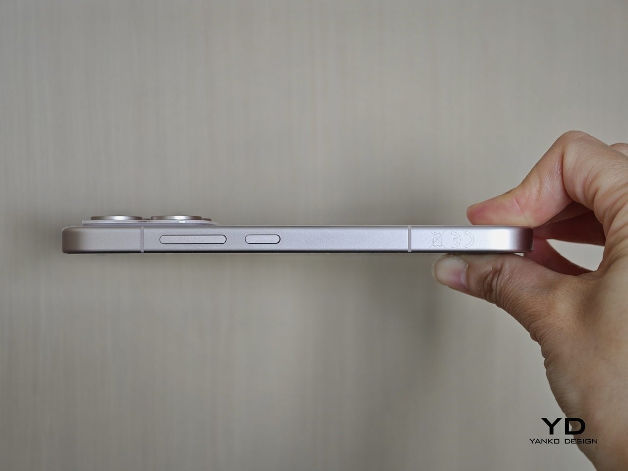
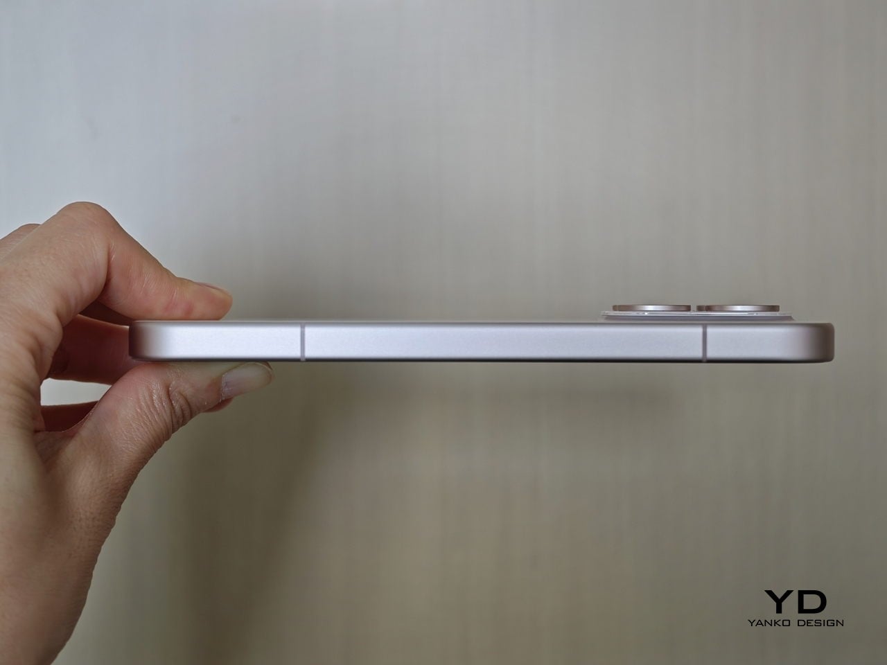
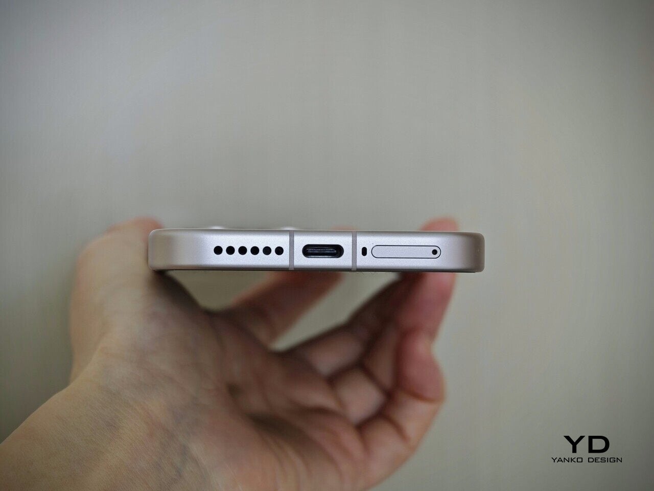
The flat aluminum frame wraps cleanly around the body, with edges that make it comfortable to grip without feeling sharp or slippery. The white model measures 8.10mm thick and weighs 192g, a hair more than the other colorways, but those differences don’t register in hand. What does register is the overall sense of a phone that’s been assembled with genuine attention to detail.
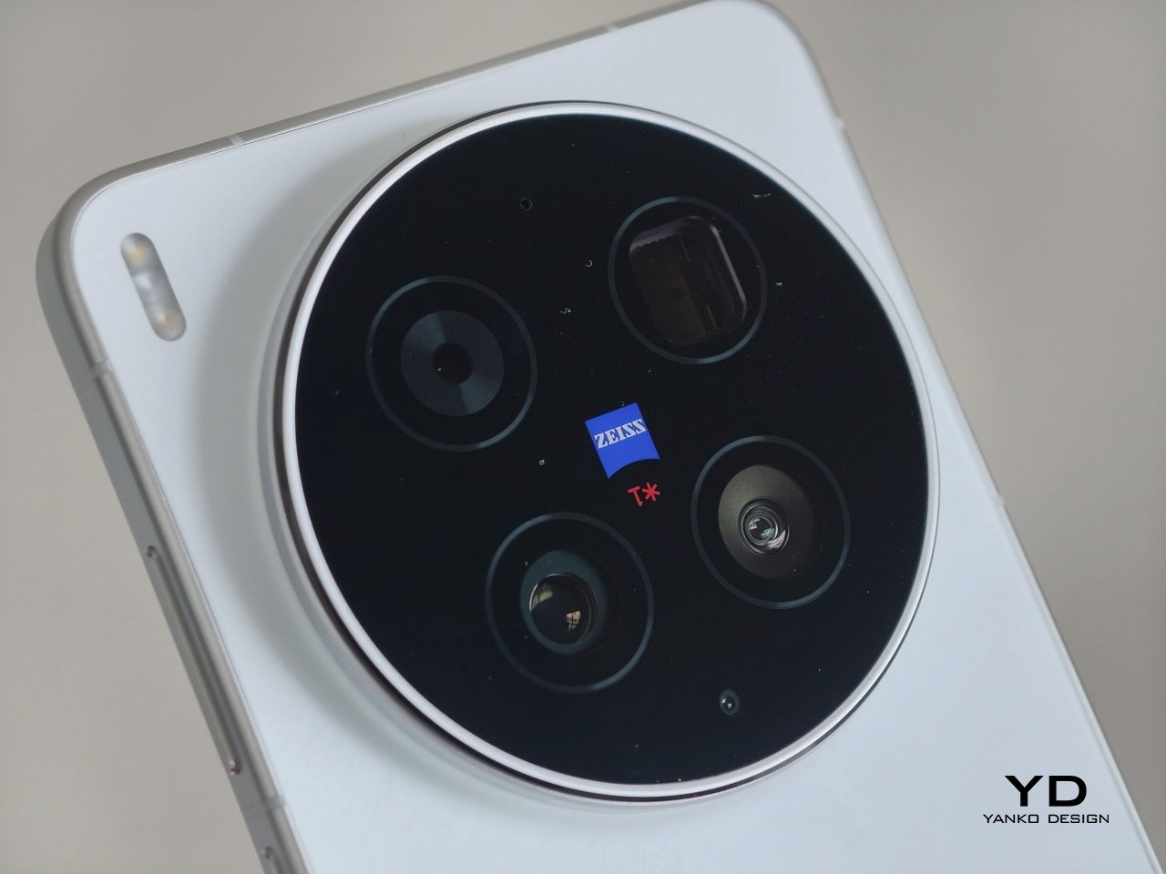
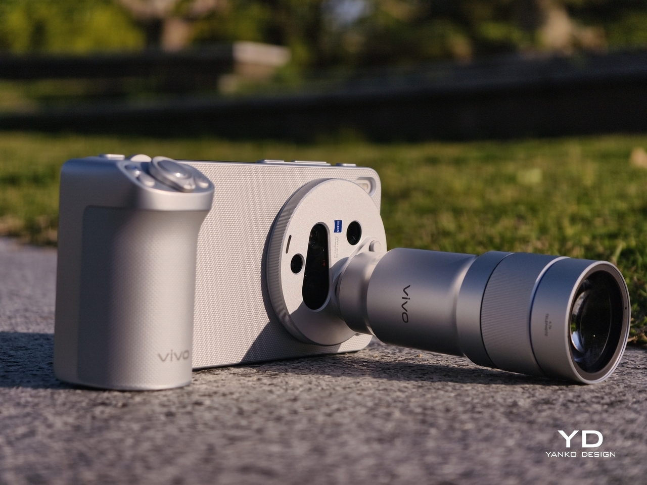
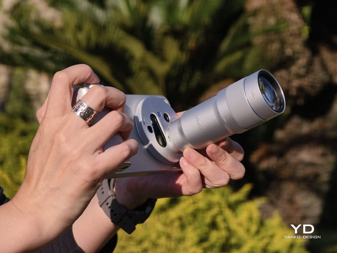
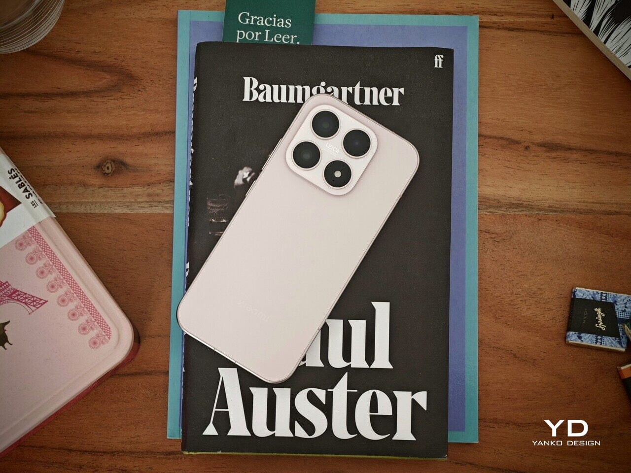
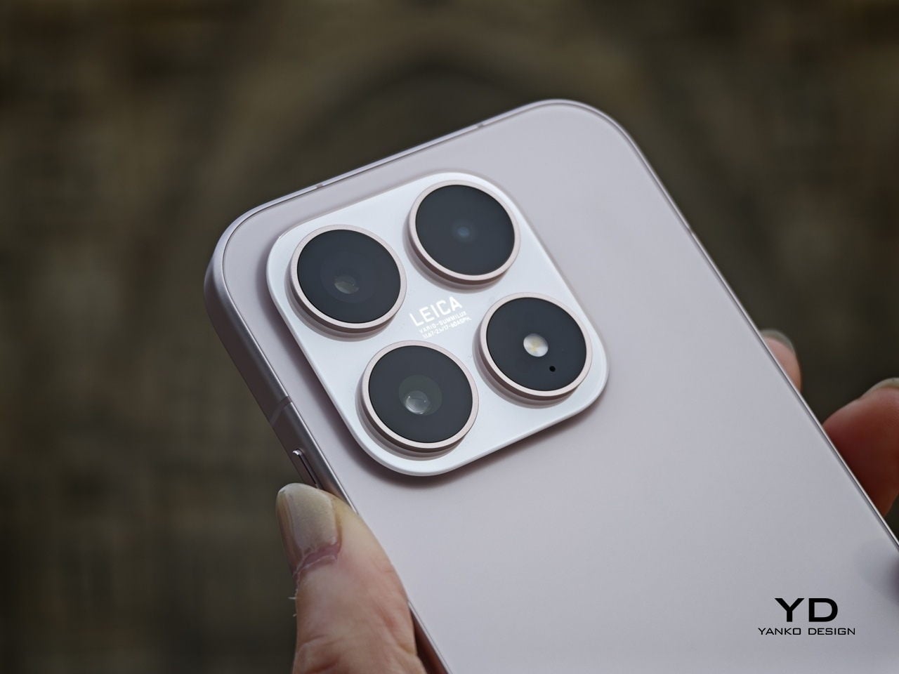
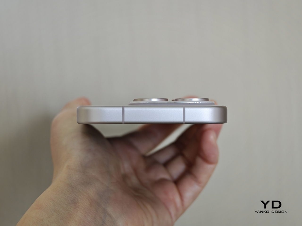
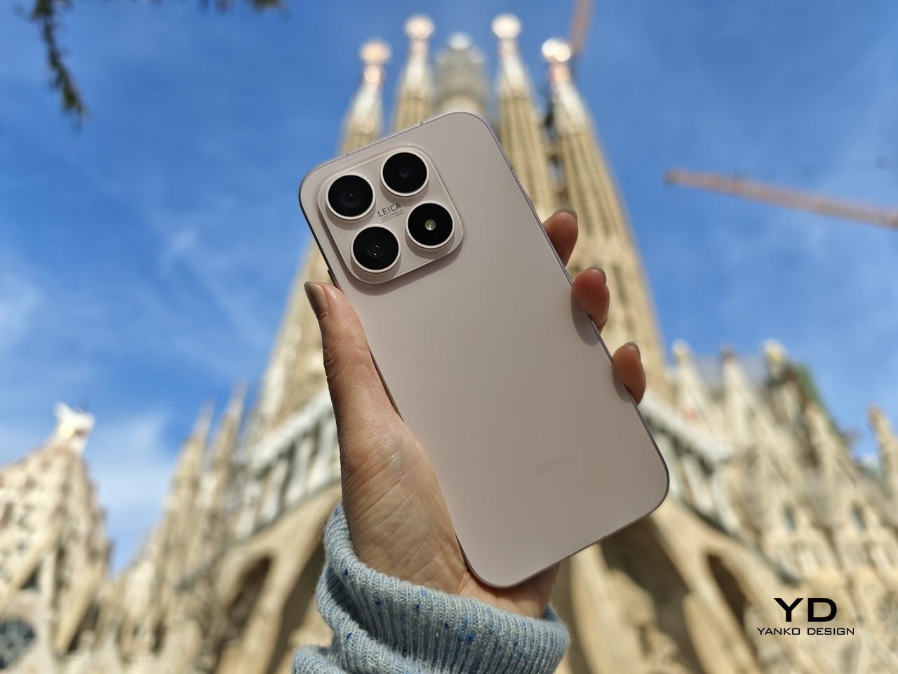
The camera module deserves its own mention. Rather than going for the oversized circular island that’s become visual shorthand for “serious camera phone,” vivo opted for a horizontal bar that spans the upper portion of the back. Three lenses are arranged neatly across it, with a ZEISS badge centered between them. It’s recognizable and distinctive without domineering the rest of the design. Admittedly, it’s going to be a divisive design, but it at least lets the vivo X300 FE easily stand out from the competition.
Ergonomics
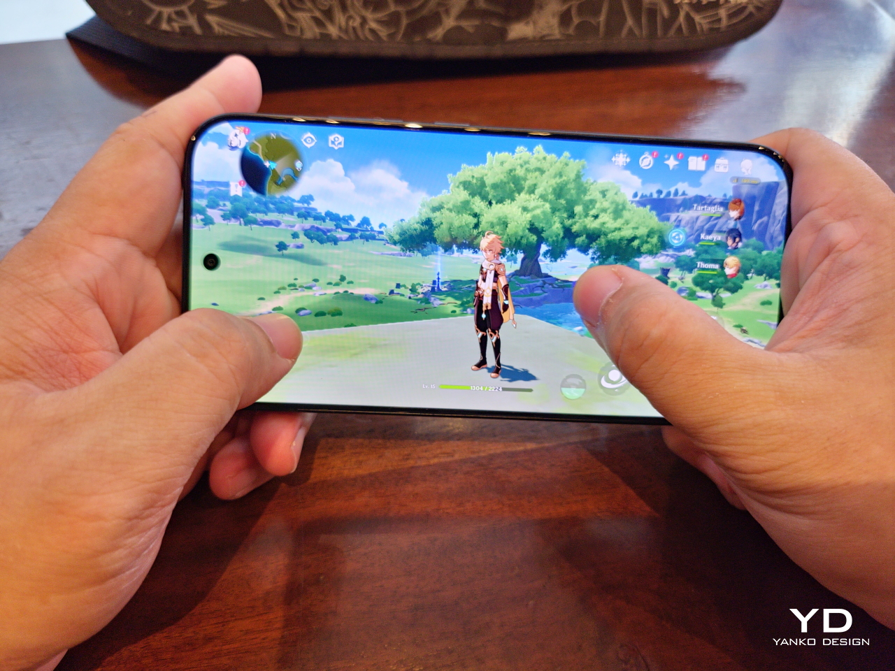
At 150.83mm tall and 71.76mm wide, the X300 FE sits firmly in one-handed territory. It isn’t trying to be a miniature phone. It’s simply sized more sensibly than most flagships on the market. You can reach across the screen without adjusting your grip, slip it into a front pocket without thinking, and hold it for extended periods without the wrist fatigue bigger phones tend to bring.
The 192g weight for the white model falls in a range that feels present without being burdensome. There’s enough substance here to reinforce the premium feel of the materials, but not so much that you’re constantly aware of it. The 8.10mm profile isn’t exactly wafer-thin, though that’s a reasonable trade-off for a 6,500 mAh cell packed inside a frame this compact.
The flat-sided frame also contributes more to the ergonomic experience than it might seem. It gives your palm a stable, consistent surface to press against during typing and scrolling, which feels more controlled than on rounded-edge designs. The compact footprint, flat back, and balanced weight distribution all work together to make this a phone that feels designed around how it’s actually used.
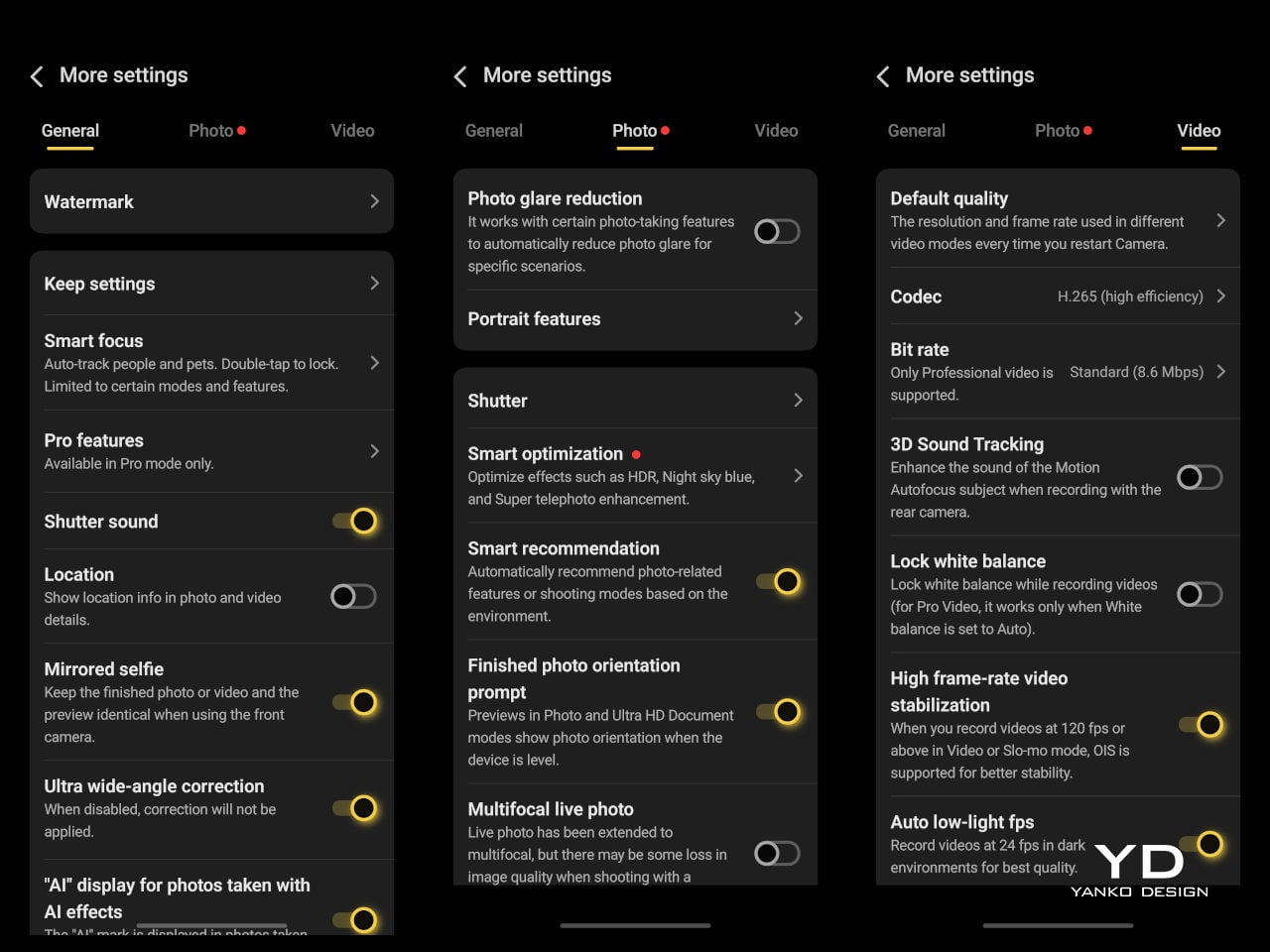
Performance
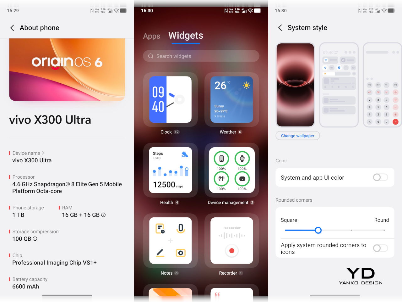
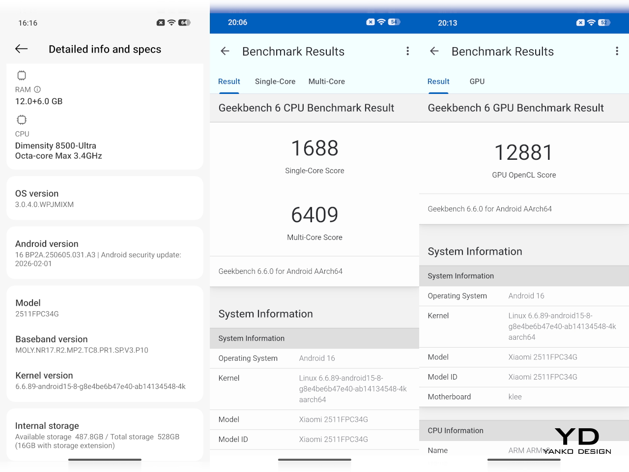
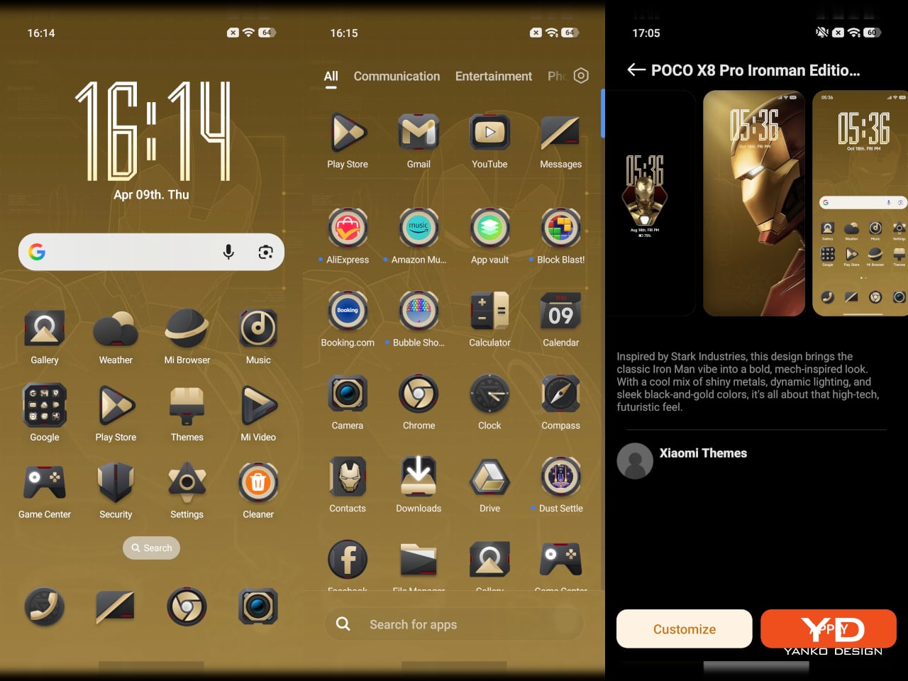
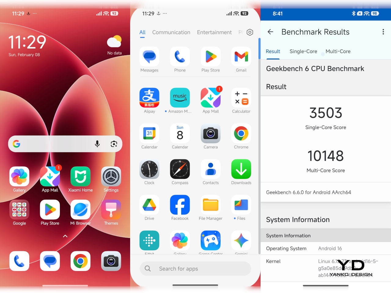
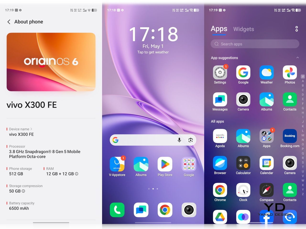
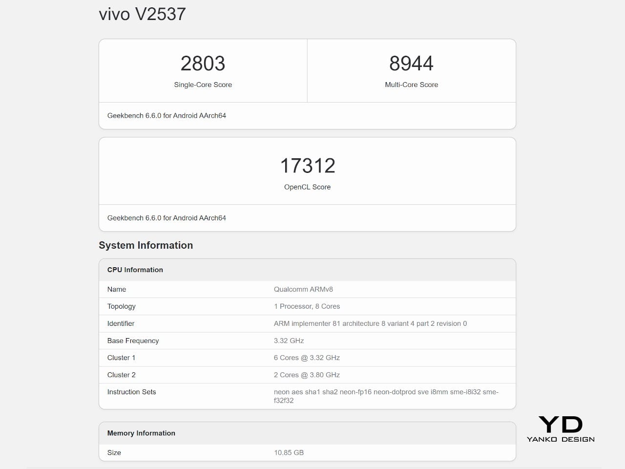
The Snapdragon 8 Gen 5 inside doesn’t need much introduction. It’s a flagship-class mobile processor, and the X300 FE puts it to good use. The 12GB RAM, expandable with another 12GB taken from the generous 512GB storage, clearly marks it as a class above your typical mid-tier compact phone. It runs Origin OS 6, based on the current Android 16 release, embracing a more minimalist and flat aesthetic that perfectly matches the phone’s design.
Day-to-day tasks feel completely effortless, from switching between apps and browser tabs to occasional gaming sessions, and nothing about the experience suggests the compact body is in any way holding the hardware back. Thermals are pretty impressive, given the vivo X300 FE’s size, but its compact form factor might work against it when it comes to how you hold it during those long periods.
Thankfully, the display backs that up well. It’s a 6.31-inch LTPO AMOLED panel with an adaptive refresh rate of 1 to 120 Hz, a 1.5K resolution at 460 PPI, and a local peak brightness of 5,000 nits. The 2,160 Hz PWM dimming also makes prolonged reading and scrolling noticeably more comfortable on the eyes, a detail that matters far more than most spec sheets would have you believe.
Then there’s the battery, arguably the X300 FE’s most impressive engineering accomplishment. A 6,500 mAh cell in a phone this slim and light isn’t something you see every day, and in practice, that capacity means genuine all-day endurance with room to spare. The 90W wired and 40W wireless charging mean you’re rarely stuck waiting long when it runs low, at least with the appropriate chargers.


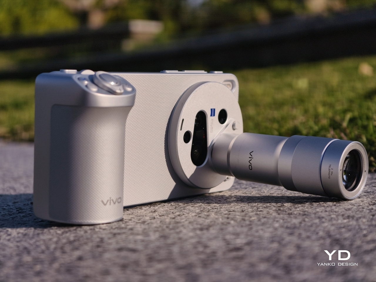
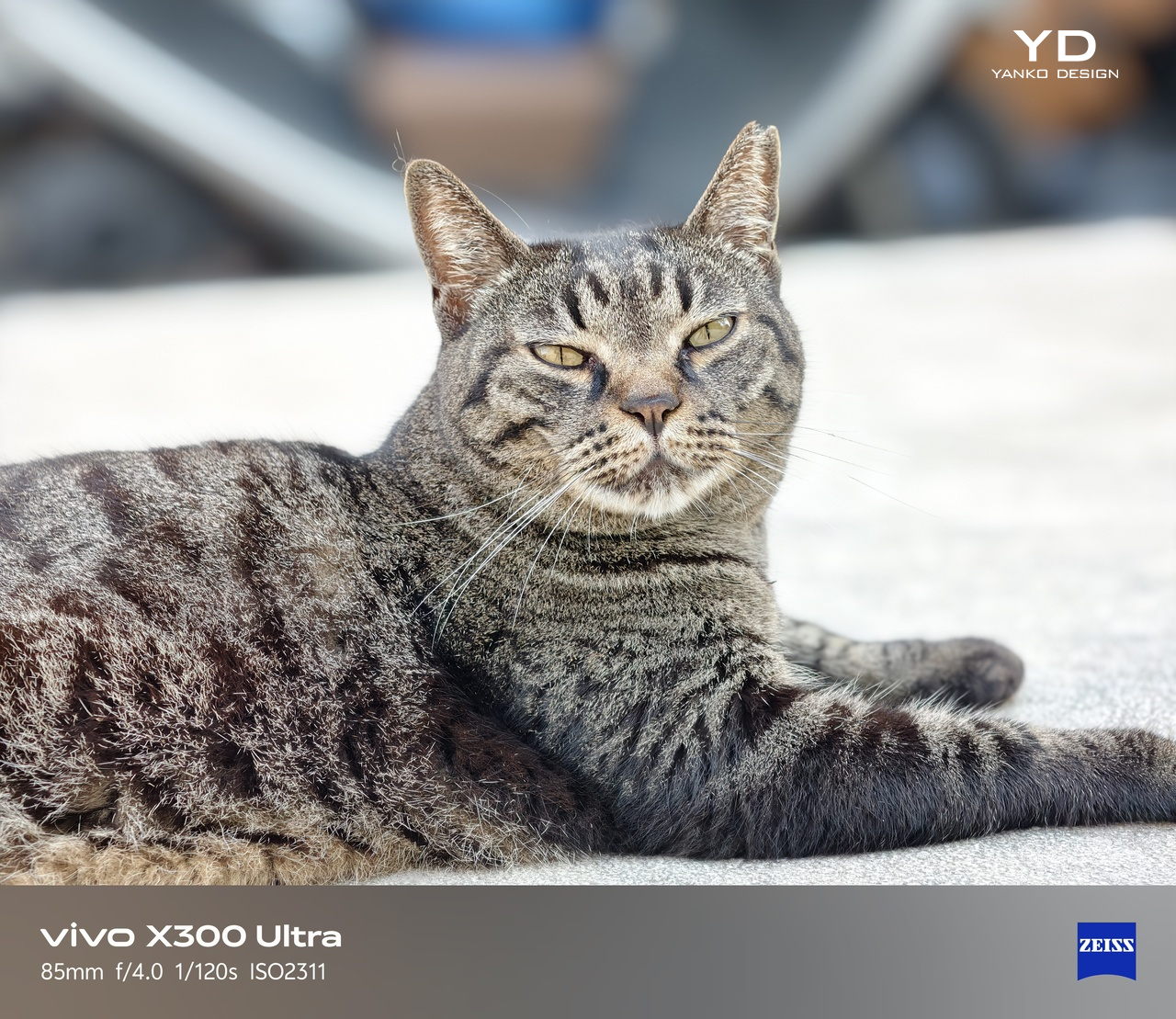
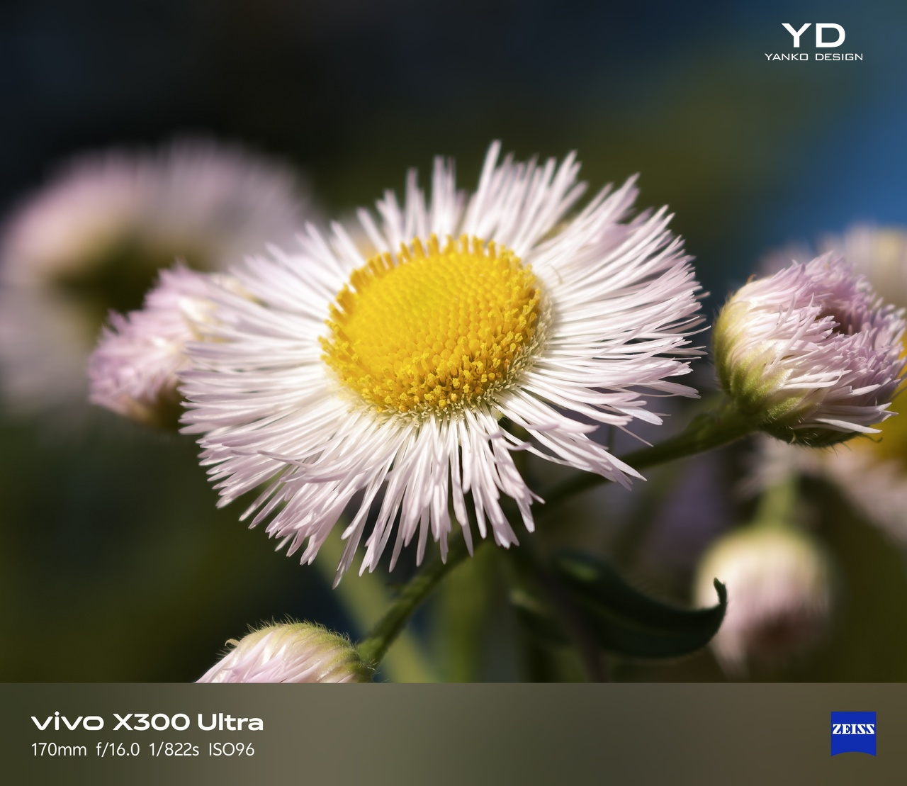
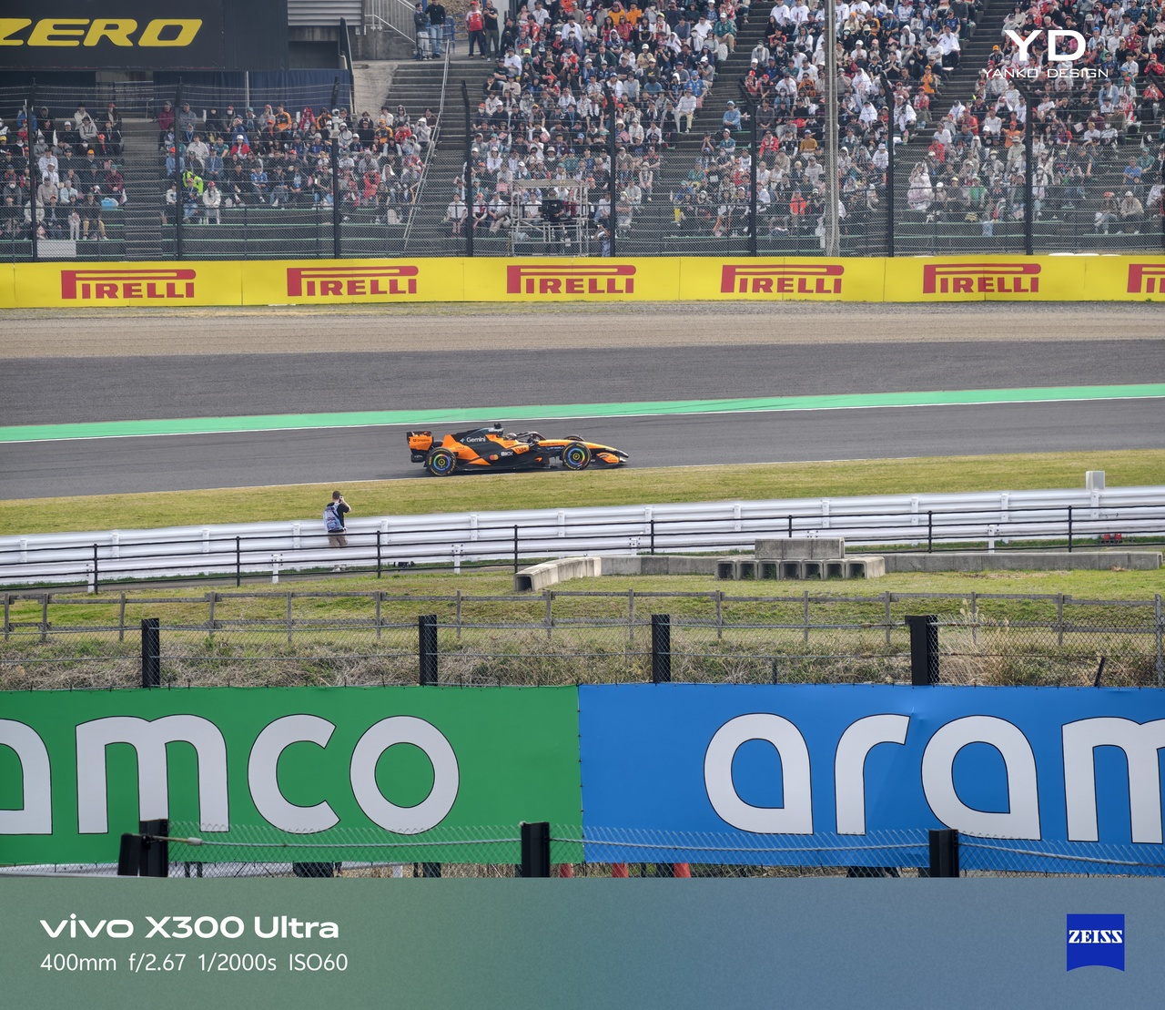
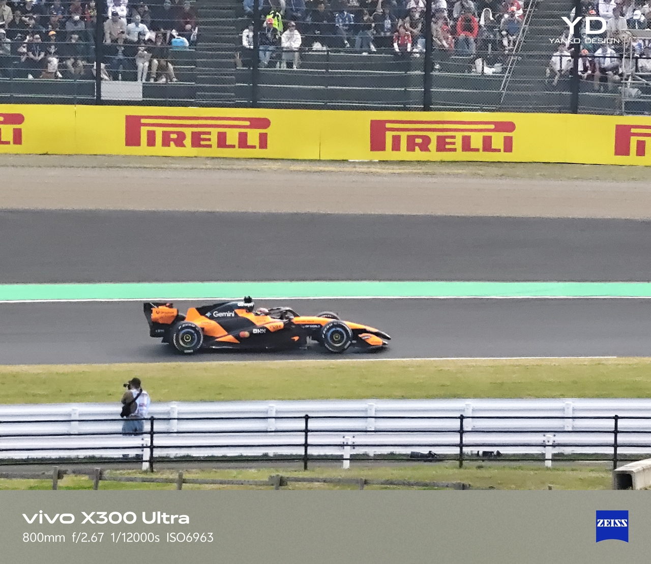
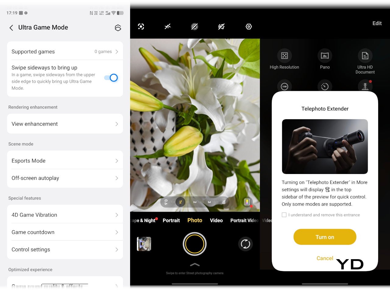
The camera system is led by a 50 MP ZEISS main camera and a 50 MP ZEISS super-telephoto camera, with an 8 MP ultra-wide rounding out the rear. The main and telephoto cameras handle portraits, street photography, and concert scenes with real confidence. An optional telephoto extender accessory also exists for those who want extended reach, though it’s firmly in niche territory.

The results are impressive, especially when starting to zoom in on subjects. Even without the telephoto extender, you can enjoy clear and detailed shots, even at night. The 8MP ultra-wide, though usable, is a bit of a letdown, but vivo had to cut some corners to bring down the price and differentiate this model from its more powerful and more expensive siblings. You do have a ton of settings to tweak to get your perfect shot, but even the defaults are good enough to make fleeting moments more memorable.
Sustainability
The X300 FE carries IP68 and IP69 dust and water resistance ratings, alongside an SGS five-star drop resistance certification, giving it a reassuring level of durability for daily use. It also carries an SGS five-star drop resistance certification, which gives it more formal durability credentials than most phones in its class. Together, those ratings make a convincing case for a phone built to survive daily life without requiring any particularly careful handling.
Software longevity is where the X300 FE makes its strongest long-term case. On that front, vivo is committing to five years of OS upgrades, seven years of security maintenance, and a five-year smooth experience promise. That support window is competitive with the best in the Android space, and it signals that this phone is meant to be genuinely used for years, not replaced the moment something newer comes along.
Value
At around €1,000, The X300 FE isn’t a budget phone, and it doesn’t try to be. It competes in the premium compact flagship space, where the particular combination it offers is harder to find than you’d expect. A current-generation chipset, a genuinely large battery, fast wired and wireless charging, ZEISS-branded imaging, and a durable premium build in a package that remains notably light for a flagship is a rare and coherent offering.
The person this phone is designed for isn’t shopping for the biggest or most spec’d-out device available. It’s someone who wants a phone that keeps pace with their life without dominating it, one that fits in a jacket pocket, lasts a full day, and still takes genuinely good photos. Frequent travelers, urban commuters, and anyone who’s tired of unwieldy flagships will feel right at home here.
Verdict
The vivo X300 FE is the kind of compact flagship that doesn’t feel like a compromise once you’re actually using it. The design is restrained and coherent, the battery is frankly impressive for the size, the chipset handles everything you throw at it, and the camera does its best work in exactly the situations most people find themselves in, out in the world rather than on a lab bench.
What the X300 FE offers is a phone that’s easy to carry, genuinely long-lasting, and capable enough for the photography and day-to-day demands you’ll actually encounter. It’s well built, well supported, and clearly designed with a specific kind of person in mind. That clarity of purpose is refreshing, and for the right buyer, it’s exactly what makes this phone worth serious consideration.
The post vivo X300 FE Review: The Compact Flagship That Earns Its Keep first appeared on Yanko Design.