The Macaron Collection That’s Actually Built to Last

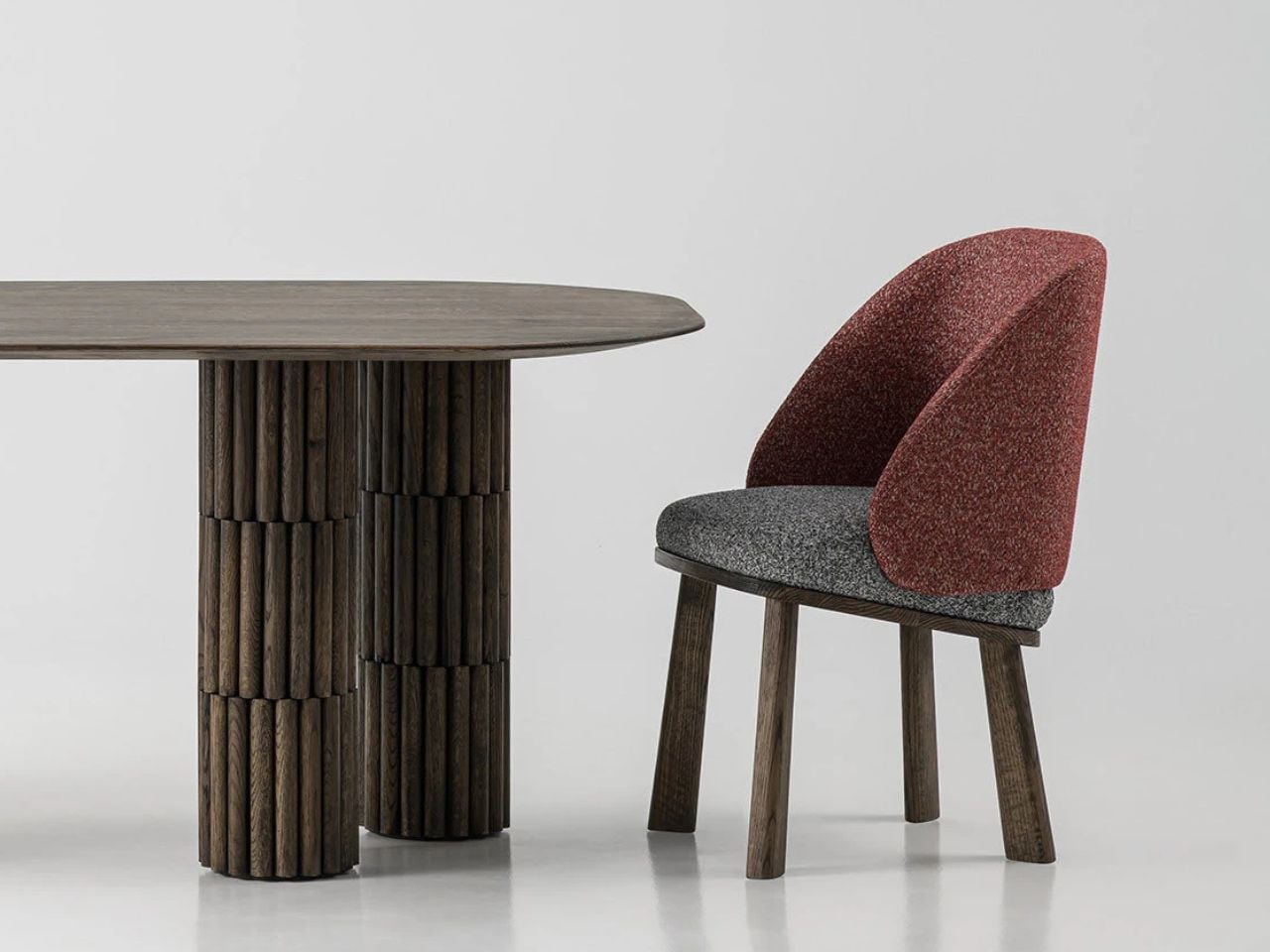
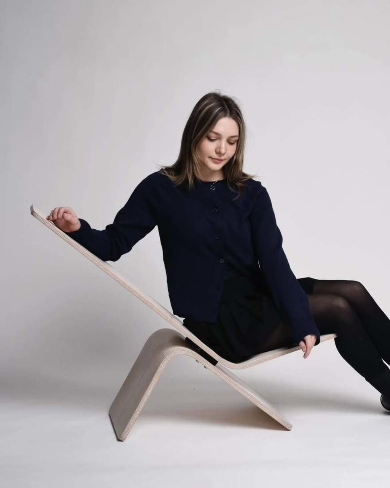
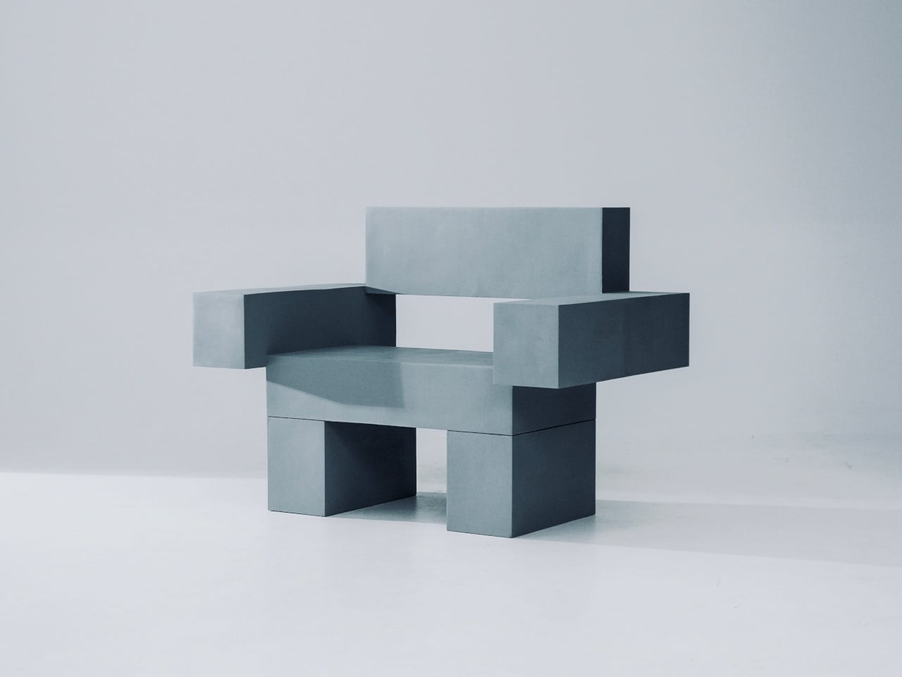
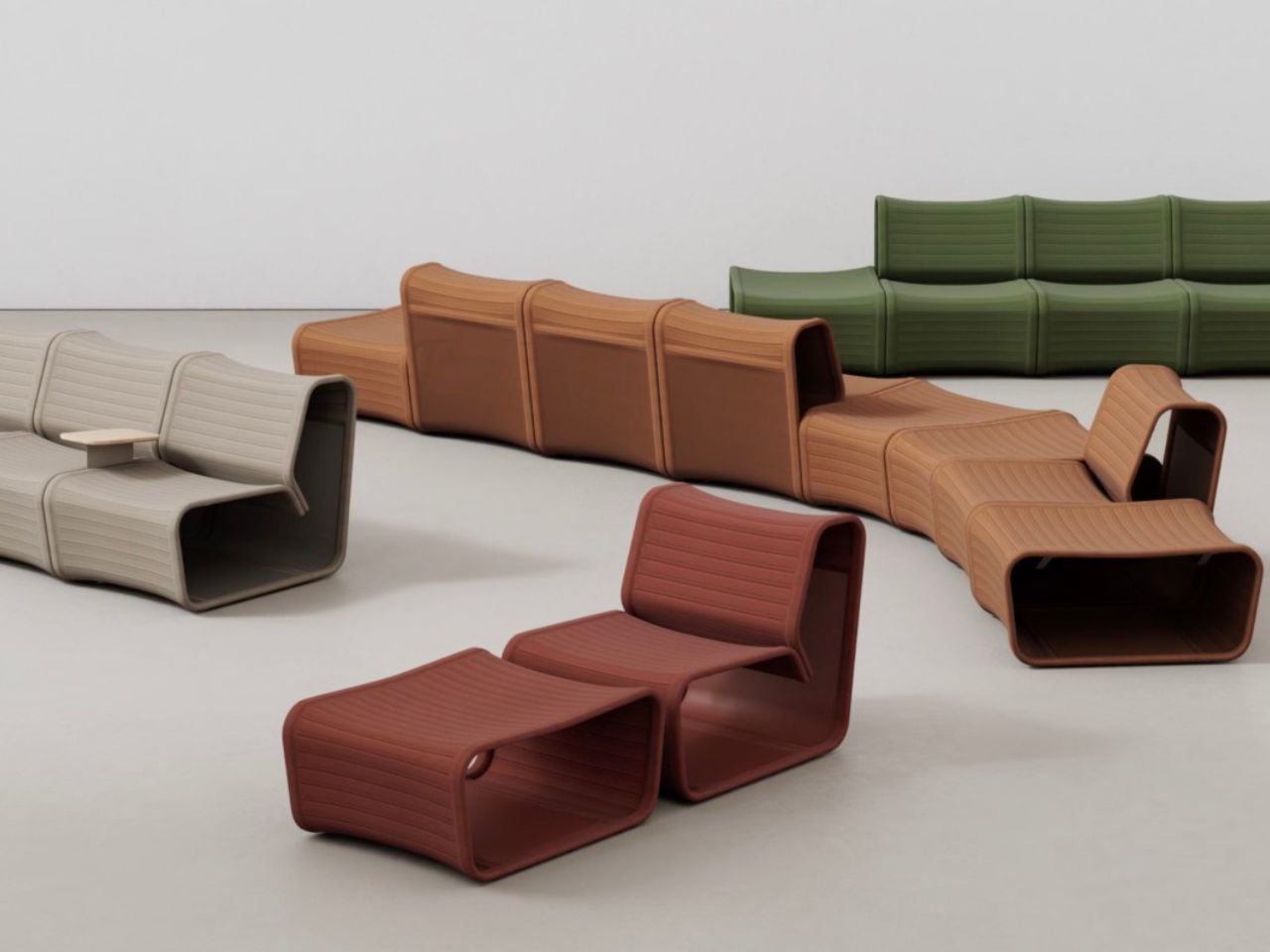
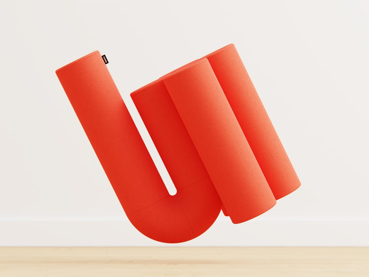
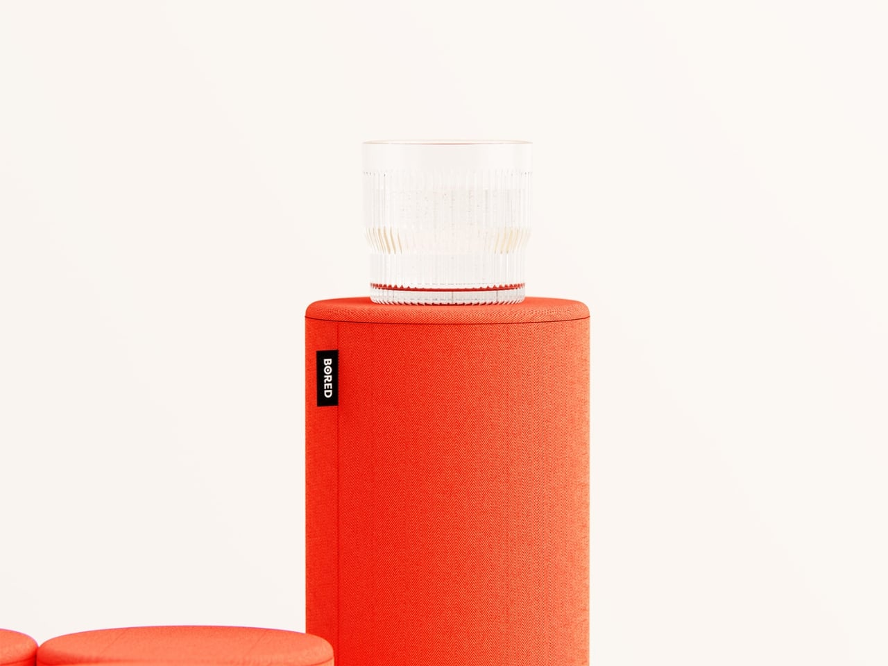
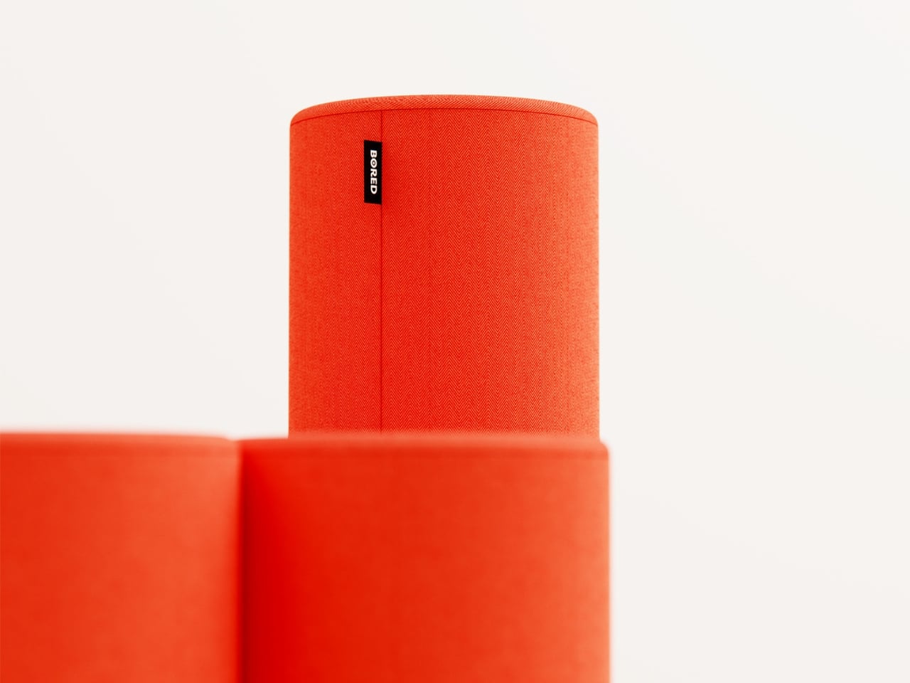
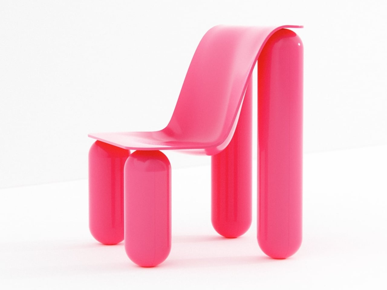
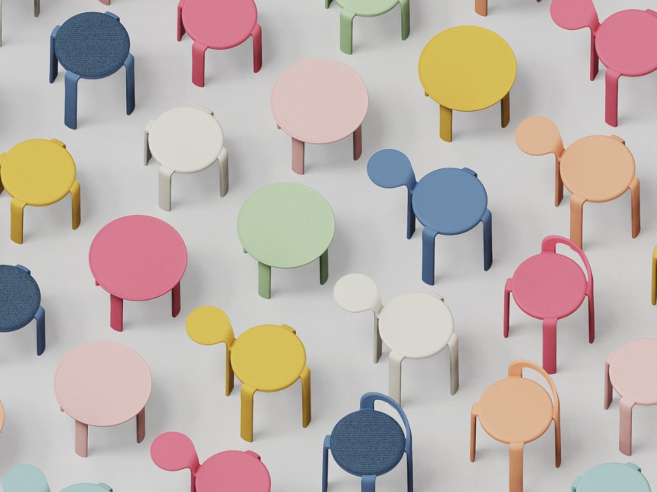
Furniture rarely makes me stop scrolling. Most of what cycles through my feed either looks too clinical to feel livable or too trendy to last past next season. But when I came across Macarons, a modular furniture system by Taiwanese designers HanYi Huang and Fong-Yi Liou, I actually paused. Not because it was trying too hard, but because it wasn’t.

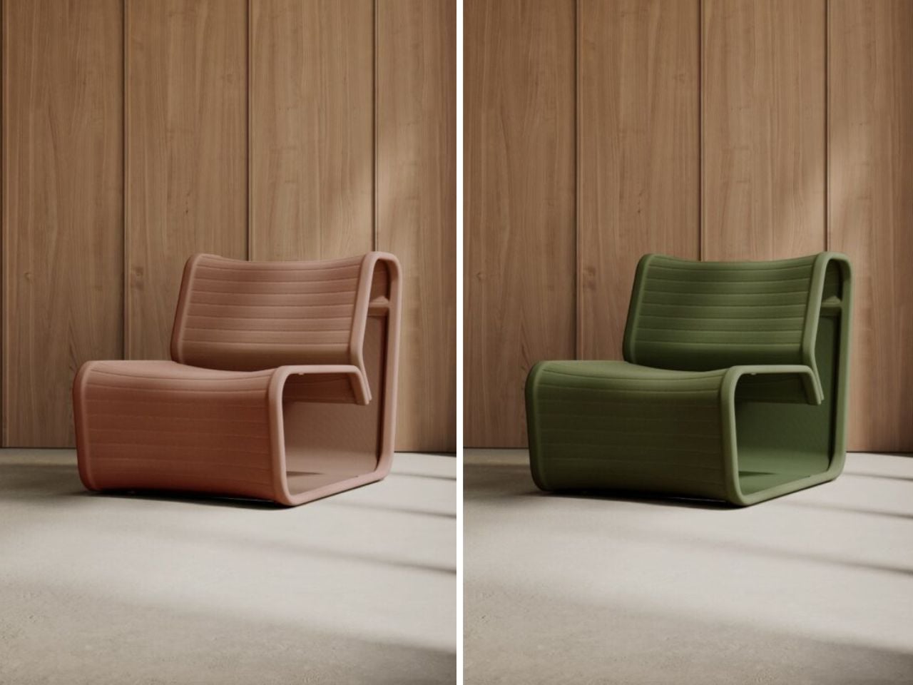
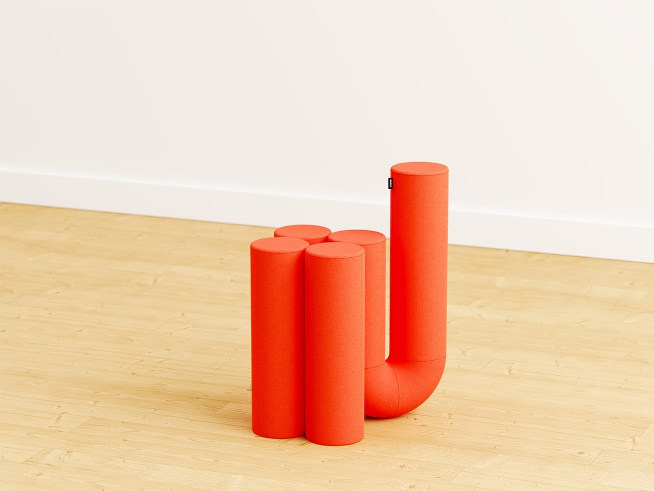
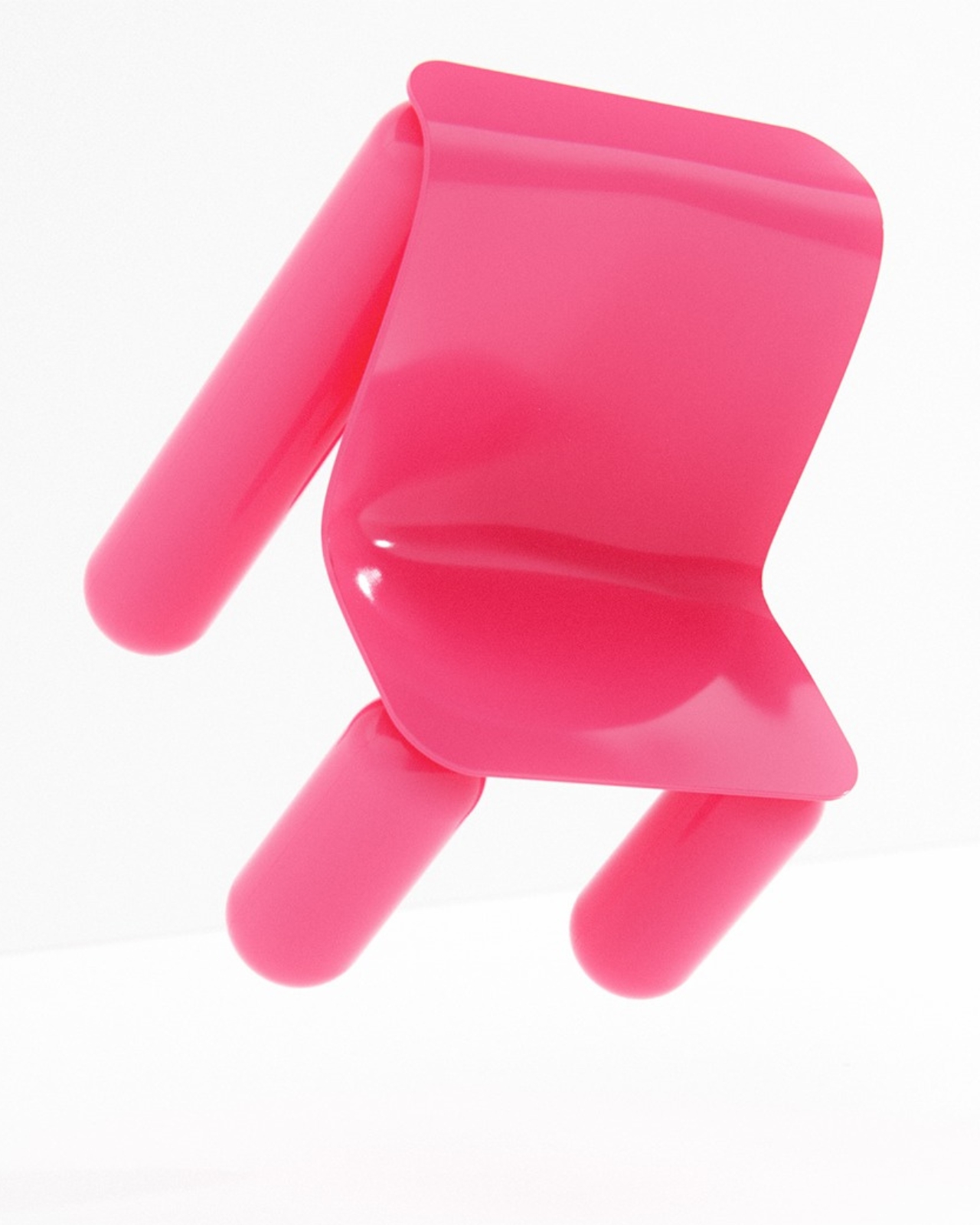
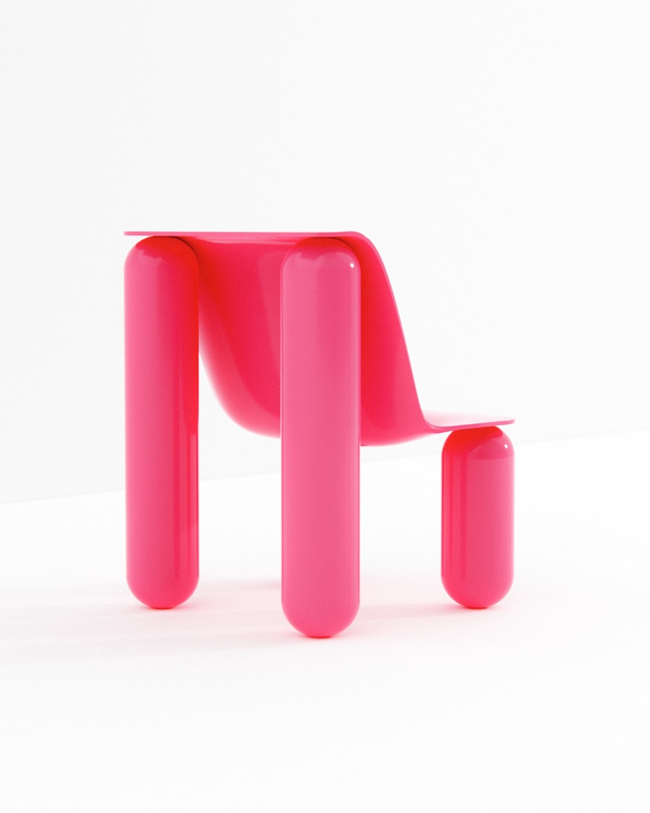
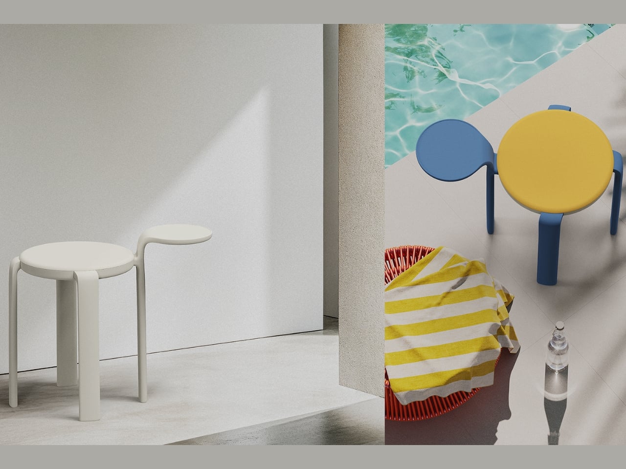
The name gives it away, and that’s the point. Macarons draws its visual language directly from the French confection, right down to the rounded forms, the layered silhouette, and that quietly playful quality that makes you smile before you even understand why. The design came from 03 Design Ltd. in Taiwan and was created for longtime furniture manufacturer Shiang Ye Industrial Co. It picked up a double win at the 2025 European Product Design Award, taking home recognition in both Home Furniture and Eco Design, which tells you this isn’t just a pretty concept piece.

Designers: HanYi Huang

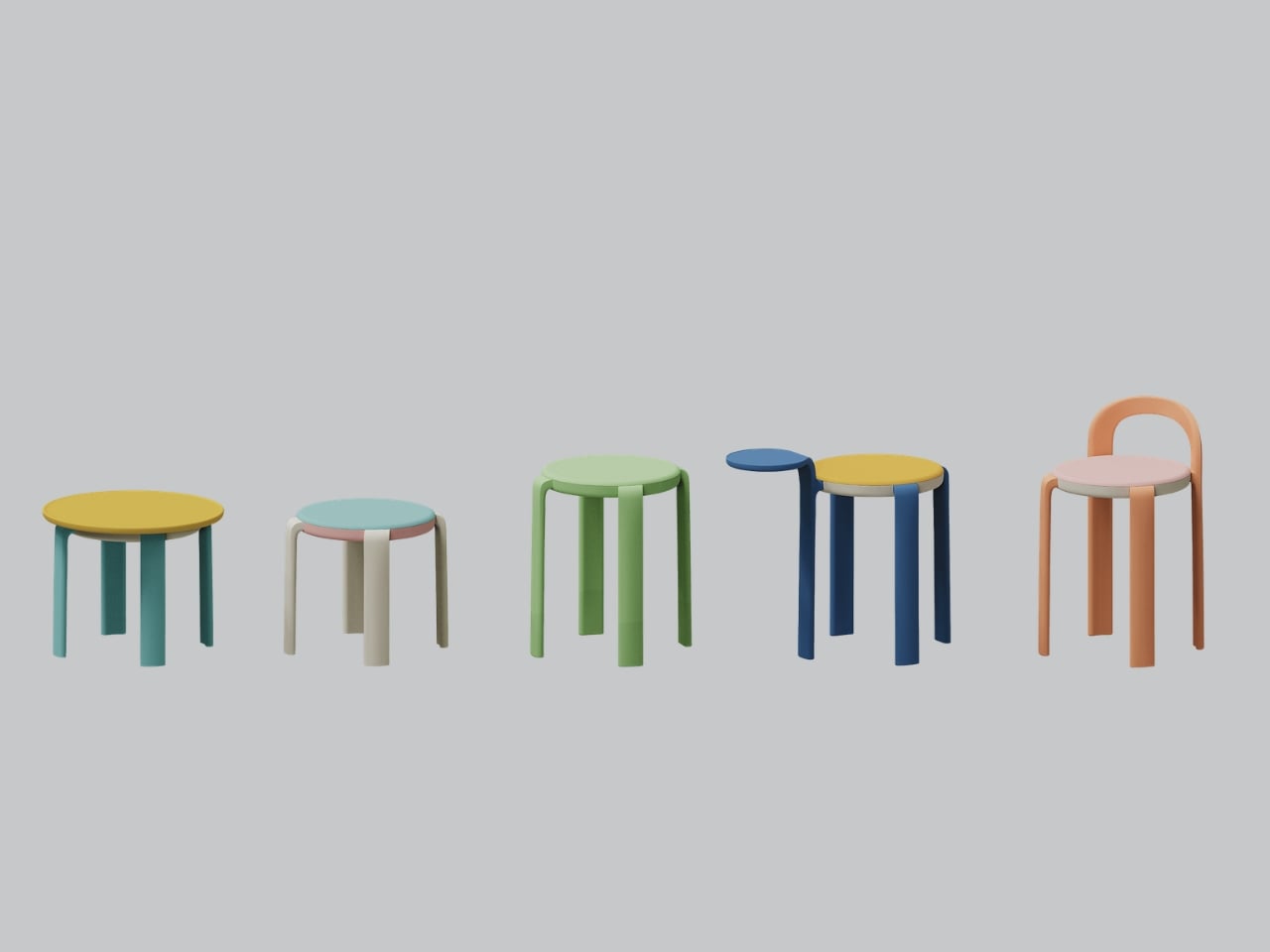
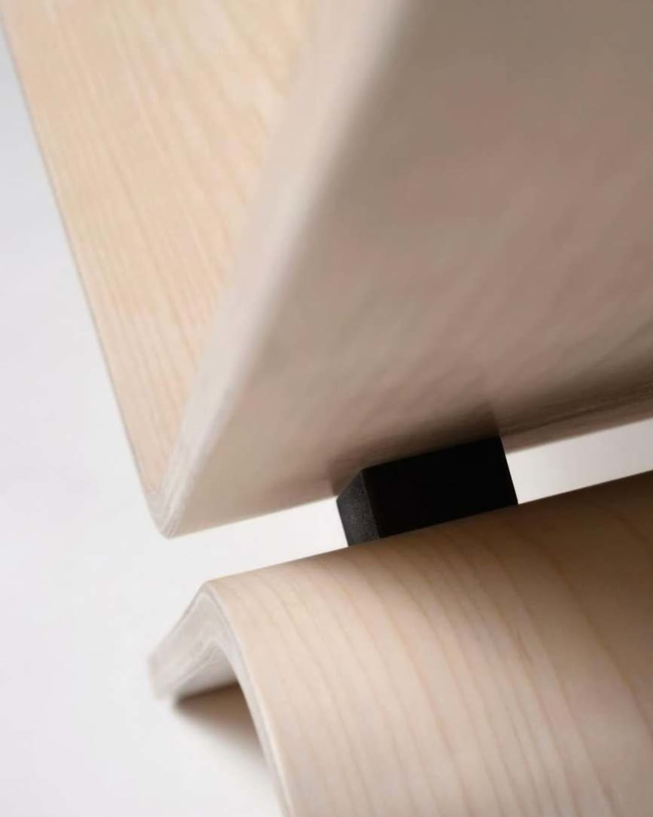
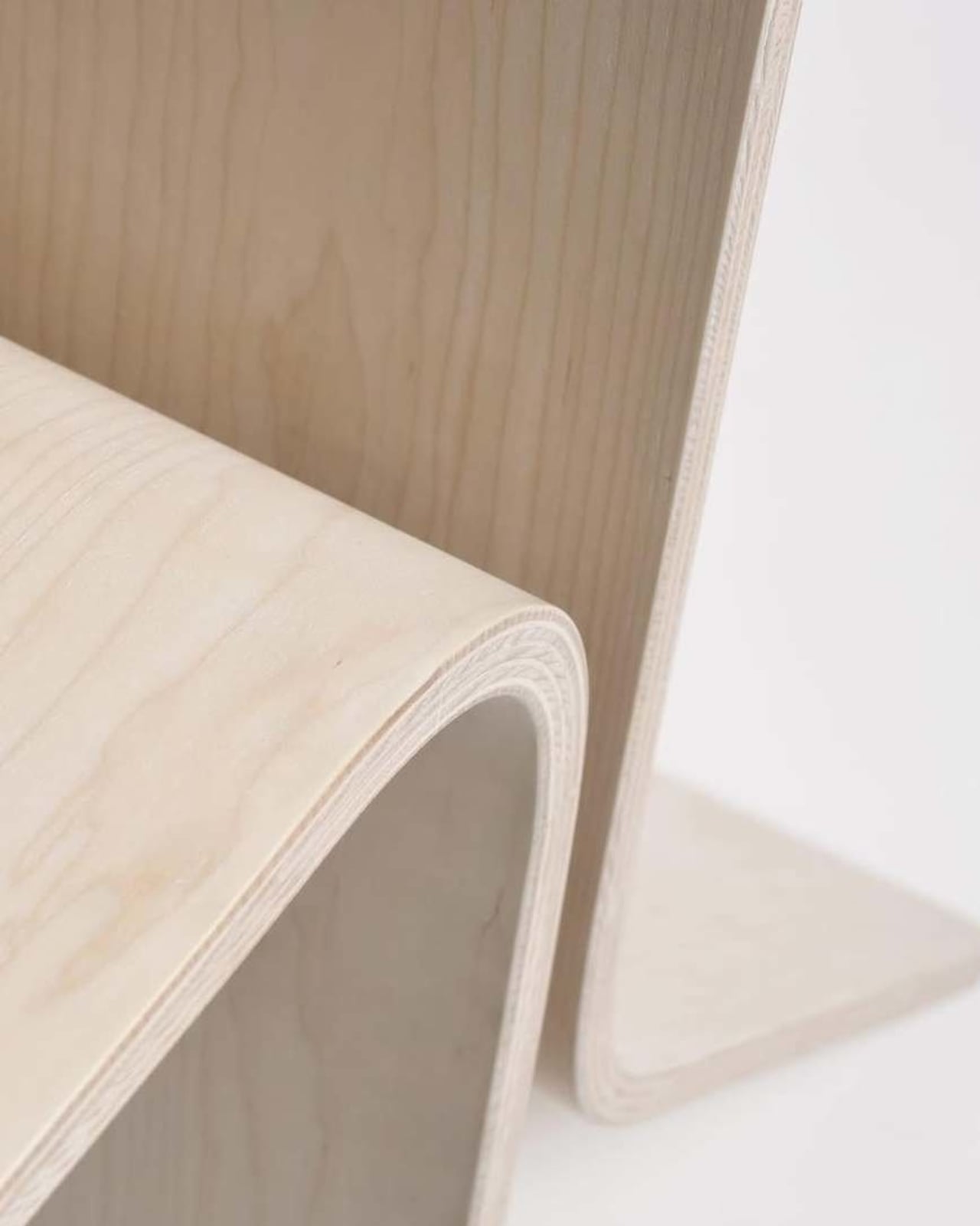
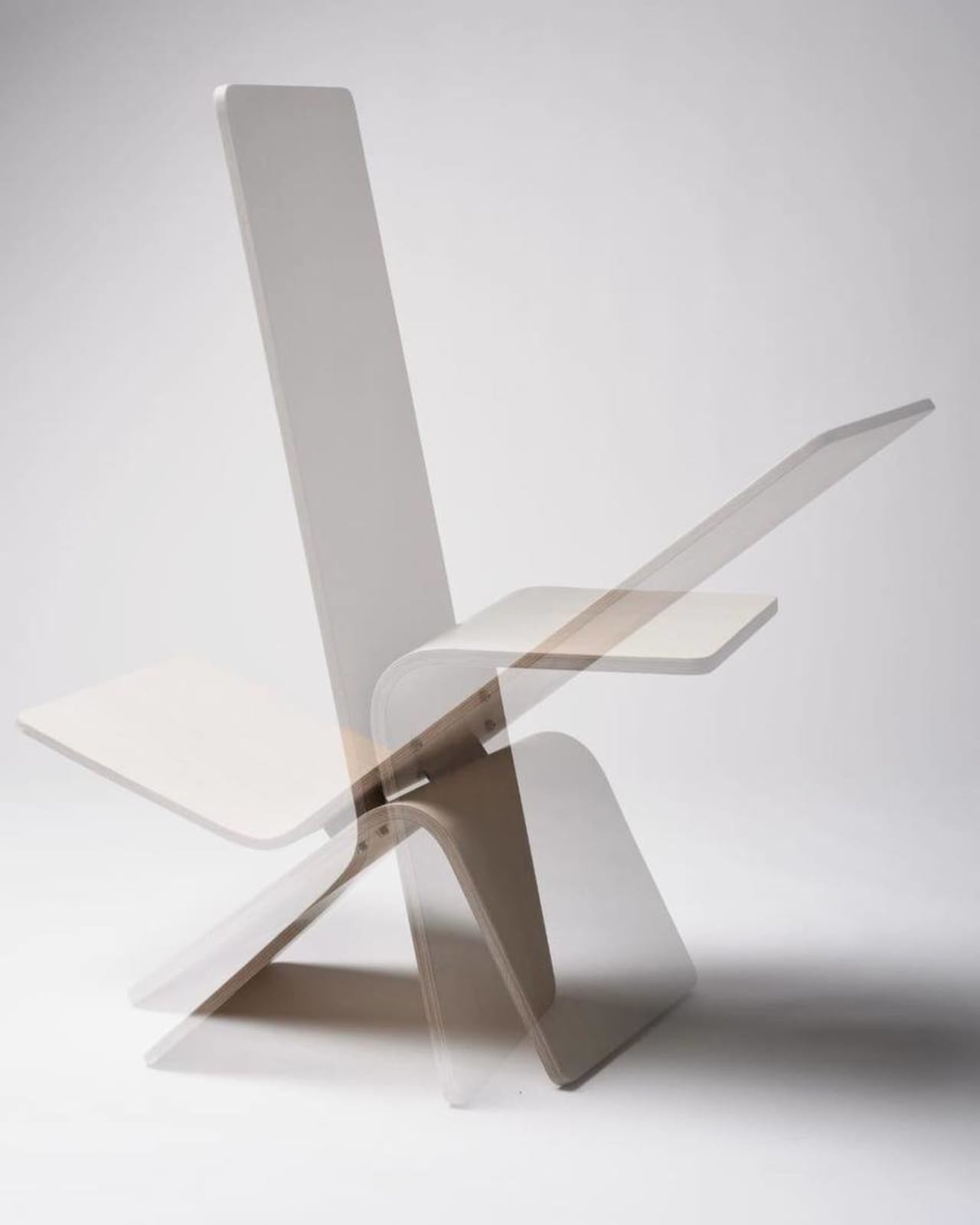
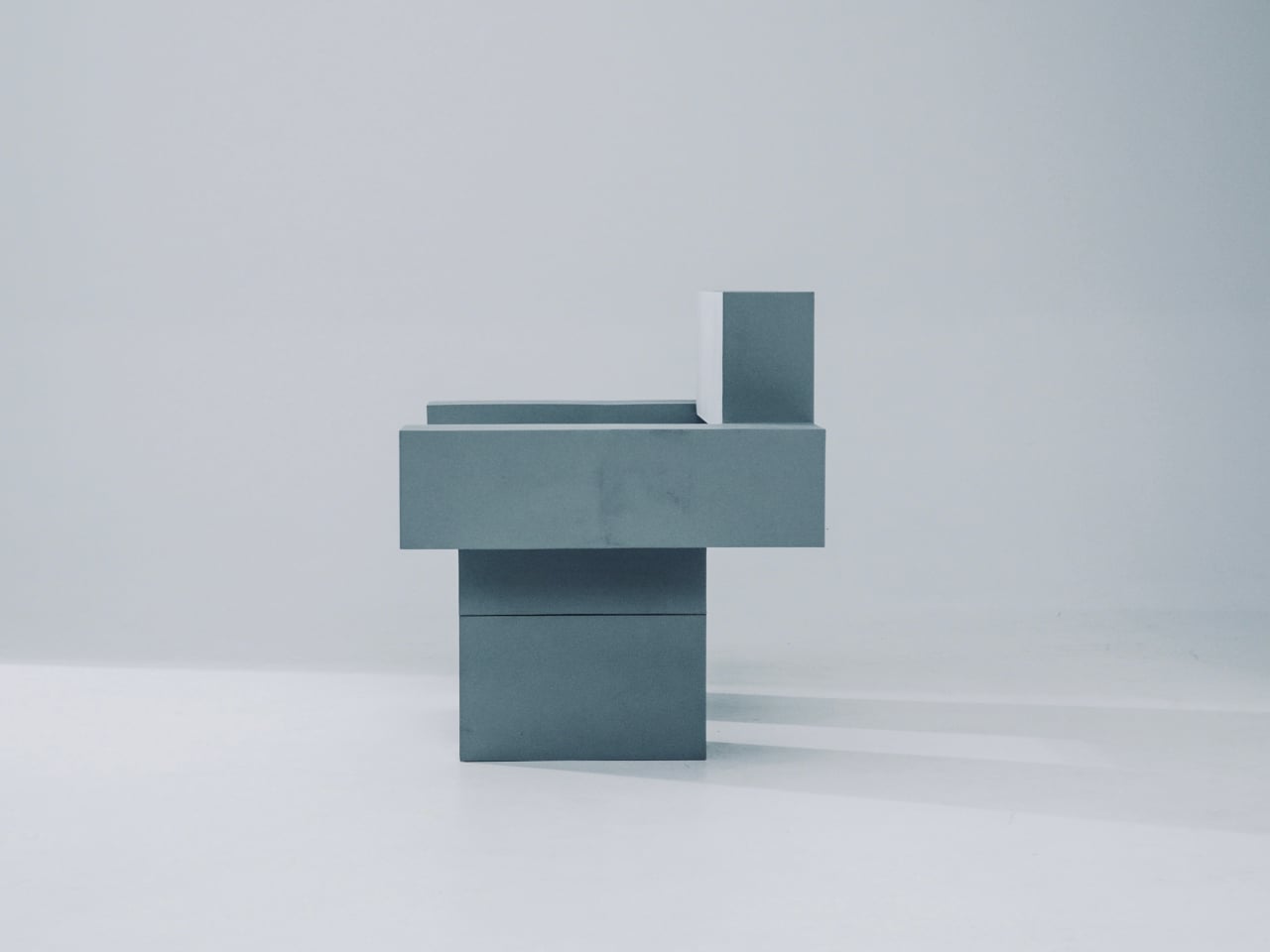
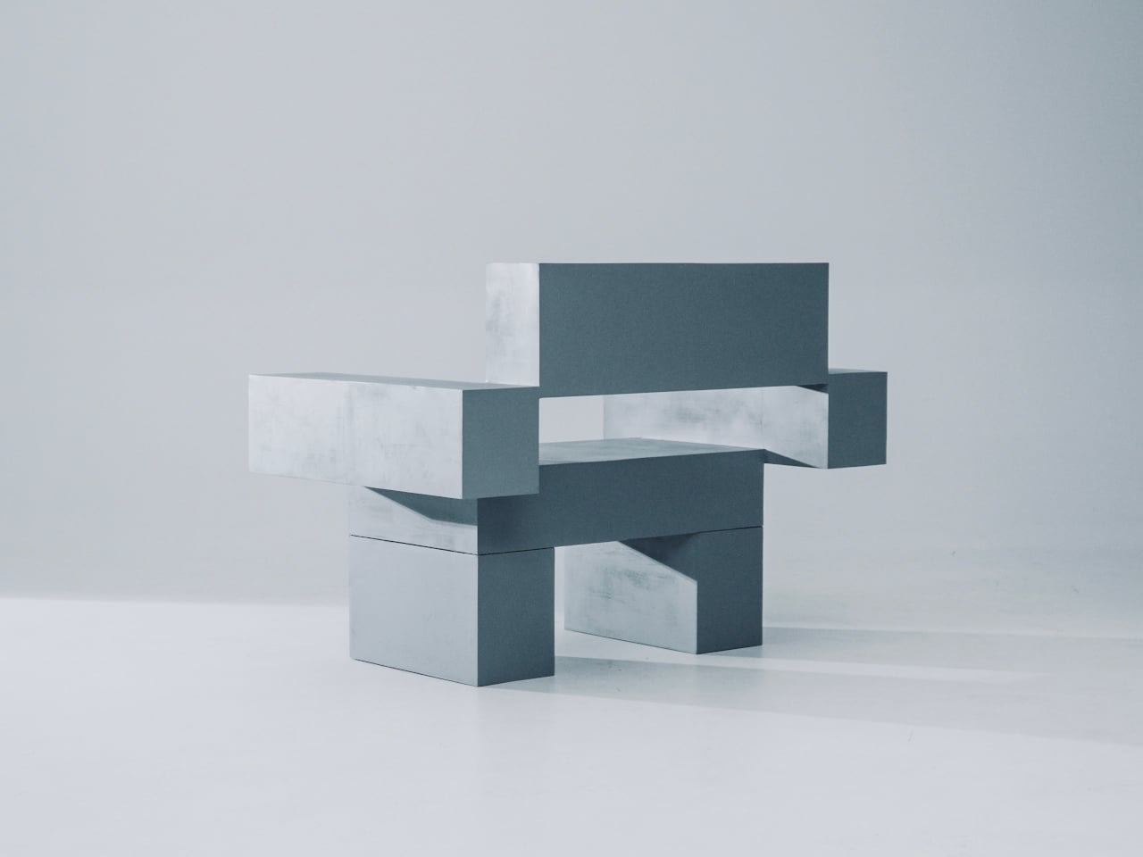
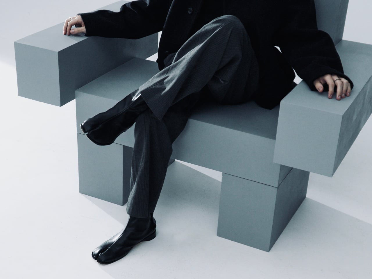
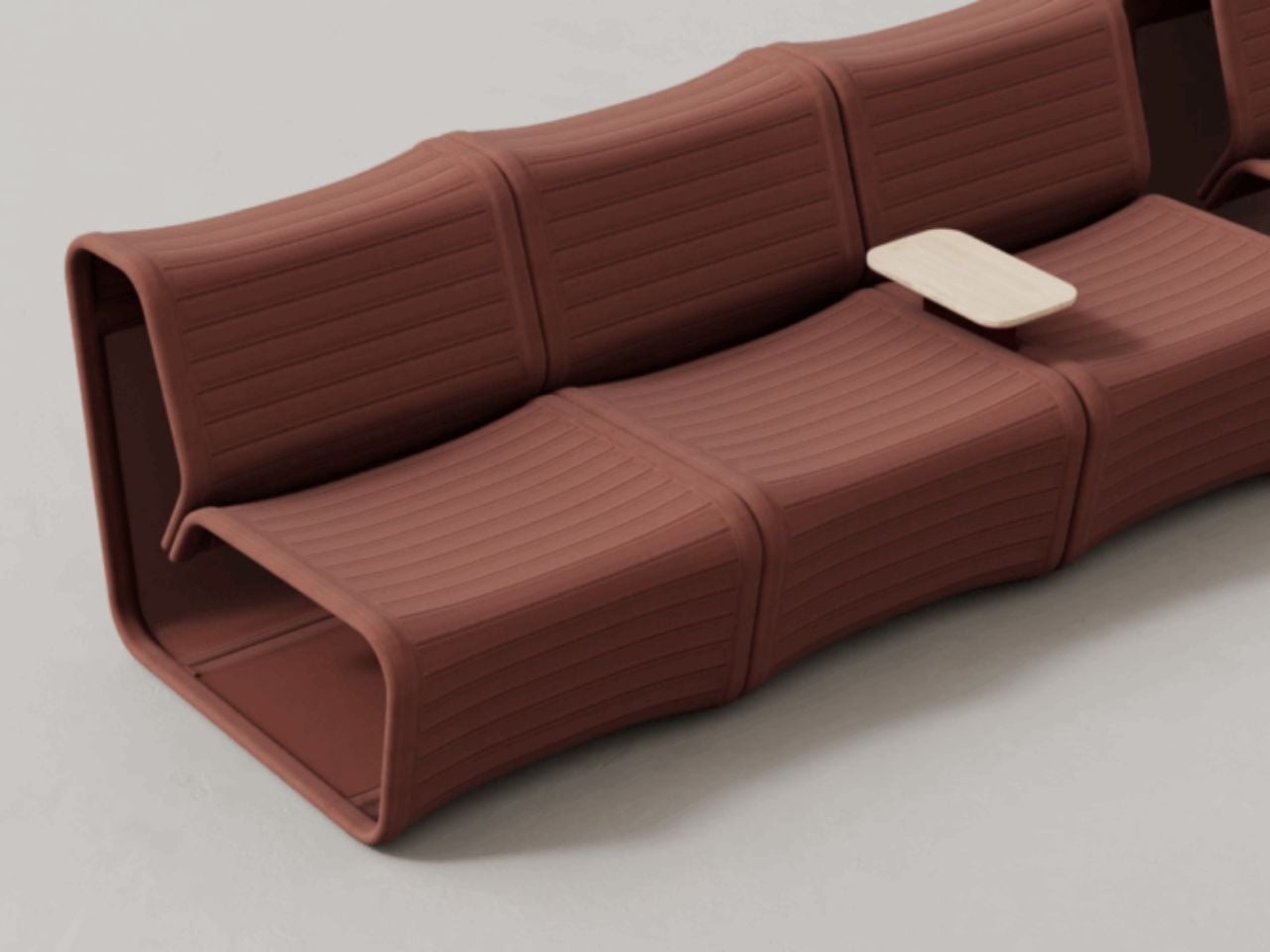
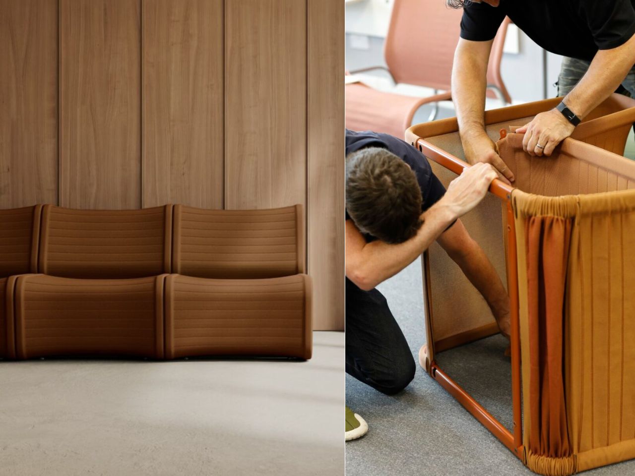
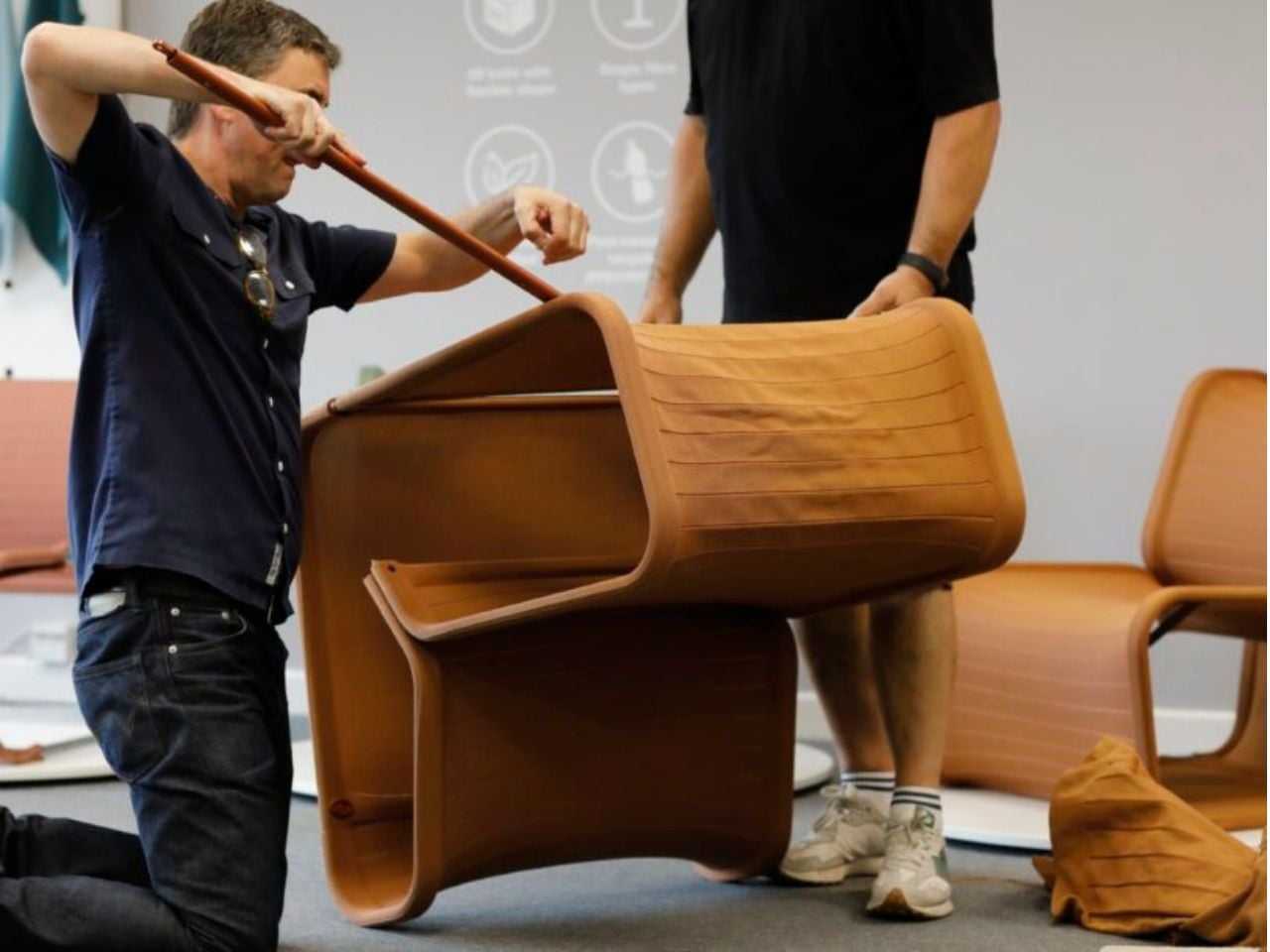
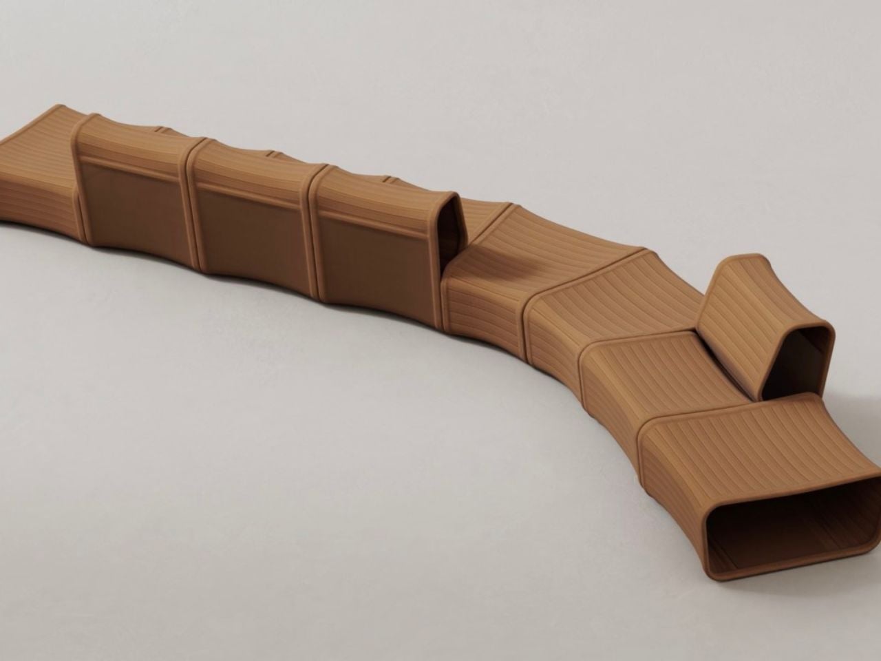
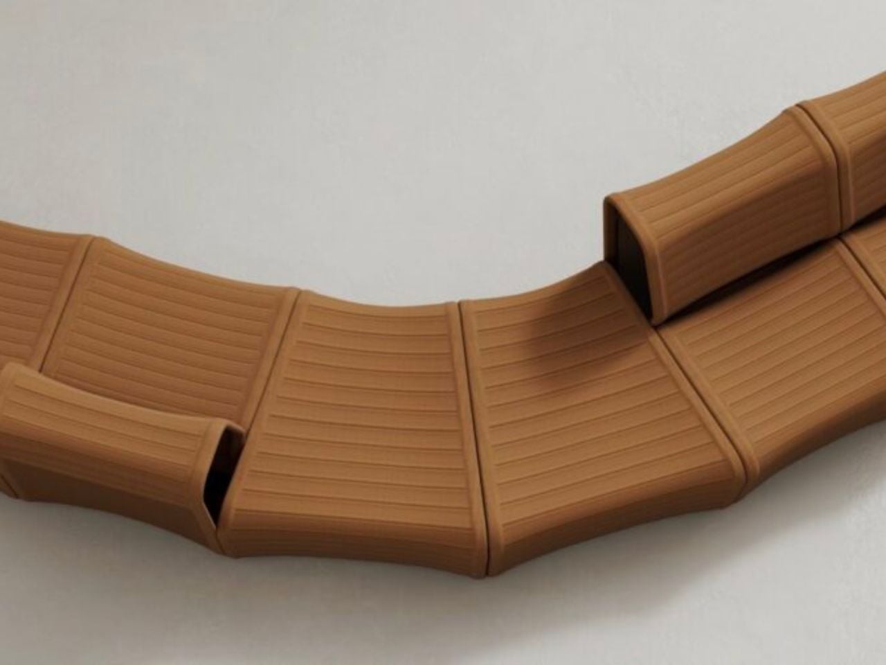
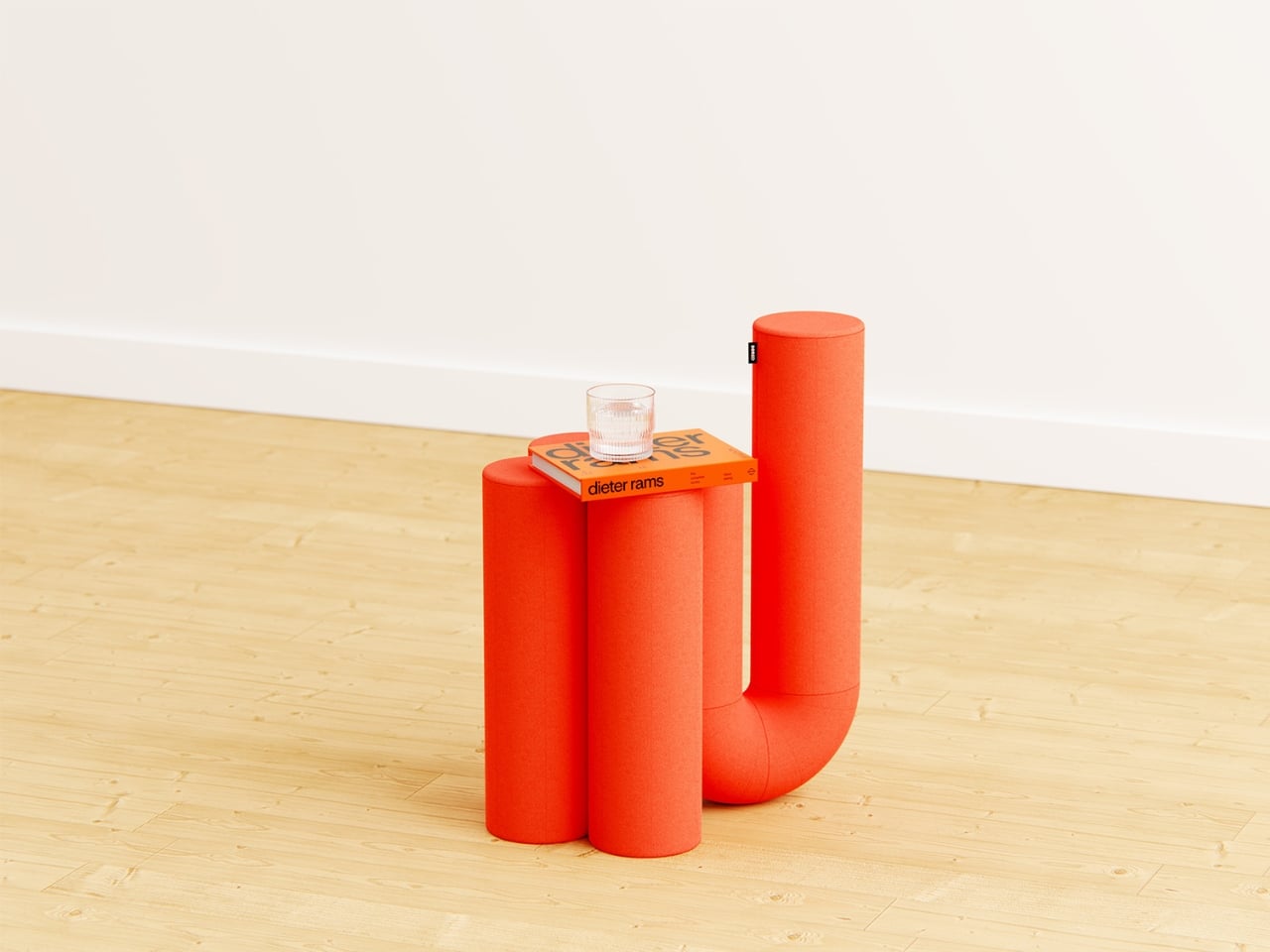
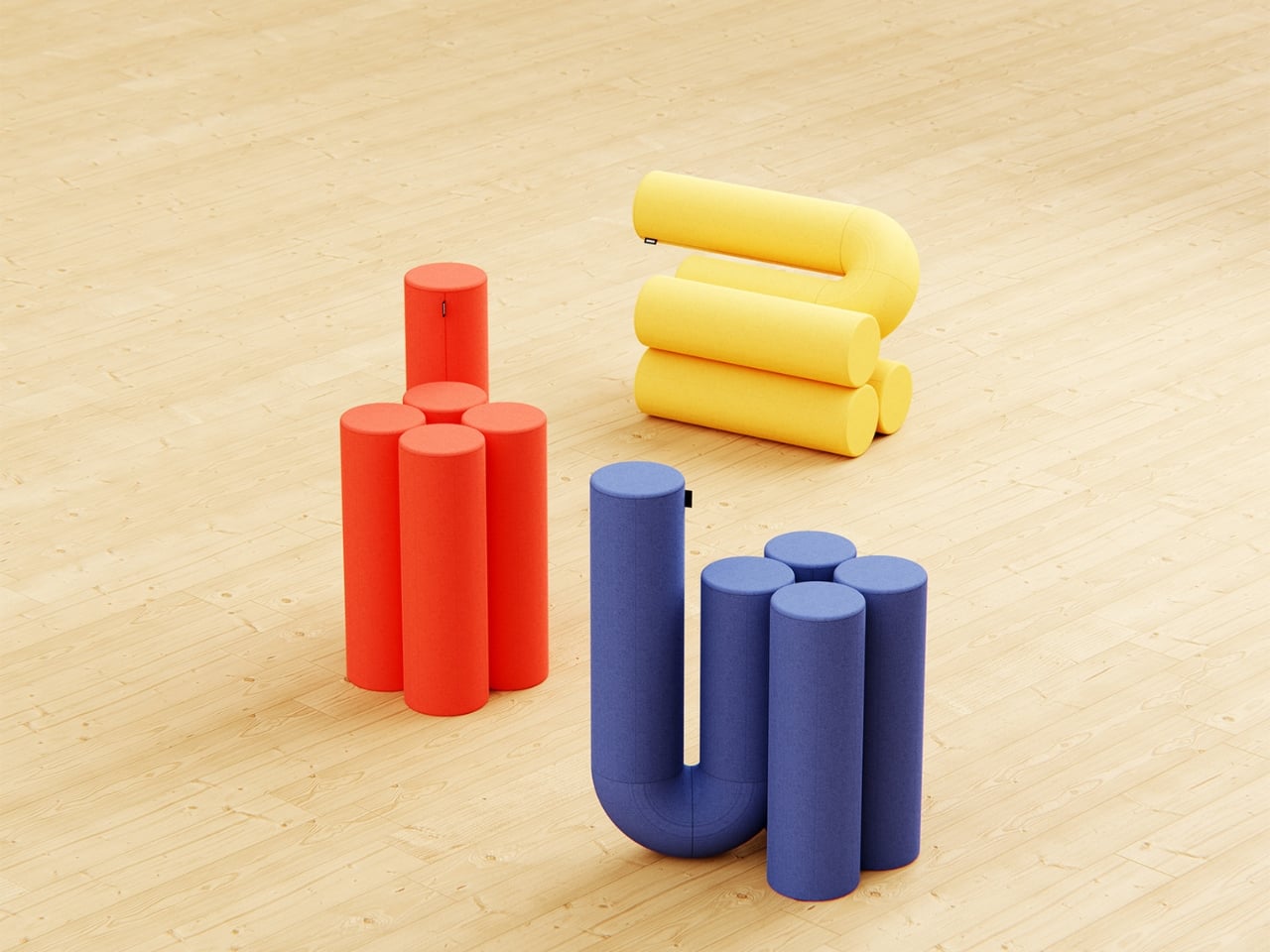
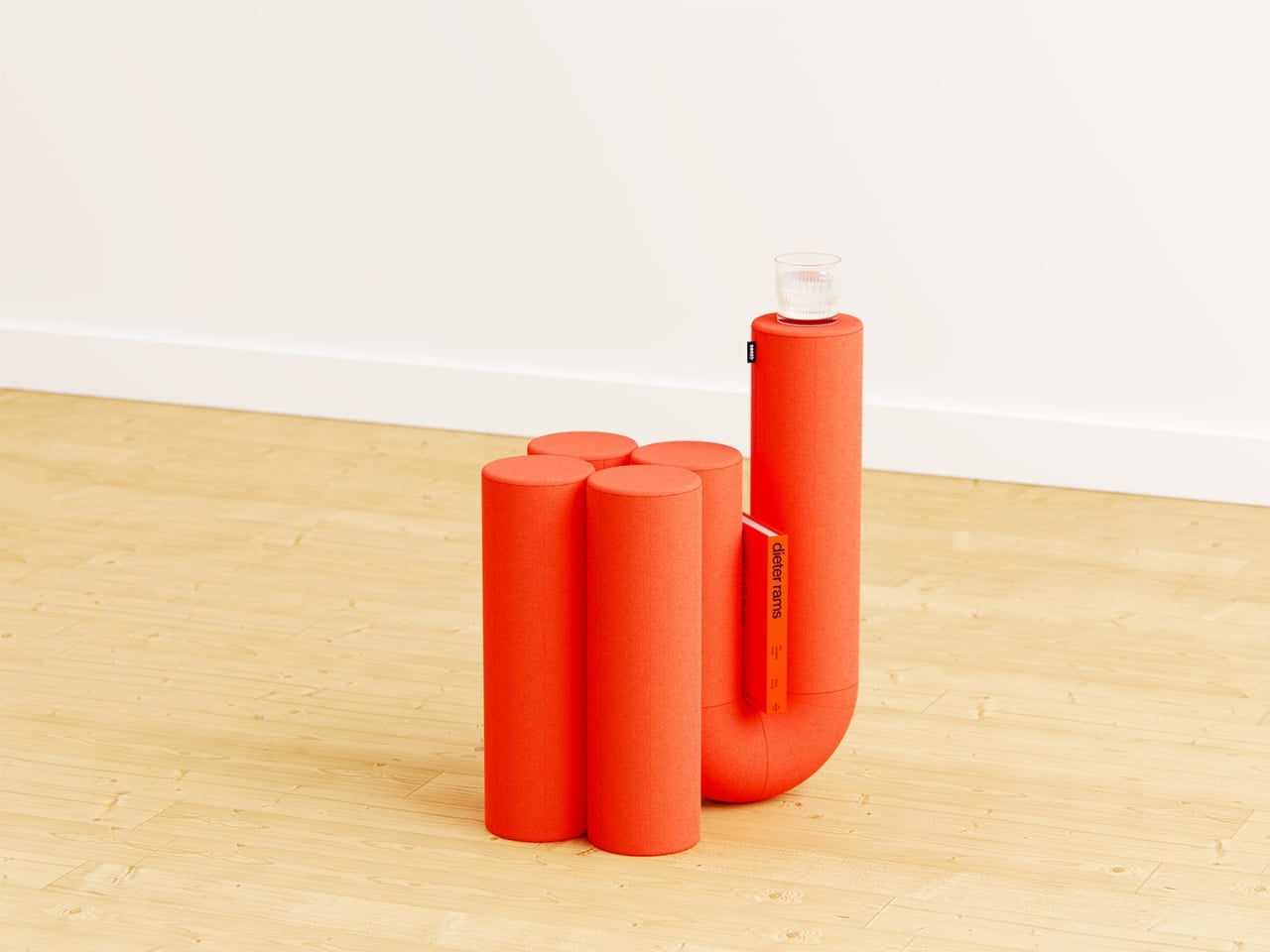
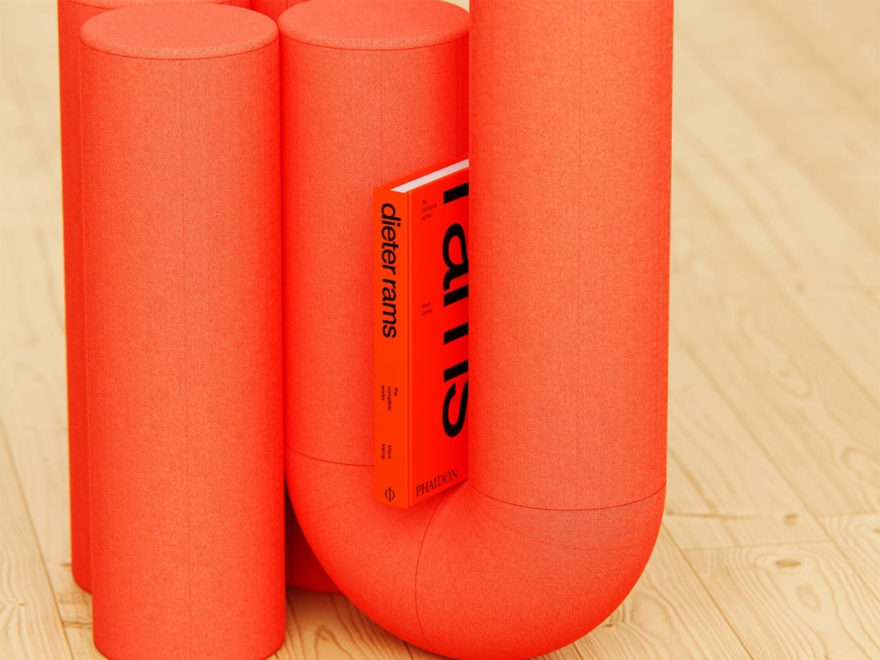
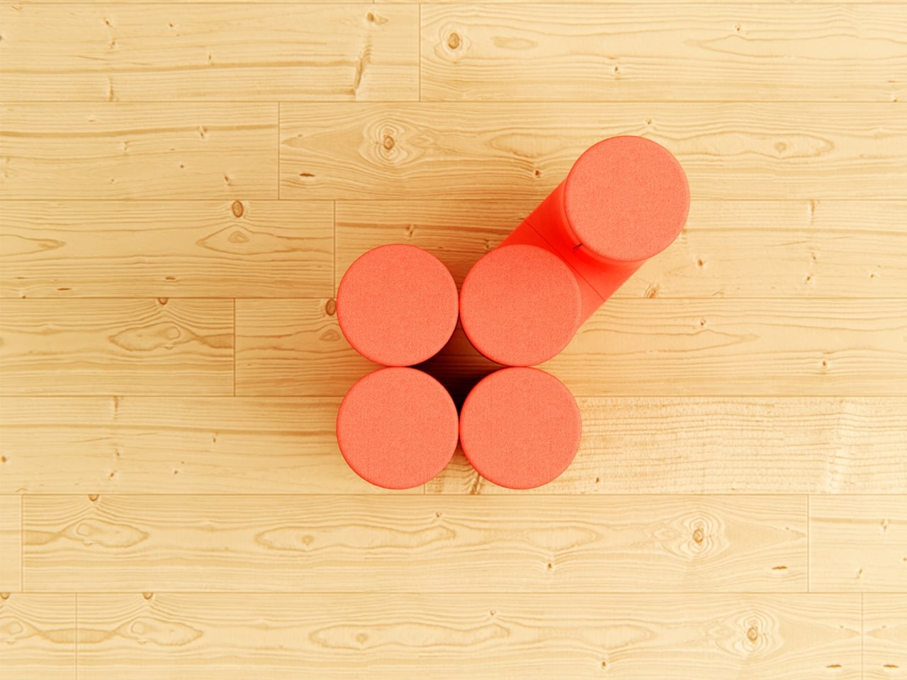
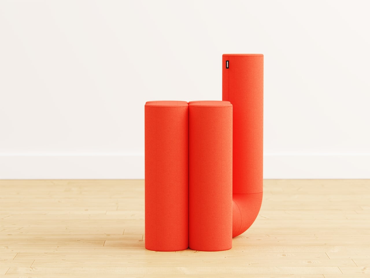
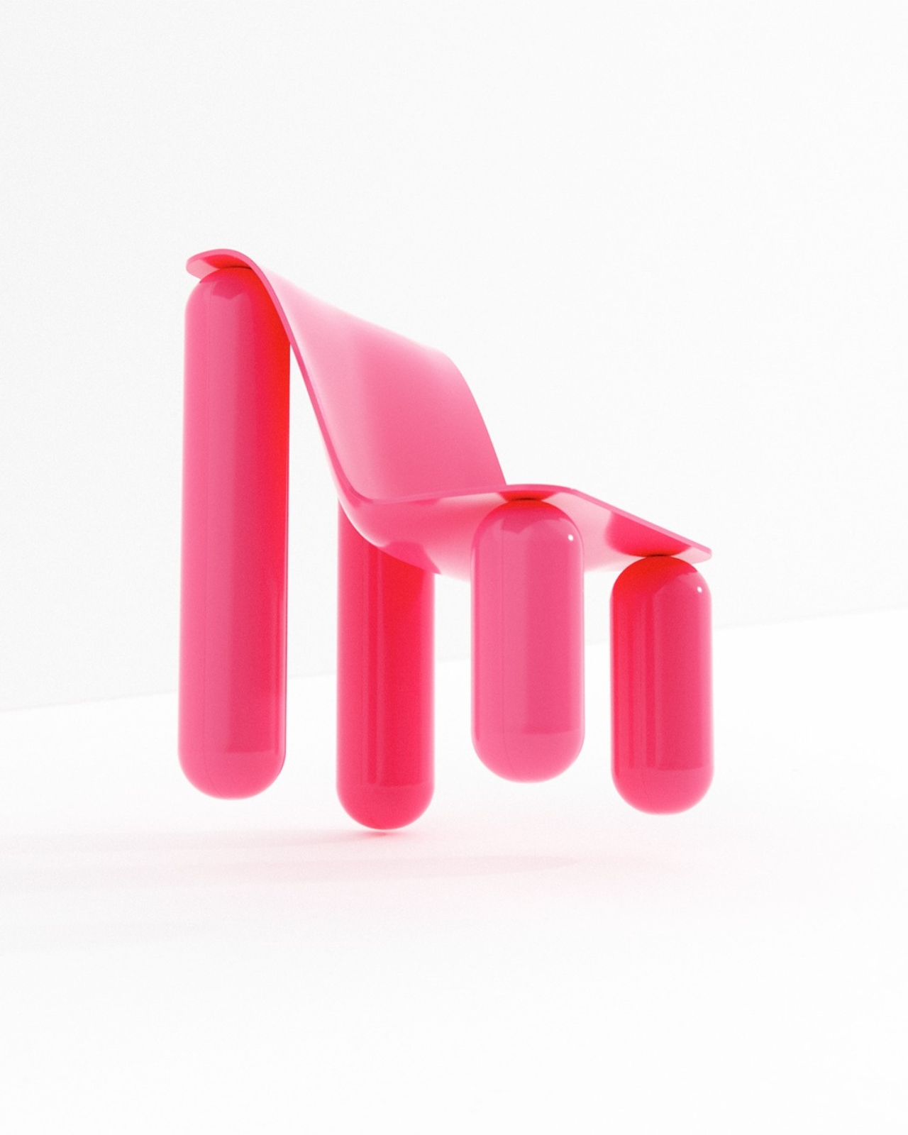
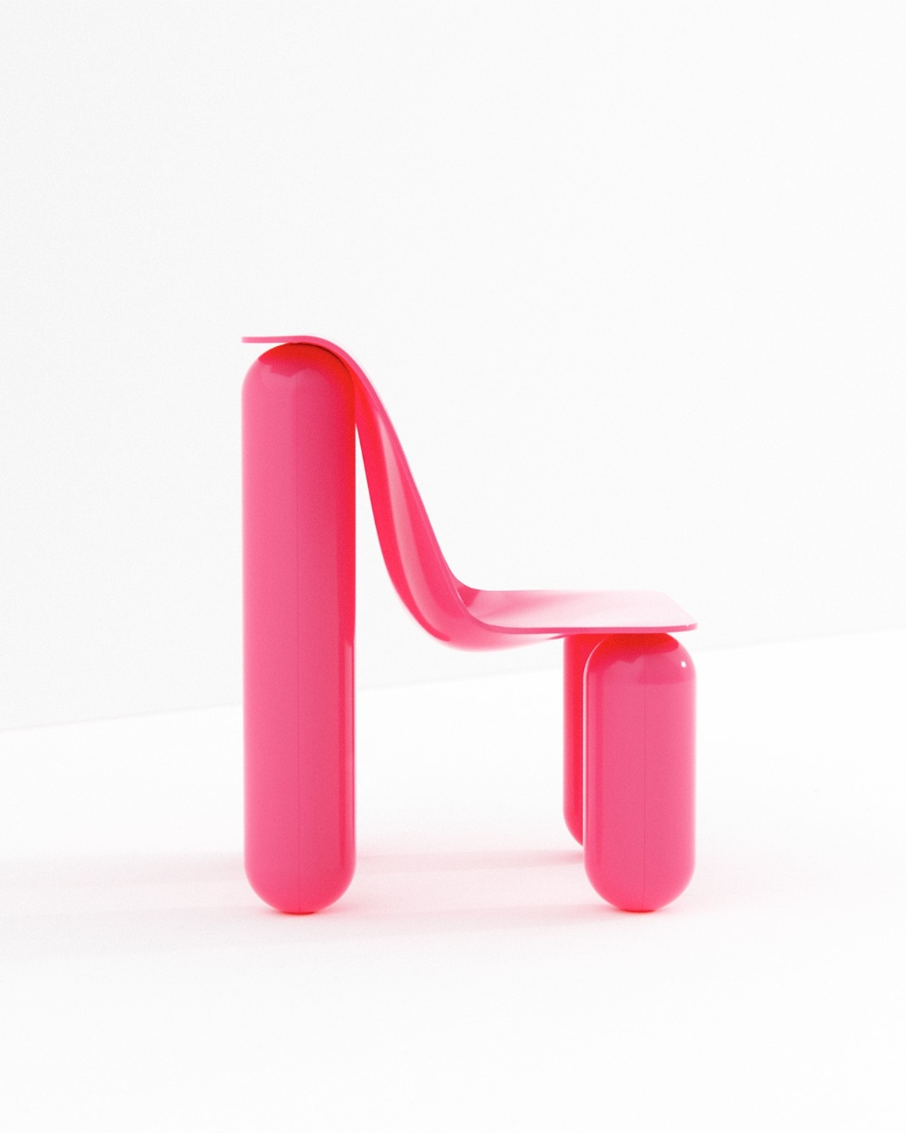
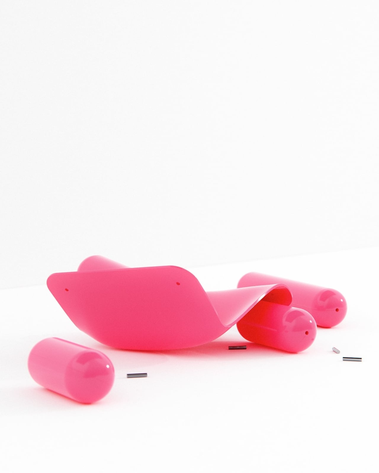
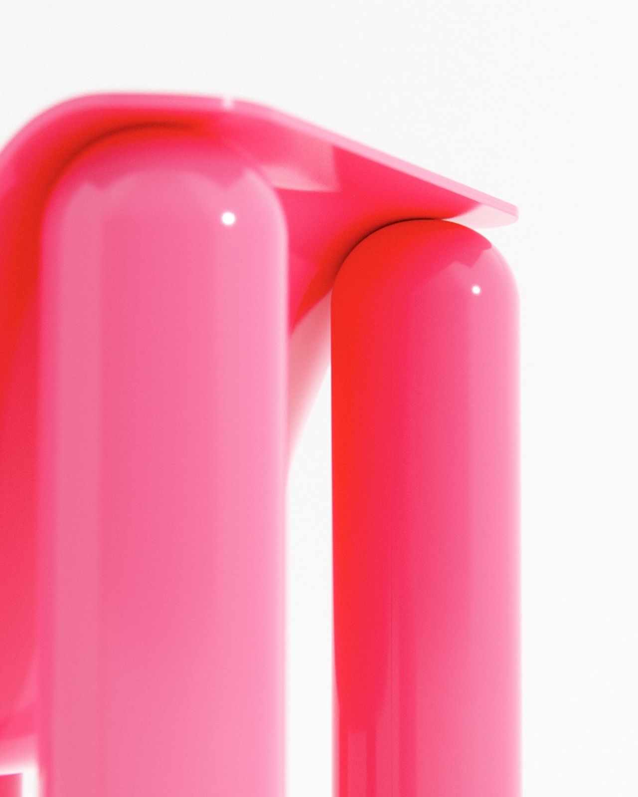
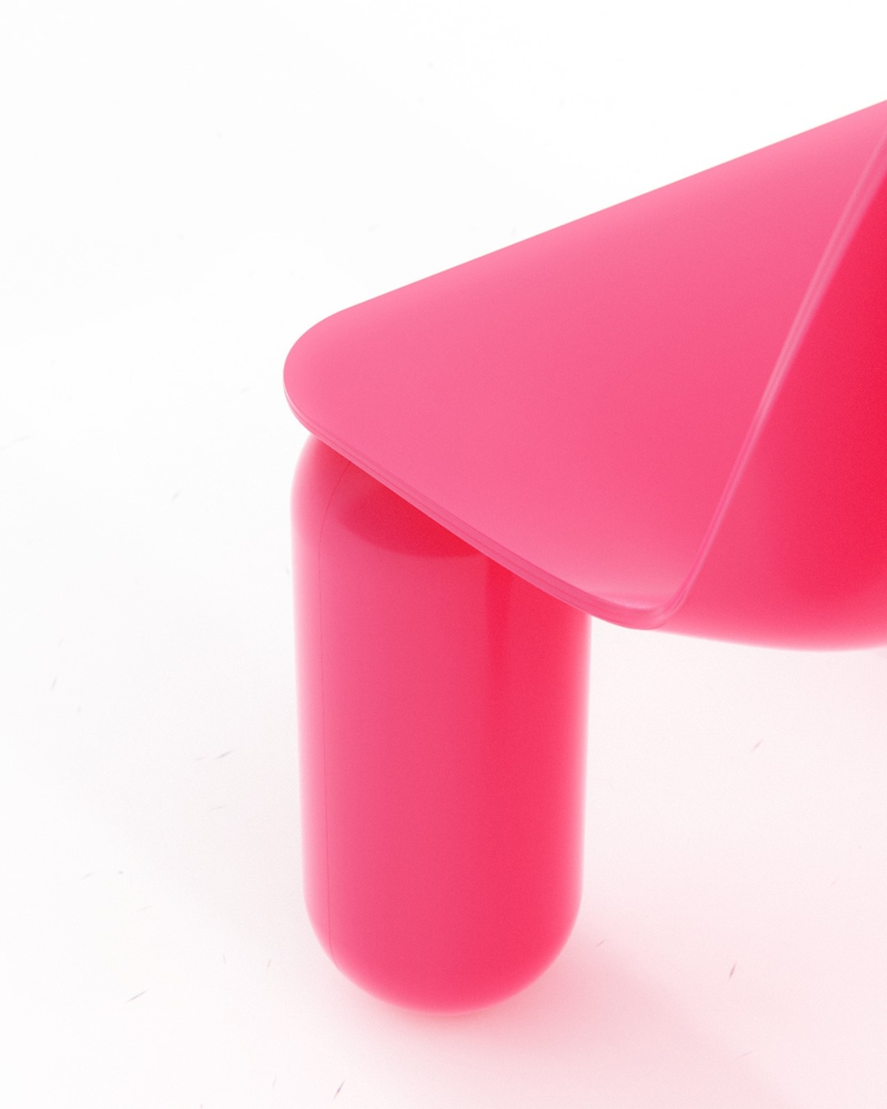
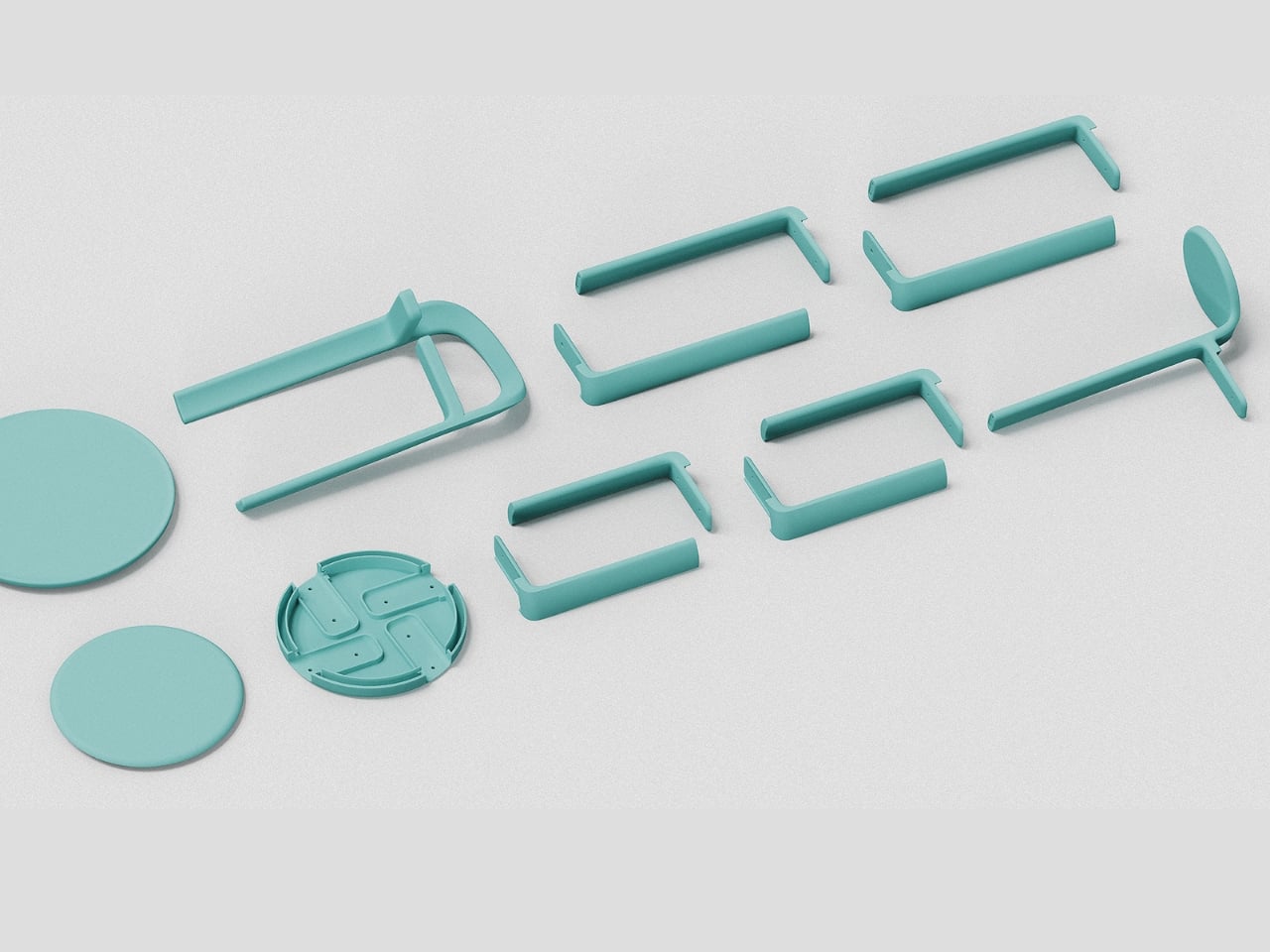
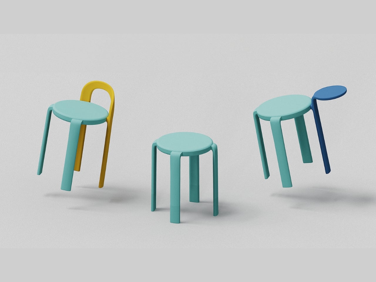
What actually makes Macarons interesting as a furniture system is the modularity. You get a configurable set of stools, chairs, and side tables built around a simple logic: swap the legs, change the seat, add on what you need. The components connect through a rotational seat mechanism that makes assembly genuinely easy and, more importantly, makes repair possible. That second part tends to get glossed over in product launches, but it matters a lot. A piece of furniture you can actually fix is one you’ll keep for a decade. That’s the quiet kind of sustainability nobody puts in the headline.

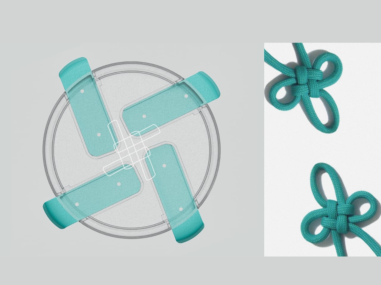
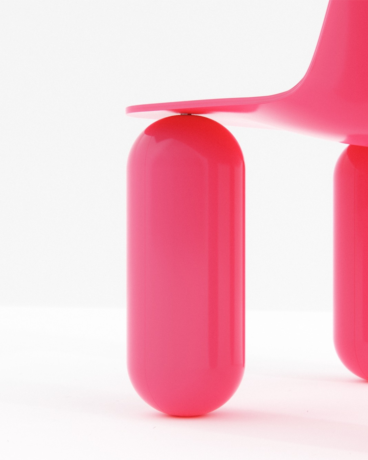
The structural engineering behind the legs is where things get clever. Huang and Liou designed an off-centered, cloverleaf knot leg structure that improves both strength and comfort simultaneously. That’s a harder problem to solve than it sounds. Most furniture designers pick one or the other and call it a day. The fact that the leg geometry does both while also contributing to the visual identity of the product is the kind of decision that separates designers who think holistically from those who think in silos.

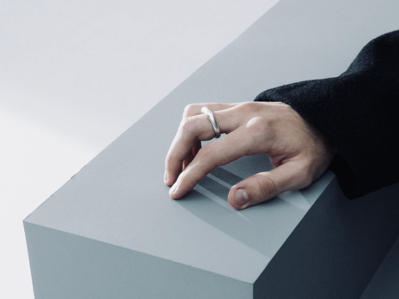
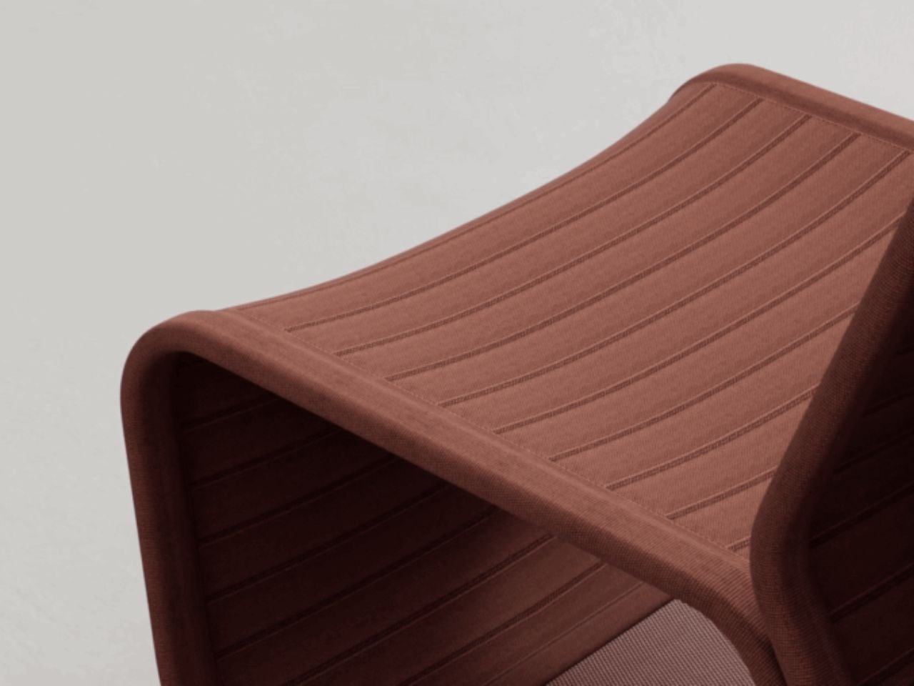
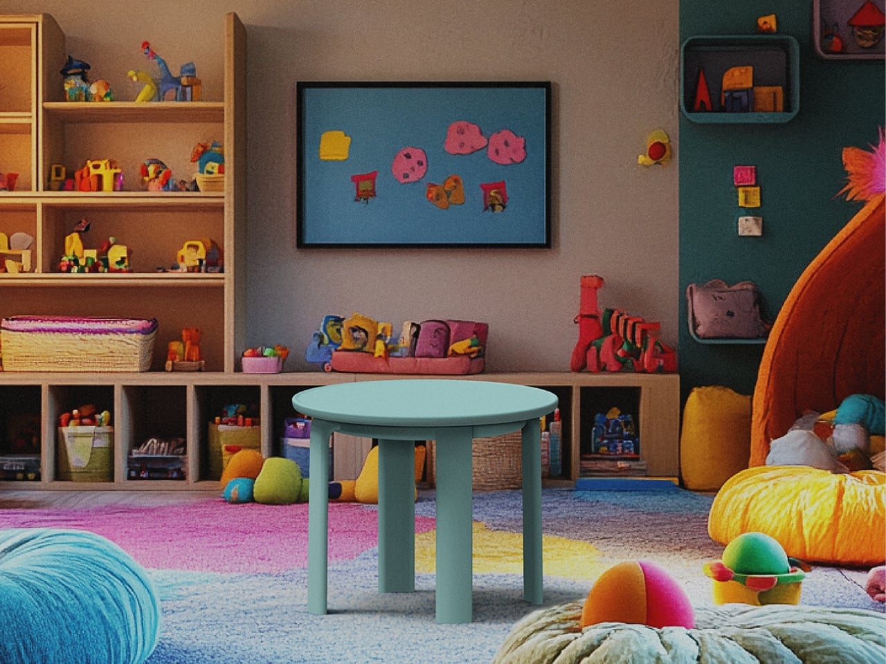
The material choice is equally deliberate. The entire system is made from post-consumer recycled polypropylene, which cuts down on waste and makes the pieces lighter to ship. Shipping weight is one of those sustainability factors that rarely gets talked about in design discourse, but it compounds fast. Lighter furniture means lower emissions per unit moved, and when you’re thinking about a modular system that’s meant to scale, that math matters.

I’ll be upfront about what I find genuinely compelling here: this isn’t sustainability as aesthetic, which is a trend I find exhausting. You know the type, raw edges, reclaimed wood, a beige palette that wants you to feel virtuous for just looking at it. Macarons doesn’t do that. It leans into color, playfulness, and modularity first, and builds the sustainability into the structure and material rather than the surface. That’s the right order of operations.

HanYi Huang brings a sharp design background to this. Her postgraduate work in Italy earned her a Red Dot Design award, and she’s been leading the design team at Shiang Ye as Creative Director, steering a traditional B2B furniture manufacturer toward work that competes internationally. That kind of trajectory, from a classic manufacturing context to award-winning modular systems with a global footprint, is worth paying attention to.

What Macarons ultimately argues is that modular, repairable, and recyclable furniture doesn’t have to feel like a compromise or a lecture. It can feel light, joyful, and considered. It can look like something you’d actually want in your home rather than something you bought to feel better about your carbon footprint. That’s a harder balance to strike than most people realize, and Huang and Liou struck it. Design that makes you feel good and does good at the same time is still the rarest kind. Macarons comes close.

The post The Macaron Collection That’s Actually Built to Last first appeared on Yanko Design.

A Chair Shaped by the Soft Curves of a Classic British Scally Cap

In a market full of furniture that competes loudly for attention, the pieces that often stay with us the longest are the ones that begin with a simple idea and a strong story. The Scally Chair is a beautiful example of this kind of design thinking. Its inspiration comes from something very familiar in British culture, the classic men’s scally cap. What is fascinating is how a small everyday object, such as a cap, can inspire the form of a chair and translate into a thoughtful piece of furniture.

The starting point of the design is an image. Instead of beginning with strict structural rules or purely functional decisions, the designer began with the recognizable shape of the scally cap. These caps are known for their soft, rounded crown and their distinct front visor. They have personality and a casual confidence that people instantly recognize. The Scally Chair translates these qualities into furniture in a subtle and elegant way.

Designer: Julia Kononenko

The rounded backrest is the most noticeable expression of this inspiration. It curves around the seat in a gentle way that recalls the soft crown of the cap. The form feels inviting and protective, almost as if the chair quietly embraces the person sitting in it. This small gesture adds a sense of intimacy and comfort while maintaining a clean and confident silhouette.

Another thoughtful detail appears at the front of the seat. The edge is slightly lifted in a gentle curve that echoes the visor of the cap. At first glance, the detail is subtle and easy to miss, but once you notice it the connection becomes clear. Instead of making the design too literal or predictable, this small reference adds character to the chair without overwhelming its form. It also introduces a sense of lightness and movement to the silhouette, making the chair feel more dynamic and visually balanced.

Material plays an important role in the experience of the Scally Chair. The use of wood brings warmth and authenticity to the design. Wood has a timeless quality that connects furniture to craftsmanship and longevity. It adds natural texture and depth to the chair while grounding the form in something familiar and tactile. The presence of wood also allows the chair to age gracefully over time, making it feel like a lasting object rather than a temporary trend.

The muted tones used in the chair are equally important. Instead of relying on bold colors to stand out, the design embraces restraint. These softer tones allow the chair to blend naturally into different environments. In modern and contemporary interiors, this quality becomes incredibly valuable. The chair does not try to dominate the room. Instead, it quietly complements the space around it.

Because of this, the Scally Chair works beautifully in many settings. It can sit comfortably in a minimalist living room, a warm Scandinavian-inspired interior, or even a more contemporary dining space. Its presence feels calm and balanced rather than loud. It supports the atmosphere of the room while still offering a strong sense of design.

What makes the chair particularly interesting is how the story behind it changes the way we experience it. Once you know about the scally cap inspiration, you begin to notice the details more carefully. The curve of the backrest, the slight lift of the seat, and the careful proportions suddenly feel intentional and thoughtful. The experience of the chair becomes more layered.

This is what gives the Scally Chair its quiet strength. It shows how everyday objects can inspire other everyday objects in unexpected ways. A familiar cap becomes the starting point for a piece of furniture that feels both contemporary and timeless. Through subtle form, warm materials, and restrained color, the chair proves that thoughtful design does not need to demand attention. Sometimes the most meaningful designs are the ones that simply fit into our spaces and lives with effortless ease.

The post A Chair Shaped by the Soft Curves of a Classic British Scally Cap first appeared on Yanko Design.

Bentu Just Built Furniture From Cities That No Longer Exist

Every city has its ghosts. Not the supernatural kind, but the kind embedded in the physical memory of places that no longer exist. Buildings torn down, neighborhoods erased, whole communities swallowed by the machinery of progress, or something far worse. Right now, in more places across the globe than most of us are comfortable counting, cities are not being redeveloped. They are being destroyed. And the rubble left behind, whether from a wrecking ball or a warhead, raises the same uncomfortable question: what do we do with what remains?

Bentu Design looked at rubble and decided to make furniture. That might sound like an overly romantic read on what is essentially a waste management challenge, but the more you learn about their project “Inorganic Growth: The Regeneration of Urban Village Memory,” the harder it is to dismiss. This is not recycling for recycling’s sake. It is design with a philosophical spine, and right now, that spine feels more relevant than ever.

Designer: Bentu Design

The concept begins with China’s urban village demolitions, where entire communities are cleared to make way for new development. The construction waste left behind, concrete fragments, red brick rubble, mortar dust, all the physical remnants of places that used to be someone’s home, is processed and reactivated into cement-based printable materials. The project achieves an 85% utilization rate of that solid waste. That figure alone is worth pausing on, because most recycled design projects deal in far smaller percentages and still get praised for it. Each piece of furniture is then built up layer by layer through large-scale 3D printing, giving it a textured, almost geological quality.

But the technical achievement is only half the story. Before a village is demolished, the team documents the site photographically. Those images are run through image-processing algorithms to extract the dominant color values of that specific place: the iron-red of old bricks, the cement-gray of crumbling walls, the muted green of weathered surfaces, the faded blue of glazed tiles. Those tones are built into a gradient control system that becomes the visual fingerprint of each piece. Every bench or chair carries not just the material of the place that was, but its palette. A gradient that encodes memory. A piece of public furniture quietly carrying the visual DNA of the neighborhood that once stood there.

Most people walking past it will never know. But the furniture knows. I keep thinking about what this means in the context of the world we are actually living in right now. Mariupol. Gaza. Khartoum. Cities being reduced to the same concrete fragments and red brick rubble that Bentu Design scoops up and turns into something lasting. The scale of destruction happening globally is staggering, and designers are not exempt from sitting with that discomfort and asking what, if anything, we can actually do about it.

We cannot stop wars. We cannot reverse the decisions of governments or the momentum of military campaigns. But Bentu’s work quietly suggests that designers do hold something real: the ability to determine what erasure looks like, and whether it has to be total. There is an argument here that is worth taking seriously. When we choose to carry the material memory of a destroyed place forward rather than simply clearing it away, we are making a statement about whose history counts. That principle scales. It applies to a demolished village in Shenzhen. It applies to a flattened street in Kharkiv.

Design, at its most serious, is always making choices about what to remember and what to let disappear. “Inorganic Growth” chooses remembrance without sentimentality, using technology as the medium and rubble as the message. That feels like the right posture for designers to hold right now: not paralysis, not performance, but a steady insistence on making things that refuse to forget. Some benches just hold your weight. These ones hold an entire neighborhood’s last breath.

The post Bentu Just Built Furniture From Cities That No Longer Exist first appeared on Yanko Design.

A Student Made the Most Honest Chair of the Year

The best furniture tends to ask a quiet question. Not loudly, not with a press release, but through the way it sits in a room and dares you to interact with it differently. Manuela Hirschfeld’s Tilt chair does exactly that, and the fact that it comes from a student project makes it all the more interesting.

Hirschfeld is an industrial design student at Germany’s Hochschule Pforzheim, and her Tilt chair is exactly what the name suggests. Built from bent plywood with a minimalist silhouette, it’s a chair that shifts between two modes: upright for sitting and reclined for lounging, all with a single gentle forward tilt. No levers, no mechanical parts, no instructions needed. Just physics, balance, and good design doing the heavy lifting.

Designer: Manuela Hirschfeld

The concept is almost disarmingly simple. Hirschfeld describes it this way: “Tilt transforms from a chair to a lounger in seconds with a gentle forward tilt. Intuitive and perfectly balanced. Two moments arise from a single piece of furniture: arriving upright or relaxing and letting go.” That last line is the one that stuck with me. Arriving upright or relaxing and letting go. It reads more like a small philosophy than a product description.

What I find genuinely impressive here is the restraint. A lot of student design work goes big. It reaches for concepts that are hard to produce, materials that don’t yet exist, or ideas that require ten slides of explanation before they make sense. Tilt goes the other direction. It strips everything down to the point where the idea can stand entirely on its own. One material, one gesture, two functions. That’s it.

Bent plywood as a material has a rich history in furniture design. Charles and Ray Eames made it iconic. Alvar Aalto built a whole vocabulary around it. Choosing it for a student project isn’t a lazy shortcut; it’s actually a high bar. The material has been done so well, so many times, that doing something genuinely new with it means you have to think carefully. Hirschfeld has clearly done that thinking, because the Tilt doesn’t feel like it’s borrowing from those references. It feels like it belongs to the same conversation without trying to imitate anyone in it.

The two-position function also taps into something real about how people use furniture. We don’t sit the same way all day. Anyone who works from home, eats at their desk, or uses their living room for everything from Zoom calls to Sunday afternoon napping already knows this. The idea that a single well-designed chair could accommodate those different physical and emotional states is more practical than it first appears. It’s a simple answer to a genuinely complicated question.

What makes this worth paying attention to, beyond the design itself, is that Hirschfeld apparently maintains no online presence. Core77, who featured the project, noted it with a certain curiosity. No portfolio, no Instagram, no LinkedIn footprint to trace. That’s almost radical for a design student right now, when visibility tends to be treated as a prerequisite for being taken seriously. It raises the question of whether the work should be enough on its own. Looking at Tilt, you’d have to say it is.

Student design work often gets dismissed as theoretical, as something that sounds good in a studio critique but would never survive contact with manufacturing, retail, or real life. Tilt doesn’t read that way. It reads as resolved. The kind of thing that could sit in a well-edited apartment or a design-forward hotel room without anyone questioning whether it belongs there. Whether it ever goes into production is anyone’s guess. But that’s almost beside the point. What Hirschfeld has done with Tilt is prove that the clearest ideas are sometimes the hardest to arrive at, and that a chair doesn’t need to reinvent itself to be worth talking about. It just needs to do two things well.

The post A Student Made the Most Honest Chair of the Year first appeared on Yanko Design.

This Brutalist Lounge Chair Is 3D-Printed From Recycled Water Bottles

Most furniture sits in a room without saying much. It fills a corner, does its job, and disappears into the background. Nako Baev’s THE OBJECT 01 is not that kind of furniture. The Amsterdam-based designer set out to build a chair that carries the weight of a spatial statement, something that holds its ground without decoration or apology, and in that specific ambition, the object largely delivers.

THE OBJECT 01 is a 3D-printed lounge chair built from recycled PETG, a plastic more commonly found in water bottles than in furniture workshops. At 20kg, it is lighter than its blocky, slab-heavy proportions suggest, though not exactly something you would reposition on a whim. Its dimensions push it closer in scale to a small architectural fragment than to a typical chair, which is likely the whole point.

Designer: Nako Baev

The construction follows a modular panel system, where each 3D-printed block fits into a sequence designed to cut material waste and keep the overall mass structurally lean. Finished in a cold grey Baev calls “Kyoto Fog,” the chair reads somewhere between concrete and matte stone. In a sparse studio or raw loft, it anchors the space with quiet authority. In a more conventional living room, it would likely dominate in ways not every household would welcome.

What makes THE OBJECT 01 genuinely worth attention is how honestly it exposes its own making. The layer-by-layer texture from the printing process is not hidden or smoothed away; it stays visible across the surface, turning the manufacturing method into part of the visual language. That kind of material honesty is far more common in ceramics or cast concrete than in plastic furniture, and it gives the piece a tactile quality that polished renders simply do not convey.

Baev describes the design as sitting between furniture and sculpture, drawing on minimalist brutalism and a quieter Japanese restraint in equal measure. The emotional reference points are more unusual: the designer cites the atmosphere of Silent Hill and Half-Life, those game environments built from silence and abandoned space, as part of what shaped the object’s mood.

The workflow involved AI assistance across early form studies, structural testing, and design refinement, reducing development time considerably. That footnote is becoming standard across the industry, and it doesn’t add or subtract much here. This process might even become the key to sustainable furniture design, as it can help optimize 3D printing, increase efficiency, and reduce waste in the long run.

The post This Brutalist Lounge Chair Is 3D-Printed From Recycled Water Bottles first appeared on Yanko Design.

The Knit Chair That Rewrites Comfort by Subtracting Instead of Adding

For decades, furniture design has followed an unspoken rule. Comfort equals more. More foam, more padding, more layers, more material. The Knit One Chair by Isomi, designed by Paul Crofts, quietly dismantles that assumption. It proposes something radical for contemporary seating: what if comfort is not about adding, but about removing?

The chair does not shout innovation through spectacle. Instead, it whispers it through restraint. Gone are the dense layers of upholstery that traditionally define lounge seating. In their place sits a single engineered knitted skin stretched across a lightweight metal frame. What appears visually minimal is in fact materially sophisticated. The knit surface is not decorative upholstery but the structural and ergonomic system itself. It supports, flexes, and adapts to the body without relying on bulk.

Designer: Paul Crofts

This shift reframes how we understand softness. Rather than cushioning the body with excess, the chair supports it through tension and precision. Paul Crofts describes the intention as a move away from resource-heavy upholstery toward something smarter and more responsible. The frame bolts together on site, while the knitted sleeve simply drops into position. The logic is elegant. Fewer components, less waste, and a construction process that feels closer to assembling a garment than building furniture.

The textile itself carries its own story of transformation. The sleeve is made from Camira’s SEAQUAL collection, a fabric created using post-consumer marine plastic waste. Each meter repurposes up to thirty-five recycled bottles recovered from oceans. Instead of treating sustainability as a surface-level gesture, the material integrates environmental responsibility directly into the structure of the chair. Advanced three-dimensional knitting technology shapes the textile precisely, eliminating offcuts and ensuring that only the exact amount of material required is produced. No surplus. No unnecessary trimming. No hidden waste.

The absence of adhesives or foam layers also means the knit can be replaced or recycled independently of the frame, extending the product’s lifespan. In an industry where furniture is often discarded when upholstery wears out, this detail feels quietly revolutionary. Longevity is designed into the system rather than promised as an afterthought.

Logistics also becomes part of the design intelligence. The lightweight frame and knit components ship flat-packed, reducing transport volume and emissions. Assembly is intentionally simple, allowing the chair to be constructed locally with minimal effort. For large-scale furniture, which often involves complex delivery and installation processes, this level of efficiency is rare and refreshingly pragmatic.

The Knit One Chair is not a standalone object but part of a modular seating family that includes a lounge chair, straight module, angled module, and a solid wood side table. Each piece is reversible, allowing configurations to shift depending on spatial needs. A single system can move from individual seating to collaborative arrangements without adding new elements. Flexibility here is not a feature but a philosophy.

What makes the design compelling is not just its sustainability credentials or modular versatility. It is the conceptual challenge it poses to the industry. The chair asks designers and users alike to reconsider a deeply embedded belief that comfort must be padded, layered, and concealed. Instead, it demonstrates that comfort can emerge from clarity of structure, intelligence of material, and precision of form.

In a time when sustainable design is often framed as sacrifice, the Knit One Chair suggests another narrative. Reduction does not mean deprivation. It can mean refinement. By removing excess, the design creates space for innovation, longevity, and environmental responsibility to coexist. It is not simply a chair. It is a quiet argument for a future where furniture is lighter, not just in weight, but in impact.

The post The Knit Chair That Rewrites Comfort by Subtracting Instead of Adding first appeared on Yanko Design.

This Chair doubles as a Floor Lamp for quirky, multipurpose furniture for tiny homes

Most furniture is remarkably obedient. It goes where you put it, does what it was designed to do, and asks nothing back. A sofa is a sofa. A side table holds your coffee and your remote and maybe a plant you keep meaning to water. The relationship is comfortable, uncomplicated, and, if you’re honest about it, a little dull.

JXY Studio’s Art-chitecture modular furniture system is not obedient. Designed by Jiaxun Xu and Yue Xu, it’s built from just two materials, stainless steel and frosted acrylic, and assembled through a modular logic that lets the same set of components become a chair, a lamp, a wall sconce, a shelf, or something that doesn’t quite have a name yet. The system isn’t asking you to commit to a function. It’s asking you to keep questioning one.

Designer: JXY Studio

The physical language of the pieces is striking right away. The steel frame is exposed and structural, bolted together with visible hardware that reads more like small-scale architecture than furniture. The frosted acrylic panels diffuse light from within, so what sits in a corner as a cubic seat by day can glow like a softbox lantern at night. One configuration mounts flat against a brick wall as a sconce. Another rests on a wooden deck with a cushion tucked inside, a side table, a pet perch, a seat, take your pick. A Pomeranian pokes its head out of one in the project photos, looking entirely at home, which tells you something about the generosity of this design.

What JXY Studio is really pushing back against is the way furniture has historically been judged: by material, proportion, craftsmanship, and style. Those things matter, but that framework also quietly boxes furniture in. It positions an object as an accessory defined by aesthetic labels rather than as a force that actively shapes how a space feels. The Art-chitecture system rejects that framing. Its position is that a chair can be a spatial element, not just a seat.

I find this genuinely compelling, partly because it mirrors conversations happening across other design disciplines. In tech, modularity and open systems have been the standard for decades. In architecture, adaptive reuse and flexible programming have become almost expected. But furniture, the thing we touch and use more than almost any other designed object, has largely stayed categorical. The Art-chitecture system asks the obvious question that rarely gets asked: why?

Part of what makes it feel so contemporary is the balance it strikes between precision and openness. The components are designed around standard industrial processes, but the assembly logic is simplified enough that the user becomes a co-designer. You’re not just buying a product; you’re buying a set of spatial possibilities and figuring out what to do with them. It has flat-pack ambition with a considerably more ambitious philosophy behind it.

Modularity in furniture is not, of course, a new idea. The USM Haller system has been doing its thing since the 1960s, and everything from Enzo Mari to IKEA has explored assembly logic in various ways. But Art-chitecture distinguishes itself by crossing categories entirely. It doesn’t modularize within furniture. It modularizes across the boundary between furniture and space. Stack and recombine enough of these units and they stop being objects in a room and start becoming the room itself.

There are real tradeoffs worth acknowledging. Frosted acrylic is beautiful when lit but shows wear over time. Visible bolts and steel framing require a particular aesthetic tolerance. And any system this open-ended demands a level of spatial imagination that not everyone wants to bring to a Tuesday evening at home. But those feel like worthwhile concessions for a project that is genuinely trying to expand what furniture can be.

The image I keep coming back to is from the project photos: a person seated on an illuminated cube by a window, silhouetted against sheer curtains, while someone else holds an unassembled frame nearby. It looks like a play where the set is still being built. The Art-chitecture system treats living as an ongoing act of construction, where the things you sit on and the spaces you inhabit are never quite finished. I find that idea hard to let go of.

The post This Chair doubles as a Floor Lamp for quirky, multipurpose furniture for tiny homes first appeared on Yanko Design.

4 Upholstered Columns Become a Chair, And One Bends Into a Table

There’s a particular kind of furniture that makes you stop scrolling. Not because it’s trying to be art, and not because it’s doing anything especially clever with materials or manufacturing. It stops you because it looks like something you’ve never seen before, and then a second later, you completely understand it. Liam de la Bedoyere’s Quad Chair is exactly that kind of object.

The concept is almost aggressively simple. Four upholstered cylindrical columns stand together in a cluster. Three of them are straight, functioning as seats or backrests depending on how you lean into them. The fourth one bends at its base in a tight U-curve, loops back up, and becomes a side table at standing height. The whole thing is covered in a single color of fabric, currently shown in a striking orange-red that does a lot of work in making the form read clearly. Available too in yellow and blue, but the red is the one that landed.

Designer: Liam de la Bedoyere

What I find genuinely compelling here is the restraint. De la Bedoyere could have made this complicated. He didn’t. There’s no mixed material moment, no contrasting leg, no cutout geometry trying to signal craft or exclusivity. The Quad Chair is basically a pipe that got upholstered and brought some friends, and somehow that reads as both completely absurd and completely resolved.

The side table column is the real insight. Furniture that doubles as something else is usually a compromise, some convertible thing that does two jobs adequately and neither one well. But because the column is already structural, already cylindrical, already the right diameter to hold a glass or a book, bending one back up to table height doesn’t feel like a feature. It feels inevitable. A Dieter Rams book propped between the columns in the product photography feels less like a styling choice and more like the designer making a point about what the object is actually for.

The brand behind the project is Bored Eye Design, which is a name that earns more credibility the longer you look at the work. There’s something in the moniker that acknowledges where design ideas actually come from: not from briefs or trend reports, but from a certain restless attention to ordinary things. Four cylinders. One bent. That’s it. You can feel the boredom that preceded the idea.

It’s worth noting this is currently a personal project rather than a production piece. The renders are polished enough that it’s easy to assume otherwise, and the product photography, shot on pale timber floors against clean white walls, is exactly the kind of work that gets picked up by design publications and mistaken for launch imagery. De la Bedoyere is clearly fluent in the visual language of contemporary design brands.

Whether the Quad Chair translates to manufacturing is a different question. The upholstered U-bend is the interesting technical challenge, and how that curve holds its shape over time, under weight, across different uses, is something renders can’t tell you. But as a concept it’s more than compelling. It’s the kind of thing that makes you wonder why it doesn’t already exist.

Furniture has been having a cylindrical moment for a while now. Puffy, tubular, soft-edged forms have been creeping through interior design for the better part of a decade, a reaction against the hard-cornered minimalism that preceded it. The Quad Chair sits comfortably in that lineage without feeling derivative. It has a specific idea at its center, which is more than can be said for a lot of what’s riding the same aesthetic wave.

The top-down photograph is the one I keep coming back to. Four circular ends of upholstered columns arranged on a light wood floor, looking less like furniture and more like a glyph, or a punctuation mark from an alphabet that doesn’t exist yet. It’s the kind of image that sticks. The kind of object you’d sketch on a napkin and then be surprised, weeks later, to realize it was real.

The post 4 Upholstered Columns Become a Chair, And One Bends Into a Table first appeared on Yanko Design.

This Resin Chair Has a Real iMac, Magic Keyboard, and Mouse Sealed Inside It… Because ‘Art’

There’s a common saying that beauty hurts. Pretty shoes that blister your heels by noon. A dress cut so perfectly that breathing becomes a optional. The needle of a tattoo tracing something meaningful into your skin. Or even a surgical knife, for the dream of a better face or physique. People have always been willing to trade comfort for something that looks or feels transcendent, and the logic has always made a strange kind of sense. What I never anticipated was applying that same sentiment to sitting on an iMac.

Dip1, a chair by Korean designer Lim Wootek, takes that idea literally. The backrest is a real iMac monitor, its slim aluminum frame pressed against your spine as you settle in. It sounds wrong. It feels wrong. And somehow, that wrongness is exactly what makes it so addictive to look at. The keyboard, mouse, and storage bins are encased beneath the seat in a glowing block of cyan resin, visible through the haze like memories you recognize but can no longer touch. I guarantee you, you’ll grimace at the thought of sitting on the chair, as you lean back against what might be the most expensive and engineered backrest known to mankind.

Designer: Lim Wootek

The resin block is where the craft gets interesting. Lim sealed a full Apple Magic Keyboard, a Magic Mouse, and a set of colored desktop storage bins inside the body of the chair. The bins are the kind that live on studio shelves holding batteries, USB cables, and every small object that never quite found a permanent home. Through the semi-translucent resin, their shapes read clearly near the seat surface and dissolve into soft blur toward the base. That gradient from legible to ghosted is the whole thesis of the piece made physical, and it required real material control to pull off at this scale.

The iMac is a 27-inch model, the flat-chinned aluminum design that Apple ran from 2012 through 2022, with the display sitting at 68.6cm diagonally and the full unit standing around 65cm tall. These are not small numbers, and the chair has the presence to match. The monitor backrest positions the screen at exactly the height you would have once made eye contact with it, which means the sitter has literally turned their back on it. The screen now faces outward, away from the person in the chair, and that single spatial decision carries more conceptual weight than most designers manage in an entire project.

Standard seat height on the resin block sits at around 45cm, which is ergonomically normal, and that normality is part of what makes the piece so disorienting. You could actually sit in this. People do sit in this, as the campaign photos show. A figure in all black, hooded, leaning back against the aluminum monitor stand with the posture of someone who has fully accepted the situation. The chair functions, and that functionality makes the statement sharper rather than softer.

Lim Wootek’s studio works across industrial design, digital design, mold design, and CMF, and Dip1 has all four disciplines firing together. The resin body has soft radii on the seat edges and a gently tapered base that stops it from reading as a plain block. The cyan is specific, close to shallow tropical water, which is why the submerged objects feel genuinely drowned rather than just encased. Getting optical clarity, structural load capacity, and color depth to coexist in a resin cast this large is a serious material engineering problem, and the fact that it reads as effortless is the tell of someone who actually knows what they’re doing.

The post This Resin Chair Has a Real iMac, Magic Keyboard, and Mouse Sealed Inside It… Because ‘Art’ first appeared on Yanko Design.

The Boop Chair Looks Inflated But It’s Completely Solid

There’s something about a really good design idea that makes you wonder why nobody thought of it sooner. The Boop Chair by Bored Eye Design is one of those things. It’s hot pink, it looks like it was inflated rather than built, and the entire concept was born at a child’s birthday party. Of all the places great furniture design could originate, that might be my favorite origin story yet.

The designer describes Boop as a chair “inspired by the balloons at my daughter’s birthday party, exploring ideas of inflation and softness through a solid design form.” That one sentence is doing a lot of heavy lifting, because what it really describes is a fundamental design paradox: something that looks soft but is rigid, something that evokes weightlessness but is undeniably structural. That contradiction is exactly where the Boop Chair earns its place in a conversation about serious design.

Designer: Bored Eye Design

Looking at the photos, the first thing that hits you is the color. That specific shade of hot pink, somewhere between magenta and neon, has a glossy finish that reads almost wet. It’s the kind of color that demands attention and refuses to apologize for it. But once you get past the color, the form starts to do its own talking. The legs are thick, rounded cylinders with perfectly domed ends, like oversized capsule pills or, yes, tied-off latex balloons. The seat and backrest are thin, curved planes that flow into each other, creating that familiar seat-to-back transition in a way that looks draped rather than engineered. The contrast between the chunky, inflated legs and the almost paper-thin seat is where this chair gets genuinely interesting.

What Bored Eye Design is tapping into here is a visual language that our brains have spent decades associating with joy, celebration, and the unself-conscious fun of childhood. Balloons don’t carry weight, at least not literally. They float, they bounce, they squeak under your fingers. Translating that feeling into something you can actually sit on takes a certain kind of design confidence. The chair doesn’t just reference balloons aesthetically. It commits to the bit entirely, and because of that commitment, it actually works.

It also fits into a broader cultural moment that design has been circling for a few years now. The puffy, inflated aesthetic has been showing up everywhere from high fashion to tech product design, a pushback against the years of ultra-minimal, razor-edged everything. There’s something genuinely appealing about rounded forms right now, forms that feel approachable and almost tactile even before you touch them. Boop lands squarely in that conversation, but with a personal story underneath it that gives the piece more grounding than a trend exercise would.

The disassembled shot is worth mentioning too. Seeing the chair broken down into its parts, the curved body laid flat and the capsule legs scattered around it alongside small metal pins, makes the whole thing feel even more considered. Those legs could be balloon animals. That seat could be a folded ribbon. It’s playful but precise, which is a genuinely hard combination to pull off.

I’ll admit my first reaction was something close to delight, which isn’t always my first reaction to furniture. Usually there’s more evaluation, more asking whether I’d actually want it in my home. With Boop, I found myself skipping past that entirely and just enjoying the thing. Whether or not it’s comfortable (and given the rigid seat, that’s a reasonable question), it functions as a piece of design that communicates something specific and does it with total conviction. Not every chair needs to be practical. Sometimes a chair just needs to make you feel something.

That this started because someone was watching balloons at a kid’s birthday party and let that moment become a full design concept is the part that sticks with me most. The best creative ideas often come from paying attention to ordinary moments. Bored Eye Design clearly paid attention.

The post The Boop Chair Looks Inflated But It’s Completely Solid first appeared on Yanko Design.