A 3D-Printed Lamp That Finally Makes Sustainability Look Great

Most lamps do one thing. They sit on your desk, light your space, and get buried under the slow-moving chaos of charger cables and forgotten receipts. The Drop Light by Teixeira Design Studio doesn’t just resist that fate; it anticipates it.

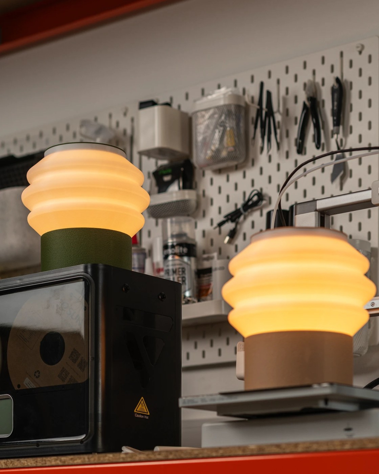
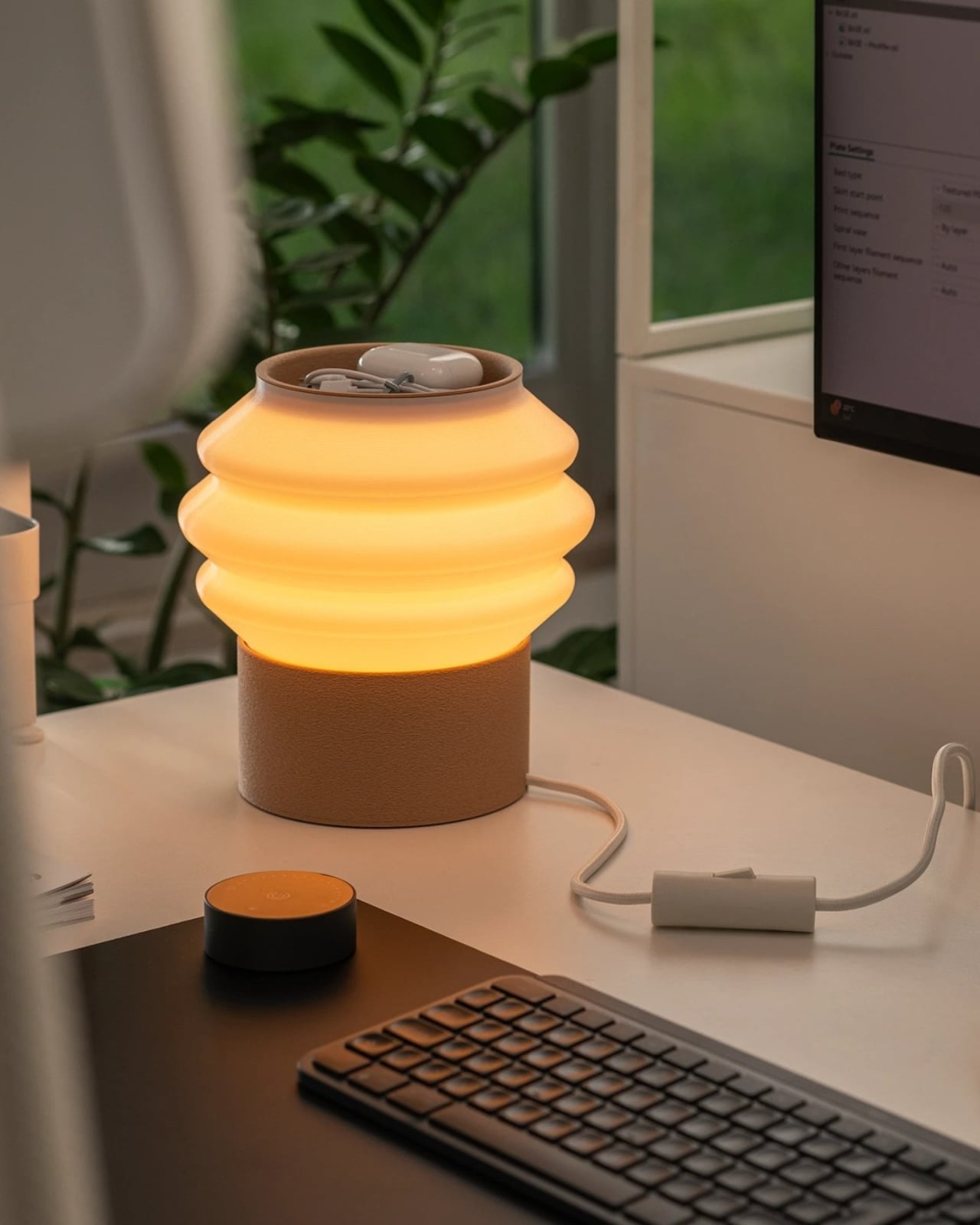
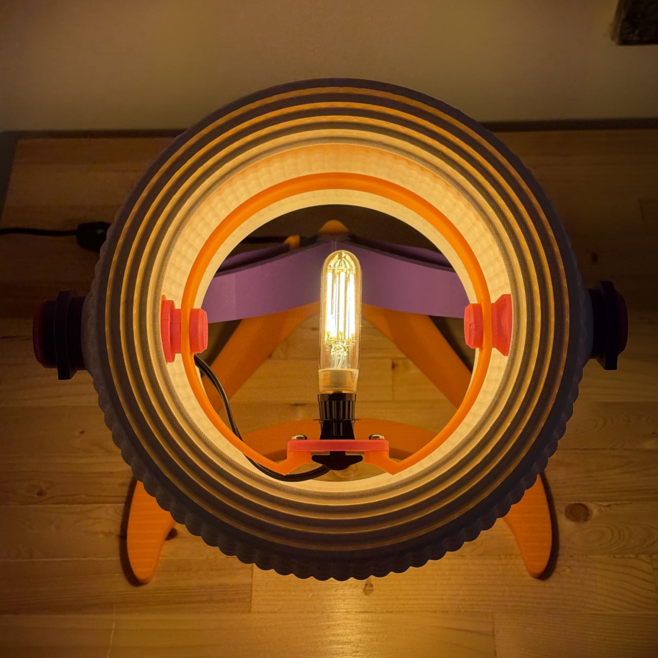
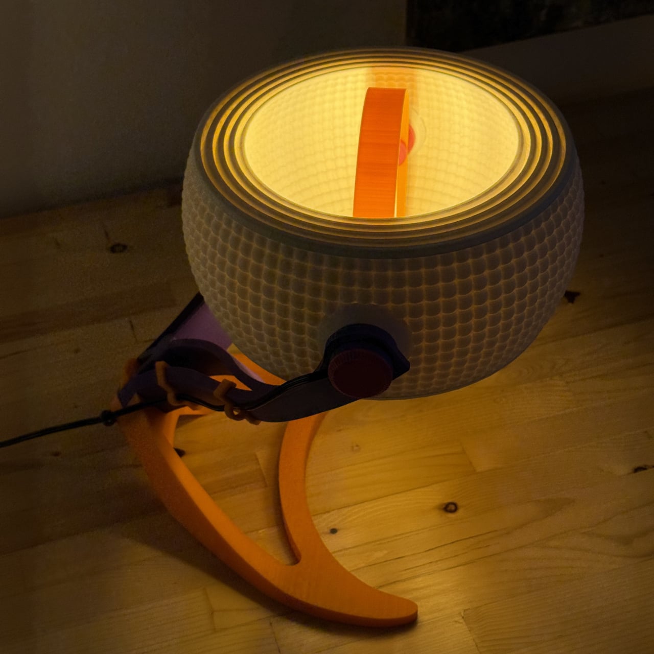
The lamp is 3D printed entirely from recycled, plant-based PLA, designed in collaboration with Oftwise Studio. It’s a desk lamp with a built-in tray at the base that holds the usual suspects: pen drives, earphones, that one charging cable you’re always looking for. The storage isn’t an afterthought bolted onto a design that already existed. It’s baked into the silhouette from the start, which is a distinction I wish more designers paid attention to.

Designer: Teixeira Design Studio

What makes the Drop Light genuinely interesting isn’t just the function-forward thinking, although that’s a big part of it. It’s the way the material actually drives the design. The base and top tray carry a fuzzy, matte PLA texture that’s scratch-resistant and tactile, almost soft to look at. The shade is printed smooth and semi-translucent, scattering light evenly without showing you the bulb. Two completely different surface behaviors, one material, one object.

That contrast between matte and diffuse isn’t just visual. It communicates function before you even plug anything in. You know instinctively where to rest your things and where the light comes from, and nothing about that has to be labeled or explained. Good design, in my opinion, should always work like that. The object tells you what it needs from you before you ask.

I’ve seen a lot of “sustainable” product design that feels more like an excuse than a commitment. Recycled materials get used in ways that look recycled. Rough edges, uneven finishes, a vague suggestion that the environmental good will outweigh the aesthetic compromise. Drop Light doesn’t do that. The layered build lines from the printing process are barely visible under the fuzzy texture, reading as intentional surface detail rather than manufacturing artifact. It looks fabricated, deliberate, finished. The plant-based PLA carries a warmth that petroleum-based plastics simply don’t, and the design leans into that warmth rather than trying to disguise it.

This is also where 3D printing, as a production method, starts to become genuinely exciting for everyday objects. For a long time, additive manufacturing lived almost entirely in the prototyping world. You used it to test a form before committing to injection molding. Drop Light is part of a growing wave of products that treat 3D printing as the final destination, not a stepping stone to something else. The result is a lamp that looks like it was designed to be made this way, not like it was designed for a factory and then adapted.

Teixeira Design Studio has done this kind of work before. Their Fold luminaire, also 3D printed, tackled the challenge of combining task and mood lighting into a single form. The studio seems genuinely interested in what the process makes possible, rather than just using it for the sustainability talking points. That consistency matters. It’s the difference between a design practice and a design trend.

Is Drop Light for everyone? Probably not. Minimalist in its silhouette, muted in its palette, it rewards people who appreciate restraint. If you’re someone who wants your lamp to announce itself, this isn’t it. But if you’re drawn to objects that feel considered, that do more than one thing without trying to look like they do, the Drop Light hits a note that a lot of current lighting design misses completely.

We talk a lot about what sustainable design could be, and not nearly enough about what it actually looks like when it works. This lamp is a solid answer to that question. Not a perfect one, but a convincing one, and sometimes that’s exactly what the conversation needs.

The post A 3D-Printed Lamp That Finally Makes Sustainability Look Great first appeared on Yanko Design.

Su Yang Choi Made a Glowing Lamp From Seaweed, Paprika, and Gardenia

Sustainable design has spent years negotiating an awkward identity crisis. The moment a material gets labeled biodegradable or plant-based, it tends to be filed under “eco-alternative,” which is shorthand for “almost as good as the real thing, but greener.” That framing puts the worth of the material almost entirely on what it replaces, rather than what it can become as something genuinely new.

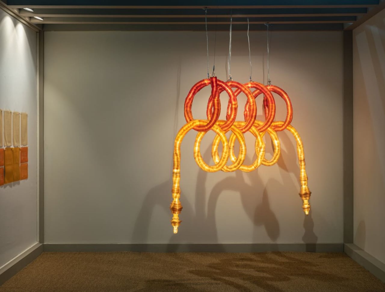
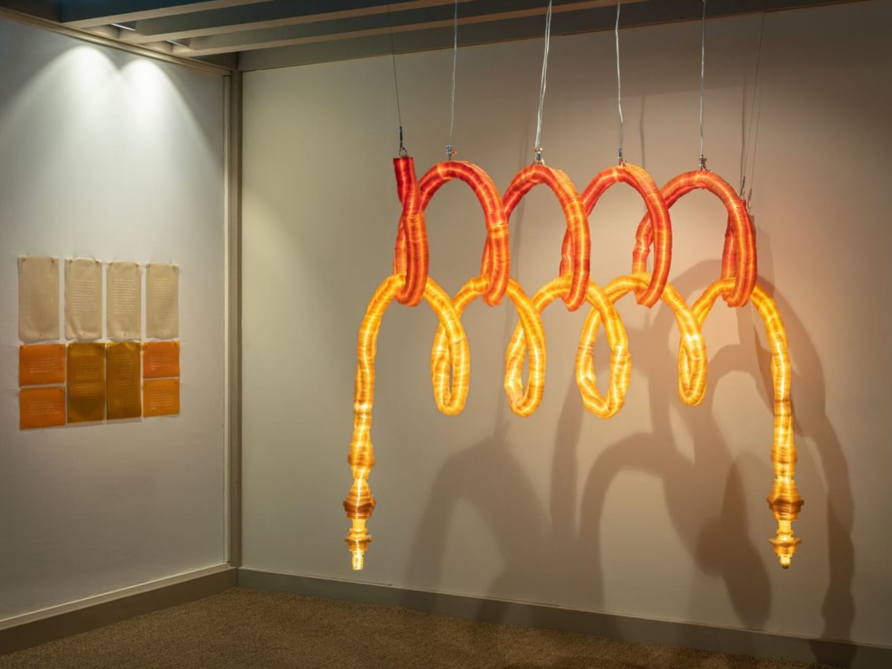
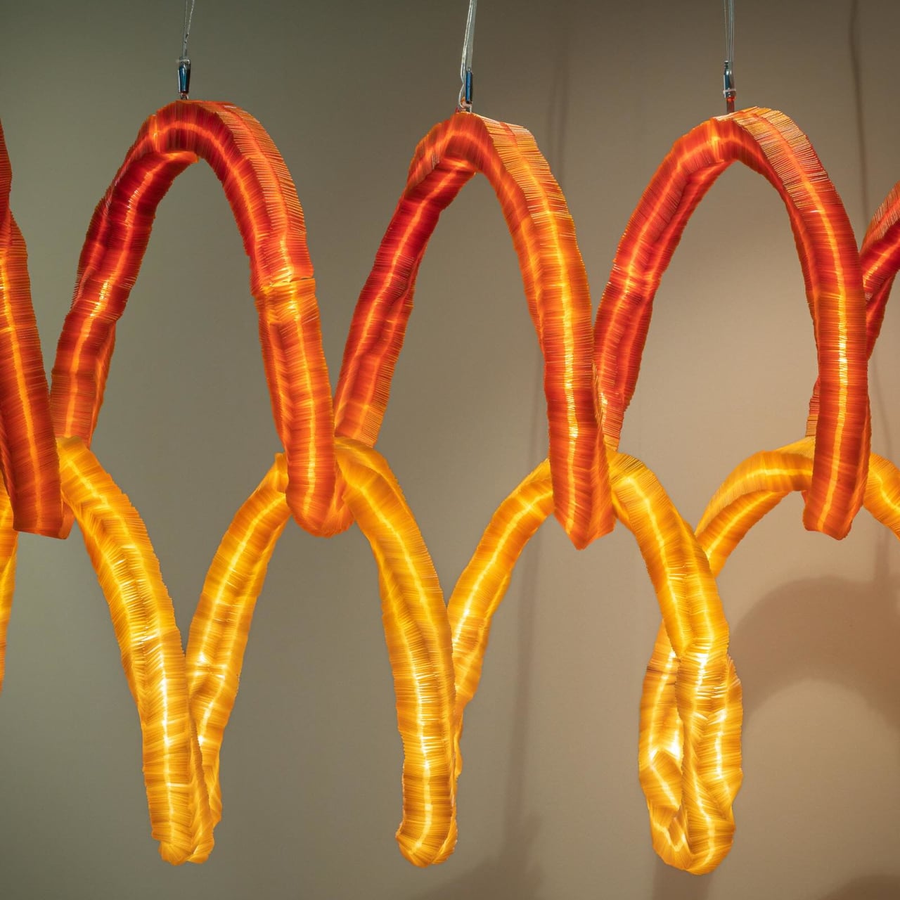
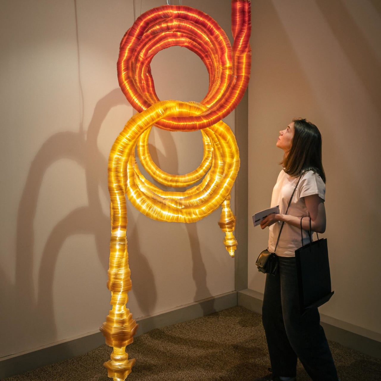
Designer Su Yang Choi has been pushing back against that assumption with the Slow Project series, an ongoing investigation into seaweed-derived agar as a material with its own aesthetic voice. Slow2, the series’ second work, was presented at Salone Satellite 2026 in Milan as a pair of glowing tubular light installations that don’t quite look like anything industrial design or nature has produced before.

Designer: Su Yang Choi

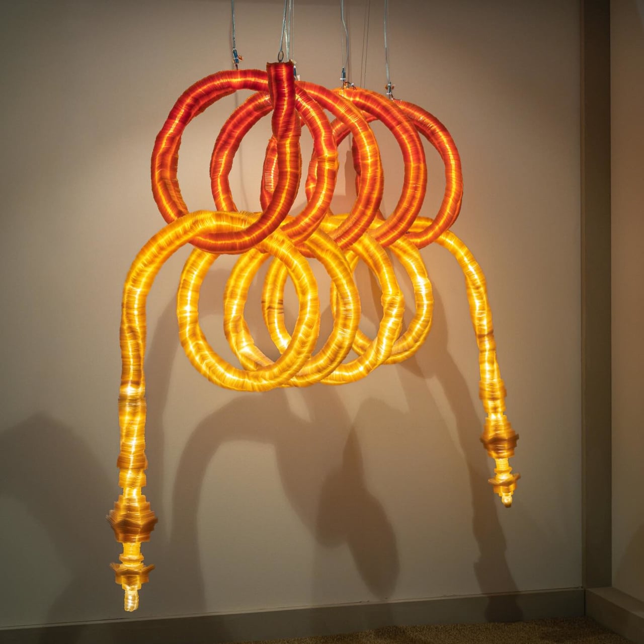
The structural idea comes from baramgil, a spatial principle in traditional Korean hanok architecture where doors and windows line up along a single axis, letting the gaze pass through layered planes and create the impression of depth. Choi translates that logic into two vertically interlocking circular tubular structures, which build perceived depth through repetition and overlap rather than any physical expansion.

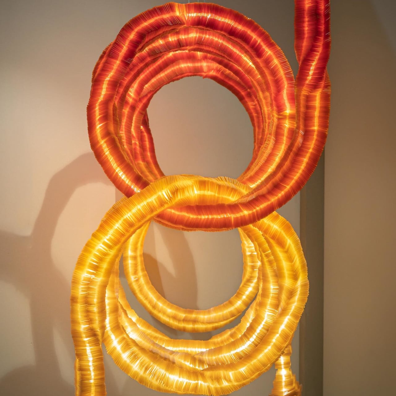
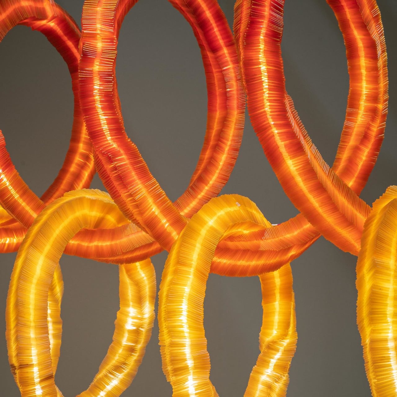
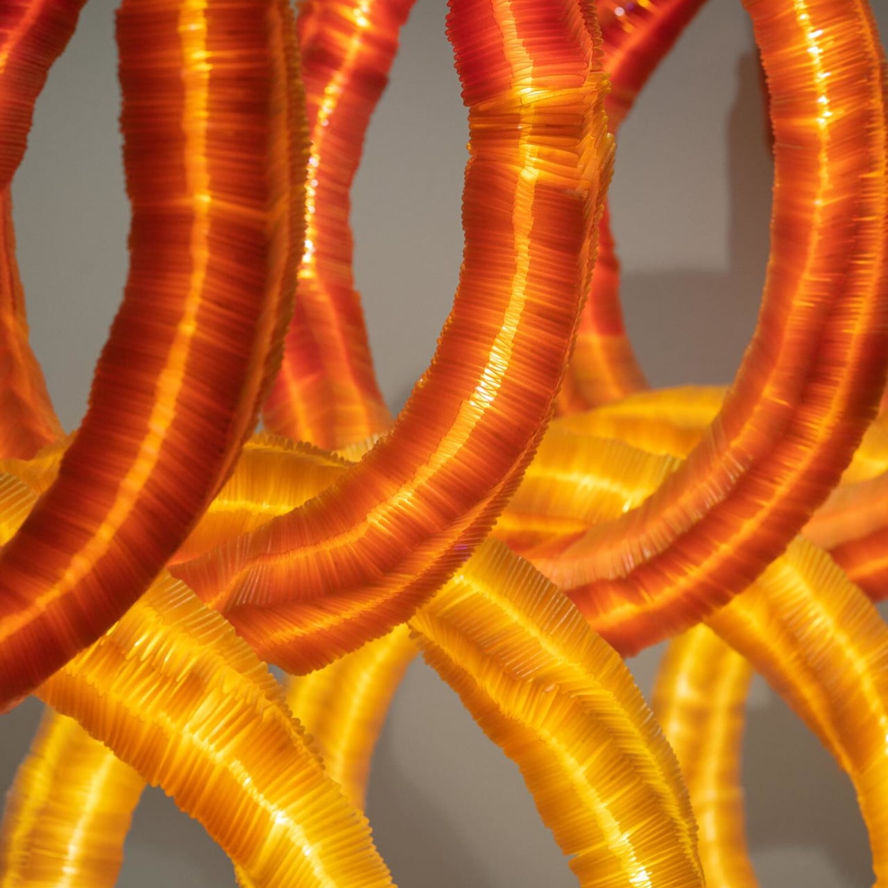
The tubes are built around a steel armature wrapped in layers of seaweed-derived agar, a biodegradable biopolymer Choi formulated independently without any synthetic additives. LED strips run through the core alongside insulating tubing, and the light passes outward through the semi-translucent material. The agar’s own surface texture, tight ridges spiraling along each curved section, reads as integral to the form rather than incidental.

Color comes entirely from natural pigments, specifically gardenia and paprika, which produce a gradient from warm amber and gold at the lower sections to a deeper red toward the top. The shift isn’t applied in flat bands but moves gradually across the form, and the LED light amplifies those variations differently through each layer of agar, so the coloration changes depending on where you look from.

Hung from the ceiling, the installation casts shadows on the wall behind it, the overlapping loops producing a secondary layer of visual information that extends the work beyond its physical boundaries. That doubling mirrors the baramgil idea at a different scale. Seen from the front, the structures read as a single unified form; shift to an angle and the depth between the interlocking sections opens up considerably.

What makes Slow2 compelling is what Choi is actually arguing through it. The Slow Project series isn’t about demonstrating what seaweed agar can replace; it’s an inquiry into whether the material can develop enough formal character to stand on its own. The baramgil reference, the natural pigments, the hand-wrapped tubes, none of it reads as sustainable messaging but as decisions the material itself invites. The concept, the form, and the substance aren’t three separate layers but one coherent thing, which is precisely where the Slow Project series seems to be heading.

The post Su Yang Choi Made a Glowing Lamp From Seaweed, Paprika, and Gardenia first appeared on Yanko Design.

Alberto Essesi Just Designed the Lamp That Celebrates Mistakes

If you’ve ever assembled furniture, built a shelf, or wired anything with your own two hands, you know the feeling. You step back, you look at your work, and then you see it. That one thing. The screw facing the wrong way. The panel installed backwards. The “how did I miss that?” moment that you either have to fix or quietly learn to live with. Alberto Essesi, an L.A.-based industrial designer, decided to immortalize exactly that feeling, and then turned it into a lamp.

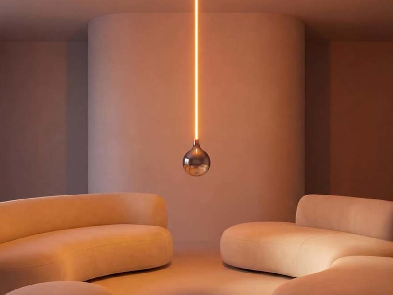
The Oops lamp is precisely what it sounds like. A hanging fixture that, at first glance, looks like something went sideways during installation. The design inverts the expected, which is Essesi’s own phrasing, and it delivers on that premise with clean, understated confidence. It doesn’t shout. It doesn’t over-explain itself. It just makes you look twice, register the joke, and then probably smile.

Designer: Alberto Essesi

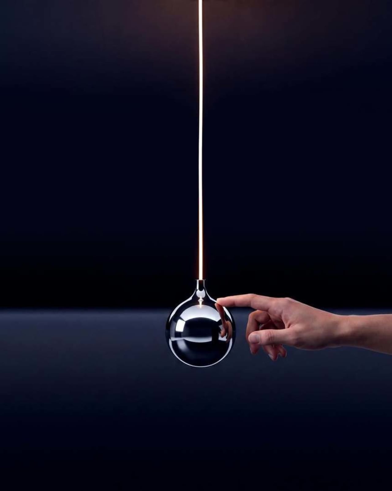
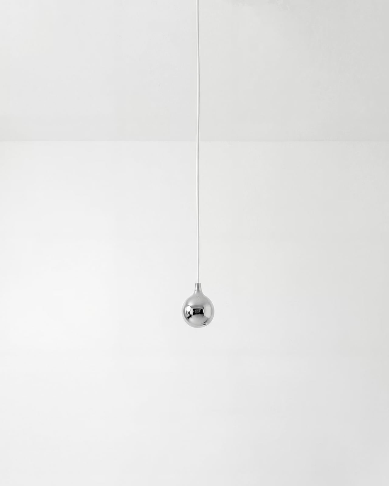
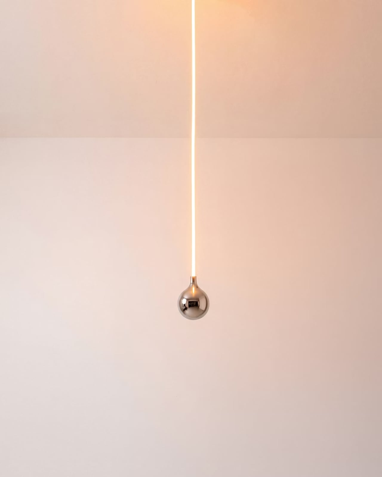
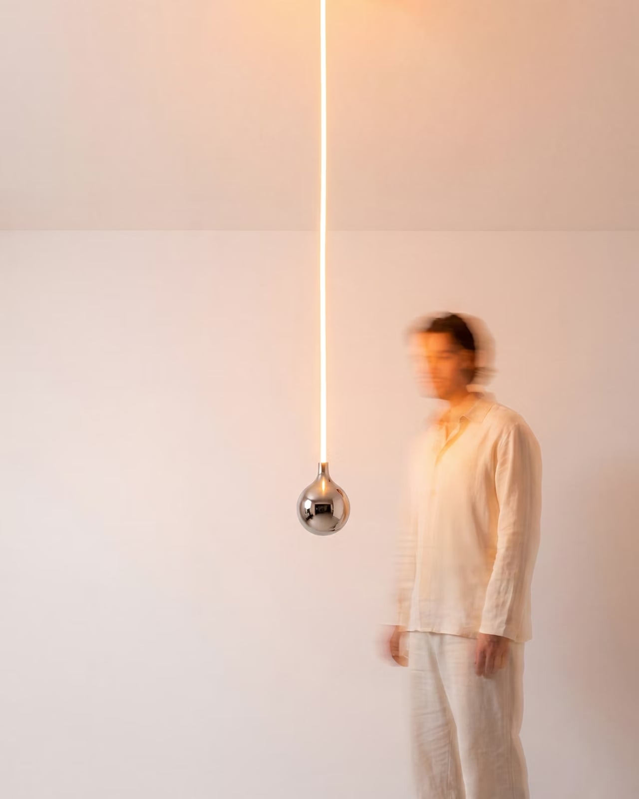
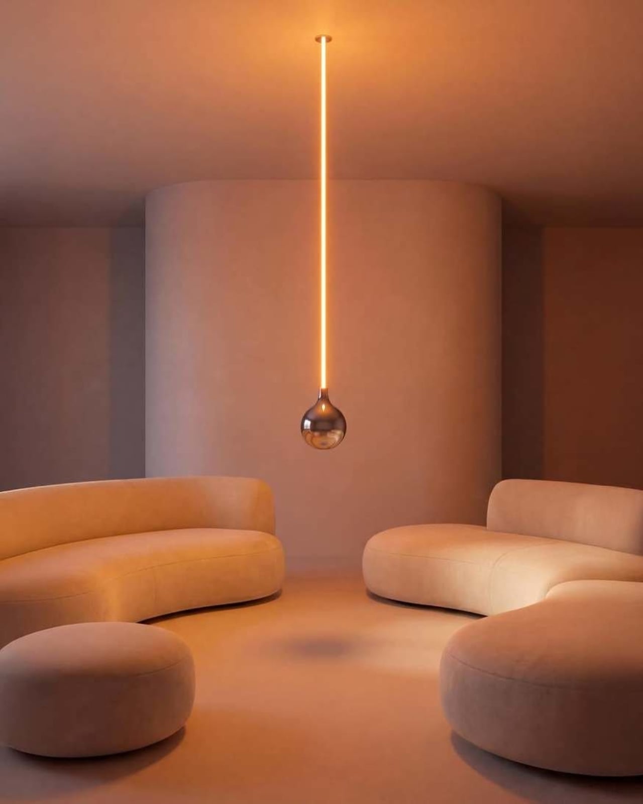
Look at it long enough and the concept becomes delightfully clear. A slender, glowing rod descends from a ceiling mount, warm light running its full length like a lit fuse. At the very bottom sits a polished chrome globe, round and reflective, the universal shape of a light bulb. Except the globe isn’t glowing. The rod is. The light is coming from exactly where you wouldn’t expect it, and the bulb, the part that’s supposed to be the whole point, is just sitting there at the bottom looking beautiful and slightly confused. That’s the joke. That’s also, somehow, the most elegant part of the entire object.

The chrome finish on the globe isn’t incidental. It picks up the amber warmth of the glowing rod above it and bounces it softly into the room, so the globe contributes light without technically being a light source. It’s a small design decision that could have easily been an afterthought, but it ends up being one of the most considered details in the whole piece. The lamp works as a room object even before you process the humor in it.

Essesi has said this idea has been rattling around in his head for years. “This has been an idea I’ve had for a few years and always laugh when I think about it,” he shared when unveiling the design. That kind of creative patience is rare, and it shows in the final execution. The Oops lamp doesn’t feel rushed or gimmicky. It feels like exactly the right amount of thought went into it, no more, no less. Sometimes a concept just needs time to ripen before it’s ready to exist in the world.

Design humor is genuinely hard to pull off. Most attempts either try too hard or land too soft. The joke gets buried under layers of irony, or it gets explained to death until any charm it originally had is long gone. The Oops lamp sidesteps all of that. The humor is baked into the form itself. You don’t need a placard or a press release to get it. You just get it. That’s the mark of a strong design concept: the idea communicates itself without any assistance.

Essesi didn’t reach for something ornate or architecturally complex to subvert. He took the most ordinary object and made one small, deliberate deviation from it. That restraint is what makes the whole thing work. The joke only lands because the rest of the design plays it completely straight. The rod is precise. The globe is perfectly spherical. The ceiling mount is minimal and clean. Every element is serious, which makes the absurdity of the overall form land even harder.

A large version has also been added to the mix, which tells me Essesi is taking this seriously as a product concept and not just a portfolio piece. No production plans have been officially confirmed yet, but that feels like a matter of when rather than if. A design this instantly readable and this universally relatable has a built-in audience. People are genuinely tired of objects that require context. They want things that communicate the moment they enter a room.

That’s the real conversation the Oops lamp is opening. It’s a small but clear reminder that good design doesn’t have to be earnest all the time. It can have a point of view. It can be a little funny. A lamp named Oops, made by a designer who let the idea sit for years until it was truly ready, might be the most quietly optimistic object to come out of this year.

The post Alberto Essesi Just Designed the Lamp That Celebrates Mistakes first appeared on Yanko Design.

This Lamp Finally Belongs on a Bookshelf Because It Looks Like a Book

Reading lamps have always had a tension with the spaces they occupy. The ones bright enough to actually read by tend to be too harsh for any other use, while the softer ones look nicer but force you to squint by page two. Neither type fits particularly well on a bookshelf, which is where most people want light when they’re reading. That’s a surprisingly overlooked problem for something so common.

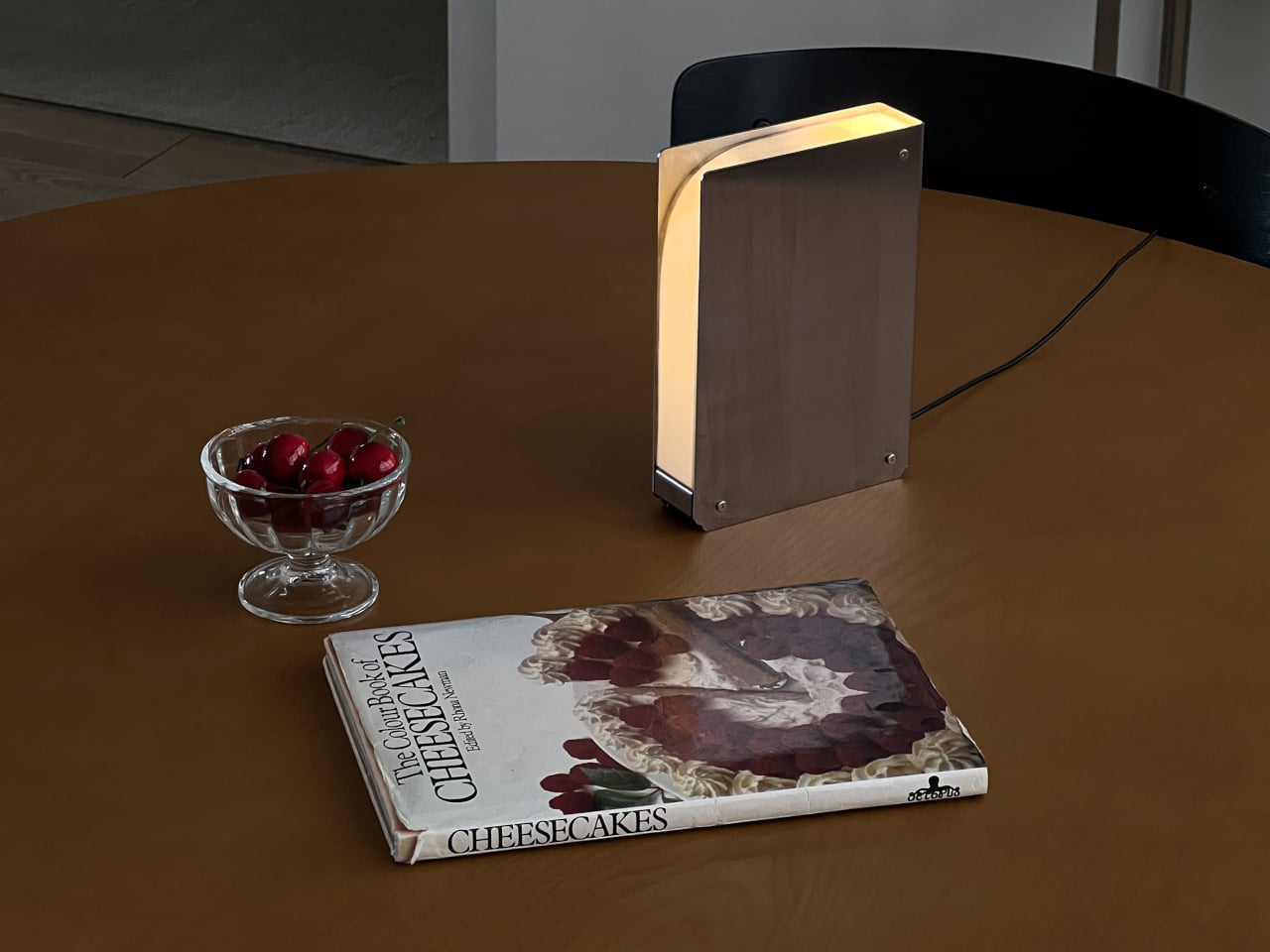
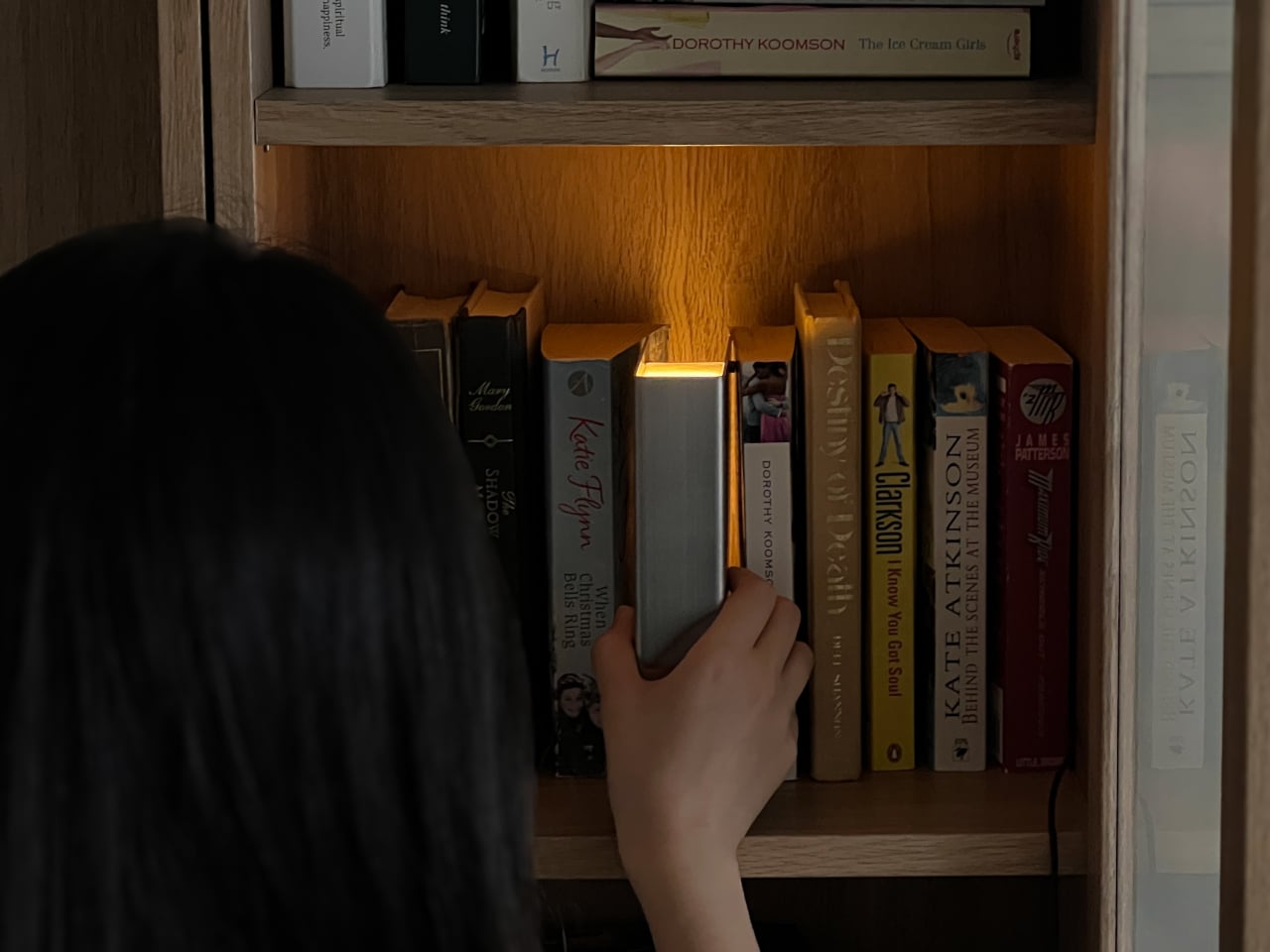
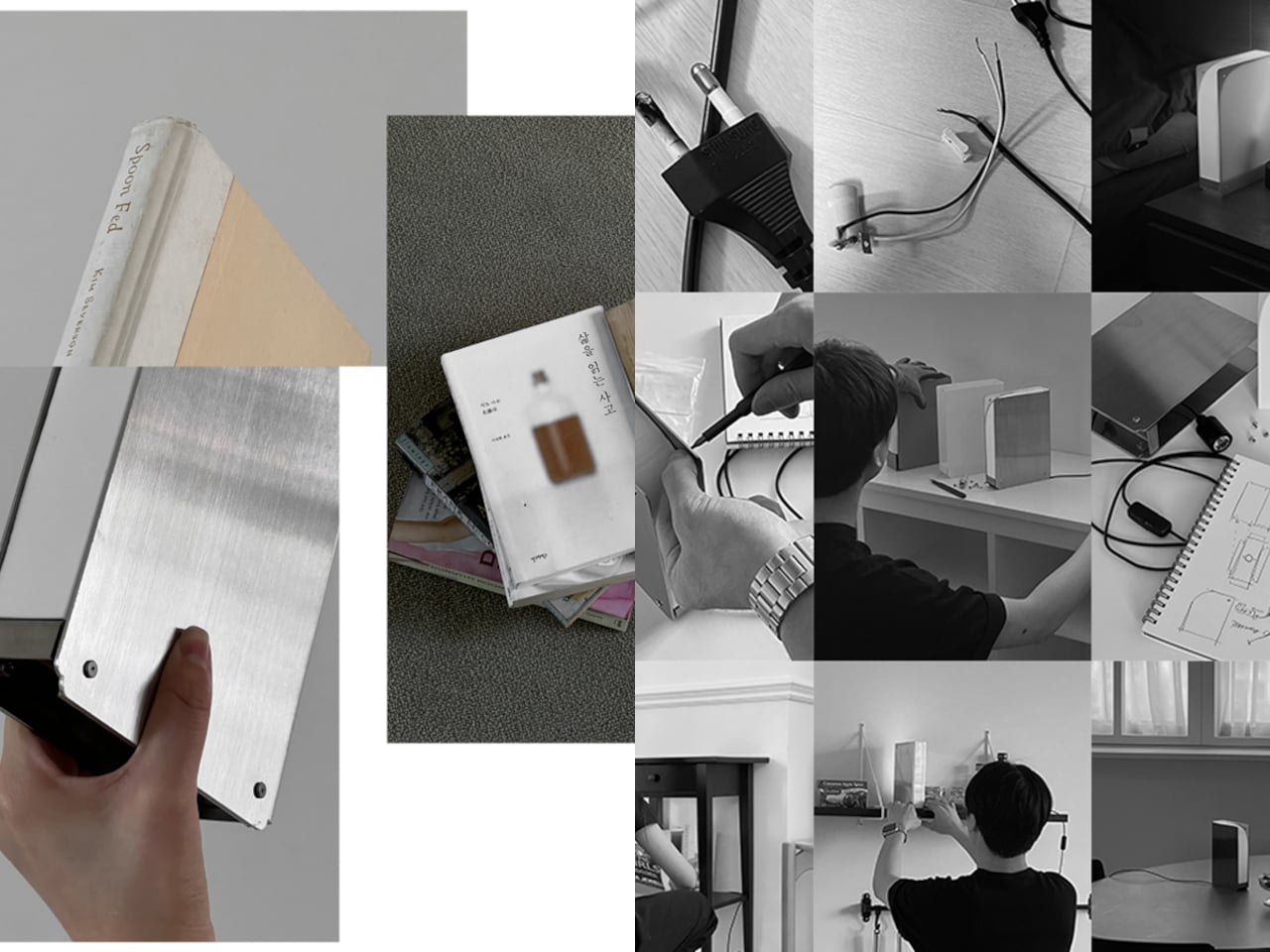
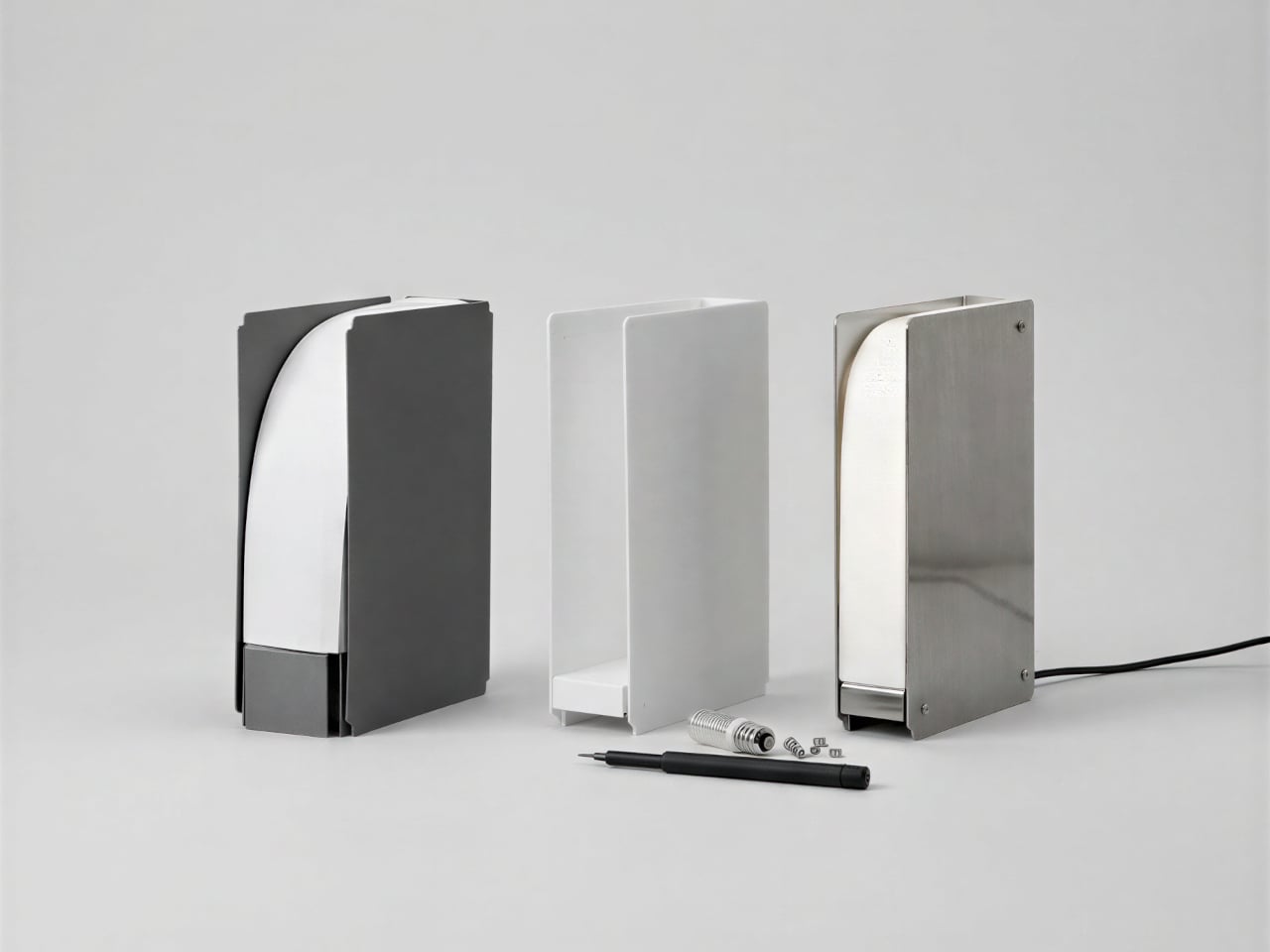
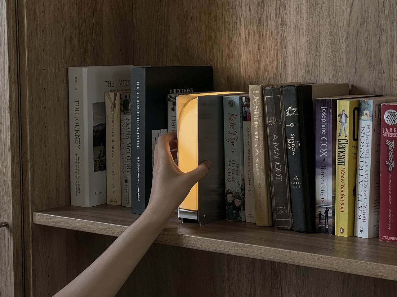
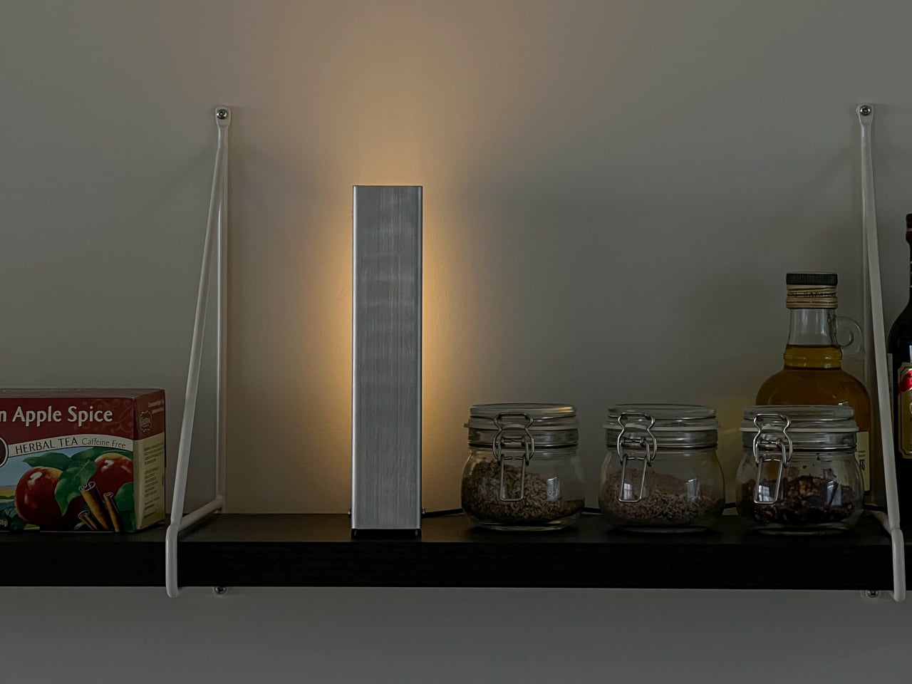
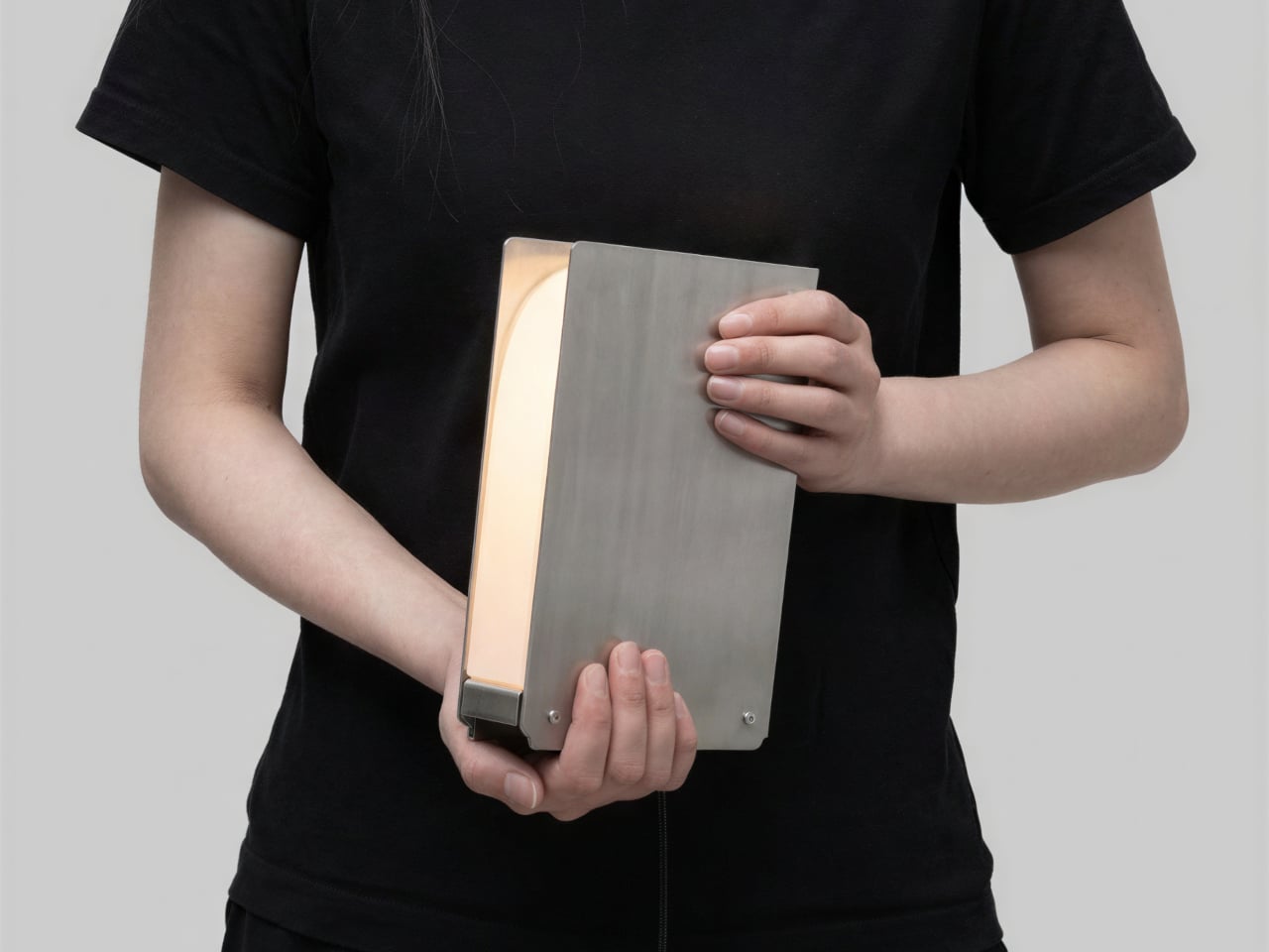
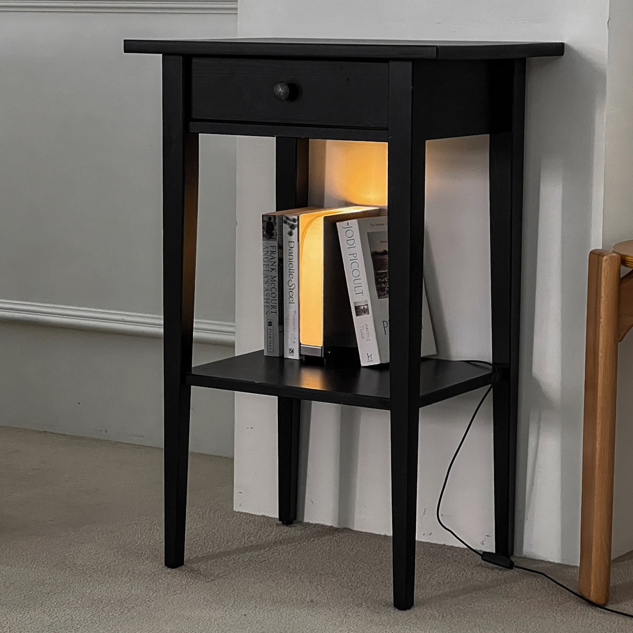
That’s the gap Eunsu Lee fills with Folio, a lamp concept that looks exactly like a book and lives exactly where books do. The idea starts from a simple question: if books give us light metaphorically, why shouldn’t that light be given back physically? The answer is a stainless steel lamp sized to stand upright between volumes on a shelf, glowing warmly from between two flat metal panels.

Designer: Eunsu Lee

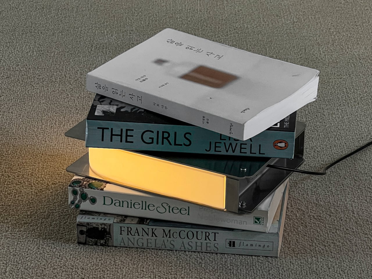
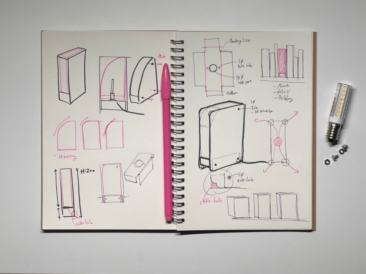
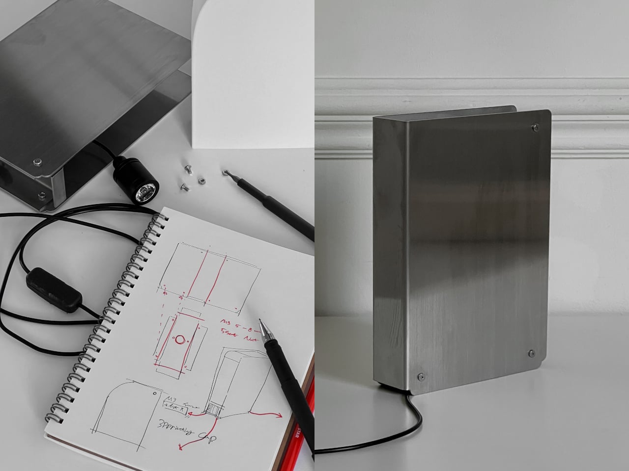
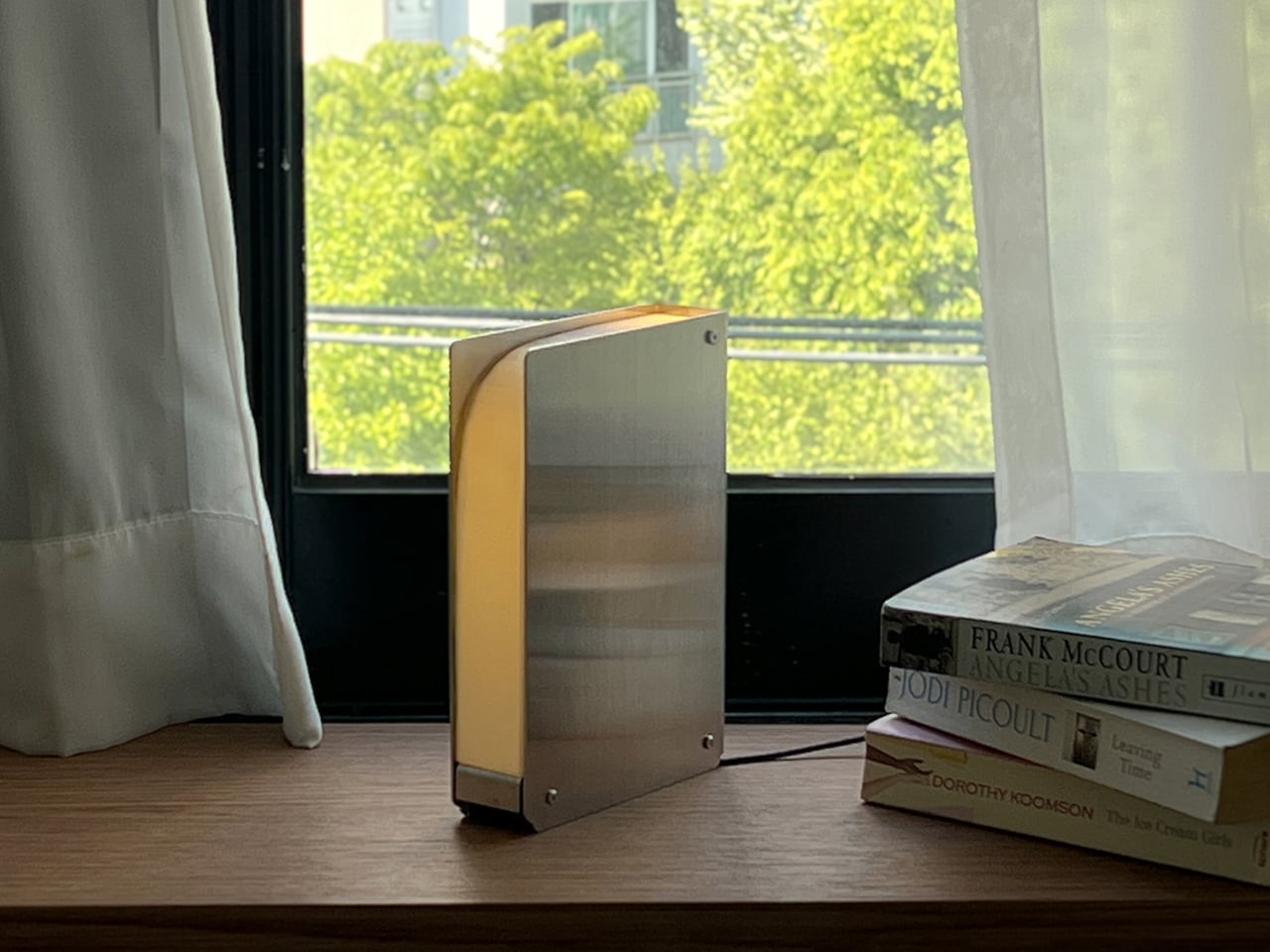
The form is deliberately stripped down to its most recognizable elements: a rectangle, a spine, a gap. Two stainless steel panels form the covers, with a 3D-printed cap sitting between them to house the LED pin lamp. The LED targets the cap directly without a socket, letting the whole spine glow evenly. The warm amber light it produces is the kind that’s easy to stay beside for hours.

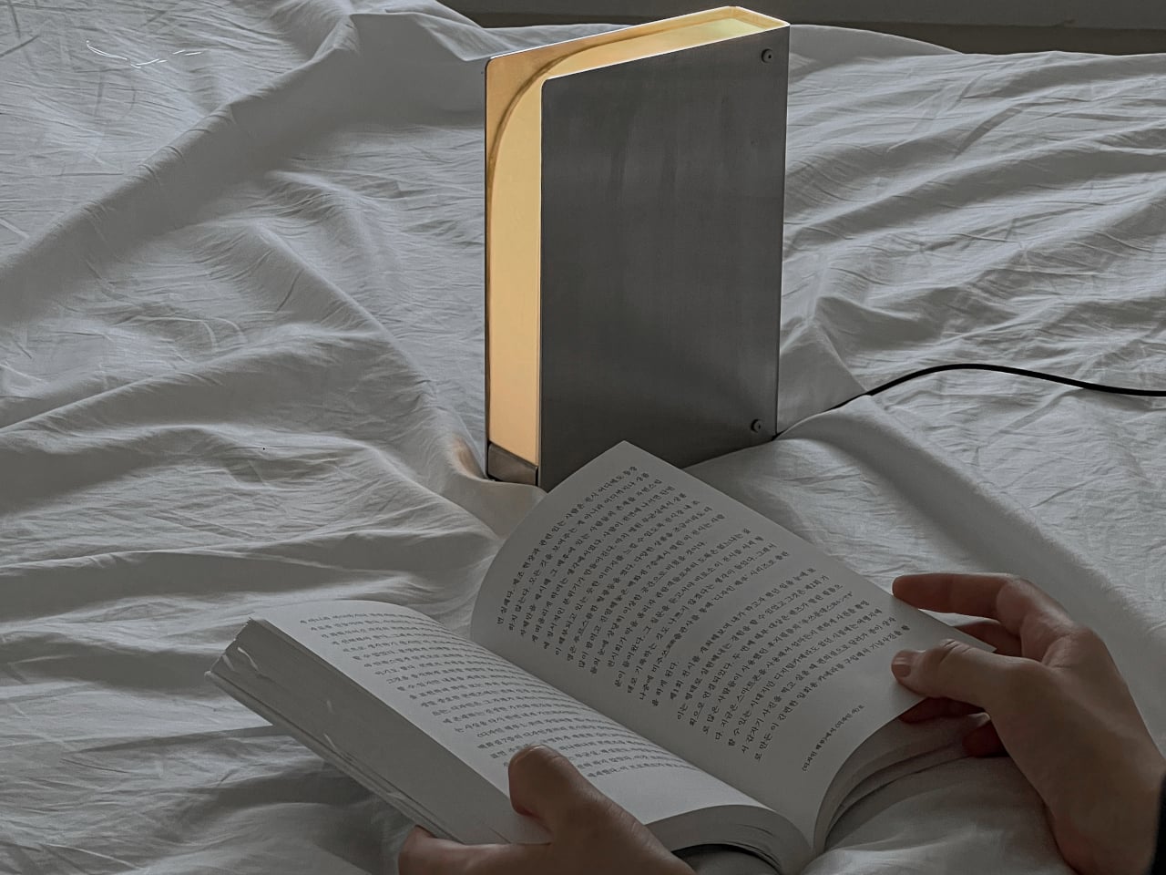
The gap at the base has a more interesting purpose than it might seem. Depending on which way you face the lamp, the character of the light changes entirely. Facing forward, it casts direct light for reading or task work. Turned around, it becomes a soft ambient source, washing the wall behind it. One rotation is all it takes to go from a focused reading lamp to a mood light.

What makes Folio particularly clever is how well it disappears into its surroundings. Slide it onto a bookshelf between a few paperbacks, and it reads as just another volume until it’s on. Set it on a bedside table, and it’s the right size, the right warmth, and exactly dim enough not to disturb anyone who’s already asleep while you finish the last few pages of a chapter.

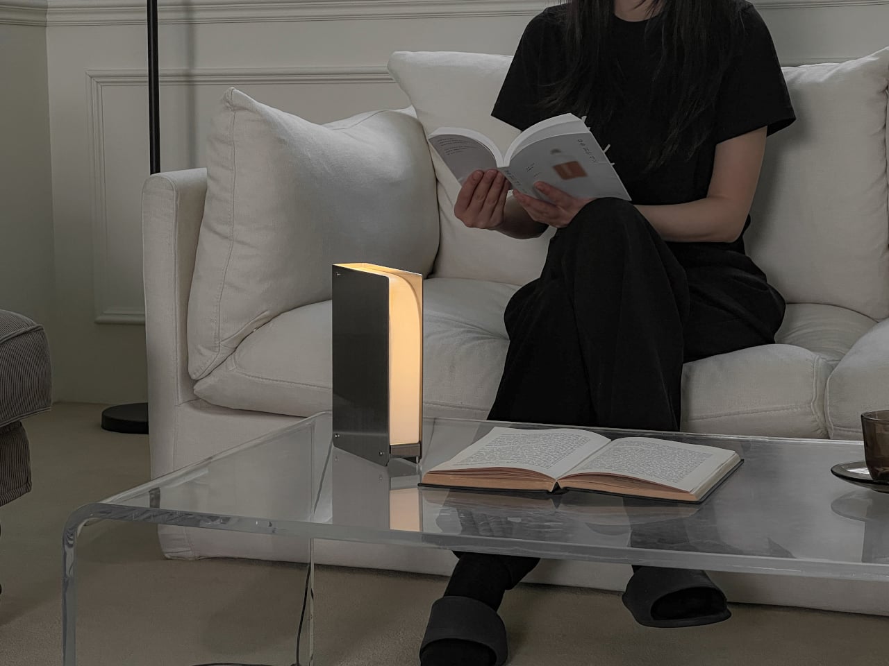
It works just as well away from the bedroom. On a coffee table, it casts enough light to read by on a sofa without flooding the whole room. On a kitchen shelf, it turns into accent lighting for a corner that usually doesn’t get any. The compact footprint and book-like proportions mean it doesn’t claim much space or demand much attention when it’s not the focus.

The construction behind Folio is deliberately minimal. Lee relied on stainless steel bending for the body and 3D printing for the cap, skipping the need for molds and keeping production straightforward for small batches. The light color is warm, calibrated for the hours around sleep, dim enough to rest beside and bright enough to actually read by. It’s the kind of balance most lamps never quite get right, and it makes you wonder why no one made a lamp that lives on a bookshelf before.

The post This Lamp Finally Belongs on a Bookshelf Because It Looks Like a Book first appeared on Yanko Design.

This 3D-Printed Lamp Has a Shell That Opens and Closes to Shape Light

The 3D printing community has spent years trying to prove that a printer can produce more than desk trinkets and cable organizers. Lighting has always been the harder sell, where aesthetics and function have to work together in ways that cheap plastic usually undermines. The better designers in that space have been quietly closing that gap, and the results are starting to look like things you’d want to live with.

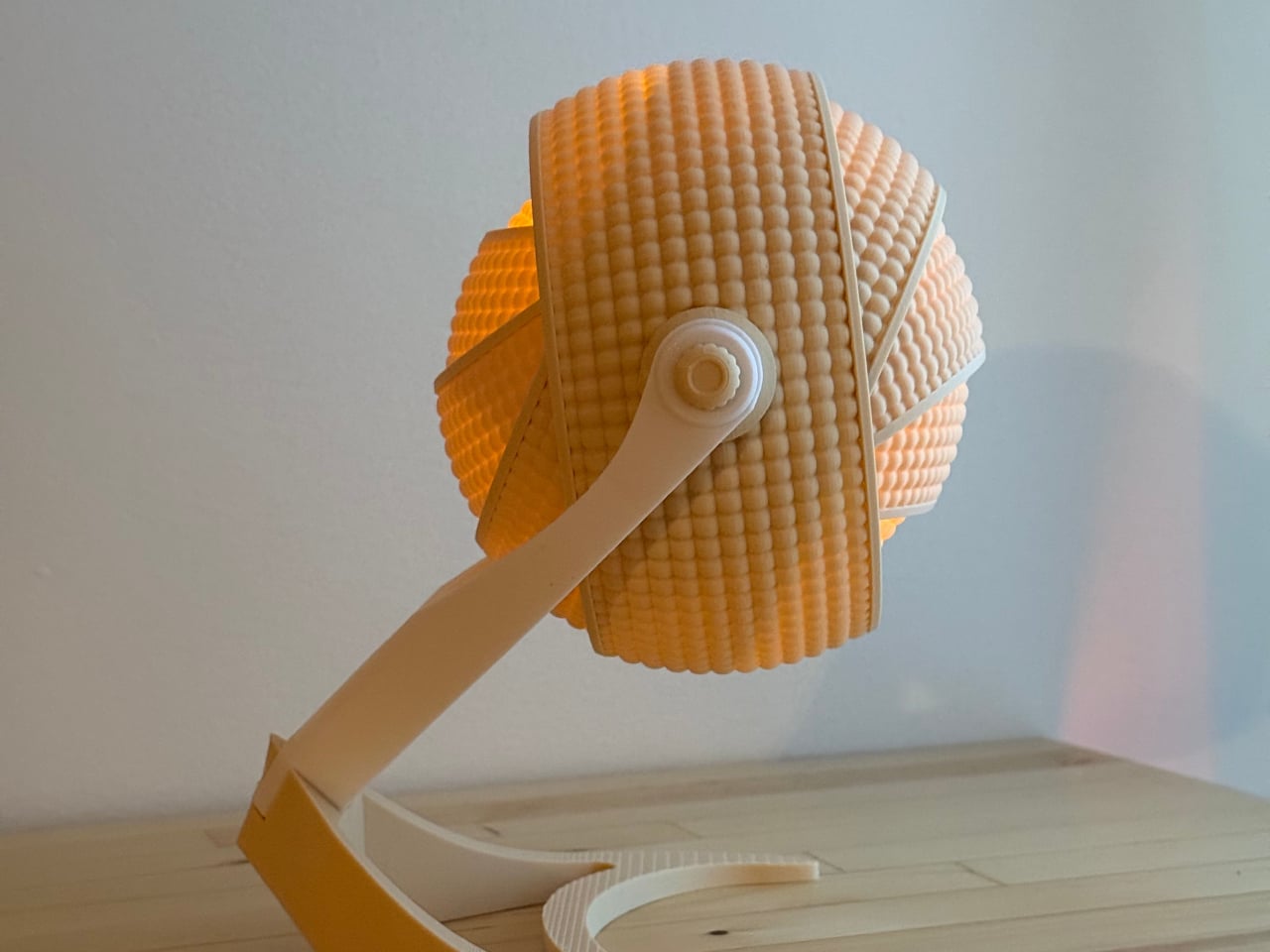
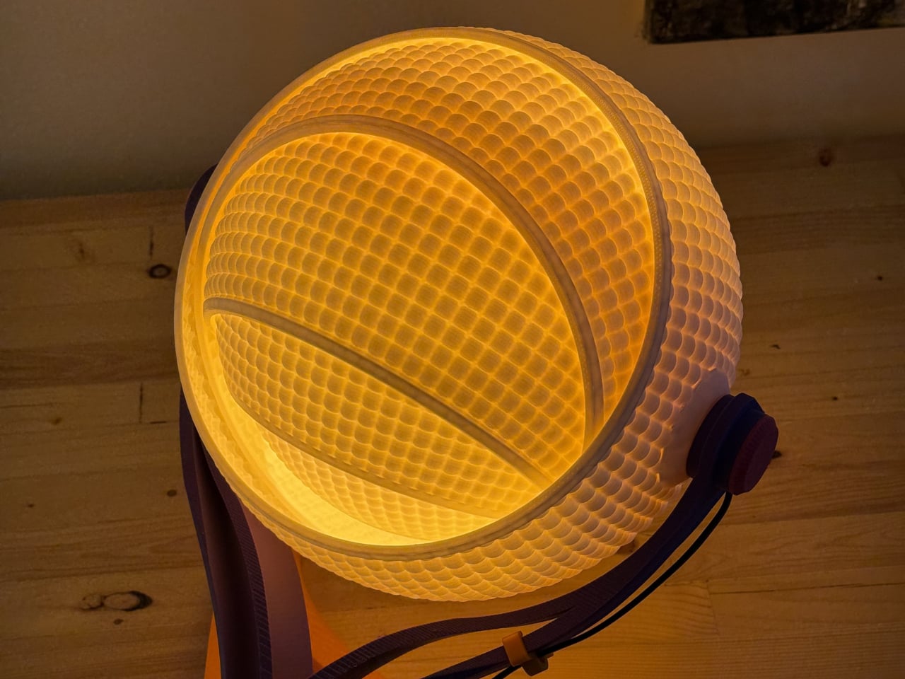
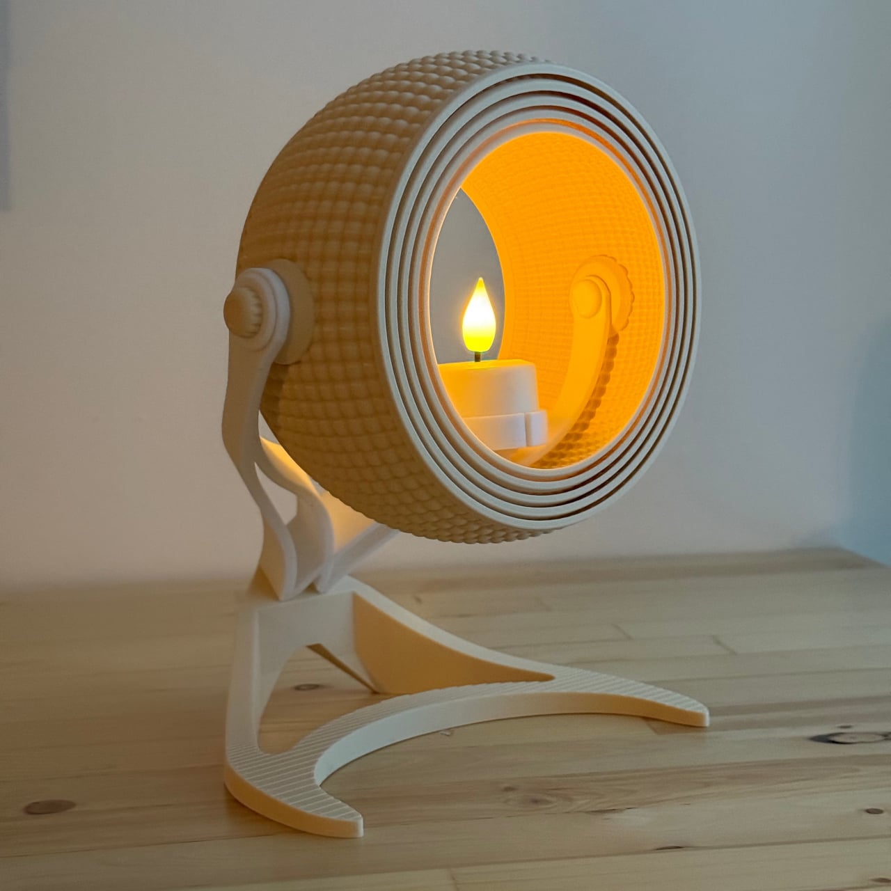
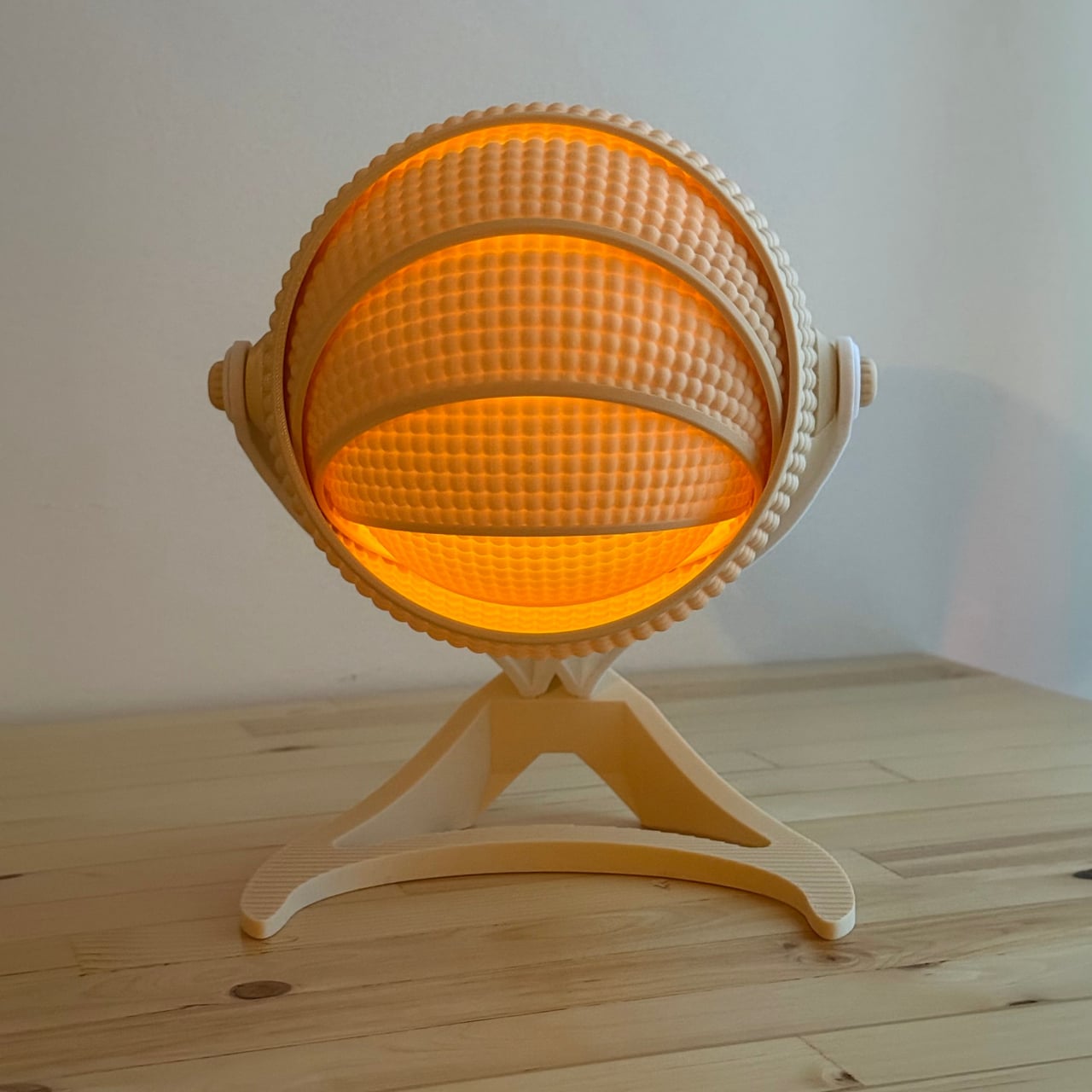
OHR Design, a Canadian 3D printing studio, is a good example of what that progress looks like. Its Armadillo series takes inspiration from one of nature’s most recognizable shapes, the segmented, overlapping bands of the armadillo shell, and turns it into a lamp shade that adjusts depending on how much, or how little, light you want in a room. And it all started from a tea light holder.

Designer: OHR Design

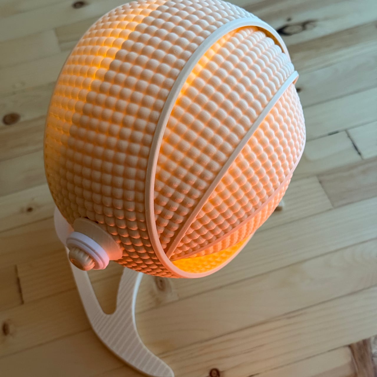
The original Armadillo grew from an earlier OHR Design called the OHRB, and it’s since inspired a whole family of spin-offs. True to its origins, the Armadillo wraps a tea light in a series of concentric rings that tilt forward to close the shade down or pull back to widen it. At 240mm tall, it’s compact enough for a bedside table or a bookshelf without demanding much real estate.

For those who want the same aesthetic energy at a bigger scale, the Armadillo XL scales the concept up into a proper desk lamp. At 373.8mm tall and 283.9mm wide, it makes a statement on a desk without being overwhelming. It accepts a real light bulb rather than a tea light, making it far more practical for anyone who actually needs their lamp to pull its weight.

What gives both versions their character is the adjustable ring system. The segmented shade isn’t just decorative; opening and closing the rings changes how the light spreads through the room, softening the glow when the rings are fully open or concentrating it when they’re pulled shut. It’s the kind of thing that turns a simple on/off appliance into something you keep reaching over to tweak.

What’s equally interesting is how OHR Design sells these. You aren’t buying a finished lamp; you’re buying the STL files to print one yourself. The original Armadillo fits on a 180mm × 180mm print bed, making it accessible on smaller machines like the Prusa Mini or Bambu Lab A1 Mini. The Armadillo XL, being larger, requires a 256mm × 256mm build volume.

The filament choice is entirely yours, which means the lamp can be as neutral or as bold as you want. OHR Design has been spotted using Overture’s Super PLA+ in various colors, from muted naturals to vivid hues, all of which change how the diffused light reads. Not many lamps invite you to physically shape the light they cast, and fewer still can be reimagined entirely based on the color spool you have on hand. The Armadillo family puts creative control squarely in the hands of whoever prints it, and that’s a genuinely refreshing place to land.

The post This 3D-Printed Lamp Has a Shell That Opens and Closes to Shape Light first appeared on Yanko Design.

A Copper-Wax Lamp Revives a Slovak Forge and Glows Like Stained Glass

Industrial heritage sites have a way of disappearing quietly. The machinery goes silent, the workers move on, and the buildings either get repurposed or left to rust. What rarely survives is the craft knowledge, the particular way a community understood and worked a material. Slovakia’s copper-processing history is one of those stories, rooted in a small central region that once hummed with the sounds of metalwork and fire.

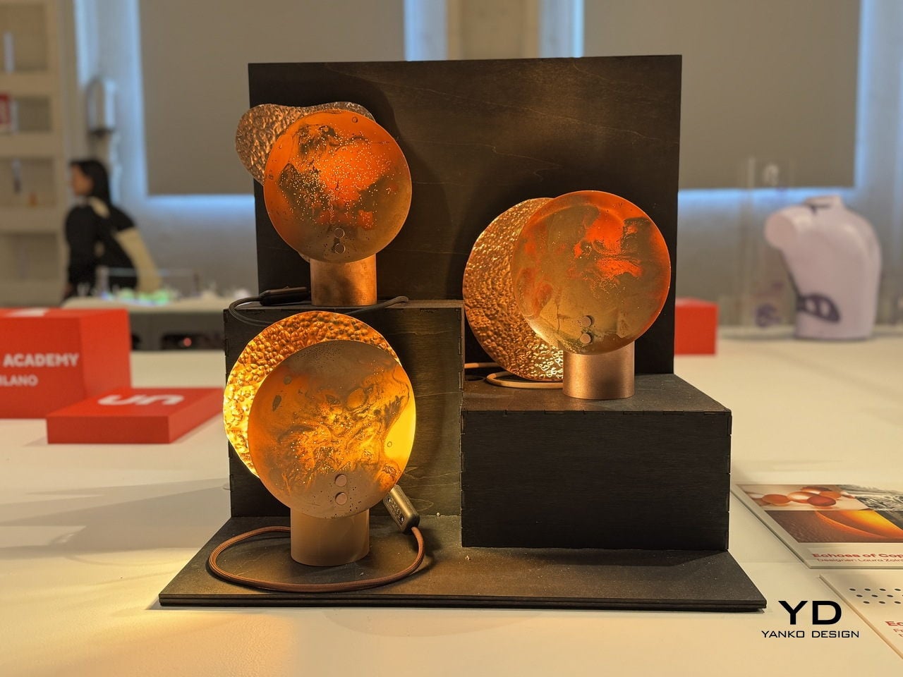
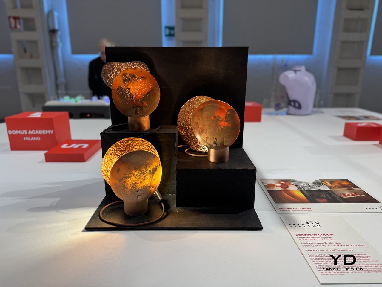
That’s the history Laura Zolnianska, a student at the Slovak University of Technology’s Faculty of Architecture and Design, decided to pull back into the present. Exhibited at BASE Milano as part of the 2026 Fuorisalone UNFOLD showcase, Echoes of Copper is a lamp collection drawing from the copper-processing traditions of Medený Hamor in central Slovakia, combining them with digital fabrication and an entirely experimental material of her own development.

Designer: Laura Zolnianska (Slovak University of Technology, Faculty of Architecture and Design)

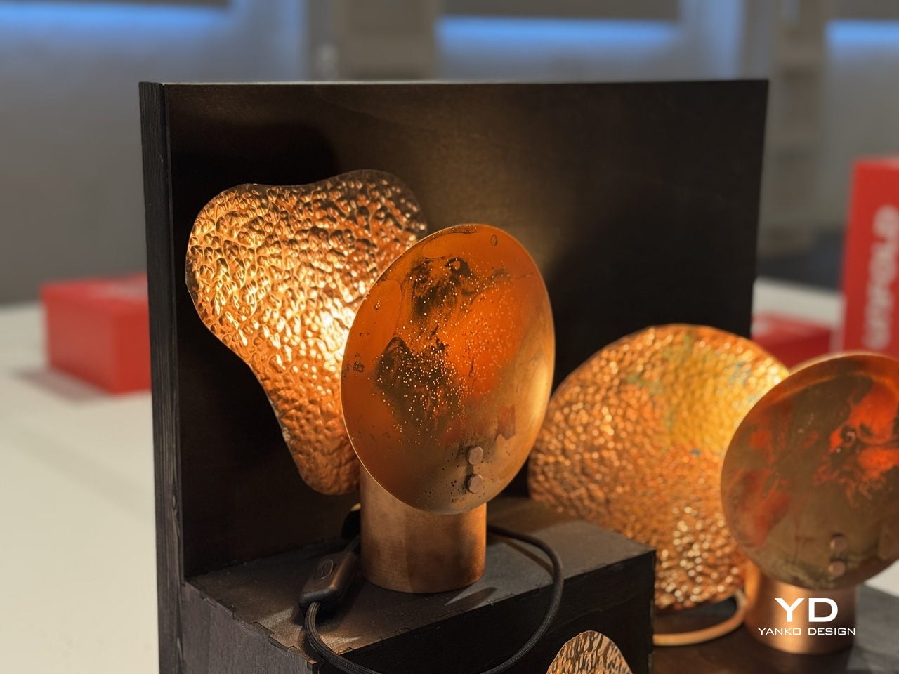
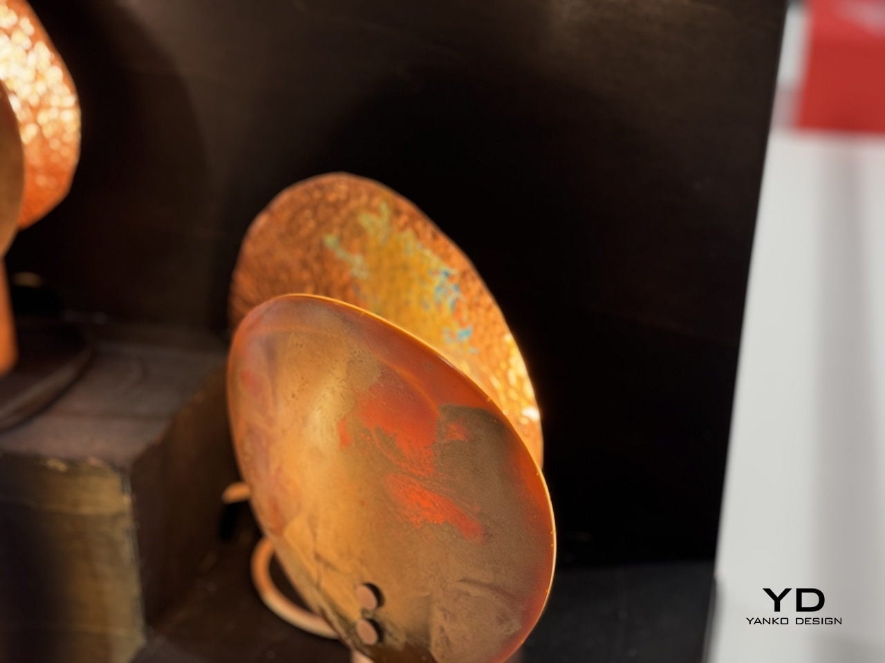
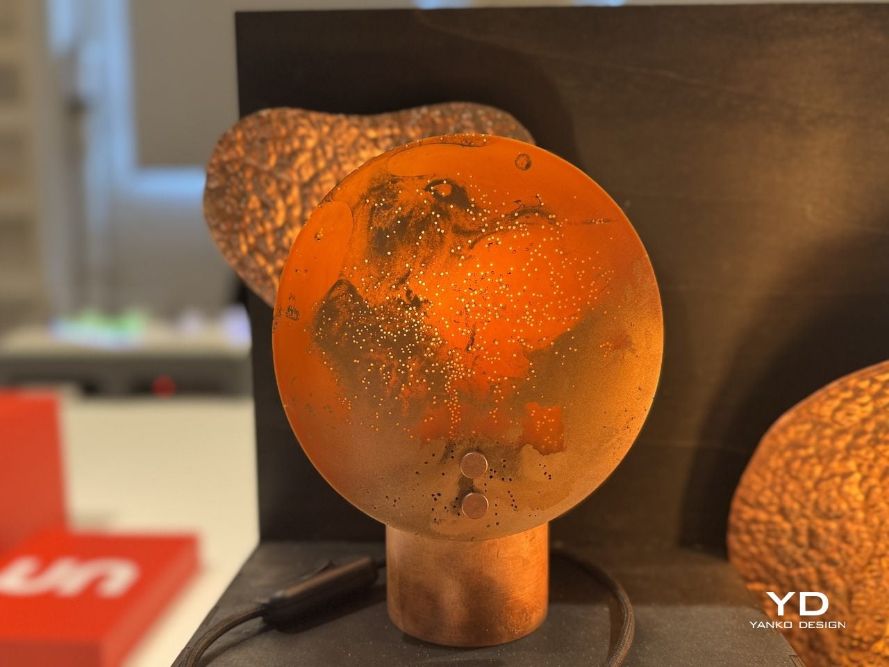
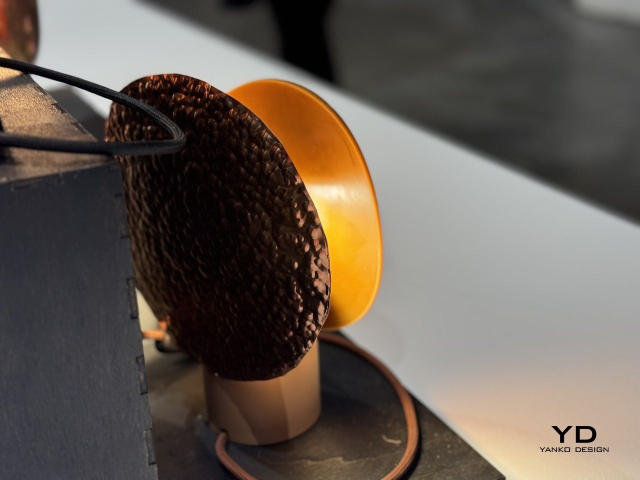
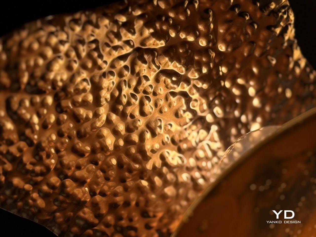
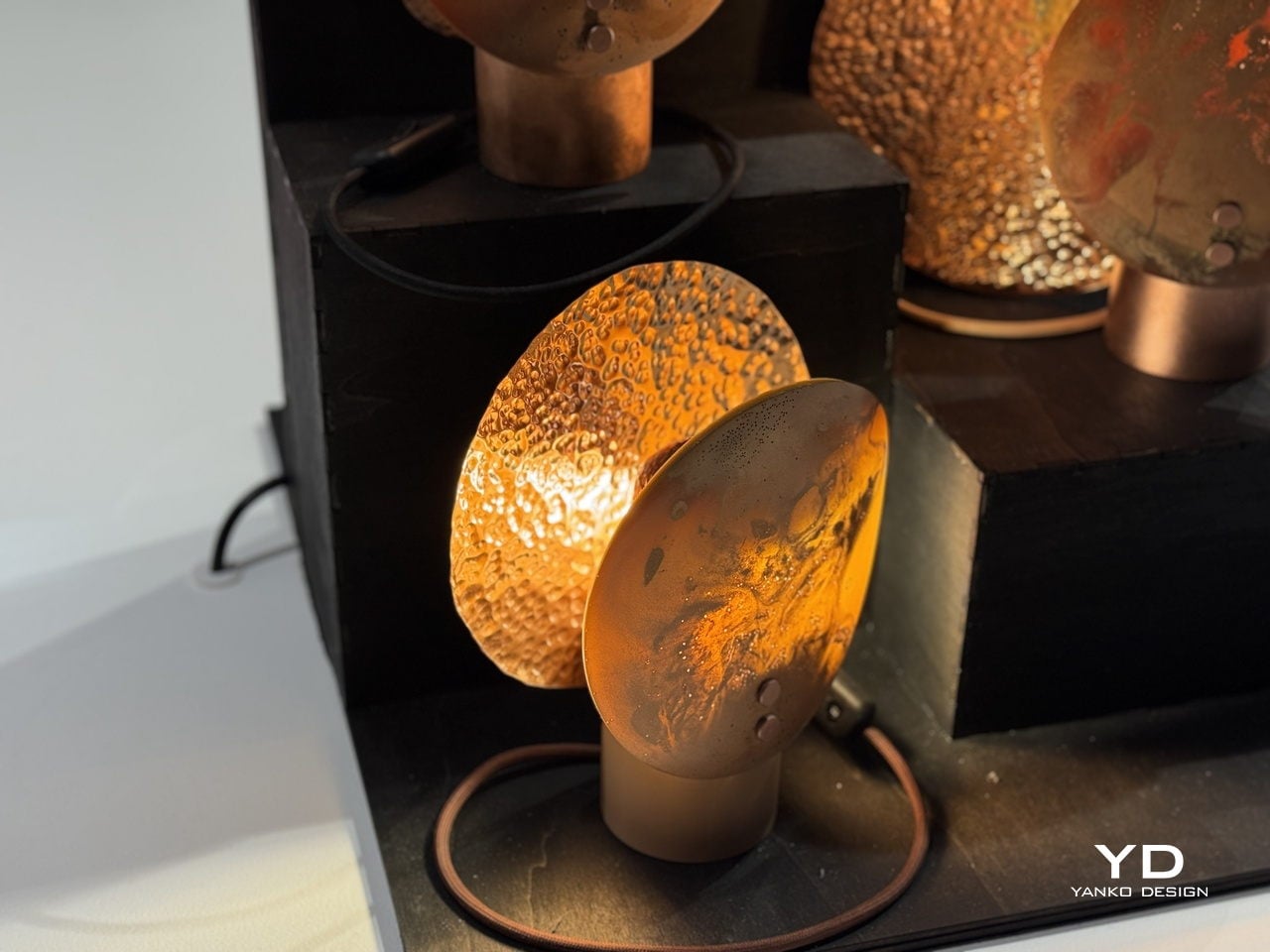
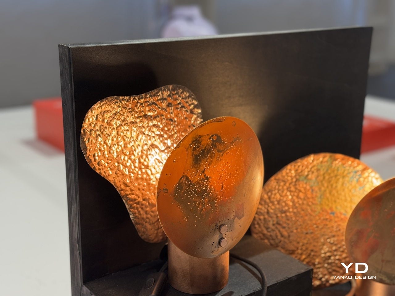
The material is the most interesting part. Zolnianska created a copper-wax composite that forms the shades, a substance that behaves differently every time it’s worked. Some shades come out smooth and disc-like, with swirling oxidation patterns that look almost planetary when lit. Others emerge heavily textured and volcanic, their deeply pitted surfaces catching and scattering light in ways that can’t be planned or predicted. No two pieces are the same.

Each lamp sits on a polished copper cylinder base with a matching copper-toned cord. When lit, the shades glow a deep amber orange, with translucent sections illuminating like stained glass while the denser, hammered areas cast dramatic, irregular shadows. The warmth of the light feels almost geological, as if it’s being filtered through something that took centuries to form rather than a material coaxed into shape in a studio.

The project isn’t purely a lighting exercise, though. Zolnianska designed Echoes of Copper around a workshop model where participants can create their own version of the lamp at the former Medený Hamor site itself. The idea is to bring people back to a place of faded industrial significance and give them a hands-on connection to the craft traditions that once defined their community.

Medený Hamor, which translates roughly to “Copper Hammer,” was a copper-processing site in central Slovakia’s Banská Štiavnica region, an area with a centuries-old metallurgical history. Using that heritage as a creative prompt rather than a museum exhibit is itself a meaningful design decision. Of course, craft doesn’t have to end up behind glass to be preserved; sometimes it ends up glowing amber on someone’s bedside table.

Echoes of Copper was exhibited at BASE Milano during Milan Design Week 2026 as part of UNFOLD, a student showcase bringing together emerging designers from institutions across Europe. It’s the kind of project that deserves more attention than student exhibitions typically get. Zolnianska didn’t just make a lamp; she made an argument that industrial communities don’t have to lose their identity to time.

The post A Copper-Wax Lamp Revives a Slovak Forge and Glows Like Stained Glass first appeared on Yanko Design.

These Marble Lamps Look Like They Were Literally Dipped in Light

There’s a quiet exhaustion in modern lighting design. Too many fixtures make a statement at the expense of the light itself, and too many others disappear so thoroughly into the background that they bring nothing to the room. The ones that manage to be genuinely beautiful objects while still doing their job well are rare enough to stop and look at twice.

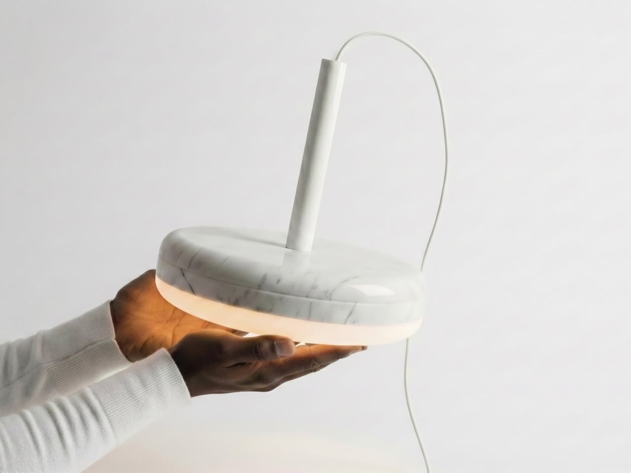
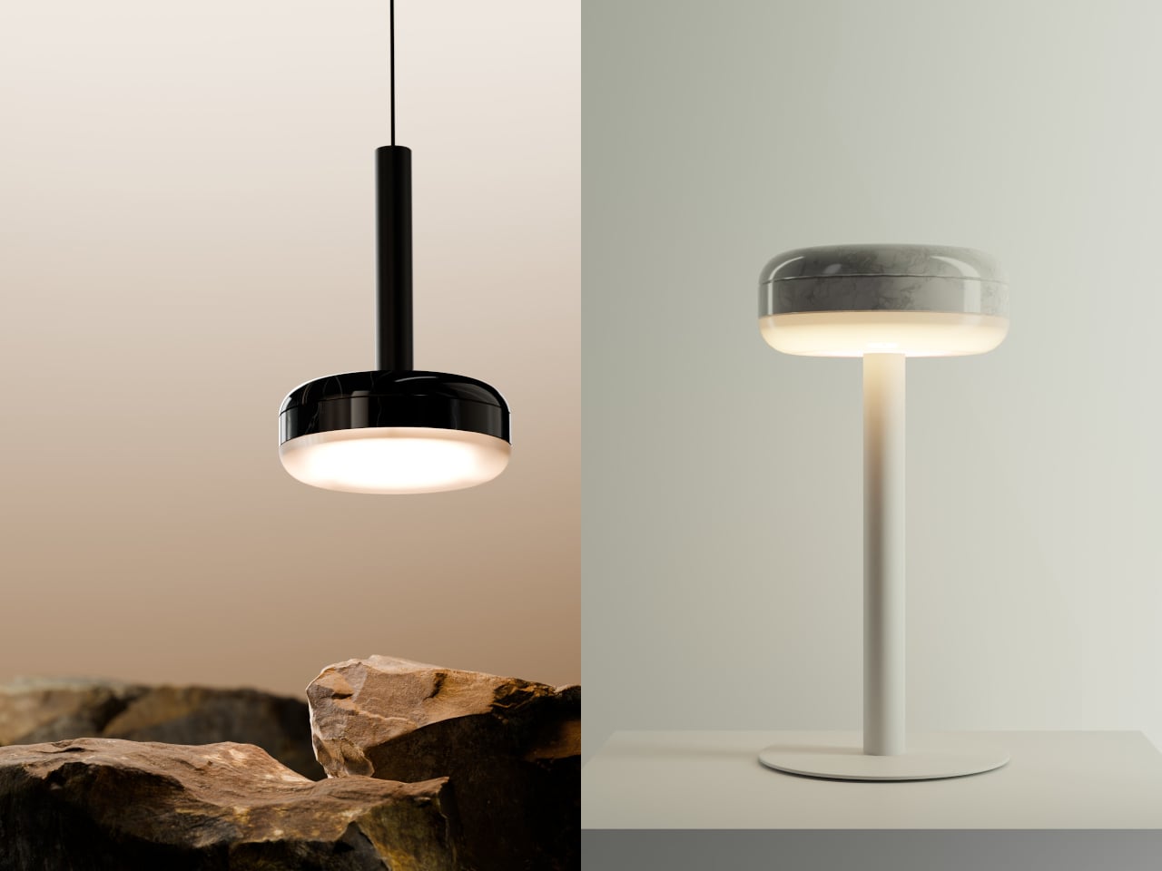
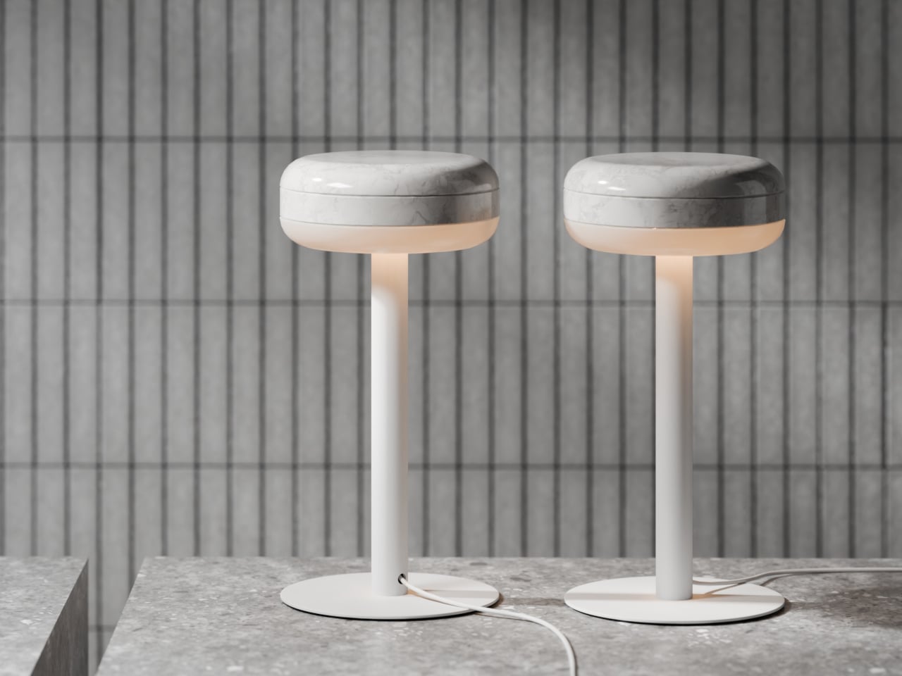
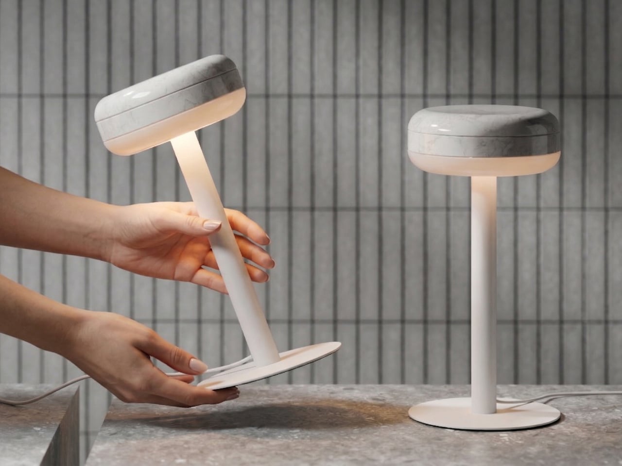
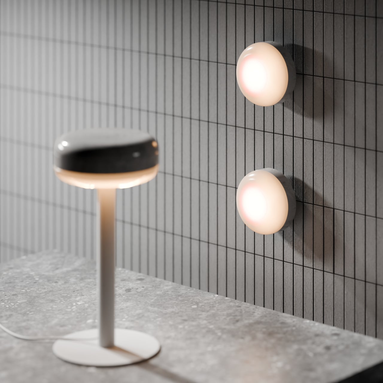
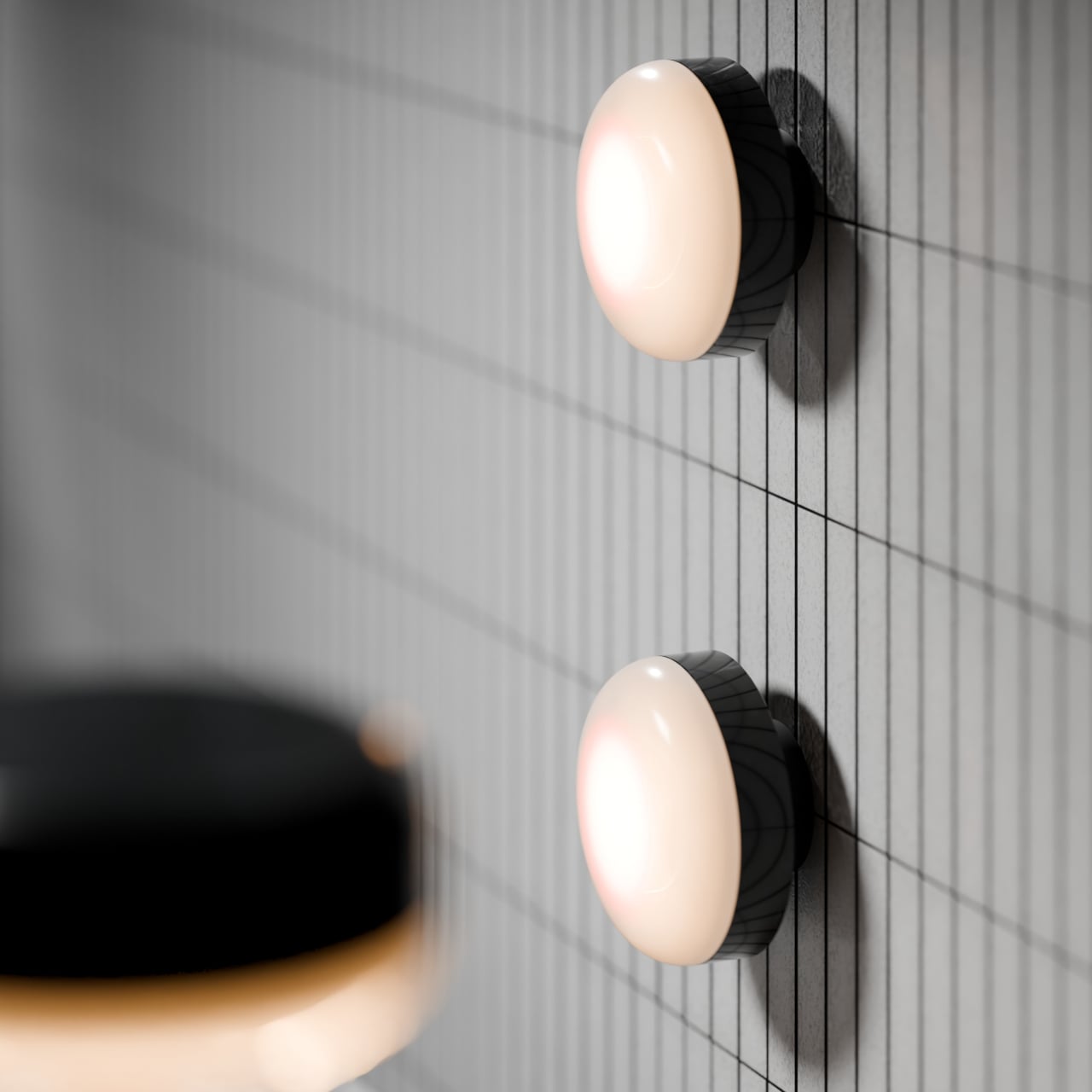
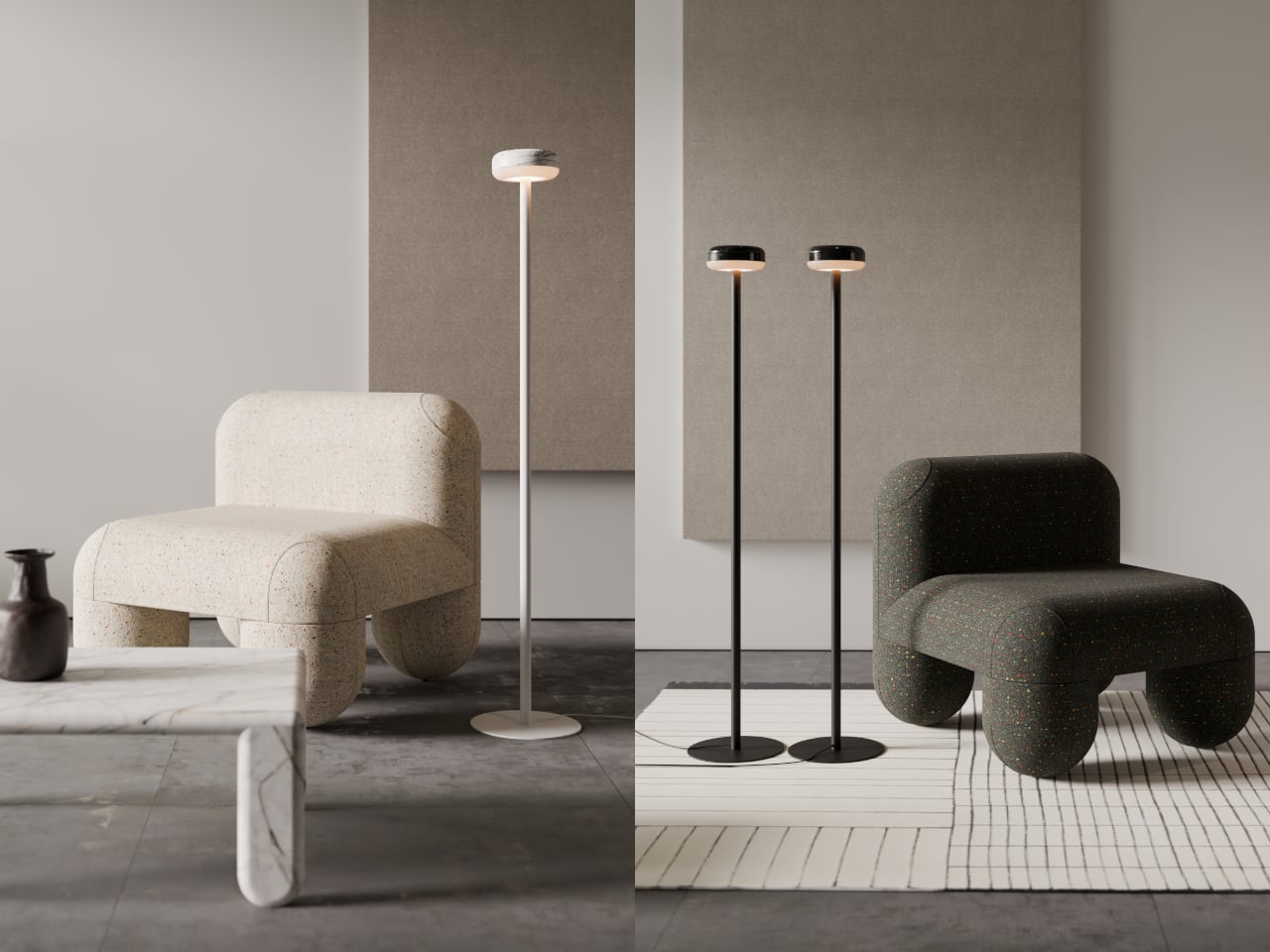
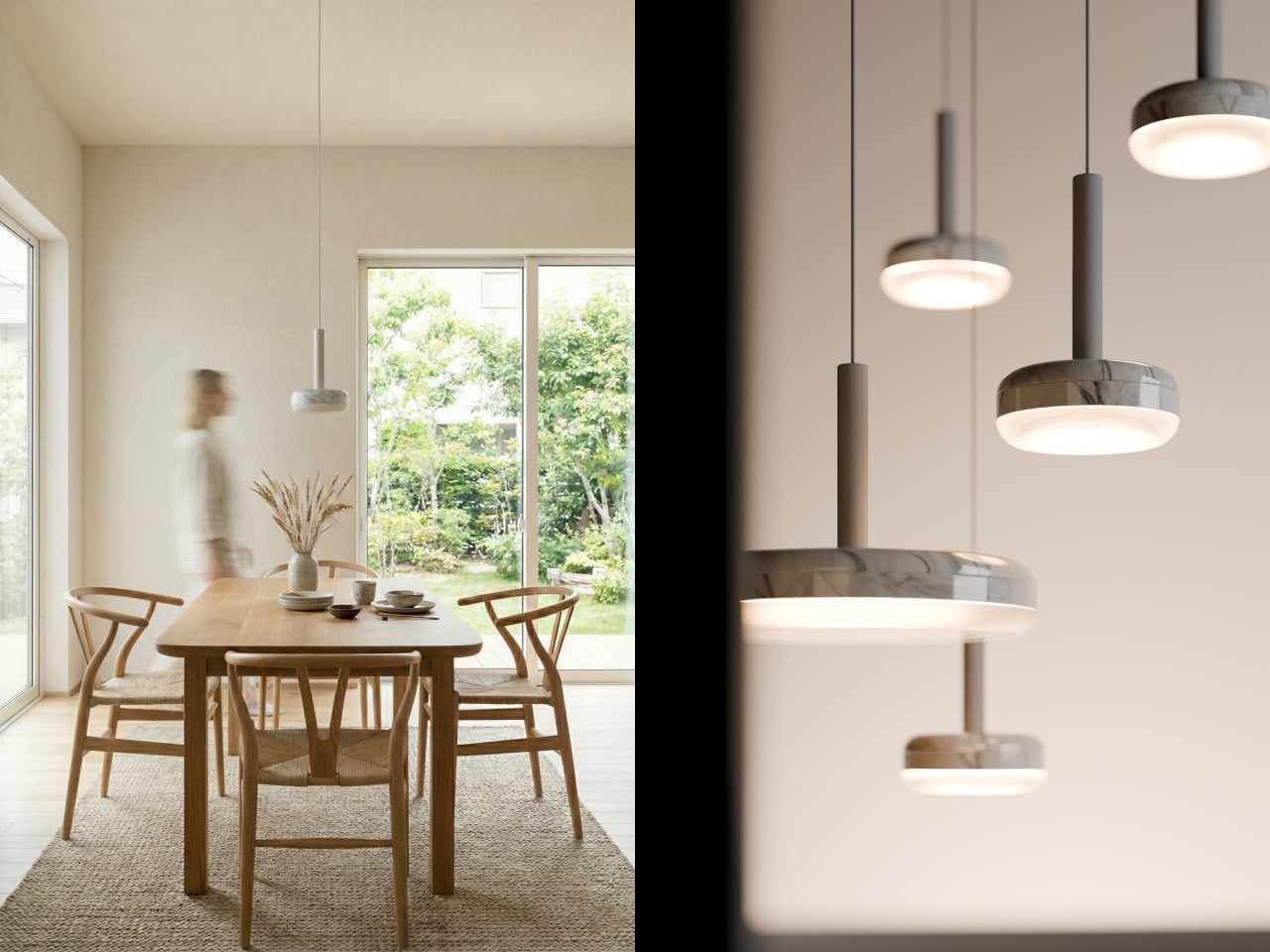
The DIP lighting collection, designed by Denys Sokolov for deday, sits comfortably in that rare middle. The central idea is simple and visual: a marble disc that appears to have been dipped in light, absorbing just enough of a warm glow to carry it back out. It’s a lamp that earns attention as a decorative object long before anyone switches it on.

Designer: Denys Sokolov

The name itself tells you what Sokolov was after. Rather than treating the stone as decoration or the light as the point, the idea positions both materials as equal contributors to a single, quiet gesture. A disc of marble that carries a glow in its belly, as if it spent some time in contact with something luminous, and the evidence hasn’t fully faded yet.

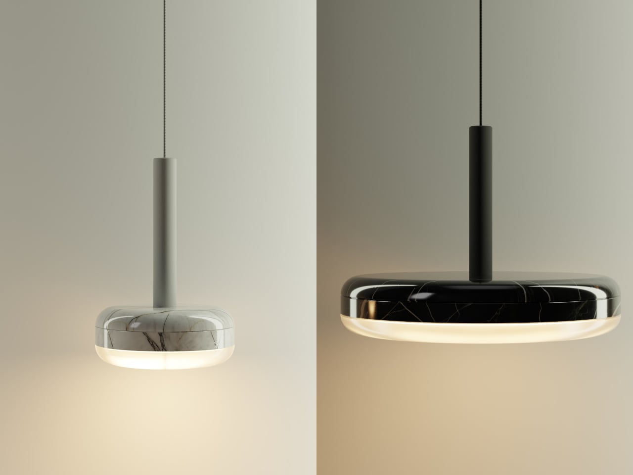
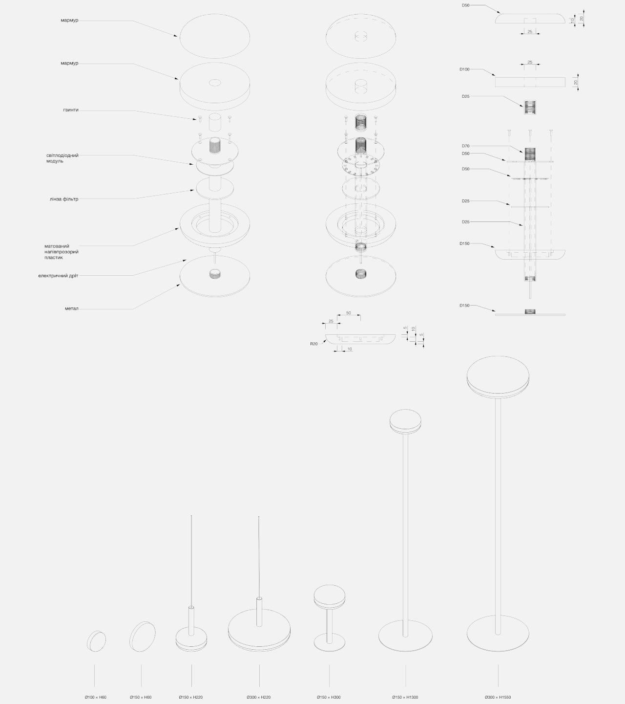
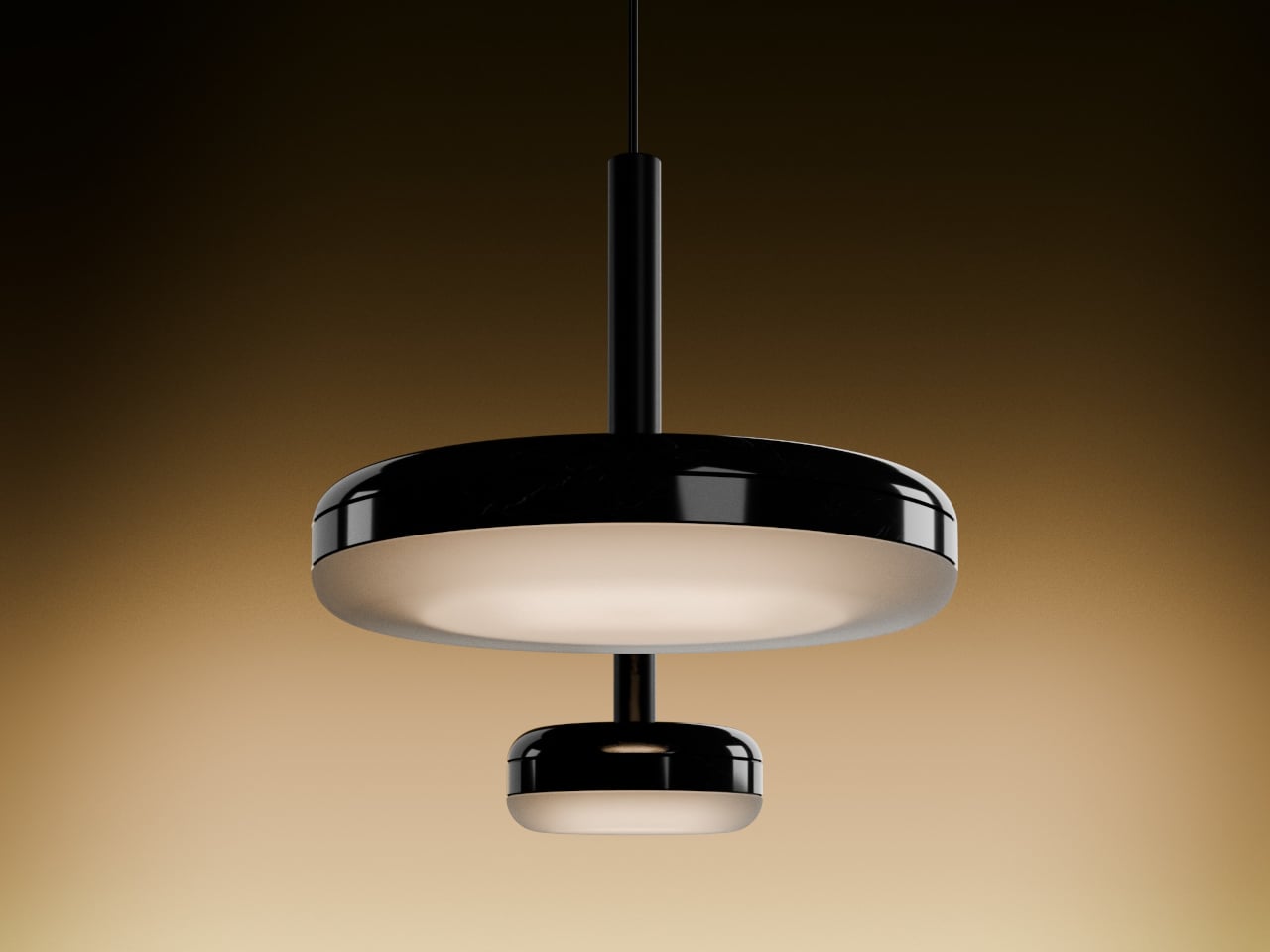
What makes the collection work beyond aesthetics is how carefully it treats the light. At the base of each marble disc sits a semi-transparent diffuser that catches the glow before it escapes, softening it into a warm, controlled halo. The result doesn’t feel like a lamp that’s been switched on so much as one that’s quietly breathing, which is a harder effect to achieve than it sounds.

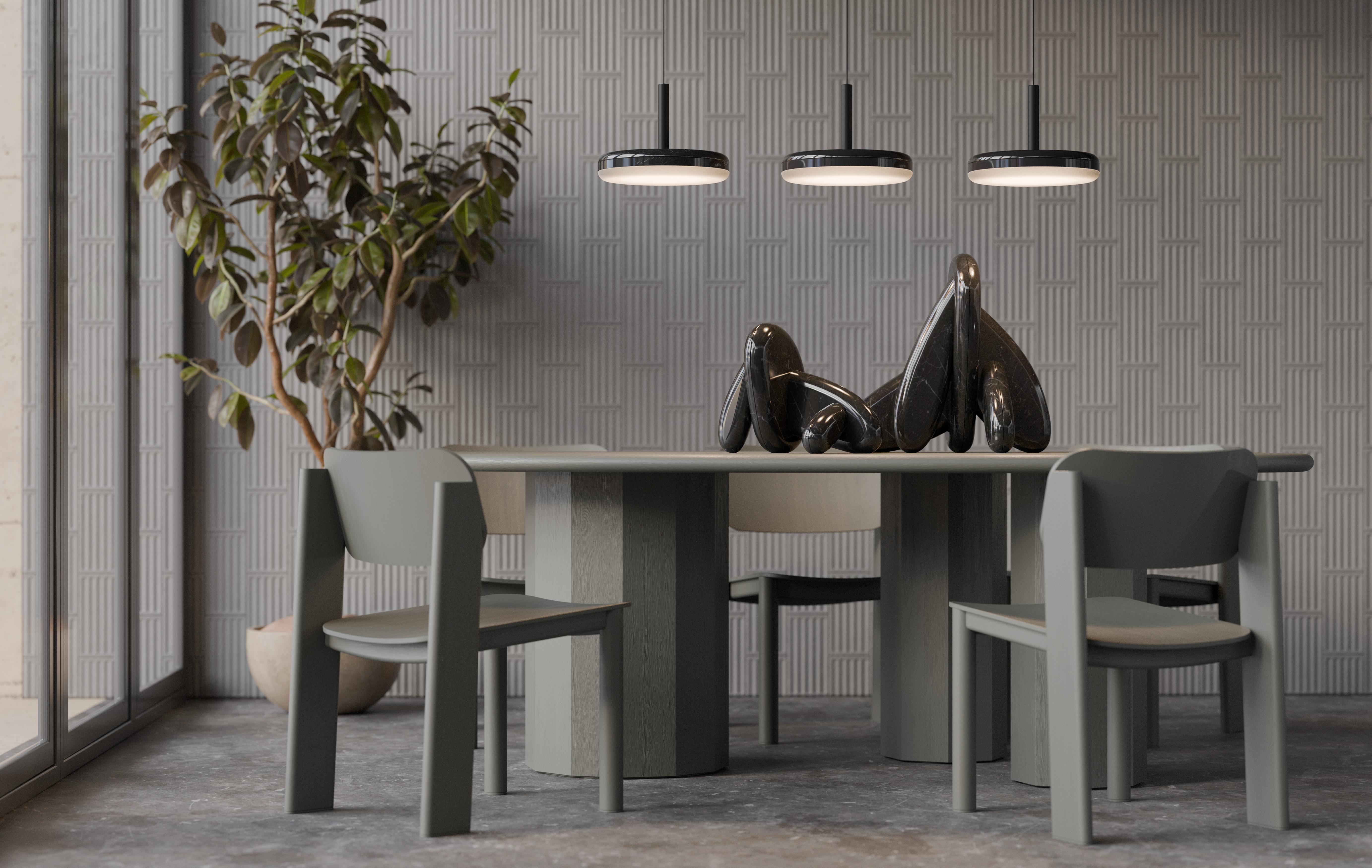
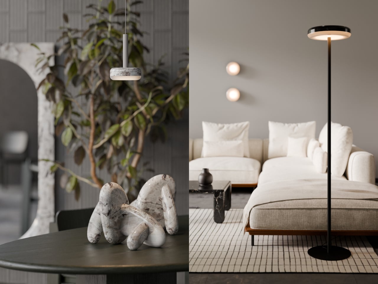
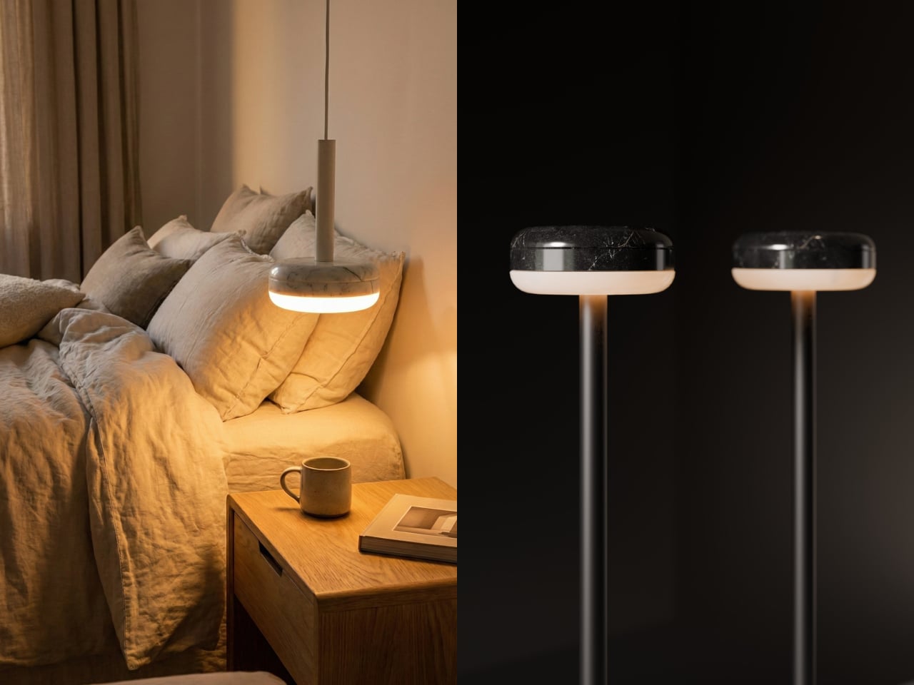
The DIP collection is designed to adapt without compromising its identity. The same disc and halo at its core translate into table lamps, floor lamps, pendants, wall sconces, and ceiling-mounted fixtures, all sharing the same quiet character. Put one over a dining table, another on a bedside surface, or mount one beside a sofa, and the result feels deliberate and composed in each setting.

The marble itself does a lot of the talking. The stone comes in lighter and darker colorways, each reacting differently to the light beneath it. The veining and texture that look merely decorative in daylight become something more layered when the lamp is on, and the contrast between the material’s weight and the gentle halo it produces is the collection’s most compelling quality.

The DIP collection fits within a design practice focused on material honesty and formal restraint. There’s no attempt to overcomplicate the object with excessive ornamentation or extra features. It’s a disc of stone that glows from its underside, and that single idea, handled with care, turns out to be more than enough.

The post These Marble Lamps Look Like They Were Literally Dipped in Light first appeared on Yanko Design.

This Lamp Gets Its Glow From a Fashionable Collar Worn 400 Years Ago

The ambient lighting market keeps growing, and yet most table lamps still work the same way they always have: they point light directly at you and call it a day. That’s fine if you’re reading, but it doesn’t do much for a room that needs to ease down in the evening. The growing appetite for softer, more atmospheric home lighting reflects a shift in how people want their spaces to feel, and it’s a gap that most conventional lamp designs haven’t quite caught up with.

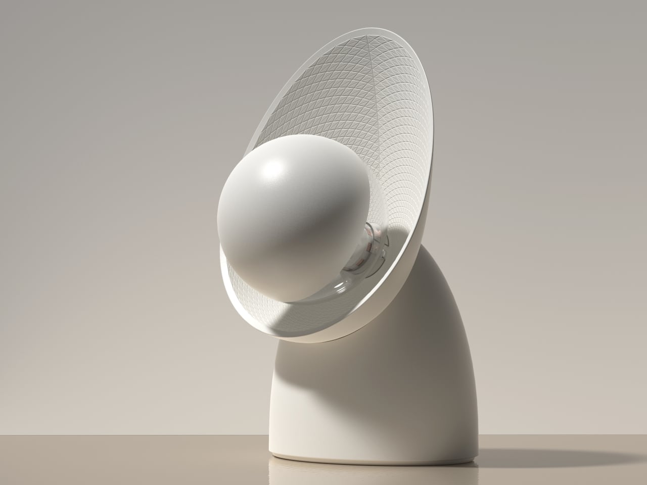
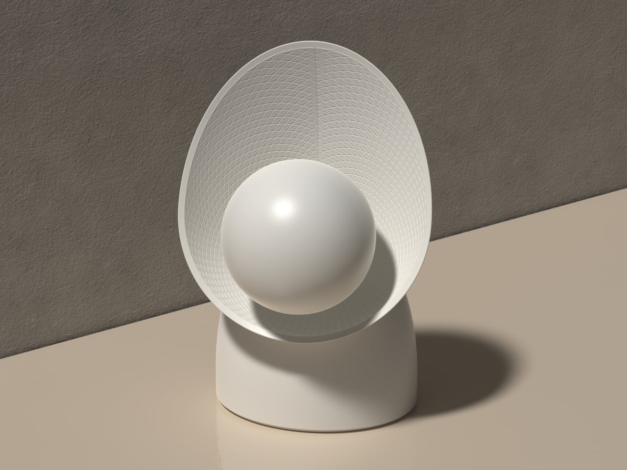
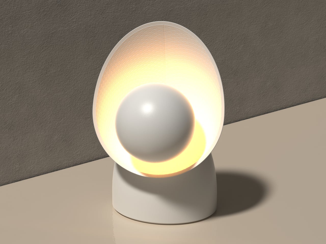
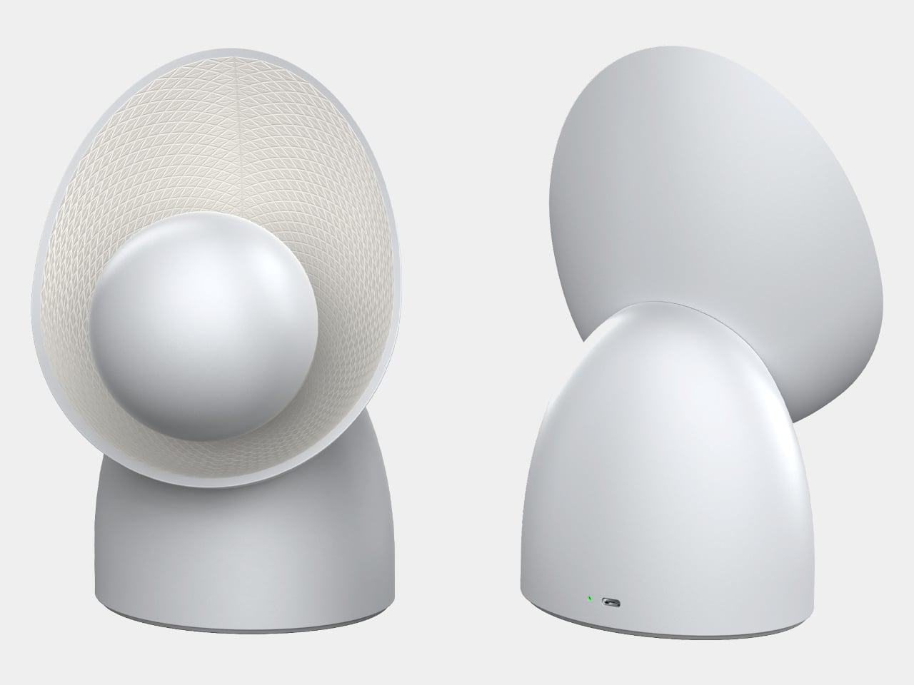
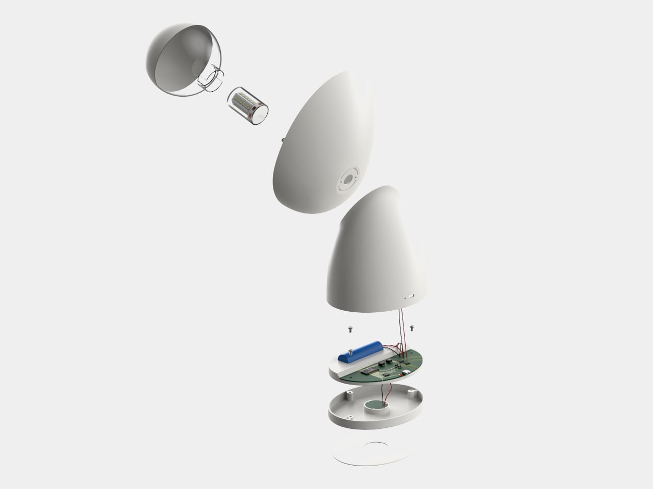
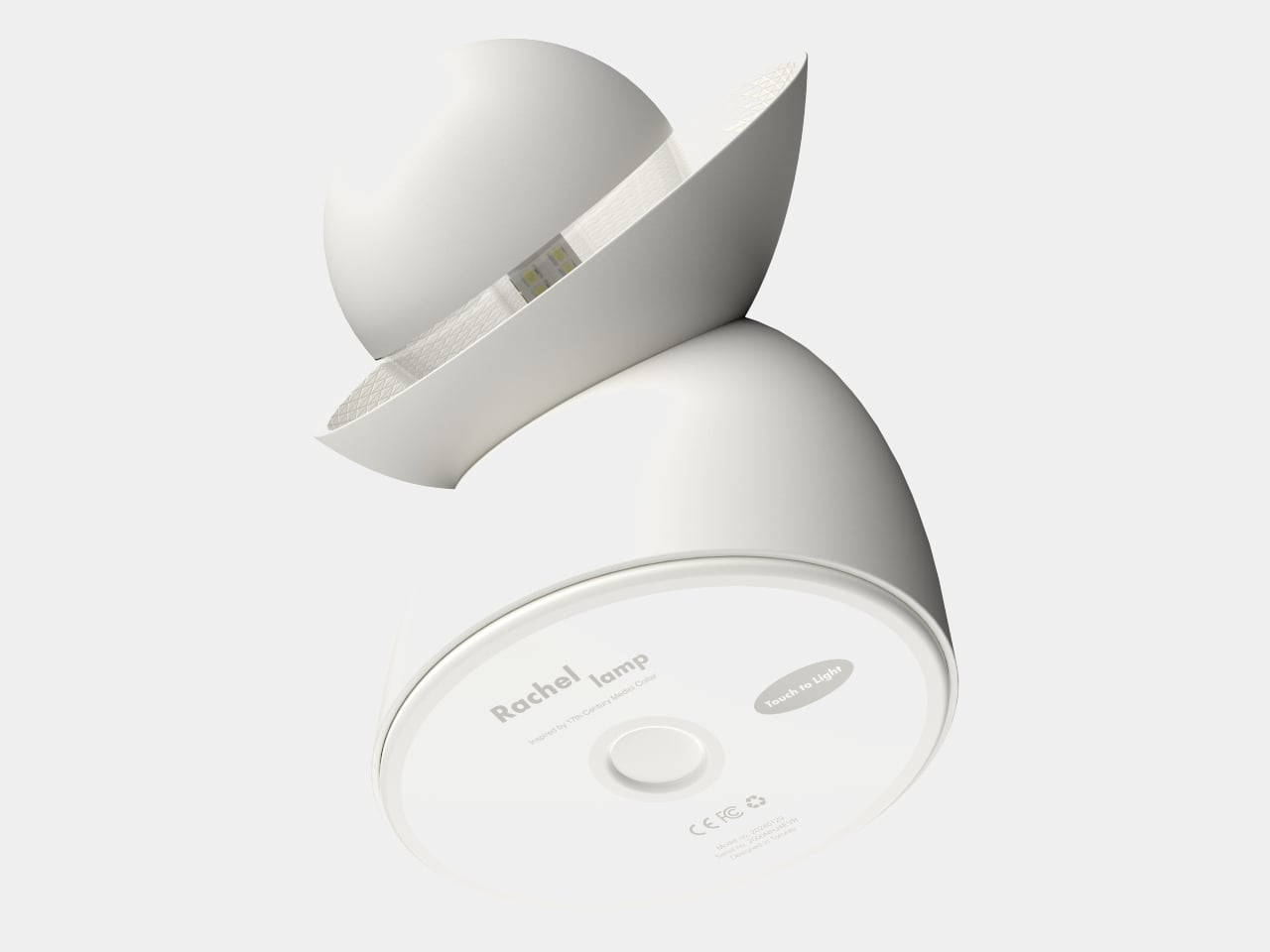
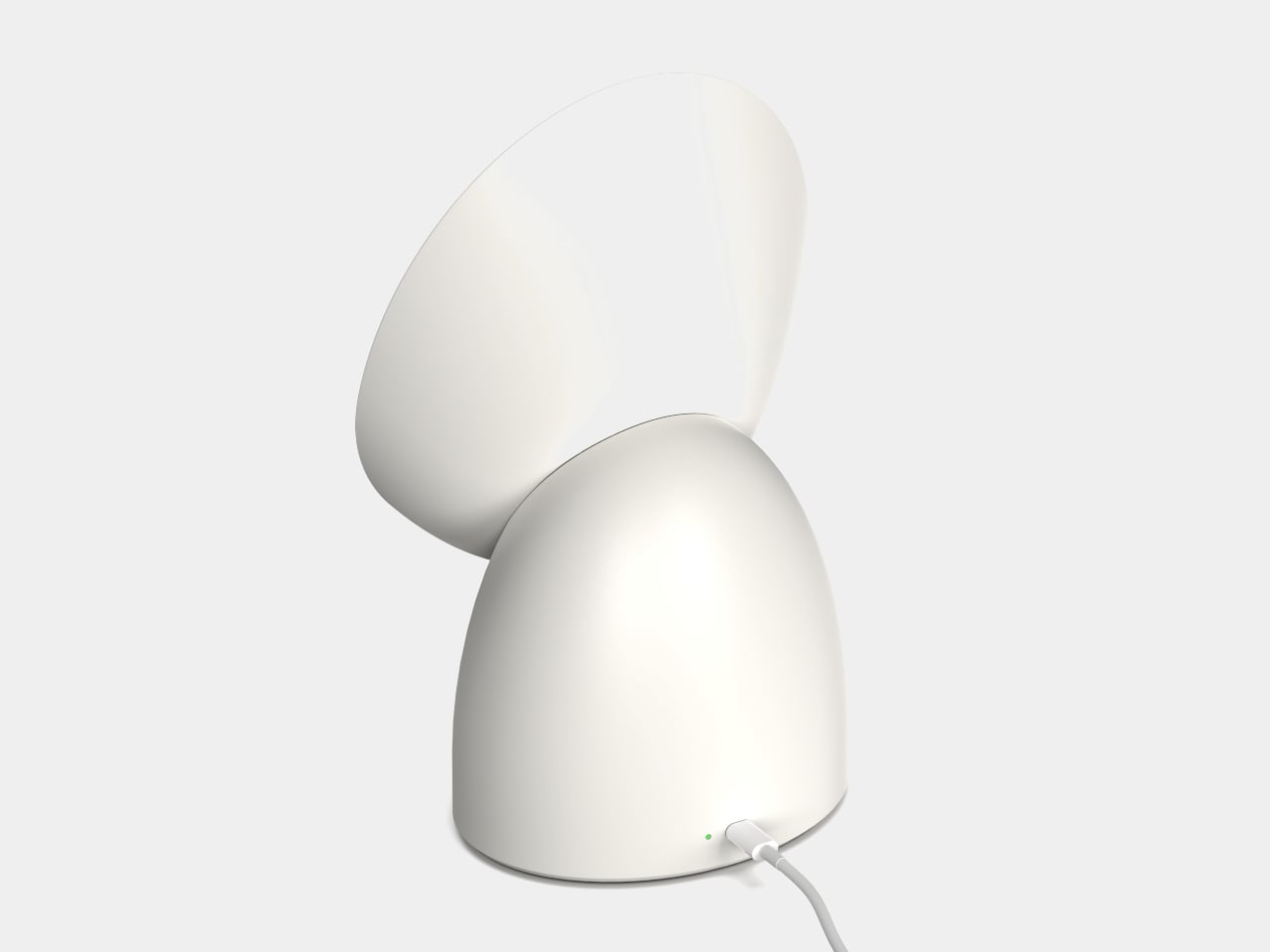
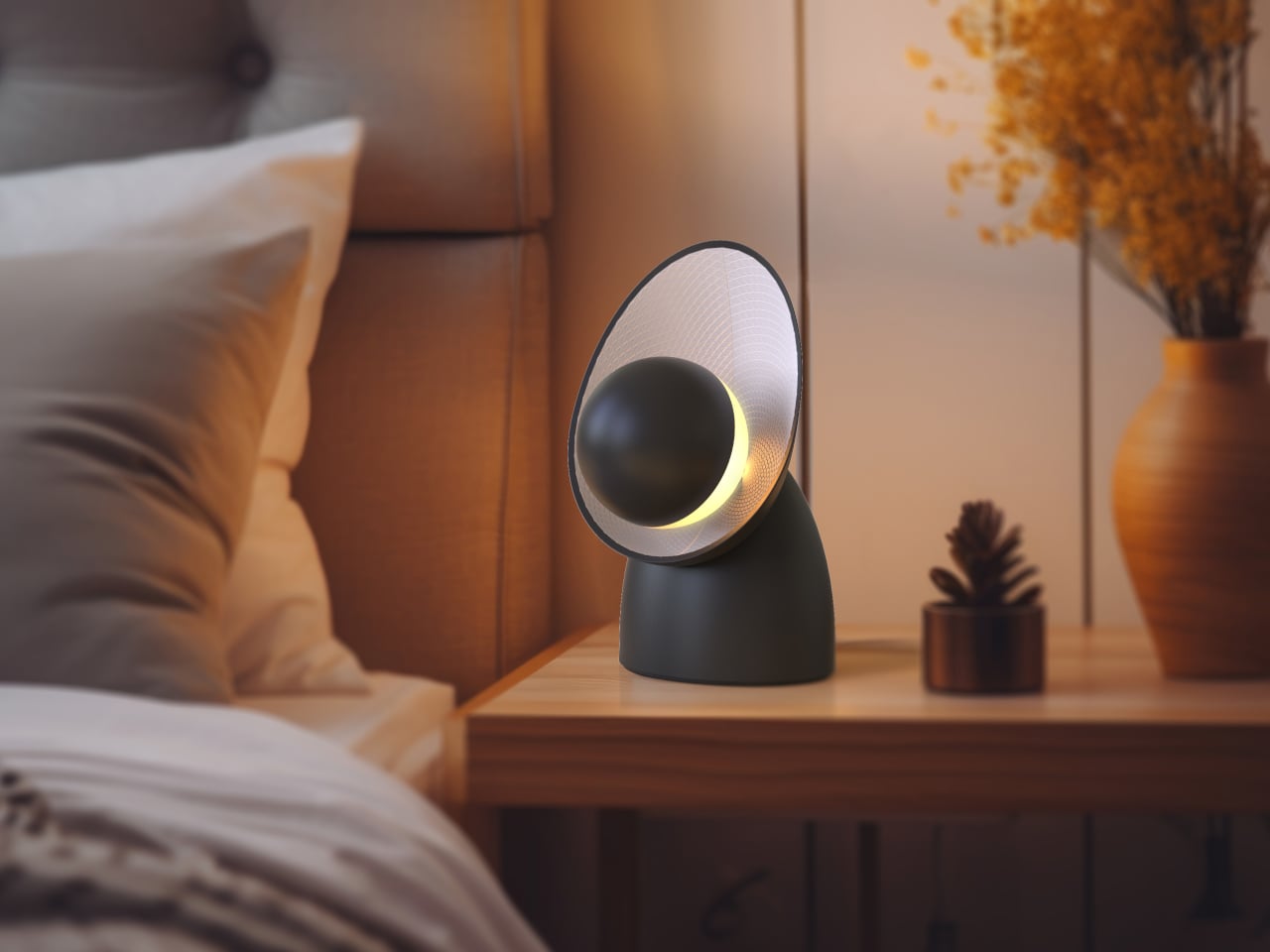
Rachel Lamp is a considered answer to that problem: a compact table lamp that doesn’t aim its light outward at all. Instead, it bounces everything against a curved back panel to create a uniform, diffused glow across the room. What makes the design genuinely interesting is where that form came from, because the geometry behind it predates electricity by a few hundred years.

Designer: Hyunjae Noh

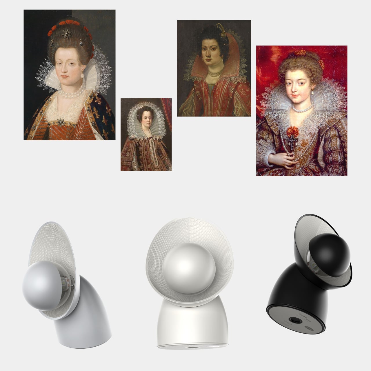
The inspiration is the Medici collar, a garment fashionable from the late 16th century to the early 17th century, known for a soft, curved silhouette that began at the back of the neck and swept forward along both shoulders. Noh adapted that same arc into the lamp’s reflector panel, which curves around the spherical bulb globe in a way that’s both functional and immediately recognizable. The form isn’t decorative for its own sake; it’s borrowed from history because it happens to describe the right shape.

The indirect lighting approach is the lamp’s central idea. Rather than hitting the space head-on, the G4 LED fires its light backward into the curved reflector, which then spreads it evenly outward. This removes the harsh contrast that direct lamps create, making the Rachel a natural fit for a bedroom nightstand, a living room shelf, or a desk where you’d rather not be squinting at harsh light after dark. It casts the kind of glow that a room can actually relax in.

The reflector panel isn’t just shaped to catch light; it’s also textured. A diamond pattern across its surface induces diffuse reflection, scattering the light further and keeping glare out of the equation entirely. It’s a detail that works on two levels: it gives the lamp visual texture when it isn’t on, and it does genuine optical work when it is.

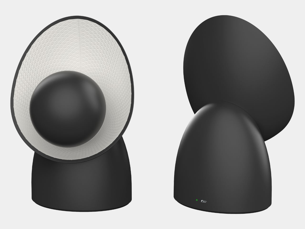
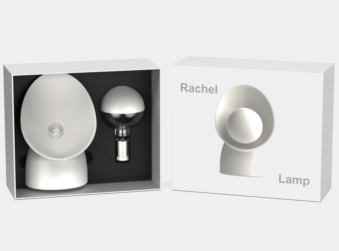
The lamp ships with the main body, bulb, and lighting cover, and assembly is straightforward enough that it doesn’t need instructions to feel self-explanatory. The G4 LED is a standard format, so replacing it when the time comes isn’t a difficult or costly process. It comes in gray, white, and black, and all three colorways share the same clean, minimal silhouette that makes it easy to fit into almost any interior without having to rethink the rest of the room around it.

What’s notable about the Rachel is that the designer didn’t arrive at its form by trying to create something that looked unusual. He started with a fashion reference from the 1600s, one that happened to describe the exact geometry needed to redirect light softly and evenly, and worked outward from there. It’s a quiet kind of reasoning, and the lamp is better for it.

The post This Lamp Gets Its Glow From a Fashionable Collar Worn 400 Years Ago first appeared on Yanko Design.

These 5 Playful Everyday Objects Were Designed to Make You Feel Like a Kid Again

For decades, “form follows function” shaped how you designed and lived. Minimalism stripped objects down to pure utility, where functional products like a chair were only a chair, or a lamp was only a source of light. That clarity once felt essential, but now it feels incomplete. We are moving into an era of playful functional design, where everyday objects reclaim character, becoming whimsical, unexpected, and slightly strange.

This shift is not about excess but about emotional precision. Function no longer ends at performance, but it extends into experience. Objects are designed to engage, surprise, and evoke emotion. A well-designed piece does not simply serve a purpose; it leaves a lasting impression.

1. Interactive Furniture Design

The era of the static, rigid sofa is fading as furniture begins to take on a more expressive role. Pieces are no longer designed to sit quietly in the background, but they carry presence through bold forms and modular compositions. Soft, blobby silhouettes and subtle anthropomorphic details transform chairs and stools into objects that feel almost alive, inviting interaction.

The real transformation lies in how people engage with these designs. Materials like memory foam and recycled plastics allow furniture to adapt to the body, shifting from passive to responsive. As a result, furniture moves beyond function and begins to feel more like a companion within a space. This shift creates interiors that are more intimate, expressive, and dynamic, where everyday objects actively shape the playful atmosphere.
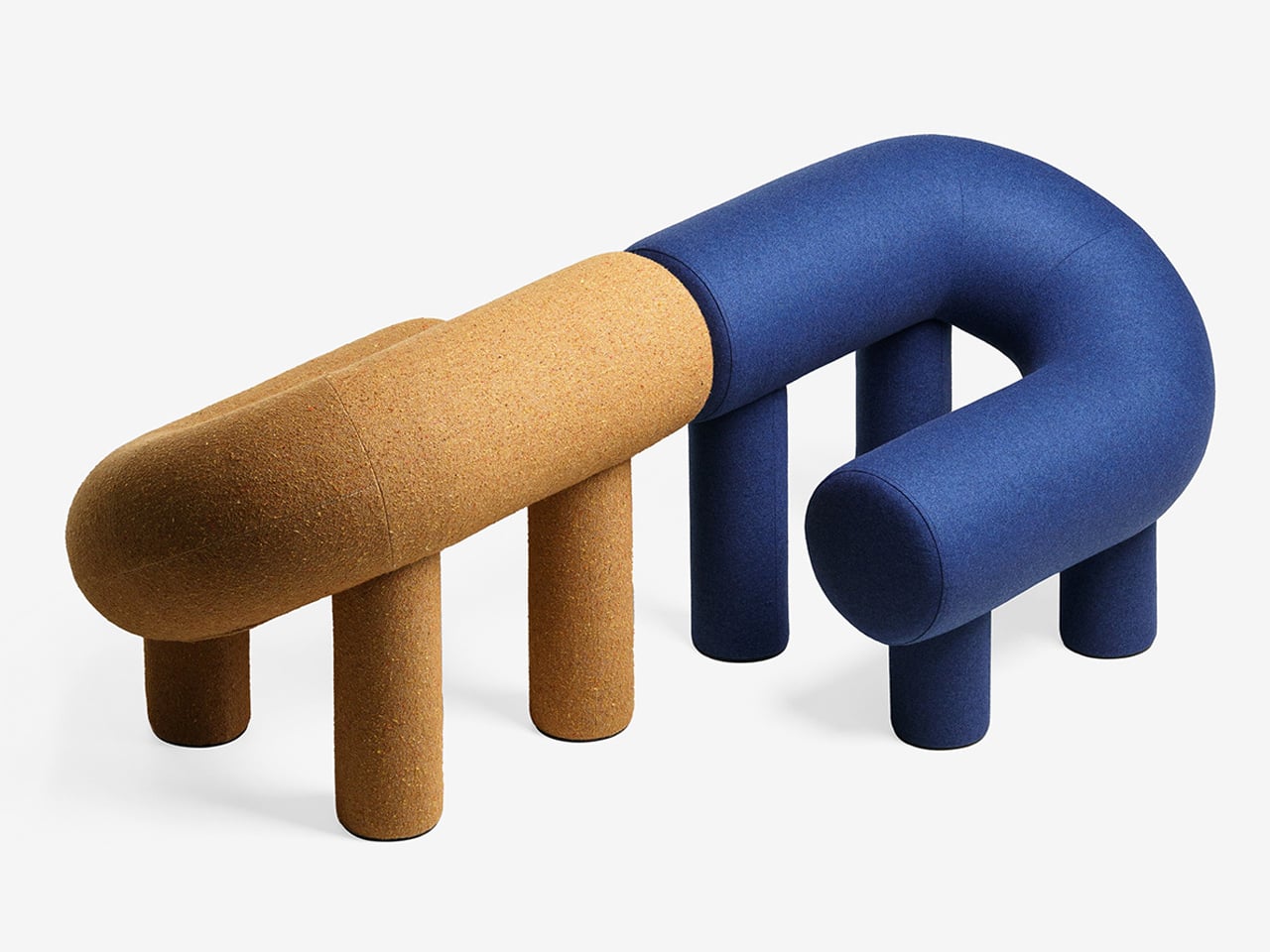
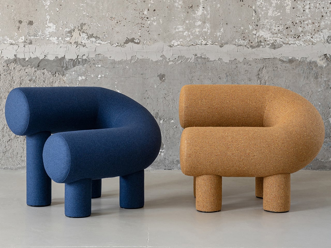
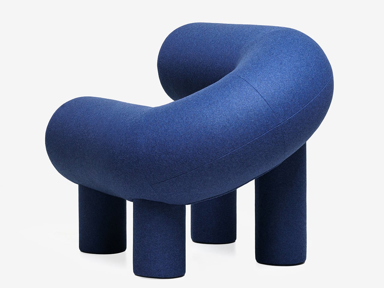
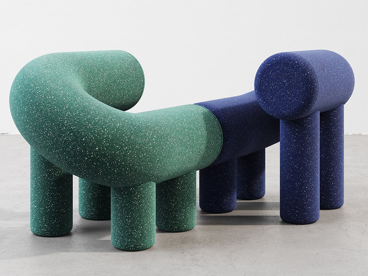
Playful furniture is reshaping everyday living, and the UMI Armchair by Rostislav Sorokovoy for Woo reflects this shift with ease. It moves beyond conventional seating, becoming an interactive object that sparks curiosity. Its bold, chunky form carries a soft, sculptural presence, giving it the character of a modern art piece. Designed to invite engagement, the chair encourages relaxed lounging and a more instinctive, almost childlike interaction.
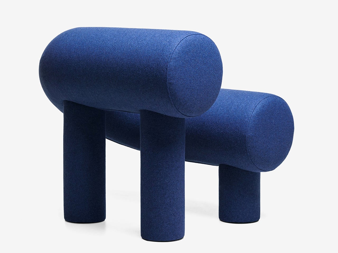
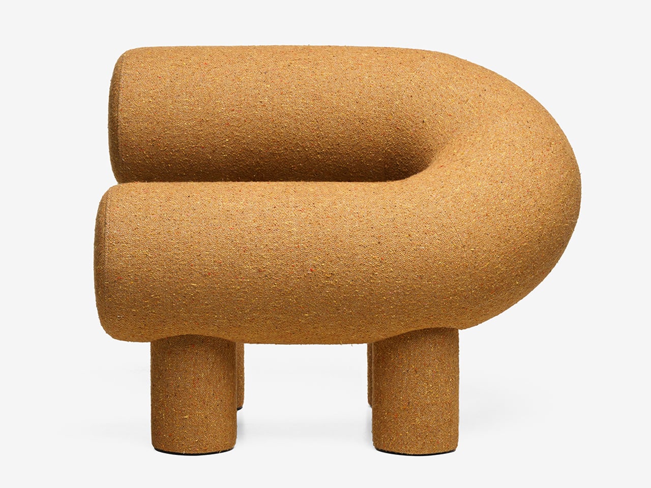
Its distinctive horseshoe shape is created using two cylindrical volumes, supported by four plush legs that provide both stability and visual charm. Constructed with a plywood frame, polyurethane foam, and textile upholstery, it delivers comfort alongside strong design appeal. While its scale may not suit compact interiors, it works effortlessly in larger spaces where its expressive form can stand out. Whether used alone or in pairs, it creates a seating arrangement that feels tactile, inviting, and visually dynamic.

2. Sculptural Light Design

Lighting has moved beyond pure function, evolving into something sculptural, immersive, and subtly performative. A fixture is no longer just a source of illumination as it becomes an object that encourages interaction. With hidden LEDs and responsive sensors, even the simple act of turning on a light feels more intentional, almost ritual-like.

The experience is defined by engagement. Some lamps require a physical gesture, like placing a glowing orb to activate them, while others shift form as they dim, echoing organic movement. When light is treated as a material to shape and experience, rather than just a utility, it transforms the mood of a space. Shadows gain depth, and dim corners turn into moments of intrigue, adding a layer of quiet wonder to everyday environments.
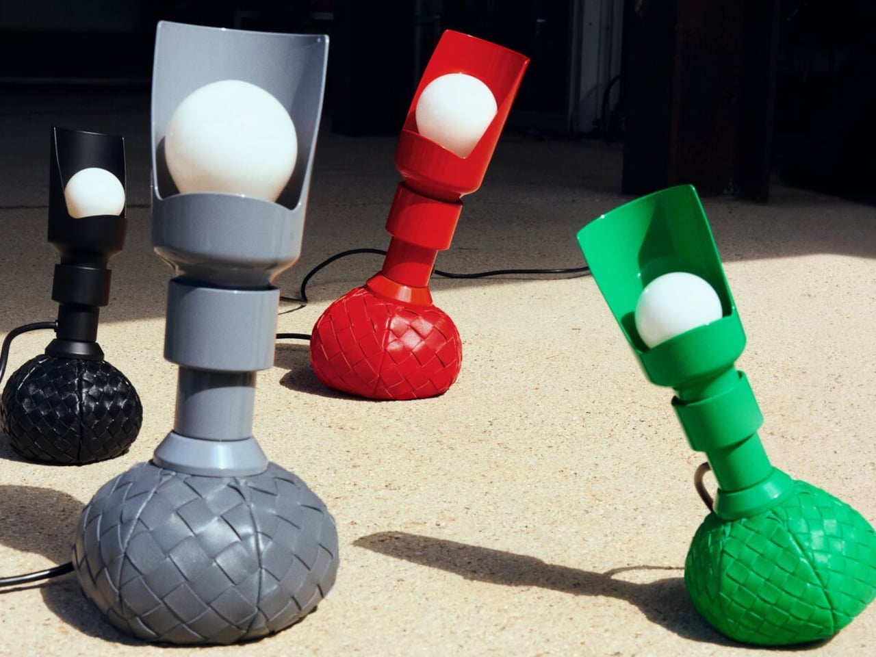
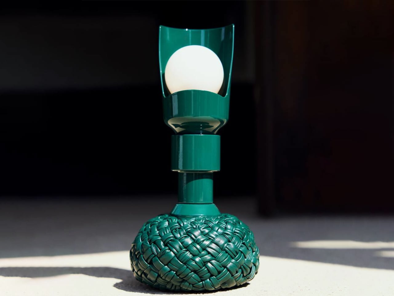
Lighting is often viewed as purely functional, designed to illuminate and enhance a space. Yet some designs move beyond utility, introducing interaction and character without feeling overly whimsical. The reimagined Model 600 by Bottega Veneta x Flos, created by Gino Sarfatti, captures this balance with ease. Its rounded base offers a soft, inviting presence, while the slender metal stem adds a refined contrast, resulting in a form that feels both approachable and sophisticated.
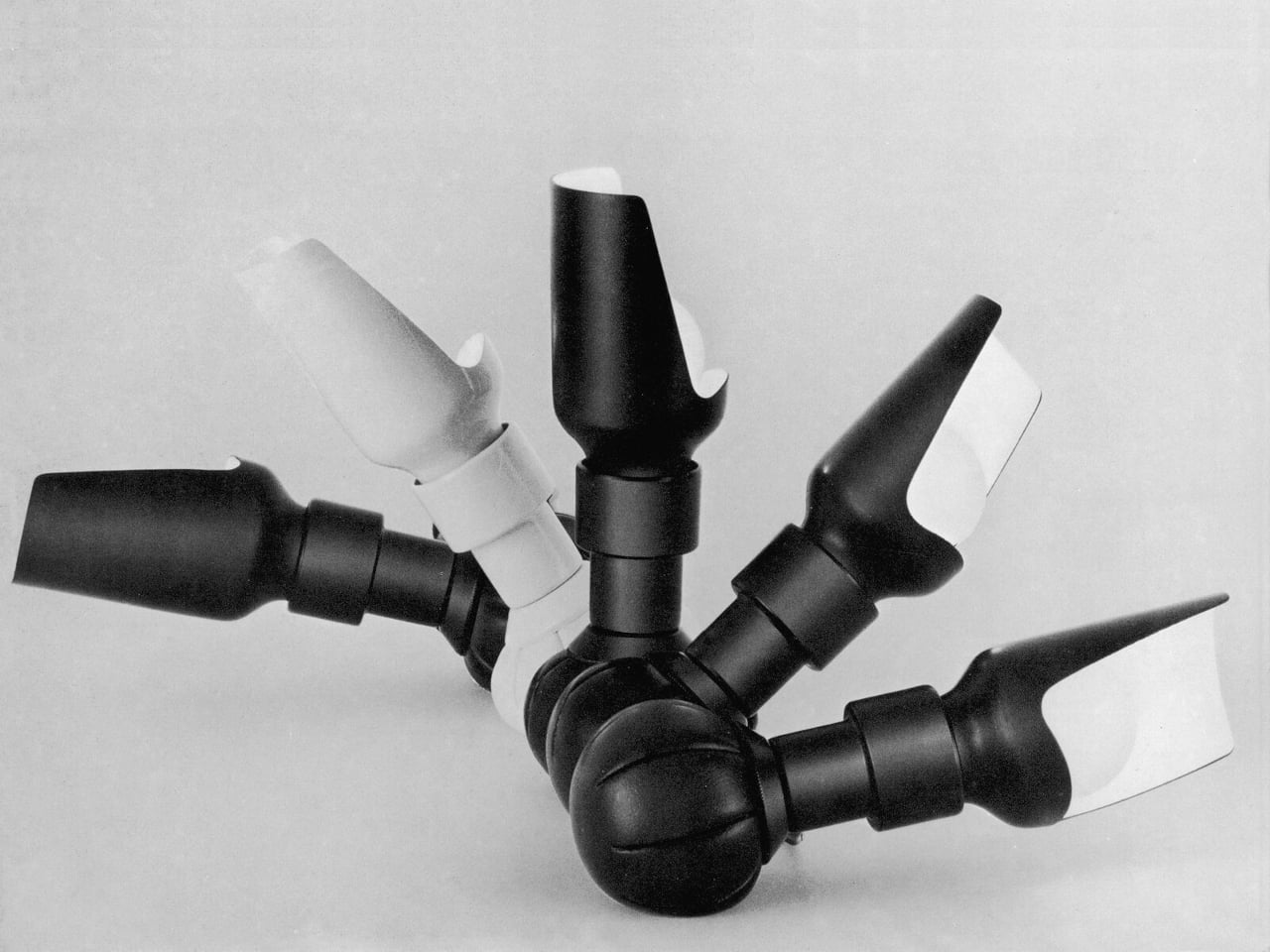
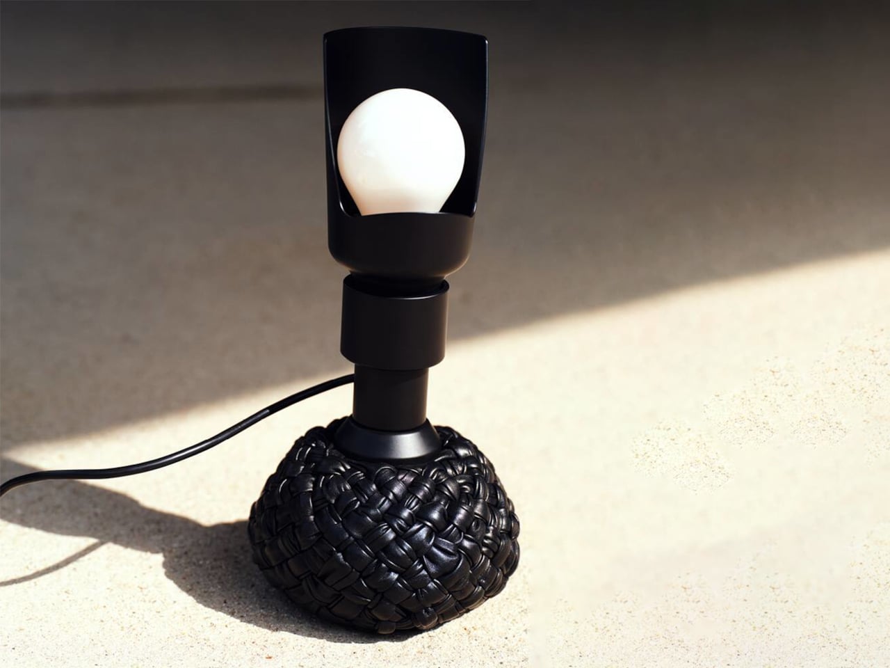
The original 1960s design embraced experimentation with a weighted leather base that could tilt without falling. The updated version retains this dynamic feature while introducing an interwoven leather texture that enhances its visual depth. Functionally versatile, it serves as a desk and floor lamp, with adjustable light direction through a curved reflector. Available in multiple sizes and colors, it merges structure with softness, creating a lighting piece that feels engaging, elegant, and enduring.

3. Playful Gadgets

Technology has long been defined by precision and restraint, often creating a sense of distance through its polished perfection. That gap is now narrowing, as a new generation of gadgets introduces softness, charm, and tactility. Drawing from “kawaii” influences and responsive design, these objects invite touch and emotional connection, from companion-like power banks to speakers that move and respond with sound.

The real shift is in how these devices are perceived and experienced. Tools once valued solely for efficiency are now designed as sensory interactions. A hard drive wrapped in soft silicone, yielding like a stress ball, blurs the line between utility and play. In this transition, technology becomes more personal and approachable, transforming everyday use into something warmer, lighter, and more human-centered.
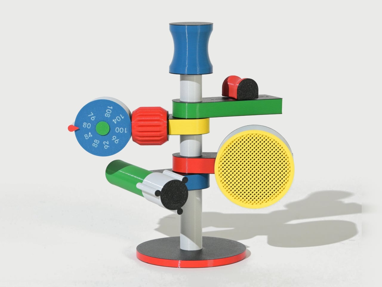
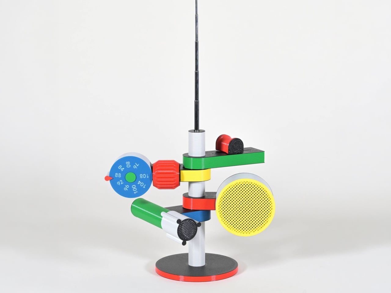
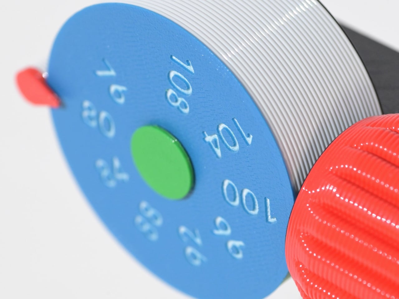
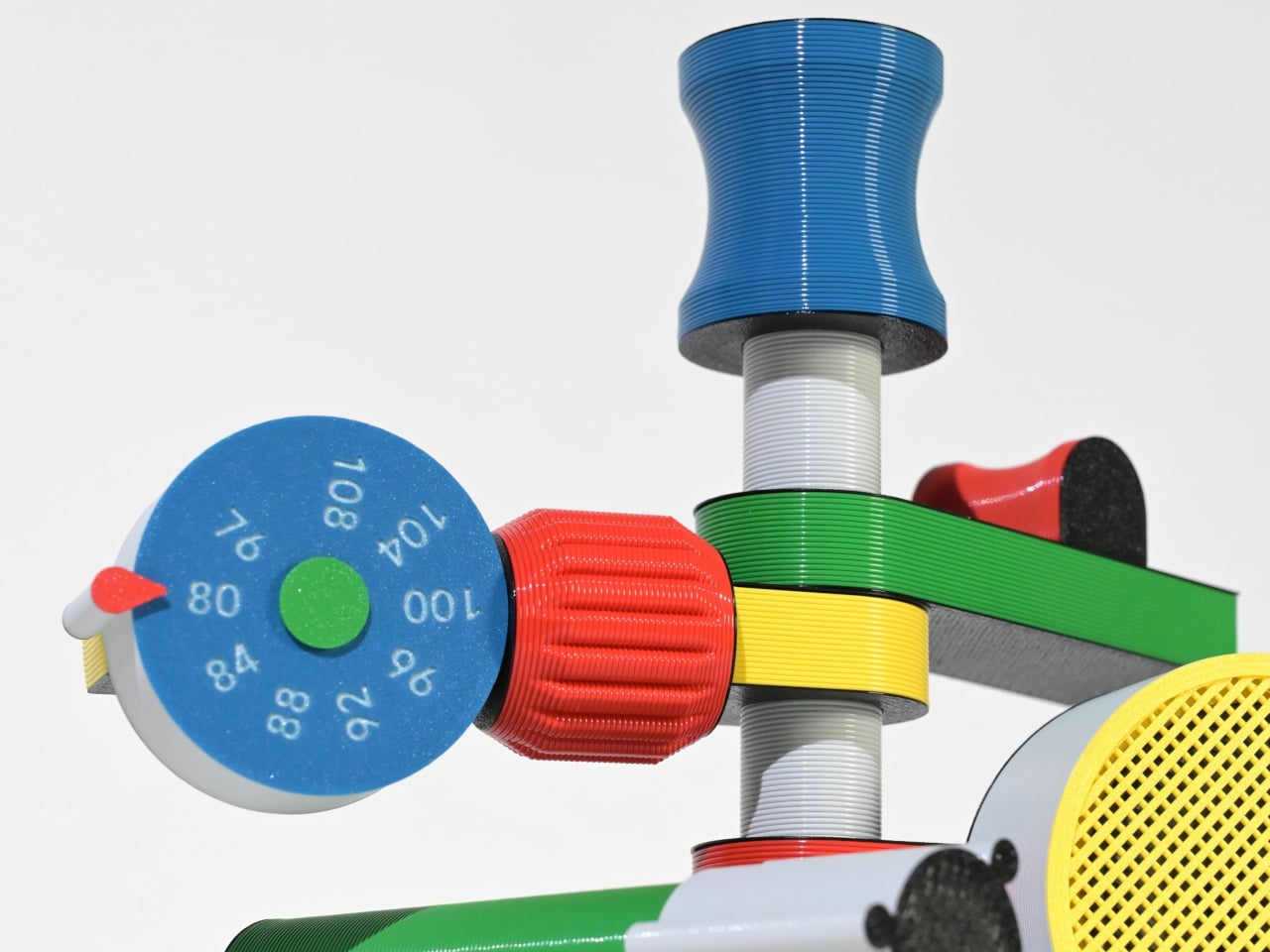
Some gadgets stand out not for precision or minimalism, but for their sense of character. The Anomalo FM radio by SHINKOGEISHA leans into this idea, presenting itself as an object that feels closer to a playful sculpture than a conventional device. With its bold colors and exaggerated form, it instantly grabs attention, sparking curiosity even before it’s switched on. The tall antenna anchors the design, while branching, limb-like extensions give it an almost animated presence.
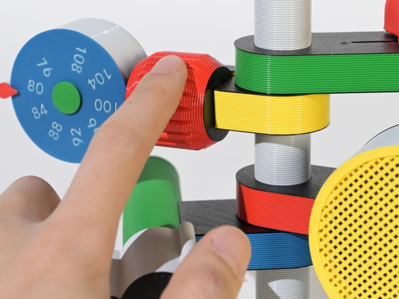
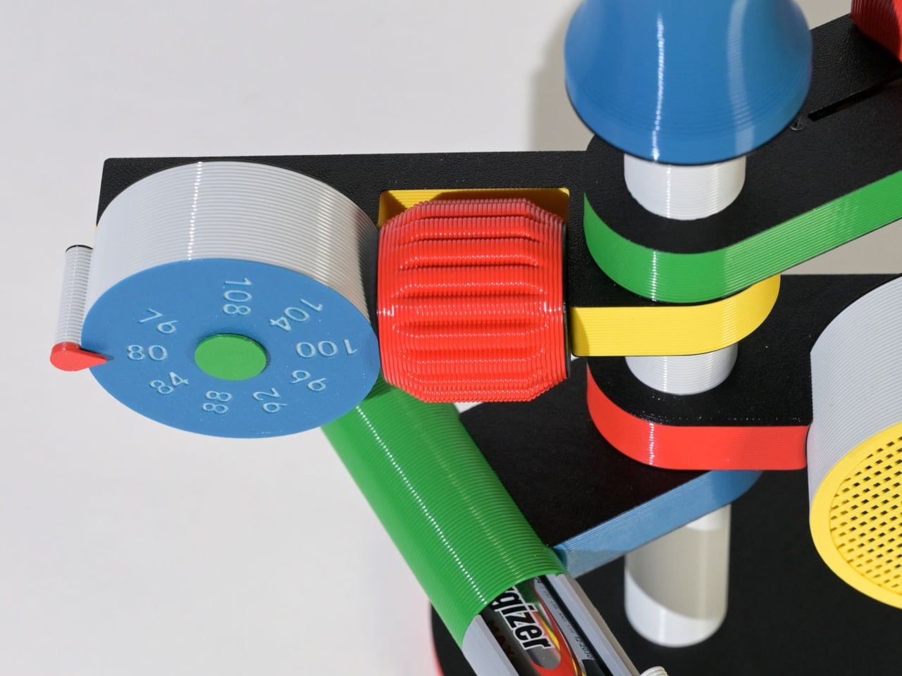
Each extension serves a clear function, creating a tactile, engaging experience. A roulette dial scans stations, a barrel controls volume, and a bold speaker projects sound, while exposed wiring enhances its expressive look. Made with PLA through digital fabrication, it favors creativity over polish, reflecting a shift toward more personal, experimental electronics.

4. The Joy of Stationery

Even in a digital world, the desk is becoming a space for quiet play. Stationery is no longer purely functional as it engages the senses. The focus has moved beyond simple aesthetics to how tools feel, respond, and enhance the act of making.

Erasable inks react to friction, washi tapes create layered compositions, and modular notebooks connect with magnetic precision. Writing no longer feels routine as it transforms into a small ritual, where thinking on paper feels intentional, creative, and deeply satisfying.
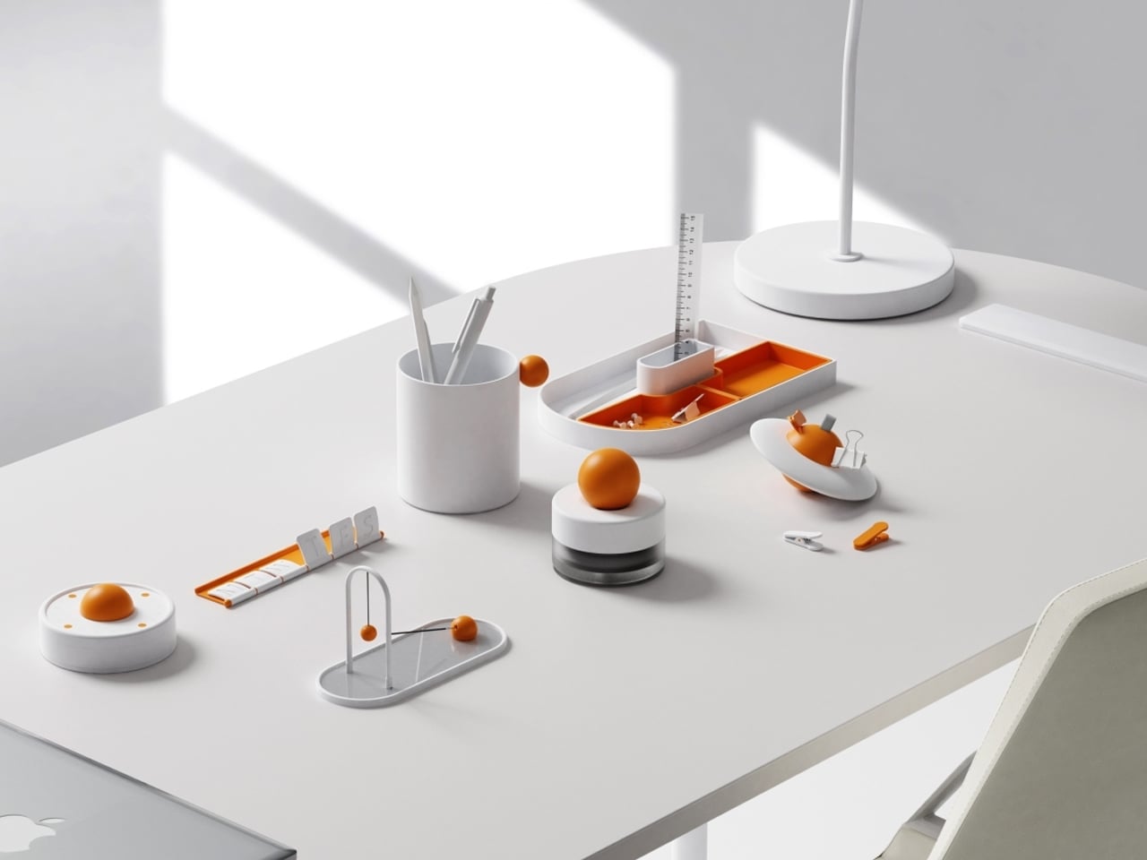
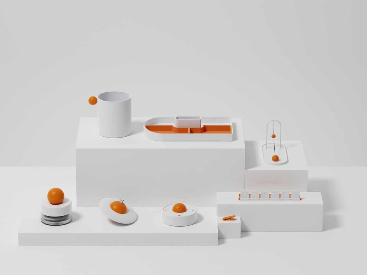
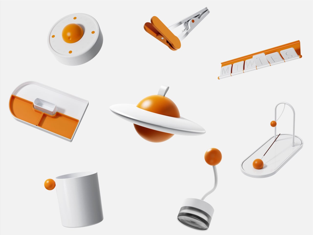
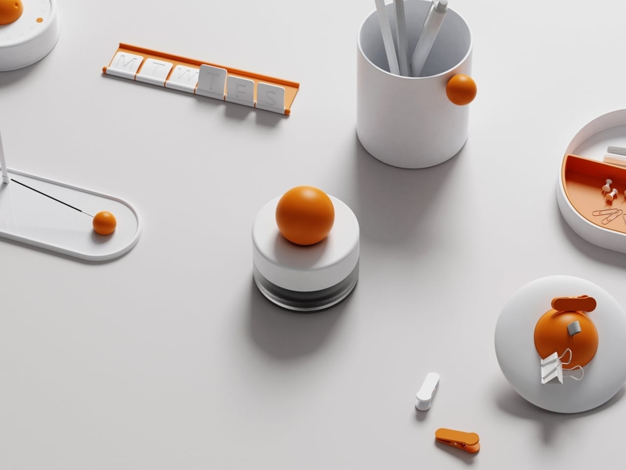
Objects on a desk quietly influence mood and thought throughout the day. While some environments lean toward minimal setups for clarity, others incorporate subtle moments of joy. The Madang collection by Jiung Yun, Siwook Lee, Jihyun Hong, and Junsu Lee brings these ideas together, balancing simplicity with a gentle sense of play inspired by traditional Korean childhood games.
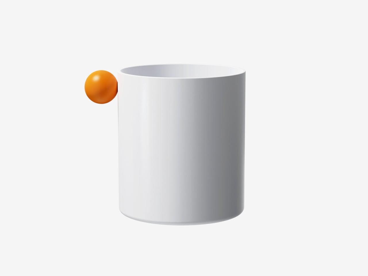
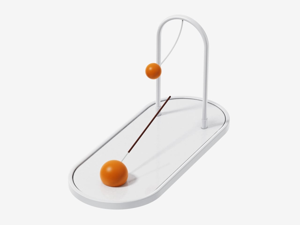
Each piece translates a familiar activity into a functional object. A wrist tool references tug-of-war, trays mirror playful ground layouts, and clips echo movement-based games, turning routine actions into engaging interactions. Even more abstract elements, like a circular timer or sculptural pen holder, carry narrative undertones. Finished in a soft white and orange palette, the collection remains visually calm yet expressive, adding character without clutter while making everyday work feel lighter and more thoughtful.

5. Joyful Building Design

Playful thinking is extending into architecture, reshaping how buildings and cities are experienced. The rigid “gray box” is gradually giving way to environments that encourage curiosity and movement. Designers are introducing spatial surprises into everyday settings, from slides integrated into workspaces to hidden gardens within facades and windows that break rigid grids to filter light in unexpected ways.

These interventions go beyond visual appeal. They disrupt routine and draw attention to the surroundings. A burst of color or an unconventional pathway shifts perception, encouraging awareness and engagement. As a result, architecture moves beyond shelter, becoming more interactive and expressive while transforming the built environment into something dynamic, human-centered, and quietly uplifting.
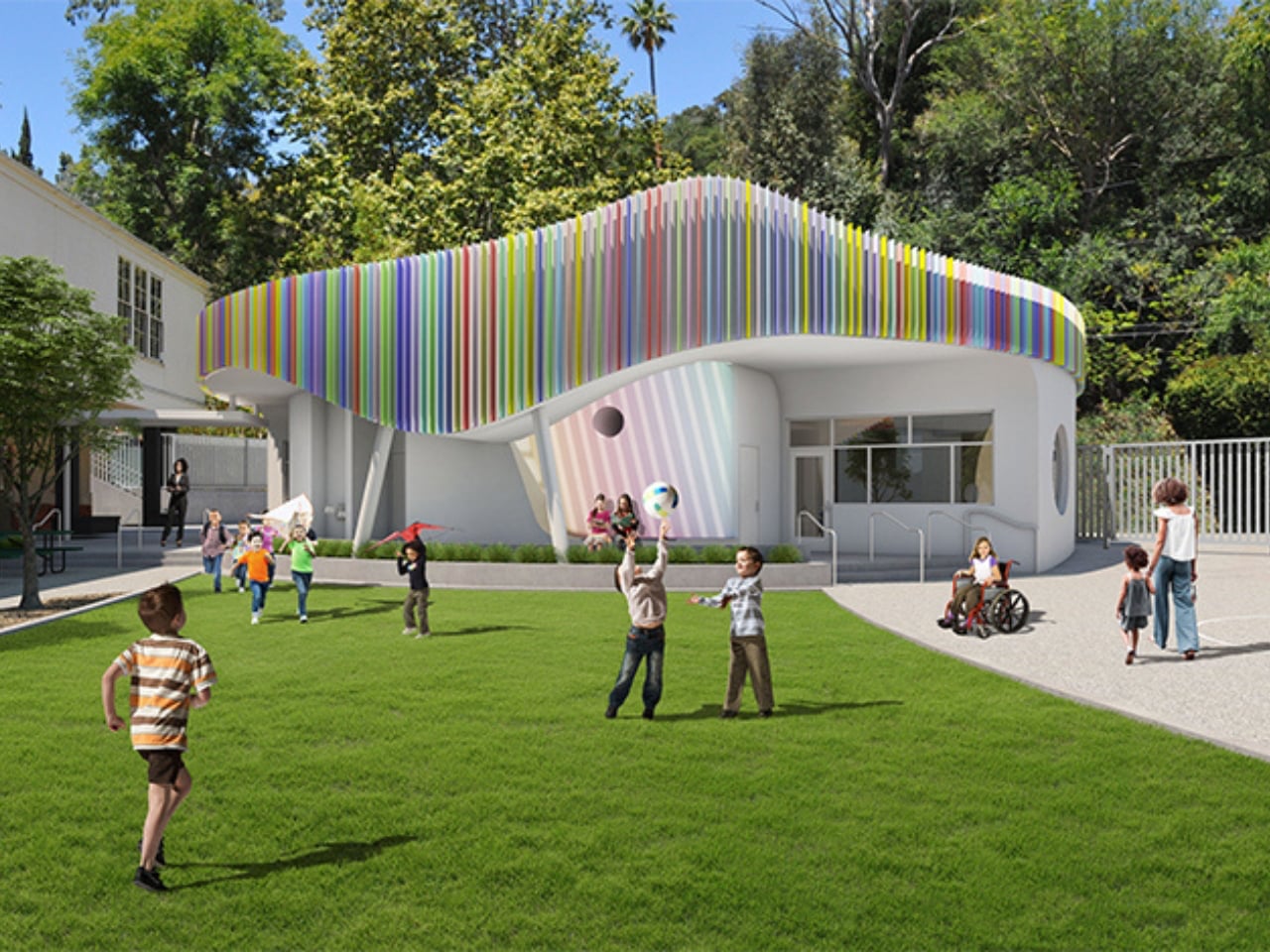
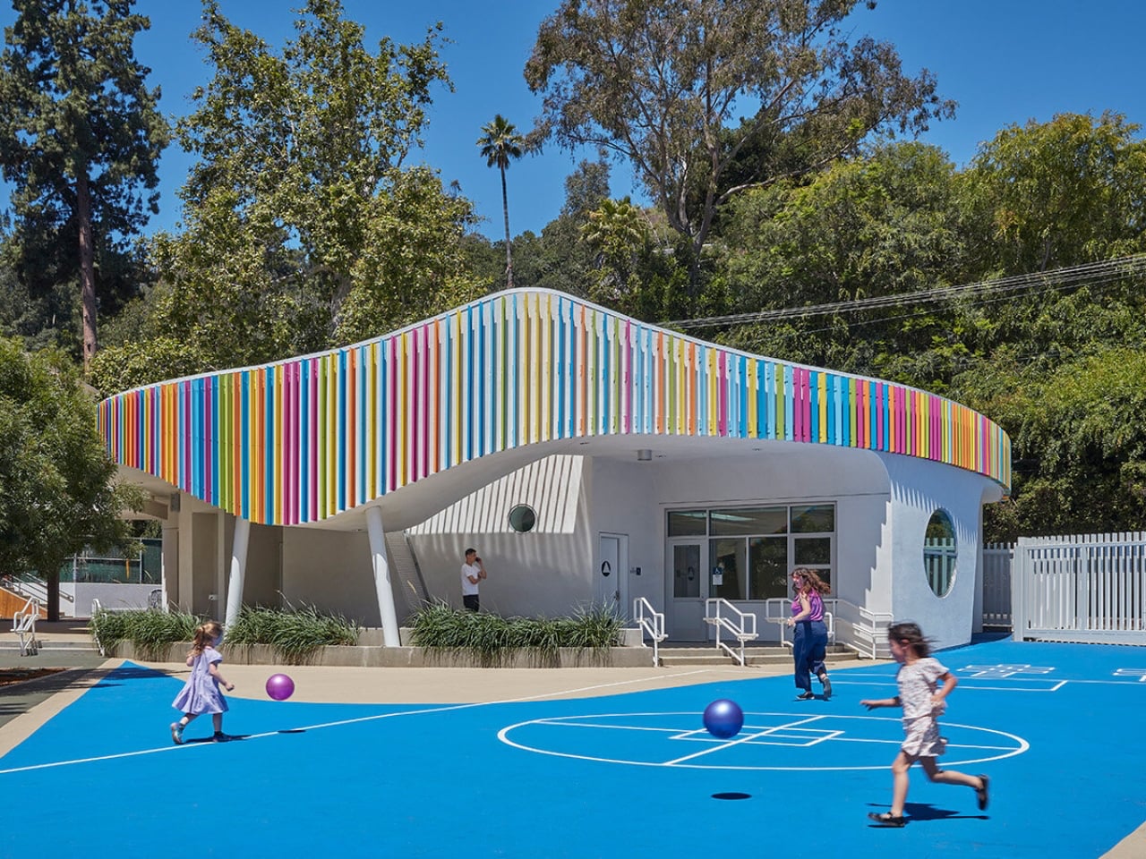
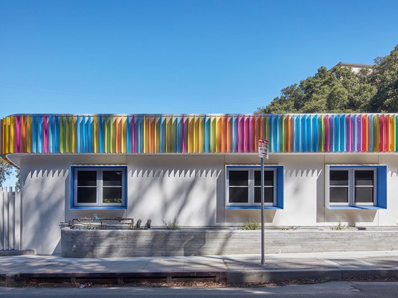
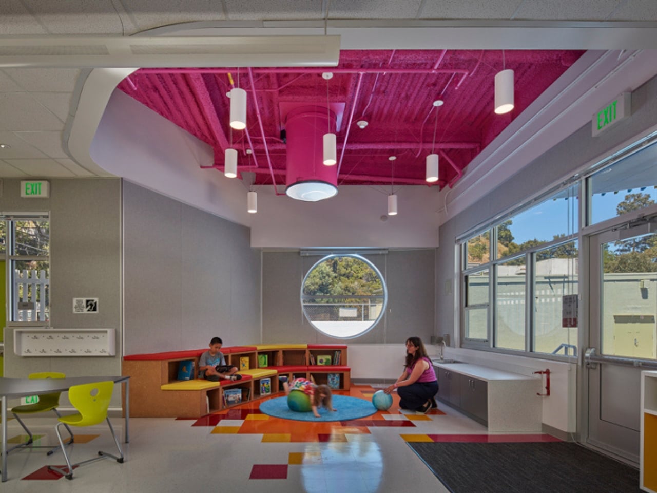
Most early school memories are tied to plain, boxy classrooms that felt more functional than inspiring. Spaces like these rarely encourage curiosity or creativity, making learning feel routine rather than exciting. In contrast, thoughtfully designed environments can shape how children engage with education. In Laurel Canyon, Los Angeles, Wonderland Elementary School’s new kindergarten building by John Friedman Alice Kimm Architects (JFAK) reimagines this experience through a design that feels open, engaging, and visually dynamic.
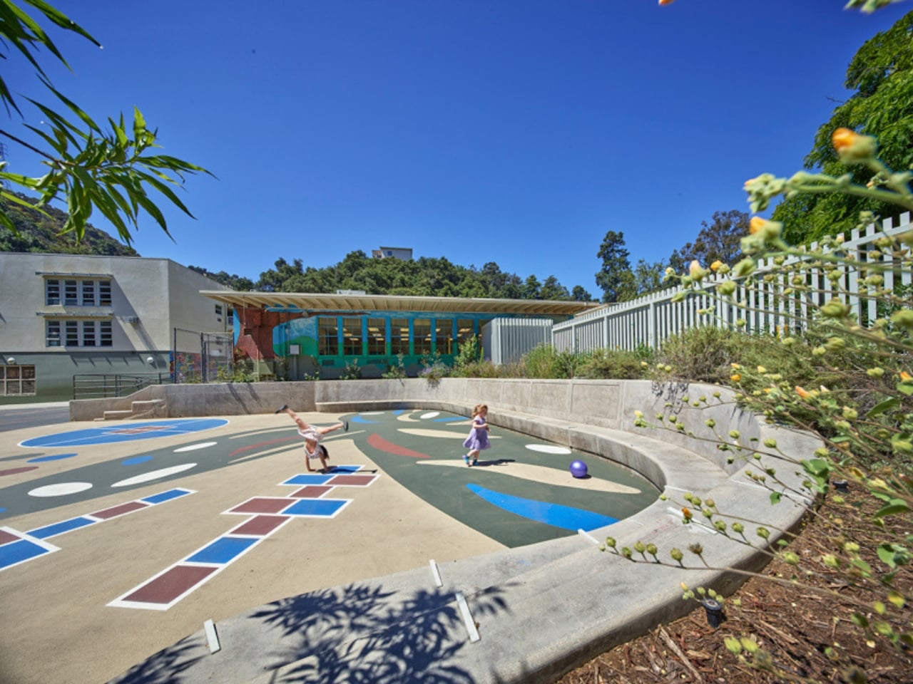
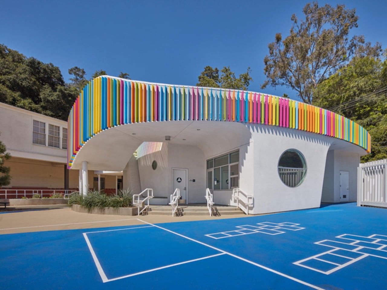
The structure stands out with its soft, curved form and colorful exterior louvers that filter sunlight into shifting patterns across the interiors. Inside, natural light pours in through skylights and solar tubes, creating a warm and welcoming atmosphere. Classrooms feature circular reading nooks, low seating, and accessible storage tailored for young learners. A semi-covered outdoor space encourages interaction and play, while exposed ceilings reveal structural elements, sparking curiosity. Designed with sustainability in mind, the building blends function with imagination, turning everyday learning into a more engaging and enriching experience.

Everyday objects still hold the power to surprise. When play enters function, design softens decision fatigue and digital burnout. Objects with wit and warmth transform spaces, turning routine into experience and making daily life feel more engaging, expressive, and alive.

The post These 5 Playful Everyday Objects Were Designed to Make You Feel Like a Kid Again first appeared on Yanko Design.
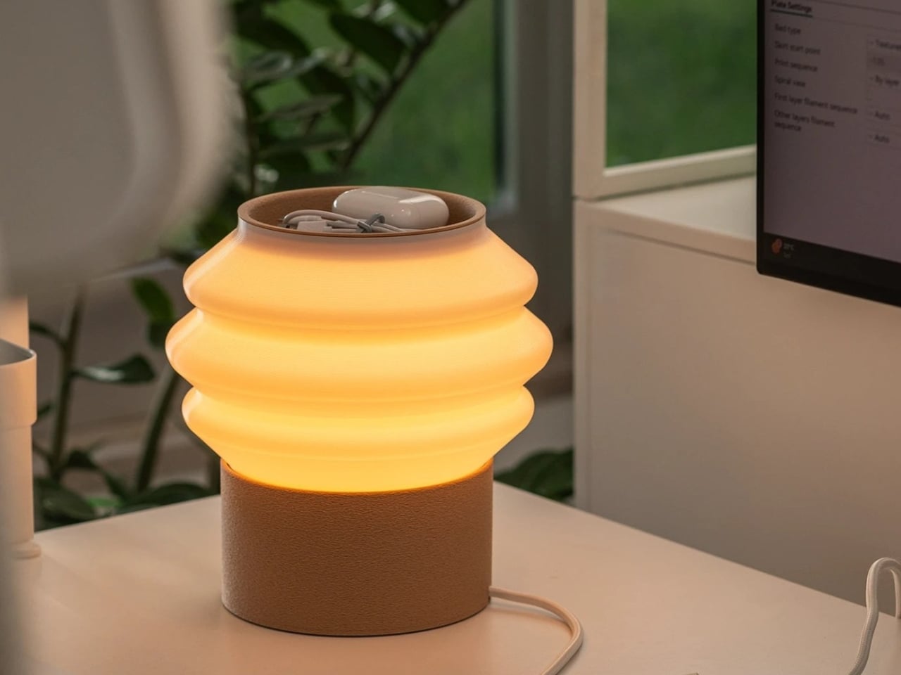
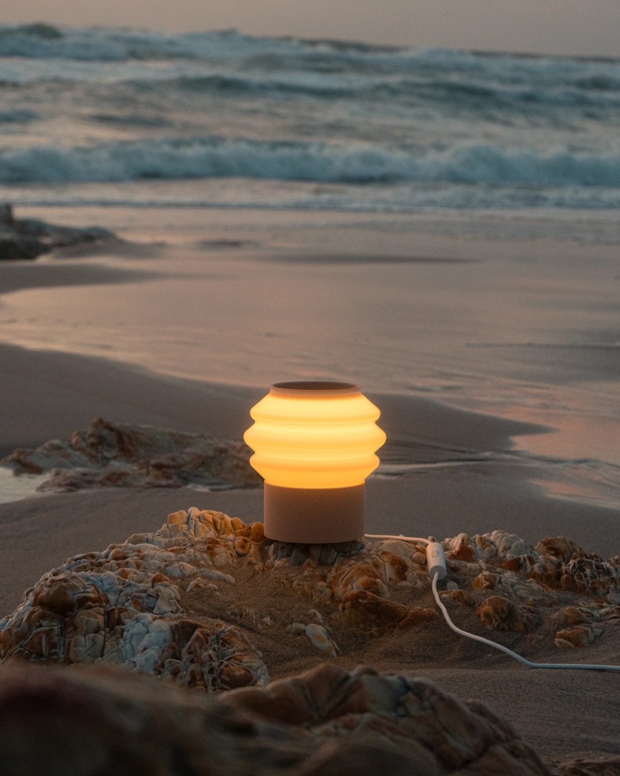
Preciosa To Make Light Feel Like a Living Thing at Milan 2026

Light has always been design’s most underrated material. We talk endlessly about furniture, textiles, and surfaces, but light? It usually plays the supporting role, the thing that makes everything else look good. Preciosa Lighting is quietly changing that conversation, and their latest collection, Drifting Lights, might be the most convincing argument they’ve made yet.

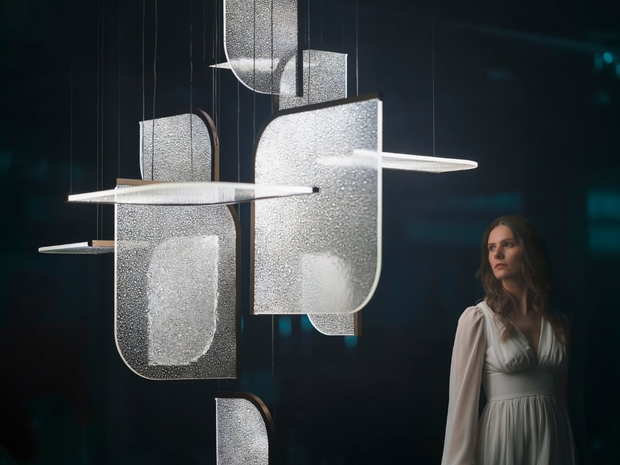
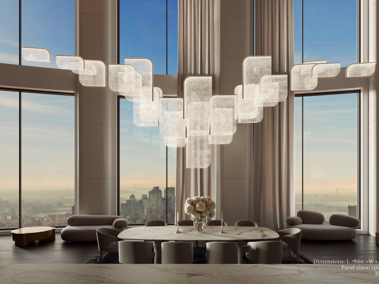
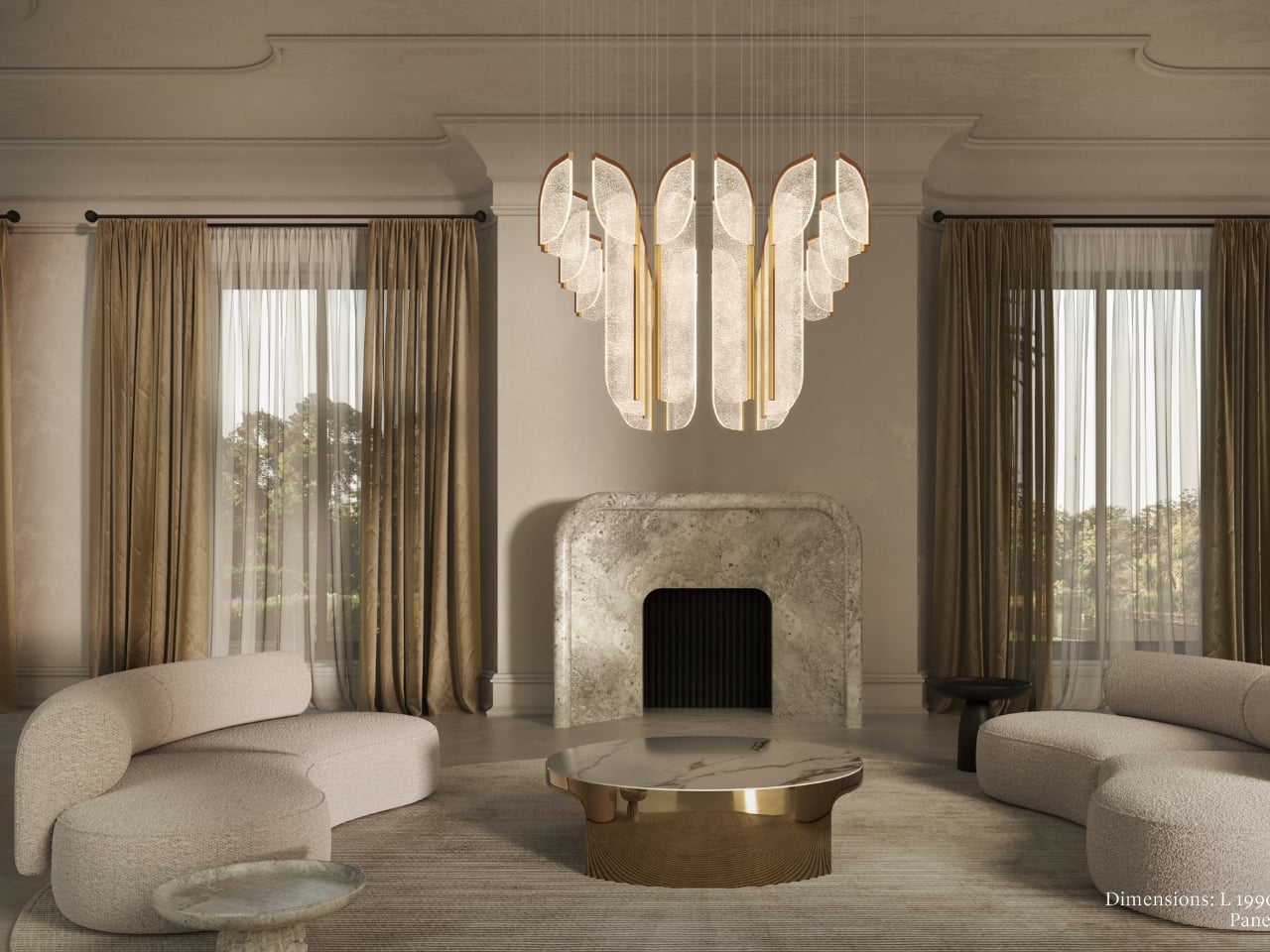
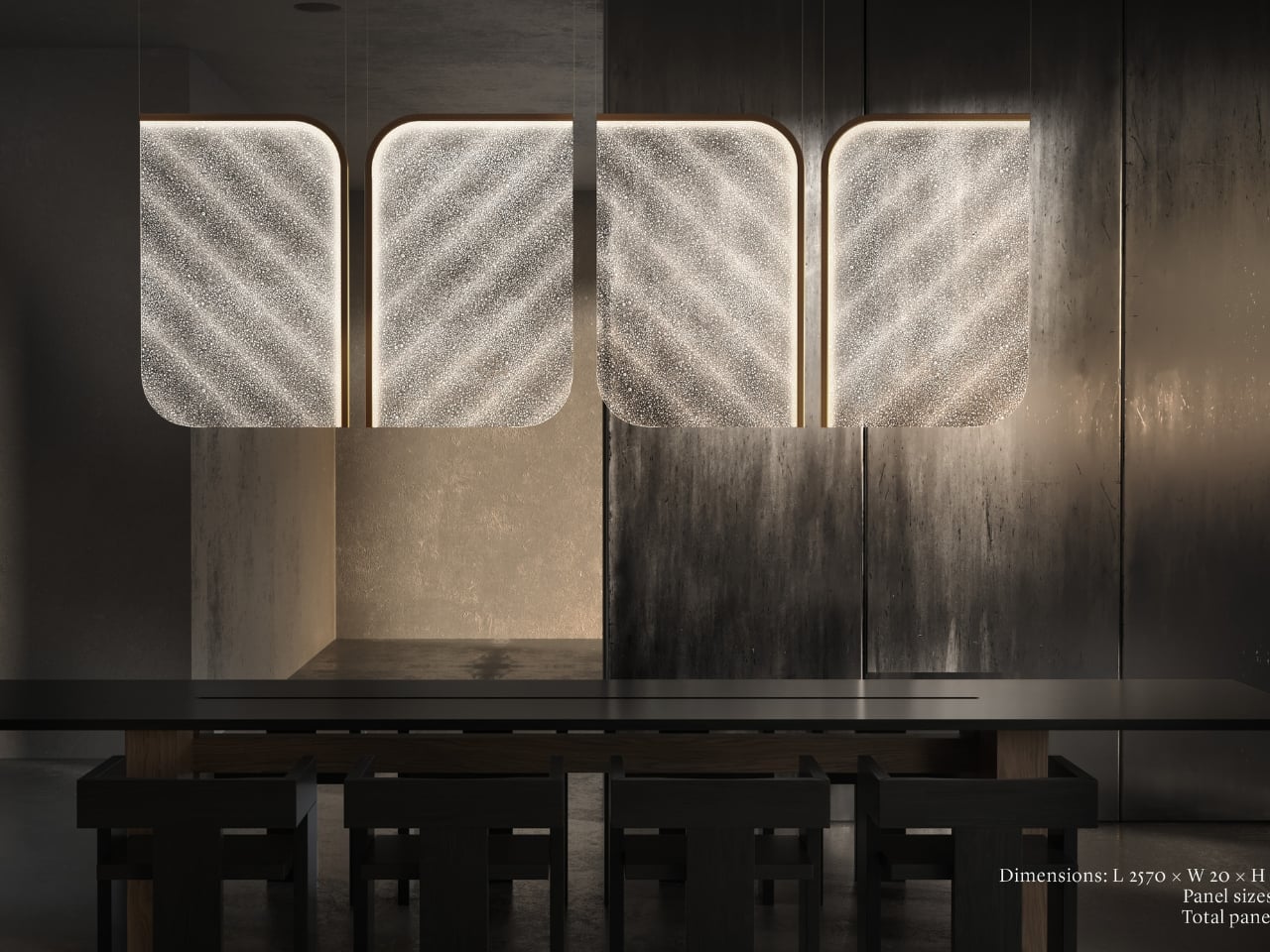
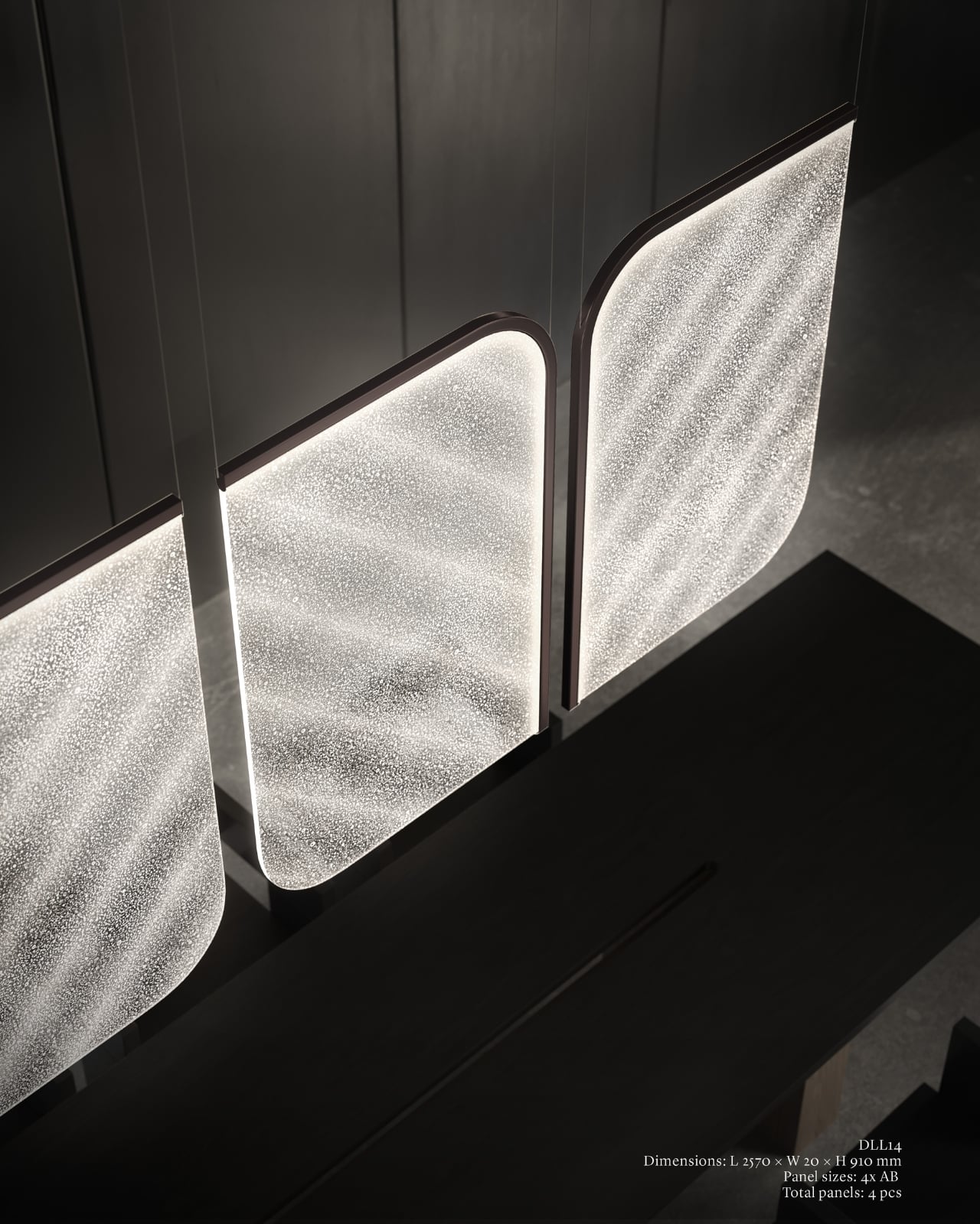
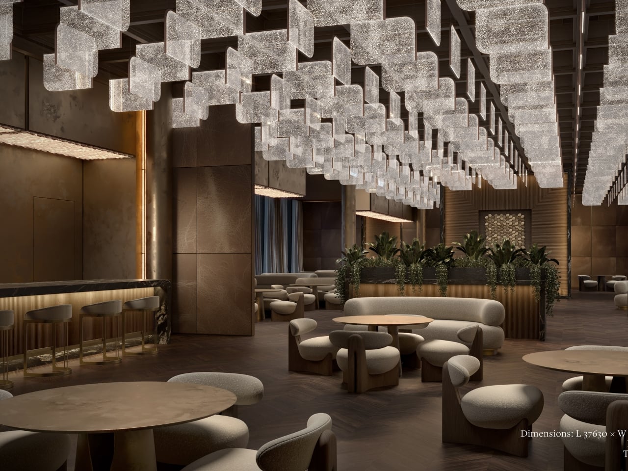
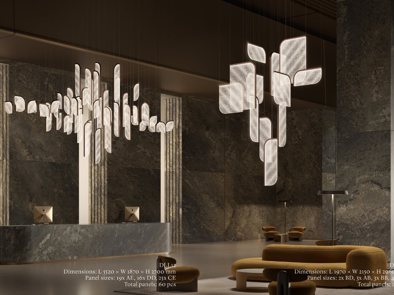
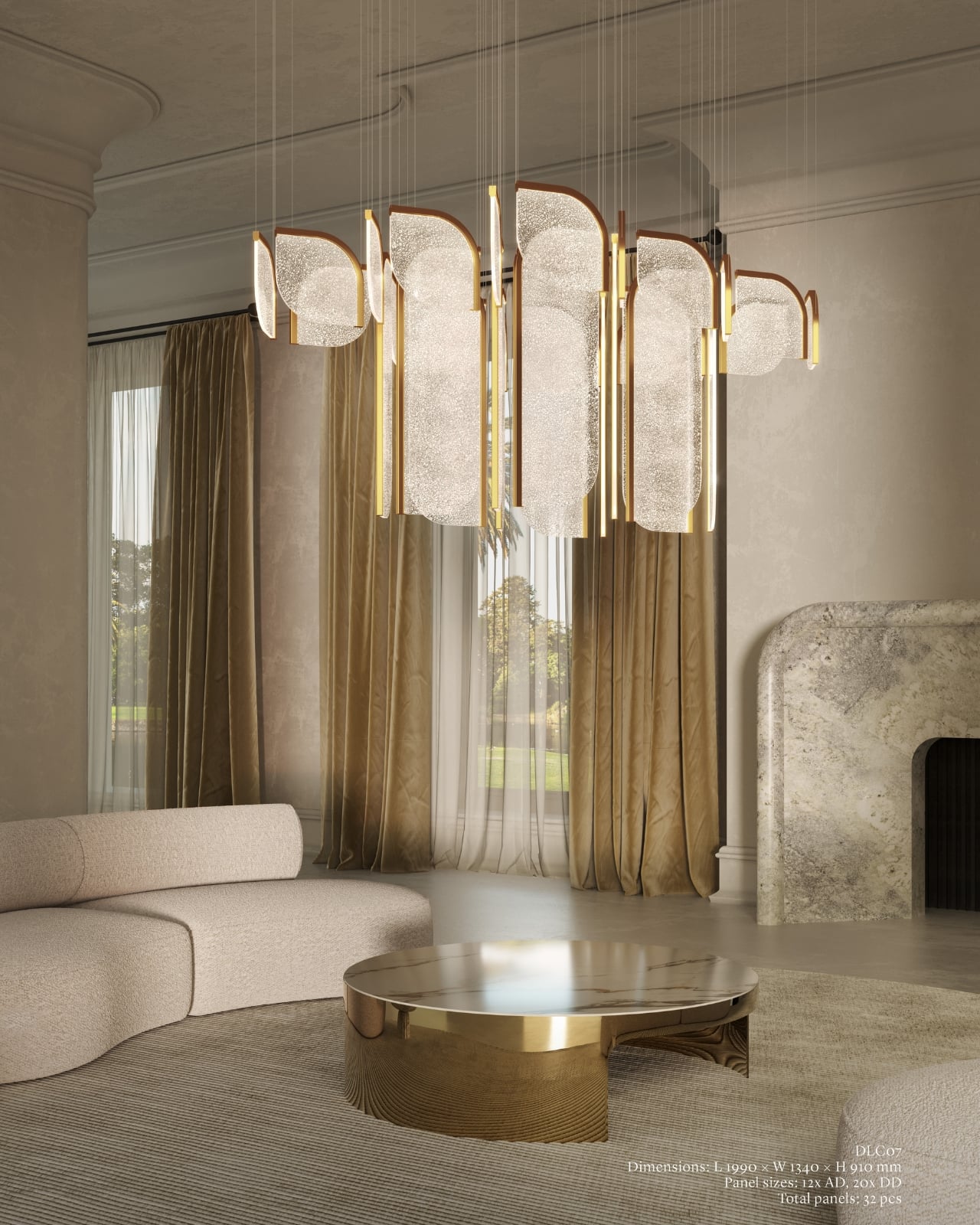
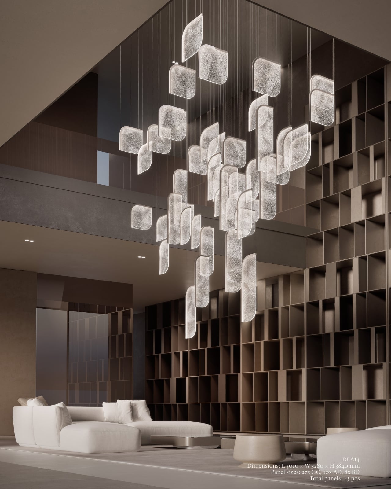
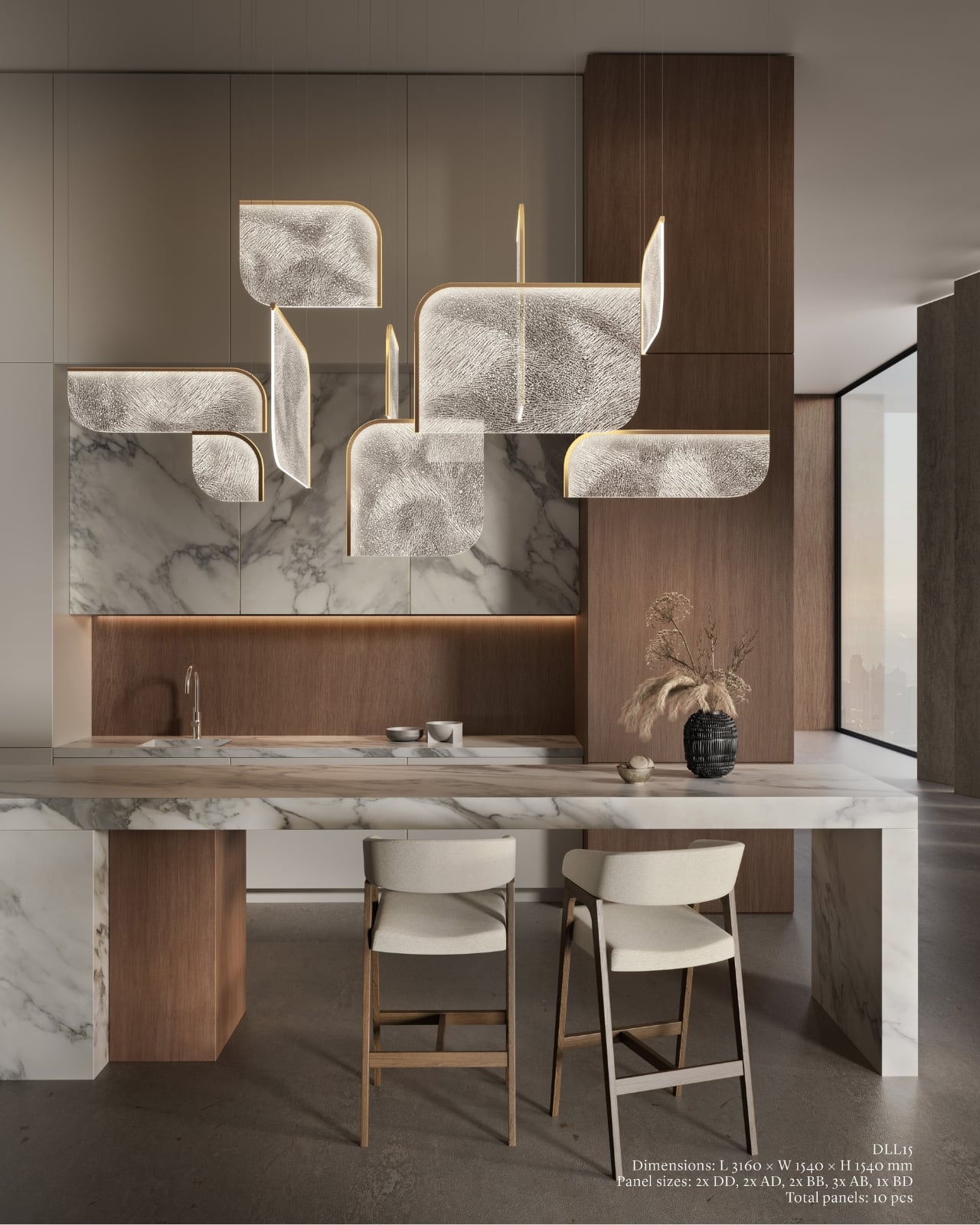
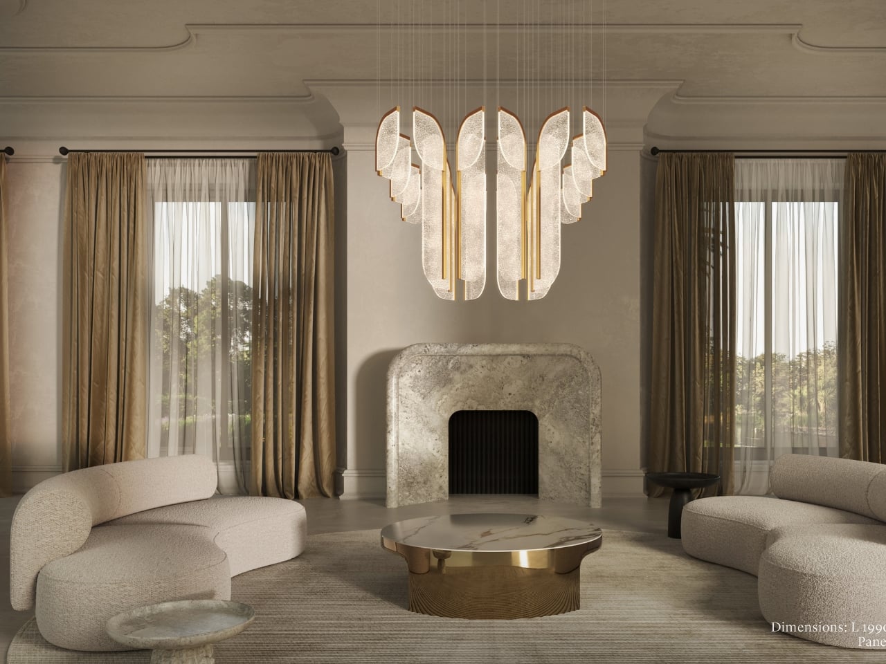
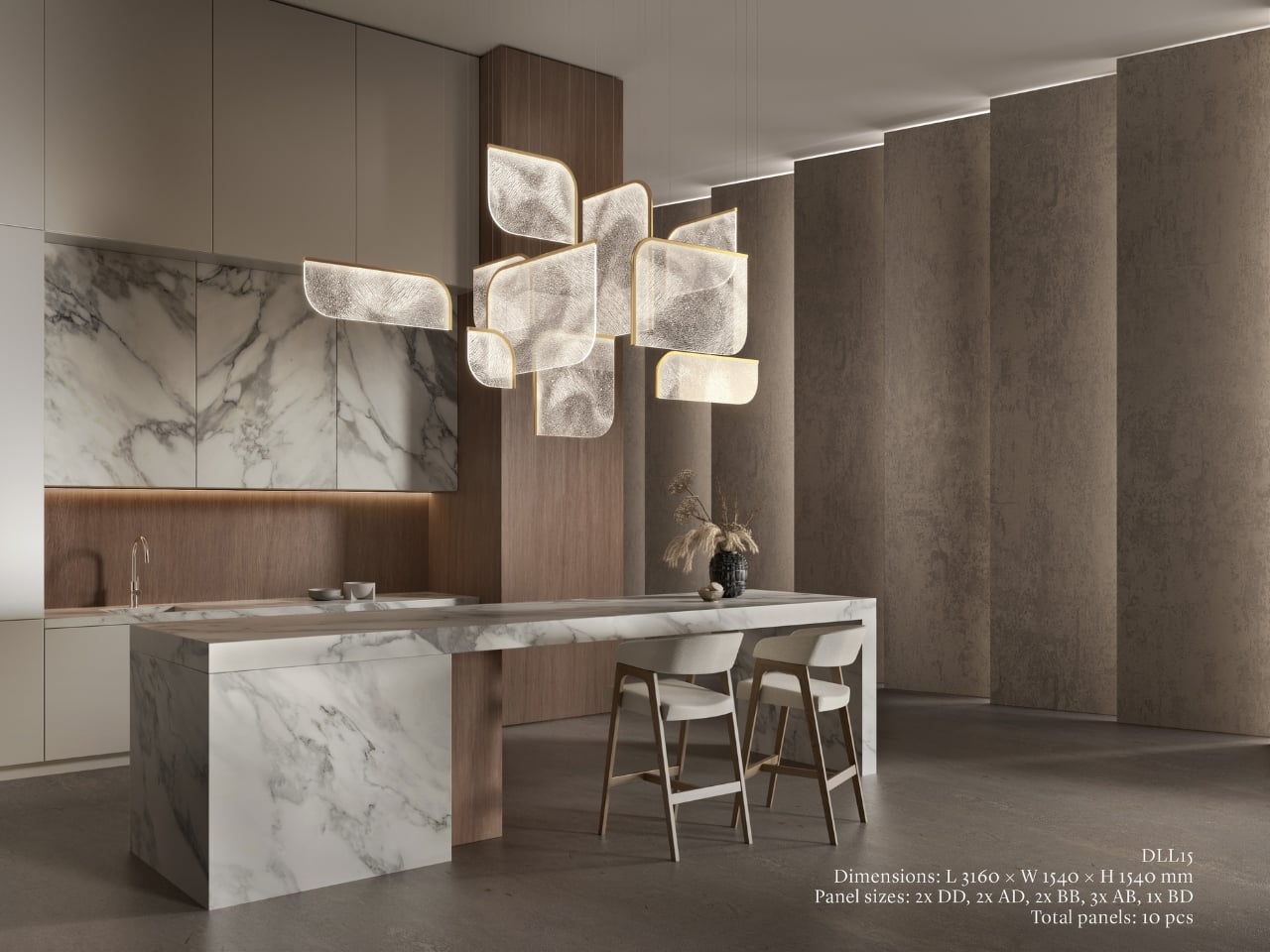
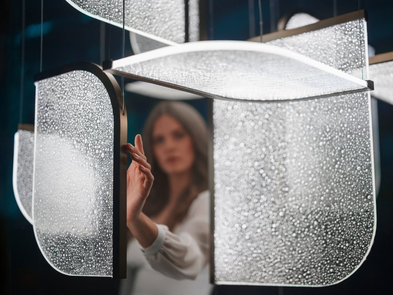
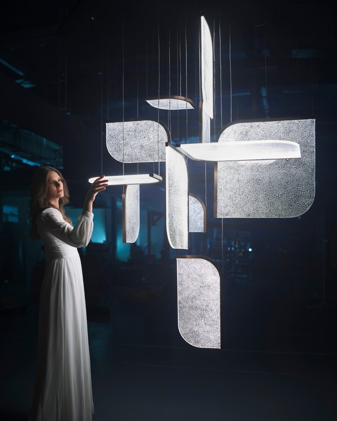
The Czech brand has been doing this long enough to know the difference between novelty and genuine craft. Their heritage is rooted in traditional glassmaking, but what they’ve built with Drifting Lights feels like a very deliberate step forward. Each piece is made up of oblong and square glass panels slotted into a stainless-steel frame that discreetly conceals an LED strip. Inside each panel, the glass has been infused with countless tiny air bubbles. When light passes through, it doesn’t just illuminate the glass. It gets lost in it, scattering through those bubbles in a way that looks less like electricity and more like light deciding where it wants to go.

Designer: Preciousa Lighting

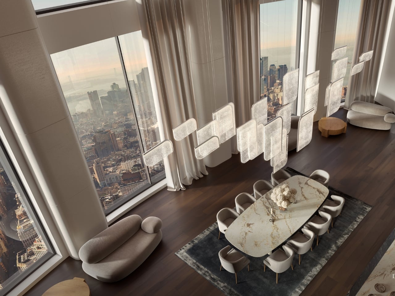
For Milan Design Week 2026, Preciosa is bringing the full Drifting Lights experience to the Tempesta Art Gallery in Brera, and the scale alone is worth paying attention to. The installation spans approximately 30 square metres and features 60 glass panels suspended vertically and horizontally, forming a structure measuring 8.7 by 3.2 by 3 metres. Set against a dark interior, the panels will be animated using 3D spatial mapping and RGBW technology, cycling through colour sequences from red to pink to green. Co-Creative Directors Michael Vasku and Andreas Klug put it plainly: the installation aims at “creating space to slow down, pause and wonder.”
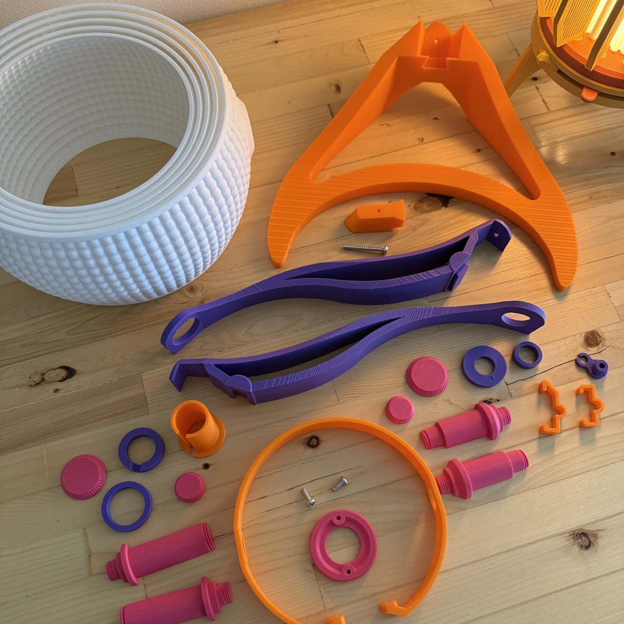
I appreciate that framing, because Milan Design Week is genuinely relentless. Every brand is competing for the loudest moment, the most shareable installation, the boldest statement. There is a real temptation to optimise for the 15-second video clip rather than the actual experience of standing in a room. Preciosa is betting on the opposite, and I think that’s the smarter play. The colour sequence from red to pink to green reads like an emotional arc rather than a tech demo, referencing love, passion, and inner peace. Whether or not you buy the symbolism, you can’t argue with the atmosphere it creates.
A design object earns its place when it works just as well outside a gallery as inside one, and Drifting Lights has clearly been thought through on that level. The panels come in ten sizes, with different metal frame finishes and the option to orient them vertically or horizontally. The same collection can fill a grand hotel lobby or anchor a living room without losing its character. For bespoke projects, Preciosa can apply a painting technique that introduces pigment bubbles into the glass, giving each panel a layer of quiet individuality. The bubbled glass can also be enhanced with their Fused Veil pattern, which shifts the direction of light and adds even more visual complexity.

Under static illumination, Drifting Lights is calm and composed. Switch to dynamic mode and the panels come alive, with light moving from one to the next like ink dispersing through water. The gradients bloom, soften, and recombine. It’s the kind of effect that makes you stay in a room longer than you planned, which is, ultimately, what great lighting is supposed to do.

Preciosa has had a strong run at Fuorisalone in recent years, with recognised installations at Zona Tortona and Euroluce. The move to Tempesta on Foro Buonaparte suits the work well: a contemporary art gallery setting that lets the installation breathe without competing with showroom furniture. It’s a confident choice for a collection that clearly doesn’t need much help making a room feel different. If you’re heading to Milan, the installation runs April 20 to 26 at the Tempesta Art Gallery on Foro Buonaparte, and this one is worth the detour.

The post Preciosa To Make Light Feel Like a Living Thing at Milan 2026 first appeared on Yanko Design.