The FIFA World Cup, the world’s biggest sporting event, is just a few months away. While there are some issues cropping up in the host countries (specifically the US and Mexico; Canada seems to be doing just fine), brand tie-ups are in full swing with global partners such as Adidas, Coca-Cola, Visa, Qatar Airways, Hyundai-Kia, etc.
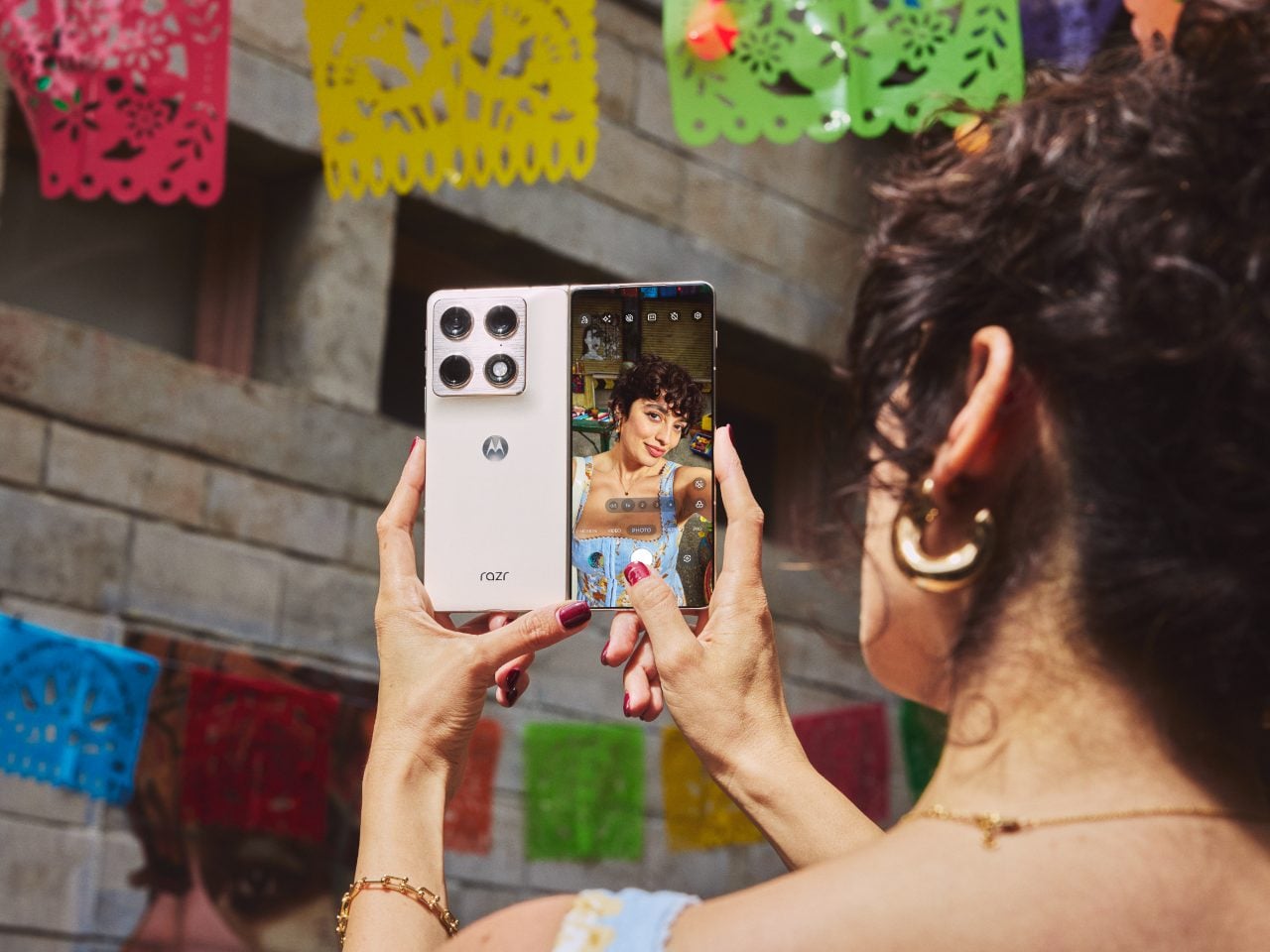
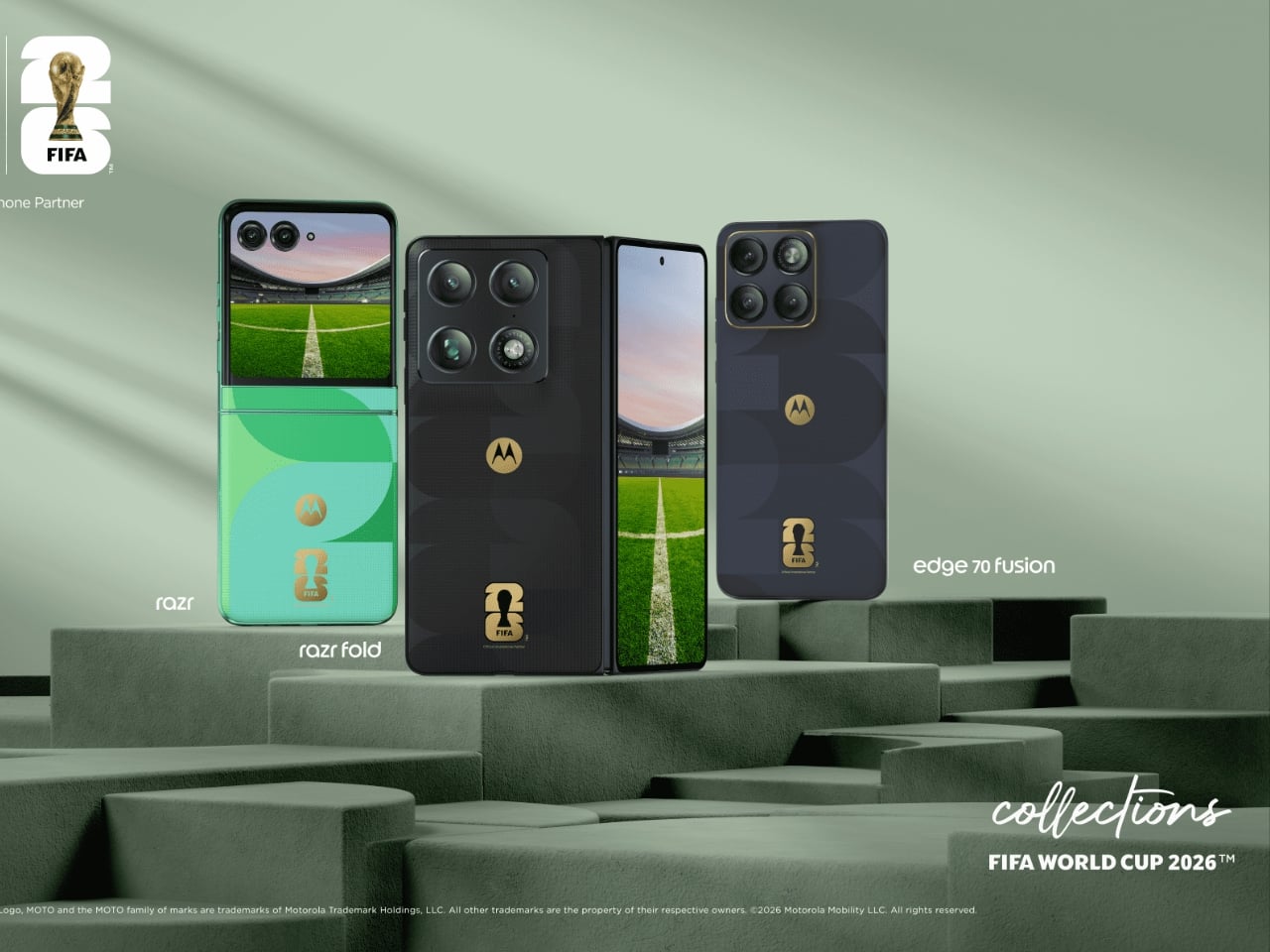
Motorola just announced two new additions to its FIFA World Cup 26 Collection, and they are exactly the kind of phones that make you stop scrolling. The Razr Fold and Edge 70 Fusion now have limited edition versions draped in football-inspired design and 24K gold accents, and whether you follow the sport or not, the craftsmanship here is genuinely worth paying attention to.
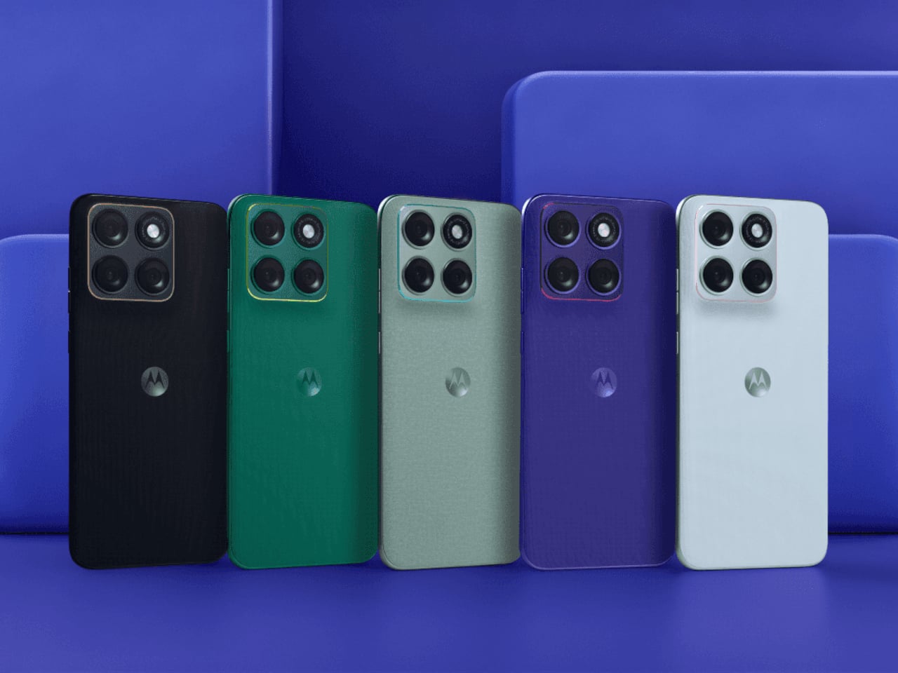
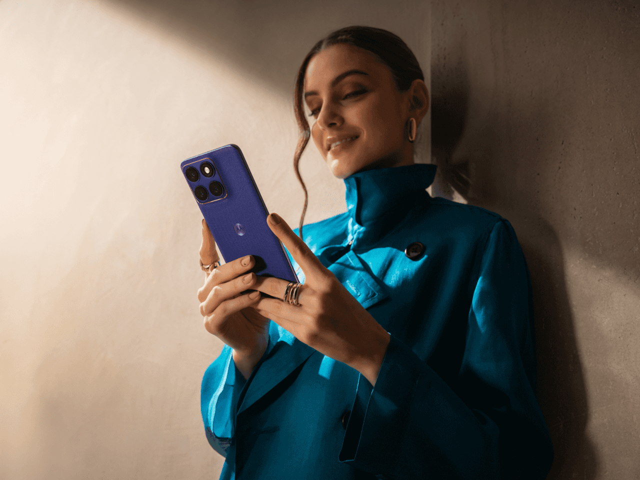
Designer: Motorola
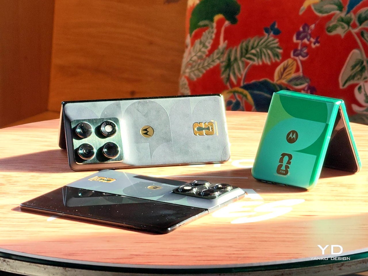
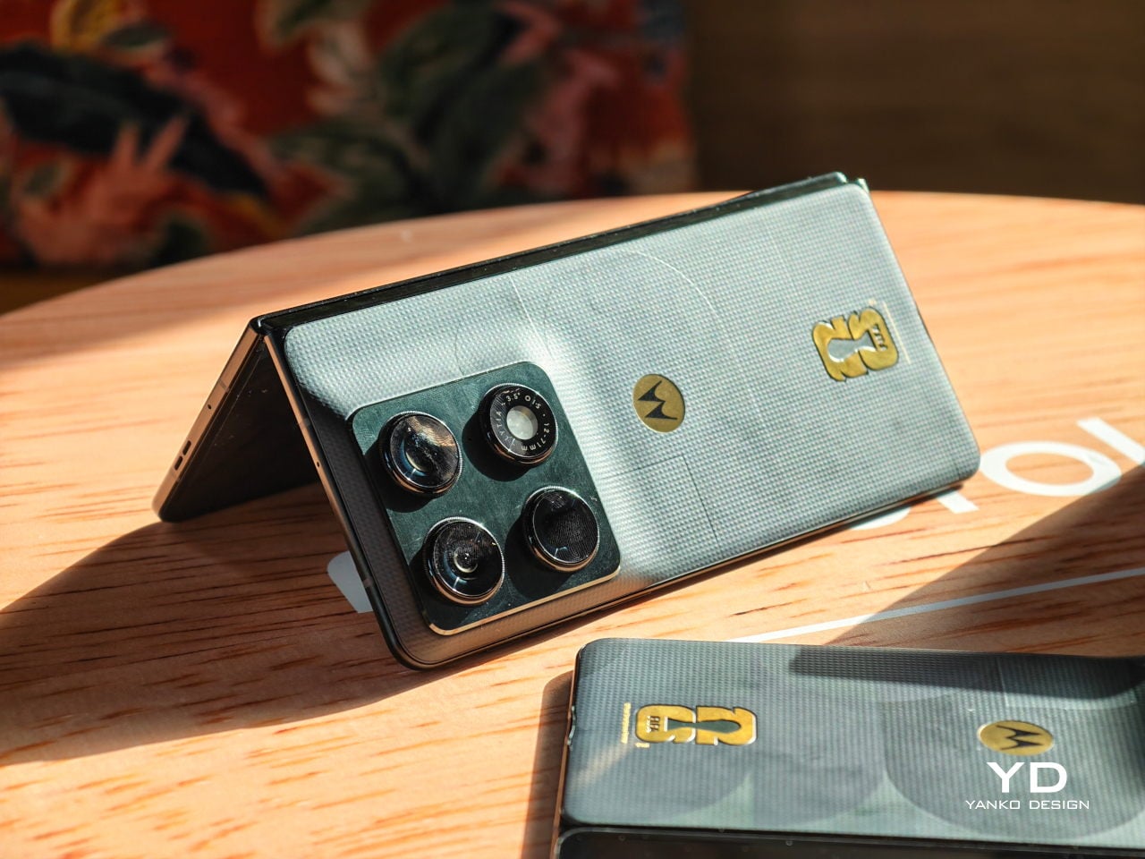
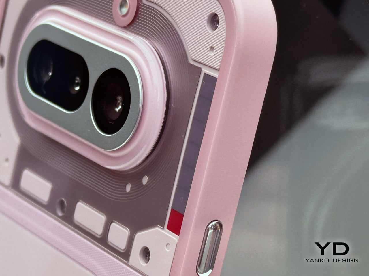
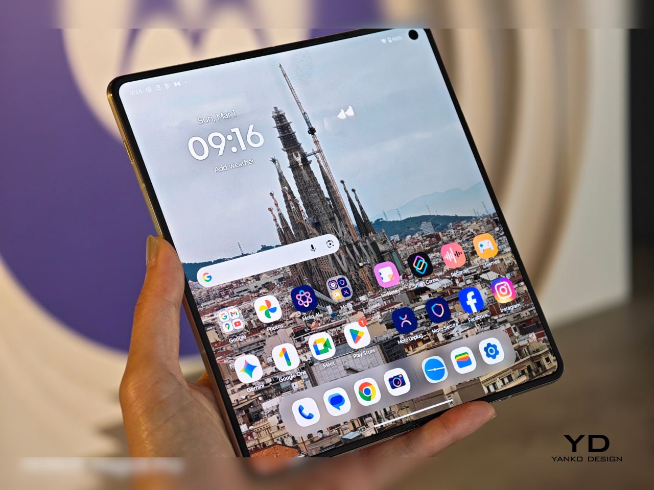
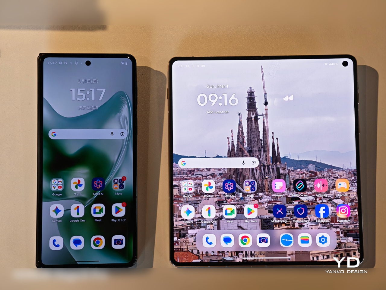
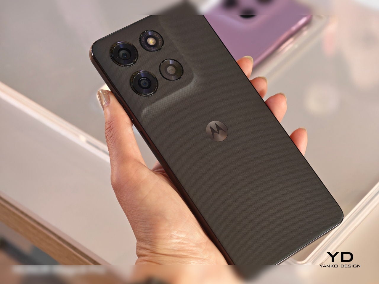
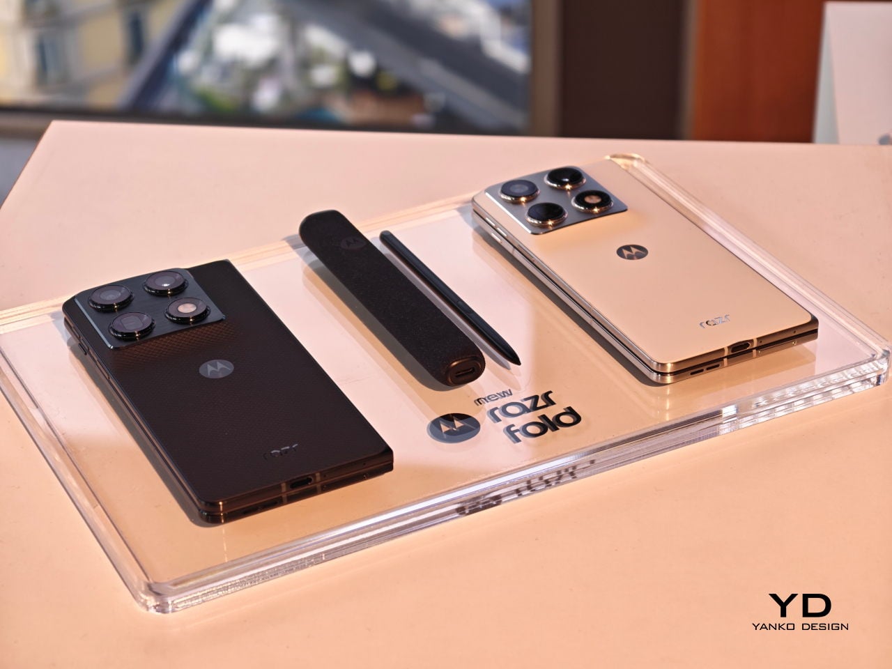
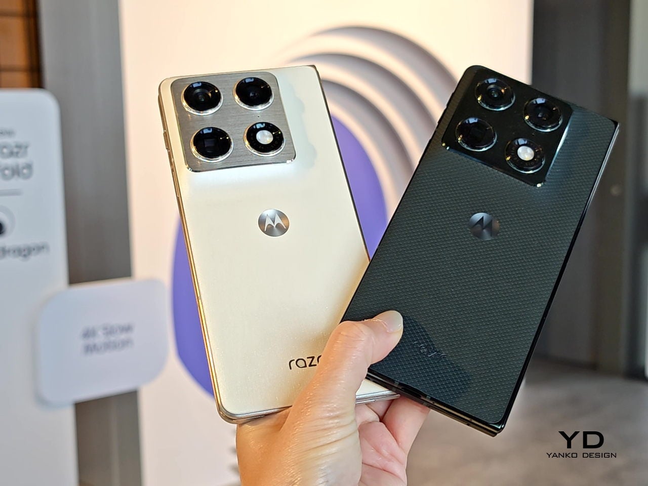
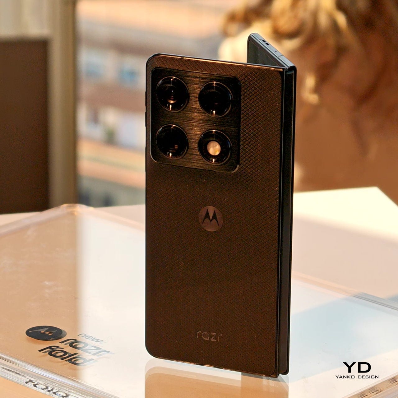
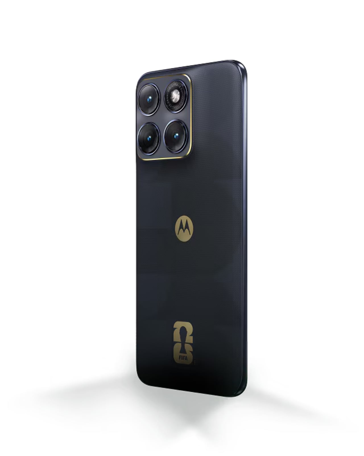
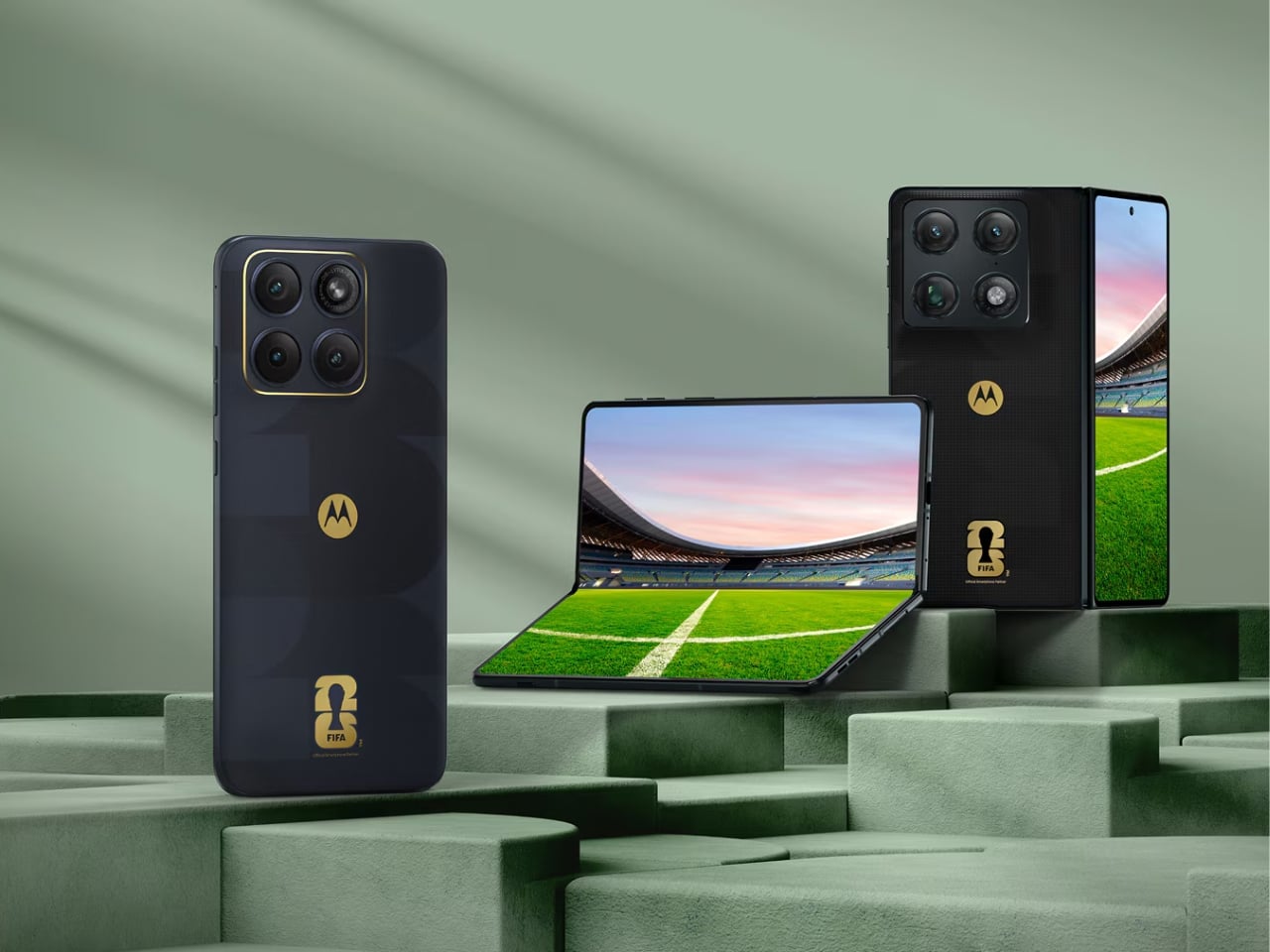
Let me start with the big one. The Razr Fold FIFA World Cup 26 Edition is Motorola’s first book-style foldable, and giving it a limited-edition treatment this early is a bold move. Motorola could have slapped a logo on the back and called it a day, but instead they went further. The back cover features a textured raised-dot pattern pulled directly from the surface of a football, giving the device a tactile quality that you actually feel in your hand. Add the glossy “26” typography cutting through that texture, and the whole thing has a collectible quality that feels deliberate rather than decorative.
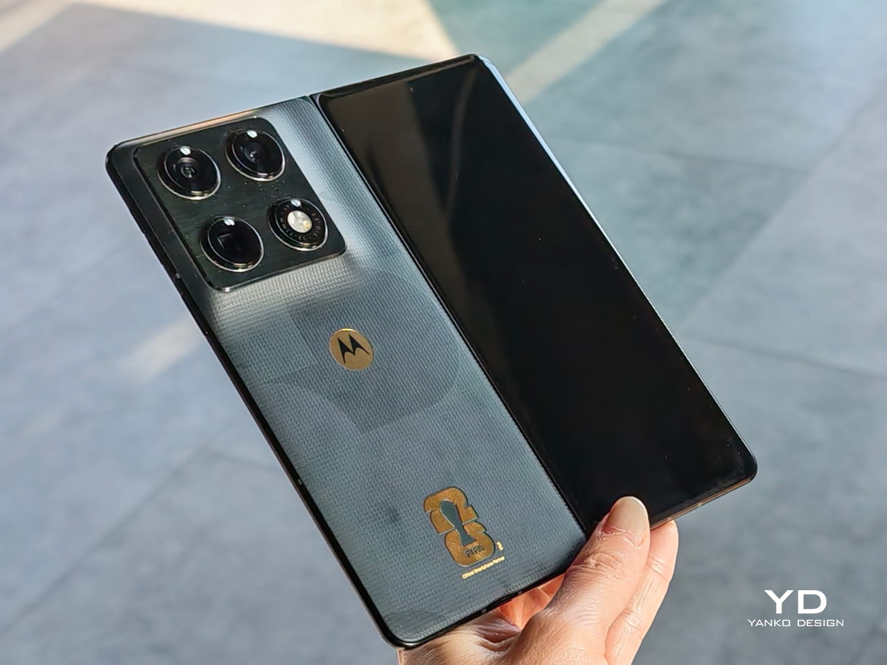
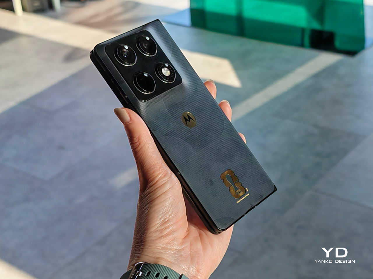
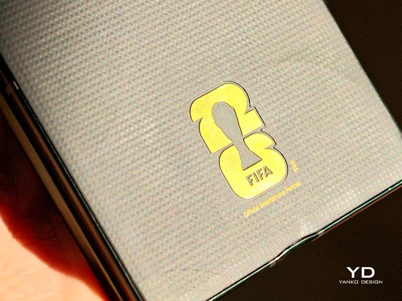
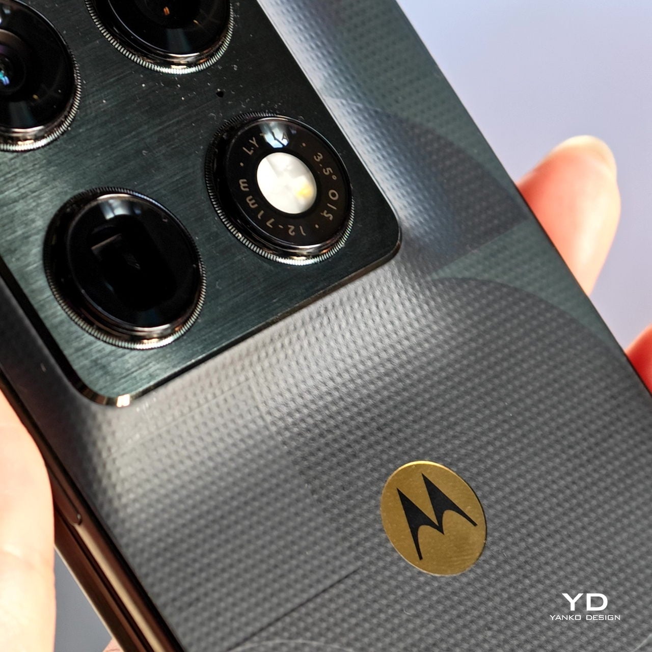
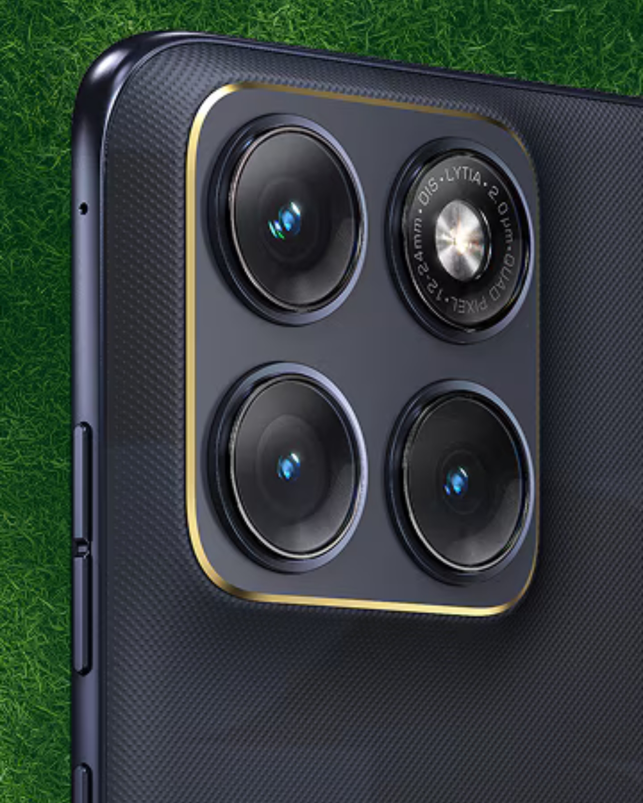
The 24K gold-plated FIFA and Motorola logos push it a step further into trophy territory. Under the hood, the Razr Fold runs on a Snapdragon 8 Gen 5 chip, carries a 6,000mAh battery, and sports an 8.1-inch internal display alongside a 6.6-inch cover screen, with three 50-megapixel cameras on the back. As a debut foldable from Motorola in the book-fold format, it’s already a statement device. The FIFA edition makes that statement louder.
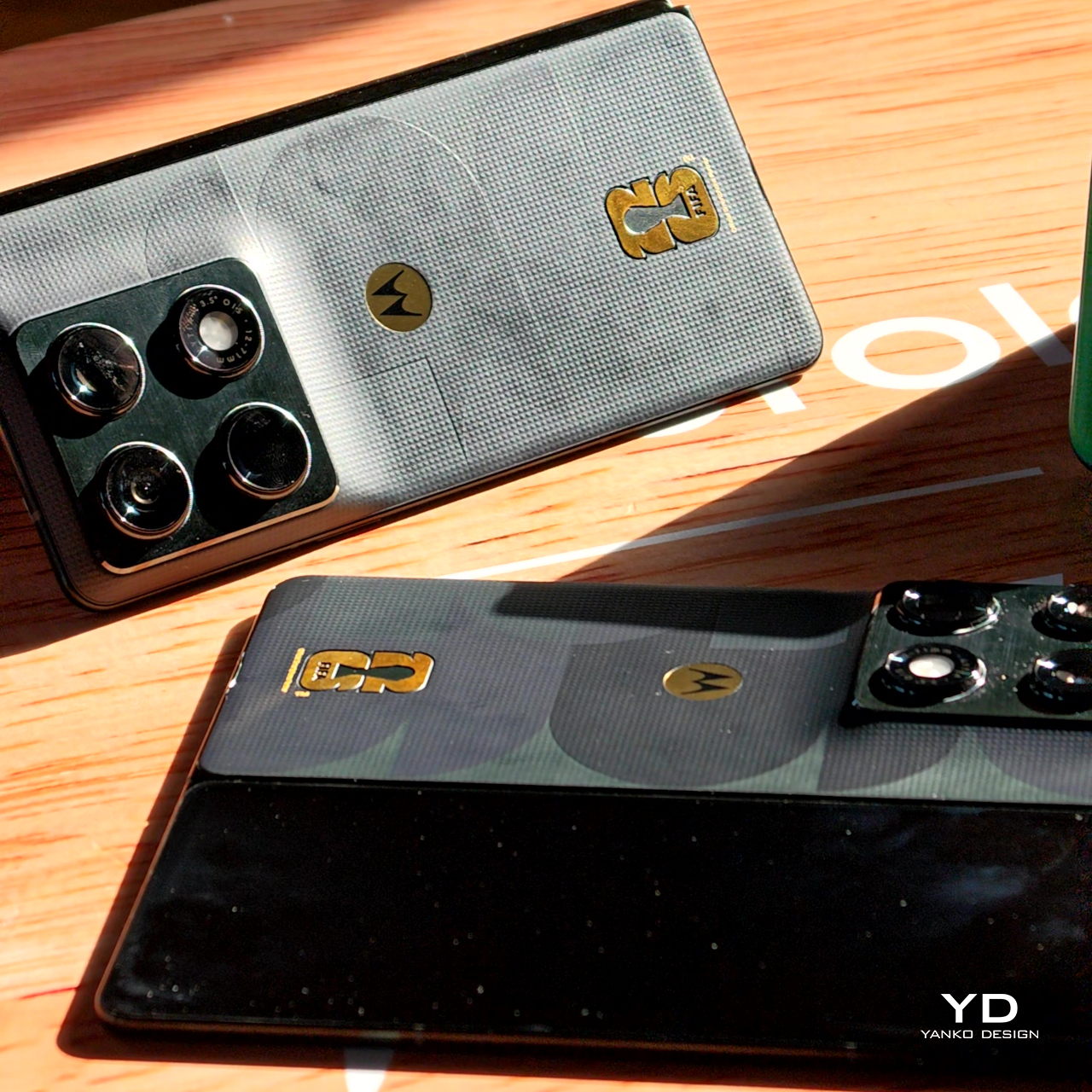
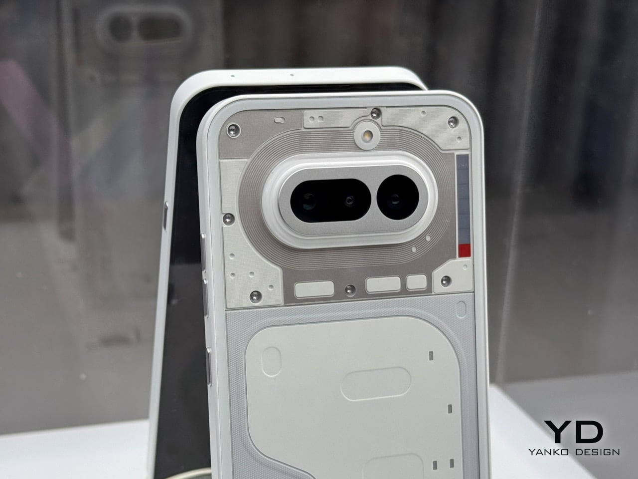
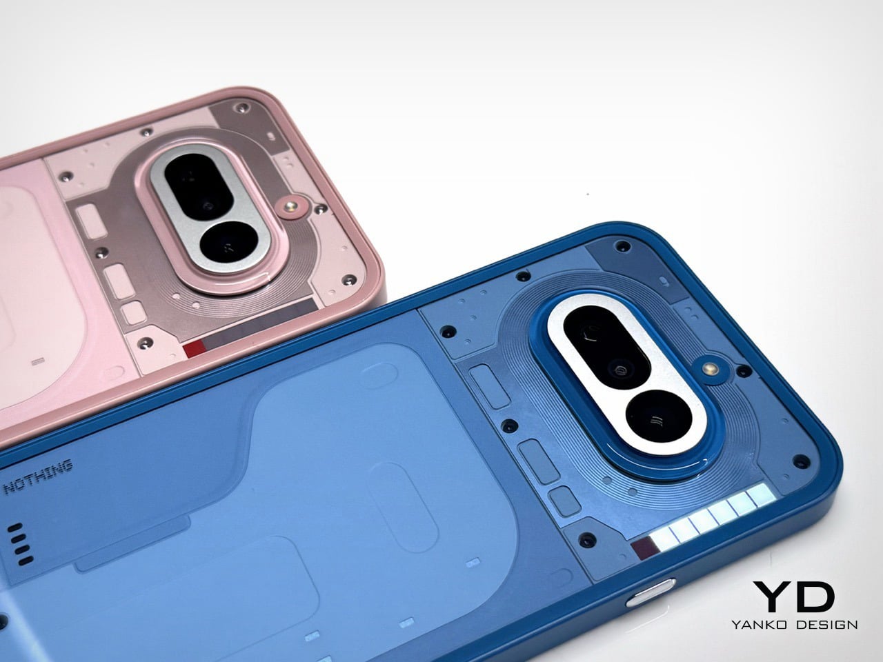
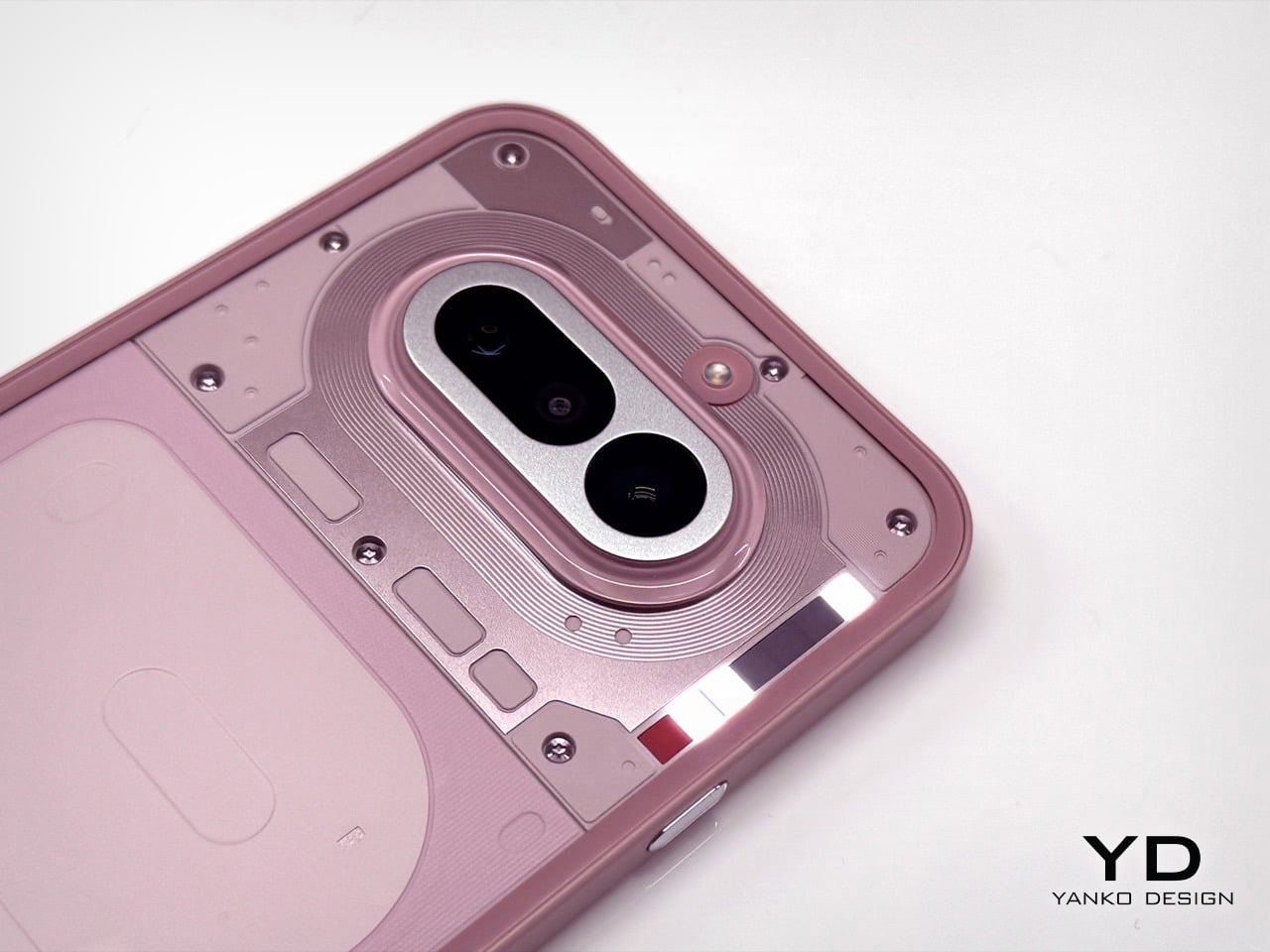
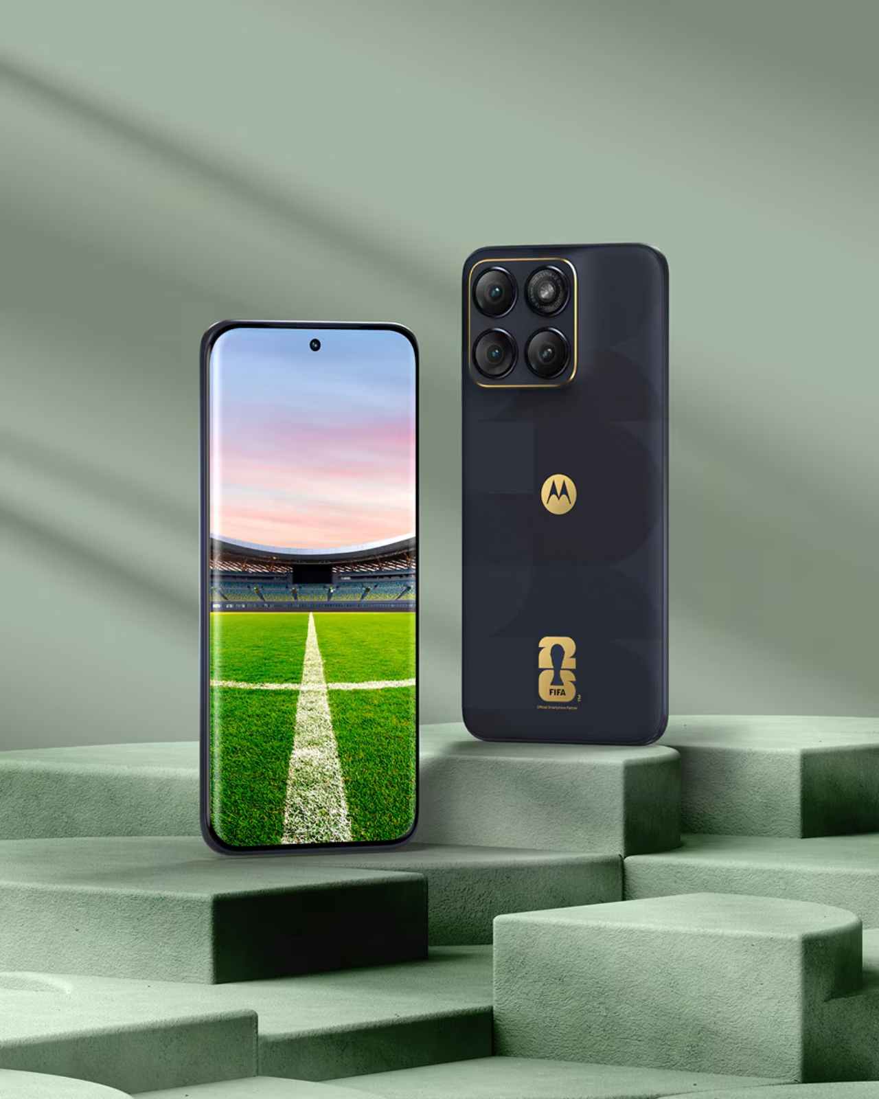
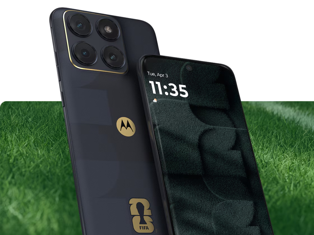
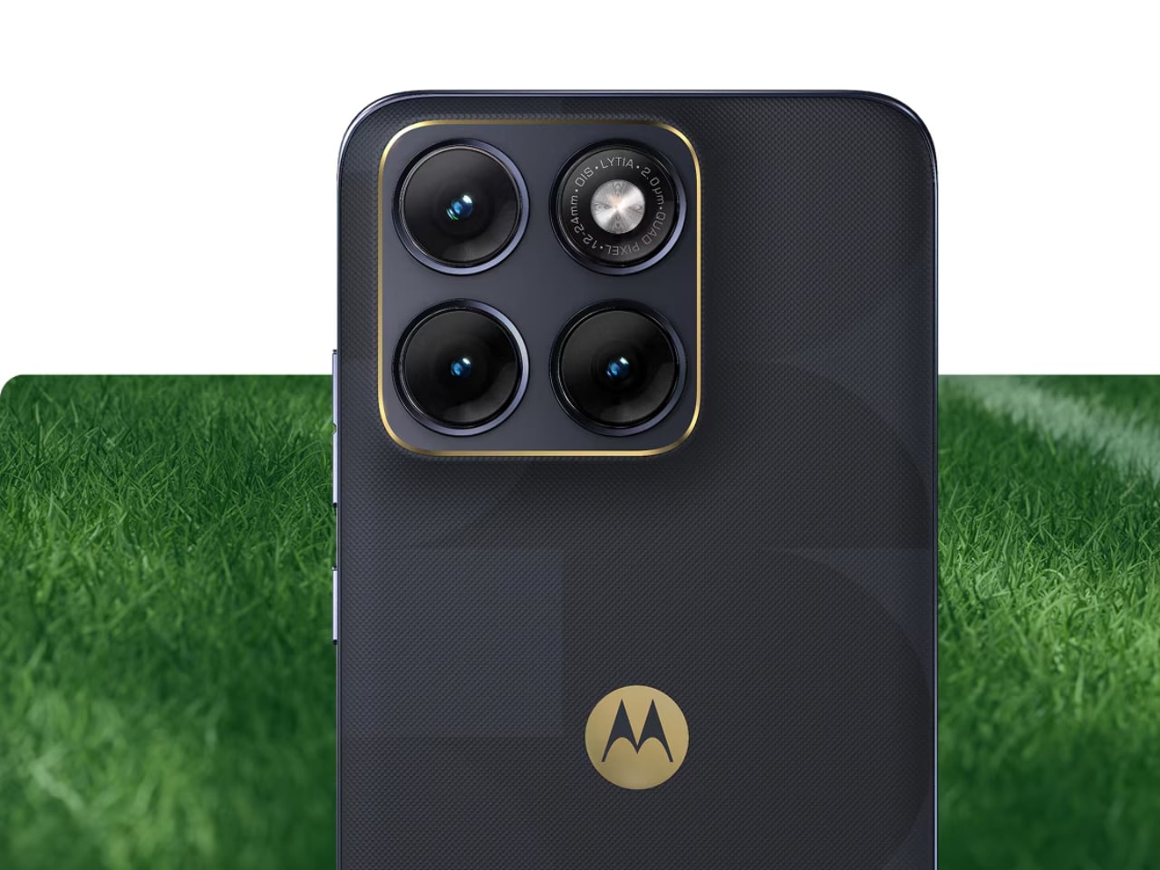
The Edge 70 Fusion FIFA World Cup 26 Edition takes a different approach, and it might actually be the more interesting design story of the two. Instead of the raised-dot texture, Motorola gave the Edge 70 Fusion a leather-inspired finish that replicates the iconic feel of a football’s surface. It’s a detail that sounds subtle but lands with real impact when you see it, because it turns an everyday mid-range phone into something that clearly belongs to a collection. The 24K gold accents extend around the camera island’s perimeter, which keeps the premium feel consistent without overwhelming the design. The phone runs on a Snapdragon 7s Gen 3 chip with a 6.8-inch 144Hz AMOLED display protected by Gorilla Glass 7i, and a 5,200mAh battery. As a mid-range device, the Edge 70 Fusion positions this collection as accessible, not just aspirational, which I think is the right call.
Both phones join the previously released Motorola Razr FIFA World Cup 26 Edition, forming what Motorola is calling the FIFA World Cup 26 Collection under its Collections by Motorola series. Announced at MWC 2026, the collection reflects Motorola’s role as the Official Smartphone Partner of FIFA World Cup 2026, which explains the depth of investment here. This isn’t a one-off co-branded phone. It’s a full lineup with real design thinking behind it.
Sport and technology collaborations can go either way. At their worst, they feel like a badge-slapping exercise where a logo gets placed on an otherwise unchanged product and the price goes up anyway. At their best, they create objects that hold cultural weight beyond their function. What Motorola has done here leans closer to the latter. The texture choices are thematic without being gimmicky. The gold accents are restrained enough to read as premium rather than flashy. And the fact that the design is carried across two very different form factors, a flagship foldable and a mid-range slab, shows that this is a cohesive collection, not just two isolated product moments.
Whether you’re a football fan who wants your phone to carry some of that match-day energy, or simply someone who appreciates when tech and design intersect in a meaningful way, the FIFA World Cup 26 Collection makes a case for itself. The Razr Fold and Edge 70 Fusion FIFA editions are set to arrive in select markets next month. If these end up being the kind of phones that get displayed on a shelf rather than used as daily drivers, I genuinely wouldn’t blame anyone for that decision either.
The post Motorola Just Put 24K Gold on Phones for the World Cup first appeared on Yanko Design.