Most conversations about aging and technology eventually circle back to the same frustrating gap: the tools we build for older people rarely feel like they were designed with older people in mind. They’re functional, clinical, and often carry the visual language of a hospital supply catalog. SAM, a concept robotic mobility aid designed by David Webber for Samsung, feels like a direct response to that problem, and it’s the kind of design thinking I genuinely want more of.
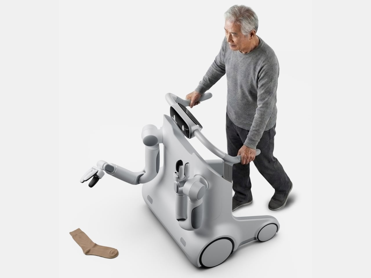
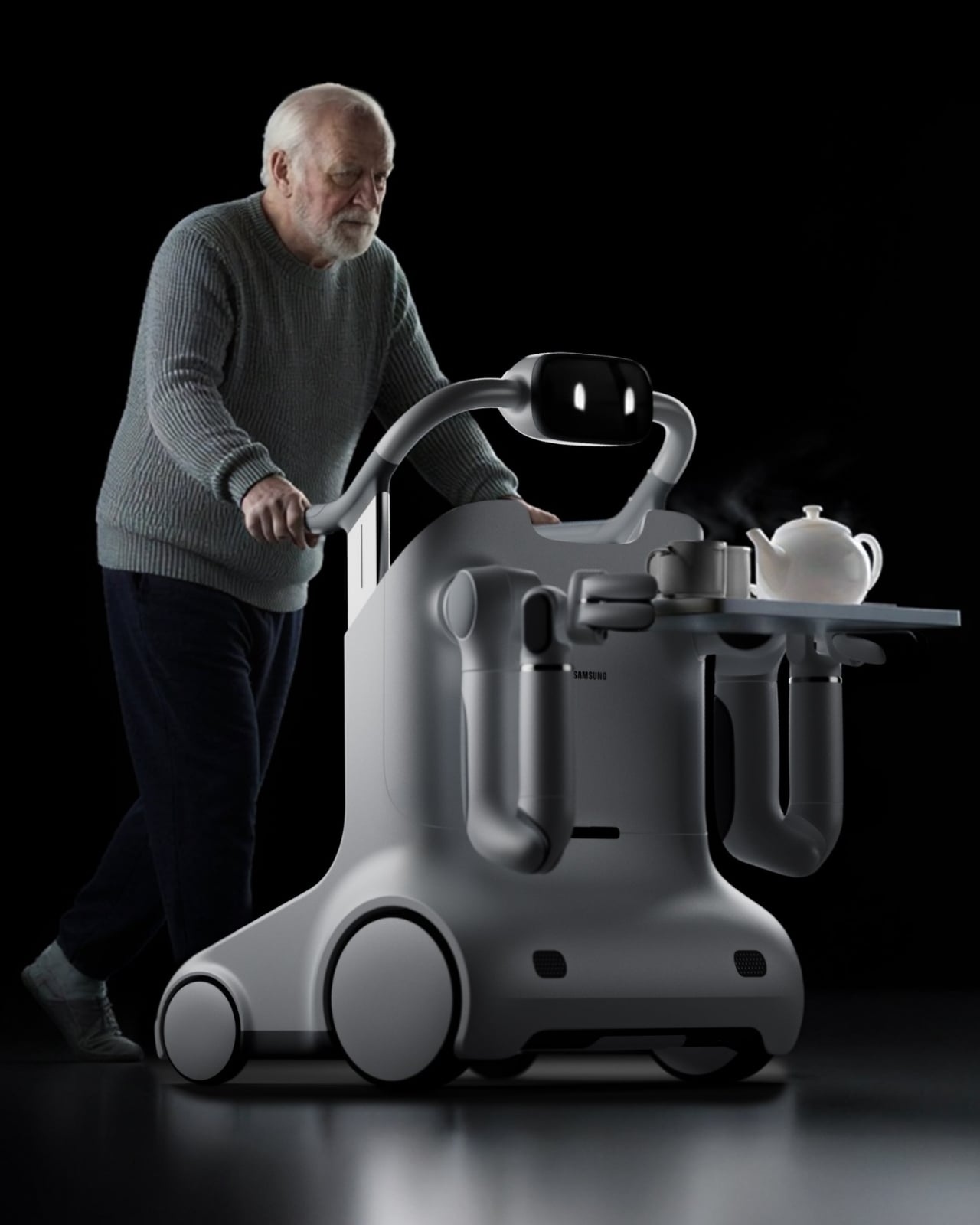
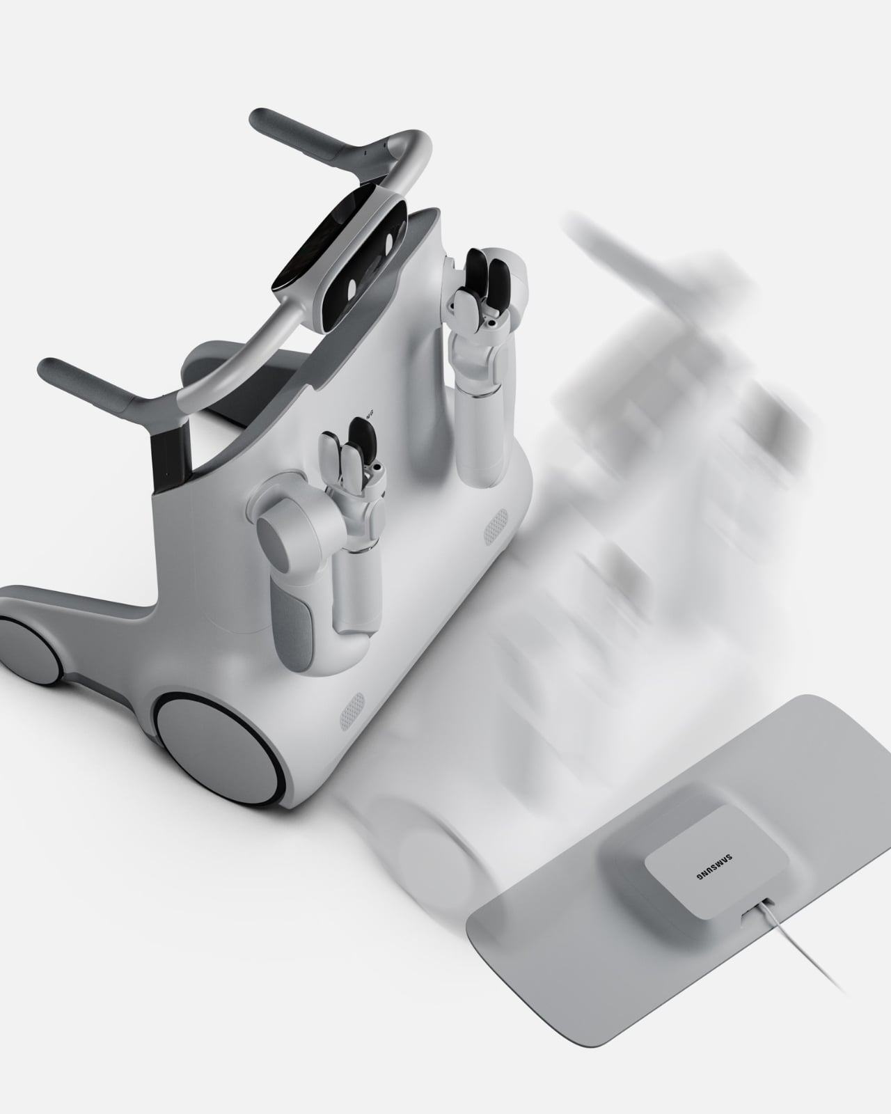
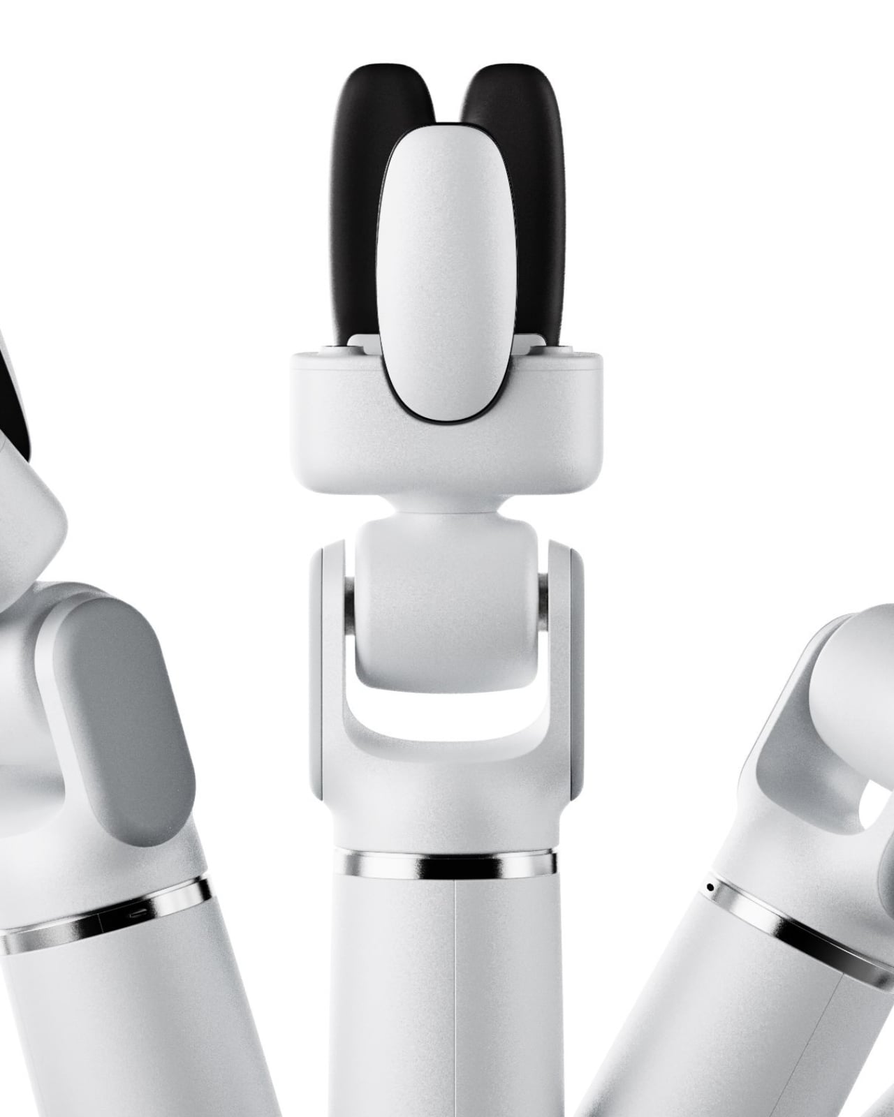
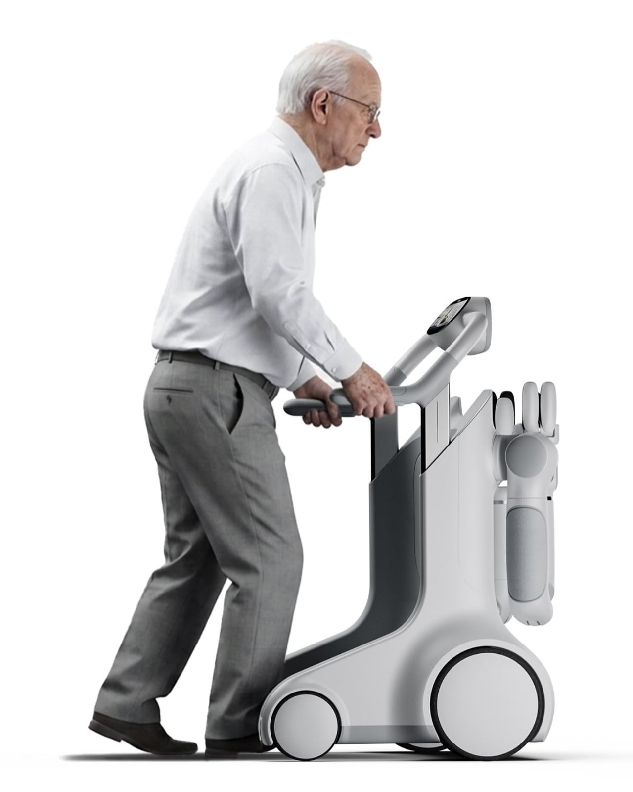
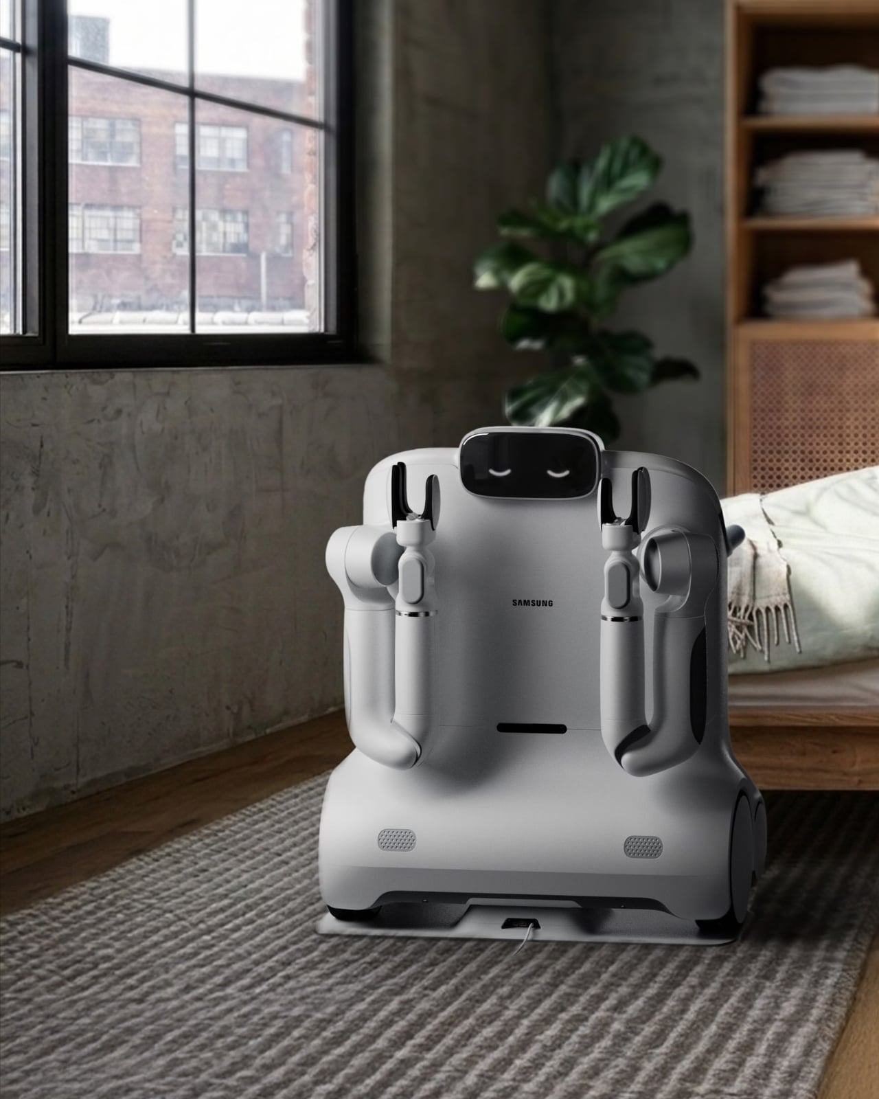
At first glance, SAM looks like it belongs on a near-future film set. The rounded, cloud-white body, the articulating arms, the small expressive face-like display on top. But spend a little more time with it and the aesthetics start to make sense in a very deliberate way. Webber didn’t want SAM to read as medical equipment. He wanted it to feel like a companion, something you’d actually invite into your home and not hide in a corner when company comes over.
Designer: David Webber for Samsung
What SAM does differently from most mobility aids is where the real story lives. A standard walker or rollator solves one problem: moving from point A to point B. SAM looks at the fuller picture of what daily independence actually requires. Picking up a dropped object from the floor. Carrying groceries from the door to the kitchen. Helping someone rise from a chair safely. These are the small, invisible tasks that quietly determine whether an older adult can continue living alone or not, and they are almost entirely absent from the current conversation around mobility technology.
The concept is built around the idea of physical AI, the notion that artificial intelligence should operate in the physical world in a way that supports human capability rather than overriding it. SAM doesn’t take over. It doesn’t assume. The user stays in control, and the technology fills in the gaps, which is a harder design problem than it sounds. Building something that assists without patronizing, that helps without making a person feel like they’ve surrendered something, requires a kind of empathy that most tech doesn’t bother with.
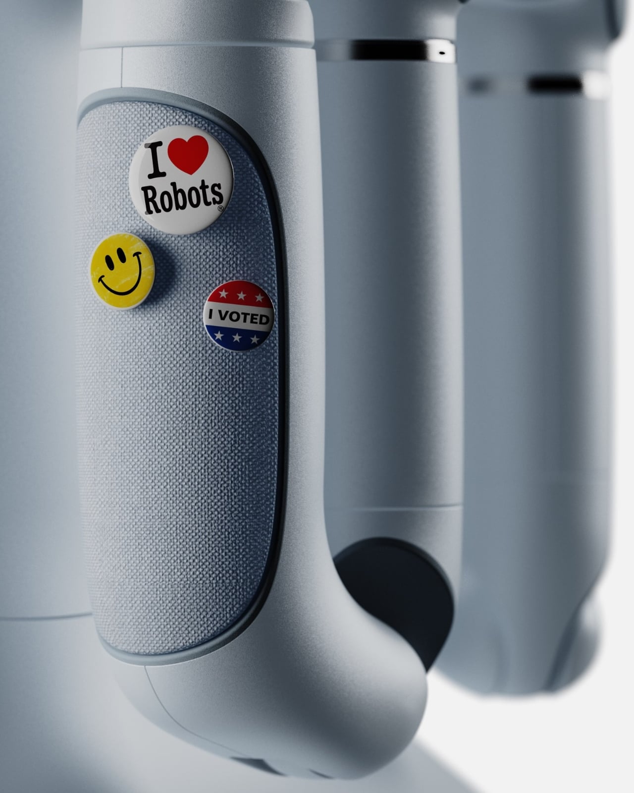
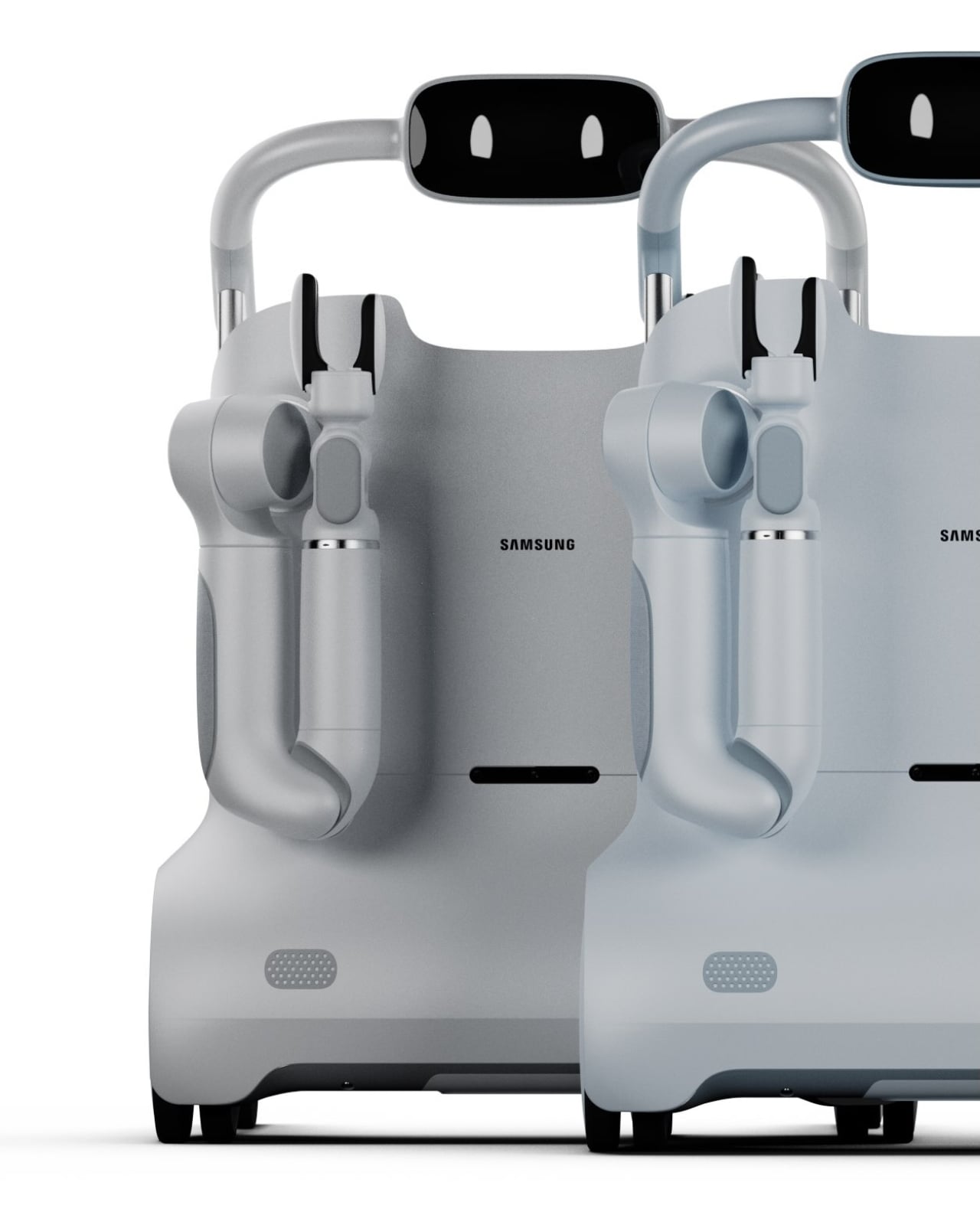
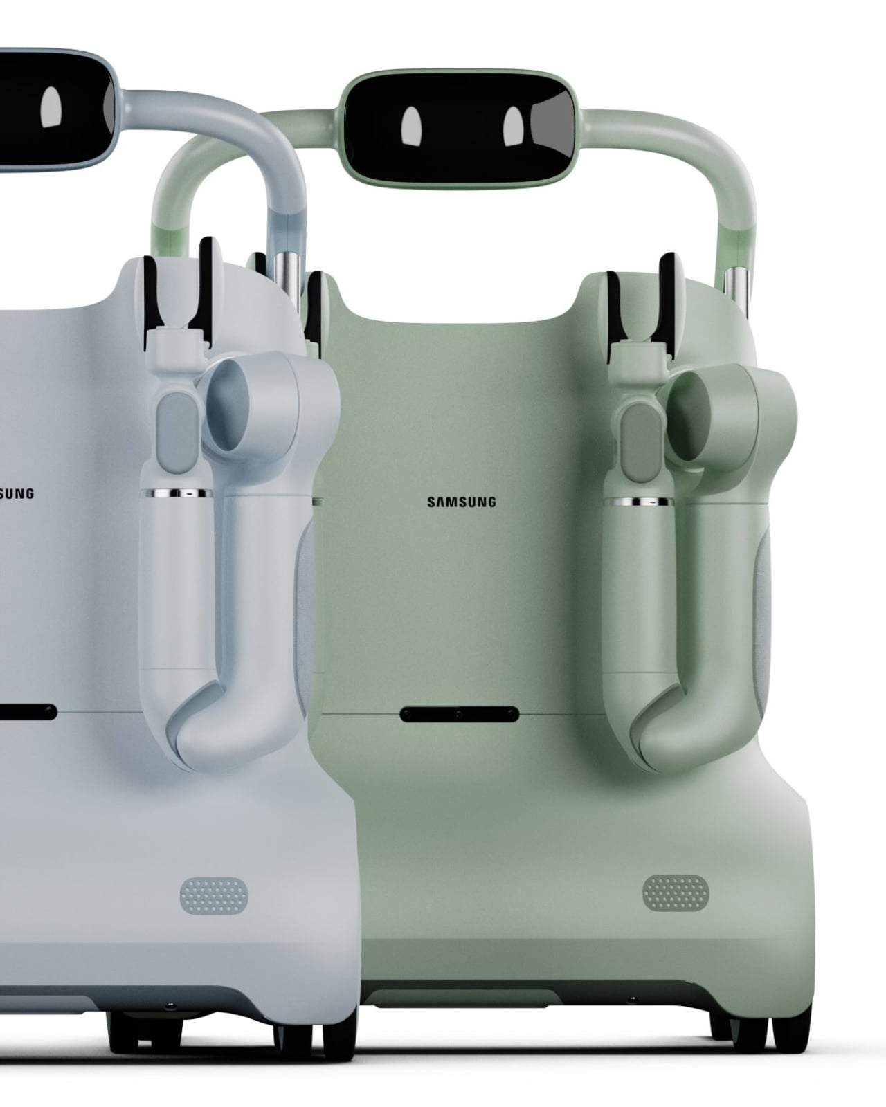
I’ll be direct: the design of SAM is one of the more thoughtful things I’ve seen come out of a Samsung concept in a while. The color options, soft greys and muted sage greens, feel intentional. They’re domestic. They say “living room” rather than “rehab facility,” and that distinction matters enormously for user dignity and adoption. Nobody wants to use a tool that announces their limitations to every visitor who walks through the door. SAM seems to understand that.
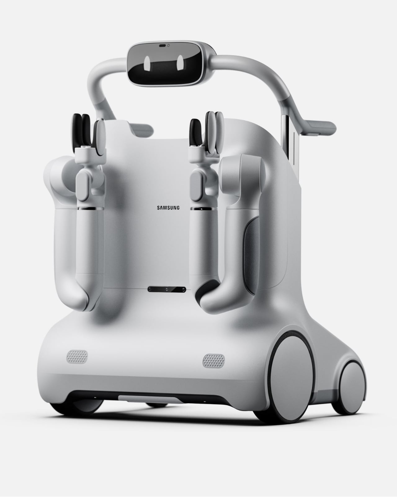
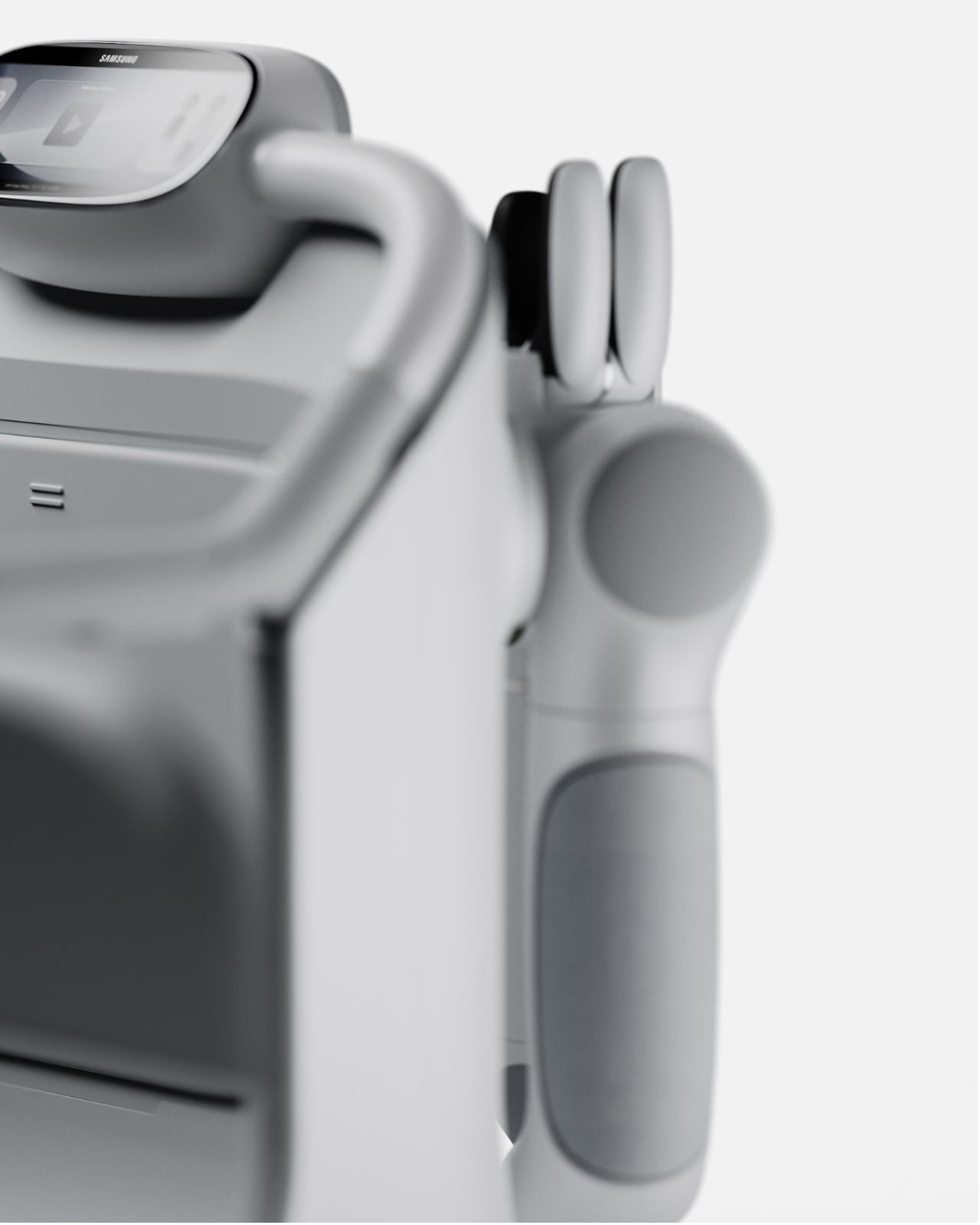
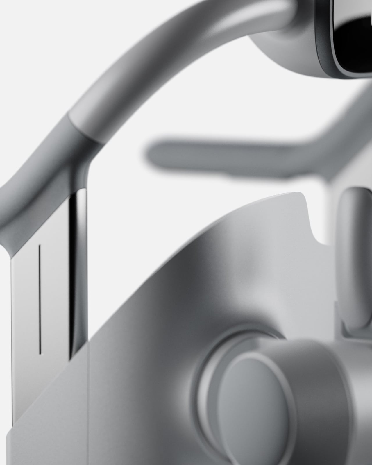
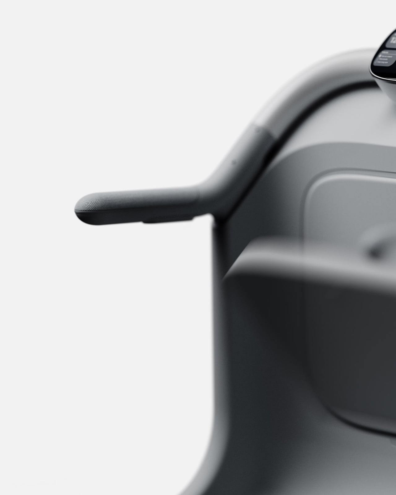
The arms and end-effectors are worth a close look too. The gripper design is specific enough to handle real objects but rounded and soft-looking enough not to feel threatening. The integrated display sits at a natural eye level when someone stands and grips the handles, showing simple information like time, a to-do list, and device status. It’s thoughtful UX layered into an already thoughtful form.
Is SAM a product you can buy right now? No. It’s a concept, a vision piece, and it should be taken as one. But the best concept designs do something important: they shift where the conversation is pointed. Right now, too much of the assistive tech space is focused on reactive solutions, devices that help after a fall, after a diagnosis, after independence has already started to erode. SAM is proposing something more proactive. It’s asking what support looks like before the crisis, and that’s a question the industry desperately needs to sit with.
What I hope designers, healthcare companies, and tech brands take from SAM is not the specific form but the underlying philosophy. That independence isn’t just about mobility. That dignity is a design requirement, not a bonus feature. That the people who need the most thoughtful design often receive the least considered version of it. If SAM pushes even one conversation in that direction, David Webber has done something genuinely worth paying attention to.
The post SAM Might Be the Most Human Thing Samsung Has Finally Built first appeared on Yanko Design.