Caring for elderly residents in a facility setting is one of the most demanding jobs in healthcare. Staff are stretched thin, emergencies don’t follow schedules, and the systems many facilities still rely on, from paper logs to fragmented call tools, create gaps that can have serious consequences. As populations age faster than care infrastructure can keep up, the pressure on care workers and the systems they depend on keeps mounting.
That’s the challenge Kando was designed around. Rather than layering another standalone app or device onto an already crowded workflow, it takes the form of three integrated hardware components that work together as a single connected care system. The pieces include a wearable button for residents, a wall-mounted box for the room, and central communication hubs that link the entire facility.
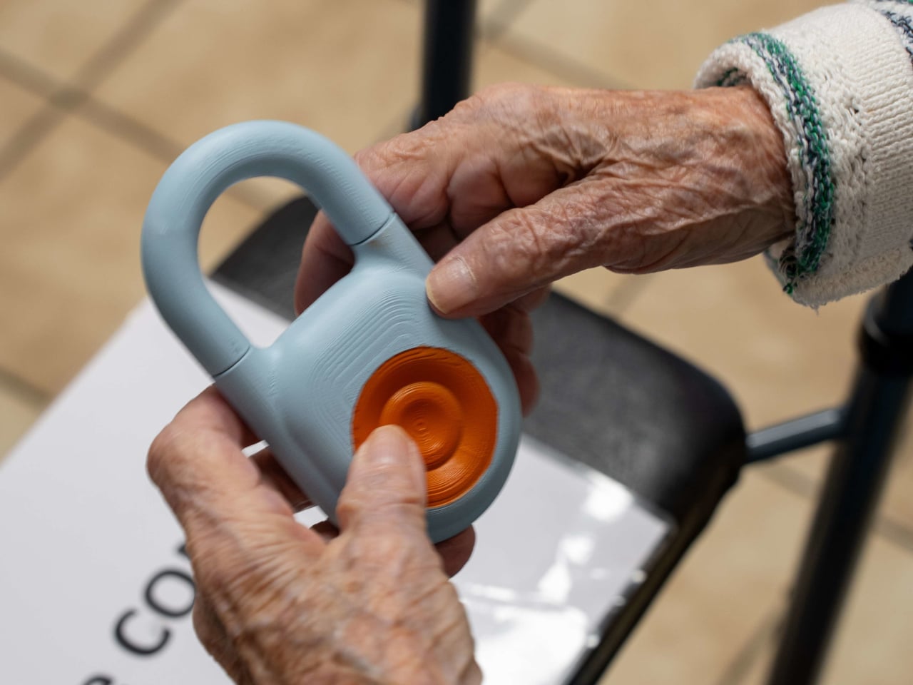
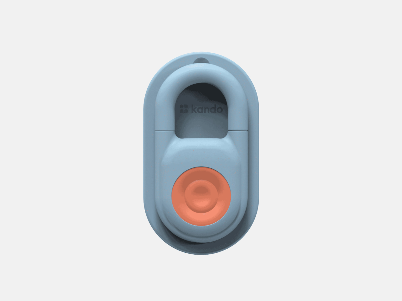
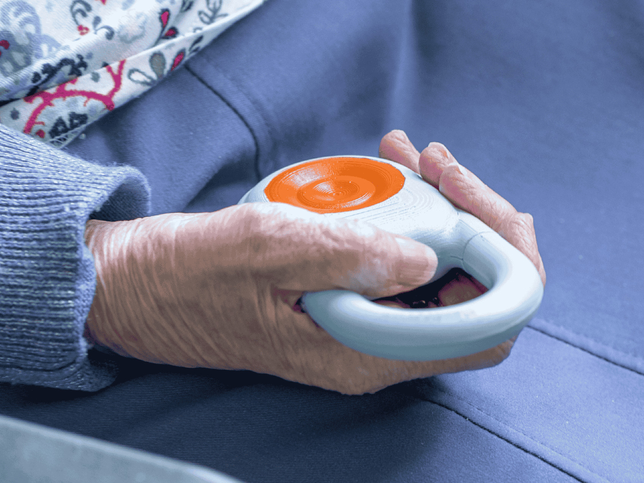
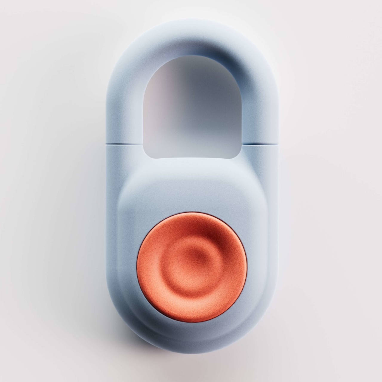
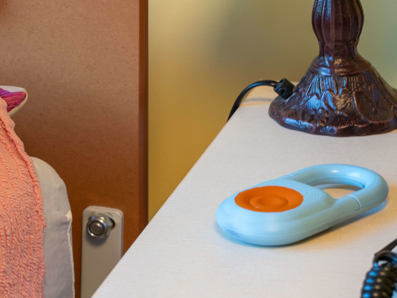
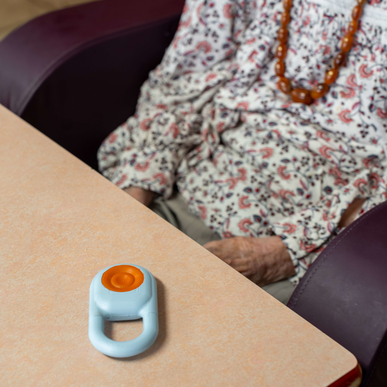
At the heart of the system is the Kando Button, a small wearable device that a resident clips onto their clothing or bed. It’s designed for simplicity: one touch triggers a request for help, confirmed immediately through both LED feedback and vibration, so the resident knows the signal went through. For someone who’s suddenly unwell or in distress, that instant confirmation matters.
Complementing the Button is the Kando Box, a wall-mounted unit that connects to the television already present in the resident’s room. Rather than adding a separate screen or terminal, it turns the TV into a visual communication interface between the resident and the care team. It’s a practical choice that keeps the environment familiar and avoids adding yet another unfamiliar device to the room.
Central hubs tie everything together, coordinating communication across the entire facility so that alerts don’t get lost between shifts. When a resident presses the Button, the information travels through a connected network rather than relying on a single staff member to notice and relay it. This end-to-end connection is what makes Kando a system rather than a collection of separate devices.
The practical outcomes add up for a facility dealing with dozens of residents and a care team that can’t be everywhere at once. Response times shorten. Paper-based documentation gives way to digital records, and over time, the operational costs tied to manual processes start to fall. For administrators, that combination of speed, accuracy, and efficiency is a genuinely compelling case.
What’s also worth noting is that Kando wasn’t designed with clinical functionality alone in mind. Every hardware decision carried a human weight too: it had to feel familiar and manageable in the hands of an elderly resident, not intimidating or cold. Medical technology often prioritizes technical function over the experience of the person it’s meant to serve, and this system tries to close that gap. The result is a system that clearly took the realities of a care environment seriously, not just from a technical standpoint but from a genuinely human one.
The home office used to mean a fixed address. A monitor you couldn’t move, a dock you couldn’t pack, a microphone that lived on one corner of a desk and stayed there. That arrangement made sense when remote work was the exception. Now that it’s the default for a significant portion of the workforce, the gear still hasn’t caught up with how people actually want to work.
These five products make a different argument. Each one is compact enough to slide into a standard laptop bag alongside your computer, and each one eliminates a specific piece of furniture or peripheral that used to anchor you to a single room. Together they cover the full surface area of a home office: display, input, audio, connectivity, and video. The café table, the hotel desk, the airport lounge seat — all of them become the office.
1. VitaLink Portable Keyboard + 4K Touchscreen
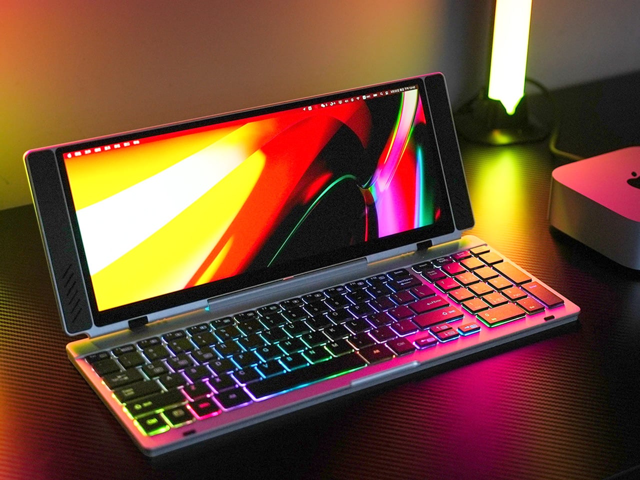
Closed, the VitaLink reads as a slim aluminum book, 20mm thick and roughly the footprint of a hardcover novel. Nothing on the outside hints at what’s inside. Open it at 180 degrees and a 13-inch, 3840×1600 touchscreen lifts above a full-width keyboard, the whole unit settling into a 34 by 15 centimeter footprint. That transformation from flat slab to dual-screen workspace is the core of the product’s appeal, and it holds up once you actually sit down with it for a full working session.
The screen runs at 298 pixels per inch, which puts it on par with Apple’s Retina displays and well above most portable monitors in this category. The 2.4:1 aspect ratio gives you enough horizontal span to run a document alongside a reference panel without either feeling squeezed. The keyboard uses 3.27mm key spacing and 0.8mm scissor switch travel, which makes extended writing feel deliberate rather than cramped. A single USB-C cable connects it to any laptop, tablet, or phone with no drivers required.
What we like
The 298 PPI display at this form factor is genuinely rare — text stays sharp and color-sensitive work is viable with 100% sRGB coverage across the full panel
Plug-and-play USB-C compatibility across Windows, macOS, Linux, Android, and even a Steam Deck means no adapter anxiety mid-trip
What we dislike
At 1,200 grams, it’s the heaviest item in this kit and will be noticeable in a shoulder bag after a few hours of walking
2. OrigamiSwift Mouse
The Origami Swift collapses flat when you’re done using it, taking up the kind of space that disappears into a bag pocket rather than demanding its own compartment. That folding mechanism draws from the same logic as the VitaLink: the product’s usefulness when open shouldn’t come at the cost of portability when closed. For anyone who has tried to fit a standard mouse into a travel bag and ended up compromising on both comfort and bag space, the design decision is immediately legible.
What makes the Origami Swift relevant to a mobile office setup specifically is that it doesn’t ask you to trade ergonomics for packability. A flat travel mouse is an easy product to design badly, the kind where you end up dragging your palm across a surface that was never shaped for sustained use. The Origami Swift’s folding structure means the grip geometry is restored when deployed, so a full day of work doesn’t leave your hand protesting by the afternoon.
The folding mechanism eliminates the usual compromise between travel-friendly dimensions and a proper hand grip during actual use
Works alongside the VitaLink’s built-in keyboard without competing for surface space when the display panel is fully unfolded
What we dislike
The folding hinge introduces a mechanical point of failure that a standard mouse simply doesn’t have, so long-term durability after daily packing and unpacking deserves attention
In dense café environments with Bluetooth congestion, wireless pairing can occasionally require a reconnect, which breaks flow at exactly the wrong moment
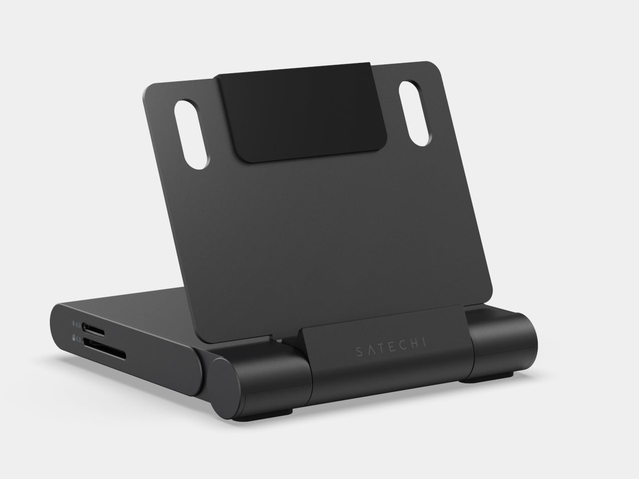
3. Satechi OntheGo Foldable Stand Hub
Four items in one is a claim most multi-function products make without fully earning, but the Satechi OntheGo Foldable Stand Hub earns it specifically. Folded flat at under 20mm and 187.5 grams, it contains a laptop stand, a USB-C dock, an SD card reader, and an HDMI output. A 17cm USB-C cable is built directly into its spine, so the hub comes alive the moment you unfold it and plug in, without a separate dongle, cable pouch, or adapter between you and a working setup.
The port selection is well-considered for the kind of work that actually happens on the road. HDMI 2.0 pushes a secondary display at 4K and 60Hz. The two 10Gbps data ports handle fast transfers without bottlenecking. The UHS-II card slots pull RAW files at up to 312 MB/s, which photographers working on location will feel immediately. The 100W USB-C passthrough keeps the host device fully charged through a heavy session, delivering 85W to the machine rather than sipping through a compromised power budget.
What we like
The stand and hub share one folded form factor, so you’re not choosing between an elevated screen angle and a full set of ports — both arrive in the same 187.5-gram object
100W passthrough with 85W delivered to the host is genuinely useful throughput; this is not a hub that throttles your laptop to keep the indicator lights on
What we dislike
The fixed 17cm cable length works well on a flat desk but becomes restrictive on configurations where the laptop sits further back or at an angle, leaving the hub’s placement feeling forced
iPad mini 2021 owners are limited to 5Gbps on the data ports due to the tablet’s own USB specification, not the hub’s
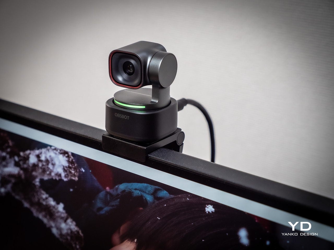
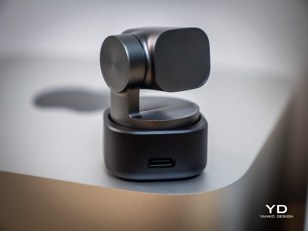
4. OBSBOT Tiny 3 4K PTZ Webcam
At 37 by 37 by 49 millimeters and 63 grams, the OBSBOT Tiny 3 occupies roughly the volume of a large die. Inside that footprint sits a 1/1.28-inch sensor, a 2-axis motorised gimbal, and a triple MEMS microphone array. That sensor size puts it closer to smartphone camera territory than the typical webcam chip, which shows up immediately in low-light performance and dynamic range. Plug it into a USB-C port, and it registers as a standard UVC device with no driver installation required.
The microphone system is where the Tiny 3 earns its place in this kit rather than just a streaming rig. Five discrete audio modes cover the full range of working scenarios: directional for solo calls, dual-directional for interviews, smart omni for meetings, and spatial audio for output that sounds like a room rather than a USB peripheral. The PTZ gimbal tracks at up to 120 degrees per second, so a full stand-up presentation or a pacing call stays in frame without any manual adjustment or reaching for a mouse mid-sentence.
What we like
Combining a 4K sensor, motorised PTZ tracking, and a proper multi-mode microphone array in one object eliminates the webcam-plus-USB-mic stack that clutters most remote setups
Voice commands and gesture control mean you can adjust framing mid-presentation without breaking the flow of what you’re saying or reaching across the desk
What we dislike
At $349, it’s the most expensive item in this kit, and the integrated design means the gimbal, sensor, and mic are one non-serviceable unit with no modular repair path
The depth of the companion app and the range of AI tracking modes and audio profiles takes real configuration time to dial in; arriving at a setup that matches your specific environment isn’t instant
5. Battery-Free Amplifying iSpeakers
A speaker that draws its power from the USB-C port it connects through doesn’t sound like a revelation until you’re three days into a trip and realize you haven’t thought about its battery once. The Battery-Free Speaker removes the recharge cycle that turns most portable audio into a management task. There’s no charge indicator to watch, no cable to find at the end of the night, no morning ritual of checking whether it has enough power to make it through a working session.
The positioning in this kit is about what it replaces rather than what it adds. A home office desk speaker is typically a separate purchase, a separate power cable, and a separate piece of real estate on the desk. This one draws power through the same USB-C ecosystem running the rest of the kit, meaning the entire audio and display setup resolves into a single cable chain. The sound output trades some low-end depth for a profile slim enough to travel without consequence, which is an honest and reasonable exchange.
Zero battery management means one fewer variable to track across a long travel day or a week-long work trip
The USB-C power draw integrates cleanly into the kit’s single-cable connectivity approach, keeping the desk surface clear
What we dislike
USB-powered audio output has physical limits on low-frequency response that a mains-powered desktop speaker doesn’t face
Sound quality is best understood as travel-grade rather than desktop-grade — this replaces the home office speaker in function, not in fidelity
The Office Is Wherever You Open the Bag
Put these five products in a bag and the total weight is manageable, the cost is meaningful but not irrational, and the capability covers the full surface area of a working office. The VitaLink provides the display and the keyboard. The Origami Swift handles precise input. The Satechi ties everything together with connectivity, stand geometry, and port access. The OBSBOT closes the loop on how you appear and sound on calls. The Battery-Free Speaker handles the rest of the room.
None of these products are compromises dressed up as solutions. Each one is designed for the specific constraints of a laptop bag, a single USB-C cable chain, and a working day that doesn’t start or end at the same desk. The home office used to follow you reluctantly on a work trip — a cable bag, a laptop, and a hope the hotel had a decent surface. This kit makes the case that it doesn’t have to.
We spend an embarrassing amount of time choosing what to listen to. You open Spotify, scroll for fifteen minutes, start a playlist you’ve already heard a hundred times, and somehow feel like you’ve made a decision. You haven’t. You’ve just exhausted yourself before the music even started. The Atonemo NTS Radio Player takes a different approach entirely, and I think it might be onto something important.
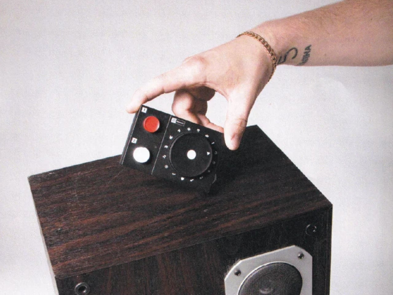
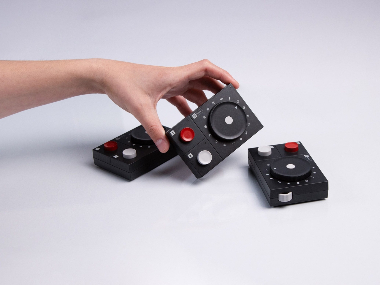
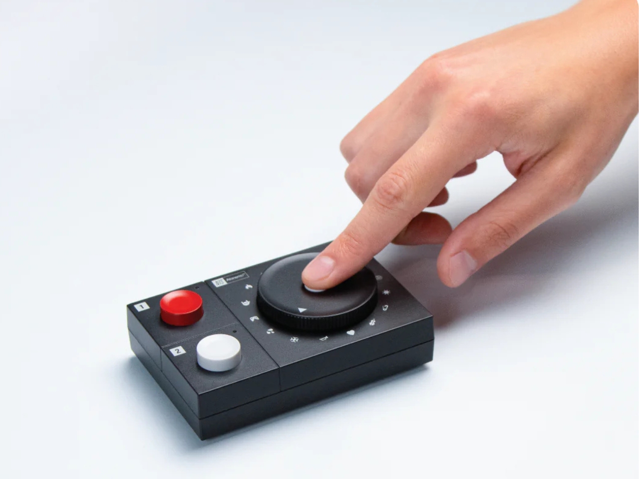
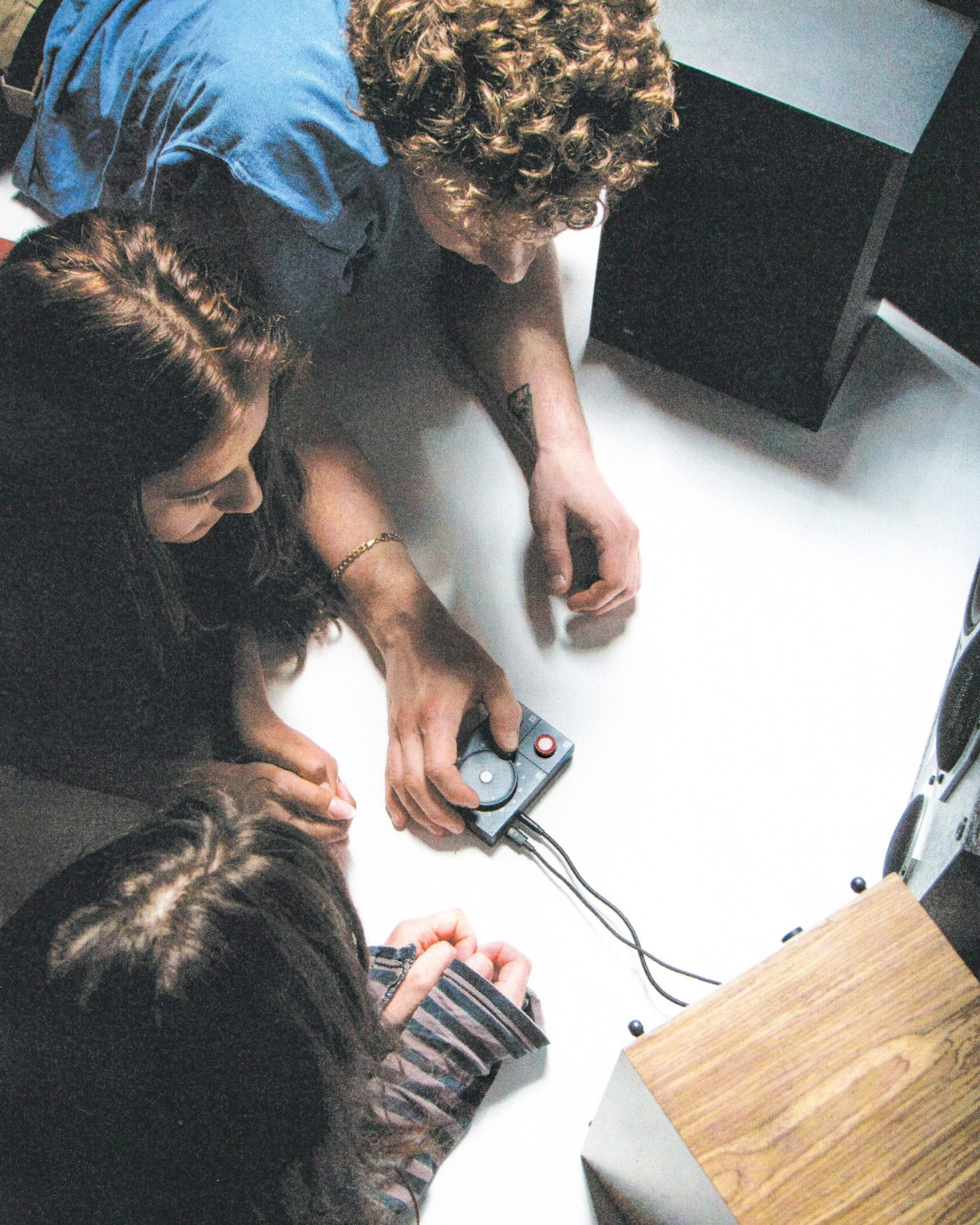
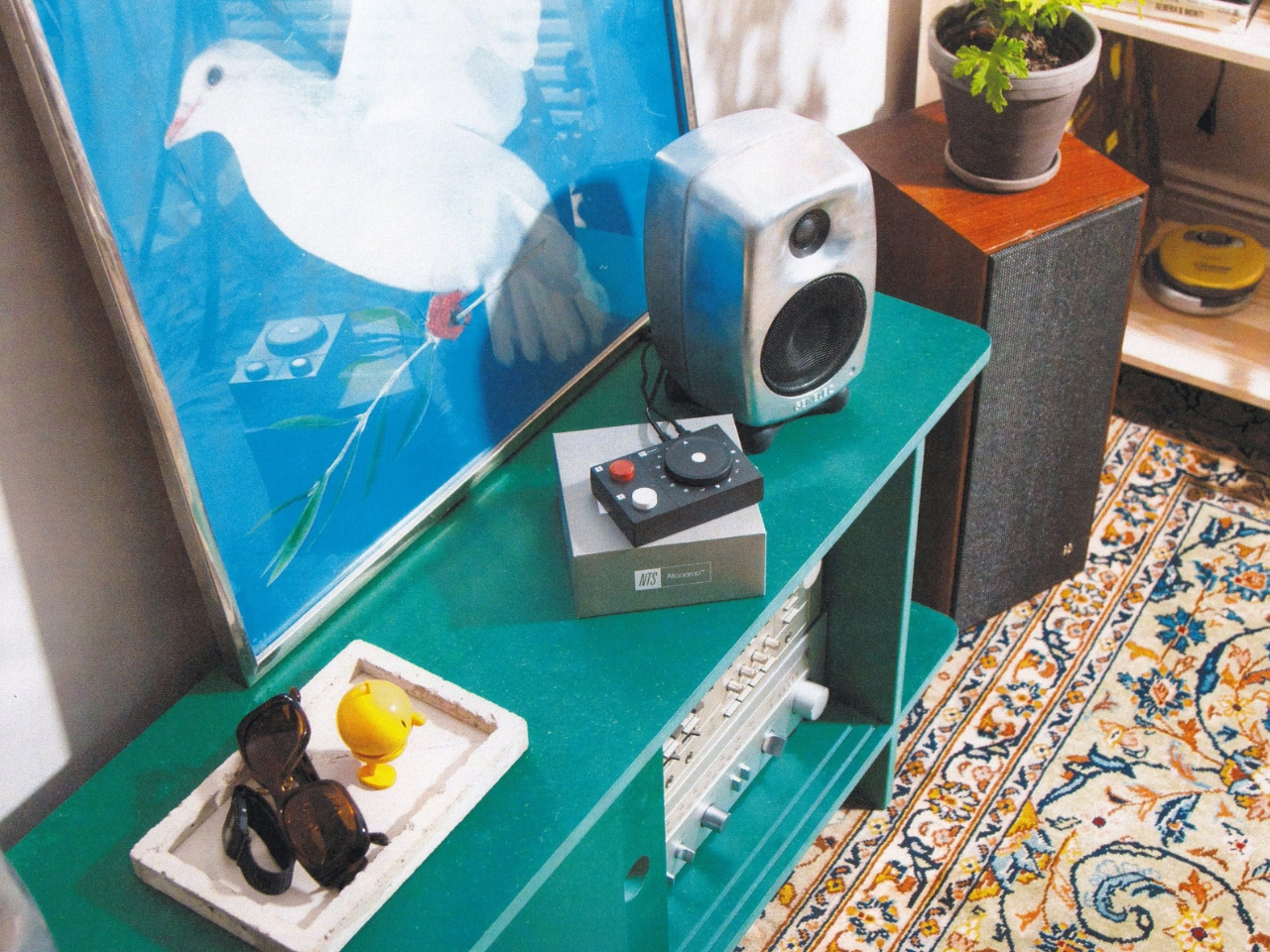
At first glance, it barely looks like a product. It’s small and flat, almost matchbox-thin, the kind of object that quietly disappears onto a shelf or windowsill without demanding attention. Swedish design company Atonemo built it in collaboration with NTS Radio, the London-born internet radio station founded by Femi Adeyemi in Hackney in 2011. Together, they’ve made something that feels less like a piece of tech and more like a considered position on how we should all be listening to music.
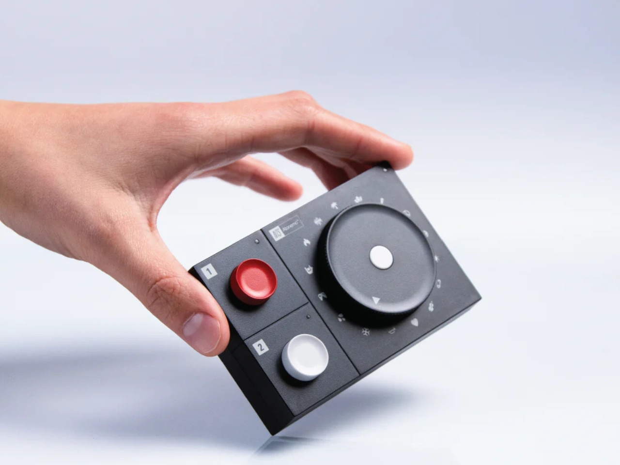
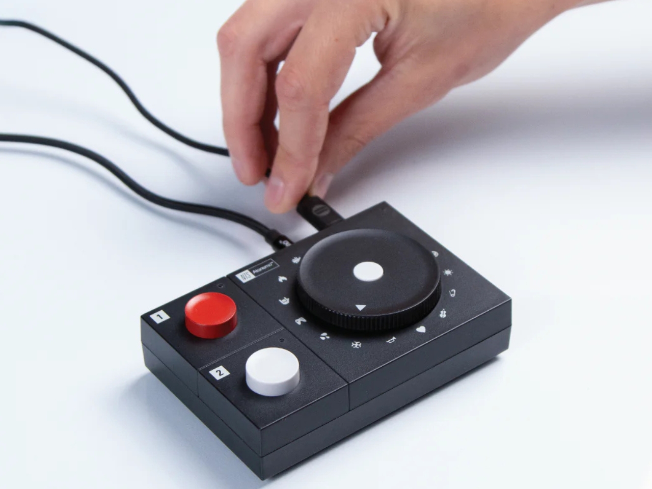
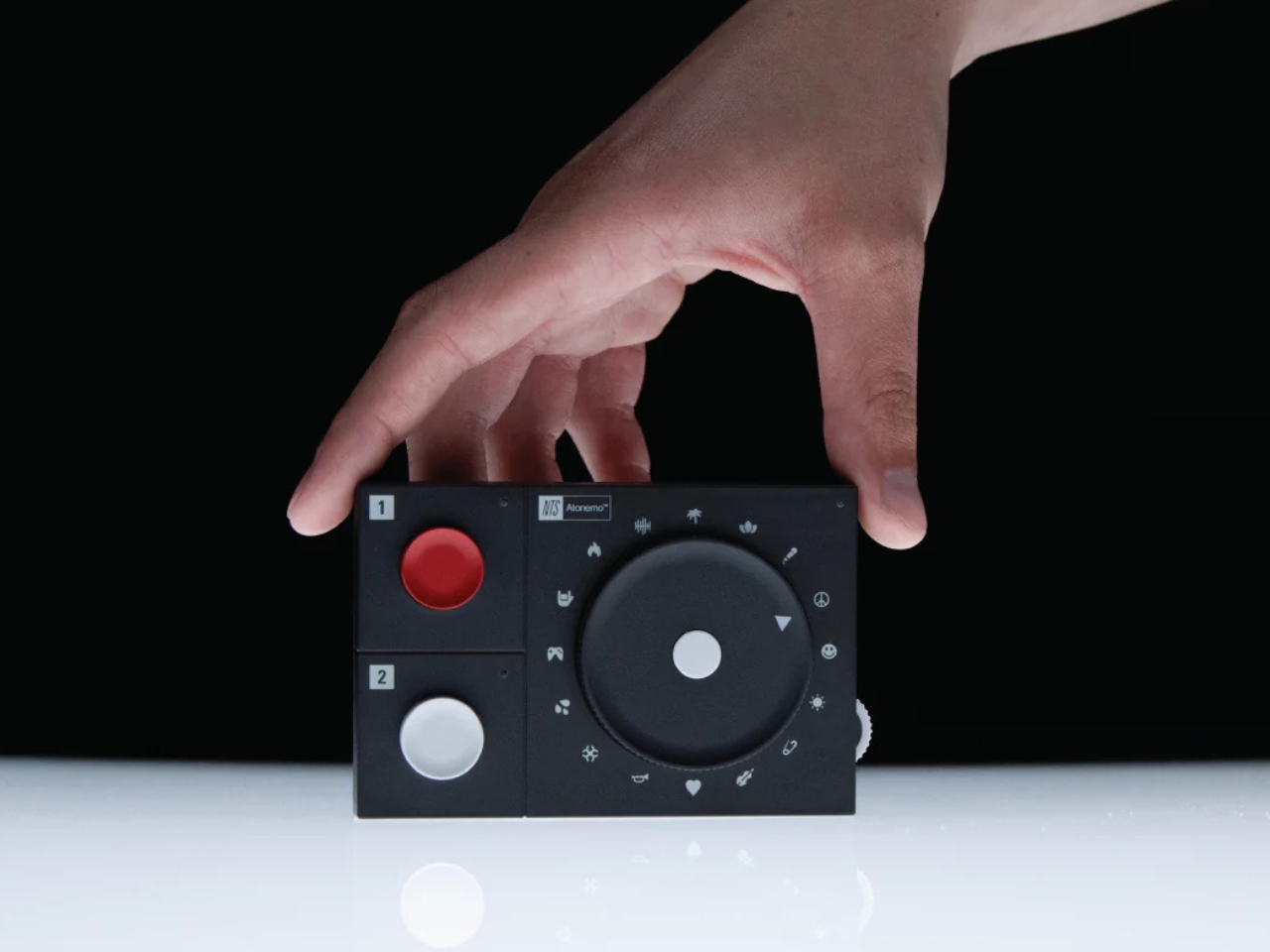
The interface is almost aggressively simple. A rotating dial lets you scroll through 16 of NTS’s “Infinite Mixtapes,” each one a continuously running, human-curated stream built around a mood or genre. No artists. No albums. Just a small icon (a sun, a microphone, a smiley face) and whatever’s playing when you land on it. Two large buttons on the device give you direct access to NTS Radio 1 and 2, the station’s two flagship live channels. That’s basically the whole UI. And somehow, that’s enough.
The concept driving the collaboration is “omakase listening,” borrowing the Japanese dining philosophy of trusting the chef to decide what you eat. As the team describes it: “You hand over the decision to someone whose taste you trust, and you get something better than anything you’d have chosen yourself.” It’s a simple premise that most of the streaming industry has completely abandoned in favor of algorithmic personalization and infinite scrollable libraries. The NTS Radio Player bets on the opposite.
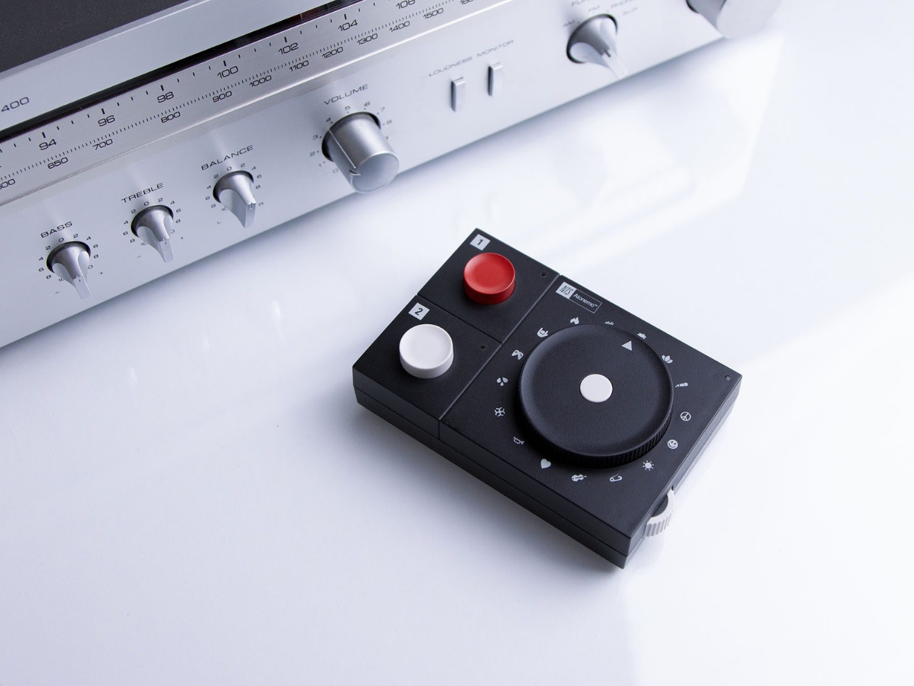
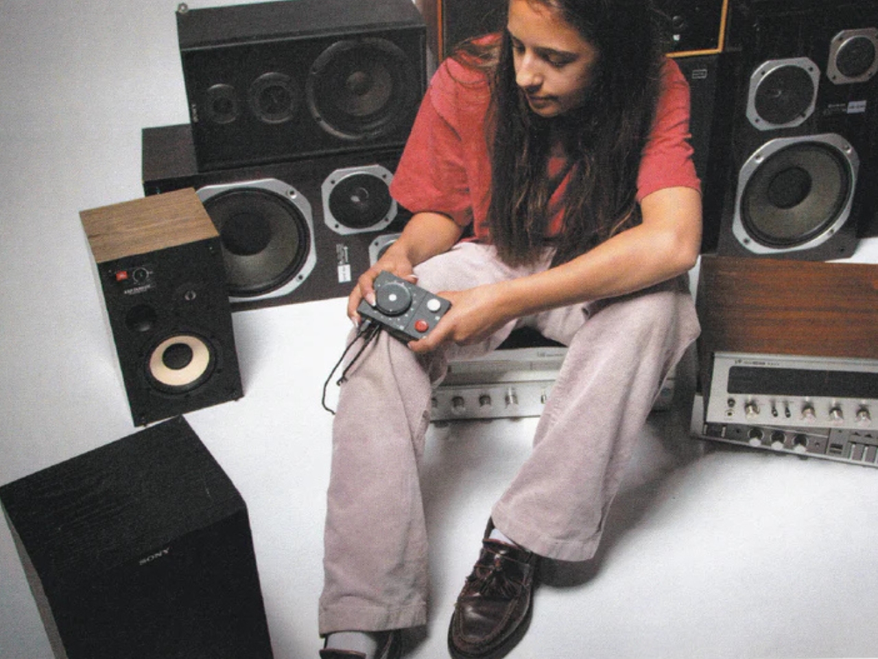
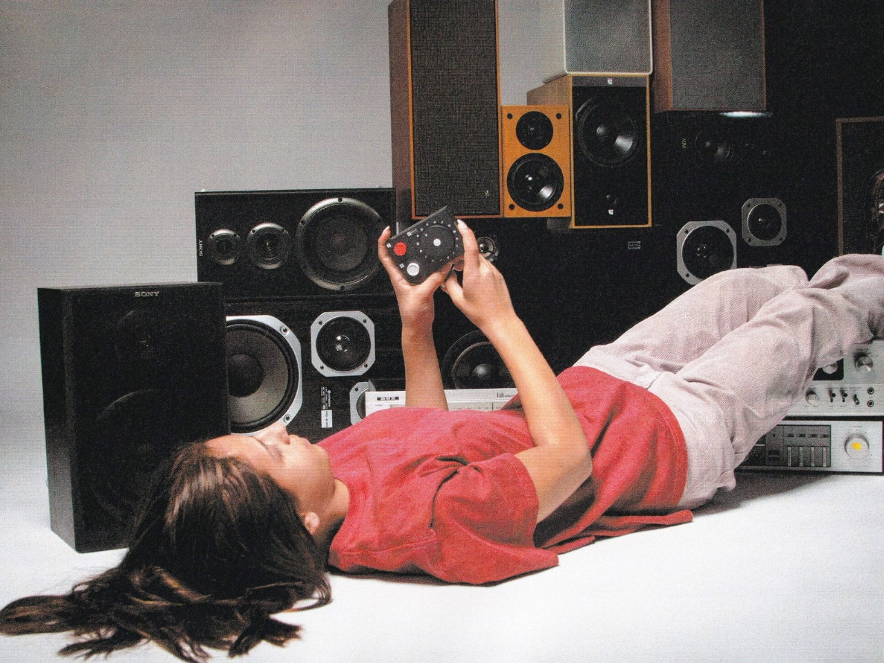
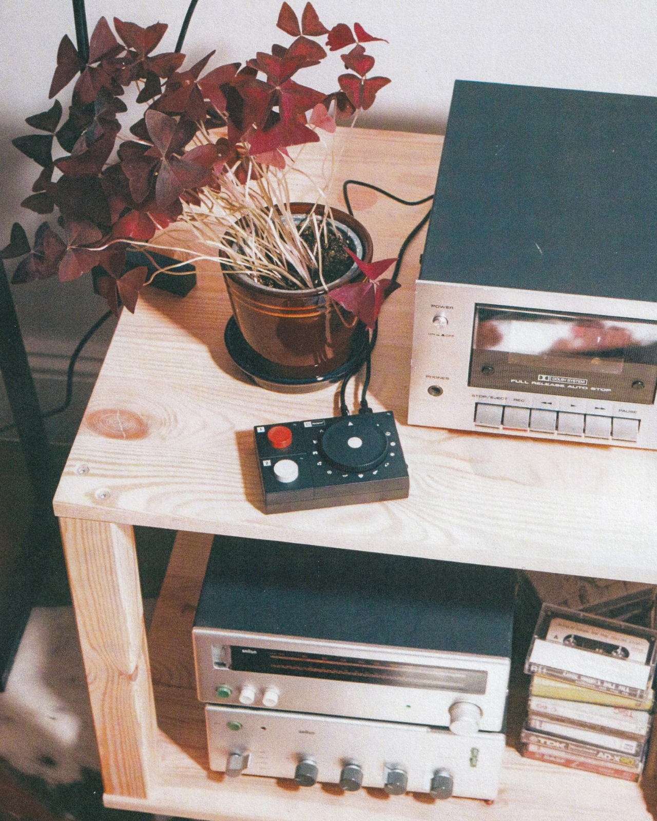
On the technical side, Atonemo hasn’t cut corners. The player outputs 24-bit audio at 192kHz through a 3.5mm analogue jack, and it ships with an RCA adapter so it can connect to older amplifiers and vintage hi-fi setups. That feels very intentional. A good chunk of NTS’s audience are people who care deeply about how music sounds, who shop for turntables, collect records, and treat their speakers like furniture. Atonemo’s core Streamplayer is already designed for that crowd, and the NTS Radio Player extends the same idea: give old gear a new life without sacrificing audio quality. It also supports AirPlay, Google Cast, Spotify, Tidal, and Qobuz for when you want to step outside the NTS ecosystem entirely.
The design itself is worth sitting with for a moment. The dial immediately calls to mind the iPod’s click wheel, which is probably not accidental. That association carries real weight: there’s something inherently warm and tactile about scrolling through options with your hand rather than your thumb. Physical interaction with music hardware is having a quiet revival right now, riding the same cultural wave that’s kept vinyl sales growing year after year. The NTS Radio Player reads the room.
My honest opinion? The $179 price point is a reasonable ask for what you’re getting, especially if you’re already an NTS listener. For anyone new to the station, this is an unusually elegant entry point into a catalog of music that’s genuinely harder to find elsewhere. NTS has built its entire reputation on programming diverse, underheard work from artists, DJs, and record collectors across more than 60 cities globally. Six million people listen every month, and it still manages to feel like a secret.
So much of modern tech is built to maximize the time you spend choosing, scrolling, and clicking. The Atonemo NTS Radio Player is designed to do exactly the opposite. You plug it in, you turn the dial, and then you just listen. For a lot of people right now, that simplicity might be the most radical feature of all.
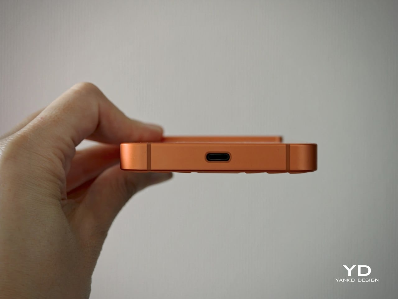
The Titan 2 Elite is not a keyboard phone for the sake of nostalgia. It is a thoughtfully modern take on a niche form factor that still offers something genuinely different.
Retro tech is back in fashion, and few categories capture that shift quite like the return of the QWERTY keyboard phone. With the market dominated by edge-to-edge glass slabs that all seem to blur into one another, the appeal of something tactile, distinctive, and a little nostalgic feels stronger than ever. But Unihertz is not simply chasing that renewed interest. The company has spent years building unusual smartphones around overlooked form factors, and the Titan 2 Elite feels more like a continuation of that mission than a sudden throwback play.
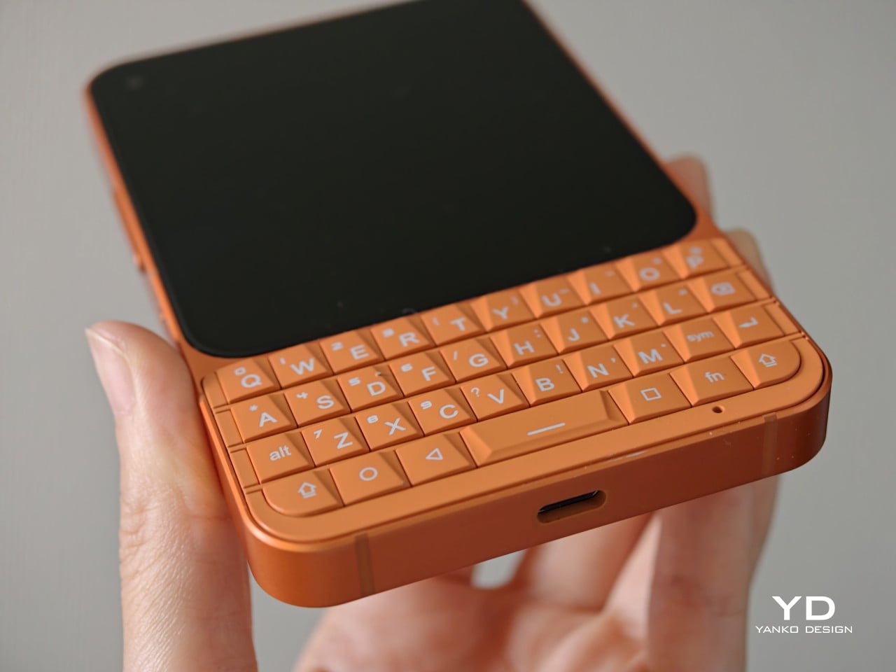
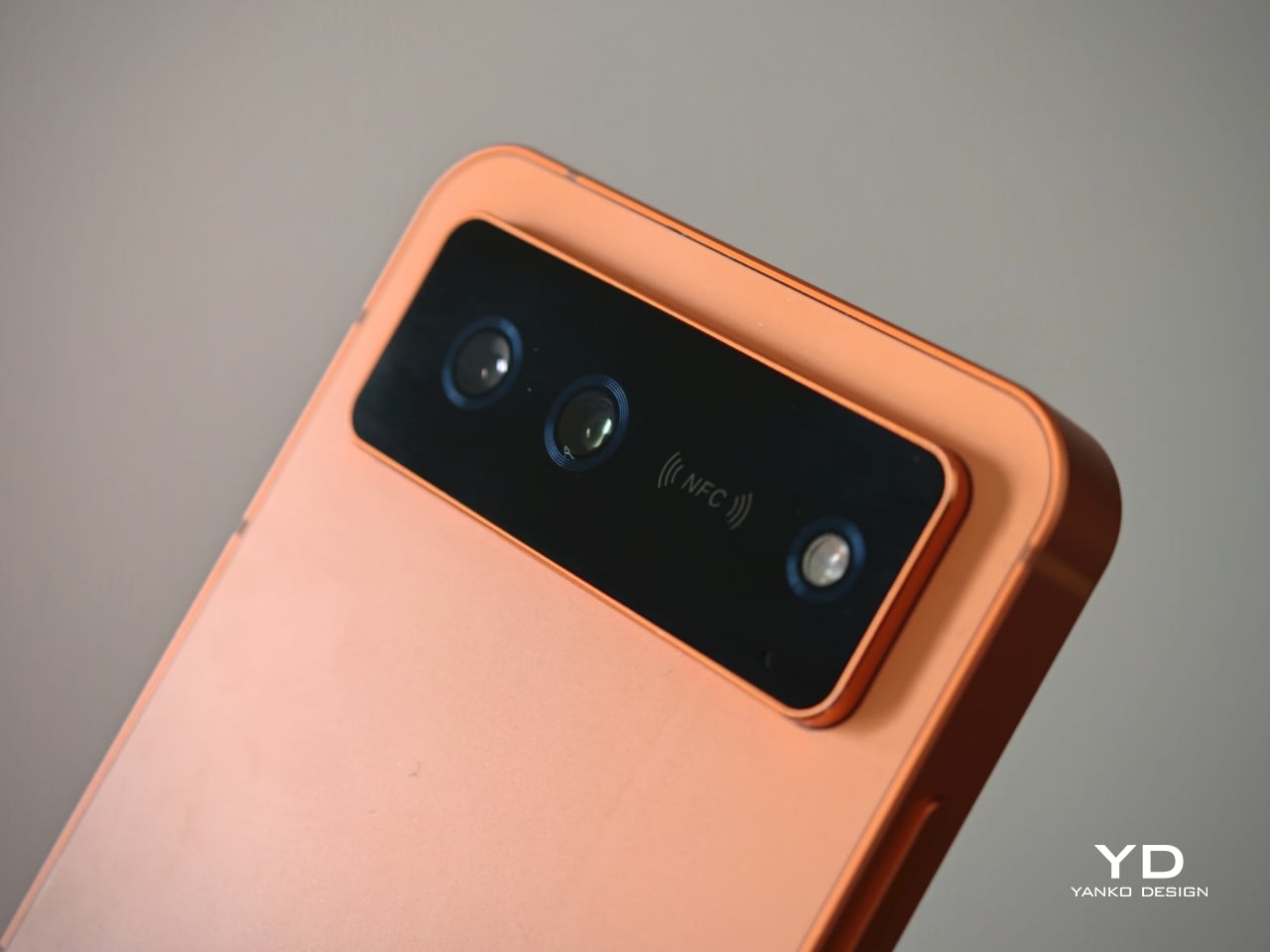
Since launching in 2017, Unihertz has focused on unusual and highly niche smartphones, often revisiting ideas that larger brands left behind long ago. The first Titan arrived in 2019, establishing the company’s QWERTY keyboard line and laying the groundwork for a series of devices aimed at enthusiasts who wanted something outside the touchscreen mainstream. The Titan 2 Elite feels like the clearest expression of that identity so far, combining Unihertz’s keyboard phone formula with more modern features like a 4.03-inch 120Hz AMOLED display, 5G, NFC, eSIM support, and dual 50MP cameras.
Designer: Unihertz
Aesthetics
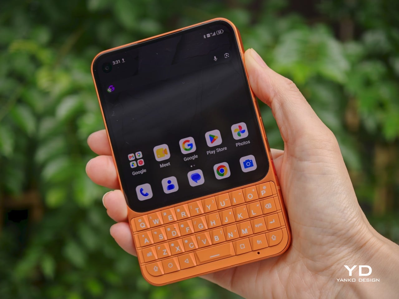
The Titan 2 Elite makes a much stronger first impression in photos than you might expect from a niche keyboard phone. In black, it looks clean, understated, and surprisingly modern, with the glossy display flowing neatly into the keyboard below. The shape still carries that familiar BlackBerry-inspired DNA, but it feels less boxy and less utilitarian than its predecessors. The front has a nice sense of balance, with the display and keyboard split in a way that looks intentional rather than cramped.
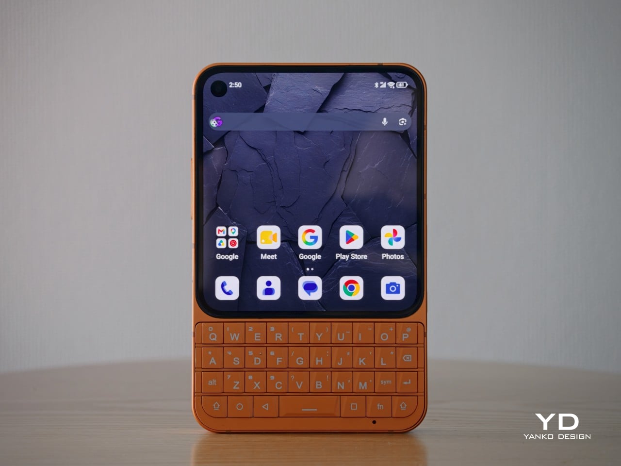
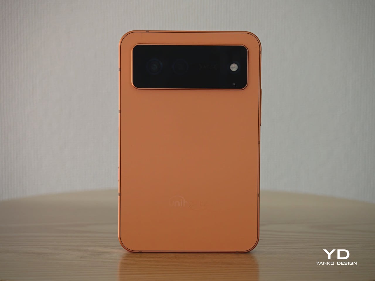
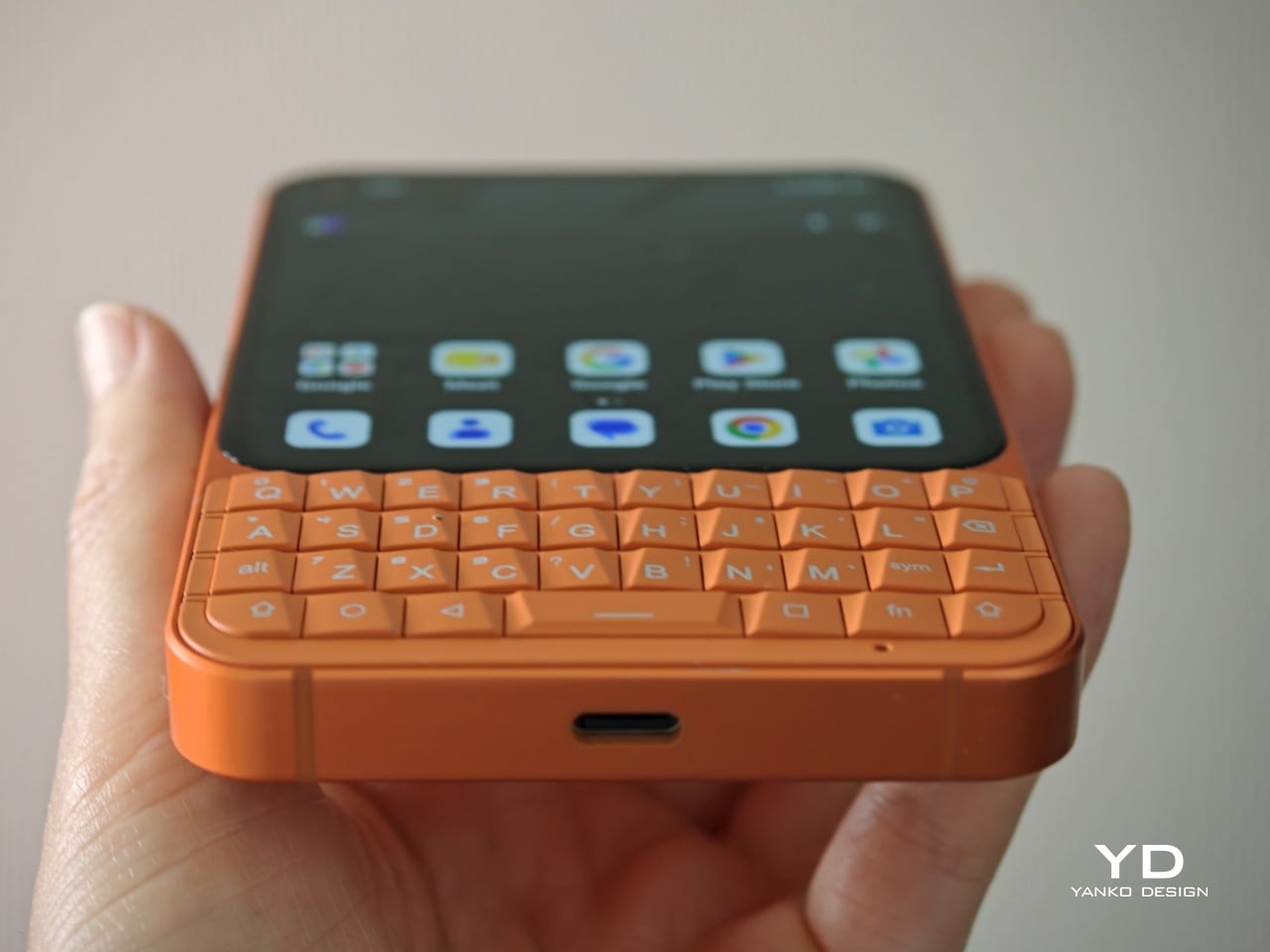
It also feels like every brand is suddenly on the orange phone wave, and Unihertz is clearly not sitting that one out. Still, I cannot really complain when the result looks this good. The orange finish gives the Titan 2 Elite a more playful, more attention-grabbing personality, and it suits the phone’s retro-leaning concept surprisingly well. Paired with the sculpted keyboard and rounded corners, it gives the device a bolder, more expressive look that stands out immediately. Where the black version feels sleek and safe, the orange one feels much more full of character.
From the front, the Titan 2 Elite feels cohesive in a way some keyboard phones do not. The keyboard looks properly built into the design rather than tacked on as an afterthought, which helps the whole phone feel more intentional and visually balanced. Flip it over, though, and some of that charm fades. The large rectangular camera bump sticks out quite a lot, especially on the orange model, and the back just does not feel as refined as the front. I do like how subtle the Unihertz logo is, but overall, the rear design feels more ordinary and less resolved.
Ergonomics
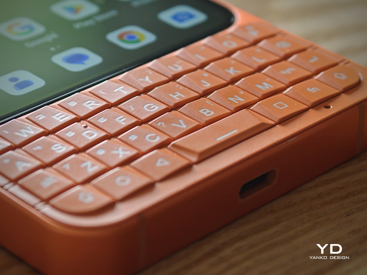
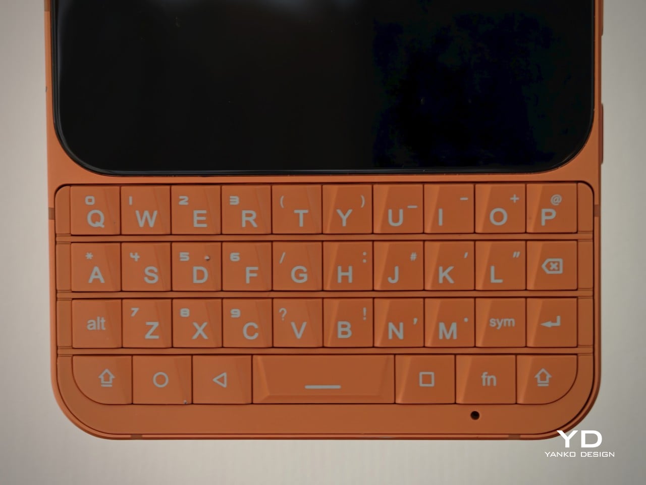
The whole experience of using the Titan 2 Elite comes down to the keyboard. If you have been away from physical keys for years, there is definitely a short adjustment period, but once your fingers settle in, the appeal becomes easy to understand. Typing feels more deliberate, more tactile, and more engaging than tapping away on glass, even if, for me, an on-screen keyboard is still the faster option. That is worth saying because speed is not really the point here. The appeal is the feel of it, and the way it changes your interaction with the phone.
The keys have a faceted, slightly angled shape that makes them surprisingly comfortable to type on. In fact, this is one of the most comfortable QWERTY keyboards I have tested on a phone. The layout feels well judged, and while it still takes some adjustment, it does not come across as cramped or awkward in the way some smaller keyboard phones can.
At 117.8 × 75 × 10.4 mm and 163g, the Titan 2 Elite is compact in height and width, but it is definitely a thick phone by modern standards. You feel that extra depth the moment you pick it up, especially compared with today’s thin slab phones. Still, the weight is fairly modest, so it does not come across as heavy or cumbersome. If anything, the thicker body makes sense for this kind of device, giving the keyboard and overall shape a bit more substance in the hand.
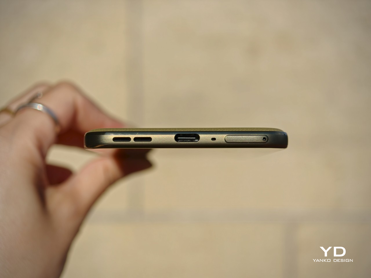
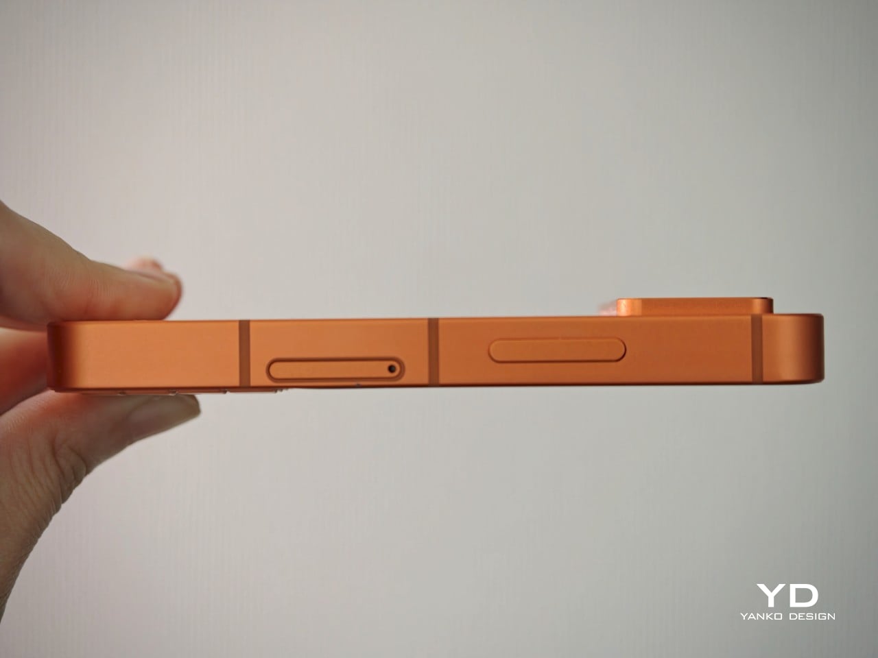
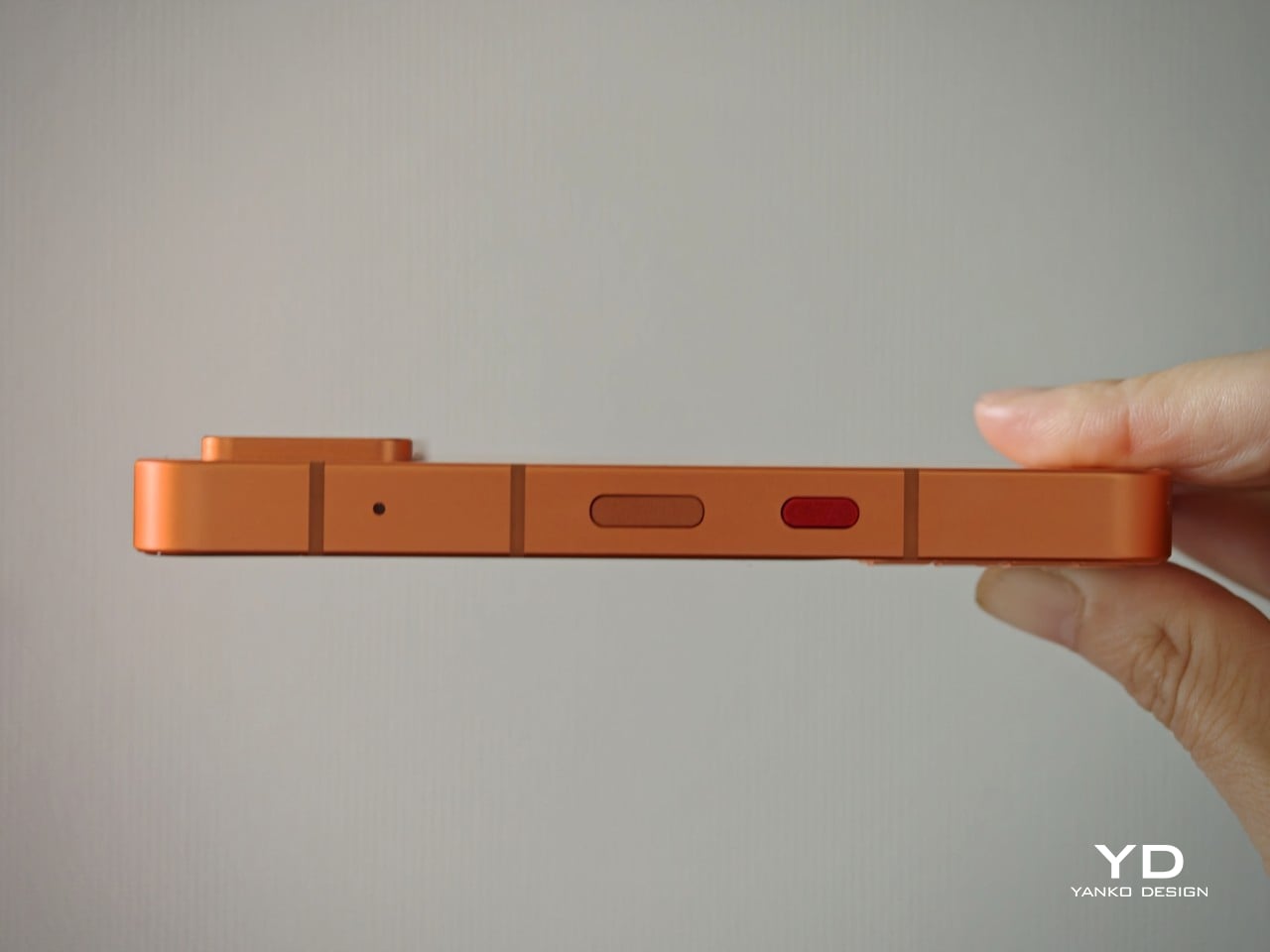
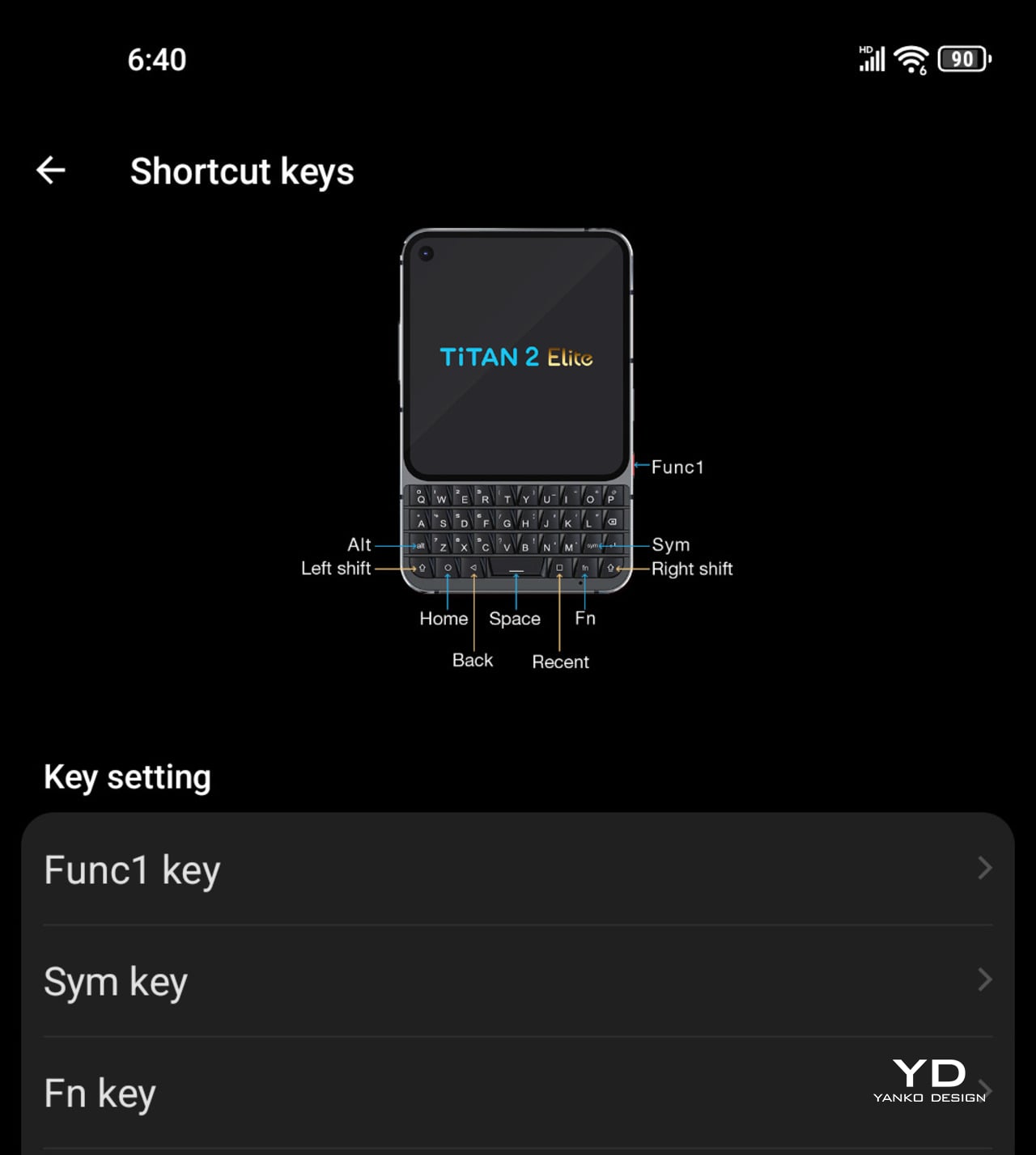
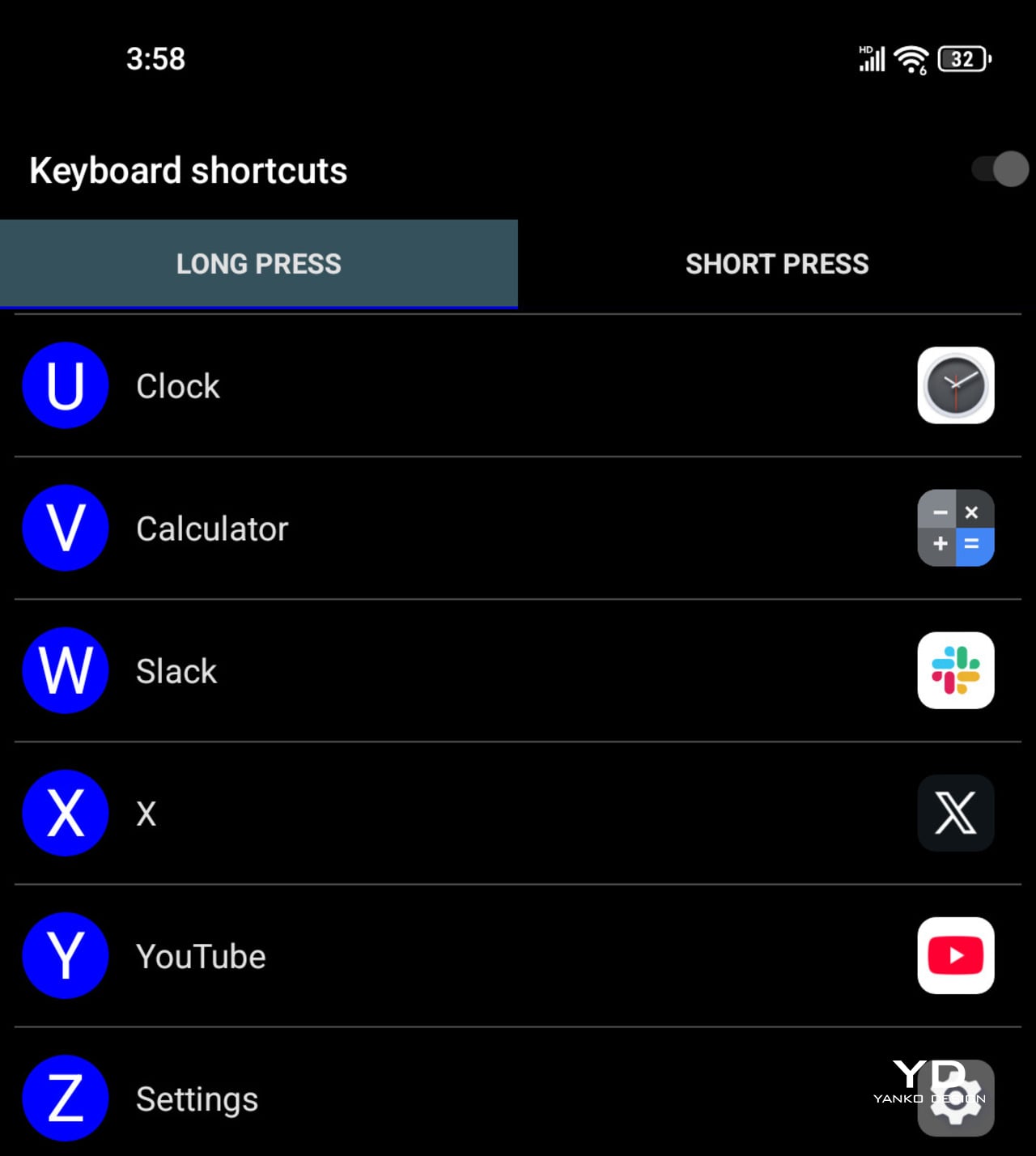
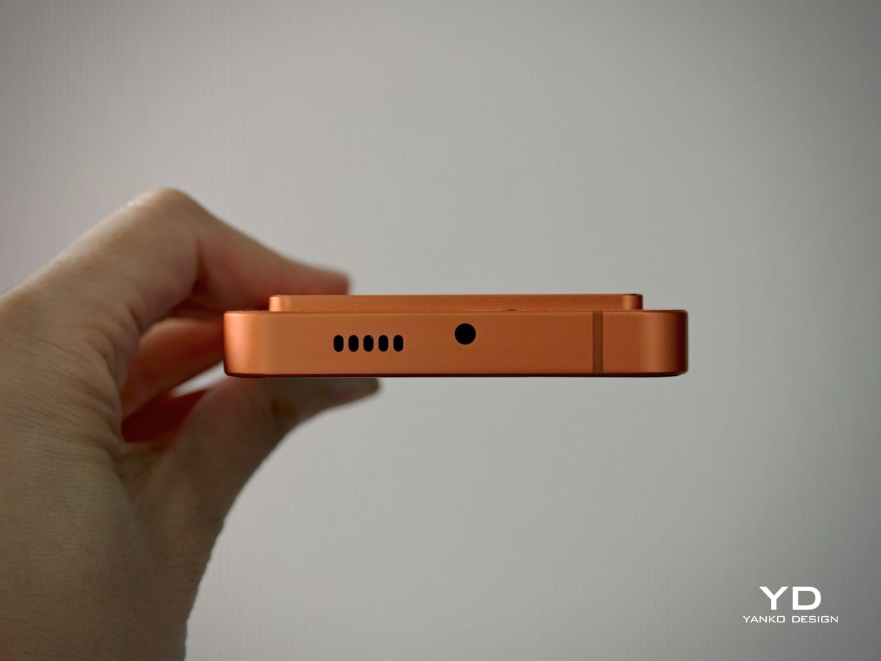
The rest of the button layout is pretty straightforward, but there are a few details worth noting. On the right side, you get the power button, which also doubles as a fingerprint scanner, along with Unihertz’s signature red programmable button. On the left, there is the volume rocker and the SIM tray, which supports either two SIM cards or one SIM card and one microSD card. It is a practical setup, and the red shortcut key in particular adds a bit of extra personality while giving power users one more tool to customize the phone around their habits.
Performance
The Titan 2 Elite is not the kind of phone you buy for raw speed, and I think that is important to establish early. If your priority is benchmark numbers, heavy gaming, or the kind of power you would expect from a mainstream flagship, this is probably not where your money should go. The appeal here is much more about the overall experience than outright performance, which feels perfectly in line with what this phone is trying to be.
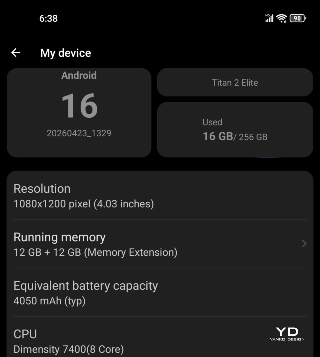
It is powered by the Dimensity 7400, paired with 12GB of LPDDR5 RAM and 256GB of storage. In everyday use, that is more than enough for the kind of tasks this phone is clearly built around. Messaging, email, web browsing, note-taking, and general app navigation all feel smooth and reliable, and at no point did the phone feel like it was struggling to keep up.
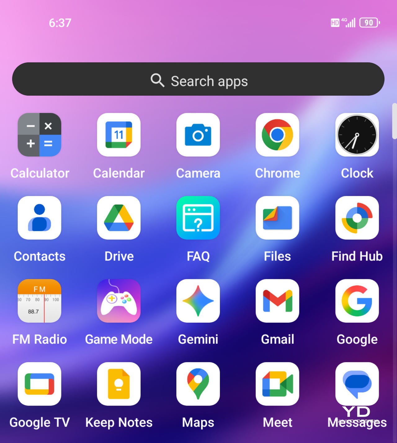
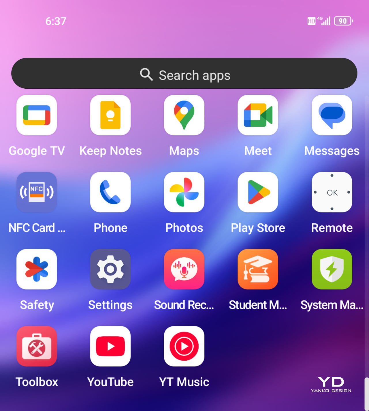
That same sense of practicality carries over to the software. The review unit runs Titan 2 Elite_V02 based on Android 16, and thankfully, there is no bloatware to get in the way. A lot of the customization revolves around the keyboard and extra controls, which makes sense for a phone like this.
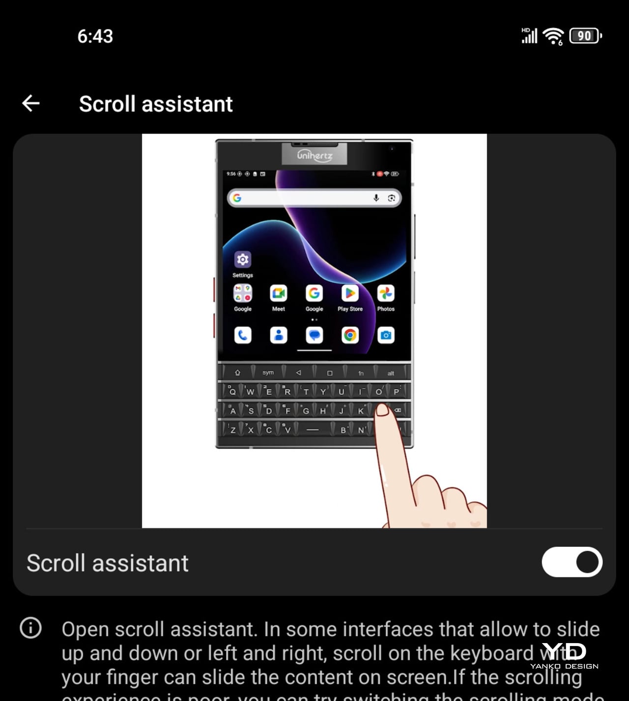
You can assign both short-press and long-press actions to keys, and there are also options to use the keyboard surface for scrolling, cursor control, or a combined touchpad and cursor mode. Better still, these can be set on an app-by-app basis, which gives the phone a level of flexibility that feels genuinely useful rather than gimmicky. The keyboard is also backlit, and the brightness can be adjusted, which is a small but genuinely helpful detail in lower light.
The 4.03-inch display also deserves some credit. On paper, it sounds small, and it is, but it is a surprisingly good panel with a 1080 x 1200 resolution, 120Hz refresh rate, 401 PPI, up to 1600 nits peak brightness, and 2160Hz PWM dimming. It looks sharp, bright, and much more modern than the phone’s form factor might suggest.
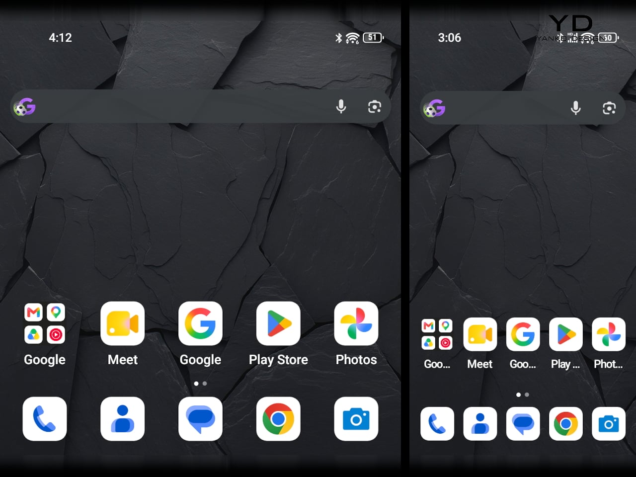
Where the screen becomes more complicated is in day-to-day use. The issue is not the quality of the panel itself, but the amount of space you have to work with. Some apps feel poorly formatted, and there are times when you simply want to see more vertical content at once. Unihertz tries to solve that with a Mini mode that switches the interface to a more traditional vertical aspect ratio, and it does help. I ended up setting a shortcut for it, and being able to switch quickly turned out to be genuinely useful.
Main, 1x
It also changed the way I used the phone. I spent less time mindlessly scrolling, and that is not because the phone is uncomfortable to hold or awkward to use. If anything, it is the opposite. The Titan 2 Elite just makes you a bit more intentional.
Telephoto, 2x
That more focused experience also shapes the rest of the phone. Audio, for example, is fine but unremarkable. The mono speaker gets loud enough for casual video watching or speakerphone use, but it lacks the fullness you would want for music or anything more immersive. It does the job, but not much more.
Main, 1x
Telephoto, 2x
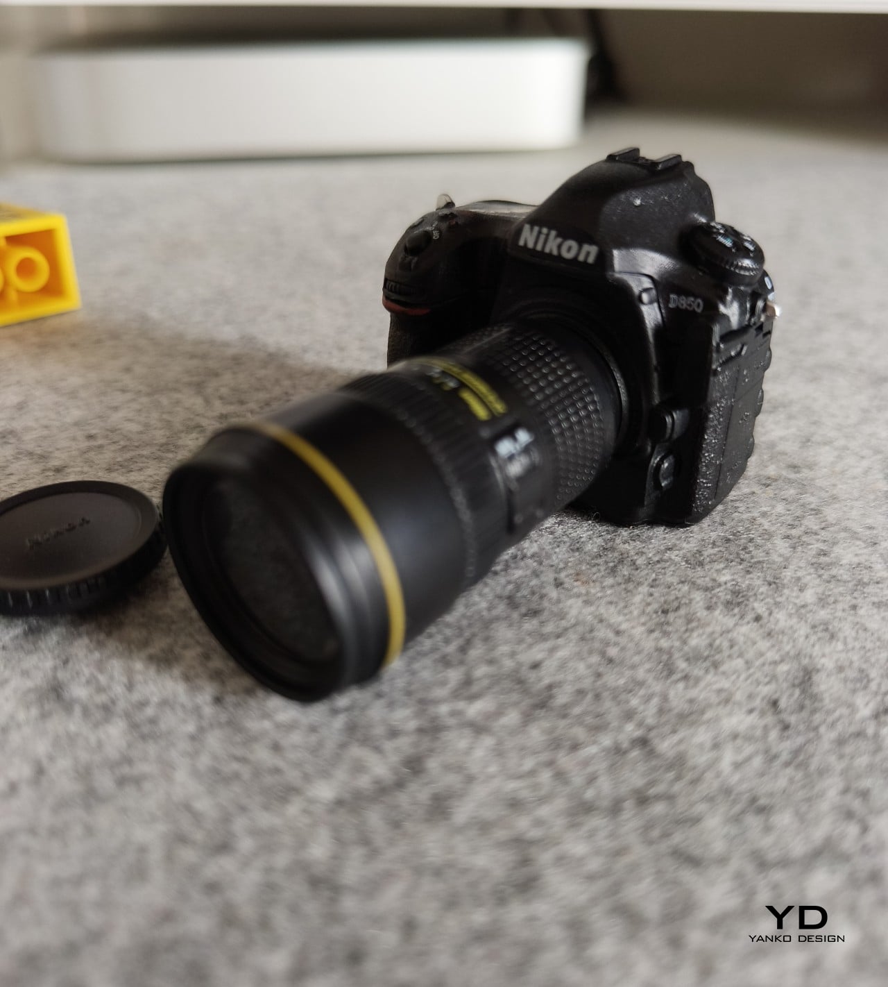
The same goes for the camera setup. It is fairly limited, but that probably will not be a dealbreaker for the kind of person who would enjoy this phone in the first place. You get a 50MP main camera, a 50MP 2x telephoto camera, and a 32MP front camera. Image quality is good enough for quick shots and everyday moments, but it is not a camera system that stands out. Colors tend to look vivid and slightly overexposed, though still perfectly usable for casual snapshots.
Main, 1x
Telephoto, 2x
Battery life is better than the 4050mAh capacity might suggest. On paper, that number does not sound especially large, but because I spent less time idly using the phone, it still got me through a full day without much trouble. Charging is less impressive. At 33W, it feels a bit slow by today’s standards, especially when plenty of phones in this price range now refill much faster.
Sustainability
Sustainability is not a major part of the Titan 2 Elite’s pitch, but there are still a few positives worth mentioning. Unihertz says the phone uses an aerospace-grade aluminum mid-frame, offers IP54 protection, and promises five years of OS updates and security patches.
That is not the same as a full sustainability strategy, especially since there is no clear emphasis on recycled materials or repairability. Still, durability and longer software support do matter. If the Titan 2 Elite holds up well over time and stays secure for years, that gives owners more reason to keep it longer instead of replacing it early.
Value
At $489, the Titan 2 Elite is not cheap, but it also feels more thoughtfully made than a novelty device cashing in on nostalgia. Beyond the physical keyboard itself, you can tell Unihertz has put real thought into the overall experience, from the programmable keys and backlit keyboard to the display quality and software features built around this unusual form factor.
That is really where the value starts to make sense. You are not just paying for a keyboard stuck onto an Android phone. You are paying for a device that feels purpose-built for a certain kind of user, and one that tries to make that experience work in a modern way. It still will not be for everyone, but for people who genuinely want a keyboard phone and appreciate the care that has gone into making it usable day to day, the $489 price feels much easier to justify.
Verdict
The Unihertz Titan 2 Elite works because it does not try to compete like a normal smartphone. Instead, it fully embraces its niche, offering a physical keyboard experience that feels polished, distinctive, and genuinely enjoyable to use. Backed by a sharp display, thoughtful software features, and reliable everyday performance, it feels much more considered than a simple nostalgia play.
The trade-offs are still there. The cameras are only decent, the speaker is forgettable, and the small display can feel restrictive in some apps. Still, if you miss physical keys or just want a phone that feels more intentional and different from the crowd, the Titan 2 Elite makes a strong case for itself. It will not be for everyone, but for the right user, it is one of the most appealing niche phones you can buy.
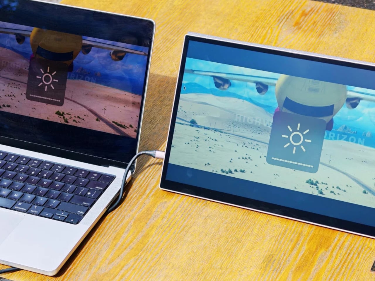
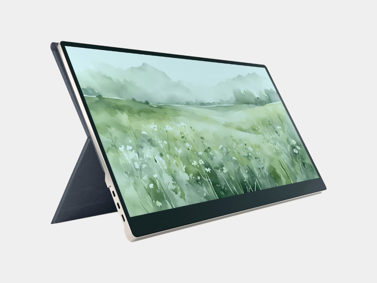
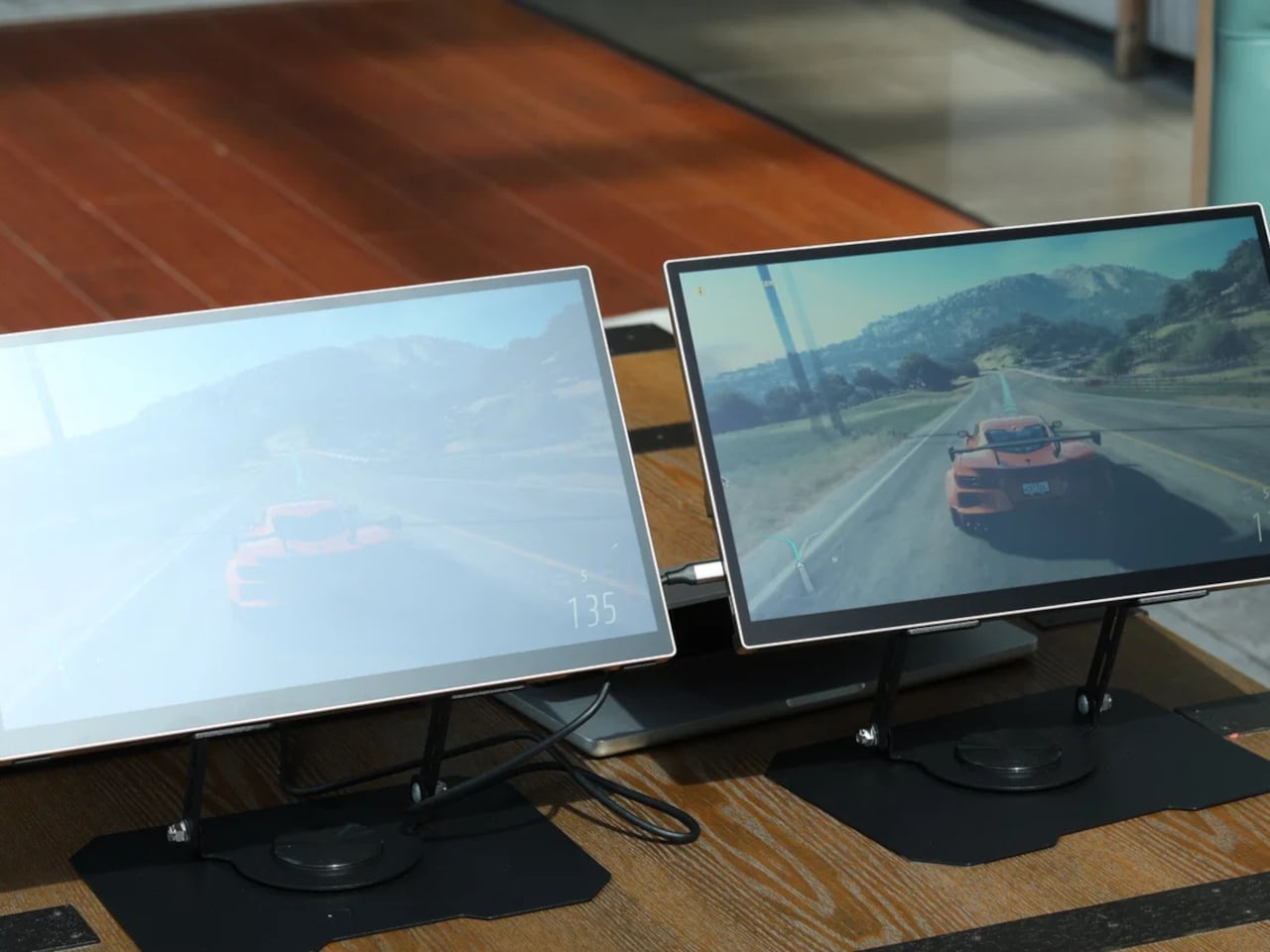
Portable monitors have become a practical extension of the laptop workflow, letting you carry a second screen to coffee shops, airports, and co-working spaces. The catch is that almost every portable monitor on the market uses a standard LCD or OLED panel, which means bright environments are its natural enemy. Step outside on a sunny afternoon or sit beside a sun-drenched window, and the glare turns your screen into a mirror.
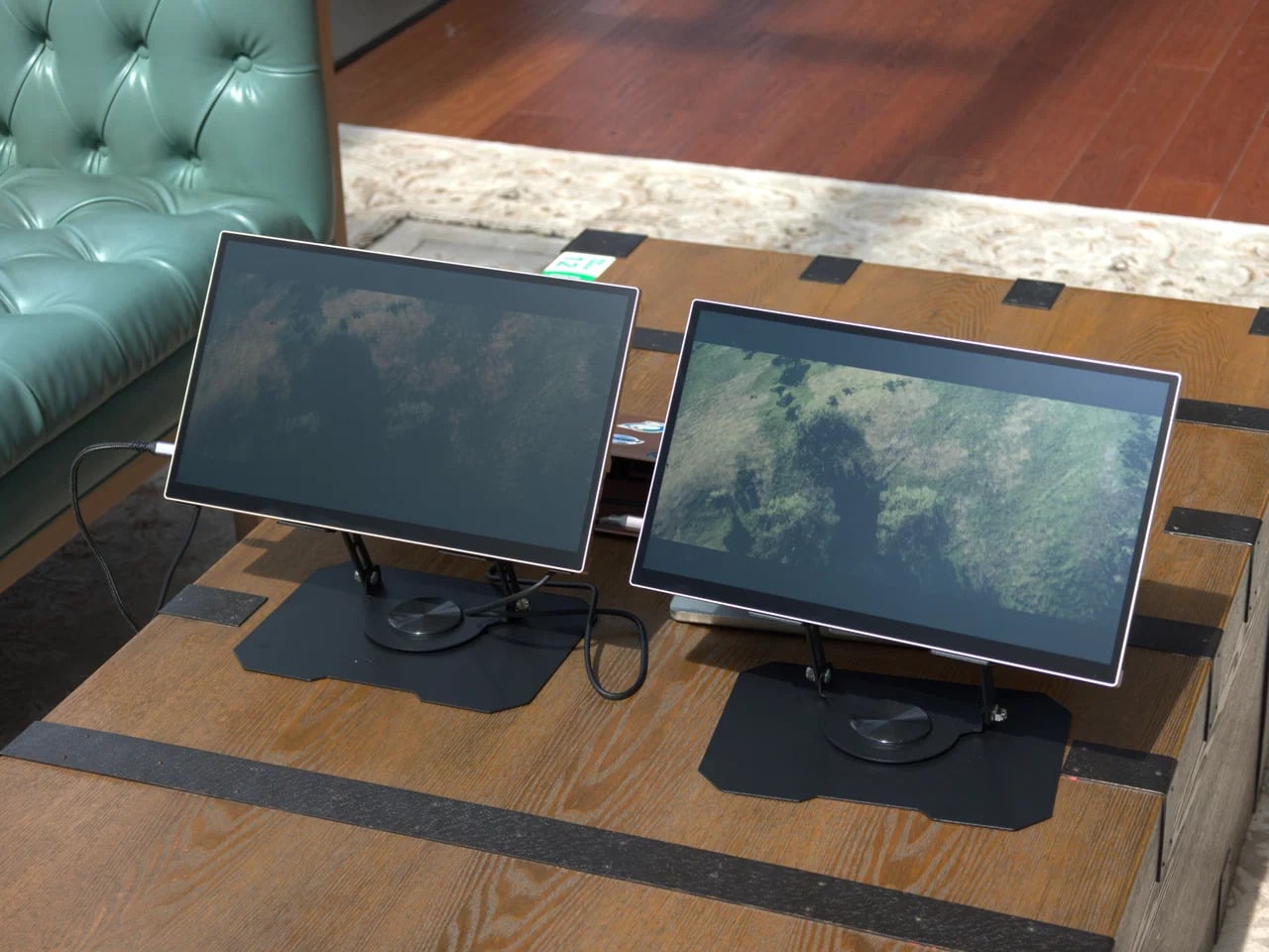
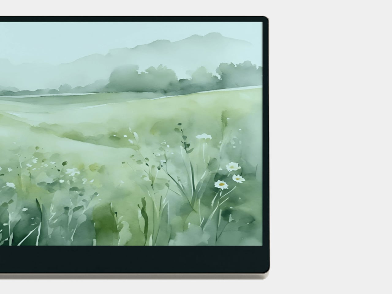
The Radiant Monitor 2 takes a fundamentally different approach to that problem. Rather than packing in more backlight power to overpower sunlight, it uses a transflective LCD panel, a display technology that works with ambient light instead of against it. The brighter the environment, the better the image becomes, which flips the script on how portable monitors have traditionally handled outdoor conditions.
The panel pairs transflective LCD technology with Eazeye’s proprietary UHR coating, which helps the display channel ambient light into better visibility, reduce glare, and sharpen image clarity without leaning on its LED backlight. On particularly sunny days, you can switch the backlight off entirely, dropping power consumption down to around 3W, and the screen remains fully usable, bright, and legible.
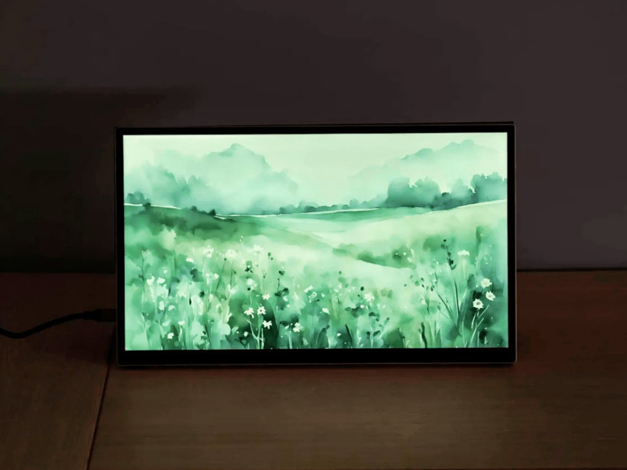
That backlight isn’t an afterthought, though. Eazeye fitted the Radiant Monitor 2 with a custom full-spectrum LED strip that uses a natural daylight spectrum and emits low blue light, making evening work sessions noticeably easier on the eyes. At full brightness, it draws around 8W, which is modest for a portable monitor, and it pairs with a 1000:1 contrast ratio and a 5ms response time.
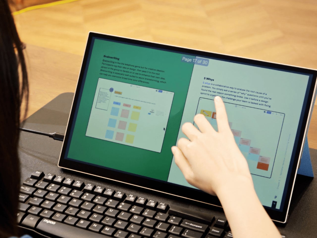
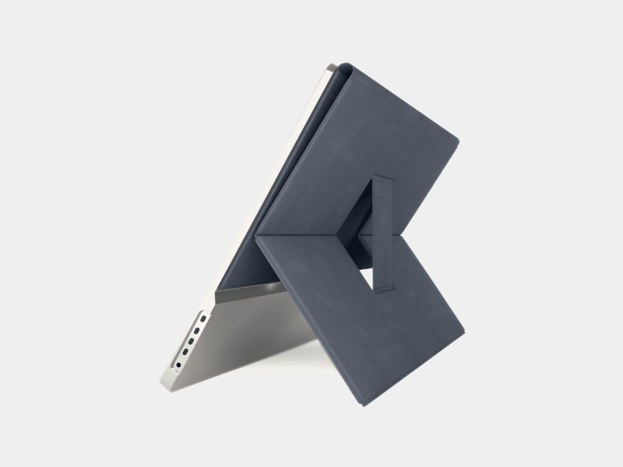
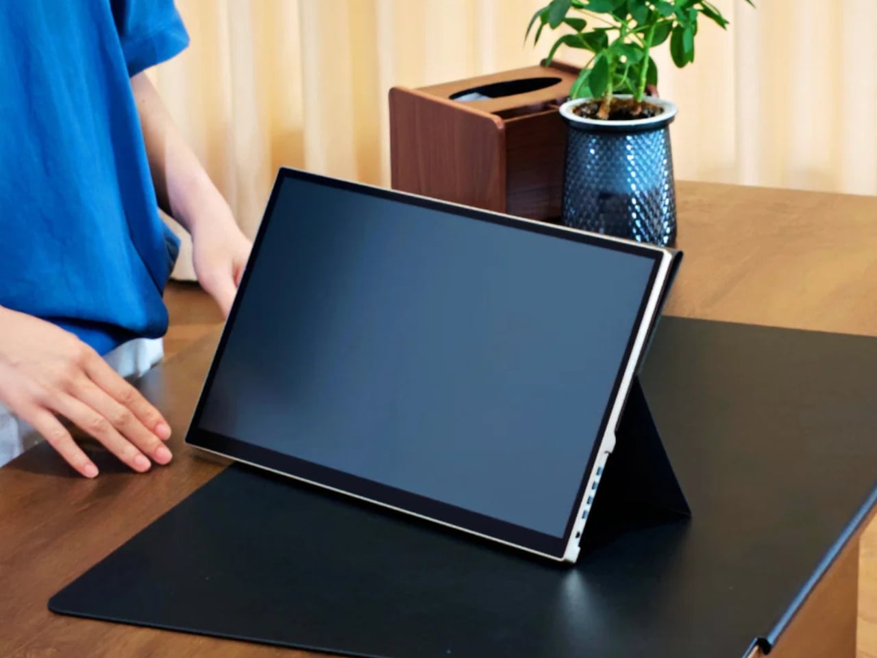
Imagine working from a café with floor-to-ceiling windows, the kind of place where a regular monitor becomes completely unworkable midday. The Radiant Monitor 2 handles this without any special positioning or shade hunting. Plug it in via USB-C or HDMI, prop it up with the redesigned magnetic folio stand, and it’s ready in seconds. The 10-point capacitive touchscreen adds another layer of interaction without needing a mouse.
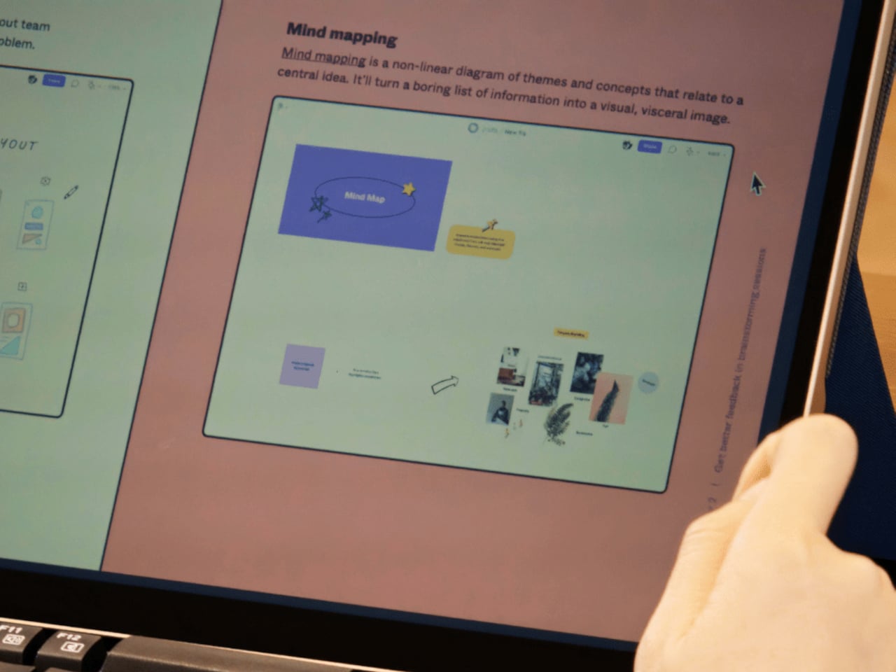
E Ink monitors are the other common choice for eye-friendly screens, but they top out at around 1 to 10 Hz, making them choppy and impractical for scrolling, video, or general multitasking. The Radiant Monitor 2 runs at 60 Hz with smooth, ghost-free performance that holds up through video calls, spreadsheets, and anything else that demands a responsive, full-color display without the visual noise of dithered E Ink output.
The monitor weighs 1.7kg and sits in a gray aluminum frame, durable enough for daily travel without feeling overbuilt. The magnetic folio doubles as a stand, redesigned to be more stable and easier to position than the original. Connectivity covers USB-C and HDMI inputs, with 75mm x 75mm VESA compatibility for desk setups, and an optional height-adjustable stand is sold separately for $99.
The Radiant Monitor 2 retails for $789, which puts it well above the typical portable monitor price range and reflects the specialized nature of its display technology. The 65-degree viewing angles are noticeably narrower than standard LCD panels, so it’s best experienced head-on. It’s one of the few portable monitors that doesn’t ask you to find a darker spot every time the sun gets too bright.
Lo-fi photography has quietly staged a comeback over the past several years. Grainy film shots and pixel-heavy images have become a sought-after look among photographers and casual snappers alike, partly as a reaction to the almost clinical sharpness of modern smartphone cameras. The Game Boy Camera, Nintendo’s cartridge-based accessory from 1998, sits at the center of this revival, beloved for its impossibly low resolution and four-shade grayscale.
Getting that Game Boy Camera experience has typically meant tracking down the original hardware through secondhand markets, often at a premium, with no guarantee the cartridge still works. Epilogue’s Flashback app changes that. It bridges the gap between a Nintendo accessory from the late ’90s and your current smartphone, letting you capture images in that pixelated, lo-fi style with or without the original cartridge, and it doesn’t cost a thing.
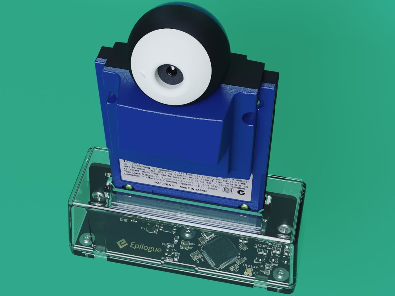
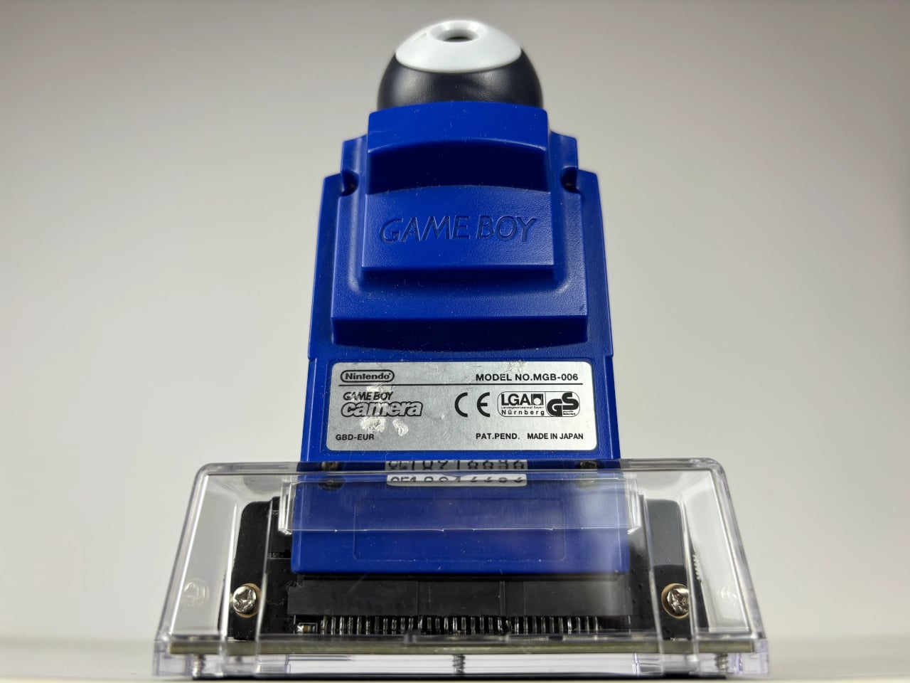
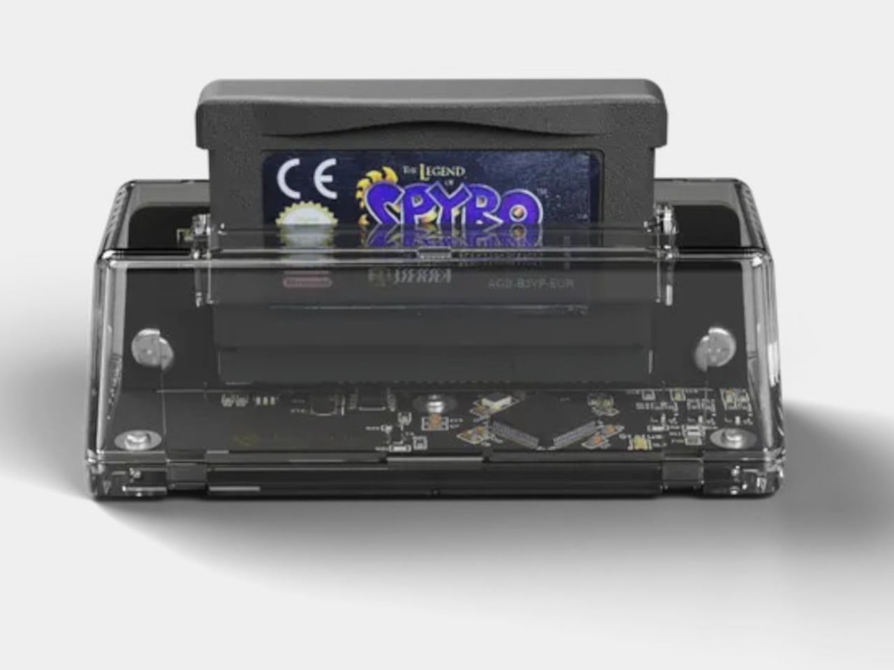
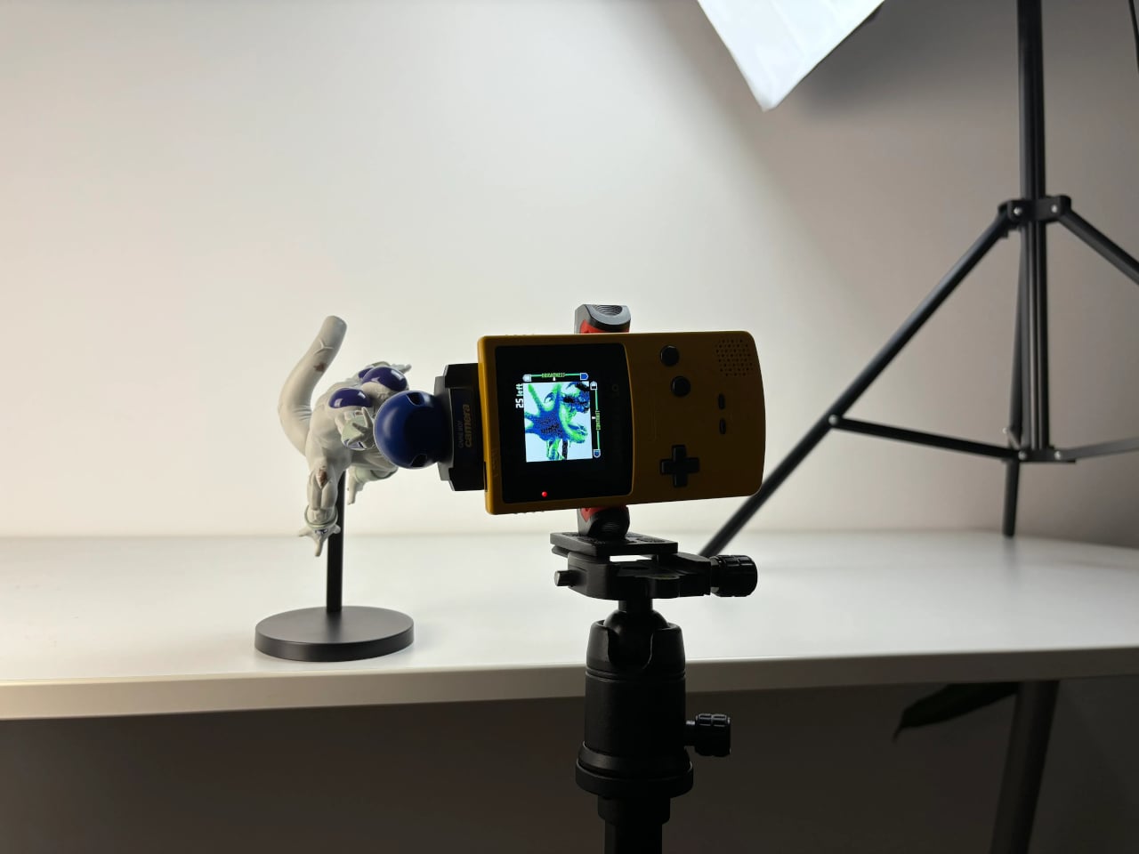
If you do have the original Game Boy Camera tucked away, Flashback has a Hardware Mode that pairs with Epilogue’s GB Operator, a $90 cartridge reader that connects to your phone via USB-C. Slot in the cartridge, plug it into your phone, and the app detects the camera automatically. No pairing is needed, and nothing is emulated: you’re shooting straight through the original Mitsubishi M64282FP sensor.
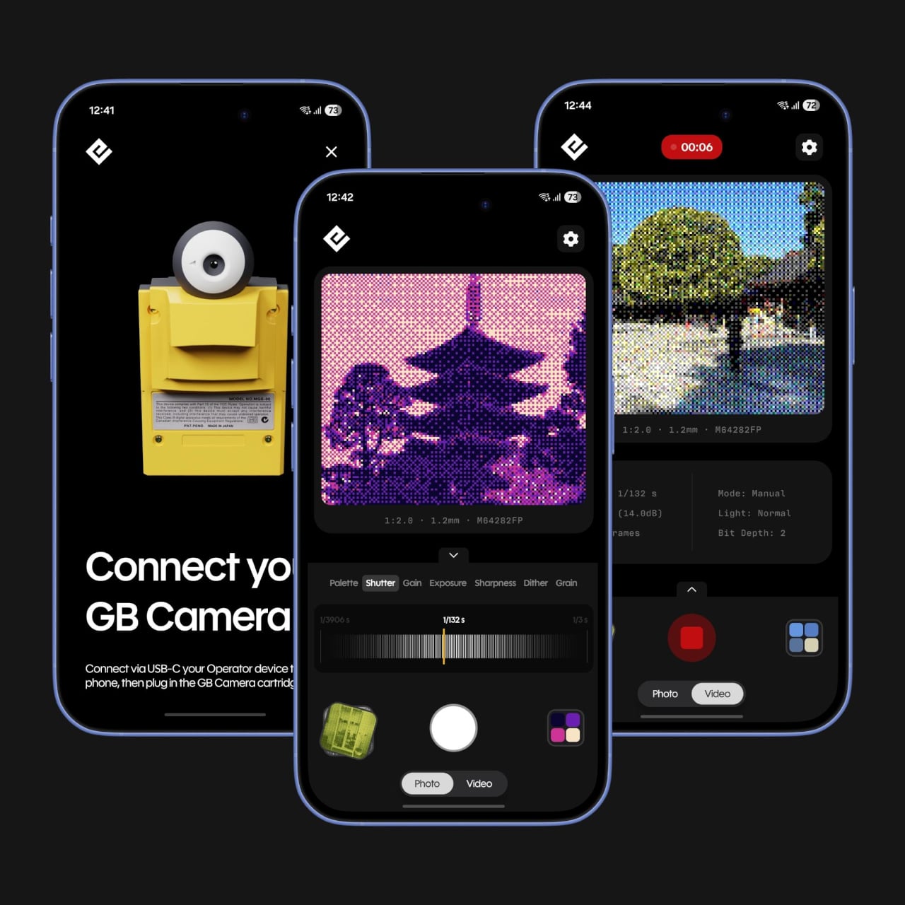
Not everyone held onto their Game Boy Camera from the ’90s, and Flashback accounts for that. Its Software Mode skips the hardware altogether, using your phone’s own camera and faithfully recreating the Game Boy Camera’s image processing pipeline. You get the same 128×112 pixel grid, the same dithering, and the same four-shade rendering, applied to whatever your lens captures. It’s a faithful recreation, not a generic retro filter.
You’re not limited to gray, either. Flashback comes loaded with 32 color palettes, ranging from the original grayscale to classic Game Boy green, plus creative options like Ice Cream, Tidewater, Spacehaze, and Velvet Cherry. In Software Mode, there’s also a Color Mode that dynamically builds a palette from whatever hues are actually in front of your lens, making the filter feel responsive rather than fixed.
For those who want to go further, Flashback opens up manual controls for shutter speed, gain, exposure, sharpness, dither, and grain. These aren’t decorative sliders. They map to the actual registers of the M64282FP sensor itself. Every shot you take gets stamped with its exact settings, so if you land on a combination you like, you’ve already saved the recipe for getting back to it.
Flashback isn’t limited to photos. It records video too, with audio captured through your phone’s microphone, giving the lo-fi aesthetic a moving dimension. Everything goes straight to your Camera Roll when you’re done. The app is free on the App Store and Google Play, available on iOS 17.2 and above, or Android 8.0 and above, and it also runs natively on Mac.
For anyone who grew up with a Game Boy, getting back to that same exact photographic experience today costs only a free app download and, if you still have the cartridge, a USB-C cable. It’s a combination that makes a sensor originally from 1998 feel unexpectedly relevant, and its lo-fi images strangely compelling for something that barely clocks 14 kilopixels.
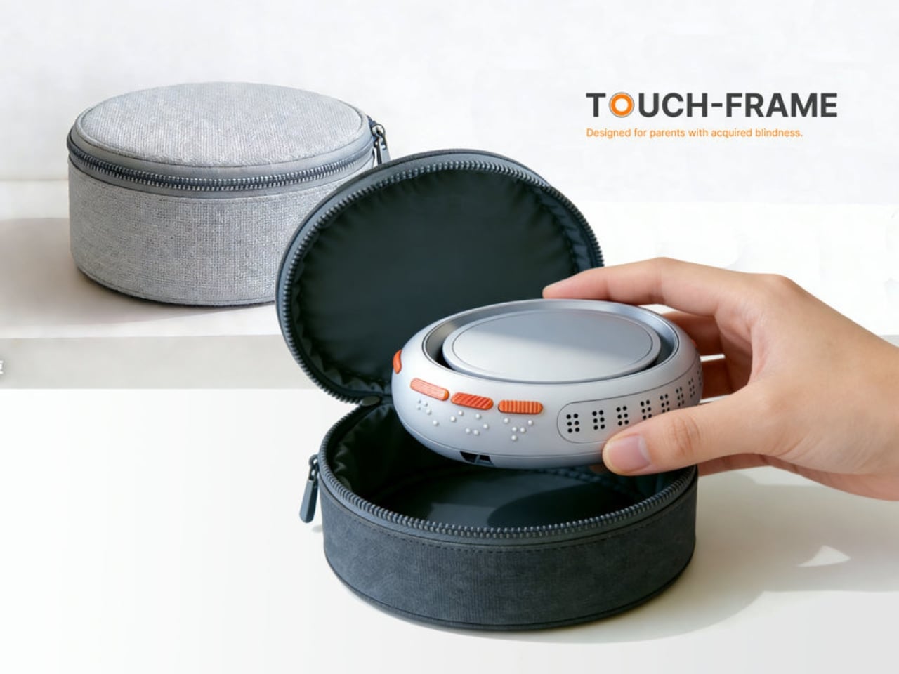
Every so often, a design concept stops you mid-scroll and makes you sit with an uncomfortable question. For me, Touch-frame by student designer Liang Han was exactly that kind of pause. It didn’t announce itself with a clever name or a slick render alone. It made me stop because of what it implied about how narrow our assumptions around photography really are.
The premise is deceptively simple: a smart photo frame designed for parents who have lost their sight. But the design challenge buried inside that premise is one most of us have never thought about. Photography, for all the innovation it has absorbed over the decades, remains a fundamentally visual medium. We build entire apps, devices, and rituals around looking at photographs. What happens when looking is no longer an option?
Designer: Liang Han
The most obvious answer to that question is AI narration, where a system describes what’s in an image and reads it aloud. It works. It’s useful. But Liang Han’s argument, embedded in the design itself, is that a verbal description of a photograph and the actual experience of a photograph are two very different things. When your child hands you a drawing they made at school, you don’t want a summary. You want to feel it.
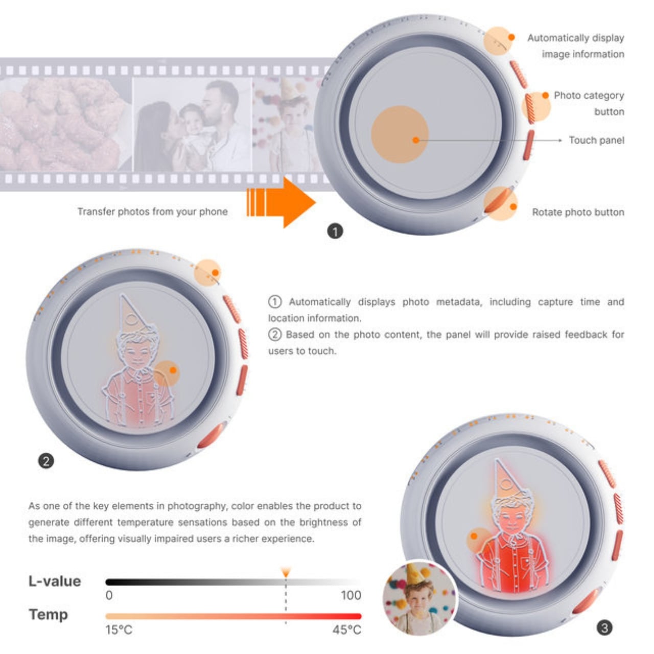
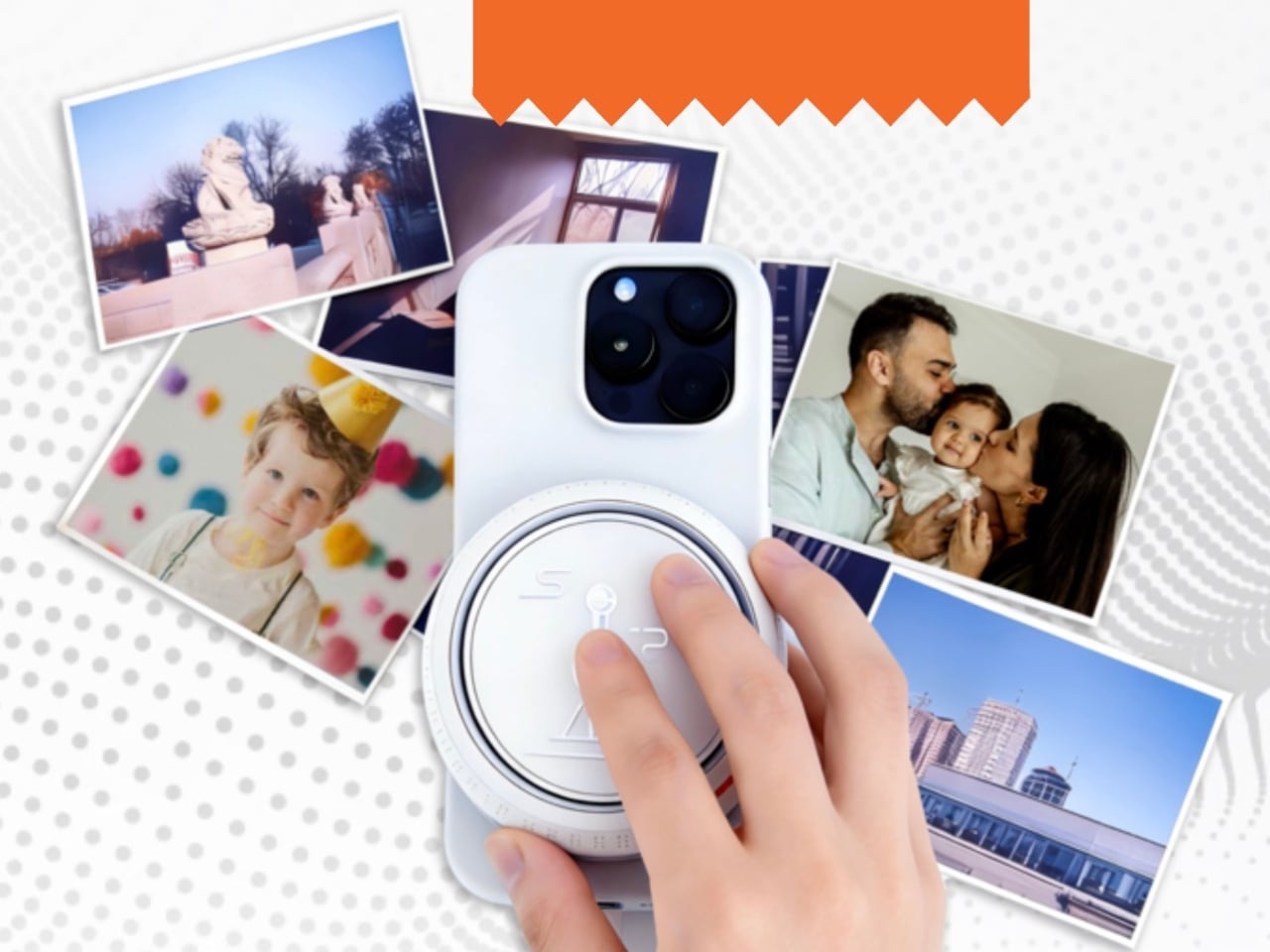
Touch-frame addresses that gap with a dynamic tactile dot matrix embedded in the panel. Instead of translating a photo into words, the frame translates it into texture, allowing users to physically trace the contours of a face, a landscape, or a meal. The surface also adjusts its temperature in real time based on the color saturation of the image, a detail that sounds technical until you realize what it means: warm tones feel warm, cool tones feel cool. A sunset photograph doesn’t just get described as golden. You feel something close to gold.
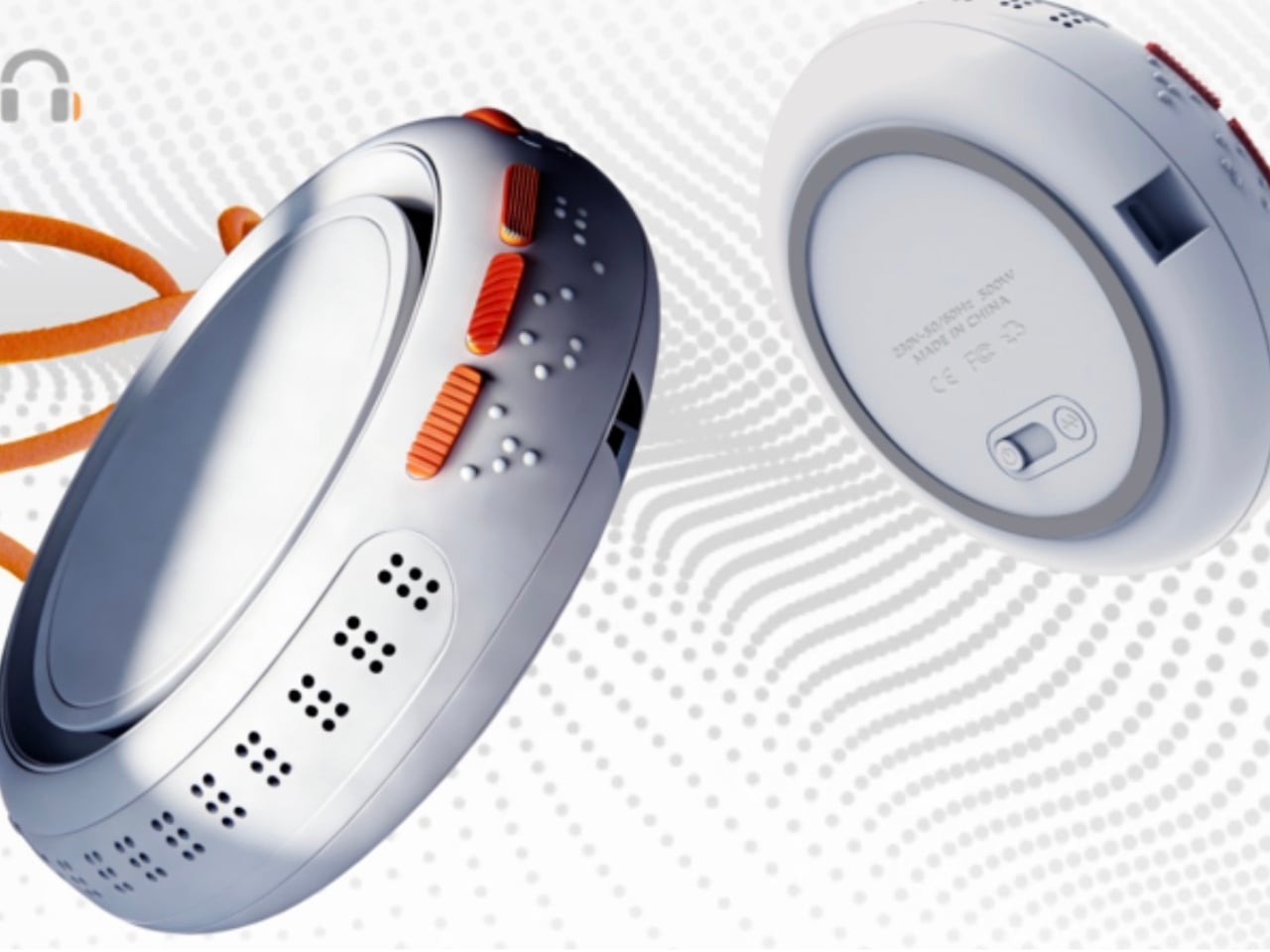
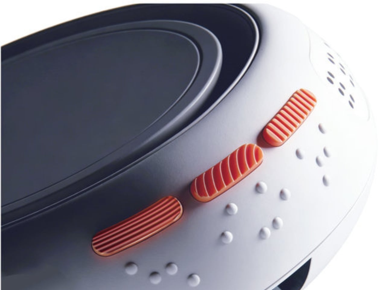
On top of the tactile experience, the device includes Braille annotations on the top surface, automatic photo categorization with textured tactile buttons (one for portraits, one for landscapes, one for food), voice metadata read-aloud with date and GPS location, and a recessed groove around the charging port so the entire device can be navigated independently without any sighted assistance. The fact that a student thought through all of these layers simultaneously, each reinforcing the others, says a great deal about where design education is headed.
What strikes me about Touch-frame isn’t just the technology. It’s the philosophy underneath it. Most assistive technology is built around compensation, giving people a workaround to approximate what they’ve lost. This design reaches for something more ambitious. It tries to restore the emotional richness of the experience itself. When a child can place their school photo or a drawing directly on the device and share it with a visually impaired parent, that’s not compensation. That’s connection. And the distinction matters enormously.
The design also consciously positions itself outside the clinical aesthetic that tends to dominate assistive products. Liang Han explicitly frames this as a shift from “medical equipment” to “personal electronics,” and the visual language of the renders backs that up. It looks like something you’d want on your shelf, not something that announces a medical condition the moment someone walks into the room. Dignity in design is still underrated, and it’s encouraging to see it treated as a deliberate intention rather than an afterthought.
You could argue that the concept still has gaps. A tactile dot matrix can only approximate so much, and thermal feedback as a color proxy has obvious limits. That’s fair. Concept designs exist in a space between aspiration and engineering reality, and not every detail survives contact with production. But the best concept designs do something valuable regardless: they reframe a problem in a way that makes you wonder why nobody thought to frame it that way before.
That, in the end, is what Liang Han has done. The photograph has been a sighted medium since its invention. Touch-frame quietly but firmly asks whether it has to be.
The Motorola Edge 2026's compact size, clean software, and thoughtful design give it a charm that many rivals simply do not have, though it might not be the right fit for everyone.
Motorola’s comeback story is about more than nostalgia. The brand may still benefit from a familiar name and a long history in mobile, but its recent momentum has not come from recognition alone. Rather than simply trading on memory, Motorola has been building devices that feel stylish, approachable, and increasingly self-assured in a market that rarely makes room for second chances.
The Edge 2026 reflects that progress, even if it does not fully embody it. This is a phone with a clear sense of what it wants to prioritize, namely comfort, portability, and day-to-day ease, but it enters a crowded midrange field where those strengths have to work harder to justify the price. That makes the Edge 2026 easy to appreciate in some ways, but harder to justify in others. The real question is whether Motorola’s priorities here line up with what buyers at this price actually want.
Designer: Motorola
Aesthetics
There is something very Motorola about the way this device presents itself. The brand has become increasingly confident with phones that blend fashion-minded styling and mainstream usability, and the Edge 2026 continues that direction with ease. It looks premium without trying too hard, which is often one of the most difficult tricks to pull off in this category.
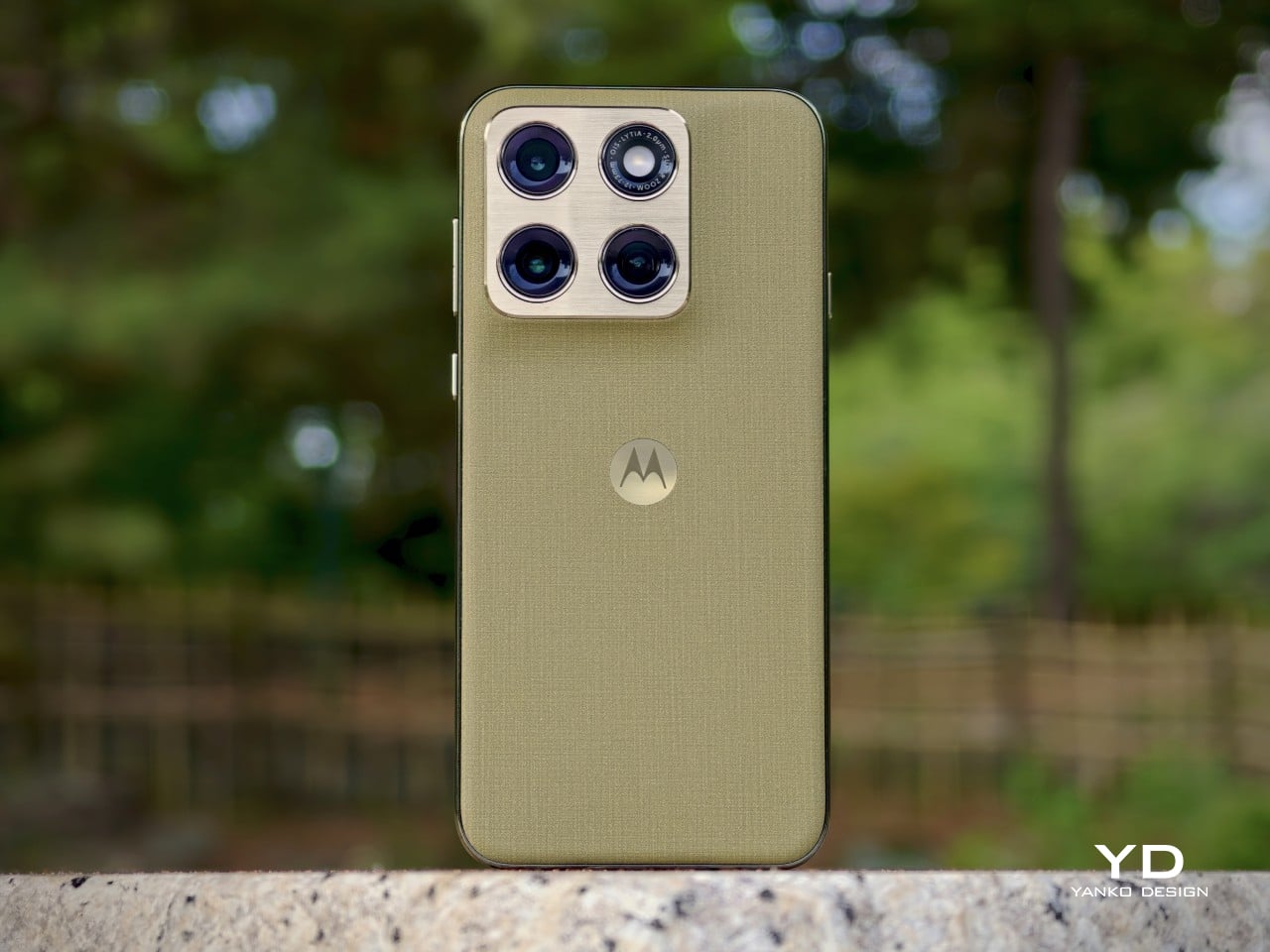
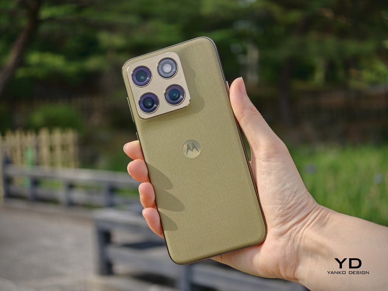
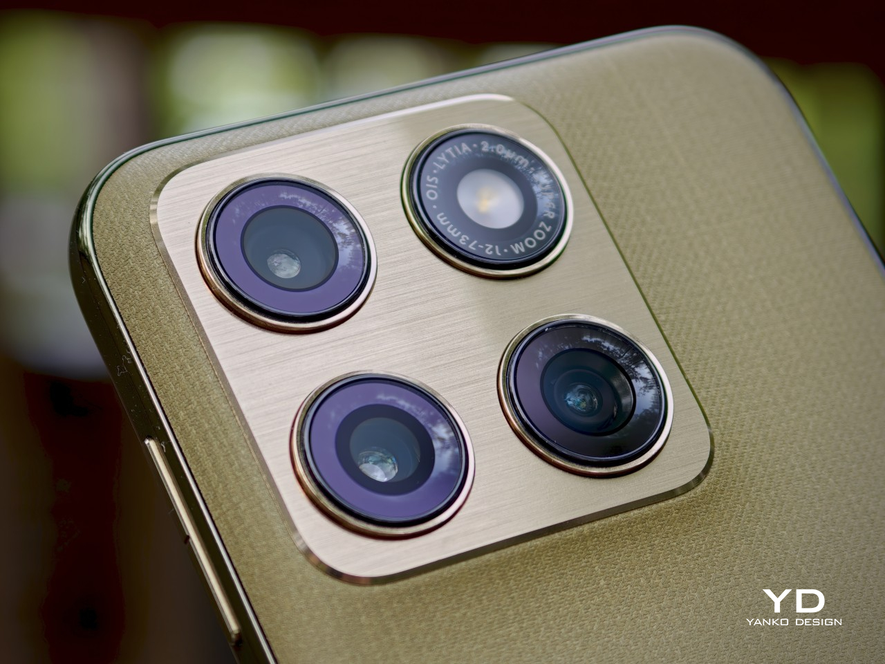
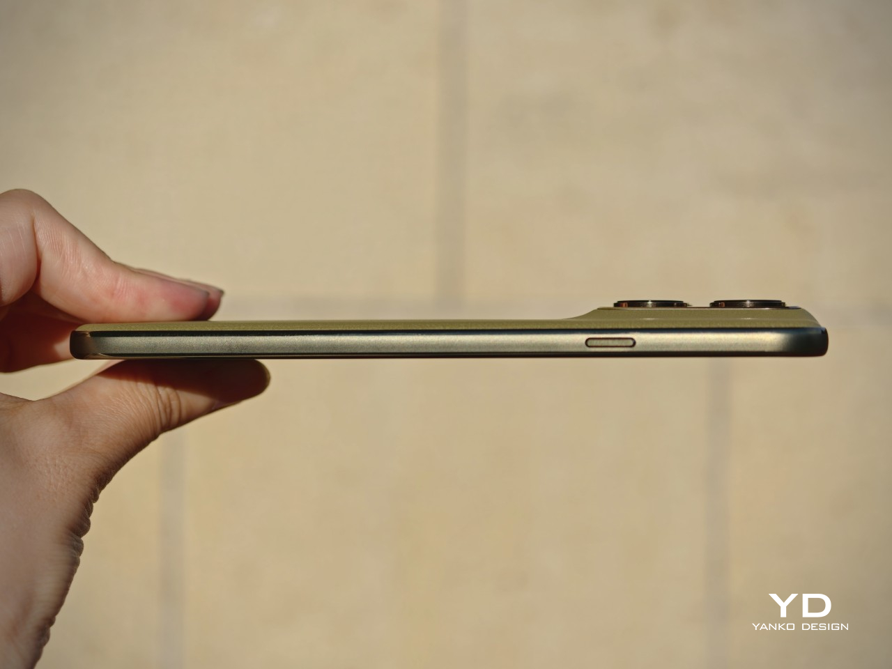
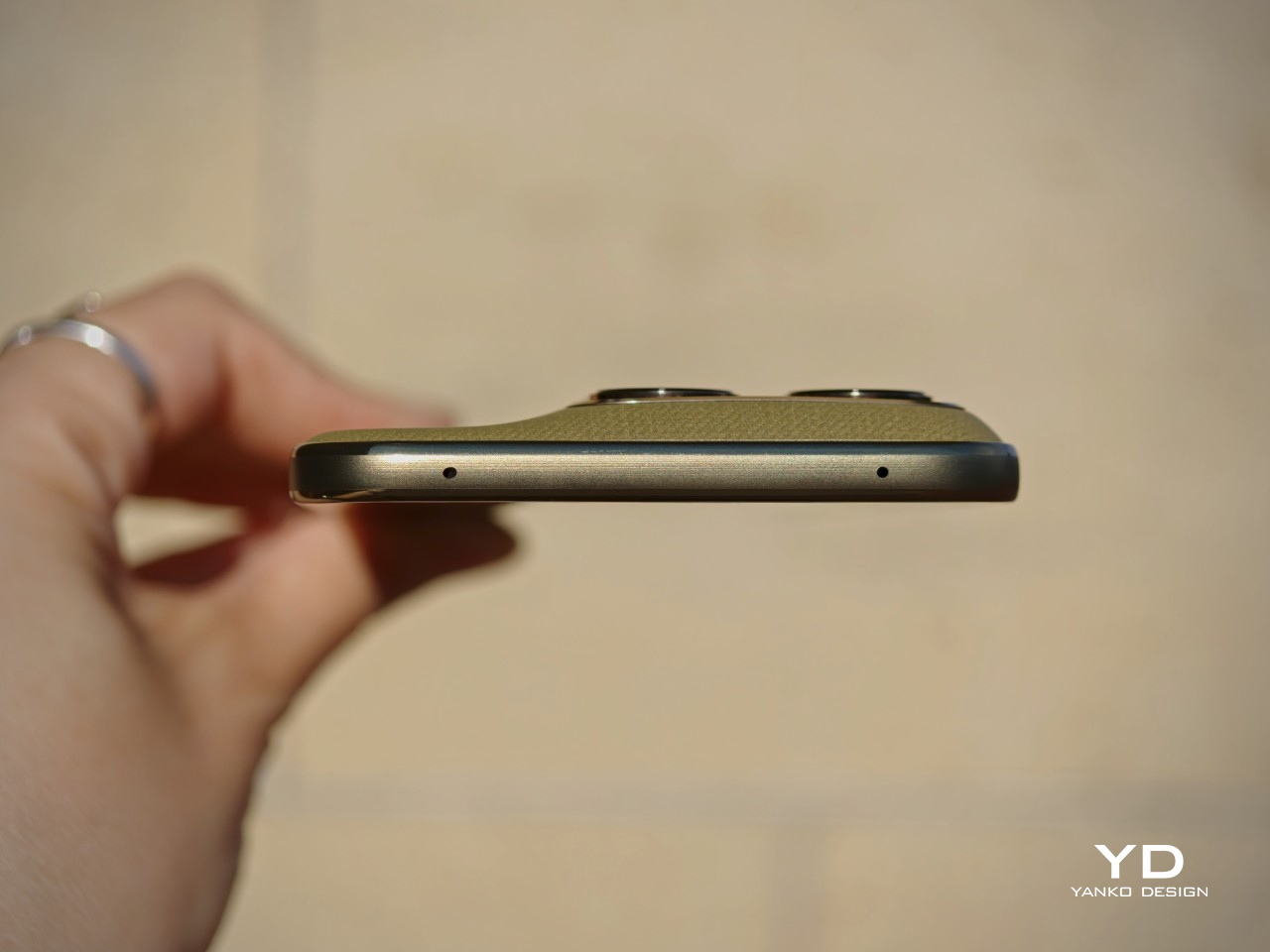
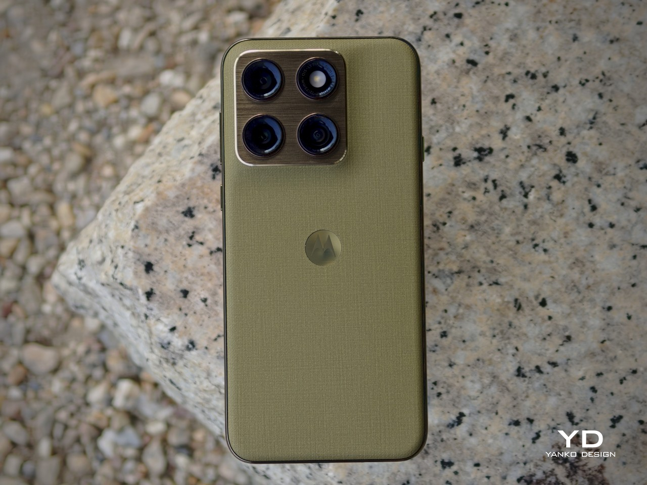
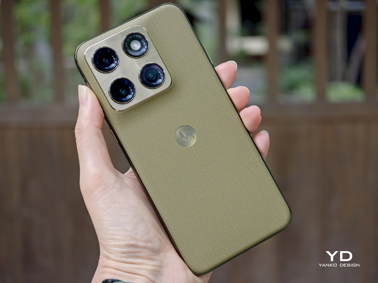
That confidence comes through clearly in the details. The back panel uses a twill-inspired finish in Pantone Martini Olive, and it gives the phone a softer, more composed visual character than the usual glossy midrange formula. Paired with the brushed gold camera bump, the centered Motorola logo, and the brushed finish frame, the whole design has a calm, almost zen-like quality. It feels restrained, but not plain, and that balance works in its favor.
It also looks strikingly close to Motorola’s flagship Signature, which is not currently available in the U.S. That resemblance gives the Edge 2026 a more elevated presence than its price might suggest, even if it also makes the phone feel a touch less distinctive on its own terms. Unlike the Signature, which comes in both Pantone Carbon and Pantone Martini Olive, the Edge 2026 is limited to just this one color option, though some buyers may wish Motorola had offered a bit more variety.
Ergonomics
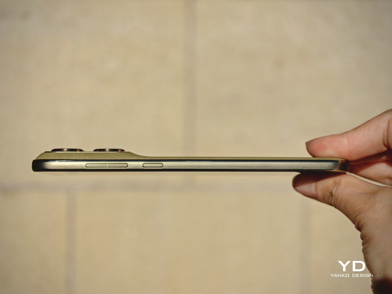
This is one of the most defining parts of the Edge 2026 experience. Motorola shrank the Edge from 6.7 inches to 6.3 inches, and that change has a bigger impact than it might seem on paper. With its more compact body, the phone feels noticeably easier to manage than many of the larger devices around it in this price range. The difference may sound small in theory, but in daily use, it changes a lot.
The Edge 2026 is genuinely pleasant to hold. It is easier to grip, easier to reach across, and easier to use one-handed without constantly adjusting your hold. In fact, it is one of the most pleasant phones I have tested in a very long time. The finish also helps in everyday use, because it does a good job resisting fingerprint smudges and light scratches, which makes the phone easier to keep looking clean over time.
Personally, I do not mind a bulkier phone if that extra size delivers the best possible experience. I know not everyone feels the same way, though, and that is exactly why a phone like the Edge 2026 makes sense. What we want from smartphones is different, and for people who care more about getting the basics right in a device that feels super portable and genuinely comfortable in the hand, this one feels very well judged.
The one clear ergonomic drawback is the fingerprint scanner placement. It sits a little too close to the bottom edge, which can make it feel slightly awkward to reach at first. It is not a major flaw, and it becomes easier to adapt to over time, but it does stand out on a phone that otherwise feels so carefully shaped.
Performance
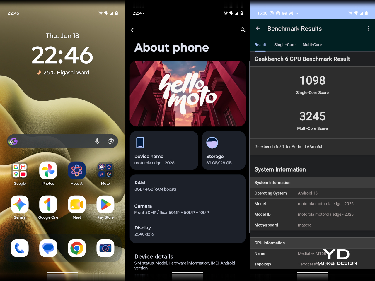
On paper, the Motorola Edge 2026 does not sound especially aggressive for the money. It runs on the MediaTek Dimensity 7450 chipset with 8GB of RAM and 128GB of storage in the U.S. model. While the chip is a modest upgrade over the previous generation, the drop from 256GB to 128GB feels less welcome.
In daily use, performance is solid without being especially impressive. Apps open quickly enough, scrolling feels smooth, and everyday tasks rarely cause much friction. For lighter users, 128GB should still be manageable, but anyone who takes lots of photos and videos, plays large games, or downloads media may run into storage limits sooner than expected.
Motorola’s software remains one of the phone’s more appealing strengths. The interface feels clean, light, and relatively uncluttered, and it was refreshing to use a phone that does not come buried under bloatware. I also liked Motorola’s added gestures and shortcuts, especially the double chop to turn the torch on and off, the double twist to quickly open the camera, and the option to flip the phone over to enable Do Not Disturb.
The company’s added features feel more useful than intrusive, which makes the software easy to settle into from the start. That said, I do wish Motorola included its own gallery app with built-in editing tools instead of relying entirely on Google Photos. Google Photos works well enough, but it does not feel as tailored or as seamless as a dedicated first-party gallery experience.
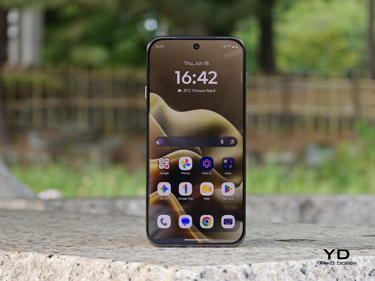
The 6.3-inch display is a big part of what makes the Edge 2026 feel great to use. With a resolution of 1216 x 2640 and a 120Hz refresh rate, the panel looks sharp, vibrant, and smooth, while the smaller size helps the phone feel more manageable without making the screen feel cramped. It also supports 1 billion colors and HDR10+, which gives content a richer and more lively look.
Colors have plenty of punch, and the display is enjoyable for everything from reading to streaming video. Audio is surprisingly rich and loud for such a compact phone, which adds to the overall media experience. Together, the screen and speakers make the Edge 2026 feel more immersive than its size might suggest.
Main Camera, 1x
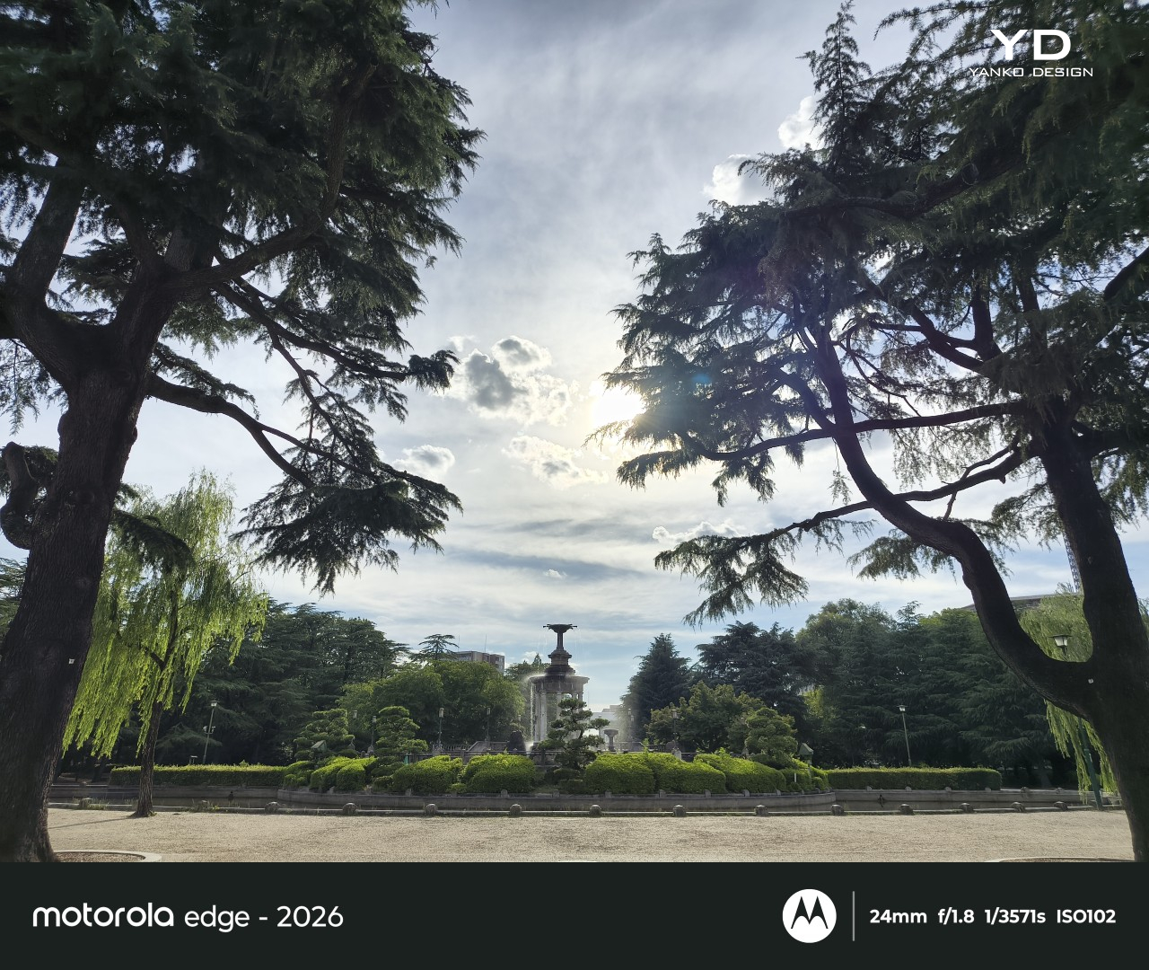
The camera setup seems largely unchanged from its predecessor. The main camera uses a 50MP 1/1.56 inch Sony LYT 710 sensor with an f/1.8 aperture and OIS, while the 10MP telephoto camera offers 3x optical zoom with an f/2.0 aperture and OIS. The LYT 710 should bring modest improvements in light sensitivity and noise reduction over the sensor used in the previous model.
Main Camera, 1x
Main Camera, 2x
Main Camera, 3x
There is also a 50MP ultra-wide camera with a 122-degree field of view and an f/2.0 aperture, and it doubles as the macro camera. On the front, Motorola includes a 50MP selfie camera with an f/1.95 aperture. All cameras can record video at up to 4K at 30fps.
Ultra-wide
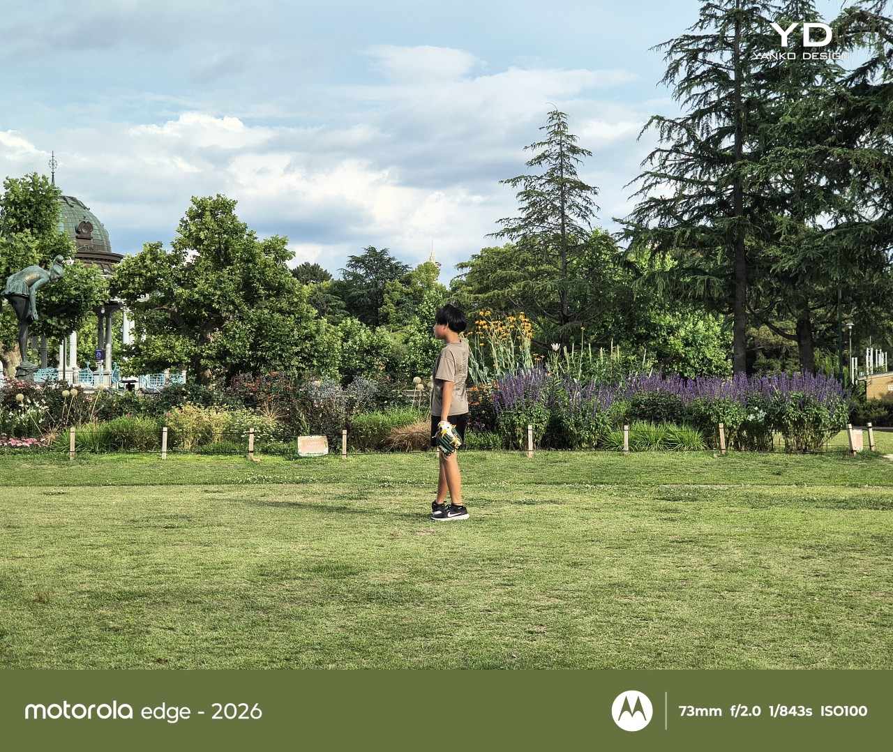
It is a well-rounded setup overall, and I was pleasantly surprised by it. It is not on the same level as a true flagship camera system, of course, but I found the color tuning more pleasing in some situations. The main camera handles dynamic range well enough to feel reliable for everyday use.
Main Camera, Portrait Mode (24mm)
Main Camera, Portrait Mode (35mm)
Telephoto Camera, Portrait Mode
The telephoto camera adds some welcome flexibility, even if its limitations become more obvious once you push beyond 3x. The phone automatically switches between the main and telephoto lenses depending on the scene, and while the telephoto camera is not especially detailed, it tends to get exposure right even in difficult lighting. Low light performance is solid too, though the shutter speed can be frustratingly slow even outside of Night mode, which makes it easier to end up with blur if your subject moves or your hand is not perfectly steady.
Telephoto Camera, 3x
Telephoto Camera, 3x
Main Camera, 6x
The battery has been reduced from 5200mAh on the previous model to 5000mAh, which is not especially exciting on paper. Even so, the phone remains efficient enough to last a full day comfortably, and light users may even be able to stretch it into a second day. That fits well with the Edge 2026’s broader focus on comfort and everyday ease.
Charging is solid, too. The 68W wired charging is quick enough to feel genuinely convenient, and 15W wireless charging adds a welcome bit of flexibility. Neither feature is especially headline-grabbing, but together they make the phone easy to live with.
Sustainability
The Motorola Edge 2026 makes a solid case for itself on durability. It is rated IP68 and IP69, uses Corning Gorilla Glass 7i, and also meets MIL-STD-810H standards. Motorola says it is designed to survive drops from up to 1.22 meters and handle extreme temperatures and high humidity.
That toughness helps its long-term appeal. The software support, however, is less impressive. Motorola promises two major OS upgrades and three years of security updates, which falls short of what many rivals now offer at this price.
Value
At $599.99, the Motorola Edge 2026 sits in a competitive part of the market, but its value becomes easier to understand once you look beyond the spec sheet. This feels like a phone aimed more at lighter users, especially with 128GB of storage, and its compact form factor is a big part of the appeal. The size, comfort, and ease of use give it an everyday charm that many rivals simply do not have.
That said, value is also shaped by how long a phone is likely to feel current. Motorola only promises two major OS upgrades and three years of security updates, which is not especially generous at this price. If you tend to keep your phone for many years, that shorter support window may matter more, even if the hardware itself feels pleasant and durable enough to last.
Verdict
The Motorola Edge 2026 knows exactly what it wants to be. It prioritizes comfort, portability, and everyday ease, and that gives it a clearer identity than many midrange phones. Its compact form factor is easily one of its best qualities, and for people who want a phone that simply feels great in the hand, it is a strong contender.
That said, it is not without compromise. The 128GB storage feels limiting, the software support is shorter than some rivals, and the performance is solid rather than standout. Still, for the right user, especially someone who values portability and comfort above all else, the Edge 2026 remains an appealing option.
We’ve reached a point where our desks have become a form of personal expression. The plant you chose, the pen holder you 3D-printed, the specific coffee mug that only leaves when it’s being washed – these things say something about who you are. XiaoBu, a desktop companion robot concept by Handsome Chen, is betting that your next statement piece might just say “hello” back.
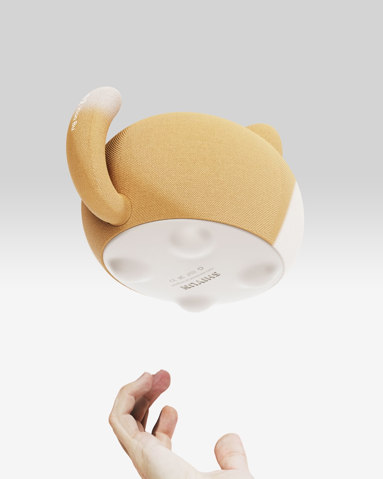
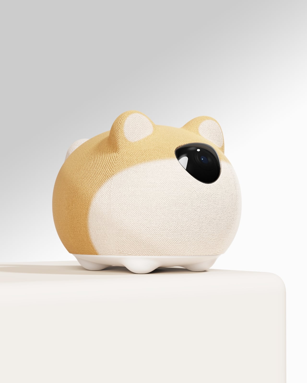
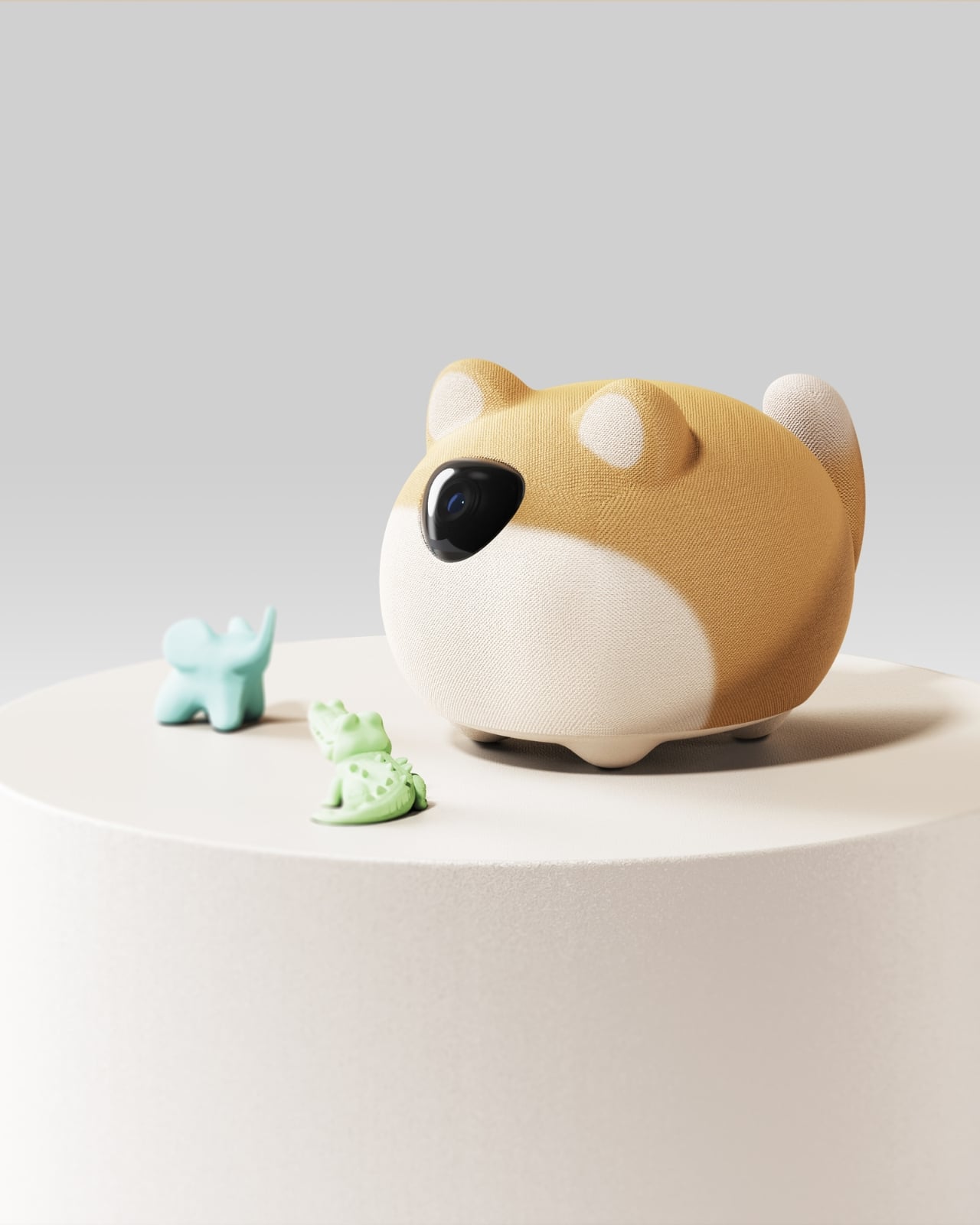
XiaoBu is not a smart speaker with a face. It’s not a Tamagotchi with an engineering degree. It’s a desktop robot that pulls together three things that usually live separately: audio function, emotional interaction, and replaceable fabric skins. The combination is what makes it feel genuinely interesting rather than like another product designed to solve a problem no one actually had. Sit with the concept for a moment, though, and the sum starts to feel quite different from its parts.
The fabric skins are the detail that stopped me mid-scroll. Most companion robots lean hard into hard plastic shells – which makes sense from a durability standpoint, but creates a certain coldness that works against the whole “companion” pitch. XiaoBu takes the opposite direction. By making the outer layer soft and swappable, it invites you to treat it less like a gadget and more like a small, quietly present roommate you can dress according to your mood. That shift in material logic carries a real design philosophy behind it: the idea that emotional connection often starts with touch, texture, and familiarity. It’s the difference between something you pick up because you need it and something you keep because it just feels right having it nearby.
The trend toward desktop companion robots has been building steadily for some time. Products like EMO and Eilik have already carved out a niche for people who want their desk to feel a little more alive – but those largely stick to the personality-through-expression model, where a tiny LED screen becomes the entire emotional vocabulary of the machine. XiaoBu’s approach is quieter and, I’d argue, more considered. It’s not performing for you. It’s designed to live alongside you, and the form reflects that distinction deliberately.
Handsome Chen, the Xi’an-based designer behind the concept, describes XiaoBu as breaking the “static limitations” of traditional desktop objects. It’s a deceptively simple framing, but it gets at something real. Most things on your desk are passive. They sit. They wait. They do nothing unless you reach for them. A companion robot, by design, has to earn its place differently – not just by being useful, but by being present in a way that feels intentional rather than intrusive.
I’ll be upfront: I’m a little skeptical of the word “companion” being attached to consumer tech. It’s an easy word to deploy and a hard promise to keep. But XiaoBu’s design, at least conceptually, seems to understand that emotional resonance can’t be engineered through features alone. It has to be built into the form, the texture, the way the object occupies space. The replaceable skins aren’t just a customization feature – they’re an acknowledgment that the relationship between a person and their space is fluid and always evolving, and the things they keep close should be allowed to evolve too.
What makes XiaoBu feel genuinely fresh in this growing category is that it doesn’t try to impress you with complexity. It doesn’t seem to be chasing a checklist of AI capabilities or competing on specs. The design conversation starts with softness, with audio warmth, with the kind of small, considered decisions that make an object feel like it belongs to you rather than to a product category.
Whether XiaoBu ever moves past concept into production is a separate question, and one I genuinely hope gets answered. Right now it lives on Behance, accumulating thousands of appreciations from people who clearly recognize the same thing I did: that sometimes the most interesting design isn’t the one with the most features. It’s the one that makes you feel like someone actually thought about what it means to share space with you.
The problem with buying tech for someone who follows tech is that he’s usually already seen it. His desk is deliberate. His bag is considered. His tech doesn’t accumulate — it earns a place and stays there. Shopping for him isn’t hard because he’s difficult. It’s hard because he’s usually right, and anything that doesn’t clear his bar comes back with a polite explanation.
The ten things on this list are the ones he hasn’t gotten to yet. Some of them are brand new. A few are still taking shape as concepts or patent filings worth tracking closely. None of them are the safe, obvious choice you grab when you’re not sure. Safe choices are what you give someone you don’t actually know that well, and the guy who has everything will see right through them.
1. Google Home Speaker
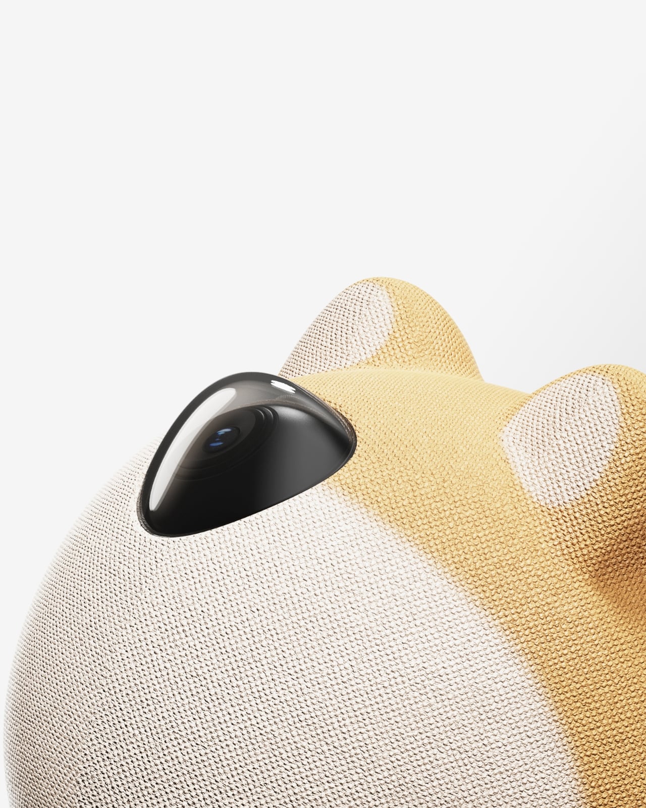
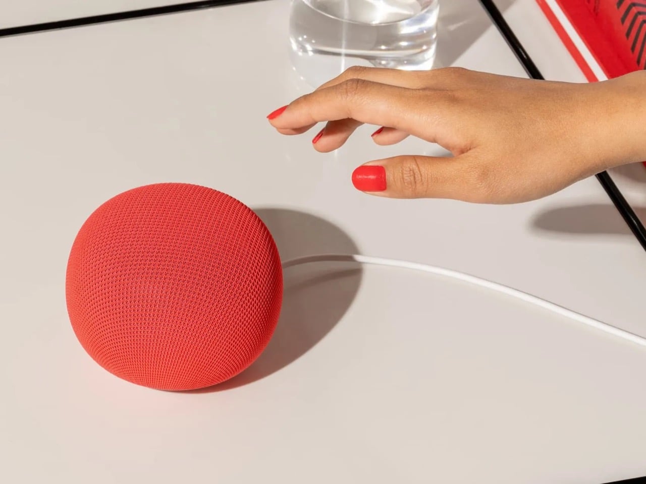
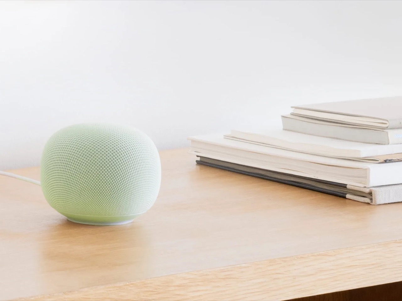
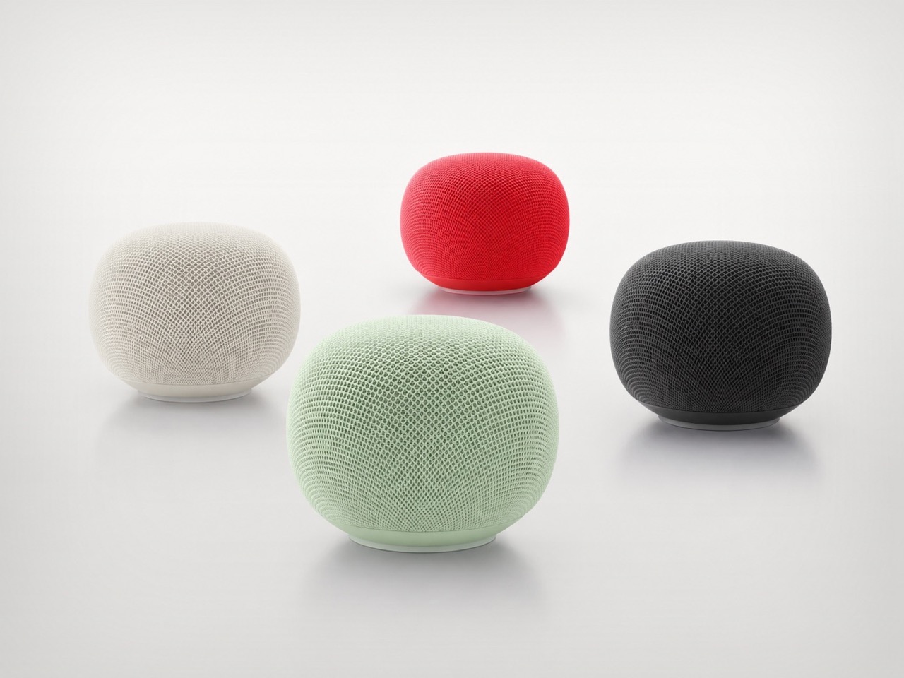
Google’s first new standalone smart speaker in nearly six years arrived in June 2026, and the gap is written into everything about it. The Nest Audio it replaces launched when people were buying anything that made a room feel less empty. The Google Home Speaker is a more considered object: small and rounded, available in colors the hardware team has always gotten right — the kind that make a shelf look slightly more curated without announcing a brand — with 360-degree audio and a light ring that tells you when Gemini is listening, thinking, or ready to respond.
The Gemini integration is the actual reason this speaker exists. Every Google product with enough surface area has been rewired into the AI model since 2025, and the kitchen turned out to be the most underserved room in the portfolio. What that means in practice is a speaker that answers hands-free cooking questions, manages a calendar, controls the broader smart home, and holds a conversation more fluently than any Nest device before it. Whether Google maintains attention on the category this time around is the only question worth watching.
What We Like
Gemini integration makes ambient AI genuinely useful in a room that needed it most
Soft, rounded form and considered color options read as a design object rather than tech hardware
What We Dislike
A six-year product gap makes long-term hardware commitment harder to trust
Full Gemini functionality requires staying inside the Google ecosystem to get the most out of it
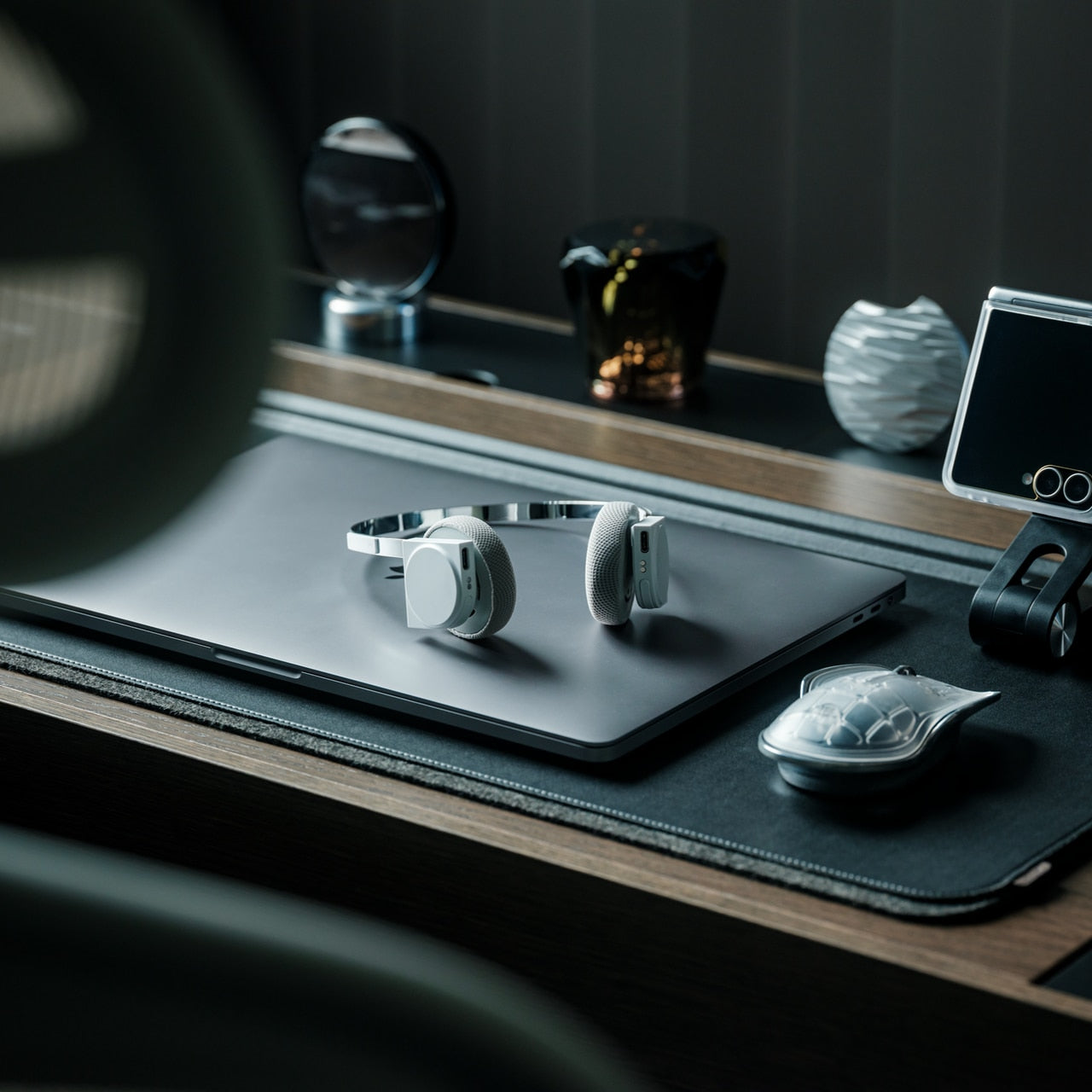
2. OrigamiSwift Folding Mouse
Most travel mice solve the portability problem by building a smaller, worse mouse. The OrigamiSwift, designed by Horace Lam, takes a different approach entirely. It folds completely flat to 0.18 inches thick, slips into a pocket, and unfolds into a full-sized ergonomic form in under half a second. The triangular structure that makes the fold work comes directly from origami geometry, which gives the collapsed state enough rigidity to survive a bag without a case, and the open position enough stability for accurate, comfortable tracking on almost any surface you set it on.
At 40 grams, you stop noticing it in your bag within the first day of carrying it, which is exactly the point. A 4,000 CPI infrared sensor handles tracking, Bluetooth 5.2 keeps the connection fast and reliable, and a single USB-C charge on the built-in lithium polymer battery lasts up to three months. The soft-click buttons are quiet enough for a shared workspace without drawing any attention. For anyone who has carried a full-sized mouse in their bag out of sheer stubbornness about ergonomics, the OrigamiSwift is the design that finally makes the case for stopping.
Opens from flat to full-sized ergonomic form in under 0.5 seconds with no mechanical fuss
Three months of battery life per USB-C charge removes recharging from the equation entirely
What We Dislike
The slim profile and 40-gram weight take adjustment for anyone used to heavier, more substantial mice
Stock is very limited — only a handful of units remain in the shop
3. Volla Plinius
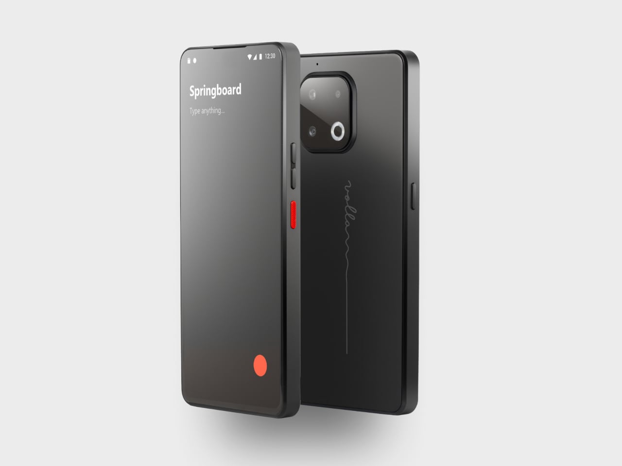
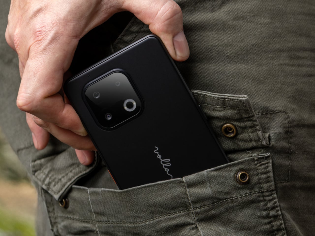
The Volla Plinius is named after Pliny the Elder, which is the kind of product name that tells you something about the people who built it. It’s a Google-free Android phone with an IP68 dust and water rating, a 6.67-inch FHD+ OLED display running at up to 120Hz, a 64MP main camera with phase-detection autofocus, an 8MP ultra-wide, and a 2MP macro, with 5G and a MediaTek Dimensity 7300 processor underneath. Out of the box, it runs Volla OS, a Google-free Android build with a clean, text-based interface and a Security Mode that governs which apps communicate with the outside world.
The detail that separates the Plinius from every other privacy phone is a user-replaceable battery you can swap with a standard screwdriver, even with the IP68 waterproofing intact. The 5,300mAh cell handles a full day comfortably, with 30W fast charging and 15W wireless charging both covered. Ubuntu Touch is available as a fully Linux-based OS from the UBports Foundation that doubles as a desktop environment when connected to a monitor. The standard Plinius starts at €598, with the Plus model adding 12GB of RAM, 256GB of storage, and a Pogo PIN connector for magnetic accessories at €698.
What We Like
User-replaceable battery with a standard screwdriver is a genuinely rare feature at any price, let alone with IP68 in place
Dual OS support means you can run Volla OS or full Ubuntu Touch on the same hardware
What We Dislike
The Pogo PIN modular accessory system is still early in its development
4. piBrick Pocket-CM5
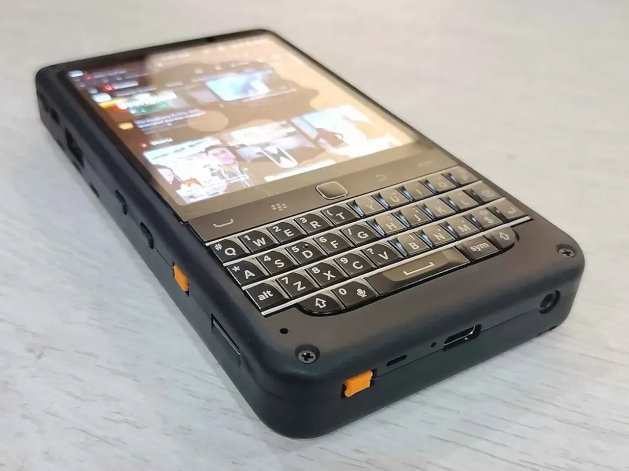
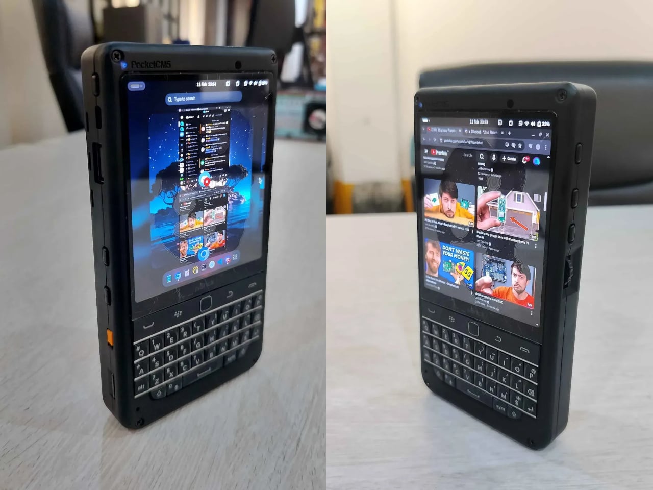
The piBrick Pocket-CM5 is an open-source handheld computer built around the Raspberry Pi Compute Module 5, a custom PCB designed for manufacturing at JLCPCB, and a 3D-printed shell. The whole parts list totals around $172, and what that buys is a device at smartphone proportions — 80mm × 145mm × 19.6mm — with a 3.92-inch AMOLED display at 1080 × 1240 pixels and 90Hz, a 5,000mAh battery, a compact QWERTY keyboard derived from the BlackBerry layout with an integrated trackpad, side rotary encoders, and five user-programmable buttons that give it a tactile depth no touchscreen-only device can replicate.
The feature that elevates the piBrick from impressive project to genuinely useful tool is USB-HID mode. Plug it into any external computer or server, and the keyboard and trackpad operate as a fully functional USB input device, independent of the Raspberry Pi running inside it. A sysadmin arriving at a server rack without a spare keyboard doesn’t need to find one. Full-size and micro-HDMI outputs allow the same device to drive an external display. NVMe SSD support in 2230 or 2242 formats adds storage beyond the SD card. The schematics, PCB files, and build instructions are open-source, making $172 the floor rather than the price.
What We Like
USB-HID mode turns it into a functioning keyboard and trackpad for any external computer or server
Full open-source hardware means the design belongs to anyone who wants to build on or modify it
What We Dislike
Requires hands-on assembly from a parts list rather than arriving as a finished, ready-to-use consumer device
The 3D-printed shell is functional but lacks the material quality of commercial hardware at this price level
5. StillFrame Headphones
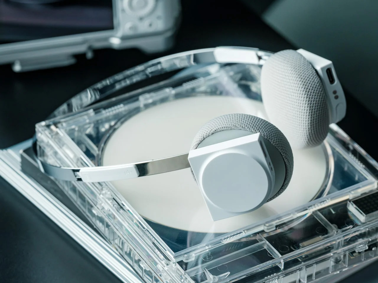
The StillFrame headphones are designed by Tatsufumi Funayama and weigh 103 grams, which is light enough that you genuinely stop noticing them across a full workday. The 40mm drivers produce a wide, open soundstage tuned for music that rewards real listening rather than functioning as background wallpaper. A stainless steel headband holds the structure with the right balance of strength and flex, and the fabric ear cushions attach magnetically, making swaps between the included colorways quick and satisfying in the way that small, well-engineered interactions tend to be. The form takes its reference from the quiet geometry of CD players from the 1980s and 1990s, and the connection is immediate once you see it.
At $245, the StillFrame competes on philosophy as much as on specification. Active noise cancellation and Transparency Mode are both on board, Bluetooth 5.4 handles wireless streaming, and a USB-C cable supports high-resolution wired playback for when the signal matters more than the convenience. Battery life runs to 24 hours. The internal circuit board is deliberately exposed within the housing, treated as part of the visual experience rather than something to hide behind plastic. The White model ships with Light Gray and Turquoise cushions included — two moods for the same object, quietly expressive without trying to be.
103g and an open soundstage make these the kind of headphones you wear for hours without wanting to take them off
The exposed circuit board and magnetic cushion system give the object a physical personality that most headphones flatten out entirely
What We Dislike
Only 4 units remain in the shop, which makes these effectively a limited run at this point
The on-ear design sits between over-ear and in-ear, and the level of passive isolation won’t suit everyone
6. Oppo Bubble
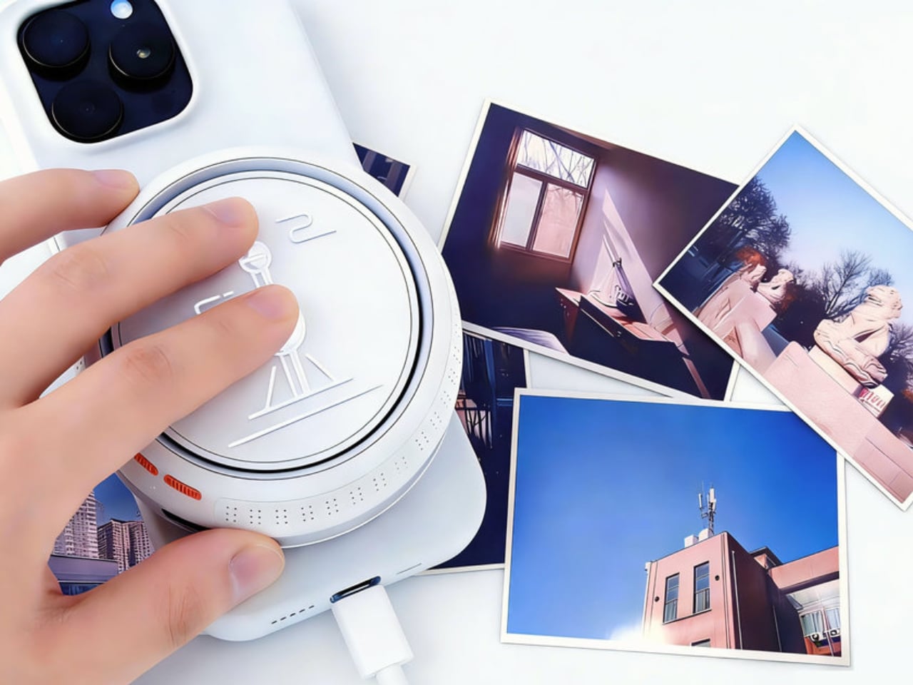
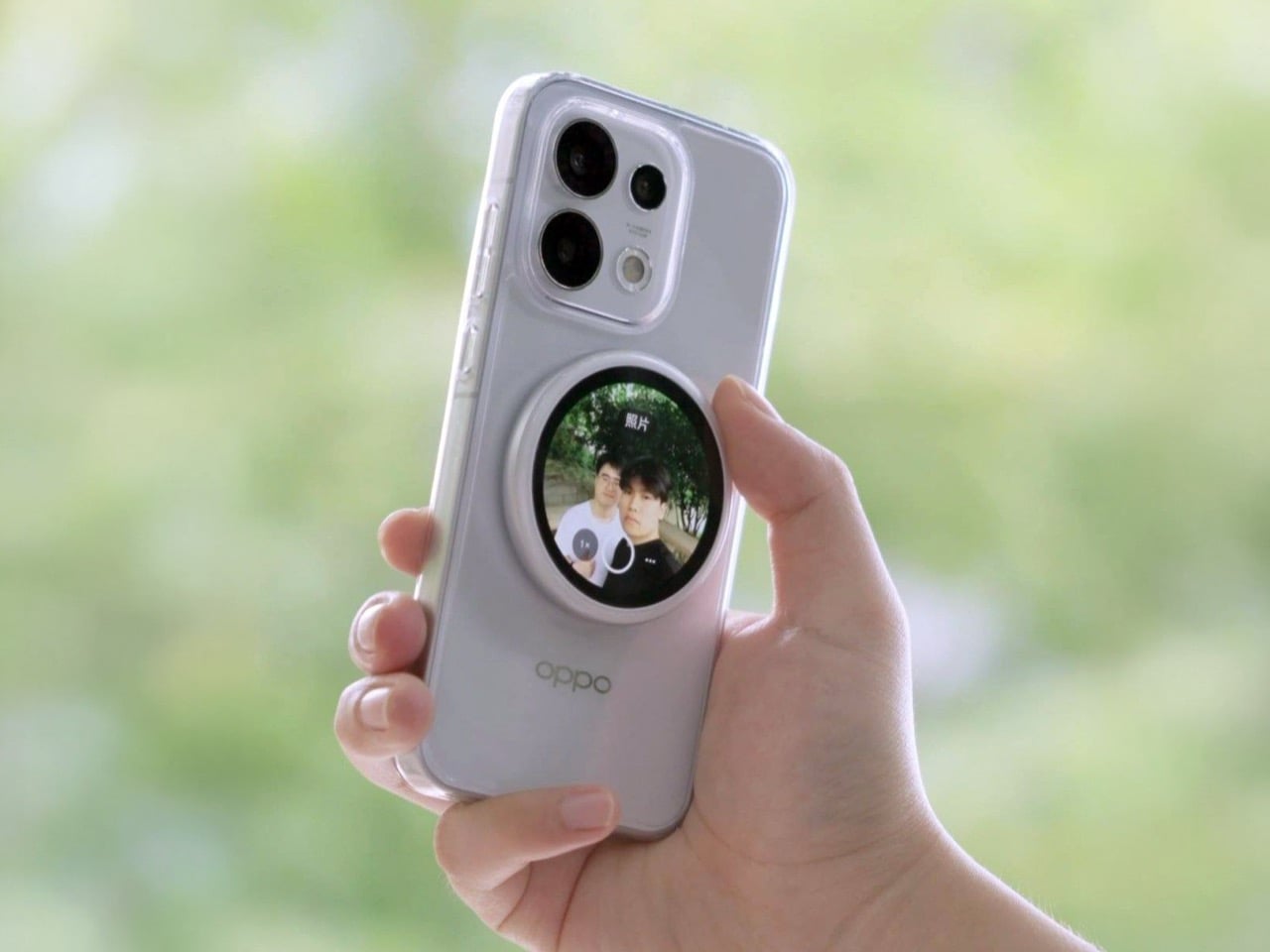
The rear camera has been the better camera for over a decade. Every benchmark, every low-light comparison, every zoom test confirms it, and yet selfie culture built itself entirely around the front-facing lens because there was no practical way to see what the good camera was capturing while it was pointed away from you. The Oppo Bubble is a small circular AMOLED touchscreen that attaches magnetically to the back of a phone and mirrors the rear camera’s live feed wirelessly, up to 10 meters away. It launched in China on May 25, 2026, alongside select Oppo Reno 16 devices, and includes a built-in remote shutter trigger. Apple has had the magnetic infrastructure for something like this since 2020. Oppo just claimed the screen real estate it left empty.
The circular AMOLED display is what makes the Bubble credible rather than merely clever. A low-resolution preview would sink the concept at its most basic job, so Oppo putting a proper screen in here is the detail that earns the price. A 550mAh battery keeps it running independently, and when the camera is off, the Bubble displays custom wallpapers, live photos, videos, and animated themes. Ten meters of wireless range repositions it from selfie mirror to legitimate remote shooting monitor — the kind of tool that used to require a separate Bluetooth trigger and a lot of hoping for the best.
What We Like
Ten meters of wireless range turns it from a selfie mirror into a proper remote monitor for tripod-mounted shooting
The circular AMOLED form gives it enough design personality to work as an accessory rather than just a functional attachment
What We Dislike
Live camera preview only works with select Reno 16 series Oppo devices at launch, which is a real limitation right now
No confirmed international release outside China as of June 2026
7. Lenovo ThinkTab X11
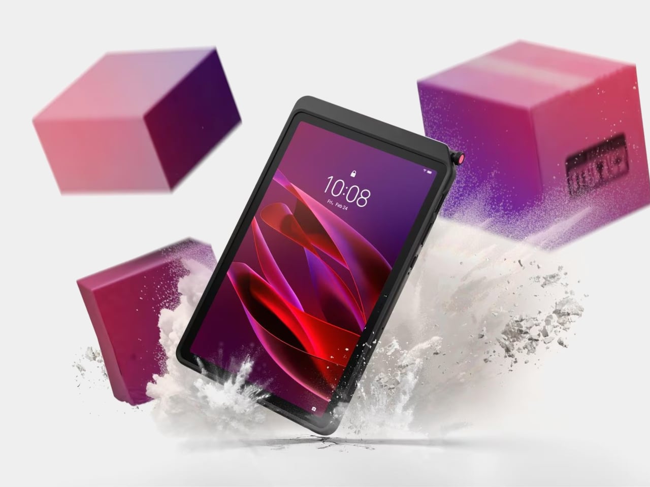
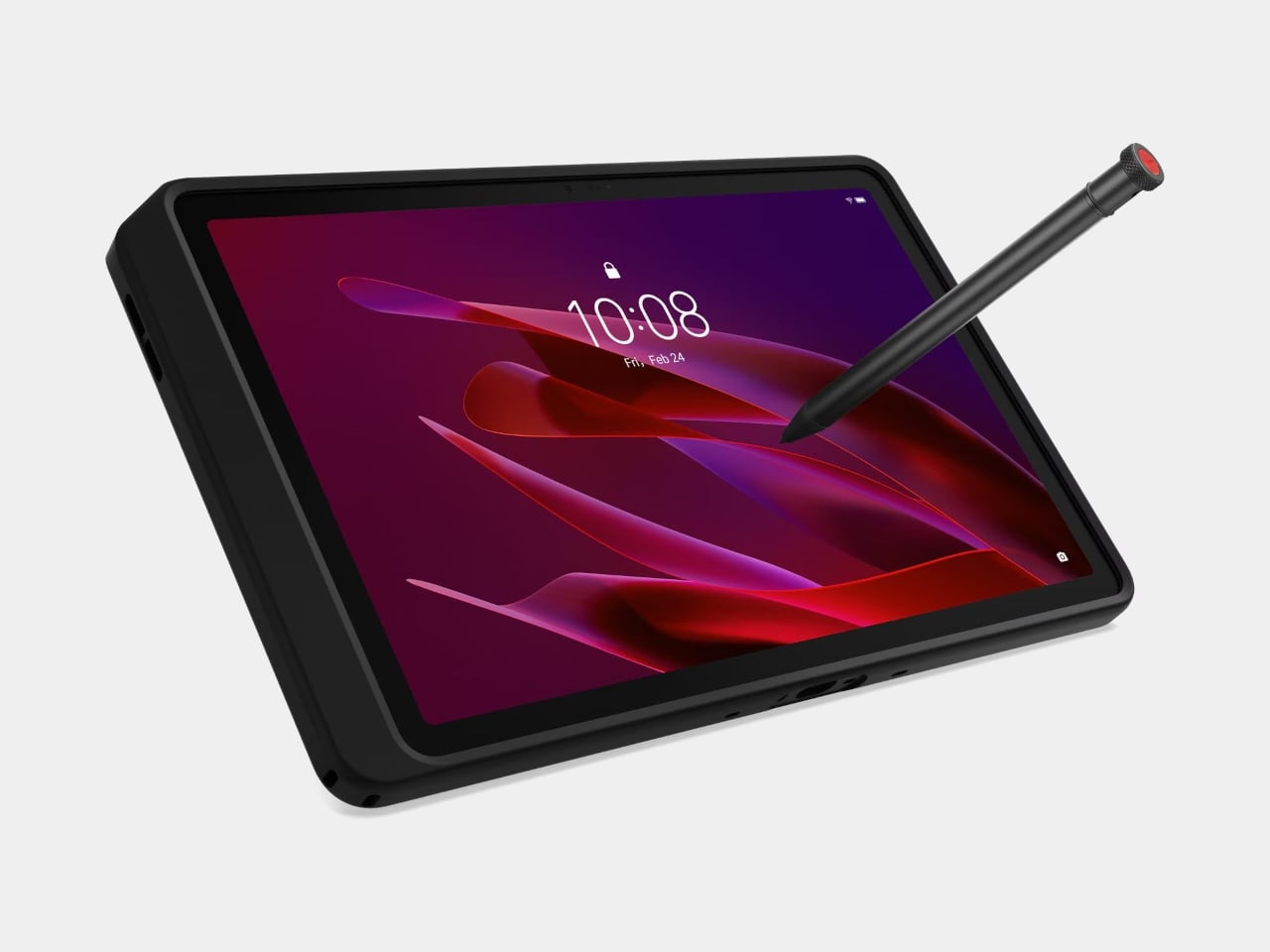
Rugged tablets have almost always meant choosing between enterprise-grade hardware at enterprise-grade prices, or pressing a consumer device into field conditions it was never designed to handle. The Lenovo ThinkTab X11 is an attempt to close that gap at $499, bringing it into reach for the people who actually use tablets in logistics, construction, transportation, manufacturing, and energy. The 10.95-inch display runs at 90Hz, reaches 800 nits under high brightness mode, and handles gloved hands and wet fingers without issue — the Snapdragon 7s Gen 3 runs the processing, with up to 12GB of RAM and 512GB of UFS 3.1 storage configurable depending on the deployment.
The battery design is what makes this genuinely interesting. The 10,200mAh cell removes on a screwless mechanism, so a worker can swap a depleted pack for a fresh one mid-shift without stopping to find a power outlet. In vehicle or fixed workstation deployments, the ThinkTab can run directly from DC power with no battery installed at all, eliminating heat buildup from continuous charging and removing long-term degradation from the equation entirely. The included case carries MIL-STD-810H certification, the device itself carries IP68, and the whole package ships with Android 16 alongside four years of security patches and two guaranteed major OS upgrades.
What We Like
Screwless hot-swap battery means mid-shift power changes are a practical workflow option, not a maintenance event
Battery-less DC operating mode for fixed deployments removes heat and degradation entirely from continuous-use scenarios
What We Dislike
At $499, it sits above consumer tablets doing lighter work, though well below comparable enterprise-only hardware
The Snapdragon 7s Gen 3 is a capable rather than cutting-edge processor for the price bracket
8. Nothing Book
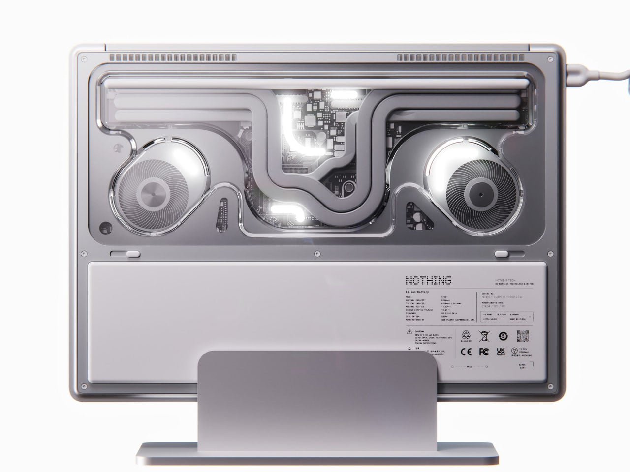
This is a concept, and it’s worth saying that plainly before anything else. The Nothing Book is a design exploration by Nikita Bukoros that takes the brand’s philosophy to its logical conclusion: a performance laptop that treats its internal architecture as the visual statement rather than hiding it. The see-through body layers the cooling system, circuit boards, and internal components into a composition that Bukoros describes as industrial art as much as consumer electronics. The see-through aesthetic Nothing built its identity around, originally inspired by the translucent polycarbonate designs of the late 1990s, reaches its most ambitious expression here.
The secondary screen mounted on the lid is the detail that makes the concept worth following. It is a slim external display that breaks the closed-laptop monotony entirely — you can push messages, symbols, emojis, or anything else in the classic Nothing font to whoever is looking at the back of your machine in a meeting or a cafe. Nikita moves beyond Nothing’s usual monochrome palette and offers the concept in hot red, cool green, subtle pink, and magnetic teal. A purpose-built charging dock triggers a cooling animation on the secondary display when the laptop is docked, which is the kind of considered detail that separates a design worth remembering from one worth scrolling past.
What We Like
The secondary lid screen is a genuinely original idea that gives the closed laptop a visual identity and purpose
See-through architecture makes the internal engineering part of the aesthetic rather than something to conceal behind a plain surface
What We Dislike
This is a concept, not a product — Nothing has confirmed a laptop is in development
The exposed internals aesthetic would face real structural and thermal engineering challenges in a shipping device
9. Canon Pocket Gimbal Camera
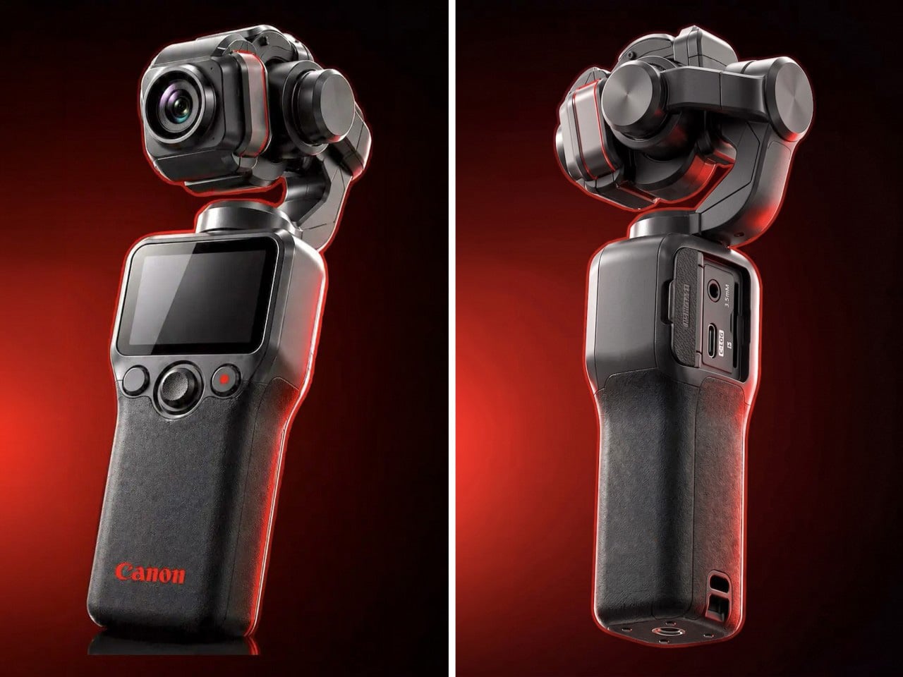
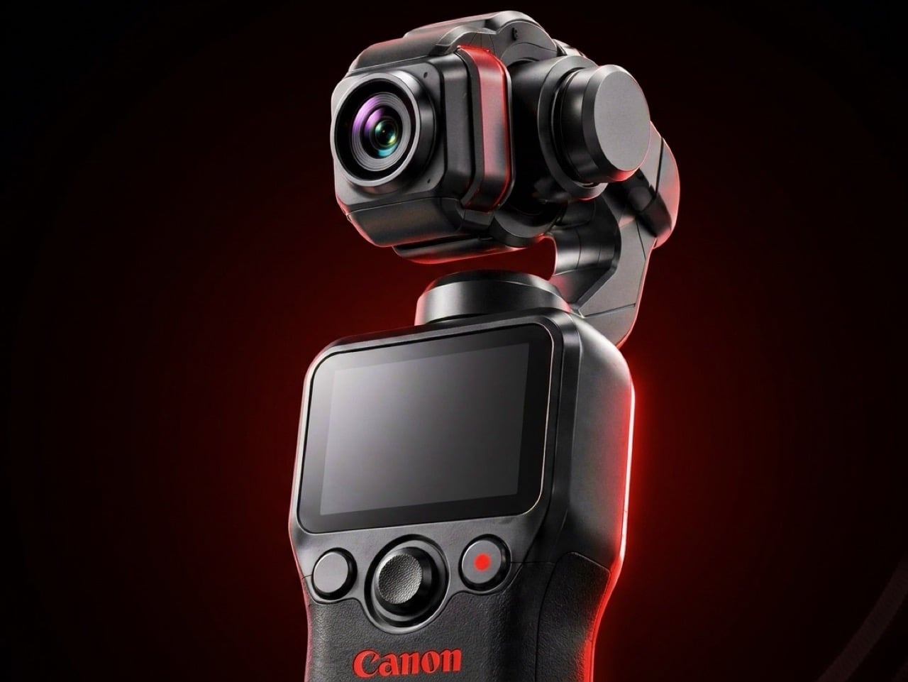
Canon filed a patent in April 2026 for a compact handheld camera with a fully integrated three-axis gimbal, a fixed lens, a grip with a screen, and a folding mechanism that protects the stabilizer head during storage. It is the most refined and product-ready of three gimbal-related patents Canon has filed since 2021, and the one that reads most like a brief handed to an engineering team rather than a thought experiment. The key detail is a smart shutdown sequence that uses magnetic sensors and image analysis to guide the gimbal safely into a folded position before cutting motor power, addressing a mechanical wear issue that has quietly frustrated gimbal camera owners for years.
The competitive timing is pointed. DJI’s drone business has faced regulatory scrutiny in the United States, and Canon has been tracking the pocket gimbal category across three progressive patent filings over five years — moving from cinema-level ambition in 2021, to an auto-flipping mechanism in 2025, to this fixed-lens, behavior-smart design in 2026. Canon’s color rendering, the warm, accurate output that photographers have built careers around, is a form of credibility no spec sheet can manufacture quickly. Whether this patent becomes a product remains unconfirmed, but the arc from moonshot to practical brief is the clearest signal yet that Canon intends to ship something.
What We Like
Smart shutdown using magnetic sensors and image analysis is a specific, practical engineering improvement, not a theoretical feature
Three filings over five years show a product being genuinely refined rather than filed and forgotten
What We Dislike
This is a patent, not an announcement — Canon’s 2021 interchangeable-lens gimbal concept never shipped
Fixed lens removes the ambition of the earlier patents, which some creators will register as a step back
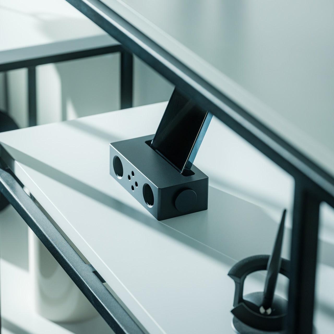
10. Battery-Free Amplifying iSpeakers
The premise behind the Battery-Free Amplifying iSpeakers is simple enough to say in one sentence: they amplify your iPhone’s audio through acoustic design alone, with no power source, no Bluetooth pairing, and no charging cycle to manage. At $179, they sit on a counter as a sculptural object even when the phone is nowhere near them, which is the standard any speaker worth keeping should meet before it earns a permanent place in the room. The best design objects don’t ask anything of you when they’re not being used. They just sit there, doing the room a favor.
For the guy who has accumulated Bluetooth speakers, wireless earbuds, a smart speaker with a subscription, and a desk speaker that needs a firmware update, a passive amplifier is the unexpected move. There is nothing to configure, nothing to pair, nothing to update, and nothing that goes wrong. You set the phone in, the sound fills the room, and that is the complete interaction.
Requires no power, no pairing, and no maintenance — the interaction is entirely physical
Functions as a display object on the counter whether a phone is in it or not
What We Dislike
Passive amplification has natural limits on output volume compared to any powered speaker
Works best in quiet rooms rather than competing with ambient noise
The Things He Didn’t Know He Was Missing
The man who already has everything doesn’t need more things. He needs the specific thing he hasn’t encountered yet — the speaker that finally has a brain worth talking to, the mouse that folds flat without a compromise on feel, the phone that keeps its data to itself, the handheld computer that doubles as a keyboard for any machine it’s plugged into. These aren’t impulse picks. Each one is here because it does something the obvious alternatives don’t, and because the guy you’re shopping for will notice the difference within the first ten minutes.
A few of these are still taking shape — a concept waiting on a decision, a patent waiting on a factory floor. That’s worth saying plainly, but it’s not a reason to dismiss them. The guy who has everything is usually the first to know what’s coming, and the first to make up his mind about it. A list that only includes what you can buy today isn’t a list for him. It’s a list for someone else entirely.










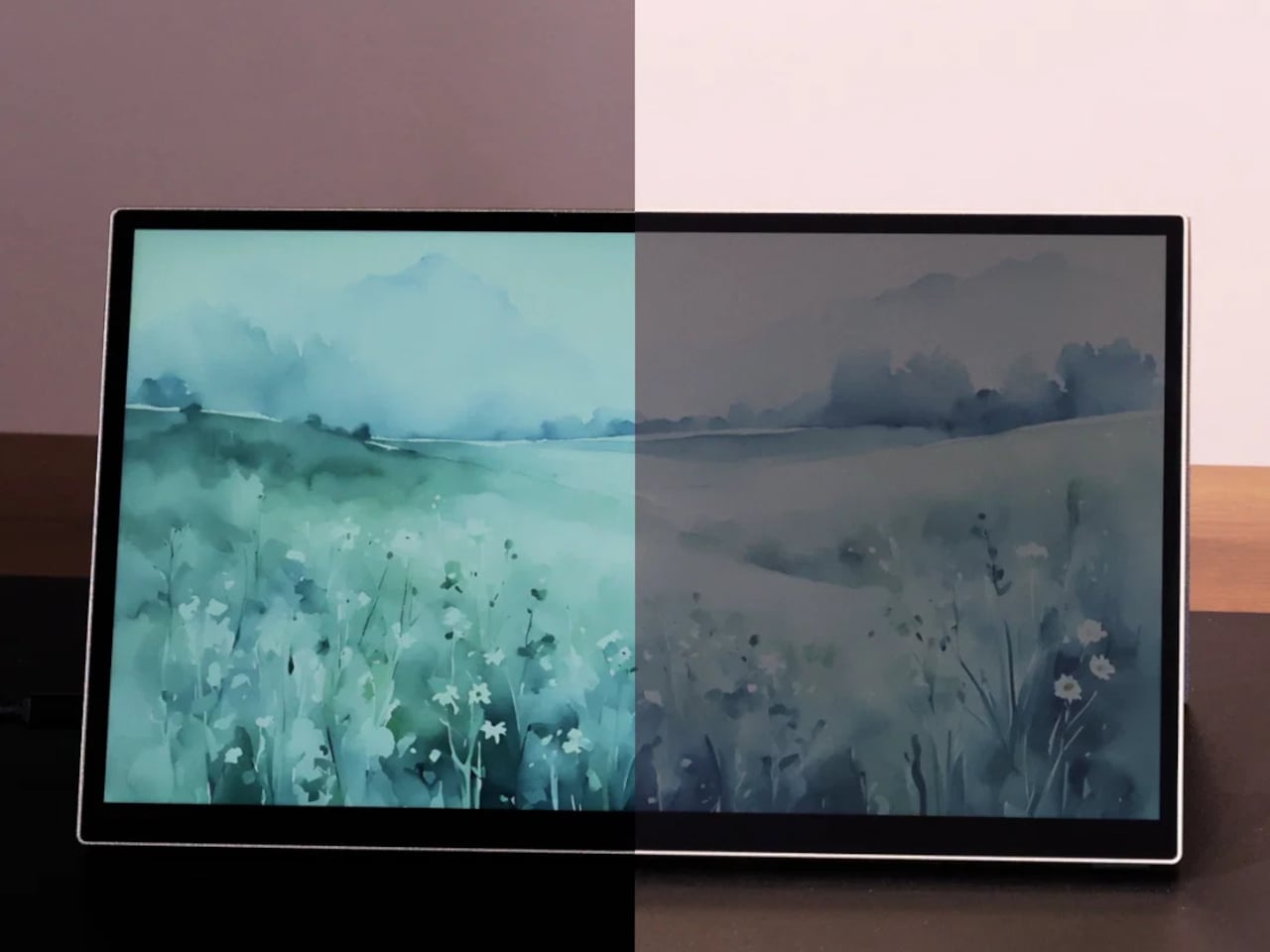
 coating, which helps the display channel ambient light into better visibility, reduce glare, and sharpen image clarity without leaning on its LED backlight. On particularly sunny days, you can switch the backlight off entirely, dropping power consumption down to around 3W, and the screen remains fully usable, bright, and legible.