This $20 Pencil Never Needs Sharpening – and It’s Quietly Replacing Everything on My Desk

There was a time when pencils felt simple. You picked one up, wrote until the tip dulled, sharpened it, and kept going. But somewhere along the way, even that small ritual started to feel more annoying than satisfying. The point breaks. The lead snaps. The sharpener is missing when you need it. And somehow, it’s always in the one room you’re not in. The tool that’s supposed to help ideas move faster suddenly becomes one more little interruption.

It’s a small frustration, but a familiar one. A sketch paused because the tip gave out. A note-taking session interrupted by a broken point. A mechanical pencil that looks precise until the lead crumbles under the slightest pressure. We tend to think of pencils as simple tools, but most of them come with just enough maintenance to get in the way. That’s what makes the Everlasting All-Metal Pencil so compelling. It takes one of the oldest writing tools around and removes the part that has always been slightly annoying.

The $20 Pencil That Made Me Stop Thinking About Pencils

At first, I thought the Everlasting All-Metal Pencil was mostly a novelty. A sleek aluminum object with a clever hook and a name designed to make you curious. But after using it for a few days, the appeal became much more practical than gimmicky.

I stopped looking for a sharpener.

I stopped dealing with snapped mechanical lead.

I stopped apologising mid-meeting for a tool that couldn’t keep up.

And I stopped thinking about the pencil at all, which is probably the highest compliment you can give a writing tool.

That’s the strange brilliance of it. It writes like a real pencil, erases like a real pencil, and yet the tip barely seems to change. You keep waiting for the usual maintenance cycle to kick in, and it just doesn’t. The result is a writing experience that feels more fluid, more dependable, and oddly calming in its refusal to interrupt you.

“I stopped thinking about the pencil at all – which is probably the highest compliment you can give a writing tool.”

Built for the Long Haul

  • Special alloy core: Leaves graphite-like marks without wearing down the way a traditional pencil tip does.
  • No sharpening required: Eliminates one of the most persistent little annoyances in writing and sketching.
  • Aluminum body: Lightweight, durable, and more substantial than a disposable wooden pencil.
  •  Erasable marks: Works with regular erasers, so it keeps the familiar flexibility of graphite.
  • Watercolor-friendly performance: Doesn’t bleed with watercolor or water-based markers, making it especially useful for sketching and mixed media work.
  • Pocket-sized option available: Easier to carry when you want something compact but more dependable than a mechanical pencil.

This isn’t about reinventing the pencil. It’s about removing the part that never needed to be there in the first place.

Not for you if: You love the ritual of sharpening or prefer the variability of a traditional graphite line for fine art work.

Three metal rods with rounded ends lie diagonally on a white surface (two dark gray, one light gray).

Why Simpler Tools Still Win

Every few years, a simple tool appears that makes you wonder why you ever accepted the complicated version. We live in a world full of products that promise precision through complexity. Click mechanisms, replaceable lead, backup cartridges, specialized refills. And yet some of the most satisfying tools are still the ones that ask the least from you. A pencil should be immediate. It should be ready the second a thought arrives, not after you fix, refill, or sharpen something.

The Everlasting All-Metal Pencil gets that. It keeps the familiar feel of graphite on paper, but strips away the maintenance that usually comes with it. That makes it feel less like a novelty object and more like a quiet correction to a category we stopped questioning a long time ago.

Silver metal rod inserted diagonally through a small square wooden block on a dark surface, like a desk accessory.

Design That Reflects Restraint

There’s a clean confidence to the Everlasting All-Metal Pencil that makes sense the longer you use it. The aluminum body gives it just enough weight to feel deliberate, while the octagonal shaft keeps it stable in the hand. Nothing about it feels decorative for the sake of it. The design is simple, compact, and resolved in the way good everyday tools tend to be.

It doesn’t try to romanticize the pencil. It just makes the experience feel more complete. That’s what gives it presence. Not flash, not novelty, just a better answer to a familiar problem.

Close-up of a dark pencil-like stylus tip on a light blue background, angled to show the pointed metal nib.

Who It’s For

  • Writers and note-takers
    A pencil that stays ready without the usual interruptions.
  • Artists and sketchers
    Especially useful for watercolor or marker work where smudging can get in the way.
  • Minimalists
    One durable writing tool that replaces the need for sharpeners, spare lead, and extra fuss.

Pencil rests on white paper beside design sketches and a roll of tape on a light desk surface

Where Writing Stays in Motion

You don’t realize how often small interruptions break your flow until one tool removes them. Most of us don’t need a smarter pencil. We need one that gets out of the way and keeps going. That’s what the Everlasting All-Metal Pencil does so well. It keeps the familiar pleasure of writing with graphite, while quietly removing the maintenance that usually comes with it.

At the end of the day, it’s still a pencil. But sometimes, the right one makes the entire act of writing feel a little less fragile.

The Everlasting All-Metal Pencil is now available for $19.95 – roughly the cost of three decent mechanical pencils that will eventually run out of lead. This one won’t.

The post This $20 Pencil Never Needs Sharpening – and It’s Quietly Replacing Everything on My Desk first appeared on Yanko Design.

7 Best Japanese Tableware Finds That Will Make You Throw Out Every Generic Plate You Own

Most dinnerware is designed to disappear. Plates, bowls, chopsticks — they accumulate in cabinets and get used without being noticed, which is fine until you eat a meal set on something that was actually made with care. Then the gap becomes impossible to close. Japan produces more objects in that second category than anywhere else on earth, not because of tradition for its own sake, but because the Japanese design standard demands that everyday tools perform well and look considered doing it.

These seven pieces represent that standard in different forms — a lacquered cedar bowl from Hida Takayama, a folding knife that rests on the rim of a plate, a porcelain cup that invites you to finish designing it yourself. None of them is a status object or a conversation piece. They are tools for eating, built by people who decided that the distance between acceptable and excellent was worth the extra work.

1. Higashi Shunkei Hida-Cedar Lacquer Bowl

The forests around Hida Takayama cover ninety-two percent of the city’s land, and Higashi Shunkei has been sourcing cedarwood from them for sixty-eight years. The bowls they make are not the obvious Japanese craft choice — that would be ceramic — but cedar carries properties that ceramic cannot replicate. The wood grain in Hida cedar is unusually hard, with softer spaces between grains, making it difficult to process and rare even within Japan. Each bowl is spun on a lathe and finished by hand before a single coat of lacquer is applied.

The lacquer goes on in layers through a process called Suri Urushi, each coat saturating the wood’s pores rather than sitting on top of them. The result feels dense, like ceramic, but insulates like wood, so hot soup stays warm while the bowl remains comfortable to hold. The color deepens with every year of use, meaning a bowl used daily for a decade looks more alive than the one you first bought. They come in rice and soup configurations, in red, black, or blue lacquer, and are dishwasher safe, which, for traditionally lacquered woodwork, is genuinely unusual.

What we like

  • Suri Urushi lacquering fuses into the wood rather than coating it, creating a surface that strengthens and deepens over time rather than peeling or chipping
  • Each bowl’s cedar grain pattern is unrepeatable, making every piece distinct without any designer having to engineer that distinction

What we dislike

  • Hida cedar’s rarity makes these bowls difficult to source outside Japan, and the original crowdfunding campaign that brought them to international attention has since closed
  • The color range of red, black, and blue is considered, but limited for those wanting a neutral or natural wood tone at the table

2. FineLine Aluminum Chopsticks

Forty rounds of refinement in Tsubame-Sanjo, Japan — adjustments to tip diameter, taper angle, grip texture, and balance in increments as small as 0.1mm. The Tsubame-Sanjo region produces surgical instruments and precision cutting tools, and that context matters here because the FineLine’s most important specification — a 1.5mm tip, roughly half the diameter of a standard pair — hides nothing. Metal chopsticks done poorly feel clinical and slippery. At this tolerance, applied through a century of metalworking discipline, they feel like the tool was always supposed to be this way.

The faceted body prevents rotation, which is the quiet frustration that round chopsticks impose across every meal. Standard chopsticks ask the hand to constantly realign the tips without the user ever quite noticing it. The FineLine removes that entirely. Anodized aluminum construction resists moisture, staining, and dimensional drift indefinitely, and the finish maintains the same grip feel years after first use as it did on day one. Available in ten satin anodized tones, the range is broad enough to suit any table setting built with intention.

Click Here to Buy Now: $30.00

What we like

  • The 1.5mm precision tip creates cleaner contact and greater control than any standard chopstick, turning precision eating into something that requires less effort, not more
  • The faceted anti-rotation body eliminates the constant silent grip corrections that round chopsticks demand, making long meals noticeably calmer

What we dislike

  • Metal chopsticks require a brief adjustment period for users conditioned to the natural flex and warmth of wood or bamboo pairs
  • A single colorway per pair means building a matched set across multiple tones requires purchasing separately

3. FineLine Chopstick Rest

The FineLine Chopstick Rest carries the same design logic as the chopsticks themselves: anodized aluminum, matching satin finish, the same restraint applied to a form most table settings never think about. Set the chopsticks down between courses, and the rest hold them at a clean angle above the cloth, keeping the tips off the surface without drawing any attention to themselves. This is the table setting equivalent of good posture — it contributes to the overall impression without announcing that it’s working at all.

On a table assembled with care, the rest completes the system. The FineLine chopsticks and their rest read as a single considered object rather than two separate purchases, which is not something many tableware accessories manage. The matching color options mean every tonal decision across the pair, and the rest can be made deliberately, whether the goal is a perfectly uniform setting or a considered contrast that only becomes legible when the whole table comes together.

Click Here to Buy Now: $20.00

What we like

  • Shares the exact anodized finish and color range as the chopsticks, reading as a unified system rather than a matching accessory treated as an afterthought
  • Holds chopstick tips cleanly above the table between courses without any visual interruption to the setting around it

What we dislike

  • Designed around the FineLine form factor, making it a less natural pairing with wider traditional wooden or bamboo chopstick styles
  • Holds chopsticks only — no accommodation for spoons or additional cutlery alongside a mixed table setting

4. Oku Folding Knife

Scottish artist and metalworker Kathleen Reilly spent time living in Japan before designing the Oku Knife, and that experience shows in the problem she chose to address. In Japanese table settings, chopstick rests elevate the tips off the surface between bites, keeping them clean and the cloth unstained. Reilly asked whether a Western table knife could carry that same principle. The result is a handle folded ninety degrees from the blade, letting the handle rest flat on any surface while the blade sits perpendicular to it, never touching the table.

The blade can also hook onto the rim of a plate, held cleanly in position between uses. Reilly worked with craftsmen in Tsubame — the same metalworking city behind the FineLine chopsticks — using generations-old handcrafting techniques in stainless steel. The inner curve of the handle makes it comfortable to hold despite the unconventional angle. The name Oku comes from the Japanese word for “to place,” and the entire object functions as a design argument: that where a tool rests between uses is part of how it should be designed, not an afterthought left to the user to solve.

What we like

  • The handle’s ninety-degree fold solves a genuine table hygiene problem with a form that addresses it structurally rather than requiring a separate accessory
  • Handcrafted in Tsubame using traditional metalworking techniques, carrying genuine craft lineage from one of Japan’s most respected precision metalworking cities

What we dislike

  • The unconventional form reads as puzzling until its purpose is understood — guests unfamiliar with the concept tend to reach for it with visible hesitation
  • No direct retail pricing or purchase link was included alongside the original design feature, making sourcing require independent research

5. USUKIYAKI KIKKA Chrysanthemum Side Plate

Usuki ware disappeared for two hundred years. The kiln tradition of Usuki City, in Oita Prefecture, went dormant until ceramicist Usami Hiroyuki spent years reconstructing the technique from historical fragments and reviving it as a living practice. The KIKKA series is the clearest expression of what came back. Each plate is shaped using the Katauchi molding technique, producing soft petal-curved forms along the rim that suggest the chrysanthemum, the series is named after. The matte white finish sits in the register between porcelain refinement and handmade warmth, where the best Japanese ceramics have always lived.

At 9.5 centimeters across, the plate is scaled for the foods that benefit from their own surface: tsukemono, a few slices of sashimi, a piece of fruit, and a small side of tofu. The wavy petal rim casts small shadows across the table as the light shifts, so the space around the food changes throughout a meal without the food itself changing at all. Microwave and dishwasher safe, the KIKKA is not a display object saved for guests. It is a daily plate built from a tradition that came within a generation of being lost permanently.

What we like

  • The Katauchi petal rim casts a genuine shadow across the table surface, creating a dynamic visual quality that flat-rimmed plates cannot produce, regardless of glaze or material quality
  • Made by USUKIYAKI artisans reviving a tradition dormant for two centuries, giving each piece craft lineage that mass production cannot manufacture or approximate

What we dislike

  • Hand production means slight variation in petal form and glaze between individual pieces, which requires accepting rather than expecting uniformity across a matched set
  • At 3.7 inches in diameter, the scale suits side dishes only — it is not a main plate and should not be asked to function as one

6. Rodent Bottle Opener

Most bottle openers live in drawers and stay there until they’re needed. Kairi Eguchi’s Rodent opener for WELD DESIGN STORE takes the opposite position. It starts as an oval steel pipe, and only the section required to remove a bottle cap receives any intervention. The rest of the pipe is left as it came, preserving what the designer calls the raw, honest character of freshly cut metal. Advanced 3D pipe laser processing makes that minimal intervention possible with the precision the form requires.

The oval profile fits naturally in the hand and carries a weight that makes the act of opening a bottle feel deliberate rather than reflexive. The cutout is shaped after a rodent’s tooth structure — which gives the product its name — and works whether the user pulls down or up, adapting to hand position without adjustment. Available in silver or black, both finished with RoHS-compliant plating that meets environmental manufacturing standards. Slip it into a drawer, rest it on a bar cart, hang it from a cord. A form this reduced works in any context because it isn’t asking the space to accommodate it.

What we like

  • Minimal processing preserves the raw character of the steel, making material honesty the entire design statement rather than a supporting claim
  • The universal up-or-down opening mechanism adapts to different hand positions and bottle angles without any deliberate adjustment required

What we dislike

  • The pipe form is so reduced that it offers no immediate visual indication of function to someone encountering it for the first time
  • A single-function object at a premium price point requires genuine appreciation of design reduction to justify over a utilitarian alternative that does the same job for a fraction of the cost

7. Corcelain Modular Porcelain Cups

Designer Kosuke Takahashi collaborated with 224 Porcelain — founded in 2012 in Ureshino City, Saga Prefecture, drawing from the Hizen-Yoshidayaki ceramic tradition — to produce the Corcelain collection. Each cup arrives from the kiln as a finished, functional vessel. It is also a starting point. Precision-engineered mounting points built into the porcelain accept 3D-printed attachments: feet, handles, lids, decorative elements, configurations that shift the same cup from a morning tea vessel to an evening sake cup without replacing the ceramic itself. The object you buy is the beginning of the design, not the end.

Takahashi’s work centers on systems rather than individual objects, and the Corcelain reflects that orientation. The 3D-printed components are engineered to match the quality and finish standard of the ceramic base, and downloadable models on MakerWorld allow users to create their own attachments — a community of makers extending a traditional craft studio’s output through digital fabrication. The collection makes an argument ceramics rarely voice aloud: that a vessel does not need to be fixed to be complete, and that the user’s participation in determining its final form is a legitimate part of what it means to be designed.

What we like

  • The modular system lets users configure handles, feet, and lids to preference, turning a traditional ceramic vessel into something co-designed rather than simply purchased and placed
  • Downloadable 3D models on MakerWorld mean the attachment ecosystem is open rather than proprietary, extending the object’s possibilities beyond what either collaborator initially designed

What we dislike

  • The modular concept requires access to a 3D printer to unlock the system’s full range, adding a technical barrier for users without that setup at home
  • 3D-printed components alongside hand-thrown porcelain require some design literacy to read as intentional rather than mismatched across the same object

The Table You Set Says Something — Make Sure It’s Worth Hearing

The thread connecting these seven objects is not minimalism as decoration. It is rigor — the decision to apply serious thought to a bowl, a knife, a rest for chopsticks, a cup that accepts attachments — and the willingness to spend more time on the object than the market strictly requires. Each piece here exists because someone refused to stop at good enough. That refusal is exactly the quality that makes a table worth sitting down to in the first place.

None of these objects will make food taste better in any measurable sense. What they change is harder to name: the quality of attention a meal receives. A cedar bowl that improves with age, a chopstick rest that holds its position without interrupting anything around it, a side plate whose petal shadow shifts through dinner — these are quiet contributions. Together, they built a table that makes eating feel like it was worth setting up with care.

The post 7 Best Japanese Tableware Finds That Will Make You Throw Out Every Generic Plate You Own first appeared on Yanko Design.

Drop-proof, under 28 grams, and finally beautiful: Benks’ new Kevlar iPhone cases put aesthetics first

There is a reason Kevlar keeps showing up in premium phone accessories. The material brings a rare combination of low weight, tactile richness, and serious structural confidence, which makes it ideal for people who want their case to feel intentional rather than disposable. BENKS has been working that territory for a while, and the new BENKS ArmorEdge launch sharpens the formula with two color-forward editions, Savvy Red and Peri Purple, designed for the iPhone 17 Pro and Pro Max. Both treat the woven surface as a design element alongside its structural role. The result is a case lineup testing whether protection and personality can genuinely coexist at the same price point.

Both cases share the same core promise, slim everyday protection with MagSafe compatibility, 360-degree airbag corners, and DuPont Kevlar construction, but deliver it with very different moods. Savvy Red runs graphic and energetic while Peri Purple reads restrained and expressive, a contrast that registers as branding intentionality as much as a color choice. BENKS ArmorEdge Air Navigator then extends the family in a lighter direction, with an exposed 600D woven back, a 27g build, and a Magellan-engraved reverse that gives the case a narrative dimension uncommon in slim case design. The three together span bold color expression, understated sophistication, and material-first minimalism within a single product family. BENKS calls it confidence-forward protection, and the physical details mostly agree.

Designer: Benks

Click Here to Buy Now: Peri Purple | Savvy Red | ArmorEdge Air Navigator

Savvy Red is structured around a raised jacquard diamond weave that catches light at shifting angles, making the surface genuinely tactile rather than decorative. As a protective Kevlar case, it keeps the frame edge at a precise 1.8mm while backing that slim profile with a four-guard 360-degree airbag system built to handle the corner-first drops that standard cases consistently fail at. We covered the BENKS ArmorGrid ArmorAir last September as a Kevlar phone case for the iPhone 17 Pro that carried real bulletproof-vest-grade material confidence, and Savvy Red builds on that character while pushing further into expressive design territory. MagSafe compatibility centers on a graphic on the back, a colorway-specific detail that ties the functional ring to a distinct visual identity rather than defaulting to a generic shared element across the lineup. At $64.99, the raised diamond weave alone justifies the ask as a tactile story that polycarbonate simply cannot replicate.

BENKS ArmorEdge Peri Purple

Peri Purple carries the same engineering foundation as Savvy Red but in a softer, more regal tone that makes it a premium Kevlar case for users who want Kevlar craftsmanship without the assertive graphic energy. BENKS describes it as designed for subtle expression over loud attention, essentially a style-driven protective Kevlar case for those who prefer their personality understated rather than announced. The airbag corners and MagSafe compatibility carry through, with a different visual graphic on the backside. That decision, giving each finish its own visual badge rather than a shared hardware element, is a considered design move that ties visual identity all the way through to the functional center of the case. Each case even showcases a different delicate badge on the bottom, right above the charging port, setting them apart distinctly. Both Savvy Red and Peri Purple retail at $64.99, positioned as two parallel expressions of personality under a single engineering standard.

BENKS ArmorEdge Savvy Red

At 27g and 0.9mm at the frame edge, the BENKS ArmorEdge Air Navigator operates on a different set of priorities from its two siblings. It qualifies as a genuine BENKS ArmorEdge Kevlar case in the fullest material sense, with DuPont Kevlar fiber forming the structure, but TPU sits only at frame edges and structural stress points, leaving the entire 600D woven back exposed and fully in contact with the hand. That material-first decision makes the grip experience central to the case’s identity rather than something filtered through a polymer overlay. BENKS ties the Navigator edition to a travel and exploration theme through an anchor medallion on the front and an engraving of Magellan’s circumnavigation route on the back, paired with the Latin inscription “PRIMUS CIRCUMDEDISTI ME,” giving the MagSafe protective case a narrative depth that most slim builds forgo entirely. At $61.99, it reads as the most considered piece in the BENKS ArmorEdge family.

BENKS ArmorEdge Air Navigator

The full BENKS ArmorEdge lineup is available now at $64.99 for Savvy Red and Peri Purple and $61.99 for Air Navigator on the BENKS website.

Click Here to Buy Now: Peri Purple | Savvy Red | ArmorEdge Air Navigator

The post Drop-proof, under 28 grams, and finally beautiful: Benks’ new Kevlar iPhone cases put aesthetics first first appeared on Yanko Design.

Anker Built a sub-$300 1080p Projector with Flippable Speakers for the Price of AirPods Pro

Most projector makers treat audio as an afterthought. Slap a single speaker somewhere on the chassis, call it Dolby-something, and move on. Soundcore, being a company that lives and breathes audio hardware, looked at that approach and decided to do something architecturally different with its first proper budget projector, the Nebula P1i.

What came out of that thinking debuted at CES 2026 for $369, and it carries a feature Soundcore is billing as a world first: flippable speakers. Two 10W drivers are physically hinged into the projector body, fold outward, and swivel in two axes so the sound follows your seating position rather than pointing at whatever wall happens to be closest. It sounds like a gimmick until you realize how consistently every other projector in this price range gets the audio completely wrong.

Designer: Soundcore (Anker)

Click Here to Buy Now

The device’s standout feature is its two hinged speakers that unfold from each side, and the result gives the projector a silhouette that feels more like a small satellite than a conventional home theater device. Each driver rotates 90 degrees side to side and 200 degrees up and down, so the sound follows your vibe regardless of where the projector is physically sitting. Fold them flush and the P1i looks like any other compact projector. Deploy them and the thing suddenly has ears, which, for a Soundcore product, feels exactly right. At 8.9 x 7.2 x 8.0 inches and just five pounds, it perches on almost any surface and travels easily by the soft handle on top. That handle is a small detail that matters more than it sounds when you’re moving the unit between a bedroom, a living room, and a backyard in the same evening.

For its $369 price tag, you get a native 1080p panel outputting TÜV-certified 380 ANSI lumens, and an all-glass lens combined with a fully sealed optical engine that resists dust and the focus drift that plastic lenses develop as they heat up over time. In a dark bedroom, colors come out surprisingly accurate for an LED projector, and the sealed optics keep the image consistent across long sessions. The brightness ceiling is real, though. Step outside before sunset or flip on a lamp and the picture washes out quickly, which puts the P1i firmly in the category of a dark-room machine. That’s not a unique limitation at this price, it’s basically the cost of admission for any projector south of $500.

Anker’s Smart Instant Setup handles the initial configuration, featuring IEA 3.0, which handles autofocus, keystone correction, obstacle avoidance, and screen fit the moment you point the unit at a wall. Google TV runs the software side, bringing native Netflix certification, YouTube, Prime Video, and the rest of the streaming stack without a dongle in sight. The one gap that stings a little is the absence of a built-in battery. For outdoor use, Anker recommends pairing the P1i with its own SOLIX C300 power station, which extends runtime to roughly 3.5 hours. That’s a workable solution, but it does add cost and bulk to what is otherwise a lean, grab-and-go setup.

The P1i retails at $369, but it has already dropped to $294.99 during promotional periods. At that sale price, you’re spending the same as a pair of AirPods Pro on a 1080p smart projector with Google TV, flippable Dolby Audio speakers, and a lens assembly that will outlast most of the competition. The budget projector market is crowded with hardware that costs half as much and delivers a quarter of the experience. Soundcore priced the P1i at the exact point where the excuse to skip it runs out.

The Nebula P1i won’t unseat a dedicated home theater setup, and it won’t pretend to work in a sunlit living room. What it does is identify the one thing budget projectors have chronically failed at, build a genuinely novel audio hardware solution around it, and deliver the whole package at a price that’s hard to argue with. For a brand making its first real statement in the projector category, that’s a strong opening move.

Click Here to Buy Now

The post Anker Built a sub-$300 1080p Projector with Flippable Speakers for the Price of AirPods Pro first appeared on Yanko Design.

8 Summer EDC Essentials So Well-Designed We Carry Them Every Single Day

Summer edits your carry down to what actually earns its place. Pockets get shallower, days stretch longer, and the patience for objects that solve problems you don’t have disappears entirely. What survives that edit is a specific kind of thing — gear that performs with such quiet consistency you stop noticing it, until the day you leave it behind and immediately feel its absence. That’s the design standard this list holds to.

The eight products here span materials from full-grain leather to aircraft-grade titanium, functions from navigation to tracking to illumination, and price points from considered to genuinely surprising. Some are old enough to have earned their reputation without needing to announce it. Others are newer but carry the same unhurried confidence of objects that know exactly what they’re for. All of them reward a summer that moves fast and asks a lot from the things you carry.

1. AirTag Carabiner

Apple’s AirTag arrived as one of the most useful small objects of the last decade and shipped with no good answer to the question of how to carry it. Every case that followed treated the tracker as cargo — something to be accommodated rather than integrated. A purpose-built AirTag carabiner changes that relationship entirely, folding the tracker into a gate clip that performs as both tracking device and functional hardware without either function compromising the other. No protrusions, no awkward bulk, no aesthetic apology.

The summer case is specific. Beach bags left at a spot, day packs rotating between people, rental bikes at a festival — the carabiner means the AirTag follows the object rather than requiring a deliberate second step to attach or remember. Machined aluminum reads intentional alongside quality leather or ripstop goods and handles salt air, UV, and bag wear without complaint. It’s the kind of upgrade that seems obvious once you’re using it and unnecessary until the moment it isn’t.

Click Here to Buy Now: $149.00

What we like

  • Tracking hardware integrated into a functional carry tool removes the awkward middle step of managing a loose disc with no natural home
  • The gate clip handles real load and daily use rather than serving purely as a display mechanism for the AirTag

What we dislike

  • AirTag replacement requires opening the carabiner body, which varies by design and isn’t always a one-handed operation in the field
  • Works exclusively within Apple’s Find My network — Android users carry nothing usable here

2. Olight Baton 4 Premium Edition

The Baton 4 Premium’s best design decision isn’t the 1,300-lumen output or the magnetic tail cap — it’s the flip-top charging case that lets you activate the flashlight without removing it from the case at all. Open the lid, press the side button, and the light fires. That single interaction collapses the gap between a flashlight that lives in a bag and one that’s actually ready when something happens. The case also carries 5,000mAh, which means it recharges the Baton 4 up to five times and fills a phone running low mid-afternoon.

Summer nights are specifically where this earns its keep. Power outages during heat waves. Poorly lit parking structures at outdoor venues. The walk back to a campsite after a late fire. The magnetic tail cap converts the flashlight into a freestanding lantern by sticking to any steel surface, removing the need for a separate camp light in most situations. The IP68 waterproof rating handles rain without any adjustment required. Olight has made fewer products than most of its competitors and made them better, and the Baton 4 Premium is the clearest expression of that.

What we like

  • The charging case serves as a functional 5,000mAh power bank and activates the flashlight without removing it — two carry problems resolved by one object
  • The magnetic tail cap frees both hands during stationary tasks without requiring any additional accessories

What we dislike

  • Maximum 1,300-lumen output demands battery and drains quickly at full brightness — the case is a compensating mechanism, which means they need to travel as a pair
  • The case adds volume to the carry; users wanting the flashlight alone will need to leave the case’s power bank function behind

3. CraftMaster EDC Utility Knife

Most utility knives are industrial objects that tolerate being carried rather than inviting it. The CraftMaster moves the design conversation to a different place — a slim, considered profile that sits flush in a pocket and deploys a blade with the kind of controlled action that signals something built to a real standard. The form factor is purpose-built for people who cut things regularly during the day but don’t want to reach for an object that looks like it belongs on a construction site.

The blade swap mechanism is where the functional case gets specific. Precision work, whether opening summer deliveries to a vacation rental, trimming materials mid-project, or handling gear maintenance on the road, is better with a fresh edge rather than an apologetic compromise of a dull one. Having a design that makes the blade replacement clean and fast, rather than a minor ordeal, matters in practice across a long season of daily use. This is an EDC knife that understands the difference between a tool you carry and one you keep reaching for.

Click Here to Buy Now: $80.00

What we like

  • The slim profile fits a shorts pocket without the blade-forward bulk that makes most utility knives feel incompatible with summer carry
  • Replaceable blades mean the cutting performance stays consistent across the full season rather than degrading to an acceptable diminishment

What we dislike

  • Utility blades require sourcing compatible replacements, which adds a minor supply consideration that a fixed-blade EDC knife doesn’t carry
  • The design sits closer to a precision tool than a versatile field knife, which may not satisfy users looking for one object to handle both categories

4. Orbitkey Key Organiser

A standard key ring solves the organizational problem with the bluntness of something designed before pockets had size constraints. Keys stack against each other, jingle against everything nearby, and press uncomfortable ridges into the thigh pocket of summer trousers all day. The Orbitkey stacks two to seven keys flat inside a full-grain leather spine and stainless steel hardware, held under tension, producing no movement and no sound. Closed, it sits flat. In a pocket, it disappears.

The leather exterior develops its own grain and wear pattern over years of daily use — an explicit design position about longevity that most keychain products don’t take. The two-screw expansion system accommodates keys confidently up to its rated capacity, and a small ring attachment handles anything that doesn’t stack flat inside the body. Five colorways cover the range from black dress leather to warmer cognac tones. This is an object that solves a problem so quietly that after the first week, you only notice it when you try to go back.

What we like

  • The tension stacking system eliminates key jingle, which sounds like a minor quality-of-life gain until you experience the cumulative silence of a full summer without it
  • Full-grain leather construction ages into character rather than showing damage — the material signals a product built to outlast the trend cycle

What we dislike

  • Initial key installation involves a screwdriver and careful threading — not difficult, but not intuitive either, and the setup time is a real first-use commitment
  • Oversized or irregularly headed keys may not stack cleanly within the system’s geometry, which is worth checking before purchase

5. DraftPro Top Can Opener

A can opener is one of those objects most people own in the worst version that technically works. The DraftPro is the version that makes the case for caring about the design of a can opener, built around a top-cut mechanism that removes the entire lid flush rather than creating a jagged inner edge. The resulting can becomes a safe, open container rather than a minor hazard. The form is compact, the materials are considered, and the grip handles the torque of the task without requiring you to adjust mid-turn.

In summer specifically, the top-cut mechanism earns its place during outdoor cooking — at a campsite, a tailgate, or a beach house stocked with canned goods and minimal gear. There’s no snagged lid to fish out of the contents and no sharp rim to watch for when reaching into the can. The compact footprint means it packs into a cooking kit without requiring its own dedicated compartment. It’s the kind of product that rewards the decision to care about the design of even the tools you only reach for occasionally.

Click Here to Buy Now: $60.00

What we like

  • The flush top-cut mechanism removes the lid cleanly with no jagged inner edge and no floating metal to dig out of the food — a genuine functional improvement over the standard approach
  • Compact enough to live in a cooking kit, travel bag, or kitchen drawer without claiming space it hasn’t earned

What we dislike

  • The top-cut mechanism requires slightly more grip coordination than a traditional side-cut opener — the learning curve is short but real for first-time uses
  • Not designed for cans with non-standard lip profiles, which occasionally appear in imported or specialty goods

6. Loki Nav Compass

Most navigation tools have been optimized for a single condition: favorable ones. The Loki Nav by EckDesign starts from the opposite position — a Grade 5 titanium compass system engineered specifically for the conditions where GPS fails, the phone goes flat, or the environment makes electronics unreliable. Three interchangeable oil-filled compass modules provide a redundant navigation system in a 46.5mm body weighing 48 grams. The IPX8 waterproof rating means submersion to a meter for thirty minutes is a non-event. The cap houses a 12× magnifying loupe, an emergency mirror, and a wood file for fire-starting tinder.

The design logic is worth pausing on. Everything non-essential has been removed; everything that remains serves a specific function under pressure. The loupe rotates to protect the lens when not deployed. The mirror sits inside the cap, accessible without disassembly. The compass modules swap out via a toothpick through a base hole — a repair mechanism that works without tools. Summer outdoor itineraries that push past well-marked trails, coastal kayaking routes, and backcountry hiking all describe situations where the Loki Nav transitions from a beautiful object in a pocket to the most important thing in it.

What we like

  • Three interchangeable compass modules create a navigation system with built-in redundancy — a design decision that treats reliability as a first principle rather than a feature mention
  • The 3-in-1 cap packs mirror, loupe, and fire-starting file into a hinged cover rather than requiring separate tools for each function

What we dislike

  • At 48 grams in titanium, the Loki Nav is noticeably heavier than a basic compass — the weight is justified by the feature set but worth considering for ultralight carry setups
  • The compass module swapping mechanism, while elegant, involves a toothpick-through-base-hole method that takes practice to execute cleanly under field conditions

7. WESN Ridgeback Microblade

WESN approaches EDC from a position most tool brands don’t occupy — the belief that a well-made small object can carry the same material and craft standards as something three times its price and size. The Ridgeback Microblade is a fixed blade built to live in a pocket or on a keychain without announcing itself, machined from titanium with a blade steel chosen for edge retention under daily-use conditions. The form is narrow enough to disappear into any carry setup and substantial enough to register as a real cutting tool when deployed.

Fixed blades are fundamentally more useful than folding knives in the situations that matter most — faster deployment, no mechanical failure point, and less maintenance over a season of outdoor use. The Ridgeback addresses the reason most people don’t carry one: size. This is a blade designed for the specific constraint of summer pockets, where the margin between comfortable carry and uncomfortable carry is measured in millimeters. It’s the kind of precision that only appears when a brand is genuinely thinking about the object rather than simply satisfying a product line requirement.

What we like

  • The fixed blade format provides faster, more reliable deployment than any folder, while the Ridgeback’s profile keeps it genuinely pocketable in summer carry
  • Titanium construction handles salt, humidity, and daily use without the maintenance overhead that blade steel requires in coastal summer environments

What we dislike

  • Fixed blades occupy a complicated legal position in some jurisdictions — blade length and carry rules vary by location and are worth checking before traveling
  • The minimal form factor prioritizes portability over grip depth, which limits utility for tasks requiring sustained cutting pressure

8. Urban Pack

The Urban Pack resolves the tension that every commuter bag eventually creates: the design that works for a laptop meeting doesn’t work for a weekend overnight, and vice versa. Loft of Combie’s approach is modular — a carry system built around zippered separation that lets the bag configure to the day rather than requiring you to pack around a fixed interior. The external form reads clean and intentional rather than tactical, which matters when the pack is moving between a client-facing context in the morning and a trail or beach in the afternoon.

Summer specifically is the season when a single bag that reads across contexts is the most valuable thing in a carry rotation. Travel weekends, work trips that extend into leisure, day hikes that start from an office — the Urban Pack absorbs these transitions without requiring a gear change. The construction is honest about its materials, and the strap system distributes load without the overengineered hardware that makes most technical packs look like they belong in a different context entirely. This is a bag that earns its place through daily practicality rather than feature accumulation.

What we like

  • The modular configuration adapts to the actual demands of the day rather than requiring the user to adapt their packing to the bag’s fixed logic
  • The considered exterior aesthetic moves comfortably across professional and outdoor contexts without the visual code-switching that tactical bags force

What we dislike

  • Modular systems require an initial investment of time to understand how the configurations interact — the flexibility is real, but so is the learning curve
  • The clean exterior silhouette prioritizes appearance over external attachment points, which limits quick-access options for high-frequency items during active use

The Best EDC Is the Gear You Stop Thinking About

Every one of these objects earned its place through the same filter — not by being the most expensive or the most specified, but by being the most considered. Good EDC design doesn’t ask you to sacrifice function for form or form for function. It finds the point where those two things stop arguing and start working together, then holds that line across daily use, weather, and the small, relentless friction of a summer that moves faster than you plan for.

What ties this specific eight together is the refusal to waste a single design decision. The AirTag Carabiner doesn’t apologize for being two things at once. The Loki Nav doesn’t hedge on durability. The Orbitkey doesn’t give you extra features you didn’t ask for. That restraint is harder to achieve than complexity, and it’s what makes these objects feel inevitable once they’ve been in your pocket long enough. Summer is the best time to find out which gear is actually worth carrying.

The post 8 Summer EDC Essentials So Well-Designed We Carry Them Every Single Day first appeared on Yanko Design.

Vizcom x Corkway Launch a ‘Cork Design Challenge’ With Winning Designs Getting Industrial Production

Cork has spent decades being underestimated. Wine stoppers, bulletin boards, yoga mats, the occasional floor tile. Somewhere along the way, a material with genuinely remarkable engineering properties got slotted into the background of everyday objects.

That changed when designers started paying attention to cork’s unique properties: it absorbs sound, repels moisture, insulates against heat, compresses without cracking, and comes from a tree that absorbs more carbon than it releases. The story of cork is really a story of a material waiting for the right question to be asked of it.

Vizcom and Corkway are asking that question now. Their Cork Design Challenge invites designers worldwide to reimagine cork in the spaces where people live, gather, and work, from home interiors to public installations to office environments. The brief is intentionally wide, letting designers push the boundaries of the material: from wall coverings, ergonomic objects, acoustic installations, to even sculptural décor. What makes the challenge compelling is that the top three designs get physically manufactured, CNC-milled from cork blocks in Portugal, and shipped to the winners. Submissions are open through June 8, 2026.

Click Here to Submit Now: Hurry, last date to enter is June 8, 2026.

The Brief

Vizcom and Corkway have structured the challenge around three spatial contexts: home, public, and office — each offering a different lens on how cork can enhance our everyday lives.

Designers are invited to think about how cork can enhance the comfort, experience, or functionality of a home? Could it redefine public installations or elevate office spaces?

At home, the intent is to push cork into décor and wall treatments that reframe how the material reads in a living space.

In public environments, the scope opens to installations, wayfinding systems, and seating concepts that could meaningfully transform communal areas.

Office applications lean into cork’s acoustic and tactile properties, where sound-absorbing partitions, ergonomic desk objects, and creative meeting environments are all fair game.

The Constraints

Creativity comes from constraints and these are the non-negotiables participants must keep in mind while they design:

  • Your design must be able to be CNC milled
  • Painted cork designs must be RAL colors
  • Must be at least 70% cork
  • Supplementary material can only be metal or plastic
  • Objects must be no larger than 890 (L) x 590 (W) x 180 (H) mm in total volume

The Submission

All entries must be designed in Vizcom: from early sketches through to final renders — and include a 3D model generated using Vizcom’s Make 3D tool as part of the submission.

All submissions must include:

  • Project name and description
  • Project inspiration
  • Vizcom project file link
  • Main hero image
  • Five final design images
  • One optional animation file

The best part: the winning concepts are made real. Corkway, the manufacturing partner behind the challenge will CNC-mill the top three designs from cork blocks at their production facility in Portugal and ship the finished objects to the winners. The challenge highlights the workflow from sketch to render, to real.

How To Participate

  1. Log in or create a free account at vizcom.com
  2. Access the Vizcom Template file from the Learn section
  3. Design your concept within Vizcom, ensuring your project meets the production constraints outlined in the challenge guide
  4. Generate a 3D model in Vizcom and set your project file to “Anyone with link” sharing

Submit your final entry at the challenge page before June 8 at 11:59 PM EST, including your project file link, hero image, five final design images, and a written project description and inspiration

Competition Dates

May 25, 2026 – Prompt released at 9:00 AM EST
June 8, 2026 – Submission deadline at 11:59 PM EST
June 16, 2026 – Top 30 announced
June 23, 2026 – Top 3 announced
Month of July – Production begins with Corkway

Judging Criteria

Entries will be evaluated by a panel of industry designers across five criteria:

  • Creativity and Originality (30%) – How well the design explores cork’s texture, flexibility, acoustic properties, and sustainability in meaningful ways
  • Design Quality and Spatial Experience (25%) – How well the concept integrates into a space, enhancing atmosphere, usability, and visual appeal
  • Feasibility and Material Understanding (20%) – Demonstrated understanding of cork as a material, including its strengths, limitations, and manufacturing possibilities
  • Process and Use of Vizcom (15%) – How ideas were explored, iterated, and developed using the platform
  • Alignment with Brief (10%) – How clearly the design connects to home, public, or office contexts while enhancing comfort, functionality, or experience

What You Can Win

Duck perched in a woven planter filled with plants floating on a pond, with a large orange koi swimming below.

  1. Your design, manufactured – in collaboration with Corkway, the top 3 winning designs will be CNC-milled and shipped to the winners
  2. Featured story – winning designs will be showcased across Vizcom’s site, social channels, and newsletter
  3. Vizcom Pro licenses – each winner receives 3 months of Vizcom’s Pro plan, free

Challenge Resources

Need feedback before you submit? Vizcom and Corkway are hosting two open office hours (May 28 at 12PM ET and June 5 at 10AM ET) — and keeping a #cork-challenge Discord channel open throughout the competition for material questions, design advice, and production guidance.

Join the Challenge

Close-up of a textured cork surface with the white branding 'vizcom × corkway' across the center.

If you’re a designer who’s ever wanted to see your idea made real, this is your chance. Design in Vizcom and submit your work by June 8 at 11:59PM for a chance to see it come to life.

How will you imagine cork in spaces we live, gather, and work?

Click Here to Submit Now: Hurry, last date to enter is June 8, 2026.

The post Vizcom x Corkway Launch a ‘Cork Design Challenge’ With Winning Designs Getting Industrial Production first appeared on Yanko Design.

8 Best Home Objects So Cleverly Designed They Make Your Entire Furniture Setup Look Boring

The most interesting objects in a room are rarely the loudest ones. They are the ones that sit quietly in plain sight, behaving like one thing until you look closely and realize they were always something else. A table that swallows a book. A clock that hides its own hands. A speaker tucked inside a tin dollhouse from the 1930s. The best design of 2025 and 2026 is hiding in plain sight, and it is hiding on purpose.

This listicle exists for the person who finds more satisfaction in a well-considered object than in a loud one. Every product here has a second identity — a behavior, a trick, or a material logic that reveals itself slowly. Some are available to buy right now. Some are concepts that deserve to exist in production. All of them share the same quality: they make you stop, look again, and want one.

1. NjommNjomm

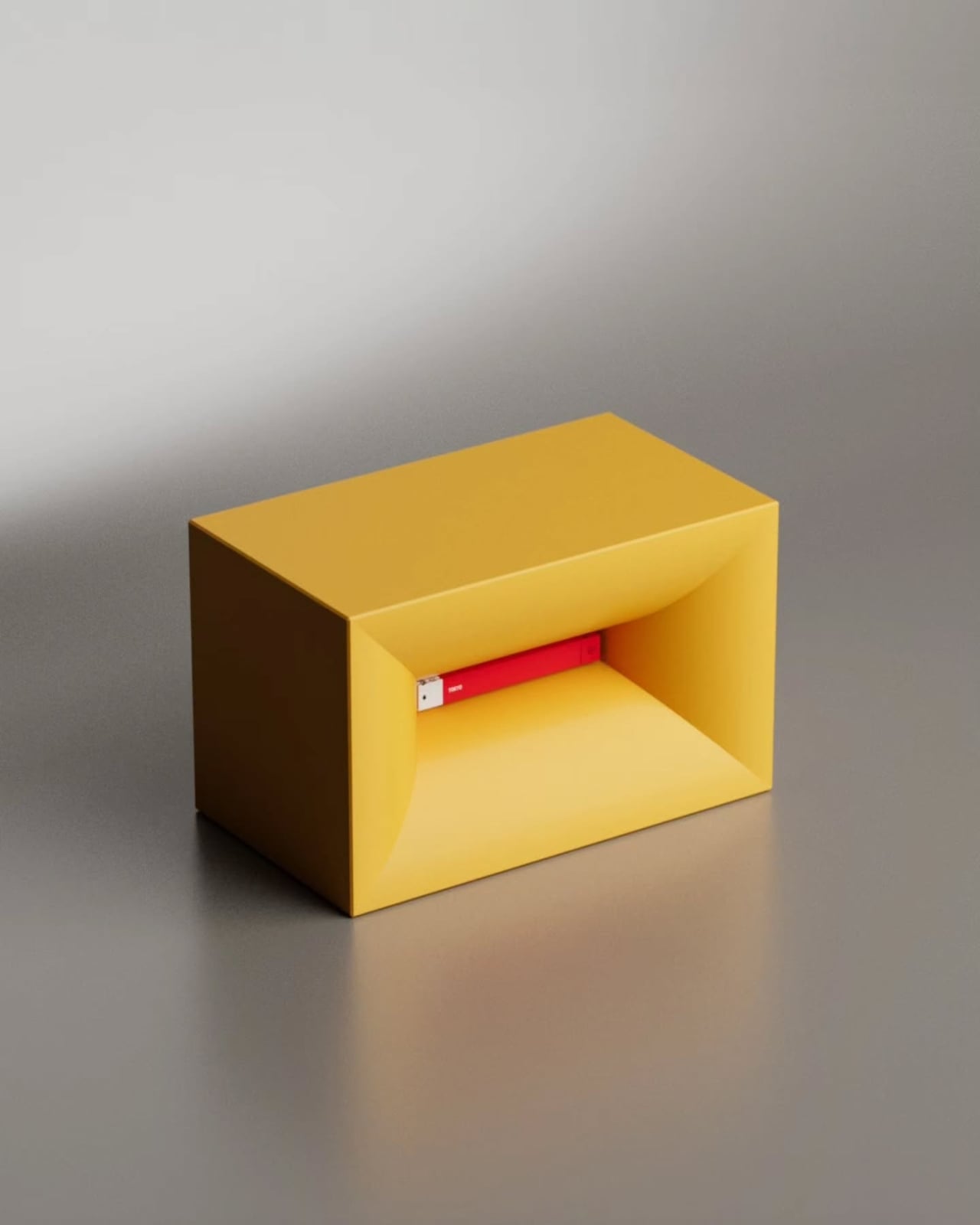
Say the name out loud, and you already understand the concept. NjommNjomm, by Stuttgart-based designer Deniz Aktay, is a cuboid coffee table made from sustainable plastics with a bevelled internal compartment that does something no coffee table has managed before: it makes a book appear to vanish inside it. Slide the right-sized book into the slot, and the table appears to swallow it whole, the pages disappearing into the body of the furniture with an optical sleight of hand that stops every person who walks into the room.

What makes it work beyond the trick is the restraint of the form. Nothing about the NjommNjomm announces itself. The exterior is clean, minimal, and almost unremarkable until the moment it is not. The cuboid shape also means the table can be repositioned vertically, giving it a flexibility most coffee tables never offer. For anyone who stacks books on every surface and has quietly given up apologizing for it, this is the table that finally takes their side. It is currently a concept by dezinobjects, and it is the right place to start.

What We Like

  • The optical illusion is genuinely surprising every single time someone encounters it
  • Works horizontally and vertically, making it adaptable to smaller living spaces

What We Dislike

  • Currently, it is a concept with no confirmed production timeline
  • The slot is most effective with books of a specific size

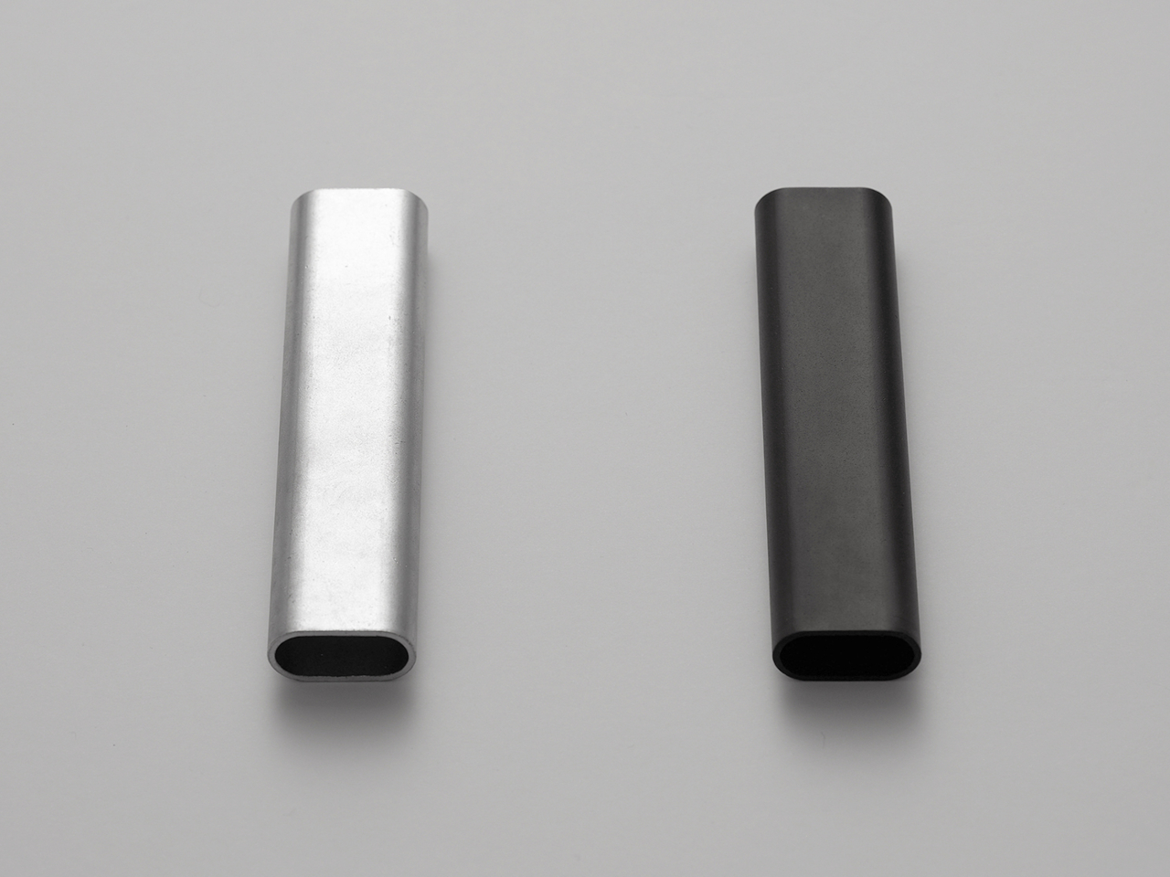
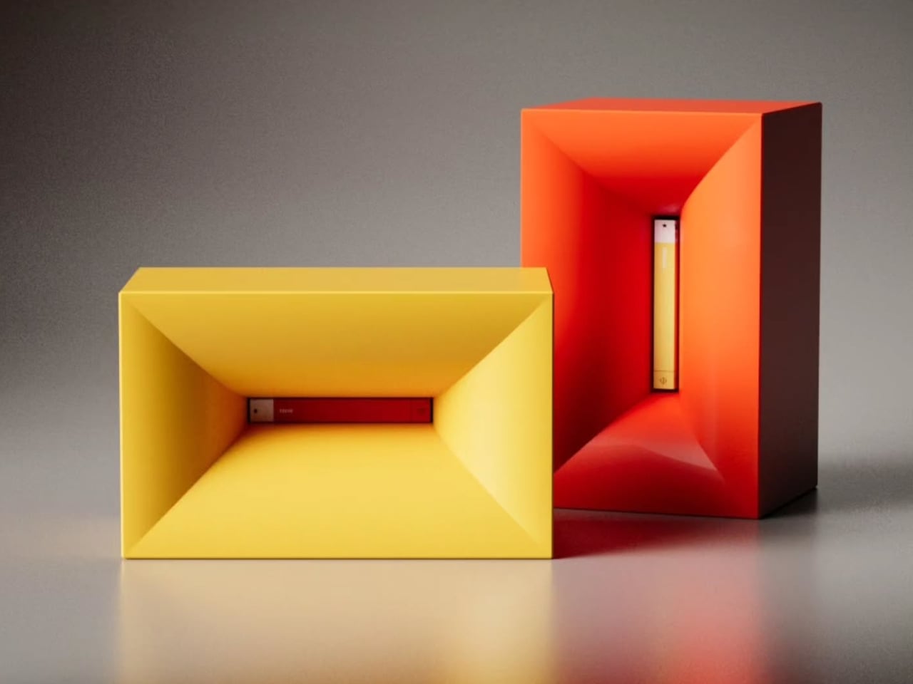
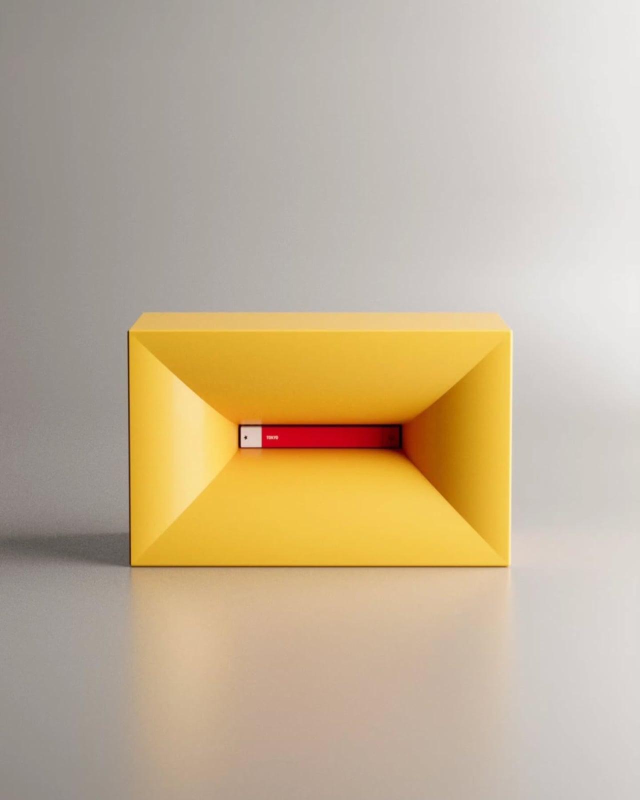
2. Portable CD Cover Player

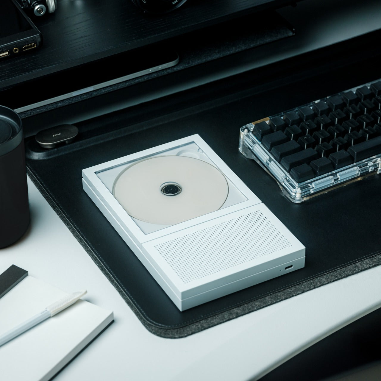
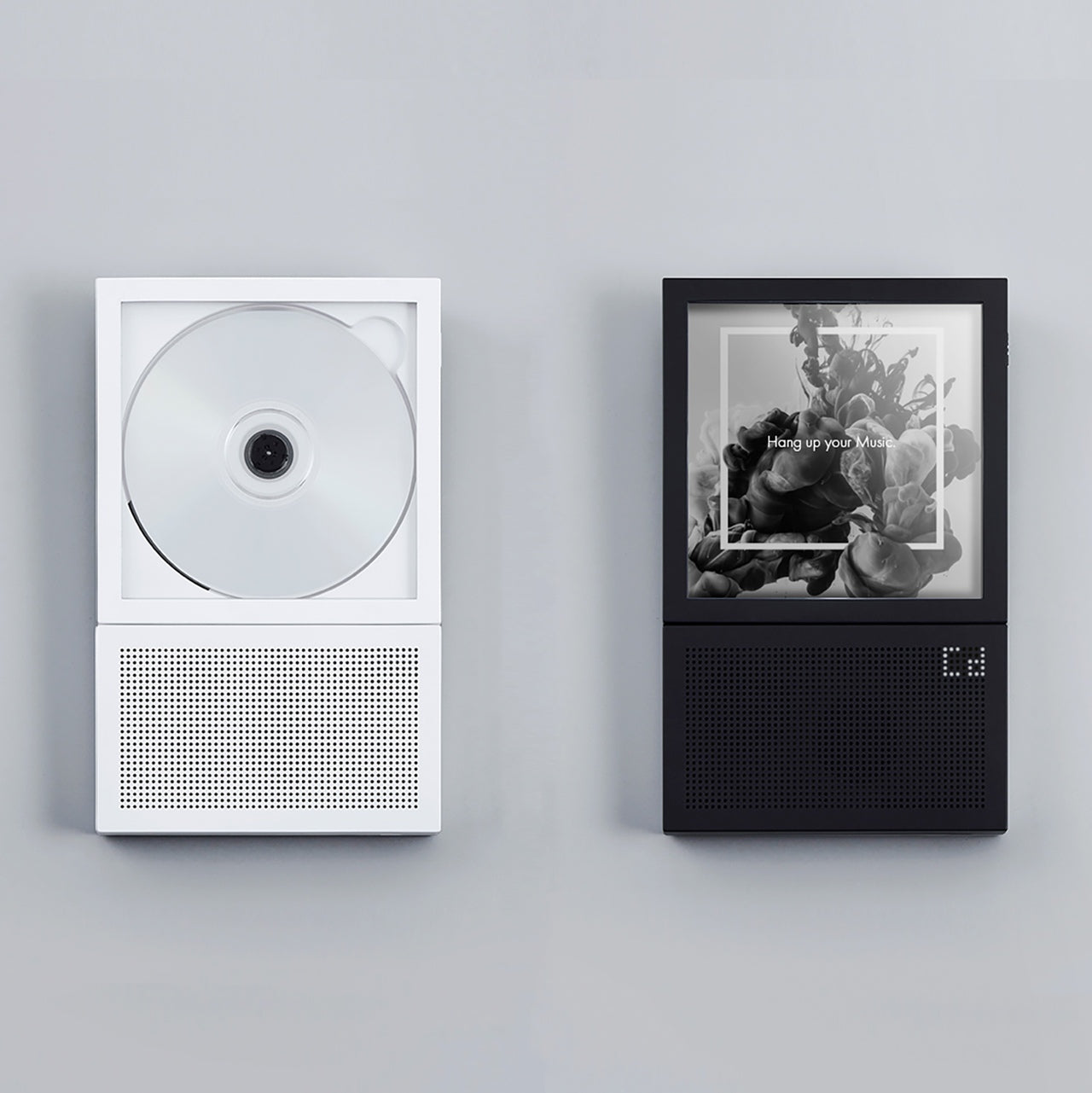
The Portable CD Cover Player does exactly what its name promises, and the effect is completely disarming. It looks like a CD sleeve. It sits like a CD sleeve. Then you realize it is the player itself. The entire device is designed around the silhouette of the packaging that physical music has always lived inside, turning the most overlooked part of the format into an object. For anyone who still has a collection gathering dust on a shelf, this reframes the entire relationship with the format in a single glance.

There is a specific kind of satisfaction in owning something that makes people pick it up and ask what it is. The Portable CD Cover Player earns that reaction every time it is left on a desk, a shelf, or a coffee table. It brings the physical music experience back without demanding space or ceremony, fitting into a bag or slotting between records with equal ease. Three remain in the YD shop, which is not a large number, and the kind of detail worth noting before moving on.

Click Here to Buy Now: $199.00

What We Like

  • The cover-as-player concept turns a format’s most discarded element into the product itself
  • Compact form factor slots naturally into an existing music collection without demanding its own space

What We Dislike

  • Only three units are currently available in the YD shop
  • Technical specifications for battery life and connectivity are not listed
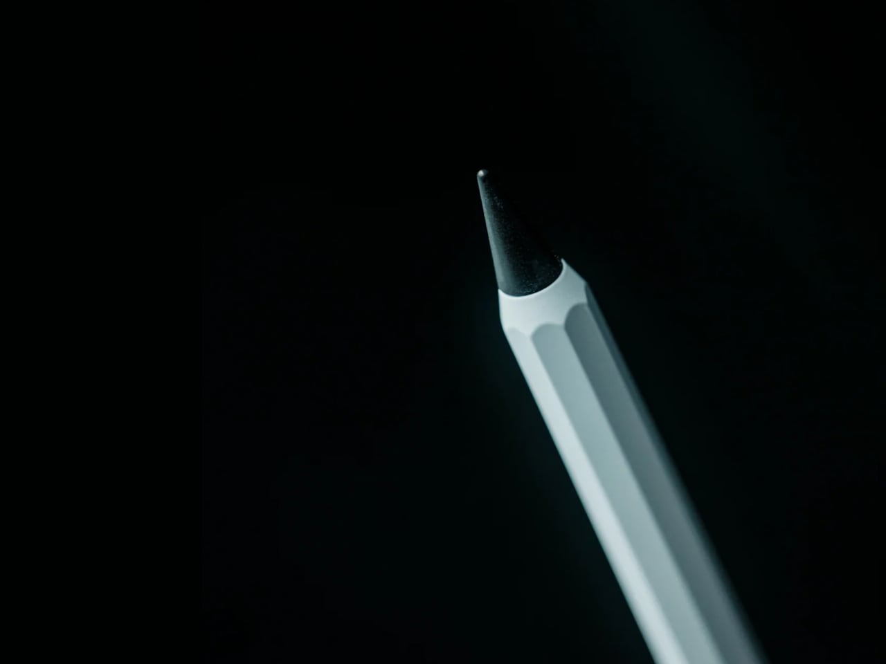
3. Ghost Clock

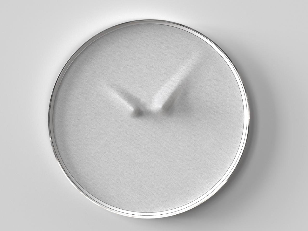
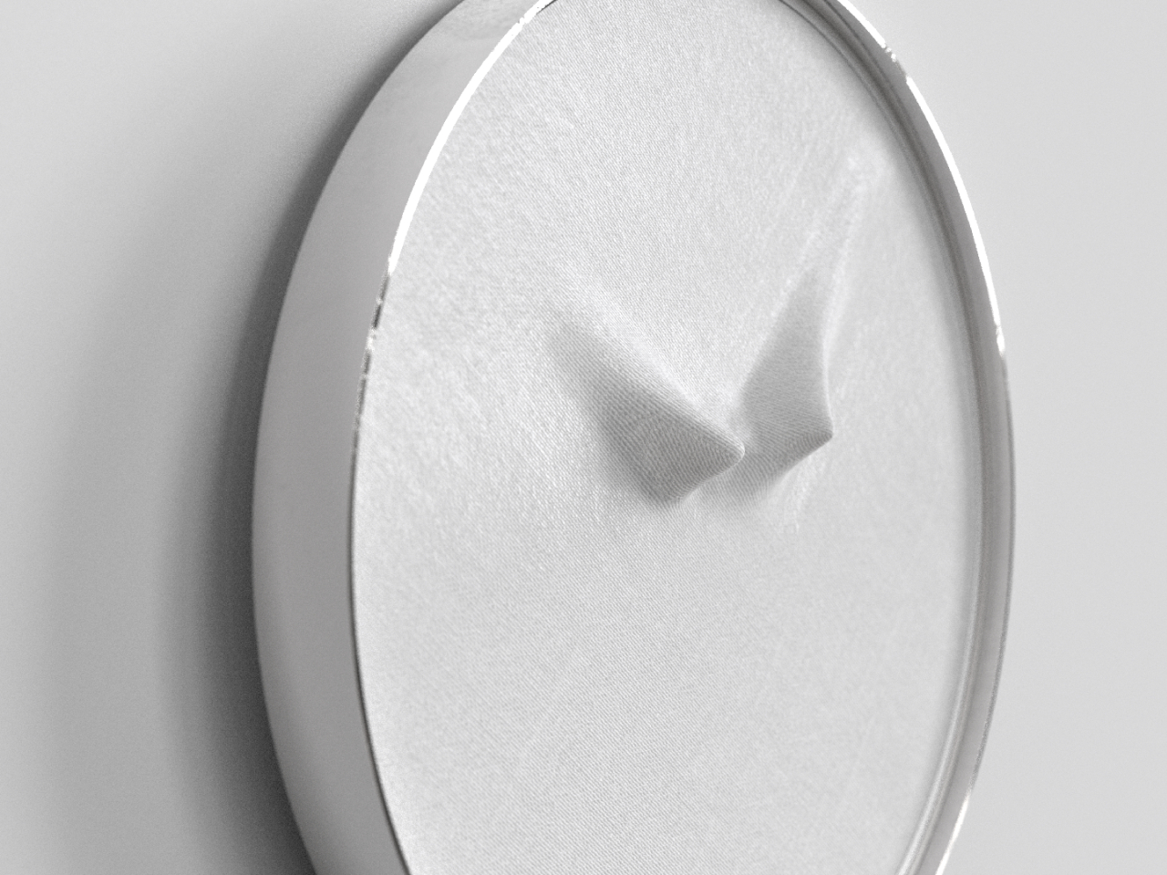
Istanbul-based designer Fatih Demirci took a simple question — what if a clock tried to disappear — and turned it into one of the most quietly compelling wall objects of 2025. The Ghost Clock stretches a thin fabric over the hour and minute hands without restricting their movement. The result is two slow-moving bumps that creep around the face of the clock, telling the time and refusing to tell it at the same time. The concept is drawn from the way objects look under drapery, and the reference earns every bit of the eerie quality it produces.

You cannot read the Ghost Clock with the precision a meeting demands, and that is the point. It is a wall object that removes the anxiety from timekeeping and replaces it with something stranger and more honest — a gentle reminder that time is moving without forcing you to count how fast. In a bedroom or a reading corner, this presence is more useful than precision. It is a concept by Fatih Demirci, and it deserves to exist in every room that takes itself a little too seriously.

What We Like

  • The fabric-over-hands mechanism is deceptively simple and visually arresting from across the room
  • Shifts the emotional register of timekeeping without removing its function entirely

What We Dislike

  • Not suited for precision timekeeping and should not be the only clock in a working space

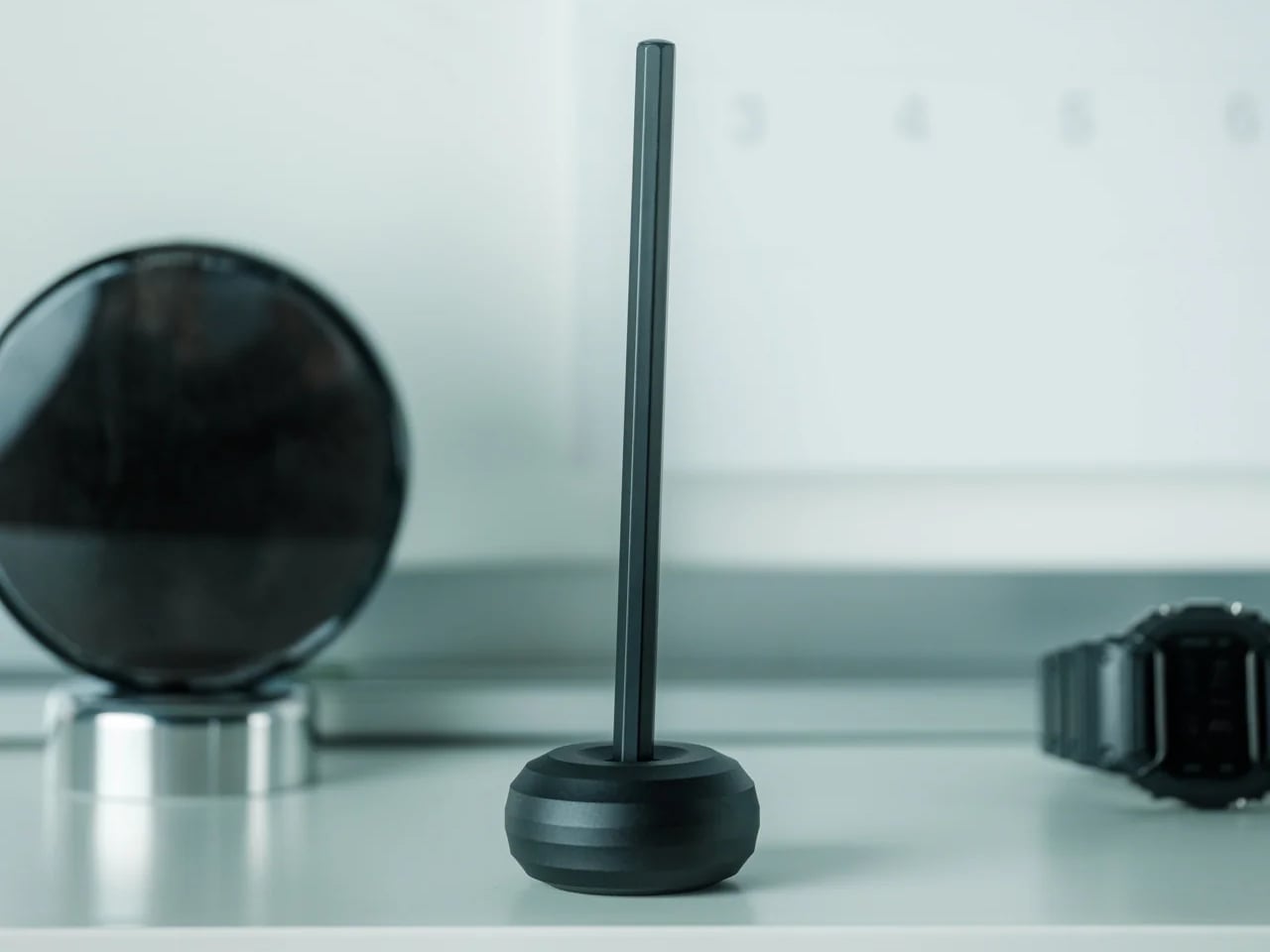
4. Sail Away Tranquility Mobile

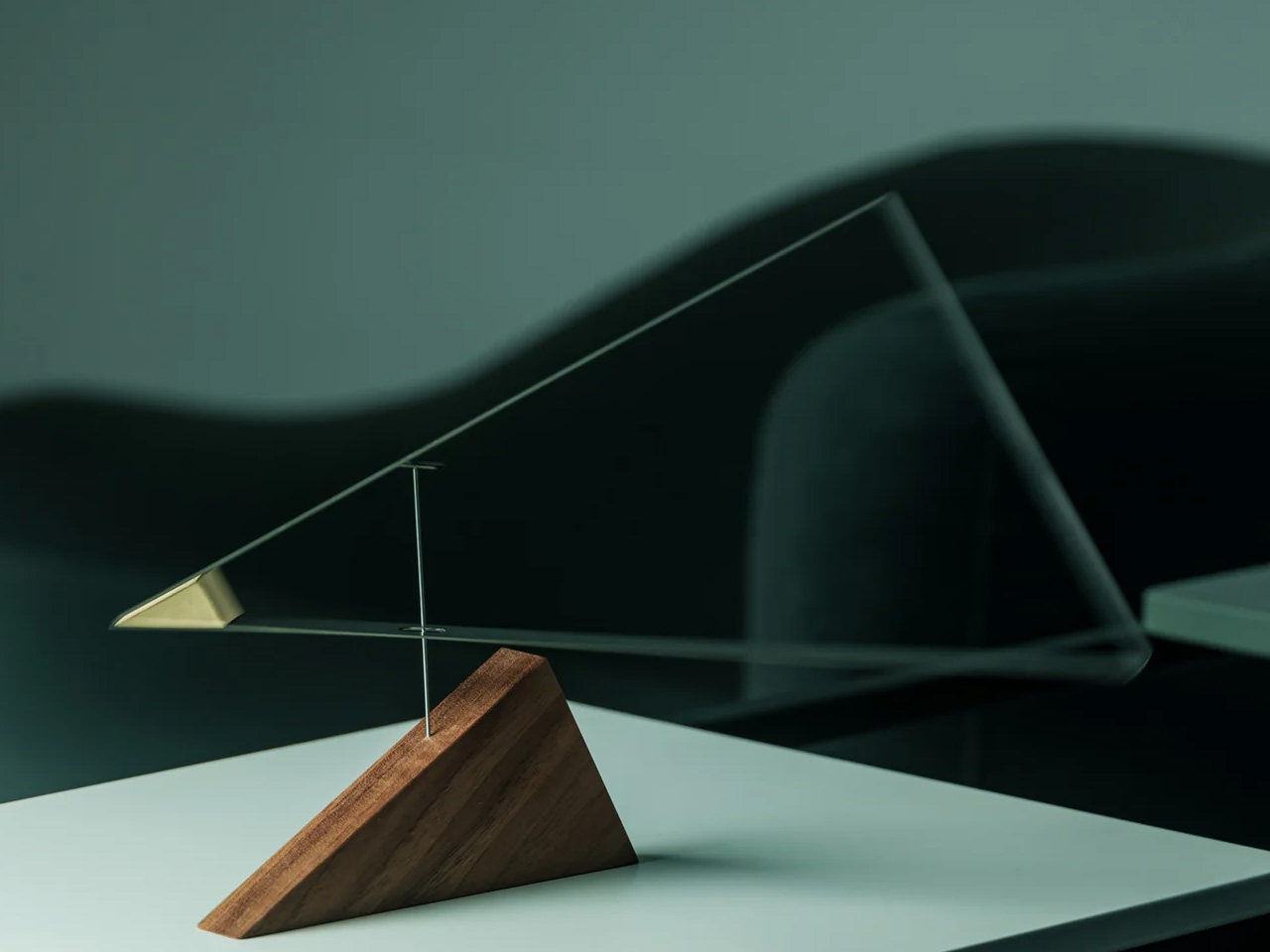
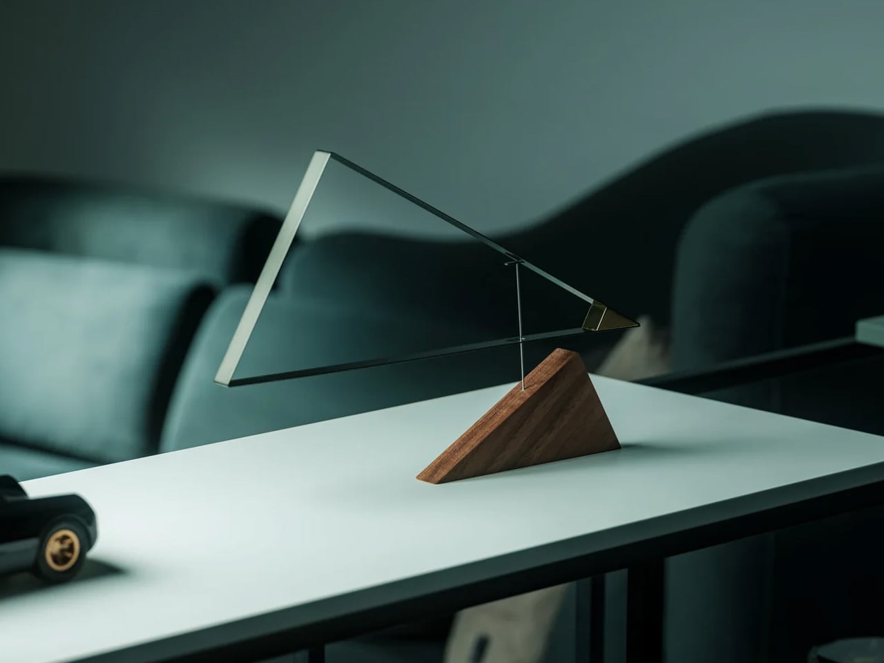
DRILL DESIGN is an award-winning Japanese studio, and the Sail Away Tranquility Mobile is the kind of object that explains why it has that reputation. Three interlocking triangles — one lightweight aluminum, one polished steel, one warm walnut — are hand-balanced at a workshop in Ashikaga City, Tochigi Prefecture, until the whole structure finds a perfect equilibrium. Then it sits on your desk and does almost nothing. Until the air shifts, and the triangles begin to move in response, and you realize you have been watching it for considerably longer than you intended.

The secret of the Sail Away Mobile is that it is kinetic without demanding anything from you. No batteries, no charging, no interaction required. The movement comes from the air in the room, which means it is always slightly different and always responding to something real. Weighing just 80 grams and requiring no tools to set up, it is genuinely easy to live with. As a desk object, a housewarming gift, or a quiet act of calm placed in a room that moves too fast, it earns the space it occupies.

Click Here to Buy Now: $129.00

What We Like

  • Entirely passive movement with no power source needed — the room does the work
  • Handcrafted in Japan with meticulous material balance across three distinct and contrasting materials

What We Dislike

  • The gentle movement requires some ambient air circulation to be fully appreciated in still rooms

5. Verse Chair

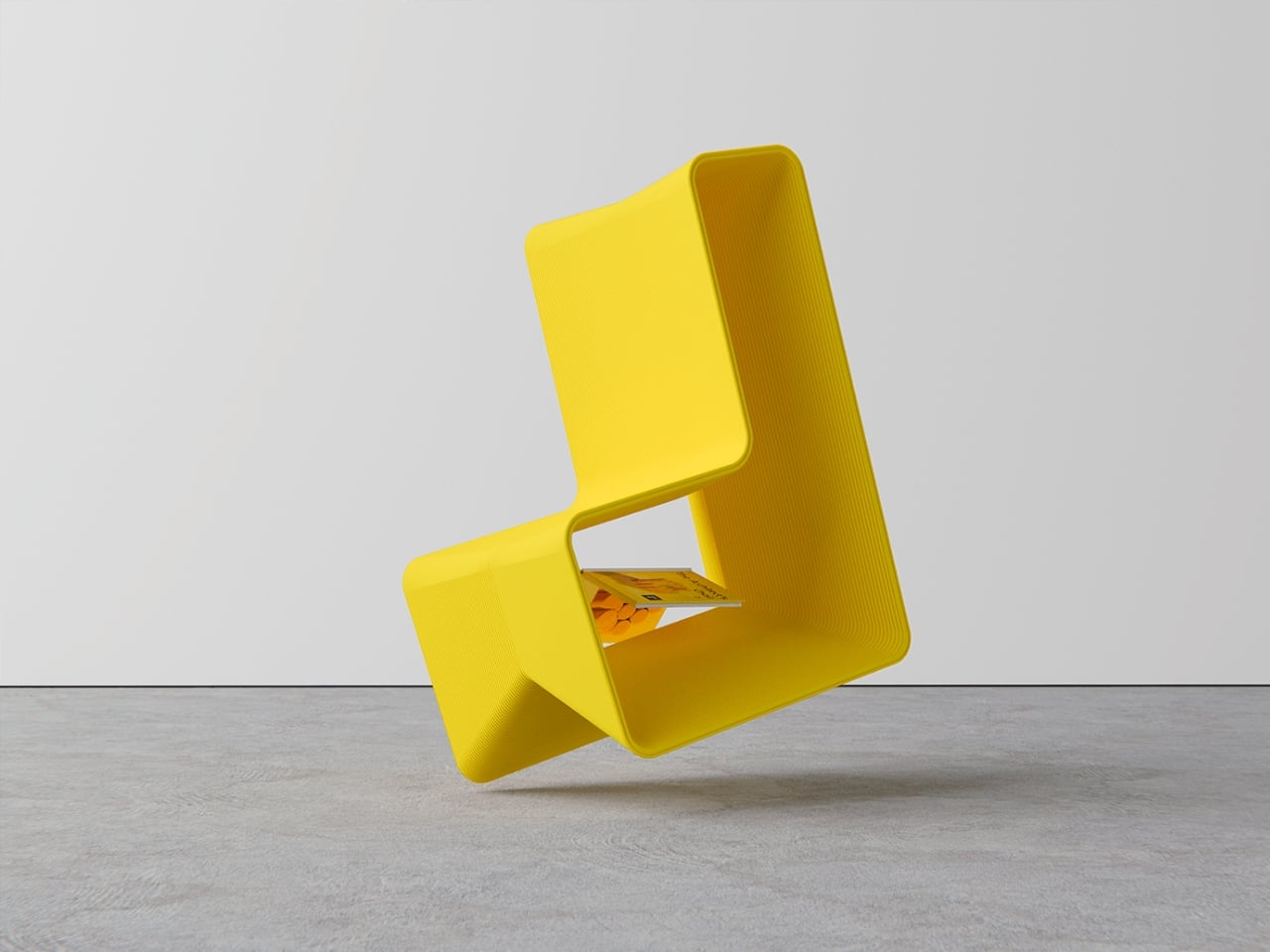
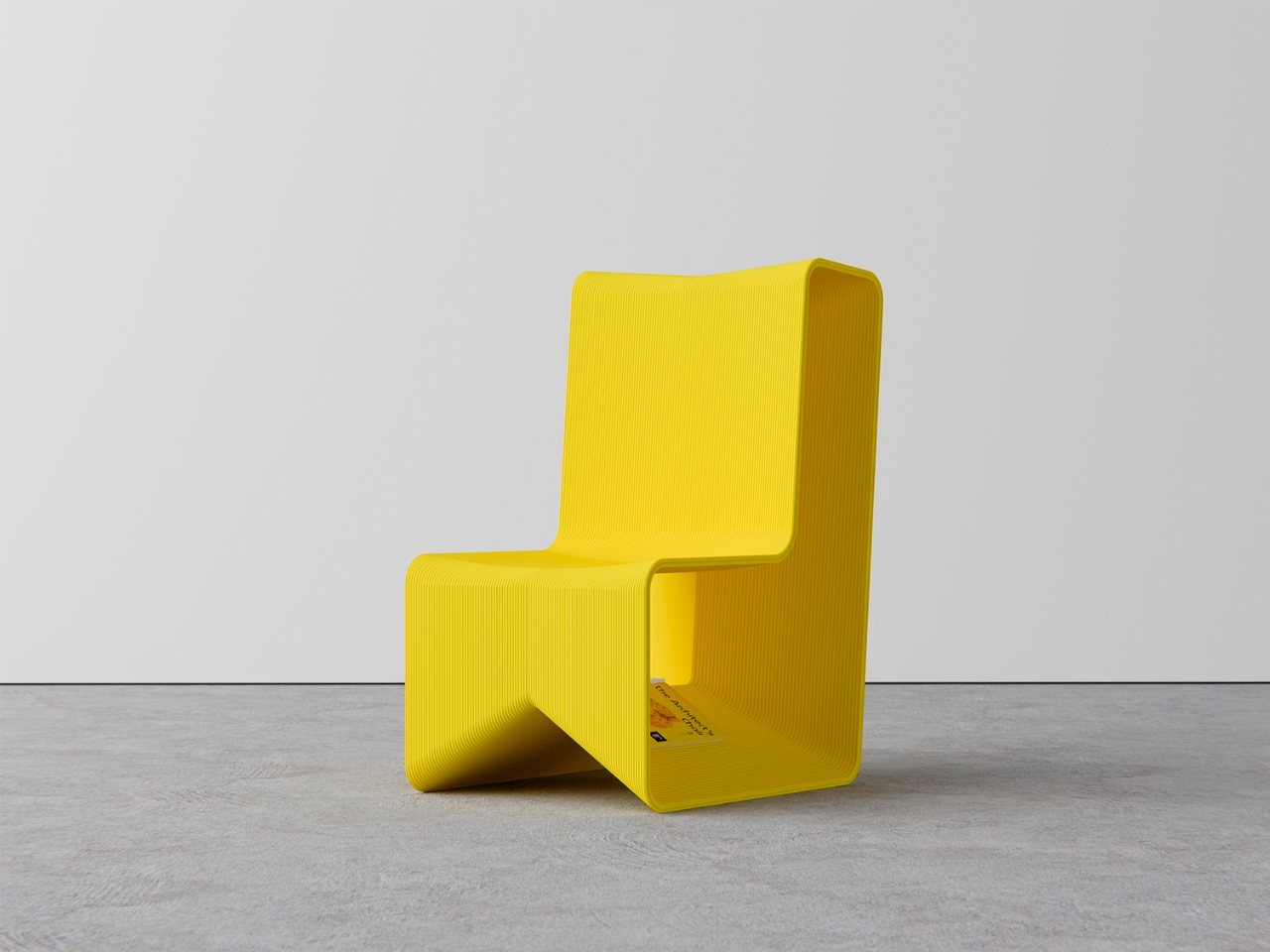
Most chairs do one thing. The Verse Chair by Liam de la Bedoyere does two, and the second one is so specific and considered that it reframes the entire object. The 3D-printed chair has a curved seat designed for ergonomic comfort, but beneath the seat lies a sharp-angled V-shaped base proportioned precisely to hold a book open at the page you left it. Set the book down mid-chapter, and the chair holds it. Come back later, and the page is exactly where you stopped. The chair remembers for you.

The name Verse refers both to the line-by-line process of 3D printing and the V-shaped form of the base, which is the kind of naming discipline most designers do not manage to pull off. The chair does not shout its bookmarking function. It holds the book quietly, at floor level, in the structure of the legs, visible only when you know to look for it. For anyone who reads in the same chair every day, this is the version of that chair designed specifically around that habit.

What We Like

  • The book-holding function is built directly into the structural logic of the chair, not added to it
  • The name connects form, manufacturing process, and purpose into one coherent idea

What We Dislike

  • Currently a concept and not available for purchase
  • The bookmarking function works most reliably when the chair remains in a fixed position

6. BGN 11

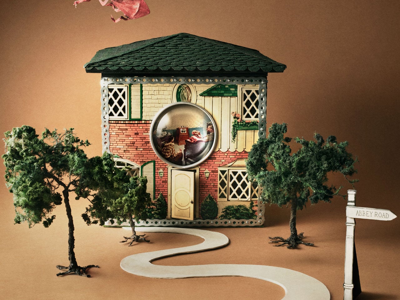
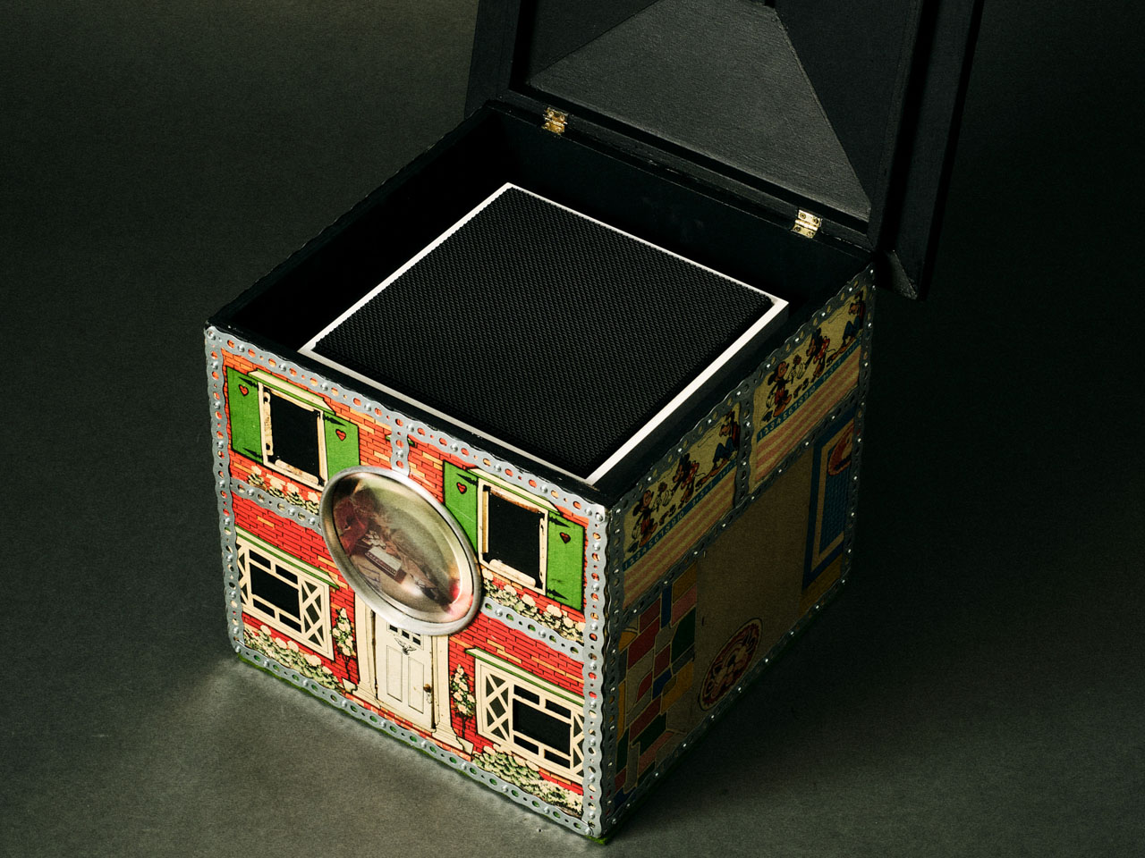
Teenage Engineering has made a sampler that plays only Gregorian chants and a PC chassis with retro-futuristic proportions, so it should come as no surprise that they also made working speakers out of 1930s tin dollhouses. BGN 11, a collaboration with Toronto-based craft collective Bentgablenits, transforms ten salvaged pressed-metal toy buildings — a chapel, a corner shop, a living room, an ice cream parlor — into working TE OD-11 speaker units. Each one was hand-altered, rewired, and reupholstered to broadcast ambient compositions matched to its specific setting.

Only ten units were ever made, shown for three days at a Shopify creative space on Greene Street in Soho, New York, in June 2025. They are gone. BGN 11 sits in this roundup not as something to acquire but as proof of a design argument: that the most interesting audio object is one that makes you forget it is an audio object. A dollhouse murmuring like a congregation. A corner shop that chimes. The speaker disappears completely into the story of the building it lives inside.

What We Like

  • Each unit delivers a specific narrative through both its visual form and its audio content simultaneously
  • The collaboration between Bentgablenits’ tactile craft and Teenage Engineering’s acoustic precision produces something neither could have made independently

What We Dislike

  • The ambient compositions are matched to each specific unit and are not user-configurable

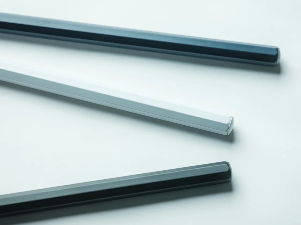
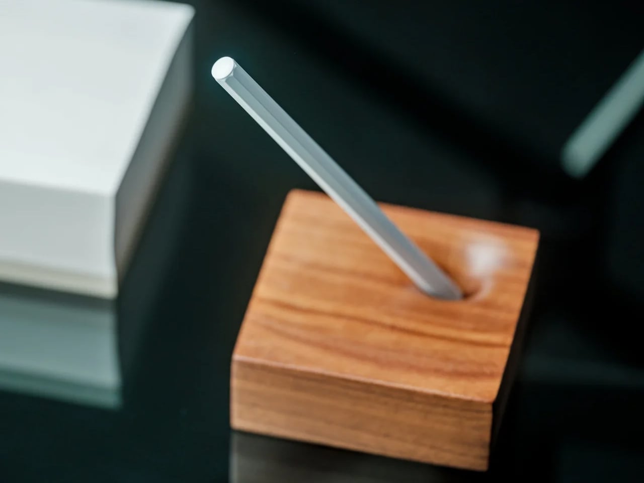
7. Invisible Shoehorn

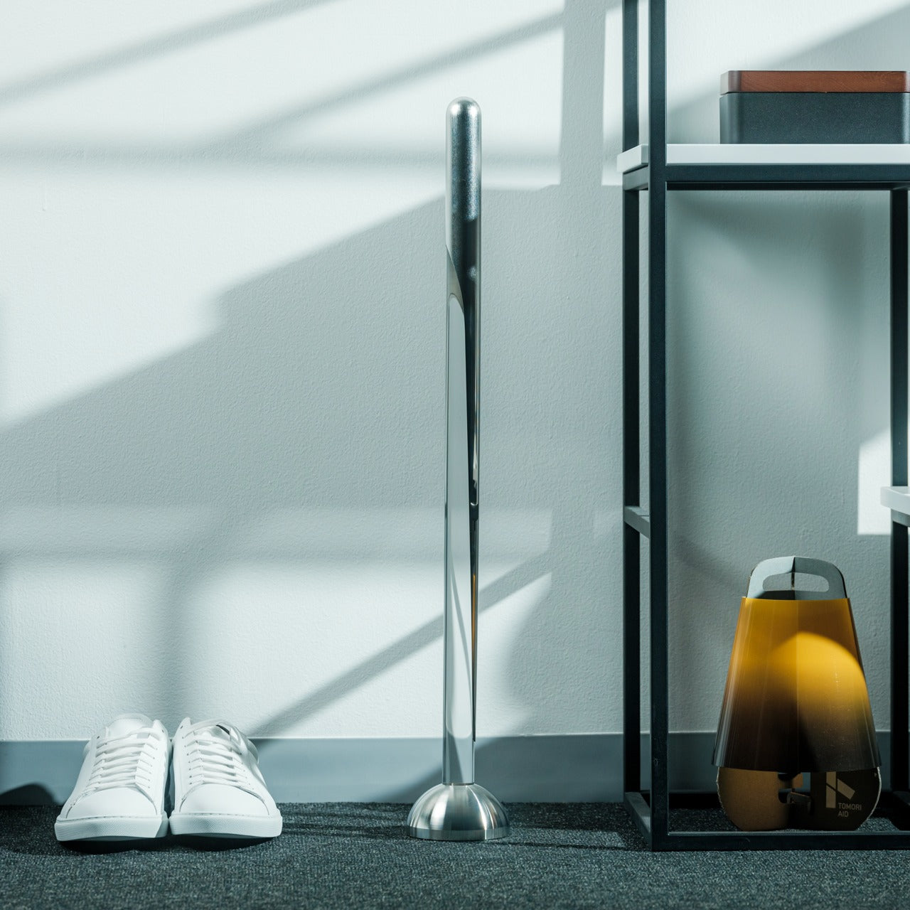
The Invisible Shoehorn is the most committed object in this roundup. Where other pieces here have hidden functions or optical tricks, this one has a single purpose and has dedicated its entire design language to not being seen while performing it. Made from transparent acrylic, it is built to vanish against any backdrop — a shelf, a closet floor, a basket by the door. Its clear body and ergonomic curved form make it read as a small sculpture before it reads as a tool, and the moment you actually need it is the moment it stops being invisible.

There is a specific kind of confidence in designing something intended to be overlooked. The Invisible Shoehorn sits in a space and contributes nothing visually until the moment it contributes everything functionally, then returns to transparency. For a hallway or entryway that takes its aesthetic seriously, this is the version of the object that belongs there. The ergonomic curve makes it genuinely comfortable and easy to grip, and the transparent material means it works equally in any color palette.

Click Here to Buy Now: $299.00

What We Like

  • Transparent acrylic construction genuinely disappears against almost any surface or backdrop
  • The ergonomic curve makes it comfortable to use without compromising the minimal, tool-free visual

What We Dislike

  • Transparent acrylic shows fingerprints and requires regular cleaning to maintain the invisible effect

8. Magician’s Rope

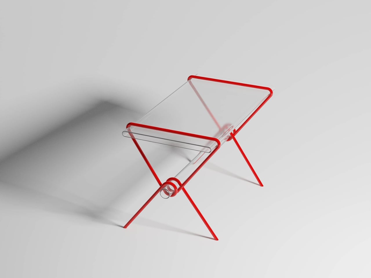
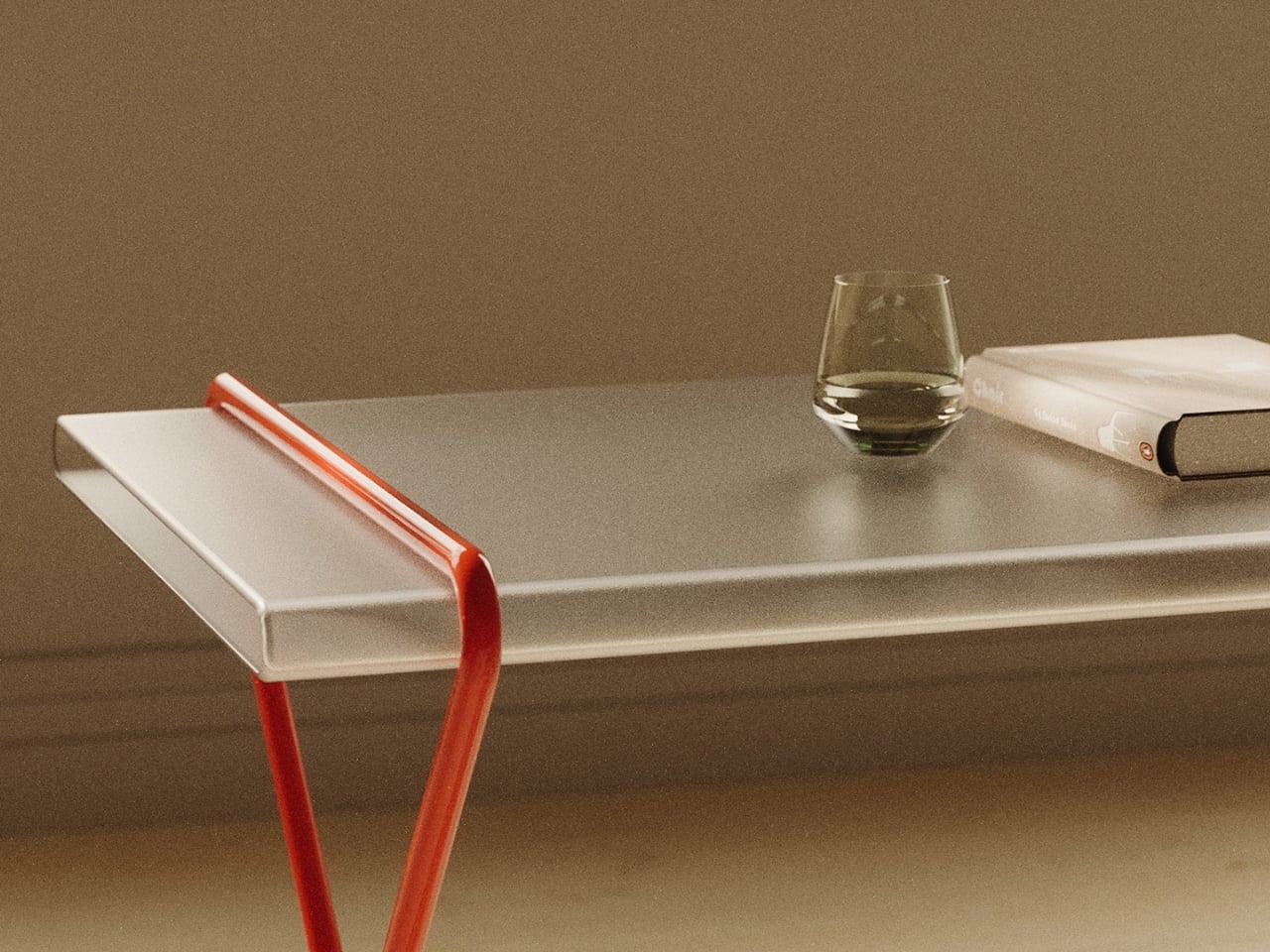
Close the roundup with the table that should not hold anything, but somehow holds everything. Magician’s Rope, by designer Hanqi Jia, earned recognition at the NY Design Awards by doing something structurally improbable and making it look completely inevitable. A single continuous red metal line bends, loops, and crosses itself into a structure that supports a transparent tabletop. It looks like a drawing. It looks like a gesture caught mid-motion. It does not look like a table, which is precisely why it is such a considered one.

The red line is the detail that holds the whole thing together conceptually. Red, in most design contexts, demands attention. Here it asserts itself visually while the overall form stays quiet — the line says look at me, while the rest of the table says I will be here whenever you need me. The transparent top reduces the visual footprint significantly, making it a strong choice for smaller rooms or spaces already doing a lot of visual work. It is a concept by Hanqi Jia, and it earns the closing position in this list.

What We Like

  • A single continuous red metal line achieves structural integrity through elegance rather than bulk
  • The transparent top reduces the table’s visual presence dramatically in smaller or busier rooms

What We Dislike

  • The red line is a defining feature that will not integrate easily into every interior palette

The Best Objects Don’t Explain Themselves

Every object in this list shares the same quality: it does something you did not expect it to do. The table eats the book. The clock hides the time. The shoehorn disappears. The dollhouse plays a sermon from a tin chapel. None of them announces their second nature from across the room. You have to live with them, look closely, or accidentally slide a paperback into the wrong slot before discovering what they actually are.

That quality — the hidden behavior, the withheld function, the object that rewards attention — is increasingly rare when most products explain themselves loudly and immediately. These eight do not. They ask you to slow down, look again, and sit with something that has more going on than it first appeared. That is a reasonable thing to ask of the objects you choose to keep around you.

The post 8 Best Home Objects So Cleverly Designed They Make Your Entire Furniture Setup Look Boring first appeared on Yanko Design.

This Magnetic Keychain Has A Three-Level Locking System So It’s Impossible To Drop Your Keys

The spring inside a conventional keychain carabiner is arguably the least-considered component in everyday carry, a tiny coiled wire doing the same job it has done for decades, prone to fatigue, deformation, and eventual failure at the exact moment reliability matters most. Titaner has rebuilt it from physics up. The Matrix replaces that metal spring entirely with precision-aligned neodymium magnets operating in controlled repulsion, generating gate-return force that doesn’t degrade with use. The brand rates the system at one million presses with zero rebound loss, a number that makes the lifespan of any conventional spring look fairly modest by comparison.

That magnetic spring delivers an incredibly smooth linear damping feel, a soft yet decisive rebound that Titaner describes as strangely addictive. It serves as the foundation for a more ambitious system: a three-level locking architecture where the number of active mechanical defenses is something the user controls. Six models span the lineup, ranging from a single-level autolock all the way to Constant Locking configurations with a physically deadlocked release button and the XYZ Tri-Axial Lock restricting gate movement across all three spatial axes simultaneously.

Designer: Titaner

Click Here to Buy Now: $29 $42 (31% off). Hurry, only 94/100 left! Raised over $94,000.

The magnetic spring structure is the invisible upgrade that takes the carabiner to an entirely new level. Where a coiled metal spring cycles between tension and compression thousands of times until molecular fatigue sets in, neodymium magnets generate repulsion force without any physical wear. The spring action remains consistent across the entire lifespan, which means the 500th press feels identical to the 500,000th. Titaner machines precision cavities into the titanium body to house the magnets, aligning their poles to create controlled repulsion that mimics the spring behavior but with a smoother damping curve. The tactile feedback on every gate release has a fidget-toy quality to it, a satisfying snap that makes you want to open and close the thing for no reason at all.

When the gate closes, the XYZ Tri-Axial Lock engages across all three spatial axes simultaneously. Traditional carabiner clips allow some degree of lateral wiggle or vertical play once the gate latches, a small but perceptible looseness that undermines the sense of security. Titaner’s lock structure eliminates that movement entirely by restricting the gate along the X, Y, and Z axes the instant it seats into the closed position. The entire assembly goes rigid, transforming from a hinged mechanism into what feels like a single monolithic piece of titanium. The lock structure is passive, meaning it happens automatically without user input, but the result is immediately noticeable the first time you handle a closed Matrix unit.

The three-level security system builds on that foundation by adding optional layers of defense. Level 1 is the magnetic spring autolock alone, best suited for quick daily access where speed matters and the risk of accidental release is minimal. Level 2 introduces a toggle switch positioned over the release mechanism, adding an active physical barrier that prevents accidental actuation. You slide the toggle to expose the release, press to open the gate, and let the toggle return to its locked position. Level 3 takes it further by physically deadlocking the release button itself. The mechanism retains the first two defense lines while introducing a third barrier that requires deliberate mechanical input before the release will respond at all. Even with Level 3 engaged, the sequence to open the gate takes under one second once you internalize the logic, which means maximum security without a meaningful sacrifice in access time.

Three-panel collage showing a compact metal key organizer in use: holding a key with the organizer, attaching a keyring to the organizer, and hooking it onto a metal surface.

Six models distribute across four series, each with a different mechanical philosophy and form factor. The S-Series is the most compact, designed for minimalist carry with a slim profile and a rotating release mechanism. The G-Series adopts a more geometric stance, with hard angles and a question-mark form factor that deviates from the traditional D-shaped carabiner. The N-Series carries the Tritium slot, a dedicated cavity machined into the body to hold a self-illuminating tritium vial that glows for over 25 years in complete darkness without batteries or charging. The L-Series is the entry point and the only model of the spring system that ingeniously achieves locking by utilizing the elasticity of metals and structural design.

Every piece starts as a solid block of GR5 titanium, the aerospace-grade alloy that delivers comparable strength to steel at roughly half the weight. Titaner machines each component on high-end CNC equipment, chamfering every edge to eliminate the sharp surfaces that shred pocket linings or catch on fabric. The finished pieces range from 12.3 grams for the L1 up to 26 grams for the G3, putting even the most feature-loaded variant comfortably within daily carry territory. GR5 titanium resists corrosion, rust, and bacterial growth, which means sweat, rain, and salty air have no meaningful effect on the material over time. The alloy is also hypoallergenic and non-toxic, qualities that matter less for a keychain than for something worn against skin but add to the overall sense of considered engineering.

Two surface finishes are available. The Micro-Blasted finish is a raw industrial matte that shows the machined titanium in its natural state, with superior fingerprint resistance and a soft tactile feel. The DLC Black finish applies a Diamond-Like Carbon coating over the titanium, adding extreme scratch resistance and an anti-reflective tactical aesthetic that photographs darker and more aggressive. Both finishes hold up to years of daily pocket carry without meaningful wear, though the DLC coating provides an additional layer of surface hardness for users who prioritize durability above all else.

Every Matrix keychain ships with a 32mm stainless steel quick-install key ring. The ring can be pried open by hand to slide a key directly onto the coil without the usual fingernail-destroying process of threading keys around a traditional split ring. Once the key is seated, the ring snaps closed and holds with enough tension to secure the key indefinitely.

The Matrix lineup is available now, with pricing spanning from $29 for the L1-2026 (the entry-level model with a traditional spring) up to $129 for the G3-2026 in DLC Black. The campaign includes optional add-ons such as Tritium vials, titanium toothpicks, and upgraded DLC finishes. Shipping is estimated to start in September 2026.

Click Here to Buy Now: $29 $42 (31% off). Hurry, only 94/100 left! Raised over $94,000.

The post This Magnetic Keychain Has A Three-Level Locking System So It’s Impossible To Drop Your Keys first appeared on Yanko Design.

A “Modular Bento Box” for Your Desk Gear: Meet Orbitkey’s $42 Grid Organizer

Orbitkey’s design story has always revolved around everyday friction, the loose keys in a pocket, the tangled cable in a bag, the small desktop essentials that somehow scatter across every available surface. Its early key organizers turned a familiar pocket annoyance into a cleaner, quieter carry experience, while the Orbitkey Nest translated that same philosophy into a lidded tray for modern EDC, complete with customizable dividers and a top surface made for quick access. Products like the Desk Mat pushed further into the workspace, showing how Orbitkey likes to treat organization as part utility, part atmosphere.

The Grid Desk Organizer brings that philosophy into a broader desktop format, creating a modular home for the loose objects that gather around work and living spaces. Its perforated tray base works with snap-in dividers that can be adjusted any number of ways to suit different layouts, whether the setup leans toward tech accessories, stationery, EDC, bedside essentials, or any items required close at hand. Stackable construction allows the system to grow over time, while soft-touch lining, quiet feet, and a lid that doubles as a phone stand sharpen the day-to-day experience. Offered in Black, Stone, and Terracotta, and available in both standard and mini versions, the Grid starts at $42 with shipping expected in September 2026.

Designer: Orbitkey (Charles Ng, Maneet Singh)

Click Here to Buy Now: $42 $49.90 (16% off). Hurry, only a few left! Raised over $428,000.

The Nest earning both an iF Design Award and a Red Dot Award in 2021 said something specific about what Orbitkey prioritizes: functional performance through material restraint rather than formal complexity. Forms across the lineup stay compact and geometric, surfaces carry a soft tactile quality, and color palettes lean deliberately toward the understated. These choices reflect a brand that understands organization products share space with other carefully chosen objects, and that the best-designed ones tend to recede rather than announce themselves. The Grid carries that same sensibility, favoring clean geometry and muted tones over anything decorative or loud. It is built to improve a space rather than compete with what is already in it.

The patent-pending snap-on divider design is the mechanical core of the Grid, a perforated tray floor that accepts snap-in dividers at any position along its grid, like a pegboard, but horizontal. Long dividers run the full depth of the tray while shorter ones slot in crosswise, and the entire arrangement can be lifted out and reconfigured whenever the contents are changed. Most desk organizers impose a fixed spatial logic, demanding objects conform to pre-cut compartments regardless of whether they actually fit. This inverts that relationship entirely, letting each divider position respond to the specific objects beside it rather than the other way around. The practical difference between those two approaches is significant enough that once you experience the latter, returning to the former feels immediately wrong.

While the main tray forms the operational base, a translucent accessories tray nested inside manages the smaller objects that vanish at the bottom of any open container. Above that, the lid serves as a valet surface for quick-drop essentials, with its handle engineered to double as a portrait phone stand when set upright. Accessing a lower layer takes only a forward slide of the top tray, fast enough to register as a gesture rather than an interruption. The structure maps to how a desk gets used through a day: high-frequency items on the surface, everything else one movement away. Each layer feels less like an added feature and more like part of a cohesive system shaped around everyday use.

The interior is lined with a soft-touch rubberized coating that protects items from scratching and gives the tray a tactile quality that cheaper desk accessories rarely bother with. Silicone feet on the base keep it from migrating across hard surfaces and cut out the sharp click that plagues most rigid desk objects when bumped or brushed. Exterior walls carry a clean matte finish that holds up well against fingerprints and reads easily alongside wood, concrete, or painted surfaces. Corners are gently curved and proportions sit deliberately low and wide, qualities that let the Grid disappear into a desk setup rather than dominating it. The three colorways, warm Terracotta, muted Stone, and near-universal Black, cover the major interior design directions without forcing a choice between personality and practicality.

Units stack both horizontally and vertically, so the Mini can sit beside or beneath the standard tray depending on the surface available. Future accessory inserts are planned as the system develops, echoing how the best modular product lines grow: incrementally, in response to real use patterns rather than speculative feature lists. For anyone already running a Nest for travel, the Grid functions as its natural stationary counterpart, the surface the Nest gets unpacked onto. Orbitkey has consistently built products as long-term investments rather than seasonal releases, and the Grid’s emphasis on future compatibility carries that same commitment.

Open black camera/tech case on a wooden desk, revealing small items: memory cards, coins, a USB drive, a fountain pen, and a small bottle with a green label in a clear tray.

The standard Grid Desk Organizer ships with one lid, one standard tray, one accessories tray, three long dividers, and four short dividers, priced at $42. The Mini, which includes a lid, mini tray, one long divider, and three short dividers, is available as a $26 add-on or bundled with the standard for $64. An Ultimate Bundle covering two standard units and two minis comes in at $110. All three colorways are available across both sizes, with color selection finalized at the close of the campaign. Shipping is expected in September 2026, and the Grid Desk Organizer is live now on Kickstarter.

Click Here to Buy Now: $42 $49.90 (16% off). Hurry, only a few left! Raised over $428,000.

The post A “Modular Bento Box” for Your Desk Gear: Meet Orbitkey’s $42 Grid Organizer first appeared on Yanko Design.

5 Best Japanese Kitchen Gadgets That Make Cooking Feel Like a Meditation Ritual

Japanese kitchen tools operate differently from their Western counterparts. They don’t promise to speed things up or reduce effort. They promise to make that effort worth something. The objects below share a commitment to material honesty and precision that changes the pace of cooking without changing the recipe. Each one invites you to slow down, pay attention, and find something close to calm in the ordinary rhythm of preparing food.

None of these tools asks for much counter space. None comes with instruction manuals. What they share is a design philosophy rooted in centuries of Japanese craft tradition, where restraint and intention produce objects that reward your attention rather than compete for it. Cooking with them slows you down in a way that feels like a gift. The meditation isn’t something you bring to the kitchen. These tools create the conditions for it.

1. Iron Frying Plate

The Iron Frying Plate removes the boundary between the cooking vessel and the serving dish. Crafted from rust-resistant mill scale steel with a detachable wooden handle, it moves from stove to table without a transfer, without a plate in between. Eggs arrive still sizzling. Fish comes off the heat and onto the table in the same object, retaining the kind of temperature and texture that plating destroys. The cook-and-serve design isn’t a shortcut. It’s a different way of thinking about food.

The uncoated surface requires no seasoning before first use and develops natural non-stick properties through regular cooking. The detachable wooden handle attaches and releases with one hand, making the transition from burner to table completely fluid. Retained heat keeps food at a temperature throughout the meal, which changes its pace in subtle but noticeable ways. You stop rushing through dinner because the plate is still doing its job while you’re still deciding what to eat first.

Click Here to Buy Now: $69.00

What We Like

  • The cook-and-serve design preserves the temperature and texture that get lost in any transfer to a separate plate
  • The uncoated mill scale steel develops natural non-stick properties through use, with no chemical coatings involved

What We Dislike

  • The iron construction retains heat long after serving, which requires careful handling at the table
  • Heavier than standard serving dishes, which takes some adjustment if you’re used to lighter ceramics

2. Katakuchi Suribachi & Surikogi Set

The suribachi is a Japanese mortar defined by its interior: a web of fine ridges that grip seeds and fibres and pull them apart through friction. Unlike smooth-walled mortars that crush, this one grinds, and the difference in what that produces is immediate. The katakuchi design adds a spout, so freshly ground sesame pours cleanly from the vessel without a transfer step. The wood surikogi follows the curve of the bowl exactly, which is the whole point of the pairing.

Using a suribachi imposes a different pace on cooking. You bring the seeds in, you begin to work the pestle in slow circles, and the sound changes as the seeds release their oil. The kitchen starts to smell like food before the pan is even on. That sensory sequence of physical work and gradual transformation is what separates this from a standard grinding tool. Available from TOIRO Kitchen in two colorways, it’s priced between $36 and $63 depending on size.

What We Like

  • The katakuchi spout makes it a single-vessel process from grinding to pouring; nothing gets lost in the transfer
  • The ridged earthenware interior produces a texture and aroma from sesame and spices that a food processor simply cannot replicate

What We Dislike

  • The earthenware body is heavy and requires careful handling; it’s not something you grab quickly
  • Cleaning the grooved interior takes more attention than a smooth-walled mortar

3. Iga-yaki Donabe Clay Pot

Iga-yaki clay comes from Mie Prefecture in Japan, where the local earth has been used for ceramics since at least the Kamakura period. The porous structure absorbs heat slowly and releases it evenly, creating a cooking environment that metal pots simply cannot replicate. Rice cooked in it sweetens. Broth deepens over a lower flame. The exterior stays rough and unfinished while the interior is glazed smooth: two textures on the same vessel, each doing exactly what it needs to.

Using a donabe imposes a different pace on dinner. You bring it to a heat gradually, you watch the steam rising from the lid, you lower the flame, and wait. That sequence of patient setup, attention to what the pot is communicating, and the discipline not to rush transforms cooking into something closer to practice than production. TOIRO Kitchen stocks Iga-yaki donabe in several sizes, all made in Japan, all functioning as vessels for the kind of cooking that rewards presence.

What We Like

  • Iga-yaki clay retains heat well past the point of turning off the flame, keeping food at a temperature while you’re still at the table
  • Genuinely versatile across hot pot, rice, steaming, and slow braise. One vessel covers all of it

What We Dislike

  • Clay donabe requires seasoning before first use, typically by simmering rice water in it, a step not everyone anticipates from the packaging
  • The porous clay body can absorb strong cooking odors over time and needs to be stored with the lid off after washing

4. Sakura Petal Grater

Fresh wasabi grated at the table is a different ingredient from the paste that comes in a tube. The same is true of ginger, of daikon, of any root that peaks the moment it’s reduced. The Sakura Petal Grater is built around that principle. Its sakura petal form brings tableside preparation into the meal itself, turning garnish work from a kitchen task into part of the ritual of eating. The circular motion has a quality that makes stopping feel abrupt.

Made from stainless steel, the grater sits flat and stable at the table, and the anti-slip silicone base doubles as a protective cover when stored. Its compact size means it takes no space to speak of, but what it brings to the table is disproportionate to its footprint. Grating fresh ginger over soup, wasabi alongside sashimi, and daikon over a bowl of soba becomes something you look forward to rather than manage. The shape itself is worth lingering on.

Click Here to Buy Now: $45

What We Like

  • Tableside grating turns fresh garnish preparation into part of the dining ritual rather than prep work done in advance
  • The compact form requires almost no storage space, and the silicone base doubles as a protective cover

What We Dislike

  • The small size means slower processing for larger quantities, so it works best for garnish amounts rather than bulk grating
  • Specialist in scope: for kitchen prep in volume, a larger grater is the more practical tool

5. Yoshihiro VG-10 16-Layer Hammered Damascus Nakiri 165mm

The Nakiri is designed exclusively for vegetables, and that singular focus is the entire point. The flat rectangular edge makes full contact with the cutting board on every stroke, without tip lift, without the curved rock of a chef’s knife. Just clean forward pressure through root vegetables, leafy greens, and ripe tomatoes with equal consistency. Yoshihiro builds this version around a VG-10 core wrapped in 16 layers of hammered Damascus steel, and the surface reduces friction through each cut, so nothing drags.

The Damascus layering produces a pattern unique to each blade, a specific arrangement of steel that no other knife in the world shares with yours. That individuality matters more than it sounds. The full-tang mahogany handle distributes weight in a way that makes extended prep feel balanced rather than tiring. Each blade is handcrafted by master artisans and certified for commercial kitchen use.

What We Like

  • The 16-layer Damascus pattern is unique to every individual blade, making this a personal object in a way factory knives never manage
  • Full-tang construction distributes weight evenly through the handle, reducing fatigue during longer vegetable prep sessions

What We Dislike

  • The Nakiri is a specialist vegetable blade and is not designed for meat, fish, or general-purpose cutting
  • Damascus finishes need careful maintenance and proper storage to preserve both the edge geometry and the layered surface over time

The Kitchen Is Already the Meditation

These five objects share something beyond country of origin. They each ask something of the person using them: attention, patience, a willingness to slow down and notice. The iron plate asks you to eat at the pace of the heat. The donabe asks you to wait for the steam before you touch the lid. The suribachi asks you to stay with the grinding until the smell tells you it’s ready. That presence is the common thread.

None of these tools will make you a better cook overnight. What they will do is change how cooking feels from one session to the next, until the kitchen becomes a place you want to spend time in rather than a place you want to get through. That shift is harder to achieve than any technical skill, and these five objects are exceptionally good at producing it.

The post 5 Best Japanese Kitchen Gadgets That Make Cooking Feel Like a Meditation Ritual first appeared on Yanko Design.